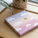
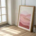
If you love that magical moment when one color melts into the next, you’re going to have so much fun with these blending painting ideas. I’m sharing my go-to ways to practice smooth gradients and soft transitions, especially for those dreamy sky-and-background moments.
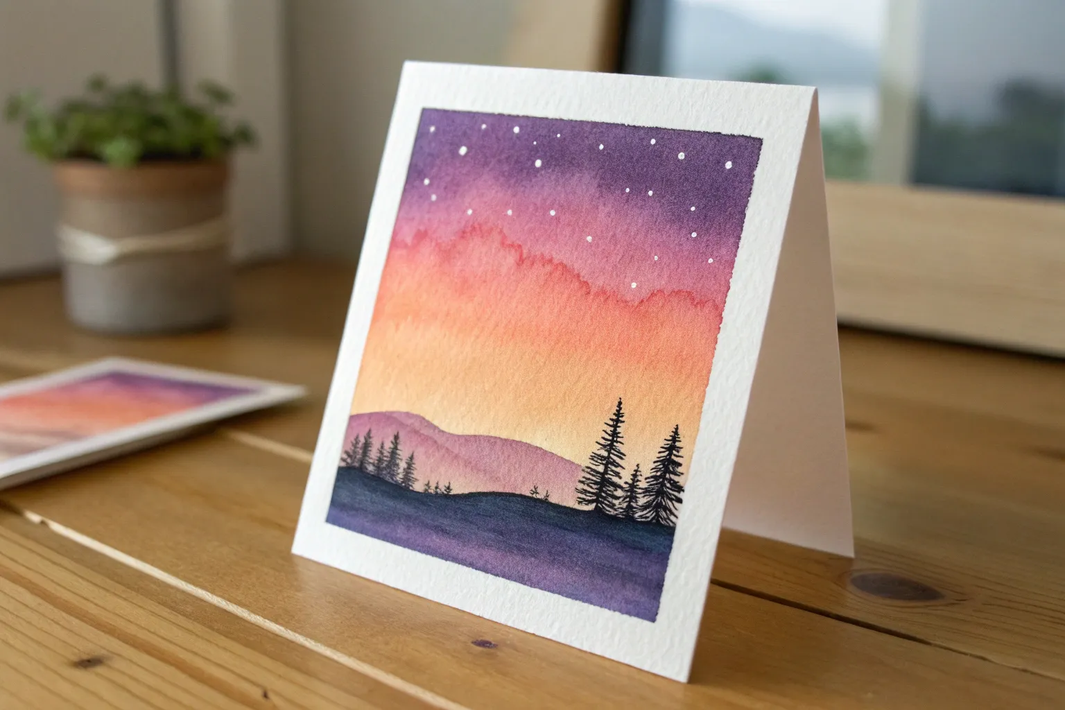
Sunset Gradient Skies
Capture the serene beauty of dusk with this gentle watercolor landscape, focusing on seamless transitions between warm and cool tones. This project is perfect for practicing wet-on-wet blending to create a dreamy, cloud-streaked sky that glows with soft light.
Step-by-Step Guide
Materials
- Cold press watercolor paper (300 gsm)
- Masking tape
- Watercolor paints (Violet, Rose/Pink, Orange, Lemon Yellow, Payne’s Grey, Burnt Sienna)
- Wide flat wash brush (3/4 inch or 1 inch)
- Round brush (size 6 or 8)
- Small liner brush
- Jar of clean water
- Paper towels
- Palette for mixing
Step 1: Preparation and Base Wash
-
Secure the paper:
Begin by taping down all four edges of your watercolor paper to a sturdy board or table. This prevents buckling when the paper gets wet and creates that crisp, clean white border at the end. -
Pre-wet the sky area:
Using your large flat brush and clean water, apply an even coat of water to the upper three-quarters of the paper. You want a consistent sheen, not puddles. -
Apply the violet layer:
While the paper is still glistening, load your brush with a watered-down violet. Paint a horizontal stroke across the very top edge, letting the pigment naturally bleed downward. -
Transition to pink:
Clean your brush slightly and pick up a soft rose or pink shade. Apply this just below the violet, allowing the two colors to touch and merge on the wet paper.
Cloud Control
To keep cloud edges soft, ensure the paper is damp. If edges form hard ‘blooms,’ your brush was too wet when adding new paint. Dry the brush slightly on a towel first.
Step 2: Building the Sunset Gradient
-
Introduce orange tones:
Move down the paper with a warm orange mix. Paint horizontal strokes, leaving some irregular gaps or ‘white space’ between the orange and pink layers to suggest cloud highlights. -
Blend into yellow:
As you reach the horizon line (about the bottom third of the page), switch to a bright lemon yellow. Blend this upward into the orange, keeping the yellow purest near the bottom of the sky. -
Tilt for softness:
If the bands of color look too distinct, I like to gently tilt the board back and forth to encourage gravity to help the colors mingle. -
Lift out clouds:
While the paint is still damp but losing its shine, use a clean, thirsty (slightly damp) brush to lift horizontal streaks of pigment out of the purple and pink sections, creating soft cloud forms. -
Deepen the shadows:
Mix a slightly more saturated purple-grey. While the paper is nearly dry, drag the side of your round brush across the purple section to add texture and depth to the upper clouds. -
Initial drying time:
Allow the sky portion to dry completely. The paper should feel room temperature to the touch, not cool.
Step 3: Horizon and Foreground Details
-
Paint the distant hills:
Mix a diluted wash of Payne’s Grey with a touch of violet. Using the round brush, paint a low, undulating silhouette along the horizon line, right over the bottom edge of the yellow sky. -
Create the water reflection:
Immediately beneath the hills, paint a wash of orange and yellow to represent water. Leave small horizontal slivers of white paper unpainted to mimic light reflecting on ripples. -
Add reflection depth:
While the water area is wet, drop in a tiny amount of the hill color (purple-grey) just below the hill line to show its shadow on the water. -
Let it dry again:
Pause here and let the water and hill layers dry thoroughly before moving to the foreground. -
Paint the foreground slope:
Mix Burnt Sienna with a little orange. Paint a sweeping triangular shape in the bottom left or right corner to ground the composition. -
Add grass texture:
Switch to your small liner brush or the very tip of your round brush. Load it with a darker mix of Burnt Sienna and Payne’s Grey. -
Detail the silhouette:
Flick the brush upward quickly from the foreground slope to create uneven, wild grass blades. Vary the direction and length for a natural look.
Bird Silhouettes
Once fully dry, use a fine-tip black pen or opaque gouache to add tiny, V-shaped bird silhouettes in the distance for scale and life.
Peel off the tape carefully at an angle to reveal your crisp edges and enjoy your peaceful sunset creation

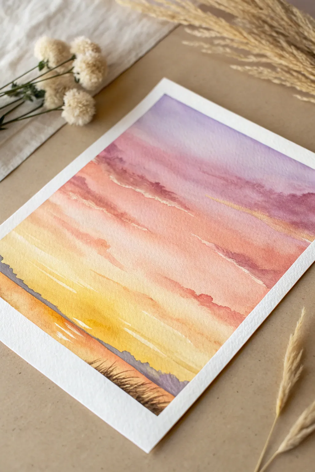
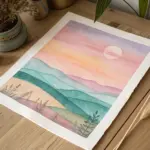
Sunrise Pastels With a Soft Horizon
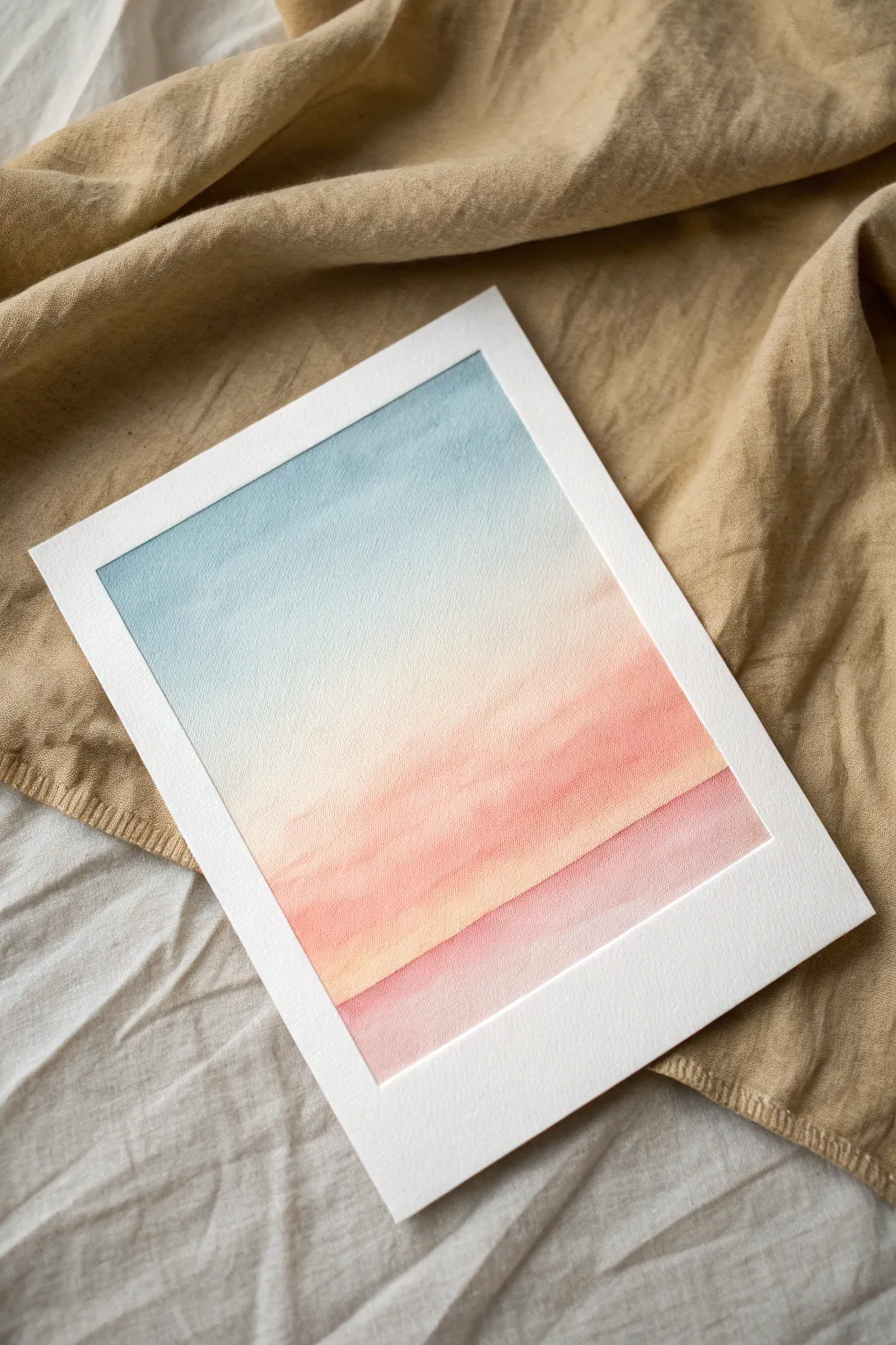
Capture the serene transition of a morning sky with this gentle gradient study. Using soft washes of watercolor, you will create a seamless blend from cool blue to warm peach, evoking the quiet beauty of dawn over a distant horizon.
Step-by-Step Tutorial
Materials
- Cold press watercolor paper (300 gsm)
- Watercolor paints (Cerulean Blue, Naples Yellow, Shell Pink or Coral, Rose Madder)
- Wide flat wash brush (1 inch)
- Medium round brush
- Masking tape
- Rigid drawing board
- Two jars of clean water
- Paper towels
Step 1: Preparation and Sky
-
Tape the borders:
Secure your watercolor paper to the drawing board using masking tape on all four sides. Press the edges of the tape down firmly with your thumbnail to ensure clean, crisp white borders later. -
Pre-wet the paper:
Dip your wide flat brush into clean water and apply an even coat across the entire paper surface. You want the paper to have a nice sheen but not be swimming in puddles. -
Apply the blue sky:
Load your flat brush with a watery mix of Cerulean Blue. Starting at the very top edge, paint horizontal strokes across the paper, moving downward about one-third of the way. -
Fade the blue:
Dip your brush into water to dilute the remaining pigment on the bristles. Continue working downward, allowing the blue to naturally fade into the white of the paper near the middle of the sheet. -
Introduce the warmth:
While the paper is still damp (not soaking), clean your brush and pick up a very pale Naples Yellow. Begin painting just below where the blue faded out, blending slightly upward to create a soft, greenish-neutral transition zone.
Preventing Blooms
Does your sky look patchy? This happens if you add wet paint into a drying area. If the shine is gone from the paper, stop painting and let it dry fully before doing a second glaze.
Step 2: The Glowing Horizon
-
Intensify the yellow:
As you move lower, add a touch more pigment to your yellow mix. Paint horizontal strokes to establish a band of light warmth that feels like the sun rising. -
Blend in the peach:
Without cleaning the brush entirely, pick up your Shell Pink or Coral color. Blend this into the bottom edge of the yellow wash, creating a lovely orange-sherbet hue in the middle-lower section. -
Deepen the gradient:
Continue painting downward with pure Shell Pink, making the color slightly more saturated as you approach the bottom third of the paper. Keep your strokes horizontal and smooth. -
Dry the first layer:
Let this initial gradient layer dry completely. The paper must be bone-dry before adding the horizon line, or the colors will bleed uncontrollably.
Step 3: Defining the Landscape
-
Mix the ground color:
Create a slightly thicker mixture of Rose Madder with a tiny touch of the Coral you used earlier. It should be darker and more opaque than your sky wash. -
Paint the first dune:
Using a medium round brush, paint a soft, sloping line across the bottom third of the paper. This line should dip slightly in the middle, creating a gentle U-shape. -
Fill the shape:
Fill in the area below this line with a wash of the Rose Madder mix. I like to keep this wash slightly uneven to suggest texture on the ground. -
Soften the contrast:
If the line looks too harsh against the sky, quickly run a clean, damp brush along the top edge of the horizon line to slightly blur it, mimicking atmospheric perspective. -
Add a foreground layer:
Once the previous layer is touch-dry, mix a slightly more saturated version of the pink. Paint a second, lower horizon line that overlaps the first one on the right side, creating depth. -
Texture the foreground:
While this bottom-most layer is wet, drop in a tiny bit of concentrated pink or red pigment in the corners to weigh down the composition. -
Final drying:
Allow the painting to dry completely. If the paper feels cool to the touch, it is still damp inside. -
The reveal:
Check that the paint is fully dry, then carefully peel away the masking tape at a 45-degree angle. Pull away from the painting to prevent tearing the paper surface.
Metallic Touch
Once fully dry, use a fine brush to add a thin line of metallic gold watercolor along the top edge of the horizon line. It catches the light like the first glint of the sun.
Step back and enjoy the calming simplicity of your private sunrise view
Night Sky Blend From Blue to Black
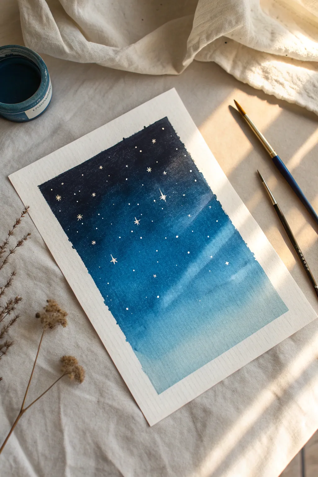
Create a dreamy transition from twilight blue to midnight black in this beginner-friendly watercolor project. This technique of grading colors creates a stunning atmospheric depth that serves as the perfect backdrop for a field of delicate stars.
Step-by-Step
Materials
- Cold Press Watercolor Paper (approx. 300gsm)
- Painter’s Tape or Masking Tape
- Watercolor Paints (Indigo or Payne’s Gray, Prussian Blue, Cerulean Blue)
- White Gouache or White Gel Pen
- Round Watercolor Brushes (Size 6 and Size 2)
- Jar of Clean Water
- Paper Towels
- Hard-board or table surface to tape onto
Step 1: Setting the Stage
-
Prepare your surface:
Start by securing your watercolor paper to a hard surface using painter’s tape. Create a crisp border by pressing down firmly along the inner edges of the tape to prevent paint from seeping underneath. -
Pre-mix your gradient:
Before shrinking the paper, mix generous puddles of your three main colors on your palette: a deep Indigo/Black for the top, a rich Prussian Blue for the middle, and a watery Cerulean Blue for the bottom. -
Wet the paper:
Using your larger brush or a spray bottle, apply a clean coat of water across the entire rectangular area inside your tape. The paper should be glistening but not holding puddles.
Uneven Drying?
If you get ‘cauliflower’ blooms where water pushes pigment away, wait until it’s dry, then glaze over the area with a very light wash of the surrounding color to smooth it out.
Step 2: Layering the Gradient
-
Start with the darks:
Beginning at the very top edge, load your brush with the darkest Indigo mixture. Paint a horizontal band across the top third of the paper, letting the pigment flow naturally into the wet surface. -
Introduce the mid-tone:
Clean your brush slightly and pick up the Prussian Blue. Apply this directly below the Indigo band, slightly overlapping the dark edge to encourage them to bleed together. -
Apply the lightest tone:
For the bottom third, wash in your diluted Cerulean Blue or a very light wash of blue gray. Paint all the way to the bottom tape line. -
The blending pass:
Clean and dampen your brush (remove excess water). Gently sweep back and forth horizontally where the colors meet to soften distinct lines. Avoid overworking it; watercolor does its best work when left alone to settle. -
Deepen the night:
While the paper is still damp, I like to drop very concentrated Indigo pigment into the top corners and upper edge to make the ‘space’ feel deeper and more infinite. -
Let it dry completely:
This is crucial. The paper must be bone dry before you add stars. If the paper feels cool to the touch, it is still wet. Using a hair dryer on low heat can speed this up.
Galaxy Glow
Add magic by lifting distinct clouds. While the blue paint is damp, dab a clean tissue to lift color in a diagonal swoosh, then paint your stars over this lighter ‘nebula’ area.
Step 3: Adding the Starlight
-
Prepare the stars:
Squeeze out a small amount of opaque white gouache. Add just a drop of water to make it creamy—not too runny, or it will fade when drying. -
Large star placement:
Using your smallest detail brush (size 0 or 2), paint a few larger 4-point stars. Draw a thin vertical line crossed by a shorter horizontal line. -
Small star clusters:
Dip the tip of your small brush or even a toothpick into the white paint. Gently dot clusters of stars around the larger specific stars, varying the pressure to create different sizes. -
Creating the Milky Way effect:
For tiny distant stars, you can flick the bristles of a toothbrush or stiff brush loaded with white paint over the paper. Protect the bottom lighter area with a scrap paper if you want stars only in the dark sky. -
Refine the shapes:
Go back to your larger distinct stars and extend the points slightly using a very fine tip to make them look like they are twinkling. -
The reveal:
Ensure the white paint is totally dry. Slowly and carefully peel away the masking tape at a 45-degree angle, pulling away from the center of the painting to keep the edges crisp.
Step back and admire how simple color blending can capture the vastness of the universe on a single page
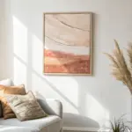
Silhouettes Over a Blended Background
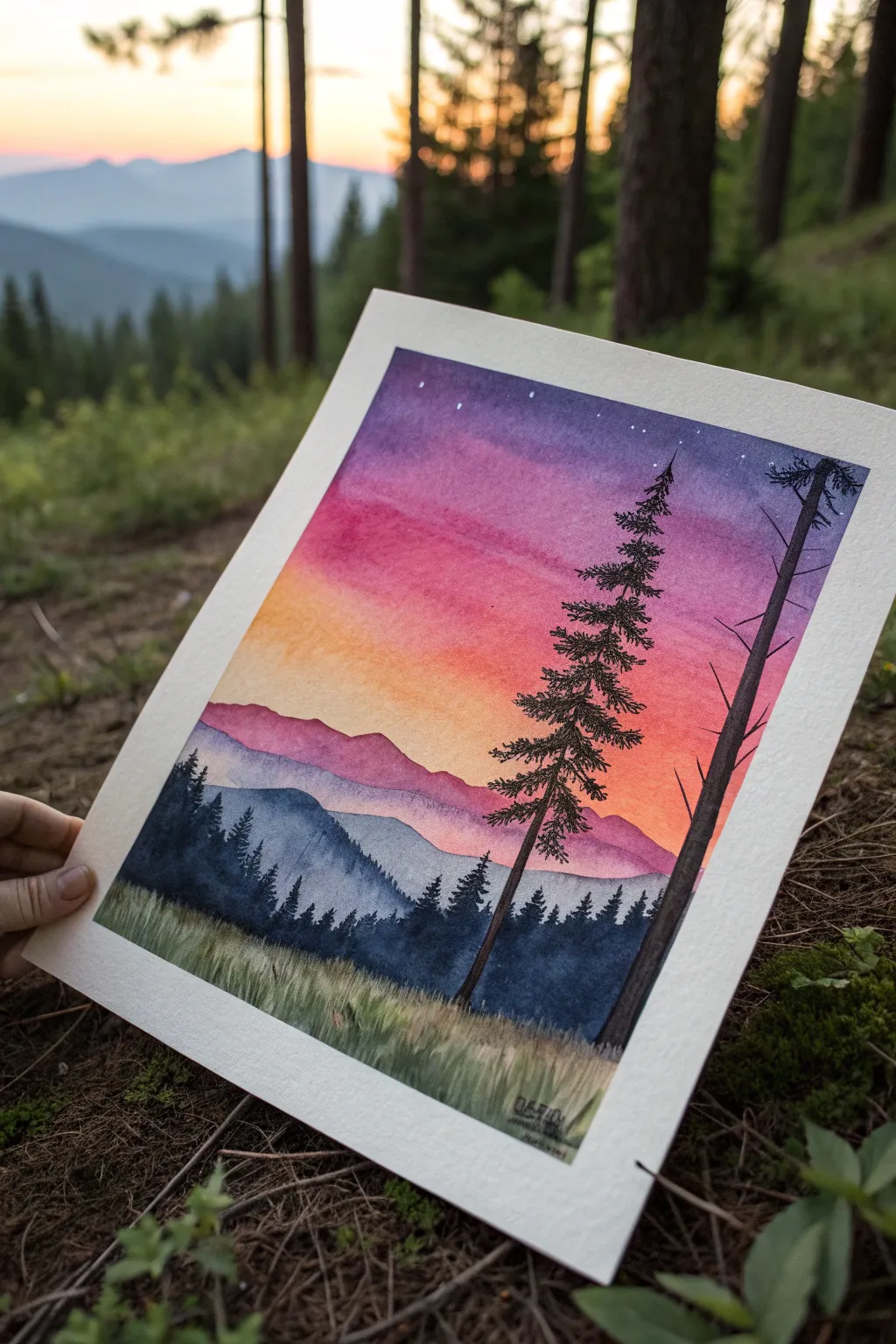
Capture the magic of twilight in the mountains with this stunning watercolor project. By blending a vibrant gradient sky behind crisp, dark silhouettes, you will create a piece with incredible depth and atmosphere.
Detailed Instructions
Materials
- Cold press watercolor paper (block or taped down)
- Watercolor paints: Indigo, Dioxazine Purple, Alizarin Crimson, Cadmium Yellow, Sap Green, Payne’s Gray
- Large flat wash brush (3/4 inch or 1 inch)
- Medium round brush (size 6 or 8)
- Small detail brush (size 0 or 1)
- White gel pen or white gouache
- painter’s tape
- Two jars of water
- Paper towels
Step 1: Painting the Sky Gradient
-
Prepare the paper:
Begin by taping the edges of your watercolor paper securely to a board or table to create a crisp white border and prevent buckling. -
Wet the sky area:
With a clean flat wash brush, apply a generous even coat of clean water to the top two-thirds of the paper, stopping where you want the mountains to begin. -
Apply the top color:
While the paper is wet, load your brush with a deep Indigo or Dioxazine Purple and paint a horizontal strip across the very top edge. -
Blend downward:
Rinse your brush slightly and pick up a bright pink or magenta shade. Apply this directly below the purple, letting the wet paper merge the colors softly. -
Add the sunset glow:
Transition into a warm orange or yellow near the horizon line. I find it helpful to make this layer fairly intense, as watercolors dry lighter. -
Smooth the gradient:
Use a damp, clean brush to gently swipe back and forth where the color bands meet to ensure a seamless transition without hard lines. -
Let it dry completely:
This is crucial: allow the sky to bone dry before moving on. Use a hair dryer on a low setting if you are impatient.
Muddy colors?
If your sunset turns brown, you likely let the purple and yellow mix too much. Let the pink act as a buffer zone between them.
Step 2: Creating the Mountain Layers
-
Paint the distant range:
Mix a watery, pale purple wash. Using a medium round brush, paint a jagged mountain silhouette just below the yellow sky, dragging the color down to fade it out. -
Add the second ridge:
Once the first range is dry, mix a slightly darker, bluer purple. Paint a second mountain ridge slightly lower, overlapping the first. -
Paint the mid-ground hills:
Mix a deeper blue-green using Indigo and a touch of Green. Paint a darker, rolling hill shape in front of the purple mountains.
Step 3: Adding Foreground Silhouettes
-
Mix shadow color:
Create a very concentrated, dark mixture using Payne’s Gray and Sap Green. It should be almost black but rich in tone. -
Paint the tree line:
Along the mid-ground hill, paint small, uneven vertical spikes to represent a distant forest of pine trees. -
Create the grassy base:
At the very bottom, paint an opaque layer of dark green. While wet, flick the brush upward to create grass blades texture. -
Draft the main tree trunk:
Using your detail brush and the darkest paint mix, draw a thin, slightly wavering line extending from the grass up into the purple sky for the main focal pine. -
Add branches:
Starting from the top of the trunk, paint downward-sloping branches. Keep them short at the top and gradually wider as you move down. -
Thicken the foliage:
Stipple or dab the brush along the branches to suggest dense pine needles, leaving some gaps so the sunset shows through. -
Add the secondary tree:
Paint a second, partly visible tree trunk on the right edge to frame the composition, using the same dark mixture. -
Final stars:
Once everything is dry, use a white gel pen or a tiny dot of white gouache to place a few stars in the darkest part of the purple sky.
Tree texture tip
For realistic pine needles, use a ‘rigger’ or liner brush. Its long bristles hold more paint and create natural, jagged lines effortlessly.
Peel off the tape carefully to reveal your crisp edges and enjoy your serene mountain escape
BRUSH GUIDE
The Right Brush for Every Stroke
From clean lines to bold texture — master brush choice, stroke control, and essential techniques.
Explore the Full Guide
Ocean Horizon With Mirror Blending
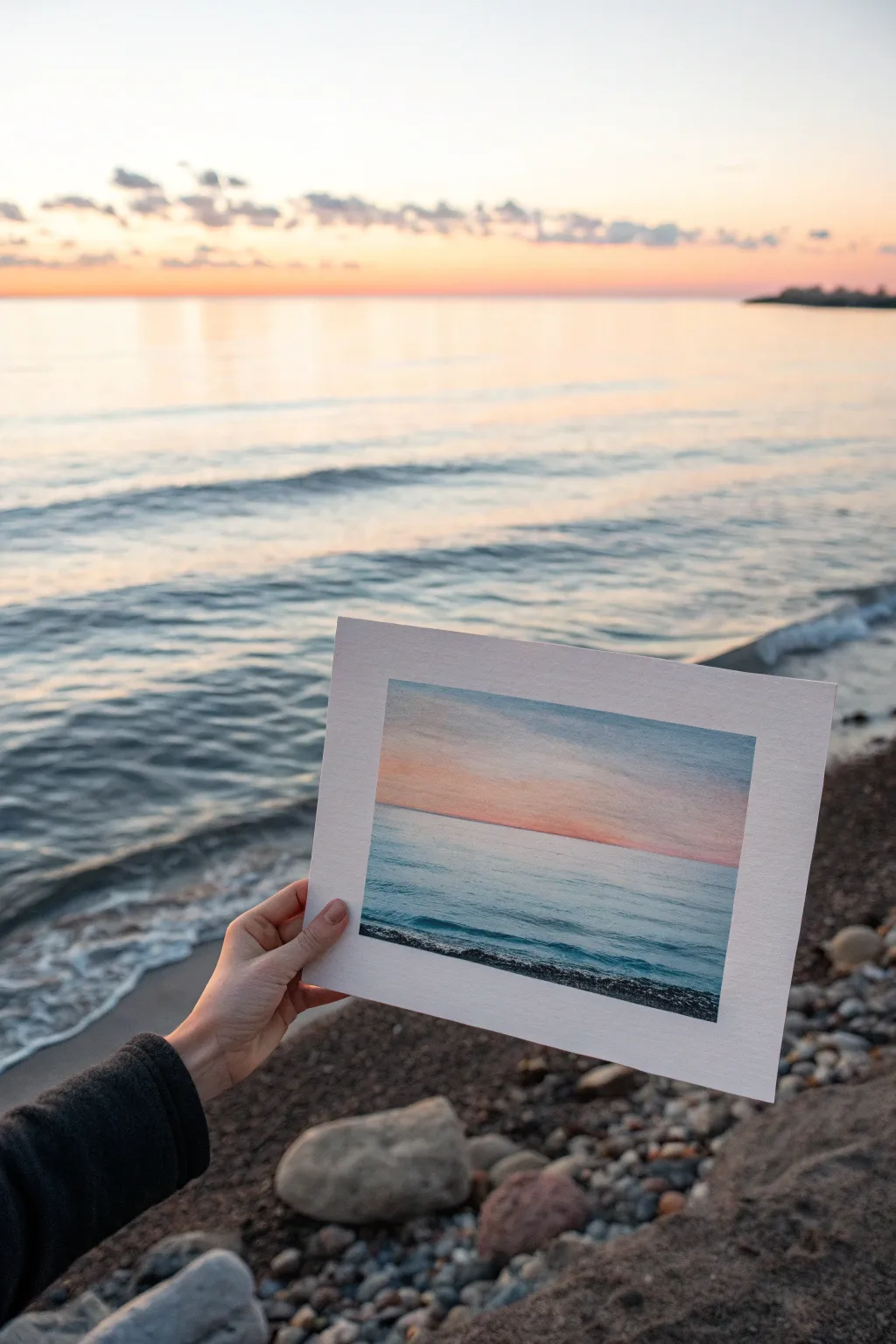
Capture the serene beauty of a sunset where water and sky meet using soft, gradient blending techniques. This project focuses on matching the subtle transitions of twilight light to create a near-seamless mirror of reality on paper.
Step-by-Step Guide
Materials
- High-quality watercolor paper (cold press, 140lb or heavier)
- Watercolor paints (phthalo blue, ultramarine, alizarin crimson, cadmium yellow, burnt sienna)
- Flat wash brush (3/4 inch)
- Round brush (size 6 or 8)
- Masking tape
- Clean water cups
- Paper towels
- Palette for mixing
Step 1: Preparation and Sky Layer
-
Secure the paper:
Begin by taping down all four edges of your watercolor paper to a board. This creates the crisp white border seen in the final piece and prevents the paper from buckling during wet washes. -
Establish the horizon line:
Use a pencil to lightly sketch a straight horizontal line about one-third of the way up from the bottom. This separates your sky from the water. -
Wet the sky area:
With your flat brush, apply clean water to the entire sky section above the horizon line. The paper should be glistening but not forming puddles. -
Apply the upper sky blue:
Mix a watery wash of phthalo blue with a touch of grey or violet. Apply this to the very top strip of the sky, letting the color naturally bleed downwards into the wet paper. -
Blend the sunset transition:
While the blue is still wet, rinse your brush and pick up a soft pale peach mix (diluted cadmium yellow and a tiny dot of crimson). Paint this horizontally across the middle sky, slightly overlapping the blue edge to create a soft, neutralized transition zone. -
Intensify the horizon glow:
Near the horizon line, drop in a slightly stronger band of pinkish-orange. Let this bleed upward into the peach tone, ensuring the color is strongest right above the pencil line.
Muddy colors?
If blue and orange mix too much, they turn brown. Keep a small strip of clear water or very pale yellow between strong blues and oranges when blending wet-on-wet.
Step 2: Water and Reflections
-
Dry completely:
Wait until the sky is bone dry. This is crucial—if you paint the water now, the horizon line will blur and ruin the sharp distinction between air and sea. -
Match the water color:
Mix a teal-blue shade by combining phthalo blue with a touch of sap green. It should be slightly darker and more saturated than your sky blue. -
Paint the water base:
Using horizontal strokes, fill the area below the horizon line. I find it helpful to start right at the horizon with a steady hand to get a sharp edge, then work downwards. -
Reflect the sunset:
While the water wash is still damp, lift out a few horizontal streaks near the center using a thirsty -
Create wave texture:
Load your round brush with a darker ultramarine blue. Paint thin, broken horizontal lines across the foreground water to mimic the rhythmic ripples of the waves.
Step 3: Foreground and Details
-
Darken the shoreline:
Mix burnt sienna with ultramarine blue to create a deep, near-black rocky color. -
Stipple the rocky beach:
At the very bottom edge of the painting, use the tip of your round brush to stipple dots and small irregular shapes, simulating the texture of pebbles and wet sand. -
Add shoreline shadows:
Paint a thin, dark line right where the water meets the pebbles to ground the image and show the wet shoreline. -
Refine the horizon:
If the horizon line isn’t perfectly straight, use a ruler and a very fine brush with opaque white gouache or slightly darker blue watercolor to clean up the edge subtly. -
Final reveal:
Once everything is completely dry to the touch, slowly peel away the masking tape at a 45-degree angle to reveal the clean white frame.
Add sparkle
For a magical touch, use a white gel pen to add tiny highlights on the crests of the foreground waves or wet shoreline pebbles once paint is dry.
Now hold your masterpiece up to the horizon and admire how you’ve captured the light
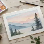
Misty Mountains With Atmospheric Blending
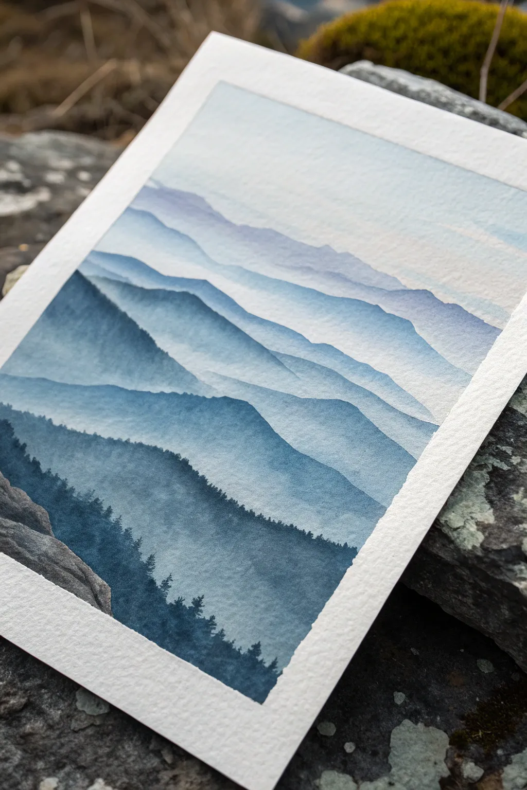
Capture the serene depth of a mountain range fading into the distance with this atmospheric watercolor study. By mastering varying dilutions of a single hue, you’ll create a stunning illusion of distance and fog.
Detailed Instructions
Materials
- Cold Press Watercolor Paper (140lb/300gsm)
- Painter’s Tape
- Indigo or Payne’s Gray Watercolor Paint
- Round Watercolor Brush (Size 8 or 10)
- Detail Brush (Size 0 or 1)
- Two Jars of Water (one clean, one for rinsing)
- Paper Towels
- Mixing Palette
Step 1: Preparation and Sky Layer
-
Secure the Paper:
Tape down all four edges of your watercolor paper to a board or table. This prevents buckling when the paper gets wet and creates a crisp, professional white border around your finished piece. -
Mix Your Base Wash:
Squeeze a small amount of Indigo or Payne’s Gray onto your palette. Create a very watery, transparent puddle for your sky wash. It should be almost clear, just barely tinted with blue. -
Paint the Sky:
Using your larger round brush, apply this faint wash across the top third of the paper. Keep the strokes horizontal and smooth. Let it fade naturally as you reach the middle of the page. -
Dry Completely:
Allow this initial layer to dry completely. The paper must be bone dry before you add the first mountain ridge, or the edges will bleed and lose definition.
Control Your Bloom
To get that ‘smoky’ mist effect at the base of a mountain, use a semi-wet brush to pull pigment down, then tilt your paper slightly so the water runs into the wash, not back up the mountain.
Step 2: The Distant Ridges
-
First Mountain Range:
Darken your paint mixture slightly by adding a tiny bit more pigment. Paint the silhouette of the furthest mountain range about a third of the way down the paper. The ridge line should be soft and jagged. -
Fade the Bottom:
Before the paint dries, rinse your brush and use clear water to drag the pigment downwards from the mountain’s base, creating a seamless gradient into the white paper below. This creates the mist effect. -
Layering Up:
Wait for the first range to dry. Mix a slightly darker value of your blue-grey. Paint a second mountain range overlapping the first one, starting slightly lower on the page. -
Repeat the Fade:
Just as before, soften the bottom edge of this new mountain shape with water so it disappears into a mist rather than ending in a hard line.
Step 3: Mid-Ground Depth
-
Increasing Contrast:
For the third layer of mountains, use significantly more pigment. The color should look distinct against the lighter background layers. -
Shape Variation:
Paint this ridge with steeper peaks and valleys to suggest clearer terrain features. I like to let my brush wiggle slightly to mimic rocky textures. -
Atmospheric Blend:
While painting the body of this mountain layer, add a drop of water directly onto the wet paper in the lower sections to encourage a ‘bloom’ or uneven drying pattern, which looks like drifting fog. -
Dry Time:
Pause and ensure everything is thoroughly dry. Use a hairdryer on a low setting if you are eager to proceed, but be careful not to blow the wet pigment around.
Birds in Flight
Use your smallest detail brush and highly concentrated black or indigo paint to add three or four tiny ‘v’ shapes in the sky area, suggesting distant birds gliding over the peaks.
Step 4: Foreground and Details
-
The Darkest Value:
Prepare your most concentrated paint mix yet—it should be nearly opaque, with very little water. This is for the closest mountain ridge in the immediate foreground. -
Painting the Foreground:
Paint a large, looming mountain shape at the bottom of the paper. This layer anchors the entire composition and creates the maximum contrast against the pale sky. -
Adding Tree Texture:
Switch to your detail brush while the top edge of this dark mountain is still damp. Use the tip to stipple tiny vertical lines along the ridge. -
Refining Trees:
Create the suggestion of pine trees by varying the heights of your vertical strokes. Focus on the silhouette rather than individual branches. -
Foreground Rocks:
If you wish to add the rock detail seen in the corner, use a very dry brush technique with your dark paint to suggest rough stone textures on the bottom left edge. -
Final Assessment:
Once totally dry, carefully peel away the painter’s tape at a 45-degree angle to reveal your clean edges.
Step back and admire how simple layers of color can build a vast, misty landscape

PENCIL GUIDE
Understanding Pencil Grades from H to B
From first sketch to finished drawing — learn pencil grades, line control, and shading techniques.
Explore the Full Guide
Wet-on-Wet Horizontal Blend Practice
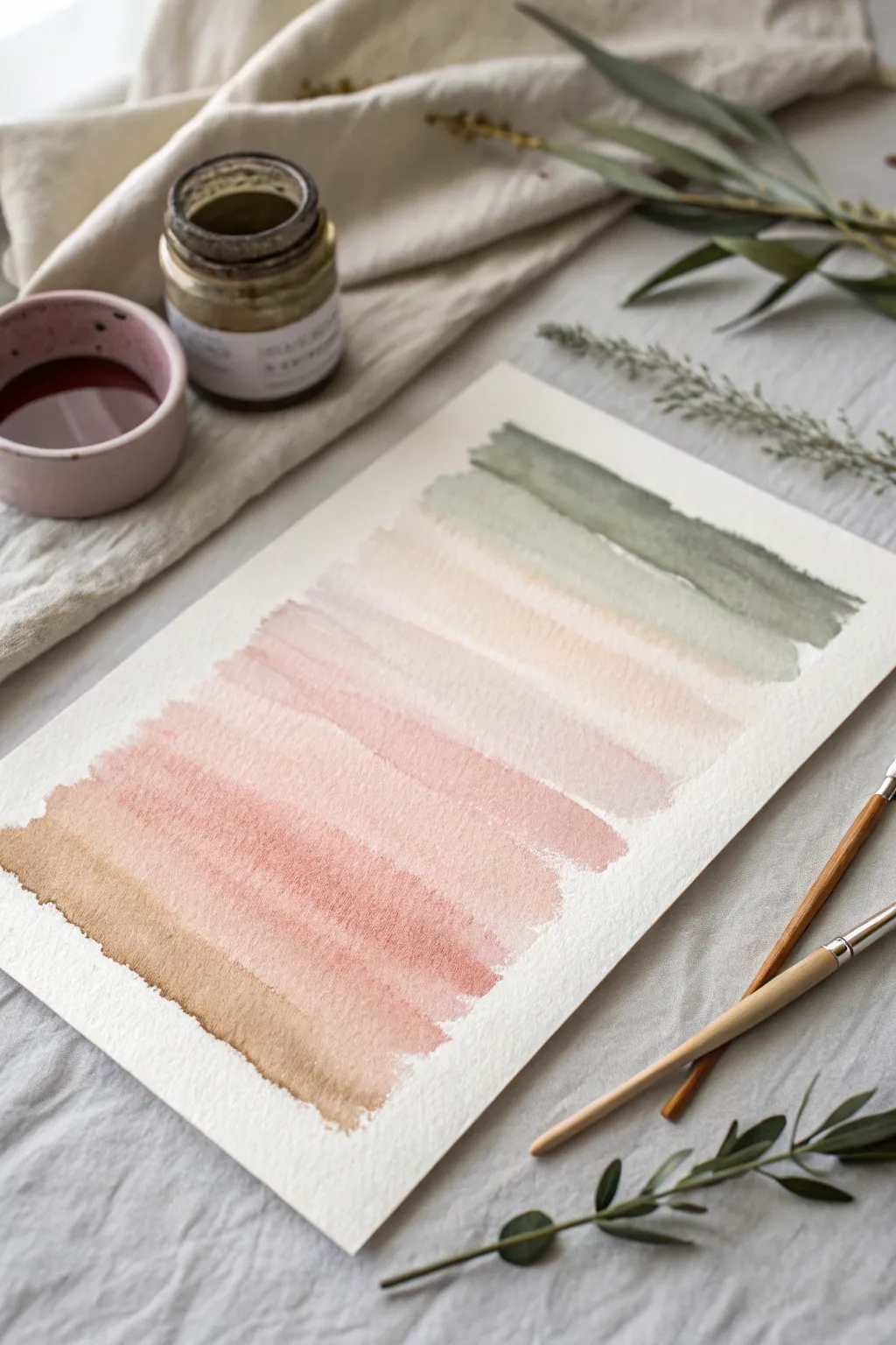
Master the art of the graded wash with this elegant practice piece featuring soft, earthy transitions. By laying down horizontal bands of color that gently bleed into one another, you’ll create a soothing vertical spectrum ranging from warm terracotta to cool sage.
Step-by-Step Tutorial
Materials
- Cold press watercolor paper (300 gsm)
- Watercolor paints (Burnt Sienna, Rose Madder or Dusty Pink, Sap Green, Payne’s Grey)
- Medium round brush (size 6 or 8)
- Small mixing palette
- Two jars of water (one for clean, one for dirty)
- Paper towels
- Washi tape or masking tape
Step 1: Preparation
-
Secure the paper:
Tape your watercolor paper down to a board or table surface on all four sides. This prevents the paper from buckling when it gets wet and ensures a nice clean border later. -
Pre-mix your palette:
Prepare four distinct puddles of paint on your palette. You will need a rich terracotta (Burnt Sienna mixed with a touch of rose), a dusty pink (dilute Rose Madder), a pale neutral beige (very dilute brown), and a muted sage green (Sap Green with a drop of Payne’s Grey). -
Test opacity:
Before touching the final paper, test your mixes on a scrap piece. You want the consistency of tea—fluid enough to move, but pigmented enough to show color.
Natural Edges Pro-Tip
Don’t try to make the ends of your brushstrokes perfect straight lines. Letting them be ragged and uneven adds to the organic, swatched feel of the final piece.
Step 2: Painting the Gradient
-
Start at the bottom:
Load your brush generously with the terracotta mix. Starting at the bottom left of your intended painting area, pull a confident horizontal stroke across to the right. -
Soften the first edge:
Quickly dip your brush in water and wipe it slightly on the rim. Run this damp brush along the top edge of your terracotta stripe to encourage the pigment to flow upward slightly. -
Introduce the second tone:
Pickup your dusty pink mixture. Paint a stroke directly above the wet edge of the terracotta band, allowing the two wet edges to touch. Watch as the colors naturally bleed and merge. -
Continue the pink section:
Lay down 2-3 more horizontal strokes of the pink, moving upward. With each stroke, dip your brush into clean water once to dilute the pigment, making the pink lighter as it ascends. -
Transition to neutral:
Clean your brush thoroughly. Switch to your pale beige mixture. Apply this directly above the faintest pink stroke while the paper is still damp. -
Bridge the gap:
If the paper has started to dry between layers, use a very slightly damp clean brush to re-wet the edge gently before applying the new color to ensure a seamless blend. -
Shift to cool tones:
As you move past the middle of the paper, begin introducing the sage green. Start with a very watery, pale version of the green mixture. -
Deepen the green:
Paint the next stroke using a slightly more saturated version of the sage green. Allow the bottom of this stroke to bleed into the pale neutral band below it. -
Final dark band:
For the topmost stroke, use the most concentrated mix of your sage green (perhaps with a tiny extra dot of grey). Apply a firm stroke across the top to bookend the gradient. -
Create texture:
While the paint is still wet, you can tilt the board slightly to encourage the heavier pigment to settle into the texture of the paper, creating nice granulation effects.
Level Up: Salt texture
While the terracotta band is still wet, sprinkle a few grains of table salt on it. As it dries, the salt absorbs pigment, creating beautiful starry textures.
Step 3: Finishing
-
Allow to dry:
Let the painting sit completely undisturbed. Moving it now might cause back-runs or ‘cauliflowers’ where the water pushes pigment away. -
Check for dampness:
Ensure the paper is cool to the touch but bone dry. If it feels cold, there is still moisture trapped in the fibers. -
Remove tape:
Peel the tape away slowly at a 45-degree angle, pulling away from the artwork to prevent tearing the paper surface.
Now you have a serene color study that perfectly captures the beauty of pigment interaction.
Circular Blending for Sun or Moon Glow
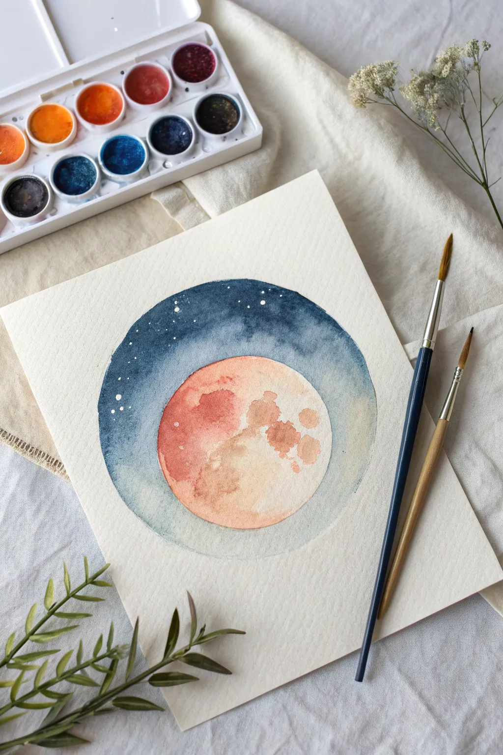
This serene watercolor project explores the beauty of circular blending, combining a warm, cratered moon against a cool, starry night sky. The contrast between the crisp circular border and the soft washes inside creates a stunning, graphic effect perfect for framing.
Step-by-Step
Materials
- Cold press watercolor paper (minimum 140lb)
- Watercolor paints: Indigo, Prussian Blue, Burnt Sienna, Yellow Ochre, Cadmium Orange
- Compass or round object to trace
- Pencil and kneaded eraser
- Round watercolor brushes (size 6 and size 2)
- White gel pen or white gouache
- Two jars of water (one for clean, one for dirty)
- Paper towels
Step 1: Planning phase
-
Trace the outer boundary:
Begin by lightly tracing a large circle on your watercolor paper using a compass or a bowl. This will define the boundary of your night sky. -
Define the moon:
Inside the larger circle, trace a smaller circle slightly offset toward the bottom center. This will be your moon. -
Lighten lines:
Use a kneaded eraser to dab away the excess graphite until the pencil lines are faint guides rather than dark outlines, as watercolor is transparent.
Clean Edges Trick
Work your brush slowly along the pencil line first to create a ‘water dam,’ then fill in the rest of the shape quickly. This prevents jagged drying lines at the border.
Step 2: Painting the Moon
-
Prepare the warm palette:
Mix a watery wash of Yellow Ochre and a separate wash of reddish-orange using Cadmium Orange and a touch of Burnt Sienna. -
Initial wash:
Wet the entire inner moon circle with clean water. Drop in the pale Yellow Ochre, letting it bloom softly across the surface but keeping some areas lighter. -
Adding atmospheric texture:
While the paper is still damp, charge your brush with the reddish-orange mix. Tap this color onto the upper left side of the moon to create a shadow side. -
Creating craters:
Load a smaller brush with a more concentrated Burnt Sienna. Dab irregular shapes onto the moon’s surface while it’s still slightly damp to create soft-edged craters. -
Hard edges:
Let the moon dry completely. Then, using the Burnt Sienna mix, paint a few dry brush strokes or distinct crater stains on top to simulate textured terrain. Let this dry completely before moving to the sky.
Shimmer Boost
Mix a tiny amount of metallic gold watercolor into your orange moon paint for a celestial object that literally catches the light.
Step 3: Painting the Sky
-
Mix the night shades:
Prepare a gradient palette: a very pale watery blue, a mid-tone Prussian Blue, and a deep, saturated Indigo. -
Wet the sky zone:
Carefully wet the area between the moon’s edge and the outer circle boundary. Be very precise near the moon’s edge so the colors don’t bleed into your finished moon. -
Start the gradient:
Begin at the top of the outer circle with your deepest Indigo. Apply the paint boldly, following the curve of the circle. -
Blend downward:
As you move down the sides of the moon, switch to the Prussian Blue. Allow the wet paint to mix naturally on the page. -
Fade to light:
Toward the very bottom of the circle, rinse your brush and use almost clear water or the faintest blue tint to fade the sky out, creating a glowing atmosphere beneath the moon. -
Refining edges:
Use the tip of a small damp brush to tidy up the outer circumference of the main circle while the paint is still workable, ensuring a crisp separation from the white paper.
Step 4: Stars and Details
-
Dry time:
Allow the sky portion to dry completely. If you touch it and it feels cool, it’s not ready yet. -
Adding stars:
Using a white gel pen or a small brush dipped in opaque white gouache, dot tiny stars into the darkest blue section at the top. -
Varying star sizes:
Cluster a few tiny dots together and leave larger gaps elsewhere to make the night sky look natural rather than a uniform pattern. -
Final texture check:
If the moon looks too flat, you can add one final glaze of diluted orange over the craters to deepen the contrast.
Once the final star is placed, you have a beautiful celestial study ready to display


Wet-on-Dry Soft-Edge Cloud Blends
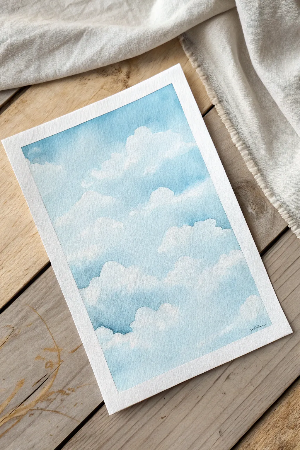
Capture the serene beauty of a fluffy, cloud-filled sky using watercolor techniques that balance precision with softness. This project focuses on building up layers of blue around pristine white paper to creating depth and volume through negative space painting.
How-To Guide
Materials
- Cold Press Watercolor Paper (preferably 300gsm/140lb)
- Masking tape
- Pencil (HB or 2B)
- Kneadable eraser
- Watercolor paints: Cerulean Blue, Cobalt Blue, Prussian Blue
- Round brush (Size 8 or 10)
- Small round brush (Size 2 or 4) for details
- Two jars of water (clean and dirty)
- Paper towels or cloth
Step 1: Preparation and Sketching
-
Secure the paper:
Tape your watercolor paper down firmly to a board or table on all four sides. This creates that crisp white border seen in the final piece and prevents the paper from buckling when wet. -
Outline the clouds:
Using your pencil, lightly sketch the contours of your cloud formations. Don’t worry about perfect shapes; clouds are organic and irregular. Focus on overlapping shapes to suggest distance. -
Lighten the lines:
Gently roll a kneadable eraser over your sketch. You want the graphite lines to be barely visible—just enough to guide you, but faint enough that they won’t show through the transparent watercolor.
Step 2: Painting the Upper Sky
-
Mix your base blue:
Create a generous puddle of a medium-tone sky blue. A mix of Cerulean and a touch of Cobalt Blue works well here. You want enough paint mixed so you don’t run out mid-wash. -
Top layer application:
Starting at the very top edge of the taped area, apply the blue paint wet-on-dry. Bring the color down towards the irregular top edge the first large cloud bank. -
Softening the edge:
Before the paint dries, rinse your brush, dry it slightly on a towel, and run the damp (not dripping) bristles along the bottom edge of the blue paint. This softens the hard line into a gentle fade where the sky meets the white cloud top. -
Wait for drying:
Let this top section dry completely. I prefer to be patient here to ensure crisp layering for the next steps.
Softness Secret
Use a ‘thirsty brush’ (damp but not wet) to lift pigment off hard edges while they are still wet. This creates that fluffy, vaporous look essential for realistic clouds.
Step 3: Building the Middle Layers
-
Define the middle clouds:
Mix a slightly stronger blue, perhaps adding a tiny bit of Prussian Blue to your original mix. You are now painting the ‘negative space’ between the top cloud and the middle cloud. -
Carving the shape:
Paint the blue sky section right underneath the first cloud shape. Use the tip of your round brush to carefully trace the bumpy, fluffy outline of the cloud above, leaving the paper white for the cloud itself. -
Blending down:
As you paint this blue patch downward, fade it out as it approaches the top of the *next* cloud bank below. Use the clean, damp brush technique again to feather the bottom edge of the blue into the white paper. -
Adding shadow nuances:
While the blue area is still damp, drop in a slightly more concentrated blue into the nooks and crannies of the cloud outline above. This deepens the contrast and makes the white cloud look brighter.
Sunset Shift
Instead of pure blue, create a gradient in your sky washes. Start with violet at the top, fading into pink or soft orange near the bottom clouds for a dusk effect.
Step 4: Lower Sky and Details
-
Continue the pattern:
Move downwards to the next layer of clouds. Repeat the process: paint the blue sky shape, carving out the top edge of the cloud below while defining the bottom edge of the cloud above. -
Deepen the color:
As you move lower in the composition, or into deeper pockets between clouds, increase the pigment concentration. Deeper blues create a sense of depth and volume. -
Softening internal shadows:
For the clouds themselves, mix a very watery, pale grey-blue. Paint faint shadows on the *bottom* parts of the puffy white shapes to give them 3D volume, instantly softening the edges with clean water so there are no hard lines. -
Review and refine:
Step back and look at the overall balance. If any blue edges look too sharp where they shouldn’t, gently scrub them with a damp brush to lift a little color and soften the transition. -
The Reveal:
Once the paper is bone dry—touch it with the back of your hand to check—carefully peel away the masking tape at a 45-degree angle to reveal the clean frame.
Now you have a serene piece of sky captured forever on paper
Sponge Blending for Velvety Backgrounds
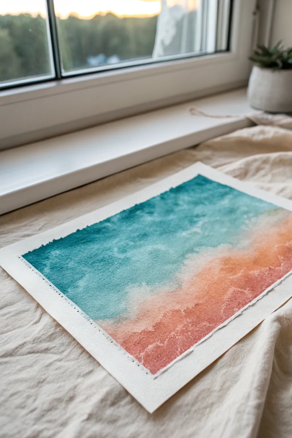
Achieve a stunningly soft, velvety transition between cooling teal and warm coral using a simple sponge. This project captures the feeling of a hazy coastline sunset through texture rather than precise brushstrokes.
Detailed Instructions
Materials
- Cold press watercolor paper (300gsm or heavier)
- Natural sea sponge or synthetic art sponge
- Watercolor paints or fluid acrylics
- Colors: Phthalo Turquoise, Cobalt Teal, Quinacridone Coral, Burnt Sienna
- Masking tape
- Clean water jar
- Paper towels for blotting
- Spray bottle (mister)
Step 1: Setting the Stage
-
Prep your surface:
Tape down your watercolor paper to a board with masking tape. For this project, leave a wide border around the edges to frame the gradient; however, if you want the rough edge look shown in the photo, you can skip the tape or tear the paper edges beforehand. -
Mix fluid colors:
Prepare two distinct puddles of paint on your palette. For the ocean side, mix Phthalo Turquoise with a touch of Cobalt Teal and plenty of water. For the shore side, mix Quinacridone Coral with a tiny hint of Burnt Sienna to earth it down. -
Dampen the sponge:
Soak your sponge in clean water and wring it out completely. It should be damp to the touch but not dripping, as excess water will dilute your pigment too much.
Muddy Middle?
If the center turns brown, your sponge is too wet or you’re overworking the blend. Let it dry completely, then glaze over a thin layer of just one color to unify it.
Step 2: Applying the Base Layers
-
Begin with the darker tone:
Dip the sponge into your teal mixture. Start dabbing at the top left corner of the paper, working diagonally downward. Use a light, pouncing motion rather than dragging the sponge. -
Fade out the teal:
As you move toward the center of the paper, press lighter with the sponge. The pigment load will naturally decrease, creating a soft, uneven edge that will be perfect for blending later. -
Clean the sponge:
Rinse your sponge thoroughly in clean water and squeeze it out until damp again. It’s crucial that no teal residue remains before switching colors. -
Apply the warm tone:
Load the sponge with your coral mixture. Start from the bottom right corner, dabbing upwards towards the teal section. Keep the texture consistent with your previous work.
Deckle Edge Effect
To mimic the handmade paper edge shown, create a line of water along the paper edge with a brush, wait a minute, and gently tear the paper along the wet line.
Step 3: Creating the Blend
-
Bridge the gap:
Bring the coral color up until it just barely touches the fading edge of the teal. Do not overlap them heavily yet. -
Mist the paper:
Lightly spritz the center meeting point with your spray bottle. Just one or two fine mists will do; you want to reactivate the paint slightly without creating puddles. -
Blend the transition:
Using a clean, barely damp portion of the sponge, gently dab along the seam where the two colors meet. This encourages them to bleed into one another, creating a third, muted transition color. -
Adjusting intensity:
If the colors look too pale, go back to your original intense puddles. Dab more saturated teal at the very top and saturated coral at the very bottom to deepen the contrast.
Step 4: Refining Texture
-
Lift for highlights:
To create the illusion of foam or light hitting the water, take a clean, dry corner of a paper towel or a clean sponge. Lightly lift a few random spots in the teal section while it is still damp. -
Add salt texture (optional):
I sometimes sprinkle a tiny pinch of table salt into the wettest part of the teal area. This creates subtle starburst patterns that mimic sea spray. -
Dry partially:
Let the paper dry until the shine disappears but the paper feels cool to the touch. -
Second sponge layer:
For a ‘velvet’ look, go back in with a very dry sponge and highly pigmented paint. Lightly scumble over the dry areas to add a layer of grainy texture on top of the smooth wash. -
Final dry:
Allow the piece to dry completely. If you taped it, peel the tape away slowly at an angle to reveal your clean edges.
Once dry, the soft texture of the sponge work evokes a peaceful, hazy day at the beach
Unexpected Gradients With a Neutral Bridge
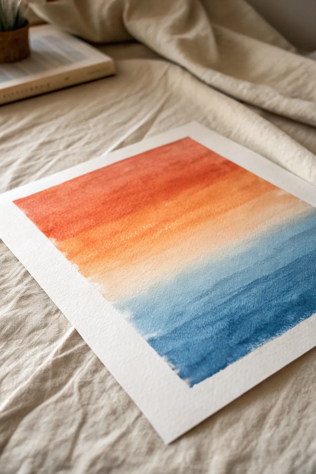
This soothing watercolor project masterfully blends warm terracotta tones into cool denim blues using a subtle, neutral bridge. The textured cold-press paper enhances the organic feel of the wash, creating a serene abstract piece reminiscent of a horizon line.
Step-by-Step Guide
Materials
- Cold-press watercolor paper (at least 140lb/300gsm)
- Watercolor paints: Burnt Sienna, Cadmium Orange, Prussian Blue, Indigo
- Large flat wash brush (3/4 inch or 1 inch)
- Medium round brush
- Two jars of water (clean and dirty)
- Artist tape or masking tape
- Paper towels
- Drawing board or hard surface
Step 1: Preparation and Palette
-
Secure the paper:
Begin by taping down all four edges of your watercolor paper to a board. Use masking tape to create a crisp white border, ensuring the tape is pressed down firmly to prevent any paint seepage. -
Mix the warm tone:
Prepare a generous puddle of your top color. Mix Cadmium Orange with a touch of Burnt Sienna to create that earthy, rusty terracotta hue. You want enough liquid to cover the top third of the paper without remixing. -
Mix the cool tone:
In a separate well, mix Prussian Blue with a tiny bit of Indigo. This should be a deep, rich denim color. Test the saturation on a scrap piece of paper; it needs to be bold. -
Prepare the bridge color:
Take a tiny amount of your orange mix and dilute it heavily with water until it is a barely-there, creamy whisper of color. This will serve as the transition zone.
Dry Brush Texture
For a grainier look, blot your brush on a paper towel before painting the gradient transitions. This skips over the paper’s valleys for more texture.
Step 2: Applying the Wash
-
Wet the top section:
With a clean flat brush, lightly moisten the top third of your paper with clean water. This wet-on-wet technique helps the initial pigment spread smoothly. -
Lay the orange band:
Load your flat brush with the terracotta mix. Start at the very top edge and paint horizontal strokes across the paper, moving downward. Allow the paint to pool slightly at the bottom of each stroke. -
Soften the edge:
As you reach the end of the top third, dip your brush into the water just once to dilute the pigment slightly. Paint one more horizontal stripe, letting the color fade naturally. -
Create the neutral zone:
Rinse your brush thoroughly. Pick up the very dilute ‘bridge’ wash you prepared earlier. Start painting just below the orange edge, allowing the two wet edges to touch and bleed into each other slightly. -
Extend the middle:
Continue painting with this pale, neutral wash through the middle section of the paper. Keep the paper damp but not soaking wet to maintain control over the texture. -
Start the blue base:
Clean your brush again. Now, start from the very bottom of the paper with your full-strength blue mix. Paint horizontal strokes, moving upward toward the middle. -
Fade the blue upward:
As you move up, gently dilute the blue paint on your brush with water. You want the blue to become less saturated as it approaches the neutral middle zone. -
Blend the meeting point:
When the fading blue meets the pale neutral wash, use a damp (not wet) clean brush to gently encourage the colors to mesh. Don’t overwork this area; let the paper’s texture do the blending work.
Step 3: Building Depth
-
Assess the gradient:
Let the first layer dry until it is damp but no longer shiny. Look for areas that need more punch. -
Intensify the top:
I like to go back in with a second, slightly more concentrated layer of the rust orange just at the very top edge to create a vignette effect. -
Deepen the bottom:
Similarly, add a second layer of the darkest blue mix to the bottom inch of the painting. Feather this upward with a damp brush so it doesn’t leave a hard line. -
Add texture:
While the paint is still slightly damp in the blue section, you can tilt the board very slightly to let gravity pull some pigment into the valleys of the paper texture, enhancing the ‘denim’ look. -
Dry completely:
Allow the painting to dry fully. The paper should feel room temperature to the touch, not cool. -
Remove tape:
Peel the tape away slowly at a 45-degree angle, pulling away from the painted area to ensure a crisp, clean edge. -
Flatten if needed:
If the paper has buckled slightly, place it under a heavy book overnight once it is 100% dry to flatten it out.
Salt Speckle Effects
While the blue section is still wet, sprinkle a few grains of table salt into the wash. It absorbs pigment as it dries, creating starry, ocean-spray textures.
Now you have a serene, minimalist gradient piece ready to frame or gift

Have a question or want to share your own experience? I'd love to hear from you in the comments below!