If you love drawings that feel dramatic and a little hypnotic, shattered drawings are the perfect playground. I’m talking about taking one recognizable subject and breaking it into crisp fragmented shards, then pushing the value contrast until it practically vibrates.
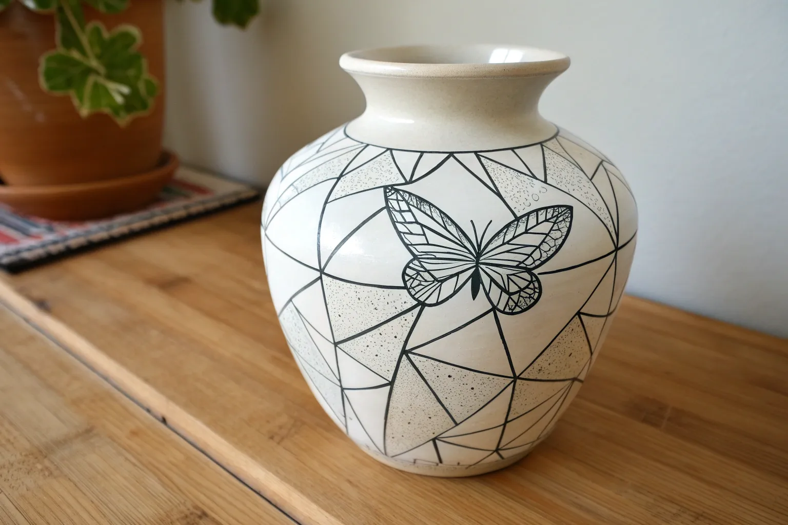
Shattered Butterfly Wings
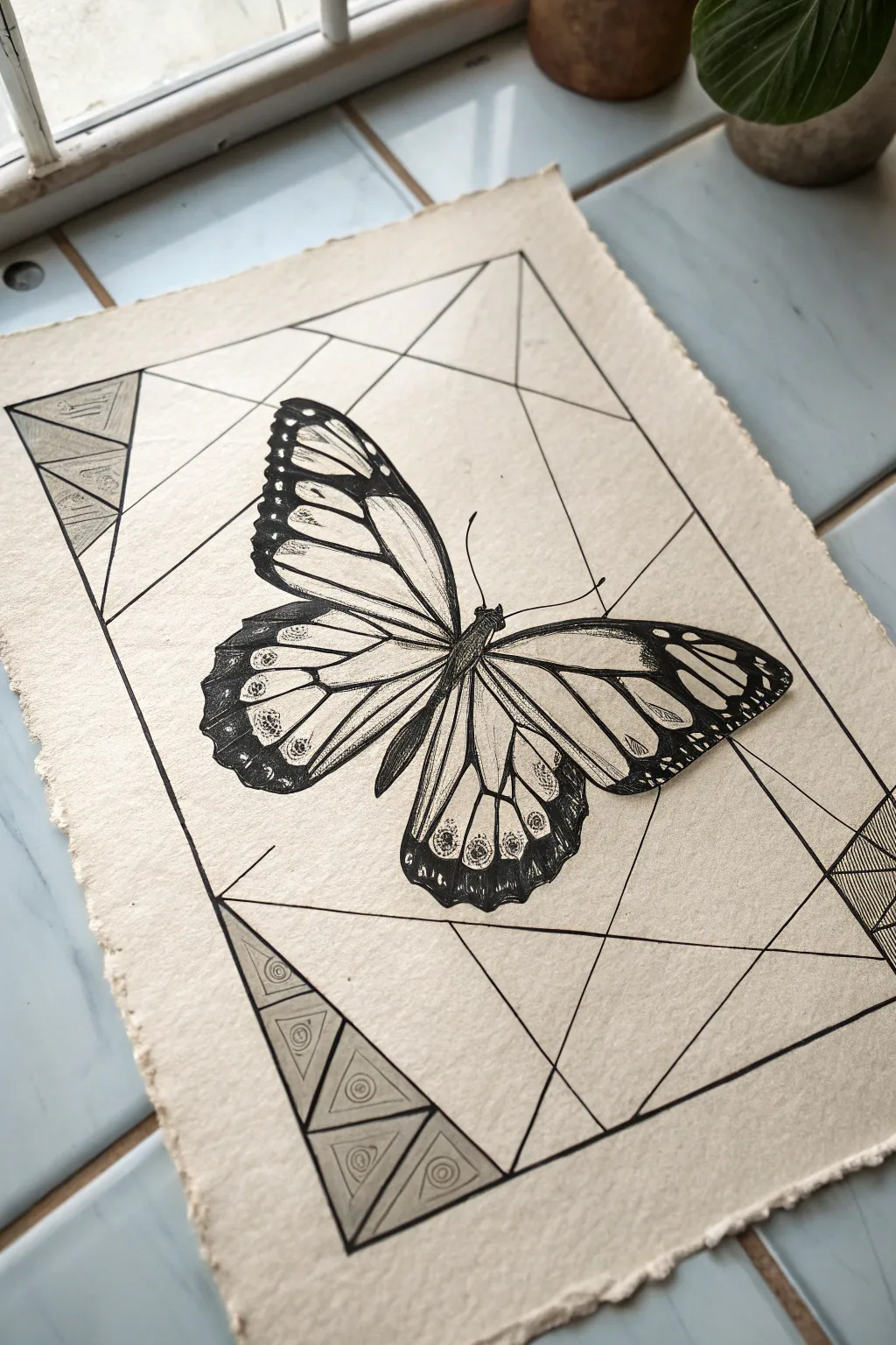
This striking ink illustration combines the organic beauty of a monarch butterfly with crisp, geometric abstraction. Using fine black pens on textured paper, you’ll learn to contrast soft, natural details against sharp architectural lines for a modern, shattered-glass effect.
Detailed Instructions
Materials
- Heavyweight textured paper (deckle edge optional)
- Black micron pens (sizes 005, 01, 03, 05)
- Pencil (HB or 2H)
- Ruler or straight edge
- Soft hi-polymer eraser
- Compass (optional for symmetry work)
Step 1: Conceptual Layout
-
Paper preparation:
Begin by selecting a high-quality, textured paper. If yours doesn’t have a deckle edge, you can gently tear the edges against a ruler to create that rustic, handcrafted look shown in the reference. -
Butterfly placement:
Using your pencil very lightly, sketch the central axis for the butterfly’s body in the middle of the page. It should be tilted slightly, perhaps at a 45-degree angle, to add dynamism. -
Wing framing:
Rough out the general triangular shapes of the upper and lower wings. Don’t worry about details yet; just focus on getting the proportions symmetrical and the scale large enough to dominate the center. -
Geometric background grid:
With a ruler and pencil, draw a large rectangle framing the butterfly. This border doesn’t need to be perfectly parallel to the paper’s edge; a slight tilt complements the butterfly’s angle. -
Shattering the space:
Draw intersecting lines through the background rectangle to create the ‘shattered’ geometric shards. Have some lines radiate from behind the butterfly to draw the eye inward. -
Corner details:
In the corners of your geometric frame (specifically top-left and bottom-left in the example), pencil in smaller nested triangles and simple circular motifs to add density to the negative space.
Ink Control Tip
Pull the pen toward you rather than pushing it away when drawing long straight lines. This gives you more control and helps prevent the ruler from smudging fresh ink.
Step 2: Inking the Butterfly
-
Outlining main veins:
Switch to an 03 pen. Carefully trace the major veins of the butterfly wings. Monarch wings have thick black structural veins, so keep your lines confident and smooth. -
Filling the edges:
Use an 05 pen to fill in the thick black borders of the wings. Leave small, circular white spots inside these black areas—these are the distinctive white dots of a monarch. -
Body texture:
For the butterfly’s thorax and abdomen, use an 01 pen with short, stippled strokes to mimic a fuzzy texture. I find this creates a nice contrast against the smooth wing veins. -
Wing shading:
Switch to your finest 005 pen. Add delicate hatching lines inside the wing panels, near the veins. This gradient shading gives the wings volume and makes them look papery rather than flat. -
Deepening contrast:
Go back over the darkest areas of the wings with the 05 pen to ensure they are solid black. High contrast is key to this style.
Step 3: Geometric Background & Finishing
-
Inking the grid lines:
Use an 03 or 05 pen and your ruler to ink the straight lines of the background geometry. Ensure these lines stop precisely where they meet the butterfly, so the insect appears to be floating in front. -
Detailing the corners:
Ink the small triangular patterns in the corners. Use thinner lines (01) for the internal designs like the small spirals or circles to keep them subtle. -
Adding shadow weight:
Thicken specific segments of the geometric lines, particularly where they intersect or form the outer border. This line weight variation adds depth to the abstract portion. -
Erase and clean:
Wait at least 15 minutes for the ink to fully cure. Gently erase all pencil guidelines with a soft eraser, being careful not to buckle the paper. -
Final assessment:
Check the balance of the piece. If the butterfly needs to pop more, slightly thicken its outer contour line to separate it strictly from the background geometry.
Add Gold Accents
For a stunning upgrade, use gold leaf or metallic gold ink to fill in the geometric shards in the background, creating a ‘kintsugi’ stained-glass effect.
Now you have a sophisticated piece that balances organic life with structural design, perfect for framing.


Shattered Owl Portrait
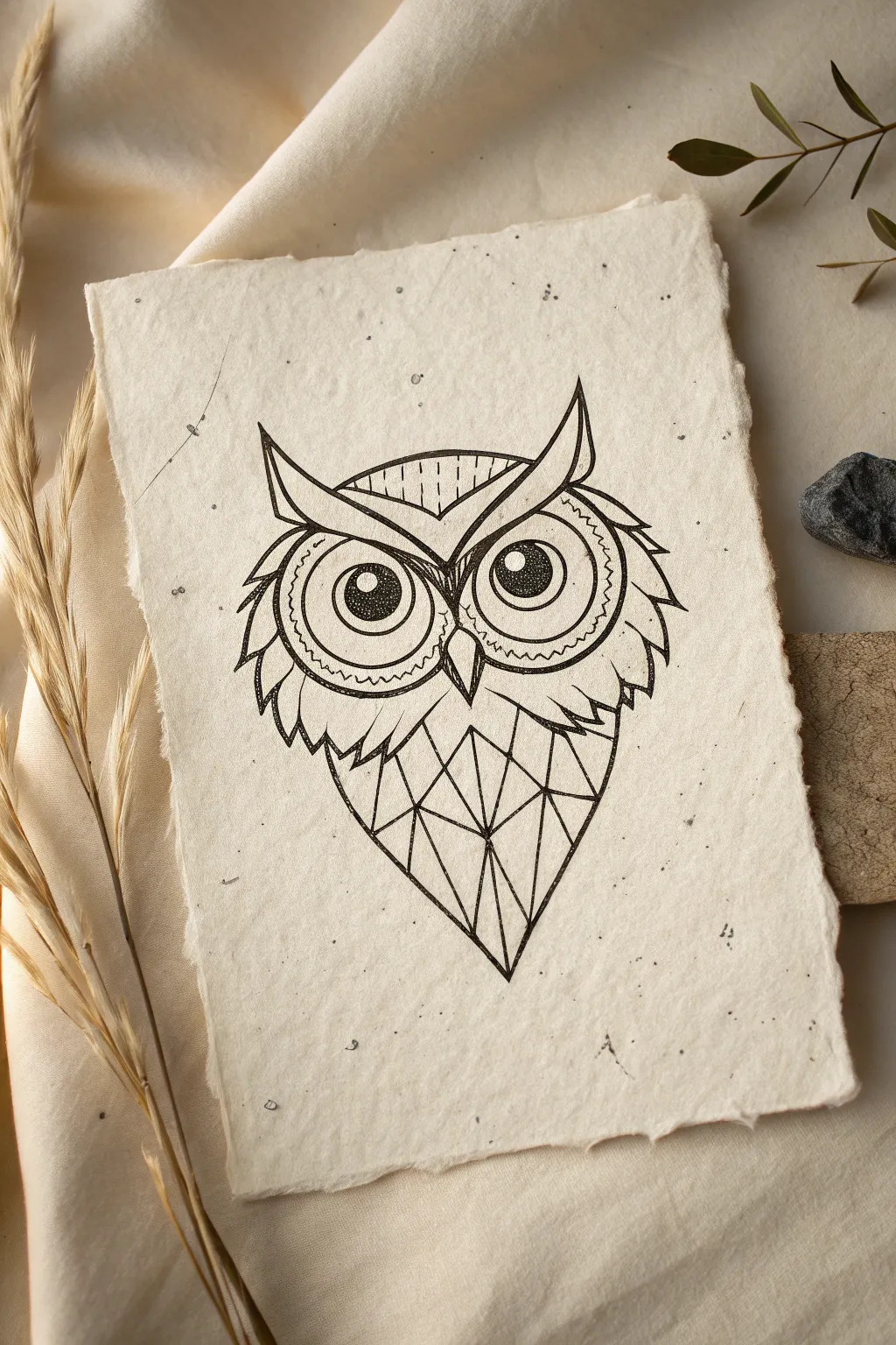
This striking black ink illustration combines organic feather textures with sharp, shattered geometric forms for a unique modern look. Drawn on beautiful handmade paper, the contrast between the rough deckle edge and the clean ink lines creates a captivating piece of art.
Step-by-Step
Materials
- Handmade cotton rag paper with deckle edge (approx. 5×7 inches)
- Fine liner pens (sizes 0.1, 0.3, and 0.5)
- Pencil (HB or 2H)
- High-quality eraser
- Ruler
- Compass or circle template (optional)
Step 1: Planning and Sketching
-
Center the composition:
Begin by lightly marking the vertical center line of your handmade paper with a pencil. Since this paper is textured and unforgiving, keep your initial lines extremely faint. -
Outline the head shape:
Sketch a wide, inverted curved triangle for the top of the head. Add the ear tufts as sharp points on either side, extending slightly outward. -
Position the eyes:
Draw two large circles dominating the upper face. You can use a compass, but a slightly imperfect hand-drawn circle often suits the organic paper better. Leave a small gap between them for the beak. -
Draft the shattered body:
Instead of drawing a feathered body, draw a large inverted triangle shape starting below the eyes and tapering to a sharp point at the bottom. This will be the framework for the geometric shards. -
Create the geometric shards:
Use a ruler to divide the lower triangle into smaller, irregular triangular sections. Connect corners randomly to create a ‘cracked glass’ or faceted crystal effect.
Paper Texture Tip
Handmade paper can snag fine nibs. Draw slowly and pull the pen across the surface rather than pushing it to prevent ink splatter.
Step 2: Inking the Organic Details
-
Outline the eyes:
Switch to a 0.5 pen to boldly outline the main circles of the eyes. Make the line weight consistent and strong. -
Draw the pupils:
Inside each large circle, draw smaller circles for pupils. Leave a small white highlight circle in each, then fill the rest of the pupil solid black. -
Add iris details:
Using a finer 0.1 pen, add stippling (tiny dots) inside the iris area to create depth and texture without making it too dark. -
Define the beak:
Draw a sharp, diamond-shaped beak between the eyes using the 0.3 pen. Add a center line to define the ridge. -
Ink the eyebrows:
Create the heavy brow ridge above the eyes. I like to double up the lines here and add small vertical hatch marks to suggest ruffled feathers. -
Create cheek feathers:
On the outer edges of the face, use jagged, zig-zag lines to represent tufts of feathers. Keep these symmetrical on both sides. -
Add under-eye patterns:
Draw a scalloped or wavy line pattern just under the eyes and a row of small dots to give the face intricate detail.
Step 3: Inking the Geometric Body
-
Trace the main triangle:
Use your ruler and the 0.5 pen to ink the outer boundary of the lower triangular body shape. Precision is key here to contrast with the feathery head. -
Ink the interior shards:
Continue with the ruler to ink over your pencil lines for the internal geometric facets. Ensure every line connects cleanly to a vertex. -
Connect head to body:
Draw a transition line where the feathers meet the geometric shape. Use small, sharp V-shapes to make it look like the feathers are morphing into the crystal shards. -
Thicken intersection points:
Go back to where the geometric lines meet (the vertices) and thicken them very slightly with the 0.3 pen to add visual weight to the structure.
Add Metallic Foil
Make the shattered shards pop by filling random triangles with gold leaf or metallic gold ink for a luxurious mixed-media finish.
Step 4: Finishing Touches
-
Erase pencil marks:
Wait at least 15 minutes for the ink to fully dry—handmade paper absorbs ink slowly. Gently erase all pencil guidelines, being careful not to snag the fibers. -
Refine the contrast:
Look at the drawing from a distance. If the eyes need more pop, thicken the outer rings. If the shards look too flat, add a few tiny decorative dots inside one or two triangles.
The stark contrast between the intricate feathers and the clean geometric lines creates a piece that feels both ancient and modern

Shattered Spider Web Geometry
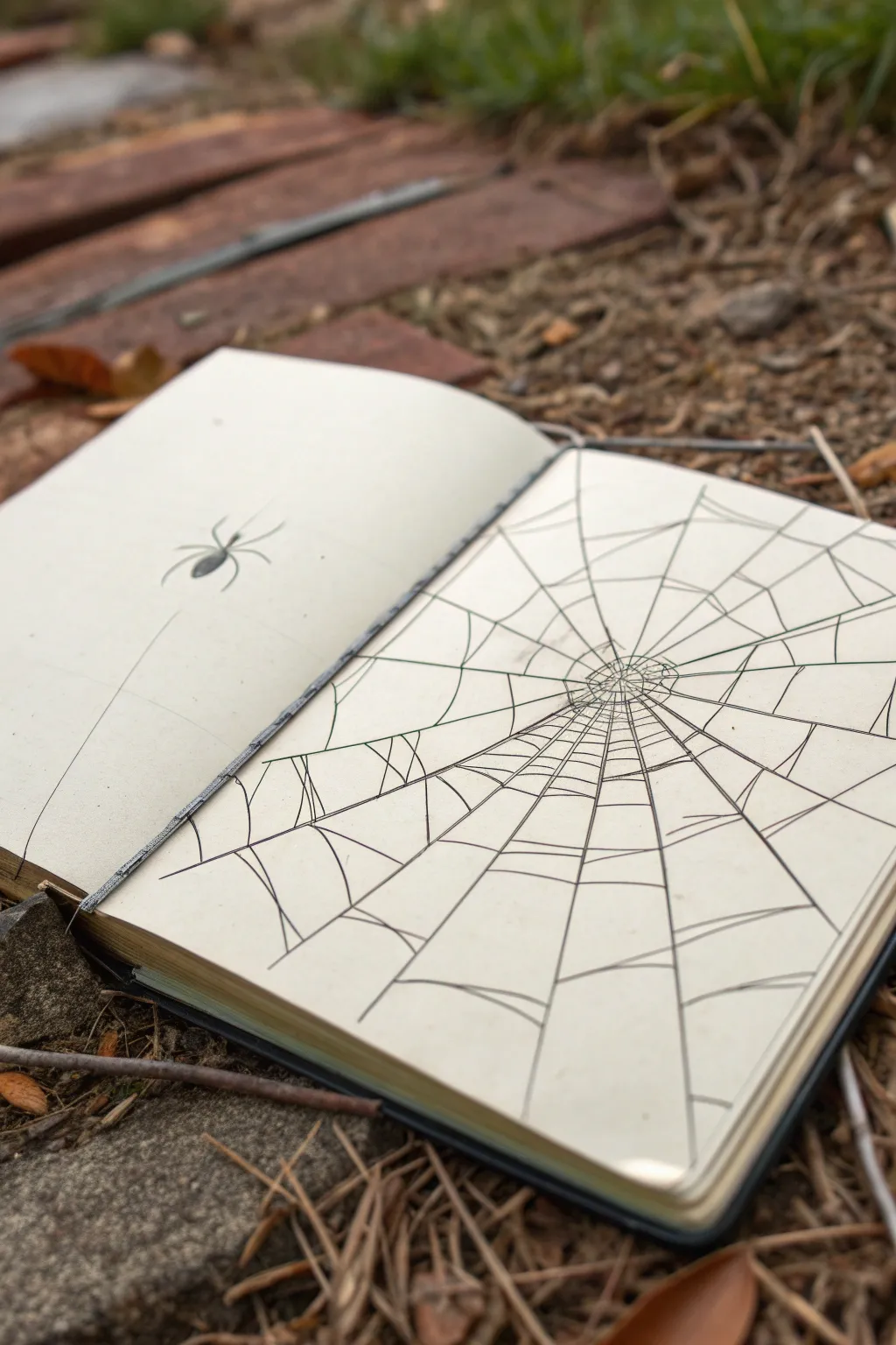
This striking sketchbook spread plays with perspective to create the illusion of a massive, fragile web stretching across the page. By contrasting a tiny, solitary spider with expansive geometric lines, you evoke a sense of scale and delicate tension.
Step-by-Step Guide
Materials
- Hardcover sketchbook (blank pages)
- H or HB pencil for initial layout
- Fine liner pen (01 or 03 nib, black)
- Thicker drawing pen (05 or 08 nib, black)
- Eraser (kneaded preferred)
- Ruler (optional, but helpful for long lines)
Step 1: Setting the Anchor Point
-
Visualize the center:
Open your sketchbook to a fresh spread. On the right-hand page, identify a spot slightly off-center, towards the middle-left of that page. This will be the epicenter of your web. -
Draft the radial lines:
Using your pencil and a light touch, draw straight lines radiating outward from that center point. Imagine them like spokes on a wheel, extending all the way to the page edges. -
Vary the spacing:
Don’t make the angles between the spokes perfectly even. Leave some gaps wider and others narrower to give the web a natural, slightly organic feel rather than a perfect mathematical diagram. -
Extend to the left page:
Let one or two of those radial lines extend across the gutter onto the left page. This connects the two pages visually and creates a single continuous space.
Wobbly Lines?
Don’t worry if your lines aren’t laser-straight. Organic webs naturally sag and stretch. A little shake in your hand actually adds realism to the silk threads.
Step 2: Weaving the Spiral
-
Start the inner spiral:
Still using your pencil, begin drawing the cross-lines connecting the spokes near the center. Instead of perfect circles, draw slightly scalloped or curved lines that dip toward the center between each spoke. -
Expand outward:
Continue adding these connecting threads as you move away from the center. As the web gets larger, increase the distance between the spiral layers. -
Create the ‘shattered’ effect:
To achieve the specific look in the image, don’t just make simple curves. Occasionally make the lines straighter or jagged, mimicking the look of cracked glass or a structural diagram. -
Distort the outer edges:
As you reach the edges of the right page, elongate the connecting lines. This stretches the perspective and makes the web feel vast. -
Review the composition:
Step back and look at your pencil sketch. Ensure the web dominates the right page while leaving the left page mostly empty, saving space for the spider.
Level Up: Depth
Use a light grey marker to trace a ‘shadow’ slightly offset from the main web lines. This makes the web appear to be floating distinct from the paper surface.
Step 3: Inking the Web
-
Trace radial lines:
Switch to your 05 or 08 pen. Carefully trace over the main radial spokes. Using a ruler here can help keep them sharp, but a steady freehand stroke adds character. -
Ink the spiral threads:
Use the finer 01 or 03 pen for the connecting spiral threads. This line weight difference is crucial for creating depth. -
Refine the connections:
When inking the intersections where the spiral meets the spoke, allow for tiny imperfections. I like to lift the pen briefly at the end of a stroke to taper the line naturally. -
Double up the center:
Go back to the very center of the web. Add a few extra tiny lines or thicken the ink slightly to create a dense, chaotic focal point where the web originates.
Step 4: The Lonely Spider
-
Position the spider:
On the left page, locate the single long thread you extended earlier. Choose a spot along that line, floating in the negative space. -
Draw the body segments:
Sketch a small oval for the abdomen and a smaller, rounded shape for the head/thorax using your pencil. -
Add the legs:
Draw eight legs extending from the center body. Make the front two reach forward and the back ones trail slightly behind. -
Ink the spider silhouette:
Fill in the spider completely with black ink. A silhouette works best here to match the graphic nature of the web. -
Connect to the thread:
Ensure the spider’s legs touch the pencil line representing the dragline, then ink that single thread carefully. -
Clean up:
Once the ink is completely dry—give it a few minutes to be safe—gently erase all underlying pencil marks to reveal the stark contrast.
Now you have a geometrically intriguing spread that turns a simple subject into a study of space and tension

Shattered Still Life Objects

This minimalist project explores the beauty of intersecting lines and negative space, creating a dynamic ‘shattered’ effect that feels both chaotic and orderly. Using simple geometric principles, you’ll transform a blank page into a striking abstract composition perfect for meditative sketching.
How-To Guide
Materials
- A5 Sketchbook or heavy geometric paper
- Fine-liner pen (0.5mm, black)
- Ruler or straight edge
- Pencil (HB or lighter)
- Eraser
Step 1: Setting the Framework
-
Define the boundaries:
Start by drawing a rectangular frame on your page with a pencil and ruler. Leave a comfortable margin of about 1-2 cm around the edges to give your drawing room to breathe. -
Create the primary divisions:
Using your ruler, lightly draw 2-3 large lines that cut diagonally across the frame. Let them crisscross at random angles, dividing the large rectangle into irregular, jagged polygons. -
Subdivide creating triangles:
Focus on the larger shapes you just created. Draw smaller lines connecting the corners or edges of these shapes to create a network of triangles. The goal is to avoid 4-sided shapes; if you see a quadrilateral, bisect it with a line to make two triangles. -
Refine the composition:
Step back and look at your pencil sketch. If any area looks too empty, add another intersecting line. You want a balanced mix of large, medium, and small triangular shards.
Keep it Clean
Wipe the edge of your ruler with a tissue frequently while inking. Ink can accumulate on the ruler’s edge and smear across your paper when you slide it to the next position.
Step 2: Inking the Fracture Lines
-
Trace the main structure:
Switch to your 0.5mm black fine-liner. Place your ruler over your pencil lines and carefully ink the entire network of triangles. Be precise at the intersections so lines don’t overshoot. -
Strengthen the border:
Go over the outer rectangular frame with your pen. I sometimes like to make this outer line just slightly bolder by drawing over it twice to contain the energy of the shattered pattern. -
Erase the guides:
Wait for the ink to dry completely—give it at least five minutes to avoid smudging. Then, gently erase all visible pencil marks to reveal a clean, crisp geometric web.
Step 3: Adding Texture and Depth
-
Select your texture zones:
Decide which triangles will receive texture. Aim for a scattered distribution, filling roughly 15-20% of the shapes so the design doesn’t feel cluttered. -
Begin hatching:
Choose a small triangle to start. Using your ruler, draw a series of closely spaced parallel lines inside the shape. Keep the spacing consistent for a uniform look. -
Vary line direction:
Move to a non-adjacent triangle. Fill this one with parallel lines running in a different angle than the first one. Changing the direction of the hatching creates visual movement. -
Cluster for contrast:
Occasionally, pick two triangles that share a side and fill both with patterns, but ensure the lines run perpendicular to each other. This creates a sharp, high-contrast focal point. -
Review the balance:
Pause and assess the white space. The blank triangles are just as important as the filled ones. If one side feels too heavy with ink, add a small textured triangle on the opposite side to counterbalance it. -
Final clean up:
Check for any tiny gaps where your hatching lines might not quite touch the triangle borders. delicately touch these up with your pen for a polished, professional finish.
Add a Pop of Color
Instead of leaving the non-textured triangles white, pick a single pastel color, like blush pink or mint green, and fill random shards to soften the harsh geometry.
Now you have a modern, abstract piece that turns simple lines into a complex visual puzzle
BRUSH GUIDE
The Right Brush for Every Stroke
From clean lines to bold texture — master brush choice, stroke control, and essential techniques.
Explore the Full Guide
Shattered Cosmic Scene
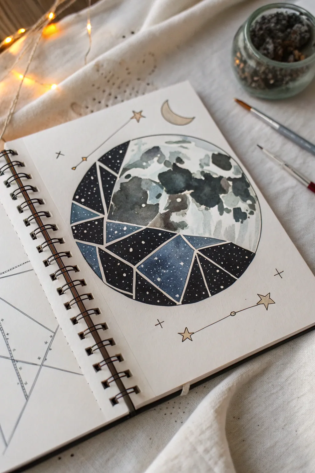
This captivating mixed-media piece combines the organic softness of a watercolor moon with a sharp, geometric ‘shattered’ effect revealing a starry galaxy beneath. It creates a beautiful contrast between realistic lunar textures and stylized cosmic abstract art.
Detailed Instructions
Materials
- Spiral-bound sketchbook (heavyweight paper)
- Watercolor paints (Payne’s grey, indigo, black)
- White gouache or white gel pen
- Compass or round object for tracing
- Pencil and eraser
- Ruler
- Fine liner pen (black, waterproof)
- Gold metallic marker or paint
- Round watercolor brushes (size 2 and 4)
Step 1: Drafting the Layout
-
Draw the main circle:
Use a compass or trace a circular object to draw a perfect circle in the center of your page. Keep your pencil lines light so they can be easily erased later. -
Divide the circle:
Lightly sketch an irregular, jagged line cutting across the circle from the bottom left to the middle right. This will separate the realistic moon area from the geometric shattered section. -
Create the shards:
In the bottom-left section, use a ruler to draw intersecting straight lines. These should form diverse triangles and polygons that look like broken glass shards. -
Add floating elements:
Sketch a small crescent moon shape above the main circle and add a few simplified star shapes and constellations around the perimeter using small crosses and connecting lines.
Step 2: Watercolor Moonscape
-
Wet-on-wet base:
In the top-right ‘realistic’ section, wet the paper slightly with clean water. Drop in very diluted grey paint to create a soft, misty background texture. -
Painting the maria:
While the paper is still damp, load your brush with a darker grey-blue mix (like Payne’s grey). Dab irregular blotches to represent the moon’s ‘maria’ or dark plains. -
Adding texture:
Let the paint bloom naturally. You can lift some pigment with a dry brush or paper towel to create lighter highlights and crater rims. -
Deepening shadows:
Once the first layer is dry, go back in with a more concentrated dark grey to define the edges of the craters and add contrast to the lunar surface.
Clean Edges
Use masking tape or liquid frisket over the dividing line between the moon and the shattered section. This keeps your watercolor washes from bleeding into the wrong area.
Step 3: Cosmic Geometry
-
Painting the shards:
In the geometric section, fill each shard individually with dark indigo or space-black watercolor. Vary the darkness slightly between shards to emphasize the fractured look. -
Splattered stars:
Protect the lunar section with a scrap of paper. Load a stiff brush with white gouache (or white watercolor) and flick the bristles to splatter tiny white stars onto the dark geometric shards. -
Detailing stars:
For larger stars, use a white gel pen or a fine brush with white gouache to add distinct dots manually among the splatters.
Add Depth
Paint a faint drop shadow under one or two of the geometric shards using a diluted grey wash. This makes the ‘shattered’ pieces look like they are physically lifting off the page.
Step 4: Inking and Finishing
-
Inking the boundaries:
Once everything is completely dry, use a fine black liner to trace the original circle outline and the straight lines separating the geometric shards. I find a ruler essential here for crispness. -
Separating the sections:
Leave a tiny white gap (negative space) between the painted shards if you can, or use a white gel pen to draw lines over the dark paint to define the shard edges clearly. -
Gold accents:
Use a gold metallic marker or paint to fill in the floating crescent moon and the small stars in the background constellations. -
Connecting the constellations:
Draw thin black lines to connect the gold stars, completing the decorative constellations surrounding the main artwork. -
Final touches:
Add small cross-hatched details or tiny floating crosses in the background to balance the composition.
Now you have a stunning juxtaposition of celestial realism and modern geometric design to admire in your sketchbook

Have a question or want to share your own experience? I'd love to hear from you in the comments below!