If you’re craving medium painting ideas that feel doable but still make you proud to hang them up, you’re in the right headspace. I pulled together a mix of medium-difficulty projects and painting medium explorations, so you can level up without getting overwhelmed.
Acrylic Sunset Gradient With Smooth Blending
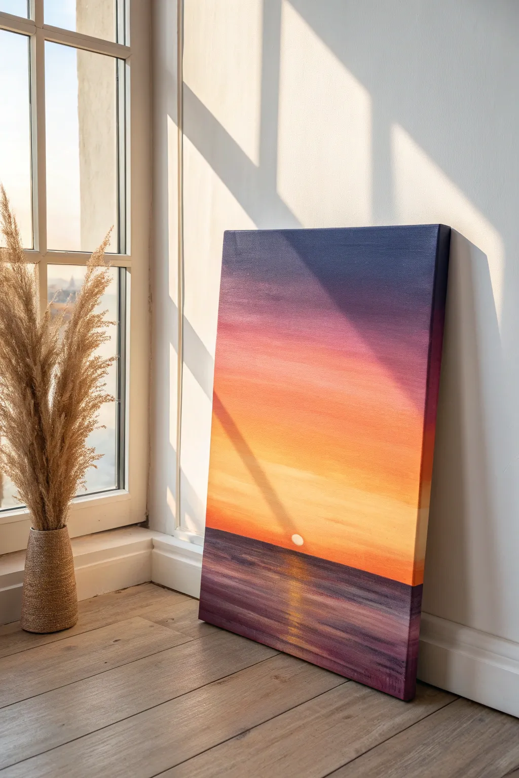
Capture the serene transition from day to night with this vibrant acrylic painting featuring a smooth, glowing gradient sky and reflective waters. This project focuses on seamless wet-on-wet blending to create a cohesive atmosphere that radiates warmth.
Step-by-Step Guide
Materials
- Rectangular stretched canvas (e.g., 16×20 or 12×16 inch)
- Acrylic paints: Titanium White, Cadmium Yellow, Cadmium Orange, Magenta or Alizarin Crimson, Dioxazine Purple, Phthalo Blue
- Large flat brush (2-inch or wide wash brush) for blending
- Medium flat brush (1-inch)
- Small round detail brush
- Palette or paper plate
- Cup of water
- Paper towels
- Masking tape (optional for horizon line)
Step 1: Setting the Horizon
-
Establish the horizon line:
Position your canvas vertically. Decide where the water meets the sky; in this composition, the horizon is quite low, sitting at about the bottom quarter of the canvas. Use a ruler and a light pencil line to mark this straight across. -
Optional masking:
If you struggle with straight lines, place a strip of masking tape directly below your pencil line to protect the water area while you work on the sky.
Keep it Wet
Work quickly on the sky! Acrylics dry fast. Mist your canvas lightly with a spray bottle of water to keep the paint workable for smoother blending.
Step 2: The Sky Gradient
-
Mix the darkest sky shade:
On your palette, mix a deep indigo color using Phthalo Blue and Dioxazine Purple. You want this to be rich and dark for the very top of the canvas. -
Apply the top layer:
Using your large flat brush, paint the top 2-3 inches of the canvas with this dark purple-blue mix, using long horizontal strokes. -
Transition to purple:
Without cleaning your brush entirely, dip into the pure purple. Paint the next section down, overlapping slightly with the dark blue area above to start the blend. -
Move into magenta:
Wipe your brush on a towel but keep it slightly damp. Load it with Magenta (or Alizarin Crimson) and paint the next band downwards. -
Blending the cool tones:
While the paint is still wet, use the large brush to sweep back and forth horizontally between the purple and magenta sections. The goal is to eliminate any hard lines. -
Introduce the warmth:
Clean your brush thoroughly. Mix Cadmium Orange with a touch of the Magenta. Paint this below the pink section. -
Brighten with yellow:
As you approach the horizon line, switch to a mix of Cadmium Yellow and Cadmium Orange. This should be the brightest part of the sky. -
Final sky blending:
Use a clean, slightly damp large brush to smooth out the entire gradient from top to bottom. Use very light pressure—I call this ‘feathering’—to blur the transitions perfectly. -
Add the sun:
Once the sky is tacky or dry, mix a tiny bit of yellow into Titanium White. Paint a small semi-circle resting exactly on the horizon line in the lower center.
Make it Pop
Add a silhouette of a sailboat or distant mountains along the horizon line in black to create depth and a focal point against the bright sun.
Step 3: Painting the Ocean
-
Remove masking:
If you used masking tape for the horizon, peel it off gently now. -
Base layer for water:
The water mirrors the sky but is darker. Start at the bottom of the canvas with your dark purple/blue mix, painting horizontal strokes. -
Gradient upwards:
As you move up toward the horizon line, begin mixing in some magenta and a touch of orange, mirroring the transition above but keeping the tones muddier and darker than the sky. -
Define the horizon:
Use a medium flat brush with a steady hand to paint a crisp, straight line of deep purple right against the bottom of the sky, cutting through the sun slightly. -
Create water texture:
Unlike the smooth sky, the water needs texture. Use the tip of your flat brush to create slight streaks of lighter purple and pink across the water surface.
Step 4: Reflections and Details
-
Sun reflection base:
Beneath the sun, paint a vertical column of short, horizontal dashes using a mix of orange and yellow. -
Highlight the reflection:
Mix a pale yellow-white. Add thinner, brighter dashes right down the center of your reflection column. These should be strongest near the horizon and fade out as they reach the bottom. -
Final adjustments:
Step back and look at your blending. If needed, glaze a very thin, watery layer of orange over the horizon area to unify the warmth.
Allow the painting to dry completely before varnishing to protect those beautiful, smooth transitions
Mountain Landscape With Atmospheric Perspective
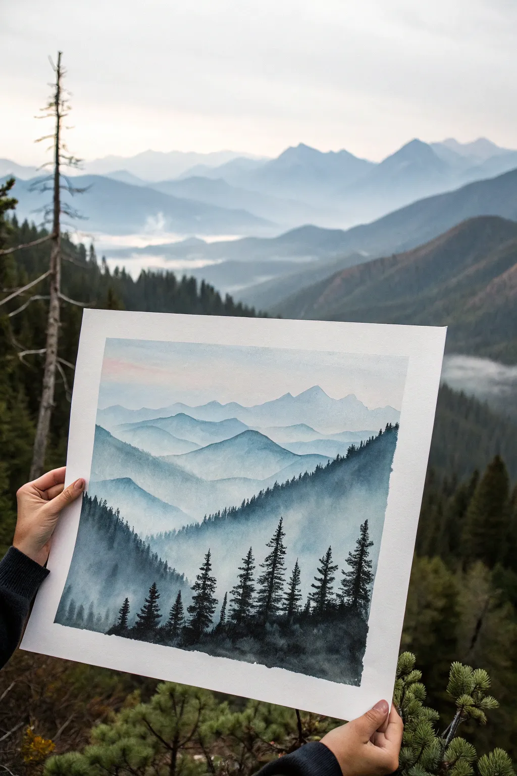
Capture the serene beauty of undulating peaks fading into the distance with this atmospheric watercolor landscape. Using a simple monochrome palette, you’ll learn to build depth through layering and value control, creating a breathtaking sense of scale and mist.
Step-by-Step
Materials
- Cold Press Watercolor Paper (140lb or higher, trimmed to square)
- Watercolor Paint (Payne’s Grey or Indigo)
- Watercolor Paint (Alizarin Crimson or faint pink for the sky)
- Large Flat Brush (approx. 1 inch)
- Medium Round Brush (Size 8 or 10)
- Small Detail Brush (Size 0 or 2 for trees)
- Two Jars of Water (one clean, one for rinsing)
- Paper Towels
- Masking Tape
Step 1: Preparation and Sky
-
Secure Your Paper:
Tape your watercolor paper down firmly to a board or table on all four sides. This creates a crisp white border and prevents the paper from buckling when wet. -
Wet the Sky Area:
Using your large flat brush and clean water, gently wet the top third of the paper. You want an even sheen, not puddles. -
Apply the Sunset Glow:
Dilute a tiny amount of pink (Alizarin Crimson) until it is very watery. Wash this across the top left corner of the wet sky area, allowing it to fade invisibly into the white paper. -
Initial Blue Haze:
While the paper is still damp, introduce an extremely diluted wash of your blue-grey mix just below the pink. Let these colors bleed softly together, keeping everything very pale. -
Dry Completely:
This is crucial: allow the sky layer to bone dry before moving on. If you touch it and it feels cool, it’s not ready yet.
Bloom Prevention
If you see ‘cauliflower’ blooms appearing in your mountains, you’re likely adding water into paint that is half-dry. Wait for layers to be fully dry before adding new wet strokes on top.
Step 2: Building the Mountains
-
Mix Your Values:
Prepare three or four puddles of paint on your palette, ranging from a ‘tea’ consistency (very light) to ‘milk’ (medium) and ‘cream’ (dark). This ensures you have your values ready as you work down the page. -
First Mountain Ridge:
Using your lightest ‘tea’ mix and the round brush, paint an uneven, jagged line across the paper, just below the sky. Fill the area below this line with the same pale wash. -
Fade the Bottom Edge:
Before that first ridge dries, use a clean, damp brush to soften the bottom edge of the wash, fading it into white. This creates the ‘mist’ effect between layers. -
Dry and Repeat:
Let that layer dry completely. Now, take a slightly darker wash and paint a second ridge overlapping the first. Vary the peaks so they don’t look uniform. -
Create Depth:
Continue this process, moving down the paper. Each new mountain range should be slightly darker than the one behind it and sit lower on the page. -
Defining the Valley:
As you reach the lower third, intricate shapes aren’t as necessary, but ensure your color is becoming significantly stronger/darker to bring these hills forward visually. -
The Final Ridge:
Paint the closest large hill shape using a fairly dark, saturated mix. Instead of fading the bottom entirely, you can leave it solid or textured to prepare for the trees.
Step 3: Foreground Details
-
Mixing the Black-Blue:
Mix your darkest concentration of paint—almost straight from the tube with very little water. It should look nearly black. -
Tree Trunks:
Switch to your smallest detail brush. Draw thin, vertical lines along the closest ridge to establish the trunks of the pine trees. Vary heights for a natural look. -
Dabbing Pine Needles:
Starting at the top of a trunk, use the tip of the brush to dab small, horizontal strokes. Widen the strokes as you move down the tree to create a triangular cone shape. -
Clustering Trees:
Paint a few trees clumped together and some standing alone. Make the trees on the right side slightly taller to frame the composition. -
Distant Trees:
On the ridge just behind the foreground, use a slightly lighter grey mix to add tiny, less detailed vertical spikes. This implies a distant forest line. -
Grounding the Foreground:
Fill in the very bottom of the paper with your dark mix, blending the bases of the trees into a dark, shadowy mass. I rarely paint distinct roots here; a shadow shape works best. -
Reveal the Painting:
Once the paint is 100% dry (give it extra time for the dark trees), carefully peel away the masking tape at a 45-degree angle to reveal your crisp white border.
Lift Some Clouds
While a layer is still wet, use a thirst (dry) brush or a corner of a paper towel to gently lift pigment off the paper. This creates soft white patches that look like drifting fog banks.
Enjoy the peaceful atmosphere your new mountain landscape brings to the room


Textured Ocean Wave With Palette Knife
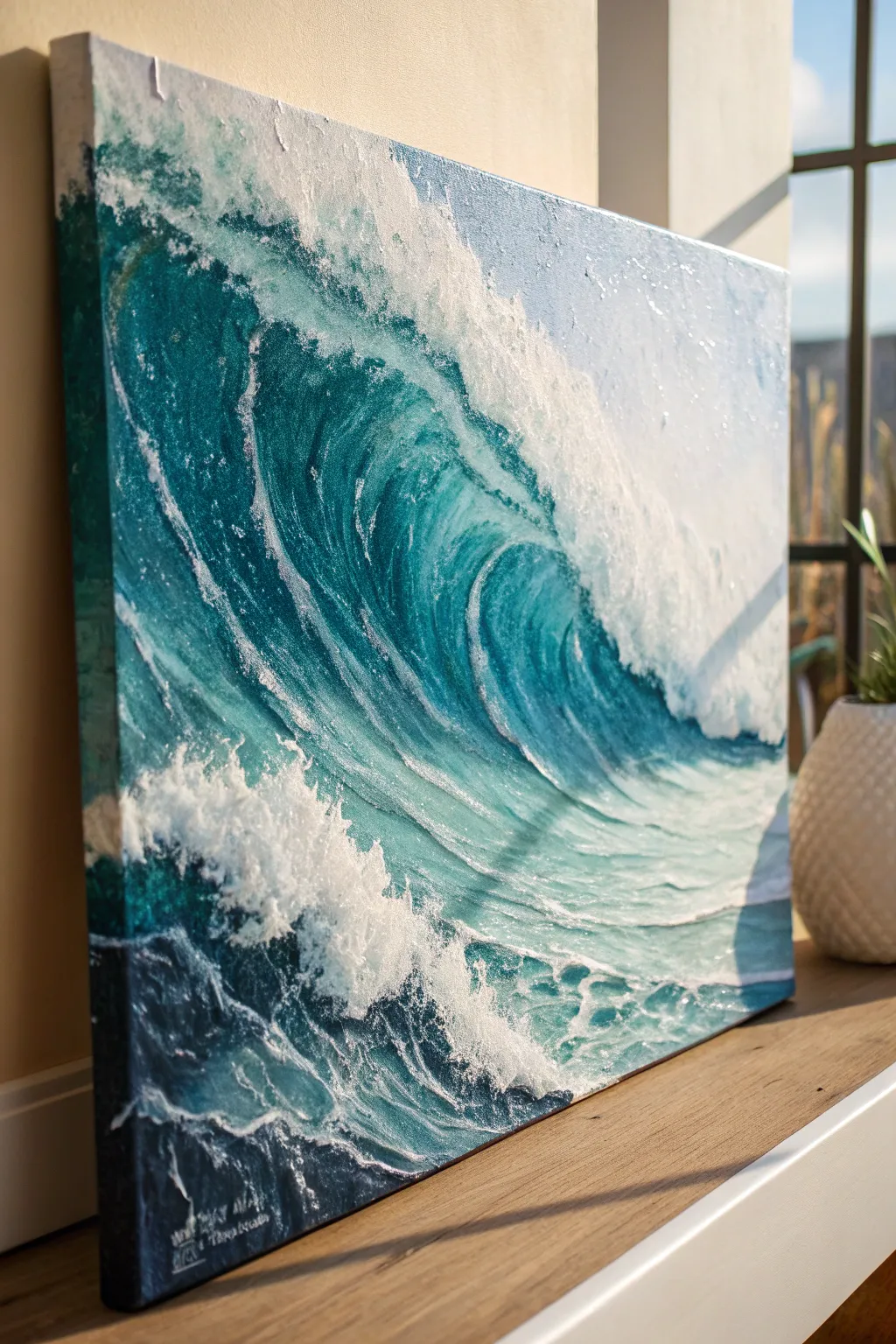
Capture the raw power of the ocean with this dynamic, highly textured painting guide. By combining modeling paste with acrylics, you’ll create a 3D effect where the crashing foam literally jumps off the canvas.
How-To Guide
Materials
- Stretched canvas (16×20 or larger suggested)
- Heavy body acrylic paints: Phthalo Blue, Phthalo Green, Titanium White, Payne’s Grey, Turquoise
- Modeling paste or thick texture medium
- Palette knives (assorted sizes, including large trowel and small diamond shapes)
- Large flat paintbrush (2 inch)
- Medium filbert brush
- Disposable palette or glass surface
- Spray bottle with water
Step 1: Building the Foundation
-
Prime with texture:
Before adding any color, scoop out a generous amount of modeling paste onto your palette knife. Apply it to the canvas in the shape of the crashing wave’s crest and the turbulent foam at the bottom. -
Sculpt the foam:
Use the edge of your knife to tap and pull the wet paste, creating rough, irregular peaks that mimic splashing water. Keep the paste flatter in the ‘barrel’ of the wave to ensure the water looks smooth later. -
Let it cure:
Allow the modeling paste to dry completely. This is crucial; depending on thickness, it may take 2-4 hours or even overnight. It must be hard to the touch. -
Base layer gradients:
Mix Phthalo Blue and Phthalo Green to create a deep teal. Using the large flat brush, paint the deepest part of the wave’s curve, blending into lighter turquoise as you move toward the crest. -
Dark undercurrents:
Apply a mix of Payne’s Grey and Phthalo Blue to the bottom left corner and the area directly beneath the crashing foam to establish depth and shadow.
Knife Angle Secrets
Hold the knife almost flat against the canvas to deposit large swaths of color, or at a 90-degree angle to scratch thin lines into wet paint for detail.
Step 2: Creating the Wave Body
-
Streaking the barrel:
Switch to a palette knife loaded with turquoise and a touch of white. Gently scrape the paint downward along the curve of the wave, allowing the canvas texture to break up the stroke for a watery look. -
Adding movement:
Use the edge of the knife to carve thin lines of lighter blue into the wet darker paint, following the C-shape curve of the wave to simulate moving water veins. -
Transition zone:
Where the deep blue wave meets the white foam, blend the colors slightly with a damp filbert brush so the transition isn’t too harsh, creating a misty spray effect. -
Refining the water color:
I like to glaze a thin layer of pure Phthalo Green mixed with glazing medium over the dried teal sections to make the water look translucent and jewel-tone.
Step 3: The Crash and Detail
-
Highlighting the texture:
Load a clean palette knife with pure Titanium White. Drag it lightly over the dried, textured modeling paste we created in step one. The paint will catch on the raised peaks. -
Building the crest:
Apply thick blobs of white paint to the very top edge of the wave using the flat side of the knife, letting the paint hang slightly over the edge for a heavy, crashing feel. -
Sea foam patterns:
Use a smaller diamond-shaped knife with thinned white paint to create the lacy, web-like foam patterns trailing down the back of the wave. -
The splash zone:
Stipple (tap repeatedly) stiff white paint into the bottom area where the wave hits the surface. Do not smooth this out; leave the peaks sharp. -
Final highlights:
Mix a tiny amount of yellow or unbleached titanium into white to create a ‘sunlit’ white. Apply this sparingly to the highest points of the spray for dimension. -
Clean up edges:
Paint the sides of your canvas in a solid dark blue or continue the image around the edges for a gallery-wrapped finish.
Muddied Colors?
If your white foam is turning light blue instead of staying crisp, let the underlying teal layer dry completely before applying the final white highlights.
Step back and admire the powerful movement and texture you have captured on the canvas
Loose Floral Bouquet in Opaque Gouache
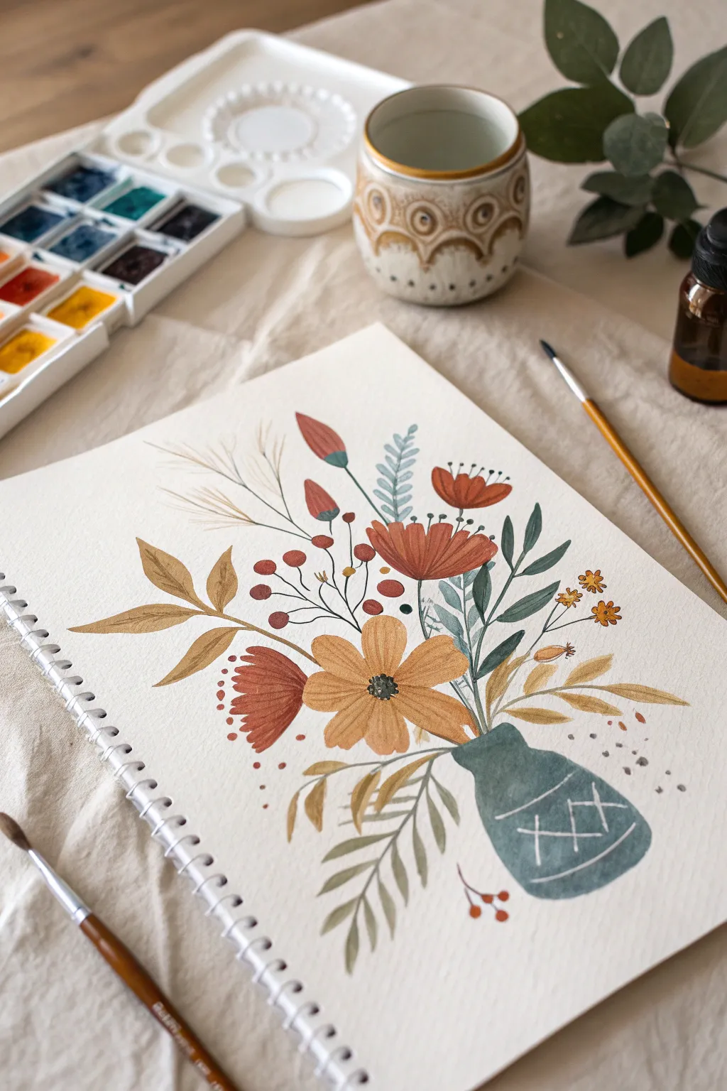
Capture the charm of autumn-hued botanicals with this opaque gouache painting exercise. Featuring stylized blooms and a textured vase, this project uses a limited, earthy palette to create a cozy and inviting composition.
Step-by-Step
Materials
- Gouache paint set (ochre, burnt sienna, deep red, olive green, teal, white, black/brown)
- Spiral-bound mixed media or watercolor paper (A4 or similar)
- Round brushes (sizes 2, 4, and 6)
- Pencil for sketching
- Palette for mixing
- Water jar
- Paper towels
Step 1: Sketching & Base Shapes
-
Plan the composition:
Lightly sketch the rough shape of the vase in the lower right area of your page. It should be a squat, pear-like shape. -
Map the stems:
Draw faint, sweeping lines extending upward and outward from the vase opening to determine the flow of the bouquet. -
Place the main blooms:
Sketch circles or ovals where the largest flowers will sit—specifically the central ochre daisy and the rust-colored blooms above and to the left. -
Mix the vase color:
Combine teal with a touch of grey or black to create a moody, slate-blue hue. Use enough water to make it creamy but opaque. -
Paint the vase:
Fill in the vase shape with your slate-blue mix. Keep the edges relatively crisp. -
Add vase details:
While the vase paint is still wet (wet-on-wet) or just after drying, use a fine brush with white or very light grey gouache to draw the cross-hatch pattern and lines on the vase.
Chalky Finish?
If your dried paint looks inconsistent or too chalky, you likely added too much water. Gouache works best with a creamy consistency like melted ice cream for that solid matte look.
Step 2: Painting the Foliage
-
Mix leaf greens:
Create an olive green tone and a separate blue-green shade to add variety to your leaves. -
Paint the ferns:
Using the blue-green mix and a size 4 brush, paint the fern-like fronds extending upwards. Use light pressure at the tip for sharp points. -
Add broad leaves:
Below the vase and tucked among the flowers, paint broader, sweeping leaves using a diluted ochre or muted brown-green to mimic dried foliage. -
Create airy stems:
Use your finest brush (size 2) and a watered-down brown to paint the thin, wispy stems that reach high into the composition, later determining where the berries will go.
Step 3: Adding the Blooms
-
Paint the central flower:
Mix a warm yellow ochre. Paint five or six broad petals for the central daisy, leaving a small gap in the middle for the center. -
Add rust-colored flowers:
Using a burnt sienna or rust shade, paint the fan-shaped flowers. Use vertical strokes that start normally and lift off at the end to create a ragged, natural top edge. -
Paint the buds:
With a deep red or maroon, paint the small teardrop-shaped buds at the top left. Add green bases (sepals) where they join the stem. -
Detail the berries:
Dot small, round berries using the same deep red color along the thin brown stems you painted earlier. Group them in loose clusters. -
Add small filler flowers:
Using a golden yellow, dab tiny star-shaped flowers on the right side of the arrangement to fill the negative space.
Layering Like a Pro
Wait for the bottom layer to be completely dry before adding veins or details on top. Opaque gouache reactivates easily, so use a light touch to avoid muddying the colors.
Step 4: Refining Details
-
Detail the flower centers:
Once the ochre petals are dry, paint a dark brown or black center. Add tiny white or yellow dots on top for pollen texture. -
Add stem connections:
I like to go back in with my detail brush and ensure all flowers actually connect to the vase with thin green or brown lines so nothing is floating. -
Enhance with linear details:
Use a fine liner brush and dark paint to add veins to the ochre leaves and fine stamens extending from the rust-colored flowers. -
Final touches:
Sprinkle a few loose dots or ‘falling petals’ near the base of the vase and in the air to give the piece a loose, illustrative feel.
Let your painting dry completely before erasing any visible pencil marks, and enjoy your beautiful botanical study
BRUSH GUIDE
The Right Brush for Every Stroke
From clean lines to bold texture — master brush choice, stroke control, and essential techniques.
Explore the Full Guide
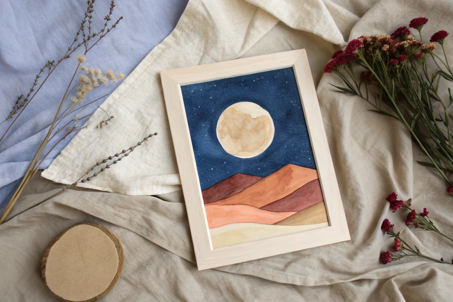
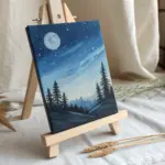
Watercolor Galaxy Wash With Granulation Effects
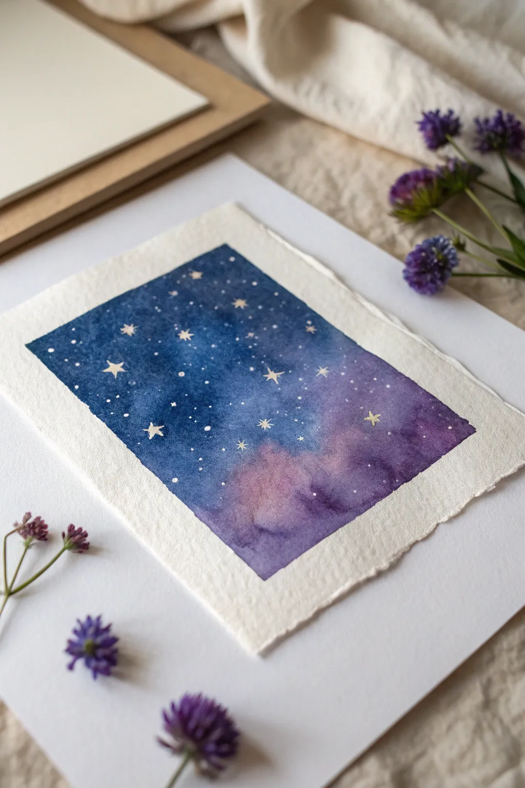
Create a mesmerizing night sky that fits in the palm of your hand with this moody, ethereal watercolor project. By blending deep indigos with soft violets and adding touches of white gouache, you will capture the magic of specific constellations and distant nebulae.
Step-by-Step Tutorial
Materials
- Cold press watercolor paper (300 gsm or heavier)
- Masking tape
- Watercolor paints (Indigo, Prussian Blue, Dioxazine Purple, Magenta/Rose)
- White opacity paint (Gouache or Bleed Proof White)
- Round watercolor brushes (Size 8 for washes, Size 0 or 00 for details)
- Jar of clean water
- Paper towels
- Salt (optional for texture)
- Ruler and pencil
- Mixing palette
Step 1: Preparation and Base Wash
-
Paper selection:
Begin with a high-quality cold press paper. Consider tearing the edges manually against a ruler rather than cutting them to achieve the soft, deckled edge look shown in the inspiration image. -
Tape the boundaries:
Using masking tape, tape down all four sides of your paper to a hard board. This creates a clean border and prevents the paper from buckling under heavy water application. -
Wet-on-wet start:
Dip your large round brush (size 8) into clean water and coat the entire painting area. The sheen should be even and glossy, but not so wet that puddles form. -
Apply the lightest colors:
Dilute your Magenta or Rose color significantly. Drop this soft pink hue into the bottom third of the wet paper, allowing it to bloom naturally into the white space. -
Introduce purples:
While the paper is still wet, mix a mid-tone purple using Dioxazine Purple. Paint this into the middle section and merge it slightly with the pink edges, smoothing the transition. -
Deepen the sky:
Load your brush with a rich Indigo or Prussian Blue. Apply this to the top half of the painting, working your way down to meet the purple. Let the colors bleed into each other but try to avoid overworking the blend.
Pro Tip: Drying Shift
Watercolors always dry lighter than they appear when wet. Don’t be afraid to go very dark with your indigo and purple layers to ensure the contrast remains strong once dry.
Step 2: Building Depth and Texture
-
Increase saturation:
While the first wash is damp but not soaking, drop concentrated Indigo pigment into the very top corners and edges to create a vignette effect, making the night sky look vast and deep. -
Create cloud-like textures:
Rinse your brush and dry it slightly on a paper towel. Gently lift out a few small areas in the purple and pink sections to create soft, nebulous cloud shapes. -
Granulation check:
If you want extra texture resembling cosmic dust, now is the time to sprinkle a tiny pinch of salt onto the wettest blue areas. Leave it undisturbed. -
Full dry:
This step is crucial: let the painting dry completely. You can use a hairdryer on a low setting, but be careful not to blow the pigment around. If you used salt, brush it off only after the paper is bone dry.
Step 3: Stars and Constellations
-
Prepare the stars:
Take your white gouache or bleed-proof white ink. Mix it with a tiny drop of water until it reaches a creamy, opaque consistency similar to whole milk. -
Splatter technique:
Load a medium brush with the white mixture. Hold it over the painting and tap the handle against another brush or your finger. This creates a spray of tiny, random background stars. -
Painting large stars:
Switch to your smallest detail brush (size 0 or 00). Dip it into the thick white paint and carefully place larger, individual dots for prominent stars. -
Adding starbursts:
Select a few of the larger dots to turn into twinkling stars. Using the very tip of your detail brush, pull tiny lines outward from the center—up, down, left, and right—creating a simple cross or four-pointed star shape. -
Refining details:
I like to add a few extremely faint, tiny dots in clusters to suggest distant galaxies, ensuring the star distribution feels organic rather than uniform.
Level Up: Metallic Accent
Use metallic gold or silver watercolor for the larger starbursts instead of white. When the light hits the painting, your custom constellations will actually shimmer.
Step 4: Finishing Touches
-
Final dry:
Allow the white gouache to dry completely. It sits on top of the watercolor, so it can smudge easily if touched while wet. -
The reveal:
Slowly peel the masking tape away from the paper, pulling at a 45-degree angle away from the painting area to ensure a crisp, clean edge. -
Mounting:
To mimic the presentation in the photo, mount your finished piece onto a larger sheet of warm white cardstock or watercolor paper using double-sided tape or adhesive dots.
Enjoy the peaceful process of watching your own tiny universe emerge on the paper
Ink Wash City Skyline With Bold Contrast
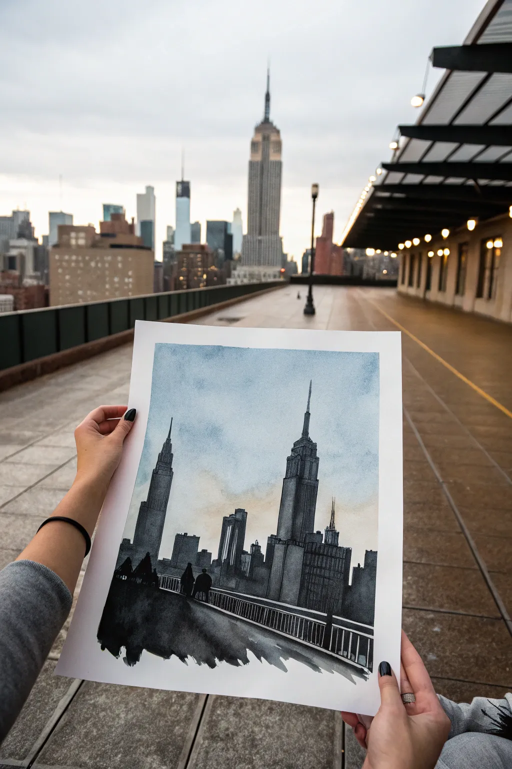
Capture the moody elegance of a cityscape using the timeless technique of ink wash painting. This project combines soft, atmospheric watercolor skies with bold, architectural silhouettes to create a scene that feels both modern and nostalgic.
Detailed Instructions
Materials
- Cold press watercolor paper (140lb/300gsm)
- India ink or concentrated black watercolor
- Payne’s Grey watercolor paint (optional, for cooler tones)
- Cerulean Blue or Cobalt Blue watercolor
- Raw Sienna or Yellow Ochre watercolor (faint wash)
- Large round brush (size 10 or 12)
- Fine detail brush (size 0 or 2)
- Flat shader brush (1/2 inch)
- Mixing palette with deep wells
- Two jars of water (clean and dirty)
- Masking tape
- Pencil and eraser
Step 1: Preparation and Sketching
-
Secure the Paper:
Begin by taping down all four edges of your watercolor paper to a board or table. This prevents buckling when we apply the wet washes later. -
Establish the Horizon:
Lightly sketch a low horizon line about one-third of the way up the page. This will anchor your bridge or walkway foreground. -
Outline the Architecture:
Sketch the basic shapes of the skyline. Focus on the iconic silhouette of the Empire State Building and the Chrysler Building (or similar tall structures). Keep these lines faint; they are just guides for your brush. -
Mark the Foreground:
Draw the sweeping diagonal of the railing and walkway in the foreground. I like to keep this perspective dramatic to lead the viewer’s eye into the painting.
Step 2: The Atmospheric Sky
-
Wet the Sky Area:
Using your large brush and clean water, wet the entire sky area down to the building outlines. The paper should be glistening but not forming puddles. -
Apply Blue Tint:
Drop in a very diluted wash of Cerulean or Cobalt Blue at the top of the sky, letting it naturally diffuse downward into the damp paper. -
Add Warmth:
While the paper is still damp, introduce a tiny hint of Raw Sienna near the horizon line between the buildings. This creates a subtle ‘city glow’ effect. -
Soften Edges:
Tilt your board slightly to encourage the colors to mix softness. If clear hard lines form, gently blend them out with a damp brush. -
Full Dry:
Wait for the sky to completely bone-dry. This is crucial so your crisp building lines don’t bleed into the clouds.
Bleeding Lines?
If your crisp building lines are blooming into the sky, the paper is still too wet. Use a hair dryer on a low setting to speed up drying before adding ink details.
Step 3: Building the Silhouette
-
Mix Your Greys:
Prepare three puddles of ink or watercolor: a light grey wash, a medium grey, and a pure black (or potent ink). -
Base Layer for Buildings:
Using the medium grey and the flat brush, fill in the main bodies of the skyscrapers. Don’t worry about windows yet, just get the mass of the structures down. -
Add Dimension:
While the buildings are slightly damp, drop darker ink onto the shaded sides (usually the right side) of the towers to suggest three-dimensional form. -
Architectural Details:
Switch to your fine detail brush. Use pure black ink or concentrated paint to draw the antennas, spires, and specific roof details of the Empire State Building. -
Create Texture:
Use a dry-brush technique (remove most moisture from the brush) to drag vertical lines down the buildings, mimicking the look of windows and steel beams. -
Background Buildings:
Paint the smaller, distant buildings with a lighter grey wash. This change in value creates atmospheric perspective, pushing them further back.
Make it Pop
Add tiny dots of white gouache or a white gel pen to the dark buildings to simulate city lights turning on at dusk.
Step 4: Foreground and Final Touches
-
Painting the Walkway:
Load your large brush with dark black ink. Paint the foreground area below the railing with bold, sweeping strokes. Leave the bottom edge rough or ‘ragged’ for an artistic, unfinished look. -
Adding Figures:
Paint small, simple silhouettes of people walking along the path. Keep them abstract—just shapes for heads and shoulders—to maintain the moody feel. -
The Railing:
This step requires a steady hand. Use the fine brush to paint the long horizontal line of the railing and the vertical slats. Ensure these lines are dark and crisp against the paler buildings behind them. -
Final Contrast Check:
Step back and look at the image. If the focal point building isn’t popping enough, add another layer of dark ink to its shadowed side once dry. -
Remove Tape:
Once the artwork is 100% dry, carefully peel away the masking tape at a 45-degree angle to reveal clear, crisp borders.
Frame your masterpiece in a simple black frame to emphasize the stark, beautiful contrast of your cityscape.

PENCIL GUIDE
Understanding Pencil Grades from H to B
From first sketch to finished drawing — learn pencil grades, line control, and shading techniques.
Explore the Full Guide
Oil Still Life With a Limited Palette
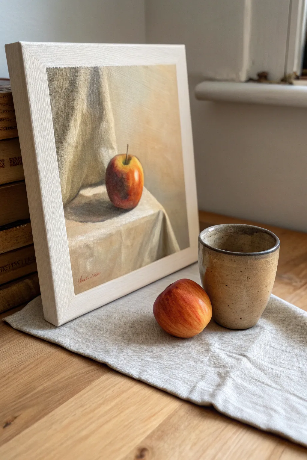
Master the subtleties of light and form with this elegant oil painting study. Using a restricted color palette, you will learn to mix harmonious earth tones to capture the soft transition of shadows on fabric and the crisp skin of an apple.
How-To Guide
Materials
- Small square canvas or canvas board (approx. 8×8 or 10×10 inches)
- Oil paints: Titanium White, Yellow Ochre, Burnt Sienna, Burnt Umber, Alizarin Crimson, Ultramarine Blue
- Odorless mineral spirits or turpentine
- Linseed oil medium
- Hog bristle brushes (flats and filberts, sizes 2-6)
- Soft synthetic brush for blending (size 4)
- Palette knife for mixing
- Wooden palette or tear-off palette pad
- Lint-free rags
Step 1: Preparation and Imprimatura
-
Tone the canvas:
Begin by applying a thin wash of Burnt Sienna diluted with mineral spirits across the entire canvas. Wipe it back with a rag to create a warm, mid-tone glowing base. -
Establish the composition:
Using a small round brush and thinned Burnt Umber, sketch the basic placement of the apple, the cylindrical cup shape (if including it, though the reference main painting focuses on the apple), and the major folds of the drapery. -
Map the shadows:
Identify the darkest areas: the cast shadow under the apple, the deep folds in the cloth, and the shadowed side of the fruit. Block these in thinly with a mix of Burnt Umber and Ultramarine Blue.
Muddy colors?
If your colors look dull, stop mixing on the canvas. Clean your brush thoroughly with spirits, mix a fresh pile of paint on your palette, and apply it decisively over the muddy area.
Step 2: Blocking In Color
-
Mix your drapery tones:
Create a range of warm greys and beiges for the background cloth. Mix White, Yellow Ochre, and a touch of Burnt Umber. Create a darker version for the shadow side of the folds by adding more Umber and a tiny touch of Blue. -
Apply the background:
Paint the background drapery using a large flat brush. Focus on large planar changes rather than details, establishing the vertical folds behind the subject. -
Block in the apple base:
Mix a muted yellow-orange using Yellow Ochre and a small amount of Alizarin Crimson. Apply this to the light side of the apple. -
Add the apple shadow:
For the shadowed side of the apple, mix Alizarin Crimson with Burnt Umber to create a deep, rich red-brown. Apply this wet-into-wet next to the lighter section. -
Paint the foreground cloth:
Using your lighter beige mixture, paint the table surface. Pay attention to the sharp edge where the cloth falls over the table edge, creating a distinct corner.
Glazing depth
Once the painting is dry to the touch, apply a thin transparent glaze of Alizarin Crimson over the apple’s shadow side to make the red skin look incredibly deep and realistic.
Step 3: Refining Form and Light
-
Model the apple:
Blend the transition between the light and dark sides of the apple using semi-circular strokes that follow the fruit’s roundness. I find adding a touch of cool grey to the turning edge helps it recede. -
Intensify the reds:
Layer pure Alizarin Crimson mixed with a little medium over the shadowed side of the apple to give it that deep, translucent skin quality. -
Add the stem and cavity:
With a small rigger or detail brush, paint the stem divot with a dark mix of Alizarin and Green (mixed from Ochre and Blue). Add the thin stem with Burnt Umber. -
Refine the cast shadow:
Darken the shadow directly beneath the apple on the cloth. Soften the edges of this shadow as it moves further away from the fruit to create a realistic sense of depth. -
Enhance drapery highlights:
Add more Titanium White to your ochre mix and paint the highest ridges of the cloth folds. Keep your brushstrokes loose and painterly here.
Step 4: Final Details
-
Add the specular highlight:
Place a small crisp dot of Titanium White mixed with a speck of Yellow Ochre on the upper shoulder of the apple where the light hits strongest. -
Soften edges:
Use a clean, dry, soft synthetic brush to very gently feather the background edges so the apple remains the sharpest focal point. -
Check values:
Step back and squint at your painting. Ensure your darkest darks (under the apple) and lightest lights (the highlight) are distinct enough. -
Sign and dry:
Sign your work in the corner using a thinned red-brown paint. Allow the painting to dry in a dust-free area for at least a week before varnishing.
This disciplined approach to color mixing will give you a timeless, classical result you can be proud of
Soft-Edge Portrait Study in Pastels
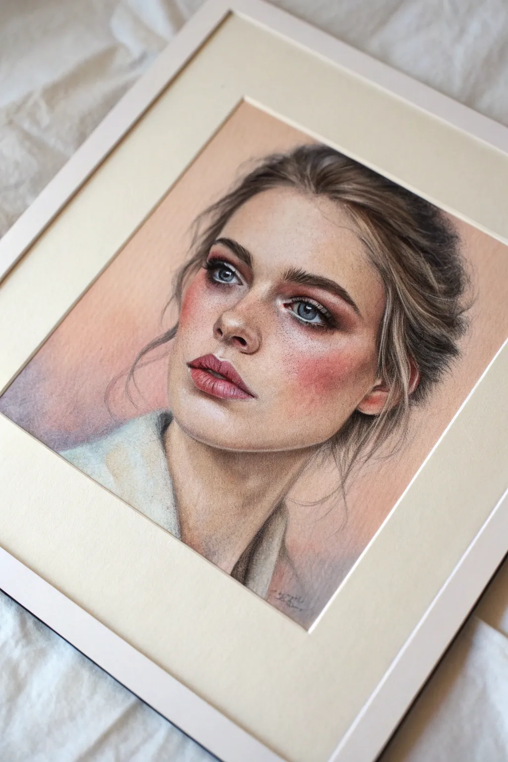
Capture the delicate nuance of human expression with this soft-edge portrait study. Using the forgiving and blendable nature of pastels, you will build up layers of rosy warmth and cool shadows to create a lifelike face that seems to glow from within.
Step-by-Step
Materials
- Pastel paper (tan or peach toned, fine tooth)
- Soft pastels (stick form)
- Pastel pencils (flesh tones, browns, reds, white, blue)
- Kneaded eraser
- Paper stumps or tortillons
- Soft tissue or cotton pads for blending
- Workable fixative
Step 1: Structural Foundation
-
Initial Sketch:
Begin with a light, loose sketch using a mid-tone brown pastel pencil. Focus on placing the eyes, nose, lips, and jawline accurately without pressing hard. Avoid graphite pencils as they can repel pastel layers. -
Mapping Shadows:
Identify the darkest areas of the face—under the jaw, the nostrils, the eye creases, and the hair rooting. Lightly scumble a cool brown or taupe pastel in these zones to establish the volume early on. -
Base Skin Tone:
Using the side of a soft pastel stick, lay down a broad, sheer layer of a pale cream or light flesh tone across the forehead and cheeks. Gently rub this into the paper’s tooth with a soft tissue to create a unified base.
Step 2: Building Complexion
-
Applying the Blush:
The subject has distinctive rosy cheeks. Use a soft coral or dusty pink pastel stick on the apples of the cheeks, sweeping upward toward the temples. Don’t worry about hard edges yet; we want a diffused look. -
Blending the Transitions:
With a clean finger or a cotton pad, blend the pink into the base flesh tone. Use circular motions to ensure the transition is seamless, mimicking the natural flush of blood beneath the skin. -
Defining Facial Planes:
Introduce a slightly darker, warmer beige to the sides of the nose and the hollows of the cheeks. This sculpting prevents the face from looking flat. -
Highlighting:
Use a white or very pale yellow pastel pencil to pick out the high points: the bridge of the nose, the center of the forehead, the cupid’s bow, and the chin. Blend the edges very softly so they don’t look like stripes.
Clean Hands, Clean Art
Keep a damp towel and dry cloth nearby. Clean your fingers between colors to avoid muddying the skin tones, especially when moving from dark hair to the pale face.
Step 3: Features and Details
-
Constructing the Eyes:
Switch to sharp pastel pencils for precision. Outline the iris with a dark grey, then fill the iris with a mix of cool blue and grey. Keep the whites of the eyes slightly off-white (greyish) to make them look spherical, not flat. -
Lashes and Brows:
Using a sharp dark brown pencil, draw the eyebrows hair by hair, following the direction of growth. Add the eyelashes in quick, flicking strokes. Keep the lower lashes sparse and soft. -
Defining the Nose:
Deepen the nostrils with a burnt umber pencil, but avoid using pure black. Soften the bridge of the nose with a tortillon so it recedes naturally into the face. -
Painting the Mouth:
Fill the lips with a muted berry or mauve shade. Focus color intensity in the center and fade it out toward the corners. Add a sharp, dark line between the lips, and a tiny dab of white highlight on the lower lip for moisture. -
Refining Skin Texture:
I like to add subtle imperfections at this stage to increase realism. Lightly tap a sharp brown pencil over the nose and cheeks to create faint freckles, pressing just enough to leave pigment without drawing dashes.
Tone It Up
Try this on a cool grey or blue paper instead of tan. The cool background will make the warm skin tones and rosy cheeks pop even more dramatically.
Step 4: Hair and Finishing Touches
-
Blocking in Hair Mass:
Use the side of a brown pastel stick to block in the main hair shapes. Follow the direction of the hair flow—sweeping back from the face. -
Adding Strands:
With a sharp dark brown pencil, draw distinct strands in the shadowed areas. Then, use a cream or light ochre pencil to draw the illuminated flyaway strands on top. -
Softening Hair Edges:
Where the hair meets the forehead and background, smudge the pigment slightly. This ‘lost edge’ technique pushes the focus back to the sharp details of the eyes and lips. -
Clothing Suggestion:
Keep the clothing sketchy. Use broad, loose strokes of white and grey to suggest a collar or shirt, leaving the paper showing through in places to maintain focus on the face. -
Final Contrast Check:
Step back and squint at your drawing. If the eyes need more pop, deepen the pupil with black. If the cheeks look too pale, glaze a final thin layer of red over the top.
Once you are satisfied with your blend, frame your piece behind glass with a mat to protect the delicate surface from smudging


Silhouette Subject Over a Layered Acrylic Background
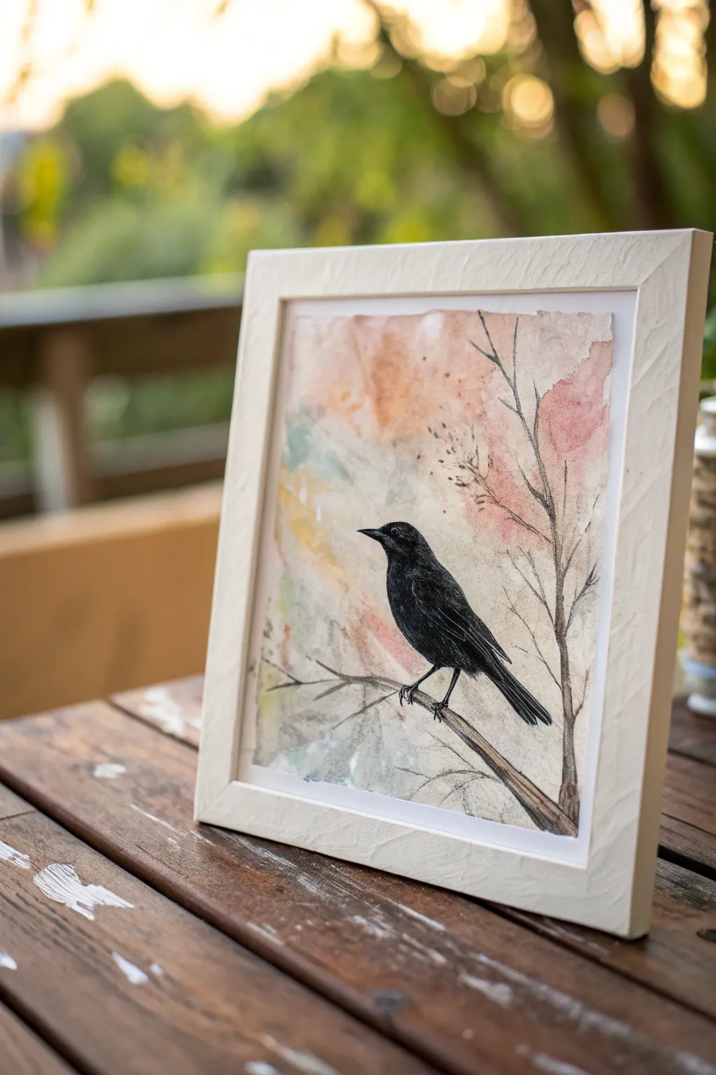
Capture the delicate beauty of a lone bird perched amidst an abstract, dreamy background with this mixed media project. The contrast between loose, colorful washes and the sharp, defined black bird creates a striking focal point with minimal effort.
Step-by-Step Tutorial
Materials
- Heavyweight watercolor paper or mixed media paper
- Fluid acrylic paints or watercolors (peach, pink, sage green, pale blue, white)
- Black acrylic paint or black gouache
- Fine liner brush (size 0 or 00)
- Flat wash brush (1/2 inch)
- Pencil and eraser
- Palette or mixing plate
- Cup of water and paper towels
- White or cream textured frame (optional)
Step 1: Creating the Atmosperic Layer
-
Prepare the paper:
Cut your watercolor or mixed media paper to fit your desired frame size. If you want the jagged ‘deckled’ edge look shown in the photo, gently tear the paper against a ruler rather than cutting it with scissors. -
Mix watery washes:
On your palette, prepare very diluted puddles of your background colors: peach, soft pink, sage green, and pale blue. You want these to be transparent, like tea, rather than opaque. -
Apply the first color wash:
Using your flat wash brush, lay down patches of the peach and pink tones primarily in the upper right and center areas. Let the water guide the paint, allowing the edges to remain soft and irregular. -
Add cool tones:
While the first layer is still slightly damp, introduce the sage green and pale blue to the lower left section. Let these colors bleed slightly into the warmer tones to create natural transitions. -
Create texture:
For a bit of visual interest, you can splatter a tiny amount of clean water onto the semi-dry paint, which will push the pigment away and create subtle blooms. Let this background layer dry completely before moving on.
Step 2: Sketching and Painting the Subject
-
Sketch the silhouette:
Lightly sketch the outline of the bird and the main branch with a pencil. Focus on the posture—ensure the head is alert and the tail feathers extend straight down. -
Fill the bird shape:
Load a round brush with black acrylic paint or gouache. Carefully fill in the body of the bird, ensuring the edges are crisp and smooth against the soft background. -
Refine the beak and eye:
Switch to a fine liner brush for the delicate beak. If you want the eye to be visible like in the example, leave a tiny negative space unpainted, or add a dot of white or grey later. -
Paint the main branch:
Using the liner brush, paint the branch the bird is standing on. Instead of a solid brown, try mixing a dark grey or brown wash so the texture of the paper still shows through slightly. -
Add texture to the feathers:
To give the black silhouette some depth, I like to mix a tiny bit of white into the black to make a dark charcoal grey. Use this to paint subtle dry-brush strokes on the wing to suggest individual feathers.
Edge Control
To get the torn paper effect on heavy paper, fold it sharply along your measurement line, run a bone folder or fingernail along the crease, wet the crease slightly, and then pull apart slowly.
Step 3: Fine Details and Branches
-
Extend the tree structure:
With your thinnest liner brush and thinned black paint (ink consistency), draw fine twigs and branches extending upwards behind the bird. -
Keep lines organic:
Allow your hand to shake slightly as you paint these branches to give them a natural, organic look rather than perfect straight lines. -
Add tiny buds:
Dot the ends of some of the finer twigs with tiny specks of black or dark grey to simulate buds or seeds. -
Check balance:
Step back and look at the composition. If the right side feels empty, add one or two more vertical twig lines to balance the visual weight of the bird. -
Final touches:
Erase any visible pencil marks once the paint is bone dry. If needed, sharpen the point of the beak or the tip of the tail feathers with your smallest brush.
Level It Up
For a magical touch, use metallic gold or copper watercolor for the tiny buds on the background branches. It catches the light beautifully when framed.
Now you are ready to frame your delicate bird silhouette and display it proudly
Collage and Glaze Mixed-Media Heart
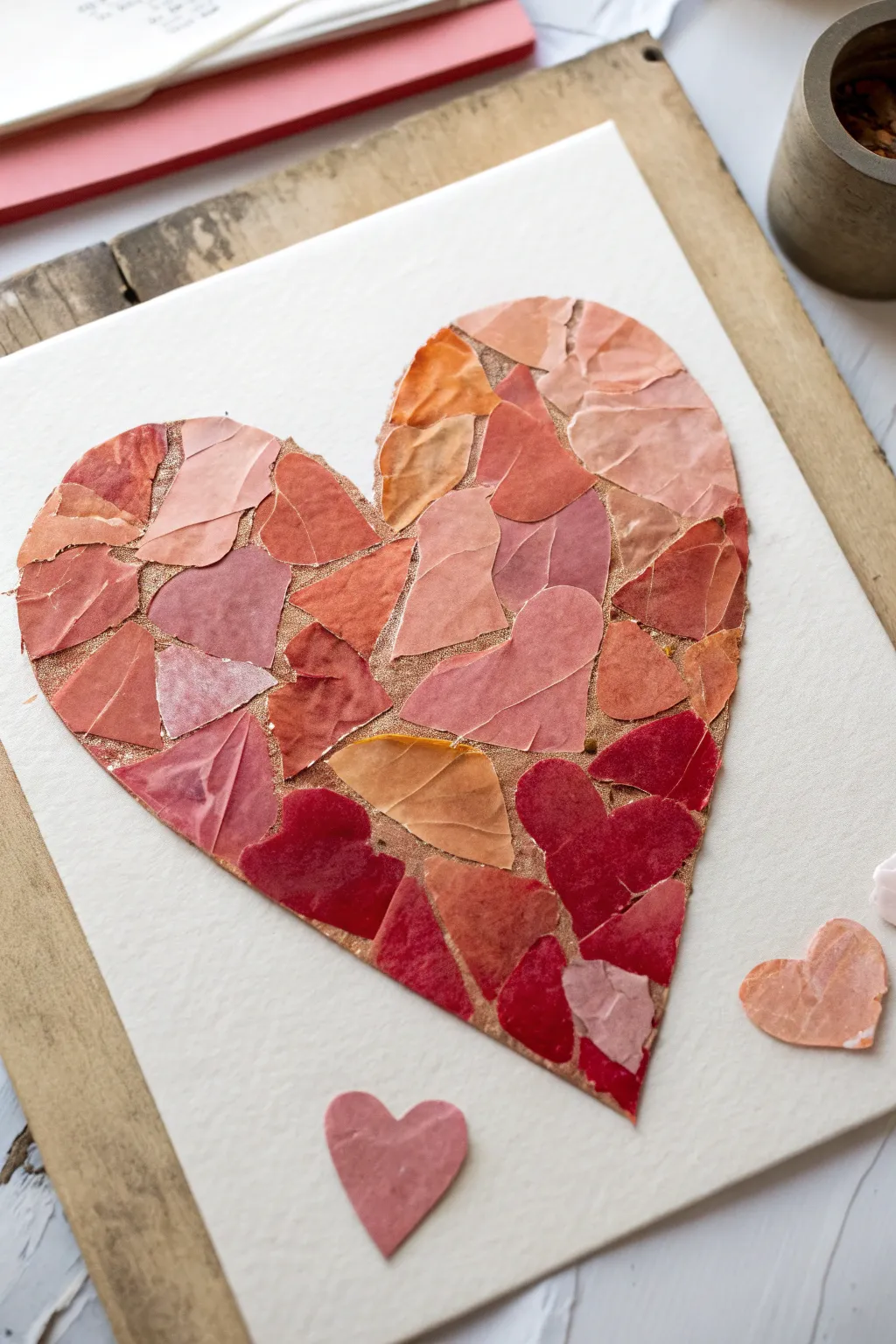
This project transforms simple painted paper scraps into a textured, dimensional heart that radiates warmth. By layering torn pieces in varying shades of pink, peach, and deep red, you create a beautiful mosaic effect with subtle gold accents peeking through.
Detailed Instructions
Materials
- Heavyweight cold-press watercolor paper (for the base)
- Scrap paper or lightweight watercolor paper (for the mosaic tiles)
- Watercolor or acrylic paints (pinks, reds, peaches, oranges)
- Gold leaf adhesive size
- Gold leaf sheets or loose flakes
- Soft synthetic brush (for glue)
- Medium round brush (for painting)
- Gel matte medium or decoupage glue
- Pencil
- A heavy book (for pressing)
Step 1: Preparing the Mosaic Tiles
-
Paint your paper sheets:
Begin by painting your scrap papers with a variety of warm tones. Mix different shades of rose, salmon, deep burgundy, and terra cotta. I like to keep the paint application loose and watery to get natural variations in color once dry. -
Let the paper dry completely:
Allow the painted sheets to dry fully. If they curl up, you can press them under a heavy book for an hour or use an iron on a low setting on the reverse side. -
Tear into irregular shapes:
Rip the painted paper into small to medium-sized pieces. Aim for variety in shape—some triangular, some curved—but keep the size relatively consistent, about 1 to 2 inches wide. -
Sort by color:
Organize your torn piles by shade: light peaches, medium pinks, and dark reds. This will make it much easier to create a gradient or balanced distribution later.
Sticky Situation?
If your paper ripples when glued, use less adhesive. Apply a thin, even layer of dense gel medium rather than watery glue, which minimizes warping.
Step 2: Creating the Base and Texture
-
Sketch the heart outline:
Lightly draw a large heart shape in the center of your main heavyweight watercolor paper base. Keep the lines faint so they can be easily erased or covered. -
Apply adhesive size:
Inside your penciled heart outline, brush a thin, even layer of gold leaf adhesive size. Focus on the areas where the ‘grout’ lines between papers will be visible. -
Apply gold leaf:
Once the size is tacky (usually after 10-15 minutes), gently press gold leaf sheets over the entire heart area. It doesn’t need to be perfect since most of it will be covered by paper tiles. -
Brush off excess gold:
Use a dry, soft brush to gently sweep away loose gold flakes, leaving a shimmering gold base layer inside your heart shape.
Shine Bright
Swap gold leaf for copper or silver flakes to change the warmth. Or, use metallic paint for the base layer instead of leaf for a subtler shimmer.
Step 3: Assembling the Collage
-
Plan your placement:
Before gluing, dry-fit your torn paper pieces onto the gold heart. Arrange them like a puzzle, leaving small gaps (about 1-2mm) between pieces so the gold underneath creates a glistening ‘grout’ line. -
Create a gradient effect:
Try placing darker red pieces toward the bottom point of the heart and lighter peach tones near the top curves. This adds visual weight and dimensionality to the artwork. -
Glue the first piece:
Pick up a piece, apply a thin layer of matte medium to the back, and press it firmly into position. Start from the center and work your way out to the edges. -
Work in small sections:
Continue gluing pieces one by one. I prefer to complete one lobe of the heart first before moving to the other, ensuring the spacing remains consistent. -
Refine the edges:
For the pieces along the outline of the heart, you may need to tear them specifically to match the curve. A sharp, clean edge on the outside helps define the heart shape clearly. -
Add floating hearts:
Use a few leftover smaller pieces to create tiny standalone hearts near the bottom of the main shape, as if they are falling or drifting away.
Step 4: Sealing and Finishing
-
Press flat:
Once all paper tiles are glued down, place a sheet of wax paper over the artwork and weigh it down with a heavy book for a few hours. This ensures all edges adhere completely. -
Apply a top coat (optional):
For a unified sheen, brush a very thin layer of matte or gloss medium over the paper tiles. Be careful not to dull the gold gaps too much. -
Clean up the background:
Check the white background paper for any stray glue marks or pencil lines. Gently erase any visible graphite around the perimeter of the heart. -
Final inspection:
Look for any loose edges on the paper tiles. Dab a tiny bit of extra glue under any lifting corners to secure them permanently.
Hang your finished mosaic heart in a spot that catches the light to let those gold accents truly sparkle
Sand-Texture Abstract With Embedded Grit
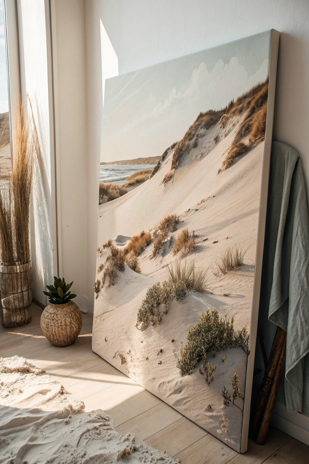
Capture the serene beauty of a windswept coastline with this large-scale acrylic painting that emphasizes tactile surfaces. By incorporating sand and grit directly into your medium, you will build 3D dunes that literally lift off the canvas.
Step-by-Step Tutorial
Materials
- Large stretched canvas (at least 36×48 inches)
- Heavy body acrylic paints (Titanium White, Unbleached Titanium, Raw Sienna, Burnt Umber, Paynes Grey, Phthalo Blue)
- Modeling paste or texture gel
- Fine clean sand (craft sand or strained beach sand)
- Coarse grit or small pebbles
- Palette knives (large trowel and small diamond shapes)
- Large flat paintbrush (2-3 inch)
- Medium filbert brush
- Fan brush
- Spray bottle with water
- Dried botanical stems or faux grass (optional for embedding)
Step 1: Base Structure & Sky
-
Prepare the Horizon:
Begin by lightly sketching your horizon line about one-third of the way up the canvas. Sketch a sloping diagonal line starting high on the right and curving down toward the left center to map out the main dune ridge. -
Mix the Sky Gradient:
On your palette, create a soft gradient mix. You’ll need a pale blue-grey using Titanium White and a tiny dot of Paynes Grey, and a warmer creamy white using Titanium White with a touch of Unbleached Titanium. -
Apply the Sky:
Using the large flat paintbrush, paint the sky area. Start with the blue-grey at the top and blend it downward into the warmer creamy white near the horizon line to simulate atmospheric perspective. -
Create Cloud Whisps:
While the sky paint is still staggering wet, use a clean, dry rag or a dry brush to lift off pigment in irregular shapes, creating soft, diffused clouds. I like to keep these subtle so they don’t distract from the dunes. -
Block in the Sea:
Mix Phthalo Blue, Paynes Grey, and a generous amount of Titanium White to get a muted ocean teal. Paint the water strip horizontally, ensuring the brushstrokes are flat and level.
Grit Adhesion Tip
If you are worried about sand falling off, mix a little PVA glue or gloss medium into your water cup when creating your initial washes to act as a binder.
Step 2: Building the Texture
-
Create the Texture Mix:
In a separate container, mix a large volume of modeling paste with your fine sand. The ratio should be roughly 2 parts paste to 1 part sand. Tint this mixture with Unbleached Titanium and a hint of Raw Sienna. -
Sculpt the Main Dune:
Using a large palette knife, apply the sandy paste to the canvas, following the diagonal slope you sketched earlier. Apply it thickly, about 1/4 inch deep in some places, smoothing it downward to mimic gravity’s effect on sliding sand. -
Add Variation:
While the paste is wet, sprinkle pinch-falls of dry, loose sand onto specific areas where you want the texture to look looser and rougher. Gently pat them down with the flat side of the knife. -
Embed Coarser Elements:
Near the bottom of the canvas and along the ridge of the dune, press small amounts of coarse grit or tiny pebbles into the wet paste. This creates the visual anchor points for the vegetation later. -
Drying Time:
This is crucial: allow the texture layer to dry completely. Depending on humidity and thickness, this could take 24 to 48 hours. The paste must be hard to the touch before glazing.
Step 3: Color & Detail
-
Wash the Sand:
Mix a very watery glaze of Raw Sienna and water. Brush this loosely over the dried textured dune, allowing the liquid to settle into the crevices of the sand paste. This instantly adds depth. -
Highlight the Ridges:
Once the wash is tacky or dry, use a dry paintbrush with pure Unbleached Titanium. specific ‘dry brush’ vertically down the slopes, catching only the raised bumps of sand to mimic sunlight hitting the grains. -
Shadows and Contrast:
Mix Burnt Umber with a little Paynes Grey. Apply this darker color sparingly along the very top edge of the dune ridge and underneath the coarser grit areas to create deep pockets of shadow. -
Paint the Grasses:
Using a fan brush or a liner brush loaded with a mix of Burnt Umber and Raw Sienna, flick upward strokes starting from the ‘shadow’ pockets you just painted. Vary the height and curve of the grasses. -
Add Greenery Texture:
For the shrubby bushes shown in the foreground, use a stippling motion with an old, splayed brush. Mix varied greens using Raw Sienna, Phthalo Blue, and Burnt Umber for a natural, dried-out coastal foliage look. -
Final Highlights:
Add tiny strokes of Titanium White to the crests of the ocean waves and the tips of the tallest grasses to catch the imaginary light source. -
Seal the Texture:
To ensure the loose sand bits don’t shed over time, coat the entire sand portion with a matte spray varnish or a fluid matte medium once fully cured.
Level Up: Real Dimensions
Glue actual dried grass stems or preserved moss into the wet modeling paste for literal 3D displacement that casts real shadows.
Hang your textured masterpiece in a well-lit spot where the changing daylight will dance across the uneven sandy surface.
Fluid Acrylic Pour With a Controlled Swipe
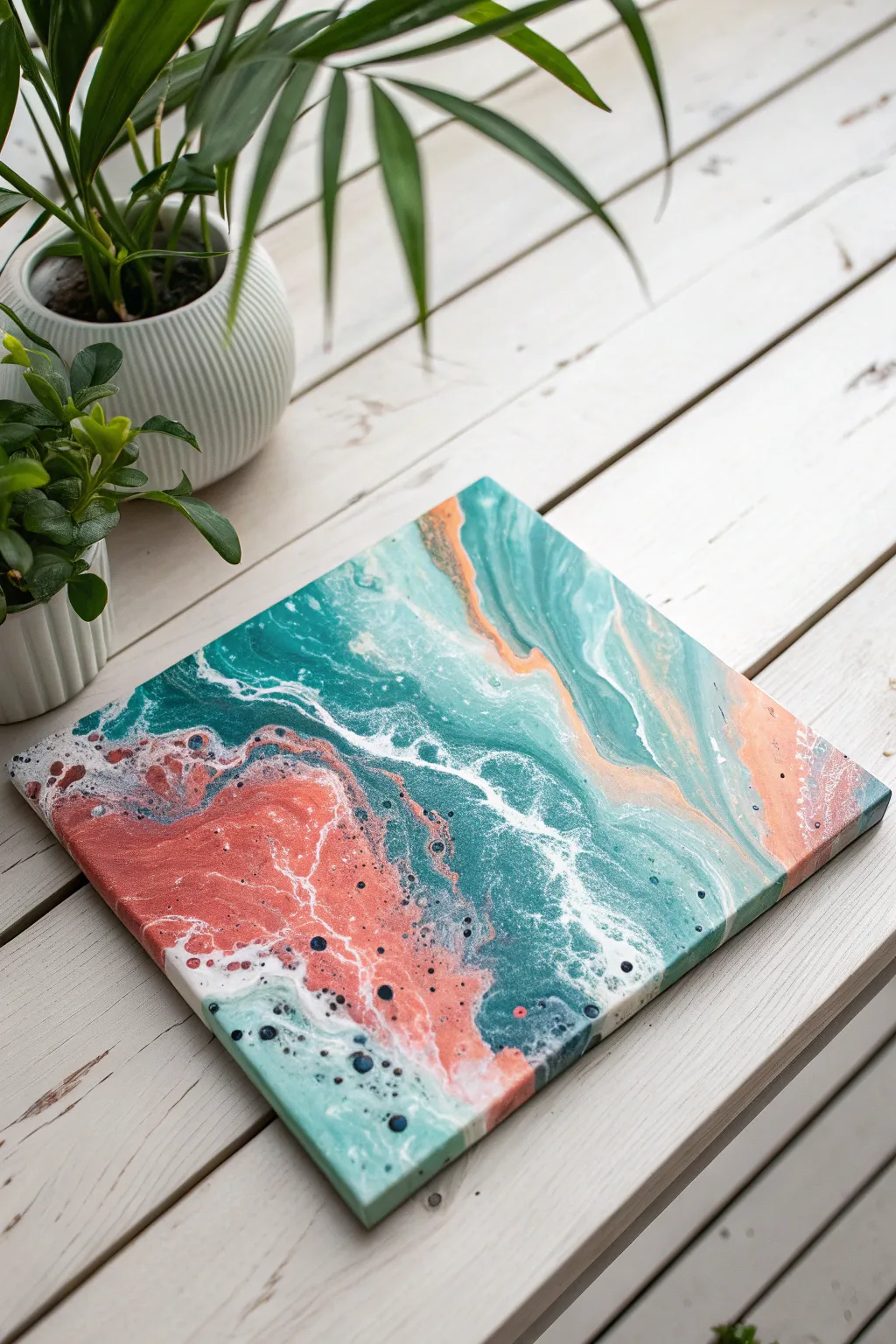
Capture the essence of crashing waves meeting coral sands with this vibrant fluid art project. By combining a classic dirty poured technique with a controlled swipe, you’ll create stunning cells and organic lacing that mimic the movement of the ocean.
Step-by-Step Guide
Materials
- Square stretched canvas (e.g., 10×10 or 12×12 inches)
- Acrylic paints (Teal, Light Turquoise, Salmon/Coral, Navy Blue, Titanium White)
- Pouring medium (like Floetrol or Liquitex)
- Silicone oil or dimethicone treadmill lubricant
- Plastic cups for mixing
- Stir sticks
- A flat, wide tool for swiping (plastic sheet, palette knife, or damp paper towel)
- Gloves
- Drop cloth or plastic sheeting
- Butane torch (optional, for cells)
Step 1: Preparation and Mixing
-
Prepare your workspace:
Fluid art is messy, so cover your table thoroughly with plastic sheeting. Set your canvas on top of four upside-down cups to elevate it, allowing excess paint to drip off freely. -
Mix your base colors:
In separate cups, mix your teal, light turquoise, salmon, navy blue, and titanium white paints with your pouring medium. A standard ratio is 1 part paint to 2 parts medium, but check your specific medium’s instructions. -
Checking consistency:
Stir each cup until the mixture is smooth and flows like warm honey. If the paint leaves a mound that disappears within 1-2 seconds, you have the right consistency. Add a few drops of water if it’s too thick. -
Add cell activator:
Add 2-3 drops of silicone oil to the teal, salmon, and navy blue cups. Stir just two or three times to fold it in; over-stirring can break the oil down too much, resulting in tiny, dusty-looking cells instead of big, juicy ones.
Swipe It Right
Use a damp paper towel as your swipe tool. The moisture helps it glide over the acrylics without dragging too much paint off the canvas, creating delicate, sheer webbing.
Step 2: The Pouring Process
-
Layer the dirty pour cup:
Take a clean, larger cup and start layering your colors. Pour a bit of white first, then layer teal, salmon, navy, and turquoise. Repeat this order until the cup is nearly full, pouring gently down the side to keep layers distinct. -
Flip the cup:
Place your canvas face down on top of the cup. firmly holding both, flip them over so the cup is now upside down on the canvas centering it. Let it sit for a moment to allow the paint to settle. -
Release the paint:
Lift the cup straight up and set it aside. The paint will puddle in the center. Don’t worry about covering the whole canvas yet. -
Tilt the canvas:
Gently tilt the canvas in a circular motion to spread the paint toward the corners. The goal is to cover the surface while maintaining bands of color.
Step 3: Adding the Controlled Swipe
-
Applying negative space:
If your corners aren’t fully covered, pour a little extra white or teal mixture directly onto those bare spots to help the main puddle glide over them. -
Prepare the swipe tool:
I like to dampen a small piece of paper towel or use a flexible plastic sheet for this. Ensure the edge is clean and flat. -
Swipe specifically for lacing:
Dip the edge of your swipe tool lightly into some white paint. Drag it very gently across the transition zones where the teal meets the salmon. Use almost zero pressure—you just want to drag the top layer of paint. -
Create movement:
For the wave effect seen in the photo, swipe in a diagonal, slightly curved motion. This drags the colors over one another, creating that foamy, shoreline look. -
Activate the cells:
If you have a butane torch, quickly pass the flame over the surface about 6 inches away. The heat will pop air bubbles and encourage the silicone oil to rise, creating distinct round cells. -
Refine the composition:
Tilt the canvas very slowly one last time if you need to stretch out the cells or adjust the composition. Be careful not to tilt too aggressively, or the cells might lose their round shape.
Muddy Colors?
If your teal and coral are turning brown where they meet, you are over-tilting or swiping too many times. Stop manipulating the paint sooner to keep separation crisp.
Step 4: Finishing Touches
-
Clean the edges:
Run a finger or a craft stick along the underside edge of the canvas to remove dripping paint. This prevents the paint on top from being pulled off by gravity as it dries. -
Let it cure:
Place the painting in a dust-free area to dry for at least 24-48 hours. Acrylics dry from the outside in, so be patient. -
Clean surface oil:
Once fully dry (give it a few days to be safe), wipe the surface gently with a paper towel and a drop of dish soap or rubbing alcohol to remove residual silicone oil before varnishing. -
Seal the artwork:
Apply a coat of gloss varnish or resin to make those teal and coral colors pop and protect your oceanic masterpiece.
Enjoy the calming process of watching your fluid seascape settle into its final, beautiful form
Acrylic Underpainting With Oil Glazing on Top
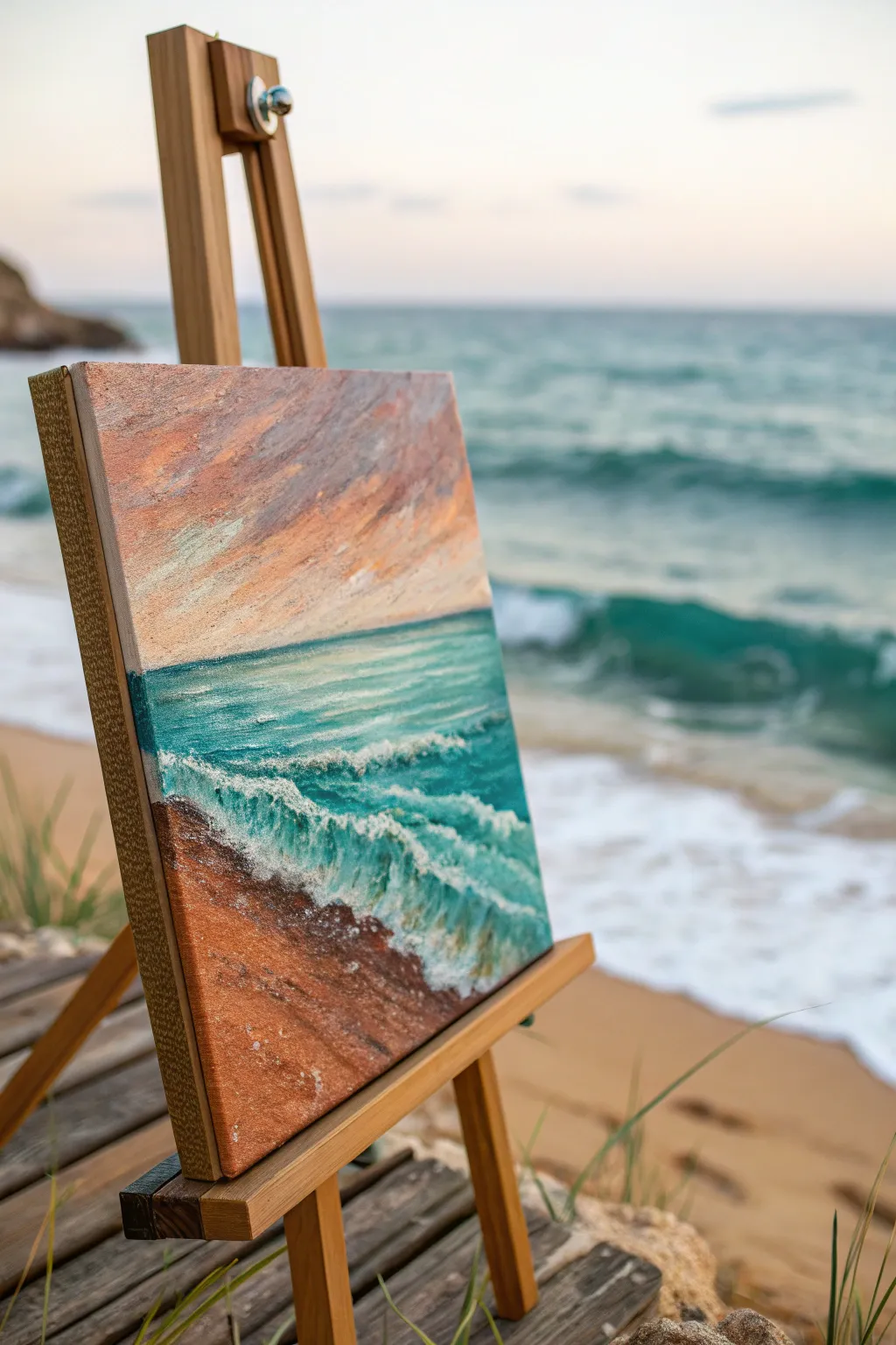
Capture the translucent glow of a seaside sunset by combining the speed of acrylics with the richness of oils. This dual-medium technique creates deep, vibrant waters and a textured, foamy shoreline that practically leaps off the canvas.
Step-by-Step Tutorial
Materials
- Stretched canvas (square format, e.g., 12×12 inches)
- Acrylic paints: Burnt Sienna, Yellow Ochre, Phthalo Blue, White, Raw Umber
- Oil paints: Alizarin Crimson, Cadmium Yellow, Viridian, Ultramarine Blue, Titanium White, Burnt Sienna
- Acrylic brushes: Large flats and filberts
- Oil brushes: Soft synthetic rounds, bristle flats for texture
- Palette knives (for texture)
- Liquin or Linseed oil medium
- Odorless mineral spirits
- Rags or paper towels
Step 1: Acrylic Foundation
-
Map the Horizon:
Begin by establishing your horizon line about one-third of the way up from the bottom. It doesn’t need to be ruler-straight; a slightly organic line feels more natural. -
Block in the Sand:
Mix a warm base for the sand using Burnt Sienna and a touch of Yellow Ochre acrylic. Apply this scrubby layer to the bottom third of the canvas, letting brushstrokes show. -
Establish the Sea Base:
For the water, mix Phthalo Blue with a considerable amount of White to create a vibrant turquoise. Paint the middle band of the canvas, darkening the value slightly as you near the horizon. -
Underpaint the Sky:
Create a gradient for the sky using warm tones. Start with a pale yellow-orange near the horizon and transition into a muted lavender-grey towards the top edge. -
Add Texture to the Foam:
Using thick white acrylic or modeling paste, rough in the shape of the crashing wave. Build up physical texture here so the oil glaze will catch in the grooves later. -
Let it Cure:
Ensure the acrylic layer is completely bone-dry before proceeding. This is crucial as moisture can affect the adhesion of the oil layers.
Muddy colors?
If your glazes look dull, you likely reworked them too much while wet. Apply the glaze confidently in one direction and leave it alone to keep the luminosity intact.
Step 2: Oil Glazing and Detail
-
Warm the Sky:
Mix a thin glaze of Alizarin Crimson and Cadmium Yellow with your medium. Brush this transparently over the sky area to create a glowing sunset effect that interacts with the acrylic underneath. -
Deepen the Water:
Mix Viridian and a touch of Ultramarine Blue with medium. Glaze this over the turquoise acrylic base, concentrating on the area just behind the crashing wave to create depth and transparency. -
Define the Wave Shadow:
Using a smaller brush and a mix of Ultramarine and Viridian, paint the shadow inside the curl of the wave. This high-contrast dark value makes the foam pop. -
Highlight the Foam:
Load a bristle brush or palette knife with thick Titanium White oil paint. Apply it to the textured acrylic ridges you created earlier, skipping the brush so it breaks naturally over the high points. -
Soft Spume Trails:
Dry-brush wispy lines of white extending back from the wave crests into the deeper water, suggesting wind-blown spume. -
Beach Reflections:
Glaze a thin layer of Burnt Sienna over the foreground sand. While wet, drag a little of the water color vertically down into the wet sand area to simulate wet, reflective beach. -
Enhance Foreground Texture:
Use a palette knife to scrape a mix of heavy body white and sand color across the very bottom edge. This mimics the coarse sand and pebbles often found at the tideline. -
Final Sky Clouds:
Add defined cloud streaks using a violet-grey mix (Alizarin + Ultramarine + White). Keep the edges soft to maintain the atmospheric feel. -
Sunlight Catch-lights:
Add tiny flecks of pure lemon yellow or pale orange to the top edges of the water ripples where they catch the sunset light.
Add sparkle
Mix a tiny amount of iridescent medium into your final white highlights on the water. This adds a subtle shimmer that mimics sunlight hitting the ocean spray.
Step back and enjoy the depth you achieved by combining the best traits of both paint mediums
Watercolor Negative Painting Botanical Layers
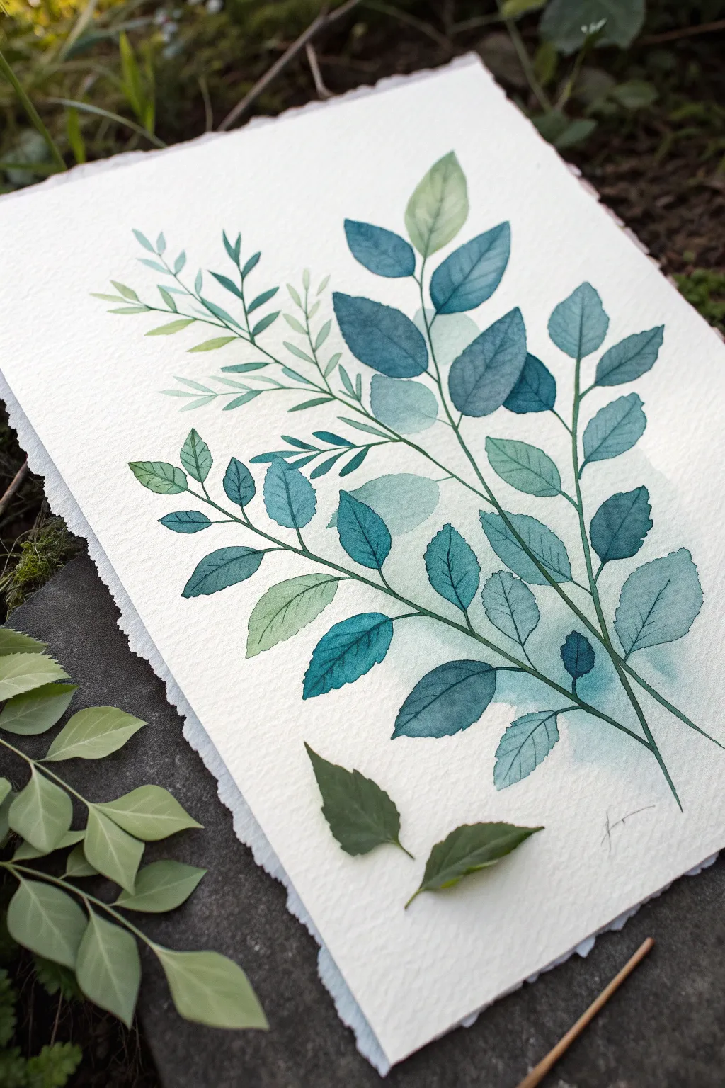
Master the delicate art of transparency with this botanical study, featuring layers of teal and sage leaves that seem to drift into the background. By carefully controlling water ratios and playing with overlapping shapes, you will create a sense of depth that feels both organic and modern.
Step-by-Step Guide
Materials
- Cold press watercolor paper (300 gsm or heavier)
- Watercolor paints: Phthalo Blue, Phthalo Green, Sap Green, Indigo, Burnt Sienna
- Round watercolor brushes (Size 4, 6, and 8)
- Pencil (H or HB)
- Kneaded eraser
- Two jars of water
- Paper towels
- Masking tape (optional)
Step 1: Planning and First Wash
-
Lightly sketch the composition:
Begin by sketching two or three main curving stems that cross gently. Keep your pencil lines extremely faint, just enough to guide the placement of the leaves. Draw the basic leaf shapes—mostly ovate or lanceolate—staggered along the stems. -
Mix your lightest wash:
Prepare a very watery, pale mixture of Phthalo Green and a touch of Sap Green. You want this to be 80% water and 20% pigment. It should look like a faint tea stain on your palette. -
Paint the background leaves:
Identify the leaves that appear ‘furthest back’ in your composition. Using a size 6 brush, fill these shapes with your pale wash. Keep the edges soft but distinct. -
Add a background tint:
While these leaves are still slightly damp, drop a tiny amount of diluted clean water near their bases to help them bleed softly into the white paper, creating that misty, undefined look. -
Allow thorough drying:
Let this first layer dry completely. This is crucial—if the paper is cool to the touch, it’s still wet. Patience here prevents muddy colors later.
Step 2: Building the Mid-Ground
-
Mix a mid-tone teal:
Mix Phthalo Blue with a little Phthalo Green and a tiny touch of Burnt Sienna to desaturate it. Add less water this time for a stronger, semi-transparent pigment. -
Paint the second layer:
Paint the next set of leaves that sit ‘above’ the first layer. It is perfectly fine to overlap the previous pale leaves; this transparency is what builds the magical depth. -
Vary the hues:
While painting this layer, dip your brush tip into a slightly greener mix occasionally. This creates subtle variegation within the leaves, making them look more natural. -
Connect to stems:
Use the tip of your brush to draw thin lines connecting these new leaves to the main stem lines you sketched earlier. Keep your hand loose to avoid stiff, unnatural lines.
Muddy Overlaps?
If overlapping colors look muddy, you likely didn’t wait long enough between layers. The bottom layer must be bone dry before glazing over it, or the pigments will churn together.
Step 3: Defining the Foreground
-
Mix the darkest pigment:
Create a concentrated mix of Indigo and Phthalo Green. This should be rich and dark, with a creamy consistency. -
Paint the focal leaves:
Select the leaves that are closest to the viewer (the ‘top’ layer). Paint these carefully with your size 4 or 6 brush, ensuring crisp edges. -
Create vein details:
While the dark leaves are wet, you can lift out a tiny bit of color with a thirsty brush to suggest a central vein, or wait until dry and paint the vein with an even darker mix. -
Glaze over intersections:
Where a dark leaf overlaps a lighter one, the watercolor purity allows the layer underneath to influence the color. Embrace this overlap rather than trying to paint around it. -
Add the main stems:
Using a size 4 brush or a rigger brush, paint the main stems connecting your darkest leaves. Vary the pressure to make the stem slightly thicker at the bottom and whisper-thin at the tip.
Level Up: Salt Texture
While the mid-tone leaves are still wet, sprinkle a few grains of table salt on them. Brush it off when dry for a starburst texture that mimics leaf imperfections.
Step 4: Details and Finishing
-
Add gentle veins:
Once everything is bone dry, mix a dilute version of your darkest teal. Use your smallest brush (size 4) to paint delicate veins on the mid-tone leaves. -
Soften harsh edges:
Scan your painting for any hard edges on the background leaves that act too distracting. You can soften them slightly with a clean, damp brush to push them further back. -
Check the balance:
Step back and look at the composition. If an area feels too empty, you can add a very faint ghost leaf using your lightest wash from the first step. -
Sign and clean up:
Erase any remaining pencil marks gently with a kneaded eraser, but only after ensuring the paint is 100% dry to avoid smearing.
Enjoy the serene process of building your botanical layers, watching depth emerge with every brushstroke
Scratch-Through Sgraffito in Acrylic Layers
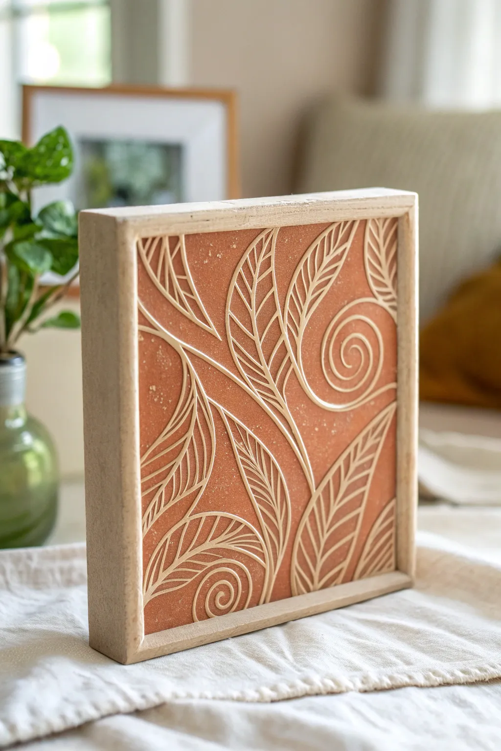
Recreate the organic warmth of carved pottery with this layered acrylic technique. By scratching through a top coat of terracotta paint to reveal a textured white base, you’ll achieve a stunning relief effect that feels both modern and earthy.
Detailed Instructions
Materials
- Square wood panel (approx. 8×8 or 10×10 inches)
- White or cream latex paint (or heavy body acrylic)
- Terracotta or rust-orange acrylic paint
- Medium-grit sandpaper
- Stylus tool, embossing tool, or a dull pencil
- Soft synthetic paintbrush (flat)
- Wood frame (optional, to fit panel)
- Matte spray varnish
- Pencil for sketching
- Paper towels
Step 1: Preparation & Base Layer
-
Prepare the substrate:
Begin with a sturdy wooden panel. If the surface is too smooth, give it a quick sanding with medium-grit sandpaper to help the paint adhere properly. -
Apply the white base:
Paint a thick, even layer of white or cream paint over the entire surface. This will be the color that shows through your scratches later. -
Build texture:
While the white paint is still wet, you can stipulate it slightly with the brush tips to add a little grain, though a smooth coat works well too. Let this layer dry completely—this is crucial. -
Optional second coat:
I usually add a second coat of white to ensure the wood grain doesn’t peek through unintentionally. Let this dry fully, perhaps overnight to be safe.
Use Wax for Ease
Rub a clear candle or wax medium over the dried white layer before painting the terracotta. The top coat will scratch off much cleaner and easier.
Step 2: Applying the Top Coat
-
Mix your terracotta tone:
If you don’t have a premixed rust color, blend burnt sienna with a touch of orange and white to get that dusty clay hue. -
Apply the top layer:
Brush a generous layer of the terracotta paint over the dried white base. You want full coverage, but not so thick that it takes hours to dry. -
Monitor drying time:
This is the tricky part. You need the top coat to be ‘leather hard’—dry to the touch but still soft underneath. Depending on humidity, this might take 10 to 20 minutes.
Step 3: Sgraffito Carving
-
Test the surface:
Test a tiny corner with your tool. If the paint drags and clumps, it’s too wet. If it flakes off in chips, it’s too dry. It should carve away smoothly like cold butter. -
Outline the main stems:
Using your stylus or dull pencil, gently carve the main curved lines of the stems. Press hard enough to reveal the white layer but not so hard you gauge the wood. -
Create the leaf shapes:
Draw the outline of the leaves attached to your stems, varying their sizes to create a dynamic composition. -
Detail the veins:
Inside each leaf outline, carve a center vein line first, followed by curved diagonal lines for the smaller veins. -
Add spiral accents:
Fill in the negative spaces between leaves with large, deliberate spiral swirls to echo the organic theme. -
Clean your tool:
Wipe the tip of your stylus on a paper towel frequently. Buildup of semi-dry acrylic can ruin the crispness of your lines. -
Add texture speckles:
For that authentic pottery look, take the tip of your tool and poke tiny random dots into the background areas to mimic clay imperfections.
Paint Flaking Off?
If the top paint chips rather than carves, it dried too long. Try re-dampening the area slightly with a mist of water or use a sharp metal tool.
Step 4: Finishing Touches
-
Clean up debris:
Once the carving is done and the paint is fully dry, very gently brush away any paint crumbs with a soft, dry brush. -
Frame the piece:
Construct or attach a simple raw wood frame around the painting. The unfinished wood creates a lovely harmony with the rustic paint colors. -
Protect the work:
Spray the surface with a matte varnish. This seals down any loose edges of paint and unifies the sheen without making it glossy. -
Distress edges (optional):
If you want a more aged look, lightly sand the very edges of the painting where it meets the frame to reveal a bit more white.
Hang your new textured relief art in a spot where the light can catch those carved grooves
Masking Tape Geometry With Clean Color Blocks
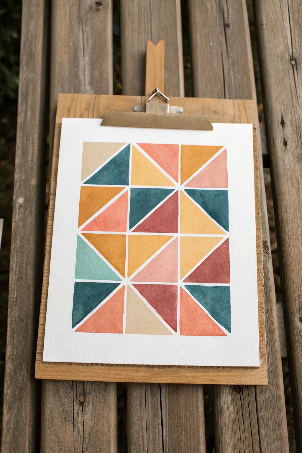
Achieve crisp lines and harmonious color balance with this geometric watercolor project. By playing with negative space and earthy tones, you’ll create a modern piece of art that feels both structured and soothing.
Step-by-Step Tutorial
Materials
- Cold press watercolor paper (A4 or similar)
- Painter’s tape or masking tape (approx. 5mm or 1/4 inch width)
- Watercolor paints (tube or pan)
- Flat shader brush (size 6 or 8)
- Pencil and ruler
- Clean water jar
- Paper towels
- Mixing palette
- Wooden board or clipboard
Step 1: Grid Preparation
-
Paper Setup:
Secure your watercolor paper to a sturdy board or clipboard. If you want a clean border around the entire artwork, tape down all four edges first. -
Measuring the Grid:
Using your pencil and ruler, lightly mark out a grid of 12 squares in total—3 squares wide and 4 squares high. Keep your pencil pressure extremely light so the graphite doesn’t smudge later. -
Diagonal Divisions:
Draw diagonal lines through each square to split them into triangles. Vary the direction of the diagonals (some leaning left, some leaning right) to create a dynamic, randomized pattern rather than a uniform one. -
Applying the Masking Tape:
Carefully apply your thin painter’s tape or masking tape over every pencil line you just drew. This tape will act as a resist, creating the crisp white channels between your color blocks. -
Sealing the Edges:
Once all tape is applied, run the back of your fingernail or a bone folder firmly over the edges of the tape. This crucial step prevents liquid paint from seeping underneath and ruining your clean lines.
Bleeding Edges?
If paint bleeds under the tape, try using a slightly thicker paint consistency next time. Less water means less chance for seepage.
Step 2: Color Strategy
-
Mixing the Palette:
Prepare your color palette before you start painting. You’ll need five distinct shades: a deep petrol blue, a warm mustard yellow, a soft terracotta or burnt orange, a dusty pink, and a pale sandy beige. -
Testing Swatches:
Test your mixed colors on a scrap piece of watercolor paper. You want them to be distinct from one another but consistent in saturation—aim for a creamy, mid-strength consistency. -
Planning the Layout:
Look at the grid and mentally map out where colors will go. Try to avoid placing two of the same color right next to each other to maintain balance.
Step 3: Painting the Blocks
-
First Color Application:
Start with your mustard yellow. Select a few scattered triangles across the grid and fill them in using your flat shader brush. Work from the tape edge inward to minimize bleed risk. -
Adding Warmth:
Rinse your brush thoroughly and switch to the terracotta orange. Fill in several more triangles, focusing on areas adjacent to the yellow blocks for contrast. -
Deepening Values:
Introduce the deep petrol blue. This strong, cool tone anchors the composition. I like to place these strategically in the corners and center to guide the eye. -
Softening the Look:
Apply the dusty pink and sandy beige to the remaining empty triangles. These lighter, neutral tones act as ‘breathing room’ for the bolder colors. -
Even Coverage:
Check your painted areas for uneven pooling. If a puddle forms, gently lift the excess liquid with a clean, damp brush or the corner of a paper towel. -
Drying Time:
Let the painting dry completely. The paper must be bone-dry to the touch before you attempt to remove the tape. Patience is key here.
Pro Sealing Tip
Brush a tiny bit of clear water or white paint over the tape edges first. This seals any gaps instantly, so your colored paint sits perfectly on top.
Step 4: The Reveal
-
Tape Removal:
Once fully dry, slowly peel back the tape. Pull it away from the paper at a 45-degree angle. This reduces the tension and prevents the paper surface from ripping. -
Detail Check:
Inspect your white lines. If any paint has crept under the tape, use a white gel pen or opaque white gouache to carefully touch up the edges. -
Erasing Guides:
If any pencil marks are still visible in the white channels, gently erase them with a soft kneaded eraser.
Now you have a striking piece of wall art that celebrates the beauty of simple shapes and complex colors
Art Journal Spread Using Paint, Ink, and Paper
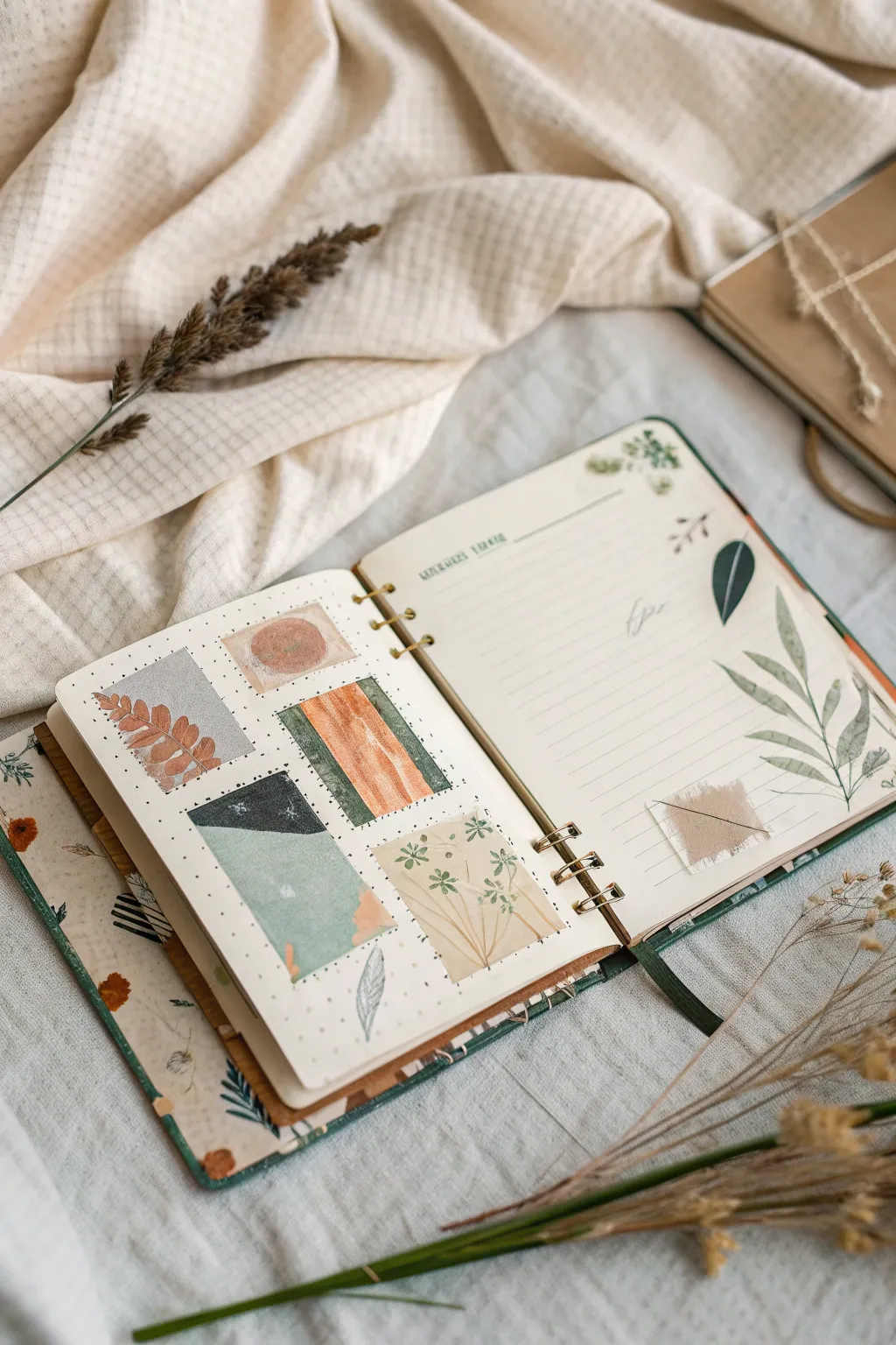
This serene art journal spread combines structured color exploration with free-flowing botanical illustration creates a balanced visual diary. The left page features a gallery of textured swatches, while the right page offers space for reflection amidst delicate leaf motifs.
Step-by-Step
Materials
- A5 or similar ring-bound sketchbook (dot grid or mixed media paper)
- Watercolor paints (earth tones: terracotta, sage green, deep gray, ochre)
- Fine liner pens (black, 0.1mm and 0.3mm)
- Washi tape or masking tape
- Small flat brush and round brush
- Scrap botanical ephemera or textured paper
- Ruler and pencil
- White gel pen or gouache
Step 1: Planning the Layout
-
Define the grid:
On the left-hand page, use your ruler and pencil to lightly map out five rectangular areas. Arrange them in a loose grid—two in the top row, two in the middle, and one centered or offset at the bottom. -
Masking boundaries:
Apply washi tape around the borders of your penciled rectangles. This ensures crisp, clean edges for your painted swatches later. -
Right page structure:
On the facing page, lightly draw horizontal lines if your paper is blank, mimicking notebook paper. Leave the outer edges free for the botanical illustrations coming later.
Step 2: Creating the Swatches
-
First color block:
Choose a soft sage green for one of the bottom rectangles. Paint a flat wash, then drop in a slightly darker green near one corner while wet to create a subtle gradient. -
Texture experiment:
For the top-left rectangle, paint a base of cool gray. While damp, press a crumpled tissue onto it to lift pigment, leaving a stone-like texture. -
Warm earth tones:
Fill a middle rectangle with a terracotta or rust orange. I personally love using vertical brushstrokes here to mimic wood grain or striated stone. -
Geometric contrast:
In the remaining middle rectangle, paint a diagonal split design. Use deep charcoal gray on the top half and a pale mint green on the bottom, letting them dry between applications to prevent bleeding. -
Botanical inset:
For the final rectangle, paint a pale beige background. Once dry, use a fine liner to draw tiny, delicate flower stems directly over the paint. -
Reveal the edges:
Wait until the paint is completely bone-dry, then carefully peel away the washi tape at a 45-degree angle to reveal your crisp rectangular swatches.
Tape Removal Trick
To prevent ripping the paper when removing tape, heat it briefly with a hair dryer. The warmth softens the adhesive for a smooth release.
Step 3: Details & Illustration
-
Adding swatch details:
Return to the rust-colored rectangle and paint a simple fern leaf over it in a darker shade of reddish-brown. On the gray rectangle, use a white gel pen to add tiny speckles or stars. -
Right page foliage:
On the right page, paint a large, sweeping fern or olive branch starting from the bottom right corner and curving upward. Keep the leaves translucent and varied in green tones. -
Pressed leaf accent:
Take a single darker green leaf shape (either painted on separate paper and cut out, or a real pressed leaf) and adhere it near the top right margin for contrast. -
Fabric element:
Cut a small square of sheer fabric or tea-stained paper. Glue this near the bottom of the written area. Stitch through it with a needle and thread or draw faux stitches for texture.
Level Up: Real Texture
Mix a pinch of baking soda or fine sand into your paint for one of the swatches to create a gritty, tangible surface texture.
Step 4: Final Touches
-
Title the page:
At the top of the right page, hand-letter a simple title or date in a serif font using your green paint or a marker. -
Main journaling text:
Fill the lined section with your thoughts. Use a light gray pen if you want the text to recede, or black for contrast. -
Connecting elements:
Draw a few loose, floating leaves or petals falling from the right page toward the left page to visually connect the two sides of the spread. -
Splatter texture:
Load a toothbrush with diluted brown ink and gently flick it over the entire spread to give it that aged, speckled earthy look.
Close your journal knowing you’ve captured a moment of calm creativity on these pages
Dark Abstract With Metallic Medium Accents
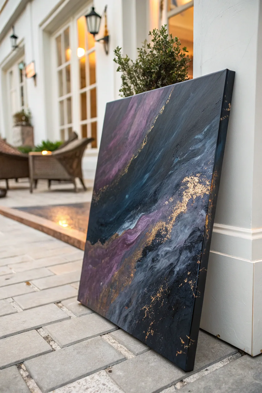
Capture the drama of a stormy night sky with this striking acrylic abstract painting. Deep blues, charcoals, and moody plums swirl together, highlighted by cragged veins of metallic gold leaf for a luxurious finish.
Detailed Instructions
Materials
- Large square gallery-wrapped canvas (24×24 or larger)
- Heavy body acrylic paints (Mars Black, Payne’s Grey, Prussian Blue, Dioxazine Purple, Titanium White)
- Acrylic pouring medium or slow-drying medium
- Large palette knife or trowel
- Metallic gold leaf flakes or imitation gold leaf
- Gold leaf adhesive (sizing)
- Soft gilding brush or fluffy makeup brush
- Spray bottle with water
- High-gloss varnish
- Clean rags or paper towels
- Plastic drop cloth
Step 1: Setting the Background
-
Prepare the workspace:
Lay down your plastic drop cloth to protect your floor or table, as this process can get messy. Prop your canvas up on cups or blocks so the edges are elevated off the surface. -
Mix your base colors:
On a palette or in separate cups, mix your dark colors (Black, Payne’s Grey, Prussian Blue) with a generous amount of pouring medium. Aim for a consistency that is fluid but still thick, like warm honey. -
Create the plum shade:
Mix Dioxazine Purple with a touch of Titanium White and a tiny drop of Black to create a muted, smokey plum color. Mix this with your pouring medium as well. -
Apply the dark base:
Start by pouring the darkest mix (Black and Payne’s Grey) onto the top right and bottom right corners of the canvas. Use your trowel to spread it, but don’t worry about perfect coverage yet.
Step 2: Creating Movement
-
Add the blue mid-tones:
Pour the Prussian Blue mixture in diagonal sweeps across the center of the canvas, roughly following the same direction you want the final flow to take. -
Introduce the purple accent:
Pour your plum mixture in a thick, distinct band running diagonally from the top left quadrant down towards the bottom center. This will be the focal highlight. -
Swipe the paints:
Using the large palette knife or trowel, gently swipe across the canvas in long, diagonal strokes. Apply light pressure to drag the colors over one another without completely muddying them. -
Use water for texture:
Lightly mist a few areas with your water spray bottle while the paint is wet. This helps create organic separation and ‘cells’ within the darker sections. -
Refine the composition:
I like to tilt the canvas slightly if the paint needs to flow more naturally, or use the edge of the knife to create sharper distinct lines where the purple meets the black. -
Paint the edges:
Ensure the dark paint wraps fully around the sides of the gallery-wrapped canvas for a professional, frameless look. Smooth any drips with your finger or brush. -
Allow to dry thoroughly:
Let the painting dry completely. Because heavy body acrylics and mediums are used, this may take 24-48 hours. The surface must be hard to the touch before gilding.
Sticky Situation
If your gold leaf isn’t sticking well, the adhesive size might have dried too much. Reapply a thin layer and test it—it should feel sticky like tape, not wet like glue.
Step 3: Gilding & Finishing
-
Plan the gold placement:
Look at the natural ridges and texture created by the dried paint. Identify the ‘veins’ where colors collide; these are the best spots for gold accents. -
Apply adhesive size:
Using a small brush, dab the gold leaf adhesive specifically along those textured ridges and in scattered clusters. Do not paint a solid line; keep the application jagged and organic. -
Wait for tackiness:
Wait for the adhesive to turn from milky to clear and feel sticky (tacky) to the touch, which usually takes about 15-30 minutes depending on the brand. -
Apply gold leaf:
Gently press sheets or flakes of gold leaf onto the sticky areas. Don’t worry about it looking messy at this stage; cover all the adhesive. -
Burnish the gold:
Use a dry, soft brush to buff the gold leaf in circular motions. The excess flakes will brush away, leaving gold only where the adhesive was applied. -
Create gold dust:
Take the ‘dust’ created from brushing away the excess leaf and sprinkle it into the darker void areas for a very subtle shimmer, lightly pressing it down. -
Seal the artwork:
Once the gilding is set, apply a coat of high-gloss varnish over the entire canvas. This protects the gold leaf from tarnishing and makes the dark colors look deeper and richer.
Cosmic Shimmer
Mix a tiny amount of iridescent pearl medium into your dark blue paint. It won’t show much indoors, but when sunlight hits the canvas, it will reveal a hidden, starlike glow.
Hang your masterpiece in a well-lit area to let the metallic accents truly shine
Monochrome Value Study With Charcoal and Acrylic Wash
Capture the organic movement of sedimentary layers and flowing water with this minimalist value study. By combining the rich, gritty texture of charcoal with soft, transparent acrylic washes, you’ll create a striking piece that balances sharp detail with atmospheric depth.
Step-by-Step Tutorial
Materials
- Heavyweight mixed media paper or hot press watercolor paper (white)
- Willow charcoal sticks
- Compressed charcoal pencil (soft/dark)
- Black acrylic paint or black acrylic ink
- Flat synthetic brush (1 inch)
- Round soft watercolor brush (size 6 or 8)
- Kneaded eraser
- Blending stump or tortillon
- Water container
- Paper towels
- Workable fixative spray
- Ruler
- Artist tape
Step 1: Preparation and Base Washes
-
Define the boundaries:
Begin by taping down your paper to a sturdy board to prevent warping. Using your ruler and a light touch with a pencil, mark out a rectangular boundary for your composition, leaving a generous white border around the edge. -
Create a dilute wash:
Mix a small pea-sized amount of black acrylic paint with plenty of water. You want a very pale, transparent grey tone—think ‘dirty water’ rather than paint. -
Apply the first layer:
Using the large flat brush, sweep this pale wash across the paper in diagonal, organic waves. Don’t cover the entire surface; leave patches of white paper showing through to represent the highest highlights. -
Add a second tone:
While the first layer is still slightly damp, add just a drop more black to your water mix. Touch this slightly darker grey into the wet areas to encourage soft, cloudy blooms. -
Let it dry completely:
This is crucial. The paper must be bone dry before introducing charcoal, or you’ll damage the paper surface. A hairdryer on a low setting can speed this up.
Step 2: Building Charcoal Texture
-
Establish the flow:
Take a piece of willow charcoal and lightly sketch flowing lines that follow the direction of your dried acrylic washes. These lines should mimic rock strata or river currents. -
Smudge for atmosphere:
Use your finger or a dry paper towel to gently rub the willow charcoal into the paper. This creates a soft, foggy mid-tone grey that bridges the gap between the white paper and the dark marks you’ll add next. -
Introduce dark accents:
Switch to the compressed charcoal pencil. Look for areas where your flow lines intersect or dip. Pressing firmly, add dark, definitive strokes in these crevices to create depth. -
Create distinct edges:
Use the side of the charcoal stick to block in larger dark shapes. Keep the edges ragged and natural rather than perfect. I find snapping the charcoal stick in half helps create unpredictable, organic marks. -
Lift out highlights:
Take your kneaded eraser and shape it into a wedge. Press and lift (don’t rub) into the charcoal areas to reclaim light streaks, creating the illusion of veins in stone or foam on water.
Pro Tip: Texture Trick
Place a piece of rough sandpaper or textured fabric underneath your paper while rubbing with the charcoal block. The texture will transfer through, adding instant geological grit.
Step 3: Acrylic Glazing and Finishing
-
Seal the charcoal (Optional):
If you are worried about smudging, give the drawing a very light coat of workable fixative. This allows you to apply wet media over the charcoal without it turning instantly to mud. -
Mix a glazing ink:
Create a slightly darker wash of acrylic paint or ink. This should be semi-transparent but darker than your initial base layer. -
Add contrast washes:
With the round brush, paint selective glazes over the darkest charcoal areas. This seals the charcoal and deepens the black to a rich, void-like value that dry media alone can’t achieve. -
Refine the composition:
Step back and assess the flow. If the image feels too chaotic, use the white space. You can use white acrylic paint or white gouache to paint back into the design if you need to recover lost highlights. -
Clean the borders:
Carefully remove the tape. Use a clean eraser to tidy up any charcoal dust that migrated into the white margins, ensuring a crisp, gallery-ready presentation. -
Final fixative:
In a well-ventilated area, spray the entire piece with a final coat of fixative to prevent the charcoal from transferring to the glass when framing.
Level Up: Gold Veining
Once everything is dry, use a fine liner brush and metallic gold ink to trace extremely thin lines along the darkest fissures, creating a ‘kintsugi’ aesthetic.
Frame your new monochrome study in warm wood to compliment the organic textures you’ve created
Stitched Canvas Mixed Media With Painted Layers
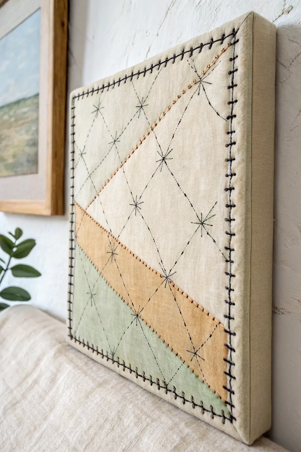
Blend the tactile warmth of embroidery with the structure of canvas painting in this minimalist mixed media piece. This project features simple geometric color blocking enhanced by rustic hand-stitching for a modern, textured finish.
Detailed Instructions
Materials
- Stretched canvas (square format, e.g., 10×10 or 12×12 inches)
- Natural linen or cotton fabric (large enough to wrap around the canvas)
- Acrylic paints (muted sage green, ochre yellow, creamy off-white)
- Fabric medium (optional, but softens the paint)
- Flat shader brushes (medium width)
- Masking tape or painter’s tape
- Embroidery floss (dark brown or black for stars/edges, rust/copper for diagonals)
- Embroidery needle (sharp, with a large eye)
- Pencil or disappearing fabric marker
- Ruler
- Staple gun or strong craft glue
Step 1: Fabric Preparation & Base Layer
-
Cut the fabric:
Cut your linen or cotton fabric so it is about 3 inches larger than your canvas on all sides. You want plenty of excess to wrap around the back later. -
Mount the fabric:
Lay the fabric face down and place the canvas frame centered on top. Pull the fabric taut and secure it to the back of the wooden frame using a staple gun. Work from the centers of the sides outward to the corners to ensure a smooth, drum-tight surface. -
Corner folding:
Fold the corners neatly, similar to wrapping a gift, to keep the edges crisp. Staple them securely so the bulk is hidden on the back.
Step 2: Painting the Design
-
Plan the geometry:
Using a ruler and a light pencil, draw two diagonal lines across the canvas to divide the space into three sections. One section will be the largest (cream), a middle stripe (ochre), and a bottom corner (sage green). -
Mask the first section:
Apply masking tape along the first pencil line to protect the area you aren’t painting yet. Press the edges of the tape down firmly to prevent paint bleed. -
Mix and apply paint:
Mix your acrylics with a little fabric medium if available, or use them straight for a stiffer texture. Paint the creamy off-white section first, using smooth strokes that follow the weave of the fabric. Let this layer dry completely. -
Paint the accent colors:
Once the first section is dry, carefully move your tape to expose the middle diagonal strip. Paint this section with the ochre yellow. Repeat the process for the final corner using the sage green, ensuring each section is fully dry before taping over it. -
Draw the grid:
Use a ruler to lightly mark a diamond grid pattern over the entire painted surface. Mark points at equal intervals along the edges and connect them diagonally to form the lattice structure seen in the reference.
Needle Driver
If stitching through the wood frame is too hard on your fingers, use a thimble or even a small pair of pliers to help pull the needle through the tough sections.
Step 3: Stitching Details
-
Stitch the color dividing lines:
Thread your needle with the rust or copper-colored embroidery floss. Stitch along the lines where the paint colors meet using a simple running stitch or backstitch to define the color blocks. -
Stitch the grid lines:
Switch to a dark contrasting thread (black or dark brown). Using a long running stitch, follow the pencil grid lines you drew earlier. I find it helpful to pierce the canvas frame backing gently if the wood is soft, or simply stitch through the hollow canvas area. -
Create the starbursts:
At every intersection where the grid lines cross, stitch a small star or asterisk shape. Make three or four crossing stitches at each point to create an 8-point starburst effect. -
Check the tension:
Be careful not to pull your thread too tight, which can cause the fabric to pucker around the grid intersections. Keep the tension even and relaxed.
Texture Play
Try using different weights of thread for variety—thick wool yarn for the border blanket stitch and delicate metallic floss for the inner stars adds depth.
Step 4: Finishing Touches
-
Edge stitching:
To frame the piece, create a blanket stitch around the entire perimeter of the canvas face. Insert your needle from the side edge and bring it out through the front face, catching the thread loop to create that distinctive ridge. -
Secure the corners:
Pay extra attention to the corners when blanket stitching, perhaps adding an extra stitch to turn the sharp 90-degree angle cleanly. -
Clean up:
Trim any loose thread tails on the back of the canvas. If you have visible pencil marks remaining from your grid, gently erase them or dab them with a damp cloth if the paint allows.
Hang your new textile art in a spot with good natural light to highlight the texture variations
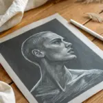
Have a question or want to share your own experience? I'd love to hear from you in the comments below!