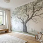
Leaves are basically nature’s ready-made paint tools—full of veins, shapes, and gorgeous imperfections that look amazing on paper. Here are my favorite leaf painting ideas, starting with the classics and building up to the more unexpected, artsy experiments.
Classic Leaf Stamp Prints
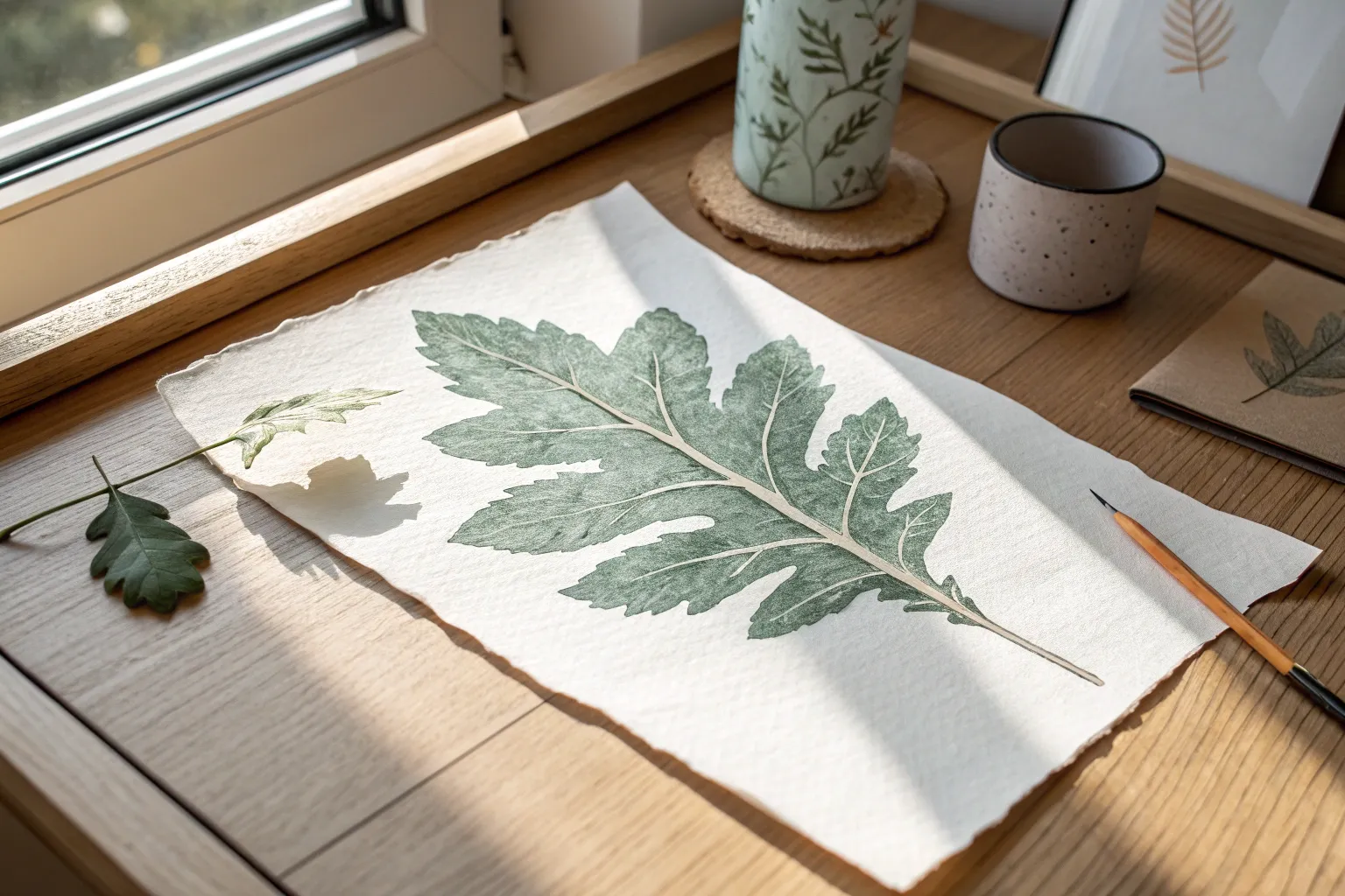
Capture the intricate beauty of a late-summer maple leaf with this detailed botanical painting project. Using translucent washes and fine brushwork, you’ll create a lifelike green leaf that seems to rest gently on the page.
Step-by-Step Guide
Materials
- Cold press watercolor paper (300 gsm)
- Real maple leaf (for reference)
- Watercolor paints (Sap Green, Olive Green, Burnt Umber, Yellow Ochre)
- Round watercolor brushes (size 6 for washes, size 0 or 00 for veins)
- Pencil (HB) and kneaded eraser
- Jar of clean water
- Palette for mixing
- Paper towels
Step 1: Sketching the Foundations
-
Select your subject:
Find a fresh, unblemished maple leaf to use as your model. A slightly flattened leaf works best if you plan to trace it, or you can place it beside your paper for direct observation. -
Outline the shape:
Lightly trace or draw the outline of the maple leaf onto your watercolor paper using an HB pencil. Keep your lines very faint so they won’t show through the translucent green paint later. -
Map the main veins:
Gently sketch the central vein running from the stem to the tip of the middle lobe. Then, add the primary veins radiating out to the other lobes. These will serve as your roadmap for painting.
Keep Edges Crisp
To get those sharp, pointy leaf tips perfect, always pull your brush stroke from the inside of the leaf outward, lifting the brush quickly at the end.
Step 2: Laying the Base Wash
-
Mix your base green:
Create a generous puddle of Sap Green on your palette. I like to mix in a tiny touch of Yellow Ochre to give it a warmer, more natural tone reminiscent of late summer foliage. -
Wet the paper:
Using your size 6 brush and clean water, dampen the entire interior of the leaf outline. The paper should glisten slightly but not be swimming in puddles. -
Apply the first wash:
Drop your mixed green paint into the wet area. Let the color flow naturally to the edges. Don’t worry about perfect evenness; the natural variation looks organic. -
Lift emerging highlights:
While the paint is still damp, rinse your brush, dry it on a towel, and gently lift a little pigment from the center of the lobes to create subtle highlights. -
Allow to dry completely:
This is crucial. Let the base layer bone dry before proceeding. The paper should feel room temperature to the touch, not cool.
Add Autumn Hints
For a seasonal transition effect, drop small spots of orange or reddish-brown watercolor onto the tips of the lobes while the green wash is still wet.
Step 3: Building Texture and Depth
-
Mix a darker olive tone:
Combine Olive Green with a speck of Burnt Umber to create a shadowed green. This will be used to define the structure of the leaf. -
Paint negative space veins:
Instead of painting the veins dark, try painting the leaf sections *between* the veins with this darker mix. This leaves the lighter base layer showing through as the vein network. -
Soften the edges:
As you paint these sections, soften the outer edges with a damp brush so the shadows blend gently into the rest of the leaf. -
Define the serrated finish:
Use the tip of your brush to crisply define the jagged, serrated edges of the maple leaf. A sharp edge here makes the leaf look crisp and realistic.
Step 4: Detailing and Vein Work
-
Switch to the fine brush:
Change to your size 0 or 00 brush for the delicate work. Mix a concentrate of Sap Green and Burnt Umber for the finest details. -
Enhance the primary veins:
Very lightly stroke a thin line of darker pigment along one side of the main veins to give them cylindrical volume and shadow. -
Add secondary webbing:
Paint the tiny, intricate web of smaller veins branching off the main ones. Keep your hand loose and light; these lines should be barely there. -
Create surface texture:
Scumble a fairly dry brush with darker green over areas that need more texture, mimicking the microscopic bumps found on a real leaf surface. -
Paint the stem:
Paint the long stem using a mix of Green and Burnt Umber. Add a darker shadow on the underside and a tiny touch of yellow at the very tip where it was attached to the tree. -
Final assessment:
Step back and look at your work. If any area looks too flat, glaze a very watery layer of green over it to unify the tones.
Once the paint is fully dry, your botanical illustration is ready to be framed or used as a stunning handmade card design
Layered Leaf Print Wreath
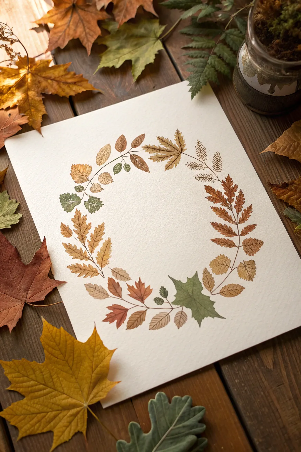
Capture the delicate beauty of fall with this hand-painted botanical wreath, featuring a diverse collection of leaf shapes arranged in a harmonious loop. The design uses earthy watercolors to celebrate the changing seasons, creating a piece that feels both rustic and refined.
Detailed Instructions
Materials
- Cold press watercolor paper (A4 or slightly larger)
- Watercolor paint set (focus on burnt sienna, yellow ochre, sap green, burnt umber, olive)
- Round watercolor brushes (Size 2 and Size 4)
- Fine liner brush (Size 0 or 00) for detailing
- HB pencil
- Circular object (bowl or compass) for tracing
- Kneaded eraser
- Paper towels
- Two jars of water
Step 1: Planning the Composition
-
Create the Guide:
Begin by lightly tracing a large circle in the center of your watercolor paper using a plate or a compass. This will serve as the spine for your wreath. -
Sketch the Leaf Placement:
Using your HB pencil, lightly sketch the outlines of various leaves along the circular path. Aim for variety: intersperse large maple shapes with slender fern-like fronds and smaller, rounded oak leaves. -
Refine and Lighten:
Once you are happy with the arrangement, roll a kneaded eraser over the sketch. You want the graphite lines to be barely visible so they don’t show through the final paint layers.
Wet-on-Dry Precision
For crisp edges like the ones shown here, always apply wet paint onto completely dry paper. Damp paper will cause the leaf shapes to bleed into one another.
Step 2: Painting the Foliage
-
Mix Your Palette:
Prepare puddles of your autumn tones. I like to keep a warm yellow ochre, a deep rust, a muted sage green, and a brown ready to go, mixing them slightly on the palette for natural variation. -
Start with the Maples:
Using a size 4 brush, paint the large maple leaf at the top right in a warm ochre-brown. Keep the wash fairly transparent to allow for layering later. -
Paint the Ferns:
Switch to a rust-orange hue and paint the fern-like fronds on the right side. Use the tip of your brush to make small, individual strokes for each leaflet, connecting them to a central stem. -
Add Green Accents:
Identify the leaves you sketched for greenery, such as the large leaf at the bottom right and the smaller clusters on the top left. Fill these in with a wash of olive or sage green. -
Fill the Gaps:
Work your way around the rest of the circle, painting the remaining oak and beech-style leaves in alternating shades of brown and reddish-orange to balance the color distribution. -
Let it Dry:
Allow the base layers of all leaves to dry completely before moving on. If the paper feels cool to the touch, it’s still damp.
Add Metallic Touches
Once the matte paint is fully dry, trace over just a few main veins with metallic gold watercolor or a gold gel pen for a subtle shimmer.
Step 3: Adding Detail and Veining
-
Mix Darker Tones:
Create darker, more concentrated versions of your original colors. You’ll need a dark brown for the most contrast, and deeper greens and reds for tone-on-tone details. -
Detail the Ferns:
With the size 0 fine liner brush, paint a central stem down the fern leaves in a dark rust color. Add tiny veins to each individual leaflet for a realistic texture. -
Vein the Green Leaves:
On the large green leaf at the bottom, paint a central vein and branching side veins using a darker olive-green mix. Keep lines thin and tapering. -
Add Texture to Brown Leaves:
For the ochre and brown leaves, use a sepia or burnt umber mix to draw fine veins. Don’t be afraid to add small serrated edges to the leaves if your initial wash was too smooth. -
Connect the Stem:
Carefully paint a thin, continuous (or slightly broken) brown line that weaves through the leaves, acting as the branch that holds the wreath together. -
Final Assessment:
Step back and look for any empty spots. You can add tiny berries or small single leaflets attached to the main stem to fill awkward gaps.
Frame your finished wreath or scan it to create your own seasonal greeting cards to share with friends
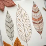
All-Over Leaf Print Pattern
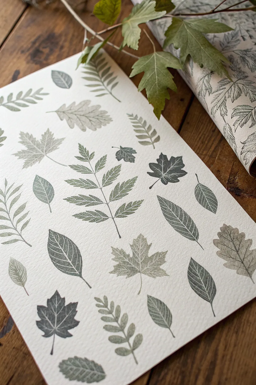
Capture the intricate veins and organic shapes of nature with this elegant all-over leaf print. Using fresh foliage as natural stamps creates a sophisticated, botanical pattern that looks beautiful as wall art or custom wrapping paper.
Step-by-Step
Materials
- High-quality printmaking paper or heavy cardstock (slightly textured)
- Collection of fresh, sturdy leaves (various shapes/sizes)
- Block printing ink (water-soluble) or acrylic paint mixed with textile medium
- Brayer (rubber roller)
- Sheet of glass or acrylic palette for rolling ink
- Scrap paper or newsprint
- Tweezers
- Paper towels
- Heavy book or barren (optional)
Step 1: Preparation
-
Select your botanicals:
Gather a variety of leaves from your garden or a walk. Look for leaves with prominent veins on the underside, as these will create the crispest prints. Ferns, maple leaves, and oak leaves work exceptionally well. Ensure they are fresh and not brittle. -
Flatten the specimens:
If your leaves are curling, press them under a heavy book for an hour. They need to be relatively flat to make full contact with the paper, but they don’t need to be dried or preserved. -
Prepare the palette:
Squeeze a small amount of block printing ink onto your glass or acrylic sheet. I suggest using a sage green and a deeper forest green to create depth. Use the brayer to roll the ink out until it sounds ‘sticky’ and has a velvety texture.
Step 2: Inking the Leaves
-
Position the leaf:
Place your first leaf on a piece of scrap paper with the veiny underside facing up. This is critical—the underside holds the texture we want to capture. -
Apply the ink:
Run the inked brayer over the leaf. Apply firm, even pressure to ensure the raised veins are coated, but try not to over-saturate the leaf, which can cause the ink to squish out and blur the details. -
Check coverage:
Look closely at the leaf surface. You want listing highlights on the veins without globs of ink in the spaces between them. If you see too much ink, gently blot it with a paper towel. -
Transfer to project paper:
Carefully pick up the inked leaf by its stem or with tweezers. Place it ink-side down onto your final art paper. commit to the placement; once it touches the paper, you shouldn’t shift it.
Clean Edges
Place a clean sheet of newsprint over the leaf before pressing/rubbing. This prevents ink on your fingers from smudging the background paper.
Step 3: Printing the Pattern
-
Pressing the print:
Place a clean piece of scrap paper over the leaf to protect your hands and the artwork. Using the heel of your hand or a clean brayer, press down firmly over the entire surface of the leaf. -
Reveal the image:
Remove the scrap paper. Grab the stem of the leaf and very slowly peel it back to reveal the print. The first reveal is always the most magical part. -
Repeat with variety:
Continue this process with different leaf shapes. I like to rotate the paper occasionally to ensure the leaves are pointing in various directions, creating a natural, random flow. -
Vary the tones:
Switch between your lighter sage and darker forest green inks. You can even mix a little grey into the green on your palette to achieve the muted, antique look seen in the photo. -
Create ghost prints:
For a fainter, textured look, try stamping a leaf a second time without re-inking it. These ‘ghost prints’ add excellent background depth. -
Fill the gaps:
As your paper fills up, look for smaller empty spaces. Use smaller, single leaves or partial sections of a fern to fill these voids and balance the composition.
Dual-Tone Leaves
Roll one half of a large leaf with dark green and the other with a lighter shade. The colors will blend beautifully in the middle where they meet.
Step 4: Finishing Touches
-
Assess the balance:
Take a step back and look at the overall pattern. If one area looks too sparse, add a small sprig or a single leaflet to even it out. -
Detail work (optional):
If a print came out imperfect or a stem didn’t transfer clearly, use a very fine brush with a tiny amount of diluted ink to carefully touch up the line, keeping it subtle. -
Let it cure:
Block printing ink takes longer to dry than standard acrylics. Allow your finished paper to sit undisturbed in a flat, dry area for at least 24 hours before framing or using it for wrapping.
The result is a stunning, nature-inspired print that perfectly reserves the delicate architecture of the leaves forever

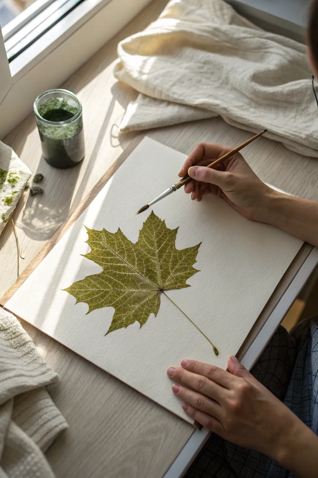
Watercolor Leaves From Real Life
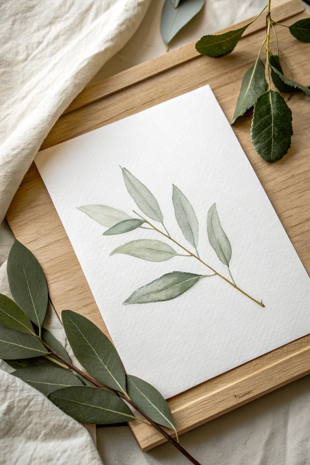
Capture the delicate grace of nature with this soft watercolor study of a slender leafy branch. Using gentle washes and a wet-on-wet technique, you’ll create diaphanous leaves that seem to float on the textured paper.
Step-by-Step Guide
Materials
- Cold press watercolor paper (300 gsm)
- Watercolor paints (Sap Green, Olive Green, Burnt Umber, Indigo)
- Round watercolor brush (size 4 or 6)
- Fine liner brush (size 0 or 1)
- Pencil (HB or H)
- Kneaded eraser
- Jar of clean water
- Paper towel
- Real branch reference (optional)
Step 1: Preparation and Sketching
-
Observe your subject:
If using a real branch locally, study how the leaves attach to the stem. Notice that the leaves on this specific specimen are elongated and taper to a point, similar to willow or olive leaves. -
Draft the central stem:
With a very light hand, draw a single, slightly curved diagonal line across your paper to represent the main stem. Keep the pressure minimal so the graphite doesn’t show through the translucent paint later. -
Sketch the leaf placement:
Lightly outline the simple shapes of the leaves branching off the stem. Alternate their positions—one left, one right—rather than having them perfectly symmetrical. Vary the angles so some point upward and others droop slightly. -
Refine the shapes:
Go back over your leaf outlines to add subtle curves and points at the tips. Keep the sketching very faint; use a kneaded eraser to lift up any dark graphite until only a ghost of the image remains.
Edge Control
To get crisp edges, wait for the paper to be bone dry before painting adjacent shapes. To get soft blends, paint while the paper is still damp.
Step 2: Painting the Leaves
-
Mix your base green:
Create a watery mix of Sap Green with a touch of Olive Green on your palette. You want a very tea-like consistency for the first layer to achieve that ethereal look. -
First leaf wash:
Load your round brush (size 4 or 6) with the watery mix. Start at the base of a top leaf and gently pull the color toward the tip. Let the water do the work, ensuring the paint doesn’t pool too heavily. -
Vary the tones:
For the next leaf, add a tiny drop of Indigo or more water to your puddle. Painting each leaf with a slightly different shade of green creates depth and realism. -
Wet-on-wet infusion:
While a leaf is still damp, touch the tip of your brush—loaded with a slightly darker, thicker green mix—to the base of the leaf. Watch the pigment naturally bleed outward. -
Leave highlights:
On a few leaves, try not to paint the entire shape flawlessly. Leave tiny slivers of white paper dry, perhaps along one edge or near the vein line, to suggest light reflecting off the surface. -
Texture the bottom leaf:
For the prominent bottom leaf, use a slightly drier brush technique (scumbling) near the edges to catch the tooth of the paper, creating a textured, organic feel. -
Allow to dry:
Let this first layer of leaves dry completely. If you paint adjacent wet areas too soon, they will merge into a single blobb shape.
Folded Leaf Effect
Paint only half of a leaf with a darker value, leaving a tiny white gap along the center vein before painting the other half lighter. This mimics a folded leaf.
Step 3: Stem and Details
-
Mix the stem color:
Combine Burnt Umber with a little of your green mix to create a brownish-green hue. It should be the consistency of milk—opaque enough to show up, but fluid. -
Paint the main stem:
Using your fine liner brush or the very tip of your round brush, carefully trace the central stem line. Make the line thicker at the bottom and let it taper into a hairline fracture at the top. -
Connect the leaves:
Draw tiny petioles (mini stems) connecting each leaf to the main branch. Ensure these connections look seamless and natural. -
Add central veins:
Once the leaves are bone dry, use a very dilute, watery mix of the stem color to paint a thin line down the center of each leaf. Keep this subtle; it shouldn’t look like a cartoon outline. -
Deepen shadows:
Identify where one leaf might overlap another or where the leaf attaches to the stem. Glaze a transparent layer of darker green (Sap Green + Indigo) over these tiny areas to pop the contrast. -
Final assessment:
Step back and look for balance. If the painting looks too flat, you can add a second layer of glaze to the bottom half of a few leaves to weigh them down visually.
Now you have a serene botanical study ready to frame or give as a thoughtful card
BRUSH GUIDE
The Right Brush for Every Stroke
From clean lines to bold texture — master brush choice, stroke control, and essential techniques.
Explore the Full Guide
Ink Outline With Painted Leaf Fills
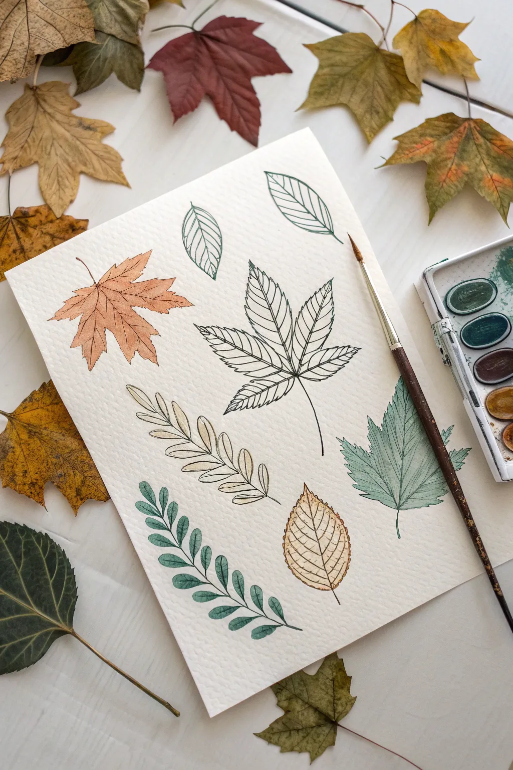
Capture the delicate structure of fall foliage by combining crisp ink illustrations with soft watercolor washes. This project balances precision drawing with loose, natural coloring for a sophisticated botanical study page.
Step-by-Step Tutorial
Materials
- Cold-press watercolor paper (at least 140lb/300gsm)
- Fine liner waterproof pigment pens (0.3mm and 0.1mm)
- Watercolor paint set (pans or tubes)
- Round watercolor brush (size 4 or 6)
- Pencil (HB or 2B)
- Kneaded eraser
- Real leaves for reference (optional)
- Water jar
- Paper towels
Step 1: Planning and Sketching
-
Gather inspiration:
Collect a variety of leaf shapes from outdoors or find reference photos. Aim for a mix of simple ovals, jagged maples, and compound fern-like structures to create a dynamic composition. -
Map out the positions:
Lightly visualize where each leaf will sit on your watercolor paper. Try to angle them differently—some pointing up, some diagonal—to mimic how they might fall on the ground. -
Sketch the central veins:
Using your HB pencil with very light pressure, draw the main stem and central vein for each leaf first. This establishes the ‘spine’ and flow of the leaf. -
Outline the leaf shapes:
Sketch the perimeter of each leaf around your center lines. Don’t worry about perfect symmetry; natural leaves have quirks and uneven edges. -
Add secondary veins:
Draw the smaller veins branching off the main stem. Keep these pencil lines faint, as they serve only as a guide for your ink work later.
Ink Confidence
Don’t try to draw straight, rigid lines. A slightly shaky or ‘broken’ line actually looks more organic and natural for botanical subjects.
Step 2: Inking the Structure
-
Trace with waterproof ink:
Take your 0.3mm waterproof pen and carefully trace over your pencil outlines. I find that pulling the pen towards my body gives me steadier lines than pushing it away. -
Detail the veins:
Switch to a finer tip, like a 0.1mm pen, for the interior veins. This creates a subtle visual hierarchy where the outline is bolder than the delicate inner texture. -
Let the ink cure:
Wait at least 15 minutes for the ink to dry completely. This is crucial—if the ink is wet, the watercolor step will smudge everything. -
Erase pencil marks:
Gently roll a kneaded eraser over the entire page to lift the graphite, leaving only the crisp black ink work.
Step 3: Watercolor Washes
-
Mix an autumn palette:
Prepare watered-down puddles of paint. You’ll need an earthy orange, a pale yellow, a muted green, and a brownish-yellow ochre. -
Paint the maple leaf:
Start with the orange maple leaf. Load your brush with watery orange paint and fill the shape. You don’t need to stay perfectly in the lines; a little looseness adds charm. -
Drop in shading:
While the orange leaf is still damp, touch a slightly darker rust color near the stem and center vein. The color will bleed naturally outward. -
Paint the compound leaf:
For the long, multi-leaf stem at the bottom left, use a cool, muted green. Paint each small leaflet individually rather than one long stroke. -
Create variation:
Move to the large central leaf. Instead of filling it entirely, paint just the veins or specific sections, or use a very pale wash so the ink drawing remains the star. -
Paint the simple oval leaves:
Use a yellow-ochre mix for the teardrop-shaped leaves. Keep the wash very transparent to mimic a dried, crispy leaf texture. -
Add the final green leaf:
Paint the jagged leaf on the right with a diluted sage green. To create a gradient, start painting at the bottom and add clean water to your brush as you move to the tips.
Fixing Smudges
If you accidentally smudge ink with paint, quickly blot it straight up with a clean tissue. Don’t rub! Turn the smudge into a shadow or dark spot.
Step 4: Final Touches
-
Dry completely:
Allow the paint to air dry fully. The paper should feel room temperature to the touch, not cool. -
Reinforce lines:
If any paint has obscured your black lines too much, go back with your fine liner to re-emphasize key overlaps or stems. -
Flatten the paper:
If the paper has buckled slightly from the water, place it under a heavy book overnight once it is 100% dry.
You now have a beautiful botanical study that celebrates the structural elegance of nature
Wet-on-Wet Autumn Leaf Bleeds
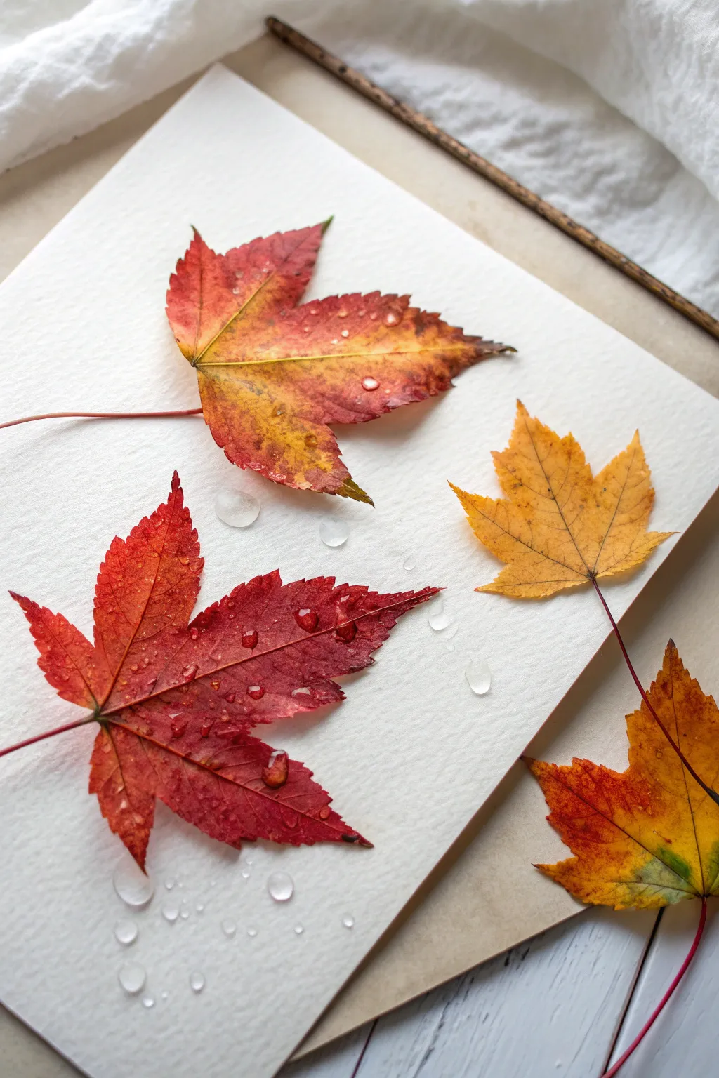
Capture the fleeting beauty of fall by painting these incredibly lifelike maple leaves using wet-on-wet watercolor techniques. The secret lies in building soft color gradients and adding painted water droplets for a stunning, tactile 3D effect.
Step-by-Step
Materials
- Cold press watercolor paper (300 gsm)
- Watercolor paints (Alizarin Crimson, Burnt Sienna, Yellow Ochre, Sap Green, Paynes Grey)
- Round pointed brushes (size 4 and size 0 for details)
- Clean water jar
- Paper towels
- Pencil (HB or H)
- White Gouache (for highlights)
Step 1: Sketching and Preparation
-
Observe your subjects:
Before startling, gather a few real maple leaves or reference photos to understand their jagged structure. Arrange your composition on the paper, placing three main leaves in a loose triangle and one peeking in from the bottom corner. -
Lightly outline:
Using an H pencil, very faintly sketch the outline of the four leaves. Keep your pressure extremely light so the graphite doesn’t show through the transparent watercolor later. -
Map the veins:
Draw the central stem and the primary veins extending to the lobe tips. Don’t worry about the tiny capillaries yet; just establish the main structure to guide your painting.
Bleeding edges?
If paint is rushing past your outline, your paper is too wet. wait 30 seconds for the sheen to dull, or blot your brush on a towel before touching the paper to control the flow.
Step 2: The Wet-on-Wet Wash
-
Pre-wet the first leaf:
Choice one leaf to start with—perhaps the large red one on the left. Using clean water and your size 4 brush, wet the entire inside area of the leaf shape. The paper should glisten but not have standing puddles. -
Drop in base yellow:
While the paper is wet, touch your brush loaded with Yellow Ochre to the center areas or tips where you want lighter tones. Watch the pigment bloom softly outward. -
Introduce crimson:
While the yellow is still damp, load your brush with Alizarin Crimson. Drop this color into the edges and lobes of the leaf, letting it bleed naturally into the yellow to create orange transitions. -
Deepen the tones:
For the darker, ‘burnt’ edges use a mix of Burnt Sienna or a tiny touch of Paynes Grey. Dab this carefully along the jagged points of the leaf to simulate crisp, drying edges. -
Lift for texture:
If a spot gets too dark, I like to use a thirsty (clean, damp) brush to lift a little pigment out, creating soft highlights that suggest undulation in the leaf surface. -
Repeat for all leaves:
Work on the other leaves one by one using this same method. Vary your color mixes—make the top leaf more orange-heavy and the right-side leaf heavily yellow with just brown tips.
Step 3: Veins and Details
-
Let it dry completely:
Wait until the paper is bone dry. If you touch it now, you will ruin the soft blends you just created. -
Paint the stems:
Using the size 0 brush and a mix of Alizarin Crimson and Burnt Sienna, paint the thin, long stems extending from the leaf bases. Keep the lines steady and fine. -
Detail the veins:
With the same thin brush and a slightly darker mix of your leaf color, paint thin lines over your initial pencil vein marks. Use broken lines occasionally to make it look more natural. -
Add imperfections:
Real leaves aren’t perfect. Add tiny speckles of brown or diluted black to simulate decay spots or natural blemishes on the leaf surface.
Level Up: Texture
Sprinkle a few grains of table salt onto the wet wash of one leaf. Let it dry completely before brushing it off. This creates stunning, starry textures that mimic decaying leaf spots.
Step 4: The Water Droplets
-
Outline the drops:
Choose a few spots on the leaves (and the paper background) to place water droplets. Lightly sketch small circles or ovals. -
Create the shadow:
Identify your light source (e.g., top left). Paint a thin, dark crescent shadow on the *opposite* side of the droplet (bottom right) using a dark grey mix. -
Cast the shadow:
Paint a small cast shadow strictly on the paper or leaf underneath the droplet, opposite the light source. This grounds the droplet. -
The highlight:
Using thick White Gouache or white watercolor straight from the tube, place a tiny, sharp dot on the top-left side of the droplet (the light source side). -
Background shadows:
Finally, paint a very subtle, diluted grey shadow underneath the leaves themselves, specifically on the side opposite your imaginary light source, to lift them off the white page.
Now you have a permanent collection of autumn foliage that looks fresh enough to pick up off the page

PENCIL GUIDE
Understanding Pencil Grades from H to B
From first sketch to finished drawing — learn pencil grades, line control, and shading techniques.
Explore the Full Guide
Metallic Vein Highlights on Leaf Prints
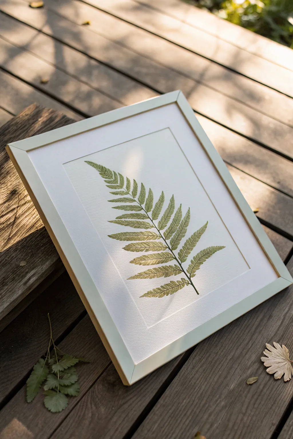
Capture the delicate structure of botanical specimens with this elegant leaf printing project that adds a touch of glamour through metallic accents. The result is a sophisticated, naturalistic print where the veins shimmer softly against the green, elevated by a classic embossed border.
Step-by-Step Guide
Materials
- Fresh fern frond (flat and intact)
- Heavyweight printmaking paper or watercolor paper (white)
- Block printing ink (sap green and olive green)
- Small brayer (rubber roller)
- Glass plate or acrylic sheet (for inking)
- Fine-point metallic gold gel pen or gold leafing pen
- Clean tweezers
- Baren or a clean wooden spoon
- Newsprint or scrap paper
- Embossing stylus (optional)
- Ruler
- Light-colored wood frame with mat board
Step 1: Preparing the Leaf and Ink
-
Select your specimen:
Choose a fern frond that is relatively flat and free of tears. If the fern is freshly picked, press it between heavy books for about an hour to flatten the spine without drying it out completely. -
Mix your palette:
Squeeze out a small amount of sap green and a tiny dot of olive green ink onto your glass plate. Mixing these creates a more natural, less artificial green tone. -
Charge the brayer:
Roll the brayer through the ink, lifting it and rolling it in different directions until you hear a consistent ‘static’ or sticky sound, indicating an even, thin layer of ink.
Clean Lines Tip
Place a barrier paper between your hand and the artwork while adding gold details. This prevents natural oils or sweat from smudging the green ink or warping the paper
Step 2: Printing the Base
-
Apply ink to the leaf:
Place your fern on a piece of scrap paper, vein-side up. Roll the inked brayer over the leaf, ensuring you cover every delicate frond tip. -
Check for coverage:
Look closely at the leaf. You want a consistent sheen of ink, but not so much that it globs in the spaces between the tiny leaflets. -
Transfer to paper:
Carefully lift the inked fern using clean tweezers. Hover it over your final heavyweight paper to align it centrally, then gently lower it down. -
Pressing the print:
Place a clean sheet of scrap paper over the fern. Using a baren or the back of a wooden spoon, rub firmly in circular motions over the entire area of the leaf. -
The reveal:
Remove the scrap paper. Use tweezers to grab the stem of the fern and peel it back slowly to reveal your green impression. -
Drying time:
Allow the green ink to dry completely. Since block printing ink can be thick, I usually give this at least 24 hours to ensure it won’t smudge during the detailing phase.
Level Up: Real Gold
Instead of a pen, apply gold leaf size to the main stem with a fine brush. Once tacky, press real gold leaf sheet onto it for a texture that truly catches the sun
Step 3: Adding Metallic Details
-
Study the veins:
Look at your reference fern or the print itself. Identify the central spine and the primary veins running through each leaflet. -
Trace with gold:
Using a fine-point gold gel pen or leafing pen, lightly trace the central stem of the fern print. -
Highlight the leaflets:
Use extremely light, feathery strokes to add gold highlights to the veins of the smaller leaves. You don’t need to outline everything; just catch the ‘light’ on the veins. -
Feathering technique:
Lift the pen at the end of each stroke to taper the line, making the metallic veins look organic rather than drawn-on.
Step 4: Finishing Touches
-
Create a faux plate mark:
To mimic the look of a professional etching press, measure a rectangle around your fern about 1 inch from the leaf edges. -
Emboss the border:
Place a ruler along your measured lines. Run an embossing stylus or a dry ballpoint pen pressing firmly along the ruler’s edge to create an indented border. -
Final inspection:
Check for any stray ink marks and carefully erase them or scrape them away lightly with a craft knife if the paper is thick enough. -
Frame your work:
Once fully dry, place the artwork into a simple, light wood frame with a clean white mat to let the botanical details stand out.
Hang your finished piece in a spot with natural light to catch the subtle glimmer of the gold veins throughout the day
Tape-Resist Leaf Grid Studies
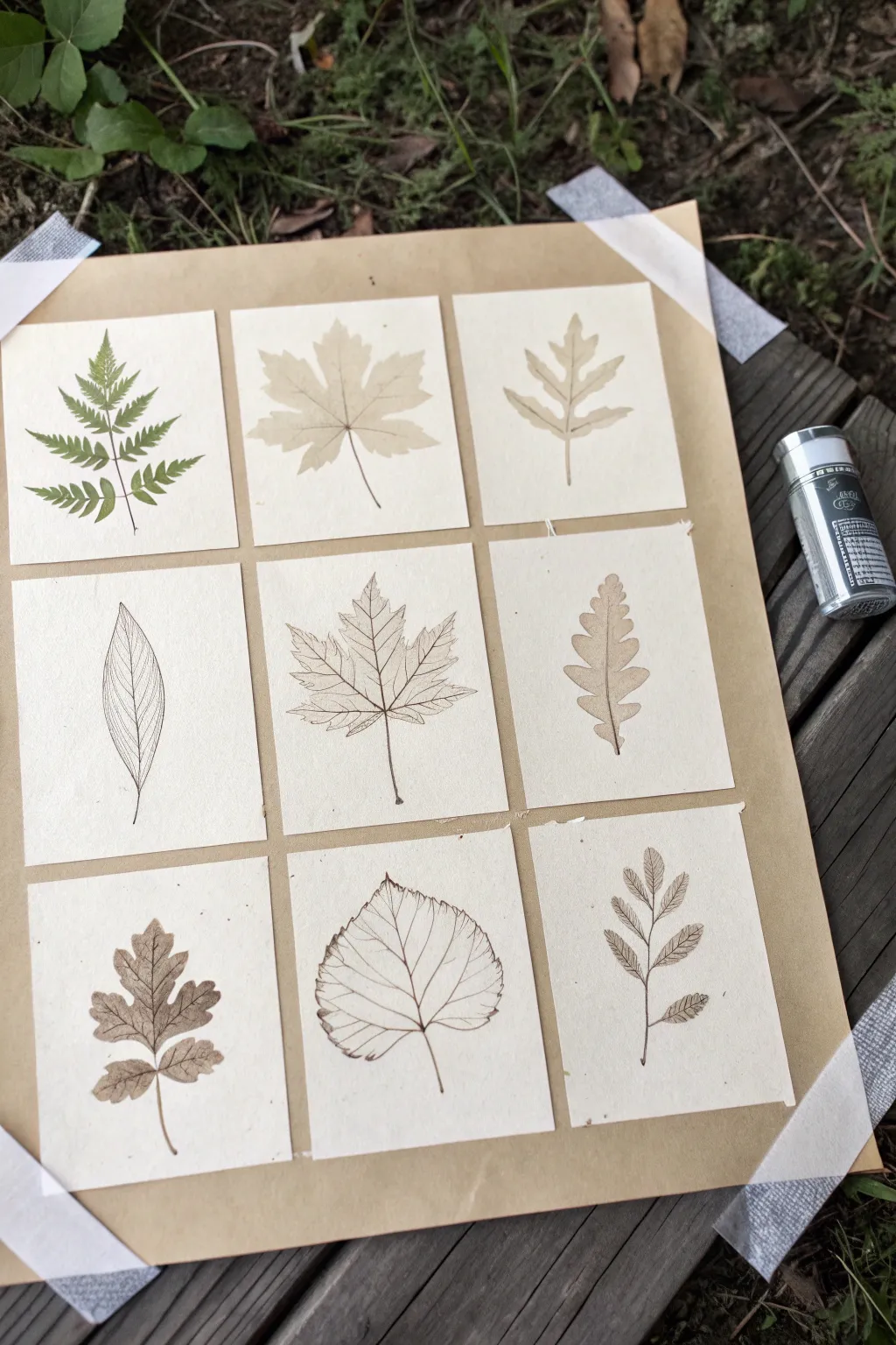
Capture the delicate beauty of different leaf specimens with this structured yet organic grid display. By combining pressed foliage, fine-line ink drawings, and soft watercolor washes, you’ll create a varied collection that feels like a vintage naturalist’s field guide.
Step-by-Step
Materials
- 9 squares of hot press watercolor paper (approx. 3×3 inches)
- Small fern fronds or delicate leaves for pressing
- Brown Kraft paper or mounting board (approx. 11×14 inches)
- White artist tape or washi tape
- Sepia or brown fine-liner pen (0.1mm and 0.3mm)
- Watercolors (sap green, burnt umber, yellow ochre)
- Small round paintbrush (size 2 or 4)
- Pencil and eraser
- Heavy books for pressing
- Ruler
Step 1: Preparation & Pressing
-
Gather specimens:
Collect a variety of small leaves from your garden or a walk. Look for distinct shapes: ferns, maple-like lobes, simple ovals, and serrated edges. You need at least three or four distinct types. -
Press fresh leaves:
Take the leaves intended for the ‘pressed’ squares (like the fern in the top left) and place them between sheets of paper inside a heavy book. Let them flatten for at least 24-48 hours until dry and crisp. -
Prepare the paper tiles:
Measure and cut your watercolor paper into nine identical squares. I find 3×3 inches works perfectly for small botanical studies without feeling cramped. -
Arrange the grid:
Layout your nine squares on the large Kraft paper board to visualize the composition. Space them evenly, leaving about a half-inch gap between each tile.
Step 2: Creating the Leaf Studies
-
Mount the pressed fern:
Select your best pressed fern or green leaf. Apply a tiny amount of glue to the back of the stem and center it on one of the top corner squares. Press gently to adhere. -
Sketch basic outlines:
For the illustrated squares, lightly sketch the leaf shapes in pencil first. Use the real leaves as references to get the proportions accurate. -
Ink the contour lines:
Using your 0.1mm sepia pen, trace over your pencil sketches. Use a very light hand; the line should feel fragile and organic, not bold or cartoonish. -
Add vein details:
Switch to an even finer pen or use the very tip of your current one to draw the central veins and smaller capillaries. Observe how the veins branch out—some are opposite, some alternate. -
Create a watercolor wash:
For the ‘shadow’ or wash-style leaves (like the top middle), mix a very watery tea-colored wash using burnt umber and a touch of ochre. Paint the silhouette of a leaf shape without adding ink lines. -
Layering color:
On the detailed ink drawings, you can add a whisper of color. Glaze a diluted brown or green over parts of the leaf, keeping it transparent enough that the ink lines show through clearly. -
Enhance texture:
For leaves with serrated edges or rough textures, use tiny stippling dots or short, broken lines with your pen to suggest the surface quality. -
Erase guidelines:
Once the ink is completely dry—give it a few minutes to be safe—gently erase any remaining pencil marks to clean up the sketches.
Uneven Spacing?
Cut a ‘spacer’ from scrap cardboard that matches your desired gap width (e.g., 0.5 inch). Place this between tiles as you glue them down for perfect alignment every time.
Step 3: Assembly
-
Position the tiles:
Place your finished squares back onto the Kraft board in a 3×3 layout. Use a ruler to ensure the spacing is uniform horizontally and vertically. -
Tape the corners:
Secure the Kraft board to your work surface or wall using artist tape at the corners to keep it flat while you attach the artwork. -
Attach the artwork:
Use double-sided tape or a small loop of masking tape on the back of each watercolor square to fix them permanently to the Kraft backing. -
Clean up borders:
If you used tape to mask the edges of your backing board, peel it away slowly at a 45-degree angle to reveal a crisp border.
Level Up: Coffee Stain
For a truly vintage look, lightly stain your watercolor paper squares with strong brewed coffee and let them dry completely before starting your drawings.
Hang your finished grid in a bright spot to enjoy the calming rhythm of nature indoors


Leaf Print Butterflies and Critters
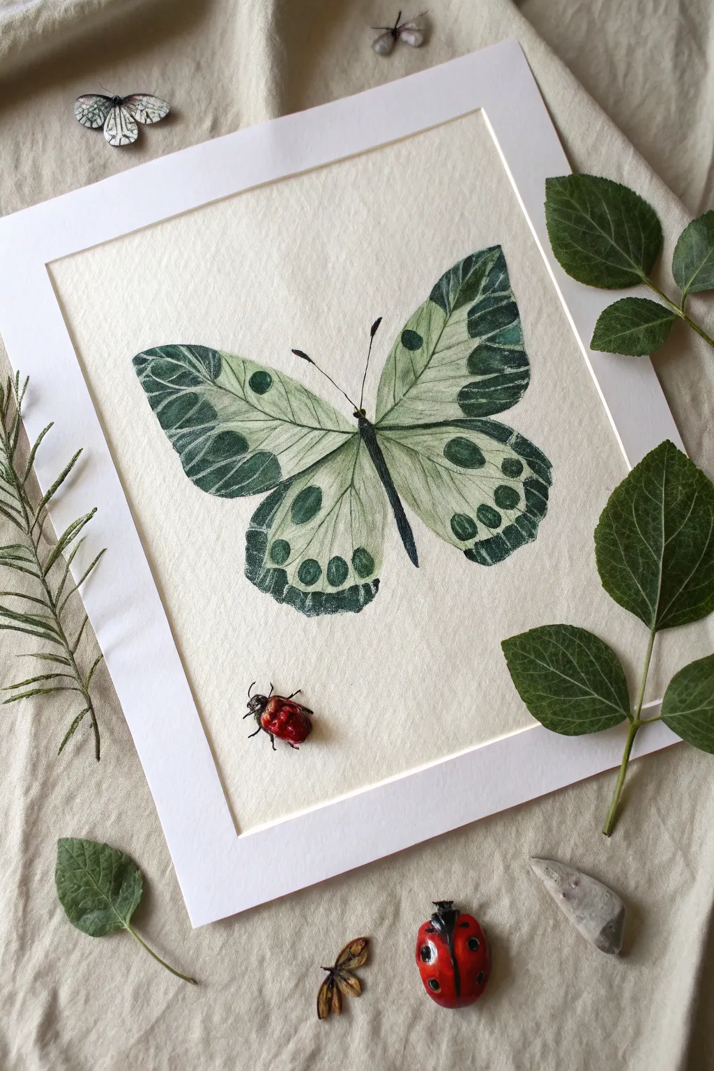
Transform fallen foliage into a stunning botanical specimen with this elegant printing project. By layering natural leaf textures with careful ink work, you’ll create a lifelike butterfly that captures the delicate veins and organic patterns of nature.
Step-by-Step Guide
Materials
- Fresh leaves with distinct veins (different sizes)
- Black and dark green block printing ink or heavy body acrylics
- Brayer or foam paintbrush
- White or cream textured watercolor paper
- Fine liner pens (black, 0.3mm and 0.5mm)
- Small round detail brush
- Pencil and eraser
- Scrap paper for testing
- White cardstock mat
- Dark green watercolor paint (optional for tinting)
Step 1: Planning and Printing
-
Select your botanical elements:
Gather four leaves to serve as the butterfly wings. You’ll need two larger, slightly elongated leaves for the top wings and two smaller, rounded leaves for the bottom. Fresh, flexible leaves with prominent vein structures on the underside work best. -
Sketch the layout:
Lightly trace the general position of your butterfly on the textured paper using a pencil. Mark a central line for the body to ensure symmetry, but keep the marks faint so they are easily erased later. -
Prepare the ink:
Mix a small amount of dark green ink with a touch of black to create a deep, forest green hue. If using acrylics, ensure the consistency is thick but spreadable, not watery. -
Ink the upper wings:
Using a brayer or foam brush, apply a thin, even layer of ink to the veined underside of your first large leaf. Ensure the ink covers the edges but doesn’t pool in the crevices. -
Print the first wing:
Carefully place the inked leaf onto your paper in the upper-left position relative to the body line. Place a scrap piece of paper over it and press firmly with your palm to transfer the details without smudging. -
Complete the wing structure:
Repeat the inking and pressing process for the right upper wing, mirroring the angle. Then, do the same for the two lower wings, overlapping them slightly with the upper ones to create a cohesive shape.
Step 2: Painting and Refining
-
Let the prints dry:
Allow the leaf prints to dry completely. This prevents smearing when you add details later. I usually wait about 20 minutes depending on the ink thickness. -
Paint the body:
Using a small round brush and black paint or ink, paint the butterfly’s thorax and abdomen down the center line. Create a segmented look by varying the width slightly, tapering to a point at the bottom. -
Add the antennae:
With a fine liner pen or the very tip of your brush, draw two delicate antennae curving outward from the head. Make the lines smooth and confident. -
Enhance the veins:
Take a fine black pen and carefully trace over the major veins created by the leaf print. You don’t need to trace every line; just emphasize the main structural veins to give the wings more definition. -
Paint wing spots:
Using the dark green ink or paint, add circular ‘eye spots’ to the wings. Place large spots on the upper wings and a series of smaller dots along the bottom edge of the lower wings. -
Add dark edges:
With a slightly drier brush, gently darken the outer tips of the wings. Feather the dark green paint inward to blend it with the leaf texture, giving the wings a natural, aged appearance. -
Define the borders:
Use the fine liner to add very subtle contour lines around the spots and the edges of the wings, sharpening the silhouette against the cream paper. -
Erase guidelines:
Once all ink and paint are fully dry, gently erase any visible pencil marks from your initial sketch. -
Mount the artwork:
Place the white cardstock mat over your finished piece to frame it cleanly, centering the butterfly within the window.
Clean Edges
If your leaf print smudges outside the desired shape, wait for it to dry, then use white gouache or acrylic paint to carefully mask the error and reshape the wing edge.
3D Effect
Cut the butterfly out entirely and mount it on foam adhesive squares inside the frame. This casts a shadow behind the wings, making it look like a real specimen.
Hang your botanical beauty on a wall that catches soft daylight to highlight the intricate textures you’ve captured
Leaf Garland Border on Paper
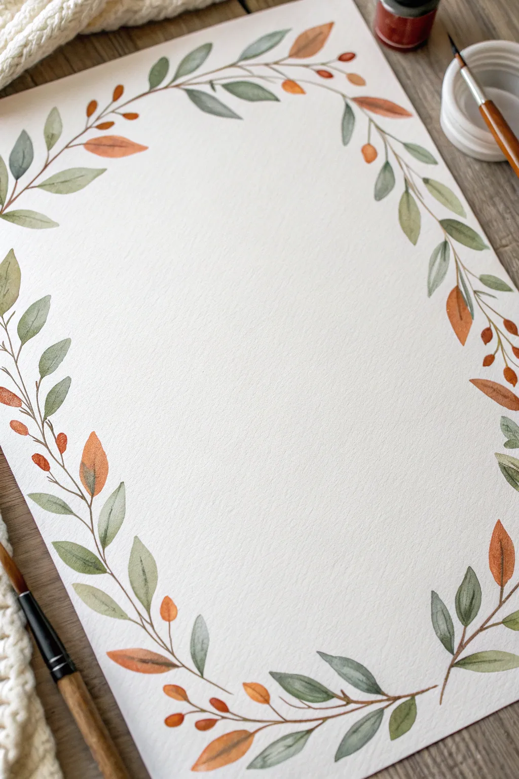
Capture the gentle transition of seasons with this delicate watercolor leaf garland. Using a harmonious palette of muted sage greens and warm terracottas, this project creates a sophisticated border perfect for stationery, journals, or wall art.
How-To Guide
Materials
- Cold-press watercolor paper (300 gsm)
- Watercolor paints (Sage Green, Olive Green, Burnt Sienna, Orange)
- Round brushes (size 2 and size 6 or 8)
- Pencil (HB or lighter)
- Eraser
- Jar of clean water
- Paper towel
Step 1: Planning and Sketching
-
Mark the boundaries:
Begin by lightly marking the four corners of your paper where the garland will curve. This visual guide ensures your border stays balanced without becoming too crowded. -
Sketch the main vine:
With a very light hand, draw a single, flowing line that meanders around the perimeter of the page. Let the line break occasionally; it doesn’t need to be perfectly continuous, just a path for your leaves to follow. -
Indicate leaf placement:
Lightly dash or tick small marks along the vine where you plan to place major leaf clusters. Keep them somewhat evenly spaced but vary the angle to keep it organic.
Step 2: Painting the Greenery
-
Mix your greens:
Prepare two shades of green on your palette: a deeper olive tone and a lighter, watery sage. I like to keep them quite diluted to maintain that translucent watercolor look. -
Paint the first leaves:
Using your larger round brush, load it with the lighter sage mix. Press down near the stem line and lift as you pull away to create a teardrop leaf shape. -
Add variety with olive tones:
While the first leaves are damp, paint adjacent leaves using the darker olive mix. Touching a wet light leaf with a darker brush can create a beautiful, soft bleed between colors. -
Vary direction and size:
Ensure some leaves point outward toward the paper’s edge and others point inward. Alternate between larger, full leaves and smaller, younger shoots. -
Connect the stems:
Switch to your size 2 brush. Using a mix of brown and green, carefully paint the thin stems connecting your floating leaves to the main vine line you sketched earlier.
Wet-on-Wet Magic
Drop a tiny amount of clear water onto a painted leaf while it’s still wet. It pushes the pigment to the edges, creating a natural, hard-edge outline effect.
Step 3: Adding Warm Autumn Accents
-
Mix the orange tones:
Create a warm, earthy orange by mixing Burnt Sienna with a touch of bright orange or red. You want a color that looks like dried autumn foliage, not a neon pumpkin. -
Insert accent leaves:
Look for gaps in your greenery. Paint single, slender orange leaves in these varied spaces. These serve as the focal points that warm up the composition. -
Add berries and buds:
Using the tip of your small brush and a slightly more saturated orange, dot small berries or buds at the ends of thin stems. Group them in pairs or trios for a natural look. -
Layering for depth:
Once your initial green leaves are dry, you can carefully paint a small orange stem or leaf overlapping a green one. This transparency adds lovely dimension.
Metallic Touch
Once fully dry, trace fine veins on the larger leaves using a gold gel pen or metallic watercolor for a subtle, elegant shimmer.
Step 4: Final Details
-
Refine the stems:
Go back over your main vine line with the fine brush and a dark brown-green mix. Make the line clearer in some spots and let it fade out in others. -
Check for balance:
Step back and view the whole page. If a corner feels empty, add a small floating leaf or a tiny twig to fill the space without overworking it. -
Erase guidelines:
Wait until the paint is bone dry—touch it with the back of your hand to check. Gently erase any visible pencil marks to clean up the illustration.
Now you have a beautifully framed page ready for calligraphy or a heartfelt letter
Abstract Leaf Mandala Layers
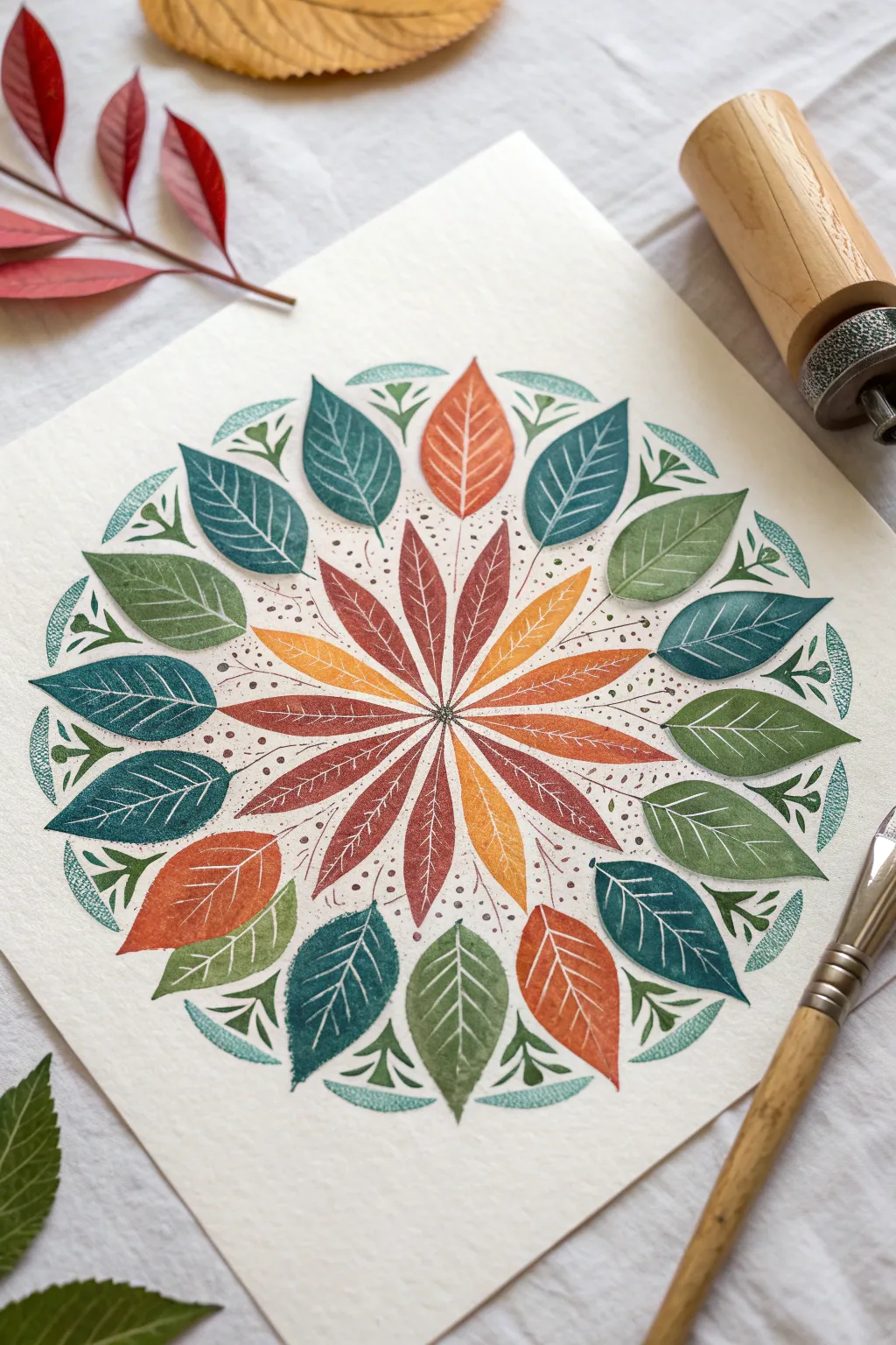
This project combines the organic beauty of botanical forms with the meditative symmetry of a mandala. By layering stamped leaf shapes in rich autumnal teals, burnt oranges, and olive greens, you’ll build a vibrant design that radiates outward from a central starburst.
Step-by-Step Guide
Materials
- Heavyweight cold-press watercolor paper or mixed media paper
- Gouache or matte acrylic paints (teal, burnt orange, olive green, deep red, yellow ochre)
- Pencil and eraser
- Compass or circular objects for tracing
- Ruler
- Synthetic oval wash brush (size 1/2 inch) or filbert brush
- Fine liner brush (size 0 or 00) for details
- Palette for mixing paint
- Optional: Real leaves or foam stamps for texture reference
Step 1: Preparation and Layout
-
Find the center:
Begin by finding the exact center of your paper. I like to lay a ruler diagonally from corner to corner to mark a light ‘X’ where they intersect, ensuring perfect symmetry. -
Draw guide circles:
Using a compass anchored at your center point, draw three light concentric circles. The smallest circle will guide the inner starburst, the middle circle is for the main ring of leaves, and the largest circle marks the outer decorative edge. -
Mark radial guides:
Use your ruler to draw very faint straight lines intersecting through the center point, dividing your circle like a pizza into 12 or 16 equal sections. These lines will help keep your leaf tips pointed perfectly inward.
Uneven Spacing?
Don’t panic if your leaves aren’t perfectly spaced. Fill larger gaps with extra ‘floating’ dots or tiny teardrop shapes to balance the visual weight without repainting.
Step 2: The Central Starburst
-
Mix the core colors:
Prepare a palette of warm, earthy tones: burnt orange, ochre, and a deep reddish-brown. The paint consistency should be creamy but opaque, similar to heavy cream. -
Paint the first ray:
Starting at the very center point, paint a long, thin, petal-like shape extending outward along one of your pencil guidelines, ending just inside the first small circle. -
Complete the inner radial:
Continue painting these thin, lance-shaped leaves around the center, alternating colors between rusty red and golden yellow. Ensure the tips all meet cleanly in the middle. -
Add texture:
While the paint is just barely tacky, you can use a dry brush or even a small sponge to lift a tiny bit of pigment, giving it that stamped, textured look characteristic of leaf prints.
Make it Metallic
Once the drying is complete, trace the main veins of the largest leaves with a metallic gold or copper gel pen to add a stunning shimmer that catches the light.
Step 3: The Main Leaf Ring
-
Mix cool tones:
For the next layer, mix a deep teal blue, a sage green, and muted olive. These cool tones will create a beautiful contrast against the warm center. -
Paint the broad leaves:
In the spaces between the inner starburst rays, paint larger, oval-shaped leaves. Base these on your middle guide circle. The bottom of these leaves should tuck near the starburst, and the tips should point outward. -
Alternate colors:
Work your way around the circle, alternating your teals and greens. Keep a steady hand to define the leaf edges clearly, leaving a small, consistent gap of white paper between each shape. -
Create vein details:
Once the base shapes are dry, mix a slightly lighter shade of each color (add a touch of white or yellow). Use your finest liner brush to paint delicate central veins and branching lines on each large leaf.
Step 4: Outer Details and Finishing
-
Add the outer rim:
Along the outermost pencil circle, paint smaller leaf shapes or tiny botanical sprigs using a blue-green shade. These should curve gently to follow the arc of the circle. -
Incorporate small dots:
Dip the handle end of a paintbrush into dark paint. Dot tiny specks around the central starburst and between the larger leaves to add texture and fill negative space. -
Refine the edges:
Check your perimeter. If the outer circle feels uneven, add small triangular stamps or tiny floating leaves to balance the visual weight of the mandala. -
Intertwine delicate vines:
Using diluted brownish-red paint and your liner brush, draw very faint, whisper-thin stems connecting some of the floating elements, giving the piece a cohesive, bound feel. -
Erase guidelines:
Allow the artwork to dry completely—give it at least an hour to be safe. Then, gently erase any visible pencil lines from your initial layout.
Take a step back to admire the rhythm and symmetry of your botanical creation
Painted Paper Cutout Leaf Collage
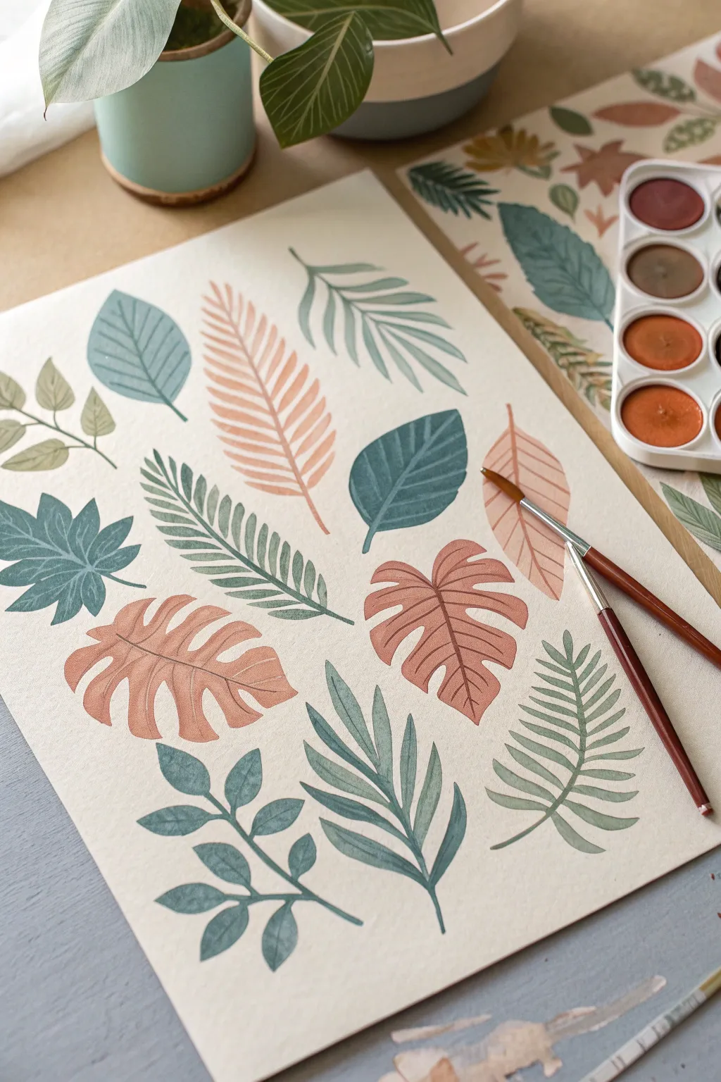
Create a calming, nature-inspired composition by painting a variety of stylized leaf shapes in a muted, earthy color palette. This project focuses on brush control and delicate veining details to produce a serene botanical illustration perfect for framing.
Detailed Instructions
Materials
- Cold press watercolor paper (300 gsm)
- Watercolor paints (Pan set: muted greens, burnt sienna, dusty rose, ochre)
- Round watercolor brushes (Size 4, Size 6)
- Fine liner brush (Size 0 or 1)
- Pencil (HB or H)
- Kneaded eraser
- Clean water
- Paper towels
- Mixing palette
Step 1: Planning and Sketching
-
Analyze the Composition:
Observe the layout of the leaves. Notice how they are spaced evenly but with variety in orientation. There is a mix of simple ovals, compound leaves, palm-like fronds, and monstera-style split leaves. -
Lightly Sketch Outlines:
Using your HB pencil, very faintly draw the basic outline of each leaf shape on your watercolor paper. Keep your lines incredibly light so they won’t show through the translucent paint later. Avoid drawing the internal veins at this stage. -
Clean Up the Sketch:
If any lines became too dark, gently roll a kneaded eraser over the page to lift excess graphite without erasing the guides completely.
Fixing Blooms
If you see ‘cauliflower’ blooms where water pooled, don’t panic. Once dry, paint the veins directly over these textured areas; the detail work usually disguises the uneven drying.
Step 2: Painting Base Layers
-
Mix Your Palette:
Prepare your colors on the mixing palette. You’ll need a range of earth tones: a soft sage green, a deeper forest green, a warm terracotta orange, and a dusty pink. Adding a touch of brown to your greens helps achieve that natural, vintage look. -
Paint Solid Rounded Leaves:
Start with the simple, blue-green rounded leaves. Load your Size 6 brush with a watery mix of blue-green and fill the shape. Keep the wash even. I like to let the puddle settle slightly to avoid streaks. -
Paint the Fern Fronds:
Switch to a warmer, dusty pink or terrain cotta for the large, feather-like fern shapes. Use the tip of the brush to create the sharp points of the frond segments. -
Create the Monstera Shapes:
Using the same dusty pink or a warm ochre, paint the broad, split-leaf philodendron shapes. Work carefully around the negative space of the splits to keep edges crisp. -
Paint Complex Compound Leaves:
For the leaves that look like stems with many small leaflets (bottom left), use a deep blue-green. Paint the central stem first with a thin line, then add the attached leaflets one by one. -
Fill Remaining Shapes:
Continue painting the remaining leaf outlines, alternating colors so that similar shades aren’t right next to each other. Use varied greens for the spiky, palm-like leaves. -
First Drying Phase:
Allow the entire page to dry completely. The paper must be bone dry before you add veins, or the lines will bleed into the base shapes.
Cutout Collage
Instead of leaving this as a sheet, carefully cut out each dried leaf. You can then glue them onto a dark cardstock background for a striking botanical collage effect.
Step 3: Adding Details and Veins
-
Prepare Detail Paint:
Mix slightly more concentrated versions of your base colors. You want the veins to differ subtly in tone—either slightly darker or slightly distinct hue—from the base leaf color. -
Line the Monstera Leaves:
Using your fine liner brush (Size 0), paint a thin central vein down the dusty pink monstera leaves. Add curved lines extending toward the leaf edges. -
Detail the Basic Leaves:
For the simple blue-green oval leaves, paint a straight central spine. Then, using very light pressure, flick fine diagonal lines upward from the spine to the edge. -
Leave White Space:
On some leaves, like the large serrated fronds, use a darker paint to create the vein, but consider leaving a microscopic gap of unpainted paper between the vein and the leaf segments for a stylized ‘cutout’ effect. -
Add Contrast to Dark Leaves:
For the darkest green leaves, mix a very deep indigo-green used purely for the veins to ensure they are visible against the dark background wash. -
Final White Gouache Accents (Optional):
If some base layers are too dark for watercolor veins to show, you can mix a tiny bit of white gouache with your color to create opaque, lighter veins for contrast.
Step 4: Finishing Touches
-
Review and Refine:
Look over the composition. If any stems stop abruptly, extend them slightly with the fine brush to ground the leaves. -
Erase Stray Marks:
Once you are 100% certain the paint is dry (check by touching the back of the paper—it should not feel cool), gently erase any remaining pencil marks.
Step back and admire your sheet of delicate, earthy botanical studies
Ghost Leaves With Wax Resist Washes
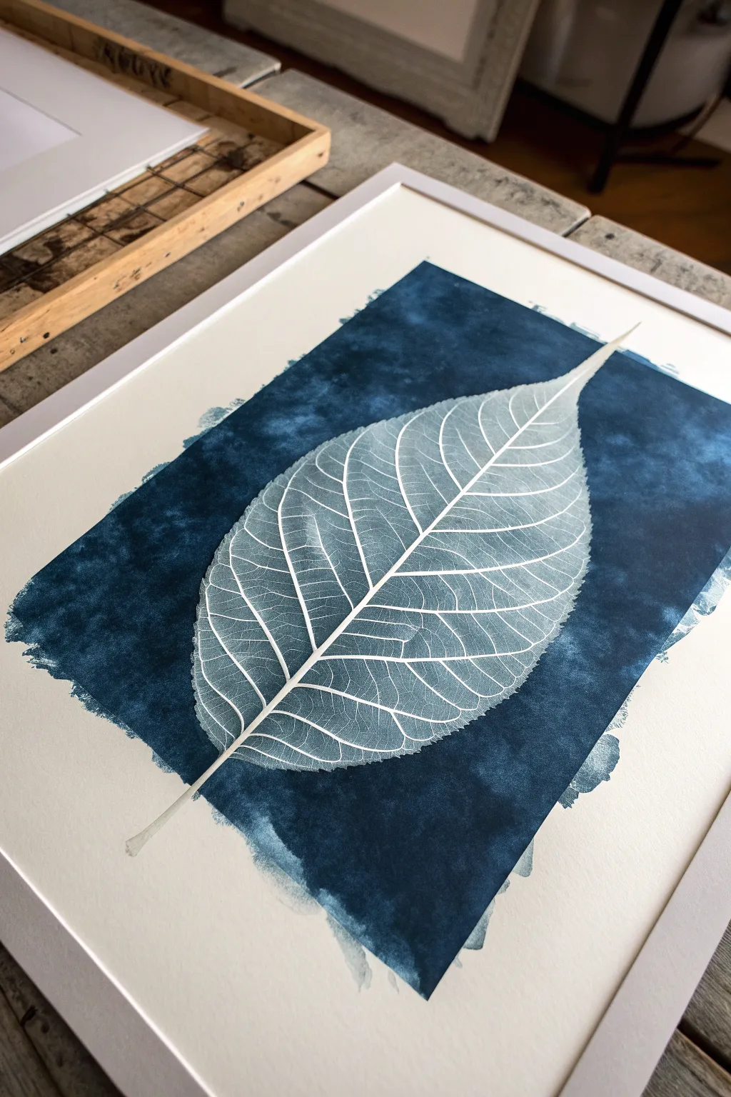
This striking project captures the ethereal beauty of a leaf skeleton using a simple wax resist technique against a moody, indigo background. The white lines of the leaf emerge like a ghost from the deep blue wash, creating a high-contrast piece that feels both organic and modern.
Step-by-Step Tutorial
Materials
- Heavyweight watercolor paper (300 gsm/140 lb, cold press)
- Clear wax crayon or oil pastel (sharpened)
- White colored pencil (wax-based) or masking fluid pen
- Real leaf skeleton (for reference)
- Indigo or Prussian Blue watercolor paint (tube preferred)
- Large flat wash brush (1 inch or wider)
- Round detail brush (size 2 or 4)
- Paper towels
- Painter’s tape
- Drawing board
- Pencil (HB or H)
Step 1: Preparation & Sketching
-
Secure the paper:
Tape your watercolor paper down to a drawing board on all four sides. This prevents the paper from buckling when we apply the heavy wash later. -
Lightly sketch the shape:
Using a hard pencil (H or HB), very faintly draw the outline of your leaf. Keep the pressure minimal so the graphite doesn’t smudge or become visible later. -
Map the veins:
Sketch the central stem running diagonally across the page, then add the primary veins branching out. Don’t worry about tiny details yet; just get the main structure in place.
Too Much Blue?
If the wax isn’t resisting well, your paint might be too watery or you didn’t press hard enough. Let it dry, re-apply wax firmly, and add a second glaze of darker paint.
Step 2: Applying the Wax Resist
-
Outline with wax:
Take your sharpened clear wax crayon or white wax pencil. Firmly trace over your pencil outline. Press hard enough to leave a solid layer of wax on the tooth of the paper. -
Define the main veins:
Go over the central vein and the larger offshoots with the wax. I find that rotating the paper helps me get smoother, more confident lines during this step. -
Add intricate netting:
This is the most crucial step for realism. Draw the tiny, interconnected net-like veins between the larger ones using the sharp edge of your crayon. These fine lines are what mimic a leaf skeleton. -
Check your work:
Tilt your paper under a light source. The wax will shine slightly against the matte paper. Fill in any gaps where the line creates a break, ensuring the ‘skeleton’ is fully protected. -
Clean the surface:
Use a soft brush or a puff of air to blow away any wax crumbs. You don’t want stray crumbs creating accidental white spots in your background.
Add Metallic Shimmer
Once the blue ink is dry, dilute a tiny bit of silver or pearl watercolor and glaze it over portions of the background for a dreamy, moonlit frost effect.
Step 3: Creating the Indigo Wash
-
Mix the paint:
Squeeze a generous amount of Indigo or Prussian Blue watercolor into your palette. Add just enough water to make it fluid, but keep it highly concentrated for that deep, dark ink look. -
Wet the background area:
Optional: lightly mist the paper with water, but don’t soak it. This helps the paint flow but keeps the edges rough. -
Start the wash:
Load your large flat brush fully. Starting from the center and working outward, sweep the blue paint boldly across the paper. -
Cover the leaf:
Paint directly over your wax drawing. Do not hesitate. As the brush passes over the wax, the white lines will magically repel the paint and appear instantly. -
Create the rough edge:
Allow the brush strokes to end naturally without reaching the tape edge. Let the bristles create a ragged, painterly border that frames the leaf. -
Intensify the color:
While the first layer is still wet, drop more concentrated pigment into the areas immediately surrounding the leaf veins to increase the contrast.
Step 4: Finishing Touches
-
Blot excess paint:
If paint pools on top of the wax lines, gently dab it with a clean paper towel. Be careful not to smudge the surrounding wet paper. -
Dry completely:
Let the painting dry naturally on a flat surface. Using a hair dryer is risky here as it might melt the wax and blur your crisp lines. -
Remove tape:
Once the paper is bone dry and cool to the touch, peel the tape away slowly at a 45-degree angle. -
Frame it:
Place your artwork in a clean white frame with a mat to emphasize the stark contrast of the blue and white.
Hang your new botanical artwork in a well-lit spot to admire the delicate interplay of negative space and rich color
Have a question or want to share your own experience? I'd love to hear from you in the comments below!