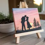
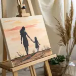
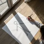
When you’re trying to draw a soulmate bond, it’s less about perfect faces and more about that feeling of fate, comfort, and “you’re my person.” Here are my favorite soulmate drawing ideas—starting with classic symbols and sliding into more creative, artsy metaphors as you go.
Sun and Moon in a Quiet Kiss
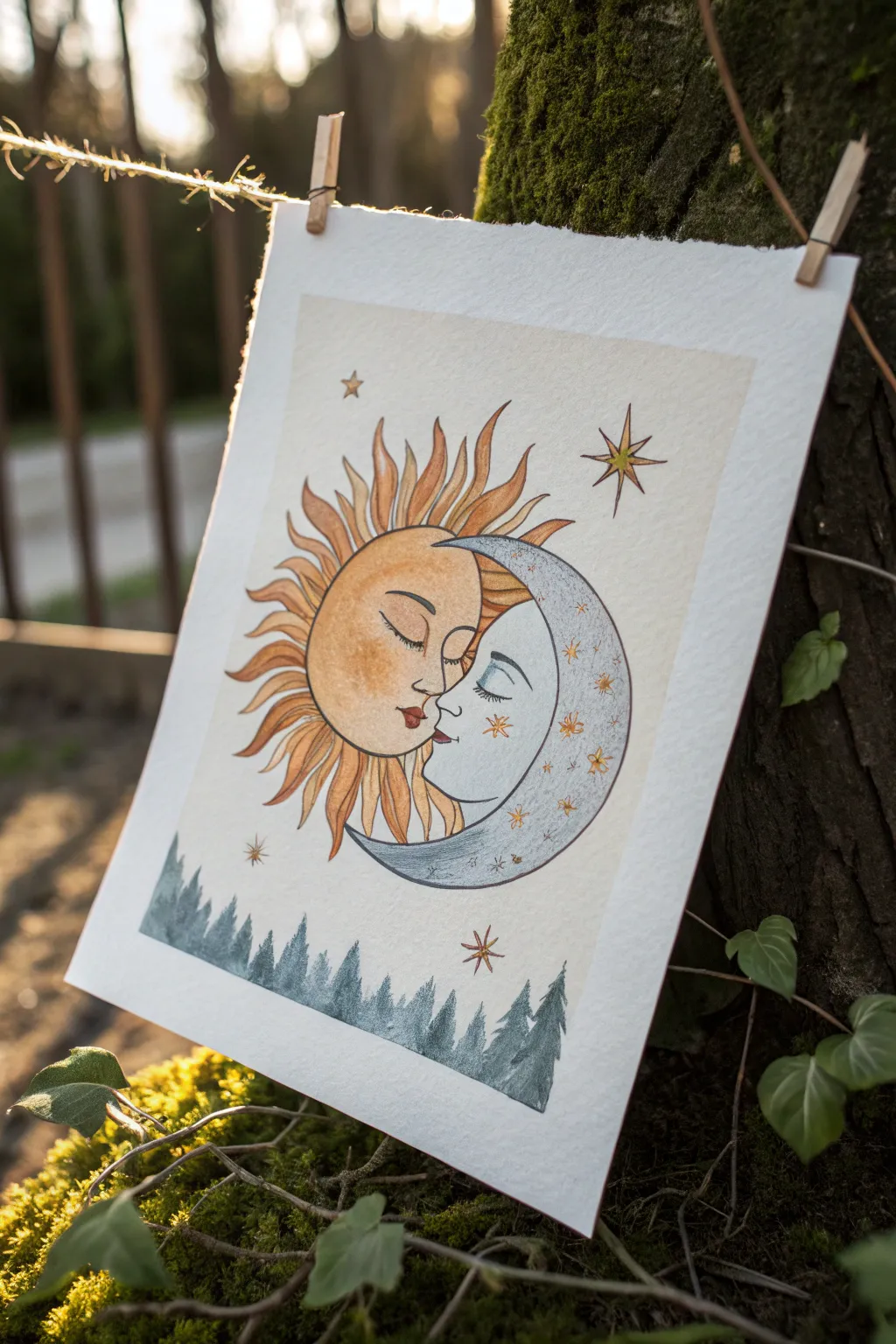
Capture the timeless romance of the cosmos with this delicate watercolor and ink illustration featuring a sun and moon locked in a gentle kiss. The warm and cool tones create a beautiful balance, perfect for symbolizing opposites attracting.
Step-by-Step Guide
Materials
- Cold-press watercolor paper (300 gsm)
- Watercolor paints (Yellow Ochre, Burnt Sienna, Payne’s Grey, Indigo)
- Fine liner pens (Black, 0.1mm and 0.3mm)
- Round watercolor brushes (Size 2 and 4)
- Gold metallic watercolor or gel pen (optional for accents)
- Soft graphite pencil (HB) and eraser
- Masking tape
- Pencil sharpener
Step 1: Sketching the Composition
-
Establish the shapes:
Begin by lightly sketching two overlapping circles in the center of your page. The left circle will become the sun face, and the right circle will be the crescent moon shape cuddling into it. -
Define the profiles:
refined the intersection of the circles into two profiles facing each other. Draw closed eyes with long lashes on both faces and shape their lips so they meet in a soft, non-overlapping kiss. -
Add the rays:
Sketch wavy, flame-like rays radiating from the sun side. Vary the lengths and curves to give it a dynamic, fluid look, ensuring they don’t encroach too much into the moon’s space. -
Draw the environment:
below the celestial bodies, lightly pencil in a jagged tree line to anchor the composition. Scatter a few four-pointed and eight-pointed stars around the upper empty spaces.
Uneven Watercolors?
If your paint dries with hard edges (blooms), soften them by scrubbing gently with a clean, damp brush before the paint fully sets to blend the harsh line.
Step 2: Painting the Sun
-
Base wash:
Load your size 4 brush with a watery mix of Yellow Ochre. Apply this pale wash over the entire sun face, avoiding the lips. -
Adding warmth:
While the base is still slightly damp, drop in touches of Burnt Sienna on the cheeks and eyelids to create a blushing effect. This wet-on-wet technique keeps the transitions soft. -
Painting the rays:
Switch to a slightly more saturated orange or Burnt Sienna mix. Carefully paint the sun rays, leaving tiny slivers of white paper between some rays if you want extra definition. -
Intensifying the shadows:
Once the first layer is dry, glaze a darker orange tone near the base of the rays where they meet the face to add volume.
Add Some Magic
Use gold leaf adhesive and foil on the sun’s rays or the larger stars for a truly metallic shine that catches the light better than paint.
Step 3: Painting the Moon and Stars
-
Cool tones:
Mix a very dilute wash of Payne’s Grey or a soft blue-grey. Paint the moon’s crescent shape, keeping it much paler than the sun to differentiate the two celestial bodies. -
Textural details:
I like to splatter teeny tiny drops of clean water onto the moon while the paint is drying, or dab it with a tissue, to create a crater-like texture. -
Starry accents:
Use Yellow Ochre or a gold metallic paint to fill in the stars surrounding the couple. You can also add tiny gold dots onto the moon’s cheeks for a magical freckle effect. -
Red details:
Using a tiny brush and concentrated red or dark orange paint, carefully fill in the lips on the sun face.
Step 4: Grounding and Lining
-
The forest floor:
Mix Indigo with a touch of Payne’s Grey for the trees. Using the tip of your brush, paint the evergreen trees at the bottom, using short, downward strokes to mimic pine needles. -
Creating depth:
Make the trees in the foreground darker and sharper, while adding more water to the mix for trees that appear further back or fade off the edges. -
Inking the outlines:
Once the paint is completely bone-dry, use a 0.1mm black fine liner to trace over your pencil lines. Use a steady hand to outline the profiles, rays, and moon curve. -
Adding facial features:
Inking the eyelashes requires a very light touch; flick the pen outward slightly. Add definition to the nose and lips with the fine liner. -
Final touches:
Erase any visible pencil marks gently. Add a few tiny stippled dots (pointillism) on the moon’s shaded side to suggest roundness and texture.
Now you have a heartwarming piece of celestial art ready to frame or gift to your own soulmate

Puzzle Pieces That Finally Fit
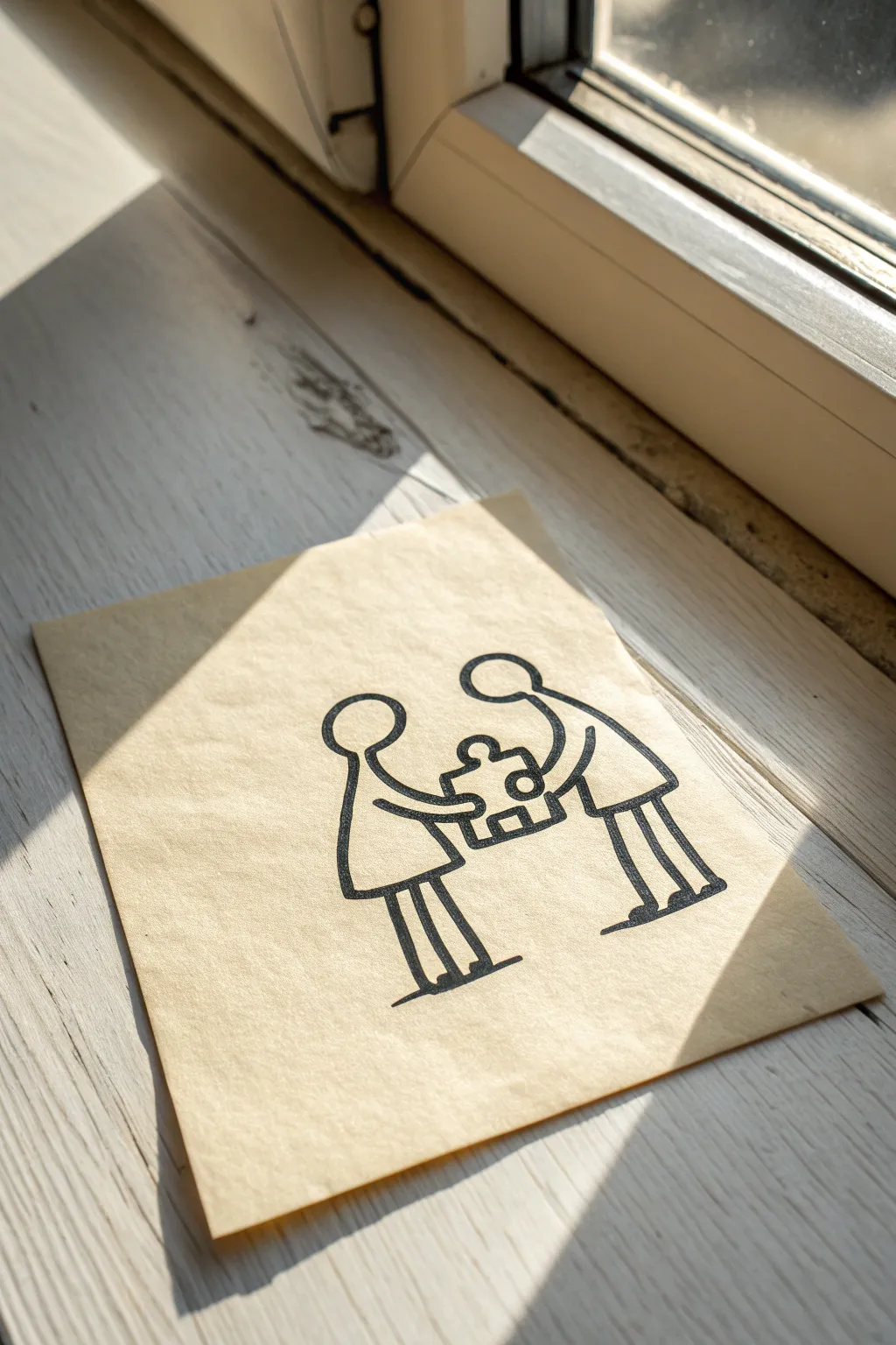
This minimalist ink drawing captures the sweet simplicity of finding your perfect fit. Using clean lines on parchment-style paper creates a warm, timeless look that feels like a treasured note left on a windowsill.
Step-by-Step
Materials
- Textured beige or parchment paper (heavyweight)
- Black drawing pen (0.5mm tip)
- Black drawing pen (1.0mm or bold tip)
- Pencil (HB or H)
- Eraser
- Ruler
Step 1: Sketching the Figures
-
Paper placement:
Begin by orienting your parchment paper vertically. Find the visual center, as this is where the puzzle piece—the focal point—will eventually sit. -
Head positioning:
Lightly sketch two circles with your pencil for heads. The head on the left should be slightly lower than the head on the right to imply a height difference. -
Left body outline:
From the left circle, draw a simple triangular shape for the dress or body. Keep the lines soft and slightly curved rather than rigid geometric triangles. -
Right body outline:
For the right figure, sketch a rectangular torso shape that leans slightly inward toward the other figure. This leaning posture creates a sense of connection. -
Legs and stance:
Add stick legs to both figures. For the left figure, draw two straight lines. For the right figure, draw slightly bent legs to suggest movement or walking toward the center. -
Grounding lines:
Sketch small horizontal lines at the base of the feet. This grounds the figures so they aren’t floating in space.
Clean Ink Tip
If you’re right-handed, ink from left to right to avoid smudging your fresh lines. Lefties should work right to left.
Step 2: The Puzzle Connection
-
Arm structure:
Draw the arms extending from the shoulders. Instead of straight sticks, give them a subtle curve so they meet in the middle, forming a heart-like arch between them. -
Drafting the puzzle piece:
In the space between their hands, sketch a large, singular puzzle piece. It doesn’t need to be perfect; a wonky shape adds charm. -
Adding the tabs:
Draw one circular ‘outie’ tab on top of the puzzle piece and one ‘innie’ hole in the center. This specific detail clarifies that it’s a puzzle piece and not just a box.
Make It Yours
Add a tiny red heart inside the puzzle piece hole, or write initials inside the figures’ bodies for a personalized touch.
Step 3: Inking and Finalizing
-
First pass outlines:
Take your 0.5mm black pen and carefully trace over your pencil lines. I prefer to start with the heads to establish the line visual weight. -
Smoothing the curves:
When tracing the arms, try to do each arm in a single, confident stroke. Hesitant lines can look shaky, but a quick stroke often looks cleaner. -
Bold outlines:
Switch to your 1.0mm or bold tip pen to go over the main outlines of the bodies and the puzzle piece again. This thickness gives it that marker-drawn aesthetic seen in the photo. -
Refining the puzzle piece:
Use the thicker pen to darken the puzzle piece outline specifically. This ensures the eye is drawn immediately to the shared object. -
Feet details:
Thicken the lines at the feet and the small ground shadows. A slightly scratchy, imperfect texture here works nicely with the textured paper. -
Erasing guide lines:
Wait at least five minutes for the ink to dry completely. Once safe, gently erase all remaining pencil marks. -
Paper distressing:
To match the reference photo’s vibe, you can gently curl the edges of the paper or crinkle a corner slightly to make it feel less like a pristine printout.
Now you have a charming, symbolic piece of art ready to frame or gift to your other half

One Continuous Line Couple
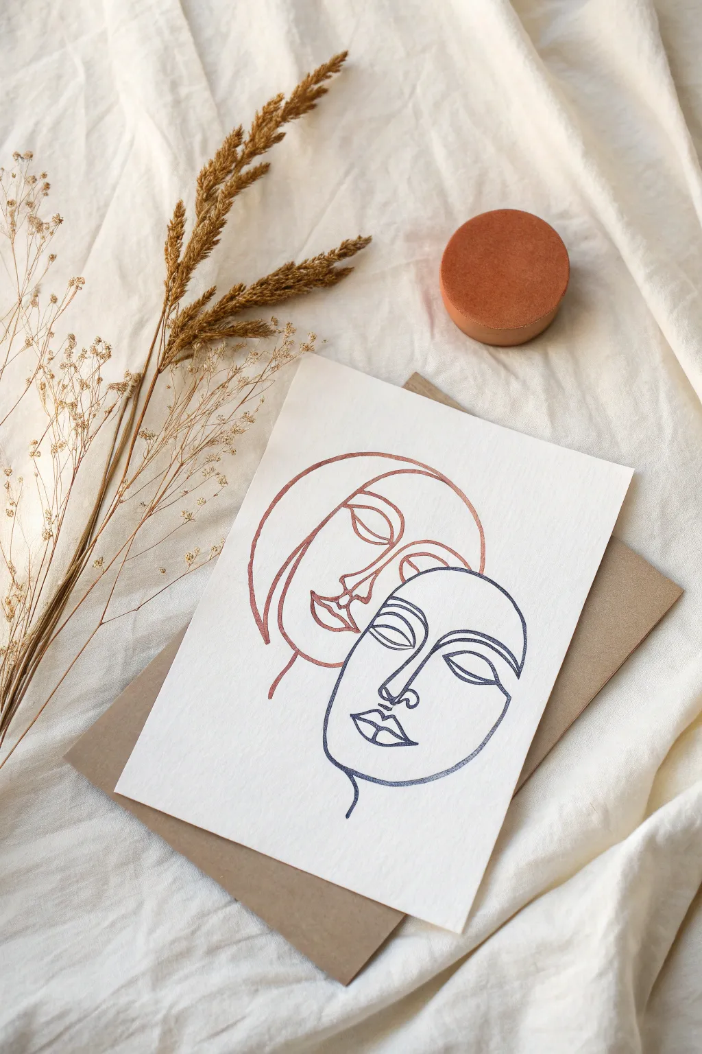
This elegant project captures the connection between two souls using the minimalist continuous line technique, elevated by shimmering metallic inks. The contrasting copper and midnight blue tones create a sophisticated balance, perfect for framing or gifting to a loved one.
Step-by-Step Guide
Materials
- High-quality textured watercolor or cotton rag paper (A5 or A4 size)
- Metallic copper gel pen or fine-point metallic marker
- Dark navy blue or black fine-point pigment liner (0.5mm)
- Pencil (HB or H for light sketching)
- Kneaded eraser
- Tracing paper (optional)
Step 1: Planning and Sketching
-
Analyze the composition:
Before putting pen to paper, visualize the layout. The two faces are positioned close together, with the upper face looking slightly down and the lower face looking forward, creating an intimate, nested feel. -
Mark placement lightly:
Using your HB pencil, mark the top, bottom, and center points where the two faces will sit on your textured paper. This ensures you don’t run off the page later. -
Sketch the upper face shape:
Begin sketching the upper face (the ‘copper’ one). Start with the curve of the hair/head covering, sweeping down to form the cheek and jawline. Keep your pencil pressure extremely light. -
Add facial features:
Draw the profile details for the top face: a brow bone connecting to a nose, followed by the lips. Don’t worry about the continuous line aspect yet; just get the proportions right. -
Sketch the lower face:
Position the lower face (the ‘blue’ one) so the forehead tucks slightly under the chin of the upper face. Outline the jawline and the prominent cheekbone structure. -
Detail the second face:
Add the nose, closed eyelids, and full lips to the lower face. Ensure the styles match—heavy lids and stylized, smooth curves. -
Refine the line flow:
Now, look at your sketch and determine the ‘path’. For a continuous line look, I find it helpful to visually trace where the line will start and stop, connecting detached features like eyes to the outer face contour. -
Lighten the sketch:
Roll your kneaded eraser gently over the entire drawing. You want the graphite to be barely visible, just enough to guide your ink without dirtying the final colors.
Smooth Operator
Work from your shoulder, not your wrist. This creates fluid, sweeping curves essential for continuous line art, preventing the shaky look that comes from tight, small movements.
Step 2: Inking the Design
-
Test your pens:
On a scrap piece of the same paper, test your copper and blue pens. Textured paper can sometimes bleed or cause skipping, so ensure the ink flows smoothly. -
Start the copper application:
Take your metallic copper pen. Begin at the hair line of the upper face. Move steadily to create the large outer curve of the head. -
Detail the copper eye:
Bring the line inward to form the eyebrow and closed eyelid. In this style, the line often loops back on itself—use that to your advantage to move from the eye down to the nose. -
Finish the copper face:
Complete the nose, lips, and chin of the upper figure. Keep your hand relaxed to ensure the curves look organic rather than rigid. -
Allow drying time:
Let the copper ink dry completely for a few minutes. Metallic gel inks can smudge easily, and you don’t want to drag your hand through it while drawing the next part. -
Begin the blue profile:
Switch to your dark navy pigment liner. Start at the forehead line of the lower face, carefully following your faint pencil guide. -
Navigate the features:
Draw the bridge of the nose, flowing directly into the eyebrow arch. Maintain a consistent speed; slowing down too much can cause shaky lines on textured paper. -
Complete the blue face:
Work your way down to the lips and chin, finishing with the neck line. Ensure the blue lines nestle close to the copper lines without overlapping them. -
Erase final guides:
Wait at least 15–20 minutes to ensure absolute dryness. Then, gently erase any remaining pencil marks to leave a crisp, clean design.
Ink Skipping?
Textured paper can cause pens to skip. If this happens, retrace the line gently. Don’t press harder; instead, slow your stroke speed to allow the paper tooth to grab the ink.
Once framed, the metallic ink will catch the light beautifully, adding a dynamic element to your minimalist artwork


Back-View Soulmate Hug
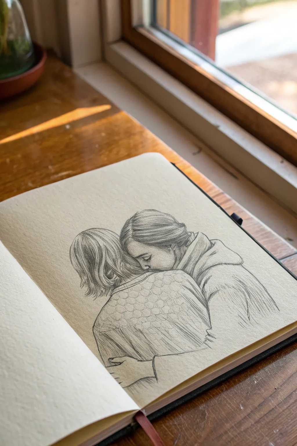
This intimate sketch captures the tender moment of a hug from behind, focusing on the texture of fabric and the flow of hair. Using graphite on warm-toned sketchbook paper adds a nostalgic, cozy feel to the finished piece.
How-To Guide
Materials
- Smooth sketchbook paper (warm cream or tan tone)
- Graphite pencils (HB, 2B, 4B)
- Mechanical pencil (0.5mm, HB or B lead)
- Kneadable eraser
- Blending stump or tortillon
- Fine-tip eraser stick (optional)
Step 1: Laying the Foundations
-
Establish the composition:
Begin with your HB pencil using very light pressure. Draw two overlapping oval shapes to represent the heads—one slightly lower and tucked into the ‘shoulder’ area of the other. -
Map the shoulders and backs:
Sketch sloping lines down from the heads to form the shoulders. The figure in the foreground (the back view) should have broader, rounded shoulders, while the figure being hugged is partially obscured. -
Draft the arms:
Lightly indicate the position of the arms wrapping around. Pay attention to the angle of the elbow on the right side and the hand resting on the back at the bottom left. -
Define the facial profile:
Carefully refine the profile of the figure facing inward. You only see a hint of the forehead, closed eye, and nose pressing against the shoulder; keep these lines delicate.
Step 2: Developing the Hair
-
Map hair direction:
Switch to your mechanical pencil for precision. Draw long, sweeping guidelines to show how the hair flows. For the left figure, the hair falls straight down; for the right, it is pulled back into a loose bun or braid. -
Building hair value (Left Figure):
On the left figure’s bob cut, use a 2B pencil to darken the roots near the parting and the tips at the neck. Leave the middle section lighter to suggest a sheen. -
Refining hair texture:
Add individual strands using quick, flicking strokes with the mechanical pencil. This creates the illusion of fine hair texture rather than a solid block. -
Structuring the pulled-back hair:
For the figure on the right, shade the hair in sections where it sweeps back from the face. Darken the area behind the ear and near the nape of the neck to create depth.
Smudge Prevention
Since you are working with soft lead pencils, place a clean scrap of paper under your drawing hand. This prevents your palm from dragging graphite across the paper and muddying the light areas.
Step 3: Fabric and Clothing
-
Outline clothing folds:
Return to the clothing. Observe where the fabric bunches, particularly at the elbow and under the armpit of the hugging figure. Draw these folds with confident, curved lines. -
Render the sweater texture:
The back-view figure is wearing a textured knit. Suggest this by drawing loose, scale-like loops or a honeycomb pattern across the upper back area. -
Shade the fabric folds:
I like to use a 4B pencil here to deepen the shadows within the deepest folds of the hoodie or jacket on the right. This high contrast makes the fabric look heavy and realistic. -
Detailing the hand:
Refine the hand resting on the back. Ensure the fingers look relaxed and slightly curved, adding faint shading between them to separate the forms.
Textural Contrast
Make the hair strokes sharp and distinct, but keep the shading on the clothing softer and more diffused. This difference in texture helps separate the materials visually.
Step 4: Final Definition
-
Blend selectively:
Use a tortillon or blending stump to soften the skin on the face and hand. Be careful not to smudge the hair texture; keep those lines crisp. -
Deepen contact shadows:
Go back in with your 4B pencil and darken the ‘crease’ lines where the two figures touch—specifically where the face meets the shoulder and where the arms overlap the body. -
Add highlights:
Take your kneadable eraser and tap it gently on the hair highlights and the top of the shoulder to lift off graphite. This brings back the paper tone and adds volume. -
Clean up edges:
Erase any stray construction lines around the silhouette to leave a clean, isolated figure against the paper background.
Take a moment to admire the gentle emotion you captured through simple lines and shading
BRUSH GUIDE
The Right Brush for Every Stroke
From clean lines to bold texture — master brush choice, stroke control, and essential techniques.
Explore the Full Guide
Yin and Yang as Two Lovers
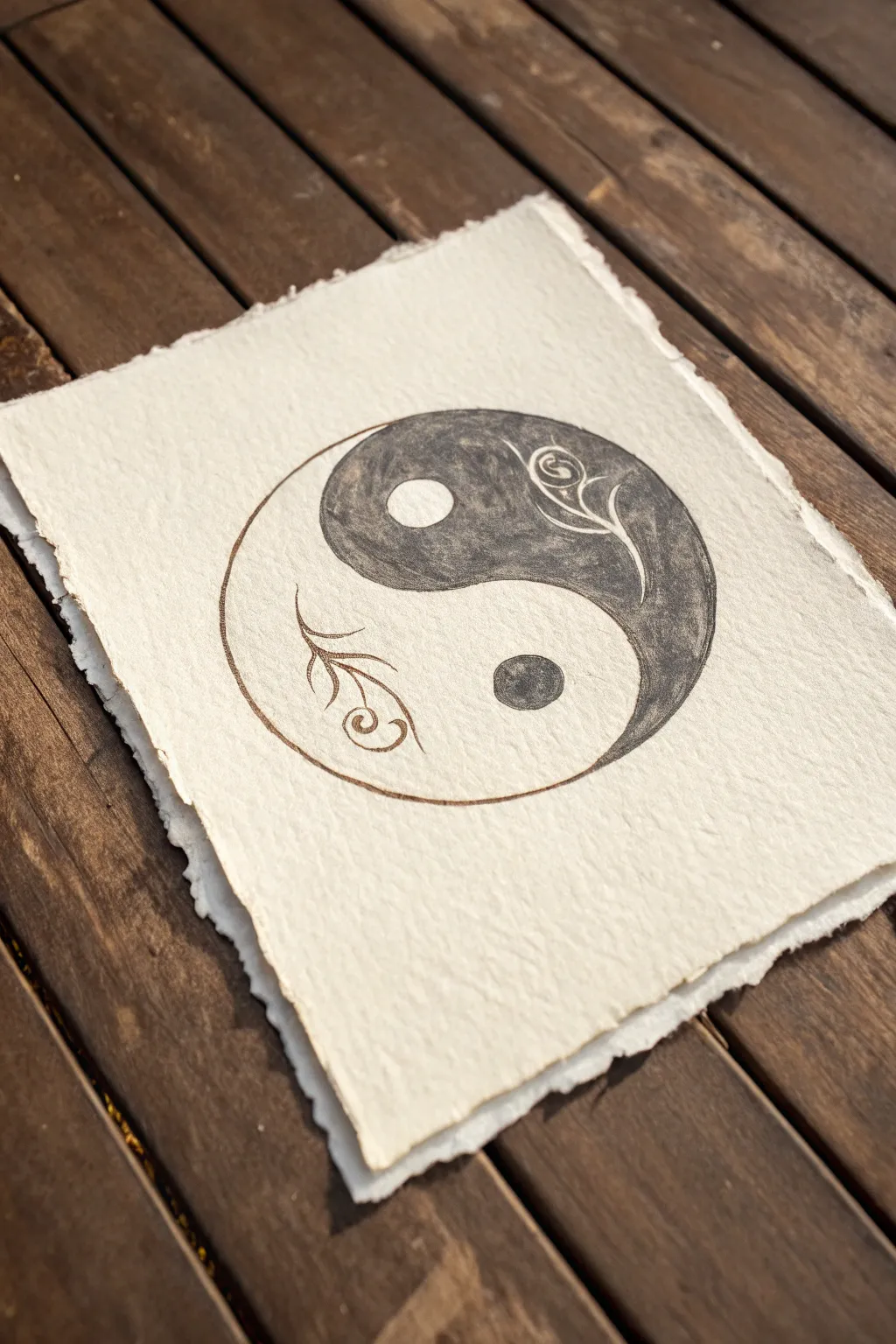
This elegant take on the classic Yin and Yang symbol transforms the traditional teardrops into flourishing vines, symbolizing growth within harmony. Drawn on textured handmade paper, the contrast of deep ink against the creamy, fibrous surface creates a timeless, romantic feel perfect for a gift.
Detailed Instructions
Materials
- Heavyweight handmade cotton rag paper (deckle edge)
- Pencil (HB or lighter)
- Compass or circular object for tracing
- Fine liner pen (01 or 03 size, black)
- Black ink or watercolor paint
- Small round paintbrush (size 2 or 4)
- Kneaded eraser
Step 1: Setting the Composition
-
Prepare your paper:
Select a piece of handmade paper with a nice, rough texture. Gently brush off any loose fibers to ensure a clean surface for drawing. -
Outline the circle:
Using a compass or by lightly tracing a round object like a jar lid, draw the main circle in the center of the paper. Use a very light hand with your pencil so the graphite doesn’t get trapped in the deep paper texture. -
Draft the S-curve:
Lightly sketch the central S-curve that divides the circle. Instead of a stiff geometric line, aim for a fluid, organic wave that splits the circle into two equal tear-drop shapes.
Paper Texture Tip
On rough rag paper, ink can bleed. Test your pen on a scrap piece first. If it bleeds, use a harder pencil outline to create a ‘dam’ before inking.
Step 2: Adding the Botanical Details
-
Sketch the vine motifs:
On the left side (the future white section), sketch a delicate vine sprouting from the bottom curve, curling upward with small leaves. On the right (the future dark section), sketch a similar vine at the top, curling downward. -
Place the core circles:
Draw a small circle in the upper half of the design and another in the lower half. These will be the contrasting ”eyes” of the Yin and Yang. -
Refine the floral elements:
Add small curlicues or spiral tendrils to the ends of your vines. These little details soften the symbol and give it that ‘lover’s embrace’ aesthetic.
Metallic Accent
Paint the floral vine on the dark side with gold metallic ink instead of leaving it plain paper white for a luxurious, shimmering finish.
Step 3: Inking the Design
-
Trace the outlines:
Take your fine liner pen and carefully trace over your pencil lines. The textured paper might cause the pen to skip slightly, so go slowly and retrace lines if needed for a solid look. -
Fill the dark section:
Using a small brush and black ink (or watercolor), begin filling in the upper right section of the symbol. Carefully paint around the small circle and the floral vine sketch you created inside this area. -
Detailing the dark vine:
For the vine inside the dark section, use the tip of your brush or pen to negative-space outline it, leaving the leaves and stem the color of the paper. -
Create texture:
I like to let the ink interact with the paper’s roughness here. Don’t worry about getting a perfectly flat black; a little texture adds character. -
Inking the light side:
Move to the bottom left section. Here, you define the shape by simply outlining the outer curve with your fine liner. Do not fill this area with ink. -
Draw the lower vine:
Use your fine liner to draw the vine and leaves in the bottom section. Since the background is white, you draw the plant itself in black lines. -
Fill the lower eye:
Fill in the small circle in the bottom section with solid black ink to complete the balance.
Step 4: Finishing Touches
-
Final line check:
Go over the main outer circle one last time with your fine liner to ensure the boundary is crisp and clearly visible against the textured paper background. -
Erase guidelines:
Wait until the ink is completely dry—handling damp handmade paper can ruin the surface. Once dry, gently dab (don’t rub) with a kneaded eraser to lift any visible pencil marks.
Now you have a deeply symbolic piece of art that balances contrast with organic beauty.
Galaxy Silhouettes in an Embrace
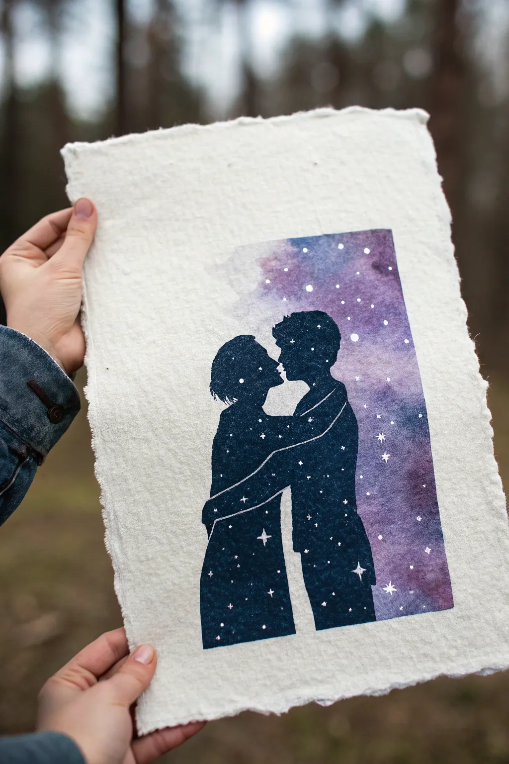
Capture the infinite depth of a soulmate bond with this striking mixed-media silhouette piece. By combining deep galaxy watercolors with crisp silhouettes on textured handmade paper, you’ll create a romantic keepsake that feels both grounded and ethereal.
How-To Guide
Materials
- Handmade deckle-edge paper (heavyweight watercolor suitable)
- Masking fluid
- Old paintbrush (for masking fluid)
- Watercolor paints (Indigo, Purple, Magenta, Black)
- White gouache or white gel pen
- Soft round watercolor brushes (sizes 6 and 2)
- Pencil and eraser
- Painter’s tape or washi tape
- Paper towels
- Reference photo of a couple
Step 1: Preparation and Masking
-
Prepare your paper:
Since we are using beautiful handmade paper with rough edges, you don’t need to tape it down flat to a board, but do ensure your work surface is protected. Lightly brush off any loose fibers. -
Sketch the silhouette:
Using a very light touch with your pencil, sketch the outline of the couple embracing. Focus on the negative space between their faces and the shape of their posture. Keep the lines faint so they don’t show through later. -
Define the borders:
Lightly mark a rectangular boundary around the couple. This doesn’t need to be perfect; the charm of this piece lies in the organic interaction between the painted area and the rough paper. -
Apply masking fluid:
This is crucial for keeping the couple’s shape crisp. Dip an old brush into soapy water first (to protect bristles), then apply masking fluid carefully *inside* the couple’s silhouette. Wait until this is completely bone-dry before proceeding.
Bleeding Lines?
If paint seeps under the masking fluid, don’t panic. Wait for the paint to dry fully, then use white gouache to carefully touch up the edges and reclaim strict silhouette lines.
Step 2: Painting the Galaxy Background
-
Wet the background area:
Using clean water and a larger brush, gently wet the rectangular area around the masked couple, but don’t soak the paper too much or it might pill. -
Drop in deep blues:
Start by loading your brush with Indigo or a deep Navy blue. Dab it into the wet paper, concentrating the darkest colors near the bottom of the rectangle. -
Add cosmic purples:
While the blue is still wet, drop in rich purple and magenta hues near the top and middle sections, letting them bleed naturally into the blue to create a nebula effect. -
Soften the edges:
I like to use a clean, damp brush to gently feather the outer edges of the rectangle, allowing the paint to fade softly into the white paper rather than ending in a hard line. -
Dry completely:
Let the background paint dry thoroughly. If the paper feels cool to the touch, it’s still wet.
Zodiac Customization
Personalize the artwork by painting the actual zodiac constellations of the couple inside their respective silhouettes for a hidden layer of meaning.
Step 3: Creating the Galaxy Silhouettes
-
Remove the mask:
Once the background is 100% dry, gently rub the masking fluid away with your finger or a rubber cement pickup tool to reveal the clean white paper underneath. -
Fill the silhouette:
Now, paint the *inside* of the couple using your darkest Indigo or a mix of Black and blue. This creates a ‘reverse silhouette’ effect where the figures hold the stars. -
Leave separation lines:
This is a key detail: leave a very thin, unpainted white line between the arms and bodies where they overlap. This defines the anatomy so the two figures don’t merge into one blob. -
Let it dry:
Allow the dark silhouette layer to dry completely before adding stars.
Step 4: Adding the Stars
-
Mix your stars:
Dilute your white gouache with a tiny drop of water until it has a milky consistency. You need it opaque but fluid. -
Splatter texture:
Load a small brush with the white mixture and tap it against another brush handle over the painting to create fine mist stars. Do this over both the background and the dark bodies. -
Paint prominent stars:
Switch to your smallest detail brush or a white gel pen. Manually paint larger four-pointed stars and specific constellations within the bodies of the figures. -
Add connecting lines:
If you are depicting specific constellations, use a very fine touch to draw the faint lines connecting the larger stars. -
Final assessment:
Step back and look at the balance. Add a few extra distinct white dots in areas that look too empty to ensure the galaxy feels full and deep.
Now you have a stunning piece that visually represents how a universe can exist within two people.

PENCIL GUIDE
Understanding Pencil Grades from H to B
From first sketch to finished drawing — learn pencil grades, line control, and shading techniques.
Explore the Full Guide
Intertwined Trees With Shared Roots
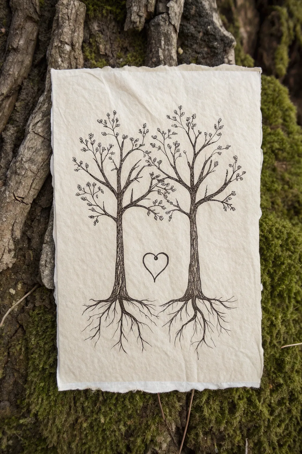
This minimalist yet deeply symbolic drawing features two trees growing together with tangled roots, perfectly capturing the essence of a shared life. Using fine liners on textured deckled-edge paper adds an organic, timeless feel to this romantic keepsake.
Step-by-Step Guide
Materials
- Sheet of handmade or cotton rag paper with deckled edges (A5 or 5×7 size)
- Pencil (HB or 2H)
- Kneadable eraser
- Fine liner pen (01 or 03 nib, black)
- Fine liner pen (005 nib, black) for details
- Ruler (optional, if you want precise spacing)
Step 1: Setting the Scene
-
Paper preparation:
Begin by selecting a high-quality sheet of handmade paper. If your paper feels too loose, you might want to tape the corners down gently to a drawing board to keep it steady. -
Rough layout:
Using your HB pencil, lightly mark the vertical center of the page. This will help ensure your trees are balanced, though they don’t need to be perfectly symmetrical. -
Trunk placement:
Sketch two vertical lines about two inches apart in the center of the page. These will serve as the inner edges of your two tree trunks.
Step 2: Drafting the Trees
-
Trunk structure:
Lightly sketch the outer lines of the trunks. Make them slightly wider at the base and taper them gently as they move upward. -
Creating the canopy:
Draw the main branches extending outward and upward. The key feature here is to have the inner branches of both trees reach toward each other, slightly crossing in the middle to form a subtle arch. -
Sketch the heart:
In the negative space between the two trunks, lightly pencil in a simple heart shape. Position it roughly halfway up the trunks, ensuring it floats evenly between them. -
Root systems:
At the base of the trunks, sketch roots extending downward. Instead of keeping them separate, draw the inner roots curving toward the center and overlapping, symbolising connection.
Uneven Ink Lines?
If your fine liner skips on the textured paper, slow down your stroke speed. Don’t press harder; instead, use a consistent, light pressure and let the ink flow naturally into the paper’s grooves.
Step 3: Inking the Drawing
-
Outline the trunks:
Switch to your 03 or 01 fine liner. Carefully go over your pencil lines for the main trunks. Don’t make the lines perfectly straight; a little wobble adds natural bark texture. -
Adding texture:
Fill the trunks with vertical, hatched lines using the 005 pen. Vary the length and density of these lines to create a convincing bark effect, making them denser near the edges for a rounded look. -
Inking the heart:
Trace the heart shape with a solid, slightly bolder line to make it a focal point. You can add a tiny loop at the top dip of the heart for a whimsical touch. -
Refining the roots:
Ink the roots, extending them into fine tendrils at the bottom. Allow the lines to cross over one another freely, making the shared root system look complex and tangled. -
Branch structure:
Go over your main branches with the thicker pen, then switch to the thinner pen to add smaller twigs splitting off at the ends.
Add a Personal Touch
Customize the artwork by carving tiny initials into the bark of the trees using very fine lines, or write a significant date in small, elegant script following the curve of a root.
Step 4: Final Details
-
Leaf clusters:
Add small, simple loops or tiny oval shapes at the tips of the smallest twigs to represent leaves. Keep these sparse and airy rather than coloring in full bushy sections. -
Depth adjustment:
Look at where the main branches diverge from the trunk. Add a few extra hatching lines in these ‘V’ shapes to create shadows and depth. -
Erase pencil marks:
Wait until the ink is completely dry—I usually give it at least ten minutes just to be safe. Then, gently roll the kneadable eraser over the entire drawing to lift the graphite. -
Final inspection:
Check for any gaps in your bark texture or broken lines in the roots and touch them up with your finest pen.
Now you have a beautifully symbolic piece of art ready to frame or gift to someone special
Two Halves of One Butterfly Wing
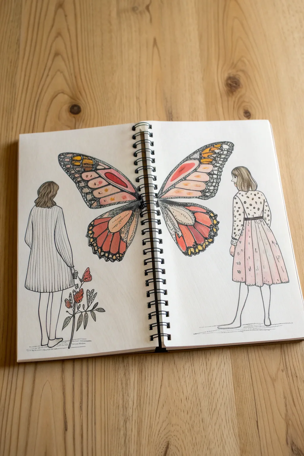
This evocative sketchbook spread symbolizes connection through a shared butterfly motif, where two distinct figures become one across the page break. Using fine liners and soft colored pencils, you’ll create a symmetrical yet personalized illustration that celebrates the bond between two people.
Step-by-Step Guide
Materials
- Spiral-bound sketchbook (heavyweight paper recommended)
- Graphite drawing pencil (HB or 2H)
- Fine liner pens (0.1mm, 0.3mm, and 0.5mm black)
- Colored pencils (various warm tones: peach, orange, red, brown)
- Eraser (kneaded preferred)
- Ruler
Step 1: Drafting the Composition
-
Establish the horizon:
Begin by lightly sketching a faint horizon line near the bottom of both pages to ensure your figures stand on the same plane. This grounds the drawing immediately. -
Position the figures:
On the far left and right sides of the spread, sketch the basic stick-figure gesture of two standing women. They should be facing away from the center spine but angled slightly so their backs form the canvas for the wings. -
Map out the wings:
Draw the general shape of a butterfly wing emerging from the back of each figure. The crucial part here is to ensure the wings meet perfectly at the spiral binding, creating the illusion of a single, continuous butterfly when the book is open. -
Add figure details:
Flesh out the figures. Sketch a simple sweater dress for the left figure and a patterned top with a skirt for the right figure. Keep the poses relaxed and natural. -
Plan the wing patterns:
Lightly draw the veins and cellular shapes inside the butterfly wings. Monarch patterns work beautifully here, with larger cells near the body and smaller ones toward the edges. Try to keep the shapes roughly symmetrical across the two pages. -
Sketch the floral element:
On the left page, near the figure’s feet, sketch a small, spindly plant with a few leaves and buds to balance the composition.
Step 2: Inking the Outline
-
Outline the figures:
Using a 0.3mm fine liner, carefully trace over your pencil lines for the two women. Use smooth, fluid strokes for the hair and fabric folds. -
Define the wings:
Switch to a slightly thicker 0.5mm pen for the main outline of the butterfly wings to make them pop. Then, go back to the 0.3mm or 0.1mm pen to draw the intricate veins inside the wings. -
Add texture:
Use the 0.1mm pen to add delicate textures, like vertical ribbing lines on the left dres, small polka dots on the right shirt, and tiny stippling or hatching within the thick black areas of the wing veins for depth. -
Incorporate the plant:
Ink the small plant on the left side, using shaky, organic lines to give it a natural feel. Add small hatch marks on the leaves for shading. -
Clean up:
Once the ink is completely dry, gently erase all underlying pencil marks with a kneaded eraser to reveal a clean, crisp illustration.
Mind the Gap
Draw the wing tips securely onto the paper, stopping 2-3mm before the spiral holes. Drawing through the holes can tear the paper or ruin your pen tip.
Step 3: Adding Color
-
Base layer for wings:
Start coloring the butterfly wings with a light peach or pale orange pencil. Fill in the ‘cells’ of the wing pattern gently, leaving some paper white for highlights. -
Deepen the wing tones:
Layer a vibrant red-orange and crimson over the outer edges of the wing cells. Blend these into the lighter center color to create a gradient effect. -
Color the heavy veins:
Instead of using solid black ink for the thick parts of the butterfly veins, use a dark charcoal or black colored pencil. I find this creates a softer, more textured look than ink alone. Press firmly for contrast. -
Tint the clothing:
Lightly shade the skirt on the right figure with a very pale pink distinct from the wing color. Leave the left dress mostly white or extremely pale grey to maintain a clean aesthetic. -
Details and hair:
Color the hair of both figures using brown or ochre tones. Use stroke directions that follow the flow of the hair strands. -
Grounding shadows:
Add a very light horizontal shadow under the feet of both figures and the plant using a grey pencil or pen. This final touch anchors them to the page so they aren’t floating.
Metallic Magic
Use a gold gel pen or metallic watercolor for the small dots on the edges of the butterfly wings to make the artwork shimmer when the pages turn.
Now you have a poetic, shared illustration that beautifully spans the separation of the pages


Shared Umbrella Under Star Rain
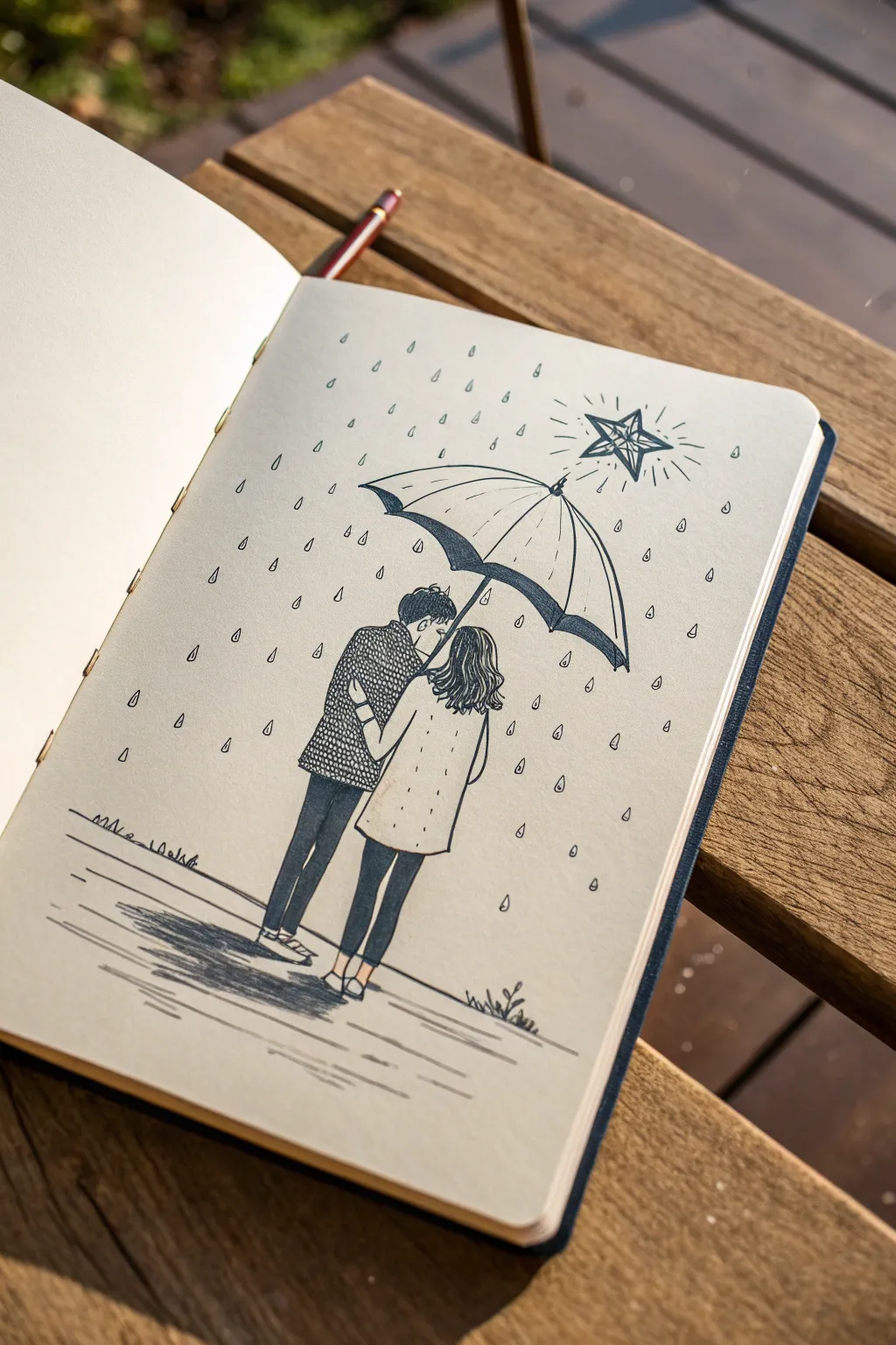
This heartwarming sketch captures a tender moment between soulmates huddled under a single umbrella amidst a stylized downpour. Using simple fineliners and clean lines, you’ll create a minimalist yet emotive illustration perfect for a bullet journal or sketchbook.
Step-by-Step
Materials
- Cream-colored sketchbook (A5 size recommended)
- Pencil (HB or 2B for sketching)
- Kneaded eraser
- Fine liner pen (0.3mm or 0.5mm, black)
- Fine liner pen (0.1mm, black for tiny details)
- Ruler (optional, for rain angles)
Step 1: Sketching the Foundations
-
Establishing the Horizon:
Start by lightly sketching a very faint, low horizon line near the bottom quarter of your page to ground your figures. This will help you position their feet correctly. -
Positioning the Figures:
Draw two basic vertical stick figures or stick-and-oval armatures in the center of the page. The figure on the left should be slightly taller. Make sure they are standing very close to each other, slightly overlapping. -
Drafting the Umbrella:
Floating above their heads, sketch a large semi-circle for the umbrella top. Draw a center line angling down towards the figures’ hands to serve as the handle. The umbrella should be large enough to cover both of them comfortably. -
Fleshing Out the Couple:
Add volume to your stick figures. For the left figure, sketch a jacket shape and trousers. For the right figure, outline a coat that flares slightly at the bottom and narrower legs. Sketch their heads close together, almost touching.
Step 2: Defining the Key Elements
-
Detailing the Umbrella:
Refine the umbrella’s shape. Draw the scalloped bottom edge where the fabric stretches between the ribs. Lightly sketch curved lines running from the center top point down to each scallop point. -
The Star Feature:
In the upper right quadrant, well above the umbrella, sketch a five-pointed star. Draw a smaller star inside it, and then add lines radiating outward to give it a glowing effect. -
Patterning the Clothes:
Lightly indicate a textured pattern on the left figure’s jacket—this will be a series of small scallops or scales later. Sketch the hair on both figures; the right figure should have wavy hair cascading down her back.
Uneven Raindrops?
If your raindrops look messy, try drawing them in subtle ‘lanes’ or clusters rather than random spots. Keeping the pointy end up creates a gravity-defying, magical look.
Step 3: Inking the Illustration
-
Outlining the Umbrella:
Switch to your 0.3mm or 0.5mm pen. Carefully trace the outer curve and the scalloped bottom of the umbrella. Ink the ribs with smooth, confident strokes. -
Adding Heavy Shadows:
Using the same pen, fill in the underside of the umbrella’s back rim with solid black ink. This creates depth and shows the three-dimensionality of the object. -
Inking the Figures:
Outline the characters’ clothing. For the left figure’s trousers and the right figure’s leggings, use firm lines. Ink the shoes simply. -
Hair Texture:
Use the 0.1mm pen for the hair. For the figure on the right, use wavy, flowing lines to create volume. For the left figure, use shorter, darker strokes. -
Texture and Patterns:
Now for the patience test. Take your fine pen and fill the left figure’s jacket with a repetitive scale or small ‘u’ pattern. Ink the simpler buttons and pockets on the right figure’s coat.
Add a Splash of Color
Use a single watercolor wash or marker color just on the umbrella or the star to make the focal point pop against the monochrome drawing.
Step 4: Atmosphere and Finishing Touches
-
Inking the Star:
Trace over your star sketch. Make the lines crisp. Add little dots or tiny lines between the main radiating rays to enhance the ‘shimmering’ look. -
Creating the Rain:
scatter stylized raindrops throughout the background. Instead of simple dashes, draw small, elongated teardrops. Keep the orientation vertical or slightly angled. I find it helpful to vary the spacing so it doesn’t look too grid-like. -
Ground Shadows:
Beneath their feet, use horizontal hatching strokes to create a shadow on the wet ground. Make the strokes denser directly under their shoes and looser as they move outward. -
Adding Ground Details:
Add a few small scribbles of grass or weeds near the bottom right to imply an outdoor setting without needing a full background. -
Erase and Assess:
Once the ink is completely dry (wait at least 5 minutes to avoid smudges), gently erase all pencil guidelines with the kneaded eraser.
Close your sketchbook and enjoy the quiet romance of a rainy day captured on paper
Constellations That Form Two Faces
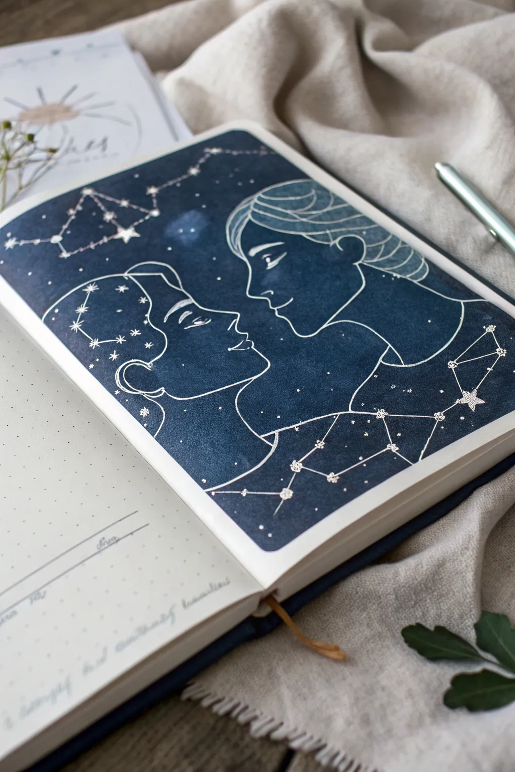
This romantic spread captures the magic of two souls meeting among the stars, featuring deep indigo hues contrasted against crisp white ink. It transforms a simple sketchbook page into a cosmic portrait where constellations trace the delicate outlines of two facing profiles.
Step-by-Step Tutorial
Materials
- Bullet journal or mixed-media sketchbook (A5 size)
- Deep indigo or navy blue watercolor paint
- Payne’s grey or black watercolor paint (for depth)
- Flat shader brush (medium)
- White gel pen (0.8mm or 1.0mm tip) or white acrylic ink with a dip pen
- Silver metallic gel pen or paint pen (fine tip)
- Pencil (HB)
- Kneaded eraser
- Painter’s tape or washi tape
- Ruler
Step 1: Preparation & Sketching
-
Mask the border:
Begin by taping off a clean rectangular border on your page using painter’s tape or washi tape. This creates that sharp, professional edge seen in the reference. Press the edges down firmly to prevent paint bleeding. -
Establish the profiles:
Lightly sketch two profiles facing each other using your HB pencil. They should be close but not touching, symbolizing a connection. Keep your lines very faint so they don’t show through later. -
Sketch the hair flow:
Add simple, flowing lines for the hair. Instead of drawing individual strands, think of the hair as hair ‘shapes’ that sweep backward from the faces. -
Map the constellations:
Plan where your major star clusters will go. I like to clear a space in the ‘mind’ area of the left figure and the ‘shoulder’ area of the right figure for the largest constellations.
Pro Tip: Opacity Hack
If your white gel pen isn’t popping against the dark blue, do a first pass, let it dry for 5 minutes, and then trace over it again. The second layer creates that bright, solid white.
Step 2: Painting the Night Sky
-
Mix the base color:
Prepare a rich, dark wash using indigo watercolor. You want this to be opaque enough to hide the paper texture but transparent enough to look like water media. -
Apply the first wash:
Using your flat brush, fill in the entire rectangle with the indigo mix, painting right over your pencil lines (you’ll still see them faintly). Work quickly to keep a wet edge and avoid streaks. -
Deepen the shadows:
While the first layer is still slightly damp, drop in concentrated touches of Payne’s grey or black near the corners and edges to create a vignette effect. -
Create texture:
Let the paint dry completely. If the result looks too flat, add a second coat of indigo, dabbing slightly with a paper towel in random spots to create a subtle, cloudy nebula texture. -
Wait for full dryness:
This is crucial: allow the background to dry completely. If the paper is cool to the touch, it’s still wet. Using pens on damp paper will ruin the nibs.
Step 3: Celestial Details
-
Trace the profiles:
Take your white gel pen and carefully trace over the main profile lines you sketched earlier. Use a steady, continuous motion for the nose and chin to keep the lines smooth. -
Detail the hair:
Add the sweeping lines for the hair details using the white pen. Keep these lines fairly simple and stylized rather than realistic. -
Draw the star points:
Using a silver metallic pen or the white gel pen, dot the ‘stars’ along the constellations you planned. Make some dots slightly larger than others for variety. -
Connect the constellations:
Use a ruler to draw straight, thin lines connecting your star dots. These geometric lines contrast beautifully with the organic curves of the faces. -
Add iconic star shapes:
Select a few larger dots and turn them into 5-point stars or diamond sparkles to make them stand out as the ‘brightest’ in the sky. -
Sprinkle background stars:
Fill the empty dark space with tiny white dots. Vary their density—grouping some together like the Milky Way creates a more realistic galaxy feel. -
The final reveal:
Once the ink is totally dry, slowly peel away the painter’s tape at a 45-degree angle to reveal your crisp white borders.
Troubleshooting: Warped Paper
If your sketchbook page buckles from the watercolor, wait until it’s barely damp, place a clean sheet of paper over it, and close the book under a heavy weight overnight to flatten it.
Now you have a stunning, personalized piece of art that perfectly captures the idea of a connection written in the stars
Two Koi Fish Circling Like Soulmates
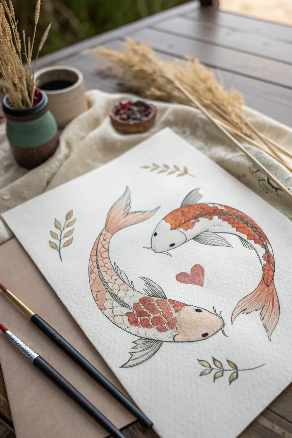
Capture the fluid elegance of connection with this watercolor painting of two koi fish swimming in a harmonious circle. The warm, earthy tones and delicate ink details create a yin-yang effect that perfectly symbolizes two soulmates moving in sync.
Step-by-Step
Materials
- Cold-pressed watercolor paper (300 gsm)
- Pencil (HB or H)
- Kneadable eraser
- Watercolor paints (Burnt Sienna, Cadmium Orange, Yellow Ochre, Paynes Grey, Burnt Umber)
- Fine liner waterproof pen (0.3mm and 0.1mm, black)
- Round watercolor brushes (Size 4 and Size 0)
- Jar of water
- Paper towels
Step 1: Sketching the Layout
-
Establish the curve:
Begin by lightly sketching a large, invisible circle in the center of your paper to guide the composition. Mark two opposing points on this circle where the heads of the fish will be, ensuring a balanced yin-yang arrangement. -
Outline the fish bodies:
Draw the curving teardrop shapes of the fish bodies, following the circular path. The upper fish should curve downwards to the right, and the lower fish should curve upwards to the left, creating a sense of rotational movement. -
Add fins and tails:
Sketch the flowing tail fins, letting them trail behind the bodies to emphasize motion. Add the dorsal (top) fins and pectoral (side) fins, keeping the lines loose and organic. -
Place the details:
Lightly pencil in the three sprigs of leaves around the fish—two on the left, one on the bottom right—and a small heart directly in the center of the negative space between the fish. -
Refine the lines:
Clean up your sketch with a kneadable eraser, lifting away heavy graphite until only faint guidelines remain, ready for paint.
Step 2: Painting the Wash
-
Base wash for the markings:
Mix a watery wash of Burnt Sienna and a touch of Cadmium Orange. Apply this color to the specific patterned areas on the backs of the fish—avoiding the heads and the fins for now. -
Adding gradients:
While the orange paint is still slightly damp, drop in a tiny amount of concentrated Burnt Sienna or Red Ochre to the center of the scales to create depth and variation in the markings. -
Painting the fins:
Switch to a lighter wash of Burnt Sienna mixed with water for the tail and dorsal fins. Allow the color to fade out toward the tips of the fins for a translucent effect. -
Tinting the pale areas:
For the white bodies and heads, use a very dilute wash of Yellow Ochre or a dirty brush water mix to give an off-white, creamy warmth, rather than leaving the paper stark white. -
The central heart:
Paint the center heart with a mix of Red and Brown to get a muted, dusty rose color that complements the fish without overpowering them. -
Surrounding foliage:
Use a mix of Yellow Ochre and a touch of Green or Brown to paint the small leaf sprigs. Keep these flat and simple to frame the central subjects.
Keep it Flowing
When inking long curves like the fish backs, lock your wrist and move your whole arm. This prevents shaky lines and creates smoother arcs.
Step 3: Inking and Detailing
-
Allow to fully dry:
Wait until the paper is completely bone-dry. If the paper feels cool to the touch, it still contains moisture, which will cause your ink lines to bleed. -
Outline the main forms:
Using a 0.3mm waterproof fine liner, trace the main outline of the fish bodies. I find that breaking the line occasionally makes the drawing look more organic and less like a coloring book. -
Detailing the scales:
Switch to a finer 0.1mm pen to draw the individual scales over the colored patches. Draw small, overlapping ‘U’ shapes, following the curvature of the fish’s body. -
Fin textures:
Use quick, flicking motions with the fine pen to add striations to the fins and tails. These lines should start from the body and fade out toward the edges. -
Facial features:
carefully draw the round eyes with a small highlight left white. Add the barbels (whiskers) near the mouth with fluid, curved strokes. -
Final touches:
Outline the leaves and the heart with delicate, broken lines. Using stippling (lots of tiny dots), add a little shading to the heads or fins where shadows would naturally fall.
Fixing Heavy Outlines
If an ink line gets too thick or dark, balance it by thickening the line on the opposite side of the shape, making it look like a deliberate shadow.
Once the ink is set, you’ll have a beautifully balanced piece symbolizing unity and connection.
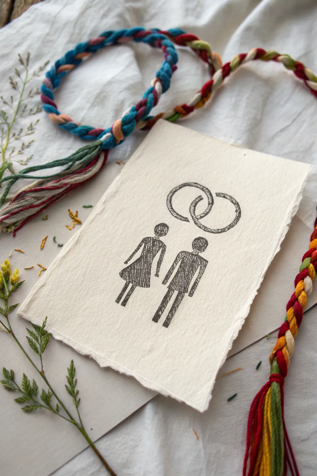
Abstract Auras Braiding Into One

This rustic, heartfelt project combines the tactile charm of handmade paper with the simple elegance of line art. By pairing a primitive-style ink sketch of a couple with vibrant, hand-braided cords, you create a keepsake that symbolizes woven lives and enduring connection.
Detailed Instructions
Materials
- Heavyweight handmade cotton rag paper (deckle edge)
- Black fine-liner pens (0.3mm and 0.5mm)
- Graphite pencil (HB or 2H)
- Kneadable eraser
- Embroidery floss or thin yarn (multifolored, e.g., blue, red, yellow, green)
- Scissors
- Tape or clip (for braiding)
- Dried pressed flowers or grasses (optional styling)
Step 1: Preparing the Canvas
-
Select the Paper:
Begin with a sheet of high-quality, handmade cotton rag paper. The texture is crucial here; you want that slightly fuzzy, soft surface with uneven deckle edges to give it an authentic, old-world feel. -
Size the Paper:
If your sheet is too large, tear it gently against a ruler rather than cutting with scissors to maintain that soft, torn edge look. Aim for a size roughly 5×7 inches. -
Plan the Layout:
Using your HB pencil very lightly, mark the center point for the interlocking rings near the top third of the paper. Then, mark two vertical center lines below for where the figures will stand.
Ink Bleed Alert
Handmade paper is very absorbent. Test your pen on a scrap piece first. If it bleeds too much, switch to a finer nib or move the pen faster.
Step 2: Sketching the Figures
-
Outline the Rings:
Sketch two overlapping circles at the top. Don’t worry about perfect symmetry; a slight hand-drawn wobble adds character. Ensure they overlap clearly in the middle. -
Draft the Couple:
Below the rings, lightly sketch the stick-figure couple. For the figure on the left, draw a triangular dress shape. For the figure on the right, draw a rectangular torso and trousers. -
Add Heads and Limbs:
Draw simple circles for heads. Add thin, stick-like arms and legs. Keep the pose stiff and stylized, evocative of primitive or folk art drawings. -
Refine the Shapes:
Go back over your pencil lines to thicken the bodies slightly. You aren’t filling them in solid yet, just defining the boundaries where the ink texture will go.
Embossed Effect
After inking, flip the paper over and gently press a rounded tool into the back of where the rings are drawn. This creates a subtle raised relief on the front.
Step 3: Inking and Texturing
-
Inking the Rings:
Switch to your 0.5mm pen. Trace the ring outlines. instead of a single solid line, use short, scratchy strokes to build up the line weight, giving it a fibrous, sketched look. -
Texturing the Rings:
Fill the interior of the ring lines with tiny diagonal hatching or stippling to make them look like textured metal rather than flat circles. -
Inking the Figures:
Outline the figures with the 0.5mm pen. For the fill, use a scribbling motion or tight cross-hatching. This scratchy texture mimics the look of a charcoal rubbing or rough print. -
Adding Detail:
Use the finer 0.3mm pen to add subtle details, like a suggestion of a collar on the right figure or the hem of the dress on the left. Keep it minimal. -
Clean Up:
Once the ink is completely dry—give it a few minutes on this porous paper—gently dab the kneadable eraser over the drawing to lift any visible graphite guide lines without smudging the ink.
Step 4: Creating the Braided Elements
-
Select Your Threads:
Choose 3-4 distinct colors of embroidery floss or yarn. Earthy primary tones like deep reds, mustard yellows, and teals work beautifully against the cream paper. -
Cut and Group:
Cut three groups of strands, approximately 15 inches long. Each group should be thick enough to make a substantial braid. -
Start the Braid:
Knot the ends together and tape or clip this knot to a table. Braid the three groups together tightly. This colored cord represents the ‘soulmate’ thread connecting the figures. -
Securing Ends:
Once braided, knot the other end. I often leave a bit of a tassel at both ends for a relaxed, unfinished look. -
Assembly:
Arrange the braid around the drawing or loop it loosely near the top to frame the artwork when displaying or photographing it.
Display your drawing alongside the braid and perhaps a sprig of dried greenery for a truly organic presentation
Have a question or want to share your own experience? I'd love to hear from you in the comments below!