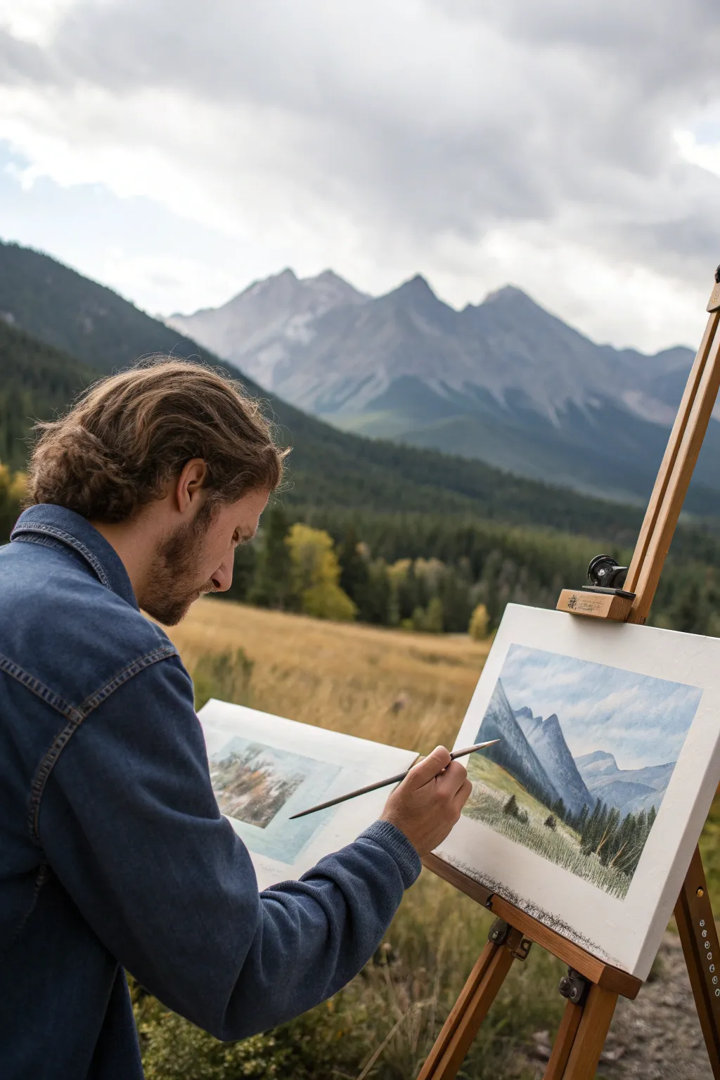
If you’ve ever wished you could make something bold and finished-looking without getting lost in tiny details, speed painting is your new best friend. These ideas are all about big shapes, strong values, and quick decisions that still look seriously impressive.
Sunset Gradient With a Bold Silhouette
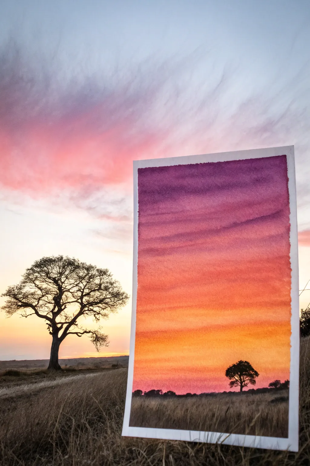
Capture the breathtaking warmth of a savannah evening with this vibrant watercolor gradient. This project focuses on mastering the wet-on-wet technique to create seamless transitions from deep purple skies to a glowing horizon, finished with a stark, evocative silhouette.
Step-by-Step Guide
Materials
- Cold press watercolor paper (approx. 5×7 inches)
- Watercolor paints (Purple, Alizarin Crimson, Cadmium Red, Orange, Yellow)
- Black ink or gouache for the silhouette
- Wide flat wash brush (1 inch)
- Small round detail brush (size 1 or 2)
- Painter’s tape or washi tape
- Jar of clean water
- Paper towels
- Palette for mixing
Step 1: Preparing the Sky Gradient
-
Tape the edges:
Begin by taping down all four edges of your watercolor paper to a rigid board or table. This creates a clean white border and prevents the paper from buckling when wet. -
Pre-wet the paper:
Load your large flat brush with clean water and coat the entire sky area of the paper. You want an even sheen, not puddles, to prepare for the wet-on-wet technique. -
Start with purple:
Mix a rich purple shade. While the paper is still glistening, apply a horizontal stroke across the very top edge. Let the water encourage the pigment to drift downward slightly. -
Transition to violet-red:
Clean your brush and pick up a violet-red or deep crimson color. Apply this directly below the purple, slightly overlapping the edge so the colors bleed together naturally. -
Add the vibrant reds:
Move down the paper with a bold cadmium red. Painting in confident horizontal strokes helps mimic the stratified look of atmospheric clouds. -
Introduce orange tones:
Blend a bright orange into the red layer as you approach the lower third of the paper. The colors should be getting progressively lighter and warmer. -
Finish the gradient:
Near the bottom of the sky area, switch to yellow mixed with a touch of pink. Fade this out just before you hit the bottom horizon line, leaving the very bottom strip almost clear or faintly pink. -
Tilt and dry:
If I feel the blend is too stiff, I like to tilt the board slightly to help gravity mix the layers. Once satisfied, let this layer dry completely. It must be bone dry before the next step.
Fixing Back-Runs
If cauliflower-like blooms appear in your sky, you likely added water to semi-dry paint. Disguise them by turning them into distant clouds with a bit of opaque white gouache.
Step 2: Painting the Silhouette
-
Mix the darkest dark:
While the sky dries, prepare your silhouette color. Pure black watercolor works, but black gouache or waterproof ink provides a more opaque, solid finish. -
Paint the horizon line:
Using the small round brush, paint an uneven, organic horizon line across the bottom. Vary the height slightly to suggest distant bushes or uneven terrain. -
Establish the tree trunk:
Choose a spot on the right side for your focal tree. Paint a vertical trunk that is thicker at the base and tapers as it rises, keeping your hand loose to avoid straight, unnatural lines. -
Add main branches:
Extend 3-4 main branches outward from the top of the trunk. African acacia trees often have a flattened, umbrella-like canopy, so extend these branches horizontally more than vertically. -
Create the foliage texture:
Dab the tip of your brush gently along the tops of the branches to create clumps of leaves. Don’t paint individual leaves; just create rough, stippled textures to suggest density. -
Add distant shrubbery:
Along the horizon line, add tiny bumps and smaller miniature tree shapes in the distance to create a sense of scale and depth. -
Paint the foreground grass:
Use a slightly watered-down gray or brown wash to quickly fill the area below the horizon line. While wet, flick the brush upward to suggest tall, dry grasses in the immediate foreground. -
Final leaf details:
Go back to the main tree and add a few tiny connecting twigs or extra leaf clusters where the silhouette looks too thin. -
Remove tape:
Wait until the painting feels cool to the touch (completely dry). Peel the tape away slowly at a 45-degree angle to reveal your crisp white border.
Vibrant Skies Shortcut
To make colors pop without mud, stick to analogous colors (neighbors on the color wheel) like red, orange, and yellow. Avoid mixing purple directly into yellow.
Place your finished piece against a window or light source to see the colors truly glow


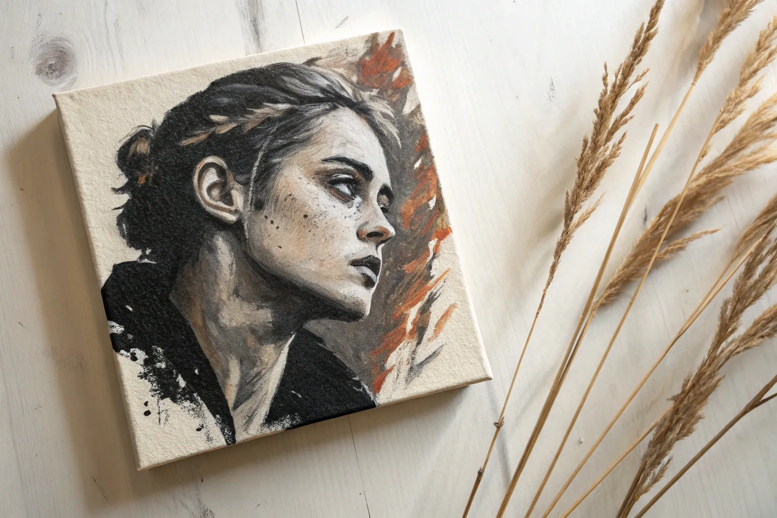
Monochrome High-Contrast Portrait
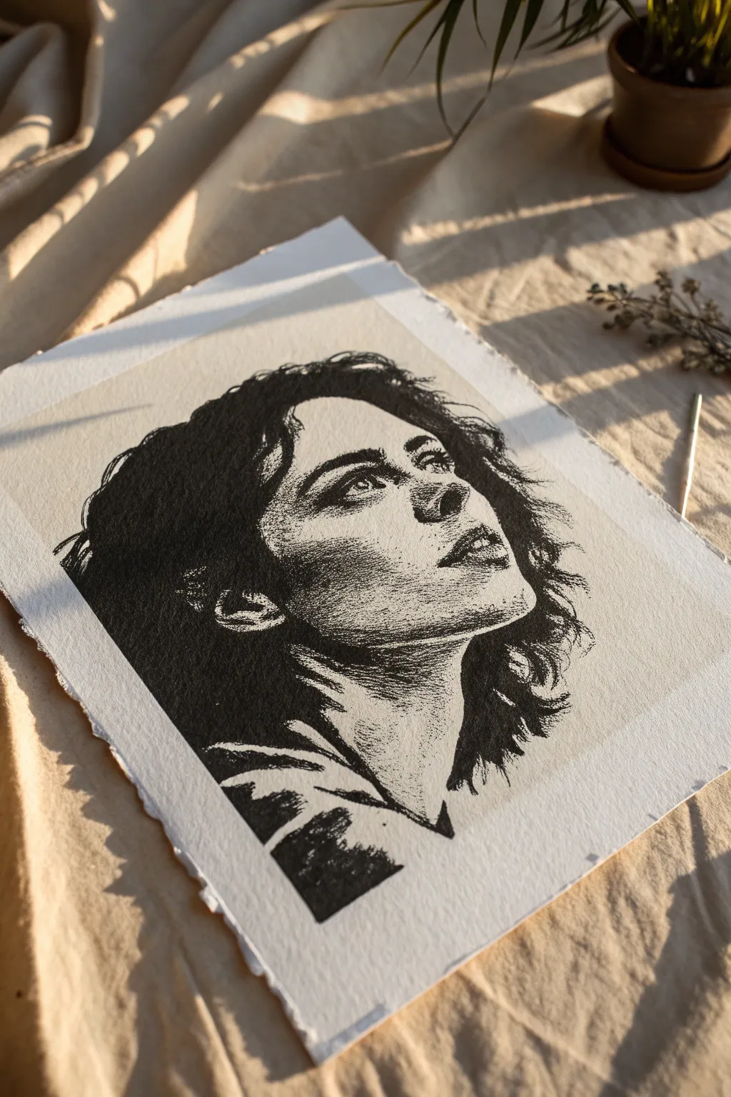
Capture emotion and depth with this striking high-contrast portrait technique that mimics the look of a classic woodblock print. Using only black ink on textured paper, you’ll learn to build form through stippling and solid blocking to create a powerful, timeless image.
Step-by-Step Tutorial
Materials
- Heavyweight cold-press watercolor paper or printmaking paper with deckled edges
- HB or 2H graphite pencil
- Kneadable eraser
- Fine liner pens (sizes 0.05, 0.1, 0.3, and 0.5)
- Black brush pen or India ink with a small brush
- Ruler (optional)
- Reference photo of a face with strong lighting
Step 1: Preparation and Sketching
-
Select your paper:
Choose a thick, textured paper. The deckled edge shown in the reference adds a beautiful artisanal quality, so if your paper doesn’t have it, you can carefully tear the edges against a ruler for a faux-deckled look. -
Define the frame:
Lightly mark a rectangular border with pencil where your image will sit. Leave a generous margin of white space around the drawing to let the artwork breathe. -
Block in the basic shapes:
Using an HB pencil, sketch the large oval for the head. Focus on the tilt of the neck and the upward gaze, which gives this specific piece its dramatic feeling. -
Place the features:
Draw guidelines for the eyes, nose, and mouth. The subject is looking up, so the chin will be prominent, the nose foreshortened, and the eyes will sit higher in the sockets. -
Outline the shadow shapes:
This style relies on high contrast. Instead of shading, draw outlines around where the deepest black shadows will be—specifically the hair, the side of the neck, and under the jawline.
Step 2: Inking the Solids
-
Fill the darkest areas:
Switch to your brush pen or India ink. Carefully fill in the large, solid black areas you outlined: the bulk of the hair, the deep shadow on the neck, and the clothing elements at the bottom. -
Refine the hair edges:
As you ink near the edge of the hair, switch to a 0.5 fine liner. Flick the pen outward to create loose, flyaway strands rather than a solid helmet-like line. -
Define the clothing:
Use the brush pen to create bold, abstract shapes at the bottom of the portrait. These don’t need to be detailed fabric studies; dynamic black triangles suggest folds effectively.
Don’t Rush the Dots
Keep your pen perpendicular to the paper when stippling. Slanted dots look like commas and ruin the texture. Take breaks to prevent hand cramping and keep dots round.
Step 3: Stippling and Detail
-
Start the mid-tones:
Now for the patience game. Using a 0.3 pen, begin stippling (making small dots) along the edge where the solid black shadow meets the skin. This transition is crucial for a 3D effect. -
Shape the jawline:
Concentrate a dense cluster of dots under the ear and along the jaw. The density of dots should fade gradually as you move toward the center of the cheek. -
Detail the eyes:
Switch to your finest 0.05 pen. Dots here need to be microscopic. Outline the iris and pupil, leaving a tiny pure white circle for the highlight to bring the eye to life. -
Sculpt the nose:
Avoid drawing a solid line for the nose bridge. Instead, use a light dusting of dots on the shadowed side of the nose to suggest its shape. The viewer’s brain will fill in the rest. -
Add texture to the lips:
Use short, tiny dashes rather than round dots for the lips to mimic the texture of skin. Keep the upper lip darker (more stippling) than the lower lip. -
Blend the transitions:
Go back with a 0.1 pen and add dots in the ‘grey’ areas—the spaces between your solid blacks and the white highlights. Smooth out any gradients that look too harsh. -
Break the hairline:
I like to add a few stray hairs crossing over the face using the 0.1 pen. A few sweeping lines over the forehead or cheek add movement and realism.
Vintage Paper Hack
Before drawing, lightly wash your paper with diluted tea or coffee and let it dry flat. This warms the background tone and enhances the classic, antique print aesthetic.
Step 4: Finishing Touches
-
Check the contrast:
Step back from your work. If the face looks too flat, you likely need more dots in the mid-tone areas (cheekbones, side of the neck). -
Erase pencil lines:
Wait until the ink is completely bone-dry—smudging now is heartbreaking. Gently roll a kneadable eraser over the surface to lift the graphite guidelines. -
Reinforce the blacks:
Paper absorbs ink as it dries. If your solid black areas look slightly grey or patchy, go over them one last time with the brush pen for maximum impact.
Frame your high-contrast masterpiece in a simple minimal frame to let the texture speak for itself

Clouds and Mountains in 10 Minutes
Capture the majestic atmosphere of a high-altitude valley with this quick, expressive oil painting exercise. You’ll layer soft atmospheric perspective against sharp mountain ridges to create depth and scale in just a short session.
Step-by-Step
Materials
- Canvas panel or stretched canvas (11×14 or similar)
- Oil paints: Titanium White, Ultramarine Blue, Burnt Umber, Sap Green, Yellow Ochre, Alizarin Crimson
- Flat brushes (sizes 8 and 4)
- Small round brush (size 2)
- Palette knife
- Odorless mineral spirits or turpentine
- Paper towels or rag
Step 1: Setting the Sky and Atmosphere
-
Map the horizon:
Begin by lightly sketching your horizon line about one-third of the way up the canvas using a thin wash of Burnt Umber and turpentine. -
Rough in the peaks:
Using the same thin wash, sketch triangular shapes for the three main mountain peaks, ensuring they overlap slightly to create depth. -
Mix the sky blue:
Combine a large amount of Titanium White with a touch of Ultramarine Blue to create a pale, airy sky color. -
Paint the sky:
With a large flat brush, apply the sky mixture using horizontal strokes, letting the color get slightly deeper blue toward the top corners. -
Create cloud forms:
While the sky is wet, mix pure Titanium White with a tiny hint of Alizarin Crimson for warmth and scumble in soft diagonal cloud shapes drifting over the peaks. -
Soften the edges:
Use a clean, dry brush to gently blend the edges of the clouds into the blue, keeping them wispy and indistinct.
Muddy Mountains?
If your mountain highlights are turning grey, stop and clean your brush thoroughly. You need a clean brush to lay pure white snow on top of wet dark paint without mixing.
Step 2: Sculpting the Mountains
-
Base mountain color:
Mix Ultramarine Blue with a little Burnt Umber and White to make a cool, slate-grey tone for the distant mountains. -
Block in shadows:
Apply this grey mixture to the shadow side (the left faces) of your mountain triangles, following the jagged angles of the rock. -
Highlight the ridges:
Mix Titanium White with a very small amount of blue-grey. Apply this to the sunlit right sides of the peaks, letting the paint drag slightly to simulate rocky texture. -
Refine the peaks:
I like to use a palette knife here to gently scrape or apply thick white highlights on the very tips of the mountains for a sharp, snowy look. -
Mist at the base:
Blend the bottom edge of the mountains into the sky color slightly to create the illusion of atmospheric mist rising from the valley.
Step 3: Valley and Foreground
-
Distant hills:
Mix Sap Green with your slate-grey mountain, adding white to desaturate it. Paint the rolling hills at the foot of the mountains. -
Mid-ground meadows:
Create a golden-green by mixing Sap Green, Yellow Ochre, and White. Brush this across the middle section using long, horizontal strokes. -
Foreground grasses:
In the immediate foreground, use a warmer, darker mix of Sap Green and Burnt Umber. Use short, upward flicks to suggest tall grasses. -
Place dark trees:
Mix a deep evergreen color using Sap Green and Ultramarine Blue with very little white. Use the flat edge of a small brush to stamp in vertical pine shapes. -
Detail the trees:
Using the small round brush, add jagged branches to your pines, keeping the bottoms wider than the tops. -
Final highlights:
Add a few touches of Yellow Ochre mixed with white to the tips of the foreground grass where the light hits. -
Check values:
Step back and ensure your darks in the foreground are significantly darker than the mountains to reinforce the sense of distance.
Add a Human Element
For a sense of scale, try painting a tiny, rudimentary hiking trail or a small cabin roof using Burnt Sienna in the mid-ground meadow.
Enjoy the fresh, crisp feeling of your completed mountain landscape study

Loose Floral Bouquet With Big Brushstrokes
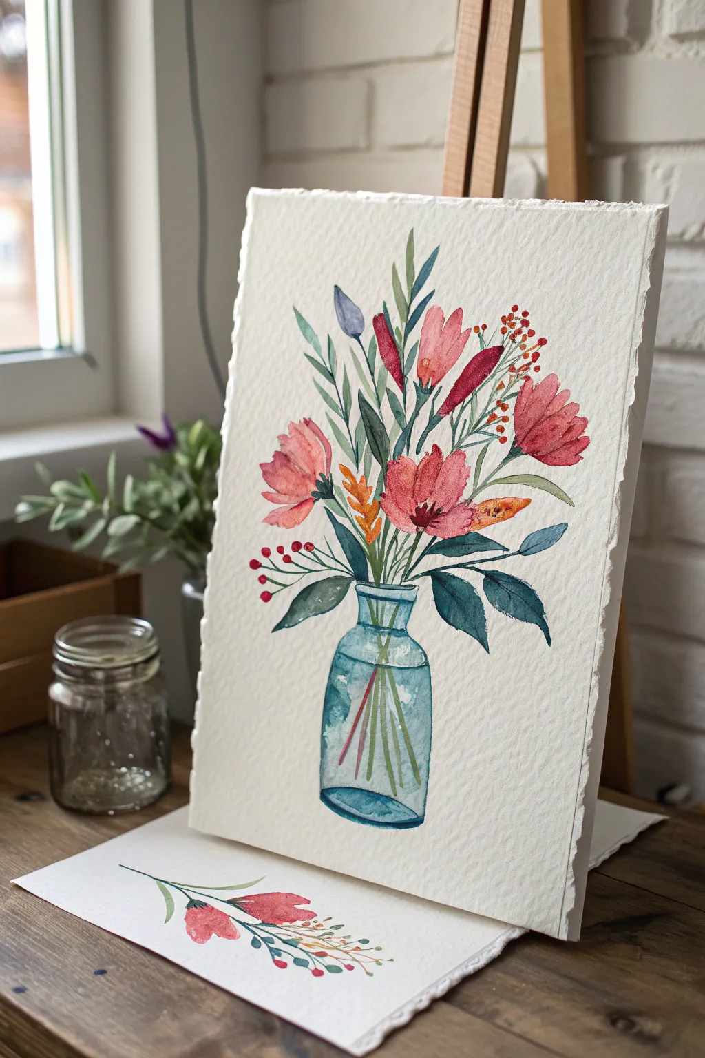
Capture the fresh, airy feel of wildflowers in this loose watercolor study. The composition relies on confident brushwork and the transparency of the medium to create a luminous blue glass vase holding a cheerful array of blooms.
Step-by-Step Tutorial
Materials
- Cold press watercolor paper (300gsm or heavier recommended)
- Watercolor paints (Alizarin Crimson, Sap Green, Ultramarine Blue, Burnt Sienna, Yellow Ochre)
- Round brushes (Size 4 for details, Size 8-10 for washes)
- Jar of clean water
- Paper towels
- Pencil (HB or lighter) for basic sketching
Step 1: Drafting the Shapes
-
Outline the vase:
Begin with a very faint pencil sketch. Draw a simple bottle shape for the vase in the lower center of your paper, slightly wider at the bottom than the neck. -
Placement of flowers:
Lightly mark circles or ovals where the main three pink flower heads will sit. Don’t draw every petal; just indicate their general position and size to ensure a balanced composition. -
Suggesting stems:
Sketch a few guide lines for the stems radiating out from the vase neck, but keep them loose as you’ll paint these directly later.
Water Control
To get those hard edges on the petals characteristic of this style, ensure your previous layer is completely dry before painting an adjacent shape.
Step 2: Painting the Glass Vase
-
Initial water wash:
Using your larger clean brush, apply a layer of clear water inside the vase outline. It should be damp and glistening, but not glistening with puddles. -
Dropping in the blue:
Load your brush with watery turquoise or cyan (a mix of Ultramarine and a touch of green). Touch the wet paper at the edges of the jar, letting the color bleed inward naturally. -
Creating dimension:
While strictly wet-on-wet, add a slightly darker, more concentrated blue to the bottom curve and the very top rim of the neck. Leave the center mostly white to suggest transparency and reflection. -
Visible stems:
Before the jar dries completely, paint thin green stem lines ‘inside’ the jar. Because the paper is damp, they will blur slightly, mimicking the distortion through glass.
Step 3: Floral Elements
-
Main blooms:
Mix a watery red-pink using Alizarin Crimson. Paint the large flower on the right first, using broad, sweeping strokes for petals. Leave small white gaps between strokes to keep it airy. -
Adding variety:
Move to the left flower, perhaps adding a touch of orange to your pink mix for warmth. Paint this bloom slightly angled away from the viewer. -
Central bud:
Paint the smaller, central flower with upright strokes. I find dropping a tiny bit of darker crimson into the base of the petals while wet adds instant depth. -
Secondary buds:
Add the smaller, distinct shapes: a purple-blue single bud near the top left, and the long, thin red buds pointing upward on the right side.
Make It a Set
Paint a matching, smaller single stem (like the one shown at the bottom of the image) on a separate scrap of paper to use as a coordinating gift tag or bookmark.
Step 4: Leaves and Details
-
Large leaves:
Load your size 8 brush with Sap Green darkened with a touch of blue. Press the belly of the brush down near the vase neck and lift as you pull outward to create the substantial, dark leaves drooping over the jar’s edge. -
Airy foliage:
Switch to a lighter, yellow-green mix. Use the tip of your brush to flick wispy stems and smaller leaves upward around the flowers, filling in the empty spaces. -
Berry accents:
Using a small number 4 brush and bright red paint, dot clusters of small berries on thin brown stems. Place some on the far left and high on the right for balance. -
Orange sprig:
Add the unique orange-yellow sprig right in the center of the bouquet for a pop of contrasting color. -
Connecting the stems:
Paint the green stems connecting your flower heads to the vase neck. It’s okay if these dry lines overlap the flowers slightly; it adds to the illustrative style. -
Final definitions:
Once the flowers are dry, add tiny dark centers to the open blooms using a mix of crimson and green. Re-emphasize the bottom outline of the jar with a strong line of blue if the original wash faded too much.
Step back and admire your lively bouquet, perfectly preserved in pigment
BRUSH GUIDE
The Right Brush for Every Stroke
From clean lines to bold texture — master brush choice, stroke control, and essential techniques.
Explore the Full Guide
One-Brush Landscape Challenge
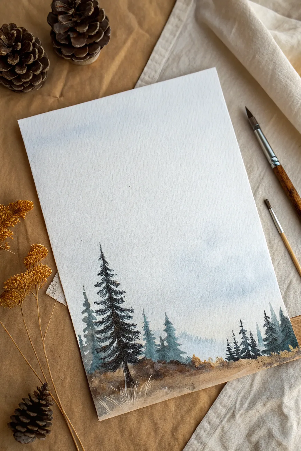
Embrace the simplicity of watercolor with this atmospheric pine forest landscape, designed to be created using primarily a single round brush. The scene features misty, faded trees in the background contrasting with a sharp, detailed conifer in the foreground, perfect for practicing depth and atmospheric perspective.
Step-by-Step
Materials
- Cold Press Watercolor Paper (approx. 300 gsm)
- Round Watercolor Brush (size 6 or 8)
- Small Detail Brush (optional, for fine grass)
- Watercolor Paint: Indigo or Payne’s Gray
- Watercolor Paint: Burnt Umber or Sepia
- Watercolor Paint: Sap Green
- Watercolor Paint: Yellow Ochre or Raw Sienna
- Jar of Clean Water
- Paper Towel
- White Gouache or White Gel Pen (optional)
Step 1: Setting the Atmosphere
-
Prepare the Sky:
Begin by wetting the top two-thirds of your paper with clean water using your round brush. The paper should be glistening but not forming puddles. -
Apply the First Wash:
Mix a very dilute wash of Indigo or Payne’s Gray. Gently touch the loaded brush to the wet paper near the top, allowing the pigment to drift down naturally creates a soft, foggy sky effect. -
Suggest Distant Hills:
While the paper is still damp (but losing some sheen), mix a slightly stronger, yet still watery, blue-grey. Paint a simple, undulating horizon line about a third of the way up from the bottom. Let the edges fuzz out into the wet sky to imply distance.
Step 2: Building the Background Forest
-
Mix Background Greens:
Create a cool, muted green by mixing Sap Green with a touch of Indigo. Dilute this mixture so it is transparent; these trees need to look far away. -
Paint Ghost Trees:
Using the tip of your round brush, paint vertical lines for tree trunks on top of the distant hill layer. These should vary in height. -
Add Foliage Texture:
Using the side of the brush or a dabbing motion, add loose foliage to these background trees. Keep the shapes indefinite and blurry. If the paper is still slightly damp, this softness happens automatically. -
Layer Mid-Ground Trees:
Let the first layer dry completely. Mix a slightly darker, less diluted version of your blue-green. Paint a second row of trees slightly lower on the page, overlapping the first set to create density. -
Grounding the Scene:
Mix Burnt Umber with a touch of Yellow Ochre. Paint the ground area below the trees, letting the brown mix slightly with the bottoms of the wet green trees to root them in the soil.
Too Much Bloom?
If your trees are turning into undefined blobs (blooms), your paper is too wet. Let it dry for a minute or two until the shine disappears before adding the next layer of branches.
Step 3: The Hero Tree
-
Mix the Darkest Value:
For the main foreground tree on the left, you need a strong contrast. Mix your darkest green-black using Sap Green and Indigo, with very little water. -
Establish the Trunk:
Starting near the bottom third of the paper, paint a confident, slightly crooked vertical line for the main trunk. It should be thicker at the base and taper to a fine point at the top. -
Start the Branches:
Starting from the top of the trunk, use the very tip of your brush to flick small branches outward. Keep them short and upward-facing at the very top. -
Fill Out the Body:
Work your way down the tree, making the branches wider and heavier. Press down on the brush belly to create the thick foliage masses, lifting up quickly at the ends to suggest pine needles. -
Add Shadow Depth:
While the paint is wet, drop pure Indigo or Payne’s Gray into the shadowed side of the tree (usually the right side) to give the foliage volume.
Make it Winter
To turn this into a snowy scene, leave white paper gaps on the top of the tree branches and spatter white gouache over the finished painting for falling snow.
Step 4: Foreground Details
-
Paint the Foreground Earth:
Mix a rich brown using Burnt Umber and a hint of dark blue. Paint the immediate foreground at the bottom of the page, using rough, horizontal strokes to simulate uneven terrain. -
Add Warmth:
While the brown wash is wet, drop in some Yellow Ochre or Raw Sienna in patches to suggest dry grass or fallen pine needles catching the light. -
Simulate Grass:
Once the ground is damp-dry (not soaking), use a dry brush technique or a smaller detail brush to flick upward strokes in the foreground. Use white gouache or a pale ochre mix for these highlights to simulate withered winter grass. -
Final Contrast Check:
Step back and assess your image. If the background trees faded too much, you can glaze a very watery blue over the bottom section to push them further back, making the main tree pop.
Enjoy the calm feeling of your misty forest landscape and remember that atmospheric depth comes from value changes
Limited Palette Seascape
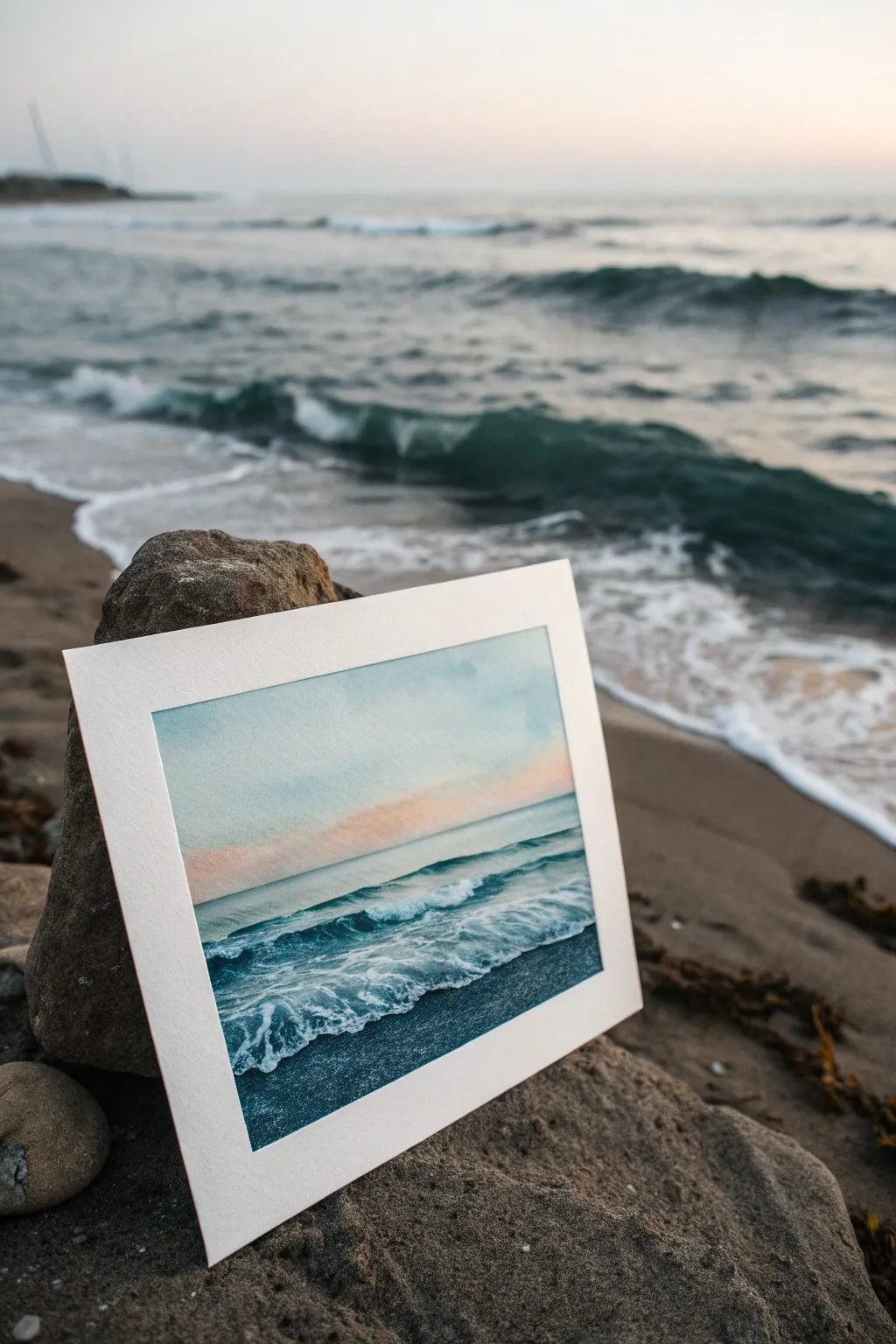
Capture the peaceful rhythm of the ocean with this minimalist watercolor study, focusing on soft gradients and crashing waves. By limiting your palette to just a few hues, you’ll learn to create depth and movement without getting overwhelmed by color choices.
Step-by-Step Tutorial
Materials
- Cold Press watercolor paper (approx. 5×7 inches)
- Watercolor paints: Phthalo Blue (or Prussian Blue), Paynes Gray, Rose Madder (or similar pale pink), and Titanium White gouache
- Flat wash brush (3/4 inch)
- Round brush (size 6 or 8)
- Small detail brush (size 2)
- Masking tape
- Paper towels
- Two jars of water
Step 1: Setting the Scene
-
Prepare your surface:
Tape down all four edges of your watercolor paper to a board. This creates the crisp white border seen in the example and prevents buckling. -
Pre-wet the sky:
Using your large flat brush and clean water, gently wet the top two-thirds of the paper. You want a sheen, not a puddle. -
Paint the upper sky:
Dilute a small amount of Phthalo Blue into a very watery wash. Sweep it across the top of the paper, letting it fade out as you move downward. -
Add the sunset glow:
While the paper is still damp, pick up a dilute mix of Rose Madder. Introduce this horizontally near the horizon line, allowing it to softly bleed upward into the blue without creating a harsh green transition.
Muddy Sky Fix
If blue and pink mix and turn grey/purple, let the layers dry completely between applications. Glazing pink over dry blue keeps colors distinct.
Step 2: Building the Ocean
-
Define the horizon:
Once the sky is matte-dry, mix a slightly stronger value of Phthalo Blue. Draw a straight, level line across the horizon using your round brush. -
Create the distant water:
Drag that blue downward from the horizon, diluting it with water as you come closer to the foreground to suggest light reflecting on the surface. -
Establish the wave form:
Mix Phthalo Blue with a touch of Paynes Gray for a darker teal. Paint the shadow side underneath the main crashing wave, leaving the top paper-white to represent foam. -
Paint the foreground water:
Fill the bottom third of the paper with your darkest mix of Blue and Paynes Gray. This deep value anchors the painting and contrasts beautifully with the white foam.
Step 3: Creating Movement
-
Soften the edges:
Use a clean, damp brush to tickle the bottom edge of the white wave foam, blending it slightly into the dark water below to show transparency. -
Add wave volume:
I like to use a very pale blue wash to add slight shadows within the white foam area, giving the crashing water a 3D rounded form rather than a flat white shape. -
Suggest ripples:
With the tip of your size 6 brush, paint thin, horizontal lines in the middle distance water to suggest gentle swells rolling in.
Pro Tip: The Magic Card
Use the edge of an old credit card to scrape into wet paint in the foreground. It pushes pigment aside to create instant, natural-looking white rocks or foam lines.
Step 4: Foam and Details
-
Mix your opaque white:
Squeeze out a bit of Titanium White gouache. It needs to be creamy, like melted ice cream, so it sits on top of the watercolor. -
Splatter texture:
Load a stiff brush or old toothbrush with the white gouache and gently tap it to create fine mist and spray around the crashing wave. -
Paint distinct foam patterns:
Using your smallest detail brush and the white gouache, paint intricate, lace-like patterns on the dark foreground water. Think of connecting uneven hexagons or spiderwebs. -
Refine the wave crest:
Add sharp highlights of pure white gouache along the very top edge of the breaking wave to make it pop against the background. -
dry and reveal:
Ensure the painting is clearly bone dry before peeling off the masking tape slowly at a 45-degree angle to reveal your crisp border.
Place your finished piece in a simple frame or on a small easel to bring a breath of fresh sea air into your room

PENCIL GUIDE
Understanding Pencil Grades from H to B
From first sketch to finished drawing — learn pencil grades, line control, and shading techniques.
Explore the Full Guide
Gesture Figure With Paint-Only Shapes
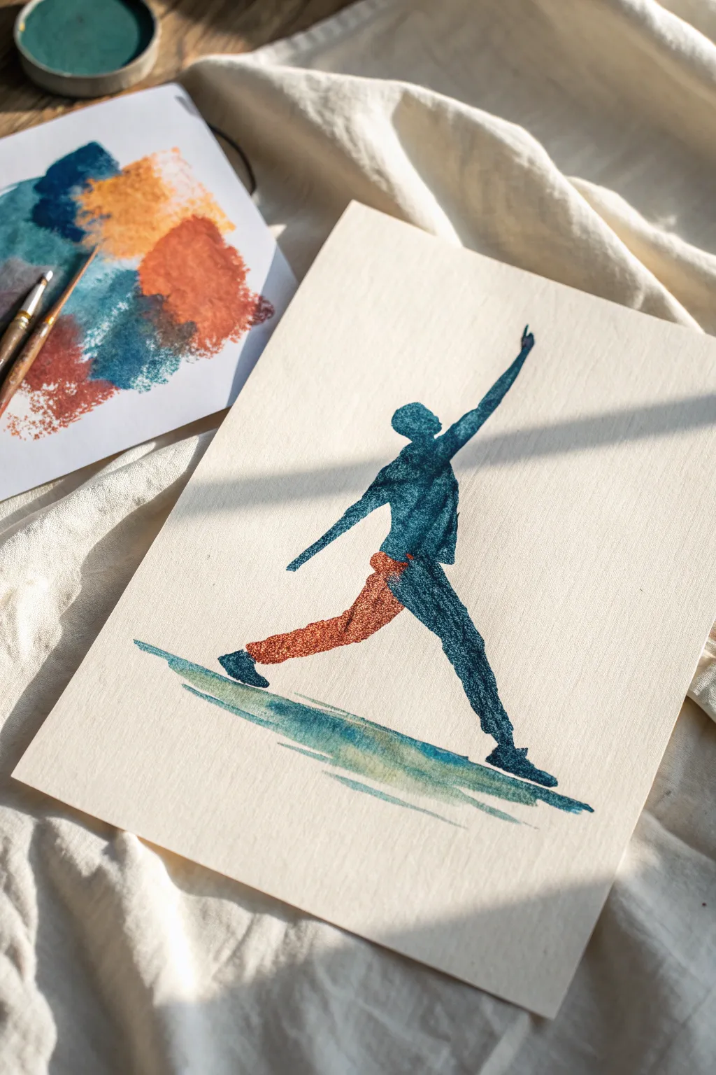
Capture the dynamic energy of human movement by skipping the pencil sketch and painting directly with confident shapes. This project uses a limited palette of deep teal and terracotta to create a striking, silhouette-style figure that feels both modern and expressive.
How-To Guide
Materials
- Cold press watercolor paper (gives a nice texture)
- Watercolor paints (Deep Teal/Indigo and Burnt Sienna/Terracotta)
- Round watercolor brush (size 6 or 8)
- Flat shader brush (optional, for the ground)
- Palette for mixing
- Water cups and paper towel
Step 1: Preparation & Color Planning
-
Select your palette:
Prepare two main colors on your palette: a deep, moody blue-green (like a mix of Prussian Blue and Viridian) and a warm, earthy orange (Burnt Sienna or Red Iron Oxide). -
Test opacity:
On a scrap piece of paper, test your paint consistency. You want a creamy, semi-opaque mixture rather than a very watery wash, as this style relies on bold shapes. -
Visualize the pose:
Before your brush touches the final paper, visualize the line of action. In this project, the figure is lunging forward with an arm raised high—a strong diagonal energy.
Bleeding edges?
If your colors are running together too much into a muddy mess, let the blue sections dry completely (about 10 mins) before painting the orange leg next to them.
Step 2: Painting the Upper Body
-
Start with the torso:
Using the deep teal mixture and your round brush, paint an oblong shape for the torso. Angle it slightly backward to suggest the body’s momentum moving forward. -
Add the head:
Place a small oval for the head just above the torso shape. Leave a tiny sliver of white space or just barely touch the torso; letting them bleed together slightly is perfectly fine. -
Paint the raised arm:
Extend a long, tapering stroke from the shoulder area straight up and slightly outward. The stroke should thin out toward the wrist and hand, suggesting a reach. -
Paint the back arm:
Add the other arm extending downward and back. Keep this shape simple and fluid, not worrying about anatomical muscles, but rather the direction of the limb.
Step 3: Adding the Legs & Color Change
-
Paint the forward leg:
Continue with the deep teal color. Paint a long leg extending forward, planting the foot firmly. This leg supports the weight, so keep the shape strong. -
Switch to terracotta:
Rinse your brush thoroughly. Pick up your burnt orange color for the back leg. This color change adds visual interest and separates the limbs. -
Paint the back leg:
Start this stroke at the hip, overlapping the blue torso slightly if the paint is dry, or letting it bleed if wet for a moody blend. Extend the leg straight back. -
Refine the connection:
If the hip area looks disjointed, I like to dab a tiny bit of the blue into the top of the orange leg to create a shadowed transition area.
Level Up: Salt Texture
While the teal paint on the torso is still wet, sprinkle a few grains of table salt on it. Once dry, brush the salt off for a starry, textured effect.
Step 4: Ground & Details
-
Add the feet:
Switch back to the deep blue. Paint simple, angular shapes for the shoes at the end of both legs. The back foot should be angled as if pushing off the ground. -
Create the ground plane:
Mix a watery wash of the teal/green. Using a flat brush or the side of your round brush, sweep a horizontal stroke beneath the feet. -
Layer the ground shadow:
While the ground stroke is damp, drop in a slightly darker pigment right underneath the shoes to ground the figure and show weight. -
Check the silhouette:
Step back and look at the overall shape. If a limb looks too thin, you can carefully widen it now, but try to avoid overworking the edges. -
Add subtle texture:
If you want the textured look from the example, take a nearly dry brush with thick pigment and scumble (rub lightly) over the darker blue areas to deepen the values without adding water.
Allow your painting to dry completely flat, enjoying the sense of movement you captured without a single pencil line
Two-Color Poster-Style Animal
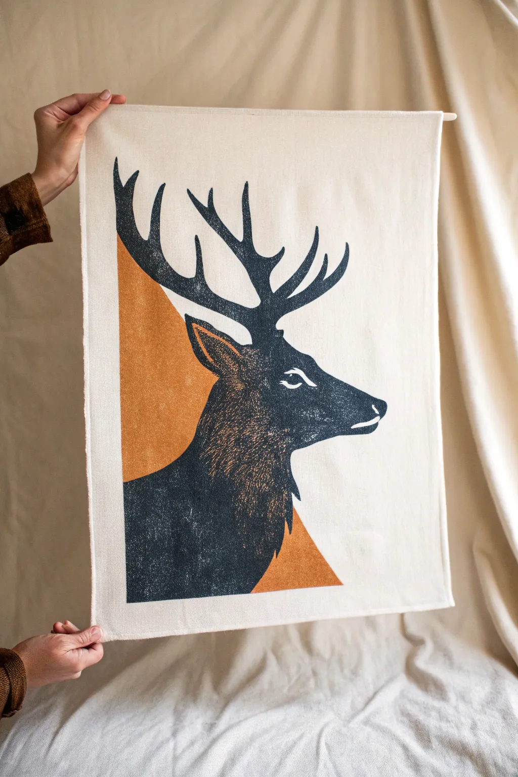
Create a striking piece of wall decor with this poster-style stag design, featuring a bold, high-contrast silhouette against a geometric accent. The result mimics the texture of a classic block print, combining deep charcoal tones with warm ochre on natural fabric.
Detailed Instructions
Materials
- Cotton or linen tea towel (natural/cream color)
- Fabric paint or screen printing ink (black/charcoal and ochre/mustard)
- Stencil film or freezer paper
- Cutting mat and hobby knife (X-Acto)
- Sponge aesthetic brushes or stencil brushes
- Iron (for heat setting)
- Painter’s tape
- Cardboard or poster board (to place under fabric)
Step 1: Preparation & Design
-
Prepare your fabric:
Wash and dry your tea towel or fabric piece to remove any sizing chemicals that might prevent paint adhesion. Press it flat with an iron to ensure a smooth working surface. -
Establish your workspace:
Place a piece of cardboard or thick poster board underneath the fabric layer you’ll be painting. This prevents ink from bleeding through to the back or your table. -
Draft the triangle shape:
Lightly mark out a large right-angled triangle on the left side of your fabric using a pencil or disappearing fabric ink. The vertical edge should run parallel to the left hem. -
Draft the stag silhouette:
Sketch the stag’s profile directly over the triangle area, or transfer a printed template using graphite paper. Ensure the antlers extend well above the triangle, creating a dynamic overlap.
Bleed Control
If your fabric feels too thin or porous, apply a clear acrylic medium or aloe vera gel along the stencil edge first to seal it before applying color.
Step 2: Creating the Background Layer
-
Mask the triangle:
Using painter’s tape, mask off the straight edges of your geometric triangle shape. This ensures crisp, clean lines for the background color. -
Prepare the ochre paint:
Squeeze out your ochre or mustard-colored fabric paint. I find that mixing in a tiny drop of brown can tone down the yellow for a more vintage look. -
Apply the first color:
Using a sponge applicator or stencil brush, dab the ochre paint inside the taped triangle area. Apply it somewhat unevenly to mimic the texture of a hand-pressed block print. -
Create the negative space:
Be careful not to paint fully over the area where the stag’s neck will be if you want the colors to remain distinct, though layering black over ochre usually works fine with quality fabric ink. -
Dry the background:
Allow this ochre layer to dry completely. You can speed this up with a hair dryer if you’re impatient, but ensure it’s bone dry before proceeding.
Step 3: Painting the Stag
-
Cut the stag stencil:
This step gives that crisp print look. Cut your stag design out of freezer paper or stencil film. If using freezer paper, iron it shiny-side down onto the fabric over your dry ochre background. -
Load the black sponge:
Load a clean sponge brush with black fabric ink. Offload excess paint onto a paper towel; you want a ‘dry brush’ effect to get that textured, vintage appearance. -
Stipple the dark layer:
Begin dabbing the black paint over the stencil. Use an up-and-down pouncing motion rather than brushing side-to-side to prevent paint from bleeding under the stencil edges. -
Build up density:
Go heavier with the ink around the edges of the silhouette and the antlers for definition, but go lighter in the center of the neck to let the fabric texture show through slightly. -
Add fur details:
While the paint is wet, use a fine, stiff bristle brush to flick tiny lines at the edges of the neck fur, creating a rougher, more organic edge than the stencil provides.
Lino-Look Trick
To fake a true linocut look, scratch into the wet black paint with a toothpick to reveal the fabric underneath, mimicking carving marks.
Step 4: Refining & Finishing
-
Detail the eye and ear:
Once the main black layer is tacky or dry, use a small detail brush with opaque white fabric paint (or the ochre color) to carefully paint the eye, muzzle highlight, and inner ear details. -
Add texture to the neck:
Using a nearly dry brush with a tiny amount of ochre paint, lightly drag it over the black neck area to simulate fur texture and highlights catching the light. -
Remove stencils:
Carefully peel away your freezer paper or stencil film. This is the most satisfying part, revealing the sharp contrast between your stag and the background. -
Touch up edges:
Inspect your edges. If any paint bled, you can sometimes scrape it away gently with a craft knife or cover it with a tiny dab of opaque white paint. -
Heat set the design:
Once the entire piece has dried for 24 hours (or as per your paint instructions), iron the reverse side of the fabric on a high setting (no steam) to permanently set the ink.
Hang your new textile art using a simple dowel or frame to bring a rustically modern vibe to your space


Speed Painting With a Stencil-Like Cutout Shape
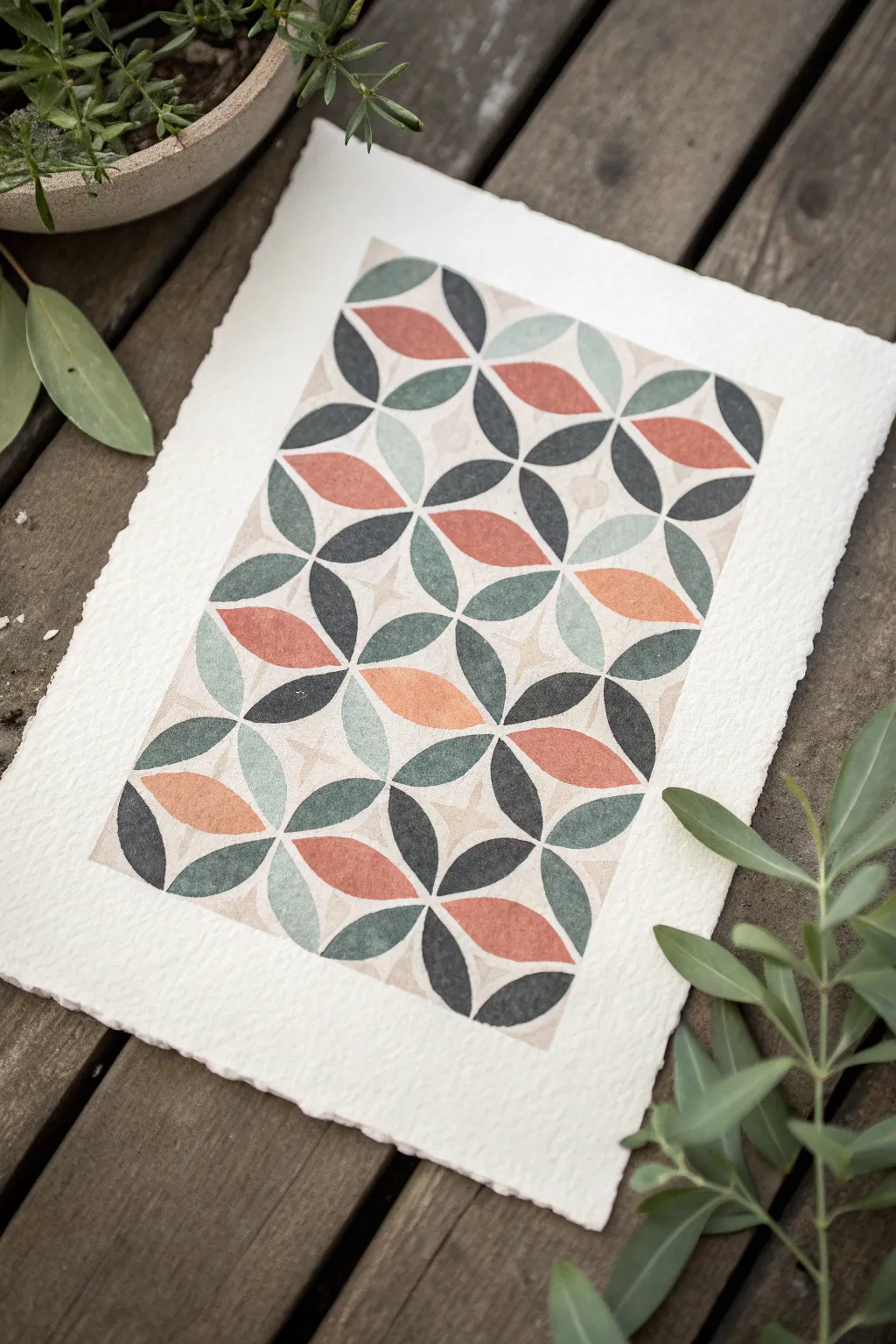
Create a stunning piece of geometric wall art using simple stenciling techniques on beautiful deckled-edge paper. This project combines the organic feel of watercolor textures with the crisp, modern lines of a repeating petal motif.
How-To Guide
Materials
- Heavyweight cold-press watercolor paper with deckled edges (300gsm)
- Small synthetic stencil brushes or high-density foam pouncers
- Stencil sheet (Mylar or acetate)
- Hobby knife (X-Acto)
- Cutting mat
- Repositionable spray adhesive or painter’s tape
- Gouache or acrylic paints (Matte finish)
- Palette
- Pencil and eraser
- Ruler
Step 1: Creating the Stencil
-
Design the motif:
Start by sketching a single ‘flower’ unit composed of four petal shapes meeting at a central point. The design relies on this single unit repeating to form a lattice. -
Prepare the stencil material:
Place your Mylar sheet over your sketch. Using a permanent marker, trace the four-petal shape clearly. -
Cut the stencil:
Place the Mylar on a cutting mat. With a sharp hobby knife, carefully cut out the petal shapes. Ensure your corners are sharp and clean, as this defines the crisp look of the final piece. -
Clean edges:
Check for any hanging bits of plastic on your stencil edges and trim them away to prevent paint bleed.
Step 2: Planning the Layout
-
Measure the paper:
Take your deckled watercolor paper and lightly mark the center point with a pencil. Decide on the size of your margins; wide margins often frame the geometric work beautifully. -
Grid lines:
Very lightly draw a grid on your paper that matches the dimensions of your stencil unit. This step is crucial for keeping the pattern straight as you work across the page.
Bleeding Lines?
If paint bleeds under the stencil, your brush is too wet. Offload more paint onto a paper towel before applying. You can scrape away small dried mistakes with an X-Acto knife.
Step 3: Painting the Pattern
-
Prepare the palette:
Mix four distinct colors on your palette: a deep charcoal, a sage green, a muted coral/terracotta, and a pale blue-grey. Gouache works well here for its opaque, matte finish which mimics a print. -
Secure the stencil:
Lightly mist the back of your stencil with repositionable adhesive. Let it get tacky for a moment, then press it firmly onto the first grid section in the center of your paper. -
Load the brush:
Dip your stencil brush into the charcoal paint. Offload almost all the paint onto a paper towel until the brush feels ‘dry.’ This prevents paint from seeping under the stencil. -
Apply the first color:
Using a vertical dabbing motion, fill in specific petals within the stencil. I prefer to do all the charcoal sections across the entire paper first to maintain color consistency. -
Move and repeat:
Carefully lift the stencil and move it to the adjacent grid square. Press down firmly and repeat the dabbing process for the charcoal petals. -
Switch colors:
Once the dark petals are done across the whole sheet, clean your stencil and brush thoroughly. Move on to the sage green color. -
Fill green sections:
Realign your stencil over the first grid square again. Dab the sage green into the appropriate petal openings, being careful not to overlap the dry charcoal areas. -
Add warmth:
Repeat the process with the coral/terracotta paint. These warm accents bring the geometric pattern to life and should be placed strategically to balance the cooler tones. -
Final accents:
Finish with the pale blue-grey paint in the remaining petal spaces. This lighter color adds dimension and softness to the rigid geometric structure.
Add Metallic Flair
For a luxe touch, swap one of the matte colors (like the grey) for a metallic gold or copper gouache. It catches the light beautifuly against the matte colors.
Step 4: Finishing Touches
-
Remove grid lines:
Allow the paint to dry completely—give it at least an hour to be safe. Then, gently erase any visible pencil grid lines from between the painted shapes. -
Assess the texture:
If some areas look too flat, you can lightly dry-brush a tiny bit of a slightly lighter shade over the centers of the petals to mimic a worn, fabric-like texture.
Once framed, this piece brings a sophisticated, handcrafted touch to any room in your home
Splash and Drag Texture for Instant Energy
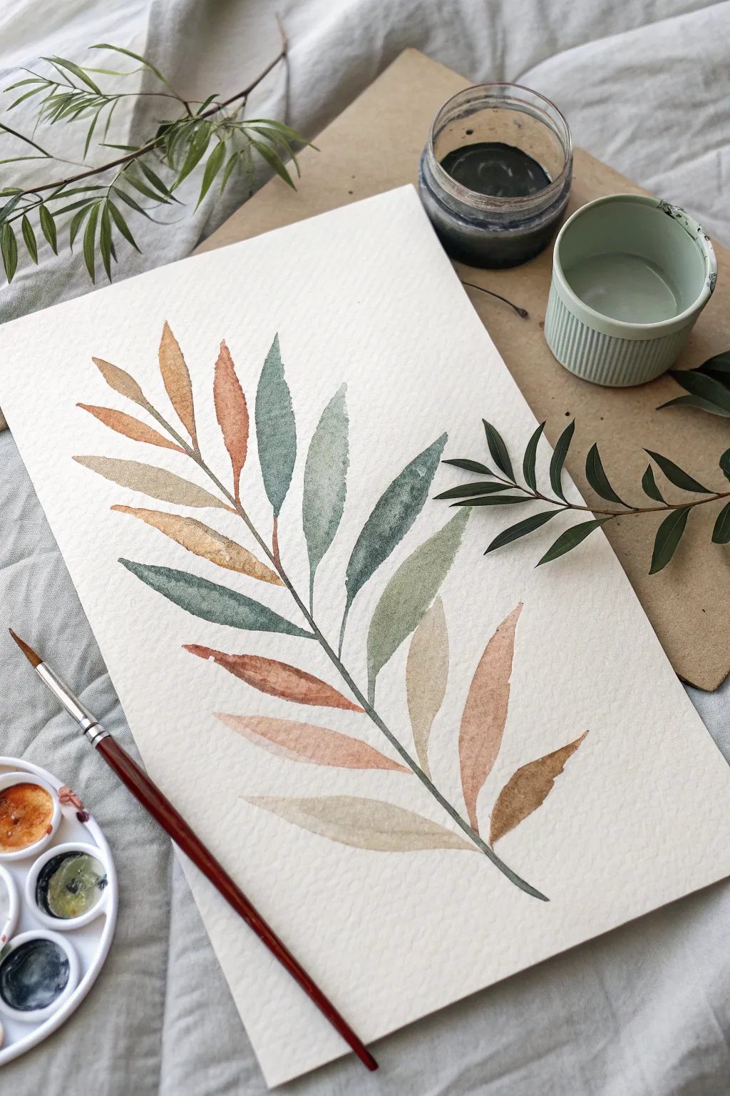
Capture the delicate transition of seasons with this elegant watercolor botanical study featuring a single branch adorned with multi-colored leaves. The piece combines muted greens, warm ochres, and soft terracottas to create a sophisticated, organic composition perfect for modern decor.
Step-by-Step Guide
Materials
- Cold press watercolor paper (300 gsm)
- Round watercolor brush (size 6 or 8)
- Small liner brush (size 1)
- Watercolor paints (Sap Green, Burnt Sienna, Yellow Ochre, Indigo)
- Clean water jar
- Dirty water jar
- Ceramic or plastic mixing palette
- Paper towels
Step 1: Preparation and Sketching
-
Paper Selection:
Begin by selecting a high-quality cold press watercolor paper. The textured surface is crucial for achieving the granulated, organic look seen in the reference image. -
Reference Line:
Using a very hard pencil (like an H or 2H), lightly draw a central curved line that will serve as the main stem. Keep this line faint so it disappears under the paint later. -
Leaf Placement:
Mark small, evenly spaced ticks along the stem where your leaf pairs will originate. Aim for an alternating pattern rather than perfectly symmetrical pairs to keep it looking natural. -
Outline Leaves (Optional):
If you aren’t confident painting freehand, lightly sketch the lance-shaped leaves. They should be tapered at both ends, wider in the middle, and angled upwards.
Water Control Fix
If you get a ‘cauliflower’ bloom where you don’t want one, use a clean, slightly damp brush to gently lift the excess water or pigment while it’s still wet.
Step 2: Mixing the Palette
-
Create a Muted Green:
Mix Sap Green with a tiny touch of Indigo or Burnt Sienna to de-saturate it. You want a sophisticated, earthy green rather than a bright spring green. -
Create a Warm Rust:
Dilute Burnt Sienna with plenty of water. For variation, mix a separate puddle adding a touch of Red or Orange to create a deeper terracotta tone. -
Create a Soft Ochre:
Prepare a watery mix of Yellow Ochre. This will be used for the lighter, sun-faded leaves. -
Test Your Colors:
Swatch your mixed colors on a scrap piece of paper. The beauty of this piece relies on the harmony between the warm browns and cool greens.
Step 3: Painting the Leaves
-
First Leaf Top:
Load your round brush with the muted green mix. Start at the tip of the top-most leaf, press down to widen the stroke for the belly of the leaf, and lift up as you reach the stem to create a point. -
Varying Concentration:
For the next leaf, add more water to your green mix on the palette. Painting with this diluted wash creates transparency and depth. -
Introducing Warmth:
Rinse your brush and switch to the Yellow Ochre mix. Paint a leaf on the opposite side. While the paint is still wet, I sometimes drop in a tiny spot of Burnt Sienna at the base for a soft gradient. -
The Two-Tone Technique:
For the middle leaves, try loading one side of your brush with green and the tip with rust. Paint the stroke in one go to let the colors blend naturally on the paper. -
Working Downwards:
Continue working down the stem, alternating between your green, rust, and ochre mixtures. Leave a tiny hairline gap between the leaf base and the main stem line to prevent colors from bleeding into the stem prematurely. -
Creating Texture:
Allow some leaves to develop ‘blooms’ or ‘backruns’ by dropping a drop of clean water into a drying leaf. This creates those beautiful, hard edges seen in the reference. -
Layering Transparency:
If you want a darker leaf, wait for a first light layer to dry completely, then glaze a second color over half of it. This mimics the look of overlapping foliage.
Splatter Effect
Tap a wet brush loaded with dark paint against your finger over the dry painting. This adds tiny, energetic specks that enhance the organic, messy-chic vibe.
Step 4: Stem and Final Details
-
Dry Check:
Ensure all leaves are completely dry before painting the main stem. If they are wet, the stem color will explode into the leaves. -
Painting the Stem:
Switch to your liner brush (size 1). Mix a dark, concentrated brown (Burnt Sienna + Indigo). Carefully paint the central stem, connecting all your floating leaves. -
Connecting Stalks:
Paint the tiny petioles (leaf stalks) connecting the base of each leaf to the main branch. Let the line weight vary subtly to look organic. -
Final Inspection:
Step back and look at the composition. If a leaf looks too flat, you can add a very faint central vein line with your liner brush using a slightly darker version of the leaf’s color.
Frame this piece behind glass or mount it on a clipboard for a casual, artistic botanical display
Negative Space Speed Painting
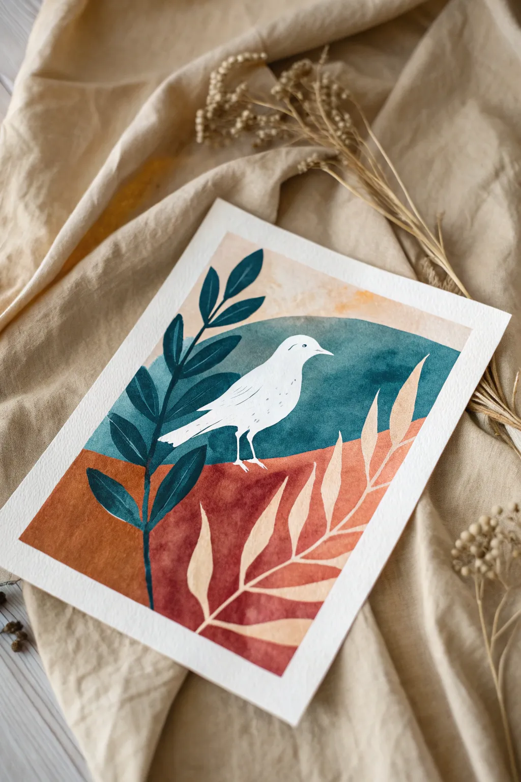
This striking project utilizes negative space to create a bright white bird silhouette amidst a rich, warm landscape. Contrasting deep teal foliage with soft cream fronds creates a balanced, modern composition perfect for a quick creative session.
How-To Guide
Materials
- Cold press watercolor paper (300 gsm)
- Masking fluid (drawing gum) and old brush
- Watercolor paints (Indanthrone Blue, Burnt Sienna, Yellow Ochre, Teal)
- White gouache paint
- Round brushes (sizes 4 and 8)
- Pencil and eraser
- Palette for mixing
- Drying tool (optional: heat gun or hair dryer)
Step 1: Planning and Masking
-
Sketch the composition:
Begin by lightly sketching the outline of a simple bird in the center of your paper. Draw a curved horizon line behind it, separating the sky area from the ground. -
Map out foliage:
Available space on the left needs a tall, leafy branch structure, while the right side will feature a fern-like frond sweeping upward. Keep these lines faint to avoid graphite showing through later. -
Apply masking fluid:
Using an old brush or a silicone applicator, carefully fill in the entire bird shape with masking fluid. This preserves the white of the paper. -
Mask the right-side fern:
Apply masking fluid to the fern shape on the right side as well. Let this dry completely before touching it; it should feel tacky but not wet.
Torn Paper Woes?
If removing masking fluid tears your paper, you removed it too quickly or the paper is too soft. Always use 100% cotton paper and ensure everything is bone dry first.
Step 2: Painting the Background
-
Mix the sky color:
Create a watery wash of teal mixed with a touch of Indanthrone Blue. You want a cool, moody tone that contrasts with the warm ground. -
Paint the upper section:
Apply the blue wash to the area above your horizon line, painting right over the masked bird. I like to keep the top edge uneven and organic rather than painting a straight box. -
Add texture to the sky:
While the blue paint is still damp, drop in slightly darker pigment near the horizon line to create depth and interest. -
Mix the ground color:
Combine Burnt Sienna with a little Red or Alizarin Crimson to get a rusty, terracotta hue. -
Paint the lower section:
Fill the bottom half of the paper with your terracotta mix, again painting freely over the masked areas. Ensure the horizon line meets the blue sky cleanly without bleeding excessively. -
Let it dry fully:
Allow the entire background to dry completely. If the paper is cool to the touch, it’s still wet.
Level Up: Texture
Sprinkle coarse salt onto the wet terracotta paint while the ground layer is drying. Brush it off later for a beautiful, sandy geological texture.
Step 3: Adding Details and Finishing
-
Paint the dark foliage:
Mix a concentrated Indanthrone Blue or a dark teal (almost navy). Using a size 4 brush, paint the leafy branch on the left side directly over the dry background. -
Refine the dark leaves:
Ensure the leaves overlap the background colors but stop neatly where they meet the bird’s masking fluid, creating a layered effect. -
Remove the masking:
Once all paint is bone dry, gently rub away the masking fluid with your finger or a rubber cement pickup to reveal the pristine white paper underneath. -
Detail the bird:
Using a fine brush and a very diluted grey or blue, add a tiny dot for the eye and a few faint lines suggesting wing feathers. Keep it minimal. -
soften the fern:
The unveiled white fern on the right might look too stark. Glaze over it lightly with a very watered-down Yellow Ochre or cream gouache to warm it up so it harmonizes with the terracotta. -
Add white touches:
If your main dark leaves on the left need definition, use opaque white gouache to add a tiny separation line where the stem meets the leaves. -
Final assessment:
Check your edges. If paint bleed occurred under the mask, touch it up with white gouache to restore sharp, crisp lines.
Step back and admire how the negative space makes your bird shine brighter than any paint could achieve
Spinning Easel Style: Rotating Mid-Paint
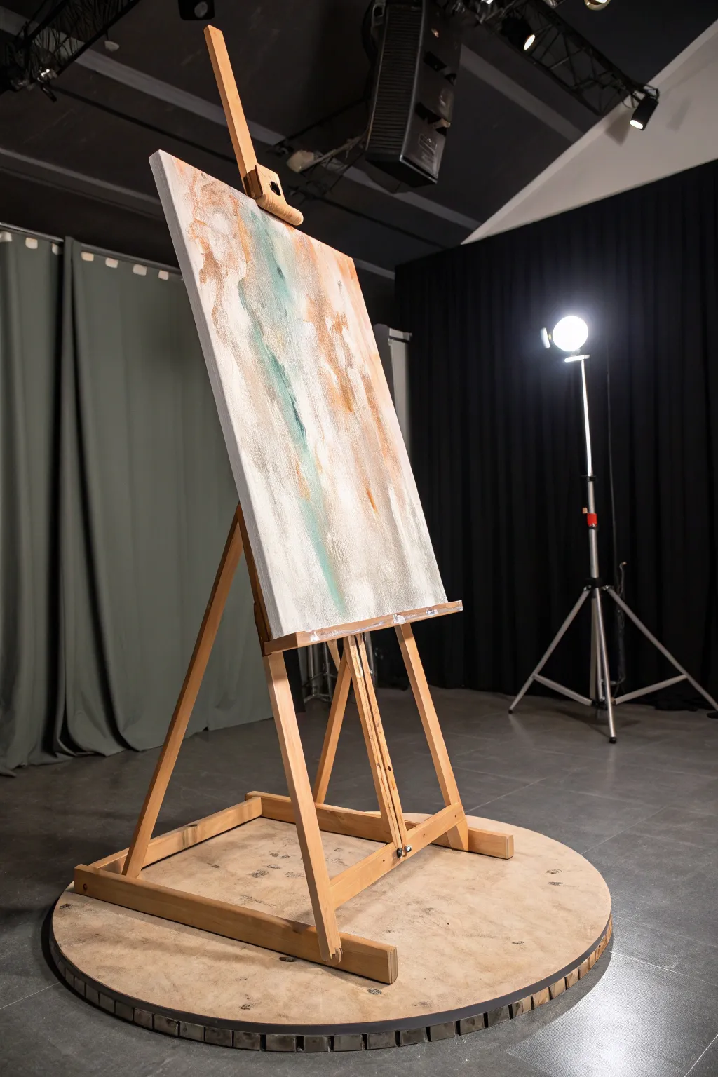
Capture the essence of motion and fluidity with this large-scale abstract painting, featuring sweeping vertical textures and a soothing palette of mint, copper, and white. By utilizing a rotating platform, you can achieve organic streaks and dynamic negative space not easily replicated by hand alone.
Step-by-Step Guide
Materials
- Large stretched canvas (24×36 inches or larger)
- Wooden easel
- Rotating circular platform or Lazy Susan base (heavy-duty)
- Acrylic paints (Titanium White, Buff Titanium, Copper Metallic, Mint Green, Teal)
- Texture paste or molding paste
- Large palette knives and scrapers
- Wide flat brush (2-3 inch)
- Spray bottle with water
- Drop cloth (essential for spinning)
Step 1: Setting the Stage
-
Secure the easel:
Before touching a brush, ensure your easel is securely mounted to the center of your circular wooden platform. It needs to be balanced perfectly so it spins without wobbling. -
Protect the area:
Lay down an extensive drop cloth underneath and around the perimeter of the platform. Spinning paint can flick outwards unexpectedly. -
Prime the canvas:
Apply a base coat of Titanium White across the entire canvas using a wide flat brush to ensure the surface is uniform and bright.
Wobble Worries
If the easel feels unstable during a spin, place sandbags or heavy weights on the back legs of the easel structure to lower the center of gravity.
Step 2: Building the Foundation
-
Apply texture paste:
Using a large palette knife, smear molding paste vertically down the canvas in random, thick patches. Focus on the center and upper-left quadrants. -
Spin and spread:
Give the platform a gentle, slow spin. While it moves, hold a wide scraper lightly against the texture paste to elongate the strokes naturally. -
Let it cure:
Allow the texture paste to dry completely, usually for a few hours, until hard to the touch. -
Mix your neutrals:
Combine Buff Titanium with a touch of white to create a creamy off-white shade. You want this to be semi-fluid. -
Vertical washes:
Apply the creamy mixture in long, vertical streaks, letting the paint catch on the dried texture ridges.
Metallic Pop
Mix a glazing medium with the copper paint. This makes the metallic pigment translucent, adding depth without covering the layers beneath.
Step 3: Adding Color and Motion
-
Introduce the teal:
Mix Mint Green with a tiny drop of Teal. Apply this color sparingly in the upper-left and center areas, letting it blend slightly with the still-wet neutral base. -
The metallic touch:
Load a palette knife with Copper Metallic. I find that applying this color quickly and decisively creates the best shimmering highlights. -
Spin for blending:
Spin the platform at a medium speed. Hold a clean, damp brush against the canvas edges to soften the transition between the colors and the white background. -
Create drip effects:
Spray water lightly on the teal and copper areas while the easel is stationary. Let gravity pull faint drips downward. -
Spin dry:
Give the easel a faster spin. The centrifugal force will push the water drips outward and create subtle horizontal feathering against the vertical strokes.
Step 4: Refining the Composition
-
Highlight with white:
Once the color layer is tacky but not fully dry, use pure Titanium White on a scraper to reclaim negative space, particularly on the right side. -
Dry brushing:
Take a dry brush with a very small amount of the copper paint and whisk it over the highest points of the texture for a gilded effect. -
Evaluating balance:
Step back and spin the easel slowly to view the piece from all angles. Add small touches of teal or white where the composition feels too heavy. -
Final cure:
Allow the painting to sit undisturbed for at least 24 hours to let the thick texture and acrylic layers cure fully.
Now you have a dynamic, textured piece that brings a sense of movement to any room


Have a question or want to share your own experience? I'd love to hear from you in the comments below!