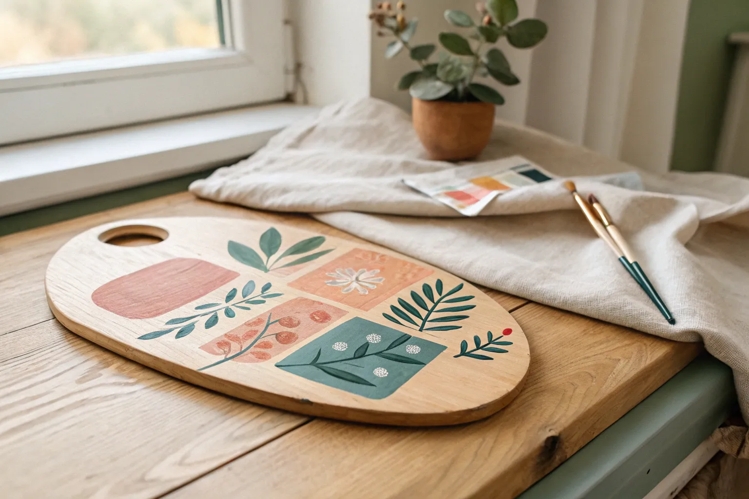
If you’re craving artistic acrylic painting ideas that look impressive without feeling intimidating, you’re in the right place. I’m focusing on beginner-friendly projects that teach core skills like smooth blending, easy texture, and bold shapes—so you can finish paintings you’ll actually want to hang up.
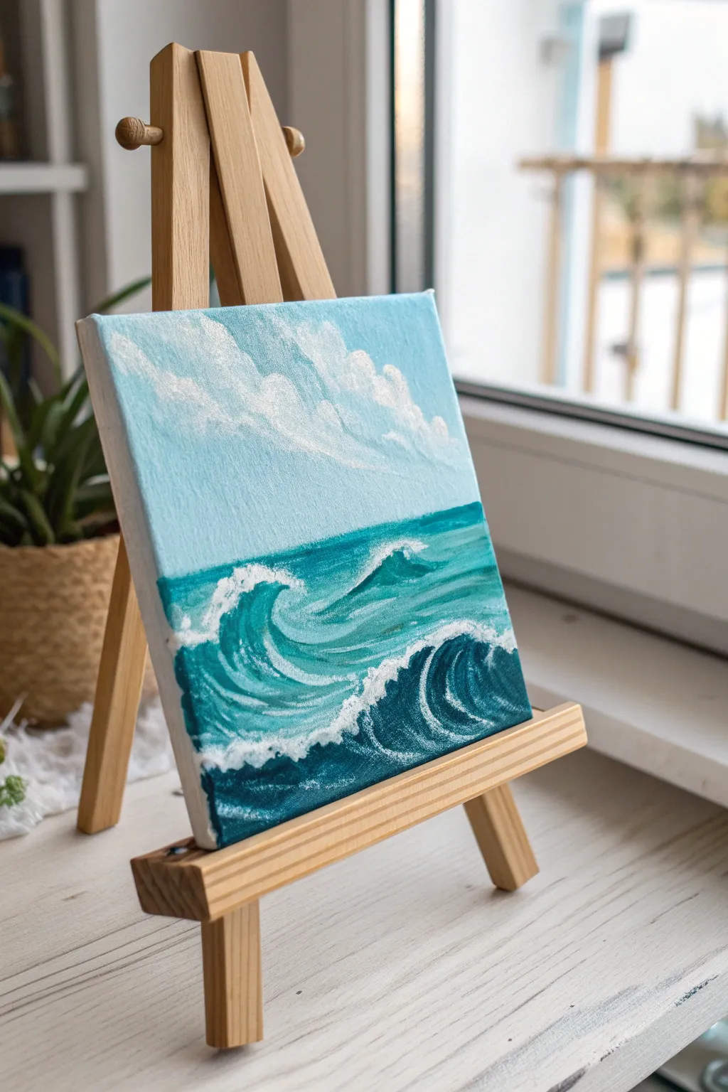
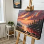
Sunset Gradient Over a Simple Horizon
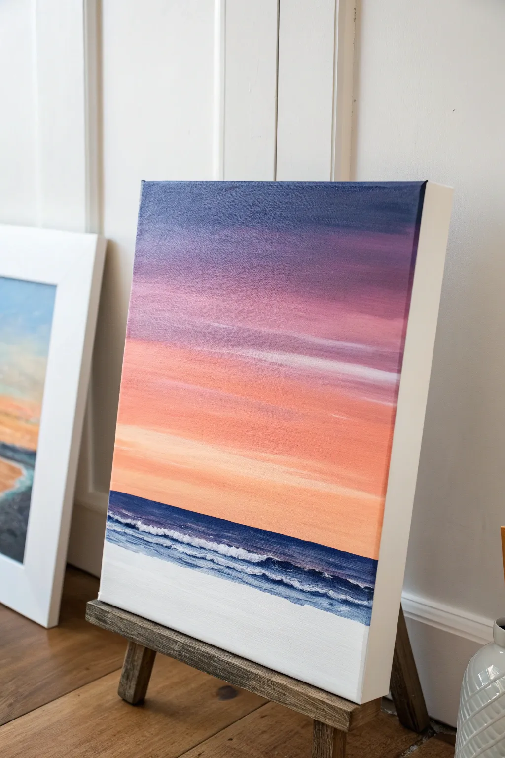
Capture the serene transition of day into night with this vibrant sunset gradient painting. By blending rich purples into soft peaches and finishing with breaking waves, you will create a calming coastal scene perfect for any wall space.
Step-by-Step Guide
Materials
- Stretched canvas (12×16 inch or similar vertical orientation)
- Acrylic paints (Titanium White, Ultramarine Blue, Dioxazine Purple, Magenta or Alizarin Crimson, Cadmium Orange, Cadmium Yellow Light)
- Medium flat brush (3/4 inch or 1 inch)
- Small flat brush (1/4 inch)
- Small round detail brush
- Palette or paper plate
- Cup of water and paper towels
- Painter’s tape or masking tape (optional for horizon line)
Step 1: Painting the Sky Gradient
-
Position the horizon:
Decide where your horizon line will sit. For this piece, place it fairly low, about one-quarter of the way up from the bottom edge. You can lightly mark this with a pencil or apply a strip of painter’s tape to keep the line crisp. -
Mix the deepest purple:
On your palette, mix a generous amount of Dioxazine Purple with a touch of Ultramarine Blue to create a deep, twilight indigo. Using your largest flat brush, paint the top 2-3 inches of the canvas with horizontal strokes. -
Transition to violet:
Without cleaning your brush thoroughly, pick up some pure purple and a tiny bit of Magenta. Paint the next section down, overlapping slightly with the dark top layer. Use long, horizontal sweeping motions to blend the wet edges where the colors meet. -
Introduce pink tones:
Wipe your brush on a paper towel. Load it with Magenta and a touch of Titanium White to create a soft orchid pink. Apply this below the purple section, blending upwards into the previous layer while the paint is still tacky. -
Warm up the sky:
Clean your brush. Mix Cadmium Orange with a little Magenta and White to get a warm salmon color. Paint the middle section of the sky, carefully blending the upper edge into the pink layer. If the blend feels dry, a slightly damp brush can help smooth the transition. -
Brighten the horizon:
For the area just above the water, mix Cadmium Yellow, a dot of Orange, and plenty of White to make a pale peach glow. Paint this all the way down to your horizon line. I like to keep this area quite bright to mimic the sun’s fading light. -
Add cloud streaks:
While the sky is drying but still slightly damp, take a smaller flat brush with a little watered-down white or pale pink paint. Gently drag a few horizontal streaks across the pink and orange sections to suggest wispy clouds.
Keeping It Smooth
Work quickly when blending the sky! Acrylics dry fast. If paint drags, mist the canvas lightly with water or use a slow-drying medium to keep colors workable.
Step 2: Creating the Ocean and Beach
-
Paint the deep water:
If you used tape for the horizon, remove it now. Mix Ultramarine Blue with a tiny touch of Purple. Using a clean flat brush, paint a dark, straight line right at the horizon, extending the blue band down about an inch. -
Lighten the shallows:
As you move closer to the bottom, start mixing White into your blue paint. Creates a gradient from the deep horizon blue to a lighter, turquoise blue as the water approaches the shore. -
Establish the sand:
For the bottom section of the canvas, simply paint pure Titanium White. While real sand is beige, this high-contrast white style gives the piece a clean, modern look. Bring the white paint up to meet the blue water. -
Blend the shoreline:
Where the light blue water meets the white sand, gently blend the two wet paints together slightly so there isn’t a harsh line, suggesting wet sand or shallow water.
Muddy Colors?
If your purple and orange mix into a brown mess, wash your brush thoroughly between these layers. Let the purple dry completely before painting orange nearby.
Step 3: Adding Waves and Details
-
Create the main wave:
Load a small round brush with thick Titanium White paint. Along the transition line between the blue water and white sand, dab the paint on to create the foamy texture of a crashing wave. -
Build foam texture:
Don’t paint a straight line for the wave; instead, use a stippling or tapping motion. Make the foam thicker and more irregular in some spots to look natural. -
Add secondary ripples:
Paint a few thinner, parallel white lines further out in the blue water to represent smaller ripples or waves rolling in. Keep these lines broken and irregular. -
Add shadows to waves:
Mix a very watery, dark blue. Using your smallest detail brush, carefully paint a thin shadow line right underneath the thickest parts of your white foam. This gives the wave volume and lifts it off the canvas. -
Paint the sides:
To finish the piece professionally without a frame, extend your sky and ocean colors around the edges of the canvas, matching the gradient layers as best you can. -
Final touches:
Step back and assess your painting. If you need brighter highlights on the wave, add one final layer of pure white on the very top of the foam once the previous layer is dry.
Allow your painting to dry completely before finding the perfect spot to display your sunset seascape

Misty Mountains With Layered Ridges
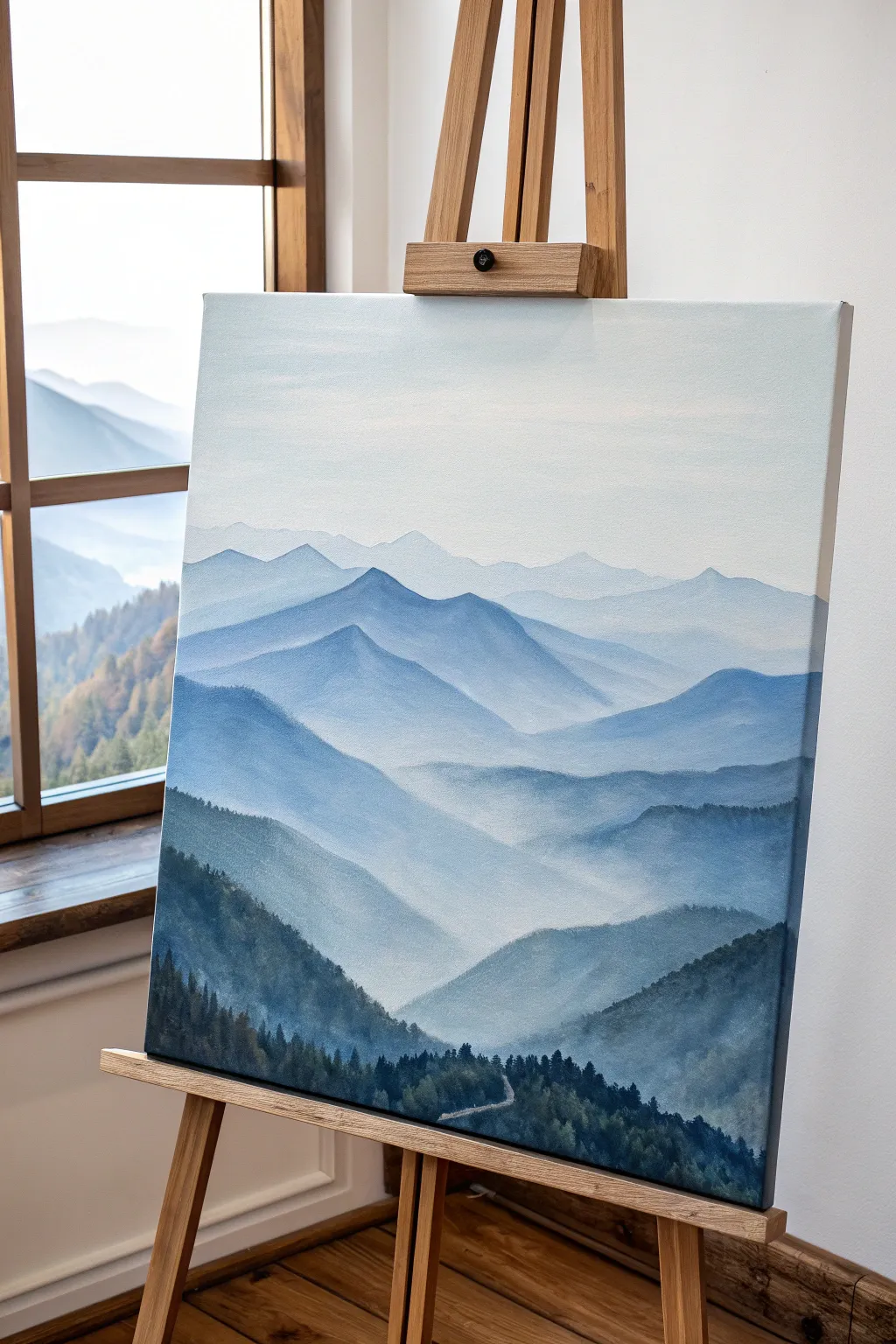
Capture the breathtaking depth of a mountain range fading into the distance with this atmospheric landscape study. Using subtle shifts in value and color saturation, you will create a sense of vast space and tranquility right on your canvas.
Detailed Instructions
Materials
- Stretched canvas (vertical orientation)
- Acrylic paints: Titanium White, Ultramarine Blue, Phthalo Blue, Mars Black, Sap Green
- Paintbrushes: 1-inch flat wash brush, medium filbert brush, small round detail brush
- Palette for mixing
- Cup of water
- Paper towels
- Easel (optional but helpful)
Step 1: Setting the Scene
-
Prepare the sky:
Start by mixing a large amount of Titanium White with the tiniest touch of Ultramarine Blue. Using your large flat wash brush, cover the top third of the canvas in a smooth, horizontal motion. The goal is a very pale, almost white sky that fades seamlessly. -
Create the first ridge:
While the sky is still slightly damp (or after it dries if you prefer hard edges), mix a very pale blue-grey. Keep it 90% white with just a hint of blue. Paint the silhouette of the most distant mountain range across the horizon line, keeping the edges soft. -
Establish the gradient:
Immediately blend the bottom of this first mountain ridge downwards into the white canvas below it using a clean, damp brush. This ‘mist’ effect is crucial; the paint should fade to nothingness before you start the next layer.
Pro Tip: Atmospheric Perspective
Depth is created by value, not just size. Ensure your farthest mountains are barely visible (low contrast) while foreground mountains have the deepest blacks and highest contrast.
Step 2: Building Layers of Depth
-
Mix the second tier color:
Slightly darken your previous mixture by adding a touch more Ultramarine and a speck of Phthalo Blue. The value shift should be subtle—just barely darker than the first ridge. -
Paint the second range:
Paint a new mountain shape overlapping the misty bottom of your first range. Vary the peaks and valleys so they don’t look identical to the layer behind them. -
Mist technique:
Just like before, wash out the bottom edge of this new mountain range with water or white paint to create that foggy, settled look in the valleys. -
Intermediate ridges:
Continue this process for the next 2-3 layers. With each new ridge moving down the canvas, add progressively more blue and a tiny hint of black to deepen the color. -
Adding texture:
As you move into the middle ground (the center of the canvas), switch to your filbert brush. Instead of flat color, use choppy, vertical strokes to suggest trees or rough terrain on the slopes, while keeping the overall color blue-dominant. -
Dry thoroughly:
Pause here and let the background and middle ground layers dry completely. If the paint is wet, the distinct layers of the foreground will muddy the mist effect.
Step 3: The Foreground Details
-
Prepare dark greens:
For the closest mountains, abandon the pale blues. Mix Sap Green with Mars Black and a touch of Phthalo Blue to create a deep, rich forest green color. -
Paint the heavy ridgeline:
Paint the large, sweeping mountain closest to the viewer in the bottom third of the canvas. This shape should be bold and much darker than anything else on the painting so far. -
Create tree textures:
Using the tip of your small round brush or the edge of a flat brush, tap tiny vertical uneven lines along the top ridge of this dark mountain to simulate the silhouette of pine trees. -
Introduce the road:
If you wish to include the small winding road shown in the example, mix a light grey. With your smallest detail brush, paint a thin, winding line snaking through the dark foreground trees, breaking the line occasionally so it looks like it disappears behind foliage. -
Final foliage layers:
Use pure black or your darkest green mix to dab in the very bottom edge of the canvas. This grounds the painting and pushes the lighter mountains further back. -
Highlighting (Optional):
If the foreground looks too flat, I find that mixing a slightly lighter olive green and stippling the tops of a few foreground trees adds nice dimension without ruining the silhouette. -
Finishing touches:
Step back five feet to view the whole composition. If the mist between layers isn’t distinct enough, you can use a dry brush with a tiny amount of white paint to glaze over the valleys.
Troubleshooting: Hard Lines?
If your ‘mist’ isn’t fading smoothly and leaves hard lines, keep a dedicated ‘blending brush’ slightly damp with clean water to soften paint edges immediately after applying them.
Hang your finished landscape where you can enjoy the peaceful view of the endless blue ridges


Easy Ocean Waves With Foamy Highlights
Capture the refreshing energy of the ocean with this beginner-friendly acrylic painting, featuring dynamic turquoise waves and soft, billowing clouds on a compact canvas. This project focuses on layering teals and whites to create depth and movement without requiring advanced brushwork skills.
Step-by-Step Guide
Materials
- Small square stretched canvas (e.g., 6×6 or 8×8 inch)
- Acrylic paints: Titanium White, Phthalo Blue (or Cerulean), Viridian Green, and a dark blue like Prussian or Ultramarine
- Flat brush (medium size) for sky and water base
- Round brush (small/detail) for foam and highlights
- Palette or paper plate for mixing
- Cup of water and paper towels
- Mini wooden easel (optional, for display)
Step 1: Sky and Base Layers
-
Prepare the sky gradient:
Mix a large amount of Titanium White with a very tiny touch of your lighter blue to create a pale azure. Paint the upper two-thirds of the canvas with this mixture, using horizontal strokes. -
Smooth the transition:
While the paint is still slightly wet, add a hint more blue to your brush and blend it into the very top edge, fading it downward to create a soft atmospheric gradient. -
Block in the ocean:
For the water, mix Viridian Green with Phthalo Blue and a little White to get a vibrant turquoise. Paint the bottom third of the canvas, ensuring a straight horizon line where it meets the sky. -
Darken the deep water:
Mix a darker teal using your dark blue and green without white. Apply this to the bottom corners and the area just below where your main wave will crash to establish depth. -
Let it dry completely:
Allow these base layers to dry fully before moving on; acrylics dry quickly, so 10–15 minutes usually suffices.
Step 2: Sculpting the Waves
-
Draft the wave shapes:
Using a slightly lighter teal mixture, paint curved, sweeping strokes to indicate the body of the waves. Focus on a large C-shape in the foreground and smaller ripples near the horizon. -
Add translucent highlights:
Mix a pale seafoam color (lots of white plus a touch of teal). Paint inside the curve of the main wave to show where the light shines through the thinner water. -
Create the cloud base:
Switching back to the sky, use a predominantly white mix with a dry brush technique to dab in fluffy cloud shapes diagonally across the sky. -
Refine the clouds:
Add pure white to the top edges of the clouds for sunlight highlights, blending the bottoms softly into the blue sky.
Muddy colors?
If your white foam turns green, the teal layer underneath wasn’t dry enough. Let the base dry completely before adding white, or wash your brush thoroughly between colors.
Step 3: Foam and Details
-
Paint the wave crests:
Load a small round brush with pure Titanium White. Paint the ragged, breaking top edge of the main wave, pulling small strokes downward to mimic falling water. -
Add sea foam texture:
Dab the brush along the bottom of the wave where it crashes. Use a stippling motion (tapping the brush tip) to create the look of bubbly, churning foam. -
Create surface ripples:
Paint thin, broken white lines horizontally along the darker water surface to represent distant ripples catching the light. -
Enhance the contrast:
If the foam looks too flat, take a tiny bit of dark blue glaze (paint thinned with water) and shadow the underside of the white foam for extra 3D volume. -
Final highlights:
I like to add a few final dots of pure white on the thickest parts of the sea foam and the brightest tips of the clouds to make them pop. -
Paint the edges:
Don’t forget to extend your painting around the sides of the canvas for a polished, gallery-ready look.
Dry Brushing
For realistic clouds and sea spray, wipe most of the paint off your brush on a paper towel before painting. This creates a scratchy, textured look perfect for mist.
Now you have a refreshing slice of the ocean ready to display on a desk or shelf
Birch Trees Using Quick Vertical Strokes
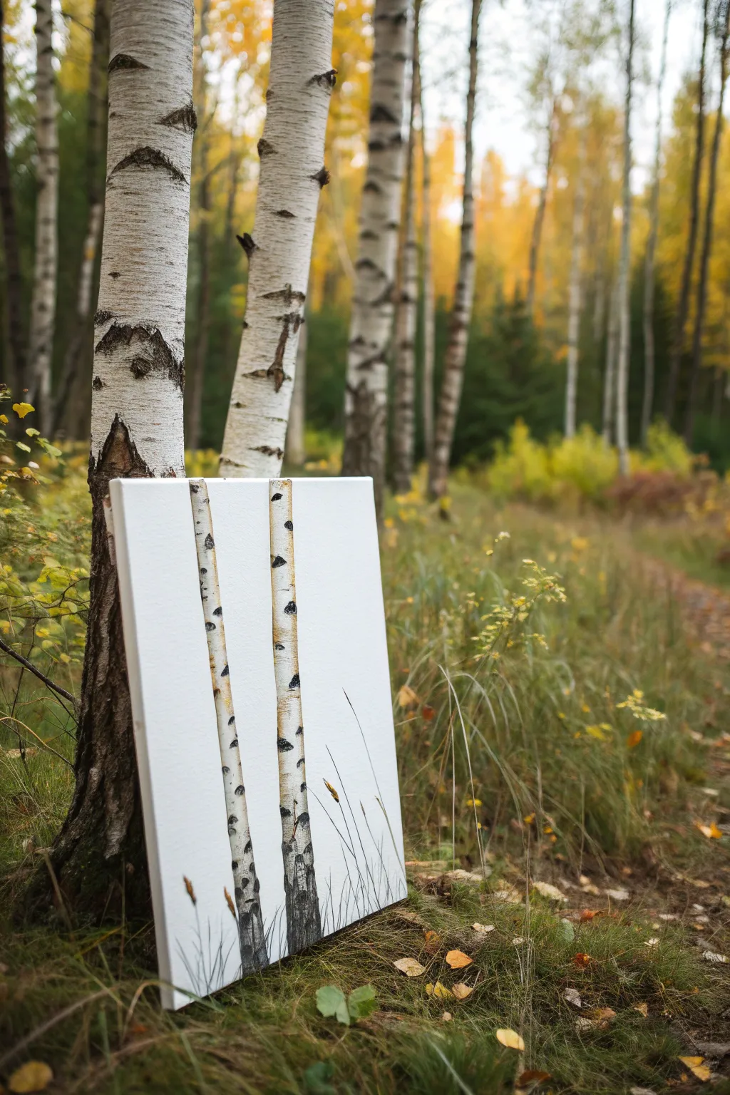
Capture the stark elegance of birch bark with this focused study that places two slender trunks against a clean white background. This project emphasizes texture and contrast, using simple techniques to replicate the distinctive peeling bark and rugged markings of the forest.
Detailed Instructions
Materials
- Rectangular stretched canvas (e.g., 11×14 or similar)
- Acrylic paints: Titanium White, Mars Black, Burnt Umber, Yellow Ochre, Raw Sienna, Sap Green
- Flat brush (1/2 inch or 3/4 inch)
- Small round detail brush (size 1 or 2)
- Rigger or liner brush
- Palette knife (optional for texture)
- Clean water cup
- Paper towels
- Pencil for sketching
- Ruler
Step 1: Setting the scene
-
Prime the background:
Begin by applying an even coat of Titanium White across your entire canvas. Even though the canvas is likely already primed, this fresh layer gives a consistent, opaque surface. Let it dry completely. -
Sketch the trunks:
Using a pencil and ruler, lightly draw two vertical lines for your first tree. Make the trunk slightly tapering as it goes up, but keep it mostly parallel. Repeat this for a second tree nearby, perhaps varying the width slightly for interest. -
Position the trees:
Ensure your trees aren’t perfectly centered; placing one slightly off-center creates a more natural composition. The bottom of the trunks should start right at the canvas edge.
Use a Card
Make bark texture instantly by dipping the edge of an old credit card or stiff cardboard into black paint and scraping it horizontally across the dried white trunk.
Step 2: Painting the Bark Base
-
Mix a warm white:
On your palette, take a large amount of Titanium White and mix in a tiny pinhead of Yellow Ochre or Raw Sienna. You want an off-white, creamy color, not a bright yellow. -
Fill the trunks:
Use your flat brush to paint inside the pencil lines of your tree trunks with this creamy white mixture. Apply the paint vertically, following the direction of growth. -
Add a shadow side:
While the paint is still slightly wet, pick up a tiny amount of grey (mix white with a dot of black) on the corner of your brush. Run this down the left side of each trunk to create a subtle cylindrical shadow. -
Highlight the light side:
Conversely, use pure Titanium White on the right side of the trunks to suggest a light source hitting the bark. Blend these transitions softly with a damp brush.
Step 3: Creating the Birch Texture
-
Mix the dark markings color:
Create a dark grey-black mixture using Mars Black and a touch of Burnt Umber. The brown warms it up so it doesn’t look like flat ink. -
Apply horizontal striations:
Using the edge of a small flat brush or a palette knife, apply horizontal scrapes and dashes across the trunk. Start from the edges and pull inward, lifting pressure as you reach the center so the mark breaks up. -
Add key features:
Paint a few larger, oblong dark patches to represent knots or scars where branches might have fallen off. These usually look like rough eye shapes. -
Vary the pressure:
I find that rolling the brush slightly as you drag it horizontally creates unpredictable, organic textures that mimic real bark peeling. -
Detailing the lenticels:
With your smallest round brush and watered-down black paint, add tiny horizontal dashes and dots between the larger markings. These are the small breathing pores (lenticels) typical of birch trees.
Level Up: Golden Hour
Create a sunset vibe by glazing a very thin, watery layer of yellow-orange over one side of the white trunks after everything is fully dry.
Step 4: Grounding and Finishing
-
Sketch the grass:
At the very bottom of the canvas, use your rigger or liner brush to flick upwards using a mix of Mars Black and Sap Green. These strokes should be quick and confident to taper to a fine point. -
Overlap the trunks:
Ensure some grass blades cross over the bottom of the white trunks. This visually pushes the trees back and grounds them in the soil rather than having them float. -
Add seed heads:
Paint small, oval seed heads at the tips of a few tall grass blades using Burnt Umber or a golden brown tone. -
Refine the edges:
If any bark paint went outside the lines, use Titanium White to tidy up the background sky area, cutting back in against the tree trunk for a sharp edge. -
Final dark accents:
Review your dark bark markings. If they dried too light, go back in with pure black in the deepest crevices to add high contrast pop.
Step back and admire the stark, graphic beauty of your birch trees before finding the perfect spot to display them
BRUSH GUIDE
The Right Brush for Every Stroke
From clean lines to bold texture — master brush choice, stroke control, and essential techniques.
Explore the Full Guide
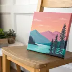
Silhouette Scene: Tree Branch and Swing
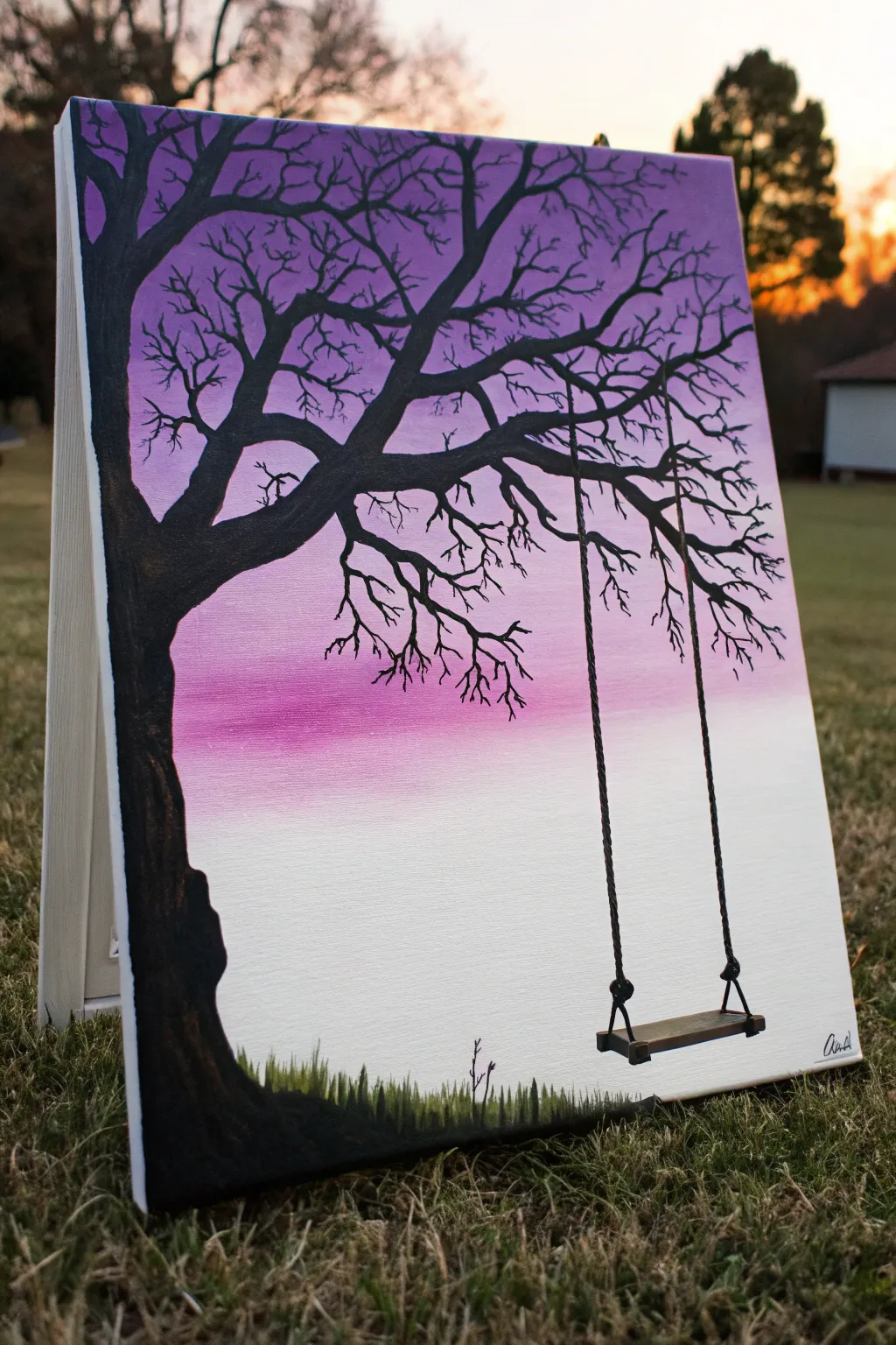
Capture the serene beauty of twilight with this stunning silhouette painting featuring a majestic tree and a lonely swing. The stunning gradient background transitions from deep violet to soft white, creating a perfect backdrop for the stark, dramatic black tree.
Step-by-Step Guide
Materials
- Stretched canvas (e.g., 11×14 or 16×20 inches)
- Acrylic paints: Titanium White, Magenta/Pink, Deep Violet/Purple, Mars Black
- Large flat brush (1-2 inch) for blending
- Medium round brush for the trunk
- Small liner brush or detail brush for branches and ropes
- Palette for mixing
- Cup of water and paper towels
- Easel (optional)
Step 1: Creating the Ombré Background
-
Prime the canvas:
Start by ensuring your canvas surface is clean. If you want a smoother gradient, you can lightly mist the canvas with water or apply a very thin layer of slow-drying medium or white paint first. -
Apply the top color:
Using your large flat brush, load up a generous amount of Deep Violet. Paint horizontal strokes across the top third of the canvas, ensuring full coverage all the way to the edges. -
Blend in the middle tone:
Without cleaning your brush thoroughly, pick up some Magenta paint. Start painting just below the violet section, allowing the colors to mix on the canvas where they meet. Use long, horizontal sweeping motions to create a seamless transition. -
Fade to white:
Clean your brush well. Pick up Titanium White and paint the bottom third of the canvas. Working upwards, blend the white into the pink section while the paint is still wet to create a soft, foggy fade towards the bottom. -
Smooth the gradient:
Take a clean, slightly damp luscious brush and lightly sweep back and forth across the entire canvas from top to bottom to smooth out any harsh lines. Let the background dry completely before moving on.
Paint Flow Master
For those tiny twigs, add a drop of water to your black paint until it feels like ink. This helps the paint flow off the liner brush smoothly for long, uninterrupted lines without breaking.
Step 2: Painting the Tree Silhouette
-
Outline the trunk:
Using a medium round brush and Mars Black paint (add a tiny drop of water if the paint is too thick), sketch the outline of the tree trunk on the left side. Make the base wide and undulating, tapering as it goes up. -
Fill in the trunk:
Fill in the trunk shape with solid black. I find it helpful to use two coats here to ensure the background color doesn’t show through the dark silhouette. -
Add main branches:
Extend a large, thick branch reaching horizontally across the upper middle of the canvas. This will support the swing. Add a few other major branches reaching towards the top corners. -
Create medium branches:
Switch to a smaller brush. Paint secondary branches growing from the main ones, ensuring they taper naturally—thicker at the connection point and thinner at the tips. -
Detail with twigs:
Using your finest liner brush with slightly thinned black paint (ink-like consistency), add intricate twigs and fine detail lines throughout the canopy. A shaky hand actually helps here to make the twigs look organic and gnarly.
Step 3: Adding the Swing and Grass
-
Position the ropes:
Locate a sturdy-looking spot on the main horizontal branch. Using the liner brush, carefully paint two vertical, slightly uneven lines down towards the bottom right area. These shouldn’t be perfectly straight ruler lines; a little texture mimics rope. -
Paint the swing seat:
At the bottom of the ropes, paint a small, thin rendering of a wooden plank seat in perspective. It should look like a narrow rectangle. Connect the ropes to the seat with small knot shapes. -
Add 3D depth to the swing:
Mix a tiny bit of white into your black to make a dark grey. Add a subtle highlight to the top edge of the swing seat to give it dimension. -
Establish the grass line:
At the very bottom of the canvas, paint a low, uneven horizon line in solid black to ground the image. -
Paint grassy texture:
Use a small brush or a fan brush turned vertically to flick short, upward strokes along the bottom edge. Vary the lengths to create a realistic grassy texture silhouetted against the white mist. -
Final touches:
Review your branches and grass. Add a tiny sapling or weed growing near the bottom center for extra interest, and sign your name in the corner.
Make it Moonlight
Switch the color palette for a different mood! Try blending Navy Blue into Phthalo Blue into White, and paint a small white circle moon among the upper branches for a night scene.
Step back and admire the peaceful solitude of your beautiful silhouette painting
Daisy Close-Up With Simple Petal Strokes
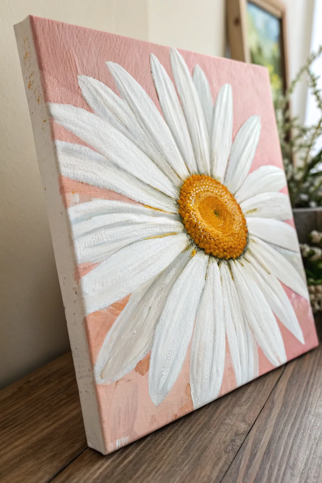
Capture the simple elegance of a single daisy with this beginner-friendly acrylic project. You’ll master petal layering and creating a textured center to make the flower pop against a soft, rosy background.
Step-by-Step Tutorial
Materials
- Square canvas (approx. 8×8 or 10×10 inches)
- Acrylic paints: Titanium White, Primary Yellow, Cadmium Orange, Burnt Umber, Light Pink (or Red + White), Grey
- Flat brush (medium size)
- Round brush (small size for detailing)
- Filbert brush (optional, for rounded petal tips)
- Palette or paper plate
- Cup of water and paper towels
Step 1: Setting the Stage
-
Base Coat:
Begin by covering your entire canvas with a mix of Light Pink and a touch of White. Use your flat brush to apply uneven, loose strokes. Don’t aim for perfect smoothness; a little texture in the background adds charm. Paint the sides of the canvas as well for a polished finish. -
Rough Outline:
Once the pink layer is completely dry, mix a very faint grey wash. Lightly sketch the large oval center of the daisy, positioning it slightly off-center to the right. Then, sketch the general direction of a few key petals radiating outward.
Muddy Centers?
If your yellow center turns muddy when adding shadows, let the base layer dry completely first. Acrylics dry fast, so waiting 10 minutes ensures crisp, clean layering.
Step 2: Building the Petals
-
First Layer of Petals:
Using a filbert or flat brush, mix Titanium White with a tiny drop of grey to create an off-white shade. Paint the first layer of petals. Start from the closest edge of the center and pull the brush outward. These petals should look slightly translucent and will act as your shadows later. -
Defining Shapes:
As you paint these foundational petals, vary their lengths. Some should reach the edge of the canvas, while others can be shorter. Let the pink background peek through the gaps between petals. -
Bright While Highlights:
Load your brush with pure Titanium White. Paint a second layer of petals on top of the dry first layer. Focus on the petals that would be catching the most light. Apply the paint thicker here to create a slight ridge texture. -
Adding Dimension:
While the white is still slightly wet, you can blend in tiny streaks of light grey near the base of the petals (where they meet the center) to create depth. This helps the flower look like a cone shape rather than a flat circle.
Step 3: The Centerpiece
-
Yellow Base:
Fill in the center circle with a solid coat of Primary Yellow mixed with a little Cadmium Orange. This creates a warm, golden base for the distinctive daisy texture. -
Shadowing the Center:
Mix Burnt Umber with your orange. Paint a crescent moon shape along the bottom and left side of the yellow center. This shadow gives the center its domed, 3D appearance. -
Stippling Texture:
Switch to your small round brush or an old, stiff brush. Mix a bright orange. Use a stippling motion (rapid dots) to create texture over the shadow area and blending into the yellow. -
Highlight Dots:
Clean your brush and pick up pure Yellow mixed with White. Stipple these lighter dots on the top right side of the center to show where the light hits the pollen. -
Deepest Shadows:
Add very tiny dots of Burnt Umber right at the edge where the yellow center meets the white petals, particularly on the shadowed side.
Impasto Effect
Use a palette knife instead of a brush for the final white petal highlights. This adds thick, physical texture that mimics real petals and catches the room’s light.
Step 4: Final Details
-
Petal Separation:
Using a very thin brush and a watery grey mixture, carefully outline just one side of a few petals to separate them visually from the ones behind them. -
Enhancing Contrast:
If the center feels disconnected, use a dry brush with a tiny bit of yellow-ochre to lightly drag color from the center base onto the very start of the white petals. -
Center Swirl:
Look closely at the center of the daisy. Add a tiny swirl or indentation in the middle using your dark orange mix to mimic the distinct button shape found in nature. -
Touch Ups:
Step back and view your painting. If the background looks too flat next to the bright flower, add a few dry-brush strokes of a darker pink or peach around the petals to make the white really pop.
Allow your painting to dry fully before hanging it to brighten up your favorite corner

PENCIL GUIDE
Understanding Pencil Grades from H to B
From first sketch to finished drawing — learn pencil grades, line control, and shading techniques.
Explore the Full Guide
Lavender Stems in a Clear Jar
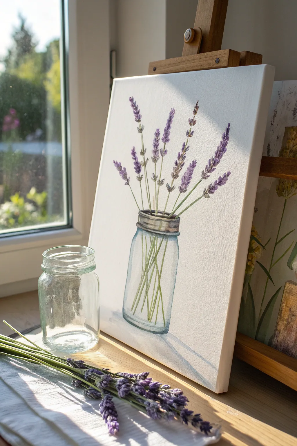
Capture the delicate beauty of dried lavender stems displayed in a simple mason jar with this light and airy acrylic painting. The striking contrast between the rustic metal lid and the soft purple blooms makes for a charming, farmhouse-style artwork.
Step-by-Step
Materials
- Stretched canvas (e.g., 9×12 or 11×14 inches)
- Acrylic paints: Titanium White, Burnt Umber, Hooker’s Green, Dioxazine Purple, Ultramarine Blue, Paynes Gray, Yellow Ochre
- Paintbrushes: Flat brush (3/4 inch), Round brush (size 4), Liner brush (size 0 or 00)
- Palette for mixing
- Cup of water
- Pencil for sketching
- Ruler (optional)
Step 1: Sketching the Composition
-
Place the Jar:
Begin by lightly sketching the outline of the mason jar in the lower center of the canvas. Use a ruler if you need help keeping the sides straight, but a slightly imperfect hand-drawn line adds character. -
Add the Lid Detail:
Draw the detailed rim of the jar. Pay attention to the threads of the screw top; sketch two or three horizontal bands representing the metal ring. -
Map the Stems:
Sketch varying lengths of stems extending upward from the jar opening. Fan them out naturally, with some leaning left, some right, and others standing taller in the center. -
Indicate Stem Depth:
Carry those stem lines down into the jar itself. Draw them lightly so they look like they are sitting inside the glass, crisscrossing at the bottom.
Step 2: Painting the Glass Jar
-
Base Color for Glass:
Mix a very watery wash of Phthalo Blue (or similar light blue) with plenty of Titanium White. Apply a sheer layer inside the jar shape to suggest the glass tint, keeping it extremely subtle. -
Painting the Lid:
Mix Paynes Gray with a touch of Burnt Umber and White to get a metallic grey. Paint the horizontal bands of the lid, leaving small slivers of white paper between the threads to act as highlights. -
Adding Shadows:
Deepen your grey mix with a bit more Paynes Gray. Add shadows specifically under the rim of the lid and along the bottom curve of the jar to give it weight and roundness. -
Glass Highlights:
Using pure Titanium White and a clean brush, paint sharp vertical streaks along the left side of the jar and the shoulder. This creates the reflection that makes the jar look glossy.
Jar looks flat?
Ensure your highlight streaks follow the curve of the glass. Vertical highlights make it look tall; curved highlights at the neck help it look round.
Step 3: Creating the Lavender
-
Base Green Stems:
Mix Hooker’s Green with a little White and a dot of Yellow Ochre for a muted, dried sage color. Use your liner brush to paint the stems, following your sketch lines carefully. -
Internal Stems:
For the stem sections inside the jar, add a tiny bit more water to your green mix to make them slightly more transparent than the stems above the rim. -
Bud Foundation:
Mix Dioxazine Purple with White to create a medium lavender shade. Using the tip of your round brush, dab small, elongated dots in clusters along the top third of each stem. -
Adding Depth:
Use the pure Dioxazine Purple (unmixed) to add tiny darker dots near the base of the flower clusters. This creates shadow and volume within the buds. -
Final Highlights:
Mix a very pale purple—almost white. Add tiny specks to the tips of the lavender buds where the light would hit them. -
Refining the Glass:
Once the internal stems are dry, go back over the jar outline with a very thin, watery grey line to crisply define the edges of the glass.
Enhance the texture
Mix a tiny bit of coarse texture gel into your purple paint for the buds. It physically raises the paint, simulating the texture of real dried flowers.
Step 4: Finishing Touches
-
Grounding Shadow:
Mix a watery grey wash. Paint a soft, horizontal shadow under the jar, focused on the left side to match the light source direction. -
Clean Up:
Check the white background. If any smudges occurred, paint over them with fresh Titanium White to ensure the background remains crisp and clean.
Step back and admire the simple elegance of your botanical creation
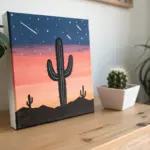
Cactus Trio in Cute, Simple Pots
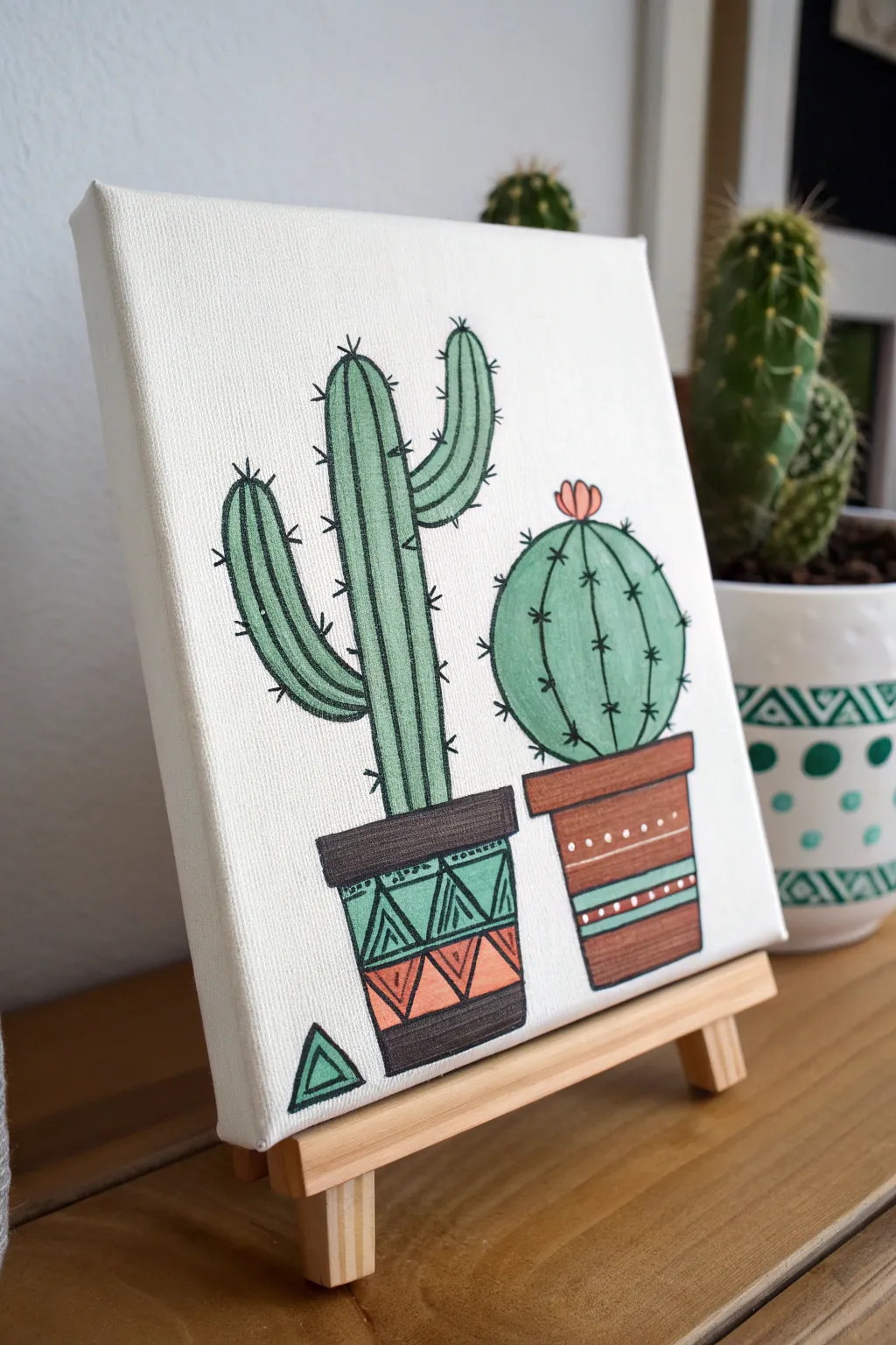
This charming canvas project features two cheerful succulents in decorative pots, perfect for adding a touch of greenery to your desk without the need for watering. The style combines clean, black illustrative lines with soft color fill for a modern, graphic look.
How-To Guide
Materials
- Small square canvas (e.g., 6×6 or 8×8)
- Pencil and eraser
- Acrylic paints: Sage green, forest green, terracotta/rust, dark brown, coral pink, teal, white, black
- Small flat brush (size 4 or 6)
- Round detail brushes (size 0 and 2)
- Black fine-liner paint pen or permanent marker (optional but recommended for outlining)
- Ruler
- Water cup and palette
Step 1: Sketching the Layout
-
Draw the pot outlines:
Begin by lightly sketching the shapes of the two pots near the bottom third of the canvas. Draw the left pot slightly taller and narrower with a distinct rim, and the right pot shorter and wider. -
Add pattern guidelines:
Using your ruler, lightly mark horizontal bands across the pots where your geometric patterns will go later. This ensures your triangles and stripes stay straight. -
Sketch the cacti shapes:
Rising from the left pot, draw a tall, three-armed saguaro cactus shape. For the right pot, sketch a large, perfect circle resting on the rim. -
Detail the segments:
Draw vertical lines inside the cactus bodies to represent ribs. For the round cactus, curve these lines outward to give it a 3D spherical effect. Add a small flower shape on top of the round cactus.
Step 2: Blocking in Color
-
Paint the cacti base:
Mix a muted sage green using green, a touch of white, and a tiny dot of black. Fill in the main bodies of both cacti, avoiding the flower. -
Add dimension:
While the green is still slightly wet, I like to blend a slightly darker green along the edges of the ribs to create very subtle shading, though a flat color works well for this graphic style too. -
Color the pots:
Paint the rim and base of the left pot with dark brown. For the right pot, paint the main body a warm terracotta or rust color. -
Fill the geometric bands:
On the left pot, paint the central band in teal. On the right pot, add any striped details using teal or dark brown as shown in the reference. -
Paint the flower and details:
Use coral pink to fill in the small flower on top of the round cactus. Paint the small triangle shape floating near the bottom left corner in green.
Wobbly Lines?
If your hand shakes while painting thin straight lines on the pots, try resting your pinky finger on a dry part of the canvas for balance or use tape.
Step 3: Pattern and Texture
-
Decorate the left pot:
Once the teal, brown, and background colors are completely dry, paint the triangle patterns. Use black or dark brown to create zigzag lines over the teal band, and fill the bottom triangles with terracotta paint. -
Decorate the right pot:
Using a very fine brush or a dotting tool, add white dots and thin white stripes to the terracotta pot for contrast. -
Outline the cacti:
This is the most crucial step for the style. Use a black paint pen or a size 0 brush with thinned black paint to trace the outer edges of the cacti and the internal rib lines. -
Add the spines:
Along the vertical rib lines and outer edges, draw small strokes for spines. On the tall cactus, make small ‘V’ shapes or simple dashes. On the round cactus, draw small star-like crosses. -
Final outlines:
Trace the pots, including the distinct rims and the separate bands of color. Outline the separate triangle decoration at the bottom left as well. -
Clean up:
Check for any pencil marks still showing and erase them gently. If you need to sharpen any lines, touch up the white background with clean white paint.
Make it Pop
For the cleanest look, use a black acrylic paint marker for the outlines and spines instead of a brush. It gives that crisp illustration style instantly.
Place your finished canvas on a mini easel to display your unkillable garden


Abstract Color Blocks With Bold Texture
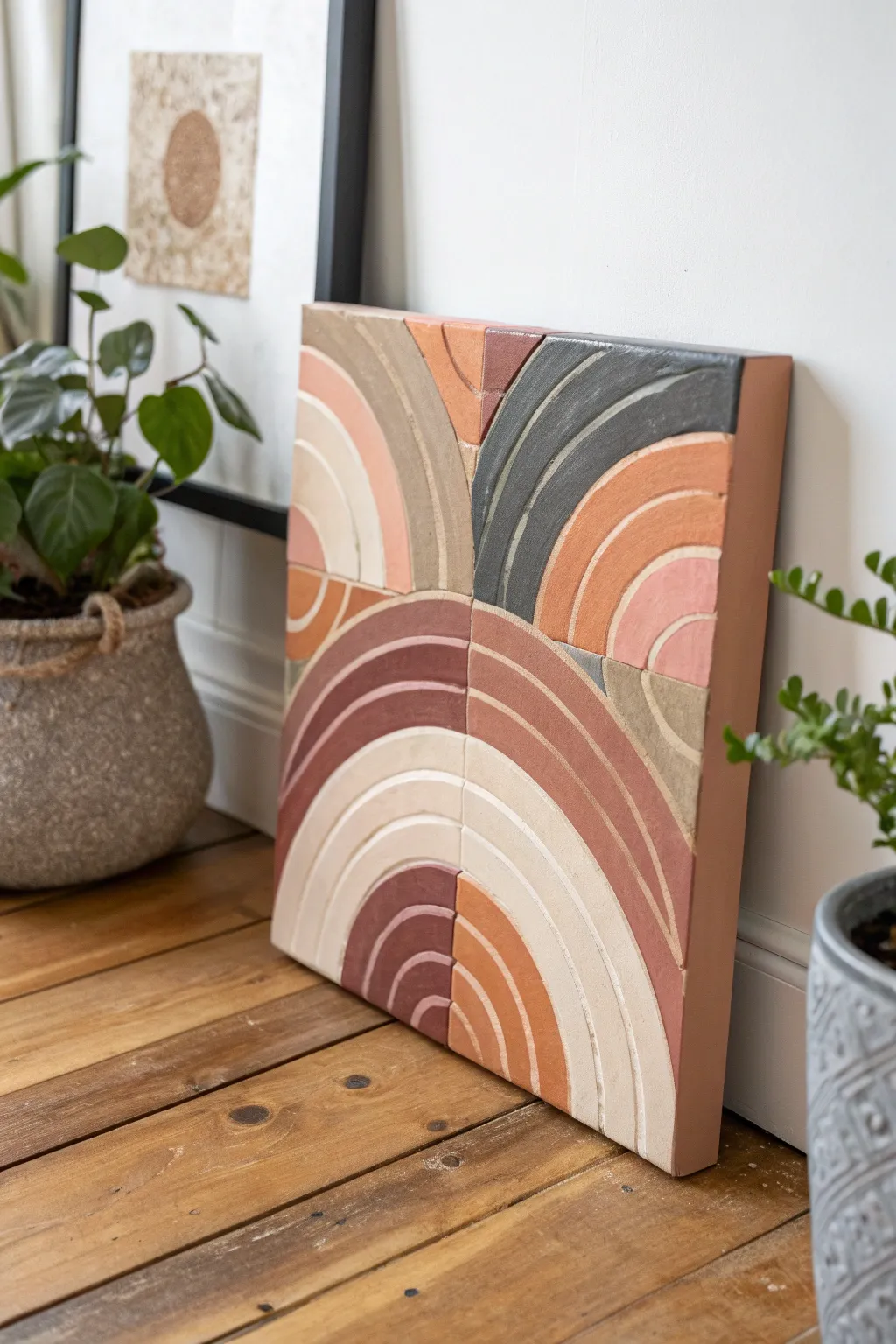
This earthy, geometric wall art mimics the look of ceramic tiles using texture paste and acrylics. Its quadrant design features concentric arches in a muted terracotta and neutral palette, bringing a warm, tactile element to any modern space.
Step-by-Step Guide
Materials
- Square wood panel or deep-edge canvas (12×12 inches)
- Modeling paste (heavy body) or texture medium
- Palette knives (various widths)
- Pencil and ruler
- Compass (or circular objects for tracing)
- Acrylic paints (terracotta, burnt sienna, unbleached titanium, warm grey, charcoal)
- Flat synthetic brushes (medium size)
- Sandpaper (fine grit)
- Matte varnish spray
Step 1: Preparation & Layout
-
Prime the Surface:
If using raw wood, apply a coat of gesso to seal the surface. If using a canvas, ensure it is taut. Let the base layer dry completely before starting your measurements. -
Grid the Canvas:
Find the exact center of your square panel using a ruler. Draw a vertical line and a horizontal line to divide the surface into four equal quadrants. -
Draft the Arches:
Using a compass placed at the corners or center point of the quadrants (depending on the orientation of the arch in that section), draw concentric curved lines. Vary the width of the bands slightly for distinct visual interest. -
Define the Orientation:
Ensure the arches in each quadrant face different directions to create the dynamic, spinning composition seen in the example. The top left and bottom right should be distinct from their neighbors.
Crack Control
Thick modeling paste can crack if it dries too fast. Let it dry slowly away from direct heat or fans. If cracks appear, fill them with more paste.
Step 2: Creating Texture
-
Apply Modeling Paste:
Working one band at a time, scoop up a generous amount of heavy modeling paste with a palette knife. Spread it thickly onto the canvas within your pencil lines. -
Sculpt the Edges:
Use the edge of your palette knife to clean up the borders between the arch bands. You want to create a small physical groove or ‘grout line’ between each section to mimic separate tiles. -
Add Surface Texture:
While the paste is wet, gently tap or scrape the surface with the flat of the knife. I prefer to leave some areas slightly rougher than others to replicate the feel of handmade clay. -
Refine the Quadrants:
Pay special attention to where the four quadrants meet in the middle. Use a clean knife to ensure the separation lines are straight and deep, reinforcing the tiled look. -
Extended Drying Time:
Allow the texture paste to dry completely. Because the application is thick, this may take 12-24 hours. Do not rush this step, or the inside will remain soft. -
Smooth the Peaks:
Once rock hard, lightly run fine-grit sandpaper over the highest peaks of the texture. This knocks down sharp ridges and creates a weathered stone effect.
Adding Grit
Mix fine sand into your acrylic paint or the modeling paste before applying. This adds an ultra-realistic grainy stone texture to the final piece.
Step 3: Painting & Finishing
-
Mix Earth Tones:
Prepare your palette with muted, natural shades. Mix burnt sienna with white for terracotta, and mix charcoal with a touch of brown for a warm dark grey. -
Paint First Block:
Start with the darkest grey arch secton. Use a flat brush to apply the paint, working it into the textured crevices. Don’t worry about perfect coverage; a little transparency enhances the stone look. -
Apply Warm Neutrals:
Paint the adjacent arches in warm beige and cream tones. Keep a damp cloth nearby to quickly wipe any accidental crossover on the ‘grout’ lines. -
Layer Terracotta Shades:
Fill in the remaining sections with variations of rust and terracotta. To add depth, you can dry-brush a lighter shade over the textured tops of these colored bands. -
Touch Up Grooves:
If paint has pooled in the separating lines, trace them carefully with a very thin brush and a dark grey or brown wash to re-establish the shadow. -
Paint the Edges:
Don’t forget the deep sides of your canvas or wood panel. Paint them a solid color, like the terracotta or a neutral beige, to frame the piece professionally. -
Seal the Work:
Finish with a spray of matte varnish. This protects the acrylic and texture paste without adding an unnatural glossy shine.
Hang your textured masterpiece in a well-lit spot to let the shadows play across the raised surfaces
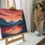
Simple City Skyline With Water Reflections
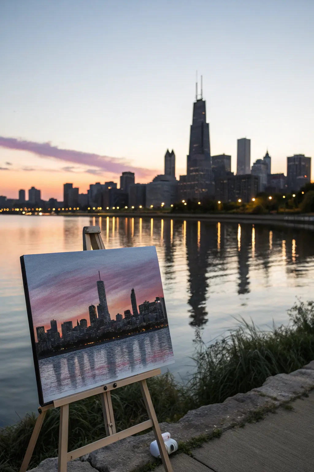
Capture the magic of twilight in the city with this vibrant acrylic painting project that focuses on geometric shapes and fluid reflections. You’ll layer rich pinks and purples to create a dramatic sky, then construct a skyline silhouette that mirrors beautifully into the water below.
How-To Guide
Materials
- Canvas board or stretched canvas (11×14 or similar)
- Acrylic paints: Titanium White, Ultramarine Blue, Alizarin Crimson, Cadmium Red, Phthalo Blue (for depth), Lamp Black, Burnt Umber, Cadmium Yellow (tiny amount for lights)
- Flat brushes (1-inch and 1/2-inch)
- Round brush (size 4 or 6)
- Detail liner brush (size 0 or 00)
- Ruler or straight edge (optional)
- Palette knife (optional for mixing)
- Water cup and paper towels
Step 1: Setting the Scene
-
Establish the Horizon:
Begin by drawing a faint horizontal line with a pencil about one-third of the way up from the bottom of your canvas to separate the water from the city. -
Map the Base Colors:
Mix a soft, dusky pink using Titanium White, Alizarin Crimson, and a touch of Cadmium Red. Using your large flat brush, paint streaky, horizontal strokes across the sky area, leaving some gaps. -
Deepen the Twilight:
While the pink is still tacky, mix Ultramarine Blue with a little Alizarin Crimson to make a deep purple. Blend this into the upper corners and top third of the sky, letting it streak down into the pinks for a cloud-like effect. -
Mirror the Water Base:
Use the same pink and purple mixes for the water area below your horizon line. Apply these strokes vertically first to pull the color down, then gently brush horizontally over them to smooth the reflection base.
Step 2: Building the City
-
Mix a Dark Base:
Create a rich, dark color for the buildings. Instead of pure black, which can look flat, I prefer mixing Lamp Black with Burnt Umber and a touch of Phthalo Blue for a deep, complex shadow tone. -
Paint the Tallest Tower:
Using a 1/2-inch flat brush or the edge of a palette knife, block in the central skyscraper. Start from the horizon line and pull upward, creating a distinct rectangular shape that tapers slightly if mimicking the reference. -
Add Surrounding Structures:
Continue using the dark mix to paint the shapes of shorter buildings on either side. Vary the heights and widths to create a realistic, jagged skyline silhouette. -
Refine the Silhouette:
Switch to a round brush to tidy up the edges of your buildings. Add small architectural details like antennas or stepped roofs to break up the flat tops.
Straight Edge Secret
Use the edge of a stiff piece of cardboard dipped in paint to ‘stamp’ straight vertical lines for buildings instantly.
Step 3: Reflections and Details
-
Start the Reflections:
Using the same dark building color and a flat brush, pull paint directly downward from the base of each building into the water area. These strokes should be vertical and slightly shorter than the actual buildings. -
Distort the Water:
Take a clean, dry flat brush and very gently swipe horizontally across the dark reflections you just painted. This blurs the edges and creates the illusion of rippling water. -
Add City Lights:
Mix a warm yellow-white tone. Using your finest detail liner brush, dot tiny windows onto the dark building silhouettes. Group them in clusters rather than perfect rows for a more natural look. -
Reflect the Lights:
Add corresponding streaks of yellow-white in the water directly below the lit buildings. Keep these strokes loose and wiggly to mimic light dancing on waves. -
Final Sky Adjustments:
If your sky needs more drama, wash a very thin glaze of Alizarin Crimson over the pink areas to boost the sunset saturation. -
Waterline Emphasis:
Paint a very thin, dark line right at the horizon where the buildings meet the water to ground the structures. -
Sign and Seal:
Once fully dry, sign your work in a corner. You can apply a gloss varnish later to make the dark colors pop and protect the painting.
Level Up: Texture
Mix a heavy body gel medium into your sky paints to create physical texture in the clouds that catches the light.
Step back and admire your personalized city view, capturing the stillness of twilight right on your canvas.
Glowing Moon in a Deep Night Sky
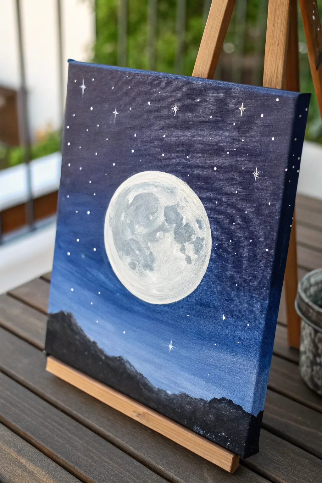
Capture the tranquil beauty of a clear midnight sky with this striking acrylic painting featuring a hyper-realistic moon. The deep blues contrast beautifully with the textured white crater details, creating a celestial centerpiece perfect for any room.
Detailed Instructions
Materials
- Small stretched canvas (easel optional)
- Acrylic paints: Titanium White, Mars Black, Ultramarine Blue, Dioxazine Purple (or a deep violet)
- Flat shader brush (medium)
- Round brush (small)
- Detail liner brush (very fine)
- Sponge or paper towel (for texture)
- Circular object for tracing (like a roll of tape or a lid)
- Pale yellow or grey chalk/pencil
- Cup of water and mixing palette
Step 1: Setting the Sky
-
Trace the moon:
Before laying down any paint, place your circular object in the center of the canvas. Lightly trace around it with a pencil or chalk to reserve the space for your moon. This ensures your circle stays crisp. -
Mix the background base:
On your palette, mix a generous amount of Ultramarine Blue with a touch of Mars Black and a hint of purple. You want a very deep, rich navy color. -
Paint the upper sky:
Using your flat shader brush, apply this dark mixture to the top half of the canvas, painting around your traced moon circle. Don’t forget to paint the sides of the canvas for a gallery-wrapped look. -
Create the gradient:
As you move down the canvas below the moon, mix in a little more pure Ultramarine Blue and a tiny speck of White to lighten the color slightly. Blend this horizontal band into the darker section above while the paint is still wet. -
Finish lower sky:
Continue painting downwards, gradually lightening the blue as you reach the bottom third of the canvas. This simulates atmospheric perspective or a glowing horizon. -
Dry completely:
Allow the background layer to dry fully before moving on. This is crucial so you don’t muddy your bright moon colors later.
Uneven Circle?
If your moon’s edge looks wobbly after painting the background, wait for it to dry completely. Then, place your tracing object back over the moon and carefully trace the edge again with white paint.
Step 2: Painting the Moon
-
Base coat the moon:
Fill in your reserved circle with Titanium White. You might need two thin coats to cover the canvas texture completely. -
Mix moon shadows:
Create a light grey by mixing a large amount of White with a tiny dot of Black. I also like to add a barely-there touch of blue to cool down the grey. -
Map the craters:
Using a small round brush and your light grey mix, dab in the larger ‘seas’ (maria) of the moon. Look at the reference photo to see the irregular, splotchy shapes—they aren’t perfect circles. -
Add deep texture:
Mix a slightly darker grey shade. Apply this inside the existing grey areas to create depth, leaving the edges lighter to simulate the crater rims. -
Stipple for realism:
Take a dry brush or even a small piece of sponge, dip it sparingly into the grey paint, and gently stipple (tap up and down) over the transition areas between white and grey. This creates that authentic, cratered texture. -
Highlight the rim:
With a clean brush and pure Titanium White, carefully repaint the very edge of the moon on the side facing the light source (usually top right or left) to make it pop against the background.
Soft Moon Glow
To make the moon glow, dry-brush a very faint, translucent ring of white and blue paint onto the dark sky immediately surrounding the moon’s edge.
Step 3: Stars and Silhouette
-
Mix the mountain color:
Combine Mars Black with a little bit of your dark blue mix. Pure black can sometimes look flat, so the blue adds richness. -
Paint the horizon:
Using a medium brush, paint an uneven, jagged line across the very bottom of the canvas. Fill everything below this line with your black mountain mixture. -
Create distant peaks:
Add a few smaller, lower humps on the left or right side to suggest a mountain range receding into the distance. -
Prepare for stars:
Dilute a small amount of White paint with water until it has an inky consistency. -
Dot the stars:
Using your finest detail liner brush, gently dot stars into the sky. Vary the pressure to create different sizes—some should be tiny specks, others distinct points. -
Add ‘glint’ stars:
Select 3 or 4 larger stars and carefully paint a small cross or plus sign (+) over them. Extend the lines slightly to create a twinkling effect. -
Final touches:
If you accidentally got any blue paint on your moon, clean it up with opaque white now. Step back and admire your celestial scene.
Now you have a stunning piece of night sky art ready to display on a mini easel or hang on your wall
Geometric Animal Filled With Easy Patterns
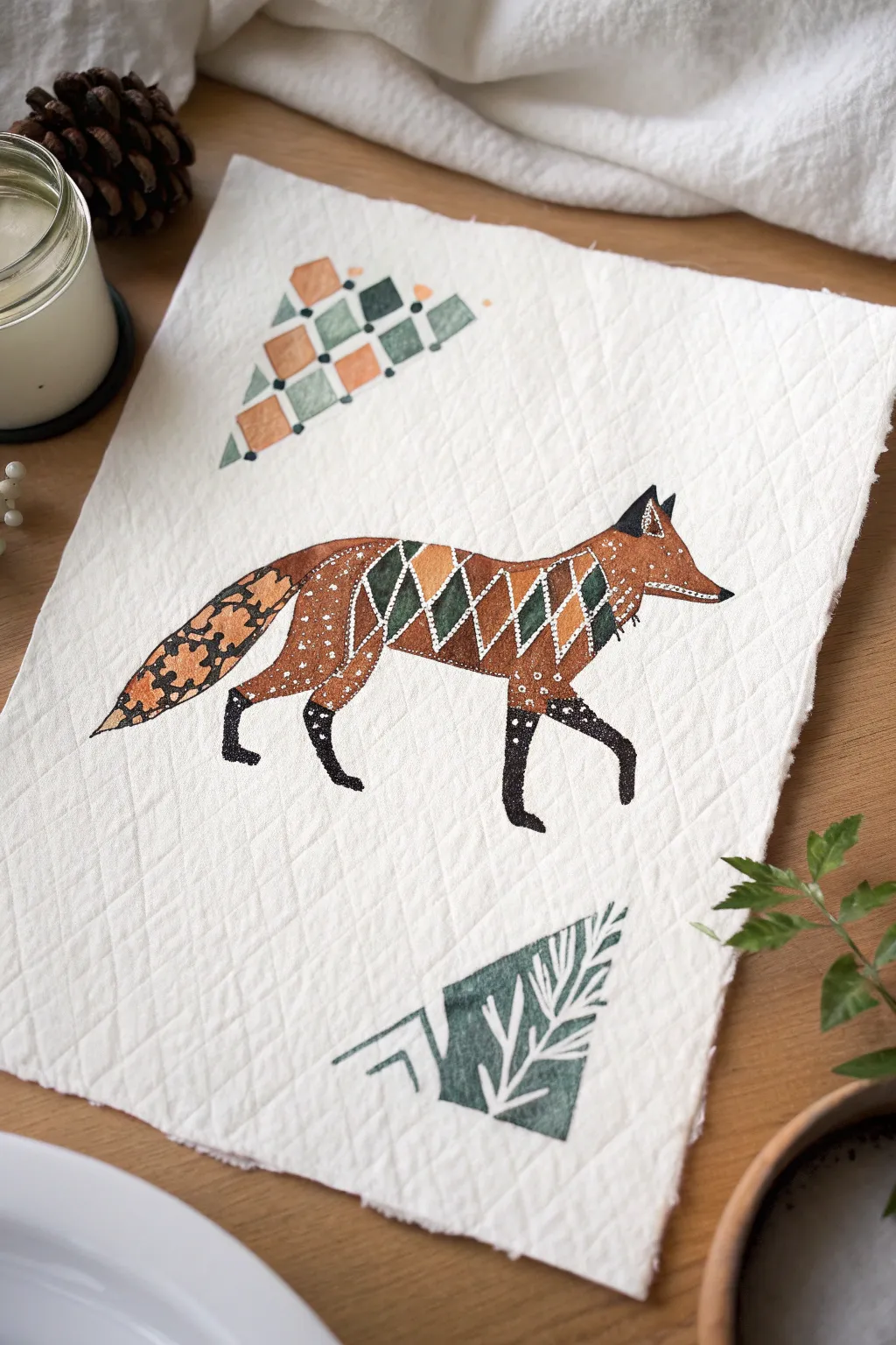
This charming project combines the warmth of rustic folk art with clean geometric lines, resulting in a cozy piece of wall art or a unique placemat. Using simple acrylics on quilted fabric creates a lovely textural contrast between the soft background and the crisp, patterned fox design.
Step-by-Step Guide
Materials
- Quilted cotton or heavy muslin fabric (white or cream)
- Acrylic paints (burnt sienna, black, forest green, hunter green, titanium white)
- Fabric medium (optional but recommended for softness)
- Pencil for sketching
- Fine liner brush (size 0 or 00)
- Small flat brush (size 2 or 4)
- Ruler
- Palette or mixing plate
- Water cup and paper towels
Step 1: Preparation and Sketching
-
Prepare the fabric canvas:
Cut your quilted fabric to your desired size, leaving raw, pinked, or frayed edges for a rustic look. If the fabric is wrinkled, give it a quick press with an iron. -
Outline the fox silhouette:
Lightly sketch the basic outline of a walking fox in the center of the fabric. Focus on capturing the elongated body, bushy tail, and pointed snout. Keep the lines faint so they don’t show through later. -
Add geometric guides:
Inside the fox’s body, use a ruler to lightly draw the diamond grid pattern across the midsection. Sketch the triangle motif above the fox and the stylized tree/triangle motif below the fox to balance the composition.
Bumpy Fabric?
Painting on quilted material can be tricky. Use a stiff bristled brush to gently ‘scrub’ paint into the texture, or dilute paint slightly with water to help it sink into the grooves.
Step 2: Base Colors and Blocking
-
Mix your colors:
Prepare your palette. I like to mix a little fabric medium into the acrylics at this stage; it helps the paint glide over the quilted texture much smoother. -
Paint the fox’s body:
Using the burnt sienna (rust) color and a flat brush, fill in the head, the front of the chest, and the rear section of the fox. Leave the central diamond band and the legs empty for now. -
Fill the geometric center:
Carefully paint alternating diamonds in the midsection. Use forest green for the dark diamonds and burnt sienna/rust for the lighter ones. Leave very thin unpainted gaps between shapes if you want the white fabric to act as a separator, or paint them touching to outline later. -
Block in the legs:
Paint the four legs using black acrylic. Note how the paws taper to points and have a slightly distinct ‘sock’ line where they meet the body pattern. -
Paint the tail base:
Fill the tail shape with a solid coat of burnt sienna mixed with a tiny drop of black to make it slightly darker than the body.
Make it a Wall Hanging
Attach a wooden dowel rod to the top edge using fabric glue or a simple hem, and tie a piece of twine or leather cord to the ends for an instant rustic wall display.
Step 3: Adding Details and Patterns
-
Detail the head:
Use your liner brush and black paint to add the ears and a small eye. Add a streak of white paint along the jawline and tip of the snout for definition. -
Create the midsection lattice:
Load your fine liner brush with white paint. Carefully paint diagonal grid lines over the diamond section to create a crisp white lattice effect. This separates the green and rust geometric shapes. -
Add intricate dots:
Using the very tip of your brush or a dotting tool, apply tiny white dots. Cluster them on the chest, the rump, and the darker ‘socks’ of the legs to simulate fur texture in a stylized way. -
Pattern the tail:
Paint black organic, leafy splotches over the dried rust-colored tail. This mimics the black-tipped fur of a real fox tail but keeps the geometric aesthetic.
Step 4: Surrounding Motifs
-
Paint the top triangle:
Moving to the top motif, paint the small diamond grid. Alternate between rust, sage green (mix green with white), and dark green. Keep the edges sharp. -
Add surrounding dots:
Add small black dots at the intersections or corners of the top geometric triangle for extra detail. -
Paint the bottom motif:
For the bottom tree-like triangle, paint the main shape in dark forest green. While wet, or after drying, paint white skeletal branch lines over it. -
Final touches:
Review your work. If any paint absorbed unevenly into the quilt batting, apply a second thin coat to make the colors opaque.
Let the fabric dry completely before handling or displaying your new woodland artwork
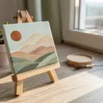
Minimal Desert Sun With Long Shadows
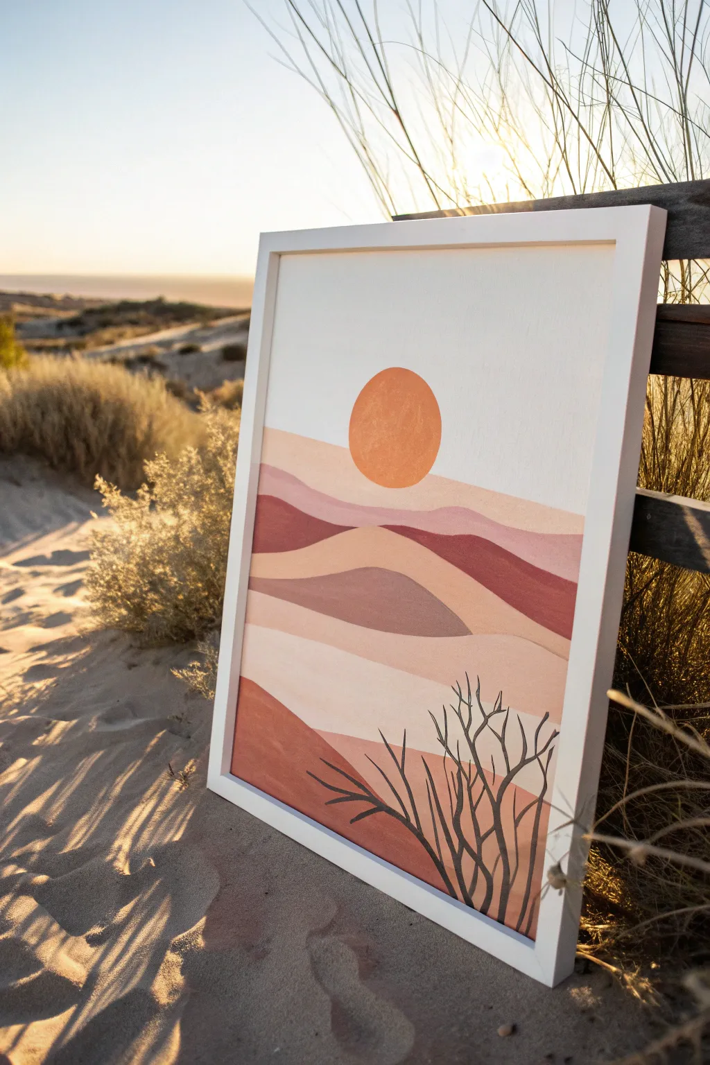
Capture the serene warmth of a desert sunset with this minimalist acrylic landscape featuring soft, rolling dunes and a bold, textured sun. The muted, earthy color palette of terracotta, beige, and sage creates a calming, modern boho aesthetic perfect for any space.
How-To Guide
Materials
- Canvas or canvas board (16×20 inches recommended)
- Acrylic paints: Titanium White, Burnt Sienna, Yellow Ochre, Raw Umber, Mars Black, Unbleached Titanium
- Flat shader brushes (1 inch and 1/2 inch)
- Small round detail brush (size 1 or 2)
- Palette or paper plate
- Painter’s tape or masking tape
- Circular object for tracing (like a roll of tape or a small bowl)
- Pencil
- Cup of water and paper towels
Step 1: Planning & Sketching
-
Establish the horizon:
Begin by lightly drawing a wavy, organic line across the canvas about one-third of the way up from the bottom. This will serve as your foreground dune. -
Draw the mid-ground layers:
Sketch two or three more rolling lines behind the first one, varying their heights and curves to create depth. Allow them to overlap naturally, like hills receding into the distance. -
Create the background horizon:
Draw a final, slightly flatter line about two-thirds up the canvas. This separates the land from the sky area. -
Position the sun:
Place your circular object in the center of the sky area, just hovering above the furthest dune line. Trace lightly around it with your pencil to create a perfect circle.
Perfect Circles Every Time
If painting the sun freehand is tricky, let the sky dry fully, then place a loop of masking tape over the area and paint inside it for a crisp edge.
Step 2: Painting the Sky & Sun
-
Mix the sky color:
Combine a large amount of Titanium White with a tiny touch of Unbleached Titanium to create a warm, off-white cream color. -
Fill in the sky:
Using your large flat brush, paint the entire sky area around the sun circle. Use horizontal strokes to keep the texture smooth and consistent. -
Refine the edges:
Carefully cut in around the pencil line of the sun and the top dune edge. It helps to use the corner of the flat brush for these curves. -
Mix the sun color:
Mix Yellow Ochre with a bit of Burnt Sienna to get a warm, muted orange. I like to keep this mixture slightly thick to add subtle texture. -
Paint the sun:
Fill in the circle carefully. You can stipple the paint slightly with the tip of the brush to give the sun a tactile, rough quality distinct from the smooth sky.
Step 3: Layering the Dunes
-
Mix the furthest dune shade:
Create a pale sand color by mixing White, Unbleached Titanium, and a speck of Burnt Sienna. Apply this to the dune layer directly beneath the sky. -
Create the mid-ground tone:
Darken your previous mixture by adding more Burnt Sienna and a touch of Raw Umber. This should be a dusty rose or terracotta shade. -
Paint the hills:
Fill in the middle layers of hills. If you have multiple layers here, slightly vary the darkness of this mixture for each one to distinguish them. -
Paint a dark accent dune:
Mix a deeper reddish-brown using mostly Burnt Sienna with a touch of Mars Black. Apply this to one of the middle dunes to create a strong band of contrast. -
Finish the foreground:
For the closest dune at the bottom, mix a lighter, warm beige. It should be darker than the sky but lighter than the reddish accent dune. -
Let the layers dry:
Allow all paint layers to dry completely. Acrylics dry darker, so check if you need a second coat on any patchy areas once dry.
Streaky Sky Fix
Using a dry brush or too little paint causes streaks. Slightly dampen your brush and load it generously with paint for smooth, opaque coverage.
Step 4: Adding Final Details
-
Mix the shadow color:
Create a dark, almost black brown by mixing Raw Umber with Mars Black. -
Thin the paint:
Add a few drops of water to this dark mixture until it has an ink-like consistency. This makes painting fine lines much easier. -
Paint the branch structure:
Using your smallest round brush, starting from the bottom right corner, paint thin, jagged lines reaching upward. These are the dry desert branches. -
Add branch details:
Extend smaller, varied twigs off the main branches. Keep your hand loose and shaky to mimic the natural irregularity of dried wood. -
Final touches:
Check for any white canvas showing through or pencil marks still visible. Touch up with the appropriate paint color if needed.
Place your finished canvas in a simple wooden frame to complete that warm, desert-inspired look
Acrylic Pour Swipe on Mini Canvases
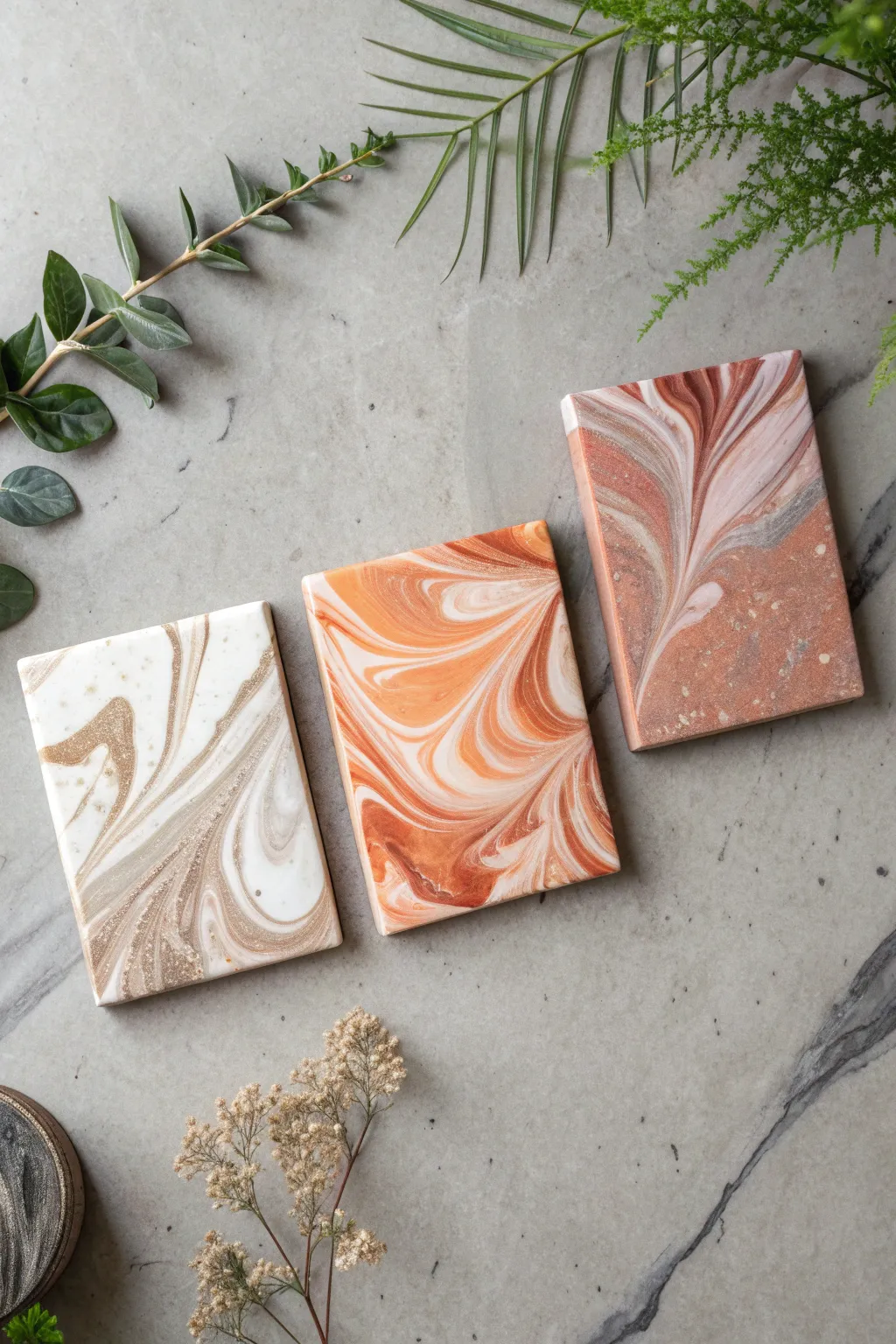
These elegant mini canvases showcase the mesmerizing interaction of fluid acrylics, creating organic, marble-like patterns in rich earthy tones. The swipe technique used here generates distinctive cells and lacing, perfect for beginners looking to make sophisticated, small-scale art.
Step-by-Step
Materials
- 3 mini stretched canvases (approx. 4×6 inches or 5×7 inches)
- Acrylic paints (Titanium White, Gold, Metallic Bronze, Burnt Sienna, Terracotta, Beige)
- Pouring medium (Floetrol or specialized pouring medium)
- Silicone oil (100% pure treadmill lubricant or spot-on oil)
- Small plastic cups for mixing
- Wooden stir sticks
- Swipe tool (plastic sheet, damp paper towel, or thin palette knife)
- Plastic drop cloth or garbage bag to protect surface
- Disposable gloves
Step 1: Mixture Preparation
-
Mix your base ratios:
Begin by mixing your acrylic paints with the pouring medium. A standard ratio is 1 part paint to 2 parts medium, but adjust until you reach a consistency similar to warm honey. -
Check consistency:
Lift your stir stick; the paint should flow off in a continuous stream without breaking, forming a small mound that disappears within a second or two. -
Create distinct palettes:
For the three designs shown, mix separate color families. Set 1: White, Gold, Beige. Set 2: Orange, White, Terracotta. Set 3: Brick Red, Pink, Metallic Bronze. -
Add cell activator:
Add 1-2 drops of silicone oil to only the colors you want to create cells (usually the metallics or darker tones). Stir just twice to barely incorporate it; over-mixing breaks the oil too much.
Swipe Tool Tip
Cut up clear plastic file folders into small rectangles. They are flexible, reusable, and let you see the paint moving underneath as you swipe.
Step 2: Pouring & Layering
-
Prepare the canvas:
Elevate your mini canvases on upturned cups so edges can drip freely. Ensure they are perfectly level. -
Apply the base coat:
For the white/gold canvas, pour a puddle of white paint across the top third of the canvas to act as your swipe color. -
Layer the river:
Pour lines or puddles of your gold and beige colors below the white section. Don’t worry about being neat; organic blobs work best. -
Repeat for other palettes:
Set up the other two canvases similarly. For the orange one, use a white base at the top. For the red one, try a pale pink or white base at the top.
Level Up: Resin Coat
Instead of varnish, finish with a top coat of clear art resin. It creates a glass-like finish that makes the metallic gold paints shimmer incredibly.
Step 3: The Swipe Technique
-
Position the tool:
Take your swiping tool—a flexible piece of plastic or a damp paper towel works well for this scale. Place it gently into the top base color liquid. -
Glide down:
With very light pressure, drag the top color down over the other colors. You want to skim the surface, not scrape the canvas bare. -
Create movement:
Instead of a straight line, wiggle your hand slightly as you pull down to create the wavy, marble-like distortion seen in the orange and red examples. -
Watch cells appear:
Let the paint settle for a minute. The silicone oil will start to rise, creating small circular cells and intricate lacing effects. -
Refine the edges:
Check the sides of the canvas. Use a finger to dab dripping paint onto any bare spots on the corners or edges to ensure full coverage.
Step 4: Drying & Finishing
-
Protect while drying:
Cover the wet canvases with a clean cardboard box or plastic tub to prevent dust from settling on the sticky surface. -
Allow cure time:
Let them dry undisturbed for at least 24 to 48 hours. Acrylic pours dry from the outside in, so be patient. -
Clean the surface:
Once fully cured (after a few weeks), use a soft cloth with a tiny bit of dish soap to wipe away excess silicone oil. -
Varnish:
Apply a coat of gloss varnish to make the colors pop and give it that ceramic-like shine shown in the reference image.
Display your trio of swiped masterpieces together on a shelf or mount them as a cohesive wall series once fully dry
Textured Paste Painting With Raised Details
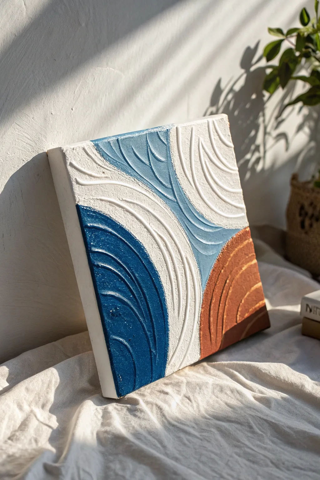
This striking abstract piece combines soothing coastal colors with bold, tactile texture that you can actually feel. Using modeling paste to build dimension, you’ll create satisfying, sweeping curves that catch the light and add instant modern elegance to any wall.
Detailed Instructions
Materials
- Square stretched canvas (12×12 inches recommended)
- Modeling paste (or texture paste)
- Acrylic paints (dark blue, light teal/blue-grey, copper/terracotta, white)
- Palette knife (flat or trowel shape)
- Texture combs or a stiff, notched spreader
- Old credit card (optional alternative for smoothing)
- Pencil
- Painter’s tape or masking tape
- Matte or satin varnish (optional spray)
Step 1: Preparation & Mapping
-
Prepare your canvas:
Ensure your canvas is clean and taut. Place it on a protected surface, as texture paste can get messy. If desired, lightly gesso the surface first, though standard pre-primed canvases work just fine for this heavy application. -
Sketch the design:
Using a pencil, lightly draw your layout directly onto the canvas. You want four distinct sections: a large central hourglass shape for the white and teal sections, and two semi-circles on opposite corners (bottom-left and bottom-right) for the dark blue and copper areas. -
Tape off sections (optional):
For beginner artists, applying painter’s tape along the pencil lines can help keep the color zones distinct. However, since the texture paste is thick, you can also just work carefully up to the line freehand.
Step 2: Building Texture
-
Mix the first color:
Scoop a generous amount of modeling paste onto your palette. Mix in your dark blue acrylic paint. You want a ratio of about 70% paste to 30% paint so the mixture remains thick and spreadable like frosting. -
Apply the dark blue section:
Using your palette knife, spread the blue mixture into the bottom-left curved section. Apply it thickly—about 1/4 inch deep—so you have enough material to carve into later. -
Create the swirl pattern:
Immediately use your texture comb or the edge of a palette knife to drag curved lines through the wet paste. Follow the curve of the shape, creating parallel grooves that mimic ripples. -
Clean your tools:
Wipe your tools completely clean before moving to the next color to avoid muddying the pigments. -
Mix and apply the copper tone:
Mix your copper or terracotta paint with fresh modeling paste. Apply this to the bottom-right corner section, ensuring the layer is just as thick as the blue section. -
Texture the copper section:
Carve your curved lines into the copper paste. Try to make these curves echo the opposite corner but perhaps arch in a different direction for visual interest.
Cracks appeared?
Thick paste can crack if it dries too fast. If small cracks form, mix a tiny bit of paint and water, then gently brush it into the fissures to hide them seamlessly.
Step 3: The Central Hourglass
-
Apply the white paste:
For the large white sections, you can use the modeling paste plain or mix it with titanium white paint for a brighter finish. Spread this into the upper-right and mid-left areas of your design. -
Carve the white curves:
Use a wider comb or the back of a brush to create deep, sweeping lines in the white paste. I like to let these lines flow outwards, giving the piece a sense of expansion. -
Mix the teal accent:
Mix a soft teal or blue-grey paint with your remaining paste. This color acts as a bridge between the white and dark blue sections. -
Fill the central channel:
Apply the teal mixture in the central channel that connects the top and bottom of the canvas, filling in the remaining negative space. -
Final texture pass:
Add texture to the teal section. Carefully drag your tool so the grooves connect visually with the surrounding shapes, creating a cohesive flow across the canvas.
Pro Tip: DIY Comb
Don’t have a texture comb? Cut notches into a piece of stiff cardboard or an old credit card to create custom groove widths for unique patterns.
Step 4: Finishing Touches
-
Refine the edges:
While the paste is still wet, use a clean palette knife to tidy up the outer edges of the canvas. You can either smooth the paste flush with the edge or wrap the texture around the sides for a gallery look. -
Check for peaks:
Look closely at your texture. If there are overly sharp peaks of paste standing up, you can very gently tap them down with a flat knife so they aren’t brittle when dry. -
Allow extensive drying time:
This is crucial: because the paste is thick, let the artwork dry flat for at least 24-48 hours. The surface may feel dry sooner, but the interior needs time to harden. -
Seal the work:
Once fully cured, spray the piece with a matte or satin varnish to protect the textured grooves from dust and seal the color.
Hang your textured masterpiece where side-lighting can hit those ridges and really show off the dimension you created.
Have a question or want to share your own experience? I'd love to hear from you in the comments below!