When I’m craving a truly polished look, I reach for a restricted color palette, intentional negative space, and one or two details that shimmer when the light hits. Here are elegant painting ideas that feel gallery-worthy, elevated, and totally doable in your own style.
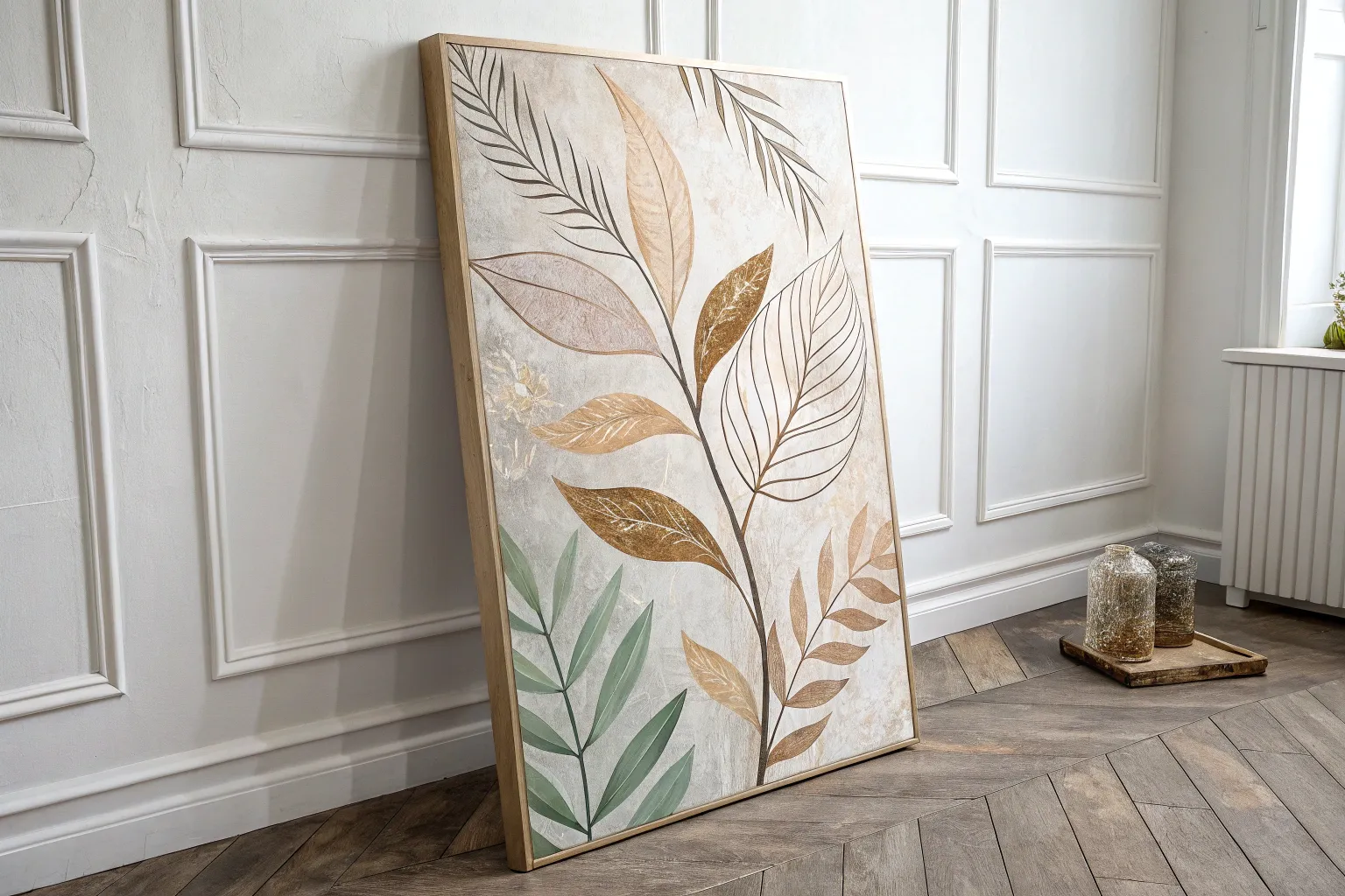
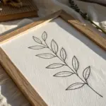
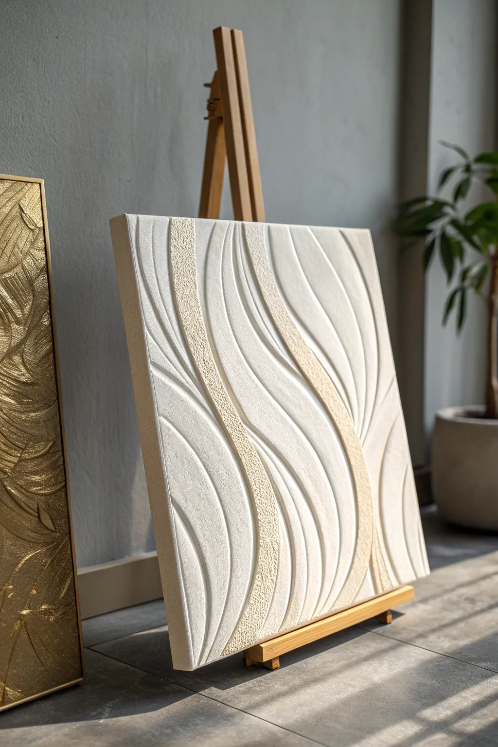
Neutral Abstract with Gold Leaf
This sophisticated, large-scale abstract piece combines serene neutral tones with the luxurious shimmer of gold leaf to create a statement artwork. The layered textures and horizontal movement mimic a calming, hazy landscape, perfect for adding warmth and elegance to any modern living space.
Step-by-Step
Materials
- Large canvas (e.g., 36×48 inches)
- Acrylic paints: Titanium White, Unbleached Titanium, Raw Umber, Burnt Sienna
- Modeling paste or heavy structure gel
- Gold leaf sheets
- Gold leaf adhesive (size)
- Wide flat synthetic brushes (2-3 inch)
- Palette knife or large scraper tool
- Soft gilding brush or fluffy makeup brush
- Spray bottle with water
- Varnish (gloss or satin)
Step 1: Preparation and Texture
-
Prime the Surface:
Ensure your large canvas is clean and taut. If it’s raw canvas, apply a coat of gesso; if pre-primed, you can skip this, but a fresh coat helps paint adhesion. -
Build Texture:
Using a palette knife or a large scraper, spread modeling paste primarily in the central and lower sections of the canvas. Apply it unevenly to create ridges and valleys. -
Create Direction:
While the paste is wet, drag your tool horizontally across the surface. This establishes the landscape-like horizon feel that underpins the entire composition. -
Dry Completely:
Allow the texture medium to dry fully. Depending on thickness, this could take several hours or overnight. Patience here ensures cracks don’t form later.
Sticky Situation
If your gold leaf isn’t sticking, you likely applied the leaf too soon while the glue was wet. Wait until the adhesive is clear and feels sticky like tape before applying.
Step 2: Layering Color
-
Mix Base Tones:
On your palette, mix Titanium White with a touch of Unbleached Titanium to create a creamy off-white. Also, mix Raw Umber with Burnt Sienna for a rich, warm earth tone. -
Apply the Dark Base:
Using a wide brush, apply the dark earth blend heavily at the very bottom of the canvas, roughly the bottom 15%. -
Fade Upwards:
While the bottom strip is wet, start introducing Unbleached Titanium above it. Blend the dark and light paints directly on the canvas using horizontal strokes. -
Create the Hazy Center:
Load a clean wide brush with Titanium White. Start from the center and work outwards. I like to spritz a little water on the canvas here to make the white wash semi-transparent, letting texture peek through. -
Add Upper Warmth:
For the top third, mix a very diluted wash of Burnt Sienna and Unbleached Titanium. Apply this loosely in horizontal bands, leaving plenty of white space. -
Refine Transitions:
Use a dry, clean brush to softly sweep back and forth over the transition areas between colors to blur any harsh lines.
Frame It Up
Level up the elegance by adding a floating frame. Paint the frame gold or use natural wood to complement the metallic accents within the painting.
Step 3: Gilding Details
-
Plan Gold Placement:
Visualize where you want the gold accents. In the reference, they appear as broken horizontal bands near the top and scattered specks in the textured bottom area. -
Apply Adhesive:
Brush the gold leaf adhesive (size) onto these specific areas. Apply it thinly and unevenly for a distressed look. -
Wait for Tackiness:
Let the adhesive sit until it becomes clear and tacky. Refer to your bottle’s instructions, but usually, this takes 15-20 minutes. -
Lay the Leaf:
Gently press sheets of gold leaf over the sticky areas. Don’t worry if the sheets tear or wrinkle; that adds to the organic aesthetic. -
Burnish and Brush:
Use a very soft, dry brush to gently rub the gold leaf. The excess that isn’t stuck to adhesive will flake away, leaving jagged, natural-looking gold marks. -
Enhance Texture:
For the bottom texturized area, you can dry-brush a tiny bit of darker paint over some gold sections to make them look embedded in the landscape.
Step 4: Finishing Touches
-
Final Assessment:
Step back five feet. Look for balance. If the whites look too flat, scumble a little more texture gel mixed with white paint over the center. -
Seal the Art:
Once fully dry (give it 24 hours), apply a varnish. This protects the acrylics and prevents the gold leaf from tarnishing over time.
Now you have a stunning, gallery-worthy centerpiece that radiates calm luxury

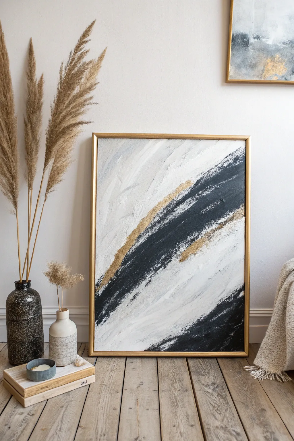
Black-and-White Gesture Strokes
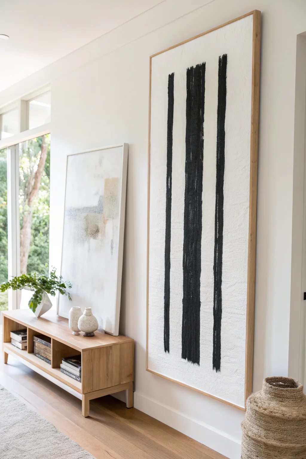
Make a bold, minimalist statement with this large-scale abstract painting featuring striking black vertical forms against a textured white background. The heavily textured surface adds depth and warmth, turning simple gestural strokes into a piece of sophisticated modern art.
How-To Guide
Materials
- Large-scale gallery wrapped canvas (e.g., 24″ x 60″)
- Gesso or white acrylic primer
- Heavy body black acrylic paint
- Modeling paste or texture medium
- Large palette knife or trowel
- Wide flat brush (3-4 inch)
- Rough bristle brush or chip brush (2 inch)
- Matte varnish
- Painter’s tape based on your preferred design
- Light wood floating frame (optional)
Step 1: Preparing the Textured Base
-
Secure the workspace:
Lay down a drop cloth or old sheet to protect your floor or table, as this project involves heavy mediums that can be messy. -
Mix the texture medium:
Mix a generous amount of modeling paste with white gesso or white acrylic paint in a ratio of about 2:1 to ensure the base remains pliable but holds shape. -
Apply the first layer:
Using a large trowel or palette knife, spread the texture mixture over the entire canvas. Don’t worry about smoothness; imperfections are the goal here. -
Build vertical texture:
While the paste is still wet, use the trowel to scrape lightly in upward and downward motions. This establishes a subtle vertical grain that will complement the final painted strokes. -
Rough up the surface:
Take a dry chip brush and stipple or drag it through random sections of the wet paste to create deeper pits and ridges, which adds organic character. -
Let it cure fully:
Allow the texture layer to dry completely. Depending on the thickness of your paste usage, this can take anywhere from 12 to 24 hours. I usually let it sit overnight to be safe.
Step 2: Planning the Composition
-
Visualize the spacing:
Look at your canvas vertically. Imagine three distinct vertical columns. The center stripe should be the widest and most dominant, with two thinner companion stripes flanking it. -
Mark light guides:
Use a pencil or charcoal stick to very lightly mark the top and bottom starting points for your three stripes. Do not draw solid lines, as you want the final stroke to feel freehand, not traced. -
Prepare the black paint:
Squeeze a substantial amount of heavy body black acrylic onto your palette. Do not add water; you want the paint thick and opaque to catch on the texture below.
Texture Pro Tip
Mix a handful of clean sand into your white modeling paste. This creates a gritty, stone-like surface that grabs the black paint beautifully for a rugged look.
Step 3: Executing the Gesture Strokes
-
Start the center stripe:
Load a 3-4 inch wide flat brush generously with black paint. You need enough paint to travel the length of the canvas without constant reloading. -
Paint the first pass:
Starting from the very top edge, pull the brush straight down with confident, steady pressure. Let the bristles skip over the texture’s valleys, creating a ‘dry brush’ look naturally. -
Thicken the center line:
The center line needs weight. Make a second pass right next to the first one, blending them slightly to create one solid, thick black column that dominates the space. -
Create the left stripe:
Using a slightly narrower brush or the side of your large brush, paint the left stripe. Keep this line thinner and ensure there is significant white space breathing room between it and the center mass. -
Create the right stripe:
Paint the final stripe on the right side. Aim for asymmetry subtle imperfections here—perhaps this line is a little shorter or breaks more often than the others. -
Refine the edges:
Use a smaller rough bristle brush to feather the edges of the black lines slightly. You don’t want perfect geometric rectangles; you want them to look like ink strokes. -
Check for balance:
Step back five feet. If any area looks too perfectly solid black, use a dry brush to scrape away a little wet paint to reveal the white texture peaks underneath.
Level Up: Color Tint
Mix a tiny drop of Raw Umber into your black paint. It won’t look brown, but it creates a ‘soft black’ that feels warmer and more organic than harsh tube black.
Step 4: Finishing Touches
-
Allow to dry:
Let the black paint dry completely. Heavy body acrylics are thick, so give this a few hours to ensure the center isn’t still wet. -
Seal the artwork:
Apply a coat of matte spray varnish. Avoid brushing on liquid varnish if possible, as it might smear the black into the white texture if not 100% cured. -
Frame the piece:
Install the canvas into a light wood floating frame. This specific frame style leaves a small gap between the canvas edge and the wood, elevating the gallery aesthetic.
Hang your new masterpiece in a well-lit area where the shadows can play across the unique texture you created
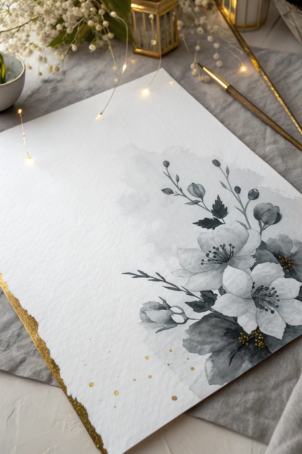
Moody Monochrome Florals
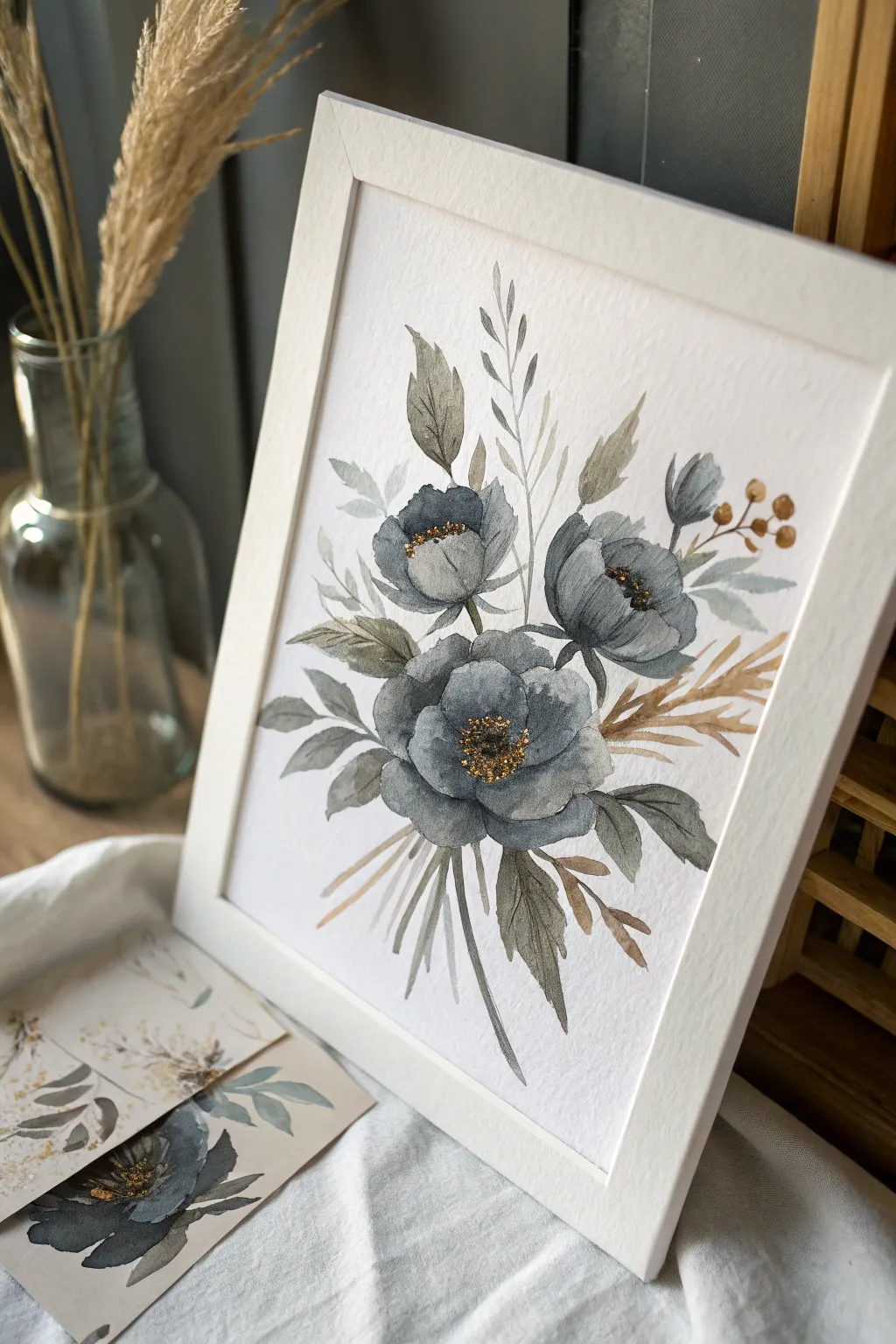
Achieve a sophisticated, modern look with this stunning watercolor project that balances moody blue-grey tones with delicate golden accents. The composition relies on loose, organic floral shapes and earthy dried botanicals for a piece that feels both vintage and contemporary.
Step-by-Step
Materials
- Cold press watercolor paper (300 gsm)
- Watercolor paints: Payne’s Grey, Indigo, Sepia, Burt Sienna, Yellow Ochre
- Gold metallic watercolor paint or gold gouache
- Round watercolor brushes: Size 8 (for washes) and Size 2 (for details)
- Pencil (HB or H) for light sketching
- Water jars (two: one for clean, one for dirty)
- Paper towels
- White or natural wood frame (optional)
Step 1: Planning the Composition
-
Light sketch:
Begin by lightly sketching the placement of the three main blooms. Draw a large central circle for the main flower and two smaller, slightly ovoid shapes above and to the right for the supporting blooms. -
Map the stems:
Sketch curved, intersecting lines extending downward from your flower heads to establish the flow of the stems. Don’t worry about perfect straightness; organic curves look more natural. -
Leaf placement:
Mark the general position of the larger leaves surrounding the central bloom, ensuring they radiate outward to fill the negative space.
Muddy Colors?
If your grey flowers look muddy, you likely overworked the paper while it was wet. Lay down the stroke and leave it alone; let the water do the mixing work.
Step 2: Painting the Blooms
-
Mix your moody grey:
Create a watery mixture of Payne’s Grey with a tiny touch of Indigo. You want a color that is dark but translucent enough to show paper texture. -
First wash – Central bloom:
Using the size 8 brush, paint the outer petals of the central flower first. Use wet-on-dry technique, laying down the shape and then dropping in a slightly more concentrated pigment at the base of the petal while it’s still wet. -
Inner petals:
Paint the inner petals, leaving very thin slivers of white paper (negative space) between them and the outer petals to define the individual shapes. -
Upper blooms:
Repeat this process for the two smaller upper flowers. Keep the tops of these petals slightly more jagged or organic to suggest a ruffled texture. -
Deepen the shadows:
While the flowers are damp but not soaking, mix a more saturated Indigo/Grey. Dab this into the deepest centers of the flowers to create instant volume and depth. -
Let it dry:
Allow the flower heads to dry completely before moving on to foliage so the colors don’t bleed into the greenery.
Step 3: Adding Foliage & dried Elements
-
Mix leaf colors:
Create two greens: one cool, desaturated green (mix your grey blend with a touch of Sepia) and one warmer, earthy tone (Sepia with Yellow Ochre). -
Paint main leaves:
Using the desaturated green mixture, paint the broad, pointed leaves extending from the main bloom. Use a single stroke, pressing down on the belly of the brush and lifting at the end for a sharp tip. -
Add ‘dried’ sprigs:
Switch to your warm earthy mix (Sepia/Ochre). Paint fine, feathery sprigs and wheat-like stalks poking out from behind the blue flowers. -
Stem work:
Using the size 2 brush and a mix of Grey and Sepia, carefully trace over your pencil lines for the stems. Vary the pressure to make the lines look organic rather than uniform. -
Ghost leaves:
Dilute your grey mix significantly with water until it’s very pale. Paint a few faint ‘ghost’ leaves in the background to add atmospheric depth.
Add Texture
Sprinkle a tiny pinch of table salt onto the wet grey petals. As it dries, the salt absorbs pigment, leaving behind beautiful, crystalline starburst textures.
Step 4: The Golden Details
-
Prepare the center:
Ensure the flower centers are bone dry. Load your small brush with a thick, creamy consistency of gold metallic paint. -
Stippling texture:
Hold the brush perpendicular to the paper and create a cluster of tiny dots (stippling) in the very center of each dark bloom. -
Gold berries:
Paint the small round berries on the right side using the gold paint or a mix of gold and Burnt Sienna for a more antique look. -
Final assessment:
Step back and look at the balance. If the center feels too dark, I sometimes add a few tiny white gouache dots among the gold for sparkle. -
Erase and frame:
Once artwork is fully dry (give the metallic paint extra time), gently erase any visible pencil marks and mount in a clean white frame.
Hang your new masterpiece in a well-lit spot to catch the shimmer of the gold details throughout the day

Stylized Feather with Metallic Veins
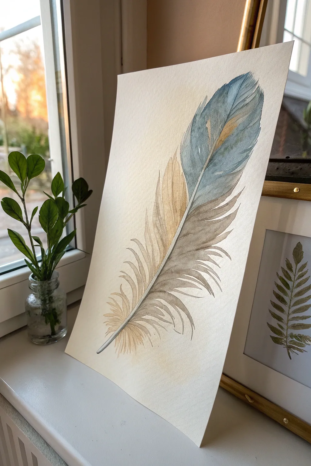
Capture the delicate beauty of nature with this airy watercolor feather painting. Combining soft washes of dusty blue and warm beige with fine, illustrative lines creates a piece that feels both organic and elegantly stylized.
Step-by-Step Tutorial
Materials
- Cold press watercolor paper (300 gsm)
- Watercolor paints: Indigo or Payne’s Grey, Yellow Ochre, Burnt Sienna
- Round watercolor brushes (Size 6 and smaller detail brush like Size 0 or 1)
- Pencil (HB or H)
- Kneaded eraser
- Jar of clean water
- Paper towels
- White gouache or white gel pen (optional for highlights)
Step 1: Sketching the Bones
-
Draw the central quill:
Begin by lightly drawing a long, curved line diagonally across your paper. This will serve as the rachis, or the stiff central shaft of the feather. -
Outline the shape:
Sketch the outer boundary of the feather. Start wider at the top and taper it down towards the quill at the bottom. Keep the lines faint so they won’t show through the transparent paint later. -
Add the barbs:
Refine the edges by drawing jagged, irregular splits along the sides. Feathers aren’t perfect solids; indicate where the individual barbs separate, especially near the bottom where the fluff is.
Step 2: Laying the Washes
-
Mix your palette:
Prepare two main puddles of color. For the cool tone, mix a watery Indigo or a blue-grey. For the warm side, dilute Yellow Ochre with a touch of Burnt Sienna to create a sandy beige. -
Paint the blue section:
Using your size 6 brush, paint the upper-right side of the feather with the blue-grey mix. Use the tip of the brush to flick paint outward towards the edge, mimicking the direction of feather growth. -
Soften the transition:
While the blue paint is still damp, rinse your brush and gently soften the inner edge near the central quill, but avoid painting over the quill itself just yet. -
Paint the beige section:
Now apply the warm sandy mix to the lower-left section of the feather. Start from the quill and pull the color outwards, letting it fade naturally as it reaches the fluffy tips. -
Blend lightly:
If the colors touch near the top or bottom, let them bleed slightly for a natural look. I usually find that accidental bleeds create the most beautiful textures. -
Dry completely:
Let this first layer of washes dry fully before moving on. The paper should feel room temperature to the touch, not cool.
Fixing Hard Edges
If a paint edge dries too harsh, scrub it gently with a damp stiff brush and dab with a paper towel. This ‘lifting’ softens the line back into a gradient.
Step 3: Defining with Details
-
Deepen the blue:
Mix a slightly more concentrated version of your blue-grey. Use the smaller detail brush to paint thin, hair-like strokes over the dry blue wash, following the curve of the barbs. -
Enhance the beige:
Repeat this process on the warm side with a slightly darker brown mix. These fine lines simulate the individual texturing of the feather fibers. -
Define the quill:
With a very fine brush and a neutral grey or diluted brown, carefully paint the shadow side of the central quill shaft to give it dimension. Leave the center of the shaft unpainted or very pale. -
Add splits and gaps:
Use a damp, clean brush to lift clearer lines or use the darker paint to create negative space ‘V’ shapes along the edges, emphasizing the splits in the feather. -
Darken the crossover:
Where the beige side tucks under the main blue body (around the middle section), darken the shadows with a deeper brown to create a sense of layering and overlap. -
Final airy wisps:
Use your thinnest brush with very watery paint to add loose, flyaway strands at the very bottom of the quill. These should look soft and unkempt compared to the top.
Gilded Touch
Once fully dry, trace the central quill or select barbs with metallic gold watercolor or ink. It adds a subtle, luxurious shimmer when the light hits.
Now you have a serene piece of nature art ready to frame or gift
BRUSH GUIDE
The Right Brush for Every Stroke
From clean lines to bold texture — master brush choice, stroke control, and essential techniques.
Explore the Full Guide
Butterfly Silhouette with Foil Details
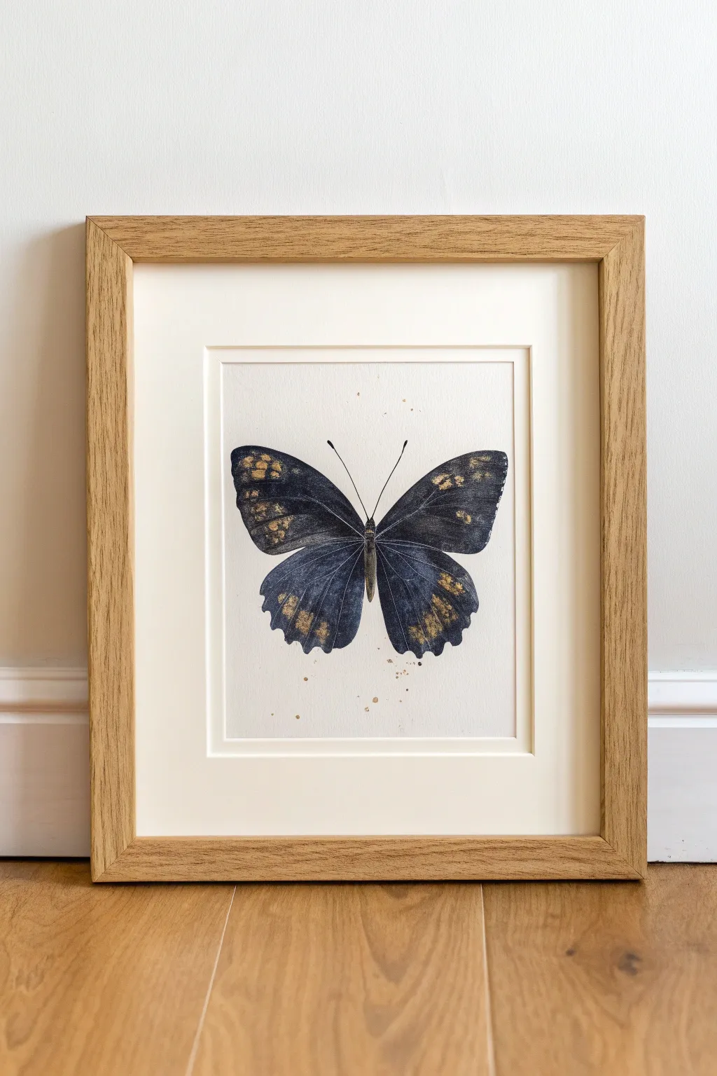
Merge the fluid beauty of dark watercolor with the luxurious shimmer of gold leaf in this elegant insect study. The result is a striking, sophisticated piece that balances scientific structure with artistic spontaneity.
Detailed Instructions
Materials
- Hot press watercolor paper (smooth texture)
- Black watercolor paint or Payne’s Gray
- Indigo watercolor paint
- Gold leaf sheets or metallic gold watercolor paint
- Gold leaf adhesive (sizing) – if using leaf
- Gold leaf sealer – if using leaf
- Round watercolor brushes (size 2, 6, and 10)
- Pencil (HB)
- Butterfly reference image or silhouette
- Masking fluid (optional)
- Light wood frame with mount
Step 1: Drafting the Design
-
Prepare your paper:
Begin with a sheet of hot press watercolor paper trimmed to fit your frame’s mount. I prefer hot press because its smooth surface allows the gold leaf to sit flat and catch the light beautifully. -
Outline the silhouette:
Lightly sketch the butterfly shape using an HB pencil. You can freestyle this or lightly trace a printed silhouette if you want perfect symmetry. -
Define the veins:
Very faintly sketch the major vein lines inside the wings. These will guide where you deposit the pigment later to create depth.
Sticky Situation?
If gold leaf sticks where you don’t want it, your paper wasn’t dry enough or you touched it with oily fingers. Use a clean, stiff brush to gently scrub away errant flakes.
Step 2: Painting the Base
-
Mix your darks:
Create a watery puddles of paint. You want a deep, inky mixture of Black and Indigo. Aim for a consistency like light cream—pigmented but fluid. -
The wet-on-dry technique:
Start with the upper left wing. Using your size 6 brush, fill the shape with clean water first, stopping just short of the pencil line. -
Drop in color:
While the wing area is wet, drop your dark paint mix into the water, starting near the body and letting it flow outward. This creates a natural gradient. -
Create texture:
While still damp, lift out a little pigment in the center of the wing sections using a clean, thirsty brush. This suggests the translucency of a butterfly wing. -
Paint the remaining wings:
Repeat the process for the other three wing sections, ensuring you leave a very thin sliver of white paper between the wings so they don’t bleed into one single blob. -
Detail the body:
Switch to your size 2 brush and paint the thorax and abdomen with a more concentrated, darker mix of black. Add the two delicate antennae using a swift, confident stroke to keep lines crisp.
Pro Tip: Vein Logic
Use a white gel pen to draw very thin veins over the dark painted areas once dry. It adds incredible realism and breaks up the heavy black shapes.
Step 3: Gilding and Flourishes
-
Dry completely:
Let the painting dry fully. The paper must be bone dry before applying adhesive, or the gold leaf will stick everywhere. -
Apply sizing:
Identify the spots where you want gold accents—focus on the wing tips and random clusters near the heavy veins. Apply the gold leaf sizing adhesive in small, organic dabs. -
Wait for tackiness:
Allow the sizing to sit until it becomes clear and tacky (usually 10-15 minutes depending on the brand). -
Apply the leaf:
Gently press a sheet of gold leaf over the tacky areas. Use a soft, dry brush to smooth it down, breaking away the excess leaf that isn’t stuck to the glue. -
Add energetic splatters:
Load a brush with a metallic gold watercolor (or very watery sizing followed by leaf dust). Tap the brush handle against your finger to fling tiny golden specks around the butterfly silhouette. -
Seal (optional):
If using real metal leaf (like copper or imitation gold), apply a thin sealer over the metal areas to prevent tarnishing over time.
Step 4: Final Assembly
-
Erase guidelines:
Once absolutely everything is dry, gently erase any visible pencil marks, being careful not to rub the gold leaf. -
Mount and frame:
Center your artwork behind the white mount and place it into a simple oak or light wood frame to complement the warm gold tones.
Hang your shimmering specimen in a well-lit spot to catch the light throughout the day
Fashion-Style Line Portrait
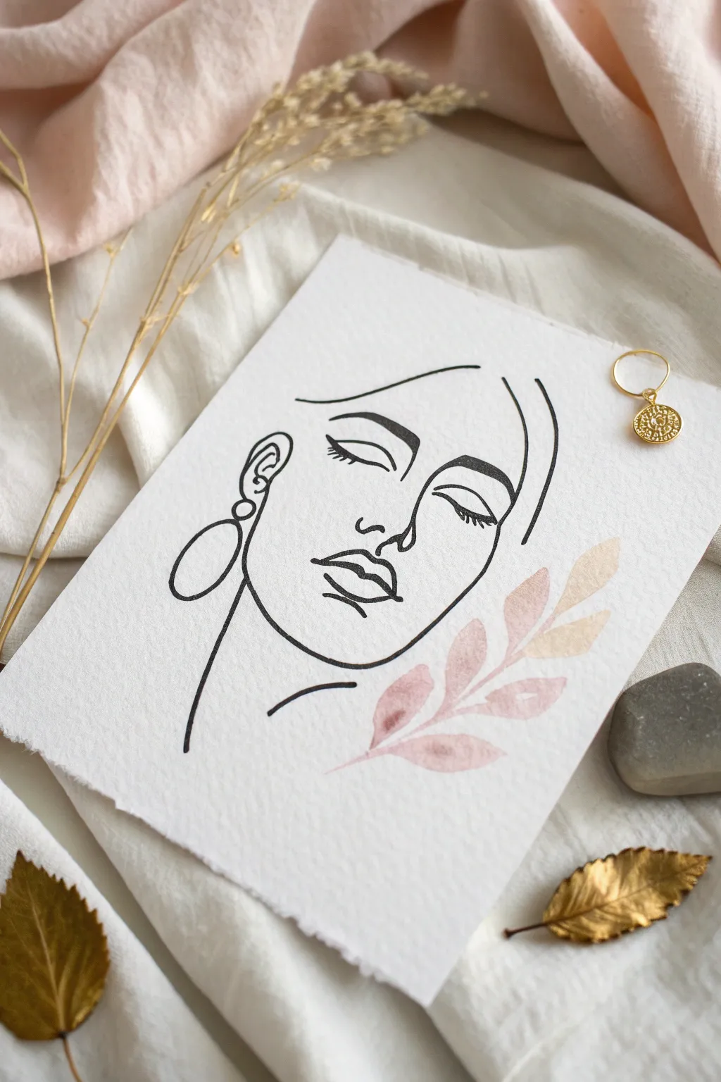
Embrace the elegance of simplicity with this continuous line-style portrait featuring delicate watercolor accents. This sophisticated piece combines bold ink work with soft, feminine colors to create stunning modern wall art.
Step-by-Step Tutorial
Materials
- Cold press watercolor paper (300 gsm)
- Black archival ink fine liner (size 05 or 08)
- Watercolor paints (dusty rose, peach, light sand)
- Small round watercolor brush (size 2 or 4)
- Pencil (HB or 2H)
- Kneadable eraser
- Ruler (optional)
- Deckle edge ruler or scissors (for paper finish)
- Water cups and paper towels
Step 1: Preparation & Sketching
-
Prepare the paper:
Begin by tearing your watercolor paper to size. For that rustic, handmade look seen in the photo, tear the edges against a ruler rather than cutting them. This creates a soft deckle edge that adds character. -
Map facial proportions:
Lightly sketch a central vertical line and horizontal guides for the eyes, nose, and mouth using your HB pencil. Keep these marks extremely faint so they are easily erased later. -
Sketch the primary contour:
Start drafting the face shape. Focus on the left side jawline leading into the chin. The style relies on negative space, so you don’t need to close every shape perfectly. -
Draft the features:
Draw the eyes closed with a heavy upper lash line. Add the nose bridge connecting to an eyebrow, and outline the lips. Keep your pencil grip loose to encourage fluid, confident curves. -
Add abstract hair elements:
Sweep a few curved lines above the forehead and down the right side to suggest hair strands without drawing every single hair. Simplicity is key here. -
Sketch the accessories:
On the left side, draw a large oval connected to a smaller circle for the statement earring. -
Refine the lines:
Review your pencil sketch. Erase any scribbles and strengthen the lines you want to keep. The final inked version should look intentional and smooth.
Unsteady Hands?
If you struggle with long continuous lines, try drawing quickly rather than slowly. Momentum smooths out the wobble, resulting in cleaner curves.
Step 2: Inking the Portrait
-
Begin inking:
Take your archival fine liner (size 05 is a good standard). Start with the eyes, as they anchor the face. Use smooth, continuous strokes rather than short, sketchy dashes. -
Vary line weight:
To add dimension, I like to go over certain curves twice, like the underside of the jaw or the upper eyelashes. This subtle thickening creates depth without shading. -
Complete the outline:
Trace the rest of your pencil lines for the face, hair, and earring. Commit to your strokes; if a line goes slightly off, treat it as an artistic choice rather than a mistake. -
Let the ink set:
Allow the ink to dry completely for at least 10-15 minutes. This prevents smudging when you erase the pencil guides. -
Clean up the sketch:
Gently gently roll a kneadable eraser over the entire drawing to lift the pencil graphite, leaving only your crisp black ink work.
Step 3: Watercolor Accents
-
Mix your palette:
Create a watery mix of dusty rose and peach. You want the consistency to be very transparent, like tea, rather than thick and opaque. -
Paint the bottom stem:
Dip your small round brush into the paint. Just below the chin on the right side, paint a thin stem curving upward toward the cheek. -
Add leaves:
Press the belly of the brush down and lift up to create simple leaf shapes attached to the stem. Use the dusty rose color for the lower leaves. -
Blend the gradient:
While the paint is still wet, clean your brush and pick up a little peach or sand color. Drop this into the upper leaf shapes to create a gentle transition of color. -
Refine leaf edges:
Use the tip of your brush to sharpen the points of the leaves. The watercolor should sit beside the face, framing it without overlapping the black ink lines. -
Final drying:
Let the watercolor dry completely flat to avoid buckling. Once dry, your elegant artwork is ready to be displayed.
Level Up With Gold
Once the watercolor is dry, add metallic gold paint to the earring or trace the leaf veins for a touch of refined luxury.
Enjoy the calming process of creating this stylish, minimal piece for your home

PENCIL GUIDE
Understanding Pencil Grades from H to B
From first sketch to finished drawing — learn pencil grades, line control, and shading techniques.
Explore the Full Guide
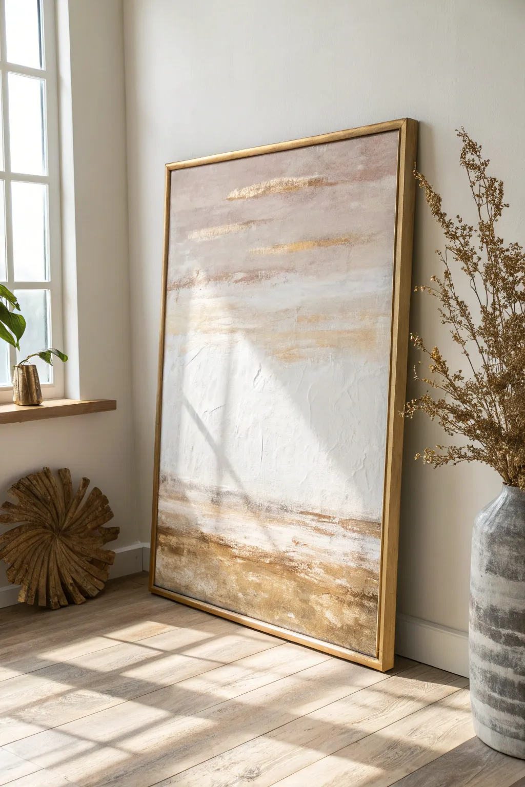
Soft Ombre Wash Background
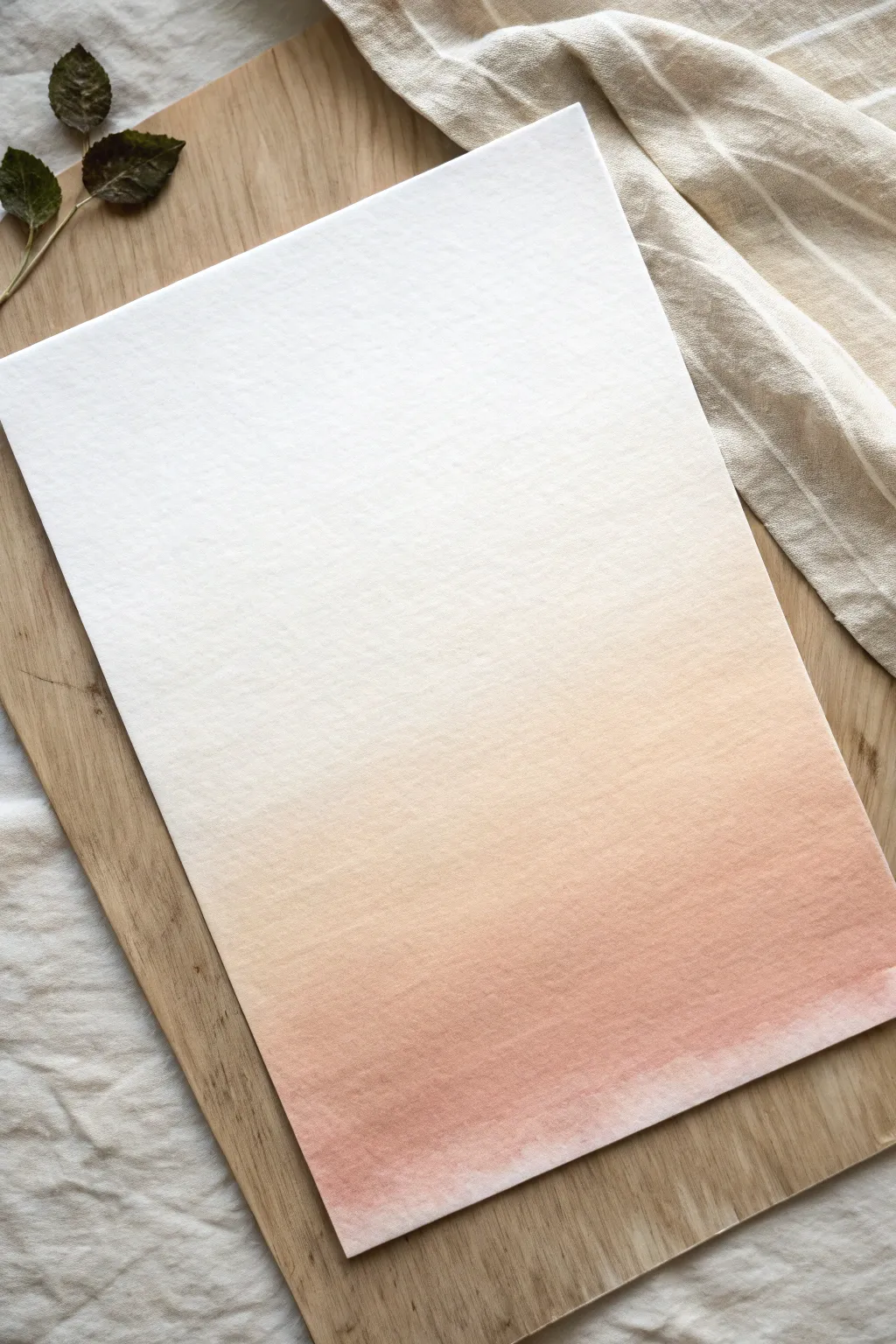
Master the art of the perfect gradient with this soft, glowing ombre wash background. Reminiscent of early morning light, this subtle transition from white to warm terracotta creates an elegant foundation for calligraphy or stands beautifully on its own.
Step-by-Step
Materials
- Cold press watercolor paper (300 gsm)
- Wide flat wash brush (1 inch or larger)
- Watercolor paint (Burnt Sienna or Rose Madder)
- Two containers of water
- Painter’s tape or masking tape
- Paper towel or rag
- Drawing board or hard surface
Step 1: Preparation and Setup
-
Secure the paper:
Tape your watercolor paper down firmly onto a drawing board or hard surface. Ensure the tape covers about 1/4 inch of the paper edges to create a clean border and prevent buckling when wet. -
Tilt the surface:
Prop up the top of your board slightly (about 15-20 degrees) so gravity can help the paint flow downwards. A thick book or block of wood works perfectly for this. -
Mix your paint:
Prepare a generous puddle of your chosen terracotta or peach color. Aim for a ‘tea-like’ consistency—not too thick, but pigmented enough to show true color. -
Prepare clean water:
Keep a separate container of completely clear water next to your mixed paint. This is crucial for diluting the color as you move up the page.
Step 2: Creating the Wash
-
Load the brush:
Dip your wide flat brush into the paint mixture, ensuring it is fully saturated but not dripping excessively. -
Apply the first stroke:
Starting at the very bottom of the paper, lay down a confident, horizontal stroke from left to right. This will be your darkest, most saturated band of color. -
Reload and repeat:
Reload your brush with the same paint mixture and apply a second stroke just slightly overlapping the top edge of the first one. Let the bead of water merge the two lines. -
Begin diluting:
Dip your brush quickly into the clean water container, then back into your paint mix just a tiny bit. I like to blot it slightly on the palette to ensure it’s not too runny before applying the next stroke above the previous one. -
Lighten the mixture:
For the next stroke, dip your brush further into the clean water, diluting the pigment remaining on the bristles. Apply the next band, moving upwards. -
Continue upward:
Repeat the process: dip into clean water, apply a horizontal stroke that overlaps the previous one, and watch the color gently fade. -
Pure water transition:
By the time you reach the upper middle section, your brush should mostly hold clean water with just a whisper of pigment. Apply these strokes carefully. -
Finish with clear water:
For the top quarter of the page, rinse your brush completely and use only pure, clean water to drag the faint edge of the wash up to the top tape line. -
Manage the bead:
If a pool of water (the ‘bead’) collects at the bottom of a stroke, dry your brush on a paper towel and gently touch the excess liquid to soak it up.
Wet-on-Dry vs. Wet-on-Wet
For this crisp gradient, use the ‘wet-on-dry’ method described. Wetting the paper first (wet-on-wet) makes the paint flow wilder and harder to control.
Step 3: Drying and Final Touches
-
Let it settle:
Leave the board at its tilted angle for about 5-10 minutes. This allows the pigment to settle naturally into the paper texture without back-runs. -
Flat drying:
Once the shine has left the paper (matte finish), you can lay the board flat to dry completely. Wait until the paper is cool to the touch. -
Remove the tape:
Peel the tape away slowly at a 45-degree angle, pulling away from the painted area to ensure you don’t tear the paper surface. -
Flatten if needed:
If the paper has slight curling despite the tape, place it under a few heavy books overnight once it is 100% dry.
Go Monochromatic
Try layering a second wash in a different hue (like soft yellow) once the first layer is bone dry for a glowing dual-tone effect.
Enjoy the peaceful process of watching the colors blend seamlessly together
Stormy Cloudscape Abstraction
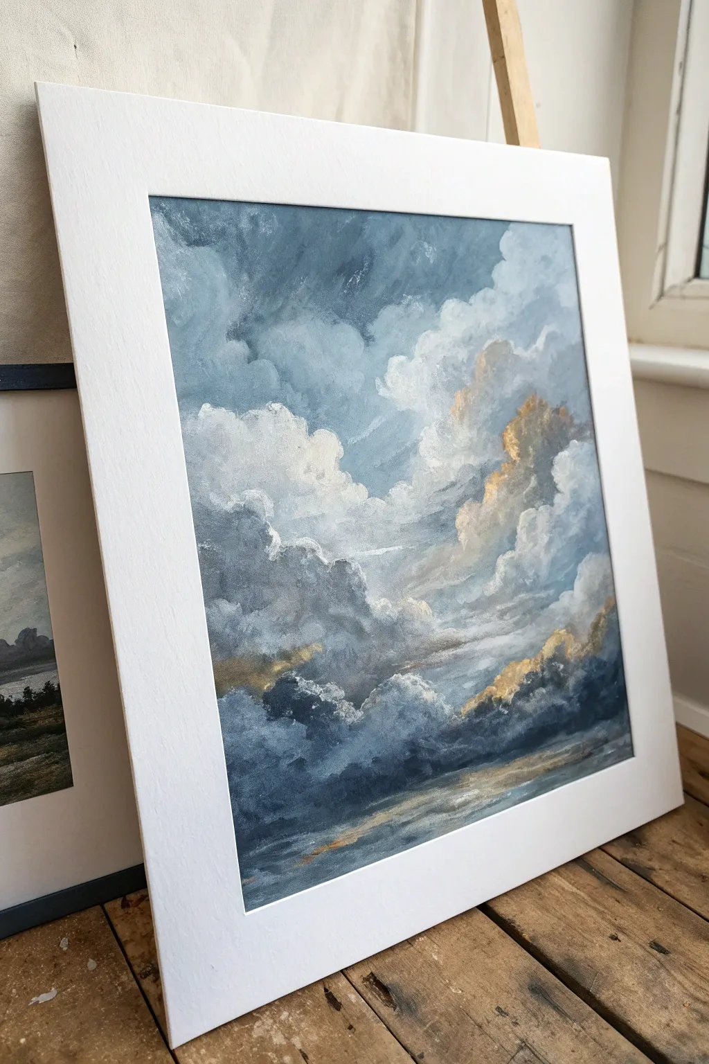
Capture the dramatic tension of a storm breaking with this atmospheric cloudscape, featuring rolling thunderheads and piercing golden warmth. This project balances moody indigo depths with soft, diffused highlights to create a sophisticated piece of art.
Detailed Instructions
Materials
- Square canvas board or stretched canvas (10×10 or 12×12 inch)
- Heavy body acrylic paints
- Paint colors: Titanium White, Payne’s Grey, Prussian Blue, Burnt Umber, Yellow Ochre, Gold Metallic (optional)
- Large flat brush (1-inch)
- Medium filbert brush
- Small round detail brush
- Palette knife
- Slow-drying medium or retarder
- Water container and paper towels
- Pre-cut white mat board for framing
Step 1: Setting the Atmosphere
-
Prime the Surface:
Even if your canvas is pre-primed, apply a thin coat of white gesso mixed with a tiny drop of Payne’s Grey. This creates a cool, off-white base that helps the colors harmonize later. -
Map the Composition:
Using a diluted wash of Prussian Blue and a small round brush, sketch the basic shapes of your cloud formations. Divide the canvas so the darkest, heaviest clouds anchor the bottom third, while the billowing peaks reach toward the top right. -
Mix Your Base Darks:
Prepare a deep, stormy mixture using Payne’s Grey and Prussian Blue. Don’t worry about perfect blending on the palette; leaving some separation creates variety. -
Block in Shadows:
With the large flat brush, apply your dark mixture to the bottom section of the canvas and the deep recesses between the cloud banks. Use loose, dabbing motions rather than long strokes. -
Create the Mid-Tones:
Mix Titanium White with a touch of Prussian Blue and Burnt Umber to create a slate-grey mid-tone. Apply this around the edges of your dark shadows, overlapping them slightly while the paint is still wet to encourage soft boundaries.
Muddy Clouds?
If your whites are turning grey/brown on the canvas, stop and clean your brush thoroughly. Let the dark underlayer dry for 10 minutes before applying fresh white highlights on top.
Step 2: Building the Clouds
-
Introduce Warmth:
Before the cool tones dry completely, mix Yellow Ochre with plenty of Titanium White. Apply this creamy color near the center and right side where the light would naturally hit the cloud edges. -
Blend the Transitions:
Using a clean, dry filbert brush, gently sweep over the areas where the darks, greys, and warm creams meet. This ‘scumbling’ technique creates the soft, misty effect characteristic of distant clouds. -
Add Texture:
Load your medium brush with pure Titanium White. Press the brush firmly onto the canvas and twist slightly as you lift off to create the fluffy, billowing tops of the clouds in the upper left quadrant. -
Deepen the Drama:
Revisit your darkest Payne’s Grey. Mix it with a small amount of glazing medium or water and glaze over the bottom corners to deepen the contrast without covering the texture underneath. -
Suggest the Horizon:
Near the bottom edge, use horizontal strokes of varied greys and muted blues to suggest a distant sea or flat landscape beneath the storm. Keep this area abstract and less detailed than the sky.
Level Up: Palette Knife
Swap the brush for a palette knife on the brightest white highlights. Apply the paint like butter on toast for impasto texture that physically stands out from the canvas surface.
Step 3: Highlights and Refining
-
The Golden Hour:
Mix a small amount of Yellow Ochre with Burnt Umber. I like to dab this selectively on the ‘shoulders’ of the cumulus clouds, specifically on the right side, to mimic sunlight breaking through. -
Refine Edges:
Use the small round brush to sharpen the very tops of the clouds with pure white. This crisp edge contrasts beautifully with the misty, blended bottoms of the clouds. -
Add Metallic Hints:
If using metallic gold paint, dry-brush a very faint amount over the warmest ochre sections. This adds a subtle shimmer that catches the light when viewed from different angles. -
Soften the Sky:
In the top left corner, create a very pale blue-grey mix. Smooth this area out to look like the calmer sky behind the storm front, ensuring it recedes into the background. -
Final Assessment:
Step back five feet. Look for areas that feel too heavy or lack transition. Use a soft, dry brush to lightly feather out any harsh lines that shouldn’t be there. -
Framing Preparation:
Once fully dry, place your white mat board over the painting to find the most compelling composition. The crisp white border will instantly elevate the moody colors.
Place your finished piece in a simple frame to let the storm take center stage


Triptych Horizon in Neutrals
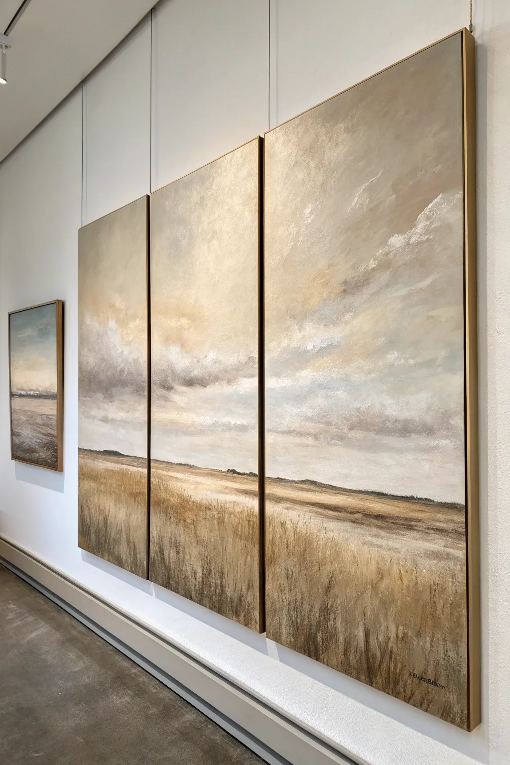
Capture the expansive beauty of a quiet field with this large-scale triptych project. Using a soothing palette of ochres, creams, and greys, you will build up layers of texture to create a seamless landscape that flows across three separate canvases.
Step-by-Step Tutorial
Materials
- 3 large vertical canvases (equal size, e.g., 24×48 inches)
- Heavy body acrylic paints (Titanium White, Unbleached Titanium, Yellow Ochre, Raw Umber, Burnt Sienna, Payne’s Grey)
- Large flat brushes (2-3 inch width)
- Medium filbert brushes
- Fan brush
- Palette knives (large and small)
- Slow-drying medium or retarder
- Easel or large wall space
- Painter’s tape or masking tape (optional)
Step 1: Preparation and Base Layer
-
Surface Prep:
Arrange all three canvases side-by-side on your easel or wall. Treat them as a single, continuous surface. If you are working on a wall, you might want to gap them slightly, but keep the gap small enough to visualize the flow. -
Establishing the Horizon:
Mix a light wash of Raw Umber and water. Sketch a low horizon line across all three panels, placing it about one-quarter of the way up from the bottom edge. Keep this line slightly uneven to mimic natural terrain. -
Underpainting the Sky:
For the upper three-quarters, apply a base coat of Unbleached Titanium mixed with a touch of Payne’s Grey. Use a large flat brush and wide, sweeping distinct crisscross strokes to cover the canvas quickly. -
Underpainting the Ground:
Below the horizon line, brush on a warm base tone using Yellow Ochre and Burnt Sienna. Don’t worry about texture yet; just get the color blocked in to kill the white of the canvas.
Step 2: Atmospheric Sky
-
Mixing Cloud Tones:
Prepare three piles of color on your palette: a creamy white (Titanium White + touch of Yellow Ochre), a mid-tone grey (White + Payne\’s Grey), and a darker storm grey. -
Applying the Atmosphere:
Start applying the mid-tone grey near the horizon line, blending upward. I like to mix a little slow-drying medium here to allow for softer transitions between colors. -
Adding Cloud formations:
Using a palette knife or a large brush, scrub in the darker storm grey in diagonal patches to suggest movement. Focus on the convergence points where the canvases meet to ensure the clouds look like they drift from one panel to the next. -
Highlighting the Clouds:
Load a clean brush with the creamy white mixture. Scumble this over the upper sections of the sky, letting the brush drag dryly to create broken, feathery textures that resemble high-altitude cirrus clouds. -
Softening Edges:
Take a large, dry blending brush and very lightly sweep over the wet paint in the sky area. This softens harsh brushstrokes and creates that ethereal, hazy aesthetic characteristic of tonal landscapes.
Seamless Transitions
When painting across gaps, actually push the canvases together so they touch. Paint across the seam, then separate them to finish the inside edges.
Step 3: The Grassy Foreground
-
Darkening the Horizon:
Mix Raw Umber with a tiny bit of Payne’s Grey. Paint a thin, dark strip right along the horizon line to ground the image and create depth. -
Mid-ground Texture:
Using a palette knife, scrape a mixture of Unbleached Titanium and Burnt Sienna horizontally across the middle ground (just below the horizon). This suggests distant fields or receding plains. -
Vertical Grass Strokes:
Switch to a medium filbert brush. Using a mix of Yellow Ochre and Raw Umber, begin flicking vertical strokes starting from the bottom edge and moving upward toward the middle ground. -
Layering Colors:
While the previous layer is tacky, add variety by painting lighter stalks using Unbleached Titanium. Vary the pressure so some grasses look thick and others wispy. -
Integrating the Panels:
Step back and check the flow across the triptych gaps. Ensure the density of the grass and the angle of the strokes continues logically from the left panel, through the center, to the right. -
Final Highlights:
Use a fan brush or a fine liner brush with pure Titanium White (slightly watered down) to add the finest, sun-catching tips of grass in the immediate foreground at the very bottom.
Muddy Colors?
If your sky colors are turning into a brown mess, stop. Let the layer dry completely before adding fresh highlights. Wet-on-wet blending has a time limit.
Step 4: Refinement
-
Correction Glazes:
If the sky looks too flat, create a very transparent glaze of Payne’s Grey and water. Lightly wash over areas that need more shadow, particularly in the corners. -
Edge Painting:
Remove the canvases from the wall. Paint the deep sides of the canvas with a neutral grey or continue the image around the edges for a gallery-wrapped look. -
Varnishing:
Once fully dry (give it at least 24 hours), apply a satin varnish to unify the sheen of the different paint layers and protect those delicate textures.
Hang your new masterpiece with equal spacing between panels to enjoy the sweeping view you have created
Abstract Marble Veining
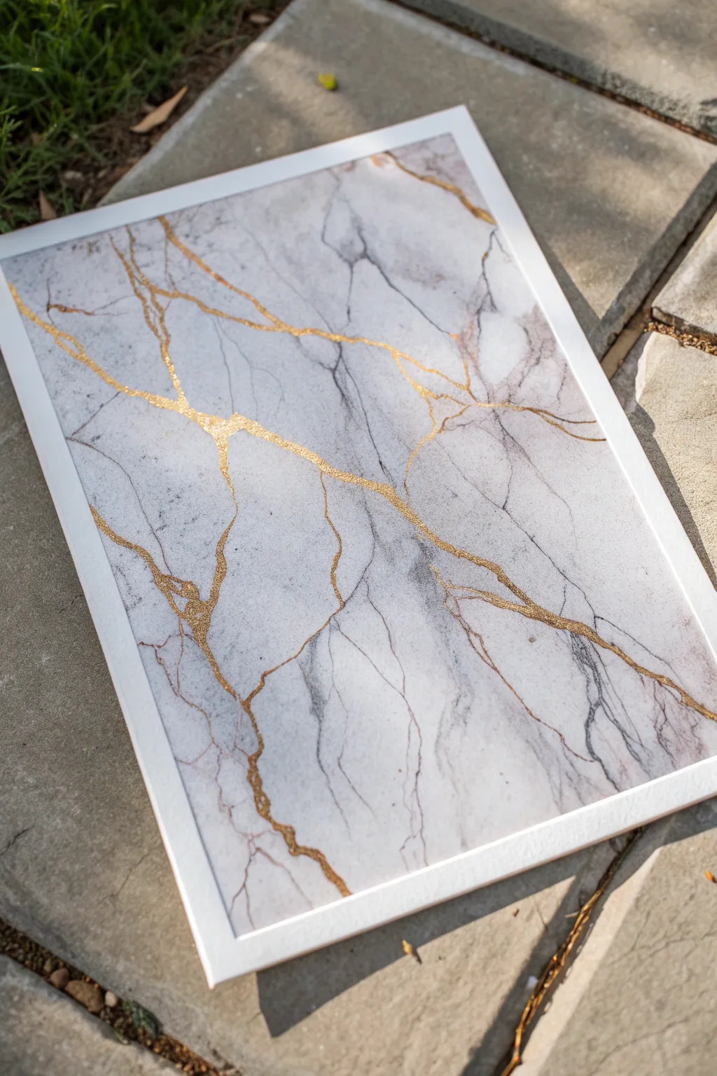
Transform a blank canvas into a piece of high-end stone with this faux marble technique. Soft blends of gray and white create a realistic stone foundation, while shimmering gold leaf brings an opulent, organic fracture line to life.
Step-by-Step Guide
Materials
- Stretched canvas or wood panel (white)
- White acrylic paint (heavy body)
- Gray acrylic paint (payne’s gray or charcoal)
- Glazing medium or water (for thinning)
- Gold leaf adhesive size
- Gold leaf sheets or metallic gold flakes
- Soft synthetic brushes (large flat and small round/liner)
- Sea sponge or crumpled plastic bag
- Feather or fan brush
- Soft clean dry brush (for gilding)
- Satin or gloss varnish
- Water container
- Paper towels
Step 1: Setting the Stone Foundation
-
Prime the Surface:
Begin with a flawless base. Even if your canvas is pre-primed, apply a fresh coat of white acrylic paint to ensure a smooth, opaque foundation. Let this dry completely before moving on. -
Mix Your Glaze:
Create a translucent gray glaze by mixing a small amount of gray paint with a generous portion of glazing medium. Ideally, the mix should be about 80% medium to 20% paint. You want the gray to be whisper-thin, not solid. -
Apply the First Wash:
Using a wet sea sponge or damp crumpled plastic bag, lightly dab patches of the gray glaze onto the canvas. Keep the application random and organic—nature rarely makes straight lines or perfect patterns. -
Soften the Edges:
While the glaze is still wet, take a damp, clean brush or a soft cloth and blur the edges of your gray patches. This creates that cloudy, deep look characteristic of real marble. -
Deepen the Texture:
Once the first layer is tacky but not fully dry, add slightly darker gray accents into the existing gray areas. Use a feather or fan brush to drag faint, wispy lines that suggest directional movement in the stone.
Natural Chaos
Use a feather dipped in rubbing alcohol to splatter small droplets onto wet gray paint. The alcohol repels the acrylic, creating instant organic cells and natural-looking stone textures.
Step 2: Establishing the Veins
-
Drafting the Initial Veins:
Switch to a thin liner brush loaded with a slightly darker gray mixture. Paint thin, trembling lines that connect your cloudy gray patches. These shouldn’t be straight; let your hand shake a little to mimic natural mineral fractures. -
Feathering:
Immediately use a dry soft brush to lightly sweep over these wet veins. This feathers the paint out, making the vein look like it’s submerged within the stone rather than sitting on top. -
Adding Contrast:
I like to mix a tiny drop of brown or purple into the gray for variety. Paint very sparse, fine secondary veins branching off the main gray ones to add depth and realism. -
Drying Time:
Allow the painted marble layers to dry completely. This is crucial because the gold size used in the next step is sticky and could lift wet paint.
Liquid Gold Alternative
If you find leafing tricky, use liquid gold gilding paint instead. Mix it with a pouring medium and drizzle it directly onto the canvas for a thicker, slightly raised texture.
Step 3: The Golden Fracture
-
Mapping the Gold:
Decide where you want your prominent gold cracks to be. Usually, following the path of the darkest gray veins looks most natural. Paint a thin, deliberate line of gold leaf adhesive size along these chosen paths. -
Varying Line Width:
Don’t make the adhesive line uniform. Allow it to pool slightly in intersections or thin out to a hairline fracture in other spots. -
Waiting for Tack:
Wait for the adhesive to turn straight-up tacky. It usually goes from milky to clear. Check your specific product’s instructions, but it generally takes 15-30 minutes. -
Applying the Leaf:
Gently press sheets or flakes of gold leaf over the tacky adhesive lines. Don’t worry about being neat; cover the sticky areas generously. -
Burnishing:
Take a soft, dry brush and rub firmly over the gold leaf in circular motions. This pushes the gold into the adhesive and flakes away the excess leaf that isn’t stuck down. -
Cleaning Up:
Brush away all loose gold dust. You should be left with crisp, brilliant gold veins running through your soft marble background. -
Sealing the Piece:
Finish with a coat of clear gloss varnish to protect the gold leaf from tarnishing and to give the entire piece the shine of polished stone.
Now step back and admire how a few simple layers of paint have captured the timeless weight and luxury of marble
Art Deco-Inspired Geometrics
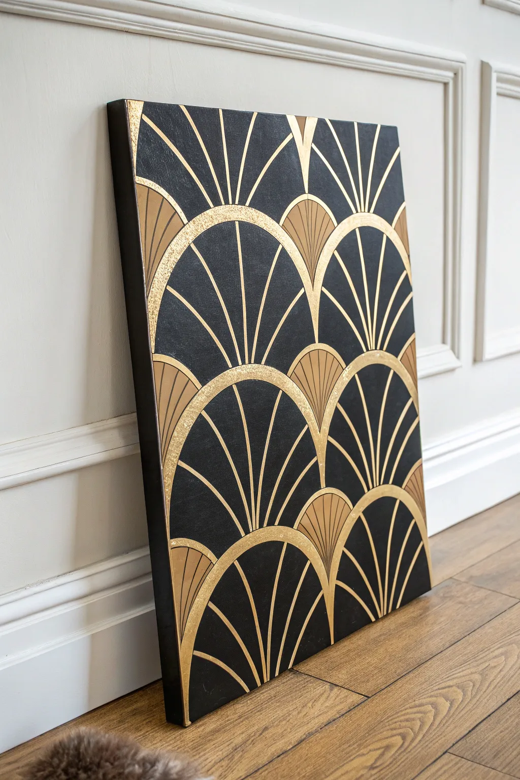
Bring the roaring twenties into your home with this stunning black and gold statement piece. This Art Deco-inspired design relies on repetitive geometric fan shapes and metallic textures to create an opulent, high-contrast finish that looks far more expensive than it is to make.
Detailed Instructions
Materials
- Large rectangular stretched canvas (e.g., 24×36 inches)
- Black acrylic paint (matte finish)
- Metallic gold acrylic paint (bright gold)
- Gold leaf sheets and adhesive size (optional, for extra texture)
- Compass with extension bar or a large circular template
- White or yellow chalk pencil
- Painter’s tape (or masking tape)
- Flat shader brush (medium width)
- Fine liner brush (for details)
- Protractor (optional)
- Ruler or straight edge
- Varnish/sealant (gloss or satin)
Step 1: The Foundation Layer
-
Prepare the Surface:
Begin by ensuring your canvas is clean and taut. If the canvas texture is very rough, you might want to apply a layer of gesso and sand it down lightly for a smoother finish, as this helps sharp geometric lines stand out better. -
Apply the Base Coat:
Cover the entire canvas with matte black acrylic paint. Use a large flat brush or a foam roller to ensure an even, streak-free application. -
Paint the Edges:
Don’t forget the sides of the canvas. This gallery-wrap style ensures the piece looks finished from every angle without needing a frame. Allow this base coat to dry completely, preferably overnight, so your layout lines don’t dig into soft paint.
Fixing Wobbly Arcs
Make a mistake? Don’t panic. Let the gold dry completely, then use the black base paint to carve back into the line and reshape the curve.
Step 2: Drafting the Pattern
-
Establish the Grid:
Using a ruler and a chalk pencil, lightly mark horizontal guidelines across the canvas. The distance between lines determines the height of each fan tier; about 6-8 inches works well for a large canvas. -
Mark Center Points:
On the bottom guideline, mark the center point. For subsequent rows above, offset the center points so the fans stagger like bricks (the peak of one fan sits between the two below it). -
Draw the Arcs:
Set your compass to the desired radius (matching your guideline height). Place the point on your marked center spots and draw sweeping semi-circles with the chalk pencil to create the main fan outlines. -
Create the Inner Arcs:
Reduce the compass radius by about 0.5 to 1 inch and draw a second, smaller semi-circle inside each main fan. This creates the thick gold border effect seen in the reference. -
Draft the Spokes:
Use a protractor or simplified geometry to mark 5 or 7 evenly spaced radiating lines within each fan, extending from the bottom center point up to the inner arc.
Elevate the Texture
Mix fine sand or modeling paste into the gold paint for the thick arched bands. This adds a tangible, relief-like quality that catches the light beautifully.
Step 3: Gilding the Geometry
-
Outline the Fans:
Load a liner brush with metallic gold paint or gold leaf adhesive. Carefully paint the space between your two concentric arcs. This thick curved band is the defining feature of the pattern. -
Paint the Spokes:
Switch to a fine liner brush for the radiating spokes. Paint straight lines from the base of the fan upward. Keep your hand steady and maintain varying thicknesses if you want that hand-painted vintage look. -
Fill the Lower Triangles:
At the very bottom center of some fans (where the spokes converge), paint small solid triangular or semi-circular sections in gold to anchor the design visually. -
Detail the Fan Tips:
Between the spokes near the top arch, you can add small fill details or vary the line weight. In the reference, some sections are solid gold while others are linear; choose a fill pattern and repeat it across the canvas. -
Apply Gold Leaf (Optional):
For the intensely reflective sections visible in the photo, apply gold leaf size to specific bands. Once tacky (usually 15-20 minutes), press the gold leaf sheet down and gently brush away the excess. -
Clean Up Edges:
I find that dipping a small angled brush in black paint allows me to sharpen any gold lines that became too thick or wobbly effectively erasing mistakes.
Step 4: Finishing Touches
-
Remove Chalk Marks:
Once the paint is thoroughly dry (give it a few hours to be safe), gently wipe away visible chalk guidelines with a slightly damp microfiber cloth. -
Seal the Artwork:
Apply a coat of gloss or satin varnish over the entire piece. This protects the gold leaf from tarnishing and unifies the sheen of the black background.
Hang your masterpiece in a well-lit spot to watch those golden arches shimmer throughout the day
Botanical “X-Ray” Leaves
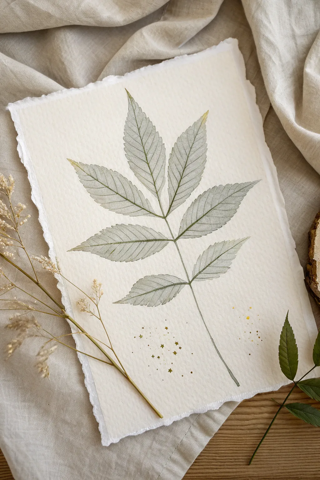
Capture the delicate, translucent beauty of nature with this elegant botanical ‘x-ray’ painting technique. By layering diluted washes and fine linework on handmade paper, you’ll create a ghostly, sophisticated leaf study that feels both modern and timeless.
Step-by-Step Tutorial
Materials
- Thick watercolor paper with deckled edges (300gsm cold press is ideal)
- Watercolor paints (Payne’s Gray, Sap Green, and Raw Umber)
- Fine liner brush (size 0 or 00) for details
- Round brush (size 4 or 6) for washes
- Pencil (H or HB for light lines)
- Kneaded eraser
- Gold metallic paint or gold ink
- Small stiff brush or toothbrush for splattering
- Clean water and mixing palette
Step 1: Planning and Sketching
-
Prepare your paper:
Start with a high-quality sheet of watercolor paper. If you don’t have pre-deckled paper, you can create the look by carefully tearing the edges against a ruler or using a deckle edge ruler to get that soft, fibrous border. -
Observe your subject:
Find a reference photo of a compound leaf, like a walnut or ash leaf, which has multiple leaflets stemming from a central stalk. Notice how the veins branch out. -
Lightly sketch the structure:
Use your H pencil to map out the central stem line first. Keep it slightly curved to look organic rather than stiffly straight. -
Outline the leaflets:
Draw the basic shapes of the leaflets attached to the stem. Press very lightly so the graphite won’t show through the transparent paint later. Don’t worry about the serrated edges yet; just get the oval shapes right. -
Refine the edges:
Go back over your oval shapes and add the serrated, saw-tooth edges typical of these leaves. Use a kneaded eraser to gently lift up the initial oval guides, leaving only the detailed serrated outline.
Uneven Washes?
If your initial wash dries with ‘blooms’ or uneven patches, don’t restart. Use a barely damp brush to gently scrub and lift the pigment, smoothing out the texture for a flatter look.
Step 2: Creating the Translucent Wash
-
Mix your ghost color:
Create a very watery mix of Payne’s Gray with a tiny touch of Sap Green. You want a color that is barely there—mostly water with just a hint of pigment to create that ‘x-ray’ transparency. -
Apply the first wash:
Using your size 6 round brush, fill in one leaflet at a time with your watery mix. Work quickly to ensure an even coat without hard drying lines. -
Control the pooling:
If the water pools at the edges, dab your brush on a paper towel and lift the excess liquid away. You want a flat, uniform tint. -
Paint the remaining leaflets:
Continue painting each leaflet, ensuring they don’t touch while wet if you want crisp separations. I sometimes leave a hair-thin gap between the leaflet and the main stem to keep things neat. -
Dry completely:
Let this base layer dry fully. The paper must be bone dry before you add the veins, or the lines will bleed and lose that precise scientific illustration look.
Pro Tip: Steady Hand
For the finest veins, hold your brush perpendicular to the paper. Exhale slowly as you pull the brush toward you; breathing out steadies your hand for smoother, straighter lines.
Step 3: Detailing Veins and Stems
-
Mix a darker definition shade:
Take your previous mixture and add more Payne’s Gray and a dot of Raw Umber. This should be significantly darker than your wash but still transparent enough to look like watercolor. -
Paint the central veins:
Switch to your size 0 fine liner brush. With a steady hand, paint the central vein running down the middle of each leaflet. -
Add lateral veins:
Paint the smaller veins branching out from the center to the edges. Keep your pressure extremely light at the end of the stroke so the lines taper off beautifully. -
Define the serrated edge:
Very gently outline the serrated edges of the leaves with your fine brush. You don’t need a solid, heavy outline—keep it broken and delicate in places to maintain the ethereal feel. -
Darken the main stem:
Paint the main stalk connecting all the leaflets. You can make this slightly darker at the bottom and where the leaflets join to suggest shadow and depth.
Step 4: Finishing Touches
-
Add subtle texture:
Once the veins are dry, you can add tiny textural dots or faint cross-hatching in the darker areas near the central vein to simulate the density of a real leaf. -
Prepare the gold accents:
Mix a small amount of metallic gold paint or ink on your palette. It should be fluid enough to splatter easily. -
Splatter the gold:
Load a stiff brush or an old toothbrush with gold. Run your thumb across the bristles to flick tiny specks of gold onto the bottom portion of the paper, around the stem. This adds a magical, festive quality. -
Optional star details:
Use your fine liner and the gold paint to hand-draw a few tiny four-pointed stars amidst the splatter for extra whimsy. -
Final assessment:
Step back and look at the overall balance. If any veins look too faint, carefully re-layer them, but preserve the delicate nature of the piece.
Now your ethereal botanical artwork is ready to be framed in a floating frame to show off those beautiful edges.
Ink Wash with Gold Splatter
This project combines the ethereal softness of grayscale watercolor with the striking luxury of gold leaf. You will create a delicate floral composition that feels both vintage and modern, anchored by a unique torn gold edge.
Step-by-Step
Materials
- Cold press watercolor paper (300 gsm)
- Black watercolor paint or black India ink
- Gold leaf sheets and gilding size (adhesive)
- Gold metallic paint or gold ink pen
- Round brushes (sizes 2, 6, and 10)
- Clean water jars
- Palette for mixing gray washes
- Pencil for light sketching
- Paper towel
Step 1: Preparing the Foundation
-
Tear the edge:
Begin by carefully tearing the bottom-left corner of your watercolor paper. Don’t use scissors; pull the paper towards you to create a rough, organic deckled edge where the gold leaf will eventually sit. -
Sketch the composition:
Using a pencil very lightly, map out your floral arrangement in the bottom-right quadrant. Draw two main open blossoms, a few buds, and flowing stems reaching upwards towards the center. -
Pre-mix gray values:
On your palette, create three puddles of wash: a very pale, watery gray (almost clear), a medium charcoal gray, and a deep, potent black.
Fixing “Blooms”
If your gray wash bleeds too much into the petals, blot immediately with a clean tissue twisted into a point. Start again once bone dry.
Step 2: Painting the Watercolor Wash
-
Wet the background:
With your largest brush and clean water, gently wet the area around your sketch, letting the moisture bleed outward into the negative space. Do not soak the paper, just dampen it to create soft edges. -
Apply the atmosphere:
Drop your palest gray wash into the damp background area. Tilt the paper slightly so the pigment drifts around the flowers like a mist, avoiding the actual petals for now. -
Define the first bloom:
Switch to a size 6 brush. Using the pale gray again, paint the petals of the largest flower. Keep the edges nearest the center of the flower wet to prepare for darker accents. -
Add depth to petals:
While the petals are still damp, touch the medium charcoal mix into the base of each petal. Let the paint bleed naturally outward to create a soft gradient. -
Paint the leaves:
For the leaves and stems, use a mix of medium and dark gray. I like to vary the pressure on the brush here—press down for the belly of the leaf and lift up for a sharp tip. -
Darken the shadows:
Once the initial layers are semi-dry, use the darkest black mixture to paint the deep recesses between petals and the underside of leaves to create dimensional contrast. -
Paint fine stems:
Using your smallest size 2 brush and the dark ink, draw the thin, spindly stems reaching upward. Keep your hand loose to avoid stiff lines. -
Add tiny buds:
At the ends of your thin stems, paint small, dark rounded shapes for buds. Leave tiny slivers of white paper showing to represent light hitting the top of the bud. -
Detail the center:
Wait for the flower centers to be completely dry. With the small brush and very concentrated black ink, paint delicate stamens radiating from the middle, topped with tiny dots for pollen.
Texture Twist
Sprinkle a pinch of table salt onto the wet grey background wash. Once dry, brush it off to create a unique, crystalline texture in the ‘mist’.
Step 3: Gilding and Embellishment
-
Apply gilding size:
Along the rough torn edge you created in step one, carefully brush on a thin layer of gilding size (adhesive). Follow the manufacturer’s instructions, usually waiting 10-15 minutes for it to become tacky. -
Lay the gold leaf:
Gently press a sheet of gold leaf over the sticky edge. Use a dry, soft brush to pat it down, ensuring it adheres into the texture of the torn paper. -
Burnish and clean:
Once the gold is set, use a stiffer brush to dust away the excess flakes, leaving a jagged, luxurious golden border. -
Add gold splatter:
Dip your medium brush into gold metallic paint. Hold it over the floral area and tap the handle against another brush to splatter fine gold droplets across the bottom of the bouquet. -
Highlight the center:
For a final touch of elegance, add a few tiny dots of gold paint directly into the center of the flowers, mixing them among the black stamens.
Allow the entire piece to dry completely before framing this sophisticated study in contrast
Raised Texture with Gilded Edges
This project creates a sophisticated statement piece using simple modeling paste to build raised, flowing lines that catch the light beautifully. The interplay between smooth, sweeping curves and bands of gritty texture adds a modern, organic elegance to any space.
Step-by-Step Guide
Materials
- Large square canvas (e.g., 20×20 inches)
- Heavy body acrylic modeling paste (smooth)
- Coarse texture gel or plain modeling paste mixed with fine sand
- Gesso (white)
- Palette knives (various sizes, focusing on rounded tips)
- Pencil for sketching
- Wide flat brush
- Sandpaper (fine grit)
- White or cream acrylic paint
- Matte varnish
Step 1: Preparation and Mapping
-
Prime the Surface:
Ensure your canvas is taut. Apply a coat of white gesso to the entire surface with a wide flat brush to create a smooth, gripping base for the heavy textures. Let this dry completely. -
Sketch the Flow:
Lightly trace your design onto the canvas using a pencil. Aim for organic, vertical wave patterns that curve gently. Mark specific ‘channels’ where you want the coarser texture to go, keeping them separate from the smooth areas. -
Prepare Your Mediums:
Set up your workspace with two separate piles of medium on your palette: your standard smooth modeling paste and your coarse texture gel. If you don’t have texture gel, simply mix a little clean, fine sand into a portion of your modeling paste until it feels gritty.
Cracks in the Paste?
Thick paste can crack if it dries too fast. If cracks appear, mix a thinned slurry of paste and water, paint it into the cracks with a small brush, and let dry again.
Step 2: Building the Relief
-
Apply the Coarse Bands:
Start with the gritty texture bands first. Scoop up the textured paste with a palette knife and fill in the specific channels you marked earlier. -
Flatten the Texture:
Use the flat edge of your knife to level these gritty areas, keeping them slightly lower than the height you plan for the smooth waves. They should provide a contrasting, recessed feel. -
Begin the Smooth Waves:
Load a generous amount of smooth modeling paste onto a medium-sized palette knife. Apply it alongside the textured bands, following your pencil curves. -
Sculpt the High Points:
Build up the height of the smooth waves. I find that applying the paste in a thick bead and then gently smoothing the top creates the nicest profile. -
Create Definition:
Use the edge of your palette knife to clearly define the boundary where the smooth paste meets the dry canvas or the textured bands. This sharp edge is crucial for the shadow play seen in the final piece. -
Refine the Curves:
For the converging lines (where two waves meet), carefully guide your knife to taper the two ridges together into a single point. This mimics the natural folding overlap of fabric. -
Build the Outer Sections:
Move to the outer edges of the canvas, adding the wider, sweeping curves. Ensure the paste is thick enough to cast a shadow; if it looks too flat, add a second layer while the first is still wet. -
Smooth the Surfaces:
Dip your palette knife in a tiny bit of water and glide it very lightly over the tops of the smooth waves to remove any unwanted jagged peaks or tool marks. -
Initial Drying Time:
Let the artwork dry flat for at least 24 hours. Modeling paste shrinks as it dries, so patience is key here to avoid cracking.
Metallic Accent
For a luxe touch, gently run a touch of gold gilding wax along the very highest ridge of the sweeping curves once the paint is fully dry.
Step 3: Finishing and Painting
-
Sand Imperfections:
Once fully cured, inspect the smooth waves. Use fine-grit sandpaper to gently knock back any sharp points or rough patches that interrupt the visual flow. -
Dust Off:
Wipe the entire canvas with a dry microfiber cloth or large soft brush to remove all sanding dust. Debris left in the cracks will ruin the paint finish. -
Base Coat Painting:
Mix a warm white or soft cream acrylic paint. Using a soft synthetic brush, apply an even coat over the entire piece, including the textured areas. -
Ensure Coverage:
Check the deep crevices and the gritty texture bands from multiple angles to ensure no raw paste is showing through. Dab paint into the texture rather than brushing it. -
Optional Highlight:
If you want extra dimension, dry-brush a pure bright white on the very highest ridges of the smooth waves. -
Seal the Work:
Apply a final coat of matte varnish to protect the surface and unify the sheen, giving it that professional, plaster-cast look.
Hang your textured masterpiece in a spot with changing daylight to see the shadows evolve throughout the day
Oversized Calligraphic Marks
This striking artwork balances bold, sweeping energy with elegant simplicity, using oversized calligraphic marks to create a dynamic focal point. By layering textured black and white acrylics with touches of gold leaf, you can achieve a sophisticated, gallery-worthy piece that feels both modern and timeless.
Step-by-Step
Materials
- Large stretched canvas (24×36 or similar)
- White Gesso
- Heavy body acrylic paint (Mars Black, Titanium White)
- Modeling paste or texture medium
- Large flat paintbrush (2-3 inch)
- Palette knife or large scraper tool
- Gold leaf sheets
- Gold leaf adhesive size
- Soft gilding brush
- Simple gold floating frame
Step 1: Preparing the Foundation
-
Prime the surface:
Even if your canvas is pre-primed, adding a fresh coat of white gesso gives a better tooth for the heavy body paints. Apply it evenly across the entire surface and let it dry completely. -
Create the base texture:
Mix Titanium White acrylic with a generous amount of modeling paste. Using your palette knife or scraper, spread this mixture across the canvas in random, multi-directional strokes to create a subtle, uneven background texture. -
Let the base cure:
Allow this white textured layer to dry fully. This is crucial because you want the subsequent dark strokes to sit on top of the texture, not blend into wet white paint.
Dry Brush Technique
To get those rough, scratchy edges, ensure your brush isn’t overloading with paint. blot excess paint on a paper towel before hitting the canvas.
Step 2: The Dynamic Sweep
-
Plan the composition:
Visualize a strong diagonal movement from the bottom left to the top right. This is where your main energy will flow. -
Mix the dark tone:
Squeeze out a large amount of Mars Black paint. You want this paint slightly thick, so avoid adding water; mixing in a tiny bit of modeling paste can help it hold brush marks. -
Apply the main black stroke:
Load your large flat brush heavily with black paint. Committing confidently, make a broad, sweeping pull diagonally across the canvas. Don’t overthink it; speed helps create the ‘dry brush’ effect at the edges. -
Add secondary strokes:
Add a second, parallel sweep slightly below the first one to thicken the band of black. Allow the bristles to drag and skip over the dried white texture underneath, creating rough, natural edges. -
Balance with white:
Once the black is tacky but not fully wet, load a clean brush with Titanium White. Add swift, lighter strokes parallel to the black ones, cutting into the dark areas slightly to create gray transitions and depth. -
Refine the edges:
Use a smaller brush to feather out the ends of the strokes if they look too abrupt. The goal is to make the movement look like it continues off the canvas.
Step 3: Gilding and Framing
-
Identify gold placement:
Look for the natural ridges where the black paint meets the white. These transition zones perfectly catch the light and are ideal spots for gold leaf. -
Apply adhesive size:
Using a small detail brush, paint thin, erratic lines of gold leaf adhesive size along the edges of your main black sweep. Keep these lines jagged and organic, not straight. -
Wait for tackiness:
Let the adhesive sit for about 15-20 minutes (check your specific brand instructions) until it becomes clear and tacky to the touch. -
Lay the gold leaf:
Gently press gold leaf sheets over the tacky adhesive areas. Use the backing paper to press it down firmly without touching the delicate metal with your fingers. -
Buff away excess:
Take a soft, dry gilding brush and briskly rub over the gold areas in circular motions. The excess leaf will flake away, leaving only the gold that stuck to your adhesive lines. -
Seal the painting:
Apply a clear isolation coat or varnish over the dried painting to protect the surface and prevent the gold leaf from tarnishing over time. -
Frame the work:
Place the canvas into a sleek gold floating frame. Secure it from the back, ensuring an even gap between the canvas edge and the frame for that professional gallery look.
Gold Won’t Stick?
If the leaf isn’t adhering, you likely applied it too soon while the glue was wet. Wait until the adhesive is clear and feels sticky like tape before applying.
Hang your masterpiece in a minimalist space to let the bold movement and metallic shimmer take center stage
Pearlized Ocean Swell Abstract
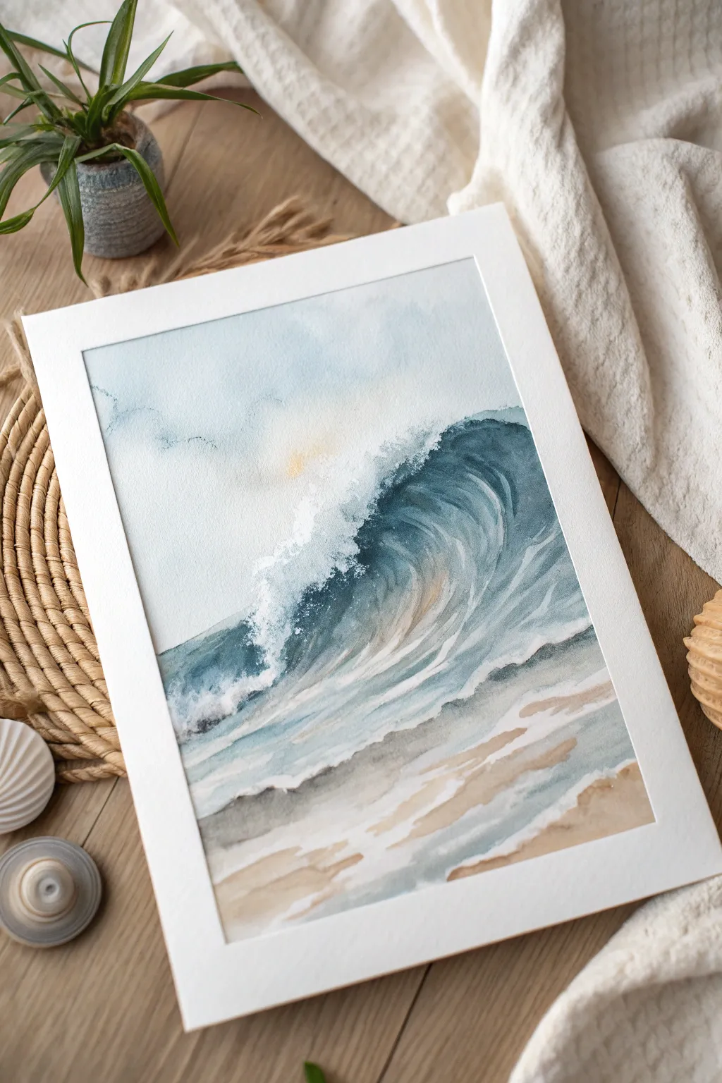
Capture the graceful power of a curling wave with this serene watercolor project that balances fluid washes with structured detailing. The soft blues and shimmering highlights create a calming, almost dreamlike coastal scene perfect for any modern space.
How-To Guide
Materials
- Cold press watercolor paper (140lb/300gsm), taped down to a board
- Watercolor paints: Indigo, Prussian Blue, Turquoise, Burnt Sienna, Yellow Ochre, and a touch of Lemon Yellow or Naples Yellow
- Pearlized or iridescent watercolor medium (or white gouache)
- Round brushes: sizes 4, 8, and 12
- Flat shader brush: 1/2 inch
- Masking fluid (optional)
- Two jars of water
- Paper towels
- Palette for mixing
- Pencil for sketching
- Artist tape
Step 1: Preparation and Sketching
-
Secure the paper:
Tape your watercolor paper securely to a hard board using artist tape. Ensure the edges are sealed well to create a crisp white border when finished. -
Lightly sketch the wave:
Using a pencil, draw the main curve of the wave. Start from the right side, sweeping up and over to the left, creating the classic ‘C’ shape of the barrel. Mark the horizon line faintly in the background. -
Define the shoreline:
Sketch irregular, organic lines at the bottom for the foamy water reaching the sand. Keep these lines loose; they guide where the sand meets the sea.
Pro Tip: Lifting for Light
Use a “thirsty” brush (clean but damp) to lift color from the wave’s face while wet. This creates soft, natural highlights without white paint.
Step 2: Sky and Background
-
Wet-on-wet sky:
With your large round brush, wet the sky area above the wave with clean water. The paper should be glistening but not pooling. -
Apply soft sky tones:
Drop in a very dilute wash of Indigo mixed with plenty of water. Keep the color concentrated near the top corners and fade it out as you approach the horizon line. -
Add a hint of sun:
While the sky is still damp, touch a very small amount of diluted Lemon Yellow or Naples Yellow near where the sun would be, just behind the crest of the wave. Let this bleed softly into the blue.
Step 3: Painting the Wave
-
Base layer for the wave:
Mix a medium-strength Prussian Blue with a touch of Turquoise. Apply this to the main body of the wave, painting in the direction of the water’s movement—curving upwards. -
Darkening the barrel:
While the base layer is still slightly damp, drop concentrated Indigo into the hollow part of the wave (under the curl). This creates depth and shadow. -
Creating the spray:
Use a clean, damp brush or paper towel to lift pigment along the top edge of the wave crest. This negative painting technique simulates the white spray and foam breaking off the top. -
Adding movement lines:
With a smaller size 4 brush and a darker blue mix, paint thin, curved lines following the shape of the wave’s face. These lines mimic the striations of water being pulled upward.
Level Up: Salt Texture
Sprinkle fine table salt onto the damp sand area or the wave foam. Once dry, brush it off to create unique, organic textures that look just like sea spray.
Step 4: Foreground and Sand
-
Sandy beach wash:
Mix Burnt Sienna with a little Yellow Ochre and lots of water for a sandy beige. Apply this to the bottom third of the paper in horizontal, slightly wavy strokes. -
Wet sand effect:
While the sand wash is wet, add a slightly darker mix of Burnt Sienna near the water’s edge to represent wet sand. I find mixing a tiny bit of blue into the brown creates a perfect neutral shadow here. -
Painting the receding foam:
Use a pale, watery blue-grey mix to paint the shadows of the foam patterns on the sand. Leave the white of the paper showing between these strokes to represent the white sea foam itself. -
Softening edges:
Use a clean, damp brush to soften any hard edges in the sand area, blending the brown and blue tones where the water is shallowest.
Step 5: Details and Highlights
-
Deepen shadows:
Once the wave is dry, go back in with your darkest Indigo mix. Add sharp, defining shadows right under the lip of the curl and in the deepest part of the barrel. -
Adding texture:
Use a dry brush technique with slightly thicker paint to scumble texture onto the wave face, enhancing the feeling of rushing water. -
Pearlized highlights:
Mix your iridescent medium or white gouache with a little water. Paint highlights on the crest of the wave and along the foamy edges on the sand to give it that magical shimmer. -
Final touches:
Step back and assess your values. If the spray looks too flat, splatter a tiny bit of white gouache or masking fluid near the crest for extra texture. -
Reveal the border:
Wait until the painting is completely bone-dry. Carefully peel off the tape at a 45-degree angle to reveal your crisp, clean edges.
Frame your masterpiece in a simple white mat to let those ocean hues truly shine
Floating Motif in a Painted Frame
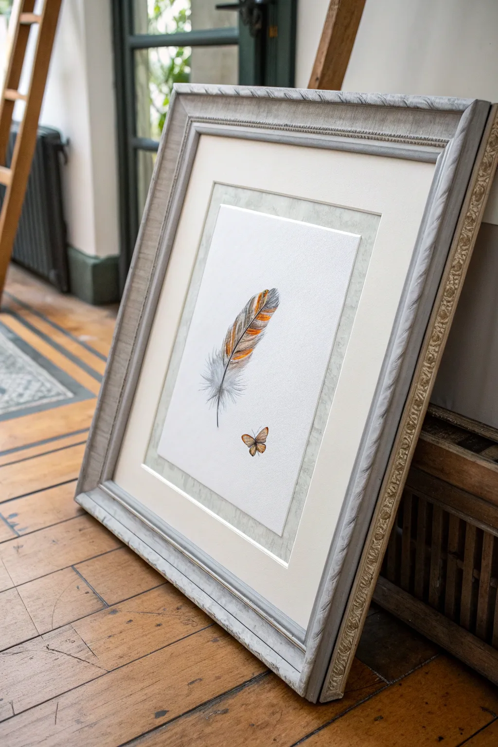
This elegant project combines delicate illustrative skills with a sophisticated framing technique to create a piece that feels both rustic and airy. The detailed feather and butterfly seem to suspend in space, surrounded by a subtle, textured mount and a classic antiqued frame.
Step-by-Step
Materials
- Heavyweight hot-press watercolor paper (smooth texture)
- Watercolor paints (Payne’s grey, burnt sienna, yellow ochre)
- Fine liner brushes (size 00 and 1)
- Colored pencils (grey, warm brown, orange, black)
- Pencil (HB) and kneaded eraser
- Textured craft paper or handmade paper (silver-grey mottled)
- Cream mount board (mat board)
- Large wooden frame (distressed silver/grey finish)
- Mount cutter or craft knife
- Double-sided archival tape
- Ruler and cutting mat
Step 1: Drawing the Motifs
-
Initial Sketch:
Begin by lightly sketching the central rachis (shaft) of the feather in the center of your watercolor paper. Keep the line slightly curved for a natural look. Sketch the outline of the vanes, leaving gaps near the bottom for the fluffy down feathers. Below and slightly to the right, sketch the simple outline of the small butterfly. -
Watercolor Wash – Feather:
Mix a very dilute wash of Payne’s grey. Apply this loosely to the feather shape to establish the shadows and the darker striped areas. While wet, drop in a small amount of yellow ochre and burnt sienna into the upper striped sections. Let this layer dry completely. -
Watercolor Wash – Butterfly:
Using a size 1 brush, paint the butterfly wings with a warm yellow ochre, transitioning to burnt sienna at the edges. Keep the body dark grey. Allow to dry. -
Refining Feather Texture:
Once the watercolor is bone dry, use your colored pencils to add detail. Start with the grey pencil, drawing fine, diagonal strokes outward from the shaft to mimic the barbs of the feather. Vary your pressure to create depth. -
Adding Warmth and Definition:
Layer orange and warm brown pencil strokes over the dried colored watercolor sections. This intensifies the characteristic banding of the feather. Use a sharp black pencil to define the very darkest parts of the pattern and the central shaft. -
Creating the Down:
For the soft, fluffy base of the feather, switch back to a very fine 00 brush with watered-down grey paint. Use quick, flicking motions to create wispy, chaotic lines that look like soft down. I find that holding the brush further back on the handle helps keep these lines loose. -
Butterfly Details:
Use a sharp black pencil or fine liner pen to outline the butterfly wings and draw the delicate veins. Add the antennae with a single confident stroke for each.
Step 2: Creating the Textured Mount
-
Measuring the Artwork:
Measure your finished painting. You want to leave roughly 1-2 inches of white space around the motifs. Trim the watercolor paper to this size using a craft knife and ruler. -
Preparing the Inner Mount:
Cut a piece of your mottled, silver-grey textured paper. It should be roughly 1.5 inches larger on all sides than your trimmed artwork. Center your artwork on top of this textured paper. -
Mounting the Art:
Apply archival double-sided tape or photo corners to the back of your artwork. Press it firmly onto the center of the textured paper, creating a layered look where the artwork sits on top of the texture.
Uneven Watercolors?
If you get ‘blooms’ or hard edges in the paint, soften them with a slightly damp, clean brush before they fully dry. Colored pencil layers can also hide many watercolor imperfections.
Step 3: Final Framing
-
Cutting the Outer Mat:
Take your cream mount board. Cut an opening that is slightly smaller than the outer dimension of your textured paper layer so the texture shows through but the edges are hidden. Alternatively, cut a larger opening to reveal the entire textured sheet, creating a ‘double mount’ effect. -
Assembling the Sandwich:
Place the cream mount board over your layered artwork. Ensure the margins are even. Secure the textured paper to the back of the mount board using tape. -
Fitting the Frame:
Clean the glass of your distressed wooden frame thoroughly. Place the glass in, followed by your mounted artwork assembly. -
Closing Up:
Add the backing board to the frame. Secure it with flexi-points or small nails. Check the front to ensure no dust is trapped between the glass and the artwork.
Level Up: Shadowbox Effect
Use foam spacers between the artwork and the glass. This creates a true shadowbox effect, emphasizing the ‘floating’ nature of the feather motif.
Hang your piece in a well-lit spot where the subtle textures can catch the light.
Monochrome Painting with One Bold Jewel Tone
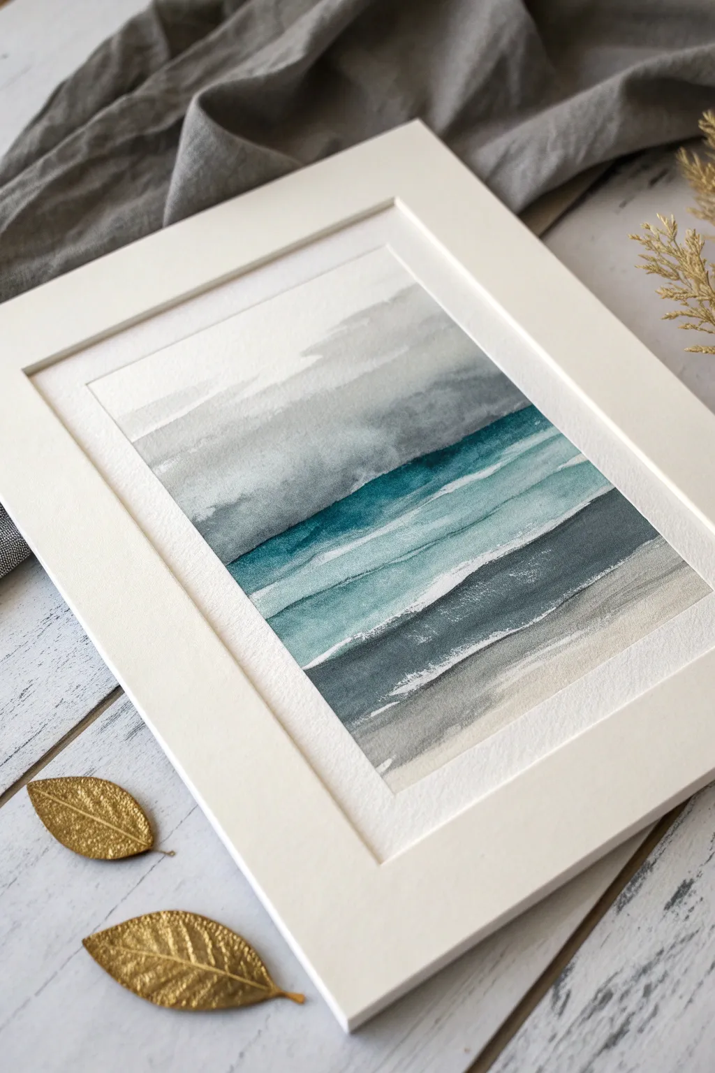
Capture the moody elegance of a storm-tossed sea with this striking watercolor composition. By utilizing a restrained palette of monochromatic greys against a single, vibrant teal jewel tone, you can create a modern seascape that feels both calm and dramatic.
Detailed Instructions
Materials
- Cold press watercolor paper (300 gsm or heavier)
- Watercolor paints: Payne’s Grey, Indigo, Teal or Phthalo Turquoise, and a warm Grey or Burnt Umber
- Flat wash brush (1 inch)
- Round brush (size 6 or 8)
- Masking tape
- Two jars of water
- Paper towels
- Palette for mixing
Step 1: Preparation and Sky Layer
-
Secure the Paper:
Begin by taping down all four edges of your watercolor paper to a board. Use masking tape to create a crisp white border, pressing down firmly to prevent paint from seeping underneath. -
Pre-wet the Sky Area:
Using your flat wash brush and clean water, gently wet the top third of the paper. You want an even sheen, not puddles, to prepare for a wet-on-wet technique. -
Apply the First Grey Wash:
Dilute a small amount of Payne’s Grey to a very pale consistency. Sweep this across the top third of the paper, allowing some unevenness to suggest cloud formations. -
Deepen the Clouds:
While the paper is still damp, pick up a slightly more concentrated mix of Payne’s Grey. Dab this horizontally into the wet wash near the middle horizon line to create soft, diffused storm clouds. -
First Drying Period:
Allow this sky section to dry completely. If the paper is cool to the touch, it is still wet; wait until it feels room temperature before proceeding.
Step 2: The Jewel Tone Ocean
-
Mix the Jewel Tone:
Prepare a rich puddle of Teal or Phthalo Turquoise. You can deepen it slightly with a touch of Indigo if the color looks too artificial or bright. -
Paint the Horizon Line:
Using the round brush, paint a distinct, horizontal line right below your dried grey sky. Load the brush with plenty of pigment so this edge is the darkest part of the painting. -
Create the Gradient:
Quickly rinse your brush and use clean water to drag the bottom edge of that teal line downward. This creates a gradient that fades from deep teal to a watery turquoise. -
Add Wave Motion:
While the teal section is wet, lift out a few horizontal streaks using a clean, thirsty brush or the corner of a paper towel. This negative space suggests cresting waves or foam. -
Second Drying Period:
Let this vibrant ocean layer dry fully. I like to leave this layer alone for a good 20 minutes to ensure my hard edges stay crisp.
Leaving White Space
Don’t overwork the gaps! The unpainted white strips between color bands are crucial—they act as the breaking waves and add sparkle.
Step 3: Shoreline and Details
-
Paint the Lower Sea:
Mix a medium-strength wash of Indigo and Payne’s Grey. Paint a horizontal band below the teal section, leaving a thin gap or sliver of white paper between them to mimic sea foam. -
Soften the Transition:
As you move lower down the page, add more water to your brush to fade the dark indigo into a lighter, transparent grey captured in the wash. -
Create the Sand Layer:
Mix a very dilute warm grey or a touch of Burnt Umber with lots of water. Apply this to the bottom-most section of the paper, overlapping slightly with the damp grey sea wash above it. -
Add Texture:
Load your brush with relatively dry pigment (Indigo or Grey) and engage the ‘dry brush’ technique. Lightly skim the brush horizontally over the textured paper surface in the dark grey sea area. -
Refine the White Caps:
If you lost too much white space between layers, you can use opaque white gouache or white ink to reinstate tin, sharp lines representing breaking waves. -
Final Assessment:
Step back and look at the balance of tones. If the horizon line needs more drama, glaze a thin layer of concentrated Payne’s Grey right at the junction where the teal meets the sky. -
Reveal the Border:
Once the painting is 100% bone dry, carefully peel away the masking tape at a 45-degree angle not to tear the paper surface.
Avoiding Muddy Colors
If your grey washes are bleeding into the teal and turning dull, ensure the previous layer is totally dry before painting the next stripe.
Frame your new seascape in a crisp white mat to let those jewel tones truly shine
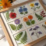
Have a question or want to share your own experience? I'd love to hear from you in the comments below!