When you start playing with overlapping shapes, your drawings instantly feel deeper, busier, and way more “alive.” I love it because the magic happens right in those intersection zones, where you get brand-new shapes, color shifts, and easy depth without complicated perspective.
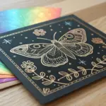
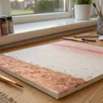
Interlocking Circles Color-Mix Study
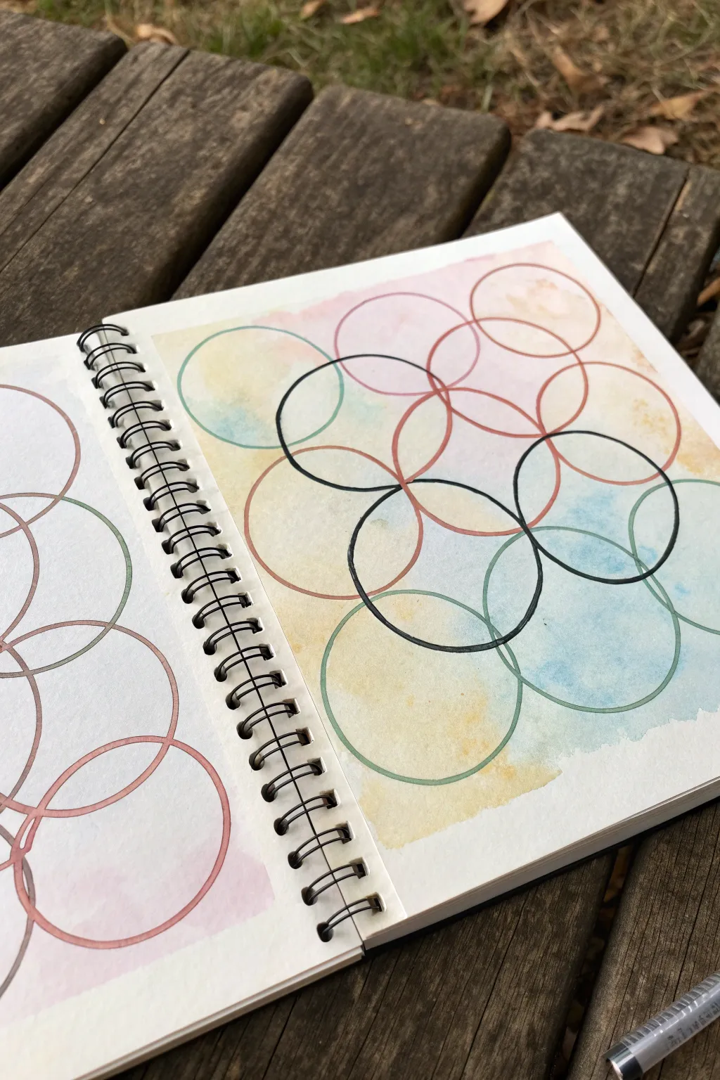
This meditative project combines soft, free-form watercolor washes with the structured precision of geometric line art. The result is a beautiful study in transparency and overlap, where delicate inks define shapes atop a dreamy, pastel background.
Step-by-Step
Materials
- Mixed media or watercolor sketchbook (heavyweight paper)
- Watercolor paints (pan set or tubes)
- Soft round watercolor brush (size 6 or 8)
- Clean water jar and paper towels
- Pencil (HB or lighter)
- Circular object for tracing (like a jar lid or roll of tape) or a compass
- Fine liner pens (black, brown, and/or dark green)
- Eraser
Step 1: Preparation & Watercolor Base
-
Prepare your workspace:
Set up your sketchbook on a flat surface. ensure your paper is thick enough to handle water without buckling too much. -
Mix pastel washes:
On your palette, prepare three to four distinct watercolor puddles. Aim for soft, diluted colors like pale rose, buttery yellow, and sky blue. You want them very watery for a translucent effect. -
Apply the first color wash:
Wet your brush and pick up the yellow wash. Apply it loosely to the paper in random, cloud-like patches, leaving plenty of white space and room for other colors. -
Introduce the second color:
While the yellow is still slightly damp or just starting to dry, rinse your brush and pick up the pink wash. Drop this color into the white spaces, letting it touch the yellow edges occasionally so they bleed together softly. -
Add the final color accents:
Repeat the process with your blue wash. Place this color in the remaining gaps, allowing it to mingle with the neighbors. I like to let these colors drift naturally without over-mixing them on the page. -
Let it dry completely:
This is crucial—the paper must be bone dry before you add ink. If the paper is cold to the touch, it’s still wet. Waiting ensures crisp lines later.
Pro Tip: Wet-on-Wet
To get those cloudy, soft edges in the background, pre-wet the paper with clean water before dropping in your paint. The pigment will bloom outward beautifully.
Step 2: Drafting the Geometry
-
Determine circle placement:
Once the paint is dry, take your circular tracing object (or compass). Plan a layout where circles will overlap each other significantly. -
Pencil the outlines:
Lightly trace your circles with a pencil. Don’t press hard; you just need a faint guide. Create a grid-like pattern or a random scatter, ensuring plenty of intersections. -
Review the composition:
Step back and look at your pencil web. If any areas look too empty, add another circle to bridge the gap.
Step 3: Inking the Structure
-
Select your pens:
Choose a few fine liner pens. The reference uses primarily black, but also incorporates muted brown or dark green for a subtle variation in the overlapping rings. -
Trace the primary circles:
Start with a black pen. Trace several of the pencil circles carefully. Try to keep a steady hand, but don’t worry about perfect machine-like precision; slight wobbles add character. -
Interlock with secondary colors:
Switch to a brown or dark green pen for adjacent circles. This color variation helps distinguish the overlapping rings and adds visual interest to the intersections. -
Emphasize intersections:
Where the ink lines cross, you create new shapes. Pay attention to how the colors of the background change within these specific enclosed segments. -
Vary line weight (optional):
For added depth, you can go over certain segments of the circles a second time to thicken the line, particularly where the circles overlap. -
Erase pencil marks:
Wait at least 10-15 minutes to ensure the ink is fully cured. Then, gently erase the underlying pencil guides to leave a clean, crisp finish.
Troubleshooting: Bleeding Ink
If your ink lines look fuzzy or spread into the paper, the background wash wasn’t fully dry. Use a hair dryer on the low setting to completely dry the page first.
Enjoy the calming rhythm of tracing shapes over your colorful background

Overlapping Geometric Shapes, Stained-Glass Style
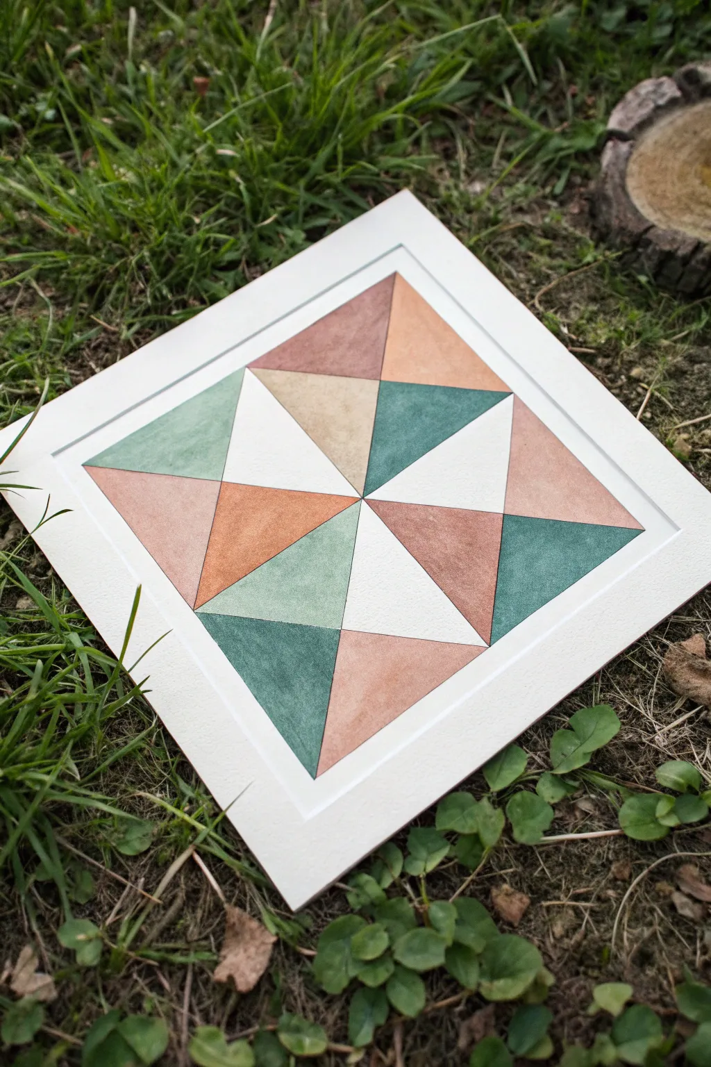
This project creates a soothing, symmetrical design reminiscent of classic quilt blocks or stained glass, using earthy tones and crisp geometry. By carefully masking off sections and applying watercolor washes, you’ll achieve sharp lines and a beautiful depth of color.
Step-by-Step Tutorial
Materials
- Heavyweight watercolor paper (300gsm/140lb) or illustration board
- Pencil (H or HB)
- Ruler
- Compass (optional but helpful)
- Watercolor paints (shades: dark teal, sage green, terracotta, peach, beige)
- Medium soft round brush (size 4 or 6)
- Masking tape or painter’s tape
- Eraser
- Water cups
- Paper towels
Step 1: Planning the Grid
-
Prepare the paper:
Begin by cutting your watercolor paper into a perfect square. A standard 8×8 or 10×10 inch size works well for this level of detail. -
Draw the frame:
Using your ruler, measure about 1.5 inches inward from all four edges to create a wide border. Draw a light square frame in the center where your artwork will live. -
Divide the square:
Draw an ‘X’ from corner to corner of your inner square to find the precise center point. Then, draw a vertical line and a horizontal line through that center point, dividing the square into four smaller quadrants. -
Create the triangles:
Within each of the four quadrants, draw a diagonal line connecting the outer corners to the center axes. This will subdivide the space into the triangular facets seen in the pinwheel design.
Bleeding Lines?
If paint bleeds under your tape, try ‘sealing’ the tape edge first with a tiny bit of clear water or white masking fluid before applying your color.
Step 2: Applying Color
-
Masking strategy:
To get those razor-sharp edges without colors bleeding, you cannot paint adjacent shapes at the same time. Apply masking tape over every *other* triangle, pressing down firmly on the edges. -
Mix your palette:
Prepare your watercolor washes. You want an earthy, muted palette: deep teal, a lighter sage green, a warm terracotta, a soft peach, and a neutral beige. -
First color application:
Start painting the exposed shapes. For this design, balance is key—if you paint a section dark teal, try painting the corresponding opposite section in the same tone to confuse the eye pleasantly. -
Controlling the wash:
Use a fairly dry wash (more pigment, less water) if you want the solid, matte look shown in the reference. If you prefer texture, I like to let the water pool slightly to create those characteristic watercolor ‘blooms.’ -
Wait and peel:
Wait until the paint is completely bone-dry. Carefully peel back the masking tape at a low angle to avoid ripping the paper surface. -
Mask the second distinct set:
Now, apply tape over the sections you just painted to protect them. You are revealing the remaining white triangles that need color. -
Painting the secondary tones:
Fill in these new sections with your lighter colors—the peach, beige, and sage green—ensuring they contrast well against their darker neighbors. -
Leaving white space:
Notice that some triangles in the reference are left unpainted (white). Check your pattern and leave these specific sections blank to add brightness and breathing room to the design. -
Remove tape:
Once dry, remove all tape gently. You should now have crisp, clean lines separating your colored sections.
Pro Tip: Color Balance
Create a thumbnail sketch on scrap paper first. Number the triangles and assign colors to ensure you don’t accidentally place two identical colors next to each other.
Step 3: Refining and Finishing
-
Clean up borders:
Examine the outer edges of your painted square. If any paint seeped under the tape, you can gently scrape it away with an X-Acto knife or cover it with a tiny bit of white gouache. -
Add the depressed border:
To recreate the embossed or ‘framed’ look seen in the photo, place your ruler about 1/4 inch outside your painted square. Use a bone folder or the back of a butter knife to score a line into the paper without cutting through it. -
Erase guidelines:
Use a soft kneadable eraser to lift away any pencil lines that remain visible within the unpainted white triangles or borders. -
Final press:
If the watercolor has caused the paper to buckle slightly, place the finished piece under a heavy book overnight to flatten it out completely.
Display your geometric masterpiece in a simple wooden frame to complement those earthy tones


Balloon Bunch With Clear Front-and-Back

This charming watercolor project captures the lightness of a balloon bouquet using a muted, earthy palette. By mastering the wet-on-dry technique and subtle overlapping, you’ll create a sense of depth and transparency that makes the balloons feel floaty and real.
Step-by-Step
Materials
- Cold press watercolor paper (300 gsm)
- Watercolor paints (Sage Green, Dusty Rose/Pink, Terracotta, Mustard/Ochre, Payne’s Grey)
- Round brushes (Size 4 and Size 8)
- Fine liner pen (Black, waterproof, 0.1mm or 0.3mm)
- Pencil (HB or H)
- Kneaded eraser
- Jar of clean water
- Paper towel
Step 1: Planning and Sketching
-
Map out the Composition:
Begin by lightly sketching the general oval shapes of the balloons with your pencil. Aim for a cluster of about 8-9 balloons, allowing them to overlap slightly. Vary the tilt of each oval to make them look naturally jostled together. -
Define the Cluster:
Refine the shapes, ensuring some balloons appear ‘in front’ and others tuck behind. Don’t worry about perfect circles; slight irregularities add character. Lightly mark the tie-off points at the bottom of each balloon. -
Add the Highlights:
Draw small, curved rectangular highlights near the upper-left or upper-right side of each balloon. This reserves the white of the paper early on, which is crucial for that shiny, rounded look. -
Lighten the Lines:
Use your kneaded eraser to gently roll over the sketch, lifting most of the graphite until only faint guidelines remain. This prevents the pencil from dirtying your translucent watercolor layers.
Step 2: Painting the Balloons
-
Mix Your Palette:
Prepare your colors on the palette. You want watery, transparent mixes of sage green, dusty rose, terracotta, and mustard yellow. I like to test the transparency on a scrap paper first to ensure they aren’t too opaque. -
First Balloon Layer:
Start with a balloon that is ‘in front’ (fully visible). Load your size 8 brush with the dusty rose mix. Carefully paint around the highlight shape you marked earlier, filling in the rest of the oval. -
Creating Volume:
While the paint is still wet, drop a slightly more saturated version of the same color into the bottom right curve of the balloon to create a shadow. This simple gradient adds instant roundness. -
Work Across the Cluster:
Move to a non-touching balloon next—perhaps a sage green one at the top. Painting non-adjacent areas first prevents wet colors from bleeding into each other unwantedly. -
Layering the Overlaps:
Once the first set of balloons is completely dry, tackle the balloons ‘behind’ them. When painting an overlapping area (like the dark grey/green balloon in the center), carefully paint right up to the edge of the dried balloon. -
Applying the Darker Tones:
For the darker, shadowed balloons nestled in the middle, use a mix involving Payne’s Grey or a deeper green. These receding shapes help push the lighter, brighter balloons forward visually. -
Painting the Back Layer:
As you paint the rearmost balloons (like the orange one on the far right), keep the color wash flat and even. You can let the edge of the front balloon define the shape of the back one. -
Drying Time:
Let the entire painted cluster dry completely. The paper must be bone dry before you introduce any ink, or the pen lines will feather and blur.
Muddy overlaps?
If overlapping colors turn brown or muddy, ensure the first layer is 100% dry before painting the next. Also, use transparent pigments rather than opaque ones for clearer layering.
Step 3: Detailing and Inking
-
Start the Outlines:
Using your waterproof fine liner, trace over the pencil outlines of the balloons. Keep your hand loose; broken or jittery lines often look more artistic than rigid, perfect tracings. -
Add the Knots:
Draw small, wiggly triangle shapes at the base of each balloon to represent the tied knots. These anchor the strings to the balloon bodies. -
Draw the Strings:
From each knot, draw a long, slightly curved line converging toward a single point at the bottom of the page. Use a quick, confident stroke for smoother lines. It helps to look at where you want the line to end, rather than watching your pen tip. -
Create the Bow:
At the convergence point where all strings meet, draw a simple looped bow. Add two loose, trailing ends hanging down from the knot. -
Finish the Bundle:
Continue the string lines slightly past the bow, fraying them out at the very bottom so it looks like a cut bunch of strings. -
Final Touches:
If any highlights got painted over, you can reclaim them with a tiny dab of white gouache or a white gel pen. Finally, erase any remaining visible pencil marks gently.
Level Up: Pattern Play
Before the paint dries on a specific balloon, try dropping in clean water droplets for a blooming texture, or add faint polka dots with a darker shade for variety.
Hang your finished piece in a bright spot to enjoy the uplifting feeling of your floating bouquet
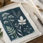
Overlapping Leaves for Easy Organic Layers
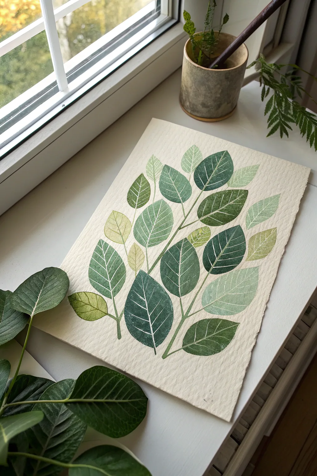
Capture the delicate beauty of foliage with this botanical block printing project. By layering translucent inks in varying shades of green, you’ll create a lush, organic composition that celebrates determination and growth.
Step-by-Step Tutorial
Materials
- Soft-cut lino block (at least 4×6 inches)
- Lino cutting tool with V-gouge and U-gouge blades
- Water-soluble block printing inks (dark green, light green, yellow, white extender)
- Brayer (rubber roller)
- Sheet of glass or acrylic for inking
- Heavyweight textured paper (like Rives BFK or handmade cotton paper)
- Pencil and tracing paper
- Barren or a clean wooden spoon
Step 1: Designing and Carving
-
Sketch your leaf shapes:
Begin by sketching 3-4 distinct leaf shapes on tracing paper. Aim for simple, ovate forms typical of ficus or citrus leaves. Vary the sizes slightly—one large, two medium, and one smaller—to create visual rhythm in your final print. -
Transfer to the block:
Place your tracing paper graphite-side down onto the soft-cut lino block. Rub the back firmly to transfer the outlines. Repeat this process to fit as many separate leaf shapes on your block as possible, leaving space between them for cutting. -
Carve the outlines:
Using a fine V-gouge blade, carefully carve along the outline of each leaf shape. Keep the blade at a shallow angle to ensure smooth curves. This defines the edge of your stamp. -
Detail the veins:
Switch to your finest V-gouge. Carve a central vein running from the stem to the tip of each leaf, then add diagonal side veins. These carved lines will remain white (the color of the paper) when you print, acting as the negative space. -
Clear the background:
Use a wider U-gouge to cut away all the lino material surrounding your leaf shapes. You want to isolate the leaves so they become individual stamps. I prefer to cut the block apart into separate stamps with a utility knife for easier placement.
Step 2: Printing the Layers
-
Prepare your palette:
Squeeze a small amount of dark green, light green, and yellow ink onto your inking plate. Mix a little transparent extender into the greens to make them semi-translucent; this is crucial for achieving that beautiful overlapping effect where colors blend. -
Load the brayer:
Roll your brayer into the lightest green mixture first. Roll back and forth and lift frequently until the roller has a consistent, velvety texture and makes a slight hissing sound. -
Print the first layer:
Ink up two or three of your leaf stamps. Press them firmly onto your textured paper in a loose arrangement. Use a barren or the back of a spoon to apply even pressure, ensuring the ink transfers into the paper’s texture. -
Vary the hues:
Clean your brayer or switch to a new color area on your palette. Mix a slightly darker or yellower green. Ink up different leaf stamps and print them near the first set, changing the angle for a natural look. -
Create overlaps:
Now for the magic. Ink a stamp with a darker, transparent green. Position it so it partially overlaps a previously printed (and slightly dry) lighter leaf. Press down. The colors will combine where they meet, creating a third, deeper shade. -
Build the stem structure:
As you add more leaves, think about how they would connect to a central stem. Use the edge of a clean, un-inked stamp or a fine brush with green ink to faintly suggest stems connecting your floating leaves, grounding the composition. -
Add final depth:
For the leaves in the foreground, use your darkest, most opaque green. Place these strategically to cover any awkward gaps or to create a focal point near the bottom center of the cluster. -
Let it cure:
Allow the print to dry completely. Water-soluble inks usually dry within an hour, but because of the overlapping layers, give it extra time to ensure the colors set without smudging.
Transparency Trick
Add ‘transparent extender’ medium to your ink. This makes the color see-through, allowing the bottom leaves to show through the top ones for that watercolor effect.
Splotchy Prints?
If your print looks too speckled, your paper might be too textured. Mist the paper very lightly with water before printing to help it grab the ink from the block.
Now step back and admire how simple carved shapes can build a complex, living work of art
BRUSH GUIDE
The Right Brush for Every Stroke
From clean lines to bold texture — master brush choice, stroke control, and essential techniques.
Explore the Full Guide
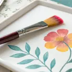
Overlapping Flowers With Petal Intersections
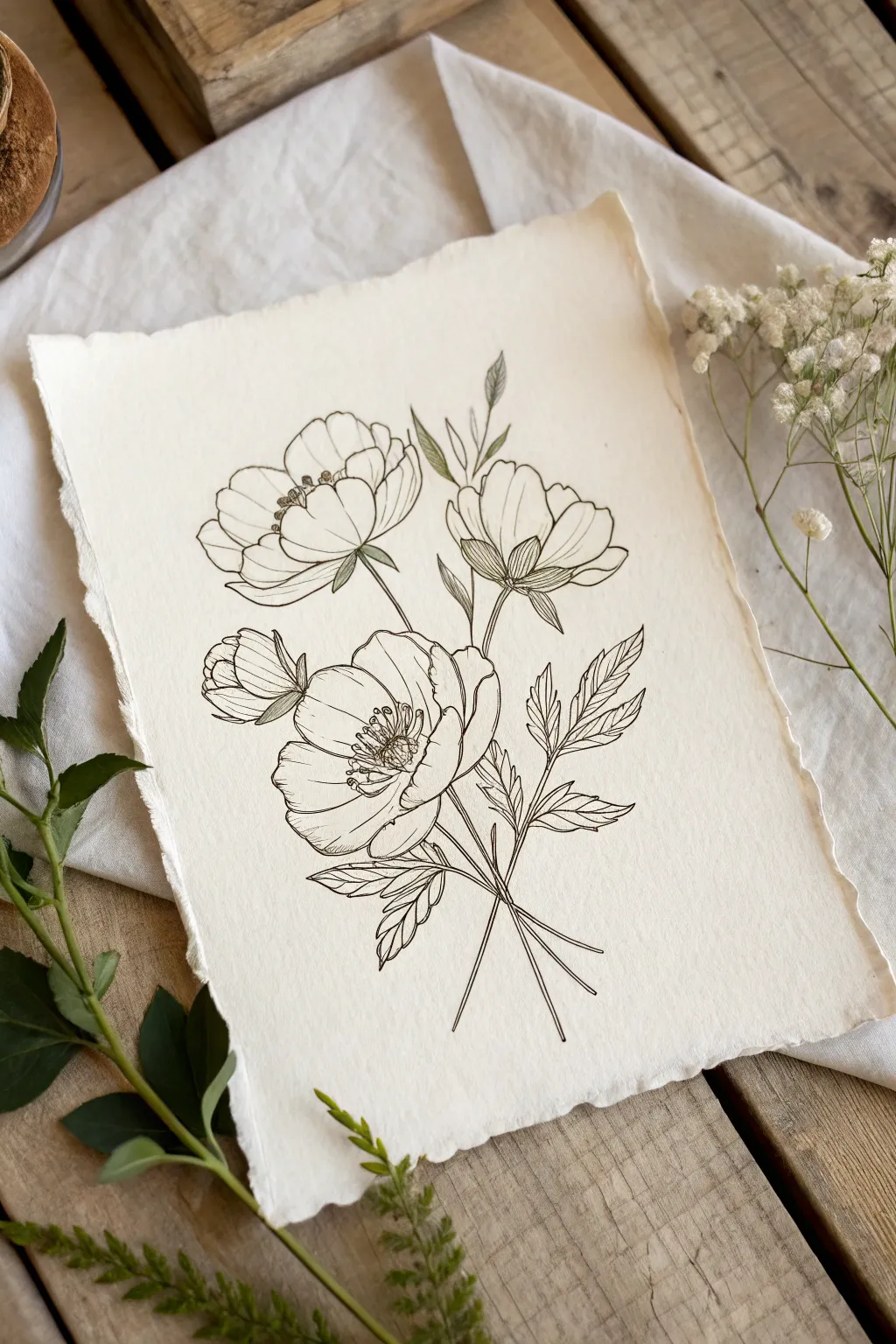
Capture the fragile beauty of wildflowers with this elegant line art project on handmade paper. You will learn to draw overlapping petals and stems, using fine ink lines to create depth and a classic botanical illustration feel.
How-To Guide
Materials
- Handmade paper with deckled edges (cotton or rag paper)
- H or HB pencil
- Kneaded eraser
- Fine liner pens (sizes 0.05, 0.1, and 0.3)
- Ruler (optional)
- Smooth surface or drawing board
Step 1: Conceptual Sketching
-
Outline the main stems:
Begin by lightly sketching three main stem lines using your H pencil. Fan them out from a central point near the bottom, crossing them slightly to establish the bouquet shape. The center stem should be the shortest, while the side stems reach higher. -
Position the flower heads:
Draw three loose ovals at the top of your stems to mark where the blooms will go. Place one large bloom low and center, one high on the left, and a slightly smaller one on the right. Add a small circle on the left side for a bud. -
Draft the petal shapes:
Inside your ovals, sketch the large, cup-shaped petals. Pay close attention to the overlaps; draw the entire shape of the front petals first, then tuck the back petals behind them. Don’t worry about details yet, just the main forms. -
Add foliage and sepals:
Sketch small leaves at the base of each flower head (sepals). Then, add jagged, fern-like leaves extending from the stems. Ensure some leaves overlap the stems or tuck behind them to create a sense of three-dimensional space. -
Detail the centers:
Lightly mark the center of the open blooms. Sketch a cluster of tiny circles for the stamens and anthers. This helps orient the direction the flower is facing.
Ink Bleeding Control
Handmade paper is thirsty! Test your pen on a scrap piece first. If it bleeds, move your hand faster to deposit less ink, or switch to a slightly harder nib.
Step 2: Inking the Outlines
-
Start the final lines:
Switch to your 0.1 fine liner. Begin tracing your pencil lines, starting with the foremost petals—the ones that are ‘on top’ of everything else. This ensures you don’t accidentally draw through a petal that should be hiding a stem. -
Define the overlaps:
Carefully ink the petals behind the front ones. Stop your line exactly where it hits the edge of a foreground petal. This creates the clean intersection that defines the ‘overlapping’ style. -
Ink the stems and leaves:
Draw the stems, making sure to break the line where leaves or flowers cover them. When drawing the leaves, use slightly jagged, confident strokes to mimic the serrated edges of the foliage. -
Erase the graphite:
Wait for the ink to dry completely—handmade paper can be absorbent and smudge easily. Once dry, gently roll a kneaded eraser over the drawing to lift the pencil marks without damaging the paper texture.
Pro Tip: Line Quality
Don’t connect every single line perfectly. Leaving tiny gaps in the petal outlines or leaf veins lets the drawing ‘breathe’ and feels more organic.
Step 3: Shading and Texture
-
Add core shadows:
Using the 0.05 pen, add very fine hatch marks at the base of the petals where they meet the center. Keep these lines short and flick your wrist to taper them. -
Detail the stamens:
Go back to the flower centers. Ink the tiny circles and add small stalks. Darken the negative space between the stamens slightly to make them pop. -
Texture the leaves:
Draw a central vein down each leaf. Add smaller veins branching out. Use hatching on one side of the central vein to suggest a slight curve or shadow on the leaf surface. -
Enhance intersections:
Where two petals or stems overlap, add a tiny bit of extra hatching on the object underneath, right next to the boundary line. This cast shadow separates the layers visually. -
Refine the line weight:
Take your 0.3 pen and selectively thicken a few key outlines, particularly on the shadowed side (usually the bottom or right) of the flowers. This line weight variation adds sophistication. -
Final assessment:
Step back and look for any areas that feel flat. I often add a few stray dots or tiny lines near the petal edges to suggest the delicate texture of the flower skin.
Now you have a timeless botanical piece ready to be framed or gifted
Layered Mountain Ridges in Silhouettes
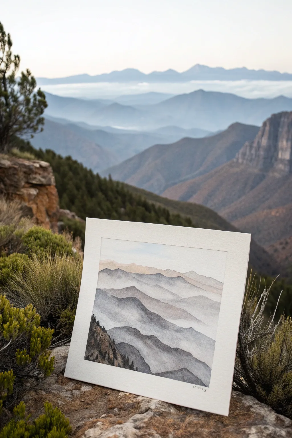
Capture the serene beauty of atmospheric perspective with this watercolor study of layered mountain ridges. By using a monochrome palette that gradually lightens, you’ll create a stunning sense of depth where distant peaks seem to dissolve into the mist.
Step-by-Step
Materials
- Cold press watercolor paper (300 gsm or heavier)
- Painter’s tape or masking tape
- Drawing board or hard surface
- Watercolor paints: Indigo, Payne’s Gray, and a touch of Burnt Sienna
- Round watercolor brushes (Size 4, 8, and a large blending brush)
- Clean water jar and waste water jar
- Paper towels
- Pencil (HB or lighter) and kneaded eraser
Step 1: Preparation & Sketching
-
Secure the paper:
Tape your watercolor paper down firmly to your drawing board on all four sides. This creates a clean white border and prevents buckling when the paper gets wet. -
Plan layers:
Visualize your composition. You need about 6-8 distinct layers of mountain ridges, starting from the top (furthest) down to the bottom (closest). -
Lightly sketch outlines:
Using your HB pencil, draw very faint, wavy lines to represent the ridges. Keep the lines organic and uneven to mimic natural terrain. Don’t press hard; you don’t want these lines visible later.
Fixing Hard Edges
If you get a hard line where you wanted a fade, wait for it to dry. Re-wet that specific edge with a damp stiff brush and gently scrub to lift the pigment and soften the transition
Step 2: Painting the Atmospheric Layers
-
Mix the sky wash:
Prepare a very watery, pale wash using a tiny amount of Payne’s Gray and plenty of water. It should be barely tinted. -
Paint the sky:
Apply this wash to the sky area above your highest mountain line. Use a clean, damp brush to soften the bottom edge so it doesn’t leave a hard line. -
First ridge (furthest):
Mix a slightly stronger wash for the most distant mountain range. Add a tiny hint of Burnt Sienna to your gray/indigo mix to warm it up slightly, suggesting morning light. -
Apply the first layer:
Paint the shape of the furthest ridge. While the paint is still wet, drag the color downwards with water so it fades out completely into the white of the paper below. -
Dry completely:
I like to be patient here—let this layer dry fully before touching the next one. This crisp edge is crucial for the overlapping effect. -
Second ridge:
Create a slightly darker mix of Indigo and Payne’s Gray. Paint the second ridge line, overlapping the bottom faded edge of the first layer. -
Fade the second layer:
Just like before, once the top edge is defined, use clean water to pull the pigment downwards, fading it into transparency as you move lower on the page. -
Repeat with darkening values:
Continue this process for the next 3-4 layers. Each new ridge should be painted with a slightly more saturated, darker mixture of paint than the one before it. -
Vary hills and valleys:
Ensure your ridge lines aren’t parallel. Let some dip low and others peak high to create visual interest and realistic topography.
Step 3: Foreground Detail
-
Approach the foreground:
As you reach the bottom 2-3 layers, the ‘mist’ effect should decrease. Instead of fading out completely at the bottom, keep the color solid. -
Darkest mix:
For the closest mountain layer in the bottom left corner, use your most concentrated Indigo mixed with Payne’s Gray. It should be nearly opaque. -
Add texture:
While painting this dark foreground mass, use a smaller brush (size 4) to dab vertical marks along the ridge line, suggesting pine trees or rough rocks. -
Dry brush technique:
If you want rocky textures, blot your brush on a paper towel so it’s damp but not soaking, and drag it across the lower dark areas to leave some paper tooth showing. -
Review contrast:
Check the jump in value between layers. If two layers look too similar, you can carefully glaze a thin wash over the closer one to darken it once everything is bone dry. -
Remove tape:
Wait until the paper is completely cool to the touch (indicating it is dry). Slowly peel the tape away at a 45-degree angle to reveal your crisp white border. -
Sign the work:
Add your signature small and discreetly in the bottom corner using a fine brush or a micron pen.
Expert Tip: Color Temperature
Add warmth to distant peaks and cool tones to close ones. A touch of pink in the far back vs. deep blue in front exaggerates the atmospheric depth effect
Place your finished piece in a simple frame to let the subtle gradients speak for themselves

PENCIL GUIDE
Understanding Pencil Grades from H to B
From first sketch to finished drawing — learn pencil grades, line control, and shading techniques.
Explore the Full Guide
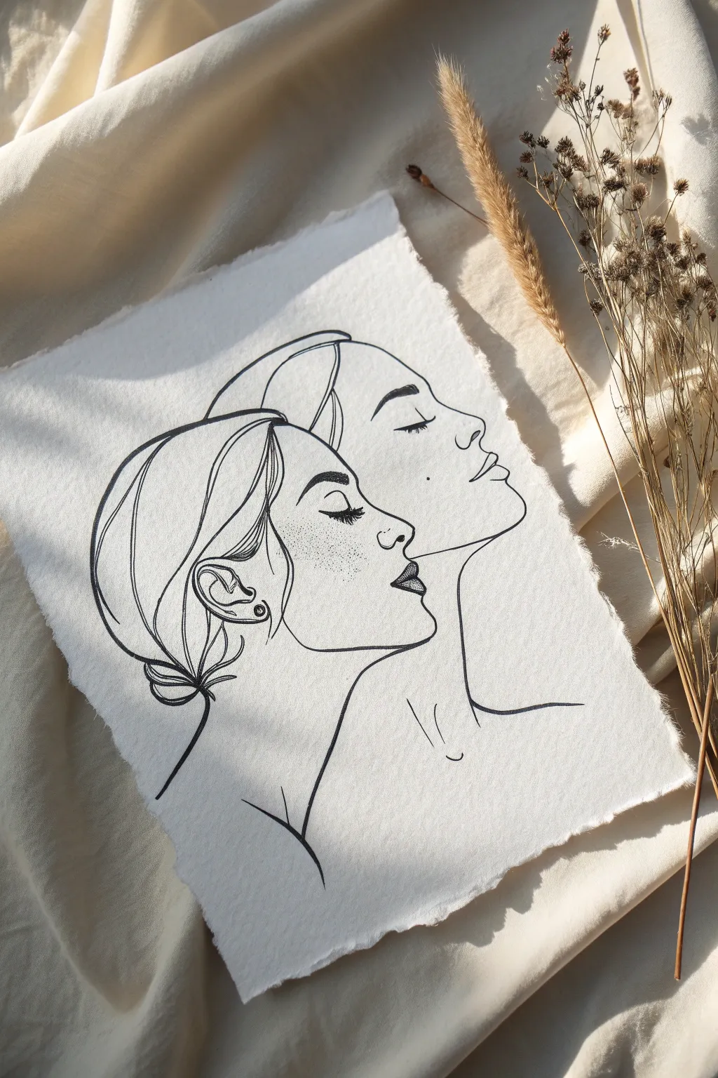
Overlapping Portrait Profiles

Capture the graceful connection between two subjects with this elegant minimalist line drawing. This project uses precise ink work and subtle shading techniques on textured paper to create a sophisticated, airy composition where two profiles seamlessly merge.
Step-by-Step Guide
Materials
- Heavyweight textured paper (watercolor or handmade cotton paper)
- Pencil (HB or 2H for sketching)
- Kneaded eraser
- Fine liner pens (sizes 0.1, 0.3, and 0.5)
- Ruler (optional)
- Reference photo of side profiles
Step 1: Planning the Composition
-
Prepare your paper:
Begin by selecting a high-quality sheet of paper with a visible tooth or texture. To achieve the artisanal look shown in the example, carefully tear the edges of the paper against a ruler rather than cutting them to create a soft, deckled border. -
Establish placement:
Lightly mark the center of your page with your pencil. You want the two heads to be slightly offset—one foreground profile lower and to the left, and the background profile slightly higher and to the right. -
Sketch the forehead curves:
Start sketching lightly with an HB pencil. Draw the curve of the forehead for the foreground figure first using a smooth, sweeping motion. -
Define the first profile:
Continue down from the forehead to outline the nose, lips, and chin of the bottom-left profile. Keep your lines incredibly faint so they can be easily adjusted or erased later. -
Sketch the second profile:
Draw the second profile slightly behind and above the first. The key overlapping moment happens near the forehead and eye level. Ensure the back of the second head merges naturally into the space occupied by the first figure’s hair. -
Outline the hairstyles:
Sketch the hair shapes. Instead of drawing individual strands, focus on the large, sweeping contours of the hair buns and loose framing strands. Notice how the lines of the hair serve as the boundary for both figures. -
Refine the connection points:
Look closely at where the lines intersect. The jawline of the upper face should disappear behind the forehead of the lower face. Erase any confusing internal lines so you have a clean map to follow with ink.
Step 2: Inking the Forms
-
Begin the main contours:
Switch to your 0.5 fine liner pen. Start inking the boldest outer lines first—the curve of the necks, the backs of the heads, and the main profile lines. Use confident, single strokes rather than feathery, scratchy lines. -
Detail the facial features:
Switch to a specifically thinner 0.3 pen for the delicate facial features. carefully ink the eyelids, nostrils, and the parting of the lips. I find holding the pen slightly further back helps keep the hand relaxed for these curves. -
Add hair texture:
Using the 0.3 pen again, add sweeping internal lines within the hair shapes to suggest flow and volume. Keep these lines sparse; too many lines will make the drawing look cluttered. -
Create the overlapping effect:
Where the two faces meet, ensure your line weight remains consistent. The beauty of this style is in the ‘shared’ lines where one form flows uninterrupted into the other.
Shaky Lines?
If your hand shakes during long strokes, try ‘ghosting’ the movement (hovering over the paper) before lowering the pen. Drawing from your shoulder, not your wrist, also creates smoother curves.
Step 3: Adding Texture and Finish
-
Stipple the lips:
Switch to your finest 0.1 pen. Instead of coloring the lips solid black, use tiny dots (stippling) to create a gradient. Concentrate the dots at the corners of the mouth and the bottom of the upper lip for depth. -
Add freckles:
Using the same 0.1 pen, gently tap the paper to create freckles across the cheeks and bridge of the noses. Vary the pressure slightly so some dots are darker than others for a natural look. -
Refine the eyes:
Darken the lash lines with the 0.3 pen to make the closed eyes pop. Add tiny, individual lashes curving outward. -
Erase pencil guides:
Wait at least 15 minutes for the ink to cure completely. Once dry, gently run your kneaded eraser over the entire drawing to lift the graphite sketches. -
Strengthen weighted lines:
Review your drawing. Go back over key structural lines (like the jawline turn and the neck) with the 0.5 pen to thicken them slightly, adding graphical weight to the composition. -
Final touches:
Add the small details, such as the earring stud on the lower figure and the small suggestion of collarbones at the base of the necks.
Pro Tip: Line Variation
Vary your line weight intentionally. Make the outer silhouette lines thicker (0.5mm) and internal details like eyelashes and hair strands thinner (0.1mm) to give the drawing instant professional depth.
Display is best kept simple to let the intricate line work speak for itself
Have a question or want to share your own experience? I'd love to hear from you in the comments below!