
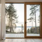
If you can draw a convincing path, you can instantly pull the viewer into your scene like they’re about to step right into it. I love paths because they’re the easiest way to practice depth, perspective, and storytelling all at once.
Classic One-Point Perspective Road
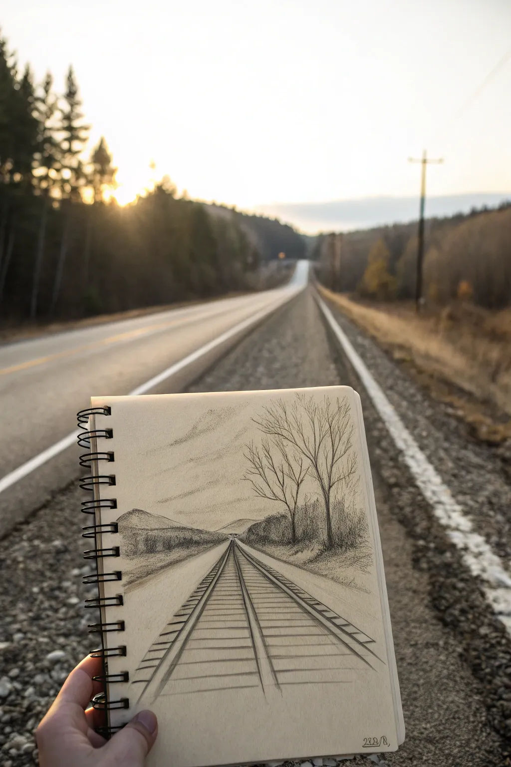
This classic one-point perspective study transforms a simple road view into a nostalgic railway scene. Using graphite pencils, you’ll learn to create depth and distance by drawing converging tracks that disappear into a single focal point on the horizon.
Step-by-Step Tutorial
Materials
- Spiral-bound sketchbook (medium weight paper)
- Graphite pencils (HB, 2B, 4B)
- Ruler or straight edge
- Kneaded eraser
- Blending stump or tissue
Step 1: Setting the Perspective
-
Establish the horizon:
Begin by lightly drawing a horizontal line across your page, about one-third of the way up from the bottom. This will represent your eye level and the distant horizon. -
Mark the vanishing point:
Place a small, faint dot right in the center of your horizon line. This is the ‘vanishing point’ where all parallel lines will appear to converge. -
Draw the outer rails:
Using your ruler, draw two diagonal lines starting from the very bottom corners of the page (or slightly inward) that meet exactly at your vanishing point. These form the outer edges of the train tracks. -
Add the inner rails:
Draw two more diagonal lines just inside the first pair, also converging at the vanishing point. Keep the spacing consistent to represent the thickness of the steel rails.
Step 2: Constructing the Tracks
-
Sketch the nearest ties:
Draw the first few wooden ties (sleepers) at the bottom of the page horizontally between the rails. Make these quite thick and wide apart, as they are closest to the viewer. -
Fill in the distance:
Continue drawing horizontal ties moving upward toward the horizon. Here’s the trick: as you get higher up the page, draw the lines thinner and closer together to create the illusion of recession. -
Add side details:
Sketch a diagonal verge line on the right side, starting from the bottom right corner and angling toward the horizon, to create an embankment for the trees. -
Draft the hills:
Lightly outline organic, rolling shapes on the left and right sides of the horizon line to represent distant hills or mountains.
Fixing Flat Tracks
If the tracks look like a ladder climbing a wall, your tie spacing is too even. Make sure the gaps between ties get significantly smaller as they move toward the horizon.
Step 3: Shading and Texture
-
Darken the rails:
Switch to a softer pencil like a 2B. Go over your rail lines, making them dark and bold. Add a slight shadow on the inner side of each rail to give them a 3D metallic look. -
Texture the ties:
Shade the wooden ties, using uneven strokes to suggest rough wood grain. Allow some paper white to show through for highlights. -
Create the gravel:
Using the side of your pencil or a scribbling motion, add texture between the ties and on the sides of the track to verify the look of loose gravel or ballast. -
Plant the trees:
On the right embankment, draw the skeletons of bare trees. Use jagged, V-shaped lines for branches that get thinner as they reach upward. I find it helpful to press harder at the trunk base and release pressure as I move up. -
Foliage and details:
Add some scrubby bushes at the base of the trees using small, circular scribbles. On the left side, shade the distant hills with a light, even tone, fading them out near the bottom to suggest atmospheric mist. -
Sky and atmosphere:
Lightly sketch some wispy clouds in the sky using a very dull pencil or side-shading. You can smudge this slightly with your finger or a tissue for a soft effect.
Pro Tip: Atmospheric Depth
Use harder pencils (H or HB) for distant hills and softer pencils (4B) for the foreground tracks. This contrast in value makes the close objects pop and distant ones recede.
Step back and admire how simple lines can create a convincing illusion of infinite distance


Winding Forest Trail
Capture the serene mystery of a misty woodland path with this layered colored pencil drawing. You’ll learn to build atmospheric depth using soft grays and warm earth tones to recreate the vanishing trail.
How-To Guide
Materials
- Heavyweight drawing paper (bristol vellum or hot press watercolor paper)
- HB graphite pencil for sketching
- Kneaded eraser
- Artist-grade colored pencils (warm grays, cool grays, burnt ochre, yellow ochre, sap green, indigo blue, white)
- Colorless blender pencil or blending stump
- Fixative spray
Step 1: Sketching the Layout
-
Establish the horizon:
Lightly draw a horizontal line roughly one-third up from the bottom of your page to mark where the path disappears into the fog. -
Draft the path:
Sketch the S-curve of the path starting wide at the bottom corners and narrowing significantly as it winds toward the center. Ensure the curves feel organic, not perfect geometric arcs. -
Place the trees:
Mark vertical lines for the tree trunks. Place thicker, darker trunks in the foreground on the left and right, and thinner, fainter lines as you recede into the distance.
Fixing Muddy Colors
If your greens and browns blend into a muddy mess, stop layering. Spray a workable fixative, let it dry completely, and then apply fresh, sharp colored pencil strokes on top to regain clarity.
Step 2: Building the Atmosphere
-
Base layer of fog:
Using a cool gray pencil, lightly shade the background area between the trees. Keep your pressure extremely light to create a soft, hazy effect. -
Softening the distance:
Take a white pencil and burnish over the distant gray trees to push them back visually. This creates that ‘foggy’ look where details get lost. -
Distant foliage:
Stipple very faint sap green and cool gray in the mid-ground to suggest leaves without drawing individual shapes.
Step 3: Developing the Path
-
Path base color:
Fill the path area with a layer of cream or very light yellow ochre to establish the sandy dirt color. -
Adding texture:
Layer burnt ochre and light brown over the path, using horizontal strokes to mimic the direction of the ground. Leave the center of the path slightly lighter to show wear. -
Defining the edges:
Darken the edges of the path where it meets the grass with a mix of dark brown and indigo to create contrast and depth. -
Wheel rut details:
Draw two parallel, slightly darker tracks winding up the path to suggest tire ruts or foot traffic. Keep these subtle.
Add a Focal Point
To give the eye a place to rest, draw a tiny silhouette of a hiker, a dog, or a simple wooden signpost where the path curves out of sight into the fog.
Step 4: Defining the Foreground
-
Tree bark texture:
On the large foreground tree (left), use dark cool gray and indigo. Use short, vertical strokes to create rough bark texture. I find pressing harder here really helps bring the tree forward. -
Foreground grass:
Use sharp sap green and olive pencils to draw individual blades of grass along the bottom edge and sides of the path. -
Shadows and depth:
Add deep shading at the base of the foreground trees and under the grassy edges using indigo or black to anchor the scene. -
Final blending:
Use a colorless blender to smooth out the path surface, making it look packed down, but leave the trees slightly rough for texture. -
Highlight recovery:
Use an electric eraser or the sharp edge of a kneaded eraser to lift out tiny highlights on the path or tree bark if they became too muddled.
Now you have a moody, atmospheric landscape that invites the viewer to step right into the woods

Park Path With Lamp Posts
Capture the serene depth of an autumn walkway with this detailed ink drawing tutorial. Using perspective techniques and varied hatching, you will create a sense of distance that draws the viewer’s eye straight down the path.
Detailed Instructions
Materials
- Sketchbook with smooth, heavy paper
- Pencil (HB or 2B)
- Eraser (kneaded preferred)
- Ruler
- Fine liner pens (sizes 0.1, 0.3, and 0.5)
- White gel pen (optional for highlights)
Step 1: Setting the Perspective
-
Establish the horizon line:
Start lightly with your pencil. Draw a horizontal line across the page where the sky meets the ground, placing it slightly below the center. -
Mark the vanishing point:
Place a small dot in the exact center of your horizon line. This will be the point where all diagonal lines converge. -
Outline the path:
Using a ruler, draw two diagonal lines extending from the vanishing point down to the bottom corners of your paper. This forms the main path. -
Block in tree placement:
Sketch light vertical lines on the left side of the path to indicate where the main tree trunks will stand. Make the ones closer to the bottom of the page taller and thicker, shrinking them as they recede toward the vanishing point. -
Position the lamp post:
On the right side, sketch a vertical line for the prominent lamp post in the foreground. It should be tall enough that the lamp head sits above the horizon line.
Uneven Ink Flow?
If your pen skips over textured paper, slow your stroke speed. Fast lines can break on toothy paper, while slower strokes allow ink to soak in fully.
Step 2: Inking the Structure
-
Draw the main trees:
Switch to a 0.5mm pen. Trace your pencil lines for the large trees on the left. Give the edges a slightly jagged, organic feel to mimic bark texture rather than perfect straight lines. -
Add branches:
Extend branches upward and outward from the trunks. Keep your lines thinner as the branches reach their tips, creating a web-like canopy. -
Detail the lamp post:
Carefully ink the lamp post structure. Draw the lantern head with its glass panes and the decorative metalwork below it. Use the ruler for the straight pole section if you want it crisp. -
Define the path edges:
Ink the borders of the path. On the left side, where the grass meets the pavement, use a series of small, rough ovals to suggest the curb stones lining the walkway.
Depth Trick
Make foreground lines (bottom of page) much thicker and darker than background lines. Use a 0.05 pen for distant details to force them back.
Step 3: Adding Texture and Depth
-
Texture the tree trunks:
Using a 0.1mm pen, add vertical hatching lines up and down the tree trunks. Concentrate the lines on the right side of each trunk to create a shadow side, giving the trees a cylindrical 3D form. -
Create the grassy texture:
For the ground on the left, use short, scribbled strokes and stippling to simulate uneven grass and fallen leaves. Leave some white space to suggest light hitting the ground. -
Draw the background trees:
In the distance near the horizon, use very light, scribbly circular motions to suggest the foliage of distant trees. Keep this area less detailed to push it into the background. -
Pave the path:
Draw vertical lines running down the length of the path. Then, add faint horizontal lines to create the grid of the paving stones. I like to let these lines fade out as they get closer to the horizon to avoid cluttering the focal point. -
Add figures for scale:
Draw two tiny silhouettes walking down the path near the vanishing point. This simple addition instantly gives the drawing a massive sense of scale.
Step 4: Refining Values
-
Deepen the shadows:
Go back with your 0.3mm pen and darken the areas under the trees and the shadow side of the lamp post. Contrast is key here. -
Cast shadows:
Add horizontal cast shadows stretching across the grass and slightly onto the path from the tree trunks. -
Clean up:
Once the ink is completely dry, gently erase all your initial pencil guidelines to leave a crisp, clean illustration.
Step back and admire how simple lines created a deep, inviting landscape


River Path With a Small Arch Bridge
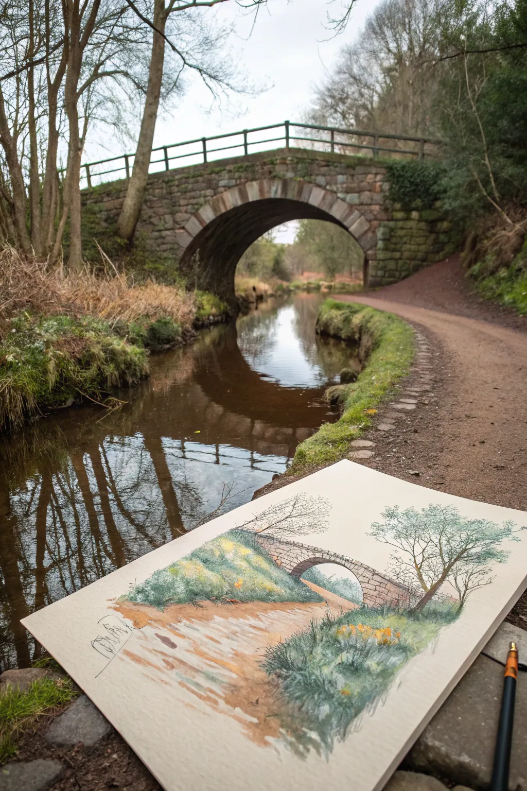
Capture the serene beauty of a stone arch bridge reflected in still water with this mixed media drawing. Using a combination of fine liner and pastel pencils creates a soft, textured look that perfectly mimics mossy banks and weathered stone.
Step-by-Step Tutorial
Materials
- Heavyweight textured drawing paper (tan or cream tone)
- Pastel pencils (Greens, Browns, Greys, Yellows, Ochre)
- Fine liner pen (Black or Sepia, 0.1mm – 0.3mm)
- Graphite pencil (HB for initial sketch)
- Kneaded eraser
- Paper stump or blending tool
- Workable fixative spray
Step 1: Planning and Sketching
-
Establish the horizon:
Begin by lightly drawing a horizon line about one-third of the way up the page. This will help ground your bridge and path. -
Outline the bridge arch:
Draw the semi-circle of the bridge arch slightly off-center. Pay attention to the perspective; the underside of the arch should be visible to give it depth. -
Map the path:
Sketch a winding path leading from the bottom foreground towards the bridge. Make the path wider at the bottom and narrower as it recedes to create distance. -
Position the trees:
Lightly indicate the placement of the large tree on the right bank and the smaller shrubbery on the left bank. Keep these shapes loose and organic.
Keep it Grainy
Don’t over-blend your pastel pencil layers. Letting the tooth of the paper show through mimics the rough texture of dirt paths and stone walls perfectly.
Step 2: Adding Ink Details
-
Define the stonework:
Switch to your fine liner pen. carefully draw the individual stones of the bridge, varying their sizes to look natural. Use broken lines for a weathered effect. -
Detail the tree structure:
Ink the trunk and main branches of the right-side tree. use quick, zig-zagging strokes for the smaller twigs to suggest complexity without drawing every leaf. -
Identify grassy textures:
Add small tufts of grass along the path edges and riverbanks with short, upward pen flicks. This sets a guide for your color application later. -
Erase pencil guides:
Once the ink is completely dry, gently run your kneaded eraser over the drawing to lift the graphite guidelines, leaving a clean ink drawing.
Step 3: Layering Color
-
Base layer for the path:
Using a light ochre or tan pastel pencil, fill in the path area. Apply the pencil lightly, allowing the paper’s texture to show through for a gravelly look. -
Shadowing the path:
Layer a reddish-brown pastel pencil over parts of the path, particularly in the foreground and edges, to suggest damp earth and shadows. -
Coloring the banks:
Apply a base of olive green to the grassy riverbanks. Scumble the color—moving the pencil in small circular motions—to create a mossy texture. -
Deepening the greens:
I like to come in with a darker cool green or slate blue in the shadowed areas under the tree and near the water’s edge to add volume to the foliage. -
Filling the bridge:
Lightly shade the bridge stones with warm grey. Add touches of rusty brown here and there to mimic the local sandstone color shown in the reference.
Smudged Ink?
If your fine liner smears when adding color, ensure it’s waterproof. If not, wait at least 30 minutes before coloring, or apply the ink AFTER the pastel work.
Step 4: Refining and Blending
-
Create the water reflection:
Below the bridge, gently smudge a mix of grey and green downwards. Keep the strokes vertical to simulate the reflection in the water. -
Add floral accents:
Dot in bright yellow pastel pencil marks amongst the green banks to represent wildflowers or gorse bushes. -
Highlight the foliage:
Use a white or pale cream pencil to add highlights to the tops of the grassy tufts and the upper edges of the tree branches where the light hits. -
Soften edges:
Use a paper stump to selectively soften the colors on the path and water, but keep the textured strokes on the grass crisp for contrast. -
Final Contrast check:
Review your drawing. If the bridge arch needs more depth, darken the underside with a dark grey or charcoal pencil to make it pop.
Finish by spraying a light coat of fixative to protect your delicate pastel work from smudging
BRUSH GUIDE
The Right Brush for Every Stroke
From clean lines to bold texture — master brush choice, stroke control, and essential techniques.
Explore the Full Guide
Tree Tunnel Path With Canopy Shadows
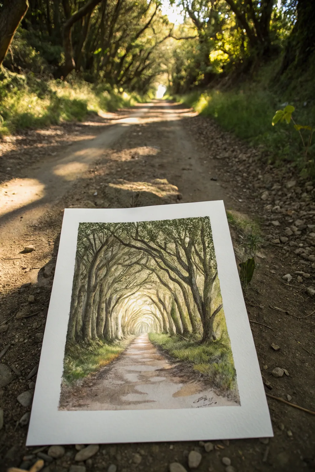
Capture the magic of a forest path where overarching branches create a natural tunnel, guiding the eye toward a glowing light at the end. This mixed-media approach combines the soft gradients of watercolor with the precision of ink or fine liner to replicate the intricate texture of bark and leaves.
How-To Guide
Materials
- Cold press watercolor paper (300 gsm)
- Watercolor paint set (forest green, olive green, burnt umber, raw sienna, yellow ochre)
- Drawing pencil (HB or 2H)
- Fine liner pens (black or sepia, sizes 0.1 and 0.3)
- White gouache or white gel pen
- Soft synthetic watercolor brushes (sizes 4 and 8)
- Masking fluid (optional)
- Paper towels
Step 1: Sketching the Skeleton
-
Establish the perspective:
Begin with a light pencil sketch. Draw a point in the center of the page as your vanishing point. Sketch the path widening as it comes toward you, establishing triangular wedges of grass on either side. -
Map the trunks:
Sketch the main tree trunks on the left and right. Notice how the trees in the distance (near the vanishing point) appear thinner and closer together, while the foreground trees are thick and spaced apart. -
Form the canopy arch:
Draw the major branches reaching upward and curving inward to meet at the top, creating that distinct ‘tunnel’ effect. Keep your lines loose and organic; trees rarely grow in perfect straight lines.
Atmospheric Depth
Make colors paler and cooler (more blue) as you move toward the center of the tunnel. This mimics atmospheric perspective, making the tunnel feel deeper.
Step 2: Washing in Light and Color
-
Creating the glow:
Wet the center area of the tunnel (the distant exit) with clean water. Drop in a very dilute wash of yellow ochre or weak lemon yellow to establish the blinding light at the end of the tunnel. -
Laying base greens:
While the center is still damp, mix a light olive green and apply it loosely to the canopy area. Let it bleed slightly into the yellow center to create a soft, hazy transition. -
Painting the path:
Mix a watery wash of raw sienna and a touch of burnt umber. Paint the dirt path, dragging your brush horizontally in places to suggest uneven ground and shadows cast across the road. -
Adding depth to the grass:
Using a slightly stronger green mix, dab color onto the grassy banks on either side of the road. Don’t paint individual blades yet; just focus on blocks of color and texture.
Step 3: Building Structure and Shadow
-
Defining the trunks:
Once the paper is bone dry, mix a dark grey-brown using burnt umber and blue. Paint the tree trunks, keeping the sides facing the tunnel exit lighter to show where the light hits them. -
Layering the canopy:
Switch to a smaller brush. Use a stippling motion (dabbing the tip repeatedly) with dark forest green to create clumps of leaves in the upper canopy. Leave small gaps of white or light green showing through to represent sky holes. -
Ground shadows:
Paint horizontal shadow strips across the dirt path using a transparent grey-brown mixture. These shadows should follow the perspective lines, wider in the foreground and thinner in the distance.
Uneven Road Texture
Sprinkle coarse salt on the wet path wash and brush it off once dry. The salt pushes pigment away, creating instant rocky, dirt road texture.
Step 4: Refining with Ink and Details
-
Outlining bark texture:
Take your 0.1 fine liner pen. On the dry paint, gently scribble intricate vertical lines and knots up the tree trunks to simulate rough bark. -
Branch definition:
Use the pen to trace the undersides of the main overhead branches. This adds immediate weight and contrast, making them stand out against the sunlit leaves. -
Contrasting foliage:
In the darkest corners of the canopy, use the pen to add dense stippling. This ink work deepens the shadows that watercolor sometimes can’t achieve alone. -
Grassy textures:
Add short, upward flicks with your pen or a dry brush along the grassy verges to suggest tall weeds and grass blades catching the light.
Step 5: Final Highlights
-
Restoring light:
If you’ve lost the bright sparkle of the sun on the path or leaves, use a tiny amount of white gouache or a white gel pen to add highlights back in. -
Softening edges:
If the distant tunnel opening looks too sharp, use a clean damp brush to gently scrub and soften the edges, enhancing the atmospheric perspective. -
Final assessment:
Step back and check your values. The center should remain the brightest point, drawing the viewer all the way down the path.
Now you have a serene woodland scene that invites the viewer to take a walk toward the light
Mountain Switchback Trail
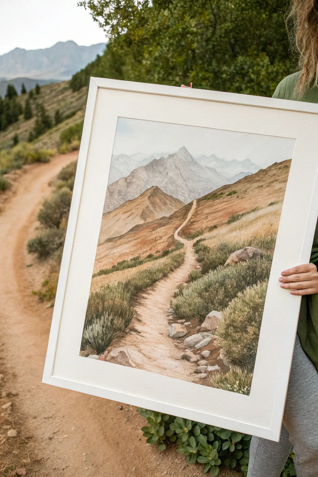
Capture the serenity of a high-altitude trail with this detailed watercolor landscape, featuring soft, hazy peaks and a textured, winding path. This project balances atmospheric depth with intricate foreground vegetation for a truly immersive scene.
Step-by-Step
Materials
- Cold press watercolor paper (300 gsm)
- Watercolor paints (Ultramarine Blue, Burnt Sienna, Yellow Ochre, Sap Green, Payne’s Grey, Alizarin Crimson)
- White gouache (optional for highlights)
- Masking fluid
- Round brushes (sizes 2, 6, and 10)
- Flat brush (1 inch)
- Pencil (HB) and kneaded eraser
- Two jars of water
- Paper towels
- Painting tape
- Board for taping down paper
Step 1: Sketch and Preparation
-
Secure the paper:
First, tape your watercolor paper securely to a board on all four sides. This creates a crisp white border and prevents buckling when we add heavy washes later. -
Outline the composition:
Using an HB pencil, lightly sketch the main elements: the horizon line, the jagged shapes of the distant mountains, the rolling mid-ground hills, and the winding S-curve of the path. Keep lines faint so they disappear under the paint. -
Protect the path:
Apply masking fluid carefully along the path’s edges and over the larger foreground rocks. I find this essential to keep those highlights crisp while painting the surrounding grass.
Muddy colors?
Wait for each layer to dry completely! If the paper is cool to the touch, it’s still damp. Painting over damp areas lifts the previous layer and creates mud.
Step 2: Atmospheric Background
-
Wet-on-wet sky:
Wet the sky area with clean water using your flat brush. Drop in a very dilute mix of Ultramarine Blue and a touch of Payne’s Grey near the top, fading to clear water as you reach the mountains. -
Distant peaks base:
Once the sky is dry, mix a pale, cool grey using Ultramarine and a tiny bit of Alizarin Crimson. Paint the furthest mountain range with a watery wash to push it into the distance. -
Adding mountain volume:
For the closer, more prominent peak, use a slightly stronger mix of grey-blue. While the wash is still damp, drop in slightly darker pigment on the right sides of ridges to suggest shadow and form.
Step 3: Golden Hills and Mid-ground
-
Base wash for hills:
Mix Yellow Ochre with a touch of Burnt Sienna. Create a graded wash for the rolling hills, starting lighter near the top ridges and getting slightly warmer and richer as you move down the slope. -
Defining the ridges:
Once the base wash is dry, use a size 6 brush to paint the shadows of the hills using a mix of Burnt Sienna and Payne’s Grey. Use the side of the brush to create jagged, rocky textures on the steeper slopes. -
Hints of green:
Before the hill wash completely dries, glaze some diluted Sap Green into the lower sections of the hills to suggest patches of distant vegetation.
Dry Brush Texture
For the rocky slopes, wipe most moisture off your brush before picking up pigment. Drag it lightly across the paper grain to create natural rugged rock texture.
Step 4: Foreground and Details
-
Remove masking:
Gently rub off the masking fluid once the paper is completely bone dry. You should now have stark white paper for your path and rocks. -
Painting the path:
Wash the path with a very dilute Burnt Sienna. While wet, drop slightly darker brown along the edges and in the texture of the dirt to show where footsteps have worn the trail. -
Rock texturing:
Paint the rocks using a mix of Payne’s Grey and Burnt Sienna. Paint only the shadow sides, leaving the tops of the rocks unpainted or very pale to represent sunlight hitting them. -
Base grass layer:
Using a size 6 brush, apply a loose, grassy wash of Sap Green and Yellow Ochre on either side of the path. Don’t worry about individual blades yet; just establish the color mass. -
Detailed grass texture:
Switch to your size 2 brush. Mix a darker green (Sap Green + Ultramarine) and paint individual tufts and clumps of sagebrush in the foreground. Use quick, upward flicking motions to mimic grass blades. -
Final shadows:
Add the deepest shadows under the foreground bushes and rocks using a concentrated mix of blue and brown. This anchors the objects to the ground. -
Opaque highlights:
If you lost any sparkle, use a tiny amount of white gouache to add highlights back to the tips of the grass or the brightest edges of the rocks.
Peel off the tape carefully to reveal your crisp edges and enjoy your serene mountain landscape

PENCIL GUIDE
Understanding Pencil Grades from H to B
From first sketch to finished drawing — learn pencil grades, line control, and shading techniques.
Explore the Full Guide
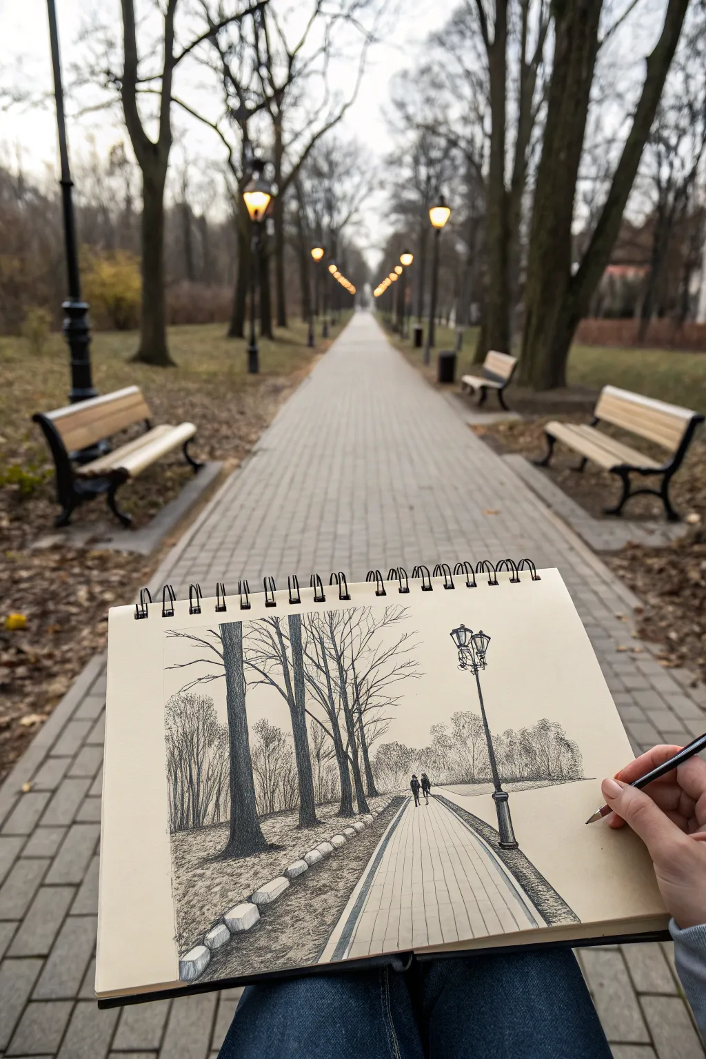
City Sidewalk Perspective Lines
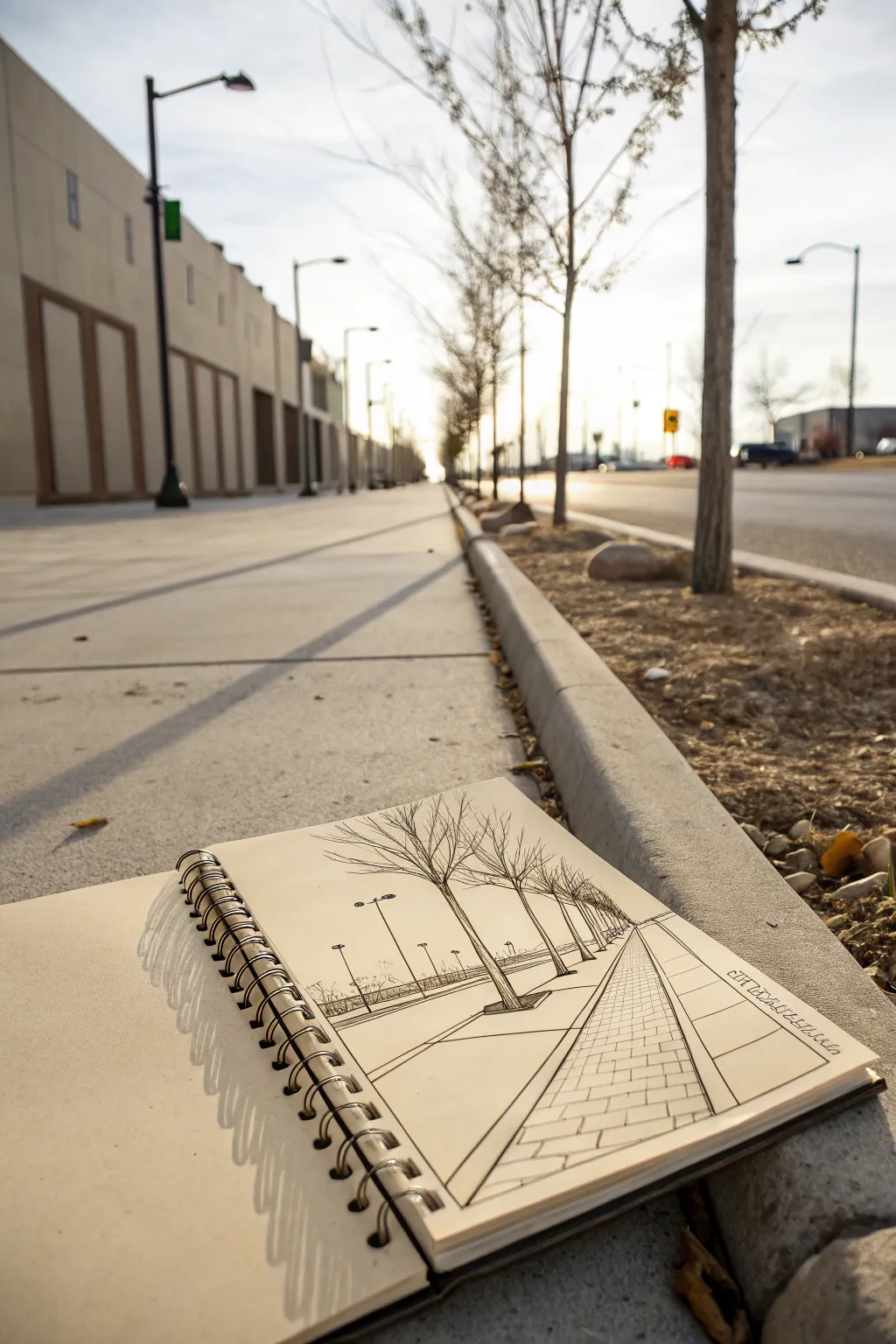
Capture the geometric beauty of a city street with this clean, ink-based location sketch. Using a real-world sidewalk scene as inspiration, this project focuses on strong perspective lines, diminishing rhythm, and bold contrast to create a dynamic urban landscape.
Step-by-Step Guide
Materials
- Spiral-bound sketchbook (heavyweight paper suitable for ink)
- Pencil (HB or 2B)
- Kneaded eraser
- Ruler or straight edge
- Fine liner pen (0.1mm or 0.2mm)
- Medium liner pen (0.5mm or 0.8mm)
- Portable stool (optional for outdoor sketching)
Step 1: Establishing the Perspective
-
Find your horizon line:
Start by lightly drawing a horizon line across the upper third of your page. This will represent eye level and serve as the anchor for your vanishing point. -
Mark the vanishing point:
Place a single dot on the right side of your horizon line. Even though the real street might go on forever, this point is where all your parallel lines will converge. -
Draft the curb line:
Using a ruler, draw a diagonal line from the bottom left corner extending all the way to your vanishing point. This establishes the curb or edge of the sidewalk. -
Define the path width:
Draw another diagonal line from the bottom right side of the page to the same vanishing point. This creates the basic triangular shape of the sidewalk path.
Line Weight Magic
Use thicker pens for objects in the foreground and thinner pens for the background. This trick instantly adds 3D depth to flat paper.
Step 2: Building the Elements
-
Sketch the trees:
Lightly sketch vertical lines representing tree trunks along the left side of your path. Remember that trees closer to you should be tall, and they get progressively shorter and closer together as they recede into the distance. -
Add branch structures:
Draw V-shaped branches radiating from the tops of your trunks. Keep the branches bare to match the wintry aesthetic of the reference scene. -
Indicate streetlamps:
On the far left, behind the trees, sketch thin vertical poles for streetlamps. These should also follow the rules of perspective, getting smaller as they move back. -
Grid the pavement:
To create the paver pattern, draw horizontal lines across the sidewalk path. Space them widely at the bottom of the page and condense them tightly as they near the horizon. -
Create vertical paver joints:
Add vertical lines between your horizontal rows. Stagger them like bricks to create a convincing Interlocking pavement texture.
Step 3: Inking and Refinement
-
ink the main lines:
Switch to your medium liner pen (around 0.5mm). Carefully trace over your main perspective lines—the curb and the path edges—to give the drawing a solid structure. -
Outline the foreground tree:
Use the medium pen for the largest, closest tree trunk. I like to make the base of the trunk slighty thicker to show weight. -
Detail the distant trees:
Switch to your fine liner (0.1mm). Ink the trees further down the line. Using a thinner line weight here helps create atmospheric depth, making them look farther away. -
Ink the branches:
Continue with the fine liner to draw the intricate network of branches. Use quick, confident strokes that taper at the ends for a natural look. -
Define the pavers:
Ink the sidewalk pattern. Do not ink every single line perfectly; leaving some gaps or broken lines can make the texture feel more organic and less rigid. -
Add grassy textures:
Use small, scribbly marks near the base of the trees and along the curb edge to suggest grass or dry vegetation. -
Enhance contrast:
Use your thicker pen to darken the shadows at the base of the objects and along the main curb line, anchoring the drawing to the ground. -
Erase pencil guides:
Wait until the ink is completely dry to avoid smudging. Then, gently erase all your initial pencil construction lines. -
Final touches:
Assess the drawing. If the foreground needs more punch, thicken the outline of the closest tree again. Add your signature or date in a stylized box on the right side.
Cast Shadows
Add diagonal hatching lines slanting away from the trees across the path to simulate long, early-morning shadows for dramatic effect.
Now you have a striking perspective study that transforms a simple walk into dynamic art
Moonlit Path With Long Shadows
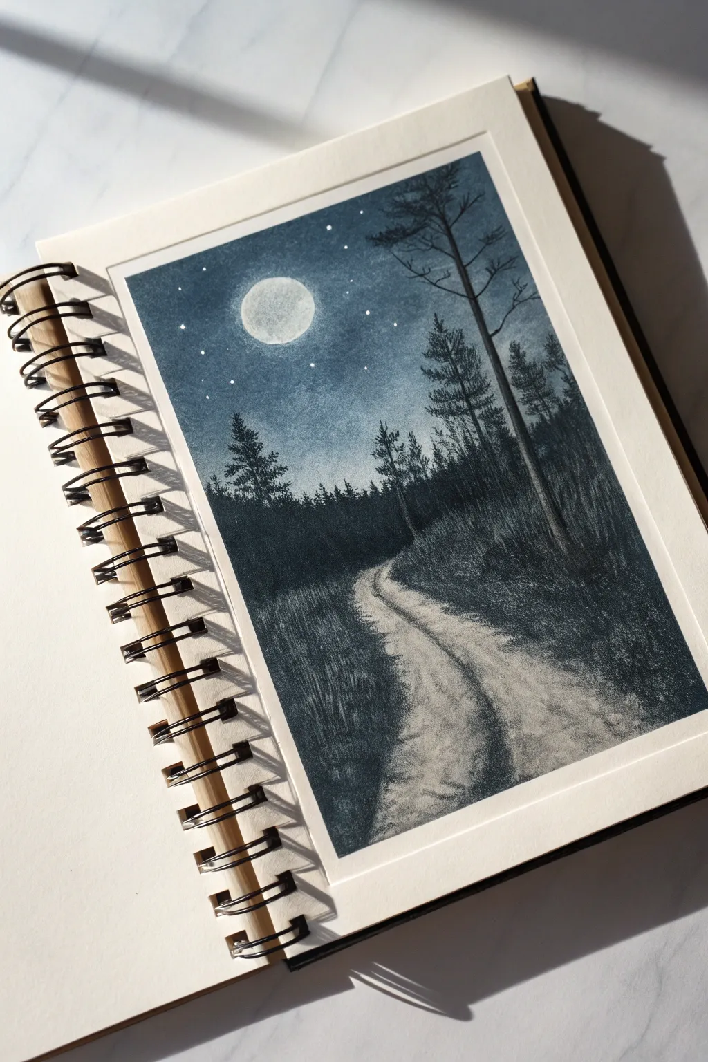
Capture the serene mystery of a moonlit night with this monochromatic study. Using a single deep blue hue helps you focus entirely on value and texture, creating a striking contrast between the glowing moon and the shadowy forest path.
Step-by-Step Guide
Materials
- Cold-pressed watercolor paper (A5 or similar sketchbook size)
- Masking tape
- Indigo or Payne’s Grey watercolor paint
- White gouache or white gel pen
- Round brushes (size 6 or 8 for washes, size 0 or 2 for details)
- Pencil (HB) and eraser
- Jar of clean water
- Paper towel
Step 1: Sketching and Preparation
-
Tape the borders:
Begin by taping down all four edges of your paper with masking tape. This will create that crisp, clean white border shown in the original image once you remove it at the end. -
Outline the main shapes:
Lightly sketch the circle for the moon in the upper left quadrant. Draw a curving line starting from the bottom center, winding slightly right and then disappearing into the middle distance to form the path. -
Mark the horizon:
Sketch a rough, uneven horizon line about halfway up the paper where the trees will meet the sky. Keep this line jagged to suggest distant treetops.
Bleeding Edges?
If paint bleeds under the tape, it usually means the tape wasn’t pressed down firmly enough or the paint was too wet. Use a slightly thicker consistency next time to prevent seepage.
Step 2: The Night Sky
-
Prepare the sky wash:
Mix a generous amount of your dark blue paint with water to create a medium-strength wash. You want it dark enough to look like night, but transparent enough to show paper texture. -
Paint around the moon:
Carefully paint the sky area, starting from the top and working down toward the horizon. Be very careful to leave the moon circle completely white and unpainted. -
Create a gradient:
As you get closer to the horizon line, add a tiny bit more water to your brush to lighten the value slightly. This creates a subtle atmospheric glow above the tree line. -
Detail the moon:
Once the sky is dry, mix a very watery, pale grey-blue. Gently dab some texture inside the white moon circle to suggest craters, keeping the edges crisp against the dark sky.
Make it mystical
Add a thin glaze of watered-down white gouache near the horizon line before painting the foreground trees to create a spooky, low-hanging mist effect.
Step 3: Forest and Foreground
-
Block in the distant trees:
Using a slightly darker mixture than your sky, paint the silhouette of the distant forest along the horizon line. Use vertical strokes to mimic the shape of pine trees. -
Define the path edges:
Mix a dark, saturated value of your blue. Paint the grassy areas on either side of the path. Use short, upward flicking strokes with the tip of your brush to simulate tall grass blades along the road’s edge. -
Deepen the shadows:
While the grass area is still damp, drop in more concentrated pigment into the areas furthest from the path to create depth and heavy shadow. -
Texture the road:
With a very dry brush and a tiny amount of pale paint, lightly drag horizontal texture across the white path. This ‘dry brush’ technique mimics the rough dirt texture without covering the white paper entirely.
Step 4: Trees and Final Details
-
Paint the tall pine:
Using your smallest brush and highly pigmented paint (almost black), paint the tall, thin tree trunk on the right side. It should extend from the foreground grass all the way up past the horizon. -
Add branches:
Add scraggly, horizontal branches coming off the main trunk. Make them thinner as they reach outward, and keeping them sparse near the bottom. -
Add mid-ground trees:
Paint a few medium-sized pine trees on the left and right sides of the path. Use a stippling motion to create the texture of pine needles on the branches. -
Enhance the grass:
Go back into the foreground grass with your darkest mixture. Add distinct, sharp blades of grass overlapping the edges of the path to make it look overgrown and wild. -
Add the stars:
Using white gouache or a white gel pen, dot small stars into the sky. Cluster a few near the moon and scatter others randomly, varying their sizes slightly. -
Final reveal:
Wait until the painting is completely bone-dry. Slowly peel away the masking tape at a 45-degree angle to reveal your clean edges.
Now you have a moody, atmospheric landscape that perfectly captures the quiet of a midnight walk.


Minimalist Path Using Contour Lines
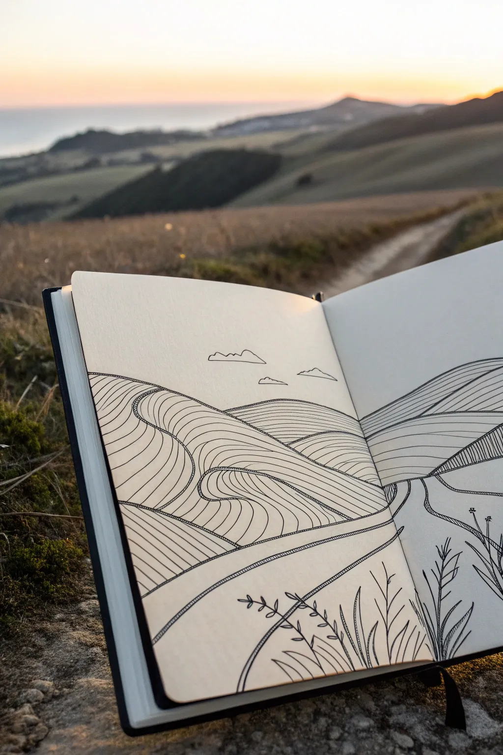
Capture the rolling rhythm of a landscape using nothing but flowing, parallel lines in this minimalist ink study. The result is a mesmerizing, topographical effect that suggests form and distance without needing shading or color.
How-To Guide
Materials
- Sketchbook (heavyweight paper preferred)
- Pencil (HB or H for light sketching)
- Eraser (kneaded or soft vinyl)
- Fine liner pen (0.3mm or 0.5mm, black)
- Fine liner pen (0.1mm for details, optional)
- Ruler (optional, if you prefer straight horizon lines)
Step 1: Laying the Foundations
-
Establish the horizon:
Begin with a light pencil sketch. Draw a faint horizon line across both pages, placing it slightly higher on the right side to create a gentle slope. Keep this line organic rather than perfectly straight. -
Map the hills:
Lightly outline the major shapes of the hills. Think of them as overlapping humps or waves. Draw a large hill dominating the left foreground and a receding range on the right page. -
Carve the path:
Sketch the winding path. Let it start wide at the bottom center of the spread and narrow significantly as it winds upward between the hills, disappearing toward the horizon line to create depth. -
Under-drawing the flow:
Very faintly pencil in directional arrows or a few guide lines on each hill. These will tell you which way your contour lines should curve—up and over the forms—later on.
Smooth Operator
Draw contour lines by moving your whole arm, not just your wrist. This creates smoother, more consistent curves that mimic rolling terrain.
Step 2: Inking the Structure
-
Outline the main shapes:
Switch to your 0.5mm fine liner. Go over your pencil outlines for the hills and the path edges with a confident, solid line. -
Define the horizon:
Ink the horizon line, but leave gaps where the path or foreground hills interrupt it. This solidifies the separation between earth and sky. -
Add distant clouds:
Draw three or four small, simple cloud shapes floating above the horizon. Keep the bottoms flat and the tops bumpy, using a broken or lighter line weight if available.
Wobbly Lines?
Don’t stress if parallel lines touch or waver! This adds organic character. Just embrace the ‘mistake’ and keep the next line parallel to the wobble.
Step 3: Creating Texture with Contours
-
Start the left hill:
Begin filling the large hill on the left. Draw long, continuous lines that follow the curve of the hill’s top edge. Space them evenly, about 2-3mm apart. -
Curving the lines:
As your lines approach the path, curve them downward abruptly. This hook shape mimics the way a hill slopes down into a valley or road. -
Fill the right slopes:
Move to the right page. Fill the hills with similar parallel lines, but angle them slightly differently than the left side to distinguish the separate landmasses. -
Varying direction:
For hills that appear further back, make your lines distinct. If the foreground lines are horizontal, try slightly diagonal lines for the background hills to separate the planes. -
Drawing the path surface:
Inside the path outlines, draw lines that run parallel to the road’s edges. This reinforces the direction of travel and makes the path look like a distinct surface.
Step 4: Foreground Details and refining
-
Sketch foreground flora:
In the bottom right corner, sketch a few simple stalks of grass or wheat. Keep the leaves long and pointed. -
Ink the plants:
Go over the plant sketches with your pen. I find that using quick, upward flicks of the wrist keeps the grass looking sharp and natural. -
Double-line detail:
Add a second line very close to the stems and leaves of the foreground plants to give them a tiny bit of volume without coloring them in. -
Clean up:
Wait at least five minutes for the ink to dry completely. Gently erase all visible pencil marks, being careful not to buckle the paper. -
Final assessment:
Look for any large gaps in your contour pattern. If a hill looks too empty, add an intermediate line between existing ones to tighten the texture.
Now you have a serene, topographical landscape that leads the viewer’s eye right into the distance.


Have a question or want to share your own experience? I'd love to hear from you in the comments below!