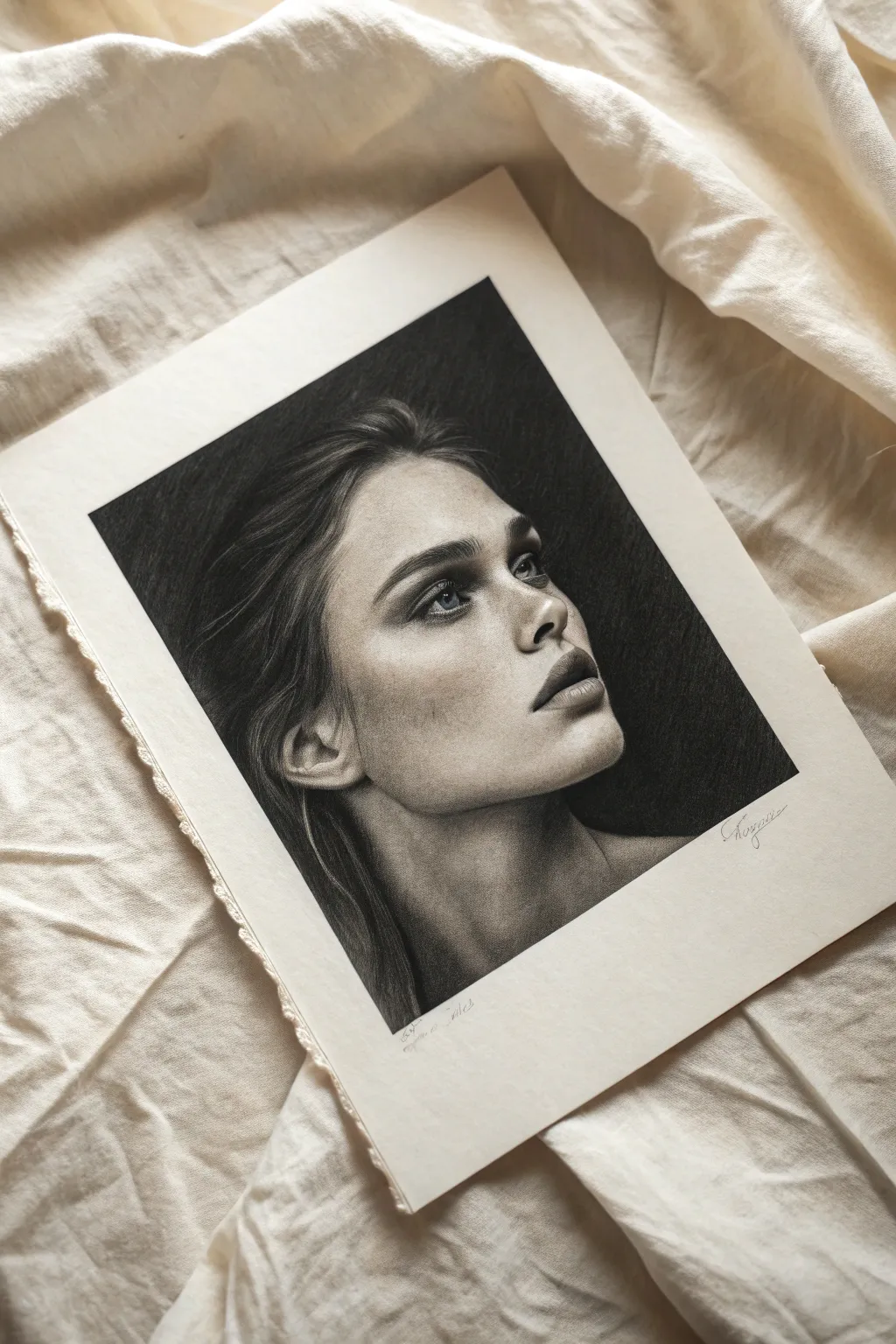
When I’m drawing a portrait, the background is where the whole vibe clicks into place—it can make the face feel brighter, moodier, softer, or more dramatic in seconds. Here are my go-to portrait drawing background ideas to fill that negative space in a way that supports your subject instead of competing with it.
Simple Midtone Backdrop
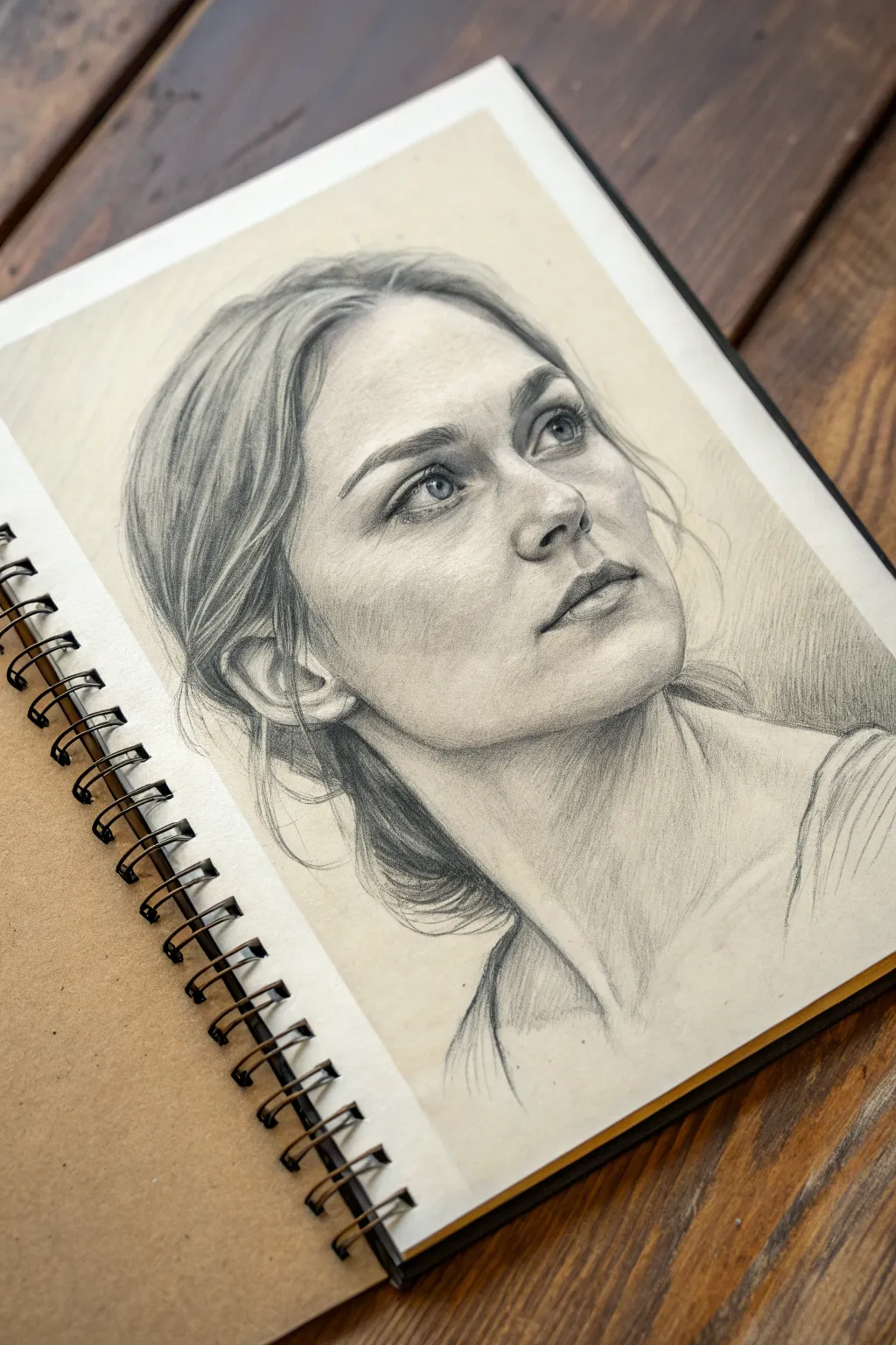
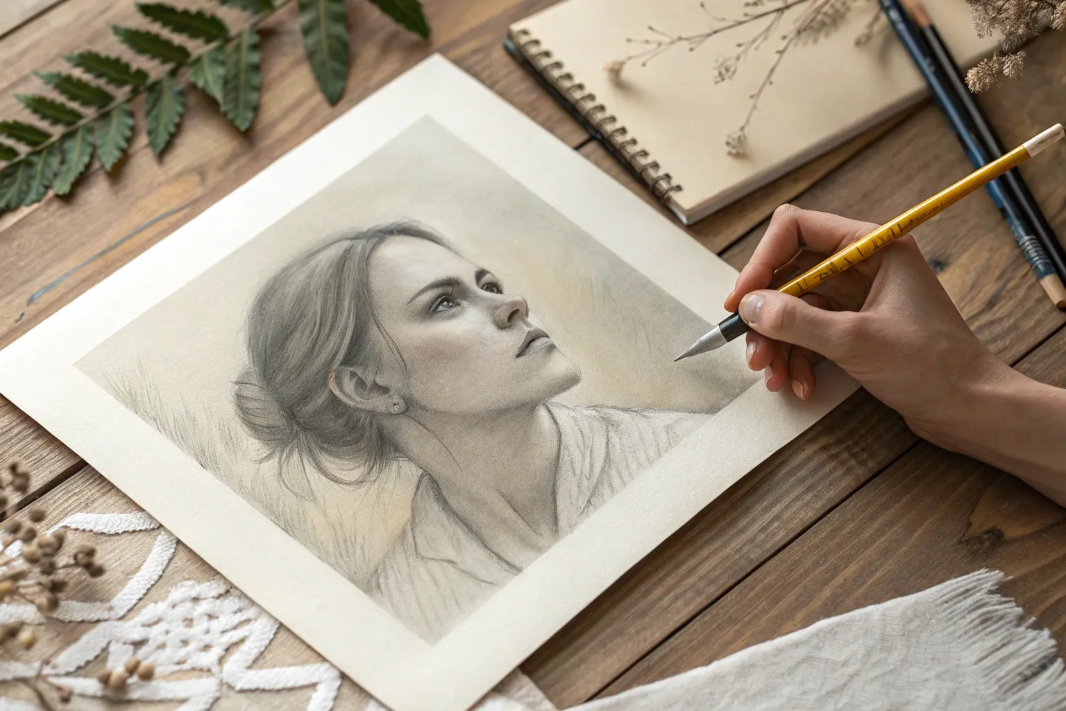
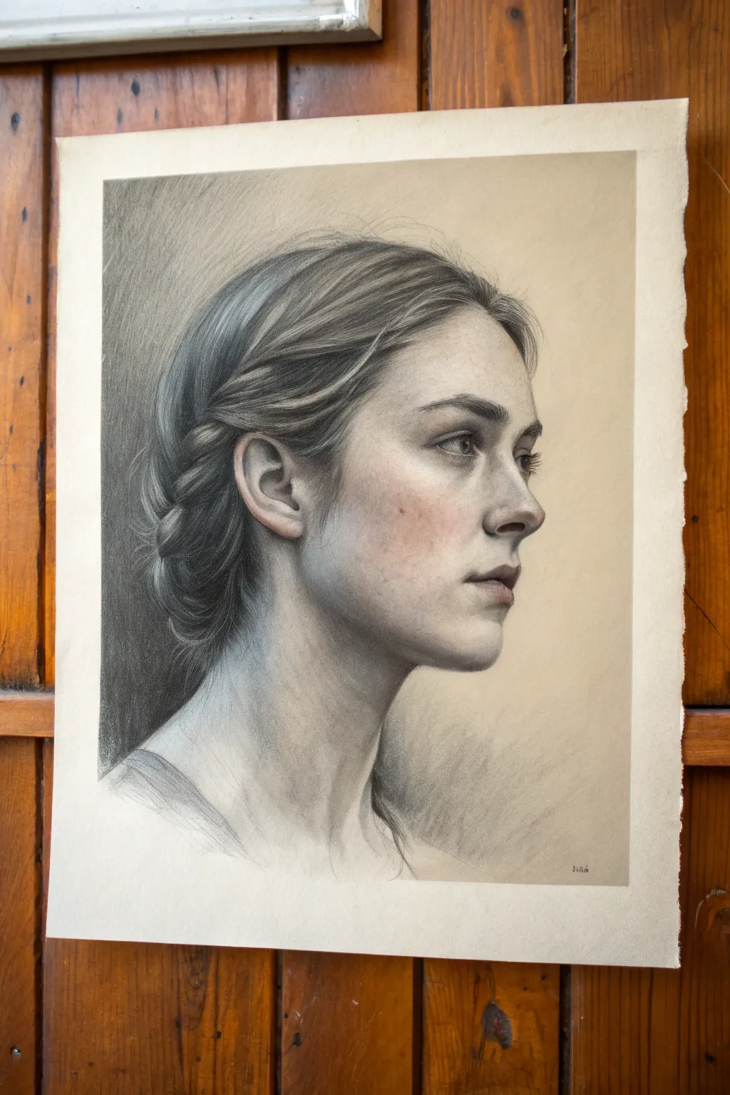
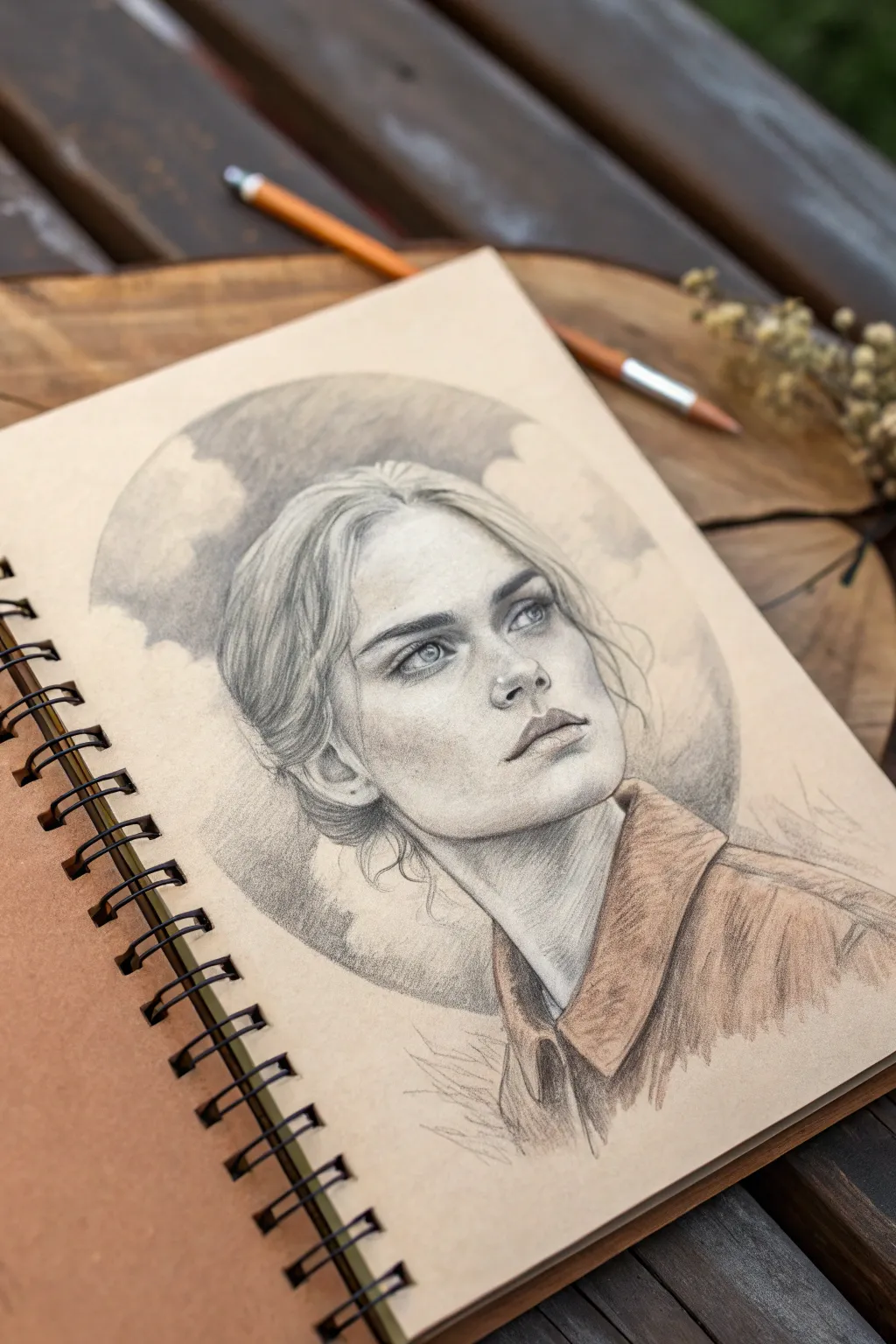
This project focuses on capturing a realistic female portrait with emphasis on soft shading and a subtle midtone background. The technique creates a sense of depth and atmosphere, making the subject pop from the page without needing complex scenery.
Step-by-Step Guide
Materials
- Spiral-bound sketchbook (heavyweight drawing paper)
- Graphite pencils (HB, 2B, 4B, 6B)
- Mechanical pencil (0.5mm, HB) for fine details
- Kneaded eraser
- Blending stump or tortillon
- Tissue or soft cloth
- Fixative spray (optional)
Step 1: Structural Layout
-
Map the proportions:
Begin with a light HB pencil to establish the basic oval of the head and the angle of the neck. Draw a vertical centerline that curves with the form of the face, noting that the subject is looking up and to the right. -
Place facial features:
Mark horizontal guidelines for the eyes, nose, and mouth. Position the eyes slightly higher than the center of the oval due to the upward viewing angle. Sketch basic geometric shapes for the nose and lips. -
Define the contour:
Refine the jawline, chin, and ear placement. Keep your lines loose and sketchy at this stage; exact precision isn’t necessary yet, but getting the tilt of the head correct is crucial. -
Mock up the hair:
Sketch the general mass of the hair, focusing on the sweep of the strands away from the face and the bun at the nape of the neck. Don’t draw individual hairs yet, just large shapes.
Fixing Smudges
If your hand smudges the graphite on the cheek, gently tap it with a clean kneaded eraser. Avoid rubbing, which grinds the dirt into the paper fibers.
Step 2: Shading and Form
-
Establish the midtone background:
Using the side of a 2B pencil or graphite powder, create a soft, gray wash across the background area. Use a tissue to rub this graphite into the paper, creating the ‘midtone backdrop’ that frames the face. -
Core shadows on the face:
Switch to a 2B pencil and lightly shade the shadow side of the face (the left side in this reference). Focus on the eye sockets, the shadow under the nose, and beneath the bottom lip. -
Deepen the eyes:
Sharpen your 4B pencil to add contrast to the pupils and lash line. Leave tiny white spaces for the catchlights in the eyes, which brings them to life instantly. -
Sculpt the nose:
Shade the underside and side of the nose. Avoid hard outlines; instead, let the shadow define the edge of the nose against the lighter cheek. -
Render the lips:
Use vertical hatching strokes for the lips to mimic texture. The upper lip should be generally darker than the lower lip. Add a darker accent at the corners of the mouth.
Adding Atmosphere
Use a ruler and eraser to slice clean lines through your background shading. This creates a stylized ‘ray of light’ effect behind the portrait.
Step 3: Texturing and Refining
-
Detail the hair direction:
With a sharp HB or mechanical pencil, draw long, flowing strokes following the direction of hair growth. Press harder in the shadowed areas near the roots and behind the ear. -
Darken hair shadows:
Take your 6B pencil into the deepest recesses of the hair—specifically the twist at the back and the area right behind the ear—to create volume and contrast. -
Smooth the skin tones:
Use a stump to gently blend the facial shading. I like to keep the blending subtle, preserving some pencil texture so the drawing doesn’t look plastic. -
Lift highlights:
Use your kneaded eraser to tap and lift graphite from high points: the bridge of the nose, the forehead, the cheekbone, and the top of the chin. -
Define the neck and collarbone:
Add shading to the neck muscles (sternocleidomastoid) that are stretched due to the head turn. Sketch the hint of clothing or shoulder straps loosely to keep focus on the face. -
Refine the midtone backdrop:
Return to the background. Darken the graphite tone slightly where it meets the light side of the face. This specific contrast makes the lit profile stand out brilliantly against the gray. -
Final touches:
Review the entire drawing for contrast balance. Deepen the pupil blacks if they have faded and reinforce the outer edge of the eyelashes.
Now you have a striking portrait where simple background values do the heavy lifting
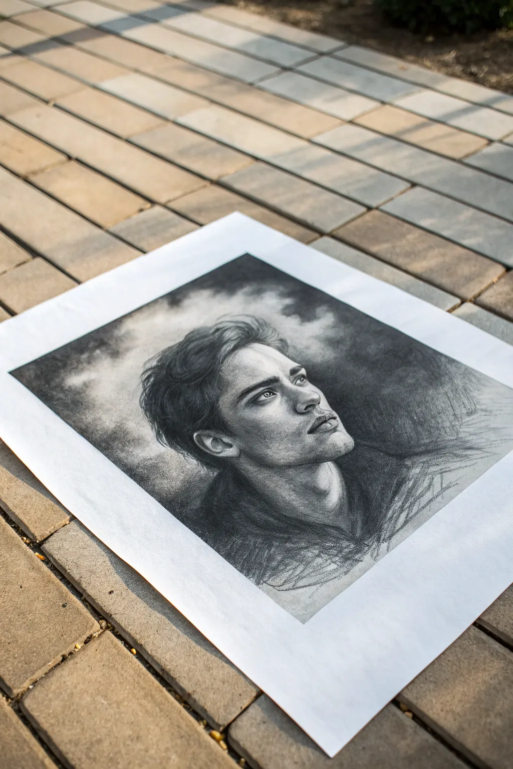
Soft Value Gradient
This elegant drawing technique combines the precision of graphite with the atmospheric depth of charcoal on warm-toned paper. By building a soft gradient background that melts away from the subject, you create a timeless, ethereal look that emphasizes the profile’s delicate features.
Step-by-Step Tutorial
Materials
- Warm gray or oatmeal toned drawing paper (heavyweight)
- Graphite pencils (HB, 2B, 4B)
- Charcoal pencils (soft and medium)
- White pastel pencil or white charcoal
- Kneaded eraser
- Tombow Mono Zero eraser (small detail eraser)
- Blending stump (tortillon)
- Soft tissue or chamois cloth
- Soft brush (for sweeping away dust)
Step 1: Structural Foundation
-
Gesture and placement:
Begin by lightly marking the top, bottom, and side boundaries of the head to ensure the composition fits comfortably on the page. Use an HB pencil with very light pressure to sketch the sweeping gesture line of the neck and the tilt of the head. -
Profile scaffolding:
Map out the major landmarks of the face—the brow ridge, the tip of the nose, the lips, and the chin. Keep these lines geometric and angular at first, focusing on the correct proportions and angles relative to the ear placement. -
Refining the contour:
Once the proportions feel correct, curved lines can replace the angular scaffold. Carefully detailed the eye shape, the nostril wing, and the complex curves of the ear. Draw the hairline and the general mass of the braid, but don’t draw individual hairs yet.
Muddy Highlights?
Never layer white pastel directly over heavy graphite; it turns gray and muddy. Apply white only to clean paper or very lightly shaded areas for a crisp glow.
Step 2: Establishing Values and Background
-
Background gradient initialization:
Before fully shading the face, establish the dark background behind the head. Using a soft charcoal pencil or broad graphite stick, apply a dense layer of tone on the left side, right up against the back of the hair and neck. -
Softening the atmosphere:
Use a chamois or heavy tissue to blend this dark patch outward towards the right. I like to rub in a circular motion to push the pigment into the paper tooth, letting the value fade naturally into the tan paper tone before it reaches the face profile. -
Core shadows on the face:
Switch to a 2B graphite pencil to map the core shadows on the skin. Focus on the shadow under the jawline, the eye socket, and beneath the nose. Keep the pressure light; rely on layering rather than hard pressing. -
Mid-tones and transitions:
Using the side of the pencil lead, fill in the mid-tones on the cheek and neck. Use a clean blending stump to smooth these graphite layers, creating that soft, skin-like texture seen in the reference.
Step 3: Detailed Rendering
-
Defining the features:
Sharpen your 4B pencil or charcoal for the darkest accents: the pupil, the lash line, and the nostril. Contrast is key here to make the features pop against the softer skin tones. -
Rendering the lips:
shade the upper lip slightly darker than the lower lip. Use vertical, curved hatching strokes to mimic the texture of lip skin, softening the edges with a stump so they don’t look like outlines. -
Hair massing:
Treat the hair as large ribbons of form rather than single strands. Shade the darkest recesses of the braid and the area behind the ear first, establishing volume. -
Hair texture:
With a sharp HB pencil, draw long, flowing strokes over the hair masses to suggest individual strands. Ensure these strokes follow the direction of growth, curving around the head. -
The glow effect:
This is a crucial step for this style. Use a white pastel pencil or white charcoal to add highlights. Apply this to the bridge of the nose, the top of the cheekbone, the bow of the lip, and the forehead. -
Blending the highlights:
Gently smudge the white pastel into the surrounding tan paper tone. This mixing creates a luminous, creamy skin tone that graphite alone cannot achieve on toned paper.
Pro Tip: Hand Guard
Place a scrap sheet of glassine or smooth paper under your drawing hand. This prevents your palm from smudging the delicate background gradient you just created.
Step 4: Final Atmosphere
-
Refining the silhouette:
Revisit the boundary between the back of the neck/hair and the background. Darken the negative space further if needed to ensure the profile feels pulled forward. -
Flyaway hairs:
Using a very sharp pencil, add loose, stray hairs escaping the braid and at the hairline. Some should cross into the dark background, and some white pencil strokes should cross onto the forehead. -
Subtle textures:
Add tiny details like freckles or skin texture using the point of a hard pencil (H or HB). Tap lightly rather than drawing circles. -
Edging adjustments:
Use the kneaded eraser to lift off any graphite that smudged into the ‘light’ side of the background gradient, keeping the empty space on the right clean and open.
Step back and admire how the interplay of light and shadow brings your portrait to life on the page

Bold Blackout Background
This project explores the dramatic impact of high contrast by pairing a delicate, realistic graphite portrait with an intense, solid charcoal background. The deep matte black negative space pushes the subject forward, creating a luminous, cinematic effect.
Step-by-Step
Materials
- High-quality Bristol board or hot press watercolor paper (smooth texture)
- Graphite pencils (HB, 2B, 4B)
- Compressed charcoal stick or jumbo charcoal pencil (soft/extra dark)
- Mechanical pencil (0.5mm 2B) for fine details
- Kneaded eraser
- Tombow Mono Zero eraser
- Blending stumps (tortillons)
- Soft makeup brush or drafting brush
- Workable fixative spray
- Masking tape
Step 1: Planning and Underdrawing
-
Prepare the paper:
Begin by taping down your paper to a rigid board. This prevents buckling and creates a crisp white border around the finished piece, which adds a professional frame. -
Establish the outline:
Using a sharp HB pencil, lightly sketch the contour of the face. Focus on capturing the upward tilt of the head and the specific angle of the jawline. -
Map facial features:
Lightly block in the eyes, nose, and lips. Pay close attention to proportions; since the face is angled, the far eye should be slightly foreshortened. -
Define the hairline:
Sketch the flow of the hair, noting where strands will eventually merge into the dark background and where light hits the crown.
Keep it Clean
Place a scrap sheet of paper under your hand while shading. Charcoal spreads instantly, and this shield protects the delicate skin tones from smudges.
Step 2: Shading the Portrait
-
Lay the tonal foundation:
Start shading the skin with an HB pencil using small circular motions. Keep this layer light and smooth to establish the mid-tones on the cheeks and forehead. -
Deepen the shadows:
Switch to a 2B pencil to darken the shadow underneath the chin and along the neck. This separation is crucial for making the jawline pop later. -
Refine the eyes:
Use the mechanical pencil to draw the pupil and iris. Leave a tiny white spot reserved for the catchlight, which gives life to the gaze. -
Sculpt the nose and lips:
Build up graphite layers around the nostrils and the corners of the mouth. Use a blending stump to soften the transition from shadow to highlight on the cupid’s bow. -
Texture the skin:
Gently dap portions of the shaded skin with a kneaded eraser to lift barely-there highlights, simulating skin texture on the cheekbones and nose bridge. -
Render the hair base:
Draw long, flowing strokes for the hair using a 2B or 4B pencil. Don’t worry about individual strands yet; focus on the main clumps and waves.
Step 3: The Blackout Background
-
Outline the boundary:
Carefully trace the final outer edge of your subject with a darker pencil. This serves as a barrier so your background medium doesn’t accidentally smudge onto the skin. -
Apply the first charcoal layer:
Using the compressed charcoal stick, begin filling in the background. Start away from the subject’s edge and work inward. Apply firm pressure to get a deep, solid tone. -
Refine the edges:
Switch to a sharp charcoal pencil to fill the tight spaces right up against the hair and neck. This edge needs to be crisp but organic. -
Blend the darkness:
I usually take a soft tissue or a large blending stump to rub the charcoal into the paper tooth. This removes white speckles and creates that velvety, endless void effect. -
Second pass for depth:
Apply a second layer of charcoal over the background if needed. Any unevenness will distract from the portrait, so aim for a flat, matte finish.
Add Drama
Instead of a messy hair transition, create a ‘lost edge’ where the shadow side of the hair completely disappears into the black background for mystery.
Step 4: Final Integration
-
Soften hair transitions:
Use a sharp graphite pencil to draw flyaway hairs that cross from the dark background back onto the light skin, or vice-versa. This integrates the subject into the space. -
Push the contrast:
Revisit the darkest shadows on the face (nostrils, eyelashes, neck shadow) with a 4B pencil to ensure they balance against the intense black background. -
Final highlights:
Use the Tombow Mono Zero eraser to cut sharp, final highlights into the hair and the wet line of the eyes. -
Clean and seal:
Dust off any loose charcoal particles with a soft brush. Once satisfied, mist the drawing with workable fixative to prevent the dark background from smudging.
Peeling off the tape reveals a stunning, gallery-worthy piece where the light seems to emerge directly from the darkness
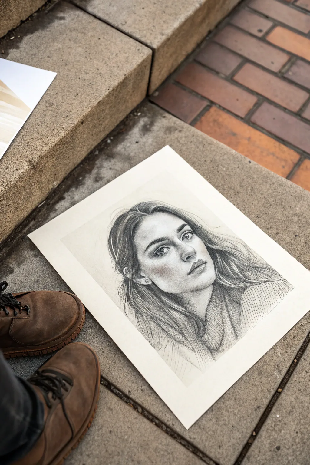
Smudged Graphite Haze
Capture the mood of a contemplative moment using graphite and warm colored pencil on toned tan paper. This project combines precise portraiture with an atmospheric, circular background that frames the subject in a dreamlike haze.
Step-by-Step Tutorial
Materials
- Toned tan sketchbook paper (spiral bound)
- Graphite pencils (HB, 2B, 4B)
- White charcoal or pastel pencil (for highlights)
- Sepia or terracotta colored pencil (for clothing)
- Blending stump or tortillon
- Paper tissue or chamois cloth
- Kneaded eraser
- Circular stencil or compass (optional)
Step 1: Laying the Foundation
-
Define the Composition:
Begin by lightly sketching a large circle in the center of your page to serve as the background boundary. Place the head and shoulders within this circle, letting the shoulders extend slightly beyond the bottom edge for a dynamic look. -
Map Facial Features:
Using an HB pencil with a very light hand, outline the oval of the face. Mark horizontal guidelines for the eyes, nose, and mouth. The subject is looking up and to the right, so angle your features accordingly. -
Refine the Sketch:
Draw the almond shapes of the eyes, the bridge of the nose, and the curve of the lips. Keep lines faint so they can be easily corrected. Sketch the flowing hair, focusing on the big shapes of the locks rather than individual strands.
Step 2: Creating the Graphite Haze
-
Shade the Background:
Take a 4B pencil and shade loosely within the circular boundary behind the head. Vary your pressure to create dark patches and lighter areas. -
Smudge for Atmosphere:
Wrap a piece of tissue around your finger or use a chamois cloth to rub the graphite vigorously. This creates the soft, cloud-like texture characteristic of the ‘Graphite Haze’ style. -
Clean the Edges:
Use your kneaded eraser to clean up the outer edge of the circle, making it crisp. You can also lift out some graphite inside the circle to create ‘clouds’ or lighter airy patches.
Clean Edges
Place a piece of scrap paper under your hand while drawing. This prevents your palm from smearing the graphite haze or transferring oils to the portrait area.
Step 3: Developing the Portrait
-
Shade the Skin:
Switch to a 2B pencil to shade the face. Focus on the shadows around the eye sockets, under the nose, and beneath the jawline. The toned paper acts as your mid-tone, so you only need to add shadows. -
Detail the Eyes:
Sharpen your 4B pencil to a fine point. Darken the pupils and the upper lash line. Leave tiny spots of the paper bare for the catchlights in the eyes to bring them to life. -
Sculpt the Nose and Lips:
Softly shade the side of the nose. For the lips, darken the corners and the line where the lips meet, but keep the shading on the lips themselves soft and subtle. -
Define the Hair:
Use long, flowing strokes with an HB pencil to follow the direction of the hair growth. Darken the areas near the roots and behind the ears to create depth. -
Add Highlights:
Here I like to take a white charcoal pencil and add touches of light to the bridge of the nose, the forehead, and the highest points of the cheekbones. Add a few strokes to the hair for shine.
Texture Play
Try using rougher sandpaper to sharpen your graphite lead directly onto the background area. The falling dust creates a unique, speckled texture when rubbed in.
Step 4: Adding Contrast and Color
-
Introduce Sepia Tones:
Use a warm sepia or terracotta colored pencil to shade the collar and shirt. Apply the pencil with directional strokes that mimic the texture of fabric. -
Deepen Clothing Shadows:
Layer a 4B graphite pencil lightly over the darkest folds of the shirt to desaturate the color and create deep, realistic shadows within the fabric. -
Enhance Outlines:
Go back over the main contours of the face and jawline with a sharp 2B pencil. A slightly firmer outline helps separate the clear portrait from the hazy background. -
Final Blending touches:
Use a clean blending stump to soften the transition between the hair and the background haze, integrating the subject into the atmosphere. -
Final Highlights:
Add one last crisp touch of white charcoal to the tip of the nose and the lower lip to make the features pop forward.
Step back and admire how the circular frame creates a window into your subject’s world

PENCIL GUIDE
Understanding Pencil Grades from H to B
From first sketch to finished drawing — learn pencil grades, line control, and shading techniques.
Explore the Full Guide
Velvety Charcoal Smoke
Capture the moody intensity of this portrait by learning how to render a striking face against a velvety, cloud-like atmosphere. This project focuses on building deep values and soft transitions to create a dreamlike, smoky background that perfectly frames your subject.
Step-by-Step
Materials
- Heavyweight drawing paper (smooth or vellum finish)
- Vine charcoal sticks (soft)
- Compressed charcoal sticks (medium and hard)
- Charcoal pencils (2B, 4B, 6B)
- Kneaded eraser
- Blending stumps (tortillons) in various sizes
- Soft synthetic brush or makeup brush for blending
- Paper towels or tissue
- Workable fixative spray
Step 1: Laying the Foundations
-
Map the proportions:
Begin with a light sketch using a harder charcoal pencil or a light touch with vine charcoal. Focus on the tilt of the head and the upward gaze. Mark the key features: the sharp jawline, the nose bridge, and the expressive eyes. -
Establish the shadows:
Identify the primary light source coming from the upper left. lightly block in the shadow shapes under the jaw, the eye sockets, and the side of the nose using a soft vine charcoal stick. -
Refine the features:
Switch to a charcoal pencil to define the eyes and lips more clearly. Keep your lines relatively loose at this stage; we don’t want harsh outlines, but rather guides for where the dark values will sit.
Patchy Background?
If your smoke looks scratchy, you likely aren’t using enough charcoal dust. Load more material onto the paper before blending, or switch to a softer brush to push the dust into the paper tooth.
Step 2: Creating the Smoky Atmosphere
-
Apply the first background layer:
Take a soft vine charcoal stick and lay it flat against the paper. Rub it gently over the entire background area around the head, leaving some random patches lighter to suggest clouds or smoke. -
Soften the texture:
Use a soft brush or a tissue to blend the vine charcoal into the paper. Use circular motions to effectively crush the charcoal dust into the grain, creating a smooth, medium-gray base tone. -
Deepen the darks:
Using compressed charcoal for intense blackness, darken the corners of the paper and the areas directly behind the lighter side of the face. This high contrast makes the profile pop. -
Sculpt the smoke:
I like to use a clean kneaded eraser here to lift pigment away. Dab and drag the eraser through the gray background to create wispy, organic white shapes that look like rising smoke or clouds. -
Blur the edges:
Gently blend the edges of your ‘smoke’ clouds with a clean blending stump. You want soft, diffuse transitions rather than hard lines to maintain that velvety look.
Step 3: Rendering the Portrait
-
Darken the hair:
Fill in the hair mass with a mix of vine charcoal for the base and charcoal pencil for direction. Follow the flow of the hair strands, sweeping back from the forehead. -
Define the eyes:
Sharpen your 4B pencil to add details to the pupils and iris. Leave a tiny white spec of paper for the highlight in each eye to give them life and wetness. -
Contour the face:
Use a blending stump dipped in leftover charcoal dust to shade the skin. Build up the values slowly on the cheekbones and neck. Avoid drawing heavy lines; think in terms of patches of shadow. -
Detail the mouth and nose:
Add definition to the nostrils and the parting of the lips. Keep the upper lip darker than the lower lip to simulate overhead lighting. -
Connect figure to ground:
Allow the dark collar of the shirt to blend slightly into the dark areas of the smoky background. This ‘lost edge’ technique integrates the subject seamlessly into the environment. -
Refine hair texture:
Go back into the hair with a sharpened eraser to pull out flyaway strands that catch the light, adding realism to the messy style. -
Final value check:
Step back and squint at your drawing. Darken the deepest shadows in the background one last time with compressed charcoal to ensure the white of the face stands out brilliantly. -
Preserve your work:
Once fully satisfied, spray a light coat of workable fixative in a well-ventilated area to prevent the heavy charcoal from smudging.
Kneaded Eraser Hack
Warm your kneaded eraser in your hand before sculpting the smoke. A warm eraser is more pliable and lifts charcoal much cleaner than a cold, stiff one.
Frame this moody piece with a wide white mat to let the dark, velvety textures really breathe
Raw Paper Grain
Capture the delicate balance of light and texture with this realistic pencil portrait, emphasizing the interplay between smooth skin tones and detailed hair strands. The subtle raw grain of the paper adds a natural, organic finish that brings depth and character to the subject’s expression.
Step-by-Step Tutorial
Materials
- High-quality drawing paper (smooth or fine-tooth grain)
- Graphite pencils (H, HB, 2B, 4B, 6B)
- Mechanical pencil (0.5mm HB for fine details)
- Kneaded eraser
- Precision eraser (stick eraser)
- Blending stumps (tortillons)
- Tissue or chamois cloth
- Pencil sharpener or sandpaper block
Step 1: Structural Outline
-
Establish the Head Shape:
Begin with a light H pencil, sketching a basic oval for the head. Mark the center vertical axis and the horizontal eye line, positioning the face slightly angled. -
Map Facial Features:
Lightly block in the positions of the eyes, nose, and mouth. Focus on proportions rather than detail at this stage, ensuring the eyes are spaced correctly and the nose sits comfortably between them. -
Refine the Contours:
Sketch the jawline, chin, and hair outline. Pay attention to the subtle curves of the cheeks and the flow of the hair around the shoulders.
Keep it Clean
Place a scrap piece of paper under your drawing hand. This prevents natural oils and friction from smudging your work or dragging graphite across the white paper.
Step 2: Shading the Features
-
Detail the Eyes:
Using a sharp HB or 2B pencil, draw the iris and pupil. Leave a small, crisp white paper highlight in each eye to give life to the gaze. Shade the upper eyelid crease darkest. -
Build Skin Values:
With a 2B pencil held at a low angle, lay down a light base tone across the shadowed areas of the face—under the cheekbones, the side of the nose, and the jawline. -
Smooth the Skin Texture:
Use a blending stump or tissue to gently buff the graphite into the paper grain. This creates the soft, seamless look of skin, but be careful not to over-blend and lose the paper’s natural texture entirely. -
Enhance the Nose and Mouth:
Deepen the shadows around the nostrils and the corners of the lips. Use vertical strokes for lip texture, keeping the center of the lip lighter for volume. -
Add Depth with Darker Grades:
Switch to a 4B or 6B pencil to push the darkest values in the pupils, nostrils, and the deep shadow cast by the hair against the neck.
Step 3: Hair and Finishing Touches
-
Block in Hair Masses:
Look at the hair as large shapes rather than individual strands. Shade the darkest recesses first using broad strokes with a 4B pencil. -
Create Flowing Strands:
Using a mechanical pencil or a very sharp HB, draw long, sweeping lines that follow the direction of hair growth. Vying pressure creates thick and thin variations. -
Lift Highlights:
Take a kneaded eraser or a precision stick eraser and lift out bright streaks in the hair where the light hits the curves. This adds shine and dimension. -
Refine the Clothing:
Sketch the ribbed texture of the sweater using repeated, parallel hatching lines. Keep this looser than the face to direct focus back to the portrait. -
Final Contrast Check:
Step back and assess your values. Darken the deepest shadows one last time and clean up the background edges with an eraser for a pristine, professional look.
Boost the Realism
Add tiny stray hairs flying away from the main mass using a sharp H pencil. These ‘flyaways’ break the perfection and make the portrait feel more organic.
Now you have a striking portrait that balances softness with intricate detail ready to display.
BRUSH GUIDE
The Right Brush for Every Stroke
From clean lines to bold texture — master brush choice, stroke control, and essential techniques.
Explore the Full Guide
Toned Paper As Background
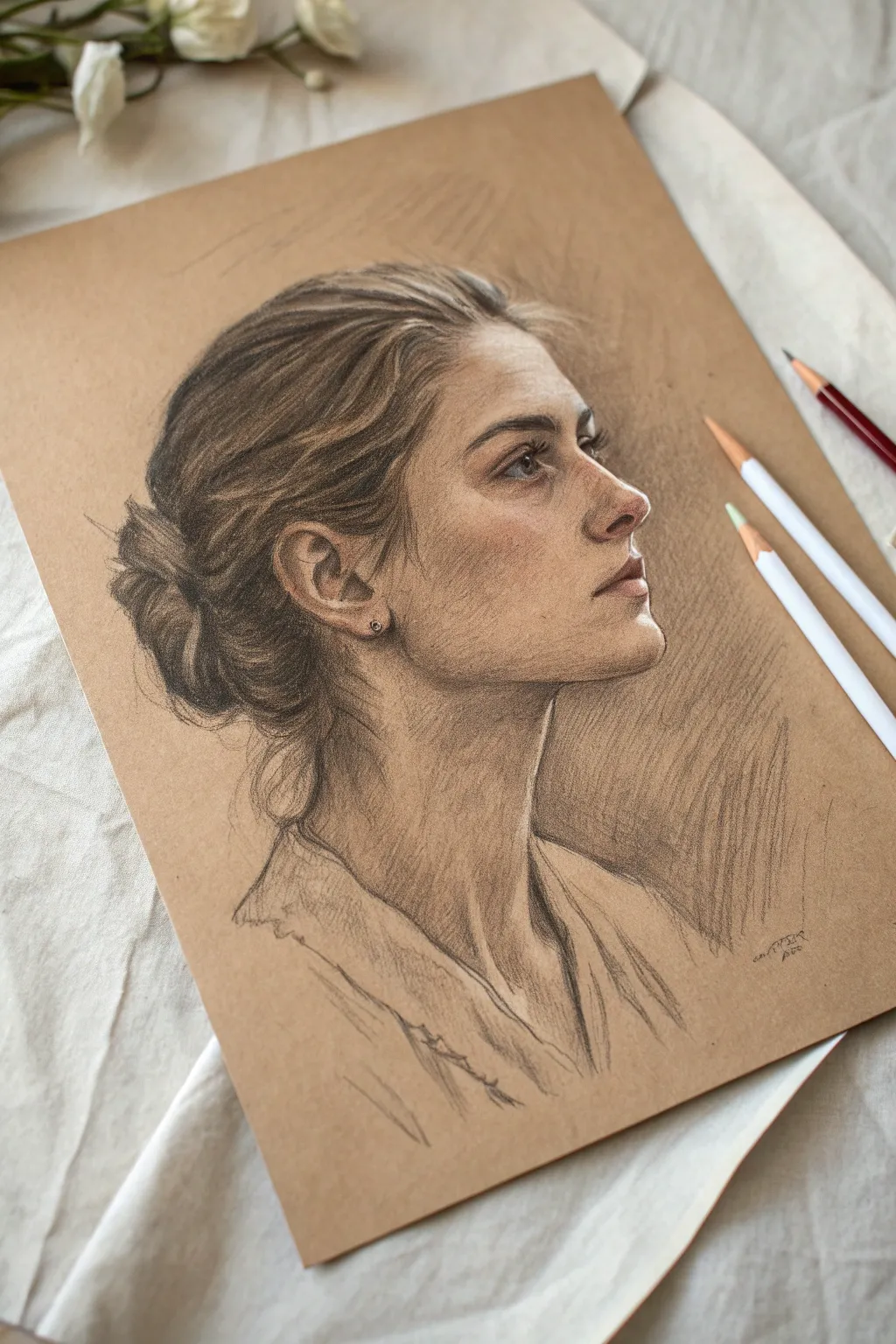
Using warm-toned paper as a mid-value creates an instant atmosphere for this striking profile portrait. By working with both dark charcoal for shadows and white charcoal for highlights, you’ll achieve a sculptural three-dimensional effect that practically pops off the page.
Detailed Instructions
Materials
- Tan or brown toned sketchbook paper (smooth or fine grain)
- Graphite pencils (HB, 2B, 4B)
- Black charcoal pencil or dark conte crayon
- White charcoal pencil or white pastel pencil
- Kneaded eraser
- Blending stump (tortillon)
- Tombow Mono Zero eraser (optional for fine hair details)
Step 1: The Foundation
-
Establish the envelope:
Begin by lightly sketching the overall shape of the head using an HB graphite pencil. Focus on the large angles of the jawline, the slope of the nose, and the mass of the hair bun. -
Map the features:
Refine the placement of the ear, eye, and nostril. Keep your lines faint so they don’t indent the paper, making adjustments until the proportions of the profile feel accurate. -
Identify shadow shapes:
Lightly outline the major shadow areas—specifically under the jaw, the hollow of the cheek, the eye socket, and the dark masses within the hair.
Step 2: Building Form and Value
-
Lay in the darks:
Switch to a 2B pencil or charcoal to block in the darkest values. Focus on the pupil, the nostril, the corner of the mouth, and the deepest crevices of the hair bun. -
Develop facial planes:
Using hatch marks, shade the side of the face. Unlike white paper, here you leave the tan paper bare to represent the mid-tones of the skin. -
Soft blending:
Use a stump or your finger to gently soften the graphite on the cheek and neck, creating a smooth skin texture while keeping edges sharp around the nose and lips. -
Deepen the contrast:
Go back in with a 4B pencil or black charcoal to punch up the darkest shadows behind the ear and at the nape of the neck to anchor the head.
Muddy Highlights?
If your white charcoal turns gray, it’s mixing with the graphite. Spray a workable fixative over the drawing before adding whites to keep layers separate.
Step 3: Hair and Texture
-
Flowing strands:
Draw the hair using long, sweeping strokes that follow the direction of growth. Don’t draw every hair; instead, group them into locks and ribbons of value. -
The bun detail:
Create the messy texture of the bun by using short, curved strokes. Add some loose ‘flyaway’ hairs at the nape of the neck and near the forehead for realism. -
Neck and clothing:
Sketch the suggestion of a collar or neckline with loose, gesture-like strokes. Keep this area less detailed than the face to ensure focus remains on the profile.
Paper Power
Let the paper do the work! Leave about 40% of the toned paper untouched. This automatic mid-tone saves time and unifies the color palette instantly.
Step 4: Highlights and Refinement
-
First light application:
Take your white charcoal pencil and identify the highest points of the face: the bridge of the nose, the brow bone, the top of the cheekbone, and the chin. -
Adding brilliance:
Apply the white pigment firmly in these areas. I find precise placement here is better than blending, which can sometimes make the white look muddy against the gray graphite. -
Eye highlights:
Add a small, sharp dot of white in the eye to bring it to life, and a touch on the moist lower lip. -
Hair luminance:
Streak white charcoal through the lighter areas of the hair to simulate shine, following the same directional curves as your dark strokes. -
Background atmosphere:
Using the side of a graphite pencil or charcoal stick, add broad, hatched shading behind the profile (on the right side). This pushes the light face forward. -
Final touches:
Review the drawing for balance. If the white highlights have faded, re-apply them. Use a kneaded eraser to lift out any graphite that smudged into the light areas.
Step back and admire how the warm paper tone brings an immediate life and glow to your subject
Loose Crosshatch Texture
This elegant graphite study combines a refined, classical profile with a loose, atmospheric background. The textured crosshatching surrounding the subject creates visual interest and depth without distracting from the delicate features of the face.
Step-by-Step
Materials
- Smooth bristol or drawing paper (heavyweight)
- H or HB graphite pencil (for initial layout)
- 2B and 4B graphite pencils (for shading)
- Kneaded eraser
- Pencil sharpener or craft knife
- Drafting tape (optional)
Step 1: Planning and Structure
-
Establish the envelope:
Begin with your H pencil, holding it loosely further back on the barrel. Lightly sketch the ‘envelope’ or general shape of the head, ensuring there is ample negative space around the figure for your future background work. -
Map key landmarks:
Draw faint vertical and horizontal guidelines to place the eyebrow ridge, the base of the nose, and the bottom of the chin. Measure the proportions carefully, as a profile view is unforgiving if the ear is placed too far forward or back. -
Refine the contour:
Using light, sweeping strokes, define the jawline, the curve of the neck, and the slope of the shoulders. Keep these lines understated; they are merely the scaffolding for later shading.
Step 2: Rendering the Features
-
Detail the eye:
Switch to a sharpened HB pencil. Define the upper eyelid and the iris, leaving a tiny spot of white paper for the catchlight. Shade the pupil dark, but keep the edges relatively soft. -
Sculpt the nose and mouth:
Work downward to the nose. Instead of drawing a hard outline, use small patches of shadow to suggest the nostril wing and the tip. For the lips, focus on the shadow beneath the lower lip and the corners of the mouth. -
Block in the hair:
Treat the hair as large masses rather than individual strands. Use broad strokes to follow the direction of growth, sweeping back from the forehead into a low bun. -
Add core shadows:
With a 2B pencil, lay down the core shadows on the cheek, neck, and beneath the jaw. I like to keep my pencil strokes directional here, following the curvature of the form to enhance volume.
Keep it Sharp
For the finest crosshatching lines, rotate your pencil slightly every few strokes. This keeps the lead point sharp and prevents the lines from becoming thick and fuzzy.
Step 3: Creating the Background
-
Start the hatching:
This project’s signature look comes from the background. Using an HB or 2B pencil, begin creating diagonal hatch marks starting near the back of the head and shoulders, working outward. -
Vary stroke length:
Keep your wrist loose. Make the strokes closest to the figure slightly denser and darker, and let them become longer, lighter, and more spaced out as they move toward the page edge. -
Cross the direction:
Turn your paper slightly if needed. Apply a second layer of hatching lines at a roughly 45-degree angle to the first set. This loose crosshatching creates a woven texture that isn’t solid black but suggests gray atmosphere. -
Fade the edges:
Allow the background hatching to fade out naturally into the white of the paper. This vignette effect draws the viewer’s eye straight to the portrait center.
Tinted Paper
Try this same technique on toned tan or gray paper. You can then use a white charcoal pencil to add bright highlights to the nose, cheek, and forehead for a dynamic 3D effect.
Step 4: Final Definition
-
Deepen darks:
Take your 4B pencil and re-establish the darkest points: the pupil, the depth of the nostril, the corner of the mouth, and the deepest crevices of the hair. -
Refine hair texture:
Add a few sharp, darker lines within the hair masses to suggest individual strands catching the shadow, specifically where the hair pulls back into the bun. -
Clean up edges:
Where the face meets the background, use your kneaded eraser to tap away any accidental smudges on the skin, ensuring the profile silhouette remains crisp against the hatching. -
Soften transitions:
Use the clean side of the eraser or a very light touch with an H pencil to smooth out any jarring transitions on the cheekbone or neck, blending them into the mid-tones.
Step back and admire how the loose, energetic background contrasts beautifully with the serene expression of your subject


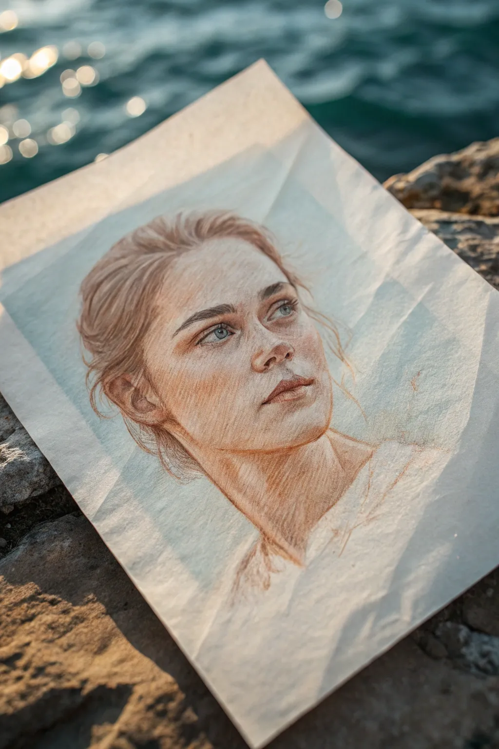
Soft Color Wash
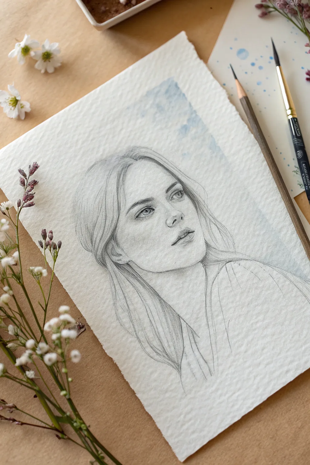
This project combines the precision of graphite pencil with the softness of a watercolor wash to create a dreamy, atmospheric portrait. The subtle blue background elevates a standard sketch into a finished piece of mixed-media art that feels both classic and contemporary.
Detailed Instructions
Materials
- Cold-press watercolor paper (300 gsm)
- Graphite pencils (HB, 2B, 4B)
- Watercolor paint (Cerulean Blue or Cobalt Blue)
- Soft round watercolor brush (size 8 or 10)
- Kneaded eraser
- Paper towel
- Water container
- Drafting tape or masking tape
Step 1: Preparation and Initial Sketch
-
Paper selection:
Begin by selecting a high-quality sheet of cold-press watercolor paper. The textured surface is crucial for achieving the grainy interaction between the pencil graphite and the paper tooth. -
Creating the outline:
Using an HB pencil with a very light hand, map out the general proportions of the face. Focus on placing the eyes, nose, and mouth correctly before committing to details, keeping your lines faint enough to erase easily. -
Refining features:
Once the placement is accurate, gently refine the outline of the facial features. Pay special attention to the upward gaze of the eyes and the tilt of the head, which give this portrait its contemplative feel.
Keep It Clean
Place a piece of clean scrap paper under your drawing hand. This prevents natural skin oils from smudging your graphite work or dirtying the pristine white paper.
Step 2: Applying the Background Wash
-
Mixing the wash:
Dilute a small amount of blue watercolor paint with plenty of water. You want a very transparent, ‘tea-strength’ consistency rather than a saturated color. -
Testing the color:
Before touching your drawing, test the wash on a scrap piece of the same paper to ensure it isn’t too dark. It should be a whisper of color, not a shout. -
Wetting the background:
Dip your clean brush in plain water and lightly dampen the area around the head where you want the sky-like texture to be. Avoid getting water inside the face outline. -
Dropping in color:
While the paper is still damp, gently touch your loaded brush to the wet areas. Let the pigment bloom and spread naturally rather than painting stiff strokes. -
Feathering edges:
Use a clean, damp brush to soften the outer edges of the blue wash so it fades into the white of the paper rather than leaving a hard line. -
The crucial pause:
Stop and let the paper dry completely. Touching the damp paper with a pencil later will result in dark, unremovable gouges, so patience is key here.
Level Up: Salt Texture
While the blue watercolor wash is still wet, sprinkle a tiny pinch of table salt into it. As it dries, the salt pushes pigment away, creating a stunning, starry texture.
Step 3: Shading and Definition
-
Establishing the eyes:
Switch to a 2B pencil to darken the pupils and lash line. The eyes are the focal point, so keep your pencil sharp for crisp details in the iris. -
Soft facial shading:
Using the side of your HB pencil, lightly shade the shadow areas of the face—mostly under the chin, beneath the nose, and the side of the cheek. Let the texture of the paper do the work for you. -
Building contrast:
Gradually deepen the darkest shadows (nostrils, corners of the mouth) with a 4B pencil. I find that layering graphite slowly builds a more realistic skin tone than pressing hard all at once. -
Highlight management:
Use a kneaded eraser to lift pigment away from the high points of the face, specifically the tip of the nose, the forehead, and the highlights in the eyes.
Step 4: Hair and Final Touches
-
Flowing hair lines:
Sketch the hair using long, sweeping strokes that follow the direction of growth. Don’t draw every single strand; instead, group them into locks. -
Adding volume:
Darken the areas where the hair tucks behind the ear or falls into shadow against the neck to create a sense of volume and depth. -
Integration:
Where the hair meets the blue wash, allow some pencil lines to overlap the dry watercolor slightly. This integrates the subject with the background so she doesn’t look like a cutout sticker. -
The deckled edge:
If you want the rustic look shown in the example, tear the edges of your paper against a ruler edge instead of cutting them with scissors.
Step back and admire how the cool blue tones make the warmth of the graphite portrait truly shine
Cool Complement Background
This project captures the delicate interplay of warm sunlight and cool shadows in a realistic colored pencil portrait. The finished piece features visible, expressive pencil strokes on textured paper, creating a lively and organic feel perfect for an outdoor setting.
Step-by-Step Guide
Materials
- Heavyweight textured drawing paper (white or off-white, at least 180gsm)
- Artist-grade colored pencils (warm browns, terracotta, ochre, peach, cream, slate blue, indigo)
- Granite or HB graphite pencil for initial sketch
- Kneaded eraser
- Pencil sharpener
- Drawing board or hard surface
Step 1: Initial Sketching
-
Outline the head shape:
Begin with a light graphite pencil to block in the basic oval shape of the head. Keep your lines incredibly faint so they won’t show through the lighter colored pencil layers later. -
Place the features:
Mark the guidelines for the eyes, nose, and mouth. The subject is looking up and away, so ensure the eye line curves slightly upward and the features are angled in three-quarter view. -
Refine the line art:
Carefully draw the specific shapes of the eyelids, the nostrils, and the lips. Pay special attention to the hair’s volume, sketching the general flow of the strands rather than individual hairs. -
Lift excess graphite:
Roll your kneaded eraser over the entire sketch. You want to lift up most of the graphite, leaving only a ghost image to guide your colored pencil work.
Step 2: Layering Skin Tones
-
Base layer shading:
Using a pale peach or cream pencil, establish the lightest areas of the face. Use broad, angled hatching strokes that follow the contours of the cheekbones and forehead. -
Define the shadows:
Switch to a light ochre or warm tan pencil. Lightly shade the side of the face away from the light source, the area under the chin, and the hollows of the eyes. Keep the pressure light to allow the paper texture to show through initially. -
Add warmth:
Introduce a terracotta or reddish-brown pencil to deepen the shadows around the eyes, nose, and jawline. This warmth suggests the sunkissed look of the reference. -
Build up the hatching:
Instead of blending smoothly, deliberately use diagonal cross-hatching strokes. This visible texture gives the drawing its characteristic energetic, sketchy quality.
Muddy colors?
If skin tones look dirty, you may be pressing too hard too soon. Light layers preserve luminosity. Use an eraser to lift heavy pigment.
Step 3: Facial Features
-
Detail the eyes:
Use slate blue and a touch of indigo for the irises, leaving a small spot of white paper for the catchlight. Define the lash line with a sharp dark brown pencil, not black, to keep the look soft. -
Sculpt the nose:
Use your warm brown tones to shade the underside of the nose. Avoid outlining the nose bridge; instead, let the shadow on the side define its shape. -
Shape the lips:
Fill in the lips with a muted rose or brick red. Make the upper lip slightly darker than the lower lip. Use firm pressure on the line between the lips for definition. -
Deepen facial contrast:
Go back over the darkest areas—nostrils, corners of the mouth, and creases of the eyelids—with a dark umber pencil to make the features pop.
Level Up: Cool Shadows
Lightly glaze pale blue over the deepest shadow areas (like the neck) to create a complementary contrast against the warm skin tones.
Step 4: Hair and Finishing Touches
-
Base hair color:
Lay down a wash of light golden brown over the hair area. Follow the direction of hair growth with long, sweeping strokes. -
Define hair strands:
Select a darker chestnut or burnt sienna pencil. Draw distinct, flowing lines to represent clumps of hair, focusing on the shadow areas near the roots and behind the ears. -
Add loose wisps:
With a sharpened pencil, add fine flyaway hairs around the temples and neck. These loose lines add movement and realism to the portrait. -
Suggest the clothing:
Sketch the neckline and shoulders very loosely with minimal shading. The focus should remain on the face, so keep the clothing sketchy and light, letting it fade into the white of the paper. -
Final highlights:
I like to use a white colored pencil or even a tiny bit of white gouache to re-establish the brightest highlights on the nose tip and lip if they got lost during shading.
Now step back and admire how the directional strokes bring your seaside portrait to life with vibrant energy
Warm Glow Background
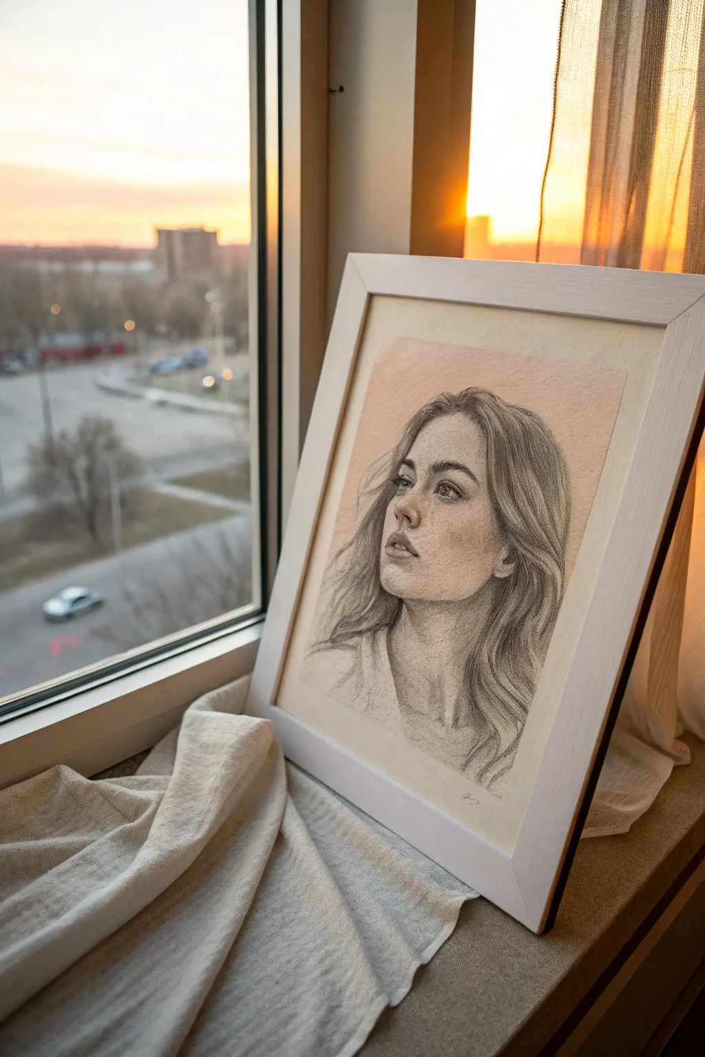
Capture the warmth of golden hour with this atmospheric portrait study. By using toned pastel paper as your base, you immediately establish a glowing middle ground, allowing both deep graphite shadows and subtle highlights to pop beautifully.
How-To Guide
Materials
- Toned pastel paper (peach, salmon, or warm tan)
- Graphite pencils (HB, 2B, 4B, 6B)
- White charcoal pencil or white pastel pencil
- Kneaded eraser
- Paper stump or blending tortillon
- Fixative spray (workable)
- Drawing board and tape
Step 1: Preparation and Blocking In
-
Prepare your surface:
Tape your toned paper securely to a drawing board. This paper provides the ‘warm glow’ inherent to the piece, so keeping the edges clean with tape creates a nice border later. -
Establish the head shape:
Using a light hand and an HB pencil, sketch a basic oval and the gesture line of the neck and shoulders. Keep the lines faint so they don’t groove the paper. -
Map the features:
Draw the central axis lines for the eyes, nose, and mouth. Observe the three-quarter angle of the reference; the far eye will be slightly foreshortened and tucked deeper into the socket.
Step 2: Developing the Structure
-
Refine the contour:
Strengthen the jawline and the slope of the nose with a sharper 2B pencil. Pay close attention to the tilt of the head, which gives the subject that contemplative look. -
Add separation lines:
Lightly mark the separation of the lips and the upper eyelid creases. Avoid hard outlines; think of these as the boundaries where shadows begin. -
Block in hair masses:
Instead of drawing individual strands, outline the major shapes of the hair as it flows around the face and shoulders. Note where the hair lifts off the scalp to creating volume.
Muddy Skin Tones?
If shadows look dirty, you’ve likely over-blended graphite with the peach paper. Use a clean kneaded eraser to dab (not rub) the area back to the original paper tone, then re-apply shadows lightly.
Step 3: Shading and Depth
-
Lay down base shadows:
Switch to a 4B pencil. Lightly shade the darker areas: under the chin, the side of the nose, and the deepest recesses of the hair. Use the side of the lead for a softer application. -
Blend the skin tones:
Use a paper stump or your finger to gently smudge the graphite on the face. This creates a smooth skin texture. Let the peach paper show through for the mid-tones—this is crucial for that warm effect. -
Define the eyes:
Sharpen a 4B or 6B pencil to a fine point. Draw the pupils and the upper lash line darker than anything else on the face. Keep the iris slightly lighter to show transparency. -
Cultivate the lips:
Shade the upper lip slightly darker than the lower lip. Use vertical, curved hatching strokes to mimic the texture of the lip surface.
Enhance the Glow
For a dramatic sunset effect, gently rub a tiny amount of sanguine or terracotta pastel dust into the background area near the face before fixing. It amplifies the warm paper tone.
Step 4: Hair and Textures
-
Darken hair roots:
Use your 6B pencil to deepen the roots and the areas where hair tucks behind the ears. This contrast makes the face come forward. -
Create flow:
With long, sweeping strokes of a 2B pencil, follow the direction of the hair growth. vary your pressure to suggest strands catching the light versus those in shadow. -
Soften the edges:
Use the kneaded eraser to lift pigment slightly on the illuminated side of the hair, keeping the look airy and not too stiff.
Step 5: Atmospheric Highlights
-
Integrate the background:
Using the side of a 2B pencil, lightly shade the background area directly behind the lit side of the face. This ‘counter-change’ technique makes the light side of the face pop without outlining it. -
Add white highlights:
Take your white charcoal or pastel pencil. Apply touches of white ONLY to the highest points: the tip of the nose, the lower lip, the catchlights in the eyes, and a few stray hairs catching the sun. -
Refine the clothes:
Sketch the clothing loosely. We want the focus on the face, so keep the shirt texture rough and sketchy, fading out toward the bottom. -
Final adjustments:
Step back. Start darkening your darkest darks one last time with the 6B to ensure a full range of value. I often find the eyes need just one more pass of depth here. -
Protect the work:
Spray a light coat of workable fixative to prevent the soft graphite and white charcoal from smudging before framing.
Place your finished drawing in a simple white frame near a window to echo the beautiful natural light you’ve captured
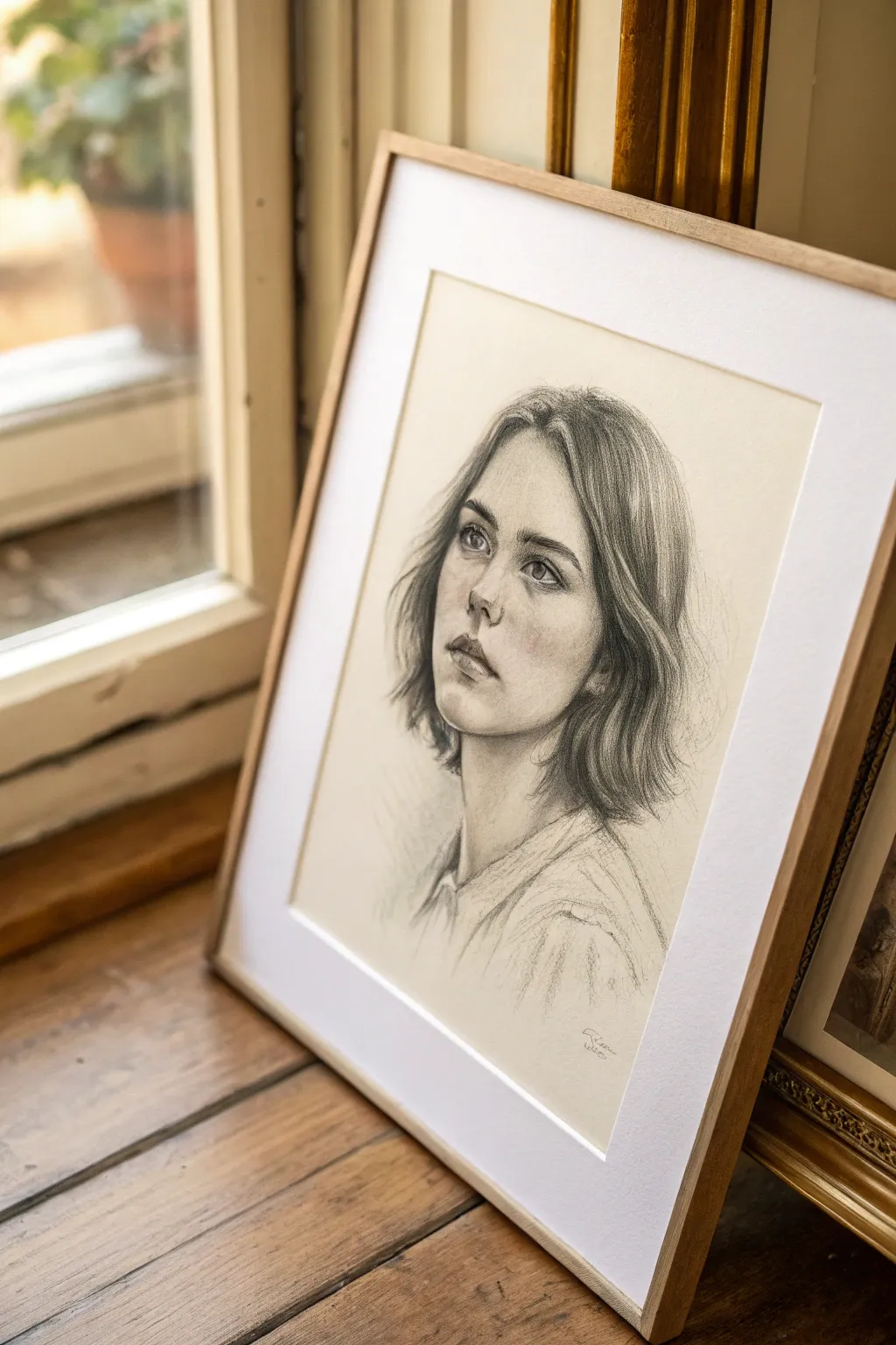
Faded Vignette Edges
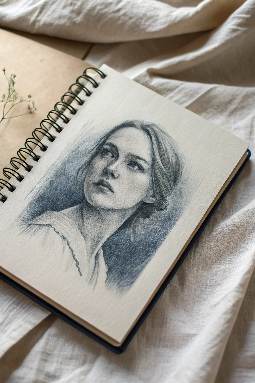
This project captures a soulful expression using graphite pencils, focusing on soft shading and a classic vignette background that draws the eye inward. The result is a timeless, sketchbook-style portrait that feels both finished and effortlessly artistic.
Detailed Instructions
Materials
- Spiral-bound sketchbook with off-white, medium-tooth paper
- Set of graphite pencils (HB, 2B, 4B, 6B)
- Kneaded eraser
- Blending stump or tortillon
- Soft tissue for blending
- Ruler (optional for grid method)
Step 1: Laying the Foundation
-
Basic Framework:
Begin with an HB pencil to lightly sketch the oval shape of the head. Add a vertical center line to determine the angle of the face, which is tilted slightly upward and to the left in this reference. Mark horizontal guidelines for the eyes, nose, and mouth. -
Blocking Features:
Rough in the placement of the eyes, ensuring the left eye is slightly higher due to the tilt. Sketch the simple triangular shape of the nose and the general curve of the lips. Don’t press hard; keep your lines faint and easily erasable. -
Defining the Contour:
Refine the jawline and neck. The neck should look graceful and elongated. Sketch the basic mass of the hair, paying attention to how it frames the face on the right side and tucks behind the ear.
Fixing “Muddy” Shading
If skin tones look dirty or grey, you may be over-blending. Lift excess graphite with a kneaded eraser and re-apply crisp hatch marks for cleaner texture.
Step 2: Developing the Portrait
-
Eyes and Gaze:
Switch to a 2B pencil to detail the eyes. Draw the iris and pupil, leaving a small white highlight to suggest life. Shade the upper eyelid crease slightly darker to create depth. -
Nose and Mouth Structure:
Define the nostrils and the shadow underneath the nose. Move to the lips, shading the upper lip darker than the bottom one. Use soft strokes to suggest the philtrum (the groove above the lip). -
Initial Shading Pass:
Using the side of your 2B pencil, lay down a light layer of graphite over the shadowed side of the face (the left side in the image). This establishes the main light source coming from the upper right. -
Refining Facial Planes:
Deepen the shadows around the eye sockets and under the chin using a 4B pencil. Blend these gently with a tissue or blending stump to create smooth skin transitions, avoiding harsh lines.
Step 3: Hair and Clothing
-
Hair Texture:
Use long, sweeping strokes with a 4B or 6B pencil to create hair strands. Focus on the main clumps of hair rather than individual strands. Darken the areas where the hair meets the neck and face to add contrast. -
Loose Clothing Sketch:
Sketch the collar of the shirt with loose, gestural lines. Keep the clothing less detailed than the face to ensure the viewer’s focus remains on the portrait. Add minimal shading to the folds of the fabric.
Pro Tip: Soft Transitions
Hold your pencil near the back end when shading the vignette background. This forces a lighter pressure and creates a smoother, more ethereal gradient.
Step 4: The Vignette Background
-
Establishing the Field:
Taking a 6B pencil, begin shading the background area immediately behind the head. Start dark right against the hair and neck to make the portrait pop forward. -
Creating the Gradient:
Work outward from the dark area, lightening your pressure as you move away from the head. I find using circular motions helps create a cloud-like texture here. -
Fading the Edges:
Let the background shading fade extensively into the white of the paper. You don’t want a hard box; you want a soft, vignette effect that disappears into the sketchbook page. -
Blending the Vignette:
Use a tissue to smudge the background graphite softer and smoother. Drag the graphite outward gently to enhance the fading effect.
Step 5: Final Touches
-
Reviewing Values:
Check your contrast. The darkest darks should be in the pupils, nostrils, and the deep shadow of the hair against the neck. Strengthen these with a 6B if necessary. -
Lifting Highlights:
Use your kneaded eraser to tap and lift graphite from the high points of the face: the tip of the nose, the cheekbone, and the forehead. This reintroduces light and dimension. -
Edge Control:
Soften any outlines that look too stiff, particularly around the hair and shoulders. The portrait should feel integrated with the background, not cut out and pasted on.
Close your sketchbook knowing you’ve created a piece with depth and emotion
Lost Edges Into Background
This tutorial guides you through creating a soft, evocative graphite portrait where the focus stays firmly on the face while the clothing and background melt away. By utilizing ‘lost edges,’ you’ll learn how to suggest form without rigid outlines, giving your drawing a dreamy, ethereal quality.
Step-by-Step Tutorial
Materials
- High-quality drawing paper (smooth or vellum bristol)
- Graphite pencils (HB, 2B, 4B, 6B)
- Kneaded eraser
- Blending stump (tortillon)
- Tissue or chamois cloth
- Pencil sharpener
Step 1: Structural Foundations
-
Establish the head shape:
Begin with a very light HB pencil to sketch a basic oval for the head. Keep your hand loose and avoid pressing hard into the paper, as these lines are merely guides. -
Map the facial features:
Draw faint guidelines for the eyes, nose, and mouth. The subject is looking slightly up and to the left, so curve your horizontal guidelines upwards to match the tilt of the head. -
Refine features and proportions:
Lightly sketch the distinct almond shape of the eyes and the soft curve of the lips. Pay attention to the spacing between the nose and the upper lip to capture the youthful expression. -
Outline hair mass:
Block in the general shape of the bobbed hair. Don’t draw individual strands yet; just focus on significant chunks and how the hair frames the face.
Keep it Loose
Hold the pencil further back near the eraser end when drawing the clothing. This forces a lack of control that creates beautiful, expressive, and natural-looking strokes.
Step 2: Shading and Definition
-
Developing the eyes:
Switch to a 2B pencil to darken the pupils and the upper lash line. Leave a small, crisp white spot in each pupil for the catchlight, which brings life to the portrait. -
Sculpting the nose:
Use the side of your HB pencil to shade the underside of the nose and the nostril area. Avoid hard outlines; let the shadow define the form. -
Softening the skin:
Apply a light wash of graphite over the shadowy side of the face (the left side). I prefer using a tissue here to gently rub the graphite for a smooth, skin-like texture. -
Adding lip volume:
Shade the upper lip darker than the lower lip. Use vertical, curved hatching lines to suggest the texture of the lips, keeping the edges soft. -
Deepening facial shadows:
Use a 4B pencil to deepen the shadows under the chin, in the corners of the eyes, and beneath the hair. This contrast makes the face pop forward.
Step 3: Hair and Texture
-
Layering hair strokes:
Starting at the roots, use long, sweeping strokes with a 4B or 6B pencil to create depth. Lift the pencil at the end of each stroke to taper the line naturally. -
Creating highlights:
Leave areas of the paper white where the light hits the curve of the hair. You can also use a kneaded eraser to lift out graphite and create stray, light-catching strands. -
Defining the neckline:
Draw the neck with soft vertical shading. The shadow cast by the chin should be the darkest point, gradually lightening as you move down.
Smudge Control
If your background gets too looking dirty from stray graphite dust, use a kneaded eraser rolled into a cylinder to gently roll over—not rub—the paper to lift the excess.
Step 4: The Lost Edges Technique
-
Indicating the collar:
Sketch the collar of the shirt with quick, loose 2B lines. Do not connect every line; broken lines suggest fabric movement better than solid ones. -
Fading the shoulders:
As you draw the shoulders and shirt texture, purposefully lighten your pressure. The lines should become fainter the further they get from the face. -
Blurring outwards:
Take your blending stump or a clean tissue and gently smudge the outer edges of the clothing drawing directly into the white of the paper. This creates the ‘lost edge’ effect. -
Final touches:
Revisit the eyes one last time with your sharpest 6B pencil to ensure the darkest darks are truly black, anchoring the viewer’s focus before the rest of the image fades away.
Frame your piece with a simple mat as shown to give your fading edges plenty of breathing room
Background Overlap Shapes
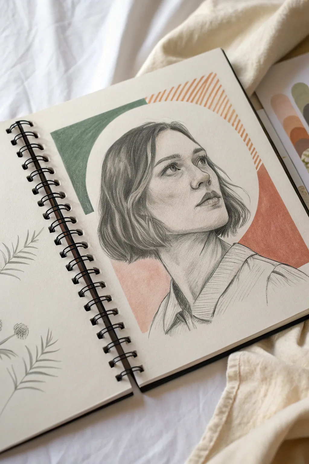
This striking sketchbook page combines a realistic graphite portrait with bold, abstract color blocks for a modern aesthetic. The interplay between the detailed pencil work and the flat, geometric background shapes creates a beautiful sense of depth and contrast.
Detailed Instructions
Materials
- Spiral-bound sketchbook (smooth or vellum finish)
- Graphite drawing pencils (HB, 2B, 4B, 6B)
- Colored pencils or markers (Sage Green, Terracotta/Burnt Orange)
- Mechanical pencil (0.5mm) for fine details
- Kneaded eraser
- Blending stump or tortillon
- Circle template or compass
- Ruler
Step 1: Planning the Composition
-
Sketch the layout:
Begin by lightly mapping out where your portrait will sit on the page using an HB pencil. You want the head to be central but slightly lower to allow room for the geometric shapes above. -
Draft the background shapes:
Use a compass or circle template to draw a large circle or arch that frames the head. Don’t press too hard; these lines are just guides. Divide this shape into segments—a solid block on the left and a larger block on the right. -
Refine the interacton:
Determine where the portrait will break the frame. In this piece, the head sits ‘inside’ the white negative space of the circle, while the colored shapes act as a background layer behind her neck and shoulders.
Clean Edges Trick
Use a piece of low-tack masking tape or a scrap of paper to mask off the edges of your geometric shapes while coloring. This ensures razor-sharp lines without accidentally coloring into the portrait.
Step 2: Drawing the Portrait
-
Block in facial features:
Sketch the basic proportions of the face. The subject is looking up and to the right, so pay attention to the angle of the jawline and the nose. -
Define the eyes:
Use a 2B pencil to carefully draw the eyes. Since she is looking upward, the iris should be positioned higher in the eye socket. Keep the shading around the eyelids soft. -
Shade the skin tones:
Start shading the face using an HB pencil for lightest tones and a 2B for mid-tones. Use a blending stump to smooth out the graphite on the cheeks and forehead to create a soft, realistic skin texture. -
Sculpt the nose and lips:
Deepen the shadows under the nose and the bottom lip using a 4B pencil. The light source appears to be coming from the front-left, casting subtle shadows on the right side of her face. -
Render the hair:
Switch to a 4B or 6B pencil for the hair. Draw in the direction of hair growth, using long, sweeping strokes. Create distinct clumps of hair rather than individual strands, focusing on the dark shadows near the neck and parting. -
Add hair highlights:
Use your kneaded eraser to lift out graphite in the hair to create highlights, giving volume and shine to the bob cut. -
Detail the clothing:
Sketch the collar of her shirt. Use cross-hatching or linear shading to suggest fabric texture, keeping this looser than the face to maintain focus on the portrait.
Step 3: Adding the Geometric Background
-
Outline the green segment:
On the left side of your composition, define the boundaries of the green block. It should look like a segment of a thick ring or arch. -
Fill the green shape:
Using a sage green colored pencil or marker, fill in this shape. If using pencil, shade in uniform, tight strokes to create a solid block of color without too much texture. -
Create the orange section:
Outline the larger shape on the right side in terracotta. This shape extends behind the neck and shoulder area. Fill the solid lower portion with your orange/terracotta medium, ensuring a crisp edge against the pencil drawing. -
Add the lined pattern:
For the upper right section of the arch, use a ruler and a fine-tip orange marker or sharp colored pencil to draw diagonal hatched lines. Keep the spacing consistent to create a lighter, textured visual weight compared to the solid blocks. -
Clean up edges:
Go back with your mechanical pencil and sharpen the outline of the head where it meets the white circle negative space. This crisp boundary is crucial for the ‘cutout’ effect. -
Final contrast check:
I like to step back here and see if the face needs more pop. If the background colors are strong, you might need to darken the deepest shadows in the hair and facial features with a 6B pencil to balance the composition.
Mixed Media Pop
Instead of pencil crayons for the background, try using gouache paint. The matte, opaque finish of gouache contrasts beautifully with the sheen of graphite and makes the shapes look digitally flat.
Now you have a stunning page that blends classical drawing skills with contemporary design elements
Blurry Indoor Backdrop
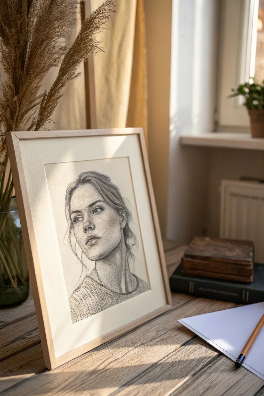
Capture the delicate intersection of light and emotion with this realistic pencil portrait project. By focusing on gentle shading, texture, and subtle cross-hatching, you’ll create a timeless piece that feels both classic and intimately modern.
Step-by-Step Tutorial
Materials
- High-quality drawing paper (smooth or vellum finish)
- Graphite pencils (HB, 2B, 4B, 6B)
- Mechanical pencil (0.5mm, HB lead)
- Kneaded eraser
- blending stumps or tortillons
- Light wooden frame with matting
- Workable fixative spray
Step 1: Structural Foundation
-
Basic shapes:
Begin with a light HB pencil to sketch a simple oval for the head. Mark the center vertical line for facial alignment, curving it slightly to the left to indicate the three-quarter view. -
Feature placement:
Draw faint horizontal guidelines for the eyes, nose base, and mouth. The eyes should sit roughly halfway down the oval, with the space between them equal to the width of one eye. -
Refining the contour:
Outline the jawline and hair mass. Notice how the jaw is softer on the shadow side; keep your lines loose here rather than committing to a hard edge too early. -
Mapping the features:
Lightly sketch the almond shapes of the eyes, the bridge and tip of the nose, and the lips. Pay special attention to the nose’s angle—it’s the anchor for the three-quarter perspective.
Smudge Prevention
Place a clean sheet of paper under your drawing hand while you work. This acts as a shield, preventing oils from your skin and friction from your palm from smearing your careful shading.
Step 2: Shading and Form
-
Establishing light source:
Identify your light source coming from the upper left. Use a 2B pencil to lay down the first layer of shadow on the right side of the face, under the chin, and in the eye sockets. -
Sculpting the eyes:
Switch to a mechanical pencil for precision in the iris and pupil. Leave a tiny, crisp white circle in each eye for the highlight, which brings the subject to life immediately. -
Nose and cheek definition:
Build up the shadow beside the nose bridge using soft, circular strokes. Avoid drawing hard lines for the nose; let the contrast between light and shadow define its shape. -
Lip texture:
Use a 4B pencil for the darker line between the lips to create depth. Render the lips with vertical, curved strokes to mimic the natural texture of skin, keeping the upper lip slightly darker than the lower one. -
Soft blending:
Take a blending stump and very gently smooth out the graphite transitions on the cheeks and forehead. I find it helpful to wipe the stump on scrap paper first so it doesn’t apply too much dark graphite unexpectedly.
Step 3: Detailing and Texture
-
Adding freckles:
With a sharp HB or mechanical pencil, dot tiny, irregular marks across the nose and cheeks. Vary the pressure—some should be distinct, while others should be barely visible for a natural look. -
Hair strands:
Use the 4B and 6B pencils for the hair. Draw long, flowing strokes that follow the hair’s growth pattern. Focus on the darker areas behind the ear and neck first to create volume. -
Wispy details:
Add loose, stray hairs around the temples and neck using the mechanical pencil. These ‘flyaways’ prevent the portrait from looking stiff and add a sense of realism. -
Clothing texture:
Sketch the sweater’s neckline and ribbed texture. Use quick, parallel diagonal hatching lines to suggest the fabric’s knit without overworking every single thread. -
Final contrast:
Deepen the darkest shadows—pupils, nostrils, corners of the mouth, and under the chin—with your 6B pencil to maximize the dynamic range.
Dramatic Sunshine
To enhance the sunlit effect, erase a sharper, angled shape across the neck or lower face, mimicking the look of hard light cutting through a window blind or curtain.
Step 4: Preservation
-
Highlights check:
Use your kneaded eraser to tap and lift graphite from the bridge of the nose, forehead, and cheekbones to re-establish the brightest highlights. -
Fixative:
In a well-ventilated area, spray a light coat of workable fixative over the drawing to prevent smudging. -
Framing:
Once dry, place the drawing behind a clean white mat and secure it in a simple light wood frame to complement the organic feel of the pencil work.
Hang your finished portrait near a window to echo the natural light captured in your drawing
Out-Of-Focus Outdoor Greens
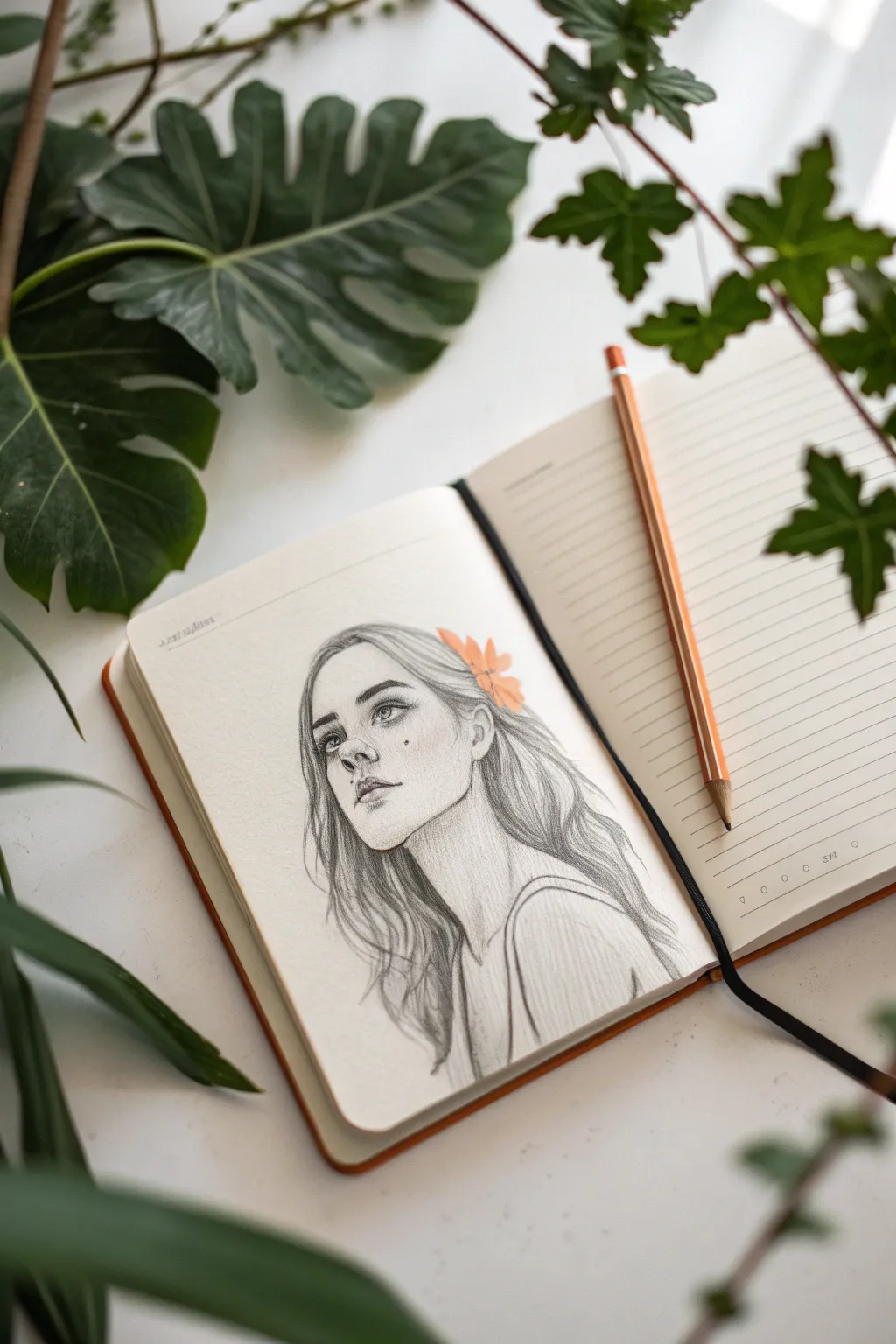
Capture a moment of quiet reflection with this delicate pencil portrait, set against the implied tranquility of a garden backdrop. This project focuses on soft shading, expressive line work, and a touch of color to bring a sketchbook page to life.
Step-by-Step Guide
Materials
- Hardbound sketchbook (cream or off-white paper preferred)
- Graphite pencils (HB, 2B, 4B)
- Orange colored pencil or pastel pencil
- Kneaded eraser
- Blending stump (tortillon) or tissue
- Precision eraser or eraser stick
Step 1: Laying the Framework
-
Establish the Head Shape:
Begin with an HB pencil, using very light, loose strokes to draw an oval for the head. Tilt the axis slightly to the left to give the subject a relaxed, upward-gazing posture. -
Mark Guideline Placements:
Sketch a vertical center line curving with the shape of the face. Add horizontal guidelines for the eyes, nose, and mouth. Since she is looking up, curve these lines upward slightly to match the perspective. -
Define the Jaw and Neck:
Refine the jawline, making it softer and slightly squared near the ear. Extend two long, elegant curves down for the neck, suggesting the start of the shoulders and collarbone area.
Smudge Control
Graphite smudges easily on cream paper. Keep a scrap sheet under your drawing hand to protect the paper oils and prevent dragging graphite across the clean areas of the page.
Step 2: Features and Expression
-
Sketch the Eyes:
Place the eyes regarding the guidelines. Draw the irises positioned upward to create that dreamy, gazing-at-the-sky look. Keep the upper lash line thicker than the lower one. -
Nose and Mouth Construction:
Indicate the nose with soft shading rather than hard lines, focusing on the nostrils and the shadow underneath. Draw the lips slightly parted to enhance the natural, candid expression. -
Refine Features:
Switch to a 2B pencil to darken the pupils and the crease of the eyelids. Add subtle eyebrows, focusing on individual hair strokes rather than solid blocks. -
Add the Beauty Mark:
Place a small, distinct beauty mark on the cheekbone below the eye to add character and focal interest to the face.
Step 3: Hair and Accessories
-
Outline Hair Flow:
Map out the general volume of the hair. It should drape loosely around her face and over her shoulders. I find it helpful to draw long, sweeping curves to establish the rhythm of the strands. -
Draw the Flower:
Tuck a small flower behind her ear on the right side. Draw simple petal shapes radiating from a center point, keeping the style loose and illustrative. -
Detail the Strands:
Using a 2B or 4B pencil, darken the areas where the hair tucks behind the ears and falls against the neck. Leave the top of the head lighter to suggest sunlight hitting the hair.
Style Variation
Instead of a flower, try drawing a small butterfly or a leaf tucked in her hair to change the seasonal feel. Use a cool blue or green pencil for this accent to shift the mood.
Step 4: Shading and Final Touches
-
Shade the Skin:
Use an HB pencil to add very light hatching on the side of the face away from the light source. Smooth this gently with a blending stump for a soft, skin-like texture. -
Deepen Shadows:
Apply the 4B pencil to the darkest areas: the pupils, the nostrils, the corners of the mouth, and the deep recesses of the hair near the neck. -
Define the Neck and Shoulders:
Add vertical shading lines down the neck to emphasize its length and structure. Sketch the strap of a tank top or dress simply, focusing on the shadow it casts on the skin. -
Add the Pop of Color:
Take your orange colored pencil and gently fill in the flower petals. Keep the application soft so the texture of the paper shows through, matching the delicate nature of the graphite drawing. -
Clean Up Edges:
Use a precision eraser to lift any smudges around the face and to pick out bright highlights on the nose tip, lip highlight, and in the eyes.
Now you have a serene, captured moment ready to be admired in your sketchbook
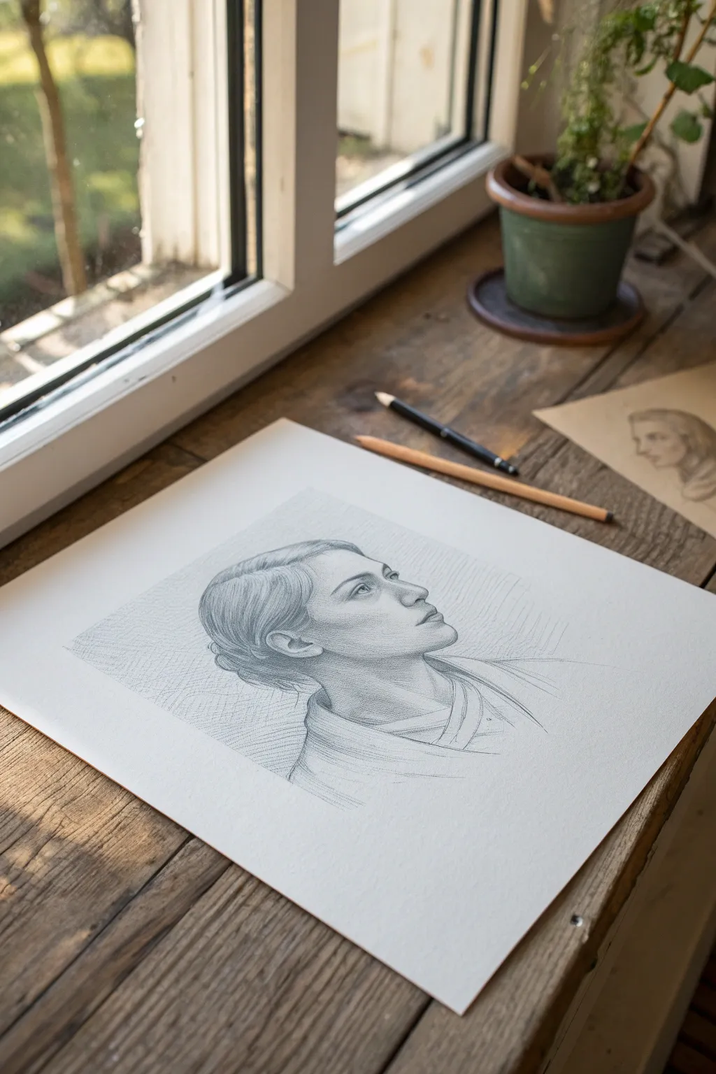
Windowlight Geometry
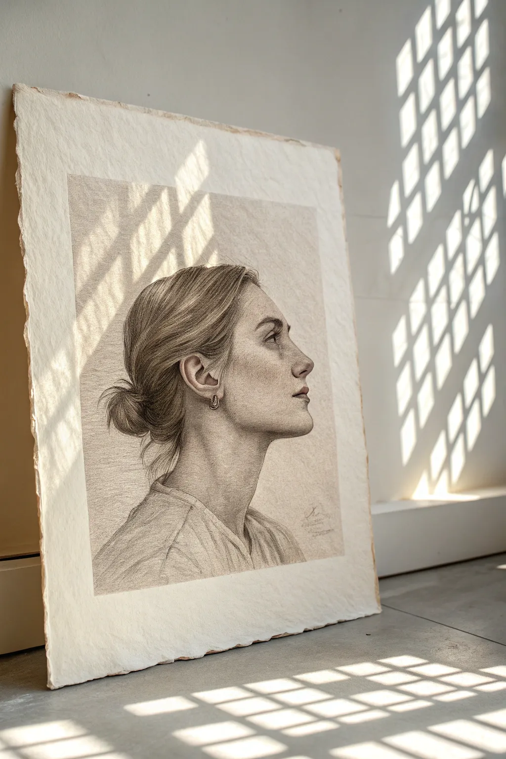
This project captures a serene profile portrait rendered in soft graphite, emphasizing delicate skin textures and the play of light. The drawing features a strong sense of realism on textured paper, perfect for studying facial anatomy and subtle shading.
How-To Guide
Materials
- High-quality textured art paper (e.g., Arches cold press or heavy cartridge paper)
- Graphite pencils (HB, 2B, 4B, 6B)
- Mechanical pencil (0.5mm, 2B lead)
- Kneaded eraser
- Tombow Mono Zero eraser (for fine highlights)
- Blending stumps (tortillons)
- Soft tissue or chamois cloth
- Artist tape
- Drawing board
Step 1: Structure & Proportions
-
Prepare the surface:
Begin by taping your textured paper to a drawing board. This paper has a lovely ‘tooth’ or grain visible in the final image, so securing it ensures it doesn’t buckle as you work. Leave a generous white margin around the edges, imitating the deckled frame look. -
Establish the envelope:
Using an HB pencil with a very light hand, sketch the general ‘envelope’ or outer shape of the head and shoulders. Focus on the negative space around the neck to get the posture right. -
Map the features:
Draw the profile line carefully. Mark the brow ridge, the tip of the nose, the lips, and the chin. Ensure the ear is placed correctly—it should align horizontally between the eye and the nose base. -
Refine the outline:
Once proportions are solid, firm up the contour lines slightly. Pay special attention to the nose’s slope and the jawline’s curve, as these define the subject’s likeness.
Step 2: Shading & Form
-
Lay the base tone:
Using a 2B pencil held mostly on its side, lightly shade the shadow areas of the face—under the jaw, the side of the neck, and the eye socket. Keep this layer gentle to avoid flattening the paper grain. -
Blend the mid-tones:
Take a soft tissue or chamois and gently sweep over your initial shading. This pushes the graphite into the paper’s valleys, creating that smooth, skin-like base tone while keeping the texture visible. -
Deepen the shadows:
Switch to a 4B pencil to darken the core shadows. Focus on the nostril corner, the crease of the eyelid, and the area just behind the ear lobule where the hair casts a shadow. -
Sculpt the cheekbone:
I prefer to build the cheek structure slowly. Add subtle graphite layers below the cheekbone and blend outward, leaving the top of the cheekbone lighter to catch the imaginary light source. -
Render the eye:
Switch to your mechanical pencil for precision. Draw the iris and pupil, ensuring you leave a tiny speck of white paper for the catchlight. Shade the eyeball itself lightly; it is never pure white.
Grainy shadows?
If the paper texture is too rough in smooth skin areas, use a harder pencil (H or HB) to fill the tiny paper valleys, then blend firmly with a stump.
Step 3: Texturing Hair & Details
-
Block in hair masses:
Instead of drawing individual strands immediately, use a 4B pencil to shade the large shapes of the hair bun and the swept-back front section. Follow the direction of hair growth. -
Add hair definition:
With a sharpened 2B or mechanical pencil, draw flowing lines over your dark base to represent distinct strands. Vary your pressure to create depth within the hair mass. -
Create flyaways:
Use a light touch to add the loose strands escaping the bun and base of the neck. These chaotic lines add realism and movement to the otherwise still pose. -
Refine the ear:
The ear is complex; render the cartilage folds with high contrast. Deep shadows inside the folds will make the outer rim pop forward.
Protect your work
Place a scrap sheet of paper under your drawing hand. This prevents skin oils from transferring to the paper and stops you from smudging finished areas.
Step 4: Final Polish
-
Clothing contours:
Sketch the clothing loosely with a 2B pencil. Unlike the face, keep the fabric strokes wider and more expressive to suggest folds without over-detailing. -
Lift highlights:
Use the Tombow Mono Zero or a shaped kneaded eraser to lift pigment from the bridge of the nose, the lip peak, and the top of the earring. This brings the light back into the drawing. -
Enhance contrast:
Do a final pass with a 6B pencil in the darkest crevices—the pupil, the darkest corner of the bun, and the necklace shadow—to anchor the drawing’s value range. -
Clean the edges:
Erase any smudges in the background area to ensure the profile silhouette stands out crisply against the clean textured paper.
Step back and admire how the light seems to travel across the features you have sculpted
Simple Botanical Frame
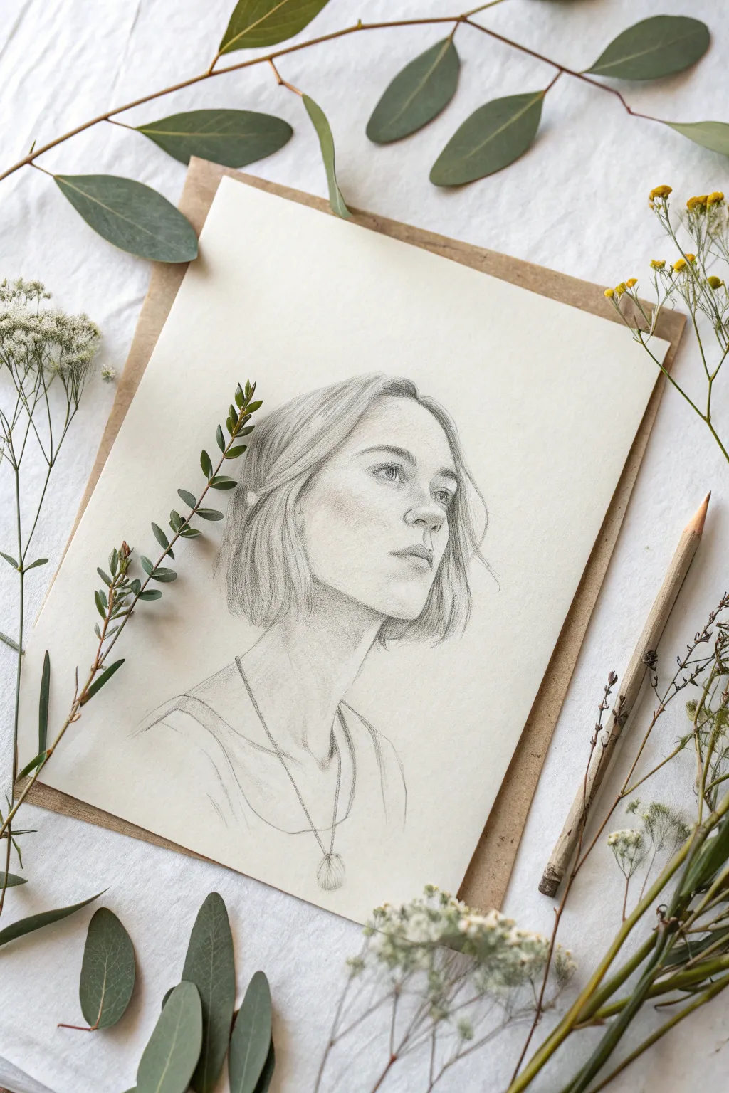
Capture the delicate balance of nature and humanity with this soft graphite portrait setup. This project surrounds a finely rendered character study with real botanical elements for a stunning, organic presentation.
Detailed Instructions
Materials
- High-quality drawing paper (cream or off-white)
- Graphite pencils (HB, 2B, 4B)
- Mechanical pencil (0.5mm HB for details)
- Kneaded eraser
- Blending stump or tortillon
- Brown kraft cardstock or cardboard backing
- Fresh eucalyptus branches
- Dried baby’s breath or similar wild filler flowers
- Wooden pencil (for styling)
- Fixative spray (matte)
Step 1: Planning & Sketching
-
Lay the Foundation:
Begin with a light, loose sketch using an HB pencil. Focus on the tilt of the head and the placement of the eyes, nose, and mouth. Keep your lines incredibly faint so they can be easily adjusted or erased later. -
Refine the Features:
Once the proportions feel right, gently define the eye shape and the shadow beneath the nose. The subject is looking up and away, so pay attention to the foreshortening of the facial features. -
Map the Hair:
Sketch the general flow of the hair rather than individual strands. Mark the parting and the way the bob cut frames the face, indicating where the darker shadows will fall behind the ear and neck.
Keep it Clean
Place a piece of scrap paper under your drawing hand while working. This prevents oils from your skin transferring to the paper and stops dragging graphite across clean areas.
Step 2: Shading & Developing Form
-
Establish Tone:
Switch to a 2B pencil to start shading the face. Apply graphite gently to the shadow side of the face (the left cheek) and under the chin to create volume. -
Soft Blending:
Use a blending stump to smooth out your graphite application on the skin. This creates that ethereal, soft-focus look seen in the reference. I prefer to use a circular motion to avoid streaks. -
Deepen the Eyes:
Use a 4B pencil or a sharp mechanical pencil to darken the pupils and the upper lash line. Leave tiny highlights white to give the eyes life and direction. -
Define the Nose and Mouth:
Add shading under the nose tip and define the lips. The upper lip should generally be darker than the lower lip. Use the kneaded eraser to lift pigment from the center of the lower lip for a highlight. -
Developing Hair Texture:
Using long, sweeping strokes with the 2B and 4B pencils, fill in the hair. Follow the growth direction. Darken the areas near the roots and the tips where the hair clumps together. -
Adding Stray Hairs:
Take your sharpest mechanical pencil and draw very fine, loose flyaway hairs escaping the main shape. This adds realism and movement to the portrait.
Tone It Up
For a vintage look, lightly brush the entire paper with a wash of weak tea or coffee and let it dry completely flat before you start drawing your sketch.
Step 3: Details & Neckline
-
Neck and Shoulders:
Extend the drawing down to the neck. The shading here should be lighter than the face to keep the focus upward. Sketch the collarbones lightly. -
Clothing Suggestion:
You don’t need intense detail here; sketched lines indicating the neckline of a top are sufficient. Keep the strokes loose and artistic. -
The Necklace:
Draw the thin chain with a sharp HB point. Add the small pendant at the bottom, shading side to give it dimension. It acts as a grounding anchor for the composition. -
Final Highlights:
Use the kneaded eraser to tap out highlights on the cheekbone, nose bridge, and forehead. This pushes the contrast against the shaded areas. -
Seal the Drawing:
Once satisfied, protect your work with a light coat of matte fixative spray to prevent smudging during the styling phase.
Step 4: Styling the Frame
-
Mount the Art:
Center your finished drawing on a piece of brown kraft cardstock. The border should be just visible, creating an earthy frame. -
Arrange the Greenery:
Place fresh eucalyptus branches in an overarching curve above the paper. Allow the leaves to naturally overlap the corners of the paper slightly. -
Add Texture Details:
Scatter dried baby’s breath or small wildflower stems along the sides. Place a single detailed sprig directly on the drawing surface (like the reference) to create depth between the art and the viewer. -
Final Touches:
Lay a wooden pencil along the side to emphasize the ‘artist at work’ aesthetic and complete the botanical vignette.
Now you have a serene, nature-inspired portrait display that feels as peaceful as it looks
Bold Patterned Backdrop
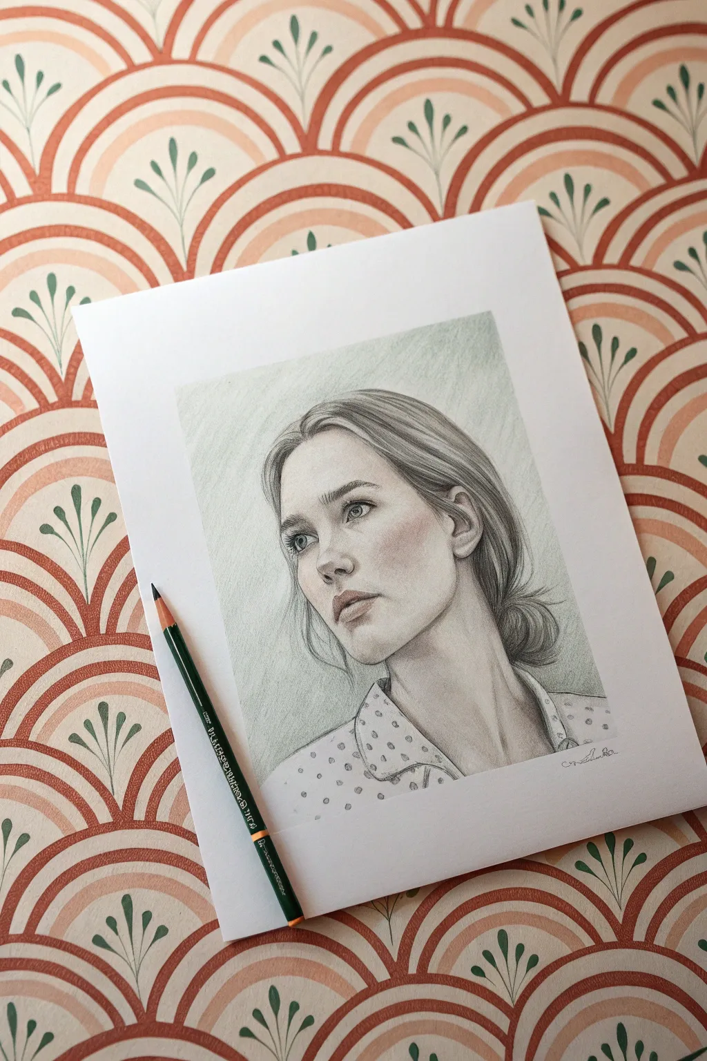
Contrast the timeless elegance of a realistic pencil portrait against a vibrant, Art Deco-inspired patterned background for a striking visual pop. This project combines classic graphite techniques with bold design elements to create a piece that feels both vintage and contemporary.
Step-by-Step Tutorial
Materials
- High-quality drawing paper (Bristol board or smooth vellum)
- Graphite pencils (HB, 2B, 4B, 6B)
- Mechanical pencil (0.5mm, HB or 2B) for fine details
- Kneaded eraser
- Blending stumps (tortillons) or soft tissue
- Reference photo of a subject looking away
- Ruler or stencil (optional for background)
- Fixative spray
Step 1: Laying the Foundation
-
Establish the composition:
Begin by lightly sketching the outline of the head and shoulders on your paper. Since you are planning a patterned background, consider placing the subject slightly off-center to allow the negative space to play a role. -
Map facial features:
Using an HB pencil, delicately plot the position of the eyes, nose, and mouth. The subject in the example is looking up and away; ensure the angle of the eyes and the tilt of the nose reflect this perspective. -
Block in the hair:
Sketch the general shape of the hair, focusing on the main masses rather than individual strands. Mark out where the low bun sits at the nape of the neck. -
Indicate clothing:
Draw the collar and shoulders. For the polka-dot shirt effect, lightly mark circles where the pattern will drape over the fabric folds, but don’t fill them in yet.
Step 2: Developing the Portrait
-
Shade the skin tones:
Start shading the face using a 2B pencil. Use light, circular motions to build up the graphite slowly. Focus on the shadow areas first: under the brow bone, the side of the nose, and the jawline. -
Define the eyes:
sharpen your pencil or use a mechanical pencil to detail the eyes. Darken the pupils and the upper lash line. Keep the whites of the eyes slightly shaded (they are spheres, not flat circles) to create depth. -
Refine the nose and mouth:
Softly shade the under-plane of the nose. For the lips, avoid outlining them; instead, shade the upper lip darker than the lower lip and define the corners of the mouth for a realistic look. -
Blend for smoothness:
Use a blending stump or tissue to gently soften the skin shading. Be careful not to over-blend; you want to maintain some texture so the skin doesn’t look like plastic. -
Detail the hair:
Switch to a 4B pencil. Draw strokes in the direction of hair growth. Create darker values near the roots and where the hair gathers at the bun, leaving lighter areas for highlights. -
Establish the neck:
Pay attention to the sternocleidomastoid muscle (the large muscle running from behind the ear to the collarbone). Shade deeply behind this muscle to push the neck back in space.
Muddy Shading?
Graphite can look grey and shiny if over-layered. If shading looks muddy, lift graphite with a kneaded eraser and apply fresh strokes with a sharper pencil instead of pressing harder.
Step 3: The Bold Background
-
Design the pattern:
Behind the head, we want to create that bold, fan-like pattern seen in the inspiration. You can use a compass or a circular stencil to lightly draw repeating arch shapes that mimic the Art Deco wallpaper style. -
Add nature motifs:
Within the arches or negative spaces, sketch small, stylized leaf sprigs. Keep these shapes graphic and simple to contrast with the realism of the face. -
Color selection (optional):
While the reference portrait is graphite, the background gets its ‘bold context’ from the environment. To recreate this on the paper itself, you can color the pattern with colored pencils (like terracotta and sage green) or keep it monochromatic but heavily shaded. -
Shade the background:
If staying monochromatic like the drawing shown, use a soft broad pencil (6B) or a blending stump loaded with graphite to create a cloudy, atmospheric vignette behind the head, fading out toward the patterned edges you drew.
Make it Pop
For a mixed-media twist, draw the portrait in graphite but render the background pattern using metallic gold ink or watercolor. The contrast between grey pencil and gold is stunning.
Step 4: Final Touches
-
Clothing texture:
Return to the shirt. Shade the fabric folds with an HB pencil. Darken the polka dots, paying attention to how they distort within the folds of the cloth. -
Deepen contrast:
Look at the overall image. Use your darkest pencil (6B) to re-emphasize the darkest points: the pupils, the corners of the mouth, the deepest hair shadows, and the line where the collar meets the neck. -
Highlight retrieval:
I find that using a kneaded eraser to tap out highlights on the nose tip, the lower lip, and the shinier parts of the hair really brings the drawing to life. -
Clean up edges:
Erase any stray smudge marks from the white border of your paper to ensure a crisp, professional presentation. -
Seal the work:
Spray the drawing with a fixative in a well-ventilated area to prevent the graphite from smudging over time.
Now step back and admire how the patterned backdrop frames your realistic portrait with unique style
Surreal Double-Exposure Background
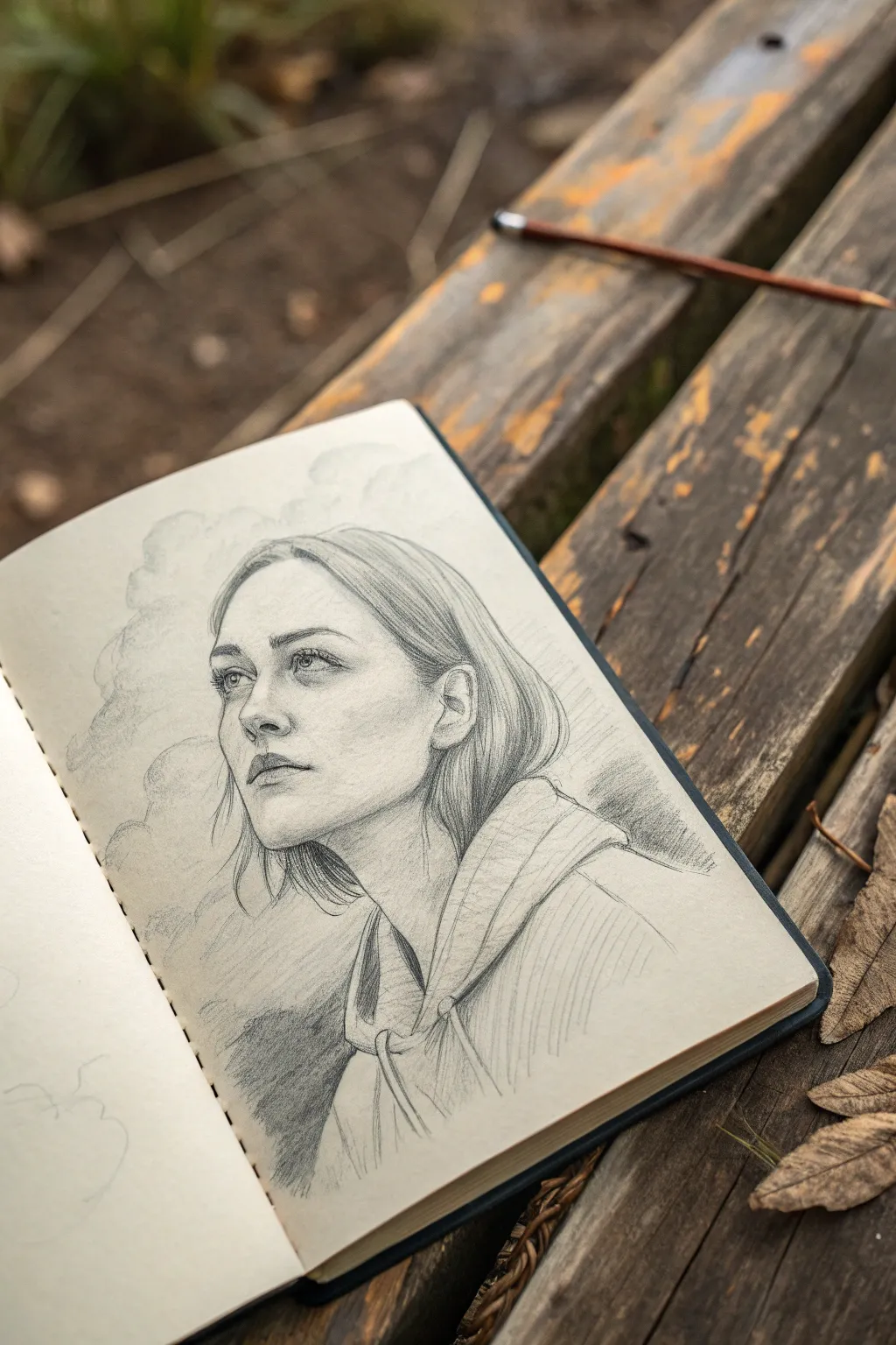
This stunning pencil sketch merges a realistic portrait with atmospheric elements, creating a dreamy double-exposure effect where the subject fades into rolling clouds. The result is a soft, surreal composition that balances precise facial features with loose, expressive shading.
How-To Guide
Materials
- Smooth sketchbook paper (vellum finish ideal)
- Graphite pencils (HB, 2B, 4B, 6B)
- Mechanical pencil (0.5mm, HB) for fine details
- Kneaded eraser
- Blending stump or tortillon
- Tissue or cotton swab
- Workable fixative (optional)
Step 1: Laying the Foundation
-
Gesture and blocking:
Begin with a light HB pencil to sketch the basic head shape. Use an oval for the cranium and a jawline extending down, tilting the head upward to convey a sense of longing or thought. -
Mapping facial features:
Draw faint guidelines for the eyes, nose, and mouth. Position the eyes slightly higher than halfway down the face due to the upward angle, observing the perspective shift where the far eye is slightly smaller. -
Structural hair outline:
Lightly sketch the general flow of the hair. Instead of drawing individual strands, think of the hair as mass shapes draping over the skull and tucking behind the ear. -
Clothing rough-in:
Outline the collar of the hoodie or jacket. Keep the lines loose here, as the clothing will eventually merge with the background texture.
Step 2: Developing the Portrait
-
Defining the eyes:
Switch to a mechanical pencil or a sharpened 2B. carefully render the irises, pupils, and upper lash line. Leave tiny white spots for catchlights to bring life to the gaze. -
Shaping the nose and lips:
Use soft shading rather than hard lines to define the nose bridge and nostrils. For the lips, darken the corners and the center line, shading the upper lip slightly darker than the bottom. -
Facial shading:
With an HB or 2B pencil, apply gentle hatching to the side of the face, under the chin, and in the eye sockets. Use a blending stump to smooth these transitions for a realistic skin texture. -
Refining the hair:
Use long, sweeping strokes with a 4B pencil to add depth to the hair. focus on the darker areas near the roots and where hair tucks behind the ear, leaving lighter areas for highlights.
Pro Tip: Eraser Sculpting
Don’t just erase mistakes! Use a clean kneaded eraser like a white drawing tool to ‘draw’ light beams and bright cloud edges back into your dark shaded areas.
Step 3: Creating the Double-Exposure Effect
-
Introducing the clouds:
Around the back of the head and the base of the neck, start sketching soft, billowing cloud shapes using the side of a 2B pencil. Avoid hard outlines; think ‘cotton ball’ softness. -
Merging hair and sky:
Where the hair ends at the back, let the pencil strokes dissolve into the cloud shapes. Instead of a distinct hairline, allow the strands to fray and become wisps of smoke or vapor. -
Clothing disintegration:
Apply the same technique to the bottom of the jacket. As you shade the folds of the fabric, let the bottom edges fade out into rough, atmospheric shading rather than finishing the drawing with a crisp border. -
Textural contrast:
Use a 6B pencil to deepen the shadows within the clothing folds and the darkest parts of the background clouds. This high contrast anchors the drawing. -
Softening the atmosphere:
Take a tissue or cotton swab and gently rub the background cloud areas. This creates a mist-like effect that contrasts beautifully with the sharp details of the face.
Troubleshooting: Muddy Shading?
If your shading looks grey and smeared, your hand might be dragging graphite. Place a scrap sheet of paper under your drawing hand to protect the work beneath.
Step 4: Final Touches
-
Enhancing highlights:
Use a kneaded eraser to lift pigment from the clouds, the tip of the nose, and the hair highlights. I find molding the eraser into a fine point helps create very specific, clean highlights. -
Deepening blacks:
Do a final pass with your darkest pencil (6B) on the pupils, nostrils, and deepest hair shadows to ensure the full tonal range is utilized. -
Stray hairs:
Add a few loose, flying hairs with a sharp mechanical pencil around the forehead and blending into the background clouds to increase the sense of movement. -
Review and balance:
Step back and check the balance between the realistic portrait and the surreal background. Add light shading to the corners of the page if needed to vignette the image and draw focus to the face.
Close your sketchbook on this dreamy creation, knowing you’ve captured a moment suspended between reality and imagination

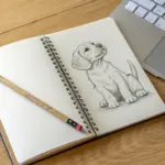
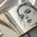

Have a question or want to share your own experience? I'd love to hear from you in the comments below!