Whenever you’re staring at a blank page, the quickest way in is to lean on basic shapes and let them turn into something cute. Here are my favorite simple easy drawings that give you that fast, satisfying “I made something!” feeling without needing fancy supplies or tons of time.
Moon and Tiny Stars Doodle
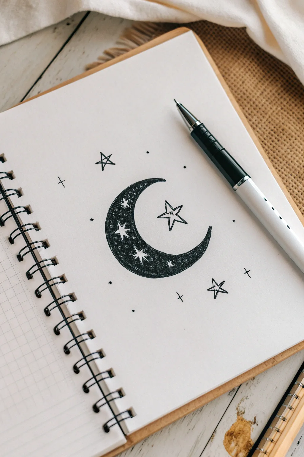
This whimsical doodle features a crescent moon filled with intricate negative-space stars, surrounded by floating celestial elements. It creates a bold, high-contrast look that is surprisingly simple to achieve using just a single black pen.
Step-by-Step Tutorial
Materials
- Spiral-bound notebook or sketchbook paper
- Pencil (HB or 2B)
- Eraser
- Black ink pen (fineliner or gel pen, 0.5mm to 0.7mm recommended)
Step 1: Drawing the Base Outline
-
Sketch the moon shape:
Begin by lightly sketching a crescent moon shape with your pencil. Start with a large ‘C’ curve for the outer edge, then draw a smaller inner curve that meets the top and bottom points to close the shape. -
Add the central star:
Identify the open space in the middle of the ‘C’ curve. Sketch a five-pointed star here, slightly offset from the center, ensuring the points are sharp. -
Outline floating stars:
Sketch two more open prominent stars around the moon—one near the top tip and one near the bottom tip—to balance the composition. -
Sprinkle in details:
Lightly mark positions for smaller background elements using tiny plus signs (+) and small dots to act as distant stars.
Step 2: Inking the Moon
-
Draft the inner stars:
Inside the crescent moon shape, draw several small four-pointed stars and tiny circles using your pencil. These will remain white, so spacing is key. -
Ink the moon outline:
Switch to your black ink pen. Carefully trace over the outer and inner curves of the crescent moon to define its boundary. -
Define negative space:
Inside the moon, carefully outline the small stars and circles you sketched earlier. Do not fill them in; these shapes must stay white. -
Fill the background:
Begin filling in the rest of the moon with solid black ink. Work slowly around your tiny star outlines. -
Refine the fill:
Go back over the black areas to ensure there are no streak marks. I find using small circular motions with the pen helps create a solid, velvety texture. -
Add stippling texture:
If you want a bit of depth, add a few tiny dots of ink close to the white stars inside the black fill, blending the solid black into the white shapes slightly.
Don’t Smudge the Ink
Place a scrap piece of paper under your drawing hand. This acts as a shield, preventing oils from your skin from touching the paper.
Step 3: Finishing Touches
-
Ink the floating stars:
Trace the large floating star inside the crescent curve. Draw inner lines on the star points to give it a faceted, 3D appearance. -
Ink the surrounding elements:
Go over the remaining stars, plus signs, and dots scattered around the page. Keep your lines crisp and confident. -
Double-check lines:
Look closely at your star points. If any lines don’t quite meet, extend them carefully so every corner is sharp. -
Erase pencil guides:
Wait until the ink is completely dry—this is crucial to avoid smudges. Once dry, gently erase all underlying pencil sketch lines.
Add Cosmic Shimmer
Once the black ink is dry, use a white gel pen or metallic silver marker to add tiny dots or sparkles inside the black part of the moon.
Now you have a striking piece of celestial art that pops right off the page


Smiley Sun With Simple Rays
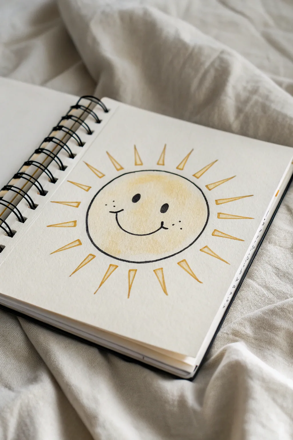
Bring a little warmth to your sketchbook with this cheerful smiling sun, combining soft watercolor washes with crisp ink details. The soft yellow glow and playful face create an instantly recognizable symbol of happiness that’s perfect for beginners.
How-To Guide
Materials
- Watercolor paper sketchbook (spiral bound preferred)
- Pencil (HB or similar light graphite)
- Compass or round object for tracing (like a roll of tape)
- Fine liner pen (black, waterproof, size 0.5 or 0.8)
- Watercolor paints (yellow ochre and lemon yellow)
- Round watercolor brush (size 6 or 8)
- Clean water cup
- Paper towel
Step 1: Sketching the Foundation
-
Establish the center:
Begin by finding the approximate center of your page to ensure your sun has plenty of room to shine without getting cut off at the edges. -
Draw the main circle:
Using a compass or by lightly tracing around a circular object, draw a perfect circle in the center of your page. Keep your pencil pressure very light so the graphite doesn’t show through the paint later. -
Position the rays:
Lightly sketch lines radiating outward from the circle to mark where your sun rays will go. Space them relatively evenly, aiming for about 16 to 18 rays around the circumference. -
Define the triangle shapes:
Turn those radiating lines into long, skinny triangles. The base of each triangle shouldn’t touch the circle; leave a small gap between the main sun body and the start of the rays.
Loose Lines
Don’t worry if your ink outline doesn’t perfectly match the paint edge. That slight misalignment creates a trendy ‘loose’ illustration style.
Step 2: Adding the Golden Glow
-
Mix your base yellow:
Prepare a watery mix of lemon yellow on your palette. You want this first layer to be very transparent and light. -
Paint the first wash:
Load your brush and fill in the central circle. Start from the middle and push the pigment toward the edges, keeping the wash fairly even. -
Create a gradient:
While the paper is still damp, I like to drop in a slightly deeper yellow or yellow ochre just around the edges of the circle to give it a rounded, 3D effect. -
Paint the rays:
Using the tip of your round brush, carefully paint inside your sketched triangle rays. Use the yellow ochre mix here so the rays stand out slightly darker than the center. -
Let it dry completely:
This is crucial: wait until the paper is bone dry. If you touch it and it feels cool, it’s still damp. Painting or drawing over wet paper will cause the ink to bleed.
Rosy Cheeks
Dilute a tiny drop of red or pink watercolor and dab two soft circles on the cheeks while the yellow is dry for a blushing effect.
Step 3: Inking the Details
-
Outline the sun:
Take your black fine liner and carefully trace over your original pencil circle. A slightly wobbly hand actually adds character here, so don’t stress about perfection. -
Outline the rays:
Go around each triangular ray with the pen. Remember to keep that small gap unlinked between the ray and the central circle. -
Draw the eyes:
Place two small oval dots in the upper middle of the circle for the eyes. Fill them in solid black, tilting them slightly inward for a friendly look. -
Add the smile:
Draw a wide, shallow ‘U’ shape between the eyes. Add little cap lines at the ends of the smile to emphasize the cheeks. -
Add freckles:
Dot three tiny specks on each side of the smile to create cute freckles. -
Clean up:
Once you are absolutely sure the ink is dry, gently erase any visible pencil marks to clean up the drawing.
Now you have a beaming piece of art that can brighten up any sketchbook page

Puffy Heart Variations

Fill a sketchbook page with these charming, hand-drawn heart variations that range from simple stripes to intricate patterns. This collection of doodles uses basic black ink to create texture and depth, perfect for personalizing journals or cards.
Step-by-Step Tutorial
Materials
- Sketchbook or drawing paper (medium weight)
- Fine liner pen (0.3mm or 0.5mm, black)
- Pencil (HB or H)
- Eraser
Step 1: Planning the Layout
-
Sketch the main outlines:
Begin by lightly sketching the outline of a large, symmetrical heart near the top center of your page using a pencil. This will serve as the base for the ‘polka dot’ heart. -
Add secondary hearts:
Sketch a second large heart outline below the first one, slightly to the right. Make this one a bit wider to accommodate a thick border later. -
Place the smaller elements:
Pencil in the positions for scattered smaller hearts: two on the left side, two on the bottom right, and one unique ‘lollipop’ heart at the bottom left. Add two small star shapes for balance.
Step 2: Inking the Polka Dot Heart
-
Draw the double border:
Using your fine liner, trace over the top heart’s pencil line. Draw a second line just inside the first to create a narrow border around the entire shape. -
Create the scalloped edge:
Inside the double border, draw tiny half-circles (scallops) all the way around the inner edge. This gives it a lacy, puffy appearance. -
Divide and fill:
Draw a vertical line down the center of the heart. On the left side, draw tiny ‘v’ shapes or rice grains scattered randomly. On the right side, draw tiny solid hearts in a similar random pattern.
Smudge Alert
Work from top-left to bottom-right (if you are right-handed) to avoid dragging your hand through wet ink. If you are left-handed, reverse the order.
Step 3: Creating the Striped Hearts
-
Outline the left-side hearts:
Ink the outlines of the two medium-sized hearts on the left side of the page. -
Fill with vertical hatching:
Fill both hearts with vertical lines. Don’t use a ruler; the slight wobble in your hand adds a nice hand-drawn character. Repeat this process for the two small hearts on the bottom right. -
Ink the small center heart:
Between the two large hearts, ink the outline of the tiny heart and fill it with the same vertical striping technique.
Add Pop
Use a white gel pen to add tiny highlights inside the solid black hearts or on the hatched frames for extra dimension.
Step 4: Detailing the Button Heart
-
Draw the thick frame:
Move to the large lower heart. Ink the outer line, then draw a second inner line about 3-4mm inside it to create a thick frame. -
Hatch the frame:
Fill this thick frame with short, repetitive hatch lines perpendicular to the border. This creates a textured, fabric-like rim. -
Add the center button:
Draw a small, solid black heart floating in the very center of the empty space.
Step 5: Finishing Touches
-
Draw the lollipop heart:
Ink the heart shape at the bottom left. Draw a smaller heart inside it, leaving a gap, and fill that inner heart with heavy scribble shading. Add a long stick extending downward. -
ink the stars:
Trace your pencil stars. For a fun effect, draw a simple five-point star, then add a second outline just inside passing through the points. -
Add decorative dots:
Scatter groups of tiny ink dots around the hearts and stars to fill empty negative space and tie the composition together. -
Erase guidelines:
Wait at least five minutes to ensure the ink is completely set, then gently erase all visible pencil marks.
You now have a playful page of heart variations ready to be scanned or admired


Easy Flower Bouquet
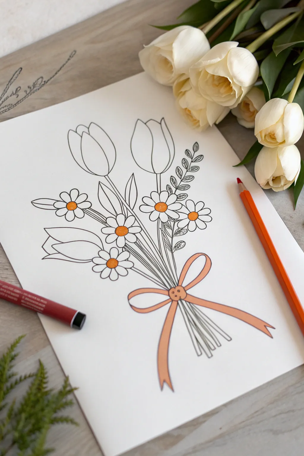
Create a sweet, hand-drawn arrangement featuring bold tulips and cheerful daisies tied together with a simple bow. This illustration mixes clean line art with pops of warm color for a lovely, understated finish that looks great on a greeting card or in a sketchbook.
Step-by-Step
Materials
- White drawing paper or cardstock
- Fine-liner pen (black, waterproof)
- Pencil (for initial sketching)
- Eraser
- Orange or yellow-orange colored pencil
- Peach or light orange marker/pen
Step 1: Drafting the Shapes
-
Map out the composition:
Start lightly with your pencil. Draw a loose, imaginary V-shape near the bottom center of your paper where the stems will gather. This helps ensure your bouquet looks bundled rather than floating apart. -
Sketch the main tulips:
Near the top of your composition, sketch three large U-shapes for the tulip heads. Place one centrally and the other two slightly angled outward to the left and right. -
Define the tulip petals:
Inside each U-shape, draw a curved line down the middle to separate the petals, rounding off the tops to create that classic closed-tulip look. -
Add the daisy guidelines:
scattered below the tulips, draw five or six small circles. These will become the centers of your daisies. Vary their heights so the bouquet feels organic. -
Draw the stems:
From each flower head, draw long, slender lines converging at that V-point you established earlier. Don’t worry if they overlap; we will refine this with ink later.
Keep it Clean
Place a clean sheet of scrap paper under your drawing hand while inking. This prevents oils from your skin transferring to the paper and stops fresh ink from smudging.
Step 2: Refining the Linework
-
Shape the daisy petals:
Around each small circle center, sketch oval-shaped petals. Keep them simple and slightly rounded. For daisies tucked behind others, only draw the visible petals. -
Add leafy details:
Draw broad, lance-shaped leaves curving up from the stems of the tulips. On the right side, I like to add a sprig of smaller, detailed leaves to create texture variety. -
Sketch the bow:
At the convergence point of the stems, draw a small button-like center. Extending from this, sketch two teardrop loops for the bow and two long, flowing ribbons trailing downward. -
Draw the bottom stems:
Below the bow, add short straight lines to show the cut ends of the stems peeking out.
Step 3: Inking and Coloring
-
Ink the main outlines:
Using your black fine-liner, carefully trace over your pencil lines. Start with the flowers in the front (usually the daisies) so you don’t accidentally draw lines through them. -
Detail the leaf sprig:
When inking the small leafy sprig on the right, use short, precise strokes to capture the small veins or leaf shapes. -
Erase pencil marks:
Wait a moment for the ink to dry completely to avoid smearing. Then, gently erase all the underlying pencil sketches to leave a crisp black-and-white image. -
Color the daisy centers:
Take your orange colored pencil and fill in the circular centers of the daisies. Press firmly to get a saturated pop of color against the stark white petals. -
Color the bow:
Using the peach or light orange marker, color in the entire ribbon and bow. The marker gives a smooth, solid finish that contrasts nicely with the textured pencil work on the flowers. -
Add the button detail:
If your bow center looks like a button, create two small dots with the darker orange pencil inside the center knot for a cute, crafty touch.
Watercolor Wash
Instead of marker, try a very light watercolor wash for the ribbon. Let the paint bleed slightly outside the lines for a loose, artistic ‘fashion illustration’ vibe.
Now you have a timeless floral drawing ready to brighten up your journal or gift to a friend
BRUSH GUIDE
The Right Brush for Every Stroke
From clean lines to bold texture — master brush choice, stroke control, and essential techniques.
Explore the Full Guide
Cute Cat Bean Face
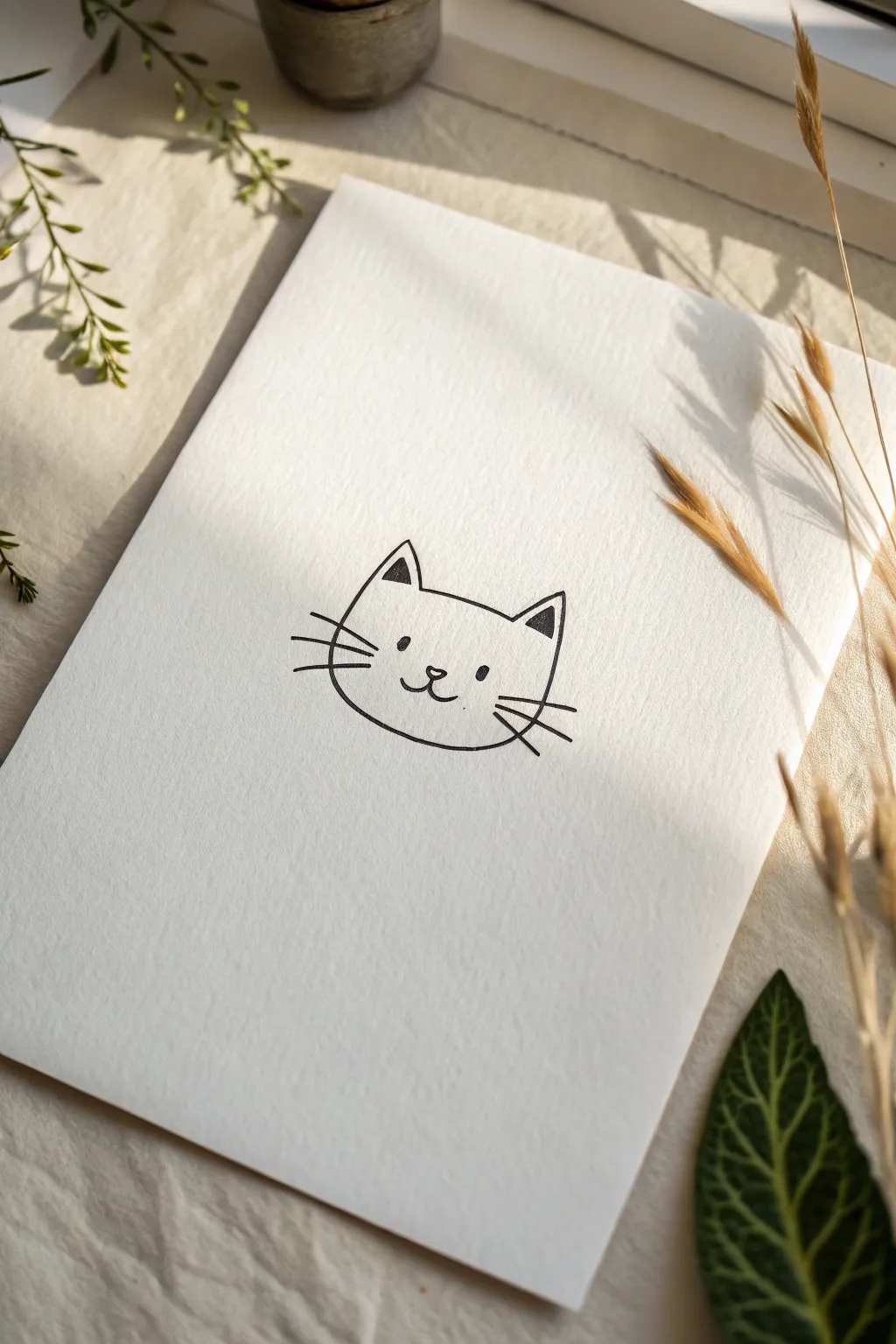
This charmingly simple project features a clean, minimalist line drawing of a cat’s face on textured watercolor paper. It captures a sweet, serene expression using only essential strokes, making it perfect for handmade greeting cards or wall art.
Step-by-Step Guide
Materials
- Heavyweight textured paper (cold press watercolor or mixed media paper)
- Black fine liner pen (size 05 or 08)
- Pencil (HB or 2H)
- Soft eraser
- Ruler (optional)
Step 1: Setting the Foundations
-
Center your composition:
Begin by finding the visual center of your textured paper. Lightly mark a small cross or dot with your pencil to guide where the nose will eventually sit, ensuring the face feels balanced on the page. -
Sketch the head shape:
Using very light pencil strokes, draw a soft, wide oval that is slightly flattened at the bottom. This ‘bean’ shape forms the main outline of the cat’s head. Keep your pressure minimal so the lines are easy to erase later. -
Add guide lines for ears:
At the top of your oval, lightly sketch two triangles. The outer lines of the triangles should flow naturally from the side of the head, pointing upwards and slightly outwards. -
Placement of facial features:
Draw a faint horizontal line across the lower third of the face. This will help you keep the eyes and nose perfectly aligned. Mark two small dots for the eyes and a tiny triangle for the nose.
Ink bleed prevention
On textured paper, ink can sometimes ‘feather’ or bleed. Test your pen on a scrap piece of the same paper first. If it bleeds, switch to a pigment liner or move your hand faster.
Step 2: Inking the Outline
-
Start with the ears:
Switch to your black fine liner. Begin at the top left ear tip, drawing a confident line down to the base. Repeat for the right ear. I prefer to rotate the paper slightly to get the most comfortable hand angle for these straight strokes. -
Refine the head shape:
Ink the curve between the ears first. Then, draw the sides of the face, stopping just before you reach the bottom chin area to check your symmetry. Connect the bottom with a gentle, wide U-shape. -
Detail the inner ears:
Inside each ear triangle, draw a smaller triangle that mirrors the outer shape. Fill these small triangles in solid black with your pen to add contrast and depth to the drawing. -
Let the ink set:
Pause for a moment to let the outline ink dry completely. Textured paper can hold ink longer than smooth paper, and smudge easily if touched too soon.
Shaky lines?
If your lines look wobbly, don’t worry. Go over the line again to thicken it intentionally. A thicker line style looks graphic and intentional, hiding any small jitters.
Step 3: Drawing the Face
-
Draw the eyes:
Using the guide dots you made earlier, draw two small, vertical ovals for the eyes. Fill them in completely with solid black ink. Spacing them widely apart gives the cat that cute ‘bean’ look. -
Create the nose:
Directly between the eyes but slightly lower, draw a tiny upside-down triangle with rounded corners. Leave the inside white for a delicate look. -
Form the mouth:
From the bottom point of the nose, draw a very short vertical line down. From there, curve outwards to the left and right to create a classic ‘w’ mouth shape. -
Add the whiskers:
On the left cheek, draw three straight lines fanning outwards. Do the same on the right. Make the middle whisker slightly longer than the top and bottom ones for a whimsical touch.
Step 4: Finishing Touches
-
Erase pencil guides:
Once you are absolutely certain the ink is dry, gently run your soft eraser over the entire drawing to remove the initial pencil sketches and guide lines. -
Check line weight:
Inspect your lines. If any look too thin or broken due to the paper’s texture, carefully go over them a second time to ensure a solid, bold black line suitable for this simple style.
Now you have a sweet, minimalist cat illustration ready to frame or gift
Simple Dog Side Profile
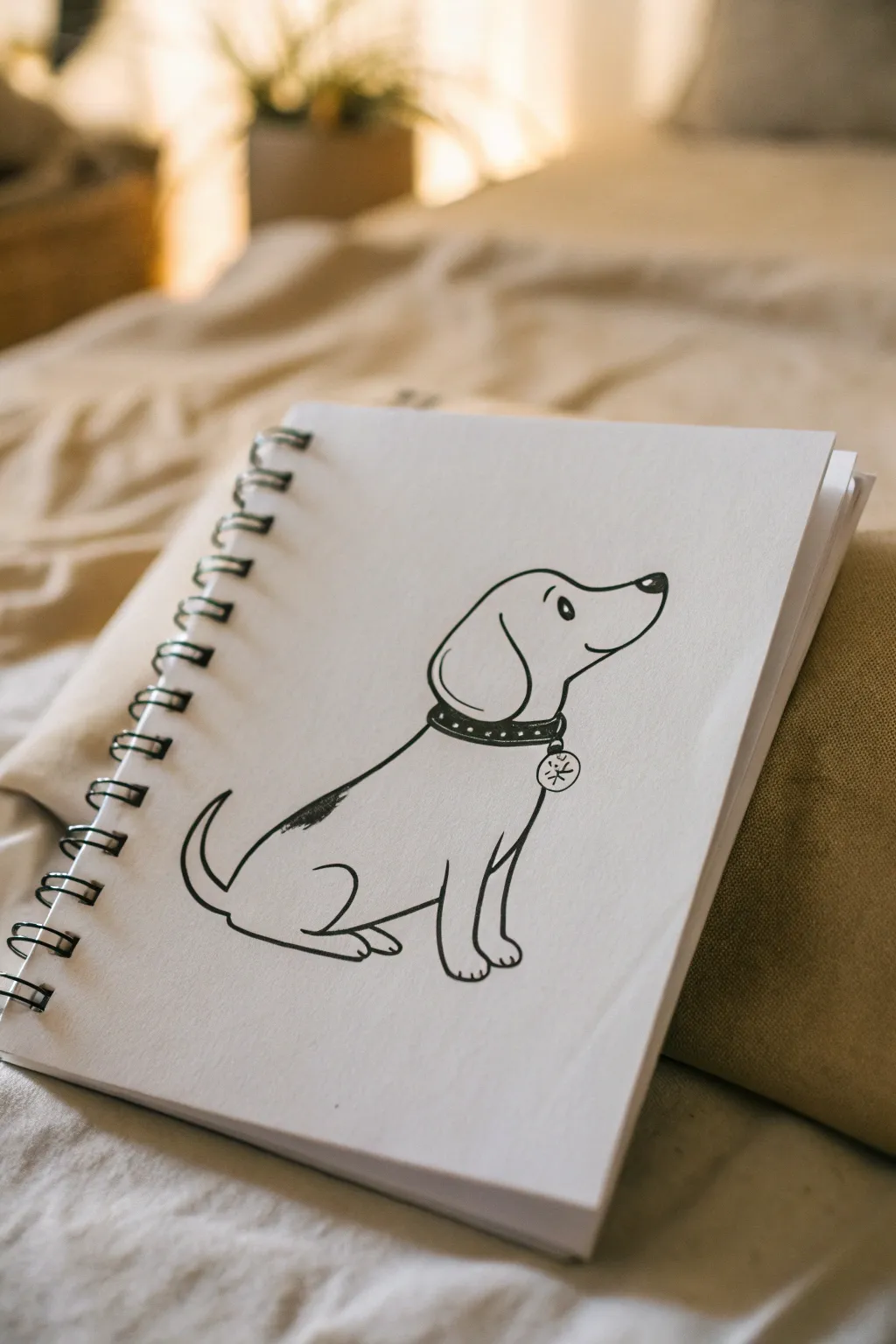
Capture the charm of man’s best friend with this clean, illustrative line drawing. Using confident, swooping lines and minimal shading, this project creates a sweet character perfect for greeting cards or journal margins.
Step-by-Step
Materials
- Sketchbook or drawing paper
- Pencil (HB or 2B)
- Eraser
- Fine liner pen (black, 0.5mm or 0.8mm)
Step 1: Planning and Structure
-
Placement:
Begin by finding the center of your page. Lightly mark where the dog’s head will be to ensure you have enough room for the body below. Keep your pencil strokes very faint so they erase easily later. -
Head and snout:
Sketch a rounded dome shape for the top of the skull. Extend this line forward and dip it slightly to form the snout, curving it back up where the nose will sit. -
Body curve:
From the back of the neck, draw a long, smooth diagonal line sloping downward to the left. This single line defines the dog’s back and posture. -
Seated pose:
Rough in the seated position by drawing a curve for the haunch (back leg) and two vertical lines for the front legs to establish the dog’s foundation.
Step 2: Inking the Outline
-
Start with the ear:
Switch to your fine liner pen. Draw a floppy, teardrop-shaped ear starting from the top of the skull. Let it hang down past the jawline for that cute, relaxed look. -
Nose and mouth:
Draw the nose as a small, rounded triangle at the tip of the snout. Color it in black, leaving a tiny white speck for a highlight. Add a simple curved smile line underneath. -
The eye:
Place the eye relatively high on the face. Draw a small oval and fill it in, but like the nose, leave a small white dot to make the character look alive and alert. Add a tiny curved eyebrow floating above it. -
Defining the collar:
Draw two parallel curved lines around the neck area. This band creates the collar. Connect these lines to the back of the head and the front chest line. -
Collar details:
Add small black dots along the center of the collar band for decoration. Draw a small circle hanging from the bottom of the collar for the tag. -
Tag motif:
Inside the tag circle, draw a simple asterisk or star shape to represent an engraving.
Ink Confidence
When inking long curves like the dog’s back, try to move your whole arm rather than just your wrist. This prevents shaky lines.
Step 3: Body Definition
-
Back and tail:
Trace over your pencil line for the back with a confident, smooth ink stroke. Toward the bottom, curve the line upward into a hook shape to create a wagging tail. -
Back leg:
Starting from the base of the tail, draw a prominent curve that swoops forward to form the tucked back leg. Add a small line for the paw resting on the ground. -
Front legs:
Draw the front legs as straight, sturdy pillars. Give the paws slight curves at the bottom to suggest toes. The leg closest to the viewer should slightly overlap the one behind it. -
Connecting the belly:
Draw a short line connecting the front legs to the back leg to complete the belly area. -
Spot detail:
Add a small, irregular patch on the dog’s lower back. Use a scribbling motion with your pen to fill this spot in, giving it a bit of texture distinct from the solid black nose. -
Clean up:
Wait a moment for the ink to fully dry to prevent smudging. Use your eraser to gently remove all the underlying pencil guidelines.
Make It Yours
Customize the tag with your own pet’s initial, or change the ear shape to pointed triangles to create a completely different breed.
You have now created a charming companion on paper that is ready to sit faithfully in your sketchbook

PENCIL GUIDE
Understanding Pencil Grades from H to B
From first sketch to finished drawing — learn pencil grades, line control, and shading techniques.
Explore the Full Guide
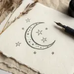
Tiny Turtle With Patterned Shell
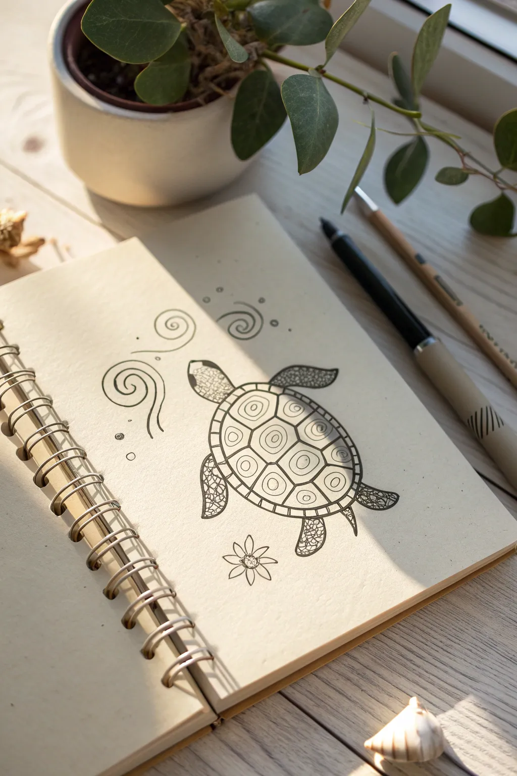
This charming ink drawing features a sea turtle decorated with geometric shell patterns and delicate scale textures, surrounded by playful swirls. It’s a relaxing project that combines simple shapes to create an intricate-looking marine friend.
Detailed Instructions
Materials
- Spiral-bound sketchbook or drawing paper
- HB or 2B pencil for sketching
- Fine-point black fineliner pen (0.3mm or 0.5mm)
- Eraser
- Ruler (optional, but helpful for symmetry)
Step 1: The Basic Shell Structure
-
Draw the main oval:
Start by lightly sketching a large, slightly tilted oval in the center of your page. This will become the turtle’s shell, so make sure it’s big enough to hold all the patterns. -
Create the shell border:
Draw a second, slightly smaller oval inside the first one. This creates a rim or border around the main shell area where we will later add small divisions. -
Map out the scutes:
Inside the central oval, sketch a grid of roughly pentagonal and hexagonal shapes. Start with three large shapes running down the center spine, then fill in the sides with slightly smaller, curved shapes that fit against the border.
Wobbly Lines?
Don’t stress about perfect geometric shapes. If your shell lines are uneven, thicken them slightly to hide the wobble. Organic lines look more natural for animals anyway.
Step 2: Inking the Outline
-
Outline the shell:
Using your black fineliner, carefully trace over your pencil lines for the main shell border and the inner geometric scutes. -
Add the head and flippers:
At the top left of the shell, draw a rounded shape for the head. Add two large front flippers extending outward and two smaller, stubbier back flippers at the rear. -
Detail the tail:
Draw a tiny, pointed tail peeking out from the very bottom center of the shell. -
Erase guidelines:
Once the ink is completely dry—give it a minute to avoid smudges—gently erase all your original pencil sketches to reveal a clean outline.
Step 3: Adding Patterns and Texture
-
Decorate the central scutes:
Inside each of the central geometric shapes on the shell, draw a smaller concentric shape. Place a small circle or dot in the very center of each one, creating a target-like effect. -
Pattern the side scutes:
For the shapes along the sides of the shell, draw simple internal lines or smaller ovals to differentiate them from the center spine. -
Segment the border:
Go back to the rim of the shell (the space between your first two ovals). Draw small perpendicular lines all the way around to create a segmented, brick-like border. -
Scale the flippers:
Fill the flippers and head with a dense pattern of small, irregular circles or pebble shapes. I find this creates a nice ‘leathery’ reptile skin texture without needing to be perfect. -
Refine the head:
On the head, draw a small eye near the front and leave the area around it slightly less detailed to make it stand out.
Add a Splash of Color
Use watercolor pencils to lightly shade the shell green and the water blue. Then, run a damp brush over it to blend the colors while keeping the ink crisp.
Step 4: Atmospheric Details
-
Draw swirling currents:
To the left and top of the turtle, draw three or four loose spirals. Vary the line weight slightly by pressing harder on the curves to simulate water movement. -
Add bubbles:
Intersperse a few tiny open circles around the swirls and near the turtle’s nose to look like rising bubbles. -
Sketch the seabed flower:
Near the bottom flipper, draw a simple flower shape with pointed petals and a detailed center to ground the composition. -
Final touches:
Look over your drawing. If you want more contrast, thicken the outer contour line of the entire turtle to make it pop off the page.
You now have a beautifully patterned sea turtle swimming across your page
Cozy Mushroom Buddy
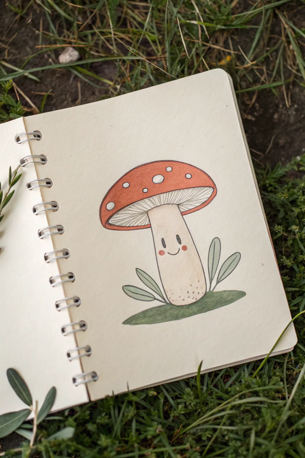
This endearing little mushroom brings a touch of whimsy to any sketchbook page with its rosy cheeks and gentle smile. The style is clean and illustrative, using soft coloring techniques to create a warm, inviting character.
How-To Guide
Materials
- Sketchbook or heavyweight drawing paper
- HB or 2B pencil for sketching
- Fine liner pen (black, 0.3mm or 0.5mm)
- Colored pencils or alcohol markers (red-orange, cream/beige, sage green)
- White gel pen or Posca marker
- Eraser
Step 1: Basic Sketching
-
Outline the cap:
Start by lightly drawing a large, wide semi-circle for the mushroom cap. The curve should be smooth and slightly flattened at the very top. -
Draw the rim:
Connect the ends of your semi-circle with a gentle upward curve to create the bottom rim of the cap. Inside this shape, draw a second curved line parallel to the first one to create depth for the gills. -
Add the stem:
From the center of the cap’s underside, draw two vertical lines that flare out slightly at the bottom like a bell-bottom trouser leg. Rounded off the bottom of the stem gently. -
Ground the figure:
Draw an oval shape behind and around the base of the stem to represent a patch of moss or grass. -
Sketch the foliage:
Add simple leaf shapes sprouting from behind the stem. Draw two leaves on the left and three on the right, keeping them rounded and pointed upwards.
Step 2: Inking & Facial Features
-
Refine the lines:
Using your fine liner, carefully trace over your pencil lines. For the cap’s rim, make sure the line is clean and continuous. -
Detail the gills:
Under the cap, draw fine lines radiating from the top of the stem outward toward the rim. These represent the mushroom gills; keep them light and closely spaced. -
Create the face:
In the middle of the stem, draw two small, solid black ovals for eyes. In between and slightly below them, draw a tiny ‘u’ shape for a smile. -
Add texture:
Dot the very bottom of the stem with tiny stippling marks to suggest dirt or texture. -
Clean up:
Once the ink is completely dry, thoroughly erase all pencil guidelines to leave a crisp black outline.
Spot Saviour
If using markers, colored pencils won’t layer over the white spots well. Leave the paper bare for the spots or use opaque white gouache/acrylic for correction.
Step 3: Adding Color
-
Color the cap base:
Fil the mushroom cap with a red-orange hue. Color evenly, but leave several circular spots completely white. I find it helpful to outline the white circles first so I don’t accidentally color over them. -
Shade the stem:
Use a cream or light beige color for the stem. Apply the color lightly at the center and slightly darker at the edges to create a rounded, 3D effect. -
Add blush:
Take a pink or light red pencil and draw small, soft circles right under the eyes for rosy cheeks. -
Color the greenery:
Use a sage or muted green for the leaves and the ground patch. Keep the tone earthy rather than neon bright. -
Detail the white spots:
If your white paper spots aren’t bright enough, or if you accidentally colored over one, use a white gel pen to make the spots on the cap crisp and opaque. -
Final touches:
Add a tiny white highlight dot to the top corner of each black eye to make the character look alive and sparkling.
Woodland Vibes
Try drawing a whole family of mushrooms in different heights or adding a tiny snail climbing up the stem for extra cuteness.
This charming little character is now ready to brighten up your sketchbook spread


Minimal Mountains in a Circle

Capture the spirit of the outdoors with this clean, minimalist drawing of twin peaks nestled inside a geometric frame. This line art style relies on basic shapes and subtle details to create a serene little mountain scene perfect for travel journals.
Step-by-Step Tutorial
Materials
- Sketchbook or drawing paper
- Pencil (HB or 2B)
- Eraser
- Fine liner pen (black, 0.5mm tip works well)
- Drawing compass (or a round object to trace)
- Ruler
Step 1: Setting the Scene
-
Draw the frame:
Start by lightly drawing a perfect circle in the center of your page using a compass or by tracing a round object like a mug rim. Keep this line very faint as it will serve as a guide for your final inked border. -
Add a baseline:
Using your ruler, draw a horizontal line across the bottom third of the circle. Let the line extend slightly past the circle’s edge on both sides—this creates the ground where your mountains will sit.
Keep it Loose
Don’t stress about perfectly straight lines for the mountains. Shaky or organic lines actually make the peaks feel more natural and rocky.
Step 2: Drafting the Peaks
-
Form the first mountain:
On the left side of your baseline, draw a large triangle. The peak shouldn’t quite touch the top of the circle, leaving some breathing room. -
Add the second mountain:
Draw a second, slightly taller and wider triangle on the right side. Let this one overlap the first triangle slightly to create depth, positioning its peak a bit higher than the left one. -
Outline the snowcaps:
Near the top of each triangle, sketch a jagged, zig-zag horizontal line. These don’t need to be perfect; irregular shapes look more like natural snow lines.
Step 3: Inking the outlines
-
Trace the main triangles:
Switch to your fine liner pen. Carefully trace over the outer lines of your two mountain triangles. -
Define the overlap:
Where the mountains cross, stop your line so the front mountain appears solid and creates a clean visual separation from the one behind it. -
Ink the snowcaps:
Go over your jagged snowcap lines with ink. I sometimes like to double up this line in places to give the snow edge a bit more visual weight. -
Solidify the ground:
Ink the horizontal baseline. You can make this line slightly thicker than the mountain outlines to provide a strong foundation for the composition.
Add a Night Sky
Fill the upper empty space of the circle with tiny stars, a crescent moon, or vertical lines to mimic the northern lights.
Step 4: Adding Texture and Details
-
Sketch the trees:
At the base of the left mountain, draw three small pine trees. Use a simple vertical line for the trunk and downward-angled dashes for branches. Make them different heights for variety. -
Add a distant tree:
Draw one tiny, singular pine tree at the base of the right mountain to emphasize scale and distance. -
Stipple the mountains:
Add texture to the rocky part of the mountains (below the snow line) by adding random dots. Concentrate more dots near the bottom and sides to suggest shadow and form. -
Detail the snow:
Add two or three small vertical lines within the white snowcap area of each peak. This minimal shading suggests the steep slope of the summit.
Step 5: Finalizing the Frame
-
Create the inner circle:
Ink the main circle outline you sketched earlier. Instead of a continuous line, you can break it slightly where it intersects with the ground line for a stylized look. -
Add the decorative dots:
Draw a second, slightly smaller ring of dots just inside the main circle line. Try to keep the spacing between the dots consistent all the way around. -
Erase pencil marks:
Wait at least a full minute for the ink to dry completely to avoid smudging. Then, gently erase all your underlying pencil sketches to reveal the crisp black lines.
Now you have a charming mountain vignette that looks great on its own or as part of a larger travel journal spread
Little House With a Path
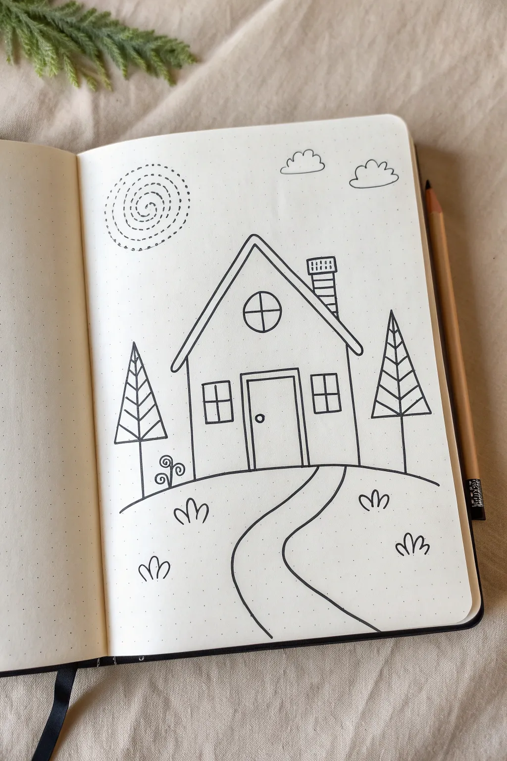
This charming little house drawing is perfect for bullet journals or sketchbooks, featuring simple geometric shapes and cozy details. The clean lines and whimsical elements like the spiral sun and winding path create a welcoming scene that is easy for anyone to recreate.
Step-by-Step Guide
Materials
- Dotted grid notebook or plain paper
- Fine-liner pen (black, 0.3mm or 0.5mm)
- Pencil (HB or lighter)
- Eraser
- Ruler (optional, for straighter lines)
Step 1: Drafting the Main Shapes
-
Outline the house frame:
Begin by sketching a simple square or rectangle in the center of your page using a pencil. This will be the main body of the house. On top of this rectangle, draw a large triangle to form the roof. -
Add the ground line:
Draw a curved horizon line that starts from the left side of the page, goes behind the house (imaginarily), and continues to the right. This grounds your house in a landscape rather than having it float. -
Define the path:
From the center bottom of the house, sketch two winding lines that curve downwards and widen as they reach the bottom of the page creating a welcoming pathway leading to the front door.
Use Dots as Guides
Since you are using dot grid paper, count the dots to ensure your house remains symmetrical. For example, if the left wall is 4 dots high, make the right wall match exactly.
Step 2: Inking the Structure
-
Ink the roof:
Switch to your fine-liner pen. Draw the two slopes of the roof, extending the lines slightly past the walls of the house for an overhang. Add a second, parallel line just underneath the first roof line to give it some thickness. -
Draw the walls:
Ink the vertical lines for the walls of the house, connecting cleanly with your roof structure. -
Create the chimney:
On the right slope of the roof, draw a small rectangular chimney. Add a slightly wider rectangle on top for the cap, and draw horizontal lines inside to represent bricks. -
Outline the door:
In the bottom center of the house wall, draw a tall rectangle for the door frame. Draw a slightly smaller rectangle inside it for the door itself, and add a tiny circle on the right side for the doorknob.
Wobbly Lines?
If your straight lines look shaky, embrace it! Go over them a second time loosely. This creates a charming ‘sketched’ aesthetic where imperfections look intentional.
Step 3: Adding Windows and Details
-
Draw the attic window:
In the center of the roof triangle (the gable), draw a circle. Divide it with a vertical and horizontal line to create window panes. -
Add main windows:
On either side of the door, draw two square windows. Like the attic window, divide each square into four smaller distinct panes with a cross shape. -
Ink the landscape:
Go over your curved horizon line with the pen. Be careful to stop drawing where the house and trees (which we’ll add next) overlap so lines don’t run through solid objects. -
Trace the path:
Ink the two winding lines of the path you sketched earlier, ensuring smooth, confident curves.
Step 4: Nature Elements
-
Shape the trees:
On both the left and right sides of the house, draw a tall, narrow triangle for pine trees. Draw a single vertical line straight down the middle of each triangle to create the trunk. -
Detail the tree branches:
Inside the tree triangles, draw diagonal lines branching upwards from the central trunk line to the outer edges, creating a stylized leaf pattern. Add a stick at the bottom for the visible trunk. -
Add the sun:
In the upper left sky area, create a sun using a dashed spiral line. Start from the center and spiral outwards with small dashes instead of a solid line for a whimsical look. -
Draw clouds:
Sketch two fluffy clouds in the upper right corner using a series of connected bumps or scallops. Vary the size of the bumps to make them look uniform but organic. -
Plant some grass:
Scatter small ‘m’ shapes or three-humped curves around the ground area to represent tufts of grass. I prefer placing them in little groups of two or three for balance. -
Add a decorative flourish:
Near the base of the house on the left, draw a small curled vine or fern shape—a vertical line with spiral curls coming off it—to add a bit of botanical interest.
Step 5: Finishing Touches
-
Erase pencil marks:
Wait until the ink is completely dry to avoid smudging. Then, gently erase all your initial pencil guidelines to reveal the clean, sharp line art. -
Final check:
Look over your drawing for any lines that need thickening or connecting. You might want to thicken the outer lines of the house slightly to make it pop more.
Now you have a sweet little landscape ready to be colored in or left as a minimalist black and white piece
Cute Snack Doodle
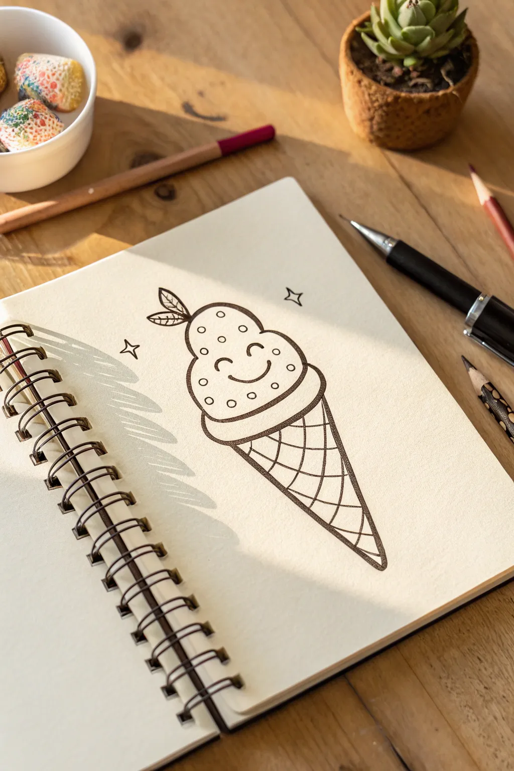
Brighten up your sketchbook with this adorable, smiling ice cream cone character. It’s a simple line art project that uses clean shapes and charming details to create a sweet, happy snack.
Detailed Instructions
Materials
- Spiral-bound sketchbook or drawing paper
- Fine-liner pen (black, 0.5mm or 0.8mm)
- Pencil (HB or 2B) for sketching
- Eraser
Step 1: Sketching the Base Shapes
-
Draft the scoop shape:
Start by lightly sketching a rounded, bulbous shape for the ice cream scoop. It should look a bit like an inverted ‘U’ but wider at the bottom, almost like a lightbulb. -
Add the scoop’s bottom edge:
Draw the bottom curve of the scoop where it meets the cone. This should be a soft, wavy line or a slightly flattened curve that extends a bit past the width of the scoop itself to suggest fullness. -
Outline the cone:
From the bottom edges of the scoop, sketch a V-shape extending downwards. Keep the sides straight and meeting at a sharp point at the bottom to form the classic waffle cone. -
Create the cone rim:
Add a distinct rim around the top of the cone, right under the scoop. Draw a curved band that wraps around the base of the ice cream, giving it a sturdy foundation to sit in.
Curve Your Grid
When drawing the waffle pattern, slightly curve the lines outward. This simple trick makes the cone look round and dimensional rather than flat.
Step 2: Adding Character Details
-
Position the face:
In the center of the scoop area, lightly mark where the eyes and mouth will go. You want them centered vertically within the main rounded section. -
Draw the eyes:
Sketch two small, upward-curving arcs for the eyes. These ‘happy eyes’ instantly give the character a cheerful personality. -
Add a smile:
Place a simple U-shape curve right between and slightly below the eyes for a big, friendly smile. -
Top with a leaf:
At the very top left of the scoop, sketch two small leaves attached to a tiny stem. This adds a cute, organic garnish detail.
Step 3: Inking and Refining
-
Ink the main outline:
Using your fine-liner pen, carefully trace over your pencil lines for the main shape of the ice cream and the cone. Use a confident, continuous stroke for the smoothest look. -
Ink the facial features:
Go over the eye arcs and the smile. You might want to make the smile line just a tiny bit thicker in the middle to emphasize the expression. -
Add sprinkles:
Draw small circles randomly scattered all over the scoop. I prefer to keep them fairly evenly spaced but irregular enough to look natural. Don’t draw over the face area. -
Define the rim:
Ink the band around the top of the cone. Make sure the lines connect cleanly to the scoop above and the cone below. -
Detail the leaf:
Ink the leaves on top. Add a tiny line down the center of each leaf to suggest a vein pattern.
Ink Smudges?
If your hand smudges the ink, try placing a scrap piece of paper under your drawing hand as a shield, or work from left to right if you’re right-handed.
Step 4: Texturing the Waffle Cone
-
Draw diagonal lines one way:
Inside the cone shape, draw a series of parallel diagonal lines sloping from the top right to bottom left. Keep the spacing consistent. -
Cross-hatch the pattern:
Now draw diagonal lines in the opposite direction, creating a diamond grid pattern. This creates the classic waffle cone texture. -
Curved cross-hatching tip:
Try to curve these grid lines slightly to follow the rounded form of the cone, rather than keeping them perfectly straight. This makes the cone look 3D. -
Add background sparkles:
Draw a few simple four-pointed stars or diamond shapes floating to the left and right of the scoop to add a bit of magic to the composition. -
Erase pencil marks:
Wait for the ink to dry completely to avoid smudging. Then, gently erase all the underlying pencil sketches to reveal your clean artwork.
Now you have a sweet little character ready to greet anyone who opens your sketchbook
Leafy Vine Page Corner
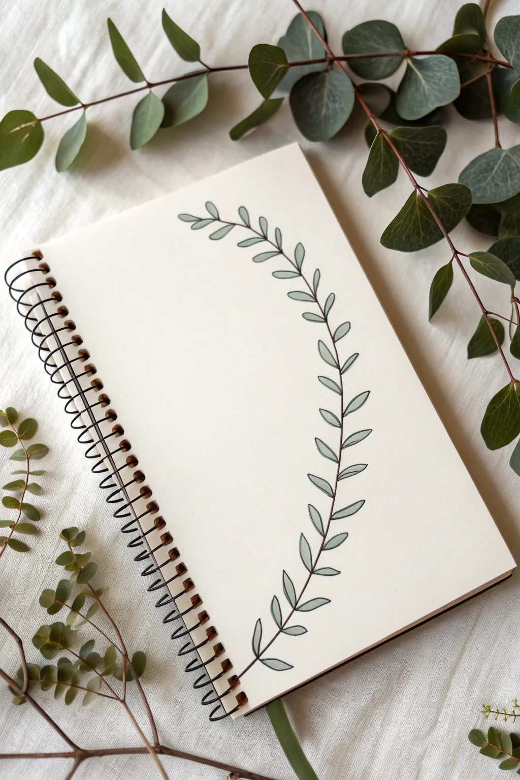
This minimalist project adds a touch of nature to your notebook without overwhelming the page. The graceful curve acts as a perfect frame for your notes, featuring clean lines and a soft, muted green palette.
How-To Guide
Materials
- Fine-point black drawing pen (0.3mm or 0.5mm)
- Pencil (HB or lighter)
- Eraser
- Soft green colored pencil or marker (sage or eucalyptus shade)
- Spiral-bound notebook or sketchbook
Step 1: Planning the Shape
-
Visualize the curve:
Before putting pencil to paper, look at your blank page. Imagine a gentle ‘C’ curve starting near the top center-right and sweeping down to the bottom center-right. It shouldn’t touch the very edge of the paper; leave about an inch of breathing room. -
Pencil the spine:
Using a very light hand, sketch this main curved line. This will be the central stem of your vine. Don’t worry about making it perfectly smooth yet; just establish the general flow.
Wobbly Lines?
Don’t panic! If a line goes astray, simply thicken the stem slightly in that area or turn the mistake into a new, smaller leaf bud.
Step 2: Drawing the Leaves
-
Start at the top:
Begin adding leaves near the top of your stem. These initial leaves should be slightly smaller than the ones in the middle. -
Leaf shape guide:
Draw the leaves as simple elongated ovals or almond shapes. They should attach directly to the main stem or have extremely short, almost invisible petioles. -
Establish the pattern:
Work your way down the spine, alternating leaves on the left and right sides. This creates a balanced, organic look rather than a rigid ladder appearance. -
Vary the angles:
As you draw, angle the leaves slightly upward, following the direction of growth. I like to make sure they aren’t all perfectly uniform; nature loves slight imperfections. -
Refine the sizes:
Let the leaves in the middle section of the curve be the largest, then gradually taper back down to smaller sizes as you reach the bottom end of the vine. -
Review the spacing:
Step back and look at your pencil sketch. Ensure the gaps between leaves are relatively consistent, but avoid making them mathematically perfect.
Step 3: Inking the Design
-
Trace the stem:
Take your fine-point black pen and carefully trace over your main stem line. Use confident, smooth strokes rather than short, scratchy ones. -
Outline the leaves:
Outline each leaf shape. When you connect the leaf to the stem, you can thicken the line slightly at the connection point to mimic a real plant joint. -
Add central veins:
Draw a single, simple line down the center of each leaf. Keep this line thin and stop just short of the leaf tip for a delicate appearance. -
Let it dry:
Give the ink a minute or two to set completely to avoid any accidental smudging. -
Erase pencil marks:
Gently gently erase your initial guide lines, leaving only the crisp black ink.
Make it Bloom
intersperse tiny circles or three-dot clusters between some leaves to represent small berries or flower buds for extra detail.
Step 4: Adding Color
-
Select your green:
Choose a muted, sage green or a soft eucalyptus tone. The goal is a subtle wash of color, not a neon highlight. -
Fill the leaves:
Lightly color inside each leaf. If using a colored pencil, use small circular motions for even coverage. -
Leave highlights:
For a bit of dimension, don’t press too hard. You can even leave a tiny sliver of white space near the center vein on some leaves to suggest light reflecting. -
Final check:
Assess the color balance. If any leaves look too pale, add a second light layer of green to deepen the tone without overpowering the black lines.
Enjoy using your new beautifully bordered page for journaling or lists
One-Line Face Portrait
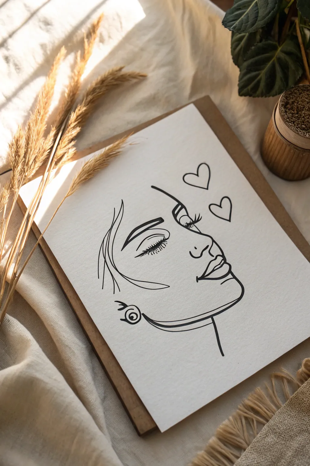
Capture the elegance of simplicity with this charming line art portrait, featuring delicate facial features and floating hearts. This project focuses on clean, sweeping strokes to create a modern and romantic aesthetic perfect for framing.
Detailed Instructions
Materials
- High-quality white cardstock or drawing paper (A4 or A5)
- Pencil (HB or 2H for sketching)
- Eraser
- Fine liner pen (0.5mm or 0.8mm black)
- Ruler (optional, for centering)
- Clipboard or wooden board for backing
Step 1: Planning and Sketching
-
Paper Preparation:
Begin by securing your paper to a flat surface or clipboard. If you want the drawing perfectly centered, lightly mark the center point with your pencil, though slightly off-center works well for this asymmetrical profile. -
Outline the Nose and Forehead:
Start your light pencil sketch with the forehead line, curving gently downward. Extend this line out to form the bridge and tip of the nose. Keep the tip slightly rounded rather than sharp. -
Form the Lips:
Just below the nose, sketch the upper lip with a small ‘cupid’s bow’ dip. Bring the line down to meet the full curve of the bottom lip. Leave a tiny gap between the lips to suggest they are slightly parted. -
Define the Chin and Jaw:
From the bottom lip, draw a smooth curve inward for the chin, then sweep back and upward towards the ear area to create a strong, clean jawline. -
Sketch the Eye:
Position the eye halfway down the face profile. Draw a closed eyelid shape—a simple arch. Add long, sweeping lashes curving upward from the outer corner. -
Add the Eyebrow:
Above the eye, draw the eyebrow. Start thick near the nose bridge and taper it to a thin point as it arches outward. I usually sketch the outline of the brow first before filling it in later. -
Create the Ear and Earing:
Sketch a simplified C-shape for the ear where the jawline ends. Add a circle below the earlobe with a smaller circle inside it to represent a stud earring. -
incorporate Hair Strands:
On the left side of the face, draw a few loose, sweeping curves to suggest hair falling over the temple and cheek. These shouldn’t be detailed strands, just flowing lines. -
Place the Hearts:
Finally, sketch two simple heart outlines floating above the forehead area to the right. Make the top one slightly smaller than the lower one.
Fixing Shaky Lines
If a line comes out wobbly, don’t restart. Instead, carefully thicken the line slightly to mask the shake. A bolder line style often looks intentional and confident.
Step 2: Inking and Finalizing
-
Test Your Pen:
Before touching the final paper, test your fine liner on a scrap piece to ensure the ink is flowing smoothly without blotches. -
Ink the Profile:
Carefully trace over your pencil lines for the face profile (forehead, nose, lips, chin). Try to keep your hand steady and use continuous strokes where possible to avoid shaky segments. -
Detail the Eye and Lash:
Ink the eyelid arch. For the lashes, use quick, flicking motions with your pen to make the ends tapered and natural-looking. -
Fill the Eyebrow:
Outline the eyebrow shape, then fill it in completely with black ink. Ensure the edges remain sharp and defined. -
Ink Hair and Jawline:
Go over the jawline and the hair strands. Vary your pressure slightly here—press harder at the start of a hair strand and lift off at the end for a fluid look. -
Detail the Earring:
Trace the earring circles carefully. You can thicken the line weight on the bottom of the outer circle to give it a bit of dimension. -
Trace the Hearts:
Ink the two floating hearts. These don’t need to be geometrically perfect; a slightly loose, hand-drawn feel adds to the charm. -
Add Line Variation:
Look over your drawing. If some main lines (like the jaw or profile) look too thin, go over them one more time to thicken them, adding weight and contrast. -
Erase Sketches:
Allow the ink to dry completely for at least five minutes. Then, gently erase all underlying pencil marks, being careful not to crumple the paper.
Level Up: Watercolor Splash
After the ink is waterproof-dry, add a loose splash of light pink or beige watercolor behind the profile. This adds a soft pop of color without overwhelming the line work.
Step back and admire the sophisticated simplicity of your hand-drawn portrait
Hand Making a Heart Sign
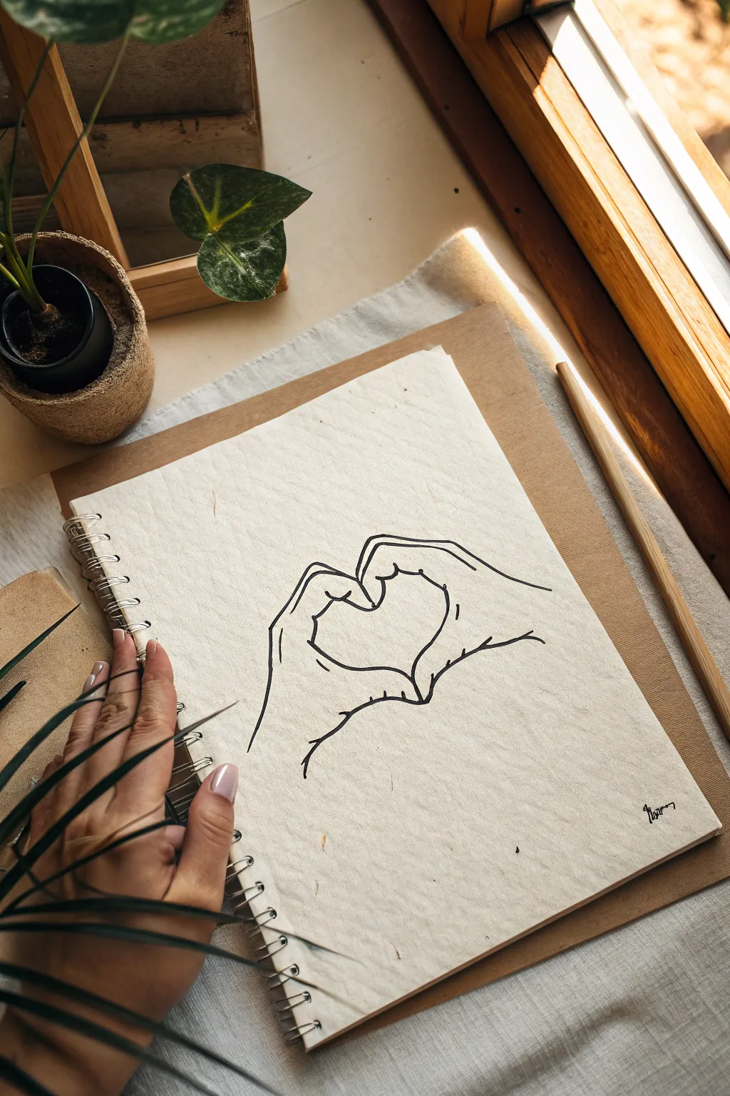
Capture a gesture of love with this minimalist line drawing of two hands forming a heart. Using simple contour lines on textured paper creates a raw, organic feel that is perfect for cards or journal entries.
Step-by-Step
Materials
- Textured cream or off-white sketchbook paper
- HB graphite pencil (for initial sketch)
- Kneaded eraser
- Fine liner pen (black, 0.5mm or 0.8mm)
- Ruler (optional, for placement)
Step 1: Drafting the Basic Shapes
-
Establish the center point:
Begin by lightly marking a small dot in the center of your page to serve as the anchor point for the heart’s bottom tip. This helps keep your composition balanced. -
Sketch the thumb framework:
Draw two angled ovals touching at their tips near the top center. These will represent the thumbs pointing downward to form the top arches of the heart. -
Outline the index fingers:
Curving downwards from the thumbs, sketch two long, sweeping shapes that meet at the bottom center dot. This creates the primary heart silhouette formed by the index fingers. -
Block in the palms:
Extend lines outward from the base of the thumb ovals to suggest the width of the hands. Allow these lines to flare out slightly, indicating the wrist area. -
Add finger suggestions:
Behind the main heart shape, lightly sketch the simplified forms of the remaining fingers tucked behind. You only need the knuckles and top edges visible to show the bulk of the hand.
Step 2: Inking the Outline
-
Begin the final lines:
Switch to your black fine liner pen. Start at the very center where the thumbnails meet. Draw the cuticle and nail of the left thumb first to set your scale. -
Form the left arch:
Trace the curve of the left thumb, bringing the line down along the inner edge of the index finger. Keep your line weight consistent but relaxed; a little wobble adds character. -
Complete the heart tip:
Continue the line from the left index finger down to the bottom point, then curve sharply upward to start the right index finger’s inner edge. -
Draw the right arch:
Follow your sketch up the right index finger, curving back inward to outline the right thumb. Ensure the two thumbs press together gently at the top. -
Define the outer hand contours:
Starting from the left wrist area, draw a line upward that bumps out slightly for the knuckles of the pinky and ring finger before joining the main hand shape. -
Detail the right hand profile:
Repeat the process on the right side. Draw a sweeping line from the wrist that suggests the back of the hand, curving in toward the thumb base.
Natural Lines
Don’t try to make straight lines perfect. The charm of this style comes from slightly shaky, organic strokes that mimic the skin’s texture.
Step 3: Refining Details
-
Add knuckle creases:
Draw small, short curved lines where the thumbs bend. These tiny details are crucial for making the hands look flexible rather than rigid. -
Indicate finger separation:
On the outer edges of the hands, add very small tick marks or broken lines to suggest where the folded fingers separate from one another. -
Detail the nails:
Add the thumbnail on the right hand. Keep the shape simple—just a curved line for the cuticle and the top edge of the nail. -
Texturize the wrist area:
At the bottom where the wrists would continue off-page, leave the lines open-ended. I find this open composition makes the drawing feel more artistic and less distinct. -
Erase pencil guides:
Wait at least five minutes for the ink to fully dry. Then, gently rub your kneaded eraser over the entire drawing to lift up the graphite sketch, leaving only clean ink lines. -
Strengthen key intersections:
Go back over the point where the thumbs touch and where the fingers meet at the bottom. Adding a tiny bit of extra line weight here creates depth and shadow. -
Add a signature:
Finish your piece by signing your name or adding a small date in the bottom corner using the same pen for valid consistency.
Make it Pop
Use a red watercolor wash or colored pencil just inside the heart shape to create a focal point and emphasize the love theme.
Now you have a charming hand-drawn illustration ready to frame or gift to someone special
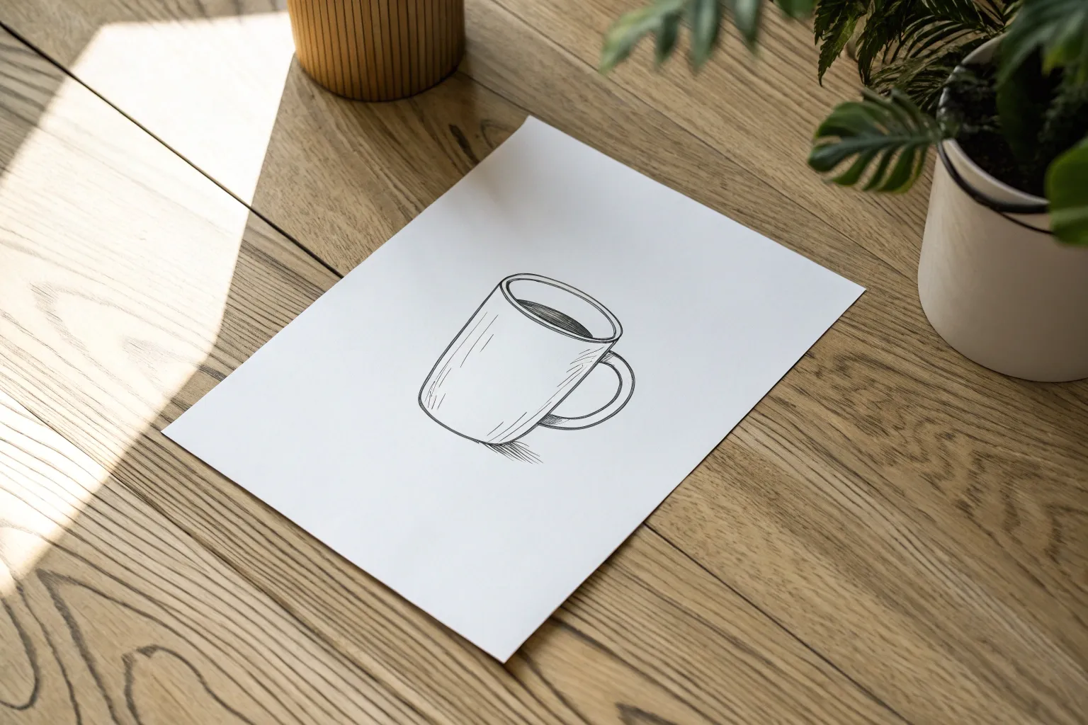
Galaxy in a Teacup
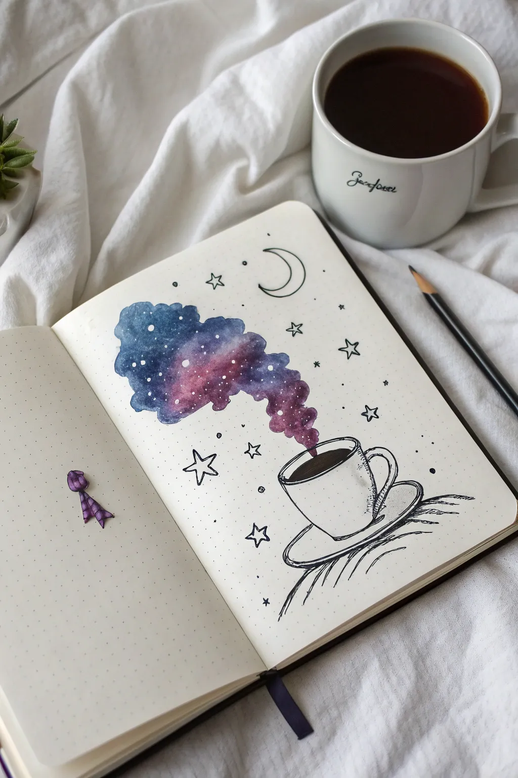
Transform a simple coffee sketch into a magical scene where the steam swirls into a vibrant, starry nebula. This mixed-media project combines crisp black line art with a splash of loose, dreamy watercolor to create a cozy yet mystical vibe.
Step-by-Step Tutorial
Materials
- Dot grid notebook or watercolor paper
- Fine liner pen (black, waterproof, sizes 0.3mm or 0.5mm)
- Pencil and eraser
- Watercolor paints (indigo, violet, magenta/pink)
- Small round watercolor brush (size 2 or 4)
- White gel pen or white gouache
- Water cups and paper towel
Step 1: Sketching the Foundation
-
Place your cup:
Start by lightly sketching a simple teacup shape in the lower right quadrant of your page. Draw a wide oval for the rim and a ‘U’ shape for the body. -
Add the saucer:
sketch a larger, flatter oval underneath the cup to represent the saucer. It creates a nice base for your object to sit on. -
Outline the coffee:
inside the rim oval, draw a smaller curve to indicate the surface of the coffee or tea. This will later be filled in with dark ink. -
Draw the steam path:
Instead of normal steam lines, sketch a billowing cloud shape rising from the cup. Let it curve upward and to the left, getting wider as it rises, like a genie escaping a bottle.
Bleeding Lines?
If your black ink blurs when you add watercolor, your pen isn’t waterproof. Test your pen on a scrap piece of paper with water before starting the final piece.
Step 2: Inking the Lines
-
Trace the cup:
Using your waterproof fine liner, carefully go over your pencil lines for the cup, handle, and saucer. I find that quick, confident strokes often look smoother than slow, shaky ones. -
Fill the liquid:
Color in the coffee surface completely black with your pen. Leave a tiny sliver of white near the edge if you want to suggest a reflection on the liquid. -
Add grounding lines:
Sketch a few quick, scratchy hatched lines underneath the saucer to ground the image so the cup isn’t floating in space. -
Erase pencil marks:
Once the ink is totally dry—give it a minute or two—erase the pencil lines around the cup. Leave the pencil outline for the steam cloud for now; we’ll paint inside it.
Level Up: Salt Galaxy
While the watercolor paint is still wet, sprinkle a tiny pinch of table salt onto the cloud. When it dries and you brush the salt off, it leaves beautiful star-burst textures.
Step 3: Painting the Galaxy
-
Prepare your colors:
Activate your watercolors. You’ll want a deep indigo blue, a rich violet or purple, and a touch of bright magenta or pink. -
Base layer:
Wet the paper inside your steam cloud shape with clean water first. Then, drop in your lightest color (magenta) near the bottom of the cloud where it meets the cup. -
Blend upwards:
While the paper is still damp, introduce the purple in the middle section, letting it bleed naturally into the pink. -
Add the deep space:
Load your brush with indigo blue and paint the top left portion of the cloud. Allow this dark color to swirl into the purple, creating that soft gradient look. -
Refine the edges:
Carefully paint along the edges of your cloud shape to give it a defined silhouette. The contrast between the crisp edge and the blended interior is key. -
Let it dry:
Wait for the paint to dry completely. If the paper feels cold to the touch, it’s still wet.
Step 4: Celestial Details
-
Add stars:
Using a white gel pen or a tiny dot of white gouache, tap little stars onto the dried watercolor cloud. Vary the spacing so it looks random. -
Draw the environment:
Switch back to your black fine liner. Draw outline stars around the cloud—some five-pointed, some four-pointed. -
Include the moon:
Sketch a simple crescent moon near the top of the cloud to balance the composition. -
Final dusting:
Scatter tiny black dots and small circles around the background stars to fill the empty space and create movement.
Now you have a dreamy piece of art that perfectly captures the magic of a morning coffee
Have a question or want to share your own experience? I'd love to hear from you in the comments below!