If you’ve ever watched two colors melt into each other on a canvas, you already know how satisfying ombre painting can be. Here are my favorite ombre painting ideas—from classic, soothing gradients to bolder, more unexpected twists you can totally make your own.
Classic Two-Color Vertical Ombre
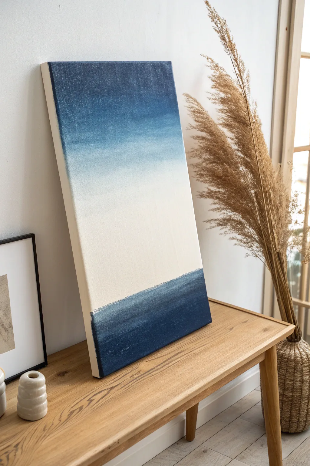
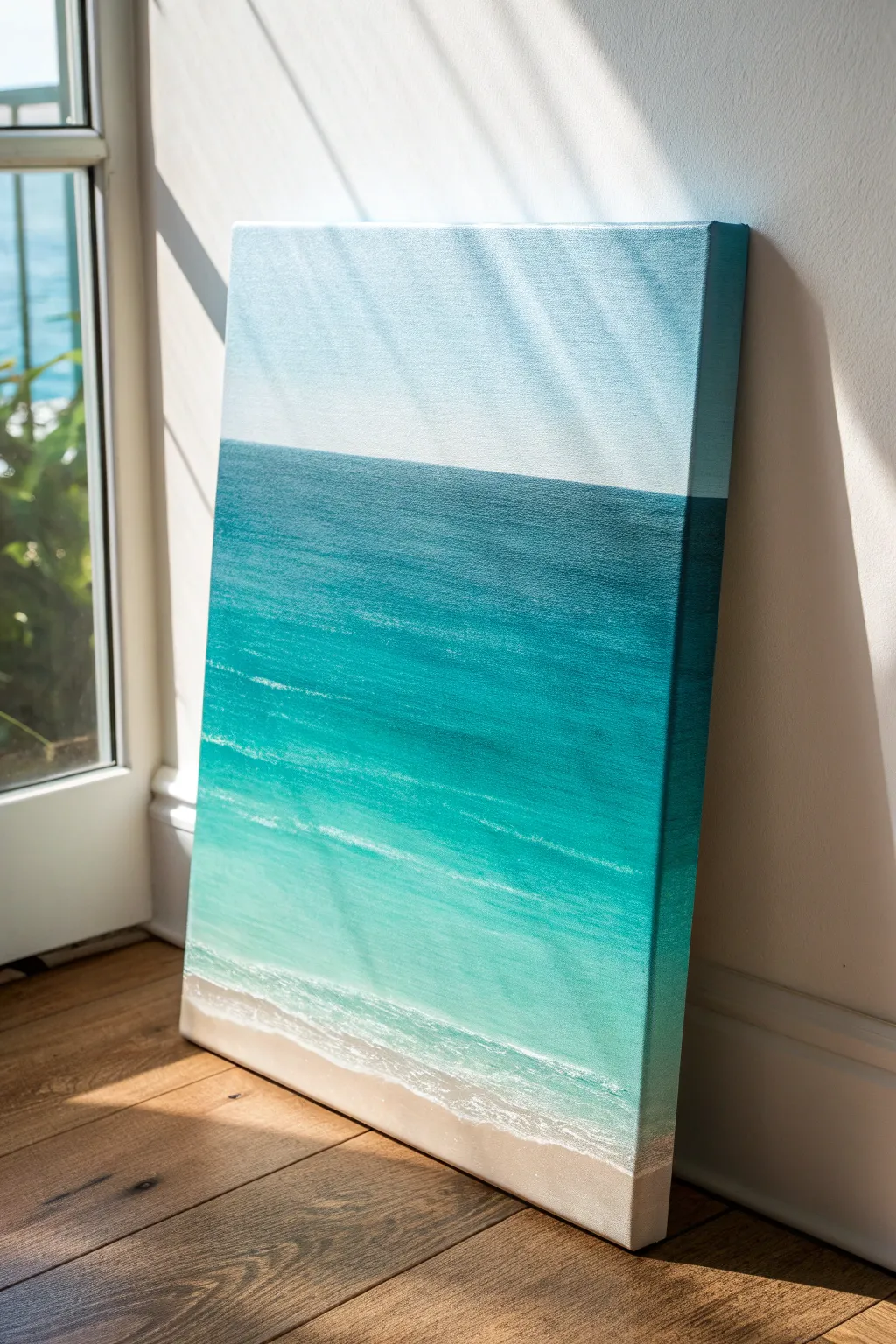
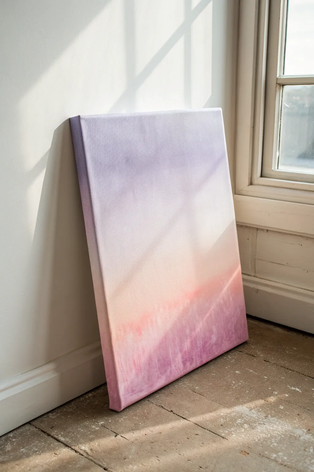
Capture the serene essence of a shoreline with this vertical canvas painting, featuring deep indigo waves that transition dramatically into a calm white center before fading back into a soft denim sky. This piece uses a wet-on-wet blending technique to create smooth, atmospheric gradients that feel both modern and timeless.
Step-by-Step Guide
Materials
- Rectangular stretched canvas (e.g., 20×40 inches)
- Acrylic paints (Indigo Blue, Phthalo Blue, Titanium White)
- Small amount of water for misting
- Large flat paintbrush (2-3 inches wide)
- Medium filbert brush for edges
- Palette or mixing plate
- Spray bottle with water
- Paper towels
- Drop cloth
Step 1: Preparation and Base Colors
-
Set up your workspace:
Lay down your drop cloth and set your canvas upright against a wall or on an easel. Having the canvas vertical helps you visualize the horizon line better than working flat. -
Define the color zones:
Squeeze out generous amounts of your three main colors onto the palette. You will need significantly more White than Blue. -
Paint the bottom section:
Using your large flat brush, load it with the darkest Indigo Blue. Paint the bottom 15-20% of the canvas with horizontal strokes to establish the ‘sea’ base. -
Paint the top section:
Clean your brush thoroughly. Load it with a mix of Phthalo Blue and a touch of Indigo. Paint the top 20% of the canvas, ensuring even coverage along the upper edge. -
Fill the center:
Clean the brush again. Fill the large middle section with pure Titanium White. Don’t worry about the borders touching the blue sections just yet; leave a small gap of about an inch between the white and the blue zones.
Keep it Wet
Acrylics dry fast. If the paint starts dragging or feeling sticky while blending, mist it immediately with water to reactivate the flow.
Step 2: Creating the Ombre Blend
-
Mist the canvas:
Lightly spritz the entire canvas with your spray bottle. The paint needs to stay wet for successful ombre blending, so a fine mist is crucial here. -
Blend the bottom transition:
Use the large brush—slightly damp but without extra paint—to stroke horizontally where the dark Indigo bottom meets the White center. -
Work the gradient upwards:
Continue brushing back and forth across that transition line, slowly moving the brush upwards into the white area to drag the blue pigment up gently. -
Clean and repeat:
Wipe your brush on a paper towel often. If you don’t clean it, you’ll drag too much dark blue into the white, ruining the fade. -
Blend the top transition:
Flip the canvas upside down if it helps you reach, or simply work from the top down. Blend the upper blue section into the white center using long, sweeping horizontal strokes. -
Softening the sky:
I like to use a very dry, clean brush for this step. Lightly whisk over the top transition zone to eliminate harsh lines, creating a soft, cloud-like fade.
Step 3: Refining Details
-
Add depth to the bottom:
While the bottom section is still slightly tacky, mix a tiny bit of White into your Indigo. Add a few subtle horizontal streaks in the dark blue area to suggest movement in the water. -
Create the horizon line:
The transition from the dark bottom to the white center can be slightly sharper than the sky blend. Use a smaller brush to define a slightly textured ‘horizon’ line where the deep blue ends. -
Paint the canvas edges:
Don’t forget the sides of your canvas. Use your medium filbert brush to extend the colors around the edges—dark blue on the bottom sides, white in the middle, and blue on the top. -
Final smoothing pass:
Step back and look at the gradient. If any area looks streakier than you want, very lightly brush over it with a slightly damp, clean brush to unify the texture. -
Let it cure:
Allow the painting to dry undisturbed for at least 24 hours. Acrylics dry fast to the touch, but thick layers need time to fully set.
Muddy Middle?
If your white section is turning too blue, stop. Let it dry completely, then paint a fresh layer of Titanium White over the center and re-blend edges.
Once dry, this soothing gradient piece is ready to bring a breath of fresh coastal air to your living space

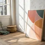
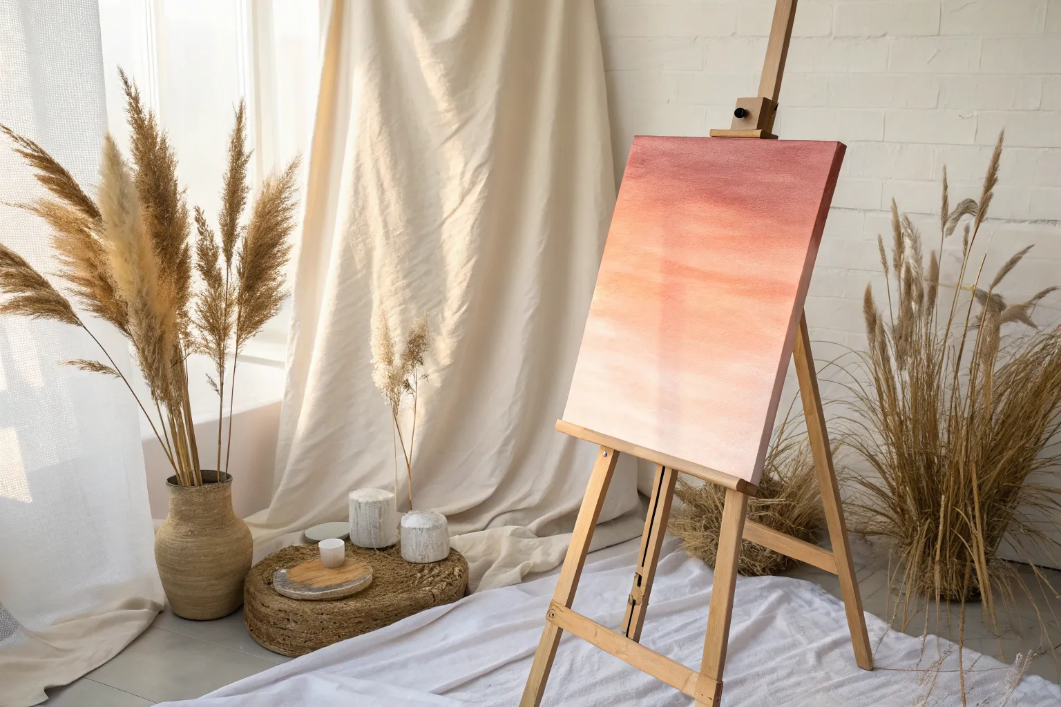
Sunset Blend Ombre Sky
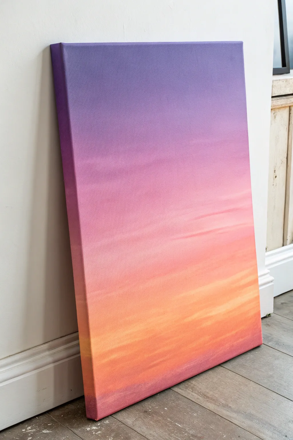
Capture the serene beauty of twilight with this seamless ombre blends painting. This project focuses on masterfully transitioning from deep violets to warm, glowing oranges to create a tranquil sunset sky effect.
Step-by-Step
Materials
- Stretched canvas (rectangular, portrait orientation)
- Acrylic paints: Deep Violet, Magenta, Titanium White, Cadmium Orange, Cadmium Yellow Medium
- Large flat synthetic brush (2-3 inch)
- Medium flat brush (1 inch)
- Palette knife
- Palette or disposable plate
- Cup of water
- Paper towels
- Spray mister bottle (optional)
Step 1: Setting the Foundation
-
Prepare the workspace:
Lay down drop cloths or old newspapers to protect your flooring. Set up your canvas upright against an easel or wall, or lay it flat on a table if you prefer easier control over drips. -
Mix your base colors:
Squeeze generous amounts of deep violet, magenta, orange, yellow, and white onto your palette. You will need plenty of paint to ensure a smooth blend without the brush dragging. -
Prime the canvas:
Apply a thin, even coat of Titanium White across the entire canvas using your large flat brush. This wet base helps the colored paints slide and blend more easily.
Paint drying too fast?
Acrylics dry quickly! Keep a spray bottle handy to mist the canvas, or mix a slow-drying medium (retarder) into your paints before starting.
Step 2: Blocking in Color Zones
-
Apply the top band:
Load your large brush with Deep Violet. Paint a horizontal band across the top quarter of the canvas, ensuring you wrap the color around the top and side edges for a finished look. -
Add the middle transition:
Wipe your brush slightly (don’t wash it fully). Pick up Magenta and paint the next section below the violet, overlapping the wet violet edge by about an inch. -
Introduce the warmth:
Clean your brush thoroughly. Mix a little Magenta with Cadmium Orange to create a coral hue. Apply this band below the pure magenta section, working your way down the canvas. -
Apply the glowing horizon:
Rinse the brush again. Load it with a mix of Orange and Cadmium Yellow. Paint the lower third of the canvas, leaving just a thin strip at the very bottom empty. -
Create the ground line:
At the very bottom edge, apply a narrow strip of dark purplish-red (mix a little violet back into your orange/magenta residue) to inhibit a sense of ground or deep shadow.
Smoother Gradients
Wash your brush completely between blending different color zones. A dirty brush will drag dark purple into yellow and create muddy, brown streaks.
Step 3: The Great Blend
-
Begin the top blend:
Return to the top of the canvas while the paint is still wet. Using a clean, slightly damp large brush, work the transition line between the violet and magenta using long, horizontal strokes. -
Move to the center gradient:
Work your way down to where the magenta meets the coral/orange. Use a back-and-forth sweeping motion to blur the hard line between the colors. -
Smooth the warm tones:
Continue blending downwards into the yellow-orange section. If the paint feels tacky or drags, lightly mist the canvas with water—just a tiny spritz—to reactivate the acrylics. -
Check the edges:
Don’t forget to check the sides of the canvas. Extend your blending strokes around the corners so the gradient looks continuous from all viewing angles. -
Strengthen the violet:
If the blending has made the top purple too pale, add a fresh layer of Deep Violet to the very top edge and softly feather it downwards again. -
Adding texture detail:
Switch to a smaller 1-inch brush. Load it with a pale mix of yellow and white. Add very subtle, horizontal streaks in the orange section to suggest faint cloud layers. -
Final softening:
I like to take a large, dry soft brush and very lightly whisk over the entire surface in horizontal strokes to remove prominent brush ridges and unify the glow.
Allow your beautiful sunset gradient to dry completely before displaying it in your favorite corner


Ocean Fade Ombre Water
Capture the calming essence of the seaside with this stunning ombre painting that transitions from sandy shores to deep horizons. This project uses smooth blending techniques to create a realistic yet soothing gradient of teal and turquoise water.
Step-by-Step Guide
Materials
- Rectangular stretched canvas (e.g., 18×24 inches)
- Acrylic paints: Titanium White, Unbleached Titanium (sand), Phthalo Blue, Phthalo Green, Cerulean Blue
- Large flat brush (2-inch)
- Medium flat brush (1-inch)
- Small round detail brush
- Palette knife (optional for mixing)
- Water cup and paper towels
- Ruler and pencil
Step 1: Setting the Horizon
-
Define the horizon line:
Place your canvas vertically. Measure about two-thirds of the way up the canvas and use a ruler to draw a very light, straight horizontal line across the width. This divides your sky from your ocean. -
Mix the sky color:
On your palette, mix a large amount of Titanium White with a tiny touch of Cerulean Blue. You want a very pale, almost white, sky blue. -
Paint the sky gradient:
Starting at the very top edge of the canvas, paint a strip of slightly darker blue (add a bit more Cerulean). Immediately below it, use your pale mix. Blend them downwards using horizontal strokes until you reach the horizon line, where the color should be almost pure white. -
Let the sky dry:
Allow the sky section to dry completely before touching the horizon line again. This ensures a crisp edge later.
Blending trouble?
If the paint dries too fast while blending the ombre layers, lightly mist the canvas with water or use a slow-drying medium to keep the acrylic workable longer.
Step 2: Creating the Deep Ocean
-
Mix the deep sea color:
Combine Phthalo Blue and Phthalo Green with a small amount of black or dark grey to create a rich, deep teal color. -
Paint the horizon edge:
Turn the canvas upside down if it helps you paint a straighter line. Using the medium flat brush, careful paint a sharp line of deep teal right against the dry sky line. -
Fill the deep water zone:
Continue painting downwards (technically upwards if your canvas is flipped) with the deep teal for about 4-5 inches. Keep your brushstrokes mostly horizontal to mimic the water’s surface.
Step 3: Blending the Ombre Water
-
Transition to mid-tones:
Without washing your brush fully, dip into some pure Phthalo Green and a little White. Paint this turquoise mix directly below the deep teal band. -
Blend the transition:
Using long, sweeping horizontal strokes, brush back and forth where the deep teal and turquoise meet. I like to keep the brush slightly damp to help the acrylics merge smoothly. -
Creating the shallows:
Mix a light aqua color using Titanium White, Phthalo Green, and a tiny dot of Phthalo Blue. Apply this to the lower section of the water, leaving about 3 inches at the bottom for the sand. -
Blend the shallows:
Just like before, blend the meeting point between the turquoise mid-tone and the light aqua shallows. The goal is a seamless fade from dark top to light bottom.
Level Up: Texture
Mix heavy gel medium into your white paint for the final foam details. It creates raised, 3D ridges that catch the light like real sea foam.
Step 4: The Shoreline
-
Paint the sand:
Mix Unbleached Titanium with a lot of White for a soft sandy beige. Fill in the remaining bottom strip of the canvas. -
Create the wet sand effect:
Where the water meets the sand, brush a little bit of the light aqua paint over the beige while it’s still tacky. This creates the transparent look of wet sand. -
Add the white foam line:
Load a small round brush with pure Titanium White. Paint a thin, slightly wavy line right where the water meets the sand. -
Feather the foam:
Immediately use a clean, dry brush to lightly ‘feather’ the top edge of that white line upwards into the blue water, creating the look of sea foam receding. -
Add subtle wave crests:
Using a very dry brush with a tiny amount of white paint, add horizontal streaks throughout the aqua and turquoise sections. Keep these very faint and disconnected to suggest distant rolling waves. -
Paint the edges:
Don’t forget to extend your colors around the sides of the canvas. Match the sky, water, and sand gradients on the edges for a finished, gallery-ready look.
Now you have a tranquil seascape that brings a breath of fresh ocean air into your home
Blue-to-White Morning Sky Ombre
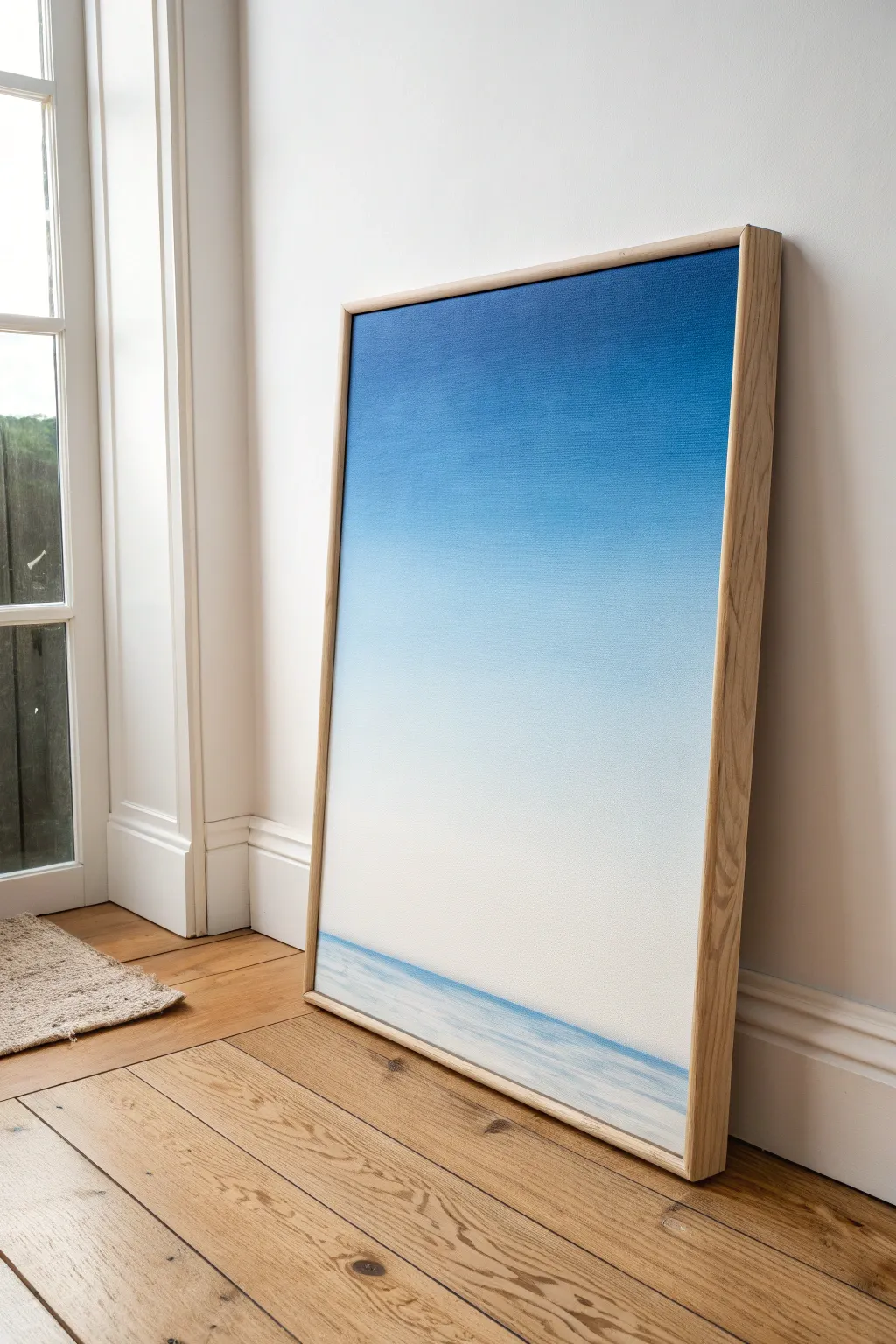
Capture the serene stillness of dawn with this sleek blue-to-white ombre painting on canvas. The smooth gradient mimics a vast, cloudless sky meeting a calm ocean horizon, creating a minimalist statement piece perfect for a modern space.
Step-by-Step Tutorial
Materials
- Large rectangular stretched canvas (e.g., 24×36 inches)
- Acrylic paints: Ultramarine Blue, Phthalo Blue, Titanium White
- Large flat paintbrush (2-3 inches wide)
- Wide blending brush or soft synthetic brush
- Palette or large mixing surface
- Water container
- Spray bottle with water (misting)
- Paper towels or rag
- Painter’s tape
- Light wood floater frame (optional, for finishing)
Step 1: Preparation & Base Mixing
-
Prep your workspace:
Lay down a drop cloth or newspaper to protect your floor. Set up your canvas vertically against a wall or easel, as gravity can help slightly with blending large gradients, though laying flat is safer for beginners to avoid drips. -
Pre-mix your gradient values:
On your palette, create four distinct pools of paint to ensure a smooth transition. Start with pure Ultramarine Blue for the darkest top section. -
Mix the mid-tone blues:
Create your second pool by mixing Ultramarine Blue with a touch of Phthalo Blue and a little Titanium White. This will be your transition from deep sky to mid-sky. -
Mix the pale sky tones:
For the third pool, use mostly Titanium White with a very small amount of Phthalo Blue. This should be a very pale, airy blue. -
Prepare the horizon white:
The final pool should be pure Titanium White. Keep a generous amount ready, as the bottom third of the canvas relies heavily on this bright, clean tone.
Keep it workable
Use a retarder medium mixed into your acrylics. This slows drying time significantly, giving you stress-free minutes to perfect that flawless, cloud-like gradient blend.
Step 2: Painting the Gradient Sky
-
Apply the darkest blue:
Using your large flat brush, paint the top 1/4 of the canvas with the pure Ultramarine Blue. Use long, horizontal strokes that go all the way from the left edge to the right edge. -
Add in the mid-tone:
Immediately below the dark blue, apply your second mixed blue pool. Allow the wet edges to touch. Don’t worry about blending perfectly just yet; simply get the color onto the canvas. -
Start the initial blend:
While the paint is still wet, use a clean, slightly damp blending brush to work the boundary between the dark and mid-tone blues. Use soft, horizontal strokes to blur the line. -
Apply the pale blue:
Continue down the canvas with your third pool (the pale blue mix), covering the middle section. Bring this color down until you are about 1/5th from the bottom edge. -
Blend the mid-section:
Use your blending brush again to seamlessly merge the mid-tone blue into this paler blue. If the paint feels tacky, give it a very light mist of water to keep it workable. -
Add the white horizon area:
Fill the remaining bottom section with pure Titanium White, bringing it up to meet the pale blue. This large expanse of white creates that foggy, ethereal morning effect. -
Refine the full gradient:
With a large, clean, dry brush, sweep horizontally across the entire canvas from top to bottom. I find this helps eliminate brush marks and creates that super-smooth, airbrushed look essential for an ombre sky.
Step 3: Creating the Sea Horizon
-
Let the sky dry:
Allow the main gradient layer to dry completely. This is crucial so your sharp horizon line doesn’t muddy into the sky. -
Tape the horizon line:
Place a strip of painter’s tape horizontally across the bottom of the canvas, roughly 1/8th of the way up from the bottom edge. Ensure it is perfectly level. -
Paint the water line:
Mix a light blue-grey using White and a tiny dot of Ultramarine. Paint below the tape line to create the ocean surface. Keep the strokes horizontal and slightly textured to suggest ripples. -
Add subtle depth:
While the water area is wet, add a hairline streaking of darker blue right against the tape edge to suggest the depth of the horizon line where the water meets the sky. -
Remove the tape:
Carefully peel off the painter’s tape while the paint is still slightly damp to reveal a crisp, sharp horizon line. -
Soften the water:
If the water looks too stark against the white sky, use a dry brush with a tiny amount of white paint to lightly feather the bottom area of the water, fading it out slightly toward the very bottom edge of the canvas.
Level Up: Texture
Before painting, apply a thin layer of fine texture paste to the bottom ‘water’ section only. When you dry-brush over it later, it will catch the paint like real waves.
Step 4: Finishing Touches
-
Inspect the edges:
Paint the sides of your canvas to match the gradient on the front, or paint them a solid white for a clean, gallery-wrapped look. -
Frame the piece:
Once fully dry (give it 24 hours), install the canvas into a light wood floater frame. This natural wood tone contrasts beautifully with the cool blues and warms up the overall presentation.
Hang your new masterpiece in a well-lit room and enjoy the calm atmosphere it brings to your home
BRUSH GUIDE
The Right Brush for Every Stroke
From clean lines to bold texture — master brush choice, stroke control, and essential techniques.
Explore the Full Guide
Night Sky Ombre With Speckled Stars
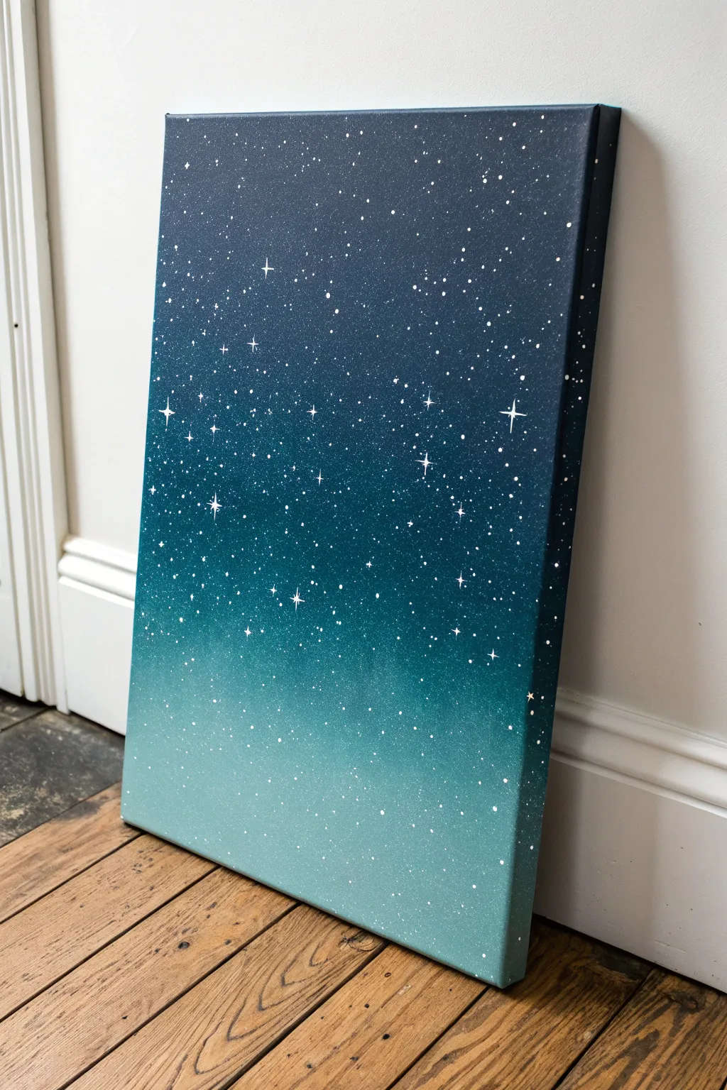
This stunning canvas captures the serene transition from a deep midnight sky to a glowing teal horizon, sprinkled with a galaxy of stars. The seamless ombre blend serves as the perfect backdrop for a constellation of splatter-painted stardust.
Detailed Instructions
Materials
- Rectangular stretched canvas (e.g., 16×20 or 12×16)
- Acrylic paints: Navy Blue, Phthalo Blue (or similar deep blue), Teal, White
- Large flat brush (1.5 or 2 inch) for blending
- Medium flat brush
- Small round detail brush (size 0 or 1)
- Old toothbrush or stiff bristle fan brush
- Cup of water
- Paper towels
- Palette or paper plate
Step 1: Creating the Ombre Base
-
Prepare the palette:
Squeeze out generous amounts of Navy Blue, Phthalo Blue, Teal, and White onto your palette. You will need plenty of paint to ensure a smooth blend without the canvas drying too quickly in between layers. -
Apply the darkest tone:
Using your large flat brush, paint the top third of the canvas with Navy Blue. Use horizontal strokes that go all the way across the canvas, ensuring you also paint the top edge and the upper sides for a finished look. -
Introduce the mid-tone:
Without cleaning your brush thoroughly (wipe it slightly if it’s too saturated), pick up the Phthalo Blue. Paint the middle section of the canvas, slightly overlapping the bottom edge of the Navy Blue section. -
Blend the upper transition:
While both paint sections are still wet, use long, smooth horizontal strokes to work back and forth where the Navy and Phthalo Blue meet. The colors should mix directly on the canvas to create a soft gradient. -
Apply the lightest tone:
Clean your large brush well. Mix the Teal with a small amount of White to create a soft, glowing horizon color. Paint the bottom third of the canvas with this mix, covering the bottom edge as well. -
Finalize the lower blend:
Work the light Teal mix upwards into the Phthalo Blue mid-section. Use light pressure and continuous left-to-right strokes to feather the lighter color into the darker one until no hard lines remain. -
Check the edges:
Inspect the sides of the canvas. Make sure the ombre pattern wraps around the edges of the frame so the painting looks professional from every angle. -
Let it dry:
Allow the background to dry completely. This step is crucial; if the base is wet, your stars will mix with the blue paint and turn muddy instead of staying crisp white.
Muddy Blending?
If the colors are turning gray or muddy, clean your brush completely between blending sections. If paint dries too fast, mist the canvas lightly with water to reactivate it.
Step 2: Adding the Galaxy
-
Prepare the star paint:
Mix a small amount of White paint with a few drops of water. You want the consistency to be like heavy cream or fluid ink—thin enough to splatter easily, but thick enough to be opaque. -
Test the splatter:
Dip an old toothbrush or a stiff fan brush into the thinned white paint. Test your splatter technique on a scrap piece of paper first by running your thumb across the bristles to flick the paint forward. -
Create the star field:
Hold the brush near the canvas and flick the bristles to spray tiny white dots across the entire surface. Vary the distance: hold it closer for dense clusters and further back for a light dusting. -
Add larger distant stars:
Use the handle end of a paintbrush or a dotting tool dipped in un-thinned White paint to place random, slightly larger round dots scattered throughout the sky. -
Paint the hero stars:
Switch to your smallest detail brush. Choose 5-7 spots where you want prominent twinkling stars. Paint a small ‘plus’ sign (+) at each spot using pure White paint. -
Elongate the star rays:
Carefully drag the paint from the center of the ‘plus’ sign outward to make the vertical and horizontal lines longer and thinner, tapering them to a sharp point at the ends. -
Add the diagonal glint:
For the largest stars, paint a tiny ‘X’ shape through the center of the cross you just painted. These lines should be much shorter than the main vertical and horizontal rays. -
Highlight the centers:
Once the star shapes are dry, add a tiny, fresh dot of thick White paint right in the absolute center of your largest stars to make them look like they are glowing intensely.
Starry Precision
When flicking paint for stars, cover your work surface with newspaper first. Paint travels further than you think, and you don’t want a starry table to match your canvas.
Now hang your celestial masterpiece and enjoy the calm view of deep space right in your home
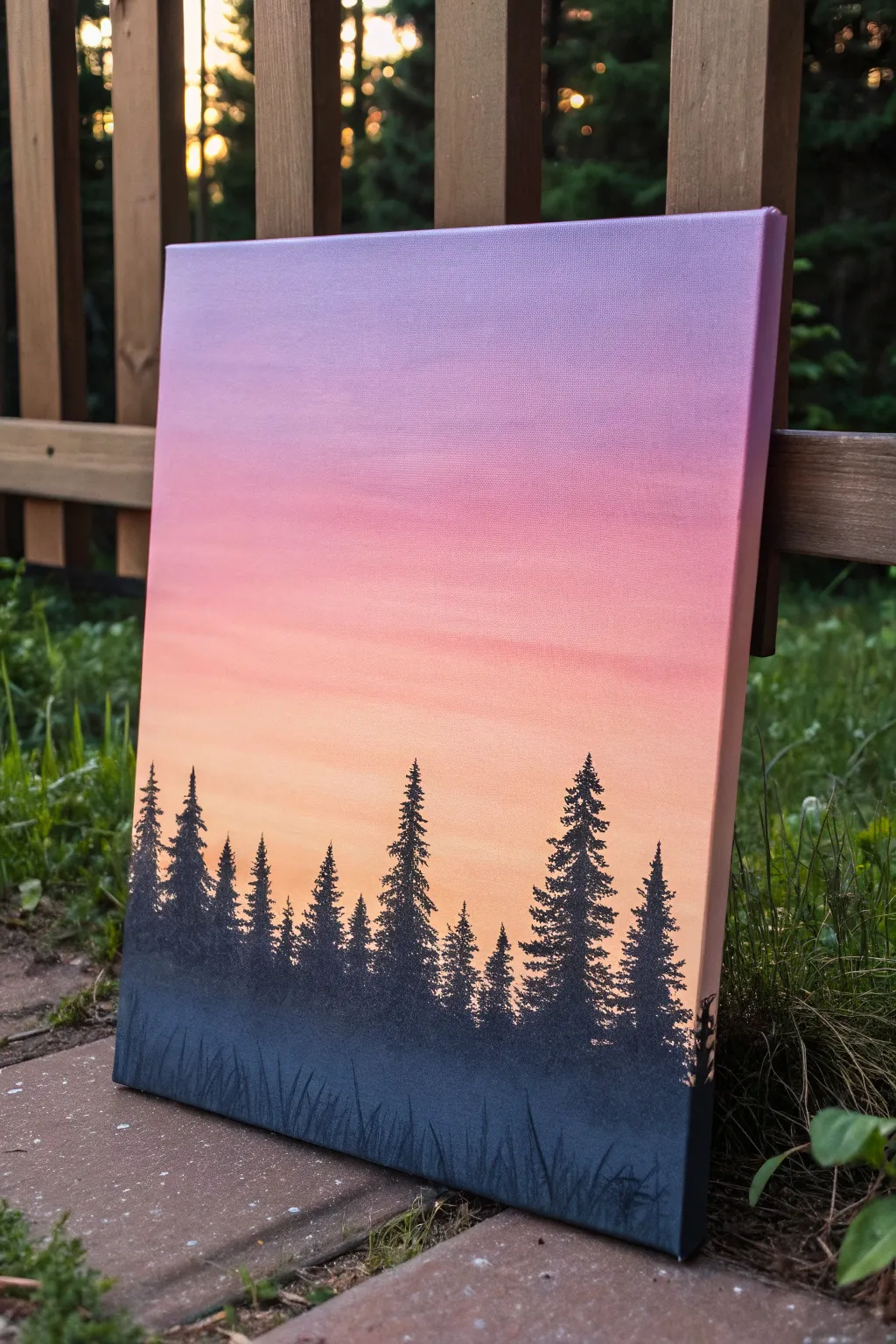
Mountain Silhouette Over Ombre
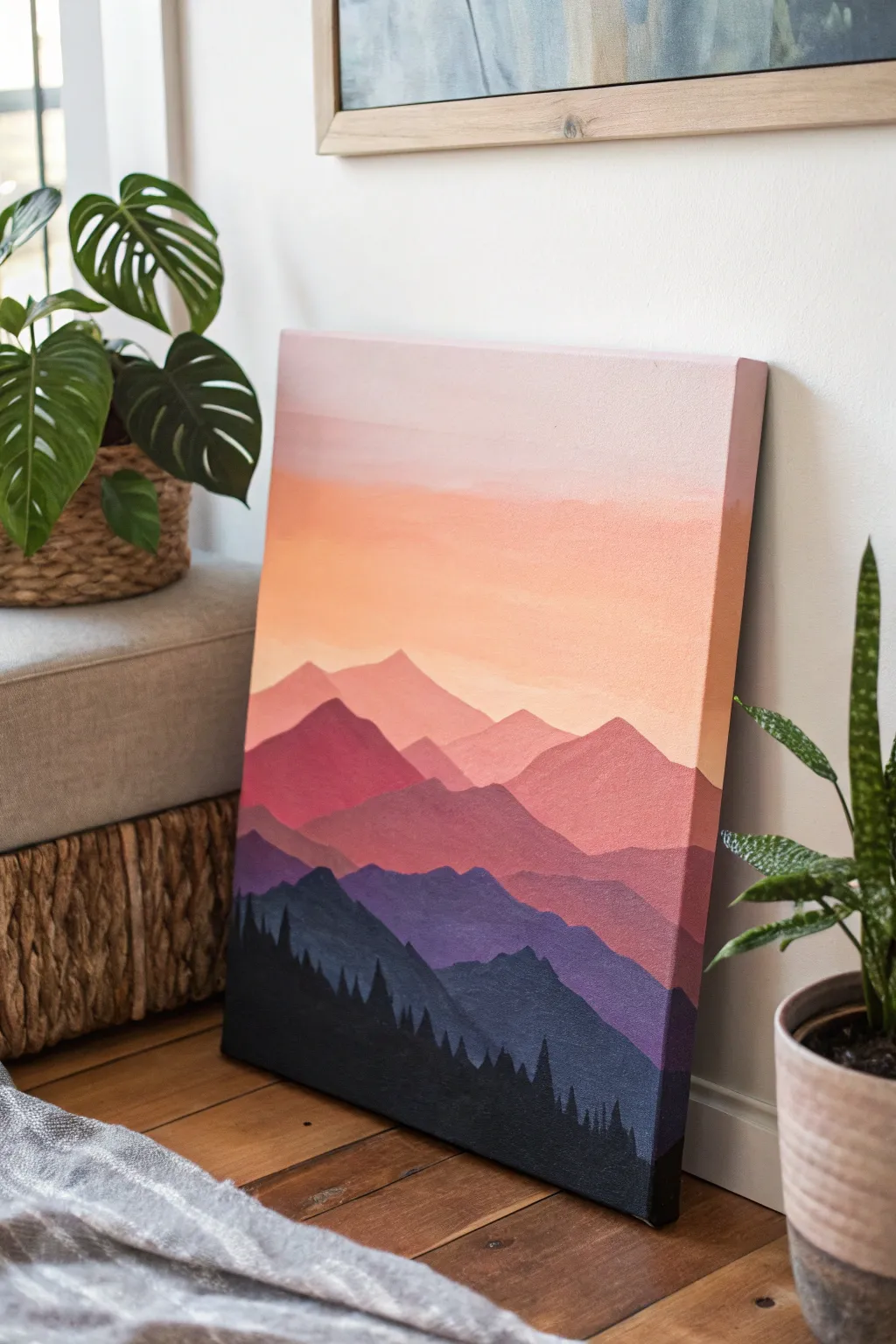
Capture the tranquil beauty of a sunset mountain range with this layered acrylic painting. By blending a soft ombre sky and stacking progressively darker mountain ridges, you’ll create a stunning sense of depth and atmospheric perspective.
How-To Guide
Materials
- Stretched canvas (e.g., 16×20 inch)
- Acrylic paints (Titanium White, Primary Yellow, Magenta, Violet, Phthalo Blue, Mars Black)
- Wide flat brush (2 inch) for the sky
- Medium flat or angle shader brush (1/2 inch) for mountains
- Small round brush (size 2 or 4) for tree details
- Palette or paper plate
- Cup of water
- Paper towels
- Pencil (optional)
Step 1: Painting the Ombre Sky
-
Mix the lightest sky color:
Start by mixing a large amount of Titanium White with a tiny dot of Magenta and a speck of Yellow to create a very pale, warm pink. It should be almost white. -
Apply the top sky layer:
Using your wide flat brush, paint the top third of the canvas with this pale pink mixture. Use long, horizontal strokes from edge to edge to ensure a smooth finish. -
Transition to peach:
While the pink is still wet, mix a little more yellow and a touch more magenta into your white base on the palette to create a soft peach tone. Apply this below the pink section, blending upward where they meet. -
Deepen the horizon color:
Add a bit more magenta and yellow creates a vibrant salmon-orange color. Paint this from the peach section down to where your mountains will begin, roughly halfway down the canvas. Blend the transition carefully while the paint is wet for a seamless gradient. -
Let the sky dry:
Allow the sky completely dry before moving on. I like to take a break here, as painting over a wet sky can muddy the crisp mountain lines we want later.
Uneven Gradients?
If your sky stripes aren’t blending well, keep a slightly damp brush nearby. Run it lightly horizontally across the transition line to soften harsh edges while paint is wet.
Step 2: Layering the Mountains
-
Sketch the ridgelines (optional):
If you’re nervous about freehanding, lightly sketch roughly 4-5 wavy horizontal lines across the canvas to map out your mountain ranges. Make the peaks distinct and jagged. -
Mix the first mountain color:
Prepare a misty rose color by mixing White, Magenta, and a tiny hint of Violet. This should be just slightly darker than your darkest sky color. -
Paint the furthest range:
Using the medium flat brush, paint the silhouette of the furthest mountain range against the sky. Fill in the shape solid down to your next pencil line. -
Create the second range color:
Add more Magenta and a little more Violet to your previous mix. You want a distinct step down in value—darker and richer than the first range. -
Paint the second range:
Paint the next range below the first one. Let the ridges overlap the previous layer to create depth. Don’t worry if the paint is slightly translucent; a second coat can be added once dry. -
Mix a purple-mauve tone:
For the third range, introduce more Violet and a touch of Blue to the mix, reducing the White. This layer creates the transition from the warm sunset colors to the cool shadows. -
Paint the middle ground:
Apply this purple-mauve tone to the third mountain section. Ensure the top edge is crisp and sharp against the lighter range behind it. -
Deepen the color for shadows:
Mix Violet, Phthalo Blue, and a small amount of Black. This should be a deep, cool purple-blue, representing the mountains closer to the viewer in shadow. -
Paint the foreground mountains:
Paint this dark blue-purple layer near the bottom area, leaving just a sliver of space at the very bottom for the tree line.
Step 3: Adding the Pine Forest
-
Mix the darkest value:
Mix a solid black using Mars Black with a tiny bit of Phthalo Blue to give it depth. It should be very opaque. -
Paint the bottom focal mass:
Fill in the very bottom section of the canvas with this black mixture, creating a solid base for your trees. -
Detail the tree tops:
Switch to your small round brush. Along the top edge of the black section, paint small vertical lines of varying heights to form tree trunks. -
Flesh out the branches:
Starting from the top of each trunk line, use a zig-zag motion to tap paint downward, getting wider as you go down. This creates the classic triangular pine tree shape. -
Vary sizes and density:
Make some trees tall and others short to look natural. Ensure they overlap slightly so it looks like a dense forest rather than individual stickers. -
Final touches:
Paint the sides of the canvas to match the adjacent colors if you aren’t framing it, or simply paint the edges black for a finished look.
Metallic Magic
Mix a tiny amount of gold or pearlescent medium into the paint for the sunlit, peach-colored sky section to give the sunset a subtle, shimmering glow.
Step back and admire your atmospheric landscape, bringing a piece of mountain serenity right into your room

PENCIL GUIDE
Understanding Pencil Grades from H to B
From first sketch to finished drawing — learn pencil grades, line control, and shading techniques.
Explore the Full Guide
Pine Forest Line on Ombre Canvas
Capture the serene beauty of twilight with this stunning canvas project featuring a smooth, gradient sky and striking pine silhouettes. The seamless transition from cool lavender to warm peach creates the perfect backdrop for a dramatic, high-contrast forest line.
Step-by-Step Guide
Materials
- Stretched canvas (e.g., 11×14 or 16×20 inches)
- Acrylic paints (Titanium White, Lavender/Light Purple, Magenta or Pink, Light Orange/Peach, Mars Black)
- Large flat brush or wash brush (2-3 inches)
- Medium flat brush
- Small/medium fan brush
- Small round detail brush (size 0 or 1)
- Palette or paper plate
- Cup of water and paper towels
Step 1: Painting the Ombre Sky
-
Prepare the Palette:
Squeeze out generous amounts of your sky colors: Lavender, Magenta, Titanium White, and Light Orange. You will want plenty of white to help blend the transitions smoothly. -
Paint the Top Section:
Using your large flat brush, start at the very top of the canvas with the lavender paint. Apply long, horizontal strokes across the full width, covering about the top quarter of the canvas. -
Introduce the Mid-Tones:
Without cleaning your brush fully, pick up some magenta and mix it slightly with the lavender on your palette. Paint the next section down, overlapping the bottom edge of the pure lavender. -
Blend the Transition:
clean your big brush, dampen it slightly, and run it horizontally back and forth where the purple and pink meet. The goal consists of eliminating any hard lines so the colors melt into each other. -
Add warmth:
Mix a light pink using magenta and plenty of white. Paint the middle section of the canvas, blending it upwards into the darker pink area while the paint is still wet to ensure a soft gradient. -
Create the Horizon Light:
For the bottom third of the sky, switch to your Light Orange or peach color mixed with white. Apply this below the pink section, blending the seam carefully. This area represents the glowing horizon. -
Final Sky Smoothing:
Take a clean, dry brush and very lightly sweep it horizontally across the entire canvas from top to bottom. This soft ‘feathering’ technique removes brushstrokes and perfects the ombre effect. -
Let it Dry:
Allow the background sky to dry completely. If you engage the next step while the sky is tacky, the black trees might muddy the beautiful colors you just created.
Seamless Blending
Keep a misting spray bottle handy. A very light mist over the canvas keeps acrylics wet longer, allowing you more time to blend that perfect gradient without it drying too fast.
Step 2: Creating the Forest Silhouette
-
Establish the Ground Line:
Load a medium flat brush with pure Mars Black. Paint a solid horizontal band at the very bottom of the canvas, about 2-3 inches high, to serve as the dark forest floor. -
Mark Tree Positions:
Use a small round brush to paint thin vertical lines rising from the ground layer. Vary their heights significantly—make some tall leaders and some shorter saplings to keep the composition natural. -
Start the Tree texturing:
Switch to a fan brush loaded with black paint. Turn the brush vertically so you are using just the corner or the thin edge. Start at the top of one of your vertical lines and tap gently to create the tiny top branches. -
Build the Pine Shape:
As you move down the tree trunk, turn the fan brush flat and tap horizontally, moving in a zigzag motion. Widen your strokes as you descend to create the classic triangular pine tree shape. -
Fill in the Foliage:
I like to go back over the trees and dab extra paint in the middle sections to make the trunks look dense. Leave the outer edges slightly jagged and transparent so light seems to peek through the branches. -
Vary the Trees:
Repeat this process for all your vertical lines. Ensure no two trees look identical; give some jagged, sparse branches and others full, thick needles. -
Paint Small Saplings:
Use your small round detail brush to fill the gaps between large trees with tiny, simple tree shapes. These don’t need much detail, just jagged strokes to suggest distance and density. -
Extend the Ground cover:
Using the paint left on your brush, darken the area where the tree trunks meet the ground to ensure they feel rooted and not floating. -
Add Tall Grass Details:
Finally, drag the small round brush or a liner brush upwards from the very bottom edge of the canvas in quick, flicking motions. This creates the look of tall grass blades in the immediate foreground. -
Final Canvas Edges:
Don’t forget to wrap your painting around the sides! Paint the sky colors on the top and side edges, and continue the black ground and trees around the bottom edges for a professional finish.
Starry Night Twist
Before painting the trees, flick a toothbrush loaded with watered-down white paint over the purple section to add a sprinkle of stars for a night-time galaxy vibe.
Step back and admire how the stark black trees pop against your beautifully blended sunset sky
Dandelion Wish Silhouette on Ombre
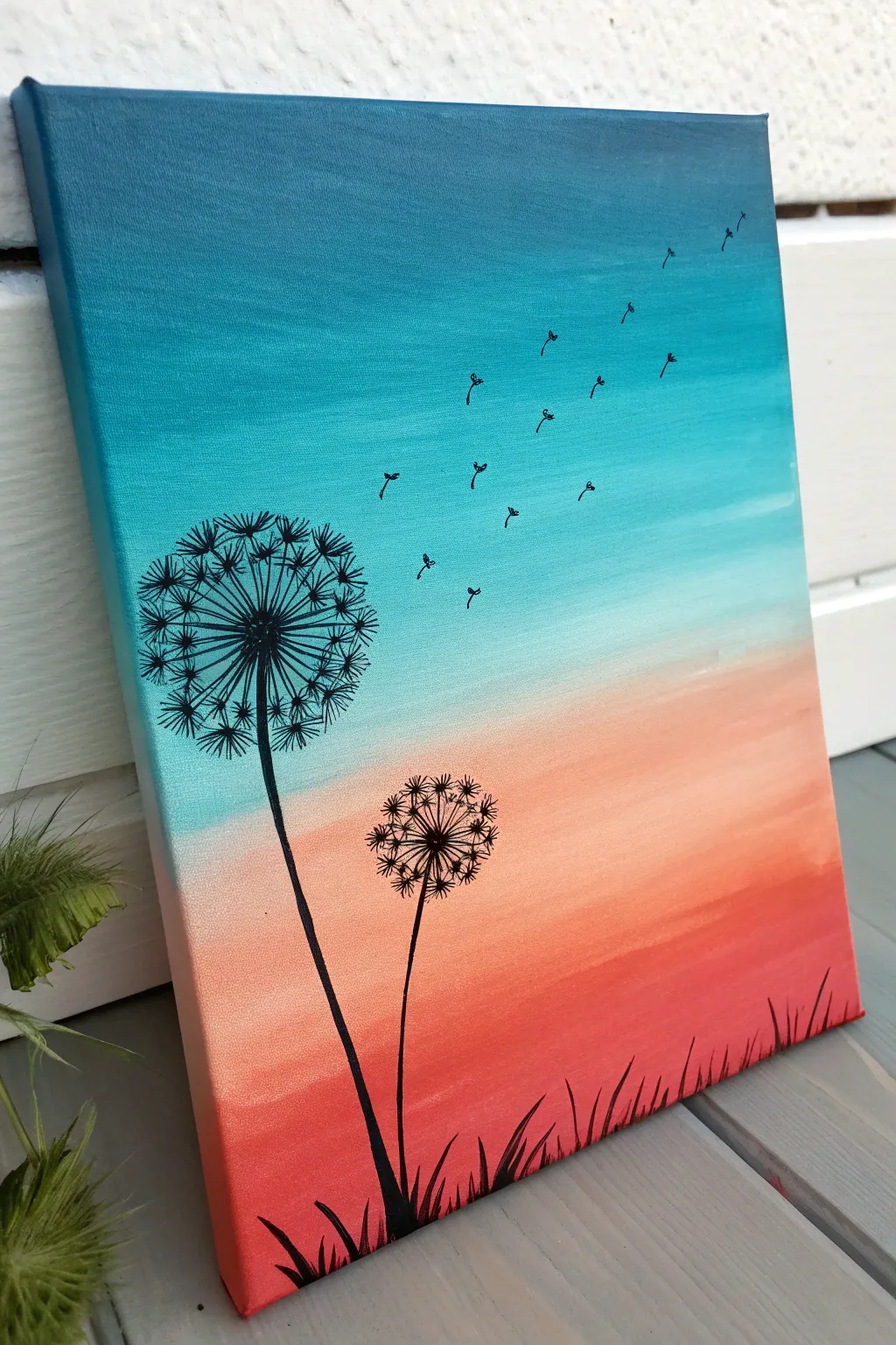
Capture the fleeting beauty of a sunset with this serene acrylic painting, featuring delicate dandelion silhouettes against a vibrant teal and coral backdrop. The smooth ombre gradient creates a peaceful atmosphere, while the stark black details add a touch of whimsy and contrast.
Step-by-Step Tutorial
Materials
- Rectangular stretched canvas (e.g., 8×10 or 11×14 inches)
- Acrylic paints: Teal/Turquoise, White, Salmon/Coral, Red-Orange, Black
- Large flat brush (for background blending)
- Small round detail brush (size 0 or 00)
- Water cup and paper towels
- Palette or paper plate
- Pencil (optional)
Step 1: Creating the Ombre Background
-
Prepare your palette:
Squeeze out your background colors in a line on your palette: Teal at the top, White in the middle, then Salmon, and finally Red-Orange at the bottom. Keep a separate blob of Black for later. -
Start with the sky:
Using a large flat brush, paint the top third of the canvas with a solid coat of Teal. Ensure you paint the top and side edges of the canvas as you go for a finished look. -
Introduce the transition:
Without cleaning your brush, pick up some White paint. Apply this directly below the Teal, blending upwards into the wet Teal paint. Use horizontal back-and-forth strokes to create a smooth, lighter turquoise transition area. -
Shift to warmth:
Wipe your brush on a paper towel to remove most of the cool tones. Pick up the Salmon/Coral color and apply it to the middle-lower section of the canvas, blending it slightly into the white-turquoise area above to create a soft, hazy horizon line. -
Deepen the base:
Load your brush with the Red-Orange paint. Apply this to the bottom quarter of the canvas, blending it smoothly upward into the Salmon section. At the very bottom edge, you can mix a tiny dot of black into the red to ground the painting, though pure vibrant red works well too. -
Perfect the gradient:
Clean your brush completely and squeeze out excess water. With the slightly damp, clean brush, run it horizontally across the transition zones (where colors meet) one last time to feather out any harsh lines. Let the background dry completely before proceeding.
Pro Tip: Blending
Work quickly on the background! Acrylic dries fast, so you need the paint wet to get a smooth ombre blend. A misting spray bottle of water helps keep the paint workable.
Step 2: Painting the Dandelions
-
Sketch the placement:
Once dry, lightly use a pencil to mark the center points of your two dandelions. I suggest placing the larger flower head on the left, slightly above the midpoint, and the smaller one lower and to the right for balance. -
Paint the stems:
Switch to your small round detail brush and thin your black paint slightly with a drop of water for smoother flow. Paint two curved lines starting from the bottom edge of the canvas up to your pencil marks. Make them naturally uneven rather than ruler-straight. -
Create the seed centers:
Paint a small, solid black dot at the top of each stem where the flower head begins. This anchor point will be the center where all your seeds radiate from. -
Draw the spokes:
Using the very tip of your brush, flick thin, straight lines outward from the center dot in a full circle, like the spokes of a bicycle wheel. Make the lines on the larger dandelion longer than the smaller one. -
Add the fluff:
At the end of each ‘spoke’ line, paint tiny ‘V’ shapes or little tufts. Vary the angles slightly to make the dandelion look fluffy and organic. -
Fill in the volume:
Go back and add shorter spokes in between the main ones, adding tiny tufts to these as well. This layering creates the density of the seed head without turning it into a solid black blob.
Step 3: Final Details
-
Floating seeds:
To the right of the large dandelion, paint several small, detached seeds ‘floating’ away into the teal sky. Paint a tiny stem line with a small tuft at the top for each one, arching them upward as if caught in a breeze. -
Paint the grass blades:
Along the very bottom edge of the canvas, use quick, upward flicking motions with your detail brush to create grass blades. Vary their heights and directions so they cross over each other naturally. -
Ground the stems:
Ensure the bottom of your dandelion stems blend seamlessly into this new grassy area, thickening the base where they meet the ‘ground’. -
Review and refine:
Step back and look at your composition. If the dandelions look too sparse, add a few more delicate lines to the flower heads. Ensure your black paint is opaque; add a second coat to the silhouette elements if the background color shows through.
Level Up: Metallic Touch
Once the painting is totally dry, add tiny dots of metallic gold or silver paint to the centers of some dandelion tufts for a magical, shimmering effect.
Now you have a tranquil piece of art that perfectly captures the stillness of early evening.


Birds in Flight Across an Ombre Sky
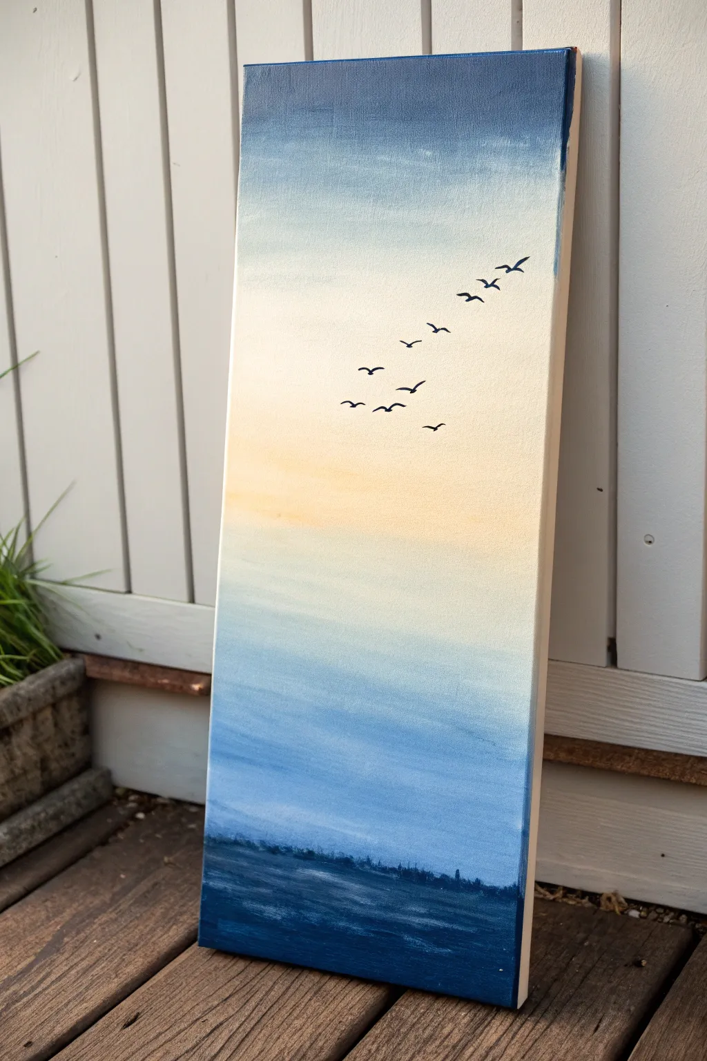
Capture the serene transition of day to dusk with this vertical landscape painting. Using smooth blending techniques, you will create a soft gradient sky that serves as the perfect backdrop for a minimalist flock of silhouetted birds.
How-To Guide
Materials
- Tall, narrow canvas (e.g., 10×20 or similar ratio)
- Acrylic paints (Phthalo Blue, Ultramarine Blue, Titanium White, Naples Yellow or a soft light orange)
- Black acrylic paint or a black paint pen
- Large flat brush or wash brush (2-inch)
- Medium flat brush (1-inch)
- Small round detail brush (size 0 or 1)
- Palette or mixing plate
- Water cup and paper towels
- Spray bottle with water (optional)
Step 1: Creating the Sky Gradient
-
Prepare the deep blue top:
Start by mixing a deep blue shade using Ultramarine Blue with a touch of Phthalo Blue. Apply this color liberally to the top 2-3 inches of your canvas using your large flat brush. -
Begin the transition:
Without cleaning your brush, pick up a significant amount of Titanium White. Mix it directly on the canvas just below the wet dark blue strip to create a medium sky-blue tone. -
Blend downward:
Continue painting downward, adding more white to your brush as you go. Use long, horizontal strokes that span the entire width of the canvas to ensure a seamless fade from dark to light blue. -
Introduce the warmth:
Wash your large brush thoroughly. Below the light blue section (roughly the middle of the canvas), apply a mix of Titanium White with a very small amount of Naples Yellow. This mimics the soft glow of a setting sun. -
Merge blue and yellow:
Gently blend the top edge of this creamy yellow section into the pale blue above it. The colors might mix to create a very subtle green-grey, which is natural; just keep the blending soft and misty. -
Fade back to blue:
As you move past the yellow center band, begin reintroducing pale blue tones. Mix white with a tiny dot of blue and blend it below the yellow area, transitioning slowly back into a cooler palette. -
Deepen the lower sky:
Continue painting downwards, gradually making the blue slightly darker as you approach the bottom quarter of the canvas, preparing the visual space for the water.
Step 2: Painting the Water & Horizon
-
Establish the horizon line:
Switch to your medium flat brush. Mix a dark, moody blue using Phthalo Blue and a tiny touch of black or dark grey. Paint a straight horizontal line across the canvas where the water meets the sky. -
Fill in the sea:
Fill the remaining bottom section of the canvas with this dark blue mixture. Use horizontal strokes to mimic the texture of distant waves. -
Add water texture:
While the dark blue is still slightly wet, mix a slightly lighter blue-grey. Lightly drag your brush horizontally across parts of the water to create the reflection of light on the waves. -
Create the distant skyline:
Using the dark blue mixture, stipple tiny, uneven shapes right along the horizon line. These irregular bumps suggest distant trees or a shoreline.
Keep it Wet
Acrylics dry fast! Mist your canvas lightly with a spray bottle while blending the sky. Moisture helps the colors merge smoothly without harsh lines.
Step 3: Detailing the Flight
-
Plan the composition:
Allow the background to dry completely. Visualize an S-curve or diagonal line stretching from the middle-right up toward the top-right corner to guide your bird placement. -
Paint the first bird:
Using your smallest detail brush and black paint (or a paint pen for easier control), create a small ‘V’ shape near the center. Elaborate on the wings by giving them a slight curve. -
Vary sizes and shapes:
Paint the remaining birds along your imaginary line. Make the birds near the top slightly larger to suggest they are closer, and the ones lower down smaller and simpler. -
Adjust wing positions:
To make the flock look realistic, change the wing articulation for each bird. Some should have wings fully up in a ‘V’, while others should be flatter or dipping down like an ‘M’ shape. -
Final touches:
Check the edges of your canvas. I prefer to paint the sides of the canvas with the matching gradient colors so it looks finished even without a frame.
Muddy Colors?
If the yellow and blue mix too much and turn bright green, let the blue layer dry first. Then, glaze a thin layer of white over it before adding the yellow.
Step back and enjoy the peaceful sense of movement your new artwork brings to the room
Hand-Lettered Quote Over Ombre
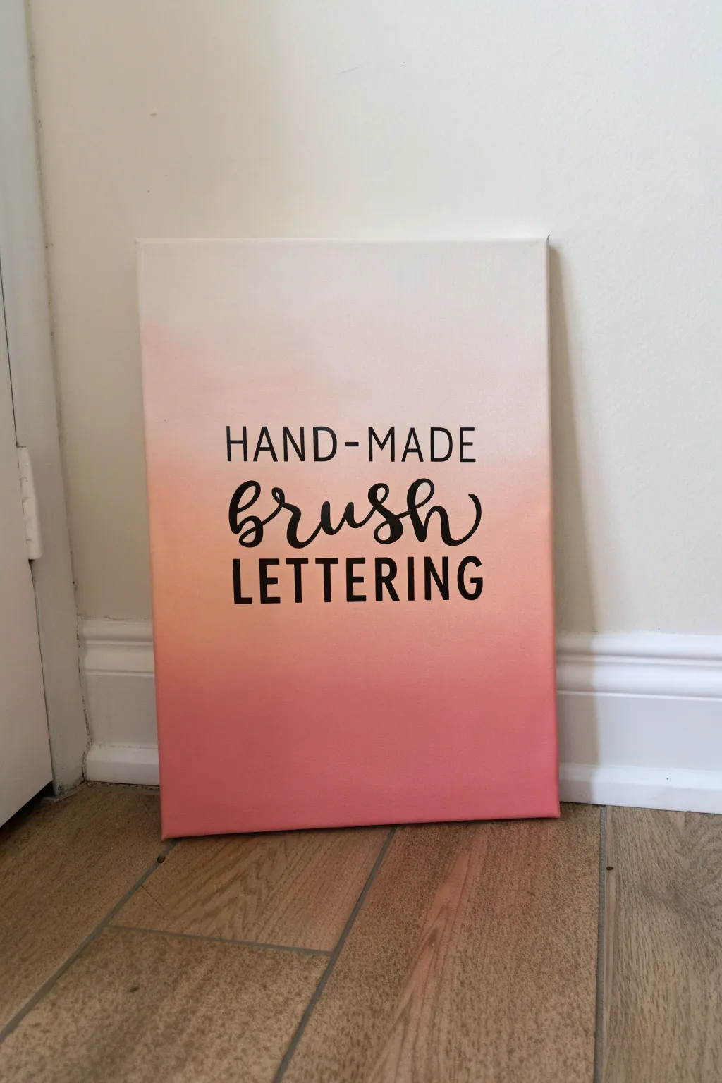
Blend the warmth of a sunrise with crisp, modern typography in this soothing canvas project. The smooth transition from creamy white to deep coral creates a stunning backdrop for your favorite creative phrase.
Step-by-Step Guide
Materials
- Stretched canvas (e.g., 11×14 or 16×20 inches)
- Acrylic paints: White, Pale Peach, and Coral/Dark Salmon
- Large flat brush or foam brush (2-3 inches wide) for background
- Small round synthetic brush (size 2 or 4) for lettering
- Black acrylic paint or black paint marker
- Pencil
- Ruler
- Palette or paper plate
- Water cup and paper towels
- Spray bottle with water (optional)
Step 1: Painting the Ombre Base
-
Prepare your palette:
Squeeze out generous amounts of your three background colors onto your palette: White, Pale Peach, and Coral. Keep them separate for now. -
Apply the darkest shade:
Using your large flat brush, apply the Coral paint in horizontal strokes across the bottom third of the canvas. Ensure the coverage is solid and opaque. -
Add the middle tone:
Without washing your brush fully—just a quick wipe—dip it into the Pale Peach. Paint the middle section of the canvas, slightly overlapping the top edge of the Coral section. -
Blend the transition:
While the paint is still wet, stroke back and forth horizontally where the peach and coral meet. I like to keep my brush slightly damp here to help the colors marry together seamlessly. -
Paint the top section:
Wipe your brush clean or rinse it lightly. Pick up the White paint and cover the top third of the canvas, bringing it down to meet the peach section. -
Final blend:
Blend the boundary between the white and peach just like you did before. Use long, continuous strokes from left to right to smooth out any harsh lines. -
Paint the edges:
Don’t forget to wrap the color around the sides of the canvas frame, matching the gradient on the front for a polished, gallery-ready look. -
Let it cure:
Allow the background to dry completely. This is crucial; if it’s damp, your lettering might smudge or lift the paint. Use a hairdryer on a cool setting if you’re impatient.
Step 2: Adding the Lettering
-
Plan your layout:
Lightly sketch guidelines using a ruler and pencil. You’ll need three lines: one for the sans-serif top text, a centered space for the script, and one for the bottom text. -
Sketch the text:
Using a very light touch, pencil in ‘HAND-MADE’ in block letters, ‘brush’ in a bouncy script, and ‘LETTERING’ in block letters below. Check your centering before moving on. -
Lettering Phase 1: Top line:
Using black acrylic paint and a fine liner brush (or a paint marker), carefully fill in ‘HAND-MADE’. Keep the lines thin and uniform for a clean, modern sans-serif look. -
Lettering Phase 2: The script:
Paint the word ‘brush’ in the center. Use slightly more pressure on the downstrokes to make them thicker, and barely touch the canvas on the upstrokes for hairline thinness. -
Refine the script:
Go back over your downstrokes on the word ‘brush’ to thicken them further if needed. This faux-calligraphy technique helps mimic the look of a brush pen. -
Lettering Phase 3: Bottom line:
Finish by painting ‘LETTERING’ in the same block style as the top line. Ensure the height of these letters matches the top row for balance. -
Erase guidelines:
Once the black paint is 100% dry (give it at least an hour), gently erase any visible pencil marks. -
Add clear coat (Optional):
If you want to protect your work, apply a thin layer of matte varnish spray over the entire piece.
Smooth Operator
Keep a spray bottle of water handy. A quick, light mist over the canvas while blending keeps the acrylics wet longer, giving you a smoother gradient transition.
Make It 3D
Add dimension to the script word by painting a thin white or grey shadow line just to the right of each black stroke.
Hang your custom artwork in a bright spot where the natural light can play off the soft gradient colors
Moon and Glow Ombre Night
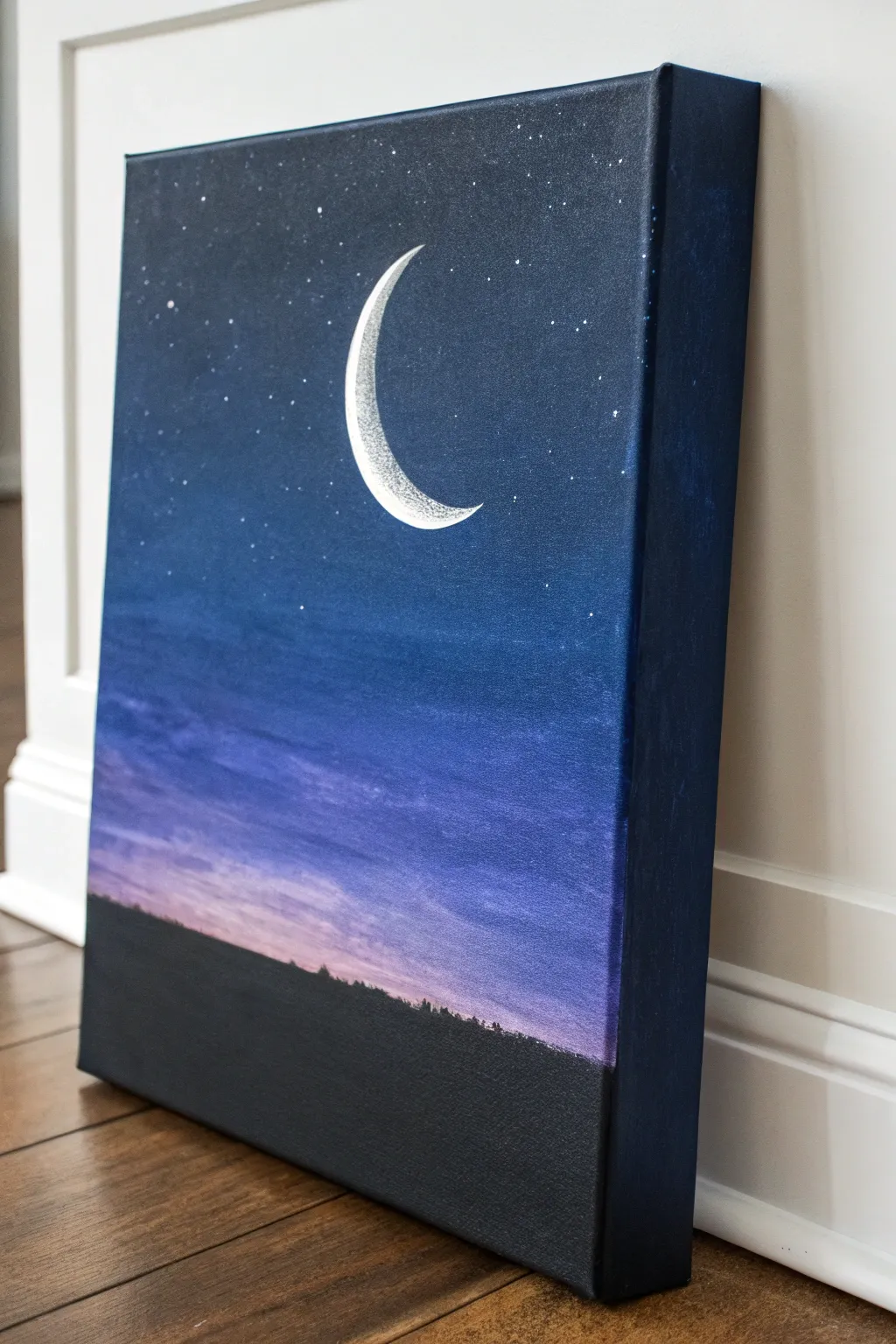
Capture the serenity of a twilight evening with this stunning acrylic painting featuring a seamless ombre gradient. The transition from deep midnight blue to a soft, glowing horizon creates a perfect backdrop for a crisp, detailed crescent moon.
Step-by-Step Guide
Materials
- Rectangular stretched canvas (e.g., 16×20 inches)
- Acrylic paints: Carbon Black, Prussian Blue, Titanium White, Dioxazine Purple, Magenta or Pink
- Large flat wash brush (2-3 inches)
- Medium flat brush
- Small round detail brush (size 0 or 1)
- Palette or paper plate
- Cup of water and paper towels
- Pencil for sketching
- Old toothbrush (optional for stars)
Step 1: Creating the Ombre Sky
-
Prepare your palette:
Squeeze out generous amounts of your sky colors: Prussian Blue, Dioxazine Purple, Magenta, and Titanium White. Having them ready is crucial since acrylics dry fast and blending needs wet paint. -
Paint the top section:
Using your large flat brush, start at the very top of the canvas with a mix of Prussian Blue and a tiny touch of Black. Paint the top quarter of the canvas using long, horizontal strokes. -
Transition to blue-purple:
Without washing the brush completely, pick up pure Prussian Blue and a bit of Purple. Apply this below the dark section, overlapping slightly to encourage blending. -
Blend the mid-tones:
Clean your brush slightly, then load it with Dioxazine Purple and a touch of White to lighten it. Paint the middle section of the canvas, working your brush back and forth horizontally where the colors meet to create a soft, seamless transition. -
Add the sunset hues:
As you move lower, mix Magenta/Pink with White to create a soft pastel glow. Apply this near the bottom, blending it upward into the purple section. -
Paint the horizon line:
At the very bottom strip of the sky area (before you hit the ground), use a very pale pink-white mix to mimic the last light of the sun. -
Paint the canvas edges:
Don’t forget the sides. While you have the dark blue mix on your palette, paint all four outer edges of the canvas to give it a finished, gallery-ready look. -
Let the background dry:
For the crispest details later, allow the background gradient to dry completely. It should be cool to the touch before proceeding.
Step 2: Adding the Landscape & Moon
-
Sketch the moon placement:
Lightly sketch a crescent moon shape in the upper third of the canvas with a pencil. Place it off-center for a more interesting composition. -
Block in the moon:
Using your small round brush and pure Titanium White, carefully fill in the crescent shape. This serves as a bright base layer. -
Texture the moon:
While the white is still slightly tacky or after it dries, dab a tiny amount of grey (mix white and a speck of black) onto the inner curve of the moon to suggest craters and shadow. -
Refine the moon edges:
Go back with pure white on your smallest brush to crisp up the outer edge of the crescent so it looks sharp against the dark sky. -
Paint the ground silhouette:
Switch to a medium flat brush and load it with Carbon Black. Paint a solid strip across the very bottom of the canvas to establish the ground. -
Create the treeline:
Using the corner of a flat brush or a small round brush, dab irregular, small vertical shapes along the top edge of the black strip. Vary the heights to simulate a distant forest silhouette. -
Add distant stars:
Dilute a small amount of white paint with water until it’s inky. Dip an old toothbrush into it and flick the bristles with your thumb to spray tiny stars across the upper sky. -
Place focal stars:
Use your smallest detail brush to manually place a few larger, brighter stars. I like to concentrate a few near the moon to balance the composition.
Blending Trouble?
If the acrylics differ too much or dry too fast, keep a mister bottle handy. A light spritz of water keeps the paint workable and helps colors slide into one another.
Pro Tip: Masking Magic
For a perfectly sharp crescent moon, you can cut the shape out of masking tape or adhesive vinyl, stick it to the dry canvas, paint white, and peel it off.
Hang your finished piece in a well-lit spot to let the subtle gradients shine
Geometric Tape Design Over Ombre
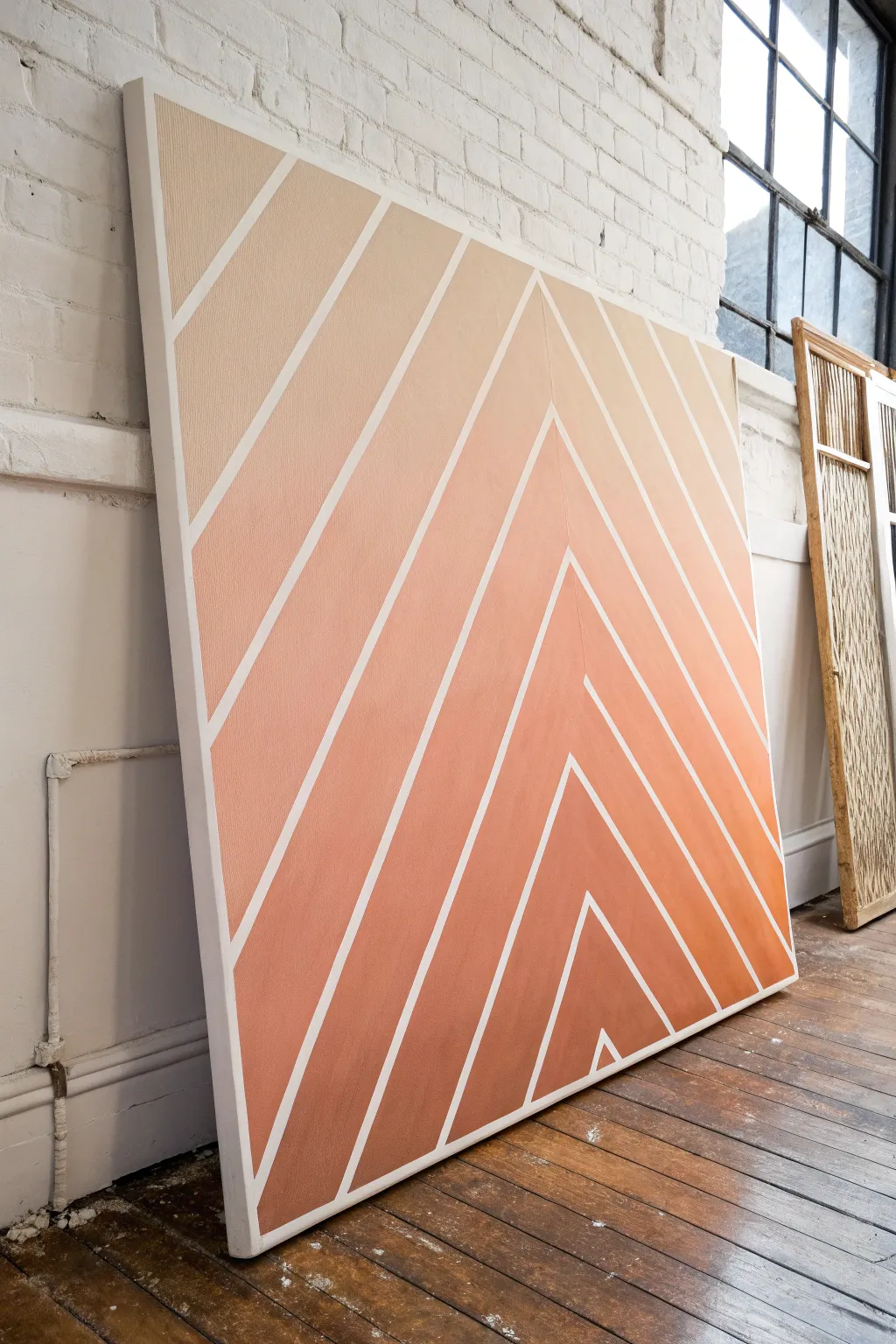
Marrying the warmth of a sunset gradient with crisp, modern lines, this large-scale geometric piece makes a bold statement in any room. The sharp white negative space creates a striking contrast against the soft blend of peach and rust tones.
Detailed Instructions
Materials
- Large stretched canvas (e.g., 36×48 inches)
- Gesso (optional, for priming)
- Painter’s tape (0.5 inch or similar width)
- White acrylic paint (for sealing tape)
- Acrylic paints (White, Peach, Terracotta/Rust, Burnt Sienna)
- Large flat brush or paintbrush set
- Palette or paper plates
- Ruler or yardstick
- Pencil
- Spray bottle with water (for blending)
Step 1: Preparation & Taping
-
Prime the canvas:
If your canvas isn’t pre-primed, apply a coat of white gesso to ensure a smooth surface. Even on pre-primed canvas, a fresh coat of white acrylic paint creates a bright base for your negative space lines. -
Find the center:
Measure the width of your canvas at the bottom edge and mark the exact center point lightly with a pencil. Do the same at the top edge to create a vertical guide. -
Establish the central peak:
Decide where you want the highest point of your chevron pattern to be. In the inspiration piece, the peak is quite high, near the top third. Mark this central peak point along your invisible vertical center line. -
Tape the first chevron:
Apply two strips of painter’s tape starting from your central peak mark, angling them down towards the bottom corners. Use your yardstick to ensure these lines are perfectly straight before pressing the tape down firmly. -
Create parallel lines:
Working outward from that central V-shape, apply subsequent tape lines. Use a spacer (like a piece of scrap wood or simply the width of the tape roll itself) to keep the distance between the chevrons consistent. -
Seal the tape edges:
This is the secret to crisp lines: paint a thin layer of white acrylic paint over the edges of all your tape strips. This seals any tiny gaps, ensuring that if any paint bleeds under, it’s white and won’t be visible.
Step 2: Painting the Ombre
-
Mix your gradient palette:
Prepare three or four distinct paint puddles on your palette: a very light peach (mix white + peach), a medium peach, a true terracotta, and a deep rust (terracotta + burnt sienna). -
Start at the top:
Begin painting the top section of the canvas with your lightest peach mixture. Apply the paint generously over the tape; don’t worry about staying inside the lines since the tape protects the design. -
Apply the mid-tones:
Move down the canvas, painting the middle section with your medium peach and pure terracotta colors. Work quickly so the paint stays wet for blending. -
Paint the base:
Fill the bottom third of the canvas with your darkest rust color, anchoring the visual weight of the piece. -
Blend the transitions:
Where two colors meet, use a clean, slightly damp brush to whisk back and forth horizontally. I find that misting the canvas very lightly with a spray bottle helps keep the acrylics workable for a smoother gradient. -
Check for coverage:
Step back and look for thin spots. Apply a second coat to the gradient areas if necessary to ensure the color is opaque and vibrant.
Bleeding Lines?
If paint seeps under the tape, wait for it to fully dry. Then, gently scrape the excess with a craft knife or paint over it with your base white color.
Step 3: The Reveal
-
Let it firm up:
Allow the paint to dry until it is tacky to the touch, but not fully hardened. If the paint is bone dry, it can sometimes pull up in sheets. -
Peel the tape slowly:
Gently catch the end of a tape strip and pull it back at a sharp 45-degree angle away from the painted area. Do this slowly to ensure clean edges. -
Touch up imperfections:
Once the tape is removed, inspect your white lines. If any color bled through, use a small detail brush and white paint to clean up the edges for a professional finish.
Smoother Blends
Add a drop of acrylic retarder or slow-drying medium to your paint. This keeps acrylics wet longer, giving you more time to perfect that seamless ombre fade.
Hang your finished canvas and enjoy how the geometric precision balances the soft, warm glow of the colors
Negative Space Shape With Ombre Fill
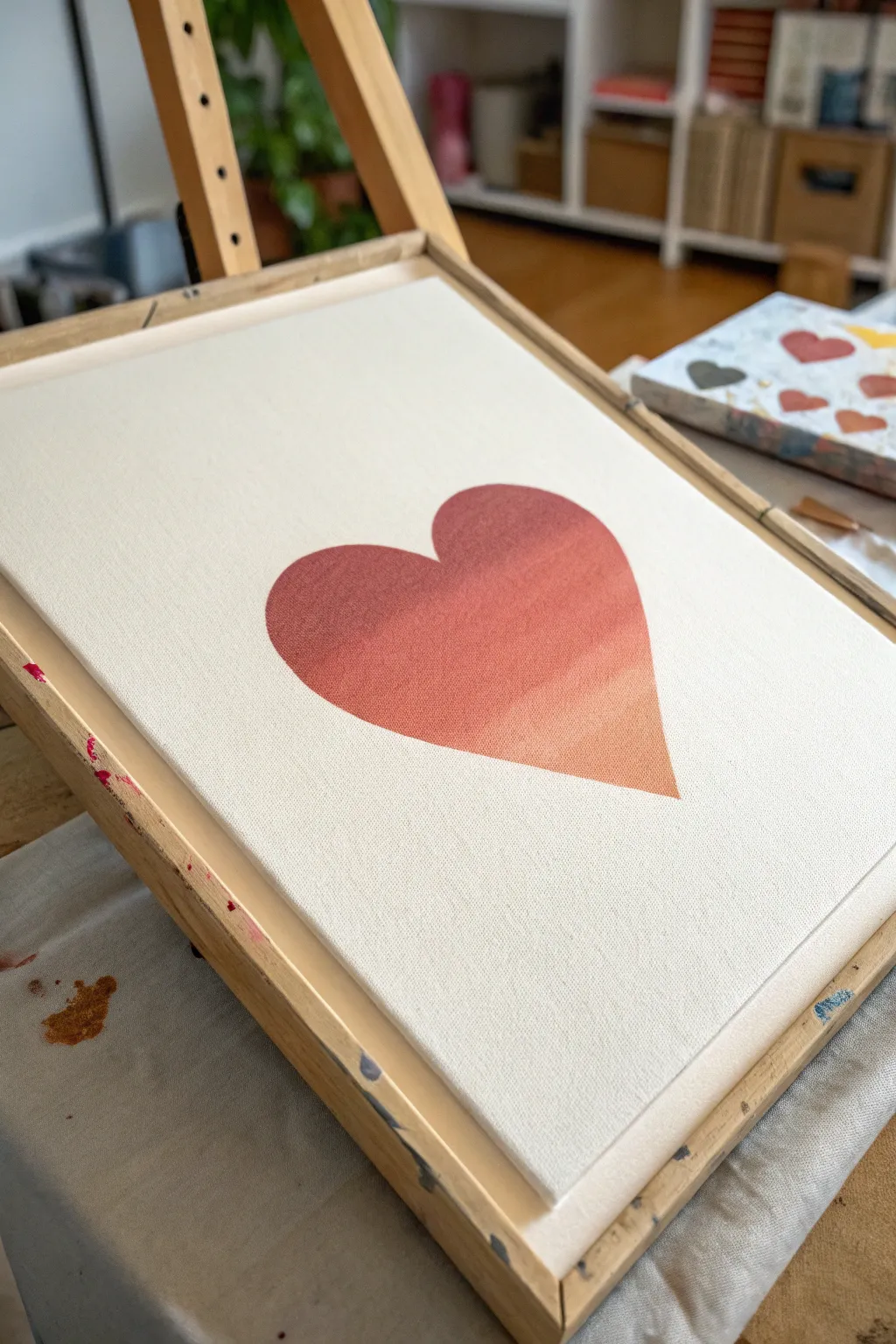
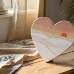
This tutorial guides you through creating a stunningly simple yet effective piece of wall art featuring a crisp heart shape filled with a warm, gradient sunset palette. The contrast between the clean white negative space and the rich, blended interior makes this a modern classic.
How-To Guide
Materials
- Stretched canvas (e.g., 11×14 or 16×20)
- Acrylic paints (Dark red/maroon, terracotta, peach, white)
- Wide flat synthetic paintbrush (1-inch width)
- Self-adhesive vinyl or contact paper
- Scissors or craft knife
- Pencil
- Burnishing tool or old credit card
- Palette or paper plate
- Water cup and paper towels
Step 1: Preparation & Masking
-
Create your stencil:
Begin by drawing a large, symmetrical heart shape on the backing paper of your vinyl or contact paper. Ensure it is sized appropriately for your canvas, leaving a generous border of white space around the edges. -
Cut the shape:
Carefully cut out the heart shape. For this technique, we actually need the ‘negative’ space—the large sheet with the heart hole in it—rather than the heart cut-out itself. Keep the interior heart for another project. -
Prepare the canvas:
Wipe your canvas down with a dry cloth to remove dust. If the canvas texture is very rough, you might choose to apply a coat of gesso first for smoother paint application, but it’s not strictly necessary. -
Apply the stencil:
Peel the backing off your vinyl sheet and carefully position it onto the canvas. Center the heart cutout. Press down firmly. -
Seal the edges:
Using a burnishing tool or a credit card, firmly rub along the inner edges of the heart cutout. This is crucial to prevent paint from bleeding under the sticker and ensures that crisp, professional line we’re aiming for. -
The sealing trick:
For an ultra-crisp line, I like to paint a very thin layer of white paint (or clear matte medium) along the inside edge of the stencil first. This seals any tiny gaps; if anything bleeds, it will just be clear or white, keeping your final color edge perfect.
Clean Edges Secret
Work the brush from the stencil outward into the shape, rather than pushing paint under the stencil edge.
Step 2: Painting the Ombre
-
Mix your palette:
Squeeze out your paints: dark maroon, a medium terracotta/rust, and a light peach. You want to have them ready to go so you can blend while wet. -
Start dark:
Load your flat brush with the darkest maroon color. Start painting at the very top left lobe of the heart. Paint with horizontal strokes, covering about the top third of the heart shape. -
Add the mid-tone:
Without cleaning your brush fully (just wipe excess on a towel), pick up the terracotta color. Apply this to the middle section of the heart, slightly overlapping with the wet maroon edge above. -
Blend the transition:
Brush back and forth horizontally where the maroon and terracotta meet. The wet paints will mix on the canvas, creating a smooth transition from dark to medium. -
Apply the light tone:
Wipe your brush clean again. Pick up the light peach color and paint the bottom tip and remaining area of the heart. -
Final blending:
Blend the peach into the terracotta section using the same horizontal strokes. Work quickly so the paint remains wet enough to manipulate. Step back to check if the gradient looks smooth from top-left to bottom-right. -
Let it dry completely:
Allow the paint to fully dry. This is important because peeling the stencil while the paint is tacky can sometimes lift the paint skin and ruin the edge.
Add Metallic Flair
Once the gradient is dry, splatter a tiny bit of gold paint over the heart for a chic, shimmering finish.
Step 3: The Big Reveal
-
Remove the stencil:
Once the paint is dry to the touch, locate a corner of your vinyl stencil. Very slowly and carefully peel it back at a sharp 45-degree angle. -
Touch ups:
Inspect the edges of your heart. If there are any tiny bleeds, use a small detail brush and white paint to clean them up, erasing the mistake. -
Erase guidelines:
If you made any small pencil marks for centering earlier, gently erase them now, being careful not to smudge the paint.
Now you have a beautifully gradient heart that looks professionally printed right in your own studio
Dry-Brush Textured Ombre Stripes
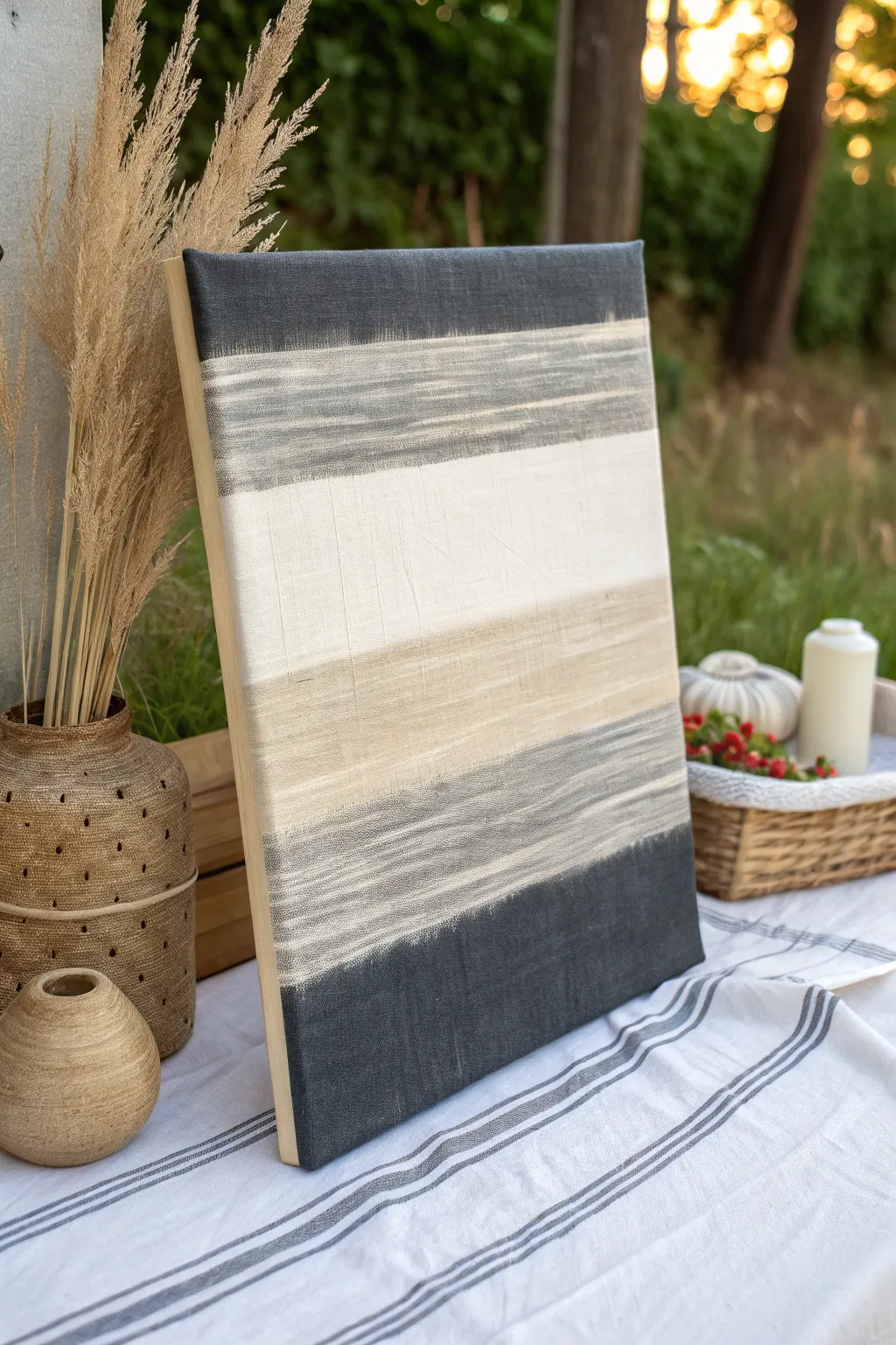
Embrace the imperfect beauty of raw texture with this calming, minimalist canvas art. By layering heavy body acrylics with a stiff dry brush, you’ll achieve a sophisticated, weathered look that mimics woven fabric.
Step-by-Step
Materials
- Stretched canvas (11×14 or similar)
- Heavy body acrylic paints (Dark Charcoal, Warm Grey, Canvas/Buff, Cream/White)
- Large flat bristle brush (2-3 inch width)
- Small stiff flat brush
- Palette or paper plate
- Paper towels or rag
- Easel or flat work surface
Step 1: Base Preparation
-
Assess your surface:
Begin by inspecting your canvas. For this specific textured look, an unprimed linen canvas works beautifully, but a standard primed cotton canvas works perfectly too. -
Lightly sand:
If using a standard gessoed canvas, give it a very light scuff with fine-grit sandpaper to break the surface tension, allowing the paint to drag more effectively. -
Mixing the palette:
Squeeze out your four main colors: Dark Charcoal, Warm Grey, Buff, and Cream. Don’t add water; you want the paint as thick and pasty as possible.
Paint Too Splotchy?
If paint is blobbing rather than streaking, your brush is too wet or overloaded. Wipe it aggressively on a rag until it barely marks before touching the canvas again.
Step 2: Dark Anchors
-
Load the darks:
Dip your large flat brush into the Dark Charcoal paint. Offload most of the paint onto a paper towel; the bristles should be stained but almost dry. -
Bottom stripe:
Start at the very bottom edge of the canvas. Drag the brush horizontally back and forth, applying firm pressure to force paint into the weave. -
Feather upward:
As you move slightly up from the bottom edge, lighten your pressure significantly. Let the brush skip over the surface to create a jagged, uneven edge. -
Top stripe:
Repeat this process at the very top edge of the canvas with the Dark Charcoal, feathered downwards this time. Keep this top band narrower than the bottom base.
Step 3: The Mid-Tones
-
Switch to grey:
Clean your brush thoroughly and dry it completely—moisture is the enemy of this technique. Pick up the Warm Grey tone, offloading excess paint again. -
Apply the grey band:
Paint a horizontal stripe just below the top charcoal section. Overlap the feathering slightly so the grey and charcoal bristles mix visually on the canvas. -
Add the secondary grey:
Apply a second, thicker band of Warm Grey near the bottom, just above your dark charcoal base. I like to let this dry briefly so I don’t muddy the colors too much. -
Scumble the edges:
Use the brush tip to ‘scumble’ or scrub the connection points between the grey and charcoal, softening any harsh lines into a blurred transition.
Add Dimension
Mix a tiny amount of modeling paste into your white acrylic for the center stripe. It adds physical ridges that catch the light and deepen the textile effect.
Step 4: Central Light & Texture
-
Applying the buff:
Using a clean, dry brush, pick up the Buff (tan) color. Paint the section directly above the bottom grey band. -
Create the drag:
Make long, swift horizontal strokes. Because there is very little paint on the brush, you will see streaks where the canvas shows through, creating that faux-thread look. -
Highlighting with cream:
Fill the large remaining center gap with your Cream/White paint. This should be the brightest part of the painting. -
Bridge the gap:
Work the cream paint downwards into the buff section and upwards into the top grey section. Do not overblend; allow individual brush hairs to leave visible streak marks. -
Vertical distressing:
For the finishing touch seen in the image, take a nearly empty brush and drag it lightly vertically once or twice across the cream section to simulate vertical fabric weave. -
Final assessment:
Step back. If any color transition looks too stark, lightly dry-brush the intermediate color over the seam to marry the sections.
Let your textured masterpiece cure fully before displaying it on a console table or shelf
Sponge-Soft Pastel Ombre Blend
This ethereal canvas blends soft pastels into a dreamy, cloud-like gradient that brings a sense of calm to any room. Using a simple sponging technique, you’ll create seamless transitions from lilac to peach without needing advanced brush skills.
Step-by-Step Tutorial
Materials
- Stretched canvas (e.g., 16×20 or 18×24)
- Acrylic paints: Titanium White, Lilac/Lavender, Soft Pink/Peach, Mauve/Deep Purple
- Natural sea sponges or synthetic art sponges
- Palette or paper plate
- Spray bottle with water (mister)
- Clean rags or paper towels
- Soft synthetic blending brush (optional)
Step 1: Preparing the Base
-
Prime the Surface:
Even if your canvas is pre-primed, apply a fresh coat of Titanium White across the entire surface. This ensures your pastels will look bright and not muddy. -
Plan Your Zones:
Visualize the canvas in thirds or sections. The top will be your lightest purple, the middle fading to near-white, and the bottom a warming pink transition into darker mauve. -
Dampen the Sponge:
Soak your sponge in water and wring it out thoroughly until it is just slightly damp. A dripping sponge will cause runs, while a dry one creates harsh textures.
Stay Moist
Use a fine-mist spray bottle to keep the acrylics slightly damp on the canvas. This extends blending time and creates that watercolor-like bleed effect.
Step 2: Building the Upper Gradient
-
Mix the Top Color:
On your palette, mix a large amount of Titanium White with a small dot of Lilac to create a very pale, airy violet shade. -
Apply the Lavender:
Dab the sponge into the paint and start gently blotting at the very top edge of the canvas. Don’t forget to wrap the color around the sides of the canvas frame for a finished look. -
Fade Downwards:
As you move down the canvas about 6-8 inches, stop reloading the sponge. Let the paint run naturally dry to create a fading effect. -
Introduce White:
Load a clean section of your sponge (or a fresh sponge) with pure Titanium White. Blend this into the fading bottom edge of your lavender section. -
Soften the Transition:
Work back and forth between the lavender and white zones, dabbing lightly to blur the line where they meet until it looks like a soft mist.
Step 3: Creating the Warm Horizons
-
Mix the Mid-Tone:
Create a soft peach or salmon color by mixing Titanium White with a touch of Pink and an even smaller touch of yellow or orange if needed. -
Apply the Peach Layer:
Start applying this peach tone below the white section. I like to keep this band somewhat narrow, acting as a horizon line or a break in the clouds. -
Blend Upward:
Gently tap the peach color upward into the white section. Use a very light hand here so the colors mix on the canvas to create a pale coral transition.
Add Metallic Shimmer
For a magical touch, lightly sponge a translucent pearl or iridescent medium over the lightest white section once the paint is fully dry.
Step 4: Anchoring the Bottom
-
Prepare the Deepest Shade:
Mix your Mauve or Deep Purple with a little bit of the Pink to harmonize it with the layer above. This should be the darkest value on your canvas. -
Apply to the Base:
Sponge this darker color starting from the very bottom edge of the canvas, working your way upward toward the peach section. -
Vertical Texturing:
The image shows some vertical movement in the paint. Instead of just dabbing, try a slight dragging motion with the sponge from the bottom up to simulate rain or light rays. -
Final Blend:
Where the deep mauve meets the peach, mist the canvas very lightly with your spray bottle (from a distance) to help the acrylics stay wet. -
Smooth the Join:
Use a clean, dry sponge to tap over the boundary line between the mauve and peach, softening it until no harsh separation remains. -
Side Check:
Walk away for a moment and look at the canvas from a distance. If any area looks too blocky, lightly mist it and tap with a clean sponge to diffuse the pigment. -
Dry and Seal:
Allow the painting to dry flat for at least 24 hours. Because of the texture, the paint might be thicker in areas.
Hang your new masterpiece near a window where natural light can highlight the soft textural transitions.
Metallic Highlights on an Ombre Gradient
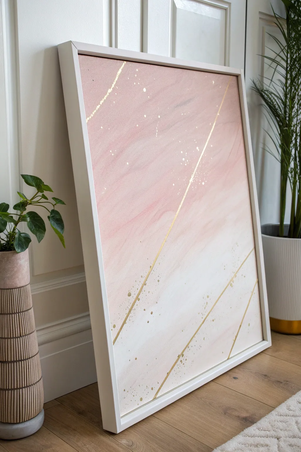
Soft pink hues melt effortlessly into white in this elegant canvas piece, punctuated by striking gold metallic geometry. The contrast between the gentle gradient and the sharp, reflective lines creates a sophisticated modern art look perfect for brightening any neutral wall.
Step-by-Step
Materials
- Large rectangular stretched canvas
- Acrylic paints: Blush pink, Titanium white, Warm pink (optional for depth)
- Wide flat brush or blending brush
- Gold metallic paint (liquid) or gold leaf pen
- Gold leaf paint (high viscosity) for splatters
- Artist’s painter’s tape (low tack)
- Small round brush
- Toothbrush or splatter brush
- Ruler or straight edge
- White floating frame (optional)
- Cup of water and paper towels
Step 1: Creating the Ombre Base
-
Prepare the canvas:
Start with a clean, primed canvas. If you want a smoother surface, apply a coat of gesso and sand it lightly once dry, though standard store-bought canvases are usually ready to go. -
Apply the darker pink:
Squeeze a generous amount of your blush pink paint onto the top third of the canvas. Using a wide, damp flat brush, spread this color horizontally across the top section, ensuring full coverage. -
Mix the transition shade:
On your palette, mix a 50/50 blend of the blush pink and titanium white. Apply this mixture directly below the pure pink section while the top layer is still wet. -
Blend the upper transition:
Using gentle, horizontal strokes, brush back and forth where the pink and the middle mixture meet. Work quickly to ensure the paints blend seamlessly before they start to tack up. -
Apply the white base:
Load your brush with pure titanium white and paint the bottom third of the canvas. Bring the white up until it meets the middle transition tone. -
Finalize the gradient:
Clean your brush or grab a dry blending brush. Softly stroke horizontally across the transition zone between the middle tone and the white bottom, smoothing out any hard lines until you have a misty, dreamy fade. -
Let it cure completely:
Allow the background to dry fully. Since you will be applying tape over this later, I recommend waiting at least 24 hours to ensure the paint has hardened and won’t lift.
Step 2: Adding Metallic Accents
-
Plan the geometry:
Decide on the placement of your diagonal lines. The reference uses three distinct, non-parallel lines: a long one crossing the top half, and two parallel short ones near the bottom right corner. -
Tape the first line:
Apply two strips of painter’s tape diagonally across the canvas to create your first line. Leave a very narrow gap usually about 1/8 to 1/4 inch wide between the strips where you want the gold to go. -
Tape the remaining lines:
Repeat the taping process for the lower diagonal accents. Press the edges of the tape down firmly with your fingernail or a spoon to prevent bleed-through. -
Seal the tape edges:
To get perfectly crisp lines, paint a very thin layer of the background color (or matte medium) over the gap first. This seals the tape edge so any seepage is invisible. -
Paint the gold lines:
Once the seal is dry, paint the gaps with your gold metallic paint. You may need 2-3 coats to achieve a truly opaque, shiny finish. -
Remove tape:
Peel the tape away carefully while the gold paint is still slightly tacky, pulling at a sharp angle away from the line to ensure a clean edge. -
Prepare the splatter:
Dilute a small amount of gold paint with a few drops of water until it has an inky consistency suitable for splattering. -
Flick the splatter:
Dip a toothbrush or a stiff bristle brush into the gold mix. Run your thumb across the bristles to flick tiny specks of gold onto the canvas, concentrating them around the diagonal lines for a cohesive look. -
Add larger droplets:
Dip the handle end of a paintbrush into the gold paint and gently dot a few larger, deliberate circles onto the canvas to varied visual interest.
Uneven Gradient?
If your ombre looks streaky, use a dry, soft brush to lightly sweep over the wet paint boundaries in a cross-hatch motion, then smooth it out horizontally.
Step 3: Finishing Touches
-
Seal the artwork:
Once all metallic elements are fully dry, apply a gloss or satin varnish. A gloss finish helps the metallic paint shimmer more effectively. -
Frame the piece:
To replicate the professional look of the reference image, install the canvas into a deep, white floating frame. This creates a shadow gap that elevates the modern aesthetic.
Pro Tip: Gold Pop
For lines that truly shine, use liquid gold leaf instead of standard acrylic gold paint. The solvent-based leaf offers a mirror-like finish that acrylics can’t match.
Now hang your shimmering masterpiece in a well-lit spot to catch those metallic glints throughout the day
Fluid Tilted Ombre Paint Pour
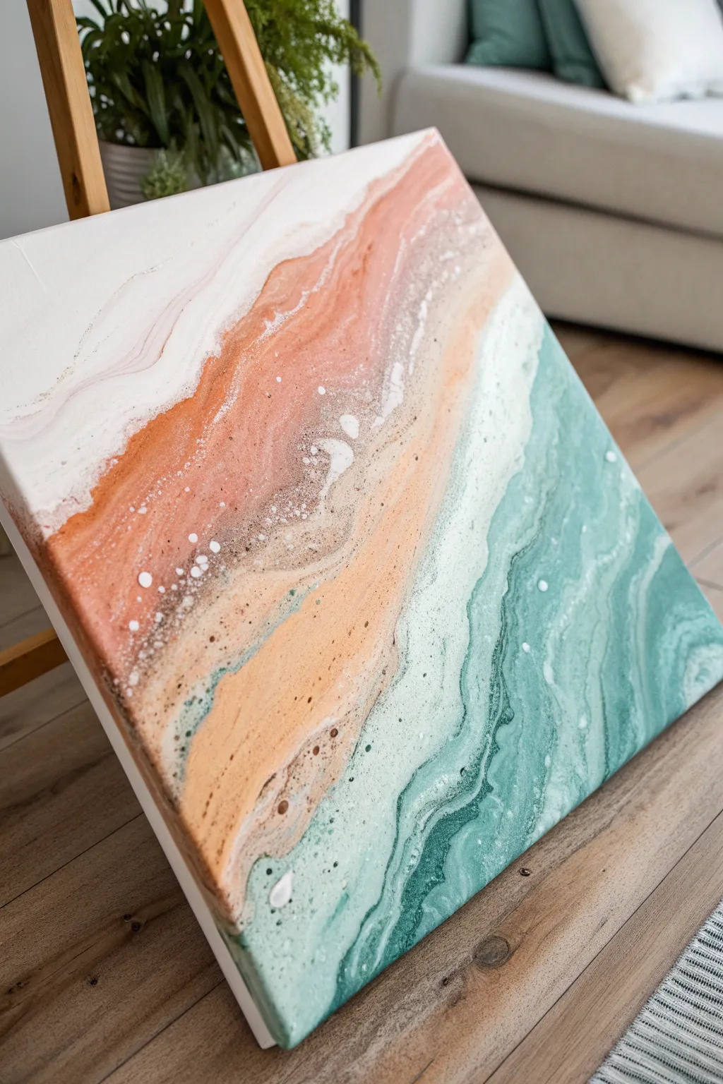
Capture the serene movement of ocean waves meeting the shore with this elegant fluid art technique. By carefully tilting your canvas, you’ll create soft, ombre transitions between sandy metallics and deep teal waters.
How-To Guide
Materials
- Square stretched canvas (12×12 or similar)
- White acrylic paint
- Sand/Beige acrylic paint
- Metallic copper or bronze acrylic paint
- Teal or turquoise acrylic paint
- Pouring medium (Liquitex or Floetrol)
- Silicone oil (optional for cells)
- Four plastic cups
- Stirring sticks
- Level working surface covered with plastic
- Push pins (for elevating canvas)
Step 1: Preparation & Mixing
-
Protective Setup:
Begin by covering your workspace thoroughly with a plastic drop cloth or garbage bag, as fluid art can get messy. Insert push pins into the four corners of the back of your canvas to elevate it off the table. -
Standard Mix Ratio:
In your plastic cups, mix each acrylic paint color with your pouring medium. A standard ratio is usually 1 part paint to 2 parts medium, but check your specific brand’s instructions. -
Consistency Check:
Stir the mixtures thoroughly until you reach a consistency similar to fluid honey. The paint should flow off the stick in a continuous stream without breaking immediately. -
Metallic Accent:
Creating the ‘sand’ requires a special touch. Mix a small amount of the metallic copper into your beige paint cup to give the shoreline a shimmering, wet-sand effect. -
Optional Silicone:
If you want small ‘cells’ or bubbles like sea foam (visible in the reference image’s white areas), add 1-2 drops of silicone oil specifically to the white and teal paints and stir very briefly.
Muddy Colors?
If your colors are turning brown or gray, you are likely tilting too aggressively or over-mixing. Tilt slowly and stop once you have a pleasing pattern.
Step 2: The Pouring Process
-
White Base:
Start by pouring a generous amount of the white mixture across the top left corner of the canvas. This creates the ‘sky’ or foam area and provides a wet surface for other colors to glide on. -
Sandy Shoreline:
Pour a thick band of your beige-copper mixture diagonally across the middle of the canvas, right next to the white section. Don’t worry about straight lines; organic wiggles look more natural. -
Deep Waters:
Pour the teal paint into the bottom right corner, filling the remaining empty space. Ensure specific thick lines of teal touch the sandy beige band. -
Bridging Colors:
Drizzle a thin line of white paint right between the teal and beige sections. This will act as the crashing wave line when we start tilting.
Pro Tip: Clean Lines
Add a few drops of white paint in between your color bands before tilting. This ‘negative space’ acts as a barrier, keeping the ombre transition crisp.
Step 3: Tilting & Refining
-
Initial Tilt:
Lift the canvas gently. Slowly tilt it diagonally back and forth, encouraging the colors to touch and overlap slightly without mixing into mud. -
Creating the Ombre:
Tilt the canvas steeply toward the bottom right to stretch the ‘sand’ into the ‘water.’ Then, tilt it back toward the top left. This back-and-forth motion creates the marbling and gradient effect seen in the photo. -
Corner Coverage:
Check the corners and edges. If paint hasn’t reached them, use your finger or a palette knife to guide the excess paint over the edge for a finished look. -
Enhancing Details:
If the definition of the ‘shoreline’ gets lost, I sometimes drizzle a tiny bit more metallic copper or white directly onto the wet canvas and gently tilt again to integrate it. -
Edge Cleanup:
Run a popsicle stick or your finger along the underside edge of the canvas to catch drips. This prevents the paint from pulling off the top surface as it dries. -
Drying Time:
Leave the painting to dry on a perfectly level surface for at least 24-48 hours. Do not move it, as shifting the fluid paint will ruin the composition.
Once fully cured, you can varnish the piece to heighten the glossy, wet look of your beautiful shoreline abstraction
Ombre Triptych Canvas Set
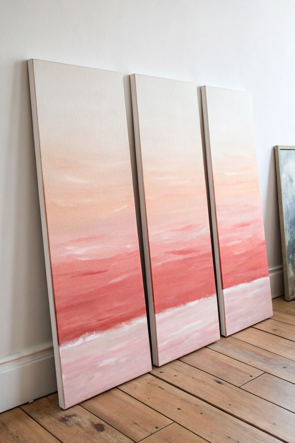
Capture the fleeting beauty of dusk with this three-panel canvas set that features a soothing gradient from creamy white to deep coral. The soft, textured color transitions create a unified horizon line that flows seamlessly across separate pieces for a modern, expansive look.
Detailed Instructions
Materials
- 3 tall, narrow stretched canvases (e.g., 10×30 inches or similar)
- Acrylic paints (Titanium White, Unbleached Titanium/Cream, Peach, Coral/Terracotta, Warm Pink)
- Wide flat synthetic brushes (2-3 inches)
- Medium filbert brush for clouds
- Palette or disposable plates
- Spray bottle with water
- Easel or drop cloth for floor painting
- Painters tape (optional)
Step 1: Preparation and Base Layout
-
Set Up Key Layout:
Place all three canvases side-by-side on your work surface or easel. Ensure they are touching or very close together so you can visualize the painting as one continuous image. -
Create a Reference Line:
Decide where your deep coral horizon line will sit. In the reference image, this is about one-third up from the bottom. Mark this lightly with a pencil across all three canvases to ensure alignment. -
Mix Your Gradient Palette:
Prepare four distinct puddles of paint on your palette: Cream/White for the sky, a soft Peach for the transition, a deep Coral/Pink for the main horizon band, and a pale Pinkish-White for the bottom water/ground section.
Uneven Blending?
If the paint dries too fast and creates hard lines, lightly mist the canvas with water or use a slow-drying blending medium to keep the acrylics workable longer.
Step 2: Painting the Sky Gradient
-
Start at the Top:
Load a wide brush with your Cream or Unbleached Titanium mixture. Begin painting the top third of all three canvases, using long horizontal strokes to cover the raw canvas completely. -
Introduce the Peach Tone:
While the top layer is still wet, pick up some Peach paint without fully cleaning your brush. Apply this starting just below the cream section, brushing horizontally. -
Blend the Transition:
Work the brush back and forth where the cream and peach meet. I like to mist the canvas slightly with water here to encourage a misty, seamless fade between the two colors. -
Intensify the Mid-Tone:
Continue moving down the canvas, adding more raw Peach and a touch of Coral as you approach the horizon pencil mark, making the color richer and more opaque.
Step 3: Creating the Horizon and Texture
-
Apply the Deepest Color:
Switch to a clean wide brush. Load it heavily with your deep Coral or Terracotta pink. Paint a bold, thick band right above your pencil line, extending slightly upward into the peach section. -
Feather the Edges:
Using swift, horizontal strokes, feather the top edge of this deep band into the lighter peach section above. Leave distinct brushstrokes visible here to mimic distant stratocumulus clouds. -
Add Cloud Details:
Dip a medium filbert brush into a mix of White and Peach. Gloss lightly over the deep coral section with quick, horizontal dashes to suggest light catching on cloud layers. -
Establish the Water Line:
Use Titanium White on a clean brush to create a sharp, distinct line right at the bottom of the deep coral band. This acts as the shoreline or break in the horizon. -
Scumble the Separation:
Drag that white line slightly upward into the wet coral paint using a dry brush technique. This creates a textured, frothy look rather than a perfect geometric line.
Perfect Edges
To ensure the horizon line matches perfectly across all three canvases, you can temporarily tape them together on the back while painting the crucial middle section.
Step 4: Finishing the Bottom Section
-
Paint the Lower Third:
Fill the bottom section of the canvases with your pale Pinkish-White mixture. Brush horizontally, pulling the paint right up to the white ‘shoreline’ you just created. -
Soisten the Bottom Gradient:
While the bottom section is wet, add very faint streaks of the Coral color into the mix to create reflections, blending them softly so no hard lines remain. -
Paint the Sides:
Since these are gallery-wrapped canvases, don’t forget to extend your colors around the deep edges of the frames. Match the gradient on the front to the sides for a professional finish. -
Final Adjustments:
Step back and view the triptych as a whole. If the flow between the panels looks disjointed, use a dry brush to bridge any color gaps across the seams. -
Dry and Seal:
Allow the triptych to dry for at least 24 hours. Once dry, you can apply a matte varnish to protect the surface and even out the sheen.
Hang your new triptych with a one-inch gap between panels to let the gradient breathe and transform your space
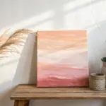
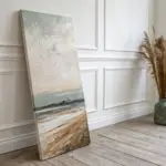

Have a question or want to share your own experience? I'd love to hear from you in the comments below!