When I need to feel like myself again, I reach for paint—not to impress anyone, but to breathe, unwind, and let my feelings land on the page. These self care painting ideas are all about gentle process, soothing color, and making art that actually takes care of you.
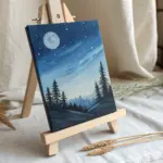
Paint a Color-Your-Mood Wash
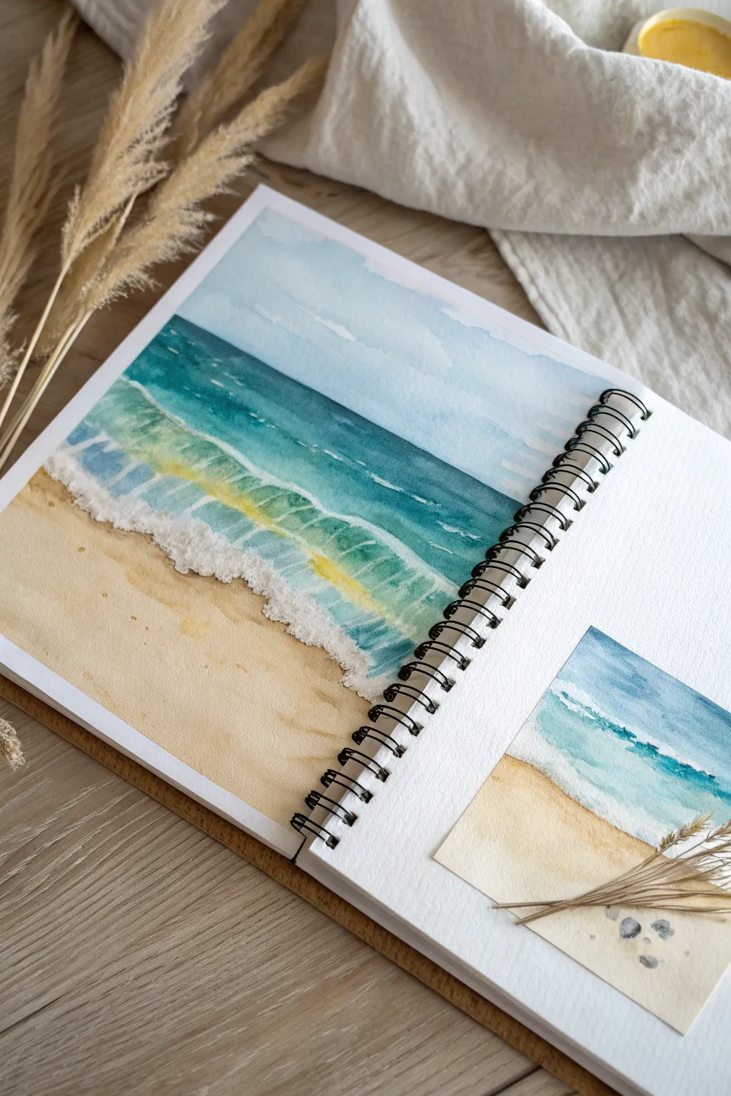
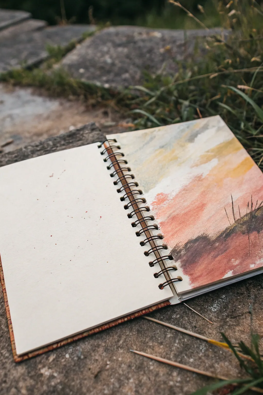
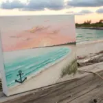
Capture the calming rhythm of the ocean with this soothing watercolor project that focuses on gradients and gentle movement. By layering washes of sand, teal, and deep indigo, you can create a serene seascape directly in your sketchbook that reflects a mood of peace and clarity.
Step-by-Step Guide
Materials
- Watercolor paper sketchbook (spiral bound)
- Watercolor paints (Yellow Ochre, Burnt Sienna, Turquoise, Phthalo Blue, Indigo)
- Flat wash brush (3/4 inch)
- Round brush (size 6 or 8)
- White gouache or white gel pen
- Masking tape (optional, for clean edges)
- Jar of clean water
- Paper towels
- Small scrap of watercolor paper for the thumbnail
Step 1: Planning and Sky
-
Define the horizon:
Visualize where your sky meets the sea. Lightly sketch a horizontal line across the top third of your page if you need a guide, but keeping it freehand adds to the relaxed feel. -
Wet the sky area:
Using your flat wash brush and clean water, gently wet the area above your imaginary horizon line. You want the paper damp but not swimming in puddles. -
Apply the sky wash:
Load a diluted mix of Phthalo Blue or a soft sky blue onto your brush. Sweep it across the top of the wet area, letting the color naturally fade as you move downward toward the horizon. -
Create cloud hints:
While the sky is still damp, lift out a few pigment areas with a clean, thirsty brush or a dab of paper towel to suggest soft, drifting clouds.
Muddy Waters?
If your ocean blue is bleeding into your sand color, you didn’t let the sand dry enough. Wait for the paper to be bone-dry, or use a hair dryer to speed up the process.
Step 2: The Sandy Beach
-
Mix the sand color:
Combine Yellow Ochre with a tiny touch of Burnt Sienna to get a warm, sandy beige. Dilute it well for the first layer. -
Paint the shore:
Starting from the bottom of the page, paint upwards with your flat brush. Use smooth, horizontal strokes, stopping just short of where the water will begin. -
Add texture:
While the wash is still wet, drop in slightly more concentrated spots of the sand mixture near the bottom corners to create depth and texture. -
Let it dry completely:
Patience is key here. Allow both the sky and sand sections to dry fully before you attempt the ocean to prevent bleeding.
Step 3: The Ocean Layers
-
Paint the deep sea:
Mix a strong Indigo or deep Phthalo Blue. Using the flat brush, paint a crisp horizontal line right against the bottom of your sky, creating the horizon. -
Transition to teal:
As you move down from the horizon, switch to a Turquoise or teal mix. Blend it slightly into the wet edge of the deep blue above so there is a soft transition. -
Form the wave body:
Continue bringing the teal color down. As you approach the sand, lighten your touch and dilute the paint to suggest the translucency of the wave before it breaks. -
Underpainting the crash:
Where the wave will eventually crash, leave the paper white or apply a very faint wash of dirty yellow-green to represent the sand churned up inside the water.
Level Up: Real Texture
Sprinkle a pinch of real table salt onto the wet sand wash while painting. Once dry, brush the salt off to reveal unique, starry textures that look just like sand grains.
Step 4: Foam and Details
-
Add wave definition:
I like to switch to the round brush here. Use a darker teal to paint distinct, curved strokes inside the wave body to show potential energy and movement. -
Create the seafoam:
Once the ocean layer is dry, use opaque white gouache. Stipple or dab the paint along the edge where the water meets the sand to create the illusion of bubbly, crashing foam. -
Highlight the crest:
Add thin lines of white gouache along the top of the wave curl and scatter a few dots in the turquoise area to catch the light. -
Shadow the foam:
Mix a very watery grey or purple and paint a thin shadow right underneath the white foam on the sand. This makes the foam look three-dimensional.
Step 5: The Thumbnail Study
-
Prep the scrap paper:
Take your small scrap of watercolor paper. This is for a loose, miniature version of the scene you just painted. -
Quick wash sketch:
Repeat the previous steps but much faster and looser. Focus on capturing the feeling of the colors rather than perfect details. -
Mount the study:
Once dry, use a bit of tape or glue to attach this mini-study onto the main sketchbook page, perhaps overlapping a corner for an artistic collage look.
Enjoy the calm feeling of having transferred the ocean’s tides onto your paper

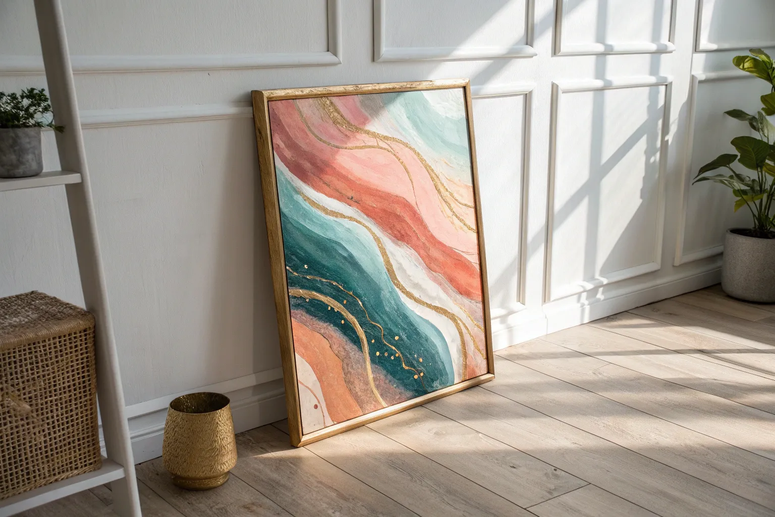
Abstract Calm vs. Chaos Split Page
Capture the fleeting beauty of a sunset meeting the earth in this loose, abstract landscape. Using warm earth tones and broad strokes, you’ll create a soothing horizon that balances vibrant sky energy with grounding terrain.
Step-by-Step
Materials
- Spiral-bound sketchbook (heavyweight paper)
- Pastels (soft or oil) OR chalky acrylic paints
- Flat shader brush (size 10 or 12)
- Small round brush for details
- Paper towel or blending stump
- Palette for mixing
- Masking tape (optional)
Step 1: Setting the Sky
-
Base Layer:
Begin at the very top of the right-hand page with a pale, creamy white or light grey. Apply this broadly across the upper quarter of the page, allowing some of the paper texture to show through for an organic feel. -
Injecting Warmth:
While the top is still fresh, introduce a soft ochre or muted yellow just below the white area. Blend it slightly upwards into the white to create a hazy transition. -
Deepening the Sunset:
Move lower into the middle section of the page, switching to a terra cotta or soft coral orange. Apply these strokes diagonally, slanting downwards from right to left, suggesting the movement of clouds or light. -
Adding Contrast:
Feather in some streaks of dove grey or muted blue among the yellow and orange layers. This breaks up the warmth and adds atmospheric depth to your abstract sky.
Keeping it Loose
Don’t overmix your colors on the palette. Allowing streaks of pure pigment to mix directly on the page adds vibrancy and texture.
Step 2: Grounding the Composition
-
Forming the Hillside:
At the bottom third of the page, block in a dark, rich shape for the ground. Use a burnt sienna or rusty brown, creating a sweeping curve that rises as it moves toward the right edge. -
Shadows and Depth:
Layer a deep charcoal or dark umber into the lower left corner and along the bottom edge of your rust-colored hill. This anchors the painting and provides a strong contrast against the pastel sky. -
Blending the Horizon:
Soften the edge where the dark ground meets the orange sky. You don’t want a sharp line here; a fuzzy, textured transition suggests distance and mist. -
Textural Interest:
If using paint, use a predominantly dry brush to drag some of the dark earth color upwards slightly, mimicking rough terrain. If using pastels, scumble the color lightly to keep the tooth of the paper visible.
Step 3: Final Details
-
Sketching Grasses:
Pick up a fine-point tool, like a thin round brush with black ink or a charcoal pencil. Draw quick, sparse vertical lines emerging from the dark hill on the right side to represent tall grasses. -
Varying Line Weight:
Ensure your grass lines vary in height and direction. Some should lean slightly left or right to feel natural rather than stiff. -
Splatter Effect:
Load a brush with watered-down terra cotta or rust paint. Hold it over the clean left-hand page and tap the handle to create a gentle spray of speckles. -
Connecting the Pages:
Allow a tiny bit of this splatter to hit your painting as well, unifying the two sides. I find this creates a nice sense of continuity across the sketchbook spread. -
Clean Up:
Check the spiral binding. If any medium got onto the rings, wipe it away quickly before it sets.
Go Metallic
Add a thin line of gold leaf or metallic paint along the horizon line where the sky meets the earth for a subtle, magical glow.
Enjoy the peaceful feeling of your completed abstract landscape

Gentle Mandala for Quiet Focus
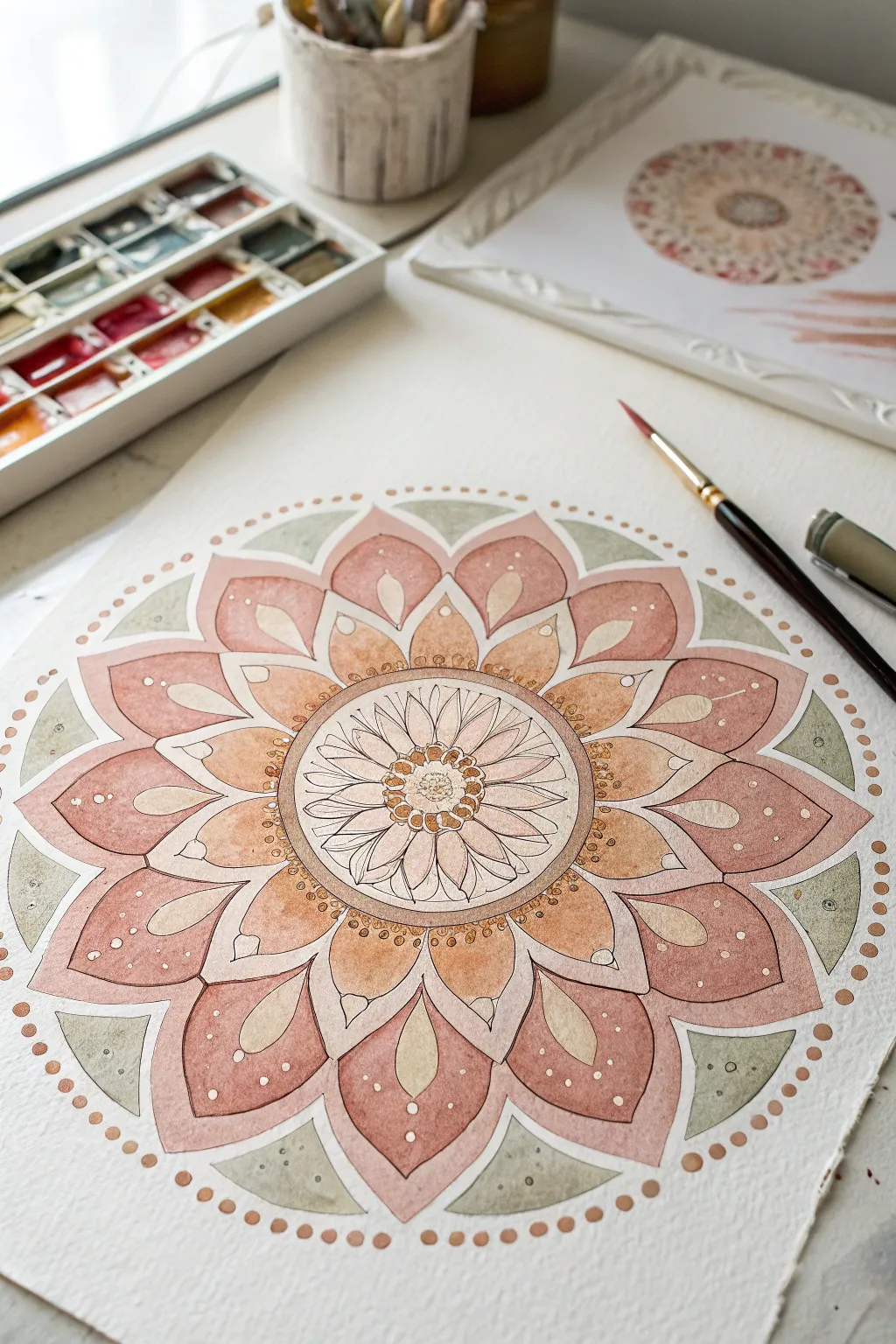
This intricate mandala captures a sense of serenity with its warm, earthy palette of peaches, rusts, and soft sage greens. The watercolor layering creates depth while the precise line work invites a meditative, focused state of mind.
Detailed Instructions
Materials
- Cold press watercolor paper (300 gsm)
- Watercolor paint set (focus on shades of warm pink, terracotta, ochre, and sage green)
- Compass and ruler
- HB or 2H pencil for light sketching
- Fine liner pen (waterproof, brown or sepia ink, 0.1mm and 0.3mm)
- Round watercolor brushes (size 2 and size 6)
- Clean water jar and paper towels
- White gel pen (optional for highlights)
Step 1: Drafting the Geometry
-
Find the center:
Begin by finding the exact center of your paper. Make a tiny mark to anchor your work. -
Draw concentric circles:
Using your compass, draw a series of light concentric circles. You will need a small inner circle for the flower center (about 1 inch diameter), a middle ring for the central petals, and two larger outer rings for the expanding petal layers. -
Divide the circle:
Use a protractor to divide your circle into equal segments—16 sections work beautifully for this design. Draw light radial lines from the center outward to guide your petal placement. -
Sketch the central flower:
In the innermost circle, sketch a simple daisy-like flower with overlapping, pointed petals radiating from the center core. -
Outline the main petals:
Moving outward, sketch large, scalloped petals in the second ring. These should be broad and gently pointed at the tips, touching the boundaries of your next guideline circle. -
Add the outer layer:
Sketch the largest layer of petals. Between each large petal, add a triangular ‘leaf’ shape to fill the negative space, creating a perfect circular boundary.
Clean Edges
If you struggle with shaky hands, pivot the paper, not your wrist. Always pull the brush or pen toward your body for smoother, more controlled curves.
Step 2: Applying Watercolor Washes
-
Paint the background triangles:
Mix a diluted, watery sage green. Carefully paint the triangular shapes on the outermost edge of the mandala. Keep the wash flat and even. -
First layer of petals:
Mix a soft, pale peach color. Paint every other large petal in the middle ring. By skipping petals, you allow the paint to dry without colors bleeding into each other. -
Second layer of petals:
Once the first set is dry, paint the remaining petals in that ring with a slightly deeper terracotta or rust shade to create variation. -
Center gradients:
For the petals immediately surrounding the center, use a wet-on-wet technique. Wet the paper slightly, then drop in warm ochre at the base of the petal, fading it out to white at the tip. -
Deepen the outer ring:
Paint the largest outer petals with a mix of rose and brown. Let the paint pool slightly at the base of the petals for natural shading, or lift color with a dry brush for a highlight. -
Central detail:
Paint the tiny center core with stippled dots of dark brown and rust to mimic soft pollen textures.
Step 3: Defining Details
-
Outline with ink:
Once the paint is completely bone-dry, take your sepia fine liner. Trace over your pencil lines with a steady hand. I prefer using a 0.3mm pen for the main petal shapes to give them weight. -
Add inner details:
Switch to a finer 0.1mm pen. Inside the large outer petals, draw a smaller, teardrop shape that echoes the outer contour. -
Line texture:
Add very fine stippling or hatching near the base of the petals to enhance the shadow effect created by the watercolor pooling. -
Decorative dots:
Refine the artwork by adding a border. Paint small, evenly spaced dots of rust or copper paint around the entire circumference of the mandala. -
White highlights:
For a final touch of sparkle, use a white gel pen or opaque white paint to add tiny dots inside the colored petals and on the sage green triangles. -
Erase guidelines:
Wait at least 30 minutes to ensure all ink and paint is cured, then gently erase any visible pencil guidelines to reveal the clean, crisp artwork.
Metallic Touch
Mix a small amount of gold watercolor or metallic ink into your ochre paint. This will make the center of your mandala shimmer subtly in the light.
Step back and enjoy the balance and symmetry of your finished piece as it dries
Paint Affirmations in an Art Journal
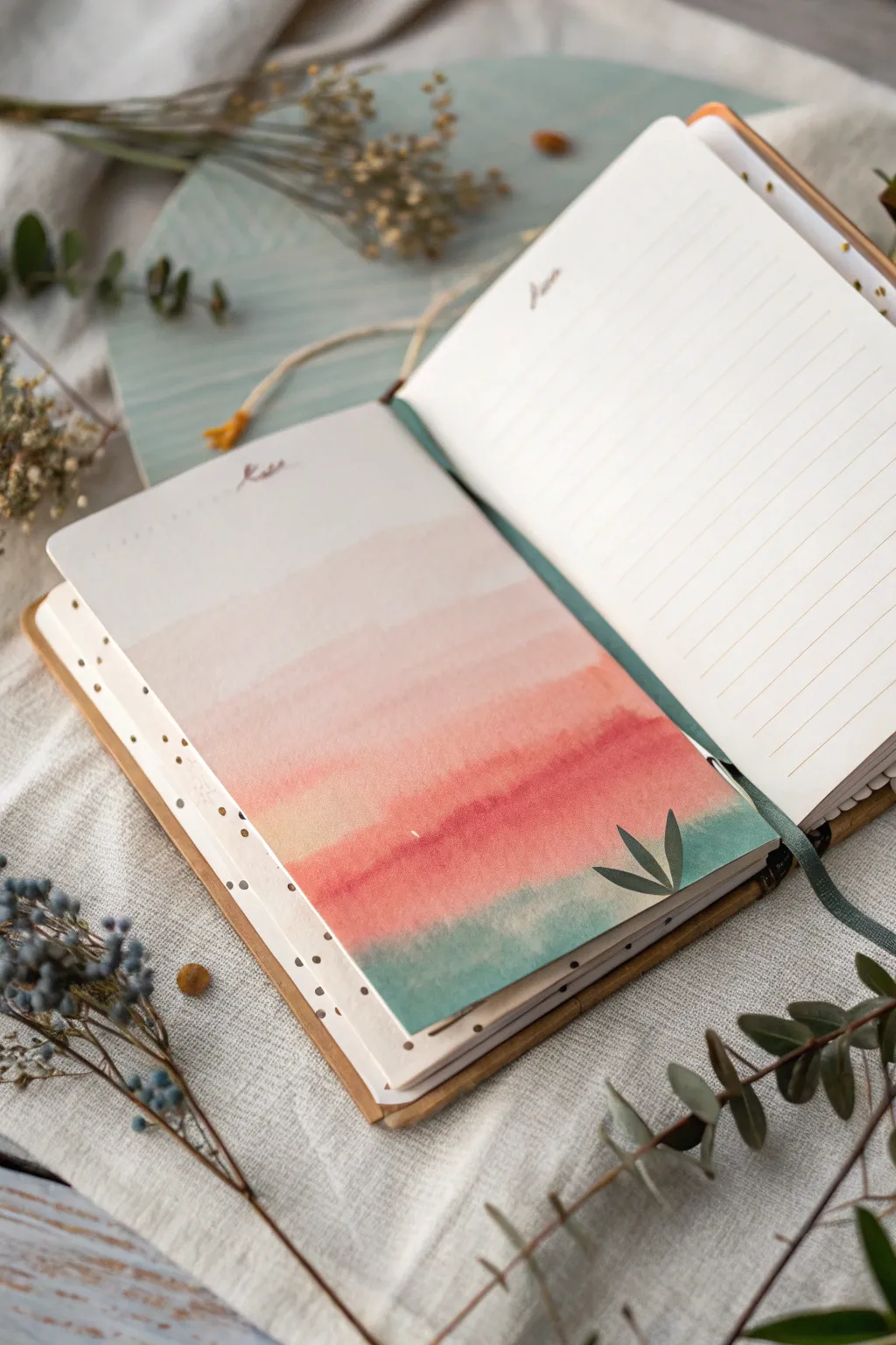
Transform a blank page in your journal into a serene meditation on color with this soft, gradient landscape. This project features gentle watercolor washes that transition from creamy blushes to grounding greens, creating a perfect backdrop for mindful reflection or daily affirmations.
How-To Guide
Materials
- Journal or sketchbook with thick, mixed-media paper
- Watercolor paints (blush pink, peach, terra cotta, rust red, teal/green)
- Wide flat wash brush (approx. 1/2 inch or 3/4 inch)
- Medium round brush (size 6 or 8)
- Small round detail brush (size 2 or 4)
- Cup of clean water
- Paper towels
- Washi tape or masking tape (optional)
- Fine liner pen (brown or black)
Step 1: Setting the Scene
-
Prepare your page:
Open your journal to a fresh spread. If you want crisp edges, tape down the perimeter of the left-hand page with washi tape, or simply prepare to paint freehand for the organic look shown in the example. -
Pre-mix your palette:
On your palette, prepare four distinct puddles of paint: a very watery blush pink, a slightly stronger peach, a rich terra cotta or rust red, and a muted teal green. Having these ready prevents the paint from drying while you work. -
Wet the paper:
Using your large flat brush and clean water, lightly dampen the bottom two-thirds of the page. You want a sheen on the paper surface, not a puddle, to help the colors blend effortlessly.
Step 2: Painting the Gradient
-
Start with blush:
Load your flat brush with the watery blush pink. Start painting horizontal strokes about one-third of the way down the page, leaving the very top section bare white or cream. -
Transition to peach:
While the blush layer is still wet, pick up your peach tone. Paint horizontal strokes directly below the blush, allowing the wet edges to touch and bleed into one another naturally. -
Intensify the color:
Switch to the terra cotta or rust hue. Apply this band of color across the middle-lower section. I find that tilting the journal slightly helps the gravity pull the pigments down for a smoother blend. -
Anchor with teal:
Clean your brush thoroughly, then load it with the teal green paint. Apply this to the very bottom section of the page. -
Blend the horizon:
Gently gently run your damp brush (with very little pigment) along the line where the rust meets the teal to soften the transition, creating a hazy, misty horizon effect rather than a sharp line. -
Lift excess pooling:
If you notice puddles of water forming at the bottom edge, touch the corner of a paper towel to the wet spot to lift the excess liquid without disturbing the pigment too much. -
Let it dry deeply:
This is crucial: allow the background wash to dry completely before moving on. The paper should feel room temperature to the touch, not cool.
Control Your Saturation
For that soft, ethereal look, test your colors on a scrap paper first. The paint should be more water than pigment, especially for the top blush layers.
Step 3: Adding Details
-
Paint the foliage:
Using your medium round brush and a more concentrated (less water) mixture of the teal paint, paint three simple leaf shapes in the bottom right corner. -
Refine the leaves:
Ensure the leaves have pointed tips and overlap slightly with the rust-colored section of the background. The darker teal on top of the dried wash creates depth. -
Add floating accents:
Switch to your small detail brush. Using a diluted brown or gold paint, add tiny, random dots along the left edge and bottom corner for a whimsical, stardust effect. -
Inscribe your header:
At the very top of the page, in the unpainted negative space, use a fine tip pen or a very fine brush to write a small title, date, or a single focus word like ‘Rest’. -
Outline the page (optional):
If you want to contain the composition, use your fine liner to draw a very delicate, broken line around the painted area, or leave it borderless for an expansive feel. -
Flatten the page:
Watercolor often buckles paper. Once completely 100% dry, you can close the book and stack a heavy object on top overnight to flatten the spread back out.
Fixing “Cauliflowers”
If you see uneven water blooms (backruns) forming as it dries, don’t panic. These textures add organic character to a landscape wash. Embrace the imperfections.
Now you have a tranquil, hand-painted spread ready to hold your thoughts and affirmations
BRUSH GUIDE
The Right Brush for Every Stroke
From clean lines to bold texture — master brush choice, stroke control, and essential techniques.
Explore the Full Guide
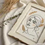
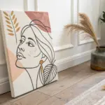
Self-Portrait as a Mood, Not a Likeness
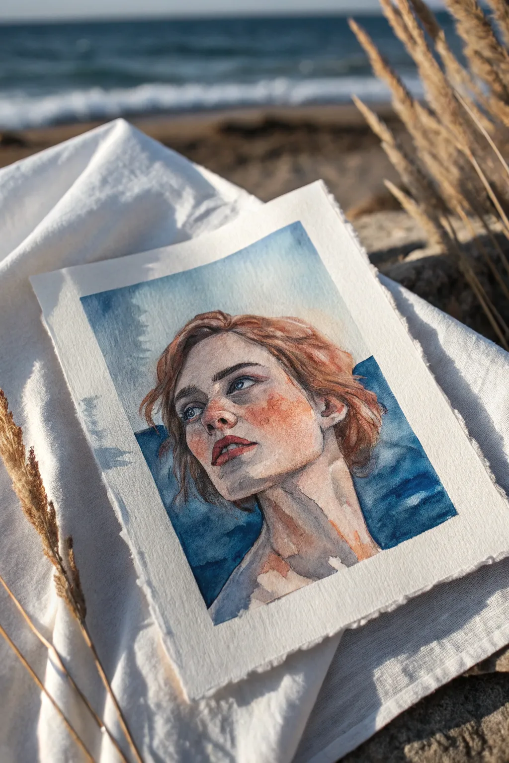
This evocative watercolor portrait captures a feeling of wistful longing, using cool ocean tones to frame the warmth of the face. Rather than aiming for photo-realism, this project encourages you to capture an expression and mood through loose washes and emotive color choices.
Step-by-Step Tutorial
Materials
- Cold press watercolor paper (300 gsm or heavier)
- Watercolor paints (Ultramarine Blue, Burnt Sienna, Yellow Ochre, Alizarin Crimson, Indigo)
- Round watercolor brushes (Size 4 for details, Size 10 for washes)
- Pencil (HB or 2B) and kneadable eraser
- Masking tape or gummed tape to secure paper
- Two jars of water
- Paper towels
Step 1: Sketching the Foundation
-
Prepare your surface:
Begin by taping down all four edges of your watercolor paper to a board. Use masking tape or deckle-edged tape to create a crisp white border once removed. This prevents the paper from buckling under heavy washes. -
Light scaffolding:
Using a light hand and an HB pencil, sketch the basic oval of the face. Don’t press hard; you want these lines to disappear later. Mark the eye line slightly higher than midway up the face, as the head is tilted back. -
Refining features:
Draw the main features—eyes gazing upward, nose, and parted lips. Focus on the angle of the jawline and the neck muscles, which are crucial for showing the upward tilt. Sketch the hair loosely; don’t draw individual strands, just the main shapes and flow.
Embrace the “Bloom”
Don’t overwork the skin. Let the water dry naturally. Accidental water marks or “blooms” on the cheek or neck add organic texture that perfectly suits the moody, introspective theme.
Step 2: The First Washes
-
Mixing skin tones:
Create a watery mix of Yellow Ochre and a touch of Alizarin Crimson for a pale skin base. Add a tiny amount of Burnt Sienna for warmth. -
Base layer application:
Apply this pale wash over the face and neck, avoiding the whites of the eyes and the highlights on the nose and lip. Let the watercolor pool naturally in shadowed areas like under the chin. -
Background wash:
While the face dries slightly, mix a watery Ultramarine Blue. Paint the upper sky area with uneven, sweeping strokes. Don’t aim for a flat color; let the water move the pigment to create cloud-like textures. -
Deepening the blues:
Introduce Indigo into your blue mix for the lower background sections flanking the neck. These darker tones will push the warm skin tones forward visually.
Step 3: Building Form and Emotion
-
Modeling the face:
Once the base layer is dry, mix a slightly stronger skin tone using Burnt Sienna and a dot of blue to desaturate it for shadows. Paint the shadow under the jaw, the eye sockets, and the side of the nose. -
Adding the flush:
Drop pure, watered-down Alizarin Crimson or reddish-orange onto the cheeks and nose while the previous layer is still slightly damp. This ‘wet-on-wet’ technique creates that soft, flushed emotional look. -
Painting the eyes:
Use a small size 4 brush for the eyes. Paint the irises carefully with a mix of blue and grey, leaving a tiny spot of white paper for the catchlight. Define the lash line with a darker mix. -
Defining the mouth:
Paint the lips with a mix of Alizarin Crimson and Burnt Sienna. Keep the edges soft, not outlined. Darken the line between the lips to show they are slightly parted.
Deckle Edge Effect
Instead of cutting your finished paper with scissors, place a ruler down and tear the paper against it. This creates a ragged, classic edge that looks stunning when mounted.
Step 4: Hair and Final Details
-
Base hair color:
Mix a vibrant Burnt Sienna with Yellow Ochre. Apply this to the hair shape, following the direction of growth. Leave some white gaps for highlights where the sun hits. -
Adding volume to hair:
While the hair is still damp, drop in a darker brown (Burnt Sienna mixed with a little Indigo) near the roots and behind the ears to create depth and volume. -
Stray strands:
Use your smallest brush with a fairly dry load of paint to flick a few loose strands escaping the main hair shape. This adds movement and realism to the portrait. -
Integrating the background:
Bring some of the background blue right up to the edge of the hair and neck. I like to let the blue slightly bleed into the hair’s shadow side in one or two spots to deeply connect the figure with the environment. -
Final touches:
Assess your values. Do the shadows under the chin need to be darker? Add a glaze of cool grey-blue over neck shadows to unify the figure with the cool background.
Peel off your tape slowly to reveal the clean border that frames your captured mood
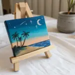
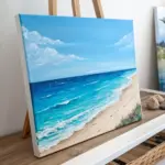
Paint a Safe Place Mini Landscape
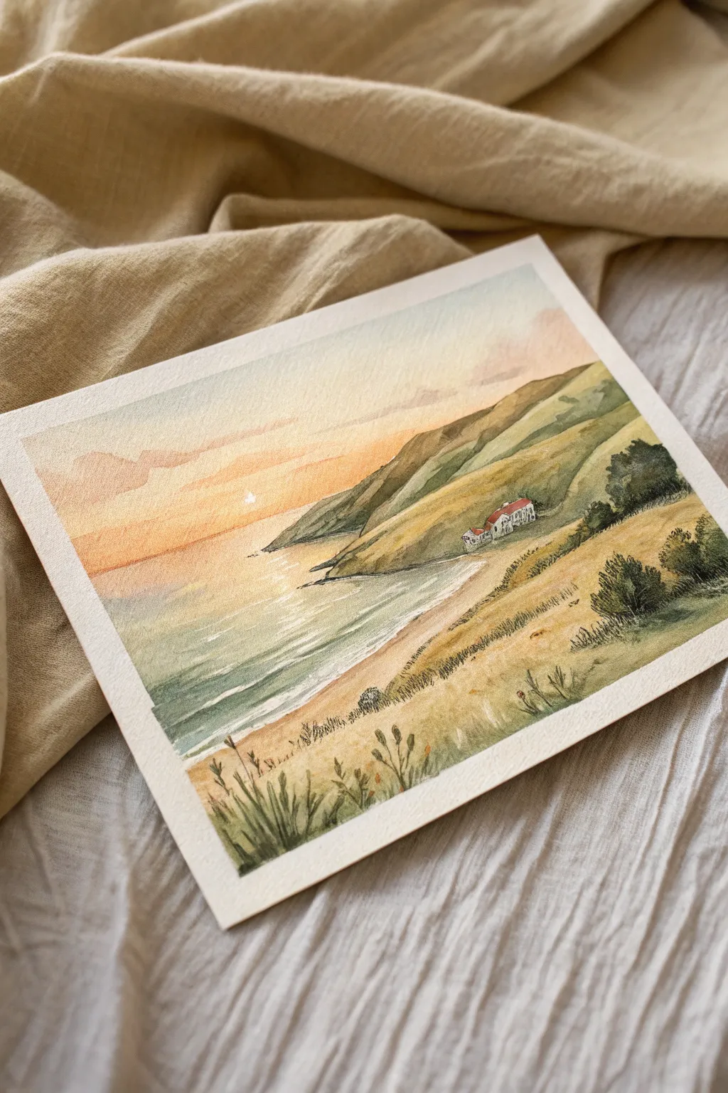
Capture the serenity of a secluded seaside escape with this warm, glowing watercolor landscape. This project focuses on soft washes for the sky and sea, contrasting with textured dry-brush techniques for grassy hills and foreground flora.
Step-by-Step Guide
Materials
- Cold press watercolor paper (approx. 5×7 inches)
- Watercolor paints (warm yellow, orange, burnt sienna, olive green, sap green, ultramarine blue, indigo, crimson red)
- Round watercolor brushes (size 8 for washes, size 2 or 0 for details)
- Masking tape
- Pencil and eraser
- Two jars of water
- Paper towels
- White gouache or white gel pen (optional for highlights)
Step 1: Sketch and Sky
-
Tape down:
Secure your paper to a board using masking tape on all four sides to create a crisp white border and prevent buckling. -
Light sketch:
With a gentle hand, sketch the horizon line about one-third of the way up the page. Outline the sloping hills on the right side and place a tiny rectangle box shape for the house nestled in the crook of the hill. -
Wet the sky:
Using your large brush and clean water, dampen the sky area above the horizon line. You want the paper glistening but not swimming in puddles. -
Sunset wash:
Drop a pale, warm yellow near the horizon line. As you move upward, blend in soft orange and a touch of light reddish-pink, allowing the colors to bleed naturally into the wet paper. -
Clouds:
While the sky is still damp, dab in delicate horizontal strokes of a diluted purple-grey mixture to suggest faint clouds drifting through the sunset.
Muddy Colors?
If your greens look dull, avoid mixing too many colors at once. Let yellow/orange layers dry completely before painting blue/green over them.
Step 2: Ocean and Hills
-
Ocean base:
Mix a watery wash of yellow-orange and gently paint the water immediately below the horizon to reflect the sky. Keep this very pale. -
Cooler waters:
Transition the ocean color into a greenish-blue as you move toward the bottom left corner. Leave horizontal streaks of white paper showing to represent waves catching the light. -
First hill layer:
Once the sky is dry, mix a light olive green. Paint the distant hill shapes, keeping the color wash fairly transparent to suggest atmospheric perspective. -
Foreground slopes:
For the closer hills on the right and bottom, use a warmer, more opaque ochre or unbleached titanium mixed with green to create a grassy, sun-dried look. -
Shoreline shadow:
Add a thin, cool grey-blue line right along the water’s edge to create the wet sand look where the tide meets the beach.
Step 3: Details and Texture
-
Hillside depth:
Define the contours of the hills by adding darker green shadows in the valleys and crevices using a smaller brush. -
The cottage:
Carefully paint the tiny house walls white (or leave the paper blank) and use crimson red for the roof. Add very small dark dots for windows. -
Dark foliage:
Mix a deep sap green with a touch of indigo. Stipple in bushes and trees around the house and along the ridges of the hills to add weight and scale. -
Foreground grass:
Using your smallest brush, flick quick upward strokes in the bottom foreground with various greens and browns to create tall, wild grasses. -
Dry brush texture:
Load a slightly dry brush with burnt sienna and lightly drag it sideways over the grassy hill areas. This creates a rough texture that mimics dry vegetation. -
Sparkle highlights:
If you lost your white highlights in the water, use a touch of white gouache or a gel pen to add sparkles on the waves and a tiny sun reflection.
Texturing Tip
Scumbling (dragging a semi-dry brush over the paper’s tooth) creates instant grassy texture without painting every blade.
Peel off the tape carefully to reveal your peaceful coastal haven

PENCIL GUIDE
Understanding Pencil Grades from H to B
From first sketch to finished drawing — learn pencil grades, line control, and shading techniques.
Explore the Full Guide
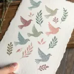
Gratitude Florals in Loose Strokes
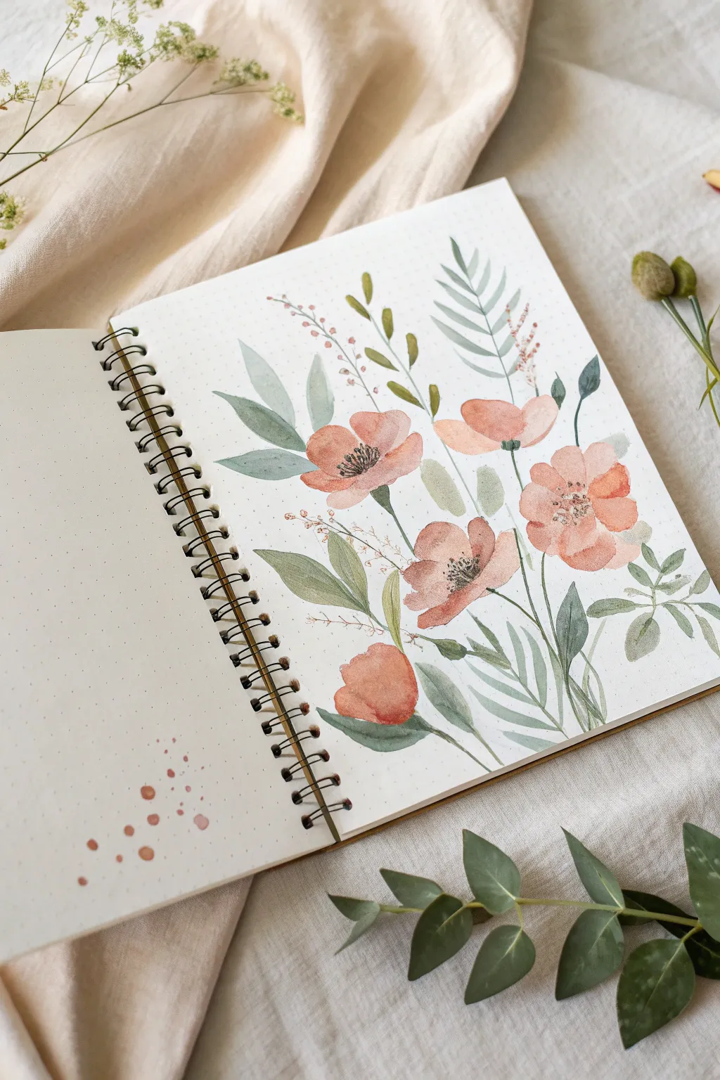
Capture the delicate beauty of a summer meadow with this loose, airy watercolor spread. The soft peach tones combined with varied sage greens create a calming botanical composition perfect for your gratitude journal.
Detailed Instructions
Materials
- Spiral-bound watercolor notebook (dot grid or blank)
- Watercolor paints (Peach/Coral, Sap Green, Olive Green, Indigo/Payne’s Grey)
- Round brushes (sizing 2, 6, and 8)
- Cup of water and paper towel
- Pencil (optional for layout)
Step 1: Laying the Blooms
-
Map the composition:
Visualize a diagonal flow across the right page. You can lightly dot the center of where you want your five main flowers to sit using a pencil, but keep it very faint to avoid erasing later. -
Mix your petal shade:
Create a watery, translucent mix of peach or coral watercolor. You want this wash to be quite fluid so the petals look soft and organic. -
Paint the first bloom:
Using a size 6 or 8 round brush, paint the largest flower in the center. Use 4-5 curved, sweeping strokes that meet loosely in the middle, leaving a tiny gap or white space at the very center. -
Add variations:
Paint the remaining four flowers around the central one. Vary their angles—make some face upward (like a cup) and others fully open. For the bottom-most flower, paint it as a bud shape using just one or two broad, rounded strokes. -
Drop in saturation:
While the petals are still slightly damp, touch the tip of your brush into a more saturated, darker mix of the same peach color and tap it near the base of the petals. This adds instant depth.
Step 2: Adding Greenery
-
Mix your greens:
Prepare two shades of green: a cool, muted sage (mix green with a touch of blue or grey) and a warmer olive tone. Having variety makes the bouquet look realistic. -
Paint broad leaves:
Start with the cool sage mix and a size 6 brush. Paint large, single-stroke leaves on the left side of the composition. Press the belly of the brush down and lift as you pull to create a tapered point. -
Add fern-like fronds:
Switch to your size 2 or small detail brush. Using the same cool green, paint a thin stem extending upward on the right side. Add small, symmetrical dashes along the stem to create a fern texture. -
Connect the blooms:
Using the olive green mix, paint thin, curving stems connecting each flower head to the imaginary center of the bouquet. Keep your hand loose and grip the brush higher up the handle. -
Fill the gaps:
Look for empty white spaces between flowers. I like to add small, rounded leaves or clusters of three leaflets here to balance the composition without overcrowding it.
Wet-on-Wet Magic
For softer leaves, wet the paper shape with clean water first, then drop green paint in. The color will bloom naturally.
Step 3: Textural Details
-
Create filler stems:
Mix a diluted reddish-brown color (you can mix your peach with a tiny bit of green). Paint very fine, branching stems that peek out above the main flowers. -
Dot the filler:
Add tiny clusters of dots along these fine stems to resemble dried baby’s breath or seeds. Keep these delicate and unobtrusive. -
Define flower centers:
Once the peach petals are completely dry, use a concentrated dark mix (Indigo or Payne’s Grey) and a fine detail brush (size 2). Paint tiny stamens—thin lines radiating from the center topped with small dots. -
Darken the pistol:
For the upward-facing blooms, paint a small, dark oval at the base of the petals to suggest the center of the cup. -
Add page splatter:
Load your brush with watery peach paint. Hold it over the bottom left corner of the opposite page and tap the handle gently to create a spray of decorative droplets.
Metallic Touch
Use metallic gold watercolor for the flower centers or filler dots to catch the light and add elegance.
Allow your spread to dry completely before closing the journal to preserve your lovely botanical artwork
Paint to Music for Emotional Release
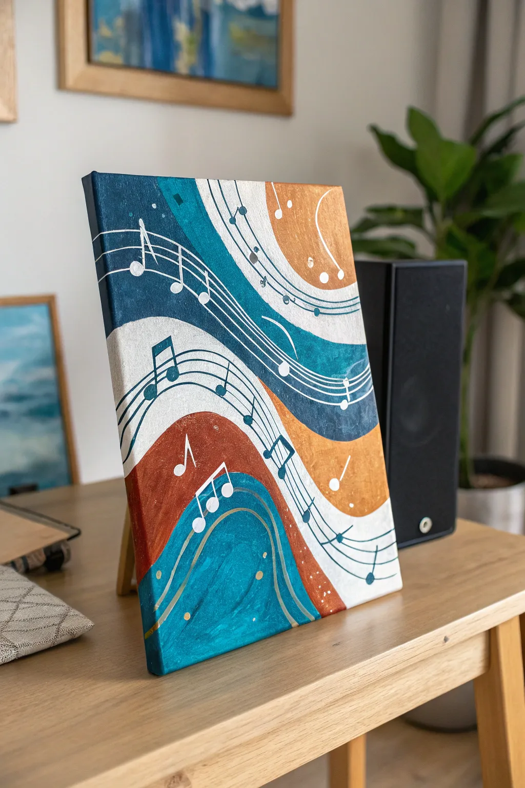
Let the rhythm guide your brush with this fluid, abstract representation of sound. This piece combines sweeping, wave-like bands of color with whimsical musical notation to create a visual harmony that looks beautiful on any shelf.
Step-by-Step
Materials
- Rectangular stretched canvas (approx. 11×14 inches)
- Acrylic paints: Deep teal, metallic gold or copper, burnt sienna, titanium white, and silver
- Flat shader brushes (medium and large)
- Fine liner brush or white paint marker
- Pencil for sketching
- Eraser
- Palette or paper plate
- Cup of water and paper towels
Step 1: Planning the Flow
-
Establish the curve:
Begin by sketching large, sweeping S-curves across your canvas with a pencil. Start from the top left and flow diagonally down toward the bottom right. -
Divide the bands:
Create parallel lines to your initial curves to form distinct thick bands. Aim for about 4-5 main sections that alternate in width. -
Refine the composition:
Lightly sketch where your musical staff lines will flow. They should mimic the same curve as your color bands, weaving in and out of the different sections.
Step 2: Blocking in Color
-
Mix your metallic shade:
Combine a bit of burnt sienna with your metallic gold paint. This creates that rich, warm copper tone seen in the upper right and lower middle sections. -
Apply the warm tones:
Paint the designated copper sections using a medium flat brush. Use long, smooth strokes that follow the curve of your sketch to enhance the feeling of movement. -
Paint the deep blues:
Using your deep teal paint, fill in the contrasting bands. I find that applying two thin coats here gives a much richer, more velvety finish than one thick gloppy one. -
Add the highlights:
Fill the remaining bands with titanium white. You might need a second coat here to fully cover the texture of the canvas. -
Add dimension:
While the teal paint is still slightly wet, you can blend in a tiny touch of lighter blue or white on the edges of the curves to create a subtle gradient effect.
Steady Hand Trick
Rest your pinky finger on a dry part of the canvas while painting thin lines. It acts as an anchor to keep your hand from shaking.
Step 3: Adding the Melody
-
Draw the staff lines:
Once the background blocks are completely dry, use a fine liner brush with slightly watered-down deep teal paint to add the five parallel lines of the musical staff. -
Keep it flowing:
Ensure these lines curve gracefully over the white and copper sections. Where the staff crosses a dark teal section, switch to white paint or a silver paint pen for visibility. -
Place the notes:
Paint the heads of the musical notes (the ovals) first. Place them randomly or follow an actual sheet music melody if you have a favorite song in mind. -
Add stems and beams:
Connect your note heads with vertical stems. For eighth notes, connect the tops with a thick beam that follows the curve of the staff lines. -
Detail with white:
Go back in with your fine liner brush or a white paint marker to add highlights to the dark notes, or to create white notes on the dark background.
Make it Sparkle
Mix a tiny amount of iridescent pouring medium into your teal paint. It won’t change the color but will make the waves shimmer in the light.
Step 4: Final Flourishes
-
Sprinkle some stardust:
Dip the wrong end of your paintbrush into white or gold paint and dot it sporadically around the canvas to mimic floating particles of sound or light. -
Clean up borders:
Use a small angled brush to clean up the edges where different color bands meet, ensuring the curves are crisp and clean. -
Paint the edges:
Don’t forget to paint the sides of your canvas. Extend the lines of your design over the edge for a professional, gallery-wrapped look. -
Protect your work:
Allow the painting to dry overnight, then apply a coat of gloss varnish to make the metallic paints shimmer and protect the colors.
Step back and admire how you’ve turned visual rhythm into a tangible piece of art for your home


Make a Self-Care Menu Icon Page
Visualizing your self-care routine becomes a calming ritual in itself with this grid-style journal spread. Using simple line drawings and a muted, earthy color palette, you’ll create a menu of comforting activities to choose from when you need a little restoration.
How-To Guide
Materials
- A5 dotted notebook or mixed media paper
- Fine liner pens (0.3mm and 0.5mm, black)
- Pencil and eraser
- Ruler
- Watercolor paints or dual-tip brush markers (sage green, terracotta, beige, warm grey)
- Small round brush (size 2 or 4)
- Jar of water and paper towel
Step 1: Setting the Layout
-
Draft the title block:
Begin at the top of your page. Using a pencil, lightly letter ‘SELF-CARE’ in a clean, all-caps sans-serif style. Allow about 1.5 inches of header space. -
Measure the grid:
Below the header, lightly sketch a 4×4 grid. Each square should be roughly 1.5 to 2 inches (about 4-5 cm) wide. Leave a small gap between each square for a neat, airy look. -
Ink the title:
Trace over your pencil title with a 0.5mm fine liner. Add a decorative flourish underneath—a simple wavy line with small sprigs or leaves branching off it gives a whimsical touch. -
Ink the grid frames:
Go over your grid lines with a thinner 0.3mm pen. Keep your hand relaxed; slightly imperfect, hand-drawn straight lines add to the cozy aesthetic.
Ink Smearing?
Ensure your fine liner is waterproof if using watercolors. If not using waterproof ink, color with colored pencils or crayons to avoid black streaks ruining your pastels.
Step 2: Sketching the Icons
-
Brainstorm activities:
Lightly sketch a different self-care object in the center of each square. Think of items like a gratitude journal, slippers, a warm cup of tea, a potted plant, or facial oils. -
Refine the shapes:
Keep the sketches simple and 2D flat-lay style. For the slippers, draw two oval shapes side-by-side. For the tea, a simple rounded mug with a handle is perfect. -
Add nature elements:
Include botanical touches like a small tree, a leaf sprig, or a flower pot. These organic shapes break up the geometry of the other objects. -
Include abstract comforts:
Consider sketching a candle, a cozy knit hat, or a simple gift box to represent treating yourself. Keep details minimal at this stage.
Step 3: Inking the Details
-
Outline the main shapes:
Using your 0.3mm fine liner, trace over your pencil sketches. Use confident, single strokes rather than feathery ones for a cleaner look. -
Add texture marks:
Add tiny details to bring life to the objects: three horizontal lines on the journal for text, little dots on the mug, or ribs on the knit hat. -
Erase pencil marks:
Wait a moment for the ink to fully set, then gently erase all the underlying pencil sketch lines to reveal a crisp black-and-white grid.
Interactive Twist
Turn this into a functional tracker: color in the background of the square only after you’ve completed that specific self-care activity during the week.
Step 4: Adding Color
-
Prepare the palette:
Mix a palette of muted tones: terracotta orange, sage green, warm ochre, and pale grey. I like to keep my colors quite watered down for a soft, translucent effect. -
Paint the first touches:
Start with the sage green. Fill in the mug, the hat, and any leaves. Keep the color placement loose; it doesn’t have to perfectly fill the lines. -
Apply warm accents:
Switch to terracotta or pale orange. Paint the slippers, the plant pot, and the gift box. This warmth balances the cooler greens. -
Add neutral tones:
Use a diluted beige or warm grey for the journal pages, background elements, or the candle jar label. -
Layer for depth:
Once the first wash is dry, add a tiny bit of darker pigment to one side of the objects (like the bottom of the pot or inside of the mug) to suggest subtle shadow. -
Final flourishing:
If you used watercolor, let the page dry completely. If you want more definition, go back in with the pen to re-darken any lines that got washed out.
Now you have a charming visual reminder to take a moment for yourself whenever life gets busy
Try Breath Brushstrokes Meditation Marks
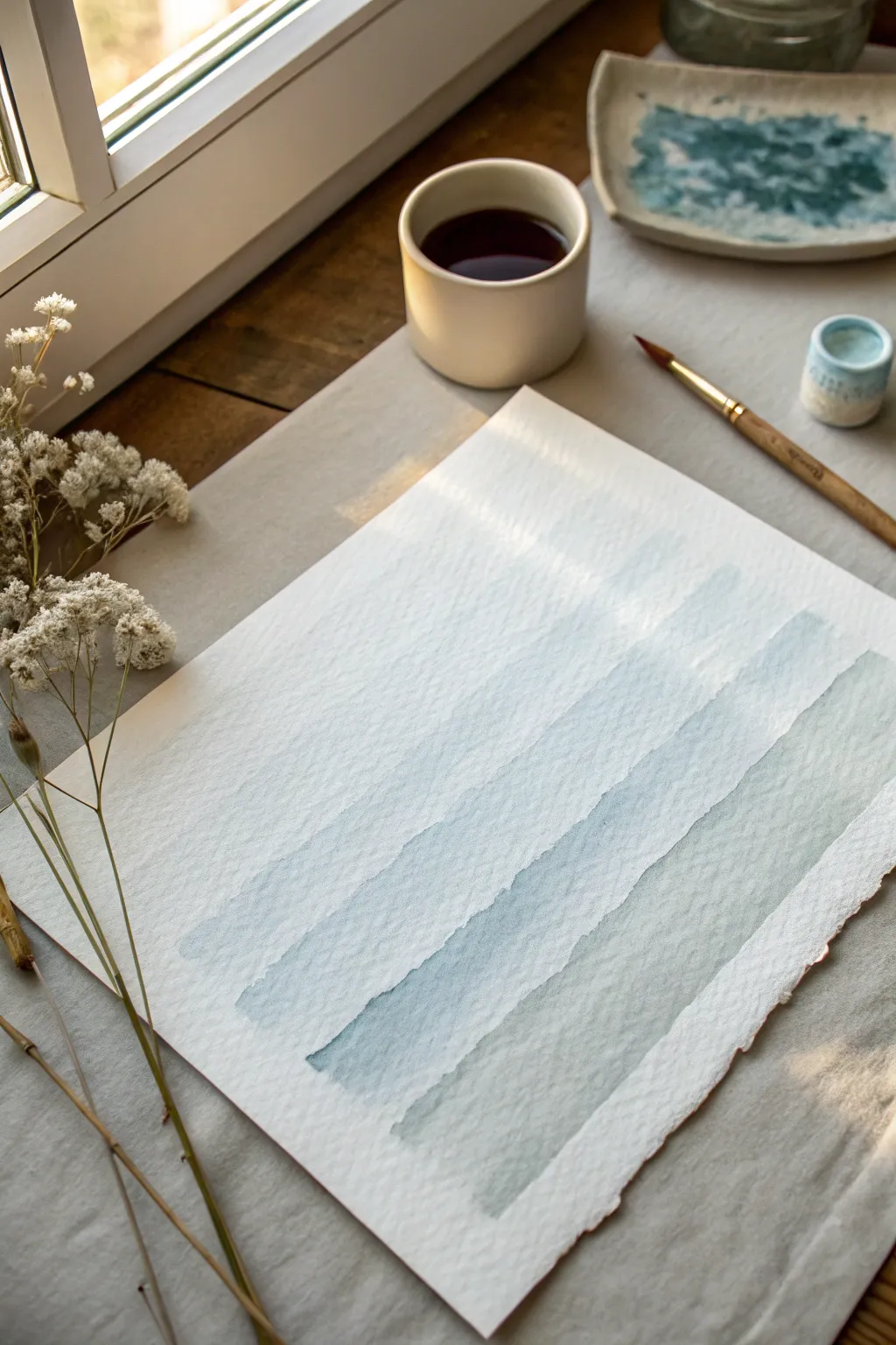
Embrace the calming rhythm of painting with this meditative watercolor exercise that synchronizes your breath with your brush. By creating soft, overlapping washes of cooler tones, you’ll produce a serene abstract piece that looks like ocean waves or distant hills.
Step-by-Step Tutorial
Materials
- Cold press watercolor paper (heavyweight, approx. 300gsm)
- Watercolor paints (Indigo, Payne’s Grey, or Prussian Blue)
- Medium round brush (size 8 or 10)
- Jar of clean water
- Ceramic palette or mixing dish
- Paper towel or cloth for blotting
- Masking tape (optional, for securing paper)
Step 1: Setting the Intention
-
Prepare your space:
Clear a comfortable spot near natural light if possible. Secure your watercolor paper to your surface using masking tape if you want crisp edges, or leave it loose for a more organic feel. -
Mix your base tone:
In your palette, create a puddle of your chosen blue-grey paint. You want a ‘tea-like’ consistency—fluid and transparent, not thick or sticky. -
Ground yourself:
Before touching the paper, take three deep breaths. Hold your brush loosely in your hand, letting your shoulder relax.
Wet Edge Control
To get that ‘bloom’ effect, touch wet paint to a damp stroke. For crisp definition, ensure the previous layer is 100% dry first.
Step 2: Painting the Breath
-
Load the brush:
Dip your brush into the paint mixture, ensuring the bristles are fully saturated but not dripping uncontrollably. -
Inhale deeply:
Take a slow, deep breath in, positioning your brush at the top left area of the paper where you want the first band to start. -
Exhale and stroke:
As you begin your slow exhale, drag the brush horizontally across the paper. Let your hand wobble slightly; don’t aim for a ruler-straight line. -
Finish the breath:
Lift the brush only when you have completely emptied your lungs. This naturally creates the length of your stroke. -
Evaluate the moisture:
Look at the band you just painted. If the bottom edge is drying too fast, you can soften it slightly with a clean, damp brush, though hard edges are beautiful too.
Gradient Magic
Add a tiny drop of green or purple to your blue mix for the bottom strokes to create a subtle color shift down the page.
Step 3: Layering the Rhythm
-
Pause for a moment:
Wait about 30-60 seconds. You don’t need the first stroke to be bone-dry, but it shouldn’t be soaking wet. -
Reload and repeat:
Pick up more dilute paint. I find slightly varying the water-to-paint ratio here adds lovely depth. -
Start the second band:
Position your brush just below the first stroke. Inhale, and on the exhale, paint the second wavy line across. -
Allow subtle bleeding:
If your brush accidentally touches the wet edge of the previous stroke, let it happen. The colors will bloom together in a beautiful, uncontrolled way. -
Adjusting opacity:
For the third band, try dipping your brush quickly in the water jar before picking up paint, making this layer slightly more transparent. -
Maintain the rhythm:
Continue down the page: Inhale, position, exhale-paint. Focus entirely on the sensation of the bristles on the texture of the paper.
Step 4: Final Reflections
-
Add a final wash:
For the bottom-most stroke, use your most watered-down pigment for a fading, ethereal effect. -
Soften harsh lines:
If any edge feels too jarring, you can gently lightly brush over it with clean water, but be careful not to scrub the paper. -
Let it rest:
Allow the paper to dry completely undisturbed. Watercolor often dries lighter, so the colors will settle into a softer state.
Now you have a visual record of a moment of calm drawn directly from your own breathing rhythm
Paint a Body Map of Tension and Ease
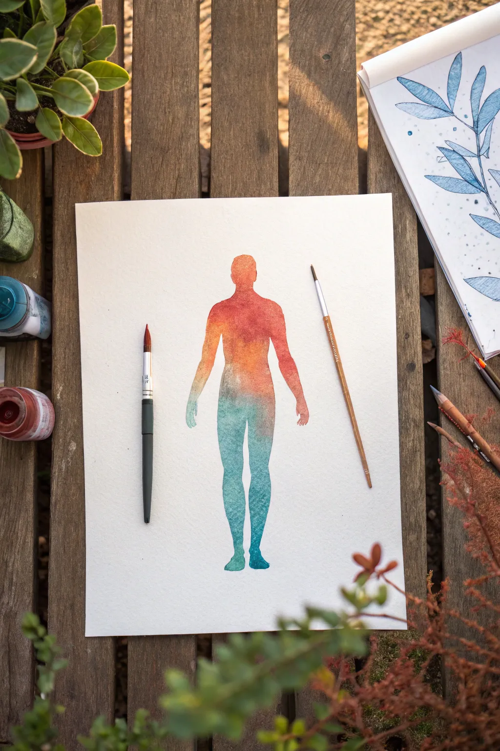
This reflective exercise combines the therapeutic practice of checking in with your body and the fluid beauty of watercolor. You’ll create a striking silhouette that transitions from warm, tense colors to cool, grounded hues, visualizing where you hold stress and where you feel at ease.
Step-by-Step
Materials
- High-quality watercolor paper (140lb/300gsm cold press recommended)
- Pencil (HB or H)
- Watercolor paints (Red, Orange, Teal, Phthalo Blue)
- Round watercolor brushes (Size 4 and Size 8)
- Palette for mixing
- Jar of clean water
- Paper towels
- Reference image or body outline template (optional)
Step 1: Preparation and Sketching
-
Set your intention:
Before picking up a brush, take a moment to scan your own body. Notice where you feel heat, tightness, or activity (often the head, neck, and shoulders) and where you feel cool, grounded, or neutral (often legs and feet). -
Outline the silhouette:
Using a pencil, lightly sketch a simple, symmetrical human figure in the center of your paper. If you aren’t confident drawing freehand, I find it helpful to lightly trace a printed template or use a light box to get the proportions right. -
Refine the edges:
Go over your sketch to ensure the lines are clean but very faint. The goal is for the pencil lines to disappear under the paint or be easily erased later, so keep a light hand.
Wet-on-Wet Magic
Work quickly! The gradient effect relies on the paper staying damp. If it dries mid-body, re-wet the edge slightly with clean water before adding the next color.
Step 2: Painting the Warm Tones
-
Mix your tension colors:
On your palette, prepare a vibrant red and a distinct orange. These colors represent high energy or tension. Adding plenty of water will keep them transparent and workable. -
Start at the head:
Load your medium-sized brush (Size 8) with the orange paint. Begin filling in the head shape carefully, using the tip of the brush to outline the edges first before filling the center. -
Transition to red:
While the orange at the neck is still wet, introduce the red paint into the shoulder and upper chest area. Let the colors bleed slightly into each other on the paper for a natural gradient. -
Build the torso:
Continue down the chest and arms, mixing orange back into your red to soften the intensity as you move toward the waist. Keep the paint wet—if an edge dries, it creates a hard line you might not want. -
Hands and lower arms:
As you paint down the arms toward the hands, dilute the red/orange mixture with a bit more water. The hands are small, so switch to your Size 4 brush here for better control over the fingers.
Step 3: Creating the Gradient
-
Prepare the transition zone:
The mid-torso is where the energy shifts. Clean your brush thoroughly. Mix a transitional color on your palette—perhaps a muddy, neutral tone or simply dilute the existing orange until it’s very faint. -
Introduce the cool tone:
Mix a teal or turquoise shade. While the waist area is damp (but not soaking), touch the teal paint to the lower edge of the orange. Watch how they interact; a little muddiness here is natural and represents the complexity of our feelings. -
Establish the hips:
Fill the hip area with the teal mixture. Use horizontal brush strokes to help blend the transition from the warmer upper body into the cooler lower body.
Level Up: Salt Texture
Sprinkle a pinch of table salt onto the wet paint in the ‘tension’ areas (red/orange). As it dries, the salt absorbs pigment, creating a starry, chaotic texture.
Step 4: Finishing with Cool Tones
-
Deepen the blue:
As you move down the thighs, mix a deeper Phthalo Blue into your teal. This signifies grounding and stability. The color should become cooler and ideally a bit more saturated or darker as you descend. -
Paint the legs:
Guide the blue paint down each leg. Be careful to keep the negative space between the legs clean and white to define the form clearly. -
Refine the feet:
Switch back to your smaller brush for the ankles and feet. Use the most intense blue here at the soles of the feet to visually ‘anchor’ the figure to the bottom of the page. -
Add texture (optional):
While the leg paint is still damp, you can drop in tiny spots of clear water or a slightly darker blue pigment. This creates a ‘bloom’ texture that adds visual interest to larger areas like the thighs. -
Final dry:
Allow the painting to dry completely flat. If the edges curled up from the water, you can press the finished piece under a heavy book once it is bone dry. -
Erase guidelines:
Once you are absolutely sure the paper is dry, gently erase any visible pencil marks around the silhouette’s perimeter to leave a crisp edge.
Now you have a serene visual map of your emotions that serves as a reminder to balance your energy
Water Yourself: A Nurturing Metaphor
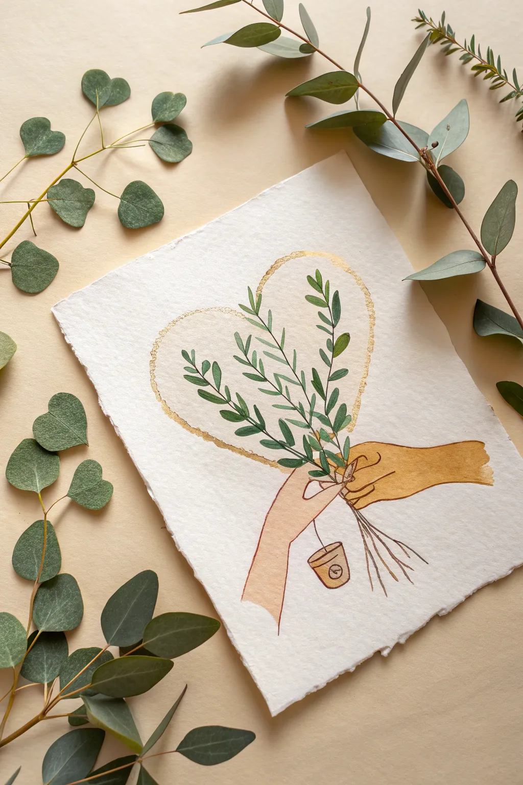
Embrace the soothing ritual of creation with this delicate watercolor piece, featuring two hands gently holding a bundle of greenery within a golden heart outline. The rustic deckle-edge paper adds an organic, handmade charm that perfectly complements the nurturing theme.
Detailed Instructions
Materials
- Heavyweight watercolor paper with deckle edge (300 gsm recommended)
- Watercolor paints (shades of green, ochre/yellow oxide, skin tones)
- Gold metallic watercolor paint or gold ink
- Fine liner brush (size 0 or 1) for details
- Round brush (size 4 or 6) for filling larger areas
- Pencil (HB or H for light lines)
- Kneaded eraser
- Jar of water and paper towels
Step 1: Sketching the Composition
-
Establish the heart shape:
Begin by lightly sketching a large heart shape in the center of your paper. Don’t worry about perfect symmetry; a slightly organic shape fits the natural theme best. -
Position the hands:
Towards the bottom center of the heart, sketch the outlines of two hands. One hand should be reaching from the bottom left, and the other clasping from the right, meeting in the middle to hold the stems. -
Draw the greenery:
Sketch three main stems rising from the hands. Draw small, alternating leaves along these stems, ensuring they stay mostly within the boundaries of your heart sketch. -
Add the tea bag detail:
From the hand on the left, draw a thin string dangling downward, ending in a small tea bag tag with a simple clock or circle symbol on it. -
Refine and lighten:
Once satisfied with the placement, gently roll a kneaded eraser over your sketch to lift the excess graphite, leaving just a faint guide for your paint.
Dry Brush Texture
For the heart halo, dab excess gold paint onto a paper towel first. Dragging a drier brush creates that lovely, broken organic texture shown in the art.
Step 2: Painting the Gold Elements
-
Outline the heart:
Load your round brush with gold metallic paint. Carefully paint along the heart outline, but instead of a solid line, use a slightly jagged, ‘dry brush’ motion to create a textured, rough edge. -
Fill the tea tag:
Use the same gold paint (or perhaps mixing in a little brown for contrast) to fill in the tea bag tag at the bottom. -
Let it shine:
Allow the gold paint to dry completely. Metallic pigments stay on the surface, so they can smear easily if you paint over them too soon.
Smudged Paint?
If wet green touches the wet hand color, don’t panic. Quickly dab it with a clean tissue to lift the mistake, let it dry fully, then repaint the area carefully.
Step 3: Bringing in Color
-
Mix your greens:
Prepare two shades of green on your palette: a deeper forest green and a lighter, mossy olive tone. -
Paint the leaves:
Using your fine brush, fill in the leaves. I like to alternate between the dark and light greens to give the bouquet depth and variety. -
Define the stems:
Draw thin lines for the stems using a mix of green and a touch of brown, extending them down below the hands to create the ‘bundle’ look. -
Paint the right hand:
Mix an ochre or yellow-oxide tone. Carefully fill in the hand on the right side. Keep the paint fairly flat and graphic rather than trying to render realistic shading. -
Paint the left hand:
Mix a soft pale peach or beige tone for the left hand. Fill in the shape, being careful where it meets the ochre hand to keep the boundary crisp. -
Add the tea string:
With the very tip of your smallest brush and dark brown paint, trace over the string line connecting the hand to the tea tag. -
Refine the tea tag:
Once the gold on the tag is dry, use a dark brown liner to add the small circle or clock detail inside the tag.
Step 4: Final Touches
-
Check edges:
Look closely at where different colors meet (like the hands holding the stems). If needed, sharpen these edges with a slightly dryer brush and more concentrated pigment. -
Erase stray marks:
Wait until the painting is 100% dry to the touch, then gently erase any remaining visible pencil lines, especially around the gold heart halo.
Now you have a gentle reminder of self-care captured on paper to display in your creative space
Paint Tiny Calm: One-Minute Miniatures
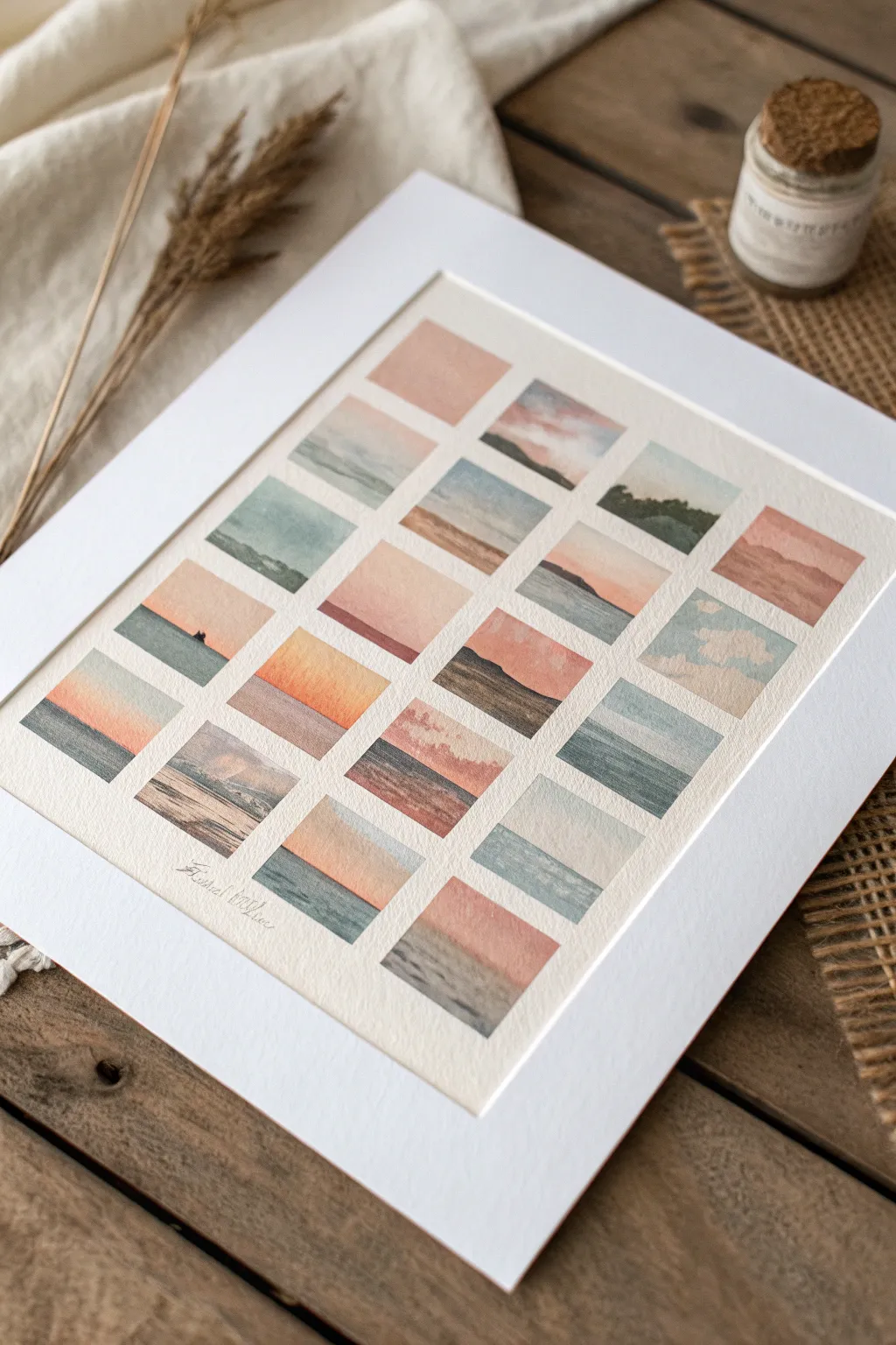
Embrace the meditative practice of creating a tiny gallery of serene landscapes, each capturing a fleeting moment of light and water. This grid of miniatures uses soft pastel washes and simplified horizons to create a cohesive, calming collection without the pressure of a large canvas.
Step-by-Step Tutorial
Materials
- Cold-pressed watercolor paper (140lb/300gsm)
- Watercolor paints (Payne’s Gray, Burnt Sienna, Indigo, Burnt Umber, Alizarin Crimson, Yellow Ochre)
- Painter’s tape or masking tape (low tack)
- Flat brush (small, size 4 or 6)
- Round brush (fine tip, size 0 or 1)
- Pencil and ruler
- Jar of water and paper towels
- Corrugated cardboard or drawing board (for taping down)
Step 1: Setting the Grid
-
Tape and Prep:
Secure your watercolor paper to a board using painter’s tape on all four sides to prevent buckling. Measure the usable area inside the tape. -
Measure the Columns:
Using a pencil and ruler, lightly mark out a grid layout. Aim for four columns and five rows, creating 20 small rectangles total. Leave about 1/4 inch of white space between each rectangle. -
Define the Rows:
Draw faint horizontal lines to complete your grid. Keep your pencil pressure extremely light so the graphite won’t show through the translucent watercolor later. -
Masking (Optional but Recommended):
If you want crisp edges without worrying about brush control, you can apply thin strips of masking tape over your pencil grid lines. Alternatively, just paint carefully within the pencil boundaries.
Tape Trick
Stick your masking tape to your clothes first before applying it to the paper. This reduces tackiness so it won’t rip your paper when you peel it off later.
Step 2: Painting the Skies
-
First Sky Wash:
Start with the top-left square. Mix a diluted wash of soft pink (Alizarin Crimson with plenty of water) and paint the upper two-thirds of the rectangle. -
Wet-on-Wet Blending:
While the pink is still wet, touch in a tiny amount of pale blue or gray at the very top edge to suggest clouds or atmospheric depth. -
Variety in Tone:
Move randomly to other squares, painting the sky portions first. Vary your sky colors: some should be warm peach (Yellow Ochre + Crimson), others cool grey-blue (Indigo + water), and some moody purple. -
Creating Clouds:
For a cloudy effect, as seen in the right-hand column, use a thirsty clean brush to lift out pigment from a wet blue wash, revealing the white paper underneath. -
The Sunset Gradient:
For the vibrant sunset squares (like the ones in the middle), paint a stripe of yellow at the horizon line and blend it upwards into orange and then pink while the paint is still damp.
Bleeding Edges?
If paint bleeds under the tape, use a stiff, damp brush to gently scrub away the error, or embrace it—cover the bleed with a thicker opaque white gouache border.
Step 3: grounding the Landscapes
-
Waiting Game:
Ensure all sky sections are completely dry before painting the land or sea. If you paint too soon, the horizon line will bleed and blur. -
Establishing the Horizon:
Switch to your flat brush. For the seascapes, mix a dark teal or slate blue. Paint a straight horizontal line across the bottom third of a square to meet the dry sky. -
Adding Land Masses:
In selected squares, replace the ocean horizon with land. Use Burnt Umber or a mix of Green and Brown to paint uneven, hilly shapes sloping down from the left or right sides. -
Layering Distance:
To create depth, paint lighter, more watery mountains in the background first. Let them dry, then paint darker, more saturated hills in front of them. -
Texture on the Water:
For sea squares, use a fairly dry brush to drag darker blue horizontally across the water area. This dry-brush technique mimics the sparkle of light on waves.
Step 4: Tiny Details
-
Defined Silhouettes:
Using your smallest round brush and concentrated Indigo or Black, add tiny focal points like a distant island or a small rock formation on the horizon line. -
Shorelines:
Where water meets land, you might want a sandy beach. Use a pale wash of Yellow Ochre or Burnt Sienna at the very bottom of the seascape squares. -
Enhancing Contrast:
I prefer to verify the contrast at this stage; if a mountain looks too pale against the sky, add a second glaze of darker paint to make it pop. -
Final Erasure:
Once the entire sheet is bonedry, carefully peel off any masking tape or gently erase visible pencil marks from the white grid lines.
Sign your name in pencil in the bottom margin to complete your gallery of miniature views
Layer a Release Page You Can Paint Over
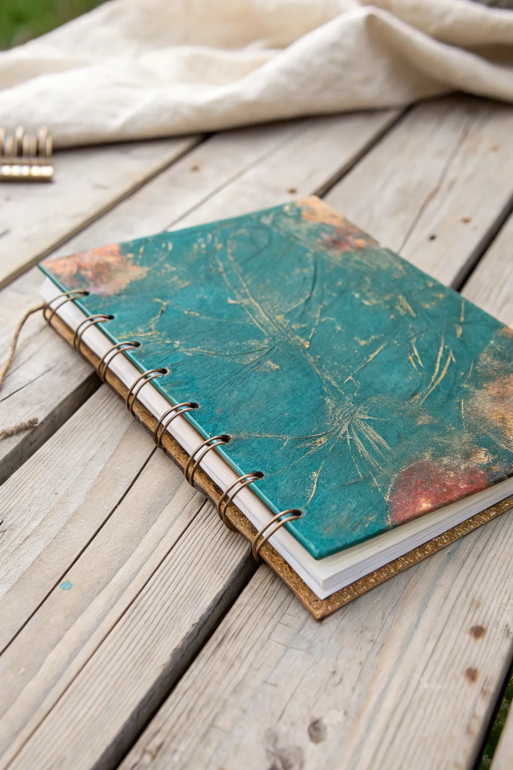
This project transforms a plain journal cover into a tactile, weathered masterpiece using rich teal tones and metallic highlights. The textured surface invites touch, while the “release” concept encourages you to let go of perfectionism and enjoy the messy, creative process.
How-To Guide
Materials
- Hardcover sketchbook or journal (spiral bound preferred)
- White or clear gesso
- Heavy body acrylic paints (teal/turquoise, burnt sienna, deep brown)
- Metallic gold acrylic paint or gilding wax
- Palette knife or old credit card
- Bubble wrap, scrunched tissue paper, or a texture stamp
- Matte medium or Mod Podge
- Synthetic flat brush (1 inch)
- Detail brush or fan brush
- Spray bottle with water
- Paper towels or rag
Step 1: Building the Foundation
-
Prep the surface:
Begin by sliding a piece of scrap paper behind the front cover of your spiral-bound journal. This protects the first actual page of paper from getting messy while you work on the cover. -
Apply the base texture:
Scoop out a generous amount of gesso onto the cover. Use a palette knife or an old credit card to spread it unevenly across the entire surface. Don’t try to make it smooth; ridges and bumps are exactly what we want. -
Create indentations:
While the gesso is still wet, take your chosen texture tool—scrunched tissue paper works beautifully here—and press it into the wet surface. Lift it straight up to leave behind organic, vein-like patterns. -
Add deep scratches:
Use the edge of your palette knife or a toothpick to scratch random lines into the wet gesso. Think of these as stress cracks or botanical veins running through the piece. -
Let it cure completely:
This is crucial: allow the gesso to dry fully. Depending on the thickness, this might take a few hours or require a hairdryer to speed things up.
Step 2: Adding Color and Depth
-
Apply the main color:
Mix a deep teal with a tiny drop of brown to muddy it slightly. Paint this over the entire textured surface, ensuring the paint gets into all the little crevices you created. -
Add warm contrast spots:
While the teal is still workable, introduce patches of burnt sienna or rust color. Focus these on the corners or random ‘blooms’ on the cover, blending the edges into the teal with a damp brush. -
Distress the surface:
Before the paint dries fully, take a damp paper towel and gently wipe across the highest points of the texture. This removes some teal paint, revealing the white gesso underneath and highlighting the texture. -
Darken the valleys:
Once the first layer is dry, mix a watery wash of dark brown acrylic. Brush it over the heavily textured areas and immediately wipe it back. The dark paint will stay in the deep scratches, adding shadow.
Sticky pages?
If your pages stick together after sealing, rub a little beeswax or clear candle wax along the edges of the cover to create a non-stick barrier.
Step 3: The Metallic Finish
-
Dry brush the gold:
Dip a dry brush into a small amount of metallic gold paint. Wipe most of it off onto a paper towel until almost nothing remains on the bristles. -
Highlight the ridges:
Lightly drag the dry brush over the raised textures, focusing on the scratch marks and the crumpled patterns. The gold should just catch the top edges. -
Add a gilding wash:
I like to water down a tiny bit of the gold paint and splatter it very lightly in one corner for an extra organic feel. -
Construct the back cover:
Repeat the gesso texturing process on the back cover if desired, but keep it simpler. Paint it a solid tone like the rusty brown seen on the bottom edge to ground the design. -
Seal the work:
Once completely dry (give it overnight to be safe), apply a layer of matte medium or varnish to protect your cover from handling and give it a finished sheen.
Level Up: Nature Imprints
Press actual dried leaves or fern fronds into the wet gesso, then peel them away carefully to leave fossil-like impressions instead of abstract texture.
Now you have a durable, personalized vessel ready to hold your thoughts and sketches


Have a question or want to share your own experience? I'd love to hear from you in the comments below!