If you’re craving paintings that feel like a deep exhale, spa-inspired art is such a satisfying direction to explore. These ideas are all about soft mood, calming symbols, and that clean, cozy wellness vibe you’d want in a treatment room or a spa-like bathroom at home.
Soothing Water Ripple Abstract
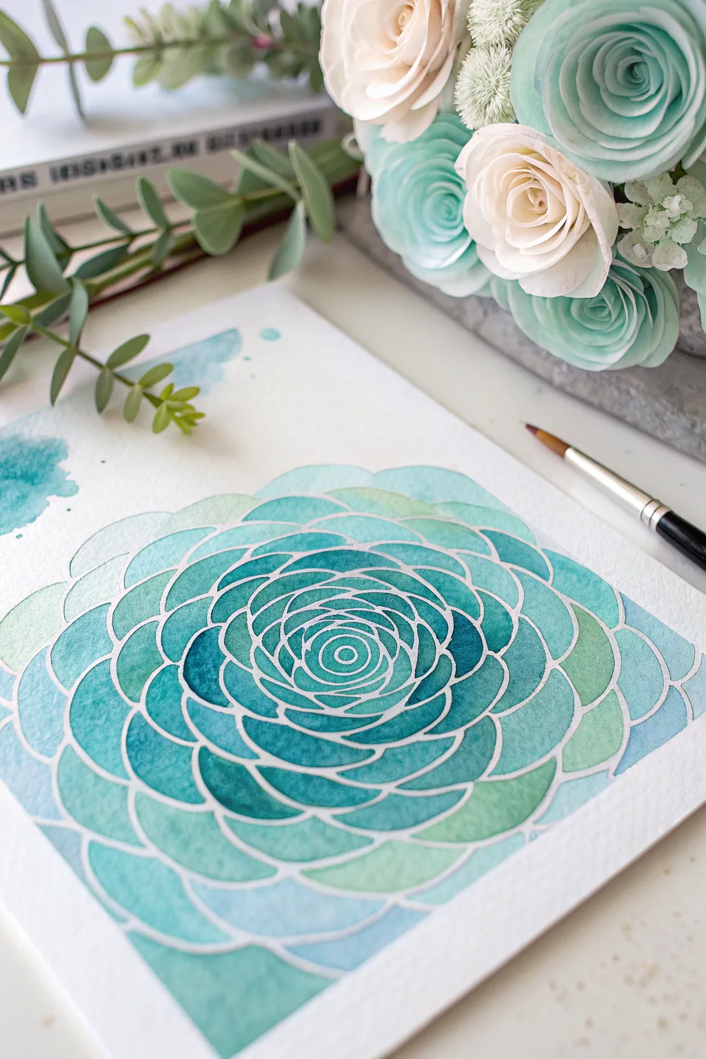
This soothing watercolor project mimics the calming energy of a spa with its cool teal palette and rhythmic, mandala-like petal structure. The white resist lines act as a frame for the beautiful watercolor gradients, creating a look that is both structured and organic.
Step-by-Step
Materials
- Cold press watercolor paper (300 gsm)
- Masking fluid (drawing gum) or white jelly roll pen
- Fine-tip applicator bottle (if using masking fluid)
- Watercolor paints: Phthalo Blue, Viridian Green, Cobalt Teal
- Round watercolor brushes (size 4 and 8)
- Pencil and eraser
- Compass or circle template
- Paper towels and water jar
Step 1: Drafting the Design
-
Mark the center:
Find the center of your paper and mark it very lightly with a pencil. This will serve as the anchor for your expanding spiral design. -
Sketch circular guides:
Using a compass, draw a series of light concentric circles expanding outward from your center point. Space them about 0.5 to 1 inch apart to guide the size of your petal layers. -
Draw the central spiral:
Starting at the very center, sketch a small, tight spiral or series of tiny overlapping arcs to create the rose-like bud. -
Sketch the petals:
Working outward, draw curved scallop shapes along your concentric guidelines. Stagger them like bricks—place the peak of a new petal directly above the gap between the two petals below it. -
Refine the outer edge:
As you reach the outer circles, broaden the petal shapes to make them wider and flatter, mimicking an open bloom.
Pro Tip: Masking Fluid
Coat your brush bristles in soap before dipping into masking fluid (if not using an applicator bottle). This prevents the fluid from drying into a rubbery mess deep in the bristles.
Step 2: Creating the Resist
-
Apply masking fluid:
Fill a fine-tip applicator bottle with masking fluid. Carefully trace over all your pencil lines. The fluid needs to be continuous to serve as a barrier for the paint. -
Check line thickness:
Aim for a consistent line width. If a blob comes out, quickly dab it with a tissue, let it dry, rub it off, and try again. -
Allow to dry completely:
Let the masking fluid sit undisturbed until it is completely dry and transparent-yellowish. This usually takes about 15-20 minutes depending on humidity. -
Clean eraser lines:
Once the fluid is 100% dry, gently erase any visible pencil marks that might show through the lighter paint colors later.
Step 3: Painting the Gradient
-
Mix your palette:
Prepare three strength levels of your teal mix: a watery pale wash, a medium tone, and a concentrated dark teal (mix Phthalo Blue with a touch of Viridian). -
Start at the center:
Load your smaller brush with the concentrated dark teal. Paint the innermost spiral shapes, as this is where the shadows would naturally be deepest. -
Transition to medium tones:
As you move to the next ring of petals, switch to your medium tone. You can drop a tiny bit of dark pigment into the wet medium paint near the base of each petal for a soft gradient. -
Paint the outer layers:
For the large outer petals, use the palest, most watery wash. This creates a luminous, backlit effect. -
Add wet-on-wet variety:
While the outer petals are still wet, touch the tip of your brush loaded with Cobalt Teal to the edges. Watch the pigment bloom softly into the pale wash. -
Create background splashes:
Use leftover medium-tone paint to add loose, abstract splashes in the upper left corner to balance the composition. -
Second drying phase:
Wait until the paint is bone dry. If the paper feels cool to the touch, it’s still damp inside.
Level Up: Metallic Pop
Once the painting is dry and mask removed, trace inside the white lines with a fine silver or gold paint pen. The metallic shimmer adds a luxurious, high-end spa feel.
Step 4: Final Reveal
-
Remove the mask:
Gently rub your finger or a rubber cement pick-up tool over the masking fluid to peel it away, revealing the crisp white paper underneath. -
Touch up edges:
If any paint seeped under the mask, you can gently scrub it with a damp, stiff brush or cover it with a white gel pen for a clean finish.
Hang this serene artwork in your bathroom or reading nook to capture a little bit of daily peace

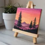
Serene Mountain Spa Landscape
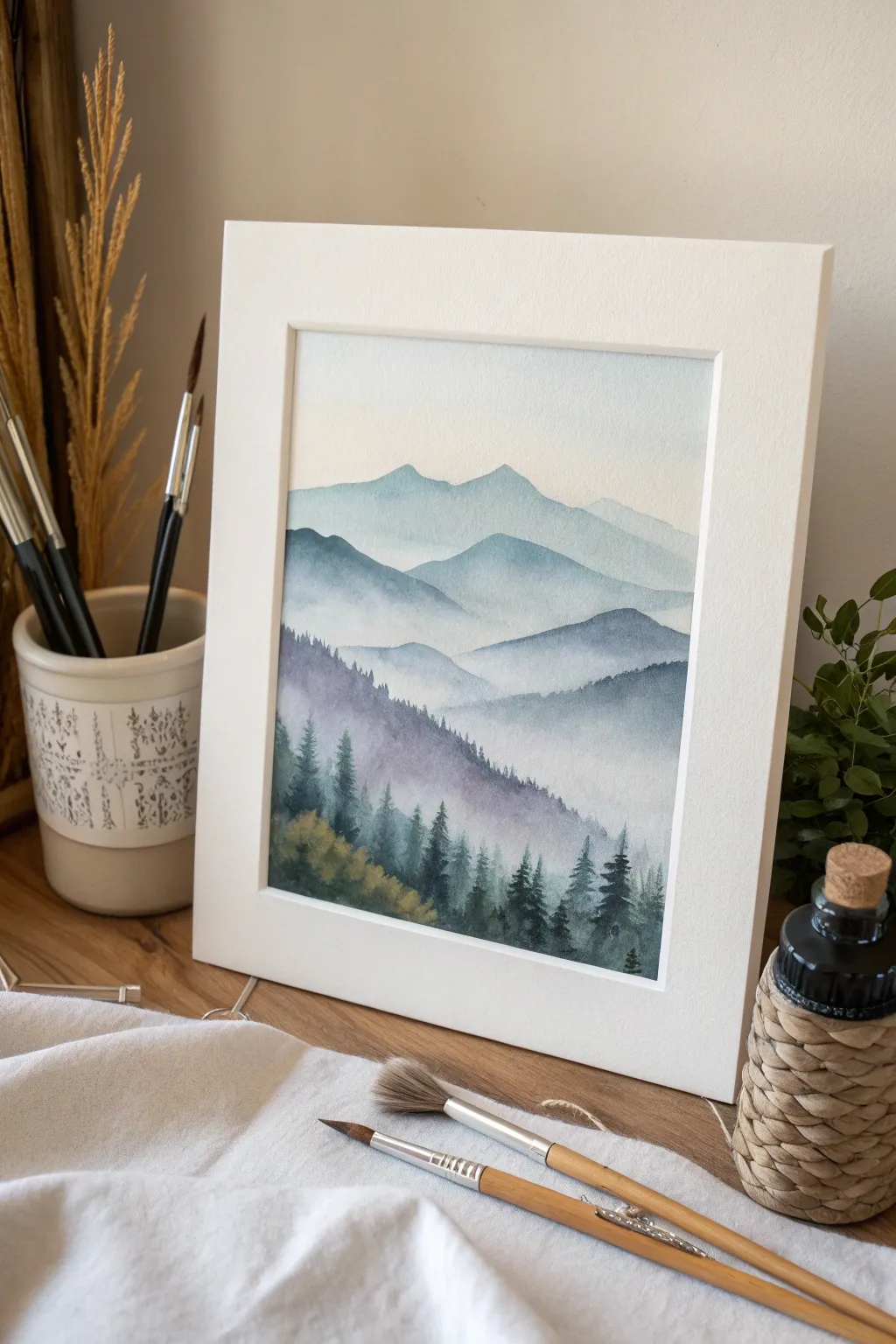
Capture the calm of a spa retreat with this layered watercolor landscape featuring rolling misty mountains and a crisp evergreen forest. The soft gradients and atmospheric perspective create a sense of depth that draws the viewer into a peaceful natural scene.
Step-by-Step Tutorial
Materials
- Cold press watercolor paper (140lb/300gsm)
- Watercolor paints (Indigo, Payne’s Gray, Sap Green, Burnt Sienna, Prussian Blue)
- Round watercolor brushes (sizes 4, 8, and 12)
- Clean water jar
- Paper towels
- Pencil and kneaded eraser
- Masking tape
- Drawing board
Step 1: Preparation and First Wash
-
Secure the paper:
Tape your watercolor paper down tightly to a drawing board on all four sides. This prevents the paper from buckling when wet and creates that crisp white border shown in the finished piece. -
Sketch the horizon lines:
Lightly sketch the outlines of your mountain ranges. Draw about four distinct layers, starting high in the sky and moving down. Keep the lines wavy and organic, allowing them to overlap slightly. -
Wet-on-wet sky:
Using your largest brush, wet the area above the highest mountain line with clean water. The paper should be damp but not soaking. -
Paint the sky:
Drop a very diluted wash of Prussian Blue into the wet area. Let it fade to white near the mountaintop to simulate atmospheric glow. Allow this to dry completely.
Fixing Hard Edges
If your mist ceases to look soft and dries with a hard line, scrub the edge gently with a damp stiff brush and blot with a tissue to soften it back into a gradient.
Step 2: Painting the Distant Range
-
Mix the lightest value:
Mix a very pale wash of Indigo and Prussian Blue. This should be transparent and light, representing the furthest mountains which are faded by distance. -
First mountain layer:
Paint the most distant mountain shape. Extend the color downwards about an inch, then clean your brush and use clear water to fade the bottom edge into nothingness. -
Let it dry:
Ensure this layer is totally dry before touching the next section to prevent the colors from running together. -
Second mountain layer:
Create a slightly darker mix by adding a touch more Indigo. Paint the second mountain range below the first, following your pencil line. Again, use clean water to soften and fade the bottom edge, creating a mist effect.
Step 3: Mid-Ground and Depth
-
Deepen the color:
For the third layer of mountains, mix Payne’s Gray into your blue mixture. This layer should be noticeably darker than the previous two. -
Paint the mid-ground:
Apply the paint to the third mountain shape. As you fade the bottom edge with water, you can drop in tiny amounts of clear water into the drying paint to create subtle ‘blooms’ that look like rising fog. -
Add a purple hue:
For the prominent ridge just before the foreground, mix a small amount of reddish-brown (Burnt Sienna) into your blue mix to create a muted purple-grey tone. Paint this layer with a slightly harder edge. -
Textural details:
While this purple-grey layer is still damp near the bottom, dab it gently with a paper towel in random spots to lift paint and create texture for the upcoming trees.
Golden Hour Glow
Before painting the first mountain layer, wash a very faint sweeping line of Yellow Ochre across the sky area and let dry. This adds a warm sunrise feels to the cool landscape.
Step 4: Foreground Forest
-
Mix forest colors:
Prepare a rich, dark green using Sap Green and Indigo. You want a very saturated, creamy consistency for the foreground. -
Paint distant trees:
Using a size 4 brush, paint small, vertical strokes along the ridge of the purple-grey mountain to suggest distant treetops peeking through the mist. -
Foreground trees base:
At the very bottom of the paper, paint a wash of Sap Green mixed with a little Burnt Sienna for warmth. This simulates the underbrush. -
Define the evergreens:
Using your smallest brush and the dark Indigo-Green mix, paint detailed pine trees over the bottom layer. Start with a thin vertical line for the trunk, then use quick, downward strokes for the branches. -
Layering trees:
Vary the height and density of the trees. Make some trees lighter (more water) and some darker (more pigment) to create depth within the forest itself. -
Final touches:
Add a few tiny dark specks or birds in the distance if desired. Remove the tape carefully at a 45-degree angle once the paper is bone dry to reveal the crisp border.
Frame your finished piece in a simple white mat to enhance the serene, spa-like quality of your artwork


Forest Bathing Pathway
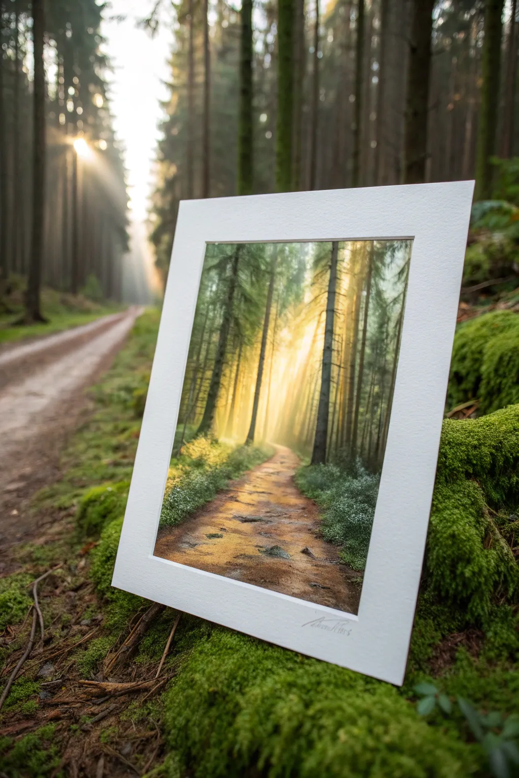
Capture the serene essence of forest bathing with this luminous landscape painting featuring soft sunbeams cutting through tall pines. This project focuses on creating depth with atmospheric perspective and capturing the golden glow of morning light on a winding trail.
Step-by-Step Guide
Materials
- Heavyweight watercolor paper or mixed media board (9×12 inches)
- White mat board with pre-cut opening (11×14 inches outer dimension)
- Acrylic paints: Titanium White, Burnt Umber, Yellow Ochre, Sap Green, Phthalo Blue, Cadmium Yellow Medium
- Soft synthetic brushes: 1-inch flat, medium filbert, fine liner
- Water container and paper towels
- Painter’s tape
- Glazing medium or slow-drying medium
Step 1: Setting the Background
-
Prepare the surface:
Tape down your watercolor paper to a rigid board using painter’s tape on all four sides to prevent buckling. Place your mat board over it briefly to lightly pencil the opening boundaries, ensuring your composition fits perfectly. -
Underpainting the glow:
Mix a substantial amount of Titanium White with a touch of Cadmium Yellow Medium. Using the 1-inch flat brush, paint the center of the canvas where the light source will be, blending outwards in a circular motion. -
Establishing the distance:
While the yellow center is still tacky, mix a pale, hazy green using White, a tiny dot of Sap Green, and Phthalo Blue. Paint the outer edges of the sky area, blending softly into the central yellow glow to create an atmospheric transition.
Pro Tip: Edges
Keep edges fuzzy for distant objects and sharp for foreground items. This mimics how the human eye focuses and adds immense depth to the scene.
Step 2: Creating the Mid-Ground Trees
-
Blocking distant trees:
Mix a very pale grey-green color. Using the flat edge of your brush, tap in vertical lines for the furthest trees. These should be barely visible against the background light, creating a sense of deep perspective. -
Adding mid-ground trunks:
Darken your green mix slightly with Burnt Umber. Switch to the filbert brush and paint the next layer of tree trunks. These should be slightly wider and darker than the distant ones, placed towards the sides of the composition. -
Painting the canopy:
Use the tip of a dry filbert brush to stipple foliage near the top of these trunks. Keep the paint thin and translucent so the background light still peeks through the leaves.
Step 3: The Foreground and Path
-
Laying the path’s foundation:
Mix Burnt Umber, White, and a touch of Yellow Ochre for the path color. Start wide at the bottom and narrow the stroke as you curve it toward the light source in the center. -
Adding texture to the trail:
While the path is wet, gently streak in darker browns horizontally to mimic uneven earth and trodden soil. Don’t over-blend; let the brushstrokes remain visible for texture. -
Foreground trees:
Mix your darkest value using Sap Green and Burnt Umber (almost black). Paint two or three large, dominant tree trunks on the extreme left and right foreground. These provide a frame for the light. -
Adding bark details:
I like to take a liner brush with slightly watered-down black/brown mix to create the rough texture of bark on the nearest trees. Add small horizontal tick marks up the sides of the trunks. -
Foreground foliage:
Load your filbert brush with dark green paint. Stipple lush bushes and undergrowth at the base of the foreground trees, overlapping slightly onto the edges of the path.
Level Up: Texture
Mix a pinch of fine sand or modeling paste into the paint used for the foreground path to give the dirt trail a real, gritty texture.
Step 4: Lighting and Atmosphere
-
Painting the sunbeams:
Mix a very distinct glaze using water (or glazing medium) and Titanium White with a hint of yellow. Using a clean flat brush, pull straight, diagonal strokes from the center light source down across the dark trees. -
Softening the rays:
If the sunbeams look too harsh, quickly wipe them gently with a dry paper towel or clean brush to feather the edges. They should look like ghosts of light, not solid stripes. -
Highlighting the path:
Use the same glaze mixture to clear up the path. Add horizontal highlights where the sunbeams would hit the dirt, creating patches of illuminated ground. -
Highlighting the foliage:
Mix a light lime green using Cadmium Yellow and Sap Green. Stipple highlights onto the tops of the foreground bushes and the edges of the tree trunks that face the light source. -
Final details:
Use the liner brush to add tiny details like thin branches reaching across the path or small rocks on the trail using a grey-brown mix. -
Mounting:
Allow the painting to dry strictly flat for at least 24 hours. Once cured, center your mat board over the image and secure it from the back with acid-free tape.
Place your finished piece in a simple frame to complete this window into a peaceful forest morning.


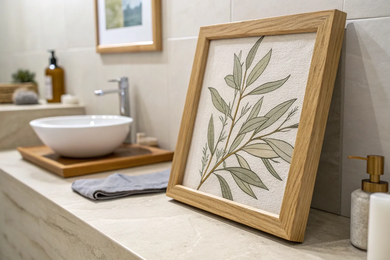
Minimal Botanical on White
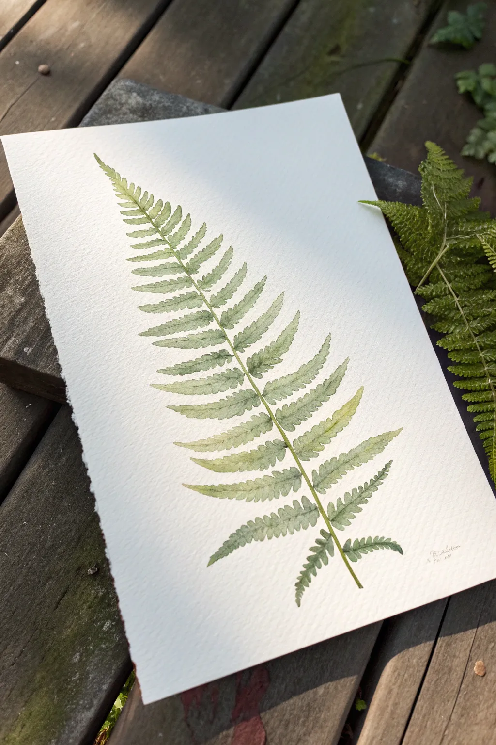
Capture the delicate tranquility of nature with this minimalist watercolor study of a single fern frond. By layering translucent greens on textured paper, you’ll create a piece that feels both organic and deeply calming—perfect for a spa-inspired space.
Step-by-Step
Materials
- Cold press watercolor paper (300 gsm or heavier)
- Round watercolor brushes (size 2 and size 6)
- Watercolor paints: Sap Green, Hooker’s Green, Lemon Yellow, Burnt Umber
- Pencil (HB or lighter)
- Kneaded eraser
- Two jars of water
- Paper towel or cloth
- Palette for mixing
Step 1: Sketching the Structure
-
Outline the central vein:
Begin by lightly sketching a single, curved line diagonally across your paper. This represents the rachis, or the main stem of the fern. Give it a gentle, organic curve rather than making it ruler-straight. -
Mark leaf placement:
Along the stem, make tiny tick marks where the individual leaflets (pinnae) will emerge. Start wider at the bottom and gradually decrease the spacing as you move toward the tip. -
Draft the leaflets:
Sketch the triangular shape of each leaflet coming off the stem. They should be longest near the bottom and taper to tiny points at the top. Keep your pencil pressure incredibly light so the graphite doesn’t show through the transparent paint later. -
Refine the edges:
Add the jagged, toothed edges to each leaflet. Ferns aren’t smooth; these little serrations give the frond its characteristic texture. Once happy, gently roll a kneaded eraser over the sketch to lift excess graphite, leaving only a faint guide.
Pro Tip: Deckle Edges
To get the torn-edge look seen in the photo, fold your watercolor paper back and forth several times along a ruler, then wet the crease with a brush before carefully tearing it apart.
Step 2: Base Washes
-
Mix a light lime green:
On your palette, mix a generous amount of Lemon Yellow with a small touch of Sap Green and plenty of water. You want a very pale, tea-consistency wash for the first layer. -
Paint the top leaflets:
Using the size 6 brush, fill in the smallest leaflets at the very tip of the fern with this pale mixture. I like to keep these top leaves lighter to suggest sunlight hitting the delicate new growth. -
Transition to mid-green:
Add a little more Sap Green to your mix. Continue painting the leaflets moving down the stem. You aren’t worry about details yet; just fill the shapes with a specialized clean wash. -
Darken the lower section:
For the largest leaves at the bottom, mix Sap Green with a tiny dot of Burnt Umber to desaturate it slightly. Paint these lower sections, allowing the colors to vary slightly from leaf to leaf for naturalism. -
Let it dry completely:
Wait until the paper is bone dry. If it’s cool to the touch, it’s still wet. This patience prevents the crisp details in the next step from bleeding into fuzzy blobs.
Level Up: Pressed Effect
While the paint is faintly damp, lay a heavy book on top (with wax paper between) and let it dry overnight. This flattens the paper completely, mimicking a pressed botanical specimen.
Step 3: Defining Details
-
Mix a shadow green:
Create a stronger, less watery mix using Hooker’s Green and a touch of Burnt Umber. This will be your detail color. -
Paint the central stem:
Switch to your size 2 brush. Carefully paint the central stem (rachis) over your pencil line. It should be slightly thicker at the base and hairline-thin at the tip. Use a steady hand and long strokes. -
Add leaflet veins:
From the central stem, paint a fine line down the center of each individual leaflet. Do not paint this line all the way to the tip of the leaf; let it fade out about halfway. -
Create depth where leaves meet:
Drop a tiny amount of the shadow green mixture into the ‘V’ shape where each leaflet attaches to the main stem. This small shadow anchors the leaves and gives the fern dimension. -
Glaze for variation:
Once the previous layers are dry, mix a very watery yellow-green glaze. Lightly brush it over random patches of the fern—specifically the tips of some middle leaves—to create a glowing, sun-dappled effect. -
Softening edges:
If any detailed lines look too harsh, rinse your brush, dry it slightly on a towel, and gently run the damp bristles along the hard edge to soften it into the background.
Step 4: Finishing Touches
-
Evaluate the contrast:
Step back and look at the painting. If the bottom leaves feel too flat, add another layer of the Sap Green mix to the lower half of those specific leaflets to suggest curvature. -
Optional splatter:
For a looser look, load a brush with watered-down paint and tap it against another brush handle to flick tiny speckles around the base of the stem. Keep this very subtle. -
Sign your work:
Use a pencil or a very fine brush with diluted gray paint to sign your initials small near the bottom stem.
Now you have a piece of botanical art that brings a breath of fresh air into your home
BRUSH GUIDE
The Right Brush for Every Stroke
From clean lines to bold texture — master brush choice, stroke control, and essential techniques.
Explore the Full Guide
Massage Room Triptych Panels
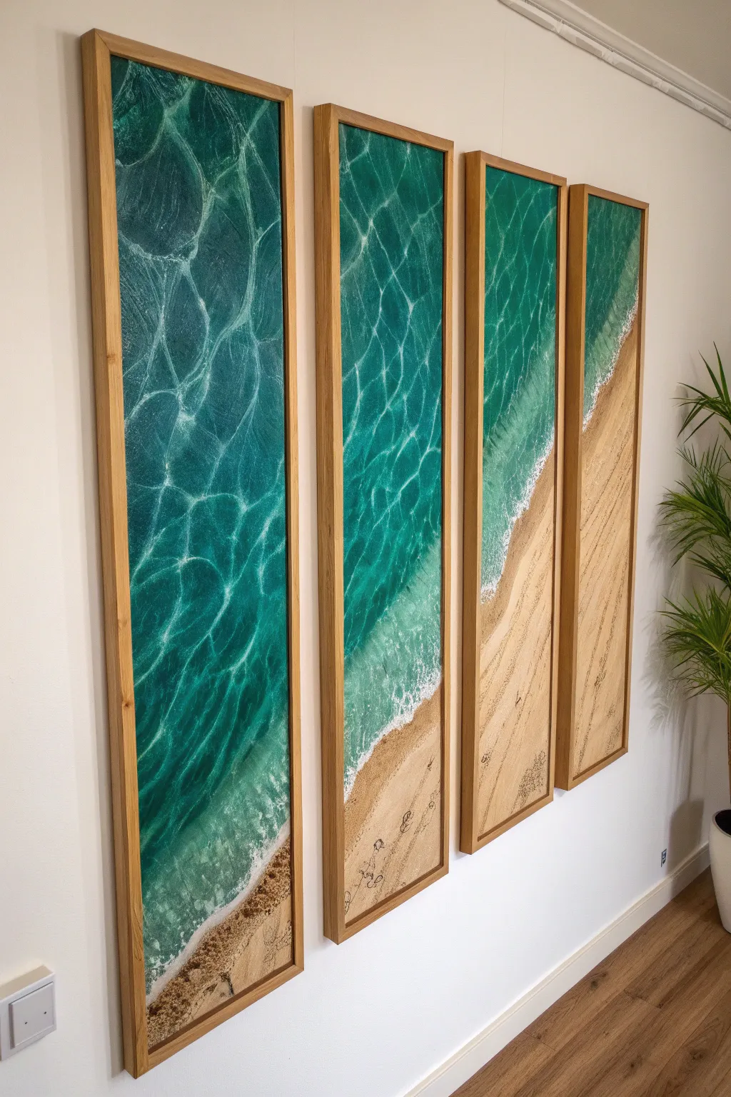
These four stunning vertical panels create a seamless aerial view of the ocean meeting the shore, bringing a serene, high-end spa atmosphere into any room. By using resin pouring techniques over a textured base, you’ll capture the hyper-realistic depth of crashing waves and the shimmering transparency of turquoise waters.
Step-by-Step Guide
Materials
- 4 tall, narrow wood painting panels (e.g., 12×36 inches)
- Real sand (fine grain)
- White acrylic gesso or texture paste
- Acrylic paints (Phthalo Blue, Turquoise, Teal, Titanium White, Raw Sienna)
- Epoxy resin (art grade, high gloss)
- Flow medium or silicone oil (for cells)
- Heat gun or culinary torch
- Mixing cups and stir sticks
- Masking tape
- Floating wood frames (oak finish)
Step 1: Preparation & Sand Base
-
Arrange the canvas layout:
Lay your four panels side-by-side on a flat, protected work surface. Using a pencil, lightly sketch a continuous diagonal wave line across all four panels so the shoreline flows naturally from one to the next. -
Prep the sand area:
Mix fine sand with a generous amount of white acrylic gesso or a texture medium until it forms a spreadable paste. You want it thick enough to hold texture but wet enough to adhere. -
Apply the beach foundation:
Spread the sand mixture onto the bottom right sections of the panels, following your sketched diagonal line. I like to taper the thickness, making it flatter near the ‘water’ and slightly rougher near the bottom edge. -
Prime the water area:
Paint the remaining upper sections of the panels with a flat coat of white acrylic paint. This brightness is crucial because it allows the translucent ocean colors to pop later on.
Making Lacy Waves
To get those perfect ‘cells’ that look like sea foam, don’t overheat the resin. A quick pass with the heat gun pushes the white pigment, then let gravity do the rest.
Step 2: painting the Depths
-
Create the sand gradient:
Once the texture paste is dry, paint over the sand area with Raw Sienna. While the paint is wet, blend in a touch of Titanium White near the water’s edge to simulate wet, reflective sand. -
Block in ocean colors:
Starting at the top left (deepest water), apply Phthalo Blue. Transition into Turquoise and Teal as you move diagonally toward the sandy shore area. -
Blend the transition:
Use a damp brush to seamlessly blend the blue gradients together. The goal is a smooth ombre effect without harsh lines between the deep and shallow zones. -
Detail the seabed:
In the shallowest teal areas, lightly dry-brush some faint ripples using a mix of sand color and white. This mimics the sun reflecting on the sandy bottom through clear water.
Milky Resin Fix
If your resin looks cloudy or milky after mixing, you likely have too many micro-bubbles. Let the cup sit for 5 minutes before pouring to let air rise and escape.
Step 3: Resin & Waves
-
Tape the edges:
Apply masking tape tightly around the back edges of each panel to catch drips. Elevate the panels on cans or cups to ensure even runoff. -
Mix the clear resin:
Follow the manufacturer’s instructions to mix a large batch of clear epoxy resin. Pour a clear coat over the entire water section of the panels, spreading it to the edges. -
Prepare the white wave resin:
In a small separate cup, mix a small amount of resin with Titanium White pigment paste or heavy body acrylic. Add two drops of silicone oil to encourage separating cells. -
Pour the wave lines:
Drizzle thin lines of the white mixture where the water meets the sand, and create a second, fainter line further out in the deep blue to suggest rolling swells. -
Blow out the waves:
Using a heat gun on a low setting, gently push the white resin back over the clear blue resin. Keep the heat gun moving to spread the white into lacy, frothy patterns. -
Create water caustics:
For the deep water ‘webbing’ effect seen in the top left, use a straw to gently blow tiny sections of clear resin apart, or use a toothpick to swirl faint white veins through the deep blue. -
Torch the bubbles:
Pass a culinary torch quickly over the surface to pop any air bubbles trapped in the resin layer. Be careful not to scorch the resin.
Step 4: Finishing Touches
-
Remove tape:
Once the resin has cured to a ‘tacky’ phase (usually 4-6 hours), carefully peel off the tape from the back edges. -
Sand the footprints:
Once fully cured, use a tiny amount of dark brown paint on a fine detail brush to paint tiny, irregular ovals on the sand section, mimicking footprints walking toward the water. -
Install the frames:
Place your cured panels into floating wood frames. Use spacers to ensure an even gap between the canvas edge and the frame for that professional gallery look.
Hang your new seascape panels with roughly two inches of space between them to let the continuous horizon line work its magic
Salt and Stone Texture Study
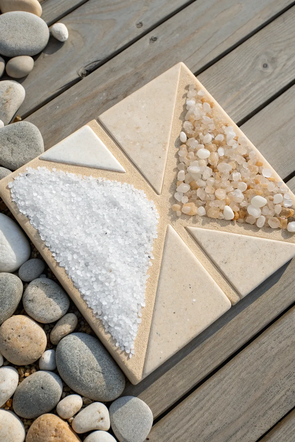
Bring the calming essence of a spa into your home with this tactile texture study that combines the grounded feel of stone with the crystalline purity of salt. This project plays with geometric negative space and organic materials to create a meditative, three-dimensional centerpiece.
How-To Guide
Materials
- Square wooden painting panel (8×8 or 10×10 inches)
- Texture paste or sandy styling paste
- Triangular stone or ceramic tiles (beige/cream)
- Coarse sea salt or white decorative sand
- Mixed small river pebbles or crushed quartz (translucent/amber tones)
- Strong craft adhesive (e.g., E6000) or heavy body gel medium
- Palette knife
- Painters tape
- Acrylic paint (Sandy Beige)
- Gloss varnish spray (optional)
Step 1: Preparation and Layout
-
Prepare the base:
Begin with a clean, dry wooden panel. If the wood is very smooth, give it a quick sanding with fine-grit sandpaper to help the texture paste adhere better. -
Establish the background color:
Paint the entire surface of the panel with a warm, sandy beige acrylic paint. This ensures that if any gaps appear in your texture later, the wood tone won’t show through. -
Dry completely:
Allow the base coat to dry fully before moving on to the layout phase. -
Plan the geometry:
Arrange your triangular stone tiles on the dry panel to visualize the design. The image shows an ‘X’ pattern formation where the tiles form arrows pointing inward, leaving two large opposing triangular voids for texture. -
Mark the zones:
Once satisfied with the placement, lightly trace around the tiles with a pencil so you know exactly where to apply adhesive versus texture.
Step 2: Setting the Structure
-
Create the sandy base:
Mix a small amount of the beige acrylic paint into your texture paste to tint it. Apply a thin, even layer of this granular paste over the entire surface using a palette knife, covering your pencil lines. -
Embed the stone tiles:
While the paste is still wet, press your triangular stone tiles firmly into their designated spots. The wet paste will act as a mortar, but for extra security, I like to add a dab of heavy glue to the back of each tile first. -
Clean the edges:
Use the tip of your palette knife or a damp cotton swab to wipe away any excess paste that may have squished out onto the surface of the smooth tiles. We want clean, sharp lines. -
Define the texture zones:
You should now have the tiles fixed in place, with two empty triangular areas of wet, sandy paste remaining. These will be our salt and pebble zones.
Loose Crystals?
If salt crystals keep shedding after drying, mix clear craft glue with water (50/50 mix) and carefully drip it over the salt using a pipette to lock everything in.
Step 3: Adding Organic Textures
-
Prepare the adhesive bed:
Identify the triangular section destined for the white salt. Apply a thick layer of heavy body gel medium or clear drying craft glue directly into this area. -
Apply the white crystals:
Generously pour coarse white sea salt or white decorative sand over the glue. Press it down gently with the flat of your hand to ensure good contact. -
Prepare the pebble zone:
Move to the opposite triangular section. Apply a generous layer of heavy glue here as well; pebbles are heavier and need a stronger bed than the salt. -
Place the pebbles:
Scatter your mixed small pebbles or crushed quartz into this glue bed. Aim for a mix of translucent, white, and amber stones to create depth. -
Refine the pebble arrangement:
Use tweezers or a small stick to nudge the pebbles around, ensuring they fit tightly together like a mosaic without piling up too high.
Level Up: Scent Integration
Add a few drops of essential oil (like lavender or eucalyptus) to the sandy texture paste before applying. The porous texture will hold a subtle spa scent for days.
Step 4: Finishing Touches
-
Let it set:
Allow the piece to dry undisturbed for at least 24 hours. The glue needs to cure completely to hold the heavy stones. -
Remove excess:
Once fully dry, tilt the panel over a tray to shake off any loose salt or unattached pebbles. If you find bald spots, dab a little glue and refill them. -
Seal the salt:
Salt can draw moisture from the air, so it is crucial to seal it. Lightly mist the salt section with a matte varnish spray. -
Enhance the stone shine:
For the pebble section, use a small brush to dab gloss varnish over the individual stones. This mimics the look of wet river stones.
Display your finished textural masterpiece flat on a coffee table or upright on a shelf for an instant touch of serenity.

PENCIL GUIDE
Understanding Pencil Grades from H to B
From first sketch to finished drawing — learn pencil grades, line control, and shading techniques.
Explore the Full Guide
Spa Affirmation Typography Painting
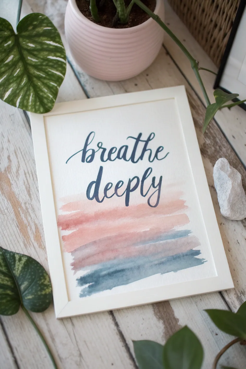
Bring a sense of calm to your space with this serene typography painting, featuring soft, gradient watercolor washes beneath an elegant script affirmation. The blend of dusty pinks and steel blues creates a soothing palette perfect for a spa-inspired atmosphere.
Step-by-Step
Materials
- Cold press watercolor paper (A4 or 8×10 inch)
- Watercolor paints (Peach/Dusty Rose, Payne’s Grey, Indigo)
- Flat wash brush (3/4 inch or 1 inch)
- Small round brush (size 1 or 2) for lettering
- Pencil and eraser
- Ruler
- Painters tape or Washi tape
- Paper towels
- 2 jars of water
- White or light wood frame
Step 1: Preparation and Sketching
-
Tape your paper:
Begin by securing your watercolor paper to a solid surface using painters tape along all four edges. This prevents buckling when the paper gets wet and creates a crisp white border. -
Plan the layout:
Using a ruler, lightly mark the center of your paper. Visualize the composition: the text will sit in the upper center, while the watercolor washes will occupy the bottom third. -
Sketch the letters:
With a very light hand, pencil in the words ‘breathe deeply’ using a cursive script style. Ensure the ‘b’ and ‘d’ ascenders are tall and elegant, and play with the bounce of the baseline for a modern calligraphy look. -
Refine the script:
Go back over your pencil lines to thicken the downstrokes slightly, creating a guide for where your brush will apply more pressure later. Keep these lines faint so they don’t show through the paint.
Step 2: Creating the Washes
-
Mix your palette:
Prepare a watery puddle of dusty rose or peach on your palette. In a separate well, mix a diluted Payne’s Grey or indigo to create a soft, stormy blue-grey. -
First pink stroke:
Load your flat wash brush with the peach mixture. Starting just below the word ‘deeply’, pull the brush horizontally across the paper using a rough, confident stroke. Let the edges be uneven and natural. -
Layering the pinks:
Add a second stroke slightly below the first, perhaps with a slightly more saturated mix of the same color. Allow the wet edges to touch slightly so the colors bleed together just a bit. -
Transitioning colors:
Clean your brush thoroughly. Pick up the blue-grey mixture. Paint a horizontal stroke below the pink area, leaving a tiny gap in some places but allowing them to touch in others for a soft blend. -
Finishing the wash:
Add one final, darker stroke of the blue-grey at the very bottom to ground the composition. This creates a gradient effect from light and airy to grounded and deep. -
Let it dry completely:
This is crucial: allow the watercolor background to dry 100% before moving to the text. Use a hairdryer on a low, cool setting if you are impatient, but air drying is safest.
Bleeding Lines?
If paint bleeds when doing the text, your background wash wasn’t dry enough. Wait longer, or use a highly pigmented, less watery paint mix for the letters.
Step 3: Lettering and Framing
-
Prepare the lettering paint:
Mix a concentrated amount of Indigo or a dark teal watercolor. You want a creamy consistency, much thicker than the background washes, to ensure crisp lines. -
Start the lettering:
Using your small round brush, begin painting over your pencil sketch. Apply pressure on the downstrokes to make them thick, and lift the brush to its tip for hairline upstrokes. -
Detailing the script:
Focus on smooth connections between letters. If your brush runs dry mid-word, re-load and carefully pick up where you left off, blending the wet edge into the dry one. -
Check for consistency:
Look at your ‘l’ and ‘h’ loops; ensure they have similar widths. I often go back and carefully smooth out any shaky edges on the thicker downstrokes once the main shape is down. -
Erase guidelines:
Once the lettering is bone-dry (wait at least an hour to be safe), gently use a kneaded eraser to pick up any visible pencil marks. -
Remove tape:
Peel the tape away from the paper slowly, pulling it back at a 45-degree angle away from the painting to prevent tearing the surface. -
Frame your work:
Place your finished piece into a simple white or light wood frame to complement the airy, spa-like aesthetic of the artwork.
Add Some Shimmer
Mix a tiny amount of metallic gold watercolor into your pink wash for a subtle, luxurious shimmer that catches the sunlight.
Hang this piece in your bathroom or reading nook to serve as a gentle reminder to pause and reset

Have a question or want to share your own experience? I'd love to hear from you in the comments below!