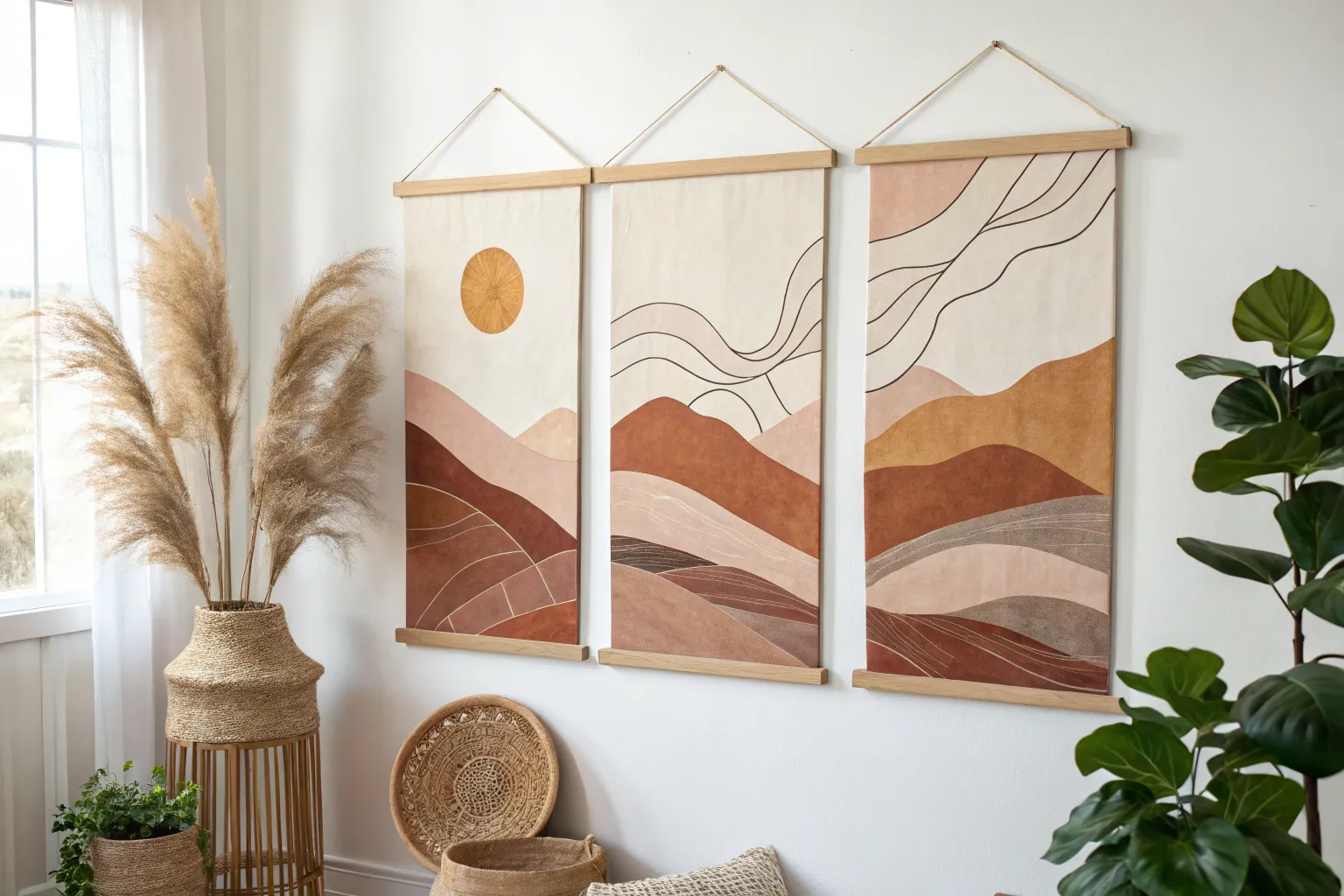
When you paint in a series, you get to explore one idea from multiple angles—and it’s honestly one of the fastest ways to grow your style. The trick is giving your set a clear thread (like a limited palette, a repeating subject, or a connected composition) so the pieces feel like they belong together.
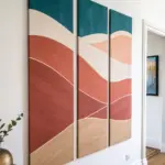
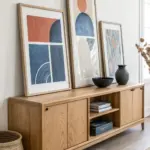
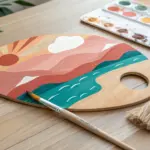
Continuous Landscape Triptych
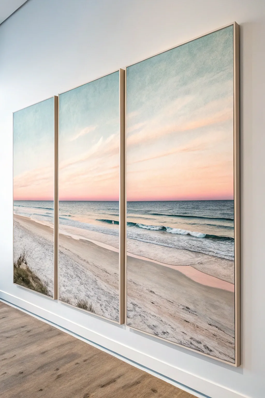
Bring the calming vastness of the ocean into your space with this three-panel continuous landscape. By breaking a single sunset horizon across three canvases, you create a modern, window-like effect that expands the visual boundaries of your room.
Step-by-Step
Materials
- 3 large primed canvases (same size, tall format)
- Acrylic paints (Titanium White, Phthalo Blue, Ultramarine Blue, Crimson Red, Cadmium Yellow, Burnt Umber, Raw Sienna)
- Gloss or matte glazing medium
- Large flat brushes (2-3 inch)
- Medium filbert brushes
- Soft blending brush (mop style)
- Masking tape
- Easel or large flat workspace
- Palette knife
- Water container and rags
Step 1: Preparation & Sky Gradient
-
Arrange the canvases:
Place your three canvases side-by-side on your easel or workspace. Leave a small gap (about 1 inch) between them to account for the frame edges, but treat them as one single surface mentally. -
Establish the horizon line:
Use a long straightedge or a piece of string to lightly pencil in your horizon line across all three panels. Position it just below the halfway point to give majestic height to the sky. -
Mix the sky colors:
Prepare three main pools of color for the sky: a pale, creamy yellow for the horizon, a soft coral pink for the middle transition, and a muted teal-blue for the very top. -
Paint the upper sky:
Start at the top of all three canvases with your teal mixture. Use long, horizontal strokes that span across the gaps where possible to ensure continuity. -
Blend the sunset hues:
While the top is wet, introduce the pink mixture below it. Use a clean, dry blending brush to gently feather the meeting point of the teal and pink until the transition is seamless. -
Adding the glow:
Apply the pale yellow mixture near the horizon line, blending it upward into the pink. This creates that soft atmospheric glow typical of twilight.
Step 2: Ocean & Waves
-
Block in the deep water:
Mix a dark turquoise using Phthalo Blue, a touch of green, and white. Paint a sharp, straight line right against your sky horizon, filling the distant ocean area. -
Create the gradient to shore:
As you move down the canvas toward the beach, gradually add more white and a tiny bit of yellow to your blue mix to warm it up, representing shallower water. -
Drafting the wave line:
Sketch a gentle, diagonal rolling wave across the middle and right panels using a thin brush and watered-down white paint to guide your foam placement. -
Painting the wave face:
Underneath the crest of your wave, paint a darker stripe of translucent teal to show the depth and shadow of the water curling over. -
Adding sea foam:
Using a palette knife or stiff brush, scumble thick Titanium White along the wave crests. Allow the paint to break up, mimicking crashing water texture.
Alignment Check
If your horizon line feels disjointed between panels, use a long strip of masking tape stretched across all three dry canvases to re-guide a perfectly straight correction line.
Step 3: Sand & Foreground
-
Base coat for sand:
Mix Titanium White with a tiny dot of Raw Sienna and a hint of purple (to de-saturate it). Apply this creamy off-white color to the entire beach area. -
Wet sand reflections:
Where the water meets the sand, glaze a thin layer of the sky colors (pinks and blues) over the sand color. This mimics the mirror-like reflection on wet sand. -
Adding texture to the dunes:
In the bottom left corner of the first panel, stipple darker shades of beige and grey to suggest the uneven surface of a sand dune. -
Painting beach grass:
Use a liner brush with a mix of Burnt Umber and green to flick quick, upward strokes on the dune. Keep these erratic and windswept for realism. -
Final highlights:
Add pure white highlights on the wave crests and subtle shadow lines in the sand to create depth and directional sunlight. -
Painting the edges:
Once the face is dry, paint the sides of each canvas. I like to wrap the image around the edges for a gallery finish, so the horizon line continues around the corner.
Floater Frames
Install simple, light wood floater frames around each canvas. The gap between canvas and frame adds a professional shadow line that elevates the whole triptych.
Step back and admire how your three separate panels unite to form one peaceful, endless horizon.

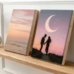
Day-to-Night Sky Series
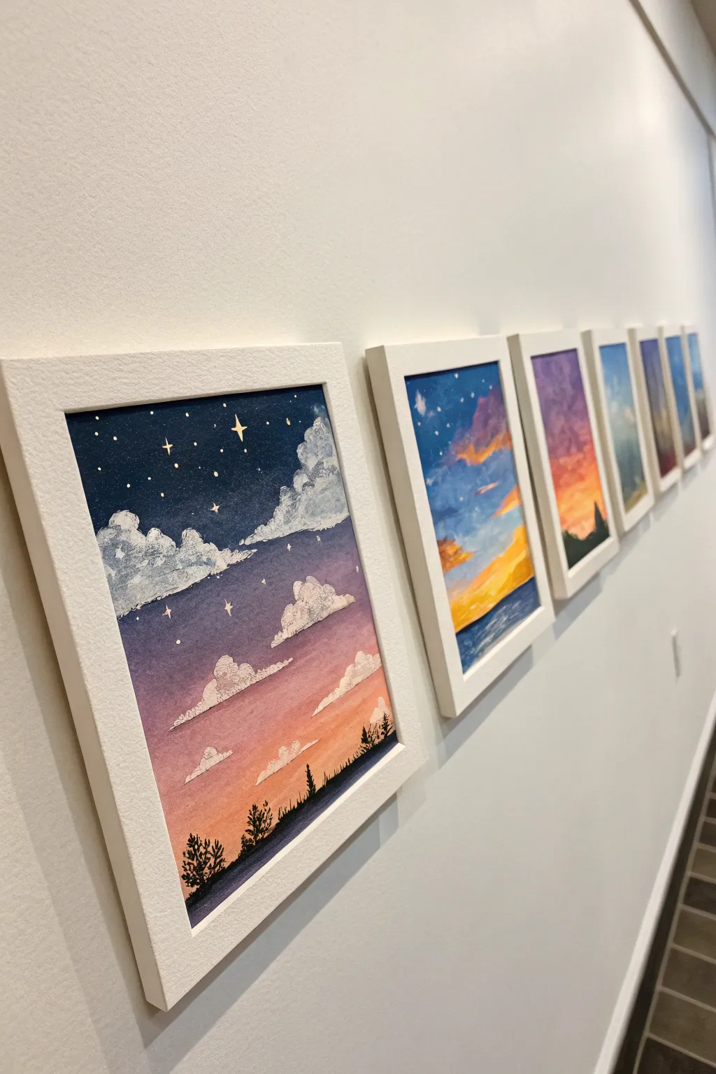
Capture the shifting moods of the sky with this stunning sequence of gouache paintings that transition from a starry night to a vibrant sunset. By creating a unified series, you’ll explore color blending techniques while building a cohesive gallery wall statement piece.
Step-by-Step Tutorial
Materials
- Heavyweight mixed-media or watercolor paper (cold press)
- Gouache paints (white, indigo, violet, magenta, orange, yellow, cerulean blue)
- Flat wash brushes (1/2 inch and 1 inch)
- Round detail brushes (size 0 and 2)
- Washi tape or masking tape
- Paper towels and water jars
- White gel pen (optional)
- White or light wood frames with mats
Step 1: Preparation & Palettes
-
Prepare the surface:
Cut your paper into identical sizes—5×7 inches works well for this series. Tape the edges of each sheet securely to a board using washi tape to create clean, crisp borders. -
Plan the color progression:
Lay out the sheets in a row. Decide the sequence: left to right moving from deep night (indigo/violet) to twilight (purple/pink), then sunset (orange/yellow), and finally day/dusk (blue/gold). -
Mix base gradients:
Pre-mix plenty of white gouache with your key colors. Gouache dries matte and slightly different in value, so having enough pre-mixed paint ensures consistency across the series.
Smooth Blends
Work quickly with gouache blending. If the paint drags, mist the paper lightly with water or add a drop of water to your brush to keep edges wet.
Step 2: Painting the Backgrounds
-
Start the night sky:
For the first painting (far left), apply deep indigo at the top. While wet, blend in a violet hue towards the middle, and transition to a dusty rose or soft magenta near the horizon line. -
Refine the blend:
Use a damp, clean flat brush to smooth the transition between the indigo and violet. You want a seamless ombre effect without harsh lines. -
Create the twilight transition:
On the second sheet, start the top with the violet color from the previous bottom layer. Shift down into vibrant oranges and warm yellows near the bottom. -
Paint the sunset and day scenes:
For the remaining panels, focus on brighter palettes. Use cerulean blue fading into peach and yellow. Keep strokes horizontal to mimic atmospheric layers. -
Let it dry completely:
Gouache can reactivate if you paint over it while damp. Allow the background gradients to dry fully to a matte finish before adding any clouds.
Step 3: Clouds & Celestial Details
-
Form the cloud shapes:
Using a size 2 round brush loaded with white (and a tiny dot of the background color to soften it), dab in fluffy cloud shapes. Focus heavily on the lower third of the composition. -
Add cloud dimension:
I like to mix a pale shadow color—usually a light lavender or grey—and tuck it under the white cloud puffs to give them volume and weight. -
Highlight the edges:
For the sunset panels, add touches of yellow or bright orange to the tops of the clouds where the sun would catch them. -
Paint the stars:
On the darker night panels, use your smallest brush or a white gel pen to dot tiny stars in the upper indigo section. Add a few diamond-shaped ‘sparkle’ stars for interest. -
Add the stars:
Scatter the stars randomly, clustering a few together. Keep them restricted to the darker upper portions of the night and twilight paintings.
Add Metallic Pop
Swap plain white gouache for metallic gold watercolor when painting the ‘sparkle’ stars or the edges of sunset clouds for a shimmering effect.
Step 4: Foreground Silhouettes
-
Mix the silhouette color:
Mix a dark color for the foreground foliage. Don’t use pure black; instead, mix indigo with burnt umber or deep green for a rich, natural shadow tone. -
Paint the horizon line:
Draw a low, uneven horizon line at the absolute bottom of each painting. This grounds the sky without taking over the composition. -
Add detail trees:
Using the tip of your size 0 brush, paint tiny vertical lines for tree trunks, then stipple the sides to create pine tree textures. Vary the heights slightly for a natural look. -
Connect the landscape:
Ensure the horizon line feels somewhat continuous if you plan to hang them closely side-by-side, though they don’t need to match perfectly. -
Peel and frame:
Once fully dry, slowly peel the tape away at a 45-degree angle to reveal the clean edges. Place the artwork into mats and frames to complete the gallery look.
Hang your series in a hallway or above a sofa to bring the calming cycle of the day into your home
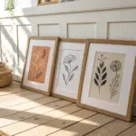
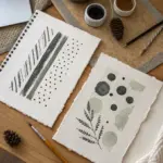
Botanical Study Wall Set
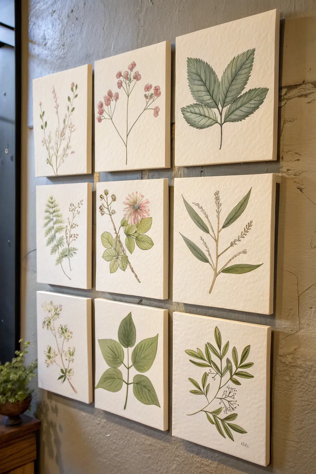
Create a sophisticated gallery wall with this set of nine delicate botanical illustrations. Using watercolor and ink on textured paper-wrapped canvases, you’ll capture the scientific beauty of various leaf structures and floral blooms in a cohesive, unified style.
Step-by-Step
Materials
- 9 small square gallery-wrapped canvases (8×8 or 10×10 inches)
- Heavyweight cold-press watercolor paper (enough to cover all canvases)
- Matte gel medium or PVA glue
- Watercolor paints (Sap Green, Olive Green, Burnt Sienna, Alizarin Crimson, Yellow Ochre)
- Fine liner pens (sizes 005, 01, and 03 in archival black or sepia)
- Round watercolor brushes (sizes 2, 4, and 6)
- Graphite pencil (HB) and kneadable eraser
- Ruler
- Reference images of local flora
Step 1: Preparing the Canvases
-
Cut the paper:
Measure your watercolor paper to fit the front and sides of your canvases, adding an extra inch on all sides for wrapping around the back. You want the heavy texture of cold-press paper to be the star. -
Adhere the paper:
Apply an even coat of matte gel medium to the front of a canvas and the back of one paper sheet. Press them together firmly, smoothing from the center outward to eliminate air bubbles. -
Wrap the edges:
Cut notches at the corners of the paper to allow for neat folding. Apply gel medium to the sides and back frame of the canvas, then tightly fold the paper over, securing it like a present. Clamp or weight down until fully dry. -
Seal the surface:
Once the paper is completely adhered and dry, brush a very thin, watered-down layer of gel medium over the front surface. This prevents the ink from bleeding too much into the paper fibers later.
Tea Staining Technique
For an antique look, brush the watercolor paper with strong brewed black tea and let it dry before you start sketching. This creates a warm, aged parchment background.
Step 2: Sketching the Botany
-
Plan your grid:
Before drawing on the canvas, sketch out your nine designs on scrap paper. Assign a mix of subjects: three flowering stems, three complex leaf clusters, and three simple branch structures to balance the visual weight. -
Lightly sketch outlines:
Using an HB pencil, very faintly sketch your designs onto the mounted watercolor paper. Focus on the curve of the stems—some should lean left, some right, and some straight up to create movement across the wall. -
Define leaf shapes:
Refine the shapes of your leaves. For the fern-like plants, mark the central vein first, then add the leaflets. For the rose-style leaves, ensure edges are serrated or smooth according to the plant type. -
Add floral details:
For the flowering panels, sketch the clusters of small blooms or the singular focal flower. Keep lines incredibly light; you don’t want graphite showing through the translucent watercolor.
Level Up: Scientific Labels
Use a dip pen and calligraphy ink to write the Latin name of each plant in small, neat script at the bottom of each canvas for authentic botanical plate vibes.
Step 3: Watercolor Application
-
Mix your greens:
Create a palette of vintage greens. Mix Sap Green with a touch of Burnt Sienna for a warm, dried-leaf look, and Olive Green with a tiny bit of blue for cooler tones. I like to keep my puddles watery for a transparent wash. -
First wash method:
Apply a pale, watery wash of green to the leaves. Don’t worry about perfect coverage; let the textured paper show through in spots to mimic natural variegation. -
Painting the stems:
Use a size 2 brush to paint the stems. Use a brownish-green mix (add more Burnt Sienna) for woody stems and a brighter green for tender, new growth stems. -
Adding floral color:
For the pink flowers, use a very dilute Alizarin Crimson. touch the wet brush to the paper and let the pigment bloom naturally rather than painting stiff shapes. -
Layering depth:
Once the first layer is bone dry, add a second, slightly darker glaze to the shadowed areas of the leaves—usually where they attach to the stem or overlap each other.
Step 4: Inking and Definition
-
Begin the outlining:
Wait until the paint is perfectly dry. Using a 01 fine liner, trace over your original pencil lines. Use a broken, organic line rather than a solid, heavy outline to keep it looking delicate. -
Add distinct veins:
Draw the central veins in the leaves with a 005 pen. Flick the pen gently outward from the center vein to suggest the texture of the leaf ribs without drawing every single line. -
Stippling details:
Add tiny dots (stippling) at the base of the flowers and along the darker sides of stems to add shading and volume without adding more paint. -
Detailing the serrations:
On wide leaves, use the pen to emphasize the jagged or serrated edges. These sharp ink marks contrast beautifully with the soft watercolor wash. -
Final erase:
Gently erase any remaining visible pencil marks with a kneadable eraser, being careful not to rub the ink if it isn’t fully set. -
Sign and hang:
Sign your work simply in the bottom corner with the fine liner. Arrange the nine panels in a 3×3 grid on the wall, spacing them about 2 inches apart for the gallery effect.
Step back and admire the calm, organic rhythm your hand-painted botanical grid brings to the room
Simple Fruit Still Life Series
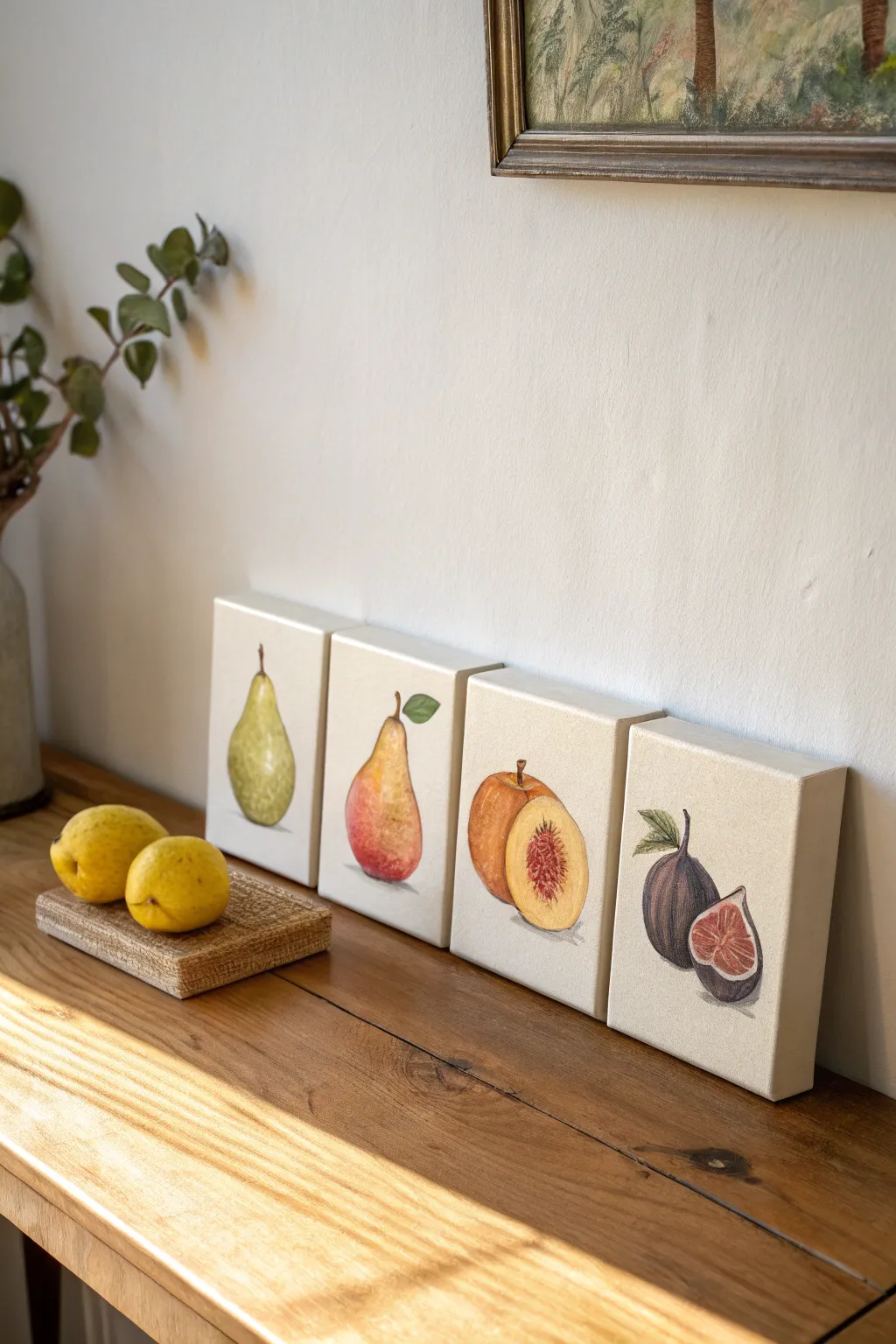
Capture the delicate beauty of orchard discoveries with this elegant series of four fruit studies. Using soft color layering and precise botanical details, this project creates a cohesive gallery wall perfect for a dining nook or kitchen shelf.
Step-by-Step Guide
Materials
- 4 Small square gallery-wrapped canvases (approx. 6×6 or 8×8 inches)
- Acrylic paints (Titanium White, Sap Green, Cadmium Yellow, Yellow Ochre, Cadmium Red, Alizarin Crimson, Burnt Umber, Dioxazine Purple)
- Set of acrylic brushes (flat shader, small filbert, fine liner)
- Pencil (HB or H)
- Palette or mixing plate
- Water cup and paper towels
- Matte varnish (optional)
Step 1: Preparation and Sketching
-
Prepare the surfaces:
Ensure your canvases are clean and taut. If the weave is very rough, you might applying a coat of clear gesso or matte medium to create a smoother surface for fine details, though painting directly on the raw-gessoed canvas works for texture. -
Lightly sketch the outlines:
Using an H or HB pencil, draw the basic shape of each fruit in the center of its own canvas. Keep the lines incredibly faint so graphite doesn’t smudge into your paint later. Draw a green pear, a red-blush pear, a halved peach, and a halved fig.
Step 2: Painting the Green Pear
-
Base coat colors:
Mix Sap Green with a touch of Yellow Ochre and White. Paint the body of the first pear, leaving the highlight area slightly lighter. -
Add dimension:
While the paint is still slightly tacky, mix a darker green using Sap Green and a speck of Burnt Umber. Blend this along the bottom and right side to create a shadow. -
Stipple texture:
To mimic pear skin, I like to use a nearly dry brush to stipple tiny dots of Yellow Ochre and darker green over the surface, creating that speckled effect. -
Stem detail:
Use a fine liner brush and Burnt Umber to paint a thin stem slightly curving upwards.
Fixing Muddy Colors
If your fruit colors get muddy, let the layer dry completely. Then, re-apply a clean layer of the pure color on top. Acrylics are opaque, so unwanted blends are easily covered.
Step 3: Painting the Red-Blush Pear
-
Gradient base:
For the second pear, start with Cadmium Yellow at the top and blend it wet-into-wet into a reddish-orange at the bottom using Cadmium Red mixed with a little yellow. -
Deepen the blush:
Glaze a thin layer of Alizarin Crimson over the bottom curve to intensify the ripeness. -
Add a leaf:
Paint a small, single leaf attached to the stem using a mix of Sap Green and White to differentiate it from the pear body.
Mixed Media Twist
Add fine details with colored pencil or oil pastel over the dried acrylic paint. It adds a lovely texture to the peach fuzz or fig skin that paint alone is hard to capture.
Step 4: Painting the Peach
-
Outer skin base:
Paint the whole peach behind the slice with a warm mix of Cadmium Orange (Red + Yellow) and a touch of Burnt Umber for earthiness. -
Flesh tones:
For the cut half, mix a generous amount of Titanium White with Yellow Ochre and a tiny dot of Red. Fill in the circle of the peach face. -
Create the pit cavity:
Using a small filbert brush, paint the center pit area with strokes of Burnt Sienna and Alizarin Crimson, radiating outward slightly to show the fibrous texture. -
Add highlights:
Place a crisp white highlight on the upper curve of the whole peach to make it look round and firm.
Step 5: Painting the Figs
-
Purple skin tones:
Mix Dioxazine Purple with a little Burnt Umber and White to get a muted eggplant color. Paint the whole fig and the outer rim of the cut fig. -
Vertical striations:
Use your liner brush with a slightly lighter lavender mix to paint faint vertical lines on the skin of the whole fig. -
Inner flesh:
Paint the inside of the cut fig with a soft cream color initially. Once dry, paint the seed area with a reddish-pink glaze. -
Seed details:
Use your finest brush to dot tiny white and cream seeds within the pink center.
Step 6: Shadows and Finishing
-
Ground the objects:
Mix a transparent wash of watery Burnt Umber or gray. Paint a very subtle cast shadow underneath each fruit to anchor them so they don’t look like they are floating. -
Final varnish:
Allow the canvases to cure for at least 24 hours. Apply a matte varnish to protect the artwork and eliminate any glossy glare.
Arrange your completed quartet in a row or grid pattern to enjoy your fresh and fruitful display
BRUSH GUIDE
The Right Brush for Every Stroke
From clean lines to bold texture — master brush choice, stroke control, and essential techniques.
Explore the Full Guide
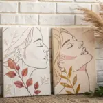
Animal Portrait Trio With Matching Backgrounds
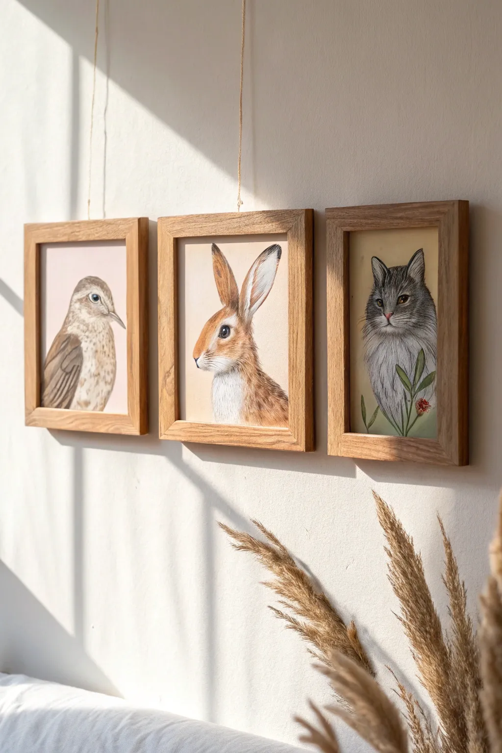
Bring the serene beauty of the outdoors inside with this charming series of animal portraits featuring a bird, a rabbit, and a cat. Using a soft mixed-media approach with watercolor and colored pencils, you’ll create a cohesive gallery wall that feels both rustic and refined.
Step-by-Step Guide
Materials
- Hot press watercolor paper (smooth texture)
- Watercolor paints (pans or tubes: Sepia, Burnt Sienna, Payne’s Grey, Yellow Ochre, Sap Green)
- Colored pencils (wax or oil-based in earth tones, black, and white)
- Round watercolor brushes (sizes 2, 4, and 6)
- HB graphite pencil and kneaded eraser
- Three matching light oak square frames (approx. 8×8 inches)
- Jute twine for hanging (optional aesthetic)
- Masking tape
Step 1: Planning and Sketching
-
Prepare your paper:
Cut three square sheets of hot press watercolor paper to fit your frames. Tape them down to a drawing board with masking tape to prevent buckling during the painting process. -
Sketch the bird:
On the first sheet, lightly sketch the bird in profile facing right. Focus on the gentle curve of the wing and the round shape of the head, keeping the pencil lines extremely faint so they don’t show through later. -
Sketch the rabbit:
For the center portrait, draw the rabbit’s head and upper chest in profile facing left. Pay special attention to the large, attentive ears; sketch the inner ear shape carefully as this will need distinct shading. -
Sketch the cat:
On the third sheet, draw the cat facing forward. Map out the almond-shaped eyes and the triangular ears. Add a few sprigs of leaves rising from the bottom right corner, overlapping the chest fur slightly.
Step 2: Watercolor Base Layer
-
Apply the background wash:
Mix a very dilute wash of Yellow Ochre and a touch of Burnt Sienna to create a creamy, vintage beige tone. Paint the background around the animal sketches on all three papers, leaving the animals themselves white for now. -
Block in the bird’s color:
Using a size 4 brush, apply a light wash of brown (mix Sepia and water) to the bird’s wing and back. Leave the chest area unpainted or extremely pale beige to represent the lighter feathers. -
Paint the rabbit’s fur base:
Wash the rabbit’s face and ears with a warm russet tone (Burnt Sienna). I suggest feathering the paint out with clean water where the brown fur meets the white chest to create a soft transition. -
Lay the cat’s grey tones:
Mix Payne’s Grey with plenty of water for a soft silvery base. Apply this to the cat, darkening the areas around the ears and forehead stripes, while keeping the muzzle and chest very light.
Fixing Muddy Colors
If your watercolor base looks muddy, let it dry completely. Then, use colored pencils on top to re-introduce vibrancy and definition without overworking the paper.
Step 3: Refining with Colored Pencils
-
Detail the bird’s feathers:
Once the paint is bone dry, use a sharp dark brown colored pencil to draw the flight feathers on the wing. Use short, curved strokes on the chest to simulate speckling and soft down. -
Define the bird’s eye:
Use a black pencil to fill in the pupil, leaving a tiny speck of white paper for the highlight. Outline the beak gently with a dark grey pencil. -
Create rabbit fur texture:
Switch to a terra-cotta or rust-colored pencil. Use directional stroking—following the growth of the hair—to build up density on the rabbit’s cheeks and ears. Use a white pencil to burnish and blend the lighter chest fur. -
Enhance the rabbit’s eye and whiskers:
Draw the large dark eye with black pencil, ensuring it looks wet and glossy. Add very fine, sweeping lines for the whiskers using a sharpened grey pencil. -
Texturize the cat portrait:
Use a charcoal grey or black pencil to draw the tabby stripes on the cat’s forehead and cheeks. Use quick, flicking motions to create the look of long, fluffy fur on the chest. -
Color the foliage:
Paint the leaves in the cat portrait with Sap Green watercolor. Once dry, outline them loosely with a dark green pencil and add a small pop of red for the berry or flower detail.
Pro Tip: Eye Sparkle
If you accidentally painted over the eye highlight, use a white gel pen or a tiny dot of white gouache right at the end to bring the animals to life.
Step 4: Framing and Assembly
-
Final inspection:
Step back and look at all three together. Deepen any shadows with your darkest pencil to ensure the contrast levels match across the trio. -
Frame the artwork:
Remove the tape carefully. Place each painting into its corresponding light oak frame, ensuring there is no dust trapped behind the glass. -
Attach the twine:
To mimic the reference, staple or glue a length of jute twine to the back of the frame corners for hanging, or simply hang them directly on nails for a cleaner look.
Hang your new woodland friends in a row to create a cozy, conversation-starting focal point in your room
One Subject, Five Color Palettes
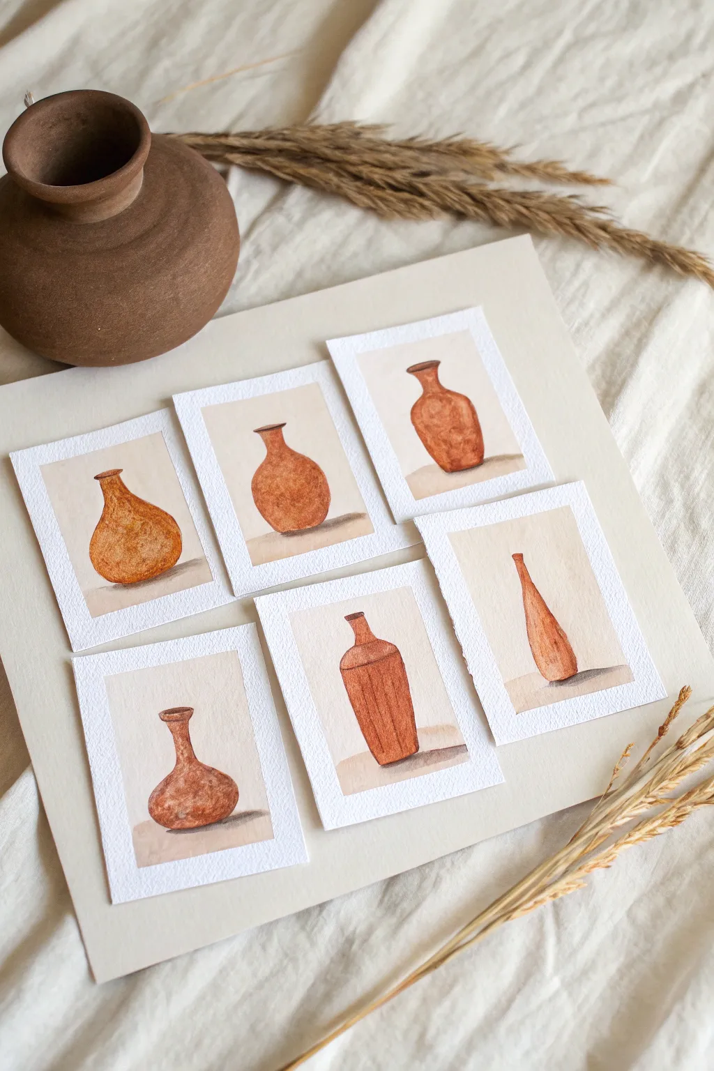
This collection of six miniature vase studies explores the warm, earthy tones of terracotta clay through simple watercolor techniques. By repeating a single subject with slight variations in shape, you create a cohesive and charming gallery wall in miniature.
Step-by-Step Tutorial
Materials
- Cold press watercolor paper (300 gsm)
- Small round watercolor brush (size 2 or 4)
- Watercolor paints (Burnt Sienna, Yellow Ochre, Burnt Umber)
- Pencil (HB)
- Ruler
- Scissors or craft knife
- Jar of clean water
- Paper towel
Step 1: Preparation and Sketching
-
Cut the paper:
Begin by cutting your watercolor paper into six equal rectangles, approximately 3×4 inches each. Keeping them uniform in size is key to the gallery effect. -
Define the frame:
The image features a clean white border around the painted area. You can achieve this by lightly measuring a central rectangle on each card, leaving about a half-inch margin, or by using masking tape to block off the edges. -
Sketch the first shape:
On your first card, lightly sketch a rounded, gourd-like vase shape. Keep your pencil lines very faint so they don’t show through the final wash. -
Vary the silhouettes:
Continue sketching one vase on each remaining card. Experiment with different silhouettes: a tall skinny bottle, a short squat pot, a wide-mouthed jug, and a classic amphora shape. -
Add a ground line:
Draw a faint horizontal line behind each vase to represent the table surface, anchoring the object so it doesn’t look like it’s floating.
Step 2: Painting the Base Layers
-
Mix your terracotta tone:
Create a warm clay color by mixing Burnt Sienna with a touch of Yellow Ochre. You want a color that glows but feels earthy. -
Apply the first wash:
Using your round brush, fill in the shape of the first vase with a watery wash of your terracotta mix. This initial layer should be pale and transparent. -
Create a highlight:
While the paint is still wet, lift a small amount of pigment from the center or the shoulder of the vase using a clean, damp brush. This ‘lift-off’ technique creates a soft volume highlight. -
Repeat for all vessels:
Paint the base layers for the remaining five vases. I like to slightly vary the water-to-paint ratio for each one to create subtle differences in tone across the series. -
Paint the background:
Prepare a very diluted wash of Yellow Ochre or a dirty brush water mix (a light beige). Carefully paint the background rectangle, stopping at the edge of the vase. You can leave the area under the vase unpainted for now.
Deckle Edge Trick
To mimic the textured edges shown in the photo, rip your paper against a metal ruler instead of cutting with scissors. It gives a handmade, artisanal look.
Step 3: Adding Depth and Detail
-
Darken the mix:
Once the initial layers are completely dry, add a little Burnt Umber to your terracotta mix to create a shadow tone. -
Add shadow side:
Paint the right side (or left, depending on your light source) of each vase with this darker mix to create form. Feather the edge with a damp brush so the shadow blends smoothly into the lighter side. -
Define the rim:
Use the tip of your brush and the darker mixture to carefully outline the rim and neck of the vases. This crisp line helps define the structure. -
Add texture:
For a rustic, clay-like feel, take a semi-dry brush with pigment and gently stipple or scumble over the main body of the dried vase. This adds a grainy, pottery texture. -
Cast the shadow:
Mix a cool grey or a diluted Burnt Umber. Paint a horizontal shadow extending from the base of the vase onto the table surface. Keep this shadow soft and diffused. -
Final touches:
Assess the set as a whole. If any vase looks too flat, add one more glaze of Burnt Sienna to the shadowed side to deepen the contrast.
Display Idea
Mount these on a larger sheet of cream cardstock using foam tape to add dimension, then frame the whole collection in a deep shadow box.
Arranging your mini masterpieces together creates a beautiful study in shape and simplicity that warms up any corner of a room

PENCIL GUIDE
Understanding Pencil Grades from H to B
From first sketch to finished drawing — learn pencil grades, line control, and shading techniques.
Explore the Full Guide
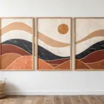
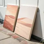
Abstract Shapes That Travel Across Canvases
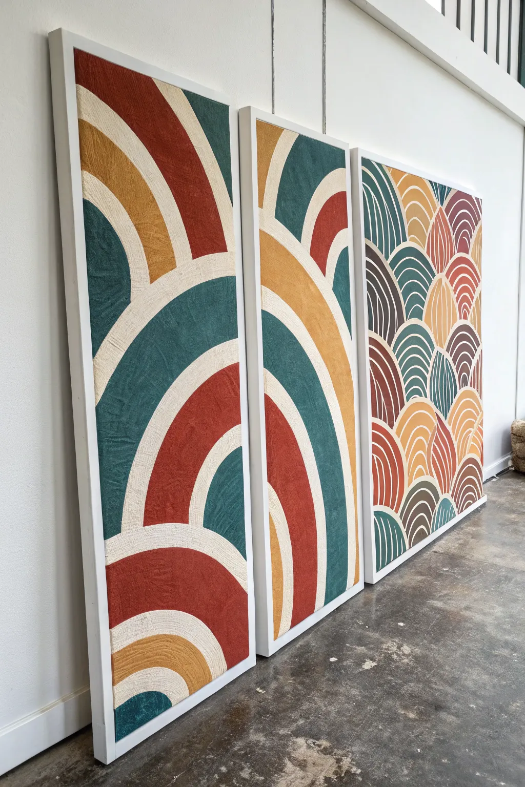
Transform a large blank wall into a statement gallery with this three-panel series featuring bold, flowing arches and rich textures. By spanning a single abstract design across multiple canvases, you create a cohesive and immersive visual rhythm that feels professional and dynamic.
Step-by-Step
Materials
- Three large rectangular plywood boards or heavy-duty stretched smooth canvases (e.g., 24×60 inches)
- White or cream textured fabric (heavy drop cloth, linen, or monk’s cloth)
- Fabric stiffener or decoupage glue (Mod Podge)
- Acrylic paints (terracotta, mustard yellow, deep teal, forest green)
- Wide flat paintbrushes and small detail brushes
- Pencil and long straightedge ruler
- Large compass or string and push-pin for drawing curves
- Heavy body texture medium or modeling paste (optional)
- Wood trim for framing (1×2 inch pine)
- Wood glue and pin nails
- White paint for frames and fabric base
Step 1: Preparation and Design
-
Surface Prep:
Begin by laying your three boards side-by-side on a flat surface, leaving about a 2-inch gap between them to simulate how they will hang on the wall. This spacing is crucial for ensuring your design flows naturally across the gap. -
Adding Texture:
Cut your textured fabric slightly larger than the boards. Adhere the fabric to the front of each board using decoupage glue, smoothing out any major bubbles but allowing the natural weave to remain visible. Wrap the excess fabric around the edges and secure it to the back. -
Base Coat:
Once the glue is fully dry, apply a coat of white gesso or white acrylic paint over the entire fabric surface. This primes the fabric so it soaks up less colored paint later and makes your colors pop. -
Mapping the Arches:
Sketch your design lightly with a pencil. Start by creating a large sweeping arch that begins on the bottom of the left panel and peaks in the middle panel. Use a string tied to a pencil and pinned at a pivot point below the canvas to create perfect curves. -
Continuing the Lines:
Extend your arch lines across the gaps to the adjacent panels. When the line hits the edge of one board, use your straightedge to align it visually with where it ‘reappears’ on the next board, maintaining the flow. -
Varying the Patterns:
For the third panel (far right), sketch a different, denser pattern—like overlapping fish scales or smaller repeating rainbows—to add visual interest and break up the symmetry of the first two panels.
Uneven Arches?
If your hand-painted curves look shaky, use flexible painter’s tape designed for curves to mask off the edges before painting for sharper lines.
Step 2: Painting and Defining
-
Mixing Colors:
Prepare your palette with earthy, mid-century modern tones. You’ll need a warm rust/terracotta, a muted mustard yellow, and a deep teal green. I like to mix a little texture paste into the paint here to give the colored sections even more physical depth. -
Painting the Bands:
Start painting the colored bands of your arches. Use a flat brush that matches the width of your bands if possible, or carefully outline the edges first before filling in the center. -
Maintaining Separations:
Leave thin strips of the white, textured background visible between each colored arch. These negative spaces act as outlines and emphasize the texture of the fabric base. -
The Third Panel:
Move to the third panel with the scallop/fish-scale pattern. Paint concentric arches within each scallop shape, alternating your rust, yellow, and teal colors alongside white accent lines. -
Clean Up Edges:
Go back with a small detail brush nicely loaded with white paint to crisp up the negative space lines between the colors. Wobbly edges can look charming, but sharp lines make the piece look graphic and intentional. -
Check the Flow:
Step back and look at all three panels together. Ensure the colors on the left panel visually connect to the middle panel. If a yellow arch exits the first frame, it should enter the second frame at the same height.
Step 3: Framing and Finishing
-
Painting Frames:
Cut your wood trim to fit the perimeter of each panel. Paint these strips a crisp, matte white to match the negative space in your artwork. -
Attaching Frames:
One by one, attach the wood strips to the edges of your canvas boards using wood glue and pin nails. Ensure the front edge of the frame is flush with the surface of the artwork. -
Sealing:
Apply a clear matte varnish spray over the painted areas to protect the pigment from dust and UV light. Avoid glossy sprays, as they will distract from the lovely fabric texture. -
Hanging Hardware:
Install heavy-duty D-rings or a French cleat system on the back of each panel. Measure carefully on your wall to ensure the 2-inch gap is maintained so your continuous design aligns perfectly.
Faux Tufted Look
Glue thick cotton yarn or piping cord along the white separation lines. Paint over it in white to mimic the raised texture of a tufted rug.
Hang your trio with pride and enjoy the warmth these sweeping colorful shapes bring to your room
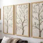
One Motif, Different Compositions
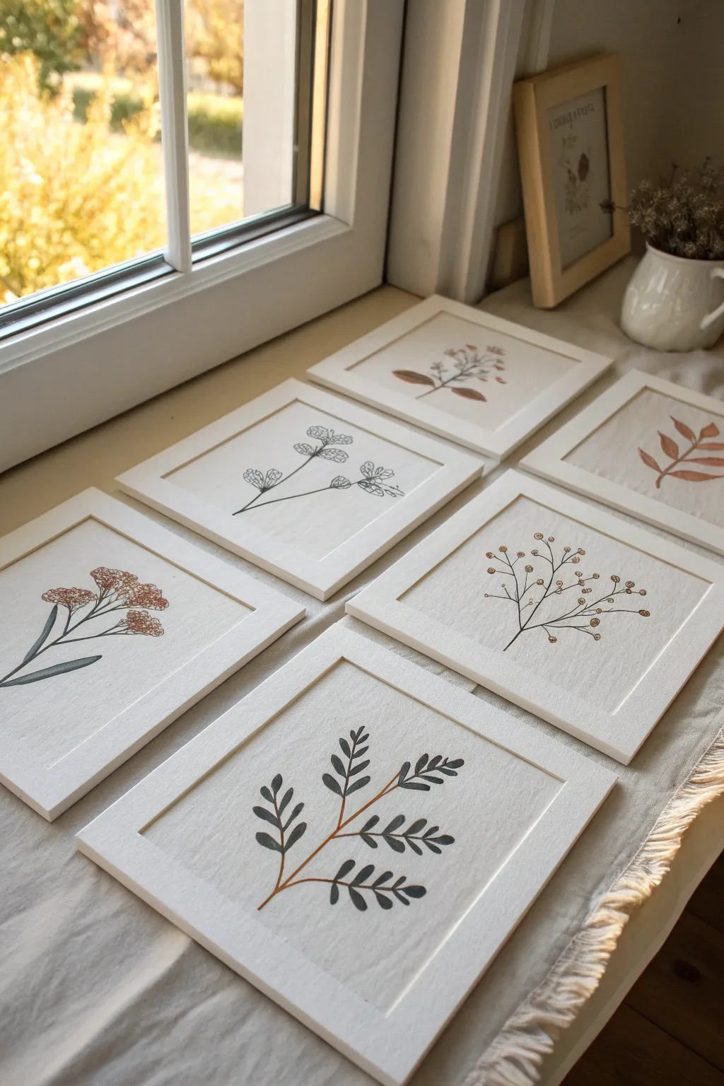
Capture nature’s quiet beauty with this series of six minimalist botanical illustrations, each showcasing a unique leaf or flower structure. The project mimics the texture of vintage herbarium specimens by using acrylics on fabric canvas panels, framed simply to let the organic forms shine.
Step-by-Step Guide
Materials
- 6 small canvas panels or canvas paper sheets (approx. 5×5 or 6×6 inches)
- 6 plain white wooden frames (without glass, or remove glass)
- Acrylic paints (muted palette: sage green, burnt sienna, deep olive, black, brown, cream)
- Fine liner brushes (size 0 and 00)
- Flat shader brush (size 4)
- Pencil for sketching
- Mixing palette
- Water cup and paper towels
Step 1: Planning and Sketching
-
Define the series concept:
Visualize six distinct botanical shapes. Aim for variety: some tall and slender, some branching wide, some leafy, and others floral. The unifying theme is the solitary stem centered on the canvas. -
Prepare the surface:
If your canvas panels are stark white, you might want to apply a very thin wash of cream or off-white acrylic to warm them up. Let this base layer dry completely before proceeding. -
Lightly sketch the stems:
Using a pencil with a light touch, draw the main stem line for each of the six compositions. Vary the curvature—make some straight and others gently bending to the left or right. -
Add branching structures:
Flesh out the skeletons of your plants. For the leafy designs, draw small stems extending outward; for the floral designs, mark the positions of the blooms or berries.
Loose Hands, Better Lines
When painting long stems, hold the brush further back on the handle. This reduces shakiness and creates more fluid, natural curves compared to a tight grip.
Step 2: Painting the Foliage
-
Mix your green tones:
On your palette, create a few variations of green. Mix sage green with a touch of gray for a muted look, and deep olive with a bit of brown for shadows. I prefer pre-mixing these so the series feels cohesive. -
Paint the main stems:
Using a fine liner brush and your darkest green or brown mix, carefully trace over your pencil lines for the main stems. Keep the pressure light to ensure the lines remain delicate. -
Fill in the broad leaves:
For the designs featuring larger leaves (like the bottom center one), use the flat shader brush. Load it with sage green and use a single stroke motion to create the leaf shape, pressing down and lifting up to form a point. -
Detail the finer leaves:
Switch back to a smaller brush for the more delicate, fern-like fronds. Use a darker grey-green or nearly black tone to create contrast against the lighter background.
Step 3: Adding Floral Accents
-
Mix the floral colors:
Create a rusty red by mixing burnt sienna with a tiny dot of red. You’ll also want a soft beige or muted mustard yellow for berries and buds. -
Paint the berries:
For the design with scattered berries (middle right), dip the tip of a small round brush into your paint and gently dot it onto the canvas. Vary the pressure slightly so the berries aren’t perfectly uniform. -
Create the flower clusters:
For the floral motif on the left, use a stippling motion with the rusty red mix to create the textured look of tiny flower heads bunched together. -
Add subtle highlights:
Once the main colors are dry, mix a tiny bit of white into your original colors. Add extremely subtle highlights to the tops of the berries or the tips of leaves to give them dimension.
Level Up: Embroidered Detail
Before framing, use a needle and embroidery thread to add stitched accents over the painted stems or flower centers for a mixed-media 3D effect.
Step 4: Refining and Framing
-
Review outlines:
Step back and look at the stems. If any connections look weak, use your finest brush and a watered-down brown-black mix to sharpen the connection points between leaves and stems. -
Clean up the background:
If you accidentally smudged any paint, use a precision brush with your background cream color to paint over the mistake. This works like an eraser on canvas. -
Let it cure:
Allow all six paintings to dry completely, ideally overnight, to ensure the acrylic has fully set and won’t stick to anything. -
Mount in frames:
Place each canvas into the white wooden frames. For this look, discard the glass to eliminate glare and let the canvas texture remain visible. -
Arrange the series:
Display your artwork together. They look best when grouped, perhaps leaning on a shelf or hung in a grid, allowing the varying shapes to play off one another.
Now you have a serene gallery of botanicals ready to bring a touch of nature indoors


Cropped Close-Ups of One Image
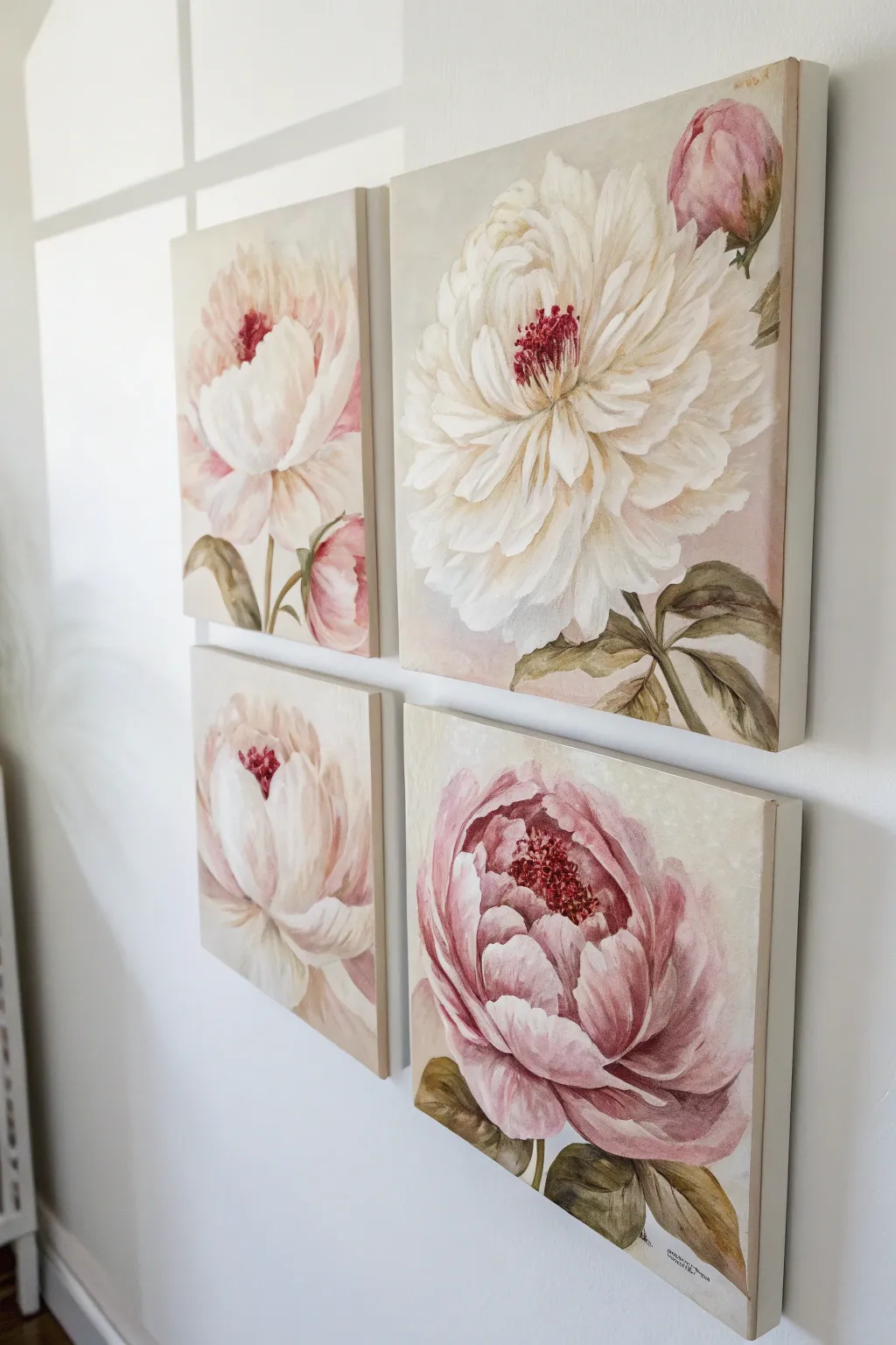
Capture the delicate beauty of a garden in full bloom with this four-part floral series. By splitting the composition across four square canvases, you create a modern, cohesive gallery wall that highlights the intricate details of petals and leaves.
How-To Guide
Materials
- 4 Square Canvases (10×10 or 12×12 inch)
- Acrylic Paints: Titanium White, Unbleached Titanium, Alizarin Crimson, Sap Green, Burnt Umber, Yellow Ochre
- Synthetic Bristle Brushes: Flat (1 inch), Filbert (size 6 and 10), Round (size 2)
- Palette and Palette Knife
- Water Cup and Paper Towels
- Graphite Pencil (HB) or White Chalk Pencil
- Easel or Flat Workspace
Step 1: Preparation & Sketching
-
Arrange the Layout:
Lay your four canvases out on a flat surface in a 2×2 grid with about an inch of space between them. This helps you visualize how the stems and leaves might flow from one panel to another, creating a unified look. -
Tone the Canvases:
Mix a wash of Unbleached Titanium with a tiny touch of Burnt Umber and plenty of water. Apply this warm, neutral beige tone over all four canvases to kill the stark white background. Let this base layer dry completely. -
Sketch the Composition:
Using a pencil, lightly sketch large circle shapes to place your main blooms. Position one large bloom dominating the top right, another centered bottom left, and partial blooms on the other two. Don’t worry about petals yet, just size and placement. -
Refine the Drawing:
Inside your rough circles, draw the jagged, ruffled edges of the peony petals. Add the stems and leaves, ensuring at least one leaf or stem visually ‘crosses over’ into a neighboring canvas to link the series.
Muddy Colors?
If your pinks look dirty, you likely mixed in green by accident or over-blended with the beige background. Let the paint dry completely, then repaint the petals with fresh, clean white and pink.
Step 2: Blocking In Color
-
Mix Your Base Pinks:
Create a gradient of pinks on your palette. Mix White with a small dot of Alizarin Crimson for a pale blush, and a second pile with slightly more Crimson and a touch of Yellow Ochre for a warmer, deeper pink. -
Block in Shadows:
Using the Filbert brush, paint the deepest shadow areas between the petals first using your darker pink mix. This establishes the depth of the flower immediately. -
Paint the Petal Base:
Fill in the remaining petal shapes with the pale blush mix and pure Unbleached Titanium. Keep the paint application loose and fluid; don’t blend everything perfectly smooth just yet. -
Establish Greenery:
Mix Sap Green with a little Burnt Umber for a deep, earthy olive. Block in the leaves and stems. Add a touch of White to the green to paint the lighter, top-facing planes of the leaves.
Step 3: Building Form & Detail
-
Layering the Whites:
Once the base layer is dry, use fresh Titanium White to paint the outer tips of the petals. Use a curving stroke that mimics the shape of the petal, pulling the paint inward toward the center. -
Softening Edges:
While the white paint is still damp, gently blend it into the shadow pinks using a clean, dry filbert brush. This creates that soft, velvety transition peonies are famous for. -
Deepening Shadows:
Mix Alizarin Crimson with a tiny bit of Burnt Umber. Use a smaller brush to glaze this dark hue into the deepest crevices near the center of the flowers to increase contrast. -
Painting the Centers:
For the striking centers, stipple a mix of pure Alizarin Crimson and Burnt Umber in the middle of the open blooms. Use short, vertical dabbing strokes. -
Adding Anthers:
Switch to your smallest round brush. Mix Yellow Ochre with White and dab tiny dots on top of the dark red centers to represent the pollen-covered anthers.
Level Up
Add texture to the flower centers using modeling paste mixed with your red acrylics before painting. This creates a 3D effect for the stamen that catches the light beautifully.
Step 4: Final Touches
-
Refining Leaves:
Add veins to the leaves using your dark green mix and the liner brush. Glaze a little bit of the pink color onto the edges of the leaves to harmonize the color palette. -
Background Cleanup:
Revisit the background beige color. Use it to ‘cut in’ around the edges of your petals and leaves to sharpen any outlines that became too messy during the painting process. -
Edge Painting:
Don’t forget to paint the sides of your canvases. You can wrap the image around the edge or paint them a solid neutral color for a framed look without the cost of framing.
Hang your finished quartet with equal spacing to reveal your elegant floral garden on the wall
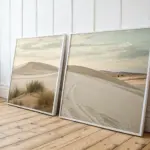
Monochrome Series With One Accent Color
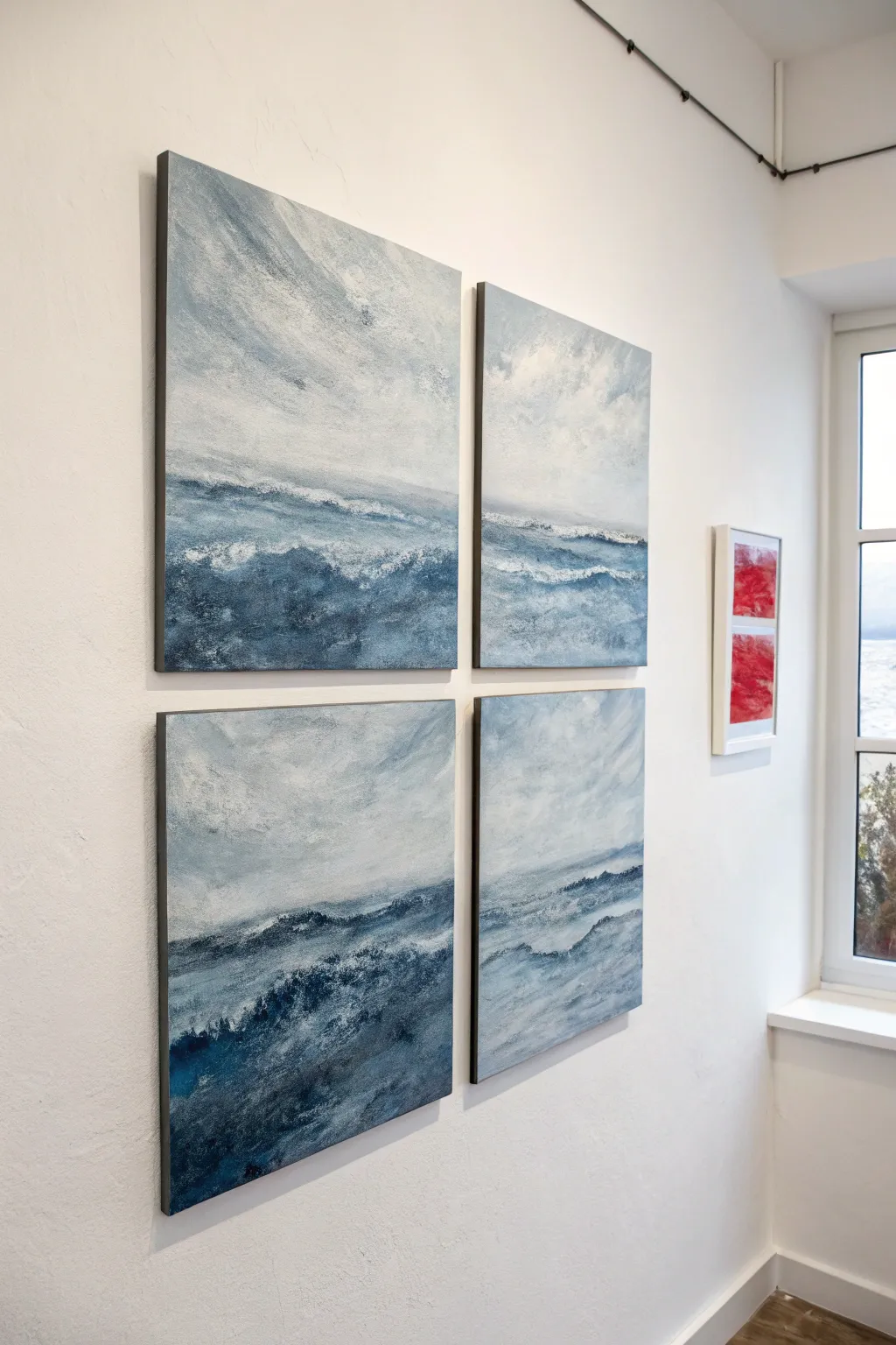
This evocative project captures the raw power of the ocean across four separate canvases that work together as a single cohesive unit. Using a limited palette of slate blues, deep indigos, and stark whites, you will learn to build layers of texture to mimic crashing waves and turbulent skies.
Step-by-Step
Materials
- 4 square stretched canvases (e.g., 12×12 or 16×16 inches)
- Acrylic paints: Payne’s Grey, Titanium White, Prussian Blue, Ultramarine Blue, hint of Burnt Umber
- Gesso (optional but recommended for texture)
- Large flat brushes (2-3 inch)
- Palette knives (various shapes, especially trowel style)
- Sea sponge or crumpled paper towel
- Spray bottle with water
- Easels or flat working surface
Step 1: Preparation and Foundation
-
Surface setup:
Arrange all four canvases together in a square grid on your workspace or wall if possible. Seeing them as a whole right from the start helps maintain the flow across the gaps. -
Prime the surface:
Apply a coat of gesso to all four canvases. While the gesso is wet, use a large stiff brush to create directional strokes—horizontal for the sea area and chaotic/diagonal for the sky. Let this dry completely. -
Block in the horizon:
Mix Payne’s Grey with a touch of Prussian Blue and plenty of water to create a thin wash. Mark your horizon line roughly one-third of the way up from the bottom across the lower two canvases, ensuring the line connects visually.
Palette Knife Mastery
Hold the knife loosely and drag it parallel to the canvas. Let the canvas texture ‘grab’ the paint rather than pressing it into the weave.
Step 2: Building the Sky
-
Upper sky base:
On the top two canvases, apply a mix of Titanium White and a tiny dot of Payne’s Grey. Use large, sweeping crisscross strokes to cover the ‘sky’ area, keeping the application loose. -
Adding atmospheric depth:
While the white is still tacky, introduce a mid-tone grey-blue into the corners and edges. Blend this inward using a clean, dry brush to create a soft, misty gradient. -
Cloud structure:
Load a palette knife with pure Titanium White. Scrape the paint across the sky area in random, jagged motions to suggest heavy cloud cover. Don’t overwork this; let the texture of the gesso underneath catch the paint.
Go Big or Subtle
Make the series larger by adding two more canvases for a 2×3 grid, or change the mood by swapping the blue palette for stormy greys and charcoal.
Step 3: Developing the Ocean
-
Deep water tones:
For the bottom two canvases, mix your darkest color using Prussian Blue and a touch of Burnt Umber to deepen it. Apply this heavily at the very bottom right corners and low centers. -
Mid-water transition:
As you move up toward the horizon line, lighten your blue mix with white. Paint horizontal bands of varying blues, letting them overlap slightly to create the illusion of depth. -
Creating the wave crests:
Using the side of a palette knife, drag thick white paint horizontally across the dark blue ocean sections. Breaks in the paint application will look like sea foam riding the waves.
Step 4: Unifying the Composition
-
Connecting the panels:
Stand back and look at the gap between the top and bottom canvases. I find it helpful to paint ‘bridges’ of color that seem to flow from the top panel into the bottom one, ensuring the horizon and atmosphere feel continuous. -
Textural spatter:
Dilute some white paint with water until it’s milky. Load a toothbrush or stiff brush and flick tiny droplets over the wave area to simulate sea spray. -
Softening edges:
Use a dry sea sponge or crumpled paper towel to gently dab any areas where the brushstrokes look too harsh, particularly where the sky meets the distant water line. -
Final highlights:
Add the brightest highlights last. Use pure, heavy-body Titanium White on the palette knife to add thick impasto ridges on the most prominent wave crests. -
Painting the sides:
Don’t forget the edges of the canvases. Paint them a dark grey or continue the image wrap-around style so they look finished when hung unframed.
Once dry, hang your quadriptych with small, equal gaps between the panels to let the eye bridge the image together
Storyboard Series in Three to Six Panels
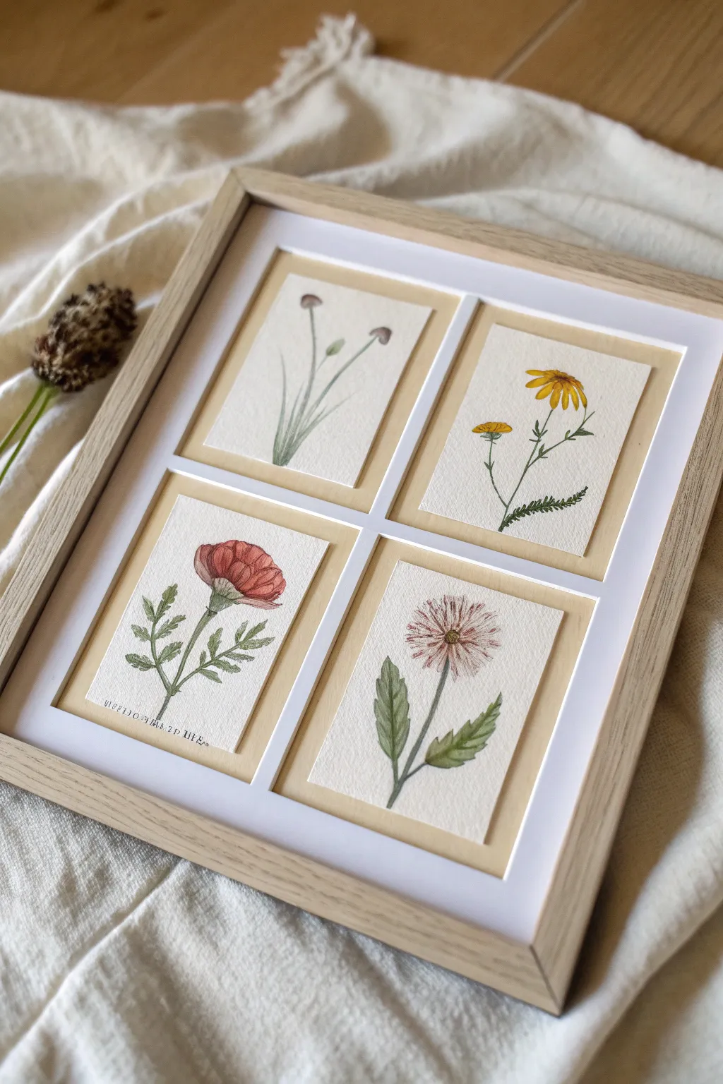
Capture the delicate beauty of a wildflower meadow with this charming four-panel storyboard series. Using soft watercolors and fine linework, you will create a cohesive set of vintage-style botanical illustrations that bring a serene, natural touch to any wall.
How-To Guide
Materials
- Cold press watercolor paper (300 gsm)
- Watercolor paints (Olive Green, Sap Green, Yellow Ochre, Cadmium Yellow, Alizarin Crimson, Burnt Umber)
- Fine round watercolor brushes (sizes 0 and 2)
- Fine liner pen (0.1mm, brown or sepia)
- HB pencil and eraser
- Ruler and craft knife
- Light wood gallery frame with a 4-window mount
- Masking tape
Step 1: Preparation and Sketching
-
Measure and Cut:
Begin by measuring the openings in your frame’s mount. Cut four pieces of watercolor paper roughly 1/2 inch larger than these dimensions on all sides to allow ample room for mounting later. -
Initial Layout:
On each paper square, lightly mark the center. Plan four different specimens: a tall budded plant, a yellow daisy-like flower, a red poppy-style bloom, and a pink aster or chrysanthemum. -
Light Sketching:
Using your HB pencil with a very light hand, sketch the central stem for each plant first to establish the posture. Add the basic shapes for leaves and petals, keeping the composition centered but slightly organic. -
Refining Shapes:
Go back over your rough shapes and define the jagged edges of leaves or the individual petals, ensuring the pencil lines remain faint enough to be easily erased later.
Step 2: Watercolor Application
-
Mixing Greens:
Prepare two shades of green on your palette. Mix Sap Green with a touch of Burnt Umber for a brownish ‘dried’ green, and Olive Green with a drop of blue for a cooler leaf tone. -
Painting Stems:
Using the size 2 brush, paint the stems of all four plants. Use the tip of the brush to keep the lines thin, lifting pressure as you reach the delicate offshoots. -
Leaf details:
Fill in the leaves. For the poppy (bottom left) and daisy (top right), use short, deliberate strokes to mimic jagged edges. For the larger leaves on the bottom right flower, use a wet-on-dry wash for a smooth texture. -
Top Left Panel:
Paint the small buds with a very watered-down purple-grey mix. Keep them minimalist to contrast with the more colorful panels. -
Top Right Panel:
Dip into Cadmium Yellow and Yellow Ochre. Paint the petals of the top bloom, leaving tiny slivers of white paper between petals to define them without outlining. -
Bottom Left Panel:
Use a diluted Alizarin Crimson for the poppy. Apply a light wash first, then drop slightly more concentrated pigment near the base of the petals while still wet to create depth. -
Bottom Right Panel:
Mix a dusty pink using Alizarin Crimson and a touch of Burnt Umber. Paint fine, radiating lines from the center outward to create the texture of the aster petals.
Fixing “Cauliflowers”
If you get uneven water blooms in your paint, don’t panic. Once dry, use a damp stiff brush to gently scrub the edge, or cover it with some detail ink work.
Step 3: Details, Text, and Assembly
-
Adding Contrast:
Once the base layers are completely dry, mix a darker version of each flower’s color. Add tiny details like the centers of the yellow flowers or the shadow side of the red petals. -
Fine Ink Details:
I personally love adding ink at this stage to sharpen the look. Use a sepia fine liner to gently outline specific focal points or add veins to the larger leaves, but don’t outline everything. -
Adding Text:
On the bottom left panel (or whichever you prefer), carefully print a small botanical name or phrase in tiny capital letters near the stem base using the fine liner. -
Final Drying:
Allow the papers to sit for at least an hour to ensure no moisture remains, which could cause buckling inside the frame. -
Positioning:
Place your mount face down. Position each painting face down over its respective window. Use small pieces of masking tape to secure the corners once you are happy with the alignment. -
Framing:
Clean the inside of the frame glass to remove dust. Place the mount and backing board into the frame and secure the clips.
Vintage Patina
Soak the paper in strong black tea and let it dry before painting. This gives a warm, antique parchment look that complements botanical art perfectly.
Hang your new botanical gallery and enjoy the quiet elegance of your hand-painted collection
Have a question or want to share your own experience? I'd love to hear from you in the comments below!