Whenever I’m stuck on what to draw, I pick one color and let it lead the whole page—and purple never disappoints. Here are my favorite purple drawing ideas that go from classic sketchbook staples to the kind of weird, dreamy experiments that end up being everyone’s favorites.
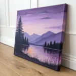
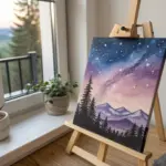
Purple Twilight Sky Gradient
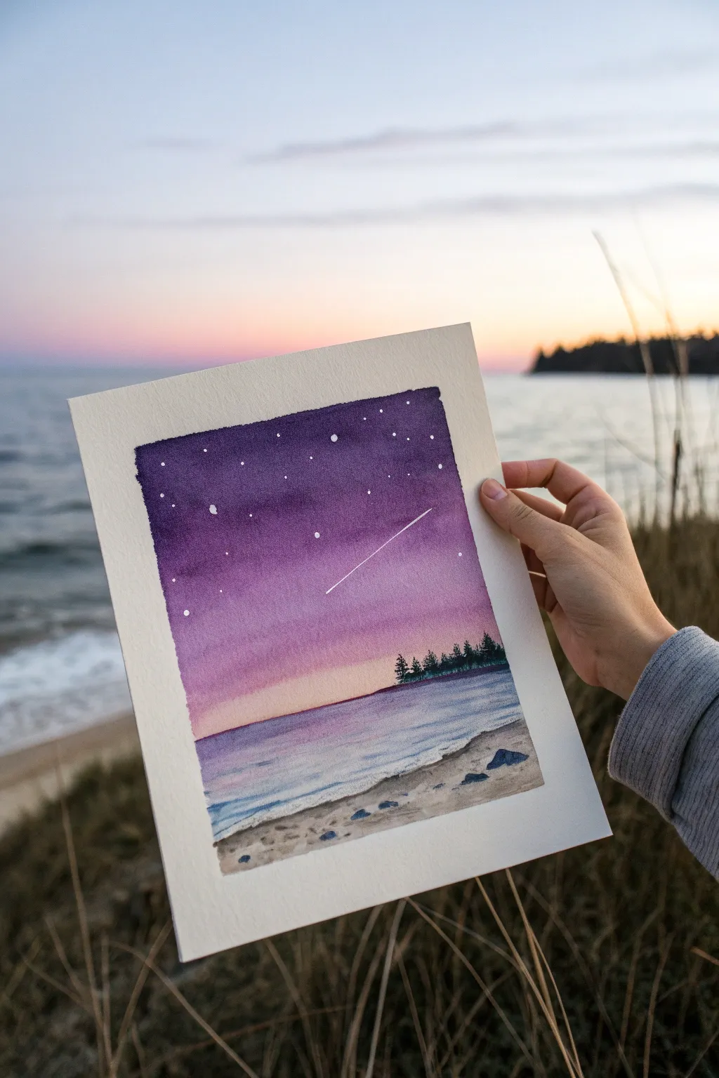
Capture the magic of a fading sunset with this serene watercolor landscape featuring a deep purple night sky that melts into a soft horizon. This beginner-friendly project uses simple wet-on-wet gradients and masking techniques to create a stunning celestial scene over a quiet beach.
Detailed Instructions
Materials
- Cold press watercolor paper (approx. 5×7 inches)
- Masking tape or painter’s tape
- Watercolor paints (Indigo, Purple/Violet, Alizarin Crimson, Burnt Sienna, Yellow Ochre, Paynes Grey)
- White gouache or white gel pen
- Round watercolor brushes (Size 8 for washes, Size 0 or 2 for details)
- Jar of clean water
- Paper towels
- Pencil and eraser
- Ruler
Step 1: Preparation & Sky Gradient
-
Tape the borders:
Begin by taping down all four edges of your watercolor paper to a hard board or table. Press the tape down firmly to ensure crisp, clean edges later. -
Sketch the horizon:
Lightly draw a horizontal line about one-third of the way up from the bottom of the paper. This separates the sky from the water. -
Sketch the shoreline:
Below the horizon line, sketch a gentle curve for the shoreline, leaving some space at the bottom for the sand. -
Pre-wet the sky:
With your larger round brush, brush clean water over the entire sky area above the horizon line. You want the paper to be glistening but not forming puddles. -
Start the deep purple:
Load your brush with a concentrated mix of Indigo and Purple. Apply this to the very top of the sky, letting the color bleed downwards naturally. -
Blend downwards:
Rinse your brush slightly and pick up a lighter purple or violet shade. Blend this into the bottom edge of the dark section, pulling the color further down comfortably. -
Add the twilight glow:
Clean your brush and pick up a watery wash of Alizarin Crimson or a soft pink. Blend this from the purple down toward the horizon line, getting lighter as you go. -
Warm the horizon:
Just above the horizon line, add a very faint touch of yellow ochre or peach to create the last light of the sun, ensuring it blends seamlessly into the pink above. -
Lift the shooting star:
While the sky is still damp, use a clean, slightly damp brush or the corner of a paper towel to lift out a thin diagonal line for the shooting star’s trail. Alternatively, leave it to dry and add white later.
Pro Tip: Seamless Gradients
Work quickly while the paper is wet! If the paper starts to dry, stop adding paint to avoid “blooms” or cauliflower textures. Rewet the whole area if needed.
Step 2: Water & Foreground
-
Paint the water base:
Once the sky is dry, wet the water area. Apply a light wash of purple mixed with a touch of blue, mirroring the sky’s colors but lighter. -
Define the water ripples:
While the water wash is still wet, add thin horizontal strokes of slightly darker purple near the horizon and the shoreline to suggest gentle waves. -
Paint the sand:
Mix a watery light brown or beige using Burnt Sienna and plenty of water. Paint the beach area at the bottom. -
Texture the sand:
While the sand wash is damp, drop in tiny spots of darker brown or grey (Burnt Sienna mixed with a little Paynes Grey) to create the texture of pebbles and uneven sand. -
Add larger rocks:
Using a smaller brush and a mix of Paynes Grey and Indigo, paint a few small, distinct rocks sitting on the sand.
Level Up: Reflection Magic
Add a few horizontal lines of white gouache on the water directly beneath the brightest part of the horizon to mimic the light reflecting on the waves.
Step 3: Silhouettes & Details
-
Paint the tree line:
Ensure the sky and water are completely bone dry. Using a small brush and a thick mix of Paynes Grey or dark green, paint a distant strip of land on the right side of the horizon. -
Add pine trees:
On top of that dark strip, paint tiny vertical lines and stipple small branches to create the silhouette of pine trees sitting on the far shore. -
Add the stars:
Dip a small brush or a toothbrush into white gouache (watered down slightly). Tap the brush against your finger to splatter tiny stars across the purple section of the sky. -
Highlight specific stars:
I like to use a white gel pen or the tip of a fine brush with gouache to add a few larger, deliberate stars and to crisp up the shooting star line created earlier. -
Peel the tape:
Wait until the entire painting is perfectly dry. Carefully peel the tape away at an angle, away from the painting, to reveal your crisp white border.
Now you have a tranquil twilight scene that perfectly captures the stillness of dusk
Purple Butterfly Color Study
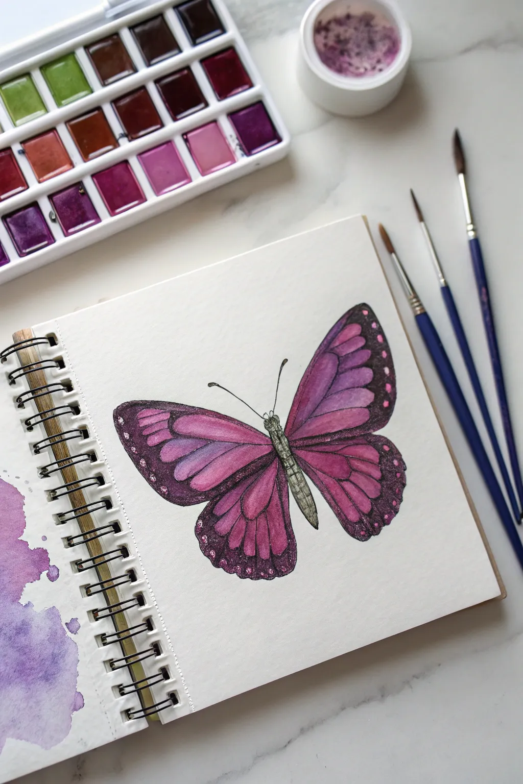
Capture the delicate beauty of nature with this vibrant purple butterfly study. Using a blend of rich violet hues and deep plums, you will build up layers of transparent watercolor to create wings that feel both gentle and striking.
Step-by-Step Tutorial
Materials
- Cold press watercolor paper sketchbook
- Watercolor paints (pans or tubes) with a focus on purples (e.g., quinacridone violet, dioxazine purple, rose madder)
- Round watercolor brushes (sizes 2, 4, and 6)
- Pencil (HB or lighter)
- Kneaded eraser
- Clean water jar
- Paper towels
- White gouache or white gel pen for highlights
Step 1: Sketching the Anatomy
-
Establish the centerline:
Begin by lightly drawing a diagonal line to guide the angle of the butterfly’s body. This creates a more dynamic composition than a perfectly vertical orientation. -
Draft the body segments:
Sketch a narrow, segmented oval for the abdomen and a smaller rounded shape for the thorax along your guide line. Keep the lines faint so they won’t show through the paint later. -
Outline the forewings:
Draw the upper wings (forewings) extending outward from the thorax. They should be roughly triangular but with rounded outer edges that sweep upward. -
Add the hindwings:
Sketch the lower wings (hindwings) starting just below the forewings. These are more rounded and slightly smaller, completing the classic butterfly silhouette. -
Refine the veins:
Lightly trace the vein structures inside the wings. Draw these as slender, radiating lines extending from the body toward the wing edges, creating the ‘cells’ you will fill with color.
Muddy Purple Fix
If your purples look brown or dull, clean your water jar immediately. Purple is sensitive to dirty water. Test mixtures on a scrap paper first to ensure clarity.
Step 2: Applying the Base Layers
-
Paint the body:
Mix a diluted grey-green or sage color. Carefully paint the thorax and abdomen, leaving tiny gaps between segments to suggest texture. -
First wash on the wings:
Prepare a watery, pale pink-purple wash. Apply this freely to the inner sections of the wings (the cells between the veins), keeping the paint wet and fluid. -
Introduce the gradient:
While the first wash is still damp, drop in a slightly stronger violet near the body and let it bleed outward. This wet-on-wet technique creates a soft, natural transition. -
Define the outer margins:
Using a stronger mix of deep purple or plum, paint the thick borders along the outer edges of the wings. Be careful to paint around the delicate vein lines you sketched earlier. -
Let it dry completely:
Pause here. The paper must be bone dry before you add the next layer, otherwise your crisp lines will blur into the background.
Level Up: Metallic Touch
Layer a iridescent watercolor medium or metallic paint over the dark wing borders. When tilted in the light, the wings will shimmer just like a real insect.
Step 3: Deepening Color and Detail
-
Darken the wing borders:
Mix a very concentrated dark purple (almost black-violet). Go over the outer margins again to create a high-contrast frame for the brighter inner wings. -
Glaze the inner cells:
I like to take a translucent rose or magenta and glaze over the inner wing sections again. This second layer makes the color pop and adds depth without hiding the first wash. -
Paint the veins:
Switch to your smallest brush (size 0 or 2). Use a dark charcoal or deep violet mix to carefully paint the thin vein lines, connecting the body to the dark outer borders. -
Add texture to the body:
Using a relatively dry brush with dark grey, add tiny stippling dots or small lines to the butterfly’s body to give it a fuzzy, insect-like texture. -
Draw the antennae:
With a steady hand and your finest brush tip, pull two long, slender curved lines extending from the head, topping each with a tiny bulb shapes.
Step 4: Final Highlights
-
Add white spots:
Using white gouache or a gel pen, add small dots along the dark outer borders of the wings. Vary the size of the dots for a more organic look. -
Highlight the body:
Place a few tiny specks of white on the thorax and abdomen to suggest light hitting the rounded forms. -
Optional background splash:
If you want to frame the drawing as shown, wet a small area of the paper edge (left side) and drop in loose purple pigment, letting it bloom naturally without touching the butterfly itself.
Now you have a vibrant, permanent specimen captured in your sketchbook to enjoy forever

Purple Heart Pattern Page

Transform a blank journal page into a satisfying tapestry of affection with this monochromatic heart study. By mixing solid fills, delicate outlines, and intricate patterns in varying shades of purple, you’ll create a visually rich yet relaxing doodle spread.
Detailed Instructions
Materials
- A5 Sketchbook or Dot Grid Journal (high quality paper prevents bleed-through)
- Purple felt-tip pens or brush pens (light lavender)
- Purple fine liners (medium violet)
- Dark purple marker or gel pen (deep plum)
- Pencil (optional for sketching)
- Eraser
Step 1: Setting the Composition
-
Visualizing the grid:
Before putting pen to paper, mentally divide your page into a loose, staggered grid. You aren’t aiming for rigid lines, but rather an organic distribution where hearts float near each other without touching. -
Optional pencil sketch:
If you are nervous about placement, lightly sketch the outlines of the larger hearts with a pencil. Aim for about 5-6 hearts per row, staggering their positions like a brick wall pattern. -
Establishing the large hearts:
Using your medium-shade purple marker, draw the outlines of your main hearts scattered across the page. Keep their sizes relatively consistent, roughly the size of a large coin, but allow for hand-drawn imperfections.
Step 2: Adding Variety & Filling
-
Solid fills:
Select about 20% of your outlined hearts and color them in completely solid. Use your darkest purple marker for some and a medium shade for others to create depth and contrast immediately. -
Striped patterns:
Choose another set of hearts and fill them with diagonal stripes. Try varying the line thickness or direction—some going left-to-right, others right-to-left—to keep the eye moving. -
Polka dots and circles:
For the next group, fill the interiors with small polka dots. I like to leave a few as white circles on a purple background (negative space) and others as purple dots on a white background. -
Grid textures:
Create a cross-hatch or grid pattern inside a few hearts. These look particularly nice when done with a fine-point pen to keep the lines crisp and legible. -
Scalloped details:
Draw tiny ‘U’ shapes or scallops inside a few hearts, stacking them like fish scales. This adds a lovely, organic texture that contrasts well with the geometric stripes. -
Concentric hearts:
Inside a few of the open outlines, draw a second, smaller heart. You can fill the gap between them or leave it open for an airy look.
Ink Smudging?
If your hand drags ink across the page, place a clean scrap piece of paper under your drawing hand. Work from the top left to bottom right (if right-handed) to avoid fresh ink.
Step 3: The Tiny Details
-
Sprinkling mini hearts:
Now, look at the gaps between your main hearts. Switch to your finest tip pen or a lighter lavender shade. -
Filling the negative space:
Draw tiny, solid mini-hearts in the white spaces between the larger motifs. These act as confetti, tying the whole composition together and reducing the feeling of emptiness. -
Checking the balance:
Step back and look at the page. If one area feels too ‘white’ or empty, add a medium-sized heart with a simple pattern, like a squiggle or a squiggle-grid. -
Adding specific squiggles:
Replicate the specific doodle where a heart is filled with a continuous loopy line. This messy texture provides a great break from the cleaner geometric fills. -
Final outlines:
Go over any pencil lines that are still visible with your eraser. If any outline looks too faint, carefully re-trace it with your darkest purple pen to make it pop.
Level Up: Ombré Effect
Use a water-based marker and a damp brush to fill some hearts. The water will bleed the ink slightly, creating a soft, watercolor-like gradient inside the shape.
Enjoy the soothing rhythm of filling your page with these charming purple designs
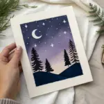

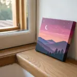
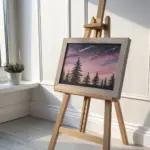
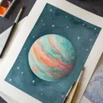
Moon and Stars in Purple
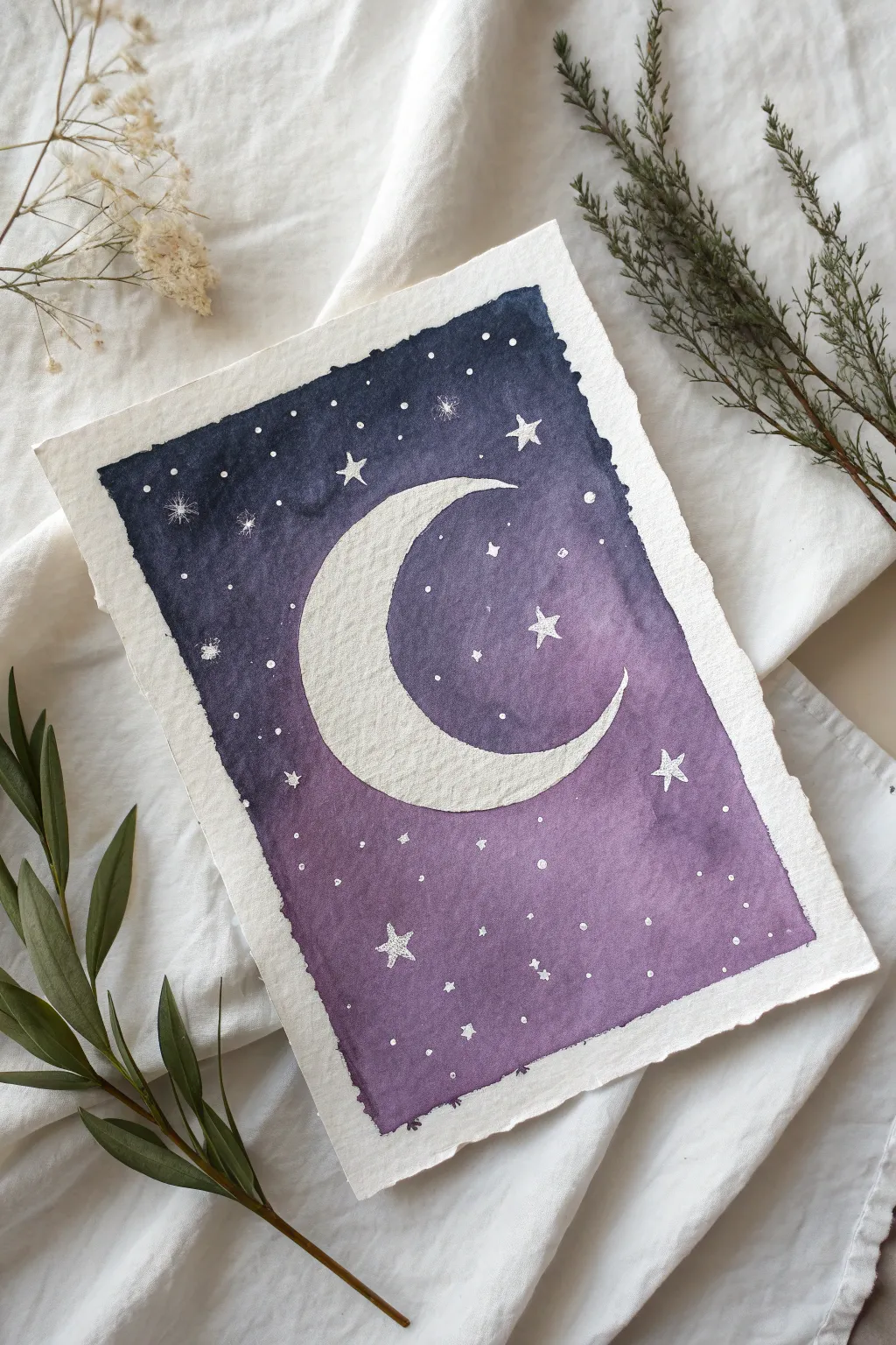
This dreamy watercolor project captures the magic of a night sky with a deep purple gradient and a glowing crescent moon. The textured paper and scattered stars create a gentle, illustrative feel perfect for beginners.
Step-by-Step
Materials
- Cold press watercolor paper (deckle edge optional)
- Watercolor paints: Violet, indigo, or deep blue
- Masking fluid (drawing gum) or masking tape
- Round watercolor brush (size 6 or 8)
- Fine liner brush or white gel pen
- White gouache or white ink
- Pencil and eraser
- Two jars of water
- Painters tape
Step 1: Preparation & Sketching
-
Tape down your paper:
Start by securing your watercolor paper to a board or table. If you want that rough, organic border shown in the photo, apply the tape about half an inch inward from the paper’s edge, creating a defined rectangle. -
Sketch the moon:
Lightly draw a large waxing crescent shape in the center of your taped area. Keep your pencil lines very faint so they don’t show through the final paint. -
Protect the moon area:
Apply a layer of masking fluid carefully inside the moon shape. This barrier will keep the paper pristine white while we paint the dark sky around it. -
Mark larger stars:
For the crispest stars, use a small dot of masking fluid on the tip of a brush handle or a fine applicator to mask out tiny circles where your brightest stars will be. -
Wait for drying:
Allow the masking fluid to dry completely. It should feel gummy and hard to the touch, not tacky.
Uneven Gradient?
If your sky dries with harsh lines between colors, re-wet the entire background very gently with clean water and drop in more pigment to smooth the transition.
Step 2: Painting the Sky Gradient
-
Prepare your colors:
Mix a generous amount of deep violet paint on your palette. In a separate well, mix a dark indigo or navy blue. -
Wet the background:
Using clean water, wet the entire area surrounding the masked moon. The paper should be glisteny but not soaking wet. -
Apply the purple base:
Load your round brush with the violet mix. Start applying it at the bottom of the painting, letting the color bloom into the wet paper. -
Transition to darkness:
As you work your way up past the middle of the moon, begin introducing the indigo paint into your brush. -
Create the ombre:
Blend the indigo into the violet while the paper is still wet. By the time you reach the top edge, the color should be a very dark, midnight blue. -
Deepen the edges:
I find that adding a touch more pigment right along the tape edges creates a nice frame effect, so dab extra dark blue along the top corners while wet. -
Let it dry fully:
This is crucial: let the background paint dry completely. If the paper is cool to the touch, it’s still damp.
Add Metallic Magic
Once everything is dry, re-paint the crescent moon or specific stars with metallic silver or gold watercolor for a shimmering effect that catches the light.
Step 3: Revealing & Detailing
-
Remove the masking:
Once the paint is bone dry, gently rub off the masking fluid with your finger or a rubber cement pickup tool to reveal the stark white paper underneath. -
Soften the moon texture:
If the moon looks too stark white, mix a very watery, pale gray wash. Lightly dab it onto parts of the moon to simulate craters and texture. -
Prepare white medium:
Get your white gouache (mixed to a creamy consistency) or a white gel pen ready. -
Paint main stars:
Using a fine liner brush and gouache, paint five-pointed stars scattered throughout the sky. Vary their sizes for interest. -
Add tiny distant stars:
Dip a toothbrush or stiff brush in white paint and flick the bristles to spray a fine mist of tiny white dots over the purple background. -
Enhance glows:
For a magical effect, paint faint, translucent halos around the largest stars using very diluted white paint.
Step 4: Finishing Touches
-
Clean up edges:
Carefully peel away the painter’s tape. Pull it at a 45-degree angle away from the painting to prevent tearing. -
Deckle the edges (optional):
If your paper didn’t come with deckled edges, you can manually tear the very edge of the paper now, using a ruler as a guide for a rough, handmade look.
Hang your celestial painting in the bedroom for a peaceful night-time vibe

PENCIL GUIDE
Understanding Pencil Grades from H to B
From first sketch to finished drawing — learn pencil grades, line control, and shading techniques.
Explore the Full Guide
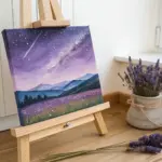
Purple Mountain Silhouettes
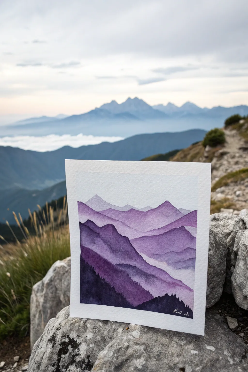
Capture the breathtaking depth of a mountain range using nothing but varying shades of purple watercolor. This project focuses on atmospheric perspective, where distant peaks fade into the sky and foreground ridges stand bold and dark.
How-To Guide
Materials
- Cold press watercolor paper (300 gsm)
- Painter’s tape or washi tape
- Watercolor paints (Violet/Purple, Indigo, and a touch of Black)
- Round brushes (Sizes 6 and 10)
- Fine detail brush (Size 0 or 2)
- Mixing palette
- Two jars of water
- Paper towels
- Pencil and eraser
Step 1: Preparation and Sketching
-
Secure the paper:
Tape down all four edges of your watercolor paper to a board or hard surface. This creates a clean white border and prevents the paper from buckling when wet. -
Plan the layers:
Using a pencil, very lightly sketch five or six wavy lines across the paper. These will represent the ridges of your mountains. Keep the lines irregular and jagged to mimic natural terrain. -
Prepare your palette:
Squeeze out a generous amount of purple paint. You will need to create puddles of varying intensities, so having enough pigment ready is crucial. I like to pre-mix four distinct puddles: one very watery and pale, and three that get progressively darker and more saturated.
Step 2: Painting the Distant Peaks
-
First wash:
Load your larger round brush with the palest, most watered-down purple mix. Paint the strip of sky at the very top if desired, or start directly with the furthest mountain range. -
Farthest ridge:
Paint the shape of the most distant mountain peak. Keep this layer very light and transparent to create the illusion of distance. -
Allow to dry:
Let this first layer dry completely. If you paint the next layer too soon, the colors will bleed together and lose the crisp ridge line. -
Second ridge:
Using a slightly more saturated mix of purple, paint the second mountain range just below the first one. Ensure precise brushwork along the top edge to define the silhouette against the lighter mountain behind it. -
Softening the bottom:
While the paint for the second ridge is still wet, rinse your brush and run clean water along the bottom edge of this shape. This fades the color out into white, creating a misty valley effect.
Water Control Pro Tip
For the misty effect, tilt your board slightly. Gravity pulls the pigment down, and when you add clean water to the bottom edge, it naturally creates a smooth gradient.
Step 3: Building Depth and Foreground
-
Third layer:
Wait for the previous layer to dry. Mix a medium-tone purple, perhaps adding a tiny touch of indigo to cool it down. Paint the third mountain range, following your pencil sketch. -
Adding texture:
While this wet paint settles, you can carefully drop in tiny amounts of clear water or slightly darker pigment to create subtle texture within the mountain shape. -
Fourth layer complexity:
For the next ridge closer to the viewer, use a dark, rich purple. Make the silhouette jagged and interesting. This layer should cover more vertical space on the paper. -
Mist technique:
Again, fade the bottom of this fourth layer out with clean water so it blends seamlessly into the white paper below, preserving that foggy atmosphere.
Level Up: Starry Night
Once the sky area is dry, splatter tiny flecks of white gouache or acrylic ink using a toothbrush to create a subtle starry sky above the peaks.
Step 4: The Darkest Foreground
-
Mixing the darkest tone:
For the closest mountains, mix your purple with indigo or a small amount of black to create a near-silhouette consistency. It should be creamy and opaque. -
Painting the foreground:
Paint the final, lowest mountain range. This shape should be solid and bold, anchoring the composition. -
Creating trees:
Switch to your fine detail brush. Along the top ridge of this darkest foreground layer, paint tiny vertical irregular strokes to suggest the tops of pine trees. -
Refining details:
Add a few more jagged edges or textures to the dark foreground to simulate rocky terrain. -
Final dry:
Allow the entire painting to dry completely. This might take longer due to the multiple layers. -
The reveal:
Carefully peel away the painter’s tape at a 45-degree angle to reveal your crisp white borders.
Now you have a serene mountain landscape that captures the quiet majesty of high altitudes
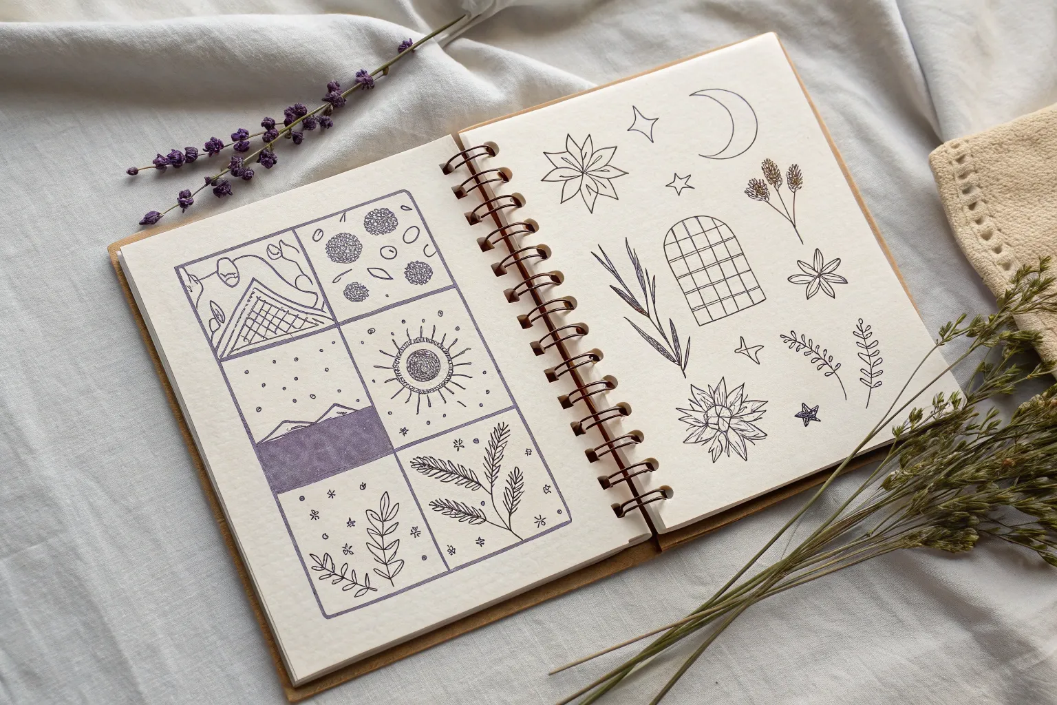
Grid Mood Board in Purple

Transform a simple grid page into a curated gallery of miniature ideas using a single purple fine-liner. This grid mood board combines floral elements, celestial shapes, and everyday objects in a cohesive, sketch-style layout that is perfect for practice or decoration.
Step-by-Step
Materials
- Grid notebook or graph paper
- Purple extra-fine sketching pen (0.3mm or 0.5mm)
- Pencil (optional for sketching)
- Eraser
Step 1: Floral Elements
-
Start with the top lily:
Begin in the upper-left quadrant by drawing a five-pointed flower. Draw five teardrop-shaped petals radiating from a center point. Fill each petal with color, leaving very thin white lines radiating from the center to suggest veins and depth. -
Draw the stylized rosette:
To the right of the lily, sketch a rosette. Start with a small, messy circle in the middle, then draw two layers of rounded petals around it. Add a few small leaves tedious peeking out from behind the petals. -
Create the sunflower shape:
Below the lily, draw a larger floral mandala or sunflower. Draw a central circle with a dot in the middle, surrounded by a ring of small loops. Add a layer of pointed, serrated petals around the outside, shading them lightly with a scribbling texture. -
Sketch the dandelion cluster:
In the bottom-left area, draw three thin stems meeting at the bottom. At the top of each stem, scribble small, tight circles to create fluffy, pom-pom style flower heads. Darken the centers of these scribbles slightly for volume.
Uneven Ink Flow?
If your pen skips or pools, keep a scrap paper nearby. Scribble quickly on the scrap to clear the nib, or blot excess ink before returning to your grid drawing.
Step 2: Celestial & Geometric Shapes
-
Draw the star card:
In the center of the page, draw a vertical rectangle slightly titled to the right. Inside, draw a smaller rectangle to create a border. Fill the inner space with a grid pattern, then draw a five-pointed star in the upper center and shade it in dark purple. -
Outline the crescent moon:
To the right of the star card, draw a simple crescent moon shape. Keep the lines clean and leave the interior empty for a crisp look. -
Add the leaf shapes:
Draw two distinct leaves. For the one on the far right, draw a simple outline with a central vein and diagonal veins. For the leaf below the sunflower, make the shape solid purple, leaving thin white gaps for the veins to show through the negative space. -
Create the button layout:
Below the crescent moon, draw a medium-sized circle. Inside, sketch four smaller circles arranged like button holes or craters. Add a few tiny dots around the perimeter for texture.
Grid Guide
Use the grid lines of the paper to align your drawings or size them consistently. Counting squares helps keep objects proportional to one another.
Step 3: Objects and Final Touches
-
Sketch the UFO:
Below the star card, draw a flattened oval for the UFO base and a dome on top. Add tiny circles along the bottom rim. Draw a diamond shape inside the dome and add a few small stars floating above it. -
Draw the candle:
Near the bottom left, sketch a short, wide candle. Draw a flame shape on top with a wick. Add a simple base or holder underneath, using horizontal hatching lines to shade the bottom of the holder. -
Add the fern sprig:
In the bottom center, draw a curved line for a stem. Add pairs of simple, loop-like leaves moving up the stem, finishing with a single leaf at the tip. Keep these outlines open rather than filled. -
Balance the composition:
If I notice any large empty gaps, I like to draw tiny stars, dots, or small scribbles to balance the visual weight of the page without overcrowding it.
Enjoy seeing your grid fill up with these charming purple sketches
BRUSH GUIDE
The Right Brush for Every Stroke
From clean lines to bold texture — master brush choice, stroke control, and essential techniques.
Explore the Full Guide
Pizza Slice Pattern Wheel
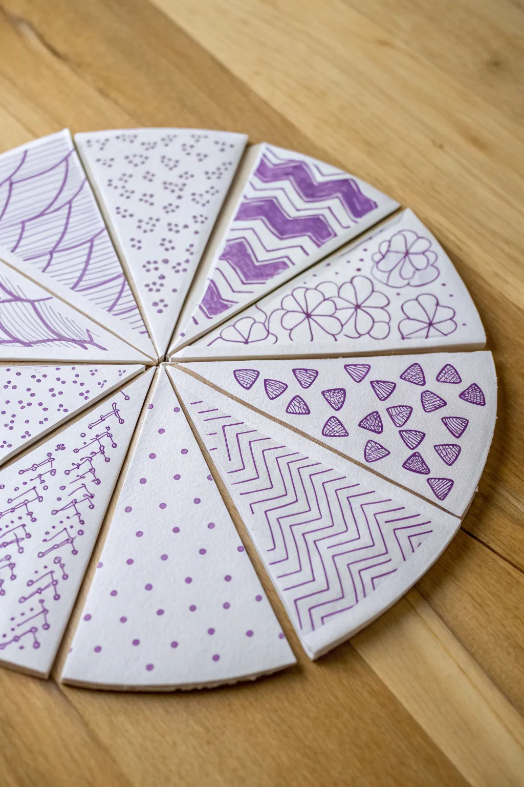
Transform a simple circle of paper into a stunning sampler of purple patterns, reminiscent of pizza slices. This monochromatic project explores rhythm and doodle art techniques, creating a mesmerizing radial design.
Step-by-Step Tutorial
Materials
- Heavyweight white cardstock or watercolor paper
- Purple felt-tipped marker (fine point)
- Purple felt-tipped marker (medium point or brush pen)
- Ruler
- Compass (or round object for tracing)
- Pencil
- Eraser
- Scissors
Step 1: Preparing the Base
-
Draw the main circle:
Start by drawing a large circle on your cardstock using a compass or by tracing a round plate. A diameter of about 6 to 8 inches works well for this level of detail. -
Mark the center:
Ensure you have a clear dot marking the exact center of your circle. -
Divide into slices:
Using your ruler and pencil, lightly draw lines from the center point to the outer edge to divide the circle. Aim for 8 to 10 equal “pizza slices”. -
Cut the slices:
Carefully cut along your pencil lines with scissors so each slice is a separate, triangular piece of paper. -
Arrange the workspace:
Lay your cut slices back into a circular formation on your table to visualize the full effect, but feel free to pull one slice out at a time to draw on it comfortably.
Smudge Prevention
Place a scrap piece of paper under your drawing hand while you work. This prevents oils from your skin from transferring and stops you from dragging wet ink across the white cardstock.
Step 2: Zig-Zag and Line Patterns
-
Create the bold zig-zag slice:
On your first slice, use a pencil to sketch wide zig-zag lines parallel to the curved outer edge. Fill alternating bands with your thicker purple marker to create solid stripes. -
Add connecting lines:
In the white spaces between the bold zig-zags, use the fine-point marker to draw two or three thinner parallel zig-zag lines. -
Draw the chevron slice:
For the next slice, draw a vertical line down the center. Using the fine-point marker, draw inverted V-shapes (chevrons) pointing up toward the wide end, stacking them closely from tip to crust. -
Design the sweeping curve slice:
On a new slice, start at the bottom point and draw curved lines that fan out toward the left and right edges, resembling the veins of a leaf or a sweeping abstract net. Cross-hatch sections for texture.
Step 3: Geometric Shapes and Dots
-
Outline tiny triangles:
Take a fresh slice and draw scattered small triangles using the medium pen. Orient them randomly so they look like confetti. -
Fill the triangles:
Go back into each small triangle with your fine liner and fill them with tiny stripes or cross-hatching to add visual weight without making them solid black. -
Create the polka dot slice:
For a simpler texture, take a new wedge and fill it with solid purple dots using the medium marker. Space them evenly, but avoid a rigid grid for a more organic look. -
Draw clustered dots:
On another slice, use the fine point pen to draw clusters of three small circles. I find grouping them tightly looks like little paw prints or flowers. -
Connect the mechanical motif:
If you’re feeling adventurous, dedicate one slice to a tech-inspired pattern. Draw small circles and connect them with straight lines and right angles, mimicking a circuit board.
Level Up: Gradient Fun
Instead of using one shade of purple, try a gradient! Use a dark plum for the center point of the slice and transition to a light lavender near the wide outer edge.
Step 4: Floral and Final Touches
-
Sketch the flower slice:
Using a pencil first, lightly sketch 3 or 4 large flowers that fill the entire wedge. -
Ink the florals:
Trace over your pencil lines with the fine purple marker. Add a simple line down the center of each petal for dimension. -
Erase guidelines:
Once the ink is completely dry on all slices, gently erase any visible pencil marks. -
Reassemble the wheel:
Arrange all your finished slices back into a circle. You can leave them loose to play with the arrangement or glue them onto a backing sheet for a permanent display.
Now you have a dynamic spectrum of patterns that look great separated or together
Amethyst Crystal Sketch
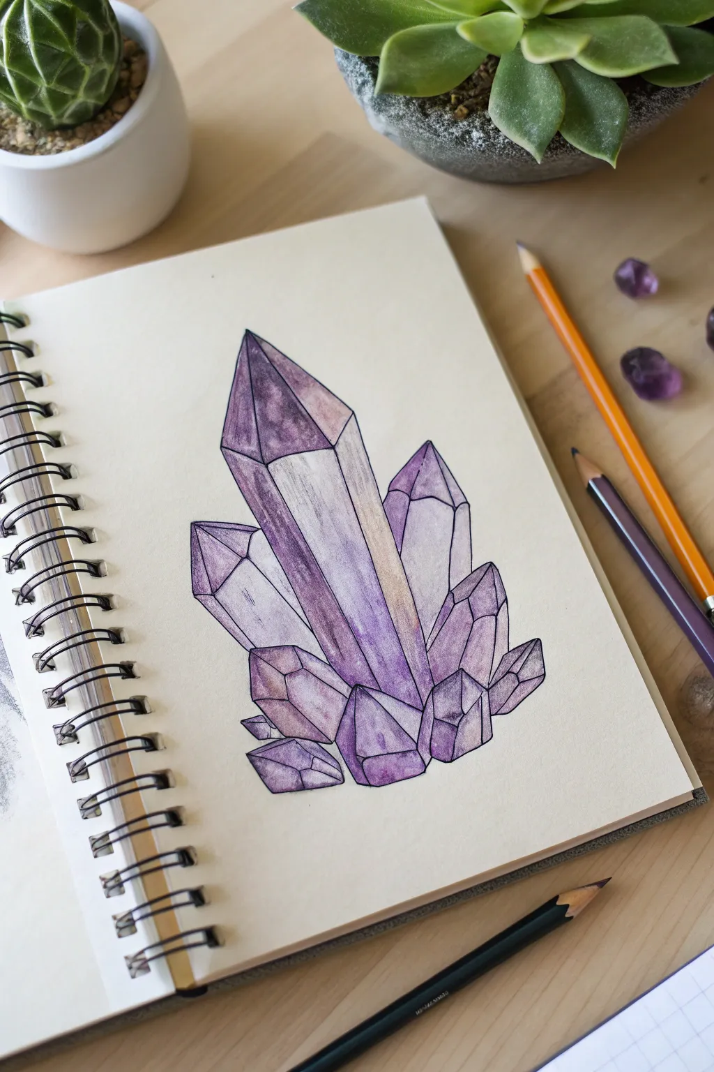
Capture the mystic beauty of crystals with this structured yet colorful amethyst sketch. By breaking complex natural forms into simple geometric planes, you can create a striking, jewel-like illustration right in your sketchbook.
How-To Guide
Materials
- Spiral-bound sketchbook (heavyweight paper preferred)
- HB graphite pencil for sketching
- Eraser
- Fine-tip black ink pen (archival ink)
- Set of purple colored pencils (light lavender to deep violet)
- Neutral gray or muted cream colored pencil
Step 1: Constructing the Framework
-
Start with the main spire:
Begin by drawing a tall, vertical rectangle in the center of your page. At the top, add a simple triangle to create a pointed tip. This will be the largest crystal that anchors the entire cluster. -
Facet the main crystal:
Draw vertical lines down the length of specific points on the triangle tip to create ‘facets’ or distinct planes. Slightly angle these lines so the crystal looks 3D rather than flat. -
Add supporting side crystals:
Sketch two medium-sized crystals flanking the main spire. Make them shorter and angle them slightly outward, like flowers blooming from a central stem. Give them pointed, geometric caps just like the first one. -
Draw the base cluster:
At the bottom of your main crystals, draw a collection of smaller, chunky shapes. Think of these as hexagonal or pentagonal blocks that jumble together to form a solid base foundation. -
Refine the geometry:
Go over your sketch and sharpen the lines. Amethyst grows in specific geometric habits, so ensure lines are straight and angles are crisp, avoiding curved or organic flowing lines.
Keep it Sharp
Use a ruler for longer vertical lines if you struggle with steadiness. Crisp, straight edges are the secret to convincing mineral drawings.
Step 2: Inking the Outline
-
Trace the primary lines:
Using your fine-tip black pen, carefully trace over your graphite lines. Keep a steady hand to maintain those sharp, crystalline edges. -
Vary line weight:
I find that making the outermost perimeter lines just a tiny bit thicker helps the cluster pop off the page, while keeping internal facet lines thinner preserves delicacy. -
Add internal details:
Draw faint, short scratchy lines inside a few facets to suggest texture or internal fractures within the stone. Don’t overdo this; just a few hint lines work best. -
Clean up:
Wait for the ink to dry completely to prevent smudging, then erase all underlying pencil marks to leave a clean, crisp varied line drawing.
Step 3: Coloring and Shading
-
Lay down the lightest wash:
Take a pale lavender or cream pencil and color the most prominent front-facing facets. These planes catch the most light, so keep the pressure very light to preserve the paper’s brightness. -
Apply mid-tones:
Select a standard purple shade. Color the side planes of your crystals, pressing slightly harder to create a distinct difference from the highlighted front faces. -
Deepen the shadows:
Identify the facets that would be turned away from the light source. Use your darkest violet pencil here, applying firm pressure to create deep, saturated shadows, especially near the bottom of the cluster. -
Blend the transitions:
Use a lighter purple to smooth out the transition areas where a light plane meets a dark plane, though keeping some edges hard looks more realistic for crystals. -
Add gradient effects:
On the tall main crystal, create a vertical gradient. Keep the tip dark and saturated, fading to a lighter, more transparent purple as you move down the shaft to mimic natural quartz variation. -
Enhance contrast:
Go back in with your darkest purple or even a touch of dark blue to deepen the crevices between the crystals. This high contrast makes the lighter facets appear to sparkle.
Add Sparkle
Once finished, use a white gel pen to add tiny dots or star-shapes on the darkest points of the crystal tips for a magical, reflective sheen.
Now you have a permanent gem in your sketchbook that captures the light without fading


Purple Night Ocean Waves
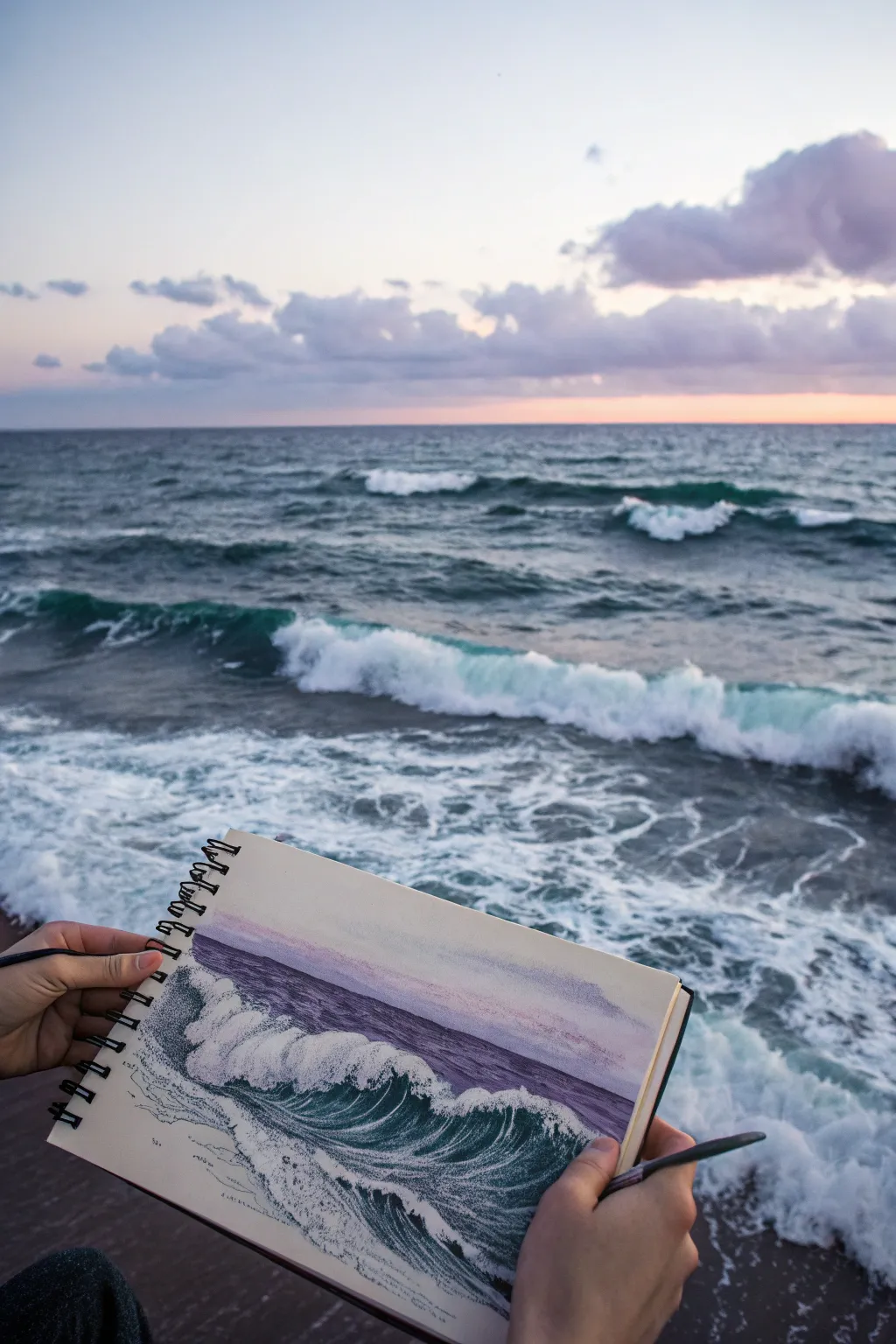
Capture the moody romance of a sunset ocean with this mixed-media sketch that balances deep teal waves against a soft violet sky. This project combines the fluidity of watercolor with the precision of stippling pens to recreate the raw energy of crashing water.
Step-by-Step Tutorial
Materials
- Spiral-bound sketchbook (heavyweight paper, mixed media or watercolor)
- Watercolor paints (Payne’s Gray, Prussian Blue, Viridian Green, Purple/Violet)
- Fine liner pens (Black, sizes 0.1, 0.3, and 0.5)
- White gel pen or white gouache
- Small round brushes (size 4 and 6)
- Pencil (HB) and eraser
- Painter’s tape or masking tape
- Cup of water and paper towels
Step 1: Sketching the Composition
-
Define the horizon:
Begin by lightly drawing a straight horizontal line about one-third of the way down from the top of your page. This will separate the sky from the distant sea. -
Outline the main wave:
In the bottom half of the page, sketch a large, sweeping curve moving from left to right to represent the crest of the main crashing wave. Keep the lines loose and jagged where the foam will be. -
Map the foam patterns:
Lightly trace the chaotic path of the sea foam trailing behind the wave and in the foreground. These don’t need to be perfect; they just serve as boundaries for where you will avoid painting later.
Ink Bleeding Prevention
If your fine liner starts spreading into spiderwebs, your paper is still damp inside. Touch the paper with the back of your hand; if it feels cool, wait 10 more minutes.
Step 2: Applying the Watercolor Base
-
Paint the violet sky:
Mix a watery wash of violet with a tiny touch of blue. Apply this to the sky area above the horizon line, letting it fade slightly as it moves upward for an atmospheric gradient. -
Establish the deep ocean:
Mix Prussian Blue with a hint of Payne’s Gray. Paint the band of water between the horizon and the main wave crest. I like to keep this stroke horizontal and flat to suggest distance. -
Color the wave face:
For the translucent part of the wave—the ‘barrel’—mix Viridian Green with a little Prussian Blue for a teal hue. Paint the curved face of the wave, being careful to leave the top crest completely white. -
Shadowing the water:
While the teal is still slightly damp, drop some darker Payne’s Gray into the very bottom of the wave curve to create depth and volume. -
Let it dry completely:
Pause here and allow the watercolor layers to fully dry. The paper needs to be bone dry before we add ink, or the pens will bleed.
Golden Hour Glow
To change the time of day, swap the violet sky wash for a soft peach or jagged orange line, and reflect that color slightly on the white foam caps.
Step 3: Inking and Detailing
-
Start stippling the foam:
Using your 0.1 fine liner, begin adding tiny dots (stippling) to the shadowed areas of the white foam. Concentrate the dots on the underside of the splashes to give them form without outlining them. -
Texture the distant water:
Use the 0.3 pen to draw very thin, broken horizontal lines in the purple/blue distant water area. This mimics the ripples of far-off waves. -
Deepen the wave shadows:
Switch to a 0.5 pen. Add denser stippling and short, curved hatching lines inside the darkest teal part of the wave to exaggerate the movement and curvature. -
Define the crash:
Where the wave hits the water, use scribbly, loose ink marks to suggest the chaos of the splash. Keep your hand relaxed to avoid stiff lines. -
Reference the foreground:
Add subtle texture to the foreground water with very light, sparse dots. You want the viewer’s eye drawn to the main wave, not the bottom edge of the paper.
Step 4: Final Highlights
-
Add bright whites:
Take your white gel pen or a small brush with white gouache. Add crisp highlights to the very top edge of the wave crest to make it pop against the darker water behind it. -
Creating mist:
If you are using gouache, you can dry-brush a tiny bit of white appearing as ‘mist’ coming off the back of the wave for extra realism. -
Refining the horizon:
Check your horizon line. If the paint bled, use the white pen to clean up the edge where the purple sky meets the dark sea. -
Review contrast:
Step back and look at the sketch. If the wave feels flat, add more black ink stippling to the deepest curves to push the contrast further.
Now you have a dynamic seascape that captures the rhythm of the tide right in your sketchbook
Purple Cow Print Remix
This project transforms the classic black-and-white animal print into a soft, dreamlike pattern using watercolor paints. The design features organic purple blotches that cluster at the bottom and fade upward, leaving plenty of negative space for a note or quote.
How-To Guide
Materials
- Cold press watercolor paper (A5 or 5×7 inches)
- Purple watercolor paint (or mix blue and red for a custom violet)
- Round watercolor brush (size 4 or 6)
- Clean water
- Paper towel
- Pencil (optional)
- Eraser (optional)
Step 1: Planning the Layout
-
Establish the curve:
Visualize a diagonal, gentle curve stretching from the bottom left corner up to the middle of the right edge. This line will serve as the invisible boundary where your pattern will stop. -
Rough sketching (optional):
If you are nervous about painting freehand, very lightly sketch a few random, irregular shapes to guide your placement. Keep the pencil marks extremely faint so they won’t show through the translucent paint.
Water Control Pro Tip
Keep a paper towel in your non-painting hand. Dab your brush on it after rinsing to control exactly how much water goes onto the paper, preventing puddles.
Step 2: Painting the Base Shapes
-
Prepare your violet mix:
Mix a generous puddle of purple watercolor paint on your palette. Aim for a medium consistency—watery enough to flow, but pigmented enough to look vibrant on the paper. -
Start at the corner:
Begin painting your first shape in the bottom left corner. Create an irregular, blob-like form with soft, rounded edges rather than sharp angles. Think of smooth river stones or clouds. -
Work along the edge:
Continue adding shapes along the bottom edge of the paper. Vary the sizes slightly, but keep them roughly similar in scale to create a cohesive pattern. -
Mind the gap:
Leave thin channels of white paper between each purple shape. These white ‘rivers’ are crucial for defining the cow print look; try to keep them consistent in width, about 2-3 millimeters wide. -
Build upward:
Move your brush up to the next ‘row’ of spots. Instead of stacking them directly on top of the first row, offset them slightly, fitting new blobs into the valleys created by the shapes below.
Metallic Level Up
Once fully dry, outline a few random spots with a gold gel pen or gold watercolor paint to add a touch of glamour to the rustic print.
Step 3: Adding Depth and Variation
-
Vary the saturation:
As you paint, dip your brush into water occasionally without picking up more paint. This will create some lighter, more translucent shapes alongside the darker, more saturated ones. -
The wet-in-wet technique:
While a shape is still wet, I like to drop in a tiny dot of slightly darker purple or clean water. This creates a beautiful ‘bloom’ texture as it dries, which is characteristic of watercolor. -
Follow the diagonal:
As you approach the imaginary diagonal line you visualized earlier, begin to space the shapes out just a little more or make them slightly smaller to create a fading effect. -
Creating the edge:
Paint the final shapes along that diagonal boundary. Ensure their top edges look complete and rounded, not cut off, so the pattern feels like it’s organically floating. -
Review the balance:
Step back and look at the composition. If there’s a white gap that feels too large within the purple area, add a small ‘pebble’ shape to fill it.
Step 4: Finishing Touches
-
Smooth the edges:
Check your painted shapes for any jagged edges. While the paint is damp, you can gently smooth out a rough line with the tip of your brush. -
Let it dry completely:
Allow the paper to dry flat. Do not touch the damp shapes, as watercolor can smudge easily at this stage. -
Flatten the paper:
If your paper has buckled slightly from the water, place it under a heavy book overnight once it is 100% dry to flatten it out perfectly.
Now you have a serene, custom-painted card ready for a heartfelt message
Drippy Purple Smiley Face
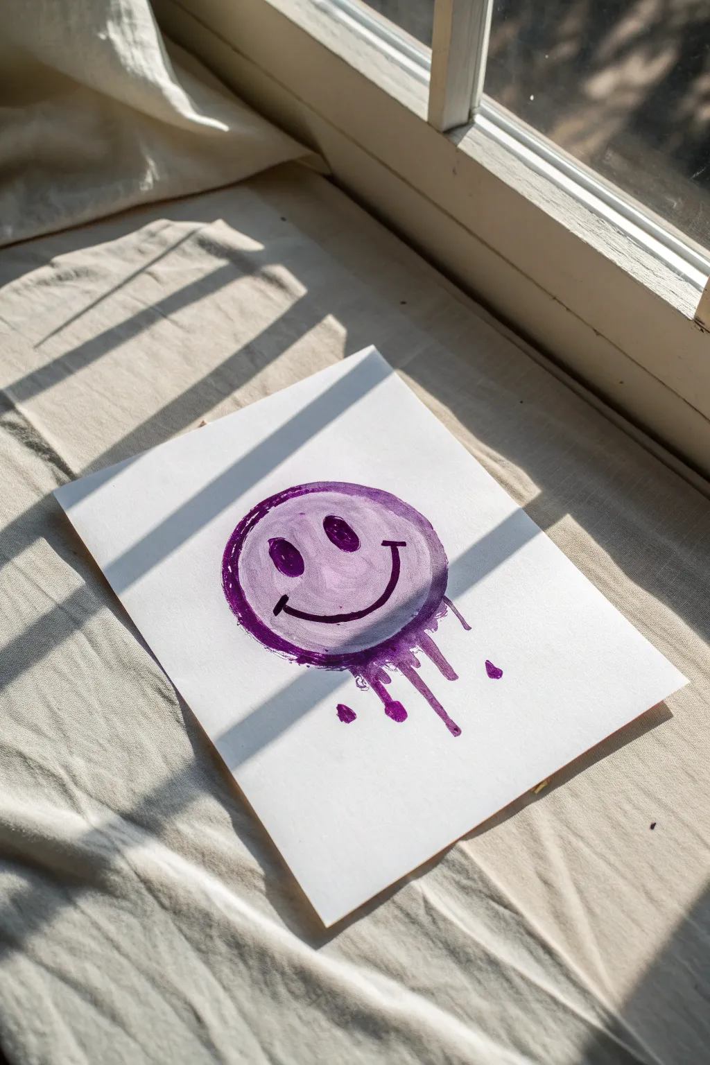
Add a touch of playful grunge to your sketchbook with this melting purple smiley face. Created using watercolor or ink, this project plays with gravity to achieve a cool drippy effect that looks great on textured paper.
Detailed Instructions
Materials
- Heavyweight watercolor paper or mixed media paper
- Purple watercolor paint or purple acrylic ink
- Medium round paintbrush (size 6 or 8)
- Small round paintbrush (size 2 or 4)
- Black ink pen or fine liner
- Paper towels
- Cup of water
- Pencil (optional)
Step 1: Base Shape
-
Sketch the outline:
Begin by lightly sketching a simple circle on your paper with a pencil if you aren’t confident going straight in with paint. It doesn’t need to be perfect; a little wobbliness adds character. -
Mix your purple:
Prepare your purple medium. If using watercolor, mix a generous puddle of purple paint with water to get a fluid, but vibrant consistency. If using acrylic ink, shake the bottle well. -
Paint the circle base:
Using your medium round brush, fill in the circle with a light wash of purple. You want this layer to be semi-transparent, showing some of the paper texture underneath. -
Create the darker rim:
While the center is still slightly damp, load your brush with more pigmented paint (less water). Run this darker purple along the rim of the circle to create a defined, sketch-like border.
Step 2: Adding the Face
-
Paint the eyes:
Switch to your smaller brush or load the tip of your larger brush with concentrated dark purple. Paint two vertical ovals for the eyes, placing them slightly high in the circle. -
Paint the smile:
Create the smile with a single, sweeping stroke of dark purple. Add small perpendicular ticks at the corners of the mouth for a classic smiley look. -
Rough up the edges:
Go back over the outer circle line again, making it purposefully uneven. I like to let the brush skip slightly here to create that rough, frantic texture visible on the left side.
Gravity Hack
If your drips aren’t looking natural, lightly tap the bottom edge of your drawing board against the table while the paint is wet to jar the liquid downward.
Step 3: The Mellting Effect
-
Pool the paint:
At the bottom edge of your smiley face, dab a significant amount of watery purple paint. You want a small pool to form right on the line. -
Initiate the drips:
Tilt your paper upright so gravity can pull the paint down. If it refuses to run, use the tip of your brush to drag a line of wet paint downwards to guide it. -
Vary the drip lengths:
Create three or four main drips of different lengths. Let some run long and others stop short to keep the composition dynamic. -
Add disconnected droplets:
Dip your small brush into the paint and gently touch the paper below the main drips to create isolated droplets, suggesting splashes falling further down.
Neon Pop
Once the purple is totally dry, use a white gel pen or neon yellow highlighter to add small reflection highlights to the eyes and the dripping paint.
Step 4: Finishing Touches
-
Darken the features:
Once the first layer of the eyes and mouth is tacky or dry, go over them one more time with your darkest purple or even black ink to make them pop against the background. -
Enhance texturing:
If the main face looks too flat, use a nearly dry brush to scrub a little more texture into the purple background area. -
Let it dry completely:
Lay the paper flat again and allow the pooled paint at the bottom to dry undisturbed. This might take longer than usual due to the heavy application.
Now you have a lively, expressive piece of art that perfectly captures a mood
Distorted Purple Checkerboard
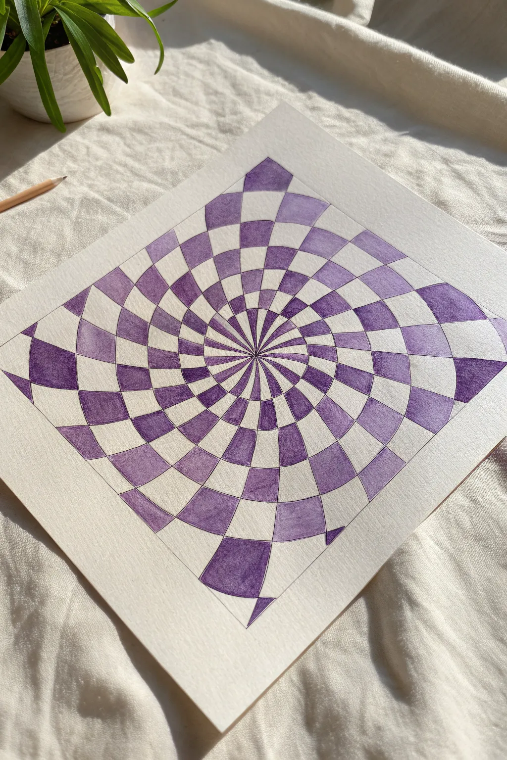
This mesmerizing drawing takes a classic checkerboard pattern and twists it into a captivating vortex that draws the eye inward. Using varying shades of purple, extending from deep violet to soft lavender, adds depth and movement to the geometric illusion.
Step-by-Step
Materials
- Square drawing paper (smooth bristol or mixed media)
- Ruler
- Compass
- Pencil (HB or lighter)
- Eraser
- Fine liner pen (black or dark purple)
- Purple markers or colored pencils (minimum 3 varying shades)
Step 1: Drafting the Grid
-
Find the center:
Start with a square piece of paper. Use your ruler to lightly draw diagonal lines from corner to corner to pinpoint the exact center of the page. -
Draw concentric circles:
Place the point of your compass on the center mark. Draw a series of concentric circles radiating outward. Aim for about 6-8 circles, spacing them somewhat evenly, though they don’t need to be mathematically perfect. -
Create the radial lines:
Using the center point as your anchor, draw curved lines radiating outward to the edge of the paper. Imagine these like the curved spokes of a pinwheel rather than straight sun rays. Curve them all in the same direction to create the spiral effect. -
Refine the grid count:
Ensure you have an even number of ‘wedges’ created by your radial lines. This is crucial for the checkerboard pattern to alternate correctly (black, white, black, white). -
Define the border:
If you want the floating square look seen in the example, use your ruler to draw a straight-sided square frame around the central spiral, cutting off the outer edges of the circles. This contains the illusion.
Curve Control
Make the radial lines curve more drastically near the center and straighten out slightly near the edges. This exaggerates the twisting ‘deep hole’ effect.
Step 2: Inking the Structure
-
Outline main lines:
Take your fine liner pen and carefully trace over the pencil lines that will remain part of the final design. Outline the curved radial lines and the circular segments within your square border. -
Clean up:
Once the ink is completely dry, gently erase all original pencil marks. I find a kneaded eraser works best here to avoid smudging the ink or damaging the paper surface.
Metallic Twist
Swap the white squares for silver or gold metallic ink. The reflection adds a futuristic, sculptural quality to the standard optical illusion.
Step 3: Applying Color
-
Plan the pattern:
Before coloring, lightly mark the alternating squares with a small pencil dot where the purple will go. This prevents mistakes in the checkerboard pattern. -
Start from the center:
Begin coloring the innermost segments near the vortex. Use your finest tip marker here, as the shapes get very narrow ensuring sharp points where they meet the center. -
Vary the hues:
Instead of a single flat purple, mix your shades. Use the darkest purple for segments that feel ‘deeper’ or shadowed, typically closer to the bottom or sides of the spiral arms. -
Create gradients:
For a more dynamic look, try blending colors within single squares. Start with a medium purple at one edge of a square and fade into a lighter lavender toward the center. -
Work outward:
Continue filling in the alternating segments moving toward the perimeter. As the shapes get larger, switch to a broader marker tip or use colored pencils to cover more area smoothly. -
Check consistency:
Pause occasionally to look at the overall balance. Ensure you haven’t accidentally colored two adjacent squares or missed a spot in the sequence.
Step 4: Final Touches
-
Deepen contrast:
Go back over your darkest purple areas. Adding a second layer of ink or pencil can increase saturation and make the white spaces pop more. -
Refine edges:
If any color bled over the lines, use a white gel pen to clean up the edges or re-trace the black outline to hide imperfections.
Enjoy the dizzying depth of your new optical art creation

Have a question or want to share your own experience? I'd love to hear from you in the comments below!