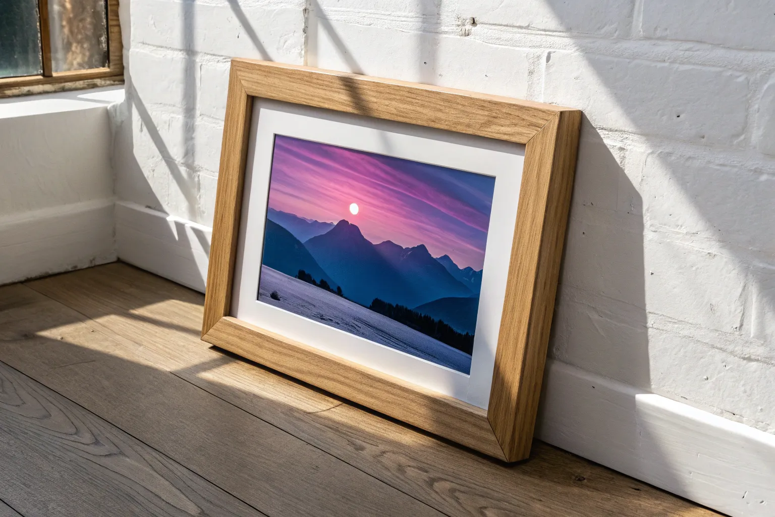
When you’re craving fine art ideas, it helps to have prompts that feel a little more “gallery wall” and a little less “random doodle.” Here are my go-to concepts that build real skills—composition, light, edges, and meaning—while still leaving plenty of room for your own voice.
Portrait Study in a Limited Palette
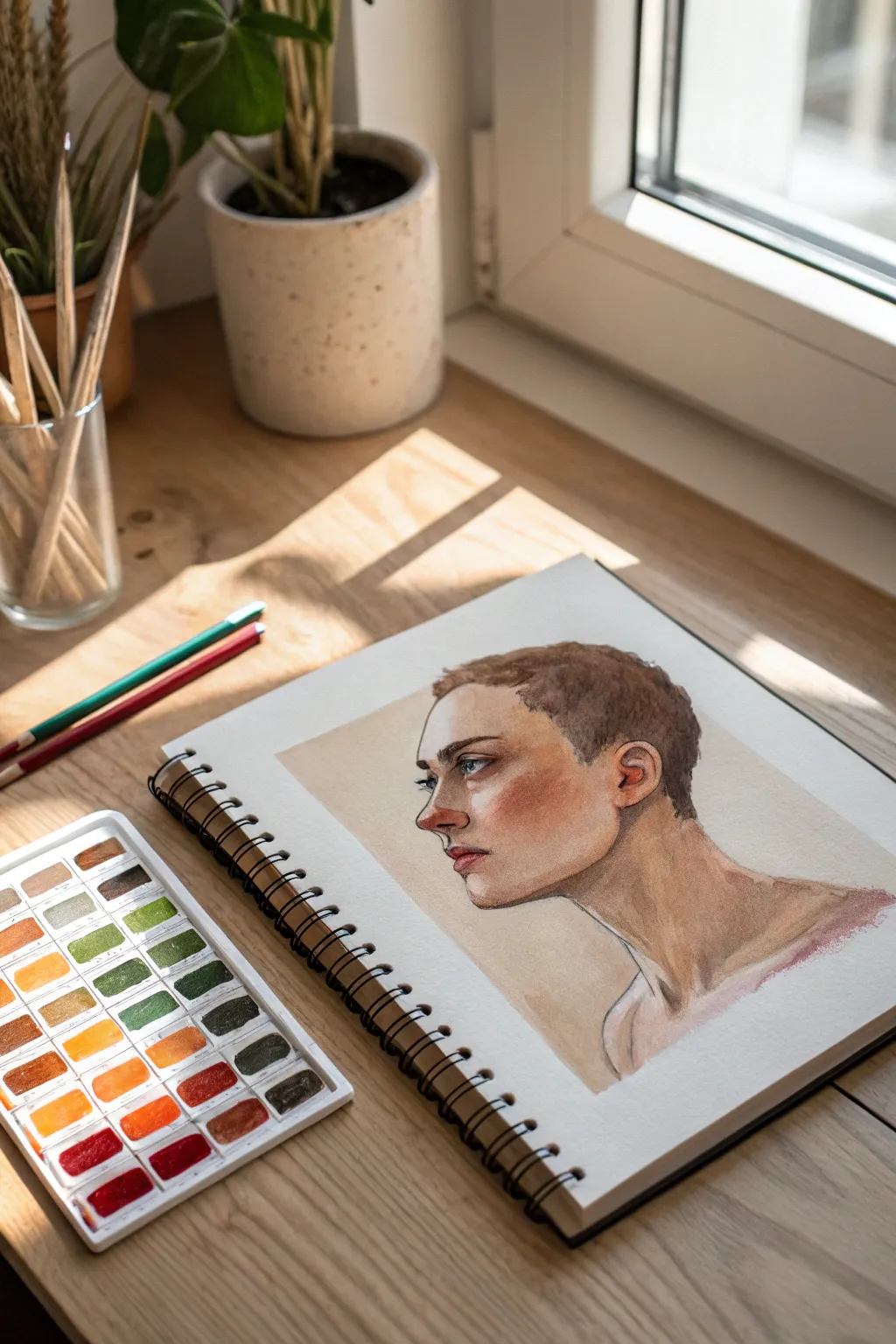
Capture the delicate strength of a portrait using a refined, limited palette that emphasizes form and light. This study focuses on building skin tones through transparency and mastering the subtle gradient of a shadow.
Step-by-Step
Materials
- Hot press watercolor paper sketchbook (smooth texture)
- H or HB graphite pencil for initial sketching
- Watercolor pan set (focused on earth tones: Burnt Sienna, Yellow Ochre, Alizarin Crimson, Sepia, Ultramarine Blue)
- Synthetic round brushes (sizes 2, 6, and 8)
- Clean water jar
- Paper towels
- Pencil crayons (optional for refining)
Step 1: Structural Sketching
-
Establish the Head Shape:
Begin with a light graphite sketch to map out the cranium. Draw a loose oval for the main part of the head and extend a jawline downwards. Keep your grip loose on the pencil to avoid engraving the paper. -
Place the Features:
Mark the eye line halfway down the face. Sketch the profile view of the nose, ensuring the bridge dips slightly before the tip. Position the ear relatively low and back, aligning the top of the ear with the eyebrow line. -
Refine the Profile:
Sharpen the contours of the face. Pay close attention to the philtrum (the space between nose and lip) and the chin’s prominence. Sketch the short, textured hairline, keeping the lines jagged to suggest strands. -
add the Neck and Shoulders:
Draw the neck muscles, specifically the sternocleidomastoid, leading down to the clavicle. This anchors the floating head and adds realism to the posture. Clean up any stray construction lines with a kneaded eraser.
Keep it Fresh
Avoid overworking the skin. If a bloom or hard edge happens, leave it! These ‘mistakes’ often add character and transparency that make watercolors beautiful.
Step 2: Layering Skin Tones
-
First Wash:
Mix a very dilute wash of Yellow Ochre and a touch of Burnt Sienna. Apply this over the entire face and neck area as a base tone, leaving the highlight on the nose tip and forehead white. -
Building Warmth:
While the first layer is damp (but not soaking), drop in a stronger mix of Burnt Sienna and Alizarin Crimson onto the cheek, ear, and nose tip. Let the colors bleed naturally for a ‘blushed’ look. -
Defining Shadows:
Mix Sepia with a tiny bit of Ultramarine Blue to create a cool shadow tone. Apply this under the jawline, inside the ear, and in the eye socket to create depth. Soften the edges with a clean, damp brush. -
The Eye Detail:
Switch to your size 2 brush. Paint the iris with a diluted blue or grey. Once dry, use a concentrated dark brown for the pupil and upper lash line. Keep the lower lash line very faint. -
Sculpting the Lips:
Use a mix of Alizarin Crimson and Burnt Sienna for the lips. Paint the upper lip slightly darker than the bottom lip to indicate shadow. Leave a tiny sliver of white on the lower lip for a highlight.
Try a Rough Edge
Instead of a clean background, let your brush strokes dry with a jagged, ‘dry brush’ texture at the shoulders to give the piece a sketchy, artistic sketchbook feel.
Step 3: Hair and Final Touches
-
Base Hair Layer:
Mix a light brown wash using Burnt Sienna and Sepia. Apply this over the hair area, following the direction of growth. Don’t fill it in solid; let the paper show through for texture. -
Adding Hair Texture:
Once the base is dry, use a size 2 brush with a darker, thicker Sepia mix. Paint short, flicking strokes to mimic the short cropped hairstyle, concentrating density near the nape of the neck and behind the ear. -
Deepening Facial Contours:
I find it helpful to look at the work from a distance here. If the contrast feels low, glaze a thin layer of Burnt Sienna over the cheek hollows and the side of the nose to reinforce the 3D form. -
Background Wash:
Mix a very pale, watery wash of beige or light grey. Paint a loose background around the back of the head and neck to make the portrait pop forward, fading the wash out toward the paper edges. -
Final Pencil Accents:
Once the painting is completely bone-dry, use a sharp graphite pencil or colored pencil to re-emphasize the eyelashes, the nostril curve, and a few sharp hairs. This brings crispness back to the watercolor softness.
Step back and appreciate how your limited color choices have created a moody, emotional portrait study
Atmospheric Landscape With Depth Layers
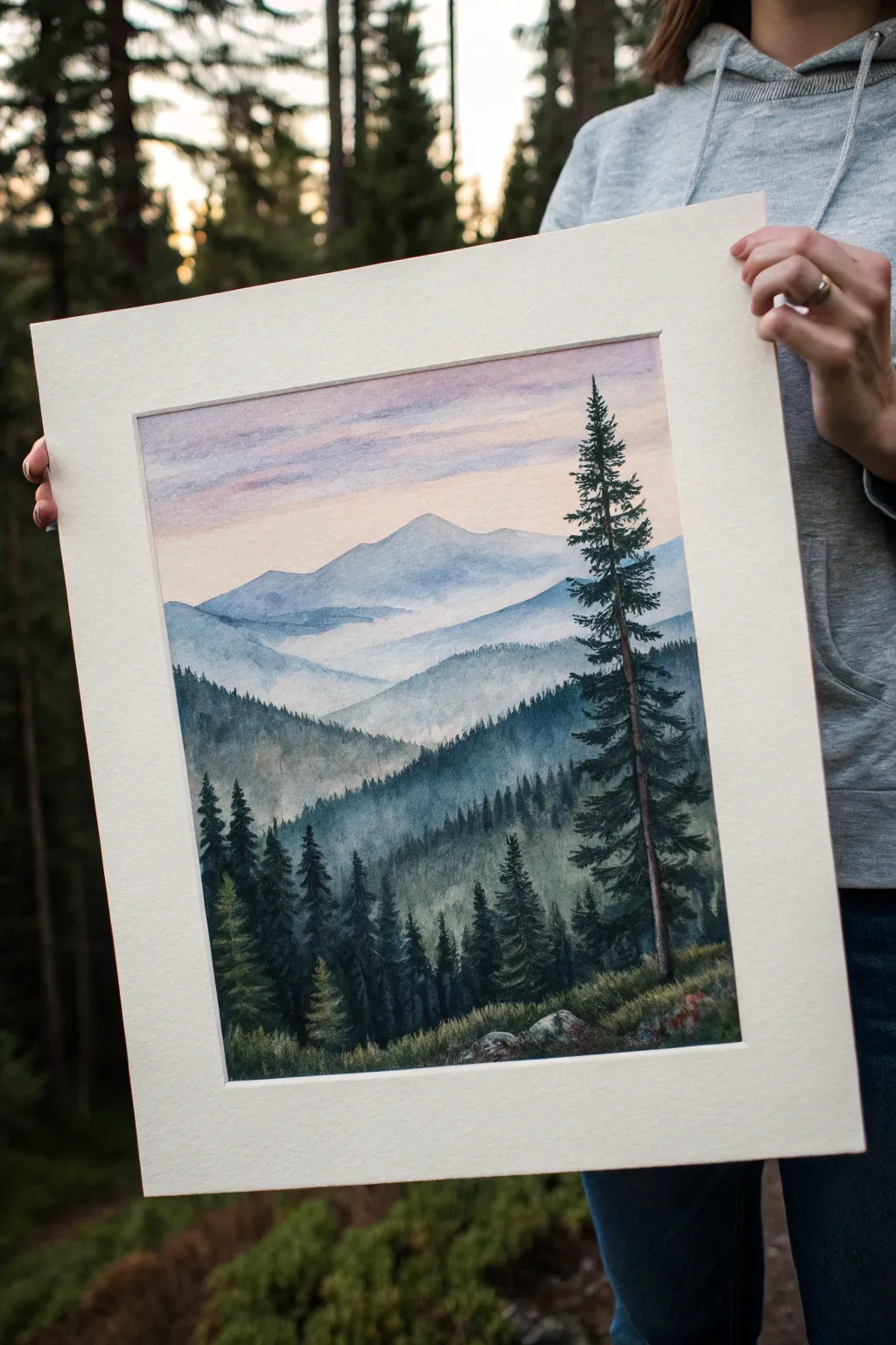
Capture the serene beauty of a mountain range fading into the distance with this atmospheric watercolor tutorial. By layering washes of blue and green, you will create a stunning sense of depth and mist that draws the viewer’s eye from the crisp foreground pines to the soft, hazy peaks.
Detailed Instructions
Materials
- Cold press watercolor paper (140 lb/300 gsm)
- Watercolor paints (Indigo, Payne’s Grey, Sap Green, Burnt Sienna, Alizarin Crimson, Ultramarine Blue)
- White Gouache (optional for mist)
- Flat wash brush (3/4 inch)
- Round brushes (size 4, size 8, and a small rigger or liner brush)
- Artist tape or masking tape
- Two jars of water
- Paper towels
- Pencil for sketching
- Mixing palette
Step 1: Preparation and Initial Washes
-
Prepare your workspace:
Begin by taping down all four edges of your watercolor paper to a board using artist tape. This creates a crisp white border and prevents buckling when the paper gets wet. -
Lightly sketch the landscape:
Using a hard pencil (like an H or HB), very lightly sketch the outlines of your mountain layers. Draw roughly four distinct layers: the distant sky line, the far peaks, the mid-ground hills, and the foreground slope with the tall pine tree. -
Wet the sky area:
With your large flat brush and clean water, wet the entire sky area down to the top of the furthest mountain range. The paper should be glisten, but not hold puddles. -
Paint the sky gradient:
Mix a very dilute wash of Alizarin Crimson and a touch of Ultramarine for a soft purplish-pink. Apply this to the top of the wet sky, letting it fade into a pale yellow or peach tone (mix a tiny bit of Burnt Sienna with lots of water) near the horizon line.
Step 2: Painting the Distant Layers
-
Mix the distant mountain color:
Create a pale, cool blue by mixing Ultramarine Blue with plenty of water. It should be transparent and light to represent atmospheric perspective. -
Paint the furthest peak:
Once the sky is completely dry, paint the shape of the furthest mountain using your size 8 round brush. Keep the bottom edge of this shape wet and soft, perhaps lifting a little pigment with a damp brush to create a misty effect. -
Add the second mountain layer:
Mix a slightly darker, cooler blue-grey using Indigo and a touch of the previous blue. Paint the next range of mountains below the first one. -
Create mist between layers:
While the second layer is still damp near the bottom, use a clean, damp brush to soften the bottom edge, blurring it out so it looks like fog settling in the valley.
Atmospheric Perspective
Depth is key! Remember: objects get lighter, bluer, and less detailed the further away they are. Use more water for distant mountains and more pigment for foregrounds.
Step 3: Mid-Ground and Depth
-
Mix a greener hue:
For the third layer of hills, introduce Sap Green into your Indigo and Payne’s Grey mix. This layer should be darker and more saturated than the previous ones. -
Paint the tree-covered hills:
Use the side of your round brush to create a slightly textured top edge for this layer, implying distant treetops. Fill in the shape, gradually darkening the color as you move down. -
Suggest dense forest texture:
Before this layer dries completely, drop in thicker pigment (less water) of deep green-blue into the wet wash. This wet-on-wet technique creates soft shadows that look like dense forests. -
Allow thorough drying:
It is crucial to let the paper dry completely bone-dry now. If the paper is cool to the touch, it is still damp. Wait until it feels room temperature.
Cauliflower Blooms?
If jagged watermarks appear in your smooth washes, you likely added water to a section that was already half-dry. Try to work quickly or wait until fully dry to glaze.
Step 4: Foreground and Details
-
Paint the foreground slope:
Mix a rich, dark green using Sap Green, Payne’s Grey, and a touch of Burnt Sienna to warm it slightly. Paint the bottom-most hill slope, using short, upward strokes to simulate grass and low vegetation. -
Sketch the hero tree:
With a fine brush or pencil, faint mark the vertical line for the main tall pine tree on the right side to ensure it stands straight. -
Paint the tall pine trunk:
Using a liner or small round brush and a dark brown-black mix (Burnt Sienna + Indigo), paint the thin trunk of the main tree. Don’t make it a solid line; break it up slightly where branches will cross. -
Add pine branches:
Load a size 4 brush with thick, dark green pigment. Starting from the top of the tree, use a stippling or dabbing motion to create the needle clusters. Keep the branches shorter at the top and wider at the bottom. -
Populate the foreground forest:
Using the same dark green mix, paint smaller pine trees on the left side and in the background of the immediate foreground slope. I like to vary their heights and spacing to make it look natural. -
Add final highlights:
If you have white gouache, mix a tiny amount with water and splatter it very lightly near the bottom for texture, or use it to add tiny highlighted tips to the foreground rocks and grass. -
Reveal the border:
Once the painting is 100% dry, carefully peel away the artist tape at a 45-degree angle to reveal your clean, sharp edges.
Step back and admire your misty mountain landscape, enjoying the peaceful depth you’ve created with simple layers of color.
Hyper-Real Eye Close-Up Study
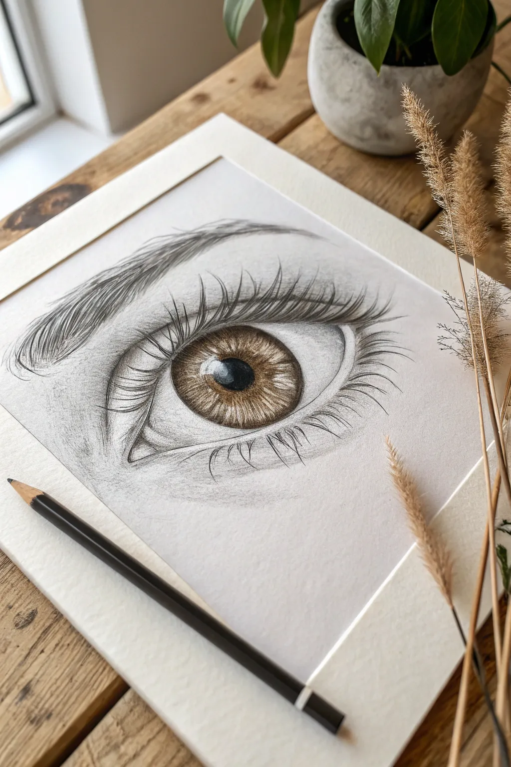
Master the delicate art of hyper-realistic drawing with this striking eye study, which balances soft graphite shading with intense, warm brown iris details. This project teaches you to capture the glossy texture of the eye and the gentle sweep of eyelashes on high-quality textured paper.
Step-by-Step Guide
Materials
- Heavyweight textured drawing paper or Bristol vellum
- Graphite pencils (HB, 2B, 4B, 6B)
- Black colored pencil or charcoal pencil (for deepest pupils)
- Brown colored pencils (Ochre, Burnt Sienna, Dark Umber)
- White gel pen or gouache (for highlights)
- Blending stumps (tortillons)
- Kneadable eraser
- Fine mechanical pencil (0.5mm)
- Ruler (optional for placement)
Step 1: Structural Outline and Base Shading
-
Light Outline:
Begin with a very faint HB pencil sketch of the eye’s shape, including the almond curve of the lids, the circular iris, and the pupil. Mark the waterline and the crease of the eyelid above. -
Iris Mapping:
Inside the iris, lightly draw the ‘starburst’ pattern radiating from the pupil. Also, outline the shapes where the bright white reflections (catchlights) will go—it’s crucial to leave these paper-white from the start. -
Pupil Depth:
Fill in the pupil using a 6B graphite pencil or a black colored pencil. Press firmly to get a deep, void-like black, but leave the reflection shapes untouched. -
Establishing the Sclera:
Using an H or HB pencil, lightly shade the ‘white’ of the eye (sclera). Remember, eyeballs are spheres, so shade the corners darker and fade to white toward the iris to create volume. -
Blending the Whites:
Take a clean blending stump and smooth out the graphite on the sclera. This creates that moist, organic look rather than a scratchy drawing texture. -
The Tear Duct:
Sketch the inner corner (tear duct) with irregular organic shapes. Use a 2B pencil for shadowing, leaving small highlights to suggest wetness.
Fixing Flatness
If the eye looks flat, the sclera (white part) is likely too bright. Don’t be afraid to shade it gray, especially under the upper lid. Only the highlight remains pure white.
Step 2: Coloring and Iris Detail
-
Iris Base Layer:
Switch to your brown colored pencils. Lay down a base of Ochre or light hazel radiating from the pupil outward, keeping the strokes distinct like spokes on a wheel. -
Building Warmth:
Layer Burnt Sienna over the outer two-thirds of the iris. I find that flicking the pencil from the outer ring inward creates natural-looking fibers. -
Darkening the Rim:
Use a Dark Umber or a 4B graphite pencil to define the limbal ring (the dark outer circle of the iris). Blend this slightly inward so it doesn’t look like a harsh cartoon outline. -
Internal Shadows:
Add depth near the upper eyelid casting a shadow onto the top of the iris. Glaze over this area with a 4B pencil to dull the color slightly, placing the iris ‘behind’ the lid. -
Highlight Refinement:
Ensure the catchlights are crisp. If you accidentally smudged them, use an electric eraser or a dab of white gouache to reclaim the bright white.
Add Wetness
Use a white gel pen to add tiny, sharp dots of moisture along the lower waterline and inside the tear duct. These micro-highlights instantly make the eye look wet and alive.
Step 3: Skin Texture and Lashes
-
Eyelid Crease:
Deepen the crease above the eye using a 4B pencil. This line should be soft but dark, fading upwards into the brow bone. -
Skin Shading:
Using the side of a 2B pencil, lightly shade the skin around the eye. Use a circular motion to work the graphite into the paper’s texture, then blend softly with a stump. -
Eyebrow Foundation:
Sketch the direction of the eyebrow hairs using light strokes. Notice how the hairs grow upward at the start and sweep outward toward the temple. -
Eyebrow Hairs:
With a sharp mechanical pencil or 4B, draw the individual brow hairs. Vary the pressure—start firm and lift off quickly to create a tapered, realistic hair tip. -
Lower Lashes:
Draw the lower lashes. These grow from the outer edge of the waterline, not the inside. Keep them sparse and slightly chaotic, grouping some together. -
Upper Lashes:
Draw the long, sweeping upper lashes. Start the stroke on the eyelid line, press down, and curve upward significantly. The lashes should reflect in the white highlight of the eye. -
Final Contrast Check:
Step back and assess your values. Darken the pupil and the lash line one last time to ensure the drawing has high contrast and pops off the page.
Step back and admire the soulful depth you’ve created clearly on the page.
Grisaille Underpainting for Realism
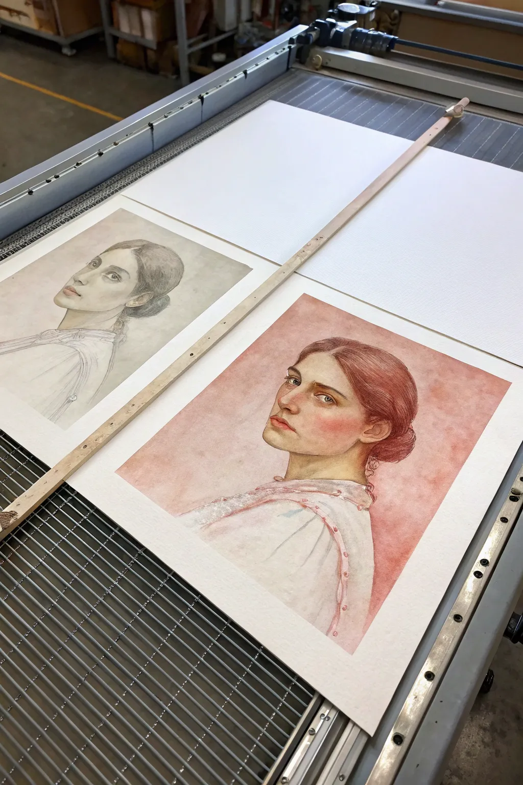
This project explores the classical method of building realism by first establishing a monochromatic underpainting before adding color glazes. The result is a pair of striking portraits: one showcasing tonal structure and the other glowing with depth and life.
Step-by-Step Tutorial
Materials
- High-quality cold press watercolor paper (300 gsm)
- H or HB graphite pencil for initial sketching
- Kneaded eraser
- Watercolor paints (Payne’s Grey, Burnt Umber, Alizarin Crimson, Cadmium Red, Yellow Ochre)
- Round watercolor brushes (sizes 2, 6, and 10)
- Palettes for mixing
- Two jars of water
- Masking tape or gummed tape to secure paper
- Paper towels
Step 1: Preparation and Drawing
-
Prepare the Paper:
Begin by taping down two sheets of watercolor paper to a rigid board. This prevents buckling when washes are applied later. Ensure the paper is taut and flat. -
Establish Guidelines:
Lightly sketch the profile of your subject on both sheets using an H or HB pencil. Focus on accurate proportions, paying close attention to the angle of the nose, jawline, and the sweep of the hair. -
Refine the Features:
Tighten the drawing, adding details to the eye, ear structure, and the delicate lace collar. Keep your lines light; you don’t want graphite smudging into your delicate watercolor washes.
Grisaille Patience
Ensure your monochromatic underlayer is 100% dry before glazing color. If it’s damp, the layers will muddy together and you’ll lose the luminosity.
Step 2: The Grisaille (Monochromatic) Layer
-
Mix the Grisaille Tone:
Create a neutral, semi-transparent greyish-brown mix using Payne’s Grey and a touch of Burnt Umber. This will be your ‘shadow’ color for the underpainting. -
Apply the First Wash:
On the first sheet (the grisaille study), start painting the darkest shadow areas: under the chin, the hair bun, and the deep folds of the clothing. Use a size 6 brush for control. -
Build Mid-Tones:
Dilute your grey mix with more water. Apply this to the softer shadows around the cheekbone, eye socket, and neck. Leave the paper white for the highlights on the nose and forehead. -
Detailing Hair and Eyes:
Switch to a size 2 brush. Using a more concentrated mix of the grisaille color, carefully define the strands of hair and the pupil of the eye. I find it helpful to squint at my reference to see the values clearly. -
Softening Edges:
Use a clean, damp brush to soften any hard edges on the cheek and neck, creating a smooth transition from shadow to light. Let this sheet dry completely; this is your finished grisaille artwork. -
Replicate for Color Version:
Repeat the previous three steps on the *second* sheet of paper. This establishes the tonal map for your color version. Ensure the values are accurate, as they will support the color layers.
Try Verdaccio
Instead of grey, try a traditional ‘Verdaccio’ underpainting using varied greens. The green neutralizes pink skin tones on top for incredibly realistic flesh.
Step 3: Glazing Color
-
Mixing Flesh Tones:
Once the grisaille on the second sheet is bone dry, mix a watery wash of Yellow Ochre and a tiny bit of Cadmium Red. The underpainting will show through, providing the shadows automatically. -
First Color Glaze:
Gently wash the flesh tone over the face and neck. Be careful not to scrub, as this might lift the grey underpainting. Let the warmth of the glaze sit on top of the cool grey shadows. -
Adding the Blush:
While the skin tone is still slightly damp, drop in a mix of Alizarin Crimson and Cadmium Red onto the cheek, nose tip, and lips for a soft, blooming flush. -
Hair Color Base:
Mix a warm auburn using Burnt Umber and Alizarin Crimson. Apply this over the hair area. Notice how the dark underpainting immediately gives the hair volume and depth without extra effort. -
Deepening Values:
Once dry, re-glaze shadow areas with a slightly cooler purple-grey mix (Alizarin Crimson + Payne’s Grey) to deepen the contrast under the jaw and behind the ear. -
Background Wash:
Mix a large puddle of diluted red-ochre. Using your largest brush (size 10), apply a textural wash around the figure. Allow some blooms or back-runs to happen for visual interest.
Step 4: Final Details
-
Clothing Details:
Paint the dress white or very pale grey, using the grisaille as the main shadow. Add small touches of pink to the buttons or stitching on the garment. -
Enhancing the Eyes:
Use a fine liner brush to add a tiny spark of white gouache or leave the white paper crisp for the catchlight in the eye. Re-darken the lash line if it faded during glazing. -
Final Assessment:
Place both artworks side by side. Check if the color version needs any more localized saturation. Add final touches to hair strands or lace patterns with your smallest brush.
Now you have a stunning diptych that demonstrates the power of tonal values and the magic of glazing color
BRUSH GUIDE
The Right Brush for Every Stroke
From clean lines to bold texture — master brush choice, stroke control, and essential techniques.
Explore the Full Guide
Color Temperature Portrait Lighting
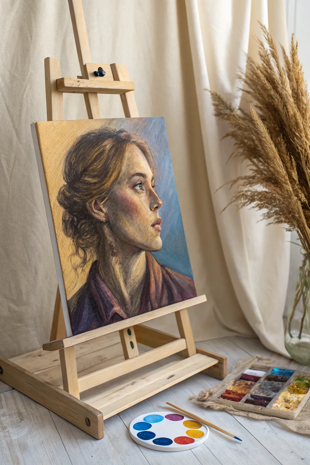
This project explores the dynamic interplay of warm and cool tones through a striking side-profile portrait created with soft pastels. By utilizing a golden-toned ground, you will capture the luminosity of skin while contrasting it against a cool, atmospheric background.
Step-by-Step Guide
Materials
- Textured pastel paper or board (golden/ochre toned)
- Soft pastels (stick form)
- Pastel pencils (for details)
- Workable fixative spray
- Paper stump or blending tool
- Kneaded eraser
- Artist tape
- Easel or drawing board
Step 1: Initial Sketch & Blocking
-
Prepare the surface:
Secure your golden-toned paper to your backing board. The warm undertone of the paper is crucial here, as it will serve as the mid-tone for the glowing skin, saving you work later. -
Outline the profile:
Using a hard pastel pencil in a neutral brown or burnt sienna, lightly sketch the profile of the subject. Focus on the main angles of the nose, jawline, and the sweep of the hair. Keep these lines loose and gestural. -
Establish the shadows:
Identify the darkest areas: the deep crevices of the hair, the nape of the neck, and the cast shadow under the jaw. Block these in using a dark, cool brown or deep purple pastel stick. Avoid pure black to keep the colors vibrant. -
Block in the cool background:
Apply broad strokes of cerulean and muted blue pastel to the background area behind the face. Leave the golden paper visible near the face’s edge; scrubbing the blue right up to the outline can make the portrait look like a cutout.
Muddy colors?
If tones look dirty, you’ve likely over-blended complimentary colors. Stop blending immediately. Spray a light layer of fixative, let it dry, and apply fresh, clean strokes on top.
Step 2: Building Form & Temperature
-
Apply warm mid-tones:
Select warm ochres, terra cottas, and burnt oranges. Apply these to the shadow side of the cheek, the neck, and the warm areas of the hair. Let the texture of the paper show through slightly. -
Introduce cool reflected light:
On the shadowed side of the face (the cheekbone away from the light) and the neck, gently scumble a touch of the background blue or a violet grey. This connects the figure to the environment. -
Define facial features:
Switch to pastel pencils for more control. Refine the shape of the eye, nostril, and lips. Use a dark umber for the pupil and lash line, but keep the edges soft. -
Layering the hair:
Using the broad side of a brown pastel stick, sweep in the mass of the hair. Follow the direction of growth. Add darker streaks for depth and lighter ochre strokes where the light hits the bun. -
Blend selectively:
Use your finger or a paper stump to gently soften the transitions on the cheek and neck. Be careful not to over-blend; you want to retain that painterly, textured look characteristic of pastels.
Step 3: Highlights & Finishing Details
-
Add strongest lights:
Now for the drama. Take a creamy, pale yellow or soft white pastel. Apply bold strokes to the bridge of the nose, the forehead, the chin, and the top of the cheekbone. -
Refine the background edge:
Work back into the blue background, bringing it closer to the profile where needed to carve out the shape of the nose and lips. This ‘negative painting’ technique sharpens the profile without drawing a hard outline. -
Intensify color temperature:
Check your contrasts. If the cheek needs more warmth, glaze a layer of bright orange or pink over the mid-tones. If the shadows look muddy, add a fresh scumble of cool violet. -
Enhance hair texture:
Use sharp pastel pencils to draw loose, flying strands of hair escaping the bun. These fine lines add movement and realism to the style. -
Clothing rough-in:
Roughly sketch the collar and shoulders using deep magentas and browns. Keep this area looser and more abstract than the face to ensure the viewer’s eye stays focused on the portrait. -
Final highlights:
Place a tiny, sharp dot of white in the eye for the catchlight, and a touch of light on the lower lip to make it look moist. These small details bring the portrait to life.
Pro Tip: Keep it loose
Don’t fill every inch of the paper. Leaving bits of the golden-toned paper visible throughout the hair and background adds unity and makes the artwork feel like it’s glowing from within.
Step back and admire how the warm skin tones vibrate against the cool background colors, creating a portrait full of life and dimension
Abstract Expression With Gestural Marks
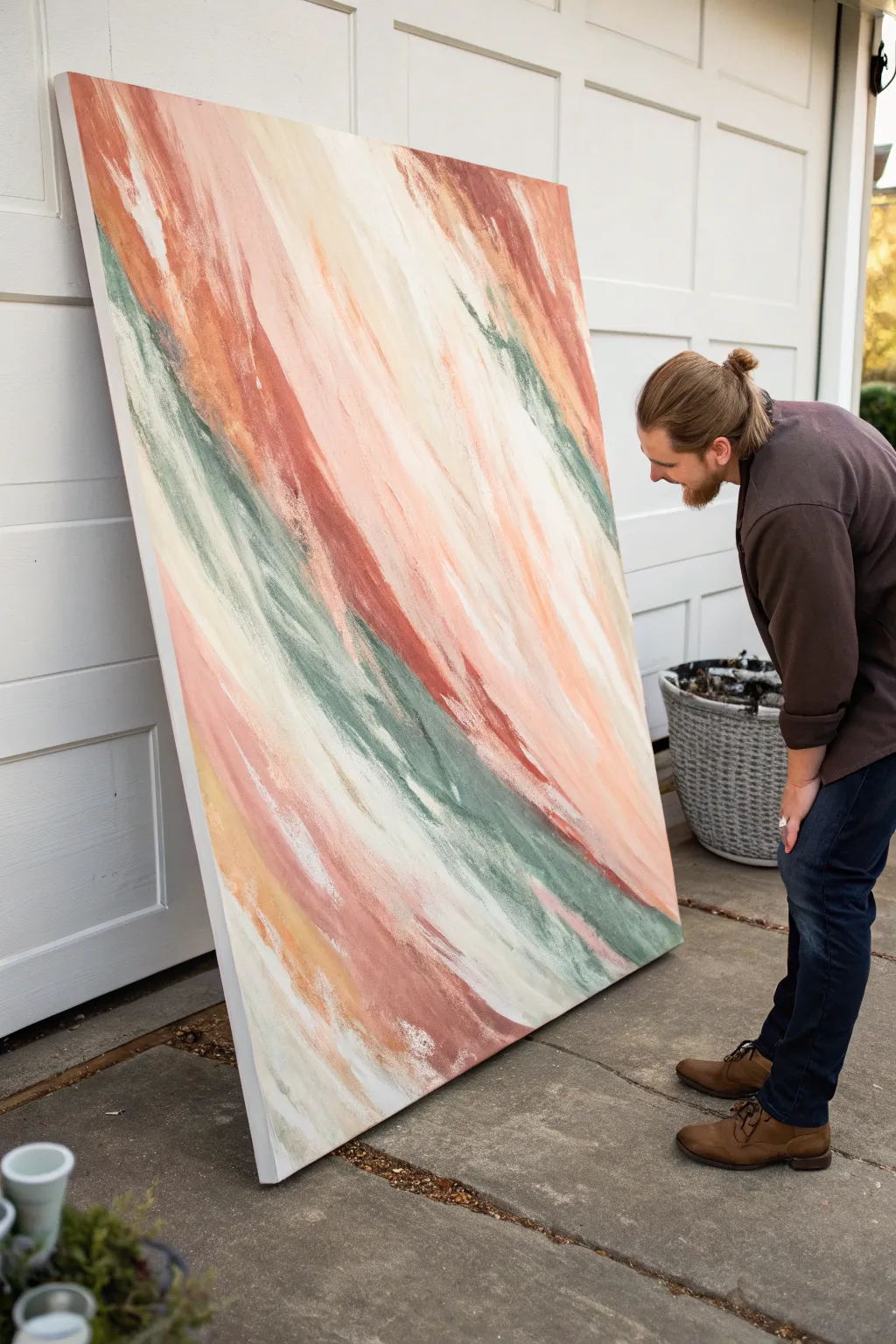
Capture the energy of movement with this large-scale abstract painting that balances earthy greens with warm terracotta and blush tones. Using a layering technique with wide tools creates dynamic, sweeping textures that feel both energetic and grounded.
Detailed Instructions
Materials
- Large canvas (48×60 inches or similar)
- Heavy body acrylic paints (Terracotta, Blush Pink, Olive Green, Deep Teal, Titanium White, Cream)
- Medium body acrylics or flow extender
- Large flat brushes (3-4 inch)
- Wide drywall scraper or palette knife (4-6 inch)
- Large spray bottle with water
- Gesso (optional, for priming)
- Drop cloth
Step 1: Setting the Foundation
-
Prime surface:
Begin by ensuring your large canvas is clean. If it isn’t pre-primed, apply two coats of white gesso to create a smooth, receptive surface, letting it dry completely between layers. -
Base wash:
Mix a large amount of Cream and Titanium White with a little water to create a fluid consistency. Cover the entire canvas with this neutral base coat using a large brush. -
Plan composition:
Visualize the diagonal flow of the piece. The movement travels from the top left towards the bottom right. You don’t need to sketch this, but keep this directional energy in mind as you begin adding color. -
Mix primary tones:
Prepare your palette by putting out generous mounds of Terracotta, Blush Pink, and the green tones. Because this is a large work, you’ll want plenty of paint ready to go so you don’t have to pause to mix.
Use Gravity
Work with the canvas vertical against a wall. If paint drips, it reinforces the downward alignment. If drips go the wrong way, rotate the canvas.
Step 2: Layering the Sweep
-
Apply first warm sweep:
Load a wide brush with the Terracotta and Blush mix. Start from the upper left quadrant and pull the brush diagonally downward in a confident, sweeping motion. -
Add contrasting greens:
While the first layer is tacky but not wet, switch to your Deep Teal and Olive mixture. Apply a bold, diagonal stripe slightly below and parallel to your warm tones. -
Blend active edges:
Use a clean, damp brush to soften the edges where the pinks and greens meet. You want them to interact without turning into muddy brown, so avoid over-mixing directly on the canvas. -
Introduce negative space:
Take your Titanium White and cut into the color fields. Paint thick, diagonal swathes of white in between the colors to create separation and breathing room. -
Scraping technique:
Here I like to use the drywall scraper. While the paint is still wet, gently drag the scraper down the length of a paint stroke to flatten the texture and create that ‘pulled’ look. -
Dry time check:
Step back and allow this foundational layer to dry significantly. This prevents the next layers from dragging up the base coats.
Step 3: Refining Texture and Depth
-
Second color pass:
Revisit your darkest greens and brightest pinks. Apply them in thinner, more intentional streaks over the dried base layers to deepen contrast. -
Enhance texture:
Using heavy body paint straight from the tube, use the palette knife to add thick ridges of white and cream along the edges of the color blocks. -
Dry brushing:
Dip a dry, stiff brush into a small amount of dark paint. Lightly skim it over the textured areas of the canvas to catch the ‘peaks’ of the paint, adding grit and complexity. -
Soften transitions:
Mist a specific section lightly with your spray bottle. Use a soft brush to feather out any harsh stops or starts in your diagonal lines, making the movement look continuous. -
Add detail highlights:
Look for areas that feel flat. Add small, sharp dashes of pure white or very pale pink with a smaller palette knife to catch the light. -
Review contrast:
Step at least 10 feet back from the canvas. Check if the diagonal flow feels interrupted. If so, use long, fluid strokes to bridge any gaps. -
Final dry:
Allow the painting to cure flat for at least 24 hours (or longer for thick impasto areas) before hanging or sealing.
Metallic Accent
Mix a small amount of gold leaf or metallic copper paint into the terracotta sections for a subtle shimmer that catches ambient light.
Step back and admire the powerful, sweeping movement you have captured on the canvas

PENCIL GUIDE
Understanding Pencil Grades from H to B
From first sketch to finished drawing — learn pencil grades, line control, and shading techniques.
Explore the Full Guide
Geometric Abstraction With Bold Shapes
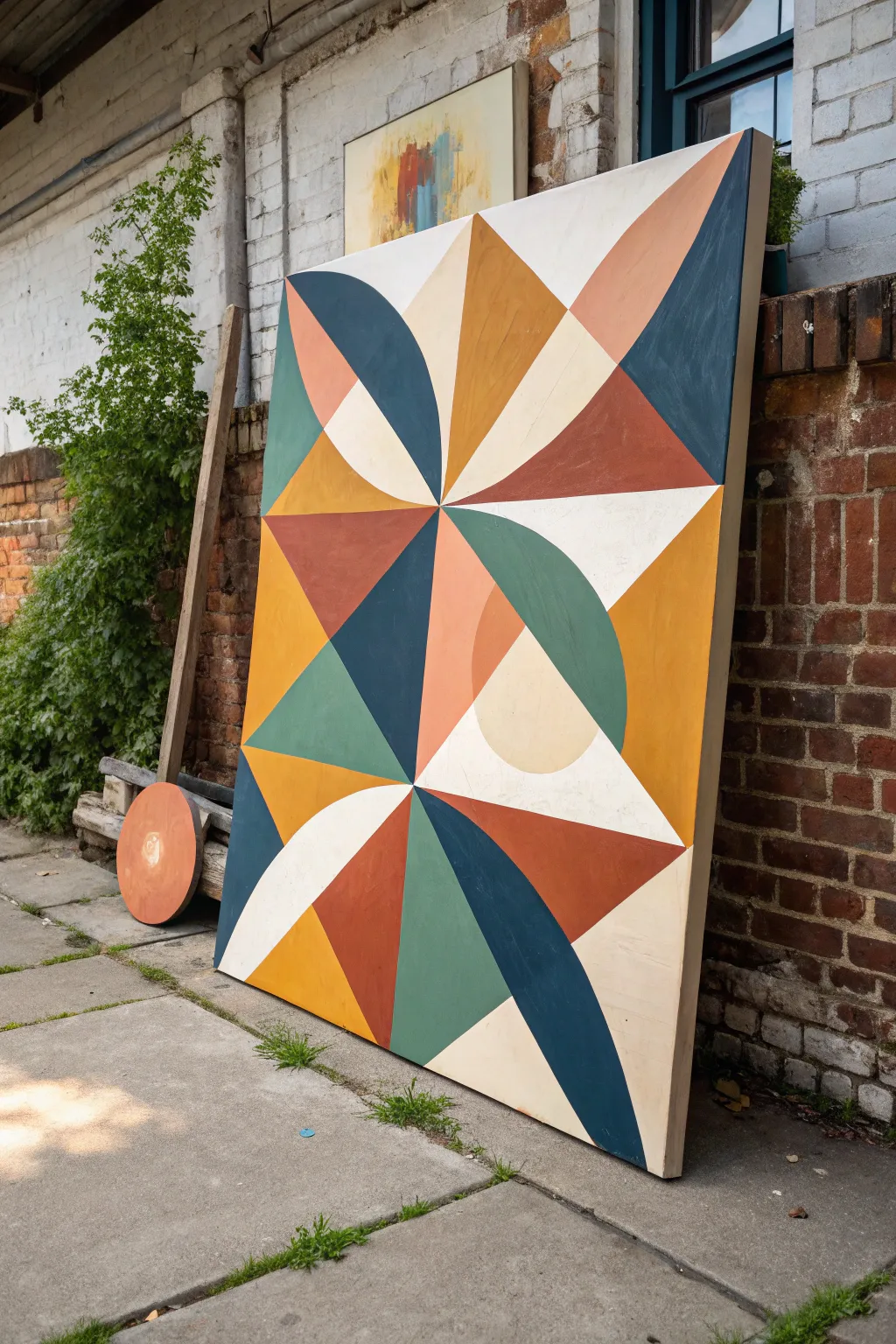
This massive geometric wall art brings a sophisticated balance of sharp angles and soft curves in a palette of warm earth tones. Using hard-edge painting techniques, you’ll transform a plain canvas into a structured masterpiece that feels both modern and mid-century.
Step-by-Step
Materials
- Large stretched canvas (at least 36×48 inches)
- Acrylic paints (Golden Ochre, Terracotta, Sage Green, Deep Teal, Cream/Off-White)
- Painter’s tape (high quality, for delicate surfaces)
- Gesso (white)
- Ruler or yardstick
- Compass or string and pencil for curves
- Pencil and eraser
- Flat synthetic brushes (1-inch and 2-inch)
- Palette or paper plates
- Matte varnish (optional)
Step 1: Planning and Mapping
-
Prime the Surface:
Begin by applying a generous coat of white gesso to your canvas to create a smooth, non-absorbent surface. This is crucial for crisp geometric lines. Let it dry completely before moving on. -
Find the Center:
Measure the width and height of your canvas to find the exact center point. Make a small mark. Draw a vertical line and a horizontal line through this center to divide the canvas into four equal quadrants. -
Create the Grid:
Subdivide your quadrants further. Based on the reference, you want a grid that is roughly 2 units wide by 3 units high. Use your yardstick to draw these main structural guidelines lightly with a pencil. -
Draw Diagonal Guides:
Within each grid rectangle, draw diagonal lines connecting opposite corners. These ‘X’ shapes will guide where your triangles and star-burst patterns originate. -
Sketch the Curves:
For the curved ‘petal’ or quarter-circle shapes, use a large compass. If you don’t have one large enough, I find the old string-and-pencil trick works perfectly: pin a string to a grid intersection and swing the pencil to create the arc. -
Finalize the Design:
Go over your converging lines to ensure the central ‘star’ point meets perfectly in the middle. Erase any confusing stray marks so you have a clean map to follow.
Step 2: Painting the Shapes
-
Tape the First Color Group:
Select all shapes that will be painted the Deep Teal color. Apply painter’s tape along the outside edges of these specific shapes. Press the tape edges down firmly with a fingernail or credit card to prevent bleeding. -
Seal the Tape:
Brush a very thin layer of your base color (white or cream) or matte medium over the edge of the tape. This seals the gap so the colored paint won’t seep underneath. -
Apply the Deep Teal:
Paint the Deep Teal sections using a flat brush. Apply two thin coats rather than one thick gloopy coat for the smoothest finish, allowing drying time in between. -
Remove and Repeat:
Peel the tape off while the second coat is still slightly damp. Let the paint cure fully. Repeat the taping and painting process for the Golden Ochre sections. -
Add Warmth with Terracotta:
Move on to the Terracotta/Rust shapes. Be strategic with your taping; ensure you aren’t taping over fresh paint that hasn’t fully cured. I like to work on non-adjacent sections to save time. -
Paint the Greens:
Fill in the Sage Green areas. Use a smaller flat brush for the sharp corners of the triangles to keep points crisp. -
Fill the Negative Space:
Finally, paint the remaining shapes with your Cream or Off-White color. This acts as the ‘highlight’ that makes the darker colors pop.
Bleeding Lines?
If paint bleeds under tape, wait for it to dry completely. Then, scrape the excess gently with an X-Acto knife or re-tape and paint over the mistake with the original background color.
Step 3: Finishing Touches
-
Touch Ups:
Once all tape is removed, inspect your lines. Use a small detail brush to fix any little bleeds or jagged edges with the appropriate color. -
Paint the Edges:
Don’t forget the sides of the canvas. Paint them a solid color (like the Deep Teal or Cream) or continue the design over the edge for a gallery-wrapped look. -
Varnish:
Allow the painting to cure for at least 24 hours. Apply a layer of matte varnish to unify the sheen of the different paint colors and protect your hard work.
Add Texture
Mix a little modeling paste into your lighter cream paint before applying. This adds subtle tactile dimension to the lighter ‘negative space’ shapes.
Hang your bold new artwork in a well-lit spot where those crisp lines can really shine
Stippled Portrait With Pointillism Texture
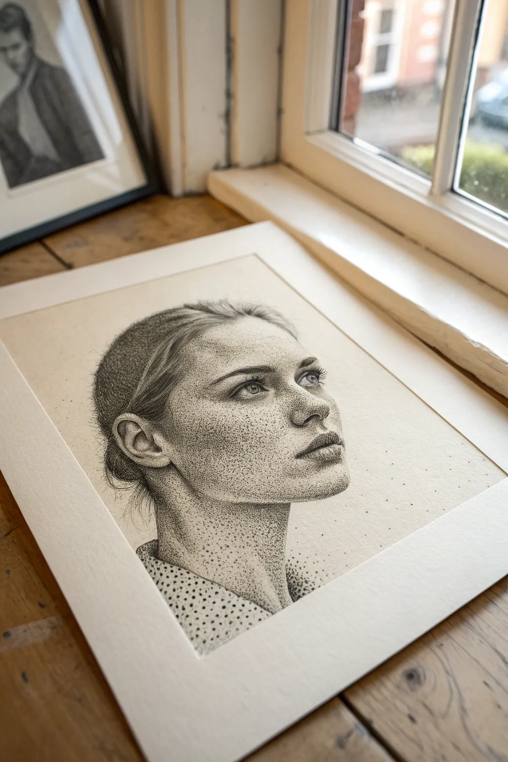
This project explores the meditative art of stippling, using thousands of tiny ink dots to build form, shadow, and emotion. The result is a striking, hyper-textured portrait that feels both vintage and contemporary, rendered beautifully on high-quality paper.
Detailed Instructions
Materials
- High-quality bristol board or hot-press watercolor paper (smooth surface)
- HB pencil for sketching
- Kneaded eraser
- Set of technical drawing pens (sizes 0.05, 0.1, 0.3, and 0.5)
- Standard ruler
Step 1: Preparation & Sketching
-
Prepare your workspace:
Tape your paper down to a flat surface or drawing board. Good lighting is crucial for this much detail work, so ensure your area is well-lit, preferably with natural light. -
Map the basic proportions:
Using your HB pencil, lightly sketch the oval shape of the head. Mark horizontal guidelines for the eyes, nose, and mouth to ensure facial symmetry. Keep these lines very faint as you’ll need to erase them later. -
Refine the features:
Sketch the specific features of the model. Focus on the upward gaze of the eyes, the slight part of the lips, and the curve of the jawline. Don’t shade with the pencil; just outline the shapes. -
Outline the hair mass:
Draw the general flow of the hair pulled back. Instead of drawing individual strands, outline the major shapes and sections where shadows will fall. -
Clean up the sketch:
Use your kneaded eraser to roll over the drawing, lifting up most of the graphite until only a ghost image remains. This prevents graphite from dirtying your ink later.
Wrist Fatigue?
Stippling is repetitive. If your hand cramps, stop immediately. Shake it out or switch to a slightly thicker pen size (like 0.3) for shadow areas to cover ground faster.
Step 2: Building the Foundation
-
Start with the darkest areas:
Take your 0.1 pen and begin stippling (dotting) in the darkest areas first: the pupils, the nostrils, and the corners of the mouth. Do not draw lines; only use dots. -
Establish the jawline shadow:
Move to the neck and jawline. Create a dense cluster of dots under the chin to establish the main anchor of shadow. This helps define the separation between head and neck early on. -
Define the eyes:
Use the 0.05 pen for the delicate area around the eyes. Dot sparingly on the iris and eyelids. The white of the eye should have very few dots, perhaps only in the corners to show roundness. -
Shape the nose:
Concentrate dots on the shadowed side of the nose (the left side in this reference) and under the tip. Leave the bridge of the nose almost empty to represent a highlight. -
Texturing the skin:
Using the 0.05 pen, apply a very light, even layer of dots across the cheeks and forehead. This base layer stops the face from looking like stark white paper.
Step 3: Depth & Detail
-
Deepen the shadows:
Switch to a 0.3 pen to build contrast. Go back over the shadow under the jaw, the side of the cheek, and the hair. I find that layering larger dots over smaller ones creates a richer texture. -
Model the cheekbones:
Create a gradient on the cheek. Make the dots dense near the ear and jaw, gradually spacing them out as you move toward the center of the face and the highlight on the cheekbone. -
Render the hair:
Hair requires directional stippling. Arrange your dots in rows that follow the direction the hair is pulled. Use the 0.5 pen for the deepest shadows in the hair bun to create volume. -
Detail the lips:
On the upper lip, pack dots tightly to make it darker. On the lower lip, leave a central area with fewer dots to create a shine, making the lips look moist and dimensional. -
Add freckle details:
To mimic the specific texture in the reference, add slightly larger, distinct dots across the nose and cheeks to represent freckles. Make these random and uneven for realism. -
Create the garment texture:
For the clothing at the neckline, use a completely different dot pattern. If the collar has a pattern (like polka dots), stipple around those shapes to leave them white, filling the background fabric with dense ink. -
Atmospheric particles:
Allow some dots to ‘escape’ the main drawing. Place scattered dots around the back of the head and shoulders, fading into the white paper, to give the piece an ethereal, artistic edge.
Pro Tip: Gradient Control
To check your shading without line distraction, squint your eyes or look at your drawing in a mirror. This blurs the individual dots and reveals the overall values.
Step back and admire how thousands of singular points have merged to create a cohesive, expressive portrait


Mixed Media Collage With Drawing Overlay
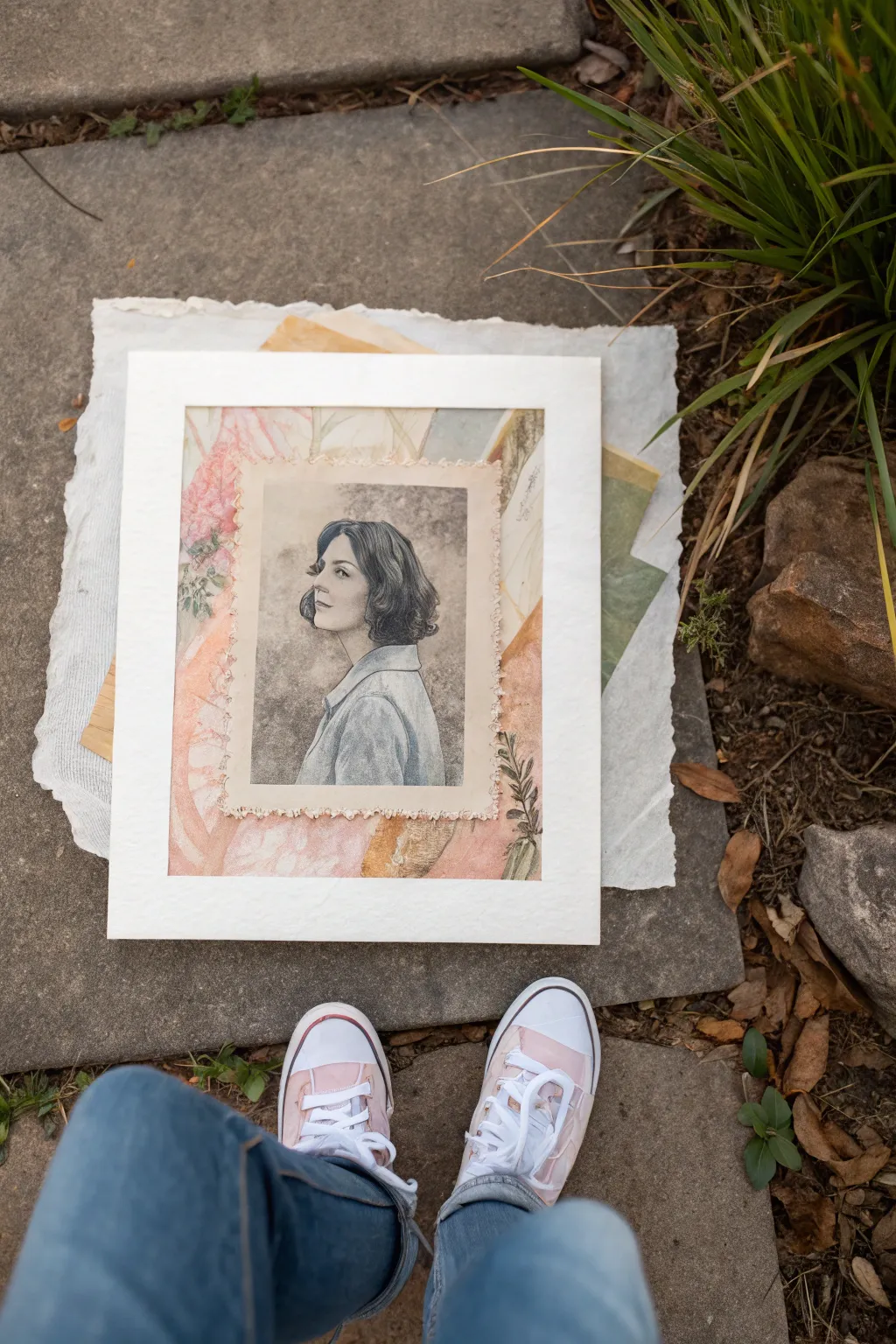
This elegant mixed media project combines the soft charm of collage with the crisp detail of a graphite drawing. By layering varying paper textures and delicate watercolor washes, you can create a nostalgic piece that feels like a treasured memory preserved in time.
Step-by-Step
Materials
- Heavyweight watercolor paper or mixed media board (base)
- Drawing paper (high quality, smooth or vellum surface)
- Graphite pencils (ranging from HB to 6B)
- Watercolor paints (muted pinks, ochres, sap green)
- Vintage floral patterned paper or napkins
- Matte finish collage medium (e.g., Mod Podge or acrylic medium)
- Soft synthetic brushes for collage
- Small round brushes for watercolor details
- Bone folder (optional, for tearing)
- Ruler
- White or cream mat board (window mount)
Step 1: Creating the Background Collage
-
Prepare the base:
Cut your heavyweight base paper to size. This should be slightly larger than the mat opening to ensure full coverage. -
Select collage materials:
Gather your vintage floral papers. Look for muted tones like dusty rose, sage green, and sepia to match the aesthetic. -
Arrange the composition:
Tear the floral papers into organic shapes. Avoid straight scissor cuts; the torn edges blend better. Arrange them loosely on the base paper to abstractly frame the center where the portrait will go. -
Glue the layers:
Apply a thin, even layer of matte medium to the back of your paper scraps and adhere them to the base. Smooth out air bubbles gently with your fingers or a brayer. -
Add watercolor washes:
Once the glue is dry, use diluted watercolors to tint areas of white space or unify the collage pieces. A wash of pale ochre or tea-stain color adds instant age. -
Introduce botanical details:
Using a small brush and sap green watercolor (or a fine liner pen), sketch delicate branches or leaves overlapping the collage pieces. These marks should look organic and slightly faded.
Collage Wrinkles?
If your collage paper bubbles while drying, place a sheet of wax paper over it and weigh it down with heavy books overnight to flatten it perfectly.
Step 2: Drawing the Central Portrait
-
Sketch the outline:
On a separate sheet of high-quality drawing paper, lightly sketch the profile of your subject using an HB pencil. Focus on the classic bob hairstyle and upward gaze. -
Shade the face:
Build up the facial tones gently. Use blending stumps or a tissue to keep the skin texture smooth, reserving the white of the paper for the highlights on the nose and cheek. -
Define the hair:
Switch to softer pencils (4B or 6B) to darken the hair. Use directional strokes to mimic the flow of the curls and create volume. -
Detail the clothing:
Sketch the collar and shoulder with looser, sketchier lines. You don’t need photorealism here; a suggestion of fabric texture works beautifully. -
Create the tonal background:
Lightly shade the negative space around the portrait with graphite dust or a wide pencil stroke to make the bright face pop forward.
Step 3: Assembly and Finishing
-
Create the deckled edge:
This is a key stylistic element. Place a ruler along the edge of your finished drawing. Wet the paper along the ruler’s edge with a damp brush, wait a moment, and then gently tear the paper away to create a soft, fibrous edge. -
Position the overlay:
Center your drawing over the dried collage background. I like to hold it up to a light source first to ensure the floral elements frame the face nicely. -
Adhere the portrait:
Apply adhesive only to the center of the drawing’s back, leaving the torn edges free. This adds dimension and prevents the drawing from buckling if the background has texture. -
Stipple the edges:
Use a nearly dry brush with a tiny amount of white high-flow acrylic or gouache to dab along the torn edge of the drawing paper. This creates a lace-like transition between the drawing and the background. -
Final inspection:
Check your balance of tones. If the portrait feels too separated from the background, add a tiny bit of the background color (e.g., dilute pink) into the shadows of the drawing. -
Mount and mat:
Place the artwork behind your clean white mat board. Use archival tape to secure it from the back.
Add Antique Flair
Brew a strong cup of black tea and lightly brush it over the finished edges of your drawing paper before mounting for an authentic aged look.
Now step back and admire how the layers of history and hand-drawn detail come together.
Sgraffito Painting With Scratched Lines
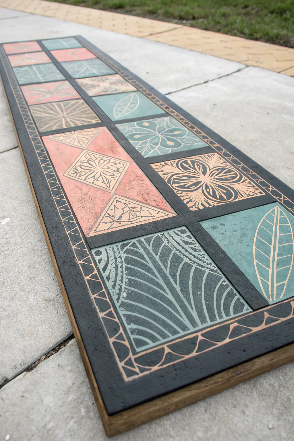
This stunning table runner or wall hanging mimics the look of encaustic tiles using simple painting and scratching techniques. By layering acrylic paint over a wooden board and carving through the top wet layer, you’ll reveal intricate, contrasting designs that feel both rustic and modern.
Step-by-Step Guide
Materials
- Long rectangular wooden board (approx. 10″ x 36″)
- Gesso or white primer
- Acrylic paints (black, muted teal, coral/terra cotta, beige)
- Painter’s tape (1/4 inch width)
- Ruler and pencil
- Sgraffito tools (stylus, old ballpoint pen, or hardwood stick)
- Polyurethane sealer (matte or satin)
- Sandpaper (medium grit)
- Flat paintbrushes (various sizes)
Step 1: Preparation and Base Layer
-
Sand the board:
Begin by sanding your wooden board thoroughly. You want a smooth surface so your scratching tools don’t catch on splinters or rough grain later. -
Prime the surface:
Apply a coat of white gesso or primer to the top surface of the board. This ensures the colors pop and prevents the wood from soaking up too much paint. -
Apply the under-layer:
For this specific look where the scratched lines reveal a light wood tone, paint a base layer of a light beige or metallic copper acrylic. Let this dry completely—I like to give it at least an hour to ensure it’s rock hard before taping.
Extended Work Time
Mix a slow-drying medium or retarder into your acrylic paints. This keeps the paint wet longer, giving you more time for intricate scratching without rushing.
Step 2: Creating the Grid
-
Measure the border:
Use your ruler to mark a uniform border around the entire edge of the board, about 1 to 1.5 inches wide. -
Tape the grid:
Using 1/4 inch painter’s tape, tape off the central area into a grid of squares. Create two columns running the length of the board. Press the tape edges down firmly to prevent bleed-through. -
Tape the border design:
Add a strip of tape inside the border area to create a channel for the geometric border pattern seen in the reference image.
Jagged Lines?
If paint is flaking rather than furrowing smoothly, it has dried too much. Re-apply a fresh, thin coat of paint over that section and try scratching again immediately.
Step 3: Painting and Sgraffito
-
Paint the background black:
Paint the border area and the dividing lines (where the tape isn’t) with black acrylic paint. You can do this now or save it for the final touch-up, but painting the border base now helps frame the work. -
Block in block colors:
Working fairly quickly, paint the individual squares in an alternating pattern of muted teal, coral, and black. Do not let this paint dry yet—sgraffito requires wet or tacky paint. -
Scratch the first design:
While the paint on a teal square is still wet, take your stylus tool and gently scratch through the paint to reveal the base layer. Try a simple leaf or petal shape. -
Work square by square:
Continue painting one or two squares at a time, then immediately scratching your designs. If you paint them all at once, the first ones will dry before you can scratch them. -
Create variety:
Mix up your motifs. Use geometric lines, floral rosettes, and cross-hatching textures. For the black squares, scratch bold floral motifs to create high contrast. -
Clean your tool:
Keep a paper towel handy. Wipe the paint buildup off your stylus tip after every few strokes to keep your lines crisp and clean. -
Detail the border:
Once the center squares are done, paint the border black (if you haven’t already) and while wet, scratch a repeating geometric pattern, like triangles or half-circles, along the edge.
Step 4: Finishing Touches
-
Remove the tape:
Carefully peel away all the painter’s tape. Do this while the paint is still slightly tacky to avoid chipping, or wait until fully dry if you are very careful. -
Paint the grid lines:
The area under the tape will be your base color. Paint these grid lines black to separate the colorful tiles, creating a ‘grout’ look that mimics the reference image. -
Touch up:
Check for any paint bleed. Use a small brush and the appropriate background color to neaten up edges where the colors meet the black grid. -
Seal the work:
Allow the entire piece to cure for 24 hours. Once fully dry, apply a coat of clear matte or satin polyurethane to protect the surface, especially if functioning as a table runner.
Place your finished board on a dining table or hang it vertically for a striking piece of faux-tile wall art
Surreal Psychedelic Landscape Twist
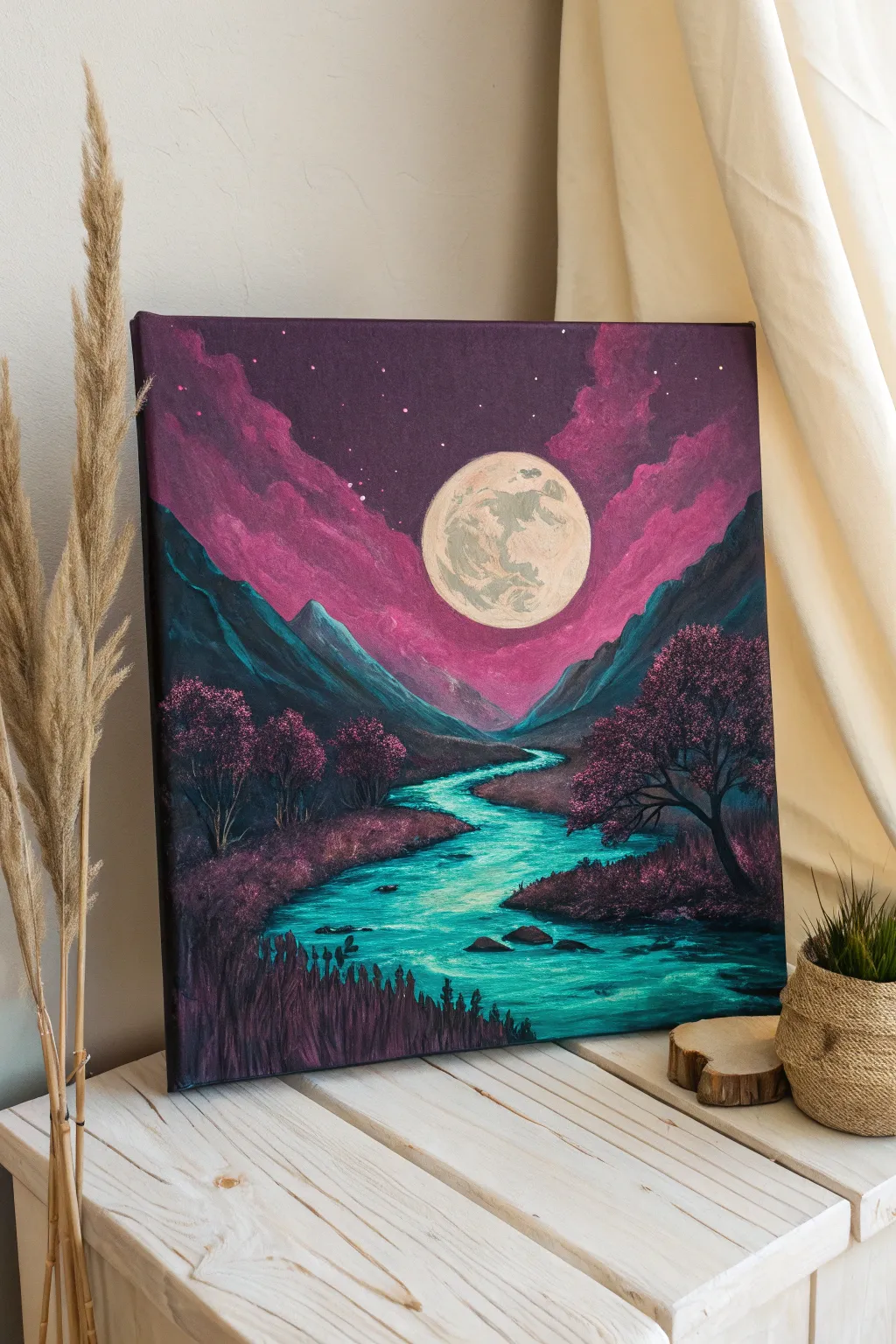
Transport yourself to a dreamlike world with this vibrant acrylic painting that blends classic landscape techniques with a surreal, neon color palette. This project focuses on high-contrast blending to create a glowing moonlit valley where magenta clouds meet a radiant turquoise river.
Step-by-Step Tutorial
Materials
- Square stretched canvas (approx. 16×16 inches)
- Acrylic paints: Carbon Black, Titanium White, Dioxazine Purple, Magenta (or Quinacridone Magenta), Phthalo Turquoise, Teal
- Flat shader brushes (1 inch and 1/2 inch)
- Small round detail brushes (sizes 0 and 2)
- Fan brush (optional, for trees)
- Palette knife
- Cup of water and paper towels
- Easel or flat painting surface
Step 1: Setting the Scene
-
Base Sky Gradient:
Begin by painting the upper two-thirds of the canvas with Dioxazine Purple. While the paint is still wet, blend in Carbon Black at the very top corners to create a vignette effect, deepening the night sky. -
Magenta Clouds:
Mix Magenta with a touch of Titanium White to create a vibrant pink. While the purple background is still slightly tacky, use a scrunching or dabbing motion with a flat brush to form large, billowing cloud shapes angling inward from the top left and right corners. -
Refining Cloud Forms:
Add pure Magenta to the lower edges of the clouds for depth. Then, highlight the upper crests of the cloud formations with a very pale pink (Magenta plus more White) to simulate moonlight hitting them. -
Starry Night:
Load a toothbrush or stiff brush with watered-down Titanium White paint. Flick the bristles to spatter tiny stars across the dark purple section of they sky, keeping the area where the moon will go relatively clear.
Pro Tip: Glowing Water
To make the river look like it’s emitting light, blend a pure white line down the very center of the water path, then glaze over it with neon teal once dry.
Step 2: The Glowing Moon & Mountains
-
Moon Placement:
In the center of the sky, just below the darkest purple area, paint a perfect circle using Titanium White. A jar lid makes a great stencil if you struggle with freehand circles. -
texturing the Moon:
Mix a tiny amount of grey or dusty yellow. Sponging or lightly dabbing this over the white circle creates craters and texture. Keep the edges crisp white to maintain the glow. -
Mountain Underpainting:
Using a dark mix of Phthalo Turquoise and Black, block in the mountain shapes on the left and right sides. These should slope downward toward the center horizon line. -
Mountain Highlights:
Mix Teal with a little White. Using a palette knife or the edge of a flat brush, drag this lighter color down the inner slopes of the mountains (facing the moon) to create rugged, rocky highlights.
Step 3: The River & Foreground
-
Drafting the River:
Sketch the river path with thinned turquoise paint. Start narrow at the distant valley center and widen it significantly as it winds toward the bottom right foreground. -
River Glow:
Fill the river shape with Phthalo Turquoise. While wet, blend Titanium White into the center of the stream to create a luminous reflection, keeping the banks darker. -
Ripple Details:
With a small round brush and dark teal or black, paint thin horizontal wiggly lines across the water surface to suggest movement and current. -
Riverbanks:
Paint the land flanking the river with a dark purple-black mix. Use rough brushstrokes to imply uneven terrain. -
Adding Rocks:
Place a few dark oval shapes in the river and along the bank to represent boulders. Highlight their tops with the same pale pink used on the clouds to tie the lighting together.
Level Up: UV Paint
Swap the standard magenta and teal for fluorescent or UV-reactive acrylics. Under a blacklight, your moonscape will literally glow in the dark.
Step 4: Vegetation & Finishing Touches
-
Distant Trees:
On the left bank, use a small brush to dab in clustered shapes using deep purple and magenta. These represent a dense forest line. Keep details minimal here due to distance. -
Foreground Tree Structure:
On the right middle-ground, paint a silhouette of a large tree trunk and branches using black. Let the branches twist organically over the water. -
Tree Foliage:
Using a fan brush or a scruffy round brush, stipple Magenta and pink leaves onto the black tree structure. Concentrate the lighter pinks on the top left of the foliage clusters where the moonlight hits. -
Foreground Grasses:
In the immediate bottom foreground, use a liner brush or the edge of a palette knife to flick upward strokes of dark purple and black, creating tall grasses. -
Color Harmony:
Glaze a very thin, watery layer of magenta over the shadowed parts of the grass to reflect the ambient light of the environment.
Step back and admire how the surreal colors create a landscape that feels both familiar and alien
Silhouette Against a Celestial Gradient
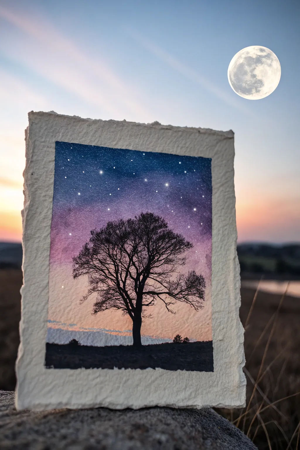
Capture the magic of twilight with this delicate watercolor painting featuring a stark tree silhouette against a vibrant, starry gradient. The rough, deckled edges of the handmade paper add an organic, timeless feel to this celestial scene.
How-To Guide
Materials
- Heavyweight watercolor paper with deckle edges (300gsm or greater)
- Watercolor paints: Indigo, Violet/Purple, Magenta, Peach/Light Orange
- Gouache or opaque white ink
- Technical drawing pen (black, 0.3mm or 0.5mm)
- Small round brushes (size 2 and size 6)
- Clean water and mixing palette
- Masking tape (optional)
Step 1: Preparing the Sky Gradient
-
Establish the horizon:
Visualize where your ground line will be—keep it low, about one-fifth up from the bottom edge. We will paint the sky down to this area but leave the very bottom blank for now. -
Wet the paper:
Use a clean brush to apply a wash of clean water to the sky area. The paper should be glisten with moisture but not have standing puddles. -
Apply the deepest blue:
Load your brush with concentrated Indigo. Start at the very top edge and paint horizontally across, letting the color bleed slightly downwards into the wet paper. -
Introduce purple tones:
While the blue is still wet, mix a rich Violet. Apply this just below the blue, allowing the two colors to touch and merge naturally on the paper surface. -
Shift to warmth:
Rinse your brush thoroughly. Pick up your Magenta or a pinkish-purple and paint a band below the violet layer, softening the transition. -
Create the sunset glow:
Finish the gradient near the bottom with a pale Peach or slightly orange tint. This should be the lightest part of the sky. -
Add low clouds:
Before the peach layer dries completely, dab a very dilute, grayish-blue mixture horizontally near the horizon line to suggest distant cloud banks. -
Dry partially:
Let the painting sit until the shine disappears from the paper but it still feels cool to the touch.
Mud-Free Gradients
If your purple and orange mix into a brown mess, let the purple layer dry slightly before adding the orange, or use a clean damp brush to bridge the gap.
Step 2: Adding the Stars
-
Prepare the stars:
Dilute a small amount of white gouache or opaque white ink with water on your palette. It should be fluid but opaque. -
Splatter large stars:
Take a loaded brush and gently tap it against another brush handle over the dark blue section of the sky to create random splatters. -
Detail specific stars:
Use a very fine brush tip to manually place a few larger, brighter stars in the transition zone between blue and purple. -
Complete drying:
Allow the entire background to dry completely. The paper must be bone dry before you begin the silhouette work to prevent bleeding.
Golden Hour
For a magical touch, use metallic gold watercolor instead of white for the stars, or add a thin rim of gold ink to the silhouette edges.
Step 3: The Silhouette Tree
-
Paint the ground:
Using concentrated Indigo or black watercolor, paint the solid ground strip at the bottom. Make the top edge of this strip uneven to mimic terrain. -
Draft the trunk:
Using a fine liner brush or a technical pen, draw the main trunk line starting from the center of your ground strip. I find it helpful to make the trunk slightly thicker at the base. -
Branch structure:
Extend two main branches outward from the trunk. Keep your lines shaky and organic rather than perfectly straight. -
Add secondary branches:
Split each main branch into smaller offshoots. Remember that branches generally get thinner the further they are from the trunk. -
Create the canopy:
Fill the space with many fine, web-like twigs. Crossing lines over each other adds realistic density to the winter tree silhouette. -
Balance the shape:
Step back and look at the overall tree shape. Add small twigs to the outer edges to round out the canopy if it looks lopsided. -
Final foliage touches:
If desired, create tiny stippled dots along the horizon line with your black paint to suggest distant bushes or trees.
Place your finished piece in a floating frame to show off those beautiful deckle edges.
Conceptual Diptych: Memory vs Reality
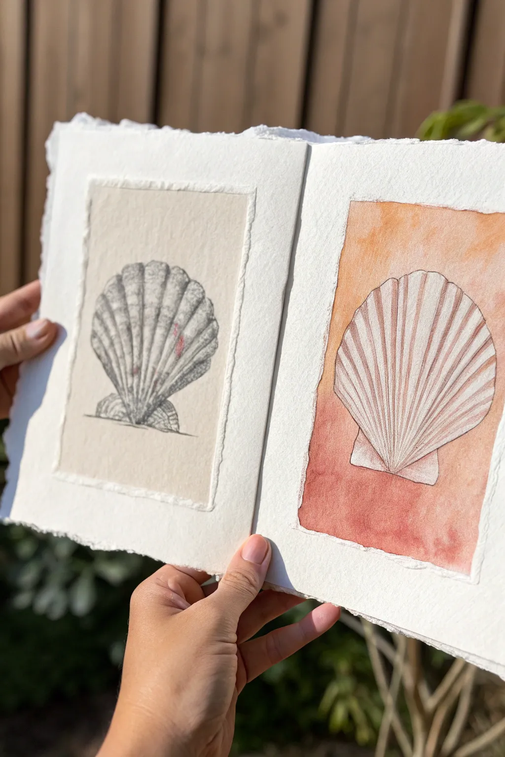
Capture the delicate beauty of ocean treasures with this diptych study contrasting structure and color. This project pairs a highly detailed graphite rendering on beige paper with a softer, watercolor-washed interpretation to explore the same form through two different artistic lenses.
Step-by-Step Guide
Materials
- Heavyweight watercolor paper (hot press preferred for smooth texture)
- Beige or cream-colored paper (or coffee for staining)
- Graphite pencils (HB, 2B, 4B)
- Black fine liner pen (waterproof, 0.1mm or 0.3mm)
- Watercolor paints (Burnt Sienna, Cadmium Orange, Alizarin Crimson)
- Soft synthetic watercolor brushes (flat wash and round detail)
- Masking tape
- Ruler
- Paper glue or double-sided tape
- Deckle-edge ruler or tearing tool (optional)
Step 1: Preparation & Backgrounds
-
Prepare the substrate:
Begin with a large sheet of heavy watercolor paper folded in half to create a bifold card format, or use two separate sheets for framing side-by-side. The paper should be thick enough to handle glue and washes without buckling. -
Create the tonal panel:
Cut a rectangle of beige or cream-colored paper. Its size should be smaller than your main page to leave a generous white border. If you don’t have colored paper, I like to lightly stain a piece of watercolor paper with diluted coffee and let it dry completely. -
Create the deckled edge:
For that artisan look, carefully tear the edges of your beige panel against a ruler rather than cutting it with scissors. This creates the soft, fibrous ‘deckle’ edge seen in the reference. -
Mount the tonal panel:
Center the beige paper on the left-hand page of your spread. Adhere it securely using smooth paper glue or double-sided tape, ensuring the corners are flat. -
Prepare the color panel:
On the right-hand page, lightly sketch a rectangle that mirrors the size of the left panel using an HB pencil. Tape around this rectangle with masking tape to create a crisp border for your watercolor wash, or leave it freehand if you prefer the uneven edge shown in the example.
Step 2: The Graphite Study (Left)
-
Outline the form:
On the beige panel, lightly sketch the fan shape of the scallop shell. Include the horizontal hinge at the bottom and the gentle curve of the top edge. -
Define the ribs:
Draw the main vertical ribs radiating from the hinge at the bottom center. A scallop shell usually has alternating ridges and valleys, so map these out lightly. -
Apply initial shading:
Using a 2B pencil, begin shading the ‘valleys’ between the ribs. Keep your strokes vertical, following the curvature of the shell. -
Enhance texture:
Deepen the shadows using a 4B pencil, focusing on the bottom area near the hinge and the outer edges to create curvature. Use cross-hatching—small intersecting lines—to build up density and texture. -
Add highlights:
Use an eraser to pull out highlights on the raised ridges of the shell. This contrast between the dark graphite valleys and the light paper ridges gives the drawing volume. -
Ground the object:
Add a small, horizontal cast shadow underneath the hinge using your darkest pencil to ensure the shell feels like it is sitting on a surface.
Uneven Wash?
If your background wash looks streaky, pre-wet the paper with clean water first (wet-on-wet technique). This helps the orange and red pigments blend smoothly.
Step 3: The Watercolor Study (Right)
-
Sketch the silhouette:
Lightly draw the same shell shape in the center of your right-hand panel area. Keep the lines faint as they will be inked later. -
Paint the background wash:
Mix a warm gradient wash. Start with a pale orange or peach at the top and transition into a deeper burnt sienna or rusty red at the bottom. Paint the background rectangle, carefully painting *around* your shell sketch so the shell remains white. -
Refine the wash edges:
While the paint is wet, allow some pigment to bloom slightly for texture. Let the wash extend outwards to form rough, organic edges similar to the deckled paper on the left, rather than a perfect box. -
Dry completely:
Wait until the background wash is bone dry. This is crucial—if it’s damp, your ink lines will bleed. -
Ink the outline:
Using a waterproof fine liner, trace the outer contour of the shell. Instead of a solid line, use a slightly broken or wavering line to mimic organic imperfections. -
Detail the ribs:
Draw the internal radiating lines of the shell with the pen. Keep these lines delicate. Add very subtle shading marks near the bottom hinge, but keep the overall look much cleaner and more graphic than the left side. -
Optional tinting:
If the white shell feels too stark against the warm background, you can add an extremely pale wash of watered-down pink or beige over the shell area, but keep it transparent to maintain the contrast.
Deckle Hack
Don’t have a deckle ruler? Paint a line of water where you want the tear, wait a minute for it to soak in, and gently pull the paper apart along the wet line.
Step back and admire how the two styles complement each other, highlighting both the texture and the vivid warmth of your subject
Have a question or want to share your own experience? I'd love to hear from you in the comments below!