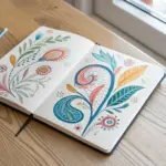
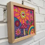
When I’m craving pure good vibes, I always reach for groovy painting—big shapes, bold color, and patterns that feel like they’re dancing. These ideas lean into that classic 60s/70s psychedelic energy: playful nature, wavy worlds, and satisfyingly simple designs you can totally make your own.
Flower Power Daisies
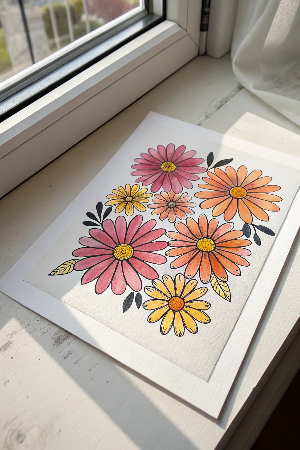
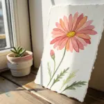
Channel the 70s with this vibrant floral art piece featuring stylized daisies in warm shades of pink, orange, and sunshine yellow. The bold black outlines give it a crisp, illustrative quality that makes the colors pop beautifully against the white background.
Step-by-Step Tutorial
Materials
- Cold press watercolor paper (A4 or 8×10 inch)
- Pencil (HB) and eraser
- Watercolor paint set (pinks, oranges, yellows, browns)
- Round watercolor brushes (size 4 and 8)
- Fine liner pen (black, waterproof/archival ink, 0.5mm)
- Masking tape
- Jar of water and paper towels
Step 1: Sketching the Layout
-
Tape the paper:
Secure your watercolor paper to a flat surface or drawing board using masking tape along all four edges. This creates a clean white border and prevents the paper from buckling when wet. -
Map out flower centers:
Lightly sketch seven small circles scattered across the page to represent the centers of your daisies. Keep the spacing random but balanced, leaving room for petals between them. -
Draw the petals:
Around each center circle, lightly sketch long, rounded petals. Vary the sizes of the flowers—make two large focal flowers (one pink, one orange), and fill the gaps with medium and smaller blossoms. -
Add foliage:
Sketch simple, teardrop-shaped leaves tucking out from behind the petals. Add a few lone leaves floating in the empty white spaces to balance the composition. -
Refine the lines:
Go over your sketch to ensure the petals look symmetrical enough for your liking, but keep the vibe hand-drawn and organic. Gently erase any heavy graphite lines until they are just barely visible guide marks.
Uneven Watercolors?
If your paint dries with hard edges inside the petals (blooms), try mixing more water into your paint puddle before applying. Keep the leading edge of your brush stroke wet as you work.
Step 2: Adding Colorful Washes
-
Paint the first pink flower:
Mix a rosy pink watercolor. Using the size 8 brush, fill in the petals of the large flower on the middle-left. Use a ‘wet-on-dry’ technique for control, carefully staying within your pencil guides. -
Paint the orange blooms:
Switch to a vibrant orange hue. Paint the petals of the large flower on the right side and the medium flower just below the pink one. Let the brush deposit more pigment at the base of the petals for a subtle gradient. -
Fill the yellow daisies:
Load your brush with a bright, sunny yellow. Paint the petals of the bottom-most flower and the small one tucked near the top left. -
Add variation:
For the remaining two flowers (top center and tiny middle one), mix a muted coral or salmon tone by combining your pink and orange paints. Fill these petals in. -
Color the centers:
Once the petals are semi-dry, paint the round centers. Use contrasting colors: yellow centers for pink/orange flowers, and orange or ochre centers for yellow flowers. I like to dab the paint on here to create a little texture. -
Paint the leaves:
Select a few leaves to color. Paint the bottom-left leaf yellow and two small leaves on the right yellow as well. Leave the other sketched leaves unpainted; these will be filled with black ink later for a graphic look. -
Let it dry completely:
Walk away for at least 20 minutes. The paper must be bone dry before the next step, or the ink line will bleed into the damp paper.
Check Your Ink
Test your black pen on a scrap piece of watercolor paper first. Paint over the dried ink with water. If it smudges even a little, do not use it! You must use waterproof or archival ink.
Step 3: Inking giving Definition
-
Outline the centers:
Using your waterproof fine liner, trace the circles in the center of each flower. Add small dots or stippling inside the circles to mimic pollen texture. -
Outline the petals:
Carefully trace the perimeter of every petal. Don’t worry if your ink line doesn’t perfectly match the paint edge; that slight offset adds to the charming, illustrative style. -
Add petal details:
Draw single, straight lines down the center of each petal, starting from the flower center and stopping about halfway up the petal. This gives the flowers dimension. -
Outline painted leaves:
Trace the yellow painted leaves and add a center vein line to them. -
Fill the black leaves:
Locate the remaining unpainted leaf sketches. Outline them with the pen and then color them in fully solid black. This bold contrast anchors the bright colors. -
Final clean up:
Wait about 5-10 minutes for the ink to fully set, then gently erase any remaining pencil marks visible on the paper. -
Reveal the border:
Slowly peel away the masking tape at a 45-degree angle to reveal your crisp white edges.
Now you have a vibrant, retro-inspired floral print ready to frame and brighten up any room

Smiling Sun and Moody Clouds
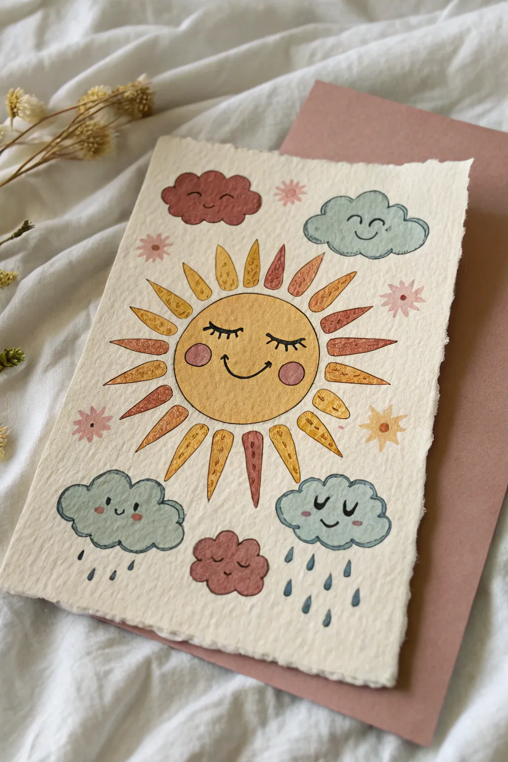
Brighten up your desk with this adorable, retro-inspired painting featuring a cheerful sun surrounded by a mix of happy and sleepy clouds. This project plays with soft watercolor washes and bold linework to create a piece that feels both nostalgic and fresh.
Detailed Instructions
Materials
- Cold press watercolor paper (rough texture preferred)
- Watercolor or gouache paints (yellow, terra cotta, light blue, pink, dusty rose)
- Fine liner pen (black, waterproof, size 03 or 05)
- Round watercolor brush (size 4 or 6)
- Pencil and eraser
- Ruler (optional)
- Jar of water and paper towels
Step 1: Sketching the Layout
-
Establish the center:
Begin by lightly sketching a large circle in the very center of your textured paper for the sun’s face. Keep your pencil pressure light so the graphite doesn’t show through the yellow paint later. -
Add the rays:
Sketch triangular rays radiating outward from the central circle. Don’t worry about making them perfectly uniform; vary the lengths slightly to give it that hand-drawn, groovy feel. -
Place the clouds:
Draw four distinct cloud shapes around the sun: a large fluffy one on the top right, a smaller reddish one top left using bumpy curves, and two rain clouds at the bottom. Sketch small raindrops falling from the bottom clouds. -
Add filler details:
Fill in the empty spaces with small sketched flowers or stars to balance the composition.
Smudged Ink?
If your pen smudges, the paper likely wasn’t 100% dry. Wait longer next time, or use a hairdryer on a low, cool setting to speed up the process before inking.
Step 2: Applying Color
-
Paint the sun’s face:
Mix a warm, golden yellow and fill in the central circle. While the paint is still damp, you can drop in a tiny bit of darker yellow near the bottom for subtle shading. -
Color the rays:
Alternate colors for the sun’s rays. Use your golden yellow for some, and a warm terra cotta or rusty orange for others. Leaving a tiny gap between the ray and the central circle can add a nice stylistic touch. -
Paint the blue clouds:
Using a diluted light blue-grey, paint the top right cloud and the two bottom rain clouds. Keep the wash fairly transparent to let the paper texture shine through. -
Paint the accent clouds:
Use a dusty rose or mauve color for the top left cloud and the small cloud nestled at the bottom center. -
Add rosy cheeks:
Once the sun’s face is completely dry, mix a soft pink and paint two small circles for cheeks. Do the same for the smiling blue rain clouds. -
Fill in small details:
Use your rust and yellow shades to paint the small stars and flowers scattered in the background. Paint the raindrops using a slightly darker blue than the clouds. -
Add texture to rays:
If you want that grainy look, I like to use a nearly dry brush with darker pigment to dab small dots or lines onto the dried sun rays.
Step 3: Inking and Finishing
-
Outline the sun:
Once the paint is bone dry, use your black fine liner to draw the smiling face on the sun. Give it closed, curved eyes with long lashes and a wide, u-shaped smile. -
Outline the rays:
Trace around each sun ray. The lines don’t need to be perfectly straight; a slightly wobbly line adds to the charm. -
Define the clouds:
Outline the cloud shapes with the pen. Add smiling faces to the happy clouds and closed, sleeping eyes to the dusty rose clouds. -
Inking the rain:
Outline the raindrops and ensure the background stars and flowers get their final definition lines. -
Final texture check:
Add small decorative dots or dashes inside the sun rays or clouds if any areas feel too flat. Erase any visible pencil marks carefully.
Torn Edges
To get the soft, deckled edge look shown here, fold your paper back and forth along a ruler, then wet the crease with a damp brush before gently tearing it.
Display your cheerful painting on a mini easel or use a glue dot to attach it to a colored backing card for a finished look

Peace Sign Poster Collage
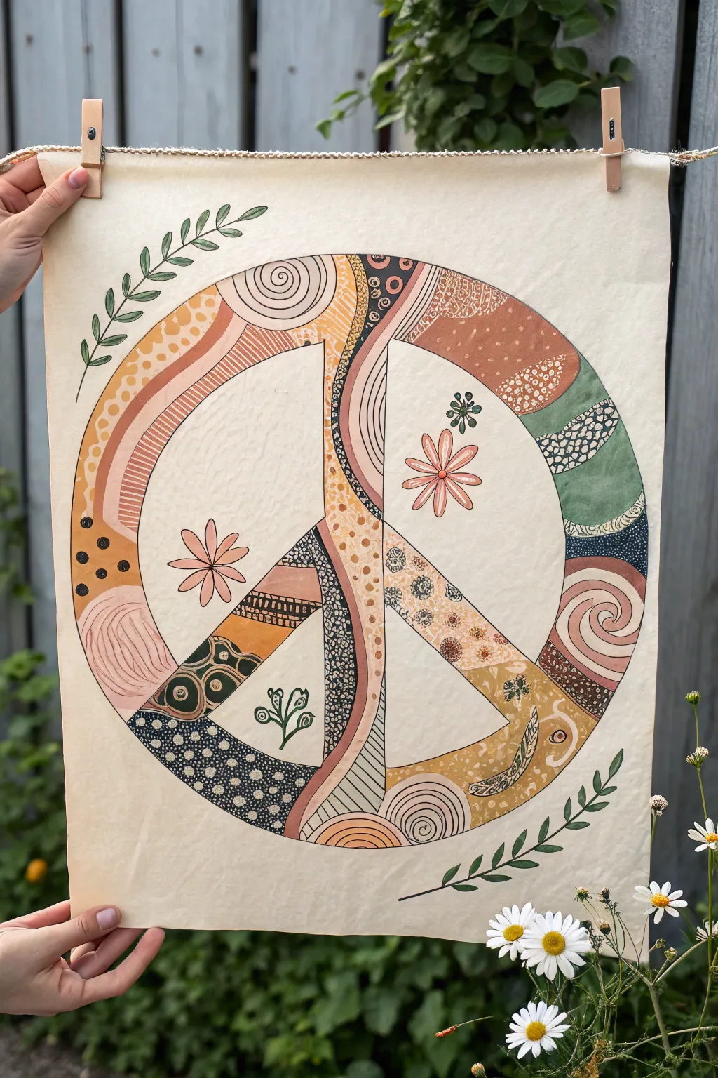
Bring a touch of retro peace and love to your space with this intricately patterned poster. Using a warm, earthy color palette and repetitive doodling techniques, you’ll transform a simple symbol into a mesmerizing piece of wall art.
Step-by-Step Tutorial
Materials
- Heavyweight unbleached canvas sheet or cream mixed-media paper (approx. 18×24 inches)
- Pencil and eraser
- Large circular object (like a serving platter) or a compass tool for large circles
- Ruler or straightedge
- Acrylic gouache or matte acrylic paints (terracotta, mustard yellow, sage green, cream, blush pink, navy blue)
- Fine liner pens (black, 0.5mm and 0.8mm)
- Small round paintbrushes (sizes 0, 2, and 4)
- Wooden clothespins and twine for hanging
Step 1: Drafting the Design
-
Prepare your surface:
Start by laying out your unbleached canvas or heavy paper on a flat surface. If the edges are curled, you may want to press them under heavy books overnight or tape the corners down with gentle masking tape. -
Draw the outer circle:
Using a large circular object or a makeshift compass (a string tied to a pencil works well), lightly sketch a large circle in the center of your page, leaving a generous border on all sides. -
Sketch the inner circle:
Draw a second, slightly smaller circle inside the first one to create the outer rim of the peace sign. Aim for a width of about 2–3 inches for this rim. -
Add the vertical bar:
Use your ruler to draw a vertical rectangle running straight down the center. It should connect the top inner edge to the bottom inner edge. Keep the width consistent with the outer rim. -
Create the angled legs:
Sketch the two diagonal legs of the peace sign extending from the center point of the vertical bar down to the outer rim at roughly 45-degree angles. Erase the intersecting lines inside the shapes so you have one continuous hollow peace symbol. -
Divide into sections:
Lightly draw curved lines across the peace sign shape to break it into organic ‘zones.’ These will be the boundaries for your different patterns and colors later.
Step 2: Blocking in Color
-
Paint the base layers:
Select your palette of earthy tones—terracotta, mustard, sage, and blush. Begin filling in the divided sections of the peace sign symbol. Paint adjacent sections with contrasting colors to make the design pop. -
Let it dry completely:
Allow the first coat of paint to dry thoroughly. Because acrylic gouache dries matte and opaque, you might only need one coat, but check for streaky areas that need a touch-up. -
Add secondary color details:
Once the base colors are dry, use a smaller brush to add painted details like thick curved stripes or large dots in contrasting colors on top of the base layers.
Smudge Alert
Work from the center outward or place a clean sheet of scrap paper under your drawing hand. This prevents the oils from your skin or wet ink from smearing your crisp black lines.
Step 3: Patterning and Detail
-
Outline the main shape:
Using a thicker black fine liner (around 0.8mm), carefully trace the entire outline of the peace sign to define the shape clearly against the cream background. -
Add the section dividers:
Go over the pencil lines that divided your colored zones with the black pen. This creates a ‘stained glass’ effect that separates your patterns. -
Doodle detailed patterns:
Switch to a finer 0.5mm pen. Begin filling specific color blocks with intricate doodles. Try creating zones of small circles, stippling dots, swirls, or leopard-print style spots. -
Incorporate linear textures:
In the narrower sections (like the legs of the peace sign), draw tight parallel lines, cross-hatching, or ladder-like geometric patterns to add visual rhythm. -
Paint the floral elements:
In the negative space (the empty cream areas inside the peace sign), sketch simple floral shapes. Paint two large daisies with blush petals and yellow centers, and a few smaller sprigs. -
Detail the flowers:
Once the flower paint is dry, outline the petals with your fine liner and add a center dot to the daisies. -
Draw the outer vines:
In the exterior corners of the poster, draw flowing leafy vines using dark green paint or a green marker. I like to have one vine reaching down from the top left and another curving up from the bottom right to frame the piece. -
Final touches:
Erase any remaining stray pencil marks. Inspect your patterns and darken any lines that look too faint.
Go Metallic
Use a gold paint pen for some of the dividing lines or specific pattern details (like the dots). It captures the light beautifully and adds a chic, polished finish to the rustic boho look.
Hang your masterpiece with clothespins on a string of twine perfectly fits the relaxed vibe of the art
Groovy Rainbow Arches
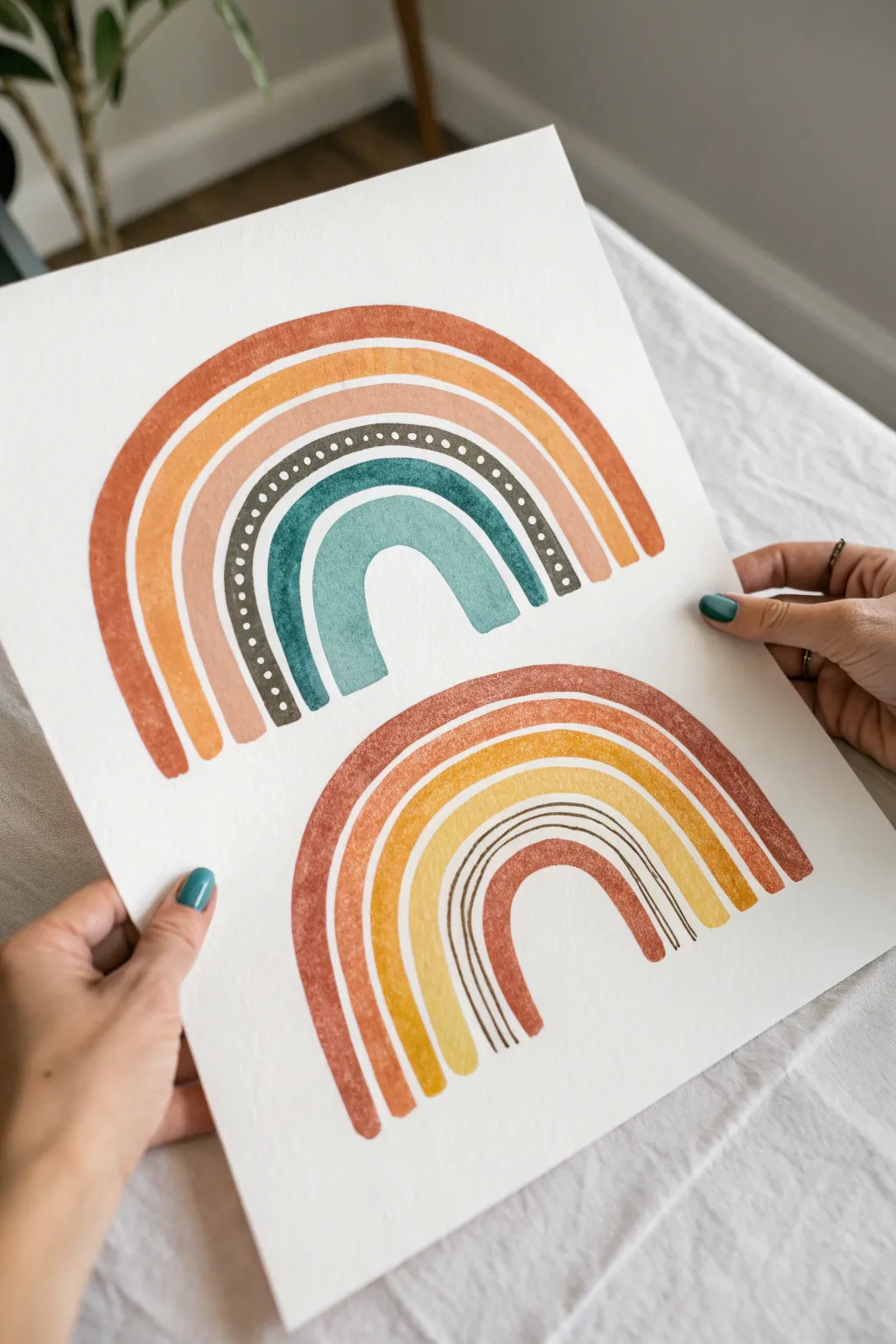
Capture the retro-meets-modern aesthetic with these two distinct rainbow variations featuring earthy tones and simple geometric patterns. This project blends warm terracottas with cool teals for a balanced, groovy composition perfect for wall art.
How-To Guide
Materials
- Cold press watercolor paper (140lb/300gsm)
- Gouache or watercolor paints (burnt orange, mustard yellow, dusty pink, dark slate, teal, brown)
- Round paintbrushes (sizes 4 and 8)
- Small detail brush (size 0 or 1)
- Pencil and eraser
- Compass or round objects for tracing
- Palette for mixing
- Water cups and paper towels
Step 1: Preparation and Sketching
-
Position your arches:
Decide on the placement of your two rainbows. I like to offset them slightly, placing the larger, cooler-toned rainbow near the top left and the warmer, striped rainbow toward the bottom right for a balanced composition. -
Sketch the top rainbow guidelines:
Using a compass or by lightly tracing circular objects, draw six concentric semicircles. Leave varying gaps between them; the two outermost bands should be close together, while the inner bands can be thicker. -
Sketch the bottom rainbow guidelines:
Draw the lower rainbow with five layers. The innermost arch will be the smallest, and one of the middle layers needs to be wide enough to accommodate thin line details later. -
Refine the shapes:
Lightly erase your pencil lines until they are barely visible. This ensures the graphite won’t dirty your light paint colors, especially the yellows and pinks.
Wobbly Arches?
Pencil lines not helping? Try using masking tape or flexible curve tape to block out the negative space between arches for sharper edges.
Step 2: Painting the Top Rainbow
-
Start with the outer band:
Mix a warm burnt orange color. Using your size 8 brush, paint the largest, outermost arch. Maintain a steady hand to keep the edges crisp. -
Add the yellow layer:
Switch to a mustard yellow shade for the second arch. Leave a tiny sliver of white space between this arch and the orange one to keep the colors distinct. -
Paint the pink band:
For the third layer, use a dusty pink or light terracotta. Paint this arch slightly thicker than the previous two. -
Create the patterned base:
Mix a dark slate or deep grey-green color. Paint the fourth arch. This layer needs to be opaque and dark to make the white dots pop later. -
Fill the inner arches:
Paint the fifth arch in a deep teal and the final, smallest center arch in a lighter, watery teal or seafoam green.
Step 3: Painting the Bottom Rainbow
-
Paint the outer warm layers:
Mirror the top rainbow’s warmth by painting the outermost arch of the bottom rainbow in a slightly lighter, textured terracotta. -
Layer the yellows:
Paint the next two inward arches with yellow-orange tones, making the second one slightly lighter than the first to create a gradient effect. -
Add the detail gap:
Leave the fourth space empty for now—this will be filled with fine line work. Skip to the innermost arch and paint it a solid warm brown.
Level Up: Gold Leaf
Replace the white dots or the thin brown lines with liquid gold leaf or metallic paint for a glamorous mid-century modern twist.
Step 4: Adding Details
-
Dot the slate arch:
Return to the top rainbow. Once the dark slate layer is bone dry, use your smallest brush and white gouache (or opaque white ink) to dab a row of evenly spaced dots along the center of the band. -
Line the bottom arch:
For the empty gap in the bottom rainbow, use your finest brush and dark brown paint. Carefully draw three parallel, thin curved lines that follow the arch’s shape. -
Clean up edges:
Inspect the flat bottom edges of both rainbows. Use a slightly damp, clean brush to tidy up any ragged ends, giving them a uniform termination point.
Step 5: Finishing Touches
-
Add texture:
If you want that vintage, weathered look, you can dry brush a little bit of texture over the solid bands once they strictly dry. -
Erase guidelines:
Once the entire painting is completely dry to the touch, gently erase any remaining visible pencil marks from the white paper surrounding the arches.
Frame your new artwork in a light wood frame to complement the earthy tones
BRUSH GUIDE
The Right Brush for Every Stroke
From clean lines to bold texture — master brush choice, stroke control, and essential techniques.
Explore the Full Guide
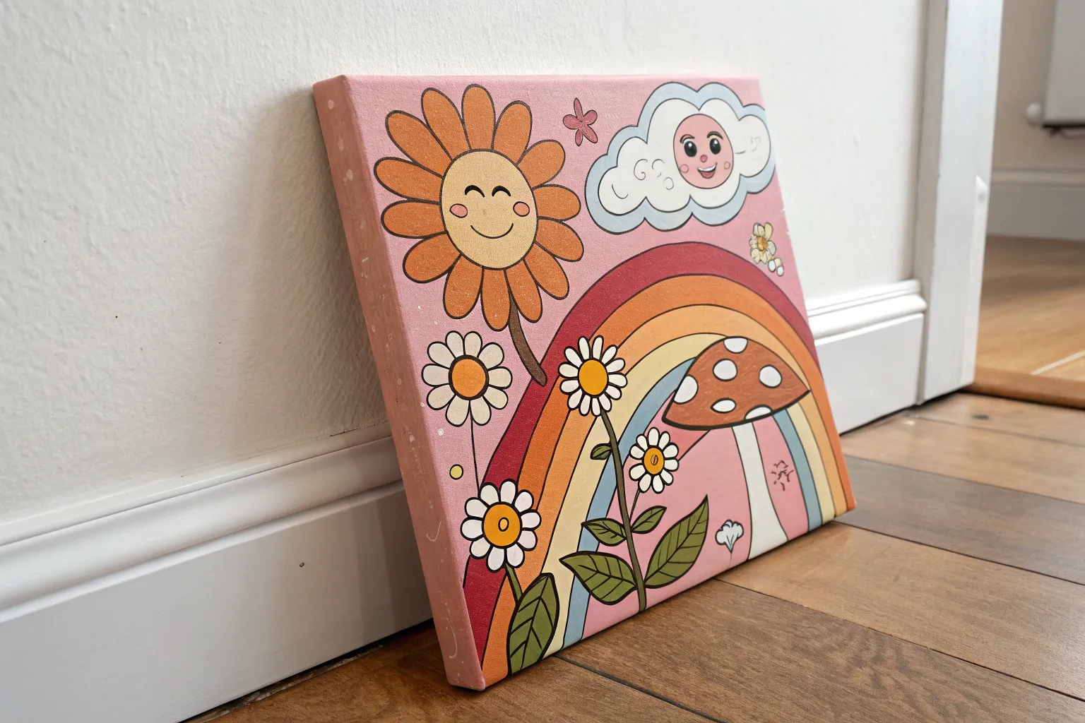
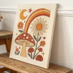
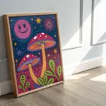
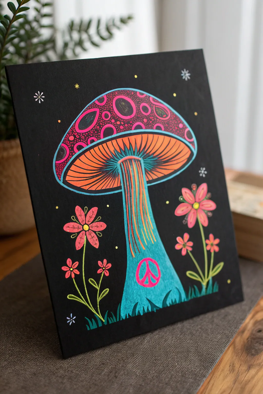
Magic Mushroom Patch
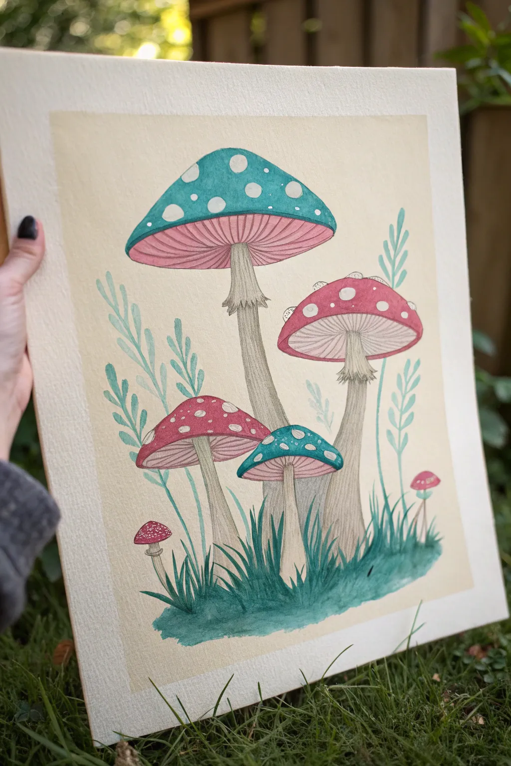
Capture the charm of the forest floor with this whimsical painting featuring stylized teal and pink mushrooms. Using a combination of watercolor washes and fine liner details, you’ll create a polished illustration with a defined, professional border.
Detailed Instructions
Materials
- Cold press watercolor paper (140lb/300gsm)
- Masking tape or artist tape
- Watercolor paints (Teal/Turquoise, Magenta/Rose, Sap Green, Payne’s Gray/Black, Burnt Umber)
- Fine liner pens (Black or sepia, sizes 0.1 and 0.3)
- White gel pen or gouache
- Pencil (HB) and eraser
- Round brushes (sizes 2, 4, and 8)
- Jar of water and paper towels
Step 1: Preparation and Sketching
-
Tape the borders:
Begin by taping down all four edges of your watercolor paper to a board or table. Measure about an inch in from the edge to create a clean, crisp frame for your composition. -
Sketch the main shapes:
Lightly sketch the layout using an HB pencil. Place a large mushroom near the top center and a medium one to the right. Add a few smaller mushrooms clustered near the bottom left and center. -
Add foliage details:
Draw long, slender stems for the fern-like foliage rising behind the mushrooms. At the base, sketch tufts of grass to ground the composition. -
Refine the caps:
Draw the spots on the mushroom caps now so you remember to paint around them later. Add the gills underneath the caps and the frilly skirts on the stems.
Step 2: Painting the Base Layers
-
Paint the background wash:
Mix a very dilute wash of a warm beige or tea-stain color. Apply this evenly across the entire background, painting carefully around your mushroom sketches. Let this layer dry completely. -
Color the teal caps:
Using a size 4 brush, paint the caps of the largest and smallest center mushrooms with a rich teal. Be careful to leave the circular spots unpainted (white paper showing through). -
Paint the red caps:
Switch to a muted red or deep magenta for the remaining mushroom caps. Again, paint carefully around the white spots. -
Wash the gills:
Mix a very pale, watery pink. Apply this wash to the gills (underside) of all the mushrooms. Keep it light so you can add details later. -
Stem base layer:
Mix a pale, grayish-brown wash. Paint the stems of the mushrooms, letting the color fade slightly as it reaches the bottom.
Bleeding Lines?
If your fine liner bleeds when you apply paint over it, switch the order: do all your painting first, let it fully dry, and do the pen work last.
Step 3: Inking and Detailing
-
Add texture to the stems:
Once the paint is bone dry, use a fine liner or a very sharp pencil to draw vertical striations up the mushroom stems. Use short, flickering strokes near the skirt to show texture. -
Detail the gills:
Draw fine lines radiating from the stem to the edge of the cap on the pink under-gills. I find a 0.1mm pen works best here for delicacy. -
Paint the foliage:
Mix a soft, minty green/blue watercolor. Paint the fern leaves in the background. Keep the color transparent so they feel distant. -
Anchor the grass:
Using a deeper blue-green (mix teal with a touch of Payne’s gray), paint the grassy clumps at the bottom. Use upward, flicking brushstrokes to mimic blades of grass. -
Shade the ground:
While the grass is damp, drop in a little more dark green at the very bottom to create weight and shadow under the mushrooms.
Add a Glow
Paint a very faint halo of yellow or pale gold around the mushroom caps to give the illustration a magical, glowing effect.
Step 4: Final Touches
-
Enhance the spots:
If you accidentally painted over any spots, use a white gel pen or opaque white gouache to reclaim them or make them brighter. -
Deepen shadows:
Add a tiny bit of dark outlining or shading just under the caps where they meet the stems to increase the contrast. -
Dry and reveal:
Ensure the paper is 100% dry to the touch. Slowly peel back the masking tape at a 45-degree angle to reveal your crisp, clean edges.
Frame your fantastical fungi or adhere the page into your art journal for a touch of woodland magic
Wavy Hills at Sunset
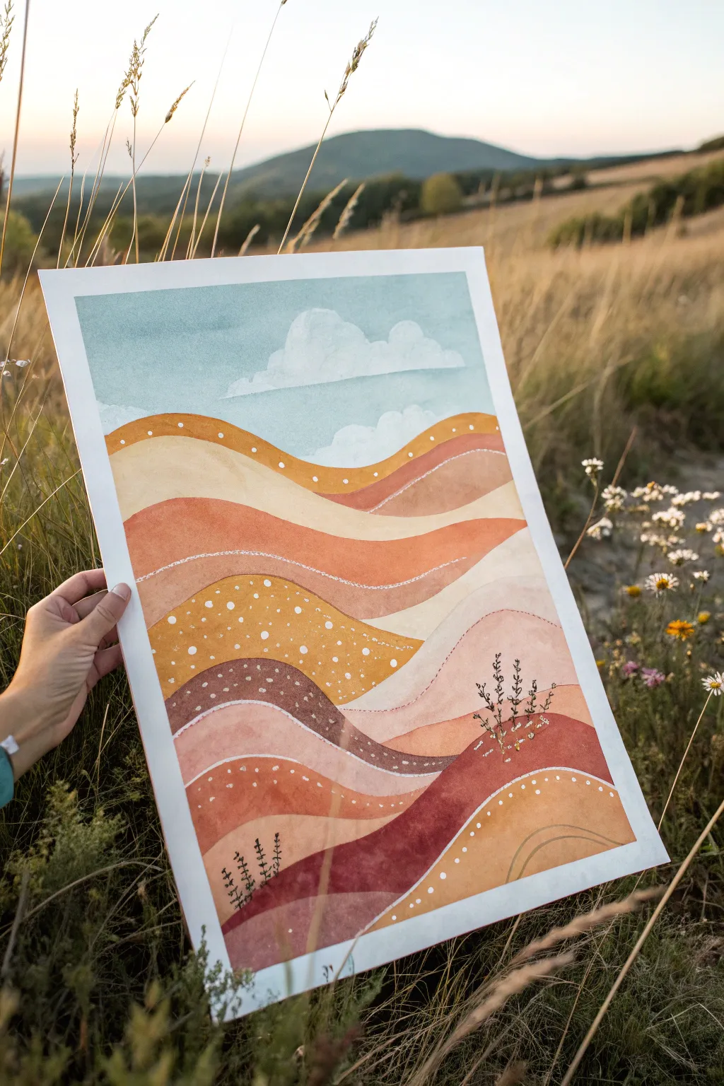
Capture the warmth of a golden hour landscape with this stylized, layered hill study. Using a blend of opaque gouache or watercolor, you’ll build up groovy waves of earth tones topped with whimsical dotted patterns.
Detailed Instructions
Materials
- Heavyweight watercolor paper (300 gsm) or mixed media board
- Gouache paints (burnt sienna, yellow ochre, terracotta, burnt umber, sky blue, titanium white)
- Wide flat brush (3/4 inch)
- Medium round brush (size 6 or 8)
- Fine detail brush (size 0 or 1)
- Painter’s tape
- Pencil and eraser
- Mixing palette
- Water cups and paper towels
Step 1: Sketching & Sky
-
Tape the edges:
Begin by securing your watercolor paper to a flat surface using painter’s tape on all four sides. This creates that crisp, professional border seen in the final piece and keeps the paper from buckling. -
Map the waves:
Lightly sketch a series of rolling, wavy lines starting about one-third down from the top of the paper. These lines don’t need to be perfect; they define the separate hill layers. Draw about 5-7 distinct sections. -
Paint the sky base:
Mix a muted sky blue with plenty of white to get a soft, pastel tone. Fill the top third of the paper with this color using your wide flat brush, ensuring an even, smooth application. -
Add cloud shapes:
While the blue is drying (or immediately after if you want softer edges), mix a pure white to paint fluffy cloud shapes. Keep the bottoms of the clouds flat and the tops rounded and billowy.
Step 2: Layering the Hills
-
Mix your palette:
Prepare several warm earth tones on your palette. You’ll need a gradient ranging from pale cream and yellow ochre to deep rust, terracotta, and dark brown. -
Paint the furthest hill:
Start with the hill layer closest to the sky. Use a warm, medium-tone yellow ochre. Paint smoothly along the wavy line, filling that segment completely. -
Lighten the next layer:
For the second wave down, use a very pale cream or beige tone. Painting light against dark helps distinguish the layers visually. -
Deepen the tones:
Move to the third wave using a rich terracotta or burnt orange. I strive to keep my brushstrokes flowing horizontally with the curve of the hill to maintain the texture. -
Create variation:
Continue painting down the page, alternating between lighter sandy tones, textured browns, and deep reddish-browns. Let each section dry slightly before painting the neighbor to prevent bleeding. -
Anchor the bottom:
For the final bottom waves, use your darkest reddish-brown and a deep ochre to create visual weight at the base of the composition. Let the entire painting dry completely before moving on.
Smooth Gouache
If your gouache feels draggy or chalky, mix in a tiny drop of gum arabic or honey. This improves flow without losing opacity and makes those wavy lines much easier to paint cleanly.
Step 3: Details & Texture
-
Mix a semi-transparent wash:
Take a bit of white paint and water it down significantly. Use this to add subtle, sweeping highlights or ‘ghost’ lines inside some of the darker hills to suggest volume. -
Dot the upper ridges:
Using your fine detail brush and thick white paint, add a row of small, evenly spaced dots along the top edge of the highest orange hill layer. -
Create a starry field:
Select one of the middle ‘sandy’ colored hills and fill it with a scattered pattern of white dots. Vary the size slightly to make it look organic and playful. -
Add line accents:
On the darker brown hills, use the fine brush to paint thin, white contour lines that mimic the curve of the hill itself. This adds that ‘groovy’ rhythmic feel. -
Paint stylized plants:
Mix a very dark brown or black-brown. Paint simple, upright sprigs or tiny stylized tree shapes on the lower two hills. Keep them minimal—just a vertical line with tiny side branches. -
Final dot details:
Add a few final clusters of white dots around the base of your plants to ground them, almost like tiny flowers or stones. -
The reveal:
Once strictly dry, peel away the tape slowly at a 45-degree angle to reveal your clean white edges.
Metallic Pop
Swap the white paint for a metallic gold or copper pen when adding the final dots and plant details to give the sunset hills a shimmering, magical finish.
Now you have a serene, retro-inspired landscape ready to frame or gift

PENCIL GUIDE
Understanding Pencil Grades from H to B
From first sketch to finished drawing — learn pencil grades, line control, and shading techniques.
Explore the Full Guide
Lava Lamp Blobs and Drips
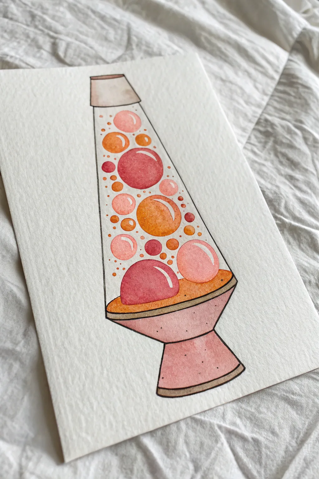
Capture the groovy essence of the 60s with this vibrant watercolor illustration of a classic lava lamp. The piece features a distinct outlined style filled with warm, bubbling gradients of pink and orange.
Detailed Instructions
Materials
- Cold-pressed watercolor paper (300gsm)
- Waterproof fine liner pen (black, 0.3mm or 0.5mm)
- Watercolor paints (Alizarin Crimson, Cadmium Orange, Yellow Ochre, Burnt Sienna)
- Round watercolor brushes (sizes 2 and 6)
- Pencil and eraser
- Ruler
- Clean water and paper towels
Step 1: Sketching the Structure
-
Draft the base shapes:
Start by lightly sketching a vertical centerline with your ruler to ensure symmetry. Draw a wide trapezoid for the base and a narrower, inverted trapezoid for the cap. -
Connect the glass body:
Draw the tapered glass body connecting the cap to the base. The sides should angle inward as they go up, creating that iconic conical flask shape. -
Add the lava blobs:
Lightly sketch various circles and ovals inside the glass area. Vary their sizes significantly—large blobs near the bottom, medium ones floating upward, and tiny bubbles scattered throughout for movement. -
Refine the forms:
Go over your sketch to ensure the curves of the base and cap match the perspective. The bottom of the glass should nestle slightly into the base stand.
Smudge Alert
If your background wash reactivates the bubble colors, your brush is too wet. Let the bubbles cure longer, or use less water and fewer strokes for the background fill.
Step 2: Inking the Outline
-
Trace with liner:
Using your waterproof fine liner, carefully trace over your pencil lines. Keep your hand steady for the long, straight edges of the glass. -
Add weight to the base:
You might want to thicken the line slightly at the very bottom of the lamp’s base to -
Erase pencil marks:
Wait until the ink is completely dry—I usually give it at least five minutes to prevent smudging—then gently erase all visible pencil sketches.
Step 3: Painting the Lava
-
Base wash for blobs:
Mix a watery pale pink using Alizarin Crimson. Paint the lightest parts of the bubbles, leaving a small white crescent shape unpainted on the upper right of each blob to represent a highlight. -
Deepen the reds:
While the pink is still damp, drop in a more concentrated red or magenta on the lower left side of the larger bubbles. This creates a shadow and gives them a spherical volume. -
Create orange bubbles:
Repeat the process for the orange blobs using Cadmium Orange. Paint the main shape, leaving a highlight, and drop in a touch of red at the bottom curve to blend a seamless gradient. -
Bottom lava pool:
Paint the large semi-circle of ‘lava’ resting at the bottom of the glass. Use a gradient that starts with deep red in the center and fades to orange at the edges where it touches the glass. -
Tiny droplets:
Use the tip of your size 2 brush to dot in the smallest bubbles in solid colors—some red, some orange to balance the composition.
Glow Up
Make the lamp actually glow by painting the background around the lamp a dark navy blue or charcoal gray. The contrast will make the bright lava colors pop intensely.
Step 4: Completing the Lamp
-
Paint the liquid:
Once the bubbles are totally dry, mix an extremely diluted wash of yellow ochre or pale orange. Carefully paint the background space inside the glass, tinting the ‘liquid’ without disturbing the bubbles. -
Color the base stand:
Mix a dusky pink by adding a tiny touch of brown to your red. Paint the base stand and the cap with a flat wash. -
Base shadows:
When the base wash is dry, mix a slightly darker, cooler version of that dusky pink. Paint the underside of the rim and the right side of the base to suggest a light source coming from the left. -
Metallic accents:
Use a diluted mix of neutral gray or brown to color the thin rim bands at the top cap and the bottom of the base stand. -
Final texture:
To give the base a retro speckled look, load your small brush with darker paint and tap it against your finger to splatter tiny flecks onto the dry pink base.
Let your groovy masterpiece dry completely before framing it to brighten up your desk space
Bubbly Good Vibes Lettering
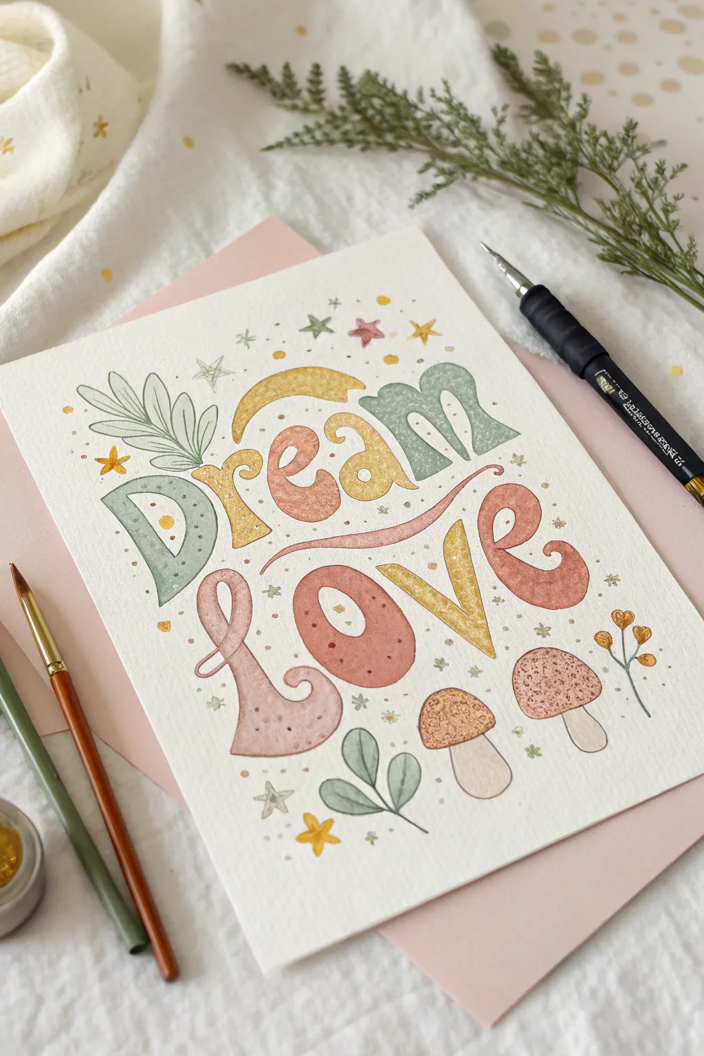
Embrace a soft and dreamy aesthetic with this ’70s-inspired hand-lettering project. Featuring bubbly typography and sweet botanical accents, this piece uses a muted pastel palette to evoke a sense of calm nostalgia.
Step-by-Step Tutorial
Materials
- Cold press watercolor paper (A5 size)
- Pencil (HB or H)
- Kneaded eraser
- Watercolor paints (Sage green, dusty pink/rose, mustard yellow, peach)
- Round watercolor brushes (Size 2 and 4)
- White gouache or white gel pen
- Fine liner pen (optional for outlining, though this example is lineless)
- Paper towel
- Jar of water
Step 1: Drafting the Design
-
Sketch the layout:
Begin by lightly sketching two curved guidelines for your text. The word ‘Dream’ should arch slightly upward, and ‘Love’ should curve gently below it to nestles the words together. -
Draw the letters:
Using your pencil, sketch out the letters. Aim for a distinct ‘groovy’ font style: thick vertical strokes, curled serifs on the ‘r’ and ‘m’, and exaggerated rounded bottoms on the ‘L’ and ‘e’. -
Add illustrative elements:
Sketch a large leaf sprig emerging from the ‘D’. Below the text, draw two simple mushroom shapes. Scatter small stars, circles, and four-pointed sparkles around the empty spaces. -
Lighten the lines:
Once you are happy with the composition, gently roll your kneaded eraser over the entire page. You want the graphite lines to be barely visible so they don’t show through the transparency of the watercolor.
Clean Edges Trick
Work slowly on the letter edges. If you exceed the line, quickly lift the mistake with a clean, damp brush then blot with a paper towel.
Step 2: Painting the Typography
-
Paint the letter D:
Load your size 4 brush with a watery sage green. Carefully fill in the ‘D’, keeping the edges crisp. While the paint is still wet, you can drop in a tiny bit of darker green at the bottom for an ombre effect. -
Alternate colors:
Move to the ‘r’. Mix a mustard yellow tone and fill it in. Proceed to painting the ‘e’ in a soft peach or terracotta tone. Alternating colors like this keeps the piece dynamic. -
Finish the word Dream:
Paint the ‘a’ in that same mustard yellow, and finish the ‘m’ in sage green. Let this top row dry completely before moving down to avoid smudging. -
Paint the word Love:
For the bottom row, use a dusty rose pink for both the ‘L’ and the ‘e’. Paint the ‘o’ in a deeper terracotta or rust red, and use the mustard yellow again for the ‘v’. Ensure the decorative swash of the ‘L’ curves nicely under the word above.
Gold Accents
Swap the mustard yellow paint for metallic gold watercolor on the stars and the letter ‘v’ for a magical shimmer that catches the light.
Step 3: Adding Details and Accents
-
Paint the leaves:
Using the sage green mixture, paint the leaf sprig coming out of the ‘D’. Switch to a smaller brush (size 2) if needed for the tips. Paint the smaller leaf cluster at the bottom center in the same shade. -
Color the mushrooms:
Paint the mushroom caps. I like to use a textured approach here—dab a mix of peach and light brown onto the caps to give them an earthy, speckled look. Use a very pale beige wash for the stems. -
Fill the background elements:
Using your smallest brush, paint the scattered stars and circles. Use green for the stars, and alternate yellow and pink for the dots and sparkles. -
Add texture to letters:
Once the main letters are bone dry, mix a slightly darker, more concentrated version of your paint colors. Use a small brush to add tiny dots or patterns inside the letters for a speckled, vintage texture. -
Add white highlights:
With white gouache or a gel pen, add tiny highlights inside the letters and on the mushroom caps to give them dimension. -
Final touches:
Inspect the edges of your letters. If any look wobbly, you can carefully refine them with a slightly damp brush or your fine liner if you prefer a outlined look.
Allow your artwork to dry flat completely before framing or gifting this cheerful message


Melting Sun Over a Dreamy Horizon
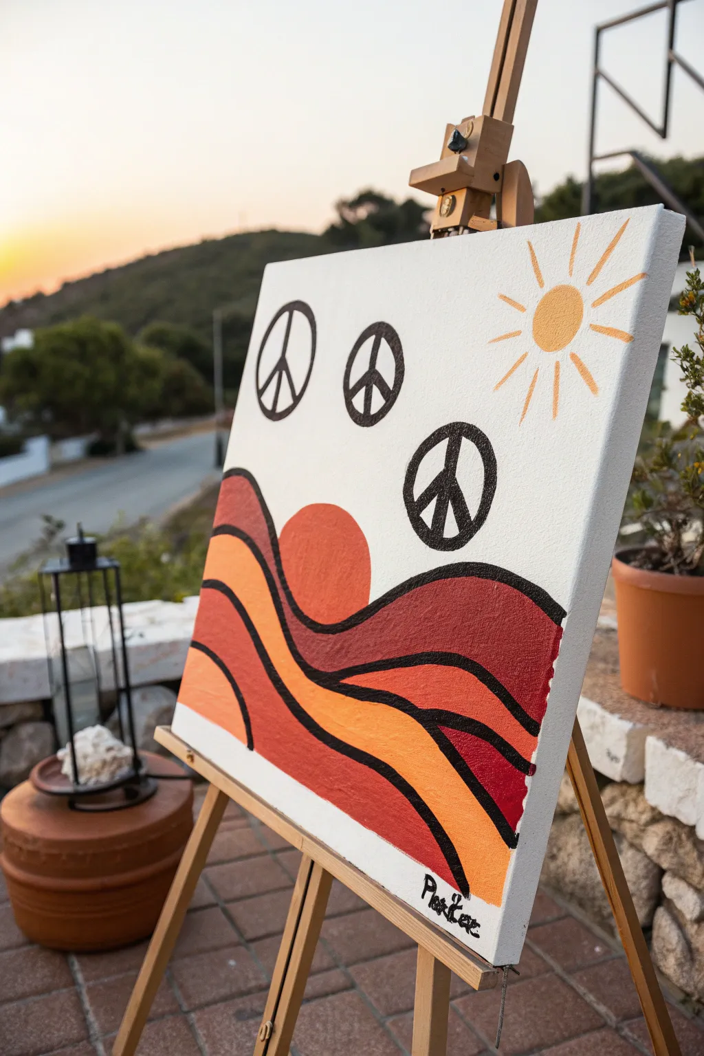
Capture the spirit of the 70s with this warm, groovy landscape featuring rolling hills and floating peace signs. The bold black outlines and sunset palette create a striking, poster-like quality that brings instant nostalgia to any room.
Step-by-Step Tutorial
Materials
- Square stretched canvas (e.g., 12×12 or 16×16 inches)
- Acrylic paints: White, Terracotta/Burnt Sienna, Deep Red, Bright Orange, Golden Yellow, Black
- Pencil and eraser
- Flat paintbrushes (medium and large)
- Round detail paintbrush (small, distinct tip)
- Paint palette or mixing plate
- Cup of water and paper towels
- Ruler (optional)
- Circular objects for tracing (cups, lids, or a compass)
Step 1: Sketching the Layout
-
Establish the rolling hills:
Start by lightly sketching the wavy landscape lines with a pencil. Draw three major flowing curves that span horizontally across the bottom half of the canvas, stacking them to create depth. -
Position the sun element:
Nestled between the second and third hill bumping up from the bottom, sketch a semi-circle to represent the setting sun. It should look like it’s tucking behind the foreground hill. -
Outline the peace signs:
In the open sky area, trace three circles using a cup or compass. Place them in a diagonal arc rising from left to right. -
Finish with the sky sun:
In the top right corner, sketch a small circle for the sun and drawn simple, straight lines radiating outward for the rays.
Clean Lines Hack
Dilute your black acrylic detailed paint with a few drops of water. Inky, fluid paint flows off the brush much smoother than thick paint, creating crisper outlines without drag marks.
Step 2: Blocking in Color
-
Paint the background sky:
Mix a large amount of white acrylic with the tiniest dot of yellow or cream to warm it up. Paint the entire upper sky area, carefully painting around your pencil sketches for the peace signs and sun elements. -
Fill the top hill:
Using your medium flat brush, paint the uppermost wave (the hill furthest back) with a deep maroon or dark terracotta shade. Don’t worry about perfect edges yet; the black lines will cover them later. -
Paint the middle hill:
For the middle section of the landscape, use a bright orange mixed with a little terracotta to bridge the gap between the dark top and light bottom. -
Complete the foreground:
Paint the lowest hill—the one closest to the bottom edge—using a mix of red and orange for a vibrant, warm tone. -
Fill in the setting sun:
Paint the semi-circle sun shape with a solid, flat orange or red-orange tone that contrasts slightly with the hill behind it. -
Let the base layers dry:
Allow the canvas to dry completely before moving on. I usually give this about 20 minutes so the wet paint doesn’t smear when I rest my hand on it for details.
Step 3: Details & Outlining
-
Paint the top sun:
Using a golden yellow, fill in the small circle in the top right corner and paint the radiating lines using a smaller flat brush for crisp edges. -
Draft the peace sign interiors:
Once the white sky is dry, use your pencil to lightly draw the internal lines of the peace signs (the vertical line and the two angled legs) inside your empty circles. -
Start the black linework:
Switch to your small round detail brush and black paint. Begin outlining the rolling hills first to get comfortable with the viscosity of the paint. -
Thicken the landscape lines:
Go back over the landscape curves to thicken the black lines. The style relies on bold, uniform outlines, so don’t be afraid to make them substantial. -
Paint the peace symbols:
Carefully paint the outlines and inner lines of the three floating peace signs. Keep your hand steady and rotate the canvas if needed to get the best angle. -
Sign your work:
Use the small round brush to add your signature in the bottom corner with black paint to match the outlines.
Wobbly Circles?
If painting the peace signs freehand is difficult, use a black paint marker or a permanent marker for the outlines instead of a brush. It offers way more control.
Hang this piece in a sunny spot to maximize those warm, retro vibes in your space
Happy Mountains With Faces
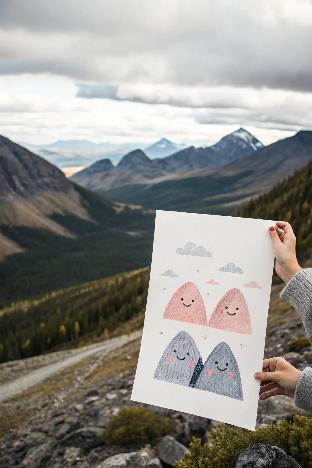
Bring some joy to your art space with this adorable illustration featuring friendly mountain peaks. The soft, textured look combined with simple kawaii faces makes this a delightful project for artists of any skill level.
Step-by-Step
Materials
- High-quality watercolor paper or heavy mixed media paper (A4 or similar size)
- Watercolor paints or gouache (soft pink and cool grey)
- Black fine-liner pen or black gel pen
- Pink posca paint marker or fine brush with pink acrylic
- Round watercolor brush (size 6 or 8)
- Small round brush (size 2)
- Pencil and eraser
- Water cup and paper towels
Step 1: Sketching the Scene
-
Map out the composition:
Begin by lightly sketching the placement of your four mountains. Position two slightly rounded triangles in the upper-middle section for the pink peaks, and two more directly below them for the grey peaks. -
Refine the shapes:
Soften the points of your triangles so they look like gently rounded humps rather than sharp spikes. The bottom two mountains should overlap slightly in the center. -
Add the sky elements:
Sketch a few small, fluffy cloud shapes floating above the top mountains to fill the negative space.
Pro Tip: Texture Magic
For a crayon-like texture shown here, use cold-press watercolor paper. The rough surface naturally breaks up the strokes and adds instant character.
Step 2: Painting the Base Layers
-
Mix your pink tone:
Create a soft, dusty pink color using your watercolors or watered-down gouache. -
Fill the top peaks:
Paint the two upper mountain shapes with the pink mix. Aim for a slightly uneven, textured wash to give it that organic feel. -
Mix the grey tone:
Prepare a cool, medium-grey shade. I find adding a tiny touch of blue makes the grey look crisp and fresh. -
Paint the bottom peaks:
Fill in the bottom two mountain shapes with the grey wash. Where the mountains overlap, you can let the paint be slightly darker to show depth. -
Paint the clouds:
Use a very watered-down version of your grey mix to paint the cloud shapes above the pink mountains.
Step 3: Adding Texture and Details
-
Let it dry completely:
Ensure the paper is bone dry before proceeding, otherwise your pen lines will bleed into the paint. -
Add texture lines:
With a slightly darker shade of pink (or a colored pencil), add faint vertical striations or texture lines on the pink mountains to suggest rocky surfaces. -
Texture the grey peaks:
Do the same for the grey mountains using a darker grey pencil or dry brush strokes, creating vertical motion. -
Darken the overlap:
If the separation between the two bottom grey mountains isn’t clear, use a dark grey pencil or paint to add a shadow wedge between them.
Level Up: 3D Elements
Cut your mountains out and mount them on foam tape against a separately painted background for a cool pop-up shadowbox effect.
Step 4: Bringing Them to Life
-
Draw the faces:
Using your black fine-liner, draw small, wide-set eyes and simple curved smiles on all four mountains. Simplicity is key for the cute factor here. -
Add rosy cheeks:
Use a pink paint marker or a small brush with opaque pink paint to dab small circles or hearts onto the cheeks of the grey mountains. -
Detail the pink mountains:
For the pink mountains, use a slightly darker red or pink marker to add their cheek details so they stand out against the background color. -
Final whimsical touches:
Scatter small doodles around the mountains using your black pen—tiny squiggles, dots, and little ‘x’ marks. -
Float some hearts:
Add a few tiny pink cloud shapes or hearts floating near the peaks to tie the color palette together.
Once dry, frame your cheerful mountain family to add a touch of whimsy to any room
Trippy Swirl Portal Background
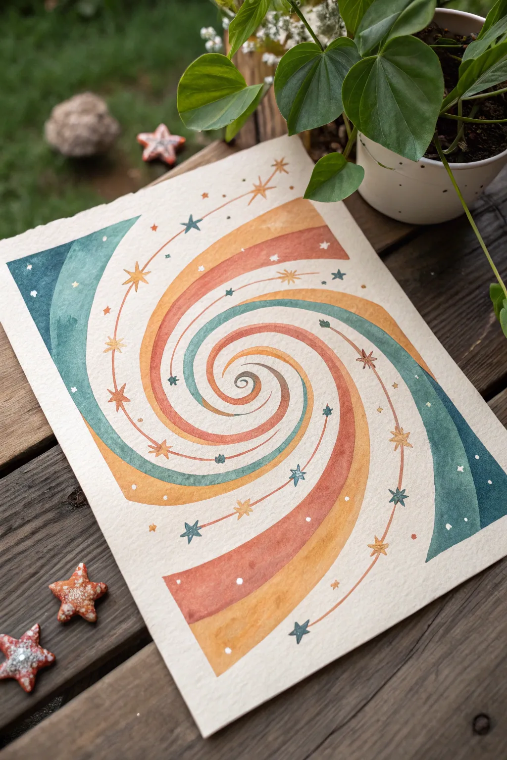
Transport yourself back to the 70s with this groovy, celestial-inspired swirl painting. Featuring a warm, earthy palette contrasted with cool teals and adorned with delicate stars, this piece creates a mesmerizing optical illusion that is simpler to achieve than it looks.
Step-by-Step Tutorial
Materials
- Cold press watercolor paper (A4 or 9×12 inch)
- Watercolor paints (Teal, Burnt Sienna, Yellow Ochre, Indigo)
- Pencil and eraser
- Compass (optional but recommended for spacing guide)
- Round watercolor brushes (sizes 2, 4, and 6)
- White gel pen or gouache for highlights
- Gold metallic watercolor or pen (optional)
- Two jars of water
- Paper towels
Step 1: Drafting the Spiral
-
Find the center:
Begin by lightly marking the center of your watercolor paper with a pencil. This will be the origin point for your spiral. -
Map the boundaries:
Sketch a rectangular boundary or tape off your edges if you want a clean border, though this particular piece has a lovely deckled edge feel. -
Sketch the primary coil:
Starting from the center dot, draw a single curved line that spirals outward. Focus on keeping the distance between the lines gradually increasing as you move toward the edges. -
Thicken the bands:
Draw parallel lines next to your initial spiral line to create distinct bands. You need four or five alternating thick bands that will eventually hold different colors. -
Extend to corners:
Continue the spiral lines until they run off the page, particularly flaring out broadly into the corners of the paper to create movement.
Wobbly Lines?
If your spiral lines look shaky, sketch firmly with your whole arm, not just your wrist. Focus your eyes slightly ahead of where you are drawing, rather than on the pencil tip.
Step 2: Applying Color
-
Mix the teal shade:
Mix a deep teal using blue-green paint with a touch of gray or indigo to desaturate it slightly. Test the color on a scrap piece of paper first. -
Paint the cool band:
Select one of your spiraling bands to be the teal section. Using a size 6 brush, carefully fill it in, ensuring you achieve an even wash without hard water edges. -
Mix the rust tone:
While the teal dries, mix Burnt Sienna with a tiny drop of red to create a warm, rusty terracotta color. -
Paint the warm band:
Apply the rust color to the band adjacent to the teal one. Be very careful where the wet paints might touch; wait for the teal to be semi-dry if you are worried about bleeding. -
Add the yellow ochre:
Mix a diluted yellow ochre. Paint the remaining band with this sunny, earthy yellow. I like to keep this wash slightly more transparent to let the paper texture show through. -
Deepen the outer corners:
For the broad sections in the corners (top left and bottom right), use a darker, more saturated version of your teal or rust mix to
Pro Tip: Masking
To get crisp edges between the spiral colors without waiting for each to dry perfectly, use liquid frisket (masking fluid) to draw the lines between the bands before painting.
Step 3: Celestial Details
-
Let it dry completely:
Ensure the entire painting is bone dry. If the paper is cool to the touch, it still holds moisture. Use a hairdryer on a low setting if you’re impatient. -
Connect with star lines:
Using a very fine brush (size 0 or 2) and a diluted brown or rust paint, draw thin, curved lines that arc across the colored bands, connecting different sections of the spiral. -
Paint the stars:
Along these thin connecting lines, paint small four or five-pointed stars. Vary the colors—use teal stars on warm bands and rust stars on cool bands for contrast. -
Add floating stars:
Scatter a few additional tiny stars in the negative spaces or floating within the wider color bands to balance the composition. -
Sprinkle dots:
Using the tip of your brush, add tiny colored dots of paint randomly along the spiral path to mimic distant stardust. -
Add white highlights:
Finally, take your white gel pen or opaque white gouache and add tiny white speckles or highlight the centers of the larger stars to make them sparkle.
Step back and admire your cosmic creation as the colors swirl together into a retro masterpiece
Retro Van in a Psychedelic Meadow
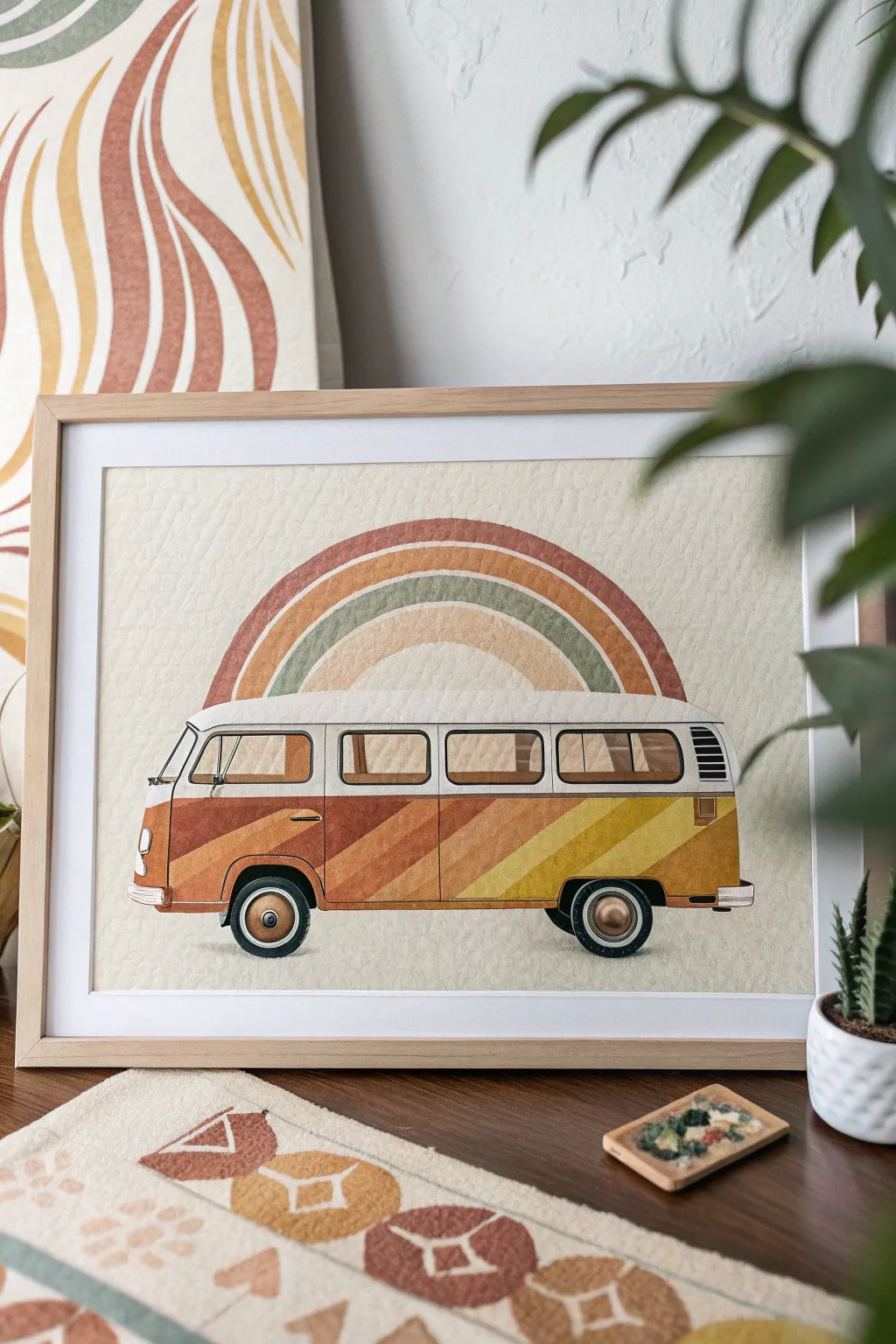
Capture the spirit of the open road with this nostalgic artwork featuring a classic camper van beneath a muted, earthy rainbow. Using gouache or acrylics on textured paper creates a vintage, matte finish that feels straight out of the 1970s.
Step-by-Step Guide
Materials
- Cold press watercolor paper or textured illustration board (heavyweight)
- Gouache paint set (primary colors plus burnt sienna, yellow ochre, and white)
- Pencil (HB) and eraser
- Ruler or straight edge
- Compass or circular object (for the rainbow)
- Fine liner brushes (sizes 0 and 2)
- Flat shader brushes (sizes 4 and 6)
- Micron pen or fine black marker (optional for outlining)
- Masking tape
- Mixing palette
Step 1: Drafting the Design
-
Tape Borders:
Begin by taping down your paper to a hard surface with masking tape. This creates that crisp, clean white border seen in the final piece and prevents the paper from buckling when wet. -
Horizon Line:
Use your ruler to lightly draw a straight horizontal line across the lower third of the page. This will serve as the ground line for your van’s wheels. -
Geometric Van Shape:
Block out the main body of the van using a rectangular shape with rounded corners. The top section (roof) should be slightly narrower than the bottom body to capture that classic bus silhouette. -
Rainbow Arcs:
Center the point of your compass just below the roofline of the van. Draw four concentric semi-circles arching over the van to create the rainbow bands. -
Detail Sketching:
Refine your sketch by adding the windows, headlights, bumpers, and tires. Don’t worry about the diagonal stripes on the van body just yet; we’ll add those later.
Mastering Matte
To get that vintage poster look, mix a tiny pinch of cornstarch into your gouache or acrylic paint. It kills the gloss and creates a velvety, matte finish.
Step 2: Painting the Backdrop
-
Mixing Earth Tones:
Prepare your palette with a retro scheme: mix burnt sienna with a touch of white for terracotta, yellow ochre for mustard, and a muted sage green. -
Rainbow Layering:
Carefully paint the rainbow bands. Start with the outermost terracotta band, followed by the cream/beige space, then the green band, and finally the inner mustard arch. Use a steady hand and a flat shader brush for even coverage. -
Background Texture:
For the subtle textured background, dilute a tiny amount of cream or beige paint with plenty of water. Wash it over the empty sky and ground areas, blotting gently with a paper towel if you want to enhance the paper’s texture.
Step 3: Coloring the Camper
-
Roof and Top Section:
Paint the roof and the upper section of the van (around the windows) in a solid, opaque white or cream. I find two thin coats work better than one thick one to avoid brushstrokes. -
Drafting the Stripes:
Once the white paint is fully dry, lightly pencil in the diagonal stripes across the lower body of the van. The angle should slope upwards from left to right. -
Painting the Stripes:
Fill in the diagonal stripes using the same color palette as your rainbow—terracotta dark, terracotta light, mustard dark, and mustard light. Let each stripe dry before painting its neighbor to keep edges sharp. -
Windows and Interiors:
Paint the window panes with a very diluted brown or beige wash. This transparency suggests glass without needing complex reflections.
Retro Texture
Before painting, lightly sand your heavy paper with fine-grit sandpaper. The paint will catch in the roughened fibers, mimicking old, weathered print stock.
Step 4: Fine Details
-
Tires and Hubcaps:
Paint the tires with a dark charcoal grey (avoid pure black for a softer retro look). For the hubcaps, use a metallic bronze or a mix of yellow ochre and white for a shiny effect. -
Chrome Accents:
Use a light grey paint to fill in the bumpers, side mirrors, and window trims. Add tiny highlights of pure white to these areas to make them pop. -
Clean Lines:
Using your smallest fine liner brush or a Micron pen, carefully outline the van’s main features—door seams, window frames, and the separation between the roof and body. -
Final Inspection:
Check for any uneven edges. If necessary, use a tiny bit of the background creation color to clean up the outer silhouette of the rainbow or van. -
The Reveal:
Wait until the painting is completely bone dry before slowly peeling away the masking tape at a 45-degree angle to reveal your crisp border.
Frame your groovy masterpiece in simple light wood to complement those warm, nostalgic tones
Patchwork Pattern Sampler Grid
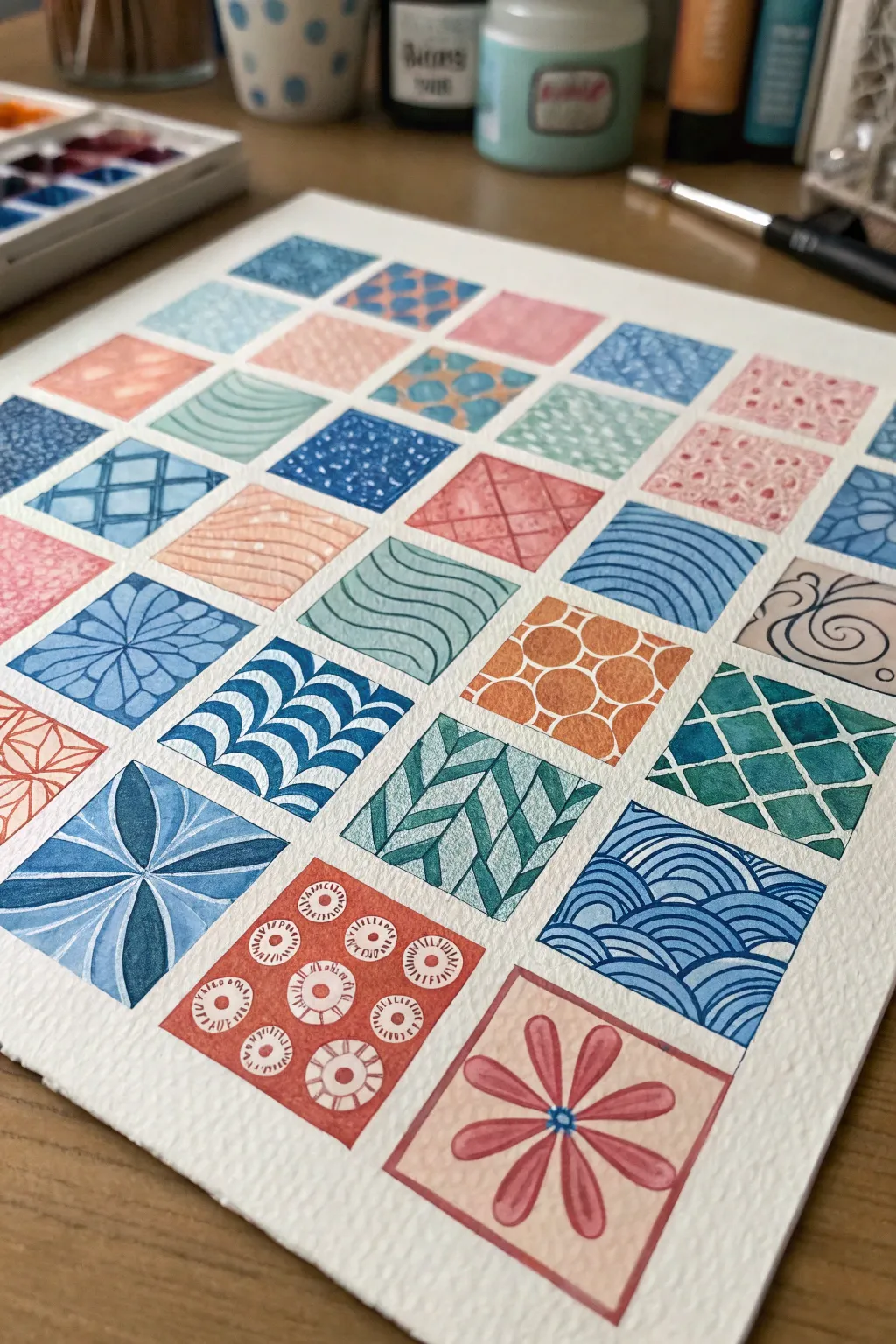
Create a soothing visual rhythm by exploring repetition and variety in this geometric watercolor grid, perfect for practicing brush control. This sampler project lets you test out multiple patterns—waves, tiles, and florals—all within a harmonized color palette of blues, teals, and corals.
How-To Guide
Materials
- Cold press watercolor paper (140lb/300gsm)
- Watercolor paints (Indigo, Teal, Coral, Light Blue/Turquoise)
- Ruler
- Pencil (HB or H)
- Kneadable eraser
- Fine round watercolor brushes (Size 0 and Size 2)
- Masking tape (optional for edges)
- Jar of clean water
- White gel pen (optional for highlights)
Step 1: Preparation & Grid Layout
-
Prepare your workspace:
Begin by taping down your watercolor paper to a hard board or your table surface. This helps prevent buckling when the paper gets wet and creates a clean border around your final piece. -
Measure the grid:
Using a ruler and a light pencil touch, measure out a square grid. The example uses a 6×6 layout, but you can adjust based on paper size. Aim for squares that are roughly 1.5 to 2 inches wide. -
Draw the boundaries:
Lightly rule the grid lines. Keep your pencil pressure very soft so the graphite doesn’t show through the transparent watercolor layers later. -
Lighten the guides:
Roll your kneadable eraser gently over the entire grid to lift excess graphite, leaving just a faint ghost image to guide your painting.
Bleeding edges?
If colors bleed into neighbor squares, your paint is too wet. Leave a microscopic hairline gap of white paper between squares to act as a barrier.
Step 2: Planning the Palette
-
Mix your colors:
Prepare puddles of your main colors: a deep indigo, a bright teal, a soft turquoise, and a warm coral/terracotta. Having these pre-mixed ensures consistency across the different squares. -
Test transparency:
Swipe a test stroke of each color on a scrap piece of paper. You want a consistency that flows well but holds a crisp edge, something resembling heavy cream.
Step 3: Painting the Patterns
-
Start with solid base shapes:
For patterns like the white circles on orange (bottom left center), paint the negative space first. Carefully paint the coral color around imaginary circles, leaving the white paper exposed. -
Create linear waves:
Moving to a blue square, use the tip of your size 0 brush to paint fine, parallel wavy lines. Keep your wrist loose to maintain a fluid curve throughout the stroke. -
Paint the geometric tiles:
For the checkerboard or diamond patterns, paint every other shape first. Let them dry completely before painting the adjacent shapes to prevent the colors from bleeding into one another. -
Add floral elements:
Locate a square for the large flower (bottom right). Paint the square a very pale coral wash first and let it dry. Then, paint the darker petal shapes on top using a more concentrated mix. -
Execute the ‘Scale’ pattern:
For the fish-scale or scallop pattern (blue, center right), paint a row of small arches. Let that row dry before painting the next row directly above it, staggering the position like bricks. -
Layering weaves:
For the basket-weave texture (teal, bottom-middle), paint diagonal strokes in one direction. Once dry, paint the opposing diagonal strokes, leaving tiny gaps of white paper to suggest texture. -
Detail work: dots and dashes:
Select a few squares to fill with simple stippling or small dashes. Varied densities of dots can create a lovely gradient effect without mixing new colors. -
Work across the board:
Continue filling squares, alternating between blue, teal, and coral themes to keep the color balance distributed evenly across the page. I find it helpful to jump around the grid rather than working linearly to let wet squares dry.
Negative Space Pro Tip
Treat the white paper as a color! Patterns like the ‘white’ waves on blue only work if you carefully paint the negative space around them.
Step 4: Finishing Touches
-
Refine edges:
Check the boundaries of your squares. If any paint has strayed, you can sometimes lift it with a clean, damp brush, or simply touch up adjacent squares to neaten the grid lines. -
Add white accents:
If you lost some white highlights during painting, use a white gel pen to add tiny details back in, such as the centers of the small coral circles or thin grid lines on dark blue squares. -
Erase grid lines:
Once the painting is bone dry—touch it with the back of your hand to be sure—erase any remaining visible pencil lines between the squares.
Step back and enjoy the calming rhythm of your completed geometric sampler.
Neon-on-Dark Psychedelic Silhouettes
Brighten up your space with this psychedelic neon-on-black mushroom design that pops off the page with groovy 60s vibes. Using high-contrast acrylic paint markers on a dark surface allows you to achieve stunning luminosity without complex blending techniques.
Detailed Instructions
Materials
- Black canvas board or blackboard art paper (approx. 8×10 inches)
- White colored pencil or chalk pencil (for sketching)
- Acrylic paint markers (medium and fine tips): Cyan/Teal, Neon Pink, Orange, Yellow
- Ruler (optional)
- Kneaded eraser
Step 1: Sketching the Bones
-
Establish the horizon:
Using your white pencil, lightly draw a horizontal line near the bottom of your black surface to mark where the ground will be. It doesn’t need to be perfectly straight; a little organic wave looks natural. -
Outline the mushroom cap:
Draw a large, wide dome shape in the upper center of the canvas. This will be the mushroom cap. Add a slightly curved line connecting the bottom edges to form the underside of the cap. -
Draft the stem:
Extending from the center bottom of the cap, sketch a thick stem that flares out widely at the base, almost like a bell-bottom shape. Make sure the base connects fully with your ground line. -
Place the flowers:
On the left side, sketch two small flower shapes—a larger one slightly higher and a smaller bud lower down. Repeat this on the right side with a similar arrangement to create balance.
Prime Your Tip
Shake markers vigorously before uncapping. Press the nib on a scrap paper repeatedly until ink flows freely to avoid blobs on your art.
Step 2: Main Color Blocking
-
Outline the mushroom shape:
Take your cyan or teal paint marker and trace slightly outside your pencil line for the entire outer mushroom silhouette. This creates that glowing ‘halo’ effect. -
Fill the stem:
Use the same teal marker to color in the entire stem and the grass area at the bottom. Apply smooth, vertical strokes to ensure solid coverage against the black background. -
Create the cap texture:
Switch to your neon pink marker. Draw large, varying circles and ovals across the top dome of the mushroom. Leave significant black space between them for now—don’t fill the background yet. -
Fill the cap background:
Now, carefully color the space *between* the pink circles using the pink marker, but use stippling (little dots) or a cross-hatch pattern to create a textured, shaded look, differentiating it from the solid rings. -
Detail the underside:
Using the orange marker, draw the gills under the cap. Start from the center (where the stem meets the cap) and draw curved lines radiating outward to the edge of the cap.
Step 3: Floral and Celestial Details
-
Color the flower petals:
Use the neon pink marker to fill in the petals of the side flowers. Leave small circular centers empty for now. -
Draw stems and leaves:
With a fine-tip lime green or yellow marker, draw thin lines connecting the flower heads to the ground. Add simple oval leaves branching off the stems. -
Add flower centers:
Dot the centers of your flowers with the yellow marker to make them pop against the pink petals. -
Draw the peace sign:
On the base of the blue mushroom stem, draw a circle in neon pink. Add the internal vertical line and two diagonal lines to create the classic peace symbol.
Make it Glow
For an even brighter neon effect, lay down a layer of white paint first where the pinks and oranges will go. Let dry, then color over it.
Step 4: Final Flourishes
-
Texturize the stem:
Overlay thin vertical stripes of orange along the blue mushroom stem. I find that letting the lines break slightly adds to the organic feel. -
Define the grass:
At the very bottom, use the teal marker to add small, upward flicks over your base color to simulate blades of grass. -
Add ‘starbursts’:
Use a white or silver paint pen (or very pale yellow) to draw small asterisks (*) scattered in the black sky area. -
Sprinkle dots:
Add tiny single dots of yellow and pink around the mushroom cap and flowers to mimic floating pollen or distant stars. -
Clean up sketch lines:
Once the paint is totally dry (give it at least 20 minutes), gently erase any visible white pencil lines with your kneaded eraser.
Step back and admire how those neon colors vibrate against the dark background
Surreal Flower Characters in Boots
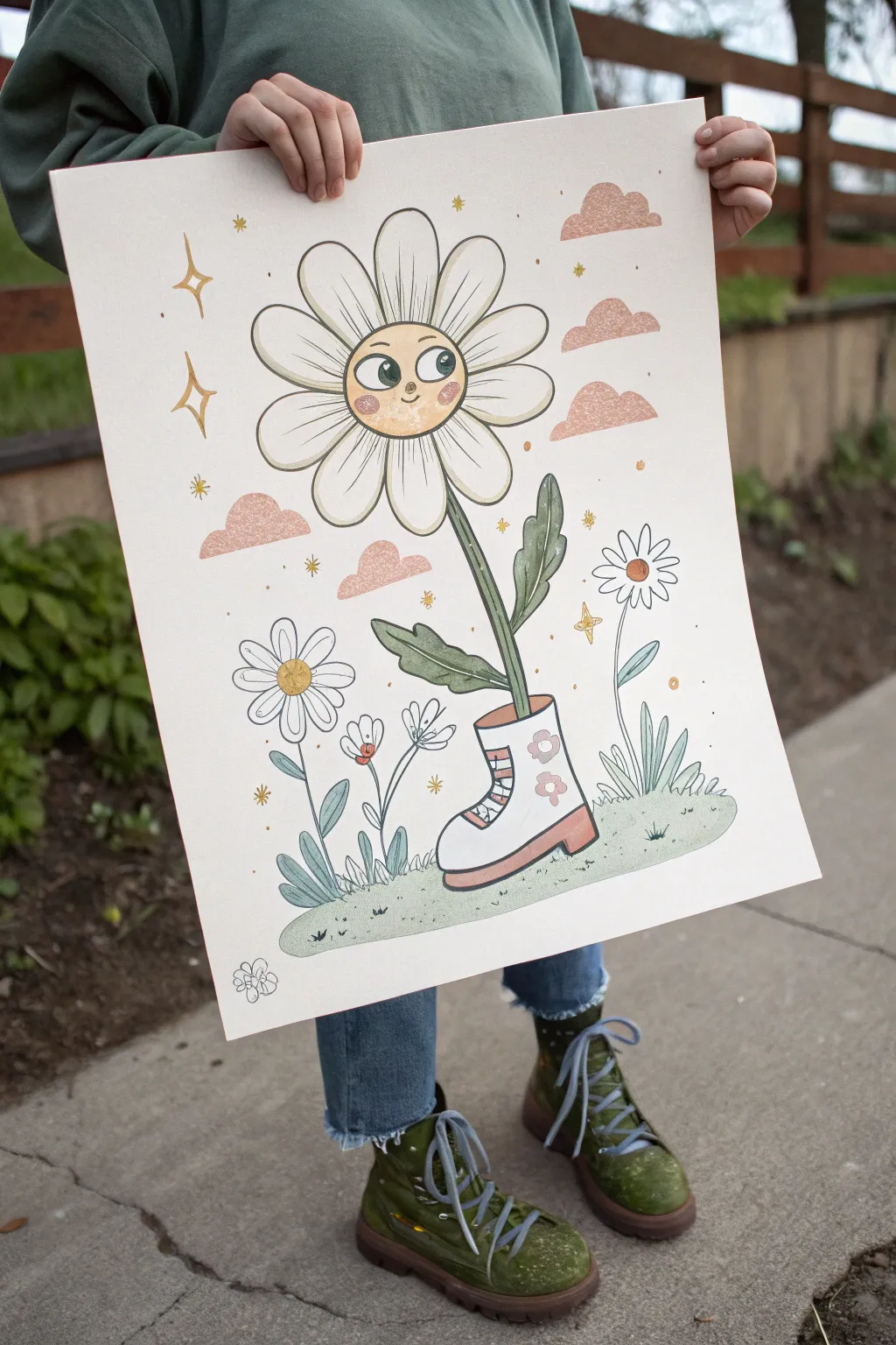
Capture a playful, retro vibe with this charming illustration of a happy daisy taking a stroll in a stylish boot. With its soft pastel palette and bold linework, this piece brings a touch of groovy 70s nostalgia to any wall.
Step-by-Step
Materials
- Large sheet of hot press watercolor paper or bristol board (smooth surface is best)
- Gouache paints (white, yellow, peach/coral, sage green, dark green, brownish-grey)
- Pencils (HB for sketching)
- Black waterproof fine liner pens (0.5mm and 0.8mm)
- Detail brushes (rounds size 0, 2, and 4)
- Mixing palette
- Painter’s tape
- Eraser
Step 1: Planning the Composition
-
Prepare the surface:
Tape down your paper to a flat board or table using painter’s tape on all four sides to prevent buckling when adding paint. -
Sketch the main character:
Lightly sketch a large circle in the upper center for the daisy’s face. Below that, draw a long, slightly curved stem leading down into a boot shape near the bottom. -
Detail the shoe:
Refine the boot sketch. Give it a distinct chunky heel, laces, and a rounded toe. I like to add two small flower shapes on the side of the boot for extra flair. -
Add petals and leaves:
Draw long, rounded petals radiating from the face circle. Add two large, wavy leaves growing from the stem. -
Populate the scene:
Fill the empty space by sketching smaller daisies on the left and right, some grass tufts at the bottom, and fluffy, flat-bottomed cloud shapes in the sky.
Fixing Wobbly Lines
If your ink lines aren’t perfectly smooth, don’t worry! Thicken the line slightly to hide the jitter, or embrace the ‘wiggle’ as part of the energetic, hand-drawn style.
Step 2: Painting the Base Colors
-
Mix your face tone:
Create a warm, creamy yellow-orange using white, yellow, and a tiny dot of peach. Paint the center circle of the main daisy. -
Paint the boot:
Fill in the main body of the boot with white gouache. Paint the sole and heel with a muted coral or peach tone. -
Greenery block-in:
Mix a soft sage green. Paint the stem, the leaves, and the grass mound at the bottom. Use a slightly lighter blue-green for the stems/leaves of the background flowers. -
Cloud coverage:
Use a diluted coral-pink to paint the clouds. Keep the paint somewhat translucent or textured to give them a soft, dreamy look. -
Petal wash:
The petals of the main daisy are white, but you can add a very faint wash of cream if your paper is stark white, just to give them substance.
Add Texture
Use a dry brush technique or colored pencils over the dried gouache to add gritty texture to the cheeks, clouds, and shoe sole for a vintage print effect.
Step 3: Adding Details and Personality
-
Face features:
Once the face circle is completely dry, use dark green or black paint to add two large oval eyes with pupils looking sideways. Add a small U-shaped smile and a tiny nose. -
Rosy cheeks:
Mix a pink tone and dab two circles on the daisy’s cheeks. I sometimes stipple this lightly to make it look like a textured blush. -
Boot details:
Paint the small flowers on the boot in pink. Add red stripes to the lace area. -
Magic sparkles:
Using a golden-yellow hue, paint four-pointed stars and small dots scattered throughout the background sky.
Step 4: Inking and Finishing
-
Check dryness:
Ensure absolutely every painted area is bone dry before picking up your pen, or the ink will bleed. -
Line the main daisy:
Use the thicker 0.8mm pen to outline the main daisy petals, face, stem, leaves, and boot. This bold line weight separates the main character from the background. -
Line the background:
Switch to the finer 0.5mm pen to outline the clouds, the smaller flowers, and the grass. Keep these lines delicate. -
Detail lines:
Add interior details with the fine pen: veins on the leaves, creases on the petals, and small grass blades on the ground mound. -
Final clean up:
Once the ink is set, gently erase any visible pencil sketch lines. Peel off the painter’s tape slowly.
Hang your quirky floral friend up to bring a smile and a bit of wanderlust to your room.
Have a question or want to share your own experience? I'd love to hear from you in the comments below!