Whenever I want a poster to look finished (without doing a ton of extra work), I add a hand-drawn border—it’s like giving your layout a neat little stage. Here are my go-to border ideas for poster designs, starting with the classics and ending with a few fun curveballs.
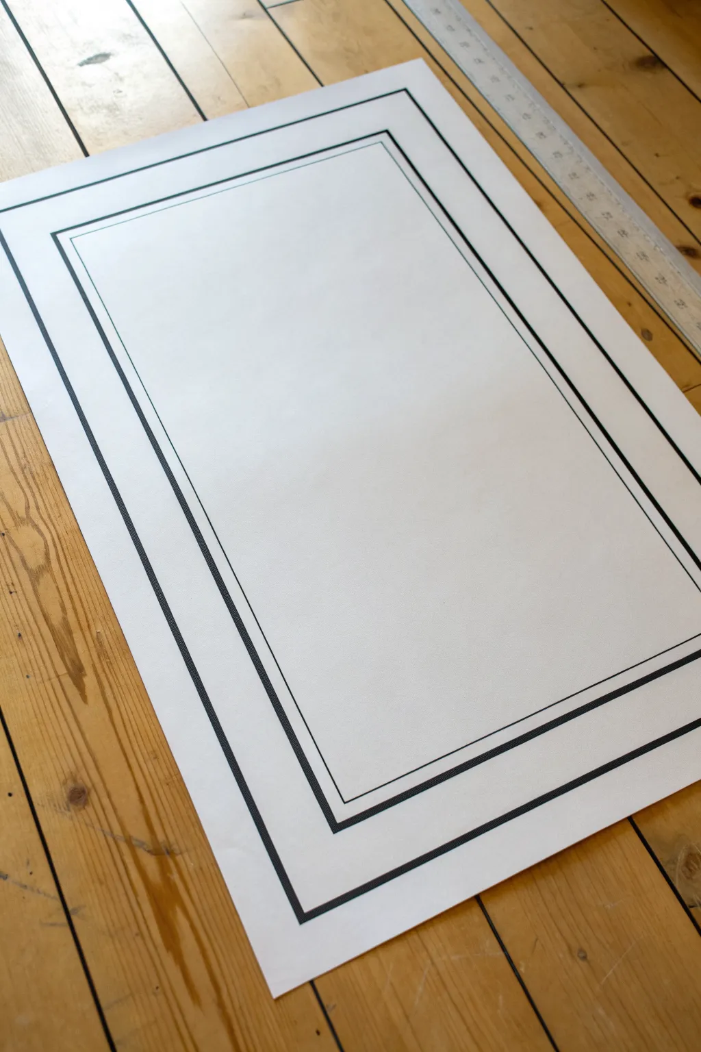
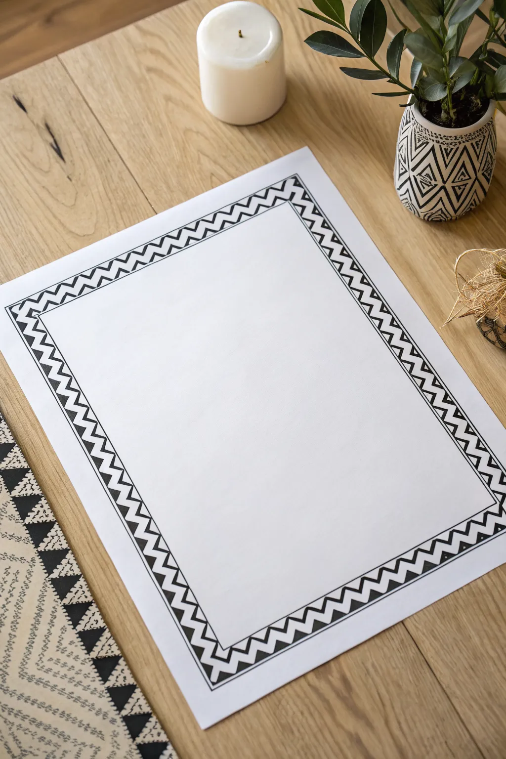
Clean Poster Border Line Frame
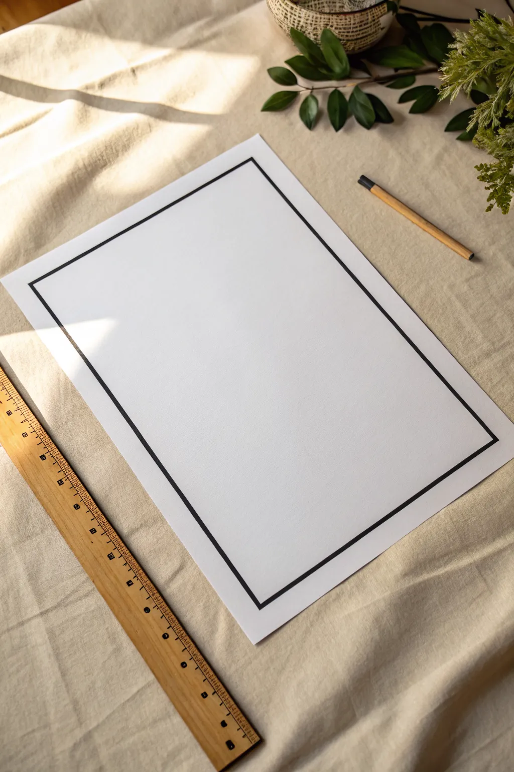
Sometimes less really is more, especially when you want your artwork or text to take center stage without distraction. This clean, bold black line border creates a gallery-ready look that feels intentional and structured, instantly upgrading even the simplest poster design.
Detailed Instructions
Materials
- High-quality white poster paper or cardstock
- Long ruler (18-24 inches)
- Black fine-tip drawing pen (0.5mm or 0.8mm)
- Thick black chisel-tip marker
- Graphite pencil (HB or 2H)
- White vinyl eraser
- Masking tape or drafting tape
Step 1: Preparation & Measuring
-
Secure the paper:
Begin by laying your poster paper on a completely flat, clean surface free of any texture that might transfer through when you draw. Use small pieces of masking tape on the very corners to hold the paper steady so it doesn’t shift while measuring. -
Decide on margin width:
Determine how much white space you want around your frame. For a balanced look like the example, a 1.5 to 2-inch margin works beautifully on standard poster sizes. -
Mark the corners:
Using your ruler and pencil, measure inward from the top edge and left edge to mark your first corner point. Repeat this process for all four corners, ensuring your measurements are precise to the millimeter. -
Connect the dots lightly:
Lightly sketch the connecting lines between your corner dots using the pencil. Keep a very light hand here—you just want a faint guide that will be easy to erase later. -
Check for squareness:
Before committing to ink, measure the diagonals of your penciled rectangle. If the measurements match, your angles are perfectly square; if not, adjust your corners slightly.
Step 2: Inking the Border
-
Establish the outer edge:
Place your ruler along the first pencil line. Using the fine-tip drawing pen, trace firmly along the ruler’s edge to create a crisp, unwavering line. I find it helps to stand up while doing this to get better leverage over the ruler. -
Complete the fine outline:
Continue around the perimeter with the fine-tip pen until you have a thin, complete rectangle. Ensure the corners meet sharply without crossing over or leaving gaps. -
Create the inner boundary:
To thicken the border, you need a second guideline. Measure inward exactly 1/8th or 1/4th of an inch (depending on desired thickness) from your inked line and pencil a second, smaller inner rectangle. -
Ink the inner line:
Use your fine-tip pen and ruler again to ink this inner rectangle. You now have two parallel thin lines defining the width of your bold border. -
Switch to the chisel tip:
Now, take your thick chisel-tip marker. This tool will be used to fill the space between your two fine lines, providing the dense black coverage needed for high contrast. -
Fill in the border:
Carefully color the channel between the two lines. The fine lines you drew earlier act as barriers, preventing the thick marker from bleeding outward onto the clean paper. -
Maintain consistent saturation:
Move the marker slowly to ensure solid ink coverage. If you see lighter streaks, do a second pass while the ink is still slightly damp to blend the strokes together seamlessly.
Smudge Prevention
Tape a penny to the underside of your ruler. This raises the edge slightly off the paper, preventing ink from bleeding under the ruler and smearing when you move it.
Step 3: Finishing Touches
-
Let the ink cure:
Allow the border to dry deeply for at least 30 minutes. Thick marker ink can stay smudge-prone longer than you’d expect, especially on coated cardstock. -
Erase pencil marks:
Gently glide the white vinyl eraser over the border area to remove any original graphite guides. Hold the paper taut with your other hand to prevent crinkling. -
Inspect the corners:
Look closely at the four corners. If the chisel tip couldn’t reach the sharpest point of the angle, use your fine-tip pen to touch up those tiny voids for a razor-sharp finish. -
Remove tape:
Carefully peel away the masking tape from the corners, pulling it away from the center of the paper to avoid tearing the edge.
Double Frame Effect
Draw a second, extremely thin line 1cm inside your main bold border. This ‘mat board’ effect adds depth and makes the poster look professionally framed.
Now you have a crisp, professional foundation ready to showcase your next big idea


Double-Line Border with Breathing Room
This tutorial guides you through creating a crisp, architectural border that adds instant polish to any poster or presentation. By combining varied line weights with intentional negative space, you achieve a professional, gallery-worthy look using just markers and a ruler.
Step-by-Step
Materials
- Large sheet of white poster paper or cardstock
- Long metal ruler (at least 24 inches or length of paper)
- Pencil (HB or H for light lines)
- White eraser
- Thick black permanent marker (chisel tip or broad point)
- Fine point black fineliner pen (0.5mm or 0.8mm)
- Masking tape or painter’s tape (optional)
Step 1: Preparation and Guides
-
Secure the paper:
Lay your large sheet of paper on a clean, flat surface like a floor or large table. If the paper has a tendency to curl, use small pieces of masking tape on the very corners to hold it flat against the surface. -
Determine the margin:
Decide on the width of your outer margin. For a poster this size, a 2-inch margin works well. Place your ruler along the edge of the paper and make a small pencil mark at the 2-inch point. -
Mark all corners:
Repeat this measuring process near all four corners of the paper. Making two marks per side helps ensure your line will be perfectly straight. -
Lightly pencil the outer frame:
Connect your pencil marks using the long ruler. Draw a very faint guideline around the entire rectangle. This will be the path for your outermost thick border. -
Measure the inner gap:
From your initial pencil line, measure inward another 0.5 to 0.75 inches. This space creates the ‘breathing room’ between the two border elements. -
Pencil the inner frame:
Create a second rectangle of light pencil guidelines based on this inner measurement.
Pro Tip: Clean Edges
To prevent ink from bleeding under the ruler, adhere a few pennies or washers to the underside of the ruler. This raises the edge slightly off the paper.
Step 2: Inking the Borders
-
Test your markers:
Before touching the final paper, test your thick marker and fine pen on a scrap piece of the same paper type to check for bleeding or ink spread. -
Draw the main outer border:
Align your ruler slightly away from the first pencil line so the marker tip runs directly over the graphite. Using the thick chisel-tip marker, draw the outermost rectangle. Move the ruler immediately after drawing to avoid smearing. -
Create the secondary thick line:
Moving to the inner set of pencil guidelines, use the same thick marker to draw a second heavy rectangle. I find it helpful to rotate the paper so I’m always drawing the line horizontally across my body. -
Add the fine detail line:
This is the crucial step for that architectural look. Place your ruler just inside the second thick line you just drew. Leave a tiny gap—about 1/16th of an inch. -
Draft the thin line:
Using the fine point fineliner, draw a delicate line parallel to the inner thick border. This contrast in line weight creates visual sophistication. -
Check corner intersections:
Inspect the corners where the lines meet. If the chisel tip left a rounded edge or didn’t quite touch, carefully touch up the corner with the fine point pen to make it sharp and square.
Step 3: Clean Up
-
Allow ink to cure:
Let the poster sit untouched for at least 15 minutes. Heavy marker ink can stay wet longer than you think, especially on coated poster board. -
Erase guidelines:
Gently run your white eraser over the border area to remove any visible pencil marks. Hold the paper taut with your other hand to prevent it from crinkling. -
Remove tape:
If you taped the corners down, peel the tape away slowly, pulling it back flat against itself rather than straight up to avoid ripping the paper surface.
Troubleshooting: Smudges
If you accidentally smudge a line, don’t panic. You can often clean up minor errors on glossy poster board by very gently scraping with a craft knife or razor blade.
Now you have a structured, geometric foundation ready to showcase your central content

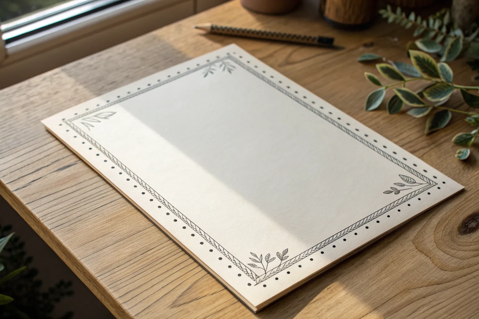
Dotted Hand-Drawn Border
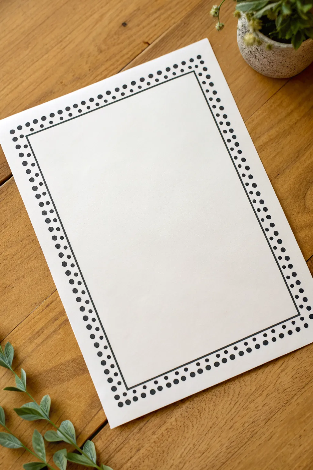
This clean and minimal border design combines structure with a playful touch, perfect for framing posters, certificates, or journal pages. Using simple geometric elements—lines and dots—you create an engaging frame that draws the eye inward without overwhelming your content.
Step-by-Step Tutorial
Materials
- White cardstock or heavy drawing paper (A4 or Letter size)
- Black fineliner pen (0.5mm or 0.8mm)
- Black marker or felt-tip pen (medium tip)
- Long ruler (12-inch or longer)
- Pencil (HB or H)
- Soft eraser
Step 1: Planning the Layout
-
Define the margins:
Start by deciding how wide you want your border to be. I find that leaving about 1 to 1.5 inches of space from the edge of the paper works best to give the design breathing room. -
Mark the corners:
Using your ruler and pencil, lightly mark a small dot at the four corners where your inner rectangular frame will sit. Ensure these measurements are consistent on all sides. -
connect the guides:
Lightly draw the rectangle connecting your corner marks. This pencil line will serve as the anchor for the entire design, so keep your hand steady but light enough to erase later. -
Sketch the dot guidelines:
Lightly sketch two parallel guidelines outside of your main rectangle. The first should be about 3-4mm away, and the second about 6-8mm away. These will help you keep your dot rows straight.
Dot Spacing Hack
Use a piece of scrap paper with marks on the edge as a spacing ruler. Move it along your line to place every dot perfectly.
Step 2: Inking the Frame
-
Draw the main line:
Switch to your black fineliner pen. Place your ruler along the pencil lines of the main rectangle and draw a crisp, solid line all the way around toward each corner. -
Check the corners:
Ensure the corners meet sharply at 90-degree angles. If they overlap slightly, that’s okay—it adds to the hand-drawn charm. -
Let the ink set:
Give the main line a moment to dry completely to avoid any smudging while you work on the dots.
Color Pop
Keep the main line black, but swap the outer row of dots for a metallic gold or neon marker to match your event theme.
Step 3: Adding the Inner Dots
-
Select the right pen:
Stay with the fineliner or switch to a slightly smaller tip for the inner row of dots. These dots should be delicate and uniform. -
Start at the corners:
Place a small dot near each corner of the rectangle first. This ensures your spacing remains balanced across the length of the line. -
Fill in the rows:
Working along the first guideline you sketched, place dots continuously around the frame. Aim for consistent spacing—about 3mm apart usually looks balanced. -
Maintain alignment:
Try to keep the dots centered relative to your guideline. Don’t rush this step; finding a rhythm helps keep the pattern steady.
Step 4: Adding the Outer Dots
-
Switch to the marker:
For the outer row, use the medium-tip black marker. We want these dots to be visibly larger and bolder than the inner row to create visual weight. -
Align with the inner row:
Position your marker on the outer pencil guideline. As you dot, try to place each large dot directly adjacent to a corresponding small dot from the inner row. -
Alternate the spacing:
Alternatively, place the large dots in the gaps between the smaller inner dots for a staggered look. In this specific design, however, side-by-side alignment creates a cleaner grid effect. -
Commit to the pressure:
Press down firmly with the marker to create full, round circles rather than tiny points. Consistency in pressure equals consistency in dot size. -
Turn the paper:
Rotate your paper as you work on each side. It is much easier to pull the pen toward you or move sideways comfortably than to contort your wrist.
Step 5: Cleaning Up
-
Wait for full drying:
This is crucial—wait at least 5 to 10 minutes to ensure the heavy marker ink is completely dry. -
Erase guidelines:
Gently run your soft eraser over the entire border area to remove the pencil sketches. Hold the paper taut with one hand to prevent crinkling. -
Final inspection:
Look for any uneven dots. You can carefully round out any misshapen marker dots to perfect the final look.
Your page now has a professionally framed look ready for your best handwriting or artwork
Dashed “Cut Line” Border
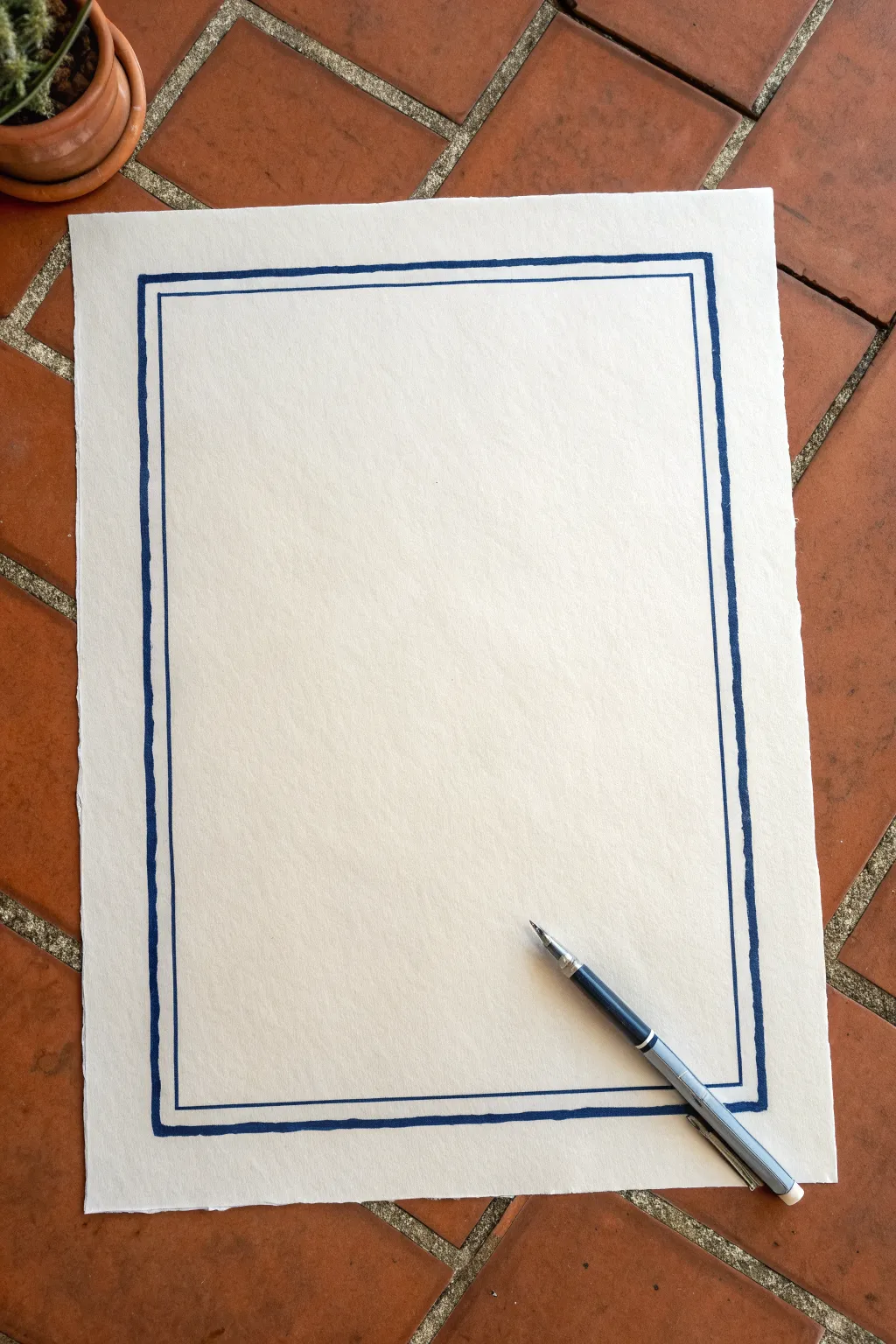
This elegant border design mimics the precision of architectural blueprints while maintaining a distinct hand-drawn charm. By combining a bold outer stroke with a delicate inner line, you create depth and sophistication perfect for menus, certificates, or minimalist posters.
Detailed Instructions
Materials
- Heavyweight watercolor paper or cardstock (with deckled edge preferred)
- Ruler (clear acrylic or metal)
- Pencil (HB or H)
- Eraser
- Blue felt-tip marker (medium/bold tip)
- Blue fine-liner pen (0.3mm or 0.5mm)
- Masking tape or painter’s tape
Step 1: Preparation & Layout
-
Paper selection:
Begin with a sheet of high-quality, textured paper. The example uses paper with a rough, deckled edge, which adds significant character to the simple lines. -
Secure the workspace:
Tape the corners of your paper down to your work surface. This prevents shifting while you are measuring and drawing the long straight lines. -
Measure the outer margin:
Decide on your margin width. For this look, measure in about 1 to 1.5 inches from the edge of the paper. Mark this distance lightly with a pencil at the top, bottom, and both sides. -
Draft the outer box:
Using your ruler and pencil, connect your marks to create a faint rectangular guide. This will serve as the path for your thickest border line. -
Measure the inner gap:
Measure inward roughly 1/4 inch from your first pencil rectangle. Mark this spacing lightly. -
Draft the inner box:
Connect these new marks to create a second, smaller rectangle inside the first one. You should now have two concentric pencil boxes.
Step 2: Inking the Border
-
Test your pens:
Before touching the final paper, test your bold marker and fine-liner on a scrap piece of similar paper to ensure the ink flows smoothly and the colors match or complement each other well. -
Draw the bold outer line:
Take your medium/bold blue felt-tip marker. Align your ruler slightly away from the outer pencil line so the ink doesn’t bleed under the ruler’s edge. -
Execute the first stroke:
Draw the first vertical line of the outer box. Move the pen at a steady, moderate pace. If the line has tiny wobbles or texture from the paper, that’s actually desirable for this hand-drawn aesthetic. -
Complete the outer rectangle:
Continue around the perimeter, drawing the remaining three sides of the outer box. Ensure the corners connect cleanly, but don’t worry if they aren’t mathematically perfect right angles. -
Wait for drying:
Give the bold ink a moment to set. I usually wait about two minutes here to avoid inadvertently smudging the wet ink with my hand or ruler. -
Draw the fine inner line:
Switch to your fine-liner icon. Align your ruler with the inner pencil guide. -
Execute the fine strokes:
Draw the inner rectangle. Use a lighter touch here. The contrast between the heavy weight of the outer line and the delicacy of this inner line is the key design element. -
Check corners:
Pay close attention to where the fine lines meet at the corners. A crisp connection looks best, whereas overlapping lines can look messy.
Smudge Prevention
To stop ink from bleeding under your ruler, tape a penny or thick washer to the underside of the ruler. This lifts the edge slightly off the paper.
Step 3: Final Touches
-
Inspect for gaps:
Look closely at your lines. If the texture of the paper caused the marker to skip significantly, carefully touch up those spots, but try not to overwork it. -
Erase guidelines:
Once you are absolutely certain the ink is fully dry (touch it lightly to check), gently erase any visible pencil marks. -
Clean up:
Brush away the eraser shavings carefully so you don’t smudge the paper surface or the fresh ink.
Level Up: Vintage Wash
Before drawing the lines, lightly brush the paper with weak tea or diluted coffee and let it dry flat. This gives an aged, parchment-like background.
The stark contrast of the blue ink on the textured paper creates a frame that is both classic and wonderfully handcrafted
BRUSH GUIDE
The Right Brush for Every Stroke
From clean lines to bold texture — master brush choice, stroke control, and essential techniques.
Explore the Full Guide
Classic Scallop Edge Border
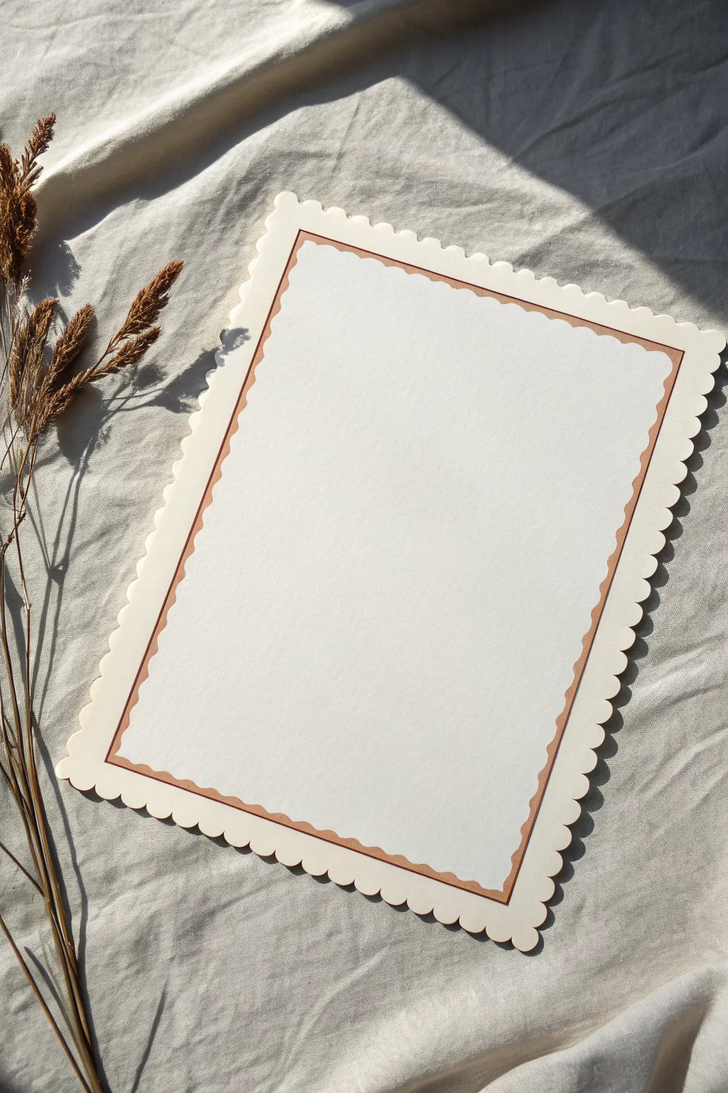
Create a timeless and elegant border that mimics the look of vintage stationery. This project uses precise cutting or specialized tools to achieve a soft, wavy edge paired with a delicate inner contour line for a sophisticated finish.
How-To Guide
Materials
- Thick cardstock or watercolor paper (heavyweight, cream or off-white)
- Pencil
- Ruler
- Eraser
- Scalloped scissors or a scalloped edge punch
- Fine-tip brown or copper pen (archival ink)
- Compass or circle template (optional)
- Bone folder (optional for smoothing)
Step 1: Planning the Shape
-
Define dimensions:
Begin by deciding on the final size of your poster or card. Lightly mark a rectangle on your cardstock with a pencil and ruler to represent the outermost boundary. -
Mark the scallop guide:
Draw a very faint pencil line about 1/4 inch inside your cut line. This will act as a guide to ensure your decorative scissors stay straight. -
Test the tool:
On a scrap piece of the same paper, test your scalloped scissors or punch. Notice where the pattern repeats and how to align the blade for a continuous wave.
Uneven Waves?
If a scissor cut creates a jagged ‘step’ in the wave pattern, use a fine-grit nail file or sandpaper to gently sand down the harsh nub until smooth.
Step 2: Creating the Scalloped Edge
-
Align the first cut:
Start at one corner of your cardstock. Align the scalloped scissors with your pencil guide. -
Execute the cut:
Cut steadily along the edge. If using scissors, open them fully for each new snip to maximize the straightness of the line. -
Connect the pattern:
As you move down the paper edge, careful alignment is key. Match the last hump of the previous cut with the first blade curve of the next cut to avoid jagged interruptions in the wave. -
Navigate corners:
When you reach a corner, I find it easiest to stop just before the turn. Cut the adjacent side next, aiming to have the two scalloped lines meet cleanly at the vertex, rather than trying to turn the scissors around the sharp angle. -
Repeat all sides:
Continue this process until all four sides have a continuous, wavy edge. -
Erase guides:
Once the cutting is complete, gently erase any remaining pencil guidelines, brushing away the crumbs.
Step 3: Detailing the Inner Border
-
Measure the inner margin:
Using your ruler, measure lightly about 1/2 inch to 3/4 inch inward from the valley of your scalloped edge. Make small pencil tick marks around the perimeter. -
Sketch the inner curve:
Connecting your tick marks, lightly sketch a second scalloped line that mirrors the outer edge. This doesn’t have to be geometrically perfect; a hand-drawn look adds charm. -
Refine the corners:
Ensure the corners of your pencil sketch curve gently to match the softness of the outer cutout. -
Ink carefully:
Take your fine-tip brown or copper pen. Slowly trace over your pencil sketch. Keep your wrist loose to create fluid waves rather than stiff, jagged lines. -
Double-check the lines:
If you want a bolder look, you can go over the line a second time to thicken it slightly, or add a second, very thin line right next to it. -
Dry and clean:
Allow the ink to dry completely to prevent smudging. I usually give it at least 15 minutes before touching it with an eraser. -
Final erase:
Gently erase the pencil sketch from underneath the ink, leaving a crisp, floating border.
Add Dimension
After inking, mount the entire piece onto a darker colored mat board using foam tape. This lifts the scalloped edge, creating real drop shadows.
Now you have a beautifully bordered surface ready for calligraphy or a mounted photo
Simple Wavy Line Poster Frame
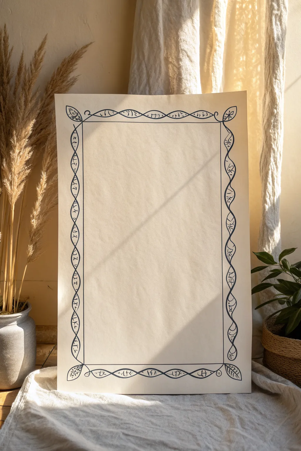
This elegant border design creates a mesmerizing frame using overlapping sine waves that resemble a simplified biological helix or vinework. The hand-drawn aesthetic adds warmth to the geometric precision, making it perfect for framing poems, calligraphy, or special announcements.
Step-by-Step
Materials
- Large sheet of cream or off-white drawing paper (A3 or larger)
- H or HB pencil
- Long ruler (18-24 inches)
- Black geometric compass (optional but helpful)
- Fine liner pen (0.5mm, black archival ink)
- Medium felt tip pen (0.8mm or 1.0mm, black)
- Good quality eraser
Step 1: Planning and Foundation
-
Define the perimeter:
Start by finding the center of your paper to ensure the border sits evenly. Measure about 1.5 to 2 inches from each edge and lightly draw a rectangular box using your pencil and long ruler. This will be the outer boundary of your design. -
Create the inner boundary:
Measure inward from your first rectangle by approximately 1.5 inches. Draw a second, smaller rectangle inside the first. The space between these two lines is where your wavy pattern will live. -
Mark your intervals:
To ensure your waves are consistent, use your ruler to make light tick marks every 2 inches along the center of the border channel. These marks will guide where your waves cross over each other.
Uneven Waves?
Don’t panic if your loops aren’t identical. Organic variation adds charm. Just ensure the crossover points remain aligned along the center path.
Step 2: Drawing the Helix Structure
-
Sketch the first wave:
Using a loose pencil grip, draw a continuous sine wave that touches the outer line at one interval and the inner line at the next. Aim for a smooth, flowing motion rather than stiff geometry. -
Sketch the mirroring wave:
Now draw an opposing wave that mirrors the first one. It should cross the first wave exactly at the center tick marks you made earlier, creating a series of almond-shaped loops or ‘pod’ shapes. -
Define the corners:
At each corner, allow the waves to naturally loop around. I find it easiest to sketch a simple leaf shape pointing diagonally outward at each corner to cap off the design before connecting the vertical and horizontal waves. -
Refine the pencil lines:
Step back and look at your pencil work. Erase and adjust any loops that look too skinny or too wide compared to the others. The goal is visual balance, not mathematical perfection.
Add Color
Use watercolor pencils to lightly shade the inside of the ‘pods’ with earth tones like ochre or sage green for an illuminated manuscript look.
Step 3: Inking and Detail Work
-
Ink the main structure:
Take your medium felt tip pen (around 0.8mm) and carefully trace over your pencil waves. Use confident, steady strokes. When you reach a crossover point, choose one line to go ‘over’ and one to go ‘under’ for a woven effect, or simply let them intersect clearly. -
Add the inner straight lines:
Ink the straight-line borders of your inner rectangle now using the ruler, but stop short of the actual wavy design so the waves appear to float freely or break the frame slightly. -
Patterning the loops:
Switch to your finer 0.5mm pen. Inside each almond-shaped loop created by the waves, draw small, simple symbols. The example uses tiny runic-style marks, triangles, and dots. Vary them slightly for an organic feel. -
Detailing the corners:
Inside the corner leaf shapes, add a central vein and small stems or dots to distinguish them from the rest of the helix pattern. -
Add texture marks:
Along the main black waves, add tiny, quick hatching marks or small dots near the intersection points. This gives the drawing a bit of depth and an engraved quality.
Step 4: Finishing Touches
-
Let the ink cure:
Wait at least 15 minutes for the ink to dry completely. Heavy black ink can smear easily on smooth drawing paper if you rush. -
Erase guidelines:
Gently erase all your pencil tick marks, the initial guide rectangles, and the sketch lines underneath the ink. Hold the paper taut with one hand while erasing to prevent crinkling. -
Assessment:
Check for any gaps in your inking. If some lines look too thin, go over them again with the thicker pen to bolden the main helix structure.
Now you have a beautifully framed space ready for your favorite quote or illustration

PENCIL GUIDE
Understanding Pencil Grades from H to B
From first sketch to finished drawing — learn pencil grades, line control, and shading techniques.
Explore the Full Guide
Bold Zigzag Poster Border
This striking black-and-white border adds a touch of modern tribal flair to any poster or art project. The high-contrast geometric pattern frames your content boldly without overwhelming it, making it perfect for minimalist designs.
Step-by-Step Guide
Materials
- White cardstock or heavy drawing paper (A4 or desired poster size)
- Pencil (HB or lighter)
- Ruler (preferably clear acrylic)
- Eraser
- Fine-point black permanent marker (e.g., Micron 05)
- Broad-tip black marker or brush pen
Step 1: Setting the Guidelines
-
Define the outer edge:
Place your paper on a flat, clean surface. Using your ruler, lightly measure and mark a border about 1 inch (2.5 cm) from the edge of the paper on all four sides. Connect these marks to draw a light rectangle representing the outermost limit of your design. -
Define the inner edge:
Measure inward 1 inch (2.5 cm) from that first rectangle line. Draw a second, smaller inner rectangle. The space between these two rectangles is where your zigzag pattern will live. -
Mark the center points:
To keep the pattern symmetrical, find the exact center of each side of your border frame. Mark these center points lightly with your pencil. -
Create zigzag spacing:
Starting from your center marks and working outward toward the corners, make tick marks every half-inch along both the inner and outer rectangular lines. These will guide the peaks and valleys of your zigzags.
Step 2: Drawing the Pattern
-
Sketch the zigzags:
Connect the tick marks diagonally to create a continuous zigzag line running through the center of your border space. The points should touch the outer line and the inner line alternately. -
Thicken the line:
Now, draw a second zigzag line parallel to the first one, spaced slightly apart. This converts the single line into a ribbon that zigzags back and forth. -
Define the triangles:
You should now see triangular shapes forming between your zigzag ribbon and the straight border lines. Ensure the corners resolve neatly; you might need to adjust the angle slightly at the very corners to make the turn look seamless. -
Finalize pencil lines:
Step back and look at the symmetry. If any triangles look too wide or too narrow, erase and adjust them now before ink touches the paper.
Smudge Control
Place a scrap piece of paper under your drawing hand while you work. This prevents oils from your skin transferring to the paper and stops you from accidentally smearing the wet ink.
Step 3: Inking and Filling
-
Outline the main frames:
Switch to your fine-point black marker. Carefully trace the two main straight rectangular lines (the inner and outer boundaries). Use your ruler to keep these lines crisp. -
Outline the zigzags:
Still using the fine-point marker, trace the pencil lines of your zigzag pattern. I find it helpful to rotate the paper as I go so I’m always pulling the pen toward me for better control. -
Identify fill areas:
Look closely at the reference image. The pattern alternates: the ‘ribbon’ itself remains white, while the triangles pointing inward and outward are filled with black. Lightly mark an ‘X’ in the sections that need to be colored black to avoid confusion. -
Fill the triangles:
Use your broad-tip marker to fill in the areas you marked with an X. Start near the edges and work inward to avoid checking outside the lines. -
Refine the edges:
Once the heavy filling is done, use your fine-point pen again to sharpen the very tips of the triangles where the broad marker might have been too clumsy. -
Second pass for depth:
If your black marker looks streaky once dry, apply a second coat to ensure a solid, deep matte black finish. -
Clean up:
Wait at least 10 minutes for the ink to dry completely. Gently erase all remaining pencil guidelines, being careful not to smudge the fresh ink.
Add Gold Accents
For a luxe variation, use a metallic gold paint pen to fill in the zigzag ribbon (the white space) after the black ink has fully dried. This creates a stunning contrast.
Now you have a bold, professional-looking frame ready for your text or artwork
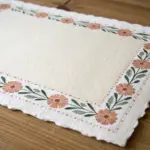
Triangle Pattern Border
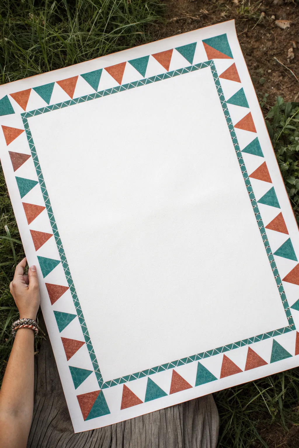
This striking border design relies on simple geometry and alternating colors to frame your poster with a lively, festive energy. The combination of earthy terracotta and deep teal triangles creates a modern yet classic look that works beautifully for event signage or classroom displays.
How-To Guide
Materials
- Large white poster board or thick cardstock
- Pencil
- Eraser
- Long ruler or yardstick
- Teal acrylic paint or marker
- Terracotta/rust orange acrylic paint or marker
- Fine-tip black marker or pen
- Flat shader paintbrush (if painting)
- Small angled brush (for sharp corners)
- Painters tape (optional for guidelines)
Step 1: Setting the Boundaries
-
Measure the outer margin:
Start by deciding how thick you want your border to be. Measure about 2 to 3 inches in from the edge of your paper on all four sides and make light pencil marks. -
Draw the inner frame line:
Connect your marks using a long ruler to create a large rectangle in the center of your page. This line will act as the separation between your border and the main content area. -
Create the border width:
Measure outward from that first rectangle about 1 inch. Draw a parallel rectangle around the first one. This 1-inch band will become the decorative ‘stitch’ strip that holds the design together.
Clean Lines Hack
Apply strips of washi tape or painter’s tape along the pencil lines of your triangles before painting. Peel it off while the paint is still wet for razor-sharp edges.
Step 2: Drafting the Geometry
-
Mark triangle spacing:
Along the outermost edge of your paper, make small tick marks every 3 inches (or your preferred spacing). Do the same along the outer line of the inner 1-inch band you just drew, but offset the marks so they sit exactly between the outer marks. -
Sketch the triangles:
Connect the marks to form a zigzag pattern. The points of the triangles should touch the outer edge of the paper and the outer edge of the inner band. You should now have a continuous row of triangles pointing inward and outward. -
Draw the cross-hatch pattern:
Inside that 1-inch inner band, lightly sketch a series of ‘X’ shapes or a continuous zigzag line that connects the top and bottom of the band, creating a diamond or lattice effect.
Step 3: Adding Color
-
Prepare your palette:
Squeeze out your teal and terracotta paints. If you are using markers, test them on a scrap piece of paper to ensure the ink isn’t running dry. -
Paint the first color:
Start with the teal paint. Fill in every other triangle. Use a flat brush for the main areas and switch to a small angled brush to get crisp, sharp points without going over the lines. -
Paint the second color:
Once the teal is slightly dry to the touch, fill in the remaining triangles with the terracotta color. I find it helpful to rotate the poster board as I work so my hand doesn’t smudge the wet paint. -
Let it dry completely:
Wait for all paint to dry thoroughly. If the colors look transparent or streaky, apply a second coat for a more solid, opaque finish.
Uneven Spacing?
If your triangles don’t fit perfectly at the corners, simply adjust the size of the last two triangles on that side slightly. Visually, the eye won’t notice the small difference.
Step 4: Defining the Details
-
Outline the inner band:
Using a fine-tip black marker and your ruler, carefully trace the two long rectangular lines that define the 1-inch inner band. -
Inking the lattice:
Go over your pencil sketches inside the band with the black marker to create the cross-stitch or lattice pattern. Keep your hand steady and maintain consistent pressure. -
Outline the triangles (Optional):
For a bolder look, you can outline the colored triangles with the black marker, but leaving them without an outline gives the softer, block-print aesthetic seen in the example. -
Erase guidelines:
Once you are absolutely certain all ink and paint are dry, gently erase any visible pencil marks remaining around the triangles or border.
Your custom border is now ready to frame whatever message or artwork you place inside


Corner Doodle Border Anchors
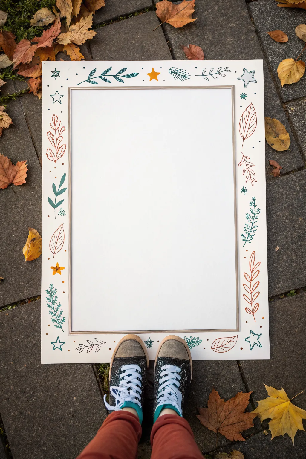
Transform a plain poster board into a charming photo prop or display piece with this hand-drawn border design. Featuring a distinct mix of autumnal leaves, winter botanicals, and playful stars, the simple line art creates a cozy, seasonal aesthetic perfect for framing memories.
Step-by-Step
Materials
- Large white poster board or heavy cardstock (A1 or A2 size recommended)
- Pencil and eraser
- Long ruler or T-square
- Paint markers or colored felt-tip pens (Teal, Burnt Orange/Rust, Mustard Yellow)
- Small round object (for tracing berries, optional)
- Scissors or craft knife (if cutting out the center)
Step 1: Setting the Stage
-
Define the inner frame:
Begin by laying your poster board on a flat, clean surface. Using a long ruler and a pencil, lightly mark out a large rectangle in the center. Leave a generous margin of about 3-4 inches around the perimeter for your artwork. This inner rectangle will remain blank or can be cut out later. -
Add a double border:
To separate the doodle area from the center space, draw a second rectangle just outside the first one, approximately 1/4 inch away. This creates a thin, double-line frame effect. -
Plan your corner anchors:
Visualize the four corners as your main anchor points. Sketch faint circles or guides in pencil at each corner where you want your largest doodle elements to go. This ensures the design feels balanced before you commit to ink.
Ink Flow Tip
Test your paint markers on a scrap piece of paper before every few shapes. This prevents sudden blobs of ink from ruining your clean poster board.
Step 2: Drawing the Botanical Elements
-
Start with the corner vines:
Using a teal paint marker, draw sweeping, curved vines extending from the corners inward. Add small, almond-shaped leaves along both sides of the stems. Keep the lines fluid and organic rather than rigid. -
Add rust-colored foliage:
Switch to your burnt orange or rust marker. In the spaces between the teal vines, draw large, single leaves with prominent veins. I find that varying the direction these leaves point adds a nice sense of movement to the border. -
Draw delicate sprigs:
Create tall, thin botanical sprigs using the rust color again. Draw a central stem with pairs of oval leaves branching off symmetrically, resembling a simplistic fern pattern. -
Insert pine or fir accents:
With the teal marker, sketch pine branches. Draw a curved center line and add short, quick dashes along one side to represent needles. These look great placed near the corners or midway along the sides. -
Create detailed berry branches:
Using the teal marker, draw a vertical stem. Instead of leaves, draw clusters of small, textured circles or tiny ‘x’ marks attached to the stem to mimic dried berries or floral buds.
Level Up: Metallic Pop
Trace the veins of the leaves or the centers of the stars with a gold or silver metallic pen to catch the light and add a festive sparkle.
Step 3: Adding Whimsy and Filler
-
Incorporate the stars:
Now, bring in the mustard yellow marker. Draw simple five-point stars scattered randomly around the border. Fill some in completely for a pop of solid color, and leave others as line drawings. -
Draw teal outline stars:
To add variety, use the teal marker to draw larger, open five-point stars. Place these near the corners to help anchor the design visually. -
Scatter small dots:
Look for empty patches of white space between your leaves and stars. Use the rust and mustard markers to place small dots or varying sizes. This ‘confetti’ effect ties the whole border together. -
Check for balance:
Step back and look at the overall composition. If one side looks too empty, sketch a small extra leaf or a few dots to balance the visual weight.
Step 4: Finishing Touches
-
Ink the inner frame:
Go back to the double rectangle you penciled in the center. Carefully trace over these lines with a neutral color like grey or a metallic silver marker to give it a polished, framed look. -
Erase pencil marks:
Once you are absolutely certain the link is dry (give it a few minutes explicitly), gently run your eraser over the entire board to remove any visible graphite sketches. -
Optional: Cut the center:
If you intend to use this as a photo booth frame, carefully cut out the inner white rectangle using a craft knife and a ruler as a guide. If using it as a poster, leave the white space blank for your text.
You now have a beautifully hand-illustrated frame ready to showcase your message or capture fun moments.
Leafy Vine Poster Border
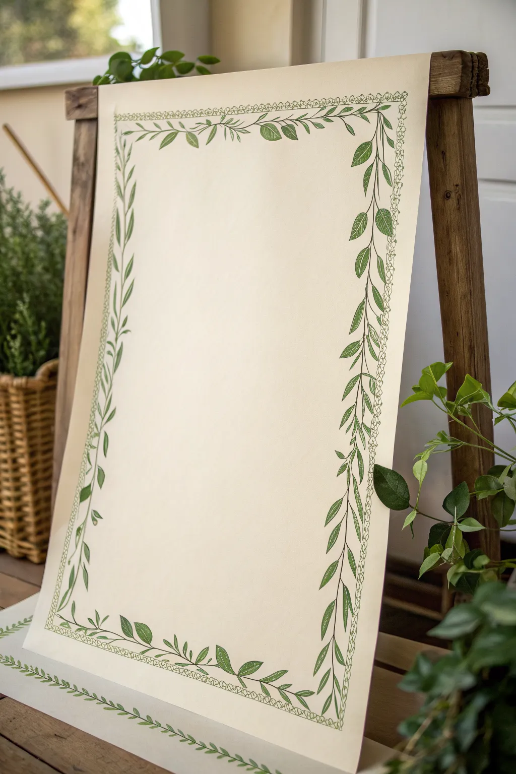
Frame your message with nature’s elegance using this dual-layered vine border design that combines delicate linework with bold leaf accents. The contrast between the botanical green ink and the creamy off-white paper creates a fresh, organic look suitable for everything from wedding signage to garden party menus.
Step-by-Step Tutorial
Materials
- Large sheet of cream or off-white poster paper (heavyweight)
- Pencil (HB or H)
- Long ruler or T-square
- Eraser
- Fine-tip green drawing pen (0.5mm or 0.8mm)
- Medium chisel-tip green marker or brush pen
- Compass (optional for corners)
Step 1: Setting the Guidelines
-
Measure the margins:
Begin by deciding how wide you want your border to be. Measure about 2 inches in from the edge of your paper on all four sides and lightly mark dots with your pencil. -
Draw the frame:
Connect your dots using a long ruler to create a light rectangular box. This will serve as the central spine for your main vine. -
Add the inner boundary:
Measure another 0.5 inches inward from your first rectangle and draw a second, smaller rectangle. This guideline is for the delicate inner chain border.
Oops, Smudged Ink?
If you smudge green ink while erasing, turn the mistake into a new leaf! Draw a leaf outline over the smudge and fill it in with the darker marker to hide it.
Step 2: Drawing the Inner Chain
-
Start the loops:
Using your fine-tip green pen, begin tracing along the inner pencil line. Instead of a straight line, draw tiny, continuous looping circles or flower-like scalloped shapes. -
Focus on consistency:
Keep the loops small and relatively uniform in size. They don’t need to be perfect circles—a slightly organic, wobbly shape adds to the hand-drawn charm. -
Turn the corners:
When you reach a corner, simply curve your line of loops gently around the 90-degree angle rather than making a sharp turn. -
Complete the circuit:
Continue until you meet your starting point, ensuring the final loops connect seamlessly with the first ones.
Step 3: Creating the Main Vine
-
Draft the stems:
Switch to your medium marker or brush pen. Trace over your main outer pencil rectangle with a smooth, continuous line to create the central vine stem. -
Add movement:
If you want a more natural look, allow this line to waver very slightly as you draw, preventing it from looking too rigid or mechanical. -
Sketch the leaf placement:
Using a pencil, lightly mark where your leaves will sprout. Leaves should alternate sides along the stem, spaced about 2-3 inches apart. -
Draw the leaf outlines:
With the fine-tip pen, draw the outlines of the leaves. Aim for a mix of larger, broad leaves and slender, curved ones to create variety. -
Detail the veins:
Draw a central vein down the middle of each leaf, followed by smaller diagonal veins branching off. This adds texture and realism to the foliage.
Add Subtle Depth
Use a second, slightly lighter shade of green marker to color in every other leaf. This creates visual depth and makes the foliage look lush and multi-dimensional.
Step 4: Filling and Finishing
-
Fill the leaves:
Using the medium green marker or brush pen, shade inside your leaf outlines. You can fill them completely solid or use a hatching technique for a textured look. -
Layer overlapping leaves:
Identify spots where the Border looks sparse. Draw smaller leaves behind the main ones, or add tiny tendrils curling off the main stem to fill the gaps. -
Add corner accents:
The corners are often focal points. I like to add an extra cluster of 2-3 leaves at each corner to give the frame more visual weight and stability. -
Check for balance:
Step back and look at the poster from a distance. If one side looks heavier than the other, add a few more small leaves or spiraling tendrils to balance it out. -
Erase guidelines:
Wait at least 15-20 minutes to ensure all ink is completely dry. Then, gently erase any visible pencil lines, being careful not to smudge your green ink.
Now your poster has a natural, sophisticated frame ready for your content
Tiny Flower Garland Border
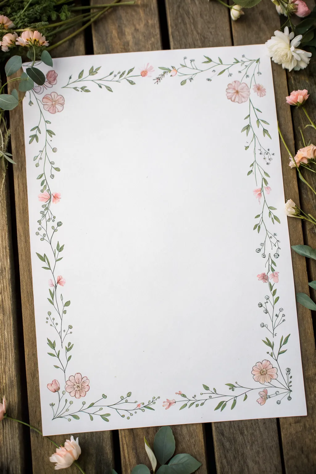
Frame your favorite quotes or create stunning stationery with this delicate botanical border. Combining fine ink lines with soft watercolor washes, this design creates an airy, romantic look perfect for spring-themed posters.
Step-by-Step Guide
Materials
- High-quality watercolor paper (white or cream)
- Fine liner pen (0.1mm or 0.3mm, waterproof, black or sepia)
- Watercolor paints (Sap Green, Olive Green, Rose Madder, Yellow Ochre)
- Round watercolor brushes (size 0 and size 2)
- Pencil (HB)
- Kneaded eraser
- Jar of clean water
- Paper towels
Step 1: Sketching the Framework
-
Define the boundary:
Begin by lightly sketching a rectangle on your paper to mark the outer edge of your border. Keep this about an inch from the paper’s actual edge to allow ‘breathing room’ for the design. -
Map the corners:
Place a light circle sketch in each of the four corners. These will become the anchor flowers—typically slightly larger blooms like cosmos or wild roses. -
Connect with vines:
Draw faint, winding lines connecting your corner circles. Don’t make these lines perfectly straight; let them meander and curve slightly to mimic natural vines. -
Add midway blooms:
Sketch smaller circles or teardrop shapes along the vines, spacing them irregularly. Aim for one or two smaller flower clusters on each side between the corners.
Step 2: Inking the Details
-
Draw the main blooms:
Using your waterproof fine liner, ink the corner flowers first. Draw five or six loose, organic petals radiating from a textured center. -
Ink the vines:
Trace over your pencil vine lines with the pen. Create a continuous, flowing line, occasionally breaking it where a leaf or flower will overlap. -
Add simple leaves:
Draw small, pointed oval leaves branching off the main vine. Vary their direction and size, clustering some near the flowers and leaving others solitary. -
Incorporate filler stems:
Draw very thin, branching stems that end in tiny dots or small three-petaled buds. These ‘filler’ elements add volume without weight. -
detail the centers:
Add tiny stippled dots to the center of your open flowers to give them pollen texture. -
Erase pencil guides:
Wait until the ink is completely dry—I usually give it a full five minutes to be safe—then gently remove all pencil marks with the kneaded eraser.
Loose Lines
Don’t try to trace the ink lines perfectly with your paint. Leaving small white gaps between the line and the color makes the illustration feel airy and light.
Step 3: Adding the Watercolor Wash
-
Mix your greens:
Prepare two shades of green on your palette: a fresh Sap Green and a muted Olive Green. Dilute them well so they are transparent. -
Paint the leaves:
Using the size 2 brush, drop the lighter green into some leaves and the darker olive into others. Don’t worry about staying perfectly inside the lines; a little bleed adds charm. -
Prepare the pinks:
Dilute Rose Madder with plenty of water to create a soft blush pink. Mix a tiny bit of Yellow Ochre into a separate puddle for a peachy variation. -
Wash the petals:
Paint the flower petals with the blush pink. Start at the center of the flower and pull the color outward, lifting the brush as you reach the petal tip for a faded effect. -
Add depth to blooms:
While the pink is still slightly damp, drop a tiny amount of the more concentrated pigment into the very center of the flowers to create a natural gradient. -
Paint the buds:
Use the peachy mixture for the smaller, closed buds along the vine stems. -
Add warmth to centers:
Once the petals are dry, use the size 0 brush to dab a tiny dot of Yellow Ochre or brown into the stippled centers of the main flowers. -
Final touches:
Step back and assess your border. If any areas look too sparse, you can add tiny floating petals or extra green dots with your brush to balance the composition.
Metallic Accent
Once the watercolor is fully dry, use a gold gel pen to add tiny dots to the flower centers or trace a few select leaves for a luxurious shimmer.
Your delicate garland is now ready to surround your favorite poem or hand-lettered quote with natural beauty
Laurel Corner Sprigs Border
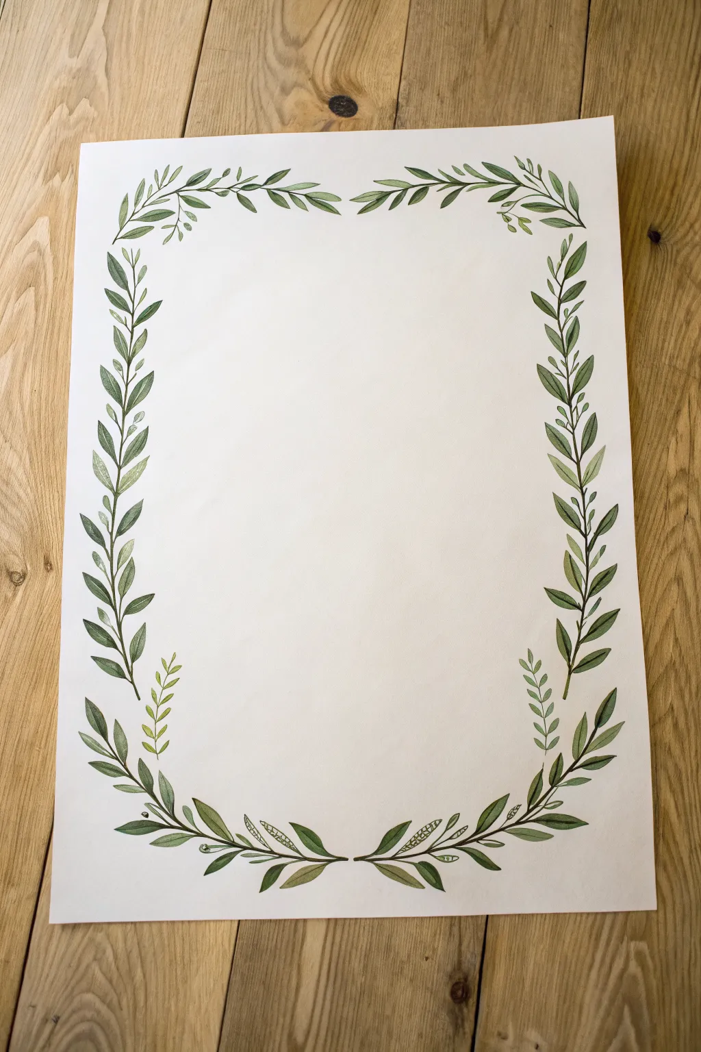
This classic laurel leaf border brings an elegant, timeless touch to any poster or invitation, framing the content without overpowering it. Using simple watercolor techniques, you’ll create lush, symmetrical greenery that feels organic and handcrafted.
Step-by-Step Tutorial
Materials
- High-quality watercolor paper (cold press recommended)
- Pencil (HB or H)
- Kneaded eraser
- Watercolor paints (Sap Green, Olive Green, Hooker’s Green, Burnt Umber)
- Small round watercolor brushes (size 2 and 4)
- Palette for mixing
- Ruler
- Jar of clean water
- Paper towels
Step 1: Planning the Layout
-
Mark geometric guides:
Begin by lightly penciling a rectangle about an inch or two inward from the edge of your paper. This will serve as the spine for your vines to follow. -
Define the gaps:
Decide where you want the border to break. In the reference image, there is a distinct gap at the top center and the bottom center. Mark these stopping points lightly so your vines don’t touch. -
Sketch the main stems:
Drawing lightly, sketch curved lines along your rectangular guide. Let the lines wave slightly rather than being ruler-straight to give the plant an organic feel. -
Add leaf placements:
Sketch small, alternating almond shapes along the stems. Group them denser at the corners and spread them out slightly as they move toward the gap centers. -
Soften the sketch:
Take your kneaded eraser and gently roll it over the pencil lines. You want the graphite to be barely visible—just enough to guide your brush without showing through the paint.
Uneven Watermarks?
Bloom marks happen if you add water to drying paint. Wait until a layer is completely bone-dry before glazing new leaves on top to keep edges crisp.
Step 2: Painting the Base Layer
-
Mix your base green:
On your palette, mix Sap Green with a tiny touch of Burnt Umber to dull the brightness. Add enough water to create a tea-like consistency. -
Paint the bottom stems:
Using the size 2 brush, paint the main stem lines starting from the bottom corners and sweeping inward toward the bottom center gap. -
Paint the side stems:
Continue painting the fine stem lines up the sides of the paper, tapering them off as they reach the top corners. -
Paint the top stems:
Connect the top corners by painting stems that curve inward toward the top center gap. Keep your hand loose to maintain fluid lines. -
Paint the first set of leaves:
Switch to your size 4 brush. Load it with your base green mix and paint the leaves on the left vertical side first. Press down to widen the leaf belly and lift up to create a sharp point. -
Complete the base leaves:
continue painting leaves around the remaining three sides. Vary the direction slightly so they look like they are growing naturally toward the light.
Level Up: Metallic Pop
Once the green paint is dry, use a fine gold paint pen or metallic watercolor to add tiny veins or berries throughout the vines for an elegant finish.
Step 3: Adding Depth and Detail
-
Mix a darker shade:
Create a shadow color by mixing Hooker’s Green with a bit more Burnt Umber. It should be less watery than your first mix. -
Layer darker leaves:
Once the first layer is dry to the touch, paint a second set of leaves interspersed among the first. I like to place these slightly behind or overlapping the lighter ones to create density. -
Add detail to the corners:
The corners should act as anchors. Paint a few extra small leaves clustering at the four corners to add visual weight and round out the rectangle. -
Introduce a yellow-green:
Mix Olive Green with a drop of yellow or water it down significantly. Use this to paint small, fresh sprigs or filler leaves in the gaps between the mature leaves. -
Add very fine stems:
Using the tip of your size 2 brush and the darkest green mix, add tiny connection points where leaves meet the main stem to ensure everything looks connected. -
Create distinct lighter sprigs:
Looking at the artwork, notice the small, lighter ferns near the bottom curves. Paint these using your lightest yellow-green mix with very delicate, short brushstrokes. -
Refine the leaf tips:
If any leaf tips look too round, use a damp brush with a tiny amount of dark paint to extend and sharpen the points. -
Final assessment:
Step back and look at the overall balance. If one side looks too sparse, add a few more dark leaves to even out the visual weight.
Allow the border to dry completely before writing your text in the center space
Cutout Negative-Space Border
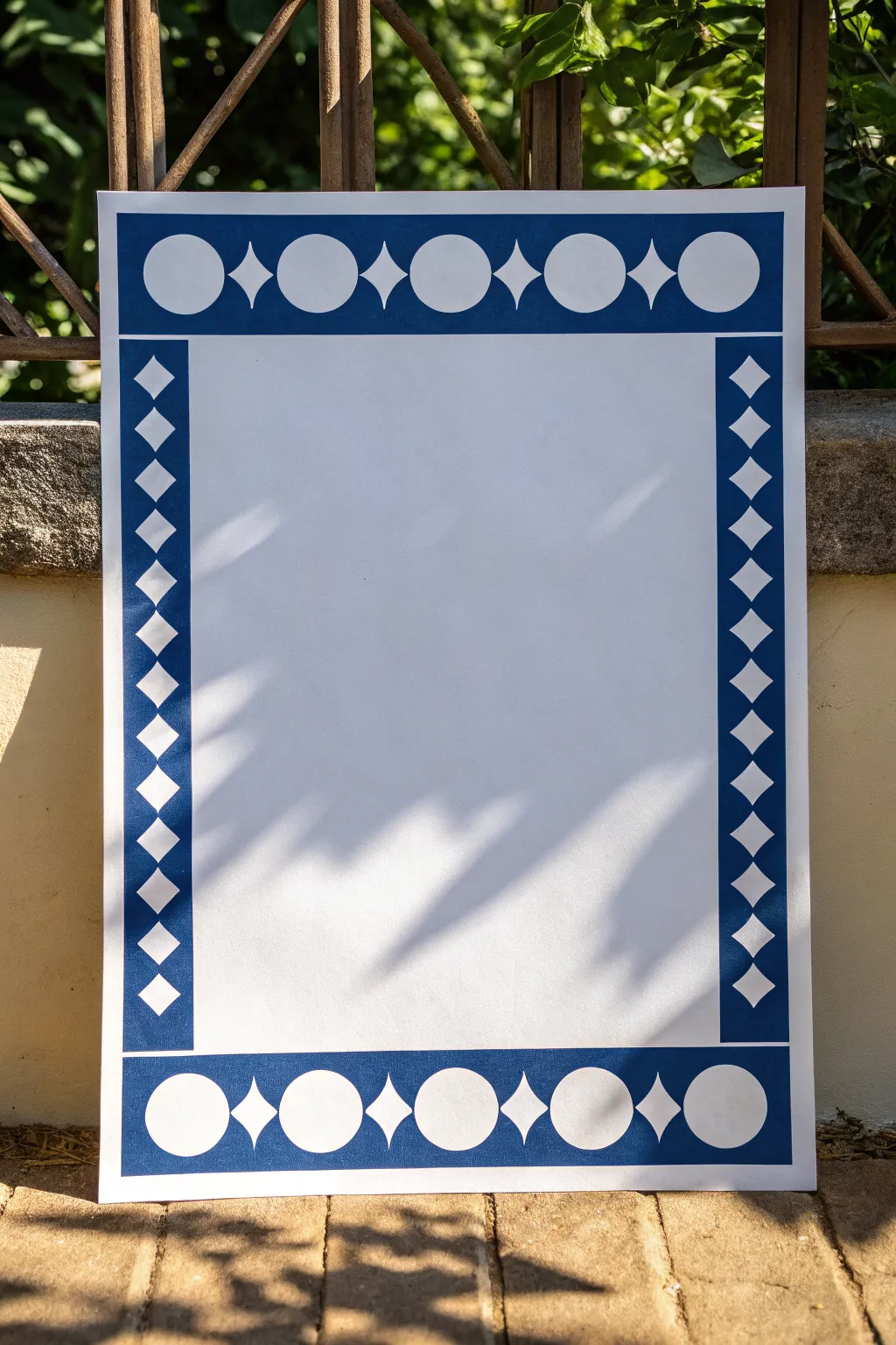
This striking border design relies on the contrast between deep blue paper and a crisp white background to create a frame that feels both classic and modern. By cutting simple geometric shapes out of colored strips, you achieve an elegant negative-space effect without needing complex drawing skills.
Step-by-Step Tutorial
Materials
- Large sheet of white poster board or heavy cardstock (A2 size or similar)
- Dark navy blue construction paper or cardstock
- Pencil
- Ruler
- Circle template or compass
- X-Acto knife or craft scalpel
- Cutting mat
- Scissors
- Glue stick or spray adhesive
- Eraser
Step 1: Planning the Frame Dimensions
-
Measure your base:
Lay out your large white poster board on a flat surface. Decide on the width of your border; for the scale shown in the image, a width of about 3 to 4 inches works well. -
Cut the blue strips:
Cut four long strips from your navy blue paper corresponding to the width you just decided on. You will need two strips for the vertical sides and two for the horizontal top and bottom. -
Check the lengths:
Ensure the vertical strips match the full height of your white board. The horizontal strips should fit between the vertical ones, or you can miter the corners if you prefer, though a simple butt joint works fine here.
Clean Cuts Pro Tip
Change your X-Acto blade as soon as you feel it dragging. A dull blade tears the paper fibers, leaving fuzzy white edges on your dark blue cuts.
Step 2: Drafting the Geometric Pattern
-
Mark the center lines:
On the back side of each blue strip, use a ruler and pencil to lightly draw a line straight down the center lengthwise. This grid will help keep your shapes perfectly aligned. -
Determine shape spacing:
Decide on a repeating pattern. The design shown uses alternating large circles and diamonds on the top/bottom, and a unified column of diamonds on the sides. Measure equal intervals along your center line to mark where the center of each shape will sit. -
Draft the circles:
For the top and bottom strips, use a compass or circle template to draw circles. Make sure they are centered on your guide line and leave a uniform amount of blue space on the top and bottom edges. -
Draft the diamonds:
Draw your diamonds between the circles (and all along the side strips). A good trick is to mark a cross shape first—determining the height and width—and then connect the four points with a ruler. -
Draw the connecting starbursts:
For the specific top/bottom pattern shown, draw a four-pointed star or ‘sparkle’ shape between the circles. This is essentially a concave diamond shape.
Step 3: Cutting the Negative Space
-
Prepare the cutting mat:
Place your drafted blue strips onto a self-healing cutting mat. Having a fresh blade in your craft knife is crucial here for clean edges. -
Cut the straight lines:
Start with the diamond shapes. Use a metal ruler as a guide for your knife to ensure the lines are perfectly straight and the corners are sharp. -
Cut the curves:
Carefully cut out the circles and starburst curves freehand. I find it easier to rotate the paper slowly while keeping my knife hand relatively still to get a smoother curve. -
Check for stragglers:
Gently pop out the cut pieces. If a corner is stuck, don’t tear it; go back in with the very tip of your knife to sever the final paper fiber. -
Erase guidelines:
Once all cutouts are removed, gently erase any visible pencil marks on the blue paper, although these should mostly be on the back side.
Level Up: Layered Depth
Place a sheet of metallic gold or silver paper behind the cutouts before gluing the strips to the white board for a luxurious, gilded effect.
Step 4: Assembly
-
Dry fit the frame:
Lay your cut blue strips onto the white poster board without glue first. Ensure the spacing looks even and the white background shows through the holes cleanly. -
Apply adhesive:
Apply a thin, even layer of glue to the back of the blue strips. A glue stick is great for control, but spray adhesive gives a very smooth, non-wrinkled finish. -
Place the strips:
Carefully adhere the strips to the edges of the poster board. Start by aligning the outer edge of the strip with the outer edge of the board. -
Smooth it down:
Use a clean brayer or the side of your hand (with a piece of scrap paper in between to prevent smudges) to press the strips down firmly, ensuring the intricate cutout areas are flat.
Your poster is now framed with a crisp, professional border that’s ready to highlight your presentation or artwork


Have a question or want to share your own experience? I'd love to hear from you in the comments below!