
Whenever I’m stuck on what to draw, a dotted notebook feels like a friendly little cheat code—those dots quietly do the measuring for me. Here are my go-to dot grid drawing ideas that start super classic and slowly ramp up into the fun, slightly unexpected stuff.
Habit Tracker Tile Grid
This sophisticated habit tracker combines classic grid layouts with a soft, earthy color palette of sage green and terracotta. The clean, rectangular tiles allow you to visualize your progress over a week at a glance, making consistency feel satisfying.
Step-by-Step
Materials
- A5 dotted notebook
- Fine liner pen (0.3mm or 0.5mm, black)
- Ruler
- Brush pen or mildliner (Sage Green)
- Brush pen or mildliner (Terracotta/Light Rust)
- White gel pen (optional, for corrections or details)
- Pencil and eraser
Step 1: Setting the Framework
-
Measure your margins:
Begin by counting the total dot width of your page to center your design. For this layout, you’ll need space for a header column on the left and seven columns for the days of the week. -
Draft the header row:
Using a pencil and ruler, draw a horizontal line near the top of the page. Leave about two grid spaces above it for your main title. -
Define the columns:
Mark out eight vertical columns. The first column (for the habit names) should be slightly narrower—about 2-3 grid squares wide. The remaining seven columns should be equal width, roughly 3-4 grid squares each. -
Create the rows:
Decide how many habits you want to track (the example shows 14). Mark horizontal lines to create rows that are exactly 2 grid squares high, giving each tracking cell a nice, boxy shape. -
Ink the main grid lines:
Once satisfied with your pencil spacing, trace over the long vertical lines that separate the days. Use a steady hand and your ruler with the fine liner. -
Ink the horizontal separators:
Ink the horizontal lines next. Notice in the design that the horizontal lines don’t necessarily cross through the ‘gutter’ between columns, giving it a ‘floating tile’ look. You can connect them fully if you prefer a solid grid.
Step 2: Adding Headers and Labels
-
Lettering the days:
At the top of the seven day columns, write the days of the week. You can use abbreviations like ‘Mon’, ‘Tue’, or numbers 1-7 depending on your aesthetic. Use a small, neat serif font. -
Lettering the main header:
Above the first column, write ‘Habits’ or ‘Tracker’ in a decorative script. In the example, a stylized, slightly gothic or old-english inspired script adds character. -
Create the habit icons:
Instead of writing out full words, draw small squares inside the first column for each row. These will serve as color-coded keys or icons for your habits. -
Erase pencil marks:
Wait until the ink is completely dry—I usually give it a full minute just to be safe—and then gently erase all underlying pencil sketches.
Clean Lines Secret
Wipe the edge of your ruler with a tissue after every few lines. This prevents ink buildup on the metal from smearing across your clean page.
Step 3: Color and Details
-
Color the habit keys:
Using your sage green and terracotta markers, color in the small squares in the first column. Alternate colors (Green, Pink, Pink, Green, Pink, Green) to create a pleasing rhythm. -
Add numerical indicators (Optional):
If you have specific goals (like ‘8’ glasses of water), write a small white number inside the colored squares using a white gel pen. -
Outline the habit keys:
Draw a small box around each colored square in the first column using the fine liner. This frames the color and makes the column look tidy. -
Draw the tracking tiles:
In the daily columns, draw the actual tracking boxes. Instead of just using the grid lines, draw a distinct square inside each grid space. This creates that ’tile’ effect where the boxes don’t touch each other. -
Consistent spacing:
Ensure there is a tiny gap (about 1mm or half a dot space) between these tracking tiles and the grid lines you drew earlier. -
The header accent:
Add a thin line of terracotta color under the main header row to separate the titles from the tracking area visually.
Make it Interactive
Instead of filling the daily squares fully when a habit is done, try drawing a simple ‘X’ or diagonal line for a more minimalist look.
Step 4: Finishing Touches
-
Double-check lines:
Look for any uneven lines or gaps in your ink work. You can carefully re-go over them to thicken the grid borders if needed. -
Add functional dots:
Inside each blank tracking tile, you can place a tiny central dot with your pen. This acts as a guide for when you eventually color them in.
Now you have a structured and visually calming layout ready to help you build your best routines.


Weekly Planner Box Layout
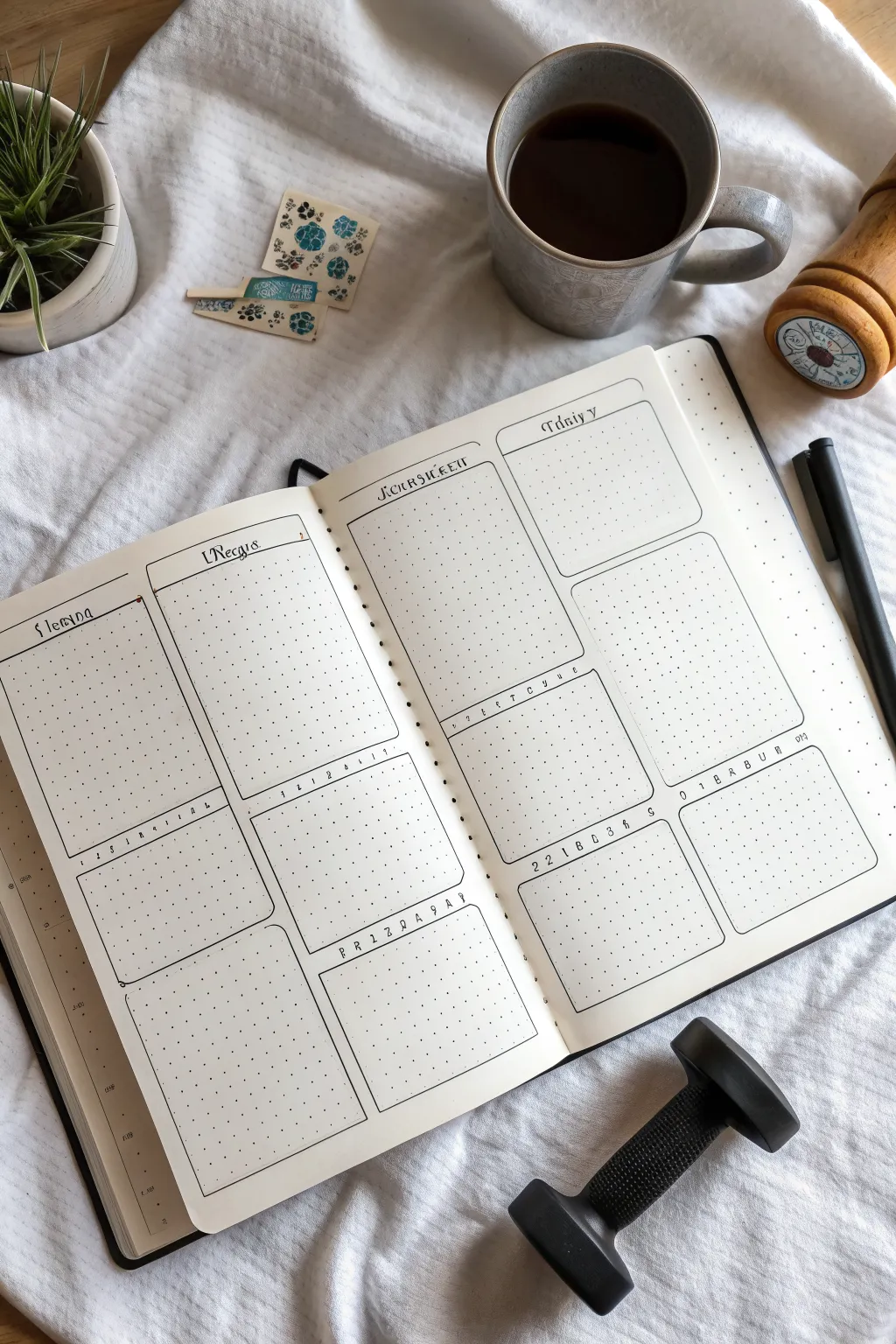
This clean, architectural weekly spread uses rounded rectangles to create structured space for your daily planning. The layout offers a perfect balance of large overview boxes and smaller detail sections, all rendered in simple black ink for a timeless look.
Step-by-Step Tutorial
Materials
- Dotted notebook (A5 size recommended)
- Fine liner pen (01 or 03 size, black)
- Ruler or straight edge
- Pencil (HB or lighter)
- Eraser
- Circle stencil (optional, for corners)
Step 1: Drafting the Layout
-
Count your grid:
Begin by counting the total width and height of dots on your open spread. This layout relies on symmetry, so find your center spine first. -
Mark the columns:
Lightly mark vertical pencil lines to divide each page into two main columns. Leave a small gutter margin of 1 or 2 dots between the columns so your boxes don’t touch. -
Define horizontal sections:
On the left page, mark out three horizontal sections. The top box should be tall (about half the page height), followed by a medium box, and a bottom box of similar size. -
Mirror the layout:
Repeat this vertical spacing on the right page to ensure your spread looks cohesive. The top boxes are your main daily buckets, while the lower ones serve for notes or habits. -
Sketch the box outlines:
using your ruler, pencil in the rectangular shapes for all eight boxes. Don’t worry about the rounded corners yet; just get the proportions right within the grid. -
Add header spaces:
Inside the top of each box, draw a faint horizontal line about two grid spaces down. This will be the dedicated area for writing the day of the week or section title.
Uneven Curves?
If freehanding corners is tough, use a washer or the small curve of a paperclip as a physical guide for consistent roundness.
Step 2: Inking the Structure
-
Draw the straight lines:
Switch to your black fine liner. Using your ruler, trace over the straight pencil lines of your boxes, stopping about one dot before each corner intersection. -
Create rounded corners:
Freehand a small curve to connect the lines at each corner. I find that focusing on the dot inside the corner helps guide the pen smoothly. -
Ink the headers:
Draw the internal horizontal lines for the headers. You can make these straight or give them a slight decorative curve or bump in the middle as shown in the reference. -
Erase pencil guides:
Wait at least five minutes for the ink to dry completely. Gently erase all pencil markings to reveal the clean, crisp layout.
Date Header Tip
Vary your header font weight. Use a thicker pen for the day name and a thinner 0.05 pen for the subtitle lines to create visual hierarchy.
Step 3: Adding Text and Details
-
Lettering the headers:
Using a slightly decorative serif font, write the days (e.g., ‘Monday’, ‘Tuesday’) in the top left corner of the large boxes. -
Number the trackers:
For the middle row of smaller boxes, write a small row of numbers (1-7) or letters representing days. This turns these boxes into mini habit trackers. -
Add date references:
In the bottom right or left corners of the habit boxes, add the numerical date range for the week (e.g., ’22-28′) in a small, spaced-out font. -
Draw decorative accents:
Add tiny decorative dots or small circles at the ends of your header lines to polish the look. -
Wait and review:
Check for any smudges or missed spots. If you want thicker borders, carefully re-trace the outer box lines now.
Now you have a structured canvas ready to organize your weekly tasks and habits with style
Satisfying Checkboxes and Lists
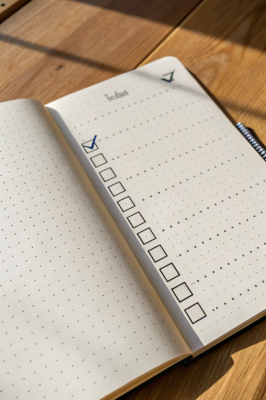
Embrace the simplicity of bullet journaling with this clean, vertical habit tracker layout. The sharp geometric lines of the checkboxes contrast beautifully against the dotted grid, creating a highly satisfying visual structure for your daily to-dos.
Step-by-Step
Materials
- Dotted notebook
- Fine liner pen (0.3mm or 0.5mm, black)
- Blue gel pen or marker
- Ruler (clear acrylic works best)
- Pencil
- Eraser
Step 1: Planning the Layout
-
Locate the starting point:
Open your dotted notebook to a fresh spread. We will be working on the right-hand page. Count about 4 or 5 rows down from the top edge to leave room for a header. -
Define the column alignment:
Choose a vertical column of dots about one-third of the way in from the left margin. This specific placement gives the list room to breathe without crowding the spine. -
Pencil the header:
Lightly sketch the word ‘Habit’ or your chosen list title at the top center of the page using your pencil. Use a calligraphy style or simple block letters, keeping it small and understated.
Smudge Prevention
Ruler dragging ink is a classic tragedy. To fix, tape a penny to the underside of your ruler. This lifts the edge off the paper, preventing ink smears.
Step 2: Drawing the Checkboxes
-
Set the box dimensions:
We will be using a 2×2 dot grid square for each checkbox. This means each box will span two dot intervals wide and two dot intervals high. -
ink the first vertical line:
Place your ruler vertically along your chosen column of dots. Using your black fine liner, draw a continuous vertical line that spans the height of one box (2 grid spaces). -
Complete the first square:
Rotate your ruler or freehand carefully if you have a steady hand. Draw the top, right, and bottom lines to close the square. Ensure the corners meet sharply without overshooting. -
Determine spacing:
Leave exactly one grid row of empty space below your first box. This negative space is crucial for the clean, airy look of the layout. -
Draw the remaining boxes:
Continue down the column, drawing 2×2 squares with a 1-row gap between each one. Aim for about 12-14 boxes total to fill the page length nicely. -
Check vertical alignment:
As you work your way down, occasionally pause to ensure your ruler is staying true to the dot column so the list doesn’t drift left or right.
Step 3: Adding Details and Finishing Touches
-
Add a decorative accent:
At the very top right corner of the page, opposite the header, draw a small, simplified icon. In the example, a small triangle or bracket shape adds a subtle geometric touch. -
Erase guidelines:
Wait at least five minutes for the black ink to fully cure. Here I prefer to test a small area first, then gently erase all pencil marks from the header area. -
Ink the header:
Go over your penciled ‘Habit’ title with the fine liner. You can use a faux-calligraphy technique by thickening the downstrokes slightly for contrast. -
The first checkmark:
Take your blue gel pen or marker. Draw a crisp checkmark in the very first box. Start the stroke slightly inside the left edge and extend the tail just past the top right corner for a dynamic feel. -
Optional texture:
If you want to mimic the exact style of the photo, add tiny, random circles or extra dots around the rest of the page to give it a ‘stippled’ artistic texture, though leaving it clean works just as well.
Drop Shadow Depth
Use a light grey marker to trace the right and bottom outer edges of each box. This simple addition creates a 3D drop shadow, making the boxes pop off the page.
Enjoy the deep satisfaction of ticking off that first box on your crisp new page


Quote Lettering With Dot Baselines
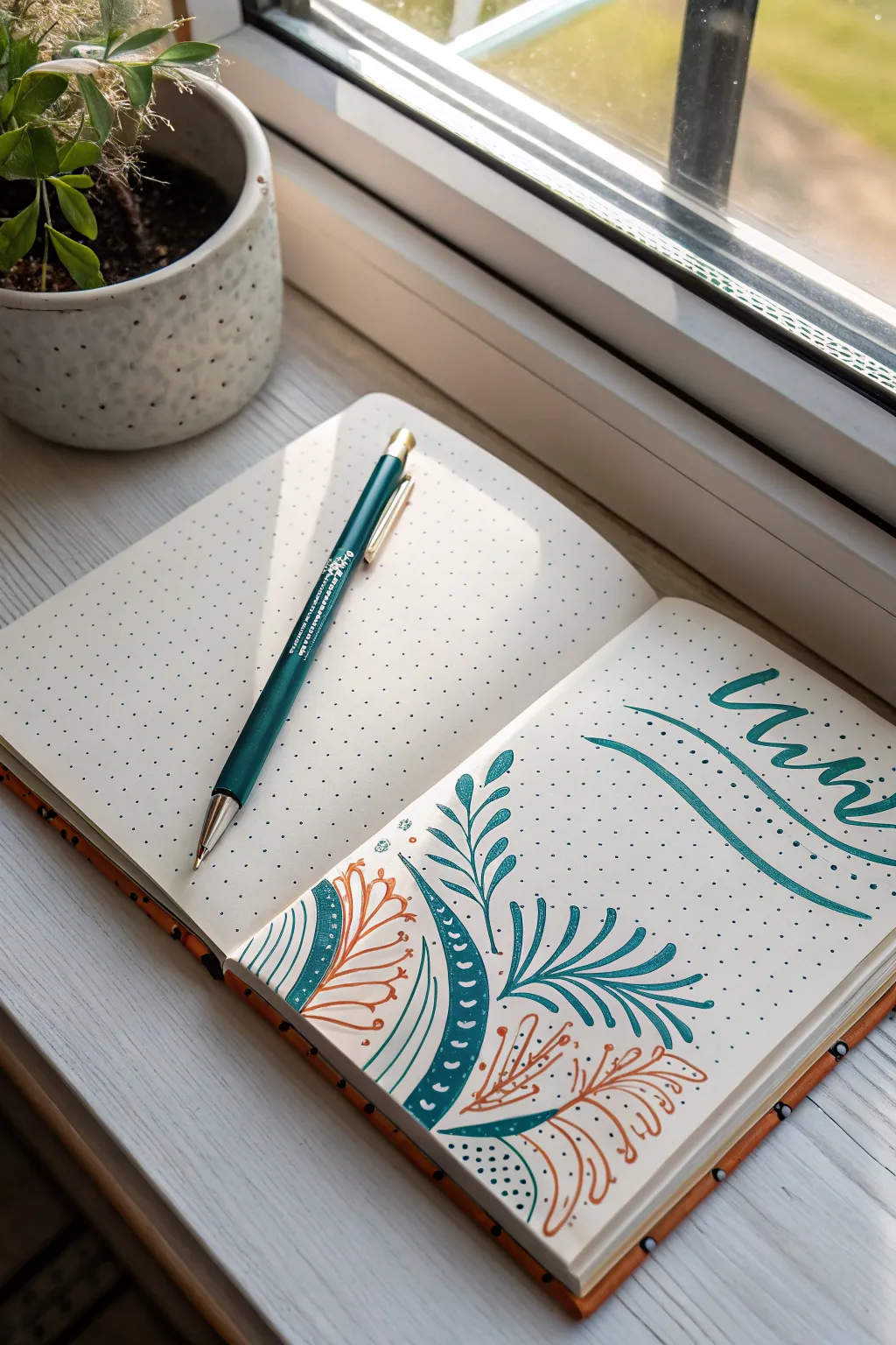
Embrace the simplicity of a dotted notebook with this serene botanical corner design featuring sweeping lines and organic leaf shapes. The combination of deep teal and rustic orange creates a balanced, earthy aesthetic perfect for a title page or weekly spread header.
Detailed Instructions
Materials
- Dotted notebook
- Teal brush pen or fine liner (0.5mm)
- Terracotta/Orange fine liner (0.3mm or 0.5mm)
- Pencil (HB)
- Eraser
- Ruler (optional)
Step 1: Planning and Setup
-
Define the composition area:
Visualize a diagonal split on your page. The bottom-left corner will house the main botanical illustration, reaching up toward the center, while the top-right corner is reserved for your lettering. -
Sketch the main curves:
Using a pencil, lightly draw a swooping curved line starting from the bottom-left edge and arching towards the center of the page. This will be the spine of your main teal leaf. -
Outline the secondary shape:
To the left of your main spine, lightly sketch a semi-circle or mound shape that hugs the corner. This area will contain the dense pattern work later. -
Block in lettering spacing:
In the top right, lightly sketch the baseline for your word (e.g., ‘Mind’ or ‘Mini’) using the dot grid as a guide to keep your script slanted but aligned.
Use the Grid
Don’t ignore the dots! Use them to ensure your curves are symmetrical and that your letter spacing remains consistent.
Step 2: Inking the Botanical Elements
-
Draw the main teal spine:
Switch to your teal pen. Trace over your pencil line for the main central stem, making it slightly thicker at the base and tapering off at the top. -
Add primary teal leaves:
Starting from the bottom of the stem, draw long, slender, lance-shaped leaves extending outward. Let them curve naturally away from the stem. -
Create the patterned band:
Define the thick curved band on the left side using the teal pen. Draw two parallel curved lines about 1cm apart. -
Fill the band:
Fill in the entire band with solid teal ink. Once dry, use a white gel pen to add small dots or distinct tick marks, or simply leave negative space shapes if you are very precise with the teal pen. -
Draw the outer contour:
To the left of that thick band, draw a thin teal outline that parallels the curve, leaving a gap for the orange leaves to reside.
Step 3: Adding Accent Colors
-
Draft the orange foliage:
Pick up your terracotta or orange pen. In the white space inside the bottom-left curve (next to the thick teal band), draw delicate, fern-like fronds. -
Detail the orange leaves:
Make these lines thinner and looser than the teal ones. Draw a central vein and add tiny, rounded leaflets coming off it. -
Add lower orange accents:
At the very bottom right of the design, intertwine another sprig of orange leaves that overlaps or sits behind the teal stem foundation. -
Incorporate decorative dots:
Using the teal pen, add clusters of small dots near the base of the stems and inside the very corner to add texture and ground the illustration.
Add Metallic Flair
Trace the orange leaves with a thin gold gel pen for a subtle shimmer that catches the light and adds elegance.
Step 4: Lettering and Finishing Touches
-
Letter the main word:
Using the teal pen (or a brush pen if you have one), write your chosen word in the top right. Use a modern calligraphy style with extended entrance and exit strokes. -
Add the underline swoosh:
Draw two long, fluid curved lines underneath the text. Start them thin from the left and let them sweep under the word to frame it dynamically. -
Refine line weights:
Go back over the main teal leaves. I like to thicken the underside of the curves slightly to give the illustration more visual weight and dimension. -
Erase pencil guides:
Wait until the ink is completely dry to the touch to avoid smearing. Gently erase all remaining pencil marks. -
Final assessment:
Check for any gaps in the solid teal band or areas that need a few extra stippling dots to balance the negative space.
Now you have a beautifully balanced corner illustration that turns a blank page into an inviting space for your thoughts

PENCIL GUIDE
Understanding Pencil Grades from H to B
From first sketch to finished drawing — learn pencil grades, line control, and shading techniques.
Explore the Full Guide
Mini Doodle Sampler Grid
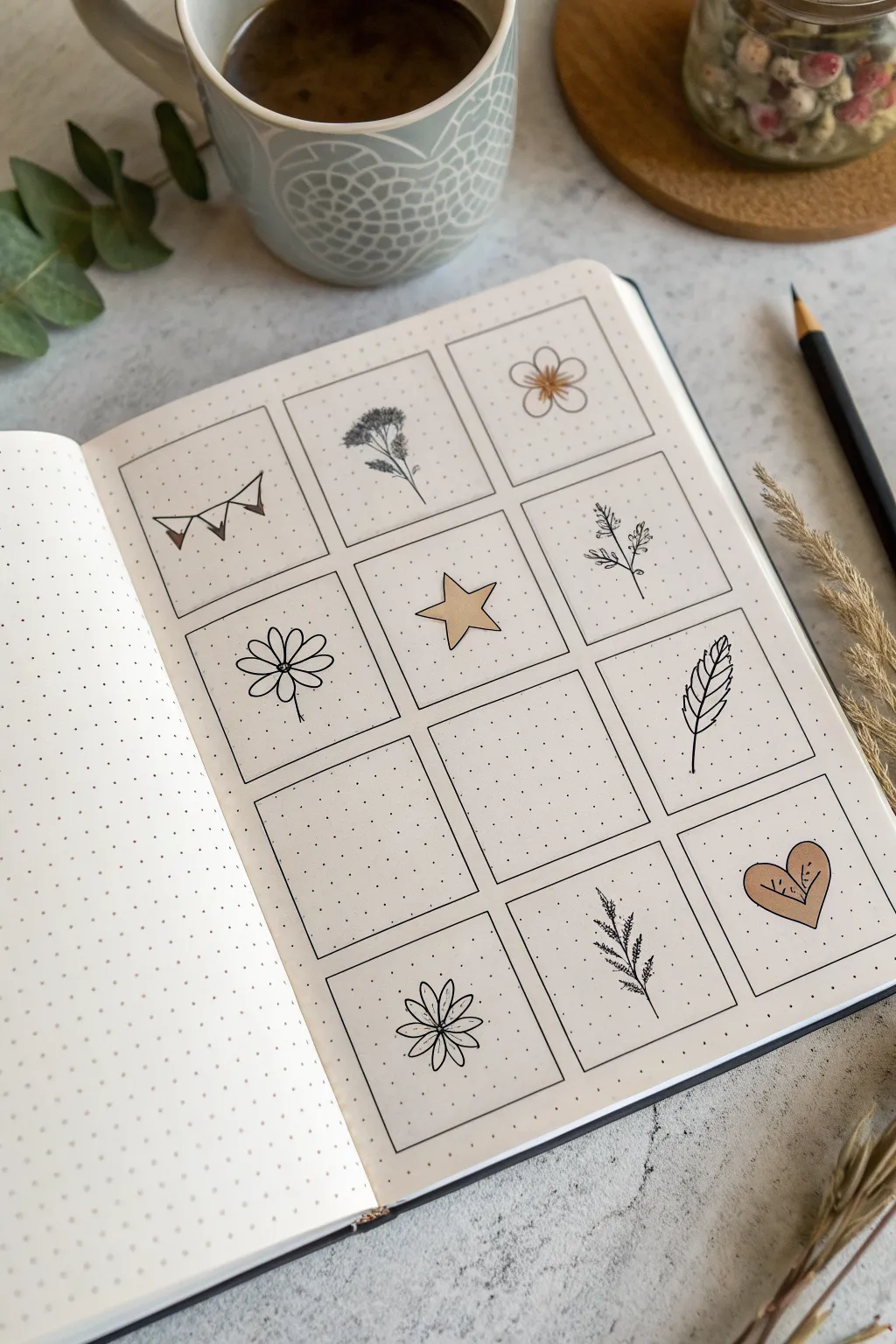
This aesthetic spread transforms a simple bullet journal page into a curated gallery of minimalist nature doodles. Using clean lines and a soft, selective color palette, you’ll create a charming sampler grid perfect for practicing small illustrations.
Detailed Instructions
Materials
- Dotted notebook (A5 or similar size)
- Fine liner pen (black, 0.3mm or 0.5mm)
- Ruler
- Pencil (HB)
- Eraser
- Light brown or beige brush pen/marker
Step 1: Setting the Grid Structure
-
Calculate spacing:
Count the dots across your page width. You want to create a grid of 3 columns and 4 rows. Aim for squares that are roughly 6×6 or 7×7 dots, leaving a 1-dot gap between each box for breathing room. -
Draft the grid:
Using your pencil and ruler, lightly sketch out the twelve squares. Don’t press too hard, as you want these guidelines to erase cleanly later. -
Ink the frames:
Go over your pencil squares with the black fine liner. Use the ruler to ensure crisp, straight edges, stopping precisely at the corners so lines don’t crisscross messy. -
Erase guidelines:
Wait a moment for the ink to set, then gently erase the underlying pencil marks to reveal a clean, empty grid.
Smudge Alert
Using a ruler with fineliners often smears ink. Stick a few layers of tape or a penny under your ruler to elevate the edge off the paper slightly.
Step 2: Row One: Whimsical Beginnings
-
Draw the bunting:
In the top-left box, draw a slightly curved horizontal line. Hang three small triangles from it. Color the first triangle with your beige marker, leaving the others white. -
Sketch the wildflower:
In the middle box, draw a thin vertical stem. Add a cluster of tiny loops or dots at the top to form a flower head, and add a few thin leaves branching off the stem. -
Create the five-petal bloom:
In the top-right box, draw a small circle in the center. Surround it with five rounded petals. Use the beige marker to color just the center circle and add tiny radiating lines from the middle.
Step 3: Row Two: Nature & Celestial
-
Draw the daisy:
In the left box of the second row, start with a small center circle. Draw long, thin, oval-shaped petals extending outward. A simple stem at the bottom grounds the flower. -
Add the star:
In the middle box, draw a five-pointed star. Try to keep the points relatively symmetrical. Fill the entire shape with the beige marker for a pop of solid color. -
Sketch the sprig:
In the right box, draw a central stem. Add tiny, frantic little hash marks or ‘V’ shapes along the stem to mimic a sprig of lavender or rosemary.
Make it a Monthly
Since there are 12 boxes, turn this into a ‘Year in Pixels’ tracker by drawing a tiny icon representing the mood or highlight of each month.
Step 4: Row Three: Negative Space
-
Leave space intentionally:
Skip the first two boxes in this row. Leaving them blank creates a sense of openness and allows you to fill them in later when inspiration strikes. -
Draw the feather:
In the right-hand box, draw a curved vertical line for the quill. Add the vane shape around it, using jagged lines to simulate the texture of feathers.
Step 5: Row Four: Final Flourishes
-
Create the sunburst flower:
In the bottom-left box (skipping one above it), draw a small center point. Draw eight petal loops radiating out. Draw a line down the middle of each petal for detail. -
Sketch the needle branch:
In the middle box, draw a slightly curved stem. Add short, distinct lines branching off both sides to resemble pine needles or a fern frond. -
Finish with a heart:
In the final bottom-right box, draw a simple heart shape. Fill it completely with the beige marker. Once the ink is dry, add some tiny black dots or lines inside for texture.
Now you have a serene little gallery page that looks beautiful as-is or ready for future inspiration
Geometric Border and Page Frame
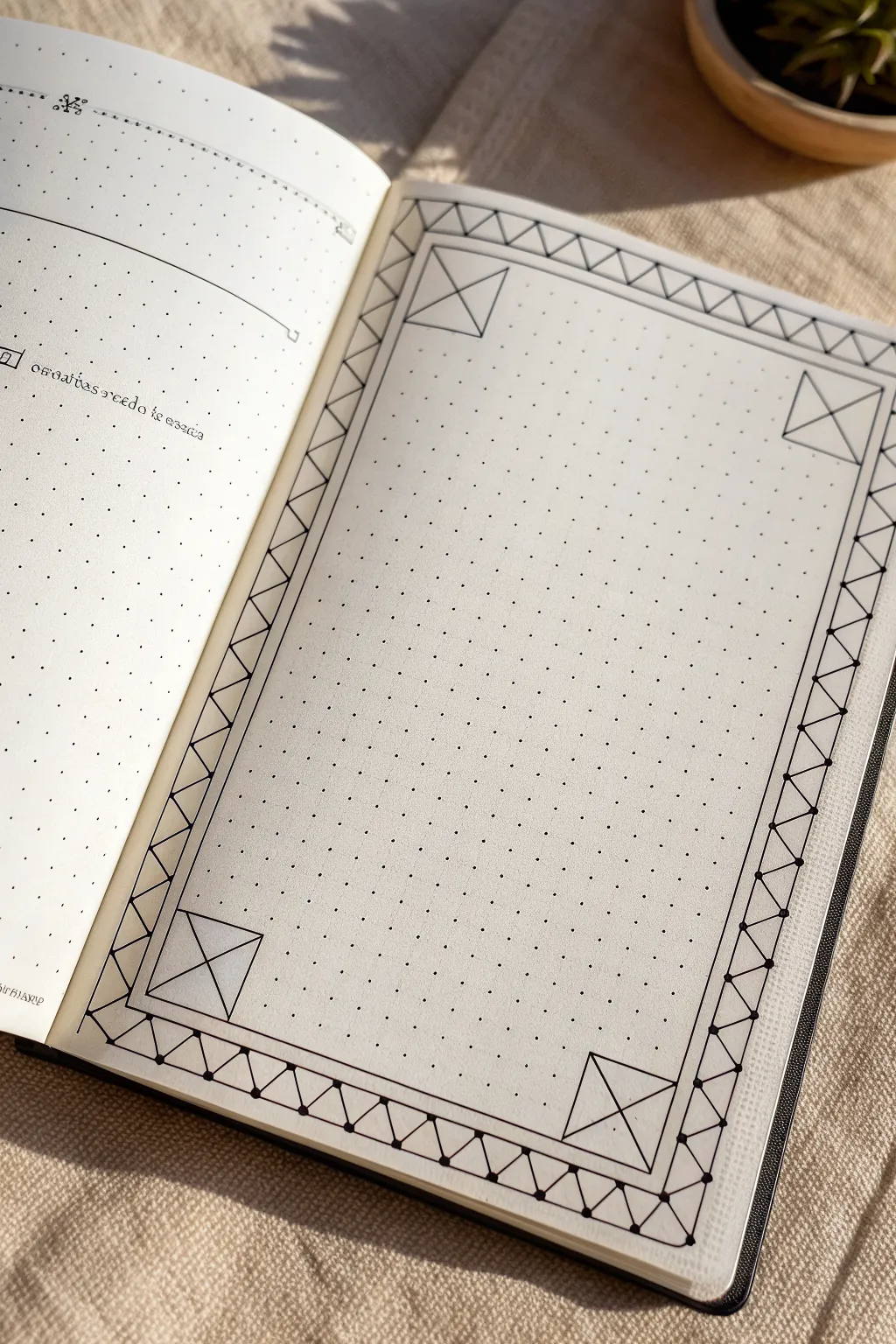
This project transforms a simple dotted page into a structured canvas perfect for bullet journaling or special entries. By connecting the grid dots with precision, you create a sophisticated border featuring corner accents and a rhythmic zigzag pattern that looks complex but is surprisingly simple to execute.
Step-by-Step Tutorial
Materials
- Dotted notebook (A5 size recommended)
- Fine liner pen (0.3mm or 0.5mm, black)
- Ruler or straight edge
- Pencil (HB or 2B)
- Eraser
Step 1: Setting Boundaries
-
Define the outer edge:
Start by establishing the outermost limits of your frame. Count about 2-3 dots in from the edge of the page on all four sides to ensure your frame is centered. -
Draw the outer rectangle:
Using your pencil and ruler, lightly draw a simple rectangle connecting these outer points. This will act as the spine of your border design. -
Define the inner edge:
Now, create the inner boundary for your writing space. Count 3 grid spaces inward from your pencil rectangle on all sides. -
Draw the inner rectangle:
Lightly pencil in this second, smaller rectangle. You should now have a 3-grid-wide channel running around your entire page.
Keep it Clean
Use a clear ruler if possible. It allows you to see the dots underneath, preventing you from accidentally overshooting your lines or miscounting grid spaces.
Step 2: Drafting the Corners
-
Box the corners:
Focus on the four corners of your frame channel. Within that 3-grid-wide space, draw a square at each corner using your pencil. These squares should start exactly where the horizontal and vertical frame sections meet. -
Cross the corners:
Inside each of the four corner squares you just drew, use your ruler to draw a large ‘X’ connecting opposite corners. -
Add vertical bisectors:
Draw a vertical line straight down the center of each corner square, bisecting the ‘X’ you just made. This creates the foundational geometric detail for the corners.
Smudge Alert
If you are left-handed, ink from right to left (or vice versa) to avoid dragging your hand through wet ink. Alternatively, place a scrap paper under your drawing hand.
Step 3: Creating the Zigzag Pattern
-
Mark the intervals:
Along the top and bottom borders (between the corner squares), lightly mark every 2nd dot along the inner and outer pencil lines. This helps spacing the zigzag triangles evenly. -
Draw the triangles:
Still using pencil, connect the dots in a zigzag motion. Draw a diagonal line from the inner line to the outer line, spanning two dots wide, then back down. Repeat this sawtooth pattern along all four straight sections. -
Check the symmetry:
Pause here to look at your pencil guide. The zigzags should connect seamlessly to the corner squares. If a triangle gets cut off, adjust your spacing slightly to make it fit evenly.
Step 4: Inking the Design
-
Ink the main frame lines:
Switch to your fine liner pen. Place your ruler carefully and trace the long straight lines that make up the inner and outer boundaries of the frame. Do *not* draw through the corner squares yet; let those lines stop where the corner box begins. -
Ink the corner squares:
Outline the four corner squares firmly with your pen. -
Ink the corner details:
Draw the ‘X’ inside each corner square. For a cleaner look, I prefer to leave out the vertical bisector line I penciled earlier, or you can trace it if you prefer a denser design. -
Trace the zigzag pattern:
Carefully ink over your penciled zigzag lines inside the border channel. Rotate the notebook as needed to keep your hand position comfortable. -
Add weight to vertices:
To give the drawing dimension, add a tiny dot or slightly thicken the line intersection points where the triangle tips touch the border lines. This mimics the look of a connected structure.
Step 5: Finishing Touches
-
Erase pencil marks:
Wait at least five minutes for the ink to dry completely. Then, gently erase all pencil guidelines, being careful not to crumple the paper. -
Review and refine:
Check for any gaps in your lines. If you missed a connection point in the zigzag pattern, carefully bridge the gap with your pen.
Your finished page now has a crisp, architectural border ready to frame your next journal entry or habit tracker
BRUSH GUIDE
The Right Brush for Every Stroke
From clean lines to bold texture — master brush choice, stroke control, and essential techniques.
Explore the Full Guide
Triangle and Diamond Tessellations
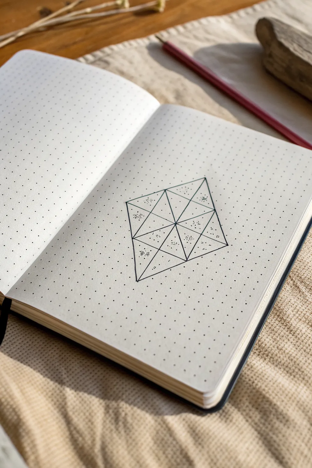
This elegant geometric diamond design transforms a simple dotted page into a mesmerizing study of structure and subtle texture. By combining clean lines with delicate stippling, you’ll create a 3D-effect tessellation that looks beautifully complex but is surprisingly simple to construct.
Step-by-Step
Materials
- Dotted grid notebook
- Fine liner pen (0.3mm or 0.5mm, black)
- Ruler or straight edge
- Pencil (HB or lighter)
- Eraser
Step 1: Setting the Framework
-
Locate the center:
Find a clear area on your dotted page. You will need a vertical space of at least 8 grid squares and a horizontal width of about 6 grid squares. -
Establish the main axis:
Using your pencil and ruler, lightly mark a central vertical line that spans 8 dot spaces (connecting 9 dots vertically). This will be the spine of your diamond. -
Mark the width:
From the vertical center point of your spine, count 3 dot spaces to the left and 3 dot spaces to the right. Mark these points lightly. -
Connect the outer diamond:
Draw the main diamond shape in pencil by connecting the top of your spine to the left width marker, then to the bottom of the spine, then to the right marker, and finally back to the top. -
Draw horizontal divisions:
Create three horizontal lines across the diamond. The middle line goes straight through the center. The other two lines should split the upper and lower halves evenly, creating four distinct horizontal sections within the diamond.
Step 2: Creating the Tessellation
-
The vertical bisection:
Reinforce your central vertical spine line with the pencil, ensuring it runs clearly from the top tip to the bottom tip. -
Diagonal cross-hatching:
Now, draw diagonal lines connecting the intersections. Start by connecting the left-most corner of the diamond to the midpoint of the central spine. -
Complete the inner triangles:
Continue drawing diagonal lines across the grid sections you’ve created. Essentially, every rectangular section formed by your horizontal and vertical lines should be bisected by a diagonal to form triangles. -
Review the geometry:
Check your pencil sketch. You should see a large diamond composed of 16 smaller triangular subsections. -
Ink the outlines:
Switch to your fine liner pen. Carefully trace over all your pencil lines. I find it helps to rotate the notebook so your hand is always pulling the pen in a comfortable direction against the ruler. -
Erase guidelines:
Allow the ink to dry completely to avoid smudging. Once dry, gently erase the underlying pencil marks to reveal the crisp geometric grid.
Smudge Alert
If you are left-handed or using a particularly ‘wet’ pen, place a scrap piece of paper under your hand while stippling to prevent smearing the fresh ink dots across the pristine paper.
Step 3: Adding Texture and Depth
-
Identify shading areas:
Look at the four central-most triangles that meet at the very middle of the design. You will be shading the outer halves of these sections, and alternating pattern spots in the outer triangles. -
Start stippling:
Using the very tip of your pen, begin adding small dots (stippling) inside the chosen triangles. Keep the dots random; don’t line them up in rows. -
Create gradients:
Cluster the dots more densely near one corner or edge of a triangle, and space them out as you move toward the center. This creates a shadow effect. -
Alternate the pattern:
Don’t shade every triangle. Leave alternating triangles completely empty to create high contrast. In the image, note how ‘clusters’ of dots float in the center of some outer triangles rather than filling them completely. -
Refine the density:
Go back over your stippled areas. Add a few more dots to the darkest areas to deepen the contrast, making the geometry pop off the page.
Gradient Control
For smoother gradients, hold the pen vertically. Light, rapid taps work better than pressing down. Build density slowly; you can always add more dots, but you can’t erase them.
Now you have a crisp, modern geometric feature that adds sophistication to your journal spread
Dot-Grid Mandala Rings
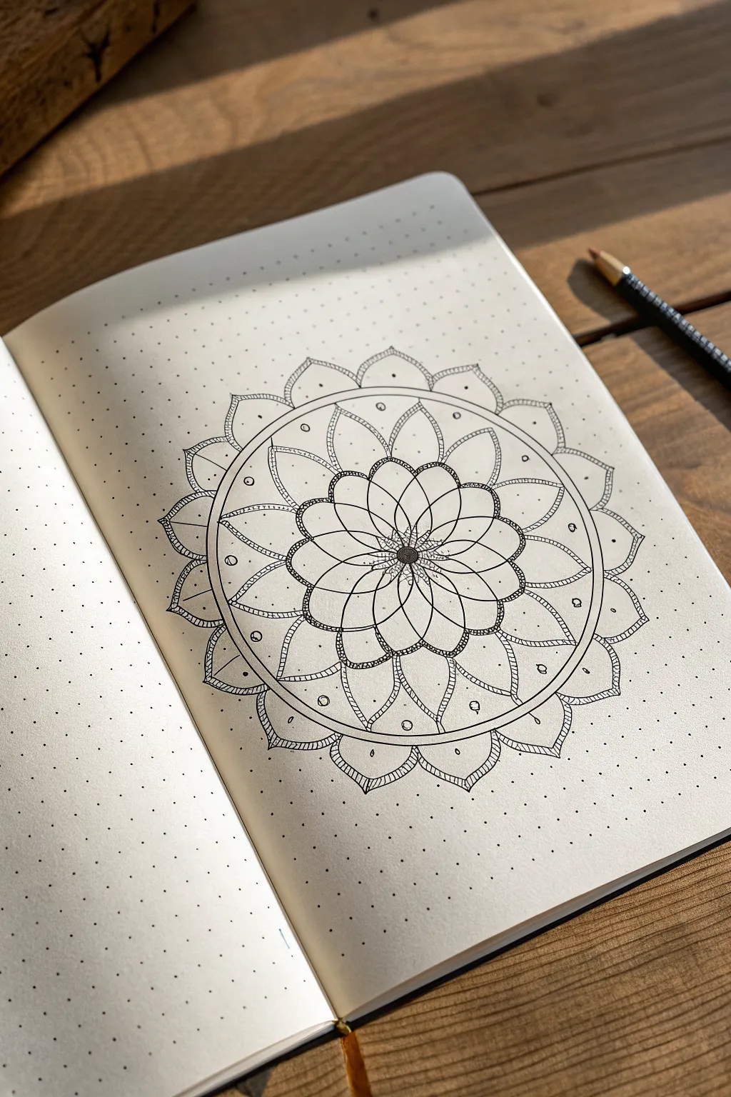
This elegant mandala design leverages the structure of dot-grid paper to create perfectly symmetrical, blooming layers. The result is a crisp, meditative piece that combines floral curves with precise geometric circles.
How-To Guide
Materials
- Dotted notebook (A5 size recommended)
- Fine liner pen (black, size 0.3mm or 0.5mm)
- Pencil (HB or H for light sketching)
- Compass (optional but helpful for circles)
- Ruler or straight edge
- Eraser
Step 1: Setting the Foundation
-
Find your center:
Begin by locating the exact center of your page. Count the dots horizontally and vertically to find the middle point, and mark it lightly with your pencil. This single dot will anchor the entire rotating design. -
Sketch the concentric rings:
Using a compass or by carefully counting dots for radius, sketch three concentric circles around your center point with a pencil. These will serve as guidelines for the three main petal layers. Keep these lines very faint so they are easy to erase later. -
Divide the circle:
Lightly sketch intersecting lines through the center to divide your circle into 12 or 16 equal pie slices. These radial lines will ensure your petals stay evenly spaced and symmetrical around the core.
Wobbly Circles?
If you don’t have a compass, trace household items like cups or washi tape rolls to get perfect pencil guidelines before inking.
Step 2: Drawing the Inner Core
-
Create the central seeds:
Switch to your fine liner pen. Directly in the center, draw a small, filled-in black circle roughly the size of a pea. Surround this filled circle with a ring of tiny stippled dots to give it a textured, pollen-like appearance. -
Draft the first petal layer:
Draw the first layer of petals radiating from the center. These should be tear-drop shaped, relatively thin, and meet at the central textured ring. There should be about 12 petals in this initial tight cluster. -
Add the overlapping petals:
Behind the first layer of petals, draw a second set of slightly wider, rounded petals that peek out from the gaps. This creates a sense of depth and density right at the start.
Add Some Shine
Use a white gel pen to add highlights on top of the black center or along the petal curves for a glossy, 3D effect.
Step 3: Expanding the Design
-
Outline the middle ring:
Moving outward to your next pencil guideline, draw a series of large, overlapping semicircles or rounded ‘U’ shapes. These form a chain-link pattern. Notice in the reference how these shapes overlap; draw the ‘top’ ones first, then draw the lines for the ones appearing to go underneath. -
thicken the linework:
Go back over the rounded tops of these chain-link petals and slightly thicken the line or add a double line to give them weight. This definition helps distinct layers pop out visually. -
Detail the middle layer:
Inside each of these rounded chain petals, draw a smaller, similar curve near the base. This mimics the veining or separation often seen in natural flower petals. -
Draw the separation circle:
Draw a continuous, solid circle enclosing the entire floral section you’ve created so far. Right outside this line, draw a second circle parallel to it, creating a thin track or channel. -
Fill the channel:
Inside that thin circular channel track, draw small circles or ‘seeds’ periodically. Space them out evenly—perhaps one every three or four grid dots—to add ornamental detail to the boundary.
Step 4: The Final Flourish
-
Create the outer petals:
sketch the largest, outermost layer of petals extending from the channel ring you just finished. These petals should be pointed at the tip, resembling a classic lotus shape. -
Add inner petal details:
Inside each large outer petal, draw a slightly smaller version of the same shape. This double-line effect adds intricate detail without needing shading. -
Texture the tips:
At the very tip of each large outer petal, add a tiny bit of cross-hatching or stippling. This small shadow anchors the points and makes the drawing feel finished. -
Connect the gaps:
In the ‘V’ shaped spaces between the large outer petals, draw small, rounded scallops or inverted triangles to bridge the gaps, unifying the outer rim. -
Clean up:
Once the ink is completely dry—I usually wait at least five minutes to be safe—gently erase all your pencil guidelines, leaving only the crisp black ink.
Enjoy the calming rhythm of your symmetrical creation as you close your notebook


Symmetry Studies: Butterflies and Flowers
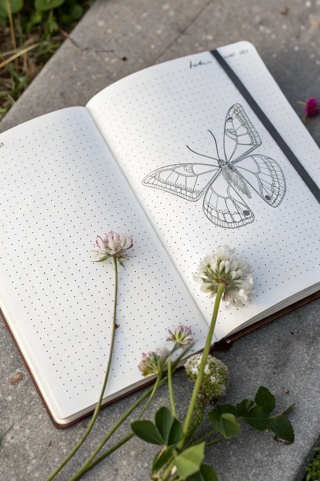
This elegant spread combines the precision of a scientific illustration with the organic charm of a field journal. By focusing on a single, detailed butterfly drawing on one side, you create a striking focal point that feels both vintage and minimalist.
How-To Guide
Materials
- Dotted grid notebook (A5 size recommended)
- Fine liner pens (sizes 0.05, 0.1, and 0.3mm)
- Pencil (HB or 2H)
- Soft block eraser
- Ruler
- Reference photo of a butterfly (e.g., Satyr or Glasswing species)
Step 1: Planning and Foundation
-
Set the compositional balance:
Since this spread relies on negative space, we are intentionally leaving the left page blank for now. Focus your attention solely on the right-hand page. -
Grid counting for placement:
Locate the center of the right page by counting the dots. Mark a faint cross lightly with your pencil to establish the central axis where the butterfly’s body will lie. This ensures your drawing doesn’t accidentally drift off the page. -
Sketch the body axis:
Draw a light vertical line specifically for the thorax and abdomen. Make it slighty tilted if you want a more natural, less rigid look, though a straight vertical alignment mimics scientific displays. -
Block in the wing shapes:
Using simple geometric shapes—triangles for forewings and rounded teardrops for hindwings—sketch the basic silhouette of the butterfly. Keep your pencil pressure extremely light so these lines can be erased later. -
Refine the wing outline:
Go over your geometric shapes and soften the edges, adding the specific indentations and curves characteristic of butterfly wings. Pay attention to symmetry, using the dot grid as a measuring tool to ensure the left and right wings match in width.
Step 2: Inking the Structure
-
Outline the main form:
Switch to your 0.3mm fine liner. Carefully trace the perimeter of the wings. Use confident, smooth strokes rather than short, scratchy ones to get a clean ‘specimen’ look. -
Detail the body:
Using the 0.1mm pen, ink the thorax and abdomen. Instead of a solid outline, use short, flicking strokes to suggest a fuzzy, hairy texture on the body segments. -
Add the veins:
With the 0.1mm pen, draw the primary veins radiating from the body to the wing edges. The dot grid is incredibly helpful here for keeping these lines straight and evenly spaced. -
Draw the antennae:
For the antennae, use a single, sweeping motion with the 0.1mm pen to avoid shaky lines. Use the 0.3mm pen just at the tips to create the small clubs.
Symmetry Check
Struggling to match the wings? Draw the left wing on a scrap piece of butter paper or tracing paper, flip it over, and trace it onto your notebook page for perfect symmetry.
Step 3: Adding Texture and Depth
-
Create the wing cells:
Switch to your finest 0.05mm pen. Draw the intricate ‘cells’ or patterns inside the wings. These lines should be much more delicate than your main outline to create visual hierarchy. -
Scribble texture for darker areas:
Identify the darker spots on the wings, such as the ‘eyes’ or marginal bands. Use a loose, controlled scribble or stippling technique with the 0.1mm pen to fill these areas without making them pitch black. -
Hatch shading on the body:
Add volume to the butterfly’s body by adding small hatch marks on the sides of the abdomen, leaving the center lighter to suggest a cylindrical shape. -
Erase pencil guides:
Once the ink is completely dry—I usually wait at least five minutes to be safe—gently erase all your pencil sketches. Be careful not to buckle the paper. -
Final crisping:
Inspect your lines. If the outer contour looks too thin compared to the detailed interior, go over the very outer edge one last time with the 0.3mm pen to make the butterfly pop off the page.
Make it 3D
Add a very faint gray shadow underneath the wings using a light gray brush pen or a diluted gray watercolor wash. This makes the butterfly look like it’s resting on the paper.
Now you have a pristine specimen preserved forever on your page, ready for notes or simply to be admired.
Topographic Contour Line Doodles
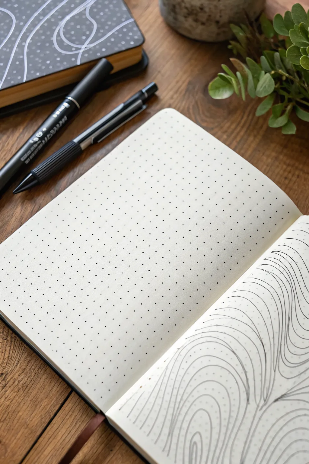
Transform a simple dotted page into a mesmerizing landscape of flowing lines, mimicking the soothing patterns of topographic maps or river currents. This project is a relaxing exercise in mindfulness, using repetitive strokes to create depth and movement.
Step-by-Step Guide
Materials
- Dotted notebook
- Fine liner pen (black, 0.3mm or 0.5mm)
- Pencil (HB or lighter)
- Eraser
Step 1: Planning the Flow
-
Visualize the peaks:
Start by looking at your blank dotted page. Imagine where you want the highest points or ‘peaks’ of your topographic map to be. These will be the centers of your ripple patterns. -
Light sketch:
Using your pencil very lightly, draw a few organic, curvy shapes scattered across the page. These shouldn’t be perfect circles; think kidney beans or amoebas. -
Define the boundaries:
Lightly sketch a few lines that separate different ‘currents’ or flow directions. This helps you decide where one set of lines will crash into another.
Uneven spacing?
If gaps vary too much, don’t force a new line in. Instead, thicken the existing line slightly on the wider side to visually balance the negative space without crowding it.
Step 2: Drawing the Core Lines
-
Start the center:
Pick one of your sketched peak areas. With your fine liner pen, draw a small, closed loop in the center. It doesn’t need to hit the dots perfectly; ignore the grid for the shape itself. -
The first echo:
Draw a second line around the first loop, maintaining a consistent distance from the previous line. I like to keep about 3-4mm between lines for a balanced look. -
Continue expanding:
Keep drawing concentric rings outward from that center loop. As you expand, let the lines become slightly more irregular or wavy to mimic natural terrain. -
Repeat for other centers:
Move to your next sketched peak area and repeat the process, creating a new set of expanding rings until they are close to touching the first set.
Varying line weight
Use a thicker 0.8mm pen for every 5th line to create ‘major’ contour intervals, mimicking real topographic maps and adding instant dimension.
Step 3: Creating Junctions
-
Identify collision points:
Notice where the expanding rings from two different centers are about to meet. This is where the ‘V’ shapes will form. -
Merge the flow:
Instead of crossing lines, make the lines curve away from each other, running parallel down a shared path. Think of two streams merging into a river. -
Filloing the gaps:
If a triangular gap forms between three converging sets of lines, fill it with smaller, nested triangles or curved lines that echo the surrounding shapes. -
Extend to edges:
Continue drawing lines that wrap around the entire cluster of shapes, extending all the way to the edges of the page.
Step 4: Refining the Details
-
Check consistency:
Look over your page. If any gaps between lines look uncomfortably wide, you can carefully add an interjecting line that starts and ends tapered against existing lines. -
Smoothing wobbles:
Don’t worry if your hand shakes slightly; the ‘wobble’ actually adds to the organic, hand-drawn topographic aesthetic. -
Let ink dry:
Give the ink plenty of time to set, especially if you used a juicy pen. Smudging at this stage is heartbreaking. -
Erase guidelines:
Gently erase your initial pencil sketches. Be careful not to crinkle the paper as you rub. -
Final assessment:
Step back and view the flow. The density of lines should create a vibrating optical effect against the dotted background.
Enjoy the rhythmic process of filling the page with these satisfying organic shapes


Have a question or want to share your own experience? I'd love to hear from you in the comments below!