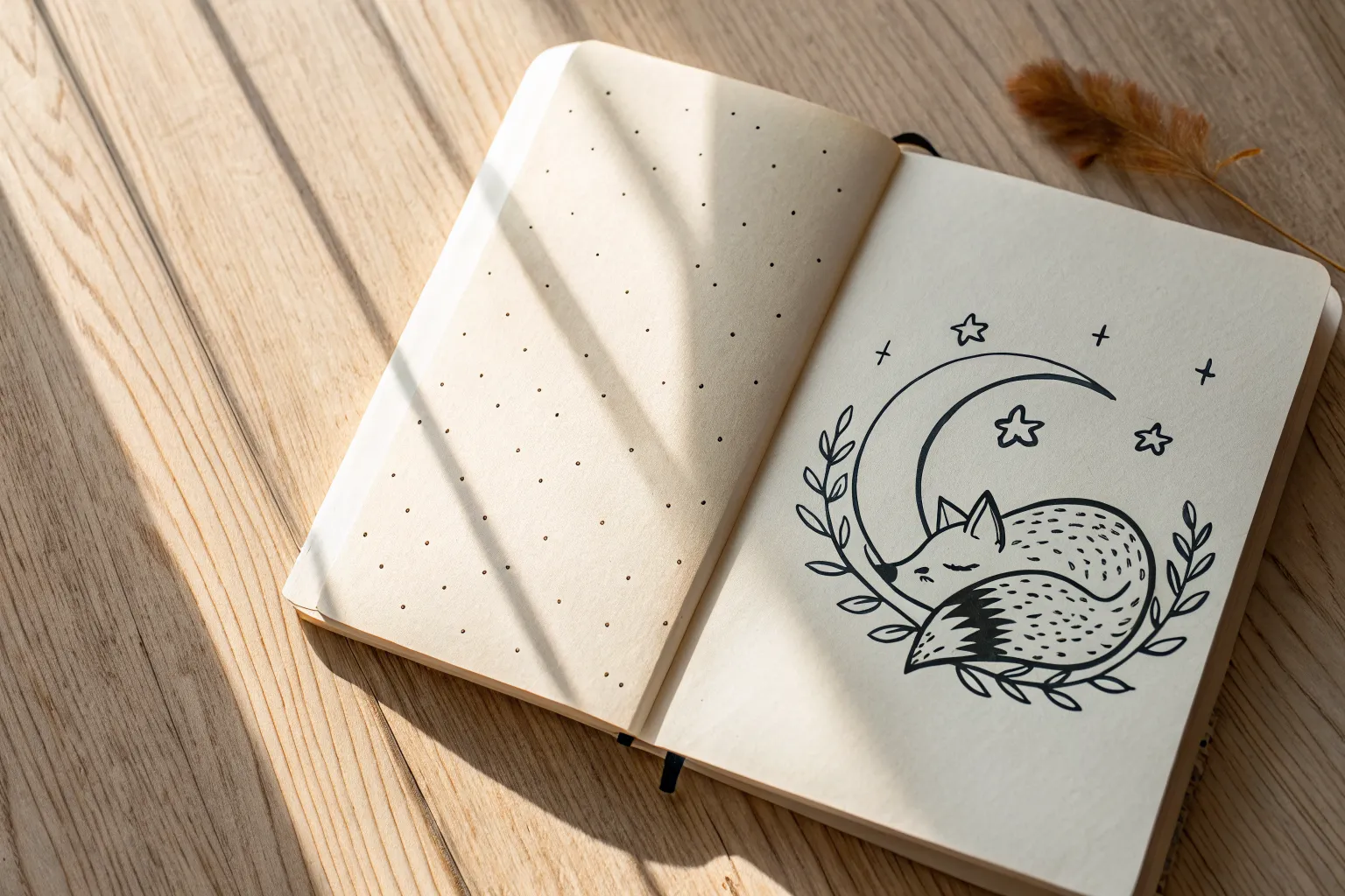
If you’re craving that cute aesthetic vibe without overthinking it, these little sketch ideas are my favorite kind of satisfying. I’m keeping everything simple, cozy, and totally doable—so you can fill a page fast and still feel proud of it.
Chubby Cat Face Doodles
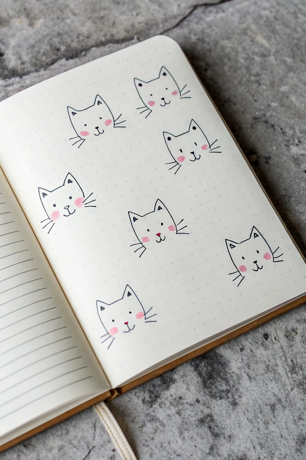
Fill your journal pages with this delightful scatter of simple, chubby cat faces. These minimalist doodles rely on basic shapes and sweet pink accents to create a playful pattern perfect for bullet journals or sketchbooks.
Detailed Instructions
Materials
- Dotted or blank journal notebook
- Fine liner pen (black, 0.3mm or 0.5mm)
- Pink colored pencil or pastel highlighter
- Pencil (HB) for sketching
- Eraser
Step 1: Setting the Scene
-
Plan your layout:
Visualize a diagonal or scattered pattern across your page. These cats look best when they aren’t perfectly aligned in rows, but rather floating freely like a printed fabric pattern. -
Sketch basic head shapes:
Using your pencil very lightly, draw a soft U-shape for the bottom of the face. Keep the bottom curve wide and slightly flattened to give them that chubby, friendly look. -
Add the ears:
Top off your U-shape with two pointed triangles. Connect them with a gentle curve in the middle representing the top of the head.
Step 2: Inking the Outlines
-
Trace the main shape:
Take your black fine liner and carefully go over your pencil lines. Don’t worry if the lines aren’t machine-perfect; a little wobble adds character to doodles. -
Draw inner ear details:
Inside each ear triangle, draw a smaller, inverted triangle near the tip. This small detail adds depth and makes them look alert. -
Erase guidelines:
Wait a moment for the ink to dry completely to avoid smudging, then gently erase all your initial pencil sketches.
Smudged Ink?
If your fine liner smears when erasing pencil lines, switch to a waterproof archival ink pen and wait at least 60 seconds before erasing.
Step 3: Creating the Faces
-
Position the eyes:
Place two small dots for eyes wide apart on the face. Positioning them lower down on the face creates a cuter, more innocent expression. -
Draw the nose:
Directly between the eyes, but slightly lower, draw a tiny, soft triangle pointing downward or a small oval for the nose. -
Add the mouth:
From the bottom of the nose, draw a small chaos-free anchor shape or two little curved hooks to form the classic ‘cat smile’ mouth. -
Add whiskers:
Flick three short lines outward from each cheek. Keep them quick and light so they taper off at the ends.
Make it a Sticker Sheet
Draw these on adhesive label paper, cut them out with a small white border, and you have custom homemade cat stickers for your planner.
Step 4: Adding Color & Character
-
Apply cheek blush:
Using your pink colored pencil, gently color small oval patches underneath the eyes on the outer edge of the face. Press lightly for a soft, powdery look. -
Color contouring:
You can add a tiny bit of the same pink to the inside of the ear triangles for extra warmth. -
Vary the expressions:
For the next cat, try tilting the head slightly by angling your initial loose sketch. I find this makes the page look more dynamic. -
Change the features:
On a few cats, make the nose a tiny solid black dot instead of a triangle, or change the eye spacing slightly to give them individual personalities. -
Final touches:
Review your doodles and strengthen any whisker lines that look too faint, ensuring the black ink stands out crisply against the paper.
Now you have a charming page full of feline friends to brighten up your daily notes

Tiny Hearts With Sweet Faces
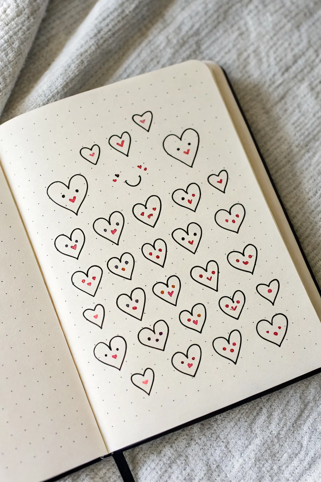
These adorable heart characters turn a simple shape into a page full of personality, perfect for filling empty notebook space. Using a dot-grid journal keeps everything neat while still allowing for that playful, hand-drawn charm.
Step-by-Step
Materials
- A5 Dot Grid Journal/Notebook
- Fine liner pen (Black, 0.3mm or 0.5mm)
- Red or pink felt tip marker or colored pencil
- Pencil (optional for sketching)
- Eraser
Step 1: Setting up the Grid
-
Observe the spacing:
Before you start drawing, look at the dot grid as your guide. You want your hearts to be roughly 2 grid squares wide and 2 grid squares tall to keep them uniform. -
Start from the center:
Locate the approximate center of your page. Draw a simple smiley face here—two small dots for eyes and a small ‘u’ curve for a smile. Leave plenty of space around it, as this won’t be enclosed in a heart outline. -
Add floating details:
Above the central smile, draw three tiny red hearts or dots to act as cheeks or floating love bubbles.
Step 2: Drawing the Heart Outlines
-
Draw the main shape:
Begin drawing the heart outlines around that central face. Use the black fine liner. Start the V-dip of the heart at a dot intersection and curve outwards and down. -
Vary the sizes slightly:
While you want them uniform, slight organic wobbles or size variations make the page look cuter and less rigid. Aim for a mix of slightly wider and narrower hearts. -
Create the rows:
Work in staggered rows. If your first row has four hearts, try placing the hearts of the second row in the spaces between the hearts above, like a brick pattern. -
Fill the page:
Continue drawing heart outlines until you have about 6-7 rows, letting the arrangement naturally taper off at the top and bottom. There are roughly 28-30 hearts in total on this page. -
Add tiny hearts:
At the very top and very bottom of the cluster, draw a few much smaller hearts without faces to serve as visual bookends for the composition.
Grid Skipping
If your hearts look cluttered, ensure you are leaving at least one full empty grid square (in all directions) between every heart outline.
Step 3: Adding Personality
-
Place the eyes:
Go back into each heart outline with your black pen. Draw two small dots for eyes. Place them relatively wide apart on the heart’s upper lobes for a ‘kawaii’ look. -
Mix up the eye styles:
For variety, draw some eyes as tiny circles, some as solid dots, and give a few hearts a winking expression using a ‘<' shape. -
Draw the mouths:
Using the red or pink marker, add a tiny mouth between the eyes. A small ‘v’ shape works perfectly for a joyful smile. -
Alternative expressions:
You don’t have to use red for every mouth. Feel free to draw some mouths in black ink—simple straight lines or small curves work well to change the mood. -
Rosy cheeks:
On the hearts where you drew a black mouth, add two tiny red dots underneath the eyes to serve as blushing cheeks. -
Check balance:
Scan the page for any hearts that look empty. Add a single red dot or a tiny accent heart inside them if a face feels too crowded for the space.
Pro Tip: Pen Test
Test your red marker on a back page first. Some alcohol markers bleed through thin journal paper; water-based fineliners are usually safer.
Now you have a whole community of cheerful hearts to brighten up your journal spread

Simple Flower Sprigs and Bows
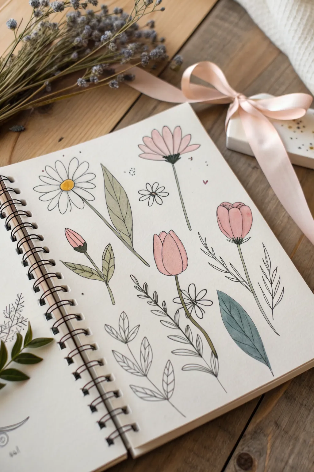
Create a charming collection of spring florals that look like they were plucked straight from a garden and pressed into your journal. This beginner-friendly project combines clean fineliner outlines with soft, muted washes of color for a delicate and airy aesthetic.
Step-by-Step Guide
Materials
- Spiral-bound sketchbook (mixed media paper preferred)
- Black fineliner pens (0.3mm and 0.5mm)
- Watercolors or alcohol markers (pale pink, sage green, mustard yellow, dusty blue)
- Pencil (HB or H)
- Kneadable eraser
- Small round paintbrush (size 2 or 4)
Step 1: Planning the Layout
-
Lightly sketch the focal flowers:
Begin by using your HB pencil to draw the simple shapes of the main flowers. Start with an oval for the tulip head near the center-right and a circle for the daisy on the top left. Keep your pressure extremely light so you can erase these lines later. -
Add stems and direction:
Draw faint lines extending down from your flower heads to establish the stems. Give them a slight curve or wave rather than drawing them perfectly straight, as this adds a natural, organic feel to the composition. -
Sketch the leaves:
Fill the empty spaces with leaf shapes. Draw a large, elongated leaf pointing upward in the center, and a wide, single leaf near the bottom right. Scatter smaller sprigs of leaves near the bottom center to balance the page.
Bleed-Through Blues
If using alcohol markers, place a scrap sheet of paper behind your current page. This catches ink bleed-through and protects the next clean sheet in your sketchbook.
Step 2: Inking the Outlines
-
Outline the daisy:
Switch to your 0.3mm fineliner. Carefully trace the center circle of the daisy, then draw long, narrow petals radiating outward. Don’t worry if they aren’t perfectly symmetrical; a little variation looks more realistic. -
Define the pink daisy:
Move to the top right flower. Draw slender petals that fan out upwards from a central point. Underneath these petals, draw a small, darkened triangular base (the sepal) and a very thin stem extending downward. -
Ink the tulips:
For the tulips, start with the central pink one. Draw a ‘U’ shape for the base and add overlapping curved lines at the top to suggest closed petals. Repeat this for the slightly larger flower on the far right and the small bud on the lower left. -
Add texture to the leaves:
Outline your leaf shapes. For the large central leaf and the blue-green leaf on the bottom right, draw valid center veins. In the large central leaf, add very subtle, faint lines branching off the center vein to suggest texture. -
Draw the botanical sprigs:
Focus on the bottom center area. Ink the delicate sprigs that look like ferns or herbs. Draw a central stem and add small, paired oval leaves climbing up the stem. Keep these lines steady but flowing. -
Erase pencil marks:
Wait until you are absolutely certain the ink is dry to avoid smudging. Gently run your kneadable eraser over the entire page to lift the graphite guidelines, leaving only the crisp black ink.
Watercolor Trick
For that soft, airy look, paint the water onto the paper first, then drop in the pigment. This wet-on-wet technique creates beautiful, natural gradients without hard edges.
Step 3: Adding Soft Color
-
Color the daisy center:
Dip your brush into a mustard yellow watercolor (or use a marker). Apply a small dab of color to the center of the daisy on the top left, leaving a tiny spot of white paper showing for a highlight. -
Paint the pink florals:
Mix a very watered-down pale pink. Gently fill in the petals of the top-right flower and the tulip heads. I like to keep the color slightly translucent so the black lines show through clearly. -
Apply sage green to stems:
Using a muted sage green, carefully paint along the thin stems of the tulips and the bud. Use the very tip of your brush to stay within the narrow lines. -
Color the large leaves:
Use the same sage green for the large vertical leaf in the center and the leaves attached to the small tulip bud. The goal is a soft wash, not heavy saturation. -
Add the dusty blue accent:
For the single large leaf at the bottom right, switch to a dusty blue or teal shade. This cool tone contrasts beautifully with the warm pinks and greens elsewhere on the page. -
Create depth with shading:
Once the base pink layers on the tulips are dry, add a second, slightly darker layer of pink just at the bottom of the flower heads where the petals meet the stem. This gives the flowers roundness and volume.
Step 4: Final Details
-
Enhance with patterns:
Go back to the bottom sprigs with the uncolored leaves. Using your finest pen, draw tiny veins inside each small leaf, or leave them empty for visual variety. -
Add decorative fillers:
To make the page feel full, draw tiny floating elements. Add a small five-petal flower outline near the center, a few stray dots, or a tiny heart shape near the pink daisy. -
Clean up edges:
Check your watercolor edges. If any paint strayed too far outside the lines, you can sometimes lift it with a clean, damp brush, or simply embrace the ‘loose’ sketchbook look.
Now you have a spread of delicate florals that captures the gentle essence of spring

Smiling Sun, Moon, and Stars
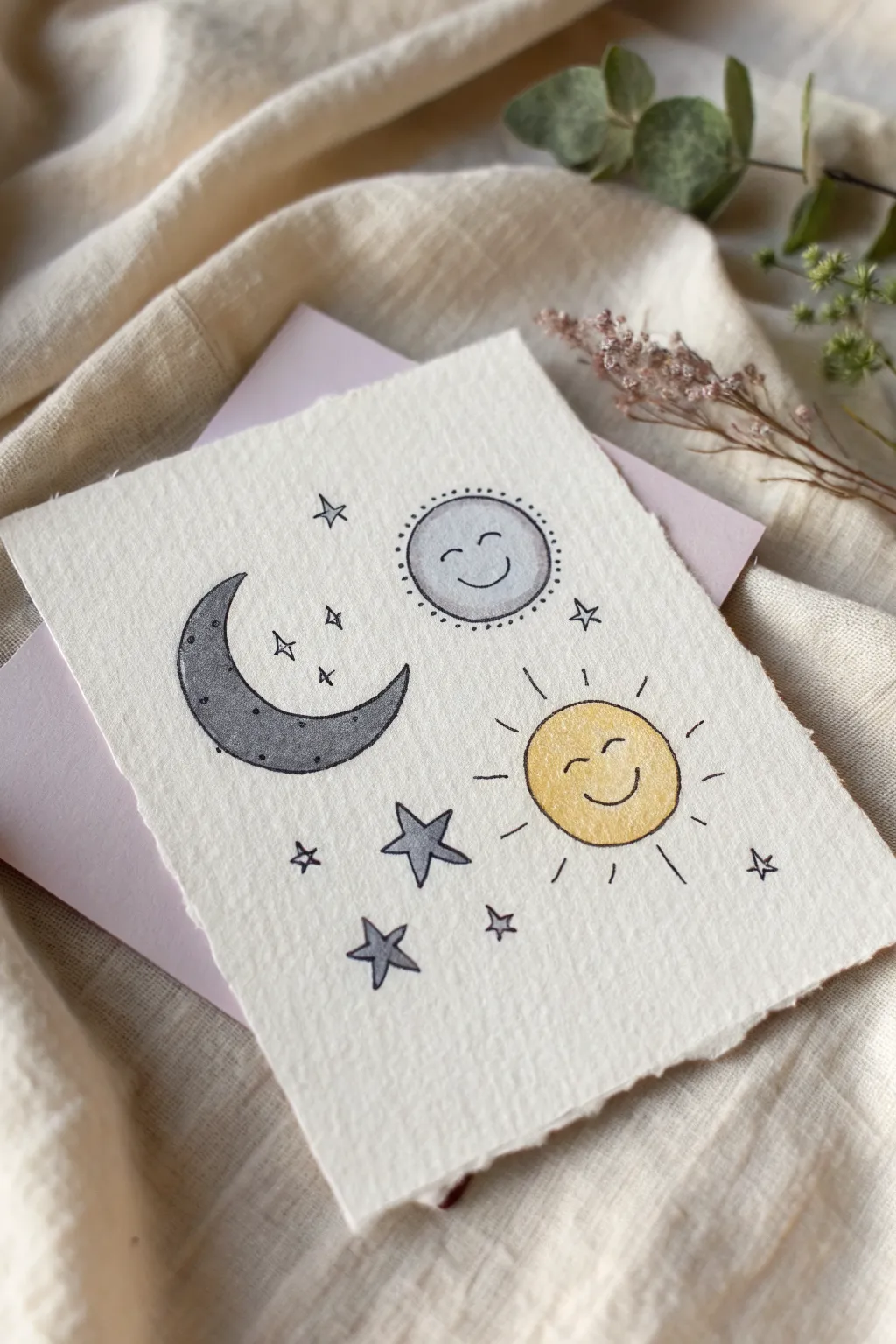
Brighten someone’s day with this charming, hand-drenched illustration featuring a cheerful trio of celestial bodies. Using simple shapes and soft washes of watercolor on textured paper, you’ll create a whimsical scene full of twinkling stars and happy faces.
Step-by-Step
Materials
- Cold press watercolor paper (approx. 4×6 inches)
- Pencil (HB or H)
- Kneaded eraser
- Fine liner pen (Black, waterproof, size 01 or 03)
- Watercolor paints (Yellow, Grey, Black/Payne’s Grey)
- Small round watercolor brush (size 2 or 4)
- Clean water and paper towel
- Ruler (optional)
Step 1: Planning the Layout
-
Paper preparation:
Begin by tearing your watercolor paper to size rather than cutting it. Use a ruler as a guide and gently tear the edges to achieve that lovely, soft deckled look shown in the photo. -
Sketching the Sun:
Lightly sketch a circle in the lower right quadrant for the sun. It doesn’t need to be geometrically perfect; a hand-drawn circle adds character. -
Sketching the Full Moon:
Above the sun, slightly to the left, sketch a smaller circle for the full moon or planet doodle. -
Sketching the Crescent Moon:
To the left of the other two shapes, draw a large ‘C’ shape to form the outer curve of the crescent moon, then add the inner curve to close the shape. -
Adding the Stars:
Scatter different star shapes around the main figures. Sketch two five-pointed stars near the bottom center and various small four-pointed sparklers in the empty spaces. -
Refining the sketch:
Gently roll a kneaded eraser over your sketch to lift up excess graphite, leaving just a faint guide for your painting.
Bleeding Lines?
If your ink feathers into the paint, the paper wasn’t dry enough. Wait longer or use a hairdryer on low heat to ensure moisture is fully evaporated.
Step 2: Adding Color
-
Painting the Sun:
Load your brush with a warm, sunny yellow watercolor. Fill in the sun circle, keeping the wash fairly even but allowing the texture of the paper to show through. -
Painting the Full Moon:
Mix a very watery, pale grey wash. Fill in the small upper circle. I like to keep this extremely pale so the face drawn later stands out clearly. -
Painting the Crescent Moon:
For the crescent moon, use a darker grey or diluted black paint. Apply a solid wash, perhaps letting it be slightly darker at the bottom curve for visual weight. -
Coloring the Main Stars:
Use a medium-grey tone to fill in the two larger five-pointed stars near the bottom. Leave the tiny sparkler stars unpainted for now. -
Drying time:
Let the paint dry completely. The paper must be bone-dry before you use the pen, or the ink will bleed.
Gold Accents
Use metallic gold watercolor or a gold gel pen to add extra dots or fill in the tiny sparkler stars for a magical, shimmering effect.
Step 3: Inking details
-
Outlining the Sun:
With your waterproof fine liner, trace around the yellow sun circle. Keep your hand loose for a sketchy feel. -
Creating the Sun’s Rays:
Draw short, straight lines radiating outward from the sun’s edge to create the rays. -
Outlining the Full Moon:
Trace the pale grey circle. Add a ring of small dots around the outside perimeter for a decorative border. -
Outlining the Crescent Moon:
Trace the crescent shape carefully. Add tiny dots inside the shape to simulate texture or craters. -
Drawing the Faces:
Draw a simple ‘U’ shape for a smile and two curved lines for closed, happy eyes on both the sun and the full moon. Position them centrally for maximum cuteness. -
Inking the Stars:
Outline the grey painted stars. Then, draw the tiny sparkler stars you sketched earlier using just the pen. -
Final Cleanup:
Once the ink is totally dry, erase any remaining pencil marks to leave the illustration crisp and clean.
Now you have a sweet celestial keepsake ready to gift or display on your desk

PENCIL GUIDE
Understanding Pencil Grades from H to B
From first sketch to finished drawing — learn pencil grades, line control, and shading techniques.
Explore the Full Guide
Moon Phases Mini Strip
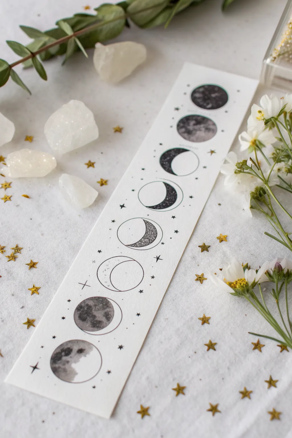
Capture the mystic cycle of the moon with this elegant, vertically aligned art strip. Combining fine line work with delicate stippling and shading, this project serves as both a beautiful bookmark and an aesthetic piece of mini-art.
Step-by-Step Tutorial
Materials
- Heavyweight white cardstock or watercolor paper (cut to approx. 2.5 x 8 inches)
- Pencil and eraser
- Compass or circle template (approx. 1-inch diameter)
- Ruler
- Fine liner pens (sizes 0.1, 0.3, and 0.5)
- Graphite pencils (HB, 2B, 4B) or gray alcohol markers
- White gel pen
- Blending stump (tortillon)
Step 1: Drafting the Layout
-
Prepare the strip:
Cut your cardstock into a long vertical strip. A width of 2.5 inches works perfectly for this design, allowing enough breathing room on the sides. -
Mark the centers:
Using a ruler, lightly draw a vertical line down the exact center of your paper strip to keep your moons aligned. -
Space the moons:
Mark eight evenly spaced points along that center line. Ensure you leave a slightly larger margin at the very top and bottom of the paper for a balanced look. -
Draw the boundaries:
Use a compass or circle template to draw eight identical circles centered on your marks. Keep the pencil pressure extremely light so you can erase these guides later. -
Sketch the phases:
Lightly sketch the crescent curves inside the circles to define the light and dark areas. Start with a full circle at the top and bottom, and gradually thin out the lit portions as you move toward the middle two circles.
Smudge Alert
Graphite smudges easily on white cardstock. Place a clean sheet of scrap paper under your drawing hand to protect the finished areas while you work on the rest.
Step 2: Inking the Details
-
Outline distinct shapes:
Using a 0.3 fine liner, carefully ink the outer circular outlines. For the crescent phases, only ink the part of the circle that represents the ‘lit’ side of the moon. -
Add separation lines:
Draw the inner curve that separates the light side from the dark side expressively. Don’t make this a perfect line; let it be slightly bumpy to mimic the moon’s cratered surface. -
Partial outlines:
For the ‘dark’ side of the moon phases, use a very broken, dotted line or leave it implied rather than drawing a solid circle. This adds to the ethereal aesthetic. -
Stippling texture:
On the central moons—the ones that are mostly dark crescents—use your 0.1 pen to create texture. Fill the dark crescent shapes with dense stippling (lots of tiny dots) rather than solid black for a stylized effect. -
Tiny stars:
Sprinkle tiny distinct stars around the central phases using your finest pen. Draw simple four-pointed stars and small dots.
Step 3: Shading and Finishing
-
Base shading:
For the more realistic moons at the top and bottom, use a 2B pencil or a light gray marker to fill in the darker craters. I find mapping out the ‘seas’ (maria) of the moon first helps establish the pattern. -
Deepen the shadows:
Layer a 4B pencil or darker gray marker into the deepest craters to create contrast. Focus on the Top and Bottom moons specifically. -
Blend the graphite:
If using pencil, use a blending stump to smooth out your crater shading, making the surface look cloudy and soft. -
Mid-strip shading:
For the middle phases, apply a solid black or very dark grey ink to the ‘shadow’ side of the crescents, contrasting sharply with the white paper. -
Clean up:
Once the ink is totally dry, gently erase the original pencil center line and circle guides. -
Decorative elements:
Add small asterisk-style stars and tiny dots in the negative space between the moons to connect the vertical flow.
Go Metallic
Use gold or silver metallic watercolor paint for the ‘lit’ crescent portions or the surrounding stars to make the bookmark shimmer when it catches the light.
Enjoy using your new celestial tracker to mark your place in your favorite book
Cute Cloud With Rain Dots
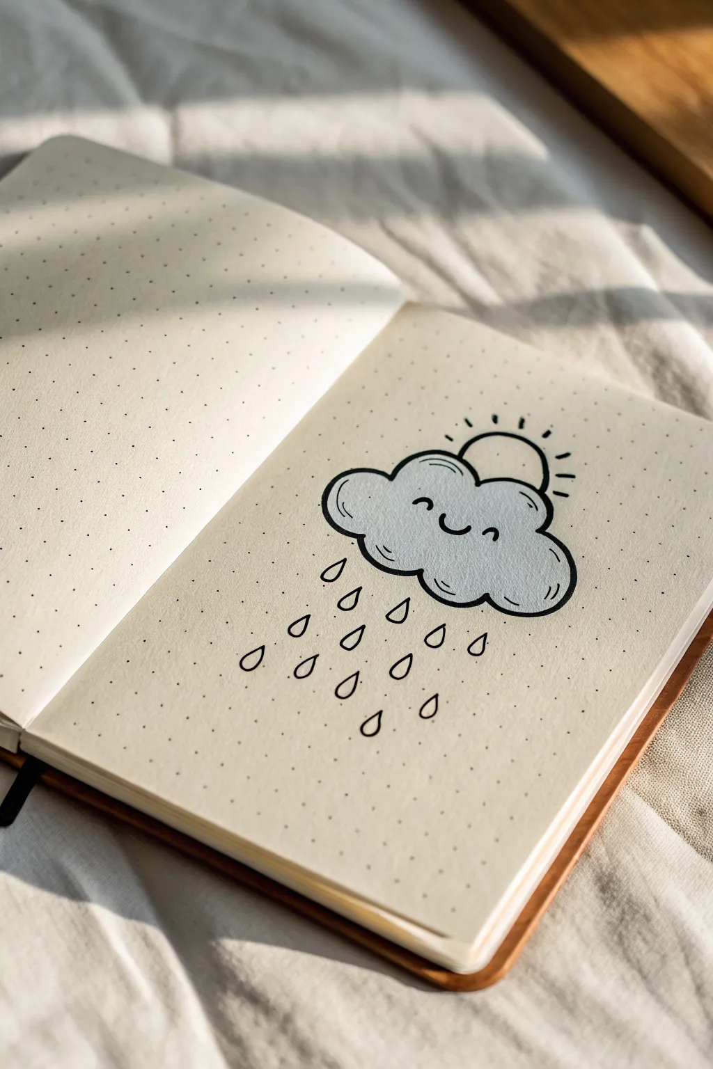
Brighten up your bullet journal with this adorable doodle featuring a smiling cloud, gentle rain, and a peeking sun. The combination of bold outlines and soft grey shading makes the cheerful expression really pop off the dotted page.
Detailed Instructions
Materials
- Dot grid notebook or paper
- Black fineliner (0.5mm tip works well)
- Light grey brush pen or mild highlighter
- Pencil
- Eraser
Step 1: Drafting the Shapes
-
Light sketch:
Start by lightly sketching the outline of a fluffy cloud shape with your pencil. Aim for about 5 to 7 rounded humps to form the cloud body, centering it on your page. -
Adding the sun:
Sketch a small semi-circle emerging from the top center of the cloud. This will be the sun peeking out from behind. -
Positioning the face:
Very faintly mark where the eyes and mouth will go. Place them low on the cloud body to give it that cute ‘kawaii’ proportion.
Step 2: Inking the Outline
-
Tracing the cloud:
Using your black fineliner, carefully trace over your pencil lines for the cloud. I like to make these slightly bolder by going over them a second time or using a thicker pen. -
Drawing the sun:
Ink the semi-circle for the sun. Add 5 or 6 small, straight tick marks radiating outward to represent the sun’s rays. -
Erasing guides:
Wait a moment for the ink to dry completely, then gently erase all visible pencil marks so you have a clean slate for coloring.
Grid Guide
Use the dots on your paper to keep the raindrops aligned. Count 2-3 dots between each drop horizontally for perfect spacing.
Step 3: Adding Color & Depth
-
Coloring the cloud:
Take your light grey marker and fill in the entire cloud shape. Use smooth, horizontal strokes to avoid streakiness. -
Wait for dry time:
Let the grey ink dry fully before adding facial features drawing over wet marker can cause the black ink to bleed. -
Drawing the face:
Using the fineliner, draw two small arched curves for the happy squinting eyes. Between them, draw a small ‘u’ shape for the smiling mouth. -
Adding detail lines:
Add two tiny curved lines inside the cloud shape—one on the left and one on the right—near the bottom edge. These suggest volume and fluffiness.
Make it Shine
Use a yellow highlighter for the sun rays or add rosy pink cheeks with a colored pencil for extra cuteness.
Step 4: The Raindrops
-
First row of drops:
Draw three teardrop shapes directly beneath the cloud. Space them out evenly, leaving a bit of vertical gap. -
Second row:
Draw four teardrop shapes below the first row, positioning them in the spaces between the drops above (staggered pattern). -
Third row:
Add three more drops below the second row, aligning them roughly with the drops from the very first row. -
Final drops:
Finish with two or three small drops at the very bottom to taper off the rain shower naturally.
Now you have a charming weather doodle to track rainy days in your journal
BRUSH GUIDE
The Right Brush for Every Stroke
From clean lines to bold texture — master brush choice, stroke control, and essential techniques.
Explore the Full Guide
Cozy Mug With Steamy Heart

Capture the warmth of your favorite hot drink with this whimsical sketch featuring a tall latte mug and fluttering heart steam. Using a mix of soft watercolor washes and defining ink lines creates a cozy, illustrative style perfect for journals.
How-To Guide
Materials
- Spiral-bound sketchbook (mixed media or watercolor paper)
- Pencil (HB or 2B)
- Eraser
- Watercolors (Brown, Ocher/Beige, Red/Rose)
- Small round paintbrush (size 2 or 4)
- Fine liner pen (Black, waterproof, size 0.3 or 0.5)
- Red or pink fine liner or gel pen (optional for details)
- Jar of water & paper towel
Step 1: Sketching the Outline
-
Establish the mug shape:
Start near the bottom third of your page. Draw a tall, slightly tapered cylinder shape. Instead of a flat top, draw a flattened oval (ellipse) to represent the rim of the mug. -
Add the handle:
On the right side of the mug, sketch a large D-shaped ear. It should start just below the rim and loop down to about the middle of the mug’s body. Double the line to give the handle thickness. -
Draw the center heart:
In the center of the mug’s body, sketch a slightly tilted heart shape. Keep lines light so they can be adjusted or erased easily later. -
Position the base:
Lightly sketch a horizontal rectangular shape underneath the mug to represent the wooden coaster or table surface.
Bleeding Lines?
If your ink bleeds into the paint, the paper was still damp. Wait longer or use a hair dryer on low heat. Always use waterproof pens if painting *after* inking.
Step 2: Adding Color Washes
-
Paint the coffee:
Mix a rich, dark brown watercolor. Carefully fill in the oval opening at the top of the mug, leaving a tiny sliver of white paper near the rim for a glossy highlight. -
Wash the mug body:
Dilute a beige or ocher color with plenty of water for a pale wash. Paint the body of the mug, letting the color be slightly uneven to suggest ceramic texture. Keep the paint outside of the heart shape. -
Shadow the edges:
While the beige wash is still slightly damp, touch a darker brown to the left side and bottom edge of the mug to create a soft, rounded 3D effect. -
Fill the center heart:
Mix a dusty rose or soft red. Paint inside the heart shape on the mug. Don’t worry about it being perfectly opaque; the watercolor texture looks lovely here. -
Paint the wooden base:
Use a light brown or tan wash to fill in the table surface below the mug. Use horizontal brush strokes to mimic wood grain. -
Create floating hearts:
Using the same dusty rose mix, paint several small hearts floating upwards from the mug. Vary their sizes and orientation to make them look like they are dancing in the steam.
Step 3: Inking & Details
-
Wait for drying:
Ensure the paint is completely dry before touching it with a pen to prevent bleeding. I usually test the paper with the back of my hand to check for cold spots. -
Outline the mug:
Take your black fine liner and trace over your pencil lines for the mug rim and body. Use a confident, slightly loose line rather than a rigid ruler-straight one. -
Define the handle and table:
Ink the handle shape and add a few horizontal lines to the wooden base to emphasize the plank texture. -
Detail the center heart:
Outline the heart on the mug with a thick, bold black line. Inside the painted pink area, add tiny scribbles, dots, or small circles to create a patterned texture. -
Add steam lines:
Draw two wavy, delicate lines rising from the coffee surface, curving upward amidst the floating hearts. These represent the steam. -
Refine the coffee:
Add a few small dots or tiny bubbles inside the dark coffee area to give it a frothy appearance. -
Final clean up:
Once the ink is totally set, gently erase any visible pencil sketch marks to clean up the illustration.
Make It Sparkle
Use a white gel pen to add a sharp highlight on the rim of the mug and a few dots inside the floating hearts for a glossy, magical finish.
Enjoy the cozy vibes of your freshly brewed artwork
Stack of Tiny Books and Sparkles

Capture the magic of reading with this charming illustration of a wobbly stack of books surrounded by twinkling stars. This minimal yet cozy design is perfect for a bullet journal cover page or a reading log header.
Detailed Instructions
Materials
- Dotted notebook or high-quality paper
- Fine liner pen (black, 0.3mm or 0.5mm)
- Teal or dark green marker/brush pen
- Burnt orange or rust-colored fine liner
- Pencil and eraser
- Ruler (optional)
Step 1: Sketching the Foundations
-
Plan the composition:
Start by lightly sketching a central vertical axis with your pencil. This will help you balance the four books so they look casually stacked but not like they’re falling over. -
Draw the top book:
Sketch the topmost book first. Draw a rectangle at a slight angle for the cover, then add thickness to the left and bottom sides to create a 3D block shape. Keep the spine facing the left. -
Add the second book:
Sketch the second book underneath, angling it slightly in the opposite direction. Make this one a bit thicker than the first. Ensure the top surface is mostly hidden by the book above it. -
Sketch the bottom two:
Continue the stack with the third and fourth books. Vary the thickness of the spines to add visual interest. The bottom book looks great if it’s the largest, anchoring the pile.
Wobbly Lines?
Don’t stress if your straight lines aren’t perfect. Slightly shaky lines actually add to the cozy, hand-drawn aesthetic of this vintage-style illustration.
Step 2: Inking the Outlines
-
Define the pages:
Using your black fine liner, go over the page edges (the white parts). Instead of straight lines, use slightly curved or multiple thin lines to mimic the texture of paper sheets stacked together. -
Outline the covers:
Ink the hard covers and spines. For the spines, curve the ends slightly where they meet the pages to show that the books have volume and aren’t just flat boxes. -
Add spine details:
Draw the decorative bands on the spines. For the bottom book, draw horizontal lines across the spine. For the third book down, stipple small dots or tiny irregular shapes to suggest a textured fabric binding. -
Erase pencil marks:
Wait until the ink is completely dry to avoid smudging, then gently erase all your initial pencil guidelines to reveal a clean illustration.
Level Up
Write the actual titles of your favorite novels on the spines instead of using scribbles to turn this into a personalized ‘To Be Read’ list.
Step 3: Color and Decoration
-
Color the dark covers:
Take your teal or dark green marker. Carefully fill in the spine of the second book and the textured spine of the third book. I like to leave tiny slivers of white space near the edges for a highlight effect. -
Add pattern to the third book:
On the third book down (the one with the stippled texture), use the teal marker to color around your little drawing details, or add white gel pen dots over the teal ink later if that’s easier. -
Draw cover designs:
On the top book’s cover, use the black pen to draw a simple rectangle outline and add some scribbly mock-text inside. It adds a lovely touch of realism without needing real words. -
Add the floral motif:
On the spine of the second book, use your fine liner to sketch a tiny, delicate branch with leaves. Keep it simple and centered. -
Detail the page edges:
Add thin, parallel lines along the page blocks (the white areas) of the bottom two books. These striations emphasize the thickness of the text blocks.
Step 4: Sparkles and Finishes
-
Draw major stars:
Switch to your burnt orange or rust-colored pen. Draw a few large, eight-pointed stars around the stack. Draw a cross first, then a smaller ‘X’ through the center. -
Add minor sparkles:
Fill in the empty space with smaller four-pointed stars (just a cross shape) and simple dots using both the orange pen and the teal marker for variety. -
Final touches:
Review the drawing. If the books look too ‘floating,’ you can add a tiny bit of shadow underneath the bottom book with a grey marker or light pencil shading.
Enjoy seeing your little library come to life on the page


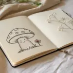
Mushroom Cluster in Soft Tones
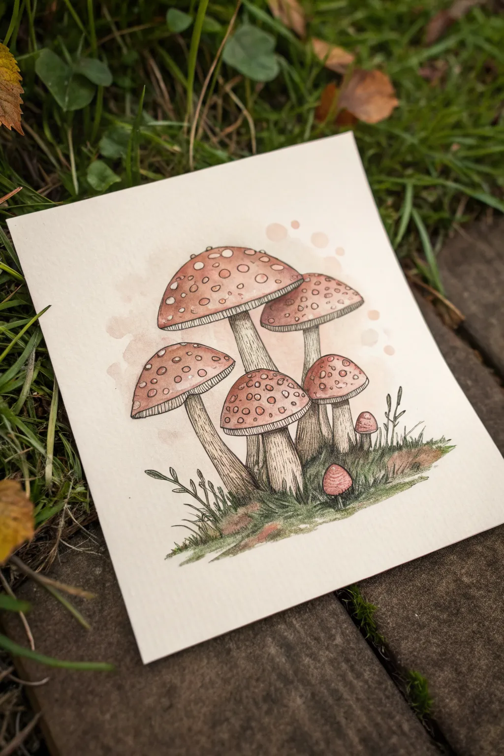
This charming illustration features a family of speckled mushrooms nestled in a grassy patch, executed in a soft, earthy palette. The gentle brown and red tones combined with crisp ink lines create a vintage botanical field guide aesthetic that feels both cozy and precise.
Step-by-Step Guide
Materials
- High-quality watercolor paper (cold press, roughly 4×5 inches)
- Pencil (HB or 2H)
- Kneaded eraser
- Fine liner pens (black, sizes 0.1 and 0.3)
- Watercolor paints (burnt sienna, yellow ochre, sap green, sepia)
- Small round watercolor brushes (size 2 and 4)
- White gel pen (optional for highlights)
Step 1: Sketching the Composition
-
Map out the caps:
Begin by lightly sketching the shapes of the mushroom caps. Start with the largest, central dome shape slightly towards the top left. Then, add a medium-sized cap to its right and two smaller ones nestled below. Remember to draw them as simple semi-circles or flattened domes initially. -
Draw the stems:
Extend stems downwards from the center of each cap. The main central mushroom should have a thick, sturdy stem, while the side mushrooms can have slightly curved, slender stems to suggest organic growth. Don’t worry about perfect lines; natural wobbles look better. -
Add tiny sprouts:
Sketch two very small, baby mushrooms peeking out near the bottom right—one just a tiny button, the other slightly taller. Add a few vertical lines at the base to indicate where the grass will grow. -
Detail the gills and spots:
Underneath each cap, draw a curved line parallel to the rim to mark the area where the gills will go. Then, lightly draw circles of varying sizes all over the top of the caps to create the signature spotted pattern.
Keep it Loose
Don’t stress about coloring perfectly inside the lines. Watercolor looks best when it bleeds slightly over ink edges, adding to that rustic, sketchbook charm.
Step 2: Inking the outlines
-
Outline the main shapes:
Using your 0.3 fine liner, carefully trace the outer contours of the mushroom caps and stems. Use a confident but relaxed hand; broken or slightly uneven lines add character to organic subjects. -
Inking the spots:
Switch to a finer 0.1 pen to outline the spots on the caps. Keep these lines very delicate. Some spots can overlap the edge of the cap to show dimension. -
Drawing the gills:
With the 0.1 pen, draw fine, closely spaced lines underneath the caps, connecting the stem to the rim. These lines represent the gills and should follow the curve of the mushroom. -
Texturing the stems:
Add vertical hatching lines along the stems, particularly near the top (under the cap) and the bottom base. This shading suggests roundness and texture. -
Sketching the ground cover:
Use quick, upward flicking motions with the 0.1 pen to create blades of grass around the base. Add a few leafy weeds on the left side for variety.
Make it Magical
Once the paint is dry, use a white gel pen to add tiny stars or sparkles floating around the mushrooms for a fairy-tale vibe.
Step 3: Painting the details
-
Base wash for stems:
Mix a very watery Sepia or dilute Brown. Paint a pale wash over the stems, leaving the center of each stem slightly lighter to act as a highlight. -
Painting the caps:
Mix Burnt Sienna with a touch of Red. Carefully paint the caps, avoiding the circular spots you drew earlier—leave them the white of the paper. I like to let the paint pool slightly at the bottom edge of the caps for a natural shadow gradient. -
Tinting the spots:
Once the red paint is dry, use a very dilute Yellow Ochre or dirty wash water to tint the white spots so they aren’t stark white, giving them an aged look. -
Adding background splashes:
While you have your reddish-brown mix, dilute it heavily with water. Paint a few loose, irregular blobs floating behind the mushroom cluster. This subtle background element adds depth and an artistic flair. -
Grounding the scene:
mix Sap Green with a little brown to get an olive tone. Paint the grass area at the bottom, dabbing the brush to create a mossy texture. Let the green fade out as it moves away from the cluster.
Step 4: Final Touches
-
Deepening shadows:
Once the first layers are completely dry, use a slightly darker mix of brown to paint shading on the stems right underneath the caps and where stems overlap each other. -
Enhancing the grass:
Use a more concentrated green to add definition to individual blades of grass and the small leafy plants on the left, creating contrast against the paler wash. -
Inking final details:
Go back in with your 0.1 pen if any lines were washed out. You can add extra stippling (dots) at the base of the stems and on the ground for more texture.
Display your botanical study in a small wooden frame or clip it to a mood board for effortless autumn vibes
Bunny With a Flower Crown
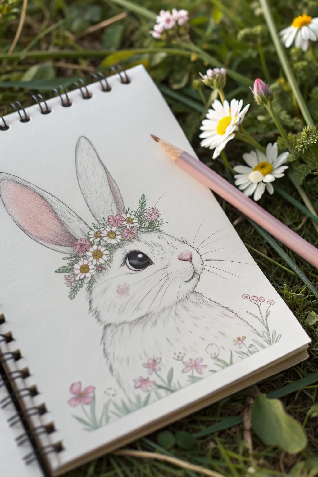
Capture the gentle spirit of spring with this adorable bunny portrait, featuring soft fur textures and a delicate crown of wildflowers. This project uses colored pencils to create a dreamy, sketchbook aesthetic perfect for nature lovers.
Detailed Instructions
Materials
- Spiral-bound sketchbook (heavyweight paper)
- H or HB pencil for sketching
- Kneaded eraser
- Colored pencils (grey, pink, green, yellow, white, brown, black)
- Fine-liner pen (optional for details)
- Pencil sharpener
Step 1: Sketching the Outline
-
Basic shapes:
Start by lightly sketching a rounded oval for the bunny’s head. Add a larger, softer curve below for the chest and body area to establish the pose. -
Ear placement:
Draw two long, tall ear shapes extending from the top of the head. Position the left one tilting slightly back and the right one standing straight up to give the bunny a curious expression. -
Facial features:
Mark the position of the eye, nose, and mouth. The eye should be large and almond-shaped, placed halfway down the head. The nose is a small triangle at the snout’s tip. -
Flower crown rough-in:
Sketch a light band across the forehead where the crown will sit. Draw small circles and star shapes along this band to plan the placement of daisies and pink blossoms.
Step 2: Adding Color to the Bunny
-
Base fur tones:
Using a light grey pencil, gently shade the bunny’s face and body. Keep your strokes short and directional, following the way fur would naturally grow. -
Inner ears:
Fill the inside of the left ear with a soft pink gradient. Press harder at the base for a deeper pink and let it fade into white near the top. -
The eye:
Color the eye with a dark brown or black pencil. Leave a small, crisp white circle near the top for a highlight—this spark of life is crucial for a cute look. -
Nose and cheeks:
Color the nose a soft bubblegum pink. Add a very faint circular blush of pink on the cheek area for extra charm.
Muddy Fur?
Keep your pencil strokes light. If the grey looks too solid, use a kneaded eraser to dab and lift pigment, restoring the paper’s white texture.
Step 3: Floral Details
-
Flower centers:
Use a yellow pencil to dot the centers of the daisies in the crown. -
Petals:
Fill in the pink flowers with a rose-colored pencil. For the daisies, you can leave the paper white or shade them very lightly with grey for dimension. -
Greenery:
Take a moss green pencil and draw small leaves and stems weaving between the flowers. I like to add tiny sprigs sticking out to make the crown look wild and natural. -
Bottom border:
Sketch a few tall, slender stems and loose flowers at the bottom of the page, overlapping the bunny’s chest slightly to ground the drawing.
Add Sparkle
Use a white gel pen to add tiny dots or ‘stardust’ around the flower crown for a magical, fairytale vibe.
Step 4: Refining and Texturing
-
Fur texture:
Sharpen your grey pencil to a fine point. Add distinct, short strokes over your base shading, especially around the cheeks, neck, and ears, to simulate fluffy fur. -
Whiskers:
In the snout area, draw long, sweeping lines for whiskers using a sharp dark grey or black pencil. Make these quick and confident so they don’t look shaky. -
Deepening contrast:
Go back over the eye outline to make it bold. Darken the nostril line and the mouth cleft to define the facial expression clearly. -
Final highlights:
If you have a white gel pen or a very opaque white pencil, add tiny touches to the flower petals or the tip of the nose. -
Cleanup:
Use your kneaded eraser to lift any stray graphite lines that are still visible around the edges, leaving a clean, colorful illustration.
Now you have a sweet woodland friend ready to brighten up your sketchbook pages
Butterfly Escaping a Jar
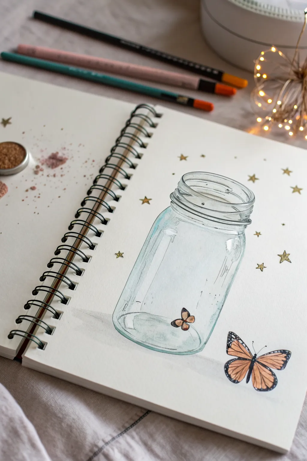
Capture a moment of magical freedom with this delicate sketchbook illustration featuring a glass jar and fluttering butterflies. Using light washes and fine lines, you’ll create transparency and contrast between the captured and the escaped.
Step-by-Step Guide
Materials
- Spiral-bound mixed media sketchbook
- HB or 2B graphite pencil
- Fine liner pen (01 or 03 size, black, waterproof)
- Watercolor paints or watercolor pencils (light blue, orange, brown, black)
- Small round watercolor brush (size 2 or 4)
- Gold gel pen or metallic gold paint
- Eraser
Step 1: Sketching the Jar
-
Establish the cylinder:
Begin by lightly sketching a vertical rectangle in pencil to define the height and width of your mason jar. Leave plenty of space on the right side of the page. -
Draw the rim:
At the top of your rectangle, draw an oval for the jar’s opening. Below this, add two slightly wider, concentric curves to indicate the threaded neck of the jar. -
Shape the body:
Round off the bottom corners of your rectangle to create the jar’s base. Connect the neck to the main body with soft, sloping shoulders rather than sharp angles. -
Initial butterfly placement:
Sketch a very small, simple butterfly shape sitting on the bottom inside the jar. Then, draw a larger, more detailed butterfly shape outside the jar on the lower right.
Glass Effect Tip
Don’t outline the entire jar with the same line weight. Break the lines on the sides to suggest light hitting the curve.
Step 2: Inking and Definition
-
Outline the glass:
Using your fine liner, trace over your jar sketch. Keep your hand loose; broken lines work better for glass than solid, heavy lines. -
Add reflection details:
Draw a few vertical, curved lines following the shape of the jar on the left and right sides. These distinct ‘glint’ marks suggest the curvature and reflectiveness of the glass. -
Inking the butterflies:
Carefully outline your butterflies. For the outside butterfly, define the wing segments clearly, as we will fill them with color later. Add the antennae now. -
Erase guidelines:
Once the ink is completely dry—give it a minute to be safe—gently erase all your pencil marks to leave a clean drawing.
Step 3: Watercolor Washes
-
Glass tint:
Dilute a light blue or teal paint very heavily with water. Paint a sheer wash over the glass jar, focusing the color on the edges and bottom while leaving the center mostly white for transparency. -
Deepen the glass:
While the first layer is still slightly damp, add a touch more concentrated blue to the threaded rim and the very bottom curve of the jar to add weight. -
Inside butterfly:
Paint the tiny butterfly inside the jar with soft orange wings and brown tips. Keep this one simple and slightly less saturated to make it look further away. -
Outside butterfly base:
Fill the wing sections of the large outside butterfly with a vibrant orange watercolor. I prefer to start lighter near the body and darken toward the wing tips. -
Butterfly details:
Once the orange is dry, use black paint or a black pen to fill in the veins, borders, and body of the large butterfly. Leave tiny white spots on the black wing tips for realism.
Level Up: 3D Wings
Cut separate paper wings for the outside butterfly and glue them exclusively by the body center so they lift off the page slightly.
Step 4: Magical Embellishments
-
Grounding shadow:
Mix a very watery grey and paint a faint, horizontal shadow underneath the jar and the escaping butterfly to ground them on the surface. -
Star placement:
Using a gold gel pen or metallic paint, draw five-pointed stars scattered randomly around the jar. Vary their sizes for a more organic look. -
Stardust dots:
Add tiny dots of gold ink in clusters around the stars and drifting out of the jar’s opening to mimic magical dust. -
White highlights:
Finally, use a white gel pen or white gouache to add sharp highlights on the jar’s shoulders and the butterfly’s wings to make them pop.
Your beautiful illustration is now ready to inspire wonder in anyone who sees it
Potted Plant in an Arch Frame
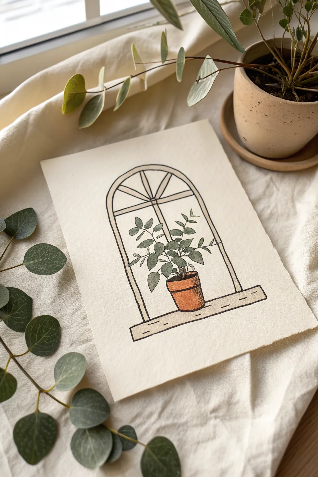
Bring a touch of botanical charm to your space with this serene illustration of a potted plant resting in a simple arched window. The minimal line work paired with muted, earthy greens and terracotta tones creates a calming aesthetic perfect for art journals or framed display.
Step-by-Step Tutorial
Materials
- Heavyweight textured paper or watercolor paper (cream or off-white)
- Fine liner pen (black, waterproof, size 0.3 or 0.5)
- Colored pencils (sage green, forest green, terracotta, light brown)
- Pencil (HB or 2B for sketching)
- Eraser (kneaded preferred)
- Ruler
Step 1: Constructing the Architecture
-
Establish the Base:
Begin by drawing a long, horizontal rectangle near the bottom of your page. This will be the window sill. Make it slightly thicker than a standard line to give it weight, and add a second, thinner rectangle underneath to suggest depth or a wooden plank. -
Draft the Arch:
Use your ruler to draw two parallel vertical lines extending upward from the sill. At the top, connect them with a smooth, semi-circular arch. I find it helpful to mark the center point lightly before drawing the curve to keep it symmetrical. -
Create the Frame Detail:
Draw an inner line paralleling the entire arch shape (sides and curve) to create the thickness of the window frame. Leave a gap in the center of the arch for the window panes. -
Add the Panes:
Sketch a horizontal bar across the upper third of the window. Then, draw vertical lines radiating from the center bottom of this bar up to the top curve, creating a sunburst-style fanlight design.
Step 2: Sketching the Botanical Elements
-
Position the Pot:
Draw a simple pot shape resting on the sill, slightly off-center if you like asymmetry. Start with an oval for the rim, a cylinder tapering slightly downward for the body, and a curved line for the base. -
Outline the Stems:
Sketch three to four main stems rising from the pot. Keep the lines loose and slightly curved; nature rarely produces perfectly straight lines. Ensure they spread out to fill the negative space of the window. -
Add Leaf Placement:
Draw small ovals or teardrop shapes along the stems. Vary their directions—some facing up, some sideways—to create a sense of fullness and volume.
Keep it Loose
Don’t strive for perfect architectural straightness. A slightly shaky line actually enhances the cozy, hand-drawn aesthetic of this style.
Step 3: Inking and Refining
-
Line the Window:
Switch to your waterproof fine liner. Carefully trace over your window frame and sill lines. For a more organic look, don’t use a ruler here; a slightly wobbly hand adds character. -
Define the Plant:
Ink the plant outlines. When drawing the leaves, connect them cleanly to the stems. Feel free to break the lines of the window frame where leaves overlap it, pushing the plant into the foreground. -
Erase Guidelines:
Once the ink is completely dry—give it a full minute—gently erase all your pencil sketches so broadly that only the crisp ink remains.
Smudged Ink?
If you smear ink while coloring, turn it into a shadow or soil texture. In the future, place a scrap piece of paper under your hand while working.
Step 4: Adding Color and Texture
-
Color the Pot:
Take your terracotta or burnt orange pencil. Fill in the pot with steady pressure. To create roundness, press harder on the sides and bottom, leaving the center slightly lighter. -
Shade the Pot Rim:
Use a darker brown to shade just under the rim of the pot, adding a shadow that suggests the rim is protruding over the body. -
Base Layer for Leaves:
Lightly color all the leaves with a sage or pale green pencil. Use a small circular motion to get an even coverage without harsh directional strokes. -
Deepen the Foliage:
Go back in with a forest green pencil. Add shading to the base of each leaf where it meets the stem, and darken some leaves entirely that would be further back in the cluster. -
Window Frame Tone:
Use a very light beige or warm grey to gently shade the window frame. Keep this extremely subtle; you just want to knock back the white of the paper slightly. -
Wood Grain Details:
On the window sill, add a few tiny horizontal dashes with your fine liner or a dark brown pencil to simulate wood grain or knots. -
Final Contrast Check:
Look at the whole piece. If the plant feels flat, add a tiny bit more black ink to the deepest shadows between the stems at the soil line.
Now you have a charming botanical illustration ready to pin up or gift to a plant-loving friend.
Tiny House With Cozy Details
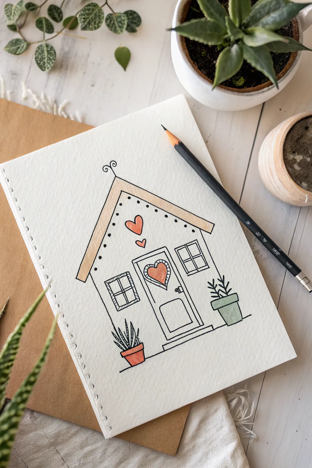
Capture the cozy essence of home with this charming line drawing featuring a peaked roof and heart details. The simple black ink lines combined with soft, minimal color make it a perfect relaxing sketch for your journal or sketchbook.
How-To Guide
Materials
- Fine-grain drawing paper or sketchbook
- Pencil (HB or 2H for sketching)
- Eraser
- Black fine liner pen (0.3mm or 0.5mm)
- Thicker black pen or marker (0.8mm) for emphasis
- Peach or light orange colored pencil/marker
- Sage green colored pencil/marker
- Ruler (optional)
Step 1: Sketching the Structure
-
Roof outline combined with walls:
Begin by lightly sketching a large inverted ‘V’ shape for the roof. Extend two vertical lines straight down from the ends of the roof to form the side walls. Connect them at the bottom with a horizontal line. -
Adding the roof trim:
Draw another inverted ‘V’ inside the first one, leaving a narrow gap to create the thickness of the roof. Extend the ends slightly past the walls to make eaves. -
Central door placement:
In the bottom center of the house, sketch a tall rectangle for the door frame. Add a slightly smaller rectangle inside it for the door itself. -
Window placement:
Sketch two squares, one on either side of the door. Try to keep them level with the top of the door frame for symmetry.
Ink Confidence
If your hand shakes while drawing long lines, try pulling the pen toward your body rather than pushing it away. This often provides better control.
Step 2: Inking the Lines
-
Outline the main shape:
Using your fine liner, go over your pencil lines for the roof and walls. Keep your lines steady but don’t worry if they aren’t perfectly machine-straight; a little wobble adds character. -
Detailing the roof:
Ink the inner and outer lines of the roof. Add a small decorative swirl at the very peak of the roof. -
Drawing the eaves dots:
Instead of a solid line underneath the roof trim, draw a series of small, evenly spaced dots following the inner V shape. This adds a lovely scalloped lace effect. -
Defining the door:
Ink the door frame. Draw a horizontal rectangle at the bottom of the door for a panel, and add a tiny circle for the doorknob on the right side. -
Adding the heart window:
In the upper part of the door, draw a heart shape. Surround it with a slightly larger heart outline to create a frame, adding small hatch marks inside the frame for texture. -
Window panes:
Ink the square windows. Divide each square into four smaller panes by drawing a cross in the distinct center of each.
Make It Yours
Customize the house number on the door or add a tiny cat sleeping on the front step to personalize your little home.
Step 3: Adding Cozy Details
-
Floating hearts:
Above the door, draw two hearts of different sizes floating upwards toward the roof peak, as if they are smoke rising from a chimney. -
Left plant pot:
To the left of the house, sketch a simple trapezoid for a pot. Draw stripy, spiky leaves pointing upward, resembling a snake plant. -
Right plant pot:
On the right side, draw a similar pot but slightly taller. Fill it with a leafy branch structure that looks more shrub-like. -
Base line:
draw a horizontal line extending from the bottom of the house to ‘ground’ the pots, so they don’t look like they are floating in space. -
Erase guidelines:
Wait a moment for the ink to fully dry, then gently erase all visible pencil marks to clean up your drawing.
Step 4: Coloring
-
Coloring the roof:
Take your peach color and gently fill in the space between the two roof lines. Use a light hand to keep the texture soft. -
Heart accents:
Use the same peach tone to color the hearts floating above the door, the heart in the door window, and the pot on the left side. -
Green accents:
Switch to sage green. Color the pot on the right side. You can also lightly trace over the plant leaves with green if you wish, or leave them black and white for contrast.
Now you have a sweet little abode on paper that radiates warmth and simplicity
Peach or Strawberry With a Face
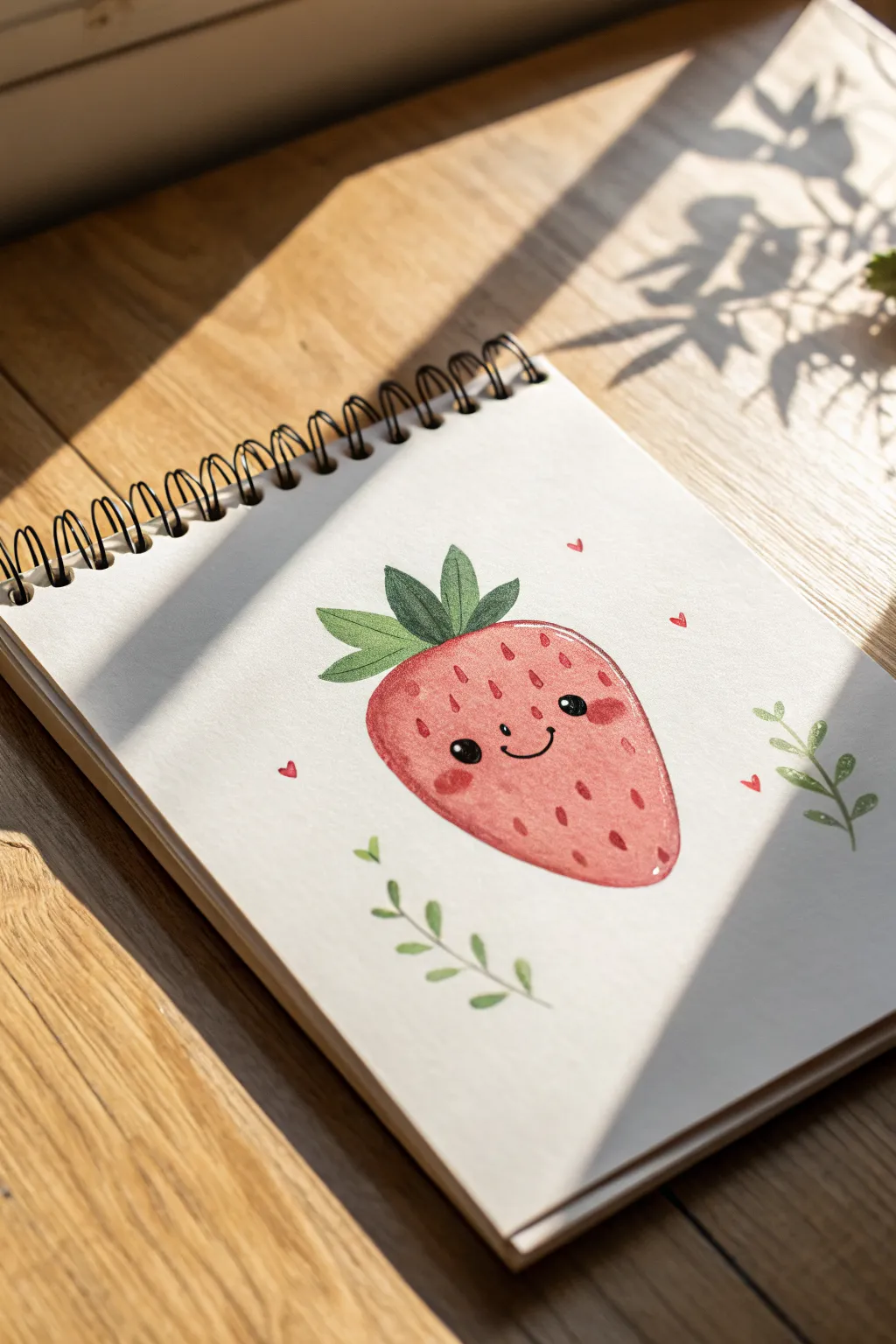
This cheerful strawberry character brings a pop of sweetness to any sketchbook page with its rosy cheeks and delicate leafy accents. Using a mix of watercolor washes and fine details, you’ll create a textured, huggable fruit that looks almost soft to the touch.
Step-by-Step
Materials
- Sketchbook with heavy mixed-media or watercolor paper
- HB pencil and soft eraser
- Watercolor paints (warm red, earthy green, pale pink)
- Small round brushes (size 2 and 4)
- Black fine liner pen or black colored pencil
- White gel pen (optional for highlights)
- Water cup and paper towel
Step 1: Sketching the Base
-
Outline the shape:
Begin by lightly sketching a rounded, inverted triangle shape for the strawberry body in the center of your page. Keep the corners soft and curved rather than sharp to give it a plump, friendly appearance. -
Add the crown:
Draw the leafy crown on top. Start with a central leaf pointing straight up, then add two smaller leaves flaring out on either side. These should look like simple, pointed ovals. -
Place the foliage:
Lightly sketch two curving stems flanking the strawberry—one on the bottom left and one on the right—with small, simple leaves attached. Add four tiny heart shapes floating around the strawberry for decoration.
Uneven Watercolors?
If your red paint dries with hard edges or blooms, soften them with a clean damp brush while wet. If dry, layer colored pencil over the top to smooth the texture.
Step 2: Painting the Fruit
-
First wash:
Mix a watery, pale red wash. Fill in the entire strawberry body, keeping the edges neat. The color should be translucent at this stage to build depth later. -
Texturing the berry:
While the first layer is still slightly damp (but not soaking), drop in slightly more concentrated red pigment along the bottom curve and the right side to create a soft shadow. -
Painting the leaves:
Load your brush with an earthy green tone. Carefully paint the crown leaves on top of the berry. If you want variety, paint one half of each leaf slightly darker to suggest a fold or shadow. -
Decorative vines:
Using the very tip of your brush (or a size 2), paint the floating vines in a lighter, watery green. Keep your wrist loose to get that gentle, organic curve. -
Heart details:
Dip a small brush into your red paint and fill in the tiny floating hearts. I like to keep these quite saturated so they stand out against the white paper. -
Drying time:
Let the entire piece dry completely. The paper must be bone-dry before you add the face, or the ink will bleed into the paint.
Step 3: Adding Personality
-
Drawing the face:
Using a black fine liner or a sharp black colored pencil, draw two small, solid black circles for eyes in the middle of the berry. Add a simple U-shaped curve between them for a smile. -
Rosy cheeks:
Mix a thicker, more opaque pink or light red. Paint two small oval blushes right underneath the eyes. This instantly makes the character look shy and sweet. -
Adding seeds:
With a fine brush and dark red (or a reddish-brown colored pencil), create small teardrop shapes scattered across the berry’s surface. Angle them slightly toward the center point of the fruit. -
Line definition:
Take a black colored pencil or very fine pen and gently outline the green crown leaves to separate them from the red fruit body. You can add a central vein line to each leaf for detail. -
Leaf details:
Outline the floating green vines with a delicate touch to match the main strawberry’s style. -
Final highlights:
For that sparkling look, place a tiny dot of white gel pen in the upper right corner of each black eye. You can also add a small white dash on the strawberry’s side to make it look shiny.
Testing Colors
Keep a scrap piece of the same paper nearby to test your paint opacity before touching the main drawing. Watercolors often dry lighter than they look wet.
Now you have a charming little fruit friend to brighten up your journal carefully close your sketchbook once the paint is fully dry
Circle Landscape Vignette
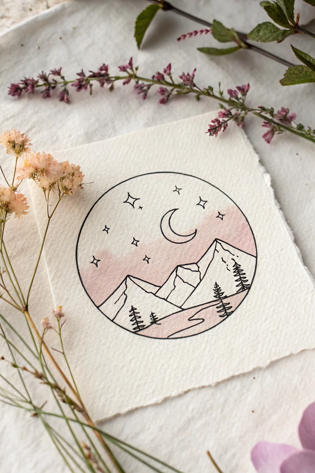
This delicate circle vignette captures the serene magic of a mountain night with clean line work and a soft wash of color. Using simple geometric shapes and a touch of watercolor, you’ll create a charming miniature world perfect for greeting cards or journal accents.
Step-by-Step Guide
Materials
- Heavyweight textured paper (cold press watercolor or handmade cotton rag)
- Fine liner pen (specifically waterproof/archival black ink, size 03 or 05)
- Compass or a circular object to trace (approx. 3-inch diameter)
- Pencil (HB or H)
- Clean eraser
- Watercolor paints (Alizarin Crimson or a dusty rose pink)
- Small round watercolor brush (size 2 or 4)
- Water cup and paper towel
Step 1: Setting the Scene
-
Paper preparation:
Begin by tearing your paper to size rather than cutting it. Gently fold the paper back and forth along your desired line, then carefully pull it apart to create those beautiful, soft, decked edges shown in the photo. -
Draw the boundary:
Place your compass or circular object in the center of the paper. Lightly trace a perfect circle using your pencil. Keep this line faint, as it’s just a guide for now. -
Sketch the mountains:
Inside the lower half of the circle, sketch the outline of two main mountain peaks. The one on the right should be taller and more prominent, overlapping the smaller peak on the left. -
Add the terrain:
Below the mountains, draw two rolling lines to suggest foothills or the ground. Add a winding S-curve starting from the bottom right, narrowing as it moves toward the mountains, to create a path or river. -
Celestial elements:
In the upper center sky, sketch a crescent moon facing left. Scatter a few four-pointed stars (diamonds with curved sides) and small dots around the sky for a starry effect.
Step 2: Applying Color
-
Mix the wash:
Dilute your pink watercolor heavily with water. You want a very transparent, ‘dusty’ rose tea consistency, not a thick opaque paint. -
Wet the sky:
Dip your clean brush in water and carefully paint just the sky area inside your pencil circle. Do not wet the moon or the mountains. -
Drop in color:
While the paper is still damp, touch your pink-loaded brush to the wet sky area. I like to let the color bloom naturally, perhaps making it slightly darker near the mountain peaks and fading out toward the top. -
Paint the path:
Using the same diluted pink, carefully fill in the winding path (or river) at the bottom. Keep this wash very light to maintain the minimalist aesthetic. -
Let it dry:
Wait until the paper is bone dry. If it feels cool to the touch, it’s still damp. This is crucial because drawing ink over wet paper will bleed and ruin the crisp lines.
Smudge Alert
If your eraser leaves smudges, your ink wasn’t fully dry. Blottest the ink on a scrap paper first. Use a kneadable eraser for the gentlest clean-up on textured paper.
Step 3: Inking the Details
-
Outline the circle:
With your waterproof fine liner, trace over the main circle perimeter. Break the line only where the mountains or trees might slightly overlap the edge, though in this design, everything is neatly contained. -
Ink the mountains:
Go over your mountain pencil lines. Add jagged, vertical zig-zag lines down the center of the peaks to indicate rocky ridges and shadow divots. -
Define the moon:
Outline the crescent moon carefully. Ensure the tips are sharp and the curve is smooth. -
Draw the stars:
Ink the four-pointed stars. For the smaller stars, use simple cross shapes or tiny open circles to add variety to the night sky. -
Create the trees:
Draw three simple vertical lines for tree trunks: two on the right side and two on the left. Starting from the top of each line, make small, downward-slanting zig-zag strokes that get wider as you go down to create pine trees. -
Final touches:
Ink the rolling ground lines and the edges of the winding path. Once the ink is totally dry (give it a few minutes to be safe), gently erase all your pencil marks.
Add Subtle Sparkle
Once the piece is finished, use a metallic gold or silver gel pen to add tiny dots in the centers of the stars or thin highlights on the moon for a magical shimmer.
Frame your mini masterpiece in a small square frame or use it as a heartfelt gift tag.
Crystal Ball With a Mini Garden
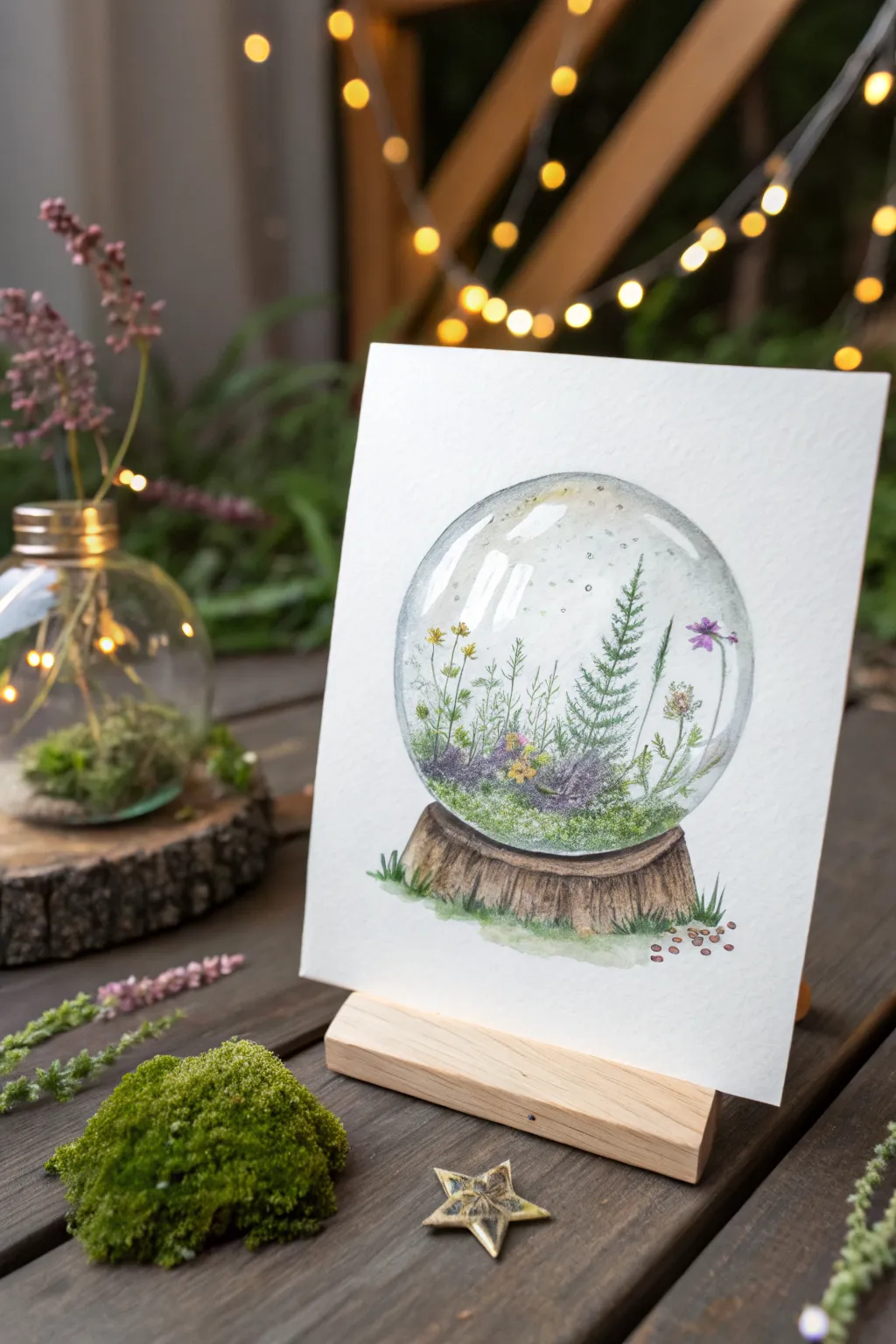
Capture the magic of a terrarium without getting your hands dirty with this delicate snow globe painting. By combining soft watercolor washes with fine ink details, you’ll create a transparent glass effect filled with a tiny, thriving ecosystem.
Step-by-Step
Materials
- Cold press watercolor paper (300 gsm)
- Pencil (HB or H for light lines)
- Compass or circular object for tracing
- Waterproof fine liner pens (black, 0.1mm and 0.3mm)
- Watercolor paints (Focus on greens, violets, browns, and indigo)
- Round watercolor brushes (Size 2 and 6)
- White gouache or white gel pen
- Eraser
Step 1: Sketching the Structure
-
Draw the Outline:
Begin by lightly tracing a perfect circle in the center of your page using a compass or a round object. This will be the glass boundary of your terrarium. -
Add the Base:
Sketch a flattened oval shape underneath the circle to serve as the wooden slab base. Draw rough, bark-like vertical lines on the sides to give it texture. -
Draft the Garden:
Inside the lower third of the circle, lightly sketch the mounds of moss and placement of taller plants. Keep these lines very faint as they will guide your painting but shouldn’t be visible later.
Glass looks flat?
Ensure you are leaving enough white space. The contrast between the painted shadow edge and the unpainted white paper is what tricks the eye into seeing a curved, reflective surface.
Step 2: Painting the Glass & Base
-
Initial Wet-on-Wet:
Wet the inside of the circle with clean water, avoiding the plant area at the bottom. Drop in very diluted indigo or payne’s gray along the the upper left and right edges to create the glass curvature. -
Enhancing the Glass:
While the first layer is still damp, add a slightly darker shadow to the right side to establish volume. Leave the upper left section almost white to suggest a highlight. -
Wood Base Wash:
Paint the wooden base with a wash of raw umber or burnt sienna. Let the color pool naturally at the bottom edge for shading. -
Bark Texture:
Once the base is dry to the touch, use a smaller brush with a darker brown mix to paint vertical, jagged lines depicting the bark texture.
Change the season
Swap the bright greens and flowers for burnt oranges and deep reds to create an autumnal globe, or use blues and teals for a winter frost version.
Step 3: Cultivating the Garden
-
Mossy Foundation:
Dab various shades of olive and sap green into the bottom area of the globe. Use a stippling motion with your brush to create the fluffy texture of moss. -
Adding Volume:
While the green layer is wet, drop in hints of deep violet and blue-green near the bottom edge of the glass line to create depth and shadows within the foliage. -
Painting Stems:
Using your smallest brush and a mix of green and brown, paint thin, delicate lines extending upward for the plant stalks. Vary the heights to make the composition interesting. -
Leaf Details:
Paint the miniature pine tree using tiny, horizontal strokes that get wider toward the bottom. For the other plants, add small dabs of yellow-green for leaves. -
Floral Accents:
Add tiny touches of yellow and purple for the wildflowers. Keep these loose and abstract; they don’t need to be botanically perfect.
Step 4: Refining and Finishing
-
Grounding Shadows:
Paint a subtle shadow underneath the wooden base using diluted gray or purple. Add a few tufts of grass poking out from under the wood. -
Scattered Seeds:
To the right of the base, paint a few tiny brown specks to represent fallen seeds or pebbles. -
Ink Outlining:
Once the painting is completely dry, use a 0.1mm pen to outline the glass globe. Keep the line broken in the highlight areas rather than a solid circle. -
Detailing Plants:
Use the fine liner to gently outline some of the stronger plant shapes and add texture to the pine tree. -
Final Highlights:
Using white gouache or a gel pen, add crisp reflection lines to the upper left curve of the glass and a few tiny dots inside the globe for magical dust motes.
Your miniature world is now perfectly preserved in paper and paint.
Doodle Grid of Mixed Cute Icons
This charming bullet journal spread transforms a simple page into a gallery of delightful miniature art. By compartmentalizing cute icons into a structured grid, you create a cohesive and satisfying visual collection that’s perfect for tracking habits or just practicing simple shapes.
Detailed Instructions
Materials
- Dotted grid notebook or journal
- Fine-liner pen (black, approx. 0.3mm or 0.5mm)
- Ruler or straight edge
- Pencil (HB or similar)
- Clean eraser
- Small decorative beads or stickers (optional, for staging)
Step 1: Setting the Structure
-
Map out the grid:
Start by counting the dots in your journal to determine the size of your squares. For this layout, count out a grid that is 4 squares wide and roughly 5 or 6 squares high. Leave a small margin of dots between each box to create breathing room. -
Pencil drafting:
Lightly sketch the horizontal and vertical lines of your grid using a pencil and ruler. This tentative step is crucial so you can adjust spacing before committing with ink. -
Inking the lines:
Once you are happy with the layout, go over your pencil lines with your black fine-liner. Use the ruler to keep lines crisp, but don’t worry if they extend slightly past the corners—that intersection detailing adds a nice sketchy aesthetic.
Ink Smearing?
If your ruler drags ink across the page, tape a penny to the underside of the ruler. This lifts the edge slightly off the paper, preventing smears.
Step 2: Planning the Icons
-
Select your motifs:
Looking at the reference, choose simple nature and celestial themes. You’ll need ideas like moons, hearts, stars, leaves, fruit (like strawberries), and simple objects like a UFO, ring, or beach ball. -
Sketch the doodles:
Before inking, lightly pencil the icon into the center of each grid square. Ensure they are relatively centered but keep the vibe relaxed and hand-drawn.
Pro Tip: Stick to Odd Numbers
When drawing scatter elements like stars or dots inside a square, group them in odd numbers (3 or 5). It naturally looks more pleasing to the eye.
Step 3: Inking the Doodles
-
Row 1: Nature & Celestial:
Ink a five-point star in the first box. In the second, draw a simple leaf with a central vein. Follow with a standard outline heart, and finish the row with a crescent moon containing a small face. -
Row 2: Geometric & Fruity:
Start the second row by drawing a star inside a circle (like a beach ball or shield). Next, draw a standard five-point star. Then, sketch a circular fruit slice (like an orange or lemon). Finish with another simple heart. -
Row 3: Time & Space:
Draw a delicate clock face or dandelion puff on the left. The next square is empty in the reference, but you can fill it with a small star. Then, draw some tiny scatter stars or sparkles. End the row with a segmented circle, looking like a beach ball. -
Row 4: Bold Shapes:
Draw a small sprig or branch with leaves. Next, draw a solid black heart for contrast. Move to the next square and draw small sparkles. Finish this row with a solid black star. -
Row 5: Fun Objects:
Draw a cute rising sun or flower shape. Follow with a simple crescent moon outline. Next is a textured strawberry with seeds. Finally, draw a classic UFO shape. -
Row 6: Finishing Touches:
In the final row, ink a detailed coin or drum shape. Sketch another simple heart. Next, draw a cluster of small round objects (like stones or berries). Finish with a hat or planetary ring shape.
Step 4: Final Details
-
Solidifying blacks:
Go back to the solid heart and solid star. coloring them in completely with your black pen to add visual weight to the page. -
Erase guidelines:
Wait at least 5-10 minutes for the ink to dry completely. I usually test a tiny corner first. Then, gently erase all pencil marks, leaving only the crisp black ink.
Enjoy flipping through your journal and seeing this organized collection of creativity
Have a question or want to share your own experience? I'd love to hear from you in the comments below!