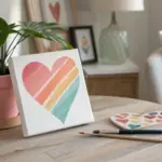
Anniversary paintings are my favorite kind of canvas project because they turn a real love story into something you can hang up and feel every day. Here are anniversary canvas painting ideas that keep it personal (without needing perfect portrait skills) and still look totally gift-worthy.
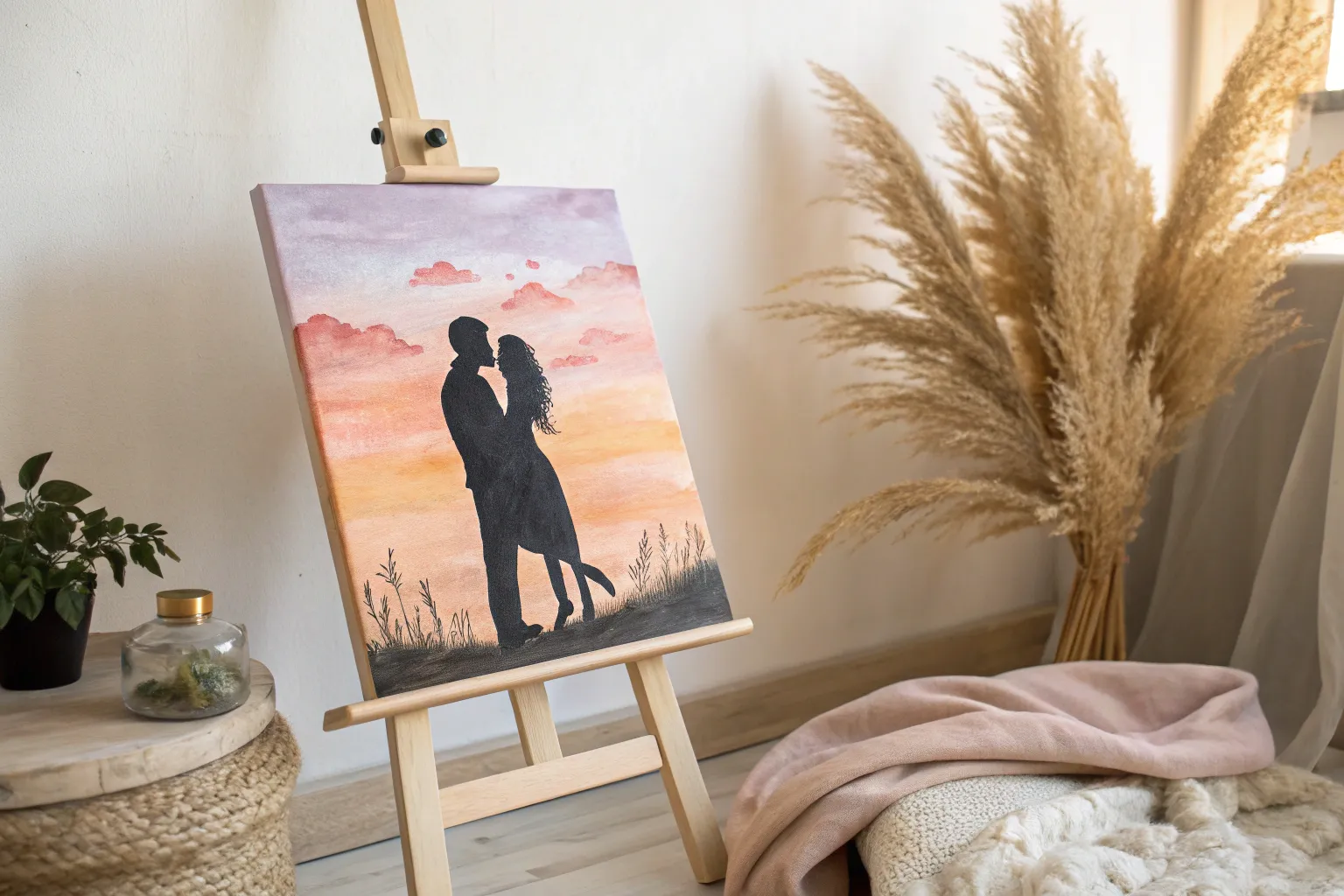
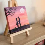
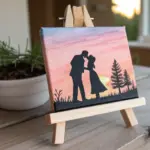
Couple Silhouette at Sunset
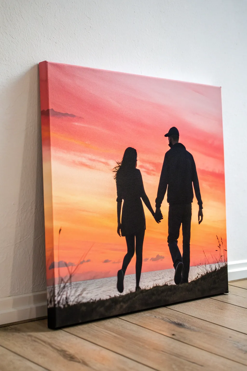
Capture a romantic moment in time with this striking silhouette painting, featuring a couple walking hand-in-hand against a vibrant, fiery sky. By blending warm acrylics for a gradient background and adding crisp black details, you can recreate the look of a professional vacation photo on canvas.
Detailed Instructions
Materials
- Stretched canvas (16×20 inches or similar)
- Acrylic paints: Titanium White, Lemon Yellow, Cadmium Orange, Alizarin Crimson, Burnt Umber, Mars Black
- Large flat brush (2-3 inch) for blending
- Medium flat brush
- Small round detail brush (size 0 or 1)
- Pencil
- Carbon transfer paper (optional)
- Reference photo of a couple walking
- Palette or paper plate
- Water cup and paper towels
Step 1: Painting the Sunset Gradient
-
Prime the horizon:
Begin by deciding where your horizon line will be—about a quarter of the way up from the bottom works well. Use a strip of painter’s tape to mask this line off if you want a perfectly straight water edge, or keep it loose for a natural shore look. -
Start with the brightest light:
Mix a large amount of Lemon Yellow with a touch of Titanium White. Apply this mixture just above your horizon line using your large flat brush, brushing horizontally across the entire width of the canvas. -
Introduce orange tones:
While the yellow is still wet, pick up some Cadmium Orange on your brush without cleaning it. Paint a band directly above the yellow, using long, sweeping horizontal strokes to blend the two colors where they meet. -
Deepen the sky:
Adding a bit of Alizarin Crimson to your orange mix, paint the next section upwards. Work quickly so the acrylics stay wet enough to create a seamless transition from the bright yellow-orange to a deeper reddish-pink. -
Finish the upper sky:
For the very top of the canvas, use Alizarin Crimson with the tiniest dot of Burnt Umber to desaturate it slightly. Blend this into the pink section below, ensuring the gradient is smooth all the way to the top edge. -
Paint the water:
Remove your tape if you used it. For the water below the horizon, use a mix of white and a tiny bit of your sky colors (very pale pinks and yellows) to reflect the light. Keep strokes horizontal but slightly choppier to suggest ripples. -
Add cloud details:
Once the background is tacky but not fully dry, use a smaller dry brush with a mix of crimson and purple (mix crimson + touch of blue or black) to scumble in faint horizontal cloud streaks across the middle section of the sky.
Fixing Patchy Black
If your black silhouette looks streaky or gray after drying, don’t overwork it. Let it dry fully, then apply a second coat of black paint mixed with a tiny drop of blue for a deep, opaque finish.
Step 2: Creating the Silhouette
-
Sketch the figures:
Once the background is completely bone-dry, lightly sketch the outline of the couple using a pencil. If drawing isn’t your strong suit, print out a photo to size and use carbon paper to trace the outline directly onto the canvas. -
Outline in black:
Load your small round brush with Mars Black paint thinned slightly with water for better flow. Carefully trace over your pencil outlines, focusing on capturing the details of the hair, hats, and the subtle connection of their holding hands. -
Fill the shapes:
Switch to a medium flat brush to fill in the larger body shapes with solid black. Apply two coats if necessary to ensure the sunset background doesn’t show through the figures. -
Create the grassy foreground:
At the very bottom, paint a slightly uneven, hilly terrain in solid black that the couple is walking on. Use the tip of your brush to flick small, upward strokes along the top edge of this hill to resemble blades of grass. -
Add wild vegetation:
On the far right and left edges of the foreground, paint taller, wispy grasses and seed heads. Use your smallest detail brush and quick, confident upward strokes to make them look organic and wind-blown. -
Refine the edges:
Check the silhouette edges for crispness. Smooth out any shaky lines on the clothing or limbs with the small round brush to make the figures look sharp against the glowing background. -
Paint the edges:
Don’t forget the sides of your canvas. Wrap the sky gradient around the top and side edges, and continue the black foreground around the bottom so the artwork looks finished from every angle.
Date Night Detail
Personalize the piece by hiding a significant date (like an anniversary) in the tall grass blades using tiny, subtle strokes that blend into the foliage.
Hang your finished masterpiece in a well-lit spot to let those warm sunset hues truly glow


Wedding Date Typography Canvas
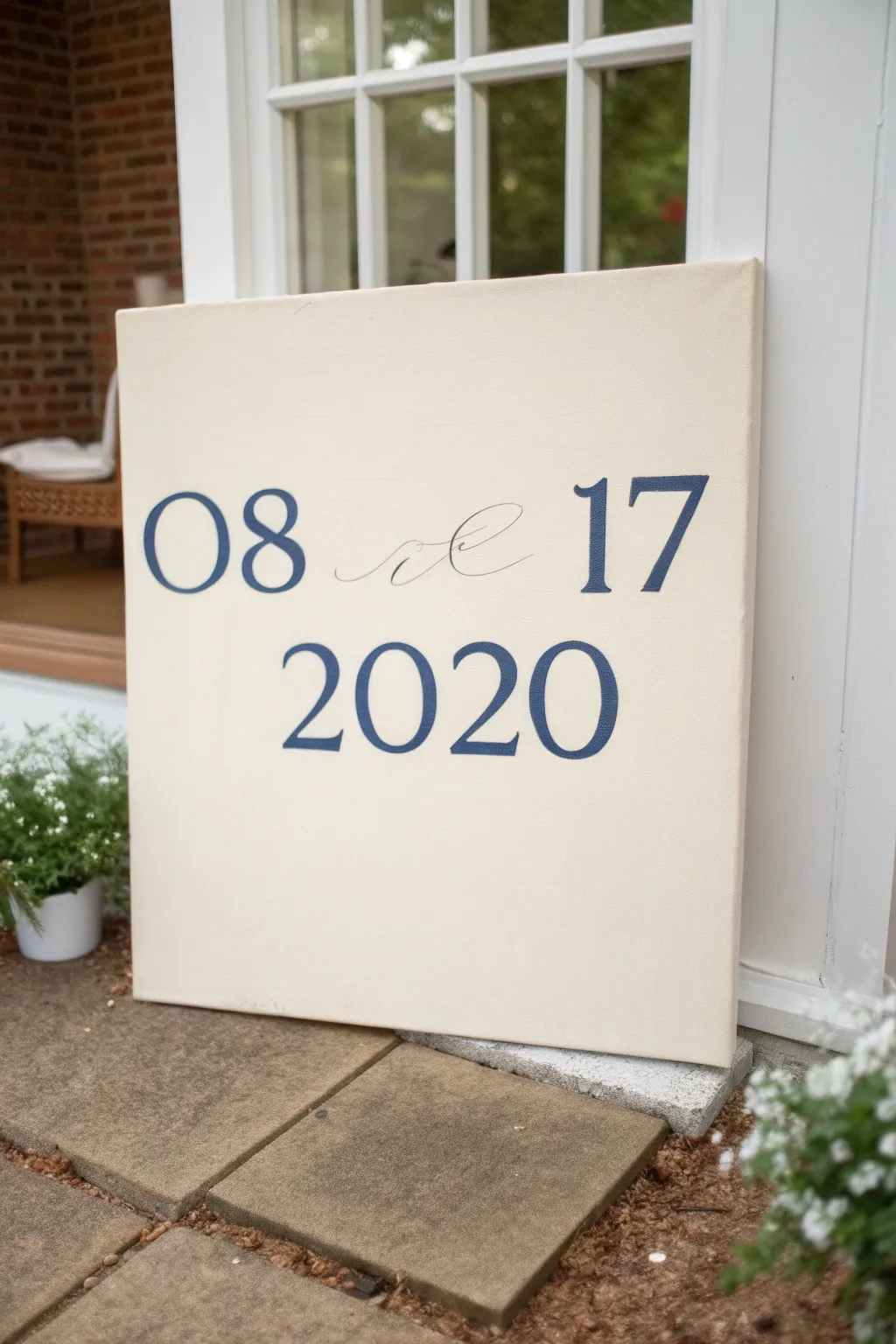
Celebrate a special day with this sophisticated typography artwork, featuring crisp serif numerals and delicate script flourishes on a creamy background. This minimalist design makes a perfect anniversary gift or wedding keepsake that blends seamlessly with modern farmhouse or classic decor.
Step-by-Step Guide
Materials
- Square creative stretched canvas (20×20 or 24×24 inch)
- Cream or antique white acrylic paint (matte finish)
- Navy blue acrylic paint (satin or matte)
- Wide flat synthetic brush (2-3 inch) for background
- Small round detail brush (size 0 or 1)
- Medium flat brush or angled shader brush (size 4 or 6)
- Computer and printer
- Standard printer paper
- Graphite transfer paper or soft pencil (6B)
- Painters tape
- Ruler or tape measure
Step 1: Preparing the Base
-
Priming the Canvas:
Begin by painting your entire canvas with the cream or antique white acrylic paint using your wide flat brush. Apply long, smooth horizontal strokes. -
Adding a Second Coat:
Allow the first layer to dry completely (about 30 minutes). I like to apply a second coat in vertical strokes to create a subtle woven texture and ensure the bright white canvas doesn’t peek through, giving it a richer, more substantial look. -
Designing the Typography:
On your computer, create your layout. Choose a bold, classic serif font (like Times New Roman or Garamond) for the numbers and a wispy, elegant script font for any decorative separators. -
Scale and Print:
Scale the font size so it will fill the canvas nicely, leaving about 2-3 inches of margin on the sides. You will likely need to print this across multiple sheets of paper using the ‘poster’ or ’tile’ setting on your printer.
Step 2: Thinking about Layout
-
Assembling the Template:
Trim the margins of your printed sheets and tape them together carefully to reconstruct the full-size date design. -
Positioning:
Place the taped paper template onto your dry canvas. Use a ruler to ensure the text is centered horizontally and that the lines of text are level. -
Securing the Template:
Once perfectly positioned, tape the top edge of the paper to the canvas to create a hinge. This prevents slipping during the transfer process.
Pro Tip: Steady Hand
Rest your pinky finger on a dry part of the canvas while painting detailed letters. This anchors your hand, reducing shakiness and giving you much cleaner lines on the serifs.
Step 3: Transferring the Design
-
Setting up the Transfer:
Lift your paper ‘hinge’ and slide a sheet of graphite transfer paper underneath, dark side facing down against the painted canvas. -
Tracing the Outlines:
Using a pencil or ballpoint pen, trace the outline of every number and the script flourish with firm pressure. Trace the outer edges of the bold serif numbers rather than filling them in. -
Checking your Work:
Lift the corner occasionally to ensure the graphite is transferring clearly onto the cream paint. The lines should be faint but visible enough to guide your brush. -
Clean Up:
Remove the paper and transfer sheet. If you have any smudges or stray graphite marks, lightly erase them now with a kneaded eraser before painting.
Level Up: Framing
Build a simple floating frame from 1×2 pine boards stained in a dark walnut tone. The contrast between the cream canvas, navy letters, and dark wood creates a high-end gallery look.
Step 4: Painting the Typography
-
Outlining the Numbers:
Load your small round detail brush with slightly thinned navy blue paint. Carefully paint exact outlines over your transferred pencil lines for the large numbers. -
Filling the Shapes:
Switch to your medium flat or angled brush to fill in the body of the bold numbers. The flat edge helps maintain crisp, sharp serifs and straight lines. -
Refining Edges:
Go back with your smallest brush to sharpen the corners of the serifs. Crisp corners are the secret to making hand-painted lettering look professional. -
Painting the Script Flourish:
For the delicate separator between the month and day, use your finest liner brush (size 0). Maintain steady pressure and try to paint the curves in fluid, single strokes rather than short, choppy ones. -
Consistency Check:
Step back from the canvas to check the opacity of the blue paint. If it looks streaky, let it dry and apply a second coat just within the dark areas for a solid, velvety finish. -
Final Polish:
Once the blue paint is fully dry (give it at least an hour), gently erase any visible graphite lines that remain around the edges of your letters.
Hang your custom date canvas proudly as a timeless reminder of your favorite moment in time

Vows as Painted Background Texture
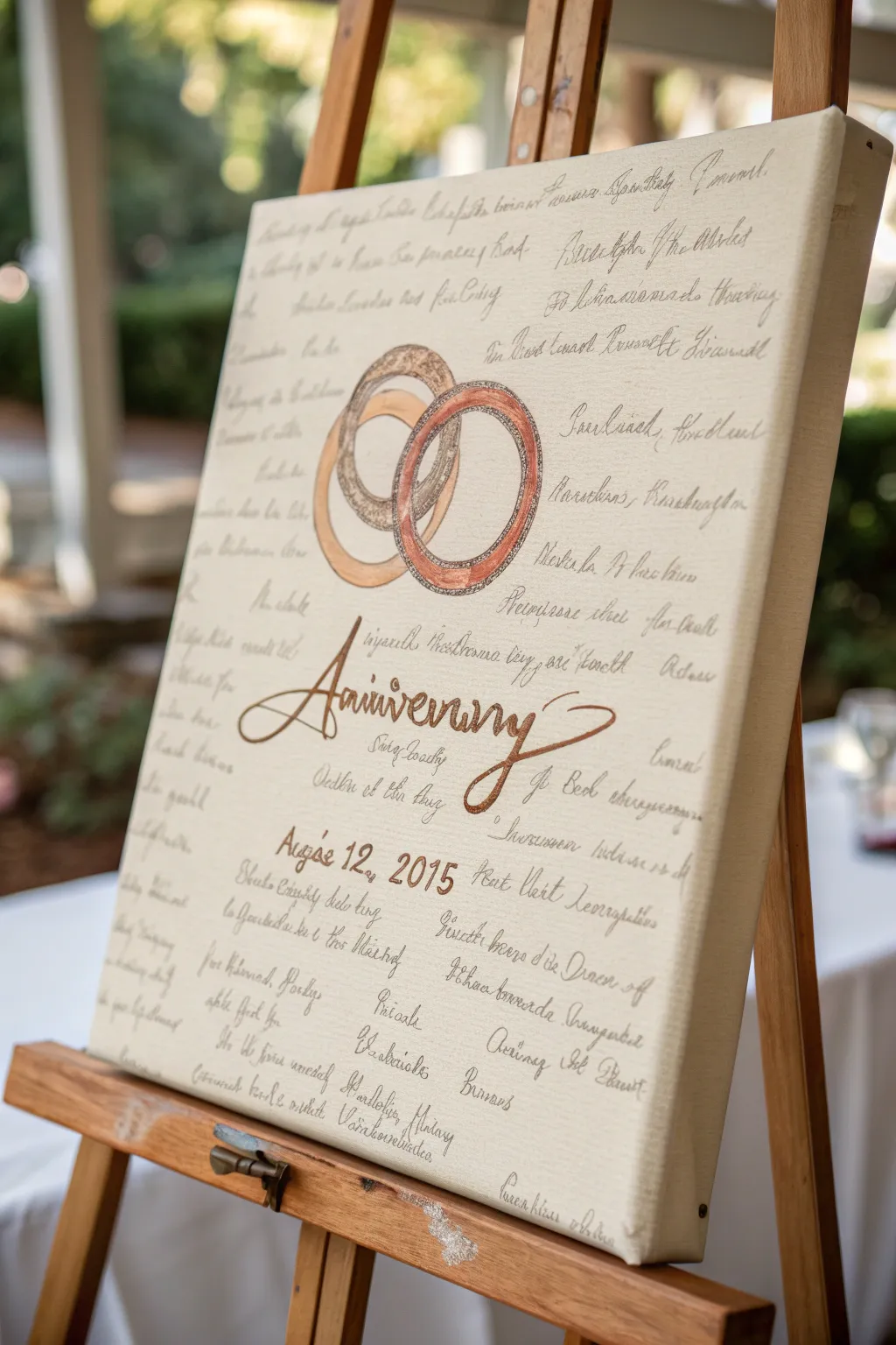
This romantic anniversary keepsake features handwritten vows serving as a delicate, parchment-like background for bold interlocking rings. The result is a deeply personal artwork where the words literally support the symbol of your union.
Step-by-Step
Materials
- Large gallery-wrapped canvas (16×20 or larger)
- Cream or off-white acrylic paint
- Light grey fine-tip paint pen or archival ink pen
- Metallic gold acrylic paint
- Metallic copper or bronze acrylic paint
- Large flat brush (2-inch)
- Round detail brushes (sizes 2 and 4)
- Tracing paper (optional)
- Pencil and eraser
- Ruler
Step 1: Preparing the Foundation
-
Base coat application:
Begin by coating your entire canvas with the cream acrylic paint. Use the large flat brush in smooth, horizontal strokes to ensure even coverage. -
Painting the edges:
Don’t forget to paint the deep sides of the canvas. This gallery-wrapped look ensures the piece looks finished even without a frame. -
Second coat:
Once the first layer is touch-dry (usually about 20 minutes), apply a second coat to ensure the bright white of the raw canvas doesn’t peek through. Let this dry completely—I usually give it at least an hour.
Ink Smearing?
If your pen smears when you paint the glaze over it, spray the text first with a clear matte aerosol sealer. Let it dry for 15 minutes before applying the wash.
Step 2: Creating the Text Background
-
Drafting guidelines:
Using a ruler and a very light pencil touch, draw horizontal lines across the canvas spaced about 1.5 to 2 inches apart. -
Writing the vows:
Take your light grey fine-tip pen and begin writing your wedding vows or a love letter along the guidelines. Keep your handwriting loose and cursive-style. -
Varying the density:
Don’t worry about perfect legibility; the goal is texture. If you make a mistake, keep going—it adds to the aged, manuscript aesthetic. -
Fading the text:
To make the text look like a subtle background texture rather than the main focal point, lightly dry-brush a very thin layer of watered-down cream paint over the dried ink. This pushes the words into the background.
Step 3: Painting the Rings
-
Sketching the rings:
Lightly sketch two large, interlocking circles in the center of the canvas. You can trace around two different-sized bowls to get perfect circles. -
Adding dimension:
Draw an inner circle for each ring to create the band’s width. Make the rings slightly different thicknesses to represent both partners. -
Base color for rings:
Fill in the left ring with metallic gold paint and the right ring with copper or bronze. Use your size 4 round brush for this. -
Adding texture details:
Once the base metallic layer is dry, use a smaller brush to dab darker metallic shades or a mix of brown and gold onto the rings to create a hammered or vintage metal texture. -
Highlighting:
Add tiny slivers of lighter gold or white on the upper curves of the rings to create a shine effect, making them look three-dimensional.
Add Metallic Leaf
For extra luxury, apply gold leaf sizing to the ‘Anniversary’ script and press real gold leaf onto the sticky adhesive instead of using metallic paint.
Step 4: Final Calligraphy
-
Drafting the title:
below the rings, lightly pencil in the word ‘Anniversary’ in a large, sweeping script font. Center it perfectly beneath the interlocking rings. -
Painting the title:
Go over your pencil lines with metallic bronze paint and a fine liner brush. I like to thicken the downstrokes of the letters to mimic faux calligraphy. -
Adding the date:
underneath ‘Anniversary’, paint your special date using a simpler, serif font for contrast. Use a dark brown or dark grey paint for readability. -
Cleaning up:
Wait until every drop of paint is completely dry (overnight is best), then gently erase any visible pencil guidelines from the background.
Hang this personalized masterpiece in your home as a daily reminder of the promises you made and the years you’ve shared


Where We Met Map Pin Art
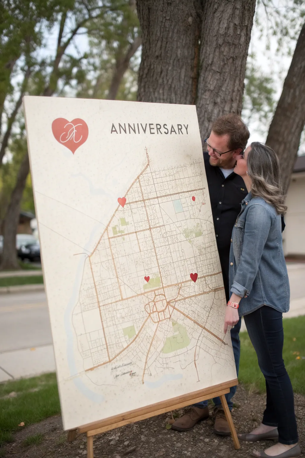
Celebrate your journey together with this grand, personalized statement piece that maps out the pivotal moments of your relationship. By mounting a large-scale vintage map onto canvas and marking your special spots with hearts, you create a romantic and sophisticated display perfect for an anniversary party or home decor.
Detailed Instructions
Materials
- Large blank canvas (approx. 36×48 inches)
- High-resolution digital file of a vintage city map
- Large format paper print of the map (same size as canvas)
- Matte Mod Podge or spray adhesive
- Red acrylic paint
- Small flat brush and fine detail brush
- Stencil vinyl or contact paper
- X-acto knife
- Pencil
- Bone folder or squeegee
- Transfer paper (optional)
- Wooden easel (for display)
Step 1: Preparing the Base Map
-
Source your map:
Find a high-resolution vintage map of your city. Look for historical archives or printable map services online that offer a clean, tan or off-white background with distinct street grids. -
Print the large engineer print:
Have your map file printed at a local print shop as an ‘engineer print’ or ‘blueprint’ on standard paper. Ensure the dimensions match your canvas exactly. -
Apply adhesive to canvas:
Work in varied sections to avoid premature drying. Take your spray adhesive or a thin, even layer of Mod Podge and coat the top six inches of the canvas surface. -
Align the print:
Carefully align the top edge of your paper map with the top edge of the canvas. Press down firmly. -
Adhere the remaining map:
Slowly unroll the rest of the map down the canvas, applying adhesive in 6-inch horizontal strips as you go. Use a squeegee or bone folder to smooth out bubbles immediately, working from the center outward. -
Seal the surface:
Once the paper is fully adhered, apply a very thin coat of matte Mod Podge over the entire top surface to seal the paper and prevent paint bleeding later. Let this dry completely.
Aged Effect Tip
If your map print looks too bright white, lightly sponge the edges with diluted tea or distressed ink before sealing to give it an authentic antique look.
Step 2: Adding Typography and Graphics
-
Create the title stencil:
Design your ‘ANNIVERSARY’ text and the large heart logo with initials on a computer. Cut these designs out of stencil vinyl using a craft cutter or by hand with an X-acto knife. -
Position the main elements:
Place the large heart stencil in the upper left corner and the text stencil centered at the top. Use a ruler to ensure the text is perfectly level with the canvas top edge. -
Paint the logo heart:
Using a small flat brush, fill in the large heart stencil with red acrylic paint. Apply multiple thin coats rather than one thick one to ensure smooth coverage without ridges. -
Add the monogram:
Once the red heart is dry, lay your monogram stencil over it. Carefully paint the initials in white or a contrasting light cream color. -
Paint the text:
Fill in the ‘ANNIVERSARY’ letters with a dark charcoal or black acrylic paint. Use a vertical dabbing motion to prevent paint from seeping under the stencil edges.
Step 3: Marking Specific Locations
-
Locate your spots:
Identify the specific intersections where you met, had your first date, or got married. Mark these lightly with a pencil. -
Create mini heart stencils:
Cut out several small heart shapes from your vinyl scraps. These should be uniform in size, roughly 1-2 inches wide. -
Place location markers:
Adhere a small heart stencil over each penciled location. Ensure the point of the heart aims at the specific street address. -
Paint the location hearts:
Fill these small hearts with the same red acrylic paint used for the main logo. Allow them to dry slightly before peeling the vinyl. -
Peel and touch up:
Carefully remove all stencils while the paint is still slightly tacky to avoid chipping. Use a fine detail brush to fix any ragged edges. -
Final protective coat:
If you plan to display this outdoors, seal the entire canvas with a clear, matte acrylic spray to protect against humidity.
Bubbles Under Paper?
If air bubbles appear after gluing, prick them with a fine needle and press the air out with your finger. Then, seal over the prick with a dab of glue.
Now step back and admire how your personal history transforms into a beautiful piece of topographical art
BRUSH GUIDE
The Right Brush for Every Stroke
From clean lines to bold texture — master brush choice, stroke control, and essential techniques.
Explore the Full Guide
Our First Home Front Door Scene
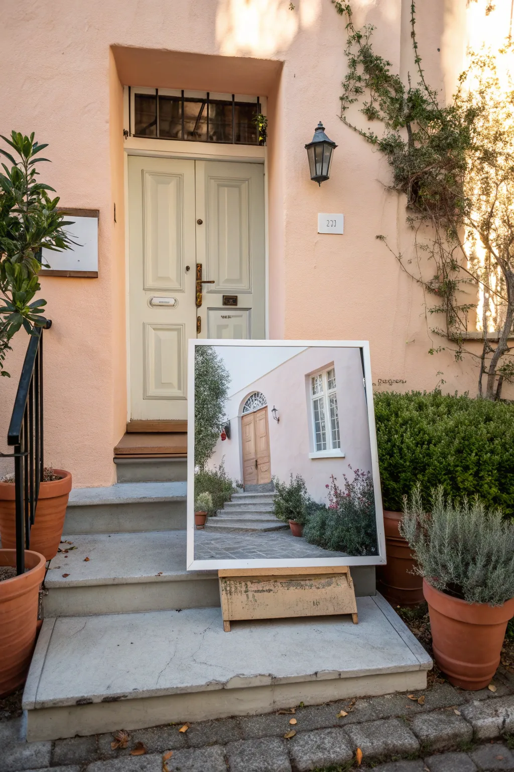
Immortalize the memory of your first shared address with this realistic acrylic painting of a sunlit front entry. This project captures the nostalgic charm of architectural details and welcoming greenery, making it the perfect sentimental anniversary gift.
How-To Guide
Materials
- High-quality stretched canvas (16×20 inches or larger)
- Acrylic paints (Titanium White, Unbleached Titanium, Burnt Umber, Yellow Ochre, Sap Green, Hookers Green, Paynes Grey, Cadmium Red)
- Set of synthetic brushes: 1″ flat wash, medium filbert, lush round (size 4-6), fine liner (size 0-1)
- Graphite pencil (HB) and eraser
- Reference photo of the house
- Ruler or T-square
- Palette and container for water
- Paper towels
- Matte medium (optional for glazing)
Step 1: Planning and Underpainting
-
Analyze the perspective:
Begin by studying your reference photo to identify the horizon line and vanishing points. Since this is an architectural piece, getting the angles of the steps and door frame correct is crucial for realism. -
Sketch the layout:
Lightly sketch the main structural elements onto the canvas using an HB pencil. Use a ruler to ensure your vertical lines for the door frame and windows remain perfectly straight, but keep the foliage shapes loose and organic. -
Apply the first wash:
Mix a very watery wash of Burnt Umber and cover the entire canvas. This tones down the bright white surface and helps you establish warm undertones that will glow through later layers. -
Block in shadow shapes:
Using a flat brush and a mix of Paynes Grey and Burnt Umber, paint in the darkest areas, such as the open doorway shadows, window panes, and deep recesses in the bushes. This establishes your value structure early on.
Straight Lines Secret
Use drafting tape or painter’s tape to mask off the edges of the door and windows. It guarantees crisp, straight architectural lines without needing a perfectly steady hand.
Step 2: Architecture and Structure
-
Paint the stucco walls:
Mix a large amount of Titanium White with a tiny touch of Cadmium Red and Yellow Ochre to create a warm, pale pink. Apply this broadly over the wall areas, using a large brush with crisscross strokes to mimic a stucco texture. -
Define the door:
For the wooden door, mix Yellow Ochre and Burnt Umber. Paint the panels, ensuring you follow the direction of the wood grain. I like to let this dry briefly and then add a second, slightly darker glaze to deepen the wood tone. -
Detail the window frames:
Switch to a smaller flat brush and use pure Titanium White (or an off-white) to carefully paint the window mullions and the door casing. Multiple thin coats are better here to achieve opaque, crisp lines. -
Paint the stone steps:
Mix varying shades of grey using White, Paynes Grey, and a touch of Umber. Paint the steps, making the top surfaces slightly lighter than the vertical risers to create dimension. -
Add architectural shadows:
Mix a transparent glaze of purple-grey. Paint cast shadows under the window sills, door frame, and where the plants meet the wall to ground the structure.
Step 3: Landscaping and Greenery
-
Block in base greens:
Mix Sap Green with a little Black or Umber for a deep, dark green. Stipple this color into the areas where the bushes and potted plants will be, focusing on the densest parts of the foliage. -
Build mid-tone leaves:
Using a pure Hooker’s Green or a mix with a little Yellow, start stippling lighter layers over the dark base. Leave some of the dark background showing through to create depth. -
Add highlights to foliage:
Mix a light olive green using Yellow Ochre and White. Use a round brush to tap the tips of the leaves where the sun would hit them, especially on the top of the bushes and the potted olive tree. -
Paint the terracotta pots:
Use Burnt Sienna and White to paint the planters. Remember to curve your brushstrokes to follow the round form of the pots, adding a dark shadow on one side. -
Add floral details:
If there are flowers, like the ones near the right wall, use a small round brush to dab in small spots of color (pinks or purples). Keep these loose and impressionistic rather than painting every petal.
Date It
Hide the move-in date or anniversary year subtly in the painting—perhaps taking the place of the actual house numbers or carved faintly into a tree trunk.
Step 4: Final Details
-
Refine the glass:
Add reflections to the window panes using light grey-blue diagonal strokes. Keep these subtle so the windows look glossy but not distracting. -
Hardware and fixtures:
Use your finest liner brush and black paint to add the door handle, light fixtures, and house numbers. Add a tiny dot of white to metal objects to make them shine. -
Enhance texturing:
Dry brush a little light grey over the stone steps to emphasize the rough texture of the pavement. -
Final adjustments:
Step back and check your values. Deepen any shadows that look washed out and add a final bright white highlight to the sunniest spots for contrast.
Once the paint is dry, you’ll have a stunning architectural portrait ready to welcome viewers into your memories.
Two Love Birds on a Branch
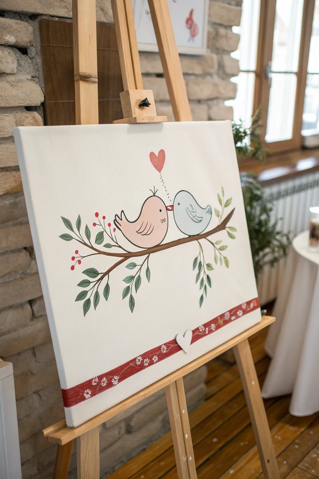
This charming canvas captures the sweetness of companionship with two stylized birds sharing a moment on a leafy branch. Its clean lines, soft colors, and decorative border make it a perfect, heartfelt gift for an anniversary or wedding celebration.
Detailed Instructions
Materials
- Stretched canvas (rectangular, e.g., 16×20 inches)
- Acrylic paints (Titanium White, Mars Black, Burnt Umber, Light Pink, Baby Blue, Crimson Red, Olive Green, Sap Green)
- Set of acrylic brushes (flat wash, round size 4 and 6, fine liner size 0)
- Pencil and eraser
- Ruler
- Palette
- Water cup and paper towels
- Small wooden heart embellishment (white)
- Strong craft glue or hot glue gun
Step 1: Planning and Sketching
-
Prepare the canvas:
Start with a clean, white canvas. If your canvas isn’t pre-primed or looks a bit dull, give it a fresh coat of Titanium White acrylic paint using a large flat brush and let it dry completely. -
Draft the branch:
Using a pencil, lightly sketch a long, slightly curved branch extending from the left side towards the right. Add a few smaller offshoot twigs drooping downwards and reaching upwards. -
Outline the birds:
Draw the main shapes for the two birds resting on the central part of the branch. Sketch a rounded, plump shape for the left bird and a slightly rounder shape for the right bird, making sure they face each other. -
Add details:
Lightly pencil in the beaks so they are almost touching. Add the tail feathers flipping up and the wings on their sides. Sketch a small heart floating above the space between their heads. -
Mark the border:
Use a ruler to draw a straight horizontal line about two inches from the bottom edge of the canvas to mark the top of the decorative ribbon border.
Wobbly Lines?
If painting the black outlines feels too difficult with a brush, wait until the paint is 100% dry and use a black fine-tip Posca marker or permanent marker for steady control.
Step 2: Painting the Subjects
-
Paint the branch:
Mix Burnt Umber with a touch of white to create a soft brown. Using a round brush, paint along your pencil lines for the branch, varying the pressure to make it thicker at the base and thinner at the tips. -
Fill the pink bird:
Paint the body of the left bird with Light Pink. You may need two coats to get an even, opaque finish. Let the first coat dry before applying the second. -
Fill the blue bird:
Paint the right bird using Baby Blue. I find that smoothing out the brushstrokes while the paint is still wet helps achieve that cartoon-smooth look. -
Paint the floating heart:
Fill in the floating heart shape with Crimson Red. You can give it a slightly textured look by dabbing the brush rather than stroking. -
Add the leaves:
Mix Olive Green and Sap Green to get a natural leaf tone. Paint simple almond-shaped leaves along the twigs. Vary the sizes, placing some in pairs and some singly. -
Create the berries:
Using the back end of a paintbrush handle dipped in Crimson Red, dot small clusters of berries near the leaves on the left side of the branch.
Make it Personal
Instead of the decorative floral border, use the red strip to paint the couple’s names and their anniversary date in white calligraphy or block letters.
Step 3: Adding the Finishes
-
Outline the birds:
Once the bird bodies are bone dry, use a fine liner brush and thinned black paint (or a black paint pen) to outline their bodies, wings, and tails. Keep the line steady but don’t worry about perfection; a organic line adds charm. -
Facial features:
Paint small black dots for eyes. Add tiny eyelashes to the pink bird if desired. Paint both beaks carefully with red or orange. -
Connect the heart:
With the fine liner brush and black paint, create a tiny dotted trail rising from the beaks up to the red heart. -
Paint the bottom border:
Paint the strip at the bottom (below your ruled line) with the same Crimson Red used for the heart. Apply two coats for richness. -
Decorate the border:
Once the red strip is dry, use your smallest brush and white paint to create little floral or star patterns along the red band. Simple clusters of five dots work perfectly for flowers. -
Attach 3D element:
Take your small wooden heart embellishment. If it’s not already white, paint it white. Glue it onto the center of the red border strip for a mixed-media touch.
Hang this sweet creation in a prominent spot to remind you of lasting affection every day

PENCIL GUIDE
Understanding Pencil Grades from H to B
From first sketch to finished drawing — learn pencil grades, line control, and shading techniques.
Explore the Full Guide
Intertwined Trees Making a Heart
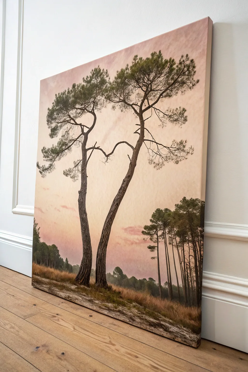
Capture the romance of nature with this serene painting of two pines curving together to form a subtle heart shape against a pastel sky. This project combines soft blending techniques with detailed branch work to create a meaningful and tranquil anniversary gift.
Step-by-Step Guide
Materials
- Large stretched canvas (e.g., 24×36 inches)
- Acrylic paints: Titanium White, Unbleached Titanium, Burnt Umber, Raw Umber, Sap Green, Hooker’s Green, Alizarin Crimson, Yellow Ochre
- Large flat brush (2-inch)
- Medium filbert brush
- Small round brushes (sizes 2 and 4)
- Fine liner brush
- Palette knife
- Water container and paper towels
- Mist spray bottle
Step 1: Setting the Sky and Atmosphere
-
Prepare the Gradient Base:
Begin by dampening your large canvas slightly with a mist bottle. This helps the acrylics blend smoothly for the soft sky effect. -
Paint the Upper Sky:
Using the large flat brush, mix Titanium White with a tiny touch of Alizarin Crimson and Burnt Umber to create a dusty rose color. apply this to the top third of the canvas using wide, horizontal strokes. -
Transition to Warmth:
Mix Titanium White with Yellow Ochre and a dot of Alizarin Crimson for a warm peach tone. Blend this into the dusty rose section, working your way down the canvas to about the halfway point. -
Create the Horizon Glow:
Near the bottom third, where the horizon will be, use a mix of Unbleached Titanium and White. Blend this upwards into the peach tone to simulate the hazy light of a setting sun. -
Add Cloud Textures:
While the paint is still tacky, use a dry filbert brush with a slightly darker rose-grey mix to scumble in soft diagonal cloud streaks. Keep these very subtle and wispy.
Step 2: Establishing the Landscape
-
Paint the Distant Treeline:
Mix Hooker’s Green with a little White and Burnt Umber to make a desaturated, hazy grey-green. Use a medium brush to dab in the silhouette of distant trees along the horizon line. -
Darken the Mid-Ground:
As you move slightly forward (right side of the canvas), darken your green mixture with more Sap Green and Burnt Umber. paint the taller, sharper pine clusters on the right side. -
Ground the Scene:
For the foreground earth, mix Burnt Umber with Yellow Ochre. paint the bottom strip of the canvas, using horizontal strokes to suggest a flat, sandy path. -
Add Grassy Texture:
Using a fan brush or an old bristle brush, flick upward strokes of Burnt Sienna and Unbleached Titanium along the bottom edge to create dry, tall grasses catching the light.
Subtle Connectivity
Don’t force the branches to touch perfectly. Leaving a tiny gap between the ‘heart’ limbs creates tension and visual interest.
Step 3: The Main Subjects
-
Sketch the Positioning:
Lightly sketch the two main tree trunks with a pencil or very thinned paint. The critical part is the curve where the trunks lean in and branches reach out to kiss, forming the heart shape. -
Block in the Trunks:
Load a medium filbert brush with a dark mix of Burnt Umber and a touch of Black. Paint the main trunks, ensuring they are wider at the base and taper naturally as they rise. -
Add Bark Texture:
I like to use a palette knife here for texture. Mix a lighter brown (Burnt Umber + White) and drag it lightly over the left side of the trunks to simulate bark catching the sunset light. -
Elongate the Limbs:
Switch to a small round brush. Extend the main branches outward, focusing on the specific limbs that curve inward to create the upper arches of the heart. -
Detail the Twigs:
Dilute your dark brown paint with water to an ink-like consistency. Use the fine liner brush to add delicate, spindly twigs extending from the main branches. -
Foliage Clusters:
Mix Sap Green with Burnt Umber for a deep pine green. Use an old, splayed brush or sponge to stipple clusters of needles onto the ends of the branches. -
Highlight the Needles:
Add a touch of Yellow Ochre to your green mix. Lightly dab the tops of the pine clusters to show where the light hits the canopy. -
Refine the Heart Shape:
Step back and check the negative space between the trees. If needed, add small twigs or needle clusters to better define the heart silhouette without making it look unnatural. -
Final Ground Details:
Add darker shadows at the base of the two main trees using Raw Umber to anchor them firmly into the ground.
Muddy Sky Fix
If your pinks and greens start mixing into mud, let the sky layer dry completely before painting any branches or leaves over it.
Hang this piece where it can remind you daily that love is a natural, growing force
Timeline of Milestone Dates
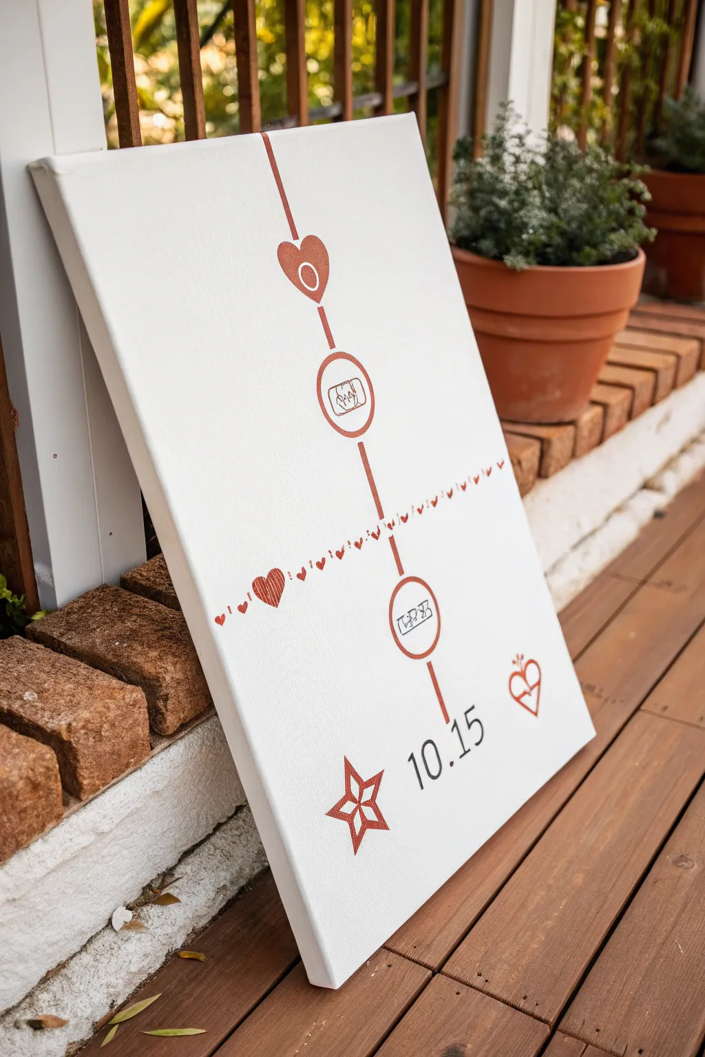
Celebrate your journey together with this minimalist milestone timeline on stretched canvas. Featuring clean lines, sweet iconography, and a rose-gold metallic finish, it creates a modern and deeply personal keepsake.
How-To Guide
Materials
- Stretched white canvas (16×20 or similar)
- Rose gold or copper metallic acrylic paint
- Fine liner detail brush (size 0 or 00)
- Flat shader brush (small)
- Pencil and eraser
- Ruler or straight edge
- Black fine-tip paint marker or permanent marker
- Circle stencil (optional but recommended)
- Painter’s tape
Step 1: Planning and Layout
-
Prepare the canvas:
Ensure your canvas is clean and taut. Place it on a flat, stable surface where you have plenty of elbow room. -
Mark the center line:
Using your ruler and a light pencil touch, draw a straight vertical line running from the top edge to the bottom, slightly offset to the right if you want an asymmetrical look. -
Sketch the milestones:
Decide on your milestone placements. Lightly sketch four circles or heart shapes along your vertical line where your icons will go. -
Draft the horizontal break:
About two-thirds down, lightly sketch a horizontal line intersecting the main vertical line. This will become your decorative heart border. -
Add icon details:
Inside your circles, lightly pencil in your symbols—rings for marriage, a house for moving in, or perhaps a bassinet for a new baby. -
Sketch the footer elements:
At the very bottom right, pencil in your special date and the decorative star and heart symbols.
Smudge Control
Metallic paint dries slower than standard acrylics. Keep a piece of scrap paper under your hand while sketching or painting details to avoid oils or accidental smears.
Step 2: Painting the Structure
-
Paint the vertical line:
Load your flat brush with rose gold metallic paint. Carefully paint over your vertical pencil line. I find using painter’s tape here guarantees a crisp, professional edge. -
Fill the top heart:
Using your fine liner brush, paint the outline of the top heart icon in rose gold. Fill it in if desired, or leave it as an outline. -
Outline the milestone circles:
Switch to your fine liner brush. Carefully trace the circumferences of your milestone circles with the metallic paint. Take your time to keep the line weight consistent. -
Create the horizontal heart line:
Along your horizontal guide, paint tiny hearts in a repeating pattern. Vary the size slightly or add dots between them for visual interest. -
Paint the decorative divider heart:
Where the horizontal line meets the left side, paint a larger, textured heart to anchor the design.
Step 3: Adding Details and Finishing
-
Ink the icons:
Once the metallic circles are fully dry, use your black paint pen to draw the icons inside the circles (rings, house keys, etc.). The pen gives you far more control than a brush for these tiny details. -
Paint the bottom star:
Use the metallic paint to fill in the star shape at the bottom. Adding a second coat here really makes the metallic pigment pop. -
Add the date:
With the black paint pen, carefully write your anniversary date (e.g., 10.15) near the bottom right. Use a ruler to keep the baseline straight. -
Detail the side heart:
Paint the small heart with the arrow or heartbeat line next to the date using the metallic paint. -
Clean up sketch lines:
Wait until absolutely every drop of paint is dry. Then, gently erase any visible pencil marks, being careful not to smudge the metallic finish. -
Final inspection:
Check for any uneven edges on your main lines. You can touch these up with a tiny bit of white paint to sharpen the look.
Add Dimension
For a 3D effect, use puff paint for the rose gold sections or glue small charms and gems inside the milestone circles instead of drawing the icons.
Hang your beautiful timeline in a spot where you can be reminded daily of how far you’ve come together


Split Canvas: Then and Now
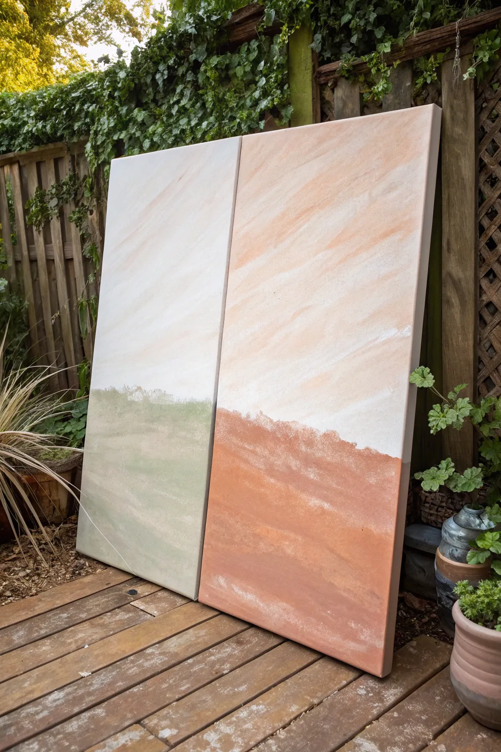
This striking diptych artfully blends past and present themes using a split-canvas technique that transforms a single horizon line into two distinct color stories. The soft, sweeping brushwork creates a serene, abstract landscape where muted sage greens meet warm terracotta tones.
Step-by-Step Guide
Materials
- Two large rectangular stretch canvases (same size, e.g., 24×48 inches)
- Acrylic paints: Titanium White, Unbleached Titanium, Sage Green, Burnt Sienna, Terra Cotta, Raw Umber
- Large flat brush or varnish brush (2-3 inch width)
- Medium filbert brush
- Palette knife (optional, for mixing)
- Cup of water
- Paper towels or rag
- Table easel or drop cloth for floor painting
Step 1: Preparation and Base Layer
-
Set the Stage:
Lay both canvases side-by-side on your workspace, ensuring the edges touch. This is crucial because you want the horizon line and sky movement to flow continuously across the gap. -
Mix the Sky Tone:
Create a large volume of the base sky color. Mix plenty of Titanium White with a small touch of Unbleached Titanium and a tiny hint of Terra Cotta. You want a very pale, warm creamy peach color. -
Apply the Sky Base:
Using your large brush, paint the upper 2/3 of both canvases. Work in long, diagonal strokes moving from the bottom left upward to the top right to create a sense of movement in the ‘clouds’. -
Build Dimension:
While the paint is still wet, dip just the corner of your brush into pure Titanium White. Sweep this over the base color in the same diagonal direction to create subtle streaks and highlights. -
Add Warmth:
On the right canvas specifically, blend a little more of the peach/terra cotta wash into the wet white paint, intensifying the warmth as you move toward the right edge.
Uneven Horizon?
If your horizon line doesn’t match up perfectly across the gap, use a yardstick or masking tape to bridge both canvases while sketching the initial line.
Step 2: Creating the Horizon
-
Mark the Horizon Line:
Decide where your ground meets the sky—roughly the bottom third of the canvas. Lightly mark this line across both canvases so they align perfectly. -
Mix the ‘Past’ Green:
For the left canvas (representing the ‘Then’), mix Sage Green with a generous amount of Titanium White and a dot of Raw Umber to desaturate it. It should look like dried eucalyptus. -
Block in the Green:
Paint the bottom section of the left canvas with your green mix. Don’t worry about a crisp top edge yet; let the brush texture be visible. -
Mix the ‘Now’ Earth Tone:
For the right canvas, mix Burnt Sienna, Terra Cotta, and a little Unbleached Titanium. You are aiming for a rich, warm clay color. -
Block in the Earth Tone:
Apply this warm mixture to the bottom section of the right canvas, ensuring the color meets the green section at the center gap.
Add Metallic Flair
Mix a small amount of gold leaf or metallic gold paint into the ‘Now’ (terracotta) side of the horizon line to symbolize a ‘Golden Anniversary’ celebration.
Step 3: Refining and Blending
-
Soften the Horizon Edge:
Using a clean, dry filbert brush, gently dab along the top edge of your green and terracotta sections where they meet the sky. I find that scumbling (scrubbing lightly) creates a distant tree-line effect. -
Create Texture in the Green:
Mix a lighter tint of your sage green. Add horizontal, sweeping strokes to the foreground of the left canvas to simulate grassy fields or rolling hills. -
Create Texture in the Earth:
Do the same regarding the right canvas: mix a lighter, sandier version of your terracotta and sweep it across the foreground to create depth. -
Transitioning the Sky:
Return to the sky area just above the horizon. Glaze a very thin, watery layer of white right above the horizon line to make the distance look hazy and atmospheric. -
Edge Continuity check:
Stand back and look at the gap between the canvases. Use a small brush to touch up the inner edges of the canvas frames so the painting wraps slightly around the sides, maintaining the illusion when viewed from an angle. -
Final Highlights:
Add a few final bright white diagonal streaks across the upper sky on both panels, ensuring a few strokes appear to cross the visual gap to tie the pieces together.
Once dry, hang these side-by-side with a small gap to enjoy a modern, unified masterpiece
First Dance Song Lyric Strip
Celebrate a special milestone with a modern, minimalist canvas that uses bold color blocking and elegant typography. This project combines soft cream, earthy terracotta, and deep teal tones in wide, textured strokes to create a warm and welcoming piece of decor.
How-To Guide
Materials
- Large stretched canvas (at least 18×24 inches)
- Acrylic paints: Cream/Off-White, Muted Terracotta/Coral, Deep Teal/Forest Green
- Large flat paintbrush (2-3 inch width)
- White paint pen or fine paintbrush with white acrylic paint
- Pencil and eraser
- Ruler or T-square
- Painter’s tape (optional)
- Easel (for display or working)
- Water cup and paper towels
Step 1: Setting the Background
-
Prep the canvas:
Begin by setting up your canvas on an easel or a flat, protected surface. Ensure the surface is clean and free of dust. -
Mix the base color:
Create a warm, creamy beige tone by mixing a generous amount of white acrylic with a tiny drop of yellow ochre or light brown. -
Apply the top layer:
Using your large flat brush, paint the top third of the canvas with this cream mixture. Don’t worry about making the bottom edge straight; let your brush strokes fade out naturally. -
Create texture:
While painting, use broad, horizontal strokes. I like to keep the paint slightly thinner near the bottom edge of this section to create a feathered effect for the next color to overlap. -
Dry completely:
Allow this first section to dry fully before moving on. This prevents the colors from muddying when you add the next layer.
Step 2: Adding the Color Blocks
-
Paint the middle stripe:
Load your large brush with the terracotta or muted coral paint. Start painting a wide band across the middle of the canvas, overlapping the bottom edge of the cream section slightly. -
Feather the edges:
Use a dry-brush technique at the top and bottom of this coral stripe. Lighten your pressure so the bristles create a rough, textured edge rather than a sharp line. -
Paint the bottom section:
Clean your brush thoroughly. Then, load it with the deep teal or forest green paint. Fill the bottom third of the canvas, working from the bottom edge upwards. -
Blend the transition:
As you approach the coral section, use the same dry-brush technique to drag the teal paint slightly over the dried coral paint, creating a rustic, layered look where the colors meet. -
Review contrast:
Step back and check the balance. You want the three sections to feel roughly equal in visual weight but with organic, imperfect boundaries. -
Final drying time:
Let the entire canvas dry completely. The paint must be rock hard before you attempt any lettering.
Uneven Lettering Fix
If your text looks crooked, don’t panic. Paint over the mistake with a small amount of the background color (coral), let dry, and try again.
Step 3: Lettering the Anniversary Text
-
Measure the center:
Find the vertical center of the canvas and mark it lightly with a pencil within the coral stripe. -
Draft the text lines:
Use a ruler to lightly draw a straight horizontal guideline where the text ‘ANNIVERSARY’ (or your chosen text) will sit. -
Sketch the letters:
Lightly sketch your letters with a pencil. A serif font adds a classic touch. Focus on spacing efficiently so the word spans comfortably across the center without feeling cramped. -
Prepare the paint pen:
Shake your white paint pen well to get the ink flowing on a scrap piece of paper first. -
Outline the letters:
Carefully trace over your pencil sketches with the paint pen. Keep your hand steady and move slowly for crisp lines. -
Thicken the strokes:
Go back over the downstrokes of each letter to add weight and traditional serif styling. This makes the text pop against the colored background. -
Clean up:
Once the white ink is fully dry, gently erase any visible pencil marks. -
Seal the artwork:
Optionally, apply a clear matte spray varnish to protect the painting from dust and UV light, especially if displaying it outdoors.
Dry Brushing Tip
To get that scratchy, modern edge between colors, wipe most of the paint off your brush onto a paper towel before hitting the canvas transition zone.
Place your finished masterpiece on a wooden easel to greet guests with style and warmth
Proposal Spot Mini Landscape
Capture the serenity of a special coastal moment with this soft and breezy miniature painting. Using gentle gradients and layered textures, you’ll create a peaceful dunescape that feels as warm as the memory attached to it.
Step-by-Step
Materials
- Small square canvas (e.g., 4×4 or 5×5 inch) or canvas panel
- Acrylic paints: Titanium White, Peach/Light Coral, Teal/Turquoise, Burnt Umber, Sap Green, and Yellow Ochre
- Miniature wooden easel
- Flat synthetic brushes (1/2 inch and 1/4 inch)
- Small round detail brush (size 0 or 00)
- Palette or paper plate
- Cup of water and paper towels
Step 1: Setting the Scene
-
Prime the sky:
Begin by squeezed out generous amounts of Titanium White and a tiny dot of Peach or Light Coral. Using your larger flat brush, cover the top two-thirds of the canvas with a very pale, creamy mix, keeping your strokes horizontal. -
Create the gradient:
While the paint is still wet, add a touch more Peach to your brush. Blend this into the lower section of the sky area, creating a soft transition that mimics the warm glow of early evening or dawn. -
Drift in clouds:
Wipe your brush clean, then pick up pure Titanium White. Gently dab faint, wispy clouds into the sky. Keep them subtle—almost transparent—so they don’t overpower the soft background. -
Paint the ocean horizon:
Mix Teal with a significant amount of White to get a soft, milky turquoise. Use the edge of your flat brush to carefully paint a straight horizontal line for the ocean, filling the space below the sky but leaving the bottom left corner empty for the sand.
Pro Tip: Soft Horizons
To ensure your horizon line is perfectly straight without painter’s tape, rest your pinky finger against the dry edge of the canvas to steady your hand as you pull the brush across.
Step 2: Building the Land
-
Map out the sand dune:
Mix Titanium White with a tiny bit of Yellow Ochre and a speck of Burnt Umber to create a warm sand color. Paint a sloping hill shape in the bottom left corner, letting it curve down into the ocean water. -
Add dimension to the sand:
While the sand base is wet, mix a slightly darker version of your sand color. Swipe this along the left side of the dune closest to the edge of the canvas to create shadow and volume. -
Underpaint the foliage:
Switch to your smaller flat brush. Mix Sap Green with a little Burnt Umber for a deep, natural green. Tap this color along the ridge of your sand dune and heavily into the bottom left corner to serve as a dark base for the grass. -
Texture the far hill:
Using the same dark green mixture, stipple tiny bushes or trees on the distant horizon line of the sand dune. Use just the corner of your brush to keep these shapes small and distant. -
Whiten the shoreline:
With a clean small brush and pure White paint, add a thin, broken line where the sand meets the water to represent the gentle sea foam.
Troubleshooting: Muddy Green
If your grass looks muddy or flat, let the dark base layer dry completely before adding lighter green strokes. Wet-on-wet blending here creates grey mush rather than distinct blades.
Step 3: Finer Details
-
Start the foreground grass:
Load your small round detail brush with a medium green (Sap Green plus a little White or Yellow). Using quick, confident upward flicks, pull blades of grass up from the dark bottom corner. -
Layering lighter grasses:
Lighten your green mix further. Add a second layer of grass blades over the first, varying the lengths and angles. I find that curving the blades slightly to the right makes it look like a gentle sea breeze is blowing. -
Adding sea oats:
Mix a light tan color using Yellow Ochre and White. Paint thin stems rising above the green grass, topping some of them with small, clustered dots to look like seed heads or sea oats. -
Highlighting the water:
Taking your smallest brush and some watered-down White paint, add a few very thin horizontal lines in the turquoise water to suggest gentle ripples and movement. -
Refining the dune edge:
If the dark green underpainting looks too harsh against the sand, dry brush a tiny bit of the sand color over the bottom edges of the green to soften the transition. -
Final dry:
Allow the entire painting to dry completely before handling. Place it on the miniature easel to display.
This little landscape is now ready to hold a big memory on your shelf
Hands Holding With Simple Line Art
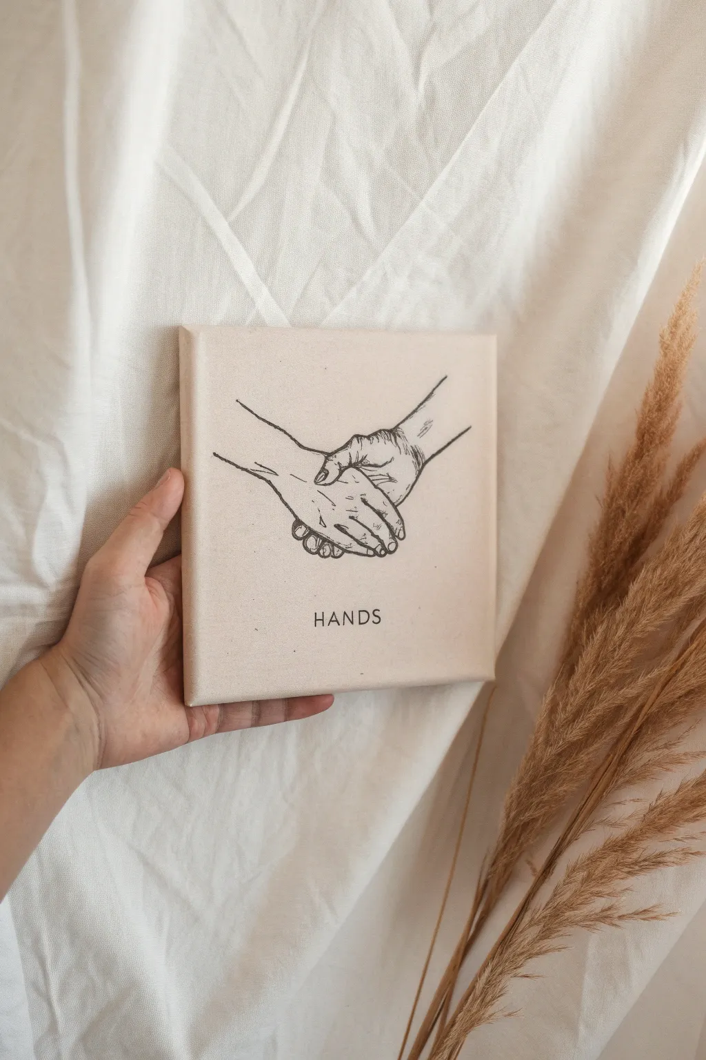
Capture the intimacy of touch with this elegant and minimalist line art piece on canvas. Featuring a warm beige background and crisp black ink work, this project creates a timeless keepsake perfect for celebrating connection.
How-To Guide
Materials
- Small square canvas (8×8 or 10×10 inches)
- Acrylic paint (warm beige or ‘buff titanium’)
- Flat paintbrush (1 inch width)
- Graphite transfer paper
- Pencil for tracing
- Fine liner paint pen (black, ultra-fine tip) or Fine liner pigment pen (0.5mm)
- Printed reference image of hands holding
- Painter’s tape
- Easel or flat work surface
- Ruler
Step 1: Preparing the Base
-
Prime the canvas:
Begin by applying a base coat of your warm beige acrylic paint. Use long, horizontal strokes to ensure an even finish that covers the white canvas completely. -
Check the edges:
Don’t forget to paint the sides of the canvas. This gives the artwork a professional, finished look without needing a frame later. -
Add a second coat:
Once the first layer is dry to the touch, apply a second coat if the canvas texture is still showing through too much. Let this base dry completely, preferably overnight, to ensure a hard surface for the pen work.
Step 2: Transferring the Design
-
Prepare your reference:
Print out a line drawing or photo of holding hands sized to fit your canvas. You can create your own from a photo of you and your partner, or find a simple line art stock image. -
Position the transfer paper:
Place a sheet of graphite transfer paper, dark side down, on top of your dried canvas. Usually, I tape the corners lightly with painter’s tape so it doesn’t shift while I work. -
Align the image:
Center your printed image on top of the transfer paper. Use a ruler to make sure the distance from the edges is equal on both sides. -
Trace the outline:
Using a pencil, trace over the lines of the hands on your reference paper. Apply firm pressure to ensure the graphite transfers onto the painted surface. -
Check your progress:
Lift one corner of the papers carefully to peek underneath and ensure the lines are transferring clearly before removing everything. -
Add the text:
Use a stencil or trace printed letters to add the word ‘HANDS’ (or a date/name) centered below the hand illustration. Keep the font simple and sans-serif.
Steady Hand Trick
Rest your painting hand on a clean, dry bridge (like a ruler propped up on books) or your pinky finger to prevent smudging wet ink.
Step 3: Inking the Lines
-
Test your pen:
Before touching the canvas, scribble your paint pen or fine liner on a scrap piece of paper to get the ink flowing smoothly. -
Begin the outline:
Start tracing over your transferred graphite lines with the black pen. Move slowly and steadily. It helps to pull the pen toward you rather than pushing it away. -
Vary line weight:
For a more artistic feel, slightly thicken the lines where shadows would naturally fall, such as underneath the fingers or where the wrists meet. -
Detail the knuckles:
Add small, delicate lines for the knuckles and finger creases. These should be thinner than the main outline to suggest texture without cluttering the drawing. -
Ink the text:
Carefully outline and fill in the text at the bottom. Keep your hand steady and try to maintain a consistent line width for each letter. -
Clean up:
Wait at least an hour for the ink to fully cure. Then, take a clean, soft eraser and gently remove any visible graphite lines that weren’t covered by the ink.
Level Up: Texture
Mix baking soda into your beige base paint to create a rough, stone-like texture before drawing your lines for an earthy, organic feel.
Now you have a beautifully simple piece of art that speaks volumes about connection and love
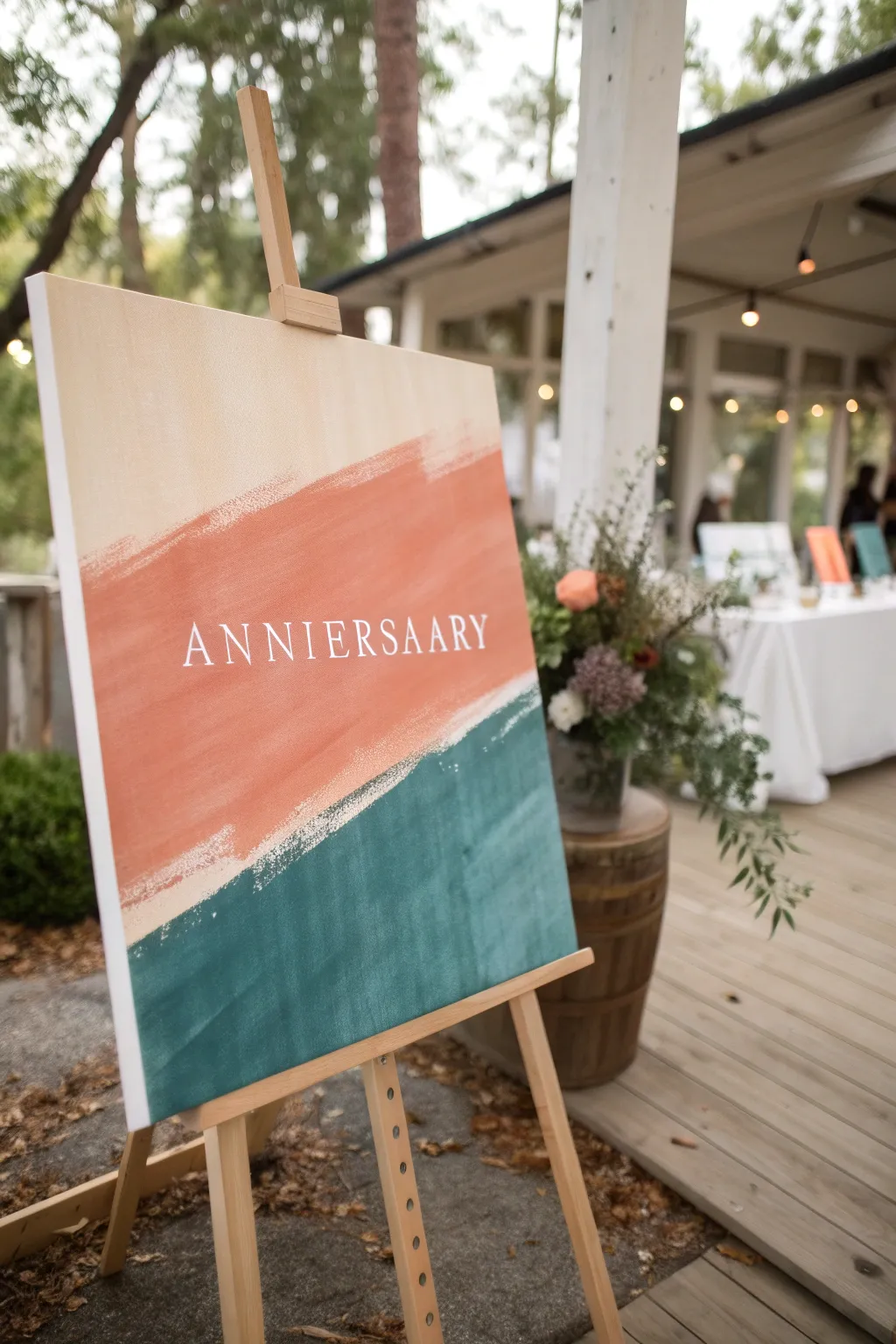
Anniversary Sky With Star Constellations
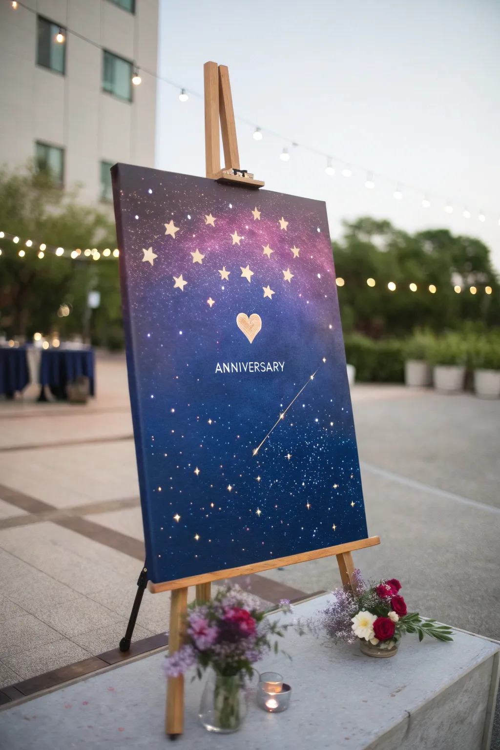
Capture the magic of your special day with a galaxy-inspired canvas featuring a dreamy gradient and sparkling constellations. This romantic piece blends deep blues and cosmic purples, centered around a glowing heart that symbolizes your unique bond in the universe.
Step-by-Step Tutorial
Materials
- Large stretched canvas (e.g., 20×30 inches)
- Acrylic paints: Navy Blue, Phthalo Blue, Deep Violet, Magenta, Titanium White, Black
- Gold acrylic paint or gold leaf pen
- Sponges or large flat brushes for blending
- Old toothbrush (for spattering stars)
- Fine detail brush (size 0 or 00)
- Star-shaped stencils or stickers (various sizes)
- Painters tape
- Pencil and eraser
- LED fairy lights (optional, for the backlit effect)
- Awl or small screwdriver (if adding lights)
Step 1: Creating the Cosmic Background
-
Prepare the gradient base:
Begin by squeezing generous amounts of Navy Blue and Black at the bottom of the canvas and Deep Violet mixed with Magenta near the top. Use a slightly damp sponge to blend the colors directly on the canvas. -
Smooth the transition:
Work rapidly while the paint is wet to create a seamless ombre effect. Drag the dark blue upwards into the purple section, softening the line where they meet so there is no harsh border. -
Deepen the night sky:
Add a second layer of Navy Blue mixed with a touch of Black to the bottom two-thirds to make the sky look vast and deep. I find that layering creates a rich opacity that single coats just can’t match. -
Add cosmic clouds:
While the background is still slightly tacky, dab a clean sponge with a tiny bit of Magenta and White into the purple section to create subtle, hazy nebulas. -
Dry completely:
Let this base layer dry fully before moving on. This usually takes about 30-60 minutes depending on paint thickness.
Nebula Nuance
Keep your sponge almost dry when dabbing the pink clouds. Too much water will lift the dark base coat and create muddy gray spots instead of vibrant nebulas.
Step 2: Painting the Constellations
-
Splatter the distant stars:
Water down a small amount of Titanium White paint. Dip an old toothbrush into it and flick the bristles with your thumb to spray a fine mist of stars across the entire canvas. -
Vary the star sizes:
For slightly larger, brighter stars, dip the back end of a paintbrush handle into undiluted white paint and dot it randomly onto the canvas. -
Place the main stars:
Arrange your star stencils across the top purple section in an arch or galaxy formation. If you don’t have stencils, you can lightly sketch five-pointed stars with a pencil. -
Fill in the gold stars:
Using your gold acrylic paint and a small flat brush, carefully fill in the star shapes. You may need two coats of gold to ensure they shine brightly against the dark background. -
Create the heart center:
In the center of the canvas, just below the arch of stars, sketch a simple heart shape. Fill this in with gold paint, using rough, sketchy strokes rather than a solid fill to give it an artistic, hand-drawn texture.
Date It
Personalize the artwork further by painting your specific wedding or anniversary date in smaller font just below the word ‘ANNIVERSARY’ or discreetly in the corner.
Step 3: Adding Details and Text
-
Letter the text:
Using a white paint pen or a very fine brush with white acrylic, verify your spacing first, then carefully write ‘ANNIVERSARY’ in simple, capital sans-serif letters beneath the golden heart. -
Paint a shooting star:
Draw a thin, diagonal line extending from the bottom right quadrant up towards the center using gold or white paint. Add a small star burst at the head of the line. -
highlight selected stars:
To make the gold stars pop, add tiny white dots to their centers or tips once the gold paint is dry. -
Add illuminated magic (optional):
If you want the light-up effect shown in the inspiration photo, poke small holes through the center of several painted stars using an awl. Push small battery-operated LED bulbs through from the back of the canvas. -
Secure the lights:
Tape the battery pack and wires to the wooden frame on the back of the canvas so they remain hidden and secure.
Place your masterpiece on an easel and light it up to celebrate your journey together
Painted Soundwave of “I Love You”
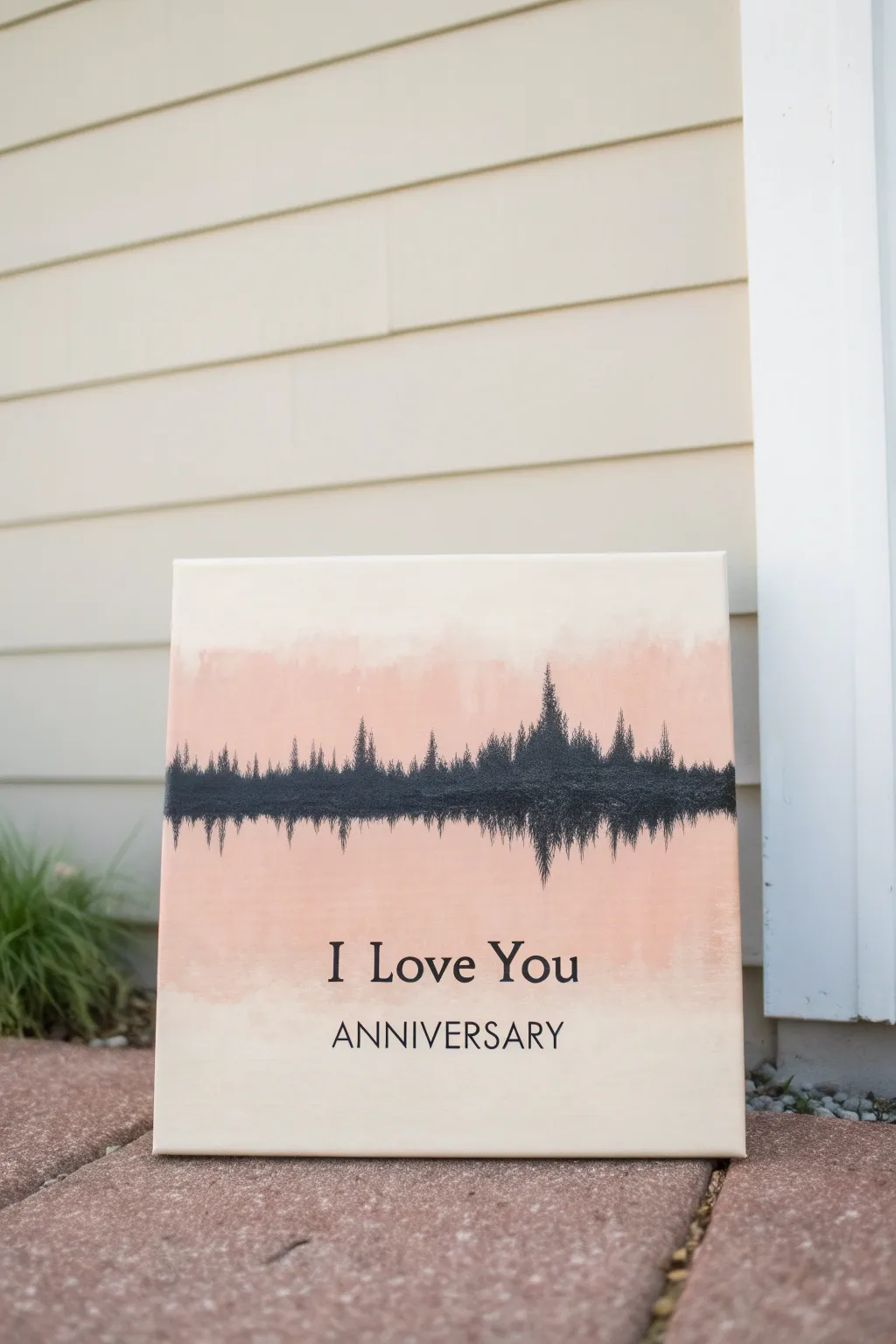
Transform a spoken phrase into visual art with this meaningful anniversary project. Featuring a soft, blended background and a striking textured soundwave, this canvas immortalizes the words ‘I Love You’ in a truly unique way.
Detailed Instructions
Materials
- Square stretched canvas (12×12 or similar)
- Acrylic paints: Titanium White, Unbleached Titanium (cream), Soft Peach or Blush Pink, Mars Black
- Wide flat brush (1-2 inch) for background
- Small round detail brush (size 0 or 1)
- Medium round brush (size 4 or 6)
- Computer and printer
- Recording software (phone app or Audacity)
- Carbon transfer paper or graphite pencil
- Painter’s tape or stencil (optional for text)
- Black paint marker (fine tip) for text
- Ruler
Step 1: Planning the Design
-
Record your message:
Use a voice recorder app on your phone or computer to record yourself saying ‘I Love You.’ Take a screenshot of the resulting waveform visual. -
Prepare the template:
Print the screenshot of the soundwave, scaling it to fit the width of your canvas. Also, type out ‘I Love You’ and ‘ANNIVERSARY’ in a serif font like Times New Roman, size it appropriately, and print this text sheet as well.
Step 2: Creating the Background
-
Base coat:
Mix Titanium White with a small dot of Unbleached Titanium to create a warm, creamy off-white. Paint the entire canvas simply to prime the surface and let it dry completely. -
Mix your blush tone:
On your palette, mix your Soft Peach paint with a little white to soften it. You want a color that is distinct but gentle against the cream background. -
Apply the color wash:
Using a slightly damp wide flat brush, paint a broad horizontal band of the peach color across the middle third of the canvas. Don’t worry about perfect edges yet. -
Create the ombre effect:
Before the peach paint dries, take a clean brush with a bit of the cream base color. Gently feather the top and bottom edges of the peach band, blending it outward so it fades seamlessly into the background color. -
Let it cure:
Allow the background to dry fully. I usually give this at least an hour because we will be tracing over it next, and a wet surface will ruin the transfer.
Smudged the ombre?
If your background blending gets muddy or streaky, wait for it to dry completely. Apply a thin wash of white over the area to mute it, then try blending the peach layer again on top.
Step 3: Painting the Soundwave
-
Trace the soundwave:
Place a sheet of carbon paper over the painted peach band. Tape your printed soundwave template on top. Firmly trace the outline of the spikes and dips with a pencil. -
Fill the center line:
Using Mars Black and a medium round brush, fill in the thickest, most central part of the soundwave first to establish the visual weight. -
Paint the peaks:
Switch to your small detail brush. Carefully paint the tall vertical spikes extending upward from the center line, using a light flicking motion to keep the tips sharp. -
Paint the reflection:
Repeat the process for the bottom half of the wave. Mirror the spikes downward, ensuring the symmetry matches your traced template. -
Add texture:
To mimic the textured look in the photo, take a slightly dry brush with very little black paint and dab around the edges of the wave to make it look less like a solid sticker and more like a painted impression.
Level Up: Metallic Pop
Mix a tiny amount of gold or copper paint into your black acrylic before painting the soundwave. It adds a subtle shimmer that catches the light without overpowering the design.
Step 4: Adding the Text
-
Position the text:
Measure to find the visually centered spot below the soundwave. Tape your text printout there with a piece of carbon paper underneath. -
Transfer the letters:
Trace the outline of ‘I Love You’ and ‘ANNIVERSARY’ very carefully. Use a sharp pencil to ensure crisp lines. -
Paint the letters:
Check that the carbon transferred clearly. If you have a steady hand, use the smallest brush and black paint to fill in the letters. -
Clean up edges:
For most people, a fine-tip black paint marker works best here. Go over the lettering to sharpen the serifs and ensure the black is opaque and solid. -
Final check:
Erase any visible stray pencil marks or smudge lines gently with a white eraser once the paint is 100% dry.
Hang your finished piece in a shared space as a daily reminder of your voice and bond
Fingerprint Heart Texture Fill
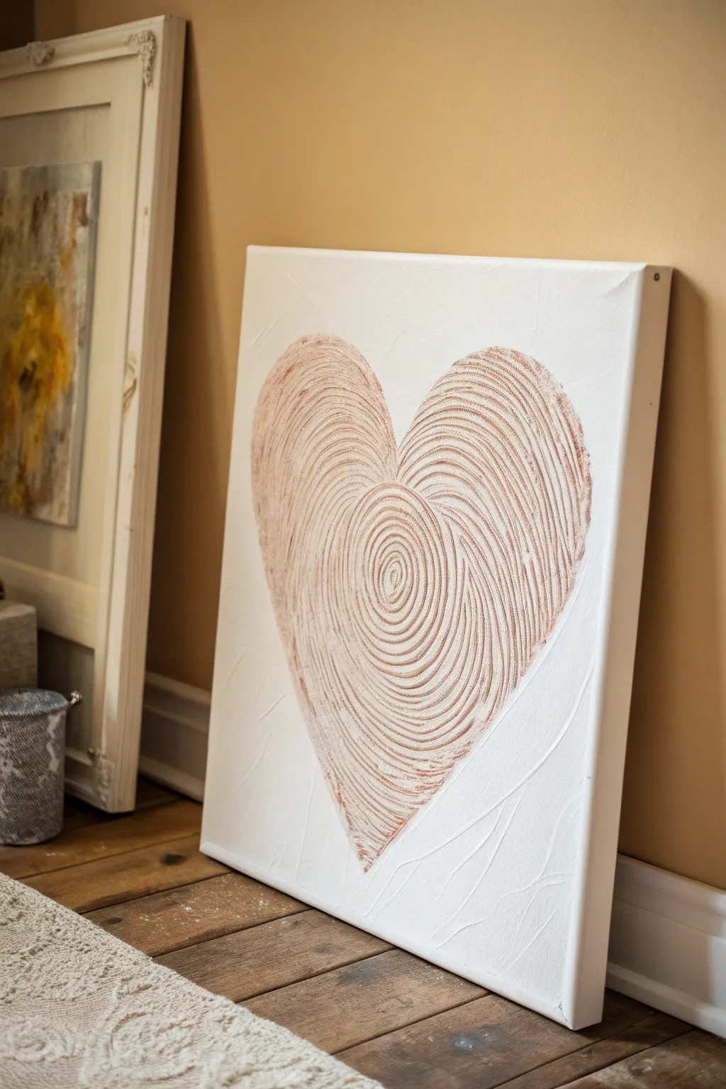
This elegant canvas piece transforms a simple symbol of love into a tactile masterpiece using heavy body textures and metallic sheen. The design creates a unique ‘fingerprint’ effect within a heart shape, combining rustic texture with modern minimalist style.
Step-by-Step Tutorial
Materials
- Stretched canvas (square or rectangular)
- Modeling paste (also called molding paste or structure paste)
- Palette knife or wide spreader
- Notched trowel tool or a firm comb (for ridges)
- White acrylic paint
- Metallic rose gold or copper acrylic paint
- Pencil
- Cardstock or paper (for stencil)
- Scissors
- Soft flat brush
- Clear matte varnish (optional)
Step 1: Preparing the Base
-
Create a heart stencil:
Cut a piece of cardstock or paper to the size of your canvas. Fold it in half and cut out a large, symmetrical heart shape. Use the outer part of the paper as a negative stencil to mask off the background. -
Position the stencil:
Place your negative stencil onto the canvas. You can secure it lightly with painter’s tape if needed, but holding it firm works well too. Make sure the heart is centered or positioned exactly where you want the focal point. -
Apply the paste:
Scoop out a generous amount of modeling paste. Using a palette knife creates a smooth application, so spread a thick, even layer of paste inside the heart stencil directly onto the canvas. Aim for a thickness of about 1/8 to 1/4 inch. -
Smooth the surface:
Gently smooth out the top of the paste so it is relatively flat, removing any major peaks or valleys. This prepares the surface for the texturing tool. -
Remove the stencil:
Carefully lift the stencil straight up while the paste is still wet. Use your palette knife to quickly neaten up any jagged edges along the heart outline.
Choosing Your Tool
Don’t have a texture comb? Cut notches into an old credit card or piece of stiff cardboard. Irregular notches look more organic!
Step 2: Creating the Fingerprint Texture
-
Identify the center point:
Visualize a slightly off-center point in the middle of the heart where the spiral will begin. This mimics the core of a fingerprint swirl. -
Begin the spiral:
Take your notched trowel or comb tool. Press it firmly into the wet paste at your chosen center point and slowly begin to turn it in a tight circular motion to create the innermost spiral. -
Expanded swirling:
Continue the motion, dragging the tool through the paste in expanding concentric circles or slightly oval shapes that follow the contours of the heart. The ridges should be deep enough to show the canvas texture below or at least create significant valleys. -
Connect the curves:
As you reach the outer edges of the heart, curve your tool strokes to follow the lobes of the heart at the top and the point at the bottom. It doesn’t have to be one continuous line; you can lift and reset the tool to align the ridges. -
Allow to dry completely:
This step requires patience. Let the modeling paste dry fully. Depending on the brand and humidity, this could take 24 hours. The paste must be rock hard before painting.
Add Actual Prints
Before the paste dries, have you and your partner press your thumbprints side-by-side into the smooth center of the heart for a hidden personal signature.
Step 3: Painting and Finishing
-
Base coat the background:
Once dry, paint the entire canvas background (outside the heart) with white acrylic paint. For added interest, I like to use a palette knife here as well to add subtle, random texture to the white space. -
Paint the heart white:
Apply a coat of white acrylic over the textured heart as well. This seals the modeling paste and ensures an even surface for the metallic layer. Let this white layer dry. -
Dry brush the metallic color:
Dip a flat, dry brush into a small amount of metallic rose gold or copper paint. Wipe most of the paint off onto a paper towel until the brush is almost clean. -
Highlight the ridges:
Gently sweep the brush over the top of the hardened paste ridges. The goal is to catch only the raised surfaces with the metallic paint, leaving the white valleys untouched for contrast. -
Build intensity:
Repeat the dry brushing process slowly. It is better to do multiple light passes than one heavy one. Focus slightly more pigment on the outer edges and the very center spiral to create depth. -
Final touches:
Inspect the edges of the heart. If any metallic paint strayed onto the background, touch it up with white paint for a crisp look.
Hang your textured masterpiece in a spot where natural light can catch those shimmering metallic ridges.
Abstract Color Story of Your Relationship
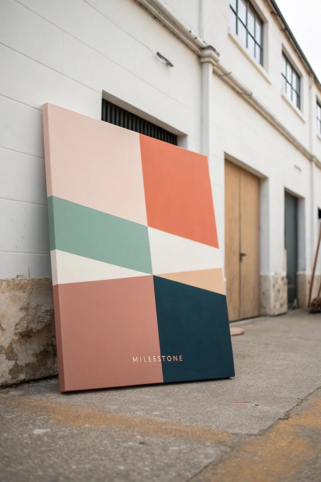
Capture the essence of your relationship through a modern, abstract lens with this striking geometric color block painting. The design relies on clean lines and a curated palette of earthy, muted tones like terracotta, sage green, and deep teal to create a sophisticated piece of wall art.
Step-by-Step
Materials
- Large rectangular canvas (approx. 24×36 inches suggested)
- Acrylic paints (matte finish suggested)
- Painter’s tape (frog tape or high-quality masking tape)
- Gesso (optional, for priming)
- Wide flat synthetic brushes (1-2 inch)
- Ruler or straight edge
- Pencil
- Palette or paper plates for mixing
- Small round brush or paint pen (for lettering)
- Matte varnish spray
Step 1: Planning and Preparation
-
Select your palette:
Choose 6-7 distinct colors that represent different phases or moods of your relationship. The example uses blush pink, burnt orange, sage green, cream, terracotta, beige, and dark teal. -
Prime the canvas:
If your canvas isn’t pre-primed, apply an even coat of white gesso and let it dry completely to ensure the paint adheres smoothly. -
Draft the layout:
Using a pencil and a long ruler, lightly sketch the geometric design. Start by dividing the canvas into four rough quadrants, but off-center the intersection point slightly for visual interest. -
Add diagonal elements:
Within the central horizontal band, draw angled lines that cut across the middle section. These diagonal cuts create the dynamic movement seen in the green and cream sections.
Step 2: Painting the Sections
-
Tape the first sections:
Apply painter’s tape along the pencil lines of non-adjacent sections. For example, tape off the top-left (pink) and bottom-right (teal) areas first. -
Seal the edges:
To get those crisp lines, I like to brush a tiny amount of clear matte medium or white paint over the tape edge first to seal it against bleeding. -
Paint the large blocks:
Fill in the taped sections with your chosen acrylic colors. Use a wide flat brush and apply long, smooth strokes to minimize texture. -
Apply a second coat:
Once the first layer is dry to the touch, apply a second coat to ensure the color is opaque and solid. -
Remove tape:
Carefully peel back the tape while the second coat is still slightly damp to prevent the paint from chipping. -
Tape remaining sections:
Allow the painted sections to cure fully (at least an hour). Then, tape over the dried paint edges to define the boundaries for the remaining middle and side sections. -
Paint remaining colors:
Fill in the sage green, cream, burnt orange, and terracotta sections using the same method of sealing the tape and applying multiple coats. -
Detail work:
Once all tape is removed and paint is dry, use a small angled brush to manually touch up any ridges or slight bleeds where the colors meet.
Bleeding Lines?
If paint bleeds under the tape, wait for it to dry fully. Then, re-tape the straight line and paint over the mistake with the original background color.
Step 3: Finishing Touches
-
Draft the text:
Decide on your text placement, centered near the bottom. Lightly pencil in a significant word, name, or date using a stencil or freehand block letters. -
Paint the text:
Using a very fine round brush and a contrasting color (like cream or metallic gold), carefully fill in your letters. Alternatively, a high-quality acrylic paint pen makes this step much easier. -
Clean up sides:
Don’t forget the edges of the canvas. Paint the sides either white or continue the design wrapping around the frame for a gallery-quality look. -
Varnish:
Finish the piece with a spray of matte varnish. This unifies the sheen of the different paint colors and protects the surface from dust.
Add Texture
Mix a little baking soda or modeling paste into your acrylics for a tactile, plaster-like finish that adds depth to the simple shapes.
Hang your completed artwork in a spot with good natural light to let the colors truly stand out
Hidden Message in Negative Space
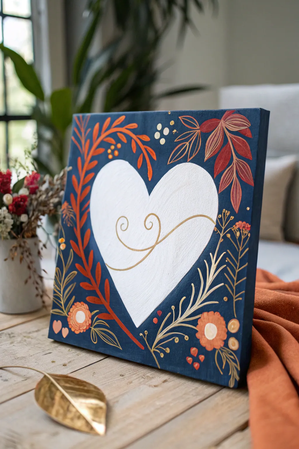
This elegant canvas project plays with negative space to create a bold white heart surrounded by warm, autumnal floral motifs on a deep navy background. The contrasting colors and metallic gold accents make this a striking piece of decor perfect for celebrating love and anniversaries.
Step-by-Step Guide
Materials
- Square stretched canvas (10×10 or 12×12 inch)
- Acrylic paints: Navy blue (or Midnight Blue), White, Rust Orange, Burnt Sienna, Cream/Pale Yellow
- Gold metallic paint or gold paint pen
- Contact paper or masking tape (for heart stencil)
- Pencil
- Scissors
- Flat shader brushes (medium and large)
- Round detail brushes (sizes 0, 2, and 4)
- Palette for mixing
Step 1: Preparing the Negative Space
-
Base coat application:
Begin by painting the entire canvas with a solid coat of white acrylic paint. This ensures your ‘negative space’ heart will be bright and crisp. Let this layer dry completely, applying a second coat if the canvas texture is still too visible. -
Create the heart mask:
While the white paint dries, draw a large heart shape on the backing of your contact paper. Cut it out carefully with scissors to create your mask. -
Apply the mask:
Once you are certain the white paint is bone dry, peel the backing off your heart cutout and stick it firmly to the center of the canvas. Smooth down the edges with your fingernail or a credit card to prevent paint from bleeding underneath. -
Seal the edges:
Paint a very thin layer of white paint over the edges of your contact paper heart. This little trick seals the edge; if any paint bleeds under, it will be white and invisible, creating a perfect seal for the blue layer.
Pro Tip: Crisp Lines
Don’t skip the ‘sealing’ step! Painting a layer of the base color (white) over your stencil edges before adding the top color (navy) is the secret to 100% bleed-proof lines.
Step 2: Building the Background
-
Applying the background color:
Load a large flat brush with your deep navy blue paint. Cover the entire canvas around the heart sticker, brushing outward from the sticker’s edge to avoid forcing paint underneath it. -
Don’t forget the sides:
Continue the navy blue paint around the sides of the canvas for a finished, gallery-wrapped look. -
Second coat:
Let the first blue coat dry to the touch, then apply a second coat to ensure a rich, opaque finish with no brushstrokes showing. Allow this to dry completely before touching the mask.
Step 3: Adding the Floral Flourishes
-
Sketching the vines:
Using a light touch with a pencil, sketch the main flow of the vines surrounding the heart. Focus on the large curve on the left and the distinct leaves on the top right. -
Painting the main vines:
Mix a rust orange color. Using a size 4 round brush, paint the thick, curved vine ascending the left side of the heart. Add the smaller vine stems branching off from it. -
Adding rust leaves:
With the same rust color, paint the teardrop-shaped leaves along the left vine. I find it easiest to press the brush down and lift as I pull away to create the tapered leaf tip naturally. -
Right-side foliage:
Switch to a Burnt Sienna or deep red tone. Paint the larger, broader leaves in the upper right corner, adding delicate vein details with a lighter orange once the base shape is tacky. -
Gold leaf outlines:
Using your gold metallic paint and a size 0 detail brush (or a gold paint pen), carefully outline the dark red leaves on the upper right to make them pop against the navy background. -
Decorative grasses:
Load a liner brush with cream or pale yellow paint. Add the wispy, grass-like strokes on the bottom right, painting from the root upward with a quick flicking motion to get thin, sharp ends. -
Floral details:
Paint the small circular flower heads near the bottom left and bottom right using orange and peach tones. Add center dots of white or cream to give them dimension. -
Whimsical accents:
Dip the handle end of a small brush into gold or cream paint to dot small berries or pollen specs around the vines. Paint tiny hearts in the bottom left corner for an extra romantic touch.
Troubleshooting: Sheer Gold
Metallic acrylics are often very transparent. If your gold details look dull on the dark blue, paint them in light ochre or beige first, then layer the gold on top.
Step 4: The Big Reveal
-
Removing the mask:
Once all your floral painting is dry, carefully peel up the contact paper heart. Pull it slowly at a sharp angle to reveal the crisp white heart beneath. -
Touch-ups:
If there are any rough edges on the white heart, use a small flat brush with navy paint to carefully tidy up the line, or use white to cover any blue smudges. -
Central flourish:
Finish the piece by painting a simple, elegant swirling line or monogram in the center of the white heart using your gold paint or pen.
Hang your finished canvas in a well-lit spot to let the metallic gold elements catch the light and shine.


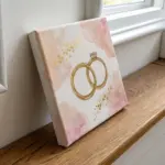
Have a question or want to share your own experience? I'd love to hear from you in the comments below!