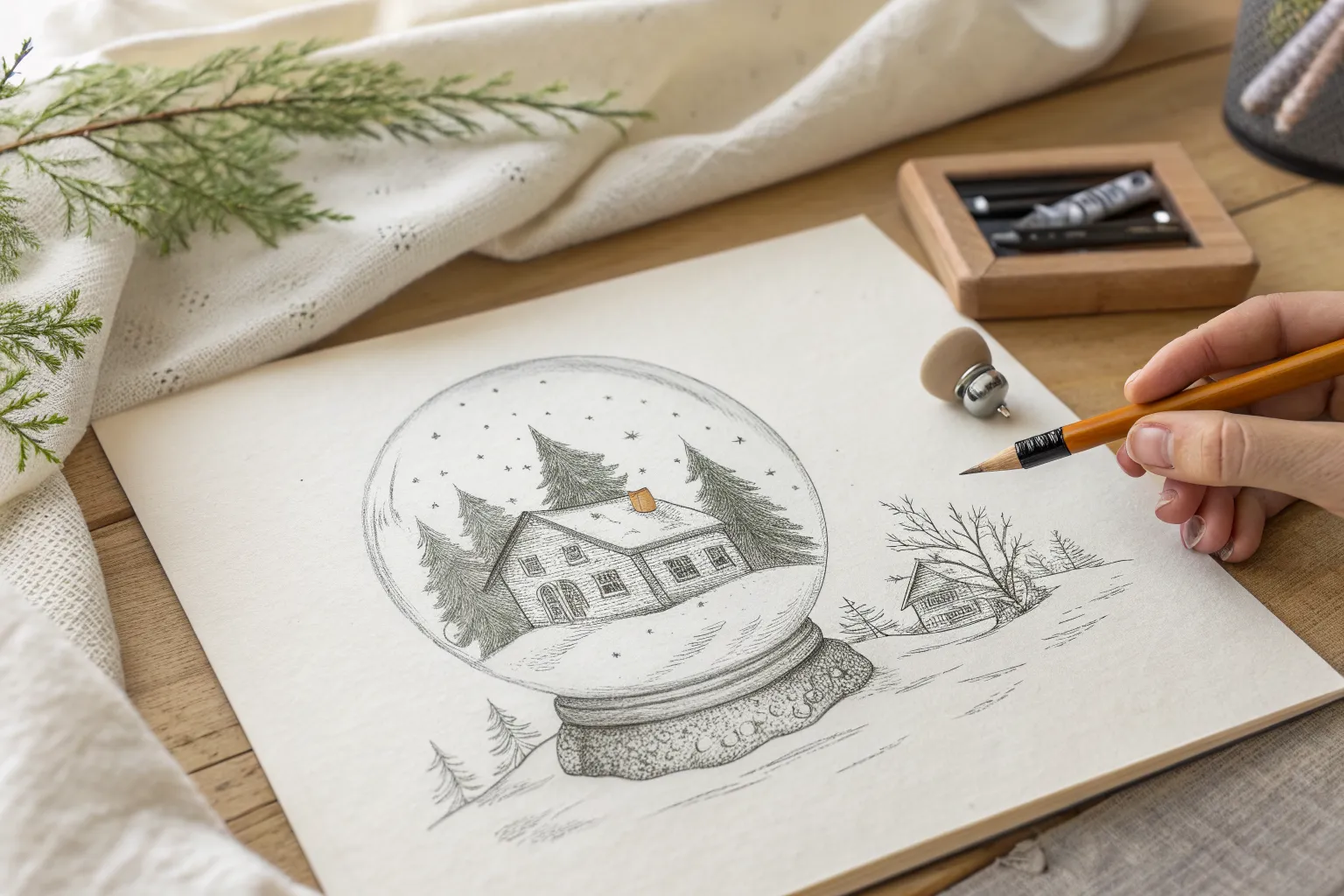
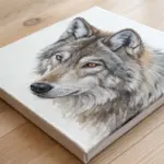
When I’m craving realistic Christmas drawings, I zero in on textures first—fur, knit, glass, and that powdery look of snow—because that’s what sells the illusion fast. Below are a bunch of my go-to graphite and charcoal ideas that feel classic at the top and get more “wow, I want to draw that” as you go.
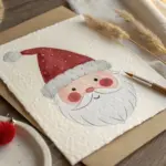
Santa Portrait With Fluffy Beard
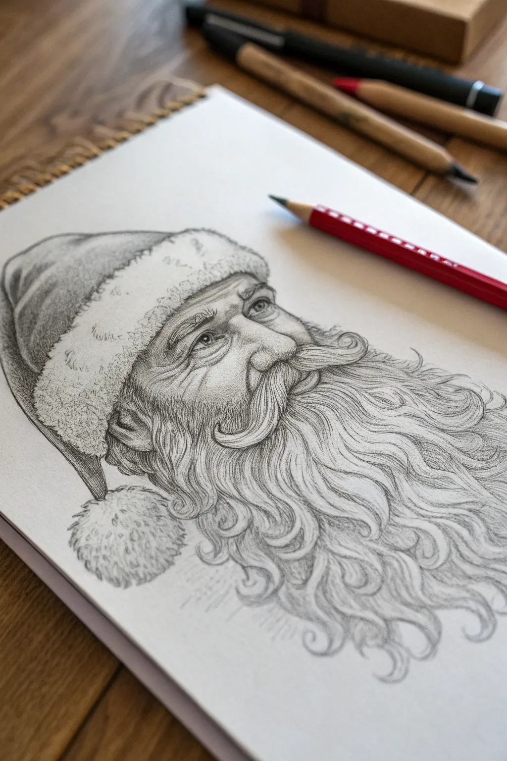
Capture the magic of the holiday season with this detailed pencil study of Santa Claus, focusing on textures like soft fur trim and his magnificent, flowing beard. By layering graphite carefully, you’ll build up a realistic sense of depth in his cheerful expression.
Step-by-Step Tutorial
Materials
- Smooth bristol or drawing paper (heavyweight, 140lb+)
- Graphite pencils (HB, 2B, 4B, 6B)
- Mechanical pencil (0.5mm HB) for fine hairs
- Kneaded eraser
- Stick eraser (or precision eraser)
- Blending stump or tortillon
- Pencil sharpener
Step 1: Basic Structure & Proportions
-
Outline the head shape:
Begin with a light HB pencil to softly sketch a large circle for the head and a loose, elongated oval shape extending downward for the beard area. This ensures you have enough room on the paper for all that hair. -
Map facial features:
Draw faint guidelines for the eyes, nose, and mouth. The nose sits centrally, slightly bulbous, while the eyes are crinkled at the corners. Remember, the mouth will be mostly hidden by the mustache. -
Sketch the hat placement:
Block in the hat’s structure. It should sit snugly on the head, with a thick, puffed band of fur framing the forehead. Let the fabric of the hat droop naturally to the left side. -
Define the beard flow:
Lightly draw sweeping directional lines to indicate how the beard flows. Instead of drawing individual hairs yet, just map out the large clumps and waves moving downward and outward.
Beard looking flat?
Don’t outline every hair. Focus on shading ‘ribbons’ or clumps of hair first. Darken the gaps deeply between these ribbons to create 3D volume, rather than drawing thousands of parallel lines.
Step 2: Facial Features & Skin Texture
-
Detail the eyes:
Switch to a 2B pencil to define the eyes. Darken the pupils and upper lash line, leaving a tiny white highlight in each eye to create life. Add the crow’s feet wrinkles radiating from the corners. -
Shade the nose and cheeks:
Using the side of your HB pencil, lightly shade the nose and cheeks. Santa has rounded features, so keep your shading smooth. Use a blending stump to soften the graphite, suggesting aged but jovial skin. -
Deepen facial shadows:
Use a 4B pencil to add contrast around the nose and under the brow ridge. These deeper shadows make the features pop forward. I like to keep the shading slightly lighter on the cheeks to suggest a rosy glow.
Pro Tip: Eraser Technique
Cut a standard white eraser with a craft knife to create a sharp wedge edge. Use this sharp edge to lift out very thin, crisp white lines for the most realistic flyaway whisker effects.
Step 3: The Hat & Fur Texture
-
Shade the hat fabric:
Use a 2B and 4B pencil to shade the main body of the hat. Follow the curve of the fabric folds, making the recessed areas quite dark (6B) to show the weight of the material. -
Create the fur trim base:
For the hat’s trim and the pom-pom, use an HB pencil to make short, scribbly, circular motions. Ideally, you want a ‘cloudy’ texture rather than straight lines. -
Detail the fur fluff:
Go back into the fur with a sharper 2B. Add tiny, erratic shadows between the tufts. Then, use a clean kneaded eraser to lift out small, bright highlights, creating a fluffy, soft appearance.
Step 4: Mastering the Beard
-
Establish the mustache:
Using a mechanical pencil or sharp 2B, draw the mustache hairs flowing outward from the center, curling slightly at the ends. Ensure these lines are distinct to separate them from the beard below. -
Build beard volume:
Work in sections, starting near the chin. Use long, flowing strokes with an HB pencil to establish the main waves. Vary your pressure—press harder at the start of the stroke (shadow) and lift off at the end (highlight). -
Darken the under-layers:
Take a 4B or 6B pencil and darken the deep recesses between the large clumps of hair. This negative space shading is crucial; it pushes the darker areas back and makes the lighter hairs appear to sit on top. -
Refine hair texture:
Switch to your mechanical pencil for precision work. Draw fine, singular hairs crossing over the main clumps to break up uniformity. A beard this big is messy and organic, not perfectly combed. -
Add highlights:
Use a stick eraser or the sharp edge of a generic eraser to ‘draw’ white hairs back into the grey areas. This subtraction technique adds incredible dimension and realism to white hair. -
Final contrast check:
Step back and look at the whole piece. Deepen the darkest shadows—likely right under the mustache and beneath the hat brim—with a 6B pencil to ensure the full tonal range is used.
Now you have a timeless portrait perfect for a holiday card or framed decoration
Christmas Tree With Layered Needles
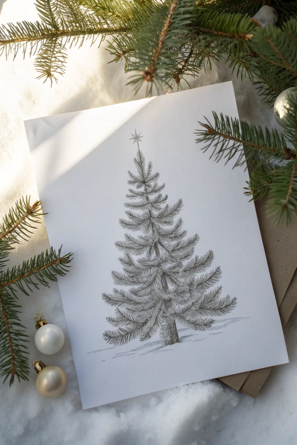
Capture the delicate, detailed beauty of an evergreen with this realistic pencil drawing focusing on needle texture and layered branches. This project creates a classic, vintage-style illustration perfect for holiday cards or elegant seasonal decor.
Step-by-Step
Materials
- High-quality white drawing paper or cardstock
- HB graphite pencil (for initial sketching)
- 2B and 4B graphite pencils (for shading and depth)
- Fine-point black fineliner pen (optional, for crisp details)
- Kneaded eraser
- Pencil sharpener
Step 1: Structural Framework
-
Establish the central line:
Begin by lightly drawing a vertical line down the center of your page with an HB pencil. This will serve as the trunk and the anchor for your tree’s symmetry. -
Mark the width:
Lightly sketch a triangle shape around your central line to determine the overall width of the tree. The bottom should be widest, tapering gradually to a point at the top. -
Block in branch layers:
Instead of drawing individual branches yet, make faint horizontal marks across the trunk to decide where your main boughs will sit. Space them out slightly to allow the tree to breathe.
Step 2: Building the Branches
-
Sketch the trunk texture:
Using short, vertical strokes, darken the central trunk line slightly. Leave gaps where the branches will cross over the front of the trunk to create a sense of dimension. -
Draw primary branch shapes:
Start drawing the main skeletal lines of the branches extending outward. Curve the lower branches slightly downward and then sweeping up at the tips, while the upper branches can point more directly upward. -
Add the central leader:
Refine the very top of the tree, creating a single, slightly uneven vertical sprig where your star will eventually sit.
Keep it Sharp
Rotate your pencil every few strokes to maintain a consistently sharp point. Only a very fine tip can create the crisp, individual lines needed for realistic pine needles.
Step 3: Needle Detail & Texture
-
Start the needle work:
Switch to a sharp 2B pencil. Begin at the top of the tree and work downward, adding short, flicking strokes to represent needles. These should radiate outward from the branch lines you established. -
Layering the needles:
Don’t draw the needles perfectly straight; angle them slightly forward along the branch. I find that grouping them in small clusters looks more natural than spacing them perfectly evenly. -
Create density:
As you move lower on the tree, make the needle clusters denser. Focus on filling the top side of the branches more heavily than the underside. -
Add foreshortened branches:
Draw a few shorter branches right in the center of the tree body, aiming ‘towards’ the viewer. Use specialized shading here—short, dark strokes—to show these branches are protruding from the front rather than the sides. -
Build the lower boughs:
For the bottom-most branches, let the needles droop slightly to show the weight of the bough. The texture here should be looser and heavier compared to the delicate top.
Snowy Overlay
Use a white gel pen or white gouache after the graphite is finished to add crisp white highlights on the tops of the branches, mimicking a fresh dusting of snow.
Step 4: Shading and Finishing Touches
-
Deepening the shadows:
Switch to your 4B pencil to add contrast. Darken the areas where branches meet the trunk and the underside of the thickest boughs to create depth. -
Refine the trunk base:
Darken the visible base of the trunk with vertical, rough strokes to suggest bark texture, ensuring it looks sturdy enough to support the tree. -
Ground the tree:
Lightly sketch a few horizontal, uneven lines beneath the tree to suggest a snowy ground or floor, so the tree isn’t floating in space. -
Add the star:
At the very peak, draw a simple multi-pointed star. Keep the lines delicate and thin to match the airy feel of the pine needles. -
Clean up highlights:
Use your kneaded eraser to lift off any smudges or stray graphite dust. You can also dab the eraser on the tops of branches to create subtle ‘snowy’ highlights.
Step back and admire the festive details of your handcrafted evergreen illustration
Ornament Close-Up With Reflections
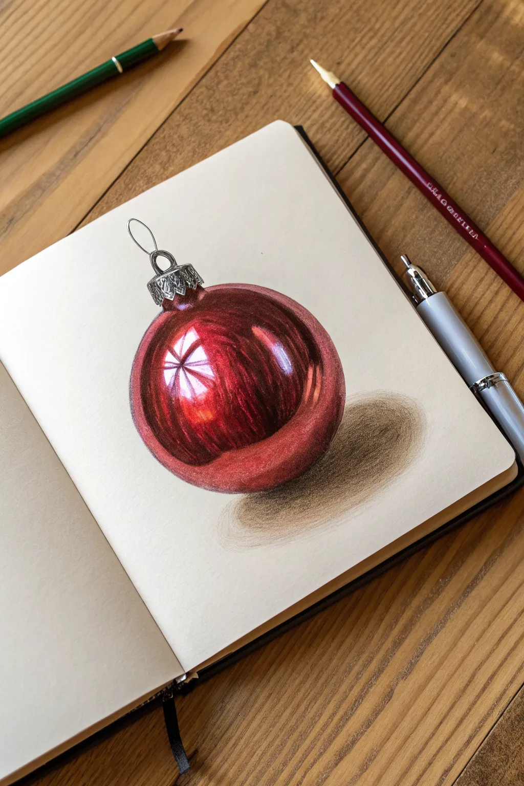
Capture the magic of the holidays with this stunning study of a reflective red Christmas ornament. Using colored pencils, you will learn to build up intense saturation and render the distorted reflections that make glass objects look so tangible.
How-To Guide
Materials
- Smooth sketchbook paper or bristol board
- HB Graphite pencil
- Kneaded eraser
- Colored pencils (wax or oil-based)
- Specific colors: Dark Crimson, Bright Red, Pink/White blender, Black, Cool Grey
- White gel pen or gouache (optional for highlights)
- Pencil sharpener
Step 1: Sketching the Form
-
Establish the circle:
Begin by lightly sketching a perfect circle for the body of the ornament. You can trace a small round object like a cup rim if you struggle with freehand circles. Keep your graphite lines incredibly faint so they don’t show through the red later. -
Add the cap:
Draw the rectangular metallic cap on top of the circle. Add the loop and hook attachment. Sketch the crimped details on the cap’s edge using small, repeating U-shapes. -
Map the reflections:
Look closely at the reference image and lightly outline the shapes of the bright highlights. These are crucial: you need to preserve the white of the paper here. There is usually a main window-pane reflection and smaller curved light sources.
Uneven Blending?
If your pencil strokes look scratchy, use a colorless blender pencil or a very light pink to burnish over the red layers. This pushes the wax into the paper grain for a glossy, glass-like look.
Step 2: Building the Red Layers
-
Base layer application:
Start with your medium red tone. Shade the entire ball *except* for the mapped-out highlight areas. Use a circular stroke to get smooth coverage, pressing very lightly to begin with. -
Deepening the shadows:
Switch to your Dark Crimson or a deep burgundy pencil. Identify the darkest areas, typically around the edges and directly underneath the bright highlights. Shade these areas to start creating volume. -
Layering for saturation:
Go back over the medium red areas with your Bright Red pencil. Increase your pressure slightly to burnish the pigment into the paper, making the color vibrant and solid. -
Refining the transition:
Around the bright white highlights, feather the red pigment softly inward. You don’t want a harsh line between red and white; it should look like a glowing transition. -
Adding the darkest values:
To make it look 3D, mix a tiny bit of black or dark purple into your darkest shadow areas at the very bottom and sides. Be careful with black—it can muddy the color, so layer it gently over the dark red.
Step 3: Metal Cap & Final Details
-
Base grey tones:
For the silver cap, use a cool grey pencil. Fill in the shape, leaving small slivers of white paper for the metallic shine. -
Defining the metal:
Use a black pencil to draw crisp, dark lines in the ridges of the cap. Metal relies on high contrast, so place your darkest darks right next to your lightest lights. -
Drawing the loop:
Sketch the thin wire loop with a sharp grey pencil, adding a thin highlight on one side to show its thickness. -
Enhancing the reflection:
If I feel the white paper isn’t bright enough, I’ll sometimes use a white gel pen or a touch of white gouache to tap in the center of the main reflection for a blinding ‘ping’ of light. -
Adding the secondary glow:
Add a faint, soft pink or orange reflection near the bottom edge of the ball to suggest light bouncing off the table.
Make It Festive
Change the reflection! Instead of a generic window shape, try drawing a tiny, distorted reflection of a Christmas tree or a face inside the highlight area for a fun, hidden detail.
Step 4: Grounding the Object
-
Start the cast shadow:
Using a dark grey or cool brown pencil, lightly shade an oval shape directly beneath the ornament. -
Darken the contact point:
Press harder right where the ball touches the surface. This should be the darkest part of the shadow. -
Fade the edges:
Soften the edges of the shadow as it moves away from the object. You can use a smudge stump or a light grey pencil to blend the grain out for a smooth finish.
Step back and admire the glossy finish of your drawing, which now looks ready to be hung on a tree

Wreath With Pine and Berry Contrast
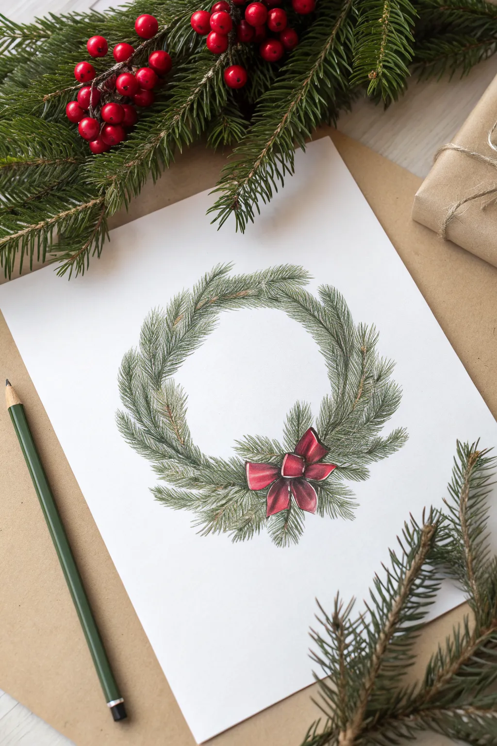
Capture the delicate texture of winter foliage with this colored pencil study of a classic Christmas wreath. The contrast between the feathery green needles and the satin-like red bow creates a simple yet elegant holiday focal point.
How-To Guide
Materials
- White smooth heavyweight drawing paper or bristol board
- HB graphite pencil
- Kneaded eraser
- Set of green colored pencils (olive green, forest green, dark hunter green)
- Set of brown colored pencils (ochre, burnt umber)
- Red and burgundy colored pencils
- A dull green colored pencil (for layout)
- Pencil sharpener
Step 1: Planning and Structure
-
Establish the shape:
Begin by lightly sketching a large circle in the center of your page using your HB pencil. This doesn’t need to be perfect; it’s just a guide for the wreath’s overall size. -
Define the inner ring:
Draw a smaller concentric circle inside the first one to establish the thickness of your wreath. The space between these lines is where your pine branches will live. -
Map the bow placement:
In the lower right quadrant of the wreath (around the 5 o’clock position), sketch a rough guideline for the bow. Draw two loops and two tails flowing downward to reserve this bright white space before you start adding greenery. -
Sketch the branch flow:
Using a light olive green pencil, draw faint directional lines flowing clockwise around the circle. These lines represent the main woody stems hidden beneath the needles.
Step 2: Layering the Foliage
-
Base layer of needles:
Start with your lightest olive green. Use short, quick, flicking strokes to create clusters of needles growing out from the central directional lines you drew earlier. -
Direction is key:
Ensure your needle strokes angle slightly forward, following the clockwise flow of the wreath. Keep the pressure light to create a soft, airy texture. -
Adding woody accents:
Take an ochre or light brown pencil and carefully draw thin hints of the branches peeking through the needles. Don’t overdo it; just a few lines here and there add realism. -
Mid-tone greenery:
Switch to a forest green pencil. Go back over the wreath, adding a second layer of needles. Focus these darker strokes closer to the center of the branch mass to create volume. -
Varying needle length:
Mix up your stroke lengths. Some needles should be short and clustered, while others can be longer and wispy, especially on the outer and inner edges of the wreath. -
Deepening shadows:
Use a dark hunter green or even a touch of indigo mixed with green to add the deepest shadows. Place these strokes in the dense areas where branches overlap, particularly near the bottom around the bow.
Needles look flat?
If your pine branches look flat, you likely kept your pencil pressure too uniform. Use sharp pencils and press harder near the branch stem, lifting pressure as you flick outward
Step 3: Drawing the Bow
-
Base red layer:
Fill in the bow shape with a bright, primary red pencil. Apply it smoothly but lightly, leaving small slivers of white paper exposed on the tops of the loops to act as highlights. -
Building form:
Use a darker burgundy or crimson pencil to shade the areas where the ribbon folds or tucks under the central knot. This creates the illusion of three-dimensional fabric. -
Adding texture:
I like to enhance the satin look by darkening the very edges of the ribbon loops and the center knot with a sharp deep red pencil. -
Final foliage integration:
Take your dark green pencil again and draw a few pine needles overlapping the edges of the bow slightly. This ‘tucks’ the bow into the greenery so it doesn’t look like a sticker floating on top.
Level Up: Frosted Look
Create a snowy effect by using a white gel pen or white gouache. Stipple tiny dots or thin lines onto the tips of the upper pine needles to mimic fresh frost
Step 4: Final Touches
-
Refine the edges:
Look at the silhouette of your wreath. Add distinct, single needles sticking out loosely at the edges to break up any perfect circles and make it look organic. -
Clean up:
Uses your kneaded eraser to gently lift any graphite guidelines that are still visible through the lighter foliage.
Now you have a timeless holiday illustration that looks perfect on a handmade greeting card

PENCIL GUIDE
Understanding Pencil Grades from H to B
From first sketch to finished drawing — learn pencil grades, line control, and shading techniques.
Explore the Full Guide
Jingle Bells With Metallic Shine
This classic holiday sketch captures the shimmer of brass bells using a striking combination of graphite and white pencil on toned paper. The warm background instantly provides a mid-tone, allowing both your deepest shadows and brightest highlights to truly pop for a realistic metallic effect.
Step-by-Step
Materials
- Tan or kraft toned sketchbook paper
- Graphite pencils (HB, 2B, 4B, and 6B)
- White charcoal pencil or white pastel pencil
- Fine-point mechanical pencil (for initial sketch)
- Kneaded eraser
- Blending stump or tortillon
Step 1: Basic Structure
-
Establish the Bow Center:
Begin by lightly sketching a small, rounded knot for the bow slightly above the center of your page. This will act as the anchor point for the entire composition. -
Outline the Bells:
Draw two bell shapes hanging from the knot. Start with the left bell hanging vertically and the right bell tilted slightly outward. Use simple geometric shapes first—a dome top and a flaring bottom rim—keeping your lines extremely faint. -
Add Ribbon Loops:
Sketch large, looping ribbons extending from the knot. Draw two upper loops curving outward and two tail ends draping down, one clearly overlapping the front of the left bell. -
Refine the Bell Shapes:
Go back over your bell outlines to add the specific details: the rim at the bottom, the subtle ridge around the middle, and the clapper (the ball inside) visible within the opening. -
Check Proportions:
Take a moment to verify that the ribbons flow naturally and the bells look symmetrical before you commit to shading. Erase any stray guidelines with a kneaded eraser.
Fixing Muddy Highlights
If your white pencil turns grey when applied, the graphite beneath is too heavy. Erase the area back to the bare tan paper first, or use a white gel pen for a clean, sharp highlight over dark areas.
Step 2: Shading and Form
-
Map the Shadows:
Using an HB pencil, lightly outline where the darkest shadows will fall. On metallic objects, these shadows often have hard formatting edges rather than soft gradients. -
Apply Initial Mid-tones:
Shade the body of the bells with a 2B pencil. Use vertical hatching lines that follow the curve of the bell’s surface. Leave specific areas blank where the brightest shine will eventually go. -
Deepen the Darks:
Switch to a 4B or 6B pencil to push the contrast. Focus on the inside cavity of the bells—this should be the darkest part of the drawing to create depth. -
Render the Clappers:
Shade the spherical clappers inside the bells. Keep the top part of the sphere slightly lighter to suggest roundness, while blacking out the space immediately behind them. -
Define the Metallic Texture:
Sharpen your dark pencil and add crisp, horizontal curved lines across the bell’s surface. These reflection lines mimic the way light wraps around polished metal.
Step 3: Ribbon and Highlights
-
Shade the Ribbon:
Use the HB and 2B pencils to shade the ribbon. Focus on the folds near the knot, making them darker, and use linear strokes to simulate the fabric grain. -
Create Cast Shadows:
Add a dark drop shadow where the ribbon overlaps the bell and where the bells overlap each other. This separates the objects and adds dimension. -
Blend for Smoothness:
Lightly use a blending stump to smooth out the graphite on the bells, merging your hatching slightly. Be careful not to smudge into the areas you reserved for highlights. -
Add White Highlights:
Using your white charcoal or pastel pencil, fill in the reserved highlight areas on the curve of the bells. Press firmly to get an opaque, bright white. -
Highlight the Ribbon:
Add subtle white touches to the high points of the ribbon loops and the edges of the knot to make the fabric look satiny. -
Final Polish:
Review the drawing for contrast. I find that reinforcing the darkest black line right next to a bright white highlight creates the most convincing metallic look. Clean up the edges with your eraser.
Level Up: Festive Holly
Tuck a sprig of holly leaves and berries behind the central knot. Use deep green colored pencils for the leaves and bright red for berries to add a pop of color against the monochromatic bells.
Enjoy displaying your festive artwork or use it as a custom design for holiday greeting cards
Reindeer Head Study With Antlers
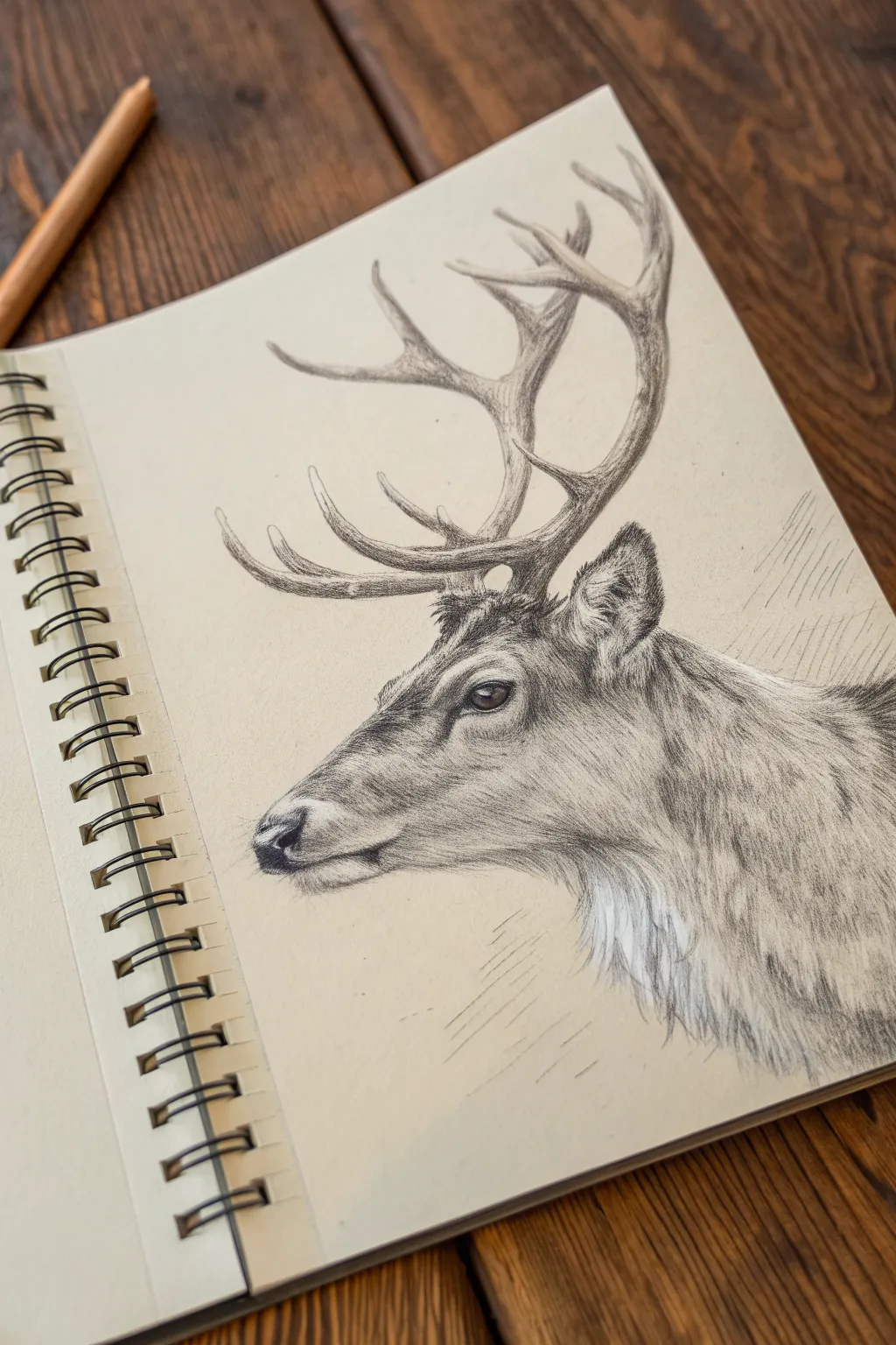
Capture the majestic spirit of the season with this detailed profile study of a reindeer, focusing on fur texture and antler structure. Working on tan-toned paper allows for rich contrasts and natural warmth, making the realism pop with fewer layers.
How-To Guide
Materials
- Spiral-bound sketchbook with tan or toned paper
- Graphite pencils (HB, 2B, 4B, and 6B)
- White charcoal or white pastel pencil
- Kneaded eraser
- Precision eraser (stick or fine-tip)
- Blending stump (tortillon)
Step 1: Basic Structure & Outline
-
Establish the Head Shape:
Begin with an HB pencil, using very light, loose strokes to map out a wedge shape for the muzzle and a rounded circle for the jaw and cranium. This forms the foundational skeleton of the head. -
Place Key Features:
Mark the position of the eye about halfway back on the head, ensuring it feels deep-set. Sketch a triangle for the nose tip and a soft curve for the mouth line beneath it. -
Draft the Antlers:
Draw the main beam of the antler curving upward and backward from the forehead. Branch off the tines, paying attention to their varied thicknesses; looking at the reference, notice how the lower tines curve forward while the upper ones reach back. -
Refine the Silhouette:
Go over your initial sketch to firm up the outline. Add the ear shape, positioned just behind the antler base, and indicate the neck’s thickness as it flows into the shoulders.
Directional Stroking
Always draw fur strokes in the direction the hair grows. On the nose, it grows down/back; on the neck, it flows downward. This ‘flow’ creates the 3D form.
Step 2: Shading & Texturing
-
Define the Eye:
Switch to a 4B pencil to darken the pupil and the upper lash line. Leave a tiny speck of raw paper white for the highlight, which brings life to the subject immediately. -
Map the Shadow Values:
Using a 2B pencil, lightly shade the darkest areas: under the jaw, the inside of the ear, the nose tip, and the deep shadow beneath the antler base. Don’t worry about fur texture yet; just establish volume. -
Create Fur Texture on the Face:
With a sharp HB pencil, start making short, directional strokes along the snout. The fur here is very short and sleek, so keep your pencil marks tight and controlled, following the contours of the bone structure. -
Build Neck Fur:
Move down to the neck with a 2B or 4B pencil. I find lengthening the strokes here helps imply the longer, coarser winter coat. Layer these strokes to build density. -
Texture the Antlers:
Antlers aren’t perfectly smooth. Use a 2B pencil to create linear, slightly wavy grain lines along the curves. Darken the undersides of the tines to make them look round and three-dimensional. -
Darken the Contrast Points:
Take your 6B pencil and punch up the darkest blacks in the nostril, the corner of the mouth, and the deepest crease of the ear. This high contrast anchors the drawing.
Muddy Fur?
If your fur looks like a solid grey blob, your pencil is too blunt. Sharpen your pencil frequently to maintain crisp, individual hair strands.
Step 3: Refining & Highlights
-
Soften with Blending:
Use a dirty blending stump to gently smudge the shadow underneath the jawline and neck. This pushes the deeper fur back, creating a soft undercoat for your details to sit on top of. -
Add White Highlights:
Using your white charcoal or pastel pencil, stroke in the lightest areas. Focus on the chest fur (the ‘beard’), the rim of the ear, and the highlighted bridge of the nose. The tan paper acts as your middle value, making these whites stand out brilliantly. -
Detail the White Fur:
Instead of coloring a solid white block, use flickering strokes with the white pencil to mimic individual hairs on the neck. Allow the tan paper to show through between strokes to create depth. -
Clean Up Edges:
Use a precision eraser to lift out any stray graphite smudges outside the outline. You can also tap the eraser on the antler tips to create subtle highlights without using white pencil. -
Final Balances:
Step back and check your values. If the white highlights look too stark, gently go over them with a clean blending stump to marry them into the grey mid-tones.
Your finished reindeer study now has a classic, timeless look perfect for the holiday season
BRUSH GUIDE
The Right Brush for Every Stroke
From clean lines to bold texture — master brush choice, stroke control, and essential techniques.
Explore the Full Guide
Santa and Reindeer Nose-to-Nose
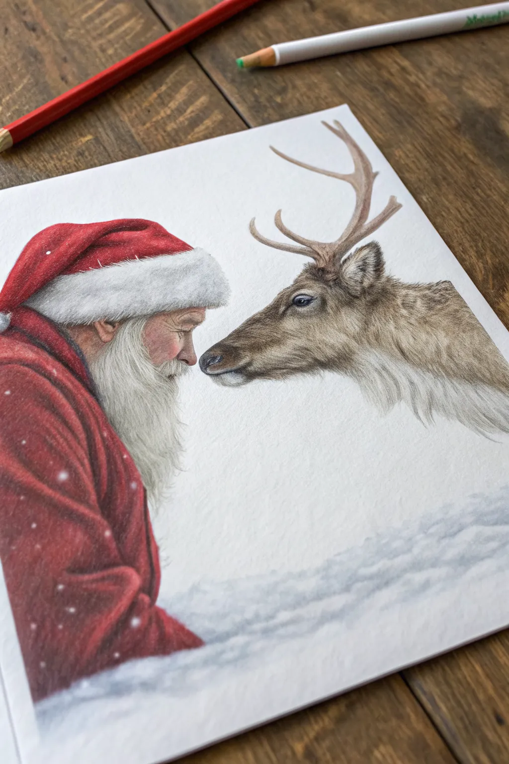
Capture a tender, silent moment between Santa Claus and one of his reindeer with this realistic colored pencil drawing. Using soft blending and careful layering, you’ll create a lifelike texture for the reindeer’s fur and Santa’s cozy red coat, all set against a snowy backdrop.
Detailed Instructions
Materials
- High-quality colored pencils (wax or oil-based)
- Heavyweight drawing paper or Bristol board (smooth or vellum finish)
- Graphite pencil (HB or H for sketching)
- Kneadable eraser
- White gel pen or gouache (for highlights)
- Blending stump or colorless blender pencil
- Pencil sharpener
Step 1: Sketching the Composition
-
Map out the profiles:
Begin with a very light graphite sketch. Draw the basic oval shape for Santa’s head on the left and the elongated shape of the reindeer’s head on the right, ensuring their noses are almost touching in the center. -
Define the features:
refine the outline of Santa’s profile, marking the nose, beard line, and the floppy shape of his hat. For the reindeer, sketch the eye placement, the curve of the snout, and the antlers branching upward. -
Clean up the lines:
Once you are happy with the proportions, use a kneadable eraser to lift off most of the graphite, leaving only a faint ghost image to guide your coloring so the graphite doesn’t muddy your colors later.
Fur Texture Tip
For the most realistic reindeer fur, use an indented line technique. Use an embossing tool to press invisible lines into the paper before coloring; the pencil will skip these grooves, leaving white hairs.
Step 2: Rendering Santa
-
Base layer for the skin:
Start with Santa’s face using a pale peach or flesh tone. Apply it lightly and evenly, avoiding the beard area. -
Add facial warmth:
Layer in light pinks and faint reds on the cheek, nose, and ear to suggest cold weather flush. Use a darker brown to define the wrinkles around his eye and the shadow under the hat brim. -
Santa’s coat foundation:
Fill in the red coat with a medium red pencil. Use circular motions to build up the tooth of the paper without pressing too hard yet. -
Deepening the fabric shadows:
Use a darker crimson or maroon to create folds in the fabric, particularly where the arm bends and under the collar. Save the brightest red for the lit areas. -
Texturing the fur trim:
For the white hat trim and beard, don’t just leave the paper white. Use a very sharp cool grey pencil to draw individual hairs, creating shadows that define the fluffy texture. Keep your strokes curved and flowing downward for the beard.
Muddy Colors?
If your reds and browns start looking waxy or muddy, you’ve burnished too early. Apply a light layer of fixative to restore some ‘tooth’ to the paper, allowing you to add fresh crisp layers on top.
Step 3: Rendering the Reindeer
-
The eye is key:
Start with the reindeer’s eye using dark browns and blacks, but leave a small white spot for the reflection. This brings the animal to life immediately. -
Layering the fur:
Begin the fur with a base of light tan or cream. Work in the direction of hair growth—short strokes near the nose and longer strokes down the neck. -
Building fur depth:
Layer darker browns (sienna and umber) over the base. I like to keep my pencil extremely sharp here to create fine, individual distinct hairs rather than a solid block of color. -
Detailing the antlers:
Color the antlers with a mix of pale brown and grey. Add texture by pressing slightly harder in small, irregular patches to mimic the rough surface of the horn. -
Connecting the shadows:
Darken the area under the reindeer’s jaw and neck to create volume, ensuring the head looks three-dimensional against the white background.
Step 4: Atmosphere and Final Touches
-
Add the falling snow:
Using a white gel pen or a tiny brush with white gouache, dot small snowflakes over Santa’s red coat. Vary the sizes slightly for a realistic depth of field. -
Ground the figures:
Lightly sketch a snowy base at the bottom using pale blue and cool grey. Use sweeping horizontal strokes to suggest drifts of snow without drawing too much attention away from the faces. -
Soften the edges:
Use a blending stump to gently soften the snowy base so it looks out of focus compared to the sharp details of the faces. -
Final contrast check:
Step back and assess your values. Deepen the darkest shadows in the coat folds and the reindeer’s pupil to ensure the drawing has a full dynamic range.
Frame your artwork in a simple wood frame to complement the rustic holiday theme
Poinsettia With Velvety Leaf Values
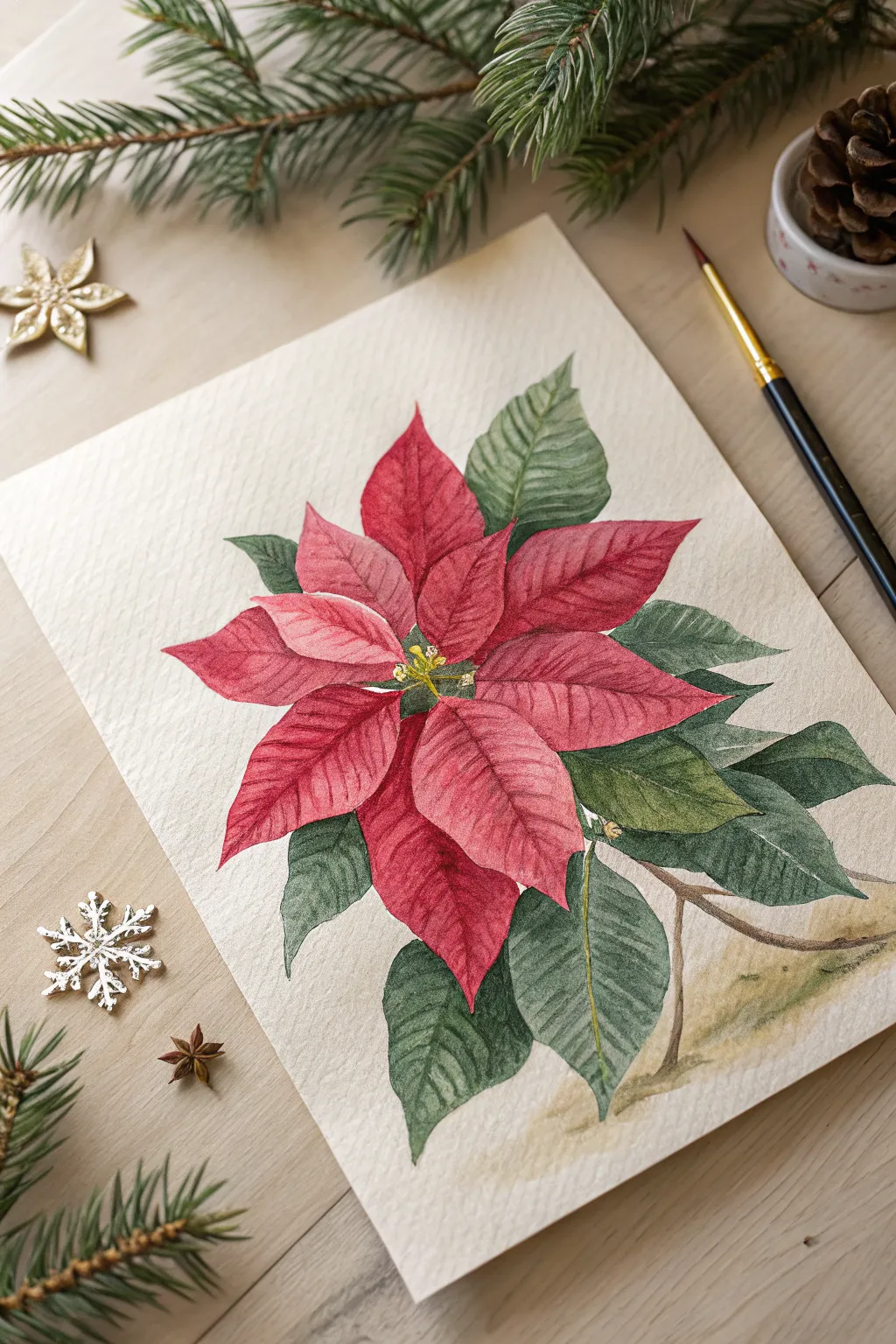
Capture the delicate beauty of the holiday season with this botanical-style watercolor of a poinsettia. By layering transparent glazes, you will build up the rich, velvety texture of the red bracts and deeply veined green leaves.
Detailed Instructions
Materials
- Cold-pressed watercolor paper (300 gsm)
- HB pencil for sketching
- Kneaded eraser
- Watercolors: Alizarin Crimson, Cadmium Red, Sap Green, Hooker’s Green, Burnt Umber, Yellow Ochre
- Round brushes (sizes 2, 4, and 6)
- Fine liner brush (size 0 or 00)
- Clean water jar and palette
- Paper towels
Step 1: Planning and Sketching
-
Observe the Center:
Start by lightly sketching the small cluster of cyathia (the true yellow flowers) in the very center of your paper. These are tiny, rounded shapes that act as the anchor for the sprouting leaves. -
Radiate the Bracts:
Draw the main red bracts radiating outward from the center. Keep the shapes organic and pointed, ensuring they overlap slightly. Don’t worry about perfect symmetry; nature is rarely perfectly symmetrical. -
Add Green Foliage:
Sketch the lower layers of green leaves tucking behind the red ones. These leaves should generally be larger and serve as a framing background. Add a simple stem structure descending towards the bottom right. -
Refine the Veins:
Lightly draw the central vein (midrib) on each leaf. From there, sketch the secondary veins curving gently toward the leaf tips. Keep these pencil lines very faint, as watercolor is transparent and won’t hide heavy graphite.
Step 2: Painting the Bracts (Red Leaves)
-
Initial Red Wash:
Mix a watery wash of Alizarin Crimson and Cadmium Red. Paint the red bracts using a wet-on-dry technique. Leave tiny slivers of white paper along the central veins to suggest light hitting the ridges. -
Dropping in Saturation:
While the first wash is still damp, drop in slightly more concentrated Alizarin Crimson near the center of the flower and the base of the leaves. This wet-in-wet technique creates a soft, natural gradient. -
Defining the Edges:
Once the first layer is fully dry, use a size 4 brush to glaze a second layer of red. Focus on the areas where one leaf casts a shadow on another to separate the overlapping shapes. -
Building Texture:
For that velvety look, use a drier brush to add very faint streaks of darker red following the direction of the veins. This mimics the microscopic texture of the plant surface.
Pro Tip: Lifting Highlight
If you accidentally painted over a vein highlight, use a stiff, damp brush to gently scrub and lift the paint while it’s semi-dry to reveal the lighter paper.
Step 3: Painting the Foliage
-
Base Green Layer:
Mix Sap Green with a touch of Yellow Ochre for a warm, natural base. Paint the underlying green leaves, again leaving the midribs unpainted or very pale green. -
Shadows and Depth:
Mix Hooker’s Green with a tiny bit of Burnt Umber or Alizarin Crimson to make a deep, dark green. Paint the shadowed areas where the leaves tuck underneath the red flower. -
Vein Detailing used dry brush:
Using a smaller brush (size 2), paint the negative space between the veins with a mid-tone green. This ‘negative painting’ technique makes the lighter veins pop forward visually.
Troubleshooting: Muddy Reds
Avoid mixing green directly into your red to darken it on the paper, as this turns brown. Instead, use a deep cool red or violet for shadows.
Step 4: Final Details
-
The Yellow Center:
Paint the central cyathia with clean Yellow Ochre. Add tiny dots of green or brown in the centers to give them dimension. -
Stem Work:
Paint the stem using a mix of Burnt Umber and a touch of green. Keep the stem edges soft by blotting them slightly if they look too harsh. -
Refining Contrast:
I like to take a step back here. If the red leaves look too flat, add a final glaze of Alizarin Crimson in the deepest crevices to boost the contrast. -
Grounding Shadow:
Mix a very watery, neutral grey-brown wash. Apply it loosely under the bottom leaves and stem to ‘ground’ the plant so it doesn’t look like it’s floating in space.
Allow your festive masterpiece to dry completely before framing it to brighten up your holiday decor


Cozy Window With Frosted Glass
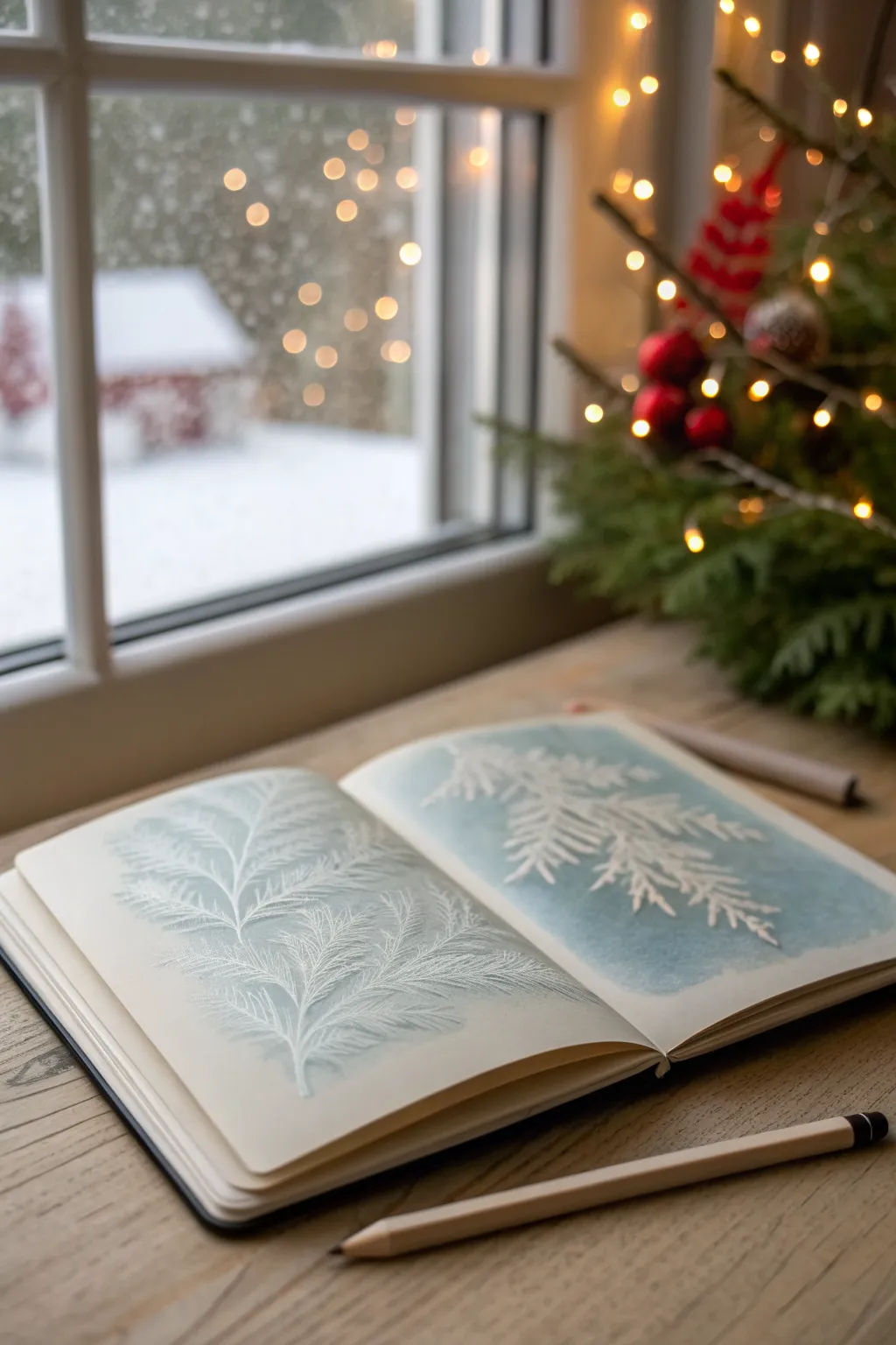
Capture the delicate beauty of ice crystals against a winter sky with this serene sketchbook spread. Using white pencil on a soft watercolor wash creates a stunningly realistic frosted glass effect that looks like nature pressed directly onto the page.
How-To Guide
Materials
- Heavyweight watercolor sketchbook (A5 or A4)
- Watercolor paints (Cerulean Blue, Payne’s Grey, Hint of Teal)
- Wide flat wash brush
- High-quality white charcoal pencil or white pastel pencil
- White gel pen (optional for highlights)
- Blending stump or cotton swab
- Paper towels
- Masking tape (optional)
Step 1: Creating the Atmosperic Background
-
Prepare the wash:
Begin by mixing a very watery, pale wash of Cerulean Blue with a tiny touch of Teal. You want the consistency of skim milk—very transparent and light. -
Apply the left page base:
Using your wide flat brush, sweep the color across the left page. Don’t aim for perfect uniformity; let the water create natural pools and lighter areas to mimic the uneven condensation on a windowpane. -
Deepen the right page:
For the right-hand page, add a drop of Payne’s Grey to your mix to create a slightly moodier, deeper blue. Apply this wash, perhaps letting it be a bit more saturated than the left side to create visual interest between the two pages. -
Let it dry completely:
This is crucial—the paper must be bone dry before you touch it with a pencil. I usually wait at least 30 minutes or use a hairdryer on a low setting. The paper should feel room temperature, not cool to the touch.
Keep it Sharp
Charcoal dulls quickly. Resharpen your pencil every few minutes. A razor-sharp point is the only way to get those delicate, crystalline needle effects.
Step 2: Sketching the Frost Structure
-
Map the main stems:
Take your white charcoal pencil and very lightly draw the central spine of your fern or pine branch. Curve it gently from the bottom center, arching outward to create a flowing, organic shape. -
Add primary branches:
Draw the main offshoots extending from the spine. Keep your strokes light and whisper-thin at this stage; you are just establishing the skeleton of the plant. -
Vary the pressure:
Start pressing slightly harder on the base of the stems where the frost would naturally accumulate more thickly.
Step 3: Building the Icy Texture
-
Create the needles:
Using a sharp point on your white charcoal pencil, begin drawing the individual needles or fronds. Instead of straight lines, use tiny, jagged back-and-forth strokes. -
Layer the white:
Go over the central areas of the leaves multiple times. The opacity of the white charcoal builds up, making the frost look denser in the middle and more transparent at the tips. -
Soften the edges:
Use a blending stump or your finger to gently smudge the white pigment at the very center of the large stems. This creates a ‘fogged’ look, like breath on glass. -
Sharpen the details on the left:
On the lighter left page, keep your details very crisp. Use a freshly sharpened pencil to add tiny, stray ice crystals floating near the main branch. -
Focus on contrast on the right:
On the darker right page, press harder to make the white pop against the deep blue background. The contrast here creates a dramatic, frozen-in-time effect. -
Highlight with gel pen:
If you want extra sparkle, use a white gel pen to add tiny dots or extremely thin lines on the tips of the fronds where ‘light’ would hit the ice.
Add Crystal Sparkle
For a magical finish, sprinkle a tiny pinch of ultra-fine clear glitter over wet white gouache on selected tips to mimic real glistening snow.
Step 4: Final Atmosphere
-
Add a frost vignette:
Lightly shade the corners of the pages with the side of your white charcoal pencil creating a vignette effect. -
Blend the vignette:
Smudge this outer shading extensively so it fades seamlessly into the blue wash, simulating a window frame freezing over. -
Review and refine:
Step back and look at the spread. Add a few more crisp white strokes over the smudged areas to bring back texture and depth.
Close your book carefully once finished to protect your winter masterpiece
Nativity Stable With Soft Candlelight
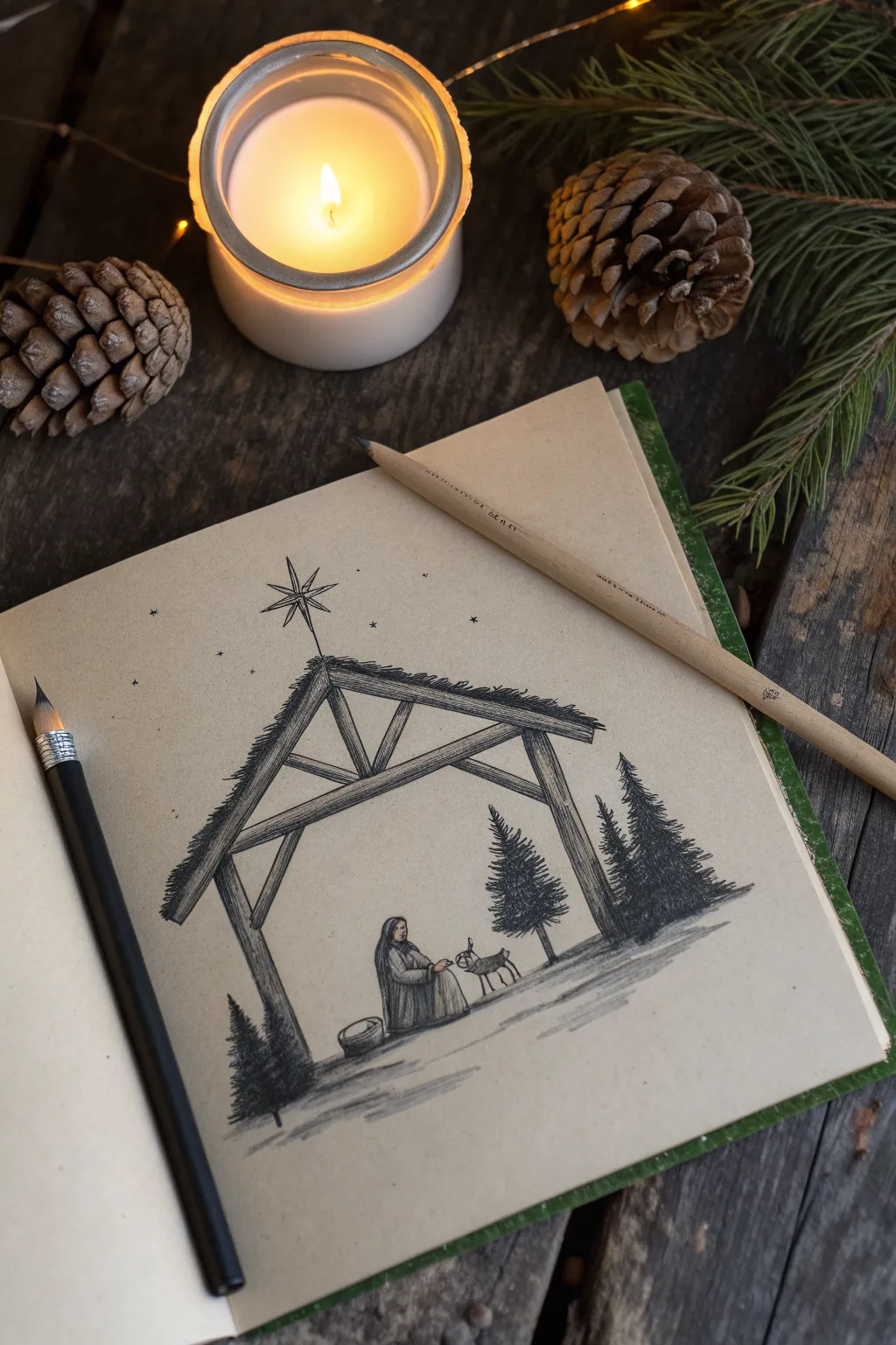
Capture the serene essence of the first Christmas with this detailed charcoal and pencil sketch on toned paper. The warm, tan background instantly adds an antique, inviting feel to the stable scene, while dark values create striking contrast.
Step-by-Step
Materials
- Sketchbook with tan or toned paper
- Soft charcoal pencil (dark/black)
- Graphite pencil (HB or 2B)
- White charcoal or pastel pencil (optional for highlights)
- Ruler or straight edge
- Blending stump or tortillon
- Kneaded eraser
Step 1: Structuring the Stable
-
Establish the ground line:
Begin by lightly drawing a horizontal line about one-third of the way up from the bottom of your page. This line doesn’t need to be perfectly straight; a slight unevenness mimics snowy or natural terrain. -
Position the roof peak:
Locate the center point for your stable’s roof, placing it well below the top edge of the paper to leave plenty of room for the star. -
Draft the beams:
Using your ruler or sketching freehand for a rustic look, draw the triangular A-frame of the roof. Add two vertical support posts extending down to the ground line. -
Add structural thickness:
Give the beams weight by drawing parallel lines alongside your initial structural marks. Connect them with cross-bracing inside the A-frame to make the architecture look sturdy and realistic.
Keep It Sharp
Charcoal pencils dull quickly. Keep a sharpener or sanding block nearby to maintain a fine point for delicate details like the star rays and pine needles.
Step 2: Drawing the Figures and Setting
-
Outline Mary:
Near the center ground, lightly sketch a seated figure. Use simple oval shapes for the head and torso to get the proportions right before adding details. -
Sketch the animal companion:
To the right of the figure, draw a small animal outline—a deer or donkey works well. Keep the lines loose until you are happy with the pose. -
Place the pine trees:
Lightly mark vertical lines where your trees will go: one small one on the far left, a medium one inside the stable, and a group of taller pines on the far right. -
Draw the guiding star:
Directly above the roof peak, draft a slender four-pointed star with diagonal rays extending outward to create that classic Bethlehem star shape.
Step 3: Adding Texture and Depth
-
Texture the roof:
Switch to your charcoal pencil or a softer graphite. Add short, downward strokes along the top of the roof beams to simulate thatch or snow hanging over the edge. -
Detail the wood grain:
Run your pencil along the length of the wooden beams with long, flowing lines. Vary the pressure to create the look of rough-hewn timber. -
Render the trees:
For the pine trees, use short, scribbled strokes that start at the trunk and flick outward and downward. Build these layers up densely to create a dark, evergreen silhouette. -
Define the figure’s robes:
Go back to the seated figure and darken the folds of her robe. I find that using vertical strokes helps define the drape of the heavy fabric. -
Refine the animal:
Sharpen the outline of the animal, adding small details like ears and legs. Use gentle shading on the underbelly to ground it in the scene.
Warm It Up
Add a subtle golden yellow colored pencil layer over the candle/star and the interior of the stable to simulate the warm glow of firelight reflecting on the wood.
Step 4: Final Touches and Atmosphere
-
Deepen the shadows:
Identify where shadows would naturally fall—under the roof eaves, beneath the figure, and at the base of the trees. Press harder with your charcoal to make these areas rich and dark. -
Ground the scene:
Add horizontal shading strokes across the ground, particularly under the stable and trees, to suggest shadows cast across the snow or dirt floor. -
Create the starry sky:
Scatter tiny dots and small cross-shapes randomly around the main star to fill the upper sky with distant constellations. -
Soften the edges:
Use a smudge stick or your finger to very lightly blend the ground shadows, making the surface look softer. -
Clean up highlights:
If you have a white charcoal pencil, add tiny touches of light to the top of the star, the roof edge, and the figure’s shoulder. Otherwise, use your kneaded eraser to lift pigment for highlights.
Close your sketchbook knowing you’ve preserved a moment of peace on paper
Winter Night Street With String Lights
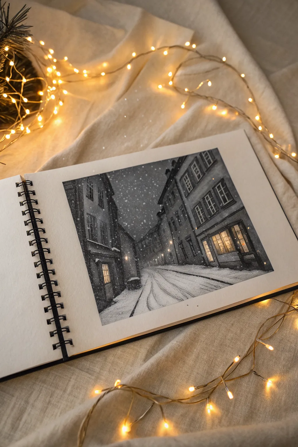
Capture the stillness of a snowy evening with this atmospheric charcoal drawing. Using heavy contrasts and white accents, you will create a cozy street scene illuminated by glowing windows.
Step-by-Step Guide
Materials
- Heavyweight sketchbook paper (smooth or slight texture)
- Willow charcoal sticks
- Compressed charcoal (medium and dark)
- Charcoal pencils (soft, medium, hard)
- White gel pen or fine white gouache
- Kneaded eraser
- Blending stump (tortillon)
- Tissue or chamois cloth
- Ruler
Step 1: Structuring the Perspective
-
Establish the horizon:
Begin by lightly sketching a horizon line about one-third up from the bottom of the page. This is a low-angle view, which makes the buildings feel taller. -
Draft the vanishing point:
Mark a vanishing point near the center of your horizon line. Draw diagonal guidelines radiating from this point to establish the angles of the rooftops and street curbs. -
Outline the buildings:
Vertical lines remain strictly vertical. Sketch the basic rectangular shapes of the buildings on both the left and right sides, following your diagonal guides. -
Add architectural details:
Lightly pencil in the placement of windows and doorways. Focus on the large shop window on the right and the smaller doorway on the left.
Smudge Control
Charcoal is messy. Place a sheet of scrap paper under your drawing hand to prevent smudging your work or transferring oils from your skin to the paper.
Step 2: Building the Dark Values
-
Base tone application:
Using a willow charcoal stick turned on its side, sweep a light gray tone across the entire sky area and the darker shadow sides of the buildings. -
Deepening the sky:
Layer compressed charcoal over the sky area. Be brave with your darks here; the night sky needs to be a deep, rich gray-black to make the snow pop later. -
Smooth the foundation:
Use a tissue or chamois cloth to gently blend the sky tones, pushing the charcoal into the grain of the paper for a smooth, velvety finish. -
Building facades:
Switch to a medium charcoal pencil to shade the brickwork. The building on the left is heavily shadowed, while the right building catches some reflected light. -
Defining the windows:
Carefully draw the window frames with a sharpened hard charcoal pencil. Leave the glass panes mostly white or very light gray for now—this is where the ‘light’ lives.
Step 3: Creating Texture and Atmosphere
-
Shadowing the street:
The street surface needs perspective. Use horizontal strokes that curve slightly to mimic the crown of the road, getting narrower as they recede into the distance. -
Carving tire tracks:
Draw the tire tracks using dark, sweeping lines that converge toward the vanishing point. Blend the edges of these tracks slightly to make them look like soft ruts in the snow. -
Illuminating the windows:
Inside the window frames, add very subtle gradients. Keep the center of the panes bright paper white, but darken the edges slightly to show depth and warmth. -
Adding the street lamps:
Draw the small street lamps in the distance. Use a focused eraser to lift a small halo of charcoal around them, creating a glowing fog effect.
Level Up: Warmth
For a truly magical feel, use a gold or warm yellow watercolor pencil just for the window lights. The warm yellow against the cool grey charcoal creates incredible contrast.
Step 4: Final Snow Details
-
Falling snow application:
This is the most satisfying part. Take a white gel pen or a fine brush with white gouache and dot tiny snowflakes across the dark sky. -
Varying snow sizes:
Make some dots larger and others merely pinpricks to create depth. I find that grouping a few flakes together looks more natural than perfect spacing. -
Highlighting surfaces:
Add thin white lines to the tops of window ledges, roof edges, and the ridges of the tire tracks where fresh snow would settle. -
Final glow adjustments:
Enhance the window glow by adding a touch of yellow pastel or colored pencil strictly inside the brightest glass panes if desired, or keep it monochromatic for classic drama. -
Clean up borders:
Use a fresh eraser to clean up the white framing around your drawing, ensuring sharp, crisp edges that contrast with the dark scene.
Now you have a serene winter moment captured peacefully on the page
Have a question or want to share your own experience? I'd love to hear from you in the comments below!