
When a drawing feels like it “just works,” it’s usually because the composition is quietly doing a ton of heavy lifting behind the scenes. Here are my favorite composition in art examples and layout ideas you can borrow anytime you’re stuck staring at a blank rectangle.
Big Value Shapes (Notan)
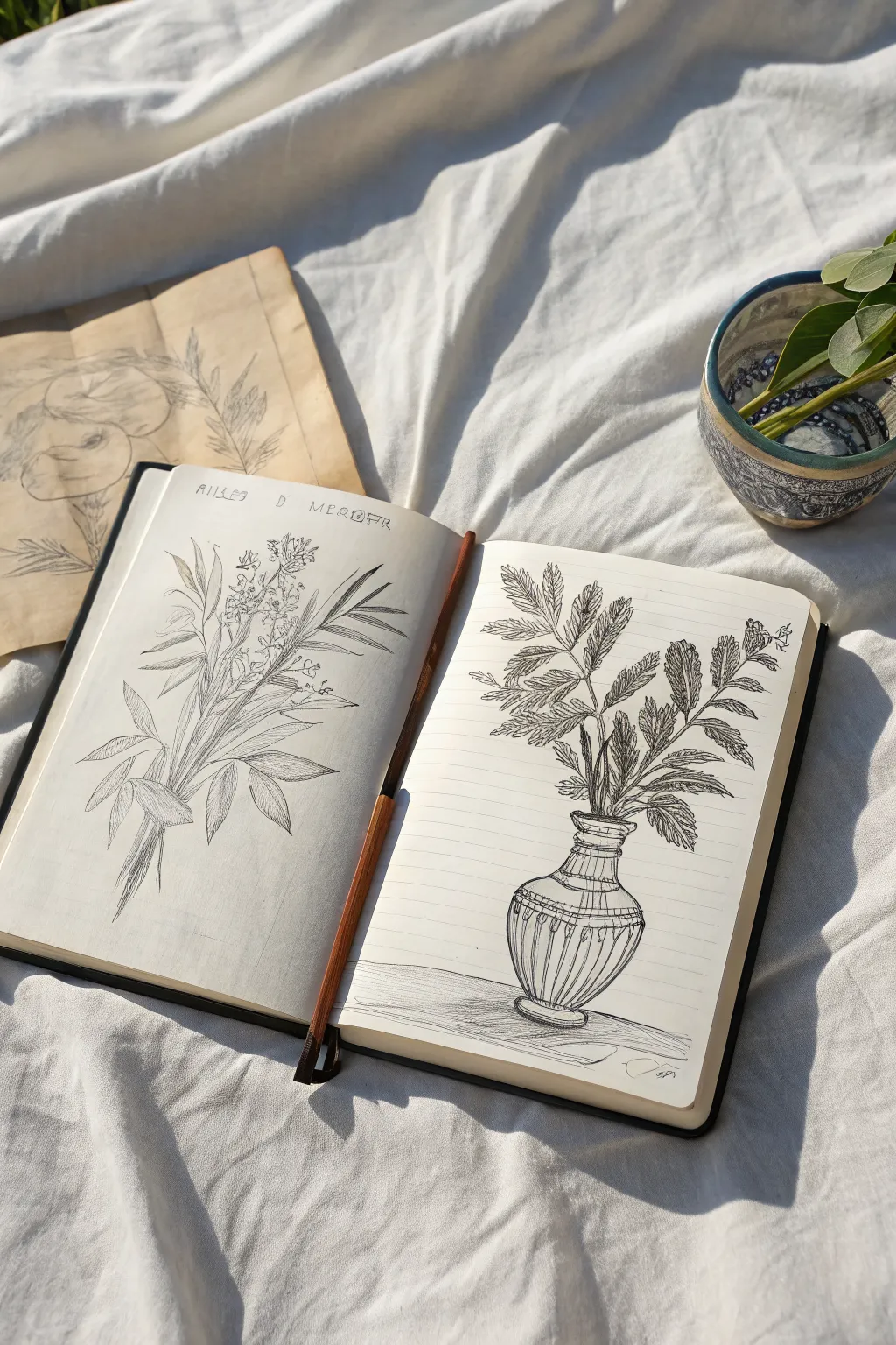
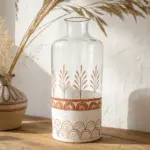
Recreate the charm of a sun-dappled artist’s afternoon with this tutorial on sketching botanical studies. You will capture delicate wildflowers and fern fronds in ink across a two-page spread, focusing on detailed line work and strong silhouettes.
Step-by-Step
Materials
- Hardbound sketchbook (A5 or similar size)
- Fine liner pens (sizes 0.1, 0.3, and 0.5)
- Pencil (HB or H for light drafting)
- Kneadable eraser
- Ruler (optional)
- Reference photos of wildflowers and ferns
Step 1: Drafting the Left Page: Wildflowers
-
Establish the stem direction:
Begin on the left page by using your pencil to lightly draw a main axis line. This diagonal sweep from bottom-left to top-center will serve as the spine for your wildflower bunch. -
Rough in the major shapes:
Sketch soft ovals and elongated leaf shapes along your axis line. Keep your pencil pressure very light so these marks are easy to erase later. -
Add handwritten notes:
At the top of the page, lightly pencil in some faux botanical names or notes. Spacing them out now ensures you don’t run out of room after the ink is applied. -
Refine the bud clusters:
Focus on the top third of the plant, sketching small circles and clusters to represent the unopened flower buds. Avoid pressing hard; you just need a guide for the ink.
Step 2: Inking the Left Page
-
Outline the main stems:
Switch to a 0.3 fine liner. Trace your pencil stems, using broken or slightly wavering lines to mimic organic textures rather than perfect straight edges. -
Detail the leaves:
For the long, lance-shaped leaves, use the 0.1 pen. Draw the outer contour first, then add a center vein. Fill the leaves with very fine, parallel hatching lines to suggest shadow and form. -
Ink the floral elements:
Use the finest point (0.1) for the delicate buds at the top. Use stippling (tiny dots) or small C-curves to create volume without weighing them down with heavy outlines. -
Add text and erase:
Go over your handwritten text with the 0.3 pen for a bold look. Once the ink is completely dry, use the kneadable eraser to lift all graphite marks, leaving a crisp black-and-white study.
Varied Line Weight
Use a thicker 0.5mm pen for the outer silhouettes of the vase and main stems, and a 0.05mm or 0.1mm pen for internal veins. This creates instant visual hierarchy.
Step 3: Drafting the Right Page: Vase & Ferns
-
Establish the vase symmetry:
On the right page, draw a vertical centerline near the bottom. Sketch a bulbous vase shape with a narrow neck around this line to ensure symmetry. -
Layout the background lines:
Use a ruler or steady hand to draw horizontal lines across the entire right page, passing behind the vase sketch. These lines mimic lined notebook paper, adding a graphic element. -
Sketch the fronds:
Draw three main stems erupting from the vase neck. Branching off from these stems, sketch the rough outlines of fern leaves, ensuring they fan out to fill the upper space.
Add a Wash
Dilute a drop of black ink or watercolor in water and paint a very pale grey shadow on one side of the vase or leaves to add three-dimensional volume.
Step 4: Inking the Right Page
-
Ink the vase details:
Use a 0.5 pen for the vase outline to give it weight. Add decorative vertical stripes or fluting on the vase belly to emphasize its roundness. -
Draw the background lines:
Carefully trace the horizontal notebook lines with a 0.1 pen. Be sure to stop and start your lines on either side of the plant and vase drawings so the lines appear to be *behind* the objects. -
Define the fern leaves:
Using a 0.3 pen, outline the serrated edges of the fern leaves. I like to make these edges quite jagged to capture the specific texture of the plant. -
Add heavy shading:
Unlike the left page, add denser hatching and cross-hatching to the leaves here. Focus the darkest ink near the central stems and where leaves overlap to create depth. -
Ground the object:
Add a few horizontal hatch marks at the base of the vase to create a cast shadow, appearing as if the vase is sitting on a table surface. -
Final clean up:
Wait for the ink to cure fully, then erase the underlying pencil structure. The contrast between the free-form botanical on the left and the structured, lined composition on the right is now complete.
Enjoy flipping through your sketchbook and seeing how these contrasting botanical styles complement each other.
S-Curve Eye Path
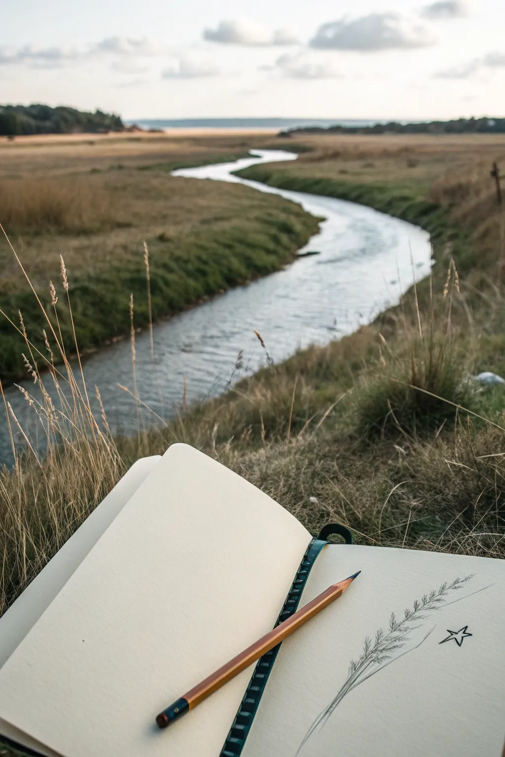
Capture the delicate beauty of a single stalk of grass with this simple yet evocative graphite sketch. This project focuses on observational drawing, recreating the fine textures of nature directly onto a sketchbook page.
Detailed Instructions
Materials
- Sketchbook with cream or off-white paper (heavyweight)
- HB or 2B graphite pencil (wooden)
- Pencil sharpener
- Kneaded eraser
- Real grass stalk for reference (optional but recommended)
Step 1: Setting the Composition
-
Position your subject:
Situate yourself comfortably in a grassy area or set up a single stalk of wheat or grass on your desk. Observe how the stem curves naturally. -
Lightly mark the stem:
Using your pencil with a very light touch, draw a long, gentle curve starting from the bottom left of the page and arching toward the top right. This S-curve or C-curve will serve as the spine of your plant. -
Determine the seed head:
Mark the section of the stem where the seed head or feathery part begins and ends. Roughly indicate the width of this area with faint guidelines so you keep the proportions correct.
Smudgy paper?
Place a scrap piece of paper under your drawing hand. This acts as a shield, preventing oils from your skin and friction from smearing your delicate pencil work.
Step 2: Drawing the Base Structure
-
Thicken the stem:
Go back over your initial spine line and add a second line parallel to it to give the stem some thickness. Taper it slightly as you move upward toward the tip. -
Sketch the central axis:
Through the seed head area, darken the central stem slightly. This axis needs to be visible enough to anchor the seeds but not so dark that it overpowers the delicate details you’ll add later. -
Add lower leaves:
If your reference stalk has any leaves near the bottom, sketch their outlines now. Look for how they wrap around the stem before peeling away.
Step 3: Adding Texture and Detail
-
Start the seeds:
Begin adding short, diagonal dashes branching off the central axis. I like to start at the bottom of the seed head and work my way up to maintain a consistent rhythm. -
Layer the texture:
Add a second layer of these dashes, making them slightly longer and more angled. Vary the pressure on your pencil to create depth—press harder near the stem and lift off as you stroke outward for a wispy effect. -
Create the silhouette:
Observe the overall shape of the seed head. It usually tapers at the top. Ensure your strokes get shorter and tighter as you reach the apex of the stalk. -
Refine the edges:
Use the tip of your pencil to add tiny, stray hairs or fibers sticking out from the main seed cluster. These fine details make the drawing look organic and less rigid. -
Darken the shadows:
Identify where the individual seeds overlap or meet the stem. Add small, dark accents in these crevices to boost contrast and make the texture pop.
Add dimensionality
Use a softer pencil (like a 4B) to darken the deepest shadows near the stem. This extra contrast will make the seed head look rounder and lift it off the page.
Step 4: Finishing Touches
-
Check the balance:
Step back and look at your composition. Ensure the curve of the grass leads the eye comfortably across the page. -
Draw the star:
To the right of the grass, sketch a simple five-pointed star. Draw it with a continuous line if possible, keeping it open and airy to match the sketch’s casual style. -
Clean up:
Use your kneaded eraser to lift away any initial guidelines or smudges that distract from the main subject. Be gentle so you don’t disturb the paper’s tooth. -
Place the pencil:
For a meta-finish like the photo, place your pencil diagonally across the page, pointing toward the artwork, creating a satisfying visual connection between tool and creation.
Now you have a serene nature study that captures a quiet moment in the field

High vs. Low Horizon
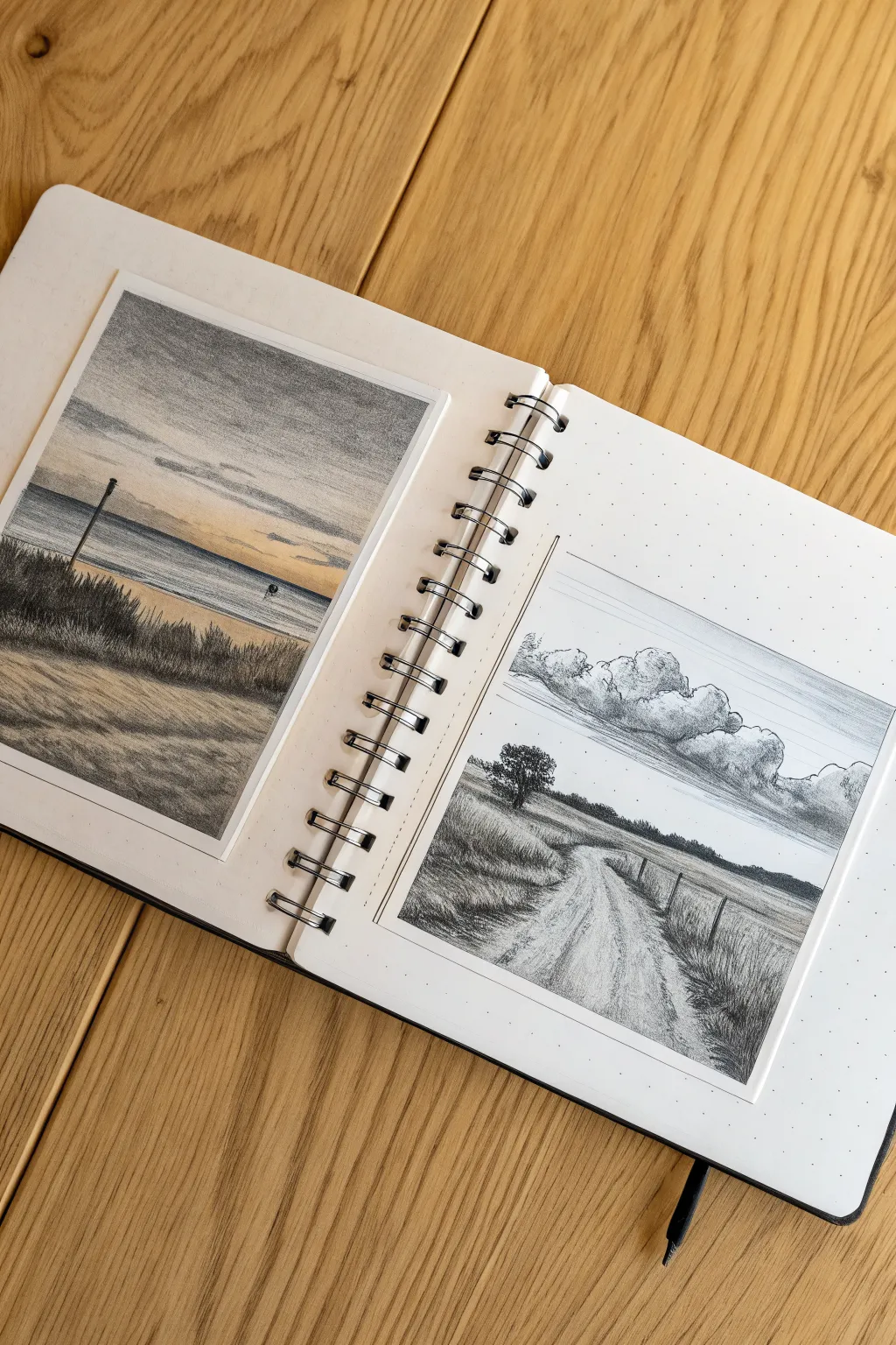
This sketchbook spread explores the power of horizon placement by contrasting a high-horizon beach scene with a low-horizon rural road. By rendering these two distinct compositions side-by-side using graphite and muted colored pencils, you’ll create a beautifully balanced study of depth and perspective.
How-To Guide
Materials
- Spiral-bound dotted journal (A5 or similar size)
- Set of graphite sketching pencils (HB, 2B, 4B, 6B)
- Muted colored pencils (ochre, slate blue, warm grey, terracotta)
- Fine-liner pen (black, 0.1mm)
- Ruler
- Kneaded eraser
- Blending stump (tortillon)
Step 1: Setting the Composition
-
Define the boundaries:
Begin by drawing two rectangular frames on your open sketchbook spread using a ruler and a fine-liner or sharp pencil. Make them roughly equal in size, leaving a comfortable white margin around each. -
Establish the horizons:
In the left frame, lightly draw a horizontal line roughly two-thirds of the way up the box for the ‘High Horizon’ beach scene. In the right frame, draw your horizon line about one-third of the way up for the ‘Low Horizon’ road scene. -
Sketch the primary shapes:
Use an HB pencil to block in the main elements. On the left, sketch a sloping dune line in the foreground and the water line. On the right, outline a winding dirt road that narrows toward the horizon and a single tree silhouette on the left side.
Smudgy Skies?
Place a clean sheet of scrap paper under your drawing hand. This prevents your palm from smearing the soft graphite or pencil layers while you work on different sections.
Step 2: The High Horizon (Left Page)
-
Sky gradient:
Start with the sky area. Lightly shade the top portion with a cool grey or slate blue pencil, fading into a warm cream or pale orange near the horizon to suggest sunset. -
Ocean texture:
Use a straight edge or steady hand to draw horizontal lines for the water. Press harder near the horizon for depth and leave some paper white closer to the shore to represent foam. -
Foreground sands:
Fill the large foreground area with sweeping, diagonal strokes using an ochre or warm grey pencil. I find that following the slope of the dunes helps convey the shape of the terrain. -
Vegetation details:
Switch to a 4B graphite pencil to draw the dune grass. Use quick, upward flicking motions to create clumps of grass that are taller and darker in the extreme foreground and smaller further back. -
Deepening contrast:
Add a dark vertical post near the left side using a 6B pencil to anchor the composition, and darken the shadow areas within the grass clumps for volume.
Step 3: The Low Horizon (Right Page)
-
Cloud formations:
Since the sky dominates this composition, lightly sketch large, billowing cumulus clouds. Shade the undersides of the clouds with a 2B pencil or grey colored pencil to give them weight. -
Sky shading:
Shade the sky behind the clouds using horizontal strokes. Keep the shading darker at the very top of the box and lighten it as you approach the clouds to make them pop. -
The lone tree:
Render the tree on the left using tiny, scumbling circular motions with a 4B pencil to create the texture of leaves. This should be a strong focal point against the bright sky. -
Road texture:
Draw the dirt road using vertical, slightly curving lines that converge at the horizon. Leave patches of white paper showing through to suggest sunlight hitting the dry earth. -
Field grasses:
Fill the fields on either side of the road with short, vertical strokes. Use lighter pressure for distant grass and stronger, clearer strokes for the grass closest to the viewer. -
Fence posts:
Add a row of small, vertical fence posts along the right side of the road, getting smaller and closer together as they recede into the distance. Connect them with faint wire lines.
Add a Border Detail
Draw an ultra-thin double line around your frames. This tiny detail mimics an architectural mat board and instantly makes the sketch feel more professional and intentional.
Step 4: Final Touches
-
Refining edges:
Re-trace the outer border of both drawings with your fine-liner or a sharp dark pencil to give them a crisp, finished look similar to a Polaroid photo. -
Highlights:
Use your kneaded eraser to lift out small highlights, such as the tops of the clouds on the right page or the crests of waves on the left page.
Now you have a stunning comparative study that clearly demonstrates how shifting the horizon line changes the emotional weight of a landscape.
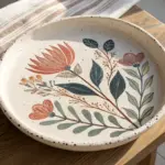

Repetition and Rhythm
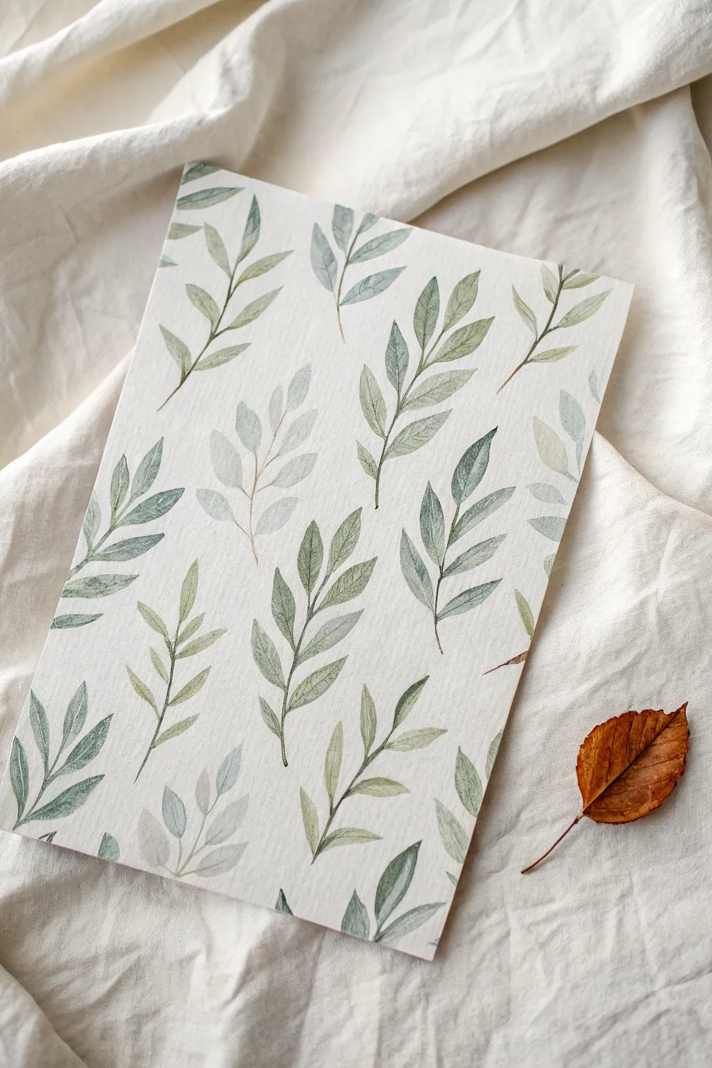
Capture the delicate beauty of nature with this serene watercolor leaf study. This project focuses on repetition and rhythm, using soft green hues to create a calming, organic pattern on textured paper.
Step-by-Step Guide
Materials
- Cold press watercolor paper (300 gsm)
- Watercolor paints (Sap Green, Olive Green, Indigo, Sepia)
- Round watercolor brushes (Size 2 and 4)
- Pencil (HB or H)
- Kneaded eraser
- Two jars of water
- Paper towels
- Mixing palette
Step 1: Planning and Sketching
-
Paper preparation:
Begin by securing your watercolor paper to a flat board with masking tape if you want clean borders, or leave it loose for a raw edge look as seen in the photo. The texture of cold press paper adds lovely character to the washes. -
Mapping the flow:
Lightly visualize where your stems will go. A strict grid isn’t necessary; instead, aim for an organic scattering where stems tilt in slightly different directions to create a gentle, rhythmic movement across the page. -
Light sketching:
Using your HB pencil, draw very faint guidelines for the main stems. Keep your lines incredibly light so they won’t show through the transparent paint later. I like to vary the curvature of each stem slightly to keep it natural. -
Adding leaf guides:
Sketch the position of the leaves attached to the stems. Don’t draw every single detail; just mark the tip and base of each leaf to establish spacing and size consistency. -
Softening lines:
Roll your kneaded eraser gently over the entire sketch. You want the graphite to be barely visible, acting only as a ghost guide for your brush.
Step 2: Mixing and First Layer
-
Preparing the palette:
Create three distinct puddles of green on your palette. Mix Sap Green with a touch of Sepia for an earthy olive, Sap Green with Indigo for a cooler forest tone, and a very watered-down version of the olive mix for the ghostly, paler leaves. -
Painting the stems:
Dip your size 2 brush into the stem color (a mix of Sepia and a tiny bit of green). With a steady hand, paint the thin, delicate central lines of your sprigs, following your pencil guides. Keep the pressure light to maintain thin lines. -
Painting the primary leaves:
Switch to your size 4 brush. Load it with your main olive green mix. Starting at the stem, press the belly of the brush down to widen the stroke, then lift as you pull outward to create a tapered point. -
Creating variety:
As you move around the paper, periodically dip your dirty brush into the cooler forest green mix without rinsing it fully. This creates subtle, beautiful variegation within the leaves themselves. -
Leaving white space:
Ensure you don’t crowd the leaves. The white space is crucial for the pattern to breathe. If two leaves touch while wet, let them bleed together for a natural watercolor effect.
Fixing Water Blooms
If you get a ‘cauliflower’ bloom where water pushed pigment away, wait for it to dry. Then, gently scrub the area with a damp, stiff brush and dab with a tissue to soften the hard edge.
Step 3: Adding Depth and Detail
-
Painting the ‘ghost’ leaves:
Use your very watery, pale green mix to paint several sprigs that appear to sit in the background. These should be significantly lighter than your main leaves to create visual depth. -
Glazing for shadow:
Once the first layer is completely dry, mix a slightly darker, more concentrated green. Carefully paint over one half of select leaves to suggest a fold or shadow, adding dimension to the flat shapes. -
Detailing the veins:
Switch back to your size 2 brush. Using a darker green mix with less water, paint a fine central vein down the middle of the prominent, darker leaves. Skip this step on the pale ‘ghost’ leaves to keep them soft. -
Adding stems to leaves:
Connect the base of floating leaves to the main stem with tiny, thin strokes. Ensure these connections look organic and not too stiff or geometric. -
Checking the balance:
Step back and look at the composition as a whole. If there are large empty gaps, sketch in a small, single leaf or a tiny sprig to balance the visual weight. -
Final touches:
If you want crisp edges on some leaves, you can wet a clean brush and gently lift pigment from the leaf tip, or sharpen the edge with a tiny bit of darker paint. -
Drying and flattening:
Let the paper dry completely, preferably overnight. If the paper has buckled slightly from the water, place it under a heavy book once it is fully dry to flatten it out.
Level Up: Metallic Veins
Once your painting is bone dry, use a fine-tip gold paint pen or metallic watercolor to draw the central veins on the darkest leaves. It adds a subtle shimmer that catches the light.
Now you have a tranquil, rhythmic piece of art perfect for framing or scanning for stationery designs
BRUSH GUIDE
The Right Brush for Every Stroke
From clean lines to bold texture — master brush choice, stroke control, and essential techniques.
Explore the Full Guide
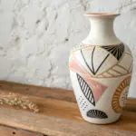
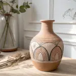
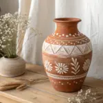
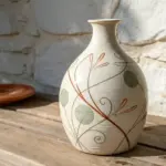
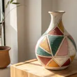
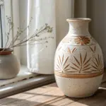
Figure-Ground Clarity
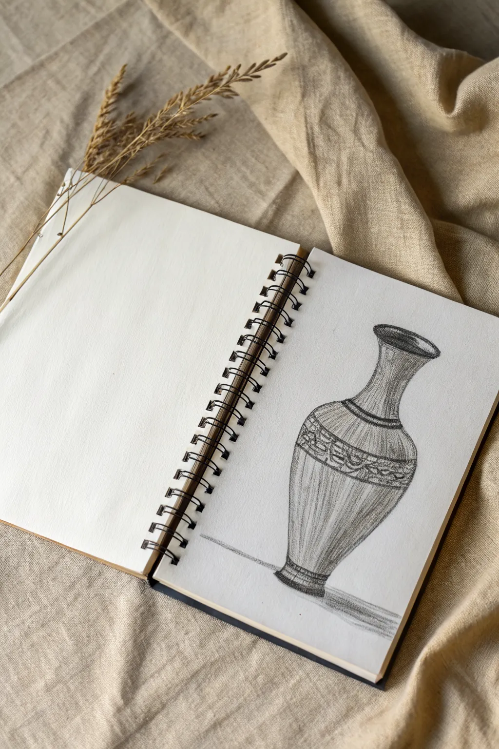
Capture the timeless elegance of pottery with this detailed pencil study of an ornamental vase. The stark contrast between the intricate graphite shading and the clean white paper creates a striking example of figure-ground clarity.
Step-by-Step
Materials
- Spiral-bound sketchbook with smooth white paper
- Set of graphite pencils (HB, 2B, 4B)
- Kneaded eraser
- High-polymer white eraser
- Ruler (optional)
- Blending stump or tissue
- Pencil sharpener
Step 1: Constructing the Frame
-
Establish the centerline:
Begin by lightly drawing a vertical axis line down the center of your page using an HB pencil. This invisible spine will ensure your vase remains symmetrical. -
Mark vertical proportions:
Divide your centerline into sections to map out the height of the rim, the narrow neck, the bulbous body, and the foot. Keep these marks light so they can be erased later. -
Sketch horizontal guides:
Through your height marks, draw horizontal ellipses. Draw a narrow ellipse for the top rim, a wider one for the widest part of the body, and a small one for the base. This creates a wireframe for the shape. -
Connect the silhouette:
Smoothly connect the outer edges of your ellipses. Draw a concave curve for the neck that flows into a convex curve for the body, tapering down to the foot. -
Refine the outline:
Go over your structural lines with a slightly firmer stroke to finalize the vase shape. Erase your initial centerline and horizontal construction guides once you are happy with the symmetry.
Uneven Symmmetry?
If one side looks lopsided, look at your drawing in a mirror. The reversed reflection instantly reveals distortion so you can correct curves.
Step 2: Designing the Ornamentation
-
Define the decorative band:
On the upper shoulder of the vase, draw two curved parallel lines following the contour of the form. This creates the belt where the detailed pattern will sit. -
Sketch the pattern mock-up:
Lightly pencil in a series of circular or floral motifs within the band. Don’t worry about perfect detail yet; just get the spacing and rhythm correct. -
Add neck details:
Draw faint vertical lines running down the neck of the vase to suggest fluting or texture. These lines should curve slightly with the form of the cylinder. -
Establish the lip:
Thicken the line at the very top relative to the rest of the drawing. Add a second inner ellipse to show the thickness of the pottery rim.
Step 3: Shading and definition
-
Base tone application:
Switch to a 2B pencil. Apply a light, even layer of hatching across the shadowed side of the vase (usually the left or right, depending on your imaginary light source). Leave a strip of white paper on the opposite side for a highlight. -
Enhance the pattern:
Darken the negative space around your floral motifs in the decorative band. The tiny white shapes will pop against the darker background. -
Vertical texturing:
Using a sharp HB pencil, draw long, flowing vertical lines down the body of the vase. Curve them toward the edges to reinforce the 3D volume. I find it helpful to rotate the sketchbook slightly to get a more natural hand movement here. -
Deepen the shadows:
Use a 4B pencil to add the darkest values. Focus on the inside of the rim, the area directly under the decorative band, and the curve of the base. -
Refine the neck shading:
Add cross-hatching to the neck area, making it darker than the main body to show it is recessed. Keep the transition into the shoulder smooth. -
Cast shadow:
Draw a horizontal shadow extending from the base of the vase across the surface. Use horizontal strokes here to contrast with the vertical texture of the object. -
Final highlights:
Take your kneaded eraser and lift out faint vertical strips of graphite on the rounded part of the body to create a soft sheen. -
Clean up:
Use the polymer eraser to remove any smudges from the surrounding white paper, ensuring the vase stands out clearly against the blank background.
Keep it Clean
Place a scrap piece of paper under your drawing hand. This prevents your palm from smudging your graphite shading while you work on details.
Now you have a beautifully rendered object study that demonstrates how shading creates volume on a flat page
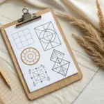
Thumbnail Variations Sheet
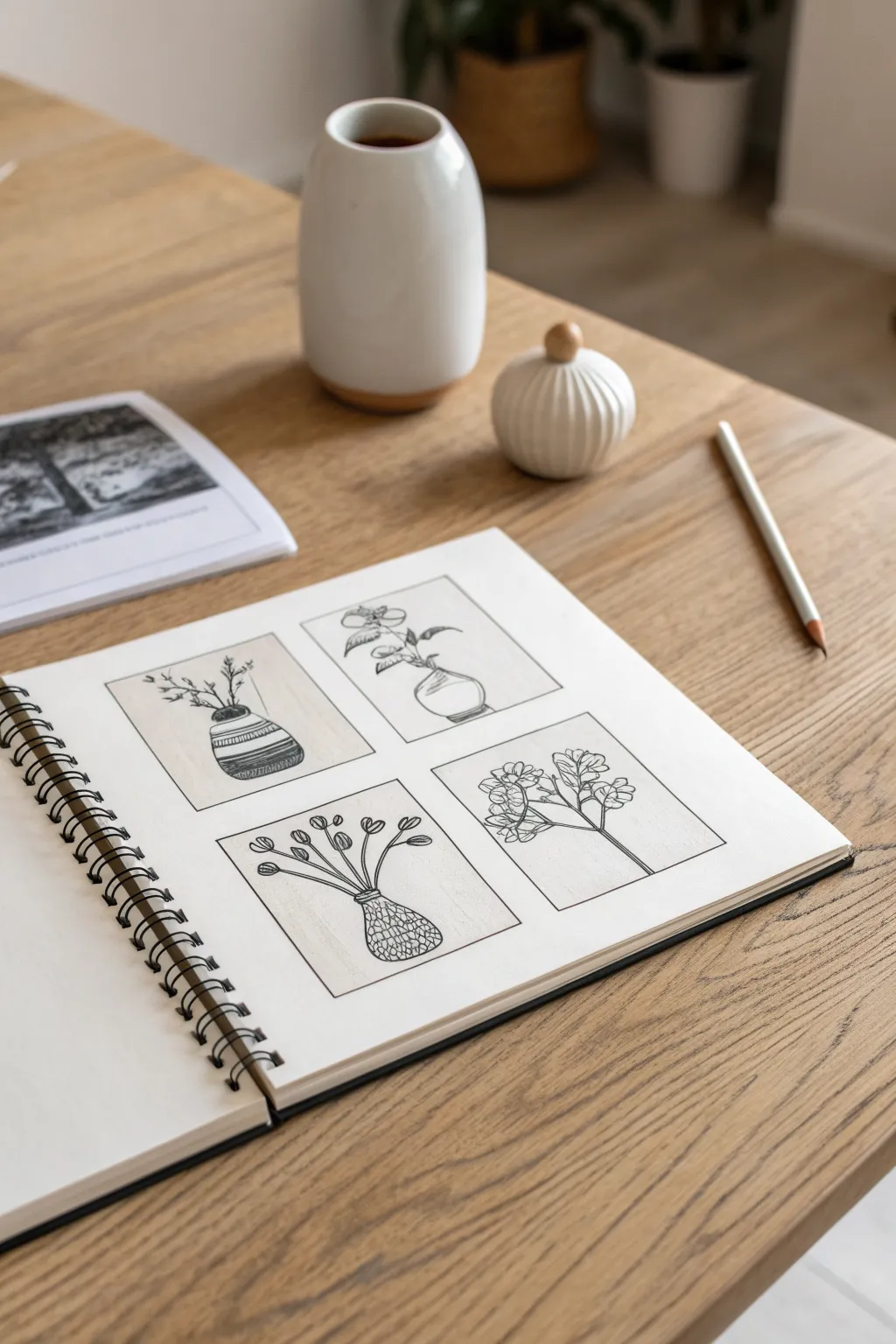
This sketchbook exercise focuses on exploring composition through four distinct botanical studies. Using simple line work and framing, you will create a harmonious grid of vases, playing with positive and negative space in a minimalist style.
Step-by-Step Guide
Materials
- Spiral-bound sketchbook or mixed media paper
- Pencil (HB)
- Ruler
- Fine liner pen (01 or 03 size)
- Beige or warm grey marker/pencil (optional for background)
- Eraser
Step 1: Setting the Structure
-
Measure the grid:
Begin by measuring out a large square or rectangle in the center of your page with a ruler, leaving a generous margin of white space around the edges. -
Divide the space:
Find the vertical and horizontal center points of your main shape. Lightly draw lines to divide the area into four equal quadrants. -
Create separation margins:
To give each thumbnail breathing room, draw inner lines about 1/4 inch away from your center dividing lines. This creates a gap between the four finished squares so they don’t touch. -
Refine the frames:
Go over the perimeter of your four new separated boxes with your fine liner to set the boundaries, but keep the lines thin and clean.
Step 2: Sketching the Elements
-
Outline the first vase:
In the top-left box, sketch a round, wide-bottomed vase. Position it slightly low in the frame to leave room for the stems. -
Add first foliage:
Draw stiff, twig-like branches extending upward and outward from the first vase, reaching toward the top corners. -
Draft the second composition:
For the top-right box, sketch a bulbous vase with a narrow neck. Place a single stem with broad leaves leaning distinctively to the left. -
Create the third vessel:
In the bottom-left box, draw a vase with a textured, bulbous base and a narrow neck. Fan out multiple stems symmetrically, topping them with small buds. -
Compose the final study:
In the bottom-right frame, focus less on the vase and more on the plant. Draw a structure that branches wide with clustered leaves, suggesting the vase is just out of frame or very minimal.
Smudged Ink?
If your fine liner smears when erasing, switch to a harder eraser or let the ink cure longer. You can cover small mistakes by thickening the line weight slightly.
Step 3: Inking and Detailing
-
Ink the outlines:
Once you are happy with your pencil sketches, use your fine liner to carefully trace the main contours of the vases and stems. -
Texture the first vase:
Return to the top-left vase. Add horizontal bands across the body, filling alternate bands with close hatching lines to create a striped pattern. -
Define leaves and petals:
Refine the top-right plant. Add veins to the leaves and ensure the connection points to the stem look natural. -
Detail the third vase:
For the bottom-left vase, create a ‘wicker’ or netted texture by drawing intersecting diagonal lines across the body of the pot. -
Add floral details:
In the final box, add small circles inside the flower clusters to suggest density and detail without overworking them. -
Background shading:
If you want the subtle warm tone seen in the example, gently color the negative space inside the boxes with a beige marker or colored pencil, carefully avoiding your ink drawings. -
Final clean up:
Wait for the ink to fully dry to avoid smudging. I usually give it a full minute before taking the eraser to the page to remove all original pencil guidelines.
Variation Idea
Instead of four different vases, try drawing the exact same vase in all four squares but with a different seasonal plant in each to represent the cycle of a year.
Step back and admire how these simple variations create a balanced and pleasing collection on a single page


Have a question or want to share your own experience? I'd love to hear from you in the comments below!