If you want a sweet, meaningful easy painting that’ll make Grandma tear up in the best way, you’re in exactly the right mindset. I love projects that feel personal (names, dates, tiny handprints) but still stay totally doable in one relaxed creative session.
Handprint Flower Bouquet for Grandma
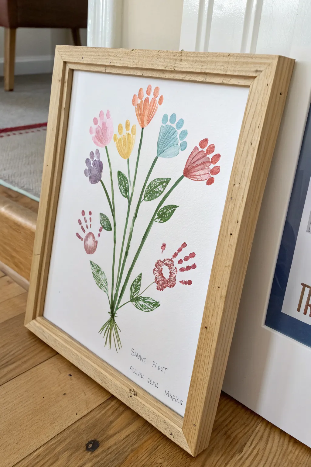
Capture the magic of little hands with this beautiful keepsake art that transforms simple prints into a vibrant bouquet of flowers. The soft, translucent watercolor style gives the piece a delicate, timeless look that Grandma will cherish forever.
Step-by-Step
Materials
- Heavyweight white cardstock or watercolor paper (A4 size)
- Non-toxic acrylic paints (pink, orange, yellow, blue, red, purple)
- Green acrylic paint or watercolor paint for stems
- Paintbrushes (flat brush for hands, fine round brush for stems)
- Fine-point black pen or marker
- Paper plate or palette
- Wet wipes or damp cloth (essential for quick cleanup)
- Light wood picture frame (A4 size)
Step 1: Creating the Handprint Blooms
-
Prepare your palette:
Squeeze dime-sized amounts of your flower colors (pink, orange, yellow, blue, red, purple) onto a paper plate. Keep a small cup of water nearby for rinsing brushes between colors. -
Start with the center flower:
Using a flat brush, paint a child’s palm and fingers with yellow paint. I prefer applying it directly with a brush rather than dipping to ensure an even, non-gloopy coat. -
Press the first print:
Guide the child’s hand to the upper-middle area of the paper. Press down firmly on the palm and each finger to ensure a clear imprint, then lift straight up to avoid smearing. -
Add the surrounding blooms:
Clean the hand thoroughly. Move on to your next color—perhaps the orange one above the yellow. Paint the hand again and press it slightly higher on the page to create height variation. -
Create the blue flower:
To the right of the center, add a blue handprint. Angle the hand slightly outward so the ‘flower’ looks like it’s reaching towards the sun. -
Add the red flower:
Below the blue one, add a red handprint. You can slightly close the fingers or keep them splayed to mimic different types of flower petals. -
Fill the left side:
Repeat the process on the left side with pink and purple paints, staggering their heights to create a balanced, natural-looking arrangement. -
Add lower fingerprints:
For the smallest flowers near the bottom, you can use just the palm or fingerprints arranged in a circle to create smaller, bud-like shapes, as seen with the red circular print on the lower right. -
Let the blooms dry:
Allow the handprints to dry completely before moving on to the stems. This usually takes about 15-20 minutes depending on paint thickness.
Clean Print Pro-Tip
Apply paint to the hand with a sponge brush instead of dipping. It creates a thin, even layer that reveals fingerprints clearly without slipping.
Step 2: Stems, Details, and Framing
-
Paint the main stems:
Using a fine round brush and green paint, draw a long, slender line from the base of each handprint palm down toward a single convergence point at the bottom center of the page. -
Create the bouquet tie:
Where all the stems meet at the bottom, paint a slightly thicker gathering point, then flare the lines out at the very bottom to look like the cut ends of stems. -
Add leafy details:
Paint simple almond-shaped leaves branching off the main stems. Fill them in with green paint, perhaps using a slightly lighter shade or leaving some white space for a sketchy texture. -
Detail the leaves:
Once the green leaves are dry, use a very fine brush or a green pen to add delicate vein lines inside the leaves for extra definition. -
Personalize the text:
At the bottom of the page, use your fine-point black pen to write a sweet message. You might write ‘Grandma’s Bunch’ or simply include the date and the child’s name in a whimsical font. -
Final inspection:
Check for any stray paint marks. If you find a small mistake, you can often gently scrape it away with a craft knife once dry or cover it with a tiny dot of white paint. -
Frame the artwork:
Open your light wood frame and clean the glass. Place your completely dry artwork inside, secure the back, and it’s ready for gifting.
Level Up: 3D Texture
Glue a small real ribbon or a piece of twine around the painted stems where they bunch together to create a charming mixed-media 3D effect.
Now you have a blooming masterpiece that captures a moment in time for Grandma to enjoy on her wall


Family Tree With Handprint Leaves
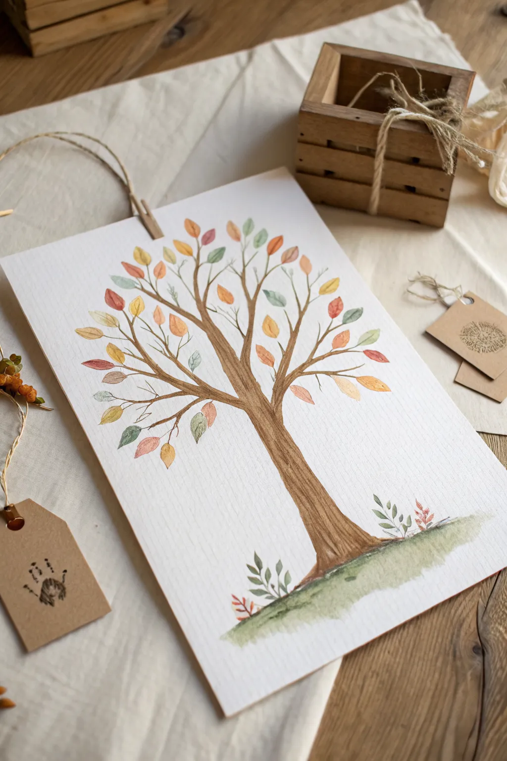
This delicate watercolor project captures the warmth of family roots with an elegant tree silhouette and soft, autumnal foliage. The textured paper adds a lovely rustic quality, making it a perfect, frame-worthy keepsake for Grandma that celebrates her growing family tree.
Step-by-Step
Materials
- Cold press watercolor paper (heavyweight, textured)
- Watercolor paint set (burnt umber, ochre, sienna, sap green, rust)
- Round watercolor brushes (size 6 for trunk, size 2 or 3 for leaves)
- Pencil (HB or lighter) and kneaded eraser
- Palette regarding mixing tray
- Cup of water and paper towels
- Fine liner or brown micron pen (optional for details)
Step 1: Planning and Sketching
-
Prepare your paper:
Start with a sheet of high-quality cold press watercolor paper. The texture is crucial here, as it helps grab the pigment and gives that lovely, organic feel seen in the example. Tape down the edges if you want to prevent buckling. -
Sketch the trunk foundation:
Lightly sketch the main trunk of the tree using your H pencil. Start wider at the base and gently taper it upward. Don’t worry about perfect straight lines; a little wobble adds character to the bark. -
Branch out:
Extend 3 to 4 main branches from the top of the trunk. From these, sketch smaller twigs reaching outward and upward. Aim for a balanced canopy shape, but keep the lines faint so they won’t show through the paint later. -
Ground the tree:
Draw a soft, shallow curve at the very bottom of the trunk to indicate the grassy hill where the tree stands. This anchors your composition so the tree doesn’t look like it’s floating.
Variation Tip
Instead of painted leaves, have family members press their fingerprints in different colored inks onto the branches to make it a true ‘family tree’ record.
Step 2: Painting the Tree Structure
-
Mix your bark color:
Create a watery mix of burnt umber with a touch of sepia or black. You want a translucent brown that isn’t too heavy. -
Paint the trunk base:
Using your size 6 brush, fill in the trunk. Use vertical strokes that follow the direction of the wood grain. Allow the brush to skip slightly over the paper’s texture to create natural white highlights. -
Extend the branches:
Switch to a smaller brush as you move up into the branches. Use the tip of the brush to drag the paint out into the finer twigs, lifting pressure as you reach the ends to make them taper naturally. -
Deepen the shadows:
While the trunk is still slightly damp, drop a more concentrated dark brown along one side (usually the right) and under the main branch connections. This wet-on-wet technique creates instant softness and volume.
Level Up: Texture
Sprinkle a tiny pinch of salt onto the wet paint of the heavier leaves or the grassy base. When dry, brush it off to reveal a cool, mottled texture perfect for nature scenes.
Step 3: Adding the Foliage
-
Prepare the leaf palette:
Mix puddles of your autumn colors: mustard yellow, burnt orange, muted red, and a soft sage green. Keep the mixes watery to maintain transparency. -
Start with the uppermost leaves:
Using your smallest round brush, paint simple almond or teardrop shapes at the tips of your branches. Start with the lighter colors like yellow and pale green first. -
Layering the mid-tones:
Introduce the burnt oranges and rust reds. Place these leaves sporadically throughout the canopy, ensuring some overlap slightly with the branches for a cohesive look. -
Vary the leaf direction:
Ensure your leaves point in different directions. Some should point up, some drift sideways, and a few can even seem to be falling, giving the tree a sense of movement. -
Add detail to dry leaves:
Once the first layer of leaves is fully dry, you can paint a tiny, thin line down the center of a few leaves using a slightly darker version of the same color. This adds definition without outlining everything.
Step 4: Finishing Touches
-
Paint the grassy base:
Load your brush with watery sap green and a touch of earth brown. Paint the curved ground area beneath the trunk using loose, horizontal strokes to suggest grass. -
Add ground foliage:
While the grass paint is wet, tap in a few tiny sprigs of leaves or grass blades popping up around the trunk base using a darker green mix to add depth to the ground level. -
Final assessment:
Step back and look at the color balance. If the tree looks too heavy on one side, add a few more small yellow or orange leaves to the opposite side to balance the visual weight. -
Dry and display:
Let the painting dry completely for several hours before erasing any visible pencil marks. You can stick it to a backing board or punch a hole at the top to hang it like the example.
This charming tree will serve as a beautiful reminder of family connections for years to come
Footprint Butterfly for Grandma
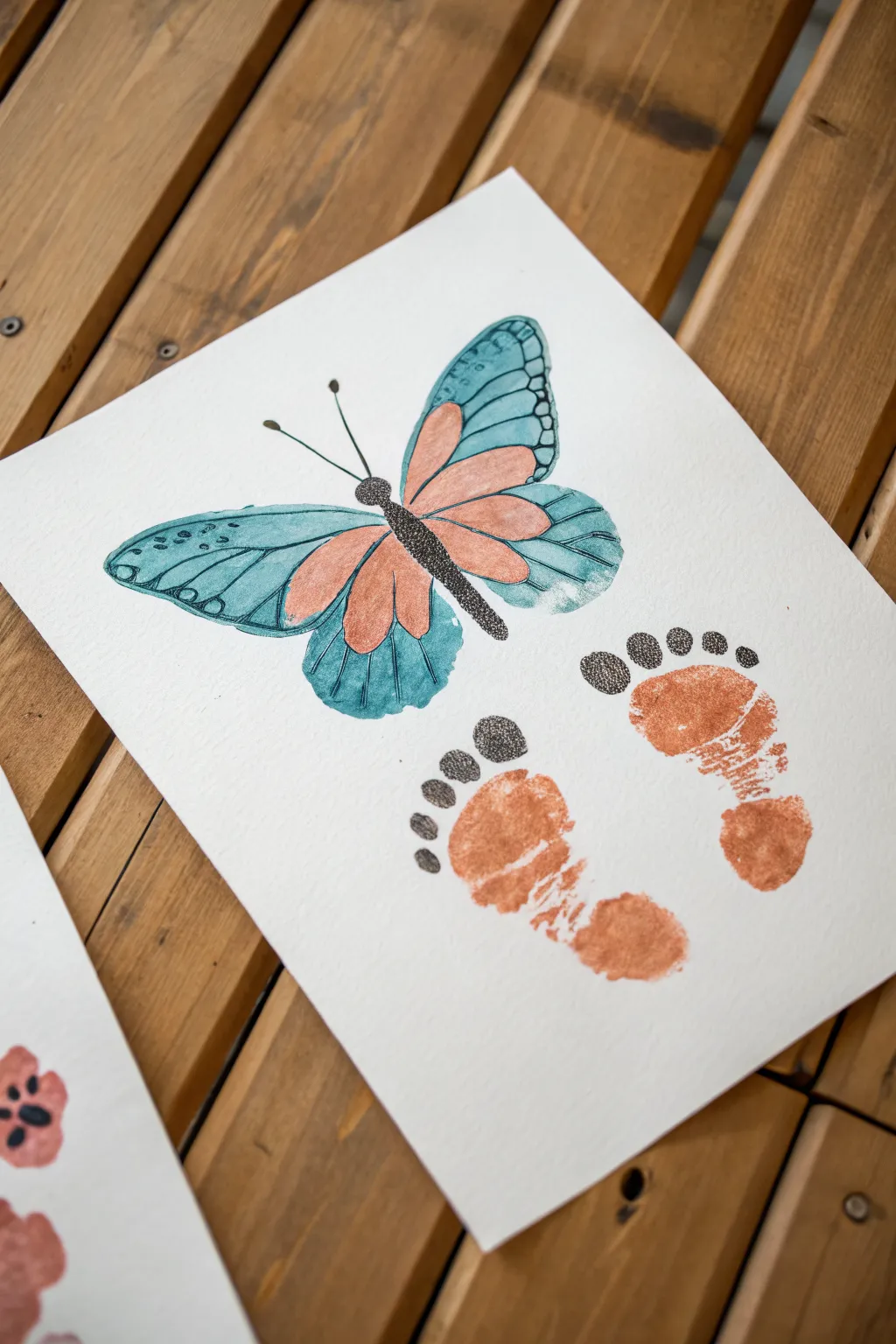
Transform a set of tiny footprints into a whimsical butterfly and a lasting keepsake for Grandma. This sweet project combines the personal touch of stamped footprints with delicate watercolor painting for a beautiful finish.
Detailed Instructions
Materials
- Heavyweight watercolor paper or cardstock (white)
- Non-toxic acrylic paint or stamp pad (terra cotta/copper color)
- Watercolor paints (teal, blue, black)
- Fine-point black ink pen or marker (05 or 08 size)
- Small round watercolor brush (size 2 or 4)
- Baby wipes or paper towels
- Pencil and eraser
Step 1: Creating the Footprints
-
Prepare the workspace:
Lay your paper on a flat, hard surface. Have your copper-colored paint and baby wipes ready nearby for immediate cleanup. -
Paint the first foot:
Apply an even layer of the terra cotta paint to the bottom of the child’s right foot. Aim for full coverage but not globs of paint, as too much paint can cause sliding. -
Stamp the right print:
Place the right foot on the lower right side of the paper. Press down firmly on the heel and toes to get a clear impression, then lift straight up. This acts as one wing section. -
Repeat for the left foot:
Clean the right foot, then paint the left foot. Stamp it next to the first print, leaving a small gap between them, angled slightly outward. Let these dry completely before moving on.
Pro Tip: Wing Symmetry
To get symmetrical wings without stressing, draw one side on scrap paper, cut it out, and trace it lightly onto your final paper before painting.
Step 2: Painting the Butterfly Wings
-
Initial sketch:
Using a pencil very lightly, sketch the outline of the upper wings above the footprints. The footprints will serve as suggested ‘lower’ elements, while the painted butterfly floats above. -
Add wing details:
Sketch the inner sections of the wings. Draw four teardrop shapes radiating from the center body area—two large ones for the top wing and two smaller ones tucked below. -
Paint the inner wings:
Mix a soft version of the terra cotta or copper color you used for the footprints. Paint the inner teardrop shapes with this color to tie the butterfly to the footprints visually. -
Paint the outer wings:
Use a teal or light blue watercolor to paint the rest of the wing shapes around the copper sections. Keep the paint somewhat transparent to let the paper texture show through. -
Add the body:
With black watercolor and a fine brush, paint a slender, segmented body in the center connecting the wings. Make the thorax slightly thicker than the abdomen.
Troubleshooting: Smudged Prints
If a footprint smudges, turn it into a ‘motion blur’ by softening the edges with a damp brush, or cover the smudge with painted grass or flowers.
Step 3: Adding Ink Details
-
Outline the wings:
Once the watercolor is fully dry, trace the outer edges of the blue wings with your fine-point black pen. Use a broken or sketchy line for a delicate, organic feel. -
Detail the inner shapes:
Outline the copper teardrop shapes inside the wings. Add veins radiating through the blue sections to give the wings realistic structure. -
Stipple the body:
Instead of a solid black line, use tiny dots (stippling) to darken and define the butterfly’s body. This adds texture that mimics fuzz. -
Draw the antennae:
Sketch two long, slender antennae extending from the head, topping each one with a small dot. -
Add footprint details:
Using the same stippling technique, add little toe details above the painted footprints. Draw five small circles above the toes and fill them with dense black dots. -
Connect the trail:
This is a fun part usually forgotten: gently stipple outlines around the main part of the footprint heel to give it distinct definition.
Now you have a captured moment in time that Grandma will cherish forever


Fingerprint Heart Wreath for Grandma
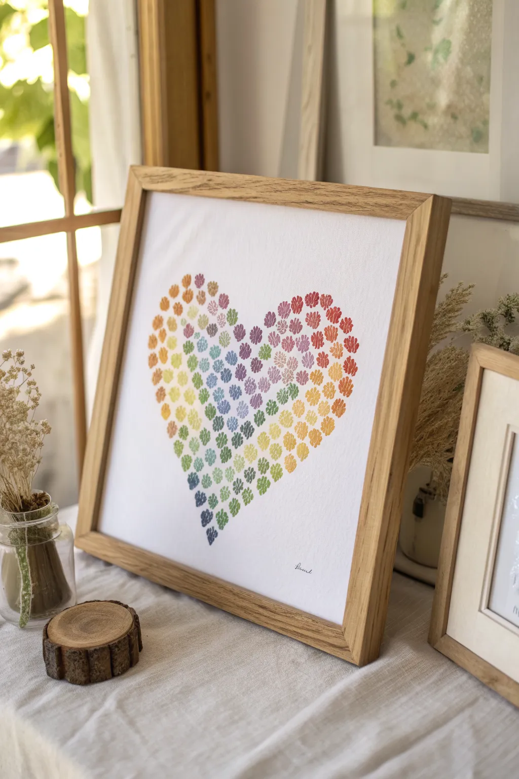
This heartwarming project transforms simple paw prints into a vibrant, rainbow-hued declaration of love that Grandma will cherish. The delicate watercolor effect creates a soft, sophisticated look while capturing the playful spirit of her favorite furry grandchildren.
Step-by-Step Guide
Materials
- High-quality white cardstock or watercolor paper (12×12 inches)
- Rubber stamp set with small paw prints (or flower petals for a similar look)
- Water-based ink pads in rainbow colors (red, orange, yellow, green, blue, purple)
- Pencil
- Large heart-shaped paper template
- Eraser
- Fine-tip black archival pen
- Wooden frame (square profile)
Step 1: Preparation & Layout
-
Prepare your paper:
Cut your cardstock or watercolor paper to fit your frame. A square format works best for this design, echoing the symmetry of the heart. -
Create the guide:
Cut a large heart shape out of scrap paper to use as a template. It should fill most of the center space, leaving a generous white border. -
Trace the outline:
Place the template in the center of your good paper. Very lightly trace around it with a pencil. You want this line to be barely visible, just enough to guide your stamping. -
Plan the color flow:
Visualize the gradient before you start. The example moves diagonally: warm tones (reds, oranges, yellows) on the top left and outer edges, transitioning into cool tones (greens, blues, purples) towards the bottom center.
Stamp Variation
Don’t have a paw stamp? Use your thumbprint! Press your thumb for the main pad and pinky tip for toes to make a custom ‘grand-puppy’ print.
Step 2: Stamping the Heart
-
Start with red:
Ink your paw print stamp with red ink. Stamp a cluster at the top right curve of the heart, staying just inside your pencil line. -
Transition to orange:
Clean the stamp thoroughly. Switch to orange ink and continue down the right side, slightly overlapping the area where the red ends to blend the visual transition. -
Add yellow tones:
Move to yellow ink, stamping along the middle-right section and curving toward the bottom point. Keep the stamps dense so the heart shape looks solid. -
Begin the left side:
Return to the top left of the heart. Start with a mix of orange and yellow tones here, creating a sunny upper left lobe. -
Introduce greens:
As you move down the left side and into the center of the heart, switch to light green ink. Stamp these loosely in the middle area to bridge the warm and cool sections. -
Layer in blues:
Using a soft blue ink, stamp in the lower central area of the heart, nestled between the greens and the upcoming purples. -
Finish with purple:
Use purple or indigo ink for the very bottom point of the heart and the lowest center section. This anchors the design with a deep, rich color. -
Fill the gaps:
Step back and look for empty white spaces within the heart shape. Use the appropriate color for that ‘zone’ to fill them in with extra stamps. -
Check the edges:
Ensure the outer edge of the stamped area follows the pencil curve nicely. Add a partial stamp here or there if the edge looks too jagged.
Fixing Smudges
If you accidentally smudge ink outside the heart, don’t panic. Turn it into a ‘stray’ floating paw print like it’s walking away from the heart.
Step 3: Finishing Touches
-
Dry completely:
Allow the ink to dry fully. Since stamp pads can be juicy, give it at least 20 minutes to prevent smearing. -
Erase the guide:
Gently erase any visible pencil lines from your initial tracing. Be careful not to rub over the stamped ink. -
Sign the work:
Using a fine-tip black pen, add a small, elegant signature or the word ‘Blessed’ in the bottom right corner. -
Frame it up:
Place the artwork into a clean wooden frame. I prefer a natural wood finish to complement the organic feel of the prints.
Now you have a beautiful, personalized piece of art ready to brighten Grandma’s wall
BRUSH GUIDE
The Right Brush for Every Stroke
From clean lines to bold texture — master brush choice, stroke control, and essential techniques.
Explore the Full Guide
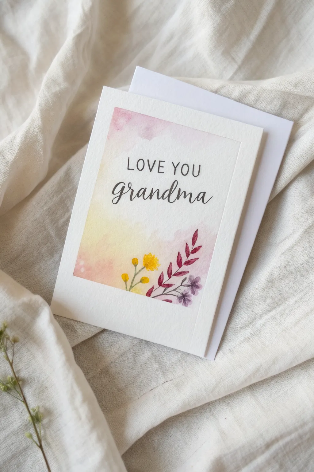
Simple Rose With a Love Note for Grandma
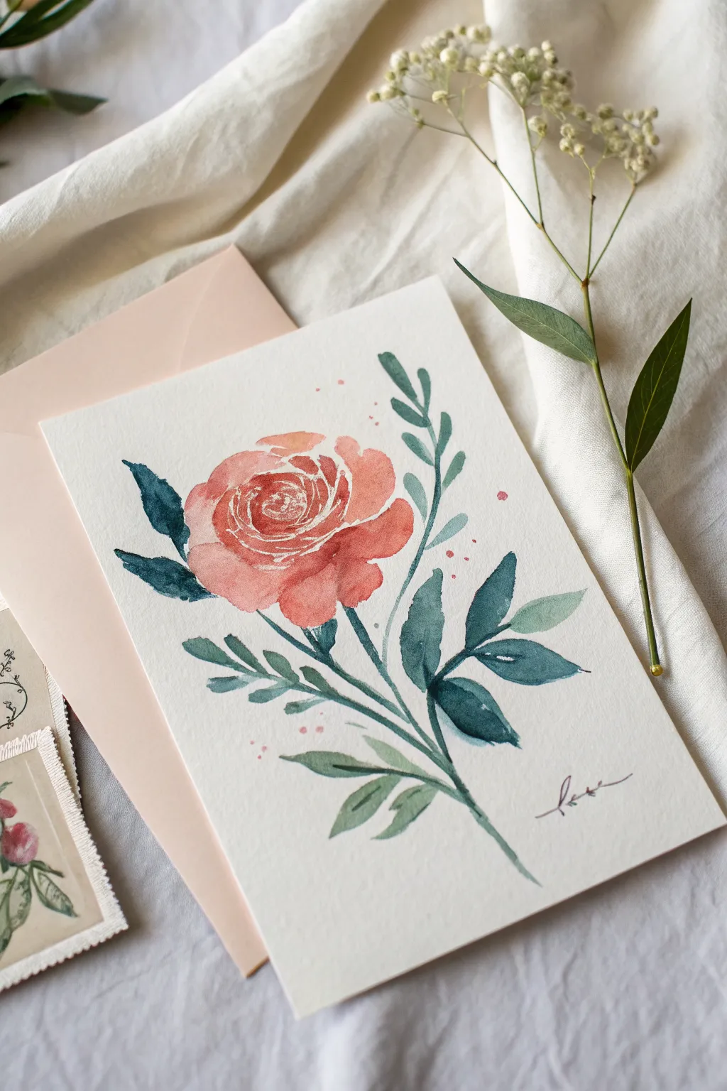
This delicate watercolor rose combines soft, coral-pink blooms with moody blue-green foliage for a sophisticated yet beginner-friendly floral study. The painted “love” script adds a personal touch, making it a perfect handmade card to tuck into an envelope for Grandma.
Step-by-Step Guide
Materials
- Cold press watercolor paper (postcard size or 5×7)
- Watercolor paints (Coral/Pink, Sap Green, Indigo/Payne’s Gray, White Gouache or masking fluid)
- Round brushes (size 6 for petals, size 2 for details)
- Pencil (H or HB)
- Kneaded eraser
- Water cups and paper towels
- Fine liner brush (optional for signature)
Step 1: Planning the Composition
-
Lightly sketch the outline:
Begin by lightly sketching the central rose shape in the upper center of your paper. Draw a loose oval for the main bloom and indicate the direction of the stem flowing diagonally downward to the right. -
Map out the leaves:
Sketch the placement of the leaves. Draw two main branches extending from the stem: one reaching up to the right and another branching out to the left. Keep your pencil lines very faint so they won’t show through the translucent paint. -
Suggest the petals:
Inside the rose oval, draw a few swirling, C-shaped lines to suggest the tightly packed inner petals. You don’t need to draw every petal perfectly; these lines are just guides for your brush.
White Line Hack
If painting negative space for the white lines is too hard, paint the whole rose pink first. Once 100% dry, use a white gel pen to draw the spiral details on top.
Step 2: Painting the Rose Bloom
-
Mix your coral color:
Prepare a watery mix of coral or salmon pink on your palette. If you don’t have a premixed coral, mix a little cadmium red with yellow ochre and plenty of water. -
Paint the rose center:
Start at the very center of the rose. Using the tip of your size 6 brush, paint small, tight C-shapes. Leave tiny gaps of white paper between strokes to represent the highlights on the petal edges. -
Expand the bloom:
Moving outward from the center, make your C-shape strokes larger and looser. I like to add a tiny bit more water to my brush as I move to the outer petals to make them look softer and lighter. -
Add depth to the shadows:
While the paint is still slightly damp (but not swimming), drop a more concentrated, darker pink pigment into the lower sections of the petals and the center crevices. Let the watercolor bloom naturally to create depth. -
Define the white highlights:
If you lost your white paper highlights during painting, you can use a small brush with opaque white gouache to add thin, crisp C-curves back into the center of the rose once the pink is dry. This mimics the look of the white ink lines seen in the inspiration image.
Level Up: Envelope Liner
Paint a matching pattern of loose rosebuds and teal leaves on a piece of printer paper. Cut it to size and glue it inside the envelope for a custom liner.
Step 3: Creating the Foliage
-
Mix cool green tones:
For that modern foliage look, mix Sap Green with a touch of Indigo or Payne’s Gray. You want a cool, muted teal-green rather than a bright grassy green. -
Paint the main stem:
Using a steady hand and a medium brush, paint the main stem extending downward from the base of the rose. Vary the pressure slightly—press down for thickness, lift up for a taper. -
Paint the left leaves:
Paint the leaves on the left side using the ‘press and lift’ technique: touch the tip to the paper, press the belly of the brush down to widen the leaf, and lift back to a point. -
Paint the right branch:
Paint the branch extending upwards to the right. Make these leaves slightly smaller and more delicate than the lower ones to balance the composition. -
Add color variation:
While the green paint is wet, drop in hints of pure indigo or even a tiny dot of the coral color into the wet leaves. This integrates the color palette and adds visual interest. -
Leaf details:
Once the main green shapes are dry, you can use a very fine brush with a darker, concentrated green-blue mix to add a central vein line to just a few of the larger leaves.
Step 4: Final Touches
-
Add splatter effects:
Load your brush with watery pink paint and tap it against your finger over the paper to create gentle splatters around the rose. This adds a loose, artistic feel. -
Paint the script:
Using a size 1 or 2 brush (or a liner brush if you have one), mix a dark burgundy or brownish-purple relative to your rose color. Carefully paint the word ‘love’ or ‘Nana’ in cursive at the bottom right. -
Check balance:
Step back and look at your painting. If the rose feels too floating, you can extend the stem slightly or add one more small leaf at the bottom for weight. -
Let it dry completely:
Ensure the paper is bone dry before erasing any visible pencil marks. Watercolor paper is fragile when wet, and erasing too soon will ruin the texture.
Once dry, this lovely floral card is ready to be paired with a heartfelt note for a gift she will treasure
Cozy Grandma House Portrait
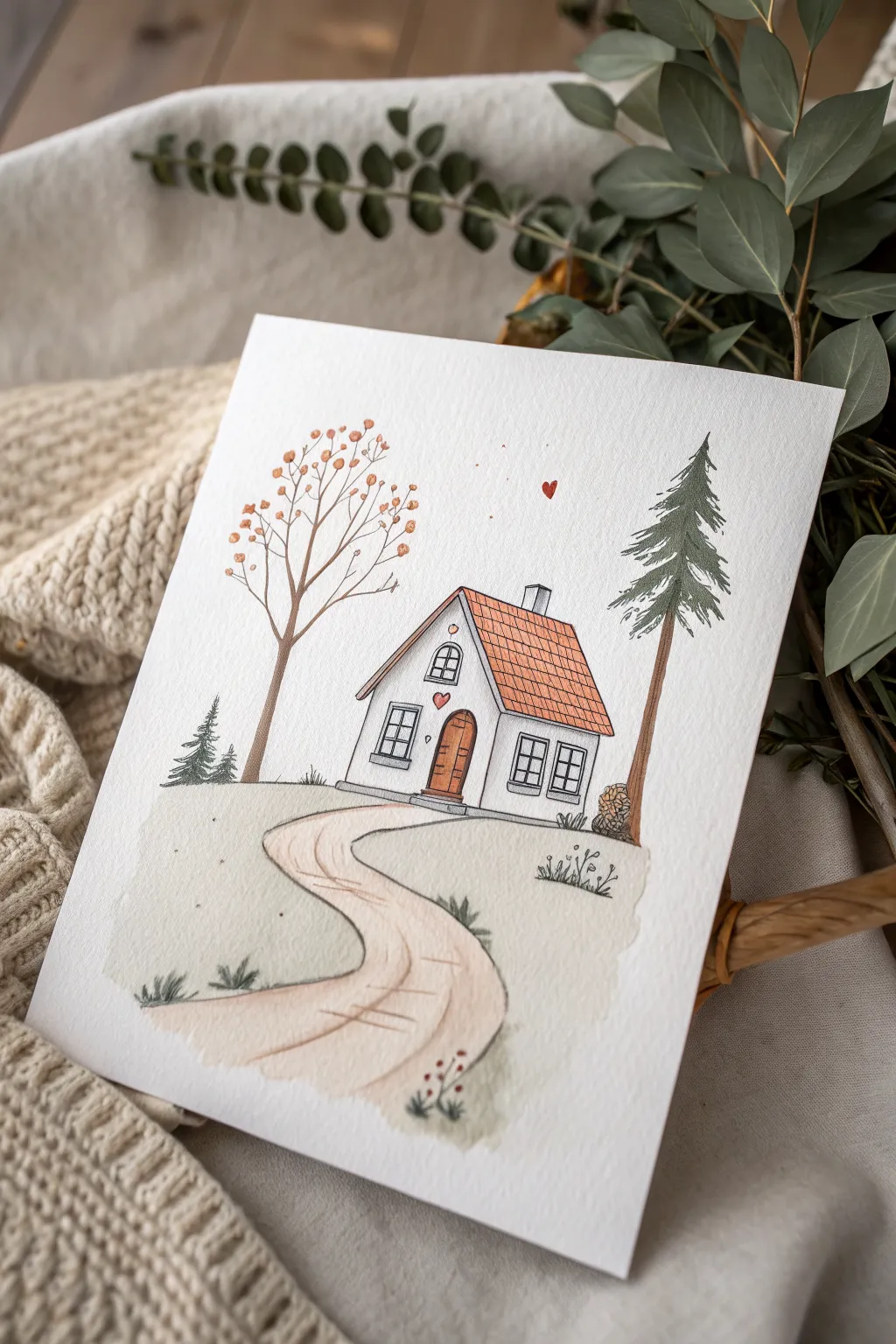
This charming portrait captures the warmth of a cozy home using delicate watercolors and crisp ink lines. With its sweet heart details and winding path, this piece makes a heartfelt gift that feels both personal and professional.
Detailed Instructions
Materials
- Cold press watercolor paper (300 gsm)
- Fine liner waterproof pens (0.1mm and 0.3mm, black)
- Watercolor paint set (Earth tones: burnt sienna, sap green, ochre)
- Round watercolor brushes (size 4 and 8)
- HB pencil
- Kneaded eraser
- Cup of water and paper towels
Step 1: Sketching the Foundations
-
Establish the horizon line:
Lightly draw a gentle, sloping curve roughly one-third of the way up from the bottom of your page to separate the foreground grass from the sky. -
Map out the house structure:
Place the house slightly off-center. Draw a simple rectangle for the base and add a steep triangular roof, extended slightly on the right side to show perspective. -
Draft the architectural details:
Sketch a chimney on the right slope of the roof. Add the arched front door, two square windows on the right wall, and a smaller window in the gable. Don’t forget the tiny heart above the door. -
Add landscape elements:
Draw a winding path leading from the door to the bottom left corner. Sketch a tall pine tree to the right of the house and a rounder, branching tree on the left.
Step 2: Inking the Lines
-
Outline the main structure:
Using your 0.3mm waterproof pen, carefully trace over your pencil lines for the house walls, door, and roof. Keep your hand steady but allow for slight natural wobbles to maintain that illustrative charm. -
Detail the trees:
Switch to a 0.1mm pen to draw the pine needles with short, jagged strokes and the delicate branches of the deciduous tree. Add texture to the tree trunks with vertical lines. -
Ink the finer details:
Draw the window panes, the tiles on the roof using a grid pattern, and the tiny heart floating in the sky. Add small tufts of grass near the path and house foundation. -
Erase pencil marks:
Wait until the ink is completely dry to touch—smearing is the enemy here—then gently remove all graphite lines with your kneaded eraser.
Keep it Clean
To get those sharp, crisp white walls, avoid painting the house facade entirely. Let the white of the paper serve as the paint color for the brightest look.
Step 3: Adding Color Washes
-
Wash the ground:
Mix a very diluted sap green with plenty of water. Paint the grassy area using a size 8 brush, leaving the path unpainted. Keep the edges soft and uneven for a dreamy look. -
Paint the path:
Use a watered-down ochre or light beige to fill in the winding path. Let the color fade out slightly as it reaches the bottom of the paper. -
Color the roof:
Load your brush with burnt sienna or terra cotta. Carefully fill in the tiled roof area, perhaps dabbing a bit more pigment near the bottom of the roof for shadow. -
Paint the door and details:
Use a slightly darker brown for the wooden door. Paint the heart above the door and the floating heart in the sky with a small touch of red. -
Add foliage color:
For the pine tree, use a richer green. For the left tree, dab small spots of orange and yellow around the branches to suggest leaves or berries.
Make it Personal
Swap the heart above the door for the house number of the recipient, or change the tree types to match the plants actually growing in their front yard.
Step 4: Final Touches
-
Deepen the shadows:
Once the first layer is dry, I like to add a tiny bit of grey-blue mixed with water under the roof eaves and along one side of the house to give it dimension. -
Enhance texturing:
Use your fine pen again to reinforce any lines that got lost under the paint, or add tiny dots in the grass for extra texture. -
Create ground details:
Paint tiny red dots on the small bushes in the foreground to mimic berries, tying the red elements of the composition together.
Frame this sweet illustration in a light wood frame to let the delicate colors truly shine

PENCIL GUIDE
Understanding Pencil Grades from H to B
From first sketch to finished drawing — learn pencil grades, line control, and shading techniques.
Explore the Full Guide
“I Love You” in Grandkids’ Handwriting
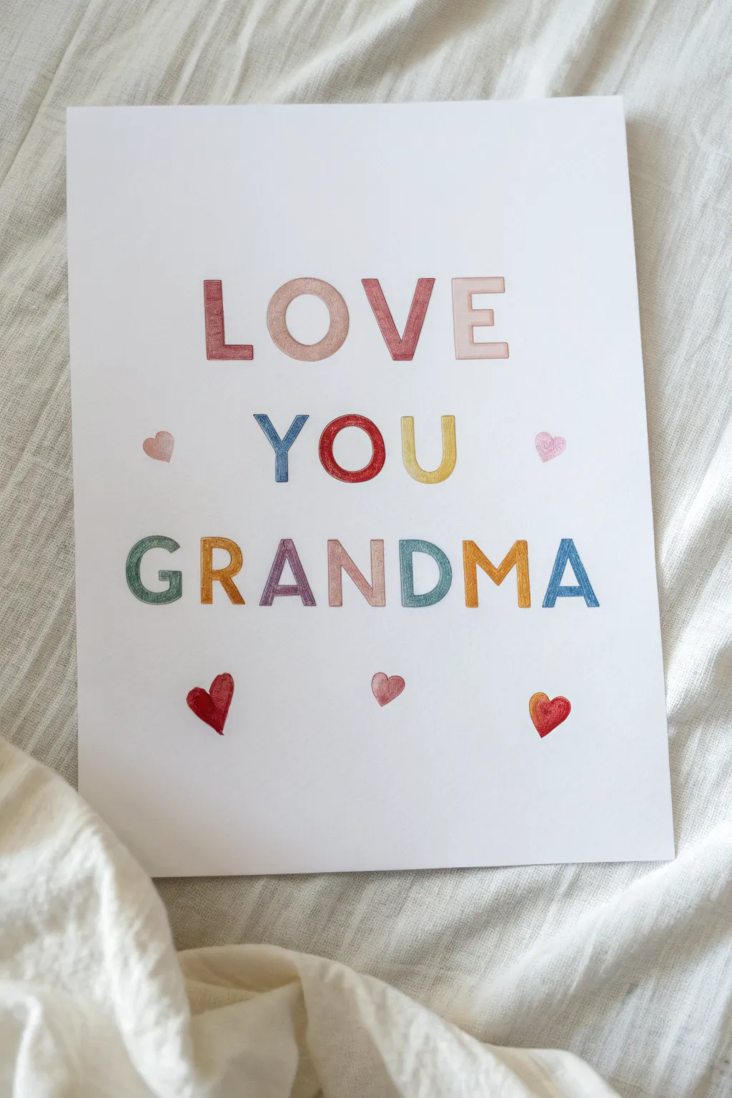
This sweet, hand-lettered art piece brings a pop of color and a lot of heart to any room. Using clean block letters filled with soft, textured marker strokes creates a warm and personal greeting card or framed wall art that Grandma will treasure.
Step-by-Step
Materials
- High-quality white cardstock or watercolor paper (8×10 or A4)
- Pencil (HB or H)
- Eraser (kneaded eraser preferred)
- Ruler
- Colored markers or colored pencils (assorted rainbow palette)
- Fine-tip black pen (optional, for outlining)
- Tracing paper (optional)
Step 1: Planning and Layout
-
Measure margins:
Start by finding the vertical center of your paper. Use your ruler to lightly mark the center point at the top and bottom, but keep these marks very faint so they erase easily later. -
Set guidelines:
Decide on the height for your three rows of text. Gently draw three sets of parallel horizontal lines across the page: one for ‘LOVE’, one for ‘YOU’, and one for ‘GRANDMA’. Leave about an inch or two of breathing room between each row. -
Draft the letters:
Lightly sketch out the block letters with your pencil. To keep things centered, start with the middle letters (like ‘O’ in YOU) and work outward to the left and right. Aim for a chunky, sans-serif style that is easy to read. -
Add floating hearts:
Sketch a few small hearts in the negative spaces around the words. Place one to the left of ‘YOU’, one to the right, and three scattered along the bottom for balance. -
Refine the shapes:
Go back over your pencil sketch to sharpen the edges. Make sure the tops and bottoms of the letters align perfectly with your guidelines, giving them a cohesive, professional look.
Stencil Secret
Don’t trust your freehand lettering? Print out the text in a bold font on computer paper first. Use a bright window or lightbox to trace the shapes onto your good cardstock.
Step 2: Adding Color
-
Select your palette:
Choose a soft, slightly muted rainbow palette. You want colors that look distinct but harmonious—think terracotta red, dusty pink, mustard yellow, teal, and slate blue. -
Color the first row:
Begin coloring the word ‘LOVE’. Use vertical or horizontal strokes to fill in the block letters. I find that keeping the stroke direction consistent within each letter makes the final texture look much neater. -
Alternate colors:
Switch colors for every letter to create that playful pattern. For example, make the ‘L’ a deep rose, the ‘O’ a soft peach, and so on. -
Fill the middle row:
Move to the ‘YOU’ row. Use a contrasting color like blue for the ‘Y’ and a bold red for the ‘O’ to make the center word pop. -
Complete the text:
Finish coloring ‘GRANDMA’ with the remaining shades in your palette. Try to avoid placing the same color directly underneath itself from the previous row to keep the visual interest high.
Add Dimension
Use a slightly darker shade of marker or pencil to draw a thin shadow line on the right side of each letter. This makes the text pop off the page instantly.
Step 3: Final Touches
-
Color the hearts:
Fill in the sketched hearts with warm tones like red and pink. You can add a tiny bit of shading to one side of each heart to give them a slight 3D appearance. -
Let it set:
Allow the marker ink to dry completely for a few minutes. This prevents smudging during the next step. -
Erase guidelines:
Carefully erase all visible pencil lines and guidelines. Be gentle around the colored areas so you don’t lift any pigment. -
Check for gaps:
Inspect your letters for any uneven white spots. If you see any, gently touch them up with the corresponding marker color. -
Optional outlining:
If you want the letters to stand out even more, you can outline them very carefully with a fine-tip pen in a matching dark shade or charcoal grey, though the soft look without outlines is equally lovely.
Once framed, this cheerful typography art will serve as a daily reminder of how much she is loved
Birth Month Flower Row for Grandma
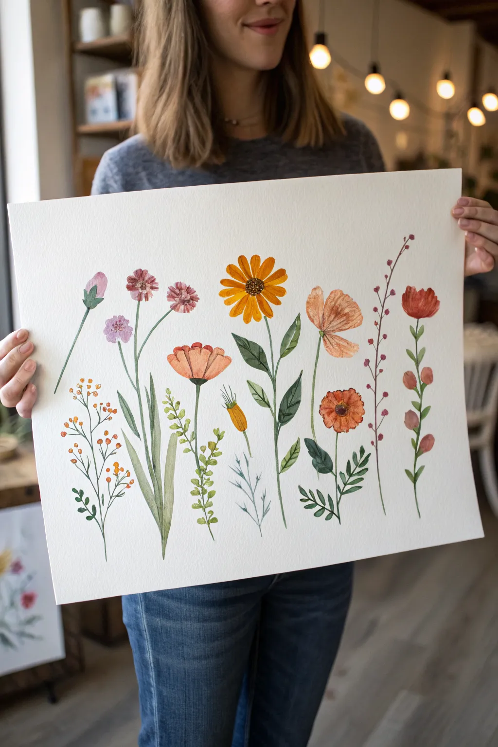
This elegant watercolor layout features a horizontal row of distinct wildflowers, meant to represent the birth months of family members. The crisp white background highlights the individual botanical stems, creating a fresh and personal botanical study.
Step-by-Step Tutorial
Materials
- Hot press watercolor paper (large format, heavy weight)
- Watercolor paints (pan or tube set)
- Round watercolor brushes (sizes 2, 6, and 8)
- Fine liner brush (size 0 or 00)
- Pencil (HB or H)
- Kneaded eraser
- jar of water
- Paper towels
- Mixing palette
Step 1: Planning and Sketching
-
Plan your layout:
Count how many birth flowers you need to include. Lightly mark vertical guidelines on your paper to space them evenly across the bottom third of the sheet, ensuring the stems will have room to ‘grow’ upwards. -
Sketch the stems:
Using an H pencil, lightly sketch the main vertical line for each stem. Vary the heights slightly—some tall, some medium—to create a natural, unforced rhythm across the page. -
Outline flower heads:
Draw simple geometric shapes to mark where the blooms will go. Use circles for the daisies and asters, teardrop shapes for buds, and loose cups for poppies. -
Refine the foliage:
Add the leaves to your stems now. Observe the reference: some stems have broad, lance-shaped leaves near the base, while others have tiny leaves climbing the stalk. Keep your pencil pressure very light so lines disappear under the paint.
Muddy Water Warning
If your yellows look dull, check your water jar. Yellow is easily polluted by dirty water. Change your rinse water before painting light-colored blooms.
Step 2: Painting the Blooms
-
Sun-kissed orange blooms:
Start with the large sunflowers or calendula. Mix a warm yellow-orange and wash in the petals, leaving the center unpainted for now. While wet, drop a tiny bit of darker orange at the base of the petals for depth. -
Delicate pinks and purples:
For the aster or cosmos flowers (the smaller purple/pink ones), use a size 6 brush. dab the color on loosely to mimic soft petals. Don’t fill the shape perfectly; white space adds sparkle. -
The poppy shapes:
For the poppy-like flowers, use a watery red-orange or coral wash. Let the edges be slightly ragged. I like to let this dry briefly and then add a second, darker glaze on one side to show the curve of the cup. -
Tiny buds and berries:
Use your smaller brush to paint the tight buds on the left and the reddish berries on the far right. These should be more pigmented and less watery than the open blooms. -
Dark centers:
Once the orange petals are dry, use a dark brown mix (burnt umber with a touch of blue) to stipple the center of the sunflower. Use the tip of the brush to create texture.
Step 3: Stems and Foliage
-
Mix your greens:
Prepare three shades of green: a yellow-green for new growth, a deep sap green for shadows, and a muted olive for dried or sage-like leaves. -
Paint main stalks:
Using a size 2 or liner brush, pull the paint from the flower head down to the bottom. Keep your hand steady but allow for slight natural wobbles. -
Broad leaves:
For the plant with large leaves near the center-left, use the size 8 brush. Press down to widen the stroke and lift up to create a point. Use two different greens here to suggest light hitting the leaves. -
Fine foliage details:
Switch to your smallest brush for the delicate, fern-like plant or the thin branches on the berry stems. These strokes should be quick and confident. -
Connecting the elements:
Check where stems meet flowers. If there is a gap, gently bridge it with green, forming the sepal (the green cup at the base of the flower).
Level Up: Names
Use a fine Micron pen to write the name or birthdate of each family member in small script just below the bottom of their respective flower stem.
Step 4: Final Details
-
Add definition:
Once everything is bone dry, take a slightly darker shade of each flower color and paint thin lines or tiny dots to define petals, veins, or texture. -
Erase guidelines:
Gently use the kneaded eraser to lift any visible graphite lines that weren’t covered by paint.
Now you have a blooming garden that celebrates the whole family in a single frame


Grandkids’ Names as Balloon Strings for Grandma
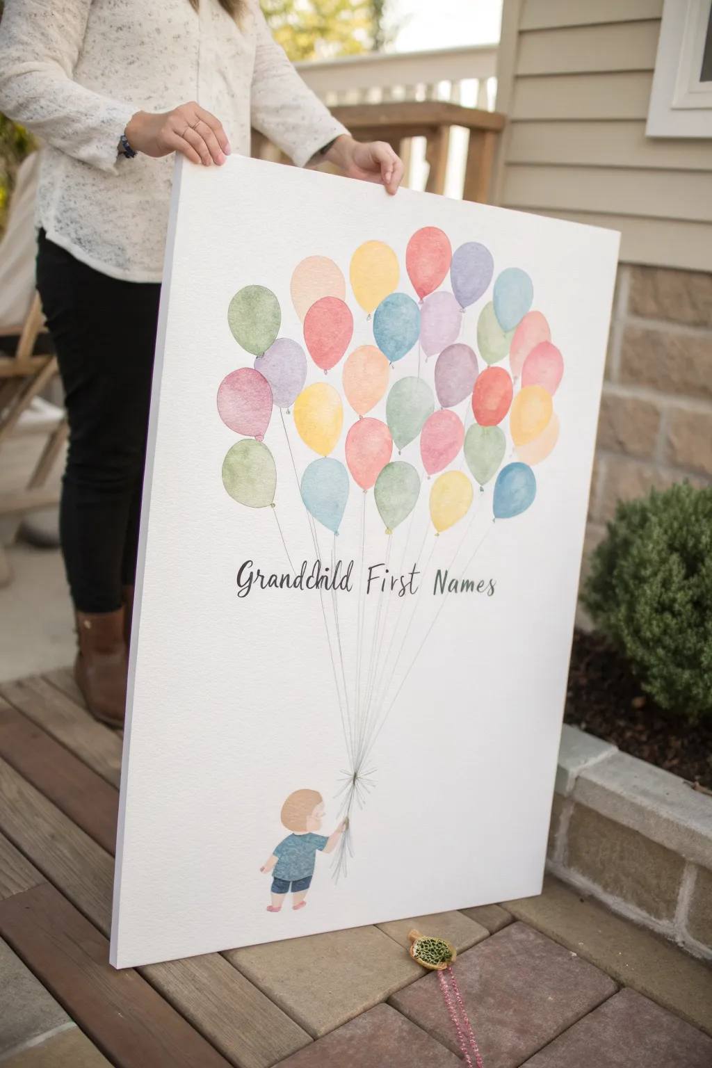
Celebrate every grandchild with this charming watercolor-style canvas that represents each little one as a bright, buoyant balloon. This lighthearted composition features a sweet illustration of a child anchoring the bunch, creating a personalized artwork that any grandma will cherish forever.
Step-by-Step Guide
Materials
- Large stretched canvas (at least 16×20 inches)
- Watercolor paints or fluid acrylics
- Soft round brushes (sizes 6 and 10)
- Fine liner brush (size 0 or 1)
- Graphite transfer paper
- Pencil and eraser
- Ruler or straight edge
- Black fine-point permanent marker or paint pen
- Printed template of child silhouette and text (optional)
- Water cup and paper towels
Step 1: Planning and Sketching
-
Prepare the layout:
Before putting brush to canvas, sketch your design on a piece of scrap paper first. Count how many grandchildren you need to represent, as this determines how many balloons you will pencil in later. -
Draft the child figure:
At the bottom center of the canvas, lightly sketch a small child reaching upward. If drawing isn’t your strong suit, print a simple clipart silhouette of a toddler, place transfer paper underneath it, and trace the outline directly onto the canvas. -
Outline the balloon cluster:
Starting about a third of the way down from the top, sketch oval balloon shapes. Group them closely together so they overlap slightly, creating a sense of fullness. -
Connect the strings:
Using a ruler and a very light pencil touch, draw straight lines connecting the bottom of each balloon to the child’s hand. These lines will guide your brushwork later, but they need to be faint enough to cover. -
Mark the text placement:
Determine where the phrase “Grandchild First Names” (or your specific names) will go—usually floating just under the balloons. Draw a faint horizontal guideline to keep your lettering straight.
Watercolor Wisdom
Work quickly when painting the balloons! If edges start to dry, you get hard lines. Keep the paint wet to achieve that soft, blended look.
Step 2: Painting the Elements
-
Mix watery washes:
Prepare your palette with a variety of soft, pastel colors. Dilute your acrylics with water (or use watercolors) to achieve that translucent, airy look seen in the reference. -
Paint the first balloon layer:
Using a size 10 round brush, fill in the balloons that appear to be in the ‘back’. Choose lighter shades like pale yellow, soft mint, and light pink. -
Create the watercolor effect:
While the paint is wet, dip your brush in clean water and touch the edges of the balloon shapes to soften them. This helps mimic the texture of the inspiration piece. -
Let it dry completely:
Wait for the first layer of balloons to be fully dry to the touch. This prevents the colors from bleeding into each other when you add the overlapping balloons. -
Add the foreground balloons:
Paint the remaining balloons that sit ‘on top’ using slightly more saturated colors—corals, sky blues, and lavenders. The transparency of the paint will allow the shapes behind to peek through subtly. -
Paint the child figure:
Switch to a smaller brush to paint the child at the bottom. Use simple block colors for clothing, like a blue shirt and denim shorts, and a soft peach or brown tone for the skin and hair. -
Detail the child:
Once the base coat on the child is dry, add tiny details like the hem of the shorts or texture in the hair using the fine liner brush.
Personalize It
Instead of writing the names in a row, write one grandchild’s name inside each balloon using a white paint pen for a hidden surprise.
Step 3: Listing the Names
-
Draft the lettering:
Using your pencil guideline, write out the names in a flowing, cursive script. I prefer to sketch the letters lightly first to ensure the spacing looks balanced. -
Ink the names:
Go over your pencil lettering with a black fine-point paint pen or a very steady hand with black paint and a liner brush. Vary the line thickness on the downstrokes for a calligraphy look. -
Draw the final strings:
Using a ruler and a fine black pen or liner brush, draw the final balloon strings. Start from the base of each balloon and converge them all into the child’s hand. -
Add string details:
Where the strings bunch up near the hand, add a few extra short strokes to show the tension and gathering of the ribbons. -
Erase guidelines:
Once the paint and ink are 100% dry—give it a few hours to be safe—gently erase any visible pencil lines from your initial sketch.
Hang this airy masterpiece in a bright room to remind Grandma of her growing family every day
Sunshine Card Painting for Grandma
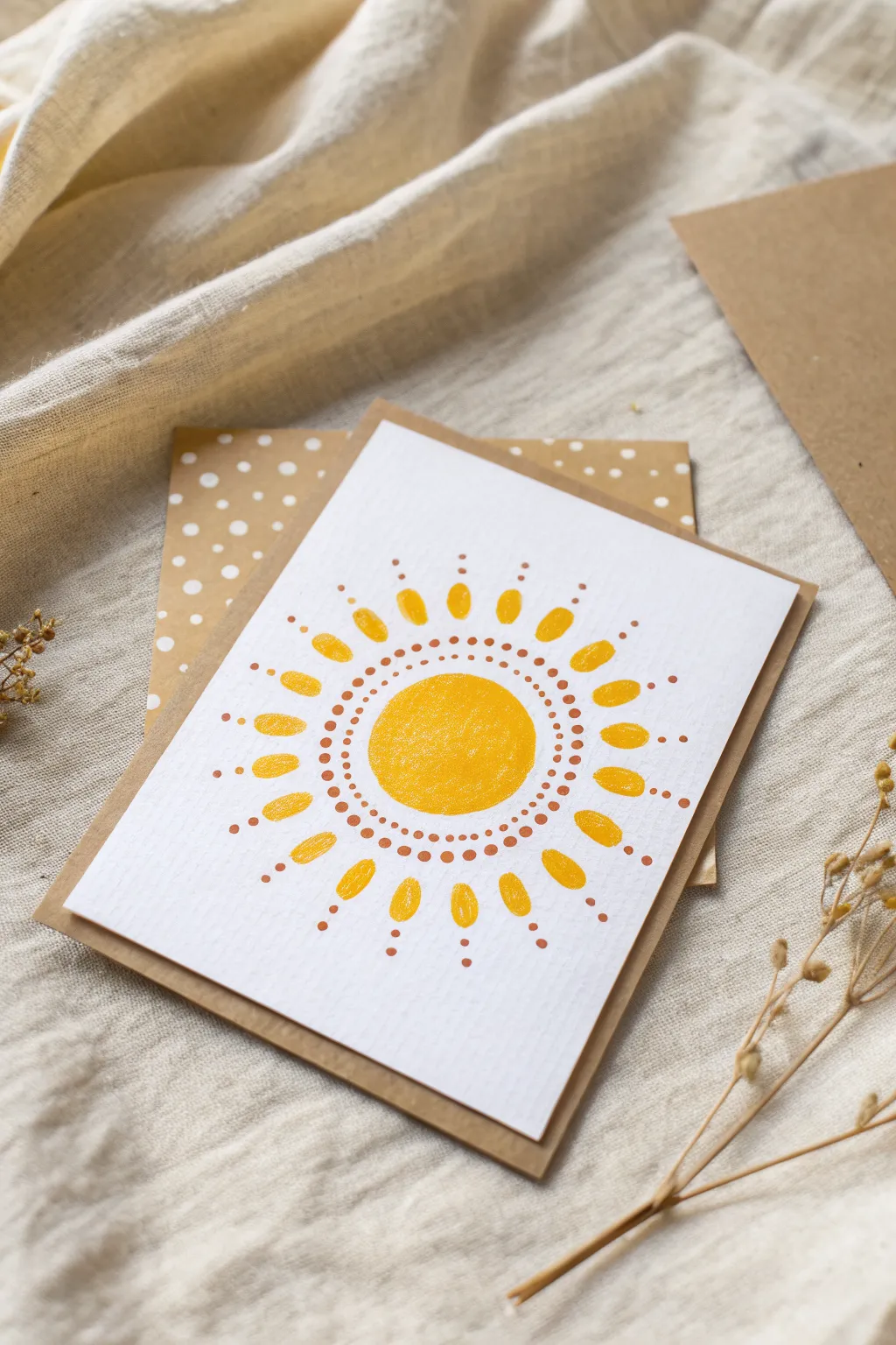
Brighten Grandma’s day with this sunny, folk-art inspired greeting card. The simple dotted patterns and warm yellow tones create a cheerful, radiant design that feels both modern and heartfelt.
Step-by-Step
Materials
- Heavyweight white textured cardstock or watercolor paper
- Kraft brown cardstock (for the card base)
- Yellow acrylic paint or gouache (warm, sunny shade)
- Copper, terracotta, or warm brown acrylic paint
- Small round paintbrush (around size 2 or 4)
- Dotting tools (or the back of a paintbrush/toothpick)
- Pencil and compass (or round object to trace)
- Eraser
- Scissors or paper trimmer
- Glue stick or double-sided tape
Step 1: Preparation & Base
-
Cut the panels:
Begin by cutting your kraft cardstock to your desired folded card dimensions (e.g., 5×7 inches when folded). Then, cut your white textured paper slightly smaller than the card front (around 4×6 inches) to create a nice brown border. -
Mark the center:
Lightly mark the center of your white rectangular panel with a pencil. This will be the anchor for your sun design. -
Draw the guide:
Using a compass or by lightly tracing a small circular object (like a specialized bottle cap), draw a faint circle about 1.5 inches in diameter in the middle of the paper.
Uneven Dots?
If your dots are different sizes, practice on scrap paper first. Reload your tool with fresh paint every 2-3 dots to keep the size consistent and avoid ‘fading’ circles.
Step 2: Painting the Sun Core
-
Fill the center:
Load your small round brush with the yellow paint. Carefully fill in the circle you just traced. -
Refine the edges:
Smooth out the circumference of the yellow circle to ensure it’s relatively round, though a hand-painted look adds charm. -
Let it dry:
Allow this center circle to dry completely. If the paint looks streaky, I like to add a second thin coat for opacity.
Step 3: Adding the Dot Details
-
First ring of dots:
Dip a fine dotting tool or the very tip of a thin paintbrush into the copper/brown paint. Create a ring of tiny dots closely surrounding the yellow center, leaving just a sliver of white space between the paint and the dots. -
Second ring of dots:
Create a second, concentric ring of copper dots just outside the first one. Try to keep the spacing consistent, but don’t stress about perfection. -
Third ring of dots:
Add a third ring of these small copper dots. This builds distinct visual separation before the rays begin.
Make it Shine
Mix a tiny pinch of gold mica powder into your yellow paint, or use a metallic gold pen for the outer dots to give the sun a subtle shimmer when the light hits it.
Step 4: Painting the Rays
-
Position the rays:
Switch back to your yellow paint and the round brush. Imagine the face of a clock to help space your rays evenly. -
Paint main rays:
Paint elongated oval shapes—almost like rice grains or sunflower petals—radiating outward. Start at the 12, 3, 6, and 9 o’clock positions to establish symmetry. -
Fill in between:
Paint two or three similar oval rays in the spaces between your main four points. You should aim for about 16 to 20 rays total around the sun. -
Check shape consistency:
Ensure the rays are roughly the same size, pointing away from the center. The gap between the rays and the copper dots should be consistent.
Step 5: Final Touches & Assembly
-
Outer dot accents:
Using the copper paint again, place a small dot at the outer tip of every yellow ray. -
Inner ray accents:
Add a tiny copper dot in the V-shaped white space between the base of each yellow ray, closer to the central rings. -
Erase guides:
Once all paint feels completely dry to the touch, gently erase any visible pencil marks from the beginning. -
Mount the artwork:
Apply glue or double-sided tape to the back of the white painted panel. -
Center and stick:
Press the white panel firmly onto the front of your kraft card base, centering it to show an even border of brown.
Write a sweet message inside and this radiant card is ready to deliver a smile
Heart Hands Painting for Grandma
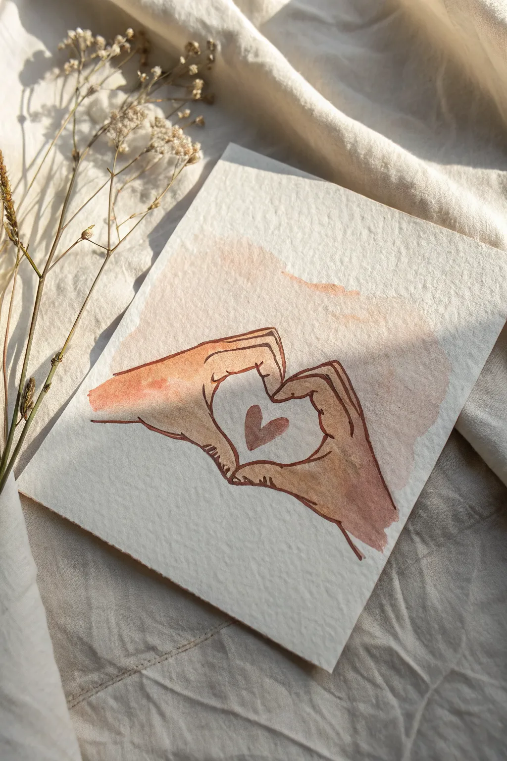
This heartwarming watercolor project captures a sweet gesture of love, featuring two hands forming a heart shape with a soft wash of color. The combination of gentle watercolor washes and delicate ink linework creates a lovely, vintage-inspired illustration perfect for gifting.
Detailed Instructions
Materials
- Cold press watercolor paper (textured)
- Watercolor paints (burnt sienna, yellow ochre, and a touch of red)
- Round watercolor brush (size 6 or 8)
- Small round detail brush (size 2)
- Brown waterproof fineliner pen (0.3mm or 0.5mm)
- HB pencil
- Kneaded eraser
- Jar of water
- Paper towels
Step 1: Sketching the Composition
-
Establish the heart shape:
Begin by very lightly sketching a small heart shape in the center of your paper. This will serve as the negative space or ‘window’ between the fingers. -
Outline the thumbs:
Sketch the thumbs first, curving them downwards so their tips touch at the bottom point of your central heart. -
Draw the index fingers:
Draw the index fingers arching upwards, bending at the knuckles so the fingertips meet to form the top arches of the central heart shape. -
Add the remaining fingers:
Sketch the middle, ring, and pinky fingers tucked behind the index fingers. They should be hinted at rather than fully detailed, creating a blocky shape for the rest of the hand. -
Refine the wrists:
Extend lines outward from the base of the thumbs and the pinky side of the hand to suggest wrists fading off the page. -
Lighten the sketch:
Take your kneaded eraser and gently blot the entire drawing until the graphite lines are barely visible. This prevents heavy pencil marks from showing through the translucent paint.
Step 2: Painting the Washes
-
Mix a skin tone base:
On your palette, mix a generous amount of water with burnt sienna and a tiny touch of yellow ochre to create a very pale, warm skin tone. -
Paint the first wash:
Using your medium round brush, apply this pale wash over the entire hand shape, carefully avoiding the central heart area. Keep the edges ragged and uneven near the wrists and outer edges for an artistic look. -
Add warmth while wet:
While the first layer is still damp, I like to drop in a slightly more saturated mix of reddish-brown near the wrists and knuckles to add life and variation to the skin. -
Create the background wash:
Mix a very watery, pale pinkish-beige wash. Paint a loose, abstract cloud shape behind and around the hands, letting it bleed slightly into the wet edges of the hands for a soft, dreamy effect. -
Paint the inner heart:
Switch to your small detail brush. Mix a slightly darker reddish-brown tone and paint a small, solid heart floating right in the middle of the negative space between the hands. -
Let it dry completely:
Allow the paper to dry fully. If the paper feels cool to the touch, it is still wet inside. Wait until it is room temperature to avoid smudging the next step.
Pro Tip: Loose Edges
Don’t try to paint perfectly to the lines. Letting the watercolor wash spill slightly outside the ink lines creates a charming, modern illustrative style.
Step 3: Inking the Details
-
Outline the thumbs:
Using the brown waterproof fineliner, carefully trace over your pencil lines for the thumbs. Use broken, sketchy lines rather than one continuous solid line to maintain a hand-drawn feel. -
Define the fingers:
Outline the index fingers and the tucked-in fingers behind them. Add small creases at the knuckles to give the hands realistic volume. -
Add palm details:
Draw a few short, curved lines on the palm and near the thumb joints to suggest the natural folds of the skin. -
Enhance shading with hatching:
Add tiny hatching lines (short parallel strokes) in the shadowed areas, such as under the thumbs and where the fingers overlap. This adds depth without using more paint. -
Review and erase:
Once the ink is absolutely dry, use your eraser one last time to remove any remaining stray pencil marks.
Level Up: Floral Touch
Instead of a simple background wash, paint tiny vines or small flowers weaving around the wrists to turn the hands into a nature-inspired portrait.
Now your sentimental artwork is ready to be framed and gifted to grandma
Abstract Color Wash With a Grandma Quote
This sweet and simple greeting card features a dreamy, soft-focus background created with a wet-on-wet watercolor technique. It frames distinctive handwritten text with delicate botanical sprigs for a heartfelt finish.
Step-by-Step Guide
Materials
- High-quality watercolor paper (cold press, 140lb/300gsm)
- Watercolor paints (pastel pink, yellow, deep red, purple)
- Clean water
- Soft round watercolor brush (size 6 or 8)
- Fine detail brush (size 0 or 1)
- Painter’s tape or washing tape
- Fine-liner pen (black, archival ink)
- Pencil and eraser
- Ruler
Step 1: Preparing the Canvas
-
Cut and fold:
Cut your watercolor paper to your desired card size—typically 10×7 inches for a folded 5×7 card. Fold it carefully in half, using a bone folder or the back of a spoon to get a crisp crease. -
Tape the border:
Open the card flat or work on a separate front panel to glue on later. Use painter’s tape to create a clean rectangular border about 1/2 inch from the edge on all sides. Press the tape edges down firmly to prevent paint bleeding.
Step 2: Creating the Wash Background
-
Pre-wet the paper:
Dip your larger round brush into clean water and apply a light sheen of water across the entire area inside the tape. The paper should be damp and glistening, but not forming puddles. -
Drop in yellow:
While the paper is still wet, pick up a watery mix of pale yellow paint. Touch the brush gently to the lower-left and middle areas, letting the color bloom and spread naturally. -
Add soft pinks:
Clean your brush and pick up a diluted pastel pink. Dab this into the upper corners and around the yellow areas. Let the pink and yellow touch slightly so they merge into a soft orange hue without turning muddy. -
Let it dry completely:
This step requires patience. Allow the wash to dry completely until the paper is flat and cool to the touch. If you paint over it too soon, the details will blur.
Clean Lines Pro-Tip
To prevent paint from seeping under your tape, quickly run a credit card or bone folder firmly along the tape’s inner edge before you start painting.
Step 3: Adding Text and Illustrations
-
Draft the text:
Using a ruler to find the visual center, lightly sketch the words ‘LOVE YOU’ in print and ‘grandma’ in cursivescript with a pencil. Ideally, place this in the upper third of the painted area. -
Ink the lettering:
Trace over your pencil lines with a black archival fine-liner. I prefer doing the print letters first to establish the structure before flowing through the cursive ‘grandma’ below it. -
Sketch floral placement:
Lightly mark where your three main stems will go in the bottom right corner: one yellow sprig, one leafy red branch, and a small purple flower cluster. -
Paint the red leaves:
Switch to your fine detail brush. Mix a saturated deep red or burgundy. Paint a thin central stem, then add small, almond-shaped leaves branching off it. Keep the paint fairly dry for crisp edges. -
Paint the yellow sprig:
Clean your brush and use a bright yellow (less diluted than the background). Paint a thin green or brown stem, then dot small yellow circles at the top to mimic billy button flowers. -
Paint purple blooms:
Mix a soft purple watercolor. Paint simple five-petal flower shapes near the base of the red stem. Add a tiny dot of darker purple or black in the center of each flower. -
Connect the stems:
Ensure all your floral elements have stems that originate from roughly the same area at the bottom edge, creating a cohesive bouquet look. -
Erase pencil marks:
Once the ink and all painted details are 100% dry, gently erase any visible pencil sketch lines around the text and flowers.
Make it Sparkle
Once the florals are dry, add tiny dots of metallic gold watercolor or a gold gel pen to the center of the flowers for an elegant touch.
Step 4: Finishing Touches
-
Remove the tape:
Carefully peel the painter’s tape away at a 45-degree angle, pulling away from the painted area to ensure a crisp, clean white border. -
Flatten the card:
If the watercolor paper buckled slightly from the water, place the finished dry card under a heavy book overnight to flatten it out perfectly.
Now you have a delicate, handmade keepsake that creates a beautiful frame for your special message
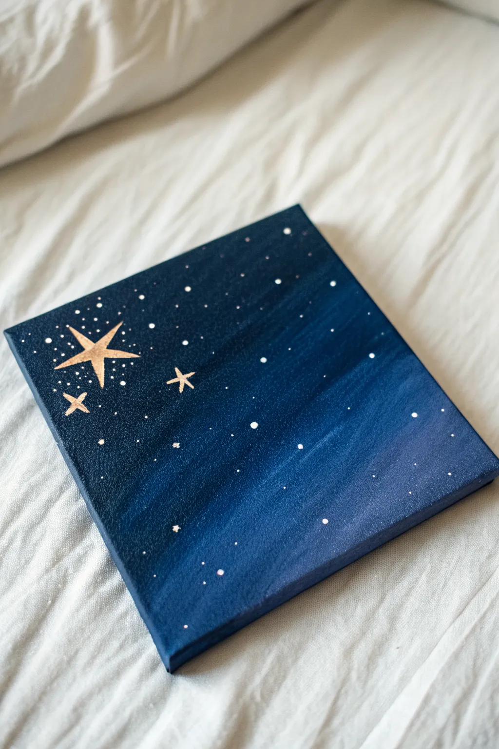
Night Sky “Guiding Light” Painting for Grandma

This celestial artwork captures the tranquil beauty of a clear night sky using rich gradients of navy and indigo. With its prominent golden stars serving as a guiding light, this piece makes a heartfelt and symbolic gift for a grandmother.
Step-by-Step Tutorial
Materials
- Square stretched canvas (e.g., 8×8 or 10×10 inches)
- Acrylic paints: Navy Blue, Phthalo Blue (or primary blue), Black, Titanium White, Metallic Gold
- Wide flat brush (for background)
- Small fine liner brush (for stars)
- Toothbrush (old)
- Palette or paper plate
- Cup of water and paper towels
- Pencil
Step 1: Creating the Midnight Gradient
-
Prepare your palette:
Squeeze out generous amounts of navy blue and black acrylic paint onto your palette. Add a separate blob of the brighter phthalo blue. -
Start with the darkest corner:
Using your wide flat brush, mix the navy blue with a little black to create a very deep, midnight shade. Paint the upper-left corner of the canvas with broad, diagonal strokes. -
Establish the transition:
Without cleaning your brush fully, pick up pure navy blue. Apply this next to your dark corner, blending the wet edges together so the black-blue transitions into the navy. -
Lighten the gradient:
As you move diagonally toward the bottom-right corner, mix the navy blue with the brighter phthalo blue. Paint this across the middle section of the canvas. -
Finish the background:
For the bottom-right corner, mix a tiny dot of white into your blue mixture to create the lightest part of the sky. Ensure your brushstrokes all follow the same diagonal direction for a smooth look. -
Paint the edges:
Don’t forget to paint the sides of your canvas with the corresponding colors so it looks finished even without a frame. -
Let it dry completely:
Wait for the background to be fully dry to the touch. This is crucial so your stars maintain sharp edges and don’t muddy into the blue.
Step 2: Adding the Constellations
-
Sketch the main stars:
Lightly use a pencil to mark the position of your three main stars in the upper-left dark quadrant. Draw a simple cross first, then add the diagonal points to create an elongated four-to-five-point star shape. -
Paint the gold base:
Dip your fine liner brush into metallic gold paint. Carefully fill in the shapes of your three stars. You may need two coats of gold for solid opacity. -
Sharpen the points:
Use the very tip of your liner brush to drag the paint outward at the tips of the stars, making them look sharp and twinkling. -
Create distant stars:
Using the handle end (the non-brush end) of a paintbrush, dip it into white paint. Gently dot the canvas to create circular stars of varying sizes. -
Vary the placement:
Cluster some white dots near the gold stars to simulate a galaxy feel, and leave other areas more sparse. -
The splatter technique:
For the tiniest, most natural-looking stars, dilute a small amount of white paint with water until it’s the consistency of ink. -
Flick the stars:
Dip an old toothbrush into this watery white paint. Hold it over the canvas and run your thumb across the bristles to flick a fine mist of ‘stars’ across the sky. -
Add final highlights:
Once the gold stars are dry, I like to add a tiny dot of white right in the center of the largest star to make it look like it’s glowing intensely.
Pro Tip: Brighter Gold
Metallic paints can be translucent. Paint the stars white first, let them dry, and then paint the gold over the top. The white base makes the gold pop brilliantly against the dark blue.
Trouble: Blotchy Gradient?
If your background blending looks rough, dip your brush in a tiny bit of water and run it lightly over the transition line between colors while the paint is still wet to smooth it out.
Now you have a stunning piece of the cosmos ready to hang on the wall


Have a question or want to share your own experience? I'd love to hear from you in the comments below!