
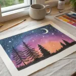
When I need a fast win in my sketchbook, I reach for soft pastels and let color blending do the heavy lifting. These easy pastel drawing ideas are all about simple shapes, bold color, and that satisfying smudge-and-glow look.
Blended Sunset Over a Simple Horizon
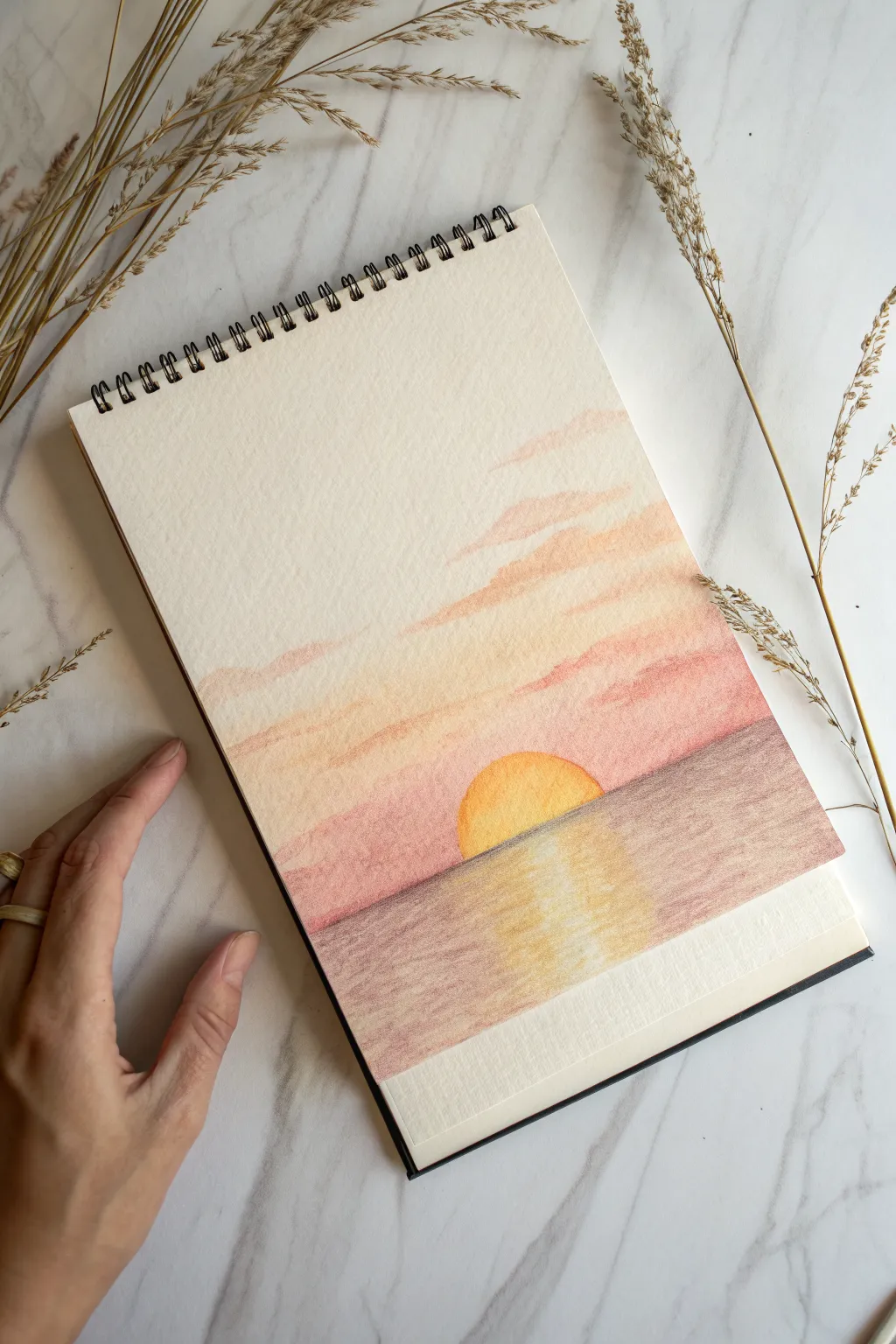
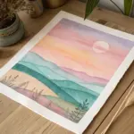
Capture the serene beauty of a sunset where the sky meets the sea with this soft, blended pastel drawing. The warm gradient of the sky and the gentle reflection on the water create a peaceful scene that’s perfect for practicing smooth transitions.
Step-by-Step Tutorial
Materials
- Spiral-bound sketchbook with textured mixed-media or pastel paper
- Soft pastels or pastel pencils (Yellow, Light Orange, Peach, Soft Pink, Dusty Rose, Brownish-Purple)
- Masking tape or artist tape
- Blending stump or tissue
- Ruler (optional)
- Clean cloth or wet wipes for hands
Step 1: Setting the Scene
-
Tape the Frame:
Begin by applying a strip of masking tape horizontally across the bottom section of your paper. This will create a clean, sharp edge for the bottom of your drawing, giving it a polished look when removed. -
Define the Horizon:
Decide where your horizon line will sit. Lightly sketch a straight horizontal line across the page about one-third of the way up from your bottom tape. You can use a ruler if you want it perfectly straight, or freehand it for a natural feel. -
Outline the Sun:
Right in the center of your horizon line, draw a semi-circle sitting on top of the line. This will be your setting sun. Keep the line faint so it doesn’t show through the lighter yellow pigment later.
Muddy Waters?
If your ocean reflection looks muddy, clean your finger or blending tool before touching the yellow area. Mixing too much purple into the yellow turns it gray.
Step 2: Creating the Sky
-
Base Yellow Layer:
Fill in the semi-circle sun with a bright, warm yellow. Apply the pastel densely here. Then, lightly scumble some of lead the same yellow horizontally into the sky area just above the horizon, fading it out as you go higher. -
Adding Orange Gradients:
Take a light orange pastel and apply it in horizontal strokes above the yellow area. Overlap the yellow slightly to encourage mixing. I like to keep my strokes loose here, mimicking the natural drift of clouds. -
Introducing Pink Tones:
As you move further up the page, switch to a soft pink or peach color. Apply this in distinct cloud-like shapes that stretch horizontally. Leave some white space between these pink clouds to let the paper’s texture or a very faint suggestion of blue show through, or simply leave it blank for a high-key look. -
Deepening the Colors:
Add touches of a dusty rose color to the undersides of the pink clouds to give them volume and weight. This shadow helps create a sense of dimension in the sky. -
Blend the Sky:
Using your finger or a blending stump, gently smudge the sky colors. Use horizontal motions to maintain the stratus cloud effect. Be careful not to over-blend; you want to keep the distinct bands of color visible.
Add Texture
Use the sharp edge of a pastel stick to draw thin, sharp white or pale yellow lines horizontally across the water’s reflection to mimic sparkling wave crests.
Step 3: Rendering the Ocean
-
Base Ocean Color:
Select a brownish-purple or muted mauve pastel for the water. Start applying this color from the bottom tape up towards the horizon line. Apply it fairly heavily at the bottom and corners. -
Leave the Reflection Path:
Crucially, leave a vertical column in the center of the water—directly under the sun—mostly empty or very lightly colored. This reserved space will become the sun’s reflection. -
Establish the Horizon Edge:
Carefully run your darker ocean color right up to the horizon line, defining the sharp edge against the lighter sky. Ensure this line is straight and crisp. -
Add the Reflection:
Fill the empty center column with the same bright yellow used for the sun. Add streaks of the light orange on the edges of this yellow path where it meets the darker water. -
Blend the Water:
Smooth out the ocean area with horizontal strokes. When blending the reflection, pull small amounts of the yellow sideways into the purple water, and pull small amounts of purple into the yellow to create a shimmering, rippled look. -
Final Touches:
Check your contrast. If the horizon line looks fuzzy, re-define it carefully with the purple pastel. If the sun needs to be brighter, add a final layer of yellow pigment on top without blending it. -
The Reveal:
Slowly peel away the masking tape at the bottom. Pull it away from the drawing area at a 45-degree angle to prevent tearing the paper on your fresh, crisp edge.
Now you have a tranquil sunset scene that brings a warm glow to your sketchbook
Glowing Full Moon in a Night Sky
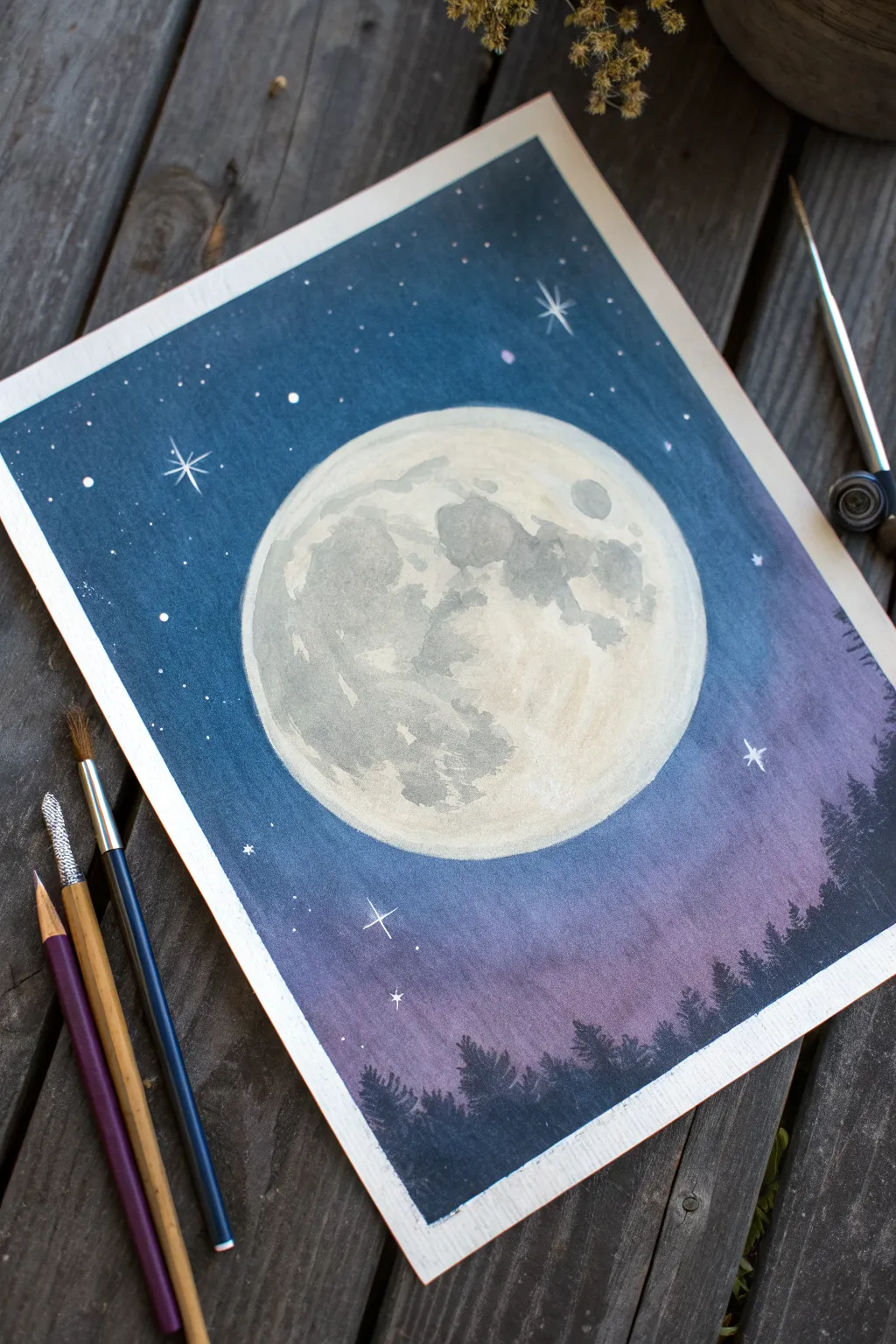
Capture the serene beauty of a full moon rising over a silent forest with this atmospheric project. Using a blend of deep blues and purples, you’ll create a glowing night sky that perfectly frames a textured, realistic moon.
How-To Guide
Materials
- Heavyweight watercolor or mixed media paper
- Soft pastels (Navy Blue, Dark Purple/Violet, Black, White, Grey, Light Cream/Yellow)
- Pastel pencils or charcoal pencils (Black for trees, White for stars)
- Blending stump or tortillon
- Paper towels or soft cloth
- Fixative spray
- Masking tape (for clean borders)
- Circle template or a round object (like a bowl)
Step 1: Setting the Scene
-
Prepare the canvas:
Tape down all four edges of your paper onto a flat surface using masking tape. This will create that crisp, professional white border shown in the final piece. -
Outline the moon:
Place your circular template slightly above the center of the page. Lightly trace the circle using a light grey or white pastel pencil so it blends in later. -
Establish the background gradient:
Starting at the very top of the paper, apply a thick layer of navy blue soft pastel. As you move down towards the middle, switch to a dark purple or violet shade. Near the horizon line (bottom third), blend the purple into a lighter violet or soft black. -
Blend the sky:
Use your fingers or a soft cloth to blend the sky colors together smoothly. Work horizontally to create a seamless gradient from the deep blue top to the purple haze near the trees. -
Refine the moon’s edge:
Be careful when blending near your circle outline. You want the sky color to touch the edge of the circle without smudging messily into the moon space.
Moon Glow Trick
Before painting the moon, lightly rub a tiny bit of white pastel into the blue sky immediately surrounding the circle. This creates a subtle atmospheric glow.
Step 2: Creating the Moon
-
Base layer for the moon:
Fill the circular moon shape with a very light cream or off-white pastel. Blend this base layer smoothly so it covers the paper grain. -
Mapping the craters:
Using a light grey pastel, gently sketch irregular shapes to represent the ‘maria’ or dark plains of the moon. Look at the reference photo to see how the larger dark patches sit mostly on the left side. -
Adding depth:
Darken the grey patches slightly with a medium grey tone. use a blending stump to soften the edges of these shapes; moon craters should look hazy, not sharp. -
Highlighting:
Take a bright white pastel and gently dab it over the lightest cream areas, focusing on the right side of the moon to suggest illumination. Blend softly.
Step 3: Silhouettes and Stars
-
Drafting the treeline:
Using black pastel or charcoal, rough in the horizon line at the bottom. It doesn’t need to be straight; a slight undulation looks more natural. -
Detailing the trees:
Switch to a sharpened black pastel pencil or charcoal pencil. Draw vertical lines for tree trunks, then scribble tiny zig-zag motions downwards to create the pine branches. Vary the heights to crowd the forest floor, with taller trees on the right. -
Adding distant trees:
For added depth, I sometimes use a dark grey or deep purple for a second row of trees slightly behind the black ones, making them look further away in the mist. -
Creating stars:
Using a sharp white pastel pencil or a white gel pen, dot random stars throughout the sky. Vary the pressure to create different sizes. -
Drawing the gleam:
Select a few major stars and draw a small cross or ‘starburst’ shape over them to make them twinkle. -
Final touches:
Remove the masking tape slowly at a 45-degree angle to reveal your clean edges. Lightly spray with fixative if desired to prevent smudging.
Smudged the Moon?
If blue sky dust enters your moon area, don’t wipe it! Dab it with a kneaded eraser to lift the pigment, then re-apply your cream base layer.
Now you have a tranquil night scene ready to be framed or gifted.
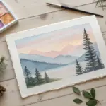
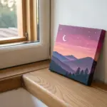

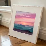
Mountain Silhouette Against a Gradient Sky
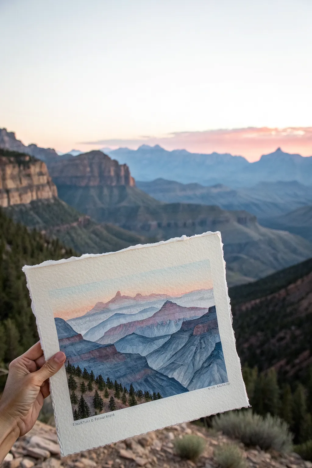
Capture the breathtaking depth of a canyon landscape with this layered watercolor study. By building up washes from distant mountains to foreground trees, you’ll create a serene sense of atmosphere and perspective on textured paper.
Step-by-Step Guide
Materials
- Cold press watercolor paper (deckled edge preferred)
- Watercolor paints (Indigo, Payne’s Grey, Burnt Sienna, Alizarin Crimson, Sap Green)
- Round brushes (sizes 4, 8, and a fine liner)
- Masking tape or gummed tape
- Pencil (HB or 2H)
- Two jars of water
- Paper towels
- White gouache (optional for mixing)
Step 1: Preparation and Sketching
-
Prepare the paper:
Start by tearing your watercolor paper to size if it isn’t already. Creating a deckled edge adds a rustic, organic feel that suits the landscape subject perfectly. Tape the back or corners lightly to your board to keep it steady. -
Lightly map the layers:
Using an HB or hard pencil, sketch the horizon line and the subsequent ridge lines. Draw these very lightly; you just want a guide for where the mountains overlap, not heavy outlines that will show through the paint. -
Plan your values:
Observe the reference: the farthest mountains are the lightest and bluest, while the foreground is dark and detailed. Mentally separating these distinct planes now will solve headaches later.
Atmospheric Perspective
Remember the golden rule: objects become lighter, bluer, and less detailed the further away they are. Keep your foregrounds dark and warm, and backgrounds pale and cool.
Step 2: Painting the Sky and Distance
-
Wet-on-wet sky:
Wet the sky area with clean water. Drop in a very dilute wash of Alizarin Crimson mixed with a touch of blue near the horizon for that soft sunset glow, fading into white paper at the top. -
The furthest ridge:
While the sky is damp but not soaking, mix a very watery, pale purple-grey. Paint the most distant mountain shape. Soften the bottom edge of this shape with clear water so it fades into nothingness. -
Second mountain layer:
Once the previous layer is dry, mix a slightly stronger blue-grey. Paint the next ridge forward. This layer needs a defined top edge but can still remain quite misty and soft. -
Adding warmth:
As you move forward to the third layer, introduce a tiny bit of Burnt Sienna to your blue mix. This subtle warmth mimics the sun hitting the rock faces. Paint the ridge, ensuring the top edge is crisp.
Make It Winter
Leave the tops of the ridges unpainted white to simulate snow caps. You can also spatter a tiny amount of white gouache over the dried painting for falling snow.
Step 3: Mid-Ground and Texture
-
Deepening the values:
For the middle ridges, we need more pigment and less water. Use Indigo mixed with a touch of purple. Paint these shapes with confidence, allowing the paint to pool slightly in the crevices to create natural texture. -
Creating rock formations:
Use the tip of your size 4 brush to suggest vertical striations in the rock on these middle layers. Don’t overdo it—just a few directional strokes help imply the canyon geology. -
The dark ravine:
Mix a dark, cool shadow color using Payne’s Grey and Indigo. Paint the deep ravine section on the right side, cutting sharply against the lighter layer behind it to push it forward. -
Adding atmospheric haze:
If a layer looks too stark, you can glaze a very watery blue over the bottom half of a mountain shape after it dries. This pushes the base back and creates that foggy canyon look.
Step 4: Foreground and Details
-
The closest ridge:
Mix your darkest color yet—Indigo plus a little Sap Green and Burnt Sienna to make a near-black. Paint the large foreground slope on the left, covering the bottom area effectively. -
Painting the tree line:
Switch to your smallest brush or a liner. Using a thick, creamy mixture of Sap Green and Payne’s Grey, dab in the pine trees along the bottom ridge. -
Tree detailing:
Start with a vertical line for the trunk, then tap irregular horizontal strokes getting wider at the bottom. Vary the heights of the trees to make the forest look natural. -
Final texture check:
Look for bare spots in the foreground rocks. Use a dry brush technique with dark paint to drag across the paper tooth, simulating rough stone texture. -
Signing and finishing:
Add any tiny final details, perhaps a bird or two in the distance if you like. Once fully dry, sign your name in the corner with a fine pen or small brush.
This serene landscape captures the majesty of the canyon and looks beautiful framed or gifted as a card

Calm Ocean With Two Easy Color Bands
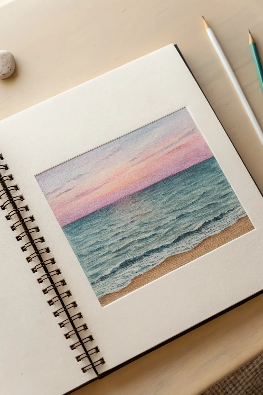
Capture the peaceful transition from day to night with this soft, two-toned seascape drawing. Using smooth blending techniques, you will create a dreamy gradient sky that meets rolling teal waves on a sandy beach.
Detailed Instructions
Materials
- Sketchbook with heavy-weight paper (mixed media or pastel paper)
- Masking tape or artist tape
- Soft pastels or pastel pencils (Teal, Navy Blue, Purple, Soft Pink, White, Sand/Ochre)
- Blending stump or cotton swabs
- Paper towel or tissue for blending
- Fixative spray (optional)
Step 1: Preparation and Sky
-
Tape boundaries:
Begin by taping off a rectangular border in the center of your sketchbook page. Press the tape down firmly to ensure clean, crisp edges when you peel it off later. -
Mark the horizon:
Lightly sketch a straight horizontal line across the middle of the box to separate the sky from the ocean. Keep this line faint so it disappears under the color. -
Apply the upper sky:
Starting near the top edge, lightly apply a soft purple or lavender pastel. Don’t press too hard; just lay down a wash of color. -
Add warmth:
Just below the purple, apply a band of soft pink. Allow this pink area to extend down towards the horizon line, but leave the very bottom sliver of the sky untouched for now. -
Blend the gradient:
Using a clean tissue or your finger, gently rub the purple and pink areas horizontally. Blend them where they meet to create a seamless transition. -
Whiten the horizon:
Apply white pastel right at the horizon line and blend it upwards into the pink. This creates that glowing, hazy look often seen at sunset.
Clean Edges
Before blending light colors like the pink sky, ensure your finger or tool is completely clean of any dark ocean pigments to avoid muddiness.
Step 2: Ocean and Waves
-
Base ocean color:
For the water, start at the horizon line with a medium teal or blue-green pastel. Fill the area down to where the waves will break, leaving the bottom section blank for the sand. -
Deepen the distance:
Layer a darker navy blue or deep teal right along the horizon line. This adds depth, making the water look like it stretches far away. -
Blend the water:
Smooth out the ocean colors with horizontal strokes using a blending stump or tissue. I find it helpful to keep the strokes flat to mimic the water’s surface. -
Sand foundation:
Fill the bottom remaining corner with a warm sand or ochre color. Blend this smoothly, pushing it slightly up towards the blue water area. -
Sketch wave shapes:
Using a sharpened white pastel or charcoal pencil, sketch wavy, slightly diagonal lines across the blue water to indicate where the foam will be. -
Intensify shadows:
underneath each white wave line, add a thin, dark teal shadow. This provides the contrast needed to make the white foam pop. -
Add frothy details:
Go back over your white wave lines with heavier pressure. Stipple or dab the pastel to create the texture of crashing foam, especially where the water meets the sand.
Step 3: Final Touches
-
Refine the shoreline:
Add a very thin, irregular shadow line on the sand right below the white seafoam to show that the water is slightly raised above the beach. -
Cloud details:
If the sky looks too empty, add faint streaks of purple gray in the upper corners to suggest distant clouds. -
Clean up:
Check your white areas. If they’ve become muddy, apply a final layer of bright white pastel to the highlight points on the waves. -
The reveal:
Carefully peel away the masking tape, pulling it away from the drawing at a 45-degree angle to prevent tearing the paper.
Make it Sparkle
Use a white gel pen or gouache paint for the very brightest highlights on the wave crests to give the water a wet, glistening effect.
Enjoy the calm atmosphere created by your beautiful pastel seascape
BRUSH GUIDE
The Right Brush for Every Stroke
From clean lines to bold texture — master brush choice, stroke control, and essential techniques.
Explore the Full Guide
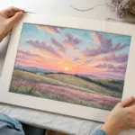
Soft Clouds With Finger-Smudge Highlights
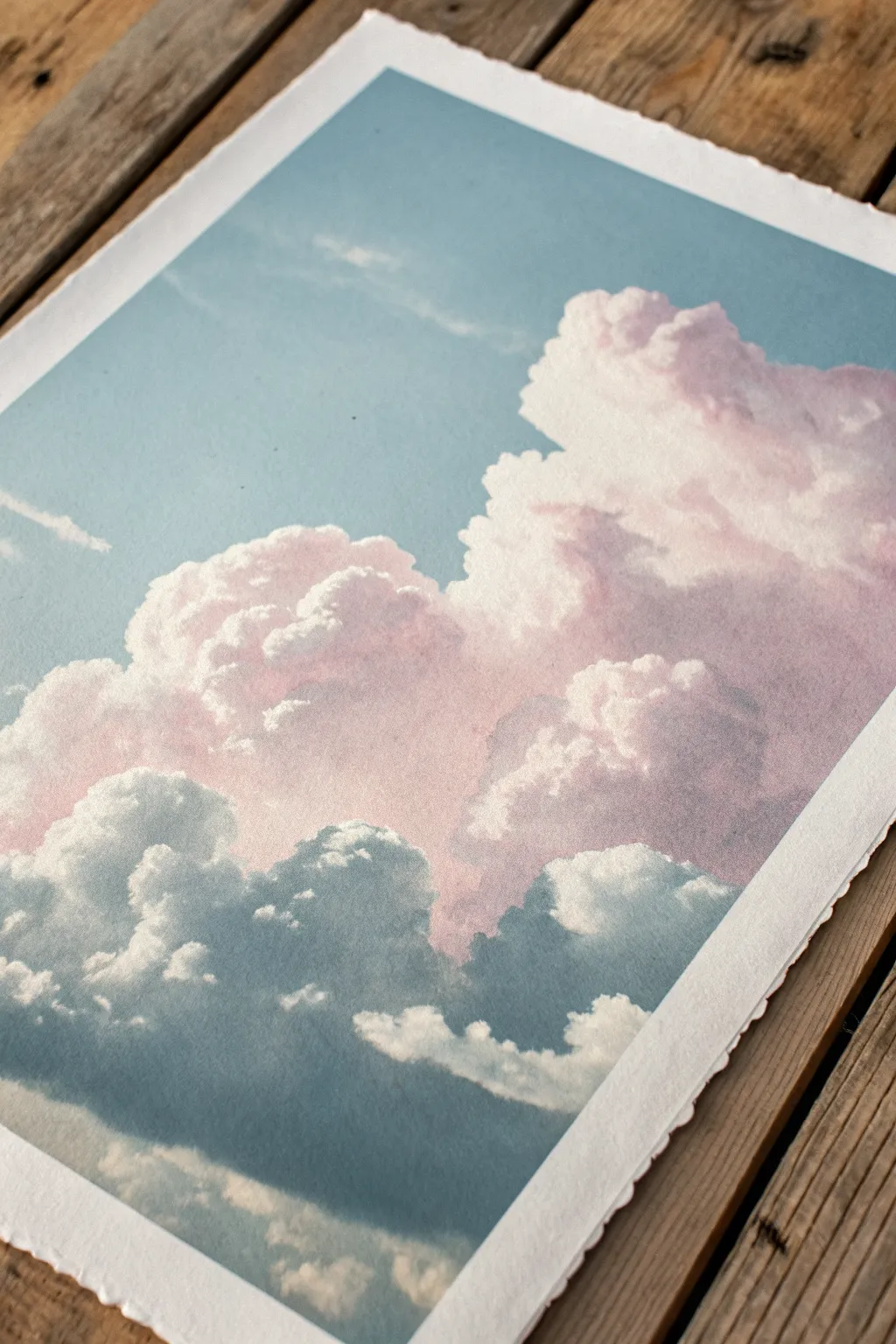
Capture the ethereal beauty of billowing cumulus clouds with this soft pastel project, featuring gentle pink highlights that fade into cool, shadowed bases. The textured paper adds a lovely organic grit that contrasts beautifully with the smoothness of the blended pigments.
Detailed Instructions
Materials
- High-quality textured paper (approx. 300gsm, cold press or pastel paper with tooth)
- Soft pastels (Light Blue, Cerulean, White, Soft Pink, Lavender/Lilac, Paynes Grey/Dark Blue-Grey)
- Workable fixative spray (optional but recommended)
- Paper towels or microfiber cloth for cleaning hands
- Blending stumps (tortillons) or soft tissues
- Masking tape (to secure paper)
Step 1: Setting the Sky
-
Secure your surface:
Begin by taping down your textured paper to a flat, hard surface. Since the paper in the reference has a lovely deckle edge, tape it from the back or very carefully at the corners if you want to preserve that rough border. -
Base sky gradient:
Using the side of a Light Blue pastel stick, lay down a broad, flat wash of color for the background sky. Don’t press too hard; let the texture of the paper show through speckles of white. -
Deepen the upper atmosphere:
Add a touch of Cerulean blue to the very top corners of your sky to create atmospheric depth, suggesting the sky gets darker as you look higher up. -
Initial blend:
Gently rub the sky pigment into the paper using your fingers or a soft tissue. Aim for a smooth, uniform hazy look, but leave the area where the main cloud mass will be mostly white paper for now.
Clean Fingers are Key
Keep a damp cloth nearby. Mixing the pink highlights with dirty grey fingers will result in muddy, dull clouds instead of bright, fluffy ones.
Step 2: Building the Cloud Form
-
Map the cloud shape:
Lightly sketch the outline of your large cumulus formation using a White pastel. Focus on creating bubbly, rounded shapes that pile on top of each other. -
Establish the shadows:
Take your Paynes Grey or Dark Blue-Grey pastel and apply it to the bottom third of the cloud mass. Use circular scumbling motions to create a fluffy texture rather than straight lines. -
Mid-tone transition:
Above the dark grey base, add a layer of Lavender or Lilac. Allow this color to overlap slightly with the grey to create a seamless transition zone. -
Soft blending:
Use a clean finger to smudge the grey and lilac areas together. Use a circular motion again to keep the cloud looking puffy. This creates that heavy, rain-laden base.
Step 3: Highlights and Details
-
Adding the pink glow:
On the upper rounded tops of the clouds, lightly apply Soft Pink. This represents the sunlight hitting the moisture in the clouds. -
Intense white peaks:
Using a sharp edge of your White pastel, firmly draw the very top contours of the clouds. Press hard to get opaque coverage that stands out against the blue sky. -
Finger-smudge layering:
I find the best results come from dragging the White pastel pigment down *into* the pink with your pinky finger. This softens the edge but keeps the brightness at the rim. -
Refining interior shapes:
Add smaller ‘cauliflower’ shapes inside the main cloud body using White and Pink. These interior shadows give the cloud volume so it doesn’t look flat. -
Atmospheric wisps:
Use a nearly clean blending stump to pull small wisps of cloud vapor away from the main mass into the blue sky, making the edges look less like a cutout.
Muddy Colors?
If your cloud colors are turning brown or grey where pink meets blue, let the first layer ‘rest’ or spray a light fixative barrier before adding the next color layer.
Step 4: Final Touches
-
Deepen contrast:
Go back with your dark grey/blue mix and darken the deepest pockets of shadow near the bottom. High contrast between the dark base and white top makes the cloud pop. -
Cleanup:
Use a kneaded eraser to pick up any stray pastel dust that fell into your blue sky area. -
Fixative (Optional):
If you wish to protect the drawing, give it a very light mist of workable fixative. Be warned that this can sometimes darken pastels slightly, so test on a scrap piece first.
Step back and admire the soft, pillowy atmosphere you’ve created on the page.
Simple Wildflower Meadow Close-Up
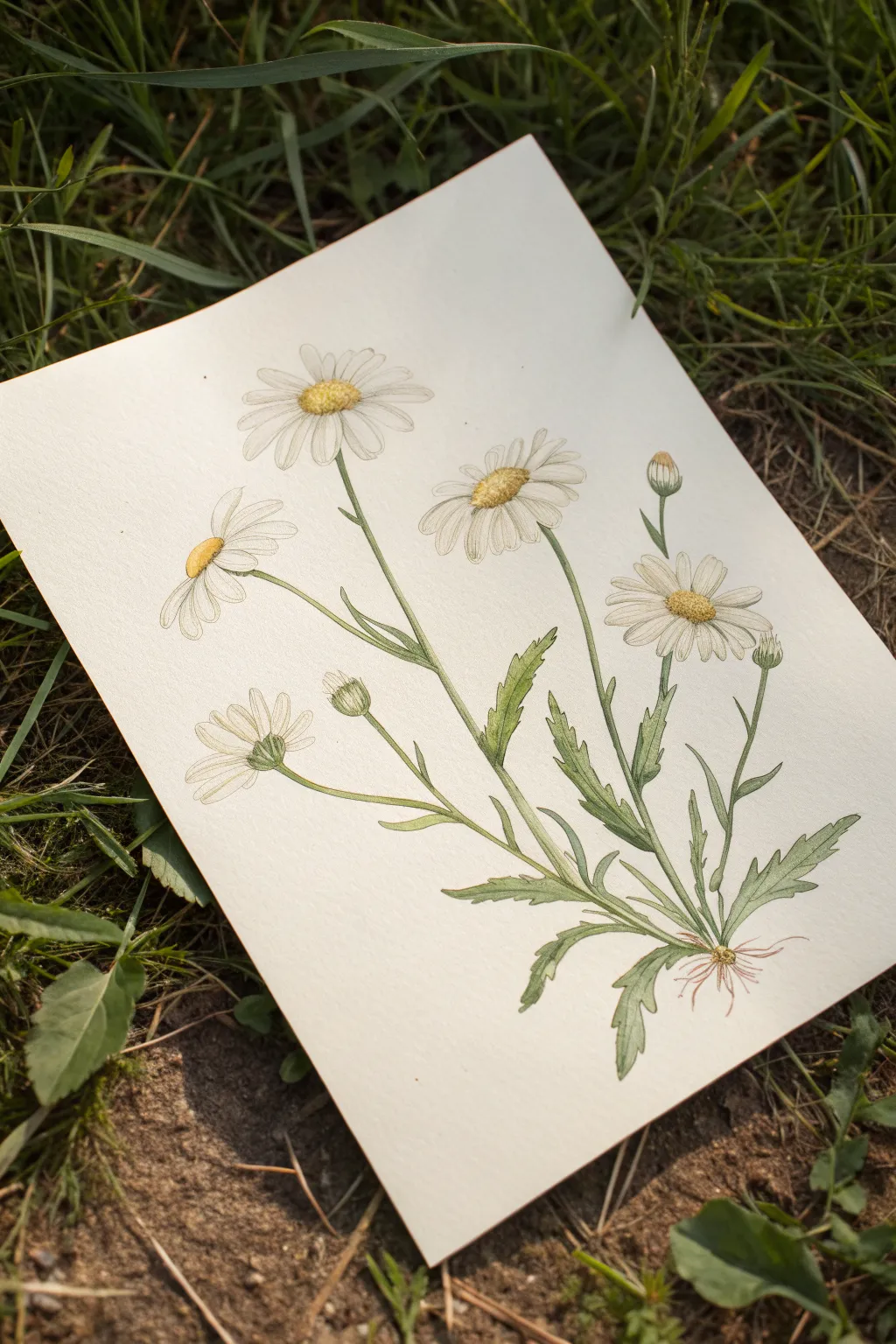
Capture the delicate beauty of oxeye daisies with this botanical-style illustration that balances scientific precision with artistic softness. The composition features a single plant cluster showing various stages of growth, from tight buds to fully open blooms, rendered in soft pastel hues.
Step-by-Step Guide
Materials
- Heavyweight drawing paper or mixed media paper (smooth texture preferred)
- Hard pastel pencils (HB and B range for sketching)
- Soft pastel pencils (White, Lemon Yellow, Golden Yellow, Sap Green, Olive Green, Brown)
- Fine liner pen (light grey or sepia) for initial outlines (optional)
- Kneadable eraser
- Blending stump or tortillon
- Fixative spray
Step 1: Structural Sketching
-
Establish the root base:
Begin near the bottom center of your page by lightly sketching a small, fibrous root system. Draw a central point from which all the stems will emerge, keeping the lines faint and loose. -
Map out stem directions:
From that central root base, draw five main lines curving upwards and outwards. Vary the heights and angles: create a tall central stem, a shorter one curving left, a medium one to the right, and two smaller stems for buds. -
Position the flower heads:
At the top of each stem, sketch simple ovals to verify composition. Use flat ovals for side-facing flowers and perfect circles for the ones facing forward. Place small tear-drop shapes for the unopened buds.
Step 2: Defining the Forms
-
Draft the petals:
On your flower ovals, lightly sketch the petals radiating from the center. Keep them thin and somewhat irregular—nature isn’t perfect. Notice how the petals on the side-facing bloom on the left curve backward slightly. -
Sketch the leaves:
Add the jagged, lance-shaped leaves along the lower half of the stems. Draw them in pairs or alternating, with serrated edges that mimic the classic weed-like foliage of a daisy. -
Detail the centers:
Refine the yellow centers (disk florets). For the main open flowers, draw a textured, slightly domed circle. For the side view, this will look like a small mound sitting atop the petals. -
Refine lines and erase:
Go over your sketch with a slightly firmer touch to finalize the shapes, then use your kneadable eraser to lift away the initial construction lines, leaving only a faint guide.
Smudge Control
Work from top-left to bottom-right (if right-handed) to avoid smearing your work. Ideally, place a piece of scrap paper under your drawing hand.
Step 3: Color Application
-
Base layer for stems:
Take a Sap Green pastel pencil and trace the stems and leaf outlines. Use a light hand; you want a pale, translucent green initially. -
Fill the foliage:
Color in the leaves using the Sap Green. Leave tiny slivers of white paper showing along the veins to suggest light hitting the ridges of the leaves. -
Deepen the greens:
I like to use an Olive Green pencil now to add shadows. Apply this darker shade to the underside of the leaves and where the stems branch off, creating depth and volume. -
Color the flower centers:
Fill the disk florets with Lemon Yellow. Then, stipple (dot) some Golden Yellow or light Brown overlap on the bottom/shaded side of the yellow center to create a 3D, textured effect. -
Shade the white petals:
Although the petals are white, they need shadow to look real. Use a very light grey or a whisper of pale blue pastel to shade the inner base of the petals near the center and where petals overlap. -
Highlight the petals:
Use a pure White pastel pencil to color the main body of the petals, blending it gently into your grey shadows so the transition is smooth.
Vintage Look
Draw on slightly off-white or cream-colored paper instead of bright white. This instantly gives the piece an antique botanical manual aesthetic.
Step 4: Refinement and Details
-
Add sepals:
Draw the tiny green cup-like structures (sepals) directly under the flower heads and buds using your sharpest Olive Green pencil. -
Texture the roots:
Using a light Brown or reddish-brown pencil, define the fine, hair-like roots at the very bottom. Keep these strokes wispy and delicate. -
Sharpen edges:
Use a very sharp grey or green pencil to re-outline any parts of the plant that look too fuzzy. This crisp outline gives it that scientific illustration look. -
Final blending:
Use a paper tortillon to gently smudge the green of the leaves just slightly if the pencil strokes look too rough, but preserve the texture in the yellow centers.
Step back and admire your precise yet gentle botanical study, ready for framing or a nature journal.

PENCIL GUIDE
Understanding Pencil Grades from H to B
From first sketch to finished drawing — learn pencil grades, line control, and shading techniques.
Explore the Full Guide
Easy Rose With Two-Value Petals
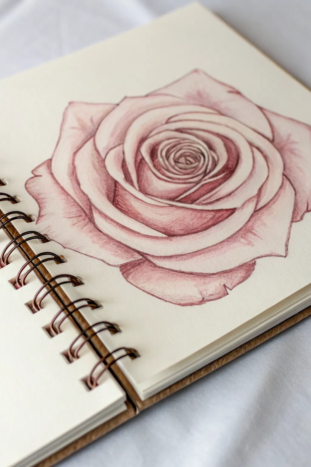
Capture the delicate elegance of a single rose bloom using warm, antique pink tones. This pastel pencil study focuses on soft gradients and crisp edges to create depth between the tightly curled petals.
Step-by-Step Tutorial
Materials
- Textured sketch paper or pastel paper (cream or off-white)
- Pastel pencils (Deep Red/Burgundy, Dusty Pink, White/Cream)
- Hard pastel stick (optional, for base shading)
- Blending stump or tortillon
- Kneaded eraser
- Pencil sharpener or sandpaper block
Step 1: Sketching the Structure
-
Map the center spiral:
Begin lightly with your lightest pink pastel pencil. Draw a small, tight spiral in the center of your page to represent the innermost petals of the rose. -
Expand the inner petals:
Around the central spiral, sketch overlapping curved shapes that hug the center. Keep these lines very faint so you can correct them easily. -
Draw the outer bloom:
Continue adding larger, wider petal shapes radiating outward. These should be more open and slightly irregular to look organic. -
Define the outer edges:
Sketch the largest, outermost petals that frame the flower. Give distinct dips and points to the edges to mimic the natural curl of rose petals.
Keep it Clean
Place a piece of scrap paper under your drawing hand. This prevents your palm from smudging the pastel dust across the paper as you work.
Step 2: Establishing Values
-
Identify shadow areas:
Look at where petals overlap. The areas underneath a petal will be your darkest points. Lightly mark these deep crevices with your burgundy or deep red pencil. -
Apply base shading:
Using the side of your dusty pink pencil, gently shade the body of the petals. Leave the top edges of each petal bare—this is crucial for the ‘two-value’ look. -
Deepen the center:
Return to the center spiral with the burgundy pencil. Apply more pressure here to create a dark, recessed look which pulls the eye inward. -
Initial blending:
Take your blending stump and gently smudge the pink shading you just applied. Push the pigment from the shadow area out toward the lighter edge, fading it as you go.
Dew Drop Drama
Add realism by drawing a tiny water droplet on a petal using a hard shadow underneath and a bright white spec of highlight on top.
Step 3: Refining and Detailing
-
Sharpen the edges:
With a freshly sharpened burgundy pencil, re-trace the lines separating the petals. These lines should be thin but decisive to separate the layers clearly. -
Add smooth gradients:
Work on one petal at a time. Enhance the shadow at the base where it tucks under another petal, then carefully blend it out to a very pale pink near the rim. -
Highlight the rims:
Use your white or cream pencil to trace the very top edge of each petal. This highlight contrasts against the darker shading of the petal behind it, creating distinct definition. -
Soften the texture:
If the paper grain is too visible, lightly glaze over the mid-tones with your lighter pink pencil to fill the tooth of the paper without losing your shadows.
Step 4: Final Touches
-
Boost contrast:
Scan your drawing for areas that look flat. Darken the deepest crevices in the center and under large outer petals with your darkest red. -
Clean up highlights:
I find it helpful to use the white pencil to clean up any smudges on the outer edges, keeping the silhouette crisp against the paper. -
Add subtle texture:
Lightly draw a few faint veins on the larger outer petals using a sharp point, following the curve of the petal. -
Final blend:
Do a last pass with a clean blending stump to smooth out any harsh strokes, ensuring the transitions from dark to light are buttery smooth.
Now you have a timeless floral study that captures the soft romance of a rose.
Classic Apple With a Bold Cast Shadow
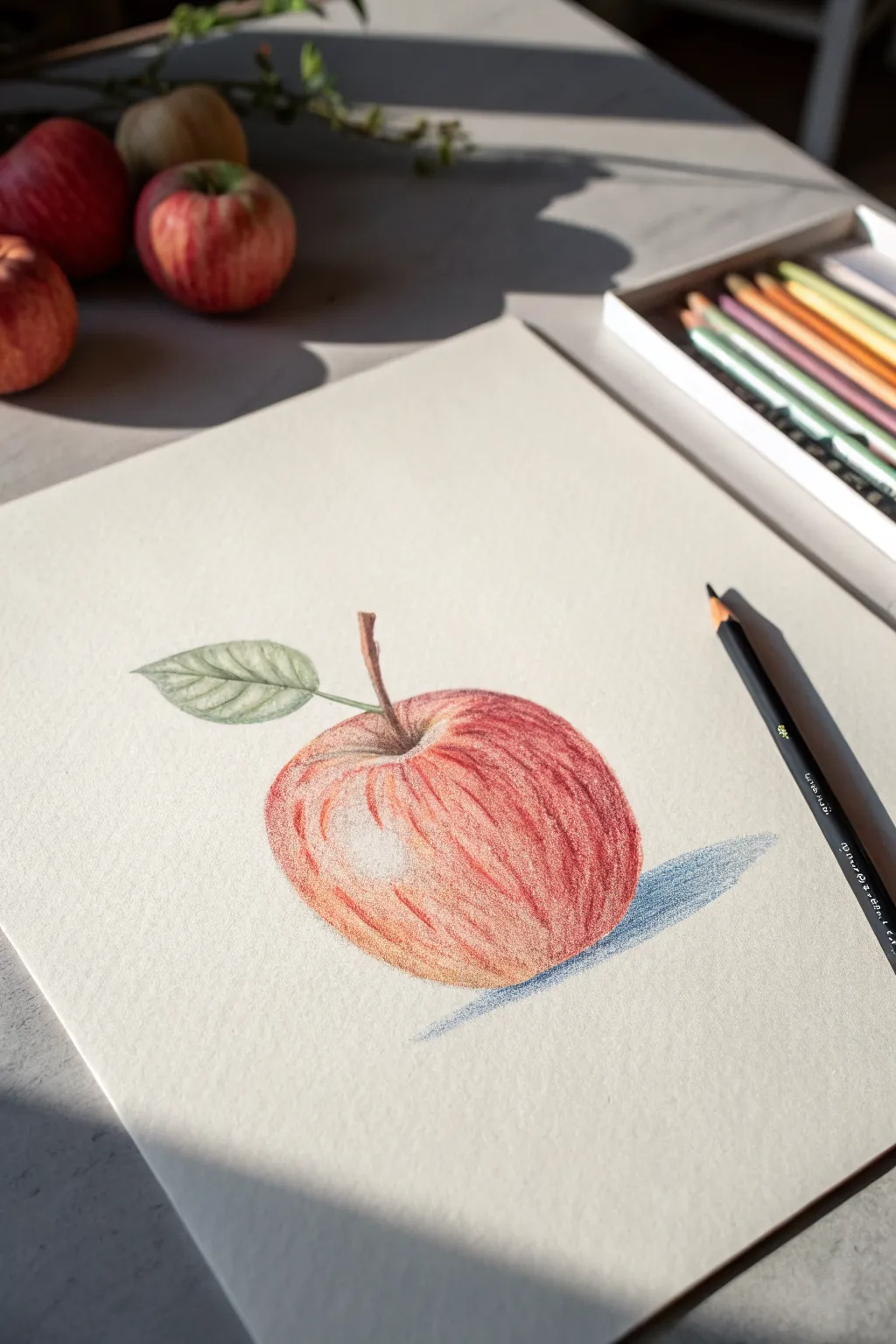
Capture the simple beauty of fruit basking in natural light with this colored pencil and pastel study. The textured shading and bold blue shadow create a striking contrast against the pale paper, making the apple pop with realism.
Step-by-Step Tutorial
Materials
- Textured drawing paper (cream or off-white)
- Pastel pencils or high-quality colored pencils (Red, Orange, Yellow, Dark Brown, Green, Blue/Grey)
- Pencil sharpener
- Kneadable eraser (for lifting highlights)
Step 1: Sketching the Outline
-
Basic Shapes:
Start by lightly sketching a loose circle for the apple’s body. Don’t worry about it being perfect; apples are naturally slightly irregular. -
Refining the Form:
Flatten the top slightly where the stem will emerge and round out the bottom. Add the curved stem originating from the top center dip. -
Adding the Leaf:
Draw an oval shape attached to the stem, extending to the left. Add a center vein line through the leaf and small serrated edges for texture.
Fixing “Wax Bloom”
If layers stop sticking because the paper is slick with heavy wax buildup, spray a light workable fixative. Once dry, this adds tooth so you can add more color.
Step 2: Layering the Apple Colors
-
Establishing the Base:
Using a light hand, fill the entire apple shape (avoiding the highlight area on the upper left) with a pale yellow or peach tone. -
First Red Layer:
Take a medium red pencil and begin shading from the bottom up. Use strokes that follow the curvature of the fruit to suggest volume. -
Building Saturation:
Apply stronger red strokes, focusing on the right side and bottom where the shadow would naturally fall. Leave the upper left section lighter. -
Adding Variety:
Introduce some orange tones near the top and mixed into the red. This gives the skin a realistic, mottled appearance rather than a flat color. -
Creating Texture:
Use short, vertical strokes with a darker red or burgundy to mimic the natural vertical striations found on apple skin. -
Deepening the Stem Well:
Press harder with your dark red or brown pencil in the dip where the stem connects. This dark recess creates immediate depth. -
The Highlight:
Ensure the bright white spot on the upper left remains untouched paper. If you colored over it, gently dab with a kneadable eraser to lift the pigment back out.
Pro Tip: Directional Strokes
Always curve your shading strokes to match the roundness of the apple. Straight up-and-down lines flatten the image, while curved lines create 3D volume.
Step 3: Detailing Stem and Leaf
-
Stem Texture:
Color the stem with a mix of brown and touches of red. Add a thin dark line along one side to give it a cylindrical look. -
Leaf Base Green:
Fill the leaf shape lightly with a pale green. Keep your strokes delicate here. -
Leaf Veins:
Use a darker green or grey to draw the veins branching from the center line. Shade slightly between the veins to simulate the leaf’s ripples.
Step 4: The Cast Shadow
-
Defining the Shape:
Sketch a long, stretched oval shape extending to the right of the apple. This represents the strong directional light shown in the reference. -
Cool Shadow Tones:
Unlike a black shadow, use a slate blue or cool grey pencil. This complementary color makes the red apple vibrate visually. -
Gradient Shading:
Press firmest right where the apple touches the table, then gradually lighten your pressure as the shadow stretches further away to the right. -
Final Contrast Check:
Review your drawing. If the apple looks flat, deepen the darkest reds on the lower right side to boost the contrast against the shiny highlight.
Step back and admire how a simple fruit study can look so elegant with the right lighting effects


Pear on Mid-Tone Paper for Instant Depth
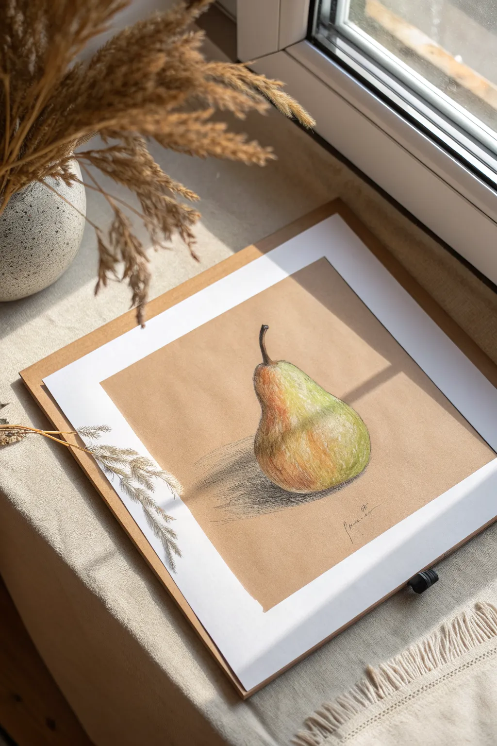
Using mid-tone paper is a fantastic shortcut for creating dimension because the paper itself acts as your base color, meaning you only need to add highlights and shadows. This realistic pear study relies on loose, expressive hatching and delicate color blending to make the fruit pop right off the page.
How-To Guide
Materials
- Tan/Kraft tone mixed media or pastel paper
- Soft pastels or pastel pencils (Yellow, Green, Burnt Sienna, Dark Brown, White)
- Black pastel pencil or charcoal pencil for definition
- Blending stump (optional)
- Kneaded eraser
- Fixative spray
Step 1: Sketching the Form
-
Outline the shape:
Begin by lightly sketching the outline of the pear using a burnt sienna or light brown pastel pencil. Don’t worry about making it perfectly symmetrical; organic fruits have bumps and irregularities. Draw the main bulbous bottom and taper it gently up toward the stem. -
Add the stem:
Sketch a curved stem at the top. Notice how the stem in the example thickens slightly where it attaches to the fruit. Keep this line work faint so it disappears into your coloring later. -
Map the shadow:
Lightly indicate where the cast shadow will fall on the table surface to the left of the fruit. This helps ground your object early on.
Loose Hatching
Don’t over-blend the shadows. Leaving visible pencil strokes (hatching) in the shadow areas adds energy and an artistic, sketchy quality to the work.
Step 2: Base Coloring
-
Apply initial yellows:
Start applying color with a medium yellow pastel. Focus on the ‘belly’ of the pear where the light hits it most directly, but don’t press too hard yet. -
Introduce greens:
Layer a light spring green on the right side of the pear and gently near the top neck area. Allow the strokes to follow the contour of the fruit to suggest roundness. -
Warm up the hues:
Add touches of orange or reddish-brown (sienna) on the left side and bottom curve. This transition from green to yellow to russet creates that classic ripening pear look. -
Initial blending:
Use your finger or a blending stump to gently smudge these base colors together. You want them to merge softly while still letting some of the tan paper texture peek through.
Step 3: Building Dimension
-
Deepen the shadows:
Take a dark brown or dark umber pastel pencil and begin darkening the left edge of the pear, which is the side away from the light source. Use swift, diagonal hatching lines similar to the reference image. -
Refine the stem:
Color the stem using dark brown and black. Add a tiny sliver of light brown on the right side of the stem to show a highlight, making it look cylindrical. -
Create the cast shadow:
Using a black or dark charcoal pencil, draw the cast shadow on the surface. Start darkest right underneath the pear’s base and let your hatching lines get lighter and looser as they move outward to the left. -
Scumble for texture:
To mimic the speckled skin of a pear, lightly ‘scumble’ (scribble loosely) some olive green over the yellow sections. I find that keeping the pencil sharp helps create those tiny dots and imperfections.
Color Variation
Make the pear feel organic by dotting in tiny ‘freckles’ of brown or burnt orange over the yellow skin to mimic natural imperfections.
Step 4: Highlights and Details
-
Add the brightest highlight:
This is the magic step. Take a pure white pastel and apply a strong, confident mark on the upper right curve of the pear. This simulates glossy skin reflecting light. -
Soften the highlight edges:
Gently fade the edges of that white patch into the surrounding green and yellow so it looks like a sheen rather than a white sticker. -
Enhance contrast:
Go back in with your black pencil and reinforce the very bottom edge of the pear where it meets the table. This dark line anchors the weight of the fruit. -
Final texture adjustments:
Look for areas that look too flat. Add a few stray hatching lines in brown or green over the colored areas to suggest the rougher texture of pear skin. -
Clean up:
Use a kneaded eraser to lift any smudges from the background paper. The clean tan background is essential for the ‘pop’ effect. -
Fixative:
Lightly spray the drawing with fixative to prevent the pastel dust from moving or smearing.
Now you have a vibrant, dimensional fruit study that really showcases the beauty of working on toned paper
Butterfly Wings With a Symmetry Shortcut
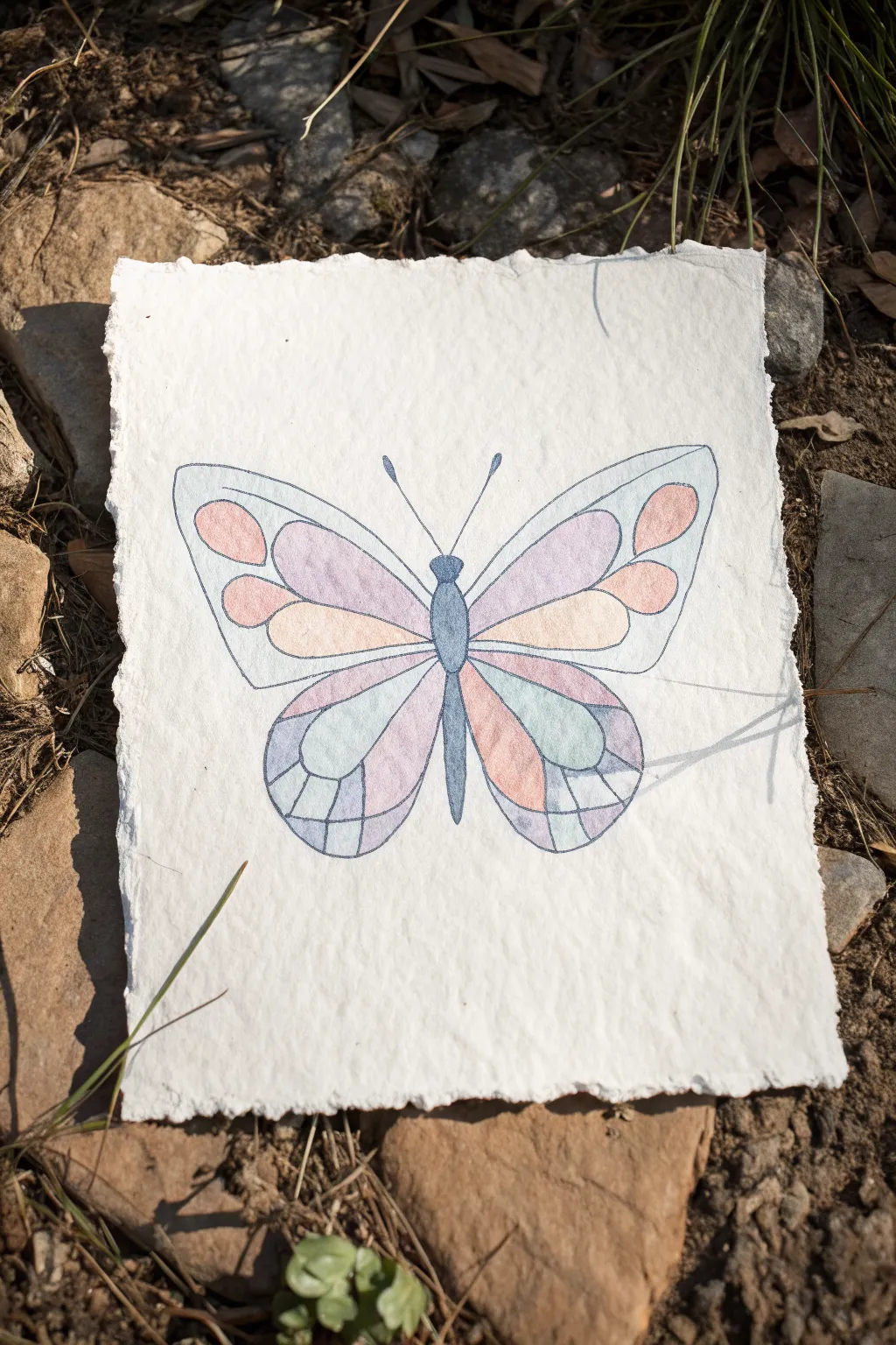
Capture the delicate beauty of a butterfly with this soft, pastel-toned watercolor project. The charming stained-glass effect is achieved through gentle washes of color on thick, handmade paper.
Step-by-Step Tutorial
Materials
- Thick handmade cotton rag paper (deckle edge)
- Pencil (HB or H)
- Fine liner pen (waterproof, grey or light black)
- Watercolor paints (pastel pink, lavender, warm yellow, soft blue)
- Small round watercolor brush (size 2-4)
- Jar of clean water
- Paper towel
- Ruler (optional)
Step 1: Planning and Sketching
-
Paper selection:
Begin by selecting a high-quality sheet of handmade cotton rag paper. The texture and deckle edges contribute significantly to the rustic, organic look of this piece. -
Central axis:
Lightly draw a vertical line down the center of your paper with a pencil. This will serve as your guide to ensure both wings are balanced. -
Drafting the body:
Sketch a slender, elongated tear-drop shape for the body along the center line, adding a small rounded shape at the top for the head. -
Wing outlines:
Draw the main outlines of the upper and lower wings. I like to keep lines loose and slightly curved. Make sure the wings mirror each other across your central axis as closely as possible. -
Drawing the segments:
Inside the main wing shapes, sketch the internal patterns. Think of these like stained glass panes—teardrops, long ovals, and segmented curves that radiate from the butterfly’s body outward. -
Adding antennae:
Complete your sketch by drawing two simple, curved antennae extending from the head.
Symmetry Hack
Draw one wing on tracing paper, flip it over, and trace onto the other side. This guarantees perfect symmetry without freehand struggles.
Step 2: Color Application
-
Mixing pastels:
Prepare your palette by diluting your watercolors significantly. You want very watery, transparent mixes of pink, lavender, yellow, and blue to achieve that soft pastel look. -
First wing segments:
Select a few segments on the left wing to paint with your pastel pink. Carefully fill the shape, letting the water settle into the paper’s texture. -
Mirroring colors:
Immediately paint the corresponding segments on the right wing with the same pink color to maintain symmetry. -
Cool tones:
Switch to your lavender mix. Fill in the large upper wing sections, again working on one side and then immediately mirroring it on the other. -
Adding warmth:
Use the warm yellow or peach tone for the middle segments. Keep your brush damp but not dripping to prevent the colors from bleeding into wet neighboring sections. -
Lower wing details:
Fill the lower wing sections with soft blue and remaining lavender tones. Leave small gaps of white paper between different colored sections if they are still wet to avoid muddiness. -
Painting the body:
Use a slightly more concentrated blue-grey mix to paint the butterfly’s body and head. This darker value helps anchor the airy wings. -
Drying time:
Allow the paint to dry completely. Handmade paper holds moisture longer than standard paper, so be patient.
Bleeding Colors?
Handmade paper is very absorbent. If paint spreads too fast, use less water on your brush and paint non-adjacent sections first.
Step 3: Definition and Finishing
-
Outlining:
Once the paper is bone dry, use a fine liner pen (grey is softer than black) to trace over your pencil lines. Trace the wing edges and all the internal segment divisions. -
Detailing antennae:
Carefully ink over the antennae lines, adding small bulbs at the tips. -
Refining the body:
Outline the body shape. If you like, add a tiny bit of texture or shading to the body with the pen to give it dimension. -
Clean up:
Gently erase any visible pencil marks that weren’t covered by the ink or paint, being careful not to abrade the soft paper surface.
Now you have a serene, symmetrical butterfly ready to bring a touch of nature to your wall
Cute Frog Made From Big Simple Shapes
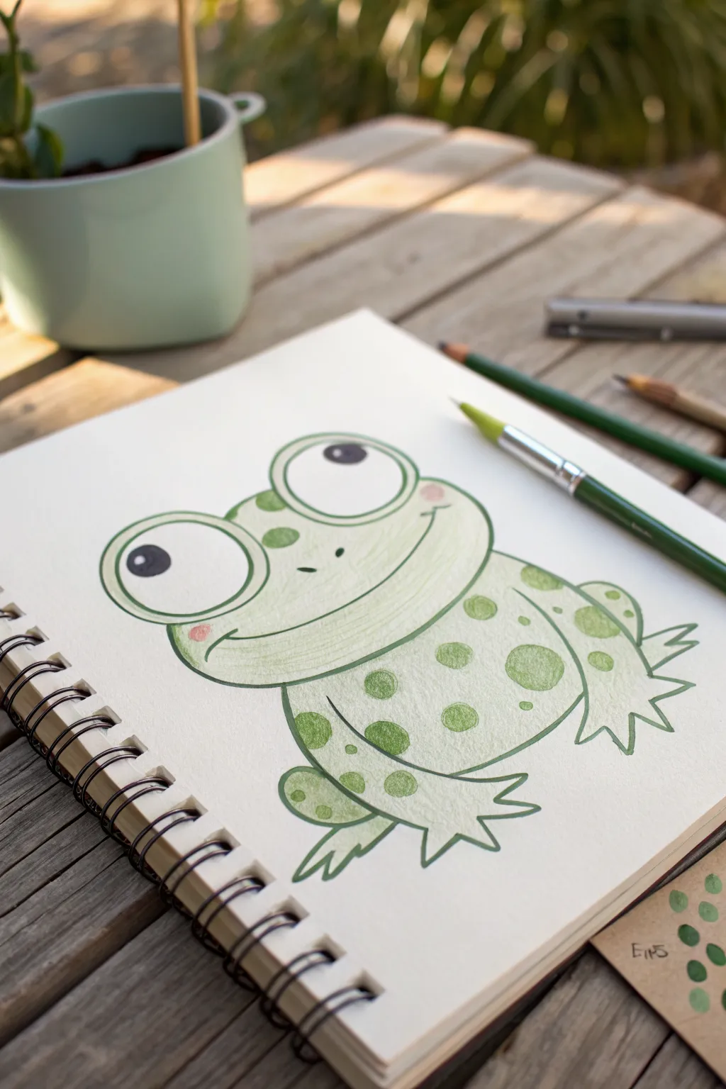
This cheerful little amphibian is built entirely from soft, rounded shapes, making it a perfect project for beginners. The gentle shading and speckled texture give it a friendly personality that hops right off the page.
Step-by-Step
Materials
- Sketchbook with slightly textured paper (spiral bound works great)
- Pastel pencils or colored pencils (Light Green, Dark Green, Black, Pink)
- Soft drawing pencil (HB or B) for sketching
- Fine-liner pen or dark green marker (optional for outlining)
- Eraser
Step 1: Sketching the Base Shapes
-
Head start:
Begin by drawing a wide, rounded oval shape in the upper center of your page. This will become the frog’s head, so keep your pencil pressure very light. -
Body basics:
Attached to the bottom of the head oval, sketch a larger, slightly flatter oval or bean shape for the body. -
Eye placement:
Draw two large circles resting on top of the head oval. Make the left one slightly larger to create a quirky, cartoonish perspective. -
Rear legs:
On either side of the body, sketch semi-circles that bulge outward. These represent the powerful thighs of the frog. -
Front feet:
At the bottom center of the body, draw two smaller shapes extending downward; add three pointy toes to the end of each. -
Back feet:
Add feet to the rear legs by drawing webbed toes sticking out to the sides, just behind the front legs.
Smudge Alert
Pastel pencils can smear easily. Place a clean sheet of scrap paper under your drawing hand while you work to keep the white background crisp.
Step 2: Refining the Lines
-
Connect the eyes:
Go over your sketch with a darker line now. Connect the eye circles smoothly into the head shape so they look like one continuous form. -
Smile wide:
Draw a very wide, curing smile that stretches almost from one side of the face to the other. Add small cheek curves at the ends. -
Pupils:
Inside the eye circles, draw large black pupils. Place them slightly off-center, looking upward to the right. -
Nostrils:
Place two tiny dots or dashes right in the center of the face for the nose. -
Clean up:
Erase any overlapping sketch lines, particularly where the head meets the body and where the legs attach.
Step 3: Adding Color and Texture
-
Base layer:
Take your light green pastel pencil and gently fill in the entire frog, avoiding the eyes and belly area. Use circular motions for an even coat. -
Cheeky accents:
Use a soft pink pastel to add small, circular blush marks right at the corners of the smile. -
Light shading:
I like to deepen the green slightly under the chin and along the bottom curve of the belly to give the frog some volume. -
Spotty texture:
With a slightly darker green pencil, draw various sizes of circles all over the body and head. Fill these in solidly. -
Eye highlights:
Ensure you leave a tiny white reflection spot inside the black pupils before filling them in completely dark. -
Final outline:
Take a dark green or black pencil (or fine-liner) and trace over the main exterior lines to make the character pop. -
Toe details:
Don’t forget to outline the toes sharply so they look distinct against the paper.
Layering Pro Tip
Apply the light green base layer very softly. If you press too hard initially, the paper tooth will fill up and won’t accept the darker green spots later.
Now you have a charming frog drawing ready to leap into your sketchbook collection
Quick Bird on a Branch
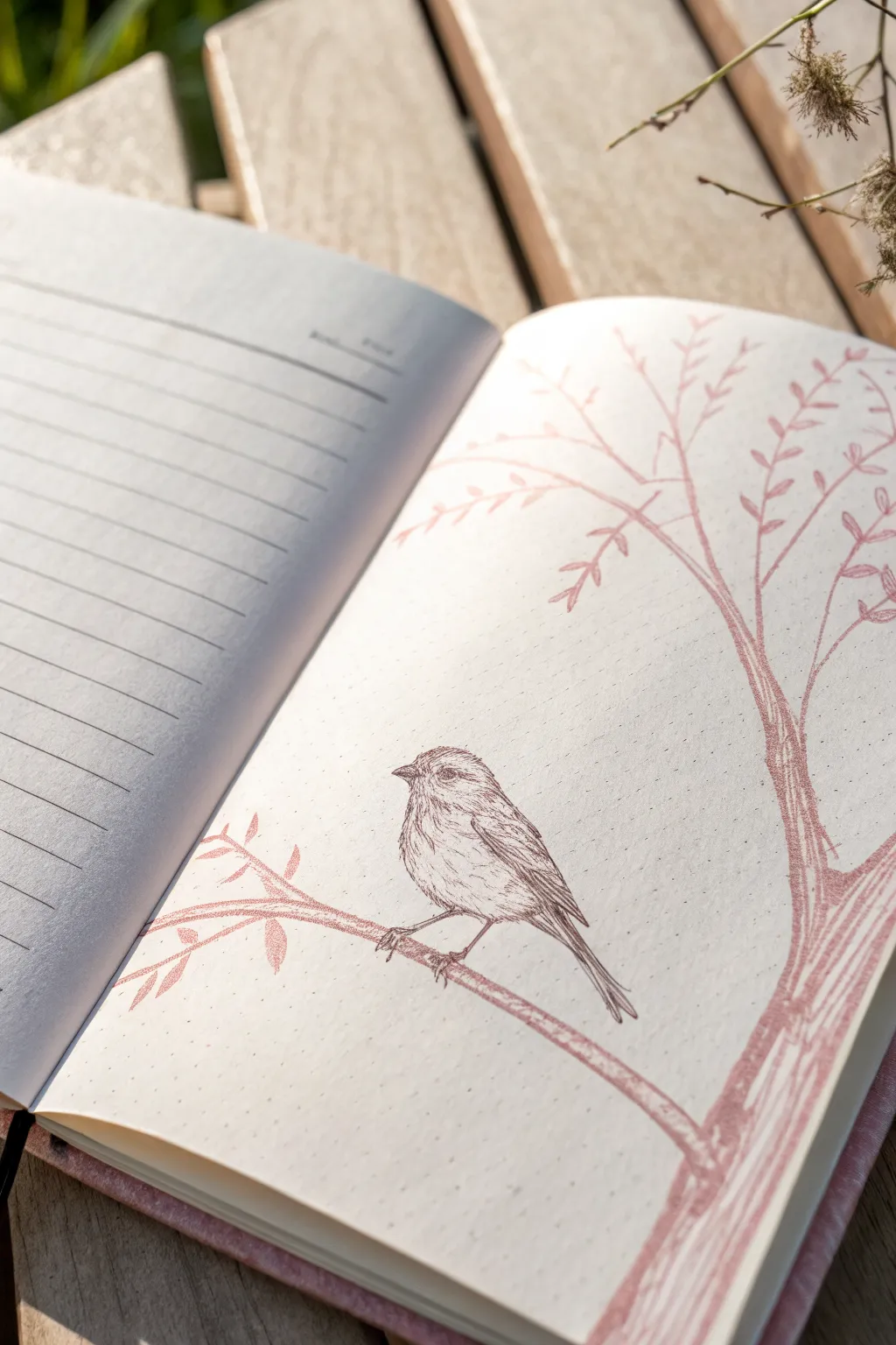
This delicate journal illustration captures the quiet beauty of a sparrow perched on a bare winter branch using a single shade of dusty rose. It’s a perfect study in minimalist drawing, focusing on linework and subtle texture rather than complex shading.
Step-by-Step
Materials
- Journal or sketchbook with cream-colored paper
- Dusty rose or terra-cotta colored pencil (or fine-tip pastel pencil)
- Fine-point drawing pen (sepia or dark brown) for the bird details
- Pencil sharpener
- Kneaded eraser
Step 1: Drafting the Shapes
-
Position the branch:
Start by lightly sketching the main branch emerging from the bottom right corner. Let it curve gently upward towards the left side of the page, creating a natural perch for your bird. -
Outline the bird’s body:
Resting on the main curve of your branch, draw a simple oval shape for the bird’s body. The oval should be tilted slightly, imitating the posture of a perched sparrow. -
Add the head:
Attach a smaller circle to the upper left of your oval for the head. Keep your lines incredibly faint here; we just want to establish the basic proportions before committing to ink or color. -
Refine the silhouette:
Connect the head to the body with smooth, sloping lines to form the neck and back. Sketch a small, triangular beak pointing left and a long, thin tail extending downwards past the branch.
Step 2: Drawing the Tree
-
Thicken the trunk:
Using your dusty rose pencil, go over the main branch lines. Press firmly to create varying line weights, making the base thicker and the tips wispy. -
Add secondary branches:
Extend a large, vertical branch shooting up towards the top right corner. Let it split into smaller forks, mimicking the fractal nature of a tree. -
Create the leaves:
Instead of realistic leaves, draw stylized, small almond shapes along the thinner upper branches. Keep these loose and sketchy, almost like distinct dashes, to maintain an illustrative feel. -
Texture the bark:
Return to the thicker lower branches and use quick, vertical hatching lines with your pink pencil. This mimicks the rough texture of bark without needing shading.
Wobbly Lines?
If your ink lines feel too shaky, embrace it. Sketchy, broken lines add character to this style. Mimic feathers by intentionally lifting the pen tip often.
Step 3: Detailing the Bird
-
Outline in ink:
Switch to your fine-point sepia or dark brown pen. Carefully trace the outline of your bird sketch, using short, broken lines to suggest fluffiness rather than a solid, hard edge. -
Define the wing:
Draw a folded wing shape along the bird’s side. Use long, parallel strokes to indicate the primary flight feathers pointing toward the tail. -
Feather texture:
Fill the body with very fine, short dashes. Focus these marks on the chest and back, curving them slightly to follow the round form of the bird. -
The eye and beak:
Place a small, dark dot for the eye, leaving a tiny speck of white paper for a highlight. Outline the beak clearly, darkening the line where the top and bottom mandibles meet. -
The tail feathers:
For the tail, draw three or four long, straight lines extending down. Keep them close together to show the tail is folded while perched. -
Drawing the feet:
Sketch very thin, spindly legs gripping the pink branch. Make sure the claws wrap visibly around the wood so the bird looks grounded.
Soft Background
Rub a tiny bit of pink pastel dust on your finger and smudge it very lightly behind the bird to create a soft, glowing atmosphere without drawing lines.
Step 4: Final Touches
-
Clean up traces:
Wait for the ink to be completely dry. Gently use your kneaded eraser to lift away any visible graphite guidelines from your initial sketch. -
Connect the elements:
Check where the bird’s feet meet the branch. I sometimes add a tiny extra stroke of pink or brown there to shadow the contact point, anchoring the bird firmly.
You now have a charming nature study enhancing the corner of your page
Two Swans on a Pink Lake
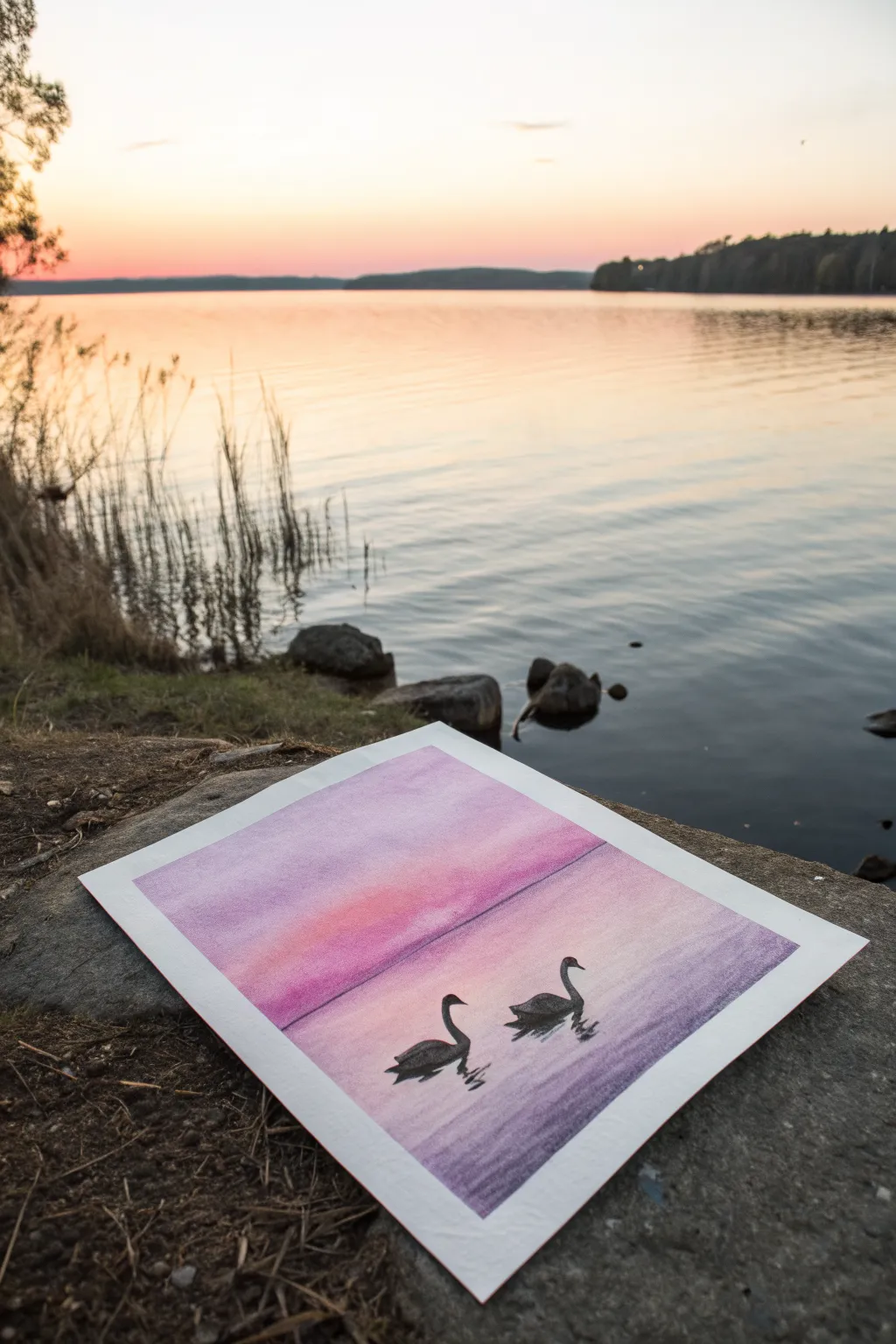
Capture the serene beauty of twilight on the water with this soft pastel landscape featuring gentle pink gradients and silhouetted swans. This project focuses on smooth transitions and simple shapes, making it a perfect exercise for mastering blending techniques.
Step-by-Step Tutorial
Materials
- Soft pastels (pink, purple, violet, light peach, black, white)
- Pastel paper or mixed media paper (smooth or slight texture)
- Masking tape or painter’s tape
- Paper towel or blending stump
- Fixative spray (optional)
- Ruler
Step 1: Setting the Scene
-
Secure the paper:
Tape your paper down to your work surface on all four sides. This not only keeps the paper flat but also creates that crisp, clean white border you see in the final image. -
Establish the horizon:
Using a ruler and a very light pencil mark or the straight edge of a piece of paper, determine where your horizon line will be. For this composition, place it just slightly below the vertical center of the page. -
Apply the first sky layer:
Start with your lightest peach or pale pink pastel. Apply broad horizontal strokes in the center area of the sky, just above the horizon line. -
Build the gradient upward:
Above the peach, layer in a medium pink tone. As you move toward the top edge of the paper, transition into a soft violet or light purple. Don’t worry about perfect blending yet; just get the pigment on the paper.
Clean Fingers, Clean Art
Keep a damp cloth nearby. Wipe your fingers between blending the sky (light) and the water (dark) to prevent muddying your vibrant pinks.
Step 2: Blending the Background
-
Blend the sky:
Using your fingers or a soft paper towel, gently rub the pastel strokes horizontally. Work from ligher colors to darker colors to keep the peach tones clean. Aim for a smooth, seamless transition from the pale horizon to the purple top. -
Mirror the colors:
Now, recreate the sky in the water section below the horizon. Start with the same pale peach right under the horizon line, followed by the pink, and finally the purple at the very bottom edge. -
Blend the water:
Blend the water section horizontally just like the sky. I like to keep the blending strokes strictly horizontal here to mimic the natural flatness of calm water. -
Define the horizon:
Take a purple or dark pink pastel and draw a straight, thin line across the horizon. Smudge it very slightly so it isn’t too harsh, separating the sky from the water distinctly.
Step 3: Adding the Swans
-
Outline the first swan:
Choose a spot in the lower right quadrant for your first swan. Using a black pastel pencil or the sharp edge of a black pastel stick, sketch the curve of the neck and the oval shape of the body. -
Fill the silhouette:
Fill in the swan’s shape completely with solid black. Press firmly to ensure the black is opaque and stands out against the soft background. -
Draw the second swan:
Position the second swan slightly to the left and a bit higher up on the paper to create depth. Sketch its neck curved downward and fill the body with solid black. -
Refine the shapes:
Use the sharp corner of your black pastel to refine the beaks and the curve of the necks. These sharp details are what make the silhouettes recognizable.
Uneven Coverage?
If the paper tooth still shows through the black swans, apply a second layer of black pastel and press firmly, or use a black charcoal pencil for density.
Step 4: Reflections and Details
-
Create the reflections:
Beneath each swan, add a few zigzagging horizontal dashes using the black pastel. These don’t need to be perfect mirror images; simple suggestions of dark ripples work best. -
Soften the ripples:
Lightly smudge these reflection lines downward and sideways to integrate them into the water surface. -
Add water texture:
Take a violet or darker purple pastel and add very subtle, faint horizontal lines in the water area, particularly near the bottom corners, to suggest gentle waves. -
Clean up:
Carefully peel away the masking tape to reveal your clean edges. Blow away any excess pastel dust.
Step back and admire the peaceful atmosphere you have created with simple gradients and striking silhouettes
City Skyline Silhouette With Neon Sky
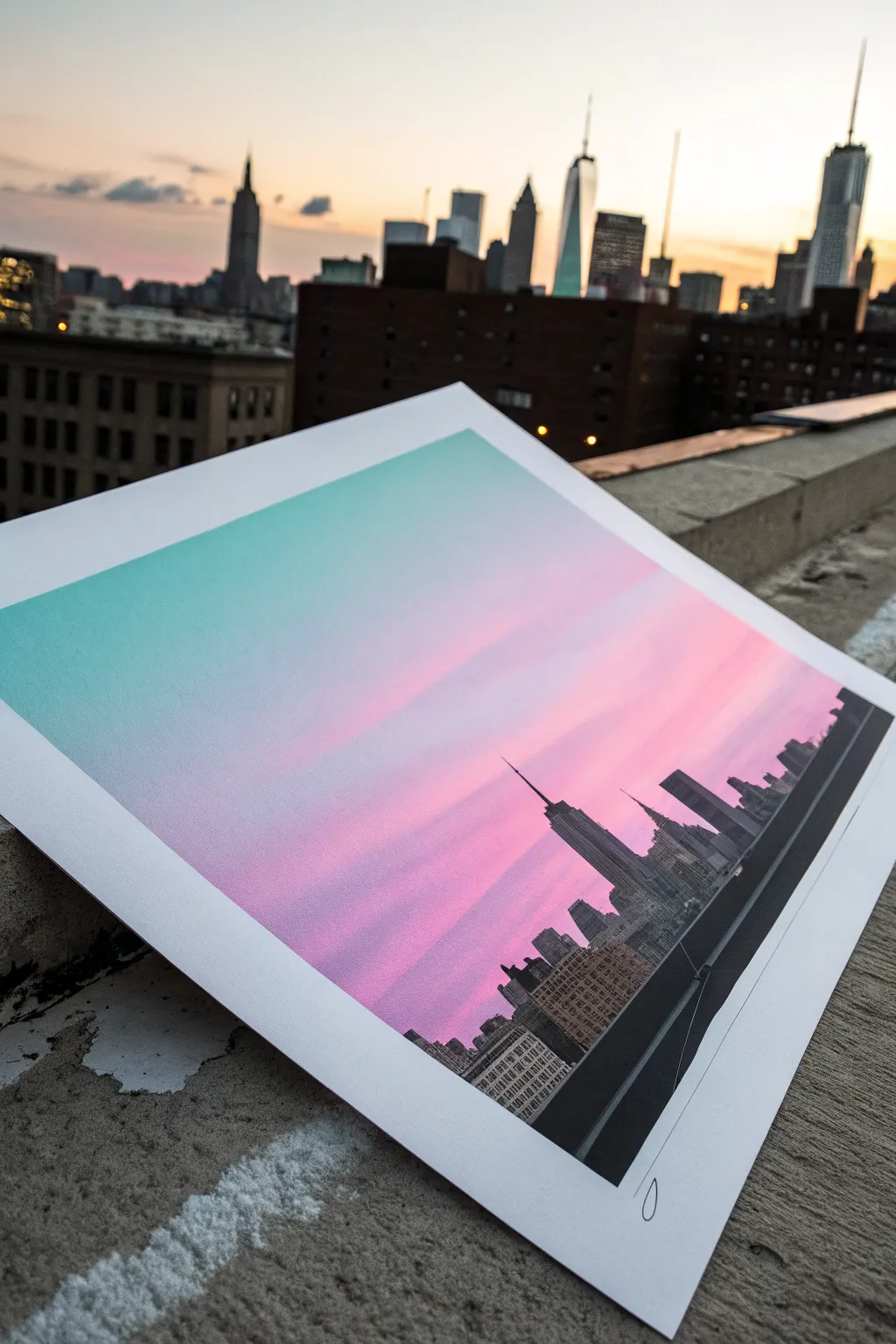
Capture the magic of twilight in the big city with this stunning gradient project. By blending soft pastels into a seamless neon fade, you’ll create the perfect backdrop for a sharp, architectural silhouette.
Detailed Instructions
Materials
- High-quality pastel paper or mixed media paper (white, smooth texture)
- Soft pastels (teal, aqua, light pink, magenta/fuchsia, purple)
- Black hard pastel or charcoal pencil
- Ruler or straight edge
- Masking tape or painter’s tape
- Fixative spray
- Blending stump or soft tissues
- Reference photo of a skyline (optional)
Step 1: Setting the Sky Gradient
-
Prepare your workspace:
Begin by taping down the edges of your paper to a flat board or table. This creates a crisp white border around your artwork and keeps the paper from shifting while you blend. -
Apply the top color:
Start at the very top of the page with a bright teal or aqua soft pastel. Apply a generous layer of pigment across the top third of the paper, using the side of the pastel stick for broad coverage. -
Add the middle transition:
Directly below the teal, introduce a band of light pink. Allow the colors to slightly overlap at the meeting point, but don’t blend them just yet. -
Deepen the horizon paint:
For the bottom section of the sky (the area just above where your buildings will be), apply a vibrant magenta or deep fuchsia. The intensity should increase as you move lower down the page. -
Initial blending:
Using a clean tissue or your fingers, gently rub the teal section horizontally to smooth out the grain. Work your way down towards the pink, using a light touch where the colors meet to create a soft transition. -
Refining the gradient:
Switch to a fresh spot on your tissue to blend the pink section. Carefully smudge the pink upward into the teal and downward into the magenta. The goal is a dreamy, seamless fade. -
Add dreamy streaks:
To mimic faint clouds, take a very pale pink or white pastel and draw faint horizontal streaks across the pink and magenta zones. Lightly buff these with a blending stump to make them appear wispy. -
Set the background:
Once you are happy with the smoothness of your neon sky, apply a light coat of fixative spray. This prevents the sky colors from muddying the black silhouette you are about to add.
Clean Colors Only
Keep a damp towel nearby to wipe your hands between colors. Getting magenta dust into your teal sky will muddy the gradient instantly.
Step 2: Building the Silhouette
-
Establish the horizon line:
Use a ruler and a hard black pastel or charcoal pencil to draw a straight horizontal line across the bottom section of the paper. This will be the base for your city. -
Draft the major landmarks:
Mark the positions of the tallest skyscrapers first. I like to lightly sketch vertical lines to determine where the Empire State Building or One World Trade Center shapes will stand. -
Fill the dense areas:
Using your black hard pastel, block in the lower mass of smaller buildings. Don’t worry about tiny details yet; focus on creating a solid, opaque black wall along the horizon line. -
Define the spires:
Switch to a sharpened charcoal pencil or the sharp edge of a hard pastel for the taller towers. Draw the distinct stepped edges and antennas with precision, ensuring the lines are crisp against the colorful sky. -
Add architectural details:
For a realistic look, use your pencil to add tiny, grid-like patterns inside the black silhouette. Leaving microscopic specks of paper showing through can look like illuminated windows at night. -
Create depth with layers:
Draw a few lower, slightly lighter grey buildings in the extreme foreground or background if you want to add depth, though a solid black silhouette often provides the strongest graphic impact. -
Sharpen the edges:
Review your skyline one last time. If any edges look fuzzy, use the charcoal pencil to sharpen the corners and antennas so they pop against the gradient. -
Final reveal:
Slowly peel away the masking tape at a 45-degree angle to reveal your clean white borders. Sign your name in the bottom margin for a professional finish.
Sharper Silhouettes
For ultra-crisp building edges, cut a piece of paper into a straight edge or ‘L’ shape and use it as a stencil while filling in the black areas.
Frame this vibrant piece in a simple black frame to make those neon colors truly shine in your home
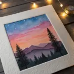
Circle-Masked Mini Landscape Window
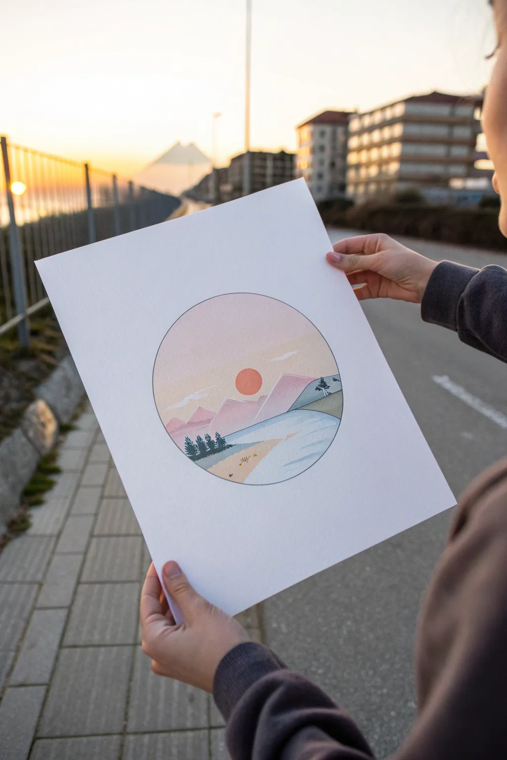
Capture the serene beauty of a mountain sunset contained within a perfect circle. This clean, geometric approach uses soft pastel gradients to create a minimalist landscape that looks like a portal to a peaceful world.
Step-by-Step Guide
Materials
- White mixed-media or drawing paper (A4 or A3 size)
- Soft pastels (chalk pastels) in pink, peach, purple, blue, and calm greens
- Pencil (HB or H)
- Compass (or a circular object like a bowl to trace)
- Ruler
- Paper tape or drafting tape
- Black fineliner (0.3mm or 0.5mm)
- Tissue paper or blending stumps
- Workable fixative spray (optional)
Step 1: Setting the Scene
-
Define the boundary:
Start by finding the center of your paper. Use a compass to draw a perfect circle about 6-8 inches in diameter. If you don’t have a compass, carefully trace around a bowl or small plate. Keep your pencil lines extremely light so they don’t show through the lighter colors later. -
Sketch the horizon:
Lightly sketch a horizon line across the lower third of the circle. This doesn’t need to be perfectly straight; a slight gentle curve can make the land feel more organic. -
Outline the mountains:
Above the horizon, sketch the jagged outlines of a mountain range. Create two layers: a larger range in the back and a slightly lower range in front to add depth. Don’t worry about details yet, just the silhouettes. -
Position the sun:
Place a small circle representing the sun slightly off-center, hovering just above the mountain peaks. It should be distinct but not overpowering in size.
Step 2: Layering the Sky and Mountains
-
Base sky gradient:
Take a very light peach or soft pink pastel. Gently rub the side of the stick across the upper sky area. I like to start at the top and work downward, fading the pressure as I reach the horizon. -
Blend the sky:
Using a tissue or your clean finger, smooth the pastel into the paper using circular motions. The goal is a seamless, creamy texture with no harsh lines. -
Add warmth:
Near the horizon line and around the sun area, introduce a slightly warmer yellow or salmon pink pastel. Blend this upward into the peach tone to create a glowing sunset effect. -
Color the sun:
Fill in your sun circle with a vibrant orange or deep red pastel. Be careful to stay within the lines, as red pigment can easily smear into the lighter sky. Use a blending stump for precision here. -
Background mountains:
Color the distant mountain range with a dusty pink or light mauve. These should be slightly darker than the sky but lighter than the foreground elements to simulate atmospheric perspective. -
Foreground mountains:
For the closer mountain range, step up to a darker purple or a deeper rose tone. Apply the pastel and blend it well, ensuring a crisp edge where it meets the sky.
Smudge Control
Place a scrap piece of paper under your drawing hand while you work. This prevents oils from your hand transferring to the paper and stops you from accidentally smearing the work you’ve already finished.
Step 3: Water and Foreground Details
-
Create the water:
Fill the lake area below the mountains with a light blue pastel. Keep your strokes horizontal to mimic the flatness of water. Leave a small slice of white paper near the bottom right for the shore. -
Define the shoreline:
Color the remaining bottom corner with a sandy beige or light ochre to represent the ground. Blend the meeting point between the sand and water gently. -
Add distant trees:
Wait for the background layers to set slightly. Using the sharp edge of a dark green or charcoal grey pastel, make tiny vertical marks on the far shoreline to suggest a distant forest. -
Draw foreground trees:
On the sandy shore area, draw a small cluster of pine trees using a dark green pastel or pencil. Press firmly to get a solid, opaque color that stands out against the light background. -
Cloud accents:
Use a white pastel stick or charcoal pencil to add a few very thin, wispy clouds across the sky. Keep them transparent and light.
Sharper Edges
For ultra-crisp mountain peaks, tear a piece of paper into a jagged shape. Hold it flat against your drawing and apply pastel over the edge. Remove the paper to reveal a perfect, sharp silhouette.
Step 4: Final Touches
-
Define the circle:
This is crucial for the ‘window’ effect. Take your black fineliner and carefully trace over the original pencil circle. Go slowly to ensure a steady, continuous line. -
Outline interior elements:
If you want a more illustrative look like the reference creates, lightly outline the mountains and the separation between land and water with the fineliner. Keep lines thin and delicate. -
Cleanup:
Use a kneadable eraser to dab away any pastel dust that strayed outside the main circle, leaving the surrounding white paper perfectly clean.
Display your mini-landscape in a simple frame to highlight the elegant geometry of the composition

Have a question or want to share your own experience? I'd love to hear from you in the comments below!