If you’re craving beginner easy charcoal drawings that look dramatic without a ton of detail, you’re in the right headspace. I’m sharing quick, doable ideas that lean into bold contrast, simple shapes, and that gorgeous smudgy charcoal magic.
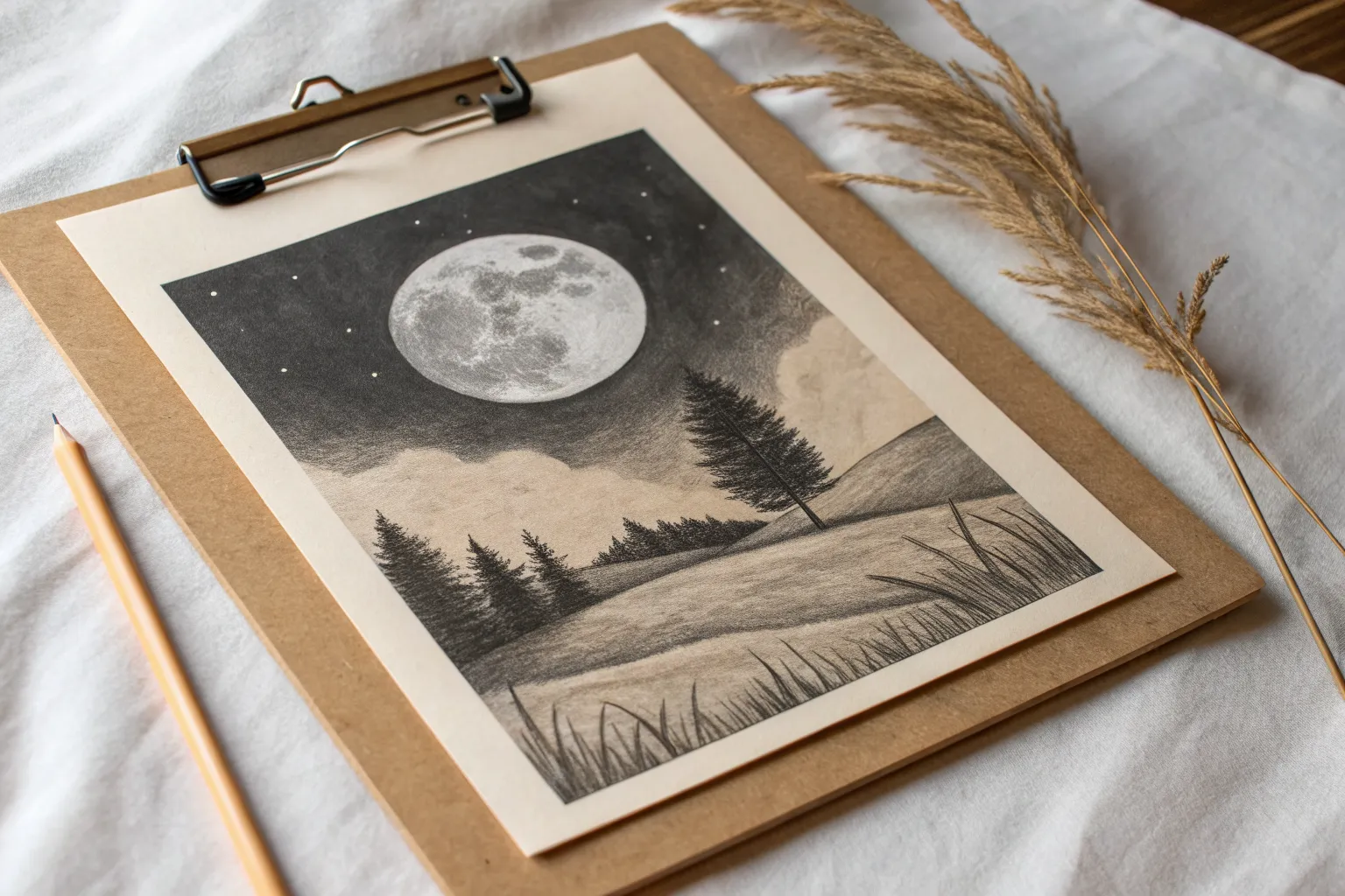
Big Moon Night Sky
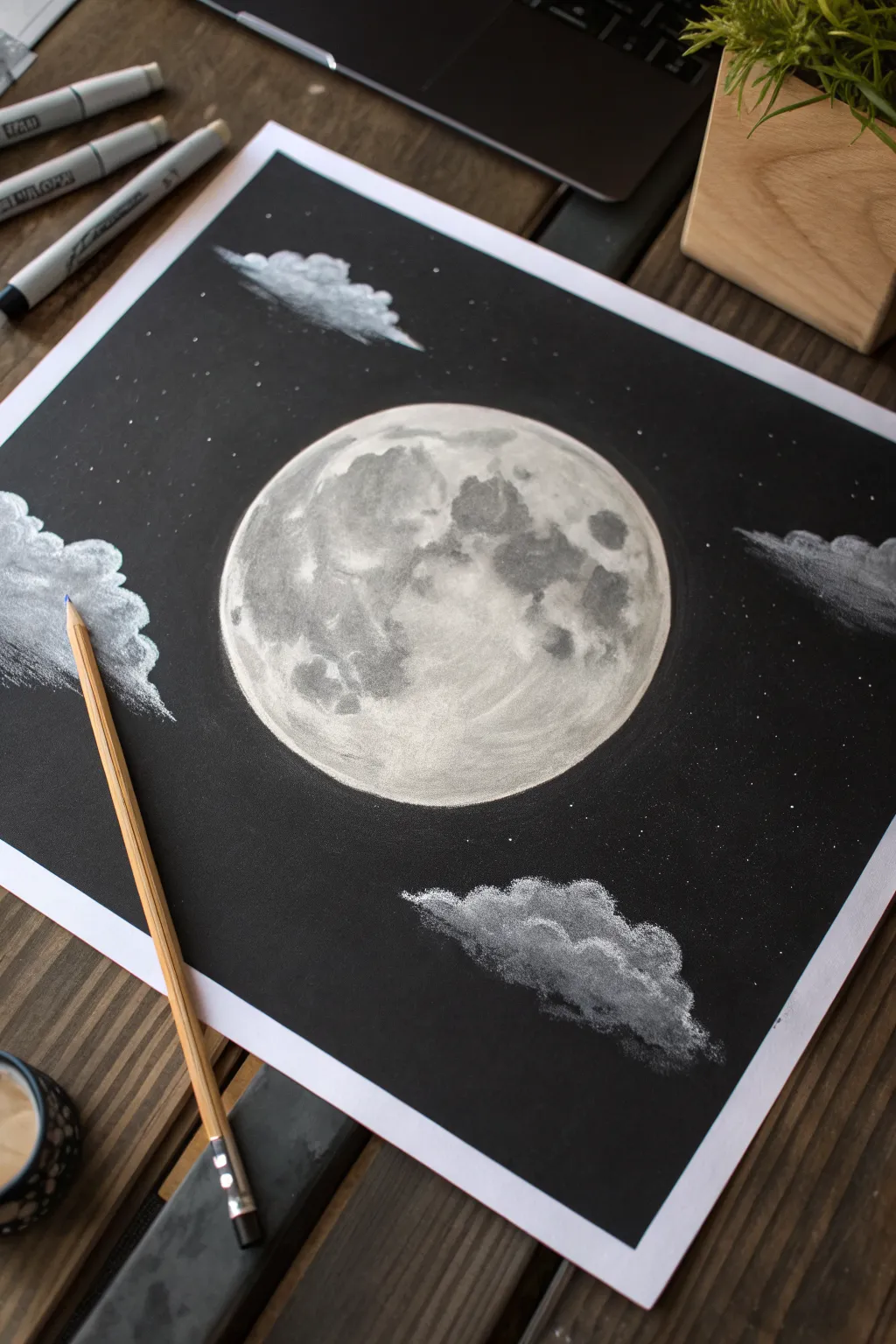
Capture the ethereal glow of a full moon surrounded by soft clouds in this striking black-and-white study. Using white charcoal on dark paper creates instant contrast and drama, making it a perfect project for mastering light and texture.
Detailed Instructions
Materials
- Smooth black cardstock or heavy charcoal paper
- Compass or circular object (for tracing)
- White charcoal pencil (soft)
- White pastel pencil (optional, for intense highlights)
- Blending stump (tortillon)
- Kneaded eraser
- Pencil sharpener
- Ruler (optional)
- Fixative spray
Step 1: Setting the Sphere
-
Outline the moon:
Begin by positioning your circle in the center of the black paper. Use a compass or lightly trace around a large roll of tape or a bowl with your white charcoal pencil. Keep this initial line very faint, as it’s just a guide. -
Create the base layer:
Lightly shade the entire interior of the circle with the white charcoal pencil. Don’t press hard yet; you want a sheer, ghostly layer of white that lets the black paper show through slightly. -
Smooth the surface:
Take a blending stump or your finger and gently rub the white charcoal layer in circular motions. This should soften the texture and create a smooth, greyish-white base for the moon.
Smudge Control
Black paper shows every smudge. Place a piece of scrap paper under your drawing hand to protect the dark background while you work on the moon.
Step 2: Mapping the Craters
-
Identify dark patches:
Look at the reference image to see where the darker ‘seas’ (maria) of the moon are located. Use your kneaded eraser to lift off the white charcoal in these specific shapes, revealing more of the black paper underneath. -
Define the edges:
Once you have the dark shapes roughly erased, use the white charcoal pencil to crisp up the edges around these darker patches. The transition shouldn’t be a hard line, but rather a textured border. -
Add mid-tones:
Lightly scumble (shade with small circular scribbles) inside the grey areas you just erased with the kneaded eraser. You don’t want them pitch black, just significantly darker than the bright highlands.
Pro Tip: Glowing Edges
Lightly rub a tiny bit of white dust just outside the moon’s rim with a soft tissue to create a subtle atmospheric halo effect.
Step 3: Building Texture and Glow
-
Intensify the highlands:
Locate the brightest parts of the moon, typically the areas between the dark craters. Press harder with your white charcoal pencil here to build up a solid, opaque white. -
Detail the rim:
Go around the outer circumference of the moon with a sharp point. Make the line clean and bright to separate the moon clearly from the night sky background. -
Create crater texture:
Inside the bright areas, make tiny dots and small, imperfect circles. The moon’s surface is battered and rough, so these little marks add necessary realism. -
Refine the contrast:
I like to go back in with the blending stump and soften just the edges of the shadows, blending them slightly into the bright areas to make the surface look spherical rather than flat.
Step 4: Clouds and Atmosphere
-
Sketch cloud shapes:
Draw three or four rough cloud shapes surrounding the moon—one large one on the left, a smaller one below, and wisps at the top. Use very light pressure initially. -
Fill the clouds:
Shade the tops of the clouds brilliantly white, as if the moonlight is hitting them directly. Fade your shading out as you move toward the bottom of each cloud. -
Blend the clouds:
Use a dirty blending stump (one that already has charcoal on it) to drag the white pigment downwards. This creates a fluffy, transparent effect at the bottom of the clouds where they fade into the dark sky. -
Add the stars:
Sharpen your white pencil to a needle point. Dot the background randomly with stars. Press firmly for close, bright stars and tap lightly for distant, faint ones. -
Final touches:
Check the overall balance. If the moon needs more punch, add a final layer of white pastel or charcoal to the brightest highlights, essentially burnishing the paper for maximum glow.
Now you have a luminous celestial scene that really pops against the dark background

Silhouette Tree at Sunset
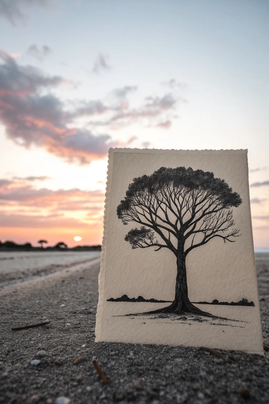
Capture the stark beauty of a lone tree against an imagined horizon with this monochrome study. Using charcoal or fine liner pens on textured paper gives the branches an organic, lifelike feel while keeping the composition strikingly simple.
Step-by-Step Guide
Materials
- Textured fine art paper (heavyweight, cold press watercolor or mixed media paper)
- Charcoal pencils (soft and medium)
- Fine liner pens (black, sizes 0.1, 0.3, and 0.5)
- Kneaded eraser
- Blending stump (tortillon)
- Ruler (optional)
- Workable fixative spray
Step 1: Setting the Horizon
-
Prepare your paper:
Begin with a piece of high-quality, textured paper. The rough edge (deckled edge) seen in the reference adds a nice rustic touch if you can find paper with it, or you can carefully tear the edges yourself against a metal ruler. -
Establish the ground line:
Using a soft charcoal pencil, light sketch a low horizon line about one-fifth of the way up from the bottom edge. It shouldn’t be perfectly straight; let it have slight dips and rises to mimic natural terrain. -
Sketch distant foliage:
Along the horizon line, draw small, irregular bumps to represent distant bushes or tree lines. Keep these very low and indistinct, as they are meant to be far in the background. -
Darken the foreground:
Fill in these distant shapes with solid black charcoal. Use a blending stump to smudge the bottom edge of these shapes slightly into the ground to create a sense of distance and shadow.
Smudge Alert
Charcoal loves to travel. Keep a clean sheet of scrap paper under your drawing hand to prevent dragging your palm through the finished work.
Step 2: Constructing the Trunk
-
Draft the main trunk:
Lightly sketch the central trunk of the tree. It should be relatively thick at the base and taper gradually as it reaches the middle of the page. Position it slightly off-center for a more dynamic composition. -
Root the tree:
At the base, flare the trunk outwards into the ground line. Draw thick roots stretching horizontally to anchor the tree firmly to your horizon. -
Define the primary branches:
From the top of your trunk, split the form into three or four main large branches. These should curve upwards and outwards, creating a chalice or ‘Y’ shape structural base. -
Add texture to the bark:
Go over the trunk with a medium charcoal pencil or a 0.5 pen. Instead of coloring it in solidly, use vertical, slightly jagged lines. This mimics rough bark texture while building up deep shadows. -
Finalize trunk shading:
Darken the sides of the trunk to create a rounded 3D effect, leaving just a hint of lighter area in the center for volume, though the goal is mostly a silhouette.
Sunset Gradient
Before drawing the tree, gently rub pastel chalks (pink, orange, yellow) onto the paper background for a soft sunset glow behind the silhouette.
Step 3: Branching Out
-
Subdivide the branches:
From each main branch, draw secondary branches splitting off. Think of veins in a leaf or cracks in pavement; they should get thinner and more erratic as they move away from the trunk. -
Create the canopy shape:
Visualize an umbrella shape for the overall crown. Ensure your branches extend to fill this imaginary dome, but keep a gap or two to let the ‘sky’ show through. -
Add the ‘isolated’ branch:
Draw a distinct, lower branch on the left side that hangs somewhat separated from the main canopy. This adds character and asymmetry to the tree. -
Switch to fine details:
For the outermost twigs, I prefer switching to a 0.1 fine liner or a very sharp hard charcoal pencil. These lines need to look delicate and brittle.
Step 4: Foliage and Finish
-
Stipple the leaves:
To create the leaves, use a stippling technique (lots of small dots) or tiny, tight scribbles. Cluster these densely at the very ends of the finest branches. -
Build canopy volume:
Concentrate your dark stippling at the top of the canopy to give it weight. Let the foliage adhere to the branch structure you drew, rather than just floating around it. -
Refine the silhouette:
Step back and look at the negative space. If the canopy looks too thin, add more clusters of tiny scribbles to darken the upper edges. -
Ground shadows:
Return to the base of the tree. Add some scribbly horizontal lines under the roots to simulate grass and cast shadows on the ground. -
Clean and seal:
Use your kneaded eraser to pick up any accidental smudges on the sky area. Spray with a workable fixative to prevent the charcoal from smearing.
Now you have a striking, classic silhouette that captures the peaceful solitude of nature.


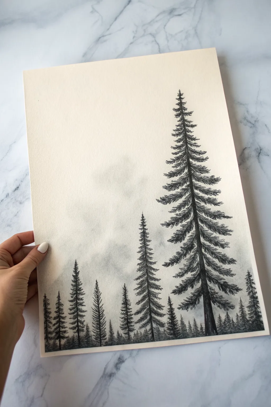
Mountain Range With Mist
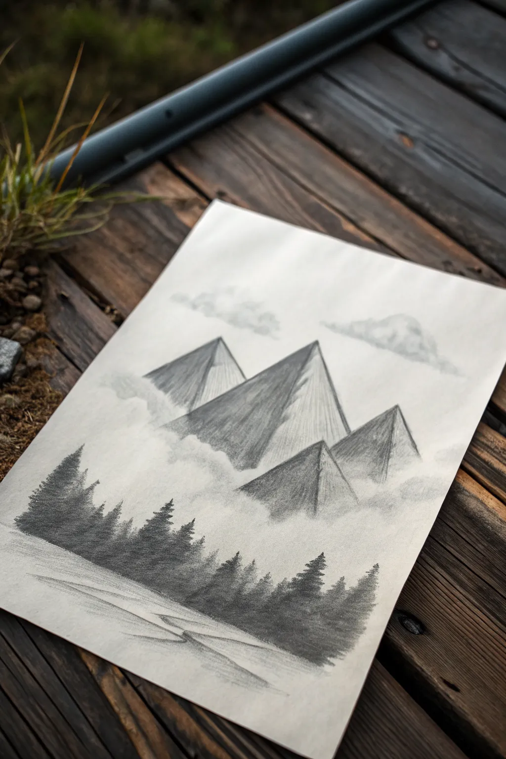
This ethereal charcoal drawing captures the imposing nature of geometric peaks rising from a sea of fog, grounded by a dark, mysterious pine forest. It’s a perfect exercise for learning how to control values and use blending tools to create convincing atmospheric depth.
Step-by-Step Tutorial
Materials
- White drawing paper (smooth or medium tooth)
- Vine charcoal (soft via willow sticks)
- Compressed charcoal stick or dark charcoal pencil (4B or 6B)
- Blending stump (tortillon)
- Kneaded eraser
- Tissue or soft cloth
- Workable fixative (optional)
Step 1: Setting the Scene
-
Outline the Peaks:
Begin by lightly sketching the outline of four large, triangular mountain peaks using a stick of vine charcoal. Place the largest, central peak slightly off-center and flank it with three smaller peaks to create a balanced composition. -
Establish Light Source:
Decide on a light source coming from the right side. Lightly mark the right slopes of your triangles to remind yourself that these faces will remain lighter, while the left faces will fall into deep shadow. -
Add Floating Clouds:
Above the peaks, sketch loose, irregular cloud shapes. Keep these outlines extremely faint, as you want them to feel airy and not heavy.
Smudge Patrol
If you accidentally get charcoal fingerprints in the sky area, don’t rub them! Instead, press a clean kneaded eraser straight down and lift up to remove the mark without spreading it.
Step 2: Building the Mountains
-
Shade the Shadow Side:
Using the side of your vine charcoal, lay down a medium-gray tone on the left-hand faces of all four mountains. Press lightly; we will darken this later. -
Define the Ridges:
Switch to a charcoal pencil or the sharp edge of a compressed charcoal stick. Draw a crisp, dark line down the center spine of each mountain where the light and shadow sides meet. -
Texturize the Slopes:
On the shadowed faces, add vertical strokes that follow the angle of the slope. This mimics the rugged terrain of rock faces. -
Initial Blending:
Take your blending stump and gently smudge the charcoal on the shadowed sides, pulling the pigment slightly towards the lighter side but keeping that center ridge distinct. This creates a softer, misty rock texture. -
Darken the Contrast:
Go back over the shadowed (left) sides with more pressure or a darker compressed charcoal. Make the base of the mountains darker than the tips to suggest they are looming large.
Sharper Peaks
To get perfectly straight mountain edges, hold a piece of scrap paper over your drawing as a mask. Shade right up to the edge of the scrap paper, then lift it to reveal a crisp line.
Step 3: Creating Atmosphere
-
Generate the Mist:
Using a tissue or your finger, smudge the charcoal at the very bottom of the mountains in circular motions. Drag this gray haze downward into the empty space below the peaks to form a thick fog bank. -
Cloud Softening:
Return to the sky clouds. Lightly shade the undersides with vine charcoal, then aggressively blend them with a clean tissue until they are soft, gauzy puffs with no hard edges. -
Erase for Highlights:
Take your kneaded eraser and shape it into a point. Tap and lift charcoal away from the illuminated (right) faces of the mountains and the tops of the clouds to reclaim the bright white of the paper.
Step 4: The Forest & Foreground
-
Map the Treeline:
Below the misty area, lightly draw a horizon line that dips and rises slightly. This will be the top of your forest canopy. -
Draw Pine Silhouettes:
Using your darkest compressed charcoal or a sharp 6B pencil, start drawing vertical lines for tree trunks. Add scribbled, downward-angled branches to create the classic pine tree triangular shape. -
Create Density:
Fill in the gaps between your distinct trees with solid dark shading. The forest should look like a dense wall of black, with only the tree tops showing individual detail against the mist. -
Vary Tree Heights:
Ensure the tops of your trees are uneven—some tall, some short—to give the forest a natural, organic look. This irregular edge contrasts beautifully with the straight lines of the mountains. -
Sketch the Ground:
At the very bottom of the paper, beneath the dark forest, use horizontal strokes of vine charcoal to suggest a flat, snowy or earthen ground. -
Foreground Details:
Draw faint, wandering horizontal lines in the foreground to suggest subtle ridges or tracks in the ground. Keep these minimal so they don’t distract from the mountains. -
Final Mist Adjustment:
I usually like to take a clean blending stump or tissue and gently blur the very tops of the distant trees where they meet the fog, making the atmosphere feel heavy and damp.
Step back and admire the moody, atmospheric landscape you have built using just shadow and light


Calm Lake Reflection
Capture the peaceful stillness of nature with this straightforward charcoal and ink rendering of a mountain lake. The composition relies on strong horizontal lines and clever vertical strokes to create a convincing reflection effect.
Detailed Instructions
Materials
- Fine-tooth drawing paper (A4 or similar size)
- Charcoal pencils (Soft and Medium)
- Fine-liner pen (black, 0.4mm or 0.5mm)
- Ruler or straight edge
- Blending stump (tortillon)
- Kneaded eraser
Step 1: Setting the Horizon
-
Establish the horizon line:
Begin by drawing a very light, straight horizontal line across the lower third of your paper using a ruler and a hard pencil or light charcoal touch. This will separate the shore from the water. -
Outline the mountains:
Above the horizon, sketch the gentle slopes of the distant mountains. Keep these lines soft and rolling, rising towards the center and dipping back down, mimicking the landscape’s natural flow. -
Add the shoreline:
Draw a second, slightly uneven line just above your horizon line to represent the physical bank where the trees will stand. The space between this and your horizon line will be the water’s edge.
Smudge Alert
Place a scrap piece of paper under your drawing hand. This prevents your palm from smearing the charcoal trees while you work on the delicate water reflections.
Step 2: Creating the Landscape
-
Sketch the main pine tree:
On the left side of the paper, draw a vertical line for the trunk of the prominent pine tree. Using short, jagged strokes, build the foliage starting narrow at the top and widening as you go down. -
Fill the tree foliage:
Darken the pine tree using your medium charcoal pencil. Leave small gaps between the branches to let “light” through, preventing the tree from looking like a solid block. -
Add distant trees:
To the right of the main tree, sketch a series of smaller, less detailed pine shapes along the shoreline. Decrease their size as you move toward the center to create a sense of depth. -
Balance the composition:
On the far right side, add another cluster of trees or a larger bush shape to frame the view, balancing the visual weight of the large tree on the left. -
Shade the mountains:
Lightly shade the mountains using the side of your charcoal pencil. I find it helpful to fade the shading out as it reaches the top edge to simulate atmospheric perspective.
Make it moody
For a misty morning look, use a blending stump to soften the tops of the distant mountains and the edges of the reflection, making them look hazy and ethereal.
Step 3: Reflections and Details
-
Start the mirror image:
Directly below the horizon line, sketch the inverted shapes of your trees. These don’t need to be perfect copies; they should be slightly elongated and less defined. -
Apply vertical reflection strokes:
Use vertical downward strokes to fill in the tree reflections. Keep your hand loose—these lines mimic the way still water drags the image downwards. -
Define the water surface:
Draw widely spaced, horizontal lines across the reflective area. This cuts through the vertical strokes and instantly communicates that the surface is water. -
Add foreground grasses:
At the very bottom edge of the paper, use your fine-liner pen or a sharp charcoal point to flick upward, creating thin marsh grasses. Vary their heights for a natural look. -
Enhance the contrast:
Go back to the shoreline (the dark strip between trees and water) and darken it significantly with your softest charcoal. This anchors the drawing. -
Refine the sky:
Leave the sky largely blank to represent a bright, clear day, or add incredibly faint horizontal shading near the top corners to vignette the image. -
Final clean up:
Use your kneaded eraser to lift off any smudges in the water area or sky, ensuring the white of the paper stays crisp for high contrast.
Step back and admire how a few simple lines can create such a vast sense of space and tranquility
BRUSH GUIDE
The Right Brush for Every Stroke
From clean lines to bold texture — master brush choice, stroke control, and essential techniques.
Explore the Full Guide
Pine Tree Silhouette Lineup
Capture the serene stillness of a pine forest with this atmospheric charcoal drawing. By layering simple tree silhouettes and smudging for a misty effect, you will create a sense of depth that draws the viewer right into the woods.
Step-by-Step Tutorial
Materials
- Textured drawing paper (cream or off-white)
- Vine charcoal stick (soft)
- Compressed charcoal stick (medium or hard)
- Charcoal pencil (black)
- Blending stump (tortillon) or cotton swab
- Soft tissue or chamois cloth
- Kneaded eraser
- Workable fixative spray
Step 1: Setting the Mystical Atmosphere
-
Prepare your paper:
Start with a clean sheet of textured, cream-colored drawing paper. Tape the edges to your surface if desired to keep it steady. -
Lay down the base tone:
Using a soft vine charcoal stick on its side, very lightly rub a patchy cloud of grey across the lower third of the paper. This doesn’t need to be uniform; irregularity helps mimic fog. -
Soften the background:
Take a soft tissue or a chamois cloth and gently rub the charcoal you just applied. The goal is to create a seamless, blurry haze that suggests distant mountains or dense fog. -
Sketch the distant treeline:
With the vine charcoal, lightly sketch faint, small vertical lines rising from the bottom edge. These are your furthest trees, so keep them short and barely visible. -
Blur the distance:
Using your finger or a clean tissue, tap these distant tree lines to push them back into the mist. They should look like ghosts of trees rather than solid objects.
Step 2: Planting the Mid-Ground
-
Position the medium trees:
Switch to a charcoal pencil for more control. Draw three or four vertical lines near the left side and center of the paper to serve as the trunks for your mid-ground trees. Vary their heights to keep the composition interesting. -
Create the top branches:
Starting at the very tip of a trunk line, use short, downward-flicking strokes to create the pointed top of the pine tree. Keep these strokes tight and narrow. -
Widen the branches downward:
Work your way down the trunk, gradually making your scribble strokes wider. Use a zig-zag motion that extends outward from the trunk, lifting your pressure at the end of each branch to make the needles look delicate. -
Add texture to the mid-ground:
Once you have the basic pine shapes, go back over the darker areas of these trees with a bit more pressure. Don’t make them pitch black yet; save the darkest darks for the foreground. -
Ground the trees:
At the base of your mid-ground trees, scribble some rough, horizontal strokes to suggest undergrowth and grass, blending it slightly into the ‘fog’ layer.
Smudge Patrol
Does your drawing look muddy? Avoid using your oily fingers for smoothing. Stick to paper stumps or tissues, and keep a clean piece of paper under your hand to protect the drawing while you work.
Step 3: The Majestic Foreground Tree
-
Draw the main trunk:
For the large tree on the right, use a piece of compressed charcoal or a sharpened charcoal pencil. Draw a solid, thick vertical line that extends almost to the top of the paper, tapering slightly as it goes up. -
Start the canopy:
Begin at the apex of this large tree. Use sharp, deliberate strokes to create the needle clusters. Because this tree is closest, you want to see individual jagged edges, not just blur. -
Build branch volume:
As you move down the trunk, visualize the branches drooping slightly under their own weight before curving up at the tips. Draw the branches in layers, leaving small gaps of white paper between them to let light through. -
Deepen the shadows:
I like to press firmly with the compressed charcoal along the underside of the main branches and the trunk itself. This high contrast is what brings the tree forward. -
Thicken the lower trunk:
Towards the bottom of the page, widen the trunk significantly and add vertical texture lines to resemble rough bark. Ensure the base looks sturdy. -
Add foreground details:
Sketch a few very short, sharp tree tops poking up at the very bottom right and between gaps to suggest tiny saplings growing in front of the viewer.
Level Up: Snowy Day
Transform this into a winter scene by using white charcoal or a white gel pen to add snow resting on top of the dark branches and scattered across the ground.
Step 4: Final Touches
-
Clean up highlights:
Use a kneaded eraser to dab away any smudges in the sky area. You can also pinch the eraser into a fine point and ‘draw’ white highlights back into the dark tree branches if they got too murky. -
Evaluate contrast:
Step back and check your values. The background should be pale grey, the mid-ground medium grey, and the main tree rich black. Darken the foreground tree if needed. -
Preserve your work:
Charcoal smudges easily, so take your drawing outside and give it a light coat of workable fixative spray to seal the particles in place.
Hang your finished forest scene in a simple frame to enjoy a window into nature every day
Palm Tree and Moon
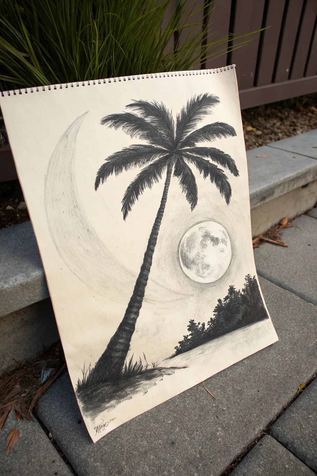
Capture the serene beauty of a tropical night with this striking charcoal composition. This project combines a detailed palm tree silhouette against a surreal backdrop featuring both a large crescent form and a realistic full moon.
Step-by-Step Guide
Materials
- Sketchbook or drawing paper (medium tooth)
- Vine charcoal (soft)
- Compressed charcoal sticks (medium and dark)
- Charcoal pencils (soft/6B and hard/2B)
- Kneaded eraser
- Blending stump or tortillon
- Tissue or chamois cloth
- Workable fixative (optional)
Step 1: Planning the Composition
-
Lightly sketch the layout:
Using a hard charcoal pencil or distinctively light touch with vine charcoal, map out the main elements. Draw a long, curving line for the palm trunk starting from the bottom left, leaning towards the center. Ideally, position the horizon line low on the page. -
Outline the celestial bodies:
Sketch a large, sweeping crescent shape on the left side of the paper that curves behind the tree area. Then, draw a perfect circle on the right side for the full moon, placing it lower than the palm fronds but above the distant trees. -
Mark the distant land:
Sketch a rough, jagged outline for the distant island or tree line on the bottom right. This should sit on the horizon line you established earlier.
Smudge Alert
Charcoal moves easily. Place a clean sheet of scrap paper under your drawing hand while you work on the palm tree details to avoid smearing the sky or moon.
Step 2: Drawing the Background Elements
-
Shade the large crescent:
Using vine charcoal, lightly fill in the large crescent shape. Keep the strokes very faint and directional, following the curve. Use a tissue to smooth this out into a pale, ghostly grey that doesn’t compete with the darker foreground. -
render the full moon:
Switch to a charcoal pencil for the full moon crater details. Keep the moon primarily white (the paper itself), but lightly shade small, irregular patches to suggest craters. Keep the edges crisp to make it pop against the sky. -
Add gentle atmospheric shading:
Apply a very light layer of vine charcoal around the moon and crescent to create a subtle sky tone. Smudge this gently with a tissue so it fades into the white paper, creating a glowing effect around the orbs.
Step 3: Creating the Palm Tree
-
Build the trunk structure:
Using a stick of compressed charcoal, darken the trunk. Instead of a solid line, use small, horizontal stacked strokes to mimic the textured, segmented bark of a palm tree. Make the base wider and taper it slightly as you go up. -
Establish the frond spines:
From the top center of the trunk, draw outward-curving lines to act as the central spines (rachis) for the leaves. Create a fountain shape, with some lines reaching high and others drooping low. -
Add the leaflets:
With a sharpened soft charcoal pencil or the edge of a charcoal stick, draw the individual leaflets coming off the spines. Use quick, flicking strokes that taper at the ends. Ensure the leaflets on the ‘underside’ of the spines are darker to show shadow. -
Darken the silhouette:
Go back over the center of the palm crown where the branches meet. Press firmly with compressed charcoal to make this area dense and black, which adds weight and realism to the silhouette. -
Refine the trunk texture:
Add deeper shadows to the right side of the trunk to suggest a light source coming from the left (perhaps the large crescent). This gives the cylinder volume.
Sharper Fronds
For razor-sharp palm leaves, sand your charcoal stick on a sanding block to create a chisel edge. Use the sharp corner for the finest tips of the leaves.
Step 4: Foreground and Finishing Touches
-
Fill the distant trees:
Fill in the distant island shape on the right with solid black compressed charcoal. Use short, vertical strokes on the top edge to simulate tiny tree tops. -
Ground the palm tree:
At the base of the palm, create a small mound of earth using dark, heavy shading. Add upward flicking strokes to represent tufts of grass growing around the roots. -
Create the reflection:
Lightly smudge horizontal lines below the distant island to create a reflection in the water. I like to use a dirty blending stump for this to keep it subtle. -
Clean up highlights:
Take your kneaded eraser and shape it into a fine point. Dab away any stray charcoal dust from the face of the moon and the highlighted areas of the sky to ensure maximum contrast. -
Final contrast check:
Step back and look at your drawing. Deepen the blacks on the palm tree fronds and the trunk base one last time if they look dusty or grey.
You have now created a moody, atmospheric landscape that perfectly balances light and shadow

PENCIL GUIDE
Understanding Pencil Grades from H to B
From first sketch to finished drawing — learn pencil grades, line control, and shading techniques.
Explore the Full Guide
Lonely Figure With a Balloon
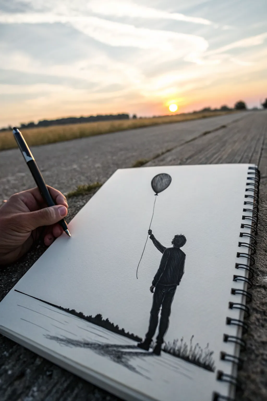
Capture a poignant moment of solitude with this high-contrast charcoal sketch featuring a lonely figure holding a balloon against an empty sky. The beauty of this piece lies in its simplicity, using bold darks against the stark white page to create emotional resonance.
How-To Guide
Materials
- Spiral-bound sketchbook (medium tooth paper)
- Charcoal pencil (soft/dark, e.g., 4B or 6B)
- Graphite pencil (HB for light sketching)
- Kneaded eraser
- Blending stump or cotton swab
- Ruler (optional)
Step 1: Setting the Scene
-
Draft the horizon:
Start by lightly drawing a horizon line across the bottom third of your page using your HB pencil. It doesn’t need to be perfectly straight; a slight organic irregularity adds realism. -
Position the figure:
Visualize where the person will stand. Lightly sketch a vertical guideline on the right side of the paper to mark the figure’s height, leaving plenty of empty space above for the balloon. -
Sketch the body shape:
Using gentle ovals and rectangles, block out the anatomy. Draw the head looking upward, a torso slightly angled back, and legs standing firmly. Don’t worry about details yet; just get the proportions right.
Keep it Clean
Place a scrap piece of paper under your drawing hand. This prevents your palm from smearing the finished charcoal sections while you verify details.
Step 2: Drawing the Figure
-
Define the silhouette:
Switch to your charcoal pencil. Sharpen it to a fine point and begin outlining the final shape of the clothing—a jacket and trousers. Add small folds and wrinkles at the elbows and knees to suggest movement. -
Fill in the blacks:
Pressing firmly with the charcoal, fill in the entire figure. Use short, dense strokes to build up a solid, opaque black, leaving no white paper showing through the clothes. -
Refine the edges:
Go back over the outline of the head and hair. Use the very tip of your pencil to add texture to the hair, making it look slightly tousled rather than perfectly smooth. -
Add the arm:
Draw the arm reaching upwards. Since this is a silhouette, ensure the hand looks like it’s grasping something by carefully shaping the fist.
Step 3: The Balloon and String
-
Place the balloon:
Estimate the distance for the string. Draw an oval shape for the balloon high above the figure’s head. -
Shape carefully:
Refine the balloon’s shape into an inverted tear-drop. At the bottom knot, add a tiny triangle where the string attaches. -
Shade the form:
Unlike the figure, don’t make the balloon solid black. Use vertical curved hatching lines to shade it, leaving a lighter area on the upper left side to suggest a reflection or shine. -
Connect the string:
Connecting the hand to the balloon requires a steady hand. Draw a very fine, slightly wavy line. I find it helps to ‘ghost’ the motion with my hand a few times before actually touching the paper.
Add Pop of Color
Make the drawing unique by using a red pastel or colored pencil strictly for the balloon, keeping everything else in monochrome charcoal.
Step 4: Ground and Details
-
Darken the horizon:
Return to your horizon line. Use the side of your charcoal pencil to create distant, indistinct shapes that look like a tree line or bushes. -
Create shadows:
From the figure’s feet, draw a long, horizontal shadow stretching to the left. Scumble the charcoal here to make it look textured like asphalt or grass. -
Add foreground texture:
Sketch some sparse, small grass blades near the figure’s feet and along the bottom edge of the paper to ground the scene. -
Smudge for atmosphere:
Take your blending stump or a fingertip and very lightly smudge the shadow on the ground to soften it, distinguishing it from the sharp silhouette of the boy. -
Clean up:
Use your kneaded eraser to pick up any stray charcoal dust from the white sky area, keeping the negative space distinct and clean.
Now you have a striking, emotive drawing ready to be displayed
Rose in Simple Values
Learn to capture the soft elegance of a rose using charcoal’s rich tonal range. This drawing emphasizes smooth gradients and crisp petal edges, creating a realistic bloom that looks like it’s resting right on the page.
Detailed Instructions
Materials
- Smooth bristol or drawing paper
- Vine charcoal (soft)
- Charcoal pencils (HB, 2B, 4B)
- Kneaded eraser
- Blending stump or tortillon
- White vinyl eraser (for highlights)
- Fixative spray (optional)
Step 1: Constructing the Bloom
-
Establish the core:
Begin lightly with a vine charcoal stick to sketch a small, tight spiral in the center of your page. This oval shape marks the tightly packed inner petals of the rose. -
Map the inner petals:
Draw overlapping C-shaped curves hugging the central spiral. These shapes should interlock like puzzle pieces, getting slightly larger as they move outward. -
Expand the outer petals:
Sketch the largest, fully opened petals around the perimeter. Keep the lines loose and flowing, allowing the edges to curl and fold over slightly to create a natural, organic look. -
Draw the stem and thorns:
Extend a curved line downward from the base of the flower head for the stem. Add small, triangular spikes for thorns, keeping them sharp and distinct. -
Position the leaves:
Sketch three to four serrated leaf shapes branching off the stem and tucking behind the main flower head. Draw a central vein line through each leaf to guide the direction of your shading later.
Step 2: Shading and Definition
-
Define the contours:
Switch to a sharpened HB charcoal pencil to firm up your initial sketch lines. Go over the petal edges, preciseing the curves and emphasizing the jagged edges of the leaves. -
Apply base values:
Using a 2B charcoal pencil, lightly shade the darkest areas, which are typically found deep inside the center spiral and underneath the folding petals. -
Blend the shadows:
Take your blending stump and gently smudge the charcoal you just laid down. Pull the graphite outward from the dark crevices towards the lighter center of each petal to create a soft gray gradient. -
Deepen the contrast:
Go back in with a 4B charcoal pencil to punch up the darkest shadows. Focus on the very deepest points where petals overlap—this high contrast helps the flower pop. -
Render the leaves:
Shade the leaves by starting at the center vein and flicking outward. Leave the edges of the veins slightly lighter to show texture. -
Detail the leaf edges:
Refine the serrated edges of the leaves with your sharpest pencil. I find that quick, short strokes work best here to mimic the saw-tooth texture.
Smudge Patrol
Charcoal loves to smear. Place a clean sheet of scrap paper under your drawing hand to protect your work or subtle shading as you move across the page.
Step 3: Finishing Touches
-
Create texture on petals:
Add very subtle, faint lines following the curve of the petals using the HB pencil. These delicate striations suggest the velvety texture of the rose surface. -
Lift highlights:
Mold your kneaded eraser into a fine point. dab and lift charcoal off the tops of the petal curves and the tips of leaves to create bright, white highlights. -
Refine the stem:
shade one side of the stem darker to give it a cylindrical form. Ensure the thorns have a crisp outline and a sharp point. -
Check balance:
Step back and look at the whole drawing. Use the white vinyl eraser to clean up any smudges on the background paper, ensuring the rose stands out clearly. -
Final polish:
If you wish, lightly spray with fixative to prevent your beautiful charcoal work from smudging over time.
Dew Drops Effect
Add realism by drawing tiny circles on a petal. Shade the top inside dark and add a bright white dot on the bottom to simulate a glistening drop of water.
You have captured the timeless beauty of a rose with just a few simple tools and patience


Single Daisy or Blossom
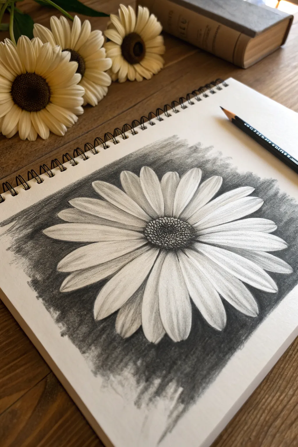
This striking single blossom study focuses on contrast and petal structure, making it a perfect project for beginners learning to control value. By using a dark, smudged background, the white paper itself does the heavy lifting to create bright, luminous petals.
Step-by-Step Guide
Materials
- Sketchbook or drawing paper (heavyweight works best)
- Charcoal pencil (soft or medium)
- Graphite pencil (HB or 2B for initial sketching)
- Blending stump (tortillon) or cotton swab
- Kneaded eraser
- Tissues or paper towel for large blending
Step 1: Initial Sketching
-
Mark the center:
Start by lightly drawing a small oval in the middle of your page with your graphite pencil. This will become the textured center of the flower. -
Define the outer limit:
Lightly sketch a large, faint circle around the center oval to act as a guideline for how long your petals should be. -
Map the primary petals:
Sketch the four or five main petals that sit in front. Draw these petal shapes extending from the center to your outer circle, keeping their lines light and flowing. -
Fill in the gaps:
Draw the remaining petals behind the first set, filling the spaces. Vary their widths slightly to make the flower look natural and organic.
Smudge Patrol
If you accidentally get charcoal dust on a white petal, don’t rub it! Press a clean kneaded eraser straight down and lift to remove the dust without grinding it in.
Step 2: Developing the Center
-
Switch to charcoal:
Pick up your charcoal pencil now. Begin stippling small dots tightly in the very middle of the center oval to create a deep, dark core. -
Texture the outer center:
Continue creating small, circular marks and dots moving outward toward the petals, but space them out slightly more to make the edges of the center look a bit lighter.
Step 3: Creating the Background
-
Outline carefully:
Using firm pressure with the charcoal pencil, carefully outline the outer edges of your petals. This creates a barrier so you don’t accidentally smudge into your white flower later. -
Fill the negative space:
Shade the area surrounding the flower with broad, dark strokes of charcoal. You don’t need to fill the whole page, just a rectangular patch around the blossom. -
Blend the background:
Take a tissue or paper towel and rub the background charcoal vigorously. Blend it until it creates a smooth, smoky gray tone that makes the white petals pop forward.
Pro Tip: Directional Strokes
When blending the background, stroke away from the flower center. This creates an energetic, radiating look rather than a messy, chaotic cloud.
Step 4: Shading the Petals
-
Add petal veins:
Sharpen your charcoal pencil to a fine point. Draw delicate lines from the center of the flower extending about halfway up each petal to suggest veins. -
Shade the base:
Add light shading at the very base of each petal where it meets the center. This adds depth and shows that the petals are curving outward. -
Soften the veins:
Use your blending stump to gently smudge the vein lines you just drew. I prefer to pull the charcoal upward toward the tip of the petal to create a soft gradient. -
Separate the layers:
Identify the petals that are “behind” other petals. Add a little extra shading on these background petals where they are overlapped to cast a shadow. -
Refine the tips:
Check the outer tips of your petals. If the outline looks too thick, use your kneaded eraser to tap it back and clean up the brightness of the white paper.
Step 5: Final Touches
-
Deepen the contrast:
Go back into the background right next to the petals and press harder with your charcoal to create the darkest possible value right against the white edge. -
Highlighting:
Use a clean edge of your kneaded eraser to lift off any gray smudges from the center of the petals, ensuring the highlights are crisp and clean.
Now you have a high-contrast floral study that really showcases the beauty of simple values
Leaf With Veins and Shadow
Capture the delicate structure of a fallen leaf with this high-contrast charcoal study. By focusing on the interplay between deep blacks and clean white veins, you’ll create a piece that feels both organic and crisply detailed.
How-To Guide
Materials
- High-quality white charcoal paper or drawing paper (medium tooth)
- Vine charcoal (soft) for initial sketching
- Compressed charcoal stick or pencil (for deep darks)
- Kneaded eraser
- Precision eraser or eraser pencil (Tombo Mono Zero style)
- Blending stump (tortillon)
- Tissues or chamois cloth
- Fixative spray
Step 1: Drafting the Structure
-
Establish the curve:
Begin by drawing a gentle, sweeping ‘S’ curve lightly with vine charcoal. This will serve as the central vein (midrib) and dictate the flow of the entire leaf. -
Outline the shape:
Sketch the outer perimeter of the leaf. Aim for a teardrop shape that is wider at the top and tapers elegantly to a point at the bottom stem. Keep the edges slightly serrated rather than perfectly smooth. -
Map primary veins:
Lightly draw curved lines extending from the central midrib out to the edges. Space them evenly, angling them upwards slightly to mimic natural growth patterns.
Smudge Control
Place a scrap sheet of paper under your drawing hand. This prevents your palm from dragging charcoal across the pristine white drafting paper while you work on details.
Step 2: Building Value
-
Identify white space:
Before adding heavy charcoal, decide exactly where your bright veins will be. You want to preserve the white of the paper here rather than trying to erase perfectly later. -
Apply base texture:
Using the side of a charcoal stick, gently rub a mid-tone layer over the leaf sections, working carefully between your marked vein lines. -
Smooth the base:
Take a tissue or your finger and softly blend this initial layer to push the charcoal into the paper’s tooth, creating a soft grey foundation. -
Deepen the sections:
Switch to compressed charcoal. Start filling in the sections between the veins with darker strokes. Press harder near the central vein and fade slightly as you reach the leaf edge. -
Refine the midrib:
The central stem needs to be the brightest part. Use your kneaded eraser to lift any stray dust off the center line, ensuring it remains stark white against the dark leaf body.
Step 3: Detailing and Texture
-
Create micro-veins:
Within the dark sections, use a sharpened charcoal pencil to draw tiny, hair-like strokes that follow the direction of the main veins. This creates the fibrous texture seen in the reference. -
Crisp up the edges:
Go back over the outer contour of the leaf. Make the serrated edges distinct and sharp using a dark line, giving the leaf definition against the white background. -
Lift fine highlights:
Using a precision eraser or the sharp edge of a generic eraser, carefully carve out thin, secondary veins branching off the main ones. I find this subtraction method creates the most realistic organic lines. -
Darken the negative space:
Reinforce the darks right next to your white veins. High contrast is key here; the blackest blacks should touch the whitest whites to make them pop. -
Texture the surface:
Use a blending stump to smudge small areas within the leaf panels, creating a sense of undulation and dimension so the leaf doesn’t look flat.
Level Up: Water Droplets
Add 3D realism by drawing a small circle. Shade the top inside dark, leave the bottom light, and add a sharp cast shadow underneath to create a dew drop.
Step 4: Final Touches
-
Draw the stem:
Extending from the bottom, draw a thin, curved stem. Keep one side dark and leave a sliver of white paper on the other side to suggest a cylindrical highlights. -
Add localized shadow:
If you want to ground the leaf, add a very faint, soft shadow underneath the bottom right edge using leftover dust on your blending stump. -
Clean the background:
Charcoal helps get messy. Use a large eraser to diligently clean the paper surrounding the leaf, removing any fingerprints or smudges to keep the background pristine. -
Protect the work:
Once satisfied, spray the drawing with a workable fixative to prevent the dense charcoal areas from smearing.
Your finished leaf study now highlights the beautiful geometry found in nature
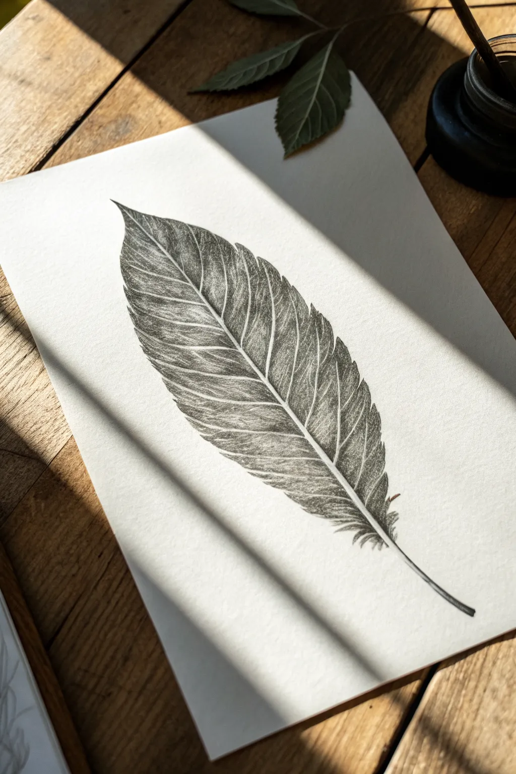
Feather With Soft Edges
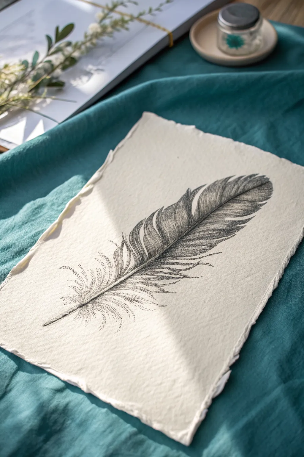
Capture the delicate softness of nature with this ethereal feather study, perfect for mastering charcoal’s range from deep blacks to whisper-light greys. Using handmade paper adds a beautiful texture that complements the organic subject matter.
Step-by-Step Guide
Materials
- Deckle-edge handmade paper (cotton rag or heavy textured paper)
- Willow charcoal stick (medium)
- Charcoal pencil (soft/2B)
- Charcoal pencil (hard/HB or H)
- Kneaded eraser
- Blending stump (tortillon)
- Soft brush (for sweeping away dust)
- Workable fixative
Step 1: Laying the Foundation
-
Positioning the quill:
Start by lightly sketching the central shaft (rachis) of the feather using your hard charcoal pencil. Draw a gentle curve that spans diagonally across the paper, starting thicker at the bottom and tapering to a vanishing point at the tip. -
Mapping the shape:
Visualize the overall tear-drop shape of the feather vane. Lightly mark the outer boundaries with faint, dashed lines just to guide where the feather will be widest and where it will narrow at the top. -
Blocking in the vane:
Using the side of a willow charcoal stick, very gently lay down a base tone for the main body of the feather. Don’t press hard; you want a misty, light grey cloud that roughly fills your mapped shape. -
Softening the base:
Take a tissue or your finger and rub this base layer of charcoal into the textured paper. This creates a soft underpainting that eliminates harsh white specks and establishes a middle value.
Smudge Control
Place a piece of scrap paper under your drawing hand while you work on the details. This prevents the oils in your skin from transferring to the paper and stops your palm from smearing your artwork.
Step 2: Building Structure & Texture
-
Defining the quill shadow:
Switch to your soft charcoal pencil. deepen the shadow along the underside of the central quill structure to make it look round and dimensional, leaving the top edge highlighted. -
Drawing the main barbs:
Start drawing the individual barbs extending outward from the quill. Use swift, confident strokes that flick upwards and outwards. Follow the natural curve of the feather—barbs near the bottom are looser, while those near the top are tighter together. -
Creating separation:
Feathers rarely stay perfectly intact. intentionally leave v-shaped gaps or ‘splits’ in the vane where the barbs have separated. Darken the edges of these splits slightly to show depth. -
Layering the darkness:
Identify the darkest areas of the feather, typically near the quill and in the overlaps of the barbs. Use the soft charcoal pencil to add firm pressure here, building up a rich, deep black. -
Blending the mid-tones:
Use a twisting motion with your blending stump to drag some of your dark pencil lines outward. This softens the transition between the dark quill area and the lighter edges of the feather.
Step 3: Detailing the Downy Edges
-
Sketching the afterfeather:
At the very base of the quill, draw the fluffy ‘afterfeather’ section. These lines should be chaotic, curly, and much lighter than the main barbs. Imagine drawing tangled thread. -
Refining the tips:
Focus on the outer contour of the feather. Use a sharpened hard charcoal pencil to ensure the tips of the barbs taper off into nothingness rather than ending abruptly. -
Adding directional texture:
Go back over the main body and add fine, parallel lines that follow the direction of growth. I find that varying the pressure here creates a shimmering, realistic surface. -
Lifting highlights:
Mold your kneaded eraser into a fine point or wedge. Gently tap and lift charcoal off the top of the quill and the upper curves of the barbs to simulate light catching the texture. -
Enhancing the fluff:
Use the dirty tip of your blending stump to add very faint, wispy shadows around the bottom downy section. This suggests volume without adding heavy lines. -
Final contrast check:
Step back and look at your drawing. If the drawing looks flat, re-darken the deepest shadows near the center line to make the highlights pop more. -
Cleaning up:
Inspect the white space around the feather. Use the kneaded eraser to pick up any accidental smudges or fingerprints, keeping the background pristine to emphasize the paper’s deckle edge. -
Preserving the work:
Take the drawing to a well-ventilated area and lightly mist it with workable fixative to prevent the loose charcoal dust from smearing over time.
Go Golden
Once the charcoal is fixed and dry, use a fine brush with gold watercolor or metallic ink to trace just the central quill. The subtle shimmer adds an elegant, modern twist to the rustic sketch.
Enjoy the gentle contrast of the dark charcoal against the creamy textured paper you have created
Two-Fruit Still Life
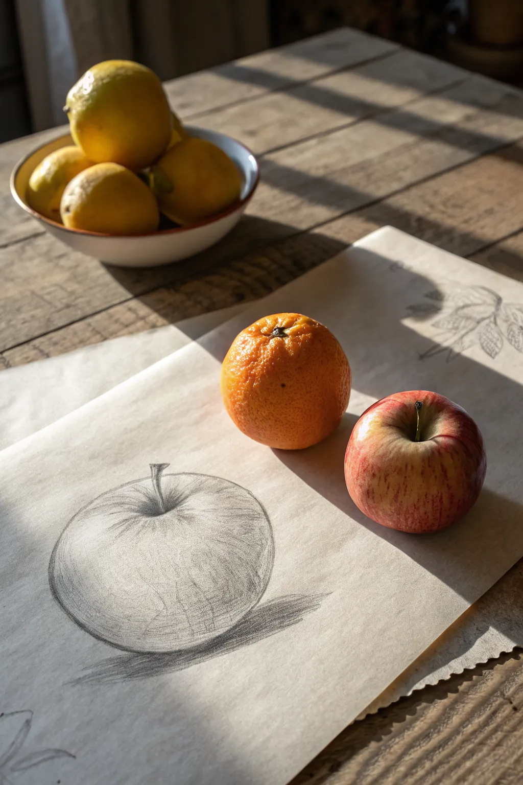
Learn to capture the simple elegance of an apple with this beginner-friendly charcoal study. By focusing on spherical form, core shadows, and gentle highlights, you’ll create a drawing that feels three-dimensional and pleasantly tactile.
Step-by-Step
Materials
- Sheet of textured drawing paper or charcoal paper
- Vine charcoal (soft/medium)
- Charcoal pencil (black)
- Kneaded eraser
- Blending stump (tortillon) or soft tissue
- Real apple for reference (optional but helpful)
Step 1: Laying the Foundation
-
Map the composition:
Start by lightly placing your apple on the paper. Using the vine charcoal, sketch a very faint, loose circle to establish the overall size. Keep your wrist loose and don’t press down hard yet. -
Refine the contour:
Apples are rarely perfect spheres. Observe the slight unevenness of your subject. Modify your initial circle to flatten the bottom slightly and create the dip at the top where the stem will sit. -
Indicate the stem cavity:
Draw a small, curved smile-shape near the top center to mark the depression where the stem emerges. This crucial line helps define the volume of the apple right away. -
Add the stem:
Switch to your charcoal pencil for a slightly sharper line. draw the stem emerging from the cavity. Give it a little bit of thickness and a slight curve so it doesn’t look like a stiff stick.
Control Your Values
Don’t press too hard with charcoal initially. It’s much easier to add layers to darken a shadow than to try and erase a heavy black mark completely.
Step 2: Developing Form and Shadow
-
Establish the light source:
Decide where your light is coming from; in the reference image, strong light comes from the left. This means the right side of the apple will be in shadow. -
Apply the first layer of tone:
Using the side of your vine charcoal, gently shade the entire right side of the apple. Apply a lighter wash of tone over the rest of the apple, leaving the top-left area white for your highlight. -
Blend for softness:
Take your blending stump or a tissue and gently rub the charcoal into the paper’s tooth. This creates a smooth base tone, blurring the harsh transition between the shadowed side and the lit side. -
Strengthen the core shadow:
Go back in with the vine charcoal and darken the area just before the edge of the apple on the right side. This darker band is the ‘core shadow’ and is essential for making the fruit look round rather than flat. -
Deepen the stem cavity:
Use the charcoal pencil to darken the dip around the stem. This area is usually quite deep in shadow. I find that accentuating this creates a convincing tunnel effect. -
Refine the stem details:
Darken one side of the stem itself to give it volume, and refine the point where it meets the apple skin.
Smudgy Paper?
Place a scrap piece of paper under your drawing hand. This acts as a bridge, preventing your palm from smearing your work or transferring oils to the paper.
Step 3: Texturing and Finishing
-
Add surface texture:
Apples often have vertical streaks or speckles. Using a sharpened tip of the vine charcoal or a very light touch with the pencil, draw faint, curved lines following the form of the sphere, radiating from the stem downwards. -
Lift out highlights:
Shape your kneaded eraser into a point. Gently dab or stroke the paper on the upper left shoulder of the apple to lift off charcoal, creating a bright, crisp highlight exactly where the light hits. -
Clean up the reflected light:
On the very bottom right edge of the apple—past the core shadow—use the eraser to lighten the edge slightly. This ‘reflected light’ bounces up from the table and separates the apple from its cast shadow. -
Draw the cast shadow:
Underneath the apple, particularly on the right side, lay down a heavy layer of charcoal for the cast shadow on the table. This should be the darkest part of your drawing to anchor the fruit. -
Feather the shadow edge:
The cast shadow should be sharpest right where it touches the fruit and softer as it moves away. Smudge the outer edge of this shadow horizontally to fade it out. -
Final contour check:
Look at the outer edge of your apple. If the outline has become too fuzzy from blending, re-state it with a confident line, but try to keep the line weight varied—thicker on the shadow side, thinner on the light side.
Step back and admire how a few simple tones have transformed a flat circle into a piece of fruit you could almost pick up
Circular Mini Landscape
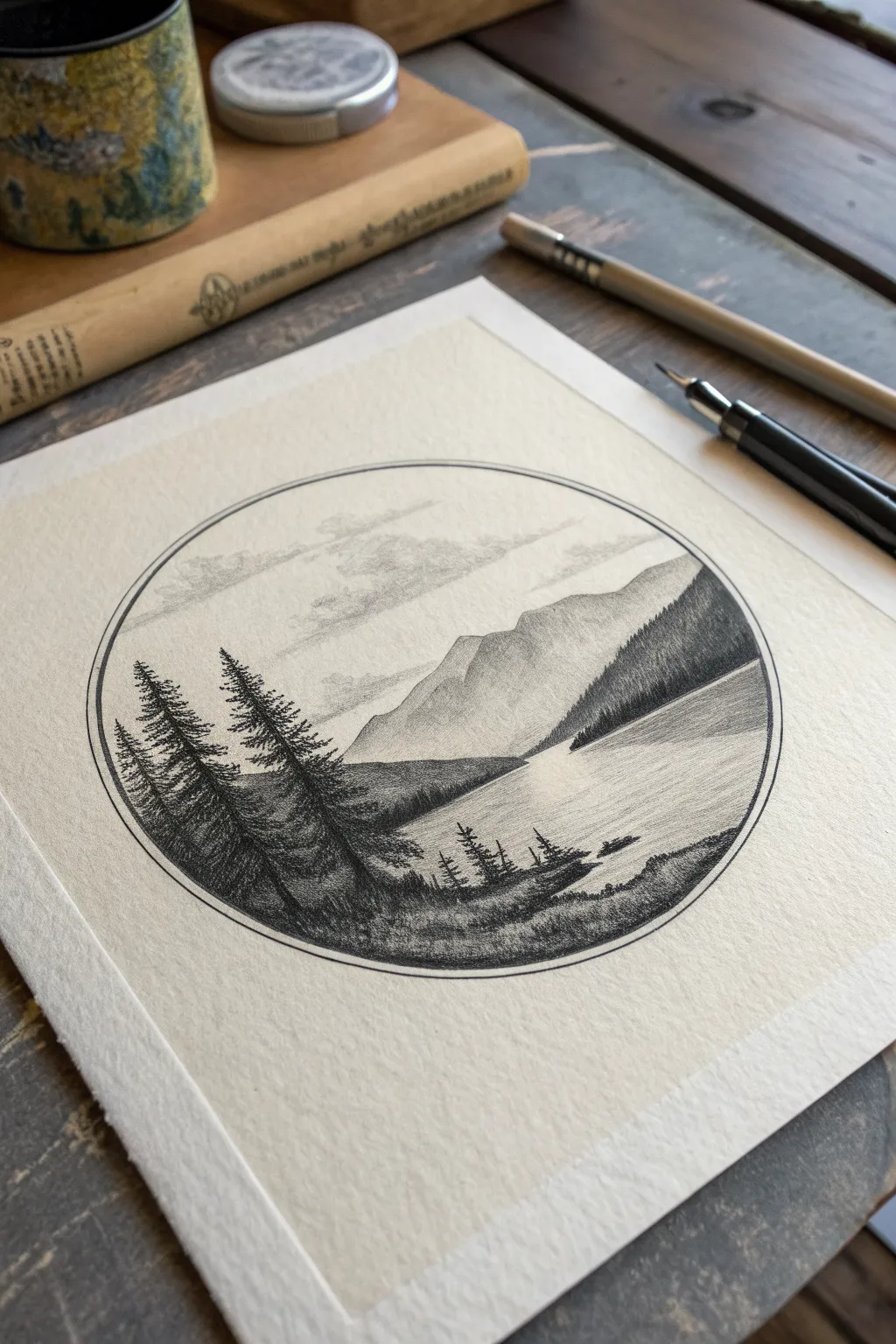
Capture the quiet majesty of a mountain lake within a perfect circle, balancing deep shadows with soft atmospheric perspective. This miniature landscape uses charcoal pencils to create striking contrast between the silhouetted pines and the misty distant peaks.
How-To Guide
Materials
- Heavyweight drawing paper (smooth or vellum finish)
- Charcoal pencils (HB, 2B, 4B)
- Compass or circular object (approx. 4-5 inches diameter)
- Black fine-liner pen (optional, for the border)
- Blending stump (tortillon)
- Kneaded eraser
- Ruler
Step 1: Framework & Sky
-
Draw the boundary:
Begin by using a compass or tracing roughly a 4 to 5-inch circle centered on your paper. If you want a crisp, graphic border like the reference, go over this pencil line carefully with a black fine-liner or a sharp charcoal pencil. Draw a second, slightly smaller circle inside it to create a thin double frame. -
Sketch the horizon:
Lightly sketch a horizontal line across the lower third of the circle to establish the water level. Add the rough angular shapes of the mountains rising from the right side and sloping down toward the left. -
Cloud formation:
Using an HB charcoal pencil, very lightly scribble irregular, fluffy shapes in the upper sky area. hold the pencil far back for a loose touch. -
Softening the sky:
Take your blending stump and gently smudge the graphite or charcoal of the clouds. You want them to look wispy and distant, almost fading into the white paper, rather than having hard outlines.
Clean Edges Prot-Tip
Place a piece of scrap paper under your drawing hand. This prevents your palm from smudging the charcoal as you work across the circle.
Step 2: Mountains & Water
-
Base mountain shading:
With an HB or 2B pencil, shade the mountain range. Use a diagonal hatching stroke that follows the slope of the rock. Keep the pressure light; these mountains are in the distance and should be lighter than the foreground trees. -
Defining ridges:
Add definition to the mountains by darkening the sides that face away from the light source. Create jagged ridges by pressing slightly harder in the crevices, leaving the peaks lighter to suggest snow or sunlight. -
Distant shoreline:
Shade the strip of land on the far side of the lake, right at the base of the mountains. This should be a mid-tone gray—darker than the mountain, but lighter than the foreground. -
Water reflections:
For the lake surface, use horizontal strokes. Start from the edges of the land and pull the strokes into the water. Keep the center of the lake mostly white or very pale gray to indicate smooth, reflective water. -
Blending the water:
I find a clean blending stump works wonders here to smooth out the water strokes, making the lake look glassy and calm.
Step 3: Foreground Trees
-
Blocking the foreground:
Sketch the silhouette of the foreground landmass on the left and bottom edge. This area will be the darkest part of your drawing. -
Tree trunks:
Draw vertical lines for the main trunks of the pine trees on the left. Make the tallest one reach almost halfway up the mountain. -
Building branches:
Switch to a 4B charcoal pencil for deep blacks. Start at the top of the tree trunk and use short, downward scribbles to create pine branches. Keep the top narrow and widen the tree as you move down. -
creating texture:
Don’t draw individual needles; instead, focus on the texture of the clusters. Use a tapping motion with the pencil tip to create density in the foliage. -
The second tree group:
Repeat this process for the smaller trees slightly further back. Ensure their bases merge into the dark grassy foreground. -
Foreground grass:
Fill in the ground beneath the trees with the 4B pencil. Use short, upward flicks to simulate grass blades along the water’s edge. -
Right-side details:
Add the smaller, distant tree line on the right slope and the tiny trees on the bottom right shore. These should be less detailed than the large left-side trees. -
Final contrast check:
Step back and look at your drawing. Deepen the blacks in the foreground trees if they look too gray. Use a kneaded eraser to lift off any smudges in the sky or water meant to be bright highlights.
Make It Yours
Try tinting the water or sky with a very soft wash of watercolor or pastel dust for a subtle pop of mood lighting.
Now you have a tranquil miniature world captured beautifully in charcoal
Charcoal Wash Storm Sky
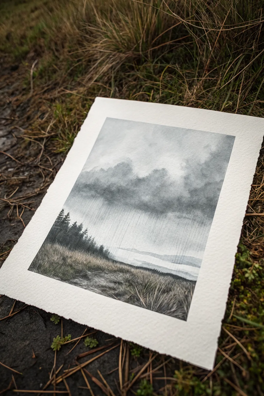
Learn to capture the brooding atmosphere of a passing storm with this moody, evocative landscape. By combining powdered charcoal washes with crisp pencil details, you will create a stunning contrast between soft, rainy skies and sharp foreground textures.
Detailed Instructions
Materials
- Heavyweight watercolor paper or textured printmaking paper (approx. 300gsm)
- Willow charcoal sticks
- Compressed charcoal pencil (soft or 4B)
- Soft synthetic brush (flat or filbert)
- Small spray bottle with water
- Sandpaper block (for sharpening and making powder)
- Kneaded eraser
- Paper towels or cotton rag
- Ruler (optional)
Step 1: Setting the Atmosphere
-
Prepare the charcoal wash:
Begin by sanding a willow charcoal stick over a small container or palette to create a pile of fine dust. Mix this with a small amount of water to create a fluid, dark grey wash. It should be the consistency of watery ink. -
Establish the sky gradient:
Using a soft brush, apply clear water to the top two-thirds of your paper. While it’s still glistening, brush the charcoal wash into the wet area, starting darker at the cloud line and fading out as you move upward toward the top edge. -
Form the cloud base:
Load your brush with a more concentrated charcoal pigment (less water). Dab this into the still-damp paper where you want the heavy storm clouds to sit, roughly across the middle of the composition. Let the pigment bloom naturally for soft edges. -
Create the rain streaks:
While the cloud layer is still wet, use a clean, slightly damp brush to drag vertical lines swiftly downwards from the dark clouds. This ‘pulling’ technique simulates the distinct look of rain sheets falling in the distance. -
Lift out highlights:
Before the paper dries completely, use a twisted corner of a paper towel to gently blot out lighter areas in the sky above the clouds. This reintroduces the white of the paper for a dynamic, rolling cloud effect. -
Define the horizon:
Paint a faint, pale grey wash horizontally below the rain to suggest distant water or flat land. Keep this very subtle and ensure the edges are soft so it looks far away. -
Allow to dry:
This is crucial. Let the entire piece dry completely before moving on to dry media. If the paper is cool to the touch, it’s still wet.
Muddy Skies?
If your clouds turn into one flat grey blob, your paper might be too wet. Let it dry just a bit until the shine disappears before adding darker details to keep the shapes distinct.
Step 2: Adding the Mid-Ground
-
Draft the treeline:
Using your compressed charcoal pencil, lightly sketch the silhouette of the pine trees rising on the left side. Group them naturally, varying their heights so they don’t look like a picket fence. -
Darken the trees:
Fill in the tree shapes with the charcoal pencil. Press firmly to achieve a deep, rich black. These trees are the darkest value in the drawing and will anchor the composition against the lighter sky. -
detail the branches:
Use a freshly sharpened point to add tiny, jagged strokes extending from the sides of the trees, suggesting pine needles and branches. The silhouette should look rugged.
Step 3: Foreground Textures
-
Block in the foreground:
Apply a medium-tone layer of dry willow charcoal over the bottom third of the paper. Use the side of the stick for broad coverage, following the slope of the hill. -
Blend the ground:
I like to use a paper towel or my finger to rub this charcoal into the paper tooth, creating a smoky, smooth base for the grass details. -
Draw foreground grasses:
With the compressed charcoal pencil, start drawing individual blades of grass in the immediate foreground. These should be long, sweeping strokes that curve in different directions. -
Vary line weight:
Make the grasses at the very bottom edge thicker and darker. As you move back toward the trees, make your marks smaller, lighter, and closer together to create depth. -
Erase highlights:
Shape your kneaded eraser into a thin wedge. Press and lift in the grassy area to remove pigment, creating ‘white’ blades of grass that look like they are catching the light. -
Final touches:
Step back and assess your values. If the rain needs to be more visible, use a ruler and a hard eraser to carefully lift faint, straight vertical lines through the grey atmosphere.
Level Up: Texture
Sprinkle coarse salt onto the wet charcoal wash in the foreground area while it dries. Brush it off later to create organic, speckled textures resembling stones or rough earth.
Now you have a moody landscape that perfectly captures the feeling of a storm rolling in


Have a question or want to share your own experience? I'd love to hear from you in the comments below!