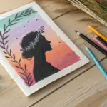
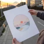
If you’re new to oil pastels, you’re about to love how fast they can look bold, rich, and finished. These beginner easy oil pastel drawing ideas lean on simple shapes, juicy blending, and high-contrast silhouettes so you get a quick, satisfying win.
Classic Sunset Gradient Sky
Capture the serene beauty of dusk with this gentle gradient study that moves from cool violets to warm oranges. This project focuses on smooth transitions and simple silhouettes to create a peaceful coastal landscape.
Step-by-Step Tutorial
Materials
- Heavyweight drawing paper or mixed media paper (square format)
- Masking tape or painter’s tape
- Oil pastels (set including violet, pink, light yellow, orange, dark grey, and black)
- Paper towel or blending stump (tortillon)
- Fixative spray (optional)
Step 1: Setting the Sky
-
Prepare the borders:
Begin by taping down your paper to a flat surface. If you want a crisp white border like the example, apply wide masking tape evenly around all four edges of your square drawing area. -
Establish the horizon:
Lightly sketch a straight horizontal line about one-third of the way up from the bottom to separate the sky from the water. -
Apply the violet tones:
Start at the very top of the sky area. Using a violet or soft purple pastel, color horizontally using light, sweeping strokes. Don’t press too hard yet; we want to build layers gradually. -
Introduce pink hues:
Directly below the violet, blend in a soft pink. Allow the pink to slightly overlap with the purple above it to start creating a seamless transition. -
Add the yellow light:
Moving downward, fill the middle section of the sky with a pale yellow. This represents the last light of the day. Overlap it slightly with the pink section above. -
Deepen the horizon line:
Just above your pencil horizon line, apply a vibrant orange. This suggests the sun dipping below the edge of the world. Blend this orange upward into the pale yellow. -
First blend:
Using a paper towel or your finger, gently rub the sky colors horizontally. Work from the lightest yellow section outward towards the purple and orange to avoid muddying the bright center.
Keep it Clean
Keep a scrap piece of paper nearby to wipe your pastel sticks clean between colors. A dirty yellow stick can ruin a sunset gradient instantly.
Step 2: Creating the Clouds
-
Streaking the sky:
Take a slightly darker violet or grey-purple pastel. Draw thin, elongated horizontal streaks across the upper pink and violet sections to suggest wispy clouds. -
Adding lower cloud texture:
Use an orange-red pastel to add similar thin streaks in the lower yellow and orange sections, mimicking the way light catches low-hanging clouds. -
Softening the clouds:
Lightly blend these new streaks into the background layer. You don’t want them to disappear completely, just to look soft and diffused.
Add Sparkle
Use a white gel pen or sharp white pastel to add a tiny reflection line on the water right under the sun area for a glittering effect.
Step 3: Foreground Elements
-
Base for the water:
For the water section below the horizon, mirror the colors from the sky but in reverse order. Start with orange just below the line, fading into pinks and soft violets at the bottom. -
Texture the waves:
Instead of blending perfectly smooth, leave some horizontal texture in your strokes here to imitate the surface of water ripples. -
Draw the distant shore:
Using a dark grey or black pastel, draw a small, uneven landmass shape on the right side of the horizon line. It should be small to show distance. -
Establish the foreground bank:
In the bottom right corner, block in a large, sloping hill shape using dark grey. Press firmly to get good coverage and opacity. -
Detail the grass:
Using the sharp edge of a black oil pastel or a black pastel pencil, flick quick, upward strokes from the top of the dark hill. Vary the lengths to look like wild dune grass. -
Add subtle highlights:
I find that adding a few very faint touches of dark green or brown into the black foreground adds a tiny bit of dimension, though the silhouette effect is the main goal. -
Final clean up:
Carefully peel away the masking tape at a 45-degree angle to reveal your crisp white borders.
Now you have a tranquil sunset scene that perfectly captures the quiet moments of evening

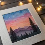

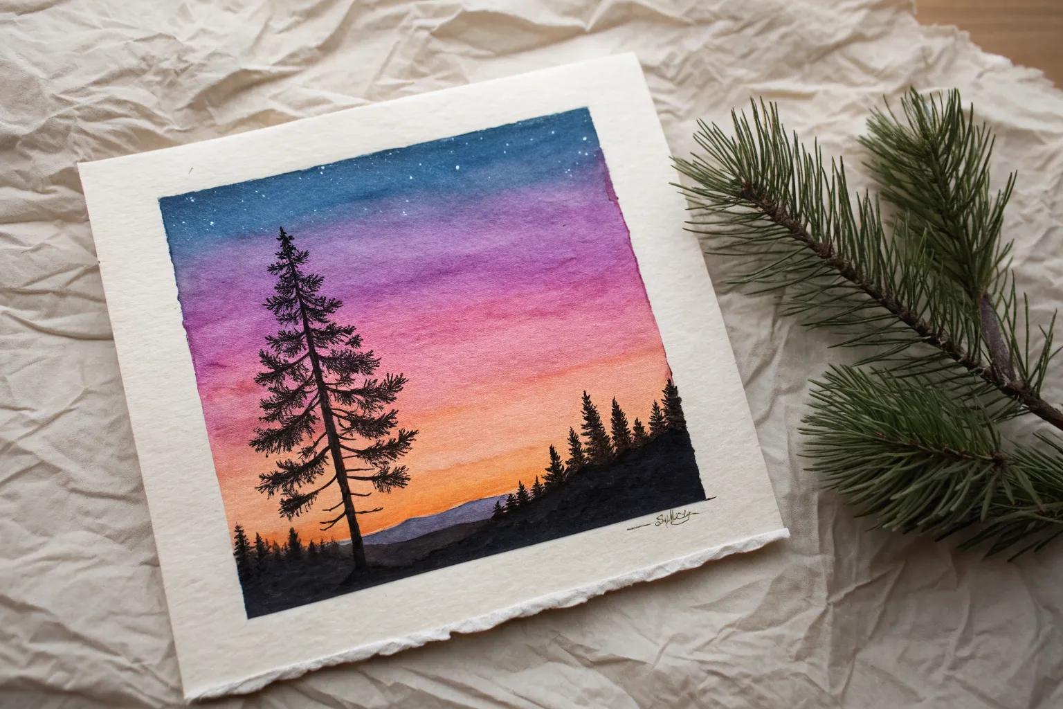
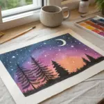
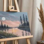
Moon and Tree Silhouette
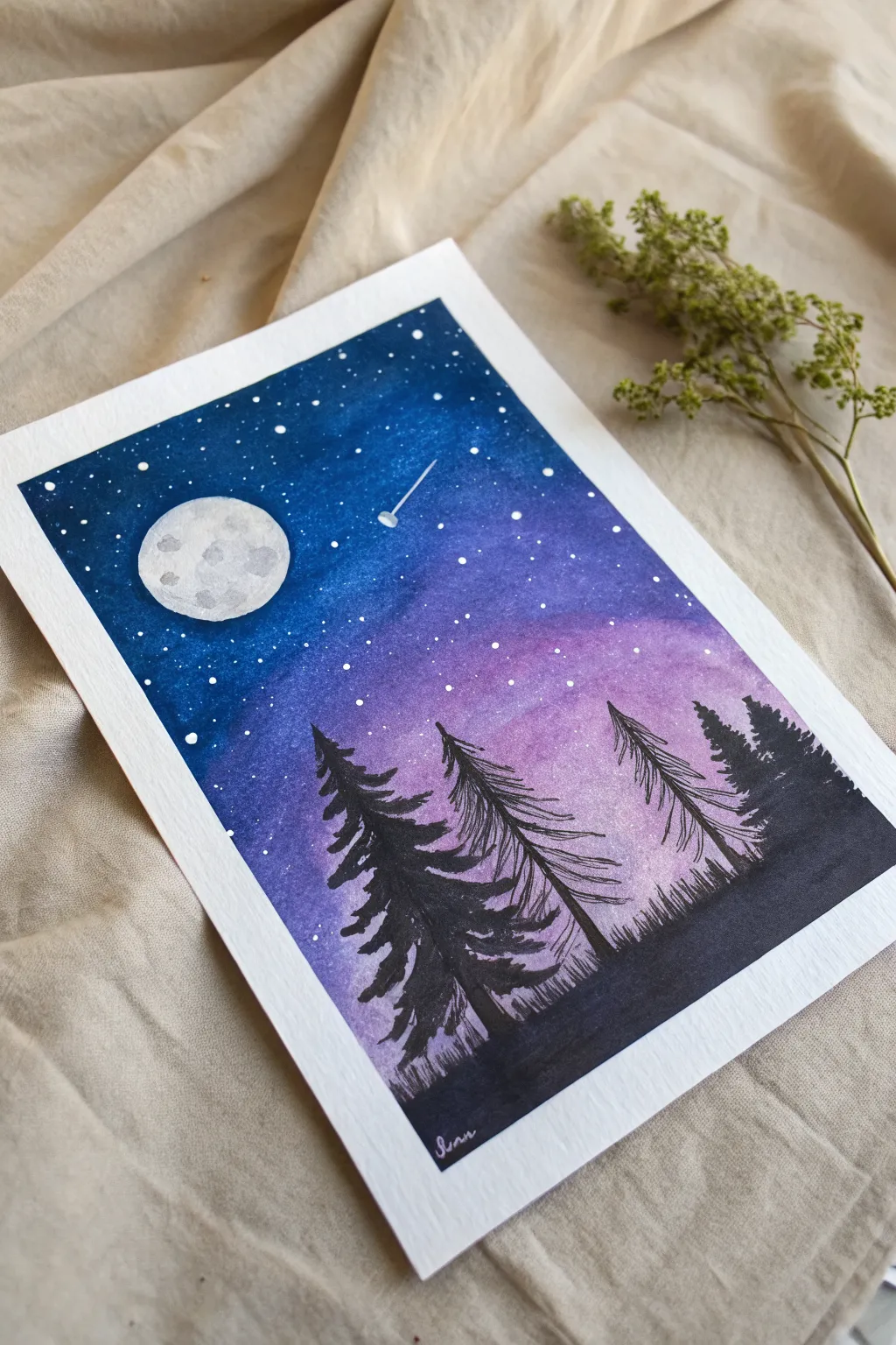
Capture the serene beauty of a moonlit forest with this striking silhouette piece. Using a blend of rich blues and purples, you’ll create a glowing night sky that perfectly frames the dark, towering pine trees.
Step-by-Step
Materials
- Heavyweight watercolor paper or mixed media paper
- Oil pastels (Dark Blue, Light Blue, Purple, White, Black)
- Masking tape (for clean borders)
- Tissue or blending stump
- White acrylic paint or gouache
- Fine detail brush or toothpick
- Black graphite pencil or charcoal pencil (for trees)
- Small round object (like a coin or cap) for the moon template
Step 1: Setting the Scene
-
Tape the borders:
Begin by taping down all four edges of your paper to a flat surface. This keeps the paper secure while you work and ensures you get that crisp, professional white border when you’re finished. -
Mask the moon:
Place a small circular object or cut a circle from masking tape where you want the moon to be. If using tape, press it down firmly so no pigment seeps underneath. This preserves the pure white of the paper.
Step 2: Creating the Galaxy Sky
-
Apply the darkest blue:
Start at the very top of the paper using your darkest blue oil pastel. Press firmly to layout a thick layer of color, covering about the top third of the page, working around your moon mask. -
Blend in lighter blue:
Below the dark blue, layer in a medium or light blue pastel. Overlap it slightly with the dark blue section above to help with the gradient later. -
Add the purple horizon:
For the bottom third of the sky (before you reach the ground), apply a vibrant purple pastel. This creates that magical, transitionary twilight glow. -
Blend the gradient:
Using a folded tissue or your finger, rub the pastels vigorously to blend them. Start from the lighter purple and work your way up to the dark blue to keep the colors muddying. The goal is a smooth, seamless transition between the bands of color. -
Reveal the moon:
Carefully peel away your moon mask. The circle should be stark white against the blended blue sky. -
Texture the moon:
Lightly dab a tiny amount of grey or diluted black pastel on your finger and tap it onto the white moon circle to create subtle craters and shadows. Keep it faint; less is more here.
Smooth Blending Pro-Tip
If the oil pastels aren’t blending smoothly, add a tiny drop of baby oil to your tissue. It breaks down the binder and turns the pastel into a paint-like consistency.
Step 3: Adding the Stars
-
Flick the stars:
Dip a stiff brush or an old toothbrush into white acrylic paint or gouache diluted with a tiny drop of water. Run your thumb over the bristles to splatter fine white specks across the blue and purple sky. -
Add larger stars:
Use a fine brush or the tip of a toothpick dipped in white paint to manually place a few larger, brighter stars. I like to focus these in the darker blue areas for better contrast. -
Draw the shooting star:
With a fine white gel pen or thin brush, draw a tiny diagonal line with a slightly distinct head to create the shooting star shown near the center.
Level Up: Reflection
Try adding a small body of water at the bottom instead of solid ground. Mirror the purple sky colors and add horizontal white streaks to suggest moonlight reflecting on water.
Step 4: Forest Silhouette
-
Establish the ground:
Using a black oil pastel or a black charcoal pencil, fill in the very bottom section of the paper to create the solid, dark ground. -
Sketch the tree trunks:
Draw three distinct vertical lines for the tree trunks. Make the one on the left the thickest and tallest, and the ones on the right slightly thinner and more delicate. -
Add pine branches:
Starting from the top of each trunk, use jagged, downward strokes to create pine branches. Make the strokes wider as you move down the tree to create that classic conical pine shape. -
Refine the silhouette:
If using oil pastel for the trees, the tips might be blunt. I prefer switching to a black colored pencil or charcoal pencil here to add sharp, fine needles at the ends of the branches for a realistic look. -
Add grassy details:
Along the horizon line where the trees meet the ground, add tiny upward flicking strokes to simulate grass or distant undergrowth. -
Final reveal:
Once everything is dry and set, slowly peel off the border tape at a 45-degree angle to reveal your clean edges.
Step back and admire your peaceful night scene, perfect for framing or gifting
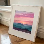
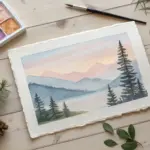
Layered Mountain Range Silhouette
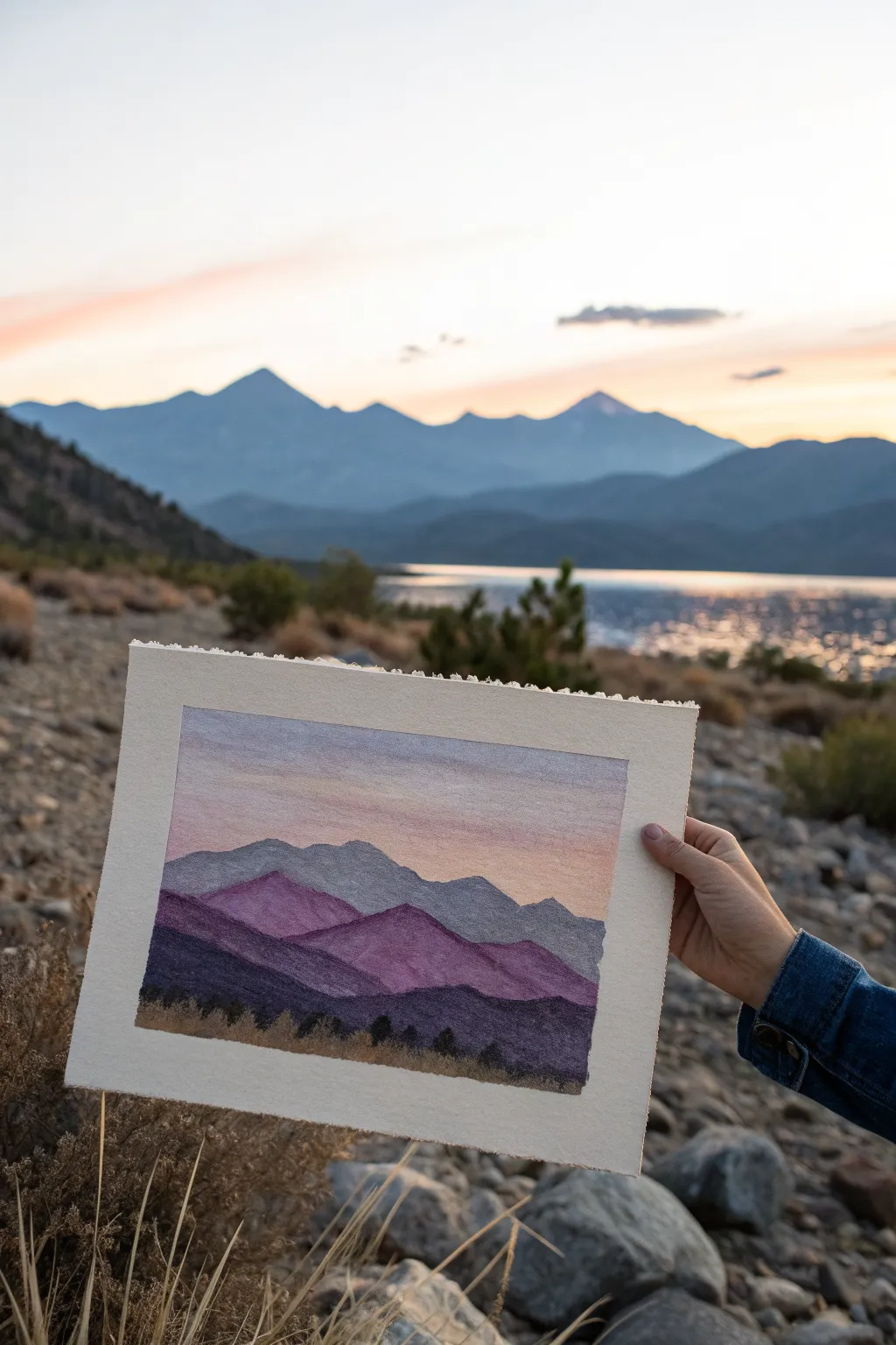
Capture the serene beauty of twilight mountains with this rich, layered oil pastel project. You will build depth by stacking silhouettes in fading shades of purple and blue against a soft, glowing sky.
How-To Guide
Materials
- Oil pastels (set including white, light pink, orange, lavender, purple, dark blue, black)
- Heavyweight textured paper or pastel paper (approx. 8×10 inches)
- Masking tape or artist tape
- Paper towel or blending stump
- Cotton swabs (optional for small details)
- Drawing board or hard surface
Step 1: Setting the Sky
-
Prepare the borders:
Tape down all four edges of your paper to a flat surface. This keeps the paper from shifting and creates that crisp, professional white border once you peel it off at the end. -
Establish the horizon:
Lightly sketch a faint line about two-thirds of the way down the page to mark where the mountains will begin. This doesn’t need to be perfect; it’s just a guide. -
Apply the top sky gradient:
Starting at the very top edge, apply a band of light violet or pale grey-blue. Keep the strokes horizontal and smooth. -
Add warmth:
Directly below the violet, blend in a soft peach or light pink tone. Overlap the colors slightly so they will mix easier in the next step. -
Brighten the horizon:
Just above your mountain guide line, add a strip of pale orange or yellow. This represents the last glow of the setting sun behind the peaks. -
Blend the sky:
Use a clean finger or a paper towel to rub the sky colors horizontally. Blend the seams where colors meet to create a seamless transition from the cool top to the warm bottom.
Step 2: Building the Mountains
-
Draw the furthest range:
Using a light grey-blue pastel, draw the outline of the most distant mountain range. These peaks should be relatively flat and low on the horizon compared to the foreground. -
Fill the background peaks:
Color in this first shape completely with the light grey-blue. Use heavy pressure to cover the paper tooth, but don’t worry about texture yet. -
Create the middle range:
Select a medium violet or lavender shade. Draw a second range of mountains that overlaps the first one, making the peaks slightly larger and more jagged. -
Color the middle ground:
Fill this second layer with your violet shade. I find it helpful to blend the bottom edge of this layer slightly to prepare for the darker colors coming next. -
Add the foreground mountains:
Choose a deep purple or dark indigo. Draw the third and largest mountain shape, bringing it closer to the bottom of the page. -
Saturate the darks:
Fill this foreground layer heavily with the dark purple. You want this to look substantial and close to the viewer.
Muddy colors?
If layers get muddy, wipe your pastel stick on a paper towel before applying. Oil pastels pick up under-colors easily, so keep the tips clean for vibrant overlapping.
Step 3: Foreground Details
-
Establish the ground:
At the very bottom of the page, lay down a strip of dark brown mixed with black to simulate the earth or dry grass area. -
Texture the mountains:
Go back over your purple mountains with a little white or light pink on clearly defined ridges to suggest light hitting the slopes. Don’t overdo it; subtle highlights work best. -
Draw distant trees:
Using a sharp corner of a black oil pastel, stipple tiny vertical marks along the bottom ridge of the mountains and into the brown foreground area. -
Vary tree heights:
Make some of the black marks slightly taller and triangular to look like pine trees. Group them in clusters rather than a straight line for a natural look. -
Blend the base:
Smudge the very bottom edge of the trees into the brown ground layer to anchor them, so they don’t look like they are floating. -
The reveal:
Carefully peel away the masking tape, pulling away from the center of the drawing to prevent ripping the paper. Admire your clean edges.
Use your nails
For tiny tree trunks or distinct ridge lines, gently scratch through the top layer of pastel with a fingernail or toothpick to reveal the paper texture.
Step back and enjoy the peaceful depth of your handmade mountain sunset.
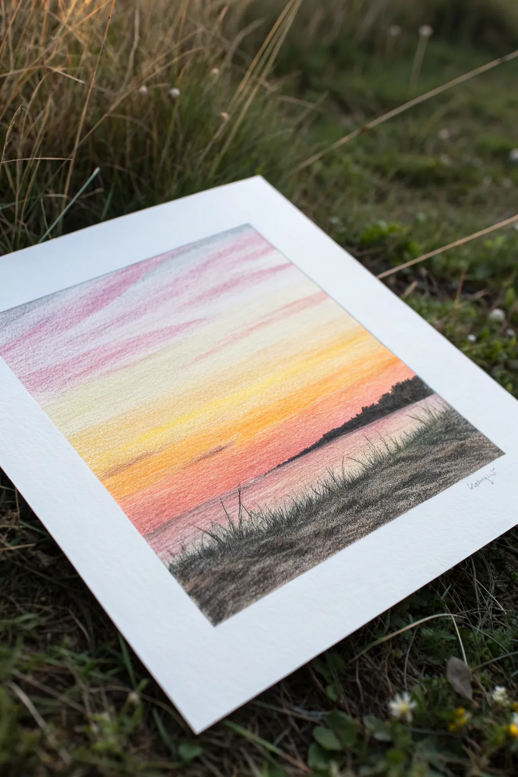
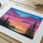
Ocean Horizon With Easy Reflection
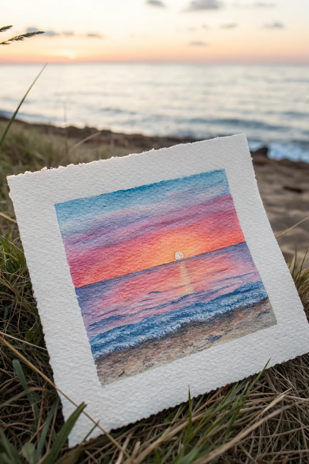
Capture the magic of golden hour with this vibrant yet soothing seascape. Using oil pastels on textured watercolor paper creates a lovely, organic grain that mimics the sparkling movement of water and light.
Step-by-Step Guide
Materials
- Cold press watercolor paper (cut to a small square)
- Oil pastels (dark blue, light blue, purple, pink, orange, yellow, white, brown, black)
- Masking tape (for clean edges)
- Blending stump or cotton swabs
- Paper towel for cleaning pastels
Step 1: Setting up the Horizon & Sky
-
Tape the edges:
Begin by taping down the four edges of your small square paper to a flat surface. This secures the paper and creates that crisp, professional white border when you peel it off later. -
Establish the horizon line:
Use a light touch with a purple or blue pastel to draw a straight horizontal line slightly below the center of the page. This divides your sea from your sky. -
Map out the sun:
Directly in the center, just above the horizon line, draw a small semicircle using white or very pale yellow to reserve the space for your setting sun. -
Applying the top sky colors:
Start at the very top of the paper with a medium blue. Color horizontally, pressing firmly enough to catch the paper’s tooth but fading out as you move down. -
Transitioning to warmth:
Below the blue, layer in a band of purple, blending slightly into the blue above. As you get closer to the horizon, switch to pinks. -
Intensifying the sunset:
Around the sun area and right above the horizon, apply bright orange and warm yellow pastels. Let these colors overlap with the pinks to create a glowing gradient. -
Blend the sky:
Use your finger or a blending stump to smooth the sky transitions. Rub horizontally to mimic the atmosphere, but be careful not to muddy the bright sun area.
Step 2: Creating the Reflective Ocean
-
Draft the sun’s reflection:
Below the horizon line, directly under the sun, sketch a series of short, horizontal dashes using white and yellow pastel. Keep this column narrow near the horizon and slightly wider as it comes down. -
Base ocean tones:
For the water surface, mirror the sky colors in reverse. Start with pink and orange near the horizon line on either side of the sun’s reflection. -
Deepening the water:
Gradually transition to purple and then to deep blue as you move lower down the paper. Keep your strokes horizontal to represent calm waves. -
Adding wave definition:
Using a dark blue or violet pastel, draw thin, slightly wiggly horizontal lines across the water to suggest ripples. I find varying the pressure helps create depth. -
Highlighting the water:
Add small touches of white pastel on the tops of the blue ripples, especially in the foreground, to suggest sea foam catching the last light.
Use Textured Paper
Using “cold press” paper is key here. The bumpy texture (tooth) naturally breaks up the oil pastel strokes, creating sparkle without extra effort.
Step 3: Foreground Sand & Final Details
-
Lay down the sandy beach:
At the bottom third of the paper, angle your shoreline. Color this area with light browns, tans, and a touch of grey for the wet sand. -
Texturize the sand:
Dab a few spots of dark brown or black lightly over the sand to create the look of pebbles or texture. Don’t blend this too smoothly; rough texture looks more realistic here. -
Create the shoreline foam:
Where the blue water meets the brown sand, apply a generous layer of white pastel. Scumble it (scribble lightly in circles) to make it look like crashing foam. -
Refine the sun:
Go back to your sun semicircle and make sure it’s bright white or pale yellow. Ensure the horizon line cutting through it is clean and straight. -
Cleaning up debris:
Before removing the tape, blow away any loose pastel crumbs to prevent smearing them across your sky. -
The reveal:
Slowly peel away the masking tape at a 45-degree angle away from the drawing to reveal the clean, crisp edges.
Sgraffito Waves
Use a toothpick to scratch thin lines into the blue ocean layers. This reveals the white paper underneath, creating tiny, sharp whitecaps.
Enjoy the peaceful view you’ve created and the satisfaction of those perfect white borders
BRUSH GUIDE
The Right Brush for Every Stroke
From clean lines to bold texture — master brush choice, stroke control, and essential techniques.
Explore the Full Guide
Simple Wildflower Field
Capture the airy charm of a summer field with this delicate wildflower composition. Soft strokes of color create a dreamy, light-filled atmosphere that brings the outdoors onto your page.
How-To Guide
Materials
- Heavyweight drawing paper or mixed media paper (smooth texture preferred)
- Set of colored pencils (yellow, pink, light green, dark green, brown)
- Light blue or teal oil pastel (for the background)
- Blending stump or cotton swab
- Pencil for sketching
- Eraser
Step 1: Setting the Background
-
Atmospheric wash:
Begin by lightly applying a very pale blue or teal oil pastel across the paper. Use broad, sweeping strokes to mimic the sky and hazy distance. -
Softening the sky:
Take a cotton swab or your finger and gently rub the pastel into the paper grain to create a smooth, cloud-like finish. Keep the application lighter near the top and fade it out slightly toward the bottom. -
Base sketch:
Using a standard pencil, very faintly sketch the primary stems. Draw curved, organic lines that lean slightly to one side, as if the flowers are swaying in a gentle breeze.
Muddy Background?
If your pastel background smears into your colored pencil flowers, try laying down the background wash first and fixing it with a spray fixative before drawing the detailed stems on top.
Step 2: Drawing the Greenery
-
Mapping the grass:
Switch to a light green colored pencil. Lay down a foundation of soft, upward strokes at the bottom of the page to establish a grassy bed. -
Stem structure:
Trace over your pencil stem guides with the green pencil. Vary your pressure to make some stems appear closer and darker, while others fade into the background. -
Feathery foliage:
On the left side, draw fern-like leaves using short, flicking strokes branching off a main stem. Keep these strokes loose to maintain the airy feeling. -
Adding depth:
Use a darker green pencil to add shadows to the lower parts of the grass and the undersides of the leaves. This grounds the drawing and prevents it from looking flat.
Step 3: Blooming Flowers
-
Yellow bursts:
Select a bright yellow pencil. Draw the first flower on the left with elongated, thin petals radiating from a center point. Add another smaller yellow bud lower down on the right. -
Pink cosmos base:
For the pink flowers, start by drawing the outline of the petals using a soft pink pencil. These petals should be slightly squared off at the tips, typical of cosmos flowers. -
Filling the pinks:
Gently fill in the pink petals with vertical strokes that follow the direction of the petal growth. Leave tiny bits of white paper showing to create texture. -
Dark contours:
Use a slightly darker pink or purple pencil to outline the tops of the pink petals and add little streaks near the center to show the cup shape of the flower. -
Flower centers:
For the yellow flower, use a touch of golden brown to stipple dots in the center. For the pink flowers, add small yellow and green dashes to indicate the stamen.
Add a Visitor
Make the meadow come alive by drawing a tiny simplified bumblebee or butterfly hovering near the tallest yellow flower.
Step 4: Final Details
-
Budding potential:
Sketch a few small, closed buds at the ends of tall stems using green and a hint of pink. I like to add tiny ‘sepals’ (the green leafy base) under the blooms for realism. -
Wispy weeds:
Draw delicate, thin lines using a brown or ochre pencil to represent dried grasses or seed heads reaching high above the main blooms. -
White highlights:
If you have a white pastel or gel pen, add tiny dots or accents on the tops of the petals where the sunlight hits them. -
Grounding accents:
Add a few heavier strokes of dark green at the very bottom edge of the paper to anchor the scene visually. -
Review and refine:
Step back and look at your composition. Gently erase any stray pencil lines that are still visible and smudge the background pastel slightly if it interferes with the delicate stems.
You have created a peaceful slice of nature that captures the quiet beauty of wild flora
Cozy Coffee Cup and Steam

Capture the cozy essence of a hot drink with this simple yet evocative oil pastel sketch. Using warm earthy tones and soft blending techniques, you’ll create a textured, inviting illustration perfect for a kitchen corner or journal cover.
Detailed Instructions
Materials
- Heavyweight textured drawing paper (watercolor paper or mixed media)
- Oil pastels (dark brown, rust/terracotta, peach/pale orange, ochre/yellow)
- Black oil pastel or charcoal pencil for outlines
- Paper stump or cotton swab for blending
- Pencil for initial sketch
- Kneaded eraser
Step 1: Sketching the Shape
-
Basic Oval:
Begin by lightly sketching a wide oval in the lower center of your paper using a pencil. This will form the rim of your mug. Keep your pencil pressure very light so it doesn’t indent the paper. -
Mug Body:
Draw two diagonal lines tapering slightly downward from the sides of the oval. Connect them at the bottom with a slightly curved line to create the cup’s cylindrical body. -
Handle Outline:
Add a C-shaped handle on the right side. Draw the outer curve first, then the inner curve, ensuring it looks thick enough to hold comfortably. -
Steam Guidelines:
Sketch three wavy, flowing lines rising from the cup. Add small swirls at the top of each line to suggest dissipating steam.
Step 2: Coloring the Cup
-
Base Color Application:
Take your rust or terracotta oil pastel and fill in the body of the cup. Use firm pressure to cover the paper well, but leave some small white specs showing for texture. -
Adding Highlights:
Before the base layer sets, strike a few diagonal lines of a lighter peach or pale orange pastel across the cup body to create texture and reflection. -
Coloring the Handle:
Fill in the handle using the same rust color. You can add a tiny touch of the lighter peach on the top curve where the light would hit. -
The Dark Coffee:
Inside the top oval, color the liquid surface with a dark brown pastel. Leave a small rim of white or light color around the inner edge to represent the thickness of the ceramic. -
Defining the Shape:
Using a dark brown pastel or a charcoal pencil, boldly outline the entire cup and handle. Go over the rim and the liquid line to make the coffee pop.
Smudge Control
If pastels smear where you don’t want them, lift the pigment with a kneaded eraser or scrape gently with a craft knife.
Step 3: Atmosphere and Details
-
Drawing the Steam:
Use a combination of peach and pale orange pastels to trace over your steam pencil lines. Vary the thickness—thicker near the mug and tapering off as it rises. -
Adding Swirls:
Curilcue the tops of the steam lines with the peach pastel. Keep these strokes loose and artistic rather than rigid. -
Grounding Shadow:
Underneath the cup, apply an ochre or yellow-brown pastel to create a soft shadow or table surface. Scribble this loosely in an irregular shape. -
Blending the Base:
I like to gently smudge the edges of this shadow with a paper stump or my finger to make it look unfocused and soft compared to the sharp cup. -
Texturing the Cup:
If the cup looks too flat, use a toothpick or the edge of a different pastel to gently scratch diagonal lines into the rust color, revealing the paper texture beneath. -
Final Outline Check:
Re-affirm the dark brown outlines if they got smudged during coloring. Ensure the rim stands out clearly against the steam.
Steam Variation
Try blending white pastel into the steam swirls while the orange is still fresh for a softer, more translucent vapor look.
Now you have a charming piece of art that radiates warmth and comfort

PENCIL GUIDE
Understanding Pencil Grades from H to B
From first sketch to finished drawing — learn pencil grades, line control, and shading techniques.
Explore the Full Guide
Candle Glow on Dark Background
Capture the warmth and ambiance of candlelight with this striking oil pastel project. The contrast between the deep black paper and the vibrant yellow and orange hues creates an instant, dramatic glow that looks impressive but is surprisingly simple to achieve.
Step-by-Step
Materials
- Black drawing paper or cardstock (heavyweight is best)
- Oil passels (white, yellow, orange, reddish-brown, grey)
- Blending stump or cotton swabs
- Graphite pencil (optional for sketching)
- Tissue or paper towel for cleaning fingers
Step 1: Setting the Scene
-
Outline lightly:
Begin by lightly sketching the basic shapes with a white pastel or a graphite pencil. Draw a vertical rectangle for the candle body and a flattened oval at the bottom for the base. -
Add the wick:
Sketch a small, curved line extending from the top center of the candle for the wick. Don’t worry about the flame shape just yet; we will build that with color. -
Base the candle:
Fill in the candle body with white oil pastel. Apply heavy pressure to get opaque coverage against the black paper, but leave the very edges slightly rough to help with blending later. -
Create the holder:
Color the oval base using a mix of grey and white. Use small circular motions to create a texture that looks like stone or metal.
Keep it Clean
Oil pastels smudge easily. Place a spare sheet of paper under your drawing hand to protect your work and keep the black background clean while you color.
Step 2: Igniting the Flame
-
Core of the flame:
Using your brightest yellow, draw the teardrop shape of the flame around the wick. Press firmly in the center to make it really pop. -
Adding warmth:
Layer a touch of orange near the bottom of the flame and the very tip. Use a clean finger or cotton swab to gently smudge the colors together for a smooth transition. -
Highlight the wick:
Go over the wick line with a black or dark grey pastel to define it, adding a tiny dot of red or orange at the very tip where it burns.
Make it Magic
Add tiny specks of yellow or white dust in the outer glow rings to mimic dust motes dancing in the candlelight.
Step 3: Building the Glow
-
First ring of light:
Take your yellow pastel and draw a circular aura around the flame. Use the side of the pastel stick and apply light pressure, allowing the black paper texture to show through slightly. -
Expanding the warmth:
Switch to an orange pastel and create a second, larger ring outside the yellow one. Overlap the edges of the yellow slightly to create a seamless gradient. -
Deepening the shadows:
Add a final, faint outer ring using a reddish-brown color. This transitions the bright light back into the darkness of the paper. -
Blend the halo:
Using your finger, gently smudge the colored rings in a circular motion, moving from the center outward. This softens the lines and creates that hazy, atmospheric glow effect.
Step 4: Defining Form and Reflection
-
Shading the candle:
To make the candle look cylindrical, add a light stroke of grey or pale yellow along the left and right edges of the white wax body. -
Melting wax detail:
Draw a slightly uneven rim at the top of the candle with white to suggest melted pooling wax. -
Grounding the object:
Use your reddish-brown and orange pastels to add cast light on the ‘table’ surface below the candle holder. Scrub these colors horizontally to distinguish the surface from the background air. -
Final highlights:
Add a crisp stroke of pure white on the side of the candle facing the viewer and a tiny touch on the rim of the base to simulate a reflective highlight. -
Cleanup:
Check your black background for any accidental smudges. You can clean these up carefully with a kneaded eraser to keep the darks crisp.
Now you have a warm, glowing artwork that pops beautifully against the dark background
City Skyline Silhouette at Night
Capture the moody charm of a city evening with this dramatic silhouette drawing. By combining a soft, textured grey background with stark black forms, you’ll create a striking high-contrast scene that looks deceptively complex but is perfect for beginners.
How-To Guide
Materials
- Heavyweight drawing paper or mixed media paper (square format recommended)
- Black oil pastel
- Grey oil pastel (light to medium shade)
- White oil pastel (optional for blending)
- Masking tape or painter’s tape
- Paper towel or blending stump (tortillon)
- Ruler
- Pencil (HB or lighter)
- Scrap paper
Step 1: Preparation and Sketching
-
Tape the Edges:
Begin by taping down all four edges of your paper to a flat surface. This not only keeps the paper steady while you work but also creates that crisp, professional border seen in the example. -
Establish the Horizon:
Using your ruler and a light pencil, draw a straight horizontal line across the bottom third of the paper. This will be the base for your city skyline. -
Draft the Buildings:
Lightly sketch varying rectangle shapes rising from your horizon line. Create a mix of heights and widths to make the skyline interesting. -
Add Height and Interest:
Choose one building on the right side to be the skyscraper dominance. Make it significantly taller than the rest, adding a stepped top or antenna to give it character. -
Sketch Windows:
Draw small squares and rectangles inside the building outlines. Don’t worry about being perfect; these will be the glowing lights left white against the black pastel. -
Outline Clouds:
In the upper left quadrant, lightly sketch a few stylized, fluffy cloud shapes. Keep the bottoms flat and the tops rounded for a graphic look.
Smudge Control
Oil pastels smear easily. To keep your work clean, place a clean scrap sheet of paper under your hand while you color the black sections.
Step 2: Creating the Atmosphere
-
Apply the Grey Sky:
Take your grey oil pastel and begin coloring the entire sky area, working around your pencil sketches of the clouds and buildings. I like to use the side of the pastel stick here for broader coverage. -
Refine the Edges:
Use the tip of the grey pastel to carefully color right up to the lines of your buildings and clouds, ensuring there are no accidental white gaps. -
Blend the Texture:
Using a paper towel or your fingertip, gently rub the grey pastel circular motions. This pushes the pigment into the paper tooth and creates that soft, atmospheric graininess visible in the reference. -
Brighten the White Space:
If your paper isn’t bright white, or if some grey smudged into the windows or clouds, you can carefully color those specific areas with a white oil pastel to make them pop.
Window Precision
Can’t keep the windows square? Use square pieces of masking tape or a stencil to protect the white window areas while filling in the black buildings.
Step 3: Building the Silhouette
-
Outline the Structures:
Switch to your black oil pastel. With a steady hand, trace over the pencil outlines of your city skyline, being careful not to color inside the window squares you sketched earlier. -
Fill the Mass:
Fill in the large bodies of the buildings with solid black. Press firmly to get a deep, opaque layer of color that completely covers the paper grain. -
Define the Windows:
The windows define this piece. Sharpen your black pastel or use a sharp edge of the stick to carefully tidy up the corners of the windows, keeping them square and distinct. -
Fill the Clouds:
Color in the cloud shapes with the black pastel. Similar to the buildings, press firmly for a solid, dark silhouette. -
Add Cloud Details:
Add a smaller, detached cloud fragment below the main group to create a sense of movement and depth in the sky. -
Refine the Antenna:
For the thin antenna on the tallest building, use only the very sharpest edge of your pastel or a black colored pencil if the pastel is too thick for fine lines. -
Final Clean Up:
Check the white window spaces for any stray black crumbs. You can gently lift these off with a piece of sticky tack or scrape them away with a craft knife. -
Reveal the Border:
Slowly peel away the masking tape at a 45-degree angle, pulling away from the drawing area to prevent tearing the paper and revealing your clean white frame.
Step back and admire your high-contrast cityscape, perfect for framing or gifting


Lighthouse Against a Stormy Sky
Capture the moody atmosphere of a coastal storm with this striking lighthouse study on textured paper. Combining the creamy richness of oil pastels with sharp black accents creates a dramatic contrast between the weathered stone tower and the turbulent sky.
Step-by-Step Guide
Materials
- Heavyweight textured paper (watercolor or mixed media, approx. 300gsm)
- Oil pastels (dark grey, light grey, teal/blue-green, white, beige)
- Black ink fineliner or hard black pastel pencil
- Paper blending stump or cotton swabs
- Masking tape
- Ruler
Step 1: Setting the Scene
-
Prepare your canvas:
Tape down the edges of your textured paper to a board. This keeps the paper flat and creates a crisp, clean border when removed later, which really mimics the professional look of the reference image. -
Sketch the horizon:
Lightly sketch a sloping hill in the bottom third of the paper. It should rise from the left and level off slightly on the right before dropping into the sea. -
Outline the lighthouse:
Position your lighthouse slightly to the left of the center. Draw a tall, tapering cylinder shape. Don’t worry about the lantern details yet; focus on getting the confident vertical stature against the sloped ground.
Smudgy Sky fixed
If your white light beam gets muddied by the grey clouds, scrape off the top layer of oil pastel gently with a palette knife or fingernail, then re-apply a thick layer of fresh white.
Step 2: The Turbulent Sky
-
Apply the base sky color:
Using a light teal or blue-green pastel, scribble lightly across the entire sky area. Use the side of the pastel to catch the paper’s tooth, leaving some white speckles showing through for texture. -
Create the clouds:
Take a dark grey pastel and draw irregular, billowy cloud shapes. Focus on heavier clouds at the top and scattered, smaller formations near the horizon line. -
Blend for atmosphere:
Use a paper stump or your finger to smudge the grey clouds slightly into the teal background. This softens the edges and makes the storm look misty rather than cartoonish. -
Add the light beam:
With a clean white pastel, firmly draw a wide, triangular beam shooting out from the lantern area to the right. Lay this white pigment on thick to make it stand out against the grey clouds.
Step 3: Structure and Sea
-
Color the lighthouse body:
Fill in the lighthouse tower with a dark grey pastel. Press harder on the left side to create a shadow, suggesting the light source is coming from the right or the lantern itself. -
Render the ocean:
In the bottom right corner, use horizontal strokes of teal and dark grey to create the water. Keep your strokes flat to distinguish the sea surface from the vertical energy of the tower. -
Build the grassy hill:
Cover the hill shape with a mix of black and very dark grey. Use short, upward strokes along the top edge of the hill to simulate tufts of grass silhouetted against the light. -
Carve the path:
Erase a winding path shape through the dark hill or layer a beige/light grey pastel heavily over the top. The path should curve from the bottom foreground toward the lighthouse base.
Sharpen those shadows
To get the sharp architectural lines on the lighthouse cage, don’t rely on the blunt pastel stick. A black colored pencil works beautifully over oil pastel for precise details.
Step 4: Fine Details
-
Define the lantern room:
Switch to a black fineliner or a sharpened black pastel pencil. Carefully draw the railing, the lantern housing, and the pointed roof at the top of the tower. -
Add architectural features:
Draw small vertical rectangles for windows down the lighthouse shaft. Adding a small door at the base grounds the structure and gives it a sense of scale. -
Enhance texturing:
Use the black tool to add scratchy texture to the lighthouse walls, mimicking weathered stone. I personally find that stippling or tiny cross-hatching works well here to imply rough concrete. -
Detail the path and grass:
Add vertical black lines along the edges of the path to show tall grass blades framing the walkway. Add a few distinct blades in the foreground for depth. -
Final contrast check:
Deepen the blacks in the foreground hill to ensure the white light beam looks as bright as possible by comparison. Once satisfied, carefully peel away the masking tape.
Step back and admire how the dark silhouette commands attention against your beautifully textured stormy sky
Bird on a Branch Silhouette
Capture the serene beauty of a quiet evening with this lovely silhouette study. By blending soft pastel hues against bold black ink, you’ll create a striking contrast that is both simple to execute and visually stunning.
Step-by-Step
Materials
- Textured watercolor paper (deckle edge preferred)
- Oil pastels (Peach, Light Orange, Purple/Violet, White)
- Black waterproof fine liner pen (01 or 03 size)
- Black brush pen or black marker
- Paper towel or blending stump
- Pencil (HB)
- Masking tape
- Ruler (optional)
Step 1: Preparing the Gradient Background
-
Secure your paper:
Begin by taping down your textured paper to a flat work surface. If you want that clean white border shown in the example, apply masking tape along all four edges, leaving about half an inch covered. -
Apply the top layer:
Start with your lightest peach or cream oil pastel. Lightly scribble horizontally across the top two-thirds of the paper. Keep the pressure light; you want the paper’s texture to show through slightly. -
Add the middle tone:
Select a slightly warmer, light orange pastel. Apply this color in the middle section of the paper, overlapping slightly with the pale peach above to create a transition zone. -
create the horizon line:
For the bottom third, apply a band of purple or violet pastel. This will act as the ground or distant horizon line. -
Blend the sky:
Using a clean paper towel or your fingertip, gently rub the boundary between the peach and orange sections. Use circular motions to soften the transition so it looks like a smooth sunset gradient. -
Blend the horizon:
Now blend the purple section. I find it helpful to pull the purple color slightly upward into the orange to create a hazy, atmospheric look where the sky meets the land. -
Refine the texture:
If the color looks too patchy, layer a white oil pastel over the entire sky area to smooth it out and unify the colors.
Smooth Blending Trick
Use a tiny drop of baby oil on a cotton swab to blend oil pastels. It dissolves the binder, creating a paint-like finish without harsh texture.
Step 2: Drawing the Silhouette
-
Sketch the main branch:
Once your background is blended and settled, lightly sketch the main diagonal branch line with a pencil. Start from the bottom right corner and curve it upwards toward the center left. -
Outline the bird:
Sketch a simple bird shape perched on the upper part of the branch. Focus on the silhouette—a rounded body, a sleek tail pointing down, and a small head with a beak. -
Add smaller twigs:
Draw several smaller branches shooting off from the main line. Let them cross over each other and reach upward to mimic the chaotic growth of nature. -
Ink the main branch:
Using a black brush pen or thick marker, trace over your main branch line. Vary the thickness by pressing harder at the base and lifting up as you move toward the tips. -
Fill the bird silhouette:
carefully fill in the bird shape with solid black ink. Ensure the edges are crisp so it stands out sharply against the soft pastel background. -
Add fine details:
Switch to a fine liner pen for the delicate twigs at the ends of the branches. Use quick, confident strokes to prevent shaky lines. -
Connect the elements:
Check where the bird’s feet would be and ensure they look firmly planted on the branch by thickening the line slightly right under the body. -
Final touches:
Look for any gaps in your black ink and fill them in to ensure a solid, opaque silhouette. -
Reveal the border:
Gently peel away the masking tape at a 45-degree angle to reveal your crisp, white edge.
Ink Not Sticking?
Oil pastels are waxy and can resist ink. If your pen skips, gently scrape the drawing area with a craft knife first to remove the wax layer.
Display your finished silhouette in a simple frame to highlight the beautiful contrast
Butterfly With Two-Color Blended Wings
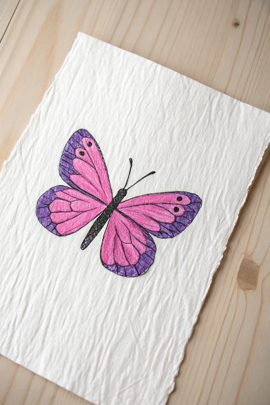
Learn to blend vibrant pinks and deep purples to create this striking butterfly illustration on textured paper. The soft, buttery nature of oil pastels is perfect for achieving the smooth gradients seen on the wings.
How-To Guide
Materials
- Textured white paper (watercolor or handmade paper works best)
- Oil pastels (Bright Pink, Purple/Violet, Black)
- Graphite pencil (HB or 2B) for sketching
- Blending stump or cotton swabs
- Tissue paper for cleaning tips
Step 1: Sketching the Outline
-
Draw the central axis:
Start by lightly sketching a faint vertical line in the center of your paper to help with symmetry. This will guide the placement of the body. -
Outline the body:
Draw three small segments for the body along your center line: a small round head, a slightly longer thorax, and a slender, tapered abdomen. -
Map the upper wings:
Sketch two large, rounded triangular shapes extending upwards and outwards from the thorax. Try to keep them roughly the same size. -
Map the lower wings:
Below the upper wings, draw two rounded shapes that curve downward, meeting near the bottom of the abdomen.
Smudge Control
Place a scrap piece of paper under your drawing hand. This prevents your palm from dragging across the oil pastel while you work on details.
Step 2: Applying Base Colors
-
Fill the inner wings:
Take your bright pink oil pastel and color the inner sections of all four wings. Leave a clear border around the outer edges white for now. -
Add the purple edges:
Using the purple pastel, color the remaining outer edges of the wings. It’s okay if the purple slightly overlaps the pink area. -
Initial blending:
I like to use a clean fingertip or a cotton swab to gently smudge where the pink and purple meet. Blend from the pink side outward into the purple to keep the pink vibrant. -
Deepen the color:
Apply a second layer of pink and purple over the respective areas to make the colors opaque and hide the paper texture.
Texture Trick
Place a sheet of sandpaper or a textured placemat underneath your drawing paper before coloring to create unique rubbings and wing textures.
Step 3: Adding Details and Contrast
-
Color the body:
Fill in the sketched body segments (head, thorax, abdomen) completely with the black oil pastel. -
Draw primary veins:
With the sharp edge of the black pastel, draw lines extending from the body to the edge of the wings. These should act like spokes on a wheel. -
Add wing patterns:
Inside the purple borders, sketch small loops or scallops with the black pastel to separate the purple edge from the pink center. -
Detail the edges:
Draw thin black lines through the purple sections, connecting the scallops to the outer edge of the wing. -
Create distinct spots:
Place a few solid black dots within the pink and purple areas on the upper wings for extra visual interest. -
Draw the antennae:
From the head, draw two long, slender black lines curving outward. Add tiny knobs at the very ends of these antennae. -
Final outline:
Trace the entire outer perimeter of the butterfly wings with black to give the drawing a finished, defined look. -
Clean up:
If any pastel smudged onto the white background, use a kneaded eraser to gently lift the pigment away.
Now you have a beautifully blended butterfly fluttering on the page
Four Mini Trees in Four Seasons
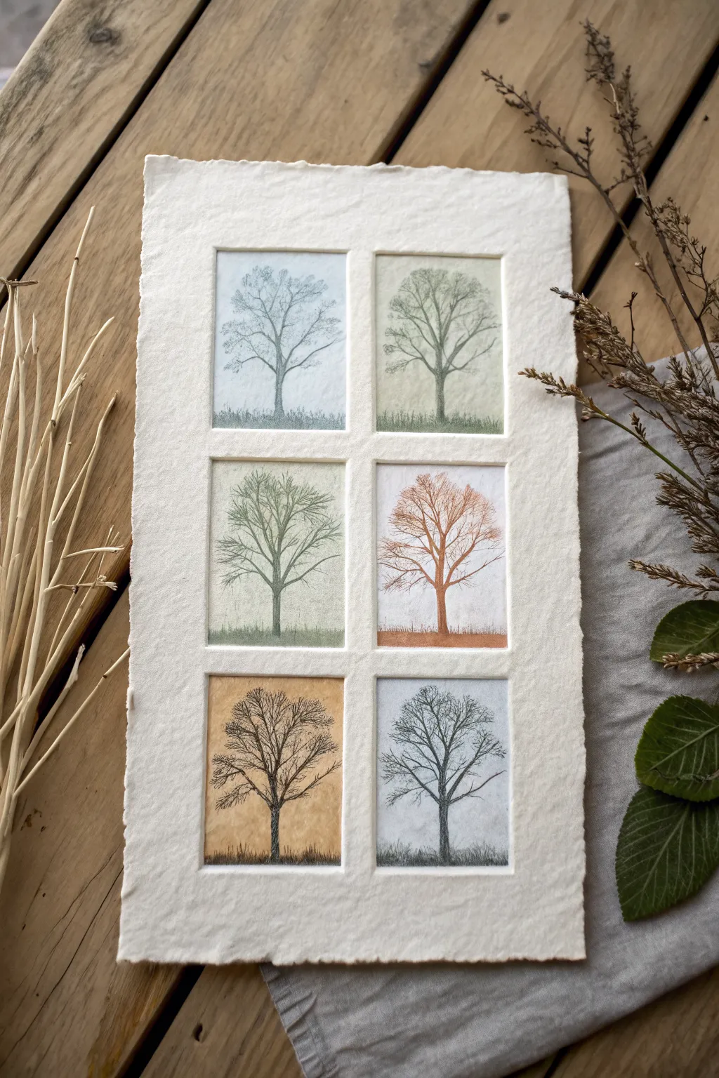
This elegant project combines the texture of handmade paper with the soft versatility of oil pastels to create a gallery of seasonal trees. By creating embossed windows first, you give each miniature landscape its own distinct frame, elevating simple tree studies into a cohesive piece of art.
Step-by-Step Guide
Materials
- Heavyweight cotton rag paper or handmade paper (approx. 300gsm)
- Oil pastels (muted seasonal palette: light blue, sage green, ochre, rust, dark brown, charcoal)
- Hard pencil (H or 2H) for sketching
- Ruler
- Bone folder or empty ballpoint pen (for embossing)
- Cardboard or mat board (to create the stencil)
- Masking tape
- Fine-point black ink pen or charcoal pencil
- Blending stump or cotton swab
Step 1: Creating the Structure
-
Prepare the embossing template:
Cut a rectangular piece of heavy cardboard or mat board that matches the size you want for your individual tree ‘windows.’ A standard 2×3 inch rectangle works well. -
Plan the layout:
Place your handmade paper face down on a clean surface. Lightly mark where your six windows should go, ensuring even spacing between them. -
Emboss the frames:
Place your cardboard template underneath the paper at your first marked position. Using a bone folder or the smooth end of a tool, firmly rub the paper over the template edges to create a raised rectangular border. Repeat this five more times. -
Define the edges:
Flip the paper over to reveal the six indented windows. I like to gently run a clean finger along the inside edges to sharpen the corners and ensure the paper is settled.
Step 2: Setting the Backgrounds
-
Apply base colors:
For the winter panels (top left, bottom right), lightly scumble a very pale blue oil pastel. Use sage green for late spring, warm ochre for autumn, and a rust-orange for deep fall. -
Blend the sky:
Using a cotton swab or your finger, rub the pastel into the paper fibers. The goal is a soft, hazy wash of color rather than a solid opaque layer. -
Ground the scene:
Add a slightly darker horizontal stroke at the bottom of each rectangle to create the ground. Blend this upward slightly to meet the ‘sky’ color, avoiding a harsh horizon line.
Clean Edges
If you struggle to keep the borders clean, use low-tack painter’s tape to mask off the raised areas before you start coloring the backgrounds.
Step 3: Drawing the Trees
-
Sketch the trunks:
Using a fine charcoal pencil or black ink pen, draw a central vertical line for each trunk. Keep the lines organic and slightly wavering, widening them slightly at the base. -
Branch structure:
Extend main branches outward from the trunk in a ‘V’ shape pattern. Remember that branches generally get thinner as they move away from the center. -
Add fine twigs:
For the winter trees, add extensive intricate twig details using your sharpest point. These bare branches are the main focus, so take your time creating a delicate web. -
Suggest foliage:
For the spring and summer trees, use the side of a green pastel to lightly dab over the branches. Do not color it solid; let the branch structure peek through. -
Autumn canopy:
On the orange and ochre trees, dab warm-colored pastels loosely around the upper branches to simulate falling leaves.
Winter Texture
For the winter trees, scratch slightly into the pastel layer with a toothpick to reveal the white paper underneath, miming frost or snow.
Step 4: Refining Details
-
Deepen shadows:
Add a touch of dark brown or charcoal pastel to the left side of each trunk to give them roundness and dimension. -
Ground blending:
Use a darker shade of your ground color to create texture like grass or fallen leaves at the base of each tree. -
Clean borders:
If any pastel smudged onto the raised white borders, carefully erase it with a kneaded eraser to keep the ‘frame’ crisp. -
Final touches:
Review the branch tips. Add tiny dots of ink or dark pastel to suggest buds or lingering leaves where the composition feels too empty.
Display this seasonal grid in a simple wooden frame to let the paper’s texture shine
Messy-Gorgeous Galaxy Nebula
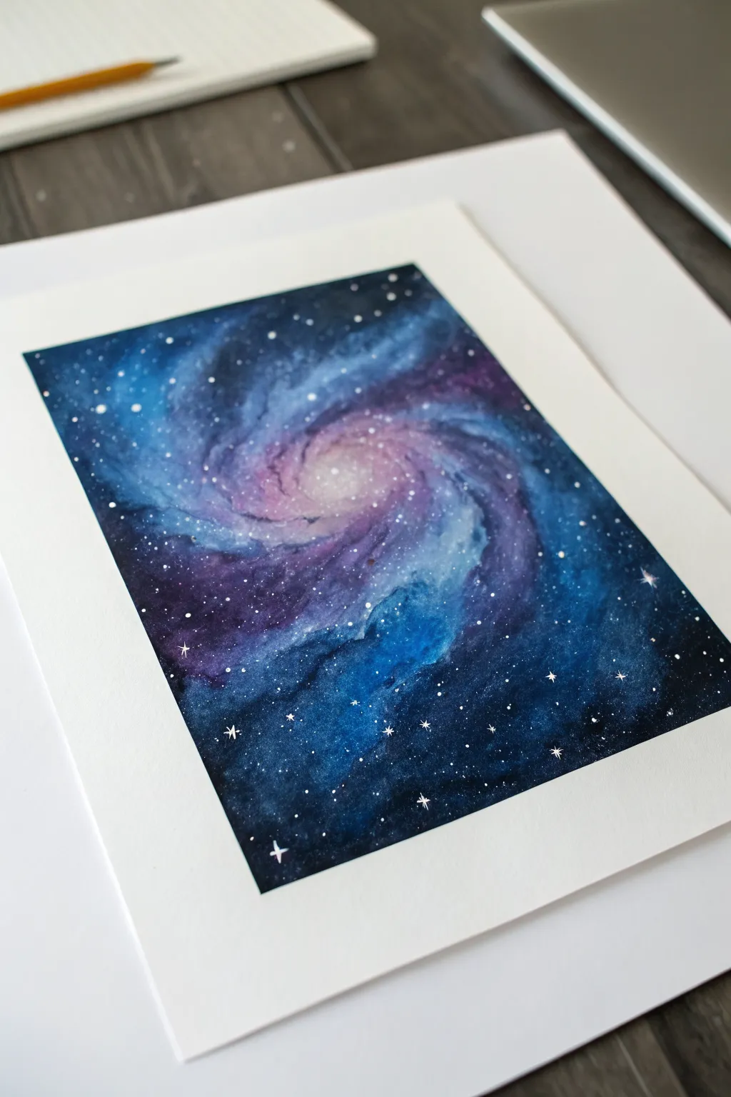
Capture the breathtaking beauty of deep space with this vibrant galaxy project. Using the creamy texture of oil pastels, you’ll blend swirling arms of deep indigo, violet, and electric blue around a glowing core.
Step-by-Step Guide
Materials
- Heavyweight drawing paper or mixed media paper
- Oil pastels (dark blue, light blue, violet, pink, white, black)
- Masking tape or artist tape
- Paper towel or tissue for blending
- Cotton swabs (Q-tips)
- White acrylic paint or gouache
- Small round paintbrush or toothbrush
- Scraper tool or palette knife (optional)
Step 1: Setting the Scene
-
Secure your paper:
Begin by taping down the four edges of your paper to your work surface. This creates a clean, professional white border around your artwork once you’re finished and keeps the paper from shifting while you blend. -
Establish the core:
Located slightly off-center, draw a small, dense circle using your white oil pastel. This will be the brightest part of the galaxy, the glowing supermassive core.
Clean Colors
Keep a scrap paper nearby to wipe your pastel sticks clean. If a light colored stick picks up dark pigment, it can muddy your bright center.
Step 2: Building the Spiral Arms
-
Add the first glow:
Surround your white center with a ring of light pink or pale magenta. Don’t worry about being too neat; rough, expressive strokes work best here. -
Expand with violet:
Layer a band of violet or purple around the pink section. Start dragging the color outwards in a sweeping, curved motion to suggest the beginning of spiral arms. -
Introduce light blue:
Using a light blue pastel, draw sweeping curves that extend from the violet areas. Imagine the shape of a pinwheel and let the lines flow naturally toward the edges of the paper. -
Deepen the cosmos:
Fill the remaining empty spaces, especially the corners and outer edges, with dark blue or navy. Press firmly to lay down a thick layer of pigment, which makes blending easier later. -
Add contrast:
Layer black oil pastel over the very darkest corners and edges of the blue sections. This adds depth and makes the glowing center pop more intensely.
Scratch It Back
Use a toothpick or palette knife to gently scratch through the top dark layers, revealing the lighter paper or colors underneath for thin, bright nebula streaks.
Step 3: Blending the Nebula
-
Initial blending:
Wrap a piece of paper towel around your finger. Start blending from the lightest colors (the center) outward to avoid dragging dark pigments into your bright core. -
Smooth the transitions:
Use a fresh section of the paper towel to blend the transition zones where pink meets violet and violet meets blue. Rub in circular motions to melt the colors together. -
Refine with cotton swabs:
For the tighter spirals near the center, switch to a cotton swab. This gives you more control to preserve the distinct swirl shape without muddying the details. -
Create texture:
If things look too smooth, go back in with your white or light blue pastel and add fresh streaks over the blended dark areas to suggest gas clouds, then tap them lightly with your finger. -
Darken the void:
Take a moment to re-evaluate your darks. If the black has faded during blending, apply another layer of black or deep indigo to the corners to frame the galaxy effectively.
Step 4: Starry Details
-
Prepare the stars:
Squeeze a tiny dot of white acrylic paint onto a palette or scrap paper. If it’s too thick, thin it with a drop of water until it has a heavy cream consistency. -
Splatter stars:
Dip a stiff brush or toothbrush into the paint. Hold it over your drawing and flick the bristles to create a spray of tiny white dots representing distant stars. -
Add hero stars:
Using a very fine paintbrush or the tip of a toothpick, manually dot a few larger, brighter stars in the dark blue areas to create variety in size. -
Create sparkle:
Select 3 or 4 of the larger dots and carefully paint a tiny cross or diamond shape over them to create a twinkling starburst effect. -
The reveal:
Once you are happy with your star field, carefully peel away the masking tape. Pull the tape away from the drawing at a 45-degree angle to ensure a crisp, clean edge.
Admire your cosmic creation and see how the deep colors contrast with the bright center
Scratch-and-Reveal Gradient Doodles
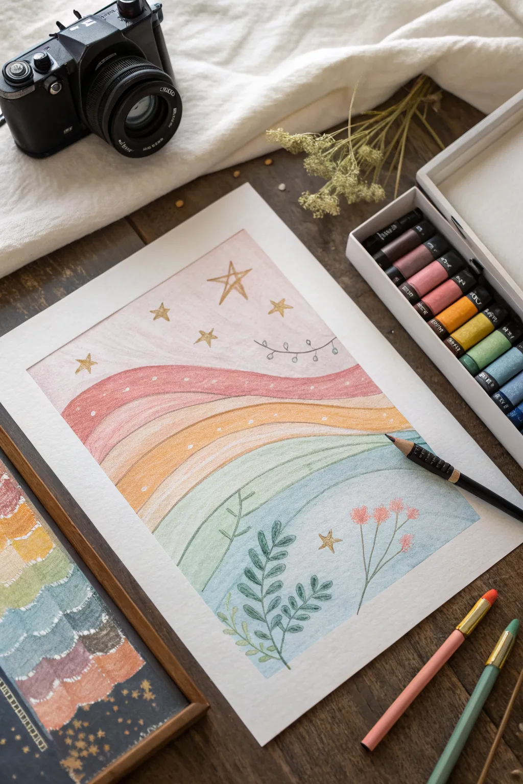
Create a dreamy, soft-textured landscape featuring gently rolling hills of gradient color. This project combines the blending capabilities of oil pastels with delicate line work for a charming, folk-art inspired result.
Step-by-Step Tutorial
Materials
- Heavyweight drawing paper or mixed media paper (A4 size)
- Oil pastels (set including pinks, reds, oranges, yellows, greens, and teals)
- Fine-point black drawing pen or colored pencils (dark grey or black)
- Tissue paper or cotton swabs for blending
- Pencil (HB or H for light sketching)
- Masking tape
- Gold or metallic gel pen (optional for stars)
Step 1: Planning and Foundation
-
Secure your workspace:
Begin by taping down the edges of your paper to a work surface or drawing board. This creates a clean white border around your artwork and keeps the paper steady while you blend. -
Lightly sketch the bands:
Using an H or HB pencil, very lightly draw wavy, horizontal lines across the paper. These will delineate your color bands. Start high for the sky and create about 5-6 flowing curves down to the bottom.
Smudge Control
If pastels are smearing into areas you want clean, keep a piece of scrap paper under your drawing hand. This acts as a shield to protect finished sections as you work.
Step 2: Layering the Colors
-
Start with the sky:
Select a very pale pink or cream pastel. Gently color the top section (the sky area), applying light pressure to create a soft base layer. -
Apply the first hill color:
For the top hill, choose a muted red or deep coral pastel. Fill in the shape following the curve of your pencil line. Don’t worry about perfect coverage yet, as we will blend later. -
Create the middle gradients:
Move downwards to the next bands using warm tones like peach and golden yellow. Try to slightly overlap the colors where the bands meet to encourage a smooth transition between the hues. -
Cool down the palette:
As you reach the lower half of the paper, switch to cooler tones. Use a sage green for the upper grassy band, transitioning into a teal or light blue for the bottommost section. -
Blend for smoothness:
Wrap a piece of tissue paper around your finger or use a cotton swab. Gently rub the pastel layers in circular motions to smooth out the grain of the paper and soften the edges between color bands. -
Add texture marks:
Using a white pastel or a scratching tool, make tiny dots or subtle scratches in the red and orange bands to suggest texture or distant flowers. I find this breaks up the solid blocks of color nicely.
Textured Magic
Try sgraffito! layer a dark color over a light one, then use a toothpick to scratch designs through the top layer, revealing the bright color underneath.
Step 3: Adding Delicate Details
-
Draw the main foliage:
Take a dark grey or black fine-point pencil (or a very fine pastel stick). In the bottom blue section, draw a central leafy stem rising upwards with paired leaves. -
Add secondary plants:
Sketch a smaller, vine-like plant to the left of the main stem, keeping the lines light and airy. Add a taller, thinner stem to the right side. -
Add floral accents:
At the top of the right-hand stem, draw small clusters of pink flowers. You can use a pink colored pencil or a sharpened pink pastel for this to ensure the color stands out against the blue background. -
Create the vine detail:
In the sky area, draw a delicate horizontal vine with tiny leaves swaying across the pink background. -
Draw the stars:
Scatter several five-pointed stars throughout the sky and a few in the lower sections. Use a gold gel pen or a sharp yellow pastel to make them shimmer. -
Refine the edges:
Check the borders of your color bands. If the blending made them too messy, use your pencil or a colored pencil in a matching shade to lightly re-define the separation lines. -
Final touch-ups:
Look at the overall balance. If the leaves need more definition, go over the stems one last time to deepen the contrast. -
Reveal the border:
Carefully peel away the masking tape, pulling it away from the drawing at a 45-degree angle to prevent tearing the paper.
Step back and admire the soft, soothing world you have created on paper
Have a question or want to share your own experience? I'd love to hear from you in the comments below!