
If you’re craving beginner drawing ideas that actually feel doable, you’re in the right headspace. I love starting with simple, recognizable sketches that build confidence fast—no complicated shading or perfect perspective required.
Simple Flower Doodles (Daisies, Tulips, and Tiny Blooms)
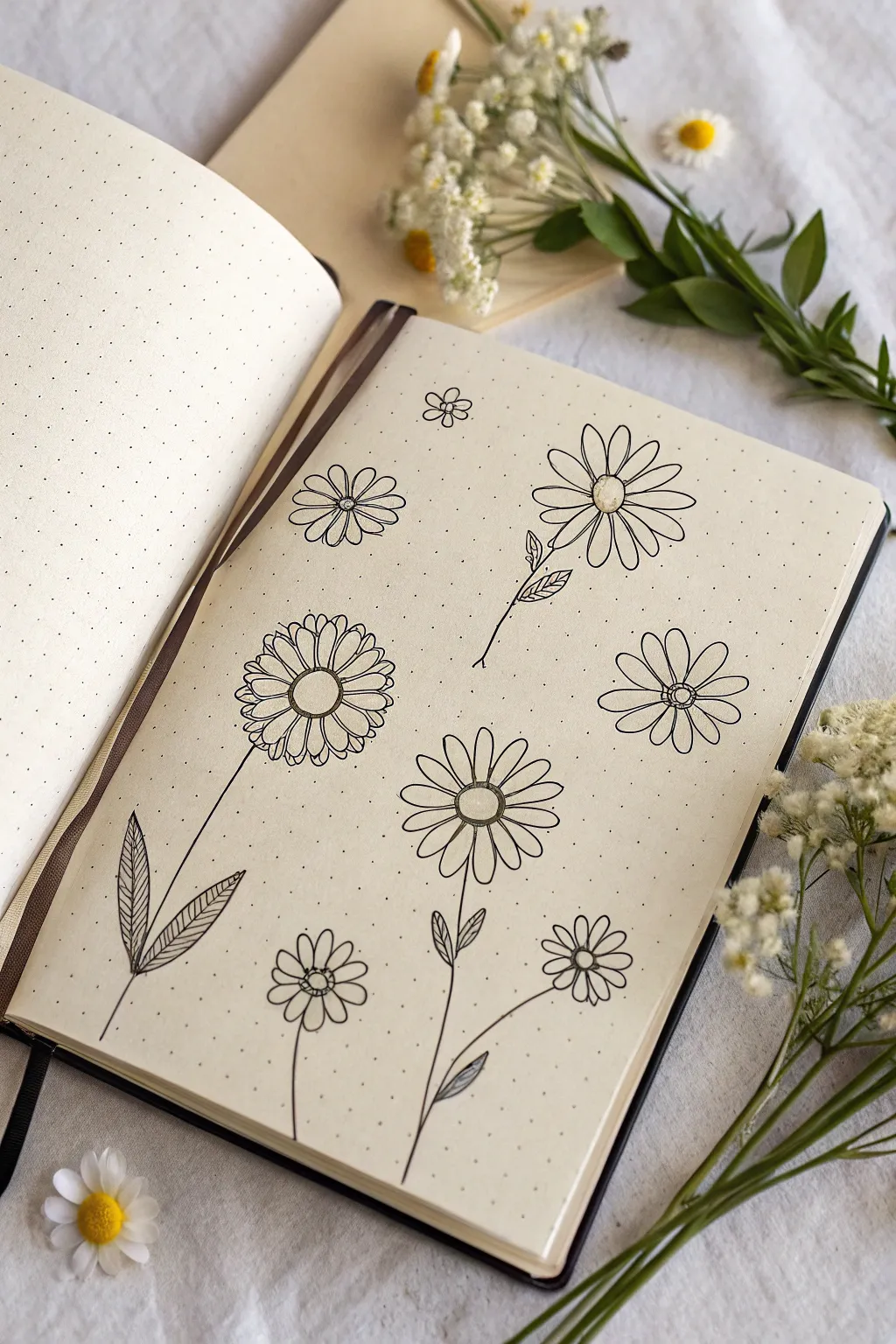
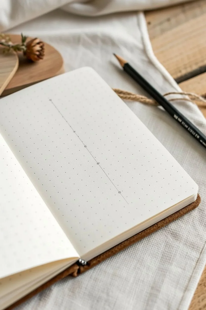
Fill your notebook pages with a charming meadow of hand-drawn daisies using just a single pen. This minimalist spread showcases a variety of simple floral shapes and stems, perfect for adding a touch of nature to your bullet journal without needing complex art supplies.
Step-by-Step Tutorial
Materials
- Dotted bullet journal or grid paper
- Fine-liner pen (black, size 0.3mm or 0.5mm)
- Pencil (optional for sketching)
- Eraser
Step 1: Planning the Layout
-
Visualize placement:
Before putting pen to paper, look at your blank dotted page. Ideally, you want to scatter the flowers so they aren’t perfectly aligned, creating a natural, organic feel. Imagine a mix of tall stemmed flowers and floating flower heads. -
Optional sketching:
If you are nervous about committing to ink immediately, lightly sketch the circles for the flower centers with a pencil to mark where each bloom will sit.
Use the Grid
Since you are working on dotted paper, use the dots as anchors. Count sketch squares to ensure your stems are the same length or to keep your petals symmetrical.
Step 2: Drawing the Flower Heads
-
Small filler flowers:
Start with the smallest flowers to warm up. Near the top center, draw a tiny five-petaled flower. Keep the petals rounded and roughly the same size. -
Medium daisy center:
Move to the left side and draw a small circle for a center. Draw a slightly larger circle around it to create a rim. This will be a medium-sized floating daisy. -
Medium daisy petals:
Add petals to this center. Make them long and narrow ovals. Leave a tiny gap between the petals at the base so they don’t look too crowded. -
Large detailed bloom center:
For the largest flower on the left, draw a circle about two dot-grid squares wide. Drawing a second concentric circle inside gives it depth. -
Layered petals:
Draw the first layer of petals on this large flower. They should be wide with slightly squared-off tips. Then, draw little peaks of a second layer of petals peeking out from behind the first set to make it look full. -
Classic daisy shape:
On the right page area, draw a classic daisy. Start with an oval center. Draw long, thin petals radiating outward. Don’t worry if they aren’t perfect; asymmetry adds character. -
Two-tiered petals:
Slightly below the center, draw a round center and add two distinct layers of petals—a shorter inner ring and longer outer ring—for a sunflower-like appearance. -
Side-view blooms:
Near the bottom, draw a couple of smaller flowers. For variety, try tilting the perspective slightly by making the center an oval rather than a perfect circle.
Step 3: Adding Stems and Leaves
-
Long stem lines:
Now, ground your flowers. For the large, detailed bloom on the left, draw a long, straight line extending down to the bottom of the page. -
Large textured leaves:
At the base of this stem, draw two large, lance-shaped leaves pointing upward. Add diagonal hatching lines inside the leaves to create texture and shading. -
Wavy stems:
For the central bottom flower, draw a slightly curved stem. It feels more natural if these lines aren’t ruler-straight. -
Tiny leaves:
Add small, simple oval leaves to the stems of the smaller flowers. Drawing loops or teardrop shapes works perfectly here. -
Leaf detailing:
Draw simple central veins in the larger solid leaves, or shade one half of the leaf with lines (hatching) to give it dimension. -
Connecting the bouquet:
Ensure the bottom-right flowers have stems that curve gently toward the bottom center of the page, as if they are growing from a single patch.
Add Pop of Color
Use a yellow highlighter or colored pencil just on the centers for a classic daisy look, or use a gray mildliner to add drop shadows under the petals for depth.
Step 4: Finishing Touches
-
Center details:
Go back to the flower centers. You can leave them plain, or add tiny dots (stippling) or cross-hatching to make them look textured and pollen-filled. -
Erase guidelines:
Once the ink is completely dry—I usually give it at least five minutes to be safe—gently erase any pencil marks you made in the beginning.
Your page is now blooming with a delightful garden of doodles ready for your daily notes


Cute Cat Faces Using Basic Shapes
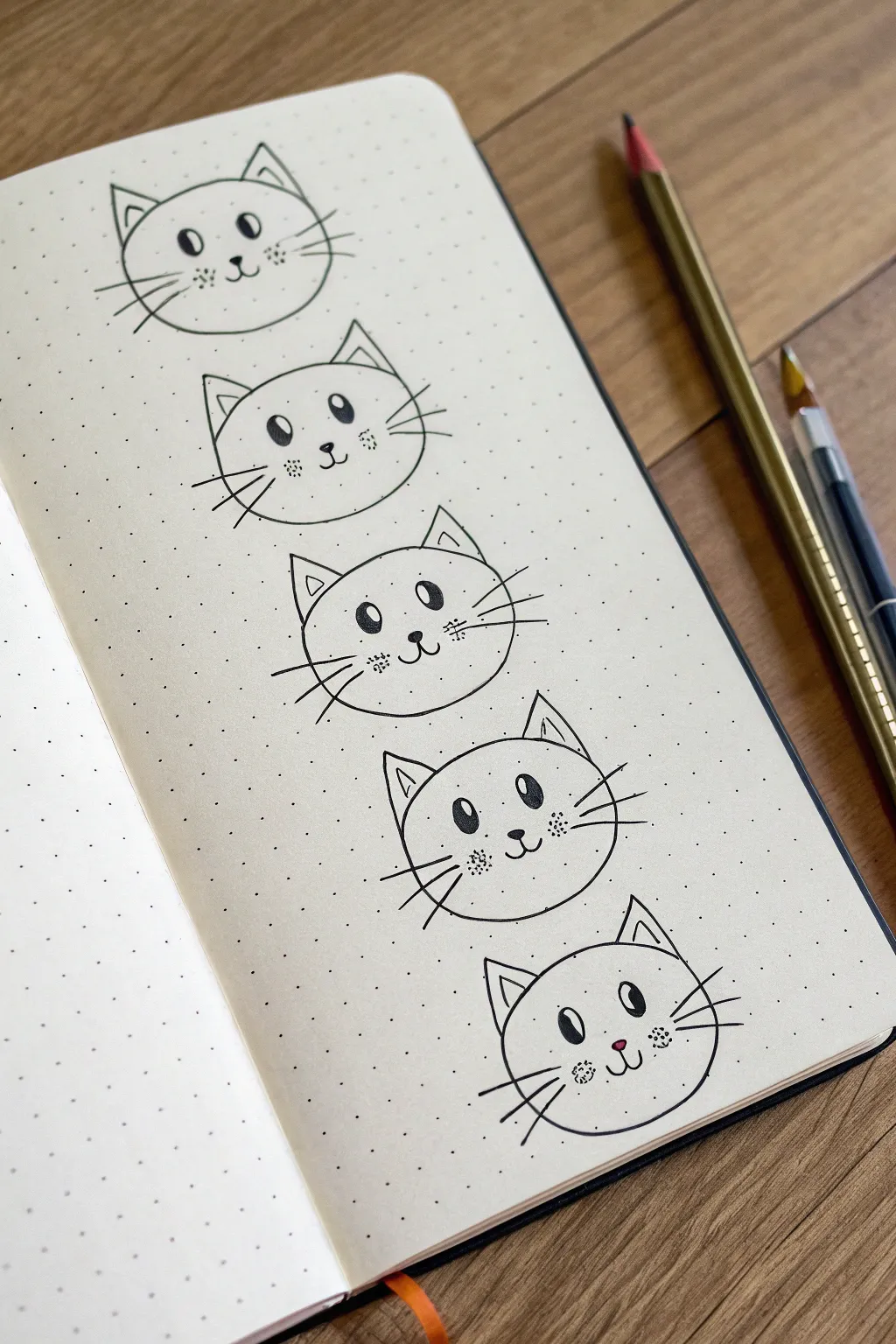
These simple yet adorable cat faces are perfect for adding a touch of cuteness to your bullet journal spreads. Using basic shapes as a foundation, you’ll create a vertical column of five distinct but cohesive kitty characters.
Step-by-Step
Materials
- Dotted notebook or bullet journal
- Fine liner pen (black, 0.5mm or similar)
- Pencil (for sketching)
- Eraser
- Gold or colored pencil (optional for coloring)
Step 1: Face Foundations
-
Map out the positions:
Begin by counting the dots in your journal to space out five faces evenly. Leave about 3-4 dot rows of space between where each head will go so the drawings don’t feel crowded. -
Shape the first head:
Starting at the top, draw a wide, slightly flattened oval shape. It doesn’t need to be a perfect circle; a slightly squashed look adds character to the face. -
Add the ears:
On top of the oval, sketch two triangles for ears. Place them fairly wide apart. Add a smaller triangle inside each one to create depth and dimension. -
Repeat down the page:
Recreate this same head and ear outline for the remaining four cats below the first one. Try to keep them roughly the same size for a uniform look.
Grid Guide
Use the grid dots to ensure symmetry. For example, make the eyes span exactly two distinct grid squares to keep them uniform.
Step 2: Basic Facial Features
-
Draw the nose:
In the lower middle third of the first face, draw a small, inverted triangle with rounded corners for the nose. This anchors the rest of the features. -
Create the mouth:
From the bottom tip of the nose, draw a small vertical line down, then curve it outward to the left and right to form a classic ‘W’ shape or anchor shape for the mouth. -
Place the eyes:
Draw two large ovals for eyes, aligned with the top of the nose. Space them widely apart. Leave a small white circle inside each oval for a highlight before filling the rest in black. -
Add cheeks and whiskers:
Draw three straight lines fanning out from each cheek area for whiskers. Between the whiskers and the nose, add a cluster of three small dots to suggest whisker pads. -
Vary the features:
For the subsequent cats, I like to subtly change the eye shape or whisker angle. Maybe make one look slightly to the side by shifting the pupil highlight.
Purr-sonality Upgrade
Give each cat a unique accessory like a bow tie, glasses, or a tiny hat to create a distinct family of characters.
Step 3: Inking and Finishing
-
Trace the outlines:
Once you are happy with your pencil sketches, carefully go over the main head shapes and ears with your black fine liner pen. Keep your hand steady and use confident strokes. -
Fill in the details:
Ink the facial features next. When filling in the eyes, be careful to preserve those tiny white highlights—they bring the cats to life. -
Add decorative touches:
For the very last cat at the bottom, try coloring only the nose with a tiny dot of pink or red ink to make it pop against the black and white design. -
Let the ink dry:
Wait a few minutes to ensure the ink is completely set. Smudging is the enemy here, so patience is key. -
Erase pencil lines:
Gently erase all underlying pencil sketches. Hold the paper taut so it doesn’t crinkle while you erase. -
Optional coloring:
If you wish, use a gold or colored pencil to lightly shade inside the ears or add rosy cheeks, as seen in the reference tools nearby, though the classic black and white looks striking on its own.
You now have a charming column of kittens ready to brighten up your daily planner


Mountains and Simple Horizon Landscapes
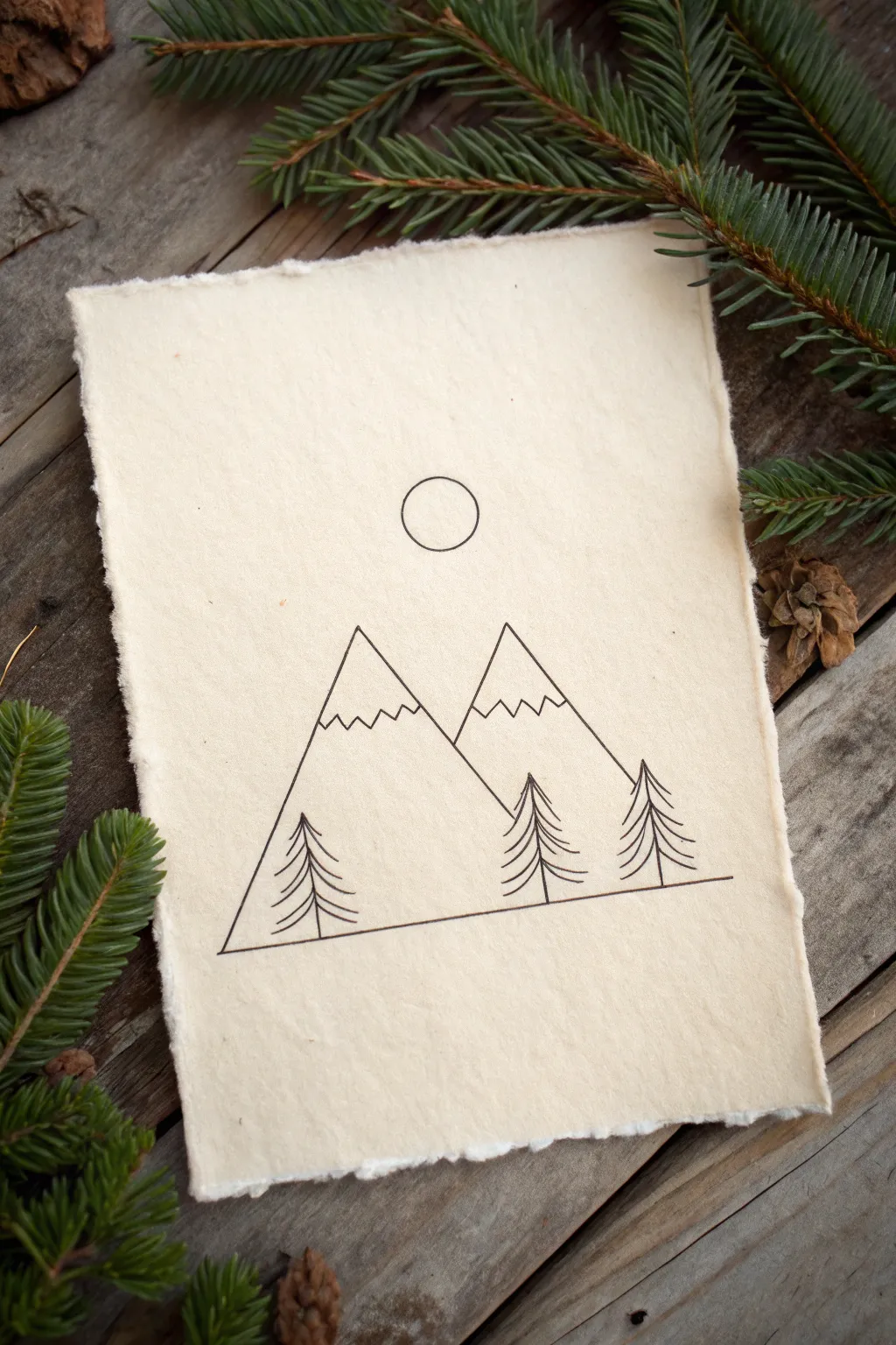
This project captures the serene beauty of a mountain landscape using clean, sharp lines on beautifully textured paper. It is a perfect exercise for beginners to practice steady hand movements and minimalist composition without needing complex shading.
How-To Guide
Materials
- Handmade cotton rag paper (deckle edge, A5 or slightly smaller)
- Fine liner pen (black, 0.3mm or 0.5mm nib)
- Pencil (HB or H for light sketching)
- Ruler or straight edge
- Soft block eraser
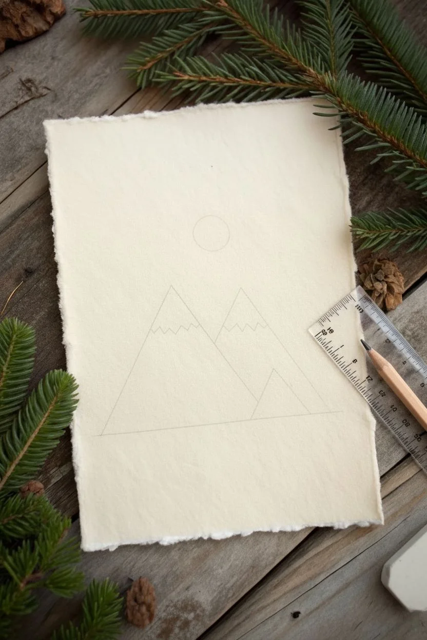
Step 1: Planning the Horizon
-
Paper preparation:
Place your handmade paper on a flat, clean surface. Orient it vertically to allow height for the mountain peaks. -
Sketch the baseline:
Using your pencil and ruler, lightly draw a straight horizontal line across the bottom third of the paper. Leave a generous margin on the left and right sides so the line floats in the center. -
Mark the peaks:
Determine where you want your two mountain peaks. Make a light dot for the taller peak on the left, slightly above the center of the page, and a second dot for the shorter peak to its right. -
Draw the mountain triangle:
Connect your baseline to your peak dots using the ruler to form two overlapping triangles. The left mountain should obscure part of the right mountain’s left side.
Ink Bleeding?
Handmade paper is thirsty! If your lines look fuzzy, switch to a pigment liner or a micron pen, which sit on top of the paper fibers better than liquid ink rollerballs.
Step 2: Inking the Outlines
-
Trace the baseline:
Switch to your fine liner pen. Carefully trace over your pencil baseline, stopping and starting exactly where your pencil marks end to keep it neat. -
Ink the first mountain:
Draw the outline of the large, front-left mountain first. Place the pen tip at the bottom left corner and draw a crisp line up to the peak and down the other side. -
Ink the second mountain:
Ink the visible lines of the second mountain. Start at the peak and draw down to the right corner, then draw the left slope only until it hits the line of the first mountain. -
Add snowcaps:
About a third of the way down from each peak, draw a jagged, zigzagging line horizontally across the mountain face to represent the snowline.
Pro Tip: Rustic Texture
Don’t press too hard with the pen. Letting the pen skip slightly over the bumps in the handmade paper adds to that organic, vintage aesthetic you see in the photo.
Step 3: Adding Nature Details
-
Tree placement:
Visualize three trees: one on the far left inside the mountain outline, and two on the right side. Lightly mark vertical guidelines for their trunks in pencil if helpful. -
First tree trunk:
Draw a simple vertical line for the trunk of the far-left tree. It should start at the baseline and extend upwards, overlapping the mountain drawing. -
Tree branches:
Starting from the top of the trunk, draw downward-sloping curved lines on either side. Keep the top branches short and gradually widen them as you move down to create a conical shape. -
Middle tree:
Repeat this process for the middle tree located near the valley between the two mountains. This tree can be slightly shorter to add variety. -
Right tree:
Draw the final tree on the far right. I usually like to make the branches slightly denser at the bottom to ground the composition. -
The moon:
Find a circular object (like a coin or bottle cap) that fits comfortably in the sky area above the peaks. Place it centered above the valley and trace it carefully with your pen.
Step 4: Final Touches
-
Let ink dry:
Wait at least 5 to 10 minutes to ensure the ink is completely dry, especially on cotton paper which can be more absorbent. -
Erase guidelines:
Gently gently rub your soft eraser over the entire drawing to remove the initial pencil sketches. Be careful not to snag the deckle edges of the paper. -
Check line weight:
Inspect your lines. If any areas look too faint due to the paper’s texture, carefully go over them one more time to darken the black.
Display your rustic mountain scene on a wooden shelf or frame it without glass to show off the paper texture

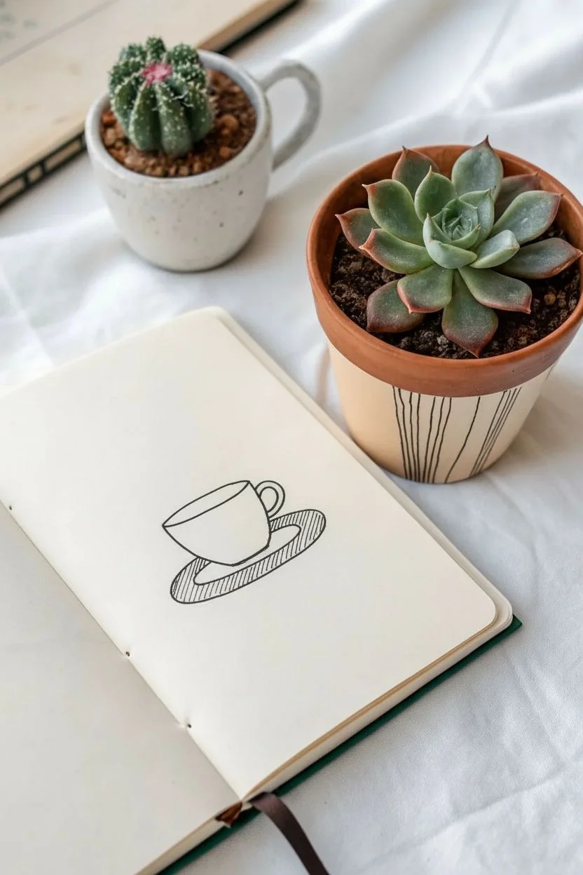
Coffee Mug Sketches With Clean Outlines


Capture the cozy vibe of a morning coffee break with this simple set of four mug sketches. Using clean lines and playful patterns, you will create a charming sketchbook page that celebrates different cup styles, from striped mugs to patterned tea cups.
Step-by-Step Guide
Materials
- Spiral-bound sketchbook (smooth paper preferred)
- Black fineliner pen (0.5mm or 0.8mm)
- Pencil (HB or 2B for sketching)
- Eraser
Step 1: Planning the Layout
-
Visualize the placement:
Imagine your page divided into four rough quadrants. You don’t need to draw grid lines, just mentally assign a space for each of the four mugs so they aren’t crowded together. -
Sketch the basic shapes:
Using your pencil lightly, draw the basic geometric forms for each mug. For the top left, draw a cylinder. For the top right, a rounded rectangle. For the bottom left, a tapered cup shape. For the bottom right, a wide, rounded teacup bowl.
Unsteady Hands?
If your lines are wobbly, embrace it! This style thrives on a hand-drawn, organic look.
Step 2: Drawing the Plant Mug (Top Left)
-
Outline the mug body:
Switch to your black fineliner. Draw the top rim as a thin, horizontal rectangle. Extend two vertical lines down for the sides and connect them with a slightly curved line at the bottom. -
Add the handle:
On the right side of the body, draw a simple ‘C’ shape for the handle, attaching it near the top and middle of the mug. -
Draw the fern leaf:
Starting from inside the rim, draw a single curved line extending upward and to the left. Along this stem, add small, closely spaced oval leaves on both sides to create a fern frond. -
Fill in the stripes:
Draw three thick, dark bands horizontally across the mug. I like to fill these in solid black with the pen to create strong contrast against the white paper.
Step 3: Drawing the Steaming Coffee (Top Right)
-
Create the rim and liquid:
Draw a flattened oval for the top opening. Inside this oval, draw a smaller oval shape slightly off-center and fill it with scribbles or stippling to represent dark coffee. -
Form the mug shape:
Draw a ‘U’ shape extending down from the outer rim to form the body of the mug. Make the bottom flat. -
Attach a round handle:
Draw a large, looped handle on the right side. Keep the lines smooth and consistent in thickness. -
Add steam tendrils:
Above the coffee, draw two or three wavy, tapered lines rising upward. Reminiscent of flames or smoke, these suggest heat.
Level Up: Shadow Play
Use a light grey marker to add a simple drop shadow to the right of each mug grounded on the page.
Step 4: Drawing the Striped Glass (Bottom Left)
-
Outline the glass shape:
Draw an oval for the top rim and a smaller oval for the base. connect the sides with straight diagonal lines tapering downward. -
Add the tea bag tag:
On the top rim, draw a tiny rectangle hanging over the edge to look like a tea bag string and tag. -
Pattern with vertical stripes:
Draw vertical lines following the curve of the glass from the rim to the base. It helps to curve them slightly to match the glass’s rounded form.
Step 5: Drawing the Polka Dot Cup (Bottom Right)
-
Draw the wide rim:
Start with a wide, open oval. Inside, draw a crescent shape on the left side and fill it in black to show the depth and shadow of the empty cup. -
Define the cup body:
Draw a short, squat ‘U’ shape for the body. This cup should feel wider and shorter than the others. -
Add the handle:
Draw a small, ear-shaped handle on the right side. -
Decorate with playful patterns:
Cover the body of the cup with small circles. Inside some circles, add a dot to create ‘eyes’ or just variety. In the spaces between circles, add tiny swirls or curved lines for texture.
Step 6: Finishing Touches
-
Erase pencil guides:
Once the ink is completely dry—give it a minute or two—gently erase all your underlying pencil sketches to leave crisp, clean black lines. -
Refine lines:
Check for any gaps in your outlines or spots where the black fill could be more solid, and touch them up with your pen.
Now you have a cozy collection of coffee doodles perfect for decorating your journal or greeting cards
BRUSH GUIDE
The Right Brush for Every Stroke
From clean lines to bold texture — master brush choice, stroke control, and essential techniques.
Explore the Full Guide
Leaf Studies With Easy Vein Patterns
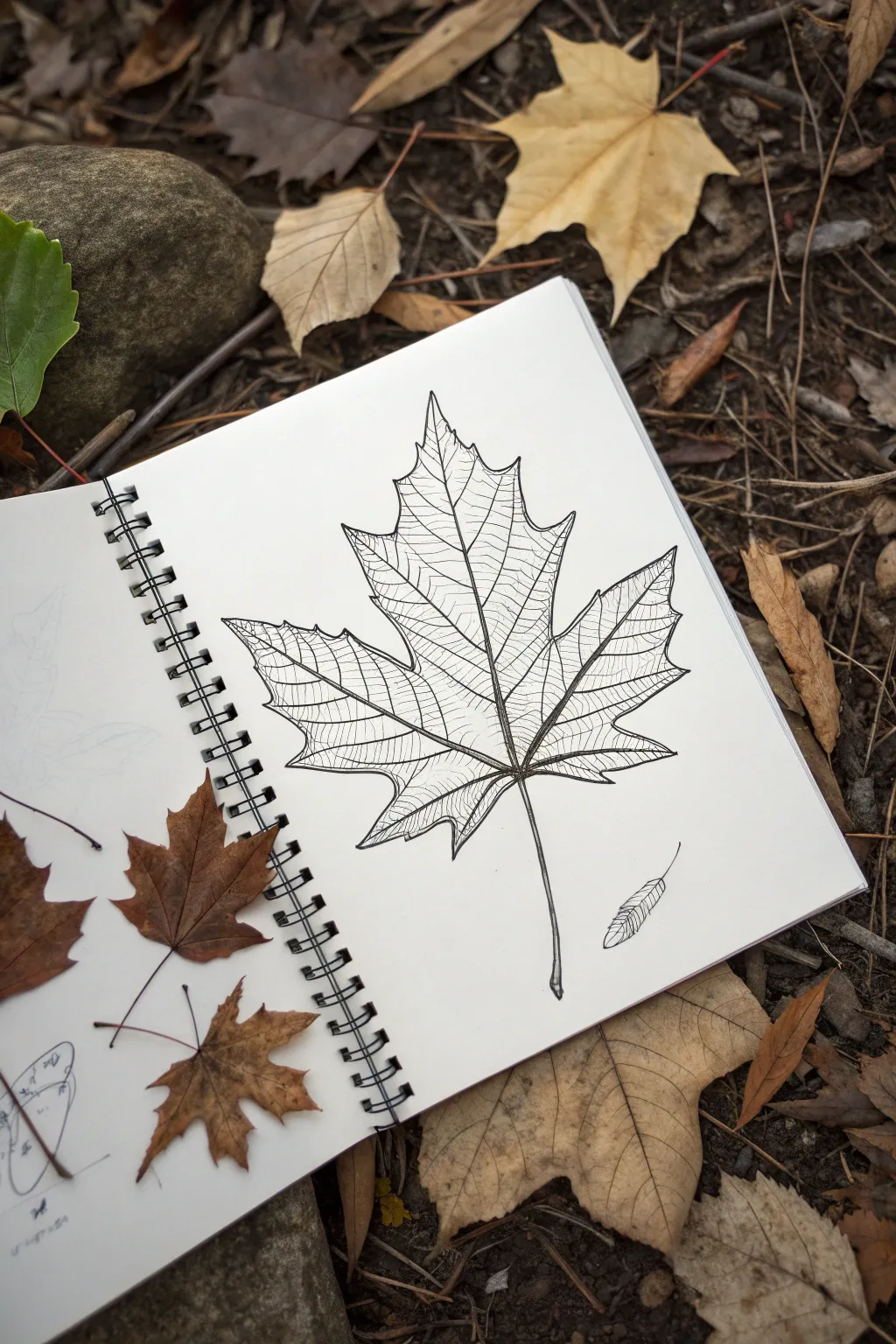
This project captures the intricate beauty of a fallen maple leaf using fine lines and careful observation. By breaking down the complex network of veins into a manageable pattern, you’ll create a striking botanical illustration that pops off the page.
Step-by-Step
Materials
- Sketchbook with smooth, heavy paper
- HB graphite pencil
- Kneaded eraser
- Fine liner pens (0.1mm, 0.3mm, and 0.5mm)
- Real maple leaf for reference (optional)
Step 1: Pencil Sketching
-
Establish the main axis:
Begin by lightly drawing a curved vertical line in the center of your page to serve as the leaf’s primary stem and midrib. Let it curve slightly at the bottom for a natural look. -
Map out the major veins:
From a central point on the stem (about a quarter way up), sketch four main diagonal lines radiating outward—two on the left and two on the right—to act as the skeletons for the leaf lobes. -
Outline the lobes:
Using jagged, V-shaped strokes, connect the tips of your radiating lines to form the classic five-point maple leaf silhouette. Keep your pencil pressure very light so these lines are easy to adjust. -
Refine the edges:
Go over your outline to sharpen the points and deepen the valleys between lobes. Maple leaves have distinct, sharp teeth along their edges, so ensure these are clearly defined. -
Sketch secondary veins:
Draw faint lines branching off the main veins towards the edges of each lobe. These should look like a fishbone pattern, creating the framework for the detailed texture later.
Ink Smearing?
Wait at least 5-10 minutes before erasing pencil lines. If you’re left-handed, place a scrap piece of clean paper under your hand to prevent dragging wet ink.
Step 2: Inking the Structure
-
Ink the primary veins:
Switch to your 0.5mm pen. Trace over the central stem and the main radiating veins. Make these lines confident and smooth, tapering them slightly as they reach the tips. -
Outline the leaf shape:
Use a 0.3mm pen to ink the heavy outer edge of the leaf. Use a slightly broken or fluctuating line weight to suggest the organic, slightly dry texture of a fallen autumn leaf. -
Erase pencil marks:
Once the foundational ink is completely dry, gently erase all your initial graphite sketches with a kneaded eraser to reveal a clean framework.
Add Autumn Color
Once your ink is fully dry, use watercolor or diluted ink to add a wash of burnt orange or yellow over the drawing. The waterproof pen lines will show through beautifully.
Step 3: Creating the Vein Texture
-
Start the venation pattern:
Using your finest 0.1mm pen, begin drawing the secondary veins that branch off your main lines. These should curve slightly creating subdivisions within the leaf surface. -
Subdivide the sections:
Inside each section created by the secondary veins, draw smaller lines that run somewhat parallel to each other. This doesn’t need to be biologically perfect; aim for a stylized, grid-like aesthetic. -
Connect the veins:
Continue filling each lobe with these fine, transverse lines. They should connect the central vein of a lobe to its outer boundaries, resembling the rungs of a ladder that has been warped. -
Add contour variation:
As you draw these fine interior lines, allow them to dip or curve slightly. This subtle curvature mimics the three-dimensional topography of a dried leaf, making it look crinkled rather than flat. -
Detail the edges:
Where the fine veins meet the outer edge, let them taper off or merge directly into the points of the leaf margin. -
Draw a fallen seed:
To balance the composition, sketch a small maple seed (samara) near the bottom right. Use the same technique: outline the wing shape with the 0.3mm pen and fill with fine 0.1mm cross-hatching.
Step 4: Final Touches
-
Thicken intersection points:
Go back with your 0.3mm pen and add tiny triangular shadows where the main veins branch out from the stem. This adds depth and strength to the structure. -
Review and refine:
Step back and look for any areas where the texture feels too sparse. Add a few extra 0.1mm lines to balance the density of the pattern across the whole leaf.
Now you have a permanently preserved piece of autumn to keep in your sketchbook
Hearts in Different Styles (Puffy, Geometric, and Ribbon)
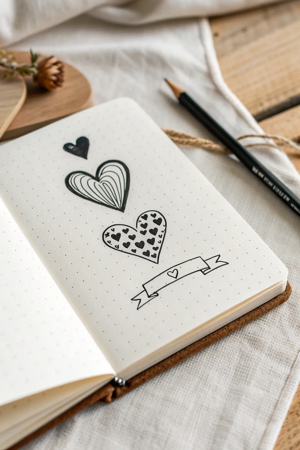
Add a touch of charm to your notebook with this sequence of stylized hearts and a playful ribbon banner. Perfect for bullet journals or doodles, this simple layout uses varied patterns to create visual interest without needing advanced artistic skills.
How-To Guide
Materials
- Dotted notebook or bullet journal
- Fine liner pen (0.5mm or 0.8mm)
- Pencil (optional for sketching)
- Eraser
Step 1: Planning the Layout
-
Find your center:
Locate the vertical center of your page to ensure your hearts hang in a straight line. The dotted grid is incredibly helpful here; simply count an equal number of dots from the left and right edges to find your centerline. -
Mark vertical spacing:
Using a pencil, lightly mark four points vertically down that center line where you want the center of each element to be. Leave about 3-4 dot rows of space between each element so the design feels airy and not cramped.
Symmetry Struggles?
If your hearts look lopsided, draw a faint vertical line in pencil first. Draw the left curve, then mirror it on the right before inking. The dots are your grid guide.
Step 2: Drawing the Sequence
-
Draw the top solid heart:
Start with the smallest heart at the top. Using your pen, draw a small, classic heart shape, approximately 2 dot-grids wide. I find that starting from the center cleft and drawing each curve separately helps symmetry. -
Fill in the top heart:
Color this small heart in completely with your black pen. Leave a tiny speck of white near the top left curve to act as a reflection highlight giving it a shiny look. -
Outline the striped heart:
Moving down, draw the outline of the second heart. Make this one larger than the first—about 4 to 5 dot-grids wide. Focus on a slightly wider, plumper shape with a distinct dip in the middle. -
Add contour lines:
Inside the second heart, draw curved lines that follow the shape of the outer outline. Start from the bottom tip and sweep upwards toward the center cleft. -
Complete the stripes:
Continue adding these curved lines until the entire heart is filled. Try to keep the spacing relatively even, but natural variance adds to the hand-drawn charm. -
Outline the patterned heart:
For the third heart, draw the largest outline yet—perhaps 5 to 6 dot-grids wide. Keep the lines smooth and join them neatly at the bottom point. -
Populate with mini-hearts:
Fill the interior of this large heart with tiny, solid black hearts. Let them scatter randomly, facing slightly different directions, but keep them contained strictly within the border. -
Refine the pattern density:
Add a few partial hearts cut off by the borderline to make it look like the pattern extends beyond the shape, rather than just floating in the middle.
Step 3: Adding the Banner
-
Draw the main ribbon section:
Below the third heart, draw a long, slightly curved rectangle. The lines should arc gently upward in the middle. -
Add the ribbon ends:
From the bottom corners of your rectangle, draw small lines angled inward. Then, draw the ‘tails’ of the ribbon flowing outwards and ending in a V-cut shape. -
Connect the folds:
Connect the top corner of the tail to the side of the main rectangle with a small diagonal line to create the illusion of the ribbon folding back. -
Decorate the banner:
In the center of the banner, draw a very tiny, open heart outline. This ties the whole composition together. -
Final clean up:
Once the ink is completely dry—give it a full minute so it doesn’t smear—erase any pencil guide marks you made at the beginning.
Make It Pop
Use a subtle grey brush pen to add drop shadows to the right side of the banner and the hearts. This creates a 3D sticker effect that lifts the art off the page.
Now you have a lovely vertical spread ready to decorate your weekly planner or note page

PENCIL GUIDE
Understanding Pencil Grades from H to B
From first sketch to finished drawing — learn pencil grades, line control, and shading techniques.
Explore the Full Guide
Clouds, Moons, and Tiny Stars as Quick Wins
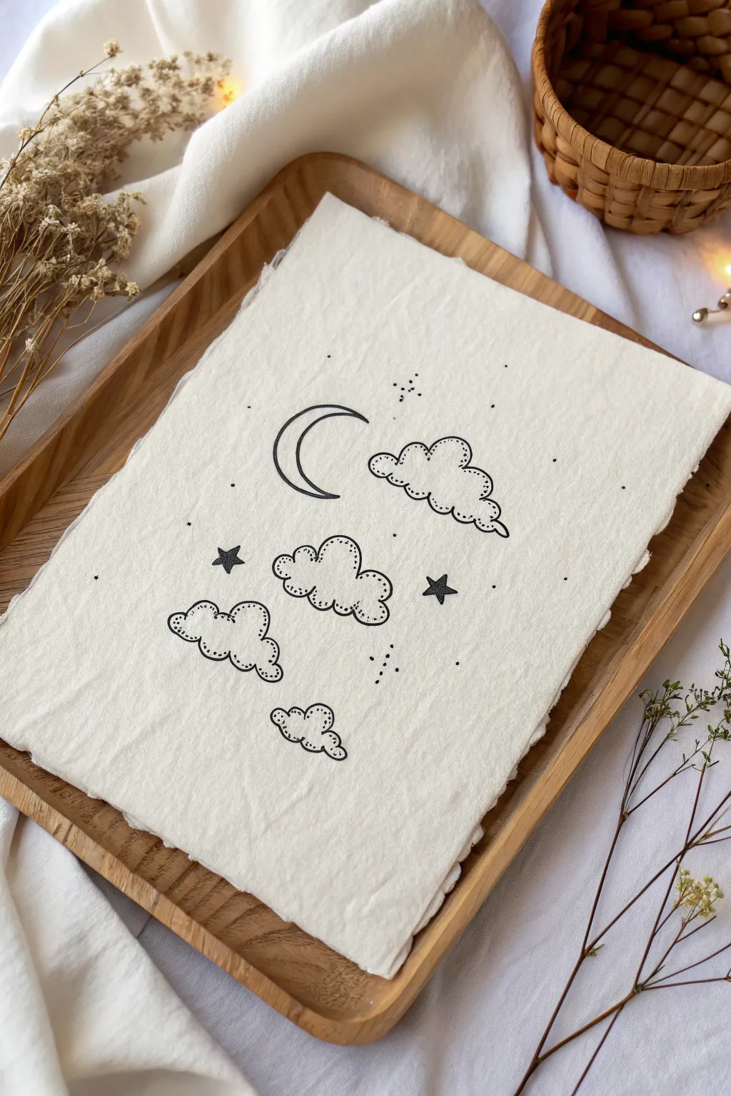
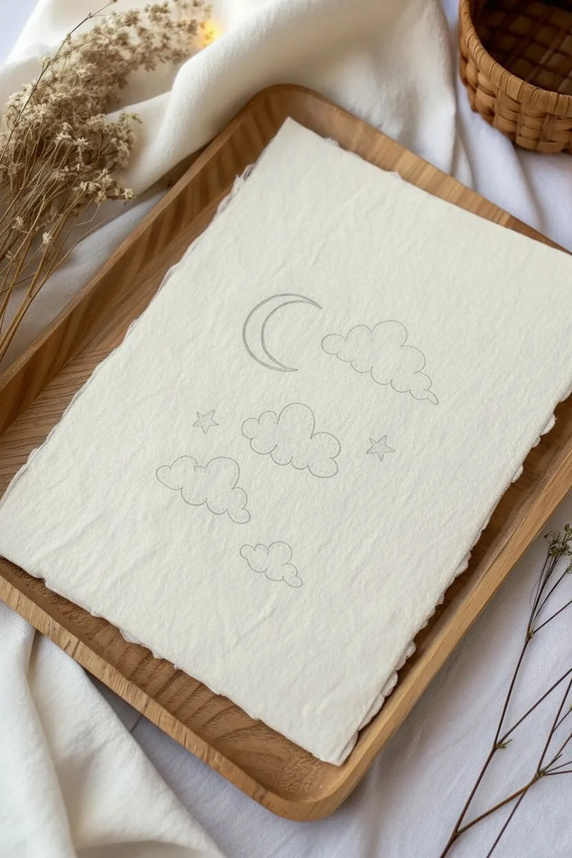
This minimal and dreamy artwork captures the calm of a night sky using simple lines and stippling techniques. It’s a perfect beginner project that emphasizes texture and delicate details on beautiful handmade paper.
Step-by-Step Tutorial
Materials
- Handmade cotton paper or textured watercolor paper (approx. A5 size)
- Fine liner pen (black, size 03 or 05)
- Fine liner pen (black, size 005 or 01 for details)
- Pencil (HB or H)
- Eraser (kneaded preferred)
- Wooden tray (for display or working surface)
Step 1: Planning the Layout
-
Prepare your paper:
Start with a sheet of textured handmade paper. The deckled edges add to the charm, so treat them gently. Place it on a smooth, hard surface for drawing, but you can keep a wooden tray nearby to frame your work visually as you go. -
Visualize the composition:
Imagine a vertical flow for your elements. You want the crescent moon near the top center, flanked by a cloud, with a cascade of clouds and stars falling beneath it. -
Sketch the moon:
Using your pencil very lightly, draw a ‘C’ shape in the upper third of the paper. Add an inner curve to close the crescent shape. Keep the lines faint so they are easy to erase later. -
Outline the clouds:
Sketch four cloud shapes. Place one directly to the right of the moon. Place a larger central cloud below the moon, a smaller one to the left below that, and a tiny one at the very bottom center. -
Add floating stars:
Lightly sketch two five-pointed stars: one to the left of the central cloud and one to the right. Don’t worry about perfect symmetry; a hand-drawn look is desirable here.
Ink Bleeding?
Handmade paper is absorbent! If your lines connect or fuzz, switch to a smaller nib size and move your hand faster. Do not press the pen hard into soft paper.
Step 2: Inking the Outlines
-
Trace the moon:
Switch to your thicker fine liner (03 or 05). Carefully trace over your pencil lines for the moon. Try to make this line confident and smooth without lifting your pen too often. -
Ink the cloud edges:
Trace the clouds using bumpy, scalloped lines. Variate the size of the bumps—some wide, some narrow—to make them look fluffy and organic. -
Draw the stars:
Outline your pencil stars. You will fill these in later, so just focus on getting the points sharp for now. -
Erase pencil guides:
Wait at least five minutes for the ink to fully dry. Gently erase all visible pencil marks using a kneaded eraser to avoid damaging the paper’s texture.
Level Up: Gold Accents
After the black ink dries, use a metallic gold gel pen or fine paintbrush to fill in the moon or add highlights to the star edges for a magical shimmer.
Step 3: Adding Texture and Detail
-
Stipple the moon:
Switch to your thinner fine liner (005 or 01). Add tiny dots inside the moon shape. Concentrate the dots along the inner curve to create a shadow effect, fading out as you move toward the outer edge. -
Detail the cloud rims:
Inside the main outline of each cloud, draw a second, thinner scalloped line that mirrors the outer shape. This creates a ‘rim’ or border effect. -
Shade the clouds:
Using the stippling technique again, fill the space between the outer and inner cloud lines with dots. Keep the dots fairly dense to distinguish the border clearly. -
Fill the stars:
Using your thicker pen, color in the two five-pointed stars completely solid black. This adds a nice heavy contrast to the delicate line work. -
Add background magic:
Scattered around the main elements, add tiny clusters of dots and single specks. Think of these as distant stars or stardust. -
Draw tiny background stars:
In the empty spaces, draw extremely small solid dots or tiny crosses to represent faraway twinkling stars. Balance is key—don’t overcrowd the negative space.
Place your finished piece in the wooden tray or a floating frame to admire your serene night sky creation
Butterflies With Symmetry-First Wings
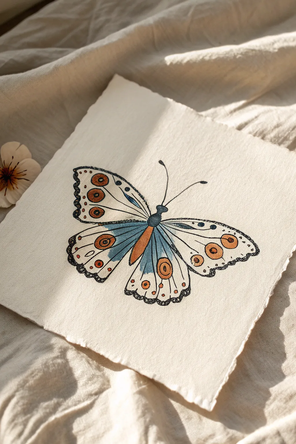
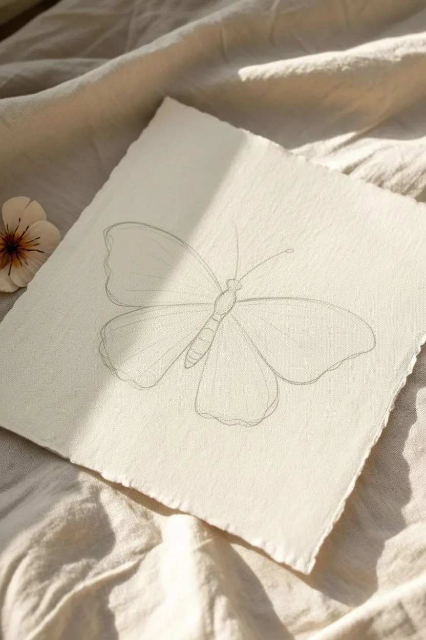
Capture the delicate beauty of a butterfly with this mixed-media project that combines bold ink outlines with soft, blended colors. The textural paper and stylized patterns give this piece a lovely vintage, hand-illustrated feel perfect for framing.
Detailed Instructions
Materials
- Slightly textured watercolor paper or handmade cotton paper (square format)
- Black fineliner pens (sizes 0.1, 0.3, and 0.5)
- HB pencil and eraser
- Colored pencils or watercolor markers (burnt orange, muted teal/blue, soft yellow)
- Ruler
Step 1: Sketching the Skeleton
-
Establish the centerline:
Begin by lightly drawing a vertical line down the center of your paper using your ruler and pencil. This invisible guide is crucial for achieving that symmetrical butterfly look. -
Map the body:
Along the center line, sketch a narrow, segmented oval for the body. It should be slightly thicker at the visible thorax (top) and taper down into the abdomen. -
Draft the upper wings:
Draw two large, rounded triangular shapes extending from the upper thorax. Keep them symmetrical, curving upwards and outwards before sweeping back in towards the body. -
Draft the lower wings:
Sketch two more rounded shapes below the first set. These should be slightly smaller and more oval-like, overlapping slightly with the upper wings near the body.
Wobbly Lines?
Don’t panic if your symmetry isn’t perfect. In nature, butterflies often have slight variations. Just thicken the outline on the thinner side to balance it out visually.
Step 2: Inking the Outline
-
Define the body:
Using a 0.5 black fineliner, trace over your pencil sketch of the body. Add small, curved horizontal lines across the abdomen to suggest segments. -
Outline the wings:
Switch to a 0.3 fineliner to ink the main perimeter of the wings. Instead of a perfectly smooth line, add a slight waviness to the edges, especially on the bottom wings, to create a natural, scalloped effect. -
Draw the antennae:
From the head, draw two long, slender curves extending outward. Top each one with a small, filled-in teardrop shape for the club. -
Erase guide lines:
Once the ink is completely dry—give it a minute or two—gently erase all your pencil marks so you have a clean slate for the details.
Vintage Texture
If using smooth paper, place a sheet of sandpaper underneath your drawing while coloring. rubbing the pencil over it will transfer a cool, grainy texture to your wings.
Step 3: Adding Patterns & Texture
-
Create the inner veins:
Draw long, sweeping lines inside the wings radiating from the body toward the outer edges. These divide the wings into sections for our coloring later. -
Add circular eye-spots:
Inside specific wing sections (referencing the photo), draw circles. Create a ‘bullseye’ effect by drawing smaller circles inside the larger ones. Place prominent ones near the tips of the upper wings and the center of the lower wings. -
Detail the edges:
Using your 0.1 fineliner, add a second, thinner line just inside the outer edge of the wings. Fill this narrow gap with tiny stippling dots or small jagged lines to create a darkened, detailed border. -
Incorporate decorative dots:
Scatter small circles and tiny dots throughout the wings, particularly along the outer margins and near the veins. These add that whimsical, illustrated character.
Step 4: Coloring
-
Apply base blue tones:
Take a muted teal or blue colored pencil. Color the sections of the wings closest to the body. Press lightly to let the paper texture show through, fading the color out as you move toward the wing tips. -
Color the body:
Use a darker blue or mix the teal with a little black to color the body segments, leaving a tiny sliver of white on one side for a highlight. -
Fill the eye-spots:
Using a burnt orange or rust-colored pencil, fill in the circular eye-spots. Press firmly here to make these vibrant focal points pop against the lighter background. -
Add accent hues:
Fill the long, central oval section on the lower wing with the orange tone. I like to layer a bit of soft yellow over the uncolored parts of the wings to give them a vintage, aged parchment look. -
Final shading:
Use a dark grey or black pencil to add very light shading right where the wings meet the body, adding depth and dimension to the center.
Now you have a stunning, nature-inspired illustration ready to display on your wall or gift to a friend


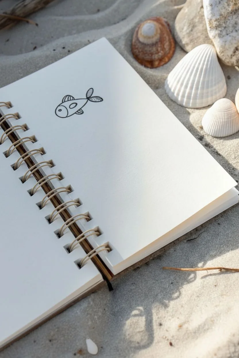
Simple Fish and Sea Creatures With Minimal Details
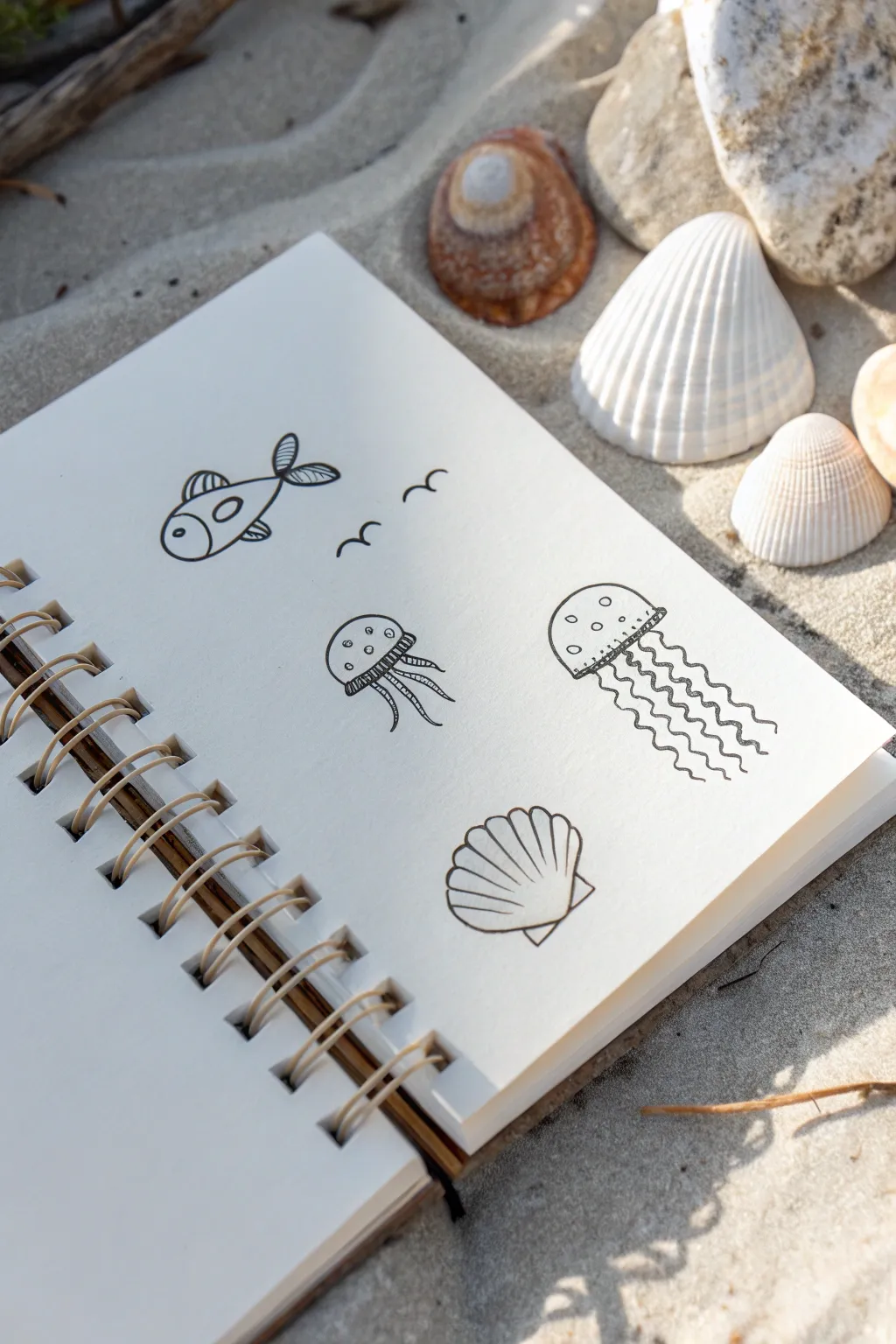
Capture the charm of the ocean with these delightful, minimalist doodles perfect for any sketchbook. Using clean black ink lines, you’ll create a playful collection of sea life that relies on simple shapes and negative space for a modern look.
Step-by-Step Tutorial
Materials
- Sketchbook with smooth, thick paper (spiral bound)
- Fine liner pen (black, 0.5mm or 0.8mm)
- Pencil (optional, for initial sketching)
- Eraser (optional)
Step 1: Drawing the Fish
-
Outline the body:
Start near the top left of your page. Draw a simple oval shape that tapers slightly at the back end to form the main body of the fish. -
Add the tail:
At the tapered end of the oval, draw two loops crossing over each other to form a fishtail that looks a bit like a propeller. -
Create details:
Draw a curved vertical line inside the oval to separate the head from the body. Add a small circle for the eye near the front. -
Finishing touches:
Draw three small arches along the fish’s back for the dorsal fin and a small triangular fin on the bottom. Add a circle on the body for a pattern. -
Texture the fins:
Using gentle, quick strokes, fill the tail and dorsal fin with closely spaced lines to give them a ribbed texture.
Wobbly Lines?
Don’t stress about perfect geometry. Slight wobbles in your ink lines actually add organic character, making the creatures look more natural and handmade.
Step 2: Flying Birds
-
First wing stroke:
To the right of the fish, draw a small, curving ‘m’ shape. Keep the curves loose and relaxed so they look like seagulls in the distance. -
Second bird:
Add a second, slightly smaller ‘m’ shape just below and to the left of the first one to create depth and movement.
Step 3: The Small Jellyfish
-
Draw the bell:
Below the fish, draw a semicircle (like an upside-down ‘U’). Close the bottom of the shape with a straight horizontal line. -
Add the fringe:
Just under the straight line, draw a series of tiny vertical lines to create the skirt or fringe of the jellyfish. -
Draw tentacles:
Extend four or five wavy lines down from the fringe. Let them curve outward slightly as if they are floating in current. -
Decorate the bell:
Inside the semicircle, draw three or four small circles randomly placed to act as spots on the jellyfish’s head.
Variation Tip
Change the expression of your fish by altering the eye placement, or make the jellyfish tentacles extra long to fill more vertical white space on your page.
Step 4: The Large Jellyfish
-
Outline the head:
To the right of the small jellyfish, draw a larger semicircle. This one should be wider and taller than the previous one. -
Create the heavy rim:
Connect the bottom ends of the semicircle with a straight line, then draw a second parallel line right above it to create a thick rim. -
Detail the rim:
Fill the space between those two parallel lines with short, vertical hash marks for texture. -
Flowing tentacles:
I like to be really loose with this part. Draw 5-7 long, squiggly lines descending from the rim. Vary the wavelength of the squiggles so they don’t look too uniform. -
Add spots:
Pepper the top dome with small open circles, just like you did for the smaller jellyfish.
Step 5: The Clam Shell
-
Start the fan shape:
Near the bottom of the page, draw a wide fan shape. Imagine a pizza slice with a very rounded crust. -
Define the ridges:
From the bottom point of the fan, draw several lines radiating upward to the curved edge. These lines create the classic scallop shell ridges. -
Scallop the edge:
Instead of a smooth top curve, connect the tops of your radiating lines with small, connecting arches to make the shell’s edge bumpy. -
Draw the hinge:
At the very bottom point where the lines converge, draw a small horizontal rectangle or triangle to represent the shell’s hinge. -
Final clean up:
If you used pencil first, wait a moment for the ink to fully set, then gently erase your sketch lines.
Now you have a charming page of seaside doodles ready to be colored or left as minimalist line art
Easy Bird Silhouettes and Perched Birds
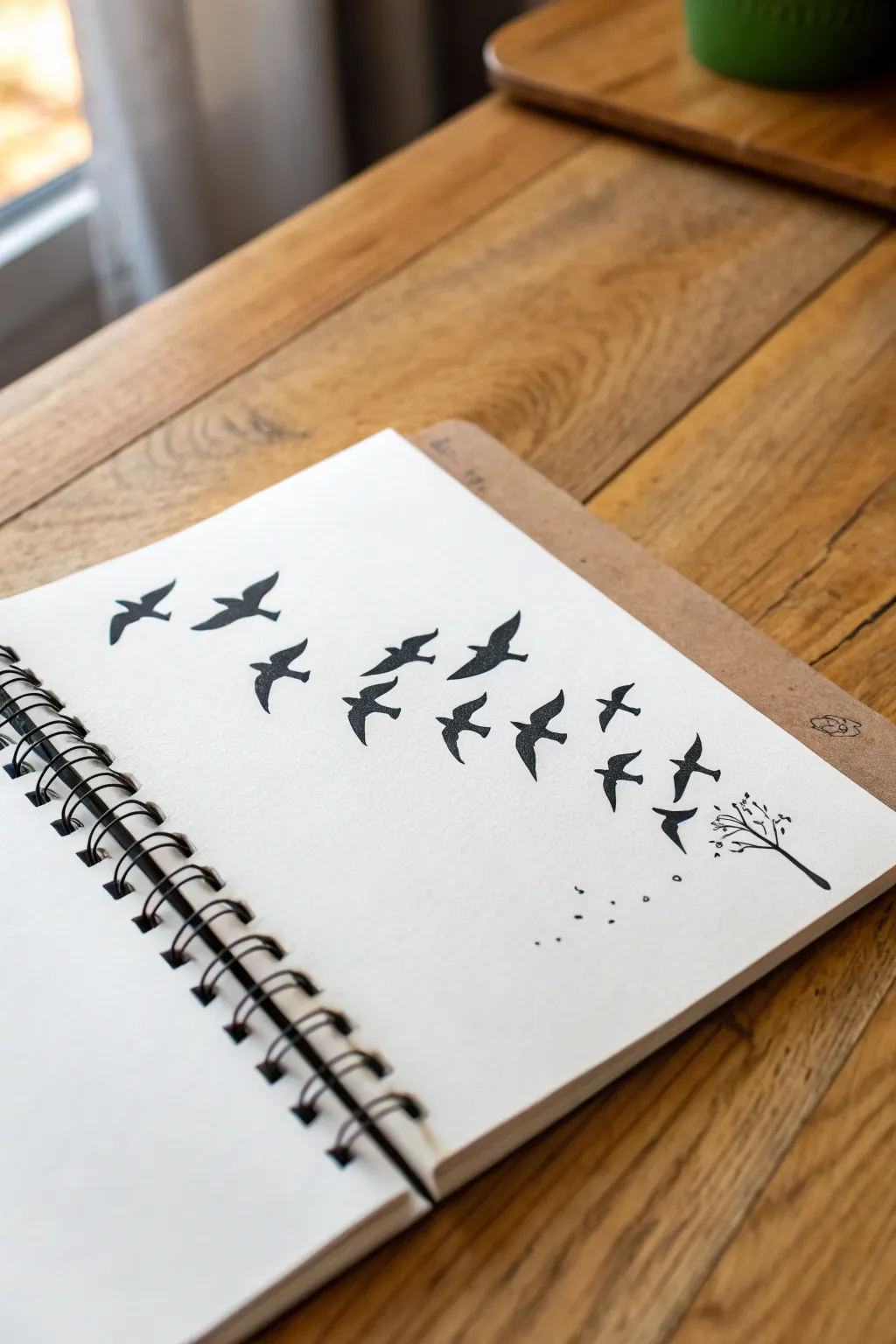
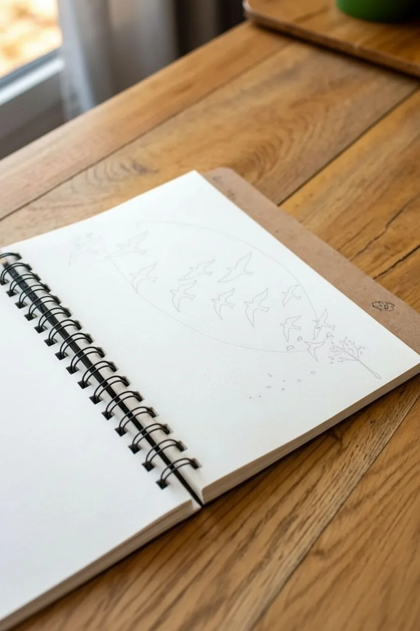
Capture the freedom of flight with this minimalist ink drawing of bird silhouettes rising from a simple tree. This high-contrast design is perfect for beginners, focusing on shape and negative space rather than intricate details.
Step-by-Step Guide
Materials
- Spiral-bound sketchbook (heavyweight paper preferred)
- Black fine liner pen (0.3mm or 0.5mm)
- Black brush pen or broad-tip marker
- Pencil (HB or 2B)
- Eraser
Step 1: Planning the Flight Path
-
Map the curve:
Start by lightly sketching a faint, sweeping curve with your pencil across the page. This line should start low on the right side and swoop upwards toward the top left corner, acting as the central spine for your flock. -
Sketch the anchor point:
At the bottom right end of your curve, draw a very simple, stick-figure style tree. Keep the branches delicate and sparse, as if the leaves have just blown away. -
Position the birds:
Along your curved line, lightly sketch small ‘V’ shapes or ovals to mark where each bird will go. Space them out irregularly to look natural—some close together, some further apart. -
Scale the size:
Ensure the shapes near the tree are tiny dots or specks, and gradually make the shapes larger as they move up and to the left to create a sense of perspective.
Natural Flow Tip
Avoid placing birds in a perfect straight line. Stagger them slightly above and below your invisible guide curve to make the flock look organic and wind-swept.
Step 2: Drawing the Silhouettes
-
Define the lead birds:
Starting with the largest birds at the top left, use your pencil to refine the ‘V’ shapes into distinct bird outlines. Give them arched wings that taper to points. -
Vary the wing positions:
Don’t make every bird identical. Draw some with wings fully spread, some with wings angled down, and others banking to the side. -
Create the mid-flight birds:
Move down the line to the medium-sized birds. Keep their shapes simple but recognizable, focusing on the classic ‘m’ or wide ‘v’ silhouette. -
Simplify the distant birds:
For the smallest birds near the tree, draw them as simple dashes or tiny ticks. They don’t need distinct wings, just the suggestion of movement. -
Add falling leaves:
Near the tree branches and under the lowest birds, sketch a few tiny, scattered dots to represent leaves or debris being kicked up by the takeoff.
Step 3: Inking and Finishing
-
Outline larger birds:
Switch to your fine liner pen. Carefully trace the pencil outlines of your largest birds, ensuring the wingtips remain sharp. -
Fill with solid black:
Use your brush pen or broad marker to color in the large silhouettes. I like to do this slowly to avoid bleeding outside the lines. -
Ink the medium birds:
Carefully ink and fill the middle section of the flock. If you’re using a brush pen, you can often create these shapes with a single, controlled stroke tailored to the wing shape. -
Detail the tree:
Use the fine liner to trace the tree trunk and branches. Keep the lines thin and slightly jittery to mimic natural wood texture. -
create the specks:
For the tiniest birds and falling leaves, simply tap the tip of your pen or make small, decisive marks. Do not try to outline and fill these; a single mark is sufficient. -
Dry thoroughly:
Let the ink sit for several minutes. Brush pens can pool slightly on smooth paper, so give it extra time to avoid smearing. -
Erase guidelines:
Once the ink is completely dry to the touch, gently erase your initial pencil curve and positioning marks.
Ink Bleeding?
If your marker bleeds into the paper fibers, switch to a pigment liner or archival ink pen. These tend to sit on top of the paper better than water-based markers.
Now you have a dynamic scene that captures momentum and movement with simple black ink
Cozy House Doodles With Simple Windows and Rooflines
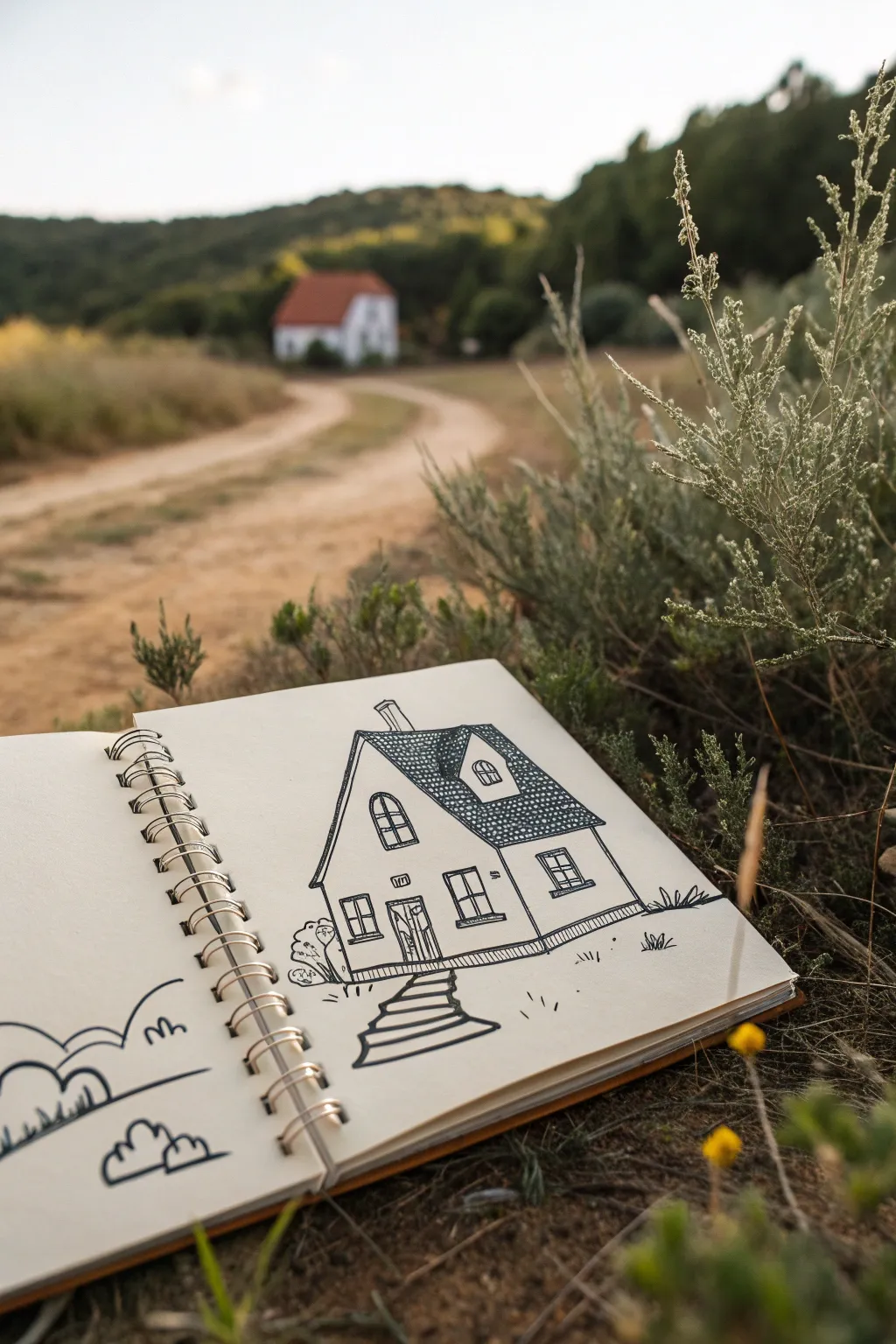
Capture the charm of a countryside dwelling with this clean, illustrative ink drawing. With bold outlines, playful textures, and a cozy aesthetic, this project is perfect for filling your sketchbook while enjoying the outdoors.
Detailed Instructions
Materials
- Spiral-bound sketchbook (heavyweight paper preferred)
- Fine liner pen (black, size 0.5 or 0.8)
- Pencil (HB or 2B)
- Eraser
- Ruler (optional, freehand is encouraged)
Step 1: Drafting the Structure
-
Establish the horizon:
Begin by lightly sketching a horizontal line near the bottom third of your page to ground your house. -
Block in the main shape:
Draw the primary facade of the house. Start with a rectangle for the base and add a tall, steep triangle on top for the gable roof facing you. -
Add the side extension:
Extend a perspective line to the right to create the longer side of the house, keeping the roofline parallel to the ground but angled slightly downward for perspective. -
Sketch the dormer:
On the right-side roof slope, draw a small rectangle popping upwards with its own tiny triangular roof. This adds architectural interest. -
Placement of windows and door:
Lightly mark rectangles for where the windows will go—one large arched window on the top left gable, one downstairs, and two on the side wall. Mark the front door centered under the gable.
Uneven Ink Flow?
If your pen skips over the textured paper, slow down your stroke speed. Pressing harder doesn’t help; instead, hold the pen more upright for better flow.
Step 2: Inking the Details
-
Outline the roof:
Switch to your fine liner. Draw the roof edges with confident, thick lines. I like to double up these lines slightly to give the roof some visual weight. -
Create roof texture:
Fill the roof sections with a dense pattern of small, scalloped ‘U’ shapes or tiny circles. This mimics shingles or tiles. Keep them tight but not perfectly uniform for a hand-drawn feel. -
Ink the main walls:
Trace over your pencil lines for the walls. Don’t worry if the lines aren’t ruler-straight; a little wobble adds character to a cottage sketch. -
Define the windows:
Ink the window frames, adding a cross-hatch or grid inside each. For the large upstairs window, emphasise the arch shape at the top. -
Detail the door:
Draw the door frame and add vertical lines inside to represent wood planks. Sketch a tiny rectangle above the door for a house number plate. -
Strengthen the foundation:
Draw a thick band at the very bottom of the house walls to simulate a stone foundation or baseboard.
Add Watercolor
Make the drawing pop by adding a light wash of watercolor. Use diluted terracotta for the roof tiles and a soft green for the grass tufts.
Step 3: Adding Life and Environment
-
Draw the path:
Starting from the front door, draw a winding path coming toward the viewer. Use horizontal lines across the path to look like steps or paving stones getting wider as they get closer. -
Add shrubbery:
On the left corner of the house, scribble some loose, cloud-like shapes to represent bushes. Keep the ink lines wiggly and organic. -
Ground the scene:
Add small tufts of grass along the horizon line and near the path using quick, upward flicks of your pen. -
Sketch the chimney:
Pop a chimney onto the left slope of the roof. Keep it simple—just a rectangle with a small cap. -
Fill the opposing page:
To balance the composition, draw simple cloud shapes or rolling hills on the left page of your sketchbook using simple, curved lines. -
Erase pencil marks:
Wait until the ink is completely dry to avoid smudging, then gently erase all your initial pencil guidelines to leave a crisp black-and-white drawing.
Now you have a charming architectural study that captures the essence of home
Mini Still Life: Book, Candle, and Cup Trio

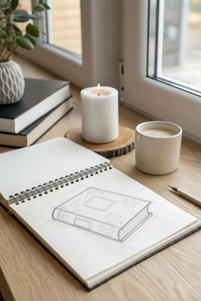
Capture the quiet charm of a reading nook with this simple yet elegant line drawing of two stacked books. This beginner-friendly sketch focuses on clean lines and minimal detailing to create a comforting vibe perfect for your journal or sketchbook.
Step-by-Step Guide
Materials
- Spiral-bound sketchbook or drawing paper
- Fine liner pen (black, 0.3mm or 0.5mm)
- HB Drawing pencil (optional for initial sketch)
- Soft hi-polymer eraser
- Ruler (optional, but helpful for crisp edges)
Step 1: Drafting the Bottom Book
-
Establish the base angle:
Start by drawing a long, diagonal line near the bottom center of your page. This line represents the spine edge of the bottom book. It should tilt slightly upward to the right to create a casual perspective. -
Form the spine:
Draw two parallel curved lines at either end of your baseline to create the rounded spine of the hardback book. Connect these curves with a top line that runs parallel to your first line. -
Add the cover thickness:
Extend lines upward from the corners of the spine to suggest the cover’s thickness. Draw the top cover shape as a skewed rectangle (parallelogram) extending back into space. -
Create the pages block:
Below the top cover line but above the bottom cover line, draw the block where the pages sit. Add a slight curve to the right side of this block to mimic how paper fans out naturally. -
Sketch the cover details:
Lightly sketch a decorative rectangle on the spine and some faint floral or abstract patterns on the front cover. Don’t worry about perfection here; loose scribbles often look more artistic.
Mastering Perspective
Keep parallel lines parallel! The top and bottom edges of the book covers should run in exactly the same direction to keep the book from looking warped.
Step 2: Stacking the Top Book
-
Position the second volume:
Place the top book slightly off-center on the bottom one. Start with the spine, angling it differently than the first book to show they are casually stacked. -
Draw the top book shape:
Similar to the first book, draw the rectangular form. Make this one slightly thinner, perhaps representing a paperback or a journal. Ensure the bottom edge of this book rests convincingly on the cover of the one below. -
Detail the pages:
Draw faint horizontal lines along the side and bottom edges of the book block to represent individual pages stacked together. -
Add the ribbon binding:
Sketch a thin ribbon wrapping around the width of the top book. Draw it crossing over the top cover. -
Create the bow:
At the center of the ribbon on top, draw a simple bow. Use two loops and two loose ends draping down. Keep the lines fluid to suggest soft fabric.
Step 3: Inking and Refining
-
Trace major outlines:
Take your fine liner pen and carefully go over the main structural lines of both books. Use confident, single strokes rather than feathery lines for a cleaner look. -
Emphasize the spines:
Add a second pass of ink or press slightly harder on the curved spines and the bottom edges of the books. This adds ‘line weight’ and grounds the objects so they feel heavy and real. -
texture the bottom spine:
On the bottom book’s spine, draw two vertical lines near the left edge to suggest the hinge indentation. -
Detail the cover art:
Switch to a lighter touch or a thinner pen if you have one. Stipple or scribble in the floral pattern on the bottom book’s cover. It should look faded and vintage. -
Enhance the page edges:
Draw very fine, closely spaced lines on the page blocks (the text block) of both books. Curve them slightly at the corners to follow the book’s form. -
Finalize the ribbon:
Ink the ribbon and bow. Make the center knot dark to show depth, and keep the loops airy. -
Clean up:
Once the ink is completely dry (I usually give it a full minute just to be safe), gently erase all pencil guidelines to reveal your crisp illustration.
Wobbly Lines?
If your straight lines are shaky, try drawing from your shoulder rather than your wrist. Or, embrace the wobble—it adds a lovely hand-sketched charm.
Enjoy the peaceful feeling of having created your own little literary still life
Simple Eye Icon (Not Hyper-Realistic)
This project features a bold, graphic interpretation of an eye that leans into symbolism rather than realism. Using simple lines and stippling techniques, you’ll create a striking, tattoo-style icon perfect for notebook covers or art cards.
Step-by-Step
Materials
- Cream or beige smooth cardstock
- Fine liner pen (size 0.3 or 0.5, black)
- Pencil (HB for sketching)
- Eraser
- Ruler (optional)
Step 1: The Basic Shapes
-
Outline the eye shape:
Start by sketching a gentle almond shape with your pencil. Make the top arch slightly more pronounced than the bottom curve, like a hill rising over a valley. -
Add the iris circle:
Draw a large perfect circle in the center of the eye shape. It shouldn’t touch the top or bottom eyelids; let it ‘float’ freely in the middle. -
Define the pupil:
Inside your iris circle, draw a much smaller circle right in the center for the pupil. -
Sketch the upper crease:
Draw an arched line above the top eyelid. This line should follow the same curve as the lid but stop slightly shorter on both ends. -
Add the needle accent:
Below the eye, sketch a long, narrow needle shape. Orient it horizontally but slightly angled, with the point facing left and the eye of the needle on the right.
Step 2: Inking the Lines
-
Trace the main outlines:
Switch to your black fine liner. Carefully go over your pencil lines for the main almond shape of the eye and the upper eyelid crease. Use confident strokes to keep the line smooth. -
Thicken the upper lash line:
Return to the top curve of the almond shape (the lash line). Draw a second line right next to it and fill in the gap to double its thickness, giving it visual weight. -
Inking the iris:
Trace the large outer circle of the iris. I like to keep this line fairly thin and crisp to contrast with the dark pupil coming next. -
Trace the needle:
Ink the outline of the needle below the eye. Don’t forget the tiny oval inside the needle’s head. -
Erase pencil guides:
Once the ink is completely dry—give it a full minute—gently erase all the underlying pencil marks to clear up your workspace.
Smooth Ink Tip
Pull the pen toward your body rather than pushing it away when drawing curves. This gives your hand more stability and keeps the arc smooth.
Step 3: Details & Texture
-
Stipple the pupil:
Instead of coloring the pupil solid black, use a stippling technique. Tap your pen repeatedly to create a dense cluster of dots until the center is nearly black, fading slightly at the very edges. -
Draw iris rays:
Draw short, straight lines radiating outward from the pupil, stopping about halfway to the edge of the iris circle. Keep them evenly spaced like the spokes of a wheel. -
Add inward rays:
Now draw similar small lines radiating inward from the outer edge of the iris roughly pointing toward the center, filling the gaps between the previous lines. -
Draw the upper lashes:
Add vertical lashes to the thickened top lid line. Start from the center and work outward, making them straight and uniform in length, like a comb. -
Add lower lashes:
Repeat the process on the lower lash line. Space these slightly further apart than the top ones to keep the design balanced. -
Extend the crease lashes:
On the floating upper crease line you drew earlier, add upward-pointing vertical lashes as well. This creates a stylized, double-layer effect. -
Detail the needle eye:
Add a tiny dot or small concentric circle inside the eye of the needle to mimic the hollow space where thread would go.
Ink Smearing?
If you are left-handed, place a scrap piece of paper under your hand as you draw to prevent dragging your palm through wet ink lines.
Your mystical eye illustration is now complete, offering a clean and modern aesthetic
Hands Made Easy With Gesture Shapes (Hearts and Peace Signs)

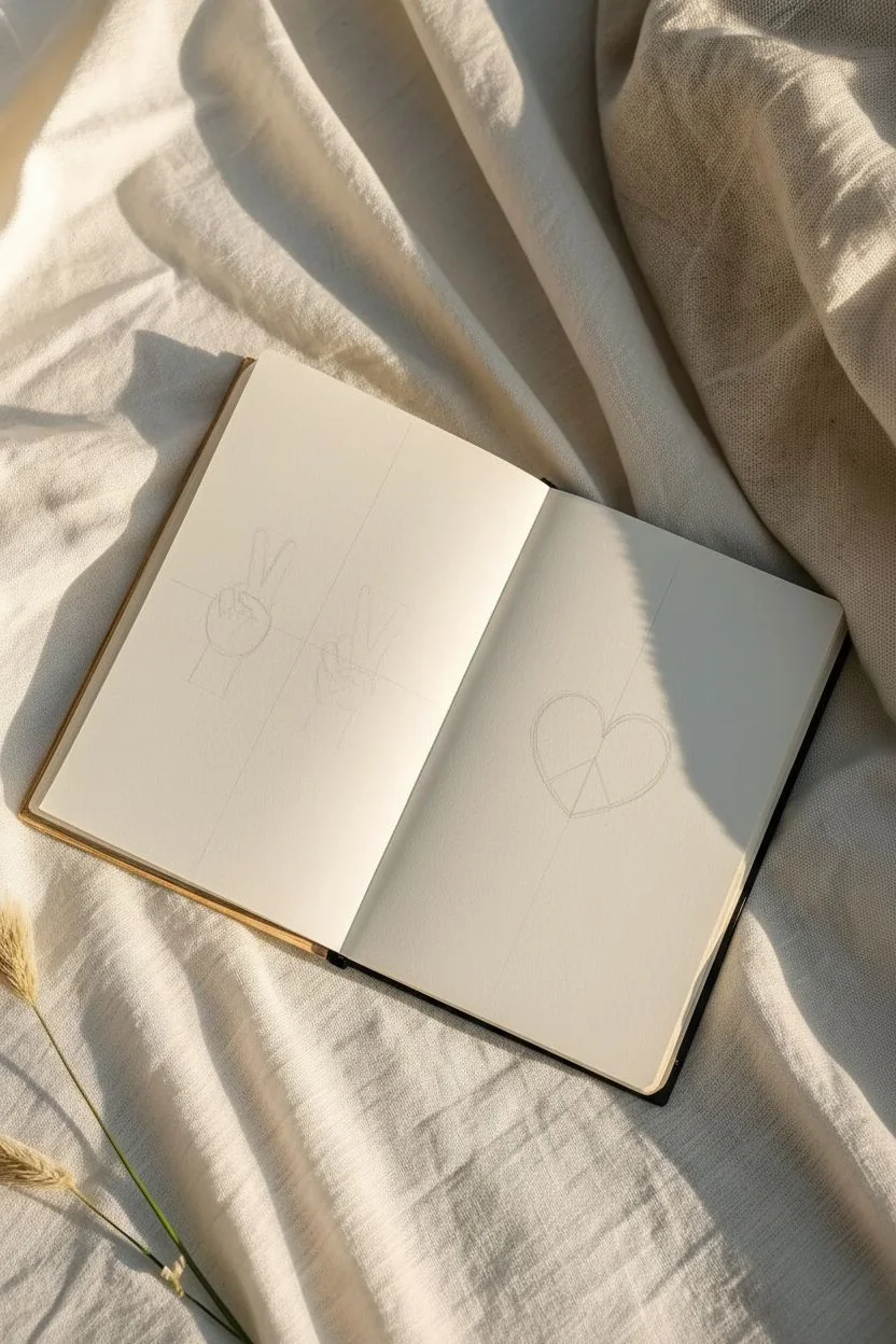
Capture a vibe of tranquility with these simple, minimalist line drawings featuring peace sign hand gestures and a symbolic heart. This project focuses on clean linework and mastering the basic shapes of hands without getting bogged down in hyper-realism.
Detailed Instructions
Materials
- Sketchbook (cream or off-white paper recommended)
- Fine liner pen (0.3mm or 0.5mm, black)
- Pencil (HB for initial sketching)
- Eraser (kneaded is best)
- Ruler (optional)
Step 1: Planning the Layout
-
Open your canvas:
Begin with your sketchbook open flat. If the pages won’t stay down, use a binder clip or hold them gently. -
Visualize the placement:
You will be drawing two hands on the left page and one large heart symbol on the right. Mentally divide the left page in half vertically to give each hand enough space.
Uneven Ink Lines?
If your lines end up looking shaky or uneven, don’t restart. Simply go over the line again slightly thicker to smooth out the wobble. This adds a bold, illustrative weight to the drawing.
Step 2: Drawing the First Hand (Left)
-
Sketch the palm base:
Using your pencil lightly, draw a rounded square or rectangle shape that tilts slightly to the left. This will serve as the main body of the hand. -
Add the curled fingers:
At the top of your square, draw two small, curved ovals tucked inward. These represent the ring and pinky fingers folded down into the palm. -
Draft the peace fingers:
Extend two long, slender oval shapes upward from the palm in a ‘V’ shape. Try to keep them equal in length for a balanced look. -
Position the thumb:
Draw the thumb crossing over the folded fingers. It should angle inward from the left side of the palm. -
Define the wrist:
Add two short vertical lines coming down from the base of the palm to indicate the wrist. -
Ink the outline:
Switch to your fine liner pen. Trace over your pencil lines confidently. I find it helpful to ink the overlapping fingers first (the thumb and curled fingers) before drawing the fingers behind them.
Add Color Accents
Use a light watercolor wash or colored pencil to fill inside the heart segments. A soft pastel pink or blue creates a nice contrast against the crisp black ink work.
Step 3: Drawing the Second Hand (Right)
-
Mirror the base shape:
To the right of your first drawing, sketch a similar palm shape, but this time angle it slightly to the right. -
Raise the index and middle fingers:
Just like before, draw the ‘V’ shape fingers extending upward. Pay attention to the negative space between them. -
Sketch the folded fingers:
Draw the ring and pinky fingers curled tightly into the palm. These might look like small knuckles overlapping the palm shape. -
Add the crossing thumb:
Sketch the thumb wrapping across the knuckles of the folded fingers. -
Add the stem:
For this second hand, instead of a wrist, draw a single line extending downward from the fingers, making it look like a flower stem or a sign holder. -
Finalize with ink:
Trace your second hand with the fine liner, keeping your lines smooth and continuous where possible.
Step 4: The Peace Heart
-
Draw the heart outline:
On the opposite page, sketch a large, symmetrical heart in the center. Make the top curves wide and the bottom point sharp. -
Add the vertical dividor:
Draw a straight vertical line from the center dip of the heart down to the bottom point. -
Create the peace symbol legs:
From the center vertical line (about halfway down), draw two diagonal lines extending outward to the bottom edges of the heart, forming an upside-down ‘Y’ shape. -
Ink the symbol:
Trace the heart and the internal peace symbol lines. Be deliberate; shaky lines are more visible on simple geometric shapes. -
Clean up:
Wait at least five minutes for the ink to dry completely, then gently erase all underlying pencil sketch marks to reveal the crisp black lines.
Close your sketchbook or leave it open on a desk to enjoy your minimalist reminder of peace
Sticker-Style Doodle Sheet (A Grid of Tiny Drawings)
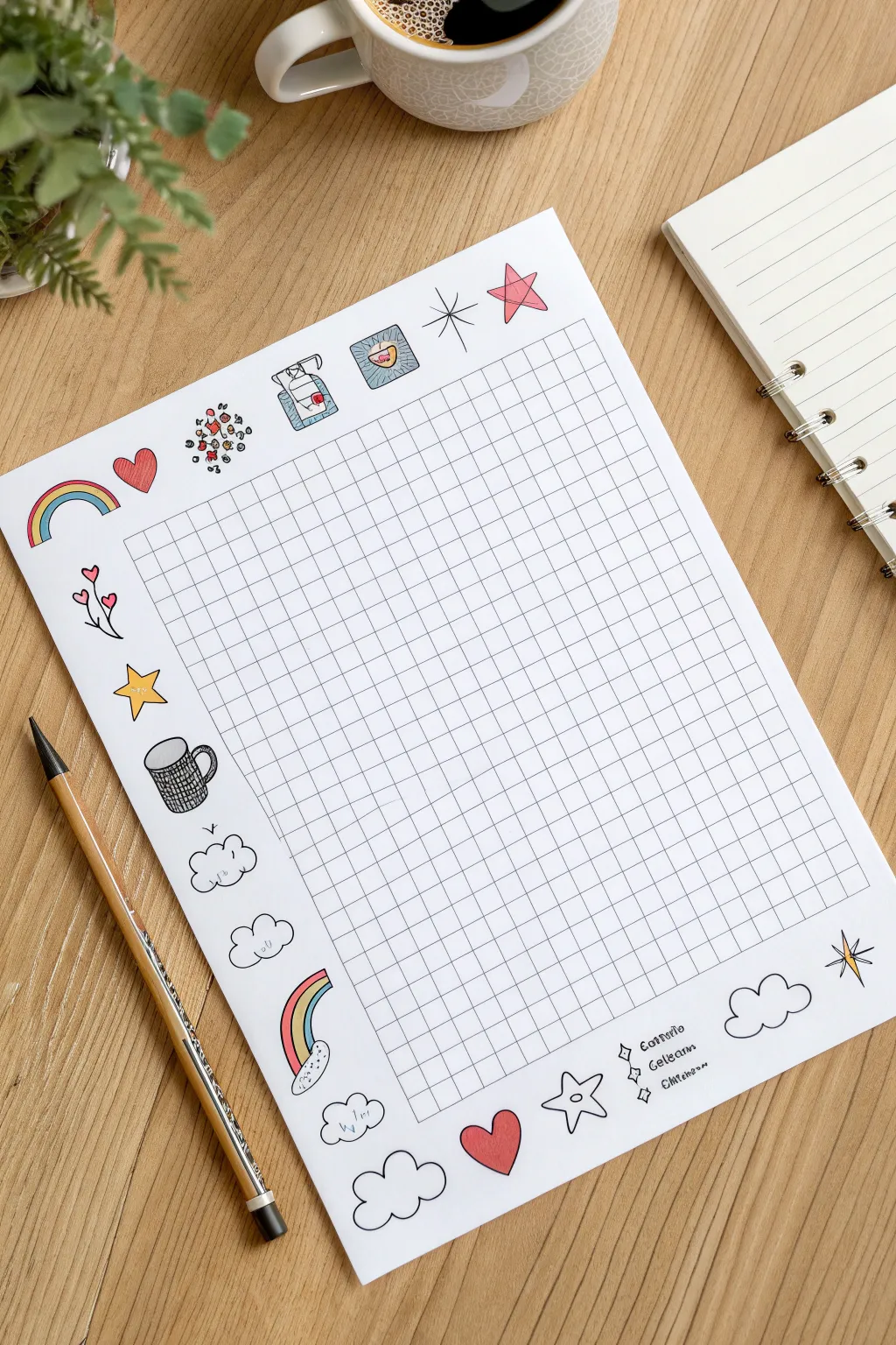
Transform a plain sheet of paper into a charming visual tracker or planner page framed by cheerful, sticker-style illustrations. This project combines geometric precision with loose, playful sketches like rainbows, clouds, and stars for a functional piece of art.
How-To Guide
Materials
- White cardstock or heavy drawing paper (A4 or Letter size)
- Ruler (clear grid ruler preferred)
- Pencil (HB or H)
- Fine liner pens (black, sizes 01 and 05)
- Colored pencils or alcohol markers (various bright colors)
- Eraser (kneaded eraser works best)
Step 1: Setting the Structure
-
Define the margins:
Begin by leaving a generous border of white space around the entire page. You’ll need about 1.5 to 2 inches of margin on the left, top, and bottom for your doodles later. -
Draft the grid perimeter:
Using your pencil and ruler, lightly draw a large rectangle in the center-right of the page. This will become your main tracking grid. Leave a slightly wider margin on the left side than the right to accommodate the larger doodle column. -
Mark grid intervals:
Along the top and left edges of your rectangle, create small tick marks every 0.5 centimeters (or roughly 1/4 inch). Ensure the marks are evenly spaced so your boxes will be square. -
Fill the grid:
Connect the corresponding tick marks across the rectangle using your ruler. Keep your pencil pressure very light, as you will ink over these lines later.
Grid Skipping?
If your ruler slips while drawing the grid, don’t erase the whole line. Turn the mistake into a ‘glitch’ effect or cover the error by drawing a small sticker-style doodle on top of it.
Step 2: Creating the Doodle Border
-
Sketch the top border:
In the white space above the grid, lightly pencil in a row of simple icons. Include a small rainbow arc on the far left, a heart, a cluster of confetti dots, a stylized sanitizer bottle or drink carton, and a star shape. -
Draft the left column drawings:
Moving down the wide left margin, sketch a vertical arrangement of doodles. Start with a flower branch (heart-shaped leaves), followed by a yellow star, and a textured coffee mug. -
Add floating clouds:
Below the mug, draw two fluffy cloud shapes. Vary their sizes slightly to keep the look organic and whimsical. -
Complete the bottom left corner:
Anchor the bottom left corner with a larger rainbow arc emerging from a cloud, followed by another pair of standalone clouds drifting toward the center. -
Fill the bottom border:
Underneath the grid, sketch a large heart, a stylized star, and a few more cloud shapes. On the far right, add a four-point sparkle star. -
Add text details (optional):
In the bottom right area, you can pencil in tiny checkboxes or category labels like ‘Coffee’, ‘Sleep’, or ‘Water’ next to small diamond bullets if you plan to use this as a habit tracker.
Step 3: Inking and Coloring
-
Ink the main grid:
Use a 01 fine liner to trace over your pencil grid lines. Keep your hand steady, but don’t worry if lines aren’t perfectly machine-straight; a little wobble adds character. -
Outline the doodles:
Switch to a slightly thicker 05 pen for the doodle outlines. This makes the cartoons pop against the finer grid lines. Be sure to close your shapes cleanly. -
Erase guidelines:
Once the ink is completely dry—I usually wait at least five minutes to avoid smudges—gently erase all underlying pencil sketches. -
Color the rainbows:
Use colored pencils or markers to fill in the rainbow bands. Stick to primary colors like yellow, blue, and red for a classic look. -
Adding warm accents:
Color the hearts and the star points with a soft red or pink. If you used a sanitizer or drink icon, add a touch of blue for the liquid. -
Shade the mug:
Add a cross-hatch pattern or a dark grey fill to the coffee mug doodle to give it contrast against the lighter elements. -
Final touches:
Add tiny details like sparkles around the stars or small dots inside the confetti cluster to finish the piece.
Make it a Monthly
Instead of random doodles, create a theme for the month! Try drawing spooky icons (bats, pumpkins) for October or snowflakes and mittens for a cozy January layout.
Now you have a personalized, hand-drawn utility sheet ready to help you track habits or organize your thoughts.
Circle-Frame Drawings (Tiny Worlds Inside a Boundary)
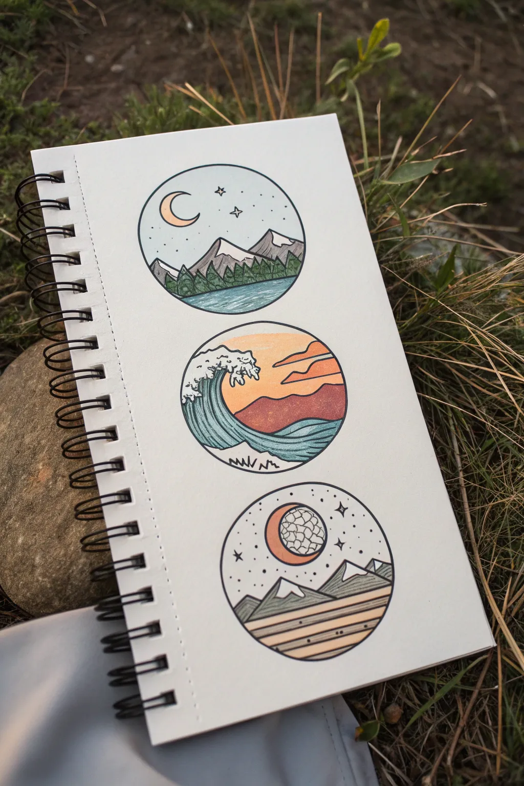
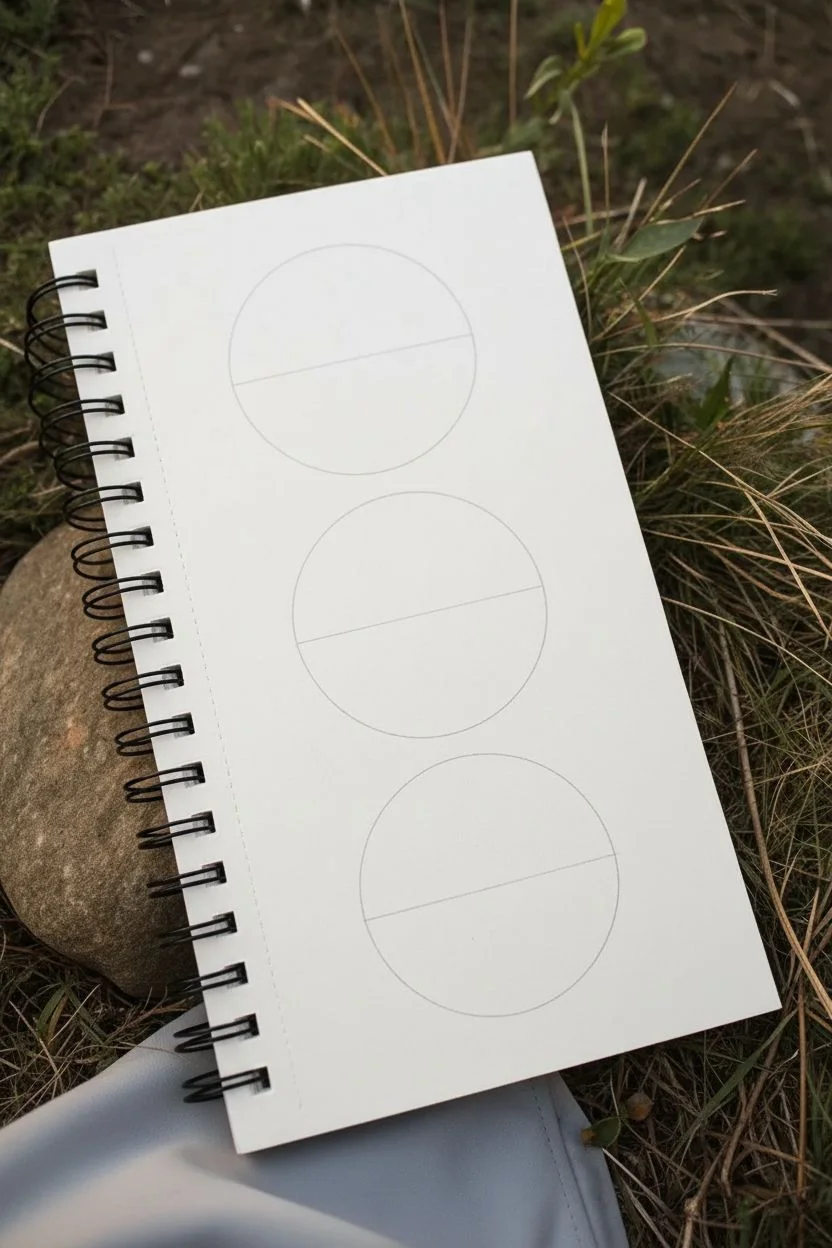
These charming circular vignettes act like portholes into serene landscapes, making them perfect for practicing composition without the pressure of filling a whole page. Using simple line work and muted colors, you’ll create a cohesive triptych featuring mountains, waves, and desert dunes captured in miniature.
Step-by-Step Guide
Materials
- Sketchbook or drawing paper (mixed media paper works best)
- Pencil and eraser
- Compass or a circular object to trace (approx. 2-3 inches diameter)
- Fine liner pens (0.3mm and 0.5mm)
- Colored pencils or alcohol markers (muted greens, blues, oranges, browns)
- Ruler
Step 1: Setting the Scene
-
Draw the frames:
Using a compass or a small circular object like a jar lid or roll of tape, trace three evenly spaced vertical circles on your page. Leave about an inch of space between each one to give them breathing room. -
Map the horizon lines:
Lightly sketch a horizontal line in each circle to establish the ground or water level. For the top circle, place it low (about 1/3 from the bottom). For the middle, place it roughly halfway up. Ideally, vary the heights to keep the stack interesting.
Wobbly Circles?
If your hand-traced circles aren’t perfect, thicken the outer line with a bolder pen (0.8mm). The variation in line weight disguises uneven edges beautifully.
Step 2: Top Circle: The Alpine Night
-
Sketch the peaks:
In the top circle, draw two or three jagged triangles for mountains. Add zig-zag lines near the peaks to define the snowcaps. -
Add the forest line:
Below the mountains but above your water line, draw a row of tiny, vertical jagged shapes to represent a dense pine forest. -
Celestial details:
Place a slender crescent moon in the upper left sky. Dot the remaining sky with tiny points and small four-pointed stars. -
Inking the top scene:
Go over your pencil lines with a fine liner. Use a slightly thicker pen for the circle’s border to contain the drawing. Add horizontal ripple lines in the water area.
Step 3: Middle Circle: The Sunset Wave
-
Draft the great wave:
Draw a large, curling wave shape on the left side that crests and crashes inward. Add foamy, bubbly textures on the tip of the wave. -
Background layers:
Behind the wave, sketch a rolling hill or mountain silhouette. Above that, draw two thin, horizontal cloud shapes drifting across the sun or sky. -
Texture details:
Add flowing lines following the curve of the water to show movement. At the very bottom of the circle, draw small zigzag grass blades. -
Ink the wave:
Trace your lines with ink. Be mindful to keep the white foam area clean and distinct from the water lines.
Level Up: Seasonal Themes
Try creating a set of four circles, each representing a different season: blooming flowers for spring, bright beach for summer, falling leaves for autumn, and a snowman for winter.
Step 4: Bottom Circle: The Patterned Desert
-
Geometric mountains:
This style is more abstract. Draw three sharp, triangular mountains. Instead of natural snowcaps, use straight lines to create geometric peaks. -
The striated ground:
Fill the lower section with horizontal bands. These represent layers of sand or sediment. Use a ruler if you want them perfectly straight, or hand-draw them for an organic feel. -
A unique moon:
Draw a large circle in the sky, partially eclipsed by a crescent shape. Inside the main moon circle, draw a crackled, stone-wall pattern. -
Final inking:
Ink the final circle. Add small stippling dots in the sky area to give it texture without overwhelming the moon.
Step 5: Bringing it to Life with Color
-
Color the skies:
Start with the lightest background colors. Use a very pale blue for the top circle’s sky and a warm gradient of yellow-to-orange for the middle circle’s sunset. -
Fill the landscapes:
Use muted, earthy tones. I find that desaturated greens work best for the trees in the top circle, contrasting nicely with the grey mountains. -
Deepen the contrast:
Use a darker rusty red or brown for the middle mountain to make the blue wave pop. For the bottom circle, alternate shades of tan and brown on the ground stripes. -
Final shading touches:
Add subtle shading to one side of the mountains (usually the right side) to suggest a light source and give the tiny worlds dimension.
Now you have a beautiful, pocket-sized art gallery right on your page
Pattern Play: Easy Repeating Lines, Dots, and Swirls
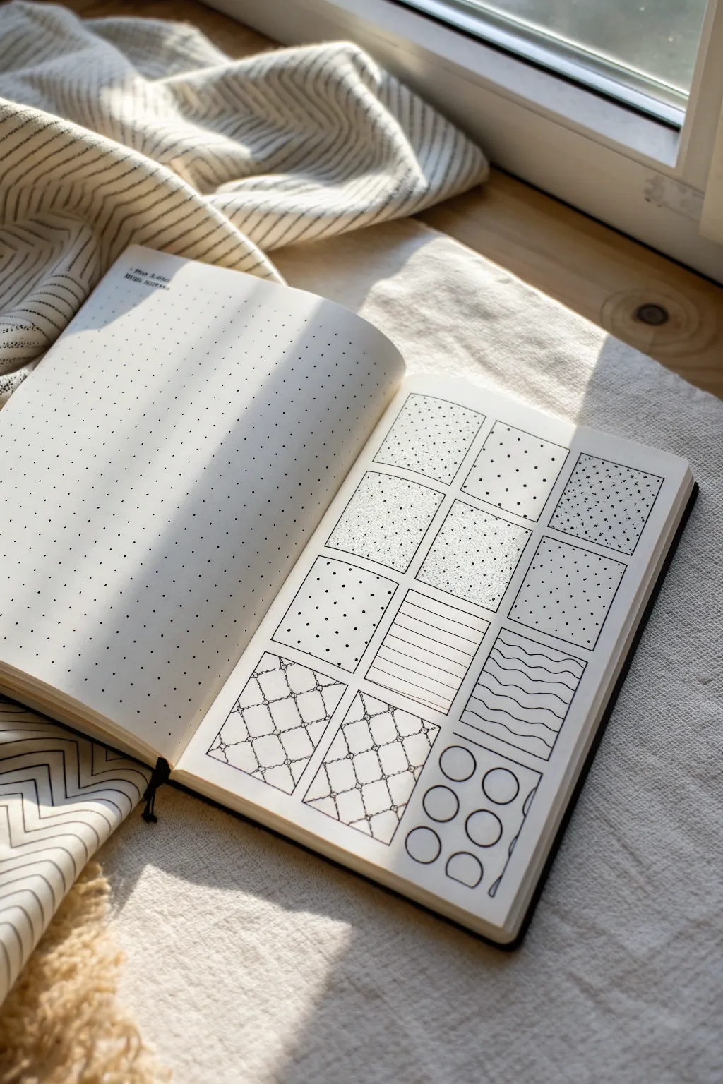
Transform a blank page into a library of textures with this grid-based pattern exercise. By breaking the page down into manageable squares, you can explore various line weights, dots, and geometric repeats without the pressure of a full composition.
How-To Guide
Materials
- A5 dotted grid notebook or sketchbook
- Fine liner pen (black, 0.3mm or 0.5mm)
- Pencil (HB)
- Ruler
- Eraser
Step 1: Setting Up the Grid
-
Define the outer boundary:
Begin by drawing a large rectangle on your page to serve as the main frame. Leave a comfortable margin of whitespace around the edges so the page doesn’t feel cramped. -
Divide into columns:
Measure the width of your main rectangle and divide it into three equal vertical columns. Use light pencil marks first to ensure spacing is even before committing with ink. -
Divide into rows:
Measure the height and divide the rectangle horizontally into four equal rows. This will give you a total of 12 small squares to fill. -
Ink the grid:
Trace over your pencil grid lines with your fine liner pen. Use a ruler to keep the lines crisp and professional, then erase the graphite marks once the ink is completely dry.
Grid Notebook Hack
Don’t measure if you don’t have to. Use the pre-printed dots in your notebook to count out equal squares (e.g., 8 dots by 8 dots) for instant symmetry.
Step 2: Row 1: Stippling & Dots
-
Square 1: Density gradient:
In the top-left square, practice stippling. Place dots densely at the bottom right corner and spread them out as you move toward the top left to create a fading effect. -
Square 2: Random scatter:
Fill the second square with evenly spaced, somewhat sparse dots. Try to avoid creating accidental lines or patterns; keep the placement random. -
Square 3: Confetti mix:
For the top-right block, combine small dots with tiny ‘x’ marks or small plus signs. This creates a festive, confetti-like texture distinct from plain stippling.
Shaky Lines?
If your straight lines wobble, breathe out steadily while drawing the stroke. Use your shoulder to move the pen, not just your wrist.
Step 3: Row 2: Texture & Uniformity
-
Square 4: Sand texture:
Return to the left column. Fill this box with incredibly tiny, almost microscopic dots. This requires patience but produces a soft, sandy texture perfect for shading. -
Square 5: Dense noise:
Similar to the previous square, but apply slightly more pressure and randomness. The goal here is a ‘static’ or ‘noise’ effect rather than a gradient. -
Square 6: Wide spacing:
In the right column, place dots in a deliberate, widely spaced grid pattern. I find using the underlying notebook dots as a guide helps keep this perfectly symmetrical.
Step 4: Row 3: Linear Patterns
-
Square 7: Large polka dots:
In the first square of the third row, draw medium-sized, filled-in circles. Arrange them in a loose, staggered formation rather than a strict grid. -
Square 8: Horizontal stripes:
Use your ruler to draw straight horizontal lines across the middle square. Vary the spacing slightly or keep them uniform depending on the look you want. -
Square 9: Wavy lines:
Draw organic, horizontal waves in the right square. Try to keep the ‘frequency’ of the waves consistent so they stack neatly like layers of lasagna.
Step 5: Row 4: Complex Geometrics
-
Square 10 & 11: Trellis pattern:
For the bottom left and bottom middle squares, draw a diamond grid (diagonal lattice). Where the lines intersect, draw tiny circles or knots to create a trellis or quilted effect. -
Square 12: Big bubbles:
In the final bottom-right square, draw large, open circles. Let some of them ‘fall off’ the edge of the box to suggest the pattern continues beyond the frame.
Now you have a reference sheet of textures to consult whenever you need to fill a space in your drawings
Mix-and-Match Doodles (Combine Two Simple Objects)
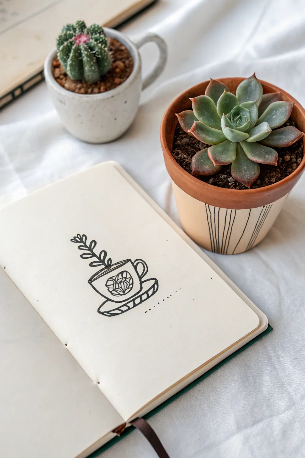
This charming sketch combines the coziness of a warm beverage with the freshness of nature by depicting a leafy vine sprouting from a classic teacup. Using clean, bold lines and simple patterns, you’ll create a delightful illustration that turns an everyday object into a miniature planter.
How-To Guide
Materials
- Sketchbook or drawing paper (light cream or white)
- Black drawing pen (fine tip) or felt-tip marker
- Pencil (optional for initial sketching)
- Eraser
Step 1: The Cup and Saucer
-
Draw the cup rim:
Start by drawing a flattened oval shape near the center of your page to form the opening of the teacup. Keep the lines smooth and continuous. -
Form the cup body:
From the sides of your oval, draw two curved lines extending downward, tapering slightly inward. Connect them at the bottom with a gentle curve that mirrors the bottom edge of the rim oval. -
Add the handle:
On the right side of the cup body, draw a small C-shape for the handle, adding a second smaller C-shape inside it to give the handle some thickness. -
Sketch the saucer:
Draw a larger, wider oval shape underneath the cup. Since the cup is sitting in it, you won’t see the back line of the saucer, so just draw a curved line extending from the bottom left of the cup, looping around to the bottom right. -
Give the saucer depth:
Underneath the saucer line you just drew, add a second parallel curved line a few millimeters below it. Connect the ends to create a thick rim. -
Add stripes:
Fill the thickness of the saucer rim with short, diagonal hash marks. This simple detail adds immediate texture and interest to the base.
Keep it Clean
If you’re nervous about making mistakes with ink, sketch the entire design lightly in pencil first. Once inked, wait at least five minutes before erasing your guides to prevent smearing.
Step 2: Botanical Details
-
Draw the vine stem:
Starting from the inside of the cup rim, draw a slightly curved line extending upward and leaning toward the left. This will serve as the main stem of your plant. -
Add leaves:
Along the stem, draw pairs of small, oval-shaped leaves. Keep them simple—just outline the shapes without worrying about veins. Start with larger leaves near the base and make them slightly smaller as you reach the tip. -
Create a decorative circle:
On the front of the cup body, draw a circle. It doesn’t need to be perfect; a loose hand-drawn quality adds to the charm. -
Draw the flower center:
Inside the circle, draw a small U-shape or a tiny dome to start the flower bud. -
Petal layers:
Add curved lines arching over your center bud, layering them like roof shingles or fish scales to create the look of a blooming rose or peony. -
Finishing touches:
Finally, draw a dotted line extending from the bottom right of the saucer for a stylistic accent, suggesting a surface or just adding a bit of movement to the composition.
Make it Yours
Try filling the cup with different “toppings.” Instead of a vine, draw a cluster of succulents, a tall cactus, or even wild mushrooms sprouting out.
Enjoy your lovely little fusion of flora and ceramics
Tiny Character Doodles Built From Ovals and Circles
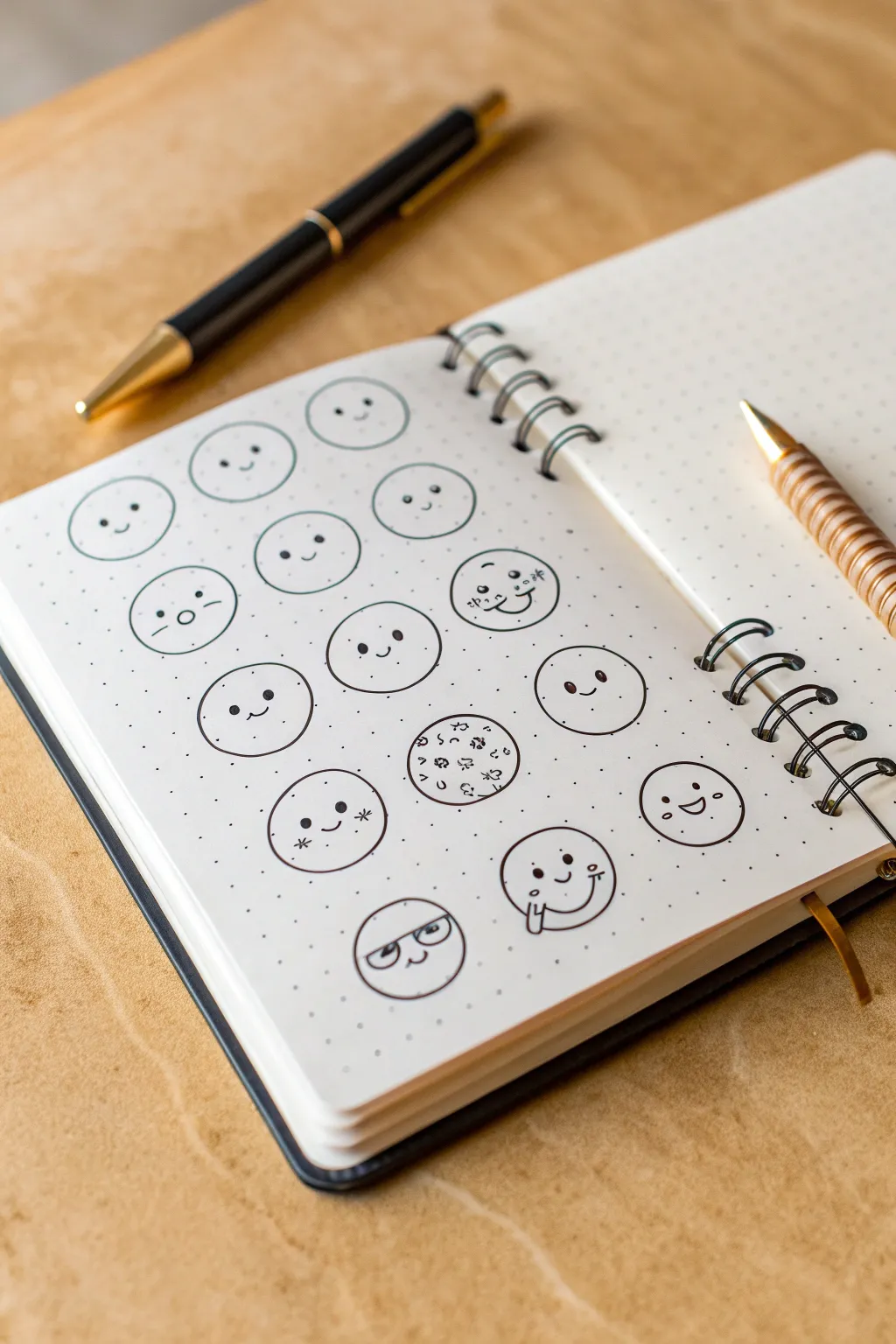
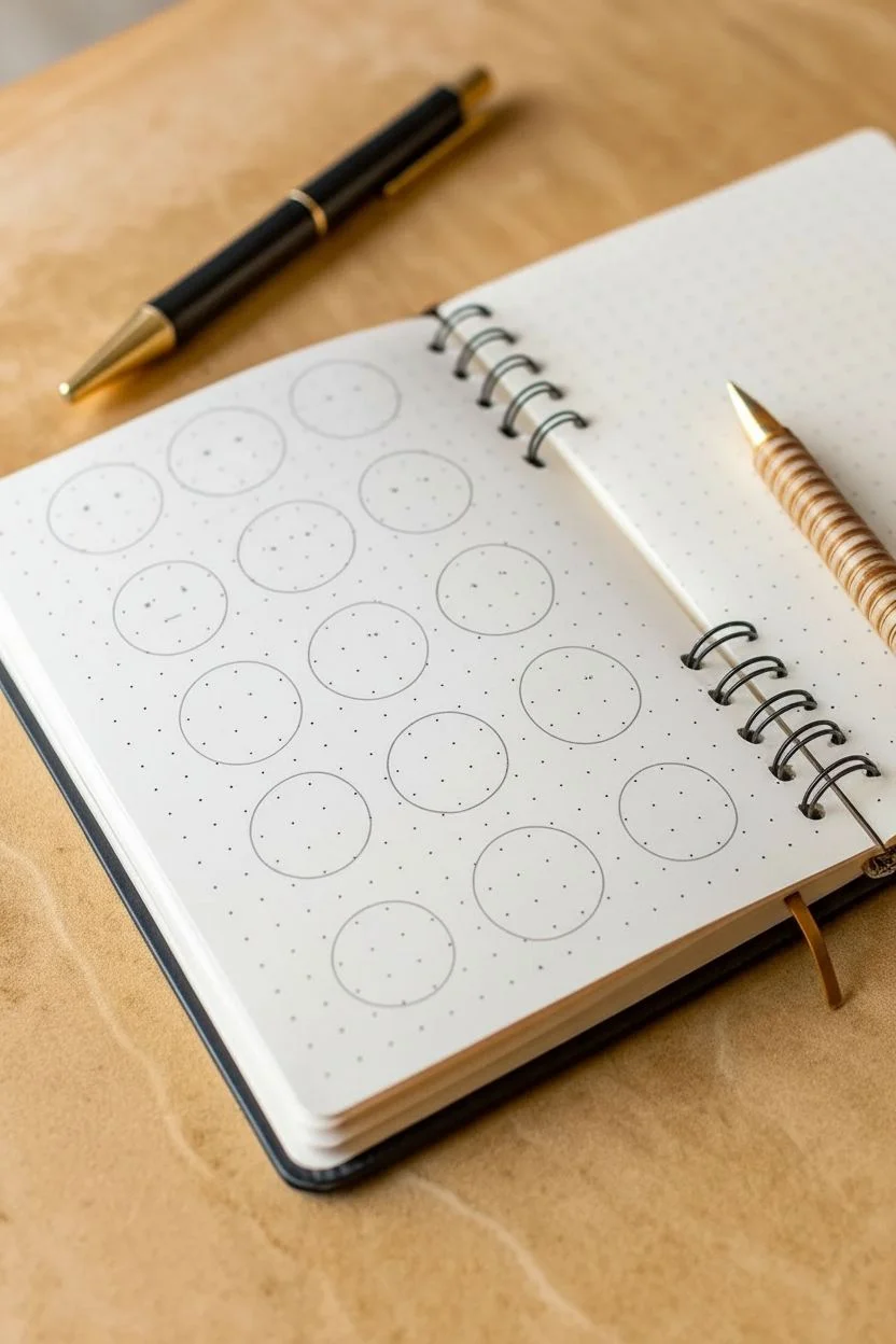
Transform a plain page into a character study with this grid of wonderfully expressive, minimal faces. This simple drawing exercise is perfect for filling a bullet journal spread or just practicing how tiny line variations can change an entire expression.
Detailed Instructions
Materials
- Dotted or grid notebook (A5 size recommended)
- Fine liner pen (Black, 0.3mm or 0.5mm)
- Circle stencil (optional but helpful)
- Pencil (HB or lighter)
- Eraser
Step 1: Setting the Stage
-
Map out the grid:
Begin by counting the dots in your notebook to space out your circles evenly. You want to aim for a grid of 4 columns and 4 rows (16 faces total). Leave about two or three empty dot spaces between each intended circle center to keep things uncluttered. -
Draft the circles:
Using a pencil, lightly sketch 16 circles. If you have a stencil or a small circular object (like a bottle cap), trace it to keep them uniform. If freehanding, don’t worry about perfection; slightly wobbly circles add organic charm. Each circle should be roughly 1 inch in diameter. -
Refine the outlines:
Once you are happy with the spacing, go over your pencil circles with your black fine liner. Use a steady, continuous motion for the cleanest line. Let the ink set for a moment, then erase the graphite guidelines underneath.
Ink Smudge Alert
Use a piece of scrap paper under your writing hand to prevent oils or sweat from smudging the ink while you draw the lower rows.
Step 2: Adding Personality
-
The standard smiles:
Start with the top two rows. Draw simple dots for eyes, placing them wide apart for a ‘cute’ aesthetic. Add tiny, U-shaped mouths between them. Vary the height of the mouth or the size of the eye dots slighty to make each one unique. -
Creating the shy face:
For the face in the second row, second column, change the mouth to a small, flat line. Add two tiny diagonal dashboards under the eyes to represent blushing cheeks. -
The confused doodle:
Moving to the second row, first circle: draw a straight horizontal line for the mouth. Instead of dots, draw small vertical dashes for eyes and add a tiny diagonal line above the left eye to suggest a raised eyebrow. -
The winking face:
On the third row, create a winking character. Draw one eye as a standard dot and the other as a sideways ‘V’ shape (pointing left). Pair this with a standard happy smile. -
The sleeping or content face:
In the fourth row, draw two wide, downward-curving arcs for closed eyes. Add a cheerful smile underneath for a serene, happy expression.
Style Variation
Try changing the eye shapes to small vertical dashes or hollow circles to dramatically change the ‘species’ of your doodle characters.
Step 3: Getting Experimental
-
The ‘cookie’ doodle:
In the central area (third row, second column), skip the face entirely. Instead, fill the circle with tiny, random scribbles and dots to make it look like a chocolate chip cookie. This breaks up the pattern playfully. -
The starry-eyed look:
For the face to the left of the cookie, draw standard eyes and a smile, but add small asterisks (*) on the cheeks. This gives the character a festive or magical look. -
The cheeky tongue:
In the bottom right corner, draw the eyes wide apart. For the mouth, draw a ‘U’ shape, but add a small line sticking out sideways to represent a tongue poking out. -
The glasses character:
On the bottom row, draw a horizontal line across the upper third of the circle. Draw two semi-circles hanging off this line to form glasses frames. Place dot eyes inside the frames and a small smile below. -
Final touches:
Scan your grid for any empty circles. Fill the remaining spots with variations: try moving the eyes higher up, adding eyebrows, or tilting the mouth to the side. Wait for all ink to be completely dry before doing a final pass with your eraser to remove any lingering pencil marks.
You now have a charming reference sheet of expressions to use in your future journaling


Have a question or want to share your own experience? I'd love to hear from you in the comments below!