If you’ve been craving fresh abstract drawing ideas, you’re in the right headspace—this is where lines, shapes, and happy accidents get to run the show. I pulled together my go-to prompts that feel approachable in a sketchbook, but still look bold enough to pin and share.
Contour Line Topography Shapes
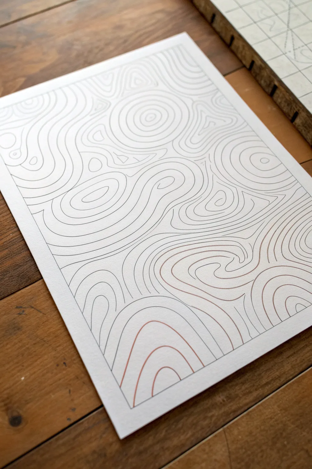
Capture the organic beauty of hills and valleys with this contour line drawing exercise. By simply echoing and expanding shapes across the page, you’ll create a mesmerizing, abstract landscape that ripples with movement.
Detailed Instructions
Materials
- High-quality white drawing paper (cardstock or bristol board works well)
- Fine-point black drawing pen (0.3mm or 0.5mm)
- Fine-point reddish-brown or sepia drawing pen
- Pencil (HB or H for light sketching)
- Soft eraser
- Ruler (optional for framing)
- Flat, smooth surface
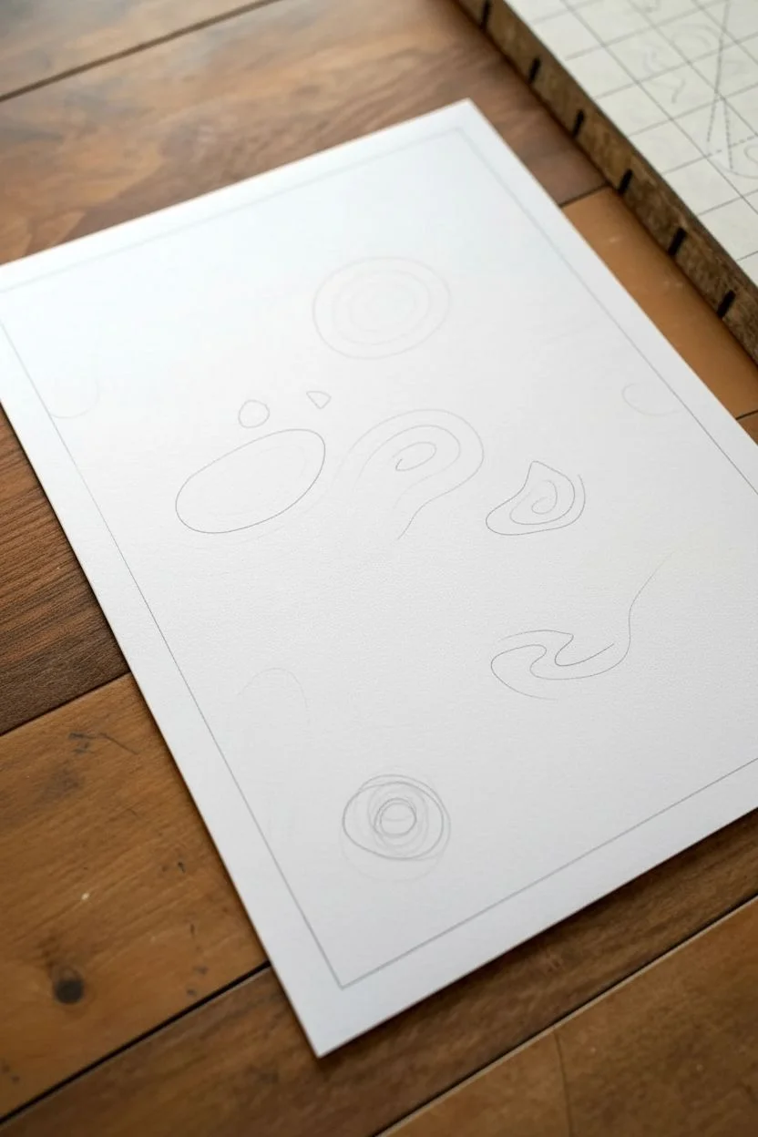
Step 1: Planning the Flow
-
Define boundaries:
Start by drawing a rectangular frame on your paper using a pencil and ruler. This contains your composition and gives it a finished, professional look right from the start. -
Plant the seeds:
Lightly sketch five to seven random, organic shapes scattered across your frame using your pencil. Think of these as the ‘peaks’ of your topographic map—circles, bean shapes, or irregular blobs work perfectly. -
Vary sizes:
Ensure variety by making some of your starting shapes small and tight, while others can be larger and more sprawling. This creates visual interest and different focal points.
Step 2: Drawing the Contours
-
Start the first peak:
Pick up your black fine-point pen. Choose one of your pencil seed shapes and draw over the outline carefully. -
Begin the ripple:
Draw a larger shape surrounding your first one, maintaining a relatively consistent gap between the lines. It doesn’t need to be perfectly parallel; slight wobbles add to the natural feel. -
Expand outward:
Continue drawing concentric rings around that center shape. As you move further out, let the lines relax and stretch, becoming less circular and more like flowing waves. -
Switch to a second peak:
Move to a different ‘seed’ shape elsewhere on the paper. Repeat the process of drawing the center and expanding outward with rings. -
Collision course:
Eventually, the expanding ripples from two different peaks will meet. When this happens, stop the lines so they don’t cross. Instead, let them run alongside each other like two rivers merging. -
Fill the voids:
Look for triangular gaps or empty spaces formed between three or more converging ripple systems. Fill these areas with smaller, nested shapes that contour to the boundaries of the surrounding waves.
Wobbly Lines?
Don’t stress if lines touch or wiggle! Use ‘line weighting’ to fix it: simply thicken the line slightly at the mistake point to make it look intentional.
Step 3: Adding Depth and Detail
-
Introduce color:
Switch to your reddish-brown or sepia pen. Select specific sections or ‘mountains’ to highlight with this color. I like to use this for the lower-right section or specific swirls to create warmth and contrast. -
Integrate the color:
Draw the contour lines in these sections just as you did before, ensuring the spacing matches the black lines so the texture feels consistent across the whole piece. -
Connect the flows:
Use sweeping lines that wrap around multiple peak groups to tie the composition together. These long lines act like valleys connecting the individual hills. -
Watch your spacing:
Keep an eye on the density of your lines. If they get too close, the drawing will look dark and heavy; too far apart, and you lose the topographic effect. Aim for a consistent ‘breathing room’ between lines. -
Refine edges:
When your lines reach the pencil border you drew in the beginning, stop abruptly. This creates a crisp, invisible edge that frames the artwork without needing a heavy outline. -
Check for gaps:
Scan the drawing for any awkward white spaces. Add a few extra lines or a tiny new ‘peak’ system to fill these areas if the composition feels unbalanced. -
Erase guidelines:
Once the ink is completely dry—give it a few minutes to be safe—gently erase your original pencil seed shapes and the border frame.
Level Up: Gradient Map
Use a gradient of pen colors (dark blue to light blue) for each ring to create a 3D depth effect, making the ‘peaks’ appear taller visually.
Now you have a stunning piece of abstract topography ready to be framed or used as a unique card pattern


Warped Grid Illusion
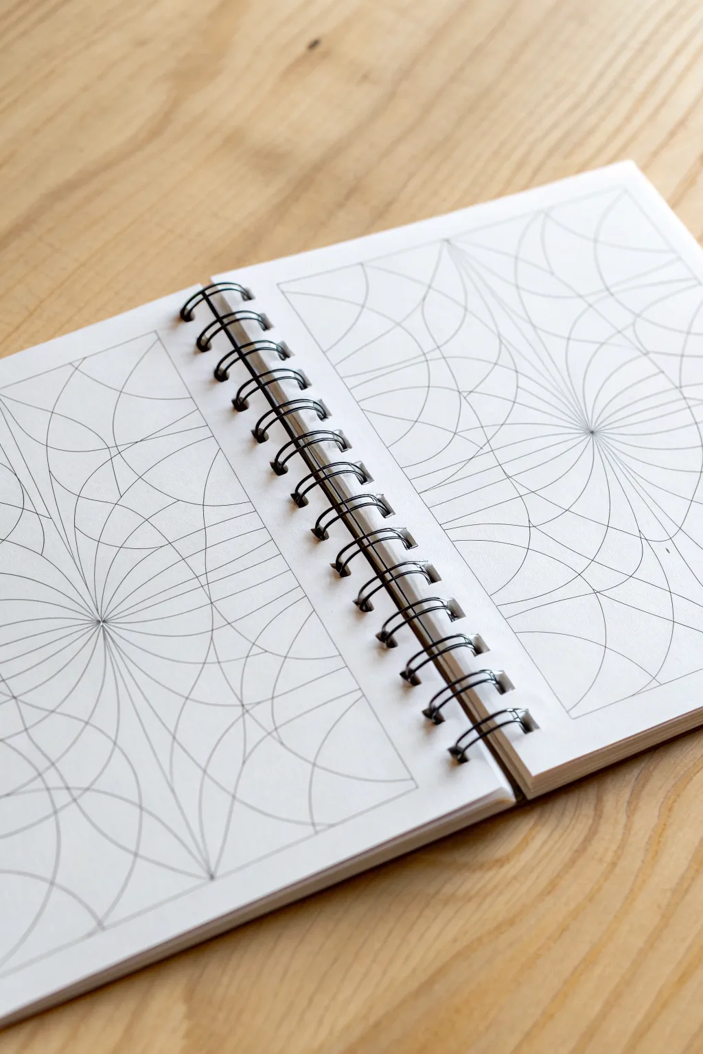
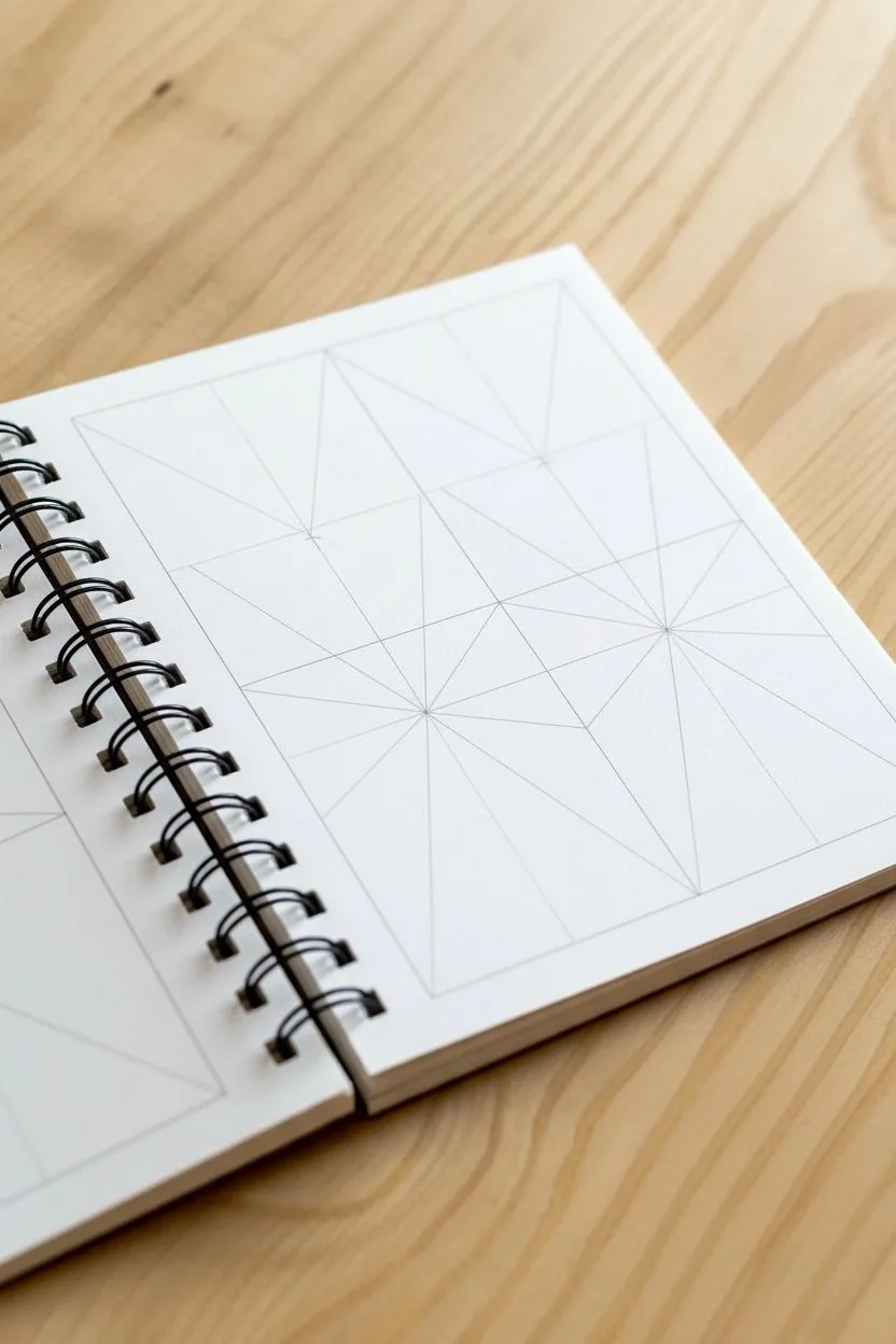
This mesmerizing exercise transforms simple curved lines into a complex, fluid structure that seems to ripple across the page. By establishing just a few focal points and connecting them with rhythmic arcs, you’ll build a drawing that feels like a topographic map or a warped spiderweb.
Step-by-Step Tutorial
Materials
- Spiral-bound sketchbook or drawing paper
- HB or 2H pencil (for light initial lines)
- Fine-tip black drawing pen (0.3mm or 0.5mm)
- Ruler or straightedge
- Compass (optional, but helpful for initial spacing)
- Eraser
Step 1: Setting the Framework
-
Define the boundaries:
Start by drawing a rectangular frame on your paper. This containment is crucial because it gives the curves something to anchor against, enhancing the illusion of movement within a fixed space. -
Place focal points:
Lightly mark two or three distinct focal points within your frame. These don’t need to be centered; usually, placing them slightly off-center creates a more dynamic composition. -
Draw the primary axes:
Using a ruler, draw a vertical and horizontal line intersecting through each of your focal points, extending all the way to the frame borders. This divides the space into quadrants around each center. -
Add diagonal guides:
Now, draw diagonal lines through those same center points, creating an ‘asterisk’ or starburst shape at each focal location. These straight lines will act as the skeleton for your curves.
Oops! Lines Crossed?
If curves accidentally overlap or cross messy, thicken the lines slightly at the intersection to create a bold, purposeful junction point rather than a mistake.
Step 2: Weaving the Curves
-
Start the first arc:
Choose one section between two straight guide lines. Starting near the center point, draw a gentle arc connecting one guide line to the next. It should look like a small slice of a spiderweb. -
Expand the ripple:
Continue drawing concentric arcs moving outward from the center in that same section. Keep the spacing relatively consistent, but don’t worry about perfection; slight variations add character. -
Complete the first focal point:
Repeat this arcing process in all the pie-slice sections surrounding your first focal point. You will see a flower-like or spiderweb pattern emerging. -
Handle the intersections:
This is the crucial part: As your arcs expand outward, they will eventually collide with the arcs coming from your second focal point. When lines meet, allow them to merge or stop abruptly against the neighboring pattern. -
Creating the ridge:
Visualize an invisible line directly between the two focal points. As you draw the outer curves, make them increasingly shallow as they approach this middle zone, creating a visual ‘ridge’ where the two patterns press against each other.
Step 3: Refining and Inking
-
Check density:
Step back and look at your pencil sketch. Are there areas that look too empty? Add intermediate curves between your existing lines to increase the density and the intensity of the warp effect. -
Begin inking:
Once satisfied with the pencil layout, switch to your fine-tip pen. Start tracing the curves carefully. I find it easiest to rotate the sketchbook frequently so my hand is always pulling the pen in a natural, comfortable arc. -
Maintain line weight:
Keep your pressure consistent. The beauty of this piece relies on the uniformity of the line weight to confuse the eye. -
Ink the frame:
Trace the outer rectangular border with a steady hand or ruler to seal the composition. -
Erase pencil marks:
Wait at least 5-10 minutes for the ink to dry completely to avoid smudging. Then, gently erase all underlying pencil guides, leaving only the crisp ink design.
Add Depth
Shade essentially every other ’tile’ created by the grid (checkerboard style) or add gradient shading near the center points to make the tunnel effect pop.
Now you have a striking optical illusion that turns a flat sheet of paper into a twisting landscape


3D Tunnel Line Drawing
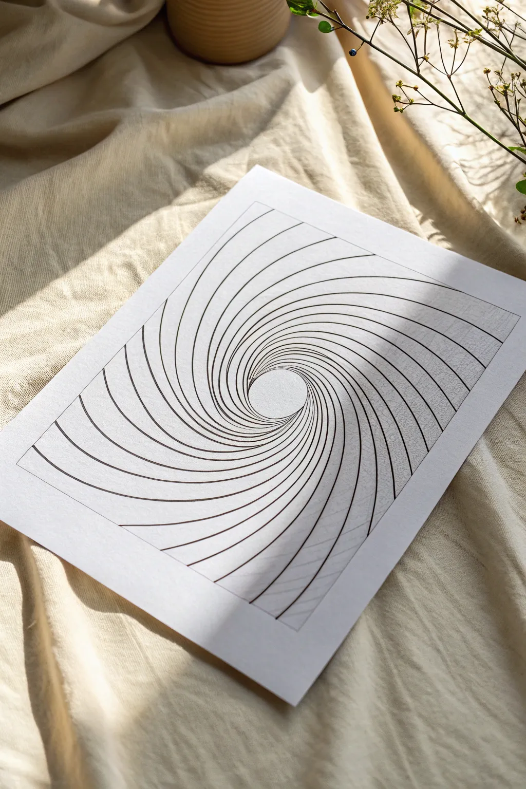
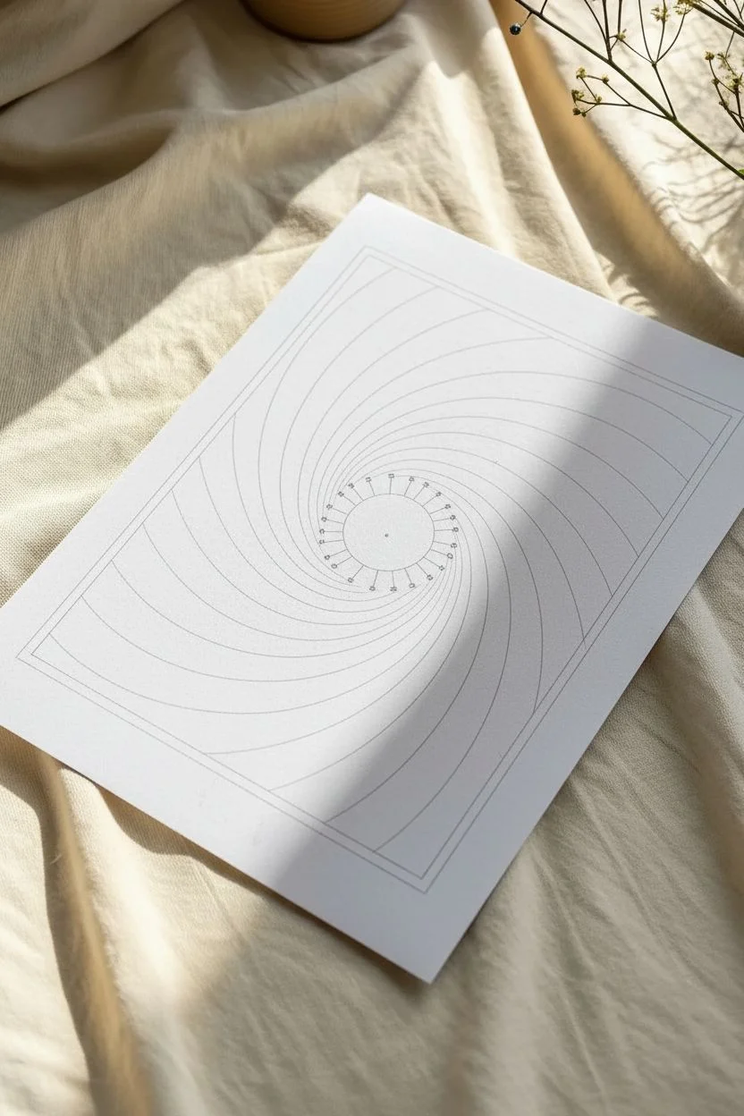
Create a mesmerizing optical illusion that pulls the viewer into a deep, twisting tunnel using nothing but simple curved lines. This minimalist black-and-white drawing relies on precise spacing and curves to generate a striking 3D effect on flat paper.
Step-by-Step
Materials
- High-quality white drawing paper (heavyweight or cardstock)
- Pencil (HB or H)
- Fine liner pen (black, 0.5mm or 0.8mm)
- Ruler
- Compass (optional but helpful)
- Eraser
Step 1: Setting the Structure
-
Create the border:
Start by lightly drawing a large rectangle in the center of your paper using your pencil and ruler. This will be the frame for your tunnel. -
Mark the center point:
Identify a focal point for your tunnel. For this specific look, place a small dot slightly below and to the right of the true center of your rectangle. -
Draw the central void:
Using your compass or freehanding carefully, draw a small circle around your focal point, about 1-1.5 inches in diameter. This circle will remain empty to create the ‘bottom’ of the tunnel. -
Divide the circle:
Lightly mark small, evenly spaced tick marks along the edge of that inner circle. Aim for about 24 to 30 marks total to ensure the tunnel walls look dense enough.
Wobbly Lines?
Don’t stress over minor jitters. In optical art, the sheer number of lines often hides individual imperfections. Just keep going with the flow.
Step 2: Drawing the Tunnel Walls
-
Start the first curve:
Place your pencil on one of the tick marks on the inner circle. Draw a smooth, arching line that curves outward and hits the rectangular border. The curve should look like a bent spoke of a wheel. -
Establish the pattern:
Move to the next tick mark on the circle. draw another curved line that follows the same trajectory as the first one, flaring out to the border. I usually rotate the paper as I go to keep my hand angle consistent. -
Continue the rotation:
Work your way around the entire circle, drawing one curved line from each tick mark designated earlier. Extend every line until it terminates at the rectangular border. -
Check density:
Review your pencil sketch. The lines should be very close together near the center circle and spread wider apart as they reach the outer frame.
Step 3: Inking and Refining
-
Trace the center:
Take your fine liner black pen. Carefully trace the small inner circle first to establish a clean edge for the void. -
Ink the curves:
Begin tracing the radiating curved lines. Use confident, steady strokes. If your hand shakes, try ghosting the motion in the air before touching the paper. -
Define the border:
Once all the internal curves are inked, use your ruler and pen to crisply trace the outer rectangular border, cutting off the ends of the curved lines cleanly. -
Let the ink set:
Allow the ink to dry completely for several minutes to prevent smudging during the next step. -
Erase guidelines:
Gently erase all underlying pencil marks, leaving only the stark black ink lines remaining. -
Add line weight (optional):
To enhance depth, you can go back and slightly thicken the lines near the outer edges of the rectangle, leaving them thinner near the center, though uniform thickness works beautifully too.
Pro Tip: Depth Boost
Make the curves tighter (more bent) to make the tunnel look deeper. Straighter lines will make the tunnel appear shallow.
Step back and overlook your drawing to see the tunnel effect fully emerge from the page

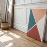
Bold Geometric Shape Stacking
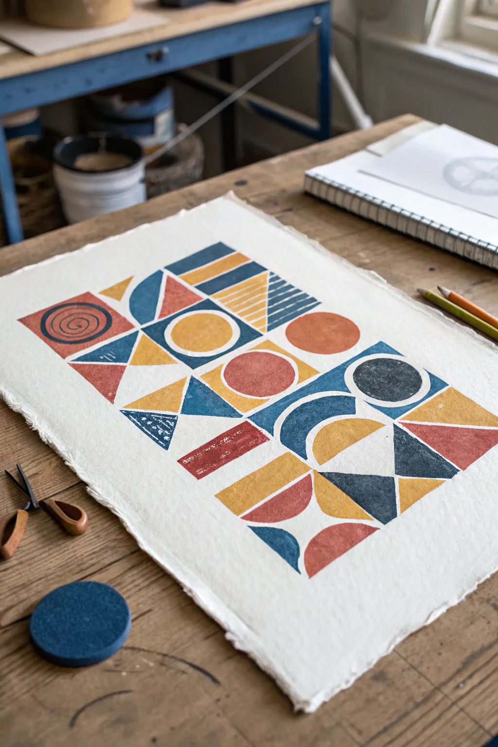
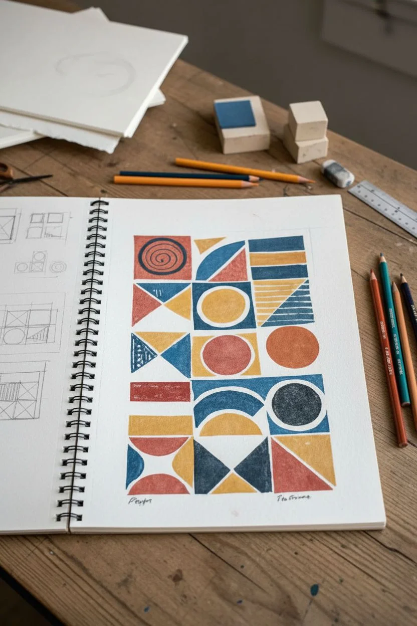
Embrace the beauty of bold forms and texture with this stunning geometric block print project. Using a warm, retro-inspired color palette and simple shapes, you’ll create a striking grid composition that feels both modern and handmade.
Step-by-Step Tutorial
Materials
- Soft-cut lino block or Speedy-Carve rubber block
- Lino cutting tools (V-gouge and U-gouge)
- Block printing ink (Terracotta, Mustard Yellow, Teal, Navy Blue)
- Brayer (rubber roller)
- Glass or acrylic sheet for rolling ink
- Heavyweight printmaking paper (deckle edge recommended)
- Pencil and sketchbook
- Ruler
- Baren or clean wooden spoon for burnishing
Step 1: Designing the Grid
-
Sketch layouts:
Begin by sketching a 4×4 or 3×5 grid in your notebook to plan your composition. Experiment with stacking shapes like half-circles, triangles, and rectangles within each imaginary square. -
Balance the shapes:
Aim for a mix of solid shapes and shapes with negative space. Notice how the example balances heavy circles with lighter triangles and striped textures. -
Plan your palette:
Decide which shapes will be which color. Distribute your terracotta, mustard, and blues evenly across the layout so no single color dominates one section.
Step 2: Carving the Stamps
-
Transfer shapes to lino:
Draw your individual geometric components onto the soft-cut lino block. You don’t need to carve the whole design as one big plate; individual stamps for each shape are more versatile. -
Carve the outlines:
Use a fine V-gouge to carefully carve the outline of your first shape, cutting away from your body for safety. -
Clear the background:
Switch to a wider U-gouge to clear away the negative space around the shape. I personally like to leave a little bit of ‘chatter’ (small ridges) in the background for that authentic texture. -
Create texture details:
For shapes with patterns, like the striped triangle or the spiral circle, carve out the interior white lines cleanly. -
Cut out the stamps:
Use a craft knife or heavy-duty scissors to cut your carved shapes out of the main block, creating individual stamps for each geometric element.
Clean Lines
To prevent ink form getting into the recesses of your design, ensure your brayer isn’t overloaded. A thin, even layer of ink is better than a thick, gloopy one.
Step 3: Printing the Artwork
-
Prepare the paper:
Lay your high-quality paper on a flat, clean surface. Hand-tearing the edges against a ruler can give you that beautiful deckle-edge look shown in the image. -
Setup the workspace:
Squeeze small amounts of your four ink colors onto your glass palette. Keep them well-spaced to avoid accidental mixing. -
Ink the first shape:
Roll your brayer into the lightest color (mustard yellow) until it makes a sticky, velcro-like sound. Roll the ink evenly onto your first stamp. -
Test print:
Always do a test stamp on scrap paper first to ensure your carving lines are clean and the ink coverage is adequate. -
Print the grid:
Press the inked stamp onto your final paper. Use a baren or the back of a spoon to rub the back of the stamp firmly to transfer the ink. -
Build the composition:
Continue stamping, changing colors and shapes according to your plan. Wipe stamps clean with a damp cloth or baby wipe before switching ink colors. -
Mind the alignment:
Use a ruler or light pencil marks to keep your imaginary grid straight, but don’t stress about perfection; slight misalignments add charm. -
Layering shapes:
For elements where shapes touch or overlap slightly, let the first color dry to the touch before placing the adjacent shape. -
Final dry:
Allow the finished print to dry completely for at least 24 hours, as oil-based inks can take time to set fully on heavy paper.
Ghost Prints
Make a second print immediately after the first without re-inking. This ‘ghost’ print creates a faded, vintage texture that looks amazing.
Frame your geometric masterpiece in a simple wood frame to highlight the rich textures and bold composition
BRUSH GUIDE
The Right Brush for Every Stroke
From clean lines to bold texture — master brush choice, stroke control, and essential techniques.
Explore the Full Guide
Black-and-White Doodle Pattern Blocks
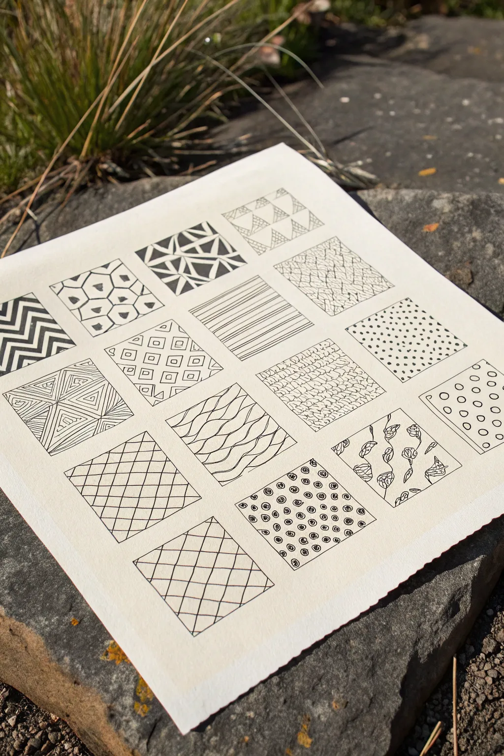
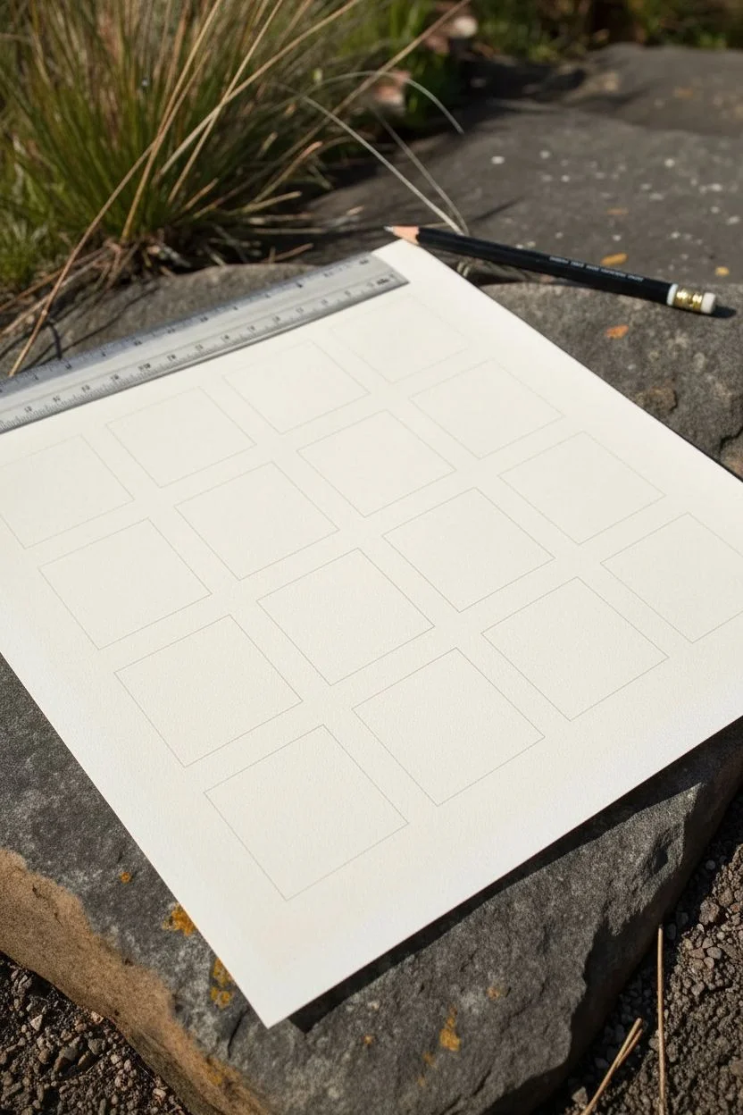
Create a soothing, geometric study of textures by filling a grid of small squares with varied black-and-white patterns. This project serves as a perfect meditative exercise, allowing you to explore different line weights and motifs in a structured, organized format.
Step-by-Step
Materials
- High-quality drawing paper (Bristol board or watercolor paper)
- Ruler
- Pencil (HB or lighter)
- Eraser
- Fine-liner pens (sizes 005, 01, 03, and 05)
- Compass or circle template (optional)
Step 1: Setting the Grid
-
Prepare your paper:
Cut your paper to a square format if it isn’t already. A 6×6 inch or 8×8 inch square works beautifully for this scale. -
Draw the grid:
Using your pencil and ruler, lightly mark out a 4×4 grid of equal squares. Leave a small, consistent margin between each square so the patterns have breathing room. I like to aim for roughly one-inch squares with 1/8-inch gaps. -
Check spacing:
Double-check your measurements to ensure the internal margins are uniform. These white spaces act as the ‘frame’ for your doodle art.
Smudge Alert
Work from the top-left to bottom-right (if right-handed) to avoid smearing fresh ink with your hand. Use a scrap paper under your palm for safety.
Step 2: Geometric Patterns
-
Zig-zag block:
Start with a simple geometric pattern in the first square. Draw bold, thick zigzag lines alternating with thinner lines. Use a thicker pen (05) for the bold stripes and a finer tip (01) for the white space boundaries. -
Triangle mosaic:
In the next block, create a shattered glass effect by drawing random triangles. Fill select triangles completely with black ink to create heavy contrast, leaving others white or hatching them lightly. -
Diamond grid:
Draw a diagonal grid in another square. Inside the resulting diamond shapes, draw concentric smaller diamonds to create a tunnel effect. -
Nested squares:
For a ‘wobbly square’ look, draw small, imperfect squares in a grid pattern. Inside each, draw 1-2 smaller squares off-center to give it a whimsical, hand-drawn feel.
Digital Hybrid
Scan your finished grid at high resolution. These texture squares make excellent custom brush presets or overlay patterns for digital art software.
Step 3: Organic Textures
-
Cracked earth:
Switch to your finest pen (005). Draw wandering, jagged lines that intersect randomly, mimicking the texture of dry, cracked mud. Keep the lines shaky rather than straight. -
Wavy lines:
Fill a block with horizontal, undulating lines. Vary the frequency of the waves, or group them in pairs, to create a sense of flowing water or fabric. -
Floral vines:
In a corner block, sketch vertical, winding vines. Add small leaves or rosebuds alternating sides. Keep the details simple and linework fluid. -
Dots and stippling:
Dedicate one square entirely to dots. You can arrange them in a random stipple gradient (dense to sparse) or in a rigid polka-dot grid for contrast.
Step 4: Line Art Studies
-
Concentric triangles:
Divide a square into four triangles with an X. Fill each quadrant with smaller triangles nesting inside each other, creating a pyramid illusion. -
Simple hatching:
Fill one block with straight, parallel lines. Vary the direction every time you hit a perceived boundary, or just keep them uniform for a minimalist look. -
Scales pattern:
Draw rows of ‘U’ shapes or scallops. Start from the bottom and stack the next row on top of the curve joints below, like fish scales or roof tiles. -
Swirls and spirals:
Create a pattern of small spirals or concentric circles. Mixing open circles with filled-in dots adds nice variety to the visual weight.
Step 5: Finishing Touches
-
Erase pencil guides:
Wait at least 10-15 minutes to ensure the ink is bone dry. Then gently erase your pencil grid lines to reveal the crisp white separation between blocks. -
Refine contrast:
Look over the whole piece. If some blocks look too light, go back in and thicken some lines or fill in small black areas to balance the values across the page.
This grid method is a wonderful way to catalogue your favorite doodles for future inspiration
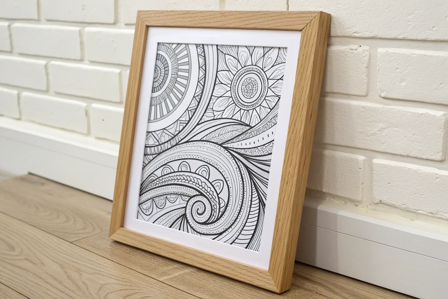
Mandala With Unexpected Lines
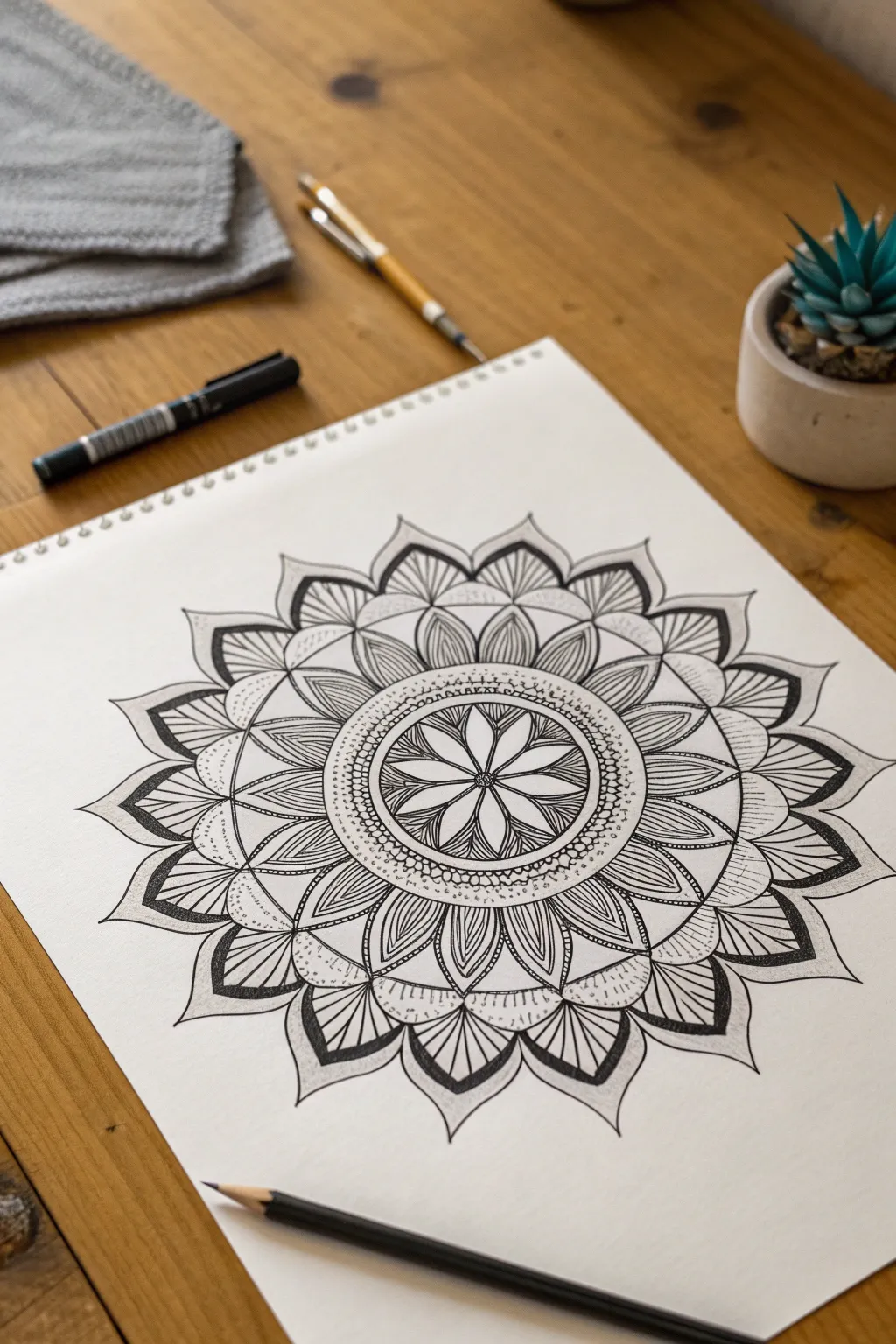
This intricate mandala combines classic geometric symmetry with organic, petal-like forms to create a soothing, hypnotic design. The heavy use of contrasting line weights—thick bold outlines versus delicate interior strokes—gives the final piece a surprising amount of depth and dimension.
Step-by-Step Guide
Materials
- White sketchbook paper (smooth texture preferred)
- Pencil (HB or 2B for sketching)
- Ruler
- Compass
- Protractor
- Fine liner pen (0.1mm or 0.3mm)
- Thick marker or brush pen (black)
- Eraser
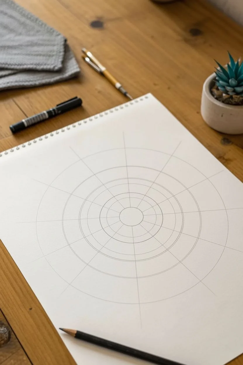
Step 1: Building the Skeleton
-
Find your center:
Begin by marking a distinct center point on your page. Using your compass, draw a small circle about 1 inch in diameter. This will be the heart of your flower. -
Create the rings:
Draw three progressively larger concentric circles moving outward from your center. Keep the gaps between them roughly even, aiming for about 1.5 inches of space between each ring to allow room for the petals. -
Divide the pie:
Use your protractor to divide your circle into even sections. For this specific 8-point flower center, divide your full 360 degrees into 45-degree segments. Draw faint straight lines through the center point extending to the outermost ring. -
Subdivide for petals:
To create the intricate outer layers, you’ll need more segments. Lightly mark divisions halfway between your existing 45-degree lines in the outer two rings, essentially creating a 16-slice pie for the exterior.
Step 2: Drawing the Core
-
Sketch the central petals:
Within the innermost circle, sketch eight teardrop-shaped petals. The tip of each petal should touch the center point, and the rounded bottom should graze the edge of the first circle. -
Fill the petals:
Inside each of these eight core petals, draw a simple straight line down the middle. Then, fan out delicate veins from the center line to the petal edges. -
Add the first border:
Create a decorative band around this central flower. Draw a double ring just outside the petal tips. Between these two thin rings, fill the space with tiny, distinct circles or ‘bubbles’ packed closely together.
Uneven Petals?
If your petals look lopsided, don’t just rely on the radial lines. Draw a quick pencil circle at the exact height where the petal tips should stop to ensure they are all the same length.
Step 3: Layering the Tiers
-
Middle tier structure:
Moving to the next ring section, sketch a row of larger, wider petals. These should sit in the ‘valleys’ between the inner petals (staggered placement). Use your guidelines to keep them symmetrical. -
Middle tier detailing:
Refine these petals with a ‘split’ look. Draw a smaller petal shape inside the main outline, then fill the gap between them with fine vertical hatching lines. This creates a shadowed effect. -
Outer tier spikes:
For the outermost layer, draw sharp, leaf-like shapes that point outward. These should be the largest elements. Instead of rounded tops, give them pointed tips for a slightly sharper aesthetic. -
Connect the layers:
Bridge the gap between your middle and outer tiers with simple arched lines connecting the petal peaks. This unifies the separate rings into a cohesive web.
Add Gold Accents
Make the piece pop by filling in specific details—like the ring of tiny bubbles or the central veins—with a metallic gold gel pen. It adds a luxury feel to the black and white.
Step 4: Inking and Definition
-
Main outlines:
Switch to your thicker marker or brush pen. Trace the primary perimeter of all major petal shapes. The heavy weight of this line is crucial for the bold look. -
Fine line shading:
Using your 0.1mm fine liner, go back into the outer petals. Draw straight, parallel lines radiating from the base of the petal toward the tip, stopping about halfway up. This simulates a gradient texture. -
Dotted details:
Identify the negative spaces between the middle tier petals. Add subtle stippling (tiny dots) in these crevices to add texture without overwhelming the design. -
Refining the center:
Return to the very center. Darken the outlines of the core flower and add a small, solid black dot in the nucleus to anchor the eye. -
Clean up:
Allow the ink to dry completely—give it at least five full minutes. I usually take a short break here to avoid smudging. Then, gently erase all your pencil guidelines and compass circles. -
Contrast check:
Assess the drawing for balance. If the outer leaves feel too light, thicken the very outer edges with your brush pen to frame the mandala effectively.
Take a moment to appreciate the rhythm of the lines you’ve created and how the simple repetitive motions built such a complex image

PENCIL GUIDE
Understanding Pencil Grades from H to B
From first sketch to finished drawing — learn pencil grades, line control, and shading techniques.
Explore the Full Guide
One-Line Abstract Ribbon Forms
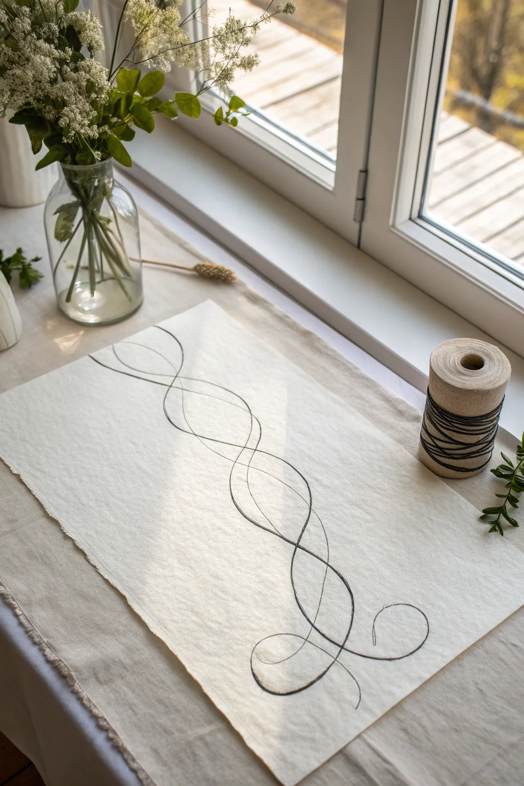
This minimalist project invites you to explore the elegance of continuous line drawing on a textured fabric canvas. By combining free-flowing loops with the rustic charm of unbleached linen, you’ll create a piece of modern, organic wall art or table decor perfect for a serene space.
Step-by-Step Tutorial
Materials
- Rectangular piece of unbleached linen or heavy cotton fabric (approx. 12×18 inches)
- Black fine-tip fabric marker or permanent ink pen (0.5mm or 0.8mm)
- Pencil (HB or lighter) for preliminary sketching
- Kneaded eraser
- Iron and ironing board
- Masking tape or painter’s tape
- Flat, smooth work surface
- Optional: Fray check sealant for edges
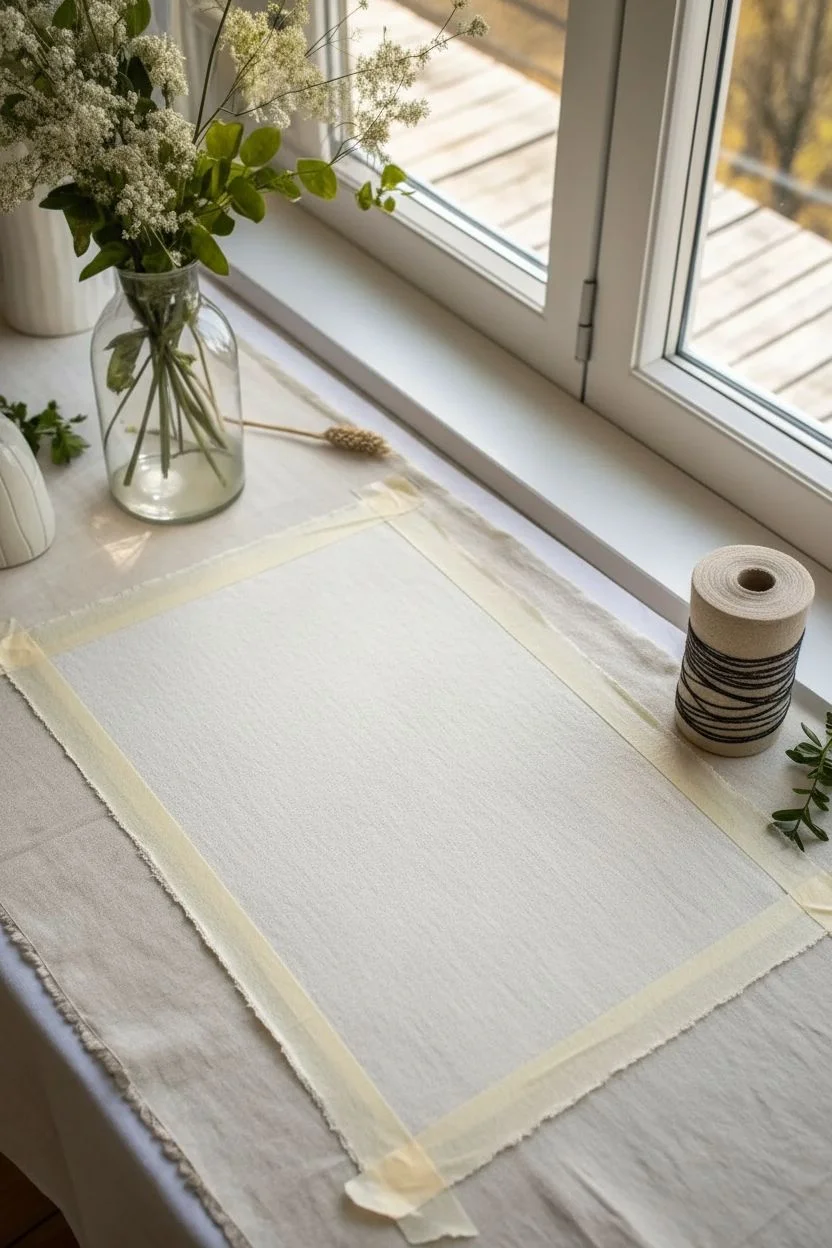
Step 1: Preparation and Setup
-
Prepare the fabric canvas:
Begin by pressing your linen or cotton fabric with a hot iron to remove any creases. A smooth surface ensures your pen won’t skip over wrinkles later. -
Create the rustic edge:
Instead of cutting with scissors, create a small snip at the edge of your fabric size mark and tear the fabric along the grain. This will give you those beautifully soft, frayed edges seen in the reference. -
Secure the workspace:
Tape the corners of your fabric directly to your smooth work surface. This prevents the fabric from shifting or bunching up while you draw, which is crucial for maintaining fluid lines.
Bleeding Lines?
If your ink feathers into the fabric weave, use a lighter touch and move faster. Alternatively, treat the fabric area with a clear aloe vera gel layer (allow to dry) before drawing to stop spreading.
Step 2: Sketching the Design
-
Visualize the flow:
Before putting pencil to fabric, practice the motion in the air. You want a design that looks like a tangled ribbon or DNA double helix, moving vertically from bottom to top. -
Lightly sketch the spine:
Using your pencil very lightly, draw a faint central guideline or axis running lengthwise down the center of the fabric. I find this helps keep the loops balanced so the drawing doesn’t drift to one side. -
Draft the first loop:
Starting near the bottom, sketch a wide, expansive loop that crosses your central axis. Keep your wrist loose to ensure the curve feels organic rather than stiff. -
Intertwine the curves:
Continue sketching upward, creating a second line that weaves through the first. Think of a figure-eight motion that stretches out vertically. -
Refine the composition:
Step back and look at your pencil sketch. Adjust the widths of the intersections so some parts feel tighter and others more open, creating a dynamic rhythm. -
Finalize the sketch:
Add the delicate finishing curls at the very bottom and top of the design. These should feel like the loose ends of a piece of thread settling naturally.
Add Dimension
For a 3D effect, adhere actual black twine or string over parts of the drawn line using fabric glue. This mixed-media approach adds tactile texture that jumps off the cloth.
Step 3: Inking the Masterpiece
-
Test your ink:
On a scrap piece of fraying fabric, test your black marker. Hold it there for a second to see if the ink bleeds outward; if it does, move your hand faster during the final drawing. -
Begin the final line:
Start at the bottom tip of your design. Commit to the line, moving your hand at a steady, moderate pace. Hesitation causes ink pools, so keep moving. -
Trace the intersections:
As you trace your pencil lines, pay close attention to where the lines cross. Ensure the ink remains solid and dark at these junctions. -
Vary line weight (optional):
If you want extra depth, go over certain curves a second time to slightly thicken them, simulating the shadow side of a ribbon. -
Complete the drawing:
Finish the line at the top, lifting the pen swiftly to create a tapered end point rather than a blunt dot.
Step 4: Finishing Touches
-
Let it set:
Allow the ink to dry completely for at least 30 minutes. Fabric ink can smear easily if touched too soon. -
Erase guidelines:
Gently dab—do not rub—the fabric with a kneaded eraser to lift away any visible pencil marks. Rubbing too hard can distort the fabric weave. -
Heat set the ink:
Once fully clean, place a thin pressing cloth over your drawing and iron on a high heat setting (no steam) for a few minutes. This makes the ink permanent. -
Detail the edges:
Use your fingers to gently pull horizontal threads from the torn edges to enhance the fringe effect. If you worry about over-fraying, dab a tiny amount of fray check on the very corners.
Place your finished artwork on a sideboard or frame it in a floating glass frame to let the textured edges shine.
Organic Blob Shapes With Graphic Outlines
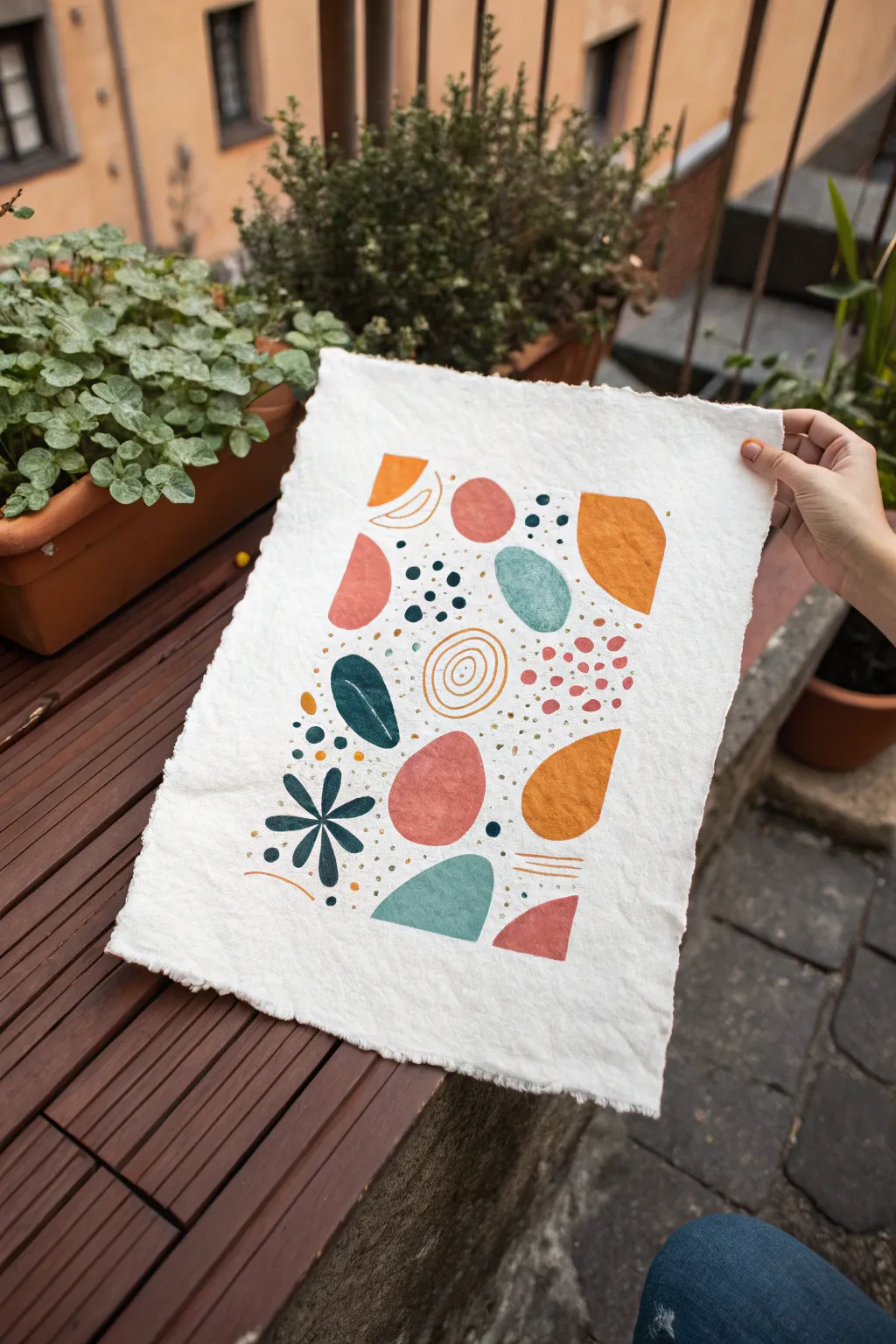
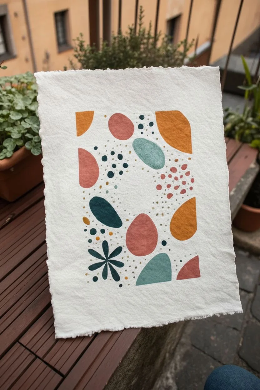
Embrace the beauty of imperfection with this abstract mixed-media piece that combines soft, organic forms with crisp graphic details. Using block printing techniques or gouache on textured handmade paper, you’ll create a composition that feels both earthy and modern, perfect for adding a touch of warmth to any space.
Step-by-Step Guide
Materials
- Heavyweight textured handmade paper (deckled edge recommended)
- Gouache paints or block printing ink (terracotta, mustard yellow, teal, dark blue-green, muted pink)
- Small rubber carving block (optional, for stamping)
- Linocut carving tool (optional)
- Small foam roller or flat paintbrushes
- Fine-point paintbrush (size 0 or 1)
- Gold metallic paint or ink
- Palette for mixing
- Pencil for light sketching
Step 1: Planning and Base Shapes
-
Set the foundation:
Begin by selecting a high-quality sheet of handmade paper. The rough texture and deckled edges are crucial for achieving the organic look shown in the photo, so flatten it gently if it has been rolled. -
Plan your composition:
Lightly sketch the placement of your main shapes using a pencil. Aim for a balanced distribution of ‘blobs’ across the paper, leaving plenty of negative space between them to let the paper’s texture breathe. -
Choose your palette:
Mix your base colors. You want an earthy, muted palette: a warm terracotta, a dusty rose, a deep teal, a mustard yellow, and a dark blue-black for contrast. If using gouache, keep the consistency creamy and opaque. -
Paint the large forms:
Start painting the largest shapes first—the tear-drop shapes and rough ovals. I like to use a flat brush here to get smooth coverage while maintaining slightly imperfect edges that look organic. -
Add secondary shapes:
Fill in the gaps with your medium-sized shapes, such as the kidney-bean curves and smaller circles. Vary the colors so that no two shapes of the same color are right next to each other. -
Create the botanical element:
Paint the dark green leaf shape and the stylized flower/starburst shape in the lower left quadrant. These act as anchors for the lighter colors around them.
Step 2: Adding Detail and Texture
-
Dry completely:
Before adding any fine details or layering, ensure your base layer of paint is 100% dry. Gouache can reactivate if you paint over it too soon. -
Add graphic line work:
Using your finest brush and a contrasting color (like white on the teal shape or mustard on the pink), paint delicate details. Try adding a simple vein line to the leaf or a curved line inside a semi-circle. -
Draw spiral accents:
Paint the open spiral circle in the center using a thin mustard tone. Keep the line weight consistent but allow the hand-drawn wobble to remain; it adds character. -
Stipple detailed areas:
Create clusters of dots. Use the dark blue-black to make small, concentrated groups of dots in the negative spaces, particularly near the top right and between the larger shapes. -
Add ‘confetti’ texture:
Dip a stiff brush or a toothpick into your pink and mustard paints to create scattered, irregular small dots around the central cluster. These should look like falling confetti. -
Incorporate metallic accents:
Using gold paint or ink, add tiny flecks or micro-dots scattered throughout the composition. This subtle shimmer mimics the look of gold leaf and elevates the rustic paper. -
Paint linear stripes:
Add small sets of parallel lines—like the three mustard lines near the bottom right. These geometric touches help balance the roundness of the other forms. -
Final balance check:
Step back and look at the whole piece. If a specific area looks too empty, add a single small dot or a tiny line segment to bridge the gap without overcrowding it. -
Flatten and finish:
Once the paint is fully cured, the paper might have buckled slightly from the moisture. Place it under a heavy book overnight to flatten it back out before displaying.
Stamp It Instead
Make this project repeatable by carving the main blob shapes out of soft linoleum or rubber erasers. Stamping them gives a lovely, mottled texture.
Level Up: Collage
Paint your blob shapes on separate sheets of colored paper, cut them out, and glue them onto the handmade paper for a 3D, layered collage effect.
Now you have a serene, modern botanical abstract ready to frame or gift


Rainbow Layered Line Waves
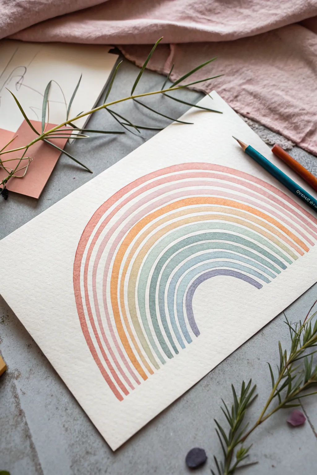
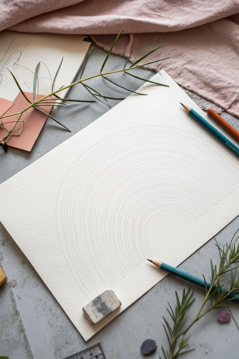
This minimalist watercolor project features a series of precisely spaced, concentric arches in a soft, dusty color palette. By focusing on negative space and control, you’ll create a soothing piece of abstract art perfect for a nursery or modern gallery wall.
How-To Guide
Materials
- Cold press watercolor paper (300 gsm)
- Watercolor paints (terracotta, peach, yellow ochre, sage green, dusty blue, violet)
- Small flat brush (size 4 or 6) or a round brush with a fine point
- Compass or circular objects for tracing
- HB Pencil
- Kneadable eraser
- Ruler
- Masking tape (optional)
Step 1: Preparation & Sketching
-
Prepare your workspace:
Tape down your watercolor paper to a flat surface if you want to prevent warping, though for a centered design like this, it isn’t strictly necessary if your paper is heavy enough. -
Mark the center:
Using a ruler, lightly find the bottom horizontal center of your paper. This will be the anchor point for your compass. -
Draw the smallest arch guide:
Set your compass to a small radius (about 1.5 inches) and draw a faint semi-circle. This marks the inner edge of the smallest purple arch. -
Define the first band width:
Widen the compass by about 1/4 inch (or your desired band thickness) and draw a second arc. This creates the boundaries for your first painted line. -
Create the gap:
Widen the compass again by a very small amount (about 1/8 inch) to create the negative space gap, and draw a faint line. -
Repeat for all layers:
Continue this pattern—band width, gap, band width, gap—until you have sketched out guides for all seven or eight layers. Keep your pencil pressure extremely light so lines can be erased later.
Uneven Gaps?
If your white gaps look shaky, don’t worry. Go back with a white gel pen or opaque white gouache after drying to clean up the negative space between the colored bands.
Step 2: Painting the Gradient
-
Mix the outermost color:
Start with the largest outer arch. Mix a muted terracotta or rusty red shade. Ensure the paint consistency is milky—not too thick, but opaque enough to hold the edge. -
Paint the first curve:
Carefully fill in the outermost channel you drew. I find using a small flat brush helps maintain consistent width, but a steady hand with a round brush works too. Work in one continuous motion if possible to avoid drying marks. -
Mix the second shade:
Clean your brush and mix a soft peach or dusty pink tone for the second layer. -
Paint the second arch:
Fill in the next band, being extremely careful not to let the wet paint touch the previous terracotta line. The white gap between them is crucial for this style. -
Transition to yellow:
Mix a warm yellow ochre or mustard tone. Paint the third arch, maintaining that consistent negative space. -
Cool down the palette:
Move into the cooler tones. Mix a pale sage or celadon green and carefully paint the fourth band. -
Add the blue layer:
Create a dusty blue-grey mixture. Paint the fifth arch, watching your hand position so you don’t smudge the drying outer layers. -
Paint the indigo band:
Mix a slightly darker, muted indigo or slate blue for the sixth arch. -
Finish with violet:
For the smallest, innermost arch, use a soft lavender or violet shade. Paint this final curve carefully.
Step 3: Finishing Touches
-
Let it dry completely:
Allow the painting to sit undisturbed until every layer is bone dry to the touch. -
Erase guidelines:
Take your kneadable eraser and gently dab or roll it over the pencil lines. Avoid aggressive rubbing, which might lift the pigment. -
Clean up edges:
If any ends of the arches are uneven at the bottom, you can use a tiny amount of opaque white gouache to straighten them, or simply accept the organic look.
Add Texture
For a vintage look, try adding salt to the wet paint on a few bands, or spatter faint dots of gold ink over the finished rainbow for a magical touch.
Once your layered rainbow is dry, frame it simply to let those beautiful arches shine on your wall
Symmetrical Inkblot-Inspired Drawing
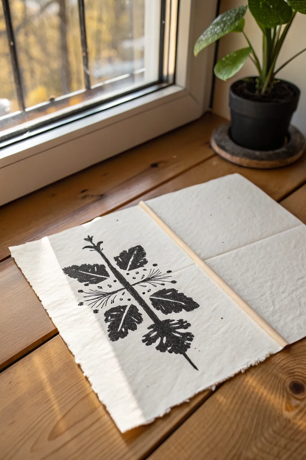
This elegant project bridges the gap between structured botanical art and free-flowing Rorschach tests, resulting in a striking piece of wall decor. By folding paper and using simple ink transfer techniques, you create a perfectly mirrored design that feels ancient and modern all at once.
Detailed Instructions
Materials
- Textured heavy-weight paper (handmade or watercolor paper works best)
- Black block printing ink or heavy body acrylic paint
- Brayer or foam brush
- Pencil for light sketching
- Thin wooden dowel (1/4 inch diameter)
- Bone folder (optional)
- Small liner brush (for touch-ups)
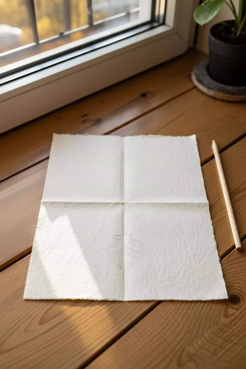
Step 1: Planning the Layout
-
Paper selection:
Choose a sheet of paper with a nice, rough tooth—this adds character to the ink transfer. Tear the edges against a ruler if you want that raw, deckled look shown in the reference. -
Creating the crease:
Fold your paper gently in half vertically to establish your central axis. You don’t need a razor-sharp crease yet, just a faint guideline to know where the symmetry will happen. -
Sketching the spine:
Open the paper flat. Lightly sketch a central vertical line down the crease with a pencil. This will be the ‘spine’ of your organic shape.
Ink Drying Too Fast?
If acrylics dry before you fold, mix in a slow-drying medium or retarder. Alternatively, lightly mist the painted side with water before folding.
Step 2: Applying the Ink
-
Preparing the ink:
Squeeze a small amount of black block printing ink onto a palette. You want it tacky, not runny. If you’re using acrylics, use them straight from the tube without water. -
Painting one side:
Working quickly so the ink doesn’t dry, paint half of your design on the *left* side of the central crease only. Start with the heavy ‘leaf’ shapes branching out. -
Adding details:
Add smaller dots and thin lines radiating from the center. Remember, you are only drawing half the image right now. -
Thickening the application:
Go back over your painted areas to ensure the ink is wet and slightly raised. A generous application is key for a good transfer.
Step 3: The Transfer Process
-
Folding:
While the ink is still wet, carefully fold the right side of the paper over the painted left side, using your previous center crease as a guide. -
Pressing:
Use the palm of your hand or a clean brayer to press firmly on the back of the folded paper. Rub consistently over the entire design area to transfer the ink. -
The reveal:
Slowly peel the paper open. You should now have a symmetrical, mirrored image. The texture of the transfer usually leaves interesting, slightly distressed gaps. -
Touching up:
If there are large gaps where the ink didn’t transfer that disrupt the design, use a small liner brush to fill them in, but leave some texture for authenticity. -
Refining the center:
I usually like to darken the central spine line manually to connect the two halves seamlessly.
Level Up: Tea Staining
Before starting, dip the paper in strong black tea and let it dry. This creates an antique, parchment-like background for your print.
Step 4: Finishing Touches
-
Drying:
Let the artwork dry completely. Block printing ink can take longer than acrylics, sometimes up to 24 hours depending on humidity. -
Flattening:
Once dry, place the paper under a heavy book for a few hours to flatten out the center fold crease. -
Adding the mount:
Take your thin wooden dowel and cut it so it extends about an inch past the paper on both sides. -
Creating the channel:
Fold the top inch of the paper backward. Place the dowel inside this fold to check the fit. -
Securing the hanger:
Apply a thin line of glue along the very top edge of the flap and press it down to create a loop for the dowel. Slide the dowel in once the glue is dry.
Hang your new botanical symmetry art near a window to let the natural light highlight the paper’s texture
Abstract Still Life Simplified Into Shapes
Transform ordinary still life elements into a striking composition of bold shapes and muted tones. This project uses geometric simplification to capture the essence of fruit and leaves, balancing structure with soft watercolor textures.
Step-by-Step
Materials
- Heavyweight watercolor paper (300 gsm or similar)
- White wooden frame (optional, for display)
- Watercolor or gouache paints (payne’s gray, terracotta, ochre/mustard, indanthrone blue)
- Pencil and eraser
- Ruler
- Fine liner brushes (sizes 0 and 2)
- Flat brush (size 4 or 6)
- Masking tape
- Gold ink or gel pen (optional for details)
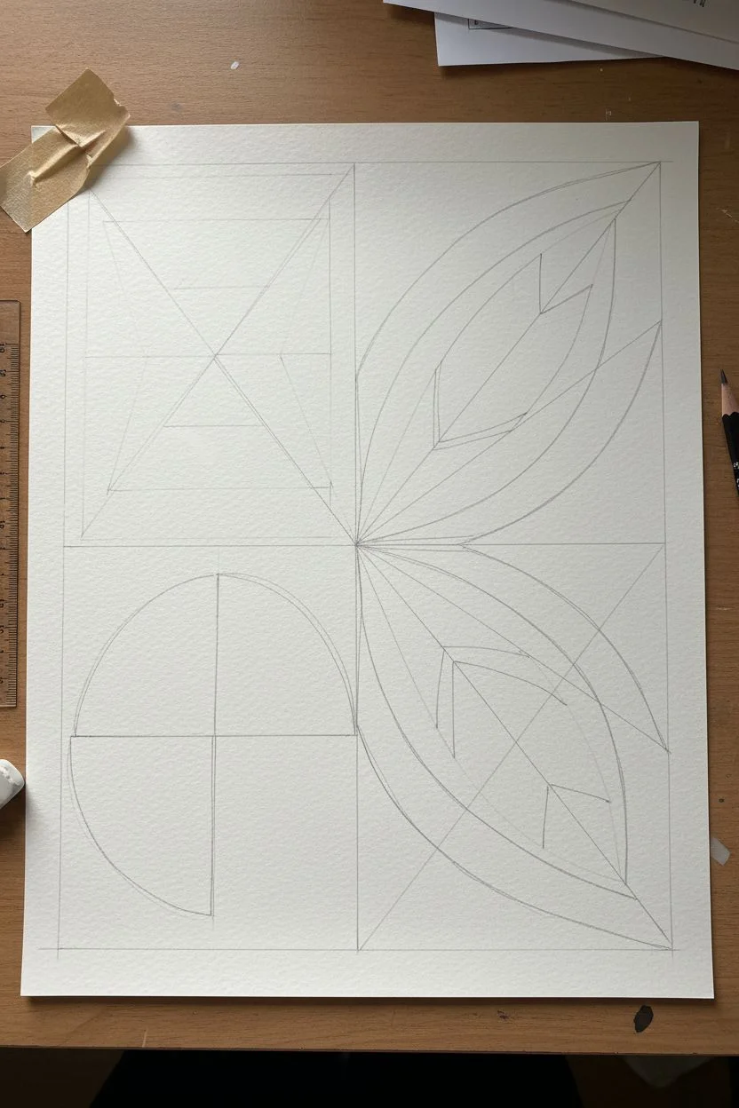
Step 1: Planning the Grid
-
Prepare your paper:
Start by cutting your watercolor paper to fit your frame. Leave a margin of about 1-2 inches around the edge to create a natural border. Lightly mark this boundary with a pencil. -
Divide the space:
Using your ruler, lightly draw a simple 2×2 grid within your border. This doesn’t have to be perfectly symmetrical; a slight intentional asymmetry can add charm, but aim for four distinct quadrants. -
Sketch the geometric forms:
In the top-left quadrant, sketch triangles pointing inward to suggest a shattered or refracted shape. This is an abstraction of light hitting an object. -
Add circular elements:
In the bottom-left quadrant, draw a semi-circle segmented into quarters. This shape mimics the cross-section of a citrus fruit. -
Fill the right side:
For the right-hand quadrants, sketch sweeping curved lines that resemble leaves or petals. Intersect these curves with straight diagonal lines to break the organic shapes into geometric facets.
Uneven Coverage?
If your watercolors look patchy, let the first layer dry completely, then apply a second wash. Gouache is naturally opaque and forgives patchiness better.
Step 2: Painting the Shapes
-
Mix your palette:
Prepare your colors. You’ll need a muted terracotta pink, a deep ochre yellow, and a dark blue-grey (mix Payne’s gray with a touch of blue). Keep the consistency creamy, like melted ice cream, especially if using gouache. -
Start with the lightest tones:
Begin painting the ochre yellow sections. I like to target the triangles in the top left and the segments of the ‘fruit’ circle in the bottom left. Apply the paint in flat, even washes. -
Apply the terracotta:
Move on to the pinkish-terracotta sections. Paint alternating facets in the leaf shapes on the right and fill in the remaining segments of the circle. Be careful to leave a tiny sliver of white paper between shapes to keep lines crisp. -
Add depth with blue:
Using your dark blue-grey mix, fill in the background shapes and the remaining geometric facets. This dark color provides the necessary contrast that makes the lighter colors pop. -
Refine the edges:
Once the main blocks of color are dry, use your smallest brush to tidy up any ragged edges. The goal is clean, unintentional ‘white space’ lines between the color blocks.
Clean Lines
For ultra-crisp white lines between shapes, use fine masking fluid or narrow painter’s tape to block out the gaps before you start painting.
Step 3: Details and Finishing
-
Add texture details:
Wait for the blue paint to be bone dry. Mix a very light wash of the yellow or use a white gouache/opaque watercolor. Paint tiny dots in the blue section of the top-left quadrant to suggest texture or seeds. -
Highlight the curves:
On the leaf shapes in the right quadrants, you can add a row of decorative dots along one of the central spines using the same light color or gold ink. -
Create the faux matting:
If you want the effect shown in the image without a physical mat board, use a ruler to draw a very faint pencil line box around your painted area, about 1/4 inch away from the paint. -
Erase guidelines:
Gently erase any visible pencil sketch lines that weren’t covered by paint. Be extremely careful not to smudge the dark paint into the light paper. -
Frame your work:
Place the finished, dry piece into your white wooden frame. The stark white frame complements the unpainted borders of the paper beautifully.
Now step back and enjoy how simple shapes can create such a sophisticated visual story
Abstract Portrait With Geometric Fragmenting
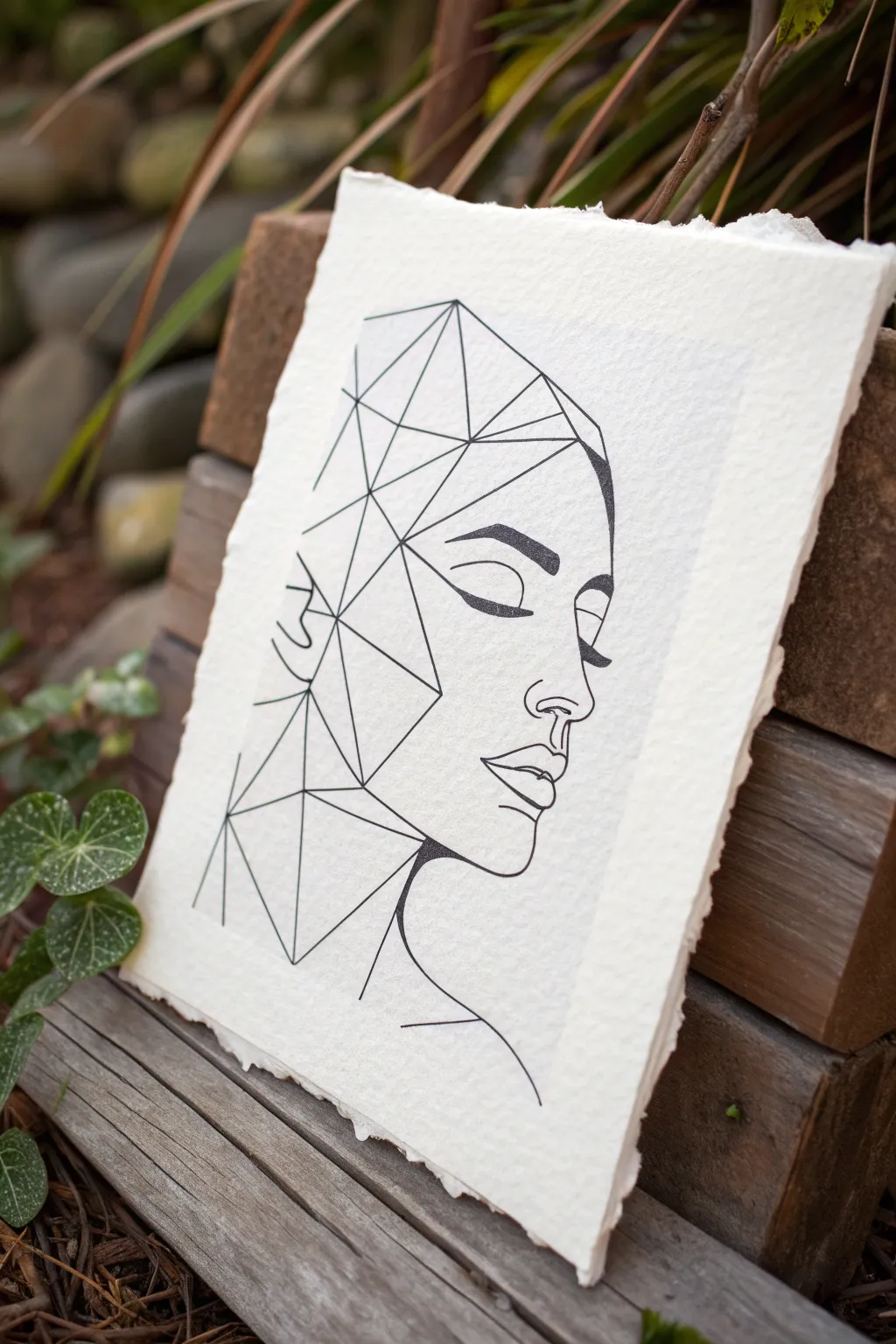
This striking project merges the organic softness of a human profile with the sharp, structured beauty of geometric forms. Using clean black lines on textured paper, you’ll create a captivating piece of art where half the face dissolves into a crystalline web of triangles.
Step-by-Step Guide
Materials
- High-quality cotton rag paper or cold-press watercolor paper (heavyweight and textured)
- Pencil (HB or 2H for sketching)
- Fine-point black ink pen (0.5mm or 0.8mm)
- Ultra-fine black ink pen (0.1mm or 0.3mm)
- Ruler or straight edge
- Kneaded eraser
- Reference photo of a side profile (optional)
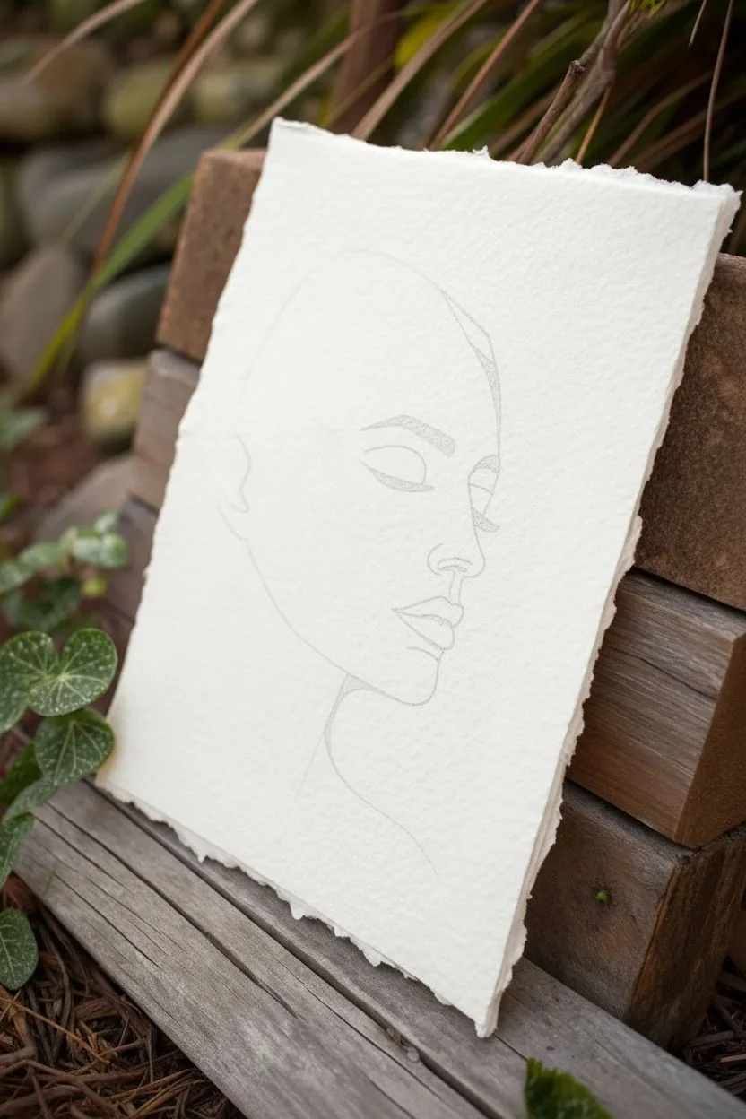
Step 1: Sketching the Foundation
-
Prepare your paper:
Start by selecting a heavy, textured paper. The jagged ‘deckle’ edge shown in the image adds a lovely artisanal touch, so consider tearing your paper edges manually against a ruler if yours are straight cut. -
Map the profile:
Lightly sketch the outline of a side profile using your pencil. Focus on the curve of the forehead, the bridge of the nose, the lips, and the chin. Keep these lines very faint as they are just guides. -
Define facial features:
Sketch the closed eye, eyebrow, and the line of the mouth. The expression should be serene. Don’t worry about shading; this piece relies entirely on line weight and placement. -
Design the hair boundary:
Instead of drawing realistic hair, draw a sweeping curve starting from the forehead and moving back. This line will serve as the boundary where the organic face meets the geometric abstraction.
Uneven Lines?
If your ruler slips and creates a smudge or crooked line, turn it into a new triangle! Add an extra connecting line to incorporate the mistake into the geometric pattern seamlessly.
Step 2: Drawing the Geometric Web
-
Create anchor points:
Along the back of the head and upper skull area, place random dots lightly with your pencil. These will act as vertices for your triangles. -
Connect the dots:
Using your ruler, connect these dots to form a network of triangles. Some triangles should be large and spacious, while others can be smaller and more clustered, especially near the boundary line you drew earlier. -
Intersect the face:
Allow the geometric lines to cut into the cheek and neck area. The goal is to make it look like the back of the head is fracturing into shards. I like to let a few lines extend down the neck to lead the eye downward. -
Refine the geometry:
Step back and look at your composition. If the geometric section looks too sparse, add a few bisecting lines to create smaller triangles within the larger ones.
Step 3: Inking and Finalizing
-
Ink the profile:
Switch to your thicker fine-point pen (0.5mm or 0.8mm). Carefully trace the organic lines of the face—the nose, lips, and chin. Use confident, smooth strokes. -
Detail the features:
Use the same pen to ink the eyebrow and the closed eyelid. Thicken the lash line slightly to add definition and weight to the eye. -
Ink the geometric lines:
For the geometric section, use your ruler and the thinner ultra-fine pen (0.1mm or 0.3mm). This slight variation in line weight helps differentiate the rigid geometry from the soft human features. -
Connect the styles:
Where the geometric lines touch the face outline, make sure the connection is crisp. You don’t want gaps between the straight lines and the curved profile. -
Add line variation:
Go back over a few select geometric lines with the thicker pen. Adding specific emphasis to certain structural lines can create a sense of depth and shadow without actual shading. -
Erase pencil marks:
Wait at least 15-20 minutes for the ink to dry completely. This is crucial to avoid smearing. Once dry, gently gently roll the kneaded eraser over the entire drawing to lift the graphite. -
Assess and adjust:
Look for any lines that need strengthening. If the profile feels too light against the busy geometric background, thicken the facial outline just a fraction more.
Deckle Edge Trick
To get that soft, torn paper edge look, fold your paper sharply along a wet line created with a paintbrush and water, then gently pull it apart.
Frame this piece in a floating glass frame to show off those beautiful torn edges and the contrast of styles
Automatic Drawing With “Find-The-Shape” Refinement
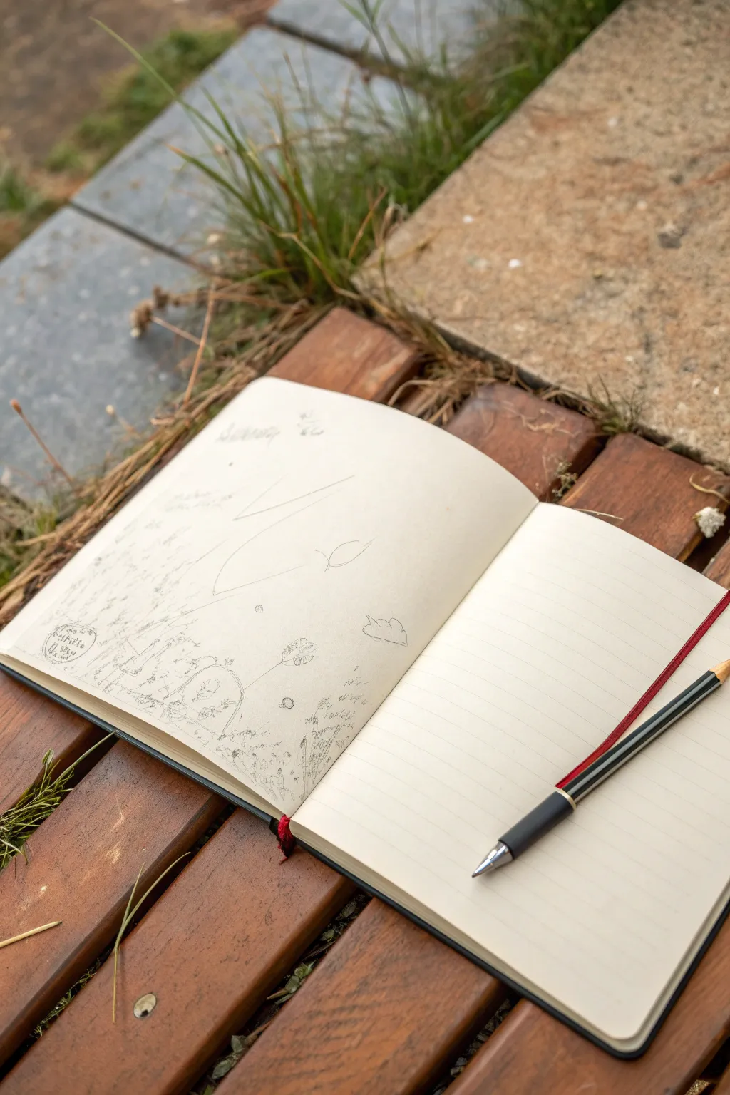
Embrace the subconscious with this relaxing exercise that transforms aimless scribbles into a delicate, dreamlike composition. By starting without a plan and refining what emerges, you’ll create a sketchbook page that feels both organic and surprisingly narrative.
Detailed Instructions
Materials
- A sketchbook (preferably with unlined or mixed paper)
- A standard graphite pencil (HB or 2B)
- A kneaded eraser (optional)
- A comfortable outdoor spot (essential for inspiration)
Step 1: The Automatic Phase
-
Set the Mood:
Find a quiet place to sit, ideally outdoors like the wooden bench shown here. The texture of your environment can influence the flow of your hand. -
Loosen Your Grip:
Hold your pencil further back than usual to prevent stiff, controlled lines. You want your wrist to float freely. -
Close Your Eyes:
For the first few moments, lightly drag the pencil across the page without looking. Let your hand wander in large, sweeping motions. -
Create the ‘Bones’:
Open your eyes but keep your focus soft. Add a few more deliberate, large curves or angular lines intersecting the random ones you just made. -
Vary Pressure:
Ensure some lines are barely visible while others are slightly darker. This atmospheric perspective gives the drawing depth right from the start.
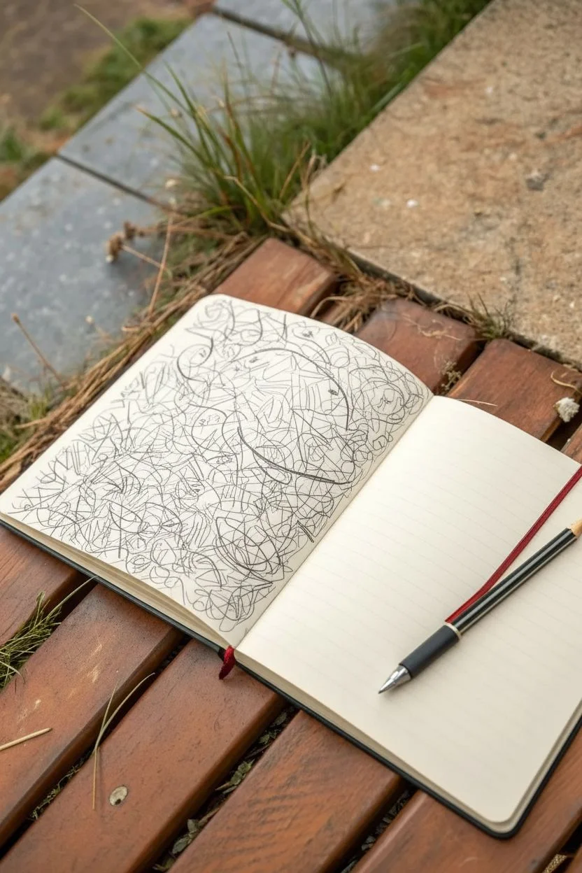
Step 2: The Discovery Phase
-
Observe the Chaos:
Stop drawing and rotate your sketchbook. Look for recognizable forms within the tangle of lines—a face, a cloud, a leaf, or a creature. -
Reinforce the First Shape:
Once you spot something, use your pencil to darken the lines that define that specific shape. Here, I liked emphasizing the large sweeping curve that became a hill. -
Add Tiny Details:
Start adding small, intricate details near the bottom of the page. Tiny vertical dashes can suggest grass or reeds sprouting from the abstract lines. -
Incorporate Organic Elements:
Draw small floral or leafy shapes using the existing scribbles as stems. Let them float in the white space. -
Find the Characters:
Look for circles or loops that could become faces. Sketch in minimal features—eyes, a nose—to bring a small character to life within the abstraction.
Don’t Force It
If you can’t see a clear shape in a scribble, don’t force it. Move to a different part of the page. The beauty of this technique is in the accidental discovery, not rigid planning.
Step 3: Refining the Narrative
-
Balance with Text:
If a stray mark looks like writing, enhance it. Add faint, illegible scribbles or specific words that capture your mood in the upper corners. -
Enhance Texture:
Use cross-hatching or stippling (tiny dots) to create shadows in the nooks of your discovered shapes. -
Create Clusters:
Group your detailed doodles in specifically chosen areas, leaving plenty of negative space on the page to let the drawing breathe. -
Connect the Elements:
Draw very faint, connecting threads or ‘thought bubbles’ between your separated doodle clusters to unite the composition. -
Final Contrast Check:
Go over your favorite elements one last time with slightly more pressure to make them pop against the faint background skeleton.
Add Ink Accents
Once your pencil sketch is done, use a fine-liner pen to trace only the ‘found’ shapes, leaving the initial construction lines in pencil for a cool, multi-layered effect.
Close your book knowing you’ve pulled a unique world out of thin air


Have a question or want to share your own experience? I'd love to hear from you in the comments below!