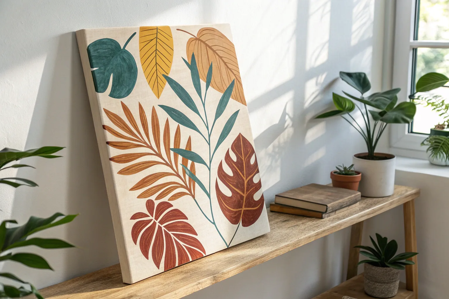
Whether you are looking to spark a little joy on a rainy afternoon or hoping to help a beginner find their creative flow, having a go-to list of approachable art activities is essential. These hands-on concepts focus on the fun of the process rather than perfect results, making them perfect for unlocking that inner artist.
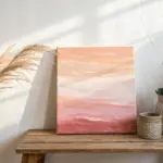
Sunset Silhouette Landscapes
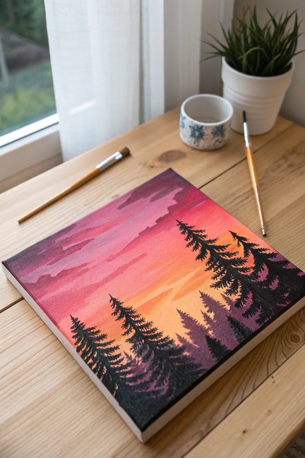
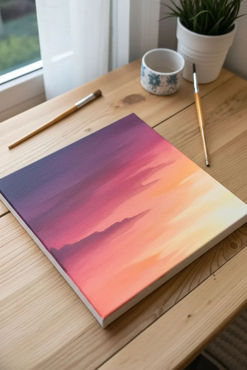
Capture the serene beauty of a fading sunset with this vibrant acrylic painting. You will learn to blend a seamless diagonal gradient and overlay it with crisp, high-contrast pine silhouettes to create a stunning depth of field.
Step-by-Step
Materials
- Square stretched canvas (approx. 8×8 or 10×10 inches)
- Acrylic paints: Deep Violet, Magenta, Cadmium Orange, Cadmium Yellow, Titanium White, Mars Black
- Wide flat brush (3/4 inch)
- Small round brush (size 2 or 3)
- Fine detail liner brush
- Palette and container for water
- Paper towels
Step 1: Painting the Sunset Sky
-
Prepare the gradient colors:
Squeeze out your violet, magenta, orange, yellow, and white onto the palette. Leave space between them to mix transition shades. -
Apply the darkest tone:
Using the wide flat brush, paint the top-left corner with Deep Violet, brushing in diagonal strokes towards the center. -
Transition to pink:
Without cleaning the brush entirely, pick up Magenta. Blend it into the wet violet edge, moving diagonally across the upper middle section. -
Add warmth:
Wipe the brush off on a paper towel. Pick up Cadmium Orange and paint the next diagonal band, blending it smoothly back into the magenta while the paint is still wet. -
Create the glow:
Mix Cadmium Yellow with a touch of Titanium White. Apply this to the bottom-right corner, blending it up into the orange to create a bright sunset glow. -
Refine the blend:
While the canvas is moist, use a clean, slightly damp brush to lightly sweep over the transition lines to remove harsh streaks. -
Add cloud texture:
Mix a soft purple-pink shade. Using the corner of your flat brush, gently streak in horizontal cloud shapes in the upper magenta section. Keep these edges soft and wispy.
Step 2: Building Atmospheric Depth
-
Dry the background:
Allow the sky layer to dry completely. This prevents the foreground colors from becoming muddy. -
Mix the distant hill color:
Create a hazy purple by mixing Deep Violet with a little White and a tiny dot of Black. It should be darker than the sky but lighter than pure black. -
Paint fading trees:
Using the small round brush, paint a jagged, uneven treeline along the bottom horizon using this hazy purple mix. These should look distant and low-contrast. -
Add silhouette structure:
Switch to pure Mars Black. Paint vertical lines to establish the trunks of the main foreground trees. I find it helpful to vary the heights to keep the composition interesting.
Streaky Sky?
If the acrylic dries too fast while blending, spritz the canvas lightly with water or add a slow-drying medium to keep the paint workable longer.
Step 3: Detailing the Silhouettes
-
Start the pine foliage:
Using the small round brush, tap pure black paint starting from the top of a trunk. Use a zigzag motion, getting wider as you move down the tree. -
Texture the branches:
Focus on the tips of the branches. Use the very tip of the brush to flick foliage slightly upward and outward for a realistic pine look. -
Fill the lower canopy:
As you reach the bottom of the trees, dab the brush more densely to create a solid mass of darkness where the forest is thickest. -
Create the large right tree:
Paint the prominent tree on the right side. Make this one larger and extend higher into the sky to frame the composition. -
Overlap the trees:
Paint the lower trees on the left side, allowing their branches to overlap slightly with the distant layer for depth. -
Add final details:
Switch to your fine liner brush. Add tiny, sharp distinct top spikes to the trees and subtle stray branches sticking out from the main silhouettes.
Pro Tip: Nature isn’t Perfect
Don’t make your trees perfectly symmetrical triangles. Skip small sections on the trunk or make one side heavier to let the glowing sky peek through.
Now you have a stunning, high-contrast landscape that brings the warmth of a sunset into any room.
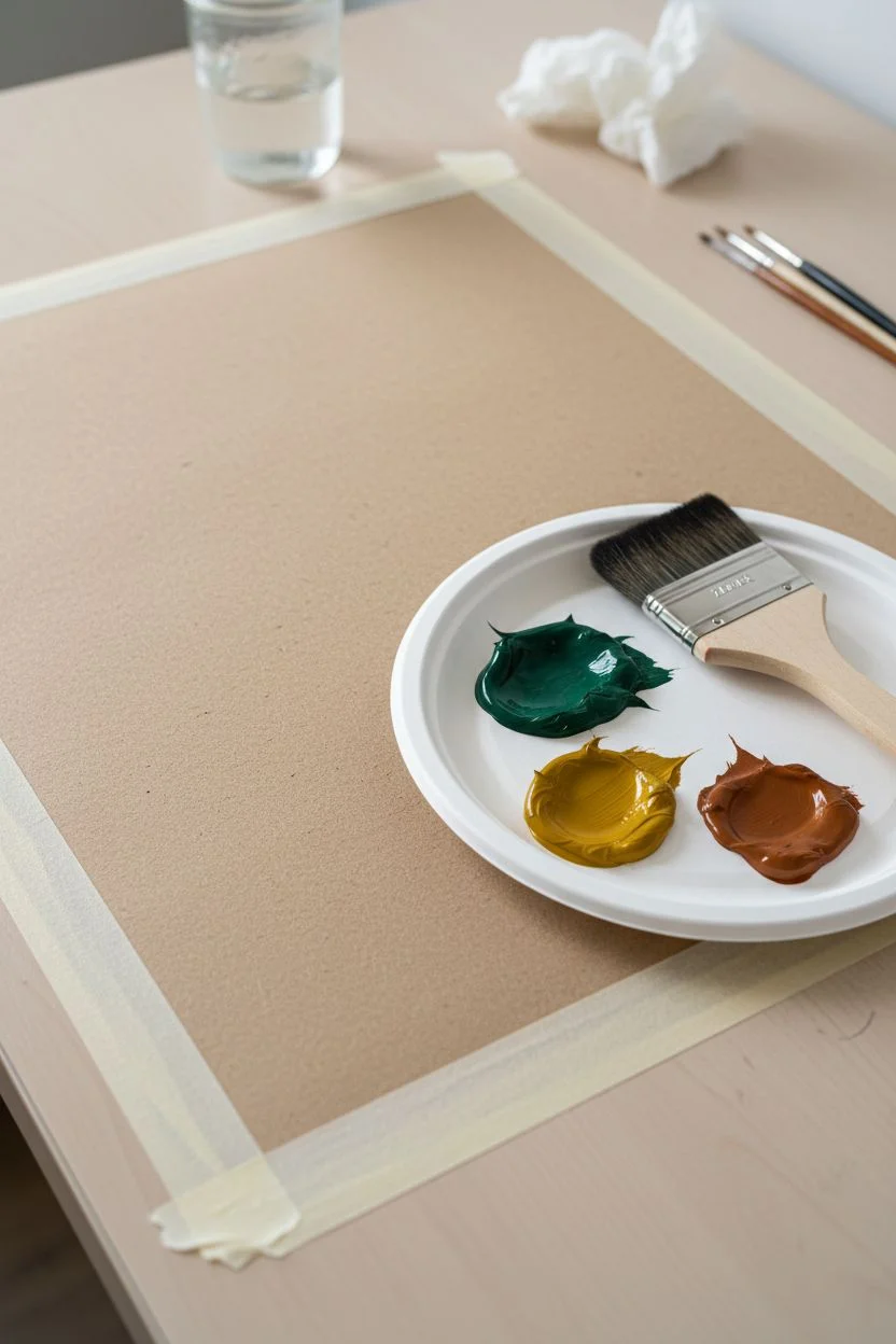
Geometric Tape Resist Art
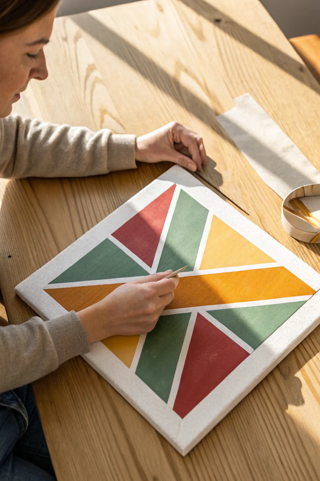
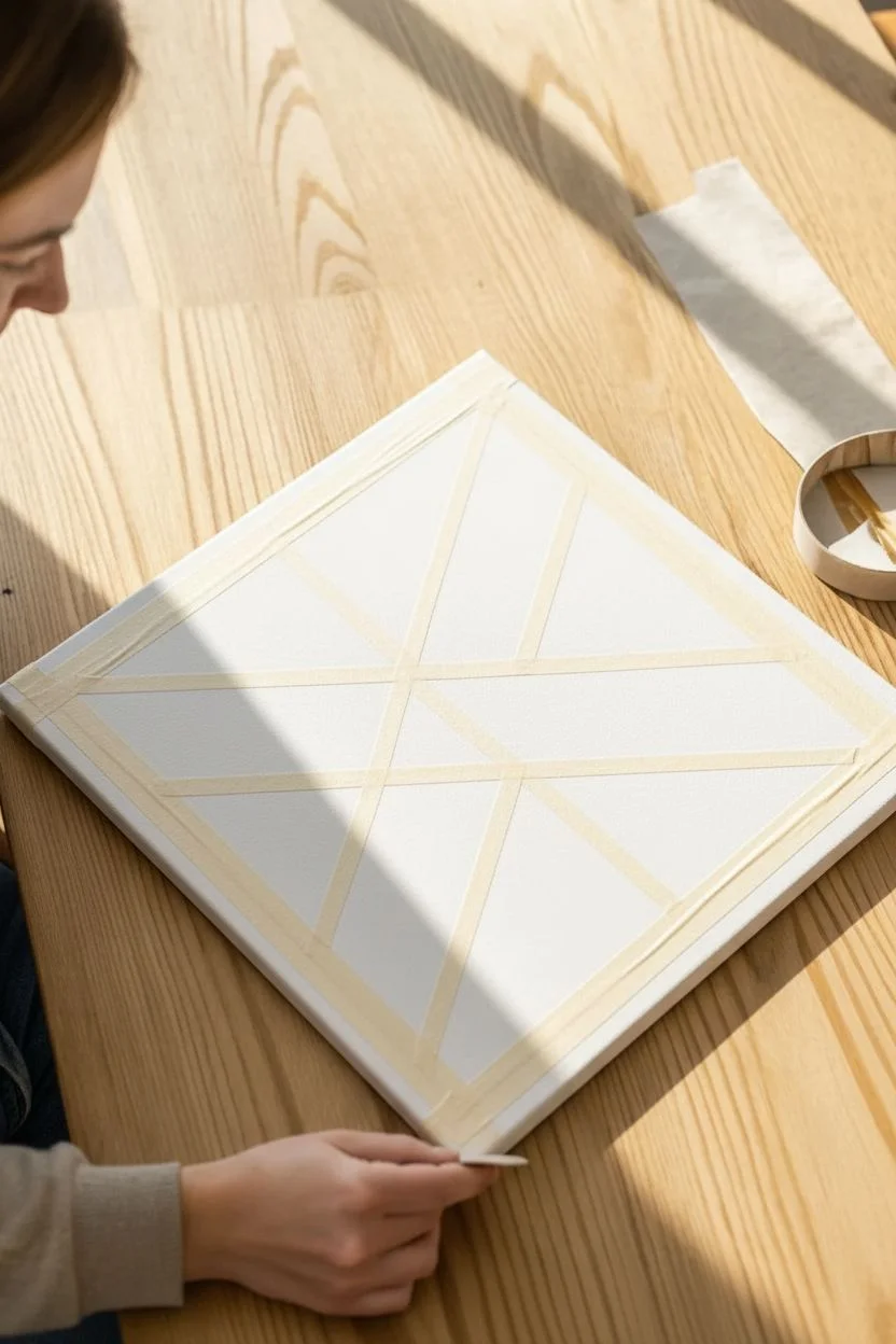
Transform a blank canvas into a striking piece of modern art using simple masking techniques and a warm, earthy color palette. This project relies on crisp negative space to define bold triangular shards, creating a sophisticated look that fits perfectly in contemporary spaces.
Step-by-Step
Materials
- Square stretched canvas (16×16 or similar)
- Painter’s tape (0.75 inch width)
- Acrylic paints (Terracotta, Sage Green, Mustard Yellow, Burnt Orange)
- White acrylic paint (for base and sealing)
- Flat shader paintbrushes
- Bone folder or wooden craft stick
- Palette and water cup
Step 1: Planning and Taping
-
Prepare the canvas:
If your canvas is unprimed, apply two coats of white acrylic paint and let it dry completely to create a smooth, bright base for your negative space. -
Lay the primary structure:
Place a long strip of painter’s tape diagonally across the entire canvas, slightly off-center, to establish your main dividing line. -
Create the intersecting lines:
Apply 3-4 additional strips of tape that intersect with your first line at sharp angles, creating a variety of large and medium-sized triangles. -
Subdivide larger shapes:
Look for the biggest triangular sections and bisect them with shorter pieces of tape to balance the composition, ensuring no single shape dominates the board. -
Secure the edges:
Wrap the ends of your tape strips around the sides of the canvas to the back, ensuring the design continues cleanly over the edges. -
Burnish the tape:
This is crucial for crisp lines: use a bone folder or a wooden craft stick to firmly rub down every inch of tape, pressing hard to eliminate air bubbles. -
Seal the tape lines:
I always take a moment here to paint a very thin layer of white paint over the edges of the tape; this blocks potential bleeds with the background color.
Step 2: Applying Color
-
Plan your palette distribution:
Before painting, visualize or lightly mark which triangle will be which color to ensure you don’t have identical colors touching each other. -
Apply the Terracotta:
Load a flat brush with your red-earth tone and fill in your designated sections, brushing away from the tape edge toward the center of the shape to minimize seepage. -
Paint the Sage Green:
Rinse your brush thoroughly (or switch to a clean one) and apply the green hue to its corresponding triangles, keeping the paint layer even. -
Add the Mustard Yellow:
Fill in the next set of shapes with the yellow tone, overlapping the paint slightly onto the tape to ensure full coverage up to the line. -
Finish with Burnt Orange:
Apply the final orange accent color to the remaining white triangles, checking for any thin spots that need a little more pigment. -
Apply a second coat:
Acrylics can sometimes dry streaky, so apply a second coat to all colors once the first layer is touch-dry for a solid, opaque look.
Seal for Success
For laser-sharp lines, paint a thin layer of white (your base color) over the tape edges before adding color. This fills any tiny gaps so the colored paint can’t sneak underneath.
Step 3: The Reveal
-
Assess dryness:
Wait until the paint is ‘leathery’—dry to the touch but not fully cured—which usually takes about 20 to 30 minutes depending on humidity. -
Begin the removal:
Start peeling the tape from one of the outer edges, pulling it slowly back upon itself at a 45-degree angle rather than pulling straight up. -
Reveal the core design:
Continue removing the tape strips, being careful where they overlap, until all masking is removed and the white grid patterns are visible. -
Fix imperfections:
If a little paint bled through, use a small angled brush with a tiny bit of white paint to tidy up the lines. -
Finish the edges:
Paint the sides of the canvas in colors corresponding to the adjacent shape, or paint them solid white for a framed look.
Add Texture
Mix a teaspoon of baking soda into your acrylic paints before applying. This creates a gritty, plaster-like matte texture that gives the geometric shapes an elevated, high-end feel.
Now you have a crisp, gallery-worthy geometric painting ready to hang


Abstract Scrape Painting
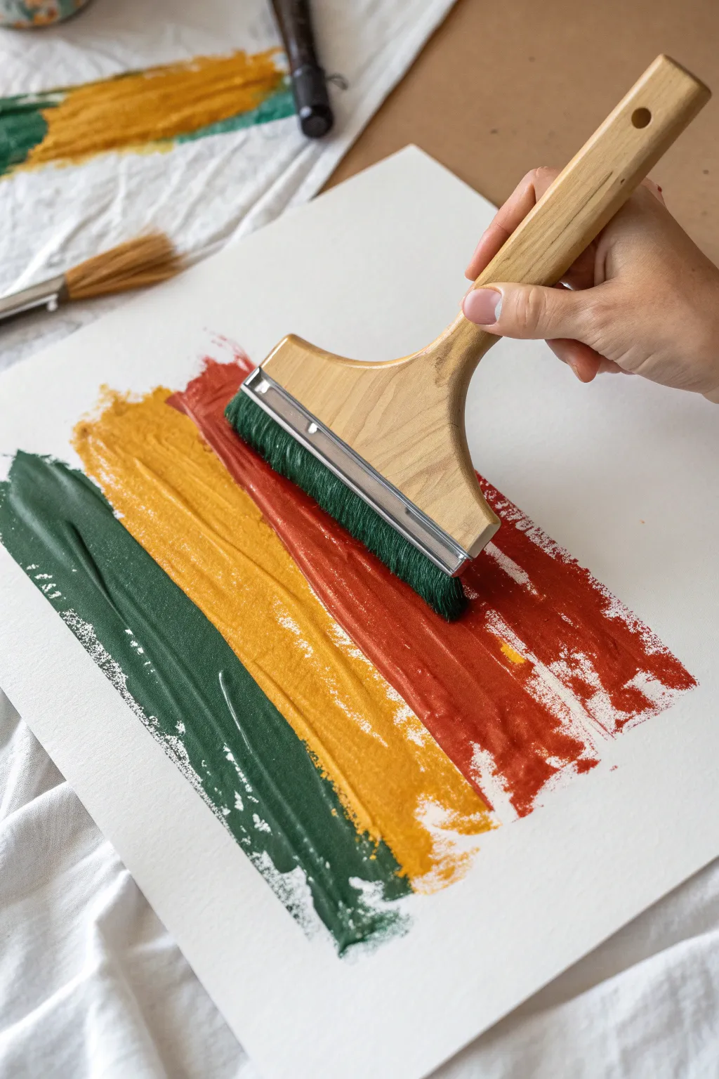
This minimalist project relies on confidence and heavy paint application to create a bold, textured statement piece. By dragging a wide brush loaded with thick acrylics, you will create satisfying bands of color that celebrate the physical texture of the bristles.
Step-by-Step Guide
Materials
- Heavyweight mixed media or watercolor paper (300gsm)
- Heavy body acrylic paints (Deep Forest Green, Yellow Ochre, Burnt Sienna)
- Wide 3-inch flat hake brush or synthetic flat wash brush
- Palette or flat disposable plate
- Masking tape
- Paper towels or heavy cloth rag
- Jar of water
Step 1: Preparation
-
Secure the paper:
Tape your paper down firmly to a flat surface using masking tape; this prevents shifting during the broad strokes. -
Prepare the palette:
Squeeze out generous amounts of all three paint colors onto your palette. -
Check consistency:
Ensure your paints are thick and creamy; do not dilute them with water, as you need the body to hold the texture. -
Clean the brush:
Make sure your wide brush is completely clean and, most importantly, fully dry before starting.
Texture Pro Tip
Do not wet your brush with water before loading the paint. Keeping the bristles dry and stiff is the secret to achieving those defined, scratchy grooves aka ‘striations’ that give the piece character.
Step 2: The Green Stroke
-
Load the brush:
Dip the dry brush into the Deep Forest Green paint, coating the bristles roughly halfway up. -
Ensure heavy coverage:
I like to wiggle the brush in the paint slightly to ensure the interior bristles are fully saturated. -
Position the brush:
Place the brush head at the top left area of your paper, holding the handle at a 45-degree angle. -
Execute the drag:
Pull the brush down towards the bottom of the paper in one smooth, confident motion without stopping. -
Create the taper:
As you reach the end of the stroke, gradually lift the brush off the paper to create a textured, ragged edge. -
Clean up:
Wash the green paint out of the brush thoroughly and squeeze it completely dry with a rag.
Spacing Troubleshooting
If your strokes end up too far apart, don’t try to fill the gap with a small brush. Instead, wait for it to dry, then add distinct splatter marks in the white space to make the gap look intentional.
Step 3: The Ochre Stroke
-
Load the second color:
Refill your brush generously with the Yellow Ochre paint. -
Align the stroke:
Position the brush to the immediate right of the green stroke. -
Overlap slightly:
Allow the bristles to graze the edge of the wet green paint slightly if you want a subtle blend, or keep a tiny gap for separation. -
Pull the paint:
Drag the brush down parallel to your first line, applying firm, even pressure to maintain the width. -
Finish the line:
Lift off near the bottom, trying to end the stroke roughly aligned with the first one. -
Wash and dry:
Clean the brush again, ensuring no yellow residue remains and the bristles are dry.
Step 4: The Rust Stroke
-
Load the final color:
Saturate the brush with the Burnt Sienna or rust-colored paint. -
Position on the right:
Set up for your final stroke on the right side of the paper. -
Final drag:
Complete the trio by dragging the paint down, mirroring the speed and pressure of the first two strokes. -
Let it set:
Resist the urge to touch up any areas; allow the thick paint to dry completely flat for at least 2 hours.
Once dry, peel off the tape to reveal your clean, modern abstract artwork ready for a frame.


Foil-Stamped Autumn Trees
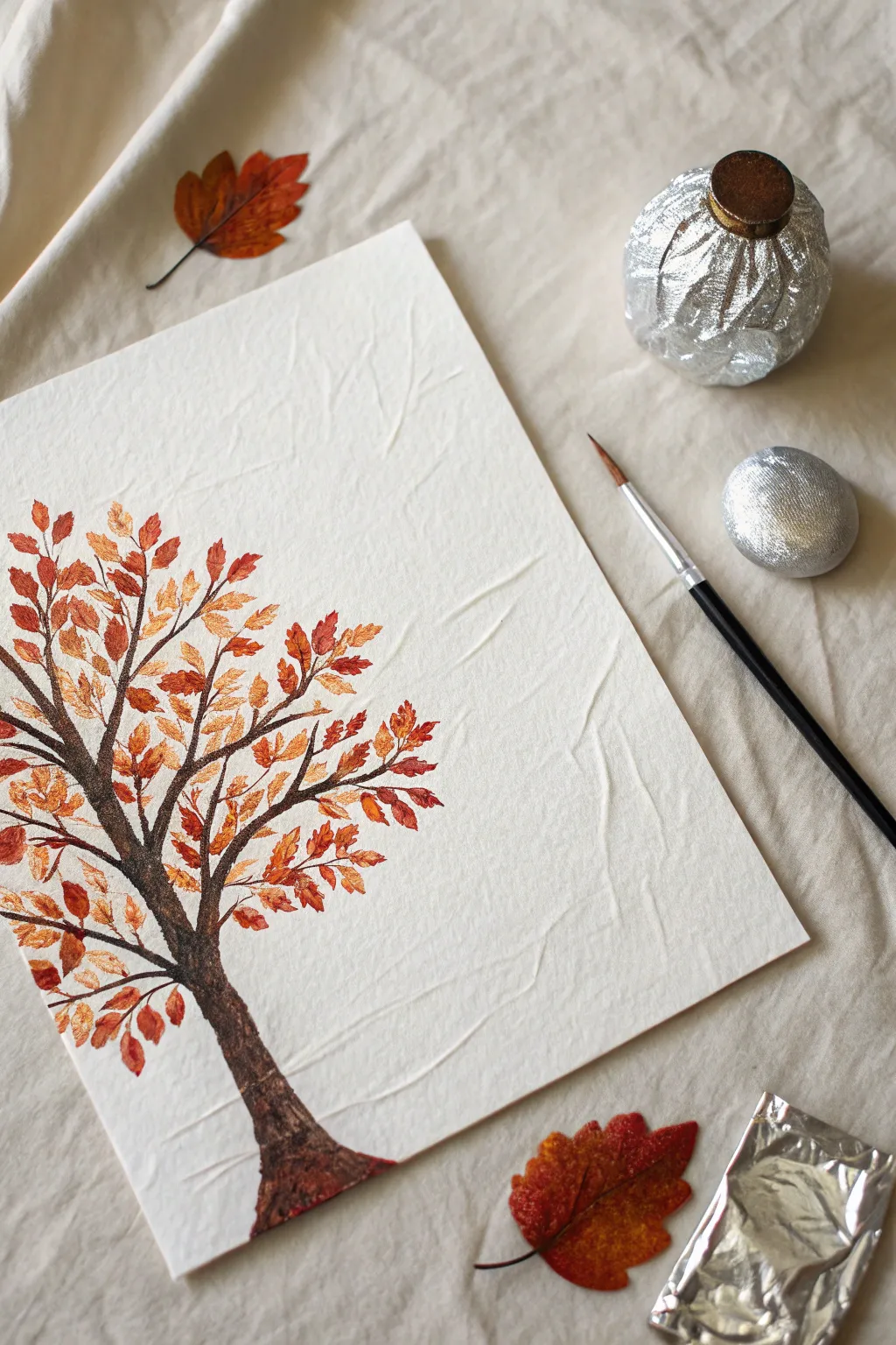
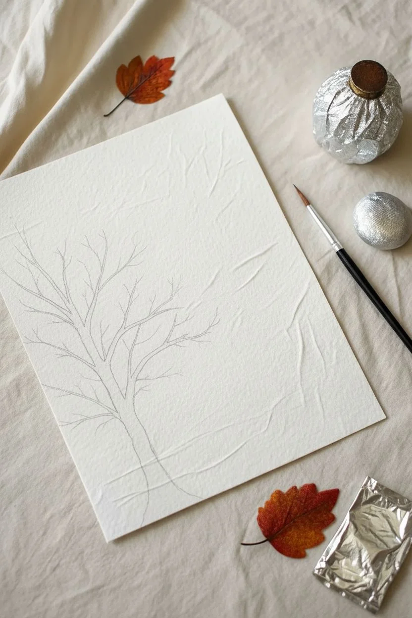
Capture the crinkled texture of falling leaves by using a surprising household tool: aluminum foil. This technique creates an organic, vibrant canopy of autumn foliage that contrasts beautifully against a sleek, painted trunk.
Step-by-Step Tutorial
Materials
- Heavyweight textured watercolor paper
- Aluminum foil
- Acrylic paints (Burnt Umber, Cadmium Red, Orange, Yellow Ochre, Metallic Gold)
- Round synthetic brush (size 6)
- Small detail brush (size 2)
- Mixing palette
- Paper towels
Step 1: Sketching the Structure
-
Prepare the paper:
Place your textured paper on a flat surface. If you want the specific wrinkled look shown in the example, you can gently crumple the paper and flatten it out again before starting, though standard watercolor paper works beautifully too. -
Draft the trunk:
Using a very light pencil touch, draw a curved line for the main trunk, starting slightly off-center at the bottom. -
Add main branches:
Sketch three to four primary branches extending outward from the trunk in a V-shape, keeping the lines flowing naturally. -
Detail the twigs:
Add smaller sub-branches attached to the main limbs, ensuring they get thinner as they move away from the center.
Blob Control
If your leaves look like solid blobs rather than textured foliage, your foil is holding too much paint. Blot the foil on a paper towel after every dip before touching your artwork.
Step 2: Painting the Bark
-
Mix the base color:
On your palette, mix Burnt Umber with a tiny drop of black to create a deep, rich brown. -
Fill the trunk:
Using the size 6 round brush, paint the main trunk using long, smooth strokes from bottom to top. -
Taper the branches:
Switch to slightly less pressure as you move up the branches to create elegant, tapered tips. -
Add texture:
While the brown is still wet, I like to streak in a little lighter brown or raw sienna on the left side of the trunk to suggest a light source. -
Refine with detail:
Use the size 2 brush to paint the thinnest twigs at the very ends of the branches, giving the tree a delicate skeleton. -
Let it dry:
Allow the trunk structure to dry completely to prevent the brown paint from bleeding into your bright leaf colors later.
Pro Tip: Texture Variety
Make your foil stamp irregular rather than a perfect sphere. A jagged, uneven surface on the foil ball creates much more realistic, organic leaf shapes.
Step 3: Stamping the Foliage
-
Create foil tools:
Tear off a piece of aluminum foil and crunch it into a small ball, creating a textured ‘stamp’ about the size of a walnut. Make a second, smaller one for details. -
Prepare the canopy colors:
Squeeze distinct blobs of red, orange, and yellow ochre onto your palette. Do not fully mix them; having multicolored blobs helps create depth. -
Load the stamp:
Dip the larger foil ball into the darkest red/orange mix. Dab it on a paper towel first to remove excess paint—too much paint removes the texture. -
Apply base layer:
Stamp the foil gently over the branch tips to create the main clusters of leaves, rotating your hand slightly between stamps for variety. -
Add highlights:
Using the smaller foil ball, dip into the brighter yellow and orange tones. -
Layer the dimension:
Stamp these lighter colors lightly over the top of the red layers, focusing on the upper parts of the leaf clusters where the sun would hit. -
Create falling leaves:
Use a clean corner of the foil to stamp a few isolated leaves near the bottom of the paper, aiming for a scattered, ‘falling’ effect. -
Metallic accents:
Once the matte colors are tacky, lightly dab a tiny amount of metallic gold paint onto the most textured peaks of the leaves for a shimmering finish.
Step 4: Final Touches
-
Connect the clusters:
If any leaf clusters look like they are floating in mid-air, use the size 2 brush and the brown trunk color to paint tiny connecting twigs. -
Ground the tree:
Paint a small, rough patch of roots and fallen leaves at the very base of the trunk to anchor the composition.
Allow the thick acrylics to dry fully before displaying your shimmering autumnal masterpiece.
BRUSH GUIDE
The Right Brush for Every Stroke
From clean lines to bold texture — master brush choice, stroke control, and essential techniques.
Explore the Full Guide
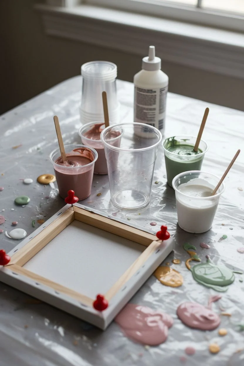
Fluid Acrylic Pour Painting
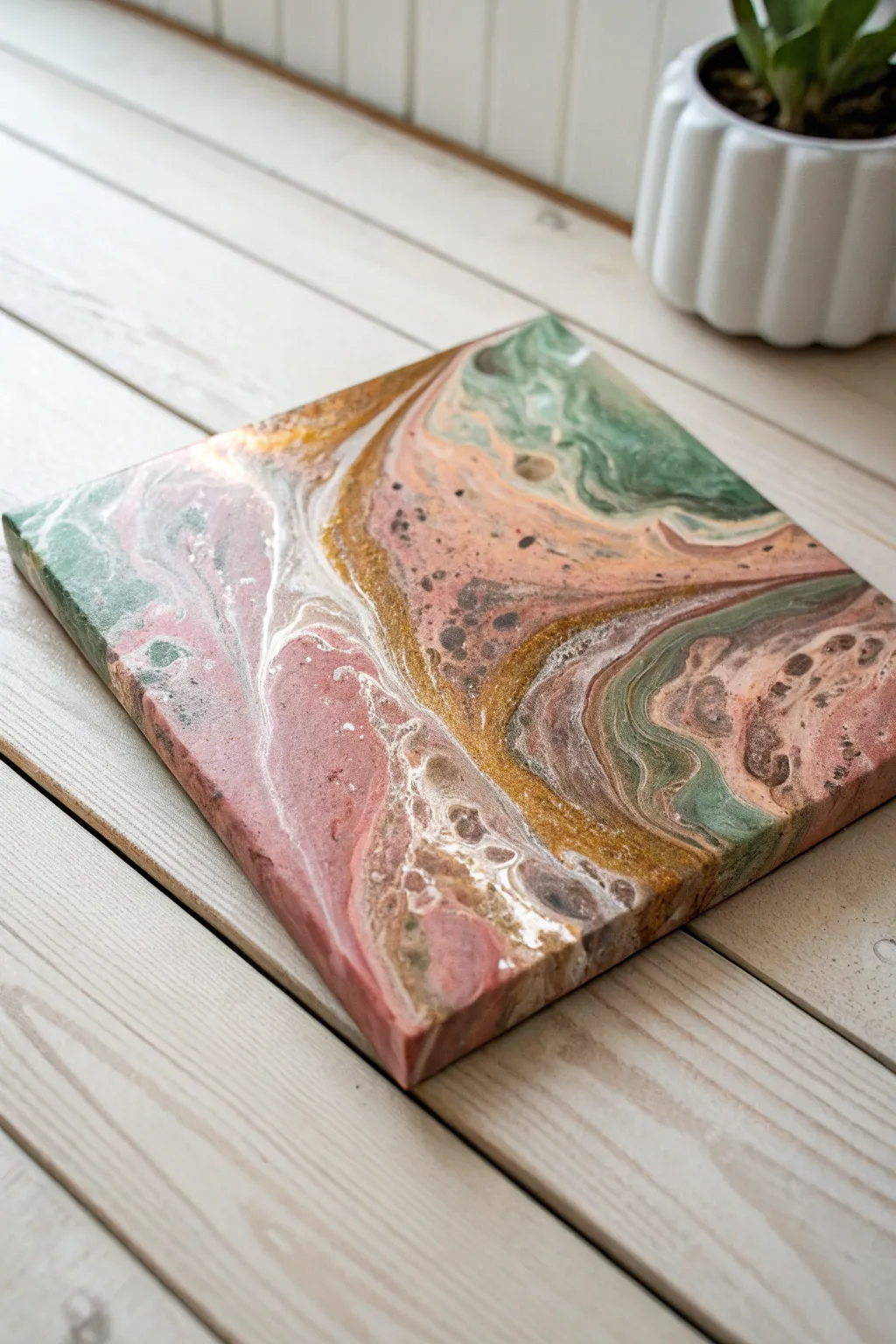
This fluid art project combines dusty rose, sage green, and metallic gold to create a sophisticated, marbled abstract piece. The organic cells and flowing lines mimic the look of polished agate stone.
Step-by-Step
Materials
- Square canvas (8×8 or 10×10 inches)
- Acrylic paints: Dusty Rose, Sage Green, Metallic Gold, Titanium White
- Pouring medium (Floetrol or similar)
- Silicone oil (treadmill lubricant works well)
- Plastic cups (4 small, 1 large)
- Wooden stir sticks
- Giant push pins (for canvas feet)
- Butane torch (optional, kitchen style)
- Drop cloth or plastic sheeting
Step 1: Preparation and Mixing
-
Prepare the workspace:
Fluid art is messy, so cover your table completely with a heavy plastic drop cloth or garbage bags to catch runoff. -
Elevate the canvas:
Flip your canvas over and hammer a large push pin into each specific corner of the wooden frame. This creates ‘feet’ to keep the canvas off the table while drying. -
Mix the pouring medium:
In the four small cups, mix one part acrylic paint with roughly one to two parts pouring medium. I prefer to start with a 1:1 ratio. -
Check consistency:
Stir each color thoroughly until it flows like warm honey. Use water sparingly if you need to thin it, adding only a few drops at a time. -
Add silicone for cells:
Add 2-3 drops of silicone oil to the Dusty Rose and Sage Green cups only. Stir just two or three times to incorporate; over-stirring will break the oil down too much.
Muddy Colors?
If your pink and green turn brown, you likely over-tilted or mixed the paints too thin. Next time, keep paints slightly thicker and stop tilting as soon as the canvas is covered.
Step 2: Creating the Dirty Pour
-
Layer the white base:
Take your large clean cup. Pour a generous amount of Titanium White into the bottom to act as a separator. -
Layer the colors:
Gently pour half of the Metallic Gold down the side of the large cup so it rests on top of the white. -
Continue the stack:
Pour in the Dusty Rose, followed by the Sage Green. Don’t dump them; let them layer gently. -
Repeat the layers:
Repeat the layering process with the remaining paint until the cup is almost full, finishing with a final dash of white.
Step 3: The Flip and Tilt
-
Position the cup:
Place the canvas face-down on top of your full cup. Holding both the cup and canvas tight together, flip them over quickly so the cup is now upside down on the canvas. -
Let it settle:
Wait about 30 seconds to let the paint settle to the bottom of the canvas before rushing to lift. -
Lift the cup:
Gently lift the cup straight up. The paint will puddle outward. If you have a torch, pass it quickly over the bubbles to pop them. -
Begin tilting:
Very slowly tilt the canvas to one corner. Allow the paint to roll near the edge, but try not to let too much flow off just yet. -
Cover the surface:
Rotate the angle and tilt the paint toward the opposite corner. The goal is to stretch the cells (the round spots) without distorting them into long streaks. -
Check the composition:
Look at the gold veins. Tilt the canvas to guide these metallic rivers where you want them, ensuring the gold breaks up the solid blocks of pink and green. -
Finish the corners:
Ensure the paint has flowed over all four corners. If a corner is bare, use your finger to dab a little matching drip from the table onto the edge. -
Final clean up:
Run a popsicle stick along the underside of the canvas frame to scrape off drips. This prevents the paint from pulling on the surface design as it dries.
Cell Creation Tip
The ‘cells’ (spots) are created by the silicone oil rising to the surface. For the look in the photo, do NOT add silicone to the white or gold paint; this keeps the metallic bands crisp.
Let your masterpiece dry on a level surface for at least 24 hours to see the metallic gold shimmer fully develop.
Squish Art Butterflies
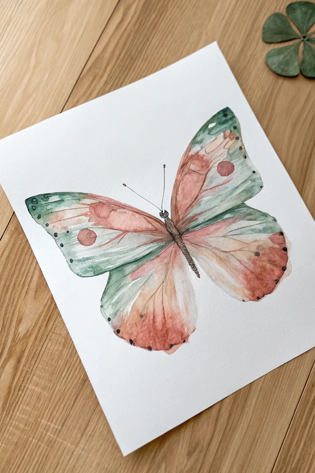
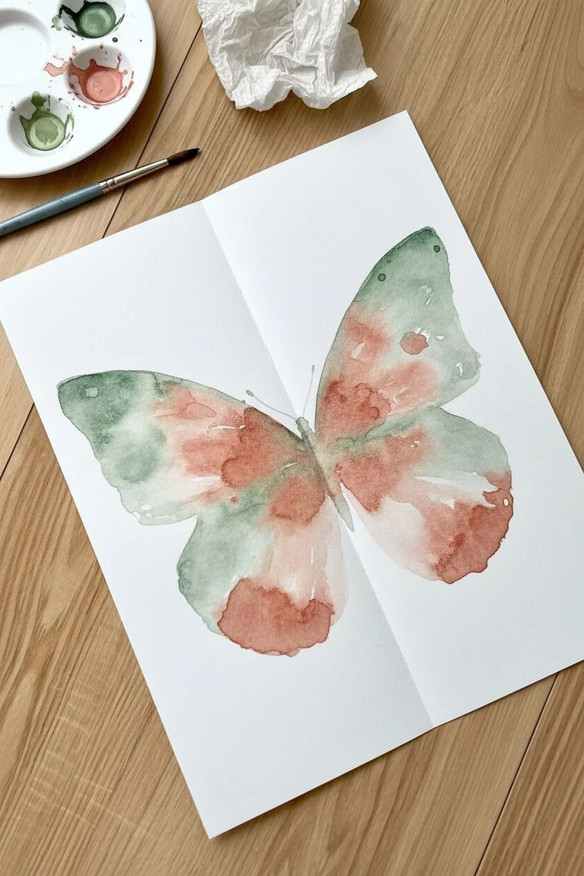
This project combines the nostalgic fun of childhood “squish art” with refined watercolor techniques to create a perfectly symmetrical, nature-inspired butterfly. The result is an elegant piece featuring soft sage greens and earthy terracotta tones with delicate ink-like details.
How-To Guide
Materials
- Cold-press watercolor paper (300 gsm)
- Watercolors (Sage Green, Terracotta/Rust, Sepia)
- Round watercolor brushes (size 6 and size 2)
- Fine-tip black waterproof liner pen (0.1 or 0.3mm)
- Clean water and mixing palette
- Paper towels
- Pencil
Step 1: The Symmetrical Base
-
Create the crease:
Start by gently folding your watercolor paper in half vertically to establish the center line, then open it back up so it lies flat. -
Mix your palette:
Prepare puddles of your sage green and terracotta paint; you want a fluid consistency that holds pigment but flows easily. -
Paint the first wing:
Working quickly on just the right side of the crease, paint the shape of the upper and lower butterfly wings. -
Blend the colors:
While the shape is wet, drop sage green near the edges and terracotta in the center, letting them bleed slightly into each other. -
Check the moisture:
Ensure the paint is still very wet and shiny; if it has started to dry, dab in a little more water or pigment. -
The squish:
Fold the clean left side of the paper over onto the wet painted side. -
Transfer the image:
Gently rub the back of the folded paper with your hand, applying even pressure to transfer the paint to the blank side. -
Reveal the shape:
Carefully peel the paper open to reveal your symmetrical butterfly base and let this layer dry completely.
Step 2: Refining and Glazing
-
Soften the edges:
If the squish created rough outlines, take a slightly damp brush and gently smooth out the perimeter of the wings to create a cohesive shape. -
Add color depth:
Glaze a second, translucent layer of sage green over the wingtips to intensify the color transparency. -
Paint the eye spots:
Using a smaller brush, paint a distinct terracotta circle on each upper wing and a soft wash of rust on the lower wing tips. -
Create veins:
With a very diluted mixture of sepia or grey, paint faint, sweeping lines radiating from the center of the wings outward.
Wetness is Key
Work fast during the first phase! The paint must be glistening wet before you fold. If it starts to soak in or dry, the transfer will be patchy and faint.
Step 3: Inking the Details
-
Paint the thorax:
Mix a concentrated dark sepia or black and paint the long, slender body of the butterfly strictly along the center crease. -
Draw the antennae:
Switch to your fine liner pen to draw two thin, delicate antennae extending from the head, topping them with tiny bulbs. -
Texturize the body:
I like to use the pen to add tiny hatch marks over the painted body to give it a fuzzy, insect-like texture. -
Add edge dots:
Using the tip of your pen or a detail brush, dab tiny black dots along the outer edges of the wings for contrast. -
Final definition:
Add a few broken ink lines near the body where the wings attach to simulate structural veins.
Uneven Transfer?
If one wing looks lighter after the squish, don’t worry. Just use your brush to manually add more paint to the lighter side to match the saturation.
Once the ink is dry, you’ll have a beautifully organic butterfly that looks like a vintage natural history illustration

PENCIL GUIDE
Understanding Pencil Grades from H to B
From first sketch to finished drawing — learn pencil grades, line control, and shading techniques.
Explore the Full Guide
Bubble Wrap Printed Textures
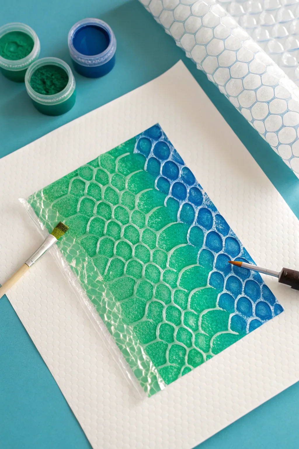
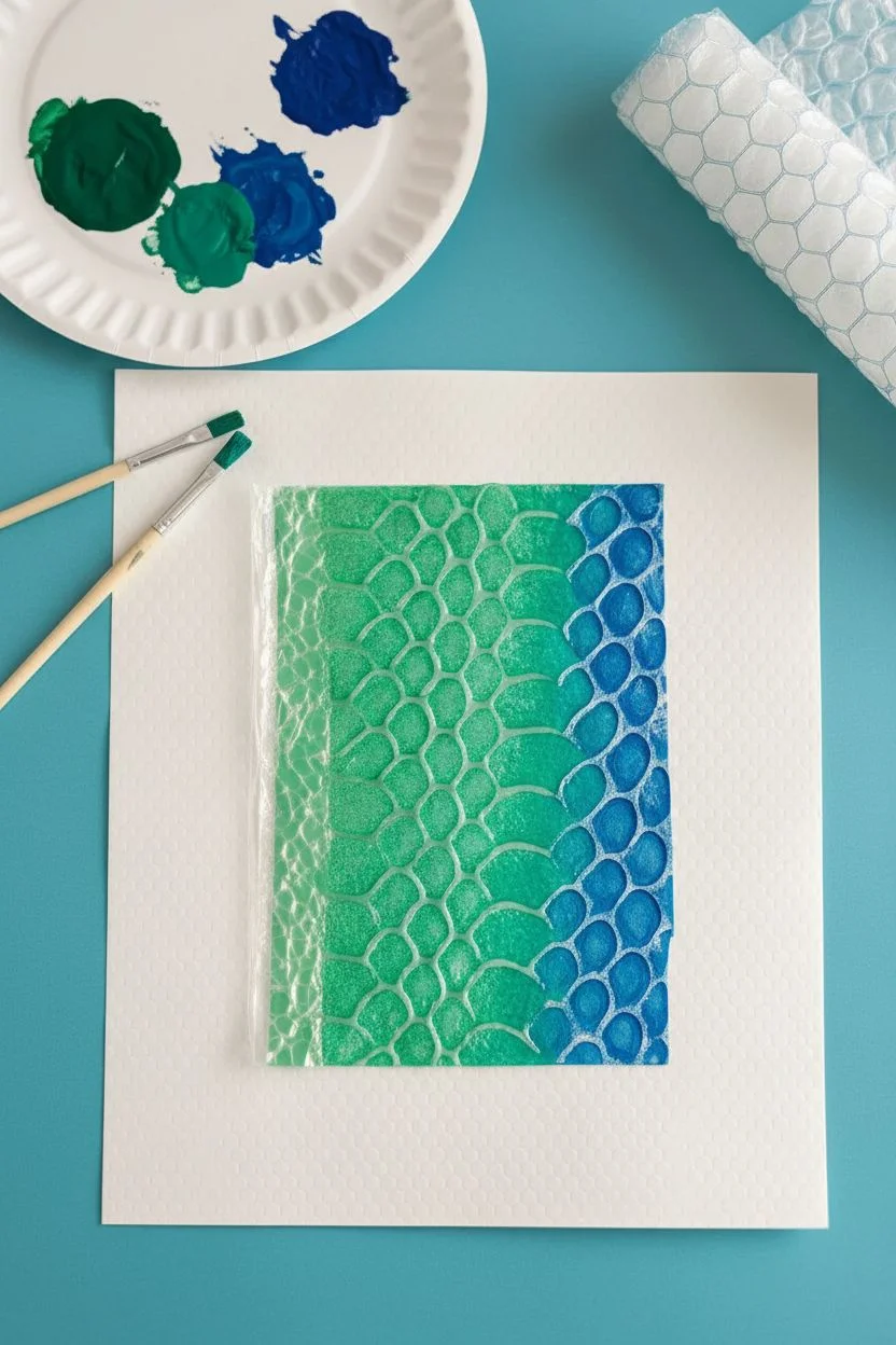
Transform ordinary packing material into a mystical reptile skin texture using a simple printmaking technique. This project uses the raised surface of bubble wrap to stamp a stunning green-to-blue gradient that looks remarkably complex but is easy to master.
Step-by-Step
Materials
- Sheet of small-bubble bubble wrap
- Thick white drawing paper or watercolor paper
- Scissors
- Gouache or acrylic paints (Emerald Green, Teal, Cobalt Blue)
- Flat synthetic paintbrushes (medium size)
- Palette or paper plate
- Protective table covering
Step 1: Preparation & Palettes
-
Cut the matrix:
Using your scissors, cut a clean rectangle from the bubble wrap. This will determine the size of your final printed area, so ensure the edges are straight. -
Prepare the workspace:
Lay down your protective covering and place your white paper in the center. Have your cut piece of bubble wrap ready with the bubbly side facing up. -
Dispense colors:
Squeeze out generous dollops of emerald green and cobalt blue onto your palette. I assume you might not have a pre-mixed teal, so leave space between them to mix your own transition shade. -
Mix the mid-tone:
Take a little bit of green and a little bit of blue to create a teal bridge color. This ensures a smooth visual flow across the scales.
Paint Consistency
Don’t add water to your paint! It needs to be tacky to stick to the plastic. If it’s too thin, it will bead up on the plastic bubbles and create blotchy spots instead of round scales.
Step 2: Inking the Bubbles
-
Load the green:
Dip your flat brush into the emerald green paint. You want the paint to be creamy but not dripping wet. -
Paint the first section:
Gently brush the green paint onto the raised bubbles on the bottom third of your plastic rectangle. Keep your brush strokes light to coat the tops of the bubbles without pushing paint into the valleys between them. -
Apply the mid-tone:
Switch to your teal mixture. Paint the middle section of the bubble wrap, slightly overlapping the green edge to create a soft blend. -
Finish with blue:
Apply the dark cobalt blue to the remaining top third of the bubble wrap, blending it slightly where it meets the teal section. -
Check coverage:
Get eye-level with your bubble wrap. Ensure every bubble in the gradient area has a nice cap of wet paint, but check that the flat spaces between bubbles are relatively clean to preserve the white ‘grout’ lines. -
Refresh if needed:
Acrylics dry fast. I like to do a quick second pass over the green if it looks like it started drying while I was working on the blue.
Clean Lines
Did paint get into the gaps? You pressed too hard with the brush. Next time, use a ‘dry brush’ technique, skimming the brush horizontally across the tops of the bubbles.
Step 3: Printing the Texture
-
Position the stamp:
Carefully pick up the painted bubble wrap by the edges. Hover it over your white paper to align it where you want the texture to appear. -
Make contact:
Flip the wrap over and place it paint-side down onto the paper. Once it touches the paper, do not slide it, or the scales will smear. -
Transfer the image:
Using the palm of your hand, press down firmly and evenly across the entire back of the bubble wrap. -
Rub the edges:
Run your fingers along the perimeter of the rectangle to ensure the borders transfer crisply. -
The peek test:
Gently lift just one corner of the wrap while holding the rest down. If the print looks patchy, lay the corner back down and press harder. -
Reveal the artwork:
Peel the bubble wrap entirely off the paper in one smooth motion to reveal your dragon scales. -
Dry and flatten:
Set the paper aside to dry completely. If the heavy paint causes the paper to curl slightly, place it under a heavy book once it is fully dry.
Now you have a shimmering textured piece that looks ready to slither off the page
Salt Textured Milky Way
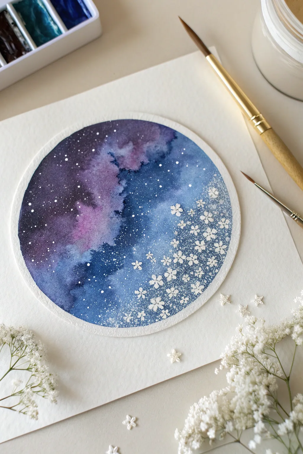
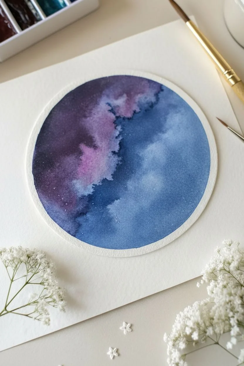
Merge the magic of the cosmos with delicate floral art in this circular watercolor piece. You will use salt textures to create a nebulous backdrop and finish with precise white gouache to paint constellations that bloom into flowers.
Step-by-Step Tutorial
Materials
- Cold press watercolor paper (300 gsm)
- Watercolor paints (Indigo, Violet, Prussian Blue, Black)
- White gouache or bleed-proof white ink
- Round watercolor brush (size 6 or 8)
- Fine detail brush (size 00 or 0)
- Table salt or sea salt
- Compass or round bowl for tracing
- Pencil and eraser
- 2 jars of water
Step 1: Preparation and Base Layer
-
Outline the shape:
Begin by lightly tracing a circle onto your watercolor paper using a compass or by tracing around a small bowl. -
Wet the paper:
Using your larger round brush, fill the inside of the circle with clean water. You want an even sheen, but avoid creating puddles. -
Apply the first colors:
Load your brush with a watery violet or purple. Drop this color into the left-center portion of the circle, letting it bloom naturally on the wet surface. -
Deepen the cosmos:
While the paper is still wet, introduce indigo and black to the far left edge to create a deep, shadowy space void. -
Add the nebula blue:
Rinse your brush and pick up Prussian Blue. Paint the right side of the circle, allowing it to touch and blend slightly with the purple in the middle.
Salt Trouble?
If the salt didn’t leave texture, the paper was likely too dry when sprinkled. If it dissolved into a blob, the paper was too wet. Aim for a ‘damp sheen’ next time.
Step 2: Creating Texture
-
Check the dampness:
Wait a moment until the paper loses some of its glossy wetness and settles into a satin sheen. -
The salt technique:
Sprinkle a pinch of salt over the blue section on the right and the transition area. This will push the pigment away to create starburst textures. -
Wait for drying:
Allow the painting to dry completely. This is crucial; if you disturb the salt too early, the texture will smudge. I often use this time to clean my palette. -
Clean the surface:
Once the paper is bone dry and warm to the touch, gently rub off the salt crystals with your clean fingertips or a soft cloth.
Make it Shimmer
Mix a small amount of pearlescent medium or silver watercolor into your dark indigo paint. The background will have a subtle, magical glitter when viewed at an angle.
Step 3: Stars and Florals
-
Prepare the gouache:
Squeeze a small amount of white gouache onto your palette and mix with a tiny drop of water until it has a creamy, opaque consistency. -
Splatter the background:
Load a wet brush with the white mix and tap it against another brush handle over the circle to create a spray of fine, distant stars. -
Paint larger stars:
Switch to your size 00 detail brush. On the dark purple side (left), paint individual tiny dots for brighter, more distinct stars. -
Start the floral cluster:
On the lighter blue right side, begin painting small five-petal flower shapes using the white gouache. Keep them very small to mimic baby’s breath. -
Build density:
Cluster the flowers densely near the right edge of the circle, almost overlapping them. -
Create the drift:
As you move toward the center of the circle, space the flowers further apart, making them smaller until they transition back into simple star dots. -
Add flower centers:
If you want extra detail, use a needle tip to prick a tiny hole in the center of the wet gouache flowers, revealing the blue underneath. -
Final assessment:
Step back and check the balance. Identify any empty-looking patches in the transition zone and fill them with the tiniest micro-dots of white.
Now you have a stunning galaxy piece where the stars seem to bloom right off the page.


Straw-Blown Crazy Hair Monsters
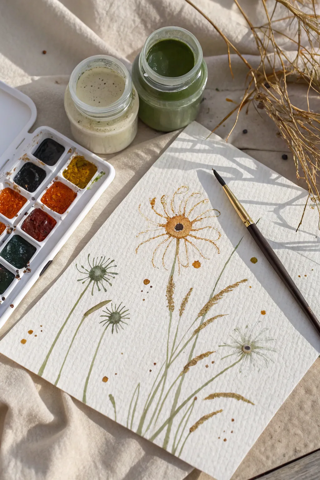
Capture the delicate beauty of a meadow with this stylized botanical painting giving off a vintage scientific illustration vibe. Using a mix of opaque earthy greens and warm ochres, you will build a whimsical composition of wildflowers and grasses.
Step-by-Step
Materials
- Cold press watercolor paper (textured)
- Opaque watercolor or gouache (Sage Green, Cream/White)
- Watercolor paints (Yellow Ochre, Burnt Umber, Lamp Black)
- Round brush (size 4)
- Fine liner or detail brush (size 0 or 1)
- Mixing palette
- Two water jars
Step 1: Laying the Greenery
-
Prepare your palette:
Mix a sage green color using gouache or opaque watercolor. You want a creamy consistency—thick enough to be opaque but fluid enough to glide off the brush. -
Paint the main stem:
Using your fine liner brush, paint a long, slightly curved line from the bottom center of the paper reaching up toward the middle for the main flower. -
Add supporting stems:
Paint two shorter stems curving off to the left side, and one delicate stem curving to the right. Varying the height creates a more natural look. -
Create grass blades:
Fill in the empty space at the bottom by flicking your brush upward to create thin, tapered blades of grass overlapping the main stems. -
Paint the dandelion bases:
On the left stems, intricate fine lines are needed. Paint small, star-like radiating lines in green to form the base of the seed heads. -
Add detail to the green heads:
Drop a tiny amount of darker green or brown into the center of these star-shapes while they are still damp to create depth.
Broken Lines?
If your long stem lines look scratchy or break midway, your paint is likely too dry. Add a single drop of water to your brush to improve flow without losing opacity.
Step 2: Flowers and Details
-
Main flower center:
Switch to your round brush and yellow ochre paint. Create a soft, imperfect circle at the top of the main central stem. -
Darken the pupil:
While the ochre is drying, drop a small, concentrated dot of black or dark brown into the very center of the flower head. -
Draft the petals:
Using a diluted brown or dark gold and your fine liner brush, paint spindly, looped petals radiating from the center. Keep lines wiggly for a whimsical texture. -
Stipple the petals:
I like to add character here by using the tip of the brush to dot warm ochre spots onto the petals you just painted. -
Paint the right-side flower:
For the flower on the right, use a watery white or cream gouache. Paint faint, translucent petals radiating from its stem. -
Add contrast to the white flower:
Place a small dark brown dot in the center of the white flower to anchor it visually. -
Texture the grasses:
Mix a golden-brown hue. Dab the brush along the tips of the tall grass blades to create the look of seeds or pollen. -
Create scattered pollen:
Load your brush with watery ochre or gold paint and gently tap the handle against a finger to splatter fine droplets around the flowers. -
Ground the composition:
Add a few larger, deliberate dots of ochre and brown near the bottom of the stems to simulate the ground. -
Final assessment:
Let the piece dry completely. If the stems look too faded, go over them one last time with your opaque sage green texturing.
Golden Hour
Swap the yellow ochre paint for a metallic gold watercolor pan when painting the seeds and splatters. This adds a beautiful shimmer that catches the sunlight.
Frame your botanical study or gift it to a nature-loving friend once it dries.
Pop Art Repeated Patterns
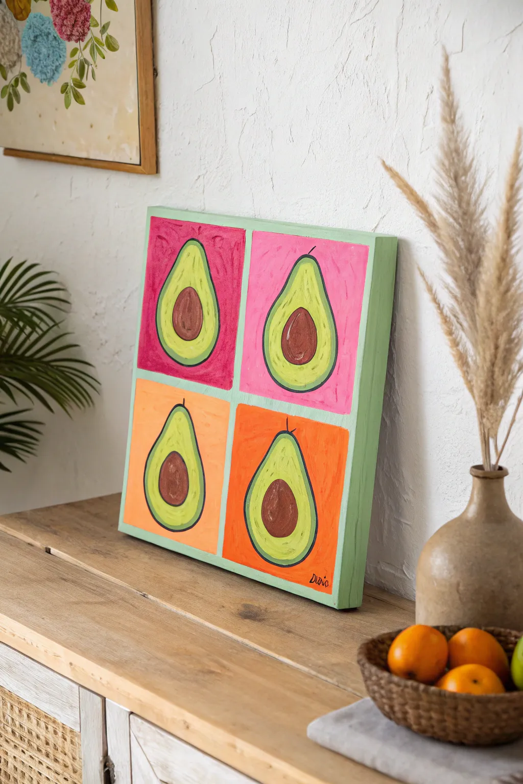
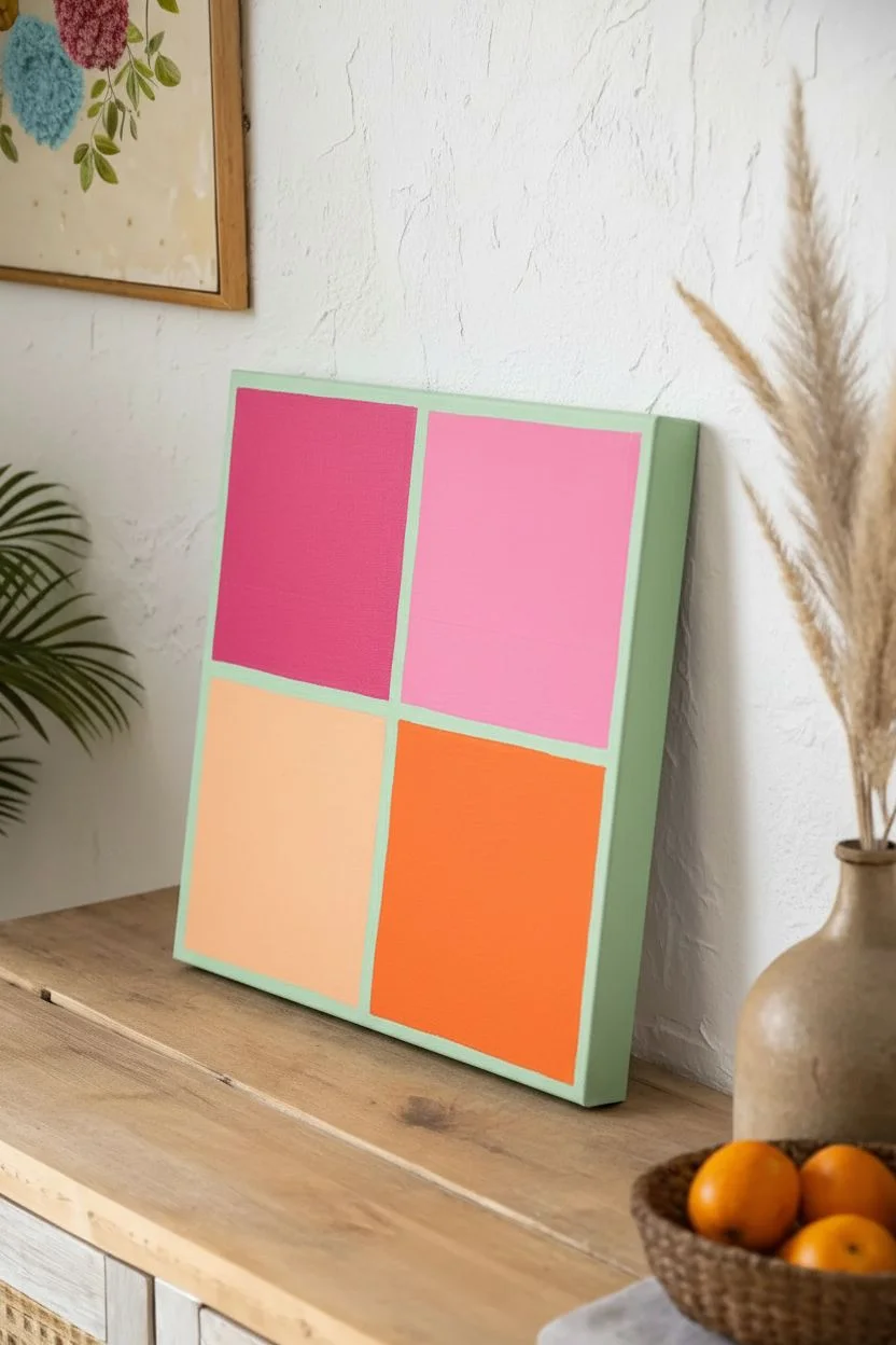
Channel your inner Warhol with this vibrant, food-inspired Pop Art canvas. Using bold, saturated colors and simple repeated shapes, you’ll create a cheerful 2×2 grid of avocados that adds a modern splash of fun to any kitchen or dining area.
How-To Guide
Materials
- Square gallery-wrapped canvas (12×12 or 16×16 inches)
- Acrylic paints (Magenta, Bubblegum Pink, Peach, Bright Orange, Lime Green, Yellow, Dark Brown, Tan, Black, Mint Green)
- Pencil and ruler
- Painter’s tape (optional)
- 1-inch flat brush
- Medium filbert brush
- Small round detail brush
- Palette and water cup
Step 1: Setting the Background
-
Measure the grid:
Use your ruler to find the exact center of the canvas. Lightly draw a vertical and horizontal line with a pencil to divide the surface into four equal quadrants. -
Tape the edges (optional):
If you struggle with straight lines, apply painter’s tape along your pencil marks to mask off one section at a time. I prefer doing this to ensure crisp boundaries between colors. -
Paint top-left quadrant:
Fill the top-left square with a deep raspberry or magenta acrylic paint. Use long, even strokes with your flat brush. -
Paint top-right quadrant:
Clean your brush thoroughly, then paint the top-right square with a bright bubblegum pink. -
Paint bottom-left quadrant:
Fill the bottom-left square with a soft peach or cantaloupe color. -
Paint bottom-right quadrant:
Finish the background grid by painting the final square in a vivid, saturated orange. -
Paint the canvas edges:
Paint the four outer sides (depth) of the canvas with a fresh mint green color to frame the bright front panel. -
Let it cure:
Allow the background colors to dry completely. If the colors look transparent, add a second coat for solid, opaque coverage.
Pro Tip: Texture Talk
Don’t over-smooth your paint. Pop Art often embraces a slightly painterly look, so leaving visible brushstrokes in the background adds authentic character and energy to the piece.
Step 2: Adding the Avocados
-
Sketch the shapes:
Once the background is dry, lightly sketch a pear shape in the center of each colorful square. Try to keep them roughly the same size. -
Mark the pits:
Draw a large circle in the lower, wider part of each pear shape to represent the avocado pit. -
Mix the flesh color:
Mix lime green with a little yellow and white to get a creamy, appetizing avocado flesh tone. -
Paint the green flesh:
Use the filbert brush to paint the green area of the avocado, carefully painting around the circular pit you sketched. -
Paint the pits:
Fill in the circular centers with dark brown paint. Don’t worry if the edges touch the green wet paint slightly; it adds texture. -
Add pit highlights:
Mix a small amount of tan or light brown paint. While the dark brown is tacky or just dry, swirl a patchy highlight onto the center-left of each pit for dimension.
Troubleshooting: Wobbly Lines?
If you find painting thin outlines difficult with a brush, wait for the paint to dry fully and use a black chisel-tip paint marker (like POSCA) to draw the outlines instead.
Step 3: Outlining and Finishing
-
Prepare outline color:
Use black paint or a very dark green. Dilute it slightly with a drop of water to help it flow smoothly off the brush. -
Outline the pits:
Using your smallest round brush, paint a thin, loose ring around the brown pit to define it against the green flesh. -
Outline the avocados:
Paint a confident outline around the entire green pear shape. Varying the line thickness slightly gives it that organic, hand-painted Pop Art feel. -
Add the stem:
Paint a small, curved line or tick mark sticking out from the very top of each avocado to suggest a stem. -
Sign your work:
Once everything is dry, sign your name or initials in the corner using a contrasting color like black.
Hang your delicious new masterpiece in a spot where it can catch natural light to make those colors truly sing
Fork-Scraped Furry Friends
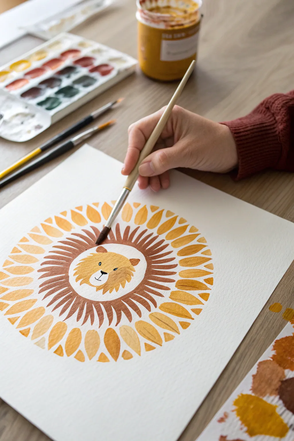
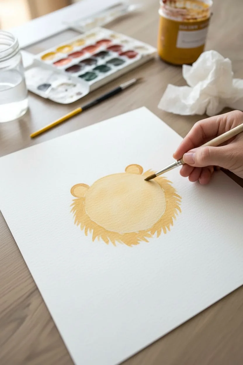
Combine the soothing geometry of a mandala with character art in this warm, sun-soaked project. Using gouache or vibrant watercolors, you will build up radial layers to create a stylized lion that looks like a shining sun.
Step-by-Step
Materials
- Cold press watercolor paper (300 gsm)
- Gouache paint or opaque watercolors
- Synthetic round brush (size 6 or 8)
- Fine detail brush (size 0 or 1)
- Palette for mixing
- Jar of clean water
- Paper towel
Step 1: The Center Face
-
Mix the base color:
Start by mixing a golden yellow-ochre on your palette. You want a creamy consistency that flows well but is opaque enough to cover the paper. -
Paint the head shape:
In the center of your page, paint a circle about 2-3 inches wide. It doesn’t need to be geometrically perfect; a slightly organic shape adds charm. -
Fluff up the edges:
While the paint is still wet, use the tip of your brush to pull tiny strokes outward from the edge of the circle to create a subtle, fuzzy texture. -
Add the ears:
Paint two small semi-circles on the top right and top left of the head shape using a slightly darker shade of ochre or light brown. -
Let it dry:
Allow this central section to dry completely before moving on to the surrounding layers to prevent colors from bleeding into one another.
Step 2: The Radiating Mane
-
Mix the mane color:
Create a rich burnt sienna or reddish-brown hue. This should provide a nice contrast to the lighter face color. -
Practice the stroke:
On a scrap piece of paper, practice the ‘tear-drop’ stroke: press the belly of the brush down, pull outward, and lift slowly to create a tapered point. -
Start the inner ring:
Beginning close to the lion’s face (but leaving a tiny hairline gap), paint your first radial stroke pointing outward. -
Continue the pattern:
Work your way around the entire circumference of the head with these dark brown strokes. I find it helpful to rotate the paper rather than my hand to keep the angle consistent. -
Check for spacing:
Aim for even spacing between the mane spikes, but don’t worry if they vary slightly in thickness; this mimics natural fur.
Pro Tip: Rotation
Tape your paper to a moveable board or simply leave it loose. Rotating the paper as you paint the radial mane allows you to pull every stroke towards your body, ensuring consistent shape and control.
Step 3: The Solar Petals
-
Prepare the outer color:
Clean your brush thoroughly and mix a warm mustard or sunflower yellow. This layer will form the outermost ring. -
paint the large petals:
Using a larger brush or pressing harder with your round brush, create broad leaf-shaped strokes that float just outside the dark brown mane ring. -
Vary the direction:
Ensure all these strokes point outward away from the center, creating a sunburst effect. -
Fill the gaps:
If you have wider spaces between your large yellow petals, add smaller, thinner strokes in between them to create density and rhythm. -
Detail the petal tips:
Go back and sharpen the outer points of your yellow petals if needed, ensuring they look intentional and crisp.
Level Up: Texture
Once the paint is bone-dry, use colored pencils to add texture. Scribble lightly over the mane for fur details or outline the yellow petals to make them pop against the white background.
Step 4: Bringing Him to Life
-
Verify dryness:
Touch the back of your hand to the paper; if it feels cool, it’s still damp. Wait until the paper is room temperature before painting facial features. -
Paint the nose:
Using a very dark brown or black mixture and your fine detail brush, paint a small inverted triangle in the lower center of the face. -
Draw the mouth:
From the bottom point of the nose triangle, paint a small vertical line down, curving into a ‘W’ shape for the mouth anchor. -
Add the eyes:
Paint two small dots for eyes, spacing them widely for a cute, innocent expression. You can add tiny eyebrows above them for character. -
Final whiskers:
With the lightest touch possible, quick-flick a few very thin whiskers extending from the muzzle area.
Step back and admire your sunny, cheerful lion creation
Negative Space Leaf Prints
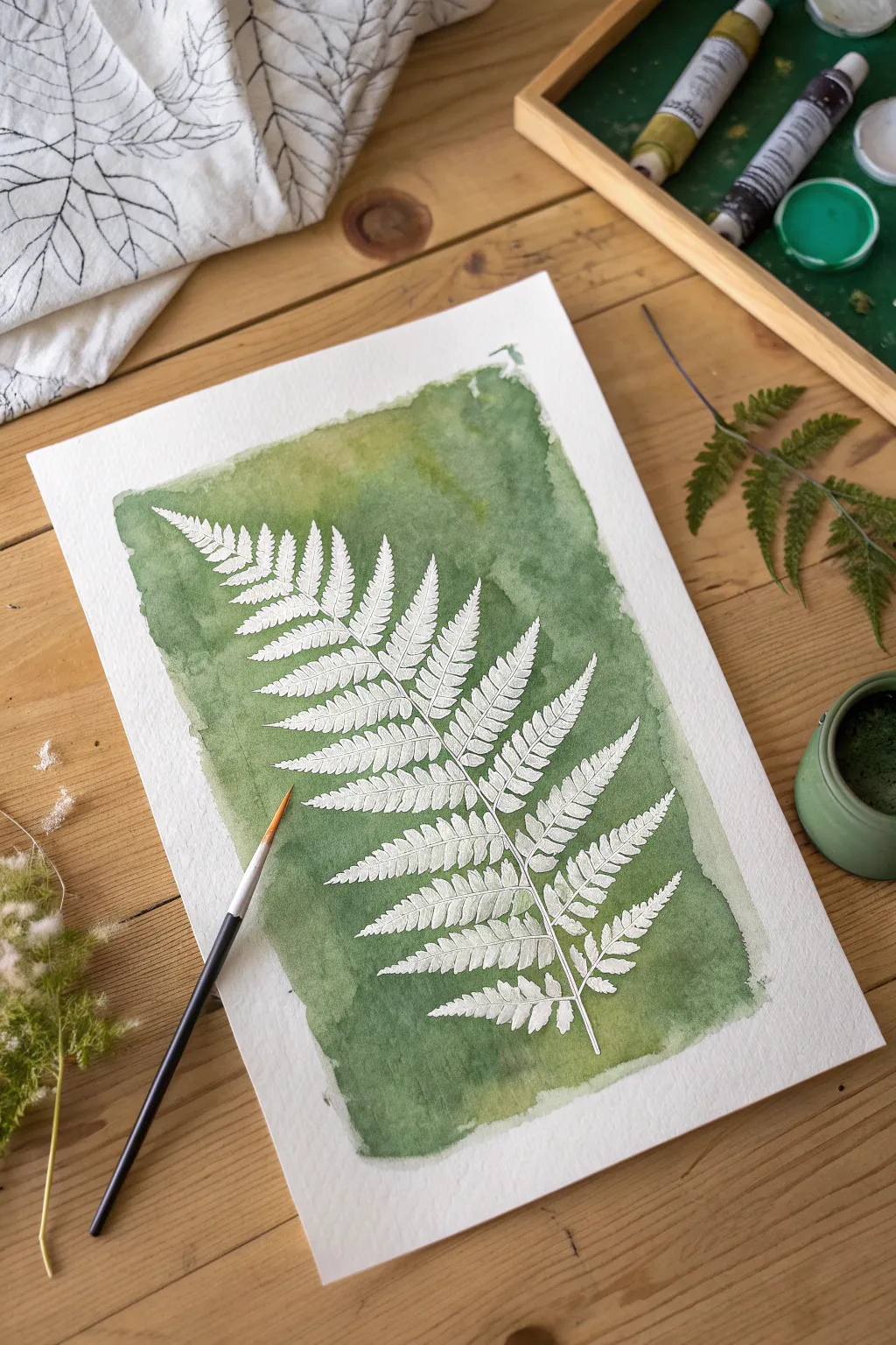
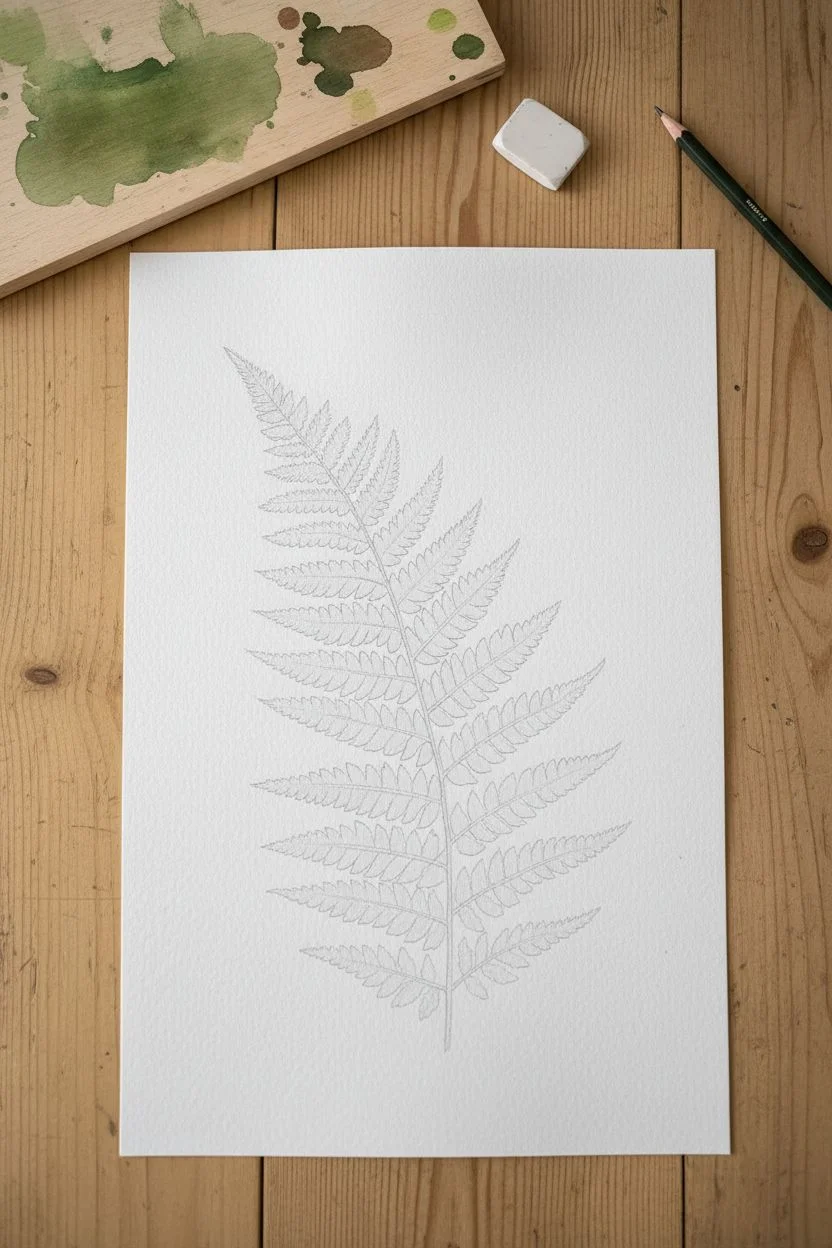
Capture the delicate beauty of botanical illustrations with this high-contrast negative space technique. Using masking fluid allows you to preserve the pristine white of the paper for the intricate fern details while letting loose with a moody, textured watercolor background.
Detailed Instructions
Materials
- Cold-press watercolor paper (300gsm)
- Liquid masking fluid (frisket)
- Watercolor paints (Sap Green, Hooker’s Green, Indigo)
- Synthetic brush (for masking fluid)
- Medium round watercolor brush (size 6 or 8)
- HB Pencil and kneaded eraser
- Bar of soap (optional)
- Real fern frond or reference photo
Step 1: Sketching the Silhouette
-
Establish the curve:
Begin by lightly sketching a single, curved line down the center of your paper to act as the main stem of the fern. -
Mark the width:
Draw faint guidelines on either side of the stem to determine how wide the frond will be, tapering to a point at the top. -
Draft the leaflets:
Sketch the individual leaflets extending from the stem, keeping them larger at the bottom and gradually smaller near the tip. -
Refine the edges:
Go back over your leaflets and add the characteristic jagged or serrated edges of a fern to make the shape look organic. -
Clean up lines:
Once satisfied with the shape, gently roll a kneaded eraser over the sketch to lift excess graphite, leaving only a ghost image.
Save Your Brushes
Does masking fluid ruin your brushes? Never use your good sable brushes for masking! Use a cheap synthetic one, or apply the fluid with a silicone color-shaping tool.
Step 2: Applying the Mask
-
Protect your brush:
Before opening the masking fluid, dampen a cheap synthetic brush and rub the bristles against a bar of soap to coat them; this prevents the fluid from ruining the brush. -
Outline the shape:
Dip your soapy brush into the masking fluid and carefully paint over the entire fern shape you sketched. -
Add clear details:
Be precise with the serrated edges of the leaves, as the paint will eventually settle snugly against these lines. -
Define the stem:
Ensure the central stem is connected clearly to all the leaflets with a thin line of masking fluid. -
Let it cure:
Allow the masking fluid to dry completely. It should feel rubbery and not tacky to the touch. I usually give this about 20 minutes to be safe.
Troubleshooting Tears
Paper tearing when you remove the mask? This usually happens because the paper underneath was still slightly damp. Ensure the paint is 100% dry and warm to the touch before peeling.
Step 3: The Watercolor Wash
-
Mix your palette:
Prepare a generous puddle of green paint. Mix Sap Green with a touch of Indigo or Hooker’s Green to get a deep, forest hue. -
Start the wash:
Using your clean round brush, load it with water and paint a clear water glaze over the area surrounding the fern, creating a loose rectangular shape. -
Apply the color:
While the paper is wet, drop your green paint mixture onto the damp area, brushing right over the dried masking fluid. -
Create texture:
Add more concentrated paint near the edges of the fern to create high contrast, allowing the paint to fade out slightly toward the edges of the paper. -
Add visual interest:
While the paint is still wet, splatter a few drops of clean water or a different shade of yellow-green into the wash to create blooms and variations. -
Dry thoroughly:
Wait for the paint to dry completely. The paper must be bone dry before the next step, or you risk tearing the surface.
Step 4: The Reveal
-
Remove the mask:
Gently rub your finger or a rubber cement pickup tool over the cured masking fluid to peel it away from the paper. -
Clean the edges:
Continue rubbing until all the greyish rubber bits are removed, revealing the crisp white paper underneath. -
Final touches:
If needed, use a very small brush to paint a thin green line down the center of the main stem if it looks too thick or disconnected.
Once the mask is peeled away, you’ll be left with a stunning, crisp botanical print that looks professional and timeless.
Upcycled Cardboard Sculptures
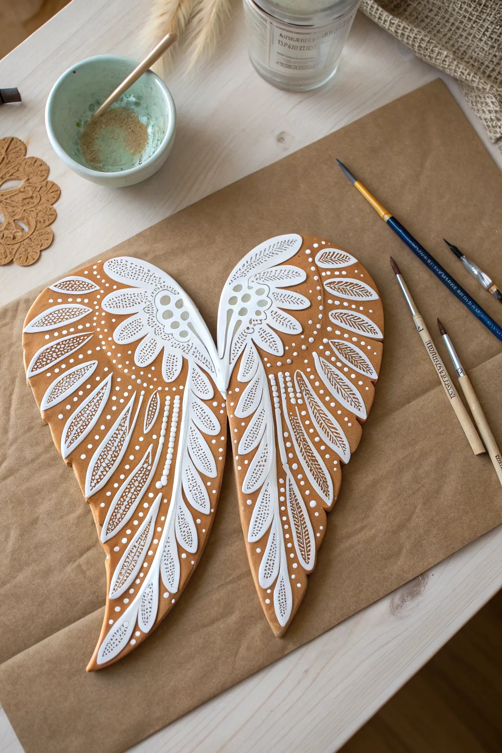
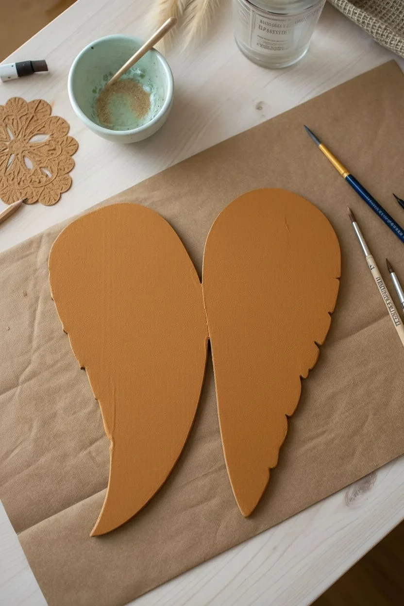
Transform humble packaging into a stunning piece of wall art that resembles intricate gingerbread or carved wood. These stylized angel wings utilize the warmth of the cardboard as a base tone, accented by crisp, puffed white details for a dimensional relief effect.
Step-by-Step
Materials
- Sturdy corrugated cardboard
- Sharp craft knife or heavy-duty scissors
- Acrylic paint: Warm Honey or Burnt Sienna
- Heavy body acrylic paint: Titanium White
- Fine liner brush (size 00 or 0)
- Round brush (size 2)
- Pencil and eraser
- Matte varnish (optional)
- Dotting tool or toothpick
Step 1: Preparation and Base
-
Create the template:
Draw a large, curved wing shape on a piece of scrap paper first to perfect the silhouette. Cut it out to use as your stencil. -
Trace and cut:
Trace the template onto your cardboard two times, flipping the template over for the second tracing to create a mirrored left and right wing. -
Cut the forms:
Carefully cut out the cardboard shapes using a sharp craft knife for clean edges. Smooth any jagged bits with fine-grit sandpaper if needed. -
Apply the base color:
Mix a warm honey-brown acrylic shade. Paint the entire front surface of both wings to give them a uniform, toasted gingerbread look. -
Dry completely:
Allow the base coat to dry fully. I usually wait about 20 minutes to ensure the surface is hard enough for sketching.
Steady Tip
Shaky hands? Rest your wrist on a dry kitchen sponge or a small book while painting intricate lines. This elevates your hand and stabilizes your stroke.
Step 2: Design and Outline
-
Sketch the anatomy:
Using a pencil very lightly, map out the three main sections: the upper curved coverts, the middle secondary feathers, and the long lower primary feathers. -
Draft the details:
Lightly sketch the individual feather shapes within those sections. Don’t worry about the tiny dots yet, just focus on the flowing outlines. -
Start the white outlines:
Load your fine liner brush with heavy body white paint. Consistency is key here; it should be fluid enough to flow but thick enough to sit opaque on the brown. -
Paint the spines:
Paint the central spine (quill) of each feather first, starting from the center of the wing and sweeping outward. -
Outline feather shapes:
Carefully paint the teardrop and oval outlines of the feathers around the spines you just painted.
Step 3: Intricate Detailing
-
Fill the upper feathers:
For the rounded feathers at the top curve, paint small, angled hatch marks inside the outlines to resemble soft down. -
Detail the flight feathers:
On the long, lower feathers, paint the internal veins. Use very light pressure to keep these lines thinner than the main outlines. -
Add decorative dots:
Dip the back end of your brush or a dotting tool into the white paint. Place dots along the spines of the middle feathers. -
Stipple the tips:
Add clusters of tiny dots at the tips of the feathers and in the negative spaces between feathers to add texture. -
Symmetry check:
Work on both wings simultaneously. Paint a section on the left wing, then immediately repeat it on the right to match the style. -
Clean up:
If transparent spots appear as the paint dries, carefully go over the main white lines a second time for a stark, embossed contrast.
Make it Pop
For a true 3D effect, skip standard acrylics for the white details and use dimensional fabric paint (puff paint) to create actual raised texture.
Hang your beautiful recycled wings together or frame them for a cozy, rustic touch.
Outdoor Splatter Action Art
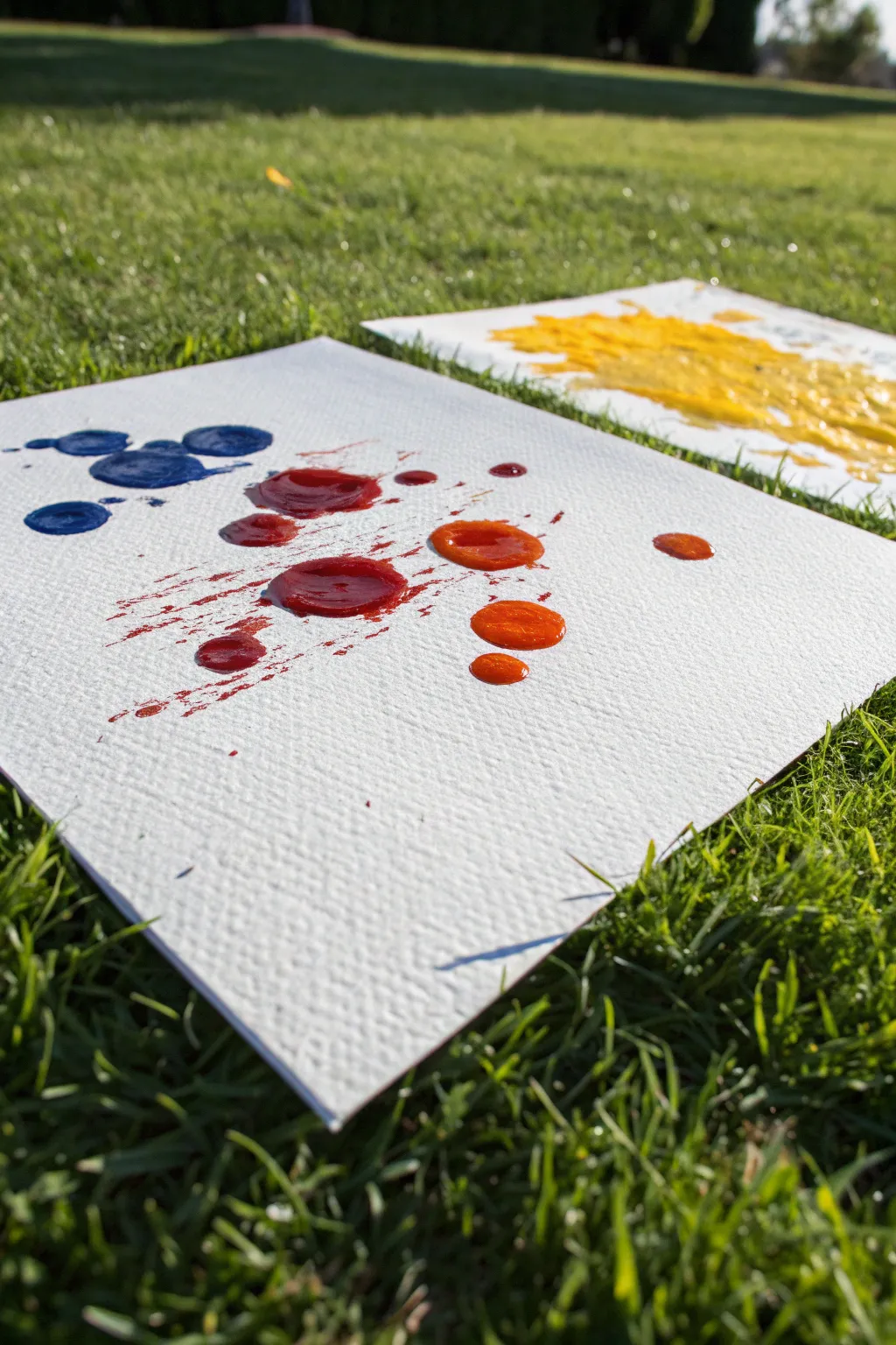
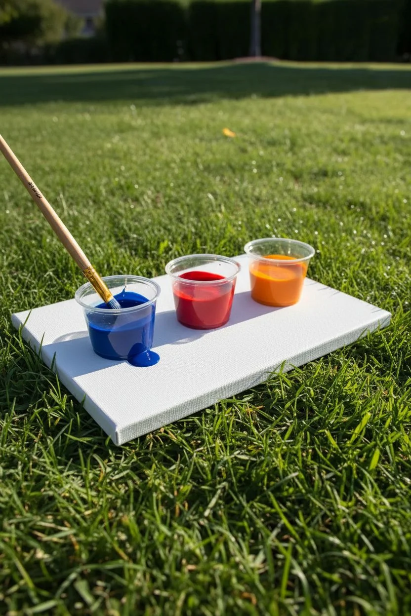
Embrace the mess and creativity of action painting by taking your studio outside to the grass. This project uses gravity and motion to create dynamic, raised textures on canvas using bright primary and secondary colors.
Detailed Instructions
Materials
- Canvas boards or heavy watercolor paper
- Acrylic paints (Blue, Red, Orange)
- Small cups or palette
- Water for thinning
- Medium round paintbrushes
- Drop cloth (optional)
Step 1: Setting the Scene
-
Find your spot:
Choose a flat, grassy area outdoors where you can work freely without worrying about paint flying. -
Prepare the surface:
Lay your canvas board directly on the grass for stability, or use a drop cloth underneath if you prefer to keep the lawn pristine. -
Mix your consistency:
Squeeze a generous amount of blue, red, and orange acrylic paint into separate cups. -
Thin the paint:
Add just a few drops of water to each color; you want the paint fluid enough to drip, but thick enough to hold a raised shape.
Flat Blobs?
If your paint dries flat instead of textured, it was too watery. Mix in more heavy-body acrylic to help the droplets keep their 3D shape.
Step 2: Creating Blue Droplets
-
Load the blue:
Dip your brush heavily into the blue paint so it is dripping wet. -
Position the brush:
Hold the brush perpendicular to the canvas, hovering over the upper left corner. -
Let gravity work:
Allow large droplets to fall naturally from the brush to create perfectly round, raised pools of color. -
Group the spots:
Move your hand slightly to create a small cluster of three or four blue circles.
Level Up: Tool Swap
Ditch the brushes and use plastic spoons to scoop and fling paint. This creates larger splashes and more unpredictable, artistic shapes.
Step 3: Explosive Red Splatters
-
Switch to red:
Clean your brush thoroughly or switch to a fresh one and load it with red paint. -
Create the action:
Instead of letting it drip, aim for the center and flick your wrist sharply downward toward the canvas. -
Check the effect:
This forceful motion should create jagged ‘starburst’ edges around the main paint blobs, adding energy to the composition. -
Add variance:
Vary the height from which you flick the paint to create a mix of large pools and tiny satellite dots.
Step 4: Orange Accents and Drying
-
Load the orange:
Saturate your brush with the bright orange mixture. -
Target empty space:
Focus on the right side of the canvas where there is still white space. -
Combine techniques:
I like to use a mix of dripping and gentle tapping on the brush handle to place these final orange circles. -
Keep them distinct:
Try to keep the orange blobs separate from the red ones to prevent muddying the colors. -
Sun dry:
Leave the artwork flat on the grass to dry in the sun; moving it too soon might cause the thick paint to run.
Enjoy the sunshine while waiting for your vibrant masterpiece to dry


Have a question or want to share your own experience? I'd love to hear from you in the comments below!