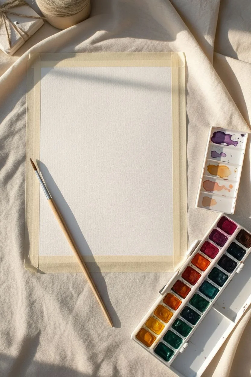
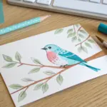
Dive into this colorful collection of simple projects designed to help you relax and let your creativity flow freely, regardless of your experience level. Whether you have five minutes or an entire afternoon, you will find plenty of inspiration to pick up your brush and start creating something beautiful today.
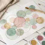
Therapeutic color blending swatches
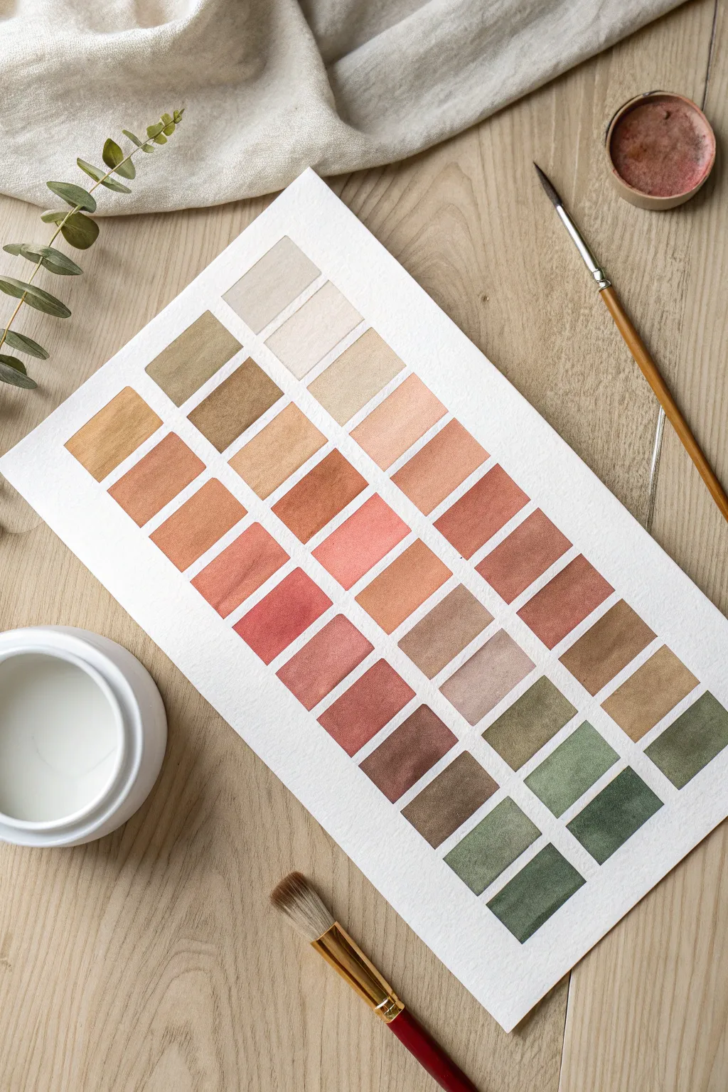
This therapeutic project turns simple color mixing into a piece of minimalist art. You will create a structured grid of swatches that transitions seamlessly from pale neutrals and warm terracottas into deep, moody forest greens.
Step-by-Step Tutorial
Materials
- Cold press watercolor paper (300 gsm)
- Watercolor paints (Yellow Ochre, Burnt Sienna, Venetian Red, Burnt Umber, Perylene Green)
- Flat shader brush (size 6 or 8)
- HB Pencil
- Ruler
- Kneaded eraser
- Two jars of water
- Paper towels
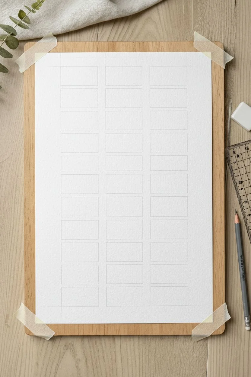
Step 1: Drafting the Grid
-
Secure the paper:
Tape your watercolor paper down to a hard board or table. This prevents warping and keeps the paper steady while you measure. -
Measure vertical columns:
Using your ruler, lightly mark three vertical columns. Leave about a half-inch of white space between each column. -
Mark horizontal rows:
Measure out approximately 12 to 14 uniform rows down the length of the paper. Keep the spacing consistent to achieve that tidy, satisfying look. -
Connect the lines:
Very lightly draw your grid boxes with the HB pencil. Keep the lines faint so they can be easily erased later or covered by paint.
Step 2: Mixing Warm Neutrals
-
Prepare the lightest wash:
Start with a heavily diluted Titanium Buff or a very watery Yellow Ochre. You want the consistency of weak tea for the top row. -
First application:
Load your flat brush and carefully fill in the top three squares. Use the flat edge of the brush to get crisp, straight borders. -
Deepen the hue:
Add a tiny drop of Raw Sienna to your mix. Paint the next row down. The change should be subtle. -
Clean your brush:
Rinse your brush thoroughly between rows if you feel the color is getting muddy. -
Introduce warmth:
gradually mix in Burnt Sienna or a terracotta tone as you move to the fourth and fifth rows. I like to test the color on a scrap paper first to ensure the transition isn’t too abrupt.
Straight Edge Secret
Use a flat shader brush rather than a round brush. The square shape of the bristles aligns perfectly with the grid lines, making it effortless to paint sharp corners without needing masking tape.
Step 3: Transitioning to Deep Tones
-
Add red earth tones:
For the middle rows, mix Venetian Red or a dusty rose color into your existing puddle to create warm, reddish-brown hues. -
Shift to cool brown:
As you move past the middle of the page, begin adding Burnt Umber to neutralize the redness and darken the value. -
Introduce green:
Start mixing a touch of Sap Green or Olive Green into your brown mixture. The resulting color should look like a dried leaf. -
Darken the value:
For the second-to-last row, use less water and more pigment. Mix in Perylene Green or a deep Hooker’s Green for a shadowy moss color. -
The final row:
Use your darkest green, perhaps mixed with a tiny bit of Indigo or Paynes Gray for depth, to paint the bottom row.
Level Up: Archive It
Turn this art piece into a functional tool by writing the precise paint names and mixing ratios (e.g., ‘50% Sienna + 50% Umber’) next to each swatch with a waterproof fine-liner pen.
Step 4: Finishing Touches
-
Check for puddles:
If any squares have excess water pooling in the corners, gently touch the tip of a dry brush to the puddle to lift it. -
Let it dry completely:
Allow the artwork to sit undisturbed until the paper is cool to the touch and completely dry. -
Clean up lines:
Gently use a kneaded eraser to lift any visible pencil lines from the spaces between the swatches.
Display your finished gradient study in a simple frame to enjoy the calming effect of organized color.


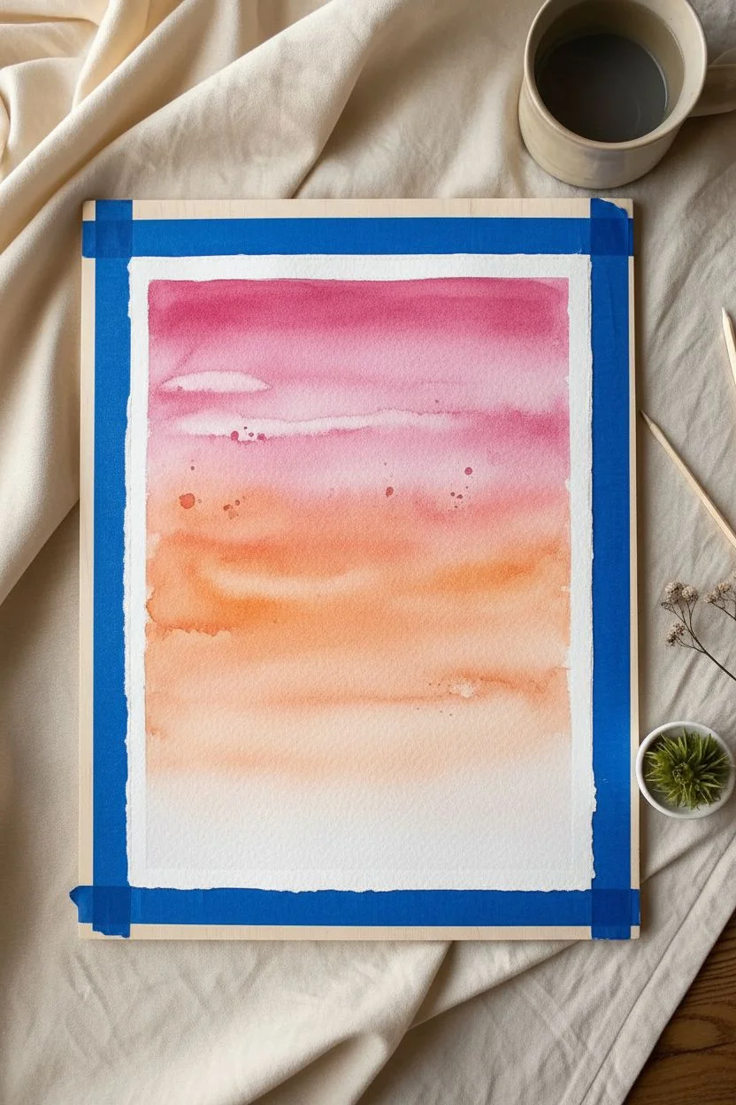
Simple wet-on-wet sunset skies
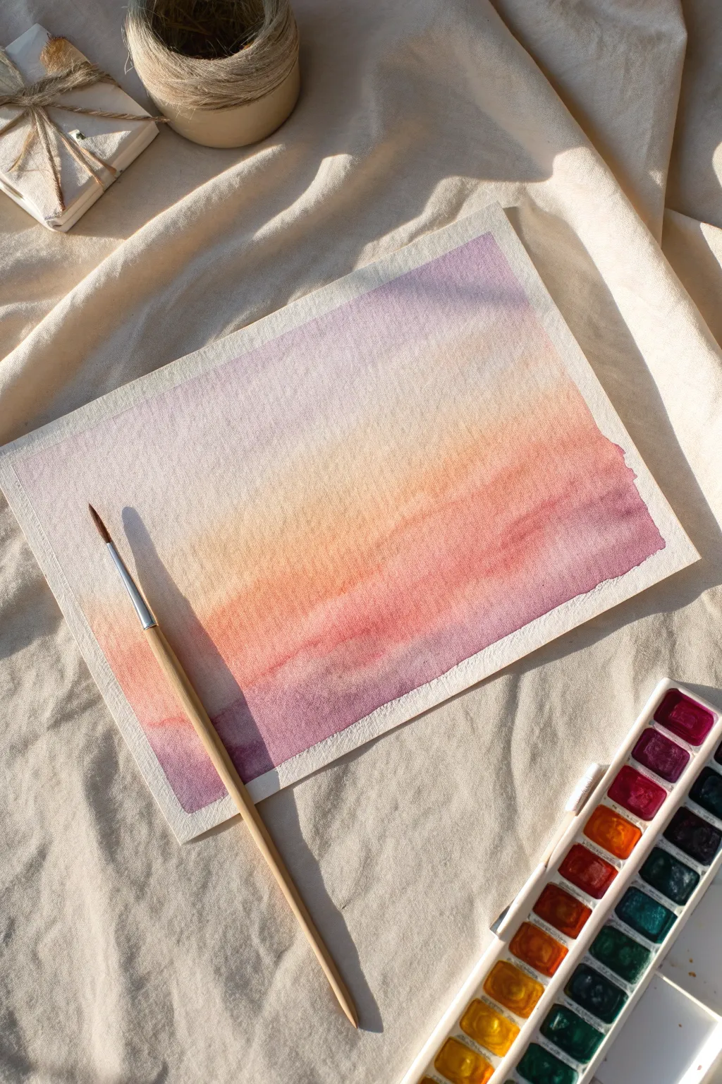
Capture the fleeting magic of twilight with this soft wet-on-wet watercolor study. This project focuses on seamless blending to create a dreamy, atmospheric sky that transitions from cool purples to warm sunset oranges.
Step-by-Step Guide
Materials
- Cold press watercolor paper (300gsm)
- Watercolor paints (Violet, Orange, Yellow Ochre)
- Round brush (size 6 or 8)
- Masking tape
- Jar of clean water
- Paper towel
- Mixing palette
Step 1: Preparation
-
Secure the paper:
Tape your watercolor paper down to a flat surface or board using masking tape, ensuring the edges are sealed tight. -
Prepare palettes:
Mix three separate puddles of paint on your palette: a watery violet, a soft orange, and a pale yellow ochre. -
Wet the paper:
Dip your round brush into clean water and coat the entire paper surface evenly. -
Check moisture:
Ensure the paper has a consistent sheen; I like to tilt my head to check for dry spots or large puddles.
Avoid Muddy Colors
If your orange and purple mix too much, they will turn brown. Rinse your brush thoroughly between color changes and let the wet paint merge on its own rather than scrubbing.
Step 2: Painting the Gradient
-
Apply the top color:
Load your brush with the violet mix and paint the top third of the paper using broad, horizontal strokes. -
Add the middle tone:
Rinse your brush slightly, pick up the orange paint, and apply it across the middle section. -
Create the blend:
Gently nudge the wet orange paint up into the violet area so they touch and bleed into one another naturally. -
Finish the gradient:
Rinse the brush again, load it with yellow ochre, and fill the bottom area, blending it softly upwards into the orange.
Silhouette Finish
Once your sky background is completely dry, use black paint to add a simple silhouette of a mountain range, pine trees, or power lines along the bottom edge.
Step 3: Refining & Drying
-
Deepen top corners:
While the paper is still wet, dab a small amount of concentrated violet into the top corners to increase contrast. -
Add bottom depth:
Drop a slightly darker purple or reddish mix into the bottom left corner to balance the composition, as seen in the photo. -
Let gravity help:
Tilt your board gently back and forth to encourage the colors to merge without brushstrokes. -
Wait for drying:
Allow the painting to sit undisturbed until it is completely dry and the paper feels room temperature. -
Reveal the edges:
Peel the masking tape away slowly at a 45-degree angle to reveal the crisp white border.
Now you have a beautifully blended sky ready to frame or use as a background for lettering.


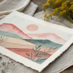
High-contrast silhouette landscapes
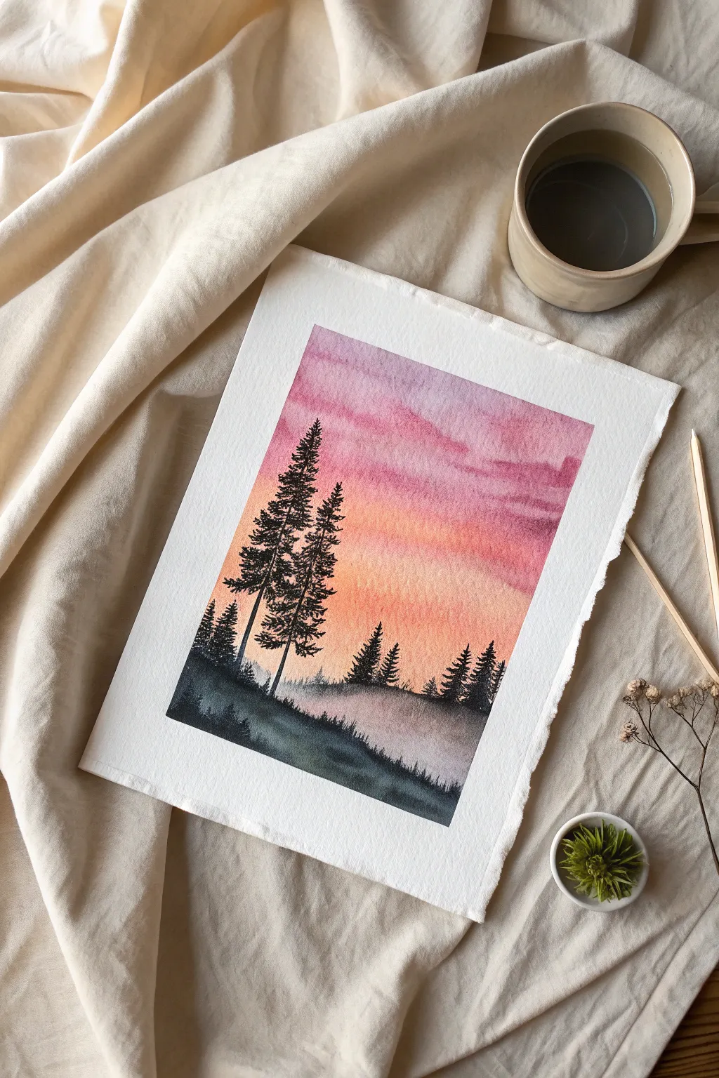
Capture the peaceful transition from day to night with this vibrant watercolor landscape. You will practice creating a seamless wet-on-wet gradient sky before adding sharp, high-contrast pine trees for a dramatic finish.
Step-by-Step
Materials
- Cold press watercolor paper (300 gsm)
- Masking tape and a board
- Large round brush (size 10 or 12)
- Small round brush (size 2 or 4)
- Watercolors: Rose/Magenta, Cadmium Orange, Indigo, Payne’s Gray
- Paper towels
- Two jars of water
Step 1: The Choosing Sky
-
Secure the paper:
Tape your watercolor paper down to a board on all four sides. Press the edges of the tape firmly to ensure clean borders later. -
Wet the surface:
Using your large round brush and clean water, apply an even coat of water to the entire paper surface until it glows with a satin sheen. -
Apply the top color:
Load your large brush with a watery mix of Rose or Magenta. Apply this to the top third of the paper, using horizontal strokes. -
Add the warmth:
Rinse your brush slightly and pick up Cadmium Orange. Apply this to the middle section, allowing it to touch and naturally bleed into the pink layer above. -
Fade to bottom:
Continue bringing the orange wash down towards the bottom third, gradually adding more water to your brush so the color fades into a very pale, nearly white wash at the horizon line. -
Create cloud texture:
While the paint is still wet, rinse your brush and dry it on a paper towel. I like to use this ‘thirsty brush’ to gently lift away a few horizontal streaks in the upper sky to suggest soft clouds. -
Texture the sky:
Alternatively, you can drop slightly more concentrated pink paint into the wet upper area to create soft blooms that mimic cloud formations. -
Dry completely:
Let the paper dry completely. This is crucial—if the paper is damp, the trees in the next steps will blur. You can use a hairdryer to speed this up.
Fuzzy Edges?
If your pine trees start bleeding into the sky, the background wasn’t fully dry. Stop immediately and wait until the paper feels room temperature to the touch (not cold) before continuing.
Step 2: The Misty Ground
-
Mix dark colors:
Prepare a dark, moody mix for the ground. Combine Indigo with a touch of Payne’s Gray to get a deep, cold blue-black. -
Paint the foreground:
Using the large brush, paint the bottom hill area solid dark, creating an undulating, uneven line for the distinct ridge. -
Add distant mist:
Dilute your dark mix with water to create a mid-tone gray. Paint some faint, low tree shapes or smaller hills just behind the main foreground ridge. -
Soften the edges:
Before the distant hill shapes dry, run a clean, damp brush along their bottom edge to blur them into the white ‘mist’ gap you left earlier.
Step 3: The Pines
-
Start the main trees:
Switch to your small round brush (size 2). Using the thick, creamy dark Indigo mix, paint a thin vertical line for the trunk of the tallest tree on the left. -
Form the branches:
Starting from the top of the trunk, use the very tip of the brush to tap and flick small branches outward. Keep the top narrow and widen the tree as you move down. -
Refine the shape:
Leave small gaps between branches so the sunset sky peeks through; this makes the tree look realistic rather than a solid triangle. -
Add a companion tree:
Paint a second, slightly shorter tree right next to the first one, using the same tapping technique. Overlap their branches slightly for a natural look. -
Fill the background:
Add a cluster of smaller, simpler pine tree silhouettes on the right side of the paper to balance the composition. -
Ground the trees:
Thicken the base of the trunks where they meet the ground, blending them seamlessly into the dark foreground hill. -
Final details:
Use the very tip of your brush to add tiny vertical strokes along the foreground ridge to simulate wild grass. -
Reveal:
Once the paint is bone dry, carefully peel off the masking tape at a 45-degree angle to reveal your crisp white borders.
Pro Tip: Richer Blacks
For the deepest silhouette color, avoid using black straight from the tube. Mix Indigo with Burnt Umber or Alizarin Crimson to create a rich, chromatic black that has much more depth.
Now you have a stunning, high-contrast landscape ready to frame or gift.
Loose-style blooming roses
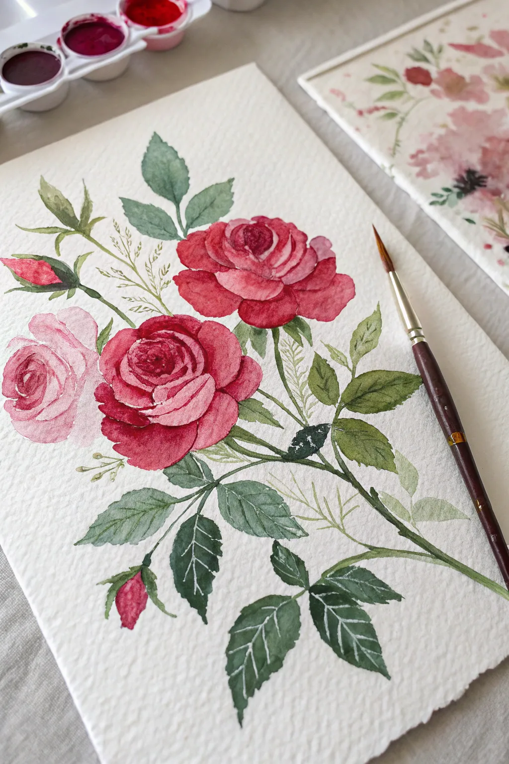
Capture the elegance of a classic botanical illustration with this composition featuring deep crimson blooms, a soft pink rose, and detailed foliage. The texture of cold-press paper adds character to the petals while white detailing brings the leaves to life.
How-To Guide
Materials
- Cold press watercolor paper (300 gsm)
- Round watercolor brushes (Size 4 and 8)
- White gel pen or white gouache
- Paints: Alizarin Crimson, Rose Madder, Sap Green, Hooker’s Green, Indigo
- HB Pencil and kneaded eraser
- Palette and two water jars
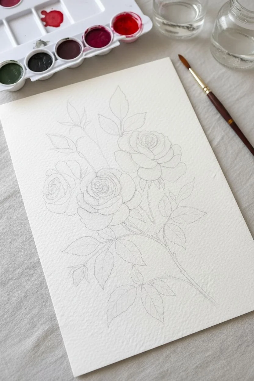
Step 1: Sketching and Composition
-
Map the arrangement:
Use your pencil to lightly sketch three circles to mark the flower heads: one large circle slightly right of center, one below it, and a smaller one to the left. -
Define the shapes:
Refine the circles into rose shapes, drawing the center swirl and outlining the outer petals. Sketch the two rosebuds on the left and the main stems extending downward. -
Add leaf placement:
Draw the serrated outlines of the leaves, grouping them along the main diagonal stem and tucked behind the blooms.
Bleeding Issues?
If your red petals are bleeding into each other, you are working too fast. This style relies on ‘wet-on-dry’ for crisp edges. Let each petal dry for a minute before painting its neighbor.
Step 2: Painting the Blooms
-
Crimson rose centers:
Start with the top red rose. Load your size 4 brush with concentrated Alizarin Crimson and paint the tight, darkest petals in the very center. -
Petal gradients:
Rinse your brush slightly to dilute the pigment. Paint the larger outer petals, leaving tiny slivers of dry white paper between them to define the edges. -
The second red rose:
Repeat the process for the lower red rose, ensuring the bottom petals appear slightly shadowed by mixing a touch of Indigo into your crimson. -
The soft pink rose:
For the left flower, use a very watery wash of Rose Madder. I like to paint the petal edges first and pull the color inward with a clean, damp brush for a soft fade. -
Buds and accents:
Paint the two rosebuds on the left using the deep crimson mix, leaving a small highlight on the rounded part of the bud.
Step 3: Foliage and Stems
-
Main stems:
Mix Sap Green with a little brown. Using the tip of your size 8 brush, paint the thin stems with confident, continuous strokes connecting the flowers. -
Leaf variation:
Paint the leaves using a mix of Hooker’s Green and Sap Green. Vary the intensity—make the leaves closest to the viewer darker and more saturated. -
Serrated edges:
While painting the leaves, carefully dab the brush tip along the outline to create the jagged, saw-toothed edges characteristic of rose leaves. -
Filler foliage:
Mix a very pale, watery yellow-green. Paint the delicate, ghost-like sprigs of filler greenery behind the main roses to add depth without distraction.
Level Up: Texture
To mimic the specific texture in the photo, ensure you use Cold Press paper. The ‘grain’ of the paper settles the pigment unevenly, creating that lovely speckled look on the petals naturally.
Step 4: Details and Highlights
-
Deepen the shadows:
Once the red roses are fully dry, glaze a dark mixture of Crimson and Indigo into the deepest crevices between petals to increase contrast. -
Sepals:
Add the small green casing (sepals) at the base of the rosebuds and the flowers where the stem connects. -
White vein detailing:
Wait for the dark green leaves to be bone dry. Use a white gel pen or a fine brush with opaque white gouache to draw thin, crisp veins on the leaves.
Sign your name in the corner and frame your elegant botanical study
BRUSH GUIDE
The Right Brush for Every Stroke
From clean lines to bold texture — master brush choice, stroke control, and essential techniques.
Explore the Full Guide
Monochrome layered mountains
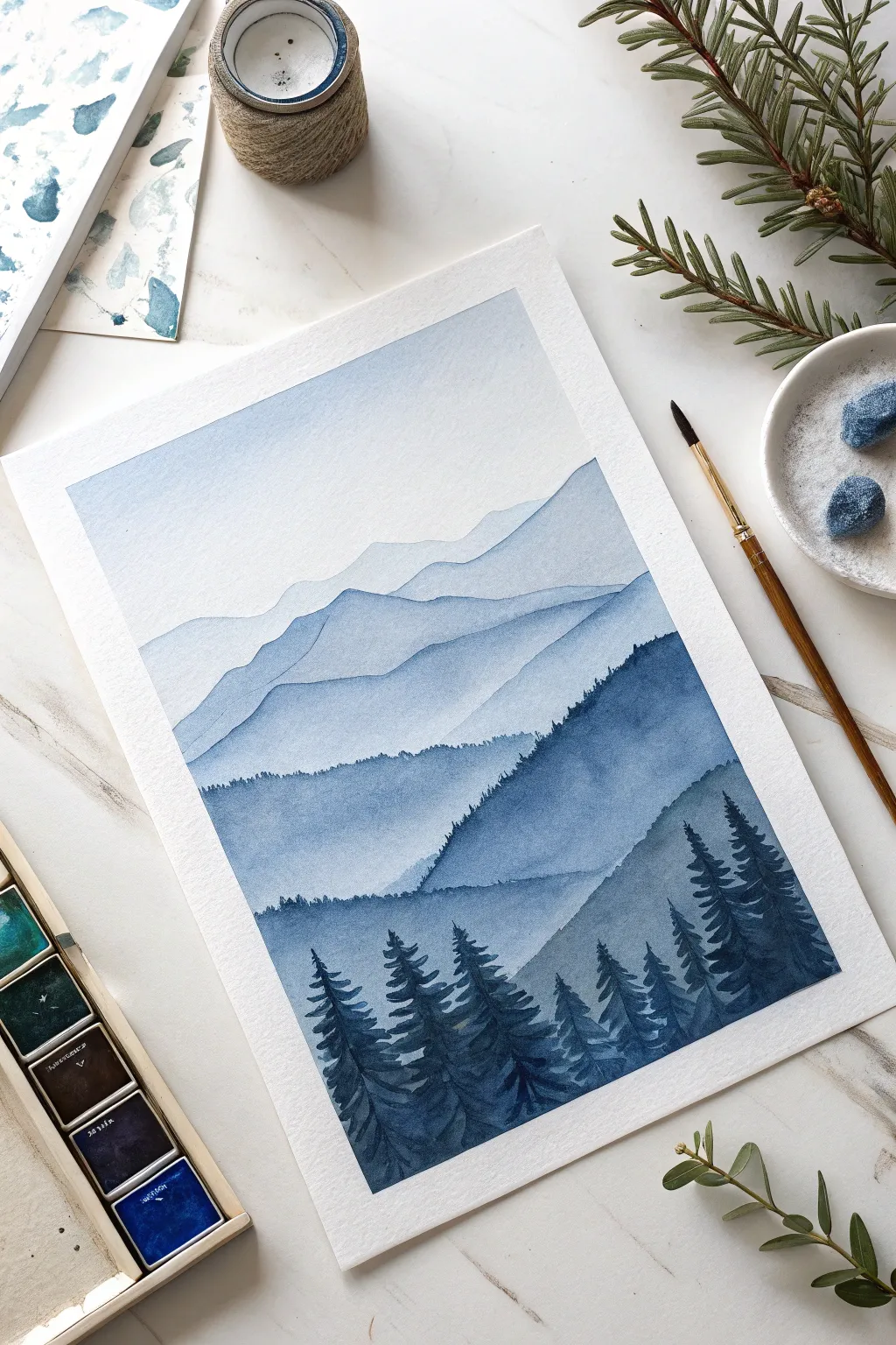
Master the art of atmospheric perspective with this calming, single-color project. By simply adjusting the ratio of water to pigment, you’ll create a stunning landscape that recedes deep into the distance.
Step-by-Step
Materials
- Cold press watercolor paper (300 gsm)
- Watercolor paint (Indigo or Prussian Blue)
- Round brush size 6 or 8 (synthetic)
- Detail brush size 2
- Two jars of water
- Masking tape
- Paper towels
- Mixing palette
Step 1: Preparation
-
Secure the paper:
Tape down all four edges of your paper to a hard board or table. This creates a crisp border and prevents the paper from buckling when wet. -
Prepare your palette:
Squeeze a dime-sized amount of blue paint onto your palette. Create four distinct puddles of diluted paint ranging from ‘tea’ consistency (very watery) to ‘heavy cream’ (thick and dark). -
Sketch the layout:
Using an H pencil, very lightly sketch five or six wavy lines across the paper to map out where your mountain ridges will sit. Keep the pencil pressure extremely light so the lines don’t show through.
Bleeding Layers?
If your mountain ridges trigger a ‘cauliflower’ bloom or bleed into the sky, the previous layer wasn’t fully dry. Use a hairdryer on a low setting between layers to speed up the process and ensure crisp lines.
Step 2: Painting the Sky and Distance
-
Wet the sky:
Use your larger clean brush to coat the top third of the paper with clean water. You want it damp, not soaking wet. -
First wash:
Load your brush with the lightest ‘tea’ mixture. Gently touch it to the top of the wet sky area and let it diffuse down, creating a soft gradient that fades to white before it hits the first mountain line. -
Dry completely:
Allow the paper to dry completely. If you engage the next step while it’s damp, you will lose your sharp edges. -
First mountain range:
Using the same light ‘tea’ mix, paint the silhouette of the furthest mountain range. Follow your pencil line, keeping a sharp upper edge. -
Fade out:
Immediately rinse your brush slightly and drag clean water along the bottom edge of this mountain shape to fade the color out toward the bottom of the page.
Step 3: Building the Middle Ground
-
Darken the mix:
Move to your second puddle of paint (a ‘milk’ consistency). Wait for the previous layer to be bone dry before starting this one. -
Second ridge:
Paint the next mountain shape, overlapping the faded bottom of the first one. I like to make the peaks slightly more jagged here to suggest rougher terrain. -
Create texture:
While the paint is still wet, you can drop a tiny bit of darker pigment into the valleys of the mountain shape for subtle variation. -
Third layer:
Once dry, use your medium-tone mix to paint the third layer. This time, as you paint the top edge, wiggle the tip of the brush slightly to create a ‘fuzzy’ look, simulating distant tree tops. -
The gradient effect:
Remember to keep fading the bottom of each mountain section into white using water. This ensures the next layer will stand out clearly against a light background.
Level Up: Depth
To enhance the sense of distance, ensure your color jumps are consistent. If the jump from the 3rd to 4th layer is too drastic, it flattens the image. Add a drop of water or paint to adjust darker or lighter.
Step 4: Foreground and Details
-
Fourth layer:
Using a dark, distinct mix, paint a prominent mountain ridge lower down the page. Use the tip of your brush to make the ridge line very ragged and distinct. -
Final slope:
For the closest hill on the bottom right, use your darkest, creamiest paint consistency. Paint a solid slope that covers the bottom corner. -
Tree trunks:
Switch to your size 2 detail brush. Using the dark paint, draw delicate vertical lines projecting upward from the final slope to serve as tree trunks. -
Pine branches:
Starting at the top of a trunk, use a scribbling, zigzag motion to paint pine branches growing wider as you move down. Keep the strokes loose and organic. -
Fill the forest:
Continue painting trees of various heights across the foreground slope. I usually overlap them slightly to create a dense forest feel. -
Finishing up:
Let the painting dry completely for at least 10 minutes. Only when the paper is warm to the touch should you slowly peel off the masking tape at a 45-degree angle.
Frame your beautiful monochrome landscape and enjoy the misty atmosphere you’ve created.
Vibrant citrus fruit slices
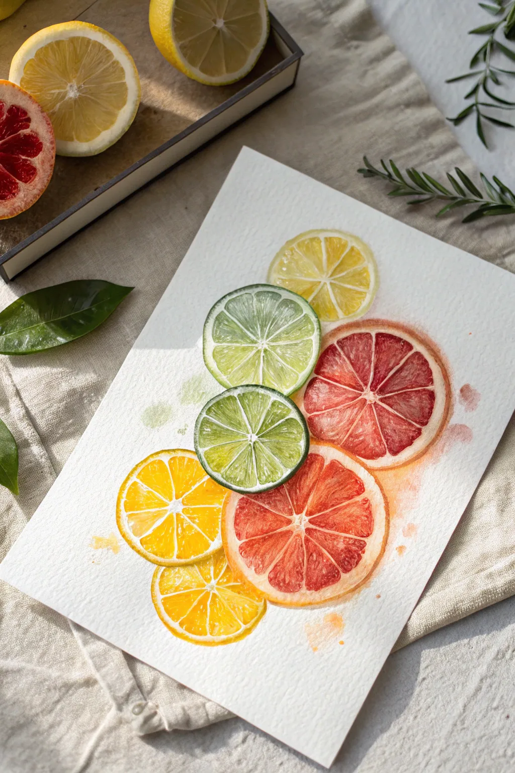
Capture the zest of summer with this vibrant arrangement of watercolor citrus slices. This project focuses on negative space and wet-on-dry techniques to create the illusion of glistening, transparent fruit pulp.
Step-by-Step Tutorial
Materials
- Cold press watercolor paper (300 gsm)
- Round watercolor brushes (size 2 and size 6)
- Pencils (HB) and a kneadable eraser
- Watercolor paints (Lemon Yellow, Sap Green, Alizarin Crimson, Cadmium Orange)
- Circular objects for tracing (cups or lids) or a compass
- Two water jars and paper towel
- Palette for mixing
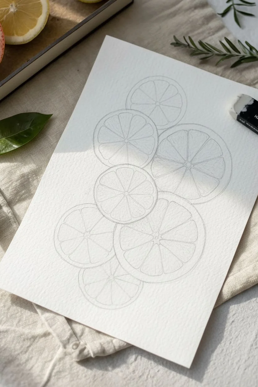
Step 1: Sketching the Layout
-
Outline the shapes:
Using various circular objects or a compass, lightly trace seven circles in a cascading vertical arrangement. Allow some to slightly overlap others to create depth. -
Define the rind:
Draw a slightly smaller circle inside each outline to define the thickness of the white pith and rind. -
Mark the segments:
Lightly sketch the triangular fruit segments radiating from the center like a wagon wheel. Keep your pencil pressure very light so the graphite doesn’t show through the yellow paint later. -
Map highlights:
I find it helpful to draw tiny enclosed shapes within the juicy segments where I want to preserve the pure white of the paper for the ‘shine’.
Bleeding Colors?
If your segment lines are disappearing because paint is flowing across them, ensure you are painting on dry paper. Let one segment dry completely before painting its immediate neighbor.
Step 2: Painting the Lemons and Limes
-
Mix your yellow:
Prepare a watery Lemon Yellow. Start with the top lemon slice, filling in the individual segments using the size 6 brush. -
Preserve the white:
Leave a thin gap of unpainted paper between each segment to represent the membrane, and carefully paint around your sketched highlight spots. -
Add the rind:
Paint the outer ring with the same yellow. While it is still damp, you can drop in a tiny touch of orange on the outer edge for volume. -
Paint the limes:
Mix Sap Green with plenty of water for a translucent lime color. Paint the middle and upper-left lime slices, using the same technique of leaving white gaps between segments. -
Deepen the green:
While the lime segments are still wet, drop a slightly more concentrated green near the center of the fruit to mimic the depth of the pulp.
Level Up: Texture
sprinkle a tiny pinch of salt lightly onto the wet segments of the grapefruit. Once dry, brush the salt away to reveal a crystalline texture that looks exactly like fruit pulp.
Step 3: Painting the Grapefruit
-
Mix the red tones:
Create a grapefruit color by mixing Alizarin Crimson with a touch of orange. Paint the large segments of the red citrus slices. -
Vary the saturation:
Let the color be uneven within the segments. I like to drop clear water into the center of a wet segment to push the pigment to the edges, creating a natural texture. -
The grapefruit rind:
For the grapefruit skin, use a very diluted wash of orange-yellow, ensuring it doesn’t bleed into the red pulp.
Step 4: Details and Finishing
-
Bottom lemons:
Paint the remaining yellow lemon slices at the bottom, varying the yellow intensity to make them interesting. -
Create shadows:
Once the base layers are bone dry, mix a diluted grey-purple. Glaze this gently over areas where one fruit slice sits underneath another to show a cast shadow. -
Add juice splatters:
Load a brush with watery paint (yellow or green) and tap it against your finger to flick tiny droplets onto the paper for a fresh effect. -
Final highlights:
If you accidentally painted over some highlights, use a white gel pen or a dot of white gouache to bring back the shine.
Allow your artwork to dry completely and enjoy the fresh, summery vibe it brings to your space.

PENCIL GUIDE
Understanding Pencil Grades from H to B
From first sketch to finished drawing — learn pencil grades, line control, and shading techniques.
Explore the Full Guide
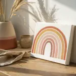
Geometric tape-resist patterns
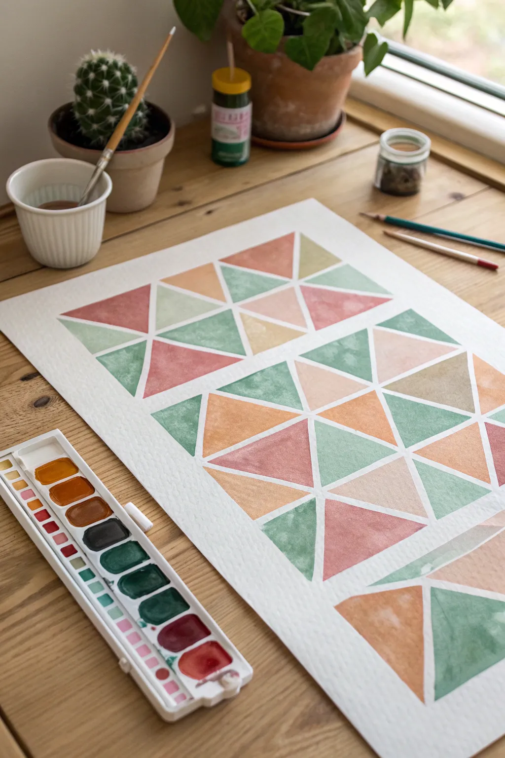
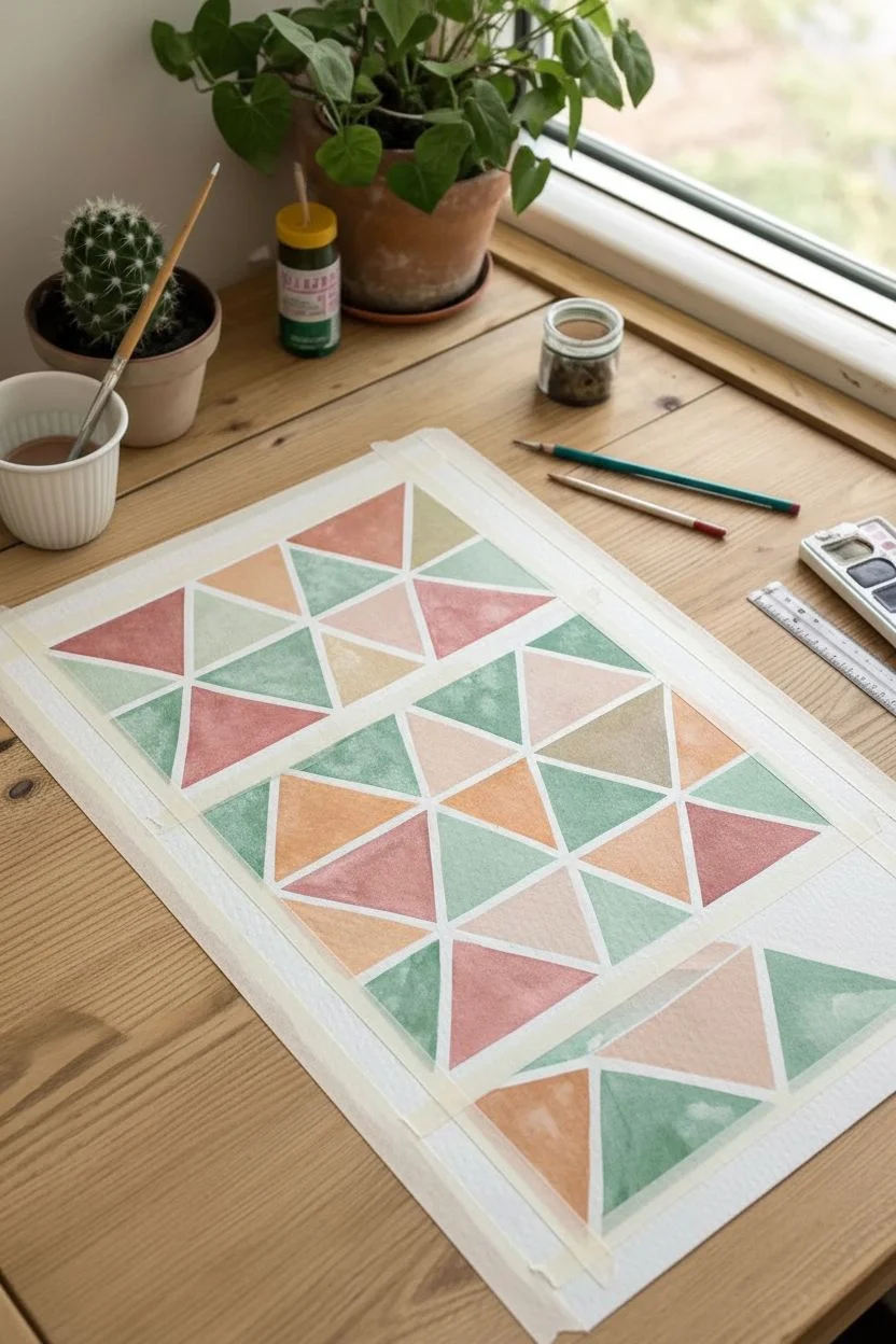
Achieve stunningly sharp lines and a modern aesthetic with this satisfying tape-resist technique. By combining earthy pastels with geometric precision, you’ll create a structured yet soothing piece of art that looks professionally printed.
How-To Guide
Materials
- Cold press watercolor paper (A4 or similar)
- Artist’s masking tape or washi tape (approx. 1/4 inch width)
- Watercolor pan set
- Synthetic round brush (size 6 or 8)
- Ruler
- HB Pencil
- Jar of water
- Paper towel
Step 1: Grid Preparation
-
Secure the paper:
Start by taping your watercolor paper down to your table or board on all four sides. This keeps the paper flat while you work and creates a clean border. -
Measure the grid:
Using your ruler and pencil, lightly mark intervals every 2-3 inches along the top and bottom edges of your paper to define your column widths. -
Connect the columns:
Place strips of masking tape vertically across the paper, connecting your top and bottom marks. Press down purely on the center of the tape for now. -
Create the rows:
Repeat the measuring process along the left and right sides to determine your row height, then run horizontal strips of tape across to form a grid of rectangles. -
Add diagonals:
Inside each rectangle formed by the tape grid, place a diagonal piece of tape connecting opposite corners. You can alternate the direction of the diagonal for each row to create visual variety. -
Seal the edges:
This is the most critical step: firmly run your fingernail or the back of a spoon along every edge of the tape. I always double-check the intersections to ensure no paint can sneak underneath.
Step 2: Color Application
-
Mix an earthy palette:
Prepare four distinct colors in your palette. Aim for a sage green, a muted terracotta, a dusty pink, and a warm ochre. Add enough water so the consistency resembles tea. -
Start with sage:
Load your brush with the green mix and fill in scattered triangles across the paper. Try not to paint adjacent shapes with the same color. -
Apply the warm tones:
Rinse your brush and switch to the terracotta. Fill in about a quarter of the remaining white spaces, letting the watery paint settle naturally into the texture of the paper. -
Fill with pink:
Move on to the dusty pink shade. If the paint pools too much, you can gently dab it with the corner of a paper towel to create a soft, clouded texture. -
Finish with ochre:
Use the yellow-ochre mix to fill in the final empty triangles. The varying water-to-paint ratios will give each shape a unique depth. -
Check for gaps:
Inspect the painting for any tiny white specks you might have missed near the tape edges and touch them up gently.
Clean Line Pro Tip
To prevent bleeding, paint a thin layer of clear water over the tape edges before adding color. This seals the tape so any seepage is just invisible water, keeping your lines razor sharp.
Step 3: The Reveal
-
Patience is key:
Allow the painting to dry completely. The paper must be cool to the touch and verify no damp spots remain, or the paper might tear. -
Begin the peel:
Start carefully peeling the tape from one corner. Pull the tape away from the paper at a 45-degree angle, moving slowly. -
Remove the grid:
The diagonal pieces usually come off first, followed by the main grid lines. Watch the crisp white barriers appear between your colorful shapes. -
Erase guidelines:
Once all tape is removed, take a clean eraser and gently remove any visible pencil marks that were left in the white spaces.
Level Up: Mixed Media
Once the paint is dry and tape is removed, use a fine-tip gold marker or black ink pen to outline specific triangles or draw patterns inside a few shapes for added detail.
Step back and admire the satisfying order and beautiful palette of your geometric masterpiece.
Potted cacti and succulents
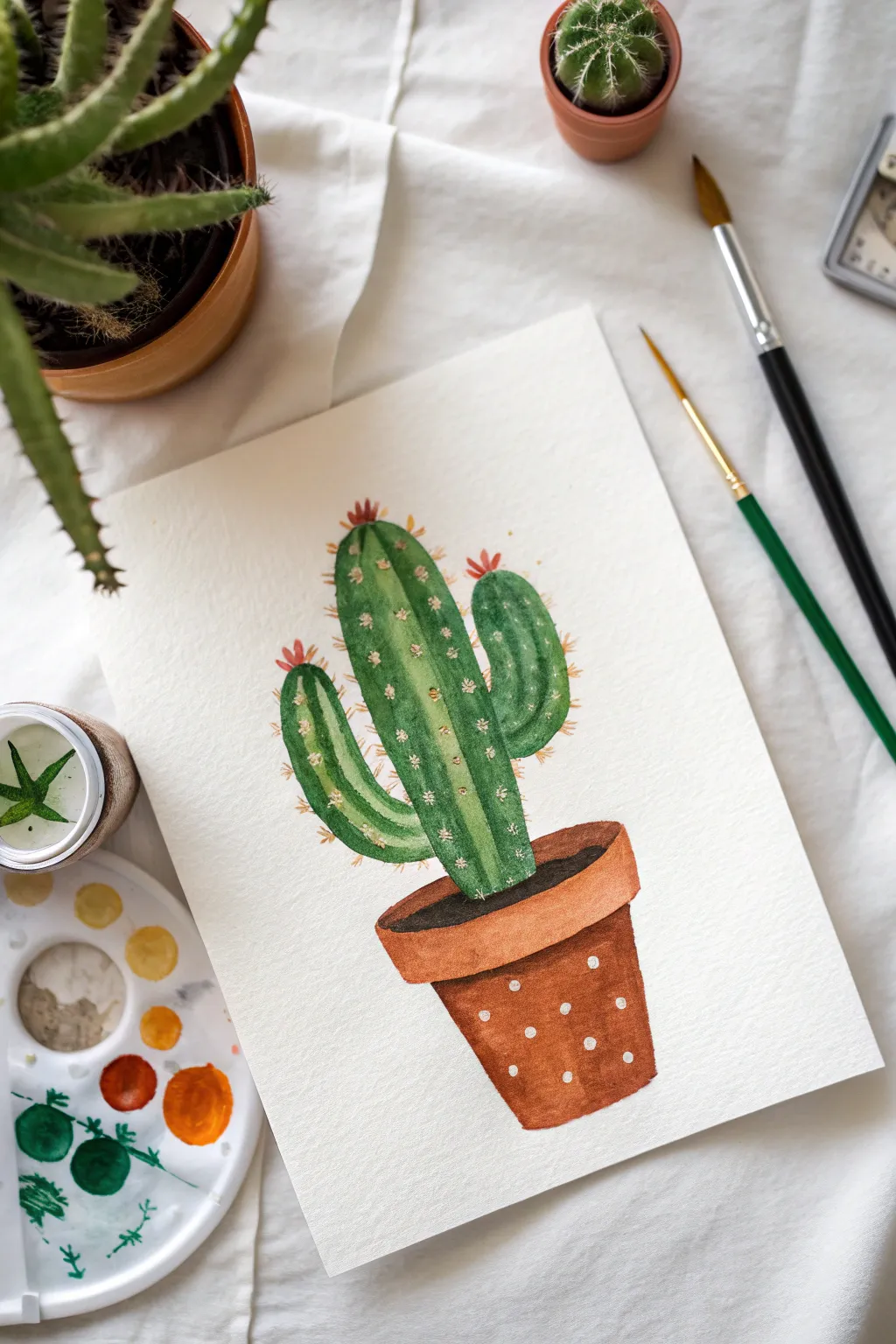
This charming watercolor illustration features a cheerful saguaro-style cactus resting in an earthy terracotta pot. The combination of textured gradients and crisp white details creates a delightful piece of botanical art perfect for beginners.
Step-by-Step Guide
Materials
- Watercolor paper (cold press, 300gsm)
- Watercolor paints (Sap Green, Hooker’s Green, Burnt Sienna, Burnt Umber, Yellow Ochre, Cadmium Red)
- Round watercolor brush (size 6)
- Fine detail brush (size 0 or 2)
- White gouache or white gel pen
- Pencil and eraser
- Palette and water jar
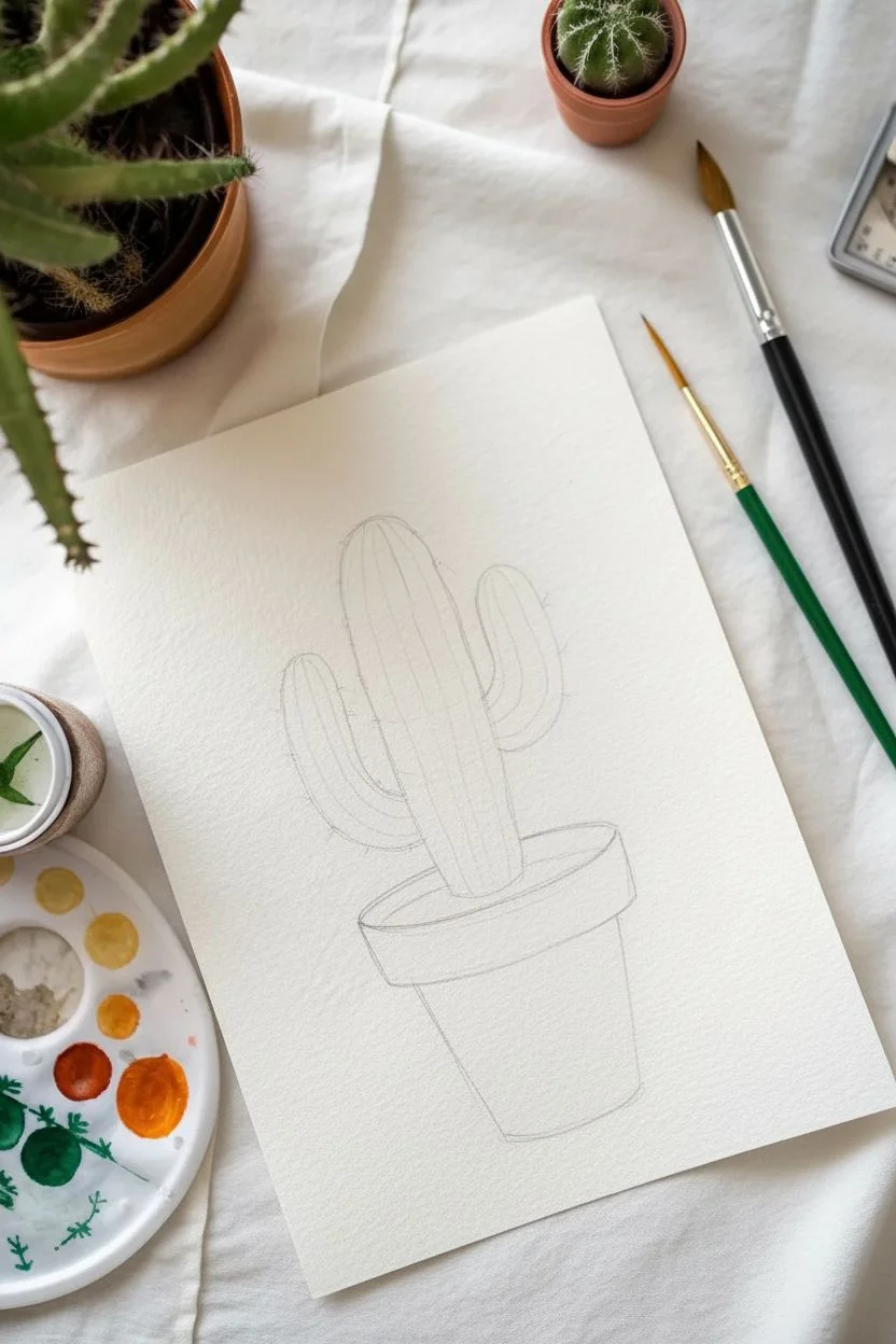
Step 1: Sketching the Outline
-
Outline the pot:
Lightly draw a trapezoid shape for the pot body and a narrow rectangle on top for the rim. -
Add the cactus:
Sketch a central tall column rising from the pot, then add two curved arms extending outward and upward. -
Clean up:
Gently erase your lines until they are faint guides, ensuring the graphite won’t muddy your paint later.
Muddy colors?
If the green bleeds into the brown pot, you didn’t wait long enough! Ensure the first section is completely dry to the touch before painting an adjacent area.
Step 2: Painting the Planter
-
Mix the terracotta hue:
Combine Burnt Sienna with a tiny touch of red or orange to get a warm clay color. -
Paint the pot body:
Fill in the main section of the pot. While the paint is wet, dab a little more pigment on the right side to create a shadow. -
Paint the rim:
Using the same color mix, carefully paint the rim of the pot. -
Add the soil:
Mix Burnt Umber with a dot of black or blue to create a dark soil color. Paint the oval area where the cactus meets the pot. -
Let it dry:
Allow the pot section to dry completely so the colors don’t bleed into the green later.
Level Up
Paint a faint cast shadow underneath the pot using a diluted mix of purple and grey. This grounds the object and stops it from looking like it’s floating.
Step 3: Creating the Cactus
-
Base wash:
Mix a light, yellowish-green (like Sap Green) and paint the entire cactus shape. -
Mix stripe color:
Create a darker green shade by mixing Hooker’s Green with a little deep blue or brown. -
ADD vertical ridges:
While the base layer is just slightly damp or dry, paint vertical stripes following the curve of the cactus to simulate ribs. -
Blend softness:
I like to soften some of the stripe edges with a damp clean brush to make the cactus look round. -
Deepen shadows:
Add a touch of the darkest green at the very bottom of the cactus where it enters the soil.
Step 4: Details & Texture
-
Paint the spines:
Switch to your fine detail brush. Use opaque Yellow Ochre or light brown to paint tiny clusters of ticks along the dark ridges. -
Add blooms:
Mix a soft red or coral color and paint small, spiky flower buds at the very tips of the cactus arms. -
Add the pattern:
Once the pot is bone dry, use white gouache or a gel pen to apply evenly spaced polka dots. -
Final highlights:
Add tiny white accents on the cactus ridges or flowers if you want extra sparkle.
Enjoy your vibrant, low-maintenance potted plant art.


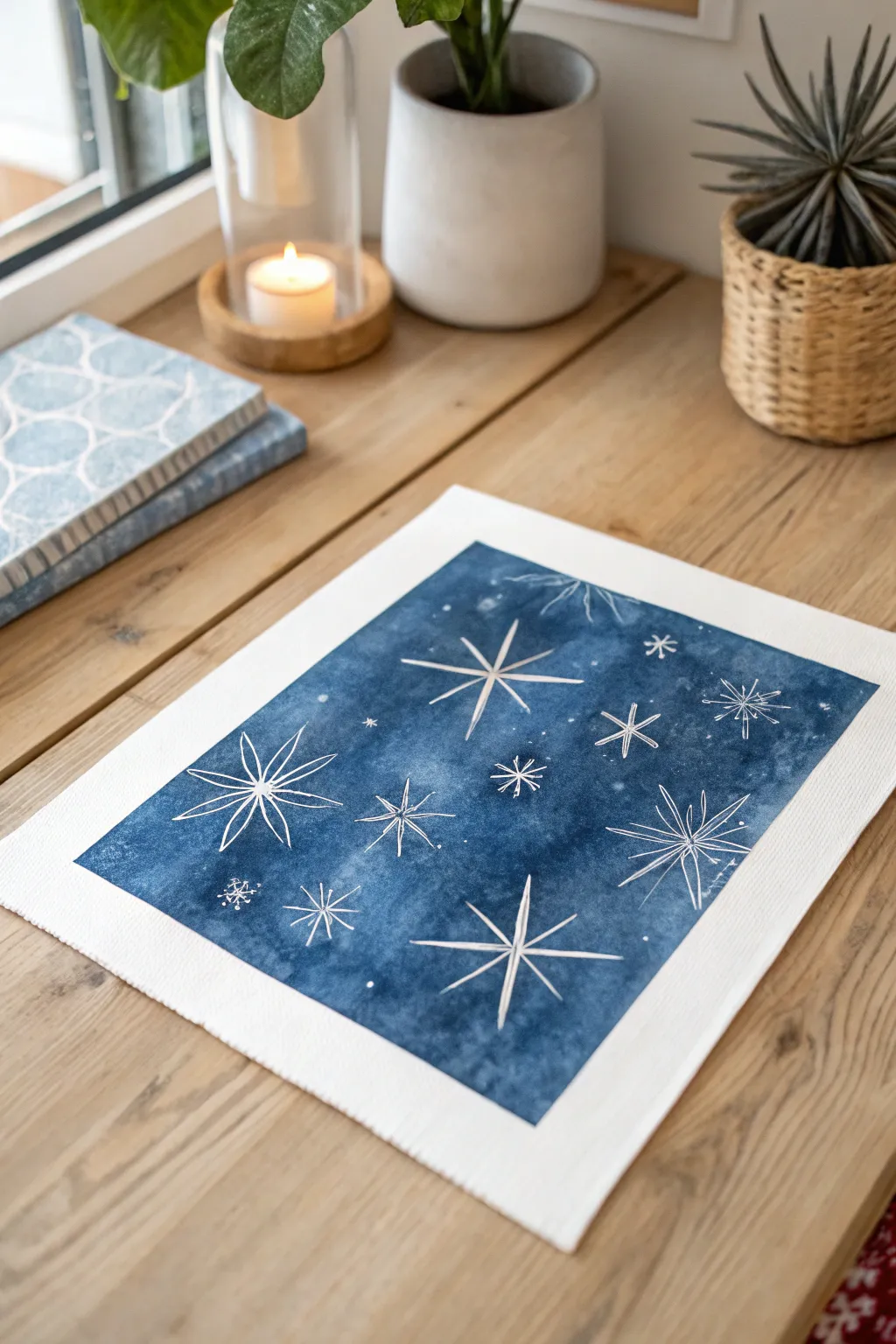
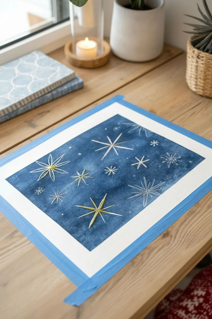
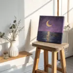
Atmospheric galaxy night skies
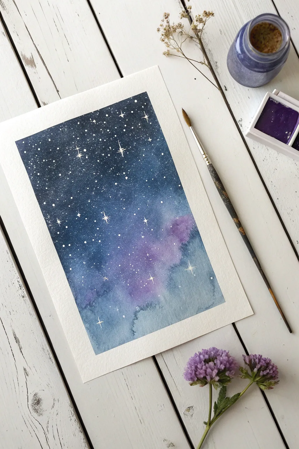
Capture the magic of the cosmos with this moody, atmospheric night sky painting. By blending deep indigo with soft violets and adding crisp white stars, you will create a stunning piece of art that looks far more complex than it actually is.
Detailed Instructions
Materials
- Cold press watercolor paper (300gsm)
- Painter’s tape or masking tape
- Watercolor paints: Indigo, Violet, Payne’s Gray
- White opacity medium: White gouache or bleeding-proof white ink
- Large round brush (size 8 or 10)
- Small detail brush (size 0 or 1)
- Water jars and paper towels
- Palette for mixing
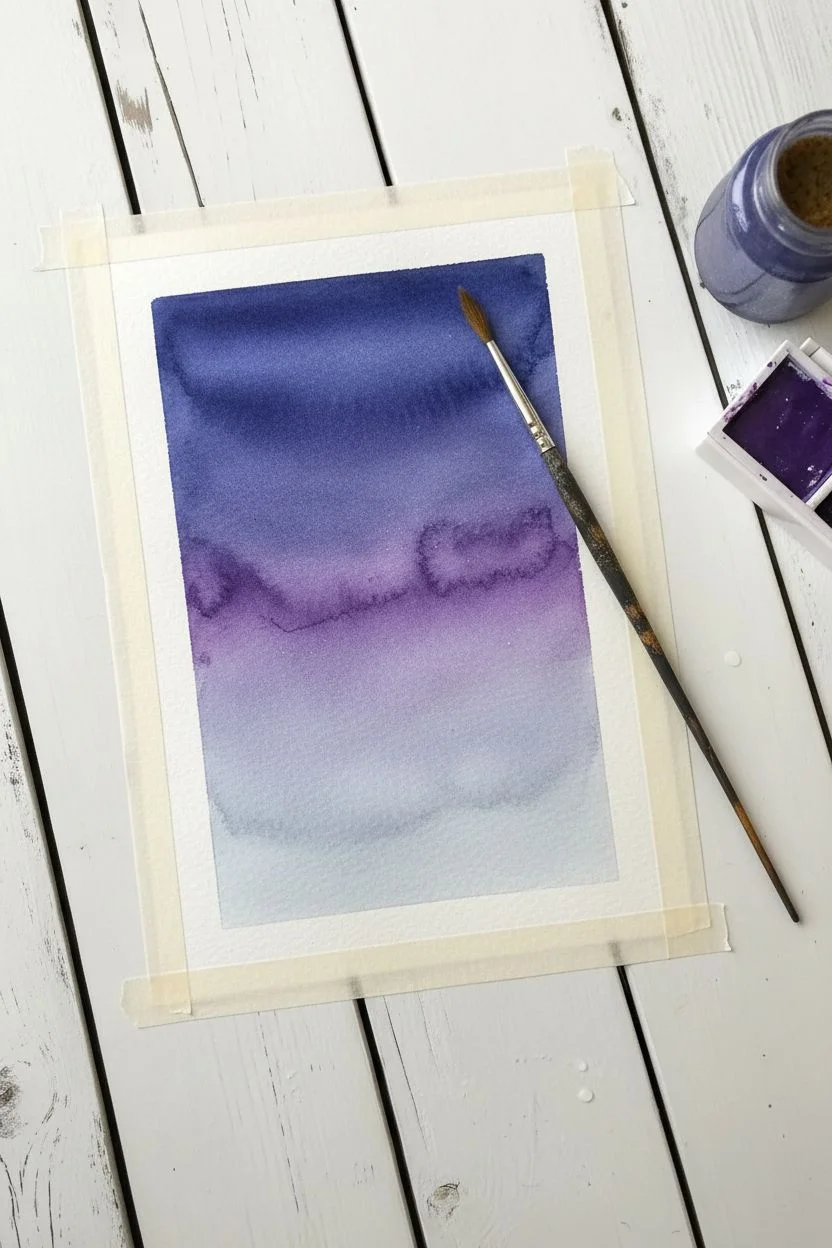
Step 1: Setting the Stage
-
Secure the borders:
Place your paper on a flat board or table. Apply masking tape firmly along all four edges to create a clean, white border later. Run your fingernail along the inside edge of the tape to prevent paint from seeping underneath. -
Prepare the wash:
Using your large round brush, apply a layer of clean water over the entire paper surface. You want the paper to be glistening and damp, but not holding puddles of water. -
Begin with darkness:
Load your brush heavily with Indigo or a mix of Blue and Black. Start painting at the very top of the paper, using horizontal strokes. The color should be extremely saturated and dark here. -
Transition to violet:
Rinse your brush slightly and pick up your Violet paint. Apply this directly below the Indigo, overlapping slightly so the colors bleed together naturally on the wet paper. -
Fade to light:
Rinse your brush again so it holds mostly water and just a touch of pigment. Drag the paint down towards the bottom third of the paper, creating a pale, misty blue-gray wash that fades out near the bottom tape line.
Clean Edge Check
If you tear the paper while removing tape, use a hair dryer to heat the adhesive slightly as you peel. Always pull the tape away from the painting, not toward the center.
Step 2: Creating Depth
-
Deepen the cosmos:
While the paper is still wet, drop concentrated Indigo or Payne’s Gray into the top corners and along the upper edge. This increases the contrast and makes the sky feel vast. -
Add nebula clouds:
Drop small amounts of Violet or even a touch of magenta into the wet middle section. Let the water move the pigment around to create soft, cloud-like shapes. -
Lift for highlights:
I like to use a clean, thirsty brush to gently lift a little color from the lower section if it gets too dark. This helps maintain that foggy, atmospheric look. -
Let it dry completely:
This is a crucial patience test. Let the painting dry until the paper is flat and room temperature to the touch. If you paint stars on damp paper, they will turn into fuzzy blobs.
Level Up: Starry Glow
For a magical glowing effect, gently dab a tiny amount of clean water over a dry painted star, lift the pigment with a tissue, and then repaint the white dot in the center of the softened spot.
Step 3: Starlight Details
-
Mix the stars:
In your palette, mix white gouache or white ink with a tiny drop of water. You are aiming for the consistency of heavy cream—thick enough to be opaque, but fluid enough to splatter. -
Splatter the background:
Load a medium brush with the white mixture. Hold it over the painting and tap the handle against another brush or your finger. This knocks off tiny droplets to create distant stars. -
Vary the density:
Focus more splatters near the dark top section where they will stand out most, and fewer near the bottom misty section. -
Paint major stars:
Switch to your smallest detail brush (size 0). Paint a few larger stars by making a small cross shape: a vertical line crossed by a slightly shorter horizontal line. -
Add the star center:
Place a tiny dot of white paint right in the center of your cross shapes to make them glow. You can also add random single dots by hand to fill any empty spaces. -
The final reveal:
Once the white paint is fully dry, slowly peel away the masking tape at a 45-degree angle to reveal your crisp, clean edges.
Enjoy your beautiful slice of the night sky.
Soft-edged decorative feathers
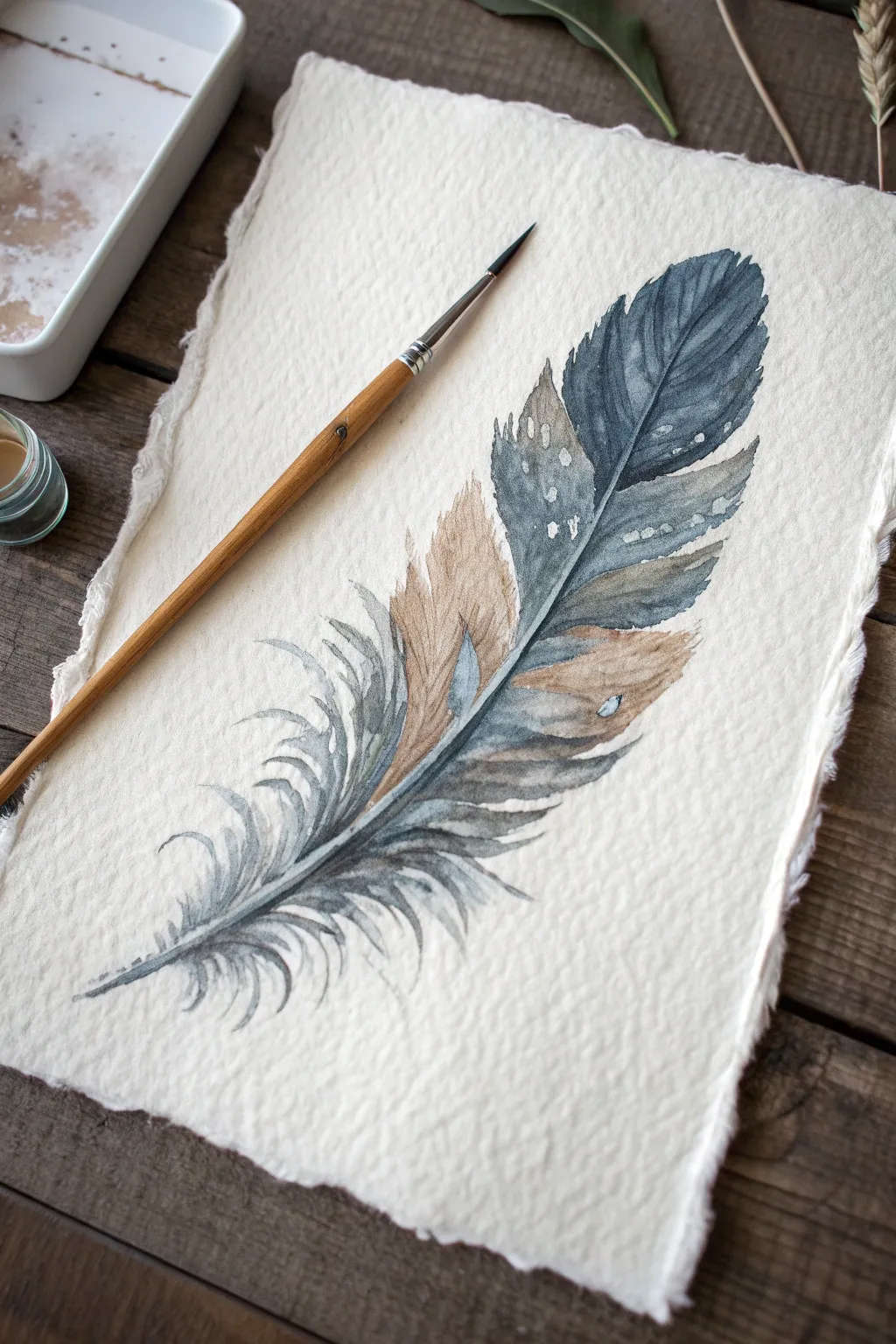
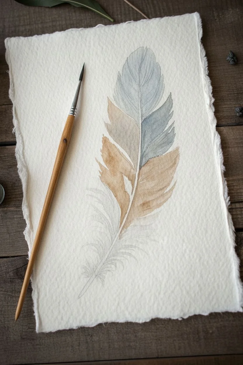
Capture the delicate beauty of nature with this detailed watercolor feather study, combining moody blues and warm earth tones. The texture of heavy paper enhances the organic feel, creating a vintage look that is perfect for framing.
How-To Guide
Materials
- Cold-press watercolor paper (300gsm, deckle-edge preferred)
- Round pointed brush (size 4 or 6)
- Fine detail brush (size 0 or 1)
- Watercolors: Payne’s Grey (or Indigo), Burnt Sienna, Raw Umber
- White Gouache or Bleed Prro White ink
- HB Pencil and kneaded eraser
- Two jars of water
Step 1: Sketching and Base Washes
-
Outline the spine:
Begin by lightly sketching the central spine (rachis) of the feather with a gentle curve. This establishes the flow of the artwork. -
Define the shape:
Sketch the outer contour of the feather, purposely leaving gaps on the left side where the barbs separate and keeping the bottom area loose and unstructured. -
Prepare the earth tone:
Mix a watery puddle of Burnt Sienna with a tiny touch of Raw Umber to create a warm, golden-brown hue. -
Apply the first wash:
Paint the middle section of the feather’s left side with the brown mix, keeping the strokes flowing outward from the spine. -
Prepare the blue-grey:
Mix Payne’s Grey with a fair amount of water to create a semi-transparent blue-grey tone. -
Paint the upper section:
Apply the grey mix to the top right section of the feather. I like to let this new wet edge just barely touch the brown section so they bleed together slightly without creating mud.
Bleeding Control
If the brown and grey sections merge into a muddy color, wait for the first color to be damp (not soaking wet) before painting the adjacent section. This keeps the edges soft but distinct.
Step 2: Creating Texture and Flow
-
Deepen the values:
While the grey section is still damp, drop in a more concentrated mixture of Payne’s Grey near the spine and the distinct dark patch near the top tip. -
Form the separated barbs:
On the left side, paint the individual, curved segments (barbs) that have pulled away from the main shape, using the tip of your round brush to taper the ends. -
Create the downy bottom:
For the bottom ‘fluff’ of the feather, use very watered-down grey. Use quick, flicking motions with just the tip of the brush to create soft, wispy lines. -
Paint the quill:
Once the surrounding areas are mostly dry, paint the central rachis with a thin, dark line of concentrated Burnt Umber mixed with a little grey. -
Add directional lines:
Using a slightly drier brush, paint faint, sweeping lines inside the main feather sections that follow the direction of the barbs to simulate texture.
Gilded Touch
For a magical twist, trace the central quill and a few tip edges with metallic gold watercolor or a gold gel pen. This adds a subtle shimmer that mimics the iridescence found in real bird feathers.
Step 3: Highlights and Details
-
Switch to the detail brush:
Load your smallest brush with a dark, creamy mix of Payne’s Grey to sharpen the edges of the upper feather where it overlaps. -
Prepare the white:
Mix white gouache with a tiny drop of water until it has the consistency of heavy cream; it needs to be opaque enough to cover the dark paint. -
Apply speckles:
Carefully dot small white patterns onto the dark grey tip of the feather to suggest natural mottling. -
Add the tear mark:
Paint a small, angled white mark on the lower brown section to mimic a hole or tear in the feather structure. -
Review contrast:
Check your painting for depth. If the quill looks too flat, run a very thin line of black or deepest grey along the shadowed side of the stem.
Allow your feather to dry completely before removing it from your board to preserve that beautiful texture.
Playful line and wash doodles
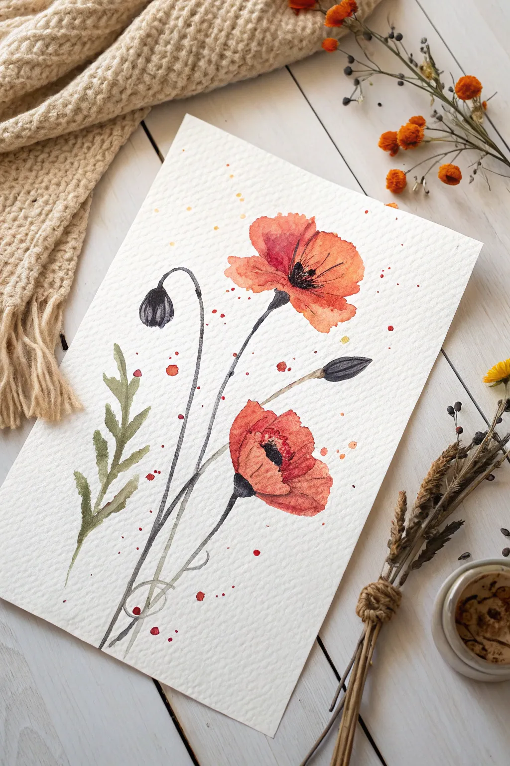
Capture the delicate beauty of wildflowers with this vibrant project that combines free-flowing watercolor with crisp ink details. The result is a spirited, illustrative piece complete with artistic splatters and a playful, sketched aesthetic.
Step-by-Step Guide
Materials
- Cold press watercolor paper (300 gsm)
- Round watercolor brushes (size 4 and 8)
- Waterproof fine liner pen (black, 0.3mm or 0.5mm)
- Watercolor paints (Vermilion, Sap Green, Payne’s Grey/Black)
- Pencil and eraser
- Paper towel
Step 1: Laying the Watercolor Base
-
Sketch the placement:
Using a pencil, very lightly mark where your two main flowers and two buds will go. Keep these guide marks faint so they don’t show through the final paint. -
Paint the top bloom:
Load your larger brush with a watery mix of Vermilion. Paint the upper flower shape loosely, leaving a few tiny gaps of white paper to suggest light reflecting off the petals. -
Add the second bloom:
Paint the second flower lower down on the paper using the same reddish-orange mix. Keep the edges organic and uneven rather than perfect circles. -
Tone variation:
While the paint is still damp, drop a slightly more concentrated orange into the center of the petals to create depth and shadow. -
Paint the buds:
Mix a dark grey using Payne’s Grey or a watered-down black. Paint two small teardrop shapes for the buds—one facing down on the left, one facing up on the right. -
Add greenery:
Using Sap Green, paint the single fern-like leaf on the left side. Use the tip of your brush to flick outward, creating jagged, natural-looking leaf segments. -
Stem shadows:
With a very dilute, pale grey wash, paint faint lines for the stems connecting the flowers and buds. These act as a shadow guide for your later ink work. -
Darken the centers:
Once the red petals are mostly dry (damp is okay), dab a strong black mixture into the center of the open flowers. Let it bleed slightly into the petals for a soft look. -
Create artistic splatters:
Load a wet brush with orange paint. Tap the handle against your finger over the paper to rain down small droplets around the flowers. I usually aim for the white space between stems. -
Dry completely:
This is the most critical step. Let the painting dry 100% before touching it with a pen, or the ink will bleed and ruin the crisp effect.
Bleeding Lines?
If your ink feathers or blurs into the paper, the paint wasn’t fully dry. Stop immediately and use a hairdryer on the low setting to completely bond the paint to the paper before resuming.
Step 2: Inking the Details
-
Outline the stems:
Using your waterproof fine liner, draw the stems. Don’t trace the painted lines perfectly; allow your pen line to cross over or sit beside the paint for a loose, sketch-like quality. -
Define the petals:
Add outline details to the orange petals. Use broken lines—lifting your pen occasionally—rather than closing the shapes entirely. This keeps the flower looking airy. -
Detail the buds:
Outline the dark buds. Add a few vertical curved lines inside the bud shape to suggest the texture of the folded petals waiting to open. -
Scribble the centers:
Go over the black painted centers with rapid, messy scribbles of ink. Draw fine lines radiating outward from the center to represent the stamens. -
Leaf definition:
Add a central vein line to your green leaf, but leave the outer edges largely un-outlined to keep the foliage looking soft. -
Final touches:
Add a few stray ink dots or tiny circles near the paint splatters to integrate the ink and watercolor layers together.
Golden Hour
For a sophisticated twist, use a metallic gold gel pen or gold watercolor paint to add highlights to the stamens in the center of the poppies after the black ink has dried.
Sign your name near the stem base to complete your lively floral doodle
Salt-textured winter scenes
This project combines the crisp lines of a masking fluid resist with the unpredictable beauty of salt textures to create a moody winter night sky. It produces a professional-looking result where bright white stars pop dramatically against a deep, frozen indigo background.
How-To Guide
Materials
- Cold-press watercolor paper (minimum 140lb/300gsm)
- Masking fluid (drawing gum) pen or bottle
- Old fine-point brush or silicone applicator
- Indigo and Prussian Blue watercolor paints
- Table salt or sea salt
- Painter’s tape and a drawing board
- Mild dish soap (if using a brush)
- Clean water and paper towels
Step 1: Preparation and Masking
-
Secure the paper:
Tape your watercolor paper down firmly to a board on all four sides. This ensures the paper stays flat when wet and creates a clean white border later. -
Draft the layout:
Using a very light touch with a pencil, map out where you want your largest stars to be. Keep the composition random to mimic a natural sky. -
Prepare the applicator:
If you are using a brush to apply masking fluid, dip it into a drop of dish soap first. I find this coats the bristles and prevents the rubbery fluid from ruining the brush. -
Draw the star beams:
Dip your soapy brush into the masking fluid and paint long, thin intersecting lines to form the 8-pointed stars. Vary the pressure to make the lines taper at the ends. -
Add background details:
Fill the empty spaces with smaller simple crosses, tiny asterisks, and single dots to represent distant stars. -
Dry the mask:
Allow the masking fluid to dry completely. It should feel hard and tacky to the touch, not cool or wet. Do not rush this step.
Step 2: The Wash and Salt Texture
-
Mix the colors:
Prepare a generous puddle of Indigo mixed with a little Prussian Blue. You want a very saturated, dark mixture to contrast with the white paper. -
Wet the paper:
Using a large soft brush, wet the entire paper surface with clean water until it has an even sheen, but isn’t forming puddles. -
Apply the wash:
Load your brush with the dark paint mixture and drop it into the wet paper. Start from the corners and work inward to create a vignette effect. -
Encourage flow:
Tilt the board slightly to let the pigment swirl and settle into the paper’s texture, ensuring the blue covers everything except the masked white border. -
Sprinkle the salt:
While the paint is still shiny and wet—but not swimming in a puddle—sprinkle a pinch of salt randomly over the paper. Focus on the open blue spaces. -
Wait for the reaction:
Watch as the salt crystals begin to push the pigment away, creating lighter, frost-like blooms in the texture.
Soap Saver Trick
Masking fluid is notorious for ruining brushes. If you don’t have a silicone tool, always coat your brush bristles in dish soap before dipping into the masking fluid. It creates a protective barrier.
Step 3: The Reveal
-
Let it dry completely:
Leave the painting to dry naturally. Using a hair dryer here can sometimes blow the salt around or melt the masking fluid into the paper, so patience is best. -
Remove the salt:
Once the paper is bone dry and warm to the touch, gently brush the salt crystals off into a trash bin using your hand or a dry clean brush. -
Remove the mask:
Use a rubber cement pickup or your finger to gently rub away the masking fluid. Start from the center of the stars and rub outward to avoid peeling the paper. -
Clean up touches:
If any pencil lines are still visible inside your white stars, use a soft eraser to gently remove them for a pristine finish. -
Remove the tape:
Peel the painter’s tape away slowly at a 45-degree angle to reveal your crisp white edges.
Salt Not Blooming?
Timing is everything. If the paper is too wet, the salt dissolves and disappears. If it’s too dry, the pigment won’t move. Aim for a ‘shiny satin’ wetness when you sprinkle to get those frosty blooms.
Frame your starry night piece to add a cool, celestial vibe to your winter decor.
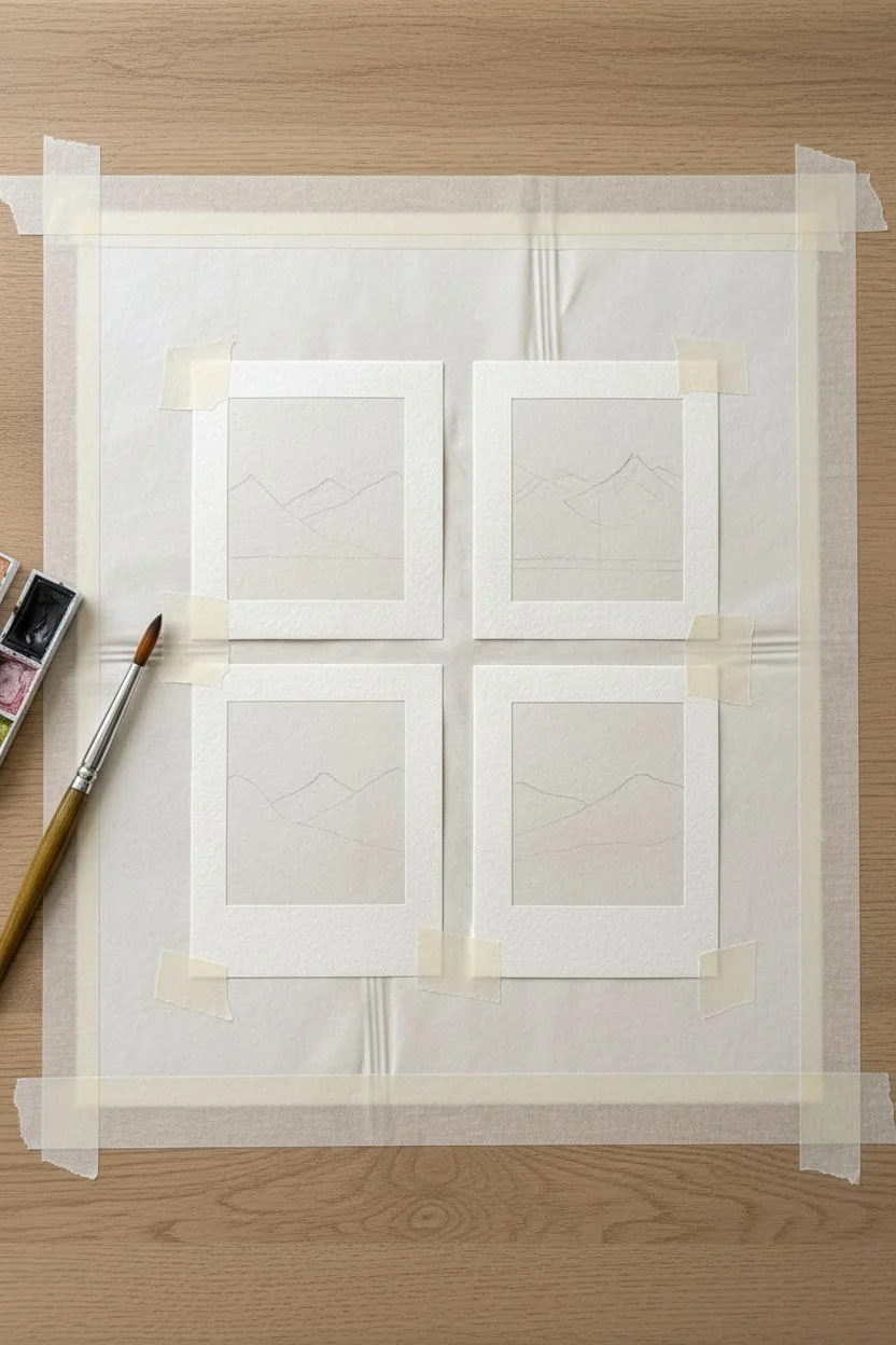
Polaroid-style mini landscapes
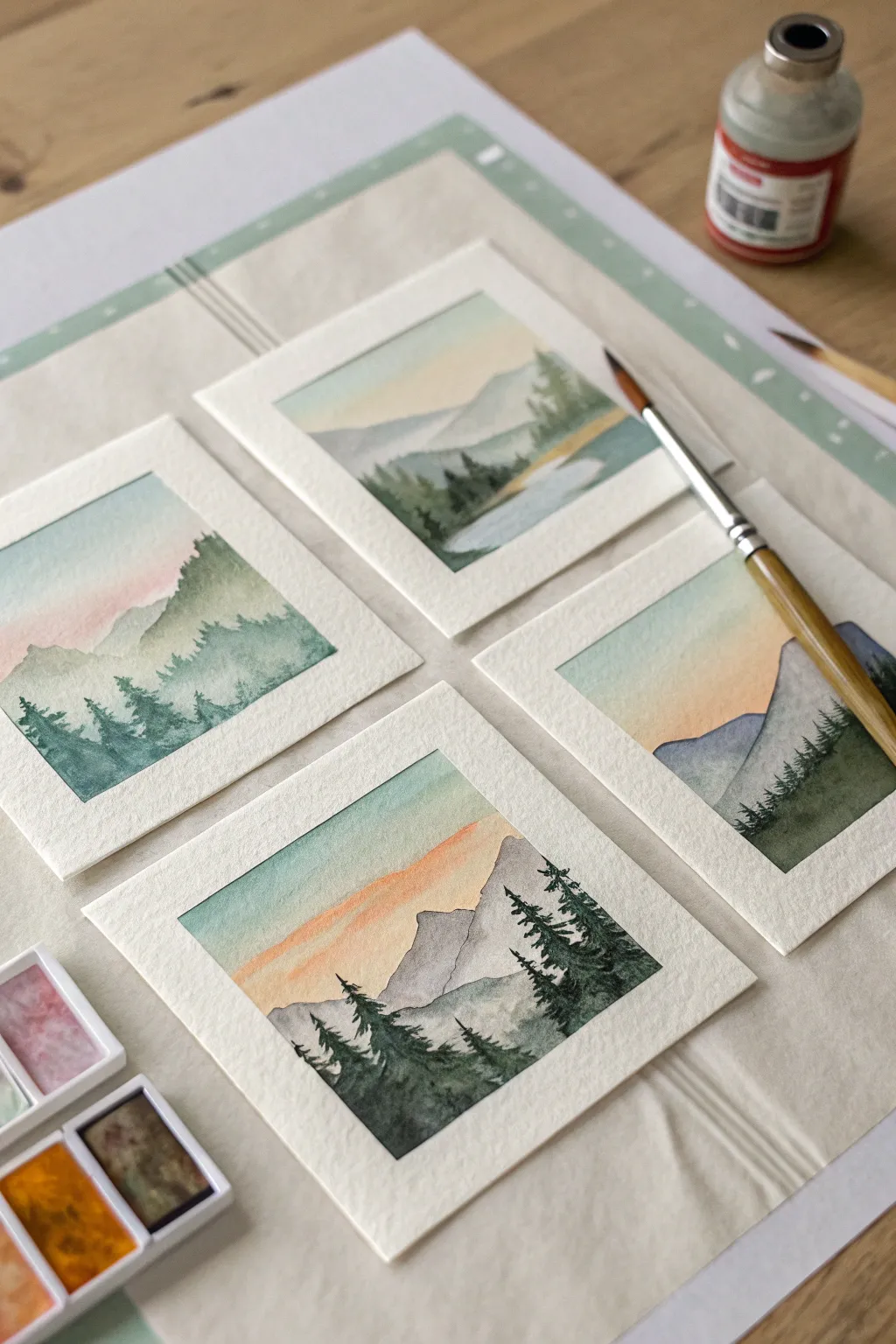
Capturing the majesty of a mountain range within a tiny, nostalgic instant-photo border is incredibly satisfying. This project teaches you to manage moisture control and atmospheric perspective on a miniature scale.
Step-by-Step Tutorial
Materials
- Cold press watercolor paper (300gsm)
- Artist tape or Washi tape (0.5 inch)
- Watercolor paints (pan set)
- Round brushes (Size 2 and 6)
- Pencil
- Water jar and paper towels
Step 1: Preparation and Sketching
-
Prepare the canvas:
Tape down your watercolor paper to a hard board or table. You can do one large sheet or individual small cuts. -
Create the frames:
Use tape to mask off small squares. Leave a wider space of white paper at the bottom of each square to mimic the classic Polaroid footer. -
Seal the edges:
Run your fingernail or a bone folder firmly along the inner edges of the tape to prevent paint from sneaking underneath. -
Draft the scene:
Using very light pressure, sketch simple triangular mountain outlines inside the squares.
Step 2: Painting the Sky
-
Wet the sky:
Dip your larger brush in clean water and lightly dampen the sky area, stopping right at the mountain outline. -
Apply the gradient:
Load diluted peach or yellow paint and dab it near the horizon line. -
Blend the blue:
While the paper is still wet, drop light blue or teal at the very top and let it bleed downward into the peach. -
Wait:
Let this layer dry completely before moving on to ensure crisp lines later.
Tape Trick
Before applying tape to your paper, stick it to your jeans or shirt once. This removes some stickiness and prevents the tape from tearing your paper when removed.
Step 3: Layers of Mountains
-
First mountain range:
Mix a very watery, pale blue-grey. Paint the furthest mountain range; the color should be translucent to suggest distance. -
Dry time:
Wait for the first range to dry. I usually work on the other squares while waiting for one to set. -
Second mountain range:
Mix a slightly darker, more saturated green-grey. Paint the next range of mountains, overlapping the first. -
Soften edges:
If you want a misty look, use a clean damp brush to soften the bottom edge of this mountain layer.
Bleeding Edges?
If paint leaked under the tape, don’t worry. Once the painting is dry, use a white gel pen or a dab of opaque white gouache to tidy up the straight lines.
Step 4: Foreground Details
-
Mix dark pigment:
Create a concentrated dark green mixture using hooker’s green and a touch of payne’s grey or black. -
Paint tree trunks:
Switch to your size 2 brush. Paint tiny vertical lines where you want your foreground pine trees to stand. -
Add pine branches:
Using just the tip of the brush, stipple small horizontal dashes downward from the trunk top, getting wider at the base. -
Fill the bottom:
Fill in the bottom corners with solid dark green to anchor the composition and connect the trees.
Step 5: The Reveal
-
Ensure dryness:
Touch the paper carefully to make sure it is bone dry. It should not feel cool to the touch. -
Remove tape:
Peel the tape away slowly at a 45-degree angle, pulling away from the painting to reveal the crisp white borders.
Sign the bottom white margin with a fine liner to complete your collection of miniature scenic windows.
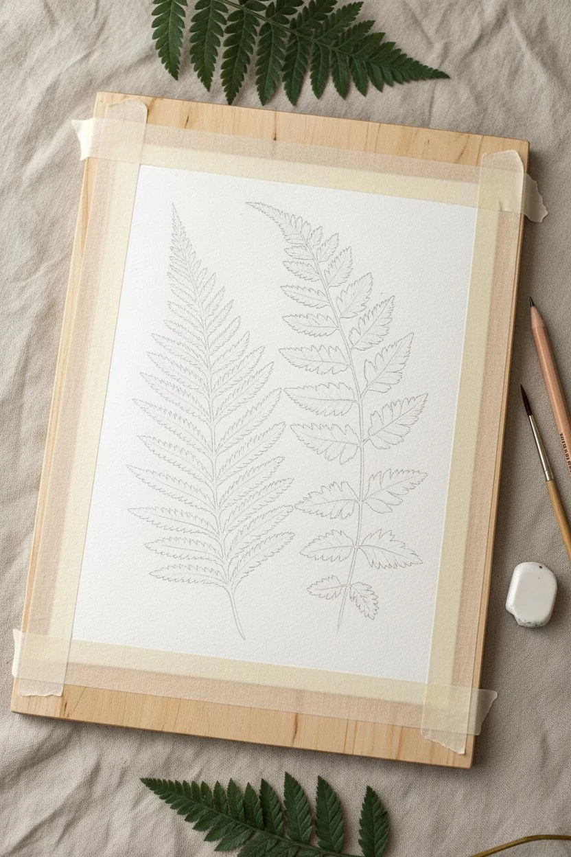
Negative space leaf patterns
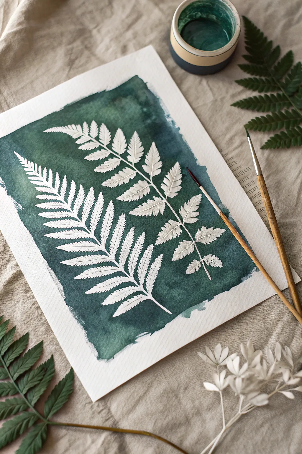
Capture the delicate beauty of fern fronds by focusing on what isn’t painted. This project uses masking fluid to preserve the stark white of the paper against a moody, textured deep green background, creating a stunning high-contrast botanical piece.
Detailed Instructions
Materials
- Cold press watercolor paper (300gsm)
- Masking fluid (drawing gum)
- Old synthetic brush or silicone applicator
- Watercolor paints (Viridian, Sap Green, Indigo)
- Round watercolor brush (size 8 or 10)
- Pencil (HB)
- Kneadable eraser
- Dish soap (for brush care)
Step 1: Sketching the Silhouettes
-
Tape it down:
Secure your paper to a board with masking tape to prevent buckling, but keep in mind we’ll be painting rough, organic edges rather than filling the whole rectangle. -
Outline the stems:
Using your pencil, lightly draw two curved lines to intricate the main stems of the ferns, letting them flow diagonally across the page. -
Draw the fronds:
Sketch the individual leaflets extending from the stems. Keep sketches light; you want a variety of sizes, tapering smaller toward the tip of the fern. -
Add serrated details:
Refine the edges of your leaves with jagged, serrated lines to mimic the texture of a real fern.
Step 2: Applying the Mask
-
Protect your brush:
Before opening the masking fluid, dip your old synthetic brush into dish soap. Do not rinse it; the soap protects the bristles from being ruined by the rubbery fluid. -
Mask the stems:
Carefully paint the masking fluid over the main stems you sketched. -
Mask the leaves:
Fill in the leaf shapes with the fluid. I find it helpful to work from the center outward to keep the edges sharp. -
Create vein details:
For that realistic look shown in the example, use a fine point (like a toothpick or very small brush) to drag thin lines of masking fluid representing veins inside each leaf. -
Total drying time:
Let the fluid dry completely. It must be solid and tack-free to the touch before any paint touches the paper.
Don’t Shake It
Never shake your bottle of masking fluid before use. This introduces air bubbles which can pop while drying, leaving tiny unmasked holes where paint can seep in.
Step 3: The Mood Wash
-
Mix a deep green:
Create a rich, dark color by mixing Viridian or Sap Green with a touch of Indigo or Payne’s Grey to get that forest-floor depth. -
Wet the background:
Brush clean water over the background area around your masked ferns, but leave the very edges of the paper dry to create a contained shape. -
Drop in color:
While the paper is glistening, load your large brush with the dark green mix and drop it onto the wet paper. -
Create texture:
Allow the paint to bloom and spread. Add more concentrated pigment close to the fern shapes to increase contrast. -
Rough edges:
Drag the brush lightly near the outer borders to create the rough, dry-brush effect seen in the reference image, rather than a perfect square border.
Soft Shadows
To add dimension, water down a tiny bit of grey-purple paint and glaze the bottom right edge of each white leaf to suggest delicate shadowing.
Step 4: The Reveal
-
Wait for dryness:
Ensure the green wash is bone dry. If the paper feels cool to the touch, it is still too wet. -
Remove the mask:
Gently rub your finger or a rubber cement pickup tool over the masked areas to peel away the dried fluid. -
Clean uph:
Use a kneadable eraser to lift any remaining visible pencil marks from the bright white paper. -
Final assessment:
If any green paint seeped into the white areas, you can carefully lift it with a clean, damp stiff brush or cover it with a tiny dot of white gouache.
Now you have a striking botanical artwork that highlights the purity of the paper itself.
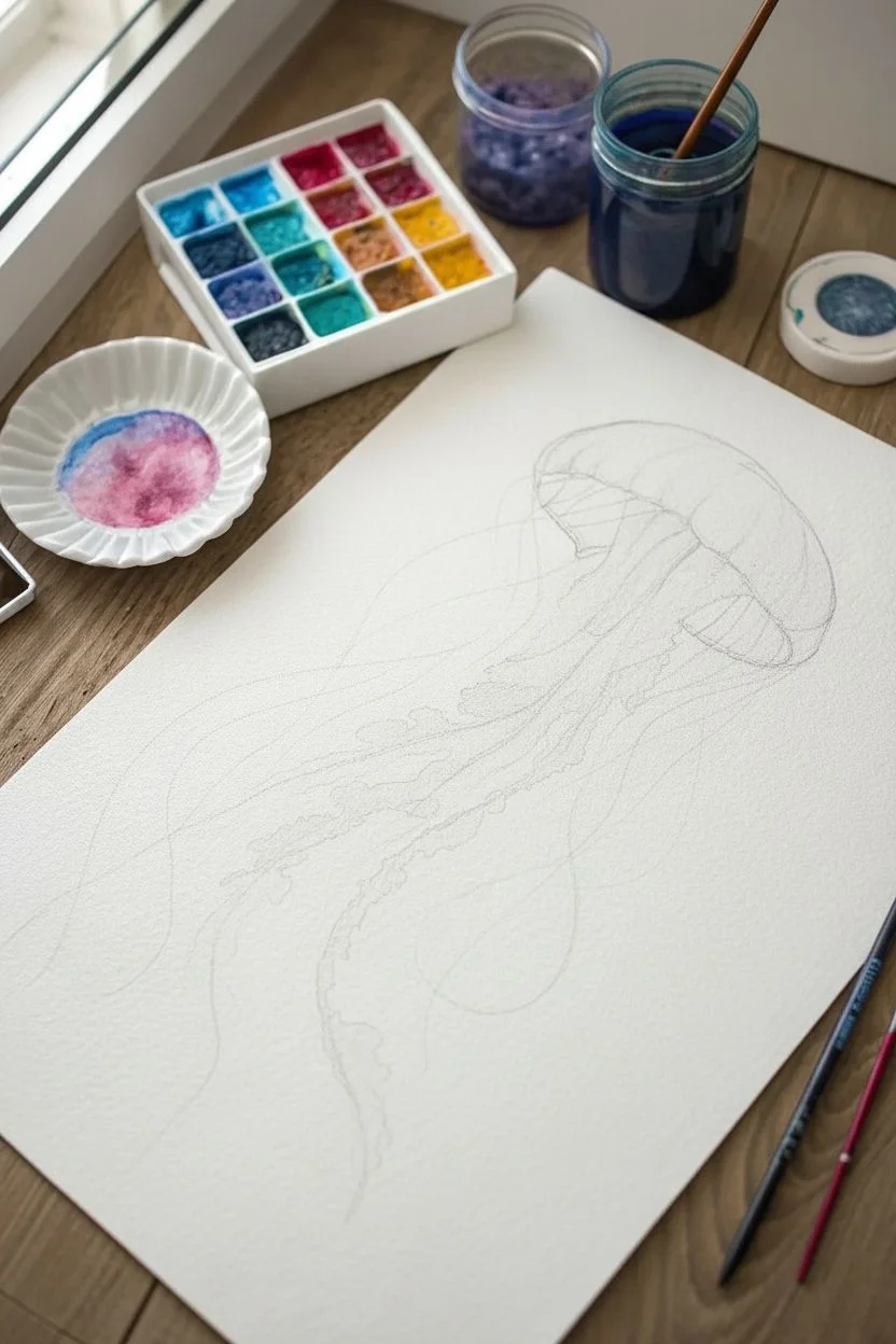
Whimsical flowing jellyfish
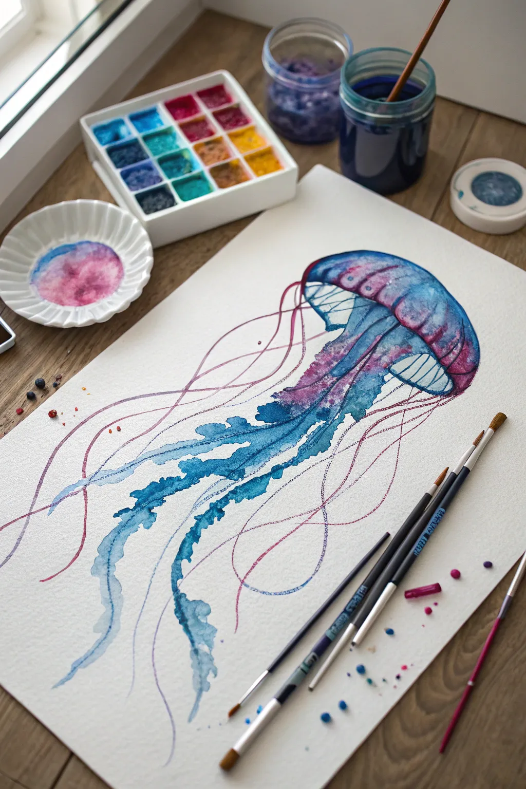
Capture the weightless beauty of marine life with this vibrant watercolor study. By blending deep indigos with bright magentas and utilizing loose brushwork, you will create a translucent effect that makes the jellyfish appear to drift diagonally across the paper.
Step-by-Step Tutorial
Materials
- Cold press watercolor paper (300gsm)
- Watercolor pan set (Indigo, Turquoise, Magenta, Purple)
- Round brush (size 6 or 8)
- Rigger brush or fine liner (size 0 or 1)
- Jar of clean water
- Ceramic palette or mixing dish
- HB Pencil
- Paper towels
Step 1: Sketching the Form
-
Draft the bell:
Lightly sketch a mushroom-cap shape in the upper right quadrant of your paper, tilting it sideways to imply movement. -
Map the flow:
Draw faint, sweeping guidlines extending from the bottom center of the cap toward the bottom left to mark where the tentacles will flow.
Step 2: Painting the Bell
-
Wet the paper:
Using your medium round brush and clean water, dampen the inside of the mushroom cap shape, but try to leave a thin dry gap between segments if you want crisp lines. -
Apply base cool tones:
Load your brush with diluted turquoise and touch it to the top curve of the bell, letting the pigment bloom downward into the water. -
Infuse warm tones:
While the turquoise is still wet, drop a small amount of magenta or purple along the bottom rim of the bell. -
Blend on paper:
Tilt the paper slightly to help the teal and purple merge naturally in the middle of the bell shape. -
Lift highlights:
I like to rinse my brush, dry it on a towel, and gently lift some pigment from the top left of the bell to create a rounded, shiny look. -
Define the segments:
Once the initial wash is fully dry, use a mix of concentrated indigo and purple to paint thin, curved lines effectively dividing the bell into sections. -
Darken the rim:
Add a deeper line of indigo along the bottom edge of the bell to give the dome structure and dimension.
Muddy colors?
If your pink and blue tentacles turn brown where they overlap, ensure the blue layer is completely bone-dry before painting the pink lines over them.
Step 3: Creating the Ruffled Arms
-
Mix the main body color:
Prepare a puddle of indigo mixed with a touch of turquoise on your palette. -
Paint the first arm:
Start from the center underneath the bell, pressing the round brush down to create a thick, ruffled stroke that meanders downward. -
Create texture:
Wiggle the brush tip as you pull the paint down to mimic the jagged, soft edges of the jellyfish’s oral arms. -
Vary opacity:
Add more water to your brush as you reach the bottom of the tentacles so they fade out into transparency. -
Layering shapes:
Paint a second and third trailing arm alongside the first, allowing them to touch and bleed into each other slightly for a unified aquatic feel.
Level Up: Salt Texture
While the paint on the bell is still wet, sprinkle a pinch of table salt onto the paper. Once dry, brush it off to reveal unique starburst textures.
Step 4: Adding Fine Tentacles
-
Switch brushes:
Change to your rigger brush or fine liner for the delicate stinging tentacles. -
Paint magenta threads:
Load the brush with a watery magenta mixture and engage your whole arm to paint long, sweeping, continuous lines that loop over the blue arms. -
Add floating loops:
Draw a few stray pink lines that billow out widely to the sides, emphasizing the water current. -
Add indigo threads:
Repeat the previous step with thin lines of dark indigo to add contrast and depth to the tangle of tentacles. -
Final splatters:
Tap a wet brush against your finger to create tiny blue and purple droplets around the tentacles for an effervescent effect.
Let your artwork dry completely before erasing any visible pencil marks, leaving you with a graceful drifter of the deep.
Have a question or want to share your own experience? I'd love to hear from you in the comments below!