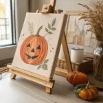
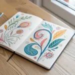
Getting lost in a sketchbook is one of the most relaxing ways to unwind, especially when you focus on mood rather than perfection. I have gathered a collection of approachable drawing ideas that prioritize simplicity and style to help you fill your pages with meaningful art.
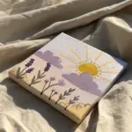
Hanging Moon and Stars
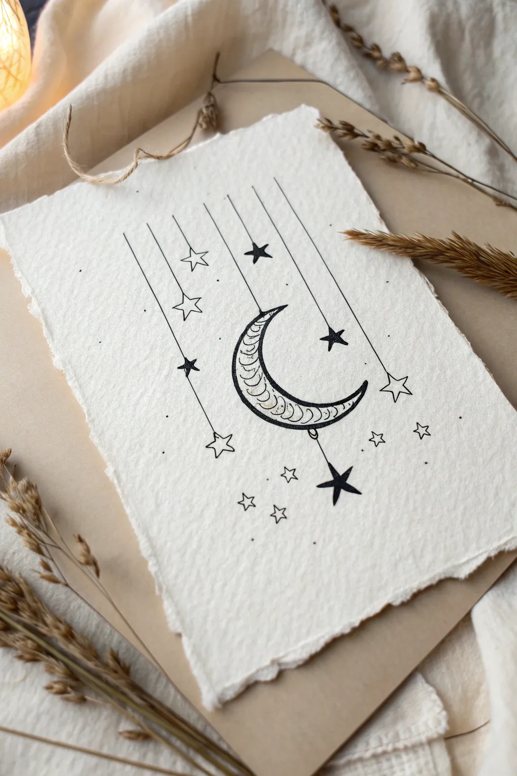
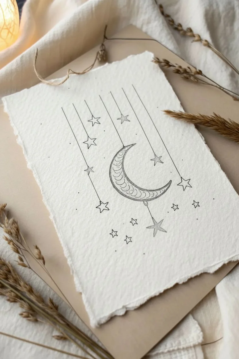
Capture the magic of the night sky with this delicate ink drawing of a hanging moon and stars. The combination of precise linework and textured paper creates a dreamy, vintage aesthetic perfect for art journals or wall decor.
Step-by-Step
Materials
- Handmade cotton paper or cold-press watercolor paper
- Black fine liner pens (sizes 01, 03, and 05)
- HB Pencil
- Kneaded eraser
- Ruler
Step 1: Planning the Composition
-
Prepare your paper:
Start with a piece of handmade paper with deckled edges for that rustic look. If using standard watercolor paper, you can tear the edges against a ruler to mimic this texture. -
Sketch the moon anchor:
Lightly sketch a large crescent moon in the center of the page using your pencil. Angle it slightly so it looks like it’s cradling the space. -
Add vertical strings:
Draw several vertical lines descending from the top edge of the paper. Vary their lengths, having some stop high up and others extend past the moon. -
Place the stars:
At the end of each vertical line, sketch a five-pointed star. Mix up the sizes slightly for visual interest. -
Add the moon charm:
Draw a small vertical line dropping from the bottom center of the crescent moon, finishing with a star to make the moon look like part of the mobile. -
Scattered details:
Sketch a few free-floating small stars and tiny dots in the empty spaces to balance the composition.
Deckle Edge Hack
To fake the handmade paper look, paint a line of water where you want the edge, wait 30 seconds, then gently pull the paper apart along the wet line.
Step 2: Inking the Moon
-
Outline the crescent:
Switch to a size 05 fine liner. Carefully trace the outer shape of the moon, ensuring the curves are smooth and confident. -
Create the inner border:
Draw a second, thinner line inside the moon shape, parallel to the outer edge, creating a narrow border. -
Draw the scale pattern:
Starting from the top tip of the moon, draw rows of small, curved arches (like fish scales) to fill the interior space. -
Refine the texture:
I find that adding a tiny second line or ‘shadow’ to some of the scales adds depth, so go back and thicken the bottom curves of your arches slightly.
Gilded Glow
For a magical twist, fill the hollow stars or the moon’s scales with metallic gold watercolor paint or a gold gel pen after the black ink dries.
Step 3: Stars and Finishing Touches
-
Ink the strings:
Using a size 01 pen and a ruler, trace over your vertical pencil lines. Keep your hand steady to ensure crisp connectors. -
Fill the solid stars:
Identify which stars you want to be solid black (usually the ones on shorter strings or alternating ones). Outline them first, then fill them in completely. -
Ink the outline stars:
Trace the remaining stars, leaving them hollow. Ensure the points are sharp and precise. -
Add floating elements:
Ink the scattered tiny stars floating in the background using your finest pen tip. -
Create stippling:
Gently tap your pen to create small dots (stippling) around the stars and moon. This mimics distant starlight and adds texture. -
Erase guidelines:
Wait for the ink to dry completely to avoid smudging. Then, gently remove all pencil marks with a kneaded eraser.
Frame your celestial artwork in a floating frame to show off those beautiful textured edges.


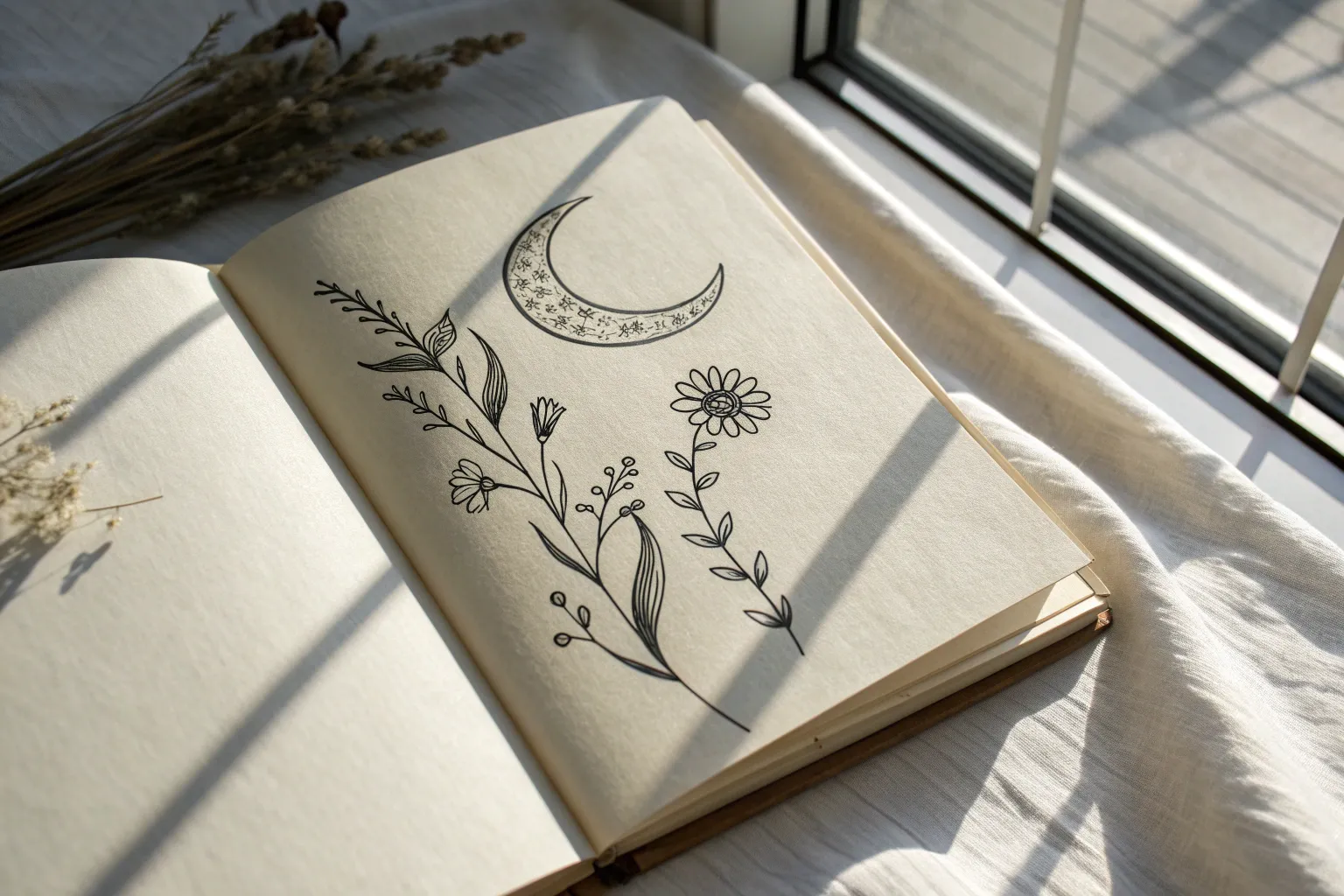
Minimalist Wildflower Sprigs
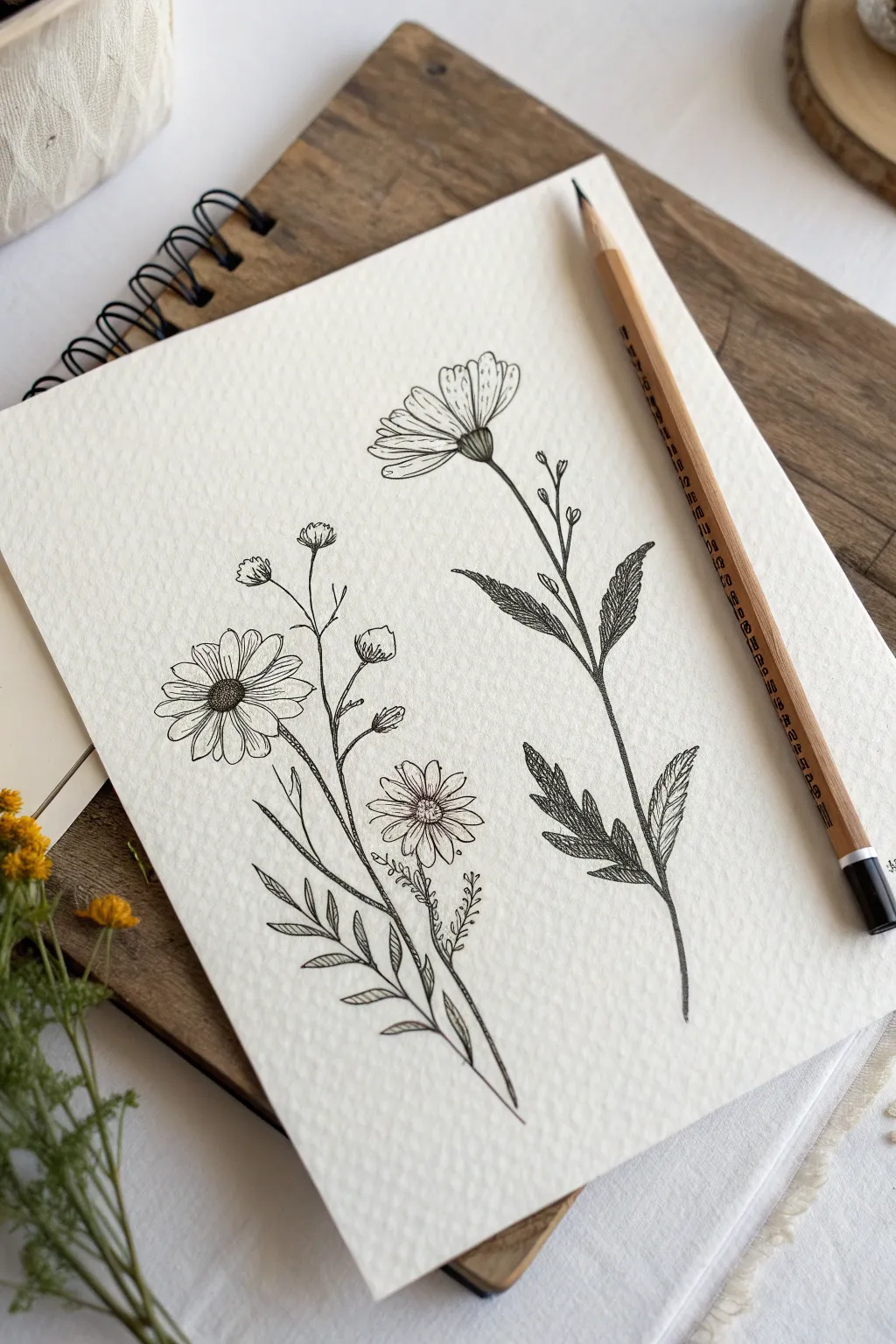
Capture the rustic charm of wildflowers with this fine-line drawing tutorial, emphasizing organic shapes and delicate textures. The contrast between crisp ink lines and the rough grain of watercolor paper creates a timeless, elegant piece perfect for framing or art journaling.
Step-by-Step Tutorial
Materials
- Cold press watercolor paper (for texture)
- HB graphite pencil
- Kneadable eraser
- Black fine liner pens (sizes 0.1 and 0.3)
- Ruler (optional)
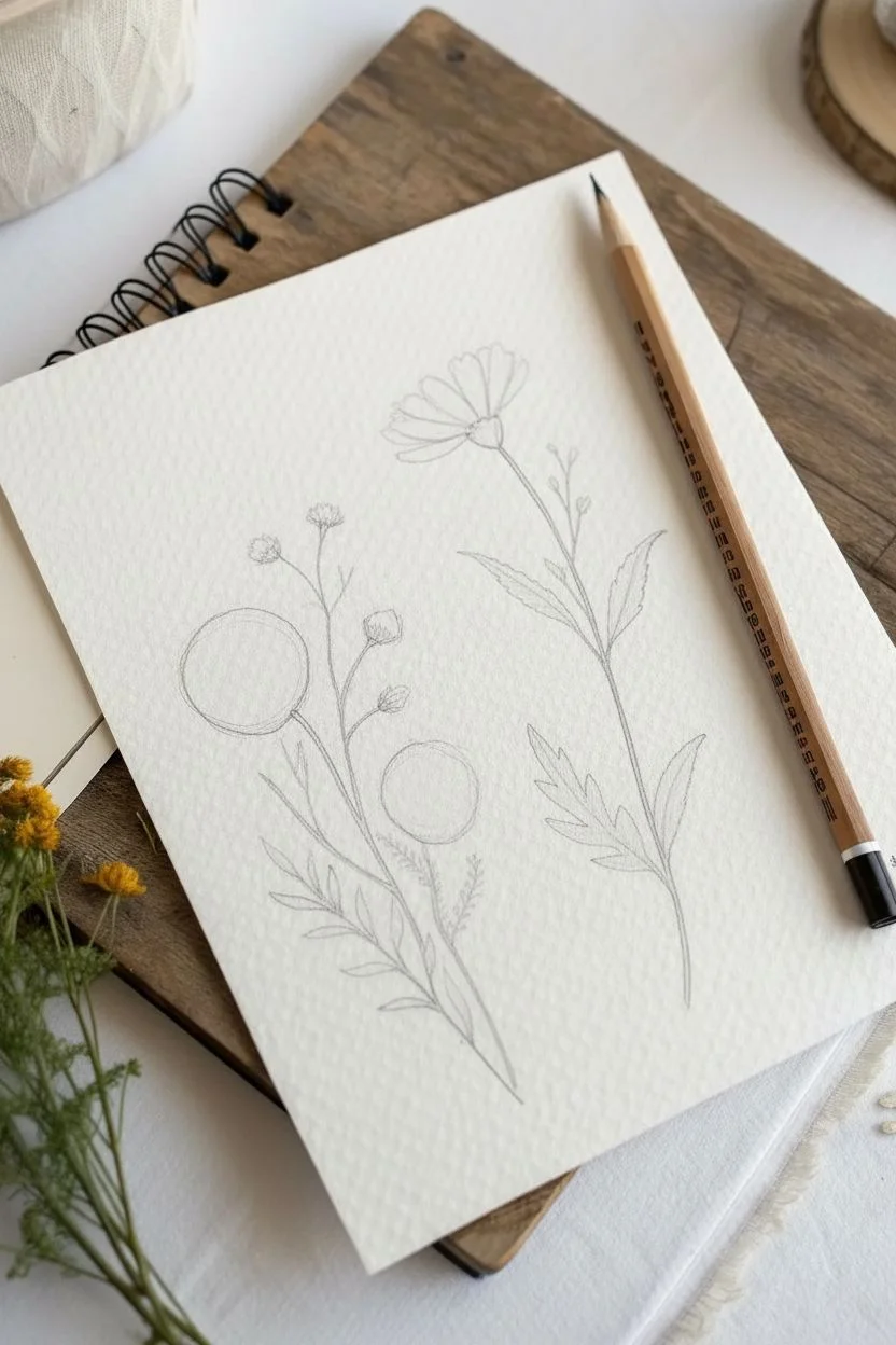
Step 1: Sketching the Framework
-
Establish the stems:
Begin by lightly tracing two main curved lines with your pencil to act as the spines for your sprigs. The left stem should curve slightly to the right, and the right stem should have a gentle S-curve leaning left. -
Mark flower placements:
For the left sprig, sketch a circle near the top for the main daisy and a smaller oval lower down for the secondary bloom. On the right sprig, draw a U-shape or cone at the very top to represent a flower viewed from the side. -
Block in foliage:
Lightly sketch the leaves. On the left sprig, draw long, fern-like shapes near the base. For the right sprig, sketch jagged, serrated leaf shapes branching off the middle of the stem. -
Add bud details:
Draw thin lines branching off the main stems to indicate where small buds will sit. Add small circles at the tips of these lines, particularly on the left sprig and near the top of the right sprig.
Step 2: Inking the Daisy Sprig (Left)
-
Detail the center:
Switch to your 0.1 fine liner. Start with the main daisy’s center by drawing a tight cluster of tiny dots and small loops to create a pollen-like texture. -
Draw the petals:
Outline the petals radiating from the center. Keep lines slightly shaky or uneven to mimic nature; perfect petals look artificial. Make some petals overlap slightly. -
Ink the buds:
Trace the small spherical buds you sketched earlier. Add tiny, jagged sepals at the base of each bud where it connects to the stem. -
Define the stem:
Trace the main stem line, thickening it slightly as you move downward. I like to lift the pen occasionally to keep the line weight feeling light and organic. -
Create fern-like leaves:
Ink the lower leaves using short strokes to create the individual leaflets. These leaves should look airy and open, so don’t fill them in—just outline the compound shape.
Smudge Control
Textured paper holds ink longer than smooth paper. To avoid smudging your handiwork, place a scrap piece of paper under your drawing hand as a shield while you work.
Step 3: Inking the Wildflower Sprig (Right)
-
Form the calyx:
Focus on the side-view flower at the top. Draw the cup-shaped base (calyx) using small, scale-like C-curves to provide texture. -
Add upward petals:
Draw the petals extending upward from the calyx. Since we are viewing this from the side, the petals should look like a fan rather than a full circle. -
Ink the serrated leaves:
Outline the leaves on this stem with jagged, saw-tooth edges. Unlike the left sprig, these leaves are solid shapes rather than compound leaflets. -
Apply shading:
Using a 0.3 pen, fill the interior of these serrated leaves with diagonal hatching lines. This makes the right sprig darker and creates visual contrast against the airy left sprig. -
Texture the stem:
Draw the stem connecting the leaves and flower. Add tiny thorns or bumps along the stem line to differentiate it from the smooth daisy stem.
Level Up: Vintage Wash
For an antique botanical look, lightly brush a diluted tea or coffee stain over the dried ink drawing. The textured paper will pool the color beautifully.
Step 4: Finishing Touches
-
Refine with stippling:
Go back to the left daisy’s center and add more density with dots on the shaded side (usually the bottom right) to give it dimension. -
Add petal veins:
With the finest pen pressure, draw very short, faint lines starting from the base of the petals to suggest veins or folds. -
Erase and clean:
Wait at least 5-10 minutes for the ink to fully cure. Gently erase the underlying pencil structure with a kneadable eraser to avoid roughening the paper texture.
Now you have a stunning botanical study that celebrates the beauty of simple lines and natural forms.


Steaming Coffee Line Art

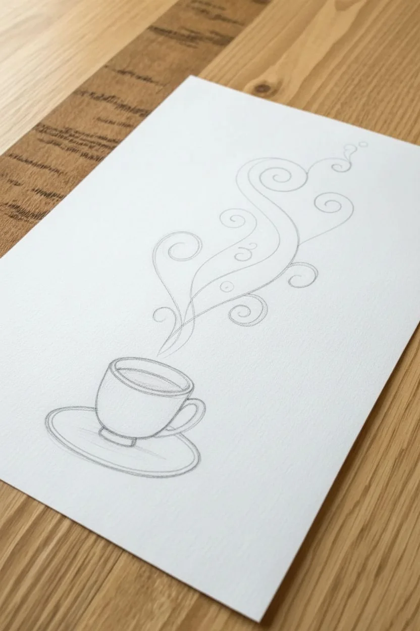
This charming line art piece captures the cozy essence of a hot drink with whimsical, swirling steam. It combines precise structural drawing for the cup with loose, flowing organic lines for the vapor, making it a perfect exercise for practicing line control and hatching.
How-To Guide
Materials
- High-quality smooth drawing paper (white)
- HB graphite pencil
- Kneaded eraser
- Black fineliner pens (sizes 0.1, 0.3, and 0.5mm)
- Ruler (optional)
Step 1: Sketching the Structure
-
Base Ellipses:
Start by lightly sketching a horizontal oval for the rim of the cup using your HB pencil. -
Cup Body:
Draw two vertical lines coming down from the sides of the oval, tapering them slightly inward, and connect them with a curved line at the bottom to form the cup shape. -
Adding the Saucer:
Sketch a much larger, wider oval surrounding the base of the cup to represent the saucer. -
Inner Details:
Add a smaller oval inside the saucer to define the indentation where the cup sits, and sketch a ‘C’ shape simply on the right side for the handle. -
Drafting the Steam:
Lightly trace the path of the steam rising from the cup. I prefer to draw a few loose S-curves first to establish the general flow before adding the spiral details.
Fixing Shaky Lines
If your long steam curves look jittery, try drawing from your shoulder rather than your wrist. Moving your whole arm helps create confident, smooth sweeps.
Step 2: Inking the Porcelain
-
Rim Definition:
Switch to your 0.5mm fineliner. Carefully trace the top rim oval, doubling the line thickness on the back edge to show depth. -
Cup Outline:
Ink the sides and bottom of the cup, stopping where the handle connects to ensure the lines don’t overlap awkwardly. -
Refining the Handle:
Draw the handle with double lines to give it thickness, smoothing out the connection points to the cup body. -
Saucer Lines:
Trace the outer edge of the saucer. For the inner rim of the saucer, create a second line just underneath the front edge to denote thickness. -
Liquid Surface:
Draw a smaller curve inside the cup rim to show the coffee surface level. Using a 0.5mm pen, fill this area in solid black, leaving a tiny sliver of white for a highlight.
Make It Pop
For a magical touch, paint over the solid black coffee liquid with a gold metallic gel pen, or add a very light wash of brown watercolor to the steam swirls.
Step 3: Shading and Texture
-
Cup Hatching:
Switch to a finer 0.1mm pen. Add horizontal hatching lines to the right side of the cup, curving them slightly to follow the cup’s roundness. -
Deepening Shadows:
Layer shorter, closer hatching lines near the right edge of the cup to create a darker core shadow. -
Saucer Shadows:
Add shadow underneath the cup on the saucer area using horizontal strokes. Keep these strokes denser directly under the cup base. -
Rim Shading:
Add tiny vertical hatch marks just under the rim of the cup to simulate the cast shadow of the lip.
Step 4: Creating the Swirls
-
Primary Steam Lines:
Using a 0.3mm pen, ink the main fluid lines of the steam. Focus on creating smooth, continuous S-curves that taper at the ends. -
Thick and Thin:
Go back over the curves of the steam and thicken specific sections—usually the outer edge of a curve—to create a calligraphy-like ribbon effect. -
Adding Spirals:
Draw tight spiral decorations branching off the main steam lines. Keep these lines thinner (0.1mm) to make them look airy. -
Floating Elements:
Intersperse a few small circles and open bubbles around the swirls to fill empty negative space. -
Final Cleanup:
Once the ink is completely dry, gently erase all underlying pencil sketches to reveal the crisp black and white contrast.
Now you have a steamy, aromatic work of art ready to display.


Polaroid Frame Landscapes
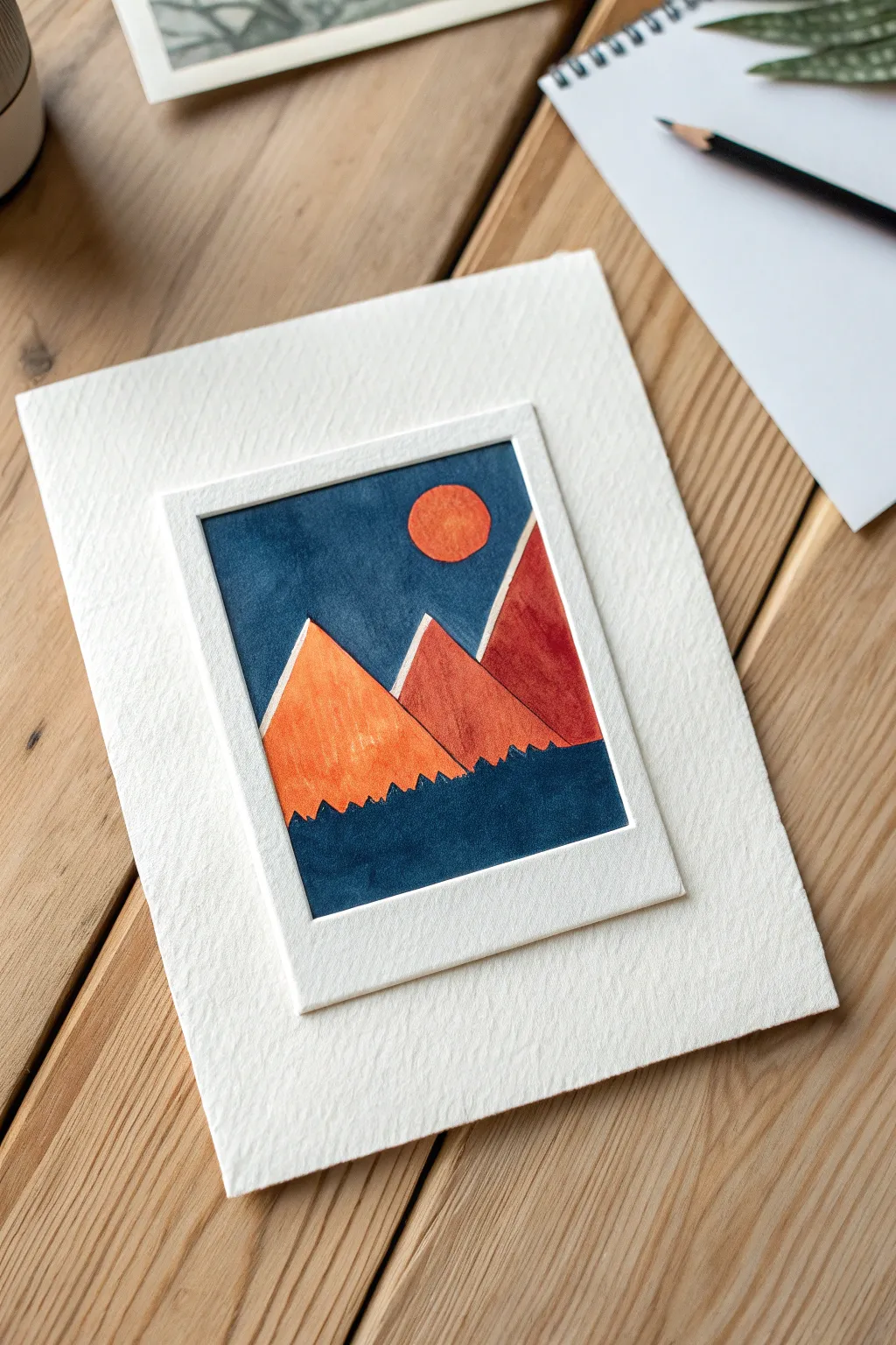
Capture the charm of instant photography without a camera using this layered gouache project. By combining opaque paints with a dimensional paper cutout, you’ll create a textured, geometric landscape that pops right off the page.
Step-by-Step
Materials
- Heavyweight cold-press watercolor paper (300gsm)
- Gouache paints (Indigo, Cadmium Orange, Burnt Sienna, Black)
- Flat shader brush (size 4 or 6)
- Small round detail brush (size 0 or 1)
- Craft knife and metal ruler
- Cutting mat
- Pencil and eraser
- Double-sided tape or glue stick
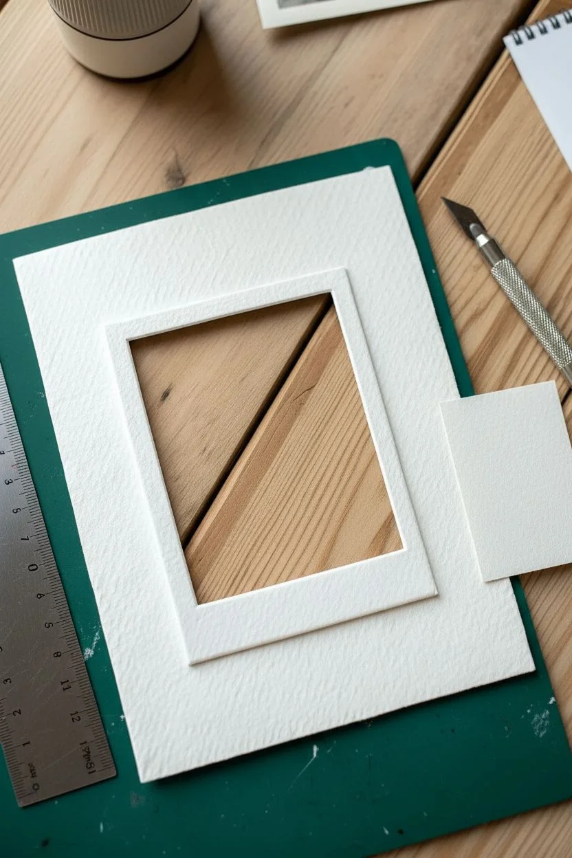
Step 1: Constructing the Frame
-
Prepare the layers:
Cut your watercolor paper into two pieces: a large A5 backing sheet and a smaller rectangle (approximately 3×4 inches) to serve as your Polaroid frame. -
Mark the aperture:
On the smaller rectangle, lightly measure a border to create the window. Leave about 0.5 inches on the top and sides, and a larger 1-inch space at the bottom for that classic instant-photo look. -
Cut the window:
Place the paper on your cutting mat and use the craft knife and metal ruler to carefully cut out the inner rectangle. Save the inner rectangle piece—you can paint directly on this scrap to ensure perfect sizing, or trace its shape onto a fresh scrap.
Step 2: Painting the Landscape
-
Sketch the geometry:
On your designated painting paper (the scrap cut from the window or a fresh piece of identical size), sketch a clean circle for the moon and three overlapping triangular peaks. -
Define the tree line:
Draw a jagged, sawtooth line lightly across the bottom third of the triangles to establish where the forest silhouette will go. -
Paint the night sky:
Mix a deep Indigo gouache to a creamy consistency. Use your flat brush to paint the sky area, carefully cutting in around the circular moon shape. -
Fill the moon:
Rinse your brush well. Fill in the moon circle with pure Cadmium Orange. I like to blot this area slightly with a tissue while damp to give it that mottled, crater-like texture shown in the image. -
Paint the first peak:
Paint the left-most mountain triangle with a mix of Orange and a touch of Burnt Sienna. Leave a hairline gap of white paper between the mountain and the blue sky to keep the shapes distinct. -
Paint the middle peak:
Add more Burnt Sienna to your mix to purge a darker terracotta shade. Paint the central peak, again leaving a tiny sliver of unpainted white paper separating it from the first mountain. -
Paint the right peak:
Use mostly Burnt Sienna with a tiny dot of Indigo to create a deep rusty red for the right-hand mountain slope, maintaining those crisp white separation lines. -
Create the forest:
Mix Indigo with a little Black for the darkest value. Using the small round brush, paint the foreground using short, vertical strokes along the top edge to mimic pine tree silhouettes. -
Fill the foreground:
Fill the rest of the bottom area solidly with the dark blue-black mix and let the entire painting dry completely.
Pro Tip: Clean Edges
If you struggle to paint straight lines freehand, apply thin strips of washi tape over the white separation lines between the mountains. Peel them off when the paint is dry to reveal perfect gaps.
Step 3: Assembly
-
Attach the frame:
Apply double-sided tape or a thin layer of glue to the back of your white Polaroid frame cutout. -
Position the artwork:
Carefully press the frame over your dry painting. Ensure the painting is perfectly covered by the borders so no rough edges show through. -
Mount the piece:
Center your finished Polaroid-style artwork onto the large A5 textured backing sheet you cut in step one. -
Final press:
Place a clean heavy book on top of the assembly for an hour to ensure the glue sets flat and the paper layers bond tightly.
Level Up: 3D Shadow
Use squares of foam mounting tape instead of glue when attaching the Polaroid assembly to the backing sheet. This lifts the artwork slightly, creating a real drop shadow and adding depth.
Now you have a stunning miniature landscape that looks like a captured memory.

PENCIL GUIDE
Understanding Pencil Grades from H to B
From first sketch to finished drawing — learn pencil grades, line control, and shading techniques.
Explore the Full Guide
Delicate Butterfly Sketch
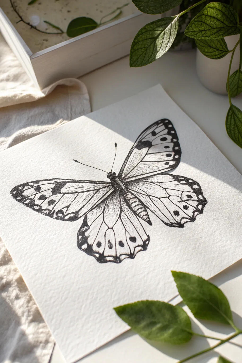
Capture the fragile beauty of a butterfly using high-contrast ink techniques on textured paper. The heavy grain of cold-press paper adds an organic feel to the wings, making the fine hatching lines pop beautifully.
Step-by-Step Tutorial
Materials
- Cold-press watercolor paper (300gsm)
- HB graphite pencil
- Kneaded eraser
- Fine liner pens (sizes 005, 01, 03, and 05)
- Ruler
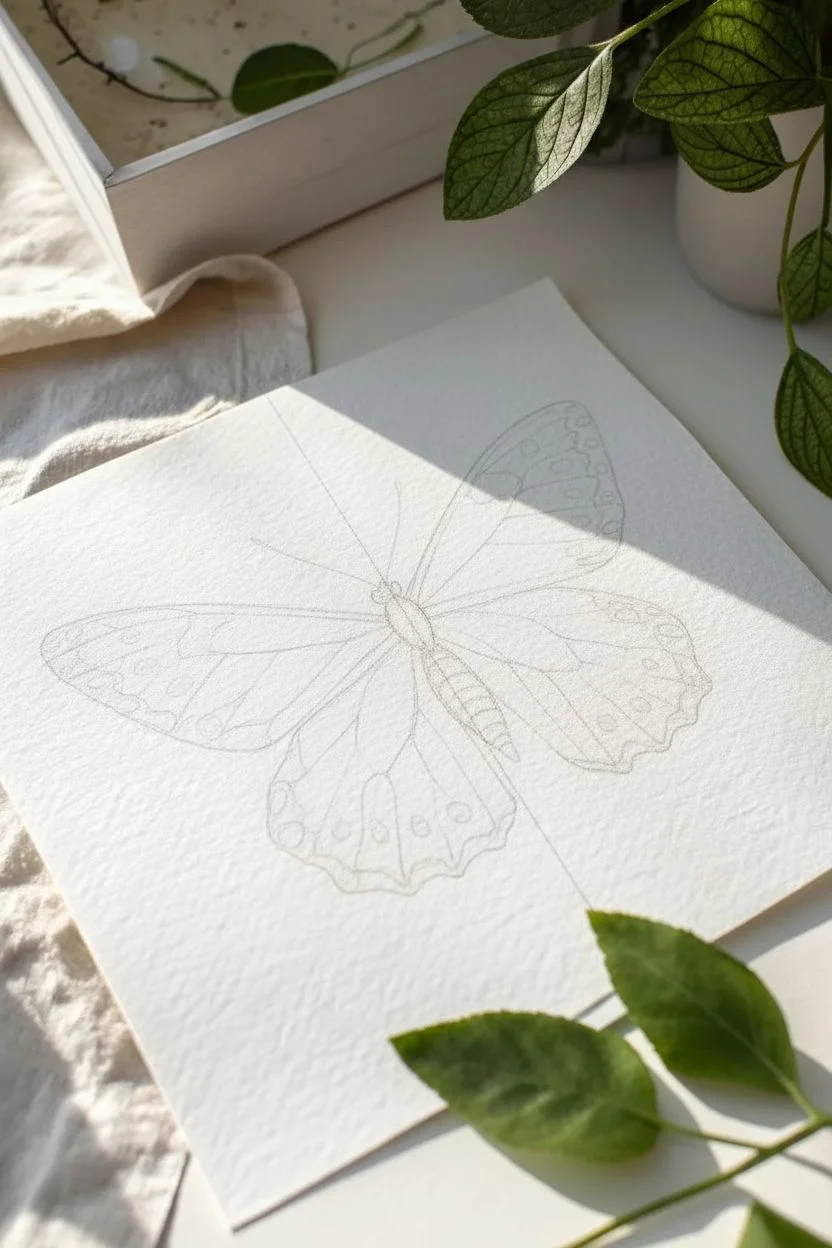
Step 1: Structural Sketch
-
Center alignment:
Begin by using your ruler to draw a very light vertical line down the center of your paper to ensure the butterfly sits straight. -
Body segments:
Sketch a gentle oval for the thorax (middle section) and a longer, segmented shape below it for the abdomen, aligning them with your center guide. -
Upper wing span:
Draw two diagonal lines extending outward from the thorax to define the top edge of the forewings. The left wing should extend slightly further to capture the slight asymmetry of a natural pose. -
Wing outlines:
Sketch the curved outer edges of the forewings and the rounded, scalloped edges of the hindwings. Keep your pencil pressure minimal so these lines are easy to erase later. -
Vein mapping:
Lightly draw the main veins radiating from the body to the wing edges. These will serve as essential guides for your shading direction later. -
Pattern placement:
Mark the locations of the dark spots along the wing margins and the distinctive circular eye-spots on the hindwings.
Step 2: Inking the Outlines
-
Body texture:
Using an 03 pen, trace the body structure. Instead of a solid line, use tiny, flicking dashes to replicate the fuzzy texture of the butterfly’s torso. -
Upper wing edges:
Switch to an 01 pen for the wing outlines. Keep the lines crisp but allow for slight natural wobbles along the scalloped edges of the hindwings. -
Defining the veins:
With an 005 pen, carefully trace the internal vein lines. I find it helpful to pull the pen toward my body to keep these long lines smooth and consistent. -
Antennae:
Draw the antennae using the 03 pen, ending each with a small, solid bulb. Ensure the lines curve gracefully outward.
Ink Bleeding?
If ink feathers on the textured paper, your hand might be too heavy. Switch to a finer nib (005) and use quicker, lighter strokes to skim over the paper tooth rather than sinking in.
Step 3: Shading and Detail
-
Filling dark zones:
Use the 05 pen to fill in the thick black borders and pattern spots on the wing tips. Be very careful to leave the small white circular markings completely uninked. -
Abdomen depth:
Add curved hatching lines across the abdomen segments with the 01 pen to create a rounded, 3D cylindrical effect. -
Directional hatching:
Using the 005 pen, begin hatching the wings. The lines should originate from the veins and flick inward, following the natural curve of the wing sections. -
Building density:
Layer more hatching strokes near the body of the butterfly where the wings attach. This gradient from dark to light adds significant depth. -
Hindwing details:
For the hindwings, keep the shading lighter. Focus the ink density around the circular eye-spots and the scalloped bottom edges. -
Refining the fuzz:
Return to the thorax with the 005 pen and add very fine stippling (dots) mixed with short dashes to increase the density of the ‘fur’. -
Clean up:
Once the ink is completely dry—give it a few minutes—gently roll your kneaded eraser over the entire drawing to lift all graphite guidelines.
Level Up: Wash
Dilute a drop of black ink with water to create a soft gray wash. Carefully paint faint shadows under the wings to make the butterfly look 3D and ready to lift off the page.
Now you have a stunning, scientifically inspired illustration ready to be framed or gifted.
Dreamy Lo-fi Clouds
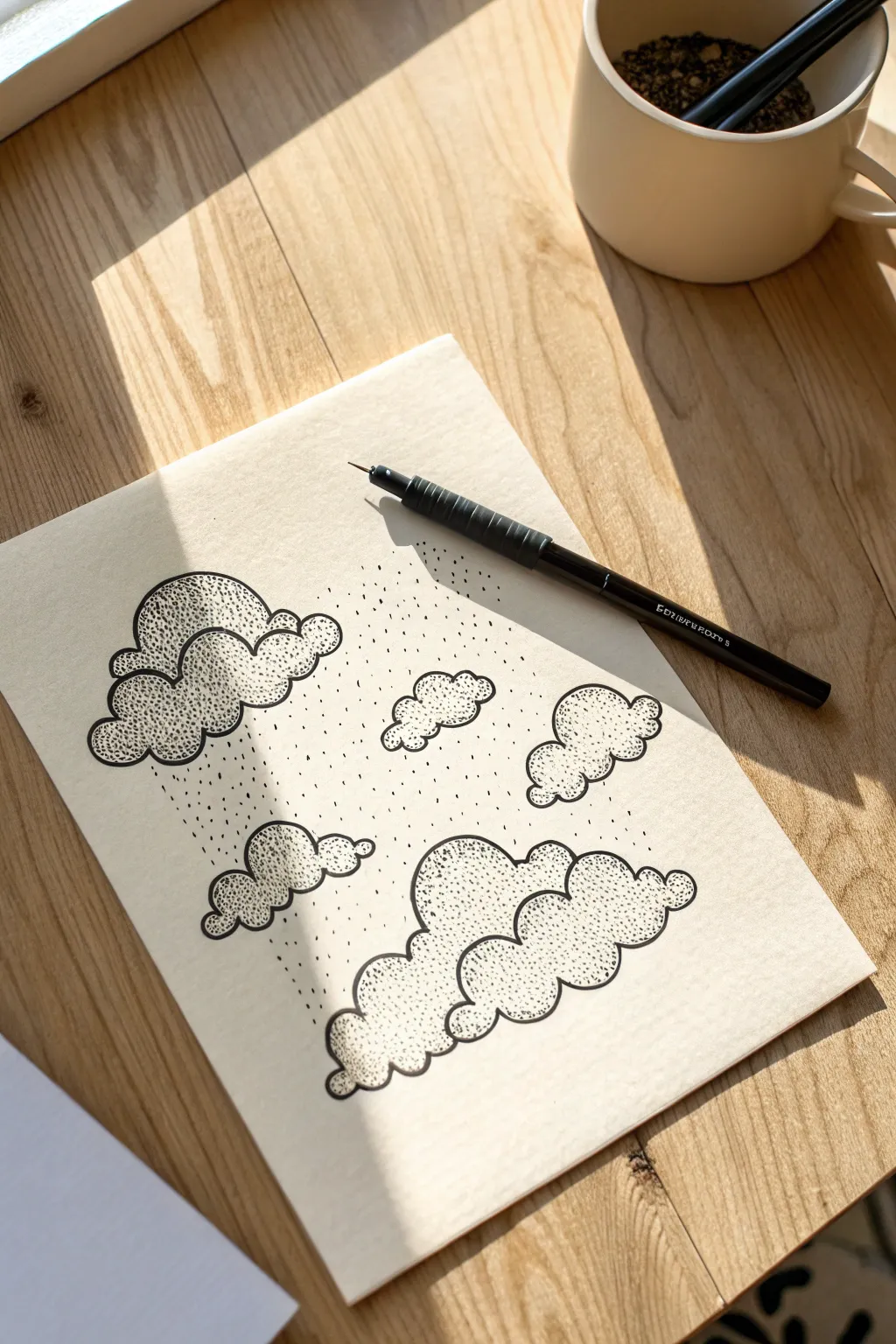
Create a calming, dreamy atmosphere with this pen-and-ink drawing that relies on simple pointillism techniques. The contrast between crisp outlines and soft, stippled shading gives these clouds a fluffy, dimensional look perfect for a lo-fi aesthetic.
Step-by-Step Guide
Materials
- Fine-liner pen (black, size 03 or 05)
- Smooth cream or white drawing paper
- HB Pencil
- Soft eraser
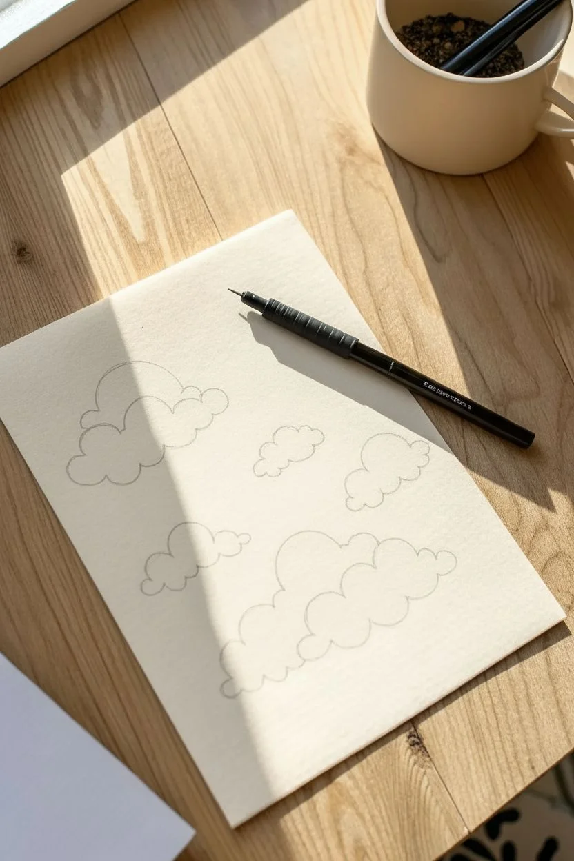
Step 1: Sketching the Layout
-
Plan the composition:
Visualize the page layout, placing a large, dominant cloud cluster at the bottom center and a medium-sized cloud floating toward the top left. -
Light pencil outlines:
Using your HB pencil with very light pressure, sketch the basic outlines of the clouds. focus on creating rounded, bumpy ‘cumulus’ shapes rather than perfect circles. -
Add floating elements:
Sketch three to four smaller, isolated cloud puffs in the empty spaces between the two main clusters to balance the composition. -
Refine the curves:
Go back over your pencil sketches to define the ‘scalloped’ edges of the clouds, ensuring the bumps vary in size to look organic.
Wrist Mechanics
Keep your wrist loose and tap vertically. If you strike the paper at an angle, your dots will turn into tiny dashes or commas.
Step 2: Inking the Forms
-
Trace the main lines:
Take your fine-liner pen and carefully trace over the pencil outlines. Move widely and confidently to keep the curves smooth. -
Connect the clusters:
Where cloud bumps overlap, stop your line just short of the intersection or let them touch gently to maintain distinct shapes. -
Clean up:
Once the ink is completely dry—I usually give it a full minute just to be safe—gently erase all the visible pencil marks.
Step 3: Shading with Stippling
-
Establish the light source:
Decide on a light direction; for this piece, imagine the light coming from the top right, meaning shadows will fall on the bottom left of each curve. -
Start the base shading:
Begin stippling (tapping dots) inside the bottom curves of the large cloud cluster. Keep the dots distinct rather than coloring them in. -
Create a gradient:
Concentrate the dots heavily along the bottom liner edge to create a dark shadow, then gradually space them out as you move upward into the center of the cloud. -
Shade individual bumps:
Treat each ‘bump’ of the cloud as a separate sphere. Add a small crescent of dots on the bottom-left side of every rounded section. -
Repeat on upper clouds:
Apply the same gradient technique to the top-left cloud and the smaller floating puffs, keeping the shadowed areas consistent. -
Add depth to intersections:
Place a few extra dots in the crevices where two cloud bumps meet to deepen the contrast and separate the forms.
Celestial Additions
Draw a clean circle outline behind the clouds to represent a moon or sun, but leave it empty of dots to make it glow.
Step 4: Atmospheric Details
-
Create rain texture:
Under the top-left cloud, tap a series of vertical dotted lines falling downward to simulate a gentle, stylized rain shower. -
Vary rain density:
Make the rain lines slightly varied in length and spacing so they don’t look like a uniform grid. -
Background atmosphere:
Add scattered, random dots floating in the empty sky around the clouds to render dust motes or distant static. -
Final assessment:
Step back and look at the overall contrast. If the clouds look too flat, add another layer of dots to the darkest shadow areas to make them pop.
Enjoy the meditative rhythm of stippling as your fluffy cloudscape comes to life on the page
BRUSH GUIDE
The Right Brush for Every Stroke
From clean lines to bold texture — master brush choice, stroke control, and essential techniques.
Explore the Full Guide
Planet Saturn Doodles
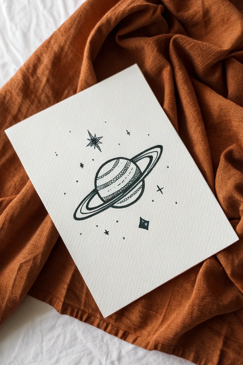
Capture the magic of the cosmos with this stylized ink drawing of Saturn floating among the stars. Using fine liners on textured paper creates a charming, hand-drawn aesthetic perfect for journals or greeting cards.
Step-by-Step Guide
Materials
- Cold press watercolor paper or textured cardstock
- HB pencil for sketching
- Quality eraser (kneaded preferred)
- Black pigment fine liner (size 03 or 05)
- Finer black pen (size 005 or 01) for details
Step 1: Sketching the Structure
-
Outline the planet:
Begin by lightly sketching a standard circle in the center of your page using your HB pencil. -
Define the ring axis:
Draw a diagonal line through the center of the circle to determine the angle of the rings. -
Sketch the rings:
Lightly draw a long, narrow ellipse around the planet, using your axis line as a guide. -
Add ring width:
Sketch a second, smaller ellipse inside the first one to create the thickness of the rings. -
Refine the forms:
Erase the back part of the ring where it passes behind the planet, and erase the planet line where the front ring passes in front of it. -
Mark the bands:
Sketch three or four slightly curved lines across the face of the planet to demarcate where your patterns will go.
Fixing Wobbly Arcs
Rings looking shaky? Try locking your wrist and drawing the movement from your elbow instead. This creates smoother, more confident curves than using just your fingers.
Step 2: Inking the Lines
-
Trace the main shapes:
Using your 03 or 05 fine liner, go over the main outline of the planet and the outer edges of the rings with a confident, solid line. -
Ink the inner rings:
Carefully trace the inner ring lines. I find it helpful to rotate the paper here so my hand draws the curve naturally. -
Create the top band:
On the highest band of the planet, fill the space with dense, scribbly hatching or heavy stippling to create a dark value. -
Detail the second band:
For the next section down, draw a series of small, connected loops or scallops to create a textured, rope-like appearance. -
Draw the equator:
Leave a small gap of white space, then draw a simple dashed line across the middle of the planet. -
Pattern the lower band:
Fill the bottom-most band with a cross-hatching pattern, drawing tiny diagonal lines in one direction and then crossing them in the other. -
Add shading:
Use your finer 01 pen to add gentle stippling (tiny dots) at the very bottom pole of the planet for shadow.
Make it Sparkle
Level up this drawing by retracing the stars and the planet’s rings with a gold or silver gel pen for a mixed-metal look that catches the light.
Step 3: Celestial Atmosphere
-
Draw the North Star:
Above the planet, draw an eight-pointed star. Start with a cross, layer an ‘X’ over it, and scribble in the center to darken it. -
Add a diamond star:
Below the planet, draw a small diamond shape. Fill in the right half of the diamond with black ink to give it a gem-like facet. -
Scatter twinkle stars:
Draw several four-pointed stars (resembling plus signs or crosses) randomly around the main subject. -
Sprinkle cosmic dust:
Finish by dotting the tip of your pen around the background to create distant stars and texture. -
Clean up:
Wait at least five minutes for the ink to dry completely, then gently erase all remaining pencil marks to reveal the crisp black and white contrast.
Now you have a stunning piece of celestial art ready to display.
Vintage Cassette Tape


Capture the nostalgia of analog music with this charming vintage cassette tape illustration. Using fine liners, you’ll create a textured, realistic drawing where the magnetic ribbon unfurls into a sweet, symbolic heart shape.
Step-by-Step Tutorial
Materials
- High-quality textured drawing paper (vellum or cold press)
- HB Drawing pencil
- Kneaded eraser
- Fine liner pens (sizes 0.1, 0.3, and 0.5mm)
- Ruler (optional)
- Black marker (for fill)
Step 1: Pencil Framework
-
Establish the angle:
Begin by drawing a large rectangle tilted at a slight diagonal angle in the center of your page using your HB pencil. -
Create the 3D form:
Add depth to the cassette by drawing a parallel line slightly below and to the left of the bottom and left edges, connecting the corners to create a 3D block effect. -
Define the label area:
Inside the main rectangle, lightly sketch a smaller rectangle with rounded corners to represent the paper label sticker. -
Trapezoid window:
Draw the central window where the tape shows. This is a long, thin horizontal rectangle in the center, flanked by two small circles for the reels.
Ribbon Flow Tip
To make the tape ribbon look realistic, ensure the ‘twist’ in the heart loop narrows slightly where the ribbon flips over itself.
Step 2: Ribbon and Details
-
The tape path:
Sketch the bottom edge of the cassette where the tape is exposed, drawing a small recessed area beneath the label. -
Forming the heart:
Draw a flowing line originating from the left side of the exposed tape area, looping down and around to form the left side of a heart. -
Completing the loop:
Bring the line back up to close the heart shape, tucking it under the first line to create a ribbon effect, and reconnect it to the right side of the tape opening. -
Refining the ribbon:
Add a second parallel line to your heart shape to give the ribbon width, ensuring it twists naturally where the curves intersect. -
Adding hardware:
Sketch four small circles in the corners for the screws, and add the two small circles near the bottom corners used for alignment pins.
Level Up: Personalize It
Use the blank label space to hand-letter a significant date or “Side A” in a retro font to turn the drawing into a personalized gift.
Step 3: Inking and Texture
-
Primary outlines:
Switch to your 0.5mm pen. Carefully trace the outer silhouette of the cassette casing and the main heart ribbon, keeping your hand steady for clean lines. -
Inner details:
Use a 0.3mm pen to outline the label area and the central window. I like to leave a few tiny gaps in the line to suggest light reflecting off the plastic. -
Reel mechanics:
Inside the two reel circles within the window, draw the small gear teeth or spokes using the 0.1mm pen. -
Filling the darks:
Use your thicker marker or 0.5mm pen to fill in the dark rectangular strip inside the central window, representing the magnetic tape on the spool. -
Shading the depth:
On the left and bottom ‘3D’ sides of the cassette, use closely spaced diagonal hatching lines to create a shadow effect. -
Adding gradients:
Use cross-hatching (overlapping diagonal lines) on the darkest corners of the casing, particularly around the screw holes, to make the plastic look solid. -
Texturing the corners:
Add tiny stippling dots or scratches near the corners of the cassette body to simulate the matte texture of old plastic. -
Screws and finishing touches:
Draw small ‘X’ or ‘+’ marks inside the corner screw circles and shade one half of the circle to give them depth. -
Review and clean up:
Once the ink is completely dry, thoroughly erase all underlying pencil sketches to reveal the crisp black-and-white contrast.
Now you have a retro-romantic piece of art perfect for a greeting card or wall decor.


Hand Holding a Flower
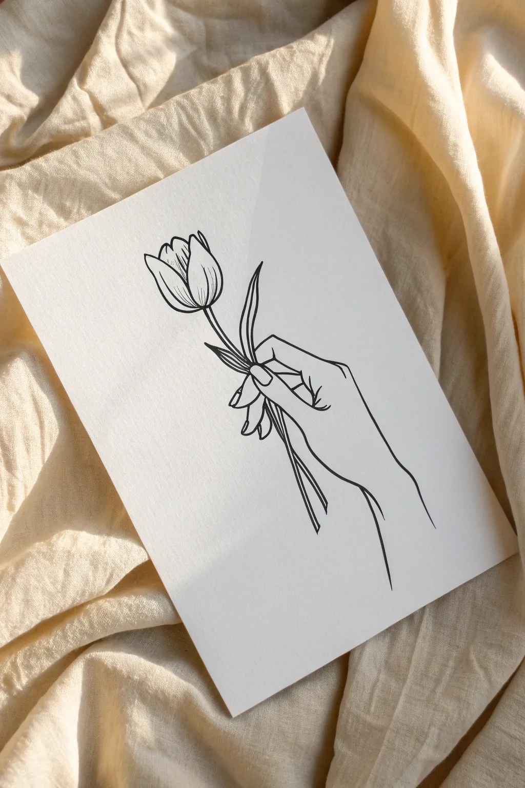
This elegant drawing captures the delicate beauty of a hand holding a tulip using clean, continuous lines. The minimalist aesthetic relies on negative space and smooth contours to create a modern, finished look.
How-To Guide
Materials
- Heavyweight drawing paper (smooth finish)
- HB Pencil
- Kneaded eraser
- Black fine liner pen (0.3mm or 0.5mm)
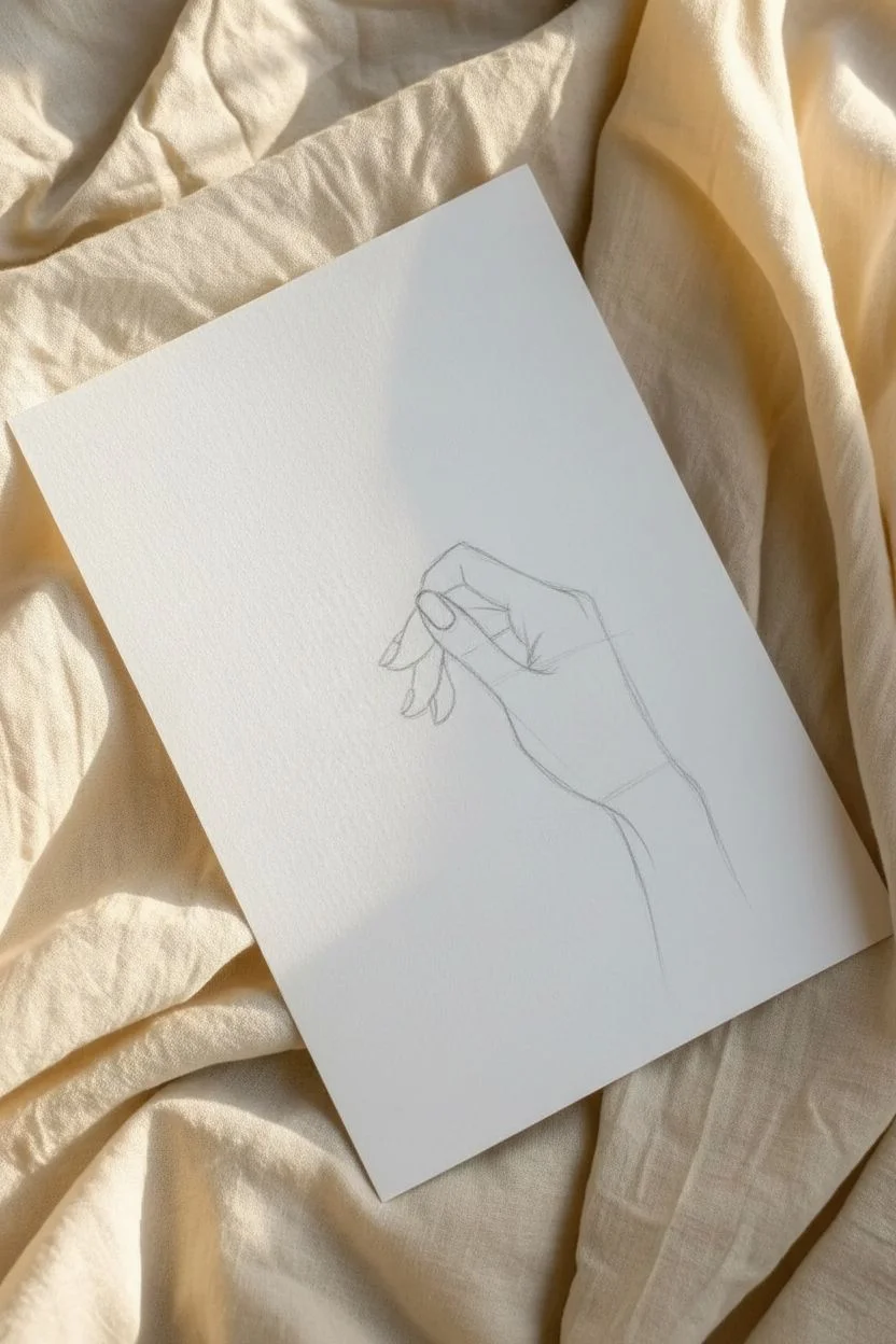
Step 1: Sketching the Anatomy
-
Wrist placement:
Start by lightly sketching the curve of the wrist and forearm entering from the bottom right corner of the page. -
Palm block:
Draw a loose, rectangular shape at the end of the wrist lines to represent the main area of the palm. -
Thumb position:
Sketch the thumb extending outward from the palm, keeping the joints soft and slightly curved. -
Index finger:
Draw the index finger curving over the top of where the stem will sit, pointing partly downward. -
Remaining fingers:
Sketch the middle, ring, and pinky fingers tucked progressively underneath the index finger to form a relaxed grip. -
Nail details:
Lightly outline the fingernails on the thumb and visible fingers using simple U-shapes and squares.
Shaky Lines?
If your lines jitter, try drawing from your shoulder rather than your wrist. Exhale steadily as you execute long strokes for smoother results.
Step 2: Adding the Floral Elements
-
Stem axis:
Draw a faint, straight guide line passing through the grip of the hand to establish the flower’s angle. -
Tulip base:
At the top of your axis, sketch a wide U-shape to form the bottom of the flower head. -
Petal shapes:
Draw an inverted teardrop in the center of the U, then add curved side petals wrapping around it to close the bloom. -
Stem thickness:
Draw parallel lines along your axis guide to give the stem width, ensuring it aligns above and below the hand. -
Leaf addition:
Sketch a slender, curved leaf branching off the stem just above the thumb, pointing upward. -
Overlap check:
Erase the parts of the stem that pass *behind* the fingers so the hand looks like it is truly gripping the flower.
Step 3: Inking and Refining
-
Outline the bloom:
Switch to your fine liner pen; I prefer a 0.5mm for bold, confident outer lines. Trace the tulip petals first. -
Ink the leaf:
Carefully ink the leaf and the upper section of the stem, stopping exactly where they meet the hand. -
Hand contours:
Trace the outer edges of the hand and fingers with smooth, flowing strokes. -
Inner details:
Ink the fingernails and small creases on the knuckles using a lighter touch or a thinner pen if you have one. -
Lower stem:
Ink the bottom portion of the stem extending out from the bottom of the hand grip. -
Wrist finish:
Draw the final lines for the wrist, letting them trail off into the white space rather than closing the shape. -
Clean up:
Wait a few minutes for the ink to dry completely, then gently erase all underlying pencil marks.
Level Up
Add a soft wash of pink or yellow watercolor inside the petals. Keep the color loose and slightly outside the lines for an artistic touch.
Now you have a sophisticated piece of minimalist art ready to display!
Galaxy in a Mason Jar
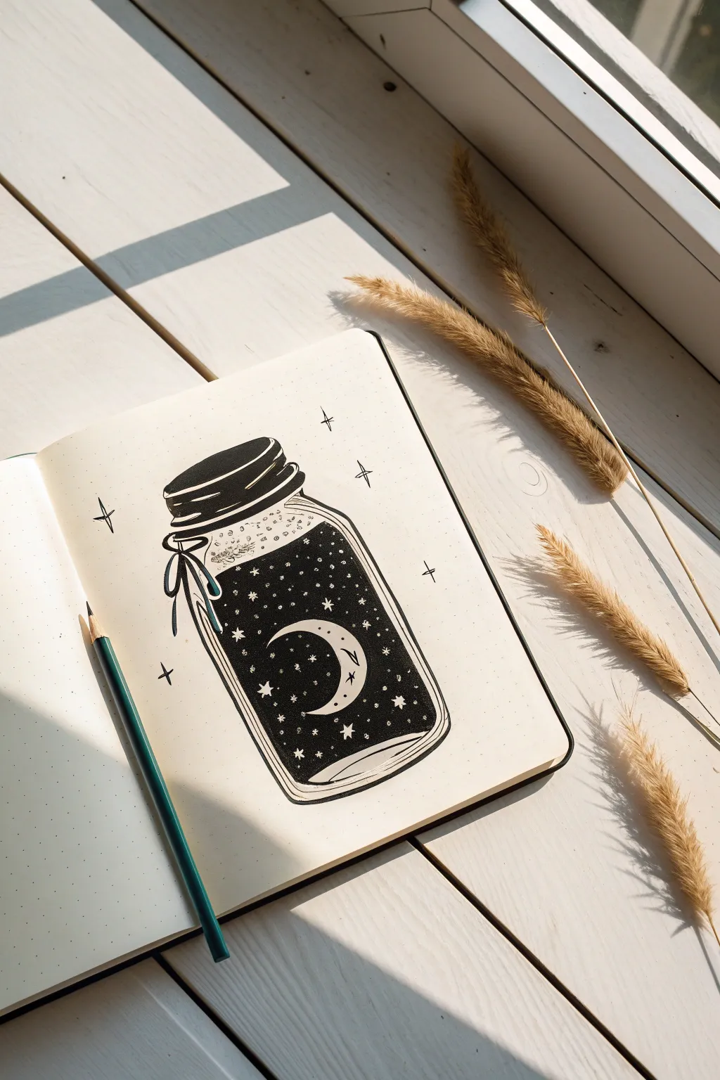
Capture a slice of the midnight sky in a glass jar with this high-contrast doodle. This tutorial uses negative space and deep black ink to create a mystical illustration perfect for dot-grid journals.
Step-by-Step Tutorial
Materials
- Dot grid journal or thick drawing paper
- HB Pencil
- Eraser
- Fine liner pen (01 or 03 size, black)
- Thicker marker or brush pen (black)
- White gel pen (optional)
Step 1: Sketching the Structure
-
Establish the width:
Using the dots on your grid as a guide, count out a width of about 10-12 dots to ensure your jar is symmetrical. -
Draw the rim:
Sketch a flattened oval for the jar opening, then add two narrow bands directly underneath it to represent the threaded lid. -
Shape the jar body:
Draw the ‘shoulders’ of the jar curving outward from the lid, then drop vertical lines down for the sides. -
Create the base:
Connect the side lines at the bottom with a gentle curve that mirrors the curve of the lid, giving the jar a 3D cylindrical look. -
Add the liquid line:
Sketch a slightly wavy horizontal line inside the jar, about an inch below the neck, to mark where the ‘galaxy’ begins.
Ink Blobs?
If you made a mistake and accidentally colored over a star, don’t worry. Just use a white gel pen or a tiny dot of white acrylic paint to add the star back in once the black ink is dry.
Step 2: Adding the Elements
-
Position the moon:
Lightly sketch a crescent moon shape floating in the center of the liquid area. -
Map the stars:
Draw tiny circles or diamond shapes scattered around the moon; these will need to remain white later. -
Tie the bow:
On the left side of the jar neck, sketch a loose knot with two loops and two tails hanging down. -
Detail the glimmer:
Mark a few jagged shapes near the top shoulder of the glass to represent light reflection.
Step 3: Inking the Outline
-
Ink the lid:
Trace the lid bands with your fine liner, shading the top band solidly black while leaving a sliver of white highlight. -
Refine the ribbon:
Outline the bow carefully, ensuring the ribbon lines overlap the glass lines realistically. -
Trace the glass:
Go over your pencil lines for the jar body, keeping the stroke relatively thin to mimic delicate glass. -
Outline interior shapes:
Trace the crescent moon and the liquid line, but do not ink the tiny stars yet.
Make it Shine
Level up this drawing by filling the crescent moon and the larger stars with metallic gold watercolor or gold gel pen instead of leaving them plain white.
Step 4: Creating the Galaxy
-
Protect the moon:
Before filling the background, carefully outline the crescent moon again to ensure you have a barrier. -
Start the fill:
Switch to your thicker marker or brush pen to fill the space inside the jar below the liquid line. -
Work around stars:
As you color the darkness, go slowly around your tiny sketched star circles to leave them white. -
Refine edges:
I usually switch back to the fine liner to get sharp, clean edges right next to the moon and inside the tight corners of the bow. -
Add detail to the liquid:
Add some stippling (tiny dots) just above the liquid line to make it look like fizz or magic dust rising.
Step 5: Final Polishing
-
Glass reflections:
Add curved hatched lines at the very bottom of the jar to simulate the thickness of the glass base. -
External magic:
Draw simple four-point sparkle stars floating outside the jar using the fine liner. -
Clean up:
Wait for the heavy ink to dry completely, then erase all visible pencil sketches. -
Enhance stiffness:
If you have a white gel pen, add extra tiny dots on top of the black ink for a deeply layered star field effect.
Now you have a little pocket of the universe captured right on your page
Crystal Clusters
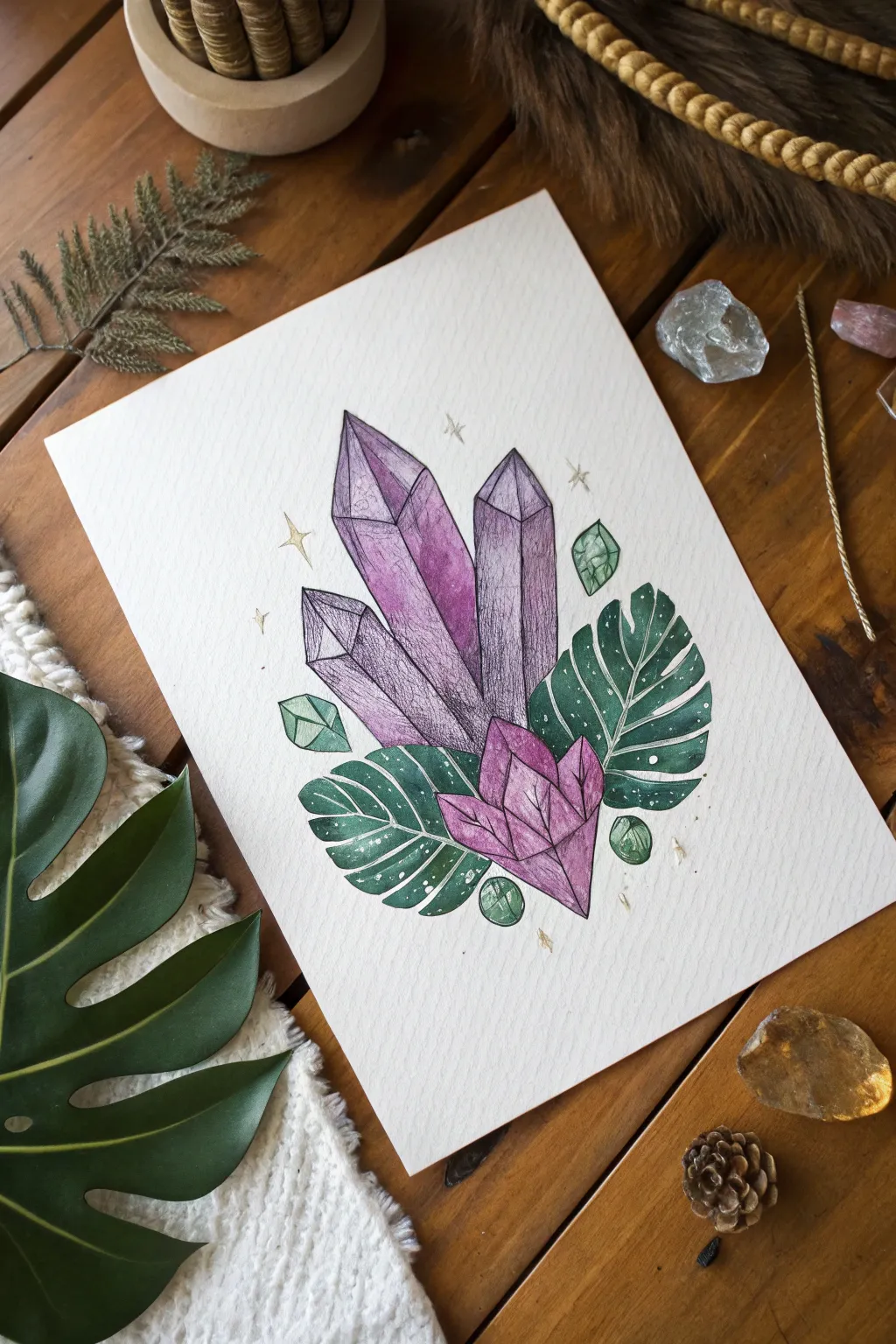
Combine the geometric beauty of crystals with organic botanical shapes in this mystical illustration. You will create a vibrant mixed-media piece using watercolors for softness and ink for crisp, defined textures.
Step-by-Step Guide
Materials
- Cold press watercolor paper (300gsm)
- Waterproof fine liner pens (sizes 01 and 05)
- Watercolor paint set
- Round brushes (size 4 and 8)
- White gel pen or acrylic ink
- Gold metallic sharpie or paint
- HB Pencil and eraser
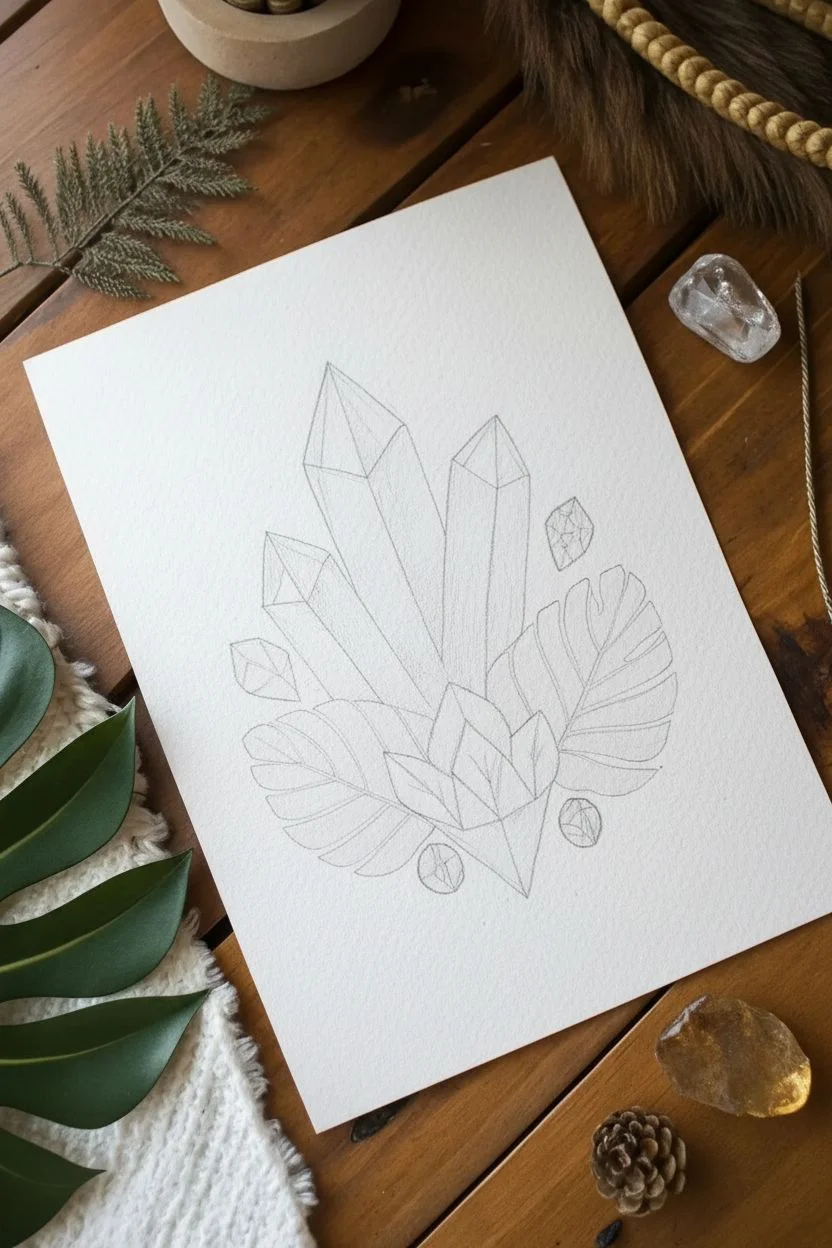
Step 1: Sketching the Composition
-
Outline the central crystals:
Begin by lightly sketching three tall, vertical crystal shards in the center of your page. Make the middle one the tallest and vary the heights of the side crystals for a balanced look. -
Add the base cluster:
Draw a smaller, horizontally oriented crystal cluster at the very base of the three towers, acting as an anchor for the composition. -
Sketch the foliage:
Tuck two large Monstera leaves behind the crystals. One should fan out to the right and a smaller one to the left to create an asymmetrical background. -
Include geometric accents:
Draw small, floating geometric shapes or mini-crystals in the empty spaces around the main cluster to fill the negative space.
Muddy Colors?
To keep the purple and green from mixing into a muddy brown, ensure each distinct section is dry before painting a neighboring area that touches it.
Step 2: Inking the Foundation
-
Trace the main lines:
Using your 05 waterproof fine liner, go over the perimeter lines of your pencil sketch. Keep your hand steady but allow for slight organic wobbles to mimic natural stone. -
Define the facets:
Draw the internal lines that define the facets of the crystals. Think of these as triangles and trapezoids connecting the tip of the crystal to the body. -
Clean up the sketch:
Once the ink is fully dry (wait a few minutes to avoid smearing!), gently erase all underlying pencil marks to leave a clean surface for painting.
Level Up
Use gold leaf adhesive and foil for the surrounding stars instead of a pen. The real metallic texture will catch the light beautifully on your wall.
Step 3: Adding Color
-
Paint the tall crystals:
Mix a diluted violet wash. Paint the three tall crystals, dropping in concentrated purple pigment near the tops and edges while the paper is wet to create a gradient. -
Color the base:
For the bottom crystal cluster, use a warmer pink or magenta tone to distinguish it from the tall purple shards above. -
Fill in the foliage:
Paint the Monstera leaves with a deep emerald green. Try to keep the color relatively flat and solid to contrast with the textured crystals. -
Tint the floating gems:
Use a light wash of green for the floating geometric shapes so they echo the color of the leaves. -
Let it dry completely:
I usually take a short break here; the paper must be bone-dry before the next detailing step to prevent the ink from bleeding.
Step 4: Texture and Details
-
Hatch the shadows:
Using the finer 01 pen, draw vertical hatching lines on the shaded sides of the crystal facets. This gives the stones volume and that classic illustration look. -
Detail the leaves:
Draw thin, crisp lines extending from the center of the leaves outward to represent veins, adding depth to the greenery. -
Add magical sparkles:
Use a white gel pen to dot small ‘stars’ or speckles onto the dark green leaves, giving them a galaxy-like or dusty texture. -
Draw the aura:
With a gold pen or metallic paint, draw small four-point stars and tiny dots floating around the top of the crystal cluster.
Frame your mystical crystal study and enjoy the magical vibes it brings to your space.
Expressive Sketchy Eyes
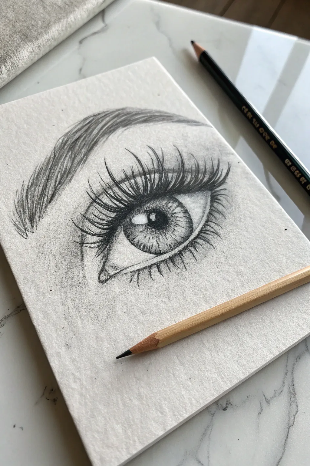
Capture the emotion and depth of a realistic eye using nothing but graphite and paper texture. This tutorial emphasizes the dramatic contrast between the dark, sweeping lashes and the brilliant highlights within the iris.
Step-by-Step Tutorial
Materials
- Textured sketch paper (cold press or drawing paper)
- Graphite pencils (HB for sketching, 4B and 6B for shading)
- Kneaded eraser
- Pencil sharpener
- Blending stump (optional)
Step 1: Laying the Foundation
-
Outline the eye shape:
Using your H or HB pencil with very light pressure, sketch an almond shape for the eye opening. Make the inner corner slightly lower and more pointed than the outer corner. -
Place the iris & pupil:
Draw a large circle for the iris, partially hidden by the upper eyelid. Accurately center a smaller circle inside it for the pupil. -
Reserve the highlight:
This is crucial: draw a small, irregular square or rectangle overlapping the pupil and iris. This is the ‘catchlight’ or reflection. Do not shade inside this shape; it must remain paper-white. -
Map the eyebrow:
Lightly sketch the arch of the eyebrow above the eye. Don’t draw individual hairs yet, just outline the general shape and flow.
Sharpness is Key
For realistic clean lashes, rotate your pencil slightly after every few strokes. This keeps the lead point sharp and prevents fuzzy, thick lines.
Step 2: Developing the Iris
-
Darken the pupil:
Switch to a 4B or 6B pencil. Fill in the pupil, pressing firmly to get a deep, rich black, but be careful to work neatly around your reserved white highlight. -
Define the limbal ring:
Thicken and darken the outer circle of the iris. The line should be fuzzy and soft, not a harsh geometric circle. -
Add iris texture:
Using a sharp HB pencil, draw lines radiating from the pupil outward like spokes on a wheel. Vary the length and pressure to create a natural, fibrous look. -
Cast a shadow:
I like to shade the top third of the iris darker than the rest. This represents the shadow cast by the eyelashes and upper lid, adding instant dimension.
Step 3: Shading for Volume
-
Shadow the sclera:
The ‘white’ of the eye isn’t flat white. Use an HB pencil to lightly shade the corners of the eyeball and right under the upper lid, leaving the center bright to suggest a spherical form. -
Define the crease:
Draw a distinct, dark line above the eye to form the eyelid crease. This line should mimic the curve of the eye shape but taper off at the ends. -
Shade the skin:
Add soft shading between the eyelid crease and the eyebrow, as well as under the eye. Use the side of your pencil lead to catch the texture of the paper. -
Detail the tear duct:
Refine the inner corner (tear duct). It’s moist and fleshy, so use careful, soft shading, leaving a tiny spot of white for a wet look.
Level Up: Extra Shine
Use a white gel pen or a tiny dot of white gouache on the catchlight (highlight) to make the eye look incredibly wet and glossy.
Step 4: Lashes and Brows
-
Base eyebrow strokes:
Start filling the eyebrow shape with short, upward strokes near the nose, transitioning to sideways strokes as you move toward the tail. -
Refine brow texture:
Go over the brow with a darker pencil (4B). Make your strokes quick and overlapping to mimic messy, natural hair growth. -
Start the upper lashes:
sharp 6B pencil is best here. Start at the eyelid rim, press down, and flick upward in a curve. Allow the line to taper off to a point. -
Cluster the lashes:
Real lashes clump together. Draw more lashes that originate from slightly different spots but join at the tips to create triangular clusters. -
Add lower lashes:
Draw the lower lashes with a lighter touch. These should be shorter, spaced further apart, and curved downward. -
Final adjustments:
Deepen the darkest areas one last time—specifically the pupil, the lash line, and the crease—to maximize the contrast against the white highlight.
Now that you’ve captured this expressive gaze, try drawing the other eye to practice symmetry!
Figure with a Cloud Head
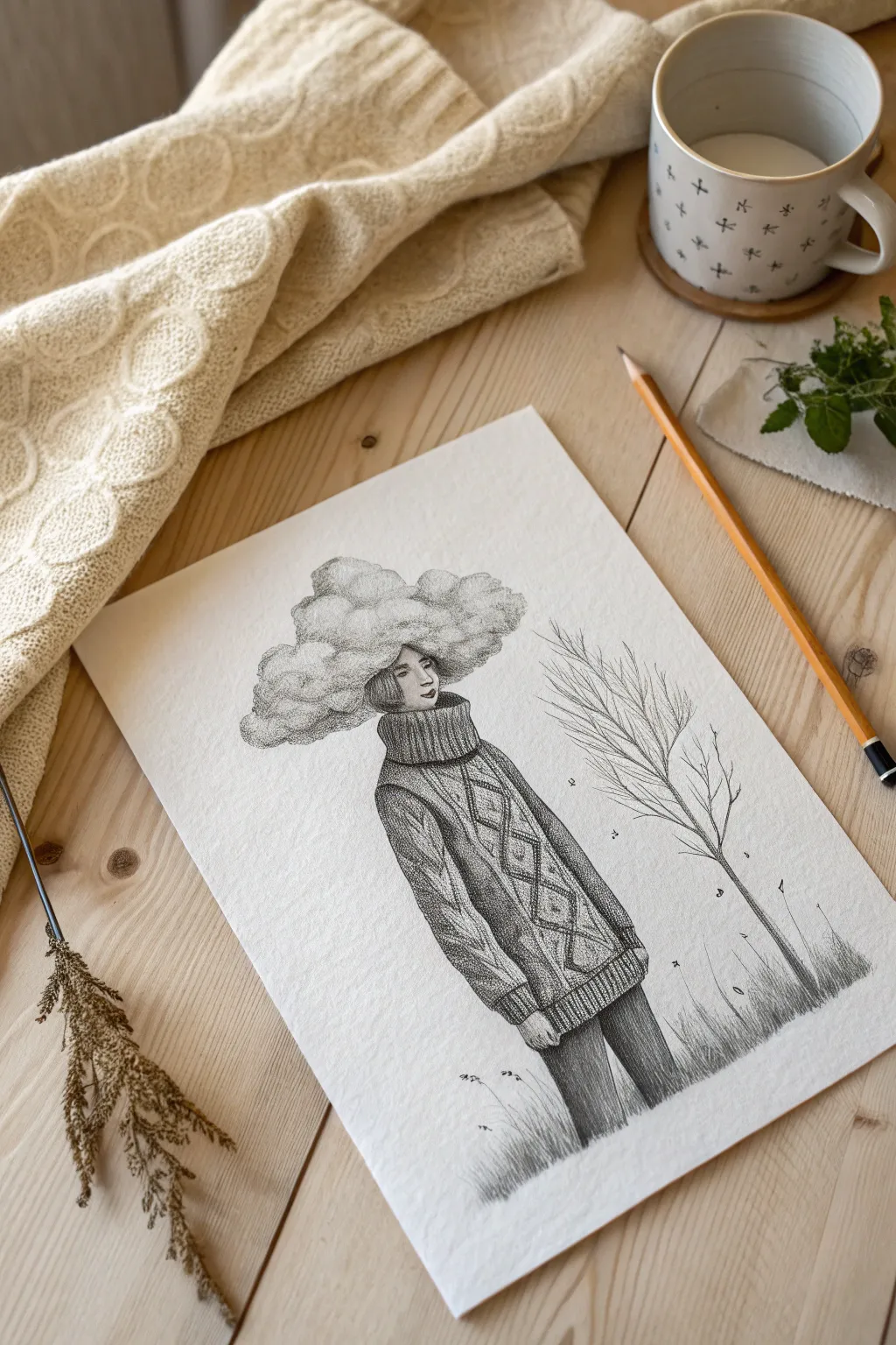
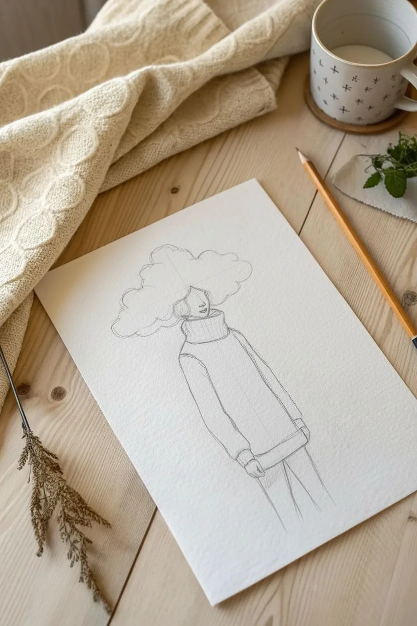
Capture a mood of dreamy introspection with this surreal pencil drawing featuring a cozy cable-knit sweater and a billowy cloud replacing the upper head. The beauty of this piece lies in the contrast between the soft, fluffy cloud shading and the intricate, structural texture of the wool.
How-To Guide
Materials
- Textured drawing paper (Cold press or medium grain)
- Graphite pencils (HB, 2B, and 4B)
- Mechanical pencil (0.5mm, HB)
- Kneaded eraser
- Precision eraser or eraser stick
Step 1: Sketching the Structure
-
Outline the posture:
Begin with a light HB pencil to sketch the vertical axis of the figure. Draw a loose rectangular shape for the oversized torso and two thin lines extending downward for the legs. -
Map the cloud head:
Instead of drawing a full skull, sketch a jawline and the lower half of a face. Above the nose line, lightly draw a large, irregular organic shape that fans out horizontally to represent the cloud mass. -
Block in the sweater:
Draw the high turtleneck collar wrapping snugly around the neck. Sketch the boxy outline of the sweater body and the long sleeves that extend past the wrists.
Textural Pro Tip
Don’t smudge the graphite with your finger! To get the ‘woolly’ look, rely on the natural grain of the paper showing through your pencil strokes.
Step 2: Detailing the Face and Clouds
-
Draw the facial features:
Switch to a mechanical pencil for precision. Draw delicate lips, a nose, and the suggestion of eyes just where the hair would begin. Keep the expression neutral and calm. -
Define the cloud fluffs:
Using a 2B pencil, lightly outline the individual clumps within the main cloud shape. Think of them as overlapping popcorn shapes or cotton balls. -
Shade the clouds:
Use a small, circular scumbling motion with the 2B pencil to shade the underside of each cloud puff. Leave the tops of the heavy paper white to create highlights.
Level Up: Seasonal Shift
Change the mood by altering the tree. Add tiny buds for spring, or draw falling rain from the cloud head to interact with the environment below.
Step 3: Weaving the Sweater Texture
-
Outline the knit patterns:
Draw vertical guidelines down the front of the sweater. Sketch a column of diamond shapes in the center and braided cable patterns on the sides. -
Detail the collar:
Draw vertical ribbing lines on the turtleneck. Use short, repetitive hatch marks between the ribs to simulate the shadow depth of the wool. -
Create the main texture:
This is the most time-consuming step. Using a sharp HB or mechanical pencil, fill the sweater with thousands of tiny dots (stippling) and very short dashes. Focus these densities around the edges of your cable patterns to make them pop. -
Darken the folds:
Where the sleeves bunch up at the elbows and hem, use a 4B pencil to deepen the shadows. I find that pressing harder in these crevices really emphasizes the weight of the fabric. -
Add the diamond details:
Inside the central diamond pattern, use cross-hatching to create a darker tone than the surrounding knit, giving the sweater variety in color and texture. -
Finish the cuffs:
Draw the ribbed texture on the bottom hem and the cuffs of the sleeves, mirroring the style used on the turtleneck.
Step 4: Atmosphere and Environment
-
Shade the pants:
Fill in the legs using vertical strokes with a 4B pencil. Aim for a dark, solid grey tone to contrast with the lighter, textured sweater. -
Sketch the barren tree:
On the right side, draw a thin, vertical trunk. Let your hand shake slightly to create organic, knotty branches that reach upward and outward. -
Detail the bark:
Add tiny lines and knots along the tree trunk using your finest pencil point to mimic rough bark texture. -
Ground the figure:
Add patches of tall grass at the bottom of the page. Use quick, upward flicking motions to dampen the bottom of the pants and the base of the tree. -
Final touches:
Add a few stray floating leaves or specs in the air for atmosphere. Use your eraser to lift out any graphite smudges from the white background to keep the look crisp.
You’ve now captured a moment of quiet surrealism that perfectly blends imagination with texture.
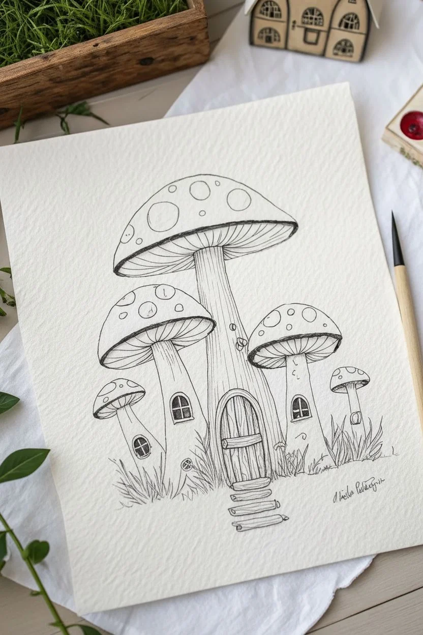
Whimsical Mushroom Village
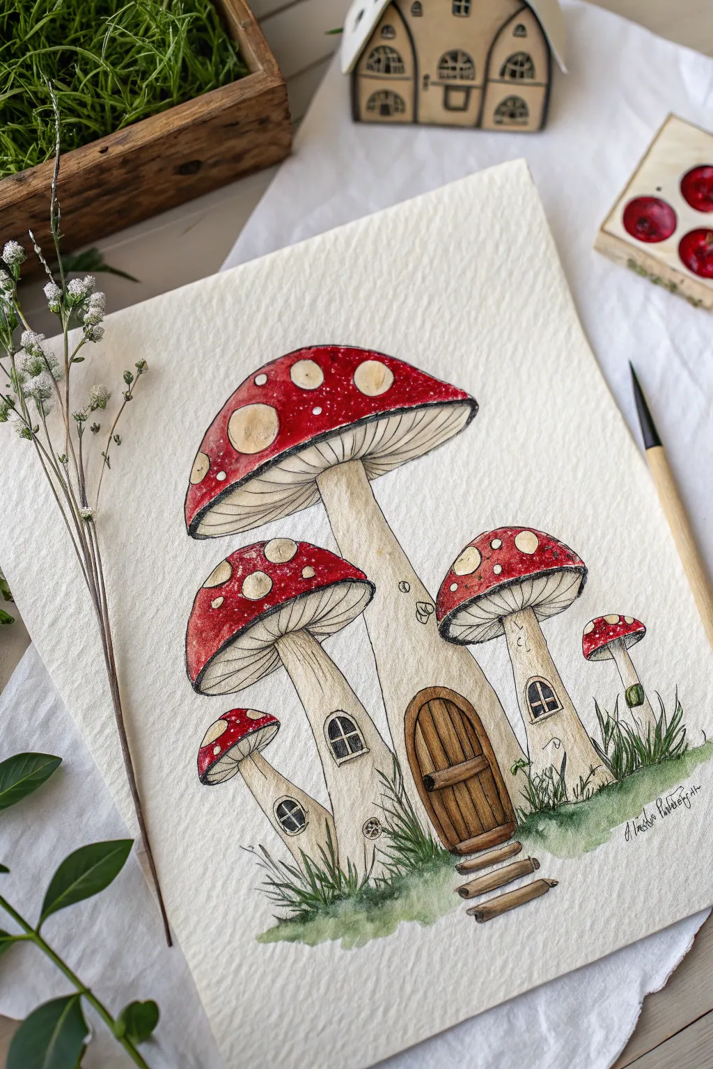
Transport yourself to a whimsical forest floor by illustrating this charming mushroom village using a classic storybook style. This project combines crisp, waterproof ink lines with vibrant watercolor washes to create texture and depth.
Step-by-Step Tutorial
Materials
- Cold press watercolor paper (300gsm)
- Waterproof fine liners (0.1mm and 0.3mm, black)
- Watercolor paints (Cadmium Red, Yellow Ochre, Burnt Umber, Sap Green, Payne’s Grey)
- Round brushes (size 2 and 6)
- HB Pencil and kneadable eraser
- White gel pen or gouache (optional)
Step 1: Sketching & Inking
-
Structure the composition:
Lightly sketch a tall, central mushroom shape in the middle of your page to serve as the main house. -
Add neighboring mushrooms:
Draw two medium-sized mushrooms on either side, leaning slightly away from the center, and add two tiny sprouting mushrooms near the base for balance. -
Detail the architecture:
Sketch a rounded door with wooden planks on the main stem, rustic steps leading up to it, and small arched or round windows on the other stems. -
Map the spots:
Draw circles of varying sizes on the mushroom caps to indicate where the white spots will be. -
Outline in ink:
Using a 0.3mm waterproof fine liner, trace over your main pencil outlines with a steady, continuous hand. -
Add fine textures:
Switch to a finer 0.1mm pen to draw delicate, closely spaced lines for the gills under the caps and vertical texture lines on the stems. -
Detail wood and windows:
Ink the wood grain details on the door and the tiny mullions (frames) within the windows. -
Clean up:
Wait a few minutes for the ink to cure completely to avoid smudging, then gently erase all visible pencil marks.
Fixing Bleeds
If red paint accidentally bleeds into a white spot, blot it immediately with a clean tissue. Once dry, cover the mistake with opaque white gouache.
Step 2: Painting & Shading
-
Paint the caps:
Load a size 6 brush with bright Cadmium Red. Paint the caps wet-on-dry, carefully working around your inked circles to leave the paper white. -
Add cap volume:
While the red wash is still slightly damp, drop a touch of darker crimson or more saturated red along the bottom edges to suggest curvature. -
Wash the stems:
Mix a very diluted wash of Yellow Ochre or heavily watered-down brown to paint the mushroom stems, keeping the color uneven for an organic feel. -
Create shadows:
Once the base stem layer is dry, mix a shadow color (pale grey-brown) and paint just underneath the caps and under the windows to add dimension. -
Paint wooden elements:
Use Burnt Umber with a size 2 brush to paint the door and steps, varying the color intensity to distinguish individual planks. -
Darken the windows:
Fill in the window panes with Payne’s Grey or black to create depth, making sure to avoid painting over the inked window frames. -
Plant the grass:
Mix Sap Green with a little brown. Using quick, upward flicking strokes, paint clumps of grass around the base of the stems to anchor the village. -
Highlight and refine:
If your white spots got messy, use a white gel pen or a dot of gouache to make them crisp and bright again.
Cozy Glow
Instead of black windows, paint the panes with a pale, watery yellow before adding the frames. This makes the cottages look warm and inhabited.
Now you have a charming little village ready to frame or turn into a whimsical greeting card.


Have a question or want to share your own experience? I'd love to hear from you in the comments below!