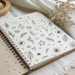
Taking a moment to create mini drawings is the perfect way to relax without the pressure of a large canvas. I have gathered nineteen accessible ideas that focus on simple lines and small scales to help you fill your sketchbook margins.
Miniature Potted Plants
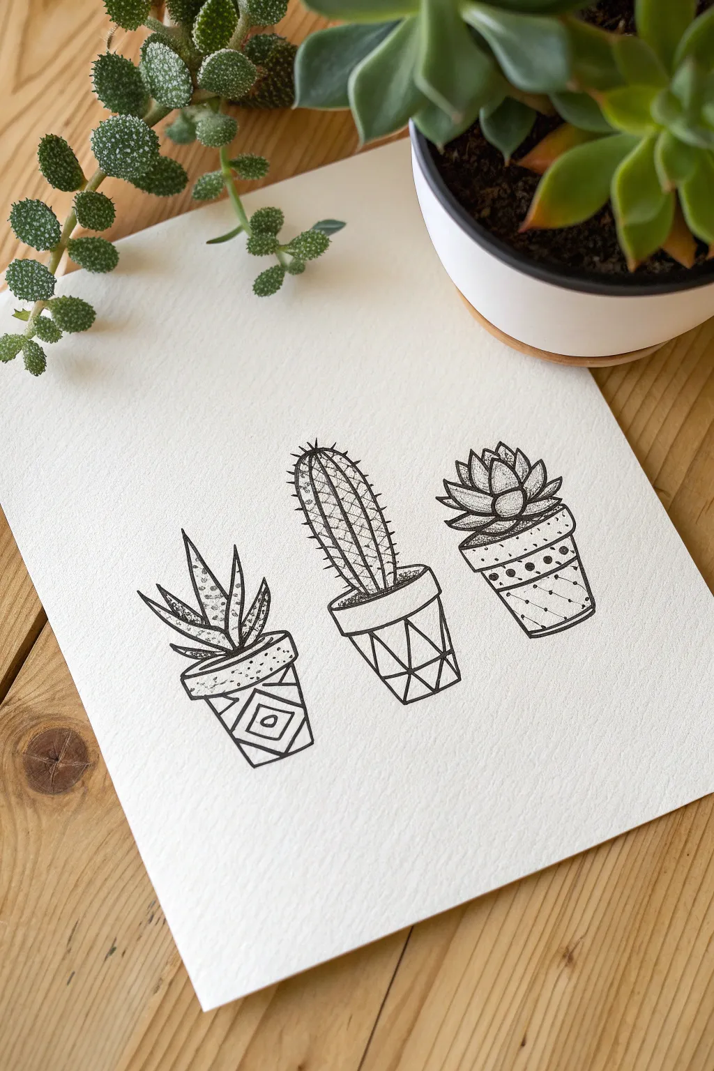
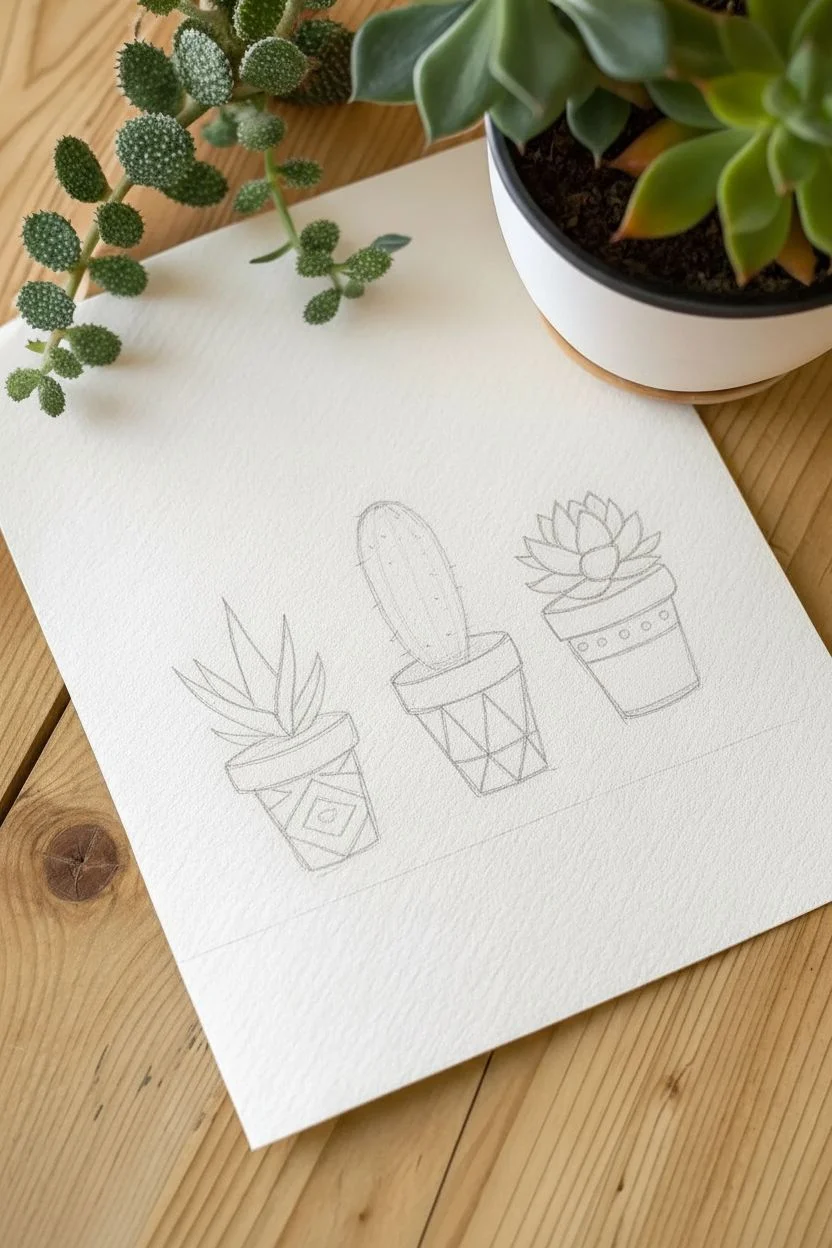
This minimalist pen-and-ink drawing captures the charm of indoor gardening with a modern twist. You’ll create three distinct succulents housed in geometric patterned pots, using simple line work and stippling to build nice contrast on textured paper.
Step-by-Step Tutorial
Materials
- Cold press watercolor paper or heavy textured sketch paper
- Fine liner pens (sizes 01, 03, and 005 for details)
- HB Pencil
- Kneaded eraser
- Small clear ruler
Step 1: Planning the Composition
-
Establish the baseline:
Using your pencil and ruler, lightly draw three horizontal orientation lines where the base of the pots will sit to ensure they are level. -
Sketch pot shapes:
Draw three slightly tapered cylinders or trapezoids for the pots. Keep the tops slightly curved to indicate the circular opening. -
Outline the plants:
Lightly sketch the plant forms: a spiky crown for the aloe on the left, a tall oval for the cactus in the center, and a rosette shape for the succulent on the right. -
Draft the pot patterns:
Sketch the geometric designs on the pots: concentric diamonds for the left, angular facets for the center, and horizontal bands for the right.
Step 2: Inking the Plants
-
Outline the aloe:
Using an 01 pen, trace the spiky leaves of the left plant. Draw the front leaves first, allowing them to overlap the ones behind. -
Texture the aloe:
Switch to your finest 005 pen. Add tiny stipple dots concentrated at the base of each leaf to create depth and shadow. -
Define the cactus:
With the 03 pen, outline the tall center cactus. Draw vertical lines running up the body to create ribs. -
Add cactus spines:
Use the 01 pen to flick tiny, short lines coming off the ribs of the cactus to represent spines. -
Ink the rosette:
Outline the right succulent’s petals, starting from the tight center bud and working outward to the wider petals. -
Shade the rosette:
I like to use the 005 pen here to add very delicate shading where the petals overlap, giving the flower volume.
Stippling Success
When adding texture dots, keep your pen vertical. Tapping at an angle can damage the delicate nib of fine liner pens.
Step 3: Inking the Geometric Pots
-
Define the rims:
Use the 03 pen to draw the top rims of all three pots. Make the line slightly thicker to emphasize the opening. -
Trace pot outlines:
Ink the outer sides and bases of the pots. Using the ruler here helps keep the lines crisp and architectural. -
Pattern the left pot:
Ink the diamond/chevron pattern on the first pot. Fill in alternating sections with angled hatching lines to distinguish the shapes. -
Pattern the center pot:
Draw the geometric facets on the middle pot. Think of it like a cut gemstone, creating triangles that fit together. -
Pattern the right pot:
Ink the horizontal bands on the final pot. Fill one band with small polka dots and use diagonal hatching on another band for variety.
Level Up
Once the ink is waterproof-dry, paint a loose wash of green watercolor over the plants for a mixed-media look.
Step 4: Final Details
-
Add soil texture:
Use the 01 pen to stipple dense dots just inside the rim of the pots, creating the look of dark potting soil. -
Refine shadows:
deepen any shadows between the pots and the plants to clearly separate the organic shapes from the geometric containers. -
Clean up:
Wait at least 15 minutes for the ink to fully cure, then gently gently roll the kneaded eraser over the page to lift the pencil sketch.
Frame this trio in a simple wood frame to bring a touch of botanical art to your desk


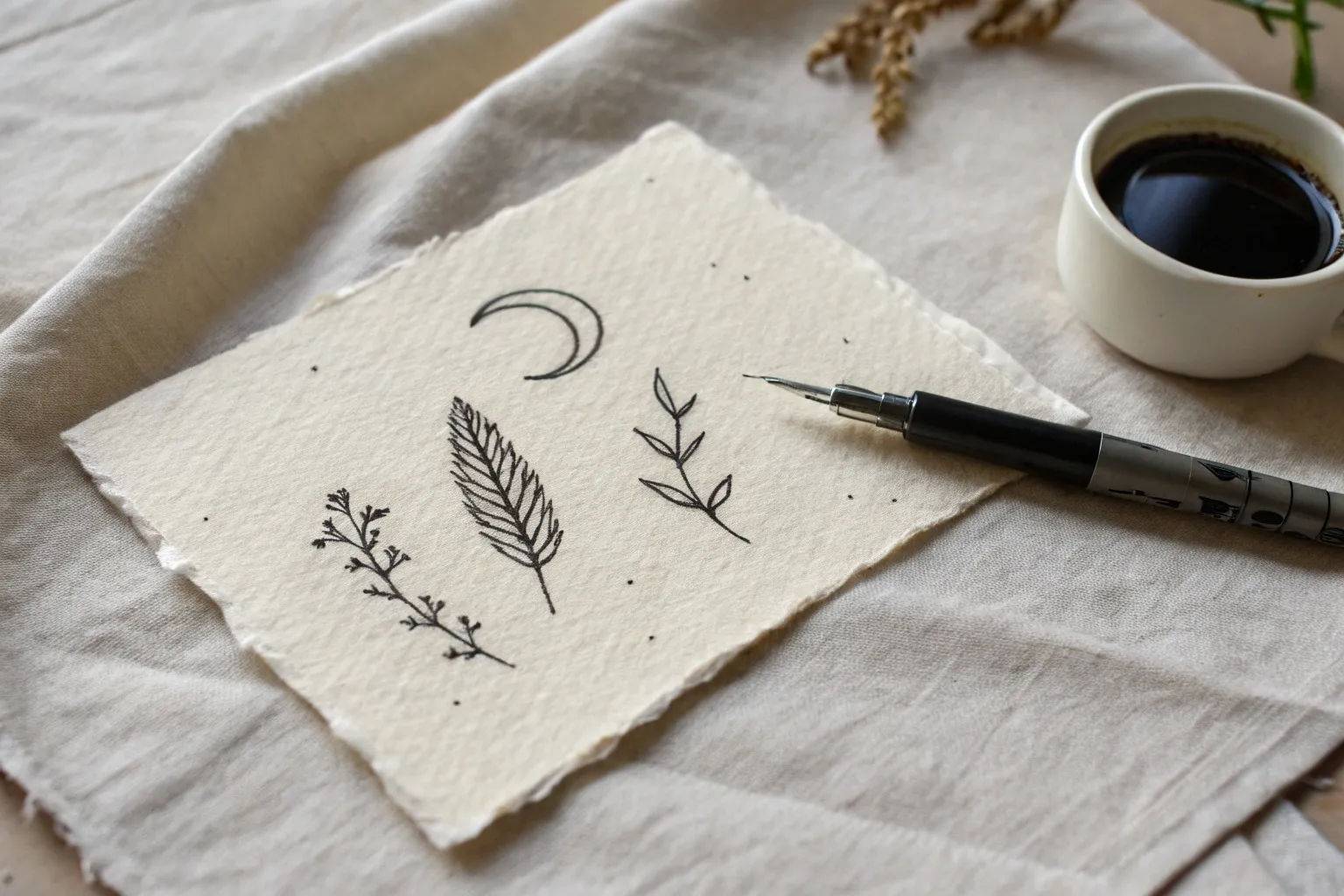
Celestial Symbols
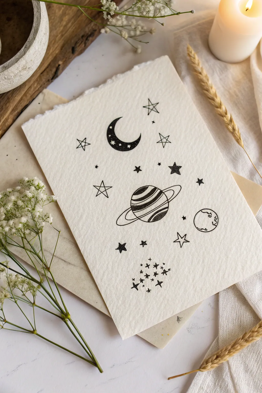
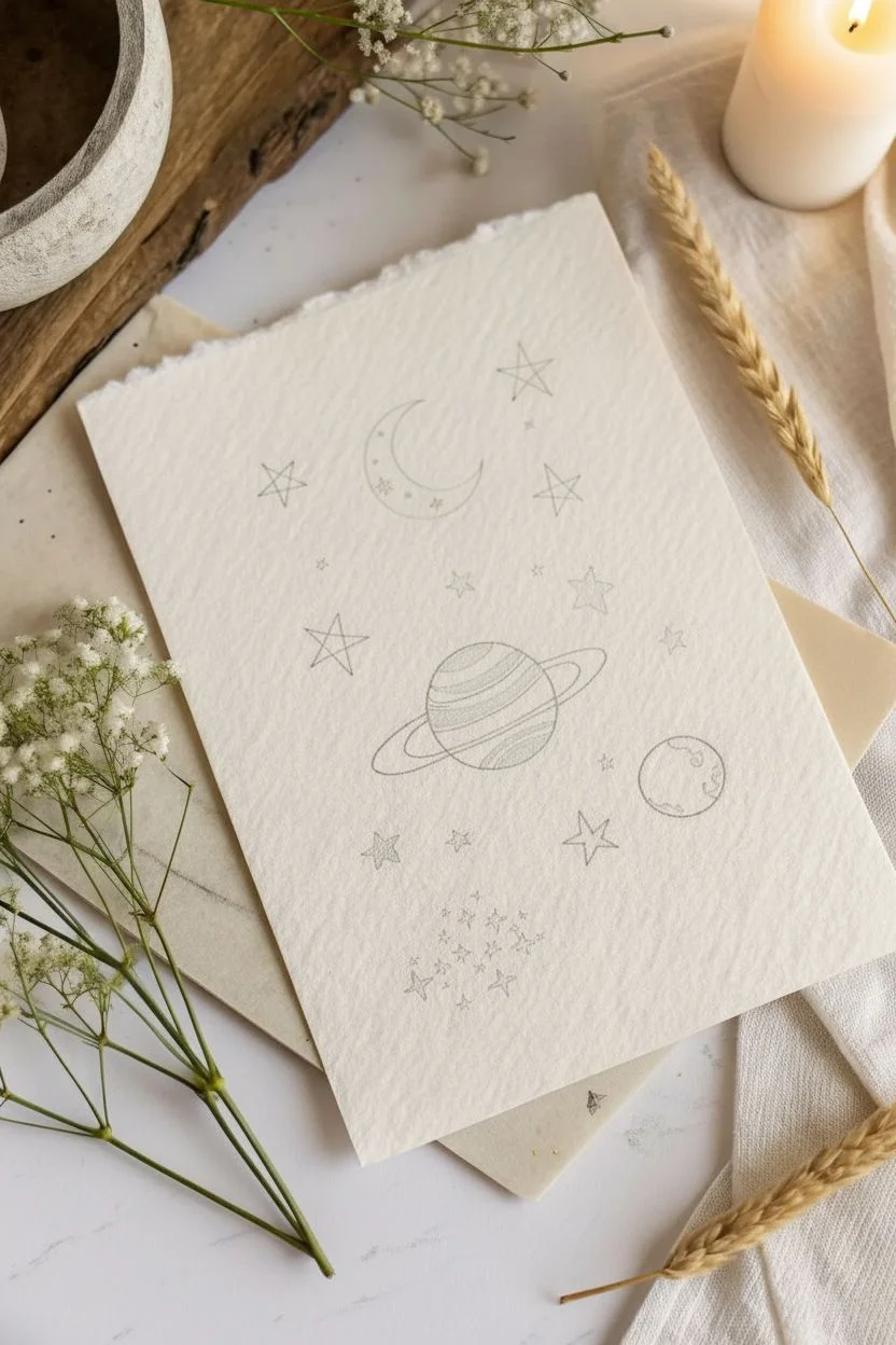
Capture the magic of the cosmos with this minimalist pen-and-ink drawing on textured paper. This project combines bold blackwork with delicate lines to create a dreamy arrangement of planetary symbols and stardust.
Step-by-Step Guide
Materials
- Heavyweight cold-press watercolor paper or handmade cotton paper
- Black pigment liners (sizes 01, 03, and 05)
- HB pencil
- Kneaded eraser
- Ruler (optional, for tearing paper)
Step 1: Preparing the Canvas
-
Create the deckled edge:
To achieve the torn, rustic look shown in the photo, place a ruler against your paper at the desired size. Firmly hold the ruler down and tear the paper upward against the edge to create a fibrous, uneven border. -
Plan the composition:
Using your pencil very lightly, sketch the rough placement of your main elements. Mark a C-shape for the moon near the top left and an oval for Saturn in the center. -
Add planet markers:
Lightly sketch a small circle for the second planet on the lower right, and mark general areas where you want your larger stars to sit.
Smudge Prevention
Handmade paper has a soft surface that can snag. When erasing, use a dabbing motion rather than rubbing back and forth to prevent the paper fibers from fuzzing up or smearing the ink.
Step 2: Inking the Moon
-
Outline the crescent:
Switch to your 05 pen. Carefully trace the outline of your crescent moon shape, ensuring the curves taper to sharp points at the tips. -
Reserve the stars:
Before filling in the moon, switch to a finer 01 pen and draw tiny stars and dots inside the crescent shape. These needs to stay white. -
Fill the blackwork:
Using the 05 pen again, color in the rest of the crescent moon, carefully working around your tiny white stars. The contrast is what makes this element pop.
Step 3: Drawing the Planets
-
Outline Saturn:
Draw the central sphere of Saturn with the 03 pen. When drawing the rings, think of them as a flattened oval encompassing the sphere. -
Detail the rings:
Draw the front section of the ring curving over the planet, and the back section disappearing behind it. Add an inner ring line to give the belt some thickness. -
Texture the surface:
Use the 01 pen to draw curved, horizontal hatching lines across Saturn’s surface. Vary the spacing—some close together (darker) and some wider apart—to give the planet a rounded, striped appearance. -
Draw the small planet:
Outline the small circle on the lower right. Use a squiggly, organic line to create continent shapes inside, but leave them uncolored for a clean look.
Level Up: Gilded Galaxo
Once the black ink is fully dry, use a metallic gold gel pen or gold watercolor to re-trace the rings of Saturn or fill in the open stars for a celestial shimmer that catches the light.
Step 4: Stars and Stardust
-
Draw open stars:
scattered around the empty spaces, draw five-pointed stars using the 01 pen. Leave these hollow. -
Add solid stars:
In the gaps between open stars, draw smaller solid black stars to add visual weight and balance to the composition. -
Create the sparkle cluster:
At the very bottom of the page, create a dense cluster of tiny elements. I like to use a mix of small ‘plus’ signs, diamonds, and micro-dots. -
Sprinkle the stardust:
Look at the composition as a whole. Place single dots randomly throughout the distinct open areas to connect the elements without cluttering them. -
Vary dot sizes:
Make some faint dots with a light touch and others slightly bolder to create depth in your ‘space’ background.
Step 5: Finishing Touches
-
Let the ink cure:
Wait at least 15 to 20 minutes to ensure the heavy black ink on the moon is completely dry. This paper type absorbs ink slowly. -
Erase pencil lines:
Gently roll a kneaded eraser over the entire drawing to lift the initial sketch marks without damaging the paper texture.
Display your celestial artwork in a floating frame or use it as a stunning centerpiece for a scrapbook page


Simple Wildflowers
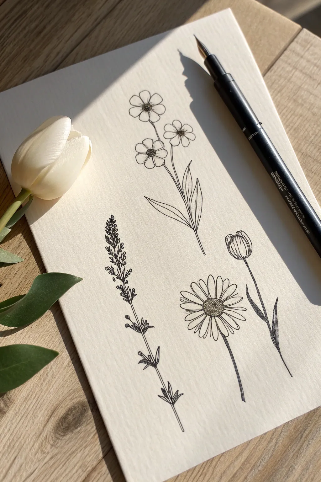
Capture the delicate beauty of a botanical garden with this collection of four minimalist wildflower drawings. Using fine lines and stippling on textured paper creates a timeless, vintage illustration style that looks lovely framed.
Step-by-Step
Materials
- Fine-liner pen (0.1mm or 0.3mm, black)
- Pencil (HB)
- Kneaded eraser
- Textured drawing paper or mixed media paper
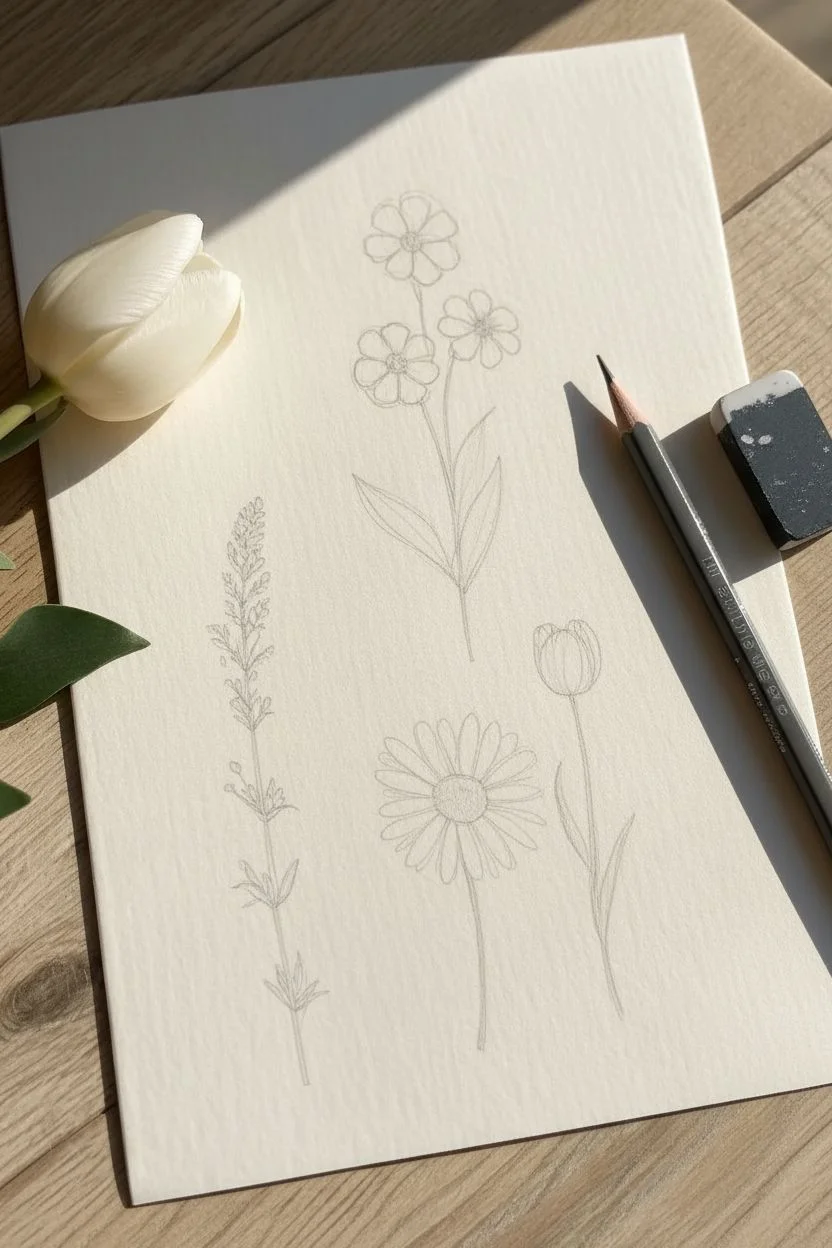
Step 1: Preparation & Shapes
-
Planning the layout:
Using your pencil very lightly, mark out the positions for four distinct plants. Place the tallest stem in the center, a stalky plant on the left, a daisy shape below, and a bud on the right. -
Sketching the triple bloom:
For the top center flower, sketch a main stem that branches into three smaller stems at the top. Draw rough circles at the end of each branch to guide the flower heads. -
Outlining the lavender stalk:
On the left, draw a straight vertical line. Sketch small, grain-like shapes clustering heavily at the top and becoming sparse further down.
Wobbly lines?
Don’t stress if your lines aren’t perfectly straight! Slight quivers in the ink actually mimic the organic imperfections of nature and add character.
Step 2: Inking the Triple Bloom
-
Drawing the petals:
Switch to your fine-liner. On the top center plant, carefully outline five round petals for each of the three flowers. Keep your hand relaxed for smooth curves. -
Adding the centers:
Draw a small circle in the middle of each flower. Fill these centers with tiny dots (stippling) to create a textured, pollen-like appearance. -
Defining the leaves:
Draw the stem downwards, branching out into two large, pointed leaves at the base. Add a single line down the center of each leaf for the vein.
Level Up
Once the waterproof ink is bone dry, lightly brush a very pale wash of watercolor—like sage green or butter yellow—over the petals for a vintage look.
Step 3: Inking the Field Flowers
-
Creating the lavender texture:
For the left plant, draw the tiny individual buds using small loop or teardrop shapes. Cluster them tightly at the tip and space them out as you move down the stem. -
Adding lower foliage:
Near the bottom of the lavender stalk, draw small, opposite pairs of leaves branching directly from the main stem. -
Drawing the daisy center:
Move to the bottom center flower. Draw a flattened oval for the center, filling it densely with cross-hatching or tight dots to make it look dark and fuzzy. -
Extending daisy petals:
Draw long, thin petals radiating from the center. I like to let a few petals overlap slightly to give the flower a natural, dimensional look. -
Finishing the daisy stem:
Draw a unified line for the stem, slightly curved, to ground the flower.
Step 4: The Tulip & Finishing Touches
-
Shaping the tulip bud:
For the drawing on the right, create a U-shaped cup. Draw a central petal shape first, then add curved lines on either side to represent the wrapping outer petals. -
Adding contour lines:
Draw very fine vertical lines inside the tulip petals, starting from the base and fading upward, to suggest the roundness of the bud. -
Tulip leaves:
Draw the stem and add two long, slender leaves near the bottom that hug the stem before curling outward. -
Erase guidelines:
Wait at least five minutes to ensure the ink is completely dry, then gently use your kneaded eraser to lift all pencil marks.
Now you have a serene botanical collection ready to display.


Micro Butterflies
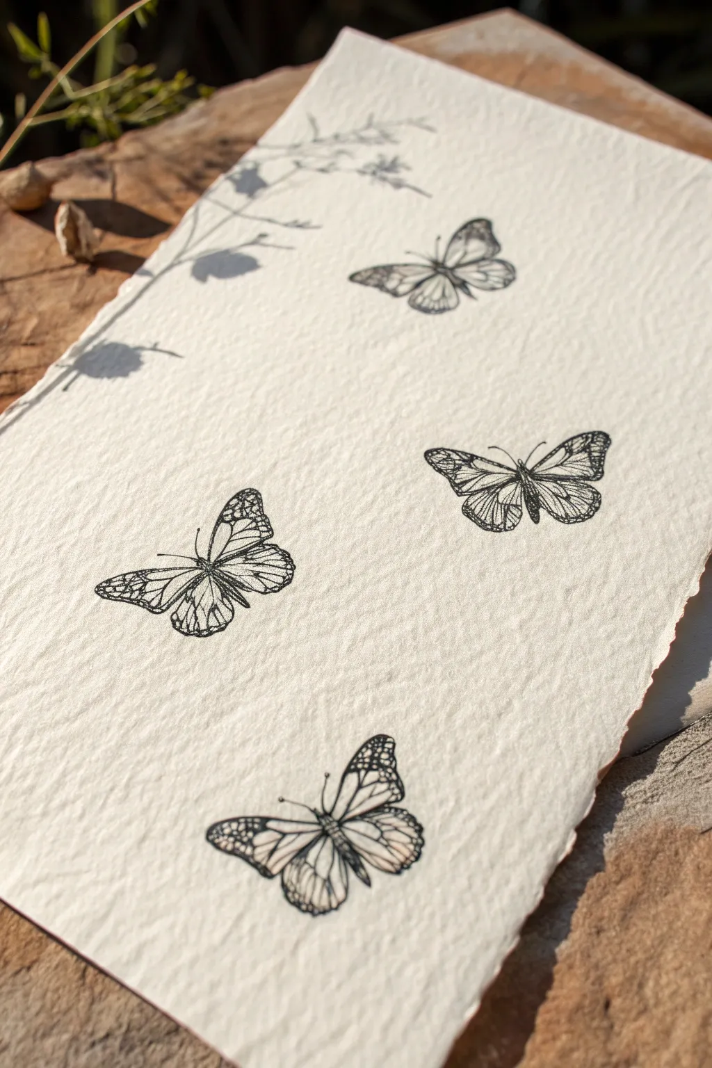
Capture the ethereal beauty of scientific illustrations with this detailed pen-and-ink project. The contrast between crisp black lines and heavy-textured handmade paper creates a timeless, vintage aesthetic perfect for framing.
How-To Guide
Materials
- Heavyweight handmade cotton paper (rough/cold press)
- Fine liner pens (sizes 005, 01, and 03)
- HB Drawing pencil
- Kneaded eraser
- Ruler (optional)
Step 1: Composition & Sketching
-
Paper selection:
Choose a sheet of paper with significant tooth and a deckled edge to match the reference. The texture adds character to the simple line work. -
Placement markings:
Using your HB pencil with very light pressure, mark four small ‘T’ shapes on the paper where the center of each butterfly will sit to ensure a balanced composition. -
Body ovals:
Sketch a thin, elongated oval for the thorax and abdomen over each placement mark. Keep these quite small, about 1-1.5cm long. -
Wing spans:
Lightly sketch the general triangular shapes of the wings. Vary the angles: make the top and bottom butterflies look mostly symmetrical, while tilting the middle two slightly for a natural, drifting look. -
Refining silhouettes:
Go back over your rough shapes to define the scalloped edges of the wings. I find it helpful to look at references of Monarchs and Swallowtails for realistic wing curves.
Drawing on Texture
On rough handmade paper, ink can snag or bleed. Move your pen slower than usual to ensure continuous lines, or use a ‘dotting’ motion to connect lines over deep texture bumps.
Step 2: Inking the Outlines
-
Primary outlines:
Switch to your 01 size pen. working from top to bottom, carefully trace the outer perimeter of the butterfly wings. Let the pen nib glide over the paper bumps without forcing it. -
Body details:
Ink the central bodies. make the thorax (upper part) slightly fuzzy with tiny dash marks, and draw segments on the abdomen (lower part) with small curved lines. -
Vein mapping:
Before adding detail, use the pencil again to lightly map out the ‘cells’ or vein structures inside the wings so you don’t get lost when inking. -
Inking veins:
Switch to the ultra-fine 005 pen. Trace your pencil vein lines. Keep your hand relaxed; a slightly shaky line actually looks more organic and natural here than a ruler-straight one.
Step 3: Detailing & Shading
-
Top butterfly scaling:
For the top specimen, use stippling (tiny dots) near the body where the wings attach. This creates depth without solid heavy blacks. -
Middle-left definition:
This butterfly resembles a Monarch. Use the 03 pen to thicken the veins considerably and fill in the dark borders of the wings, careful to leave tiny white dots on the edges if desired. -
Middle-right texture:
For this varied specimen, use very fine hatching lines (closely spaced parallel lines) near the base of the wings to imply a different texture than the others. -
Bottom butterfly contrast:
On the bottom butterfly, fill in the tips of the forewings with solid black using the 03 pen, but leave circular negative spaces white to mimic patterns. -
Wing roots:
On all four butterflies, darken the area immediately connecting the wings to the body. This anchors the wings so they don’t look like they are floating detached.
Go Metallic
After the black ink dries, trace a few of the internal wing veins with a gold or silver gel pen. It adds a subtle shimmer that mimics the iridescence seen on real butterfly wings.
Step 4: Final Touches
-
Adding antennae:
Using the 005 pen, draw delicate antennae curving outward from the heads. Keep distinct knobs at the ends for realism. -
Shadow play:
If you want to mimic the shadow effect in the photo, you can lightly stipple a faint shadow to the bottom right of each butterfly, though the drawing looks great without it too. -
Cleanup:
Wait at least 15 minutes for the ink to fully cure. Textured paper holds ink longer than smooth paper. Once dry, gently dab (don’t rub) with the kneaded eraser to lift pencil lines.
Now you have a stunning collection of micro specimens that capture the fragility of nature forever.

PENCIL GUIDE
Understanding Pencil Grades from H to B
From first sketch to finished drawing — learn pencil grades, line control, and shading techniques.
Explore the Full Guide
Peeking Cats
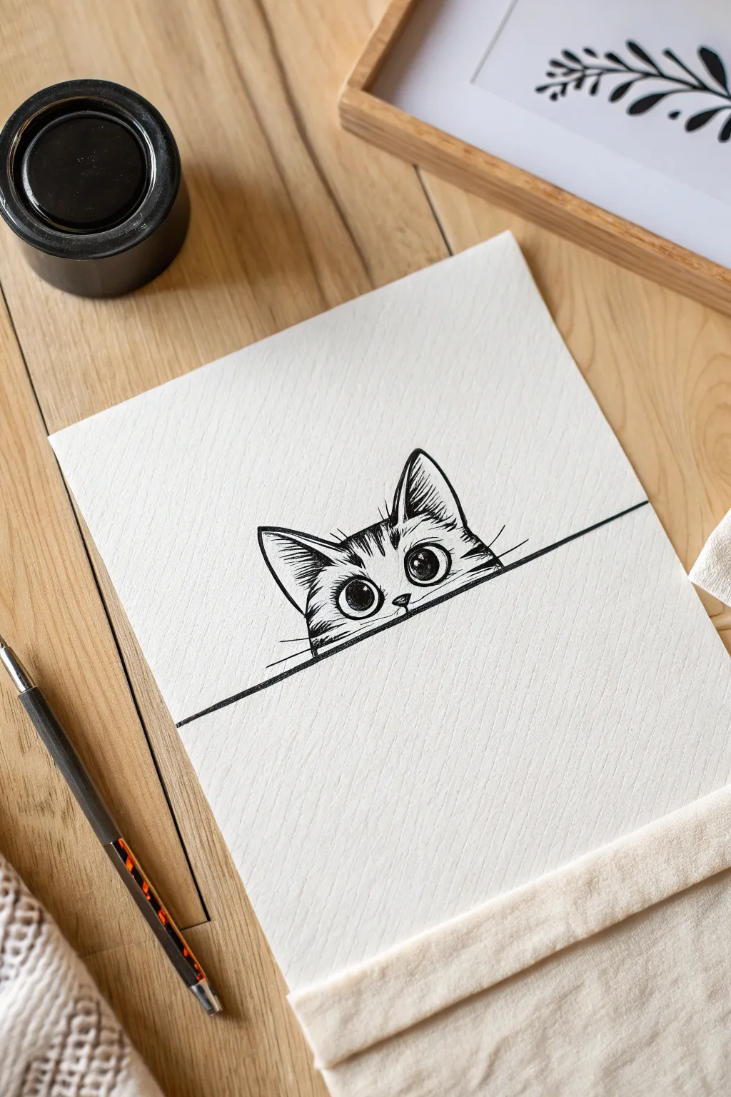
Capture the curiosity of a feline friend with this crisp, high-contrast pen and ink illustration. This project focuses on utilizing texture and negative space to create a cute subject that appears to be peering over the edge of your paper.
Step-by-Step Tutorial
Materials
- Heavyweight drawing paper or cold-press watercolor paper
- HB or 2H graphite pencil
- Kneaded eraser
- Fine liner pens (sizes 0.05, 0.1, and 0.5mm)
- Ruler (optional)
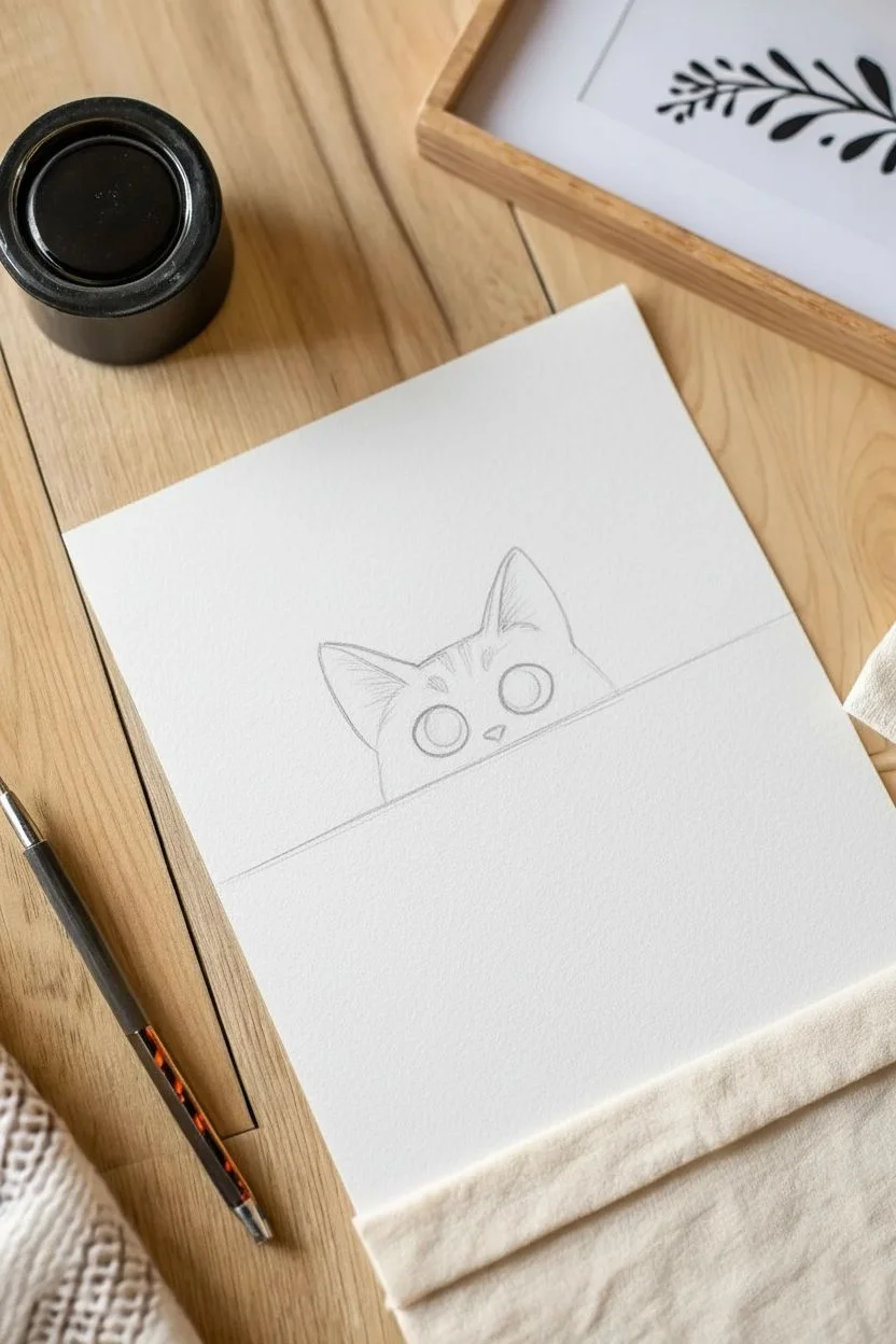
Step 1: Pencil Sketching
-
Set the ledge:
Use your pencil and ruler (or a steady freehand) to draw a straight horizontal line across the lower third of your paper to represent the table edge. -
Basic head shape:
Lightly sketch a semi-circle or shallow dome shape rising from the horizontal line to form the top of the cat’s head. -
Ear placement:
Add two large, triangular shapes on top of the dome for the ears, tilting them slightly outward. -
Eye positioning:
Draw two large circles in the lower half of the head, resting just above the point where the nose will be. -
Details sketch:
Mark a tiny inverted triangle between the eyes for the nose, and sketch faint ‘M’ shapes on the forehead for the tabby stripes.
Step 2: Inking the Features
-
Define the ledge:
Using your thickest pen (0.5mm), trace the horizontal line with a bold, confident stroke to ground the drawing. -
Eye outlines:
Switch to a 0.1mm pen to carefully outline the circles of the eyes. I find it helps to rotate the paper to keep the curve smooth. -
Highlights and pupils:
Draw a small bubble or circle in the upper right corner of each eye for the highlight, then fill the large pupil in the center with solid black ink, leaving the highlight pure white. -
Iris shading:
Use the 0.05mm pen to draw tiny, radiating lines from the pupil outward to the edge of the iris to create depth without making the eyes too dark. -
Nose and mouth:
Ink the small nose triangle and draw two tiny curves underneath for the mouth.
Fixing Shaky Lines
If your main horizontal line is uneven, don’t re-draw it. Thicken the line slightly along the whole length to mask the wobble naturally.
Step 3: Fur and Texture
-
Outer contour:
Ink the outline of the head and ears, but instead of a solid line, use short, quick flicks of the pen to mimic the texture of fur. -
Ear details:
Inside the ears, urge your pen upward with long, sweeping strokes to create the tufts of hair, leaving the center of the ear mostly white. -
Forehead stripes:
Fill in the sketched ‘M’ stripes on the forehead using dense, vertical hatching lines to suggest dark fur markings. -
Cheek markings:
Add smaller triangular striped patches on the outer cheeks, pointing inward toward the eyes, using the same hatching technique. -
Whiskers:
With a quick, deliberate motion, flick three or four long lines outward from the cheeks past the head’s outline for the whiskers. -
Clean up:
Wait at least five minutes for the ink to fully cure, then gently erase all visible graphite lines with the kneaded eraser.
Add Some Personality
Draw two small, oval paws draping over the edge of the line to make it look like the cat is actively pulling itself up for a look.
Now you have a charming little companion permanently peeking out from your sketchbook page
Little Mushroom Trio
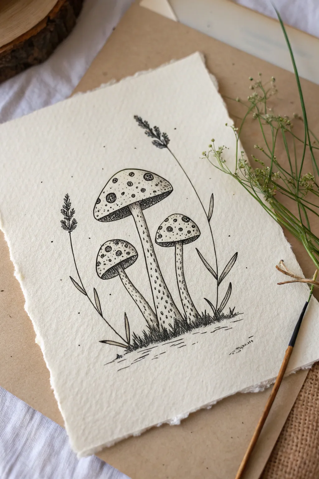
Capture the charm of the forest floor with this detailed pen-and-ink illustration. This project uses stippling techniques on textured paper to create a rustic, scientific-illustration aesthetic perfect for a nature journal.
Step-by-Step
Materials
- Textured heavy paper (cotton rag or cold press watercolor)
- Fine liner pens (sizes 0.05, 0.1, and 0.3mm)
- HB Pencil
- Kneaded eraser
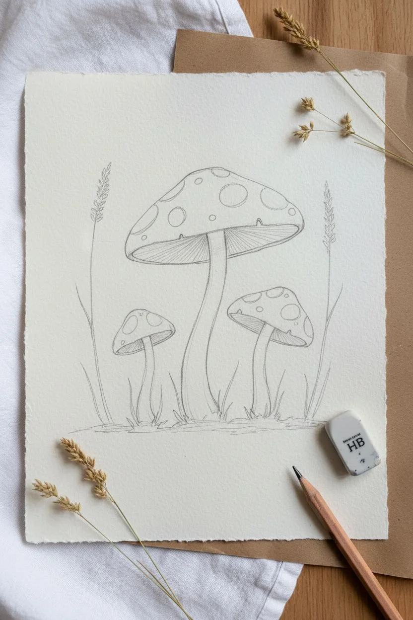
Step 1: Sketching the Composition
-
Mark the ground line:
Using your pencil lightly, mark a short, uneven horizontal area near the bottom of the page to establish where the mushrooms will sit. -
Draft the central mushroom:
Draw a tall, slightly curved stem rising from the center. Top it with a wide, umbrella-shaped cap. -
Add flanking mushrooms:
Sketch a smaller, shorter mushroom to the left, and a medium-height one to the right. Tilt their caps slightly outward away from the center. -
Placement of spots:
Draw various irregular circles and ovals on the caps. Vary the sizes, placing some near the edges to show curvature. -
Sketch the foliage:
Add thin, singular blades of grass at the base and two tall, spindly weed stalks rising behind the mushrooms on the left and right.
Ink Smearing?
Textured paper holds wet ink in its valleys longer than smooth paper. Wait at least 15 minutes before erasing pencil lines to ensure a crisp finish.
Step 2: Inking the Outlines
-
Outline the caps:
Switch to your 0.1mm fine liner. Trace the outer edges of the mushroom caps, using a slightly broken or wobbly line to emphasize organic texture. -
Define the spots:
Ink the circles on the caps. I like to keep these lines very thin, so they don’t look like cartoons. -
Outline stems and grass:
Trace the stems and the grass blades. Use quick, upward flicking motions for the grass tips to keep them sharp. -
Clean the page:
Once the ink is completely dry, gently roll your kneaded eraser over the pencil lines to remove them without roughening the paper surface.
Step 3: Shading and Texture
-
Darken the gills:
Using a 0.3mm pen, fill the area directly underneath the cap rims with dense stippling (lots of dots) or tight hatching to create a deep shadow. -
Texture the stems:
Switch to a 0.05mm pen. Stipple the stems, concentrating the dots heavily on the sides and leaving the center mostly white to create a cylindrical 3D form. -
Shade the caps:
Add light stippling to the mushroom caps. Focus the dots near the bottom rim and the very top, leaving the spots themselves mostly clear. -
Detail the spots:
Add just a few tiny dots inside the ‘white’ spots on the caps to give them a crater-like texture rather than being flat white holes. -
Define the flora:
Add texture to the tall weeds using very small, angled dashes to mimic seeds or leaves. -
Ground the image:
Darken the grass at the very bottom with dense vertical hatching to simulate soil and deep shadow. -
Atmospheric dust:
Finish by tapping your pen randomly around the mushrooms to create floating ‘magic dust’ specks that frame the composition.
Pro Tip: Dot Density
To create smooth gradients without lines, simply change the density of your dots. More dots equals darker shadow; fewer dots equals highlight.
Sign your name small near the base and enjoy your woodland sketch.
BRUSH GUIDE
The Right Brush for Every Stroke
From clean lines to bold texture — master brush choice, stroke control, and essential techniques.
Explore the Full Guide
Geometric Mountain Scenes
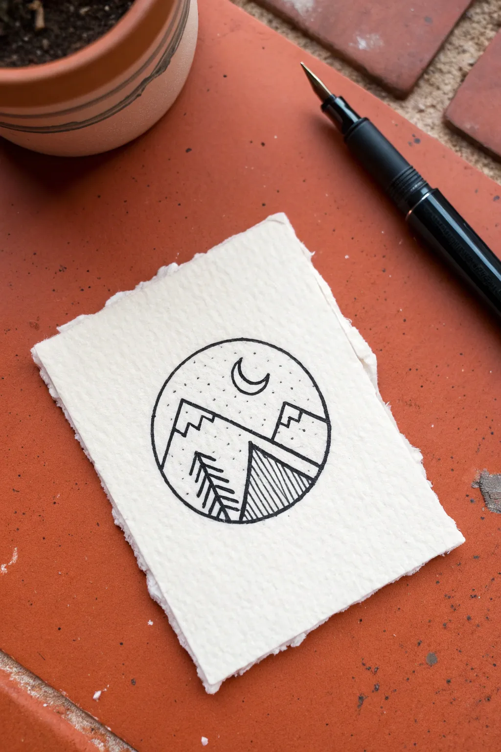
Capture the serenity of the outdoors with this minimalist geometric landscape. This project combines crisp pen work with the organic texture of torn paper for a charming, stamp-sized artwork.
Step-by-Step
Materials
- Cold press watercolor paper (300gsm)
- Black fine liner pen (0.3mm or 0.5mm) or fountain pen
- HB Pencil
- Quality eraser
- Small circular object (like a spice jar lid)
- Ruler
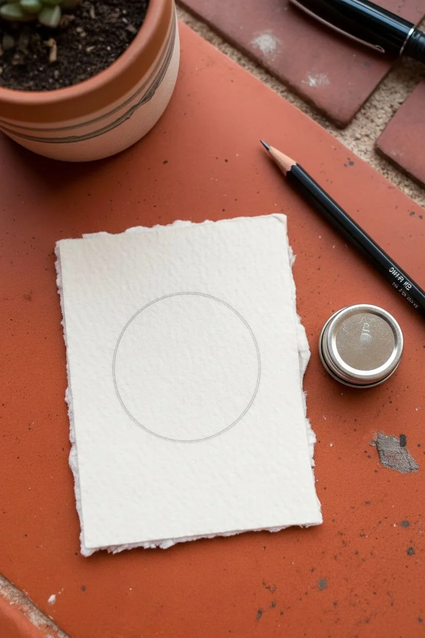
Step 1: Preparing the Canvas
-
Tear the paper:
Begin with a small rectangle of watercolor paper, roughly 3×4 inches. To get the fuzzy, antique look shown, tear the edges by hand against a ruler rather than cutting with scissors. -
Trace the boundary:
Place your circular object in the center of the paper. -
Pencil outline:
Lightly trace around the object with your pencil to create the border frame for your landscape.
Step 2: Sketching the Elements
-
Foreground slope:
Draw a diagonal line across the lower third of the circle, sloping upwards from right to left. -
Primary mountain:
Sketch a large triangle shape on the left side, resting behind the foreground slope line. -
Secondary peak:
Add a smaller triangle peek out from behind the first one on the right side. -
Geometric caps:
Inside both mountain triangles, sketch rigid, stair-step lines to suggest snow caps or geometric shadows. -
Celestial details:
Place a small crescent moon shape in the upper center of the sky area. -
Tree placement:
On the left side of the foreground slope, lightly pencil a vertical line to mark the tree trunk.
Bleeding Lines?
If your ink feathers or spreads on the textured paper, your pen might be too wet. Switch to a pigment liner (like a Micron) rather than a liquid ink pen, or work faster to deposit less ink.
Step 3: Inking and Definition
-
Ink the border:
Using your black pen, carefully trace over the circular pencil sketch to define the boundary. -
Define the mountains:
Go over the mountain outlines and the jagged interior geo-lines with confident strokes. -
Draw the tree:
Ink the tree trunk, then add simple angled lines branching downward on the left side of the trunk to create a stylized pine look. -
Detail the foreground:
Ink the main diagonal slope line. -
Add shading:
On the lower right section of the slope (the triangle formed by the slope and the circle rim), draw closely spaced vertical hatching lines. -
Ink the moon:
Outline the crescent moon carefully. I like to leave it white, but you can fill it in if you prefer a silhouette. -
Stipple the sky:
To simulate stars, gently tap your pen tip repeatedly in the sky area to create a texture of scattered dots. -
Erase:
Wait at least 5 minutes to ensure the ink is bone-dry, then gently erase all remaining pencil marks.
Pro Tip: Instant Texture
Using cold-press watercolor paper is key here. Its bumpy surface naturally breaks up your pen lines slightly, giving the drawing a rustic, etched look that standard printer paper can’t match.
Now you have a striking miniature landscape perfect for a greeting card or notebook cover.
Hanging Lightbulbs
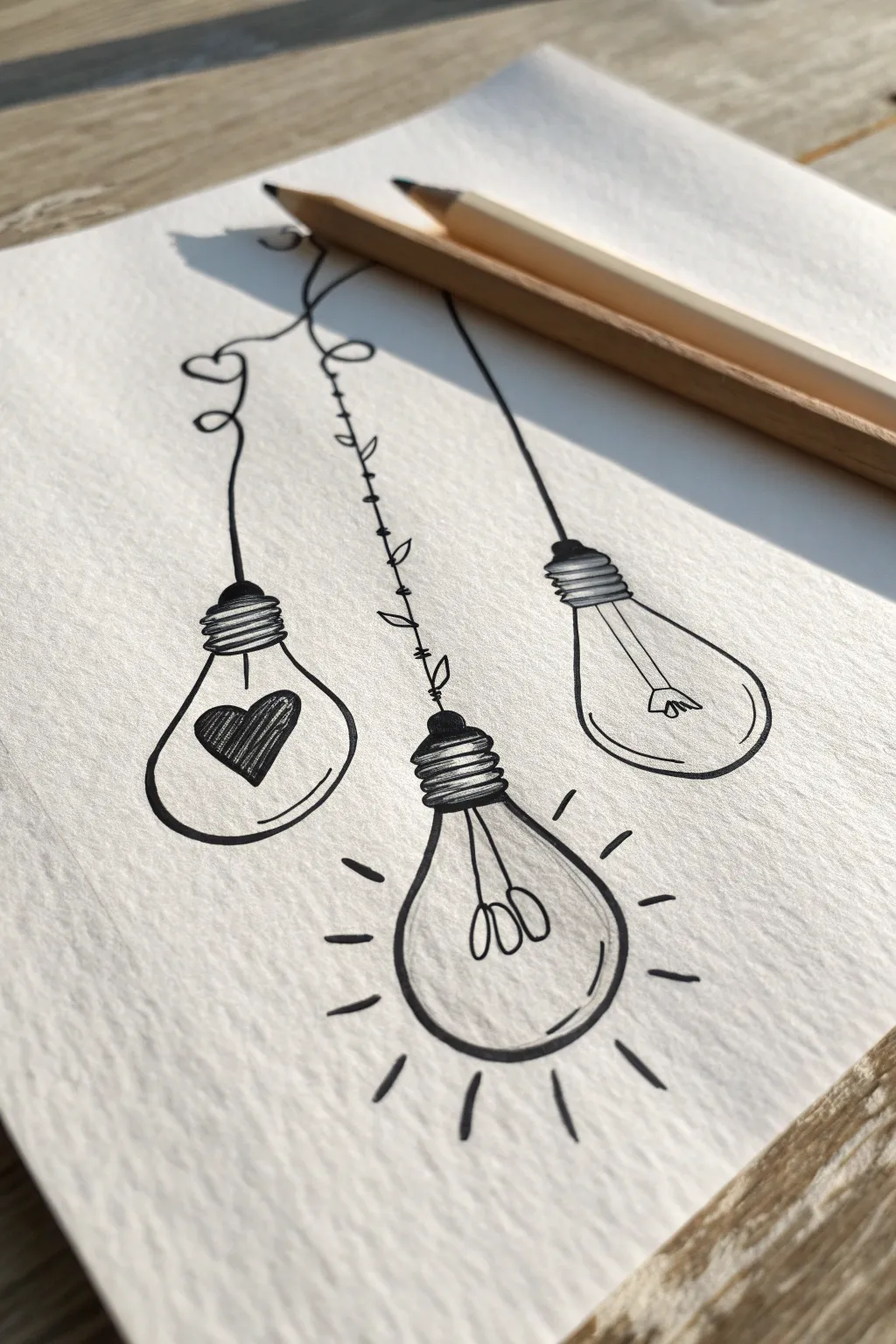
This charming sketch features three unique lightbulbs hanging from the top of the page, each with its own personality and filament design. Using simple fineliner techniques on textured paper, you will create a minimalist doodle that symbolizes love, ideas, and clarity.
Step-by-Step Tutorial
Materials
- Textured sketch paper or cold-press watercolor paper
- HB Pencil
- Eraser
- Black fineliner pen (0.3mm or 0.5mm)
- Ruler (optional)
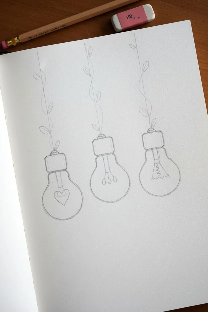
Step 1: Sketching the Composition
-
Set the positions:
Lightly mark three points at varied heights on your paper where the center of each bulb will sit, keeping the middle one the lowest. -
Draw the bulb shapes:
Sketch a circle around each point, then taper the tops upward to form the classic pear-like silhouette of a lightbulb. -
Add the screw bases:
Draw a rectangular shape with rounded corners on top of each bulb neck to represent the metal cap. -
Sketch the hanging wires:
Draw light vertical guidelines connecting the top of each cap to the top edge of your paper.
Wobbly circles?
Don’t stress about perfect geometric shapes. Slightly uneven or organic ovals actually enhance the hand-drawn, doodle aesthetic of this project.
Step 2: Designing the Filaments
-
Create the heart bulb:
Inside the left bulb, draw a heart shape in the center and connect it to the cap with two thin stems. -
Design the left wire:
Redraw the left guideline as a playful, curly line with a loop-de-loop and add two tiny heart outlines near the top. -
Create the idea bulb:
For the center bulb, draw three small teardrop loops hanging from a central stick to form the filament. -
Design the vine wire:
Turn the center wire into a botanical vine by sketching small leaves alternating along the vertical line. -
Create the classic bulb:
Inside the right bulb, sketch a standard filament detailed with two straight prongs holding a small zigzag wire between them.
Step 3: Inking and Refinement
-
Ink the screw caps:
Using your fineliner, trace the caps and draw horizontal stripes inside. Fill every other stripe solid black to resemble threads. -
Outline the glass:
Trace the bulb silhouettes. I like to leave a small break in the line on the bottom right of each bulb to suggest a shiny glass reflection. -
Detail the heart:
Ink the heart filament, filling it with tight diagonal hatching lines to make it stand out against the white paper. -
Ink the left wire:
Trace over your curly line and the floating hearts to finalize the left suspension wire. -
Detail the vine:
Go over the center vine wire, filling in the small leaves completely so they are solid black silhouettes. -
Add the glow:
Ink the center filament loops and draw short, radiating dashes around the outside of this bulb to show it is shining. -
Finish the right bulb:
Trace the standard filament and the straight wire for the final bulb on the right. -
Add curve details:
Draw a subtle curved line near the bottom inside of each bulb to emphasize the roundness of the glass. -
Clean up:
Allow the ink to dry completely to prevent smearing, then gently erase all visible pencil sketches.
Pro Tip: Line Weight
If you have them, use a thinner 0.1mm pen for the inner filaments and a thicker 0.5mm pen for the outer glass outlines to create instant depth.
Now you have a sketchbook page illuminated with your own creative spark


Stacked Books


Capture the cozy charm of a quiet afternoon with this intricate line drawing of stacked antique books. This project focuses on isometric perspective, hatching textures, and combining rigid geometry with organic botanical elements.
Detailed Instructions
Materials
- Fine liner pens (sizes 0.05, 0.1, and 0.3mm)
- HB Drawing pencil
- Kneaded eraser
- Smooth sketchbook paper (cream or off-white recommended)
- Ruler (optional)
Step 1: Structural Sketching
-
Establish the angles:
Begin with your pencil by lightly drawing a vertical center line to guide your stack. Draw a slanted rectangle at the top to serve as the cover of the first book, angling it downward to the left to establish the perspective. -
Build the top book:
Give the top rectangle depth by dropping vertical lines down from its three visible corners. Connect these at the bottom to form the thickness of the book. -
Stack the second book:
Draw the second book slightly offset from the first. Make this one a bit wider but thinner than the top book, ensuring the spine edge aligns roughly with the one above it but rotated slightly clockwise. -
Add the bottom volumes:
Sketch the third and fourth books. Make the third book the thickest of the bunch, suggesting a heavy reference tome. The bottom book should be slightly larger to provide a stable visual base. -
Curve the spines:
Refine the spines (the left-facing sides) of the books. Instead of perfectly straight vertical lines, curve them slightly outward to show they are hardcover bindings. Conversely, curve the page edges (the right-facing sides) slightly inward.
Step 2: Inking the Foundation
-
Outline the covers:
Switch to a 0.3mm fine liner. Carefully trace the outer edges of the book covers and spines. I prefer to break the line weight slightly near the corners to suggest wear and tear rather than perfect manufacturing. -
Define the pages:
Use a thinner 0.1mm pen to draw the lines separating the hard covers from the block of pages inside. Keep these lines delicate. -
Create the heavy tome:
For the thick third book, add extra detail to the spine by drawing horizontal raised bands (ridges) across the spine, typical of old leather-bound books.
Old Paper Effect
To make the books look ancient, don’t draw the cover lines perfectly straight. A slight wobble or a broken line at the corners suggests the cardboard has softened and worn down over time.
Step 3: Botanical Details
-
Sketch the flowers:
On the cover of the top book, lightly pencil a wildflower springing up. Here is the creative twist: allow the stems to extend off the cover and ‘grow’ into the space above the book. -
Ink the stems:
Using the 0.05mm pen, ink the stems with fluid, slightly wavering lines to mimic nature. Add tiny branching offshoots. -
Stipple the blooms:
Instead of drawing solid outlines for the flower heads, use a stippling technique (dots) to create clusters of tiny flowers. This creates a fluffy, light texture reminiscent of Queen Anne’s Lace or Yarrow. -
Add cover foliage:
Draw faint leaves pressed onto the cover of the top book itself, making it look like an illustration affecting the real world.
Level Up: Sepia Tone
Once your ink is dry, use a water brush to apply a very dilute wash of watered-down coffee or tea over the page edges. This creates an authentic, aged parchment look that warms up the drawing.
Step 4: Texture and Shading
-
Design the spines:
Decorate the spines of the second and third books with floral scrollwork. Use the 0.05mm pen to draw tiny vines and leaves interlinked down the center of the spines. -
Texture the pages:
To create the look of hundreds of pages, use your 0.05mm pen to draw very fine, closely spaced lines along the page edges. Follow the inward curve you established earlier. -
Reference title:
Add some scribble-text or a faux title to the spine of the top book using a slightly bolder stroke to mimic gold leaf embossing. -
Apply shading:
Hatch (draw parallel diagonal lines) on the sides of the books that are facing away from the light source. Deepen the shadows right where the books touch each other to weigh them down. -
Weathering effects:
Add a few stray scratches or dots on the covers to show age. Once the ink is completely dry, erase your initial pencil guide lines to reveal the clean illustration.
Enjoy your charming stack of literary history.
Retro Instant Cameras
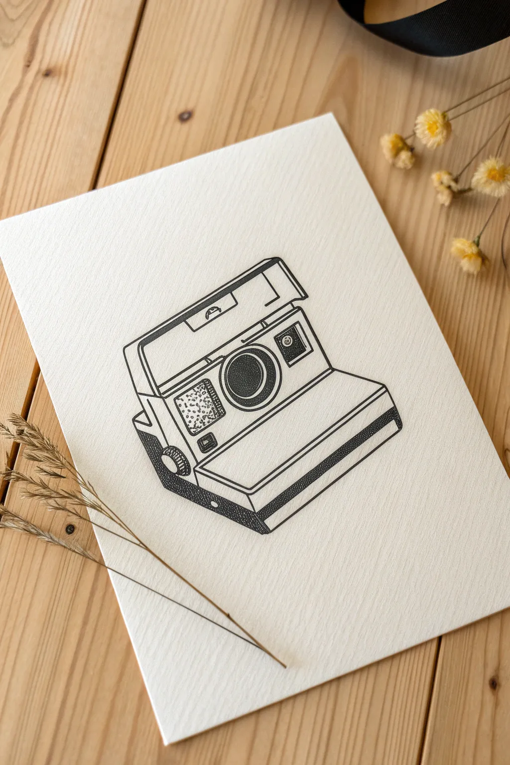
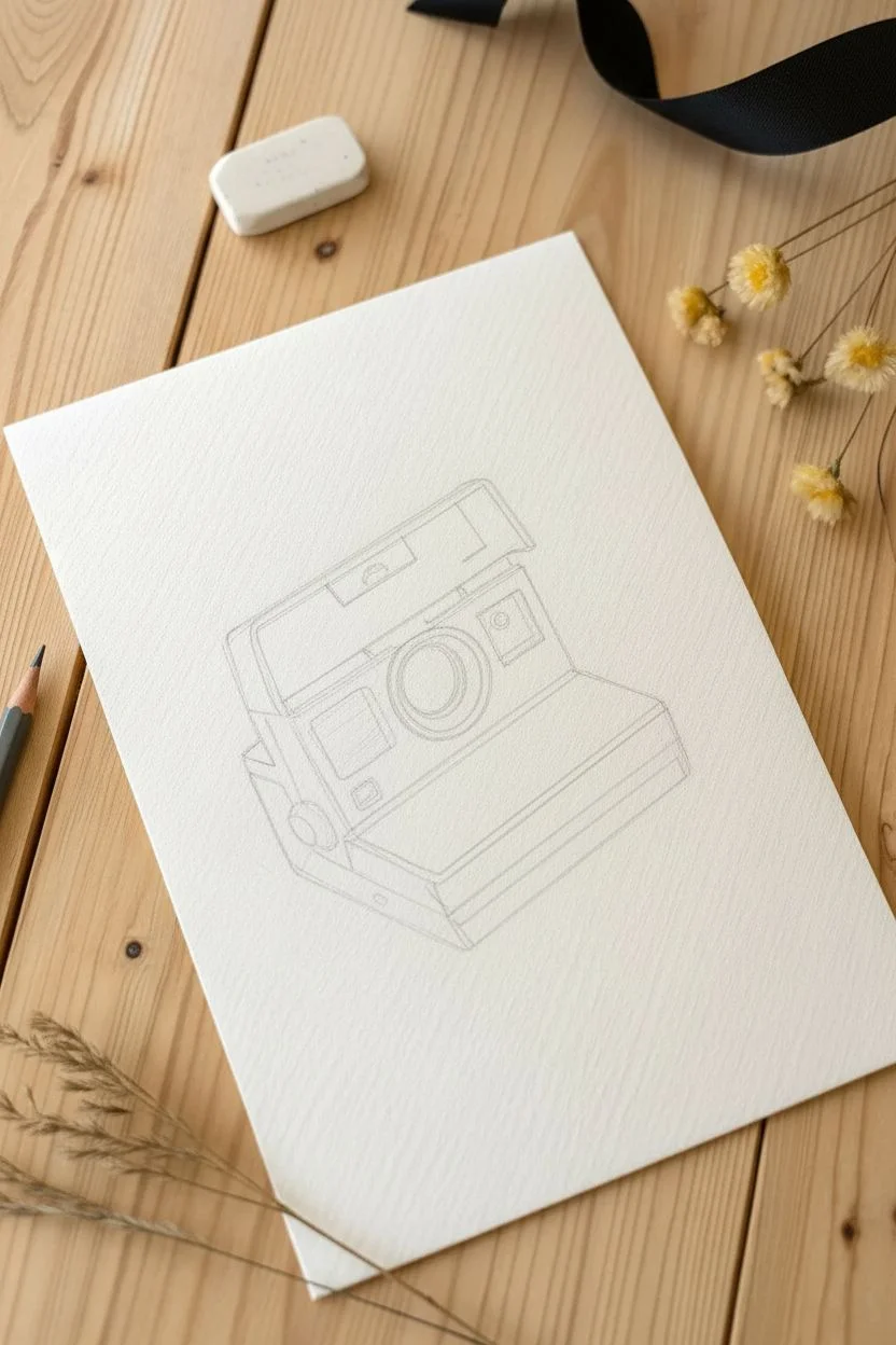
Capture the nostalgia of analog photography with this intricate line drawing of a classic instant camera. By combining clean architectural lines with patient stippling, you’ll create a piece that feels both technical and artistic.
Step-by-Step Tutorial
Materials
- High-quality drawing paper (lightly textured)
- HB Pencil
- Eraser
- Ruler
- Fine liner pens (sizes 0.1, 0.3, and 0.5mm)
Step 1: Constructing the Frame
-
Establish the base:
Start by lightly sketching a wide, flattened rectangle at a slight diagonal angle to serve as the bottom ‘jaw’ of the camera where the film ejects. -
Raise the body:
Draw a large square shape rising up from the back of your base rectangle, creating the main face of the camera body. -
Add the flash housing:
Sketch a trapezoid shape on top of the body square that angles backward slightly, representing the flip-up flash unit. -
Define the side perspective:
Connect the corners on the left side to create a 3D block effect, showing the depth of the camera casing. -
Sketch the lens:
In the center of the main body square, draw a large circle, then nest two smaller circles inside it to create the lens barrel.
Dot Control
Hold your pen completely vertical when stippling. If you tilt the pen, lines become comma-shaped dashes, which ruins the clean, grainy texture you are aiming for.
Step 2: Adding Mechanism Details
-
Place the sensors:
To the right of the lens, sketch a small rectangle for the viewfinder and exposure meter. -
Draw the flash and focus:
Add a rectangular grid on the left side of the lens face, and a small circular dial on the lower left corner for the focus wheel. -
Refine the angles:
I like to use a ruler here to sharpen the straight lines of the casing, specifically the distinct bevels around the top housing. -
Detail the tray:
Draw parallel lines along the front lip of the bottom tray to mimic the ridges found on the plastic casing.
Step 3: Inking the Outline
-
Trace the main lines:
Switch to your 0.5mm pen and carefully trace over the main outer perimeters of the camera. -
Ink the details:
Use a finer 0.3mm pen for the inner details like the lens circles, the viewfinder, and the ridges on the tray. -
Clean up:
Once the ink is completely dry to the touch, gently erase all underlying pencil sketches to leave a crisp framework.
Level It Up
To make the camera feel active, draw a white rectangle sliding out of the bottom tray, and sketch a faint scene on it to represent a developing photo.
Step 4: Shading with Stippling
-
Darken the deep shadows:
Using the 0.5mm pen, apply dense stippling (dots) to the side panel of the camera body to create a solid, dark shadow area. -
Shade the lens:
Stipple the center of the lens heavily, fading out slightly as you move toward the edges to create the look of curved glass. -
Texture the sensory panel:
On the rectangular panel to the left of the lens, use a 0.1mm pen to create a randomized ‘noise’ texture with sparse dots. -
Add depth to the housing:
Add a thin line of dots under the flash hood overhang to show a cast shadow. -
Detail the focus wheel:
Fill the focus wheel with vertical hatched lines, then stipple the side of it to give it dimension. -
Final contrast check:
Add a few extra dots to the darkest corners and inside the viewfinder square to ensure the drawing has enough punchy contrast.
Now you have a timeless piece of retro technology captured on paper, ready to be displayed.
Magic Crystal Clusters
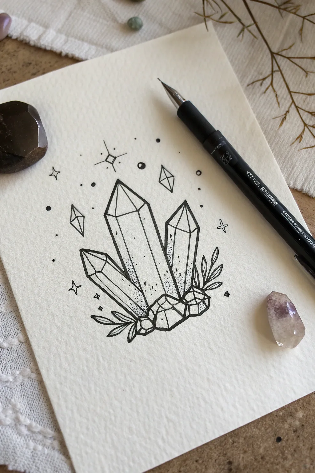
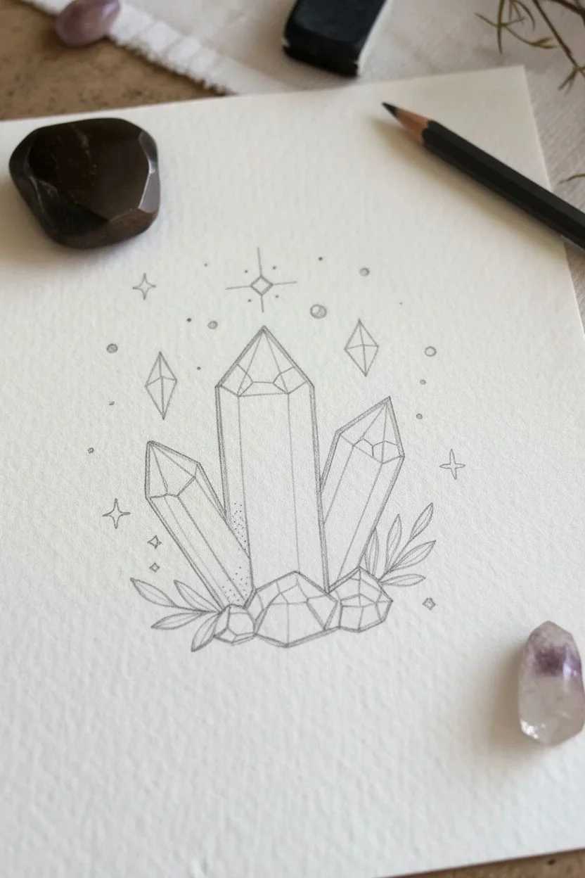
This project captures the enchanting beauty of geometric crystal points surrounding by celestial elements. By using simple fineliners on textured paper, you will build contrast through stippling techniques to create a piece that feels both earthy and magical.
How-To Guide
Materials
- Cold press watercolor paper or textured cardstock
- HB pencil
- Kneaded eraser
- Black fineliner pen (size 03 or 05)
- Fine black pen (size 005 or 01)
Step 1: Sketching the Layout
-
Center point:
Start by drawing a tall, vertical rectangle in the center of your page with your pencil. Top it with a triangle to form the main crystal point. -
Side crystals:
Sketch a slightly shorter, narrower crystal leaning against the right side of the main one. Draw a third crystal on the left, angled outward more significantly. -
Facets:
Draw lines inside the crystal tips to create facets. Connect the tip of the triangle down to the corners of the rectangle body, creating a 3D geometric look. -
Base foundation:
At the bottom of the crystals, sketch a cluster of irregular, geometric rocks and geodes to ground the shards. -
Natural elements:
Add simple curved lines extending from the bottom corners to form leafy sprigs framing the base. -
Celestial details:
Lightly mark positions for floating diamonds, sparkles, and circles in the background space above the crystals.
Shaky lines?
Don’t stress if your lines aren’t ruler-straight. Slightly organic, wobbly lines actually make the crystal facets look more natural and realistic.
Step 2: Inking the Lines
-
Main outlines:
Using your thicker fineliner (03 or 05), carefully trace over the main perimeter lines of the three large crystals. -
Inner details:
Switch to your finer pen (005 or 01) to trace the internal facet lines. Lighter lines here help distinguish the edges from the outer silhouette. -
Rocky base:
Ink the rocks at the bottom. I like to use jagged, angular strokes here to differentiate the rough texture of the stones from the smooth crystal glass. -
Foliage:
Trace the leaves with smooth, continuous curves, pointed at the tips. -
Magic dust:
Ink the background stars and diamonds. For the larger diamonds, split them in half or quarters with a fine line to add dimension.
Level Up
Add a touch of metallic gold ink to the floating stars or the internal crystal facets to make your drawing catch the light and feel truly magical.
Step 3: Shading and Finishing
-
Base stippling:
Using the fine pen, start adding small dots (stippling) at the bottom of the main crystals where they meet the rocks. -
Building gradients:
Concentrate the dots heavily at the bottom and space them out as you move upward, creating a fading gradient that disappears halfway up the crystal. -
Rock texture:
Add sparse stippling to the base rocks, focusing on the corners and bottom edges to give them weight. -
Leaf shading:
Add a few tiny dots at the base of each leaf where it connects to the stem. -
Line weight:
Go back over the very outer perimeter of the entire cluster with the thicker pen to make the drawing pop off the page. -
Clean up:
Wait for the ink to be completely dry, then gently erase all remaining pencil sketches.
Now you have a sparkling crystal illustration ready to frame or add to your journal
Cozy Cottage Doors
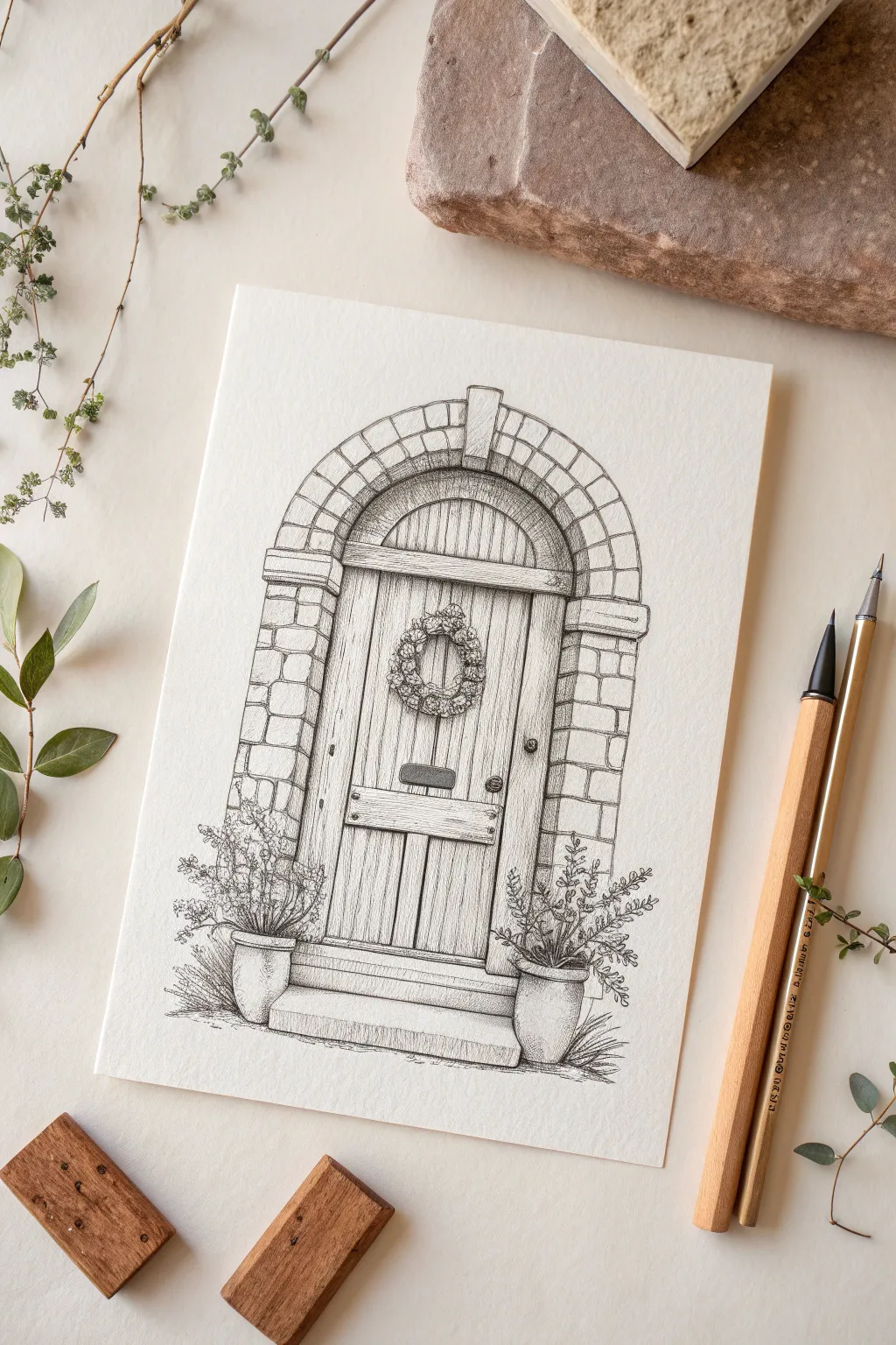
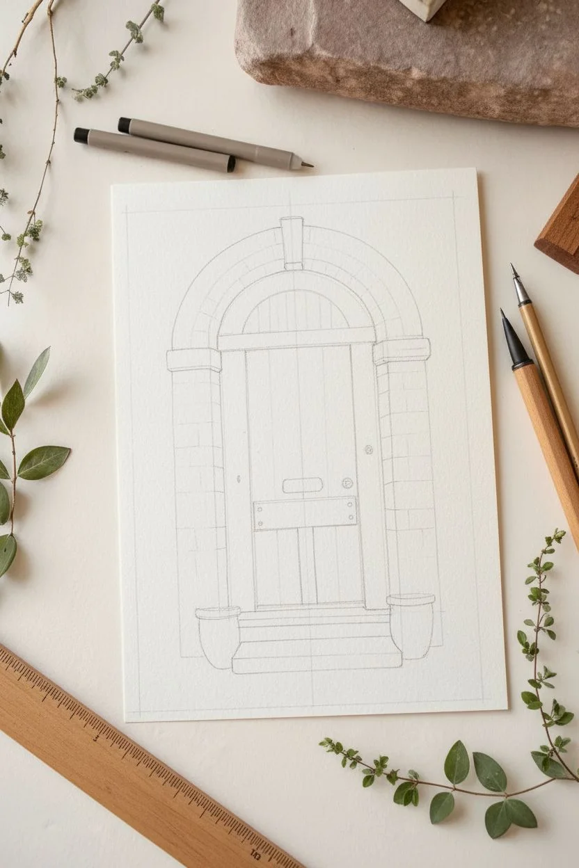
Capture the charm of an English countryside entry with this detailed pen and ink illustration. You will build layers of texture to create weathered wood, ancient stone, and welcoming botanical accents.
Step-by-Step Guide
Materials
- Heavyweight smooth drawing paper or Bristol board
- HB Pencil
- Ruler
- Fine liner pens (sizes 0.05, 0.1, 0.3, and 0.5)
- White vinyl eraser
Step 1: Structural Sketching
-
Vertical guidelines:
Begin with your pencil and ruler to draw a tall central rectangle for the door, leaving plenty of room on the sides for the stone arch. -
Arched top:
Sketch a semi-circle atop your rectangle to create the classic rounded door frame. -
Stone layout:
Draw a second, larger arch outline around the door to define the width of the stone surround, adding a keystone rectangle at the very top center. -
Steps and pots:
Lightly sketch horizontal rectangles at the base for steps, and block in two simple U-shapes on either side for the flower pots.
Uneven Stones?
Don’t fix them! If your bricks aren’t perfectly uniform, it actually improves the drawing. Old cottages have irregular masonry, so “mistakes” here just add realism.
Step 2: Inking the Framework
-
Key outlines:
Switch to a 0.3 pen to trace the main lines of the door and steps, keeping your hand relaxed so the lines aren’t too rigid. -
Brickwork definition:
Outline the individual stones in the arch and side columns using the 0.3 pen, rounding the corners slightly to make them look weathered rather than sharp. -
Wood paneling:
Draw vertical lines inside the door frame to create planks. I find that breaking the lines occasionally makes the wood look more natural and aged. -
Hardware details:
Ink the letterbox, doorknob, and keyhole, filling them in with solid black for immediate contrast.
Adding Warmth
To elevate the drawing, try using a Sepia or Dark Brown fine liner instead of Black. It gives the finished piece a softer, vintage photograph aesthetic.
Step 3: Texture and Depth
-
Wood grain:
Using your finest 0.05 or 0.1 pen, draw thin, wiggly vertical lines and small knots on the door planks to simulate wood grain. -
Stone texture:
Add small dots (stippling) and tiny cracks to the stones, concentrating more dots on the bottom edges to suggest shadow and weight. -
Wreath details:
Create the wreath using a 0.1 pen with small, circular scribbles and loop motions to mimic dried twigs and leaves, building up density in the center. -
Pot foliage:
For the side plants, use quick, upward flicking strokes for stems and small, irregular ovals for leaves giving them a wild, overgrown look.
Step 4: Shading and Final Polish
-
Arch shadows:
Use a 0.1 pen to add hatching (closely spaced parallel lines) to the underside of the stone arch where it meets the door to create deep depth. -
Grounding the scene:
Add horizontal hatching roughly under the pots and steps to ground the illustration so it doesn’t look like it’s floating. -
Deepening contrast:
Take your 0.5 pen and re-trace the outermost shadow lines underneath the door frame and pots to make the drawing pop off the page. -
Cleanup:
Wait at least 15 minutes for the ink to fully set, then gently erase all remaining pencil marks to reveal your crisp illustration.
Now you have a charming little architectural study perfect for a greeting card or sketchbook page.
Paper Airplanes with Trails

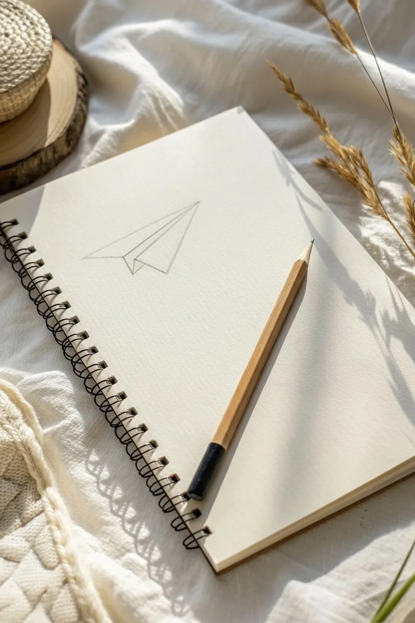
Capture the joy of daydreaming with this simple yet charming paper airplane sketch. Using basic geometric shapes and flowing lines, you will create a sense of movement that dances across your notebook page.
Step-by-Step
Materials
- Spiral-bound sketchbook (cream or white paper)
- HB graphite pencil
- Soft vinyl eraser
- Black fine-liner pen (0.3mm or 0.5mm)
Step 1: Drafting the Plane
-
Positioning:
Turn your sketchbook so you have plenty of open space. Locate a spot on the left side of the page for your airplane’s starting point. -
Base triangle:
Using your HB pencil, lightly sketch a long, sharp triangle pointing diagonally upward to the left. This forms the body of the plane. -
Wing definition:
From the wide back end of the triangle, draw a line angling inward to create the center crease of the paper airplane. -
Adding depth:
Sketch a smaller triangle shape underneath the main body to represent the underside of the opposite wing, giving the plane a 3D perspective.
Step 2: Plotting the Course
-
The destination:
Move your hand to the upper right area of the page and lightly sketch a small circle. This will become a tiny planet or moon. -
Marking the end:
towards the bottom right, sketch a tiny four-petaled flower or clover shape where the flight trail will eventually end. -
Mapping the trail:
This is the fun part. Lightly draw a flowing, continuous line connecting the back of the plane to the moon, looping around, and ending at the flower. -
Refining the curve:
Adjust your pencil line to ensure the loop feels loose and airy, rather than tight and jagged.
Dash consistency
To make the flight trail look professional, focus on the rhythm of your hand. Count ‘one, two, one, two’ in your head to keep the dash length and gap spacing uniform.
Step 3: Inking the Journey
-
Outline the plane:
Switch to your fine-liner pen. Carefully trace over the pencil lines of the paper airplane, using confident, straight strokes. -
Internal details:
Add the center fold line and a small vertical mark near the nose of the plane to emphasize the paper fold texture. -
Inking the moon:
Go over the small circle in the upper right. Add a few tiny dots or craters inside it for character. -
Beginning the trail:
Start at the back of the plane’s tail. Instead of a solid line, create short, evenly spaced dashes along your pencil guide. -
Tracing the loop:
Continue dashing along the loop. I like to rotate the notebook slightly here to keep my hand angle comfortable for the curves. -
Finishing the path:
Follow the guide all the way down to the flower, trying to keep the gap size between dashes consistent. -
Final flourish:
Ink the small leaves or petals of the flower shape at the very end of the trail. -
Clean up:
Wait a moment for the ink to set, then gently erase all underlying graphite marks to leave a crisp, clean illustration.
Cosmic upgrades
Turn the simple background into a galaxy by adding tiny stars, dots, or a small Saturn-like planet along the flight path to give the drawing a dreamy atmosphere.
Now you have a charming piece of line art that adds movement to your page


Have a question or want to share your own experience? I'd love to hear from you in the comments below!