There is something so satisfying about cracking open a fresh sketchbook and feeling the creamy texture of gouache slide across the paper. Whether you are looking to create vibrant, matte illustrations or just want to play with opaque layering, this medium offers endless possibilities for your daily practice.
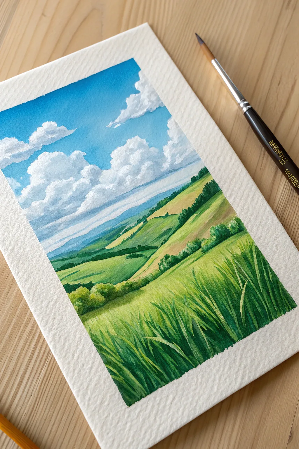
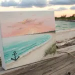
The Classic Taped-Edge Landscape
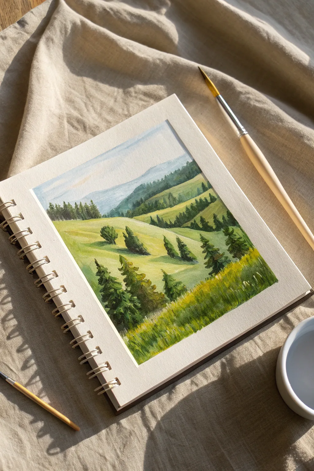
Capture the crisp beauty of a sunlit mountain valley with this gouache landscape study. Using the classic taped-edge technique, you’ll build depth from atmospheric blue mountains down to textured grassy slopes.
Step-by-Step Tutorial
Materials
- Gouache paint (Primary Blue, Lemon Yellow, Burnt Sienna, White, Black)
- Cold press watercolor paper or mixed-media sketchbook
- Painter’s tape or geometric drafting tape
- Flat shader brush (size 6 or 8)
- Round synthetic brush (size 4)
- Fine liner brush (size 0 or 1)
- Mixing palette
- Two jars of water
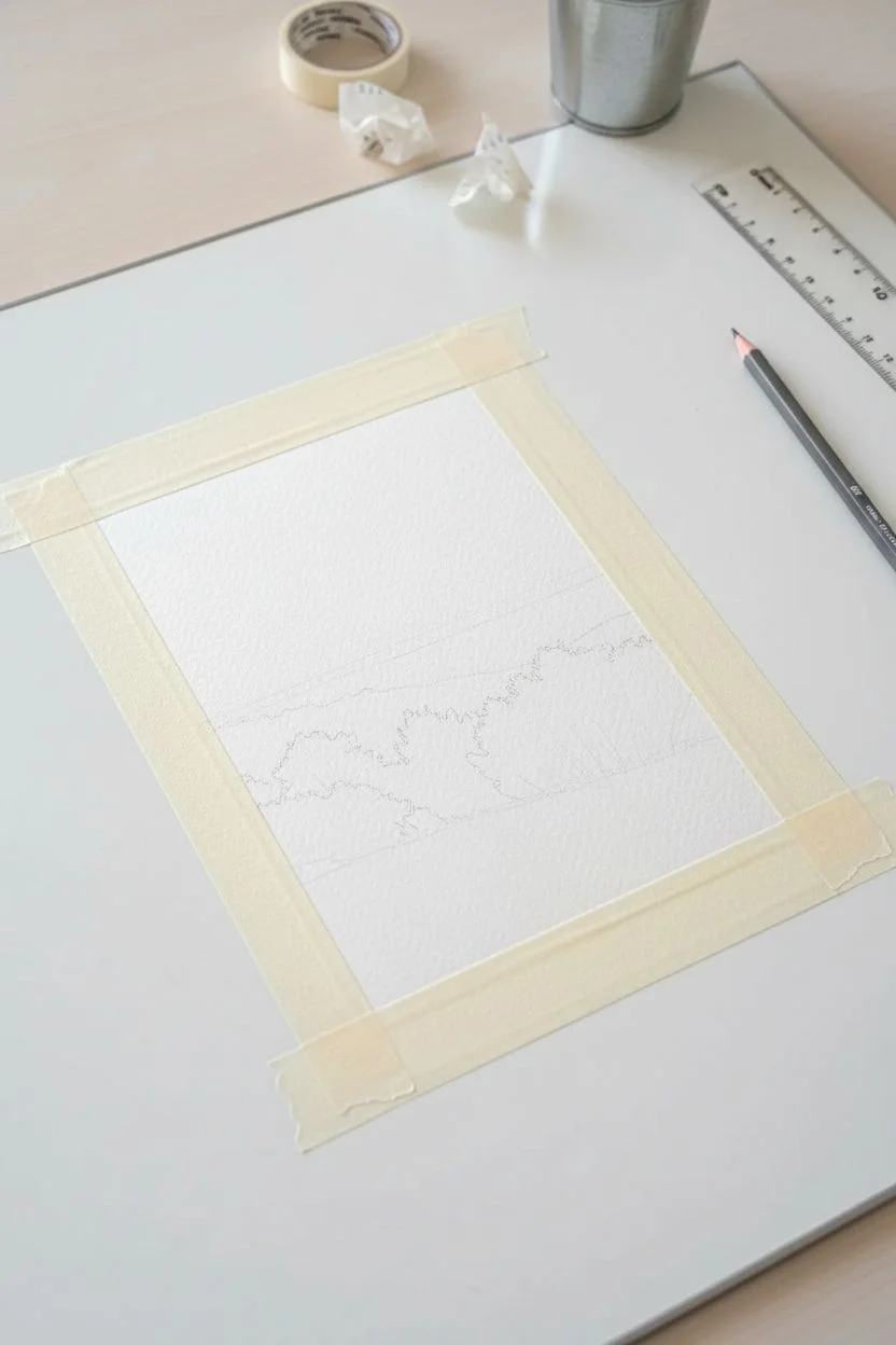
Step 1: Preparation and Background
-
Tape the borders:
Apply masking tape to all four sides of your paper to create a clean rectangular frame. Press the edges down firmly to prevent paint bleeding. -
Sketch the layout:
Lightly sketch the rolling hills using a hard pencil (H or HB). Draw overlapping curves, starting high in the back and sweeping lower towards the foreground. -
Paint the sky:
Mix a very pale wash of White and a tiny drop of Primary Blue. Fill the sky area, fading it out to almost pure white as it approaches the mountain line. -
Block in distant mountains:
Create a blue-grey shade by mixing Blue with a touch of Burnt Sienna and White. Paint the furthest mountain silhouette; this color should be cool and faint to show atmospheric distance. -
Add the faint tree line:
Using a slightly darker, greener mixture (add a little Yellow), dab small, vertical strokes along the ridge of the distant mountains to suggest a dense forest far away.
Step 2: Mid-Ground Hills
-
Mix the sunlit green:
Combine Lemon Yellow, a touch of Blue, and White to create a vibrant, light ‘spring green.’ Paint the tops of the middle hills where the light hits. -
Define the shadows:
Mix a darker, cooler green by adding more Blue and a dot of Burnt Sienna to your green mix. strong shapes of shadow on the right side of the hill slopes to define the topography. -
Blend the transitions:
While the paint is still slightly damp, use a clean, moist brush to soften the edge between the light and dark green areas on the hills, creating a rounder slope. -
Create distant pines:
Switch to your small round brush. Mix a deep forest green and paint tiny triangular shapes along the ridges of the mid-ground hills. Keep them grouped in clusters. -
Establish the valley floor:
Paint the valley section between the hills with a yellowish-green mix, keeping strokes horizontal to suggest the flat land at the bottom.
Crisp Edge Secret
To ensure your white borders are perfect, run a bone folder or your fingernail firmly along the inner edge of the tape before painting to seal it tight.
Step 3: Foreground and Details
-
Paint the foreground hill:
Load your flat brush with a rich, grassy green (less White distinct here). Fill the bottom right section, using upward sweeping strokes to mimic the direction of grass growth. -
Add foreground trees:
Using the fine liner brush and dark green paint (Green + Black or Burnt Sienna), draw vertical lines for the trunks of the large foreground pines. -
Foliage texture:
I like to use a fairly dry brush here to stipple the pine branches, working from the top of the tree down, making the branches wider at the base. -
Highlight the trees:
Mix a lighter olive green and dab it on the left side of the pine trees to show where the sunlight is catching the branches. -
Texture the grass:
Using the liner brush and a mix of Yellow and White, flick tiny upward strokes in the foreground to create individual blades of grass and stalks. -
Dapple the wildflowers:
Add tiny dots of pure yellow or white in the foreground grass to represent wildflowers catch the light. -
The final reveal:
Wait until the painting is completely dry to the touch. Slowly peel the masking tape away at a 45-degree angle to reveal your crisp white edges.
Chalky or Muddy?
If colors look muddy, wash your brush thoroughly. Gouache is opaque, so you don’t need to layer endlessly; one confident stroke is better than three reworkings.
Enjoy the satisfaction of those clean edges framing your lush mountain getaway.


Dreamy Cloud Studies
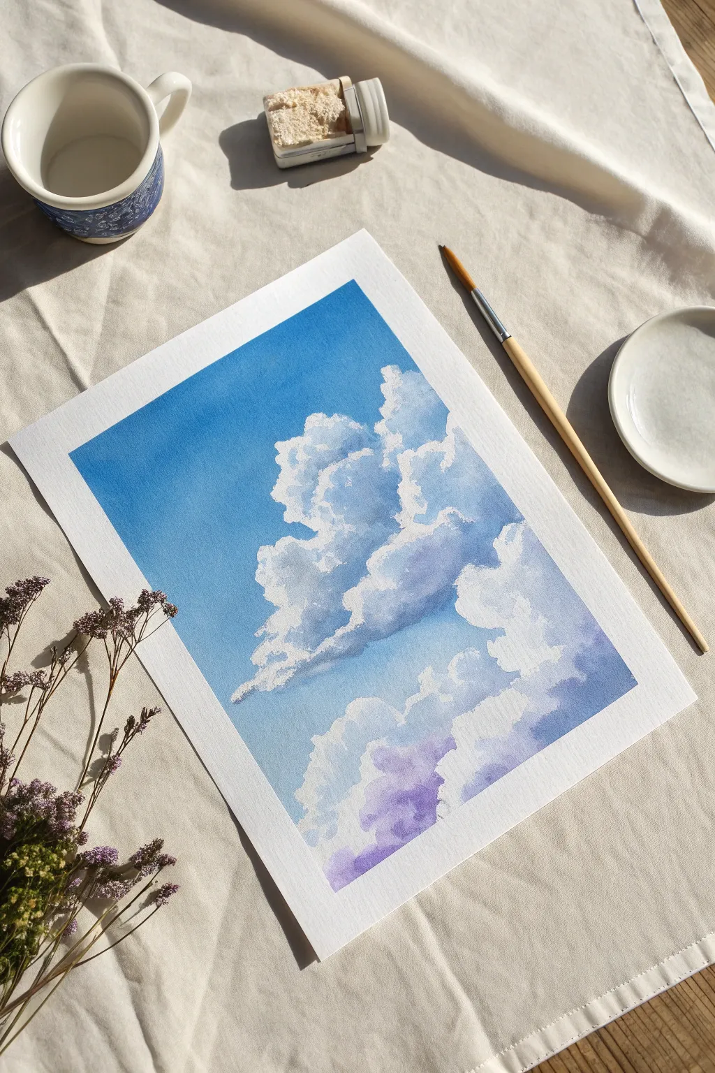
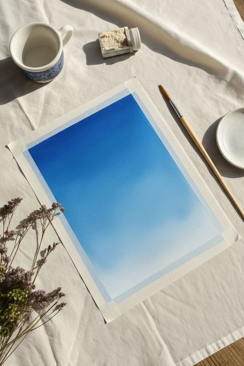
Capture the serene beauty of a summer day with this study of fluffy cumulus clouds against a gradient sky. Gouache is the perfect medium for this project, allowing you to layer crisp, opaque whites over a blended blue background.
Step-by-Step Guide
Materials
- Cold press watercolor paper (300 gsm)
- Gouache paints: Titanium White, Primary Cyan (or Cerulean), Ultramarine, and a touch of Violet
- Round synthetic brushes (sizes 4 and 8)
- Artist’s masking tape or washi tape
- Ceramic palette or mixing tray
- Two jars of water
- Paper towels
Step 1: Setting the Scene
-
Secure the paper:
Tape down all four edges of your watercolor paper to a drawing board or flat surface. Press the tape down firmly to ensure a clean, crisp border upon removal. -
Mix the sky blue:
Prepare a generous amount of sky blue on your palette by mixing Cyan with a little Titanium White. For the darker upper sky, mix in a tiny dot of Ultramarine. -
Paint the upper gradient:
Using the larger size 8 brush, apply the darker blue mix across the top third of the paper with smooth horizontal strokes. -
Lighten the mixture:
Add more white to your blue puddle to create a mid-tone. Paint the middle section of the paper, blending it slightly into the wet edge of the top darker section. -
Finish the horizon:
Clean your brush and mix a very pale blue, almost white. Paint the bottom third of the sky, blending upwards to create a seamless gradient from deep blue to pale horizon. -
Let it dry:
Allow the background layer to dry completely. Gouache dries matte and quickly; if the paper feels cool to the touch, it needs a few more minutes.
Step 2: Forming the Cloud Shadows
-
Sketch placement:
Lightly sketch the general outline of two large cloud masses—one central and one lower—using a very hard pencil (like 2H) so the graphite doesn’t smudge into the paint. -
Mix shadow tones:
Create a shadow color by mixing White, a touch of Ultramarine, and a tiny hint of Violet. It should be a soft, cool grey-blue. -
Block in shadows:
Using the size 4 brush, paint the shadowy undersides and the recessed middle areas of the clouds. Don’t worry about being neat; organic, uneven shapes look more natural. -
Add deep contrast:
While the shadow paint is still damp, drop slightly darker violet-grey pigment into the bottom-most edges of the clouds to give them weight and volume.
Keep Your Whites Pure
Gouache is easily muddied. Use one water jar strictly for rinsing cool colors and the second jar ONLY for your white paint brush to keep highlights brilliant.
Step 3: Building Fluff & Highlights
-
Prepare thick white:
Squeeze fresh Titanium White onto your palette. You want a creamy consistency with very little water added, similar to heavy cream, for maximum opacity. -
Paint the crown:
Start at the very top edge of the main cloud. Dab the thick white paint along the outline to create the crisp, illuminated ‘silver lining’ where the sun hits directly. -
Scumble the body:
Work the white paint downwards into the shadow areas using a ‘scumbling’ technique—rubbing the brush in small circular motions. This blends the white and grey creates a soft, misty transition. -
Create distinct puffs:
Paint smaller, rounded ‘cauliflower’ shapes within the main cloud body to suggest billowing masses, leaving gaps where the shadow color shows through. -
Soften lower edges:
For the bottom clouds, add a little more water to your brush to soften the white paint, making these clouds appear wispy and less defined than the main central cloud. -
Refine the purples:
I like to glaze a heavily watered-down violet over the deepest shadow areas at the bottom right corner to enhance the dreamy atmosphere.
Level Up: Golden Hour
For a sunset vibe, swap the violet shadows for a warm peach or coral tone, and add a very faint yellow glaze to the top ‘sunny’ side of the clouds.
Step 4: Final Touches
-
Highlight check:
Step back and identify the brightest points. Add final dots of pure, thick Titanium White to structure the cloud tops and maximize contrast against the blue sky. -
Remove tape:
Wait for the painting to be 100% dry. Peel the masking tape away slowly at a 45-degree angle to reveal your clean white border.
Enjoy the satisfying crispness of your new cloud study as you embrace the forgiving nature of gouache


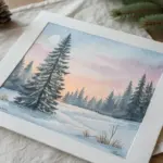
Starry Night Skies
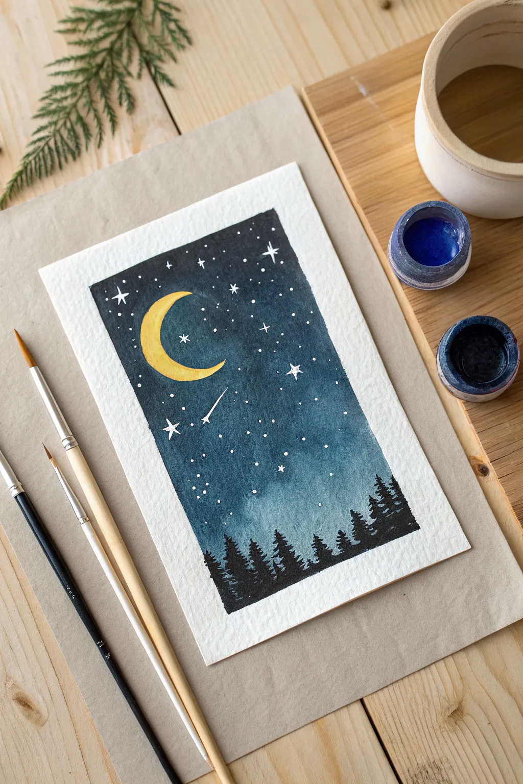
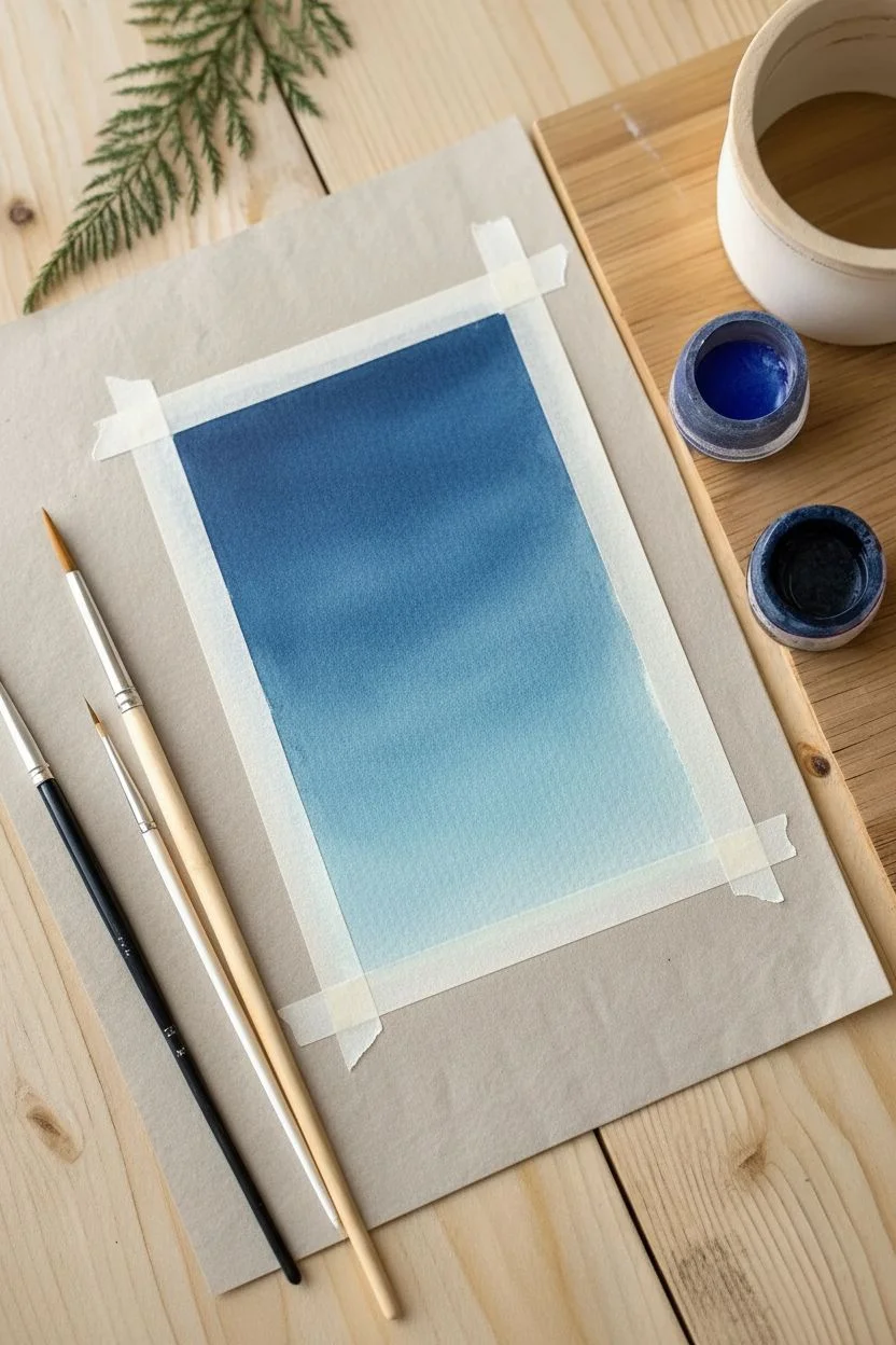
Capture the stillness of a midnight forest with this atmospheric gouache painting. This project focuses on mastering a smooth tonal gradient and practicing precise brush control for the delicate pine silhouettes.
Step-by-Step
Materials
- Cold press watercolor paper (300gsm)
- Gouache paint (Indigo, Prussian Blue, White, Yellow Ochre, Black)
- Painter’s tape or Washi tape
- Flat shader brush (size 6 or 8)
- Round detail brush (size 2)
- Fine liner brush (size 00)
- Mixing palette
- Cup of water and paper towels
Step 1: Setting the Atmosphere
-
Tape the borders:
Secure your paper to a flat board or table using tape on all four sides to create a clean rectangular frame. -
Mix sky colors:
Prepare two pools of paint: pure Indigo for the deep night sky and a mix of Prussian Blue with a little White/Teal for the lower horizon. -
Paint the top sky:
Using a slightly damp flat brush, load the Indigo and paint the top two-thirds of the paper with smooth horizontal strokes. -
Paint the horizon:
Rinse your brush and load the lighter blue mix, applying it to the bottom third of the paper. -
Blend the gradient:
While both sections are still wet, use a clean, slightly damp brush to gently stroke back and forth where the colors meet until the transition is seamless. -
Let it dry:
I like to step away for a moment here; the background must be completely dry and matte before adding details to prevent smudging.
Muddy Background?
If the blue lifts when painting stars, the background wasn’t dry enough. Gouache reactivates with water! Wait longer or use less water on your detailing brush.
Step 2: Moon and Stars
-
Paint the moon shape:
Mix Yellow Ochre with a dot of White to make it opaque. Using your round brush, paint a ‘C’ shape in the upper left area. -
Refine the crescent:
Use the very tip of the brush to taper the top and bottom ends of the moon into sharp, delicate points. -
Add distant stars:
Switch to your fine liner brush with pure White paint. Gently touch the paper to create small, random dots scattered across the sky. -
Create twinkling stars:
Paint a few larger stars by drawing a tiny cross shape—a vertical line crossed by a shorter horizontal one. -
Add the shooting star:
Near the center, paint a small star head and quickly drag a thin, fading line downwards diagonally to create the tail.
Step 3: The Silhouette Forest
-
Mix the black:
Prepare your black paint with a creamy consistency—not too watery, or it won’t be opaque enough to cover the blue background. -
Paint the ground:
Paint a solid, slightly uneven strip of black across the very bottom of the painting to anchor the trees. -
Draw tree trunks:
Paint vertical lines of varying heights rising from the ground; make some taller and some shorter for a natural look. -
Stipple the branches:
Starting at the top tip of a trunk, dab your brush in a zigzag motion, getting wider as you move down to create a triangular pine shape. -
Fill the forest:
Repeat this for all trunks, allowing the branches of neighboring trees to overlap slightly for a dense forest effect. -
Reveal the border:
Wait until the paint is bone dry to the touch, then slowly peel the tape away at a 45-degree angle.
Sharp Trees
For crisp pine needles, keep your paint thick and opaque. If the brush bristles splay too much, roll the damp brush tip on your palette to reform a sharp point.
Start your own gallery of miniature landscapes with this lovely night scene.


Studio Ghibli-Style Grasslands
Capture the nostalgic beauty of Japanese animation backgrounds with this vibrant gouache landscape. By layering opaque colors from back to front, you will create a sense of depth and breezy movement in the grass.
How-To Guide
Materials
- Gouache paint set (Essential colors: Cyan, Ultramarine, Lemon Yellow, Yellow Ochre, Burnt Sienna, Titanium White)
- Cold press watercolor paper (300gsm, 100% cotton recommended)
- Masking tape or Washi tape
- Flat shader brush (3/4 inch)
- Round brush (size 6)
- Fine liner or rigger brush (size 0 or 1)
- Ceramic or plastic mixing palette
- Two jars of water
Step 1: Setting the Scene
-
Secure the Paper:
Tape all four distinct edges of your paper down to a hard board. This creates the crisp white border seen in the example and prevents the paper from buckling under wet paint. -
Minimalist Sketch:
Lightly sketch the horizon line about 2/3rds down the page. Draw loose, bubbling shapes for the clouds and curved, rolling lines for the hills. Keep these pencil marks faint so they don’t show through later. -
Sky Gradient:
Mix a vibrant Cyan with a touch of Cobalt Blue. Using your flat brush, paint the top of the sky, adding more Titanium White to the mix as you move downward to create a smooth fade toward the horizon. -
Distant Haze:
While the sky is drying, mix a very pale, bluish-purple color. Paint a thin strip along the horizon line to represent distant mountains fading into the atmosphere.
Step 2: Sculpting the Clouds
-
Cloud Shadows:
Mix Titanium White with a tiny drop of Ultramarine and a speck of Burnt Sienna to make a cool grey. Paint the bottom and shadowed sides of your cumulus clouds using a round brush. -
Fluffy Highlights:
Clean your brush thoroughly. I like to use pure, thick Titanium White straight from the tube here. Dab it onto the tops of the clouds in rounded, circular motions to create that billowing ‘popcorn’ texture. -
Softening Edges:
Before the white paint dries completely, use a slightly damp, clean brush to gently feather some of the bottom edges of the clouds into the blue sky, keeping the top edges crisp and sharp.
Creamy Consistency
Gouache works best when mixed to the texture of heavy cream. If your white clouds look streaky or transparent, use less water and more paint on your brush.
Step 3: The Middle Ground
-
Distant Hills:
Mix a muted green using Hooker’s Green, White, and a touch of Blue. Paint the hill furthest back, overlapping the bottom of your sky slightly. -
Sunlit Slopes:
For the middle hills, mix Lemon Yellow, Yellow Ochre, and Green. Paint the rolling slopes, ensuring the edges are smooth and flowing. -
Tree Lines:
Using a smaller round brush and dark forest green, dab small, irregular vertical shapes along the ridge of the middle hill to imply a distant line of trees or hedgerows. -
Mid-Ground Foliage:
Add a row of bushy, rounded shrubs in the mid-ground depression using a deep green. Highlight the tops of these bushes with a lighter yellow-green mix to give them dimension.
Level Up: Summer Breeze
To enhance the movement, ensure all your grass strokes curve in the same general direction. You can also paint a few tiny white specks floating in the air to represent pollen or seeds.
Step 4: Foreground Grass Detail
-
Hill Base Coat:
Paint the entire foreground hill with a solid coat of bright yellow-green (Lemon Yellow + Sap Green). Let this dry completely before starting the detailed grass blades. -
Directional Shadowing:
Mix a dark, cool green. Switch to your fine liner or rigger brush. Paint thin, flicking strokes starting from the bottom right and curving toward the top left to establish the direction of the wind. -
Layering Mid-Tones:
Mix a fresh ‘sap green’ tone. Add another layer of grass blades, filling the gaps between your dark strokes. Vary the length of your flicks to make the grass look natural and wild. -
Foreground Bushes:
Paint the small cluster of bushes on the left side of the foreground using a dabbing motion with a round brush. Shadow the bottom right of each bush cluster and highlight the top left. -
Sun-Kissed Highlights:
Mix Lemon Yellow with plenty of White. Paint fine, selective highlights on the tips of the grass blades and the tops of the foreground bushes where the sun would hit. -
Final Contrast:
Step back and assess your values. If the foreground needs more depth, add a few strokes of your darkest green mixed with a touch of blue at the very bottom edge of the paper. -
The Reveal:
Wait until the painting is bone dry. I recommend waiting an extra 15 minutes to be safe. Peeling the tape away slowly at a 45-degree angle reveals those satisfying crisp edges.
Now you have a refreshing window into a peaceful world right on your desk.
BRUSH GUIDE
The Right Brush for Every Stroke
From clean lines to bold texture — master brush choice, stroke control, and essential techniques.
Explore the Full Guide
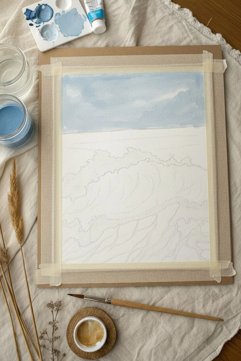
Textural Ocean Waves
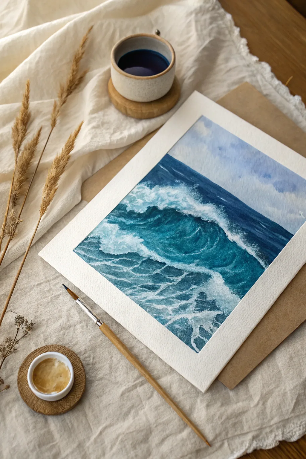
Capture the raw energy of the ocean with this gouache study of a crashing wave. You’ll learn to layer opaque colors to build depth, moving from profound indigos to translucent teals and finally, crisp white foam.
Step-by-Step Guide
Materials
- Gouache paint (Prussian Blue, Turquoise or Teal, Titanium White, Ultramarine)
- Cold press watercolor paper (300 gsm)
- Masking tape
- Flat shader brush (size 6 or 8)
- Round brush (size 4)
- Fine liner or detail brush
- Mixing palette
- Two jars of water
Step 1: Preparation & Sky
-
Secure the paper:
Tape all four edges of your paper to a hard board using masking tape. This creates the crisp white border seen in the final piece and prevents buckling. -
Sketch the composition:
Lightly draw the horizon line across the upper third of the paper. Sketch the curved outline of the rising wave in the center and the chaotic foam patterns in the foreground. -
Mix the sky color:
Create a pale, muted blue by mixing a large amount of Titanium White with a tiny dot of Ultramarine and a touch of grey. -
Paint the sky:
Fill the sky area with your pale mix. Use loose, diagonal strokes to suggest soft clouds, keeping the coverage slightly uneven for texture.
Clean Colors
Muddy colors? Gouache reactivates easily using water. Let the deep blue base layer dry completely before adding white foam. Apply white with single, confident strokes to avoid lifting the dark paint.
Step 2: The Deep Ocean
-
Establish the horizon:
Mix a deep, dark blue using Prussian Blue and a hint of black or burnt umber. Paint a sharp, straight line along the horizon. -
Paint the distant water:
Fill the area between the horizon and the main wave crest with this dark blue mix, adding a little white as you move closer to the wave to show atmospheric perspective. -
Block in the wave face:
Use the pure dark blue mix to paint the shadowed, concave face of the crashing wave. Keep the paint opaque and smooth. -
Add the translucent glow:
Mix Turquoise with a little White. Paint this into the upper curve of the wave (the ‘eye’) where the sunlight shines through the water. -
Blend the transition:
While the paint is still damp, use a clean, moist brush to blend the border between the dark blue base and the turquoise top so they transition seamlessly. -
Fill the foreground:
Paint the bottom section of the water with your dark Prussian blue mix. I prefer to use horizontal strokes here to mimic the flatness of the water surface.
Level Up: Splatter
For realistic texture, dip an old toothbrush in watered-down white paint. Gently flick the bristles with your thumb to spray a fine mist of droplets over the crashing wave crest.
Step 3: Foam & Texture
-
Let it dry:
Allow the blue layers to dry completely. If the paint is wet, your white highlights will turn light blue instead of staying crisp. -
Mix the foam consistency:
prepare pure Titanium White. It should be creamy—thick enough to be opaque, but fluid enough to flow off the brush. -
Paint the crashing crest:
Using the round brush, dab thick white paint along the very top edge of the wave to create the breaking lip. -
Create sea spray:
Using a ‘dry brush’ technique (wipe most paint off your brush), drag the white lightly down the face of the wave to simulate mist and falling water. -
Detail the sea foam:
Switch to your fine liner brush. Paint the intricate, web-like patterns of foam on the foreground water surface using wiggly, horizontal lines. -
Soften the foam:
Where the water is churning violently on the right, scumble the white paint in a circular motion to create a fluffy, cloud-like texture. -
Add shadows to foam:
Mix a very pale blue-grey. Carefully paint under the thickest clumps of white foam to give them volume and make them pop. -
Final highlights:
Add touches of pure, thick white to the brightest points of the splash and the nearest foam webs. -
Reveal the border:
Wait until the painting is bone dry, then slowly peel away the masking tape at a 45-degree angle to reveal clear edges.
Frame your seascape in a simple mount to let those intense blue hues really shine.
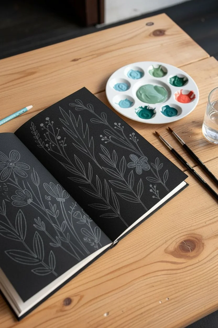
Opaque Pop on Black Paper
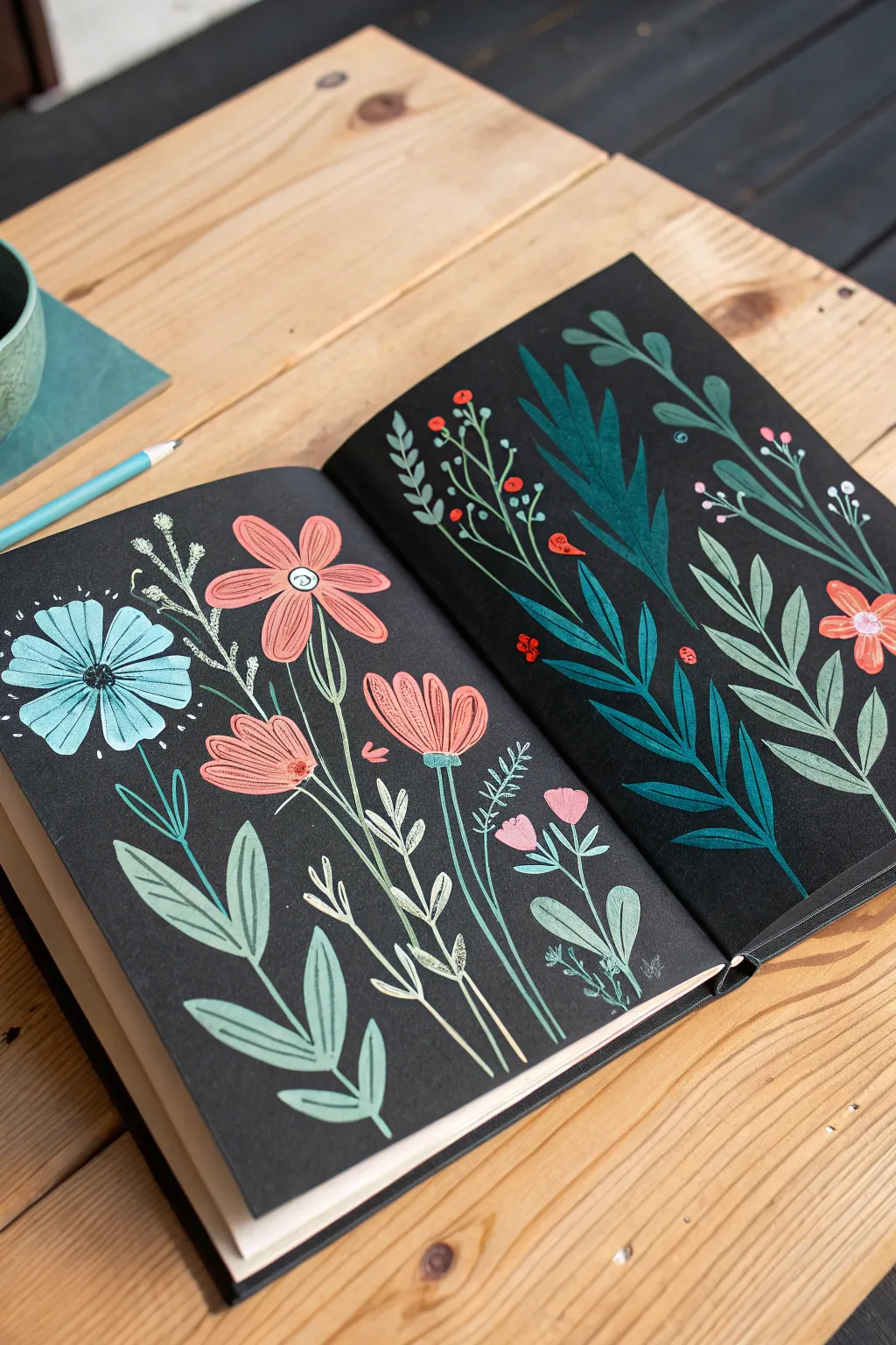
Transform a plain black page into a vibrant botanical study using the striking opacity of gouache. The dark background acts as negative space, making your pastel and coral floral hues appear to glow from within the paper.
How-To Guide
Materials
- Black paper sketchbook (heavyweight/mixed media)
- Gouache paints (Cyan, Magenta, Yellow, White)
- Round synthetic brush (size 4 or 6)
- Detail/liner brush (size 0 or 1)
- White charcoal pencil or chalk
- Mixing palette and water cup
Step 1: Palette & Sketch
-
Trace the composition:
Lightly sketch the placement of your main flowers and stems using a white charcoal pencil. Keep lines faint; graphite won’t show up well on black paper. -
Mix the pastel blue:
On your palette, mix a small amount of cyan with a large amount of white to create the opaque baby blue for the large left-side flower. -
Mix the foliage greens:
Create two shades of green: a deep, cool teal (blue + green) for the right page fern, and a softer sage green (green + white + touch of red) for the left page leaves. -
Mix the floral coral:
Blend magenta and yellow with white to create a bright salmon or coral pink for the secondary flowers.
Pro Tip
Consistency is key. If your paint is too watery, the black paper will show through. Aim for a mayonnaise-like texture so one coat covers fully.
Step 2: The Left Page
-
Paint the blue bloom:
Using the round brush, paint elongated teardrop shapes radiating from a center point to form the blue flower petals. Ensure the paint is thick like heavy cream for full coverage. -
Add pink blossoms:
Paint the three smaller pink flowers near the center fold. Use simple strokes to create five-petal shapes for the top two, and a tulip shape for the lower one. -
Detail the centers:
Once the blue flower is dry, use your detail brush to paint a dark center loop and fine radiating lines on the petals. Add white centers to the pink flowers. -
Anchor with leaves:
Load your brush with the sage green mixture and paint the large, pointed leaves at the bottom left, swooping upward. -
Connect with stems:
Switch to your liner brush. Mix a very pale, almost white green and paint the delicate, thin stems connecting the leaves and buds. -
Add pollen accents:
Dot tiny white or pale yellow specks around the blue flower to mimic floating pollen or seeds.
Level Up
Add a metallic touch! Use gold gouache or metallic watercolor for the centers of the flowers to make the illustration shimmer against the matte black.
Step 3: The Right Page
-
Paint the teal fern:
Using the dark teal mix, paint a long, curved central stem diagonally across the page. Add bold, leaf-like strokes coming off both sides of the stem. -
Layer lighter foliage:
With the sage green mix, paint a second plant focusing on long, oval-shaped leaves that overlap the background slightly. -
Weave the vines:
I like to use a very diluted pale green here to paint thin, wandering vines that fill the empty spaces between the larger leaves. -
Paint berries:
Using a pure red or bright orange, dab small circles onto the ends of the thin vines to create clusters of berries. -
Add the red bloom:
Paint a small, five-petal red flower on the far right edge to balance the color composition. -
Highlight and define:
Once all paint is bone dry, use your finest brush with pure white (or a white gel pen) to add veins to the teal leaves and small highlights to the berries.
Close your sketchbook only after everything is fully dry, and enjoy your beautiful opaque garden

PENCIL GUIDE
Understanding Pencil Grades from H to B
From first sketch to finished drawing — learn pencil grades, line control, and shading techniques.
Explore the Full Guide
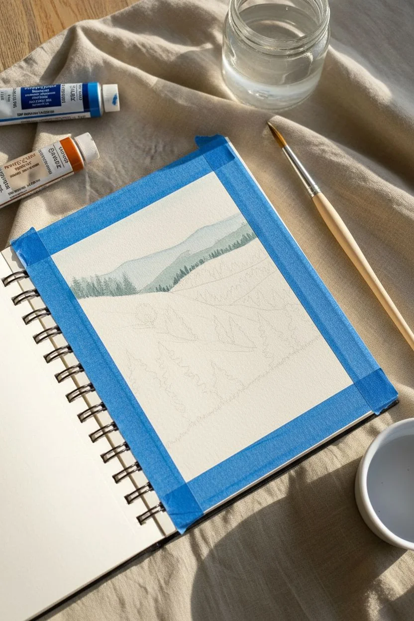
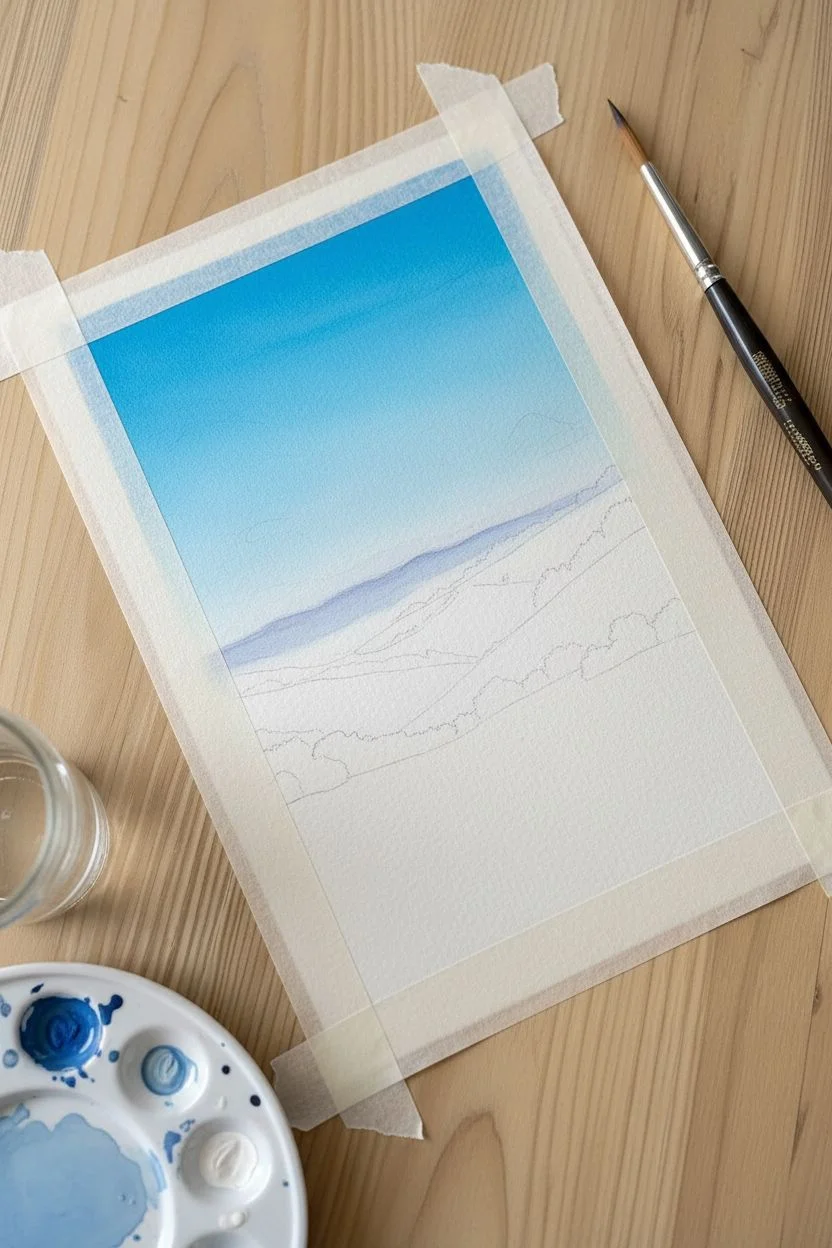
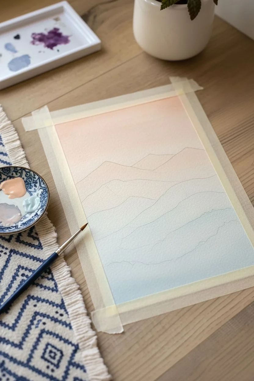
Atmospheric Mountain Ranges
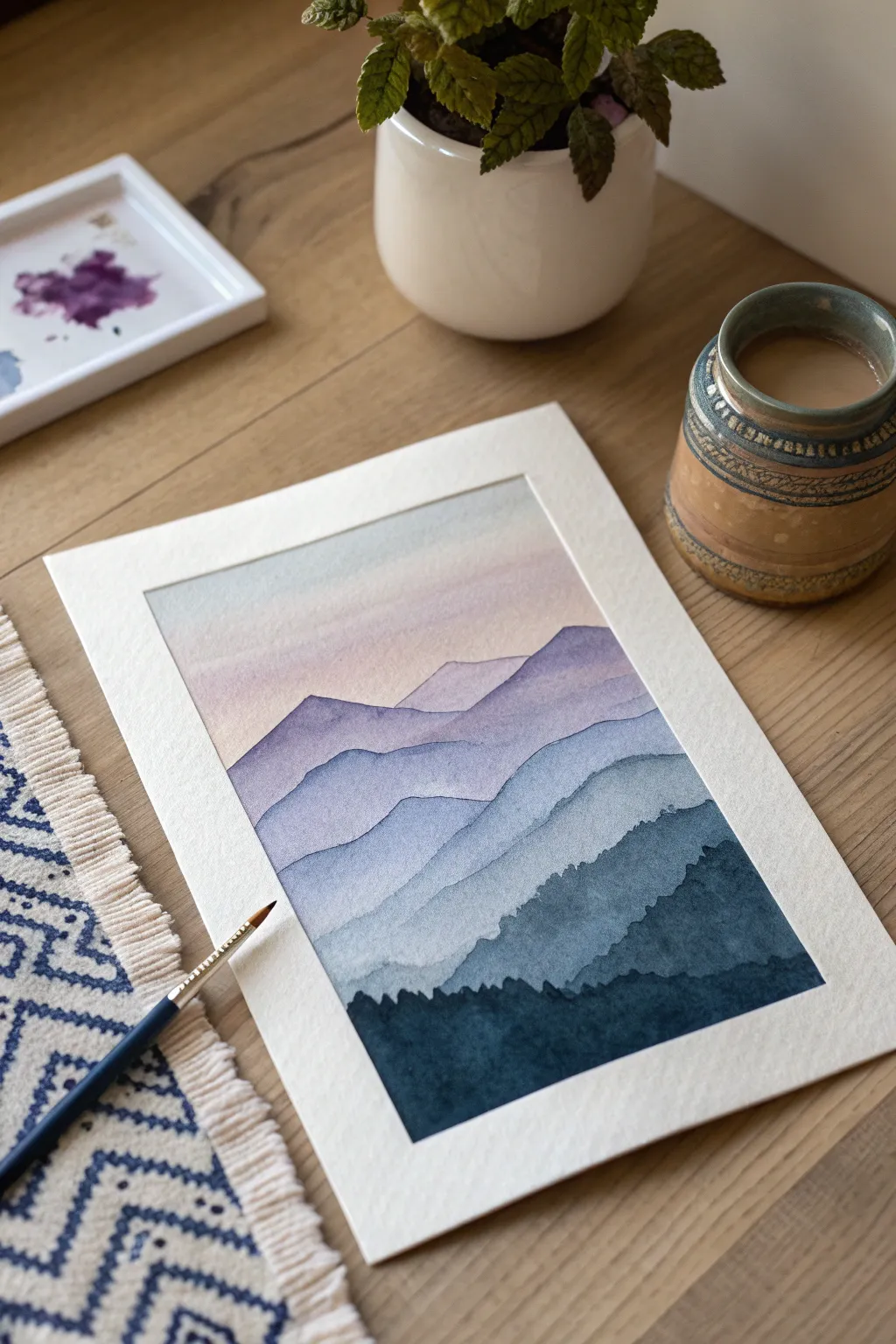
Capture the tranquil beauty of fading undulating hills with this atmospheric gouache landscape. By layering opaque colors from light to dark, you will create a stunning sense of depth and distance that draws the viewer in.
Detailed Instructions
Materials
- Gouache paint (Titanium White, Ultramarine Blue, Indigo, Alizarin Crimson, Yellow Ochre)
- Cold press watercolor paper (300 gsm)
- Round synthetic brushes (Size 4 and 8)
- Painter’s tape or washi tape
- Ceramic mixing palette
- Two jars of water
- Paper towels
Step 1: Preparation and Sky
-
Secure the borders:
Tape down all four edges of your paper to a hard board or table. Press the tape down firmly to ensure a clean, crisp border later. -
Outline the ranges:
Using a hard pencil (like an H or HB), very lightly sketch 5 or 6 undulating lines across the page to map out where your mountain ranges will sit. Don’t press too hard. -
Mix the sky base:
On your palette, mix a generous amount of Titanium White with a tiny dot of Alizarin Crimson and a speck of Yellow Ochre to create a pale, warm peach. -
Paint the upper sky:
Using the size 8 brush, apply a smooth wash of the peach mixture across the top third of the paper. -
Blend the gradient:
While the peach is still wet, introduce a very watered-down pale blue to the lower sky area, blending it upwards into the peach for a soft transition. -
Let it dry:
Allow the sky layer to dry completely. Gouache can reactivate if painted over while damp, so patience is key here.
Bleeding Edges?
If a darker layer bleeds into the lighter one behind it, the bottom layer wasn’t fully dry. Gouache reactivates easily with water, so ensure each mountain is bone-dry before overlapping.
Step 2: Layering the Ranges
-
Mix the first ridge color:
Create the color for the furthest mountain. Mix a large amount of White with a small touch of Ultramarine Blue and a hint of purple. It should look very pastel. -
Paint the furthest shape:
Paint the most distant mountain ridge. Follow your pencil line, ensuring the top edge is clean. Bring the paint down just enough to be covered by the next layer. -
Dry properly:
Wait for this layer to be dry to the touch. I like to use a hairdryer on a low, cool setting to speed this up between every single layer. -
Darken the mixture:
Add a bit more Ultramarine Blue and a touch of Indigo to your existing pastel mix. The goal is to go just a shade or two darker than the previous ridge. -
Paint the second ridge:
Paint the next mountain range, overlapping the bottom of the previous layer. Vary the shape of the peaks so they don’t look identical to the one behind it. -
Create the middle ground:
Add more Indigo to your mix. This layer marks the transition from atmospheric background to the more defined middle ground. -
Paint the middle layer:
Apply the paint for the third ridge. Because gouache is opaque, it will easily cover the bottom edge of the lighter layer behind it. -
Add texture:
While painting this middle layer, gently wiggle your brush along the top edge to create rigorous imperfections, mimicking rocky terrain.
Step 3: Foreground and Details
-
Deepen the blue:
For the second-to-last layer, mix a strong steel blue using mostly Indigo and Blue with very little White. -
Paint the lower hills:
Paint this layer with bold strokes. The contrast between this dark layer and the pastel sky is what creates the illusion of distance. -
Mix the darkest shadow:
For the absolute foreground, mix pure Indigo with a tiny touch of black or dark green to create a near-silhouette tone. -
Paint the foreground trees:
Switch to your size 4 brush. Using the tip, paint the final bottom shoreline, using small vertical dabs along the top edge to suggest the texture of a pine forest. -
Fill the bottom:
Fill in the rest of the bottom shape with solid dark color, ensuring it goes all the way to the tape. -
The reveal:
Once the painting is 100% dry, carefully peel the tape away at a 45-degree angle to reveal your crisp white borders.
Add Magic
Once the sky is dry, load a stiff brush or toothbrush with watered-down white gouache. Flick the bristles to spray a fine mist of stars over the upper sky for a twilight effect.
Frame this piece behind glass to protect the matte finish of the gouache and enjoy your serene view
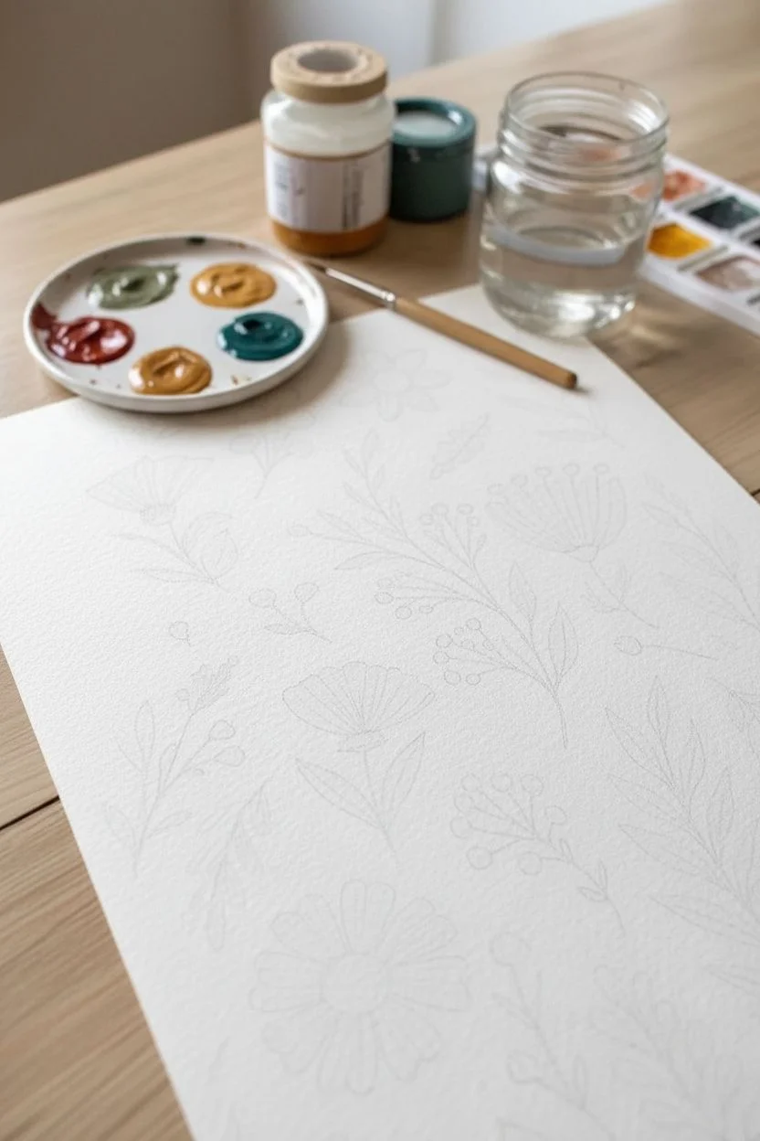
Simple Flat-Lay Florals
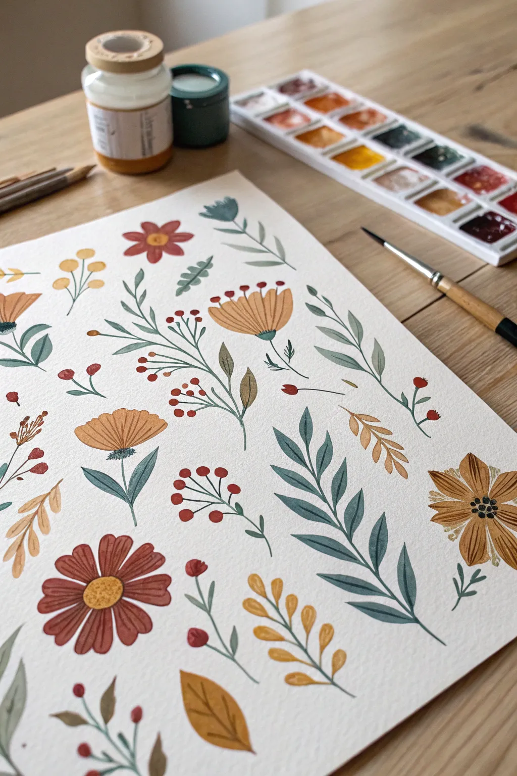
This project captures the charm of a botanical field guide with a cozy, folk-art twist. You will create a scattered pattern of wildflowers using an earthy palette that feels warm and inviting.
Step-by-Step
Materials
- Cold press watercolor paper (A4 or A5)
- Gouache paints (tube or pan set)
- Round brushes (sizes 2 and 6)
- Ceramic or plastic mixing palette
- Jar of water
- Paper towels
Step 1: Setting the Scene
-
Prepare your palette:
Mix your primary colors on the palette. You will need a rust red, a mustard yellow (ochre), a deep teal green, and a soft olive or sage green. Having these ready ensures a cohesive color story. -
Plan the layout:
Visualize a random scatter pattern on your paper. You can lightly sketch circle placeholders with a pencil for the main flowers to ensure they are evenly spaced.
Creamy Consistency
Mix your gouache to the consistency of heavy cream. If it is too thick, it may crack when drying; if it is too watery, you will lose that signature matte opacity.
Step 2: Painting the Blooms
-
Create red daisies:
Load a size 6 brush with rust red. Paint 8-10 petals radiating from a central point to form the daisy shapes, leaving the very center of the flower empty for now. -
Paint fan flowers:
Switch to mustard yellow. Paint semi-circle shapes to create the fan-like flowers. Keep the top edge slightly scalloped or uneven to make them look organic. -
Add the star flower:
Using a brownish-orange or raw sienna hue, paint the sharp, pointed petals of the star-shaped flower on the right side of the composition. -
Let it set:
Allow these base floral shapes to dry completely. Gouache dries quickly, but waiting prevents the colors from bleeding into the next layer.
Step 3: Adding Greenery
-
Paint the fern:
Mix a deep teal green for the statement fern leaf. Paint a long, curved central stem first, then add pairs of tapered leaves extending outward. -
Connect the blooms:
Switch to your sage or olive green. Paint thin, curved stems connecting to the bottom of your previously painted flower heads. -
Add leaves to stems:
Add leaves to the flower stems by pressing the belly of the brush down and lifting as you pull away to create a tapered tip. -
Fill with branches:
I like to fill larger gaps with standalone leafy branches in olive green, curving them gently to follow the flow of the artwork. -
Paint floating leaves:
For variety, paint a few single floating leaves in autumn colors like ochre or burnt orange to balance the green elements.
Texture Pop
Once the paint is bone dry, try using colored pencils to sketch veins on the leaves or outline specific petals. This adds a delightful mixed-media finish.
Step 4: Details & Fillers
-
Paint berry stems:
Using a smaller size 2 brush and dark green, paint very thin, delicate branching lines in the remaining white spaces. -
Add the berries:
Dip the small brush into bright red or crimson. Dot small circles at the ends of these delicate branches to create clusters of berries. -
Add golden sprigs:
Rinse your brush and use the mustard yellow to paint small, rounded sprigs or buds to act as golden filler between the larger elements.
Step 5: Final Flourishes
-
Complete the centers:
Return to the rust daisies using mustard yellow. Paint a solid circle in the center, dabbing the brush slightly to simulate a pollen texture. -
Add flower bases:
Paint a tiny green semi-circle at the base of the yellow fan flowers to form the sepal (the green cup holding the petals). -
Fan flower details:
Paint tiny red dots floating just above the yellow fan petals to represent stamens. If you have a steady hand, connect them with hairline strokes. -
Star flower center:
Finish by adding a cluster of black or dark brown dots to the center of the pointed star flower for high contrast.
Step back and admire your beautiful meadow of folk-art florals.


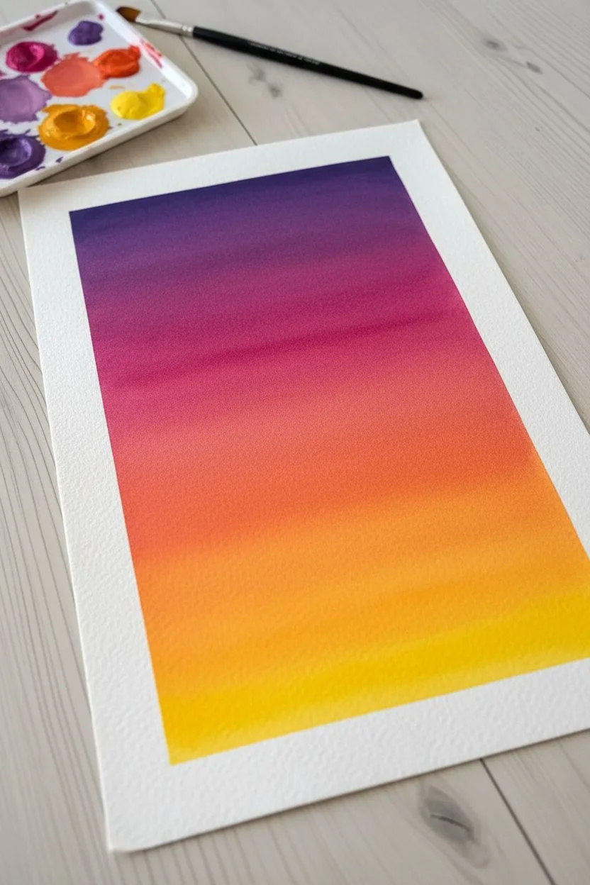
Creamy Sunset Gradients
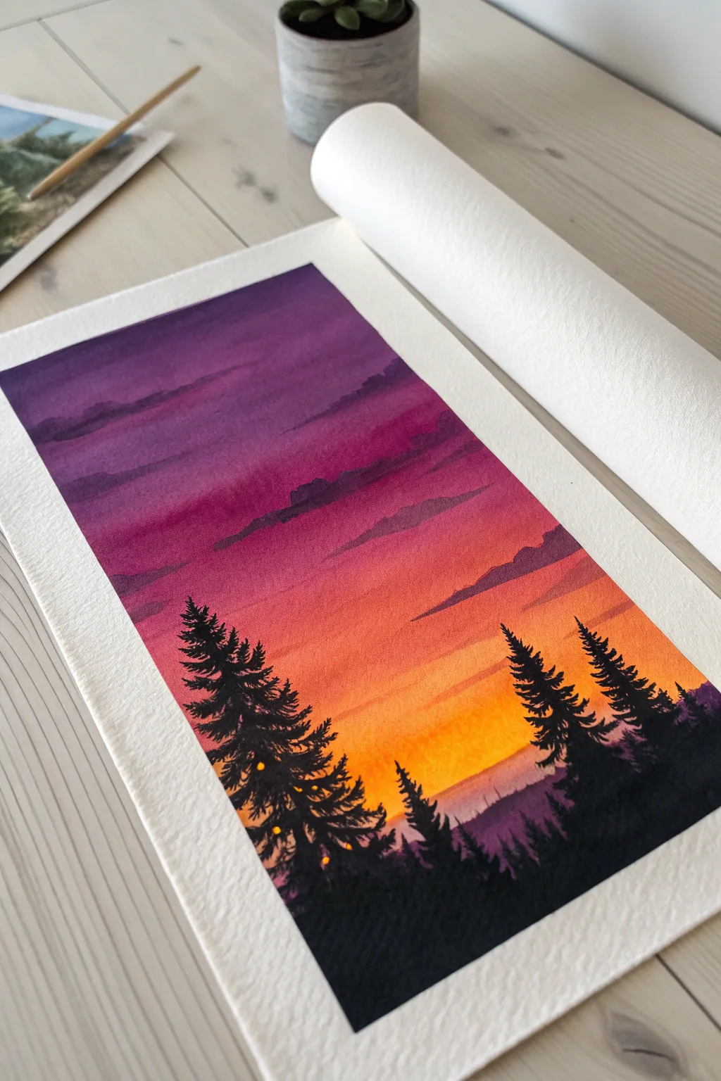
Capture the breathtaking transition of a sunset sky with this vibrant gouache project. You will layer rich violets into warm yellows, creating a dramatic backdrop for crisp, silhouetted pine trees.
Step-by-Step Tutorial
Materials
- Gouache paint set (Violet, Magenta, Orange, Lemon Yellow, Lamp Black, Titanium White)
- Cold press watercolor paper (300 gsm)
- Washi tape or masking tape
- Flat wash brush (3/4 inch)
- Round brush (size 4 or 6)
- Fine detail brush (size 0 or 1)
- Mixing palette
- Two water jars
Step 1: Setting the Sky
-
Secure the paper:
Tape down all four edges of your paper to a flat board. This ensures clean white borders and prevents the paper from buckling when wet. -
Prepare the palette:
Squeeze out your sky colors: deep violet, magenta, cadmium orange, and lemon yellow. Add a drop of water to each to reach a creamy consistency. -
Paint the upper sky:
Using the flat wash brush, applying the deep violet across the top quarter of the paper using horizontal strokes. -
Transition to pink:
Rinse your brush slightly and pick up the magenta. Paint the next section down, slightly overlapping the violet while the paint is still wet to encourage blending. -
Add the warmth:
Continue downwards with the orange paint. Work quickly so the previous layer doesn’t dry completely, allowing the pink and orange to merge softly. -
Finish the horizon:
Fill the remaining sky area with lemon yellow, blending it into the orange. The sky should now be a seamless gradient from purple to yellow. -
Smooth the gradient:
With a clean, slightly damp flat brush, run horizontal strokes across the transition lines to smooth out any harsh stripes. -
Dry completely:
Let this base layer dry fully. Gouache reactivates with water, so the sky must be bone-dry before adding clouds.
Blend Like a Pro
For the smoothest gradient, work while the paint is wet ‘on wet.’ If the paint makes drag marks, your brush is too dry; dip the tip in water to restore flow.
Step 2: Clouds and Atmosphere
-
Mix shadow color:
Create a muted purple color by mixing violet with a tiny touch of black and magenta. It should be slightly darker than your top sky layer. -
Paint cloud streaks:
Using a round brush, paint thin, elongated cloud shapes in the purple and pink sections of the sky. Keep the strokes loose and horizontal. -
Create distant mountains:
Mix a hazy lavender using violet, a good amount of white, and a speck of orange to dull it. Paint a low, uneven ridge line right where the yellow meets the bottom edge. -
Fade the distance:
Add a little water to fade the bottom of this mountain layer, making it look like it’s disappearing into mist.
Muddy Colors?
If the sky turns muddy where colors meet, stop overworking it. Let it dry completely, then apply a fresh, confident layer of color on top to fix the blend.
Step 3: The Silhouetted Forest
-
Prepare black gouache:
Mix Lamp Black with a minimal amount of water. You want an opaque, ink-like consistency that flows smoothly but covers completely. -
Tree trunk placement:
Using the fine detail brush, paint thin vertical lines for the tree trunks. Vary the heights, placing taller trees on the sides to frame the composition. -
Start the branches:
Switch to the round brush or keep using the detail brush. Starting from the top of a trunk, dab small horizontal lines, getting wider as you move down. -
Build pine texture:
I like to use a zig-zag motion here, lightly tapping the paper to create the texture of pine needles rather than painting individual leaves. -
Fill the foreground:
Once the individual trees are shaped, paint the entire bottom area solid black to ground the forest floor. -
Add magical lights:
Mix a tiny amount of titanium white with lemon yellow. Use the very tip of your smallest brush to dab tiny glowing dots deep within the dark tree branches. -
Final reveal:
Wait until the black paint is completely dry to the touch, then slowly peel off the masking tape at a 45-degree angle.
Step back and admire the glowing warmth of your sunset forest!
Juicy Garden Strawberries
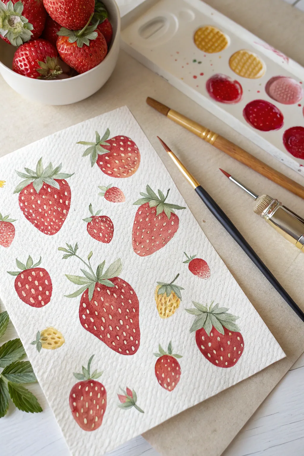
Capture the sweetness of summer with this vibrant pattern of strawberries painted in gouache. This project focuses on simple botanical shapes and layering opaque details to create a fresh, illustrative styles piece perfect for greeting cards or wall art.
Step-by-Step Guide
Materials
- Gouache paint set (Cadmium Red, Alizarin Crimson, Sap Green, Yellow Ochre, White)
- Cold press watercolor paper (300gsm/140lb)
- Round synthetic brushes (Size 6 for washes, Size 0 or 1 for details)
- HB pencil and eraser
- Mixing palette
- Two jars of water
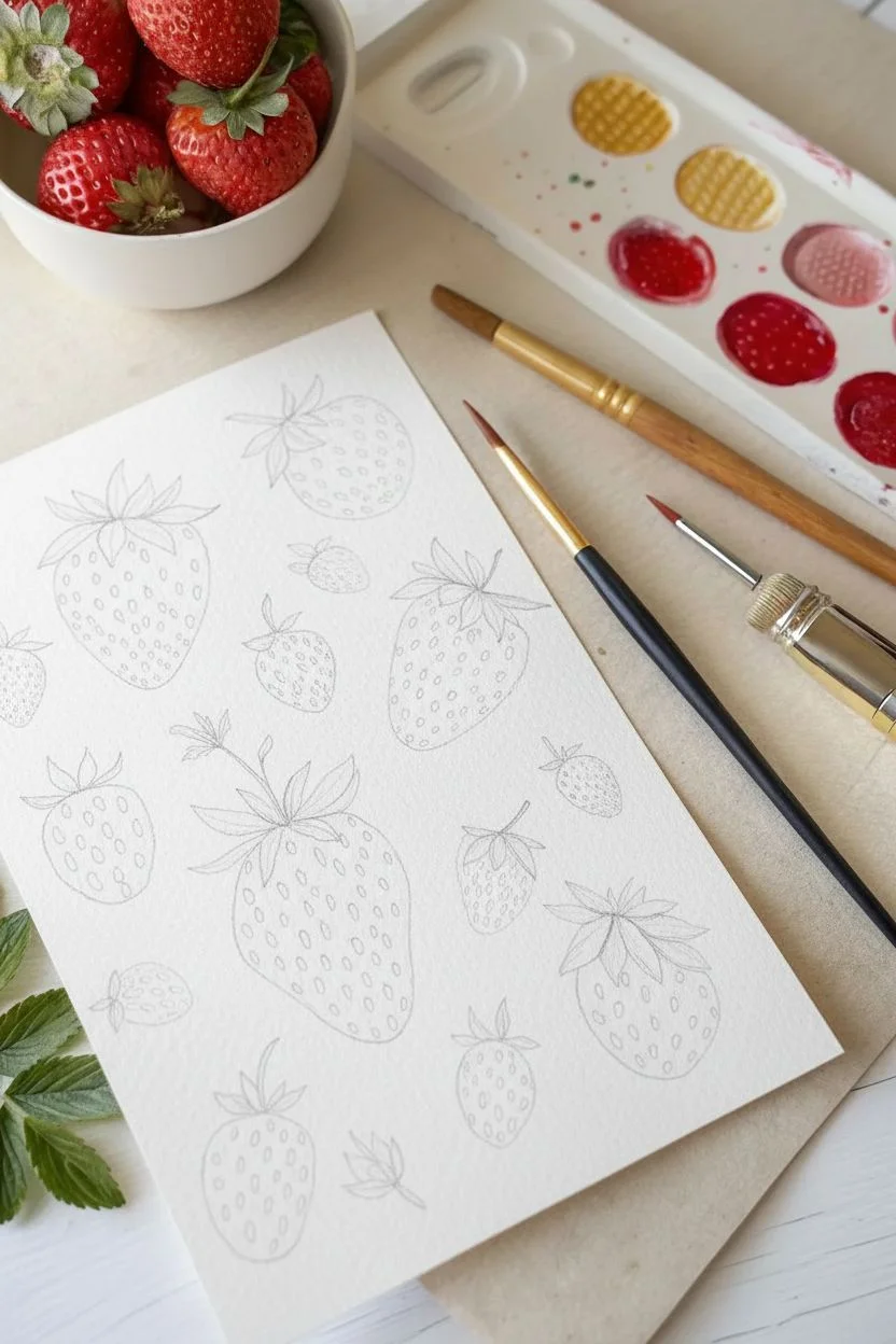
Step 1: Sketching the Layout
-
Observe the composition:
Before drawing, note how the berries are arranged in a scattered pattern. They face different directions, creating a dynamic flow across the page. -
Outline the shapes:
Using an HB pencil, lightly sketch varied strawberry shapes. Draw heart-like wedges with rounded bottoms. -
Add size variety:
Include a mix of large ripe berries, medium-sized ones, and tiny unripe berries to make the composition feel natural. -
Sketch the leaves:
Top each berry with a cluster of sepals (the leafy cap). Draw 5-6 small, jagged leaves radiating from the center top of each fruit.
Troubleshooting: Muddy Colors?
If the red bleeds into the white seeds, your red base wasn’t dry enough. Gouache reactivates with water, so apply the seeds with a single, quick dab.
Step 2: Painting the Fruit
-
Mix your main red:
Combine Cadmium Red with a touch of water. You want a creamy consistency—thick enough to be vibrant, but thin enough to flow smoothly. -
Paint the first layer:
Fill in the bodies of the largest strawberries. I like to leave tiny gaps near the top edge for a natural highlight, but painting it solid works too. -
Create color variations:
For some berries, mix in Alizarin Crimson to create a deeper, cooler red. For others, add a bit of water for a lighter, pinker wash. -
Paint unripe berries:
Mix Yellow Ochre with a tiny bit of Green. Paint the smallest berries with this pale, unripe color. -
Add gradients:
While the red paint is still slightly damp, drop a slightly darker red mixture into the bottom curve of the berries to suggest roundness.
Step 3: Painting the Greenery
-
Mix leaf colors:
Prepare a Sap Green mixture. For variety, create a second puddle on your palette with a little yellow added for a fresher green. -
Fill the caps:
Using a smaller brush, carefully paint the leafy caps. Let the green touch the red fruit slightly to connect the shapes. -
Add stems:
Extend thin stems from some of the berries. They don’t all need stems, but adding a few creates movement. -
Layering leaf details:
Once the green base is dry, mix a darker green (green + tiny touch of red/brown) and paint a thin vein down the center of each little leaf.
Pro Tip: Texture Magic
Use cold press paper. The rough texture allows the gouache to settle into the tiny valleys, giving the strawberries a natural, pitted skin appearance without extra work.
Step 4: Seeds and Highlights
-
Prepare the seed color:
Mix White gouache with a dot of Yellow Ochre to get a creamy, pale yellow. This paint needs to be opaque but flowy. -
Paint the seeds:
Using your smallest brush (size 0), dab tiny teardrop shapes or dots onto the red bodies of the strawberries. -
Follow the form:
Curve your rows of seeds slightly to match the contour of the berry, which enhances the 3D effect. -
Add highlights:
If your leaves look too flat, add tiny strokes of lighter green to the tips. You can also add a tiny white dot to the shiniest part of the red fruit if desired. -
Final assessment:
Erase any visible pencil lines around the edges once the paint is bone dry to crisp up the final look.
Step back and admire your fresh, summer-ready garden artwork.
Cozy Interior Corners
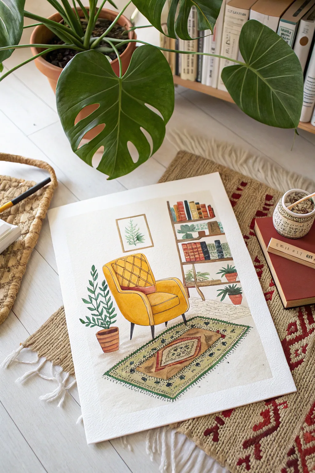
Capture the cozy essence of a quiet afternoon with this vibrant gouache illustration. You will build up layers of opaque color to create a warm scene featuring a mustard armchair, lush plants, and a detailed bookshelf.
Step-by-Step Tutorial
Materials
- Gouache paint set (tubes or pans)
- Cold press watercolor paper (300gsm)
- Round synthetic brushes (sizes 6, 2, and 00 for details)
- HB Pencil and kneaded eraser
- Ceramic or plastic mixing palette
- Masking tape
- Jar of water and paper towels
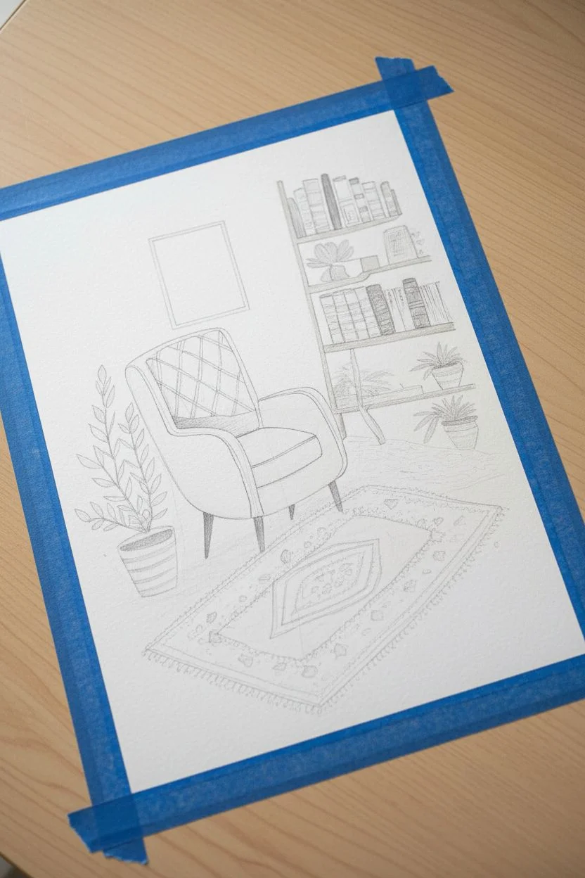
Step 1: Sketching the Layout
-
Prepare your surface:
Tape down all four edges of your watercolor paper to a board or table to create a crisp border and prevent buckling when the paper gets wet. -
Outline the main furniture:
Using an HB pencil, lightly sketch the large shapes first. Start with the armchair slightly off-center to the left, then draw the vertical lines for the bookshelf on the right. -
Add décor elements:
Sketch the rug angled beneath the chair to create perspective. Draw the pot and leaves for the floor plant, the books on the shelves, and the small frame on the wall. -
Refine the details:
Lightly draw the cross-hatch pattern on the chair cushion and the geometric shapes inside the rug so you know exactly where to paint later.
Opacity Advantage
Gouache dries opaque and matte. If you accidentally paint outside the lines, just wait for it to dry completely, then paint the correct color right over the mistake.
Step 2: Blocking in Color
-
Paint the armchair base:
Mix Yellow Ochre with a tiny touch of Titanium White to make it creamy. Fill in the chair shape, leaving the legs and the patterned cushion area blank for now. -
Fill the bookshelf:
Use Burnt Sienna or a warm brown to paint the structure of the shelf. Ensure your paint has the consistency of heavy cream for opaque coverage. -
Color the books:
Paint the book spines in varied colors like deep red, navy blue, and forest green. I like to scatter the colors randomly to make the shelf look collected over time. -
Paint the greenery:
Mix a Sap Green or Hooker’s Green. Paint the leaves of the floor plant and the shelf details. Vary the green slightly with yellow or blue for different leaves. -
Lay the rug foundation:
Mix a sandy beige color and paint the main background of the rug, carefully painting around the patterned areas you sketched.
Make It Personal
Customize the bookshelf by painting the spines to match your favorite real-life book covers, or add a tiny pet sleeping on the rug for extra coziness.
Step 3: Adding Depth and Shadow
-
Shadow the chair:
Mix a slightly darker, more orange version of your yellow tone. Paint beneath the cushion and along the side of the armrest to give the chair volume. -
Define the legs:
Use a dark brown or charcoal gray (avoid pure black for a softer look) to paint the tapered legs of the chair and the shelf. -
Detail the plant pot:
Paint the floor planter with a terracotta orange. Add a darker brown stripe on the clear side to indicate roundness and shadow. -
Shelf shadows:
Add thin dark brown lines under the books and in the corners of the shelves to separate the objects from the wood.
Step 4: The Fine Details
-
Chair patterns:
Using your smallest brush (size 0 or 00) and a reddish-brown mix, carefully paint the grid lines on the back cushion of the chair. -
Rug borders:
Paint the border of the rug with an olive green. Use little dashed strokes to mimic the woven texture of the fabric. -
Rug medallion:
Fill in the center diamond of the rug with reddish-brown and cream accents. Don’t worry about perfection; a little wobble adds to the textile look. -
Book details:
Use a fine liner brush to add text-like squiggles or straight lines in gold or white on the book spines. -
Wall art:
Paint a simple wooden frame rectangle on the wall, and add a delicate green sprig inside using the tip of your brush. -
Floor texture:
Mix a very watery, pale gray. Add subtle scribbles or speckles on the white floor area to ground the furniture so it doesn’t look like it’s floating. -
Final highlights:
Using pure white gouache, add small highlight lines to the tips of the leaves and the curve of the chair to make the scene pop.
Peel off your tape to reveal crisp edges and admire your peaceful interior scene.
Quaint Cottage Facades
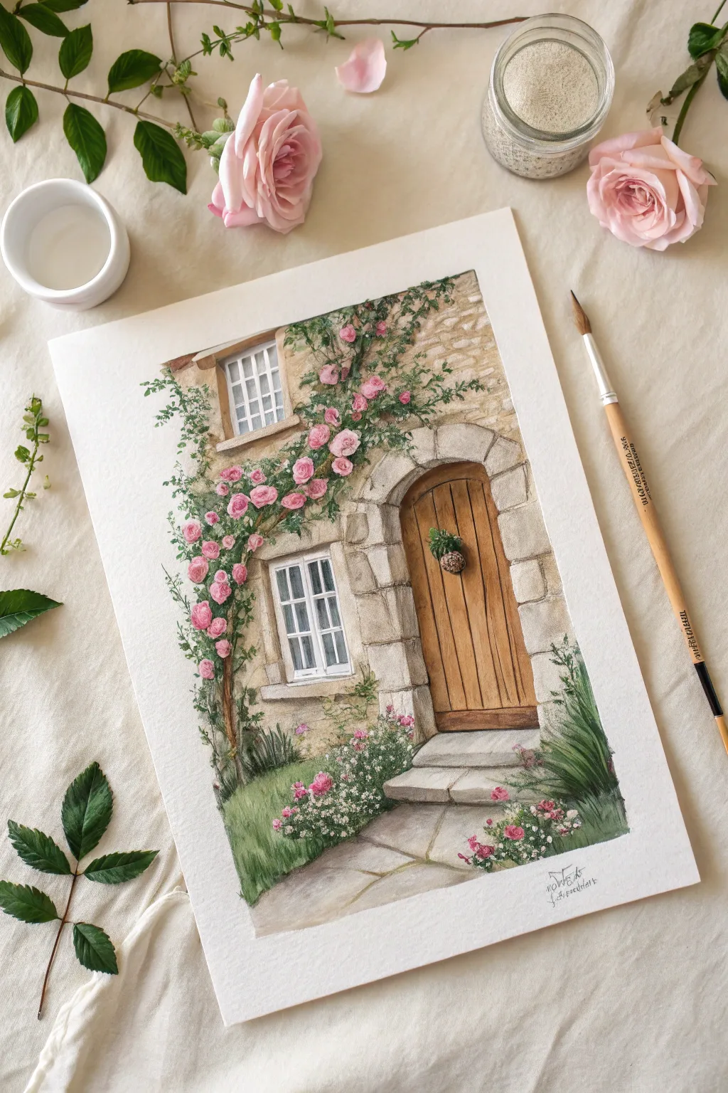
Transport yourself to a peaceful European village by painting this charming stone cottage entrance adorned with climbing roses. Using opaque gouache allows you to build rich textures for the stone walls and layer delicate floral details right over the dark foliage.
Step-by-Step Guide
Materials
- Gouache paint set (essential colors: Burnt Sienna, Yellow Ochre, Ultramarine Blue, Sap Green, Alizarin Crimson, Titanium White, Lamp Black)
- Cold press watercolor paper (300 gsm)
- Brushes: Flat shader (1/2 inch), Round brushes (size 2 and 6), Detail/Liner brush (size 00)
- HB Pencil and kneaded eraser
- Ceramic or plastic mixing palette
- Jars of clean water
- Masking tape
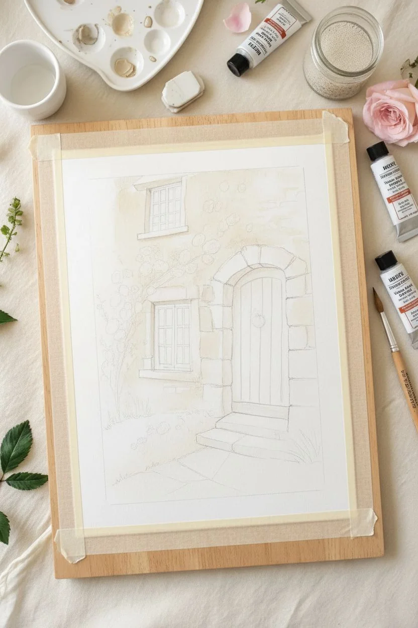
Step 1: Sketching and Base Layers
-
Prepare the surface:
Tape your watercolor paper down to a board on all four sides to prevent buckling and create a crisp clean border. -
Draft the architecture:
Lightly sketch the main elements with your pencil. Start with the arched doorway slightly off-center to the right, create the irregular rectangles for the stone borders, and place the two windows on the left. -
Outline the vines:
Sketch the flow of the rose vines climbing up the left side and over the door, but keep these lines very faint so they don’t show through lighter flower colors later. -
Base the stone walls:
Mix a large amount of a creamy beige stone color using White, a touch of Yellow Ochre, and a tiny dot of Burnt Sienna. Dilute it slightly to a milk consistency and wash over the wall areas, avoiding the door and windows. -
Define individual stones:
While the base is drying, mix slightly darker variations of your beige (add more brown or a touch of grey). Use a flat brush to paint individual rectangular stone shapes randomly across the facade to suggest texture.
Creamy Consistency
Gouache works best when mixed to the consistency of heavy cream or melted ice cream. If it’s too thick, it will crack; too thin, and it won’t be opaque enough to cover the pencil lines.
Step 2: Door and Window Details
-
Paint the door base:
Mix Burnt Sienna with a little Yellow Ochre for a warm wood tone. Paint the entire door area solidly. -
Add wood grain:
Once the door is dry, take a size 2 brush with darker brown (Burnt Sienna + small touch of Black/Blue) and paint fine vertical lines to create the wood planks and grain texture. -
Create the stone arch:
Paint the heavy stones specifically surrounding the door arch and the window frames with a lighter, cooler grey-beige to make them pop against the warmer wall texturing. -
Fill the windows:
Paint the window panes with a dark slate grey or watered-down black. I prefer to leave the mullions (the grid structure) the color of the paper for now, or paint them pure white later. -
Window highlights:
Use your smallest liner brush and pure Titanium White to paint the window frames and mullions precisely, cleaning up the edges of the dark glass panes.
Muddy Colors?
If your fresh layer of paint starts mixing with the dry layer underneath (reactivating it), you are scrubbing too hard. Lay the new paint down gently and don’t rework the same spot.
Step 3: Botanicals and Shadows
-
Lay the vine structure:
Using a thin brush and watered-down brown, paint the main twisting branches of the rose vine climbing up the wall. -
Block in foliage:
Mix a deep, dark green using Sap Green and Ultramarine. Stipple (dab) this color where the densest clusters of leaves will be, particularly near the flower groupings. -
Layer lighter leaves:
Mix a lighter olive green by adding Yellow and White to your green mix. Paint individual leaf shapes overlapping the dark areas to build volume and dimension. -
Paint the rose bases:
Mix a medium pink using Alizarin Crimson and White. Paint rounded, irregular blobs for the roses, scattering them naturally along the vine path. -
Detail the roses:
Once the pink base is dry, add a darker crimson center to each flower, and use a liner brush with very pale pink or white to paint small, curved strokes for the outer petals. -
Add the door wreath:
paint a tiny circle of dark green on the door, stippling lighter green on top for texture, to create the small hanging wreath.
Step 4: Atmosphere and Finishing
-
Ground the scene:
Paint the grass area in the bottom left using upward strokes with various shades of green. Paint large grey flagstones for the path leading to the door. -
Add bottom garden:
Stipple small white and pink dots in the grassy area and near the path to represent wildflowers like alyssum or daisies. -
Cast shadows:
Mix a transparent grey-purple wash. Glaze this gently under the door frame, under the window ledges, and beneath the main vine masses to anchor them to the wall. -
Final highlights:
Add tiny touches of pure white to the tops of the brightest leaves and the edges of the stone steps to catch the imagined sunlight.
Peel off your tape to reveal the crisp edges and enjoy your picturesque cottage painting.
Mixed Media with Colored Pencils
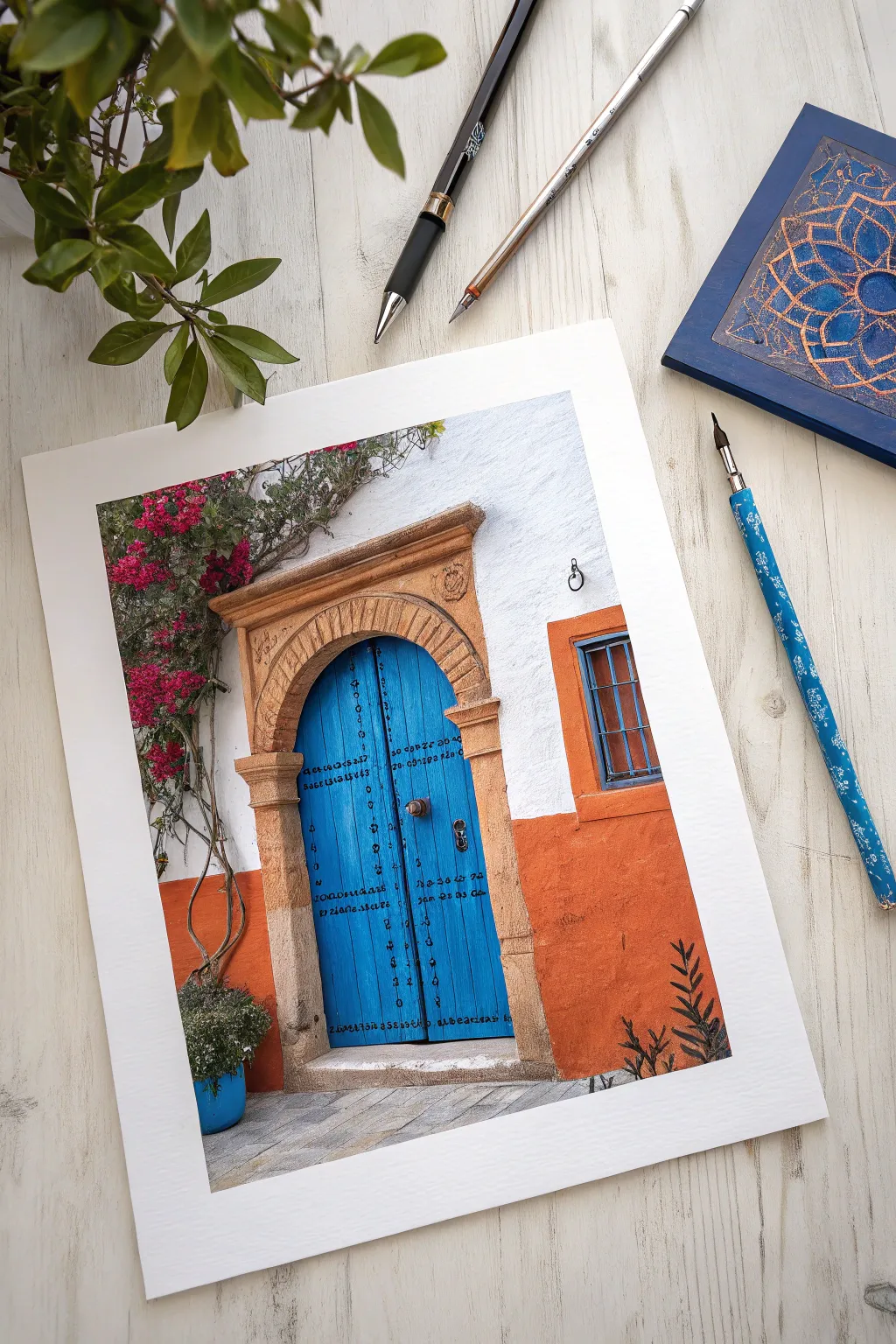
Transport yourself to a sun-drenched street with this vibrant mixed media project. You will combine the creamy matte finish of gouache for the architectural blocks with the sharp precision of colored pencils for intricate textures and details.
Step-by-Step Tutorial
Materials
- Gouache paint set (Ultramarine Blue, White, Burnt Sienna, Yellow Ochre, Magenta, Sap Green, Black)
- Hot press watercolor paper (smooth texture works best for pencils)
- Synthetic brushes: size 6 flat, size 2 round
- Colored pencils (wax or oil-based)
- HB graphite pencil and eraser
- Mixing palette
- Two jars of water
- Masking tape
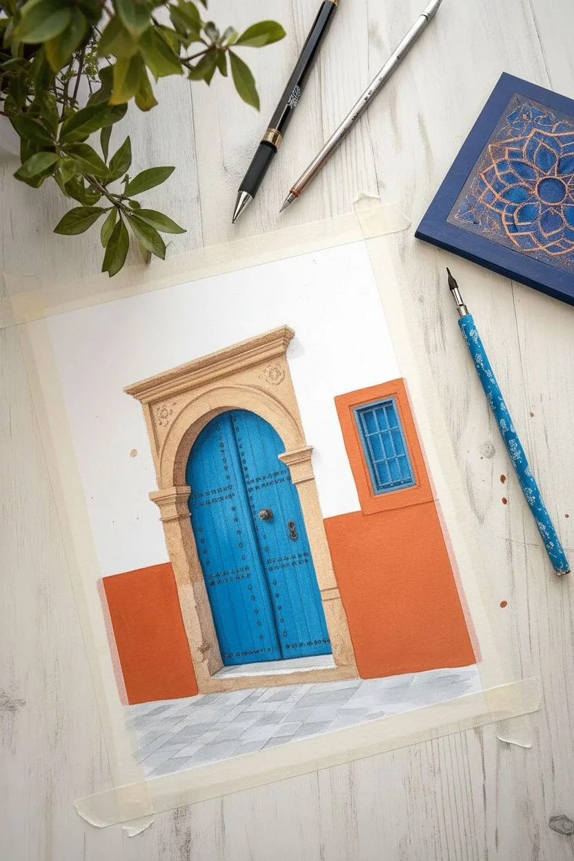
Step 1: Sketch and Base Layers
-
Tape edges:
Secure your paper to a hard board using masking tape to create a crisp border and prevent buckling when wet. -
Draft the architecture:
Lightly sketch the stone archway, the double doors, the window to the right, and the horizon line for the pavement using your HB pencil. -
Block the upper wall:
Paint the area above the horizon line and around the arch with opaque white gouache. If your paper is off-white, this adds necessary brightness. -
Paint the vibrant walls:
Mix Burnt Sienna with a touch of Yellow Ochre and White to create a terracotta orange. Apply this flatly to the lower wall section and window surround. -
Fill the blue door:
Mix a bright, punchy blue using Ultramarine and White. Paint the entire door shapes carefully, avoiding the stone arch. -
Base the stonework:
Mix Yellow Ochre, a little Brown, and White for a sandy beige. Fill in the archway and the side posts, keeping the color fairly flat for now. -
Ground the scene:
Mix a light cool gray for the pavement and fill the bottom section. I like to let this stage dry completely before starting any detail work.
Step 2: Texture and Foliage
-
Create stone texture:
Using a slightly darker beige mix and a dry brush technique, dab subtle texture onto the archway to mimic porous sandstone. -
Add deep shadows:
Mix a dark gray-brown gouache. Paint the inner shadow of the arch where it meets the door, and the interior of the window between the bars. -
Paint the vine structure:
Use a thin round brush with watery brown-green paint to sketch the climbing branches descending from the top left corner. -
Bloom the bougainvillea:
Mix Magenta with a tiny bit of Red. Dab small, irregular clusters along the vines to represent the flowers, varying the pressure for organic shapes. -
Add greenery:
Mix Sap Green with a little Yellow. Paint small leaf shapes amongst the flowers and specifically for the potted plant in the bottom left corner.
Uneven Coverage?
If your colored pencil is scratching the paint off, ensure the gouache is 100% dry. If it still happens, your paint layer might be too thick; use a lighter hand with the pencil.
Step 3: Pencil Detailing
-
Define the masonry:
Once the paint is bone dry, use a brown colored pencil to outline the individual stones in the arch and draw the Keystone details. -
Weather the wood:
Take a dark blue or black colored pencil and draw vertical lines down the blue doors to simulate wood planks and grain. -
Install hardware:
Use a sharp black pencil or fine liner to draw the iron studs, the central door handle, and the decorative script writing across the door panels. -
Detail the window:
Use a blue pencil to sharpen the edges of the window bars, adding a highlight with a white pencil or gel pen if needed. -
Refine the plants:
Use dark green and purple pencils to add shadows within the potted plant and bougainvillea clusters to give them volume. -
Pave the street:
Draw horizontal perspective lines on the gray ground with a gray pencil to suggest cobblestones or paving slabs. -
Final Contrast:
Deepen the darkest shadows under the door frame and planter with a black pencil to pop the contrast.
Metallic Magic
Use a silver or metallic ink pen for the script and door studs. It catches the light and adds a realistic gleam to the ironwork that flat colors can’t replicate.
Peel off your tape to reveal a crisp border and enjoy your stunning Mediterranean architectural study
Painted Polaroid Frames
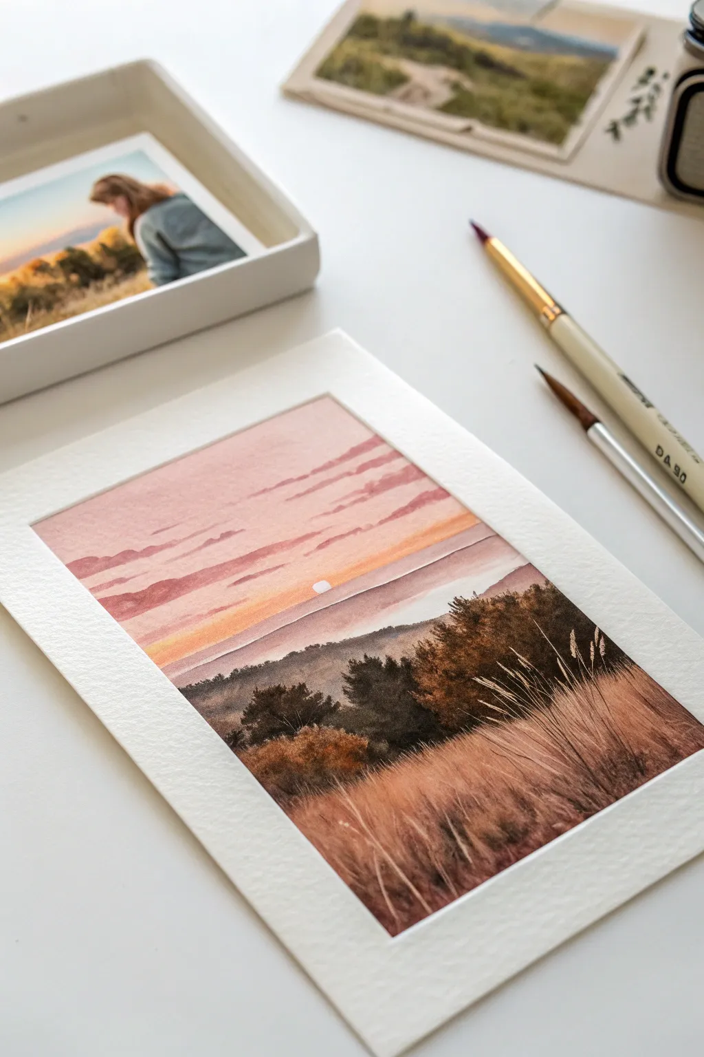
Capture the serene beauty of a setting sun over rolling fields with this miniature gouache landscape. By using masking tape to create crisp white borders, you will transform a simple painting into a nostalgic, Polaroid-style art piece perfect for gifting or journaling.
How-To Guide
Materials
- Gouache paint set (Essential colors: White, Burnt Sienna, Yellow Ochre, Ultramarine Blue, Alizarin Crimson)
- Cold press watercolor paper (300 gsm)
- Washi tape or low-tack painter’s tape
- Synthetic round brush (size 6)
- Fine liner or rigger brush (size 0 or 1)
- Mixing palette
- Jar of clean water
Step 1: Preparation & Sketching
-
Frame the composition:
Begin by taping down all four edges of your paper to your work surface. To get that classic Polaroid instant-film look, leave a wider space at the bottom tape line and narrower, equal borders on the top and sides. -
Establish the horizon:
With a hard pencil, lightly sketch a horizontal line about one-third of the way up from the bottom tape. This marks where your grassy field ends and the distant landscape begins. -
Map the foliage:
Sketch rough, irregular outlines for the clumps of bushes and trees in the middle ground, ensuring they overlap slightly to create depth. Don’t worry about details yet; simple shapes are sufficient.
Pro Tip: Creating Depth
Atmospheric perspective is key! Ensure your background hills are cool-toned and pale, your mid-ground trees are dark, and your foreground grass is warm and detailed.
Step 2: Painting the Sky
-
Mix the gradient colors:
Prepare three colors for the sky: a pale peach (white + tiny dot of red + yellow), a soft mauve (white + red + tiny blue), and a muted dusty pink. Keep the consistency creamy, like melted ice cream. -
Apply the horizon glow:
Start by painting the pale peach color directly above the land horizon line. Use horizontal strokes and keep the paint fluid to allow for blending. -
Blend the upper sky:
While the peach strip is still wet, introduce the dusty pink above it, blending the seam where they meet. Finish the very top of the sky with your soft mauve mixture. -
Add cloud details:
Once the sky base is dry to the touch, mix a slightly darker violet-grey. Use the tip of your round brush to paint thin, horizontal cloud streaks across the upper sky. -
Create the sun:
Using pure white or very pale yellow, place a small half-circle just peeking over the distant horizon line to represent the setting sun.
Step 3: Middle Ground Landscape
-
Paint the distant hills:
Mix a hazy purple-grey color. Paint a thin strip of land immediately below the sun and above your tree line. This atmospheric perspective pushes the horizon back. -
Mix dark foliage colors:
Create a deep, dark green by mixing ultramarine blue, yellow ochre, and a touch of burnt sienna. You want this to be quite dark to contrast against the bright sky. -
Block in the trees:
Fill in the tree shapes you sketched earlier. I prefer using a stippling or dabbing motion here to mimic the texture of leaves rather than smooth strokes. -
Add warmth to foliage:
While the dark trees are damp, drop in touches of burnt sienna or rust color on the top right edges of the bushes where the sunset light would hit them.
Troubleshooting: Muddy Colors
If your grass highlights are turning muddy, your base layer isn’t dry enough. Gouache reactivates with water, so let the underpainting dry completely before layering.
Step 4: Foreground Grasses
-
Base coat the field:
Paint the entire bottom section with a solid wash of burnt sienna mixed with a little yellow ochre. This serves as the soil and shadow layer for the grass. -
Add texture and shadow:
Once the base is dry, use a dark brown to flick short, vertical strokes near the bottom of the visible grassy area, creating density near the viewer. -
Paint individual blades:
Switch to your fine liner brush. Mix a lighter golden-wheat color (yellow ochre + white). Using quick, confident flicking motions from bottom to top, paint long grass blades overlapping the field. -
Create tall seed heads:
Extend some long, thin stalks up past the tree line into the dark foliage area. The light color against the dark trees creates beautiful contrast. -
Add final highlights:
Mix an almost-white pale yellow. Add tiny dotted highlights to the tips of the tallest grasses and seed heads to catch the last light of the sun. -
The reveal:
Wait for the painting to be 100% dry. Carefully peel the tape away at a 45-degree angle to reveal your crisp, clean Polaroid borders.
Now you have a stunning golden hour moment captured forever in a charming instant-photo style.
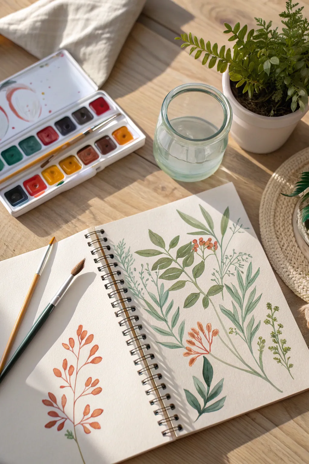
The “Messy” Studio Flat Lay

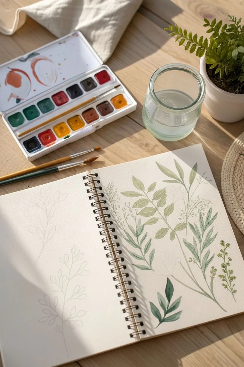
Capture the essence of a relaxed afternoon painting session with this airy botanical study. You will fill a sketchbook spread with organic leaf shapes and delicate stems, exploring the versatility of gouache to create both translucent washes and matte, opaque details.
Step-by-Step Guide
Materials
- Gouache paint set (pan or tube)
- Watercolor sketchbook (cold press paper recommended)
- Round synthetic brushes (size 2 and 6)
- Mixing palette
- Jar of water
- Paper towel
- HB pencil
Step 1: Preparation & Palette
-
Design the layout:
Lightly sketch the main curvature of the stems with an HB pencil. Place one large branch on the left page and a cluster of three different plant types on the right. -
Mix the terracotta hue:
On your palette, mix an earthy orange using vermilion, a touch of brown, and a drop of white to make it creamy. -
Create a spectrum of greens:
Prepare three distinct green puddles: a pale sage (green + much white), a warm olive (green + yellow + brown), and a deep forest green (green + blue).
Step 2: The Autumn Branch (Left Page)
-
Paint the main stem:
Using your size 2 brush and the terracotta mix, paint a thin, wandering line from the bottom of the page upwards. -
Form the leaves:
Switch to the size 6 brush. Load it with paint, then use the ‘press and lift’ method: touch the tip to the paper, press down the belly of the brush to widen the stroke, and lift as you pull away to create a tapered point. -
Vary the saturation:
I like to dip my brush in water without reloading paint occasionally; this creates lighter, more translucent leaves that add depth. -
Add stem connections:
Once the leaves are damp but not soaking wet, use the fine brush to connect them back to the main branch with thin stalks.
Muddy Colors?
If your colors are blending where they shouldn’t, your bottom layer wasn’t dry enough. Gouache reactivates with water, so always use a light touch when layering wet paint over dry.
Step 3: The Green Composition (Right Page)
-
Anchor with the central branch:
Using the warm olive mix, paint the prominent central stem. Add elliptical leaves along it, keeping the shapes loose and organic. -
Paint the feathery foliage:
For the plant on the far right, use the pale sage mix. Use the very tip of your small brush to make quick, upward flicking motions, mimicking soft fern needles. -
Add depth with dark leaves:
At the bottom right of the cluster, paint broad, pointed leaves using your deep forest green mix to act as a visual anchor. -
Layering check:
Ensure these base green layers are fully dry before proceeding to avoid muddying the colors.
Level Up
Add fine details with colored pencils over the dried gouache. A dark green pencil can make leaf veins look sharper and more controlled than painting them.
Step 4: Berries & Fine Details
-
Mix berry red:
Combine red with a tiny bit of orange to create a vibrant berry color. -
Dot the berries:
Paint small clusters of circles near the center of the right page, letting them overlap slightly with the green stems. -
Connect the berries:
Use a diluted brown paint and your finest brush to draw delicate lines connecting the berry clusters to the main arrangement. -
Define the veins:
Using a slightly darker shade of green than the leaves, paint very thin central veins on the olive branch leaves for added realism. -
Final touches:
Erase any visible pencil marks once the painting is completely bone dry.
Close your sketchbook with pride knowing you’ve captured a beautiful botanical moment.

Have a question or want to share your own experience? I'd love to hear from you in the comments below!