
There is something incredibly satisfying about the way fresh ink glides across smooth paper, instantly saturating the page with vibrant color. Whether you are looking to master seamless blends or just want to relax with some bold doodles, this collection will spark your imagination and get those caps popping.
Fresh Citrus Slices
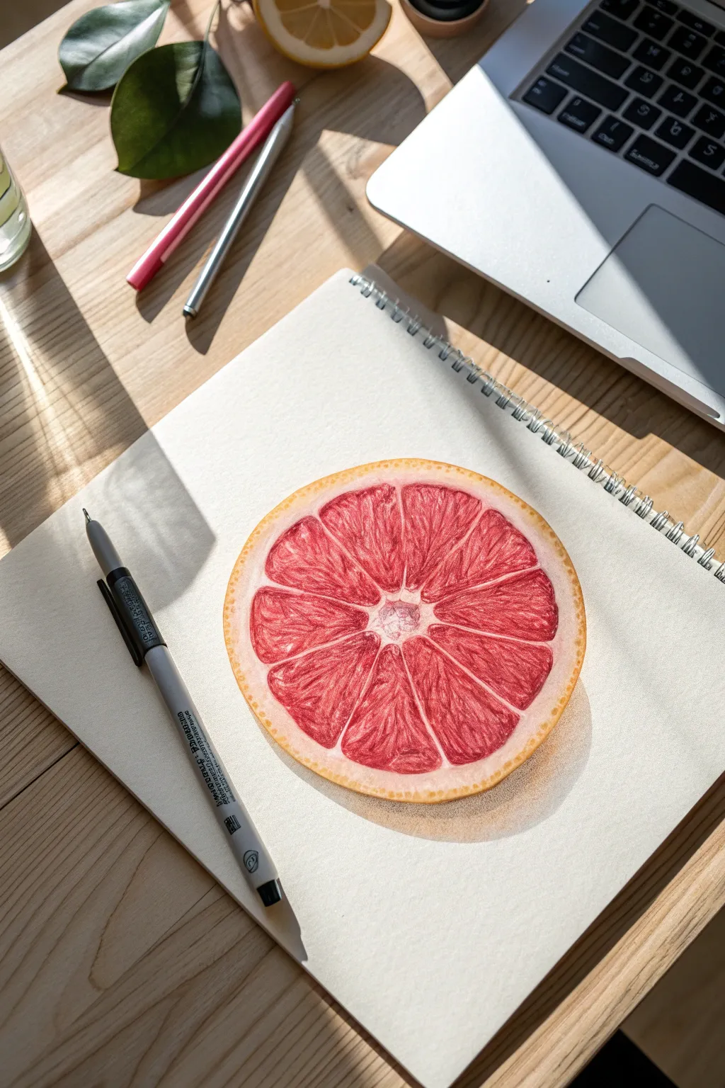
Capture the fresh, vibrant energy of citrus with this detailed marker study. By layering translucent alcohol marker ink and adding precise opaque highlights, you can achieve a juicy, three-dimensional look that pops right off the page.
Detailed Instructions
Materials
- Smooth Bristol board or marker paper
- Alcohol-based markers (Pale Yellow, Orange, Salmon Pink, Crimson Red, Cool Greys)
- Black fine liner (0.1mm)
- White gel pen (opaque)
- HB Pencil and gummy eraser
- Circle template or compass
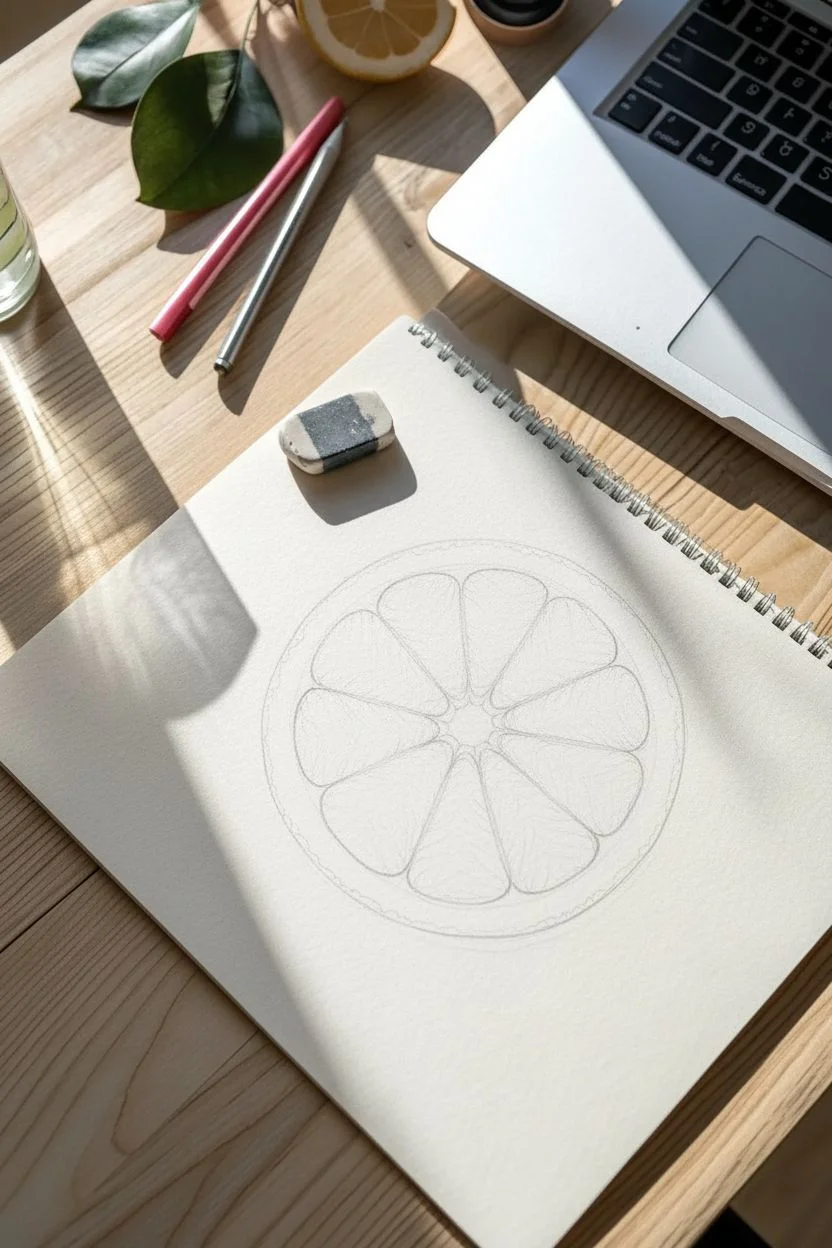
Step 1: Structural Sketch
-
Outline the shape:
Begin by drawing a perfect circle using a template or compass. Inside this, sketch a slightly smaller concentric circle to define the thickness of the rind. -
Define the center:
Mark the exact center of your circle lightly with your pencil. This will serve as the anchor point for the fruit segments. -
Create segment guides:
Draw faint straight lines radiating from the center like wheel spokes. Aim for about 10 to 12 evenly spaced sections. -
Round the segments:
Inside each triangular spoke section, draw the actual fruit segment. Round off the corners so they look like teardrops or flower petals, leaving a distinct gap between them for the white membrane (pith).
Step 2: Coloring the Rind
-
Base yellow layer:
Take your pale yellow marker and fill in the outer ring (the rind). Use smooth, continuous circular motions to ensure an even coat. -
Texturing the skin:
While the yellow is still damp, dot small amounts of orange marker randomly along the outer edge of the rind to mimic the porous zest texture. -
Creating the pith:
Leave the inner white ring mostly uncolored for now. If you want more realism, apply a very faint coat of the lightest warm grey to add volume without darkening it.
Bleeding Lines?
If your red ink is bleeding into the white pith areas, your paper might be saturated. Let the pink layer dry completely before adding the dark red details.
Step 3: Juicy Flesh & Details
-
First color wash:
Fill the teardrop segments with a light salmon pink marker. Be very careful to stay inside your pencil lines, preserving the white gaps between the segments. -
Building depth:
Switch to a crimson or deep red marker. Apply this darker color at the outer curved edge of each segment and the very tip near the center, leaving the middle of the segment lighter. -
Creating pulp texture:
I like to use the fine tip of the red marker to draw tiny, radiating lines or small ‘U’ shapes inside the segments. This simulates the individual juice sacs. -
Defining the core:
Add a few tiny dots of pink and grey in the very center of the fruit (the columella) to show texture, rather than leaving it stark white. -
Adding contrasts:
Go back in with your darkest red. Deepen the shadows right next to the white membrane lines to make the segments look plump and rounded.
Add a Dew Drop
To add a fresh morning vibe, draw a small oval on top of a segment. Shade the top of the oval dark and add a bright white reflection at the bottom to create a water droplet.
Step 4: Highlights & Shadows
-
Membrane definition:
Use your white gel pen to trace the straight lines between the segments. Keep the line slightly broken or varying in thickness to look organic. -
Wet highlights:
Add tiny glints of white gel pen inside the red segments, focusing on where the ‘juice sacs’ would catch the light. This creates the wet, glistening effect. -
Cast shadow base:
Using a light cool grey marker, draw a crescent shape underneath the fruit slice to ground it on the paper. -
Deepening the shadow:
Layer a darker grey immediately beneath the rind’s bottom edge. Fade this out into the lighter grey to create a soft, realistic cast shadow. -
Final outline:
Use the 0.1mm fine liner to gently outline the outer edge of the rind. Keep the line thin and delicate to maintain the clean illustration style.
Once dry, you’ll have a refreshing piece of art that looks good enough to eat.


Tropical Monstera Leaves
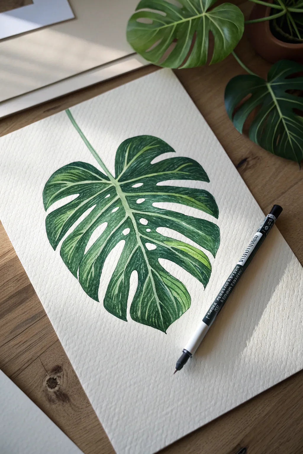
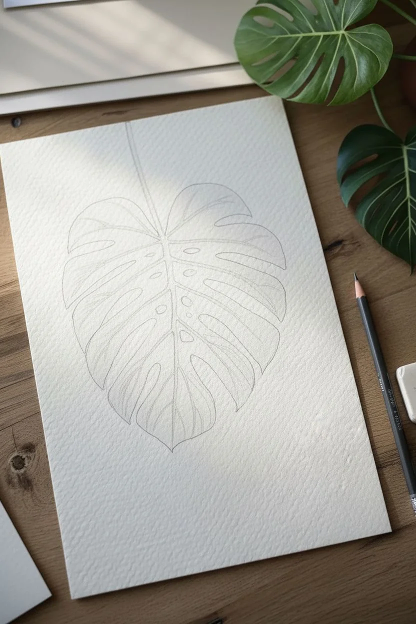
Capture the lush beauty of the tropics by drawing this highly detailed Monstera leaf. By utilizing the texture of the paper and layering green tones, you will create a botanical illustration that looks fresh enough to photosynthesize.
Step-by-Step
Materials
- Cold press watercolor paper (heavy texture)
- H pencil and good eraser
- Alcohol markers (Pale Green, Leaf Green, Forest Green)
- Fine-liner pen (0.3mm or 0.5mm, black or dark green)
- White gel pen (optional)
Step 1: Sketching the Anatomy
-
Establish the curve:
Start with your pencil to draw a long, gently curving line diagonally across the page. This forms the midrib (the central vein) and the stem. -
Main shape:
Lightly sketch a large heart shape around the center line. Keep the top rounded and the bottom tapering to a soft point. -
Carve the splits:
Draw deep, V-shaped notches cutting into the sides of the heart shape to create the iconic Monstera splits. Vary the depth so some reach closer to the center than others. -
Add fenestrations:
Sketch oval or teardrop-shaped holes inside the leaf sections, placed between the outer splits and the central midrib. -
Map the veins:
Draw faint double lines extending from the midrib out toward the leaf edges. These lateral veins must remain white or very pale, so mapping them now is crucial. -
Clean up:
Erase the original heart guideline and refine the edges, ensuring the pencil marks are very faint before we start with ink.
Bleeding Control
Is the ink spreading into the veins? Alcohol markers bleed. Work slower near edges, or use a fine-liner pen to outline the veins first to create a ‘barrier’ for the ink.
Step 2: Base Layers
-
Preserve the light:
Using your palest green marker, carefully color the stem and the mapped-out veins. I prefer doing this first so I don’t accidentally color over them with dark ink later. -
Initial wash:
Fill in the rest of the leaf segments with a light yellowish-green marker. Apply this color broadly, but stop just short of the pencil lines for the veins to keep them distinct.
Step 3: Building Texture and Depth
-
Mid-tone application:
Switch to a medium leaf-green marker. Begin coloring the sections between the veins, leaving some of the lighter under-layer visible near the center and edges for highlights. -
Directional shading:
When applying the marker, use short, flicking strokes that follow the direction of the veins. This technique mimics the natural fibrous texture of the plant. -
Deepening shadows:
Take your dark forest green marker and apply it to the areas directly next to the pale veins. This high contrast makes the veins pop visually. -
Edge definition:
Use the dark green to carefully trace the inner edges of the holes and the outer perimeter of the leaf leaves to make the shape crisp. -
Layering for saturation:
Go back over the darkest areas with a second pass of forest green. The rough texture of the cold press paper will naturally leave tiny white speckles; leave these alone as they add great organic texture. -
Blend the gradients:
Use your mid-tone marker again to blend the boundary between the dark shadows and the lighter highlights, smoothing out the transition.
Level Up: Dew Drops
Add 3D water droplets. Draw a small circle, darken the top inside edge, and add a bright white highlight dot on the bottom inside edge to create realistic moisture.
Step 4: Final Definition
-
Refining the veins:
If your markers bled into the veins, use a white gel pen or a sharp color pencil to reclaim those thin, pale lines. -
Stem detail:
Add a thin shadow line down one side of the stem/midrib to give it a cylindrical, 3D form. -
Final assessment:
Step back and check the contrast. The leaf should look significantly darker near the center rib and lighter toward the outer tips.
Now you have a vibrant, everlasting piece of foliage to brighten up your sketchbook


Whimsical Mushrooms
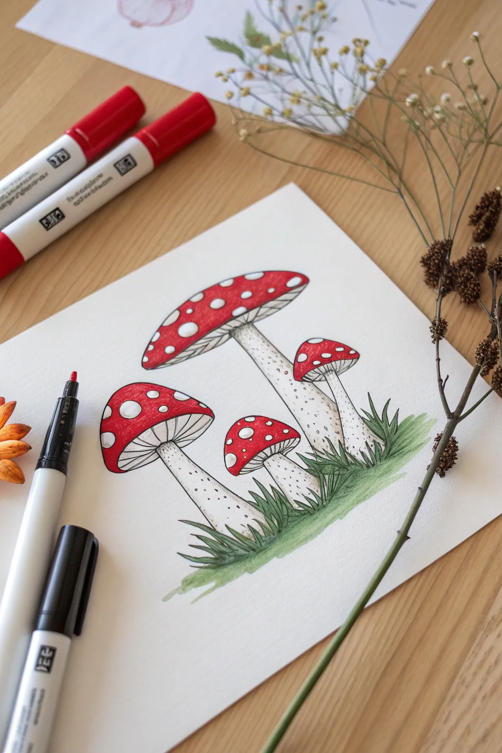
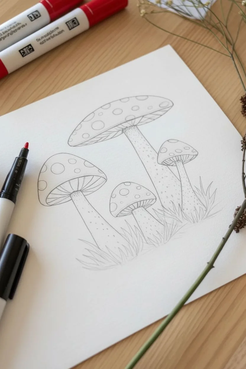
Capture the charm of the forest floor with this vibrant illustration of Amanita muscaria mushrooms. This project focuses on high contrast colors and clean linework to create a crisp, sticker-style artwork.
Step-by-Step Tutorial
Materials
- Smooth marker paper or Bristol board
- Alcohol-based markers (Bright Red, Deep Red, Warm Grey, Light Green, Forest Green)
- Black drawing pens (0.1mm and 0.5mm nibs)
- HB Pencil
- Kneaded eraser
- White gel pen (optional)
Step 1: Sketching the Layout
-
Position the main caps:
Begin lightly with your pencil. Draw a large, slightly flattened oval near the top center for the tallest mushroom, and a smaller, rounder oval to its left for the medium mushroom. -
Add the smaller mushrooms:
Sketch two smaller mushroom caps tucked underneath the right side of the tallest one to create a clustered family look. -
Draw the stems:
Extend stems downwards from the center of each cap. Make the bases thick and bulbous, tapering slightly as they reach the cap, and sketch a ruffled ring (the skirt) near the top of the taller stems. -
Detail the spots:
Draw various sizes of circles and ovals scattered across the top of all the mushroom caps. These will remain white later. -
Ground the scene:
Sketch jagged, triangular spikes around the base of the stems to represent grass blades pointing in different directions.
Step 2: Inking the Outlines
-
Outline the caps:
Using the 0.5mm black pen, trace the outer curves of the red caps. Be sure to trace the small circles inside the caps individually so you know where not to color. -
Ink the stems and grass:
Inking the stems and grass comes next. Use confident strokes for the grass blades to keep them looking sharp and organic. -
Draw the gills:
Switch to your finer 0.1mm pen. Draw thin, closely spaced lines radiating from the stem to the edge of the cap underneath each skirt to represent the gills. -
Erase guidelines:
Once the ink is completely dry, gently remove all underlying pencil sketches with your kneaded eraser to verify a clean surface.
Bleeding Red?
If your red marker accidentally bleeds into the white spots, let it dry completely. Then, use an opaque white gel pen or a white paint marker to color over the mistake and reclaim the spot.
Step 3: Coloring Vividly
-
Fill the caps:
Take your Bright Red marker and fill in the mushroom caps. Work slowly around the iconic white spots to keep them crisp and paper-white. -
Add cap shading:
While the red is still fresh, use the Deep Red marker to add shading along the bottom rim of the caps and underneath the white spots for a 3D effect. -
shade the stems:
I like to leave the stems mostly white, but to give them volume, add a stroke of Warm Grey along the left side and directly under the cap skirt. -
Color the light grass:
Color all the grass blades with your Light Green marker, using upward flicking motions to mimic the growth direction of the blades. -
Deepen the greenery:
Use the Forest Green marker to add shadows at the very bottom of the grass clumps where the light doesn’t reach.
Level Up
Create a ‘sticker’ aesthetic by tracing a thick, continuous white border around the entire group of mushrooms, then outline that border with a light grey marker drop shadow.
Step 4: Final Textures
-
Stipple the stems:
Using your 0.1mm black pen again, add tiny dots (stippling) near the base of the mushroom stems to imply dirt and rough texture. -
Enhance texturing:
Add a few more dots on the upper stem, just below the skirt, to create a subtle gradient of texture fading downward. -
Refine contrast:
If any black lines got dulled by the markers, go over them one last time with the 0.5mm pen to make the illustration pop.
Now you have a charming forest scene perfect for a greeting card or sketchbook page.


Vibrant Bird Feathers
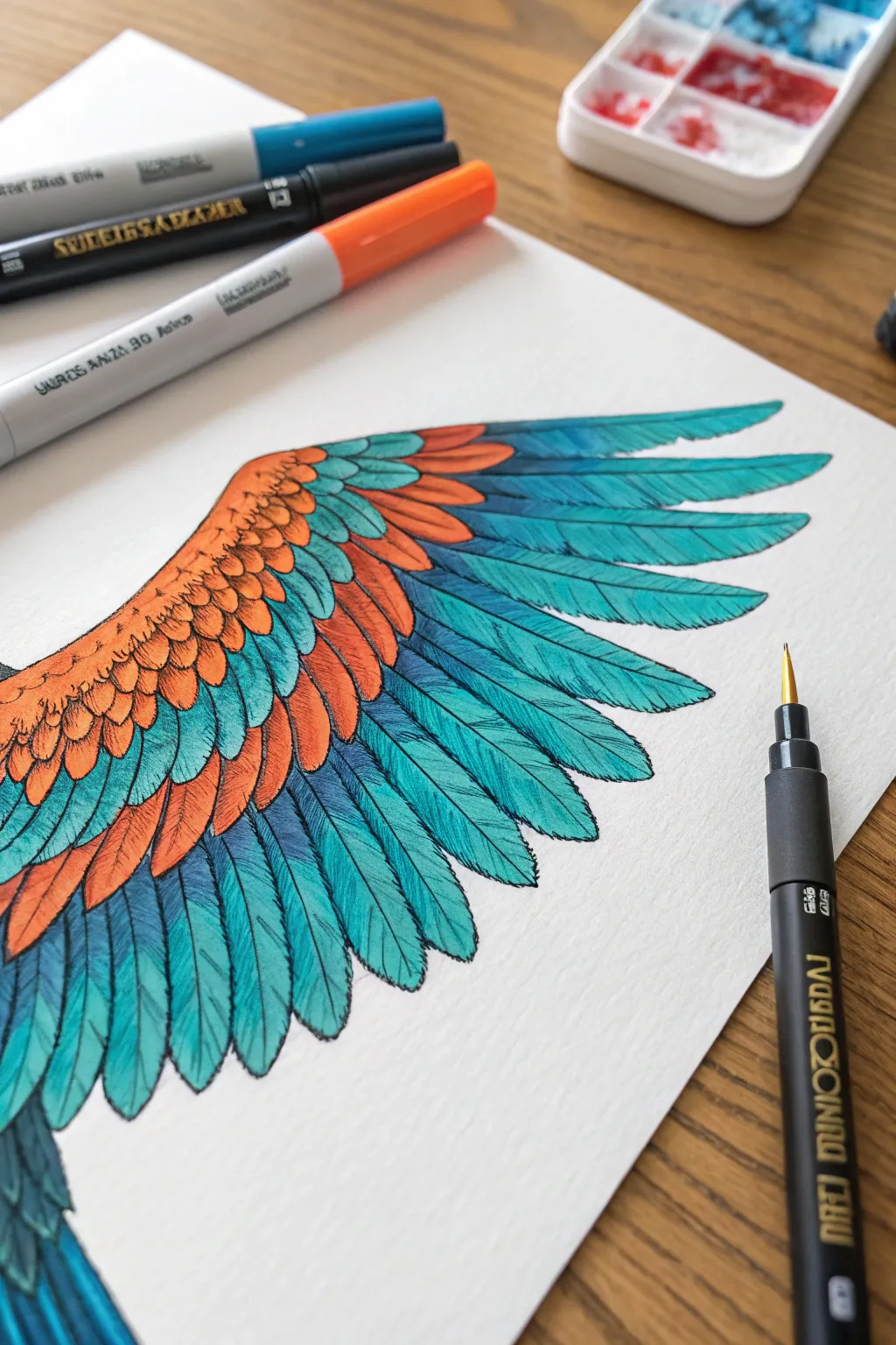
Capture the breathtaking contrast of nature with this stylized feather study. You will create a stunning gradient effect using alcohol markers, combining warm ember tones with cool turquoise hues for a pop of color.
How-To Guide
Materials
- Alcohol-based markers (Light & Dark Teal)
- Alcohol-based markers (Orange, Rust, Indigo)
- Fine liner pens (Black, sizes 01, 03, 05)
- Smooth bristol board or marker paper
- HB Pencil and quality eraser
- White gel pen (optional)
Step 1: Sketching the Plumage
-
Establish the curve:
Start with a light pencil sketch of the wing’s main arch. Draw a gentle diagonal curve extending from the top left toward the bottom right. -
Sketch the coverts:
Along the top of the curve, lightly sketch three rows of small, rounded U-shaped feathers. These should be smaller near the top and slightly larger as they move down. -
Add flight feathers:
Draw the long, primary feathers extending from beneath the coverts. These should be elongated ovals that taper to a soft point at the tips. -
Refine the layout:
Ensure the feathers overlap naturally, like shingles on a roof. I usually double-check that the long feathers fan out evenly before moving to ink.
Step 2: Inking the Outline
-
Trace the main shapes:
Using a size 03 fine liner, carefully trace over your pencil lines. Focus on the outer edges of each individual feather. -
Add central shafts:
Draw a thin line down the center of the longer teal feathers to represent the quill/shaft. Stop about three-quarters of the way down the feather. -
Clean up:
Wait about five minutes for the ink to fully set, then gently erase all visible pencil marks to leave a clean black-and-white base.
Paper Choice Matters
Use specific marker paper or smooth Bristol board. Standard sketch paper absorbs too much ink, causing colors to bleed across lines and preventing smooth gradients.
Step 3: Coloring with Warm Tones
-
Base orange layer:
Take your lightest orange marker and fill in the small, upper feathers (the coverts). Leave tiny slivers of white paper at the very top curves for highlights. -
Add shading:
Switch to a rust or burnt orange marker. Add color to the bottom half of each small feather where it tucks under the one above it. -
Blend the warmth:
Go back over the transition line with your light orange maker to soften the edge between the light top and the dark bottom of the feathers.
Gilded Edges
For a magical touch, use a gold metallic gel pen to trace the central quill line of the flight feathers. It catches the light beautifully against the matte teal.
Step 4: Coloring the Flight Feathers
-
Teal base coat:
Fill the long flight feathers with your lightest teal or turquoise marker. Use long, sweeping strokes from base to tip to avoid streaks. -
Deepen the shadows:
Using a medium teal or denim blue marker, color the top third of these long feathers, right where they emerge from under the orange layer. -
Create gradients:
Use the light teal marker again to blend the dark blue downward, creating a smooth fade into the brighter tip. -
Darkest accents:
Apply a touch of indigo or deep navy blue into the deepest crevices between the long feathers to separate them visually.
Step 5: Detailing and Texture
-
Texture the orange:
Using a 01 fine liner (very thin), draw tiny tick marks or little ‘v’ shapes inside the orange feathers to mimic fluff texture. -
Draw the barbs:
On the long teal feathers, use the 01 liner to draw fine, diagonal lines angling upward from the central shaft toward the edge. -
Vary line weight:
Don’t make these lines perfectly uniform. Some should be short, some long, and some broken to look like natural feather barbs. -
Final outline boost:
Take your thickest pen (05) and assertively trace the outer perimeter of the entire wing to make it pop off the page.
Step back and admire the vibrant flow of your finished wing illustrations.

PENCIL GUIDE
Understanding Pencil Grades from H to B
From first sketch to finished drawing — learn pencil grades, line control, and shading techniques.
Explore the Full Guide
Potted Succulents
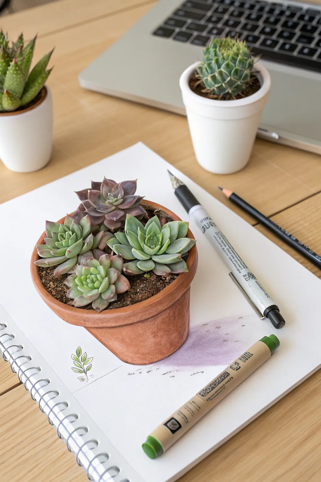
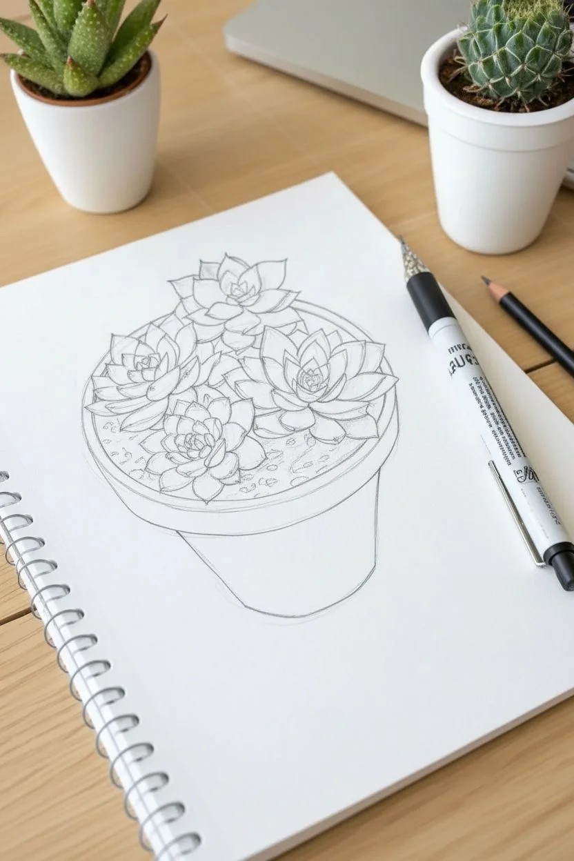
Capture the botanical charm of an indoor garden without the watering schedule. This project guides you through drawing a realistic terracotta pot overflowing with Echeveria rosettes, using alcohol markers for smooth blending and pencils for crisp textures.
Step-by-Step
Materials
- Alcohol markers (Sage Green, Olive, Dusty Purple, Terracotta, Burnt Sienna, Cool Grey)
- Colored pencils (White, Indigo, Dark Brown, Reddish-Pink)
- Fine liner pen (0.1mm black)
- White gel pen
- Marker paper or mixed media sketchbook
- Graphite pencil and eraser
Step 1: Sketching the Composition
-
Outline the pot:
Start by lightly sketching a tilted oval for the rim of the pot in the center of your page. -
Draw the base:
Extend two lines downward from the oval, tapering them slightly to form the classic terracotta pot shape, and connect them with a curved line at the bottom. -
Block in rosettes:
Sketch four circles overlapping the rim to place your succulents: one large circle at the back, two in the middle, and a smaller one tucked in the front. -
Define the leaves:
Inside each circle, draw rows of triangular, fleshy petals radiating from the center to create the rosette geometric pattern.
Preserve the White
Leave tiny slivers of the white paper uncolored on the brightest parts of the leaves. This natural brightness often looks better than adding white ink later.
Step 2: Coloring the Succulents
-
Base layer for greens:
Use a light sage green marker to fill in the front and right-side succulents, keeping the edges crisp. -
Base layer for purple:
Color the back succulent with a dusty purple or desaturated maroon marker to distinguish its species. -
Building depth:
Apply a second layer of the same marker colors towards the center of each rosette and in the crevices between leaves to simulate depth. -
Adding shadows:
I like to use a cool grey or light blue marker to glaze over the deepest shadowed areas between the petals for extra contrast. -
Detailing with pencil:
Use a sharp colored pencil (dark green or indigo) to outline the individual leaves, making the separation clear and sharp. -
Pink tips:
For the left succulent, lightly shade the very tips of the leaves with a reddish-pink colored pencil to mimic sun stress.
Level Up: Waxy Look
Burnish the colored pencil layers over the marker base. Using a colorless blender pencil can smooth out the grain, making the leaves look smooth and waxy.
Step 3: Texturing the Pot & Soil
-
Terracotta base:
Color the pot with a light terracotta or peach alcohol marker, aiming for an even wash. -
Shading the form:
Layer a darker burnt sienna marker on the left side and under the rim to create roundness and form. -
Adding clay texture:
Stipple tiny dots over the pot using a brown colored pencil or fine liner to replicate the porous texture of unglazed clay. -
Filling the soil:
Use a dark brown marker to fill the small gaps visible between the succulents and the pot rim. -
Grit details:
Tap your fine liner pen over the dark brown areas to suggest the texture of potting soil and grit.
Step 4: Finishing Touches
-
Cast shadow:
Draw a soft wash of lavender or gray marker extending to the right of the pot to ground the object. -
Highlights:
Use a white gel pen (or white pencil) to add small bright spots on the plumpest parts of the leaves to make them look waxy. -
Sketchbook doodle:
For a playful touch, draw a tiny line-art sprout in the bottom left corner with a green pen, mimicking the reference image style. -
Atmospheric wash:
Optional: lightly scribble some pale purple wash on the paper near the bottom right to add an artistic, ‘work-in-progress’ vibe.
Now you have a vibrant botanical illustration that stays green forever on your page.
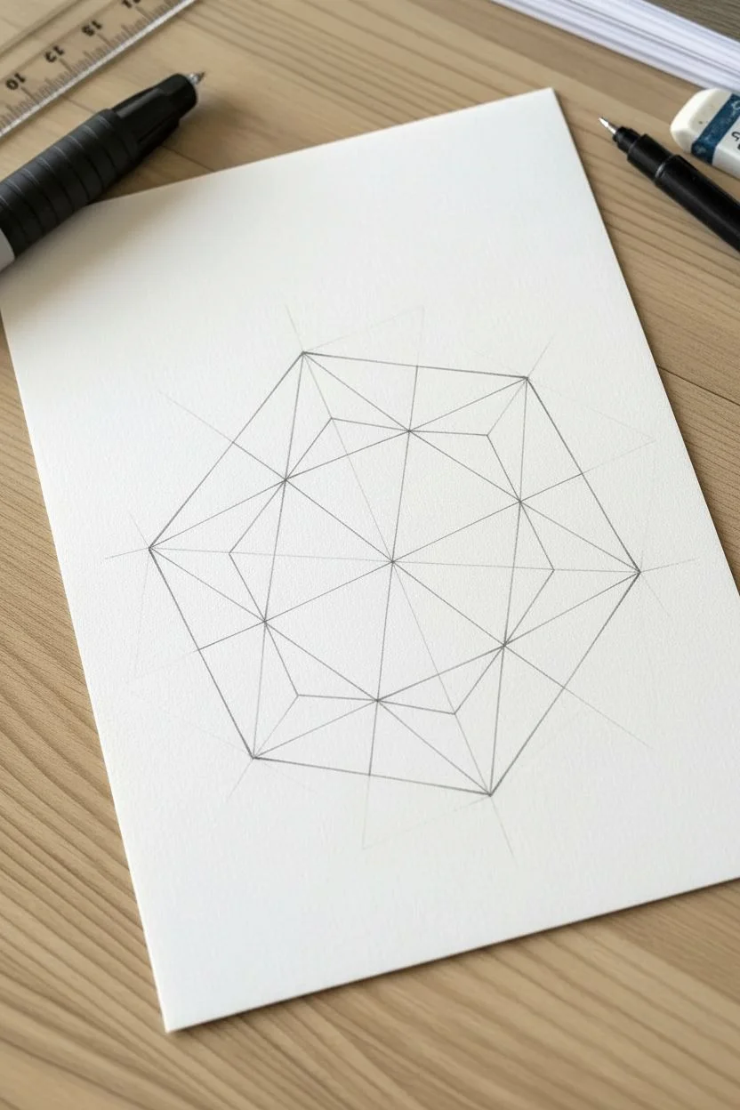
Sparkling Gemstones
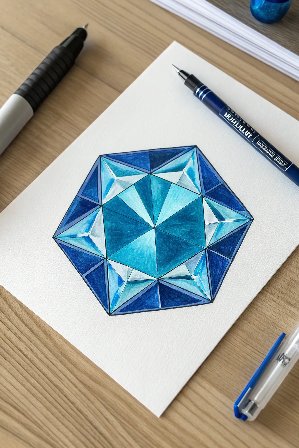
Capture the brilliant refraction of a cut sapphire with this geometric marker drawing. By combining precise ruler work with layered alcohol marker blending, you will create a gemstone that looks three-dimensional and full of light.
How-To Guide
Materials
- Smooth marker paper or Bristol board
- HB Pencil and good eraser
- Ruler and protractor (optional but helpful)
- Black drawing pen (fineliner, size 0.5mm)
- Alcohol markers: Ice Blue, Cyan, Royal Blue, Navy Blue
- White gel pen
Step 1: Constructing the Geometry
-
Establish the perimeter:
Using your pencil and ruler, draw a perfect hexagon within a faint circle. Ensure all six sides are roughly equal length for symmetry. -
Define the center:
Mark the exact center point of the hexagon. Draw straight lines from this center point to each of the six outer corners to create six large triangles. -
Add the inner table:
Inside the large hexagon, draw a smaller, parallel hexagon about halfway between the center point and the outer edge. -
Connect the facets:
Draw V-shapes connecting the corners of the inner hexagon to the midpoints of the outer hexagon sides. This creates the kite-shaped facets. -
Structure the star:
Draw lines inside the central hexagon connecting the center point to the corners of that inner shape, creating a six-pointed star pattern in the middle. -
Clean the sketch:
Gently erase any construction lines that aren’t part of the actual facet pattern so the paper is clean for coloring.
Bleeding Lines?
If your ink feathers, you may be working too slowly. Markers saturate paper quickly; rapid, confident strokes prevent the paper from getting too boggy.
Step 2: Layering the Blues
-
First light wash:
Take your Ice Blue (lightest) marker. Color the top-left facets of the central star and the adjacent middle ring facets. -
Reserve highlights:
While using the light blue, create a gradient by flicking the marker, leaving small areas of pure white paper untouched on the facets facing the imaginary light source. -
Apply mid-tones:
Switch to your Cyan marker. Fill in the facets on the right side of the inner hexagon, blending slightly into the lighter blue areas. -
Deepen the center:
Use the Royal Blue marker for the bottom-right facets of the central star. Apply the color heavily at the center point and let it fade out toward the edges. -
Build the outer ring:
Color the outer rim triangles. Alternate between Cyan and Royal Blue to create a pattern where light facets touch dark facets. -
Add deepest shadows:
Use your Navy Blue (darkest) marker to fill the outermost corners and the bottom-most facets. This implies the density of the stone where light doesn’t pass through.
Pro Tip
Leave a hairline gap of white paper between your dark blue coloring and the black outline. This ‘halo’ increases the contrast and makes the gem pop.
Step 3: Defining and Polishing
-
Blend transitions:
Go back over the boundary lines between blue shades with your lighter marker to soften any harsh streaks, smoothing the gradients. -
Ink the lines:
Once the marker ink is fully dry, trace all your pencil lines with the black fineliner. Use a ruler to ensure these lines are razor-sharp. -
Thicken the perimeter:
I like to go over the very outer hexagon outline a second time to make the border slightly thicker than the interior lines. -
Add bright reflections:
Using the white gel pen, draw thin, sharp lines along the edges of the darkest blue facets to simulate caught light. -
Final sparkle:
Add a few tiny white dots or ‘star’ crosses on the dark blue sections to make the gem look polished and reflective.
Now step back and admire the depth of your sparkling new gemstone creation.
BRUSH GUIDE
The Right Brush for Every Stroke
From clean lines to bold texture — master brush choice, stroke control, and essential techniques.
Explore the Full Guide
Anime-Style Eyes
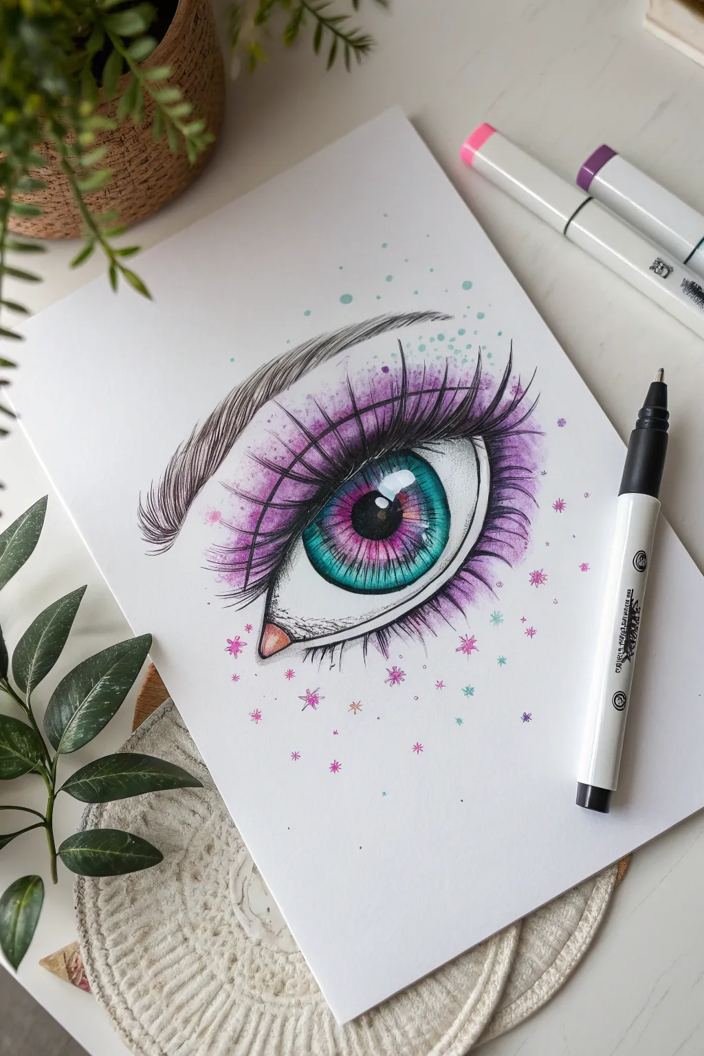
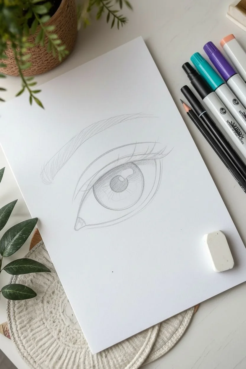
Capture the shimmering allure of anime art with this vibrant eye study. You will focus on blending bold teals and violets to create depth, contrasted against crisp, dramatic lashes and whimsical background sparkles.
Step-by-Step
Materials
- Alcohol markers (Teal/Cyan, Magenta, Violet, Cool Grey, Peach)
- Black fineliner pens (0.1mm and 0.5mm)
- White gel pen
- Pencil (HB) and eraser
- Smooth marker paper or cardstock
Step 1: Sketching the Framework
-
Outline the shape:
Begin with a light pencil sketch of an almond shape, slightly wider than a realistic eye, with a distinct dip for the tear duct on the left. -
Define the iris:
Draw a large, perfect circle for the iris in the center, ensuring the top and bottom are slightly cut off by the eyelids. -
Map the details:
Lightly sketch the pupil in the center and mark out the large rectangular ‘window’ reflection in the upper right quadrant of the iris so you don’t color over it. -
Add structure:
Sketch the arching crease line well above the eye and outline the shape of the eyebrow.
Pro Tip: Wet-on-Wet
To get that smooth blend between the pink and teal inside the iris, work quickly! Marker ink blends best when the paper is saturated and the ink hasn’t had a chance to dry fully.
Step 2: Coloring the Iris
-
Pupil base:
Fill the central pupil with a black marker or very dark grey, strictly avoiding the sketched highlight area. -
Inner ring:
Take your magenta marker and draw a ring around the black pupil, allowing it to feather slightly outward. -
Outer gradient:
Use a teal or cyan marker to fill the rest of the iris. -
Blend the transition:
While the ink is still wet, go back in with the magenta marker where the colors meet to blend slightly, creating a violet transition zone. -
Deepen the shadow:
Layer a darker teal or blue marker just under the upper eyelid to simulate the shadow cast by the lashes, giving the eye dimension.
Troubleshooting: Muddy Colors?
If the pink and teal turn brown where they overlap, wait for the first layer to dry completely before adding the second. Layering dry prevents mixing, keeping the hues distinct.
Step 3: Skin and Shading
-
Eyelid wash:
Using a violet marker, apply a sweep of color starting from the crease line and flicking upwards towards the brow. -
Softening the edge:
I prefer to use a colorless blender or a very pale lavender here to soften the upper edge of the violet so it fades into the white paper. -
The tear duct:
Color the small triangular tear duct with a pale peach or fleshy pink tone. -
Sclera shadows:
Use a very light cool grey marker to add a shadow to the white of the eye, mainly under the top eyelid.
Step 4: Inking and Details
-
Outline the eye:
Take your 0.5mm black fineliner and trace the upper and lower lash lines, making the upper line significantly thicker. -
Draw the lashes:
Using quick, confident flicks, draw long, curved lashes radiating from the upper lid. Group them slightly to create jagged ‘anime’ style spikes. -
Lower lashes:
Add smaller, more delicate triangular lashes to the lower lash line using a 0.1mm pen. -
Eyebrow texture:
Using a thin fineliner, draw the eyebrow with individual hair strokes following the direction of growth, creating a neat, arched shape. -
Magic sparkles:
Use the fine tip of your magenta and teal markers to draw small distinct stars and dots scattered around the outer edges of the eye.
Step 5: Final Highlights
-
Define the reflection:
Use the white gel pen to crisp up the large rectangular highlight in the iris, drawing a ‘window pane’ cross through it if you lost the detail. -
Add shine:
Place tiny white dots in the tear duct, on the lower waterline, and scatter a few white sparkles among the colored stars for a magical finish.
Now step back and admire the depth and sparkle effectively captured in your marker illustration
Detailed Sneaker Illustration
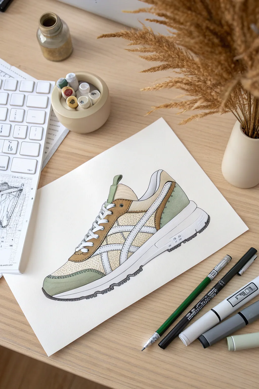
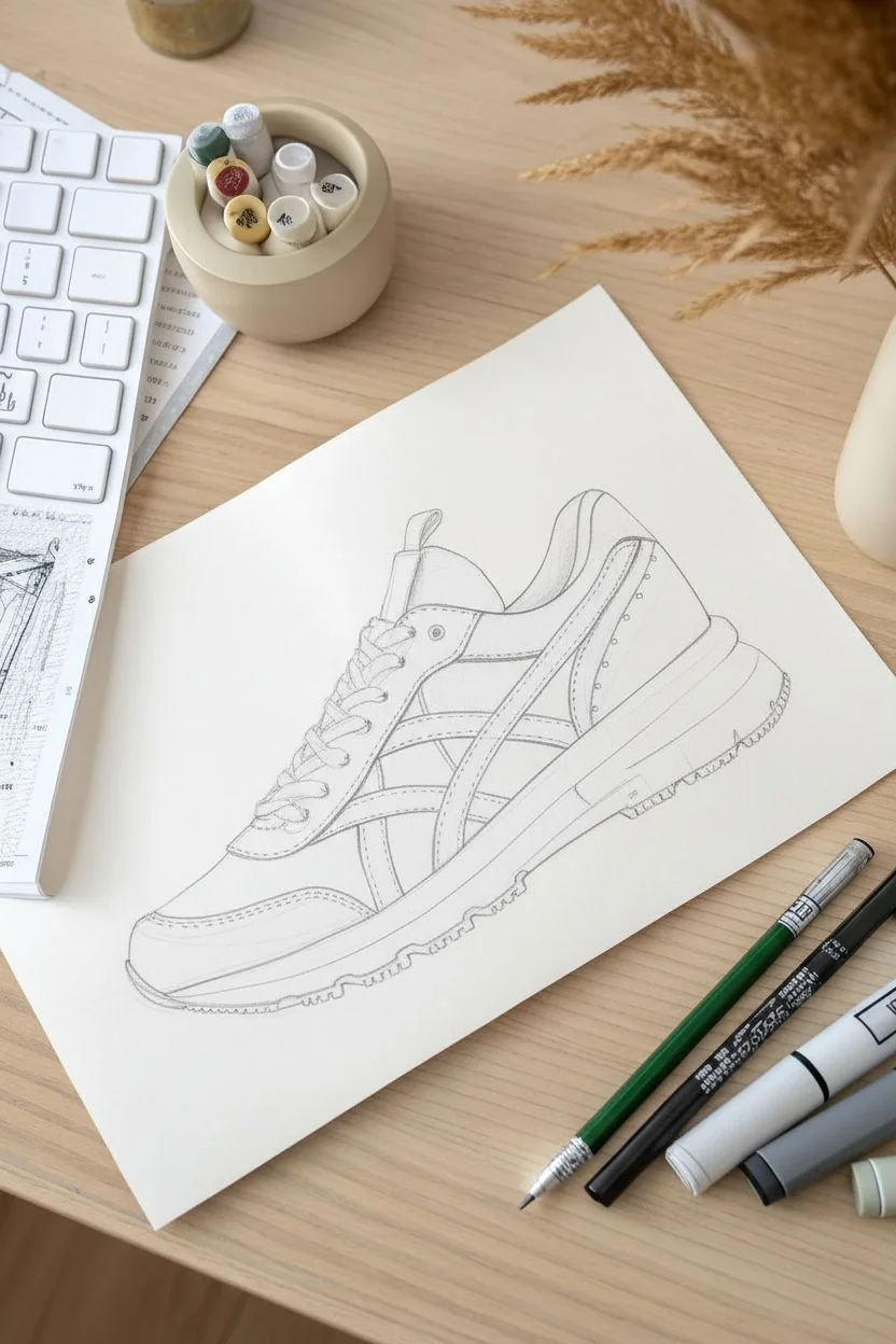
Capture the cool aesthetic of footwear design with this detailed marker illustration tutorial. You will layer earth tones and sage greens to create a stylish, retro-inspired running shoe that looks perfect for a fashion portfolio.
Step-by-Step Guide
Materials
- Alcohol-based markers (Sage Green, Tan/Ochre, Cream/Light Beige, Warm Grey, Cool Grey)
- Fine liner pens (Black, sizes 0.1mm, 0.3mm, and 0.5mm)
- White gel pen
- Graphite pencil (HB) and eraser
- Smooth marker paper or Bristol board
- Ruler
Step 1: Sketching the Silhouette
-
Establish the baseline:
Start by lightly sketching a horizontal line for the ground, then draw the wedge shape of the sole. Keep the heel thicker than the toe area to suggest a running shoe profile. -
Build the upper body:
Sketch a rounded dome shape for the main body of the shoe sitting on top of the sole. Mark the opening for the ankle and a sloping line for the tongue. -
Map the panels:
Lightly draw the different sections of the shoe: the toe cap, the eyelet strip for laces, and the heel counter. These will be the suede sections. -
Add the branding stripes:
Sketch the intersecting curved stripes on the side panel. These serve as the main graphic element, so take your time getting the curves parallel. -
Detail the laces:
Draw the crisscross pattern of the shoelaces. I find it helps to draw the oval loops of the lace holes first, then connect them.
Step 2: Applying Base Colors
-
Color the mesh areas:
Using your Cream or Light Beige marker, fill in the underlying mesh sections on the side and the top of the toe box. Apply an even, solid coat. -
Fill the suede overlays:
In the toe cap, eyelet strip, and lower heel area, apply a Tan or Ochre marker. Keep the edges crisp where they meet the lighter mesh. -
Add accent colors:
Use the Sage Green marker to fill in the top heel tab and the small accent strip near the toe. This adds that nice retro contrast. -
Color the lining:
For the interior padding visible at the ankle collar, use a very light Warm Grey to distinguish it from the exterior white parts. -
Create texture:
Go back over your Cream/Beige mesh areas with the fine tip of the same marker (or a slightly darker shade) and dot the surface to mimic a fabric texture.
Pro Texture Tip
To make the side panels look like breathable athletic mesh rather than solid plastic, use a stippling technique (lots of tiny dots) with a fine-point darker beige marker over your base color.
Step 3: Shading and Definition
-
Shadow the white areas:
The stripes and midsole are white, but they need depth. Use a pale Cool Grey to add shadows along the edges where the stripes overlap the beige mesh. -
Define the midsole:
Use a Warm Grey marker to draw a horizontal line separating the top and bottom halves of the chunky midsole. Add slight vertical shading near the heel for dimension. -
Darken the outsole:
Color the very bottom tread layer with a Dark Grey or Black marker. Leave small gaps or indentations to suggest the grip pattern. -
Deepen suede shadows:
Take your Tan marker again and add a second layer of ink just along the edges of the suede panels to make them look rounded and dimensional.
Level Up Your Design
Turn this into a design exercise by tracing your finished line art onto fresh paper three times, then coloring each one in a different colorway to create a full collection.
Step 4: Inking and Highlights
-
Outline the main shape:
Switch to a 0.5mm black fine liner. Outline the entire outer silhouette of the shoe confidently to pop it off the page. -
Detail the panels:
Use a thinner 0.1mm or 0.3mm pen for the internal details. Carefully trace the stripes, laces, and panel borders. -
Add stitching:
Draw dashed lines along the edges of the suede panels (the tan and green areas) to represent the double-stitching construction. -
Final highlights:
Using a white gel pen, add small distinct lines to the laces and the plastic heel clip to simulate gloss. You can also clean up any marker bleeding on the stripes.
Step back and admire your clean, professional-looking sneaker concept that looks ready for the runway.


Interior Design Sketches
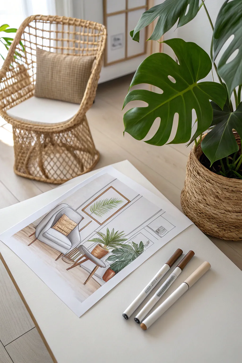
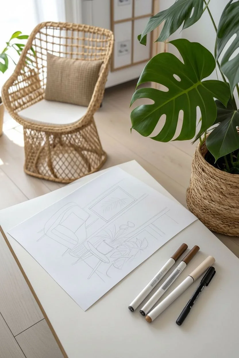
Master the art of interior design illustration with this clean, stylish rendering of a cozy reading nook. You will use alcohol markers to build depth and texture, transforming a simple line drawing into a vibrant, professional-looking architectural sketch.
Detailed Instructions
Materials
- Alcohol-based markers (Cool Greys, Warm Browns, Terracotta, Forest Greens)
- Fine liner pens (Black, sizes 0.1, 0.3, and 0.5)
- Marker paper or smooth Bristol board (A4 size)
- HB Graphite pencil
- Kneaded eraser
- Ruler
- White gel pen
Step 1: Structural Sketching
-
Establish the composition:
Begin by lightly sketching the floor line to ground your space. Position the armchair on the left and the plant arrangement on the right, keeping shapes geometric and simple at first. -
Draft the armchair:
Sketch the armchair using soft, rounded rectangles for the cushions and angled lines for the mid-century legs. Add a square shape on the seat for the throw pillow. -
Outline the greenery:
Draw the contours of the potted plants. Sketch a cylinder for the main pot and sweeping, arched lines to indicate the direction of the leaves. -
Add background details:
Use your ruler to draw the wall molding lines behind the furniture. Center a rectangular frame above the chair and lightly sketch a palm leaf motif inside it. -
Refine the lines:
Go over your rough shapes, adding details like the rim of the plant pots, the specific leaf shapes (Monstera and palm), and the piping on the armchair cushions.
Step 2: Inking the Outlines
-
Ink the foreground:
Using a 0.5 fine liner, trace the main outlines of the chair and the potted plants. Use confident, continuous strokes to define these focal points. -
Ink the background:
Switch to a finer 0.1 or 0.3 pen for the background elements. Use a ruler to ink the picture frame and the wall molding panels to ensure architectural precision. -
Add texture lines:
Add small, broken lines on the pillow to suggest fabric texture and draw the central veins on the plant leaves. -
Clean up:
Once the ink is completely dry to the touch, gently erase all graphite pencil marks with a kneaded eraser to leave a clean crisp illustration.
Bleed-Proof Success
To prevent your ink from bleeding through or feathering, always place a scrap sheet of paper underneath your work. Work quickly with markers while the ink is wet to achieve smooth, streak-free gradients.
Step 3: Marker Rendering
-
Base grey tones:
Start with a very light Cool Grey marker. Fill in the armchair body, leaving small white gaps on the top curves of the cushions to represent light hitting the fabric. -
Deepen chair shadows:
Layer a medium grey into the creases where the seat meets the backrest and along the side of the chair to create volume. -
Color the wood:
Use a warm, light brown marker for the chair legs, the picture frame, and the small plant stand. Go over the shadowed side of the legs a second time for dimension. -
Render the pillow & pots:
Color the pillow in a warm beige or ochre tone. Use a terracotta or warm brown shade for the plant pots, leaving a sliver of white on the curved side for a highlight. -
Foliage base layer:
Apply a light, yellowish-green marker to all the leaves, including the artwork on the wall. This establishes the base luminosity of the plants. -
Foliage shading:
I prefer to switch to a darker forest green here to add depth. coloring the undersides of the leaves and the areas closer to the stems. -
Grounding the objects:
Use a warm grey marker to draw horizontal strokes on the floor underneath the chair legs and pots. This casts a shadow and stops the furniture from looking like it is floating. -
Final highlights:
Use a white gel pen to add tiny accents, such as the glossy shine on the ceramic pots or separate leaves that have blended too much into the background.
Pattern Play
Customize the design by adding a pattern to the throw pillow or the floor. Before coloring, use your fine liner to draw geometric shapes or stripes to give the room more personality.
Now step back and admire your stylish interior sketch, ready to be framed or added to your design portfolio.
Fashion Croquis
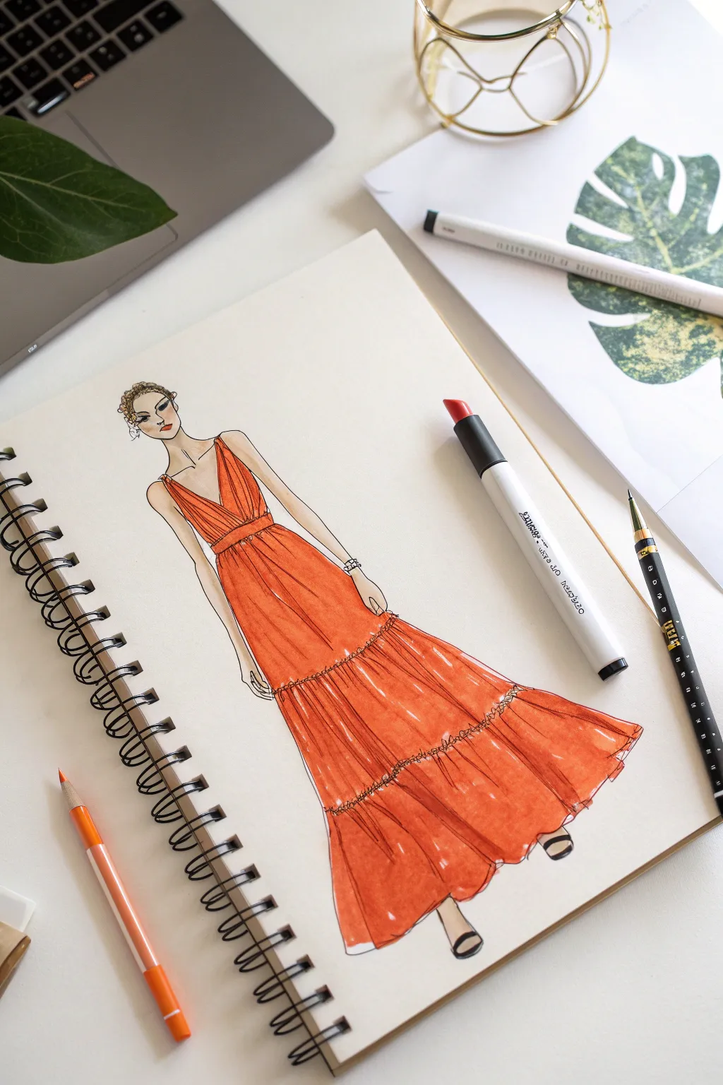

Capture the essence of high fashion design with this flowing, tiered maxi dress tutorial. You’ll practice rendering fabric drape and layering vibrant marker tones to create a luminous, runway-ready look.
Step-by-Step Guide
Materials
- Sketchbook (marker-friendly paper)
- Graphite pencil (HB)
- Kneaded eraser
- Alcohol-based markers (Light Peach, Tangerine, Rust/Deep Orange)
- Black fine liner pen (0.1mm or 0.3mm)
- Orange colored pencil (optional for details)
Step 1: Drafting the Croquis
-
Draw the balance line:
Start with a light vertical line in the center of your page to establish the figure’s balance, extending from the top of the head to the feet. -
Map the proportions:
Mark the head size, then measure approximately nine ‘heads’ down for that elongated fashion figure look. Mark horizontal lines for the shoulders, waist, and hips. -
Sketch the torso and limbs:
Using simple geometric shapes, block in the torso. Sketch the arms relaxed at the sides and the legs in a walking pose, with one foot stepping slightly forward. -
Refine the body shape:
Connect your shapes with smooth contour lines to define the neck, arms, and legs, erasing the internal geometric guides as you go. -
Add facial guidelines:
Lightly sketch a cross on the oval of the face to mark where the eyes, nose, and mouth will eventually sit.
Step 2: Designing the Dress
-
Outline the bodice:
Draw thin spaghetti straps over the shoulders and create a deep V-neck that meets at the natural waistline. -
Define the waist:
Sketch a horizontal band around the waist to show where the dress cinches before flowing outward. -
Draw the skirt tiers:
Divide the skirt into three main sections. Draw the first tier ending at the mid-thigh, the second at the knee, and the third hitting the ankles. -
Add gathering details:
At the seam of each tier, draw small, wiggly ‘m’ shapes or ruffles to indicate where the fabric is gathered and stitched. -
Create the flow:
Draw vertical lines extending down from the gathered seams to the hem of each tier to represent the folds and volume of the fabric.
Paper Highlights
Don’t color the entire dress solidly! Leave thin strips of white paper showing on the tops of the folds. This ‘paper white’ creates the brightest, most natural glossy highlight.
Step 3: Adding Color
-
Color the skin:
Use your light peach marker to fill in the face, neck, arms, and visible feet. Add a second layer under the chin and inner arms for shadow. -
Base coat the dress:
Using the tangerine marker, color the entire dress. I like to use long, vertical strokes here to mimic the direction of the fabric falling. -
Add dimension:
Go back over the dress with the same tangerine marker, layering ink where the fabric folds are deepest to create mid-tones. -
Deepen the shadows:
Switch to your rust or deep orange marker. Apply this color strictly directly under the waist belt and under each ruffled tier seam to create depth. -
Detail the hair:
Use a light brown or sandy marker to color the hair, using squiggly strokes to suggest a curly, up-do texture.
Bleed Control
If your marker bleeds outside the lines, don’t panic. You can thicken the black outline slightly to cover it, or use a white gel pen later to clean up small edges.
Step 4: Inking and Definition
-
Outline the figure:
Take your black fine liner and carefully trace the pencil lines of the body and dress. Keep the lines loose and varying in thickness for a stylized look. -
Ink the face:
Draw distinct almond shapes for eyes, a small dash for the nose, and define the lips. Add curly loops to the hair to define the texture. -
Enhance dress textures:
Use the fine liner to add small squiggles along the waist and tier seams to emphasize the gathered stitching. -
Add accessories:
Draw simple strap sandals on the feet and sketch a small bracelet on the wrist for a finished touch. -
Final touches:
Erase any remaining pencil marks once the ink is totally dry to leave a crisp, clean fashion illustration.
Now you have a dynamic fashion croquis ready to be added to your design portfolio
Sticker-Style Mascots
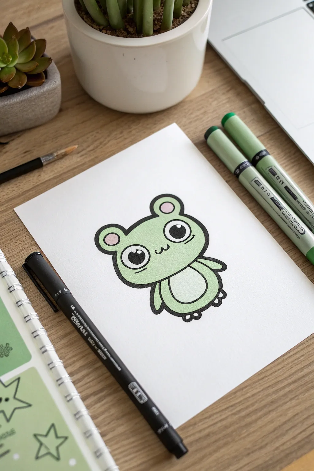
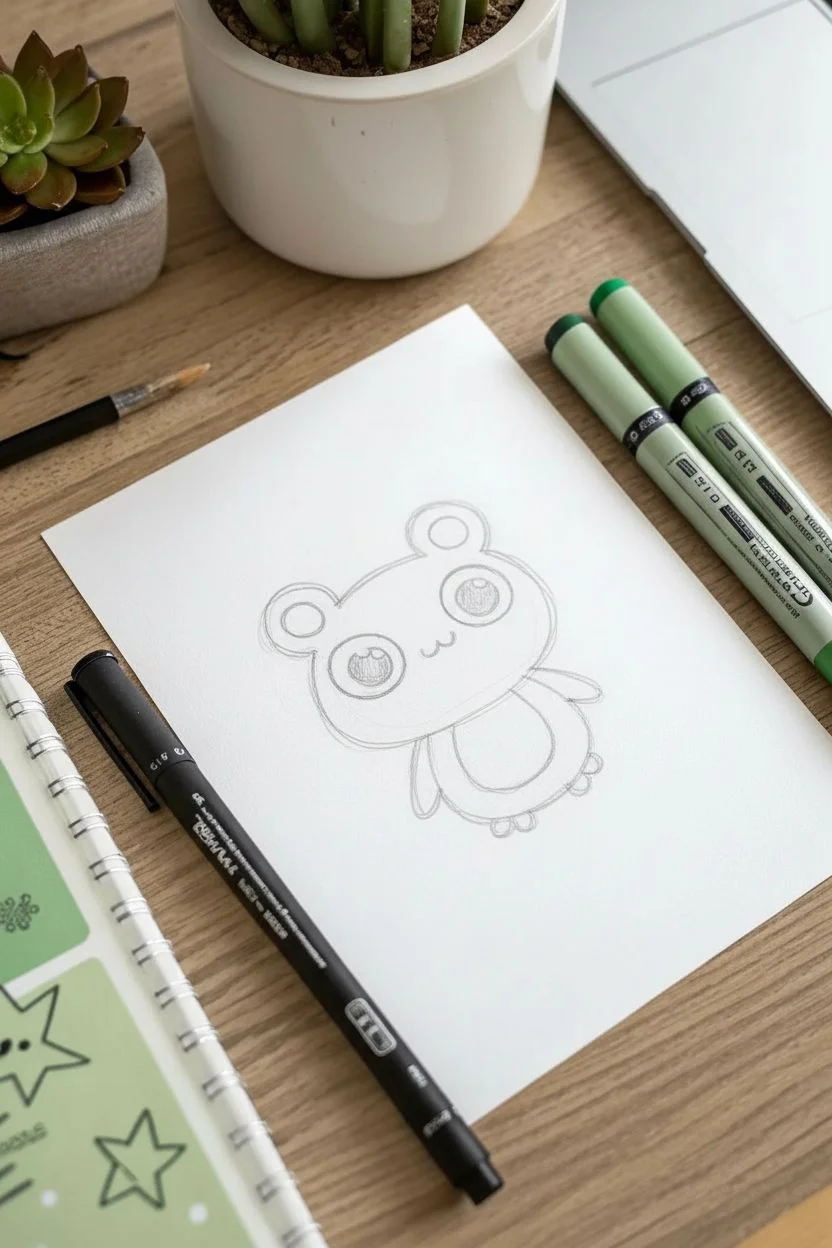
This adorable green mascot brings the charm of vinyl stickers directly to your sketchbook. With its bold, chunky outlines and simple pastel coloring, it is the perfect practice for clean line work and character design.
Step-by-Step Guide
Materials
- Smooth marker paper or cardstock
- HB Pencil and eraser
- Pale green alcohol marker
- Soft pink alcohol marker
- Thick black permanent marker (bullet or chisel tip)
- Fine-tip black liner pen
Step 1: Sketching the Character
-
Head shape:
Begin by lightly sketching a wide, soft oval for the head, flattening the bottom slightly where it connects to the body. -
Adding ears:
Draw two small, perfect semicircles sitting on top of the head. -
Inner ears:
Inside the ear shapes, sketch smaller concentric circles to mark where the pink color will go later. -
Eye placement:
Draw two very large circles for the eyes, spacing them widely apart on the face for that kawaii look. -
Face details:
Sketch a small, rounded ‘w’ shape right between the eyes for the mouth. -
Body outline:
Draft a smaller, gumdrop-shaped oval directly beneath the head for the main body. -
Arms and feet:
Attach two simple, curved tube shapes hanging from the sides for arms and add tiny rounded nubbins at the bottom for feet. -
Belly patch:
Draw a curved line across the stomach area to define a separate oval belly patch.
Smudge Prevention
Thick markers can smear easily. Let your black outlines dry for at least 5 minutes before coloring, or consider coloring the green shapes first and adding the black lines last.
Step 2: Inking the Bold Lines
-
Fine details first:
Switch to a fine-tip black liner to trace the delicate facial features like the mouth. -
Inking the eyes:
Carefully outline the eye circles. Draw two smaller circles inside each eye to preserve as white highlights, then fill the rest of the pupil solid black. -
Thick outer contour:
I like to swap to a much thicker black marker here to trace the entire outer perimeter; this creates that signature ‘sticker’ effect. -
Body lines:
Continue with the thick marker to outline the ears, arms, body, and the belly patch curve. -
Clean up:
Wait about a minute for the heavy ink to fully set, then gently erase all visible pencil marks underneath.
Level Up: Accessories
Give your mascot a job! Draw a tiny accessory in one hand, like a paintbrush, a star, or a heart, to turn your generic creature into a personalized character sticker.
Step 3: Coloring
-
Green base:
Taking your pale green alcohol marker, fill in the face area, working in slow, parallel strokes to keep the color purely even. -
Body color:
Continue with the green marker on the arms, legs, and the outer edges of the body. -
White contrast:
Leave the belly patch completely uncolored so the bright white of the paper creates a crisp contrast. -
Pink accents:
Use a soft pink marker to carefully fill in the small inner circles of the ears. -
Final smooth:
If the green looks streaky, apply a quick second layer while the ink is still slightly damp to blend it out perfectly.
Now you have a crisp, professionally drawn mascot ready to be cut out or displayed on your page.
Galaxy Silhouettes
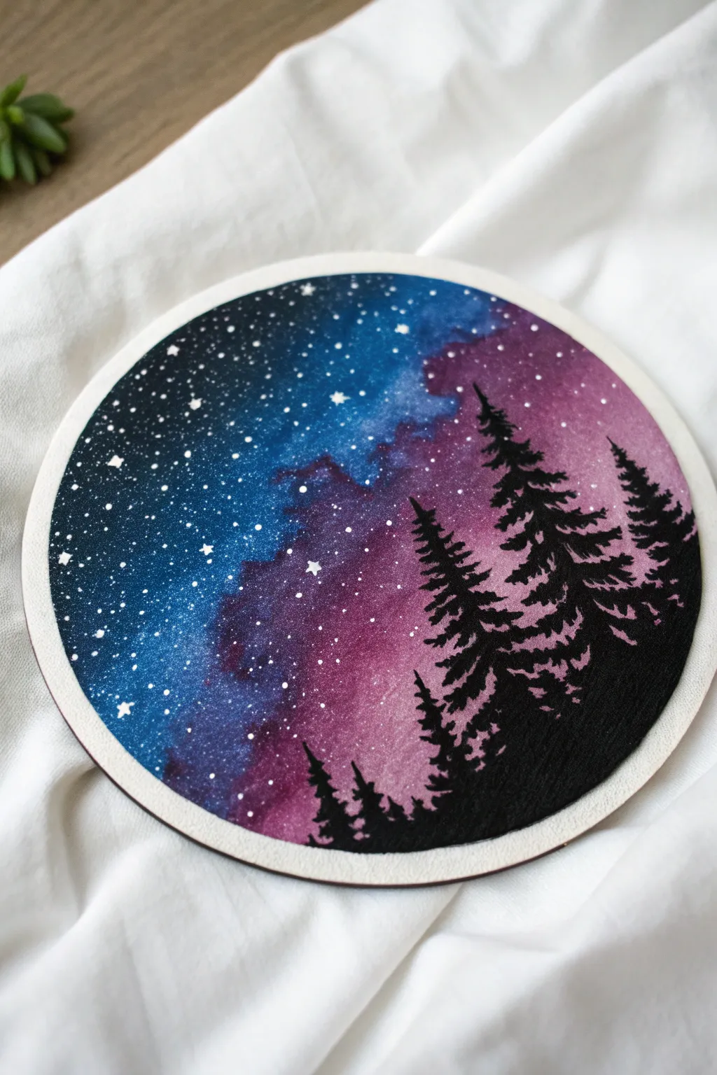
Capture the magic of a deep forest night sky using blendable markers to create a stunning galaxy effect. This project contrasts soft, nebulous colors with sharp black silhouettes for a dramatic, round artwork.
How-To Guide
Materials
- Heavyweight watercolor paper or mixed media cardstock
- Water-based blendable markers (Dark Blue, Cyan, Purple, Magenta)
- Black brush pen or broad marker
- Fine tip black drawing pen
- White gel pen or white acrylic ink
- Water brush or soft paintbrush
- Circular object to trace (approx. 6 inches)
- Scissors
Step 1: Preparing the Canvas
-
Trace the shape:
Place your circular object onto the textured side of the watercolor paper and lightly trace around it with a pencil. -
Cut the circle:
Carefully cut out the circle with scissors, trying to keep the edge as smooth and continuous as possible.
Step 2: Creating the Galaxy Background
-
Apply dark tones:
Using your darkest blue marker, scribble color onto the left side of the circle, covering about a third of the space in a crescent shape. -
Add transition colors:
Switch to a lighter cyan or bright blue marker and color right next to the dark blue, allowing the rough edges to overlap slightly. -
Introduce warm tones:
On the opposite right side, scribble in your purple and magenta shades, leaving an irregular gap between the blues and purples where they meet in the middle. -
Activate the ink:
Dip your paintbrush in water (or use a water brush) and begin painting over the lighter blue area first to dissolve the marker lines. -
Blend the gradient:
Work your wet brush from the light blue into the dark blue, and then clean your brush before activating the purple and magenta sections to prevent muddy colors. -
Create the nebula:
With the brush still damp, gently drag the blue and purple sections together in the middle so they bleed into one another, creating a soft, cloudy transition. -
Let it dry:
I usually set this aside for at least 15 minutes because the paper needs to be bone dry before we add crisp details on top.
Bleed Control Tip
If the paper buckles too much or colors pool strangely, tape the edges of your circle down to a flat surface before painting to keep it taught while drying.
Step 3: Adding the Stars
-
Dot the background:
Once the background is dry to the touch, use a white gel pen to add random dots throughout the darkest blue and purple areas. -
Vary sizes:
Make some dots tiny and others slightly larger to create depth in your galaxy field. -
Draw starbursts:
Choose three or four spots to draw tiny ‘cross’ shapes or diamond sparkles to represent bright, twinkling stars.
Level Up: Constellations
Look up a star chart and arrange your white gel pen dots to form a real constellation like the Big Dipper or Cassiopeia hidden within your galaxy.
Step 4: Drawing the Silhouette
-
Outline the ground:
Using your black fine liner, draw a sloping, uneven line across the bottom right quadrant of the circle to establish the forest floor. -
Fill the earth:
Use the broader black brush pen or marker to fill in everything below that slope completely solid black. -
Plant the main tree:
Switch back to the fine tip pen and draw a straight vertical line rising from the slope for the trunk of the tallest tree. -
Form the canopy:
Starting at the very top of the line, make small jagged zig-zag strokes downward, getting wider as you move down the trunk to create the pine shape. -
Thicken the branches:
Go back over the lower branches with the brush pen to add weight and darkness, ensuring the tree looks full and dense. -
Add companion trees:
Repeat the process to add two or three smaller trees on either side of the main one, varying their heights for a natural look. -
Final touches:
Check for any light patches showing through the black trees and fill them in to ensure a stark, high-contrast silhouette.
Now you have a stunning window into a cosmic forest that looks great displayed on a mini easel or mounted on a wall!
Neon on Black Paper
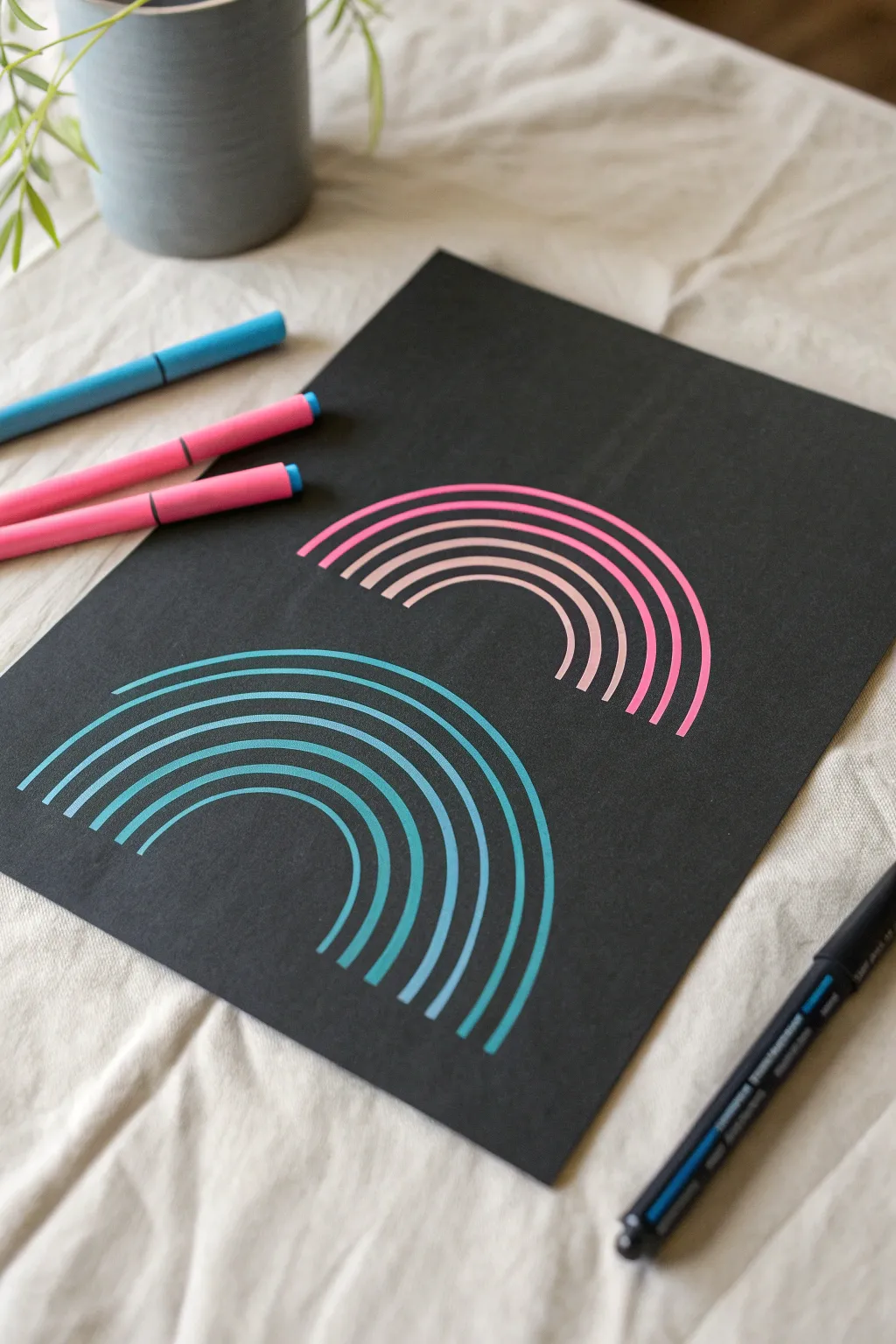
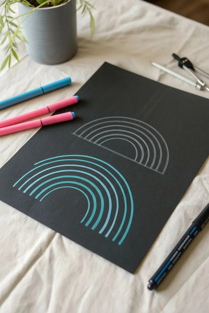
Contrast is king in this minimalist project where vibrant neon ink pops against deep black paper. The result is a modern, geometric diptych that relies on clean lines and consistent spacing for a striking visual impact.
Step-by-Step
Materials
- Heavyweight black cardstock or mixed media black paper
- Opaque neon paint markers (Pink/Magenta and Cyan/Teal)
- White or grey colored pencil (for sketching)
- Compass or various circular objects (bowls, lids)
- Soft eraser
- Ruler
Step 1: Planning the Composition
-
Prepare the surface:
Lay out your sheet of black cardstock on a flat, clean surface free of dust that might clog your markers. -
Visualize placement:
Plan for two distinct arch clusters: one positioned towards the upper right and a second one offset towards the lower left. -
Set the pink anchor:
Using a white colored pencil and a compass (or a medium bowl), lightly sketch the innermost arc for the top rainbow shape. -
Define the boundary:
Sketch the outermost arc about two to three inches above your first line to establish the total height of the rainbow. -
Draft the teal section:
Repeat this sketching process for the bottom-left shape, ensuring it sits lower than the first one to create a cascading effect.
Step 2: Creating the Pink Rainbow
-
Prime your marker:
Shake your pink paint marker well and press the nib on a scrap piece of paper until the ink flows opaquely. -
Draw the base line:
Trace over your sketched bottom curve found in the upper-right section, marked ‘pink’ in your plan. -
Establish the second line:
Draw the next curve directly above the first, maintaining a consistent gap of negative space between them. -
Continue upward:
Keep adding concentric arcs, moving outward. Focus on keeping the black space between lines as uniform as the lines themselves. -
Check symmetry:
As you get to the 5th or 6th line, ensure your arch ends line up horizontally at the bottom so the rainbow doesn’t look tilted. -
Finish the top arc:
Complete the pink section with the final, largest outer curve, aiming for a total of roughly seven lines.
Pivot from the Elbow
To get smoother, less shaky curves, lock your wrist and move your entire arm from the elbow. This creates a natural geometric arc that is much cleaner than drawing with just your fingers.
Step 3: Executing the Teal Rainbow
-
Switch colors:
Prepare your cyan or teal marker, ensuring the tip is saturated but not dripping. -
Rotate for comfort:
I like to rotate the paper slightly at this stage so my hand has a natural range of motion for this lower position. -
Trace inner curve:
Ink the smallest, innermost arch of the lower-left design. -
Build the layers:
Work your way outward just like before, drawing smooth, parallel curves. -
Mimic the spacing:
Try to match the line width and gap spacing of the pink rainbow so the two shapes feel like a cohesive set. -
Finalize the form:
Draw the remaining outer lines until the teal rainbow matches the size and visual weight of the pink one.
Boosting Opacity
If the black paper absorbs too much color making the neon look dull, let the ink dry completely and then carefully draw a second layer directly over the first to make the colors pop.
Step 4: Finishing Touches
-
Allow to set:
Let the artwork sit undisturbed for several minutes. Paint markers on non-porous paper can take longer to dry than standard felt tips. -
Clean up guidelines:
Once you are absolutely sure the ink is dry, gently erase any visible white pencil marks from your initial sketch.
Display your artwork in a well-lit area to really let those neon pigments glow against the dark background
Color Swatch Composition
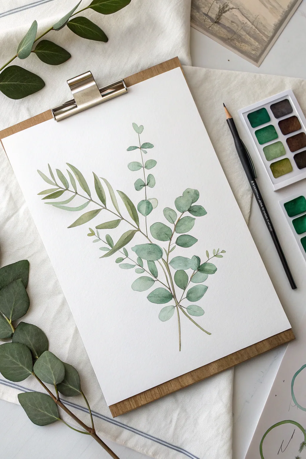
Capture the serene beauty of greenery with this botanical eucalyptus composition. Using simple watercolor techniques, you will mix round silver dollar leaves with slender willow leaves to create an elegant, natural layout.
Step-by-Step Guide
Materials
- Heavyweight watercolor paper (Cold press, 300gsm)
- Watercolor paints (Pan set or tubes)
- Round brush (Size 4 or 6)
- HB Pencil
- Kneaded eraser
- Jar of water
- Paper towel
Step 1: Sketching the Layout
-
Map the stems:
Using your pencil, lightly draw three curved lines originating from the bottom center of the page. Let them fan out gently. -
Outline round leaves:
On the central and right stems, sketch paired circles or heart shapes spaced evenly along the lines to represent the ‘Silver Dollar’ variety. -
Outline willow leaves:
On the left stem, sketch long, slender, almond-shaped leaves to represent the ‘Willow’ eucalyptus variety. -
Refine the sketch:
Go over your lines with a kneaded eraser to lighten them until they are barely visible guidelines.
Bleeding Colors?
If your leaves and stems are blurring into messy blobs, you aren’t waiting long enough between steps. Ensure the paper feels cool and dry before painting adjacent shapes.
Step 2: Painting the Foliage
-
Mix a cool green:
On your palette, mix a green pigment with a touch of blue to create a cool, muted teal for the round leaves. -
Paint the top round leaves:
Start at the top of the right branch. Load your brush with watery paint and fill in the shapes, keeping the edges soft. -
Add variation:
As you move down the stem, add a tiny bit more pigment or water to vary the transparency of each leaf. -
Paint the lower round leaves:
Continue painting the rounded leaves near the bottom. I like to leave small gaps where the stem will eventually connect them. -
Mix a warm olive:
Clean your brush and mix a sap green with a touch of yellow or brown for the willow leaves on the left. -
Paint willow leaves:
Use a ‘press and lift’ motion: touch the tip to the paper, press down to widen the stroke, and lift as you exit to create a point. -
Layering foliage:
Fill in the remaining willow leaves. If a leaf overlaps a stem, ensure the underlying layer is dry first to strictly define the shapes.
Step 3: Stems and Details
-
Dry check:
Wait until all leaf shapes are completely dry to the touch to prevent bleeding. -
Mix stem color:
Create a thin, darker brownish-green mixture for the woody stems. -
Connect the leaves:
Using the very tip of your brush (held vertically), paint thin lines connecting your floating leaves to the main branch lines. -
Add main stems:
Thicken the strokes slightly as you reach the bottom of the page where the branches gather. -
Final clean up:
Once the paint is bone dry, gently erase any remaining visible pencil marks to leave a crisp, professional finish.
Ink Outline
For a more graphic or illustrative style, try outlining your dried painting with a fine-tip waterproof black marker to make the leaves pop.
Display your botanical artwork on a clipboard or in a floating frame to bring a touch of nature indoors.
Gradient Typography
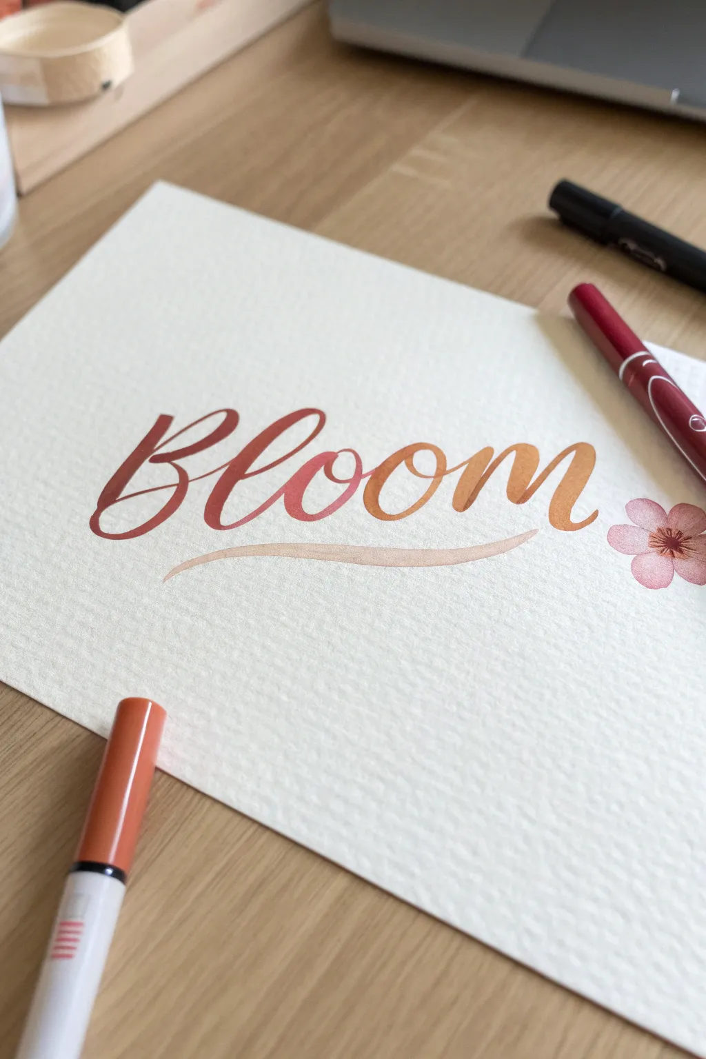
Create a warm and inviting piece of typographic art that transitions seamlessly from deep burgundy to golden orange. This project creates a smooth horizontal gradient across the word using simple blending techniques on textured paper.
Step-by-Step Tutorial
Materials
- Cold-press watercolor paper (140lb)
- Water-based brush pens (Maroon, Coral, Golden Yellow)
- Pale beige or light peach brush pen
- Pink brush pen
- Fine-tip dark brown marker
- Pencil
- Eraser
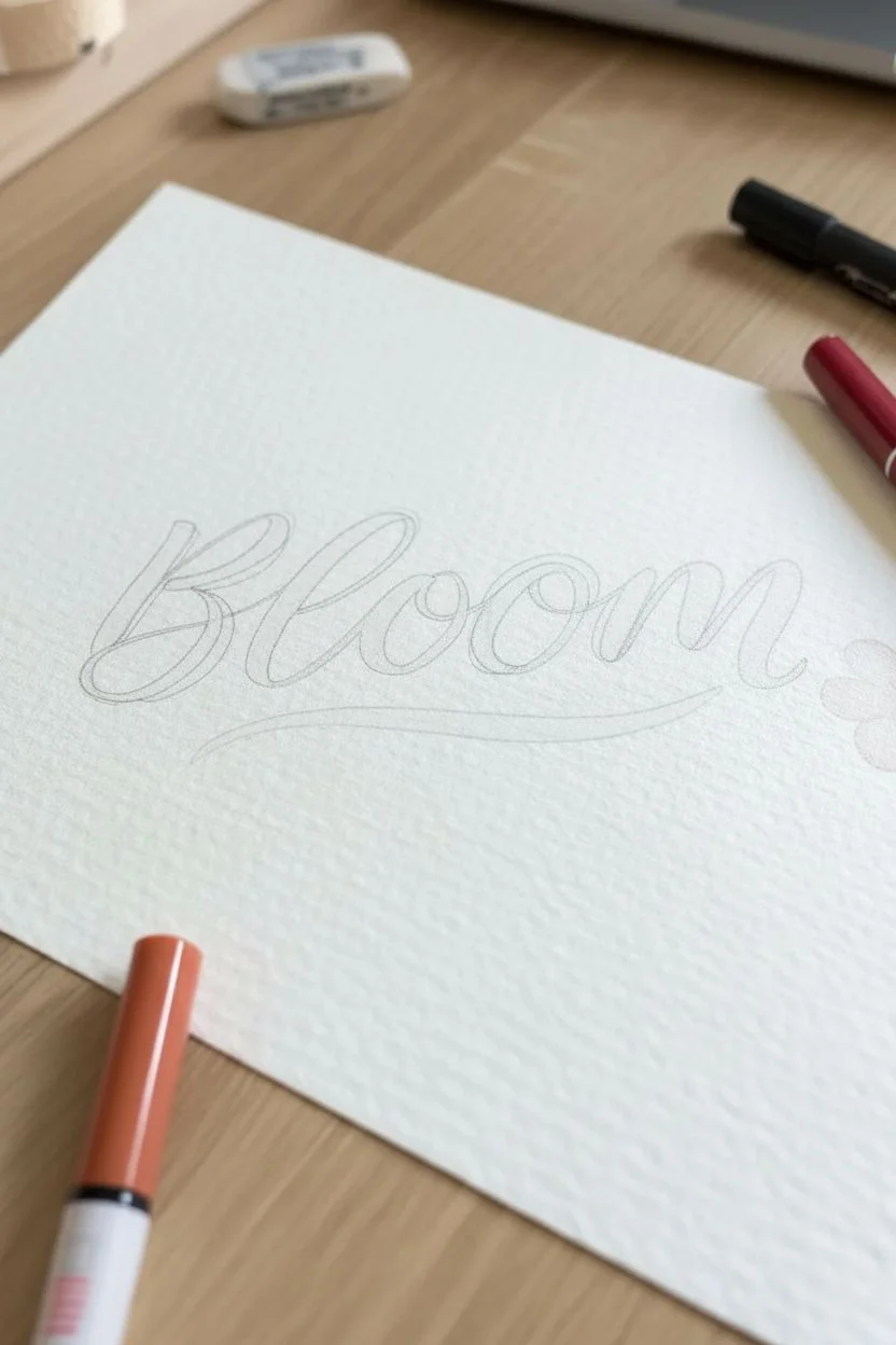
Step 1: Planning and Layout
-
Select your canvas:
Choose a sheet of cold-press watercolor paper. The bumpy texture is crucial for this project as it helps break up the marker ink and adds character to the strokes. -
Sketch the baseline:
Using a pencil, lightly draw a curved or straight baseline where your letters will sit to ensure the word stays aligned. -
Draft the lettering:
Sketch the word “Bloom” in a script style. Focus on large, open loops and consistent spacing between letters to allow room for the colors to transition. -
Thicken slightly:
Lightly outline around your single-line sketch to indicate where the thick downstrokes will be, mimicking the look of faux calligraphy.
Paper Troubles?
If your paper starts to pill or tear while blending, it’s likely too thin or smooth. Switch to 140lb (300gsm) watercolor paper which is designed to handle heavy moisture without damaging the surface.
Step 2: Gradient Lettering
-
Start with the darkest shade:
Take your deep maroon brush pen and carefully letter the entire letter “B”. Apply firm pressure on the downstrokes and very light pressure on the upstrokes. -
Prepare the transition:
For the letter “l”, we want a blend. Take your coral (medium shade) marker and touch its tip against the tip of the maroon marker for about 3 seconds to pick up some dark pigment. -
Letter the second character:
Write the letter “l” with the coral marker. The ink will start dark (from the transfer) and naturally fade into the true coral color as you write, creating a seamless gradient. -
Continue the gradient:
Use the pure coral marker to write the first “o”. I check that the ink is still wet on the previous letter to ensure they connect smoothly. -
Second color blend:
Now, take your golden yellow (lighest shade) marker and touch its tip to the coral marker’s tip for a few seconds. -
Complete the word:
Write the second “o” and the final “m” with this golden marker. The dark-to-light transition should now span across the whole word from left to right. -
Add the swash:
Using a very pale beige or light peach brush pen, draw a long, swooping underline beneath the word. Start with light pressure, press down for thickness in the middle, and lift off at the end.
Make it Shine
Once fully dry, use a white opaque gel pen to add small highlighted lines on the upper left side of your thick downstrokes. This gives the letters a glossy, “juicy” appearance.
Step 3: Floral Details & Finishing
-
Outline the flower:
To the right of your text, lightly sketch a simple five-petal flower shape with your pencil. -
Color the petals:
Fill in the petals using a soft pink brush pen. Start your strokes from the center of the flower and flick outward towards the petal tips for a soft, painterly look. -
Add the center:
Use a fine-tip dark brown marker to stipple a small circle of dots in the very center of the flower. -
Draw stamens:
With the same fine-tip marker, draw tiny, delicate lines radiating from the center dot into the petals to add realistic detail. -
Let it dry:
Wait at least 15 minutes for all ink layers to dry completely. Brush markers can stay wet longer on watercolor paper. -
Erase guidelines:
Gently erase your pencil sketches. Hold the paper taut with one hand while erasing to prevent the paper from buckling.
Now you have a stunning gradient lettering piece that looks like a professional watercolor work!
The ‘Messy’ Art Supply Flat-Lay
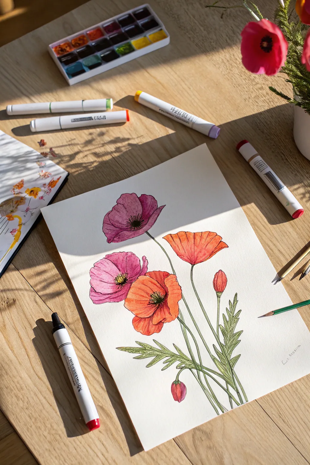
Capture the delicate beauty of wild poppies with this vibrant marker illustration. You will learn to layer colors to create depth in the petals and reproduce the characteristic crinkled texture of these beloved wildflowers.
Step-by-Step
Materials
- Heavyweight marker paper or mixed media paper
- HB pencil and eraser
- Fine liner pens (Black, 0.1mm and 0.3mm)
- Alcohol-based art markers (Various pinks, magentas, oranges, and reds)
- Green art markers (Light olive and forest green)
- White gel pen (optional)
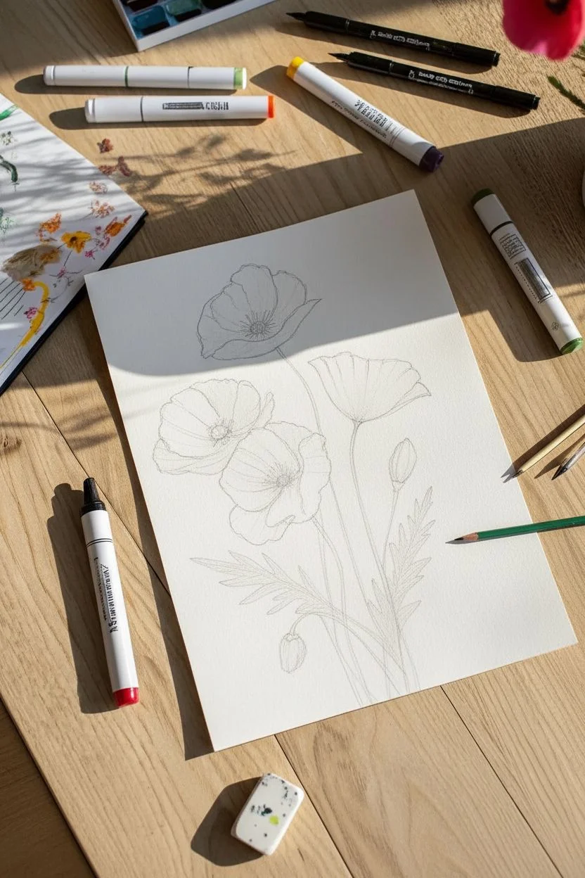
Step 1: Sketching the Composition
-
Map the stems:
Start by drawing faint, curved lines radiating from the bottom right corner to establish the posture of your flowers. -
Place the blooms:
Sketch four rough ovals at different heights on the stems to determine where the open flowers will sit. -
Add the buds:
off to the side or lower down, draw two teardrop shapes to represent the closed poppy buds. -
Define the petals:
Refine the ovals into flower shapes with four large petals each, giving the edges a wavy, irregular line to mimic the papery texture of poppies. -
Sketch foliage:
Draw jagged, fern-like leaves extending from the base of the stems, keeping them loose and organic.
Bleed Prevention
Alcohol markers typically bleed through standard paper. Always place a scrap sheet of thick cardstock underneath your artwork to protect your work surface.
Step 2: Inking the Outlines
-
Trace the petals:
Using a 0.1mm fine liner, go over your pencil lines for the petals. Break the line occasionally to keep the look airy. -
Add interior details:
Draw the center of the flowers with a small cluster of tiny circles for the anthers, surrounded by fine radiating lines. -
Outline stems and leaves:
Ink the stems and leaves, adding a few internal veins to the larger leaves for realism. -
Clean up:
Wait a moment for the ink to settle, then gently erase all graphite pencil marks until the paper is clean.
Level Up: Mixed Media
Try using watercolor paints for the base layer of the petals instead of markers. This creates a softer, more organic transparency perfect for poppies.
Step 3: Coloring the Blooms
-
Pink base layer:
For the two pink flowers (top left and bottom left), lay down a wash of light rose or pale pink. -
Pink shading:
While the ink is wet, layer a deeper magenta color near the flower centers and in overlap areas to create dimension. -
Orange base layer:
Color the remaining two flowers with a bright tangerine or coral orange hue. -
Orange shading:
Add a reddish-orange tone to the edges of the petals and the deep center folds to make the flowers pop. -
Darken centers:
I like to use a very dark brown or black marker to dot the very center of the stamens for high contrast.
Step 4: Greenery and Finishing Touches
-
Color stems:
Use a light olive green marker to carefully trace over the thin stems. -
Leaf details:
Fill the leaves with the same olive base, then use a forest green to darken the underside of the leaves and the vein lines. -
Color the buds:
Color the buds green, blending in a touch of pink or orange at the very tip to show the petal peeking through. -
Texture lines:
Use your fine liner again to add very light, swift hatching lines on the shadowed side of the stems for texture. -
Highlights:
Optionally, use a white gel pen to add tiny highlights on the edges of the petals or the tops of the buds.
Now you have a vibrant botanical study ready to be framed or scanned for custom stationery cards.


Have a question or want to share your own experience? I'd love to hear from you in the comments below!