Staring at a blank screen can be wonderful but also a little intimidating, so I have opened up my personal sketchbook to share some of my favorite prompts to get your stylus moving. Whether you are looking to practice specific technical skills or just want to get lost in a dreamy new concept, these painting prompts will help you explore the incredible versatility of your digital tools.
Dreamy Gradient Sky Studies
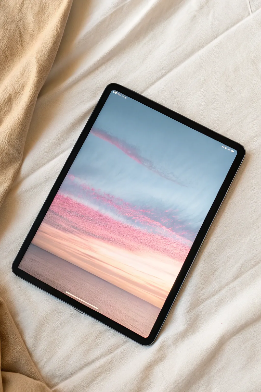
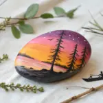
Capture the calm of a pastel sunset with this digital painting tutorial. We will focus on building atmospheric gradients and using textured brushes to create those striking, horizontal pink cloud formations.
Step-by-Step Guide
Materials
- Digital Tablet & Stylus
- Drawing Software (Procreate, Photoshop, etc.)
- Soft Airbrush
- Textured Dry Brush or Charcoal Brush
- Smudge Tool
Step 1: Setting the Atmosphere
-
Base Canvas:
Open a new canvas and fill the background layer with a muted, medium-light blue to serve as the dominant sky color. -
Horizon Gradient:
Create a new layer. select a large Soft Airbrush and choose a soft peach or pale orange color. -
Painting the Glow:
Gently paint the lower third of the canvas with the peach color, letting it fade smoothly upward into the blue sky. -
Blocking the Sea:
Use a rectangular selection tool to isolate the bottom quarter of the image. -
Sea Color:
Fill this selection with a desaturated lavender or grey-blue tone, slightly darker than your sky, to establish the water. -
Softening the Line:
I prefer to apply a very slight Gaussian Blur to the horizon line so the separation between sky and sea feels atmospheric rather than razor-sharp.
Too Heavy-Handed?
If the clouds look too solid, lower the flow setting of your brush. This allows the sky color to peek through the texture, creating a vaporous effect.
Step 2: Sculpting the Clouds
-
Brush Selection:
Switch to a textured brush, such as a Dry Ink, Charcoal, or rough Pastel brush. This is key for the grainy look seen in the reference. -
Main Cloud Band:
Select a vibrant magenta or deep pink. Paint a thick horizontal band across the lower middle of the sky using sweeping side-to-side strokes. -
Adding Dimension:
Lock the alpha of your cloud layer (or use a clipping mask). Choose a lighter coral pink and lightly brush over the top edge of the magenta band to catch the light. -
Upper Wisps:
Reduce your brush size and opacity. Sketch a few faint, thin streaks of pink higher up in the blue sky area to balance the composition. -
Refining Texture:
Use an eraser with a textured tip to lightly graze the edges of the main cloud band, making it look broken up and organic rather than a solid block. -
Smudging:
With a smudge tool set to a rough texture, gently drag some of the cloud edges horizontally to simulate wind shear.
Paper Texture
Import a high-res paper texture image on the topmost layer. Set the blend mode to ‘Multiply’ and lower opacity to 15% for a realistic traditional art feel.
Step 3: Reflections & Finish
-
Water Reflection:
On a new layer above the sea, color-pick the pink from your clouds. Paint horizontal streaks on the water surface. -
Blurring Reflections:
Apply a Horizontal Motion Blur filter to the reflection layer. This ensures the water looks glassy and distinct from the textured sky. -
Deepening Values:
Select a dark navy blue and lightly airbrush the bottom corners of the canvas to vignette the water and draw the eye upward. -
Sunlight Hint:
Add a new layer set to ‘Add’ or ‘Overlay’. Paint a soft, warm yellow glow right at the center of the horizon line. -
Noise Overlay:
To mimic the photo’s aesthetic, add a noise filter (about 3-5%) over the entire artwork for a cohesive, grainy film look.
Enjoy the peaceful vibe of your new sunset landscape.


Nostalgic Pixel Art Landscapes
Capture the warmth of a vintage poster with this digital landscape tutorial. By combining flat vector-style shapes with gritty noise textures, you’ll create a nostalgic scene that feels like it was printed on old paper.
Step-by-Step Guide
Materials
- Digital Tablet (iPad or similar)
- Stylus
- Drawing App (Procreate, Adobe Fresco, or Infinite Painter)
- Noise or Splatter Brushes
Step 1: Setting the Scene
-
Establish the palette:
Choose a warm, retro color scheme. You will need a cream/beige for the sky, varied tones of rust and burnt orange for the mountains, and a deep charcoal green for the trees. -
Background base:
Fill your background layer with your chosen cream or light beige color to serve as the sky. -
Sun placement:
On a new layer, use a hard round brush to stamp a crisp white circle in the center of the canvas. -
Drifting clouds:
Select a rust-colored mid-tone. Draw flat, elongated cloud shapes floating above and below the sun using a monoline brush for clean edges.
Smooth Operator
If your mountain edges look too shaky, turn up the “Streamline” or “Stabilization” setting on your brush to get those clean, geometric slopes.
Step 2: Building Mountains
-
Furthest peaks:
Create a new layer. Draw two geometric triangular peaks using a muted orange tone; fill the shapes completely. -
Mid-ground range:
On a fresh layer above the first, draw a larger, wider mountain range using a darker terracotta or burgundy shade. -
Locking transparency:
Activate ‘Alpha Lock’ (or ‘Protect Alpha’) on your mountain layers so you can paint inside the shapes without going over the edges. -
Adding gradients:
Select a soft airbrush and a slightly lighter version of your mountain color. Gently brush the tops of the peaks to create a subtle glow. -
The noisy transition:
Switch to a ‘Noise’, ‘Grain’, or ‘Splatter’ brush. Select a darker shade and paint the bottom half of the mountains to create that speckled, retro shading effect seen in the example.
Step 3: The Forest Foreground
-
Ground plane:
Create a new layer on top of everything. Uses your darkest charcoal-green to draw a rolling hill shape at the bottom of the canvas. -
Tree trunks:
Using a textured inking pen, draw vertical lines of varying heights across the foreground hill to act as guides for your pines. -
Pine silhouette:
I prefer to use a slightly rough brush here. Start at the top of a trunk and use zig-zag motions, getting wider as you go down, to create the pine tree shape. -
Varying density:
Repeat this for all trees, allowing some to overlap. Leave small gaps between branches so the background color peeks through. -
Secondary forest:
Add a layer *behind* your main trees. Draw smaller trees in a slightly lighter opacity to create the illusion of a dense forest receding into the distance.
Paper Trail
Import a photo of watercolor paper or cardboard as your top layer. Set the blend mode to ‘Multiply’ to give the artwork a realistic physical texture.
Step 4: Texture & Final Polish
-
Water reflection:
At the very bottom edge, use horizontal, choppy strokes to suggest a reflection in a lake or river, mirroring the dark colors of the trees. -
Global noise overlay:
Create a new top layer and fill it with a neutral gray. Apply a ‘Noise’ filter effect to the entire layer. -
Blending mode:
Set this noise layer’s blend mode to ‘Overlay’ or ‘Soft Light’ and lower the opacity to about 20%. This binds the whole image together with a film-grain look.
Now you have a serene, textured landscape that looks perfectly at home on a digital canvas.


Seamless Surface Pattern Design
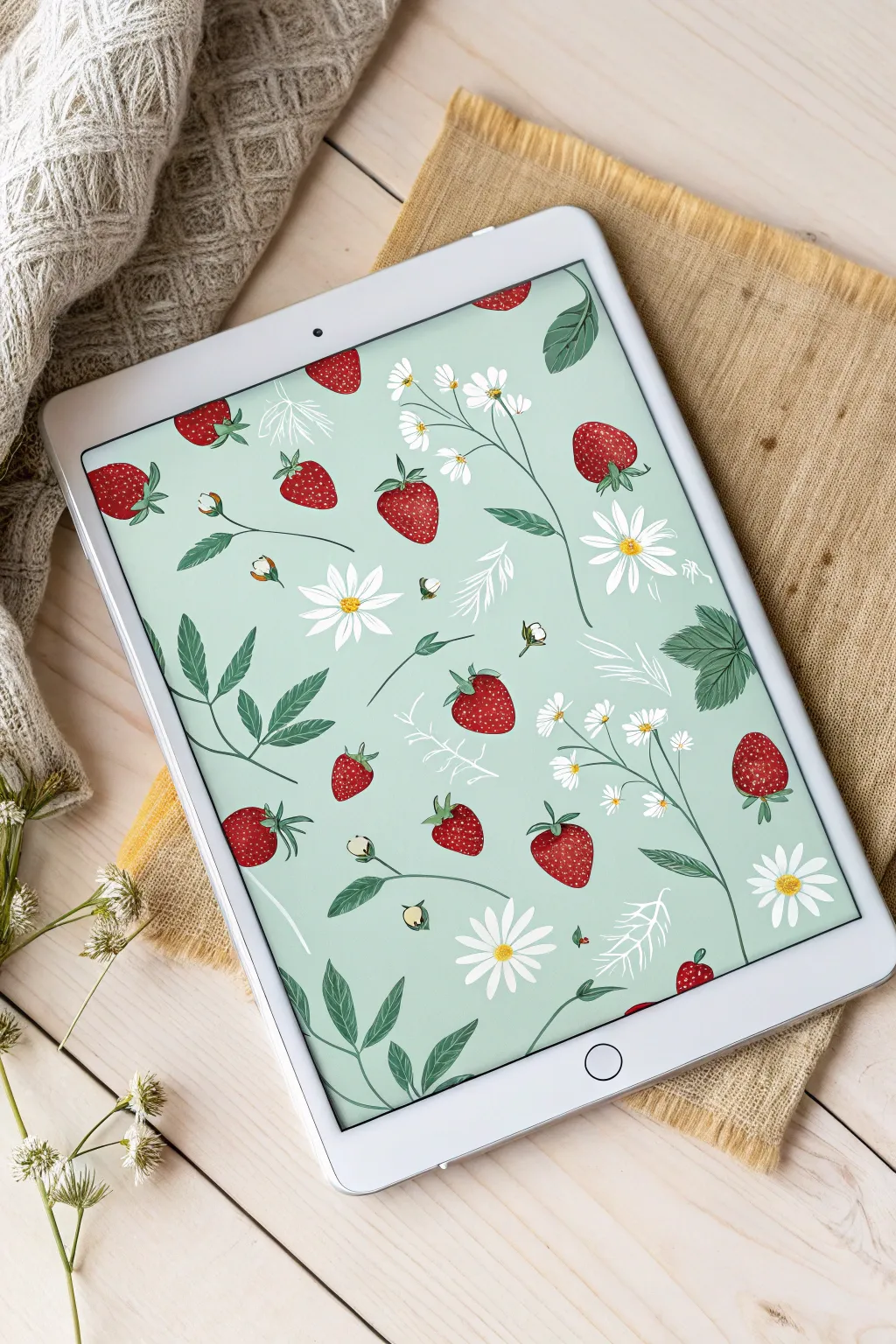
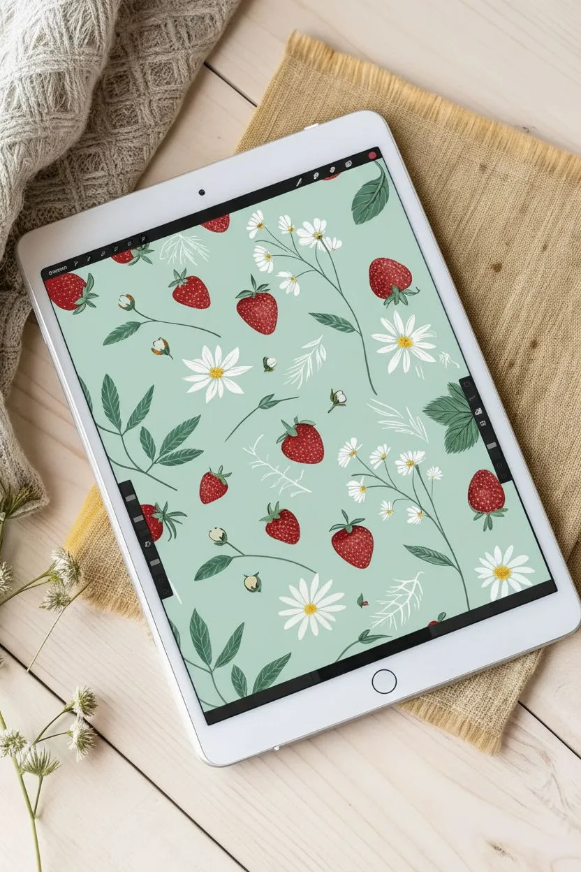
Capture the essence of early summer with this delightful botanical surface pattern design. You will learn to illustrate stylized strawberries and daisies on a soothing mint background and arrange them into a professional seamless repeat suitable for fabric or stationery.
Step-by-Step Guide
Materials
- iPad or Graphics Tablet
- Digital Pencil / Stylus
- Raster Drawing App (e.g., Procreate, Photoshop)
Step 1: Drafting the Motifs
-
Set the foundation:
Create a square canvas, ideally 3000 x 3000 pixels at 300 DPI. Fill a background layer with a soft, muted mint green color to serve as your base tone. -
Sketch the strawberry shapes:
On a new layer, use a sketching pencil brush to draw several variations of heart-shaped strawberries. Make them slightly irregular for an organic hand-drawn feel. -
Block in color:
Select a textured brush, like a dry gouache or watercolor shader. Fill your strawberry sketches with a deep, rich red, leaving subtle texture variations rather than a flat fill. -
Add the seeds:
Switch to a fine liner brush with a pale yellow or light green hue. Dot tiny seed indentations across the berries, curving your placement lines to emphasize the roundness of the fruit. -
Top with greenery:
Paint the leafy calyx on top of each berry using a forest green shade. Use short, flicking strokes to mimic the jagged edges of the leaves. -
Illustrate the daisies:
On a separate layer, start with bright yellow textured circles for the centers. Paint long, slender white petals radiating outward; don’t worry about perfect symmetry. -
Draw supporting foliage:
Create medium-sized green trifoliate leaves with serrated edges. Add darker vein details to give them depth and direction. -
Add delicate fillers:
Create a new layer for ‘ghost’ elements. Use a thin white line brush to draw skeletal fern shapes or branches. I like to reduce the opacity of this layer slightly so they sit back in the composition.
Smart Snapping
Turn on ‘Magnetics’ or ‘Snapping’ when doing the offset transform step. If the artwork shifts even one pixel off the 50% mark, distinct lines will appear in your final repeat.
Step 2: Building the Repeat
-
Group your assets:
Organize your individual drawings. It is best to keep each motif (berry, flower, leaf) on its own layer initially, or save them as ‘stickers’ so you can duplicate them easily. -
Start in the center:
Begin arranging your strawberries and daisies in the middle of the canvas. Rotate them in different directions to create a flowing, non-linear movement. -
Mind the edges:
Keep your initial arrangement away from the canvas borders for now. Creates a dense cluster of artwork in the center. -
The offset trick:
Group your arrangement layers and flatten them into one image layer (keep a backup!). Apply an ‘Affine Transform’ or ‘Offset’ filter. Shift the image horizontally by 50% of the canvas size and vertically by 50%. -
Observe the corners:
Your center cluster has now been pushed to the four corners of the canvas, creating a large empty diamond shape in the middle. This ensures the edges match perfectly. -
Fill the void:
Use your original motif assets to fill this new empty space in the center. Place berries and flowers carefully to mesh with the elements now sitting at the corners. -
Balance the spacing:
Look for awkward gaps or trapped spaces. Fill these small areas with loose petals, tiny buds, or the white line-art twigs you drew earlier.
Step 3: Finalizing the Swatch
-
Check the flow:
Zoom out to view the thumbnail. Ensure no single element creates a distracting ‘line’ or stripe effect visually; adjusting rotation usually fixes this. -
Test the pattern:
Duplicate your finished pattern square four times. Arrange them in a 2×2 grid on a larger canvas. Zoom in on the seams to ensure no pixels are misaligned. -
Color correction:
Here I prefer to add a subtle noise filter over the entire artwork to unify the texture of the digital watercolor strokes with the background. -
Export:
Save your single seamless tile as a high-quality JPEG or PNG, ready to be uploaded to fabric printing sites or used as a digital background.
Fixing White Lines
If thin white lines appear at the seams of your pattern grid, it’s often an anti-aliasing error. Duplicate the pattern layer and merge it down to thicken the edge pixels.
Now you have a charming, summery print ready to turn into tea towels or wallpaper


Three-Panel Digital Comics


Capture a quiet, narrative moment by creating a vertical three-panel digital comic strip with a hand-drawn aesthetic. This project focuses on building a cohesive visual story using earthy tones and ink-style linework that mimics traditional media.
Step-by-Step Tutorial
Materials
- Digital Tablet (iPad or similar)
- Stylus (Apple Pencil or similar)
- Digital Art Software (Procreate, Clip Studio Paint, or Photoshop)
- Textured Ink Brushes (digital)
- Paper Texture Overlay (optional digital asset)
Step 1: Layout and Sketch
-
Set up the canvas:
Open a new vertical canvas in your software, approximately 2000×3000 pixels. Use the drawing guides or grid tool to visualize a layout for three equally stacked rectangular panels. -
Draw the panel borders:
On a new layer, use a monoline brush to draw thick black rectangles for your frames. Leave a consistent gap, or “gutter,” between each panel to separate the scenes. -
Rough out the story:
Select a sketching pencil tool in a light color like blue or grey. Sketch the basic shapes for your narrative: a tabletop still life for the top, a character portrait in the middle, and a seated rear view for the bottom. -
Refine the composition:
Flesh out your sketch details. In the top panel, position a plate with food and a bowl to establish the setting. Ensure there is enough negative space in the middle and bottom panels for text bubbles later.
Step 2: Inking the Lines
-
Select your inking brush:
Choose a digital brush that mimics a slightly dry ink pen or a felt tip marker. I usually look for one with pressure sensitivity so the line weight varies naturally as I draw. -
Ink the top panel:
On a new layer above your sketch, carefully trace the final lines for the food and tableware. Add loose, organic scribbles for the background plants to give them a leafy texture. -
Ink the character panels:
Move to the middle and bottom panels. Ink the character’s messy bun and clothing folds with fluid strokes. Pay attention to the stripes on the sweater, drawing them with a slight curve to show the volume of the body. -
Add environmental details:
Draw the table surface and the back of the chair in the final panel using straight, confident lines. Use short hatching marks to suggest wood grain. -
Clean up the line art:
Hide the sketch layer to check your work. Use an eraser to tidy up any overshot lines or messy intersections, ensuring the drawings stay strictly within the panel borders.
Wobbly Lines?
If your inking feels too shaky, increase the ‘Streamline’ or ‘Stabilization’ setting in your brush properties. This smooths out your strokes automatically.
Step 3: Coloring and Texture
-
Establish the palette:
Create a color palette using muted, earthy tones: sage green, terracotta orange, pale blue, and creamy beige. This keeps the comic feeling warm and nostalgic. -
Base colors:
Create a layer beneath your line art. Use a solid fill brush to block in the main shapes, such as the character’s clothing and the wooden table surface. -
Detail coloring:
Fill in the smaller details like the food details and the leaves. Keep the colors flat for now; we aren’t aiming for realistic rendering but rather a stylized illustration look. -
Add simple shading:
Select a slightly darker, desaturated version of your base colors. Add simple cel-shading under the chin, beneath the plate, and on the chair back to add depth without overcomplicating the flat style. -
Background wash:
On a layer at the very bottom, fill the panel backgrounds with a very light cream or off-white color so the panels aren’t transparent.
Retro Print Effect
Duplicate your line art layer, turn it slightly blue or magenta, set it to ‘Multiply’, and nudge it a few pixels to the right to create a cool chromatic aberration effect.
Step 4: Lettering and Finishing
-
Draw text containers:
Using your inking brush, draw loose, freehand rectangles or bubbles in the negative spaces you planned earlier. Don’t worry if they aren’t perfectly straight; that adds charm. -
Add narrative text:
Write your dialogue or captions by hand using a clear, legible brush. If you prefer a font, choose one that resembles handwriting to match the organic linework. -
Apply texture overlay:
To mimic the look of paper, import a paper texture image on the topmost layer. Set the blending mode to ‘Multiply’ and reduce the opacity until the texture is subtle but visible. -
Final cropping:
Check the overall balance of the strip. If needed, crop the canvas slightly so the margins around the panels are even.
Now you have a charming, narrative comic strip ready to export and share!

PENCIL GUIDE
Understanding Pencil Grades from H to B
From first sketch to finished drawing — learn pencil grades, line control, and shading techniques.
Explore the Full Guide
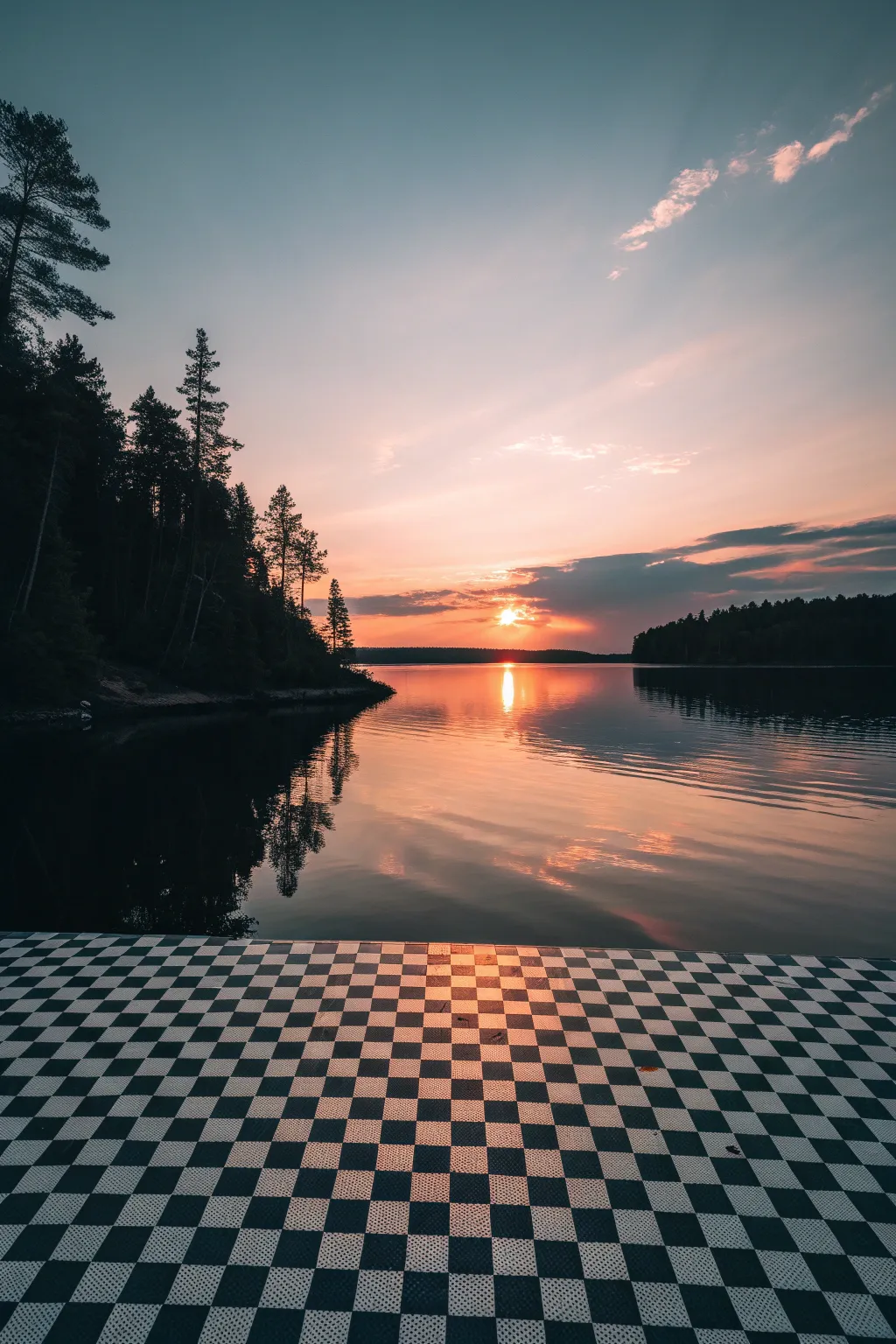
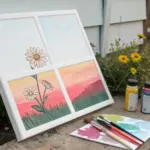
Dithered Sunset Scenes

Merge surreal geometry with natural beauty in this digital landscape tutorial. You will create a striking contrast between a rigid checkerboard dock and the fluid, organic warmth of a sunset lake scene.
Step-by-Step Tutorial
Materials
- Digital painting software (Photoshop, Procreate, or GIMP)
- Graphics tablet or stylus
- Soft round pressure-sensitive brushes
- Foliage or ‘grunge’ texture brushes
- Gradient tool
Step 1: Setting the Perspective
-
Canvas setup:
Create a new vertical canvas (approx. 2000x3000px) and fill the background layer with a deep, muted indigo color to serve as your base shadow tone. -
Create the pattern:
On a new layer, create a flat black-and-white checkerboard pattern. You can do this by tiling square selections or using a pattern fill tool depending on your software. -
Warping the floor:
Use your software’s ‘Transform’ or ‘Perspective Warp’ tool to flatten the checkerboard into a floor plane. Pull the bottom corners distinctively wide and pinch the top corners together until they meet a generic horizon line. -
Positioning:
Move this floor layer so it occupies the bottom third of your canvas. The horizon line should sit roughly at the lower 35% mark of the image.
Floored Perspective?
If the checkerboard looks like a wall instead of a floor, your vanishing point is too high. Drag the top corners of your transform box closer together and lower down to match the water’s horizon line.
Step 2: Painting the Atmosphere
-
Sky gradient:
On a layer behind the floor, paint a soft gradient starting with pale blue at the top, transitioning into soft lavender, and ending in a vibrant salmon-orange near the horizon. -
Cloud shapes:
Using a soft brush with low opacity, sketch wispy cloud formations. I find it best to keep the clouds near the top darker (grey-blue) and those near the horizon warmer (pink-orange) to simulate depth. -
Sun placement:
Paint a small, hard white circle just above the distant treeline for the sun. Switch to a soft airbrush to add a diffuse orange glow around it using an ‘Add’ or ‘Screen’ blend mode. -
Water base:
Duplicate your sky layer, flip it vertically, and squash it slightly. Position it between the floor and the sky layers to create the water reflection base. -
Water texture:
Apply a ‘Motion Blur’ filter (horizontal) to the water layer. Then, select the ‘Smudge’ tool to manually ripple the edges where colors meet, mimicking gentle waves.
Pro Tip: Tile warmth
Don’t leave the black tiles purely black. Sample the dark blue from your top sky and fill the black tiles with it, darken it slightly. This unifies the color palette instantly.
Step 3: Silhouettes and Shadows
-
Distant shore:
On a new layer, paint a dark, almost black strip right across the horizon line. Use a small jagged brush to create tiny tree tops along the upper edge. -
Foreground trees:
Create a layer for the left-side foliage. Using a textured brush, paint tall, looming pine trees. Ensure the edges are sharp against the bright sky but keep the inner mass solid black. -
Tree detailing:
Lower the opacity of your eraser slightly and gently dab into the tree silhouette edges to let small patches of sky peek through the branches for realism.
Step 4: Lighting and The Dither Finish
-
Sun reflection:
Paint a vertical streak of white and orange light on the water directly under the sun. Use a horizontal zigzag motion to break the line up, following the water ripple perspective. -
Floor integration:
The checkerboard looks too clean right now. Create a new layer set to ‘Overlay’ above the floor. Paint a soft, warm orange gradient coming from the center to simulate the sunset reflecting on the tiles. -
Atmospheric haze:
Add a very subtle layer of peach-colored mist over the distant shoreline to push it back in space. -
Noise application:
To achieve the requested ‘dithered’ aesthetic, create a top layer filled with 50% grey, set to ‘Overlay’ mode, and apply a ‘Noise’ filter (approx. 5-10%). -
Final dither pass:
For the true retro look, flatten your image (or create a merged copy) and apply a patterned dither or indexed color mode restricted to a specific palette size (e.g., 64 colors) to create the pixelated shading transitions.
Now you have a stunning, atmospheric scene that perfectly blends retro digital aesthetics with natural beauty.


Have a question or want to share your own experience? I'd love to hear from you in the comments below!