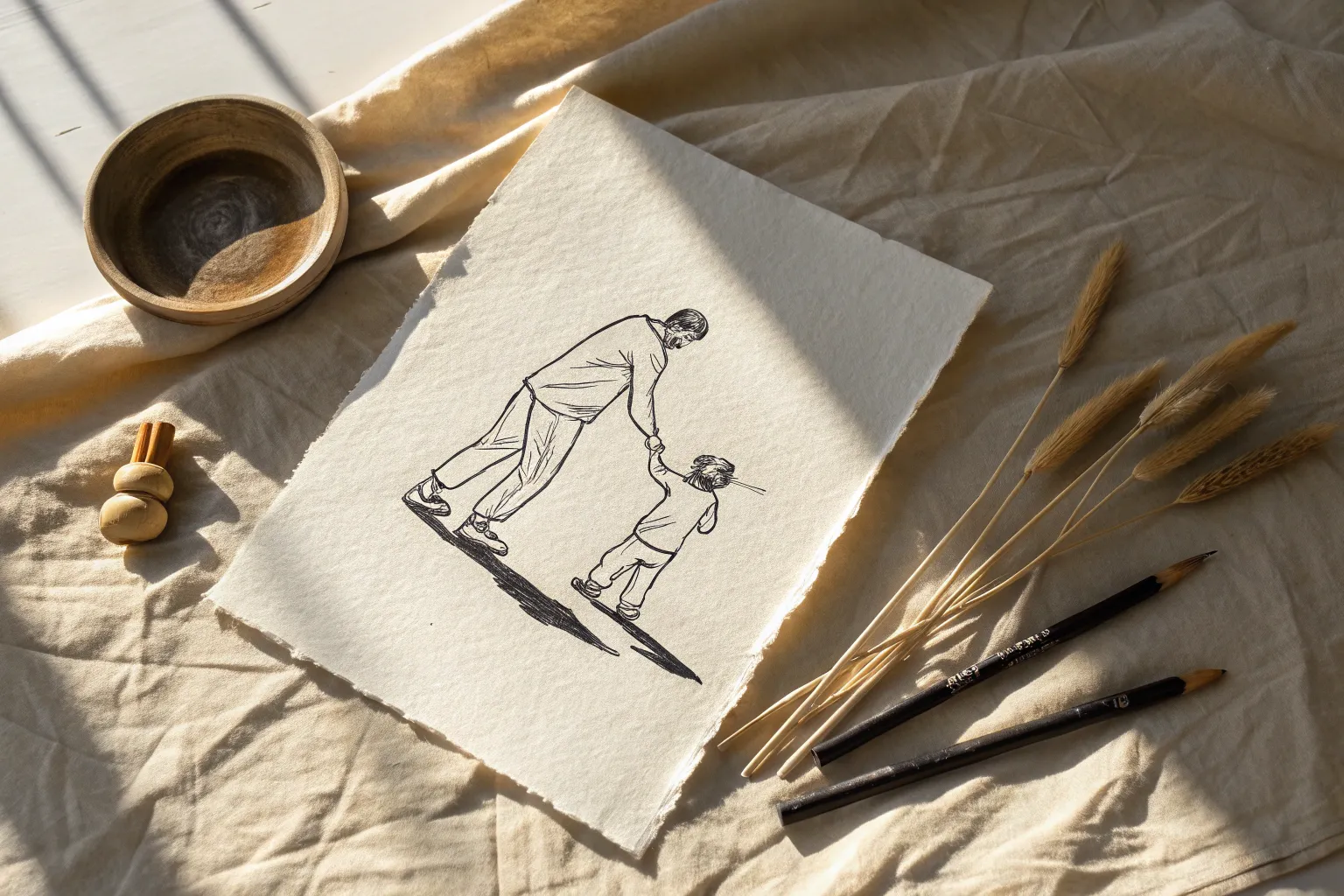
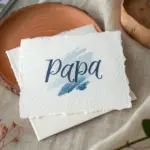
There is something incredibly grounding about sitting at the art table to create a handmade gift that honors the men who raised us. Whether you are looking for a sentimental watercolor painting or a funny doodle for a card, this collection offers inspiration for every skill level.
The Classic Patterned Necktie Design
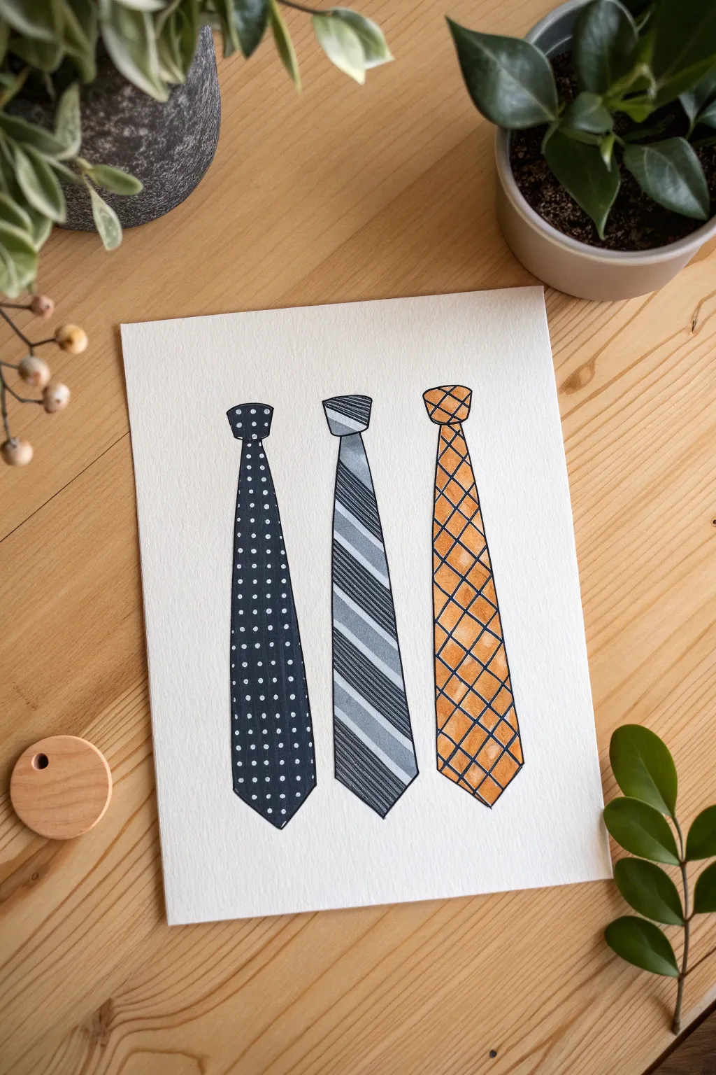
Capture the essence of classic dad style with this clean and charming watercolor illustration. By combining simple geometric patterns with vibrant washes, you will create a professional-looking greeting card perfect for Father’s Day.
Step-by-Step
Materials
- Cold press watercolor paper (A5 or 5×7 size)
- HB pencil and quality eraser
- Waterproof black fineliner (0.3mm or 0.5mm)
- Watercolor paints (Navy blue, warm grey, orange/mustard)
- Round watercolor brush (size 4 or 6)
- White gel pen or opaque white gouache
- Ruler
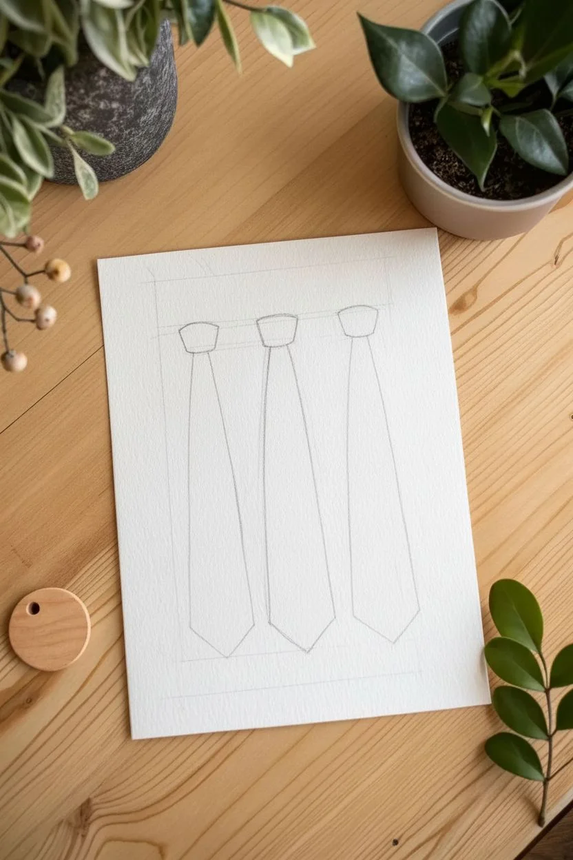
Step 1: Sketching the Silhouette
-
Establish spacing:
Use a ruler to lightly mark the center of your paper, then mark two points equal distances to the left and right to ensure your three ties will be evenly spaced. -
Draw the knots:
At each mark, lightly sketch a small, inverted trapezoid shape for the tie knot. Keep the corners slightly rounded rather than sharp. -
Form the body:
extending downwards from each knot, draw two long lines that gradually flair out, becoming wider towards the bottom. -
Add the tip:
Close off the bottom of each tie with a triangular point. Try to keep the lengths consistent across all three, but subtle variations add hand-drawn charm.
Wet-on-Dry Tip
For the crispest edges on your stripes and checks, always ensure the bottom layer of paint is 100% dry before adding the patterns on top.
Step 2: Painting the Polka Dots
-
Mix the navy:
Load your brush with a saturated navy blue paint. You want this color to be opaque and bold. -
Fill the left tie:
Carefully paint inside the sketched lines of the first tie. I prefer to start at the knot and work my way down to control the flow. -
Let it dry:
Allow this layer to dry completely before moving to the next step to prevent smudging. -
Add the dots:
Once the blue is bone-dry, use a white gel pen to tap small, evenly spaced dots in vertical rows down the length of the tie.
Step 3: Creating the Stripes
-
Base wash:
For the middle tie, apply a very watery, pale grey wash over the entire shape and let it dry. -
Mark diagonals:
Lightly sketch diagonal lines across the tie to guide your painting. -
Darker stripes:
Mix a darker, blue-grey shade and paint alternating stripes. Leave the pale base visible in between. -
Texture details:
Once dry, use a very fine brush or a grey marker to add thin, scratchy diagonal lines inside the darker stripes for a textured fabric look.
Level Up: Personalize It
Instead of using these generic patterns, look at your own dad’s tie collection and try to mimic his favorite specific tie patterns for a sentimental touch.
Step 4: The Windowpane Check
-
Orange wash:
Paint the third tie on the right with a warm orange or mustard yellow. Let the color pool slightly in some areas for natural watercolor texture. -
Crucial drying time:
Wait for the paint to be completely dry to the touch. If it is damp, the ink in the next step will bleed. -
Draw the grid:
Using your black fineliner, carefully draw thin diagonal lines going one way, then cross them in the opposite direction to create a diamond grid.
Step 5: Final Definition
-
Outline the shapes:
Go over the outer perimeter of all three ties with your waterproof black fineliner to give them a crisp, illustrative pop. -
Define the knots:
Draw a slightly curved horizontal line separating the knot from the body of the tie. -
Erase guidelines:
Once you are certain all ink and paint is dry, gently erase any visible pencil marks to clean up the artwork.
Now you have a stylish, handcrafted tribute ready to be turned into a card or framed for Father’s Day.

World’s Greatest Dad Trophy
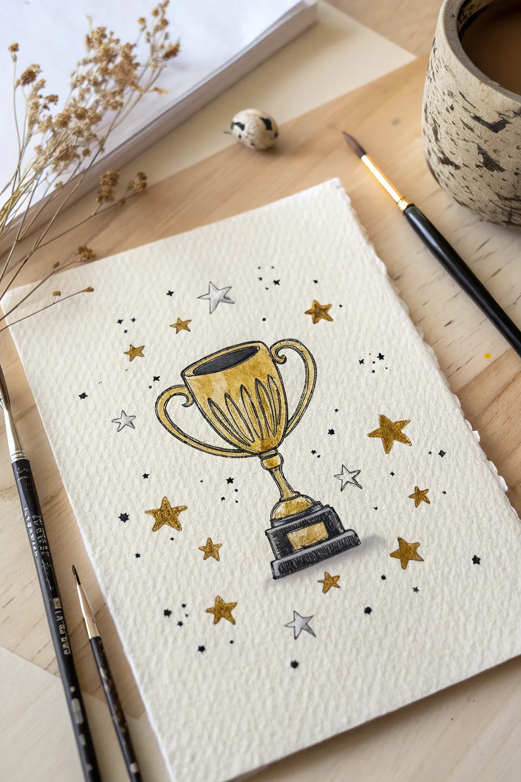
Celebrate Dad’s wins with this shimmering trophy illustration that mixes sketched ink lines with bold metallic accents. It makes for a stunning greeting card cover that looks professionally crafted yet is wonderful to create by hand.
Detailed Instructions
Materials
- Heavyweight cold press watercolor paper
- HB pencil and kneaded eraser
- Waterproof black fineliner (0.3mm or 0.5mm)
- Metallic gold watercolor paint or gouache
- Small round paintbrush (size 2 or 4)
- Black India ink or gouache
- Silver watercolor paint (optional)
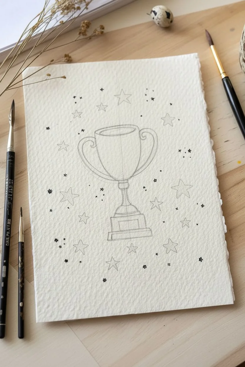
Step 1: Sketching the Shape
-
Create the axis:
Start by lightly drawing a vertical center line on your paper to ensure the trophy stands straight and symmetrical. -
Form the cup:
Sketch a wide U-shape for the main bowl, centering it on your axis line, and add a flattened oval at the top to form the rim. -
Build the base:
Draw a narrow, tapered stem extending downward, connecting to a tiered rectangular base with a space marked for a center plaque. -
Add handles:
Sketch two curved handles on the sides, shaped like ears, connecting the upper rim to the lower body of the cup. -
Scatter elements:
Lightly draw stars of various sizes scattered around the trophy to create a celebratory background.
Shine Bright
Leave tiny slivers of white paper unpainted on the curve of the cup and handles. These negative spaces act as high-gloss highlight reflections for extra realism.
Step 2: Inking the Design
-
Outline the structure:
Trace over your pencil lines with a waterproof black fineliner, keeping the line work loose and slightly sketchy for character. -
Add reflection lines:
Draw several vertical, slightly curved lines inside the body of the cup to resemble metallic fluting or reflections. -
Define the base:
Ink the tiered sections of the base and the central rectangle plaque area clearly. -
Ink the background:
Outline the stars and add tiny speckles or dots around them to fill the empty space. -
Clean up:
Once the ink is completely dry to the touch, gently erase all underlying pencil marks with your kneaded eraser.
Step 3: Applying Gold
-
Prepare the paint:
Mix your metallic gold watercolor with a little water until it reaches a creamy, opaque consistency. -
Paint the cup:
Fill in the body of the cup and the handles with gold, carefully painting around your ink lines. -
Highlight the base:
Paint the small rectangular plaque on the base with the same rich gold pigment. -
Gild the stars:
Select a few of the star shapes to fill completely with gold, balancing them around the composition.
Smudge Alert
If your black lines bleed when you add paint, switch to a permanent alcohol marker for outlines or wait longer for the ink to fully cure before painting.
Step 4: Contrasts and Details
-
Add deep blacks:
Use black India ink or gouache to fill the oval opening at the top and the tiered sections of the base. -
Silver touches:
I like to add a very watery wash of silver or grey to the outline stars for subtle dimension without overpowering the gold. -
Final polish:
Add a few final black dots or tiny cross-hatching marks with your pen to balance the texture across the page.
This metallic masterpiece creates a memorable and stylish tribute effectively capturing championship vibes for Father’s Day


The Superhero Alter Ego
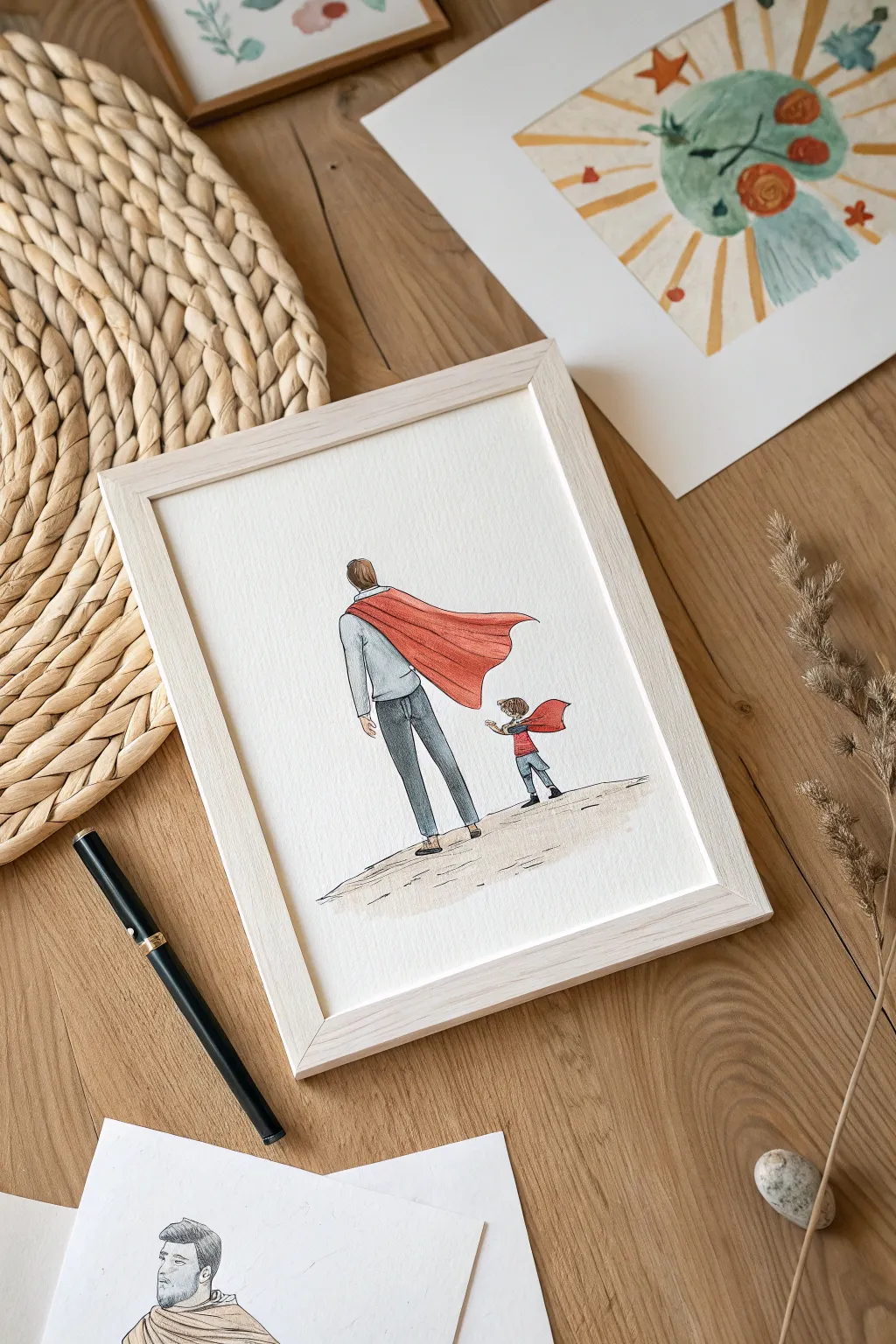
Capture a tender moment between father and child with this minimalist watercolor illustration. This project combines delicate ink linework with soft washes of color to create a heartwarming piece perfect for framing.
Step-by-Step
Materials
- Cold press watercolor paper (A4 or 8×10)
- Waterproof fine liner pen (0.3mm black)
- Watercolor paints (pan or tube)
- Round watercolor brushes (size 4 and 8)
- HB Pencil
- Kneaded eraser
- Jar of clean water
- Paper towels
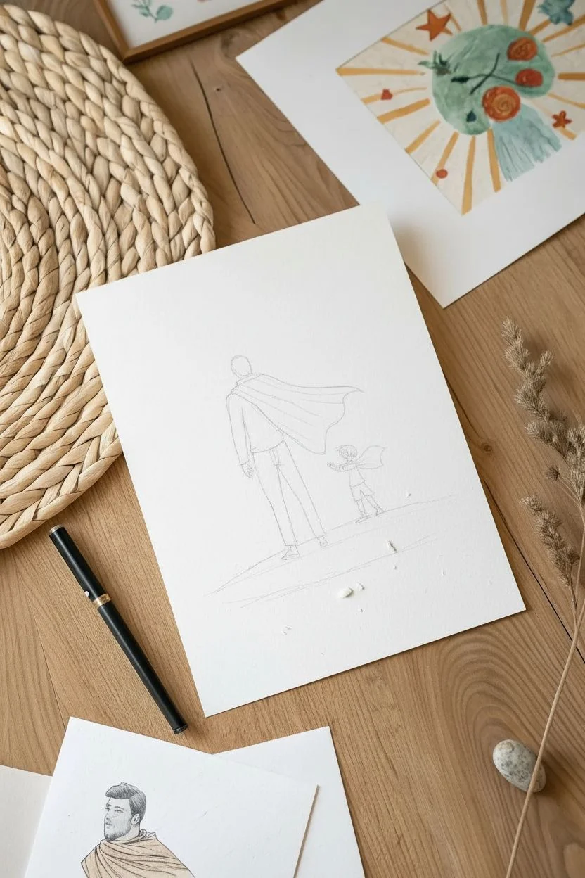
Step 1: Sketching the Foundations
-
Placement:
Begin by lightly marking the center of your paper. Draw a faint, slightly curved horizontal line near the bottom third to establish the ground. -
Father’s posture:
Sketch the father’s figure from the back, placing him slightly to the left of center. Keep the forms simple: a rounded rectangle for the torso and long cylinders for legs, capturing a relaxed walking stride. -
Child’s frame:
Draw the child’s figure to the right, significantly shorter, with the head reaching the father’s waist level. Angle the child’s body slightly toward the father to show connection. -
Cape outlines:
Add the flowing capes to both figures. Draw them billowing out to the right side to suggest movement and wind direction, keeping the lines fluid rather than rigid. -
Clothing details:
Refine the clothing outlines, adding slight creases at variables like the knees, elbows, and where the shirt tucks in.
Step 2: Inking the Scene
-
Outline work:
Using your waterproof fine liner, trace over your pencil sketches. Use a confident but relaxed hand; broken or slightly sketchy lines add to the illustrative style. -
Hair texture:
Ink the hair using short, directional strokes that follow the curve of the vivid head shapes to suggest volume and style. -
Ground texture:
Add loose, horizontal scribbles and dashes along the ground line you sketched earlier to simulate a dusty path or textured earth. -
Clean up:
Allow the ink to dry completely for at least five minutes to prevent smearing. Gently erase all visible pencil marks with the kneaded eraser.
Fixing Bleeds
If paint bleeds outside the lines, dab it immediately with a clean, dry paper towel. Once dry, you can gently scrape tiny errors away with an X-Acto knife or cover with white gouache.
Step 3: Applying Watercolor
-
Skin tones:
Mix a very watery, pale beige or brown. Lightly paint the visible neck areas and the father’s hand, keeping the color transparent. -
Hair base:
Apply a light brown wash to both heads. I like to leave tiny slivers of white paper unpainted near the crown to represent shine. -
Dad’s clothing:
Paint the father’s jeans with a diluted indigo or Payne’s gray. While wet, drop a slightly darker concentration into the inseam and folds for depth. Paint his sweater a very pale, watery blue-gray. -
Child’s clothing:
Color the child’s pants in a similar denim blue tone. If you want contrast, make the child’s regular shirt a neutral tone, as the cape will provide the main color. -
The red capes:
Load your brush with bright cadmium red. Paint the capes using the wet-on-dry technique to keep the edges crisp and bold against the lighter background. -
Cape dimensions:
While the red paint is still damp, touch a mix of red and a tiny bit of purple into the folds and bottom edges of the capes to create shadow and volume. -
Ground shadows:
Mix a very dilute sepia or light brown wash. Sweep this color horizontally across the ground area, going over your ink scribbles to anchor the figures. -
Final drying:
Let the artwork dry completely flat. If the paper buckles slightly, you can place it under a heavy book once dry to flatten it before framing.
Pro Tip: Color Harmony
To make the red capes really pop, keep all other colors (jeans, sweater, ground) desaturated. Step down the intensity of your blues and browns so the red remains the focal point.
Place your finished illustration in a simple light wood frame to complete this clean, modern tribute to fatherhood.

Dad’s Handy Tool Set Illustration
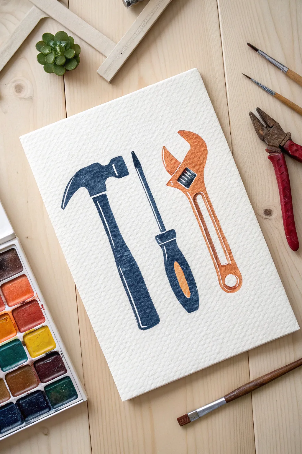
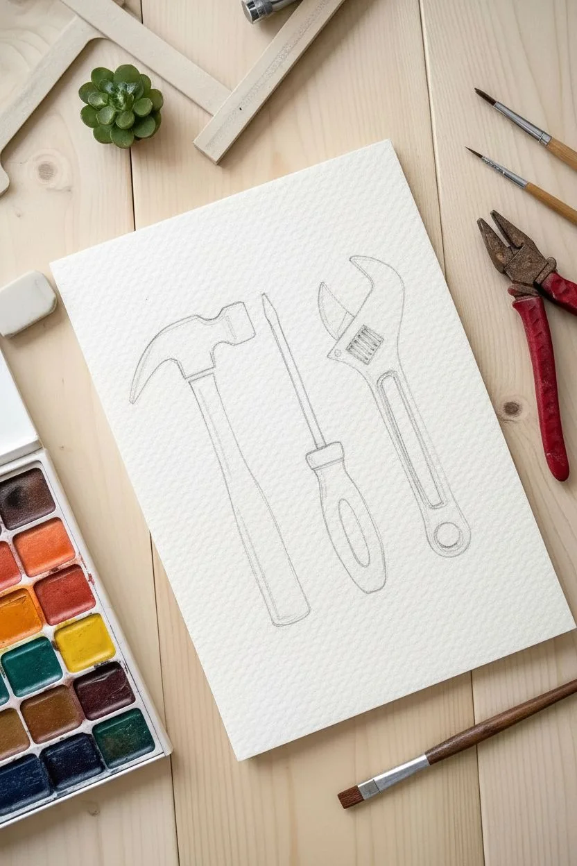
Celebrate the family handyman with this charming watercolor illustration featuring a classic hammer, screwdriver, and adjustable wrench. The textured paper and deep, saturated colors give this piece a vintage manual vibe that looks professional yet is surprisingly simple to execute.
How-To Guide
Materials
- Cold-press watercolor paper (300 gsm)
- Watercolor paints (Indigo Blue, Rusty Orange, Black)
- Round watercolor brushes (Size 4 and Size 0)
- HB Pencil
- Kneaded eraser
- Jar of water
- Paper towels
Step 1: Sketching the Layout
-
Position the tools:
Lightly sketch the outlines of the three tools using an HB pencil. Place the hammer on the left, the screwdriver in the center, and the wrench on the right. -
Refine the hammer shape:
Detail the hammer’s claw head and the straight handle, adding a small curved line near the neck to separate the metal from the grip. -
Define the screwdriver:
Draw the screwdriver with a long, thin shaft and a chubby handle. Sketch an oval shape inside the handle where the secondary color will go. -
Sketch the wrench:
Outline the adjustable wrench, paying close attention to the open jaws and the small spiral adjustment knob in the center.
Pro Tip: Highlights
Don’t use white paint for reflections. Instead, plan ahead and leave the white paper showing in tiny strips. It looks much brighter and cleaner.
Step 2: Painting the Indigo Elements
-
Mix the navy blue:
Load your Size 4 brush with a deep indigo or navy blue paint. Aim for a creamy consistency with less water to get the opaque look shown in the photo. -
Paint the hammer head:
Carefully fill in the hammer head. I like to leave a small, thin strip of white paper unpainted along the top curve to act as a natural highlight. -
Fill the hammer handle:
Continue with the blue down the hammer’s handle. Press the brush slightly harder to fill the wider space, lifting near the bottom for a rounded edge. -
Detail the screwdriver shaft:
Switch to your Size 0 detail brush to paint the thin metal shaft of the screwdriver using the same blue tone. -
Paint the screwdriver grip:
Using the Size 4 brush, paint the outer grip of the screwdriver handle blue, being very careful to leave the center oval shape empty for now. -
Dry the blue layer:
Let these blue sections dry completely before moving on to avoid color bleeding.
Level Up: Metallic Pop
Swap the grey paint for silver metallic watercolor or a silver gel pen on the screwdriver shaft and wrench knob for a realistic shiny tool effect.
Step 3: Adding the Orange Tones
-
Mix the rusty orange:
Clean your brush and mix a warm, rusty orange color. It should provide a vibrant contrast to the deep blue. -
Paint the wrench body:
Fill in the main body and handle of the wrench. Like the hammer, leave a few tiny white slivers on the corners of the jaws to simulate light hitting the metal. -
Add the screwdriver accent:
Fill in the empty oval space you left on the screwdriver handle with this orange hue. -
Paint the wrench detail:
Use the tip of your brush to paint the lower jaw of the wrench, leaving a small gap around the adjustment knob area.
Step 4: Final Mechanics & Details
-
Paint the adjustment knob:
Mix a very diluted black or grey. Paint the small adjustment knob on the wrench, adding tiny horizontal stripes to suggest the texture of the turning mechanism. -
Strengthen details:
Once the first layers are dry, go back with your fine brush and add a second layer of paint to the shadowed side of the handles (the left side) to create volume. -
Clean up edges:
Check for any uneven edges and smooth them out with the fine brush and a little pigment. -
Erase guidelines:
Wait until the painting is bone dry—warm to the touch—then gently gently erase any visible pencil marks with the kneaded eraser.
Frame this sturdy trio to remind Dad that he’s the best builder in town.
BRUSH GUIDE
The Right Brush for Every Stroke
From clean lines to bold texture — master brush choice, stroke control, and essential techniques.
Explore the Full Guide
The Generational Fist Bump
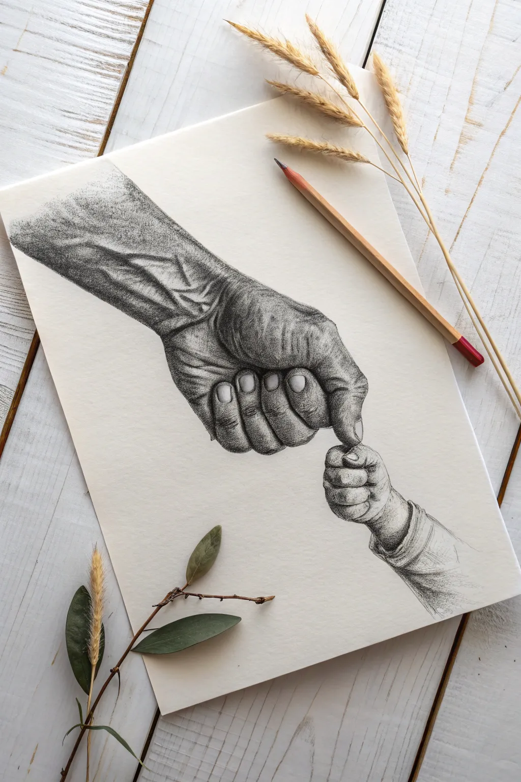
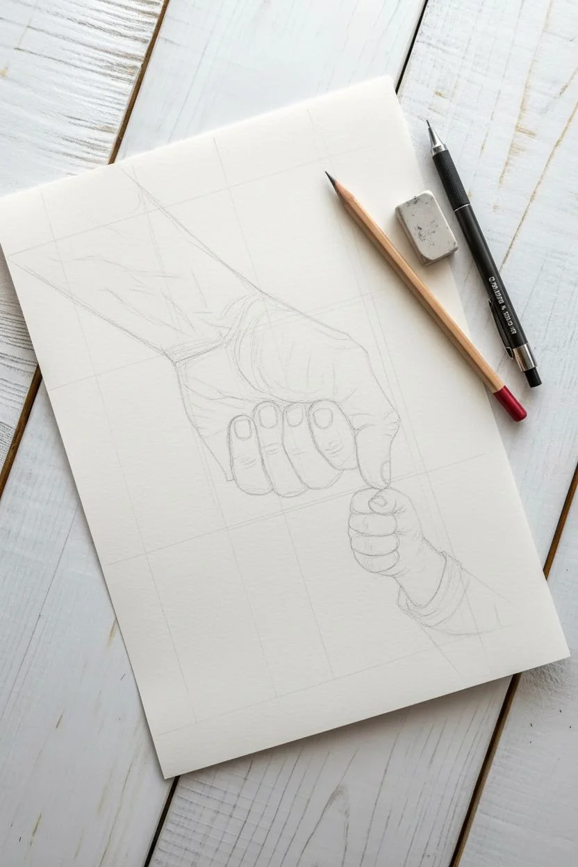
This poignant drawing captures the powerful contrast between the weathered strength of a father’s hand and the delicate, trusting grasp of a child. By focusing on hyper-realistic textures and dramatic lighting, you’ll create a timeless black-and-white tribute suitable for framing.
Step-by-Step Tutorial
Materials
- Heavyweight drawing paper (medium tooth)
- Graphite pencils (ranging from HB to 6B)
- Mechanical pencil (0.5mm or 0.3mm)
- Kneaded eraser
- Precision eraser (or eraser pencil)
- Blending stump or cotton swab
Step 1: Structural Sketching
-
Establish the axis:
Begin with an HB pencil using very light pressure. Draw a faint diagonal line from the top-left to the bottom-right to guide the angle of the arm and hand connection. -
Block the large shapes:
Sketch a cylinder for the forearm and a large, blocky oval for the adult’s hand. At the bottom right, lightly draw a smaller circle for the baby’s fist. -
Position the fingers:
Refine the adult hand shape, indicating the curled fingers and the extended index finger pointing downward. Sketch the tiny sausage-shapes of the baby’s fingers wrapping around the adult’s fingertip. -
Refine the outline:
Go over your shapes to create a clean contour line. Pay attention to the subtle bumps of the knuckles and the wrist bone, then gently erase your initial guide shapes.
Step 2: The Father’s Hand
-
Base shading on the arm:
Using a 2B pencil, lay down a base layer of shading on the forearm. Use unidirectional hatching strokes that follow the curve of the arm to suggest roundness. -
Map the veins:
With a 4B pencil, lightly sketch the path of the prominent veins on the wrist and back of the hand. Shade strongly around them, leaving the tops of the veins the white of the paper. -
Deepen the grain:
To achieve that weathered look, use a sharp mechanical pencil to draw tiny, irregular cross-hatching marks across the darker areas of the skin. I like to vary my pressure here to create a porous texture. -
Knuckle details:
On the curled fingers, draw deep creases where the skin folds. Use a 6B pencil for the darkest recesses between the fingers to create depth. -
Fingernail definition:
Outline the adult fingernails. Shade the sides of the nail bed but leave a distinct white highlight in the center of the nail to show the hard, smooth texture. -
Thumb and palm texture:
The skin near the thumb base is thicker. Use short, curved hatching lines to mimic the direction of wrinkles wrapping around the thumb muscle.
Smudge Alert
Graphite loves to smear. Place a clean sheet of scrap paper under your drawing hand as you work. This acts as a shield, preventing oils and friction from ruining your crisp details.
Step 3: The Child’s Hand
-
Soft base layer:
Switch back to an HB or H pencil for the baby’s hand. Shade very lightly, avoiding hard lines to maintain a soft, plump appearance. -
Defining the tiny fingers:
Darken the small creases between the baby’s fingers and knuckles. Unlike the adult hand, ensure these gradations are smooth by gently smudging with a blending stump. -
Adding the sleeve:
Sketch the cuff of the baby’s shirt at the wrist. Use loose, sketchy lines to suggest fabric folds, contrasting with the smooth skin. -
The contact point:
Use your darkest pencil (6B) to shade the tight shadow where the baby’s fingers press against the adult’s index finger. This shadow anchors the two subjects together.
Texture Contrast
Don’t blend the adult hand too much! Let the paper’s grain show through to mimic rough pores, while blending the baby’s hand fully to make it look soft and smooth.
Step 4: Final Definition
-
Enhancing contrast:
Look at the whole drawing from a distance. Darken the shadows on the underside of the adult arm and in the deep muscle crevices to make the form pop. -
Lifting highlights:
Take your Kneaded eraser and pinch it into a sharp wedge. Dab—don’t rub—along the tops of the veins and knuckles to pull out bright, clean highlights. -
Final texture check:
Add a few stray hairs or pores on the adult arm using the mechanical pencil, and clean up the surrounding white space to ensure a crisp layout.
Now you have a deeply meaningful textured drawing that perfectly preserves a moment of connection.
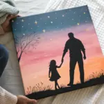
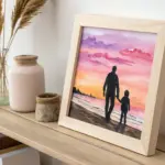
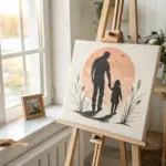
Sunset Silhouette Walk
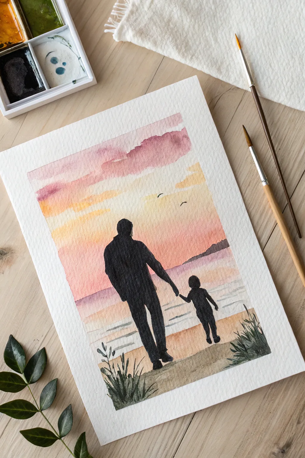
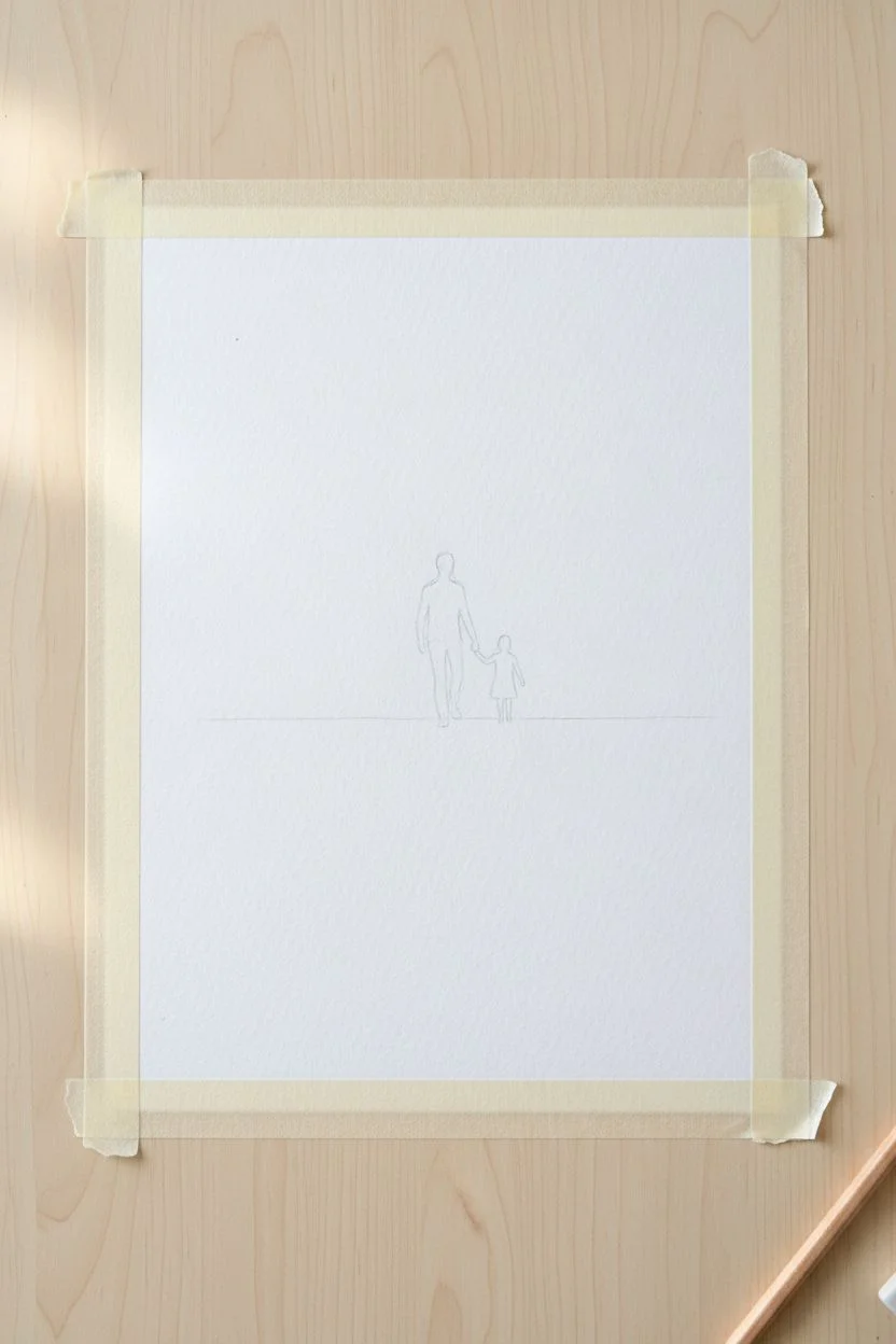
Capture the bond between father and child with this emotive watercolor silhouette painting. By combining a wet-on-wet sunset sky with crisp, opaque figures, you can create a professional-looking keepsake that feels both nostalgic and heartwarming.
Detailed Instructions
Materials
- Cold-pressed watercolor paper (300gsm)
- Watercolor paints (tube or pan)
- Round brushes (size 2 and 6)
- Flat wash brush
- Masking tape
- Pencil and eraser
- Two jars of water
- Paper towels
Step 1: Setting the Scene
-
Prepare the paper:
Secure your watercolor paper to a board or table using masking tape along all four edges. This creates the crisp white border seen in the photo and prevents the paper from buckling when wet. -
Sketch the outline:
Using a pencil, lightly sketch a horizon line about one-third up from the bottom. Sketch the silhouettes of the father and child in the center. Keep lines faint so they don’t show through the sky later.
Step 2: Painting the Sunset Background
-
Wet the sky area:
With your flat wash brush and clean water, evenly wet the entire paper surface above the horizon line until it glistens. -
Apply the upper sky:
Load a medium brush with a muted purple or mauve. touched lightly to the very top of the wet paper, letting the paint bloom downwards naturally. -
Blend the sunset colors:
Rinse your brush and pick up a soft warm pink or coral. Apply this below the purple, allowing the edges to softy merge. -
Create the golden horizon:
While the paper is still damp, paint a band of warm yellow or light orange right above the horizon line, blending it upward into the pink. I like to leave a few tiny gaps of white for cloud highlights. -
Paint the distant land:
While the sky is drying but slightly damp, dab a faint line of purple-grey mix along the right side of the horizon to imply distant mountains. -
Paint the water:
Once the sky is mostly dry, paint the water area with horizontal strokes using a very diluted mix of the sky colors (pinks and light purples). Leave some white paper showing to represent light reflecting on waves. -
Wash in the beach:
Paint the remaining bottom section with a sandy beige or light ochre wash. Let the entire background dry 100% before moving to the next phase.
Silhouette Success Tip
Ensure the background is bone dry before painting the black figures. If the paper is cool to the touch, it’s still damp! Painting too soon will cause the black to bleed into the sky.
Step 3: The Silhouettes
-
Mix the black paint:
Create a rich, opaque black on your palette. You want a creamy consistency, not too watery. If your set lacks black, mix burnt umber with ultramarine blue. -
Outline the figures:
Switch to your smaller size 2 round brush. Carefully outline the father’s head and shoulders first to establish the scale. -
Fill the shapes:
Fill in the body of the father figure. Ensure the edges are crisp against the sunset background. -
Paint the child:
Paint the child’s silhouette next, paying close attention to the connection point where their hands meet. This is the emotional focal point. -
Add the ground shadow:
Paint a darker, textured horizontal strip at the very bottom of the page where the figures are walking, anchoring them to the scene.
Level Up: Personalize It
Make this drawing specific to the recipient by adjusting the silhouettes. Add a second child, change the hair shapes, or even add a small dog silhouette trotting alongside the family.
Step 4: Final Details
-
Add grass texture:
Using the tip of your smallest brush and your black mix, flick quick, upward strokes in the bottom corners to create prominent tufts of beach grass, as shown in the image. -
Add birds:
Paint two or three tiny ‘V’ shapes in the golden part of the sky to represent distant seabirds. -
The reveal:
Ensure the painting is bone dry. Slowly peel away the masking tape at a 45-degree angle to reveal your clean white border.
Frame this piece behind glass to protect the watercolor and present it as a timeless gift.

PENCIL GUIDE
Understanding Pencil Grades from H to B
From first sketch to finished drawing — learn pencil grades, line control, and shading techniques.
Explore the Full Guide
Grill Master Food Puns
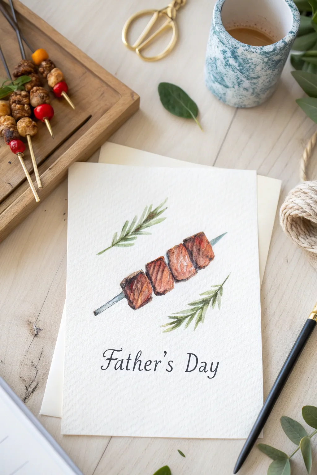
Celebrate the grill master in your life with this tasteful and realistic watercolor card design. The combination of textured paper and layered browns creates a mouth-watering illustration of a classic shish kebab, perfectly accented with fresh rosemary.
Step-by-Step Tutorial
Materials
- Cold-press watercolor paper (140lb/300gsm)
- Watercolor paints (Burnt Sienna, Burnt Umber, Alizarin Crimson, Sap Green, Payne’s Grey)
- Round watercolor brushes (Size 4 for washes, Size 0 or 1 for details)
- HB pencil and kneaded eraser
- Fine-tip black drawing pen (0.3mm or 0.5mm)
- Ruler
- Paper towel
- Water jar
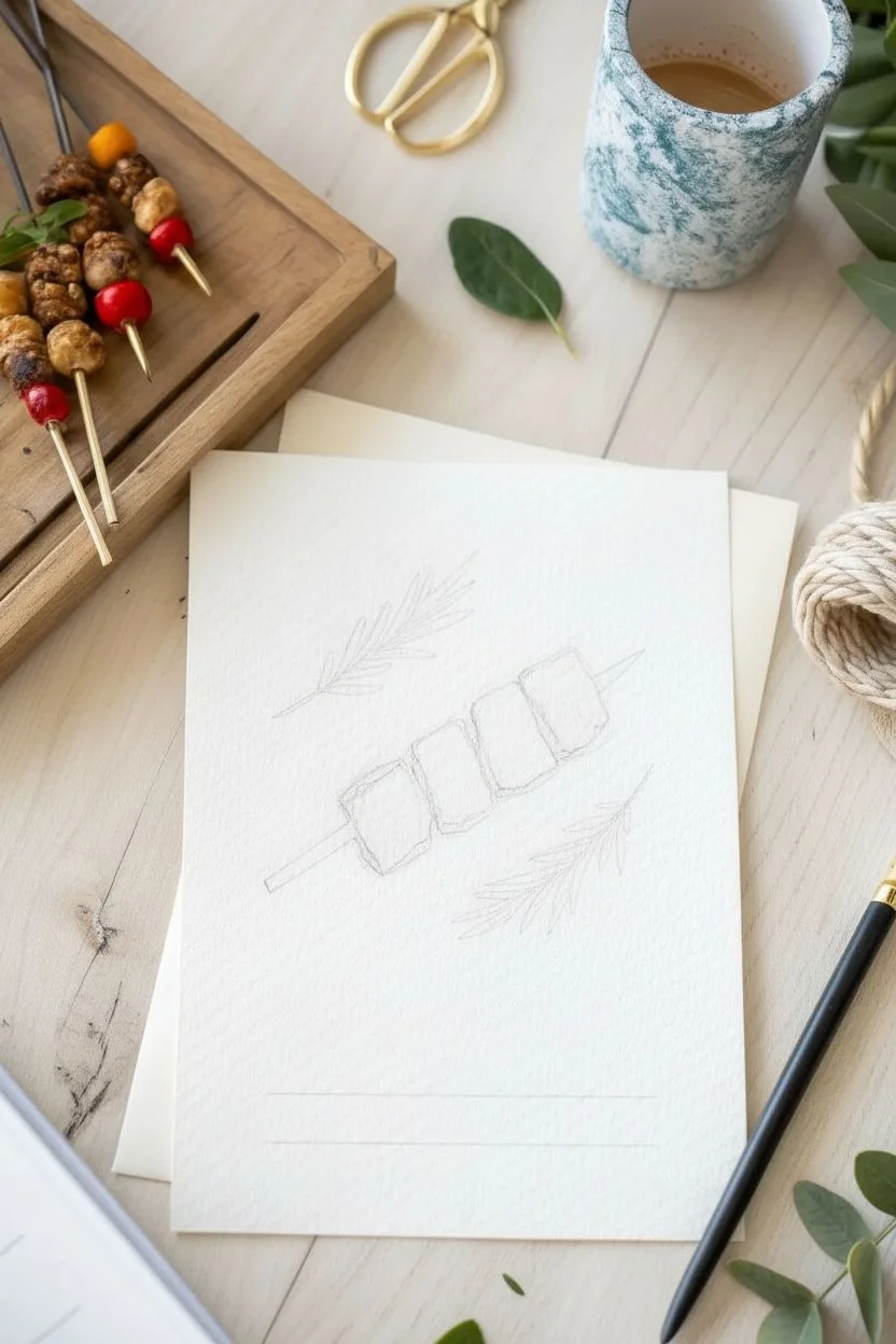
Step 1: Sketching the Composition
-
Prepare the card base:
Cut your watercolor paper to your desired card size, typically 5×7 inches when folded, ensuring the textured side faces out. -
Plot the skewer line:
Using a ruler and pencil, fairly lightly draw a diagonal line across the center of the paper to serve as the guide for your metal skewer. -
Outline the meat chunks:
Sketch four rough cubes along the diagonal line, slightly overlapping them; keep the shapes organic rather than perfect squares to mimic grilled meat. -
Add rosemary guides:
Lightly draw a curved line above the meat pointing left, and another below pointing right, to mark the stems for the rosemary sprigs. -
Mark the text placement:
lightly measure and mark guide lines at the bottom of the card where ‘Father’s Day’ will be written later.
Pro Tip: Meat Texture
To make the meat look juicy rather than flat, lift out a tiny bit of color from the center of each cube with a clean, damp brush while the paint is still wet.
Step 2: Painting the Meat
-
Base layer wash:
Mix a watery wash of Burnt Sienna with a tiny touch of Alizarin Crimson; paint the meat cubes, leaving small white gaps for highlights. -
Build the crust color:
While the first layer is still slightly damp, drop in concentrated Burnt Umber on the edges of the cubes to simulate searing. -
Define the sides:
Once the base is dry, use a darker brown mix to paint the side planes of the cubes, establishing a 3D blocky form. -
Add grill marks:
Using a very fine brush and a thick mix of Burnt Umber and Payne’s Grey, paint thin, jagged vertical lines to create texture and char marks. -
Deepen the shadows:
Paint a dark shadow line exactly where one piece of meat touches the next to separate the distinct chunks. -
Texture details:
I like to use a ‘dry brush’ technique here with dark brown to scuff over the meat surface, creating a realistic grilled texture.
Troubleshooting: Bleeding Colors
If the brown meat color bleeds into the grey skewer, your meat layer wasn’t fully dry. Let the brown dry completely before painting the metal rod passing through it.
Step 3: Details and Finishing
-
Paint the skewer:
Mix a very pale grey using watered-down Payne’s Grey and paint the exposed metal skewer ends, leaving a thin white line down the center for metallic shine. -
Rosemary stems:
Paint the main stems of the rosemary using a mix of Sap Green and a little brown for an earthy tone. -
Rosemary leaves:
Using the tip of your small brush, use short, flicking strokes to paint the needle-like leaves radiating from the stems in fresh Sap Green. -
Leaves depth:
Add a second layer of darker green strokes near the base of the rosemary needles to add volume. -
Pencil the lettering:
carefully write ‘Father’s Day’ in a serif font on your bottom guide lines using a pencil to ensure proper spacing. -
Ink the text:
Trace over your pencil lettering with the fine-tip black pen, thickening the downstrokes slightly for a calligraphy look. -
Final clean up:
Wait until the ink and paint are completely bone dry, then gently erase all visible pencil lines.
Now you have a savory piece of art ready to gift to the dad who loves his barbecue
The Great Outdoors Landscape
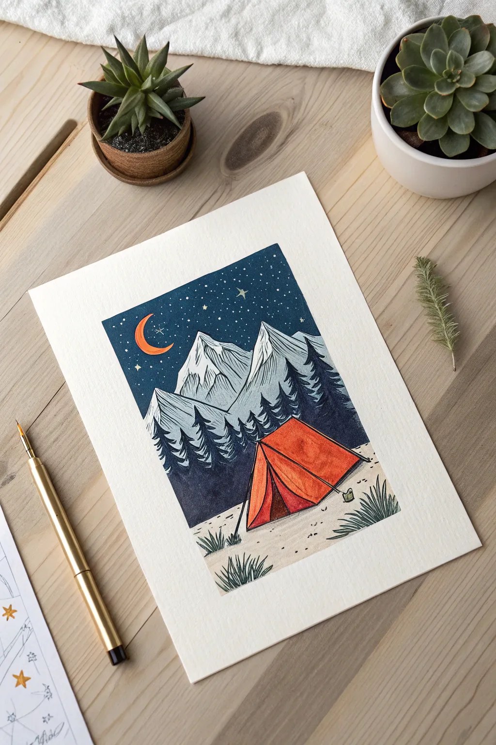
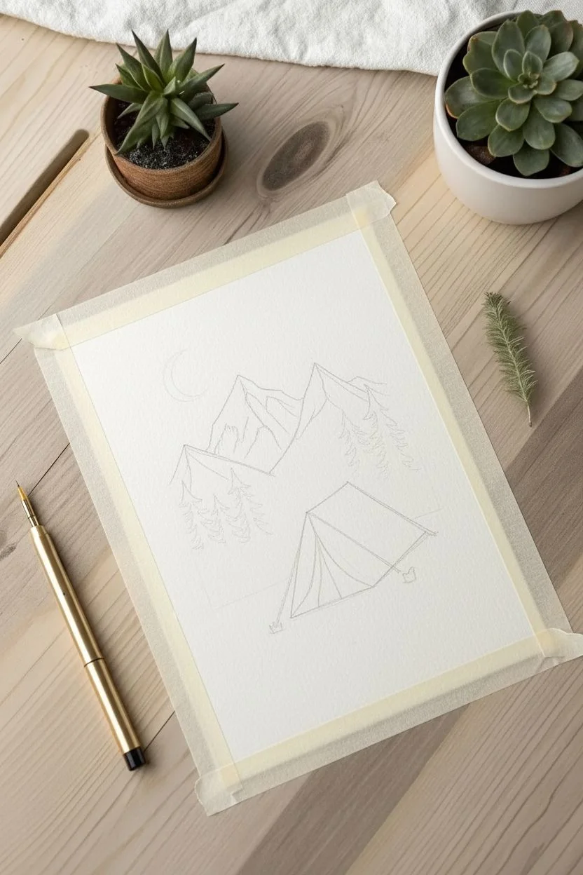
Capture the serenity of a mountain get-away with this stylized camping scene that evokes the charm of a vintage linocut print. Using bold ink lines and vibrant watercolors, you will create a crisp, graphic landscape perfect for an outdoorsy dad.
Step-by-Step
Materials
- Cold press watercolor paper (300 gsm)
- Painter’s tape or Washi tape
- Watercolor paint set
- Round brushes (Sizes 2 and 6)
- Waterproof black fineliner pens (0.1mm and 0.5mm)
- White gel pen (for stars)
- HB Pencil and eraser
Step 1: Preparation & Sketching
-
Create a border:
Securely tape down all four edges of your paper to a flat work surface. This creates the crisp white frame seen in the final piece and keeps the paper from buckling. -
Map the mountains:
Using a light pencil, draw the jagged peaks of the mountains about two-thirds of the way up the page. Keep the shapes angular and sharp rather than rounded. -
Sketch the forest line:
Draw the silhouette of the tree line below the mountains. Use zigzag motions to suggest pine trees, rising up on the sides to frame the center. -
Place the tent:
In the lower center-right, sketch the tent using a large triangle shape. Add a vertical line for the entrance and angled lines to show the tent flaps and stakes.
Bleeding Lines?
If your black ink bleeds into the paint, the paper wasn’t fully dry. Use a hairdryer on a low setting to speed up drying between the painting and inking phases.
Step 2: Painting the Base Colors
-
Paint the night sky:
Mix a deep, saturated navy blue. Carefully paint the sky area, cutting around the crescent moon shape and the tops of the mountains. Ensure the color is solid and even. -
Color the moon:
Once the blue is slightly dry to boundaries, drop a bright orange into the crescent moon shape. -
Wash the mountains:
Dilute a greyish-blue paint with plenty of water. Apply a very faint, translucent wash over the mountains so they look distant and icy. -
Fill the forest:
Mix a dark charcoal or deep forest green. Fill in the tree shapes completely to create a silhouette effect against the lighter mountains. -
Tent base layer:
Paint the entire tent with a vibrant orange. Let this layer dry completely before adding any shadow tones. -
Tent shadows:
Mix a slightly darker red-orange and paint the right side of the tent and the interior flap to give the structure three-dimensional form. -
Ground cover:
Paint the foreground in a pale beige or sand color, leaving it fairly light to contrast with the dark trees.
Step 3: Inking & Textures
-
Mountain contours:
Using the 0.1mm pen, trace the outlines of the mountains. Add thin, vertical hatching lines down the sides of the peaks to simulate craggy rock textures. -
Define the trees:
I prefer to use a slightly thicker 0.5mm pen here to outline the tops of the pine trees, separating them clearly from the mountains behind. -
Tent details:
Outline the tent with firm black lines. Draw the stakes and the guy lines extending into the ground to anchor the scene. -
Foreground grass:
Using quick, upward flicking motions with your fine pen, draw clusters of grass tufts in the foreground and near the tent base. -
Texturing the ground:
Add small dots and tiny pebbles across the beige ground area to create a gritty, earthy texture. -
Starry details:
Once the sky is bone dry, use a white gel pen to dot stars throughout the navy area. Vary the pressure to create different star sizes.
Pro Tip: Depth
To make the mountains look further away, make your ink hatching lines thinner and closer together than the lines used for the grass in the foreground.
Step 4: Finishing Touches
-
Strengthen contrasts:
Go back over any main black outlines that might need thickening to achieve that bold ‘woodcut’ illustrative style. -
The reveal:
Slowly peel away the masking tape at a 45-degree angle to reveal the clean, sharp edges of your artwork.
Now you have a stunning, graphic landscape ready to be framed or gifted for Father’s Day.


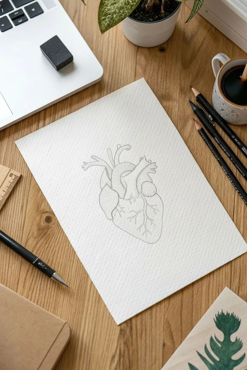
Anatomical Heart Tribute
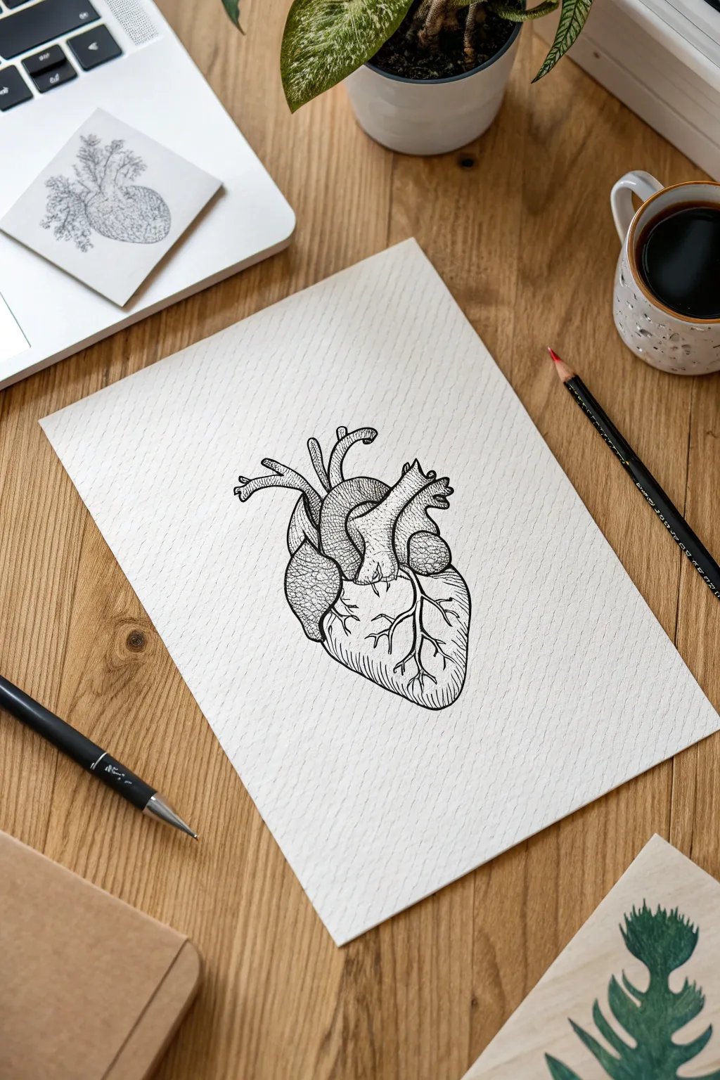
Capture the intricate beauty of life’s engine with this vintage-style medical illustration. Using stippling and cross-hatching techniques, you will create a scientific yet artistic tribute perfect for a father who appreciates detailed craftsmanship.
Step-by-Step Tutorial
Materials
- Textured drawing paper (cold press or sketch)
- HB Drawing pencil
- Kneaded eraser
- Fine liner pens (sizes 0.1mm, 0.3mm, and 0.5mm)
- Reference image of anatomical heart
Step 1: Structural Sketching
-
Form the base:
Start with your HB pencil, sketching a large, rounded egg shape that tapers slightly toward the bottom left to establish the heart’s main mass. -
Add the arch:
Draw the aorta arching over the top center of your base shape, looking a bit like a curved cane handle emerging from the middle. -
Position the arteries:
Sketch the pulmonary artery crossing diagonally in front of the aorta, and add the superior vena cava entering vertically on the left side. -
Define the ventricles:
Divide the main heart body gently to show the separation between the left and right ventricles, keeping your lines faint and adjustable. -
Map the veins:
lightly draw the branching network of coronary arteries and veins across the surface of the heart, resembling tree roots spreading downward. -
Refine the shapes:
Go over your structural shapes to define the intricate folds and tube openings at the top, ensuring the proportions look balanced before inking.
Smudge Prevention
Ink takes longer to dry on textured paper. Ensure your hand rests on a clean scrap sheet of paper while drawing to prevent oils or accidental smears.
Step 2: Inking and Outline
-
Main contours:
Switch to a 0.5mm fine liner to trace the main outer silhouette of the heart using confident, broken lines rather than a single solid wire. -
Tube detailing:
Outline the aorta and upper arteries, adding small bumps or irregularities to the line work to mimic organic tissue texture. -
Vein definition:
Using a thinner 0.3mm pen, carefully ink the branching veins on the surface, making the lines slightly wiggly to look natural. -
Erase pencil guides:
Once the foundational ink is completely dry to the touch, gently remove all graphite lines with your kneaded eraser.
Pro Tip: Line Weight
Vary your pen pressure. Use heavy lines for the outer silhouette and bottom shadows, and whisper-thin lines for the interior texture to create volume.
Step 3: Texture and Shading
-
Aorta texture:
Use the 0.1mm pen to create a ‘pebbled’ texture on the aorta arch by drawing small, tight clusters of irregular circles and semi-circles. -
Cross-hatching shadows:
Shade the right side of the main heart body using directional cross-hatching; draw parallel diagonal lines that curve with the form. -
Deepening contrast:
Add a second layer of hatching lines in the opposite direction in the darkest areas, specifically where the arteries overlap the heart body. -
Stippling details:
I like to use pure stippling (tiny dots) on the curves of the pulmonary artery to create a softer gradient shadow compared to the main body. -
Vein highlights:
Add shading only to the underside of the surface veins, leaving the tops distinct and white to make them appear raised and three-dimensional. -
Final depth:
Use the 0.5mm pen to darken the deepest crevices between the valves at the top, increasing the contrast so the image pops off the page.
Frame this sophisticated study in a simple wood frame to create a timeless gift that celebrates the heart of the family
Typography Built from Objects
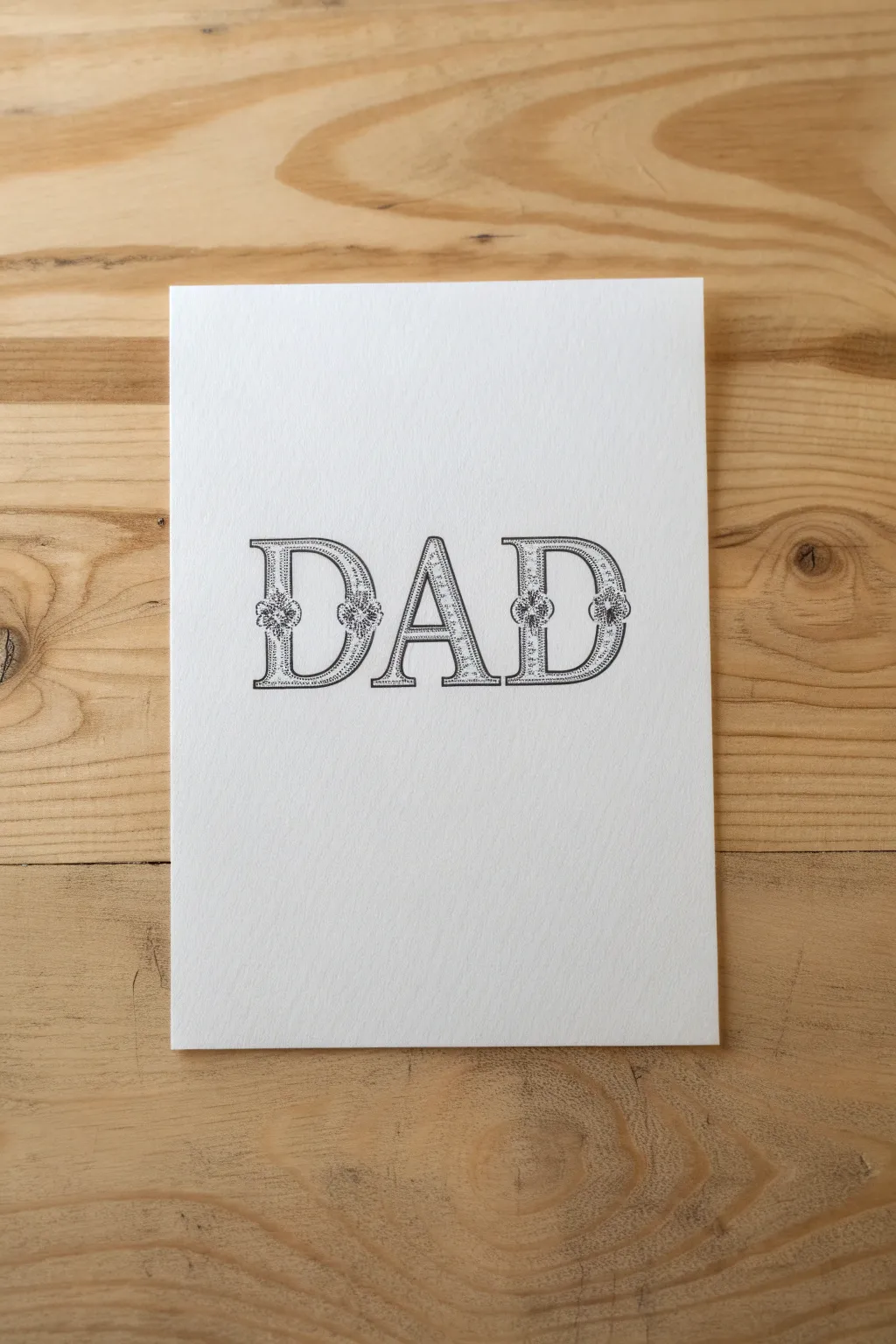
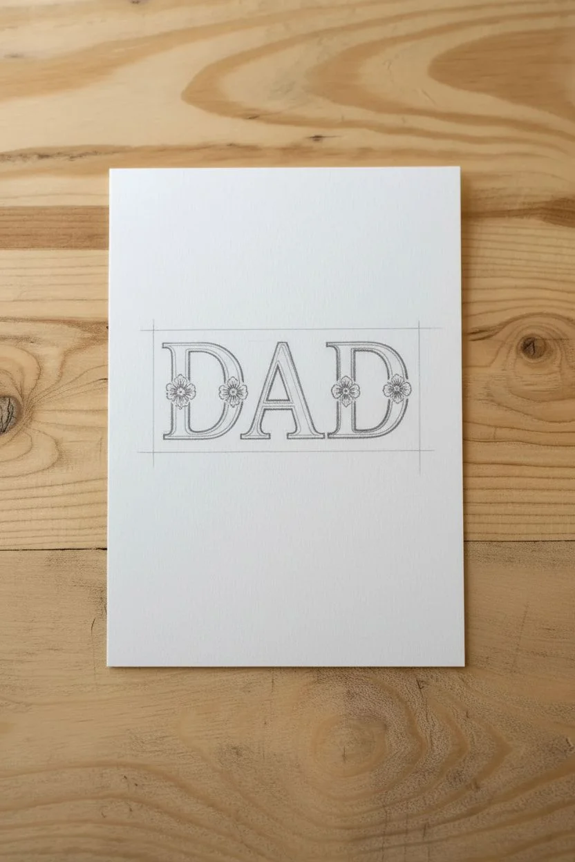
Create a classic, engraved-style Father’s Day card using nothing but fine ink pens and patience. This project focuses on building a serif typeface from scratch and texturing it with stippling techniques for a sophisticated, timeless look.
Detailed Instructions
Materials
- Heavyweight white cardstock or watercolor paper
- HB or 2H pencil (harder lead is easier to erase)
- Ruler
- Quality eraser (kneaded preferred)
- Black fine liner pens (sizes 01 or 03 for outlines)
- Ultra-fine black pen (size 005 for shading)
Step 1: Structural Sketching
-
Prepare the lines:
Begin by using your ruler to draw two parallel horizontal lines across the center of your cardstock to define the height of your letters. -
Block out the placement:
Lightly sketch three rectangles to mark the space for each letter (D, A, D), ensuring equal spacing between them. -
Sketch the letterforms:
Draw the basic serif skeletons of the letters inside your boxes. Focus on a ‘Roman’ style where vertical strokes are thick and horizontal strokes are thinner. -
Add the serifs:
Flesh out the letters by adding rectangular slabs (serifs) at the ends of straight lines. -
Create the incline:
Draw a second narrower letter shape inside each thick stroke. This creates a double-line effect, leaving a border around the edge of the text.
Step 2: Ornamental Details
-
Mark decorative spots:
Identify the center points of the thickest vertical curves on the ‘D’s and the vertical legs of the ‘D’s and ‘A’. -
Sketch floral medallions:
At these marked center points, lightly sketch small four-petal rosettes or circular knots that overlap the width of the stroke. -
Refine the connections:
Erase the straight pencil lines that pass through your new floral sketches so the flowers appear to sit on top of the letters. -
Outer inking:
Switch to your 01 or 03 size pen. Carefully trace the absolute outer perimeter of each letter. -
Inner inking:
Ink the inner border lines, skipping over the areas where your floral medallions sit. -
Detail the flowers:
With the same pen, carefully outline the small petals and centers of your decorative rosettes.
Dot Precision
Hold your pen completely vertical when stippling. Slanted angles can turn crisp dots into messy dashes, which spoils the clean, engraved effect of the typography.
Step 3: Texture and Definition
-
Erase guidelines:
Before adding texture, ensure your ink is totally dry, then gently erase all graphite pencil marks for a clean slate. -
Begin stippling:
Switch to your ultra-fine 005 pen. I find it best to work from the bottom up to avoid smudging. -
Fill with dots:
Fill the space between the inner and outer lines with tiny dots (stippling). Keep the interior of the letters empty or white. -
Build density:
Place dots closer together near the edges of the strokes and around the floral medallions to create a shadow effect. -
Fade the gradients:
As you move toward the center of the solid strokes, space the dots further apart to create a lighter gray highlight. -
Final assessment:
Step back and look at the word as a whole. Add a few more dots to any areas that look unevenly light compared to the rest.
Metallic Accent
Once the black ink is cured, use a silver or gold gel pen to add a tiny dot to the very center of each floral medallion for a subtle, high-end shimmer.
Now you have a beautifully hand-lettered card that looks like a custom print!
Festive Balloon Lettering
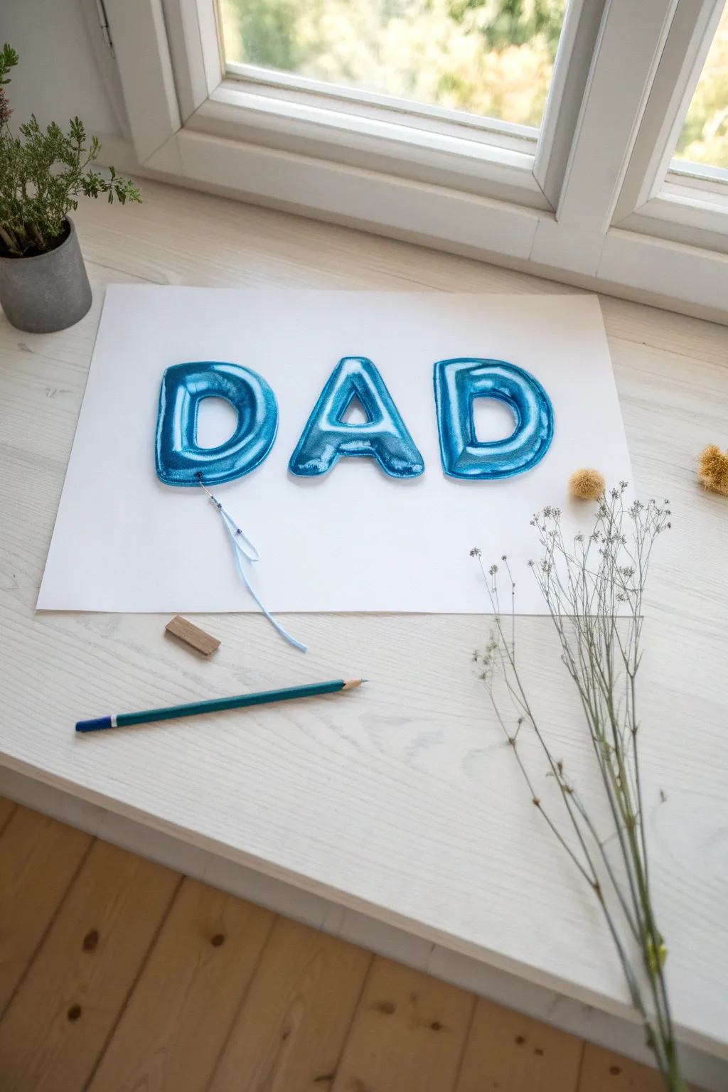

Create a hyper-realistic illusion with this mixed-media drawing project that looks just like floating foil balloons. Using a combination of markers for vibrancy and colored pencils for smooth gradients, you will capture the glossy shine and pillowy texture of the word DAD.
Step-by-Step
Materials
- Heavyweight sleek white drawing paper or Bristol board
- HB Drawing pencil and eraser
- Alcohol-based markers (Light blue, medium blue, dark blue)
- Colored pencils (Indigo, white, and black)
- Opaque white paint pen (fine tip) or white gel pen
- Thin blue satin ribbon or embroidery thread
- Craft glue or clear tape
- Scissors
Step 1: Sketching the Shapes
-
Establish guidelines:
Begin by drawing two light parallel horizontal lines across your paper to ensure all your letters are the same height. -
Block out the letters:
Sketch the letters D, A, and D using a wide, sans-serif bubble font style. Keep them spaced fairly close together. -
Round the forms:
Soften any hard corners, making the letters look inflated and pillowy. -
Draw the seams:
Draw a secondary outline slightly inside the perimeter of each letter. This inner line represents the welded seam found on foil balloons. -
Add wrinkle details:
Lightly sketch small, radiating lines near the inner corners and curves where the balloon surface would naturally crinkle.
Step 2: Adding Color & Depth
-
Base layer:
Fill the entire shape of the letters (including the seam area) with your lightest blue alcohol marker. -
Establish shadows:
Using a medium blue marker, add shading to the bottom and right sides of each letter curve to suggest rounded volume. -
Deepen the contrast:
Use your dark blue marker to color the deepest creases and the very bottom edges of the letters. -
Smooth the gradients:
I find using an indigo or dark blue colored pencil here helps blend the marker edges, creating a smoother transition from dark to light. -
Define the seam:
Use a sharp dark blue pencil to outline the inner seam line you sketched earlier, making the ‘flat’ edge distinct from the ‘puffy’ center.
Shiny Secrets
To ruin the illusion of foil, blend your highlights too much. Keep white paint stark and edges sharp. The high contrast between the dark blue shadows and pure white creates the ‘glossy’ look.
Step 3: The ‘Foil’ Effect
-
Map the light source:
Decide where your light is coming from (usually top-left) to keep highlights consistent. -
Add harsh highlights:
Using the white paint pen, draw crisp, hard-edged shapes on the upper left curves of the letters. These shouldn’t be soft; foil reflects light sharply. -
Highlight the creases:
Add thin, sharp white lines to the tops of the wrinkles you drew earlier to make them pop. -
Secondary reflections:
Add very small dots or thin lines of white along the bottom right curves to mimic reflected light from the floor.
Level Up: Shadow Play
Use a light gray marker to draw a cast shadow on the paper beneath the letters and the ribbon. This little trick lifts the artwork off the page, making the balloons look like they are floating.
Step 4: Finishing Touches
-
Attach the string:
Cut a piece of thin blue ribbon or thread similar in color to your balloons. -
Secure the tether:
Tie a small knot around the bottom loop of the first ‘D’ or simulate this by gluing the ribbon tip directly to the paper. -
Style the ribbon:
arrange the loose end of the ribbon in a playful curve down the page and glue it in place for a 3D mixed-media element.
Step back and admire how simple lighting tricks can turn a flat drawing into a festive 3D greeting
The Mustache Pattern Art
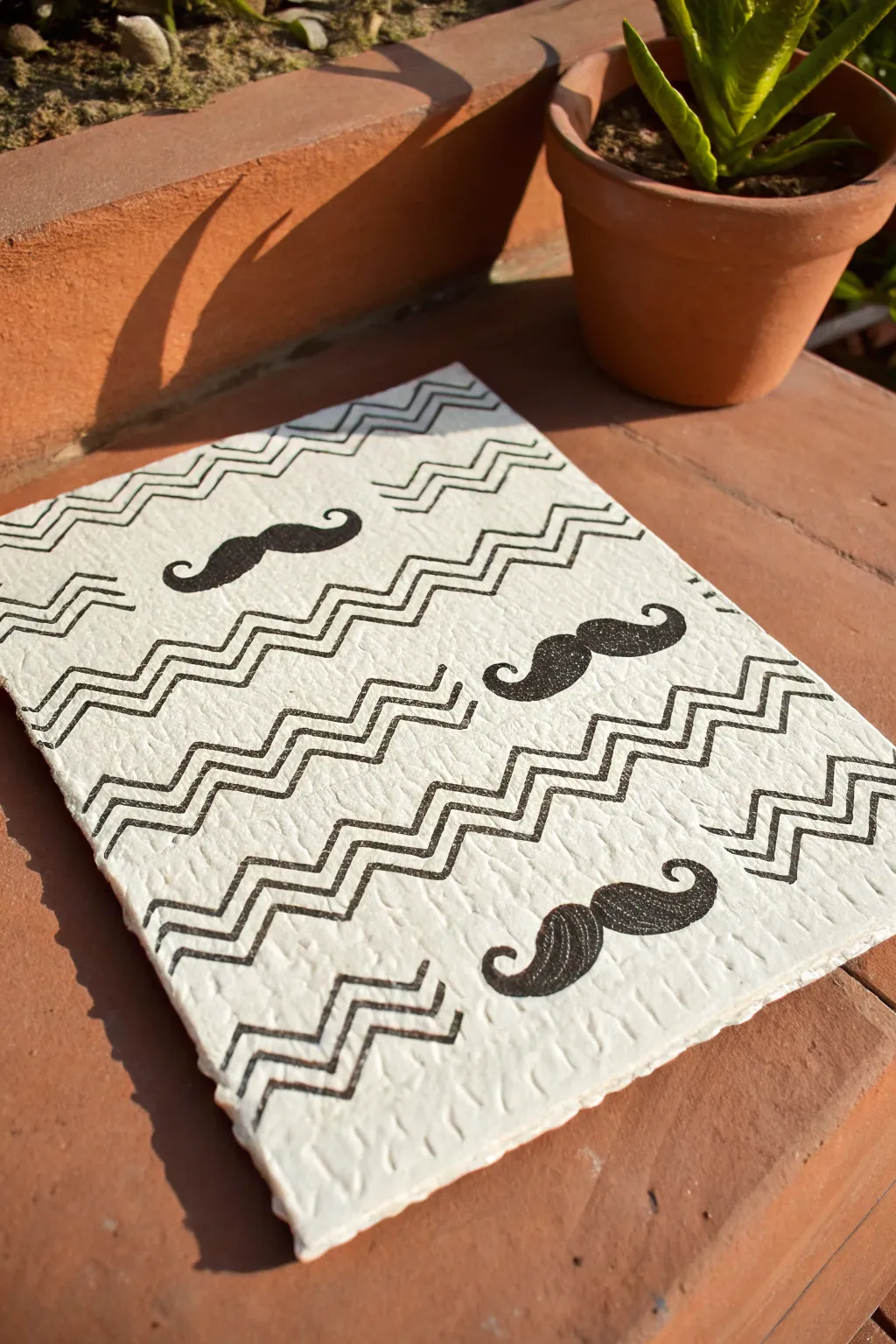
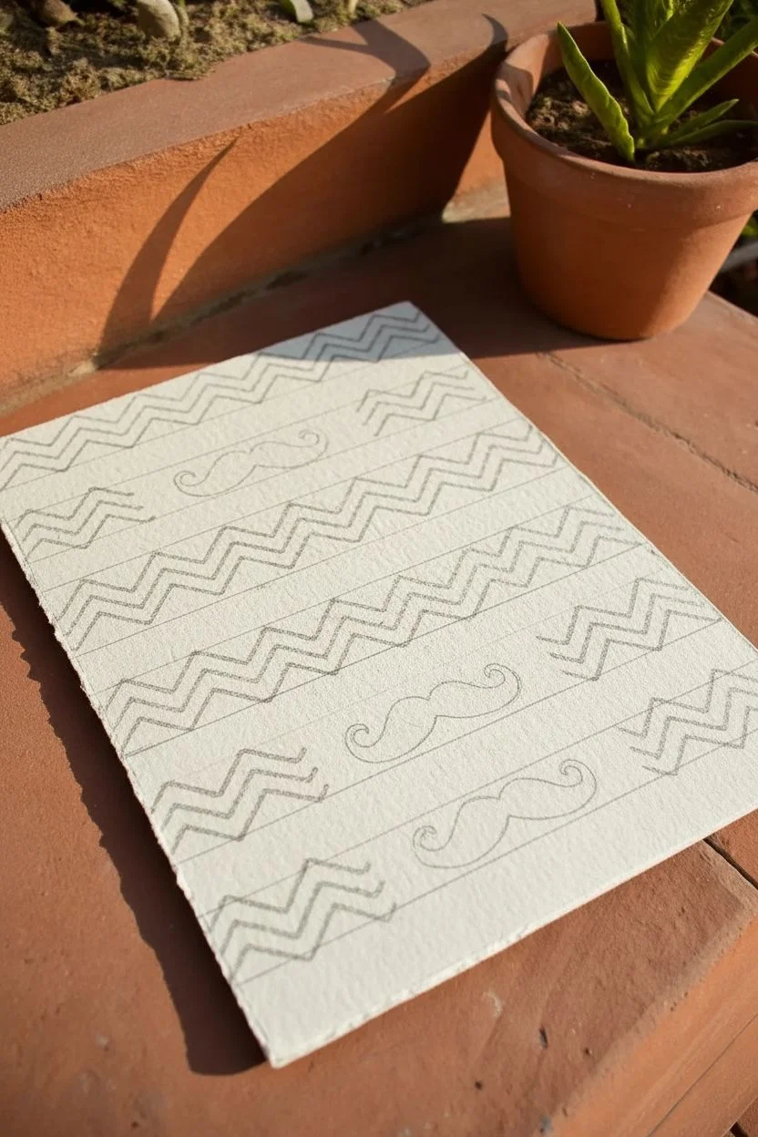
Create a sophisticated and playful piece of art for Dad using a trendy pattern of handlebar mustaches and geometric zigzags. The heavy texture of handmade paper adds a rustic charm that contrasts beautifully with the sharp black ink designs.
Detailed Instructions
Materials
- Heavyweight handmade cotton paper (approx. 300 gsm)
- HB Pencil
- Ruler
- Eraser
- Black fine liner pen (size 0.5 or 0.8)
- Black permanent marker (bullet tip)
- Small piece of cardstock (optional for template)
Step 1: Layout and Sketching
-
Prepare the surface:
Place your textured paper on a clean, flat work surface, securing the corners with masking tape if the paper tends to curl. -
Map the horizontal bands:
Using a ruler and pencil, lightly mark horizontal sections down the paper, alternating between narrow bands for the zigzags and wider bands for the mustaches. -
Define zigzag guides:
In the narrow bands, lightly sketch three parallel horizontal lines to serve as the top, middle, and bottom boundaries for your zigzag pattern. -
Draft the zigzags:
Lightly pencil in the zigzag pattern within your guidelines, aiming for sharp, consistent angles across the entire row. -
Position the mustaches:
In the wider bands, mark the center placement for the mustaches, staggering them so they alternate alignment (left, then right) as you move down the page. -
Sketch the shapes:
Draw a classic handlebar mustache shape at your marked spots; I like to cut a small stencil from cardstock first to trace, ensuring every mustache looks identical.
Stencil Pro Tip
Don’t freehand every mustache! Draw one perfect shape on cardstock, cut it out, and use it as a tracing template. This keeps the pattern looking professional and consistent.
Step 2: Inking the Design
-
Trace the first zigzag:
Take your black fine liner and carefully trace the top line of your pencil zigzag sketch, moving slowly to handle the paper’s roughness. -
Complete the trio:
Draw the remaining two parallel zigzag lines in that band, using your first line as a reference to keep the spacing uniform. -
Finish the geometric rows:
Work your way down the paper, inking all the zigzag sections first so you don’t accidentally smudge wet ink with your hand. -
Outline the mustaches:
Switch your focus to the mustache rows, tracing the outer perimeter of each shape with the fine liner to create a crisp boundary. -
Fill the centers:
Swap to the thicker bullet-tip marker to color inside the mustache outlines. -
Saturate the texture:
Use small circular motions or firm dabbing to push the ink deep into the paper fibers, ensuring a solid black appearance without white speckles. -
Review and refine:
Hold the paper up to good lighting to spot any gaps in the ink coverage and touch them up with the marker.
Step 3: Finishing Touches
-
Allow drying time:
Let the artwork sit for at least 30 minutes; thick cotton paper absorbs a lot of ink and takes longer to dry than standard paper. -
Remove guidelines:
Gently erase the visible pencil marks between your inked patterns, being careful not to rub too vigorously on the textured surface. -
Create deckled edges:
If your paper has straight machine-cut edges, you can dampen a line with water and tear the paper against a ruler to mimic the rough, handmade edge shown in the example.
Troubleshooting Ink Bleed
Handmade paper is very absorbent. If you notice your marker outlines starting to feather or bleed, switch to a waterproof pigment liner for the edges and only use the marker for the center fill.
Frame this dapper creation in a simple wood frame to give Dad a stylish handmade gift he can display proudly.
Personalized Comic Strip Story
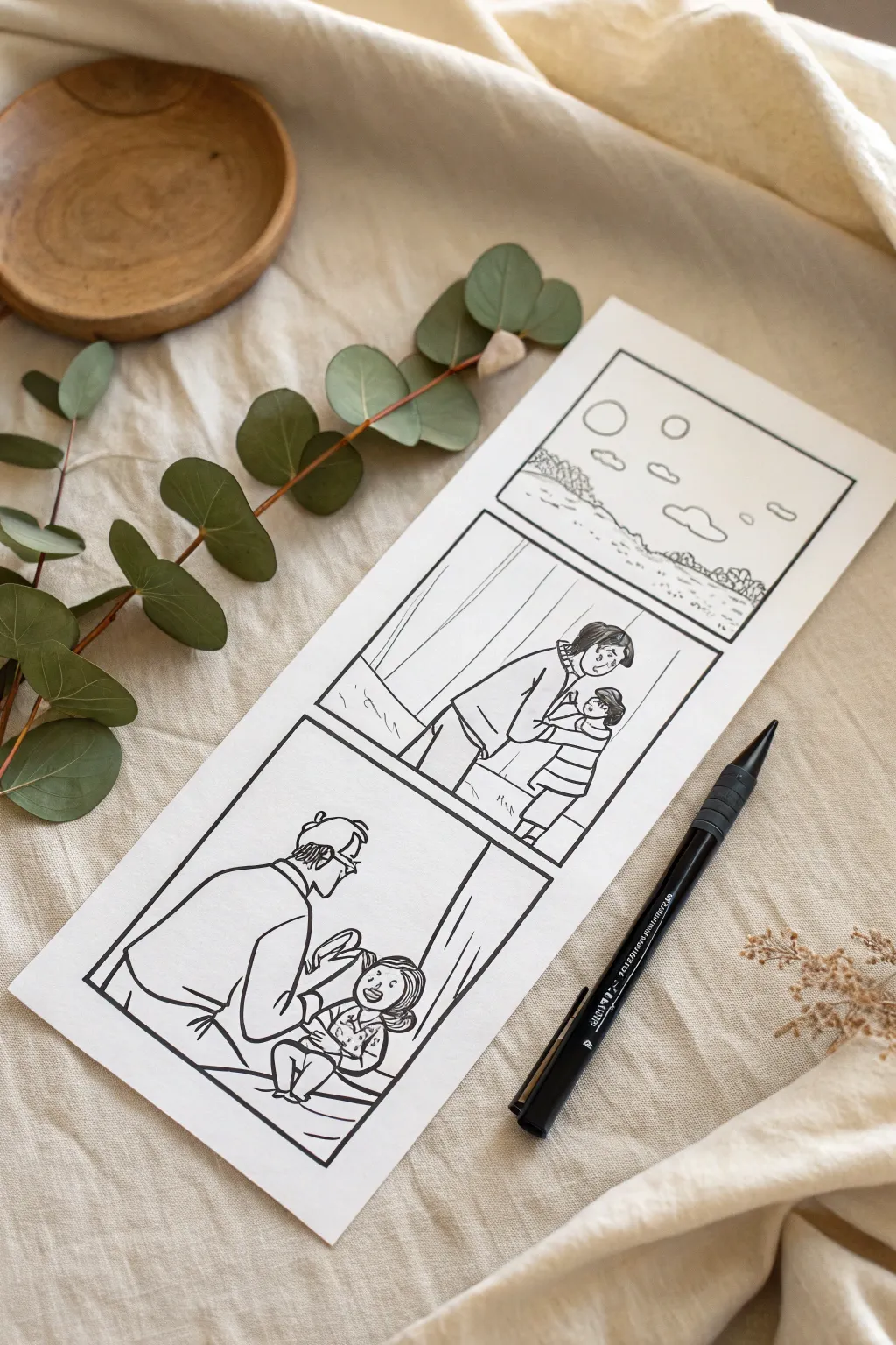
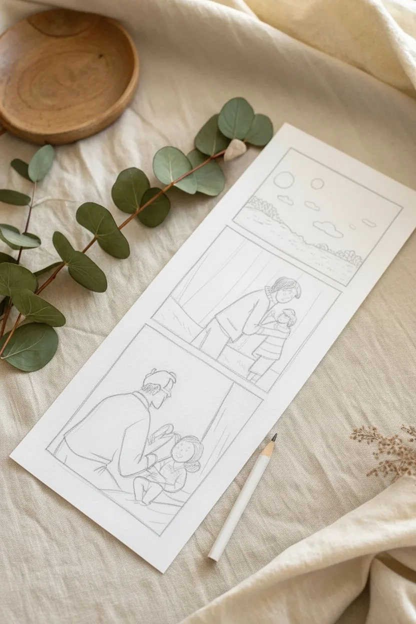
Capture the sweet evolution of fatherhood with this clean, hand-drawn comic strip illustration. Using simple black ink lines on fresh white paper creates a timeless, minimalist look that focuses entirely on the emotion of the memory.
Step-by-Step Tutorial
Materials
- Heavyweight white cardstock or Bristol board
- HB Drawing pencil
- High-quality eraser
- Ruler
- Black archival fineliner pen (size 0.5mm)
- Scissors or paper trimmer
Step 1: Layout and Sketching
-
Prepare the canvas:
Cut your cardstock into a vertical strip measuring approximately 4 inches wide by 10 inches tall to mimic a classic photo booth strip layout. -
Measure margins:
Use your ruler to mark a consistent border around the edges, leaving about half an inch of white space on all sides. -
Define the panels:
Divide the central drawing area into three equal squares vertically, leaving a small gap between each square to separate the scenes. -
Outline the frames:
Draw the square frames lightly with your pencil and ruler so you have clear boundaries for your artwork. -
Sketch the background:
In the top panel, sketch a simple landscape scene with a rolling horizon line, some distant tree shapes, and floating clouds to set the atmosphere. -
Block in figures:
For the middle panel, lightly sketch the basic shapes of a father and child standing together, using ovals for heads and simple lines for limbs to get the clear proportions. -
Refine middle details:
Flesh out the middle drawing by adding clothing details like striped shirts, hair texture, and the embrace of the arms. -
Sketch the close-up:
In the bottom panel, draw the father figure seated; I find starting with the chair or floor line helps ground the character before adding him. -
Add the baby:
Sketch the baby or smaller child in the father’s hands, focusing on the interaction and eye contact between the two characters.
Smudge Control
If you accidentally smear wet ink while drawing, turn the mistake into a stylistic choice by adding cross-hatching or extra texture over the smudge to hide it.
Step 2: Inking and Finishing
-
Ink the borders:
Switch to your black fineliner and trace the three square panel borders first, using the ruler to ensure sharp, crisp lines. -
Outline the landscape:
Ink the top panel, using a slightly wiggly, organic line for the foliage and clouds to contrast with the straight borders. -
Define the characters:
Carefully trace your pencil sketches for the figures in the middle and bottom panels, using confident strokes to avoid wobble. -
Add facial details:
Use a very light touch to add the eyes, noses, and mouths; simple dots and curves work best for this minimal illustrative style. -
Texture the clothing:
Add small hatch marks or stripes to the clothing to differentiate the characters from the white background. -
Ground the scene:
Draw short, sketchy lines at the feet of the characters and on the ground in the landscape panel to simulate grass or flooring. -
Deepen contrast:
Color in small areas like hair, shoes, or specific clothing patterns specifically with the black pen to balance the composition. -
dry completely:
Let the ink sit for at least five to ten minutes to ensure the archival ink is fully set and bonded to the paper fibers. -
Erase guidelines:
Gently erase all remaining pencil marks, holding the paper taut with one hand so the cardstock doesn’t crinkle under the friction.
Make it Pop
Though this style is monochrome, using a single color of watercolor paint (like blue or red) on just the shirts creates a stunning focal point.
Place your finished strip in a slim frame or use it as a heartfelt bookmark for a favorite book.
Watercolor Resist Secret Message
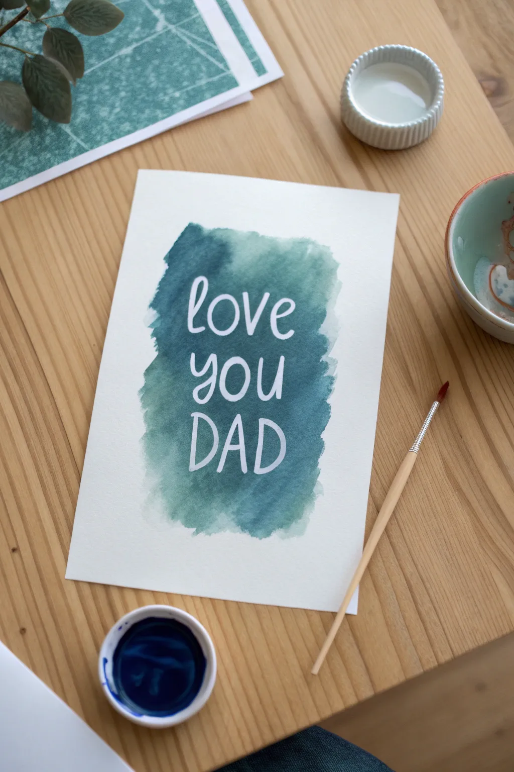
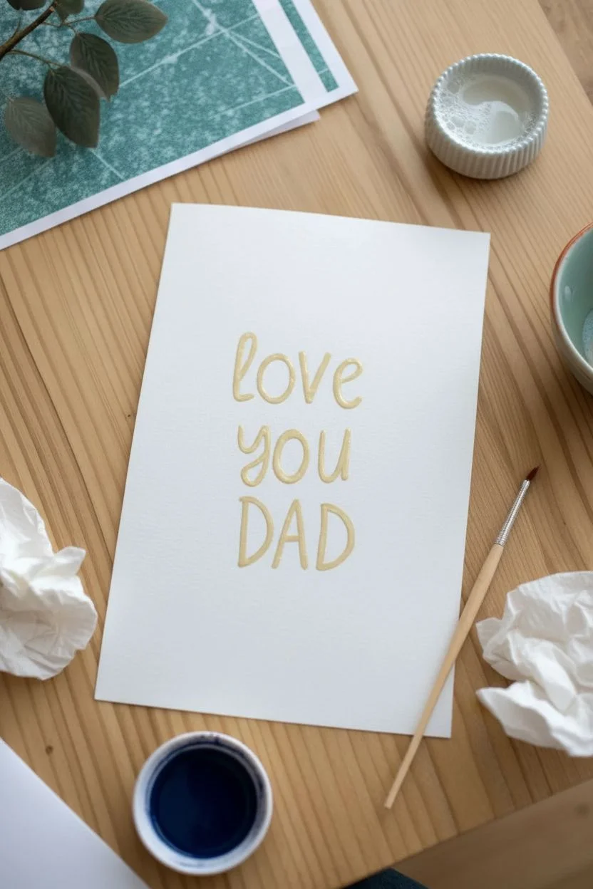
This project combines the excitement of a secret message with beautiful artistic flair using a simple resist technique. The result is a stunning contrast between a moody teal wash and crisp white lettering that will surprise any dad.
Step-by-Step
Materials
- Heavyweight watercolor paper (140lb/300gsm recommended)
- Masking fluid (drawing gum) or a white oil pastel
- Watercolor paints (Phthalo Blue and Emerald Green)
- Round paintbrush (size 6 or 8)
- Small dish for mixing paint
- Water jar
- Paper towel
- Rubber cement pickup (optional)
Step 1: Writing the Secret
-
Prepare your space:
Cut your watercolor paper to the desired card size, ensuring you have a flat, clean surface to work on. -
Draft the layout:
On a separate scrap piece of paper, practice writing “love you DAD” to get a feel for the spacing and font style you want to replicate. -
Protect your bristles:
If using masking fluid, dip your brush in a little dish soap first; this coating prevents the fluid from ruining the bristles. -
Lettering the top line:
Using the masking fluid, paint the word “love” in a relaxed cursive script near the top center of the card. -
Lettering the middle:
Continue directly underneath with the word “you,” keeping the letters similar in size to the first line. -
Lettering the finish:
Paint “DAD” in taller, bold capital letters at the bottom to give the message visual weight. -
Alternative option:
If you don’t have masking fluid, you can write the message firmly with a white oil pastel or wax crayon, though the lines will have a more textured look. -
The drying game:
Allow the masking fluid to dry completely. It is ready when it turns slightly yellow or transparent and feels hard and non-tacky to the touch.
Step 2: Applying the Wash
-
Mix your hue:
In your mixing dish, combine blue and green pigments to create a deep teal. I like to make this mixture quite concentrated for a vibrant result. -
Load the brush:
Saturate your brush with water and a generous amount of the mixed teal pigment. -
Start the wash:
Begin painting directly over the dried lettering, starting from the top and working your way down. -
Create the shape:
Don’t paint the whole page; instead, form a loose, organic rectangular patch that frames the text with plenty of white space around the edges. -
Add texture:
Allow the edges of the painted area to remain rough and uneven to mimic the artistic watercolor look in the photo. -
Manage pooling:
If paint pools heavily on top of the dried masking fluid letters, gently dab it with the corner of a paper towel, but don’t scrub. -
Let it set:
Allow the paint to dry fully. The paper must be bone dry before you proceed to the final step to avoid surface tearing.
Paper Tearing?
If the paper rips when peeling the fluid, the paint likely wasn’t 100% dry. Wait longer or use a hair dryer on a low, cool setting before peeling.
Step 3: The Big Reveal
-
Remove the mask:
Once the paint is no longer cool to the touch, gently rub your fingertip or a rubber pickup tool over the masking fluid. -
Peel away:
Roll the masking fluid off the paper to reveal the pristine white letters underneath. -
Clean up:
Brush away any little rubbery crumbs and ensure all lettering is clear and legible. -
Final check:
If using a crayon resist instead, simply polish the wax lightly with a soft cloth to brighten the white text.
Depth of Color
To get that moody clouded look, drop small dots of dark blue or indigo ink into the teal wash while it is still wet and let them bleed naturally.
Now you have a striking piece of art that hides a sweet message until the very end.
Hobby Icon Collage Spread
Capture the essence of Dad’s favorite hobby with this elegant, clean-line collage style drawing. Using a dot grid notebook simplifies the process, helping you align the musical staff and instrument details while maintaining a charming hand-drawn aesthetic.
Step-by-Step Guide
Materials
- Dot grid notebook or paper
- Fine liner pen (0.3mm or 0.5mm, black)
- Pencil (HB or H)
- High-quality eraser
- Ruler (optional)
Step 1: Drafting the Layout
-
Visualizing the composition:
Visualize an invisible diagonal line running from the top left to bottom right; we will scatter our elements loosely around the center rights of the page to create an open, airy feel. -
Sketching the musical staff:
Near the top right, use the horizontal dot rows to lightly pencil two short parallel lines representing a snippet of a musical staff. -
Adding high notes:
Sketch two eighth notes on your staff lines and connect them at the top with a single beam. -
Positioning the solo note:
Below the staff and slightly to the left, sketch a larger, single eighth note floating independently. -
Drafting the instrument:
To the right of the solo note, lightly pencil a long, slender diagonal tube to represent a flute or whistle. -
Creating the drum shape:
In the bottom right corner, sketch two cylinder shapes: a larger squat cylinder for the main drum and a smaller curved shape in front for a second drum or case.
Step 2: Adding Nature Elements
-
Drawing the long stem:
On the far left of your icon cluster, draw a long, gentle vertical curve that extends almost the height of the drawing area. -
Detailing the bud:
Top the long stem with a small, tightly enclosed bud shape, adding a few tiny sepals at the base where it meets the stem. -
Sketching the bottom sprig:
At the very bottom center, draft a small, branching sprig of dried herbs or flowers to anchor the composition.
Straight Line Struggles?
If you find your hand shaking on the flute or staff lines, try moving your entire arm from the shoulder rather than just your wrist, or use the notebook’s dots as anchor points.
Step 3: Inking and Definition
-
Tracing the music notes:
Using your fine liner, trace over the staff and notes; fill in the elliptical note heads completely with solid black ink. -
Inking the large note:
Outline the large solo note, carefully filling in the head but leaving the flag and stem as clean lines to replicate the sharp look of sheet music. -
Defining the instrument:
Ink the outline of the flute; add small horizontal bands and tiny rectangles along the body to represent keys and joints. -
Texturing the drum:
After outlining the cylinder, draw a cross-hatch or grid pattern on the side of the main drum to mimic the tension ropes or mesh texture. -
Inking organic lines:
Go over the floral elements with a slightly shaky, organic hand to distinguish them from the rigid musical instruments. -
Adding texture to the sprig:
On the bottom herb sprig, use quick, short stippling dots or tiny dashes around the branches to suggest leaves or seeds. -
Writing the title:
Above the musical staff, write a short title like ‘Sound’ or a song name in a loose, cursive script. -
Drying time:
I prefer to let the ink sit for several minutes to ensure it creates a permanent bond with the paper fibers. -
Final clean up:
Gently erase all underlying pencil marks, leaving behind the crisp, high-contrast black illustrations.
Pro_tip: Vary Your Weight
Use a 0.5mm pen for the main outlines of the drums and notes, but switch to a 0.1mm or 0.05mm pen for the delicate cross-hatching and flower details.
Now you have a sophisticated tribute to Dad’s musical passion ready to be gifted or displayed
Galaxy Silhouette Portrait
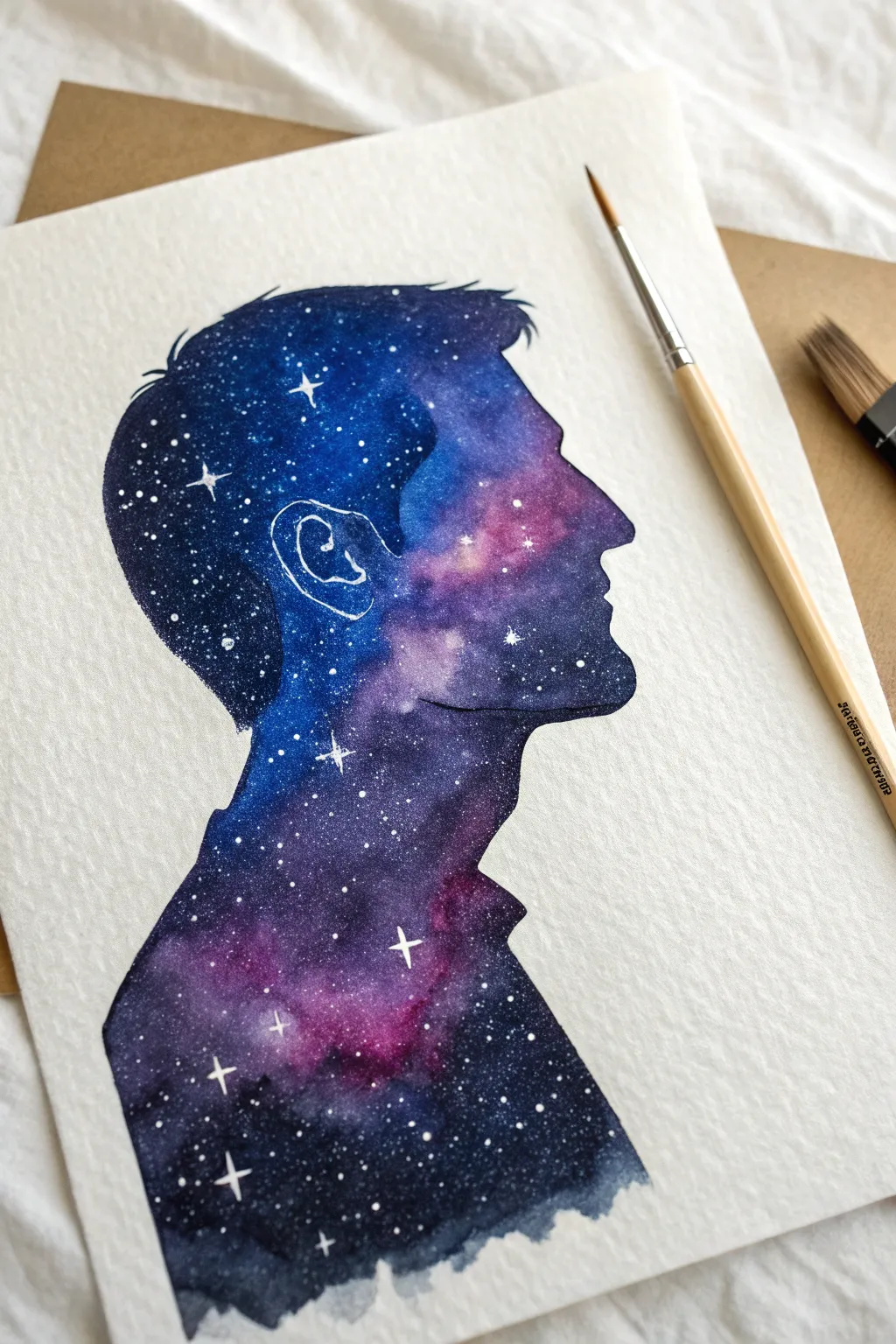
Transform a simple profile silhouette into a mesmerizing galaxy portrait that captures the wonder of the cosmos. Ideally suited for watercolor, this project blends deep indigos and vibrant magentas to create a Fathers Day gift that really is out of this world.
How-To Guide
Materials
- Cold press watercolor paper (300gsm)
- Watercolor paints (Indigo, Prussian Blue, Magenta, Purple, Black)
- Round watercolor brushes (size 6 and size 2)
- White gouache paint or white gel pen
- Pencil and eraser
- Profile photo of father for reference
- Masking tape and board
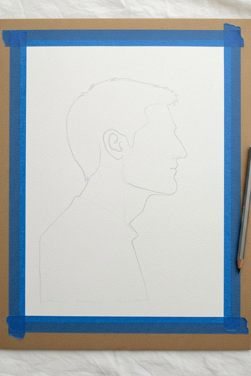
Step 1: Drafting the Silhouette
-
Prepare the workspace:
Tape your watercolor paper down to a hard board on all four sides. This prevents the paper from buckling when we add heavy washes of water later. -
Trace the profile:
Using a side-profile photo as a reference, lightly sketch the outline of the head, nose, lips, chin, and neck. Keep the pencil lines very faint so they don’t show through the final paint.
Bleeding Edges?
If paint seeps outside the silhouette line, wait for it to dry completely. Then, use thick white gouache to paint over the mistake and reshape the profile edge.
Step 2: Creating the Galaxy
-
Apply clean water:
Load your larger brush with clean water and paint specifically inside the silhouette outline. You want the paper glistening but not creating a puddle. -
Drop in light colors:
While the paper is wet, load your brush with magenta or bright purple. Touch the tip to the paper in random clusters—especially near the center of the face—and watch the color bloom. -
Add bright blues:
Clean your brush and pick up a vibrant cyan or blue. Drop this into the empty wet spaces, allowing it to touch the pinks and blend naturally on the page. -
Deepen the edges:
Now pick up your darkest colors, like indigo or Payne’s gray. Carefully paint along the inner edge of the pencil line and the back of the head. -
Blend outlines carefully:
Use the tip of your brush to ensure the paint creates a sharp, crisp line against the white background. The silhouette effect relies on this edge being neat. -
Build saturation:
If the colors look too pale, drop in more pigment while the paper is still damp. I like to add pure black to the bottom neck area for a grounding effect. -
Let it dry:
Wait for this layer to dry completely. If the paper is cold to the touch, it’s still wet inside. Patience is key here to avoid muddy colors. -
Second layer (optional):
If you want a darker galaxy, re-wet the painted area gently and add another layer of indigo, focusing on shadow areas but keeping the pink nebulas bright.
Step 3: Stars and Details
-
Mix the stars:
Squeeze a small amount of white gouache onto your palette and mix with a tiny drop of water. It should be the consistency of heavy cream. -
Splatter texture:
Load a brush with the white mixture. Hold it over the painting and tap the handle against a pencil to spray fine droplets (distant stars) over the galaxy. -
Protect the background:
Quickly wipe away any white specks that landed on the white background paper with a clean, damp tissue before they dry. -
Paint hero stars:
Using your smallest detail brush (size 0 or 2), paint a few larger, four-pointed cross stars in the darkest parts of the galaxy to create focal points. -
Outline the ear:
Since the silhouette is solid, we need to suggest the ear. Use a white gel pen or your fine brush with white gouache to draw a simple line outline of the inner ear. -
Final touches:
Add tiny highlight dots to the center of your largest stars for extra brightness. -
Remove tape:
Once the artwork is 100% dry, peel the masking tape away slowly at a 45-degree angle to reveal clear borders.
Zodiac Connection
Make it personal by arranging the larger painted stars to match the father’s specific zodiac constellation rather than placing them randomly.
Frame this cosmic portrait to give Dad a gift that celebrates his stellar personality.
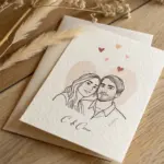
Nostalgic Polaroid Snapshot Drawing
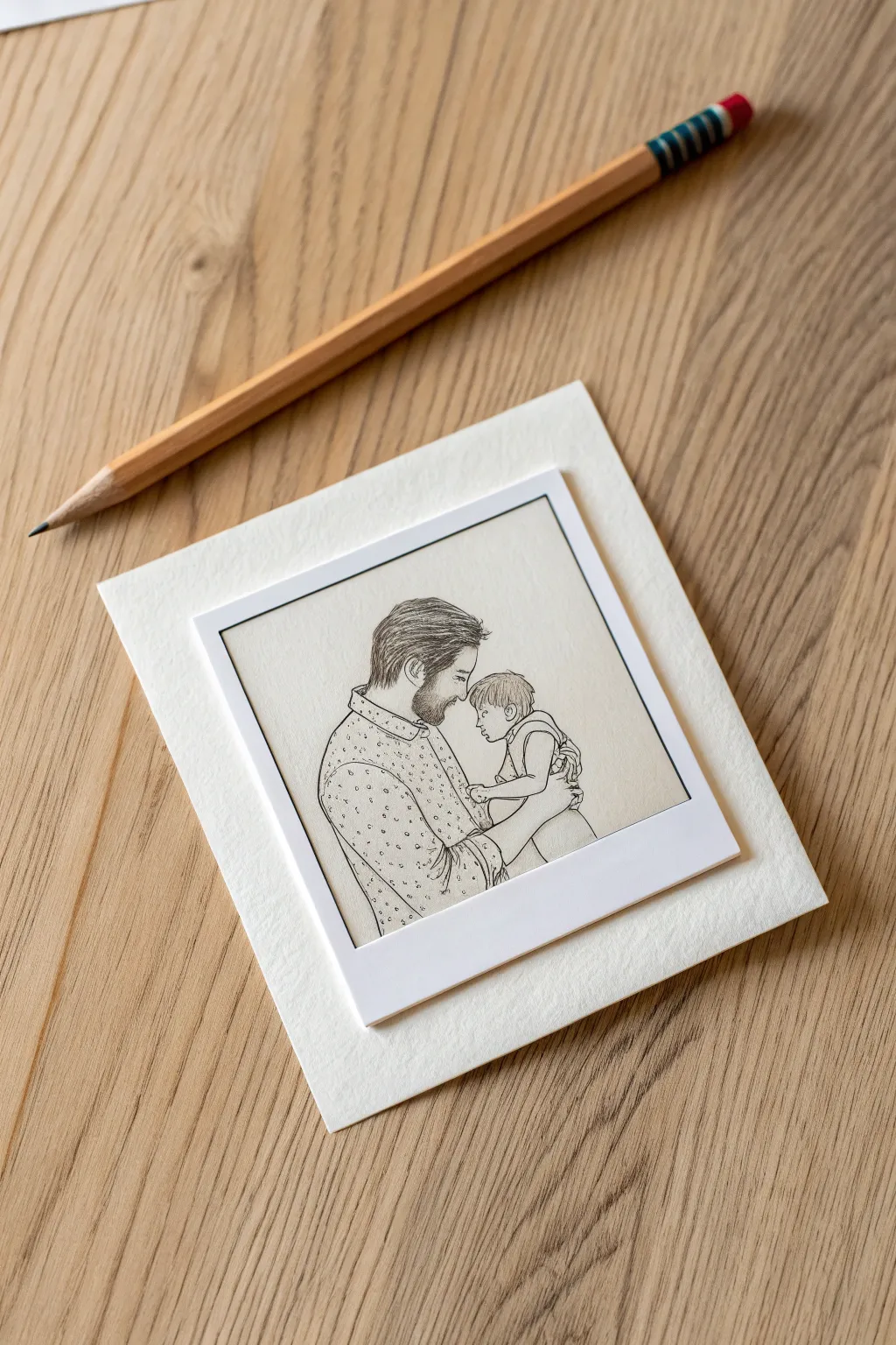
Capture a heartwarming moment with this clever trompe-l’œil drawing that mimics a vintage instant photo. By combining delicate line art with a classic Polaroid border format, you create a timeless keepsake that feels both personal and artistic.
Step-by-Step
Materials
- Smooth white drawing paper (heavyweight)
- Textured cream cardstock (for backing)
- Graphite pencils (HB and 2B)
- Fine-point black liner pen (0.1mm)
- Ruler
- Eraser
- Scissors or craft knife
- Glue stick or double-sided tape
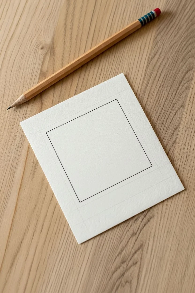
Step 1: Formatting the Film
-
Measure dimensions:
On your smooth white paper, lightly mark out a rectangle measuring approximately 3.5 by 4.25 inches to mimic the standard instant film size. -
Draw the frame:
Inside this rectangle, measure a square area for the image, leaving a roughly 1-inch blank space at the bottom and uniform narrow borders on the top and sides. -
Ink the border:
Use your ruler and the fine-point black liner to draw the square frame where the portrait will go. Keep lines crisp to simulate the edge of a photo.
Step 2: Sketching the Figures
-
Draft the shapes:
Using an HB pencil, lightly sketch the basic oval shapes for the father’s and child’s heads, positioning them in profile facing one another. -
Establish connection:
Draw faint gesture lines to indicate the father’s shoulders and arms wrapping protectively around the child. -
Refine the profiles:
Carefully outline the father’s forehead, nose, and lips, then move to the child’s softer, smaller features. -
Add hair details:
Sketch the father’s hair sweeping back and outline the shape of his beard. For the child, use short, curved strokes for a cute, tufted hairstyle. -
Detail the beard:
Fill in the beard area with short, directional hatching lines to create texture without making it a unparalleled solid block.
Smudge Prevention
Since the white border is crucial for the Polaroid look, place a scrap piece of paper under your drawing hand. This acts as a shield to keep the bright white margins clean while you shade.
Step 3: Clothing and Texture
-
Outfit outlines:
Define the collar of the father’s shirt and the curve of his sleeve. Outline the child’s sleeveless top and arm. -
Pattern work:
I like to add character here by stippling tiny dots across the father’s shirt, keeping them random but evenly spaced for a fabric texture. -
Define the hands:
Sketch the visible parts of the father’s hand supporting the child, focusing on the curve of the fingers. -
Darken lines:
Switch to a 2B pencil to darken the main outlines of the figures, adding subtle line weight variation where shadows would fall. -
Clean up:
Gently erase all underlying construction sketch lines, ensuring the white background remains smudge-free.
Level Up: Authenticity
To make the drawing look even more like a real vintage photo, lightly shade the ‘white’ borders of the Polaroid with a very hard pencil (4H) or cool gray marker to give it a slight off-white cast.
Step 4: Final Assembly
-
Cut the photo:
Carefully cut out the outer rectangle of the smooth paper using scissors or a craft knife and ruler for straight edges. -
Prepare the mount:
Cut a square of textured cream cardstock that is about 1.5 inches wider on all sides than your drawing. -
Mount the art:
Apply adhesive to the back of your polaroid drawing. -
Center and press:
Place the drawing in the center of the textured cardstock and press down firmly to complete the framed presentation.
Now you have a charming, handcrafted snapshot that captures a precious memory in a timeless format.
Have a question or want to share your own experience? I'd love to hear from you in the comments below!