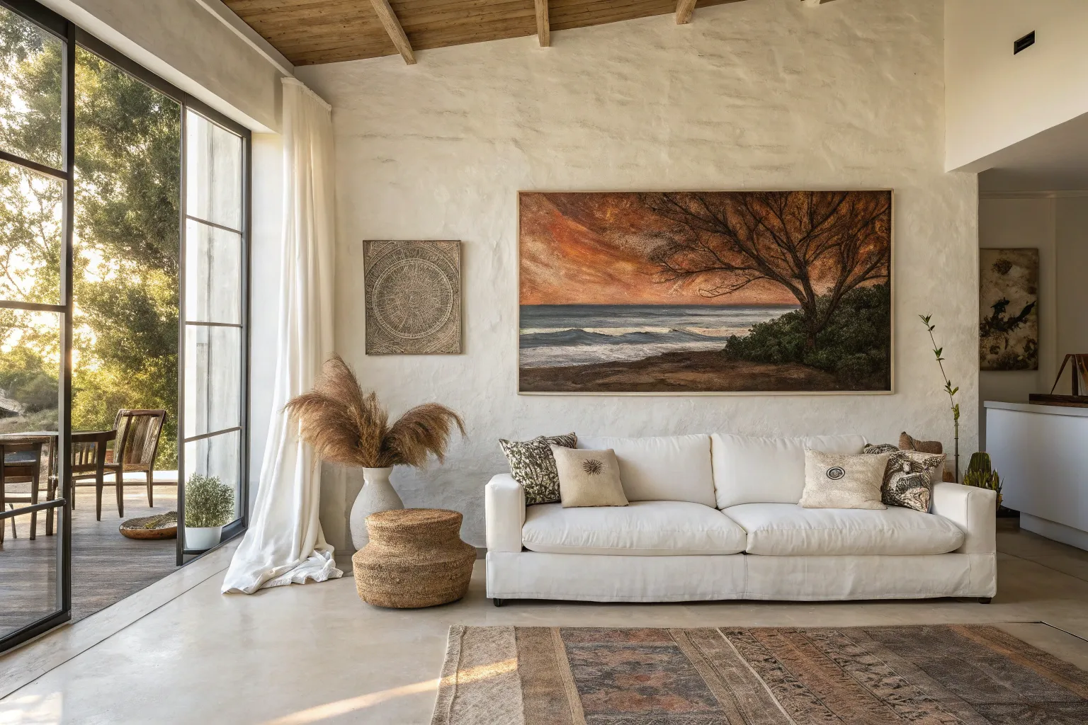
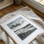
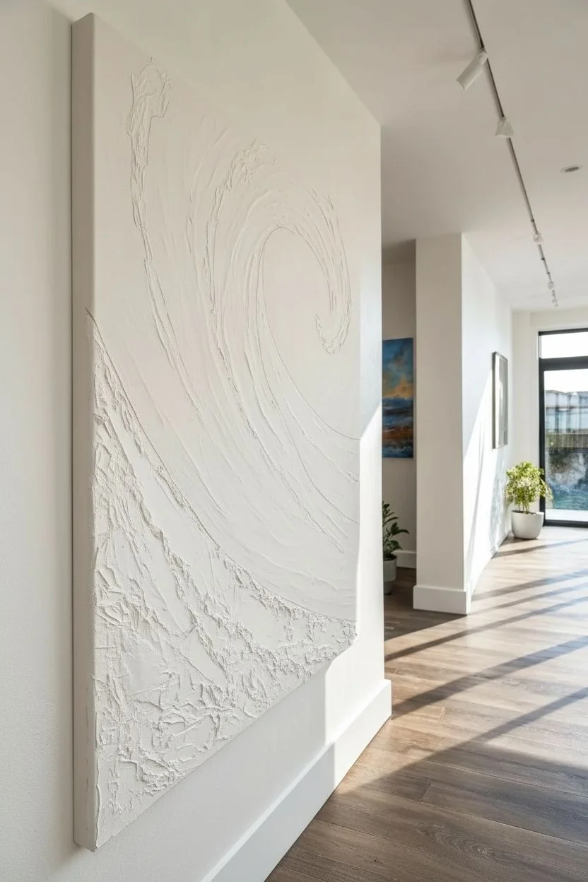
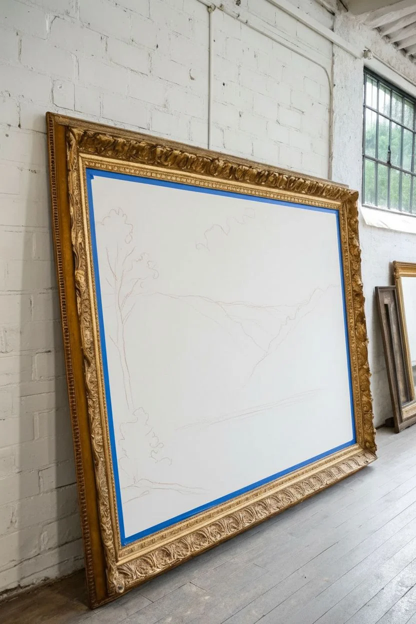
There is something incredibly freeing about stepping up to a massive canvas and letting your arm move in wide, sweeping gestures rather than getting lost in tiny details. A single oversized piece of art instantly transforms the energy of a room, turning a blank wall into a breathtaking focal point that reflects your unique creative spirit.
The Infinite Panoramic Horizon
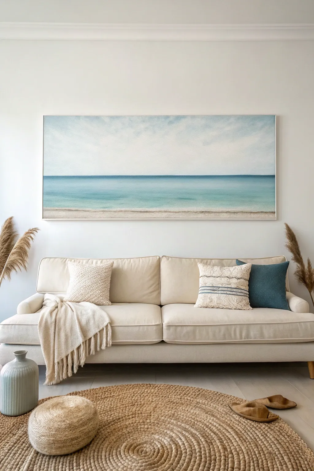
Bring the calming infinite horizon into your living room with this large-scale acrylic painting project. This panoramic piece uses soft gradients and subtle texturing to recreate the peaceful transition from sand to sea to sky.
Step-by-Step Guide
Materials
- Large panoramic canvas (e.g., 20×60 inches)
- Heavy body acrylic paints: Titanium White, Phthalo Blue, Turquoise, Raw Sienna, Burnt Umber
- Acrylic glazing liquid or slow-drying medium
- Large 3-inch synthetic flat brush
- Medium filbert brush
- Fan brush or large soft blending brush
- Painter’s tape
- Palette knife
- Water spray bottle
- Paper towels
Step 1: Setting the Sky
-
Prime the Surface:
Even if your canvas is pre-primed, apply a fresh coat of Gesso to ensure a smooth, toothy surface. Let it dry completely. -
Define the Horizon:
Measure roughly the bottom third of the canvas. Place a strip of low-tack painter’s tape horizontally across the entire width. Press the edges down firmly to prevent bleed. -
Mix Sky Tones:
On your palette, prepare a large amount of Titanium White. Create a secondary pile mixing white with the tiniest dot of Phthalo Blue to create a faint, airy blue. -
Paint the Upper Sky:
Using the damp 3-inch flat brush, apply the light blue mix to the very top edge of the canvas. Use long, horizontal strokes that span as much width as possible. -
Create the Gradient:
While the top is still wet, dip your brush into the pure white. Work your way down towards the tape, blending the white up into the blue. The goal is for the sky to be nearly pure white by the time it reaches the horizon line. -
Soften the Clouds:
I prefer to take a dry, soft fan brush at this stage and gently sweep it back and forth over the transition area to eliminate visible brushstrokes, creating a hazy atmospheric look.
Master the Blend
Gradients are key here. To keep acrylics distinct but blendable, mix in a slow-drying medium. If paint drags, mist the canvas lightly with water.
Step 2: Painting the Ocean
-
Reveal the Horizon:
Once the sky is bone dry, carefully peel off the tape. You should have a crisp, straight line dividing the canvas. -
Deep Ocean Blue:
Mix Phthalo Blue with a touch of Turquoise and a drop of slow-drying medium. With a flat brush, paint a distinct, thin band directly under the horizon line. This simulates the depth of the distant water. -
Mid-Water Transition:
Without cleaning the brush perfectly, pick up more Turquoise and White. Paint the middle section of the water, blending it slightly into the darker horizon line while the paint is wet. -
Shallows:
For the water closest to the shore, mix a large amount of White with a tiny hint of Turquoise. Paint this section adjacent to where the sand will be, keeping the color translucent and light. -
Blend the Waters:
Use a clean, slightly damp brush to gently smooth the horizontal transitions between the deep blue, turquoise, and pale shallows. Keep your strokes strictly horizontal to mimic the water’s surface.
Step 3: Sand and Shoreline
-
Base Sand Color:
Mix Raw Sienna with Titanium White and a tiny speck of Burnt Umber to create a warm beige. Paint the bottom strip of the canvas solidly with this color. -
Wet Sand Effect:
Where the sand meets the water, glaze a slightly darker version of your beige (add a touch more Raw Sienna). This mimics the look of wet, saturated sand. -
Texturing the Beach:
Using a dry chip brush or a sponge, dab lighter beige/white tones onto the dry sand area vertically. This subtle stippling creates the grainy texture of the beach. -
The Seafoam Line:
Load a filbert brush with pure Titanium White thick paint. Dabbing gently, create the organic, irregular line where the water laps onto the sand. -
Feather out the Foam:
Clean your brush and drag the back edge of the white foam line slightly into the water area to create the illusion of foam dissipating into the shallows. -
Final Highlights:
Add a few pure white horizontal streaks in the turquoise water area to suggest gentle waves catching the light.
Texture Pop
Mix fine sand or painting texture gel into your beige paint for the bottom section. This adds a literal gritty texture that catches light beautifully.
Allow the painting to cure for 24 hours before hanging your window to the sea
Mood-Setting Color Blocks
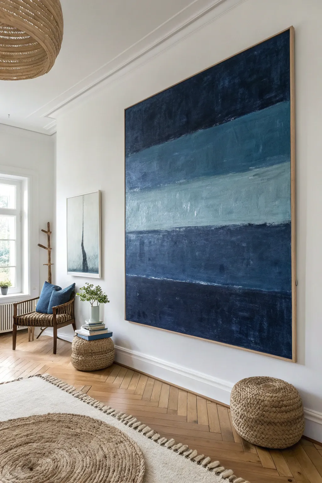
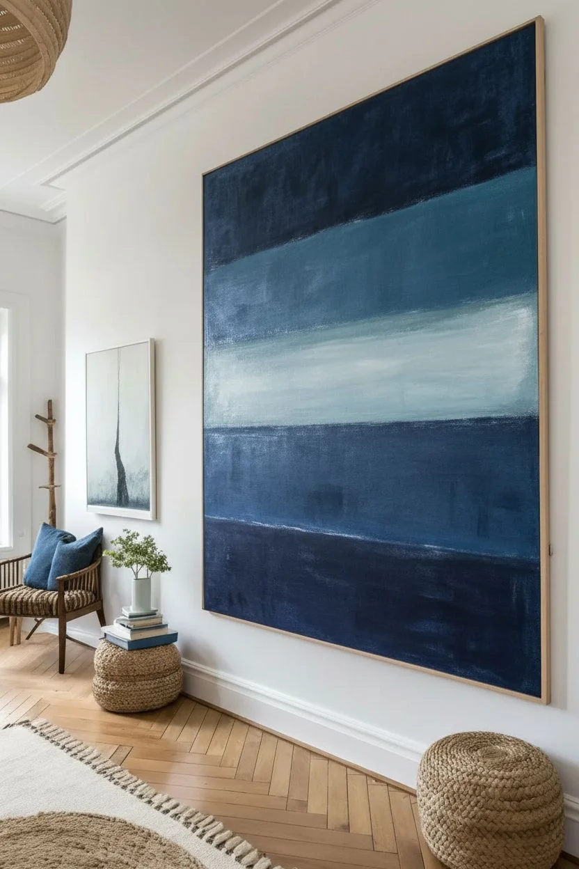
This oversized statement piece brings a calming, deep atmosphere to any room through its monochromatic blue palette using immense scale and texture. The beauty lies in the imperfect, weathered layers that give the simple horizontal composition soul and depth without requiring precise drawing skills.
Step-by-Step Tutorial
Materials
- Large gallery-wrapped canvas (e.g., 48″ x 60″)
- Heavy body acrylic paints: Payne’s Grey, Prussian Blue, Titanium White, Raw Umber
- Wide flat synthetic brushes (4-inch and 2-inch)
- Spray bottle with water
- Large palette or plastic plates for mixing
- Painter’s tape (optional)
- 1×2 inch oak lattice strips (length of canvas perimeter)
- Wood glue and finishing nails
- Sandpaper (220 grit)
Step 1: Setting the Sea Tones
-
Prepare the workspace:
Lay down a drop cloth and set your large canvas upright against a wall or on a sturdy easel. Painting vertically helps you step back and assess the composition frequently. -
Mix the deepest navy:
In your first container, mix Payne’s Grey with a significant amount of Prussian Blue. This will be your darkest value for the top and bottom bands. -
Create the mid-tones:
In a second container, take some of your dark mix and add Titanium White until you achieve a medium denim blue. Create a third mix that is slightly lighter/greyer by adding a touch of Raw Umber. -
Mix the highlight shade:
For the center band, squeeze out mostly Titanium White and add just a tiny dot of the Prussian Blue and a smidge of Raw Umber to create a misty, atmospheric pale blue.
Step 2: Painting the Horizons
-
Establish the top block:
Using the 4-inch brush, load up the darkest navy mix. Paint the top 20% of the canvas using long, horizontal strokes. Don’t worry about perfect coverage; some transparency adds character. -
Apply the second layer:
Dip your brush into the medium denim mix. Paint the second band below the navy one, allowing the wet edges to touch. I like to overlap them slightly to avoid white gaps. -
Create the misty center:
Switch to a clean brush for the light mix. Paint the middle band, keeping your strokes loose. This section represents the horizon light and should feel airy. -
Finish the lower bands:
Repeat the process for the bottom two sections, returning to the medium tones and finishing with the darkest navy at the very bottom to ground the composition.
Pro Tip: Open Time
Keep a spray bottle of water handy. If your acrylics are drying too fast while you try to blend edges, a light misting directly on the canvas will keep the paint workable longer.
Step 3: Texture and Refinement
-
Distress with dry brushing:
Once the base layer is touch-dry, dip a dry brush into a slightly different shade of blue (lighter or darker than the block you are working on). Wipe most of it off on a paper towel. -
Add surface noise:
Lightly drag this dry brush horizontally across the dried blocks. This ‘scratched’ effect mimics the look of worn denim or linen and breaks up the flat color. -
Soften the transitions:
If the lines between color blocks look too sharp, use a slightly damp brush to gently scrub the boundary line, blurring the two colors together just a tiny bit. -
Check for balance:
Step back about 10 feet. If a section looks too flat, add a thin wash of watered-down Raw Umber to knock back the brightness and add an antique feel.
Level Up: Metallic Glint
Mix a tiny amount of silver or pearl medium into your lightest ‘misty’ paint batch. It adds a subtle shimmer that catches the light only from certain angles.
Step 4: The Floating Frame
-
Prepare the trim:
Measure the height and width of your canvas. Cut your oak strips to length. For a simple butt joint, the vertical pieces should equal the canvas height, and horizontal pieces should overlap them. -
Sand and seal:
Lightly sand the wood strips to remove splinters. Keep the wood raw for that Scandinavian look, or apply a clear matte sealer if desired. -
Attach the frame:
Apply a bead of wood glue to the back of the oak strip and press it against the side of the canvas. Secure it with finishing nails every 10-12 inches. -
Final inspection:
Wipe away any excess glue immediately with a damp cloth. Check that the frame sits flush with the front face of the canvas.
Now you have a stunning, large-scale abstract piece that anchors your space with calm sophistication.


The Magic of Triptychs
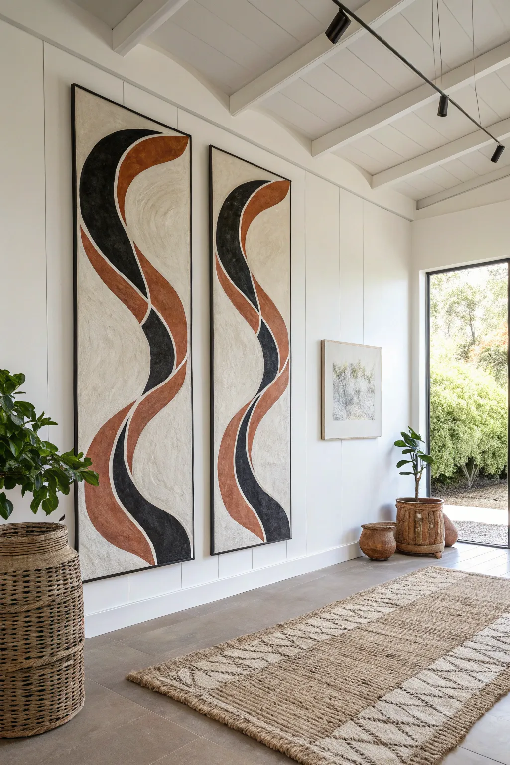
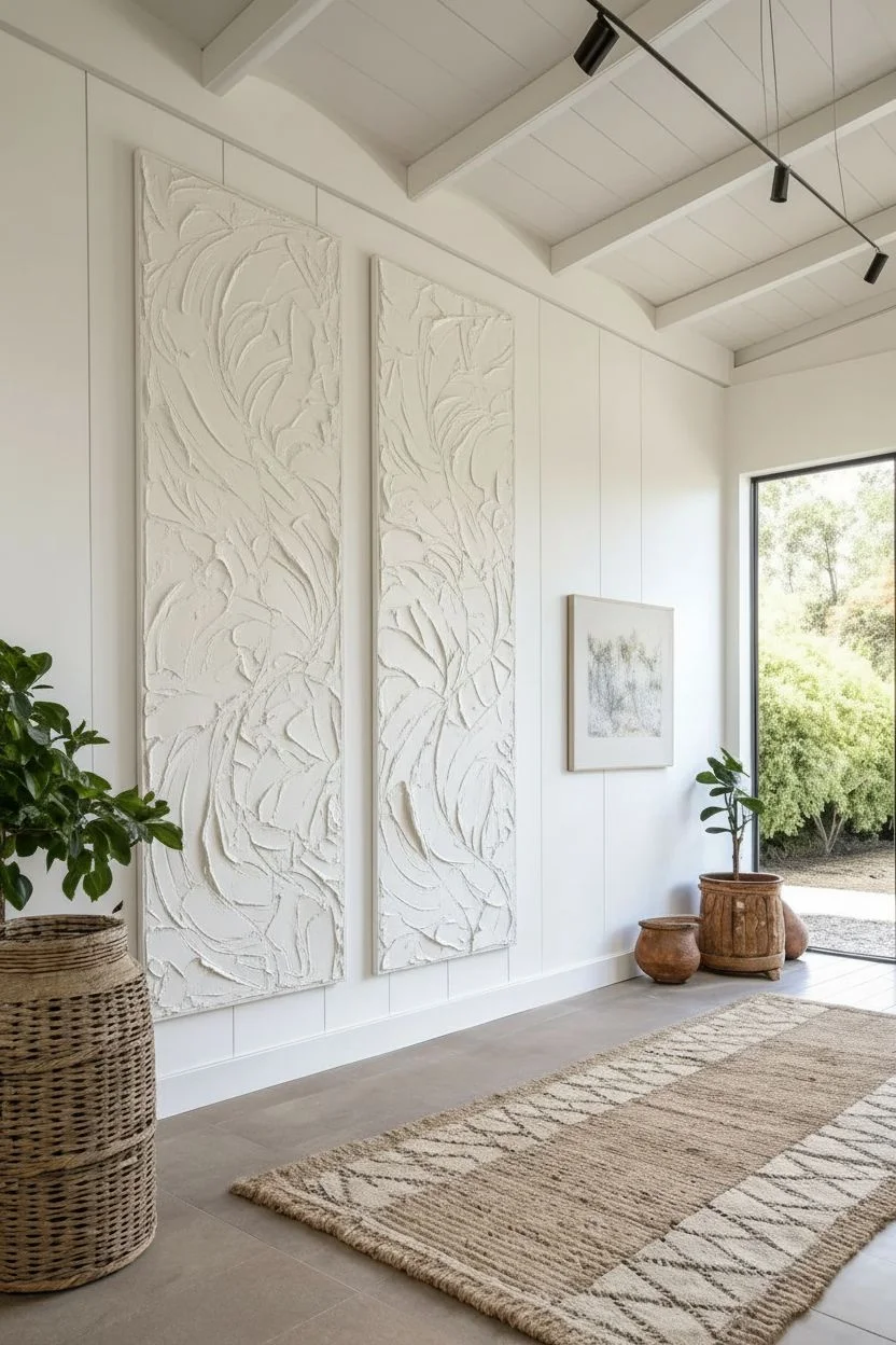
Bring the grandeur of gallery art into your home with these towering, textured abstract panels. Characterized by sinuous waves of rust and charcoal against a creamy plaster-like background, this project relies on texture media and bold, sweeping curves to create a visual rhythm.
Step-by-Step Guide
Materials
- Two large gallery-wrapped canvases (e.g., 24×60 inches)
- Modeling paste or lightweight joint compound
- Wide putty knife or trowel
- Acrylic paints: Mars Black, Burnt Sienna, Unbleached Titanium, Raw Umber
- Large flat synthetic brushes
- Small angled brush for edging
- Charcoal pencil or chalk
- Long flexible ruler or string
- Medium-grit sandpaper
- Matte varnish
- Floating frame molding (optional)
Step 1: Texturing the Canvas
-
Prepare the workspace:
Lay your two canvases side-by-side on a large flat surface or floor protected by a drop cloth. Ensure they are positioned exactly how you plan to hang them, with a small gap in between. -
Apply the base medium:
Scoop a generous amount of modeling paste or joint compound onto the center of the first canvas using a wide putty knife. -
Spread and texture:
Spread the paste across the entire surface in a thin, uneven layer. Use sweeping, multi-directional strokes to create organic ridges and valleys; avoid smoothing it out perfectly as that texture is crucial. -
Repeat and refine:
Apply the texture to the second canvas, ensuring the chaotic texture density matches the first so they feel like a unified set. -
Allow to cure:
Let the canvases dry completely, which usually takes 24 hours depending on the thickness of your paste layer. The paste will turn opaque white when fully dry. -
Softening the grit:
I like to lightly run a medium-grit sandpaper over the sharpest peaks of the dried texture to prevent future chipping and ensure a professional finish, then wipe away the dust.
Step 2: Drafting the Design
-
Visualizing the flow:
Stand over the canvases and imagine a continuous serpentine wave flowing from the top left, dipping down through the gap, and curving back up on the right. -
Sketching the ribbons:
Using a charcoal pencil, lightly draw the outer boundaries of the two main undulating ribbons. Keep your arm loose to get smooth, flowing lines rather than stiff, jagged ones. -
Connecting the panels:
Pay special attention to where the lines ‘jump’ from one canvas to the other; step back frequently to ensure the lines visually align across the gap. -
Sectioning the colors:
Draw the internal intersecting lines that divide the ribbons into segments, deciding which segments will be black and which will be rust.
Wobbly Line Fix
If your curves look shaky, don’t panic. Wait for the paint to dry, then use the background color to paint back over the mistake to ‘reshape’ the line. It’s like using an eraser!
Step 3: Painting the Forms
-
Mixing the terracotta:
Mix Burnt Sienna with a touch of Unbleached Titanium and a tiny dot of Raw Umber to create a muted, earthy terracotta hue. -
Painting the rust sections:
Fill in the designated rust segments using a flat brush. Work the paint into the textured crevices of the background paste for solid coverage. -
Applying the black:
Using Mars Black, fill in the contrasting ribbon segments. Use an angled brush along the edges to keep the boundary between the black and the background crisp. -
Painting the background:
Mix Unbleached Titanium with a lot of white to create a warm, creamy off-white. Paint the negative space around the ribbons, carefully cutting in close to your colored shapes. -
Refining the edges:
Once the first layer is dry, use a small detail brush to tidy up any wobbly lines where the colors meet the background or each other. -
Second coat:
Apply a second coat to the colored sections to ensure deep, opaque saturation that stands out against the pale background.
Level Up: The Third Panel
To embrace the full ‘triptych’ theme, replicate these steps on a third canvas placed in the center, continuing the wave pattern to create a massive, wall-spanning installation.
Step 4: Finishing Touches
-
Painting sides:
Don’t forget to wrap your design or continue the background color onto the sides of the canvas for a finished look, or paint the edges solid black to simulate a frame. -
Sealing the work:
Apply a clear matte varnish over the entire surface to protect the paint and unify the sheen levels between the black and the lighter earth tones. -
Framing:
Install the artworks into thin, black floating frames to mirror the sharp contrast of the painted design and add architectural weight.
Hang your stunning panels and enjoy the dynamic movement they bring to your space.


Oversized Macro Florals
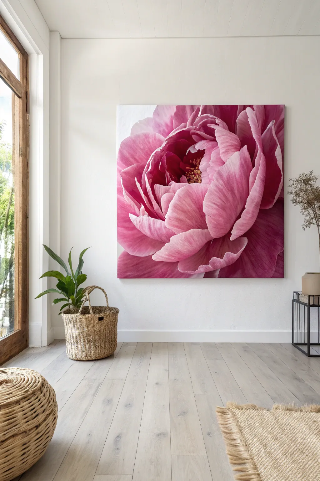
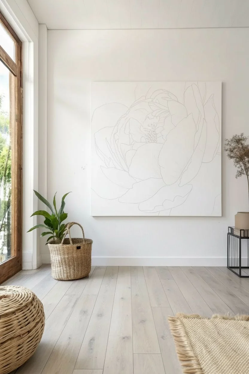
Transform a blank wall into a breathtaking focal point with this large-scale macro floral painting. By magnifying the delicate details of a peony, you will create a soft, romantic atmosphere that feels both modern and timeless.
Step-by-Step Tutorial
Materials
- Large square canvas (minimum 36″x36″ or 48″x48″)
- Heavy body acrylic paints (Quinacridone Magenta, Alizarin Crimson, Titanium White, Cadmium Yellow, Burnt Umber)
- Acrylic glazing liquid or slow-drying medium
- Gesso (for priming)
- Assorted synthetic brushes (large 3″ flat, 1-2″ filberts, small rounds)
- Charcoal vine or a pencil
- Spray bottle with water
- Palette layout (large butcher tray or paper palette)
- Reference photo of a peony
Step 1: Preparation and Sketching
-
Prime the surface:
Even if your canvas is pre-primed, apply a fresh coat of gesso to ensure a smooth, bright white surface. This helps luminosity shine through the pinks later. -
Crop and project:
Select a high-resolution photo of a peony and crop it tightly so the petals touch all four edges of the square frame. Use a digital projector to cast the image onto your canvas for accurate proportions, or grid it out manually. -
Map the petals:
Lightly trace the major petal outlines using vine charcoal. Focus on the organic curves and the deep crevices where the petals overlap; don’t worry about tiny textures yet. -
Dust off excess:
Wipe the canvas gently with a dry cloth to remove loose charcoal dust so it doesn’t muddy your vibrant pink paint.
Stay Misty
Keep a spray bottle of water handy. If your acrylics start dragging or drying too fast on the large surface, a light mist over the canvas will keep the paint workable for smooth blending.
Step 2: Blocking the Underlayers
-
Mix the deepest shadows:
Create a dark, rich hue by mixing Alizarin Crimson with a touch of Burnt Umber and a drop of Magenta. Accessing the darkest values early establishes the painting’s depth. -
Paint the core:
Apply this dark mixture to the very center of the flower and the deepest recesses between the petals. Keep the edges of these shadow shapes soft. -
Create a mid-tone pink:
Mix Quinacridone Magenta with a little Titanium White to create a vibrant medium pink. Apply this to the middle sections of the petals, blending slightly into the dark shadow areas while the paint is still tacky. -
Block in the lights:
Use a large flat brush to apply a mix of mostly Titanium White with a hint of pink to the outer edges and tips of the petals. At this stage, the painting will look like a paint-by-number with harsh blocks of color.
Step 3: Blending and Refining
-
Prepare the blending medium:
Acrylics dry fast, so mix a generous amount of slow-drying medium or glazing liquid into your paints. I find this essential for achieving that soft, oil-paint look without the wait time. -
Blend the transitions:
Working one petal at a time, use a clean, slightly damp filbert brush to smooth the area where the dark, mid, and light tones meet. Use curved strokes that follow the shape of the petal to simulate texture. -
Emphasize the ruffles:
Add pure Titanium White highlights to the rippled edges of the petals. use a smaller brush to create jagged, organic distinct lines that separate the foreground petals from the background. -
Deepen the contrast:
Once the first layer is dry, mix a transparent glaze of Alizarin Crimson and water (or medium). Brush this over the shadow areas to make the colors pop and recede further. -
Veining details:
With a fine round brush and diluted mid-tone pink, paint subtle veins radiating from the base of the petals outward. Keep these faint; they should be felt rather than clearly seen.
Level Up: Impasto Center
Mix heavy gel medium with your yellow paint for the center stamens. Applying this 3D mixture with a palette knife adds tactile texture that contrasts beautifully with the smooth, soft petals.
Step 4: The Centerpiece
-
Base the stamens:
In the dark center, dab small spots of deep yellow ochre or orange to mark the position of the flower’s reproductive parts. -
Add pollen texture:
Mix Cadmium Yellow with White for a bright, buttery color. Use a small, rough brush or even a palette knife to dab thick textured dots over your base stamen marks. -
Final highlights:
Step back from the canvas to view the whole composition. Add the brightest white highlights only on the petal tips that would catch the most light. -
Seal the work:
Allow the painting to cure for at least 72 hours, then apply a satin or gloss varnish to unify the sheen and protect those vibrant pinks from UV fading.
Now you have a stunning botanical statement piece that radiates soft elegance through the whole room.
BRUSH GUIDE
The Right Brush for Every Stroke
From clean lines to bold texture — master brush choice, stroke control, and essential techniques.
Explore the Full Guide
Bold Geometric Balance
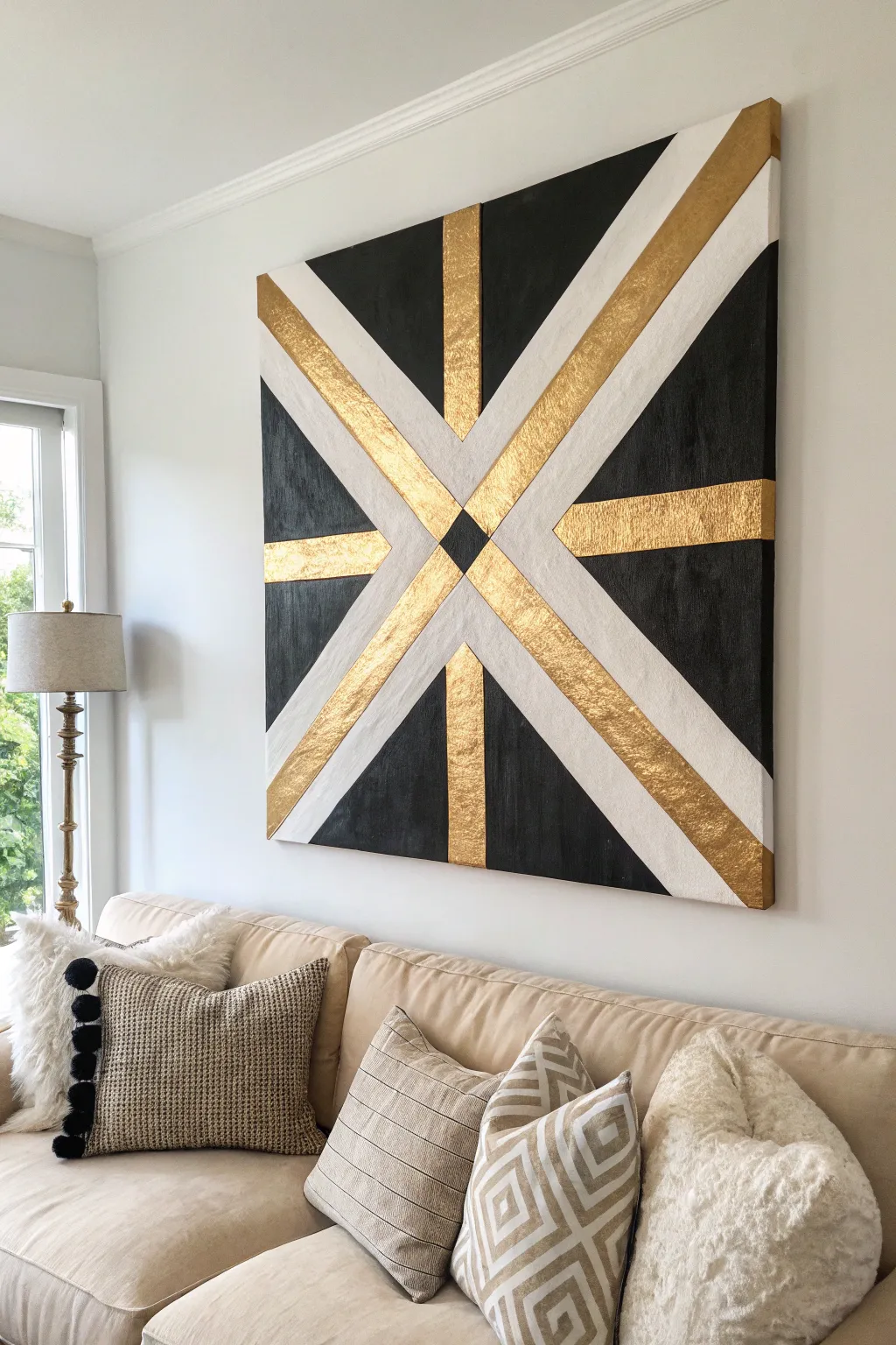
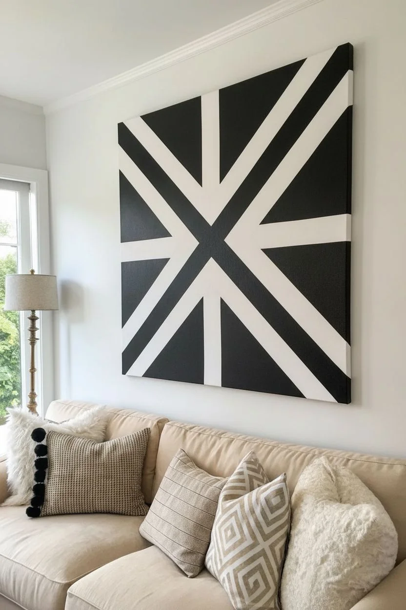
Achieve high-end gallery style with this bold geometric project. By combining matte black acrylic with the rich shimmer of textured gold leaf, you’ll create a stunning centerpiece that balances modern lines with warm luxury.
How-To Guide
Materials
- Large square canvas (36×36 inch recommended)
- White acrylic paint (heavy body)
- Black acrylic paint (matte finish)
- Gold leaf sheets (imitation or real)
- Gold leaf adhesive sizing (water-based)
- Painter’s tape (various widths, 1-inch and 2-inch)
- Yardstick or long finish ruler
- Pencil
- Soft synthetic brushes
- Dry foam brush
Step 1: Preparation & The Grid
-
Base coat:
Start with a clean slate. Even if your canvas is primed, apply a fresh, even coat of white acrylic paint. This ensures your bright white sections look intentional and crisp. Let it dry completely. -
Find the center:
Using your yardstick, measure and mark the exact center point of the canvas with a light pencil dot. -
Draw the main axis:
Draw a vertical line and a horizontal line crossing directly through your center point to form a large ‘plus’ sign. -
Draw diagonals:
Draw corner-to-corner diagonal lines through the center, creating a large ‘X’. You should now have a starburst pattern with 8 spokes. -
Define the bands:
Decide on the width of your stripes (e.g., 3 inches). Measure and mark 1.5 inches out from both sides of every pencil line. -
Connect the lines:
Use the ruler to connect your marks, lightly drawing the outlines of the thick bands. You will have a pattern that looks like a simplified Union Jack.
Pro Tip: Sharp Lines
Only painting the black sections allows for easier correction. If black bleeds onto the white, simply paint over the mistake with white before starting the gilding process.
Step 2: Masking & The Black Layer
-
Tape the design:
Apply painter’s tape to cover the areas that will eventually be White or Gold. You are masking the positive shapes (the starburst) to protect them. Only the triangular background sections should be exposed canvas. -
Burnish the edges:
Run your fingernail or a credit card firmly along the edges of the tape. Good adhesion is the secret to clean lines. -
Seal the tape:
I like to brush a very thin layer of white paint over the edges of the tape. This seals any microscopic gaps so black paint can’t bleed underneath. -
Paint the black:
Paint the exposed triangular sections with matte black acrylic. Apply two coats for solid, opaque coverage, letting the first coat dry before adding the second. -
The reveal:
Carefully peel off the tape while the black paint is still slightly tacky (not wet, but not fully cured). This prevents the paint skin from ripping. You now have a white starburst on a black background.
Step 3: Applying the Gold
-
Designate colors:
Decide which bands will be white and which will be gold. In the project image, the vertical and horizontal center bands are gold, while the diagonals are white. -
Mask for gold:
Use fresh tape to cover the black sections and the specific bands you want to keep white. Only the areas destined for gold should be exposed. -
Apply sizing:
Brush a thin, even layer of gold leaf adhesive (sizing) onto the exposed bands. It will look milky at first. -
Wait for tack:
Wait about 15-30 minutes (check your bottle’s instructions) until the glue turns clear and feels sticky to the touch, like the back of a sticker. -
Gold leaf application:
Gently lay the gold leaf sheets over the sticky areas. Don’t worry about wrinkles; texture adds character to this piece. Use a dry foam brush to press the leaf down firmly. -
Buff and clean:
Once covered, use a soft dry brush to circular buff the area. The excess gold will flake away, leaving a clean, gilded shape. Remove your masking tape. -
The center diamond:
To finish the messy center convergence, use tape to outline a small diamond in the middle of the artwork. Paint it black to tie the whole piece together.
Level Up: Texture
For the gold sections, crinkle the foil sheets slightly in your hand before applying them. This creates a fractured surface that catches the light beautifully.
Hang your masterpiece in a well-lit spot to watch the gold shift and sparkle throughout the day.
The Gallery-Wrapped Infinity Edge
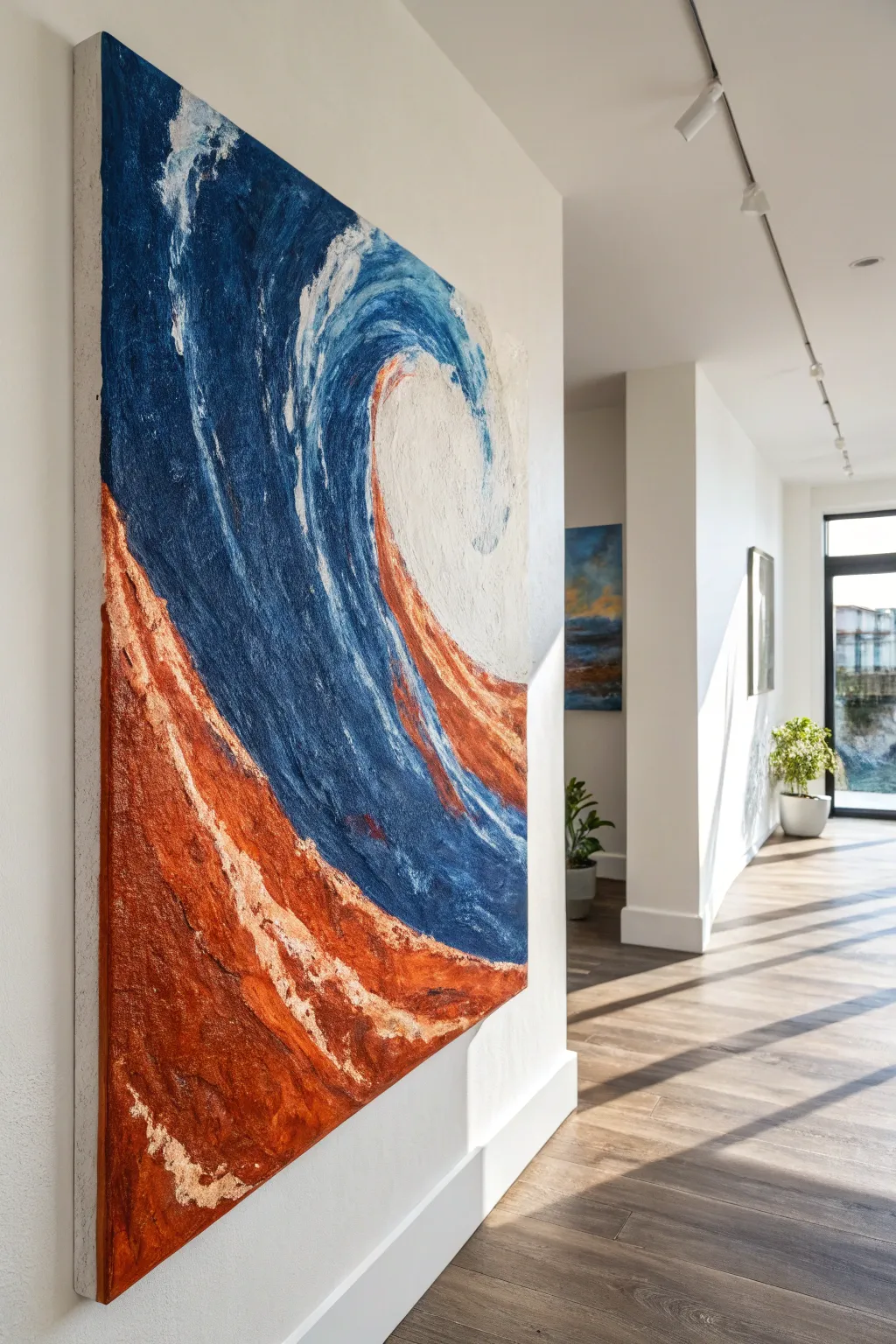
Bring the raw power of the ocean into your living space with this large-scale, textured acrylic painting. The magic of this piece lies in the “infinity edge,” where the dynamic brushwork continues around the deep sides of the canvas, making the artwork feel boundless and three-dimensional.
How-To Guide
Materials
- Large deep-profile gallery-wrapped canvas (at least 1.5 inches thick)
- Heavy body acrylic paints (Prussian Blue, Phthalo Turquoise, Burnt Sienna, Red Oxide, Raw Umber, Titanium White)
- Metallic Copper acrylic paint
- Modeling paste or heavy structure gel
- Large palette knives (trowel and diamond shapes)
- 3-inch flat synthetic brush
- Medium round brush
- Spray bottle with water
- Drop cloth
Step 1: Sculpting the Foundation
-
Map the flow:
Visualize a diagonal line splitting the canvas from the bottom left corner to the top right. Using a diluted wash of Raw Umber and a small brush, loosely sketch this sweeping s-curve to separate the ‘earth’ section from the ‘water’ section. -
Build the texture:
Scoop out generous amounts of modeling paste with a large palette knife. Apply this thickly to the bottom left ‘earth’ section, using scraping motions to create jagged, rock-like ridges. -
Wrap the texture:
Don’t stop at the border! Push the modeling paste around the left and bottom edges of the canvas. This physical texture is crucial for the gallery-wrapped effect. -
Establish the wave direction:
For the upper water section, apply a thinner layer of paste or gel, using long, swooping strokes that mimic the curvature of a crashing wave. Let the canvas dry completely, preferably overnight.
Sticky Situation?
If your palette knife drags the underlayer of paint off while layering, the bottom coat isn’t fully dry. Wait 20 minutes or use a hair dryer on a cool setting to lock in the base layers before continuing.
Step 2: The Earth Tones
-
Dark underpainting:
Mix Raw Umber with a touch of Prussian Blue to create a near-black tone. Paint into the deepest crevices of the dried texture on the bottom section to create shadow depth. -
Mid-tone application:
Load a palette knife with Burnt Sienna and Red Oxide. Drag the knife lightly over the textured ridges, allowing the paint to catch the high points while leaving the dark crevices exposed. -
Adding the heat:
Mix a bright orange using Red Oxide and a tiny bit of Titanium White. Apply this sparingly to the highest peaks of the rocky texture to simulate light hitting the shore. -
Metallic finish:
Once the earth tones are touch-dry, use your finger or a dry rag to rub Metallic Copper paint onto the most prominent ridges. I find this tactile approach gives the best shimmer control.
Level Up: Gold Leaf
For an ultra-luxe finish, apply gold leaf adhesive to the highest peaks of the copper section. Once tacky, press gold leaf sheets onto the texture for a brilliant, reflective highlight.
Step 3: The Ocean Swell
-
Deep water base:
Using the large flat brush, apply Prussian Blue to the central curve of the wave. Paint with strong, confident strokes that follow the geometry of the curl. -
Extend the blue:
Carry this deep blue paint immediately around the top and right edges of the canvas, ensuring the lines of your brushstrokes match up perfectly with the front face. -
Mid-tone blending:
While the base is still slightly wet, mix Phthalo Turquoise with a little White. Blend this into the upper part of the wave curve to create that translucent, tropical water effect. -
Creating the crest:
Using a clean palette knife loaded with Titanium White, press and drag paint at the very top of the wave where it curls over. Allow the paint to break naturally over the canvas weave for a foamy look. -
Transition details:
Where the water meets the copper earth, use a smaller brush to add streaks of deep blue and white, suggesting water rushing over the rocks. -
Final infinity check:
Walk around the canvas. Use your palette knife to ensure the copper textures and white wave crests wrap fully around the thickness of the frame, hiding all white canvas.
Hang your masterpiece on a feature wall where the light can catch those metallic valleys and thick textures.

PENCIL GUIDE
Understanding Pencil Grades from H to B
From first sketch to finished drawing — learn pencil grades, line control, and shading techniques.
Explore the Full Guide
Large-Scale Fluid Pouring
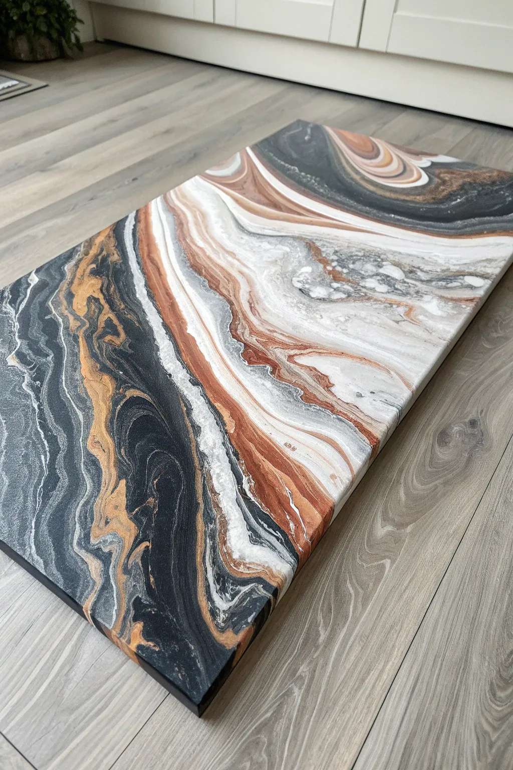
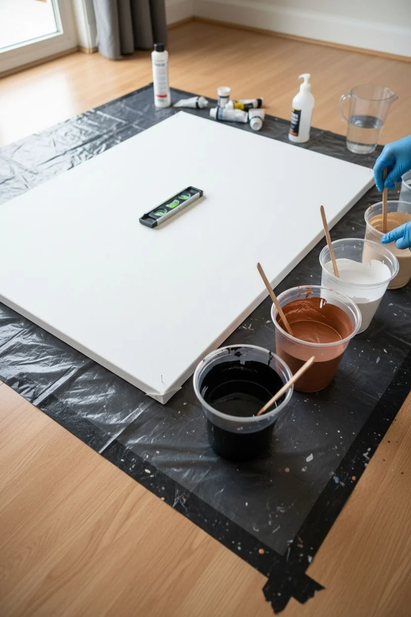
This large-scale fluid art project mimics the sophisticated look of natural stone using the popular Dutch Pour technique. By manipulating acrylics with air, you will create sweeping, smoky transitions between deep blacks, bright whites, and shimmering copper.
Step-by-Step
Materials
- Large canvas (24×36 inches or similar)
- Acrylic paints (Carbon Black, Titanium White, Metallic Copper, Beige)
- Pouring medium (Floetrol or Liquitex)
- Water
- Hair dryer with a ‘cool’ shot button
- Plastic cups and stir sticks
- Butane kitchen torch
- Push pins or giant cups (to elevate canvas)
- Drop cloth and gloves
Step 1: Preparation and Mixing
-
Prepare the workspace:
Cover your entire table and floor with a heavy drop cloth. Fluid art is inherently messy, and acrylics are permanent once dry. -
Elevate the canvas:
Insert push pins deeply into the four back corners of the canvas frame, or rest the canvas on four inverted stable cups. This allows paint to drip off edges cleanly. -
Ensure a level surface:
Use a spirit level to check your canvas. If it isn’t perfectly flat, the paint will slowly slide off the composition while drying. -
Mix the pouring base:
In large cups, mix your pouring medium with acrylic paint at a ratio of approximately 2 parts medium to 1 part paint. -
Adjust consistency:
Add water slowly to each cup, stirring thoroughly, until the paint flows like warm honey or melted ice cream. It should leave a slight mound for a second before disappearing into the mix. -
Check opacity:
Ensure your white and black mixtures are opaque. Add a little more paint if the mixture looks too translucent on the stick.
Step 2: The Pour
-
Flood the canvas:
Pour a generous amount of Titanium White over the entire canvas surface. Spread it with a wide palette knife or blow it flat to create a slick, wet base for the colors to glide on. -
Pop air bubbles:
I like to quickly pass a butane torch over this base layer to pop any trapped air bubbles before adding color. -
Lay the diagonal composition:
Pour a thick wavy line of Carbon Black diagonally from one corner area toward the opposite side, leaving the center mostly open. -
Add accent colors:
Pour lines of Metallic Copper and Beige right alongside and partially on top of the black stream. Don’t worry about being neat; organic lines work best. -
Add contrast:
Pour a fresh stream of Titanium White right down the center of your colored bands to help create upcoming separation.
Muddy Colors?
If your colors are turning grey/brown, you are over-mixing with the air. Stop blowing as soon as you see a pleasing gradient. Less is more with fluid art manipulation.
Step 3: Air Manipulation
-
Prepare the dryer:
Plug in your hair dryer and set it to the lowest airflow setting and the ‘cool’ temperature. Hot air can dry the top layer of paint too fast, causing cracking. -
The initial blow:
Aim the dryer slightly behind a pool of color and blow the white base paint *over* your color lines first. This ‘sinks’ the colors slightly. -
Blow out the composition:
Now, change the angle and blow the paint outwards across the canvas. Chase the black and copper streams out toward the edges to create feathery, marble-like veins. -
Control the flow:
Move your body around the table to push the paint in different directions, ensuring you cover the corners while keeping a diagonal flow. -
Detail work:
If you see a large blob of color that looks heavy, use a straw to blow softly on it, breaking it up into finer tendrils. -
Fix the edges:
Use your gloved finger to touch up any bare spots on the side of the canvas with the dripping paint. -
Final torch:
Do one last pass with the torch to pop bubbles that rose during movement and to encourage small cells to appear in the copper sections. -
Drying phase:
Leave the painting to dry undisturbed in a dust-free room for at least 72 hours. The paint is thick and needs time to cure evenly.
Glass Finish
Once fully cured (wait 3-4 weeks), pour a layer of clear art resin over the top. This adds depth and gives the piece that high-gloss, luxury stone appearance shown in the photo.
Hang your massive marble masterpiece horizontally or vertically to anchor the room with organic elegance.
The Minimalist ‘Rest’ Spot
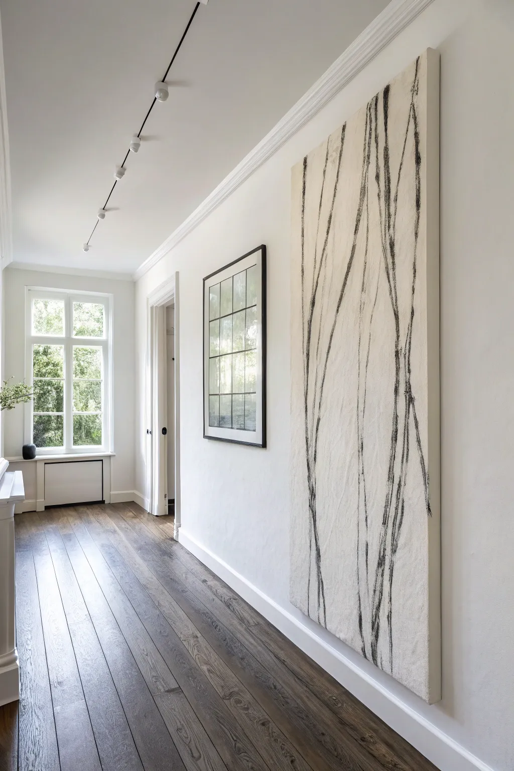
This striking floor-to-ceiling artwork mimics the raw elegance of charcoal sketches on textured fabric. By focusing on vertical movement and negative space, you will create a monumental piece that feels both grounding and ethereal.
Step-by-Step Tutorial
Materials
- Heavy-duty wooden stretcher bars (custom size to fit your wall)
- Heavyweight cotton canvas drop cloth (unprimed)
- Staple gun and heavy-duty staples
- White Gesso
- Warm white or cream acrylic paint
- Jumbo vine charcoal sticks
- Black compressed charcoal or thick oil stick
- Workable fixative spray (Matte)
- Wide paintbrush or roller
- Clean rag or chamois cloth
Step 1: Constructing the Canvas
-
Assemble the frame:
Connect your heavy-duty stretcher bars to form a tall, narrow rectangle. Ensure the corners are squared perfectly before tapping them tightly together with a rubber mallet. -
Position the fabric:
Lay your drop cloth or canvas flat on the floor, smoothing out any major wrinkles. Place the wooden frame face-down on top of the material. -
Cut to size:
Trim the excess fabric around the frame, leaving about 4 to 5 inches of material on all sides to allow for gripping and stretching. -
Begin stretching:
Start in the center of one long side. Pull the fabric tight and place one staple. Move to the opposite side, pull very taut, and place a staple in the center there as well. -
Secure the width:
Repeat this center-stapling process on the top and bottom short rails, ensuring the tension is even like a drum skin. -
Staple the perimeter:
Work your way out from the center staples toward the corners, pulling and stapling every few inches. Stop about 2 inches before the actual corner. -
Fold the corners:
Finish the stretching by folding the fabric at the corners using a “hospital corner” fold to keep it neat, then staple them securely to the back.
Pro Tip: Extension Hack
Tape your charcoal stick to the end of a long dowel or paintbrush handle. Drawing from a distance forces you to use your shoulder, creating significantly smoother, more natural long lines.
Step 2: Creating the Textured Base
-
Prime with Gesso:
Apply a coat of white gesso over the entire front surface. Use a coarse brush and deliberate, messy cross-hatching strokes to build up physical texture. -
Apply the base color:
Once the gesso is dry, mix your warm white acrylic paint. You want a color that looks like raw cotton or limestone, not a stark refrigerator white. -
Layer the paint:
Roll or brush this cream color over the canvas. I like to apply this layer slightly unevenly, allowing tiny specks of the darker raw fabric or texture to peek through for depth. -
Dry completely:
Allow the base layer to cure overnight. The surface must be bone-dry so the charcoal doesn’t gouge wet paint.
Step 3: Gestural Mark Making
-
Visualize the flow:
Stand the canvas upright against a wall. Plan your composition mentally: you want long, vertical lines that converge and branch slightly, resembling tall grass or stylized trees. -
Draft with vine charcoal:
Using the jumbo vine charcoal (which is easier to erase), lightly sketch the main vertical arteries. Start from the bottom edge and sweep your arm upward in a fluid motion. -
Add organic branches:
Draw thinner, branching lines splitting off from the main trunks. Keep your wrist loose and avoid straight ruler-lines; natural wobbles add character. -
Deepen the blacks:
Switch to compressed charcoal or a black oil stick. Trace over your vine charcoal lines, pressing harder in some areas to create bold, pitch-black accents. -
Vary the line weight:
Thicken the lines near the bottom of the canvas and let them taper off into thin whispers near the top to create a sense of height and growth. -
Create movement:
Use a dry rag or your finger to gently smudge the side of a few lines. This creates a “shadow” effect that makes the sharp lines pop forward. -
Final assessment:
Step back about 10 feet. Look for balance. If an area feels too empty, add a very faint, thin vertical line to interrupt the negative space. -
Seal the artwork:
Take the canvas to a well-ventilated area. Spray 2-3 light coats of matte fixative over the surface to prevent the charcoal dust from falling or smearing.
Level Up: antique Wash
Before sealing, water down a tiny bit of raw umber paint and flick it lightly onto the background with a toothbrush. This adds an aged, organic patina that contrasts beautifully with the modern lines.
Hang your massive canvas hallway masterpiece and enjoy the serene, museum-like atmosphere it brings to your space.


The Painted Headboard Alternative
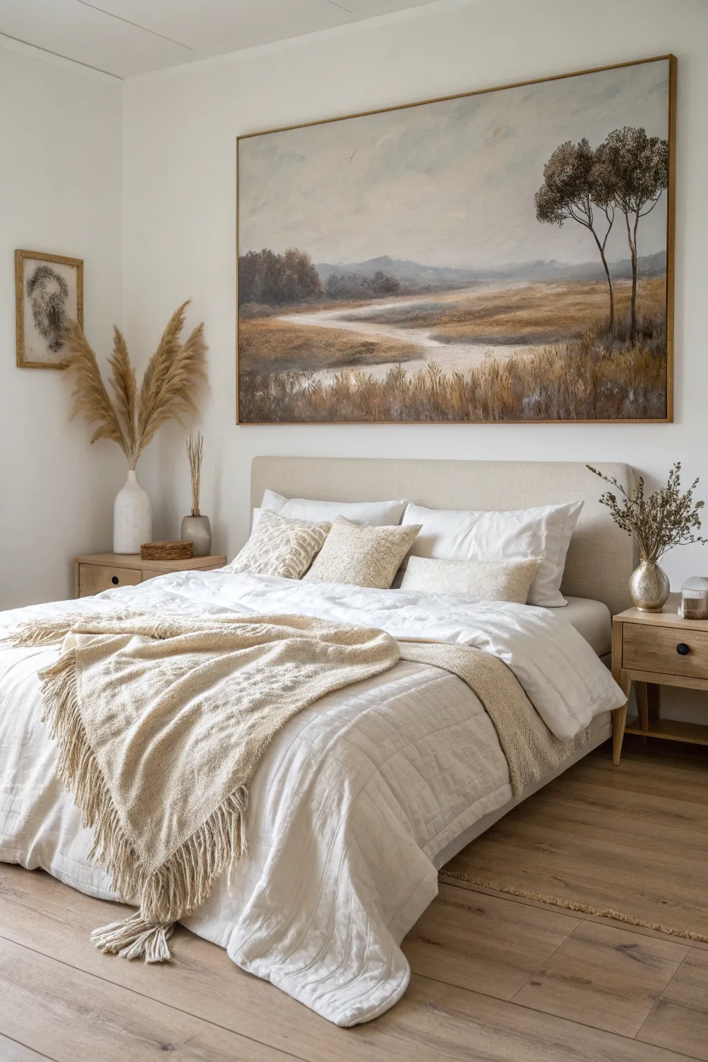
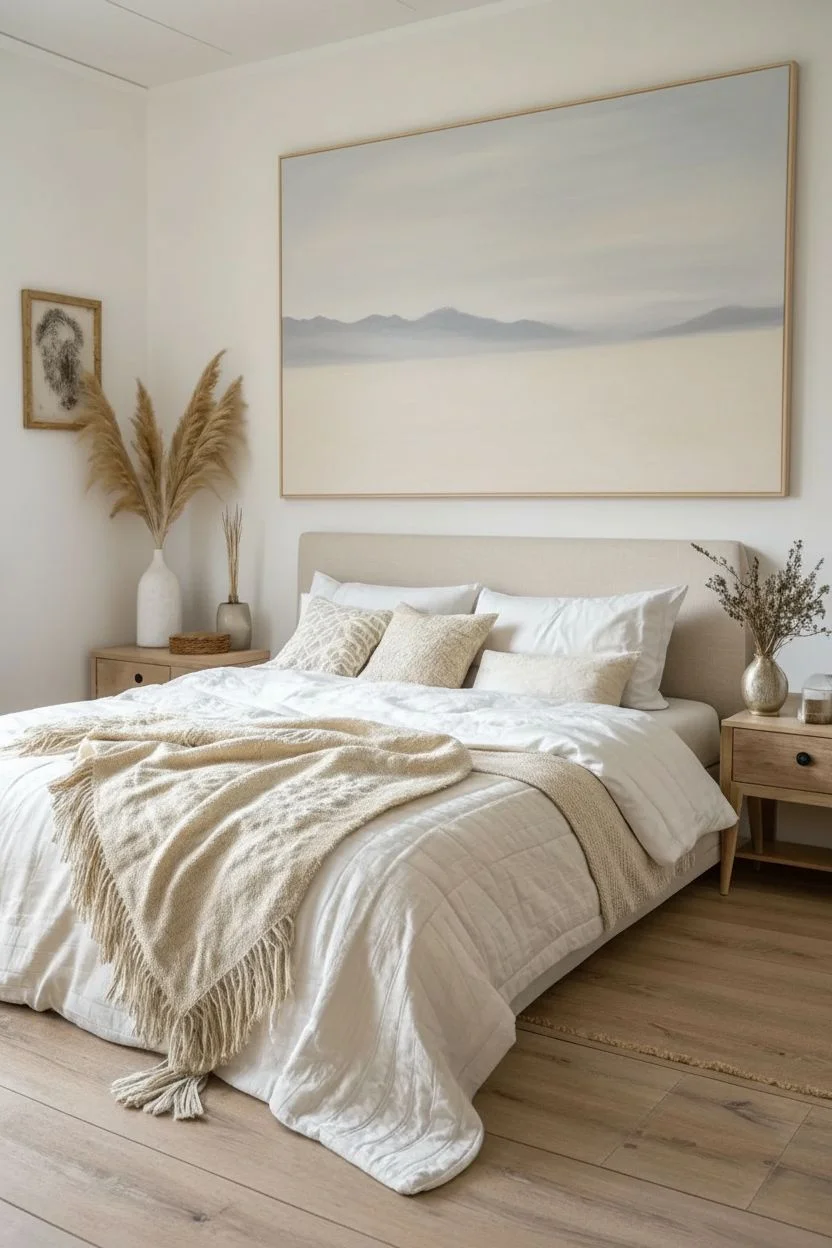
Transform your bedroom focal point with this oversized, atmospheric landscape painting that mimics the grounding presence of a headboard. Using muted earthy tones and soft blending techniques, you will create a tranquil vista featuring rolling fields, a winding path, and distinct silhouette trees.
How-To Guide
Materials
- Large canvas (approx. 48″ x 36″)
- Acrylic paints (Titanium White, Raw Sienna, Burnt Umber, Ultramarine Blue, Olive Green, Yellow Ochre)
- Large flat brush (2-3 inch)
- Medium filbert brush
- Fan brush
- Fine liner brush
- Palette and water container
- Paper towels
- Thin wood strips (for framing)
Step 1: Setting the Atmosphere
-
Prime the surface:
Begin by coating your large canvas with a mix of white and a tiny drop of raw sienna to create a warm, creamy off-white base rather than stark white. -
Sketch the horizon:
Lightly sketch a pencil line approximately two-thirds of the way up the canvas; keeping the horizon high emphasizes the vastness of the fields. -
Mix the sky colors:
Prepare a pale grey-blue mixture using white, a touch of ultramarine look, and a speck of burnt umber to desaturate it. -
Paint the sky:
Using the large flat brush, apply the sky color with broad, horizontal strokes, gradually adding more white as you approach the horizon line to create a hazy glow. -
Create distant mountains:
Mix a slightly darker, cooler grey-blue and paint low, rolling mountain shapes along the horizon, keeping the edges soft and blurry to suggest distance.
Step 2: The Valley Floor
-
Block in the fields:
Mix yellow ochre, white, and a touch of olive green. Apply this to the land area generically, getting darker and warmer as you move from the horizon down to the bottom. -
Draft the winding path:
Take a small brush with thinned burnt umber and sketch a winding ‘S’ shape path starting wide at the bottom center and narrowing to a vanishing point near the mountains. -
Paint the path base:
Fill the path shape with a mix of titanium white and raw sienna, using horizontal strokes to flatten the perspective. -
add path shadows:
Glaze a thin, watery mix of brown along the edges of the path where the grass meets the dirt to ground it to the earth. -
Mid-ground separation:
Paint a horizontal band of dark greenish-brown shapes across the middle of the canvas to represent a distant tree line or shrubbery that separates the fore and background. -
Soften the transitions:
While the paint is still tacky, use a dry, clean brush to gently feather the edges where the distant fields meet the mountains for a misty look.
Pro Tip: Atmospheric Depth
To make the landscape feel vast, strictly follow the rule: objects in the distance should be cooler (bluer) and lighter value. Objects close up should be warmer (redder/browner) and darker.
Step 3: Foreground and Details
-
Background texture:
Layer lighter beige and cream tones over the mid-ground fields using a scumbling technique (circular scrubbing motion) to imply dry field texture without distinct detail. -
Foreground grasses:
Switch to your fan brush. Load it with a mix of raw sienna and burnt umber, painting upward flicking strokes at the very bottom of the canvas for tall, dry grass. -
Grass highlights:
Clean the fan brush and load it with a lighter cream color. Add a second layer of grass strokes over the dark ones to create depth and volume. -
Sketch the trees:
I like to use a liner brush with inky, watered-down burnt umber to paint two slender, slightly bent tree trunks on the right side of the canvas. -
Add tree foliage:
Use an old, splayed bristle brush or a natural sponge dipped in dark olive and brown paint to dab clustered leaf shapes at the tops of the trunks. -
Define branches:
Go back with the liner brush to connect the leaf clusters to the main trunk with fine, twiggy lines. -
Final highlights:
Add touches of light ochre to the tops of the tree canopies and a few bright white highlights on the bend of the path where the light hits. -
Frame it out:
Attach thin wooden lattice strips around the outer edge of the canvas using finishing nails to create the minimal floating frame look shown in the image.
Level Up: Texture Gel
Mix heavy body clear gloss gel into your paint for the foreground grasses. This will physically build up ridges on the canvas, allowing the light in your room to catch the texture of the ‘wheat’.
Hang your new masterpiece centered above the bed using heavy-duty anchors and enjoy the peaceful view.
Repurposed Thrift Store Flips
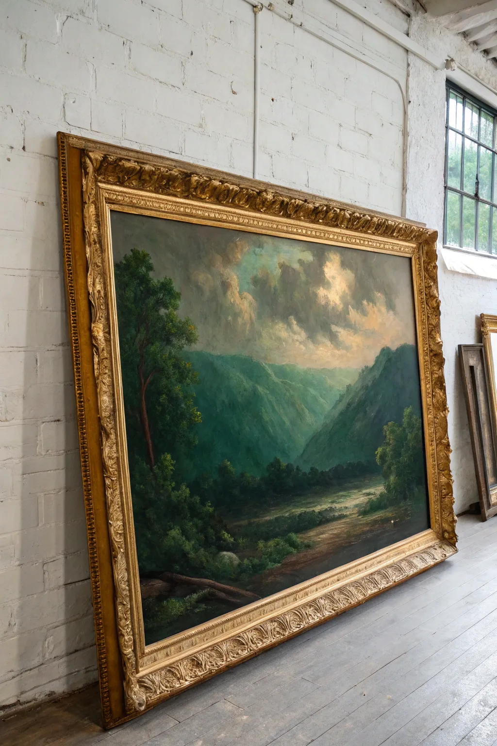
Transform a generic large-scale thrift store print into a moody, high-end landscape reminiscent of the Hudson River School style. This project embraces dramatic lighting and lush greens to turn a tired canvas into a museum-worthy statement piece.
Step-by-Step Guide
Materials
- Large thrifted framed art (canvas or board)
- White Gesso
- Acrylic paints (Titanium White, Payne’s Grey, Sap Green, Burnt Umber, Yellow Ochre, Alizarin Crimson)
- Large flat brush (2-inch)
- Medium filbert brush
- Fan brush
- Painter’s tape
- Gold Rub ‘n Buff (optional for frame)
Step 1: Preparing the Canvas
-
Clean and tape:
Wipe down the existing canvas surface with a damp cloth to remove decades of dust. Apply painter’s tape carefully along the inner edge of the gold frame to protect it while painting. -
Prime the surface:
Apply two coats of white gesso over the original image to create a blank slate, allowing the primer to dry fully between coats. If the old art had texture, lightly sand the gesso for a smoother finish. -
Sketch the composition:
Using a watered-down mix of Burnt Umber, loosely sketch a V-shape for the valley, marking the horizon line low on the canvas and positioning the large tree on the left vertical edge.
Muddy Colors?
If your mountains turn into a grey mess, stop and let the layer dry. Acrylics blend well only for a few minutes; working wet-on-tacky paint causes mud. Dry layers ensure crisp, distinct mountain ridges.
Step 2: Painting the Atmosphere
-
Sky gradient:
Start at the top with a mix of Payne’s Grey and White, blending downwards into a warmer mix of White and Yellow Ochre near the mountain peaks to simulate a glowing light source. -
Cloud formation:
While the sky is still slightly damp, use a round brush to scumble in storm clouds using Payne’s Grey with a touch of Alizarin Crimson. Keep the edges soft and hazy. -
Sunlight breaks:
Add bright highlights to the edges of the clouds where the sun breaks through using pure Titanium White mixed with a tiny drop of Yellow, creating that dramatic backlit effect. -
Distant mountains:
Mix a blue-grey color for the furthest mountains. Paint these with low opacity; things further away should look paler and bluer due to atmospheric perspective.
Level Up: Texture
Mix heavy body modeling paste into your paint for the foreground rocks and tree bark. This impasto technique creates physical ridge lines that catch the light, making the painting look like an expensive oil original.
Step 3: Valley and Vegetation
-
Mid-ground slopes:
Move forward in the landscape by adding Sap Green to your mountain mix. Paint the sloping hills on the right side, ensuring they look darker and more vibrant than the distant peaks. -
Deep valley shadows:
For the deep crevices of the valley, mix Sap Green with a little Burnt Umber. Creating deep shadows here establishes the massive scale of the landscape. -
The river path:
Paint the river or path winding through the valley floor using horizontal strokes. Reflect the sky colors—creams and light blues—into the water to tie the lighting together. -
Riverbanks:
Define the edges of the water with dark earthy browns and add small dabs of green to suggest bushes growing along the banks.
Step 4: Foreground and Details
-
Blocking the big tree:
Mix a very dark green-black using Sap Green and Burnt Umber. Block in the trunk and main structure of the tall tree on the left side, which acts as a framing device. -
Tree foliage:
I prefer using a fan brush or an old hog bristle brush here to tap on the leaves. Start with your dark base, then layer lighter olive greens on the tips where the light hits. -
Foreground texture:
In the immediate foreground at the bottom, paint rough textures like fallen logs or rocks using Burnt Umber and highlighting with pure White/Ochre mixes. -
Final glazing:
Once dry, apply a very thin wash of Yellow Ochre glazing liquid over the sun-lit areas of the grass to intensify the ‘golden hour’ glow. -
Frame refresh:
Remove the painter’s tape slowly. If the thrifted frame looks dull, use your finger to rub a little Gold Rub ‘n Buff onto the raised ornate details to make them pop.
Hang your massive masterpiece in a well-lit room and enjoy the grandeur of your new landscape
Dramatic Metallic Accents
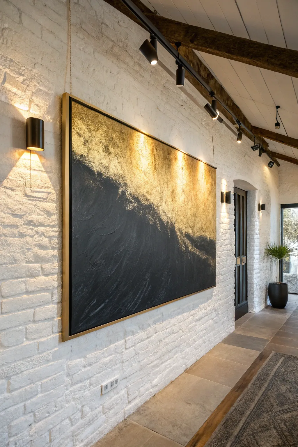
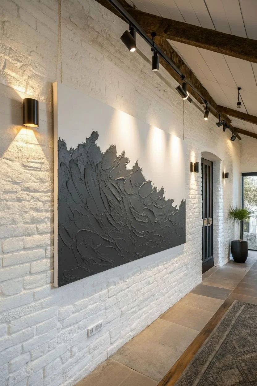
This large-scale statement piece combines moody, heavy texture with the luminous brilliance of gold leaf to create a dramatic focal point. The resulting artwork captures the energy of a crashing wave or a rugged landscape, perfect for adding sophisticated contrast to a bright interior.
Detailed Instructions
Materials
- Large gallery-wrapped canvas (48×60 inches recommended)
- Heavy modeling paste or texture medium
- Carbon Black heavy body acrylic paint
- Yellow Ochre acrylic paint (base for gold)
- Gold leaf sheets (imitation gold/brass leaf is fine)
- Water-based gilding size (adhesive)
- Large palette knife (trowel style)
- Wide lush hake brush or soft mop brush
- Gold floating frame
Step 1: Sculpting the Foundation
-
Map the composition:
Place your canvas on a flat, protected surface or an upright easel. Using a pencil or a piece of chalk, lightly sketch a diagonal, flowing line that splits the canvas roughly 60/40, with the larger section at the bottom left. -
Mix the texture:
Scoop a generous amount of modeling paste onto a disposable plate or palette. Mix in a small amount of black acrylic paint to create a dark grey base; this helps with coverage later. -
Apply the bulk:
Using your large palette knife, apply the tinted paste to the lower section of the canvas below your dividing line. -
Create the directional flow:
Spread the paste using sweeping, upward motions toward the right. Imagine the energy of a wave cresting; you want deep ridges and smooth valleys, not a flat surface. -
Feather the edge:
Where the texture meets the empty upper section, use the tip of the knife to create a broken, organic edge. I prefer to leave this boundary rough and jagged rather than a straight line to enhance the natural feel. -
Allow strictly to cure:
Let the modeling paste dry completely. This can take 24 to 48 hours depending on thickness, but it is crucial that the foundation is rock hard before painting.
Step 2: Creating the Void
-
Apply base black:
Squeeze rich Carbon Black acrylic directly onto the dry textured area. Use a medium-sized brush to work the paint deep into the crevices and ridges of the texture. -
Refine the darks:
Apply a second coat of black ensuring opacity. The goal is a light-absorbing, matte finish that feels infinitely deep. -
Soften the transition:
Using a dry brush with a tiny amount of black paint, lightly scumble (scrub) just past the textured ridge into the upper section to create a smoky fade.
Pro Tip: Sheen Contrast
To maximize drama, ensure your black paint is ultra-matte and your gold is high-gloss. This difference in light reflection makes the texture pop even in dim lighting.
Step 3: Gilding the Light
-
Prepare the upper background:
Paint the upper, smooth section of the canvas with a coat of Yellow Ochre. This acts as a warm underpainting that hides any gaps in the gold leaf later. -
Apply adhesive:
Once the ochre is dry, apply a thin, even layer of gilding size (adhesive) over the entire yellow area. Be careful to overlap slightly onto the peaks of the black texture ridges. -
Wait for tack:
Let the size sit until it becomes tacky. It should feel sticky like tape but not transfer wet glue to your finger (usually 15-30 minutes). -
Lay the gold:
Gently place sheets of gold leaf over the sticky surface. Don’t worry about wrinkles; the texture of the leaf adds character. -
Burnish the surface:
Use a soft, dry mop brush to gently rub the back of the gold leaf sheets, pressing them firmly into the adhesive. -
Remove excess:
Using the same soft brush, whisk away the loose bits of gold leaf that didn’t stick. Save these flakes in a jar for future projects. -
Highlight the ridges:
Take a little bit of the remaining gold flake dust and gently press it onto the very tips of the black texture ridges where you applied the size, creating a glittering transition. -
Seal:
Apply a clear, gloss spray sealer over the gold section to prevent tarnishing, and a matte spray over the black section to maintain the contrast.
Level Up: Antique Effect
After the gold leaf is set, lightly sponge a diluted black wash (90% water, 10% black paint) over the gold, then wipe it off immediately. This settles into creases for an aged look.
Step 4: Framing
-
Float frame assembly:
Place your finished canvas into a gold metal floating frame. This specific frame style leaves a small gap between the canvas and the edge, giving the illusion the art is hovering. -
Secure backing:
Flip the assembly over and screw the canvas into the frame using offset clips provided with your frame kit.
Hang your new masterpiece under a directional spotlight to watch the gold catch the light and bring the wall to life
High-Contrast Statement Portraits

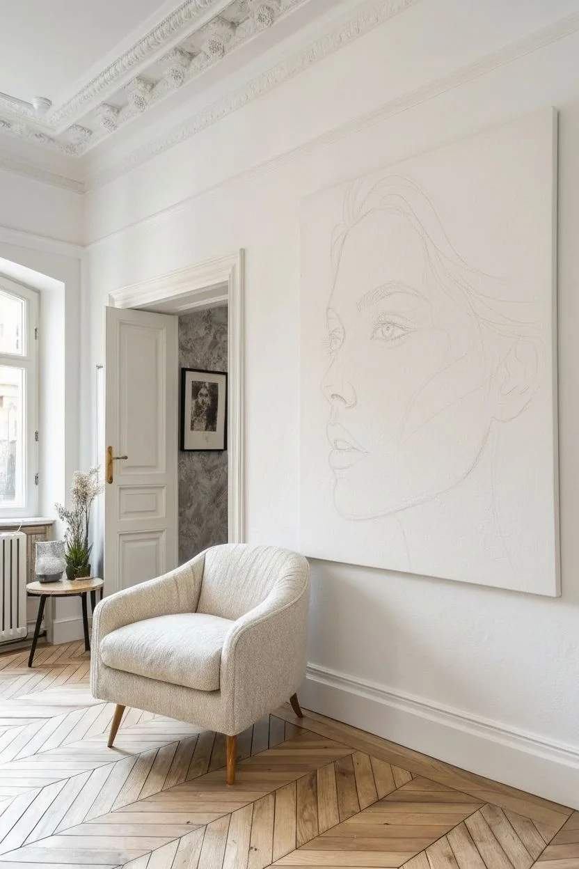
Capture the raw emotion of the human face with this striking, oversized profile portrait. Using charcoal on canvas allows for deep, velvety blacks and incredible texture that transforms a simple wall into a gallery-worthy display.
Step-by-Step Guide
Materials
- Large square canvas (48×48 inches or larger)
- White Gesso primer
- Vine charcoal sticks (soft)
- Compressed charcoal sticks (for deep blacks)
- Charcoal powder
- Large blending stumps or clean rags
- Kneaded eraser
- Fine-point eraser pen
- Soft synthetic brushes (large filbert and rounded)
- Workable fixative spray (matte)
- Projector (optional but recommended for scale)
Step 1: Preparation and Mapping
-
Prime the surface:
Apply two coats of white gesso to your canvas to create a slight ‘tooth’ or grit. Let this dry completely; the texture is crucial for gripping the charcoal. -
Project and trace:
Given the large scale, use a projector to cast your reference photo onto the canvas. Use a stick of vine charcoal to very lightly trace the major outlines: the profile slope, the eye placement, and the hair mass. -
Refine the sketch:
Turn off the projector. Stand back and ensure the proportions feel right. Lightly correct any lines that look distorted, keeping your touch feather-light so lines can be easily erased.
Step 2: Establishing Values
-
Apply the deepest darks:
Start with the hair. specialized compressed charcoal allows you to lay down rich, heavy blacks in the shadowed areas of the hair and the nape of the neck. Don’t worry about strands yet; think in large shapes. -
Create a mid-tone wash:
Dip a large, soft brush into charcoal powder. Gently swirl this over the shadowed side of the face (cheekbone, jawline, side of the nose) to create a soft, grey base layer. -
Blend the transitions:
Using a clean rag or a large blending stump, smooth out the charcoal powder you just applied. I like to rub in circular motions to mimic the soft texture of skin, fading the grey into the white of the canvas.
Smudge Prevention
Work from the top left to the bottom right (if you represent right-handed) or rest your hand on a ‘mahl stick’ (or a clean yardstick propped up detailed) to avoid smearing your work.
Step 3: Facial Features
-
Sculpt the eye:
Switch to a sharpened vine charcoal stick. Carefully draw the eyelids, the lashes, and the iris. Remember to leave the small white reflection in the pupil untouched for that spark of life. -
Define the nose and lips:
Use charcoal powder on a smaller brush to create the shadows under the nose and the volume of the lips. Avoid hard outlines here; use shadows to define the edges instead. -
Add freckles and texture:
For that realistic skin texture shown in the image, tap a stiff bristle brush loaded with charcoal powder lightly against a stick to speckle the cheek and nose bridge. Use a pencil to darken specific freckles. -
Lift highlights:
Take your kneaded eraser and firmly press and lift charcoal off the canvas to create highlights on the tip of the nose, the cheekbone, and the center of the lip.
Level Up: Sepia Tone
To exactly match the warm, vintage vibe of the inspiration image, spray the finished (and dried) charcoal piece with a very thin glaze of transparent burnt umber acrylic mixed with water.
Step 4: Hair and Details
-
Detail the hair flow:
Go back into the dark hair mass with compressed charcoal to darken visible roots. Then, use a fine eraser pen to ‘draw’ white strands by erasing lines through the black, simulating catching light. -
Soften the edges:
Look at the hairline and the back of the head. Use a large clean brush to feather these edges out so the portrait feels atmospheric rather than like a cutout. -
Intensify contrast:
Step back five feet. Identify areas that look washed out. Re-apply compressed charcoal to the darkest shadows (nostrils, pupils, deep hair folds) to ensure maximum impact. -
Clean the background:
Use a large clean eraser or a rag dampened slightly with water to wipe away any smudge marks on the negative space (the background), keeping it stark white or light grey. -
Seal the work:
Take the canvas to a well-ventilated area. Apply several light coats of matte workable fixative. This is vital to prevent the charcoal from falling off or smudging over time.
Hang your oversized masterpiece in a well-lit room and enjoy the dramatic presence it brings to your space.
The Floor-to-Ceiling Mural Illusion
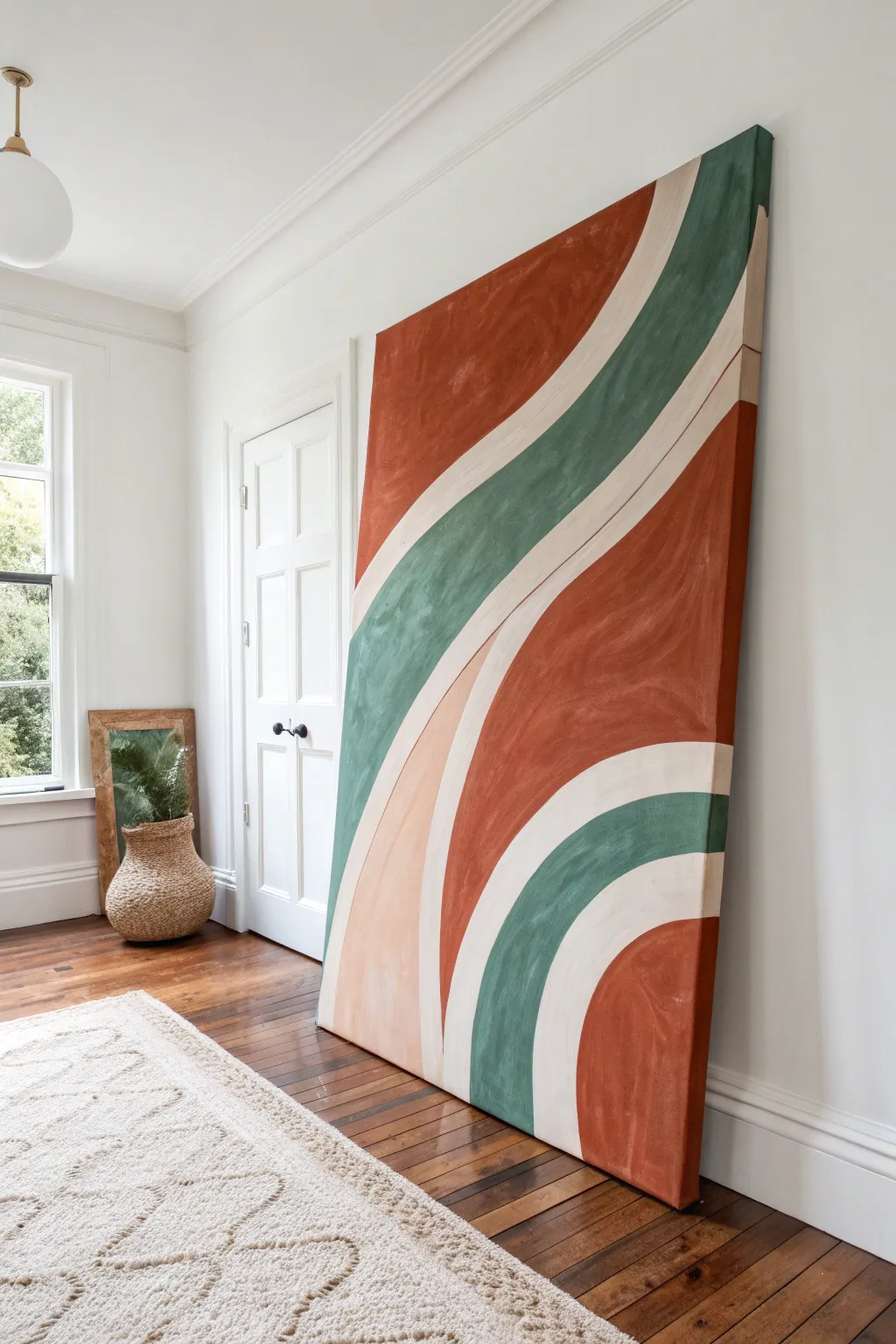
Transform a blank wall into a stunning focal point with this massive floor-to-ceiling canvas project. This abstract design uses sweeping organic curves and soothing earth tones to create a calming, modern mural illusion without actually painting on your drywall.
Step-by-Step
Materials
- Large heavy-duty canvas (or DIY 1×2 frame with stretched drop cloth)
- White gesso primer
- Heavy body acrylic paints (Burnt Sienna, Deep Green, Titanium White, Yellow Ochre, Red Oxide)
- 3-inch wide flat paintbrush
- 1.5-inch angled sash brush
- Pencil and large eraser
- Large palette or paper plates
- Cup of water and rags
- Drop cloth for floor protection
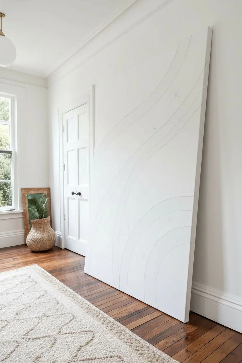
Step 1: Preparation & Sketching
-
Prime the surface:
If you are building your own canvas or using a raw one, apply two coats of white gesso to ensure a smooth, non-porous surface. Let it dry completely. -
Position the canvas:
Lean the canvas vertically against the wall where you intend to display it, or a similar flat surface. Sketching while it is upright helps you judge the scale better than if it were lying flat. -
Establish the flow:
Using a pencil, lightly draw the main ‘S’ curve that divides the canvas. Start from the top right third and swoop down toward the bottom left. -
Add secondary curves:
Sketch parallel curves on either side of your main line. Unlike geometric stripes, let these vary in thickness slightly to maintain an organic, fluid feel. -
Define color zones:
Mark each section with a small letter (e.g., ‘R’ for rust, ‘G’ for green) so you don’t get confused once you start painting. -
Step back and adjust:
Walk to the other side of the room to view your sketch. If a curve looks jagged or unbalanced, erase and redraw firmly with confident, sweeping arm movements.
Wobbly Lines?
If your curves look shaky, don’t stress. Let the colored paint dry completely, then use the cream paint to ‘cut back’ into the color shapes to tidy up the line work.
Step 2: Mixing & Blocking Colors
-
Mix the terracotta:
Combine Burnt Sienna with a touch of Red Oxide and a dab of White. You want a warm, earthy clay tone that isn’t too bright. -
Create the sage green:
Mix Deep Green with Yellow Ochre and a generous amount of White. I usually add a tiny dot of black or grey to desaturate it for that muddy, vintage look. -
Mix the blush tone:
Create the pale peach section by taking a small amount of your terracotta mix and adding a large amount of Titanium White. -
Prepare the cream:
For the negative space lines, mix Titanium White with a very small drop of Yellow Ochre to create a warm, creamy off-white rather than a stark bright white. -
Block in the rust sections:
Use the wide 3-inch brush to fill in the large terracotta areas. Don’t worry about perfect edges yet; just focus on getting the color on the canvas. -
Fill the green wave:
Switch to a clean wide brush and fill in the central green swathe. Ensure you push the paint into the weave of the canvas. -
Paint the blush accent:
Fill in the smaller sliver of peach/blush color nested between the other waves.
Use Your Whole Arm
To get smooth, flowing curves, draw and paint from your shoulder rather than your wrist. This prevents the lines from looking stiff or jagged.
Step 3: Refining & Finishing
-
Apply the second coat:
Once the first layer is dry to the touch, apply a second coat to the colored sections to ensure full opacity and richness. -
Paint the cream separators:
Using the cream mixture and the angled sash brush, carefully paint the bands between the colors. This is where you clean up the edges of your colored sections. -
Cut in the curves:
Slow down for the edges. Use the sharp tip of the angled brush to glide along the curve, smoothing out any roughness from the blocking phase. -
Wrap the edges:
Continue the design onto the sides of the canvas depth. Paint the rust, green, and cream lines over the edge to give the artwork a professional, gallery-wrapped finish. -
Final inspection:
Look for any pinholes of white canvas showing through the colored sections and dab paint into them. -
Seal the work:
Because this piece is so large and floor-standing, apply a matte clear varnish over the entire surface to protect it from dust and scuffs.
Lean your massive new masterpiece against the wall and enjoy the dramatic scale it brings to your room


Have a question or want to share your own experience? I'd love to hear from you in the comments below!