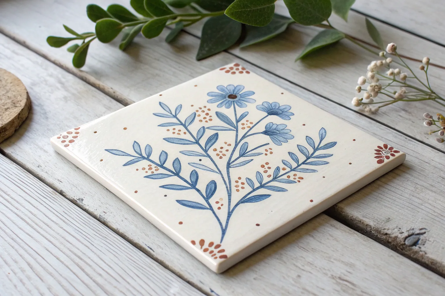
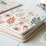
A plain ceramic tile is basically a tiny, tough little canvas that begs for color and pattern. If you’ve been craving a quick project that feels satisfying (and looks amazing in photos), these tile painting ideas will keep your hands busy and your creativity totally lit up.
Classic Blue-and-White Floral Tiles
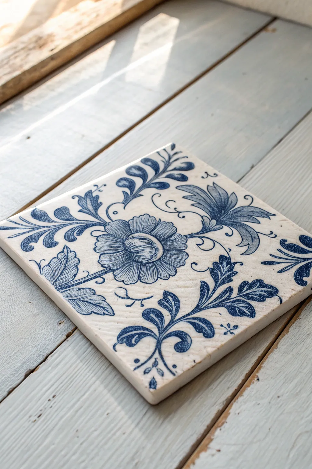
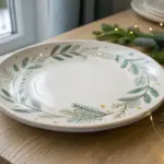
Capture the elegance of traditional Dutch artistry with this hand-painted ceramic tile project. The design features a striking central bloom surrounded by graceful scrolling foliage in classic cobalt blue against a creamy white background.
Step-by-Step Tutorial
Materials
- 4×4 or 6×6 inch white ceramic tile (bisque or glazed)
- Ceramic or porcelain paint (Cobalt Blue)
- Small round paintbrushes (sizes 0, 2, and 4)
- Fine-point detail brush (size 00 or liner brush)
- Palette or small dish for mixing
- Carbon transfer paper
- Pencil
- Printed floral pattern or sketch
- Rubbing alcohol and paper towel
- Oven (for curing, if required by paint)
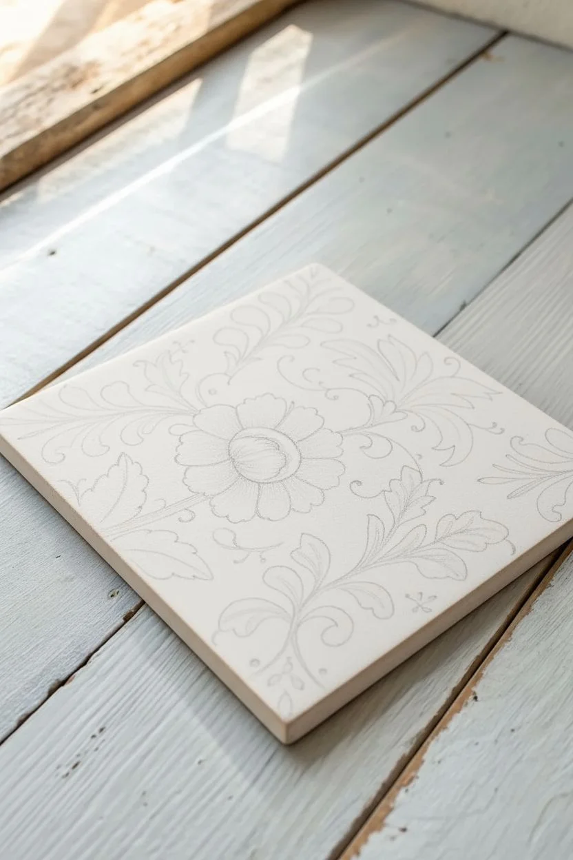
Step 1: Preparation & Mapping
-
Clean the surface:
Before putting brush to tile, wipe the entire surface firmly with rubbing alcohol and a paper towel. This removes oils and fingerprints that could repel your paint. -
Prepare your pattern:
Create a sketch on paper that matches your tile’s dimensions, featuring a large central flower and curling leaves in the corners. You can trace the example image or draw your own variation. -
Transfer the design:
Place a sheet of carbon transfer paper (dark side down) on the tile, then tape your sketch on top. Trace over your lines with a pencil to leave a faint guide on the ceramic. -
Lighten the guides:
If the transfer lines are too dark or thick, gently dab them with a kneadable eraser or a lightly damp cloth until they are just visible enough to guide you.
Fixing Mistakes
Smudged a line? Don’t panic. Dip a Q-tip in rubbing alcohol and gently erase the wet paint. Wait for the spot to dry completely before re-painting.
Step 2: Painting the Central Bloom
-
Load your brush:
Place a small amount of Cobalt Blue paint onto your palette. Using a size 2 round brush, pick up the paint but don’t overload it; you want control for the petals. -
Outline the center:
Start with the round bulb-like center of the flower. Paint the circular outline with steady, even strokes. -
Fill the details:
Add the curved lines inside the central bulb to give it volume. Use lighter pressure to create thinner lines for the interior details. -
Paint the petals:
Using the same blue, paint the individual petals radiating outward. I like to press the brush down slightly at the base of the petal and lift as I move outward to create a natural taper. -
Add texture shading:
While the paint is still wet, use a very slightly damp clean brush to pull some color from the outlines inward, creating a soft gradient shading effect on the petals.
Step 3: Scrolling Foliage & Leaves
-
Switch brushes:
Move to a size 4 brush for the larger, sweeping leaves at the corners and sides. The larger belly of the brush holds more paint for longer strokes. -
Paint the stems:
Draw the main curved stems extending from the flower outward. Keep these lines fluid and varying in thickness—thicker at the base, thinner at the tips. -
Add the leaves:
Paint the leaves attached to the stems. Use a ‘comma stroke’ technique: press down for the wide part of the leaf and lift for the point. -
Create dimension:
Similar to the flower, paint fine lines or veins inside the larger leaves using your thinnest brush (size 0 or 00). This imitates the detailed engraving look of classic Delft tiles. -
Corner flourishes:
Add the distinct fan-like leaf clusters in the upper right. These should be denser and serve to balance the composition.
Vintage Patina
For an antique look, lightly sponge a diluted warm gray or sepia glaze over the dry blue paint before baking. It mimics aged ceramic crackle.
Step 4: Final Details & Curing
-
Fine line work:
Use your liner brush or size 00 to add delicate tendrils, tiny dots, and small accent marks in the empty spaces. These small flourishes bring the whole piece together. -
Check for errors:
Carefully inspect your work. If you find a smudge, use a damp cotton swab to wipe it away immediately before it sets. -
Dry completely:
Allow the tile to air dry for at least 24 hours. The surface must be bone dry before any heat is applied. -
Bake to cure:
Place the tile in a cool oven, then set the temperature according to your paint manufacturer’s instructions (usually around 300°F/150°C). Start timing once the temperature is reached. -
Cool down:
Once the baking time is up, turn the oven off and let the tile cool down inside completely. Removing it while hot can cause cracking.
Display your masterpiece on a stand or use it as a coaster to bring a touch of old-world charm to your home

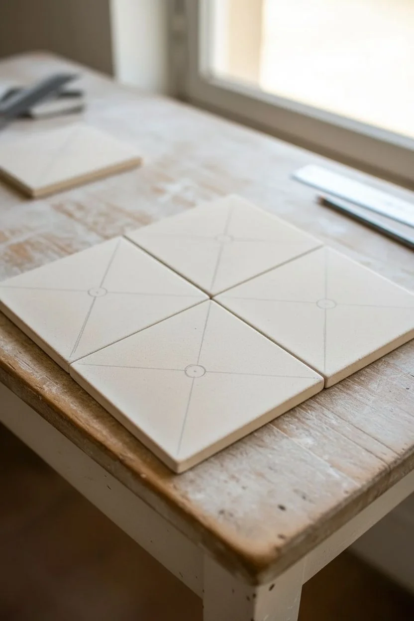
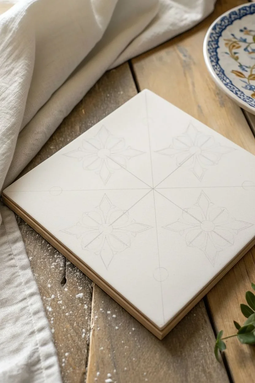
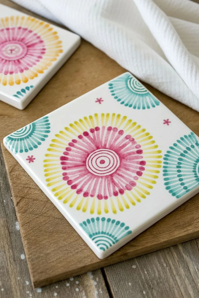
Meditative Mandala Dot-Paint Tiles
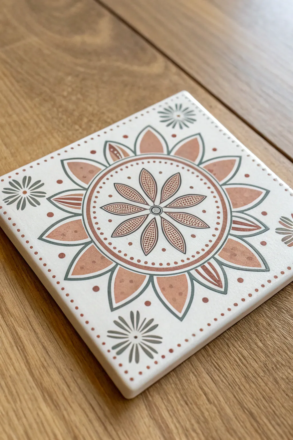
This project combines geometric precision with the soft, organic feel of a floral mandala. Using muted terra cotta and sage green tones on a white ceramic base creates a calm, decorative piece perfect for coasters or wall art.
How-To Guide
Materials
- White ceramic tile (4×4 or 6×6 inch)
- Ceramic or multi-surface acrylic paints (Terra Cotta, Sage Green/Dark Grey, White)
- Fine detail brushes (sizes 0/0 and 1)
- Compass and pencil
- Ruler
- Dotting tool or toothpick
- Clear acrylic sealer (spray or brush-on)
- Eraser
- Paper towel
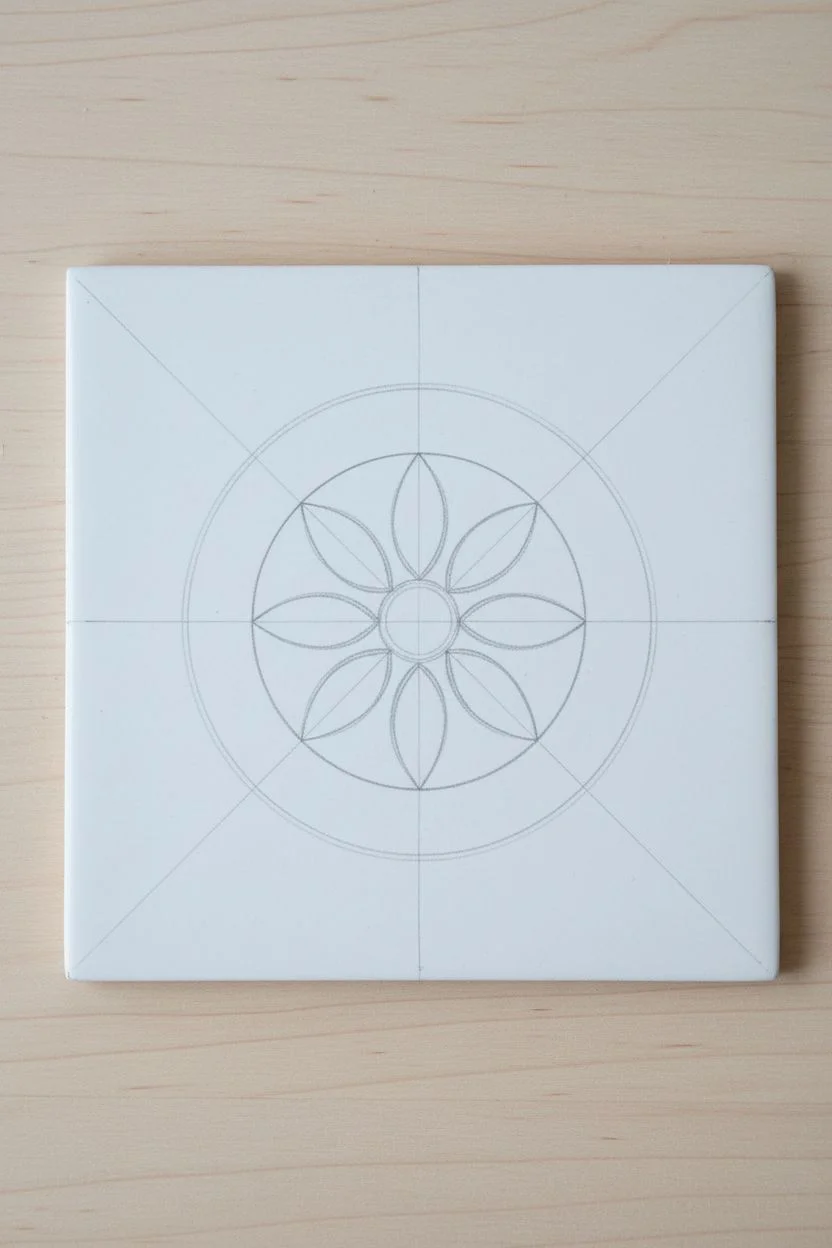
Step 1: Drafting the Design
-
Center the design:
Begin by finding the exact center of your tile using a ruler to lightly mark an ‘X’ from corner to corner with a pencil. -
Draw guide circles:
Using a compass, draw three concentric circles starting from the center point. The first should be small (about 1 inch diameter), the second medium (about 2.5 inches), and the third larger (about 3.5 inches). -
Mark petal placements:
Lightly sketch eight evenly spaced lines radiating from the center to the edge of the tile to guide your petal placement, like slicing a pizza. -
Sketch the central flower:
Draw eight long, thin teardrop petals within the innermost circle. They should touch at the center and extend nearly to the first circle line.
Step 2: Painting the Core
-
Outline the central petals:
Load a fine linear brush with your dark grey or sage green paint. Carefully trace the outline of the eight central teardrop petals. -
Fill the interior details:
Inside each central petal, paint a smaller teardrop shape using the terra cotta color, leaving a small gap between it and the dark outline. -
Add texture:
Once the terra cotta feels dry to the touch, use a very fine brush or toothpick to add tiny white grid lines or dots inside the terra cotta teardrops for texture. -
Paint the circle borders:
Go over your pencil circle guides with the dark grey paint. Create a double line for the middle circle to create a band effect.
Pro Tip: Texture Trick
To get that speckled look on the petals, dip an old toothbrush in watered-down paint and flick the bristles with your thumb over a stencil or masked area.
Step 3: Expanding the Mandala
-
Create the outer band:
Inside the double-banded circle you just painted, use a dotting tool or the end of a paintbrush handle to add a ring of evenly spaced terra cotta dots. -
Draft the large petals:
Sketch a large, wide pointed petal shape in each of the eight sections radiating outward from the middle band. -
Paint the large petals:
Outline these large petals with the dark grey paint. Fill alternating petals solidly with terra cotta paint. -
Detail the open petals:
For the petals not filled in, paint a smaller, thinner ‘floating’ petal inside using terra cotta, and add three small strokes at the base of the petal. -
Add texture to solid petals:
Dilute your terra cotta paint slightly with water or use a lighter shade to dab subtle spots onto the solid terra cotta petals, giving them an organic, speckled look.
Troubleshooting: Wobbles
If your fine lines are shaky, your paint might be too thick. Add a tiny drop of water to the paint on your palette to make it flow like ink.
Step 4: Finishing Touches
-
Add corner motifs:
In the four corners of the tile, paint a small stylized flower. Start with eight simple grey lines radiating from a point, then add a small dot in the center. -
Frame the design:
Using your dotting tool and terra cotta paint, add a border of small dots along the very outer edges of the tile, framing the entire composition. -
Clean up sketch lines:
Allow the paint to cure fully—I recommend waiting at least a few hours—before gently erasing any visible pencil marks. -
Seal the tile:
Apply a coat of clear acrylic sealer to protect your design from scratches and moisture, especially if using this as a coaster.
Once sealed, your tile is ready to serve as a stunning coaster or a decorative trivet in your home

Bold Geometric Pattern Tiles
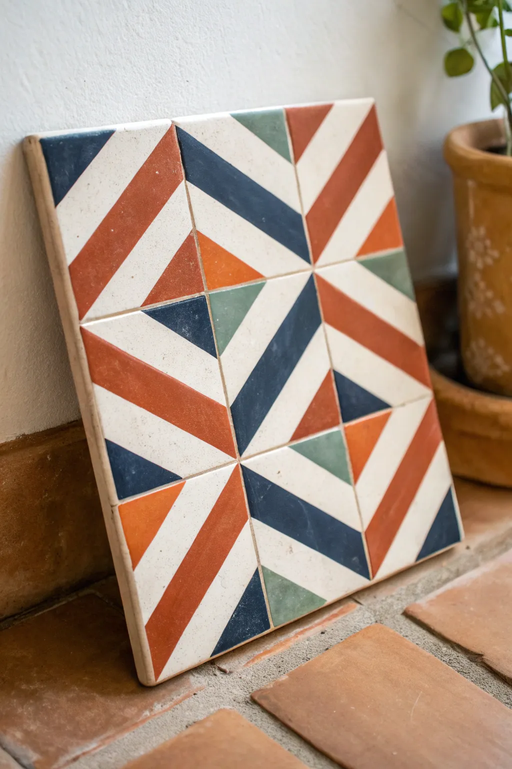
Transform plain ceramic tiles into a striking pattern play featuring bold diagonals and a sophisticated palette of rust, navy, and sage. This geometric design looks complex but is surprisingly simple to achieve with careful taping and a steady hand.
Step-by-Step Guide
Materials
- 4 square unglazed bisque tiles (4×4 or 6×6 inches)
- Acrylic paints (rust orange, navy blue, sage green, off-white)
- Painter’s tape (various widths, 1/4 inch is ideal)
- High-quality flat shader brushes (small and medium)
- Ruler and pencil
- Clear acrylic sealant (spray or brush-on)
- Palette or paper plate
- Paper towels and water cup
Step 1: Preparation & Mapping
-
Clean the surface:
Begin by wiping down your bisque tiles with a barely damp cloth to remove any ceramic dust. Let them dry completely, which should only take a few minutes. -
Establish the grid:
Since this design spans four tiles, it helps to push them together on your workspace in a 2×2 square. Use a ruler to lightly visualize where the major diagonal lines will flow from one tile to the next. -
Draft the diagonals:
On each individual tile, lightly pencil a large X from corner to corner to find the center. This pattern relies heavily on diagonal symmetry.
Seal the Tape Edges
Before painting a bold color, brush a thin layer of your base white color over the tape edge first. This seals the gap, ensuring the colored line is razor-sharp.
Step 2: Color Blocking: The Base
-
Mix the background color:
Create a warm off-white by mixing white acrylic with a tiny drop of ochre or beige. This mimics the look of raw ceramic better than stark white. -
Paint the negative space:
Identify the lighter triangular sections in the reference image. Paint these off-white areas first as your base layer. I find applying two thin coats gives smoother coverage than one thick one. -
Let it cure:
Allow the base coat to dry fully for at least 30 minutes. If the paint is cool to the touch, it needs more time.
Uneven Coverage?
If the rust or navy looks streaky, don’t keep brushing wet paint. Let the first coat dry completely, then apply a second coat perpendicular to the first.
Step 3: Creating the Geometry
-
Tape the first major stripes:
Using your painter’s tape, mask off the area for the thickest rust-orange diagonal stripes. Press the tape edges down firmly with your fingernail to prevent bleed-under. -
Apply the rust tone:
Load your flat brush with the rust/terracotta paint. Brush from the tape inward toward the painted area—never toward the tape edge—to keep lines crisp. -
Remove tape immediately:
Peel back the tape while the rust paint is still wet. This prevents the acrylic skin from ripping up when you pull. -
Allow to dry:
Wait for the rust sections to dry completely before moving to the intersecting colors. -
Tape the navy sections:
Mask off the areas for the dark blue stripes. Notice how these run parallel to some rust lines but intersect others at 90-degree angles. -
Paint the navy:
Fill in the navy blue sections. Use a smaller shader brush here to get sharp corners where the blue meets the rust or white sections. -
Add sage accents:
Once the navy is dry, mask off the final small triangular sections for the sage green. These small pops of color balance the warmth of the rust. -
Fill the green:
Paint the sage triangles. Because these shapes are smaller, be careful not to overload your brush.
Step 4: Finishing Touches
-
Touch up edges:
Inspect your lines. If any paint bled under the tape, use a very fine liner brush and the background color to tidy up the edges. -
Erase guidelines:
If any pencil marks are still visible in the unpainted areas, gently erase them now. -
Seal the tiles:
Apply a clear acrylic sealant over the entire surface. A matte or satin finish looks most authentic for this style. -
Arrange the final pattern:
Once sealed and dry, rotate your four tiles to match the diamond-like intersection seen in the photo. The pattern relies on the correct orientation of each quadrant.
Arranging these four tiles together reveals how simple stripes can combine into a stunning optical illusion on your table or shelf
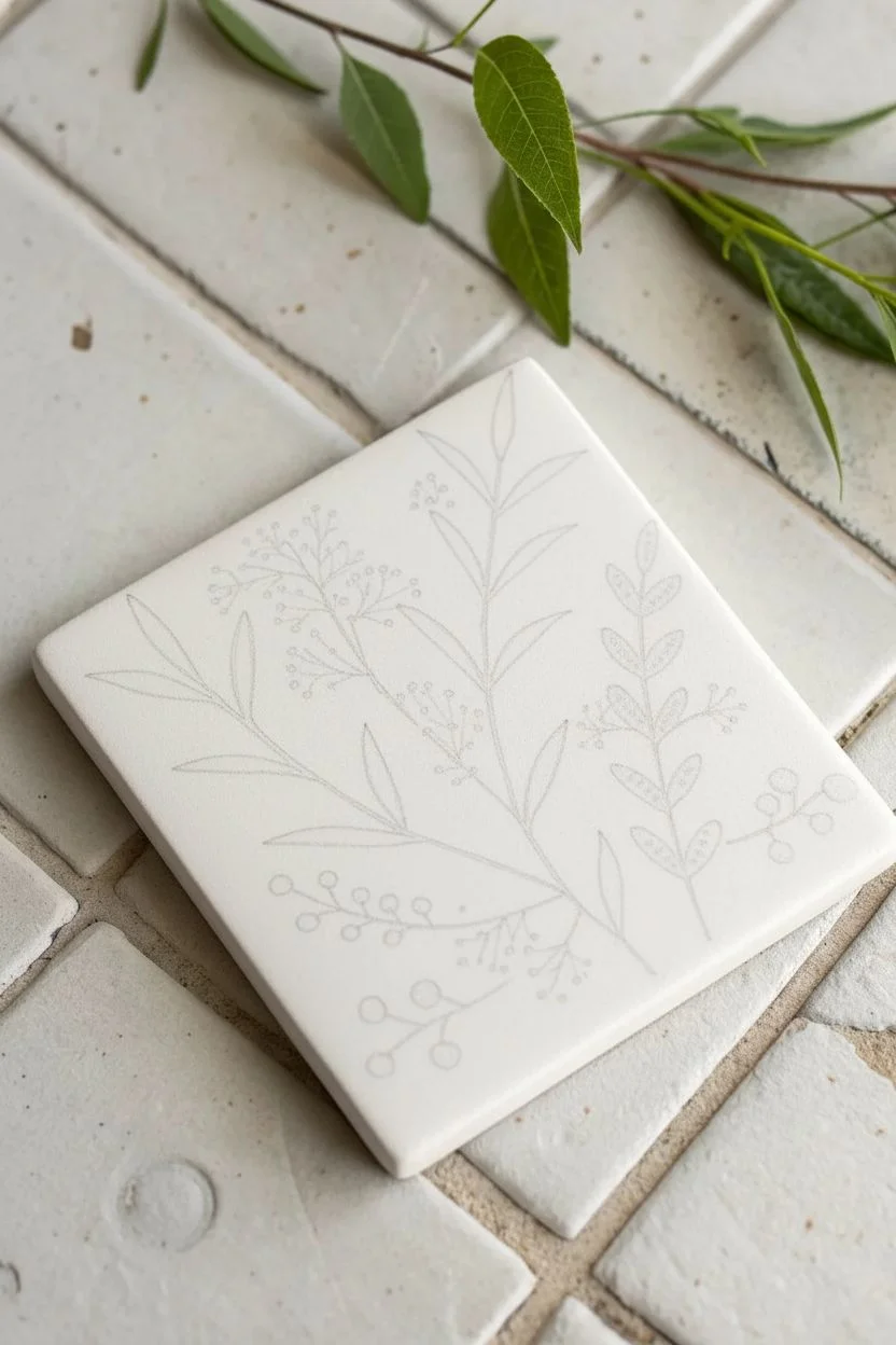
Simple Botanical Sprigs and Leaves
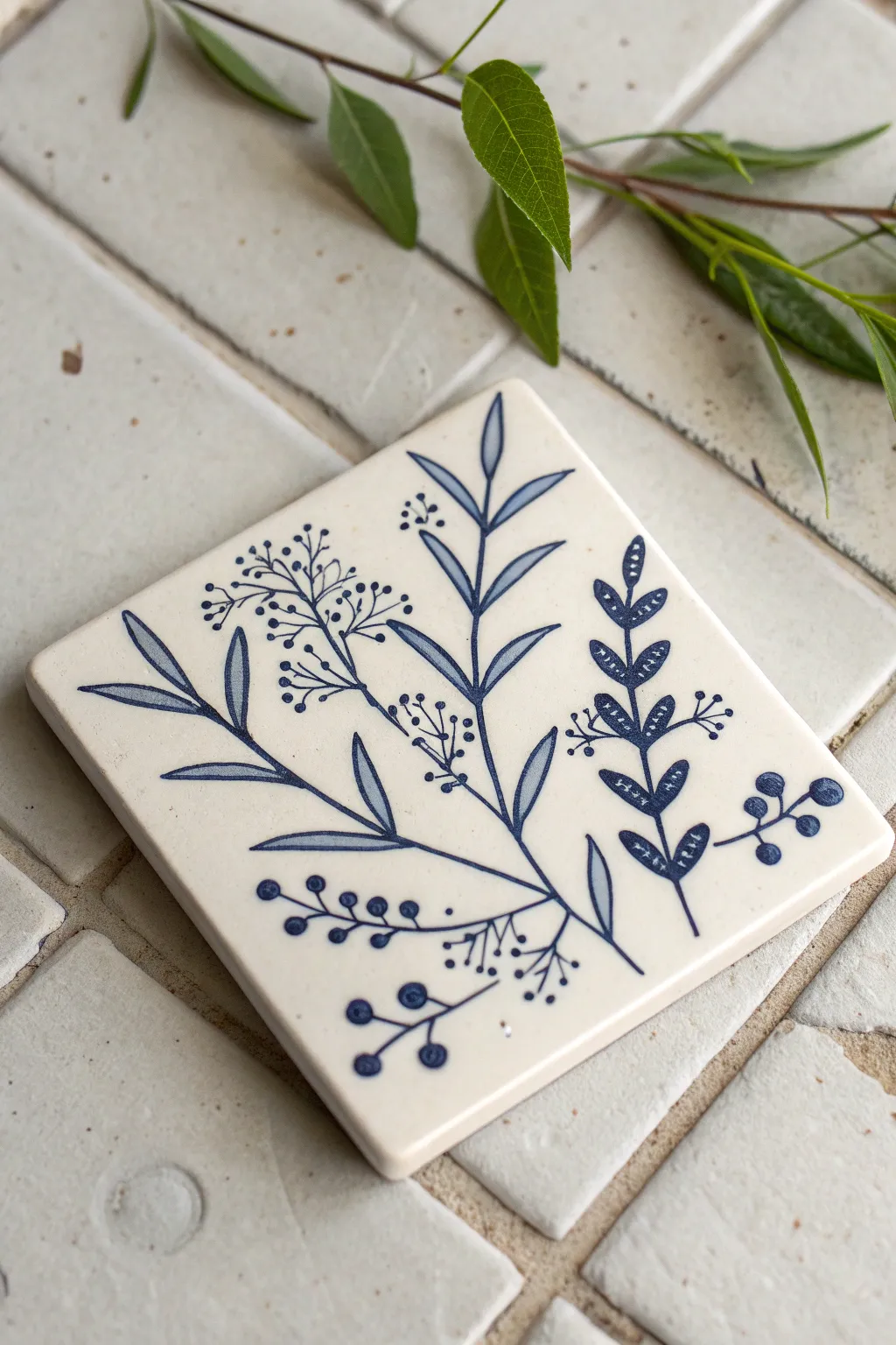
Create a sophisticated, nature-inspired accent for your home with this delicate blue and white tile coaster. Featuring a mix of solid, outlined, and patterned botanical stems, this project mimics the look of classic delftware or fine china using simple painting techniques.
How-To Guide
Materials
- 4×4 White or Cream Ceramic Tile (unglazed bisque or matte finish works best)
- Pebeo Porcelaine 150 Paint (in Navy Blue or Lapis Blue)
- Fine Detail Paintbrush (Size 0 or 00, round)
- Pencil (HB or lighter)
- Palette or small dish
- Paper towels
- Container of water
Step 1: Planning and Sketching
-
Clean surface:
Begin by wiping down your ceramic tile with a damp paper towel or a little rubbing alcohol to ensure there are no oils or dust that could repel the paint. -
Visualize the layout:
Observe the composition: three main stems rise from the bottom edge, fanning out slightly. The central stem is the tallest, while the side stems curve gently inward. -
Lightly sketch stems:
Using a very light touch with your pencil, draw the three main central lines for the stems. I find it helpful to start the lines right at the bottom edge to ground the design. -
Sketch the leaves:
Add the leaf placements. Draw simple almond shapes along the central and left stems. For the rightmost stem, draw smaller, rounded leaflets in pairs. -
Add floral details:
Sketch the fine, branching lines for the delicate berry clusters that sit between the main leaves. Keep these lines very faint as they will be quite thin when painted.
Step 2: Painting the Main Foliage
-
Prepare your paint:
Place a small amount of navy blue ceramic paint onto your palette. If the paint feels too thick for fine lines, you can thin it very slightly with the specific medium for your paint brand, but usually, it’s best used as-is for opacity. -
Paint the central stem:
Load your fine liner brush and paint the main vertical line for the central stem. Use long, confident strokes to avoid shakiness, tapering the line as it reaches the top. -
Outline the main leaves:
Carefully outline the almond-shaped leaves on the central stem. Instead of filling them in completely solid, mix a tiny drop of water or medium into your blue to create a semi-transparent wash, and fill the inside of the leaf. This creates that lovely two-tone depth. -
Paint the left stem:
Move to the stem on the left. Paint the main branch, then paint the leaves. Notice how these leaves are often solid blue at the tips or edges, fading into the center. Recreate this by applying paint to the outline and dragging it inward while wet. -
Create the patterned stem:
For the stem on the right, use a darker, fully opaque application of blue. Paint the small, rounded leaves solid dark blue. Once the solid shape is laid down, you can use a clean, dry brush tip or a toothpick to scratch back tiny lines or dots before the paint dries, or simply execute them carefully with the brush.
Design Continuity
Make a set of 4 coasters by breaking this design apart. Paint just the berry sprig on one, the solid leaf stem on another, and so on.
Step 3: Adding Delicate Details
-
Paint the berry sprigs:
Using the very tip of your smallest brush (size 00 is perfect here), paint the ultra-thin branching lines that weave between the main stems. Keep your hand light to ensure these lines are whisper-thin. -
Dot the berries:
Dip the tip of your brush handle or a dotting tool into the paint. Gently press dots at the ends of the fine lines you just painted to create the clusters of berries. -
Add texture to leaves:
Return to the patterned stem on the right. If you didn’t scratch back the texture earlier, wait for the blue base to dry completely, then use white paint to add tiny dashed lines or chevrons on top of the dark blue leaves for that folk-art look. -
Refine lines:
Check for any uneven edges on your stems. Use a damp brush to gently clean up any mistakes or to sharpen the points of your leaves. -
Create visual balance:
Look at the negative space. If an area feels too empty, add a small floating berry or a tiny detached leaf to balance the composition, just like the floating berries near the bottom right. -
Curing:
Allow the tile to dry for at least 24 hours. Once dry, bake the tile according to your paint manufacturer’s instructions (usually in a domestic oven at 300°F for 35 minutes) to set the design permanently.
Paint Beading Up?
If paint separates on the glazed surface, the tile is likely oily. Wipe it again thoroughly with rubbing alcohol and let it dry completely.
Once baked and cooled, your custom hand-painted tile is ready to serve as a beautiful coaster or decorative trivet
BRUSH GUIDE
The Right Brush for Every Stroke
From clean lines to bold texture — master brush choice, stroke control, and essential techniques.
Explore the Full Guide
Fruit Slice Tiles for Kitchen Cheer
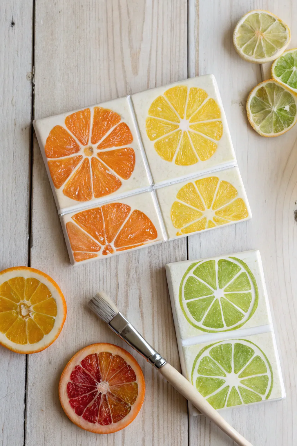
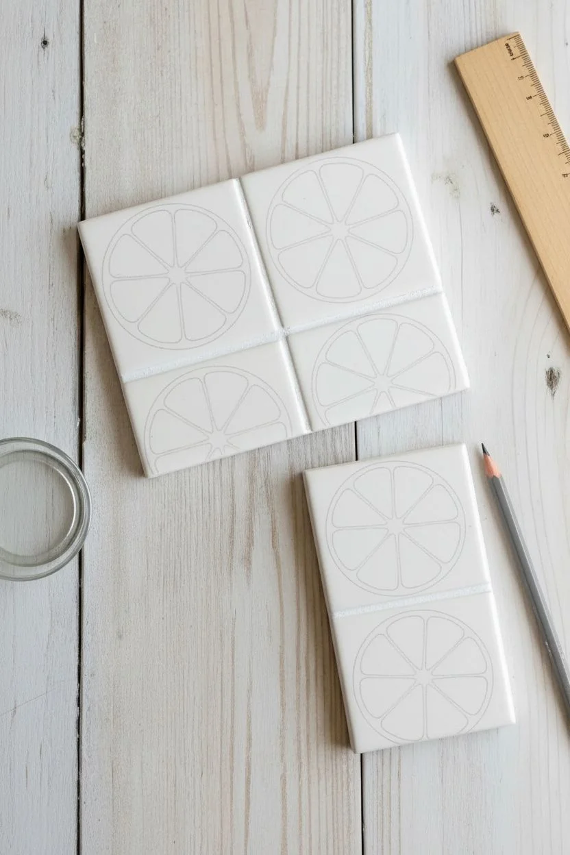
Brighten up your kitchen counter or coffee table with these refreshing, hand-painted tiles that look just like juicy citrus slices. The vibrant oranges, lemons, and limes pop against a creamy white background, making for a functional piece of art that feels like summer all year round.
Detailed Instructions
Materials
- White ceramic tiles (square and rectangular subway style)
- Rubbing alcohol
- Paper towels
- Pencil
- Circular object for tracing (like a jar lid or glass)
- Ruler
- Ceramic or enamel paints (orange, yellow, bright green, white)
- Medium flat paintbrush
- Small round detail brush
- Glazed ceramic finish or sealant (optional depending on paint type)
Step 1: Preparation and Mapping
-
Clean surface:
Before you start, wipe down all your ceramic tiles with rubbing alcohol and a paper towel. This removes any oils or dust that might prevent the paint from adhering properly. -
Mark the center:
Find the approximate center of your square tiles. It doesn’t need to be geometrically perfect, as fruit is naturally organic, but a central reference point helps with the layout. -
Trace the outline:
Place your circular object onto the tile and lightly trace around it with a pencil to create the outer rind of your fruit. For the rectangular tiles, trace the circle so it runs off the edges, giving the appearance of a close-up crop. -
Sketch the segments:
Lightly draw lines radiating from the center point to the outer circle, like slicing a pizza. Aim for about 8 to 10 wide segments per fruit. -
Round the corners:
Inside each triangular slice you just drew, sketch rounded corners near the center and the rind. This creates the characteristic teardrop shape of citrus pulp segments.
Layer for Depth
Don’t aim for one solid color. Let some brushstrokes be thinner than others. The semi-transparent nature of ceramic paint naturally replicates the translucent look of citrus flesh.
Step 2: Painting the Pulp
-
Mix your orange:
Start with the orange slices. Squeeze out your orange ceramic paint. If it feels too flat, mix in a tiny touch of yellow or red to give it dimension. -
Fill the segments:
Using the medium flat brush, fill in the segment shapes you sketched. Leave the space between the segments (the pith) unpainted so the white tile shows through. -
Switch to yellow:
Rinse your brush thoroughly and move on to the lemon tiles. Use a bright, sunny yellow to paint the segments on the designated tiles, using the same technique of leaving white gaps. -
Paint the limes:
For the lime tiles, use a fresh, grassy green. Since the rectangular tiles show two separate fruit halves, ensure you paint both sets of segments clearly. -
Create texture:
While the paint is still wet, I like to take a clean, dry detail brush and gently lift or streak the paint within the segments. This mimics the fibrous texture of real fruit pulp.
Step 3: Adding Details and Finishing
-
Paint the rind:
Using a steady hand and the flat brush, paint a thin ring of color around the outer edge of your segments. Leave a small white gap between this colored rind and the inner pulp segments. -
Refine the pith:
If your white lines (the pith) got messy, use a small amount of white ceramic paint on your detail brush to sharpen the lines between the fruit segments. -
Add highlights:
Mix a tiny bit of white into your base fruit colors to create a lighter tint. Dab this lighter color sporadically into the center of the segments to make them look juicy and reflective. -
Paint the tile edges:
For a finished look, gently brush a wash of white or a very pale version of the fruit color along the very edges of the ceramic tile to soften the stark white. -
Dry thoroughly:
Allow the tiles to dry completely according to your paint manufacturer’s instructions. This usually takes 24 hours. -
Bake to set:
If your ceramic paint requires heat setting, place the tiles in a cool oven, set the temperature to the recommended heat (often 300°F/150°C), bake for 30 minutes, and let them cool down inside the oven. -
Seal (Optional):
If these will be used as heavy-duty coasters, apply a clear, heat-resistant sealant over the top for extra durability.
Make a Backsplash
Create a stunning kitchen backsplash by mixing these fruit tiles among standard white subway tiles. Use the half-circle lemon and lime designs to create borders.
Once cooled and cured, these zestful tiles are ready to add a splash of color to your next tea time
Mini Landscape Tiles in Sunset Colors
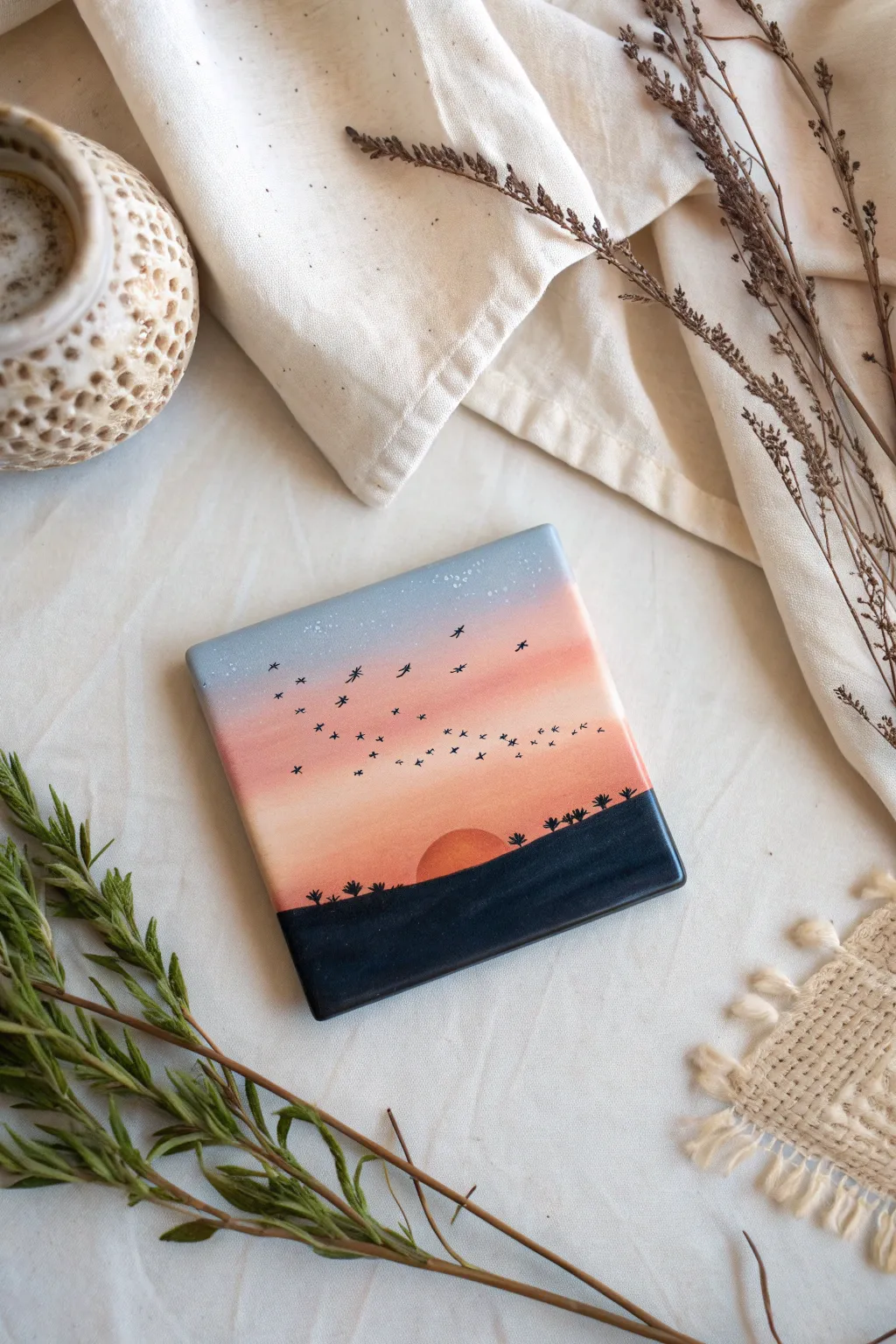
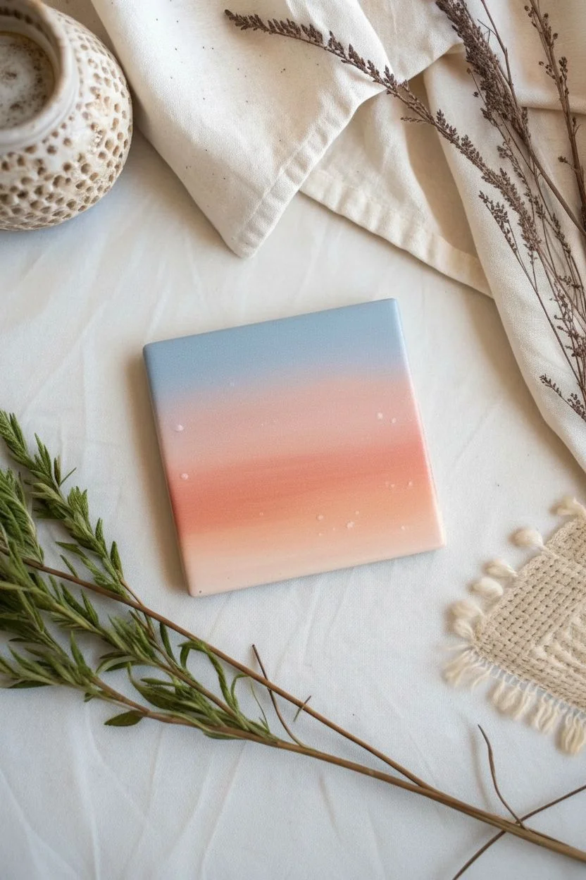
Capture the serene beauty of dusk on a simple ceramic coaster with this gradient painting project. The blend of soft pastels against stark black silhouettes creates a striking, modern look perfect for home decor or gifting.
Step-by-Step
Materials
- 4×4 inch white ceramic tile or coaster
- Acrylic paints (light blue, peach/coral, orange, black, white)
- Flat shader brush (roughly 1/2 inch)
- Small round detail brush (size 0 or 00)
- Palette or mixing plate
- Cup of water and paper towels
- Clear acrylic sealer or glossy varnish (spray or brush-on)
- Painter’s tape (optional)
Step 1: Creating the Gradient Sky
-
Prep the surface:
Ensure your ceramic tile is clean and free of dust or oils by wiping it down with a damp cloth or a little rubbing alcohol. Let it dry completely. -
Mix your sky colors:
On your palette, prepare three main puddles: a soft light blue mixed with plenty of white, a peach or coral tone, and a slightly deeper orange. You want these colors to transition smoothly. -
Apply the blue band:
Using the flat shader brush, paint the top third of the tile with your light blue mixture. Ensure smooth, horizontal strokes. -
Apply the peach band:
Clean your brush quickly and pick up the peach color. Paint the middle section of the tile, slightly overlapping the bottom edge of the blue paint while both are still wet. -
Blend the transition:
Lightly brush back and forth where the blue and peach meet to create a soft, seamless blend. If the paint feels too dry, a tiny touch of water on the brush can help move the pigment. -
Paint the horizon glow:
Apply the deeper orange to the bottom third of the sky area. Blend it upwards into the peach section just as you did before, creating a warm glow near the bottom. -
Let the sky dry:
Allow the gradient background to dry completely. This step is crucial so your sharp black details don’t muddy into the wet sky.
Uneven Gradient?
If your sky colors aren’t blending well, try using a slightly damp brush or adding a drop of acrylic flow improver. Work quickly while the paint is still wet for the smoothest transitions.
Step 2: Painting the Landscape
-
Rough out the hills:
Using black acrylic paint and your flat brush, paint a solid, undulating line across the bottom quarter of the tile to represent the ground. Fill in everything below this line with solid black. -
Add the setting sun:
Mix a vibrant orange-red. Using a clean brush, paint a semi-circle ‘sinking’ into the black hill line. It should look like the sun is just dipping below the horizon. -
Detail the foliage:
Switch to your smallest detail brush (size 0 or 00). Using black paint, dab tiny, uneven vertical strokes along the horizon line to create the suggestion of distant grass tufts, agave plants, or small bushes. -
Scatter the birds:
With the very tip of your detail brush and slightly watered-down black paint (for better flow), paint tiny ‘V’ shapes in the sky. Vary their sizes and angles to make the flock look natural and dynamic. -
Add stars (optional):
For a magical touch, dip the end of a paintbrush handle or a toothpick into white paint and add a few microscopic dots in the blue section of the sky. -
Final dry time:
Let the entire painting cure for at least 24 hours to ensure the acrylic has fully bonded to the ceramic surface. -
Seal the artwork:
Apply a coat of clear acrylic sealer or glossy varnish. This protects the paint from scratches and gives the tile a professional, finished sheen.
Pro Tip
When painting the flock of birds, practice on paper first. Make the birds closer to the horizon smaller and the ones higher up slightly larger to create a sense of depth and perspective.
Now you have a stunning miniature landscape that captures the magic of a summer evening

PENCIL GUIDE
Understanding Pencil Grades from H to B
From first sketch to finished drawing — learn pencil grades, line control, and shading techniques.
Explore the Full Guide
Black-and-White Line Art Tiles
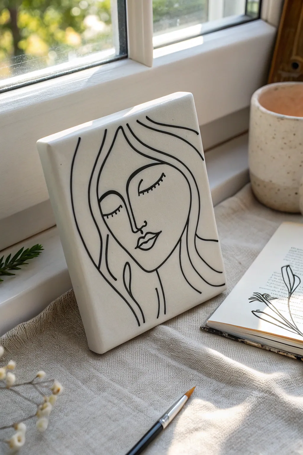
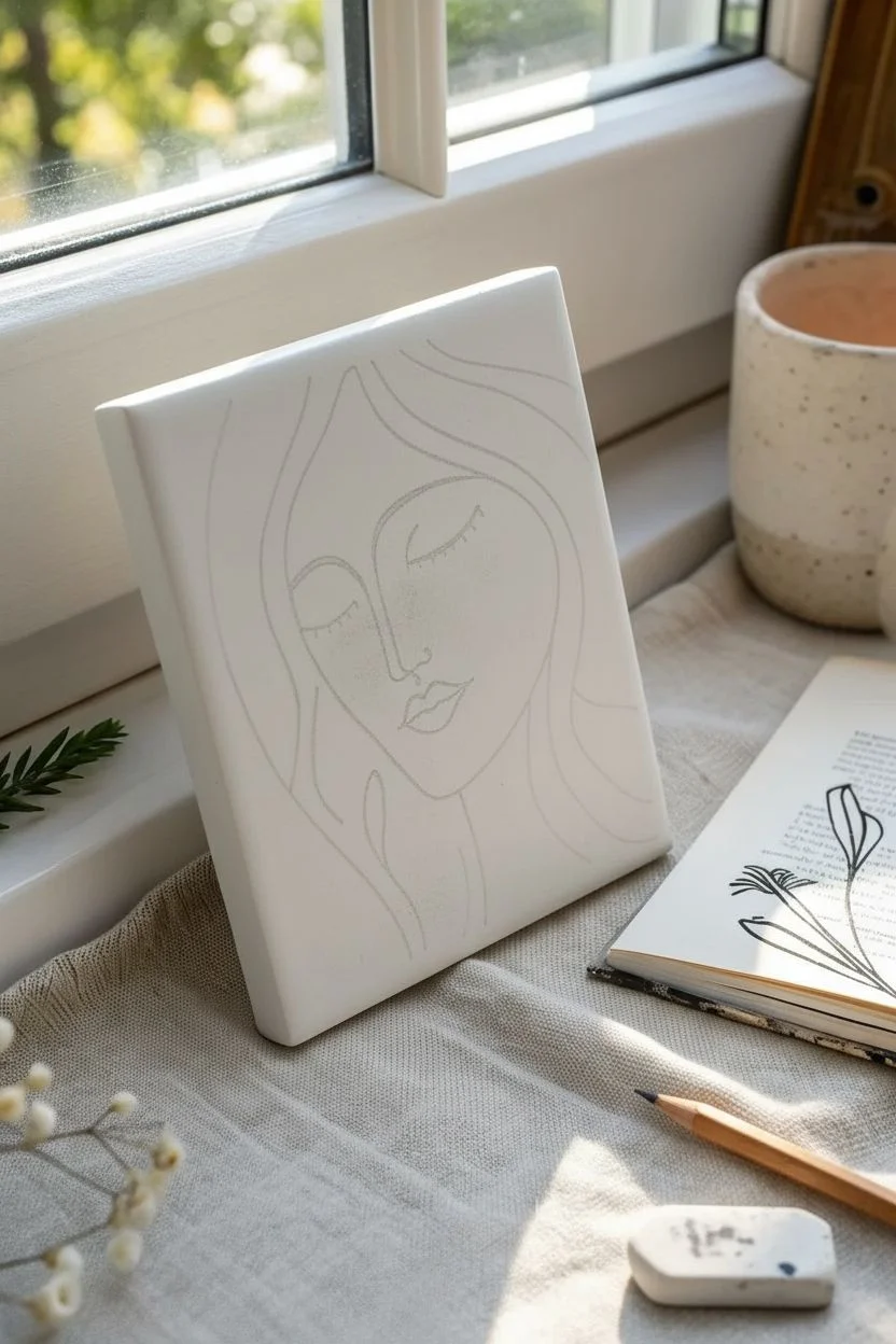
Embrace the beauty of simplicity with this elegant continuous-line portrait. Using a stark contrast of black ink on a creamy white ceramic tile, you’ll create a sophisticated piece of decor that feels both modern and timeless.
Step-by-Step Tutorial
Materials
- 6×6 inch plain white ceramic tile (matte or glossy)
- Black oil-based paint marker (fine and medium tip)
- Rubbing alcohol
- Cotton pads or soft cloth
- Pencil (HB or 2B)
- Eraser
- Carbon transfer paper (optional)
- Computer paper (for sketching)
- Paper towels
- Clear acrylic sealant spray (gloss or matte depending on tile finish)
Step 1: Preparation & Design
-
Clean the Surface:
Before you begin any artistic work, the tile must be pristine. Dampen a cotton pad with rubbing alcohol and wipe the entire surface of the tile firmly to remove dust, fingerprints, and oily residues that could repel the ink. -
Dry Completely:
Allow the alcohol to evaporate completely for a few minutes. Avoid touching the face of the tile with your bare hands after cleaning; handle it by the edges. -
Sketch the Concept:
Grab a piece of computer paper cut to the same size as your tile. Use your pencil to practice drawing the face design, focusing on creating fluid, continuous curves for the hair and jawline. -
Refine the Expression:
Pay special attention to the closed eyes and lips. The peaceful, downward curve of the eyelids and the slight fullness of the lips are central to this specific look. -
Transfer the Design:
You can lightly sketch directly onto the tile with a pencil, but for precision, I prefer to place carbon paper over the tile, layer my paper sketch on top, and trace the lines firmly to transfer a faint guide.
Smooth Operator
Rest your hand on a clean paper towel while drawing. This acts as a barrier, preventing your skin’s natural oils from transferring to the tile and stopping your palm from smudging wet ink.
Step 2: Inking the Outline
-
Prime the Marker:
Shake your black oil-based paint marker vigorously. Press the nib down on a scrap piece of paper several times until the ink flows smoothly and opaque. -
Start with the Eyes:
Begin in the center of the face to avoid smudging your work later. Using the fine-tip marker, carefully trace the downward arcs of the closed eyelids. -
Add the Lashes:
With a very light touch, add small, evenly spaced vertical ticks along the eyelid lines to create the eyelashes. -
Define the Nose:
Draw the nose line starting from the left eyebrow down to the nostril. Keep this line singular and confident; a slight wobble adds character, but try to keep the pressure consistent. -
Draw the Lips:
Outline the upper and lower lips. Ensure the corners connect cleanly. The lips in this design are slightly stylized, so focus on the shape rather than hyper-realism. -
Frame the Face:
Switch to a medium-tip marker if you want bolder lines for the outer contours, or stick with the fine tip for elegance. Draw the jawline, starting from the hair area on the left and sweeping down to the chin. -
Create the Hair Flow:
This step makes the piece dynamic. Draw long, wavy lines cascading down from the top of the tile, framing the face. Let some lines intersect naturally while others flow parallel. -
Extend to the Edges:
Allow the hair lines to run all the way off the bottom and side edges of the tile. This composition trick makes the artwork feel larger and more immersive.
Step 3: Finishing Touches
-
Clean Up Edges:
Check the very edges of the tile. If your marker slipped over the side, use a bit of alcohol on a cotton swab to clean the rim for a professional finish. -
Inspect Line Weight:
Look over your drawing. If some lines look thin or patchy, carefully go over them a second time to build up the opacity of the black ink. -
Let Ink Cure:
Allow the paint marker to dry undisturbed for at least 24 hours. Oil-based markers need time to fully set on non-porous ceramic surfaces. -
Erase Guidelines:
Once you are absolutely certain the ink is cured, use a soft eraser to gently remove any visible pencil or carbon marks left from your initial sketch. -
Apply Sealer:
Take the tile to a well-ventilated area. Hold your clear acrylic spray can about 12 inches away and apply a very light mist coat. Do not spray heavily or the ink might run. -
Final Coat:
After the mist coat dries (about 15 minutes), apply a second, slightly heavier coat of sealant to protect the design from scratches and dust. -
Display:
Place your finished artwork on a small easel or lean it on a shelf to enjoy your handiwork.
Wobbly Lines?
Don’t panic if a line goes astray. While the ink is wet, a cotton swab dipped in rubbing alcohol acts like a magic eraser. Clean the error, let it dry, and redraw the line.
This sophisticated tile art adds a perfect touch of calm to any modern shelf or desk arrangement
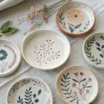
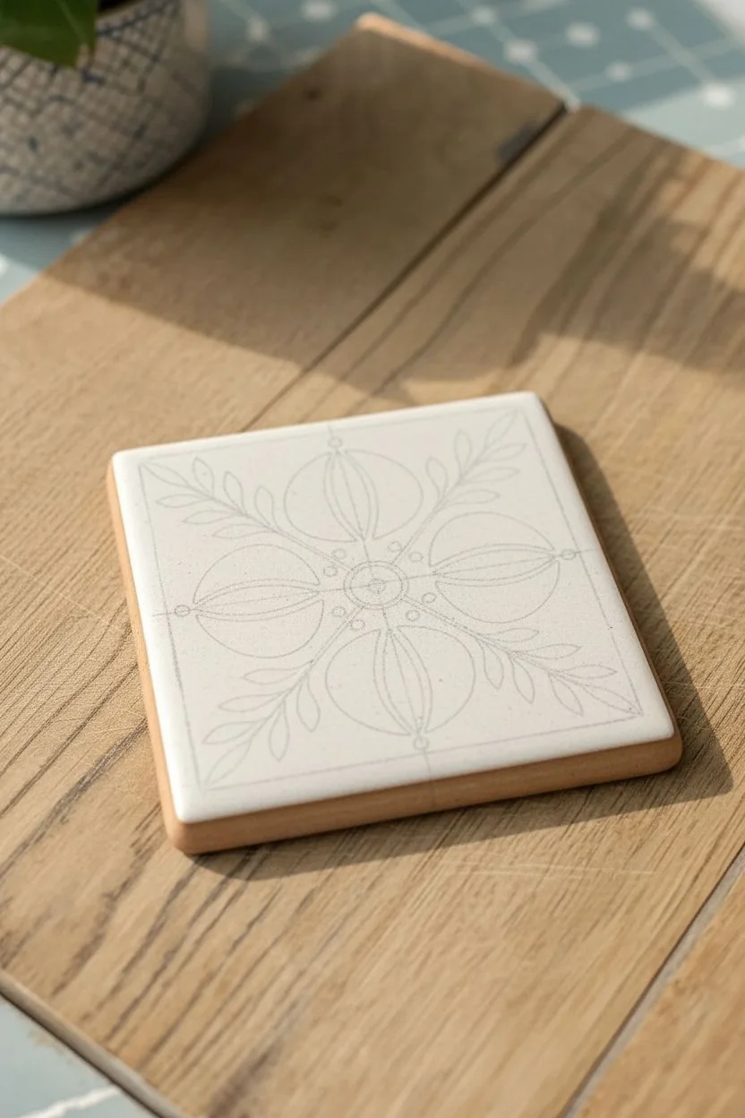
Painted Tile Coasters as a Matching Set
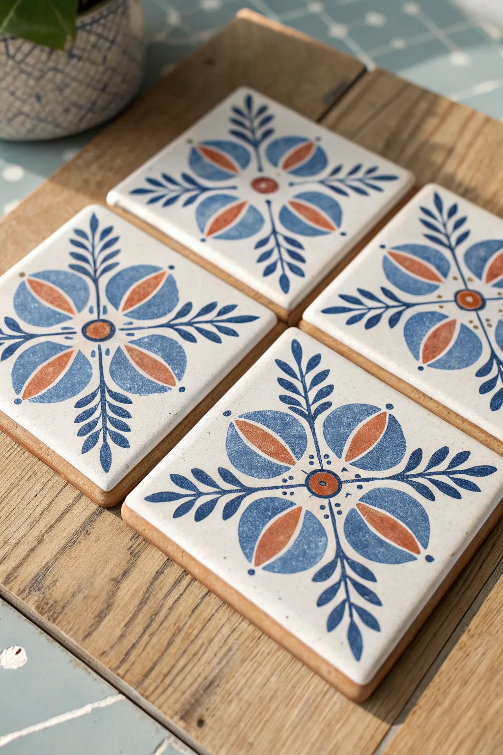
Bring a touch of Mediterranean charm to your coffee table with this matching set of hand-painted floral coasters. The design combines symmetry with a loose, folk-art painting style using deep blues and warm terracotta tones on crisp white ceramic.
Step-by-Step Guide
Materials
- 4 white ceramic square tiles (4×4 inches)
- Acrylic metallic or gloss enamel paints (Deep Blue, Terracotta/Rust Orange)
- Tile primer or gesso (optional)
- Round detail brushes (sizes 0 and 2)
- Pencil
- Tracing paper
- Ruler
- Clear acrylic sealant (gloss finish)
- Adhesive cork backing or felt pads
- Palette for mixing
Step 1: Preparation and Sketching
-
Clean the surface:
Wipe down your ceramic tiles with rubbing alcohol to remove any oils or dust. This ensures the paint adheres properly. -
Find the center:
Using a ruler and a light pencil touch, lightly mark the exact center of the tile. Draw very faint diagonal lines from corner to corner to help guide your symmetry. -
Draft the design:
On a piece of tracing paper the size of your tile, draw your master design. Create a central flower motif with four large petals extending toward the corners and four smaller leaf sprigs extending toward the flat edges. -
Transfer the pattern:
Place graphite paper or scribble pencil on the back of your tracing paper. Tape the design to the tile and trace over your lines to transfer the floral guide onto the ceramic surface.
Step 2: Painting the Core Elements
-
Paint the center:
Load a size 2 brush with terracotta orange paint. Paint a small circle at the very center of the tile where your diagonal lines meet. -
Outline the main petals:
Switch to your deep blue paint. Using a size 0 brush for precision, carefully outline the four large, teardrop-shaped petals that radiate from the center circle. -
Fill the petal tips:
With the blue paint still on your brush, fill in the top curve of each petal, creating a crescent moon shape at the wide end of the teardrop. -
Add the inner detail:
Once the blue outline is dry, take your terracotta paint and fill the inner section of the teardrop petal, leaving a tiny sliver of white space between the orange and the blue border for contrast.
Fixing Smudges
Made a mistake? Don’t panic. If the paint is wet, wipe it with a damp Q-tip. If dry, carefully scrape the excess paint away with a craft knife or a toothpick for crisp edges.
Step 3: Adding Folk Art Details
-
Paint the leaf sprigs:
Using the deep blue paint and your fine brush, paint a straight line extending from the center toward the middle of each tile edge. Add small, paired leaves coming off this stem. -
Refine leaf shapes:
I like to press down slightly at the base of the leaf and lift as I pull away to create a tapered point. Repeat this for all four directional sprays. -
Add decorative dots:
Dip the non-brush end of your paintbrush into the blue paint. Dot three small circles around the central orange core, between each petal. Add a single blue dot at the very tip of each large petal.
Level Up: Vintage edges
For a rustic, aged look, lightly sponge a small amount of diluted brown or warm grey paint along the very edges of the tile before sealing to mimic natural wear.
Step 4: Sealing and Finishing
-
Clean up lines:
If you have any stray pencil marks, wait until the paint is completely bone dry, then verify they are erased or covered. -
Bake (optional):
If using heat-set ceramic paints, place the tiles in a cold oven, heat to the manufacturer’s specified temperature (usually 300-350°F), bake for 30 minutes, and let cool in the oven. -
Apply sealant:
For standard acrylics, brush on two thin coats of clear gloss sealant. This protects the design from moisture and gives it that glazed ceramic look. -
Attach backing:
Flip the tiles over and attach a square of adhesive cork or stick-on felt pads to the corners to prevent scratching your furniture.
Now you have a stunning, durable set of coasters ready for your next gathering


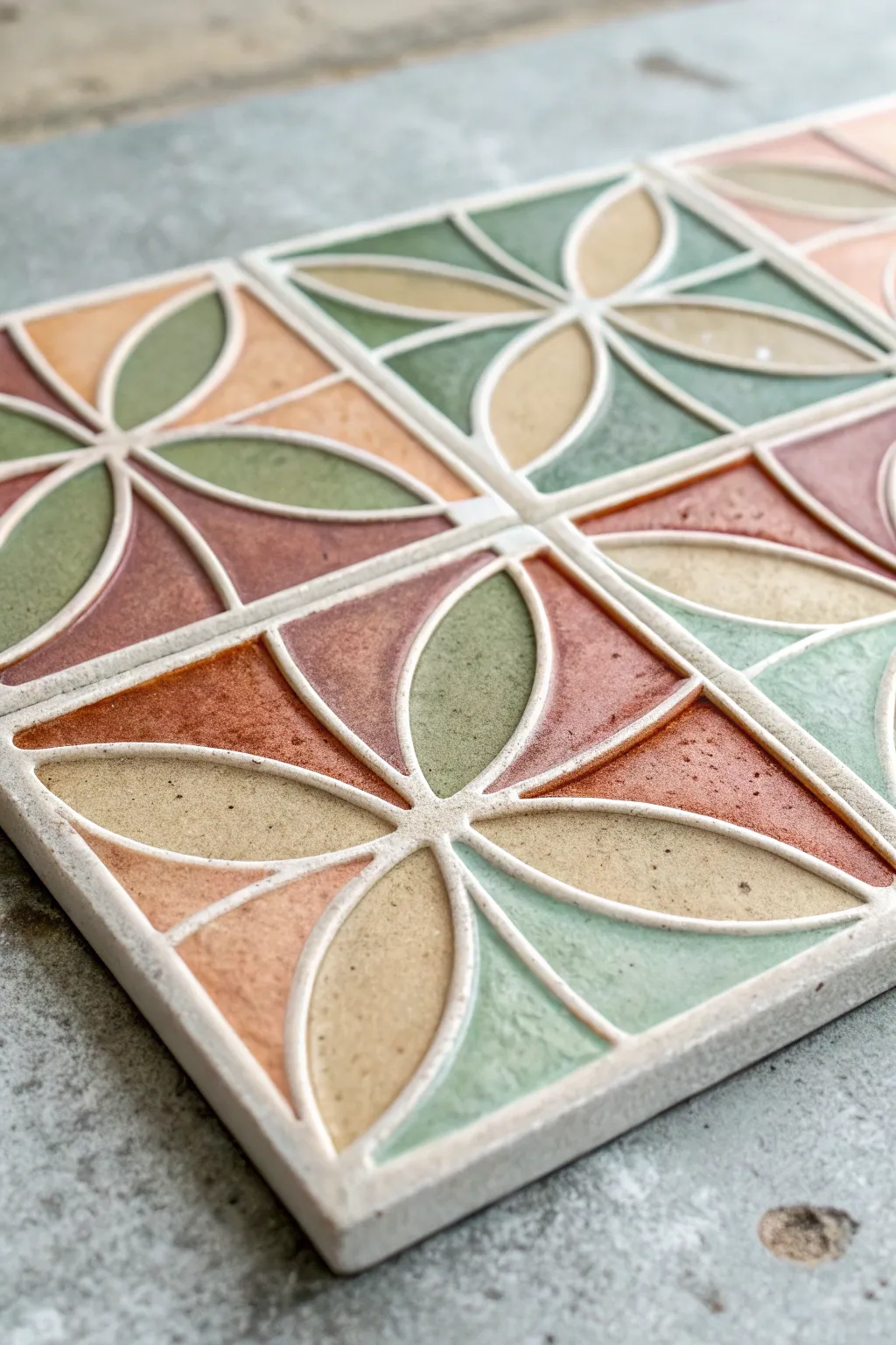
Moroccan-Inspired Repeating Tile Motifs
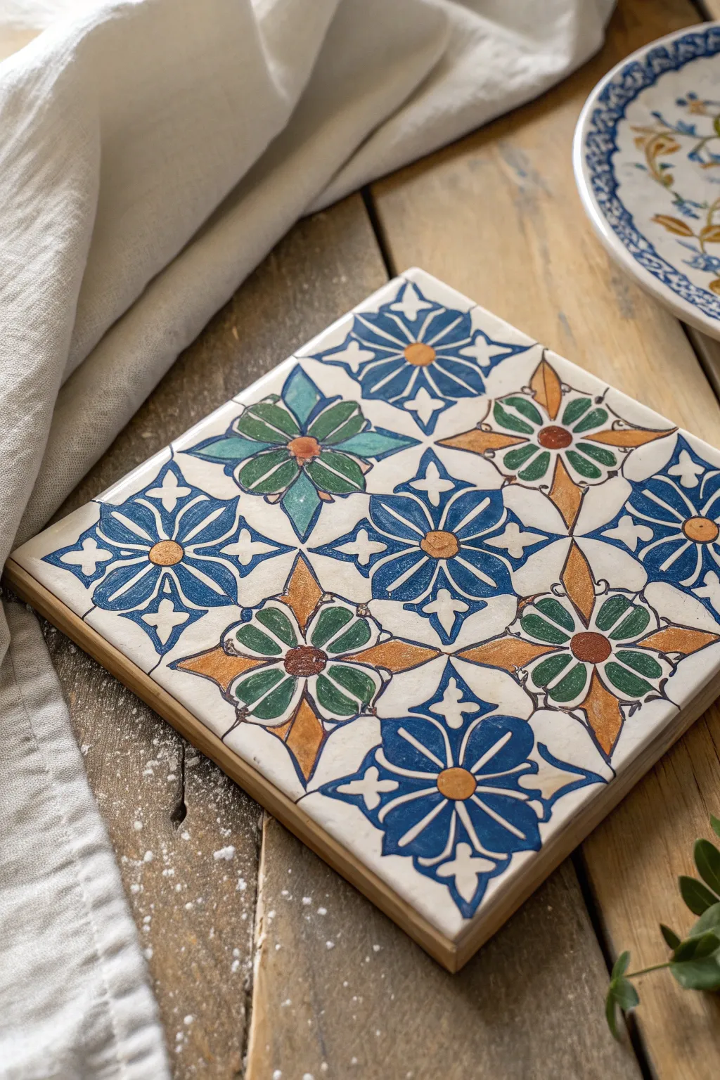
Capture the intricate beauty of Moroccan design with this repeating geometric motif that balances vibrant blues and greens with earthy ochre tones. The finished piece radiates a handcrafted charm perfect for use as a trivet or decorative wall accent.
How-To Guide
Materials
- 6×6 inch plain white ceramic tile (bisque or glazed)
- Pencil and ruler
- Tracing paper (optional but recommended)
- Acrylic paints or ceramic paints (cobalt blue, teal green, ochre/gold, dark brown)
- Small round brushes (sizes 0 and 2)
- Fine-point permanent marker or liner brush (dark brown)
- Clear acrylic sealer or varnish (spray or brush-on)
- Palette for mixing
Step 1: Drafting the Design Grid
-
Find the center:
Begin by measuring your tile to find the exact center point. Lightly mark it with a pencil. This will be the anchor for your central motif. -
Create the diagonal grid:
Using your ruler, draw diagonal lines connecting opposite corners to form an ‘X’. Then, draw a vertical and a horizontal line through your center point to form a cross. This grid is crucial for symmetry. -
Establish the repeat:
Measure halfway between your center point and each corner. Mark these points. These will be the centers for the four corner flower motifs involving the blue petals. -
Draft the petal shapes:
Sketch the primary diamond-shaped petals around your center points. On this tile, the blue flowers have four pointed petals arranged in a cross, while the alternating green/brown flowers sit on the diagonal axes.
Steady Hands
Rest your pinky finger on a dry part of the tile while painting fine lines. It acts as a pivot point and stabilizer, preventing shaky outlines.
Step 2: Painting the Motifs
-
Start with the blue flowers:
Load a size 2 brush with cobalt blue paint. Carefully fill in the four-petaled flowers located at the center top, center bottom, left, and right of the grid. -
Paint the green petals:
Switch to your teal green paint. Locate the diagonal flower motifs and paint the four inner petals that radiate from the center. -
Add the ochre accents:
Using the ochre or gold paint, fill in the extended, diamond-shaped petals that sit between the green ones. This creates that classic starburst effect. -
Fill the centers:
Dip a smaller brush into the ochre paint and create a solid circle at the center of every blue flower. For the green/brown flowers, use a dark brown dot instead. -
Apply the secondary blue details:
Look at the negative space between the main flowers. Paint the partial blue star shapes that appear along the edges and corners of the tile. -
Detail the perimeter:
If your pattern extends to the edge, carefully paint the half-shapes of the flowers along the border to imply the pattern continues indefinitely.
Step 3: Outlining and Finishing
-
Mix a lining color:
Prepare a dark brown paint with a slightly fluid consistency, or use a fine-point permanent marker if you prefer more control. -
Outline the petals:
With a size 0 brush or your marker, slowly trace the outline of every painted shape. I find it helps to steady my hand against the table edge for these long lines. -
Add internal details:
Draw a straight line down the center of each teal and blue petal. This simple line gives the floral shapes dimension and distinctiveness. -
Create the connectors:
Use your liner to draw the small, thin stems or curved lines that bridge the gaps between the different flower clusters, unifying the design. -
Clean up mistakes:
If you went outside the lines, use a damp Q-tip to gently wipe away excess acrylic paint while it’s still tacky, or paint over mistakes with white once dry. -
Seal the tile:
Allow the paint to cure fully for at least 24 hours. Once dry, apply two coats of clear acrylic sealer to protect your work from scratches and moisture.
Aged Aesthetic
Before sealing, lightly sand the painted surface with fine-grit sandpaper. It distresses the sharp paint edges for an authentic antique look.
Now you have a stunning piece of Moroccan-inspired decor ready to brighten up any table setting
Soft Neutral Tiles for a Minimal Look
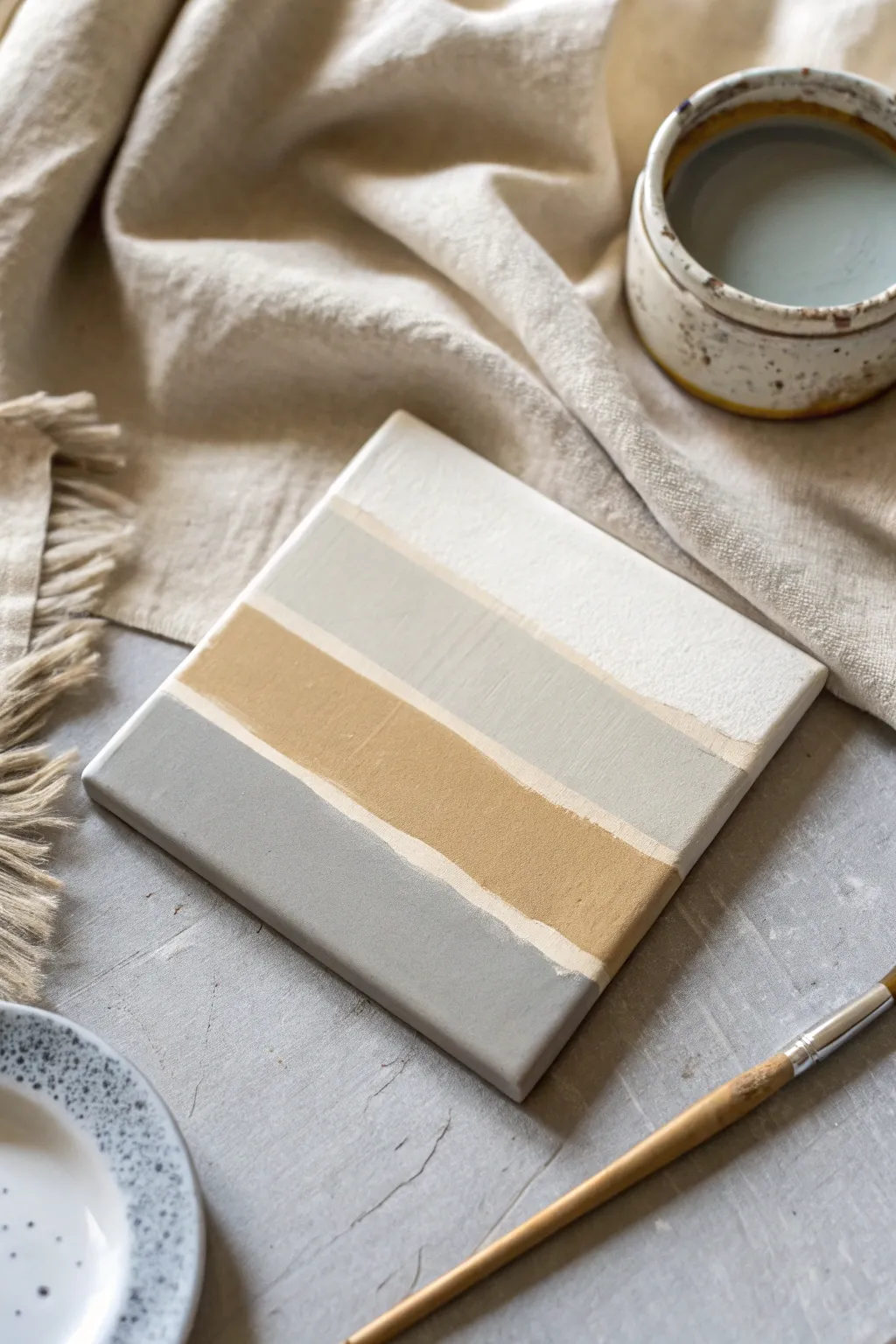
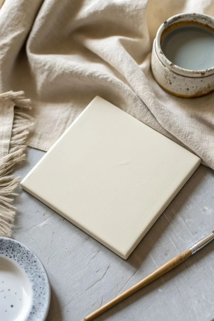
Capture the essence of calm with this beautifully simple painted tile project. Using a palette of soft whites, pale greys, warm ochres, and cool slate tones, you will transform a plain ceramic square into a functional piece of modern art perfect for any minimalist home.
Step-by-Step Guide
Materials
- 4×4 inch plain white ceramic tile (unglazed bisque preferred for texture)
- Acrylic paints: Titanium White, Warm Grey, Yellow Ochre/Raw Sienna, Cool Slate Grey
- Flat shader brush (size 6 or 8)
- Small round brush (for touch-ups)
- Palette or mixing plate
- Water cup
- Paper towels
- Fine-grit sandpaper (optional)
- Matte spray sealant or clear acrylic varnish
Step 1: Preparation & Base Coat
-
Clean surface:
Begin by wiping down your ceramic tile with a damp paper towel to remove any dust or oils. Let it dry completely. -
Sand for grip:
If your tile is very smooth or glazed, lightly scuff the surface with fine-grit sandpaper. This gives the acrylic paint something to grab onto. -
Base layer:
Mix a small amount of titanium white with a tiny drop of warm grey on your palette. You want an off-white, creamy shade. -
Apply base:
Paint the entire top surface of the tile with this off-white mixture. Use long, horizontal strokes to minimize brush marks. -
Dry time:
Allow this base coat to dry fully for about 15-20 minutes. It should feel chalky and dry to the touch.
Uneven Lines?
Don’t stress if the stripes bleed together. Embrace it! The ‘wabi-sabi’ imperfect look makes these tiles feel handcrafted and high-end rather than factory-made.
Step 2: Layering the Colors
-
Divide visually:
Visualize your tile divided into four horizontal bands. You won’t be drawing lines, just aiming for rough sections. The organic, uneven edges are part of the charm. -
Top band:
Dip your flat brush into pure Titanium White. Paint the top quarter of the tile, letting the paint be slightly thick to create texture. -
Mixing part two:
Clean your brush. On your palette, mix white with a small amount of Warm Grey to create a pale, misty stone color. -
Second band:
Paint the second band directly below the white one. Don’t worry about a perfect straight line; gently overlap the wet edge of the white paint slightly to soften the transition. -
Mixing ochre:
Prepare the third color by mixing Yellow Ochre with a touch of white. This should be a muted, earthy gold rather than a bright yellow. -
Third band:
Paint the third stripe with this warm ochre tone. I like to let the brush ‘wobble’ just a tiny bit here so the line looks hand-painted and organic. -
Bottom band:
Finally, mix your Cool Slate Grey. If it feels too dark, add a little white. Paint the bottom section of the tile. -
Refining edges:
While the paint is still slightly tacky, check the sides of the tile. Wipe away any drips with a damp cloth or paint the edges to match the front stripes for a wrapped look.
Go Monochromatic
Try a version using only shades of blue or green. Start with a dark navy at the bottom and add white progressively for each higher stripe for an ombre sea-glass effect.
Step 3: Sealing & Finishing
-
Full dry:
Let the painted tile sit for at least an hour. Acrylics dry fast, but thicker layers need time to cure. -
Check texture:
Inspect the painting. If any color looks too thin or uneven, carefully apply a second coat to that specific stripe. -
Protecting the work:
Since this may be used as a coaster, durability is key. In a well-ventilated area, spray a coat of matte sealant over the tile. -
Second coat:
Wait 15 minutes, turn the tile 90 degrees, and spray a second light coat of sealant to ensure even coverage. -
Backing:
Once fully cured (usually 24 hours), attach small felt or cork pads to the bottom corners of the tile to protect your furniture.
Now you have a stunning piece of functional decor ready to hold your morning coffee
Tile Painting With Raised Outlines
Embrace the timeless beauty of raised-line tile art with this geometric floral project. By using a dimensional relief outliner, you’ll create physical barriers that hold colorful pools of glaze, resulting in a stunning, textured finish reminiscent of traditional Spanish Cuerda Seca techniques.
Step-by-Step
Materials
- Bisque fired ceramic tiles (4×4 or 6×6 inches)
- Ceramic relief outliner (in cream/white) or dimensional fabric paint for a non-fired version
- Ceramic glazes (sage green, terra cotta, ochre yellow, pale peach)
- Small round paintbrushes (sizes 0 and 2)
- Pencil and ruler
- Tracing paper (optional)
- Bulb syringe or slip trailer (if not using pre-tubed outliner)
- Damp sponge
Step 1: Preparation and Design
-
Clean the surface:
Begin by wiping down your bisque tile with a slightly damp sponge. This removes any ceramic dust that might interfere with adhesion and prevents the dry clay from sucking the moisture out of your materials too quickly. -
Establish the grid:
Using a pencil and ruler, lightly mark the center point of the tile. Draw diagonal lines connecting opposite corners to create an ‘X’ across the surface, which will guide your floral placement. -
Sketch the arcs:
Draw four petal shapes radiating from the center point toward the corners. The tips of the petals should almost touch the corners of the tile. Keep your pencil pressure light so it doesn’t groove the clay. -
add the secondary shapes:
In the triangular spaces between the main petals, sketch smaller arc sections. This creates the negative space shapes that will eventually be filled with contrasting glaze colors.
Pro Tip: Height Matters
Make your relief lines tall enough! If they are too flat, thick glaze will easily jump the barrier during firing. Aim for a distinct ridge about 1-2mm high.
Step 2: Applying the Relief Lines
-
Test flow:
Before touching the tile, practice squeezing your relief outliner onto a scrap piece of paper. You want a steady, even line without air bubbles or sudden spurts. -
Outline the center:
Start piping your relief lines from the very center of the flower design. Hold the applicator tip slightly above the surface, letting the line ‘fall’ onto the pencil marks rather than dragging the tip against the clay. -
Complete the petals:
Work your way outward, tracing all your pencil lines with the relief paste. Ensure the lines are solid and continuous; any gaps will allow the glazes to bleed into each other later. -
Create the border:
Pipe a straight line around the perimeter of the tile. Connect the internal design lines to this border frame to create closed ‘cells’ for the color. -
Let it cure:
Allow the relief lines to dry completely. This is crucial—if they are wet, they will smudge when you start painting. I usually leave getting a coffee while this sets for at least an hour.
Troubleshooting: Shaky Hands?
If you struggle with straight lines, rest your wrist on a bridge (like a book or raised ruler) over the tile. This stabilizes your hand and prevents smudging wet work.
Step 3: Glazing the Cells
-
Mix your glazes:
Stir your glazes thoroughly. For this technique, the consistency should be like heavy cream so it flows slightly but remains controllable. -
Start with the petals:
Load a size 2 brush with your ochre yellow glaze. Drop a generous amount into the center of a petal ‘cell’ and gently push it toward the raised edges without painting over the top of the relief line. -
Alternating colors:
Use the sage green glaze for the adjacent petals or geometric sections. Work in a checkerboard pattern if you are doing multiple tiles to ensure variety. -
Fill the corners:
Apply the terra cotta or rust-colored glaze to the triangular sections near the border. Be generous with the application; the glaze shrinks when drying, and you want a rich, solid color. -
Flood the gaps:
For any remaining shapes, switch to the pale peach glaze. ‘Flooding’ is key here—you are essentially creating small pools of liquid glass within the raised walls. -
Clean up stray marks:
If you accidentally got glaze on top of the raised white lines, wait for it to dry to a chalky state, then gently scrape it off with a wooden skewer or a clean, stiff brush.
Step 4: Finishing
-
Check for pinholes:
Inspect the wet glaze for tiny air bubbles. If you see any, gently pop them with a pin or the tip of your brush to ensure a smooth finish after firing. -
Final drying:
Let the tile dry completely for 24 hours before moving it. The glaze will be powdery and fragile at this stage. -
Firing:
Fire the tile in a kiln according to the specific cone rating of your clay and glazes (typically Cone 04 or 06 for earthenware). The heat will fuse the glaze and harden the relief lines.
Once fired, these dimensional tiles make for a striking backsplash or a beautiful set of coasters that you can proudly display.
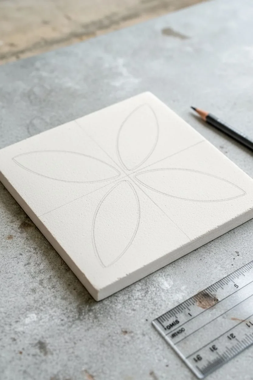
Koi Fish or Goldfish Tile Illustrations
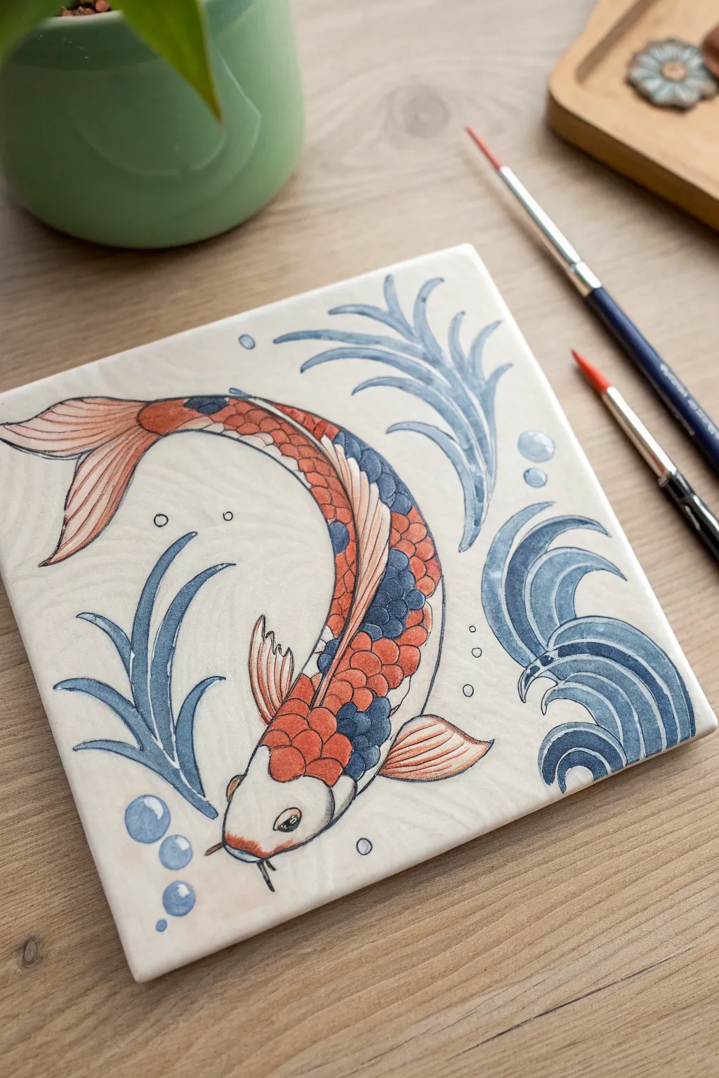
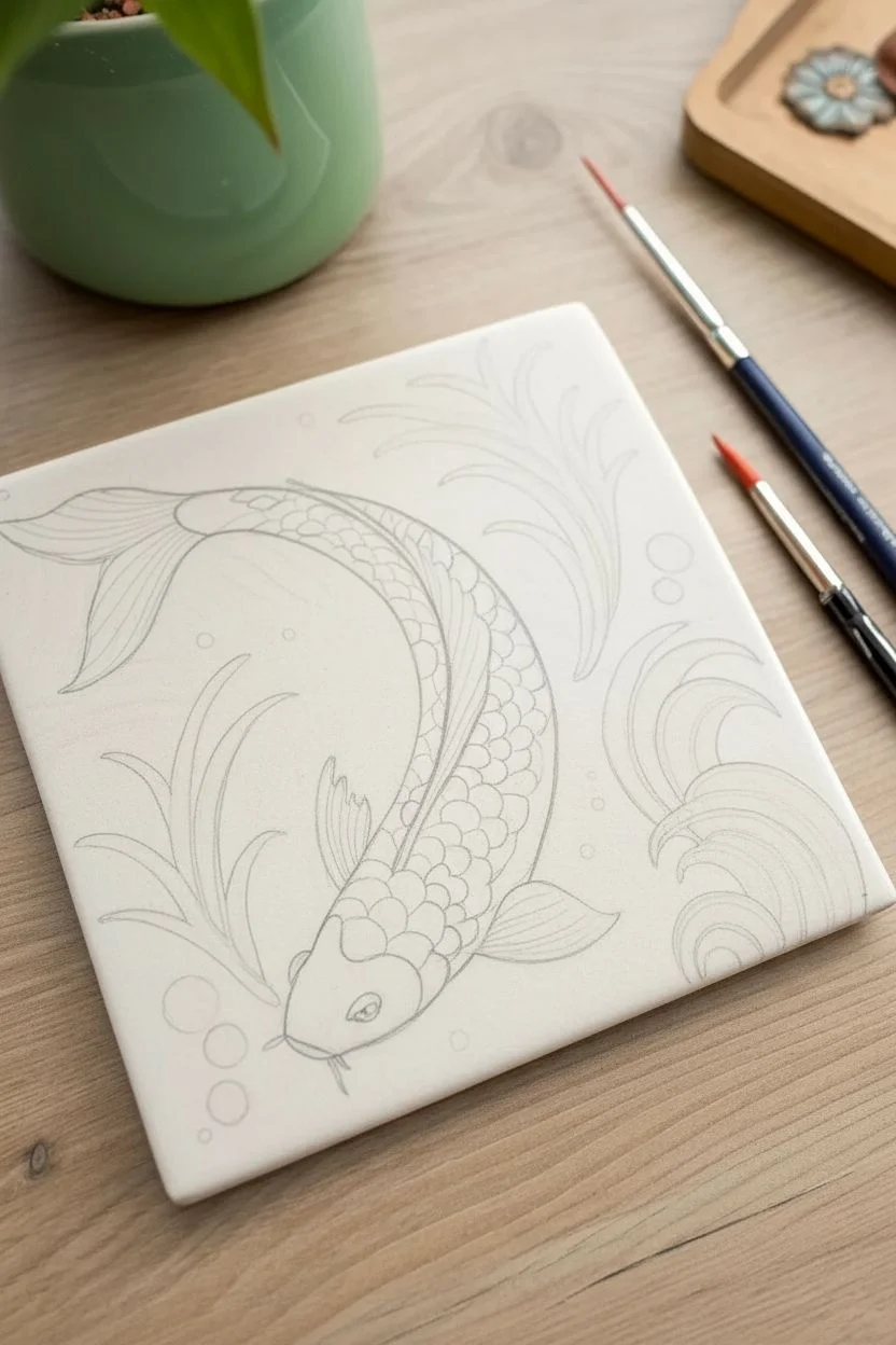
Bring a sense of movement and tranquility to your space with this elegant koi fish tile illustration. Using underglaze or ceramic paints, you’ll capture the flowing motion of the fish amidst stylized water currents and playful bubbles.
Detailed Instructions
Materials
- Bisque-fired ceramic tile (roughly 6×6 inches)
- Pencil (HB or lighter)
- Underglaze paints (Orange/Red, Dark Blue, Light Blue, Black)
- Fine liner brush (size 0 or 00)
- Round watercolor brushes (size 2 and 4)
- Clear transparent glaze
- Water container and paper towels
- Carbon transfer paper (optional)
Step 1: Drafting the Design
-
Clean the surface:
Wipe down your bisque tile with a slightly damp sponge to remove any ceramic dust. This ensures your paint adheres properly and doesn’t roll off the surface. -
Outline the koi body:
Using a light pencil, lightly sketch a large ‘C’ curve diagonally across the tile. This is the spine of your koi fish, creating that dynamic swimming motion. -
Add structural details:
Flesh out the body around your curve, tapering at the tail. Sketch the large dorsal fin along the back and the pectoral fins near the head. Don’t press too hard with the pencil; graphite will burn off in the kiln. -
Sketch water elements:
Draw three distinct seaweed-like fronds curving inward around the fish—two at the top right and one at the bottom left. Add the swirling wave motif in the bottom right corner. -
Finalize the sketch:
Add small circles for bubbles near the head and tail, and sketch the scales pattern on the fish’s back.
Steady Hand Trick
For smooth long lines on the seaweed, rest your pinky finger on a dry part of the tile while painting. It acts as an anchor to reduce shakiness.
Step 2: Painting the Koi
-
Base coat the reds:
Dip your size 4 round brush into the orange-red underglaze. Paint the scales on the upper back and the main body, skipping the area where the dark blue scales will go. -
Fill the fins:
Dilute your orange-red slightly with water for a wash effect. Carefully fill in the tail and fins, leaving thin negative space (white lines) to suggest the ribbing of the fins. -
Add the blue patches:
Using the dark blue underglaze, fill in the specific scale patches along the fish’s back to create that classic multicolored koi pattern. -
Outline the scales:
Switch to your fine liner brush and black underglaze. Very delicately outline each individual scale to separate the red and blue sections. I find holding my breath for just a second helps keep the line steady. -
Define the head:
Outline the head shape, mouth barbels, and eye with the liner brush. Leave the face mostly white, adding just a touch of red wash near the nose.
Step 3: Water and Finishing Details
-
Paint the seaweed:
Mix a medium blue shade. Use long, sweeping strokes with the size 2 brush to fill in the seaweed fronds, starting from the base and lifting pressure as you reach the tips. -
Outline the plants:
Once the blue is dry to the touch, use the dark blue (or black diluted to a dark grey) to outline the seaweed shapes for definition. -
Create the waves:
Paint the swirling wave motif in the corner using gradations of blue—darker on the outer curves and lighter inside. Use concentric curved strokes to mimic ripples. -
Add bubbles:
Fill the bubble circles with a very light blue wash, leaving a tiny white dot in each for a highlight. -
Final black lining:
Go over the main outlines of the fish body and fins one last time with the liner brush to ensure the drawing pops against the background. -
Clear glaze application:
Allow the underglaze to dry completely (usually 24 hours). Apply 2-3 coats of clear transparent glaze over the entire tile. -
Fire the tile:
Place the tile in the kiln and fire according to your clay and glaze specifications (typically cone 06 or 05 for earthenware).
Metallic Accent
After the main firing, apply a luster overglaze, like gold or mother-of-pearl, to the bubbles or scales for a shimmering, watery finish.
Once fired, you’ll have a stunning piece of aquatic art ready to be framed or installed as a backsplash focus point
Ombre Gradient Tiles With Sponged Blends
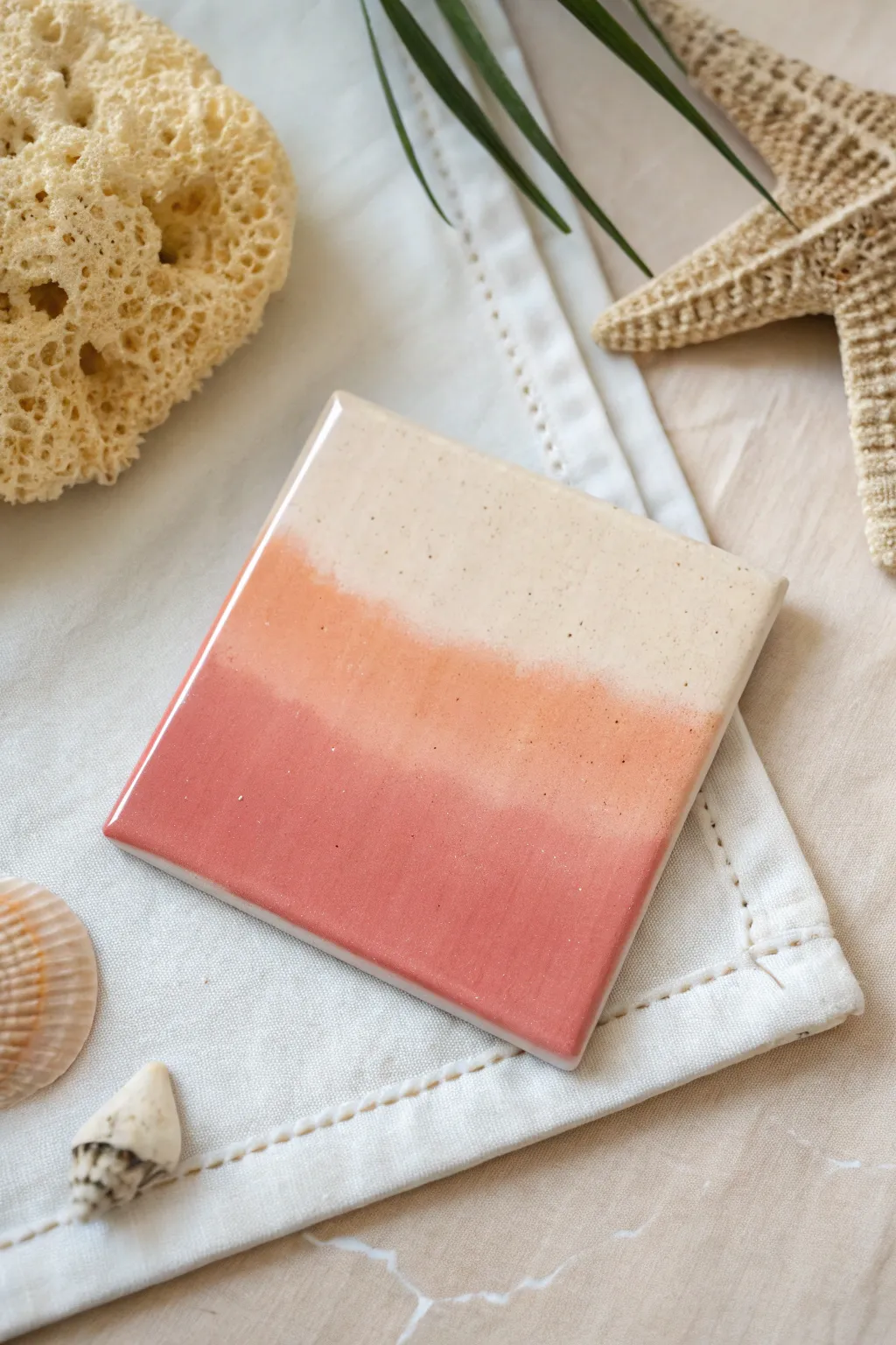
Capture the warmth of a summer sunset with these beautifully blended ombre tiles. Using simple sponge techniques, you’ll create a seamless gradient from creamy beige to deep terracotta, finished with a high-gloss glaze for a professional ceramic look.
Step-by-Step
Materials
- 4×4 inch white ceramic tile
- Acrylic craft paints (Cream/Beige, Peach/Coral, Dark Terracotta/Rust)
- Medium-grit sandpaper
- Rubbing alcohol and cotton pad
- Makeup sponges (wedges) or sea sponge
- Palette or paper plate
- High-gloss spray sealant or Mod Podge (gloss)
- Felt pads or cork backing
Step 1: Preparation
-
Clean the surface:
Before painting, it is crucial to remove any oils or dust from the ceramic tile. Wipe the entire surface thoroughly with rubbing alcohol and a cotton pad. -
Light sanding:
For better adhesion, lightly scuff the shiny surface of the tile with medium-grit sandpaper. You don’t need to remove the finish entirely, just create a bit of ‘tooth’ for the paint to grab onto. -
Clear debris:
Wipe the tile down one last time with a damp cloth to remove any sanding dust and let it dry completely.
Sponge Wisdom
Makeup wedges work best for this project because their dense foam creates a much finer texture than standard kitchen sponges.
Step 2: Creating the Base Gradient
-
prepare your palette:
Squeeze out generous amounts of your three colors onto a palette: Cream, Peach, and Dark Terracotta. Place them near each other but not touching yet. -
Load the sponge:
Dampen your makeup sponge slightly and squeeze out excess water. Dip the flat end into the Cream paint. -
Apply the top layer:
Dab the Cream paint across the top third of the tile. Use an up-and-down pouncing motion rather than dragging the sponge to create texture. -
Apply the bottom layer:
Using a fresh sponge (or the other end), load up the Dark Terracotta paint. Dab this color across the bottom third of the tile. -
Fill the middle:
Take a clean sponge and apply the Peach color in the remaining middle section, leaving a small gap between it and the top and bottom colors.
Level Up: speckled finish
Flick a toothbrush dipped in diluted white or gold paint over the dry ombre for a stunning starry or sand-grain effect.
Step 3: Blending the Transition
-
Merge top and middle:
While the paint is still wet, lightly dab the boundary between the Cream and Peach sections. I find that moving the sponge slightly up and down across the line helps blur the distinct edge. -
Merge middle and bottom:
Repeat the blending process for the Peach and Dark Terracotta line. Gentle, rapid taps work best here to mix the pigments right on the tile surface. -
Check for consistency:
Step back and look at the gradient. If any block of color looks too solid, go back in with a slightly damp sponge to soften it. -
Let it dry:
Allow this first layer to dry completely. It might look a bit streaky or translucent at this stage, which is normal. -
Second coat:
Repeat the sponging process with a second layer of paint to build opacity. The colors will become much more vibrant and the coverage more even. -
Refine the texture:
As the second coat dries, you can lightly dab a dry sponge over the surface to knock down any high peaks of paint, ensuring a smoother final finish. -
Clean the edges:
If paint dripped over the sides during sponging, use a wet paper towel or your fingernail to clean the edges of the tile for a crisp look.
Step 4: Finishing Touches
-
Full cure:
Let the tile cure for at least 24 hours. Acrylic paint needs to be fully set before sealing to prevent cloudiness. -
Apply sealant:
In a well-ventilated area, spray the tile with a high-gloss clear acrylic sealant. This replicates the shiny ceramic glaze look shown in the photo. -
Second seal:
Once the first coat of sealant is dry to the touch, apply a second light coat to ensure durability against moisture. -
Add backing:
Flip the tile over and attach adhesive felt pads or a square of cork to the corners. This protects your furniture from scratches.
Enjoy using your custom coastal-inspired coaster or display it as a standalone piece of art
Marbled Alcohol-Ink Style Tiles
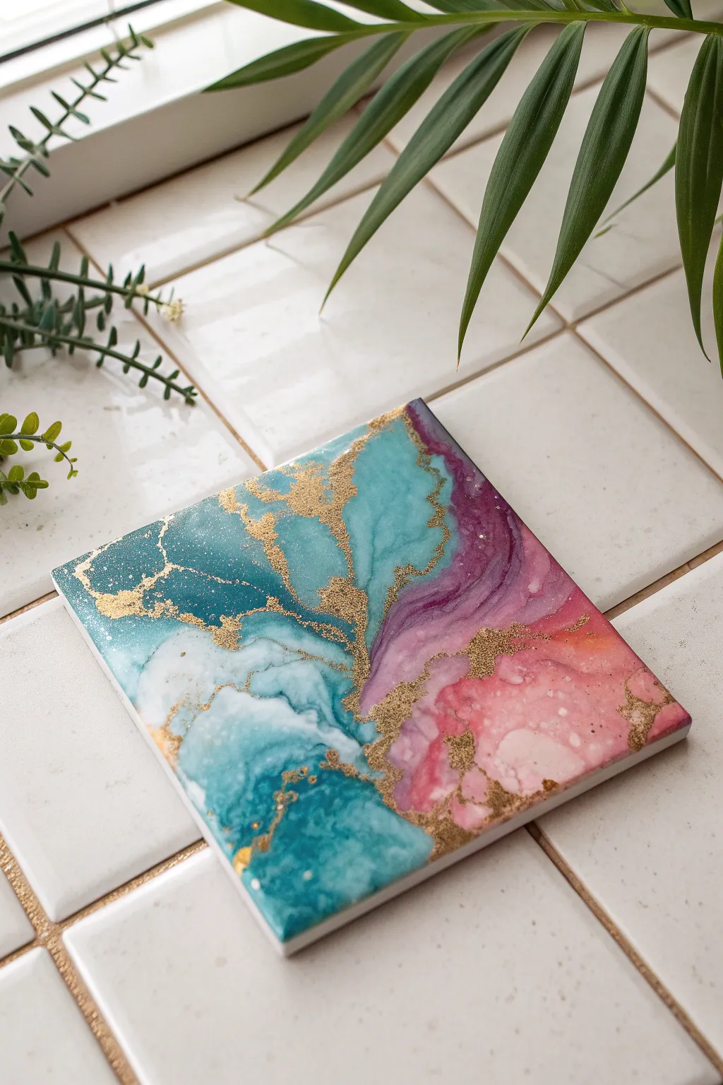
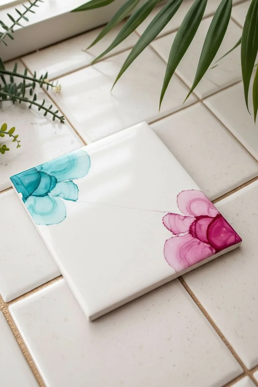
Transform plain ceramic tiles into ethereal works of art using vibrant alcohol inks and rich metallic accents. This project captures the fluid beauty of marble with swirling teals, purples, and soft pinks, all highlighted by striking veins of gold.
Detailed Instructions
Materials
- 4×4 inch white ceramic glossy tiles
- Alcohol inks (Teal, Cyan, Magenta/Purple, Soft Pink)
- Metallic mixative alcohol ink (Gold or Brass)
- Islopropyl alcohol (91% or higher) or Alcohol blending solution
- Small squeeze bottle or dropper for alcohol
- Straw or air blower tool along with gloves
- Spray sealant (UV-resistant clear acrylic)
- Heat-resistant resin kit (optional for finish)
- Plastic drop cloth
Step 1: Preparation and Base Layer
-
Clean Slate:
Begin by wiping down your ceramic tile with isopropyl alcohol and a lint-free cloth. This removes any oils or fingerprints that might resist the ink, ensuring a smooth flow. -
Create a Fluid Base:
Flood the surface of the tile with a generous amount of plain isopropyl alcohol or blending solution. You want the surface wet enough that the inks will immediately travel when dropped. -
Diagonal Divide:
This design features a diagonal composition. Mentally divide your tile from the bottom-left to top-right. This will act as your central mixing zone.
Muddy colors?
If teal and pink mix too much, they turn brown. Keep them separated by a ‘river’ of gold or clear alcohol, or let one side dry slightly before adding the neighbor.
Step 2: Applying Color
-
Drop the Teal:
Squeeze a few drops of teal and cyan ink onto the upper left triangle of the tile. Allow the alcohol base to pull the color outward naturally. -
Introduce Warmth:
Deposit drops of magenta and soft pink on the opposing lower right triangle. Let them bloom, but try to keep a small gap of clear alcohol between the teal side and the pink side initially. -
Air Movement:
Using a straw or a small air blower, gently push the teal inks towards the center line. Blow softly; distinct, harsh lines occur if you blow too hard. -
Blending the Boundary:
Now, gently blow the pink and purple inks toward the center to meet the teal. Where they touch, you might see new purple hues form. I like to add a drop of clear alcohol right at this meeting point to create wispy, cloud-like interactons. -
Diluting for Texture:
Add tiny drops of plain alcohol onto the darker saturated areas. This pushes the pigment toward the edges, creating those darker rims and lighter centers seen in the reference image.
Level Up: Gemstones
While the resin is wet, drop crushed glass or small geode chips into the gold vein area. This adds 3D texture and makes the vein look like a real crystal geode.
Step 3: The Golden Veins
-
Prepare the Metallic:
Shake your gold metallic mixative vigorously. The metallic particles settle quickly, so thorough mixing is crucial for that bright shine. -
Tracing the Edge:
Apply the gold ink selectively along the ‘fault line’ where your cool and warm colors meet. You don’t need a continuous line; broken, organic streaks look more natural. -
Dispersing the Gold:
Immediately blow on the gold ink with your straw. The metallic pigment is heavier and won’t move as easily as the color, so direct your airflow to feather it out into the surrounding colors. -
Adding Speckles:
For a terrazzo effect, put a little gold ink on a brush or stick and flick tiny specks onto the open pink and teal areas. -
Refining the Shape:
If the design looks too cluttered, drop clear alcohol on a clean area and blow it into the ink to push the color back and create white negative space, similar to the white patch in the bottom left.
Step 4: Sealing and Finishing
-
Let it Cure:
Allow the tile to dry completely, ideally for 24 hours. The ink may look dry within minutes, but it remains reactivate-able until sealed. -
First Sealant Coat:
Take the tile outdoors and apply a very light mist of acrylic spray sealant. Do not spray heavily or the ink will interact and blur. Let it dry for 20 minutes. -
Heavy Sealing:
Apply 2-3 heavier coats of the spray sealant, allowing proper drying time between each layer. -
Optional Resin Coat:
For a glass-like finish that is heat resistant for hot mugs, mix a two-part epoxy resin and pour it over the center of the tile. -
Spread and Pop:
Spread the resin to the edges with a gloved finger or stick. Use a torch or heat gun quickly over the surface to pop any air bubbles. -
Final Cure:
Cover the tile with a clean box to prevent dust from settling and let the resin cure for 48-72 hours before use.
Now you have a stunning, marbled coaster ready to protect your surfaces in style
Marker-and-Alcohol Tie-Dye Tiles
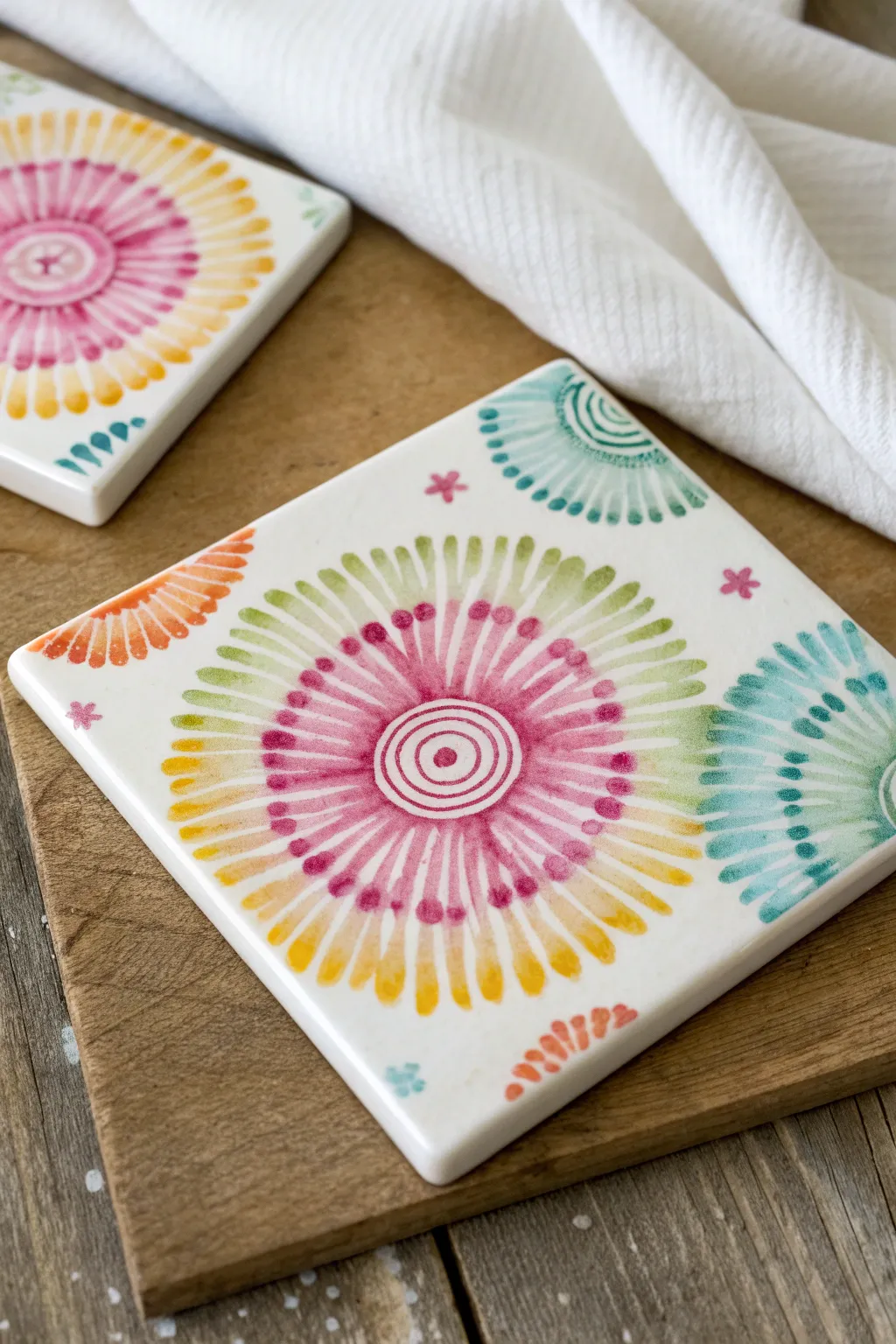
These simple yet stunning ceramic tiles capture the dreamy, fluid look of tie-dye without the messy fabric dyes. Using permanent markers and a touch of rubbing alcohol, you can bloom vibrant floral-inspired mandalas right before your eyes.
How-To Guide
Materials
- White ceramic tiles (squares, 4×4 inches)
- Permanent markers (Sharpies or similar alcohol-based markers in pink, yellow, lime green, teal, and orange)
- Rubbing alcohol (91% or higher isopropyl alcohol works best)
- Eye dropper or pipette
- Cotton swabs
- Small round paintbrush
- Clear acrylic sealer spray (glossy)
- Felt pads or cork backing (optional)
Step 1: Drawing the Base Pattern
-
Clean the surface:
Before uncapping a marker, wipe down your ceramic tile with a little rubbing alcohol on a paper towel. This removes oils or dust that might repel the ink. -
Find the center:
Locate the optical center of your tile. This will be the anchor for your main sunburst design. -
Create the central rings:
Using a pink permanent marker, draw a small dot in the center. Draw two tight concentric circles around this dot to create a bullseye effect. -
Draw the inner rays:
Switching to the same pink marker, draw radiating lines extending outward from your central circles. Make these lines about an inch long, resembling the spokes of a wheel. -
Add dot details:
At the very tip of each pink ray, draw a distinct, solid dot. This accumulation of ink is crucial because it will spread dramatically later. -
Create the middle ring:
Grab a lime green marker. Draw lines starting in the gaps between the pink rays, extending slightly further out. This creates a layered, starburst effect. -
Add the outer ring:
Using a yellow marker, draw another set of radiating lines or dots at the outer edge of the design, filling in the remaining gaps to complete the circular shape. -
Add corner accents:
Don’t leave the corners bare. Draw quarter-circles or fan shapes in the corners using teal and orange markers to frame the central motif. -
Sprinkle filler motifs:
Draw tiny asterisks or star shapes with the pink marker in the empty white spaces between the central sunburst and the corner designs.
Alcohol Percentage Matters
Use 91% rubbing alcohol or higher. Lower percentages have more water, which doesn’t break down the permanent marker ink as smoothly or vibrantly.
Step 2: The Alcohol Drop Technique
-
Prepare the alcohol:
Pour a small amount of high-percentage rubbing alcohol into a small cup or dish. -
Apply center drops:
Fill your eye dropper with alcohol. Very carefully place a single drop right in the center of your bullseye. Watch as the ink begins to liquify and push outward. -
Work on the rays:
This part requires patience. Add tiny drops of alcohol along the ring where the pink dots meet the green lines. Avoid flooding the tile; you want controlled bleeding, not a wash. -
Manipulate with a brush:
If the alcohol isn’t moving where you want it, use a small paintbrush dipped in alcohol to gently guide the ink outward, softening the hard marker lines into watercolor-like petals. -
Blur the corners:
Add a small drop of alcohol to the center of your corner fan shapes. Let the teal and orange inks bleed slightly toward the center of the tile. -
Soften the stars:
Dab a cotton swab dipped in alcohol onto the tiny pink asterisk stars to give them a soft, diffused glow. -
Let it dry completely:
Allow the tile to sit undisturbed for at least 30 minutes. The alcohol needs to evaporate entirely, leaving the pigment fixed in its new pattern.
Fixing Mistakes
Don’t like how a section blurred? Wipe the entire tile clean with alcohol while it’s still wet and start over—ceramic is very forgiving!
Step 3: Finishing Touches
-
Clean up edges:
If any ink dripped over the side of the tile during the process, wipe the edges clean with a fresh alcohol-soaked paper towel. -
Seal the design:
Move to a well-ventilated area. Spray the tile with a clear acrylic sealer. Use light, sweeping coats rather than one heavy coat to prevent the ink from reactivating and running. -
Add backing:
Once the sealer is dry to the touch (usually 24 hours), attach felt pads or a cork square to the underside of the tile to protect your furniture from scratches.
Now you have a set of vibrant, custom coasters that add a pop of artistic flair to any coffee table
Painted Grout-Line Illusions and Faux Patchwork
Transform a simple wooden square into a stunning mosaic of Mediterranean charm using nothing but paint and a steady hand. This project creates the convincing illusion of individual glazed tiles joined by grout, perfect for adding a touch of rustic elegance to your table setting.
Step-by-Step Tutorial
Materials
- Square wooden board or large ceramic coaster (approx. 6×6 inches)
- White acrylic paint or chalk paint (base coat)
- Acrylic paints: Navy blue, terracotta orange/rust, light grey
- Fine liner brush (size 00 or 0)
- Flat shader brush (size 4 or 6)
- Ruler
- Pencil
- Eraser
- Matte finish sealant spray or varnish
- Water cup and paper towels
Step 1: Preparation and Base Layout
-
Base Coating:
Begin by coating your entire wooden board with white acrylic or chalk paint. You will likely need two or three coats to get a solid, opaque coverage that hides the wood grain. Let this dry completely overnight to ensure a hard surface. -
Measuring the Grid:
Since we are creating a 4×4 grid intended to look like 16 individual tiles, measure the total width of your board and divide by four. Using a ruler and a light pencil touch, mark these increments along all four sides. -
Drawing the ‘Grout’ Lines:
Connect your marks gently with a ruler to form a grid of 16 equal squares. Don’t press too hard with the pencil, as graphite can sometimes smudge into white paint. -
Establishing the Grout:
Mix a very small amount of gray paint with white to create a realistic, slightly off-white ‘grout’ color. Using a small flat brush or even a steady liner brush, paint over your pencil grid lines. Make these lines slightly thick—about 1/8th of an inch—to mimic the spacing between real tiles.
Pro Tip: Consistency
Water down your acrylic paint slightly to an ink-like consistency for the fine lines. This helps the paint flow smoothly from the liner brush without skipping or clumping.
Step 2: Painting the Motifs
-
Planning Your Pattern:
The charm of this piece lies in the variety. Sketch faint guidelines for different radial patterns in each square. Alternating between flower bursts, four-petal clovers, and geometric stars keeps the eye moving across the piece. -
Painting Terracotta Florals:
Start with your rust or terracotta color. In selected squares, paint simple, six-petal starbursts. Start from the center of the square and pull your brush outward to create petals that taper at the ends. -
Adding Navy Anchors:
Switch to your navy blue paint. On different squares, paint large four-petal designs that touch the corners of the grid square. These bolder elements act as visual anchors for the composition. -
Creating Detailed Stars:
For the intricate blue star patterns (like the one in the bottom corner), paint a thin cross first, then add ‘V’ shapes in the negative spaces. Small dots at the end of lines add that classic Delftware feel. -
Layering Colors:
Once your base shapes are dry, add details in the opposing color. I like to add tiny blue dots to the center of the orange flowers, or outlines to the larger petal shapes. This layering adds depth. -
Crosshatching details:
Look closely at the leaf shapes in the blue designs. Use your finest liner brush to add tiny hatching lines inside the leaves rather than filling them in solid; this mimics patterns often found on transferware pottery. -
Corner Accents:
Don’t forget the negative space. In the squares with simple center flowers, add small quarter-circles or tiny triangles in the four corners of that individual tile square to frame the motif.
Step 3: Finishing Touches
-
Distressing (Optional):
If your painting looks too perfect and modern, lightly sand the surface with very fine-grit sandpaper (320 grit or higher) once the paint is bone dry. Focus on the edges and corners to simulate wear. -
Cleaning Grout Lines:
If any of your motif painting spilled onto your gray grout lines, mix up a little more of your grout color and carefully touch up the grid. Crisp separation between the ’tiles’ is crucial for the illusion. -
Sealing the Artwork:
To protect your work from moisture and scratches, especially if using as a coaster, apply a clear matte sealant. A spray sealant is often safer than brush-on varnish for the first coat to avoid smearing the fine lines. -
Final Coat:
Once the initial spray seal is dry, you can apply a second coat for durability. A matte finish looks most like unglazed ceramic, while a gloss finish mimics high-shine glazed tiles.
Troubleshooting: Shaky Hands?
If you struggle with painting straight geometric lines freehand, try using a paint pen or a fine-tip acrylic marker for the intricate blue details instead of a brush.
Place your finished faux-tile board on your coffee table and enjoy the Mediterranean warmth it brings to your space
Four-Tile Mini Mural That Connects
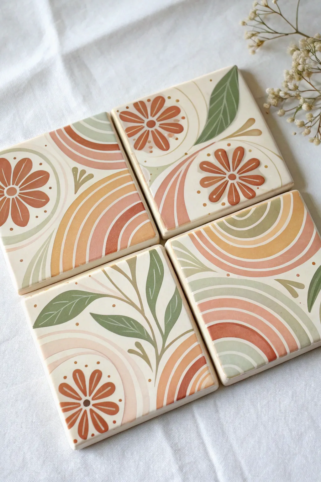
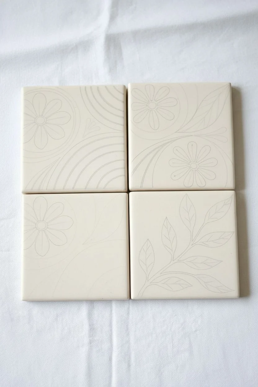
Transform plain ceramic coasters into a stunningly cohesive piece of art with this terra-cotta inspired design. The flowing arches and organic floral elements connect across the four tiles, creating a beautiful mini mural perfect for your coffee table.
Step-by-Step
Materials
- 4 square unglazed ceramic bisqueware tiles (4×4 inch)
- Acrylic paints (terracotta, peach, mustard yellow, sage green, off-white)
- Flat shader brushes (medium and small)
- Fine liner brush (for details)
- Pencil and eraser
- Ruler
- Clear acrylic sealer (matte finish)
Step 1: Preparation and Sketching
-
Surface Prep:
Begin by wiping down your ceramic tiles with a damp cloth to remove any dust. If the surface is very rough, a light sanding with fine-grit sandpaper can provide a smoother canvas. -
Base Coat:
Apply a generous coat of off-white or cream acrylic paint to the entire surface of all four tiles. I find that doing two thin coats is better than one thick one to avoid brush strokes. Let this dry completely. -
Grid Alignment:
Arrange the four dry tiles on your workspace in a tight 2×2 square grid, exactly how you want them displayed. This is crucial for drawing the connecting lines. -
Drafting the Arches:
Lightly sketch the large, sweeping arches that will span across multiple tiles. Start from the bottom-left tile, curving up into the top-right tile. Use your ruler to ensure the lines meet perfectly at the tile seams. -
Floral Placement:
Sketch the flower outlines. Notice how the large daisy-like flowers anchor specific corners—one on the bottom-left and two on the top-right tile. Add circular centers and petal outlines. -
Adding Leaf Details:
Draw the vine and leaf shapes. Focus on the bottom-right tile, where a large leafy stem originates and reaches up toward the center of the design.
Step 2: Painting the Design
-
Painting the Arches:
Start with your terra-cotta and peach paints. Fill in the arch bands using a flat shader brush. Keep a steady hand near the edges for crisp lines. -
Creating Contrast:
Use the mustard yellow for alternating bands within the rainbow arches. This warm tone helps bridge the gap between the reds and greens. -
Floral Base Layers:
Fill in the flower petals using the terracotta paint. For variation, use a slightly lighter shade for the flower on the bottom left. Don’t worry about the centers just yet. -
Painting the Leaves:
Switch to your sage green paint and fill in the leaf shapes. Use the tip of your brush to get sharp points on the leaves. I like to mix a tiny bit of white into the green for the lighter leaf accents. -
Refining Edges:
Once the main blocks of color are dry, use your small flat brush and the base off-white color to clean up any edges where the paint may have bled or gone outside the sketch lines.
Uneven Lines?
If your arch lines look shaky, use painter’s tape (washi tape is gentle) to mask off sections. Ensure the base layer is 100% dry before taping so you don’t peel up paint.
Step 3: Details and Finishing
-
Adding Flower Centers:
Paint the circular centers of the flowers with dark brown or deep terracotta. Use a fine liner brush for this precision work. -
Veins and Stems:
Using the fine liner brush and a diluted cream or light sage color, carefully paint thin central veins onto the darker green leaves for dimension. -
Detail Dots:
Dip the non-brush end of your paintbrush into terracotta or mustard paint to stamp small decorative dots around the flowers and within the negative spaces of the design. -
Adding White Accents:
Use the liner brush to add tiny white highlight lines on the flower petals and sepals to give them a stylized, folk-art look. -
Sealing the Artwork:
Allow the paint to cure for at least 24 hours. Once fully dry, spray or brush on a matte clear acrylic sealer. Apply 2-3 coats to ensure they are waterproof and durable for use as coasters.
Go 3D
Use ‘puffy paint’ or ceramic relief outliner for the white details and dots. This adds physical texture that feels amazing when you run your fingers over the finished tiles.
Arrange your finished tiles on the coffee table and enjoy the warm, bohemian vibe they bring to your space.
Stamped Pattern Tiles You Paint Over
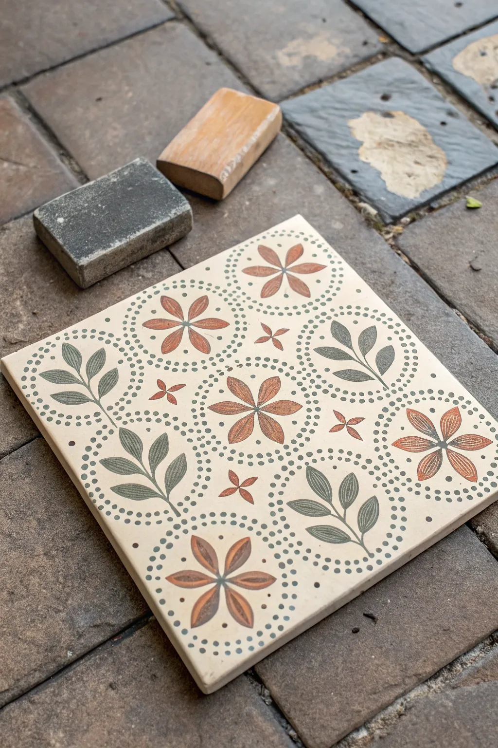
Transform a plain ceramic tile into a sophisticated, vintage-inspired piece that mimics the look of traditional encaustic cement tiles. By using layering techniques and gentle distressing, you can achieve that perfectly imperfect, aged finish without the heavy price tag.
Step-by-Step Tutorial
Materials
- Square ceramic bisqueware tile (4×4 or 6×6 inches)
- Small fine-grit sanding block or sponge
- Medium-grit sanding block
- Adhesive stencil (mandala or floral pattern)
- Chalk-style paint (Cream/Off-White)
- Chalk-style paint (Terracotta/Burnt Orange)
- Chalk-style paint (Sage Green)
- Chalk-style paint (Dark Grey/Charcoal)
- Small stencil brushes or pouncers
- Detail paintbrush (0 or 1 liner)
- Matte clear topcoat or wax sealer
- Lint-free cloth
Step 1: Base Preparation
-
Clean the surface:
Begin by wiping down your ceramic tile with a damp lint-free cloth to remove any dust or oils that might interfere with paint adhesion. Let it dry completely. -
Apply the base coat:
Using a wide flat brush, apply an even coat of your cream or off-white chalk paint across the entire face of the tile. Paint in smooth strokes from edge to edge. -
Second coat:
Allow the first layer to dry for about 30 minutes. Apply a second coat of the cream paint to ensure fully opaque coverage, hiding the raw ceramic color underneath. -
Smooth the surface:
Once the base is bone dry, take your fine-grit sanding sponge and very lightly buff the surface. I like to do this just to knock down any brush strokes, creating a flatter surface for the stencil.
Clean Edges Secret
Use spray adhesive on non-sticky stencils. A light misting let it tack down firmly, preventing ‘fuzzy’ edges better than tape alone.
Step 2: Stenciling the Pattern
-
Position the stencil:
Peel the backing off your adhesive stencil and center it perfectly on the tile. Press down firmly, paying special attention to the intricate inner details to prevent paint bleed. -
Apply the foliage color:
Load a small stencil brush with sage green paint, then offload most of it onto a paper towel until the brush is almost dry. Lightly dab the paint onto the leaf sections of your design. -
Apply the floral color:
Switch to a clean brush and use the terracotta paint for the flower petals. Use a straight up-and-down pouncing motion to drive the pigment into the stencil openings without pushing it underneath. -
Add definition:
Using the dark grey or charcoal paint, gently stipple the dotted circular borders and any central accents in the pattern. This contrast helps frame the colored elements. -
Remove the stencil:
While the paint is still slightly tacky (don’t wait for it to dry completely), carefully peel back the stencil at a sharp angle. This helps keep the edges crisp. -
Touch ups:
Inspect the design for small imperfections. Use a damp Q-tip to wipe away smears, or use a tiny liner brush to fill in gaps where the paint might have been too light.
Paint Bleeding?
If paint seeps under the stencil, you likely have too much paint on your brush. Offload 80% onto a paper towel before touching the tile.
Step 3: Distressing and Finishing
-
Full dry time:
Let the patterned tile cure for at least an hour. The paint needs to be hard enough to withstand the distressing process. -
Simulate wear:
Take the medium-grit sanding block and gently sand over the entire design. Focus slightly more pressure on the corners and edges where natural wear would occur over time. -
Reveal the texture:
Continue sanding until parts of the cream base coat start to peek through the colored pattern, and perhaps even a tiny bit of the raw tile shows on the sharp edges. This creates the ‘stamped’ encaustic look. -
Dust off:
Wipe the tile thoroughly with a dry cloth to remove all the sanding dust, which can make the colors look muddy if trapped under sealer. -
Seal the artwork:
Apply a thin layer of matte clear topcoat or wax over the tile. This protects the chalk paint and deepens the colors slightly, giving it a finished, professional sheen.
Now you have a beautifully aged, custom tile that looks like a reclaimed architectural treasure
Textured Tile Painting With Sand or Grit
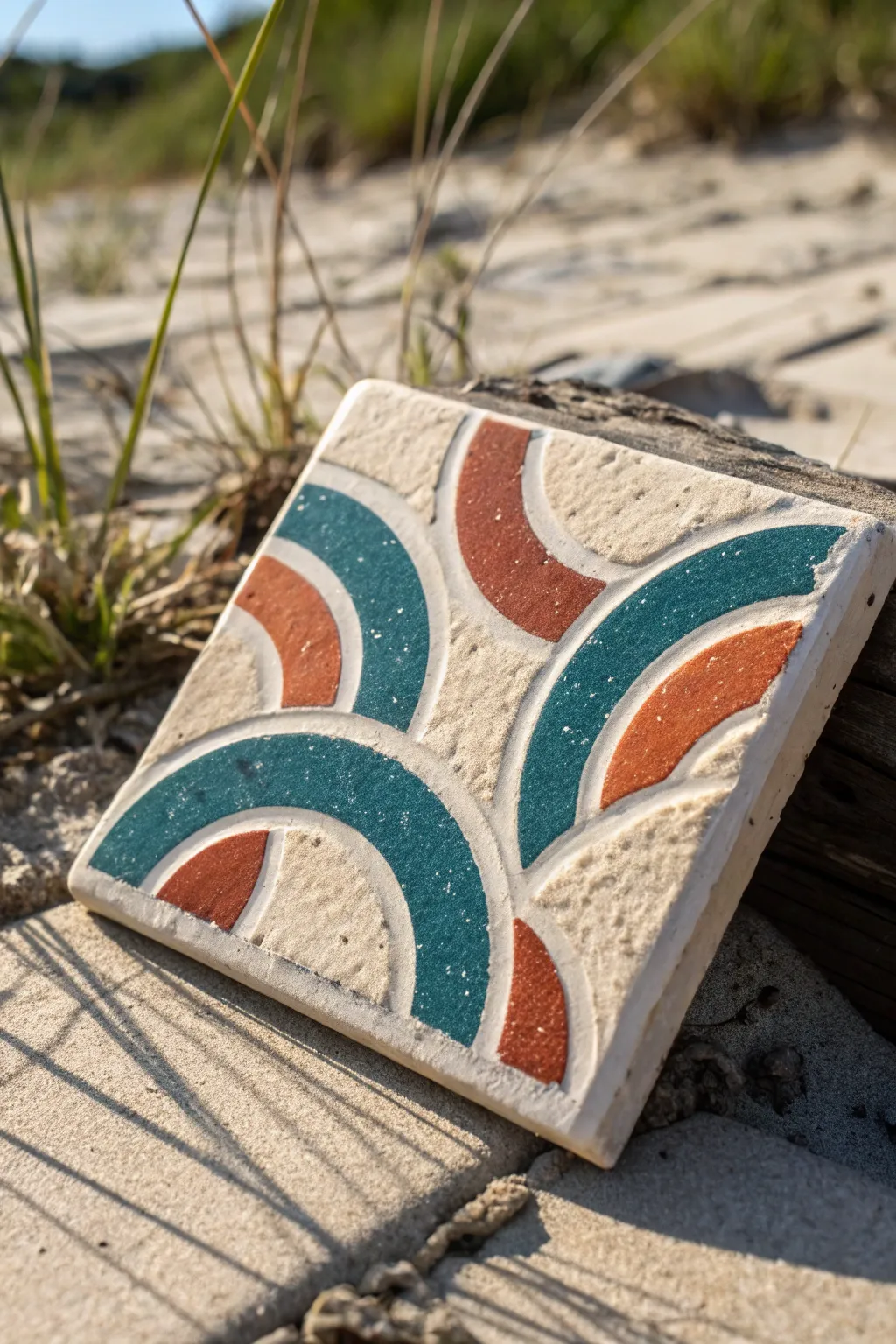
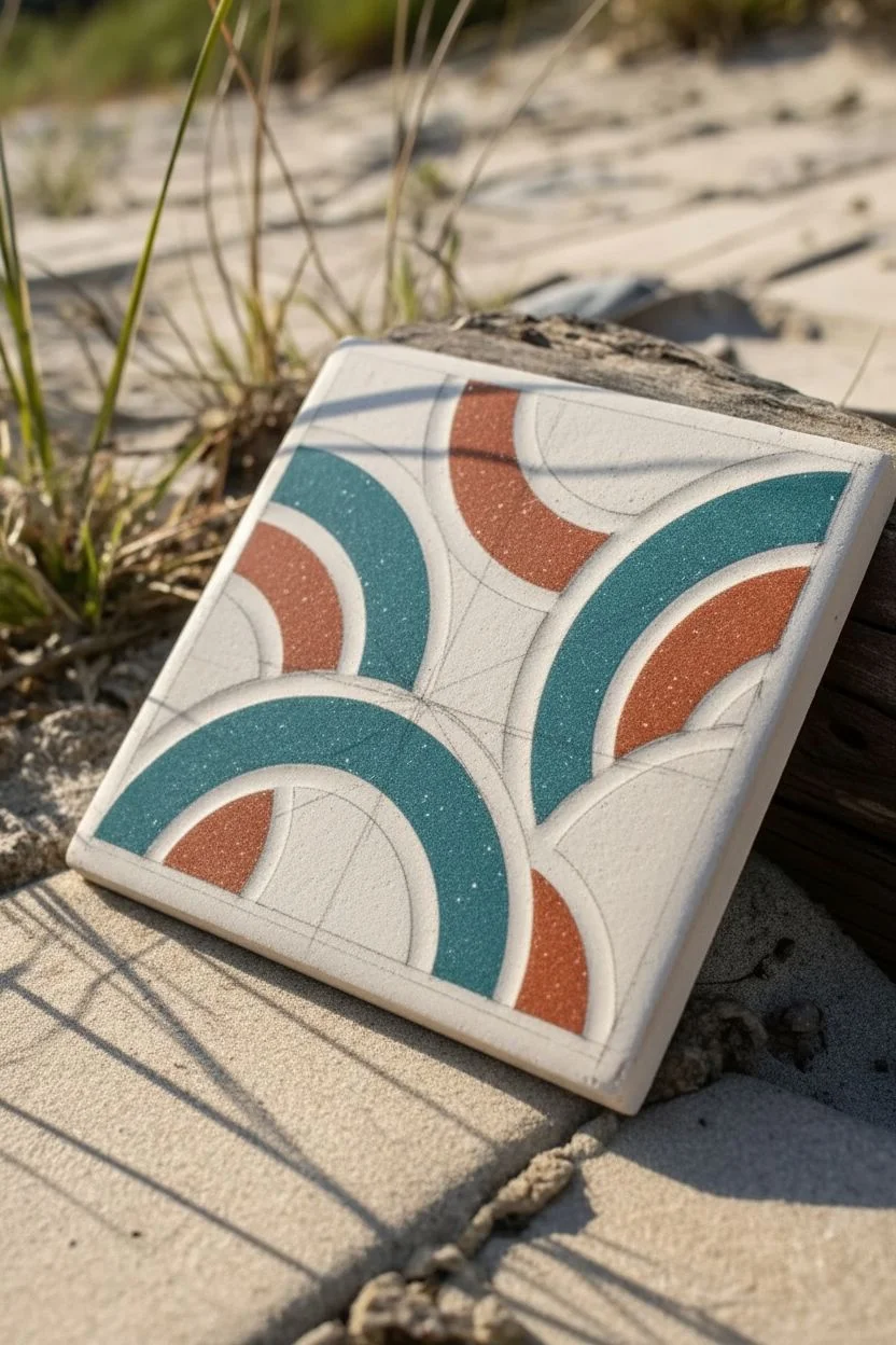
Capture the essence of the shoreline with this textured tile project that mimics sea glass and sandy dunes. By mixing fine sand directly into your paint, you create a tactile, raised surface that adds incredible depth to a simple geometric design.
Detailed Instructions
Materials
- 4×4 inch stone or unfinished ceramic tile
- Acrylic craft paint (teal/turquoise)
- Acrylic craft paint (terracotta/rust)
- Fine grit crafting sand or clean beach sand
- Painter’s tape or masking tape (1/4 inch width is ideal)
- Small mixing cups or palette
- Stiff bristle brushes (small flat and small round)
- Compass or circle stencil (optional)
- Pencil
- Matte clear sealant spray
Step 1: Preparation & Design
-
Clean the surface:
Begin by wiping down your tile with a damp cloth to remove any dust or oils. Let it dry completely so the paint adheres properly. -
Mark the center:
Find the center of the tile by lightly drawing an ‘X’ from corner to corner with a pencil. This will help you orient your arcs. -
Sketch the arcs:
Sketch four large semicircles starting from the midpoint of each side edge, curving inward. You can use a compass or just trace a round object like a jar lid. -
Add inner details:
Draw inner concentric arches inside your main shapes. This design uses alternating thick and thin bands, so mark off where your colors will go versus the negative space.
Grit falling off?
If too much sand sheds after drying, your ratio was too sandy. Dab a layer of matte Mod Podge over the painted areas to seal it back down.
Step 2: Creating Texture
-
Mix the teal texture:
In a small cup, mix your teal acrylic paint with sand. Aim for a ratio of about 2 parts paint to 1 part sand. It should feel gritty but still spreadable, like thick oatmeal. -
Mix the rust texture:
Repeat the mixing process with your terracotta or rust-colored paint in a separate cup. I find that mixing fresh batches prevents the paint from drying out too quickly. -
Test the consistency:
Dab a tiny bit of your mixture on a piece of scrap paper. If the sand clumps too much, add a drop more paint to smooth it out.
Go 3D
For even more dimension, use a puff paint or dimensional fabric paint as your base instead of standard acrylics before mixing in the sand.
Step 3: Painting the Pattern
-
Apply the first teal arc:
Using a stiff flat brush, scoop up the teal sand mixture. Dab and drag it into the marked sections for the teal arches. Do not brush back and forth too much, or you’ll wipe the grit away. -
Build the height:
The charm of this piece is the relief texture. Gently tap more mixture onto the wet paint to build up the height, making the colored sections physically higher than the bare stone. -
Tidy the edges:
While the paint is wet, use a clean, slightly damp round brush or a toothpick to push any stray sand grains back into the painted area for a crisp line. -
Apply the rust accents:
Switch to a clean brush and apply the rust-colored sand mixture to the smaller, opposing arches. Be careful not to let the wet colors touch. -
Fill remaining sections:
Continue working around the tile, filling in the alternating geometric bands. Leave the natural stone exposed between the painted shapes to serve as the ‘sand’ color in the palette. -
Check for sparse spots:
Look closely at your work from an angle. If you see spots where the coverage is thin, dab a little extra textured mix on top.
Step 4: Finishing Touches
-
Initial dry time:
Let the tile sit undisturbed for at least 2-3 hours. Because the paint is thick and textured, the outer layer will dry faster than the layer against the stone. -
Brush off loose grit:
Once fully dry to the touch, gently run a dry, soft finger over the design to dislodge any sand grains that didn’t adhere to the paint. -
Seal the artwork:
Take the tile to a well-ventilated area and spray it with a matte clear sealant. This locks the sand in place and prevents shedding over time. -
Add feet (optional):
If you plan to use this as a coaster, stick small felt pads or cork backing to the bottom corners to protect your furniture.
Place your finished piece near a window to catch the afternoon light and show off that beautiful texture
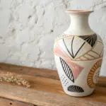
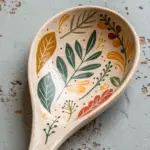
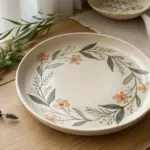

Have a question or want to share your own experience? I'd love to hear from you in the comments below!