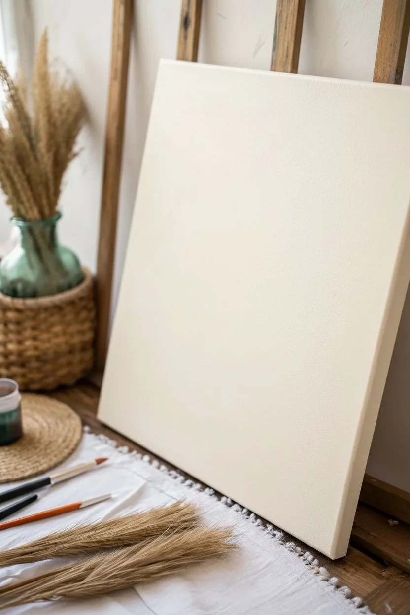
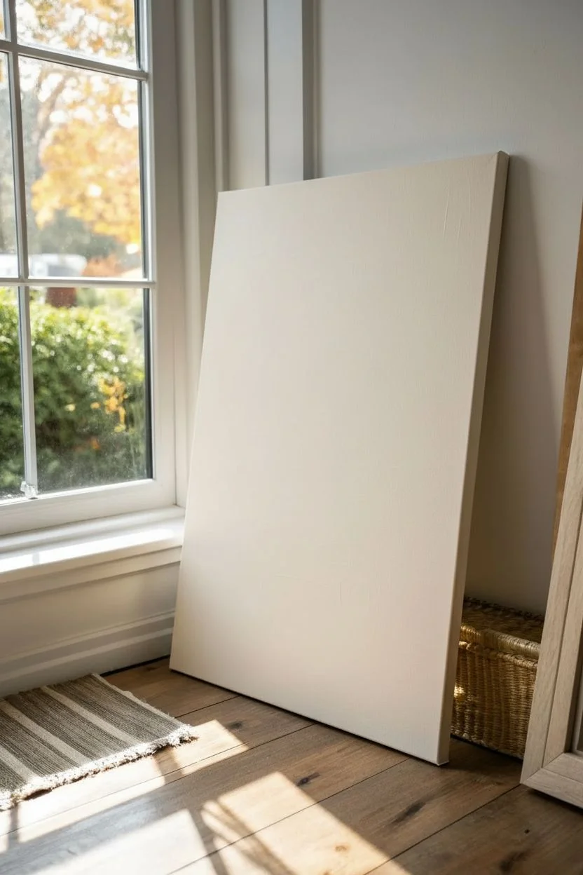
Abstract painting is my favorite kind of creative reset because you can make something modern and gorgeous without having to “draw” anything perfectly. Here are easy abstract painting ideas I use in my own studio when I want quick wins, bold color, and that satisfying finished-art feeling.
Color Blocking With Big Brushstrokes
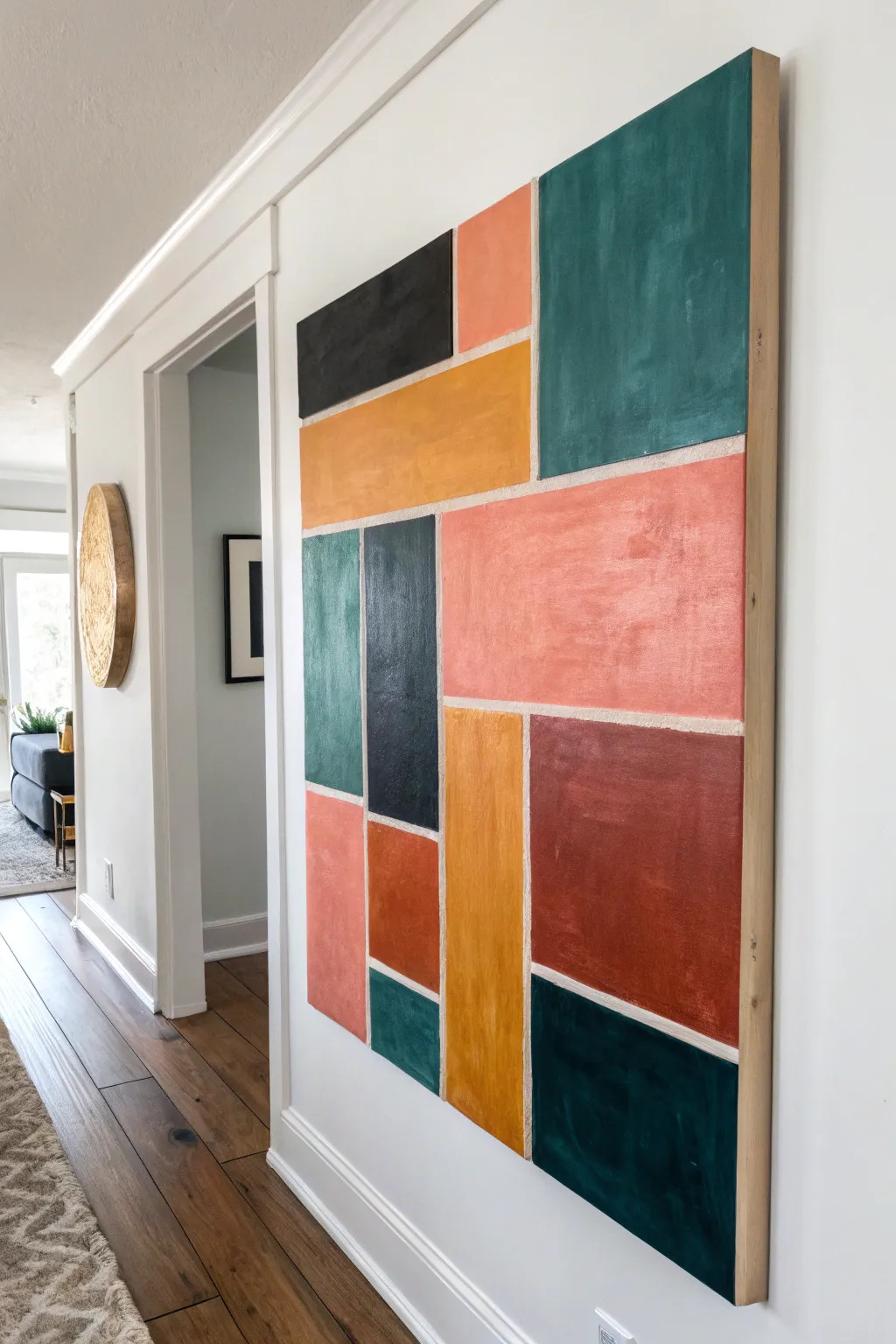
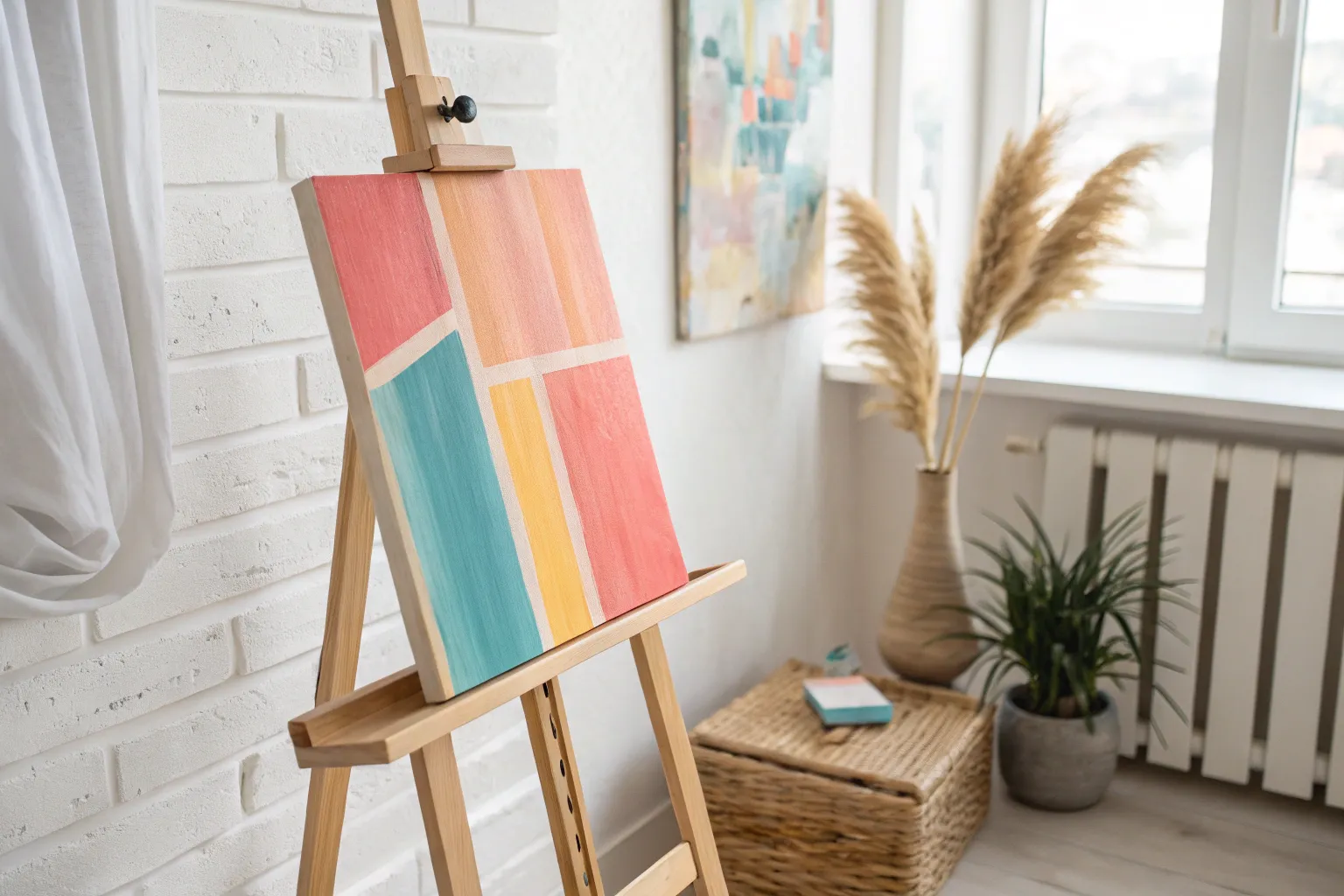
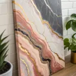
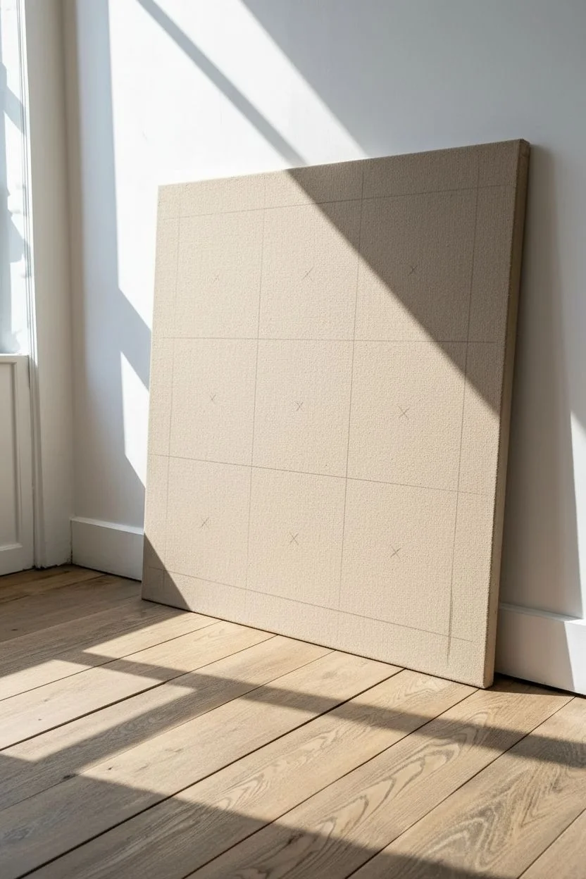
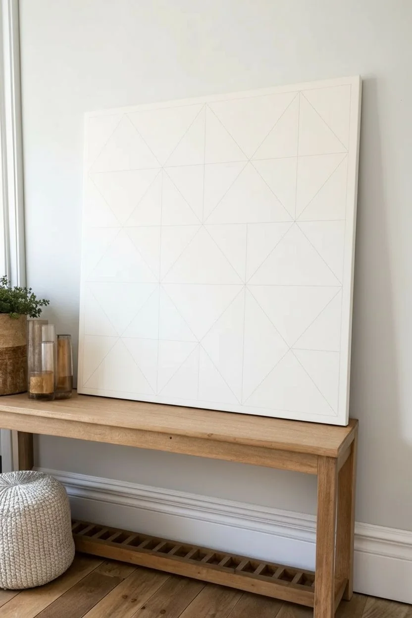
Create a stunning statement piece for your hallway or living room with this large-scale geometric painting. Featuring a warm, earthy palette and bold rectangular forms separated by crisp negative space, this project achieves a high-end designer look with deceptively simple techniques.
Detailed Instructions
Materials
- Large stretched canvas (at least 36×48 inches)
- Acrylic paints (Terra cotta, mustard yellow, deep teal, charcoal black, sage green)
- Painter’s tape (various widths, 0.5 inch and 1 inch recommended)
- Wide flat synthetic brushes (2-3 inches)
- Matte medium or white acrylic paint (to seal tape)
- Pine lattice strips or 1×2 lumber (for framing)
- Drop cloth
- Pencil and ruler
- Wood stain (light oak) and rag
- Brad nailer or finishing nails and hammer
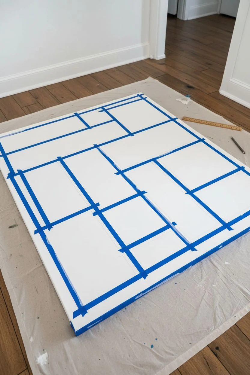
Step 1: Planning and Taping
-
Prepare the workspace:
Lay down a drop cloth in a well-ventilated area. Place your large canvas flat on the ground or on a sturdy table to prevent it from wobbling while you apply pressure with the tape. -
Sketch the layout:
Lightly sketch your geometric design directly onto the canvas with a pencil and ruler. Aim for a balanced composition of large and small rectangles, ensuring no two adjacent blocks will be the exact same color. -
Apply the tape grid:
Run painter’s tape along your pencil lines. The area covered by tape will remain white (or raw canvas) to create the separation lines between colors. -
Vary the line widths:
For added visual interest, considered using different widths of tape, or double up strips in certain areas to create thicker negative spaces between major color sections. -
Seal the tape edges:
This is the secret to crisp lines: paint a thin layer of matte medium (or white paint if your canvas is primed white) over the edges of the tape. This seals the gap so color won’t bleed underneath.
Step 2: Painting the Blocks
-
Mix your palette:
Prepare your acrylic colors on a palette or paper plates. You want a distinct earthy palette: terra cotta pinks, deep forest greens, mustard yellows, and a strong charcoal for contrast. -
Start with the largest blocks:
Choose your most dominant color (like the terra cotta or teal) and fill in the largest rectangular sections first. Use a wide flat brush to ensure broad, confident strokes. -
Create texture:
Don’t aim for perfectly flat opacity. Allow some brushstrokes to be visible, creating a slight vertical or horizontal texture that gives the piece a hand-painted, organic feel. -
Fill the remaining sections:
Work your way through the smaller rectangles, switching colors to maintain balance. Keep a cup of water handy to rinse brushes thoroughly between color changes. -
Add a second coat if needed:
Let the first layer dry to the touch. If the canvas texture shows through too much or the color looks streaky, apply a second coat to deepen the saturation. -
Remove the tape:
While the paint is still slightly tacky (not fully cured), carefully peel back the painter’s tape at a 45-degree angle to reveal the crisp lines underneath.
Tape Sealing Secret
Don’t skip sealing the tape with matte medium! It acts as a clear barrier, ensuring that if anything bleeds under the tape, it’s clear medium, not colored paint.
Step 3: Finishing and Framing
-
Touch up lines:
Inspect your white lines. If any paint bled through despite sealing, use a small flat brush and white paint (or gesso) to tidy up the edges. -
Cut the frame pieces:
Measure the height and width of your canvas. Cut your pine lattice strips or lumber to size, creating a simple butt-joint frame (where the top and bottom pieces overlap the side pieces). -
Stain the wood:
Apply a light oak or natural stain to the wood strips using a rag. Wipe off excess stain immediately to keep the wood tone light and natural, matching the aesthetic. -
Attach the frame:
Once the stain is dry, hold the wood strips against the side of the canvas. Secure them using a brad nailer or small finishing nails hammered directly into the canvas stretcher bars. -
Hang the artwork:
Install heavy-duty hanging hardware on the back of the canvas frame, ensuring it is rated for the size of your piece.
Level Up: Texture
Mix a small amount of modeling paste or drywall compound into your acrylics before painting. This adds actual physical depth and a stone-like texture to the blocks.
Step back and admire how a few simple geometric shapes have transformed into a sophisticated gallery-worthy focal point for your home


Painter’s Tape Geometric Lines (Tape-Resist)
Geometric abstraction meets rustic warmth in this striking tape-resist painting. By combining crisp lines with heavily textured paint in earthy shades of terracotta, ochre, charcoal, and cream, you can create a sophisticated statement piece that feels both modern and organic.
Step-by-Step
Materials
- Large wooden canvas or framed plywood panel (approx. 24×36 inches)
- Acrylic paints (Heavy Body): Burnt Sienna, Yellow Ochre, Mars Black, Titanium White, and Raw Umber
- Texture medium (modeling paste or sand gel)
- Painter’s tape (various widths: 1-inch and 0.5-inch)
- Palette knife
- Flat synthetic paintbrushes (1-inch and 2-inch)
- Ruler or straight edge
- Pencil
- Drop cloth
- Floating wooden frame (optional, for finishing)
Step 1: Preparation & Mapping
-
Prime the surface:
Begin by ensuring your wooden panel is clean and dust-free. Apply a coat of gesso or white acrylic paint to prime the surface, creating a bright base that will help your top colors pop. Let this dry completely. -
Mix your texture:
To achieve that rugged, stone-like surface seen in the image, mix a generous amount of modeling paste or sand gel into your acrylic paints on your palette. Aim for a frosting-like consistency that will hold peaks and brushstrokes. -
Mark the center point:
Decide on your focal point. In this design, the lines converge toward the center but are offset slightly. Make a small pencil mark near the middle of the canvas where you want all your energetic rays to originate from. -
Establish the main diagonal:
Use your ruler to draw a faint pencil line spanning diagonally across the canvas, passing through your central point. This will be the anchor for the large black strip.
Pro Tip: Baking Soda Hack
Don’t have modeling paste? Mix baking soda into your acrylic paint. Start with a 1:1 ratio. It creates a grainy, cement-like texture perfect for this rustic style.
Step 2: Taping the Geometry
-
Place the primary tape lines:
Run two strips of painter’s tape parallel to your main diagonal pencil line. Leave a wide gap between them—this open channel will become that bold, dark central stripe. -
Create the radial sections:
From your central point, extend strips of tape outwards to the edges of the canvas like rays of sunshine. Vary the angles to create triangles of different sizes. Press the edges of the tape down firmly with your thumbnail or a credit card to prevent paint bleed. -
Define the white separators:
The white lines in this piece act as separators. The tape itself masks these lines. Ensure your tape placement creates a network of triangles that don’t touch each other, separated by the width of the tape. -
Seal the tape (optional):
For razor-sharp lines, I like to brush a very thin layer of the base white paint (or matte medium) over the edges of the tape. This seals any gaps so the colored paint won’t seep underneath.
Step 3: Applying Color & Texture
-
Paint the dark sections:
Start with your textured black mix (Mars Black + texture medium). Apply this to the large central diagonal channel and a few select triangles. Use a palette knife to scrape the paint on, leaving ridges and uneven spots for character. -
Add the terracotta tones:
Mix Burnt Sienna with a touch of Raw Umber to get that deep clay color. Fill in several surrounding triangles, ensuring the paint is thick and opaque. Don’t worry about being perfectly smooth; the texture is key here. -
Fill in the lighter neutrals:
Mix Yellow Ochre with plenty of Titanium White to create a sandy beige. Use this for the remaining triangular sections. Vary your application method—use the brush for some and the knife for others to create visual interest. -
Detail the white sections:
Some sections in the reference image are textured white. Apply your thick white mix to these specific triangles now, building up the surface so it matches the height of the colored sections. -
Let it set:
Allow the paint to dry until it is firm to the touch but not fully cured. This usually takes about 30 to 60 minutes depending on how thick your texture medium is.
Troubleshooting: Paint Bleeding?
If paint bled under the tape, don’t panic. Wait for it to dry completely, then use a ruler and a white paint marker to draw over the mistake and re-establish the crisp line.
Step 4: The Reveal
-
Peel the tape:
Slowly and carefully peel back the painter’s tape. Pull it away at a 45-degree angle to the surface. Doing this while the paint is slightly tacky helps prevent the heavy texture from chipping or tearing. -
Touch up edges:
If rough texture caused a little unevenness in your lines, use a small, flat detailing brush to tidy up the white separation lines with fresh white paint. -
Seal the surface:
Once the painting is completely bone-dry (wait at least 24 hours due to the texture thickness), apply a matte varnish to protect the surface and unify the sheen. -
Frame the piece:
Finish the look by installing the painted panel into a light oak floating frame to match the organic, earthy vibe of the artwork.
Hang your new masterpiece in a well-lit spot where the shadows can play across those beautiful textured ridges
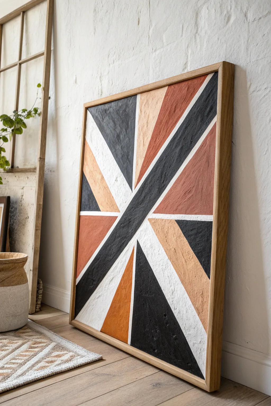
Simple Abstract Brushstroke “X” Pattern
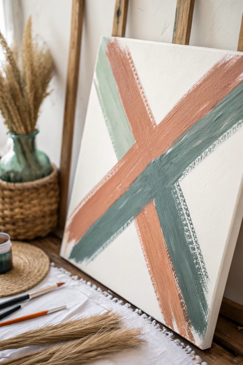
Embrace the beauty of controlled imperfection with this striking abstract canvas. Featuring bold, intersecting brushstrokes in earthy terracotta and sage green, the rough-edged aesthetic adds instant modern warmth to any space.
How-To Guide
Materials
- Square stretched canvas (approximately 16×16 inches)
- Acrylic paints: Cream/Off-White (base), Terracotta/Burnt Sienna, Sage Green/Eucalyptus
- Large flat brush (2-3 inches wide)
- Medium flat brush (1 inch wide)
- Masking tape or painter’s tape (1 inch width)
- Palette or paper plate
- Cup of water
- Paper towels
Step 1: Preparation & Base Coat
-
Prepare your workspace:
Lay down a drop cloth or old newspaper to protect your table. Ensure your canvas is clean and free of dust before starting. -
Mix the base color:
Pour a generous amount of cream or off-white acrylic paint onto your palette. If you only have bright white, add a tiny drop of brown or yellow ochre to warm it up. -
Apply the background:
Using the large flat brush, cover the entire canvas with the cream paint. Don’t worry about being perfectly smooth; a little texture adds character. -
Paint the edges:
Remember to extend the base color around the sides of the canvas for a professional, finished look. -
Let it dry completely:
Wait for the base coat to be fully dry to the touch. This is crucial so your tape doesn’t pull up the paint later.
Fixing “Too Solid” Stripes
If your stripes look too heavy, wait for them to dry. Then, dry-brush a little of your cream base color over the top to bring back the textured, worn look.
Step 2: Creating the Guides
-
Visualize the X:
Look at the canvas and imagine a large X extending from corner to corner. We are creating a wide, bold cross shape. -
Apply the first tape line:
Place a strip of masking tape diagonally from the top left to the bottom right. This will serve as the inner edge for one of your colored strokes. -
Apply the parallel tape line:
We aren’t making a solid block, so place a second piece of tape parallel to the first one, leaving about a 2-inch gap. This gap is where you’ll paint. -
Create the second diagonal:
Repeat the process for the other direction (top right to bottom left), crossing over the first set of tape strips. -
Seal the edges:
Run your finger firmly along the edges of the tape to ensure a tight seal, preventing paint bleed.
Metallic Accent
For a luxe twist, mix a drop of gold leaf paint into the terracotta stroke or add a thin gold pinstripe alongside the green line for subtle shimmer.
Step 3: Painting the Abstract Strokes
-
Prepare the terracotta paint:
Squeeze out your terracotta or burnt sienna paint. We want a dry-brush effect, so don’t dilute it with water. -
Load the brush lightly:
Dip your medium flat brush into the paint, then dab most of it off onto a paper towel. The brush should be relatively dry. -
Paint the first stroke:
Following one of your taped diagonal channels, drag the brush swiftly down the canvas. Allow the paint to skip and streak naturally. -
Add the sage green:
Clean your brush thoroughly or switch to a fresh one. Load it with the sage green paint, again keeping the brush fairly dry. -
Paint the intersecting stroke:
Apply the green paint to the other diagonal channel. Where the colors cross in the center, you can choose to let one layer sit on top or blend them slightly. -
Create the layered effect:
Looking closer at the inspiration image, the strokes aren’t just one solid color. Add a second stroke of the opposite color immediately next to the first one within the tape channel if space permits, or overlap slightly. -
Enhance the texture:
If the coverage looks too solid, take a nearly empty brush and drag it quickly over the wet paint to lift some color and reveal the canvas texture. -
Add the outer accent lines:
I like to add those faint, scratchy lines on the outer edges. With a very dry brush and a tiny amount of paint, freely drag a thin line alongside your main strokes, ignoring the tape guide essentially.
Step 4: Reveal & Finish
-
Remove the tape:
Here is the satisfying part. Carefully peel off the masking tape while the paint is still slightly tacky, pulling away from the paint line. -
Soften the hard edges:
The tape leaves a very sharp line. To mimic the inspiration photo, take a small brush with a tiny bit of base color and gently feather over the hard edges to make them look rougher. -
Final touches:
Step back and assess your composition. If the ‘X’ feels too disconnected, add a few dry brush scuffs in the center to marry the two directions.
Hang your new masterpiece and enjoy the contemporary vibe it brings to your room


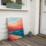
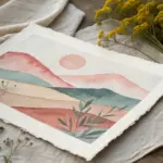
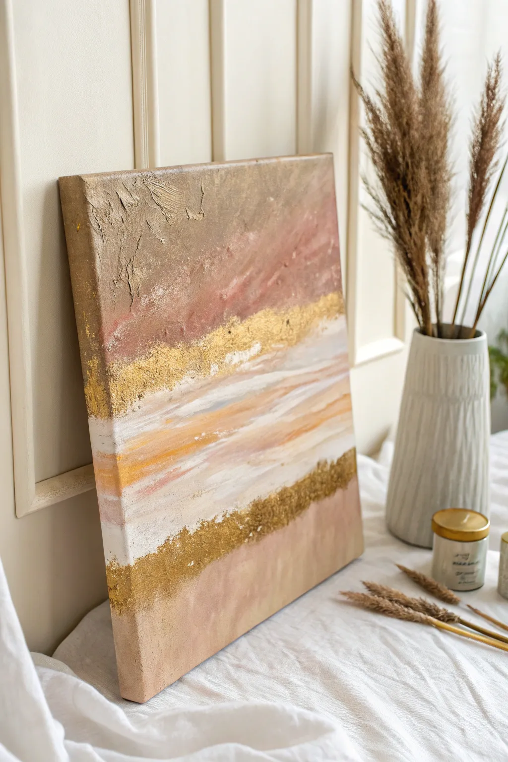
Soft Horizon Gradient Blend
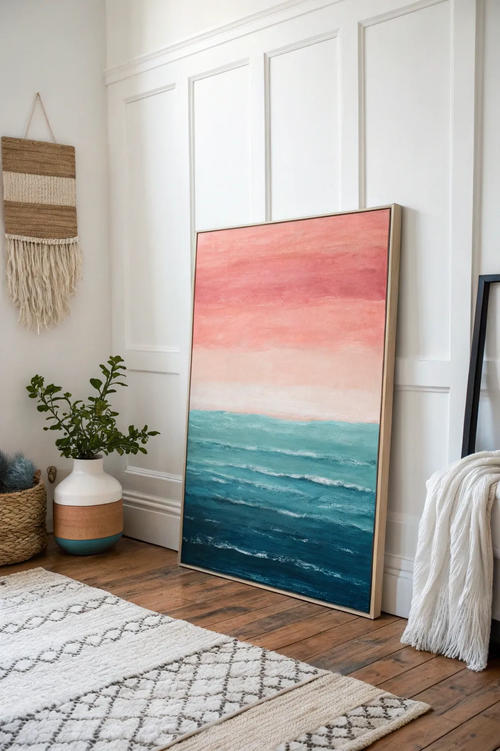
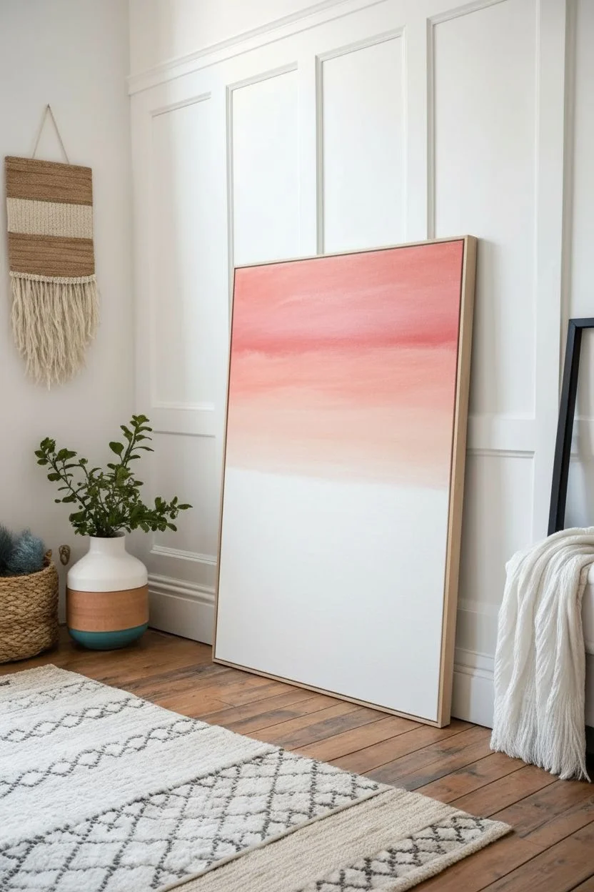
Capture the serene beauty of a setting sun meeting the ocean with this soft, layered abstract piece. Using gentle blending techniques for the sky and textured strokes for the waves, you’ll create a calming visual anchor perfect for any room.
Step-by-Step Tutorial
Materials
- Large rectangular canvas (approx. 24×36 inches)
- Acrylic paints: Titanium White, Rose Pink, Peach/Coral, Teal, Phthalo Blue, Navy Blue
- Large flat brush (2-3 inch) for the sky
- Medium flat brush (1 inch) for the ocean
- Small round brush or filbert brush for details
- Palette knife (optional, for wave texture)
- Water cup and paper towels
- Spray bottle with water (for keeping paints wet)
Step 1: Painting the Sky Gradient
-
Prepare the Horizon Line:
Decide where your horizon will sit. In this piece, it’s slightly below the vertical center. Mark a faint line with a pencil or a piece of masking tape if you want a perfectly straight edge, though a soft, hand-painted edge looks more organic. -
Apply the Deepest Pink:
Start at the very top of the canvas with your large flat brush. Mix a bold Rose Pink with a tiny touch of Coral. Apply this color in long, horizontal strokes across the top quarter of the canvas. -
Blend into Soft Coral:
Without cleaning your brush, pick up some Peach/Coral paint. Begin painting just below the pink section, overlapping the wet edge slightly. Use long, sweeping back-and-forth motions to blend the two colors where they meet. -
Transition to Creamy White:
Clean your brush thoroughly. Load it with a mix of Peach and plenty of Titanium White. Apply this to the area just above your horizon line. -
Smooth the Gradient:
Now, working upward from the horizon, use the damp brush to smooth the transition between the pale peach/white and the darker coral above. The goal is a seamless fade with no harsh stripes. -
Final Sky Touches:
If the paint dries too fast, mist it lightly with water. Add a pure layer of watered-down Titanium White right at the horizon line to create that glowing, ethereal misty effect.
Step 2: Creating the Ocean Depth
-
Base Teal Layer:
Switch to your medium flat brush. Mix Teal with a little White to get a bright turquoise. Paint a horizontal band starting right at the horizon line, blending it slightly upward into the still-damp white sky for a hazy look. -
Deepening the Blue:
As you move down the canvas, slowly introduce Phthalo Blue into your mix. Paint the middle section of the ocean with this richer, medium blue, using choppy horizontal strokes rather than long smooth ones to suggest movement. -
Darkest Depths:
For the bottom third of the canvas, mix Phthalo Blue with Navy Blue. Apply this dark, intense color to anchor the painting. I find this creates a wonderful sense of weight and depth against the light sky. -
Blending the Water Gradient:
While the blue layers are tacky but not fully dry, use a clean, slightly damp brush to soften the transitions between the turquoise, medium blue, and navy. Don’t over-blend; you want visible brushstrokes to mimic currents.
Fixing Muddy Blends
If your sky colors start turning gray or muddy, stop blending immediately. Let the paint dry completely, then apply a fresh, thin layer of the intended color over the top to restore vibrancy.
Step 3: Adding Waves and Texture
-
Mixing Foam White:
Create a mix of Titanium White with a tiny dot of Teal. You don’t want pure stark white, as it can look unnatural. The slight blue tint makes the foam look integrated. -
Painting Distant Waves:
Using a small round brush or the edge of a flat brush, paint very thin, horizontal lines in the light teal area near the horizon. Keep these lines broken and subtle. -
Building Mid-Ocean Waves:
Move to the middle section. Apply slightly thicker, more textured horizontal strokes. Allow the brush to skip over the canvas canvas grain (scumbling) to create the look of breaking water. -
Foreground Swells:
In the deepest blue section at the bottom, paint bolder, curvier lines. These represent the wave crests closest to the viewer. Vary the pressure on your brush to make lines that taper from thick to thin. -
Enhancing Texture (Optional):
If you want more dimension, take a palette knife with a bit of thick white paint and gently drag it horizontally across the wave crests. This physically builds up the paint like real sea foam. -
Final Highlights:
Step back and look at the composition. Add a few extra highlights of pure white on the thickest wave crests to catch the light.
Level Up: Metallic Glint
Mix a small amount of metallic gold or iridescent pearl medium into your white paint for the wave crests. It will make the water look like it’s shimmering in the actual sunlight.
Now let your beautiful seascape dry completely before finding the perfect spot to lean or hang it.
BRUSH GUIDE
The Right Brush for Every Stroke
From clean lines to bold texture — master brush choice, stroke control, and essential techniques.
Explore the Full Guide
Repetitive Dash Marks in Rows
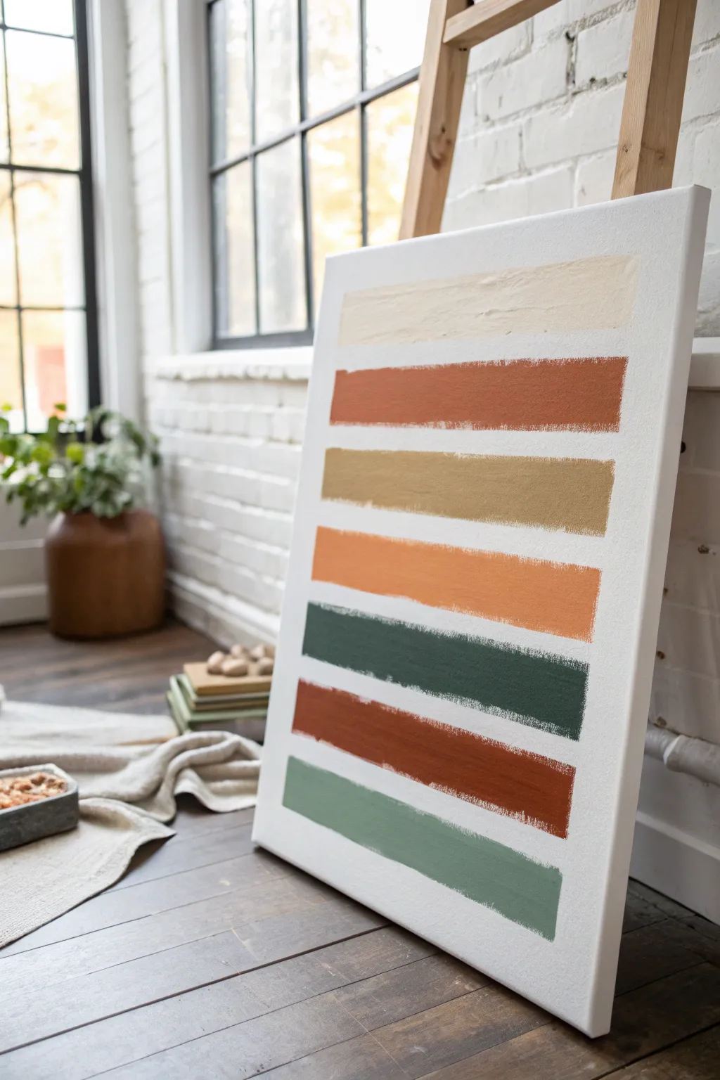
Create a calming, minimalist statement piece featuring bold horizontal strokes in an organic, earthy color palette. This project celebrates the imperfect beauty of hand-painted lines, bringing warmth and texture to any modern space.
Step-by-Step Guide
Materials
- Large pre-stretched canvas (approx. 24×36 inches)
- Wide flat synthetic paintbrush (2-3 inches wide)
- Acrylic paints: Cream, Burnt Sienna, Ochre/Mustard, Terracotta, Deep Forest Green, Sage Green
- Paper plate or painting palette
- Pencil
- Ruler or straight edge
- Painter’s tape (optional)
- Cup of water
- Paper towels
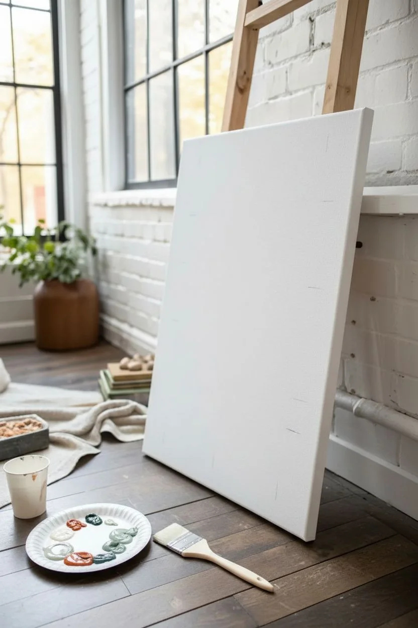
Step 1: Preparation & Color Mixing
-
Prepare your workspace:
Lay down a drop cloth or old sheet to protect your floor or table. Set up your canvas on an easel or prop it securely against a wall so it is upright. -
Plan your spacing:
Take a moment to look at your canvas size. You will need space for seven distinct horizontal bands with white space in between each one. -
Mark flexible guidelines:
Using your ruler and pencil, very lightly mark small ticks on the left and right edges of the canvas where each stripe should roughly go. Don’t draw lines all the way across; you want the painting to feel freehand, not rigid. -
Organize your palette:
Squeeze out generous dollops of your acrylic colors onto your palette. You will need enough of each color to complete a full stroke without reloading too often.
Step 2: Painting the Stripes
-
Load the brush for the top stripe:
Start with the Cream shade. Dip your wide flat brush into the paint, ensuring the bristles are fully coated but not dripping. -
Apply the first stroke:
Starting near the top left (leaving a margin of white canvas), pull the brush horizontally across to the right side. Apply firm, consistent pressure. -
Refine the edges:
If the paint ran out midway, reload and carefully blend it in. The ends of the stroke should look blunt and painterly, not perfectly squared off. -
Clean your brush:
Thoroughly rinse your brush in the water cup and dry it completely on a paper towel. Any leftover water will make the next color runny. -
Paint the Burnt Sienna stripe:
Move down to your next pencil mark. Using the Burnt Sienna (reddish-brown), paint the second stripe parallel to the first. I try to keep the white gap between stripes consistent, but slight variations add character. -
Add the Mustard tone:
Clean the brush again. Load it with the Ochre or Mustard Yellow paint. Apply the third stripe, maintain your horizontal motion. -
Apply the Terracotta stripe:
For the middle band, use the Terracotta orange. This central color warms up the entire composition. -
Paint the Forest Green stripe:
Switch to your darkest color, the Deep Forest Green. Paint this fifth stripe carefully, as the dark pigment can easily overpower the white space if it drips. -
Repeat the Burnt Sienna:
To create rhythm, repeat the Burnt Sienna color for the sixth stripe. This echoes the second stripe and ties the palette together. -
Finish with Sage Green:
For the final bottom stripe, use the softer Sage Green. Ensure you leave a white margin at the very bottom of the canvas similar to the top.
Wobbly Lines?
If you struggle with a steady hand, place a strip of painter’s tape above and below where you want the paint. Paint loosely between them, let dry slightly, and peel for crisp edges.
Step 3: Finishing Touches
-
Check for consistency:
Step back and view the painting from a distance. If any stripe looks too thin or transparent, you can carefully apply a second layer on top once the first is dry to touch. -
Touch up texture:
If you want more texture, dab a little extra paint onto the stripes while they are still wet to create raised brush marks. -
Erase guidelines:
Once the paint is 100% dry, gently erase any visible pencil tick marks on the edges of the canvas. -
Seal the artwork (optional):
If desired, apply a clear matte acrylic varnish to protect the surface from dust and UV light.
Make It Yours
Experiment with texture mediums! Mix a little modeling paste or sand into your acrylics before applying the stripes to give the artwork a gritty, tactile 3D effect.
Hang your new masterpiece in a well-lit corner to let those earthy tones bring a natural calm to the room
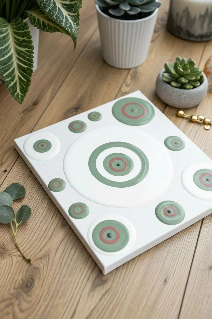
Playful Dots and Drips Over a Base Coat
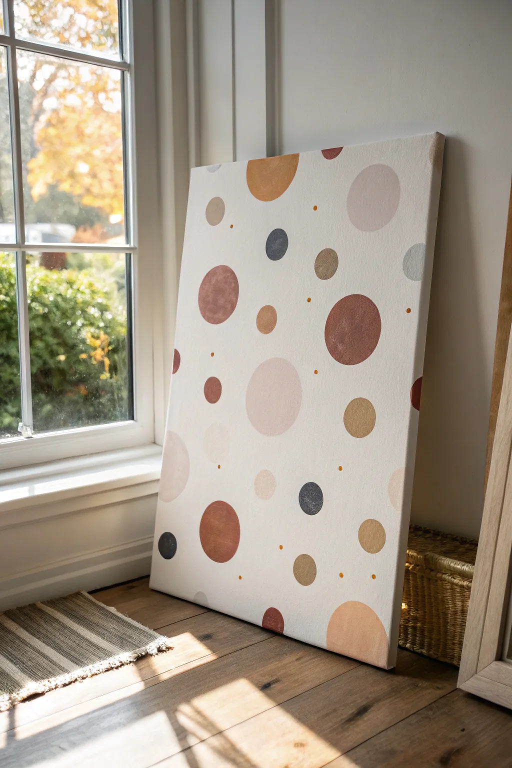
Embrace the soothing simplicity of geometric art with this modern, bohemian-inspired dot painting. By painting crisp, organic circles in a warm, earthy color palette, you’ll create a statement piece that feels both structured and delightfully random.
How-To Guide
Materials
- Large stretched canvas (e.g., 24×36 inches)
- White acrylic gesso or white acrylic paint
- Acrylic paints in earthy tones (burnt sienna, ochre, terracotta, beige, soft pink, charcoal grey)
- Small amount of gold metallic acrylic paint
- Various round items to trace (cups, jar lids, washers) or a drawing compass
- Set of round synthetic paintbrushes (sizes 4, 8, and 12)
- Pencil
- Palette or paper plate
- Cup of water and paper towels
Step 1: Preparing the Base
-
Prime the Surface:
Even if your canvas is pre-primed, apply fresh coat of white gesso or white acrylic paint to ensure a bright, clean background. This helps the circles pop later. -
Tint the Background:
If you prefer a warmer look like the reference photo, mix a tiny drop of beige or cream into your white paint. We want an off-white, eggshell finish rather than a clinical bright white. -
Create Smooth Texture:
Use a large flat brush or roller to apply this base coat. Aim for a smooth texture, brushing in one consistent direction. -
Let it Dry:
Allow the background to dry completely. It must be dry to the touch before you sketch, or your pencil will dig into the paint.
Fixing Wobbly Edges
If you struggle to paint perfect circles freehand, wait for the circle to dry, then clean up the edge by painting over the mistake with your background color.
Step 2: Mapping the Composition
-
Gather Tracing Objects:
Collect household items of various circular sizes—coffee mugs, spice jar lids, coins, and tape rolls. You’ll need about 4-5 different sizes ranging from 1 inch to 5 inches in diameter. -
Plan the Layout:
Place your objects on the dry canvas without tracing yet. Visualize the balance. You want a scattered, random effect, not a grid. -
Trace Large Circles:
Lightly trace your largest items first using a pencil. Press very gently so the graphite doesn’t smudge later. Place some near the edges so they look like they run slightly off the canvas. -
Add Medium Circles:
Fill in some gaps with your medium-sized objects. Try to avoid clustering similar sizes together. -
Fill with Small Circles:
Trace the smallest objects in the remaining negative spaces. The composition should feel ‘airy,’ so leave plenty of background showing.
Level Up: Texture
Mix a little modeling paste or baking soda into a few of the paint colors to give some of the circles a raised, 3D limestone texture.
Step 3: Painting the Circles
-
Prepare the Palette:
Squeeze out your earthy colors: terracotta, ochre, burnt sienna, and charcoal grey. Mix a few custom shades by blending white with the terracotta for a soft pink, or ochre with brown for a deep tan. -
Outline First:
Select a color for a specific circle. Using a smaller round brush (size 4), carefully paint the outline right over your pencil mark to create a crisp edge. -
Fill the Center:
Switch to a larger brush to fill in the rest of the circle using the same color. Keep the paint relatively flat to avoid heavy ridges. -
Rotate Colors:
Move around the canvas, painting the remaining circles. Try to distribute colors evenly so all the red tones aren’t on one side. I usually like to step back every few minutes to check the color balance. -
Apply Second Coats:
Let the first layer dry. Acrylics can be translucent, especially yellows and pinks, so apply a second coat to make the colors solid and opaque.
Step 4: Final Details
-
Add Tiny Accents:
Using the back end of a small paintbrush handle (dipped in paint) or a very fine detail brush, add tiny ‘micro-dots’ in the empty spaces. -
Incorporate Gold:
Use the metallic gold paint for some of these tiny accent dots. It adds a subtle shimmer that catches the light. -
Wait for Full Cure:
Let the entire painting dry overnight. If you see any stray pencil marks still visible on the edges of your circles, gently erase them once the paint is rock hard.
Hang your new geometric masterpiece in a spot that gets plenty of natural light to highlight those subtle earth tones

PENCIL GUIDE
Understanding Pencil Grades from H to B
From first sketch to finished drawing — learn pencil grades, line control, and shading techniques.
Explore the Full Guide
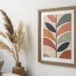
Loose Squiggles and Swirls Between Color Fields
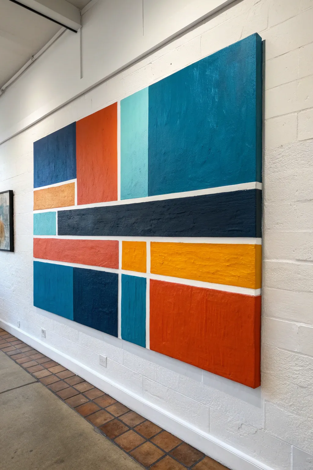
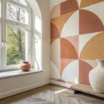
Recreate the modernist appeal of energetic color blocking with this structured yet vibrant painting project. This piece balances saturated rectangular fields of orange, teal, and blue against clean white negative space for a striking visual impact.
Step-by-Step Guide
Materials
- Large stretched canvas (e.g., 36”x48” or larger)
- Acrylic heavy body paints (Cadmium Orange, Cobalt Blue, Turquoise, Yellow Ochre, Navy Blue, White)
- Painter’s tape or masking tape (multiple widths: 1/4 inch and 1 inch)
- Large flat brushes (1-inch and 2-inch)
- Palette knife or old credit card
- Pencil and long ruler/straightedge
- Gesso (optional, for priming)
- Palette or paper plates
Step 1: Planning the Grid
-
Prime your surface:
If your canvas isn’t pre-primed, apply two coats of white gesso. Let it dry completely. A bright white base helps the colors pop. -
Sketch the layout:
Using a pencil and your long ruler, lightly draw your grid design directly onto the canvas. Focus on creating asymmetrical rectangles of various sizes. Don’t worry about perfection; you want a balanced, not identical, composition. -
Refer to the layout:
You can follow the pattern in the reference image—a large teal square top right, a tall orange rectangle to its left, and a long navy bar across the middle—or improvise your own layout. -
Apply the tape lines:
Place painter’s tape over your pencil lines to mask off the areas that will remain white. Use different tape widths to create visual interest; thicker lines separate major sections, while thinner lines can subdivide smaller blocks. -
Seal the tape edges:
To ensure sharp lines later, brush a thin layer of white paint or clear matte medium over the edges of the tape. This prevents the colored paint from bleeding underneath.
Bleeding Edges?
If paint seeps under the tape, wait for it to dry fully. Then, place a ruler alongside the blurred edge and run a white paint pen or fine brush along it to re-establish the crisp line.
Step 2: Color Application
-
Mix your palette:
Squeeze out generous amounts of your heavy body acrylics. You want the paint to be thick and opaque. -
Start with the largest blue block:
Fill the large top-right section with a mix of Teal and Cobalt Blue. Use a large flat brush, applying the paint with vertical strokes to create a subtle texture. -
Add the warm tones:
Move to the tall rectangle on the left. Paint this a vibrant Cadmium Orange. I like to mix a tiny touch of red into the orange for the bottom corner to add depth. -
Paint the dark anchors:
Fill the long horizontal bar across the middle with Navy Blue or a mix of Black and Blue. This dark section acts as a visual anchor for the lighter colors. -
Introduce contrasts:
Paint the bottom right rectangle in a deep, rusty orange. Paint the smaller adjacent block in a bright Yellow Ochre to create a warm focal point. -
Finish the smaller blocks:
Fill in the remaining smaller rectangles with lighter shades of turquoise, varying the blue tones so no two adjacent blue blocks look exactly the same.
Step 3: Texture and Finishing
-
Create surface interest:
While the paint is still tacky, use a palette knife or dry brush to gently scuff the surface of the larger blocks. This adds that hand-painted, slightly rustic texture seen in the reference. -
Apply a second coat:
If any canvas shows through, apply a second coat to your color blocks. High opacity is key for this style. -
Allow to dry:
Let the painting sit for at least an hour or until the paint is dry to the touch. -
The reveal:
Slowly and carefully peel off the painter’s tape at a 45-degree angle. This is the most satisfying part, revealing the crisp white grid lines underneath. -
Touch-ups:
If any paint bled through, use a small detail brush with white paint to clean up the edges.
Add Visible Texture
Mix a texture gel or modeling paste into your acrylics before painting. This creates physical ridges in the paint that catch the light and add dimension to the flat blocks.
Hang your new masterpiece in a well-lit space where the bold colors can truly shine
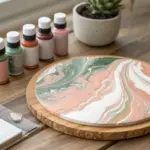
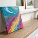
Easy Puddle Pour Abstract
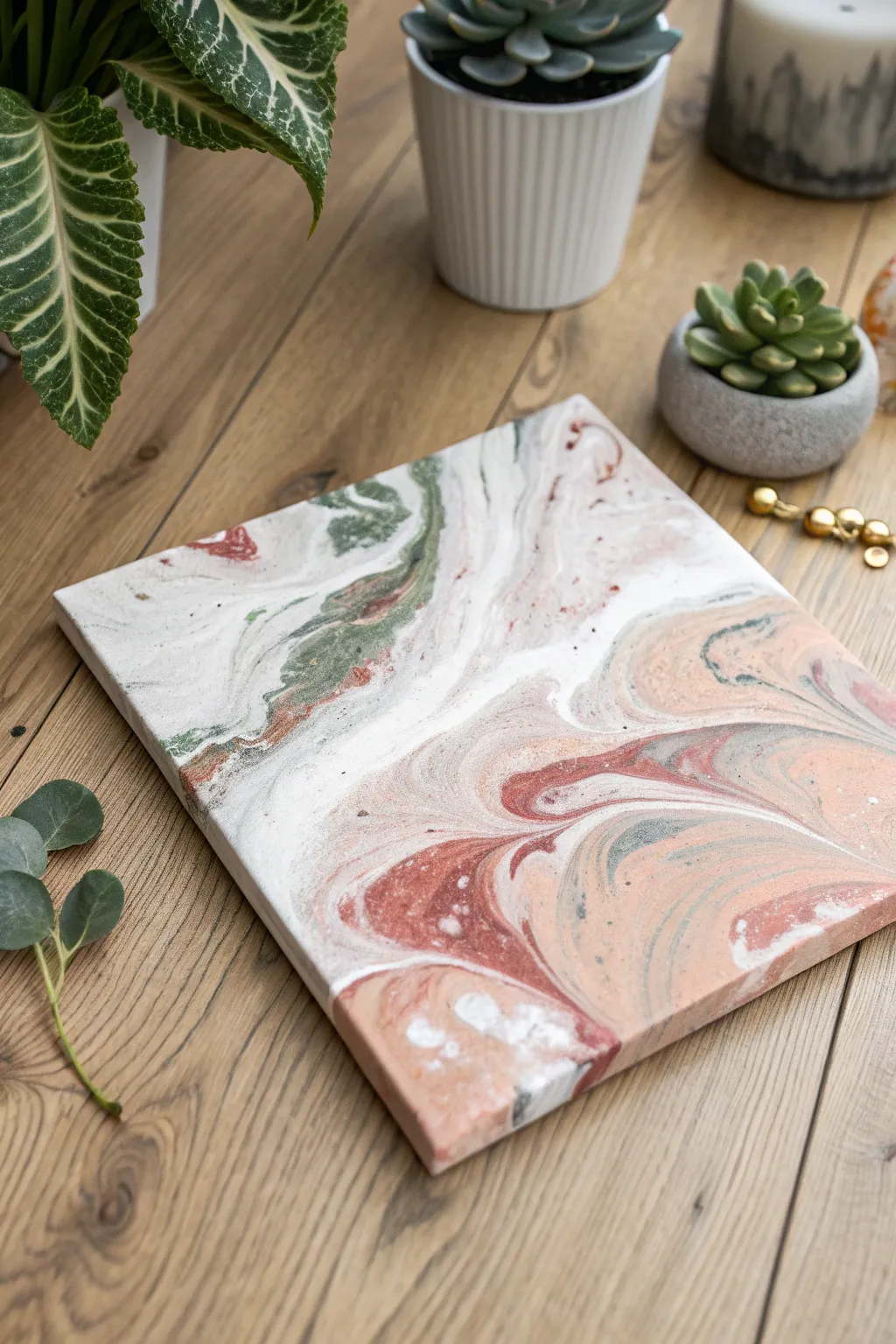
Achieve a sophisticated faux-marble look with this serene puddle pour, featuring soft waves of terracotta, sage green, and plenty of negative space. The technique creates organic cells and flowing lines that mimic polished stone without needing any artistic training.
Detailed Instructions
Materials
- Small square canvas (e.g., 8×8 or 10×10 inches)
- White acrylic paint (heavy body or craft)
- Sage green acrylic paint
- Terracotta or salmon pink acrylic paint
- Dark grey or charcoal acrylic paint
- Pouring medium (like Liquitex or Floetrol)
- 4 small plastic cups for mixing
- Wooden stir sticks
- Water (for thinning if needed)
- Cardboard box or tray (to catch drips)
- Gloves and table covering
Step 1: Preparation & Mixing
-
Set up your workspace:
Cover your table with plastic sheeting or a garbage bag. Place your canvas inside a cardboard box or on top of four upside-down cups to elevate it, allowing the paint to drip freely off the edges. -
Mix the base white:
In your first cup, mix white acrylic paint with your pouring medium at a 1:1 ratio. Stir slowly to avoid creating bubbles. This will be your most used color, so mix a larger amount than the others. -
Prepare the colors:
Repeat the 1:1 mixing ratio for the sage green, terracotta, and dark grey paints in separate cups. The consistency should resemble warm honey or heavy cream—flowing smoothly but not watery. -
Check consistency:
Lift your stir stick; the paint should drizzle off in a continuous stream without breaking. If it’s too thick, add a few drops of water at a time until you reach the right fluidity.
Muddy Colors?
If your colors are turning grey or brown instead of distinct swirls, you are likely over-tilting or mixed the paint too thin. Keep the paint thick like honey and stop tilting once the canvas is covered.
Step 2: The Puddle Pour Technique
-
Create the first puddles:
Pour a generous amount of the white mixture onto various spots on the canvas, focusing near the center and one or two corners. Don’t worry about covering everything yet. -
Add color accents:
Pour small puddles of sage green and terracotta directly into the center of your white puddles. The colors will naturally start to push against each other. -
Introduce contrast:
Drizzle a very small amount of dark grey into the colored puddles. Use this color sparingly, as it can quickly overpower the softer pastel tones if you use too much. -
Layer the puddles:
Go back and pour more white into the center of your colored puddles. This ‘sandwiching’ technique helps create the ghostly, marble-like veining where colors peek through the white. -
Connect the pools:
Continue pouring small amounts of alternating colors until most of the canvas surface has paint on it. It’s okay if there are some bare spots; tilting will fix that.
Gilded Edges
Once the painting is 100% dry, use a gold leaf pen or metallic gold paint to paint the outer edges of the canvas. This frames the soft marble pattern beautifully and adds a touch of luxury.
Step 3: Tilting & Drying
-
Begin the tilt:
Gently lift the canvas and slowly tilt it to one side. Watch how the puddles stretch and marble together. I like to move very slowly here to maintain the distinct bands of color. -
Cover the corners:
Tilt the canvas toward each corner until the paint flows over the edge. If a corner is stubborn, you can use your finger to tap a little paint onto the edge to help pull the flow over. -
Refine the composition:
Bring the paint back toward the center to re-balance the design. If you’ve lost too much color, you can carefully add a fresh puddle line and tilt again. -
Check sides and edges:
Run your finger along the underside of the canvas frame to remove drips. Ensure the sides of the canvas are fully covered with paint for a professional gallery-wrapped look. -
Let it cure:
Leave the canvas to dry on a level surface for at least 24 to 48 hours. Avoid moving it during this time, as the paint will shift slightly as it settles.
Display your new stone-finish artwork flat on a shelf or hang it as part of a calming gallery wall


Squeegee-Style Swipe Technique With Layered Paint
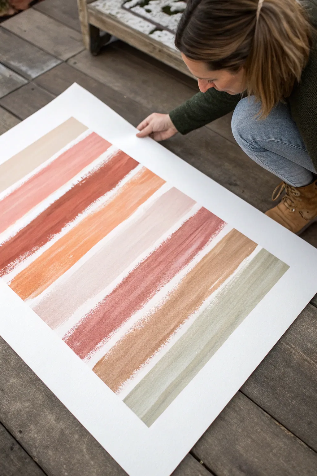
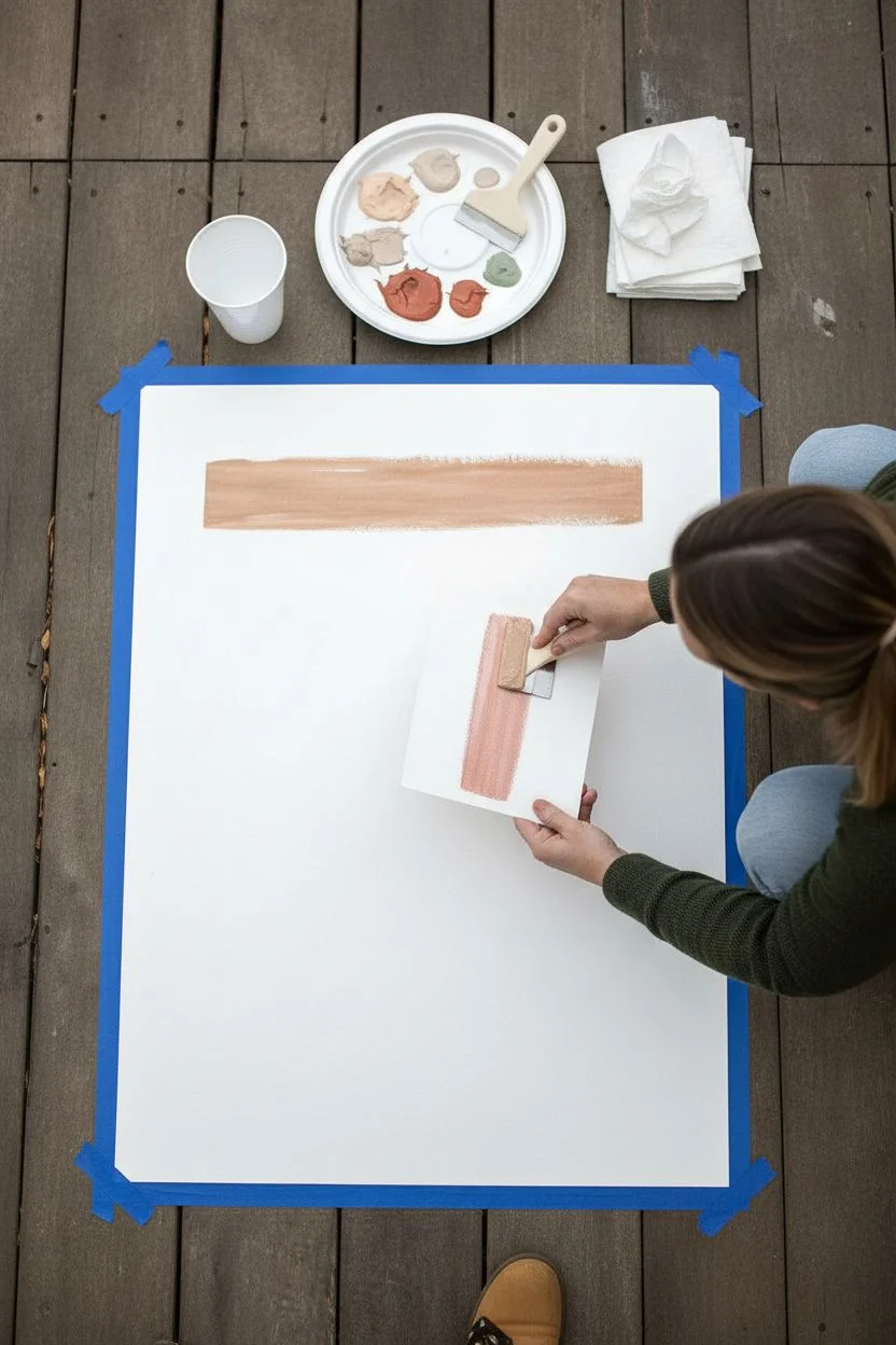
Achieve a modern, high-end look with this incredibly simple technique that focuses on the satisfying motion of dragging paint. The result is a series of muted, organic bands of color with beautiful distressed edges that reveal the paper’s texture.
How-To Guide
Materials
- Large heavy-weight watercolor paper or mixed media paper (approx. 18×24 inches or larger)
- Acrylic paints in earthy tones (terracotta, beige, burnt sienna, sage green, cream)
- Wide flat scraper, squeegee, or a piece of stiff cardboard
- Painter’s tape (optional)
- Palette paper or disposable plate
- Water cup
- Paper towels
Step 1: Preparation & Pallete
-
Secure the paper:
Lay your large watercolor paper flat on a clean, hard surface. Even a wooden deck works if you put a board underneath, but a table is best. You can tape down the corners if the paper tends to curl. -
Pre-mix colors:
Squeeze out your acrylics onto a palette. Aim for a harmonious, earthy color storyline. -
Adjust consistency:
If I’m using heavy body acrylics, I like to mix in a tiny drop of water or glazing medium. You want the paint to flow, but not be runny. -
Test your tool:
Before hitting the main paper, practice dragging your chosen scraper or squeegee on a scrap piece to get a feel for the pressure.
Pro Tip: The Edges
Don’t aim for perfect rectangles. The beauty is in the rough start and stop points. If the paint naturally runs out before the edge, leave it.
Step 2: Creating the Swipes
-
Load the paint:
Apply a generous bead or line of your first color (a light beige) directly onto the paper near the top edge. Alternatively, load the edge of your scraper with paint. -
First pull:
Place your scraping tool above the paint bead. Apply firm, consistent pressure and drag the tool horizontally across the paper from left to right. -
End the stroke:
As you reach the end of the swipe, lift the tool gently. Don’t worry if the edges are ragged; that texture is the goal. -
Space it out:
Leave a gap of about 1-2 inches of white space before starting the next row. This negative space is crucial for the modern aesthetic. -
Second color application:
Choose a darker tone, like a muted pink or terracotta. Apply the bead of paint below the first gap. -
Execute the second swipe:
Drag the tool across again. Try to keep your hand parallel to the paper to avoid curving the line. -
Clean in between:
Wipe your scraper completely clean with a paper towel between every color change so the hues remain distinct.
Step 3: Layering & Texture
-
Vary the pressure:
For the next stripe (rust orange), try slightly lightening your pressure halfway through the stroke to create ‘skips’ where the paper shows through. -
Mix colors on the paper:
For a variegated look, put two colors (like cream and light orange) side-by-side on the bead and swipe them together. -
Continue downward:
Repeat the process with the remaining colors, moving down the paper. A sage green at the bottom anchors the warm tones nicely. -
Dry the initial layer:
Let these primary swipes dry for about 10-15 minutes. Acrylics dry fast, especially in thin layers. -
Add depth (optional):
If a stripe looks too solid, you can dry-brush a lighter highlight over it using a clean scraper with very little paint. -
Final inspection:
Step back and look at the composition. If there are large unintended gaps, you can add a very thin line, but usually, simplicity is best. -
Let it cure:
Allow the entire piece to dry flat for at least an hour before framing or hanging to prevent warping.
Level Up: Metallic Pop
Mix a small amount of gold leaf paint or metallic copper acrylic into just one of the stripes for a subtle shimmer that catches the light.
Once dry, simple wooden hangers or a floating frame will perfectly complement the raw, textured look of your new art piece
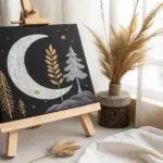
Minimal Black and White Abstract Shapes
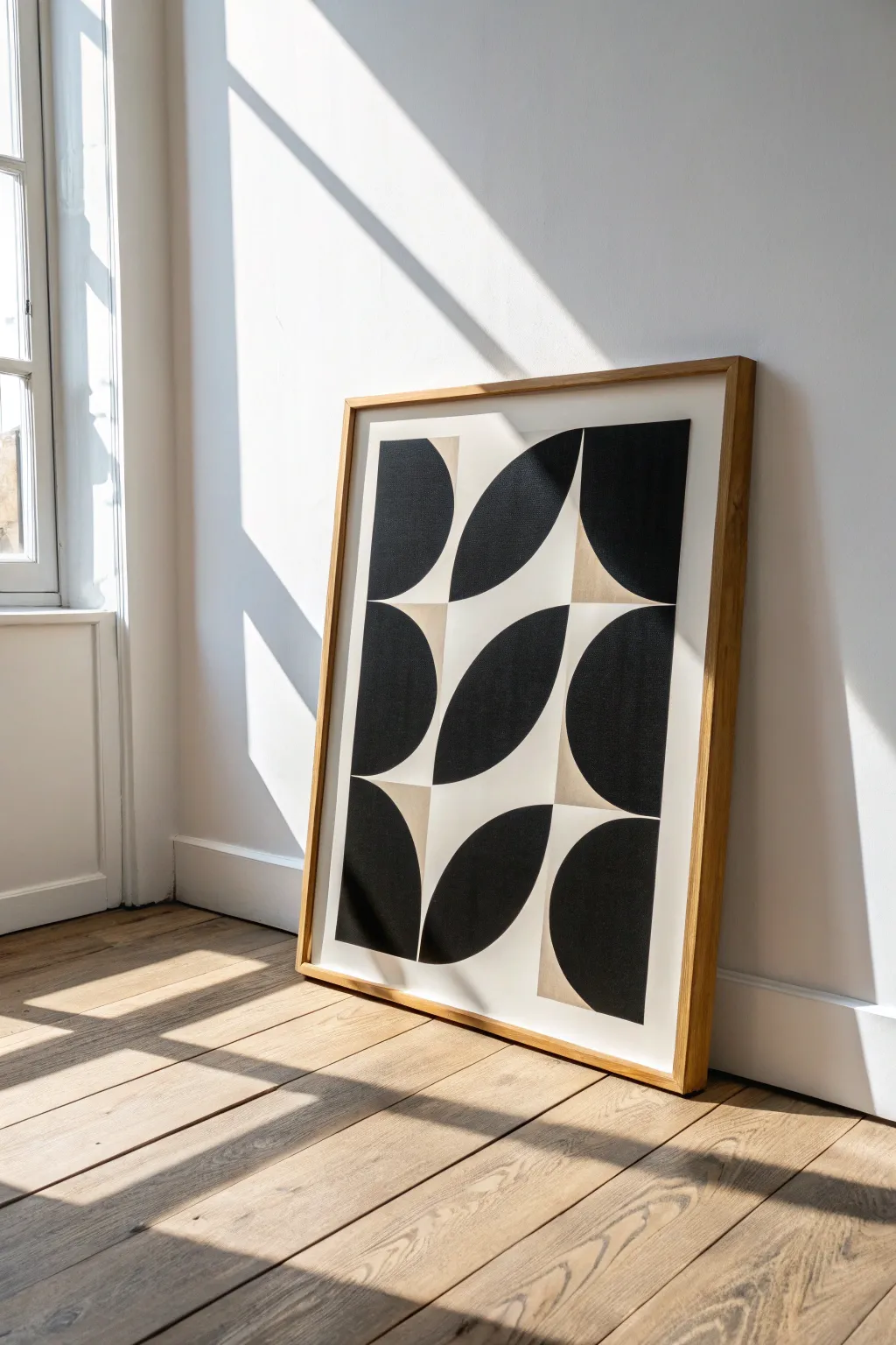
This striking piece relies on the bold contrast between deep black paint and the subtle texture of raw canvas or linen paper. By repeating simple curved geometric forms, you can create a sophisticated rhythm that feels both retro and endlessly modern.
Detailed Instructions
Materials
- Large sheet of heavyweight paper or raw canvas (approx. 24×36 inches)
- Black acrylic paint (matte finish preferably)
- Beige or cream acrylic paint (optional, for background)
- Flat artist brush (1-inch width)
- Angled shader brush (medium size)
- Painter’s tape or masking tape
- Pencil
- Large compass or a round object to trace (approx. 8-10 inches diameter)
- Ruler or T-square
- Eraser
- Wooden dowel or large frame for mounting
Step 1: Planning the Grid
-
Prepare the surface:
Lay your paper or canvas flat on a clean workspace. If you are using raw canvas, you might want to prime it first with clear gesso to keep the paint from soaking in too much, though leaving it raw adds lovely texture. -
Measure the margins:
Use your ruler to mark a uniform border around the edge of the paper, about 2 inches thick. This white space frames the composition beautifully. -
Create a grid system:
Divide the inner rectangle into a grid. For the design shown, you need a grid that is 3 columns wide and 3 rows high. Lightly draw these grid lines with a pencil. -
Find the centers:
Mark the exact center point of each rectangle within your grid. These midpoints are crucial for aligning your arched shapes correctly.
Step 2: Drafting the Shapes
-
Sketch the first curves:
Using a compass or a circular template, draw quarter-circle arcs. Start in the top-left box, drawing a curve from the top-right corner down to the bottom-left corner of that specific grid box. -
Create the opposing curves:
In the adjacent column, you will often mirror the shape. For example, in the center column, draw ‘leaf’ shapes that consist of two intersecting arcs spanning from corner to corner. -
Complete the pattern:
Follow the reference image to sketch the rest. Notice how the ‘leaf’ shapes in the middle column tilt upward to the right, while the side columns feature half-circle or quarter-circle blocks. Take your time to get the geometry right. -
Refine lines:
Go over your pencil lines to ensure they are clean. I find it helpful to erase any conflicting grid lines now so they don’t confuse me while painting.
Clean Curve Pro-Tip
Make a custom stencil from cardstock for the curves. It ensures every arc is identical without having to re-measure with a compass for every single grid block.
Step 3: Painting the Design
-
Tape the edges:
Apply painter’s tape along the straight vertical and horizontal edges of your shapes. This ensures crisp, sharp lines where the black meets the background. -
Cut in the curves:
For the curved edges where tape is difficult to use, use the angled shader brush. Load it with black paint and carefully trace the pencil line, moving your whole arm rather than just your wrist for a smoother curve. -
Fill the solids:
Switch to your larger 1-inch flat brush. Fill in the large black areas with smooth, even strokes. If you want a textured look, brush in slightly different directions. -
Consider opacity:
Acrylic paint can sometimes streak. If the first coat looks uneven, let it dry completely (about 20 minutes) and apply a second coat for that deep, velvet black finish. -
Add contrast (optional):
If your paper is bright white but you want the warmer look seen in the photo, paint the negative spaces (the background shapes) with a diluted beige or cream wash. -
Remove tape:
Peel off the painter’s tape slowly while the paint is still slightly tacky to prevent chipping. Pull the tape away from the painted area at a 45-degree angle.
Level Up: Texture
Mix baking soda or a texture medium into your black acrylic paint. This creates a grainy, stone-like relief that adds tactile depth to the flat geometric shapes.
Step 4: Finishing Touches
-
Touch up edges:
Inspect your curved lines. If any are wobbly, use a very small detail brush with black paint to smooth them out, or use a bit of white paint (or your background color) to correcting mistakes. -
Erase markings:
Once the paint is 100% dry, gently erase any visible pencil grid lines that remain in the unpainted borders. -
Seal the work:
To protect that deep black from scuffs, apply a layer of clear matte varnish over the entire piece using a wide, soft brush. -
Frame it up:
Place the artwork into a light oak or natural wood frame. The warm wood tone complements the stark graphic nature of the black and white design perfectly.
Hang your new minimalist masterpiece in a spot with plenty of natural light to let the contrast really sing
Neutral Base With Metallic Accents
This abstract piece combines soft, earthly neutrals with striking bands of metallic gold texture, creating a look that feels both geological and luxuriously modern. The interplay of dusty pinks, creams, and heavy gold leaf creates a sophisticated strata effect perfect for calm interiors.
Step-by-Step Guide
Materials
- Stretched canvas (square format, e.g., 16×16 inches)
- Modeling paste or thick texture medium
- Palette knives (assorted sizes)
- Acrylic paints: Dusty Rose, Beige/Sand, Titanium White, Raw Sienna
- Gold leaf sheets
- Gold leaf adhesive (size)
- Soft gilding brush or fluffy makeup brush
- Clear varnish or sealant spray
Step 1: Building the Foundation
-
Prepare the canvas:
Start with a clean, dry canvas. If you want a smoother base, apply a coat of white gesso and let it dry, though the raw texture of the canvas works well for this rustic style too. -
Create texture patches:
Using a palette knife, scoop up some modeling paste. Apply it randomly to the top left corner and bottom third of the canvas. -
Roughen the surface:
Don’t smooth the paste out perfectly. Use the edge of the knife to scrape, lift, and create ridges. This chaotic texture will catch the paint and gold later. -
Dry completely:
Let the modeling paste dry fully. This can take several hours or overnight depending on thickness. It must be rock hard before painting.
Sticky Situation
If the gold leaf isn’t sticking, the adhesive likely dried too much or wasn’t tacky enough yet. Reapply a thin layer of size and test with a knuckle—it should snap when pulled away.
Step 2: Layering the Colors
-
Mix the top color:
Combine Dusty Rose with a tiny touch of Raw Sienna to create a warm, earthy pink. Using a wide palette knife or flat brush, apply this to the top third of the canvas, working over the textured areas. -
Add depth to the top:
While the pink is wet, streak in a bit of pure Beige or light brown to create a weathered look. -
Establish the horizon:
Mix a substantial amount of Titanium White with a drop of Beige. Apply this cream mixture across the center of the canvas using long, horizontal strokes to mimic a horizon line. -
Blend the transition:
Where the pink meets the cream, use a dry brush to softly feather the edges so there isn’t a harsh line, but rather a misty transition. -
Paint the bottom section:
For the bottom third, mix a darker version of the top color by adding more Raw Sienna or a touch of brown to your pink mixture. Apply this solidly at the bottom. -
Add striations:
Load a small palette knife with white paint. Drag it horizontally through the middle cream section to create distinct, sharp streaks that mimic geological layers. -
Introduce warmth:
Add a few thin streaks of diluted Raw Sienna or orange-tinted beige into the middle white section for contrast.
Step 3: Applying the Gold
-
Plan the gold placement:
Identify two main horizontal bands for the gold: one separating the top pink from the middle white, and a thicker band separating the middle white from the bottom pink. -
Apply adhesive:
Brush the gold leaf adhesive (size) onto these specific areas. I like to dab it on somewhat irregularly to keep the organic feel. -
Wait for tackiness:
Wait about 15-20 minutes (check your bottle’s specific instructions) until the glue turns from milky to clear and feels sticky to the touch. -
apply the leaf:
Gently lay the gold leaf sheets over the sticky areas. Don’t worry if they wrinkle or tear; imperfection is the goal here. -
Burnish down:
Use a soft, dry brush to gently pat the gold leaf down into the texture of the canvas and paint. -
Remove excess:
Once adhered, brush vigorously back and forth to flake off the non-glued gold bits. Save these flakes for future projects. -
Seal the work:
Finish by spraying a clear varnish over the entire piece to prevent the gold from tarnishing and to protect the paint.
Metallic Mix-Up
For a cooler tone, swap the gold leaf for silver or copper foiling. Copper looks particularly stunning against the dusty rose background.
Hang your new textured masterpiece in a spot where natural light can catch the metallic details throughout the day
Masked Abstract Triangles in a Patchwork Layout
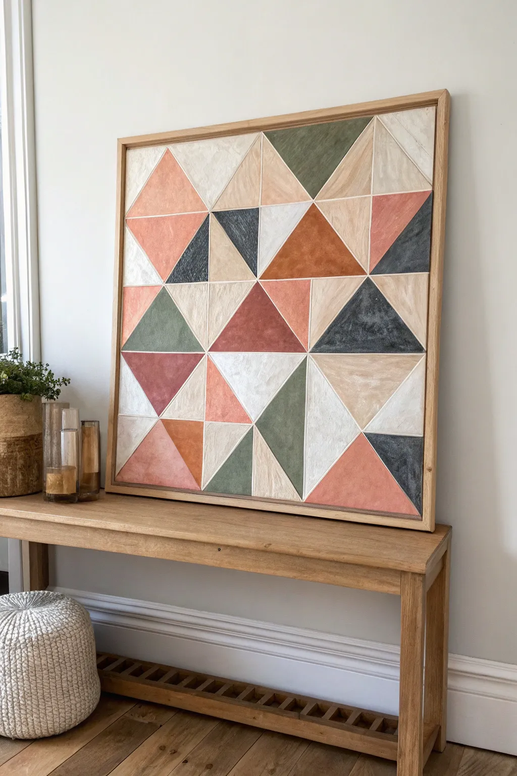
Bring warmth and modern structure to your space with this geometric patchwork painting. Featuring a soothing palette of terracotta, sage, slate, and charcoal, this project uses simple masking techniques to create clean lines and distinctive textured triangles.
Step-by-Step Guide
Materials
- Large square wooden panel or sturdy canvas (approx. 24×24 inches or larger)
- Natural wood floating frame
- Acrylic paints (terracotta, sage green, dark slate blue/charcoal, off-white, beige/tan)
- White paint pen or thin liner brush (for grid lines)
- Painter’s tape (various widths, sharp lines)
- Pencil and long straightedge ruler
- Flat shader brushes (medium size)
- Matte sealant or varnish
- Water cup and palette
- Fine-grit sandpaper (optional)
- Rags or paper towels
Step 1: Planning the Grid
-
Prepare the surface:
Ensure your wooden panel or canvas is clean and smooth. If working on raw wood, give it a quick sanding with fine-grit paper to remove any splinters, then wipe away the dust with a damp cloth. -
Establish the background:
Paint the entire surface with a base coat of off-white or cream acrylic paint. This ensures that the dividing lines between your triangles will be bright and consistent later on. Let this dry completely. -
Measure the grid:
Using your long ruler and a pencil, lightly mark a grid on the panel. For the layout shown, divide the width and height into four equal sections to create a 4×4 grid of squares. -
Create the triangles:
Draw diagonal lines through your squares to form triangles. Vary the direction of the diagonal lines—some going top-left to bottom-right, others the opposite way—to create the randomized, quilt-like patchwork effect seen in the example.
Step 2: Painting the Patchwork
-
Mix your palette:
Prepare your acrylic colors. Aim for an earthy, muted palette: mix a little brown or grey into your oranges to get terracotta, and white into greens for a soft sage. Keep the colors slightly watered down if you want a wash effect, or use them thick for opacity. -
Tape the first batch:
Apply painter’s tape along the pencil lines of non-adjacent triangles. You cannot paint touching shapes at the same time, or the wet paint will bleed. Press the tape edges down firmly to prevent seepage. -
Apply the first colors:
Select your darker hues like slate blue and deep terracotta for about a third of the exposed triangles. Paint with uneven, cross-hatching strokes to cultivate a textured, hand-painted look rather than a perfectly flat fill. -
Add lighter tones:
Fill the remaining taped-off sections with your lighter beige, sage, and off-white tones. I find it helpful to squint at the piece occasionally to ensure the distribution of dark and light values feels balanced. -
Peel and dry:
Carefully peel back the painter’s tape while the paint is still tacky to keep the edges crisp. Allow these painted sections to dry completely before moving on. -
Tape the second batch:
Once the first set is dry, tape off a new set of triangles. Place the tape over the already dried painted areas to protect them and define the edges of the new shapes. -
Complete the pattern:
Continue painting the remaining triangles, rotating through your color palette. Leave a few triangles white or very light beige to create ‘breathing room’ in the composition. -
Refine the texture:
If some colors look too flat, dry-brush a slightly lighter shade over them to add dimension. For example, add a whisper of cream over the beige triangles to mimic the look of fabric or stone.
Seal Tape Edges
Before applying color, paint a thin layer of your base white over the tape edge. This seals the gap, preventing colored paint from bleeding under deeply.
Step 3: Finishing Touches
-
Define the grid lines:
The base coat allows for natural white lines, but if paint bled or lines look messy, use a white paint pen or a thin liner brush with white paint to re-trace the grid lines between the triangles for a sharp finish. -
Seal the artwork:
Apply a coat of clear matte varnish or sealant over the entire painting. This unifies the sheen of the different paint colors and protects the surface from dust and light. -
Frame the piece:
Place the finished panel into a natural wood floating frame. The light wood tone complements the earthy palette perfectly and gives the piece a professional, gallery-style appearance.
Add Fabric Texture
Mix a small amount of modeling paste or drywall compound into your acrylics. Apply with a palette knife for a raised, tactile surface like real stone.
Hang your new geometric masterpiece in an entryway or over a console table to enjoy its calming, structured beauty every day.
Overlapping Transparent Layers for Easy Depth
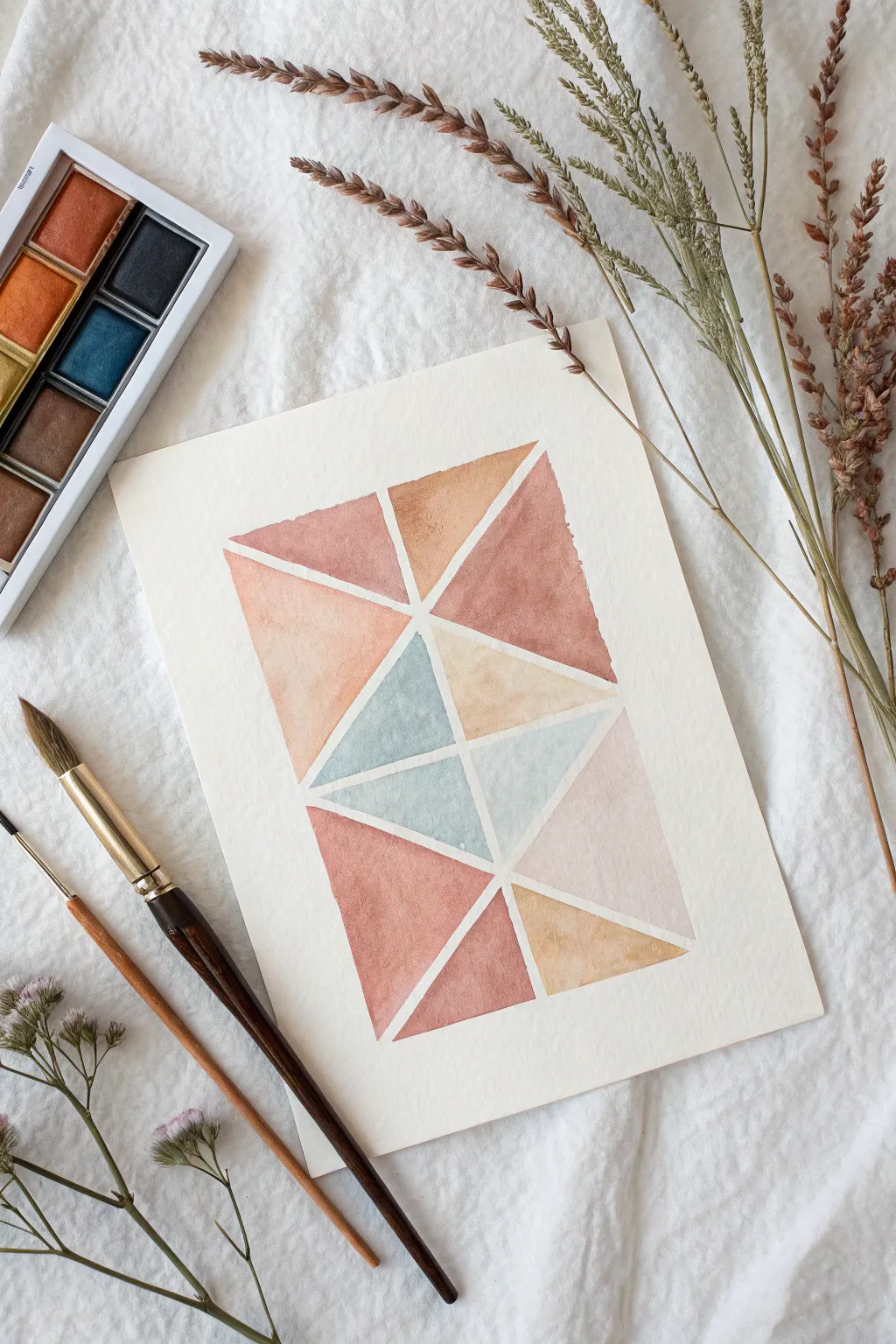
Create a soothing and sophisticated piece of abstract art using simple geometric forms and a calming, earthy color palette. This project focuses on the interplay of warm terracottas and cool slate blues, separated by crisp negative space to create a modern, stained-glass effect.
Step-by-Step
Materials
- Cold press watercolor paper (300 gsm)
- Watercolor paints (terracotta, ochre, slate blue/grey, blush pink)
- Pencil (HB or H)
- Ruler or straight edge
- Medium round watercolor brush (size 6-8)
- Small detail brush (size 2-4)
- Painters tape or masking tape (optional for borders)
- Two jars of water
- Paper towels
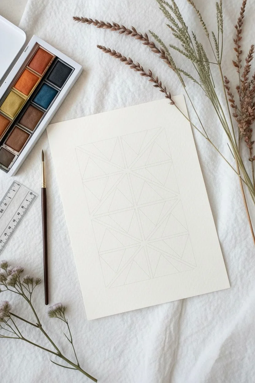
Step 1: Planning and Sketching
-
Prepare your workspace:
Begin by securing your watercolor paper to a flat surface. If you want a clean border around the entire artwork like in the photo, you can leave it free-floating or just lightly mark the outer rectangle boundaries. -
Draw the main rectangle:
Using your ruler and a pencil, draw a large, vertical rectangle centered on your paper. Press very lightly so the graphite doesn’t show through the transparent watercolor later. -
Create the grid structure:
Divide the large rectangle into smaller sections. Start by drawing a few diagonal lines that crisscross the rectangle. Don’t worry about perfect symmetry; asymmetrical lines add visual interest. -
Refine the triangles:
Continue adding diagonal lines until the rectangle is entirely broken up into varied triangle shapes. Aim for about 12-15 distinct triangular sections. -
Define the negative space:
This is crucial: Go back over your lines and visualize a tiny gap between each triangle. You won’t draw this gap, but you will need to paint *up to* it, leaving a sliver of white paper between every shape.
Use masking fluid
Can’t keep a steady hand for the white lines? Apply thin lines of liquid masking fluid over your pencil sketch before painting. Peel it off at the end for perfect, crisp white channels.
Step 2: Mixing the Palette
-
Mix a rusty terracotta:
Combine a red earth tone with a touch of brown or burnt sienna to get a rich, warm rust color. Test it on a scrap piece of paper to ensure it isn’t too bright. -
Create a slate blue:
Mix a blue tone (like Payne’s Gray or Indigo) with a tiny connection of green or burnt umber to desaturate it. You want a cool, moody blue rather than a bright primary blue. -
Prepare the ochre and blush:
Dilute a yellow ochre for a sandy beige tone. For the blush, water down a red or pink significantly so it becomes a whisper-soft pastel.
Uneven drying?
If you get ‘cauliflowers’ or hard water lines inside your shapes, try to work faster so the edge stays wet until you finish the shape. Avoid adding water to paint that is half-dry.
Step 3: Painting the Composition
-
Start with the focal points:
Identify where you want your darkest colors. Using your medium brush, paint a few non-adjacent triangles with the rusty terracotta mix. -
Mind the gap:
As you paint, carefully stop your brush stroke about 1-2 millimeters away from your pencil lines. This creates the crisp white lattice structure that defines the style. -
Add the cool tones:
Switch to your slate blue mixture. Paint the central triangles where the points meet, as seen in the center of the reference image. This anchors the composition and provides contrast to the warm outer edges. -
Wait for sections to dry:
I prefer to jump around the canvas, painting shapes that aren’t touching each other. This prevents wet paint from accidentally bridging the white gap and bleeding into a neighboring color. -
Fill with lighter tones:
Once the darker triangles are drying, pick up your diluted ochre and blush pink. Fill in the remaining triangles. -
Create variation within shapes:
For a more organic look, drop a tiny bit of clean water or a slightly more saturated pigment into a wet triangle. This creates the beautiful ‘bloom’ texture characteristic of watercolor. -
Refine edges:
Use your small detail brush to neaten up any wobbly edges. Keep those white channels consistent in width as much as possible. -
Check for balance:
Step back and look at the whole piece. If the composition feels too heavy on one side, you can glaze a second layer of color over a light triangle to deepen it. -
Erase pencil guides:
Once the painting is 100% bone dry (give it at least an hour), gently erase the original pencil lines visible in the white gaps. Be careful not to smudge the paint.
Now you have a serene, modern geometric artwork ready to frame or gift to a friend
Collaged Paper + Paint Abstract Mixed Media
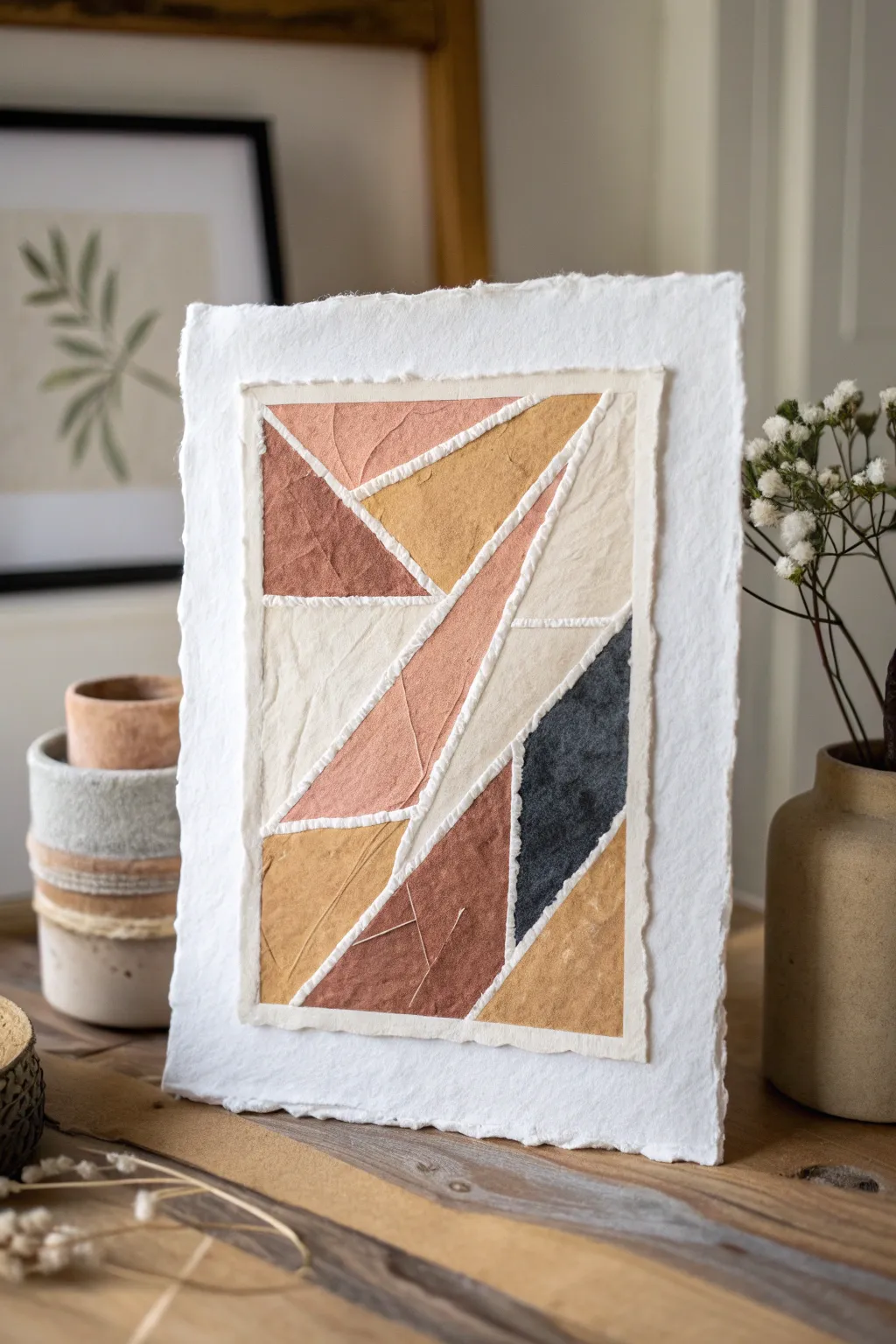
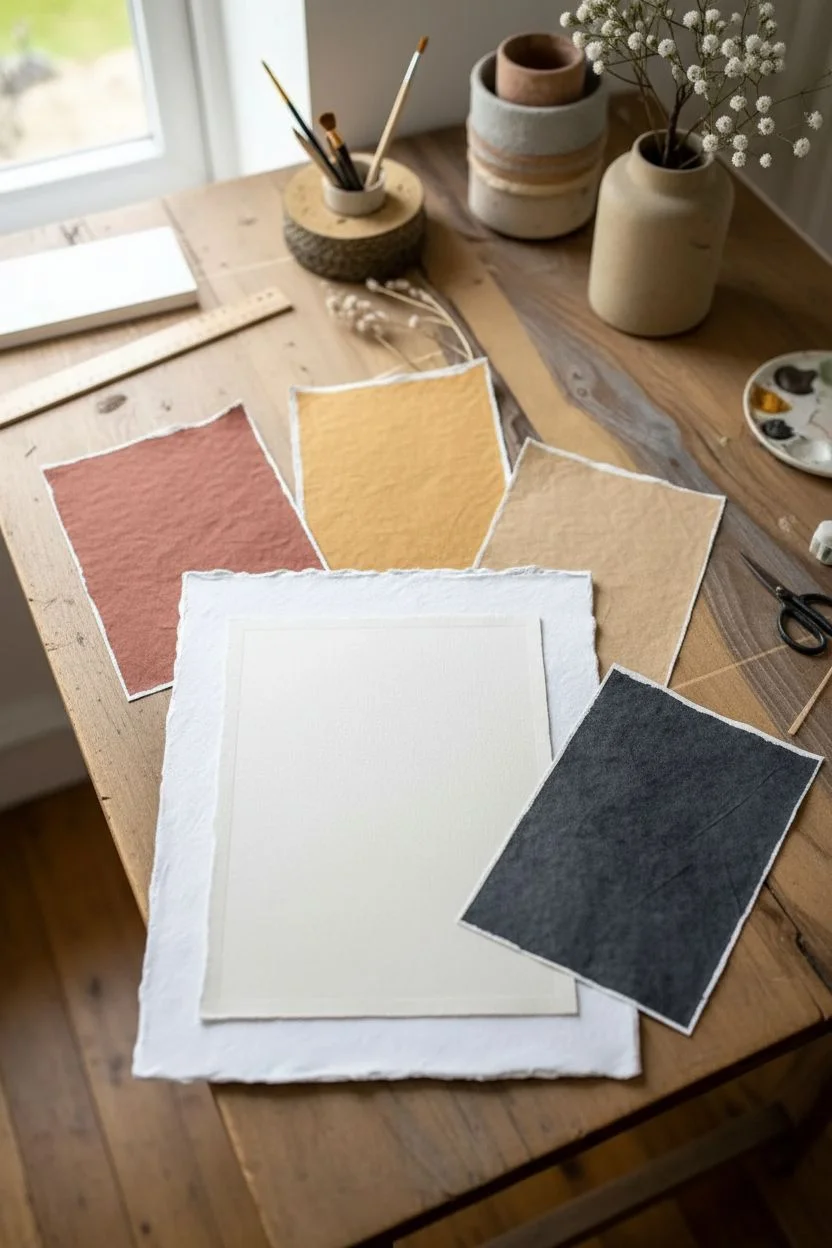
Embrace the imperfect beauty of torn edges and organic textures with this modern, earth-toned collage. By layering hand-painted papers on a deckle-edged base, you’ll create a sophisticated piece that feels both structured and delightfully soft.
Step-by-Step Guide
Materials
- Heavyweight cold-press watercolor paper (for base)
- Thinner drawing paper or tissue paper (to paint and cut)
- Acrylic paints (terracotta, mustard yellow, charcoal gray, beige, white)
- Matte gel medium or decoupage glue
- Flat paintbrushes (medium and fine)
- Ruler
- Pencil
- Scissors or craft knife
- Deckle edge ruler (optional, or tear by hand)
Step 1: Preparing the Palette
-
Paint your paper sheets:
Start by taking several sheets of your thinner drawing paper. Paint each sheet a solid color using your acrylics: one deep terracotta, one mustard yellow, one warm beige, and one charcoal gray. Don’t worry about perfect smoothness; brushstrokes add texture. -
Add subtle texture:
While the paint is still wet on your colored sheets, gently crumple the paper or blot it with a dry brush to create a weathered, stone-like appearance. Let these dry completely before handling. -
Prepare the base:
Take your heavyweight watercolor paper and tear the edges carefully to create a soft, deckled border. This will act as the frame for your collage. -
Create the inner mount:
Cut or tear a slightly smaller rectangle of plain, creamy white paper. This will serve as the immediate background where you’ll glue your geometric shapes.
Texturizing Tip
Mix a pinch of baking soda into your acrylic paints before applying them to the paper. It adds a gritty, gritty texture that mimics stone or ceramic.
Step 2: Constructing the Composition
-
Sketch the layout:
Lightly sketch a large rectangle on your inner mount paper. Inside this rectangle, use a ruler to draw intersecting diagonal lines, breaking the space into various triangles and quadrilaterals. -
Number your sections:
To keep track of your design, lightly number the sections on your sketch, and decide which color will go where to ensure a balanced distribution of tones. -
Trace shapes onto painted paper:
Using your sketch as a guide, measure or trace the corresponding shapes onto your dried, painted papers. You can use tracing paper if the geometry is complex. -
Cut the shapes:
Carefully cut out your painted geometric shapes. For a cleaner look, use a craft knife and ruler; for a softer look, scissors work fine. -
Dry fit the puzzle:
Before gluing anything, arrange all your cut shapes onto the inner mount paper. Leave a small, uniform gap between each shape—this negative space is crucial for the ‘grouted’ look. -
Adjust the fit:
Trim any edges that are touching or overlapping. The goal is to have channels of the background paper visible between every single colored shape.
Step 3: Assembly & Detailing
-
Glue the shapes:
Apply a thin, even layer of matte gel medium to the back of each shape. Press them firmly into place on the inner mount, working from one corner to the opposite side. -
Press flat:
Once all shapes are glued, place a piece of wax paper over the artwork and weigh it down with a heavy book for about 30 minutes to ensure everything dries perfectly flat. -
Define the white lines:
Mix a small amount of white acrylic paint with a tiny bit of texture paste or just use it thick directly from the tube. -
Paint the ‘grout’:
Using a very fine brush, paint over the gaps between your shapes with the thick white paint. Intentionally make these lines slightly raised and uneven to mimic stitching or ceramic grout. -
Final assembly:
Center your finished geometric collage onto the large deckle-edged watercolor paper base you prepared earlier. -
Secure the layers:
Glue the collage down, leaving a wide, white border of the textured base paper visible on all sides to frame the piece elegantly.
Warped Paper?
If your painted papers curl up while drying, simply iron them flat on a low heat setting. Place a clean cloth or parchment paper between the iron and the art.
Place your finished collage in a floating frame to show off those beautiful rough edges
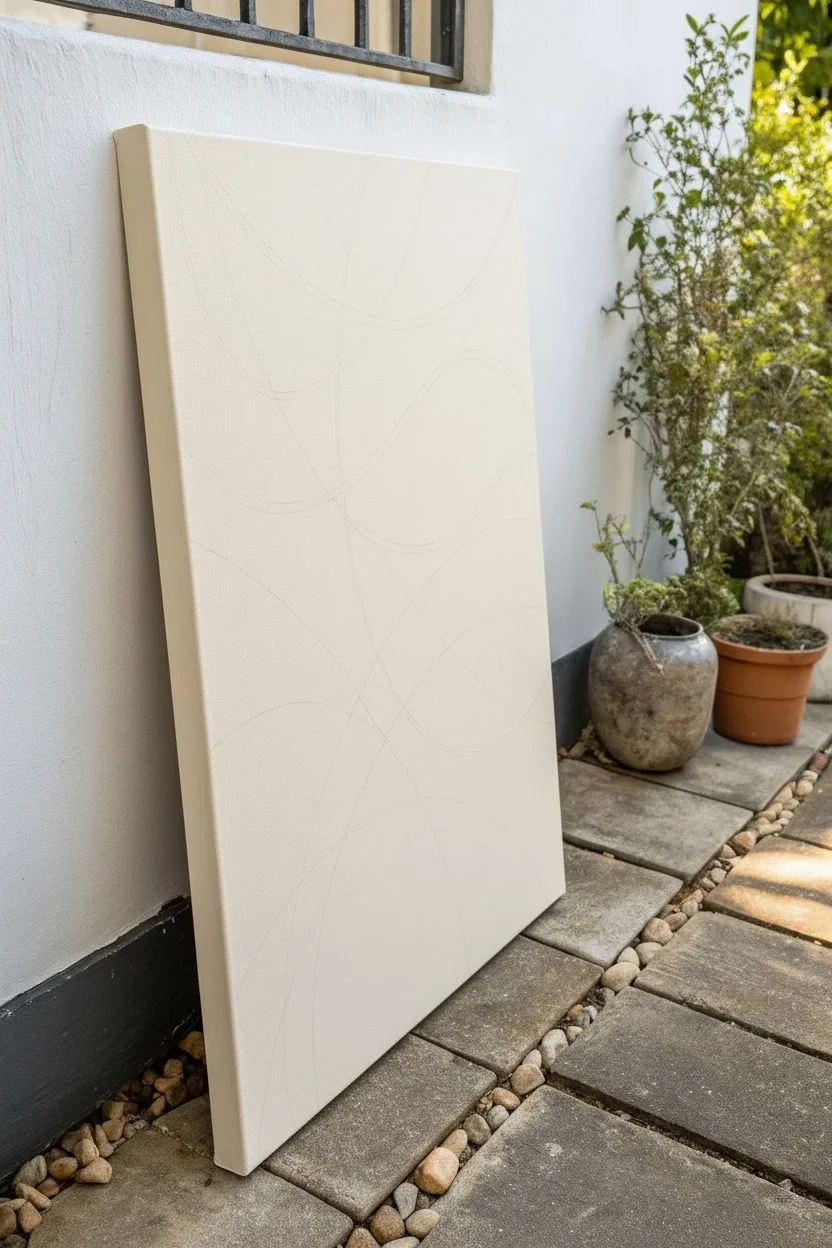
String-Pull Abstract Lines Across a Color Field
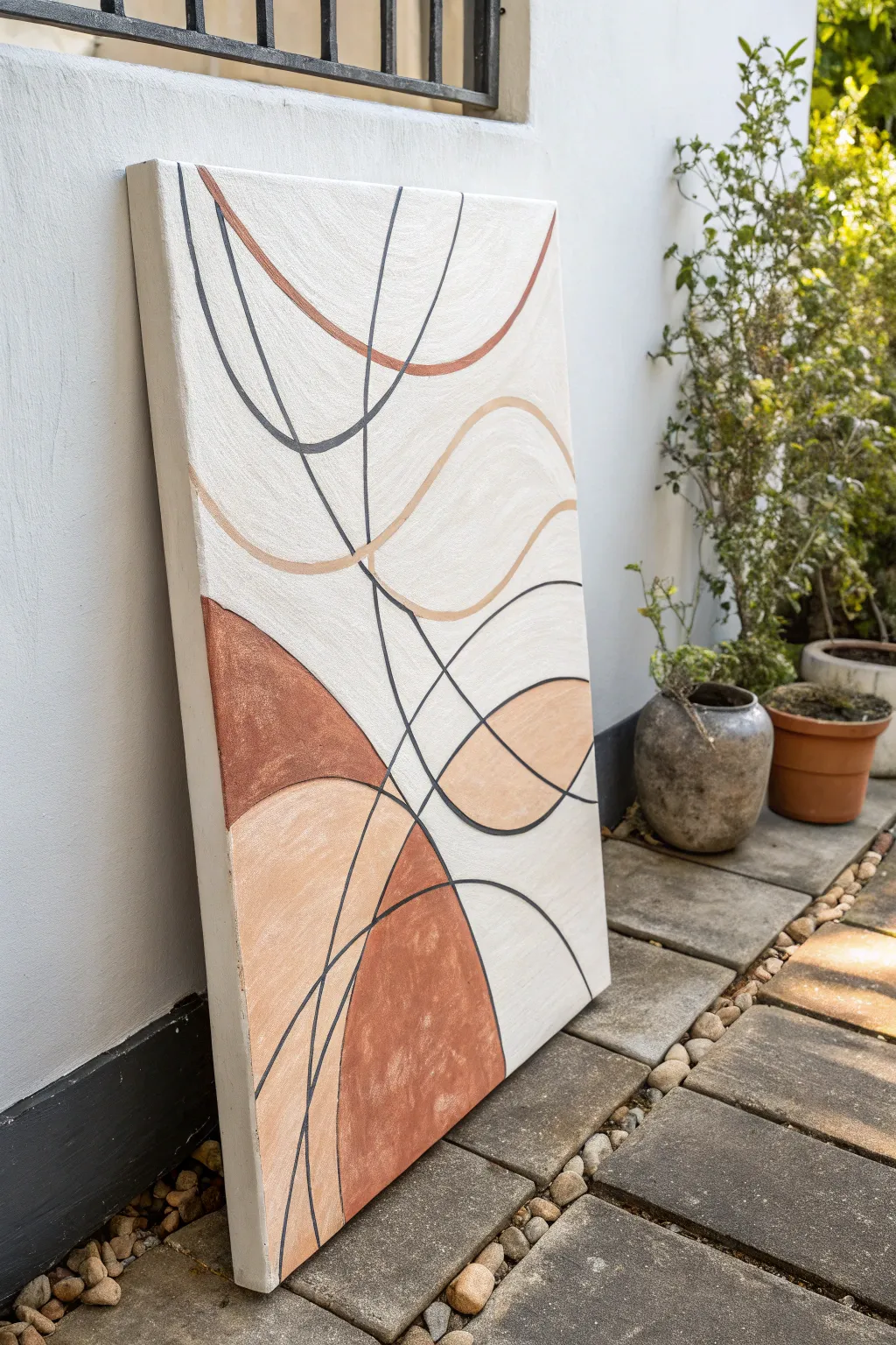
This minimalist abstract piece combines soft, earthy color blocking with elegant, sweeping curves. The juxtaposition of crisp black lines against organic terra cotta and cream shapes creates a modern, sophisticated look that is surprisingly achievable for beginners.
Step-by-Step Tutorial
Materials
- Large rectangular canvas (e.g., 24×36 inches)
- Acrylic paints: Titanium White, Terra Cotta (or Burnt Sienna), Beige/Flesh Tone, Black
- Gesso (optional, for priming)
- Pencil and eraser
- Medium flat brush (for color blocking)
- Small round brush (size 2-4)
- Fine liner brush (size 0 or 00) or black paint marker
- Palette or paper plate
- Ruler (optional)
- Cup of water and paper towels
Step 1: Planning the Composition
-
Prime the Surface:
Begin by applying a coat of gesso to your canvas if it isn’t pre-primed. This creates a smooth surface for your paint to glide on. -
Base Color Application:
Mix a large amount of Titanium White with a tiny dot of Beige or Terra Cotta to create a warm, off-white cream color. Paint the entire canvas with this shade and let it dry completely. -
Draft the Curves:
Lightly sketch your main shapes onto the canvas using a pencil. Focus on creating large, intersecting semicircles and flowing waves that start from the edges and move inward. -
Refine the Flow:
Don’t worry about perfection; erasing is fine. Aim for a balanced composition where some shapes overlap, creating new, smaller sections to be filled with color later.
Clean Lines Hack
Struggling with shaky hands? Use a black Posca paint pen or permanent marker instead of a brush for the thin lines. It offers much more control.
Step 2: Color Blocking
-
Mix the Terra Cotta:
Prepare your darkest earthy tone. If you are using Burnt Sienna, you might want to add a touch of Red Oxide or White to get that muted clay pot look. -
Paint the Dark Shapes:
Using your medium flat brush, fill in the specific sections you planned for the darkest color. In the reference, these are the large semi-circles at the bottom and middle left. -
Create the Mid-Tone:
Mix your Terra Cotta with White to create a soft peach or beige shade. This should be significantly lighter than your clay color but darker than the background. -
Fill the Lighter Shapes:
Apply this peach tone to the adjacent shapes. I like to use two coats here to ensure the brushstrokes aren’t too visible, giving it a flat, graphic quality. -
Touch Up Background:
If your pencil lines for the cream sections got messy, use your original background color to tidy up the negative space shapes now. -
Texture Check:
Look closely at the reference; the paint has a slight texture. Don’t smooth it out perfectly—allow some subtle bristle marks to remain for an organic feel.
Step 3: Line Work
-
Prepare Black Paint:
Thin your black acrylic paint slightly with water. It should be the consistency of heavy cream or ink so it flows smoothly off a liner brush. -
Trace Primary Lines:
Using a fine liner brush, carefully trace over the boundaries where your color blocks meet the background. Keep your hand steady and breathe out as you pull the stroke. -
Add Floating Lines:
Now, paint the abstract lines that don’t border a color shape. These are the loose, sweeping curves that cut across the white space and the color blocks. -
Vary Line Thickness:
Notice that some lines in the inspiration piece are thicker than others. Apply slightly more pressure on the brush for the bold black curves, and barely touch the canvas for thinner ones. -
Add Colored Accents:
Mix a reddish-brown shade (similar to your dark terra cotta) and add a few thin, sweeping lines that echo the black ones. This adds depth and ties the color palette together. -
Connect the Edges:
Ensure your lines flow all the way off the edge of the canvas. This prevents the artwork from feeling contained and gives it a dynamic sense of movement. -
Final Erasure:
Once the paint is 100% dry (give it a few hours), gently erase any visible pencil marks that weren’t covered by the paint.
Level Up: Texture
Mix baking soda or modeling paste into your terra cotta paint before applying. This creates a gritty, plaster-like texture that enhances the boho vibe.
Hang this warm, earthy abstract piece in a well-lit corner to bring a sense of calm and modern style to your space
Cut-Paper Stencil Negative Space Abstract
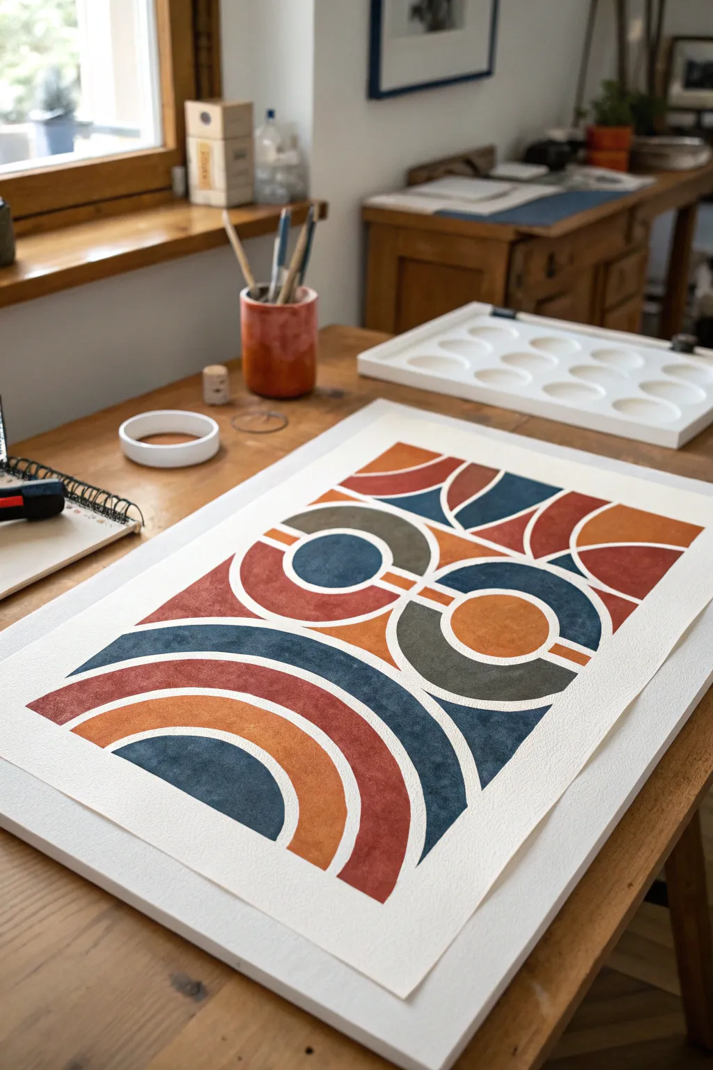
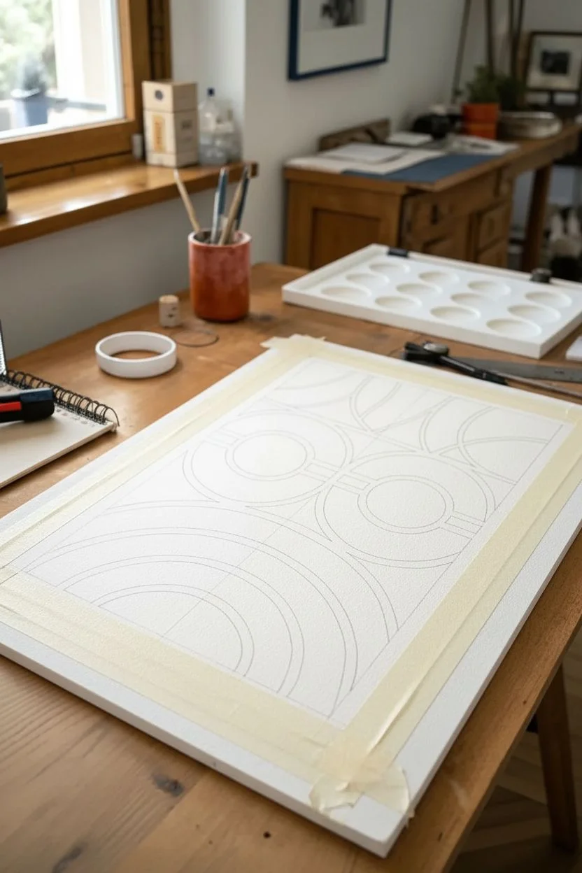
Channel a retro modern aesthetic with this striking geometric project that relies on crisp negative space. By using precise masking techniques, you will create satisfyingly clean white lines that separate bold, earthy blocks of color.
Step-by-Step Tutorial
Materials
- Heavyweight watercolor paper (300gsm or higher)
- Pencil and eraser
- Compass or circular objects for tracing
- Ruler
- Quality masking tape or artist’s tape (various widths)
- X-Acto knife or craft scalpel
- Cutting mat
- Gouache or matte acrylic paints (terracotta, slate blue, olive green, ochre)
- Flat shader brushes (medium sizes)
- Palette for mixing
Step 1: Planning and Mapping
-
Prepare your surface:
Start by taping down your paper to your work surface or drawing board. This not only keeps the paper flat but creates a crisp white border around the final piece. -
Grid the layout:
Using your ruler and a light pencil touch, measure out the center vertical line of the paper. This symmetry is crucial for the balanced look of the arches and circles. -
Draft the major shapes:
Sketch the large arches at the bottom first. Use your compass to draw concentric semi-circles, ensuring consistent spacing between each ring to create that ‘negative space’ channel later. -
Add the central geometry:
Moving upward, draft the circular motifs. Draw full circles that intersect with rectangular blocks. Don’t press too hard; you just need guidelines for where your tape will eventually go. -
Complete the composition:
Finish the top section with inverted arches or quarter-circles to mirror the bottom curves. Step back and check that your spacing looks uniform.
Bleed Patrol
Before painting, brush a thin layer of clear matte medium or white paint over the tape edges. This seals the gap so any bleed is invisible, keeping your colored layer crisp.
Step 2: Masking the Design
-
Apply tape over drawn lines:
This is the most critical phase. Apply strips of artist’s tape over the areas that you want to remain white (the negative space). Cover the pencil lines completely. -
Trim the curves:
Since tape is straight and your design is curved, apply wider tape over the curved sections. Then, carefully use your X-Acto knife to cut along your pencil lines, removing the excess tape to reveal the shape’s painting area. -
Seal the edges:
Once all masking is cut and placed, run the back of your fingernail or a bone folder firmly along every tape edge. I always double-check this step to prevent paint from bleeding under. -
Erase exposed marks:
Gently erase any visible pencil lines inside the shapes where you plan to paint. Gouache and acrylic often aren’t opaque enough to hide dark graphite.
Color Harmony
To get that vintage cohesion, mix a tiny dot of burnt umber or complement color into every shade on your palette. It knocks back the brightness for a unified, retro feel.
Step 3: Painting and Revealing
-
Mix your palette:
Prepare your colors. For this look, aim for a desaturated ’70s palette: burnt orange (terracotta), a deep slate blue, a muted olive green, and a warm ochre. -
Paint the bottom arches:
Start with the large bottom arches. Alternate colors for each ring—perhaps slate blue on the outer ring and terracotta on the inner one to create contrast. -
Technique tip:
Use a flat shader brush and pull the paint away from the tape edges toward the center of the shape. This helps minimize bleed-through. -
Fill the central shapes:
Move to the middle circle and block sections. Apply the paint in smooth, even layers. Gouache dries quickly, so work efficiently to avoid streakiness. -
Paint the top section:
Finish with the top geometric forms. If your paint looks translucent, let the first coat dry completely and add a second coat for that solid, printed look. -
Let it dry completely:
Patience is key here. Allow the painting to sit until it is bone dry to the touch. If the paint is wet, peeling the tape will be messy. -
The grand reveal:
Slowly peel the tape away at a 45-degree angle. If the tape seems stuck, you can warm it slightly with a hair dryer to loosen the adhesive. -
Final touch-ups:
Inspect your white lines. If there are tiny bleeds, use a small brush with white acrylic or a white gel pen to tidy up the edges.
Enjoy the clean lines and bold geometry of your new modernist masterpiece


Have a question or want to share your own experience? I'd love to hear from you in the comments below!