Pen drawings have this magical way of looking bold and finished fast—just lines, shadows, and your personality on the page. If you’re craving ideas that specifically shine in ink (hello high contrast and satisfying textures), these are my favorite go-to prompts and mini-challenges.
Hatching and Cross-Hatching Sphere Shading अभ्यास
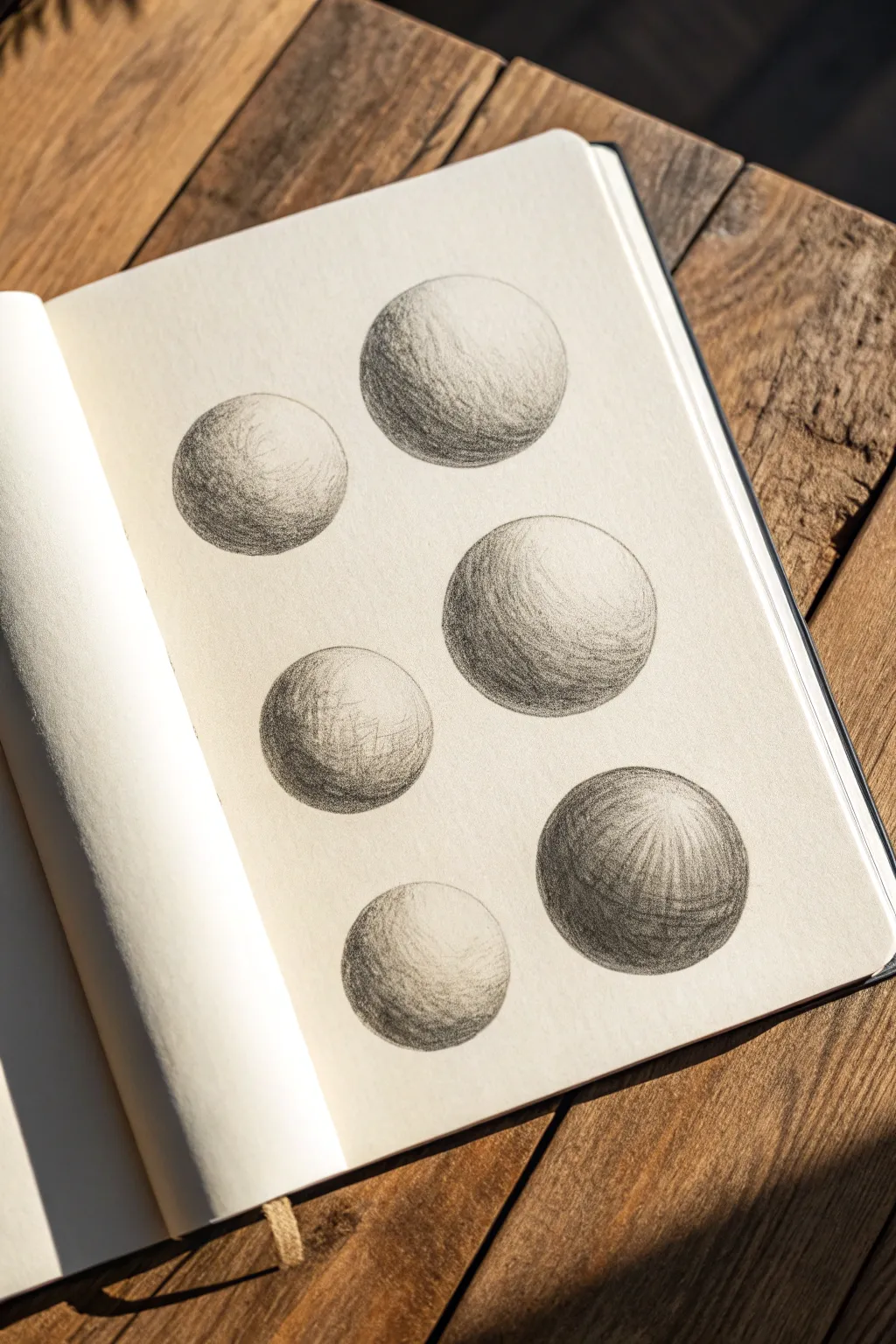

This study involves drawing six spheres to practice fundamental shading techniques like hatching and cross-hatching. The result is a clean, academic-style page that demonstrates how directional lines create volume and depth on a curved surface.
Step-by-Step Tutorial
Materials
- Fine-point drawing pens (0.1mm and 0.3mm)
- Smooth sketchbook paper or Bristol board
- Circle template or compass (optional)
- Pencil (HB or 2H for guidelines)
- Kneaded eraser
Step 1: Preparation & Outline
-
Plan the Layout:
Visualize the placement of six spheres on your page. Aim for a staggered, organic arrangement rather than a rigid grid to keep the composition interesting, leaving enough white space between each orb. -
Draw Light Guidelines:
Using a hard pencil (like a 2H) and a very light touch, draw your six circles. If you struggle with freehand circles, a compass or a circle template can ensure perfect symmetry, but freehand adds a nice sketchbook charm. -
Map the Highlights:
Before picking up the pen, lightly mark a small oval or circle area on the upper right side of each sphere to indicate where the light source hits. This area must remain completely white. -
Define the Shadow Core:
Lightly sketch a crescent moon shape on the opposite side of the highlight (bottom left). This will be the ‘core shadow’ area where your ink work will be dense.
Wrist Control
Lock your wrist and draw from the elbow for long strokes, but use finger movement for the tiny, tight details near the edges. This prevents shaky lines.
Step 2: Hatching the First Spheres
-
Start with Single Hatching:
Select your upper-left sphere. Using a 0.1mm pen, begin with simple, parallel diagonal lines across the shadowed side. Keep your hand loose and lift the pen at the end of each stroke to taper the line. -
Follow the Form:
For the next sphere, try contour hatching. Instead of straight lines, curve your strokes slightly to follow the roundness of the ball. This visual trick instantly makes the circle look 3D. -
Build the Mid-Tones:
Extend your hatching lines from the dark shadow area up toward the highlight, but spacing them further apart as you get closer to the light. This creates a gradient effect. -
Establish the Darkest Dark:
Go back over the bottom-left crescent of the sphere with a second layer of lines. I find it helpful to slightly change the angle for this second pass, creating a denser mesh that blocks out more light.
Add Cast Shadows
To ground the spheres, draw an elongated, horizontal oval shadow underneath each formatting based on your light source to make them sit on a surface.
Step 3: Cross-Hatching & Texture
-
Introduce Cross-Hatching:
Move to the central, larger spheres. Lay down your base diagonal lines, then cross them with perpendicular lines. The more layers you cross, the deeper the shadow becomes. -
Refining the Edges:
For the sphere edges furthest from the light, use short, tight hatch marks to create a crisp boundary. This separates the object from the background paper clearly. -
Create Texture Variation:
On one of the lower spheres, experiment with ‘scumbling’ or small, tight scribbles instead of clean lines. This mimics a different material texture, like rough stone or concrete. -
Deepen the Core Shadows:
Switch to a slightly thicker pen (0.3mm) strictly for the darkest part of the shadow core (the terminating line). This adds contrast and weight to the bottom of the spheres without muddying the lighter areas. -
Soften Transitions:
If a transition from dark to light looks too harsh, add very short, widely spaced ticks or dots in between the zones to bridge the gap visually.
Step 4: Finishing Touches
-
Check Contrast Balance:
Step back and look at the whole page. The areas directly opposite the highlight should be the darkest. If any spheres look flat, add another layer of hatching to the dark side. -
Reflected Light:
Notice the very bottom edge of the spheres in the reference image is slightly lighter than the core shadow? This is reflected light. Ensure you don’t ink all the way to the rim at maximum density; leave a tiny sliver of ‘breathing room’ at the bottom edge. -
Erase Guidelines:
Once the ink is completely dry (give it at least 10 minutes to prevent smudging), gently erase all your initial pencil circles and highlight markings. -
Final Clean Up:
Assess the outline of your spheres. If the hatching went slightly outside the line, you can carefully thicken the outer contour slightly to hide the mistake and unify the shape.
Now you have a reference page of three-dimensional forms that perfectly illustrates volume and light


Texture Swatch Library in Pen
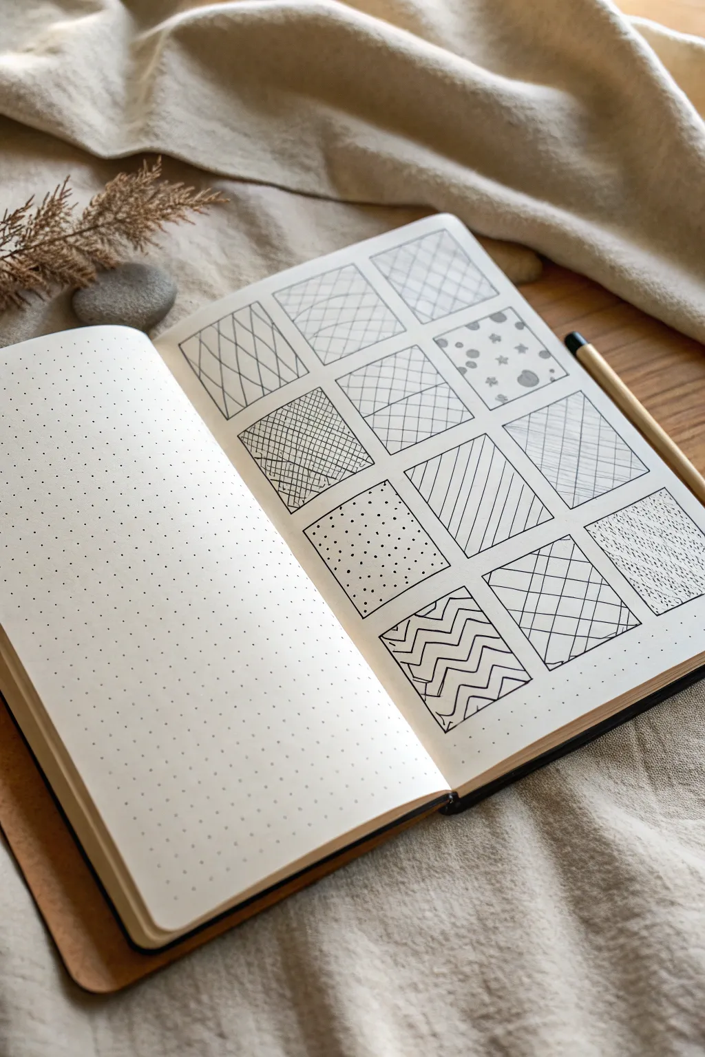
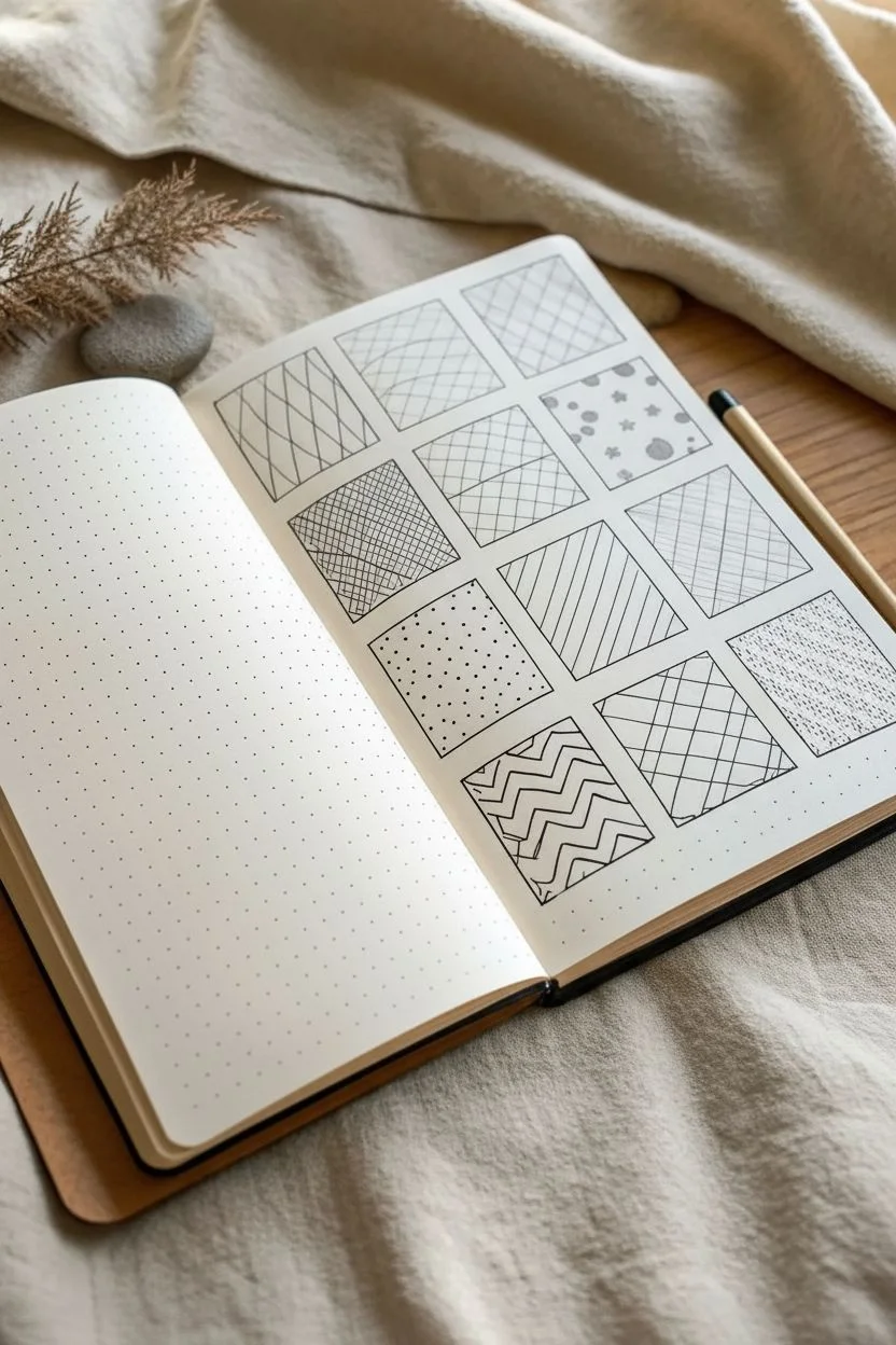
Create a calming, organized reference page for your pen textures with this 12-swatch grid layout. It serves as both a meditation in repetitive mark-making and a practical catalog for future illustration projects.
How-To Guide
Materials
- A5 Dot Grid Notebook (or blank paper with a ruler)
- Fine liner pen (black, 0.3mm or 0.5mm)
- Ruler
- Pencil (HB or 2B)
- Eraser
Step 1: Setting up the Grid
-
Calculate spacing:
Count the dots on your page to center your layout. You will need space for a 3-column by 4-row grid. Leave a margin of at least 3-4 dots around the edges to frame the work nicely. -
Draw vertical guides:
Using your pencil and ruler, lightly mark the vertical lines for your three columns. Aim for squares that are roughly 1.5 to 2 inches (about 8-10 dot grid spaces) wide. -
Draw horizontal guides:
Mark the horizontal lines to create four rows, ensuring the boxes stay square. Leave a small gap (about 2 dots or 0.5 cm) between each square so the patterns don’t bleed into each other. -
Ink the frames:
Once satisfied with the pencil layout, trace over the square outlines with your fine liner pen. Use the ruler for crisp, unwavering edges. -
Erase pencil marks:
Wait a moment for the ink to dry completely, then gently erase the underlying pencil guidelines to leave clean black boxes.
Step 2: Top Row Textures
-
Diamond lattice:
In the top left box, draw diagonal lines from bottom-left to top-right. Cross them with diagonal lines from bottom-right to top-left to create tall diamond shapes. -
Cross-hatching grid:
For the middle box, draw a loose grid of perpendicular lines. Add diagonal hatching strokes inside selected squares, creating a checkered texture effect. -
Simple grid:
In the top right box, draw widely spaced diagonal lines in one direction. Cross them perpendicularly to create a simple, clean diamond grid pattern.
Consistent Lines
To keep lines straight without a ruler, lock your wrist and move your entire arm from the elbow. This reduces shakiness significantly.
Step 3: Middle Rows Textures
-
Dense cross-hatching:
In the second row, left box, fill the space with tightly packed diagonal lines. Go over them again in the opposite direction to create a dark, shadowed texture. -
Plank flooring:
For the center box, draw horizontal lines to divide the square into three sections. Fill each section with vertical or diagonal hatching in alternating directions. -
Polka dots:
In the right box of the second row, draw small, solid circles and tiny star shapes scattered randomly. Keep plenty of negative space for a playful look. -
Stippling gradient:
Moving to the third row, left box: fill it with tiny dots. Cluster them densely at the bottom and spread them out as you move upward to create a fading gradient. -
Diagonal rain:
In the center box, draw consistent, parallel diagonal lines from top-right to bottom-left. Keep the pressure even for a uniform tone. -
Subtle hatching:
For the third row, right box, use very light, vertical lines spaced unevenly. I find this creates a nice ‘linen’ or fabric look.
Ink Smearing?
If you are left-handed, work from the right column to the left. If right-handed, work left to right to avoid dragging your hand through wet ink.
Step 4: Bottom Row Textures
-
Zig-zag chevron:
In the bottom left square, draw continuous horizontal zig-zag lines. Stack them closely so the peaks and valleys align, creating a chevron pattern. -
Woven plaid:
For the middle box, draw sets of parallel lines crossing each other at right angles, leaving some large gaps to simulate a tartan or plaid fabric. -
Organic dash:
In the final bottom right box, make short, quick dash marks in random directions. Fill the square evenly to resemble stone or terrazzo texture.
You now have a clean reference sheet to consult whenever you need inspiration for shading or filling space in your drawings


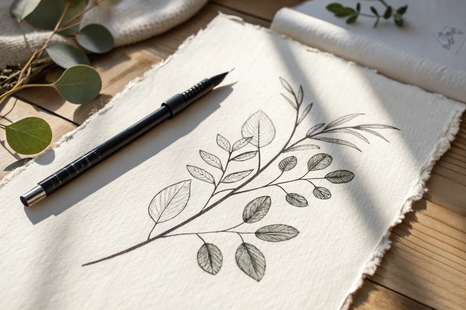
Simple Contour Line Botanicals
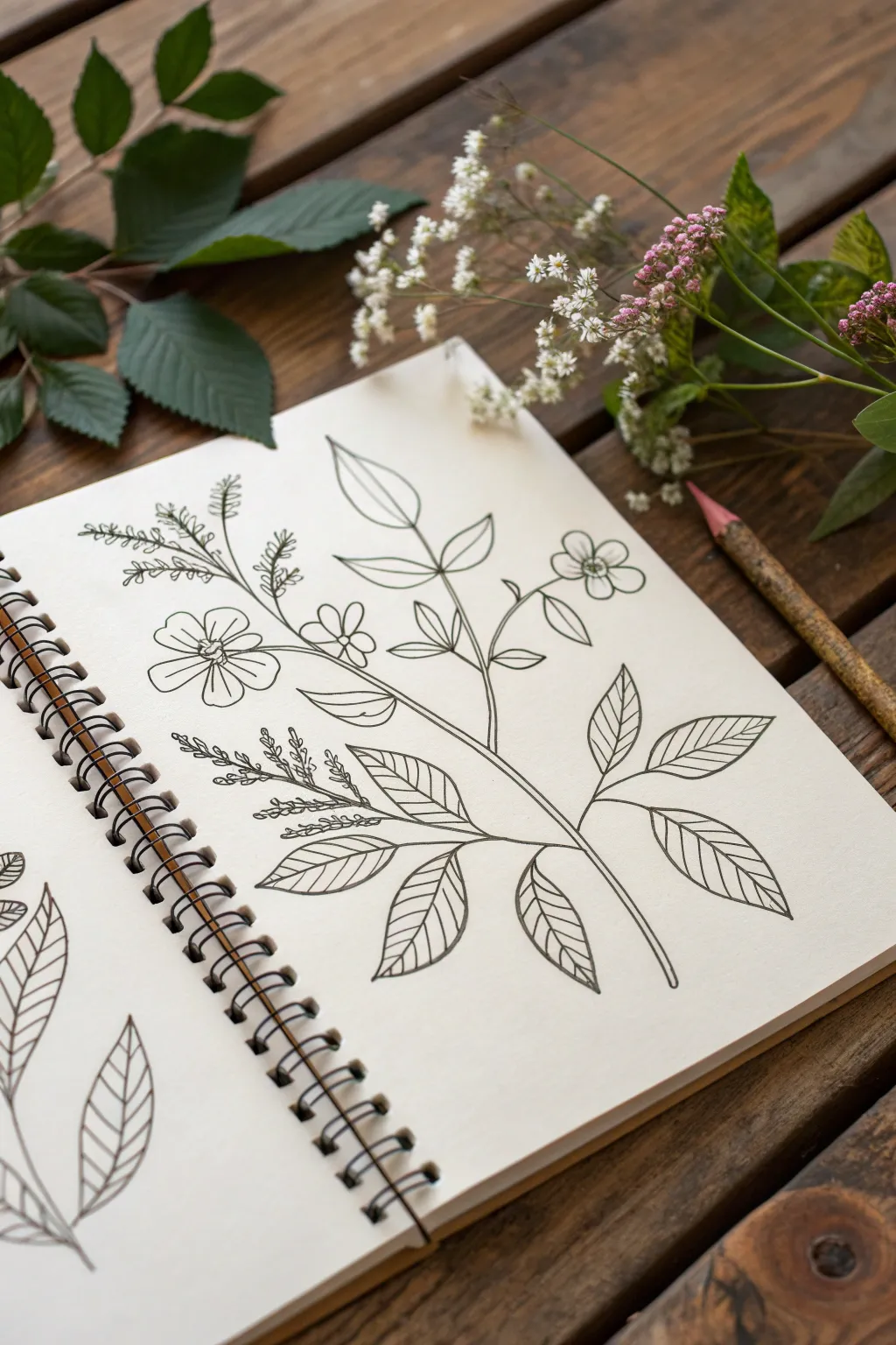
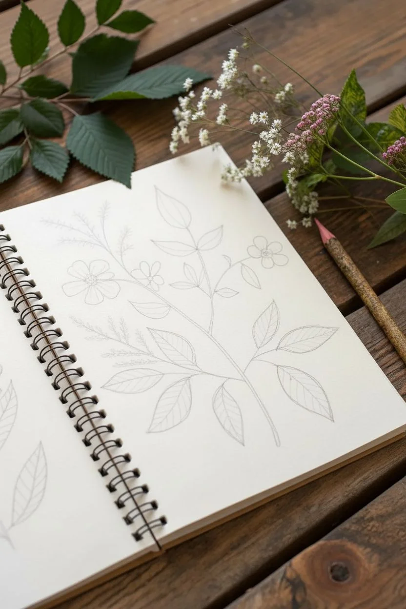
Capture the delicate beauty of garden foliage with this simple yet elegant line art project. By focusing purely on contour lines without shading, you’ll create a crisp botanical illustration that celebrates the organic forms of leaves and petals.
Step-by-Step Guide
Materials
- Spiral-bound sketchbook with smooth paper
- Fine-liner pen (0.3mm or 0.5mm)
- HB pencil for sketching
- Good quality eraser
- Real leaves or reference photos (optional)
Step 1: Laying the Foundation
-
Map the central stem:
Start with a light pencil sketch to establish the main gesture of the plant. Draw a long, gentle S-curve starting from the bottom right and reaching towards the top left of your page. This will act as the spine for your entire composition. -
Sketch branch placements:
Along this main stem, lightly mark short directional lines where the secondary branches and leaves will grow. Space them out unevenly to keep the plant looking natural, rather than perfectly symmetrical. -
Outline the leaf shapes:
Still using your pencil, sketch the rough oval shapes of the larger leaves. Place larger leaves towards the bottom and slightly smaller ones as you move up the stem. Group them in pairs or alternate them along the branches. -
Add floral elements:
Near the top and middle sections, sketch small circles to represent the placement of flowers. Don’t worry about petals yet; just establish where the blooms will sit in relation to the leaves. -
Indicate fern details:
For the feathery, fern-like sections, draw faint, wispy lines extending from the main intersections. These will guide your pen work later for the smaller, more intricate textures.
Clean Erasure
Smudges ruin crisp line work. Always test your eraser on a scrap piece of paper first to ensure it’s clean, and hold the paper taut with your other hand to prevent buckling.
Step 2: Inking the Structure
-
Start the main ink line:
Switch to your fine-liner pen. Begin tracing the main stem from the bottom, using a confident, continuous stroke. I like to lift my pen slightly at junctions where leaves attach to prevent ink blotches. -
Draw the bottom leaves:
Ink the outlines of the lowest leaves first. Give the edges a very subtle waviness rather than making them perfect geometric ovals; this small irregularity makes them look organic. -
Add central veins:
Draw a single line down the center of each completed leaf. Start at the base and flick the pen gently toward the tip, lifting pressure at the end for a tapering effect. -
Create side veins:
From the central vein, draw angled lines outward to the leaf edges. Keep these lines fairly straight and evenly spaced, suggestive of a strong skeletal structure. -
Ink the upper foliage:
Move up the stem, inking the smaller leaves. Try to vary the angle of the leaves slightly—some pointing up, some tilting to the side—to create a sense of movement.
Step 3: Adding Delicate Details
-
Define the flower centers:
For the flowers, draw a small, possibly textured center first. This anchors the petals you are about to draw. -
Draw the petals:
Ink the petals around the centers. Keep the shapes simple—rounded or slightly heart-shaped—and ensure they overlap naturally. Don’t close every line perfectly; small gaps can make the drawing feel airier. -
Create the fern texture:
Return to those wispy fern sections. Instead of drawing individual leaves, use short, repetitive dashes or tiny loops along the branch lines to suggest the texture of seeds or tiny buds. -
Connect the elements:
Check that all stems connect logically to the main stalk. If a flower or leaf looks like it’s floating, draw a thin stem line to attach it to the body of the plant. -
Refine the line weight:
Look over the drawing. If the base of the stem feels too thin, go over it once more to thicken the line slightly, giving the plant visual weight at the bottom. -
Erase pencil marks:
Wait at least five to ten minutes to ensure the ink is completely dry. Then, gently erase all the underlying pencil sketches to reveal the clean ink contour.
Steady Hand Trick
If your hands shake with long lines, try ‘ghosting’ the stroke—hovering your pen over the paper and practicing the motion in the air a few times before touching down.
Now you have a timeless botanical sketch ready to be framed or turned into a greeting card


Sunflower Study With Bold Centers
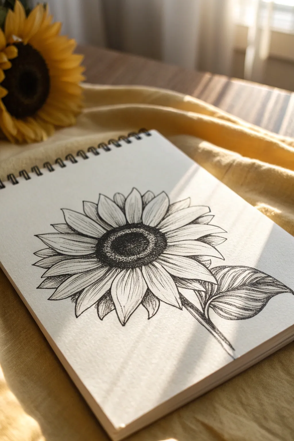
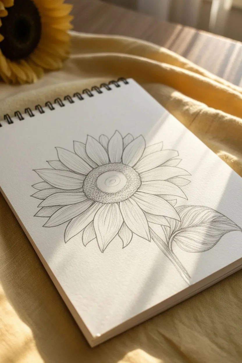
This pen-and-ink study captures the rustic beauty of a sunflower with deep textures and fine lines. By focusing on the contrast between the densely stippled center and the gracefully shaded petals, you’ll create a drawing that feels both organic and remarkably detailed.
Detailed Instructions
Materials
- Spiral-bound sketchbook (heavyweight drawing paper)
- Fine liner pens (sizes 0.1, 0.3, and 0.5)
- HB graphite pencil
- Kneaded eraser
Step 1: Pencil Sketch
-
Establish the Core:
Begin lightly with your HB pencil. Draw a medium-sized oval in the center of your page to represent the sunflower’s seed head. Tilt it slightly to the right to match the angle of the reference. -
Map the Inner Ring:
Inside that first oval, sketch a smaller, slightly off-center circle. This will define the darkest, deepest part of the seed head. -
Draft the First Petal Layer:
Sketch the primary layer of petals radiating outward from the center oval. Keep them somewhat uniform in size but vary their tips—some pointed, some slightly rounded. -
Add Secondary Petals:
Fill in the gaps between the primary petals with a second layer peeking out from behind. These should appear slightly smaller or partially obscured. -
Stem and Leaf Placement:
Draw a sturdy stem extending downwards from the bottom right quadrant. Add a large, singular leaf branching off to the right, detailing a central vein curve.
Keep It Loose
Don’t try to make every petal perfectly symmetrical. Sunflowers are naturally irregular, and slight wobbles in your line work add organic character.
Step 2: Inking the Center
-
Outline the Seed Head:
Switch to a 0.5 pen. specific Trace the outer circumference of the center oval and the inner circle you drafted earlier. Use a slightly bumpy line immediately to suggest texture rather than a perfect geometric curve. -
Stipple the Core:
Using the 0.5 pen, fill the innermost circle with dense stippling (lots of tiny dots). I find that packing the dots tighter near the edges of this inner ring helps create a sense of depth. -
Texture the Outer Ring:
For the outer ring of the seed head, use a 0.3 pen. Instead of pure stippling, mix dots with tiny, C-shaped scribbles. This differentiates the texture from the center pit. -
Darken the Perimeter:
Go back over the very edge where the petals meet the center with the 0.5 pen, making this boundary very dark to separate the flower parts visually.
Add Subtle Color
Scan your drawing and print it onto watercolor paper. Use a light wash of yellow ochre and sap green to create a delicate mixed-media piece.
Step 3: Petals and Shading
-
Outline the Petals:
Use the 0.3 pen to outline all your pencil petals. Keep your hand loose; a slight waiver in the line makes the organic shape look more natural than a stiff wire outline. -
Erase Guidelines:
Once the ink is completely dry, gently run your kneaded eraser over the drawing to lift all initial pencil marks. -
Base Shading on Petals:
Switch to your finest 0.1 pen. Start at the base of each petal (near the center) and flick quick, vertical lines outward. Release pressure at the end of the stroke so the line tapers off. -
Mid-Petal Texture:
Add a few broken, faint lines running down the center of the petals to suggest veins. Don’t connect these all the way from top to bottom. -
Deepen the Shadows:
Where petals overlap, add extra hatching on the ‘underneath’ petal to cast a shadow. This separation is crucial for a 3D effect.
Step 4: Stem and Leaf Details
-
Inking the Leaf:
Outline the stem and the large leaf with the 0.3 pen. Draw the central vein clearly. -
Vein Detailing:
With the 0.1 pen, draw secondary veins branching from the center of the leaf towards the edges. Curve them slightly to follow the leaf’s contour. -
Shading the Leaf:
Use cross-hatching or tight parallel lines between the veins to darken the leaf, leaving the veins themselves white or lighter for contrast. -
Final Contrast Check:
Step back and look at the drawing. If the center doesn’t look dark enough compared to the petals, add another layer of dots with the 0.5 pen to punch up the bold center.
Enjoy the simple rhythm of adding those final texture lines to bring your sunflower to life

PENCIL GUIDE
Understanding Pencil Grades from H to B
From first sketch to finished drawing — learn pencil grades, line control, and shading techniques.
Explore the Full Guide
House Portrait With Tiny Architectural Details
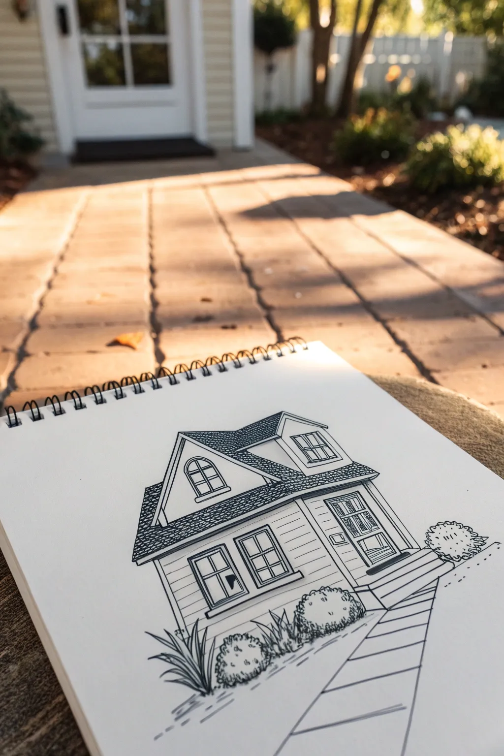
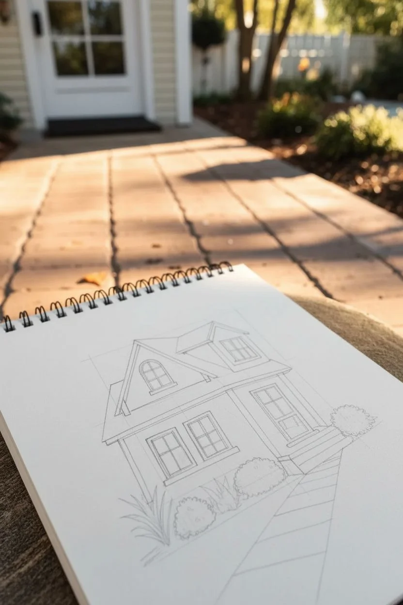
Capture the charm of home with this clean, illustrative house portrait that emphasizes crisp lines and texture. This project focuses on simplifying complex architecture into manageable shapes while highlighting delightful details like roof shingles and window panes.
Step-by-Step Guide
Materials
- Sketchbook with smooth heavyweight paper
- HB pencil
- Kneaded eraser
- Fine liner pens (sizes 005, 01, and 03)
- Ruler or straight edge
Step 1: Laying the Foundation
-
Draft the main volumes:
Start with your HB pencil and a light touch. Draw a large central rectangle for the main body of the house, and sketch a triangle on top for the main gable. Don’t press hard; these are just guidelines. -
Add the extensions:
To the right of the main gable, lightly sketch the smaller side extension. It has a slightly lower roofline and its own smaller dormer window jutting out from the roof. -
Position the windows and door:
Use your ruler to find the vertical center of the main gable. Sketch the arched window near the top and the double hung windows below. On the right extension, place the front door and the small dormer window. -
Sketch the porch and path:
Draw the steps leading up to the door using simple rectangular blocks. Extend two diagonal lines downward from the steps to broaden into the foreground, creating the perspective for the walkway. -
Block in landscaping:
Lightly draw cloud-like shapes on either side of the house foundation to represent bushes, and add a few spiky clusters for grass or agaves in the front left corner.
Roof Consistency
When drawing roof shingles, work row by row from the bottom eave upward to the peak. This naturally layers them correctly and keeps your pattern even.
Step 2: Inking the Structure
-
Outline the main roof:
Switch to your 03 pen for the strongest lines. Trace the outer edges of the roof peaks and the eaves. I like to let the ink sit for a moment before moving my hand to avoid smudging. -
Define the walls:
Still using the 03 pen, ink the vertical corners of the house and the bottom foundation line. Outline the frame of the front door and the main window casings to make them pop. -
Detail the windows:
Switch to a finer 01 pen. Carefully draw the inner dividers (muntins) of the windows. For the arched window in the gable, keep your hand steady to get a smooth curve. -
Draw the siding:
Using the 005 pen (the finest tip), draw horizontal lines across the front of the house to represent siding. Use a ruler if you want perfection, or freehand it for a more organic, sketched look. Stop your lines when you hit a window frame.
Wobbly Lines?
If your straight lines look shaky, breathe out while you draw the stroke. Consider breaking long siding lines into shorter, dashed segments for a rustic style.
Step 3: Texture and Finishing Touches
-
Shingle the roof:
This step requires patience. With the 01 pen, fill the roof sections with a dense pattern of small, scalloped ‘U’ shapes or tight overlapping scales. Keep them consistent in size to create a cohesive texture. -
Ink the door details:
Add the panels to the front door using the 01 pen. You can add tiny vertical lines inside the glass panels to suggest reflection or screening. -
Texture the bushes:
Use a scribbly, loopy motion with the 01 pen to outline the bushes. Add small dots and ‘c’ shapes inside the bush outlines to give them leafy volume without drawing every single leaf. -
Detail the foreground plants:
For the spiked plant on the left, use quick, upward flicking strokes starting from the base to create tapered leaves. -
Define the walkway:
Ink the long edges of the path with the 03 pen. Add horizontal lines across the path to create paving stones, spacing them wider as they get closer to the viewer to enhance the perspective. -
Add ground context:
Add a few broken horizontal lines under the plants and house to ground the building so it doesn’t look like it’s floating. -
Erase and clean up:
Wait until the ink is completely dry—give it a few minutes to be safe. Gently run your kneaded eraser over the entire drawing to lift all the pencil guidelines.
Now you have a charming architectural portrait ready to be framed or gifted
One-Point Perspective Road Sketch
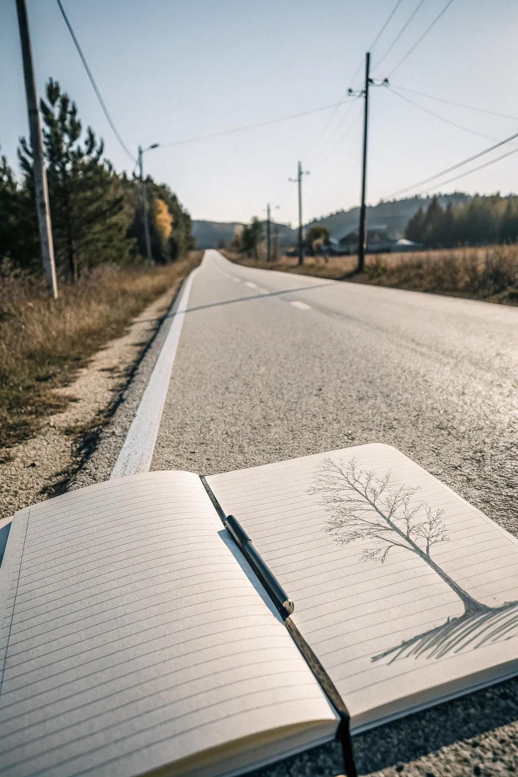

This evocative project captures the stark beauty of a leafless winter tree using just a simple black pen and a lined notebook. The sketch utilizes the notebook’s own lines to create a sense of ground and atmosphere, perfect for practicing organic branching structures.
How-To Guide
Materials
- A5 or A6 lined notebook (cream or white paper)
- Black ink pen (fine liner, 0.5mm is ideal)
- Pencil (optional, for initial placement)
- Eraser
Step 1: Setting the Scene
-
Position the spine:
Turn your notebook so a fresh spread is open. You’ll be drawing on the right-hand page primarily, but positioning the sketch near the bottom right corner gives it good visual weight. -
Define the ground line:
Identify a line near the bottom of the page—perhaps the fourth or fifth line from the bottom edge—to serve as the base where your tree will ‘root’.
Ink Bleeding?
If your notebook paper is thin, ink might feather. Place a scrap sheet behind your drawing page to protect the next clean sheet and draw with quicker, lighter strokes to minimize saturation.
Step 2: Drawing the Trunk
-
Start the base:
Using your black pen, draw the base of the trunk. Start wide at your chosen ground line, curving slightly upward and inward. -
Taper the form:
As you move up the page, narrow the trunk significantly. It should act like a lightning bolt or a river path, slightly jagged rather than perfectly straight. -
Lean the tree:
Give the main trunk a slight lean to the right. This creates a more natural, wind-blown effect rather than a stiff, vertical pole.
Step 3: Creating the Branches
-
Split the main trunk:
About halfway up the trunk, split your line into two main thick branches—one reaching high and left, the other veering right. -
Add secondary branches:
From those two main arteries, sprout smaller lines. Remember the ‘Y’ rule: branches almost always split into V or Y shapes. -
Keep lines shaky:
Don’t try to draw straight lines. A slightly shaky hand here adds realistic texture to the bark and wood. -
Thin out the tips:
As you reach the top of the tree, your pen pressure should become feather-light. These final twigs should be barely-there whispers of ink.
Add a Setting
Make it a perspective lesson by drawing a single horizon line behind the tree and a vanishing point on the left page to suggest a long road, mimicking the photo’s background.
Step 4: Detailed Textures
-
Intersecting twigs:
Cross some branches over others. Nature is chaotic; letting lines intersect creates depth and complexity in the crown of the tree. -
Add gnarls and bumps:
Thicken a few ‘elbows’ where branches split to suggest knots or old growth. -
Refine the bark:
Go back to the main trunk and add very short, vertical hatching lines along one side (the left side works well) to suggest shadow and rounded form.
Step 5: Grounding Shadows
-
Establish the shadow direction:
To match the reference, the shadow will fall to the right, consistent with the tree’s slight lean. -
Draw the shadow base:
Starting from the root of the tree, draw long, sweeping lines extending diagonally down and to the right. -
Use loose hatching:
Keep these shadow lines rapid and loose. They don’t need to be solid black; a series of quick diagonal scratches creates a believable cast shadow on grass or ground. -
Connect to the notebook lines:
Allow your shadow strokes to cross over the printed notebook lines, integrating your drawing with the stationery itself. -
Final darkened touches:
Add one last pass of dark ink right at the very bottom where the trunk meets the ground to anchor the weight of the tree.
Now you have a striking nature study that transforms a simple page into a window to the outdoors
BRUSH GUIDE
The Right Brush for Every Stroke
From clean lines to bold texture — master brush choice, stroke control, and essential techniques.
Explore the Full Guide
Urban Corner With Signage and Window Reflections
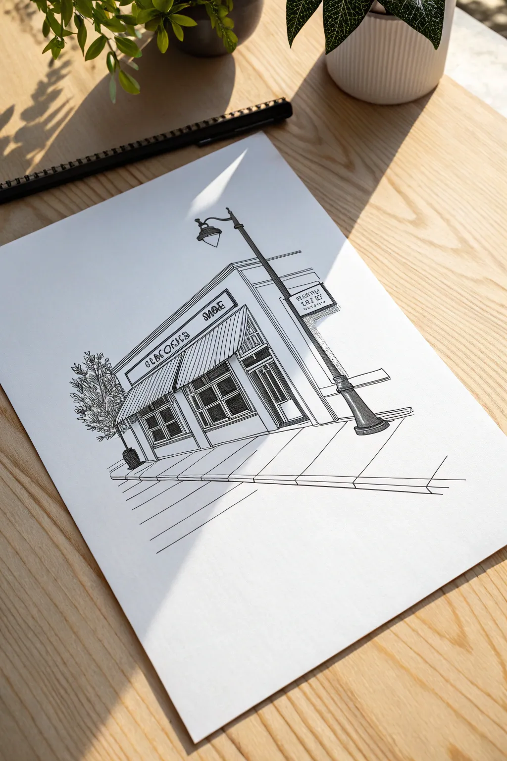
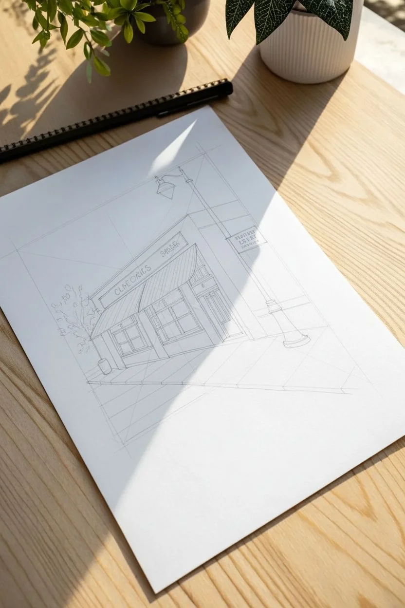
Capture the charm of a quiet city street with this clean, architectural line drawing. Using precise perspective and varied line weights, you’ll create a stylized storefront complete with a striped awning and a classic streetlamp.
Step-by-Step
Materials
- Smooth bristol or drawing paper
- HB pencil for initial sketch
- Ruler or straight edge
- Fine liner pens (sizes 0.1, 0.3, and 0.5mm)
- Eraser
Step 1: Planning and Pencil Sketch
-
Establish the horizon line:
Begin by lightly drawing a horizon line across the lower third of your paper. This will help ground your perspective. -
Block in the main structure:
Using two-point perspective guidelines, sketch a large rectangular box for the building. Position the corner of the building slightly off-center to the left. -
Add the awning and signage:
Draw a rectangular shape protruding from the main face for the sign board. Below it, sketch a slanted trapezoid shape to represent the awning. -
Sketch the windows and door:
Outline large rectangular windows under the awning. Add a recessed doorway on the right side of the storefront. -
Place the streetlamp:
Draw a vertical line intersecting the perspective lines for the streetlamp pole. Sketch the curved top and lantern shape, ensuring it stands taller than the shop signage. -
Detail the sidewalk and tree:
Lightly sketch lines radiating from your vanishing points to create the sidewalk pavement. Add a rough organic shape on the left for the small potted tree.
Step 2: Inking the Structure
-
Outline the main architectural lines:
Switch to a 0.5mm pen. Use your ruler to firmly ink the vertical corners of the building and the main horizontal rooflines. -
Define the awning stripes:
With a 0.3mm pen, draw the angled stripes of the awning. I find it helpful to start from the center and work outward to keep the spacing even. -
Ink the windows:
Carefully outline the window frames using the 0.3mm pen. Draw the internal muntins (grid lines) within the glass panes. -
Detail the door:
Ink the door frame and the glass panel within it. Add a small handle detail. -
Create the shop sign:
Outline the sign board. For the lettering, sketch stylized, slightly bubbly letters first, then ink them carefully. Don’t worry about perfect legibility; the style is key.
Wobbly Lines?
If your straight lines aren’t perfect, embrace it! A slightly shaky line adds character and makes the drawing feel more organic and hand-drawn rather than cad-generated.
Step 3: Adding Texture and Depth
-
Render the streetlamp:
Use the 0.5mm pen for the dark pole of the lamp. Leave small white slivers on one side to suggest a metallic reflection. -
Hatch shadows on the building:
Using a 0.1mm pen, add fine linear hatching under the awning and on the side of the building to create depth and shadow. -
Texture the tree:
Use a scribbling motion with the 0.1mm pen to create the foliage of the small tree. Keep the leaves loose and airy, not a solid block of black. -
Define the glass reflections:
Draw diagonal hatching lines across parts of the window glass to simulate reflection. Don’t hatch the entire window; leave some areas white. -
Ink the sidewalk:
Use long, continuous strokes with the 0.3mm pen and a ruler to define the sidewalk cracks and the curb edge. -
Final clean up:
Once the ink is completely dry, gently erase all underlying pencil lines to reveal the crisp black and white drawing.
Pro Tip: Line Weight
Use thicker pens for objects in the foreground (like the streetlamp base) and thinner pens for background details. This simple change instantly adds 3D depth.
Now you have a charming urban sketch ready to be framed or added to your sketchbook collection
Feather Study Using Directional Lines
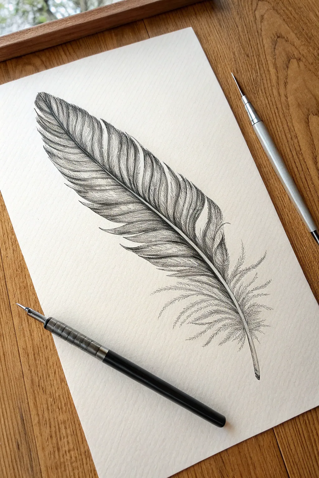
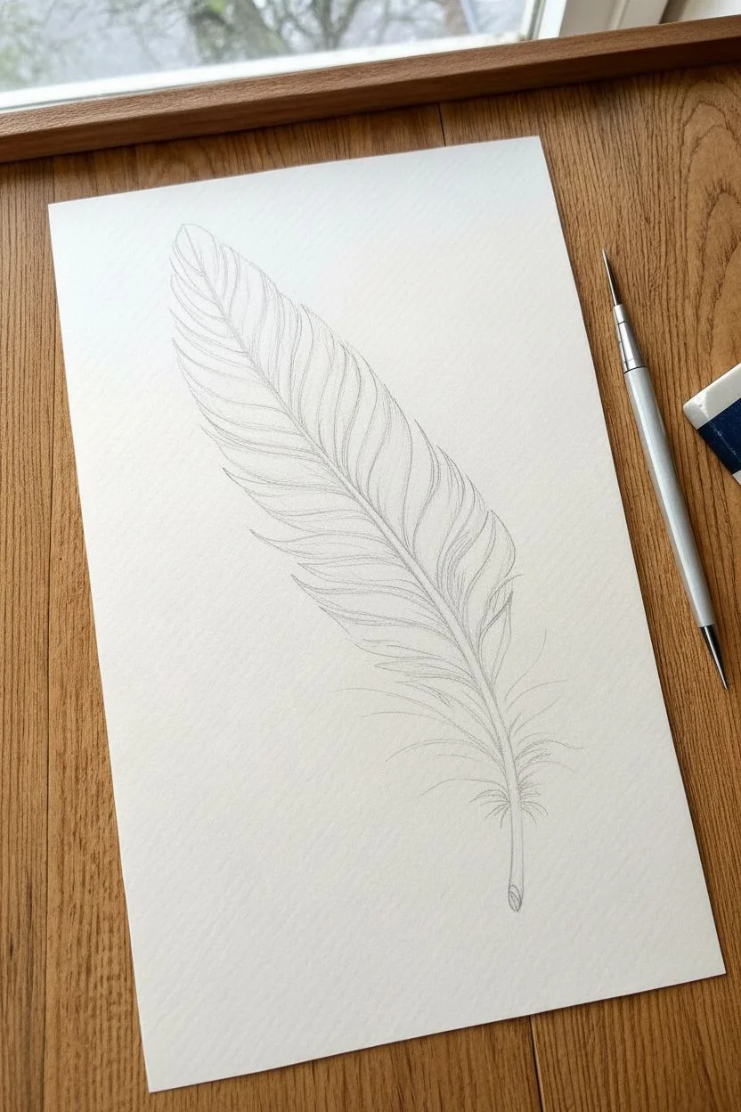
This project explores the delicate structure of a bird feather through intense, disciplined line work. By restricting yourself to only black ink, you will focus purely on texture, direction, and density to create a realistic and voluminous form.
Step-by-Step
Materials
- Smooth bristol board or hot-pressed watercolor paper (heavyweight)
- Dip pen holder
- Fine nib (e.g., mapping nib or G-nib)
- Black drawing ink (India ink or high-quality acrylic ink)
- HB or H graphite pencil
- Kneaded eraser
- Fine liner pen (optional alternative to dip pen)
Step 1: Structural Preparation
-
Map the Rachis:
Begin with your graphite pencil. Draw a gentle, arching diagonal line across your page to represent the central shaft (rachis). It should curve slightly, like a gentle ‘S’, tapering to a point at the bottom. -
Outline the Vane Shape:
Lightly sketch the outer silhouette of the feather around the shaft. Keep the top rounded and full, while the bottom section should become sparse and ragged. Avoid perfect symmetry; natural feathers often have one side slightly narrower than the other. -
Define the Quill Base:
Refine the bottom of the central shaft, drawing it slightly thicker to indicate the hollow quill (calamus) where it would attach to the bird skin. -
Sketch Directional Guides:
Within the vane outline, draw very faint guidelines extending from the shaft outward. These should curve upwards and away from the center, showing the direction the barbs will flow.
Pro Tip: The Flick Motion
Lock your wrist and move your entire forearm when drawing the long barbs. This prevents shaky lines and ensures the smooth, tapering curve essential for bird feathers.
Step 2: Inking the Core
-
Ink the Shaft:
Dip your pen and carefully trace the left side of the central shaft. Leave the center of the shaft white or very sparsely detailed to create a highlight, inking only the shadowed edge on the right side to give it roundness. -
Establish the Breaks:
Before filling in textures, identify slight gaps or splits in the feather’s edge. Mark these ‘V’ shapes along the outer contour now so you don’t accidentally ink over them later.
Step 3: Building Texture
-
Start the Barbs:
Begin at the top left of the feather. Using quick, confident flicks of the pen, draw individual lines extending from the central shaft toward the outer edge. Follow your pencil guidelines strictly. -
Layering for Density:
As you move down the feather, pack your lines closer together near the shaft. This density creates a darker value, suggesting the shadow cast by the curved barbs. -
Varying Line Weight:
I like to press slightly harder at the base of the stroke (near the shaft) and lift off as I reach the edge. This creates a tapered line that naturally mimics a hair-thin barb. -
Clumping the Barbs:
Instead of drawing thousands of parallel lines, group them into small sections. Draw 4-5 lines that adhere together, then leave a microscopic gap before the next group to simulate natural texture. -
Working Down the Left Side:
Continue this process down the left side of the shaft. Notice how the angle of the barbs changes, becoming more horizontal as you move toward the base. -
Shadowing the Curve:
Add hatch marks near the outer curve (where the feather bends away) to deepen the tone. Cross-hatching very gently here adds weight to the form. -
Mirroring the Right Side:
Repeat the texturing process on the right side of the shaft. Be mindful that your hand doesn’t smudge the wet ink on the left side. -
Handling the Splits:
Where you marked the ‘V’ splits earlier, ensure your ink lines stop abruptly at the gap’s edge, then resume on the other side. This negative space is crucial for realism.
Troubleshooting: Blotchy Ink?
If your pen drops blobs of ink, you’re overloading the nib. Dip only halfway up the breather hole and tap the excess on the bottle rim before touching paper.
Step 4: The Soft Down
-
Transition to Downy Barbs:
At the bottom third of the feather, stop drawing tight, structured lines. Switch to a loose, erratic stroke style. -
Creating Fluff:
Draw widely spaced, wavy lines extending from the quill base. These lines should cross over each other slightly and look wispy, rather than aligned like soldiers. -
Detailing the Quill:
Add tiny stippling dots or very short dashes to the base of the quill to give it a matte texture without darkening it too much. -
Final Cleanup:
Allow the ink to dry completely—give it at least 15 minutes. Gently erase all pencil guidelines with your kneaded eraser. -
Contrast Check:
Step back and squint at your drawing. If the area near the central shaft doesn’t look deep enough, add a second layer of fine hatching lines to increase the contrast against the white highlight.
You now have a beautifully detailed feather study that celebrates the elegance of simple line work


Fish Scales and Flowing Fins Pattern Practice
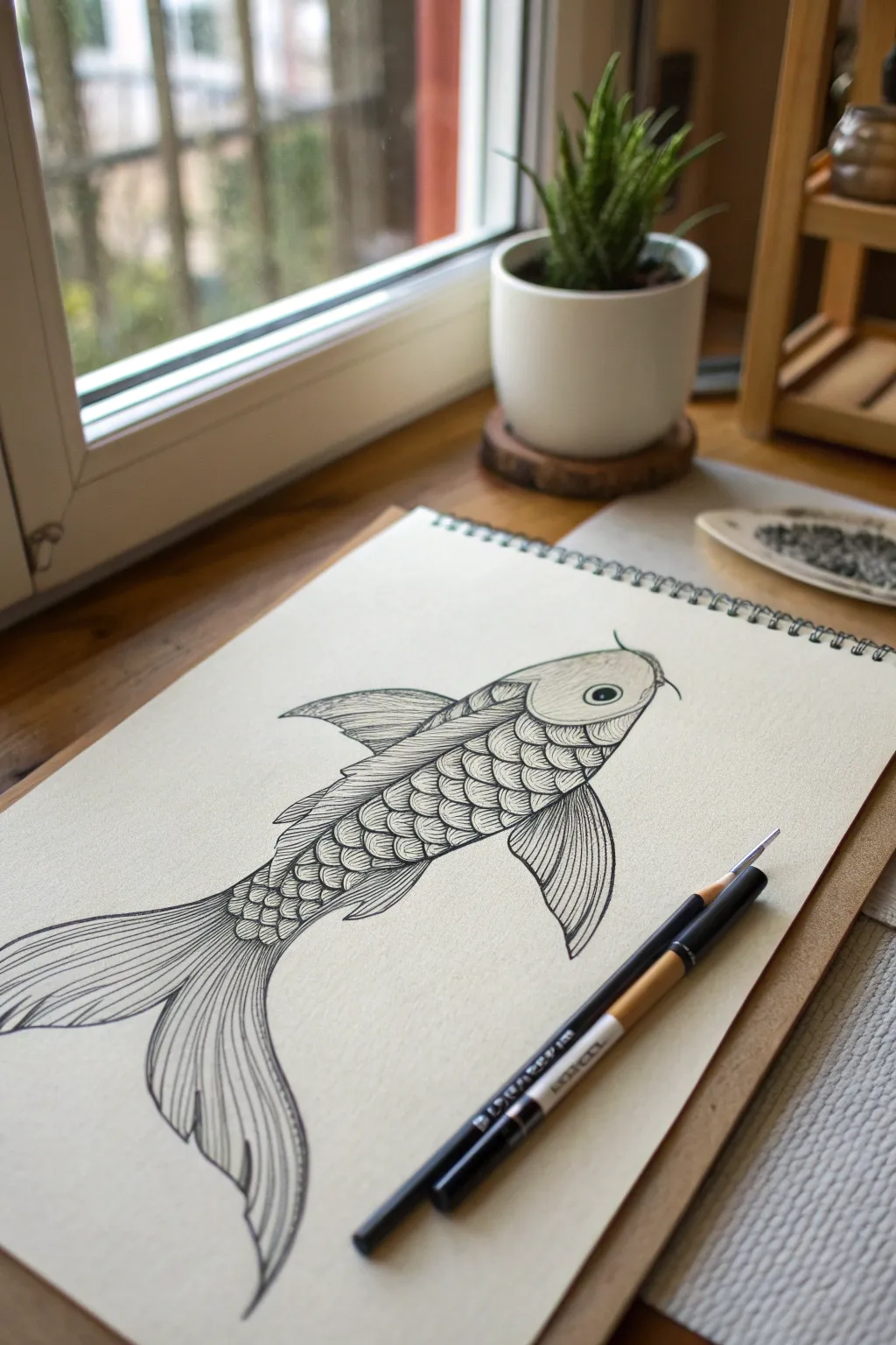
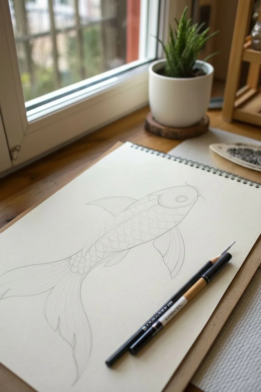
Master the art of texture and flow with this stylized koi fish illustration. By combining repetitive scale patterns with long, sweeping fin lines, you’ll create a drawing that feels both structured and fluid on the page.
How-To Guide
Materials
- Spiral-bound sketchbook with smooth, heavyweight paper
- Fine liner pen (black, 0.3mm or 0.5mm)
- Thinner fine liner pen (black, 0.1mm) for details
- Graphite pencil (HB or 2B) for sketching
- Kneadable eraser
- Brush pen (optional, for thicker outlines)
Step 1: Structural Sketch
-
Establish the curve:
Begin with your pencil by drawing a long, gentle S-curve across your paper diagonally. This ‘spine’ line dictates the movement of the fish and ensures it doesn’t look stiff. -
Map the body shape:
Lightly sketch an oval for the head at the top right of your curve. From there, extend the body downwards, tapering it gradually until it meets the tail section. The body should look like a stretched teardrop following that initial S-curve. -
Place the fins:
Sketch the triangular shape of the dorsal fin on the back. Add the pectoral fin near the gills on the side, and sketch the large, flowing caudal fins (tail) at the bottom, letting them fan out widely. -
Refine the outline:
Go over your rough shapes to create a single, clean contour line for the fish. Define the gill cover as a curved line behind the head and mark a small circle for the eye. Keep these pencil lines light so they erase easily later.
Jittery Lines?
If your long fin lines look shaky, try drawing from your shoulder rather than your wrist. Moving your whole arm creates smoother, more confident curves than pivoting just your hand.
Step 2: Inking the Outline
-
Commit to the contour:
Using your 0.5mm pen, trace the main outline of the fish’s body. Use confident, single strokes rather than feathery ones to keep the look clean. -
Detail the head:
Ink the eye, leaving a tiny white highlight circle inside the pupil for life. Draw the gill curve and add the small whisker-like barbel near the mouth. -
Erase pencil guides:
Once the main ink outlines are completely dry, gently run your kneadable eraser over the drawing to remove the graphite. This gives you a clear canvas for the texture work.
Step 3: Scales and Texture
-
Start the scale grid:
Behind the gill line, switch to your thinner 0.1mm or 0.3mm pen. Draw the first row of scales as small, overlapping semi-circles. Think of them like roof shingles. -
Build the pattern:
Continue drawing rows of scales down the body. As the body tapers toward the tail, slightly reduce the size of your semi-circles to match the perspective. -
Add dimension to scales:
Inside each individual scale, draw 3-5 tiny curved lines at the base. These hatching lines create a shadow effect, making the scales look layered and three-dimensional rather than flat. -
Fill the dorsal fin:
Move to the top fin. Draw long, straightish lines radiating from the body outward. Keep these lines close together to create a rigid, spiny texture distinct from the soft scales.
Go Metallic
Once the black ink is dry, use a gold or silver gel pen to add highlights to the center of a few scales or the eye. This mimics the shimmer of real koi fish scales.
Step 4: Flowing Fins
-
Outline the pectoral fin:
Ink the shape of the side fin. Draw long, sweeping curves inside it that follow the outer contour. I find that broken lines here can suggest movement and light reflection. -
Structure the tail:
For the large tail, draw the main ‘spines’ or rays first. These should fan out from the base where the tail connects to the body. -
Add fin webbing:
Between your main tail spines, draw finer, thinner lines that curve slightly. These represent the delicate membrane of the fin. -
Darken the tips:
Add extra hatching or slightly thicker lines near the tips of the fins and where they join the body. This added contrast grounds the drawing.
Step 5: Final Polish
-
Check line weights:
Look at the outer edge of the fish again. If it feels too thin compared to the busy interior, thicken the outer perimeter line slightly to make the fish pop off the page. -
Enhance shadows:
Add small touches of black ink in the tight corners where fins meet the body or under the gill flap to deepen the shadows.
Now you have a beautifully textured aquatic study to add to your portfolio
Stippling Gradient Mini Landscapes
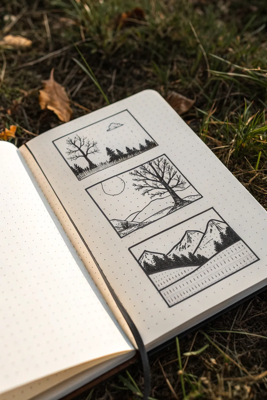
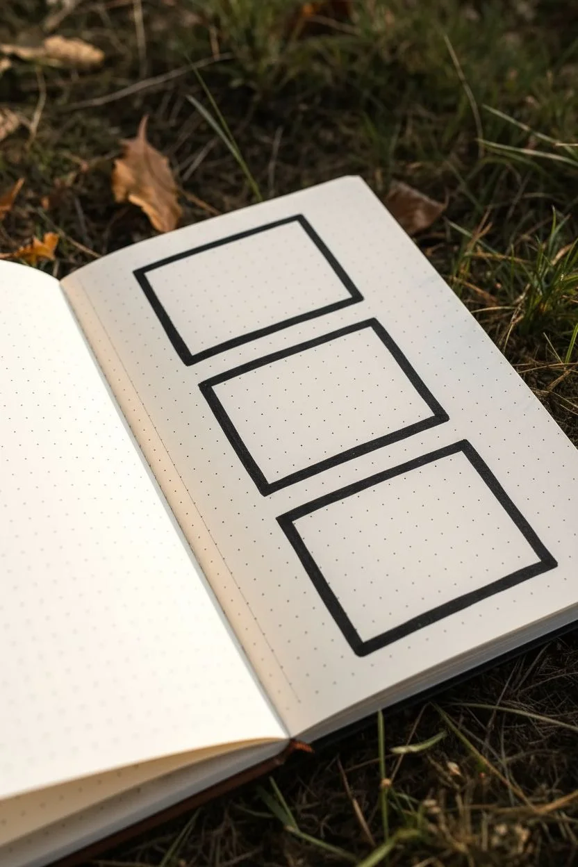
Capture the serenity of nature with these three distinct, framed pen illustrations. Using simple line work and stippling techniques on dot grid paper, this project creates a striking contrast between bold silhouettes and delicate textures.
Step-by-Step Tutorial
Materials
- A5 dot grid notebook or sketchbook
- Fine liner pens (sizes 005, 01, and 05 or 08 for filling)
- Ruler
- Pencil (HB or 2B)
- Eraser
Step 1: Planning and Layout
-
Measure the frames:
Begin by counting the dots on your page to center your composition. You will need space for three vertically stacked rectangles. Draw three equal rectangles using a pencil and ruler, leaving about 2-3 dot rows of space between each frame. -
Ink the borders:
Once you are happy with the spacing, trace over your pencil rectangles with a size 05 pen to create bold, defined frames for your landscapes. Let the ink dry completely before erasing any stray pencil marks.
Step 2: Top Panel: The Solitary Tree
-
Lightly sketch the horizon:
With a pencil, draw a low horizon line about one-third up from the bottom of the top frame. Add a small, simple cloud shape near the top center. -
Draw the bare tree:
Using a 01 pen, draw a leafless tree on the left side. Start with the trunk and branch out into finer twigs. Keep the lines somewhat jagged to mimic natural growth. -
Create the distant forest:
along the horizon line, draw a series of small, vertical jagged lines to represent distant pine trees. Fill these in solidly with a 05 pen to create a silhouette effect. -
Add texture to the grass:
Use vertical hatching lines of varying heights along the bottom of the frame to suggest tall grass. The lines should be denser near the tree base. -
Stipple the sky:
With your finest pen (005), gently add random dots throughout the sky area. Keep them sparse to suggest a clear, open atmosphere.
Uneven Ink Lines?
If your frame lines look shaky, thicken the border slightly to hide the wobble. A thicker border often makes the delicate drawings inside pop even more.
Step 3: Middle Panel: Rolling Hills
-
Outline the hills:
Sketch a rolling landscape with a foreground slope on the right and a distant hill on the left. Draw a simple circle for the sun or moon in the upper left quadrant. -
Add the focal tree:
Draw a larger, more detailed bare tree on the right slope using the 01 pen. Extend its branches so they reach across the sun, creating depth. -
Detail the ground:
Use horizontal, slightly curved lines to define the contours of the hills. Add small clusters of hatching to suggest rocks or scrubby bushes in the foreground. -
Dotted atmosphere:
Apply stippling around the sun and the bottom of the sky to give the drawing a sense of airiness.
Add Color
Use a single watercolor wash or a mildliner highlighter in a muted tone (like grey or sage green) behind the mountains or trees for a splash of mood.
Step 4: Bottom Panel: Mountain Peaks
-
Sketch the mountains:
Draw two large triangular mountain peaks dominating the scene. In the foreground, mark out a dark, solid hill. -
Ink the foreground:
Using your thickest pen (05 or 08), completely fill in the foreground hill and add small jagged shapes on top to represent a dense pine forest in silhouette. -
Detail the mountain slopes:
Switch to the 005 pen. Draw jagged lines down the side of the mountains to indicate ridges. Leave the ‘sunny’ sides of the peaks mostly white. -
Add texture to shaded areas:
Use very fine stippling or short hatching marks on the shadowed side of the mountain peaks to give them volume and mass. -
Create the reflection:
Beneath the black foreground, draw a straight horizontal line. Below this, draw vertical dashed lines of varying lengths to mimic the reflection of the trees in a still lake.
Step back and admire your trio of miniature worlds, perfect for a journal cover or a greeting card
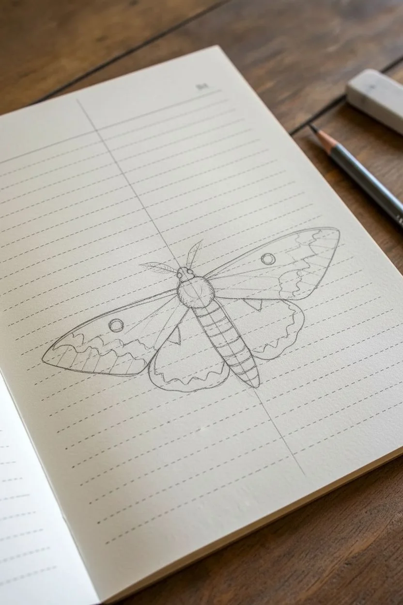
Insect Illustration With Crisp Ink Detail
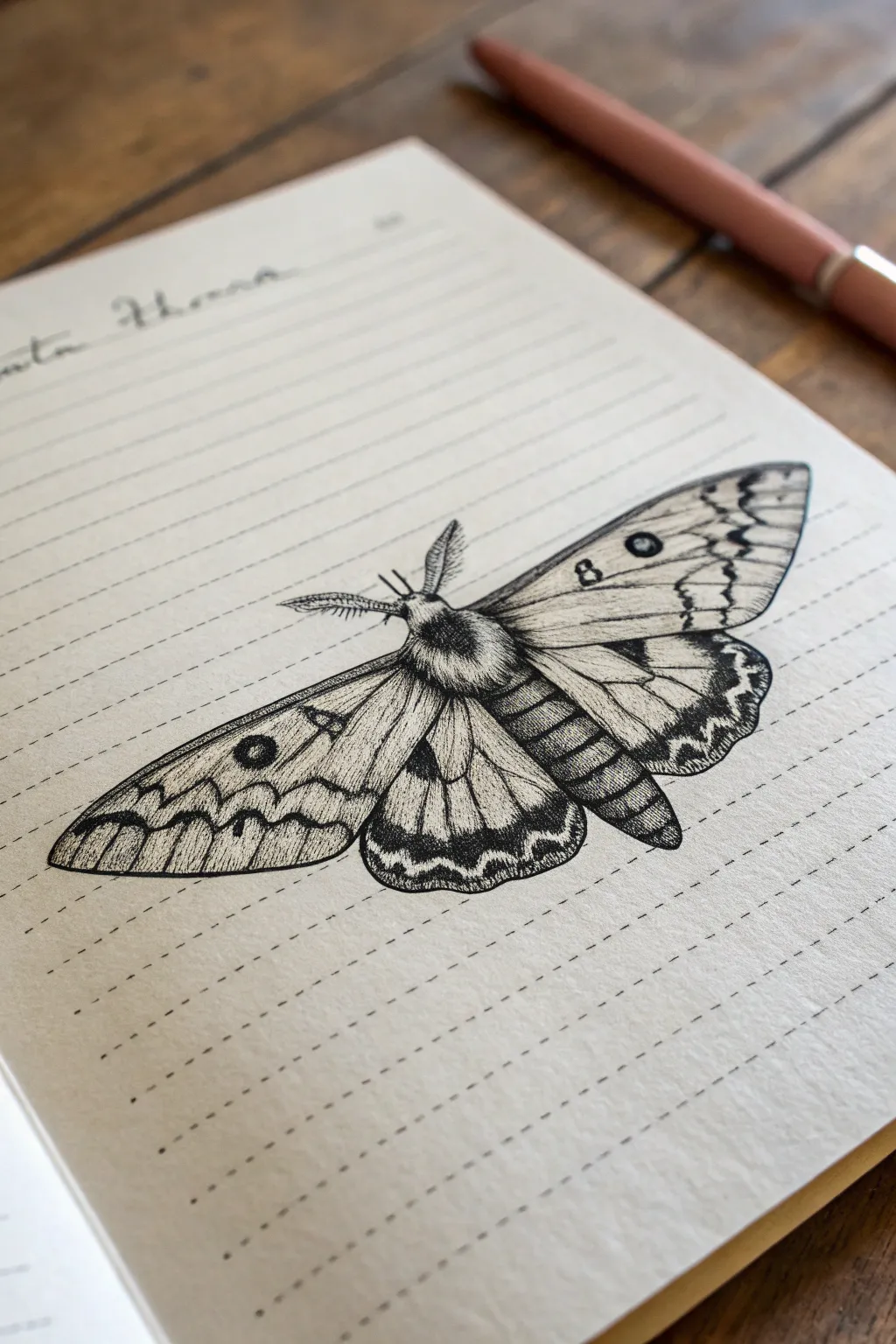
Capture the intricate beauty of an emperor moth using fine liner pens to create rich textures and crisp details. This project focuses on building depth through stippling and precise hatching, resulting in a scientific illustration style that pops off the page.
Step-by-Step
Materials
- Fine liner pens (sizes 0.05mm, 0.1mm, and 0.5mm)
- Pencil (HB or H for sketching)
- Quality eraser
- Lined notebook or drawing paper
- Ruler (optional for symmetry)
Step 1: Drafting the Structure
-
Define the Center Axis:
Begin by drawing a faint vertical line down the center of your page to act as an anchor for symmetry. Mark the top for the head and a point lower down where the abdomen will end. -
Block in the Body Shapes:
Sketch a small oval for the thorax (the fuzzy upper body) and a segmented, elongated oval below it for the abdomen. Add a tiny circle for the head at the very top. -
Map the Wing Span:
Extend two diagonal lines upwards and outwards from the thorax to define the top edge of the forewings. Draw swooping curves downwards to create the outer shape of the wings, ensuring both sides mirror each other. -
Add Hindwings:
Tuck the lower wings (hindwings) partially underneath the forewings. These should have a more rounded, scalloped bottom edge. -
Placement of Eye Spots:
In pencil, lightly draw circles where the distinct eye spots will go—one on each forewing and one on each hindwing. This ensures they are aligned before you commit to ink.
Pro Tip: Dot Density
Don’t rush stippling! Hold the pen vertically and tap lightly. Slanted dots look like dashes. Build density slowly; you can always add more ink, but you can’t erase it.
Step 2: Inking Outlines & Body Texture
-
Outline the Wings:
Using a 0.1mm pen, carefully go over your pencil outlines for the wings. Keep your hand steady but allow for slight natural variations in the line weight to mimic organic edges. -
Furrify the Thorax:
Switch to a technique of short, flicking strokes to ink the thorax. You want this area to look soft and fuzzy, so avoid a solid outline. Instead, build up the shape with many tiny hair-like lines. -
Segment the Abdomen:
For the abdomen, draw curved horizontal bands. Use stippling (tiny dots) along the bottom edge of each segment to create a rounded, 3D effect, leaving the center of each segment lighter for a highlight. -
Detail the Antennae:
Draw the main stem of the antennae first. Then, add tiny, comb-like branches coming off both sides of the stem, making them dense near the base and tapering off at the tips.
Step 3: Pattern & Shading
-
Inking the Eye Spots:
Fill in the centers of the eye spots with your darker 0.5mm pen, leaving a tiny speck of white for a reflection if desired. Draw concentric rings around them with the 0.05mm pen. -
Drawing Wing Veins:
Lightly sketch the veins radiating from the body to the wing, tips. Go over these with your finest 0.05mm pen. I find it helpful to use broken lines occasionally so the veins don’t look like stiff wires. -
Creating Zig-Zag Borders:
Draw the distinct jagged or wavy bands that run parallel to the wing edges. Fill the darker sections of these bands with dense hatching or stippling to create high contrast. -
Stippling for Gradient:
To shade the wings, use stippling. Concentrate your dots heavily near the body and the wing veins, spreading them out as you move into the open spaces. This creates a soft, gradient shadow. -
Darkening Wing Tips:
The tips of the forewings often have darker markings. Use cross-hatching (layering lines in opposing directions) here to build deep value without losing the paper’s texture completely. -
Refining the Edges:
Add tiny ticking marks or short lines along the outer rim of the wings to suggest a fringed edge. -
Final Contrast Check:
Step back and look at your drawing. Use your 0.5mm pen to darken the deepest shadows—usually right where wings overlap or under the abdomen—to make the drawing pop. -
Clean Up:
Wait at least 10 minutes to ensure the ink is completely dry. Gently erase all visible pencil guidelines to reveal your crisp ink work.
Level Up: Vintage Vibe
Draw your moth on tea-stained paper or lightly wash over the finished drawing with dilute watercolor in sepia tones for an antique field-journal aesthetic.
Now you have a stunning, permanent record of nature ready to be framed or kept in your sketchbook
Inverted Value Drawing (Black Background, White Highlights)
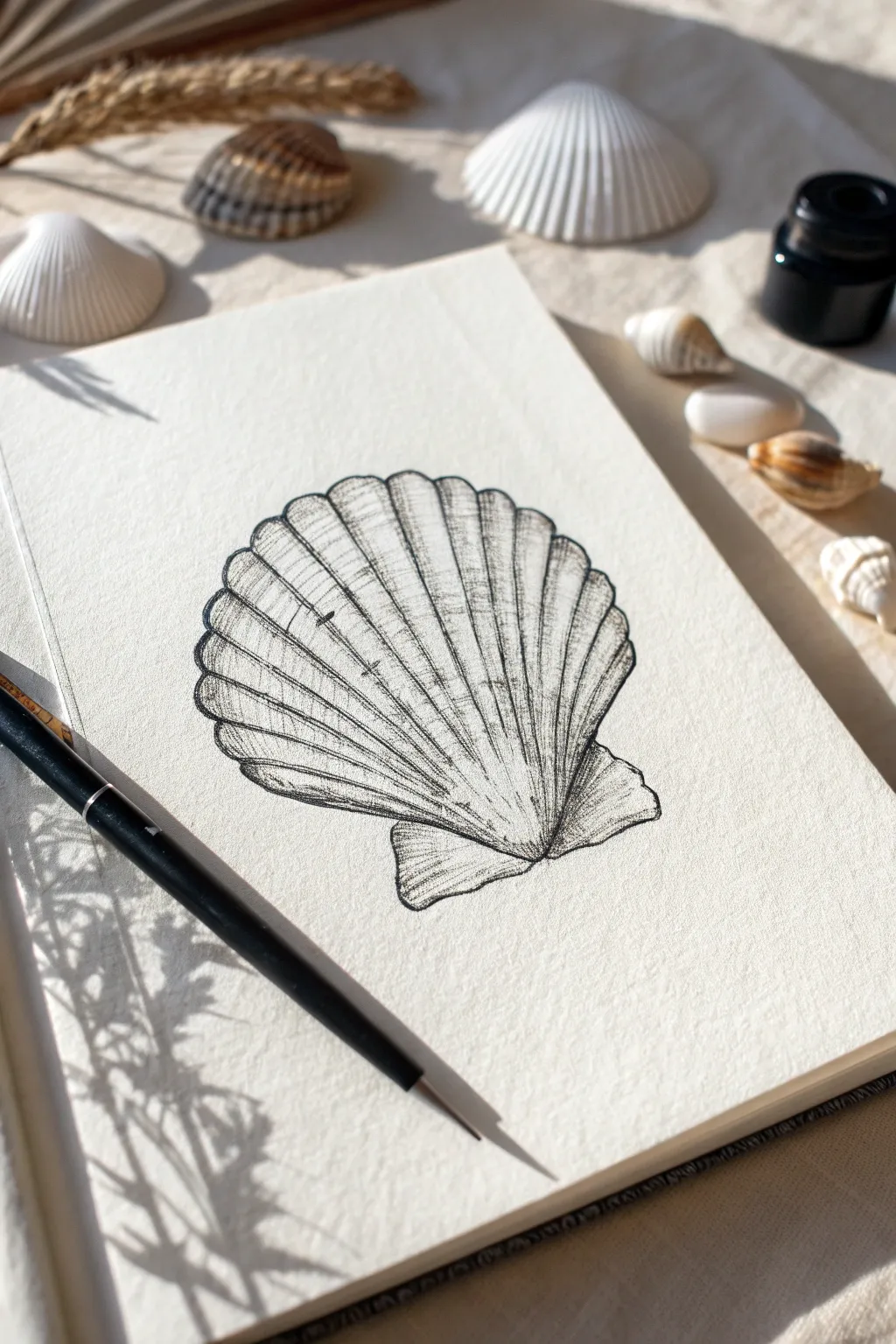
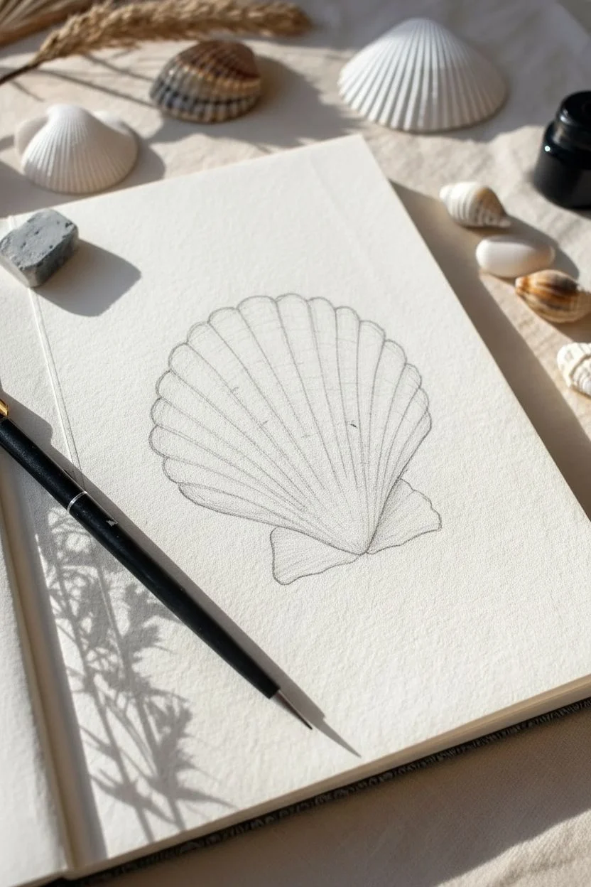
Capture the delicate textures of sea life with this detailed pen and ink study of a scallop shell. While simple in composition, this project teaches essential hatching techniques to render volume and ribbed textures on cream-colored paper.
Detailed Instructions
Materials
- Fine liner pen (size 01 or 03, black)
- Dip pen and India ink (optional, for warmer lines)
- Cream or off-white textured drawing paper (hot press watercolor or mixed media)
- HB Graphite pencil
- Kneaded eraser
Step 1: Planning the Structure
-
Establish the Fan Shape:
Begin lightly with your HB pencil. Draw a wide, inverted fan shape or a semi-circle that flattens slightly at the top. This will be the main body of the shell. -
Add the Wings:
At the narrow base of your fan shape, sketch two small, triangular protrusions extending outward. These differ slightly in size, giving the shell its characteristic asymmetrical ‘wings’ or ears. -
Map the Ribs:
Draw faint guidelines radiating from the bottom center point (the umbo) out to the curved top edge. Space them evenly, creating about 12-15 distinctive sections that widen as they reach the top.
Pro Tip: Line Weight
Vary your pressure. Press harder on the shadowed side (left) and lift the pen slightly as you move toward the light source to create instant volume.
Step 2: Inking outlines and Textures
-
Outline the Perimeter:
Switch to your black ink pen. Carefully trace the outer edge of the shell. Use a broken, organic line rather than a perfect curve to mimic the natural wear of a shell found on the beach. -
Define the Scalloped Edge:
At the top curve, make the line dip slightly between each pencil guideline, creating that classic scalloped silhouette. -
Draw the Primary Ribs:
Draw the main vertical lines following your pencil guides. I prefer to pull the pen from the bottom center upwards, letting the line vary slightly in weight to feel organic. -
Add Secondary Lines:
Between the main ribs, add very faint, broken lines. These suggest the subtle valleys between the ridges without overcrowding the drawing.
Troubleshooting: Wobbles
Shaky lines? Embrace them! Shells are naturally imperfect and weathered. A jittery line often looks more realistic than a perfectly smooth geometric one.
Step 3: Shading and Form
-
Start Hatching:
To make the shell look 3D, add hatching strokes. Focus on the left side of the shell to indicate a shadow source. Use short, diagonal strokes that cross the ribs. -
Deepen the Valleys:
Add denser vertical hatching inside the ‘valleys’ between the ribs, leaving the tops of the ribs white/blank to represent highlights catching the sun. -
Contour the Bottom:
Near the narrow base of the shell, curve your hatching lines slightly to follow the roundness of the form. This helps the shell look convex rather than flat. -
Render the Wings:
Texture the small bottom wings with horizontal lines. Keep the bottom-most edge darker to ground the object. -
Add Surface Imperfections:
Place a few random dots or tiny squiggles across the surface to mimic sand grains or calcium deposits. -
Strengthen the Contrast:
Go back over the darkest shadow areas—usually the left side and the very bottom crevices—with a second layer of cross-hatching.
Step 4: Finishing Touches
-
Dry and Erase:
Wait at least 15 minutes to ensure the ink is completely dry. Gently roll a kneaded eraser over the page to lift the graphite guides without damaging surface texture. -
Assess the Values:
Step back and look at your drawing. If it looks too flat, add a few more dark strokes at the very bottom edge where the ridges meet.
Now you have a timeless botanical-style illustration ready to frame.
Circular Vignette Seascape With Negative-Space Foam
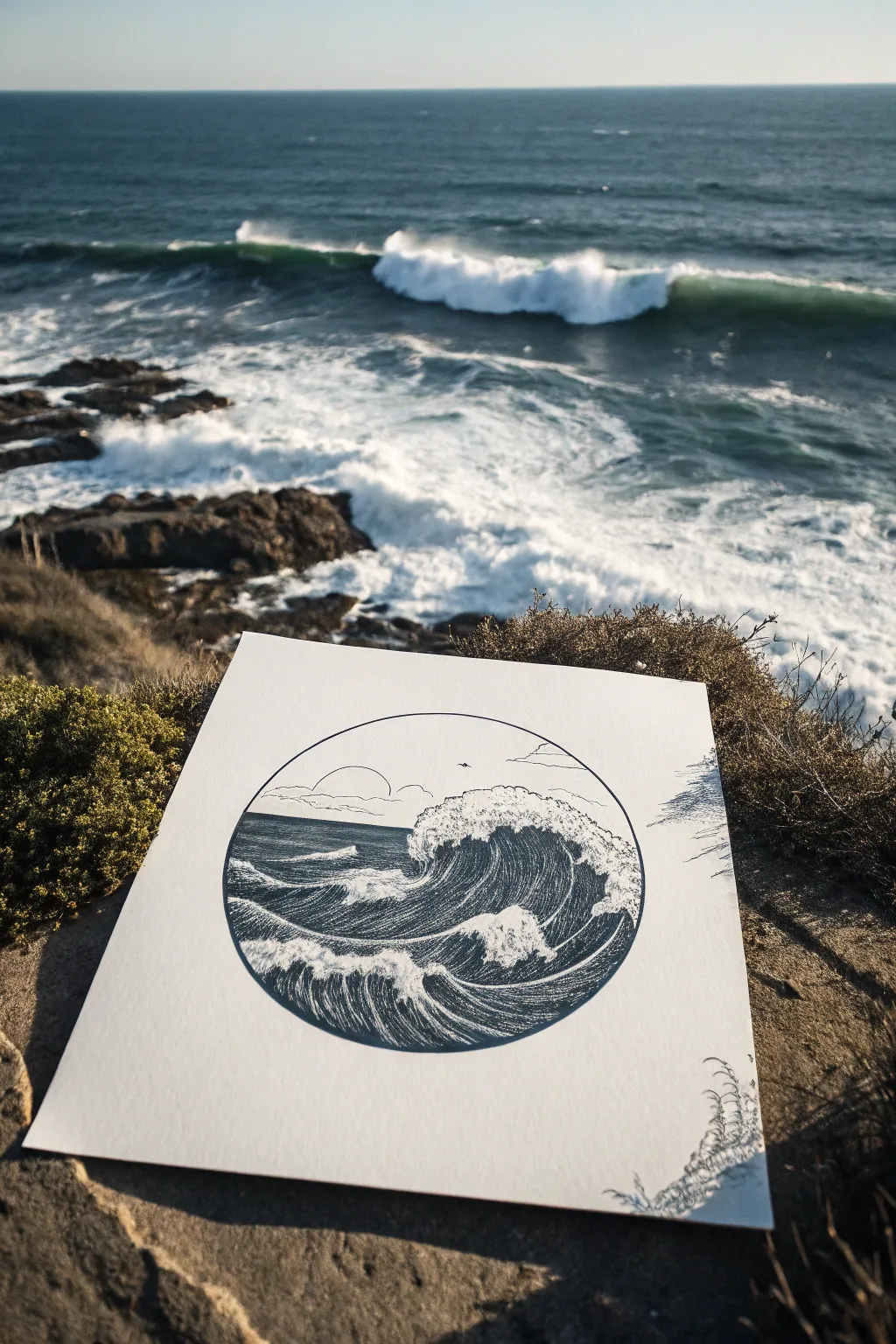
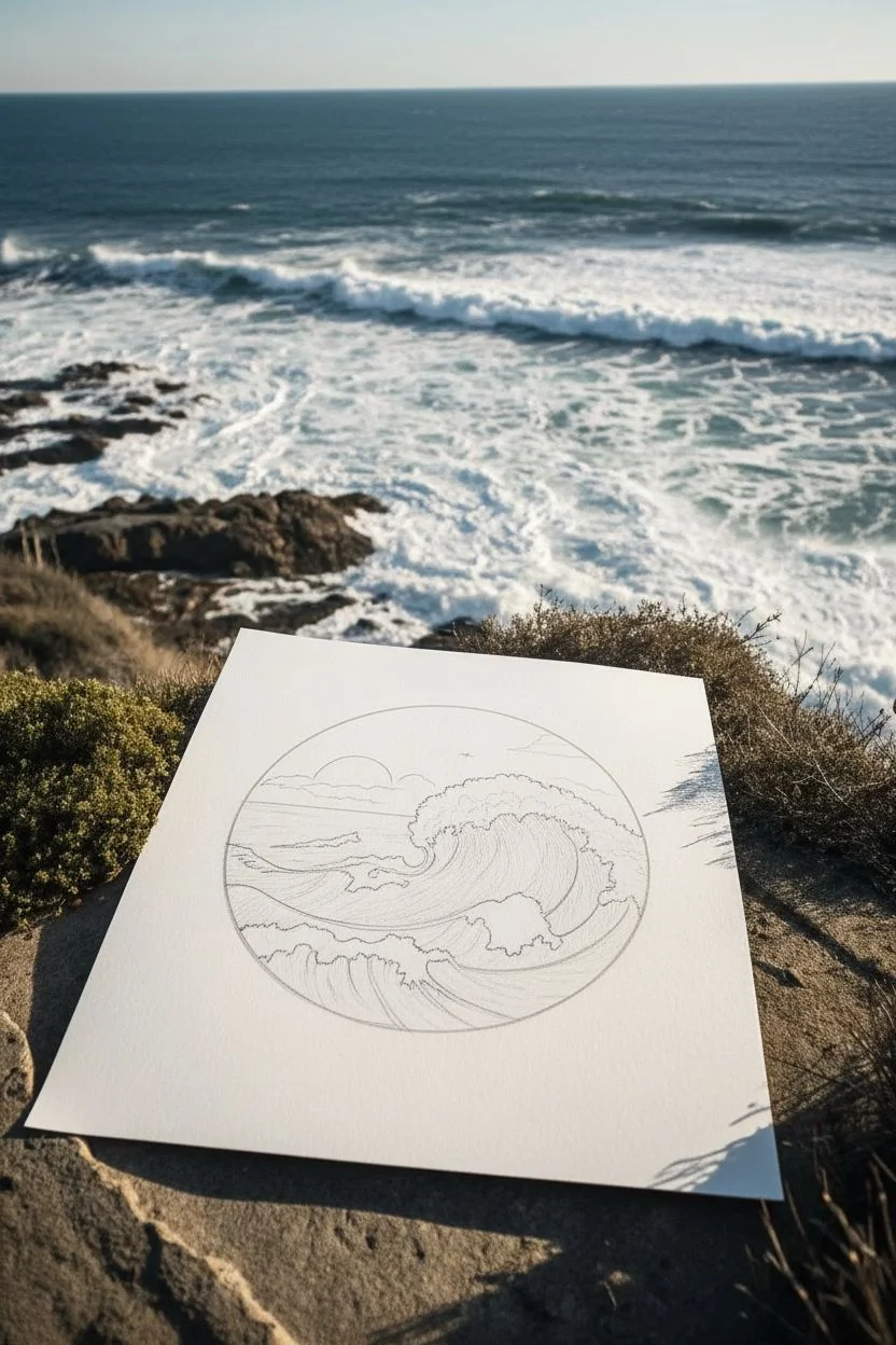
Capture the raw energy of the ocean within a serene, contained vignette using simple pen strokes. This project relies on the contrast between dense, inked water and the white of the paper to create crashing foam.
How-To Guide
Materials
- Fine liner pens (sizes 0.05, 0.1, and 0.5)
- High-quality, heavy drawing paper or bristol board
- Compass or circular template
- Pencil (HB or 2H)
- Eraser (kneaded or vinyl)
- Ruler (optional for horizon)
Step 1: Planning the Vignette
-
Draw the boundary:
Start by using your compass to draw a perfect circle in the center of your paper. This will be the distinct frame for your seascape. -
Sketch the horizon:
Lightly sketch a horizontal line across the circle, positioned a bit above the center point. I like to keep the horizon slightly higher to give more room for the waves in the foreground. -
Outline the main wave:
Sketch the shape of a large, crashing wave dominating the center. Focus on the curl—the ‘barrel’ shape—and the jagged, irregular top edge where the foam explodes. -
Add secondary waves:
Draw smaller, rolling wave shapes in the foreground and a few suggestion lines for distant swells in the background. -
Define the foam layout:
Crucially, outline the patches of foam floating on the water’s surface. These will remain uninked later, so draw their shapes clearly now. -
Place background elements:
Sketch a simple sun half-hidden by clouds near the horizon and perhaps a tiny bird silhouette for scale.
Don’t Rush the Flow
When hatching the water, rotate your paper physically. It’s much easier to draw smooth, curved lines by pulling the pen toward your body rather than pushing it away.
Step 2: Inking the Outlines
-
Ink the frame:
Using a 0.5 pen, carefully trace over your circular pencil line. A steady hand is key here to keep the vignette sharp. -
Trace foam edges:
Switch to a finer 0.1 pen. Trace the jagged tops of the waves and the outlines of the floating foam patches. Use a broken, shaky line here; water isn’t perfectly smooth. -
Ink the horizon:
Draw the horizon line and the clouds. Keep the background elements delicate to push them into the distance.
Step 3: Creating Texture and Depth
-
Establish the flow:
This is the most time-consuming part. You will be drawing the water using directional lines. Observe the curve of the wave and draw lines that follow that curve. -
Fill the dark water:
Using a 0.05 or 0.1 pen, start filling the ‘water’ areas with closely spaced, parallel lines. Leave the foam completely white. -
Building shadow:
Where the water curls under the wave (the barrel), make your lines denser or cross-hatch slightly to create deep shadow. -
Detailing the foam:
While the foam stays mostly white, add tiny dots (stippling) or very faint, short dashes near the edges of the white areas to give the foam volume. -
Refining the foreground:
In the foreground water, ensure your lines curve around the floating foam patches, making them look like they are sitting on top of the surface. -
Background contrast:
Make the distant ocean (near the horizon) darker and more uniform with horizontal hatching. This provides contrast against the lighter sky. -
Final touches:
Ink the bird silhouette solid black. Once the ink is totally dry, gently erase all underlying pencil marks to reveal the crisp contrast.
Add Decorative Elements
Break the frame! Draw some sea oats or floral elements outside the circle at the bottom right corner, overlapping the line slightly for a dynamic 3D effect.
You now have a striking nautical illustration that captures the movement of the sea within a calm geometric form
Loose Scribble Shading Portrait Study
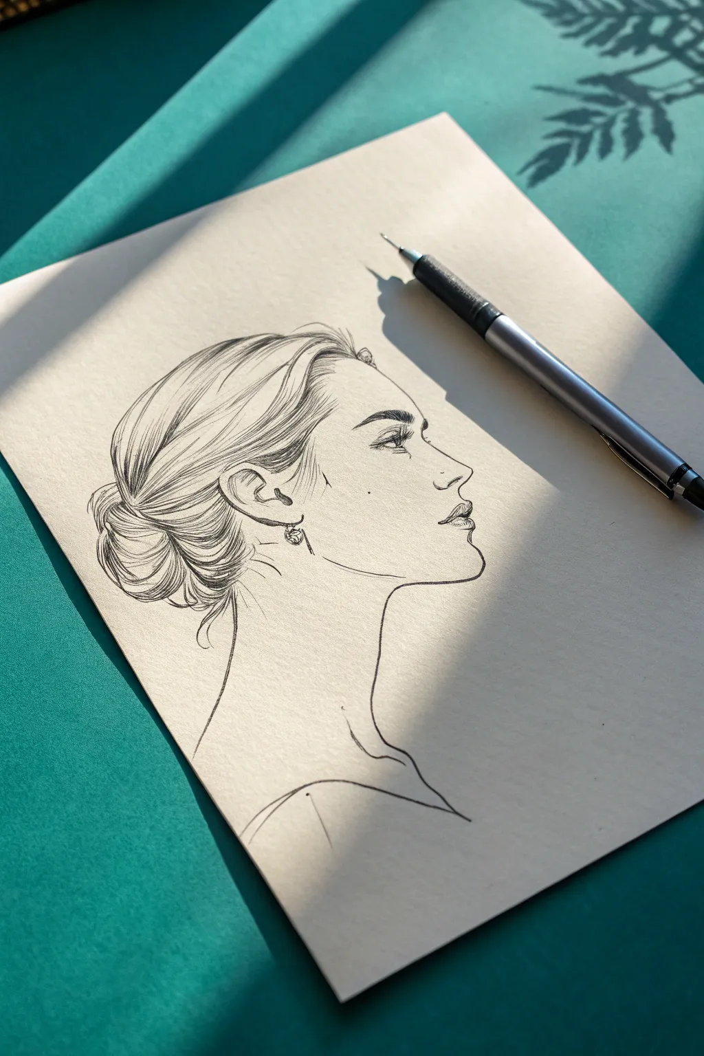
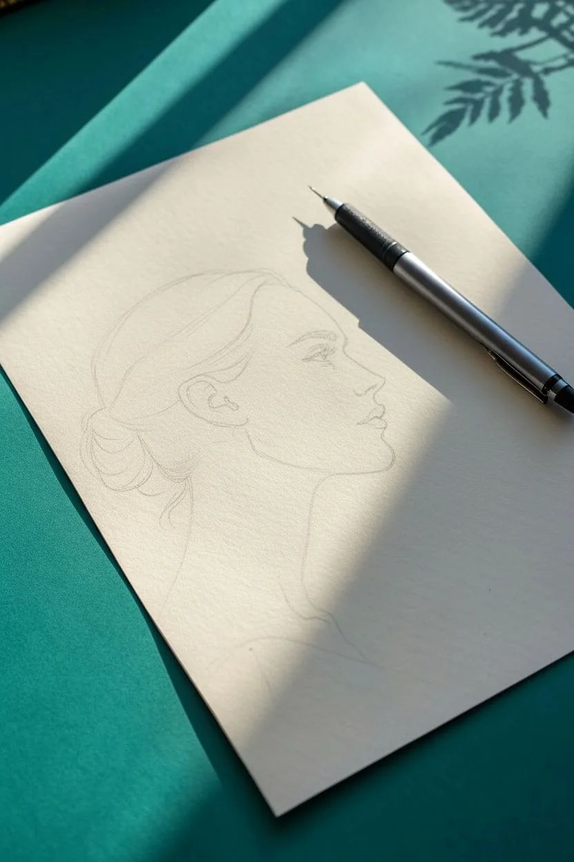
Capture the elegance of a classic profile using fine lines and confident, sweeping strokes. This pen drawing study focuses on balancing detailed hair texture with minimal facial shading for a striking, high-contrast look.
Step-by-Step
Materials
- Fine-liner pen (0.1mm or 0.3mm)
- Mechanical pencil (HB or 2B)
- Kneadable eraser
- Smooth bristol or mixed media paper (cream or off-white tone recommended)
Step 1: Penciling the Structure
-
Map the head shape:
Begin with your mechanical pencil, sketching a light oval for the cranial mass and a sweeping curve down for the jawline. Don’t press hard; these are just ghostly guides. -
Define the profile angle:
Draw a vertical line to mark the front of the face. Establish the placement of the brow ridge, the tip of the nose, and the chin. Ensure the nose has a slight upturn to match the reference’s character. -
Outline the features:
Lightly sketch the almond shape of the eye, placed just below the brow ridge. Mark the lips with three simple curves—upper lip, center line, and lower lip—keeping the mouth slightly open. -
Block in the hair:
Outline the general volume of the hair. Sketch the swept-back motion from the forehead towards the nape of the neck, and draw a loose, circular shape for the low bun. -
Refine the ear placement:
Place the ear along the jawline extension, roughly aligned horizontally between the eye and the nose tip. Sketch the basic c-shape and inner cartilage details.
Wrist Mechanics
For the long, flowing hair strands, lock your fingers and move your entire arm from the elbow. This creates smoother curves than moving just your wrist.
Step 2: Inking the Features
-
Start with the eye:
Switch to your fine-liner. Draw the upper lash line with a thick, confident stroke. Add delicate, short flicks for the eyelashes and define the iris, leaving the pupil dark but not solid black to suggest depth. -
Define the eyebrow:
Use short, directional strokes to build the eyebrow texture. Start thinner near the nose and thicken the arch, tapering off towards the temple. -
Trace the profile:
Carefully ink the forehead, nose, and lips. Use a broken line technique—lifting the pen slightly—on the bridge of the nose to keep it looking feminine and soft. -
Detail the lips and chin:
Darken the corner of the mouth and the bottom of the upper lip. Use a single, clean line for the jaw, extending it down into the neck with a gentle curve.
Step 3: Hair and Texture
-
Establish hair direction:
This is the most crucial part for that ‘loose scribble’ look. Start at the hairline and pull long, sweeping strokes back towards the ear. Keep your wrist loose. -
Build volume with layers:
Add density near the roots and the area behind the ear by grouping more lines together. Leave some areas of the paper white to represent light hitting the shiny hair strands. -
Draw the bun:
Use curved, circular strokes to form the messy bun. Allow a few ‘stray’ lines to escape the main shape, giving the drawing a natural, unposed feel. -
Darken the shadows:
Go back into the deepest areas of the hair—specifically the space right behind the ear and the base of the bun—and thicken your lines or cross-hatch slightly to add contrast. -
Add the earring:
Draw the small hoop earring with a few quick loops. Add a tiny scribbled shadow right under the earlobe to anchor it.
Clean Lines?
If your ink lines look shaky, you are likely moving too slowly. Speed up your stroke. A fast, confident line is always smoother than a slow, careful one.
Step 4: Final Touches
-
Neck and shoulder lines:
Extend the neck lines down, hinting at the throat and the sternocleidomastoid muscle. Suggest the shoulder and collarbone with very sparse, minimalist lines. -
Adding beauty marks:
Place a few small dots on the cheek and neck if desired, adding clear personality to the portrait. -
Check line weights:
Look over the drawing. Strengthen the outer contour of the profile if it feels too weak compared to the hair. -
Erase pencil guides:
Once the ink is completely dry—I usually wait at least five minutes to be safe—gently roll your kneadable eraser over the sketch to lift the graphite guides without damaging the paper surface.
Now you have a sophisticated profile study that celebrates the beauty of line weight and negative space
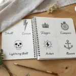
Micro-Doodle Page of Tiny Pen Icons and Patterns
Transform a plain dot grid page into a charming woodland-themed spread with this simple pen-and-ink border design. Featuring geometric bunting, a patterned side margin, and a garden of tiny botanical sketches, this layout is perfect for framing your daily notes or bujo lists.
Detailed Instructions
Materials
- Dot grid notebook or journal
- Fine liner pen (0.3mm or 0.5mm, black)
- Ruler or straight edge
- Pencil (optional, for sketching)
Step 1: Setting the Structure
-
Define the top boundary:
Begin by drawing a straight horizontal line across the top of your page, spanning from the left edge to the right. Use the dot grid as your guide to keep it perfectly level. -
Create the side margin:
draw two vertical parallel lines down the left side of the page. Space them about two or three dots apart to create a distinct column for your pattern. -
Draw the bunting triangles:
Along the top horizontal line, sketch a series of connected equilateral triangles hanging downwards. aim for about 5-7 triangles depending on your page width, letting the points rest on the dot grid row below.
Uneven Spacing?
If your triangles or column icons don’t fit perfectly at the end of the row, don’t erase! Just turn the partial shape into a decorative end-cap or fill the remaining sliver with solid ink.
Step 2: The Geometric Patterns
-
Fill the first triangle:
Starting from the left, fill the first triangle with small, tightly packed vertical lines or hatch marks. -
Add simple circles:
In the second triangle, draw a single small circle with a dot in the center, resembling a tiny eye or target. -
Create a zig-zag motif:
For the third triangle, draw a horizontal line across the middle, then fill the top half with tiny vertical dashes. -
Alternate designs:
Continue filling the remaining triangles with alternating patterns—try a simple circle, a textured scribble, or small geometric shapes. -
Start the left column pattern:
In the vertical column on the left, start at the top by drawing a few tiny star or flower shapes. -
Draw the geometric chain:
Below the stars, begin a repeating pattern of solid black squares connected by thin lines. I like to space these evenly, using the dots as anchors. -
Transition to diamonds:
About halfway down the column, switch from squares to diamonds. Draw small diamonds and fill them in with black ink, connecting them with short vertical lines to continue the ‘chain’ look.
Step 3: The Botanical Footer
-
Plant the first stem:
Along the bottom edge of your page, start on the far left by drawing a simple vertical stem. Add short, spiky branches coming off both sides to resemble a pine sprig or rosemary. -
Sketch the leafy sprout:
Next to the pine sprig, draw a stem with larger, open teardrop-shaped leaves. Keep the lines clean and simple, with leaves pointing upwards. -
Add a textured flower:
Draw the third plant with a straight stem topped by a small, dark oval bloom. Add horizontal stripes to the leaves along the stem for visual texture. -
Create a berry branch:
For variety, draw a stem that splits into many tiny offshoots, ending each one with a small, open circle to represent berries or buds. -
Draw the tall split leaf:
Next, sketch a plant with two distinct, long leaves splitting from a central point. Use small stippling or dots inside the leaves to give them a shaded effect. -
Finish with a tulip shape:
On the far right, draw a stem with alternating solid black leaves. Top it with a simple tulip-like flower head, shading the bottom half solid black. -
Add floating pollen:
To tie the bottom garden together, sprinkle a few tiny stray dots in the empty spaces between the plant stems giving the impression of floating pollen or seeds.
Level Up
Use a light gray mildliner or watercolor wash over just the bunting triangles and the leaves to add a soft pop of color without overwhelming the delicate linework.
You now have a beautifully framed page ready to hold your thoughts or daily tasks


Have a question or want to share your own experience? I'd love to hear from you in the comments below!