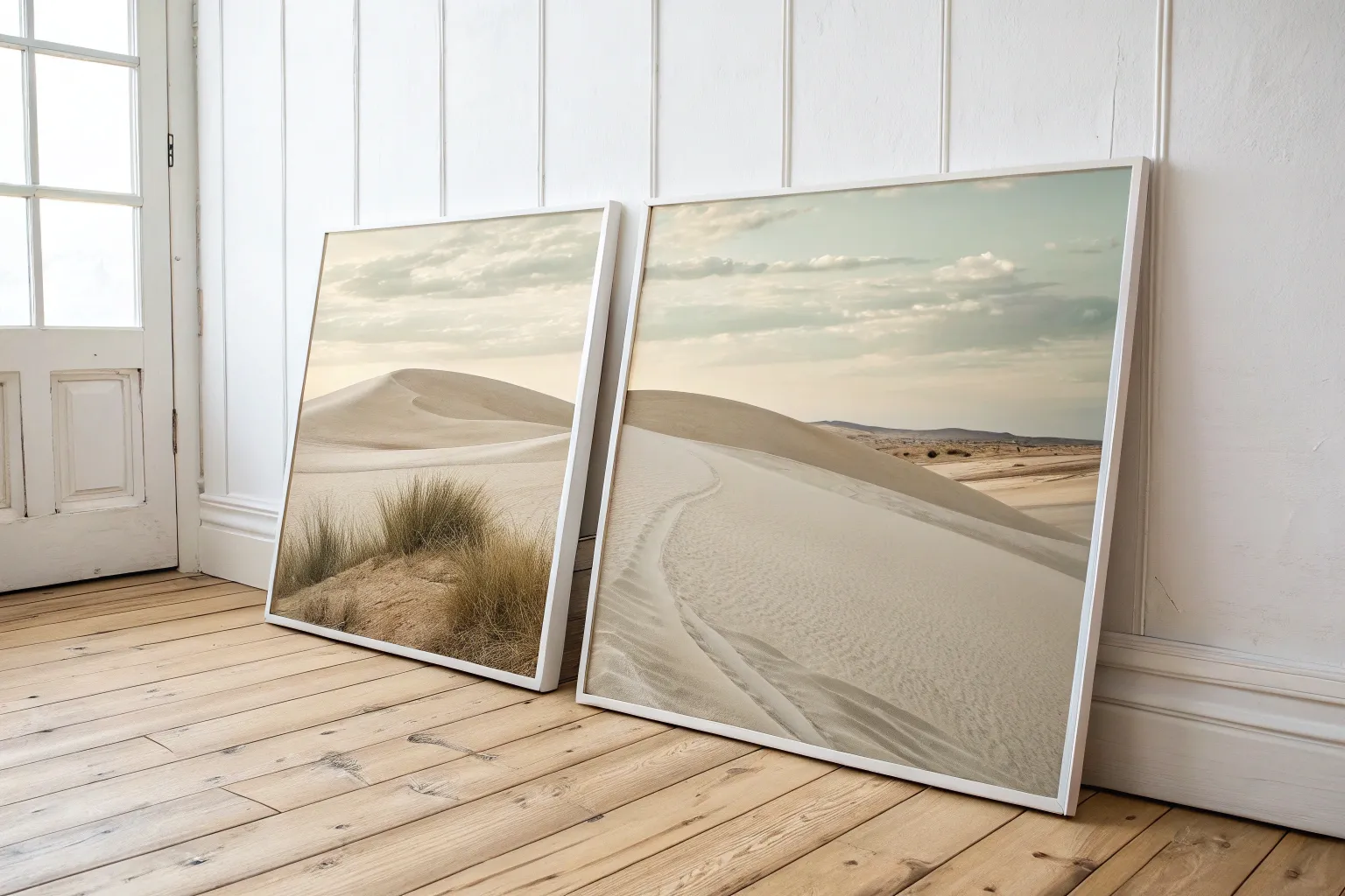
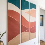
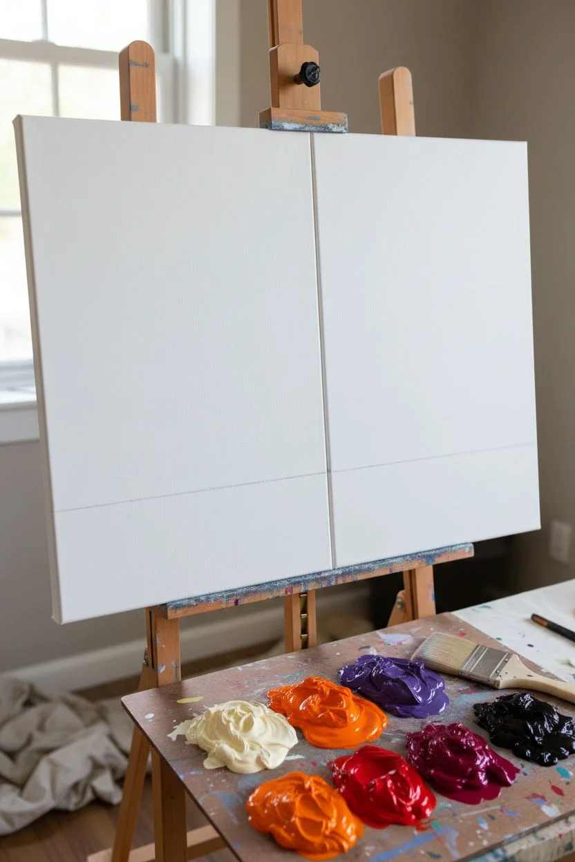
If you’ve got two canvases, you’ve basically got built-in drama—because that little gap can become part of the art. Here are my favorite 2 canvas painting ideas where the two panels talk to each other and feel like one bigger story.
Two Trees Making a Heart in the Gap
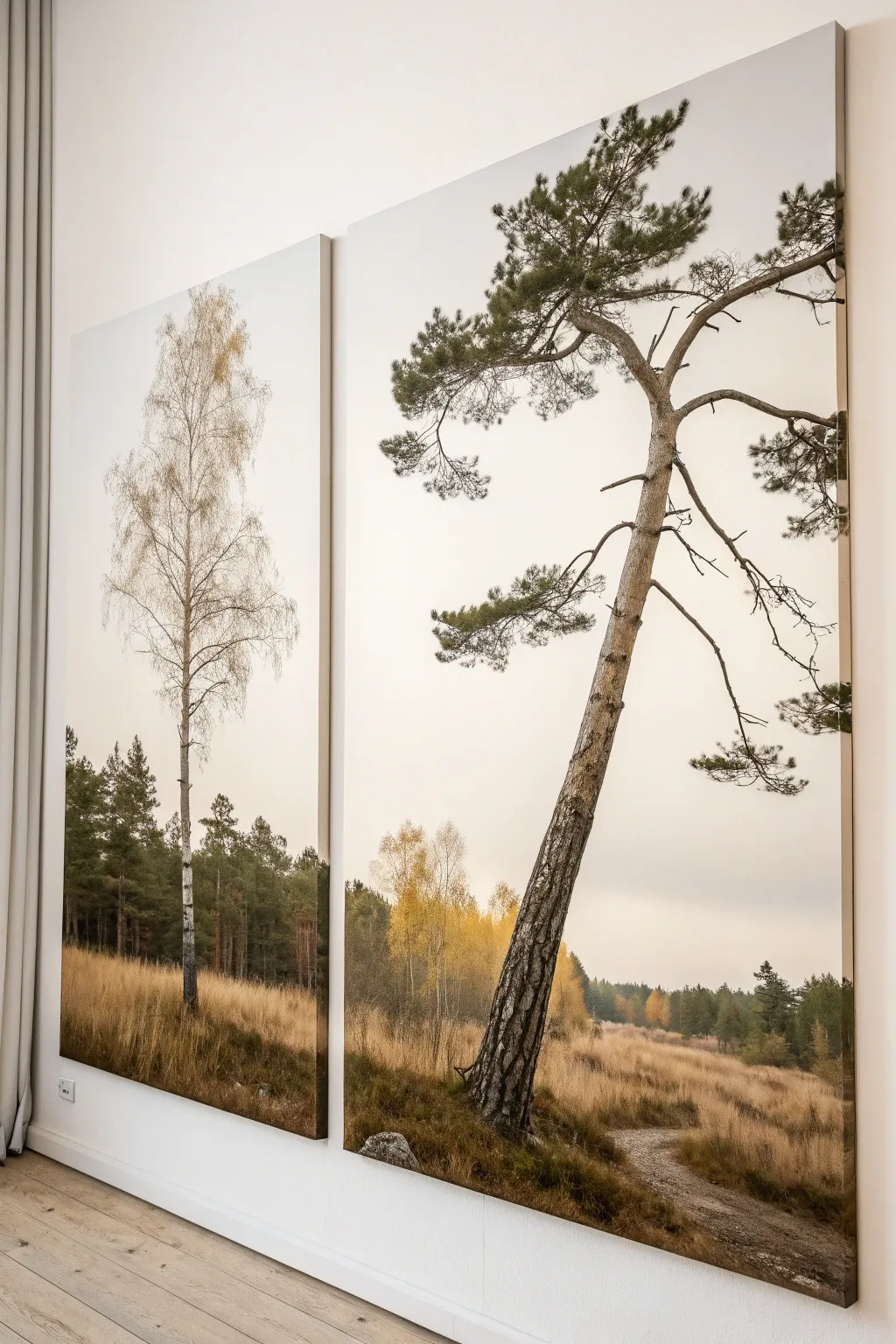
This elegant diptych project transforms a blank wall into a serene window onto a misty forest. By splitting a single panoramic scene across two large vertical canvases, you’ll create a modern, high-impact statement piece that balances the delicate verticality of a birch with the characterful lean of an old pine.
Step-by-Step Guide
Materials
- Two large gallery-wrapped canvases (e.g., 24×48 inches each)
- Acrylic paints: Titanium White, Mars Black, Burnt Umber, Raw Sienna, Yellow Ochre, Sap Green, Phthalo Green
- Large flat brush (2-3 inch) for blending backgrounds
- Medium round brush (size 6 or 8)
- Fine liner brush (size 0 or 1)
- Sea sponge or fan brush
- Palette knife
- Acrylic glazing medium (matte or satin)
- Wide masking tape or painter’s tape
- Easel or large flat workspace
Step 1: Setting the Atmosphere
-
Prepare the canvases:
Place your two canvases side-by-side on your workspace with a small gap between them, exactly as they will hang. This ensures your horizon lines and color gradients match perfectly across the break. -
Mix the sky gradient:
Create a very pale, warm grey by mixing Titanium White with a tiny dot of Burnt Umber and Yellow Ochre. You want an ‘overcast day’ feeling, not a bright blue sky. -
Paint the upper background:
Using your largest flat brush, cover the top two-thirds of both canvases with this pale mixture. Use horizontal strokes to keep the look smooth and calm. -
Blend the horizon:
While the sky paint is still wet, mix a slightly darker, hazier grey-green for the distant treeline. Blend this into the bottom third of the canvas, letting the colors merge softly to create a foggy, atmospheric perspective. -
Establish the ground layer:
For the grassy foreground, mix Yellow Ochre, Raw Sienna, and a touch of Burnt Umber. Block in the bottom section, sweeping the brush vertically in short strokes to mimic tall, dry grass.
Step 2: Building the Middle Ground
-
Add distant pines:
Mix a muted dark green using Sap Green and a touch of Mars Black. On the left canvas and the far right edge of the right canvas, paint the suggestions of background pine trees. Keep these shapes soft and slightly out of focus. -
Highlight the autumn foliage:
Using a sea sponge or an old scruffy brush, dab touches of pure Yellow Ochre and White into the lower background area where the two canvases meet. This creates the illusion of sunlit deciduous trees in the distance. -
Texture the grass:
Load a fan brush or chip brush with a mixture of Raw Sienna and White. Flick the brush upward from the bottom edge to create individual stalks of dried grass, layering them to build density. -
Create the path:
On the bottom right canvas, scrub in a wandering patch of light grey-brown paint to suggest a dirt path cutting through the grass.
Uneven Horizon Line?
If the ground level doesn’t match across the gap, place a strip of masking tape straight across both canvases to mark the horizon before you resume painting the background layers.
Step 3: The Hero Trees
-
Draft the main trunks:
Sketch the placement of your two main trees lightly with diluted paint. The birch on the left should be straight and slender; the pine on the right needs a dramatic lean toward the left. -
Paint the birch tree:
For the left canvas, paint the trunk of the birch using Titanium White. Keep it quite thin. Once dry, use a palette knife edge to scrape small horizontal lines of black across it for the signature bark texture. -
Branch out the birch:
Switch to your fine liner brush. Mix a watery grey-brown and paint very delicate, upward-reaching branches extending from the birch trunk. These should be wispy and intricate. -
Construct the pine trunk:
On the right canvas, paint the thick, leaning trunk using a mix of Burnt Umber and Grey. I find it helpful to twist the brush slightly as I pull it down to create a natural, gnarly shape. -
Add pine bark texture:
Mix a lighter tan color and use the side of your brush or a palette knife to create ‘plates’ of bark texture on the pine tree. Focus the light on the right side of the trunk to suggest a light source. -
Create pine branches:
Paint thick, jagged branches extending horizontally and downward from the pine trunk. These need to look heavy and old, unlike the delicate birch branches. -
Stipple the pine needles:
Using a stencil brush or a stiff hog bristle brush, push dark green paint onto the ends of the pine branches. Use a stabbing motion to create clusters of needles rather than painting individual distinct leaves. -
Final connection check:
Step back and look at the gap between canvases. Ensure the horizon line of grasses and the implied energy between the trees feels balanced across the empty space.
Pro Tip: Atmospheric Haze
Mix a glaze of 90% glazing medium and 10% white paint. Lightly brush this over the distant background trees to push them further back and make your foreground trees pop.
Hang your masterpieces with a two-inch gap between them to let the white wall become part of the composition

Day on One Canvas, Night on the Other
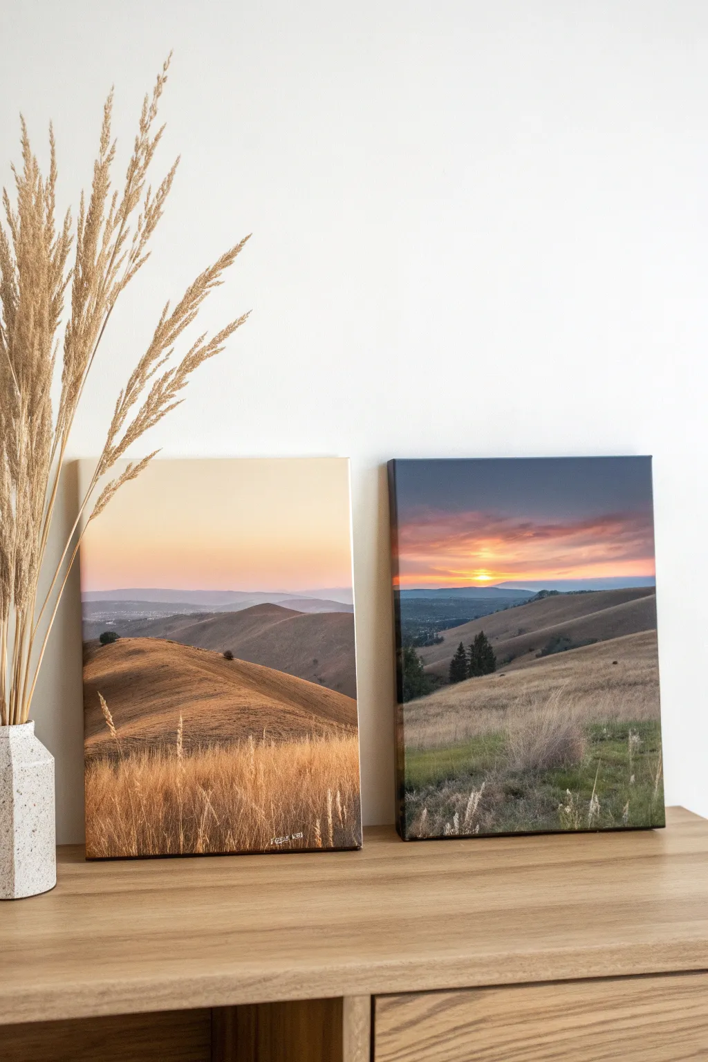
Capture the passing of time with this dual-canvas project featuring rolling hills bathed in two distinct lighting schemes. One canvas glows with warm golden hour tones, while the other captures the moody, shadowed drama of impending twilight.
Step-by-Step
Materials
- Two stretched canvases (16×20 or similar size)
- Acrylic paints (Titanium White, Yellow Ochre, Burnt Sienna, Burnt Umber, Ultramarine Blue, Alizarin Crimson, Cadmium Orange)
- Set of brushes (1-inch flat wash, medium filbert, lush fan brush, small liner)
- Palette knife
- Water cup and paper towels
- Pencil for sketching
- Easel or flat working surface
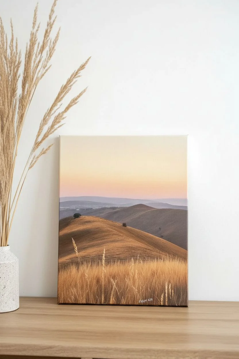
Step 1: Golden Hour Canvas
-
Sketch the Horizon:
Begin with your first canvas. Lightly sketch a rolling hill line about one-third of the way up from the bottom. Add a second, lower hill in the foreground that swoops down from the left side. -
Paint the Sky Gradient:
Mix a large amount of Titanium White with a touch of Yellow Ochre and a tiny dot of Alizarin Crimson. Paint the top half of the canvas, starting lighter at the horizon and blending slightly warmer as you move up, keeping it very soft and hazy. -
Create the Distant Hills:
Mix Ultramarine Blue with White and a little Alizarin Crimson to make a dusty purple. Paint the distant mountains just along the horizon line, keeping the edges soft to suggest atmospheric perspective. -
Block in the Middle Ground:
For the rolling hills in the middle distance, mix Burnt Sienna with Yellow Ochre and a touch of White. Apply this with a large flat brush, following the curve of the land. -
Highlight the Valleys:
While the middle ground is still tacky, mix a lighter version of your hill color. Brush this gently on the tops of the hills where the sun would hit, creating form and dimension. -
Paint the Foreground Base:
Load a filbert brush with Burnt Sienna and a bit of Burnt Umber. Block in the closest hill shape in the bottom third of the canvas. Use sweeping, horizontal strokes to mimic the lay of the land. -
Add Golden Grass Texture:
Switch to a fan brush or a dry flat brush. Mix Yellow Ochre and Titanium White. Use upward flicking motions to create tall, sun-dried grasses in the immediate foreground. -
Refine the Grasses:
Use a small liner brush with almost pure White mixed with a drop of Yellow Ochre to add individual stalks of wheat or grass that catch the light in the very front.
Muddy Mismatch
If your ‘twilight’ colors turn muddy when blending orange and blue, let the blue layer dry completely before painting the orange sunset clouds over it.
Step 2: Twilight Canvas
-
Establish the Twilight Sketch:
On the second canvas, sketch a similar composition but invite variation; perhaps the hills slope differently or there are trees visible. This ensures they look like a pair, not exact copies. -
Paint the Moody Sky:
Mix Ultramarine Blue with a touch of Burnt Umber for the top of the sky. As you work downward, blend in Cadmium Orange and Alizarin Crimson near the horizon to simulate a setting sun glow. -
Add the Sun Point:
Just above the horizon line, paint a small, soft circle using White and Cadmium Yellow to represent the setting sun breaking through the clouds. -
Create Shadowed Hills:
Mix a darker, cooler tone for the terrain using Burnt Umber and Ultramarine Blue. Block in the distant hills, making them darker than the sky to create a silhouette effect. -
Layering the Middle Ground:
For the middle hills, use a slightly lighter brown-grey mix. I like to add a hint of purple here to tie it to the evening sky tones. -
Adding Pine Trees:
Using a small flat brush turned sideways or a fan brush, dab in a few dark green-black shapes on the mid-distance ridge to represent pine trees. Keep them silhouetted against the lighter background. -
Foreground Grasses in Shadow:
Block in the foreground hill with a muted green-brown. Use a fan brush with a cool grey-beige mix to flick in texture for the grasses, which are now in shadow rather than direct sunlight. -
Final Highlights:
Add very subtle highlights to the tips of the grass using a pale grey, mimicking the last bit of ambient light hitting the field. Let both canvases dry completely before displaying them side-by-side.
Gallery Wrap Upgrade
Paint the image continuously over the sides of the canvas (gallery wrap style) so you can hang them without frames for a modern, expansive look.
Step back and admire how your dual landscapes transform the mood of the room simply through color and light

One Big Moon Split Across Two Canvases
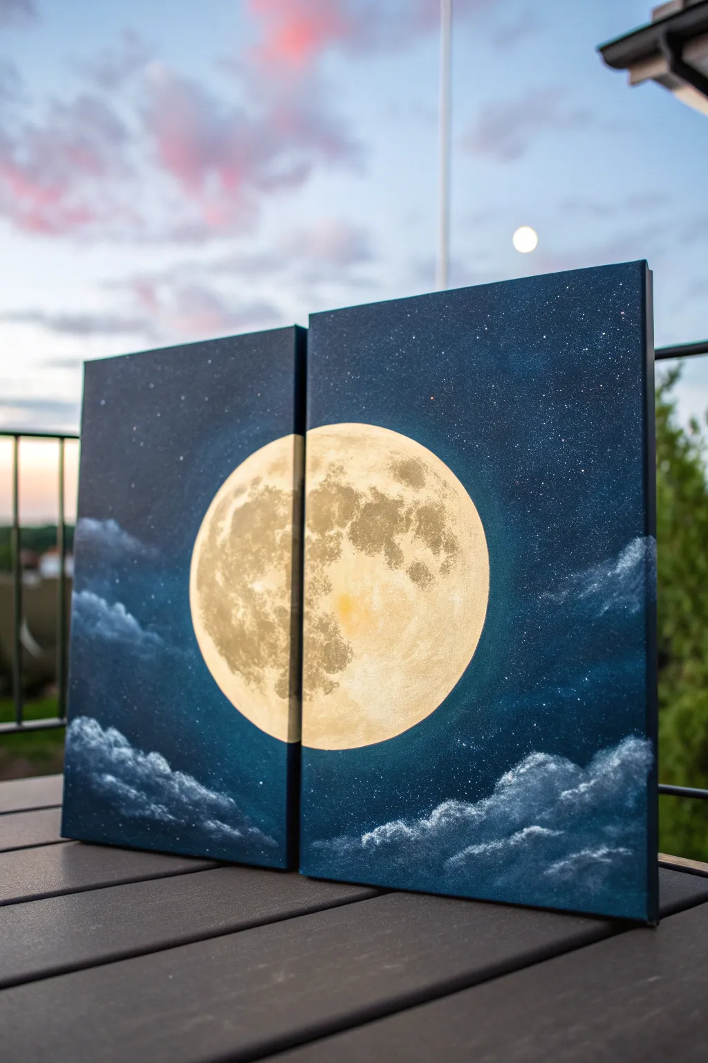
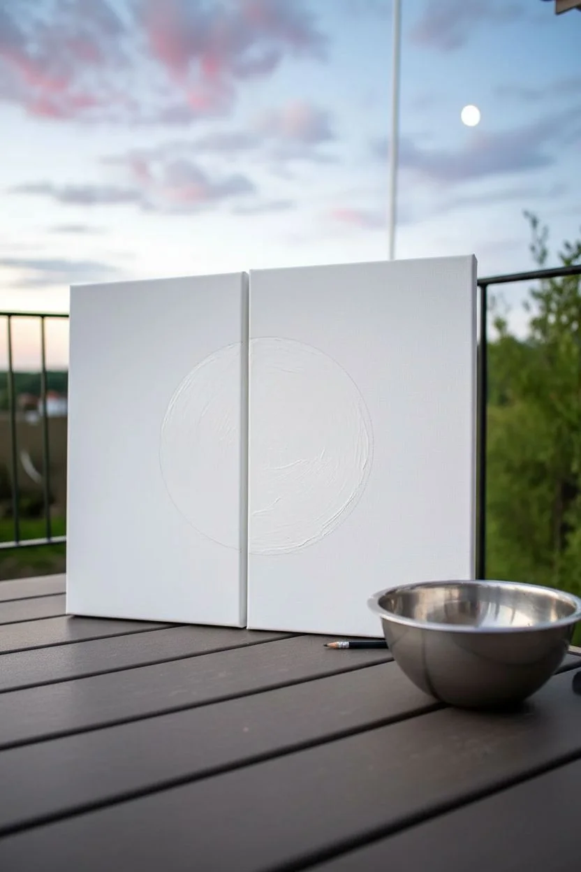
Transform your walls with this stunning celestial artwork that spans across two distinct canvases to create a unified night sky scene. This diptych features a glowing, realistic moon surrounded by deep space blues and soft cloud formations, perfect for bringing a touch of the cosmos indoors.
Detailed Instructions
Materials
- Two stretched rectangular canvases (same size)
- Acrylic paints (Phthalo Blue, Prussian Blue, Titanium White, Mars Black, Burnt Umber, Yellow Ochre)
- Circular stencil or large bowl (to trace the moon)
- Large flat brush (for background)
- Medium filbert brush (for clouds)
- Small round detail brush
- Sea sponge or scrunched paper towel
- Old toothbrush (for stars)
- Pencil and eraser
- Masking tape (optional)
Step 1: Preparation and Sketching
-
Align the canvases:
Push your two blank canvases together side-by-side on your workspace so they touch completely. You want to treat them as a single surface for the initial sketch. -
Trace the moon:
Place your circular object (like a large bowl or a plate) directly in the center, bridging the gap between the two canvases. Lightly trace the circle with a pencil. -
Protect the moon:
Paint the inside of your moon circle with a solid coat of Titanium White. This acts as a primer to make the crater details pop later, and it helps you see your boundary clearly.
Step 2: Painting the Night Sky
-
Mix the base sky color:
On your palette, create a deep midnight blue by mixing Prussian Blue with a touch of Mars Black. You want a very dark value, almost void-like. -
Apply the dark corners:
Using a large flat brush, paint the outer corners and top edges of both canvases with your darkest mixture. Paint the sides of the canvas edges too for a professional finish. -
Create a gradient:
Mix a slightly lighter blue by adding a tiny dot of white to your dark mix. Blend this inward towards the moon, but don’t touch the white circle yet. I find keeping the brush slightly damp helps blend the acrylics smoothly. -
Add the ‘glow’ zone:
Mix a lighter Phthalo Blue with Titanium White. Paint carefully around the exterior of your white moon circle, blending outward into the darker blue to create a glowing halo effect. -
Dry completely:
Let the background layer dry fully before moving on to the stars or clouds.
Paint bridge prevention
Don’t tape the canvases together! If paint dries across the seam, it will rip when you separate them. Keep a tiny hairline gap or separate them immediately after drafting the circle.
Step 3: Detailed Moon Texture
-
Base moon color:
Mix Titanium White with a very small amount of Yellow Ochre to create a warm, creamy off-white. Apply a thin, uneven wash over the bright white primer you painted earlier. -
Sponging the texture:
Dip a sea sponge (or a scrunched paper towel) into a mix of grey made from White and a speck of Black. Lightly dab this onto the moon surface to create the varied terrain. -
Adding craters:
The moon has distinct dark patches called ‘maria.’ Mix a darker grey-brown using Burnt Umber and White. Look at a reference photo of the moon and paint these organic, blotchy shapes. -
Refining the edges:
Use a small dry brush with pure white to highlight the edges of the craters. This creates the illusion of sunlight hitting the ridges. -
Warm center:
Glaze a very watered-down Yellow Ochre just in the center areas of the moon for that subtle inner warmth.
Glow level up
Mix a tiny drop of fluorescent or glow-in-the-dark paint into your final white star splatter. Your galaxy will faintly illuminate when the lights go out.
Step 4: Atmosphere and Final touches
-
Drafting the clouds:
Load a filbert brush with a mix of Phthalo Blue and White. Paint fluffy cloud shapes near the bottom corners and sides, swooping inward. -
Highlighting clouds:
Add more Titanium White to your brush and dab the tops of the cloud formations. This simulates moonlight catching the upper vapors. -
Splatter stars:
Cover the moon with a paper cutout or bowl to protect it. Dip an old toothbrush into watered-down white paint. -
Flick the stars:
Run your thumb over the bristles to flick tiny specks of paint across the dark sky areas. Vary the density, putting more stars in the darker corners. -
Verify the seam:
Separate the canvases slightly to ensure the paint hasn’t bridged the gap thickly. If needed, touch up the inner edges (the canvas sides that face each other) with the dark sky color so no bare white canvas shows in the gap.
Hang your twin canvases with a small gap between them to let the negative space play its part in your cosmic window.


Silhouette Skyline That Continues Across the Divide
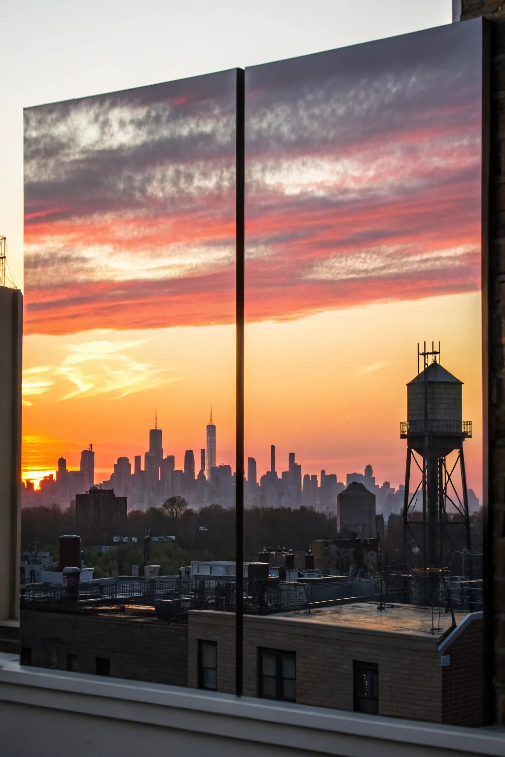
Capture the dramatic beauty of an urban sunset with this dual-canvas project that creates a stunning window-like effect. By painting a continuous gradient sky and a detailed silhouette across two separate panels, you’ll achieve a modern, panoramic look perfect for a large wall.
Step-by-Step
Materials
- Two large rectangular canvases (same size)
- Acrylic paints (Titanium White, Cadmium Yellow, Orange, Alizarin Crimson, Dioxazine Purple, Mars Black)
- Large flat paintbrush (2-3 inch)
- Medium filbert brush
- Small round detail brush (size 0 or 1)
- Reference photo of a city skyline
- Chalk or pastel pencil for sketching
- Palette and water container
- Easel or flat work surface
- Painter’s tape or clamps (optional)
Step 1: Setting the Scene
-
Prepare the canvases:
Place your two canvases side-by-side on your easel or work surface. If your workspace allows, clamp them together or tape them from the back temporarily so they act as one large surface while you work on the background. -
Establish the horizon line:
Using a chalk pencil, lightly draw a straight horizon line across the bottom third of both canvases. This ensures your city rests on level ground across the divide. -
Mix your sky colors:
Prepare large piles of your sky gradient colors on your palette: bright yellow-white for the horizon sun, transitioning into orange, then pinkish-red, and finally a deep purple-grey for the top clouds.
Uneven Gradients?
If your acrylics are drying too fast to blend smoothly, mix in a slow-drying medium or retarder. This keeps the paint open longer for soft sky transitions.
Step 2: Painting the Sky Gradient
-
Start at the horizon:
With your large flat brush, apply the brightest yellow mixed with a touch of white just above your horizon line. Keep this layer wet and workable. -
Blend upwards into orange:
While the yellow is still wet, introduce your orange paint slightly above it. Use long, horizontal strokes to blend the pigments where they meet, creating a seamless transition. -
Add the moody clouds:
Moving up the canvas, switch to your crimson and purple mixtures. Instead of perfect blending, use a slightly choppier stroke here to simulate the texture of stripy cloud formations. -
Refining the clouds:
Dip a medium filbert brush into slightly lighter pinks and scumble it over the darker purple sections while wet. This creates that fluffy, backlit cloud effect seen in the sunset. -
Cross the gap:
Make sure your brushstrokes travel right off the edge of the first canvas and immediately onto the second. I prefer to paint right over the gap as if it isn’t there, which ensures the cloud formations align perfectly. -
Let the sky dry:
Allow the background layer to dry completely. Acrylics dry darker, so if the colors look dull, you may want to add a second pass of bright yellow near the ‘sun’ area once dry.
Step 3: Creating the Silhouette
-
Separate the canvases:
Once the sky is fully dry, separate the canvases slightly (about an inch) to mimic how they will hang, or keep them together if you prefer a continuous line. Sketch the outline of your building shapes with chalk. -
Block in the largest buildings:
Load your medium brush with Mars Black. Fill in the main skyscrapers first, ensuring the edges are crisp and straight. Use a ruler or tape if you struggle with straight lines. -
Add atmospheric depth:
For buildings that should look further away, mix a tiny bit of your sky purple or grey into the black. Paint these shapes slightly lighter than the foreground towers to create atmospheric perspective. -
Paint the foreground details:
Using the pure black again, paint the water towers, rooftop elements, and smaller foreground buildings. This is where your reference photo is crucial for realistic shapes. -
Detailing the water tower:
Switch to your small detail brush. Carefully paint the thin legs and cross-bracing of the water tower structure shown on the right canvas. The contrast of thin lines against the bright sky is key here. -
Refining the edges:
Go back over your building edges with the detail brush to sharpen any blurry lines. Add tiny antennas or spires to the tops of the skyscrapers for added realism. -
Paint the sides:
Don’t forget to paint the canvas edges! Wrap the black silhouette around the sides of the canvas, and extend the sky colors around the top edges for a professional, frameless finish. -
Final check:
Step back and view the two canvases together. Ensure the horizon line flows visually from left to right and that the cloud patterns still connect logically across the gap.
Illuminated Windows
For a magical city-at-night vibe, use a needle or tiny brush to dot pale yellow or white specks onto the black buildings, creating the look of lit windows.
Hang your finished duo with a small gap in between to let the skyline leap across the wall
BRUSH GUIDE
The Right Brush for Every Stroke
From clean lines to bold texture — master brush choice, stroke control, and essential techniques.
Explore the Full Guide
Ocean Wave Line That Connects Both Panels
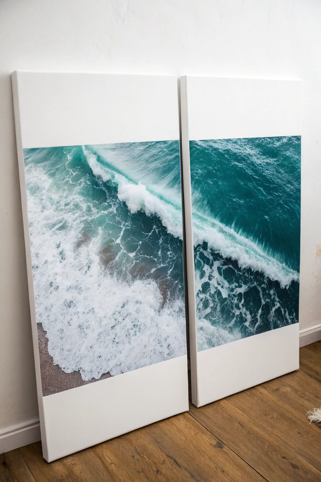
Bring the calming power of the sea into your home with this stunning diptych that splits a single ocean photograph across two large canvases. The crashing teal wave creates a dynamic line that flows seamlessly from one panel to the next, while generous white space adds a modern, gallery-style feel.
Step-by-Step Tutorial
Materials
- High-resolution digital photo of an ocean wave (top-down view works best)
- Two large, identical stretch canvases (e.g., 24×36 inches or larger)
- Mod Podge (Matte finish) or heavy body acrylic gel medium
- Large foam brush or wide synthetic paintbrush
- Computer with photo editing software (Photoshop or GIMP)
- Large format printer service or local print shop access
- High-quality matte photo paper
- Scissors and X-ACTO knife
- Metal ruler or straight edge
- Pencil
- Brayer or clean rolling pin
- Damp cloth
Step 1: Preparing the Image
-
Select your photo:
Choose a high-resolution image of a wave. A drone shot or an aerial view looking down at the shoreline works perfectly for this aesthetic because it provides rich texture in the foam and sand. -
Measure your canvases:
Note the exact dimensions of your two canvases. Decide as well how much white space you want at the top and bottom; creating a ‘letterbox’ look really elevates the piece. -
Split the image digitally:
Open your photo editing software. Create a canvas that represents the total width of both physical canvases side-by-side. Import your photo and resize it so the wave flows diagonally across the center. -
Add white borders:
Crop the image digitally to match the aspect ratio of your printing paper, ensuring you leave significant white space above and below the wave if the photo doesn’t naturally fill that vertical space. -
Slice and save:
Using the slice tool or cropping, split the image exactly down the middle into two separate files—one for the left canvas and one for the right. -
Print the panels:
Send these files to a large-format printer. Ask for a heavyweight matte paper, as glossy paper can be difficult to adhere without bubbling.
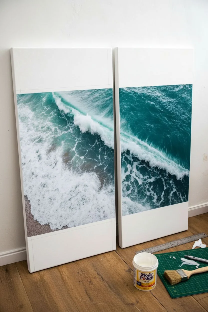
Step 2: Mounting the Photograph
-
Trim the prints:
Once you have your prints, use your metal ruler and X-ACTO knife to trim away any printer margins. Ensure the cut edges are perfectly straight, especially the inner edges where the two canvases will meet. -
Position the dry layout:
Lay your canvases flat on the floor side-by-side. Place the prints on top to verify the alignment. The wave should look like one continuous line crossing the gap. -
Mark placement:
Lightly mark the corners of where the paper should sit on the canvas with a pencil. This small guide will be crucial once you start working with the sticky medium. -
Apply the first layer of medium:
Working on one canvas at a time, apply a generous, even layer of Mod Podge or gel medium to the face of the canvas using your wide foam brush. Don’t be shy with it; dry spots cause bubbles. -
Coat the back of the print:
I like to quickly brush a thin layer of medium on the back of the photo paper as well. This creates a wet-on-wet seal that allows you a few seconds of wiggle room to slide the paper into place. -
Adhere the print:
Carefully align the top edge of your paper with your pencil marks and slowly lower it onto the canvas. -
Smooth it out:
Starting from the center and working outward in a starburst pattern, use a brayer or a soft cloth to press the paper down firmly. This pushes out trapped air and excess glue. -
Wipe edges:
If any adhesive squeezes out of the sides, wipe it away immediately with a damp cloth before it dries on the exposed white canvas border. -
Repeat for second panel:
Follow the same gluing process for the second canvas. Double-check your alignment against the first panel before the glue sets to ensure the horizon lines match up. -
Seal the surface (Optional):
For extra protection, you can brush a final layer of matte medium over the top of the photo. Use long, single directional strokes to simulate a painted texture, or skip this if you prefer the crisp paper look. -
Dry and Display:
Allow the canvases to dry flat for at least 24 hours. Leaning them against a wall creates a casual, effortless vibe, or hang them with a 2-inch gap between frames.
Seamless Transitions
Use a brayer immediately! Pressing firmly from the center prevents air bubbles. If the wave horizon doesn’t match perfectly, gently slide the paper while the glue is wet.
Add Texture
Wait for the print to dry, then apply clear heavy gel medium over the white sea foam areas. Dab it with a sponge to create actual 3D texture that catches the light.
Now you have a breathtaking ocean view that expands your space and adds a splash of color to your walls
Abstract Color Fade With a Shared Horizon Stripe
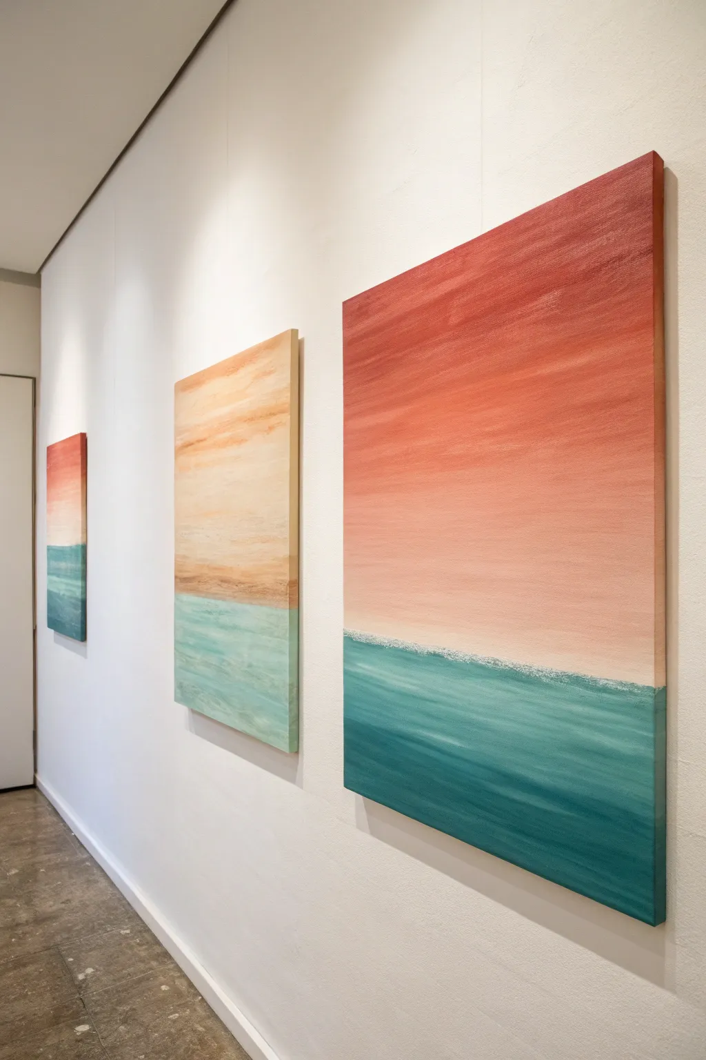
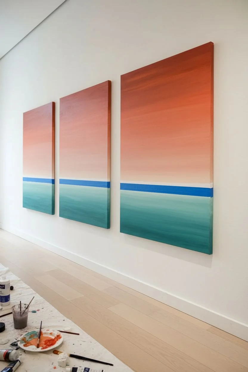
Create a stunning gallery wall with this set of three abstract canvases that mimic the soothing transition of sunset over the sea. By focusing on smooth gradients and a unifying horizon line, this triptych brings a cohesive, modern calm to any space.
Step-by-Step Tutorial
Materials
- 3 stretched canvases (rectangular, vertical orientation)
- Acrylic paints (Titanium White, Naples Yellow, Cadmium Orange, Burnt Sienna, Teal, Phthalo Blue)
- Wide flat brush (2-3 inch) for blending
- Medium flat brush (1 inch)
- Palette knife (optional for texture)
- Masking tape or painter’s tape
- Water cup and paper towels
- Easels or flat drop cloth surface
Step 1: Preparation and Horizon Line
-
Set the stage:
Arrange your three canvases side-by-side on your workspace. Deciding their order now helps ensure the colors will flow logically from one to the next if you want a continuous effect. -
Tape the horizon:
Determine where your horizon line will sit. In the example, it’s roughly one-third of the way up from the bottom. Apply a strip of masking tape horizontally across all three canvases at this height to create a crisp separation. -
Seal the tape edge:
Paint a very thin layer of Titanium White acrylic over the edge of the tape that faces the ‘sky’ portion. This prevents colored paint from bleeding underneath later.
Step 2: Painting the Sky Gradient
-
Mix the darkest sky tone:
On your palette, mix a deep, warm hue using Burnt Sienna and a touch of Cadmium Orange. This will be the uppermost color of your sky. -
Apply the top layer:
Using your wide flat brush, paint the top 2-3 inches of the canvas with this dark mixture. Don’t worry about being too neat; horizontal strokes work best. -
Creating the mid-tone:
Mix Cadmium Orange with a little Titanium White to create a soft salmon color. Apply this directly below the dark band you just painted. -
Blend the transition:
While both paint strips are still wet, use a clean, slightly damp brush to blend the area where the dark red meets the salmon. Use long, horizontal sweeping motions to blur the line. -
Add the lightest sky tone:
Mix a large amount of Titanium White with a tiny dab of Naples Yellow or Orange. Paint this from the bottom of your salmon section all the way down to the masking tape. -
Final sky blend:
Blend this lightest section upwards into the salmon mid-tone. I find that wiping the brush on a paper towel between strokes helps keep the gradient clean and prevents the dark colors from overpowering the light bottom. -
Repeat for all canvases:
Apply the same sky gradient process to the other two canvases. Slight variations in color density are fine and actually add organic character to the set. -
Remove the tape:
Carefully peel off the masking tape while the paint is still slightly tacky, revealing a sharp, clean line. Let the sky sections dry completely before moving on.
Uneven Blending?
If acrylics dry too fast to blend smoothly, mix in a slowing medium or lightly mist the canvas with water to keep the paint workable longer.
Step 3: Painting the Ocean Fade
-
Tape the sky:
Once dry, place a fresh strip of masking tape exactly over the bottom edge of your painted sky to protect it while you work on the water. -
Mix the deep sea color:
Combine Phthalo Blue with a touch of Teal. This dark, rich color will go at the very bottom of the canvas. -
Paint the bottom edge:
Apply the dark blue mixture to the bottom 3 inches of the canvas using the medium flat brush. -
create the mid-water tone:
Add more Teal and a bit of Titanium White to your blue mix. Paint the middle section of the water area. -
Blend the water gradient:
Just like the sky, use horizontal strokes to blend the dark bottom into the teal middle section while the paint is wet. -
Paint the horizon water:
For the water directly under the horizon line, mix a very pale teal using mostly Titanium White with a hint of Teal. Apply this right up against the tape. -
Smooth the transition:
Blend the pale horizon water down into the mid-tone teal. Creating a slight ‘frothy’ texture here with inconsistent strokes can simulate distant waves. -
Final reveal:
Remove the second strip of tape. You should now have a clean horizon line separating the warm sky fade from the cool ocean fade. -
Paint the edges:
Don’t forget to extend your colors around the sides of the canvas for a professional, gallery-wrapped finish.
Level Up: Texture
Before painting, apply modeling paste with a palette knife along the bottom third to give the ‘ocean’ section physical wave texture.
Now hang your trio together and enjoy the peaceful view of your handmade horizon

PENCIL GUIDE
Understanding Pencil Grades from H to B
From first sketch to finished drawing — learn pencil grades, line control, and shading techniques.
Explore the Full Guide
Big Branch and Birds Flying Across Both Canvases
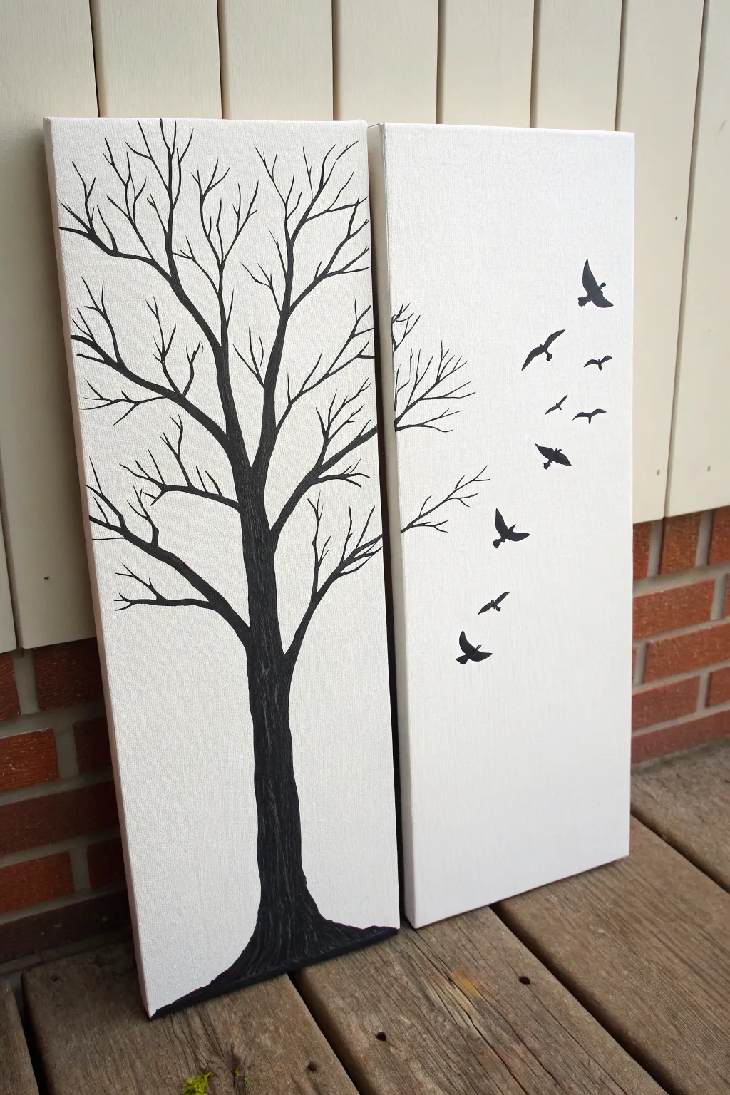
This elegant two-panel project creates a striking minimalist statement by spanning a single scene across separate canvases. The high contrast of black paint against white canvas emphasizes the intricate branching of a winter tree and the freedom of birds taking flight.
How-To Guide
Materials
- Two tall, narrow stretched canvases (e.g., 10×30 inch)
- Black acrylic paint (heavy body preferred)
- White acrylic paint (optional, for background touch-ups)
- Flat wide paint brush (for the trunk)
- Round liner brush (size 0 or 00 for fine branches)
- Medium round brush (for larger branches)
- Pencil
- Eraser
- Palette or paper plate
- Water cup and paper towels
- Drop cloth or newspapers
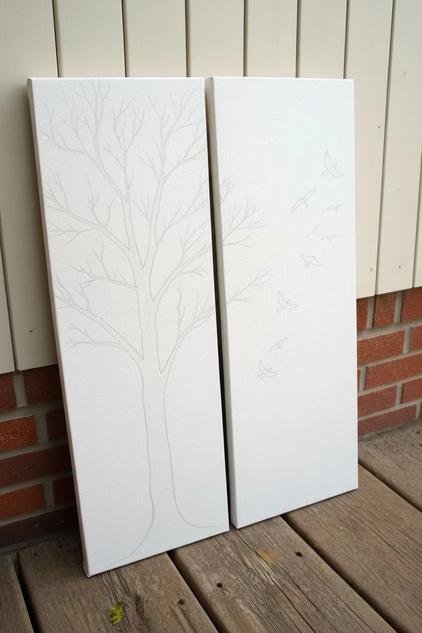
Step 1: Preparation and Planning
-
Set the Stage:
Lay your drop cloth on a flat, sturdy surface. Place your two canvases side-by-side on the table, leaving a very small gap (about 1–2 inches) between them. This gap represents the space they will hang on the wall, so you want your design to flow naturally across it. -
Visualize the Trunk:
Decide where the base of the tree will sit. In this design, the main trunk anchors the bottom of the left canvas. Lightly sketch the flared base of the roots and the upward curve of the trunk with a pencil. -
Sketch the Main Branches:
Continue sketching the primary thick branches moving upward. Allow one or two lower branches to extend from the left canvas edge towards the right. Crucially, sketch a few branch tips crossing over the invisible gap onto the right canvas, ensuring the lines align visually. -
Add the Birds:
On the right canvas, sketch the flock of birds. Start with larger birds lower down or interspersed, and make them slightly smaller as they ascend to create depth. Use simple ‘V’ or ‘M’ shapes as guides for wings.
Trembling Hand?
If you struggle painting straight thin lines for twigs, rest your pinky finger on a dry part of the canvas for stability, or support your painting hand with your other hand.
Step 2: Painting the Tree
-
Establish the Trunk:
Load your flat wide brush with black acrylic paint. Start at the bottom of the left canvas, filling in the base and the widest part of the trunk. Paint with vertical strokes to mimic the texture of bark. -
Extend the Limbs:
Switch to a medium round brush as the trunk narrows. Follow your pencil lines to paint the main structural branches. Press down firmly for the thicker bases of branches and lift pressure as you move outward to taper them. -
Paint the Crossover:
Carefully paint the branch tips on the right canvas where you marked them. Stepping back occasionally helps check that the flow from left to right looks continuous. -
Add Fine Twigs:
Using your smallest liner brush (size 0 or 00) and slightly thinned black paint (just a drop of water improves flow), add the delicate twiggy ends. The ink-like consistency helps create sharp, crisp non-tapering lines. -
Create Density:
Fill in empty spaces in the canopy with more intersecting twigs. Varying the angles—some pointing up, some crooked will make the tree look organic and natural rather than stiff.
Make it Pop
Paint the sides (edges) of the canvas black to continue the silhouette effect, or keep them stark white for a cleaner, modern gallery wrap look.
Step 3: Detailing the Birds
-
Outline the Birds:
Switch back to your small round brush. Carefully outline the silhouette of the first bird on the right canvas. Focus on the curve of the wings and the small point of the head/beak. -
Fill the Silhouettes:
Fill in the bird shapes with solid black paint. Ensure the edges are crisp; ragged edges can ruin the illusion of distance. -
Vary the Shapes:
Paint the remaining birds, paying attention to wing position. I like to paint some with wings fully up, some gliding flat, and others with wings downstroke to simulate movement. -
Double Check Opacity:
Once the black paint is touch-dry, inspect your tree and birds in bright light. If any canvas texture shows through, apply a second coat of black to achieve a truly solid silhouette. -
Clean Up:
Inspect the white background for any accidental smudges or stray pencil marks. Use an eraser for pencil lines, or a dab of white acrylic paint to cover any accidental black splatters.
Hang your new masterpieces with a small gap between them and enjoy the continuous flow of nature across your wall
A Single Flower Stem Split Into Two Panels
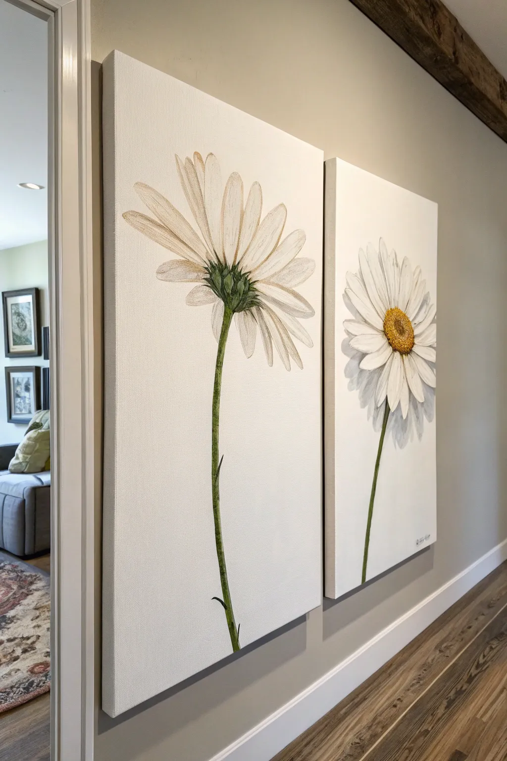
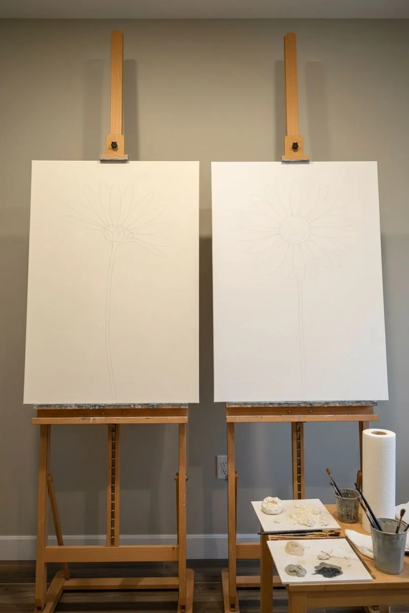
Capture the delicate beauty of a daisy from two unique perspectives with this elegant diptych project. By painting the flower’s underside on one panel and its face on the other, you create a sophisticated botanical study that feels unified yet distinct.
Step-by-Step
Materials
- Two tall rectangular canvases (e.g., 12×36 or 10×30 inches)
- Acrylic paints: titanium white, unbleached titanium, sap green, burnt umber, yellow ochre, cadmium yellow
- Gesso (optional, for priming)
- Assorted brushes: large flat brush (background), round brushes (sizes 4 and 8), liner brush (size 1)
- Pencil for sketching
- Palette
- Water cup and paper towels
- Easel or flat work surface
Step 1: Preparation and Sketching
-
Prime the surface:
Begin by applying a coat of white gesso to both canvases if they aren’t pre-primed. This ensures a smooth painting surface. Allow this to dry completely before moving on. -
Mix the background color:
Create a soft, creamy off-white background color. Mix a large amount of titanium white with a tiny touch of unbleached titanium or a speck of burnt umber to warm it up. It should look like warm linen, not stark white. -
Paint the background:
Use your large flat brush to apply the background color to both canvases. Paint the sides (edges) of the canvas as well for a professional, frameless finish. Let this base coat dry for at least an hour. -
Sketch the left panel (underside):
Lightly sketch the flower stem rising from the bottom center. Draw the green sepal (the cup-like base) about a third of the way down from the top. Sketch long, thin petals radiating upward and outward, ensuring they look like they are facing away from the viewer. -
Sketch the right panel (face-on):
On the second canvas, sketch a similar stem, but slightly lower or offset to create visual interest. Draw an oval for the flower center and sketch petals radiating fully around it in a classic daisy shape.
Natural Imperfection
Don’t make your petals perfectly symmetrical! Real flowers have bent, twisted, or overlapping petals. Intentionally curve a few petaltips for a more organic look.
Step 2: Painting the Stems and Greens
-
Base coat the stems:
Mix sap green with a little white to create a mid-tone green. Using a round size 8 brush, paint the long stems on both canvases. I find it helps to pull the brush in long, continuous strokes for a smoother look. -
Add stem shadows:
Mix sap green with a tiny bit of burnt umber. Paint this darker shade along one side of the stem (choose a light source side, usually the right or left) to create roundness and volume. -
Highlight the stems:
Add a touch of yellow to your green mix and carefully paint thin highlights on the opposite side of the shadow. This gives the stem a realistic, 3D cylindrical appearance. -
Paint the sepal detail:
On the left panel, focus on the green cup holding the petals. Use short, small strokes of dark green and light green to simulate the texture of the leafy bracts.
Step 3: Creating the Petals
-
Block in petal shapes:
Using a clean brush and pure titanium white, fill in the petal shapes on both flowers. Don’t worry about transparency yet; just establish the solid white shapes. -
Add petal shadows:
Mix a very watery wash of grey using white and a tiny dot of black or umber. Paint subtle shadows where petals start near the center and where they overlap each other. This separation is crucial for depth. -
Detail the underside veins:
On the left canvas (the back view), use your liner brush with a very faint grey-brown mix to draw delicate vertical lines running up the length of the petals. This mimics the veining texture found on real daisies. -
Highlight petal tips:
Load your brush with thick titanium white paint. Apply this brightly to the very tips of the petals on both flowers to make them pop against the cream background.
Textured Centers
For a 3D effect in the flower center, mix your yellow acrylic paint with a dedicated modeling paste before applying it. This creates real physical bumps resembles pollen.
Step 4: The Center & Final Touches
-
Base coat the center:
On the right panel, fill the center circle with a mix of yellow ochre and cadmium yellow. Let this dry slightly. -
Stipple texture:
Using an old or stiff brush, tap (stipple) burnt umber around the bottom and edges of the yellow center to create a seed texture. Use a lighter yellow to stipple the top area where the light hits. -
Refine edges:
Check the edges of your stems and petals. If the background paint covered any lines, use your liner brush to neaten them up. Adding tiny dark leaves or ‘bracts’ on the stem adds realism. -
Add shadow casting:
Mix a transparent glaze of grey (lots of water, tiny bit of black paint). Paint a soft, faint shadow behind the flower heads on the background to make the blooms feel like they are lifting off the canvas. -
Varnish:
Once the painting is fully dry (wait 24 hours), apply a satin or matte varnish to protect the artwork and unify the sheen.
Hang these canvases side-by-side to bring a permanent burst of spring into your home


Paint Pour Drift That Flows From One Canvas to the Next
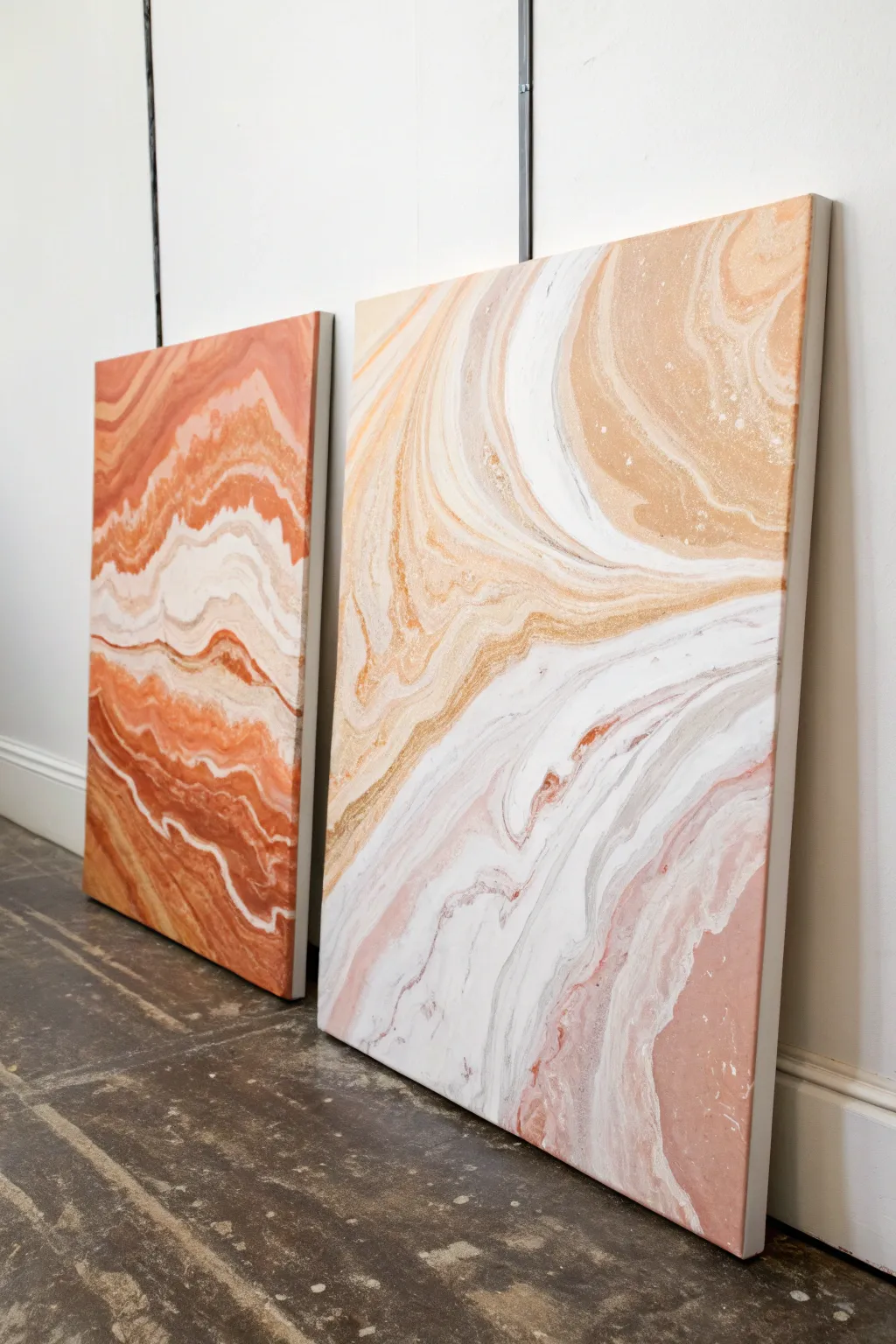
Create a stunning, seamless visual journey across two distinct canvases using fluid art techniques. This diptych mimics the organic layers of agate stone or sedimentary rock, with flowing veins of terra cotta, soft peach, and white crashing from one panel directly into the next.
Step-by-Step
Materials
- Two large rectangular stretched canvases (same size)
- Acrylic fluid paints (terra cotta, peach, beige, white, metallic gold)
- Pouring medium
- Plastic cups for mixing (one per color)
- One large ‘dirty pour’ cup
- Wooden stir sticks
- Water (distilled is best)
- Silicone oil (optional, for cells)
- Painter’s tape
- Large plastic drop cloth or garbage bags
- Leveling surface
- Gloves
Step 1: Preparation
-
Workspace setup:
Cover your entire work surface with a large plastic drop cloth. Fluid art is messy, and paint will drip off the edges. -
Tape the backs:
Flip your canvases over and apply painter’s tape to the underside edges and the wooden frame. This keeps the back neat and makes cleanup easier later. -
Join the canvases:
Lay the two canvases side-by-side on your level surface so they are touching. You treat them as one single giant canvas during the pour to ensure the design flows continuously. -
Level check:
Ensure your table is perfectly level. If it tilts, your design will slide right off the canvas while it dries.
Step 2: Mixing the Paints
-
Create pouring mix:
In individual cups, mix your acrylic paints with pouring medium. A standard ratio is 1 part paint to 2 parts medium, but follow your specific medium’s instructions. -
Consisteny adjustment:
Stir slowly to avoid air bubbles. Add tiny splashes of water until the consistency resembles warm honey—it should flow off the stick in a thin, unbroken stream. -
Add silicone (optional):
If you want cellular structures (little bubbles of color), add 1-2 drops of silicone oil to your metallic gold and peach mixtures and stir just once.
Torch Technique
Keep the flame moving constantly and never assist for too long in one spot. Holding still can cook the paint, creating a plastic-like skin that ruins the smooth finish.
Step 3: The Pouring Technique
-
Load the Dirty Cup:
Take your large ‘dirty pour’ cup. Layer your colors one by one: start with white, then terra cotta, a dash of gold, peach, and beige. Repeat this layering until the cup is nearly full. -
The Flip Cup method:
Since you are covering a large area, you might need two large cups. Quickly flip the first cup upside down onto the seam where the two canvases meet. -
Release the paint:
Lift the cup straight up and slightly glide it along the seam line, letting the paint puddle out. Do the same if you have a second cup, ensuring you cover the central area well. -
Tilt to spread:
This is the crucial part. Gently lift the canvases (you may need a helper to lift them simultaneously) and tilt them side to side. -
Connect the flow:
Focus on guiding the paint across the seam first. I find it helpful to make sure the paint bridges the gap completely before worrying about the corners. -
Cover the corners:
Slowly tilt the paint toward the top left corner, then bring it back to center. Repeat for all corners until the entire surface is covered.
Metallic Magic
Use a translucent pouring medium for your metallic color layers. This allows the shimmer to stay visible even if other opaque colors flow over the top of it.
Step 4: Refining and Drying
-
Separate panels:
Once you are happy with the composition, carefully pull the two canvases apart slightly (about an inch) to prevent them from sticking together as they dry. -
Fix the edges:
Use your finger or a stir stick to touch up the inner edges where the canvases were touching, ensuring they are fully coated with paint that dripped down. -
Torching the bubbles:
Run a kitchen torch quickly over the surface of the wet paint. This pops air bubbles and can bring up beautiful small cells if you used silicone. -
Clean the drips:
Run a craft stick or your gloved finger along the underside edge of the canvases to catch dripping paint. Do this every 10-15 minutes for the first hour. -
Long drying time:
Let the paintings sit undisturbed for at least 24 to 48 hours in a dust-free room. Do not move them until fully cured.
Once dry, hang your masterpieces with a small gap between them to admire how the pattern leaps across the negative space
Geometric Blocks That Only Align When Hung Together
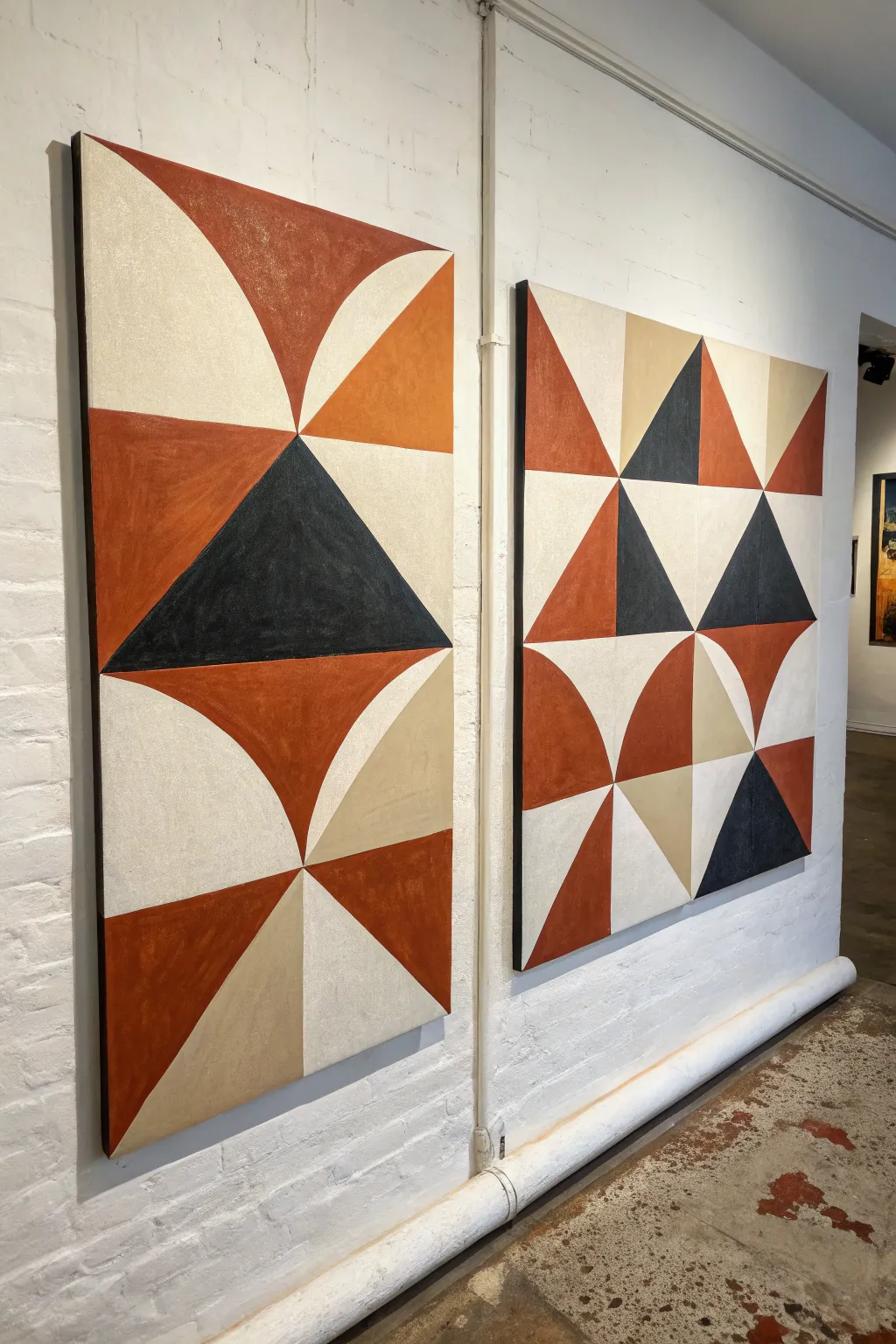
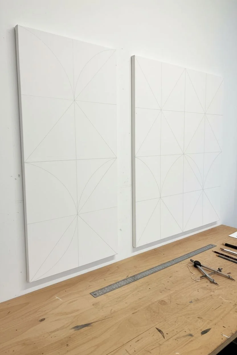
Embrace the harmony of shapes with this diptych project that relies on earth tones and bold geometry to create a continuous visual narrative. By combining sharp triangles with soft arcs across two canvases, you’ll achieve a sophisticated, gallery-ready statement piece.
Step-by-Step Guide
Materials
- Two large rectangular gallery-wrapped canvases (e.g., 24×48 inches)
- Acrylic heavy body paints (Terracotta/Rust, Deep Charcoal/Black, Warm Beige, Titanium White)
- Pencil and large ruler or T-square
- Large compass or a string and tack for drawing arcs
- Painter’s tape (various widths, high quality)
- Flat synthetic brushes (1-inch and 2-inch sizes)
- Matte gel medium (optional, for sealing tape)
- Palette knife for mixing
- Easel or large flat workspace
Step 1: Planning the Grid
-
Prepare the workspace:
Lay your two canvases side-by-side on a large flat surface or mount them on a wall exactly how you intend to hang them. Having them physically touching or very close is crucial for ensuring the design flows seamlessly from the left panel to the right panel. -
Draft the master grid:
Using a pencil and a long ruler, lightly mark a central vertical line down the middle of both canvases. Then, divide the canvases horizontally into four equal sections. This 2×4 grid on each canvas will serve as the skeleton for your geometric shapes. -
Sketch the triangles:
On the left canvas, draw a large central triangle spanning the middle two sections. On the right canvas, replicate the smaller triangle patterns seen in the reference, ensuring lines that exit the right side of the left canvas match up perfectly with entry points on the right canvas. -
Draft the curves:
For the quarter-circles, use a large compass. If you don’t have one, pin a tack at the corner of a grid square, tie a string to a pencil, and swing it to create perfect arcs. Focus on the corners where the quarter-circles meet the straight lines of the triangles.
Step 2: Blocking in Color
-
Tape the first shapes:
Choose a set of non-adjacent shapes to paint first, such as the large black triangle on the left and the scattered black triangles on the right. Apply painter’s tape firmly along the pencil lines. -
Seal the tape edges:
To get those razor-sharp lines distinct in geometric art, I like to brush a very thin layer of matte gel medium or the base canvas color over the tape edge. This prevents color bleed underneath. -
Apply the dark charcoal:
Mix your Deep Charcoal paint. Using a flat brush, apply the paint inside the taped areas. Use smooth, horizontal strokes to minimize texture, or dab vertically if you prefer a more rustic, canvas-textured look. Let this dry completely before peeling the tape. -
Tape the rust sections:
Once the black sections are dry to the touch, mask off the areas designated for the terracotta/rust color. Be extremely careful when taping over the freshly painted black lines; ensure the paint is fully cured or use delicate surface tape. -
Paint the rust tones:
Fill in the terracotta sections. Since red pigments can sometimes be translucent, you may need two coats to get the solid, opaque coverage shown in the reference image.
Bleeding Lines?
If paint bleeds under tape, wait for it to dry fully. Then, re-tape the line slightly over the mistake and paint the original background color over the bleed to erase it.
Step 3: Refining and Connecting
-
Address the beige zones:
Move on to the beige or sand-colored triangles. These lighter tones provide crucial contrast. Mix a warm beige with a touch of white to get that limestone hue, then tape and paint these sections. -
Fill the background:
The remaining negative space shapes should be painted in a creamy off-white or very pale grey. This step really makes the geometric forms pop. carefully cut in with a smaller brush near specific intersections if taping is too difficult. -
Check the alignment:
Stand the canvases up side-by-side again. Check the ‘bridge’ points where the design jumps from one canvas to the other. If a line feels disconnected, use a small brush to extend or adjust the paint slightly so the eye travels smoothly across the gap. -
Touch up edges:
Inspect your lines. If any paint bled under the tape, use a small angled brush and the appropriate color to tidy up the edges and sharpen points of the triangles. -
Apply a protective finish:
Once the entire piece has cured (usually 24 hours), apply a clear matte isolation coat or varnish. This unifies the sheen of the different paint colors and protects that crisp geometric work.
Add Texture
Mix sand or marble dust into your terracotta paint before applying. This adds a gritty, stucco-like texture that enhances the earthy, architectural feel of the piece.
Hang your dual masterpieces with a small gap between them and enjoy the sophisticated rhythm they bring to your space
Negative Space Hands Reaching Across the Gap
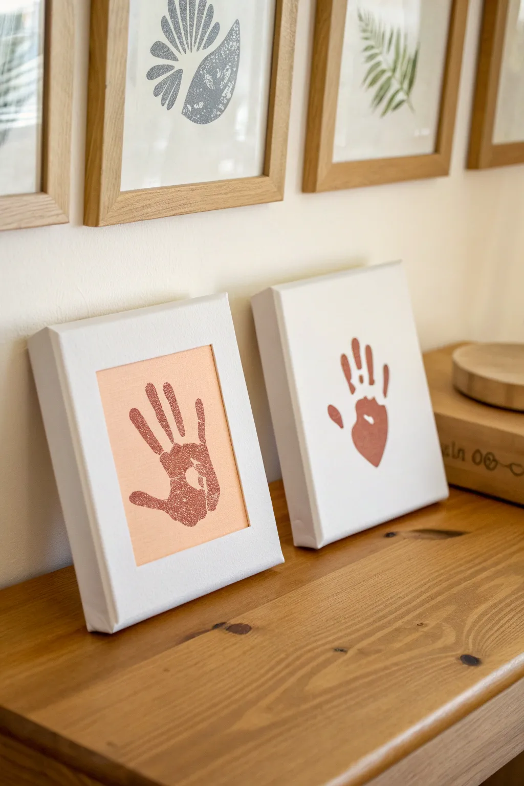
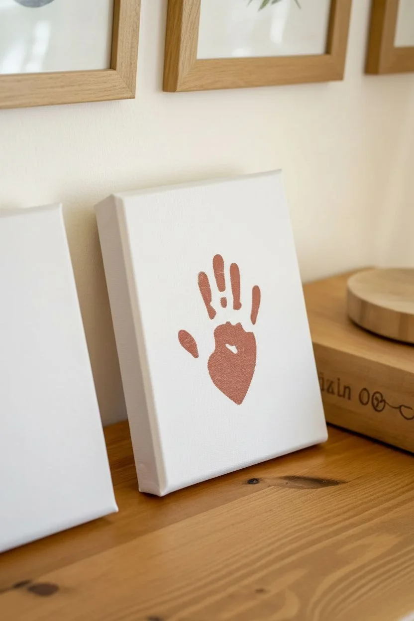
These complementary canvases create a beautiful visual dialogue by playing with positive and negative space. One canvas features a bold stamped handprint, while its partner reveals the hand’s silhouette through a wash of soft peach, making for a sophisticated and sentimental display.
Step-by-Step Tutorial
Materials
- Two small stretched canvases (approx. 5×7 or 6×8 inches)
- Terracotta or brick red acrylic paint
- Soft peach or coral acrylic paint
- Small foam roller or flat paintbrush
- Removable adhesive vinyl or contact paper
- Pencil
- Scissors or craft knife
- Paper plate or palette
- Wipes or damp cloth (for quick cleanups)
Step 1: Creating the Stamped Canvas
-
Prepare the paint:
Squeeze a generous amount of the terracotta or brick red acrylic paint onto your paper plate or palette. Using a foam roller helps spread it into an even thin layer for stamping. -
Coat the hand:
Using a foam brush or roller, apply an even coat of the terracotta paint to the palm and fingers of the hand you wish to print. Avoid heavy globs of paint, as these will slide and smudge the details. -
Stamping position:
Hover the hand over the first white canvas to center it. Aim for the middle, keeping fingers slightly spread for a clear silhouette. -
Press and lift:
Press the hand firmly onto the canvas. Gently press down on each finger and the center of the palm to ensure contact. Lift the hand straight up carefully to avoid smearing the print. -
Clean up immediately:
Wash the paint off the hand right away with warm soapy water or wipes before it dries on the skin. -
Dry completely:
Set this first canvas aside in a safe, dust-free area to dry completely. This usually takes about an hour depending on paint thickness.
Clean Edges Trick
For the negative space canvas, paint a thin layer of white (or clear matte medium) over the vinyl sticker first to seal the edges before applying the peach color.
Step 2: Creating the Negative Space Canvas
-
Trace the hand:
Place the same hand onto the backing paper of your adhesive vinyl. Trace around the hand and fingers with a pencil. To mirror the other canvas, you might want to use the opposite hand or flip your stencil later. -
Cut the stencil:
Carefully cut out the hand shape using scissors. For this negative space technique, you actually want the hand shape itself (the positive piece), not the hole left in the paper. -
Apply the mask:
Peel the backing off your vinyl hand cutout. Center it on the second white canvas and press it down firmly. Pay special attention to the edges of the fingers to prevent paint bleed. -
Prepare background color:
Pour your soft peach or coral paint onto the palette. You may need to mix in a little white if the pigment is too dark; you want a lovely contrast with the darker handprint. -
Paint the background:
Using a flat brush, paint the entire rectangle of the canvas face with the peach paint, painting right over your vinyl hand sticker. I prefer to brush away from the sticker edges outward to minimize bleeding. -
Create the border:
Leave a crisp white border around the painted rectangle by not painting all the way to the canvas edge, or use painter’s tape to mask off a strict border before you start painting. -
Let it set slightly:
Allow the paint to dry until it is tacky but not fully hardened. If it’s too wet, it might drip; if too dry, the vinyl might peel the paint. -
Reveal the silhouette:
Carefully peel up the vinyl hand sticker. Start from the wrist and pull slowly towards the fingers. The white canvas underneath will be revealed, creating the negative space hand. -
Touch ups:
If any paint bled under the sticker, use a very fine brush with white paint (or a tiny scrape with a craft knife) to clean up the edges. -
Final cure:
Let both canvases dry undisturbed overnight to ensure the acrylic is fully cured before displaying them on your shelf.
Paint Is Too Blobby
If the stamped handprint looks like a smudge, you likely used too much paint. Apply a very thin, even layer to the skin using a sponge rather than dipping the hand.
Place these side-by-side on a mantel or shelf to enjoy the artistic contrast of your personal creation


Have a question or want to share your own experience? I'd love to hear from you in the comments below!