If you’re craving beginner pencil drawing ideas that actually feel doable, you’re in the right headspace—simple subjects can teach you a ton. I’m going to share my go-to prompts that build line control and easy shading without getting tangled in complicated details.
Sketch a Simple Flower Bloom From the Side
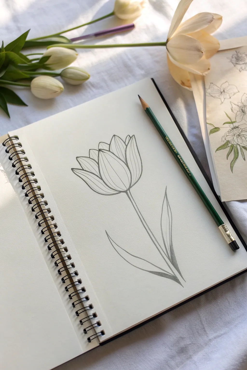
Capture the delicate beauty of spring with this simple yet graceful line drawing of a tulip bloom. Using clean lines and subtle shading, this sketch focuses on the flower’s natural upward reach and overlapping petals, perfect for practice in observing form.
Step-by-Step Tutorial
Materials
- Spiral-bound sketchbook (medium weight paper)
- Hard graphite pencil (HB or H) for initial sketching
- Soft graphite pencil (2B or 4B) for finished lines and shading
- Kneaded eraser
- Pencil sharpener
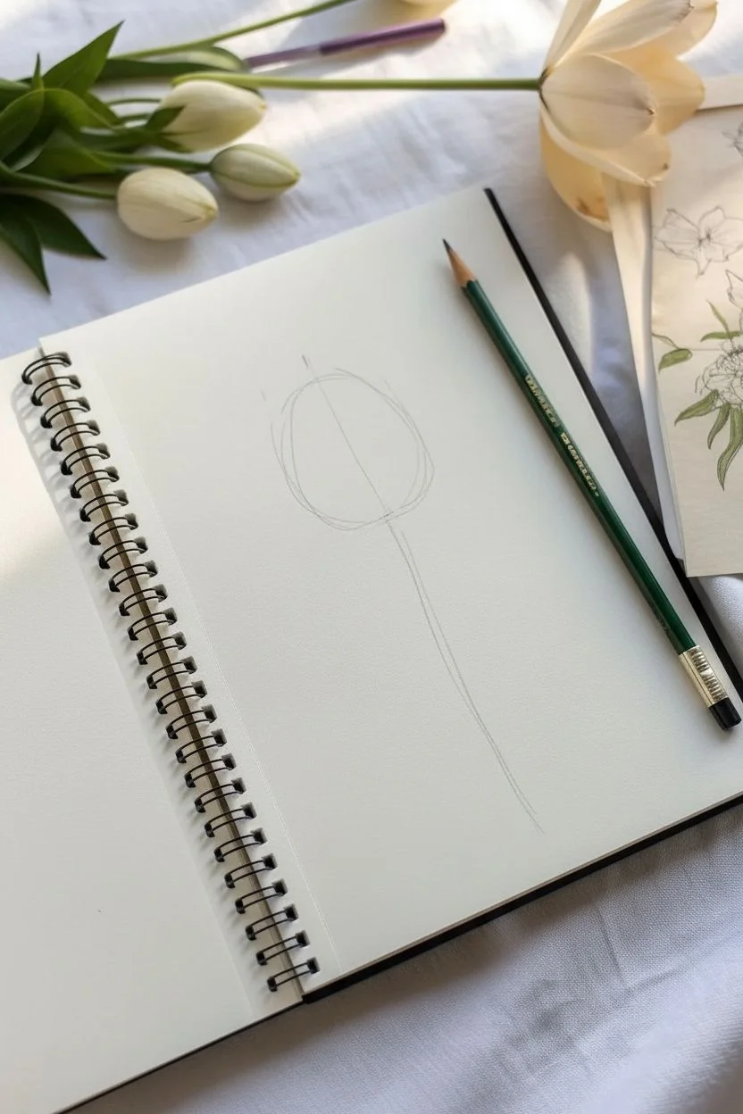
Step 1: Drafting the Basic Form
-
Draw the central guideline:
Begin by drawing a very faint, slightly curved vertical line down the center of your page. This will act as the spine for the flower stem and help center the bloom. -
Outline the cup shape:
At the top of your guideline, sketch a simple ‘U’ shape. This doesn’t need to be perfect; it just defines the general size and bottom curve of the flower head. -
Mark the petal height:
Add a few light tick marks above the ‘U’ shape to indicate where the tips of the petals will reach. Notice how the central petals are slightly taller than the side ones.
Step 2: Developing the Petals
-
Draw the front central petal:
Start with the main petal facing you. Draw a large oval shape that tapers to a soft point at the top. This petal should overlap the bottom curve of your initial ‘U’ guide slightly. -
Add vertical texture lines:
Inside this central petal, draw two or three faint, curved vertical lines that follow the contour of the petal’s shape. These lines suggest the delicate veins of the flower. -
Sketch the left side petal:
To the left of the center petal, draw a curved line sweeping out and up. Bring it back down to tuck behind the main petal. Gives this tip a slight outward flare. -
Sketch the right side petal:
Repeat this on the right side, drawing a petal that mirrors the left one but perhaps sits slightly lower or narrower to keep it looking organic rather than mathematically perfect. -
Create the background petals:
Fill in the gaps at the very top. Draw small, peaked curves peaking out from behind the front three petals to suggest the layers of the flower further away from the viewer. -
Refine the vein details:
Add simple interior lines to the side and back petals as well. Keep these lines swift and light; they should follow the curve of each specific petal to show volume.
Fixing Flat Petals
If petals look flat, curve your internal vein lines more drastically. Straight lines flatten forms, while curved lines wrap around the shape to imply volume and roundness.
Step 3: Stem and Leaves
-
Draw the stem structure:
Using your initial central guideline, draw two long, parallel lines extending downward from the base of the flower head. Keep the stem slender and elegant. -
Start the right leaf:
Near the bottom third of the stem, start a line that curves upward and outward to the right. Let it reach about halfway up the stem’s height. -
Complete the right leaf:
Bring the line back down, tapering it to join the stem at the bottom. This leaf should be quite narrow and pointed, resembling a blade of grass. -
Draft the left leaf:
Draw a second leaf on the left side, starting lower on the stem than the right one. Curve it outward gently. -
Refine the left leaf shape:
Close the shape of the left leaf. I sometimes like to make this one slightly wider or more curved to create asymmetrical balance. -
Connect the stem base:
Ensure the leaves look like they are wrapping around or emerging from the base of the stem, rather than just floating next to it.
Try Watercolor Pencils
Sketch this using watercolor pencils instead of graphite. Once finished, run a damp brush over the shading to instantly turn your sketch into a soft watercolor painting.
Step 4: Final Definition and Shading
-
Darken the main outlines:
Switch to your softer 2B or 4B pencil. Go over your perimeter lines with a confident, slightly darker stroke to make the flower pop off the page. -
Add contrast shading:
Lightly shade the areas where petals overlap. For example, add a little darkness where the side petals tuck behind the central one to create depth. -
Shade the lower stem:
Add some darker shading at the very bottom of the stem and where the leaves join the stalk. This anchors the drawing visually. -
Clean up stray marks:
Use your kneaded eraser to lift away the initial central guideline and any drafting marks that are no longer needed, leaving a crisp, clean floral illustration.
Now you have a timeless botanical sketch that captures the simple elegance of a tulip

Make a Mini Value Scale With Three Shading Styles


Master the basics of shading by breaking it down into manageable, bite-sized pieces with this grid exercise. This project focuses on filling small squares with stippling, hatching, and controlled marks to explore value and texture without the pressure of a full drawing.
Step-by-Step
Materials
- Spiral-bound sketchbook (medium weight paper)
- Black fine liner pen (0.3mm or 0.5mm)
- HB graphite pencil (for initial layout)
- Ruler or straight edge
- Eraser
Step 1: Setting up the Grid
-
Measure the main grid area:
Visualize a 3×3 grid layout on the left side of your page. Using your ruler and pencil significantly lightly, mark out a square area that is roughly 4 inches by 4 inches. -
Divide into nine squares:
Mark the internal divisions to create nine equal squares within that main box. Don’t worry if they aren’t geometric perfection; a little hand-drawn wobble adds character. -
Add floating squares:
Beneath the main 3×3 grid, sketch two additional squares in a fourth row, aligning them with the left and center columns of the grid above. -
Ink the outlines:
Switch to your fine liner pen. Carefully trace over your pencil grid lines. I prefer to lift the pen slightly at the corners rather than connecting them perfectly, giving it a loose, sketched aesthetic. -
Create the mini-reference grid:
To the right of your bottom row, draw a much smaller, independent grid. Make a 4×4 layout of tiny squares (16 total). This serves as a test patch or a color chart element. -
Erase guidelines:
Once the ink is completely dry—give it a good minute to avoid smudges—gently erase all the underlying graphite sketch lines.
Step 2: Adding Labels and Details
-
Add subtle headers:
Above the top row, write very tiny, almostscribble-like text. It simulates the look of technical notes. You can write ‘Dark’, ‘Medium’, and ‘Light’ or just use abstract scribbles for style. -
Draw corner tabs:
In the top-left corner of several random squares (try the top-left, center-left, and bottom-center ones), draw a tiny quarter-circle or tab shape. These act as little ‘labels’ for the individual boxes. -
Fill the tabs:
Inside these tiny corner tabs, add microscopic scribbles or numbers to suggest an cataloging system.
Ink Smearing?
If your fine liner smudges when erasing pencil lines, the ink isn’t fully cured. Wait at least 3-5 full minutes before erasing. Hover your hand over the paper; if it feels cool, it’s still wet.
Step 3: Executing the Shading Styles
-
Start stippling (First Row):
For the top row, we will use stippling (dots). Start with the left square. softly tap your pen to create a dense cloud of dots. Keep them concentrated to make this the darkest value. -
Gradient stippling:
Move to the middle square of the top row. Add dots, but space them further apart than the first box creating a medium gray tone. -
Light stippling:
In the right square of the top row, add just a few sparse dots. This represents your lightest value. -
Diagonal hatching (Second Row):
In the second row, use diagonal lines. For the left box, draw lines very close together. In the middle box, space them out slightly. In the right box, use very few, widely spaced lines. -
Texture variation (Third Row):
For the third row, experiment with a texture of your choice, like tiny ‘x’ marks or scumbles. Again, vary the density from left (dense/dark) to right (sparse/light). -
Fill the bottom extras:
For the two floating squares at the bottom, try a cross-hatching technique—drawing lines one way, then crossing them perpendicularly. -
Detail the mini-grid:
Return to the small 4×4 grid on the right. Leave most blank, but pick 2-3 random tiny squares to fill in completely black or with heavy hatching for visual balance.
Level Up: Gradient Flow
Instead of distinct squares, try removing the vertical dividers in one row. Practice transitioning from dark to light seamlessly across the entire horizontal bar without break lines.
You now have a clean, technical-looking reference sheet for shading values that looks great in any portfolio


Study One Leaf and Its Veins
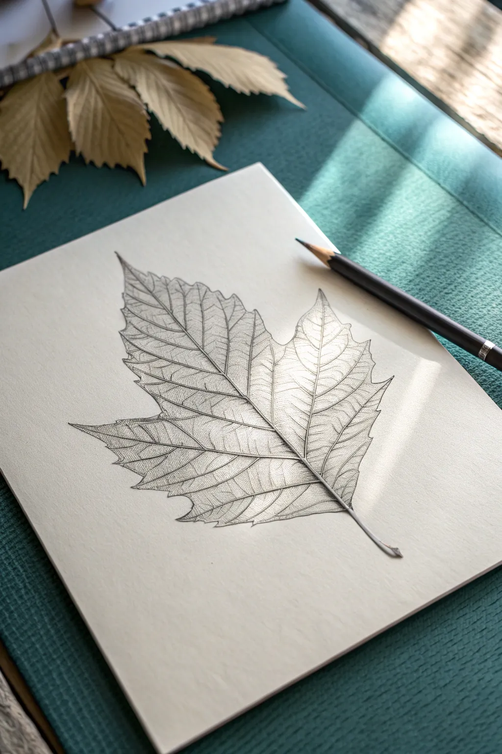
Master the art of observation with this delicate pencil study of a single maple leaf. You will learn to render intricate vein structures and subtle shading to create a drawing that feels almost transparent and alive.
How-To Guide
Materials
- High-quality bright white sketchbook paper (smooth or vellum finish)
- HB graphite pencil (for initial outlines)
- 2H graphite pencil (for light veins)
- 2B or 4B graphite pencil (for darker shadows and contrast)
- Fine-point mechanical pencil (0.5mm or 0.3mm) for precision details
- Kneaded eraser
- Blending stump or tortillon (optional)
- A real leaf or a high-resolution reference photo
Step 1: Shaping the Leaf
-
Mark the Main Axes:
Begin by lightly drawing a central vertical line to represent the primary midrib of the leaf. From the base of this line, sketch two angled lines radiating outward to the left and right, creating the skeleton for the leaf’s lobes. -
Map the Boundaries:
Using your HB pencil with very light pressure, sketch loosely geometric shapes (like triangles or diamonds) around the tips of these lines to define the general size and spread of the leaf’s five main points. -
Refine the Edges:
Connect your geometric shapes with a jagged, organic line. Study your reference to mimic the serrated teeth of the leaf margin. Don’t worry about perfection; natural leaves are rarely perfectly symmetrical. -
Establish the Primary Veins:
Darken the initial axis lines you drew. These are the thickest veins. Make them slightly wider at the base where they meet the stem and taper them to a fine point as they reach the tips of the lobes.
Step 2: Mapping the Vein Network
-
Draw Secondary Veins:
Branching off from your main primary veins, lightly sketch the secondary veins. These should angle upward and outward toward the leaf’s edges, curving gently like fish bones. -
Create the Netting Pattern:
Switch to a sharp 2H or mechanical pencil for this step. Between the secondary veins, start drawing irregular, interconnected shapes. This creates the ‘reticulate’ or net-like venation that gives the leaf its texture. -
Vary Line Weight:
Go back over your vein network. The lines closest to the main stem should be slightly thicker and darker than the tiny capillaries near the edges of the leaf sections. -
Detailing the Stem:
Draw the main petiole (stem) extending from the bottom. Give it dimension by drawing two parallel lines instead of one, and cap the bottom with a slightly ragged edge where it would have attached to the branch.
Smudged Drawings?
Place a scrap sheet of clean paper under your drawing hand. This acts as a shield, preventing oils from your skin and friction from smearing your delicate graphite vein work.
Step 3: Shading and Definition
-
Initial Tone Application:
Using the side of your HB pencil, apply a very faint, even layer of graphite over the leaf sections, avoiding the veins themselves if possible. This separates the leaf tissue from the paper background. -
Lift Highlights:
Take your kneaded eraser and shape it into a fine point. Gently dab or stroke along the primary and secondary veins to lift off graphite. This makes the veins look lighter than the surrounding tissue, a technique I rely on for realism. -
Deepen the Shadows:
Switch to a 2B pencil. Add shading right next to the raised veins. Since veins often sit lower or higher than the leaf surface, this tiny shadow creates the illusion of depth and ridges. -
Create Micro-Texture:
Inside the small ‘cells’ created by your net-like veins, add tiny dots or very short hatching marks. This mimics the rough, organic texture of a dried leaf surface. -
Enhance Contrast at the Center:
Darken the areas where the main veins converge at the base. This area is usually thicker and casts deeper shadows, anchoring the drawing visually. -
Refine the Serrated Edge:
Go around the outer perimeter once more with a fine mechanical pencil. sharpen the points of the serrated teeth and ensure the outline is crisp and distinct against the white paper. -
Cast a Subtle Shadow:
To make the leaf appear to be resting on the paper, add a very soft, diffused shadow underneath one side of the leaf using a 2B pencil, smudging it gently outward with a tortillon.
Level Up: Autumn Tones
Rather than standard graphite, try this same tutorial using sepia, sanguine, and burnt umber colored pencils to mimic the warm, crinkled look of a fallen autumn leaf.
Take a moment to step back and admire the complex network of lines you have captured on the page


Draw a Mug Using Two Ellipses


This straightforward pencil sketch teaches the fundamentals of creating dimension using basic geometric shapes. You will learn to construct a realistic mug by connecting two ellipses and adding subtle hatching for volume.
Step-by-Step
Materials
- Sketchbook or drawing paper (medium tooth)
- HB Graphite pencil (for initial outlines)
- 2B or 4B Graphite pencil (for shading)
- White eraser
- Pencil sharpener
Step 1: Constructing the Frame
-
Draw the top ellipse:
Start by drawing a narrow, horizontal oval near the top of your page. This will represent the opening of the mug. Keep your pencil pressure very light so you can erase lines later. -
Define the bottom curve:
Draw a second curve directly below the first oval to establish the base of the mug. This curve should be slightly more rounded than the bottom edge of your top ellipse to account for perspective. -
Connect the sides:
Drop two straight vertical lines down from the widest points of your top ellipse to meet the ends of your bottom curve. The lines should taper inward ever so slightly as they go down. -
Refine the rim:
Trace a second oval just inside the top ellipse to give the mug’s rim some thickness. Follow the original curve closely for a consistent width. -
Block in the handle:
Sketch a large ‘C’ shape on the right side of the body. Start the top of the handle a little below the rim and end the bottom curve about a third of the way up from the base. -
Thicken the handle:
Add a parallel line to the inside of your ‘C’ shape to give the handle structure. Pay attention to how the handle attaches to the mug body, curving the connection points slightly.
Mastering the Ellipse
Draw through the object! Draw the full bottom oval lightly, even the back part you can’t see. It helps ensure the bottom curve matches the perspective of the top rim perfectly.
Step 2: Adding Detail and Dimension
-
Outline the main form:
Switch to a darker pencil or press slightly harder to solidify the ‘good’ lines. Go over the outer sides, the rim, and the handle shape. -
Indicate the liquid:
Inside the top ellipse, draw a curved line that mimics the front rim’s curve. This suggests the surface of the coffee or tea inside. -
Begin hatching the body:
Using diagonal strokes, start shading the main body of the mug. I like to keep these lines fairly loose and parallel. Leave the left side lighter to simulate a light source coming from that direction. -
Deepen the shadows:
Go back over the right side of the mug with cross-hatching (diagonal lines in the opposite direction) to darken the shadowed area. This creates a cylindrical 3D effect. -
Shade the liquid:
Fill in the liquid area with dark, horizontal strokes. Make the area closest to the back rim darkest to show depth inside the cup. -
Detail the handle:
Add small, curved hatching lines along the handle’s curve. Darken the underside and the inside edge where less light would hit. -
Cast a shadow:
Draw some horizontal scribbles at the base of the mug, extending to the right. This grounds the object so it doesn’t look like it’s floating. -
Clean up highlights:
Use your eraser to lift out any graphite smudges on the lit side of the mug or the rim to emphasize the highlights.
Wobbly Lines?
If your straight vertical lines look shaky, don’t use a ruler. Instead, lock your wrist and pull the pencil down using your whole arm and elbow for a smoother stroke.
With these simple shapes and shadows, you have successfully captured a convincing 3D form on paper
BRUSH GUIDE
The Right Brush for Every Stroke
From clean lines to bold texture — master brush choice, stroke control, and essential techniques.
Explore the Full Guide
Sketch a Chair as Simple Shapes First
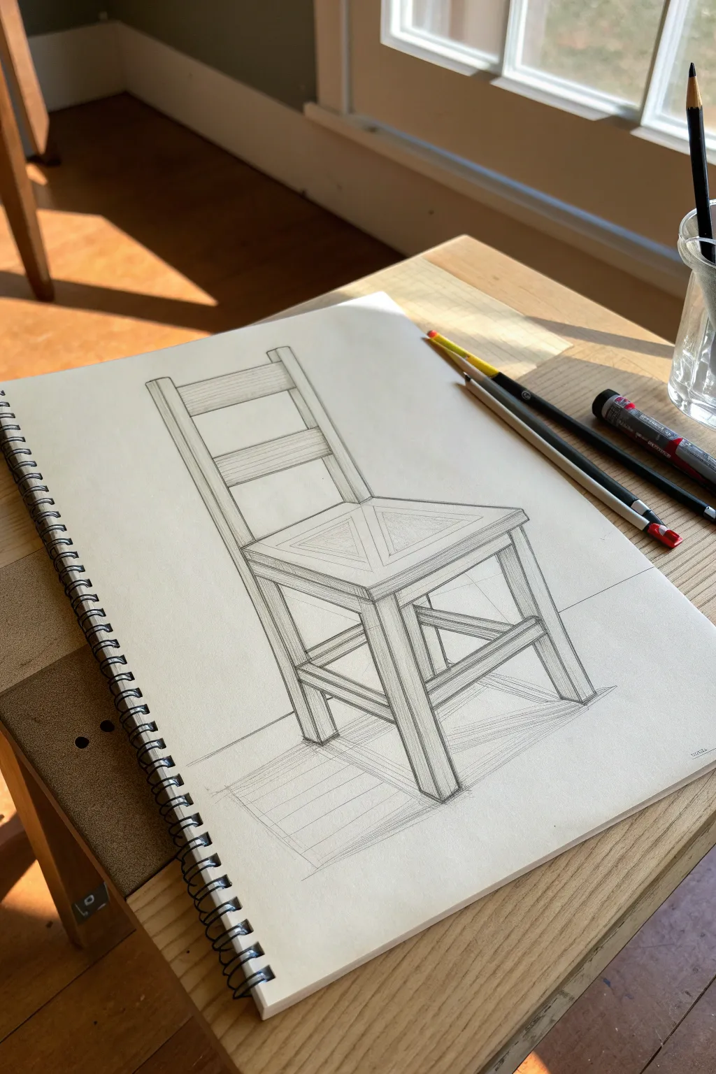
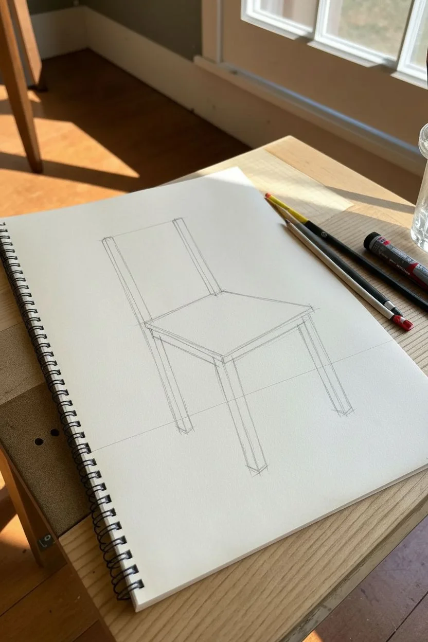
This tutorial guides you through sketching a wooden chair by breaking it down into basic geometric forms. The resulting drawing features clean lines, realistic perspective, and subtle shading that brings the structure to life.
Step-by-Step Tutorial
Materials
- Spiral-bound sketchbook (heavyweight paper)
- Graphite pencils (HB, 2B, and 4H)
- Fine-point black liner pen or marker (optional)
- Eraser (kneaded preferred)
- Ruler or straight edge
Step 1: Planning and Foundation
-
Establish the horizon line:
Begin by lightly drawing a horizontal line across the lower third of your paper. This is your eye level and will determine the perspective of the chair’s legs. -
Block in the seat box:
Imagine the seat of the chair as a flat, square box floating in space. Draw this box using light, sketchy lines. Pay attention to how the side lines angle slightly towards vanishing points on your horizon line. -
Add the leg guidelines:
Draw vertical lines extending downward from the four corners of your seat box. Notice that the front legs should appear slightly longer than the back legs due to perspective. -
Draft the backrest structure:
Extend the two back vertical lines upward to form the support posts for the backrest. Keep these lines parallel to the front leg lines to maintain vertical alignment.
Angle Check
Use your pencil as a measuring tool. Hold it up against the reference photo to mimic the angle of a leg or seat edge, then move your hand to the paper to transfer that exact angle.
Step 2: Adding Dimension and Timber
-
Thicken the legs:
Turn your single vertical lines into 3D rectangular posts. Draw parallel lines next to your initial guides to give the legs thickness and volume. I find it helpful to draw the ‘foot’ of each leg first to know where to stop. -
Detail the seat frame:
Add depth to the seat by drawing a second set of lines just below the seat surface, connecting the tops of the legs. This creates the apron or frame that supports the sitter. -
Construct the back slats:
Draw horizontal rectangles between the two back posts. Based on the reference, draw a wide top rail and a slightly narrower lower rail. Give them a 3D quality by adding a thin side edge to show the wood’s thickness. -
Add the cross-bracing:
Sketch the structural supports connecting the legs near the bottom. These H-stretchers or X-braces add stability. Draw them as rectangular bars intersecting the legs, ensuring the perspective angles match the seat above.
Go Rustic
Instead of perfectly straight ruler lines, try hand-drawing slightly wobbly lines and adding small knots or cracks to simulate aged, reclaimed barn wood.
Step 3: Refining and Shading
-
Clean up construction lines:
Take your eraser and gently remove the internal overlapping lines where the wood pieces join, making the structure look solid rather than transparent. -
Define the seat pattern:
Draw the geometric triangle pattern on the seat surface. Start from the center point and draw lines out to the corners and midpoints, creating four triangular sections that meet in the middle. -
Strengthen the outline:
Switch to a softer pencil (like a 2B) or a fine-point pen. Go over your main structural lines with a confident, darker stroke to make the chair pop off the page. -
Add heavy shadows:
Identified the light source coming from the top left. Darken the right-facing sides of the legs and seat frame significantly to create contrast. -
Hatch simple textures:
Use vertical straight lines (hatching) to shade the front faces of the legs and backrest supports. Keep these lines steady and closely spaced. -
Cast the floor shadow:
Draw a geometric shadow shape on the ‘floor’ extending to the right of the chair. Keep the edges of this shadow somewhat sharp to mimic strong lighting. -
Final touches:
Add faint wood grain suggestions on the back slats and refine any corners that look too rounded. Sharp corners emphasize the wooden material.
Now you have a solid architectural study that masterfully captures weight and perspective
Practice One Realistic Eye With Strong Contrast
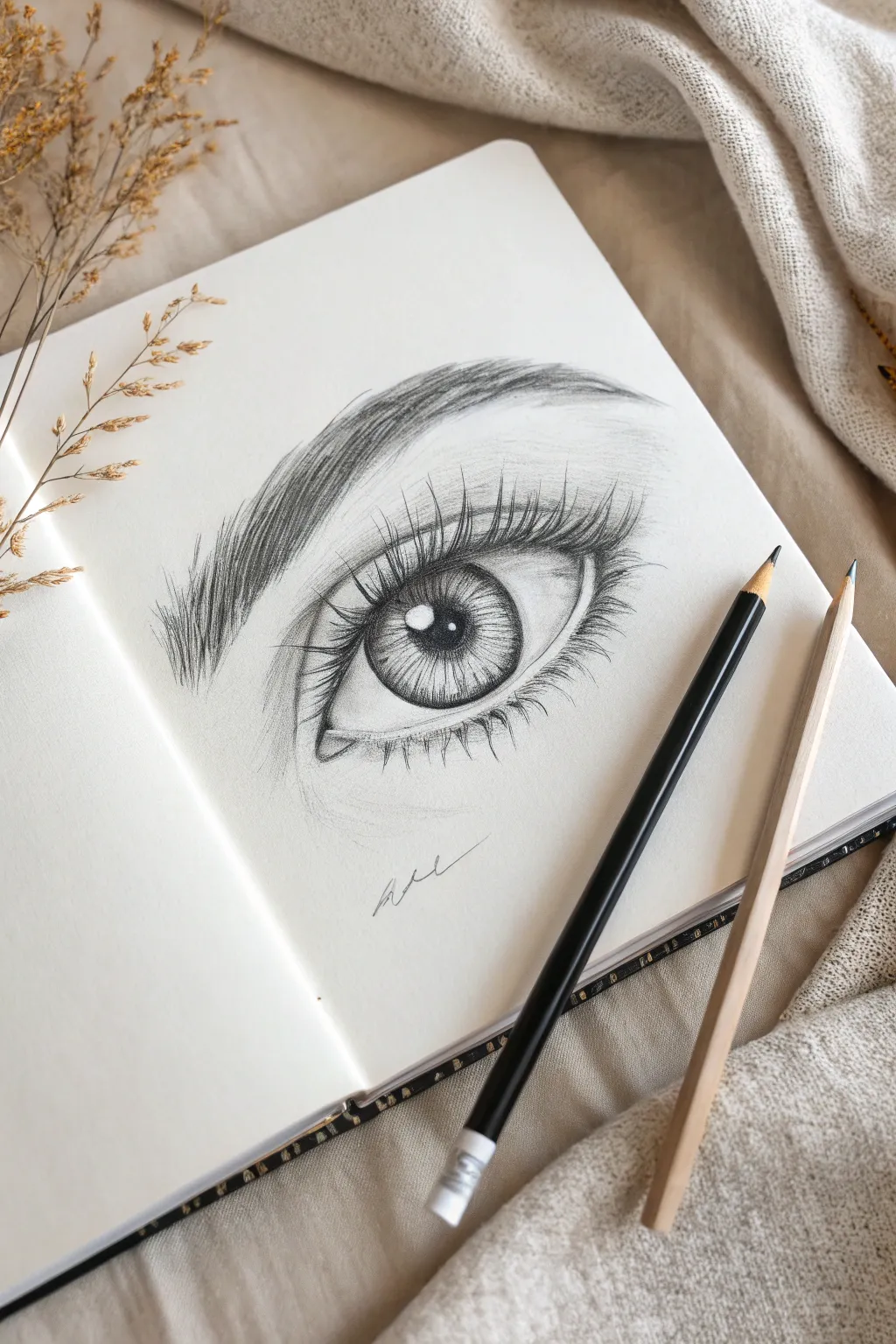
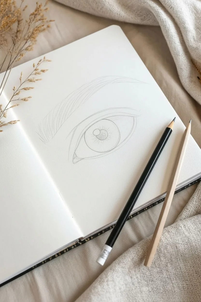
Mastering the human eye is a rite of passage for every pencil artist, and this study focuses on capturing depth through strong contrast and delicate details. You will learn to build up layers of graphite to create a lifelike iris and sweeping lashes that seem to lift off the page.
Step-by-Step
Materials
- Smooth white sketchbook paper or drawing paper (heavyweight preferred)
- HB graphite pencil (for initial sketching)
- 2B or 4B graphite pencil (for darker shading)
- Mechanical pencil or freshly sharpened hard pencil (detailed lashes)
- Black drawing pencil (e.g., General’s layout or similar, for deepest blacks)
- Kneaded eraser
- Blending stump or cotton swab
Step 1: Laying the Foundations
-
Outline the basic shape:
Begin with your HB pencil using very light pressure. Draw an almond shape for the eye opening, observing that the upper lid curve is usually steeper than the bottom. Mark the location of the tear duct on the inner corner. -
Place the iris and pupil:
Draw a perfect circle for the iris. Note that the top part of the circle is usually slightly covered by the upper eyelid. Inside this, draw a smaller circle for the pupil, ensuring it is centered. -
Mark the highlight:
Before adding any shading, draw a small, irregular shape overlapping the pupil and iris. This is your catchlight or reflection. It must stay pure white, so sketch it clearly to remind yourself not to shade inside it. -
Sketch the eyebrow and creases:
Lightly indicate the crease of the upper eyelid, which follows the curve of the top lash line. Above that, sketch the faint outline of the eyebrow shape, determining the arch and tail direction.
Step 2: Shading the Iris and Pupil
-
Fill the pupil:
Switch to your darker 4B or black pencil. Fill in the pupil completely, pressing firmly to get a deep, solid black, but be careful to preserve the sharp edge of the highlight box you drew earlier. -
Establish iris texture:
Using a sharp HB or 2B pencil, draw spoke-like lines radiating from the pupil outward toward the edge of the iris, like the spokes of a bicycle wheel. Vary the length and darkness of these lines. -
Darken the iris ring:
Shade the outer ring of the iris (the limbal ring) darker than the center. Blend this inward slightly so it doesn’t look like a hard cartoon outline. -
Add depth to the upper iris:
Shade the top section of the iris—right under the upper lid—much darker. This represents the shadow cast by the eyelid and eyelashes, which adds immediate realism.
Keep it Sharp
For realistic texture, especially lashes and iris details, a dull pencil is your enemy. Keep a sharpener handy and rotate your pencil every few strokes to maintain a needle-point tip.
Step 3: Creating Skin & Volume
-
Shade the sclera (white of the eye):
The ‘white’ of the eye is never perfectly white because it is a sphere. Lightly shade the corners of the eyeball with an HB pencil, blending towards the iris but leaving the center bright. This makes the eye look round. -
Define the skin creases:
Darken the crease line above the eyelid. Soften the line with a blending stump or cotton swab to make it look like a fold of skin rather than a wire. -
Shade the tear duct:
Add subtle value to the tear duct area in the inner corner. It should be moist and fleshy, so leave tiny specks of white paper for wet highlights.
Add a Signature
Make the drawing truly yours by adding a small, stylized signature or initials underneath the artwork in a light, flowing script, just like in the reference image.
Step 4: Lashes and Brows
-
Map the eyebrow hairs:
Using short, quick flicks, specific direction is key here. Hairs near the nose grow upward, while hairs toward the tail grow outward and downward. Layer these strokes to build density. -
Draw the upper lashes:
Switch to your sharpest dark pencil. Start each lash at the root on the eyelid rim and flick outward in a sweeping ‘J’ curve. The lashes should vary in length and sometimes clump together in triangles. -
Draw the lower lashes:
Repeat the process for the lower lashes, but keep them shorter, thinner, and more spaced out than the top ones. Pay attention to how they curve downward from the lower water line. -
Refine the brow arch:
Go back into the eyebrow with your darkest pencil to add shadow and depth to the lower edge of the brow, making it look fuller. -
Final contrast check:
Take a step back. Use your black pencil to re-darken the pupil and the upper lash line. Erase any smudges around the drawing to keep the surrounding paper crisp.
Once you’ve blown away the eraser crumbs, take a moment to admire the lifelike gaze staring back at you from the page

PENCIL GUIDE
Understanding Pencil Grades from H to B
From first sketch to finished drawing — learn pencil grades, line control, and shading techniques.
Explore the Full Guide
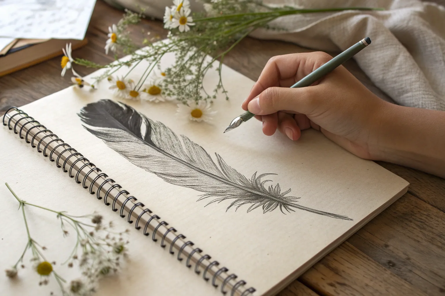
Draw a Feather to Learn Soft Texture
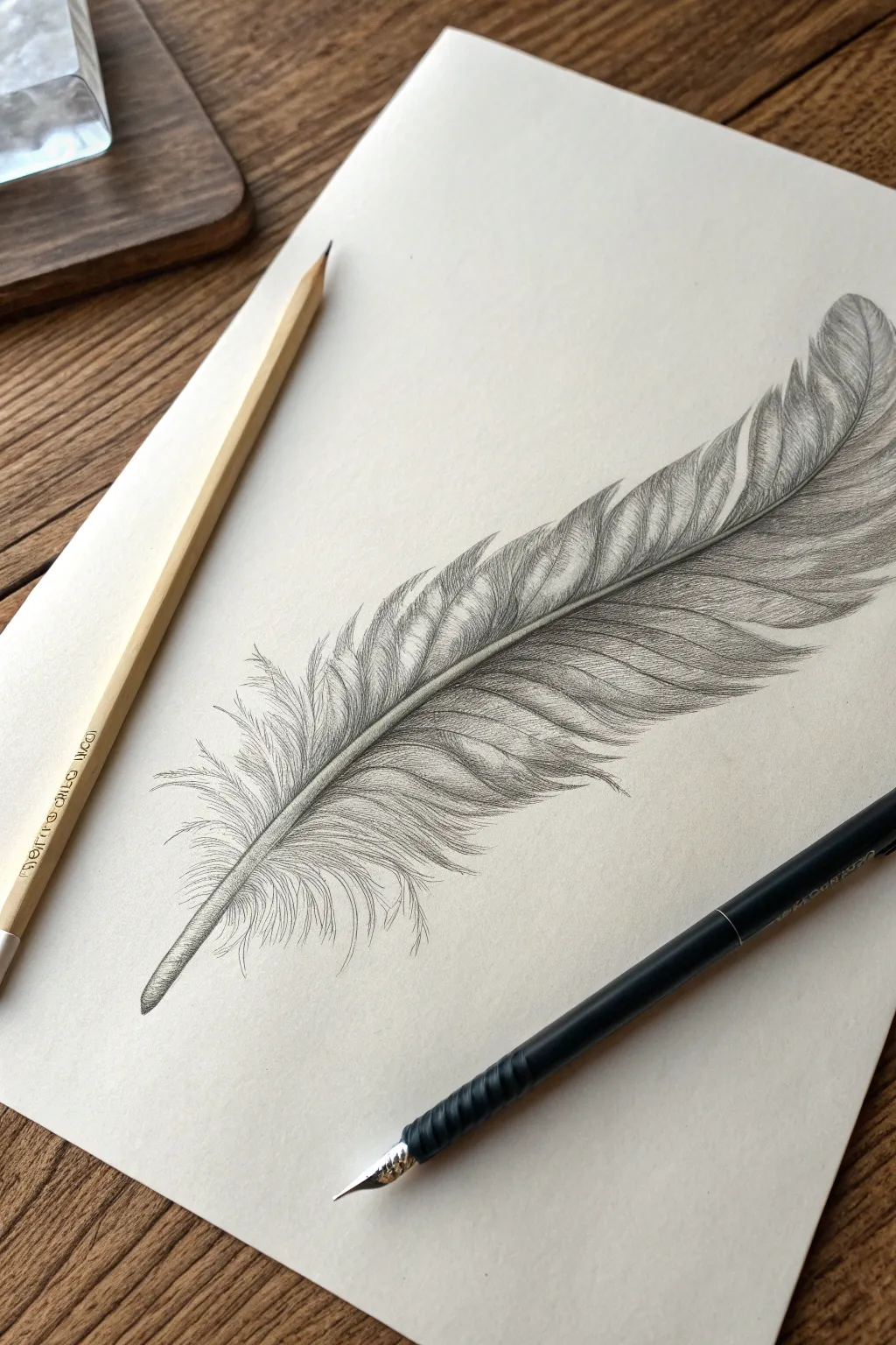
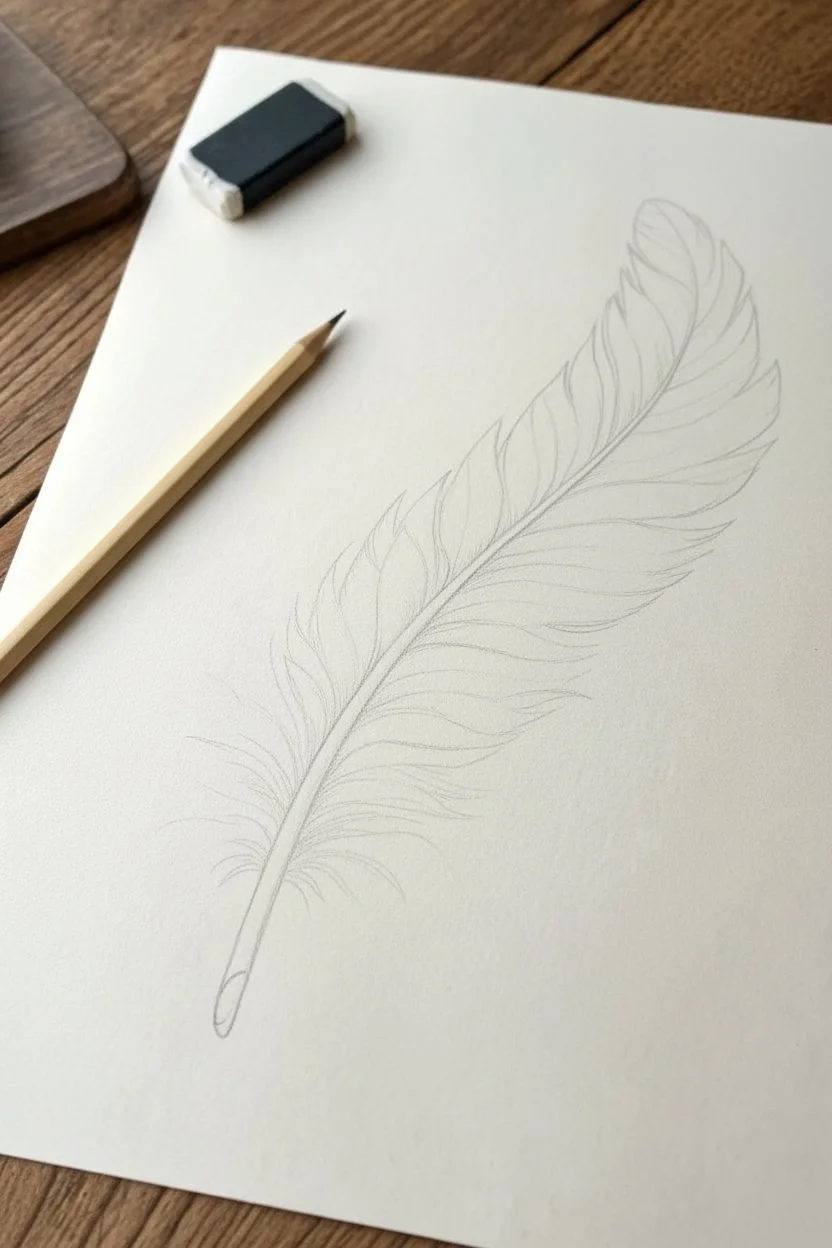
Master the art of delicate shading by drawing this realistic feather, focusing on the contrast between the rigid quill and the soft, wispy barbs. This project is perfect for practicing graduation and controlling pencil pressure to achieve a lifelike, airy effect.
How-To Guide
Materials
- HB graphite pencil (for sketching)
- 2B and 4B graphite pencils (for shading)
- Smooth heavyweight drawing paper (cream or off-white recommended)
- Kneaded eraser
- Fine-point mechanical pencil (optional, for details)
- Blending stump or cotton swab
Step 1: Laying the Foundation
-
Establish the curve:
Begin by drawing a single, gentle C-curve line lightly with your HB pencil. This will serve as the central spine or rachis of the feather. Make it about 6-8 inches long, tapering slightly at the top. -
Thicken the spine:
Add a second line parallel to your first curve, tapering them together at the very tip and widening slightly at the base where the quil interacts with the skin. The base should look like a hollow tube. -
Outline the shape:
Lightly sketch the general envelope shape of the feather around the spine. Don’t worry about individual hairs yet; just define the broad, leafy shape, keeping the top side slightly narrower than the bottom side. -
Mark separation points:
Look at the reference image and identify where the feather splits naturally. Mark these V-shaped splits lightly along the outer edges of your outline to guide your texture work later.
Too Heavy-Handed?
If your feather looks like a solid block, your strokes are too close together. Use a pointed eraser to ‘draw’ white lines back into the dark areas to restore separation.
Step 2: Building the Vanes
-
Start the barbs:
Switch to a sharpened 2B pencil. Starting from the central spine, draw outward strokes following the curve of the feather. These strokes should angle upward toward the tip. -
Create distinct segments:
Group your strokes into clustered segments based on the splits you marked earlier. Imagine each segment simply as a smaller, mini-feather shape. -
Defining the edges:
At the outer edges of the feather, allow your pencil strokes to taper off gently. Don’t create a hard outline; let the ends of the pencil strokes form the silhouette. -
Work on the fluffy base:
Near the bottom of the quill, change your stroke style. Instead of organized parallel lines, use erratic, crisscrossing, and very light scribbles to mimic the downy soft afterfeather.
Step 3: Shading and Depth
-
Shadowing the spine:
Using the 2B pencil, darken the side of the central spine that faces away from the light source. This makes the spine look round and cylindrical rather than flat. -
Deepening the splits:
Where the feather segments overlap or split, press harder with a 4B pencil to create deep shadows. These dark wedges create instant visual separation between the vanes. -
Adding texture to the vanes:
Go back over the main feather body with fine, repetitive strokes. I find it helpful to vary the pressure—darker near the spine, lifting to a whisper at the tips. -
Highlight retention:
Leave thin slivers of paper white between some of your barb groupings. These negative spaces act as natural highlights and give the feather a glossy sheen. -
Refining the quill tip:
At the very bottom of the quill (the calamus), use horizontal shading to show transparency, and add a small dark opening at the very bottom.
Make it Soar
Add a faint cast shadow underneath the feather, slightly offset from the object itself. This makes the feather appear to be floating just above the paper surface.
Step 4: Detailing and Refining
-
Sharp details:
If you have a mechanical pencil, use it now to add stray, wispy hairs that break the main silhouette. This imperfection makes the drawing look more realistic. -
Clean up highlights:
Take your kneaded eraser and mold it into a fine point. Gently lift off graphite along the upper curve of the central spine to crisp up the highlight. -
Soft blending (optional):
If the texture looks too scratchy, lightly run a blending stump over the mid-tones, but avoid the crisp edges or the finest details. -
Final contrast check:
Step back and look at the drawing. Use your 4B pencil to add one last pass of dark accents in the deepest crevices near the spine to make the image pop.
Now you have a delicate feather study that captures the softness of nature using simple pencil strokes
Sketch a Butterfly With Symmetry Lines
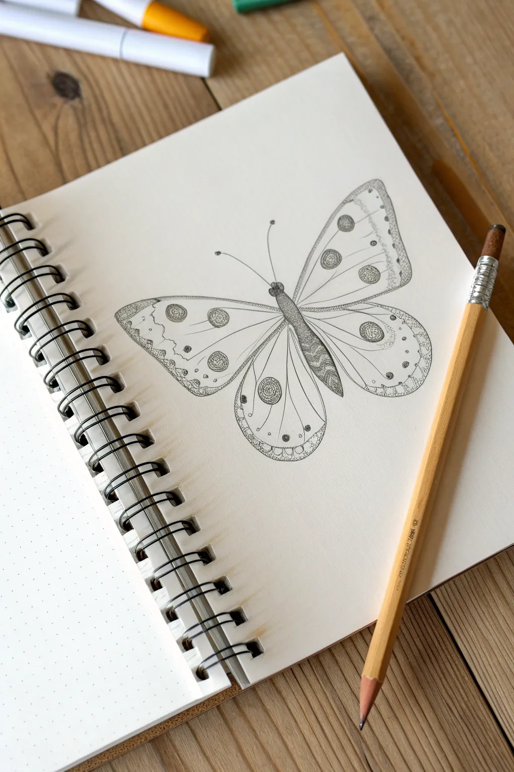
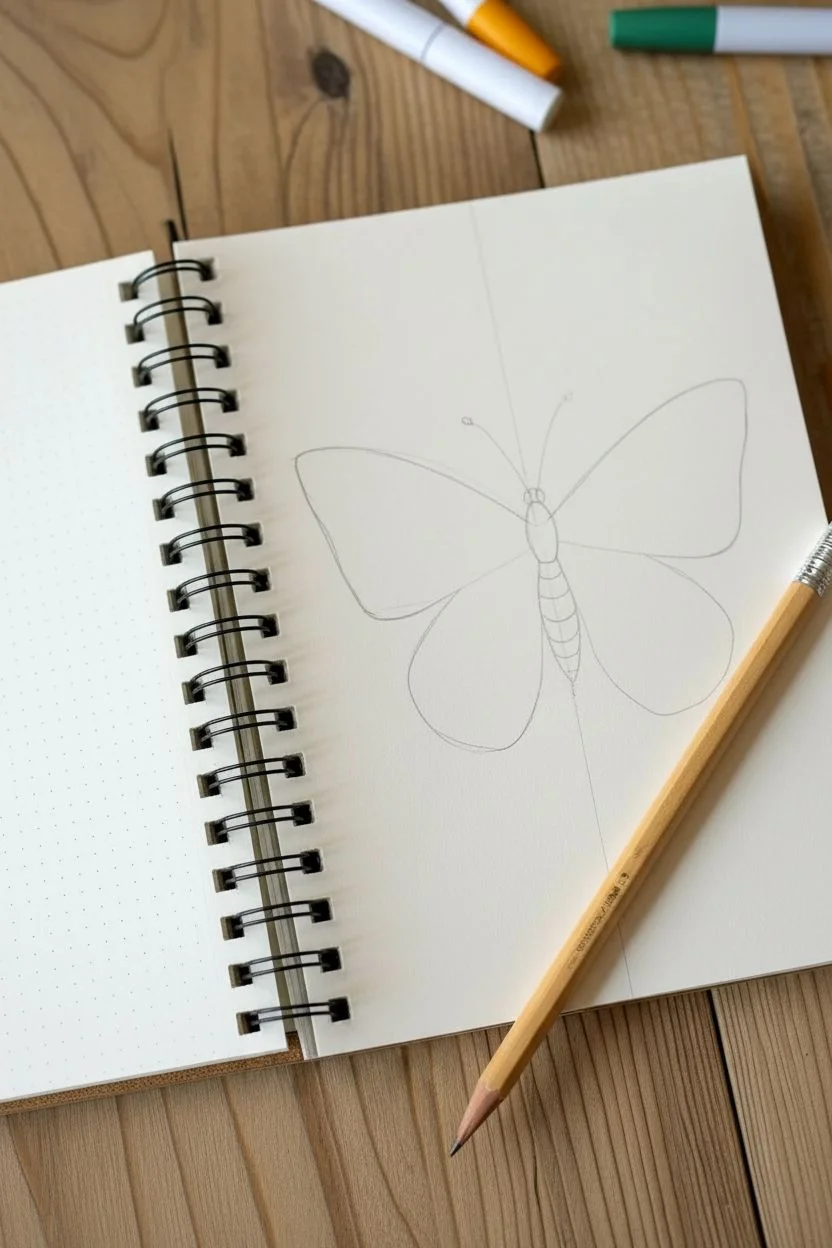
Learn to sketch a beautifully symmetrical butterfly using simple shapes and intricate pencil textures. This project focuses on balance and fine stippling details to create a delicate, illustrative look on dotted paper.
Detailed Instructions
Materials
- Dotted sketchbook paper or graph paper
- HB or 2B graphite pencil
- Quality eraser (kneaded or vinyl)
- Ruler (optional, for guiding symmetry)
- Pencil sharpener
Step 1: Drafting the Structure
-
Establish the centerline:
Begin by drawing a faint vertical line down the center of your page. Alternatively, if you are using dotted paper, simply choose a vertical row of dots to serve as your central spine. This invisible anchor is crucial for keeping your butterfly symmetrical. -
Sketch the body:
Along your centerline, draw a long, slender oval shape for the butterfly’s body. Divide it into three subtle sections: a small circle for the head, a slightly wider oval for the thorax (middle), and a tapered, elongated oval for the abdomen. -
Map the upper wings:
Starting from the thorax, sketch two large, triangular shapes extending outward and upward. Keep your lines very light. The outer edges should curve gently, rounding off at the tips rather than being sharp points. -
Map the lower wings:
Draw two rounded tear-drop shapes extending from the lower part of the body. These should be slightly smaller than the top wings and curve inward toward the abdomen. Check that the left and right sides roughly mirror each other. -
Refine the wing outlines:
Go over your initial wing shapes, adding gentle waves to the edges to make them look organic. I like to give the top edge of the upper wing a smooth curve, while making the bottom edges slightly scalloped.
Uneven Wings?
If one wing looks larger than the other, try looking at your drawing in a mirror. The reversed reflection instantly reveals distortion, allowing you to correct the shape before adding details.
Step 2: Adding Patterns & Details
-
Draw internal wing veins:
Lightly sketch lines radiating from the body toward the wing edges. These veins act as borders for your patterns. You don’t need too many—just two or three main lines per wing section to create distinct panels. -
Place the circular spots:
Draw circles of various sizes within the wing sections. Referencing the image, place larger circles near the center or upper edges and smaller dots near the wing tips. Keep them symmetrical on both wings. -
Detail the wing borders:
Draw a secondary line just inside the outer edge of all four wings to create a border strip. Inside this strip, add small semi-circles or tiny arches that hug the edge. -
Add the antennae:
From the head, draw two long, slender curves extending upward and outward. Top each antenna with a tiny, solid dot.
Keep it Sharp
For the stippling (dot work), ensure your pencil is freshly sharpened. A dull point creates mushy dots, while a sharp point creates the crisp, clean texture needed for this style.
Step 3: Shading & Texturing
-
Darken the body:
Using the tip of your pencil, shade the body with short, dense lines to mimic a fuzzy texture. Leave a tiny sliver of white down the very center or side to suggest a highlight and roundness. -
Outline boldly:
Go over the main outline of the wings and the internal vein lines with a slightly firmer pressure. You want these structural lines to be crisp and define the segments clearly. -
Stipple the spots:
Instead of coloring the circular spots in typically, use stippling. Create density by placing many pencil dots close together inside the circles. Create concentric rings of dots within the larger spots for added interest. -
Texture the inner wings:
Inside the wing segments closest to the body, add very light, wiggly lines or light shading. This makes the butterfly look distinct from the white paper background. -
Decorate the borders:
Fill the border strips you created earlier with tiny dots or small hatching lines. This frame-like effect gives the drawing a finished, intricate appearance. -
Final stippling touch:
Add extra stippling dots loosely around the main spots and near the wing roots. This gradient of dots—fading from dense to sparse—replaces traditional shading and gives that classic scientific illustration feel. -
Clean up:
Erase any remaining stray guide lines, especially your initial vertical centerline if you drew one. Check your symmetry one last time and darken any faded lines to make the drawing pop.
Enjoy the calming process of adding those final decorative dots to your butterfly


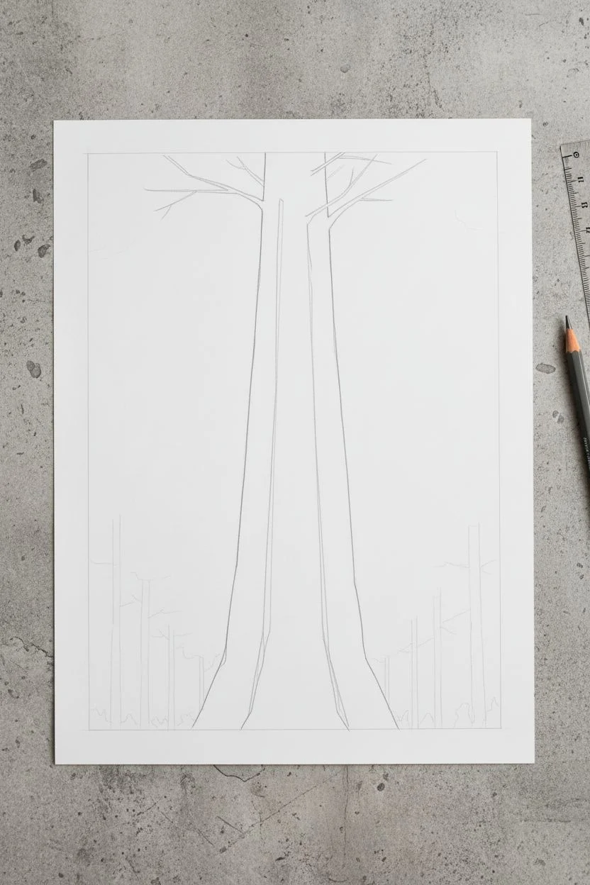
Draw a Tree Trunk With Bark Marks
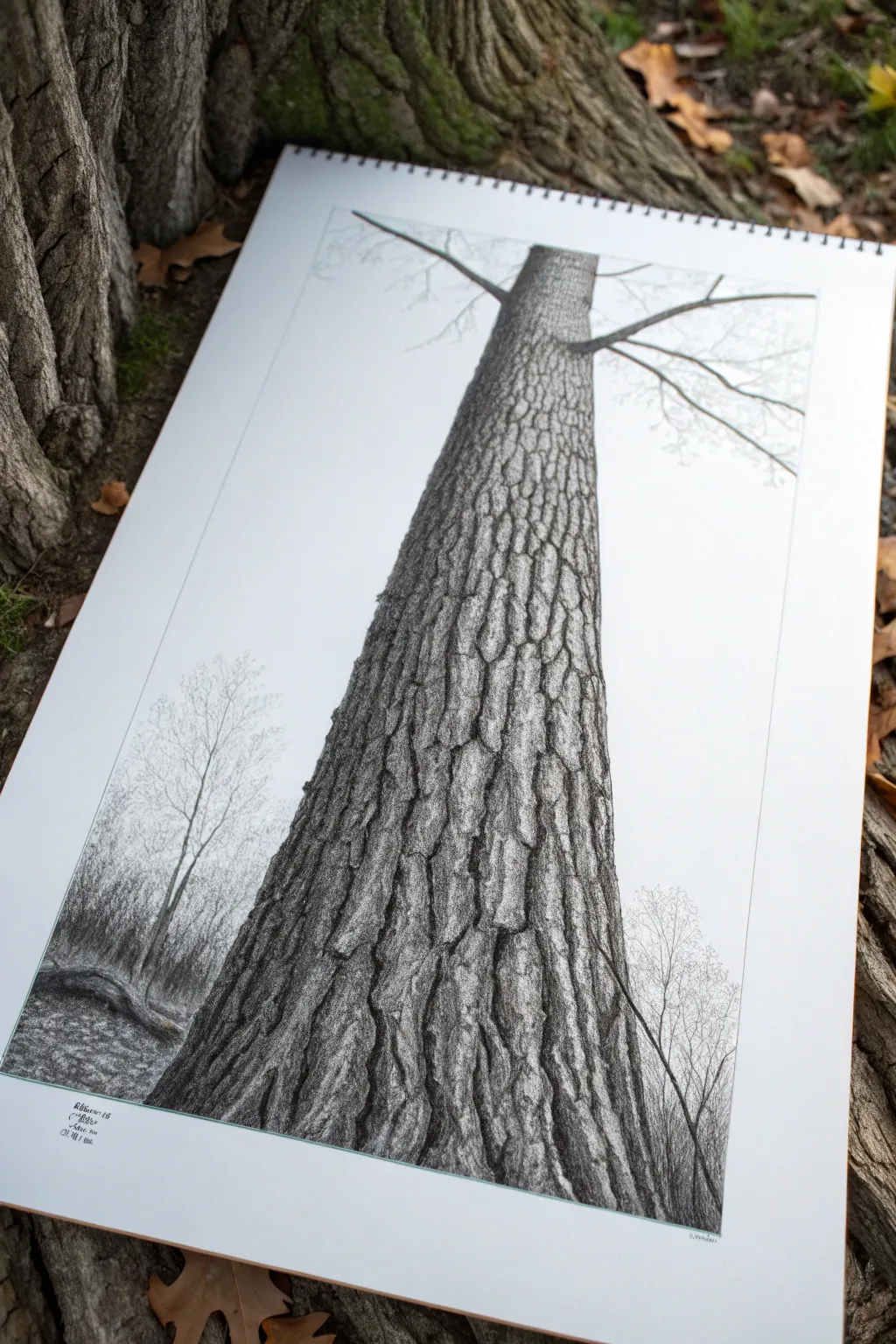
This project focuses on a dramatic, low-angle perspective of a single tree trunk, capturing the rugged beauty of nature through texture. By building up layers of graphite, you will transform a simple cylinder into a lifelike surface full of cracks, ridges, and organic character.
Step-by-Step
Materials
- Smooth bristol or high-quality drawing paper (A3 or similar size)
- Graphite pencils (HB, 2B, 4B, 6B)
- Fine liner pen (0.1mm) for tiny details (optional)
- Kneaded eraser
- Pencil sharpener
- Ruler
- Paper stump or blending tortillon
Step 1: Setting the Perspective
-
Frame the composition:
Begin by lightly drawing a rectangular border inside your paper leaving about an inch of margin. This helps frame the subject clearly. -
Draft the trunk shape:
Using an HB pencil, draw two long, vertical lines that taper slightly inward as they go up. The trunk should be wide at the bottom to suggest proximity and narrow at the top to create a towering perspective. -
Add branch indicators:
Near the top of your trunk shape, sketch a few thin lines branching outward. These don’t need detail yet; just position them to show where the canopy begins. -
Sketch the background trees:
very faintly sketch skinny, vertical lines on the left and right sides of the main trunk. These will be the distant forest background, kept light to push them backward in space.
Bark Looking Flat?
If the texture looks flat, your shadows likely aren’t dark enough. Be brave with your 6B pencil; deep, black shadows in the cracks pop the lighter bark plates forward.
Step 2: Mapping the Bark
-
Create the texture flow:
Lightly draw wavy, vertical guidelines running up the trunk. Bark grows in long strips, so these lines help ensure your details follow the form of the tree. -
Outline the plates:
Along your guidelines, start drawing disjointed, irregular shapes. Think of them like puzzle pieces that don’t quite touch, creating vertical fissures between the plates of bark. -
Vary the sizes:
Make the bark plates larger and more distinct at the bottom of the page (closest to the viewer) and smaller as you move up the trunk to enhance the illusion of height.
Step 3: Shading and Depth
-
Establish the light source:
Decide which side your light is coming from (in this example, generally from the left). This means the crevices on the right side of each bark plate will be darker. -
Darken the fissures:
Switch to a 4B pencil. Press firmly to darken the deep cracks between the bark plates. These should be remarkably dark, almost black, to create separation. -
Shade individual plates:
Using a 2B pencil, shade the bark plates themselves. Keep the edges nearest the light source lighter and darken the opposite edge to make them look rounded and dimensional. -
Add surface texture:
Use a sharp HB pencil to scribble tiny, erratic lines or stippling dots on top of the shaded plates. This mimics the rough, mossy, or flaky surface of real wood. -
Blend selectively:
I find that using a paper stump to gently smudge the mid-tones helps round out the bark, but be careful not to smudge your crisp, dark crack lines.
Pro Tip: Edge Variety
Don’t make your outlines too straight. Use a ‘shaky hand’ technique when drawing the sides of the tree to mimic the natural bumps and irregularities of organic growth.
Step 4: Final Details
-
Refine the background:
Return to the background trees. Use a light, feathery touch to add tiny branches, creating a delicate silhouette that contrasts with the heavy main trunk. -
Ground the subject:
Add some darker shading and rough texture at the very base of the tree to simulate the ground and undergrowth, anchoring the trunk so it doesn’t look like it’s floating. -
Enhance contrast:
Take a 6B pencil and revisit the deepest shadows in the bark cracks. High contrast is the secret to a photorealistic look. -
Clean up borders:
Use your ruler and eraser to sharpen the rectangular border you drew in step one, erasing any smudges outside the frame for a professional presentation.
Take a step back to admire the powerful sense of height you have achieved with your shading
Sketch a Small Bird With Basic Shapes
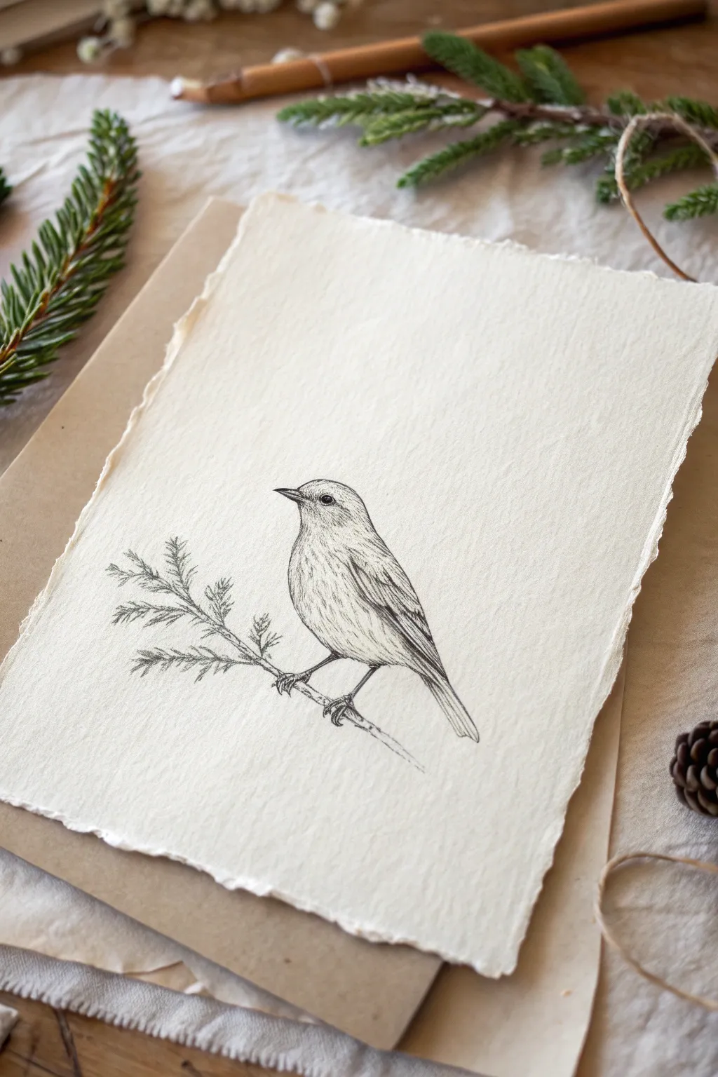
Capture the gentle spirit of nature with this fine-line graphite sketch of a small songbird perched on an evergreen branch. Using textured paper adds an organic, timeless quality to the drawing that frames the delicate pencil strokes perfectly.
Step-by-Step Guide
Materials
- Textured heavy-weight paper with deckled edges (like cotton rag watercolor paper)
- HB graphite pencil (for initial sketching)
- 2B and 4B graphite pencils (for shading and details)
- Kneadable eraser
- Fine-point mechanical pencil (0.5mm, optional for tiny details)
- Blending stump (tortillon)
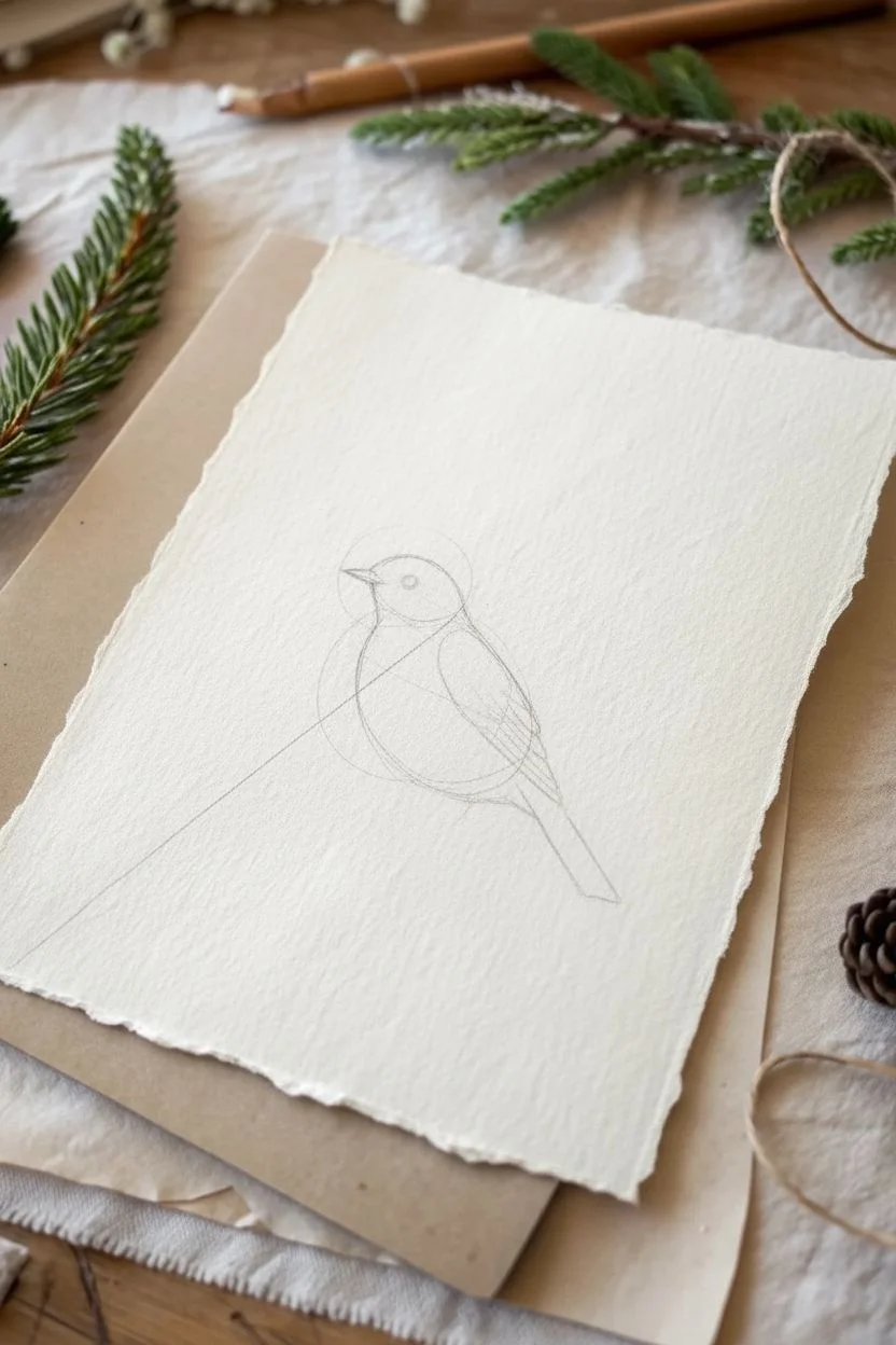
Step 1: Drafting the Basic Forms
-
Position the subject:
Visualize where the bird will sit on your paper. Aim for the center, but slightly lower to allow breathing room above its head. -
Draw the main axis:
Lightly sketch a very faint diagonal line moving from the bottom left to the center right. This will serve as the angle for the bird’s posture and the branch. -
Circle the body:
Using your HB pencil with almost zero pressure, draw a slanted oval shape for the bird’s main body. It should look like an egg leaning backward. -
Add the head:
Sketch a smaller circle overlapping the top left of your body oval. Connect these two shapes with curved lines to form the neck, creating a smooth, continuous silhouette. -
Outline the tail and wing:
Extend a long, tapered rectangle shape downwards from the back of the body for the tail feathers. Then, draw a tear-drop shape on the side of the body to indicate the folded wing.
Step 2: Identifying Features
-
Place the beak and eye:
About halfway up the head circle, draw a small horizontal line for the mouth, then form the triangular beak shapes around it. Place a small dot for the eye just behind and slightly above the corner of the mouth. -
Sketch the legs:
Draw two thin lines extending down from the belly. At the end of these lines, sketch tiny, curved claws gripping the imaginary line of your branch. -
Define the branch structure:
Thicken the diagonal line you drew earlier to create the branch. Add a secondary twig branching off to the left, behind the bird’s tail area. -
Refine the outline:
Go over your perimeter lines, smoothing out the connections between the head, back, and tail. Erase the internal construction lines (the overlapping parts of your initial circles).
Paper Texture Tip
When using rough, handmade paper, don’t fight the grain. Let the pencil skip over the tiny valleys in the paper texture; these white spots create natural highlights.
Step 3: Shading and Texturing
-
Darken the eye:
Switch to a 2B pencil. Fill in the eye, leaving a tiny speck of white paper near the top for a highlight. This breathes life into the bird immediately. -
Feather the head:
Using short, flicking pencil strokes, create texture on the head. Follow the curve of the skull, making the strokes darker near the beak and nape. -
Detail the wing:
Draw distinct, elongated U-shapes on the wing to represent layers of feathers. Press harder with a 4B pencil in the shadows between feather layers to create depth. -
Shade the belly:
I prefer to keep the belly quite light. Use very sparse, curved hatching lines on the underside to suggest roundness without filling it in completely. -
Refine the tail:
Draw long, straight lines along the tail length. Darken the edges of the tail feathers to separate them from each other. -
Draw evergreen needles:
On the branch extension to the left, use quick, sharp dashes to create pine needles. Vary their direction slightly so they don’t look too uniform. -
Texture the feet and branch:
Add small cross-hatching marks on the legs for texture. Shade the bottom of the branch to ground the bird, making it look like it is bearing weight. -
Final contrast check:
Step back and look at your drawing. Darken the deepest shadows—usually under the wing, under the tail, and the eye—to make the drawing pop against the textured paper.
Level Up: Color Tint
Use a colored pencil or a watercolor wash to add a single, faint hint of color—like a pale russet on the breast or a soft olive green on the pine needles.
Now you have a serene nature study that celebrates the beauty of simplicity
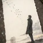
Draw a Girl From Behind Holding an Umbrella
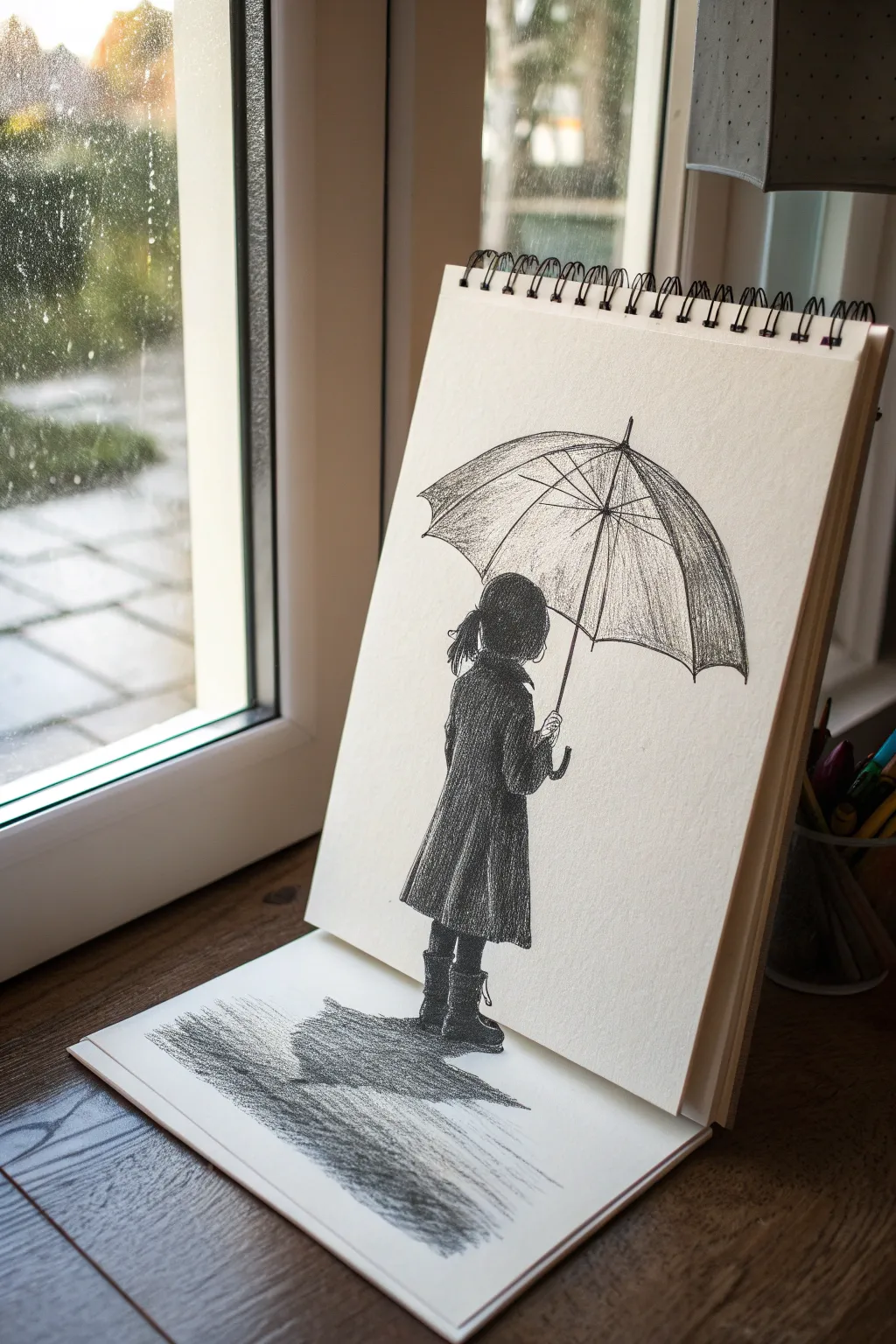
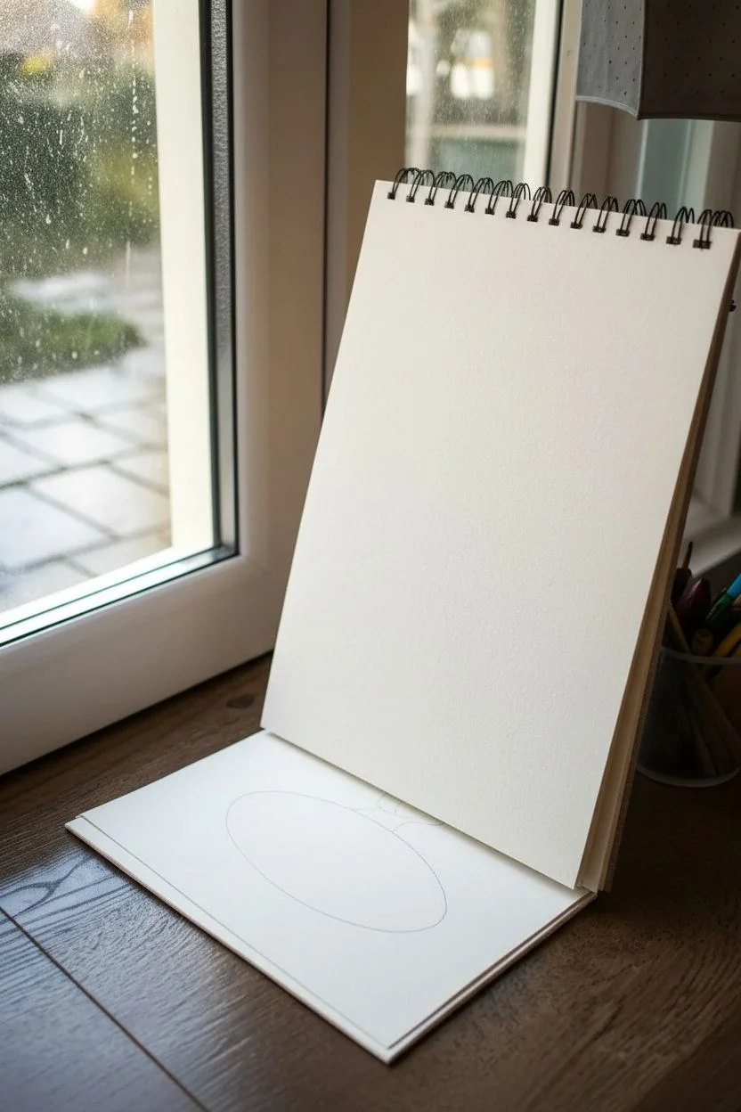
This clever pencil sketch creates a striking 3D optical illusion by utilizing two planes of an open sketchbook. The girl stands on the vertical page while her shadow stretches onto the horizontal page below, making her appear to step right out of the paper.
Step-by-Step Tutorial
Materials
- Sketchbook (spiral bound works best)
- H pencil for initial outlining
- 2B and 4B pencils for shading
- Fine-point eraser or kneaded eraser
- Ruler
Step 1: Setting the Stage
-
Prepare your canvas:
Prop your sketchbook open against a wall or window so the top page is nearly vertical and the bottom page lies flat on the table. You need to draw while seeing it from this specific angle to get the perspective right. -
Draft the illusion line:
Fold the bottom page slightly so it curves naturally away from the spiral binding. Visualize where the girl’s feet will land; they need to be exactly at the crease where the two pages meet to sell the effect.
Angle is Everything
This specific illusion only works from one viewing angle. Tape your sketchbook in place and check through your camera lens frequently while drawing.
Step 2: Sketching the Figure
-
Outline the head:
Using your H pencil, lightly sketch a rounded shape for the head about halfway up the vertical page. Don’t press hard yet. -
Draw the coat shape:
Sketch a trapezoidal shape extending down from the head to form the coat. It should widen slightly at the bottom, resembling an A-line coat. -
Position the umbrella:
Draw a large, wide arc above the head for the umbrella canopy. It should be tilted slightly forward, hiding the girl’s face completely. -
Add the feet:
Sketch two boot shapes emerging from the bottom of the coat. Crucially, position the soles of the boots directly on the bottom edge of the vertical paper.
Wet Effect
Smudge the horizontal shadow slightly with your finger or a tissue. This softness contrasts with the sharp lines of the girl, enhancing the ‘wet ground’ look.
Step 3: Building Dimensions
-
Refine the umbrella structure:
Draw the central pole extending from the coat’s collar up to the center of the canopy. Add the ribs of the umbrella radiating outward from the center point to the edge of the arc. -
Detail the hair and arm:
Add a ponytail sticking out to the left side of the head. Sketch the right arm bent at the elbow, clutching the umbrella handle near the chest. -
Texture the coat:
Switch to a 2B pencil. Use vertical, slightly curved hatching strokes to fill in the coat, creating the texture of heavy fabric. Leave the shoulders slightly lighter to suggest volume. -
Darken the figure:
Layer over your coat shading with a 4B pencil, pressing harder in the folds and under the arm to create deep contrast. This high contrast is essential for the figure to pop against the white paper. -
Shade the umbrella:
Use the side of your pencil to shade the umbrella segments. Make the segments closer to the viewer lighter and the ones underneath or further away darker to give it curvature.
Step 4: Creating the 3D Shadow
-
Map the shadow shape:
Look at the flat, horizontal page now. Lightly outline a distorted, elongated oval shape starting directly from the boots on the vertical page and stretching toward you on the flat page. -
Connect the planes:
Ensure there is zero gap between the bottom of the boots (vertical page) and the start of the shadow (horizontal page). The drawing must flow seamlessly across the paper break. -
Fill the shadow:
Using your darkest 4B pencil, fill in the shadow shape on the flat paper. I find using horizontal strokes here helps differentiate the ground plane from the vertical figure. -
Add puddle reflections:
To make it look like a wet pavement reflection rather than just a shadow, use your eraser to lift out a few horizontal streaks within the dark shadow area. -
Extend the environment:
Lightly sketch some horizontal scribbles around the main shadow on the flat page to suggest wet ground or rain splatter, fading them out as they move away from the figure. -
Final touches:
Check the transition at the paper crease one last time. Reinforce the darkness of the boots and the start of the shadow to merge them visually.
Step back and view your sketchbook from the correct angle to see your character step into reality


Have a question or want to share your own experience? I'd love to hear from you in the comments below!