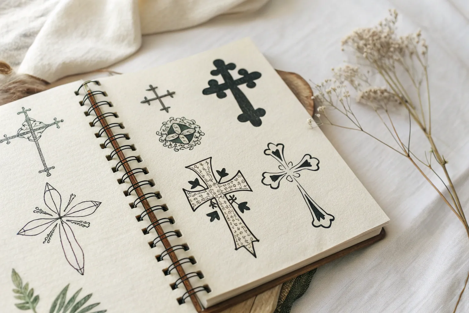
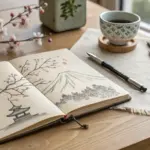
A cross is one of those simple shapes that can turn into something deeply personal with just a few thoughtful details. Here are my favorite cross drawing ideas—from classic and symbolic to bold, artsy twists you can totally make your own.
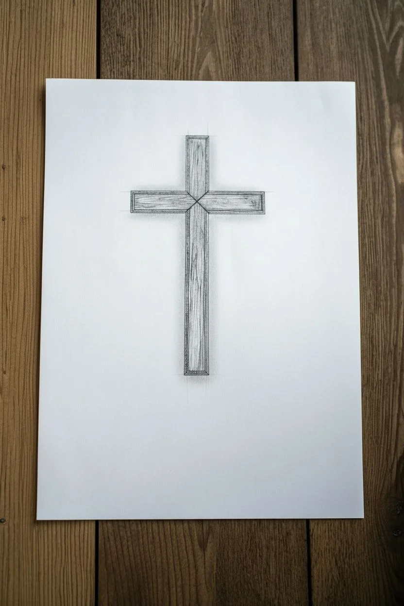
Classic Latin Cross Outline With Clean Line Weight
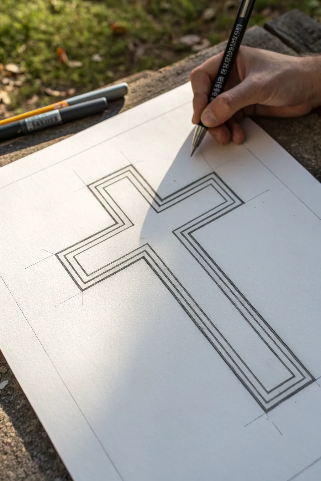
This tutorial guides you through creating a crisp, geometric Latin cross characterized by its clean parallel lines and structured proportions. The design features a distinctive triple-outline effect that adds depth and sophistication to a simple symbol.
Step-by-Step Guide
Materials
- High-quality white drawing paper or cardstock
- HB pencil
- Ruler or straightedge
- Fine liner pen (black, 0.5mm)
- Eraser (kneaded or vinyl)
Step 1: Planning and Structure
-
Establish the centerline:
Begin by using your ruler to draw a very faint vertical line down the center of your paper. This will be the spine of your cross and ensure symmetry. -
Mark the horizontal bar:
Decide on the height of the crossbar. Draw a faint horizontal line intersecting the vertical line about one-third of the way down from the top point of your intended cross. -
Define the outer boundaries:
Measure equal distances from the center point outwards to determine the width of the arms. Mark these points lightly. Do the same for the top and bottom lengths of the vertical beam. -
Box in the main shape:
Using your established points, lightly sketch the initial rectangle shapes that form the core cross. Keep your pencil pressure extremely light here, as these are temporary guides.
Step 2: Drafting the Layers
-
Draw the innermost cross:
Inside your guide box, draw the smallest, central cross shape first. Use your ruler to ensure every line is perfectly straight and corners are at 90-degree angles. -
Create the middle outline gap:
Measure outward from your inner cross by a specific small increment (e.g., 3mm or 1/8 inch). Mark these spacing points lightly on all sides. -
Draft the middle outline:
Connect your measuring marks to draw a second cross shape that essentially wraps around the first one. Parallel placement is key here for that clean look. -
Measure the outer border:
Repeat the previous measuring process, extending outward another 3mm from your middle line. I find standardizing this gap creates a more cohesive visual rhythm. -
Draft the final perimeter:
Complete the pencil phase by drawing the third and largest cross shape. Check that the spacing between all three ‘layers’ is consistent around the entire figure. -
Extend connection lines:
Lightly draw diagonal lines extending from the corners of the innermost cross through the corners of the outer outlines. This helps verify that your expansion is symmetrical.
Use a Penny Spacer
For perfectly consistent gaps without measuring every millimeter, slide a coin or washer along the ruler’s edge as a physical spacer between lines.
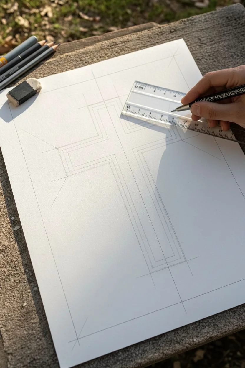
Step 3: Inking and Refining
-
Prepare your pen:
Switch to your fine liner pen. Test it on a scrap piece of paper to ensure the ink is flowing smoothly without blotching. -
Ink the innermost lines:
Carefully trace over your pencil lines for the smallest, central cross. Use the ruler as a guide for the pen tip to keep the lines unwavering. -
Ink the remaining outlines:
Move outward to the middle and then the outer perimeter lines. Work deliberately; rushing often leads to smudges or slip-ups with the straightedge. -
Let the ink settle:
Once all lines are inked, pause for several minutes to allow the ink to dry completely. This prevents the tragic ‘ruler smear’ when you move to the next step. -
Erase guidelines:
Gently run your eraser over the entire drawing to remove the initial pencil sketches, centerlines, and spacing marks. -
Inspect line weights:
Look closely at your inked lines. If any segments look faint, carefully go over them again with the ruler to ensure a solid, consistent black color. -
Clean up corners:
If any corners didn’t quite meet perfectly, use the very tip of your fine liner to carefully crisp them up into sharp points.
Ruler Smudging Ink?
Tape a few pennies to the underside of your ruler. This lifts the distinct edge off the paper, preventing capillary action from sucking ink under it.
Take a moment to appreciate the clean geometry of your finished drawing before displaying it

3D Cross With Simple Perspective and Shading
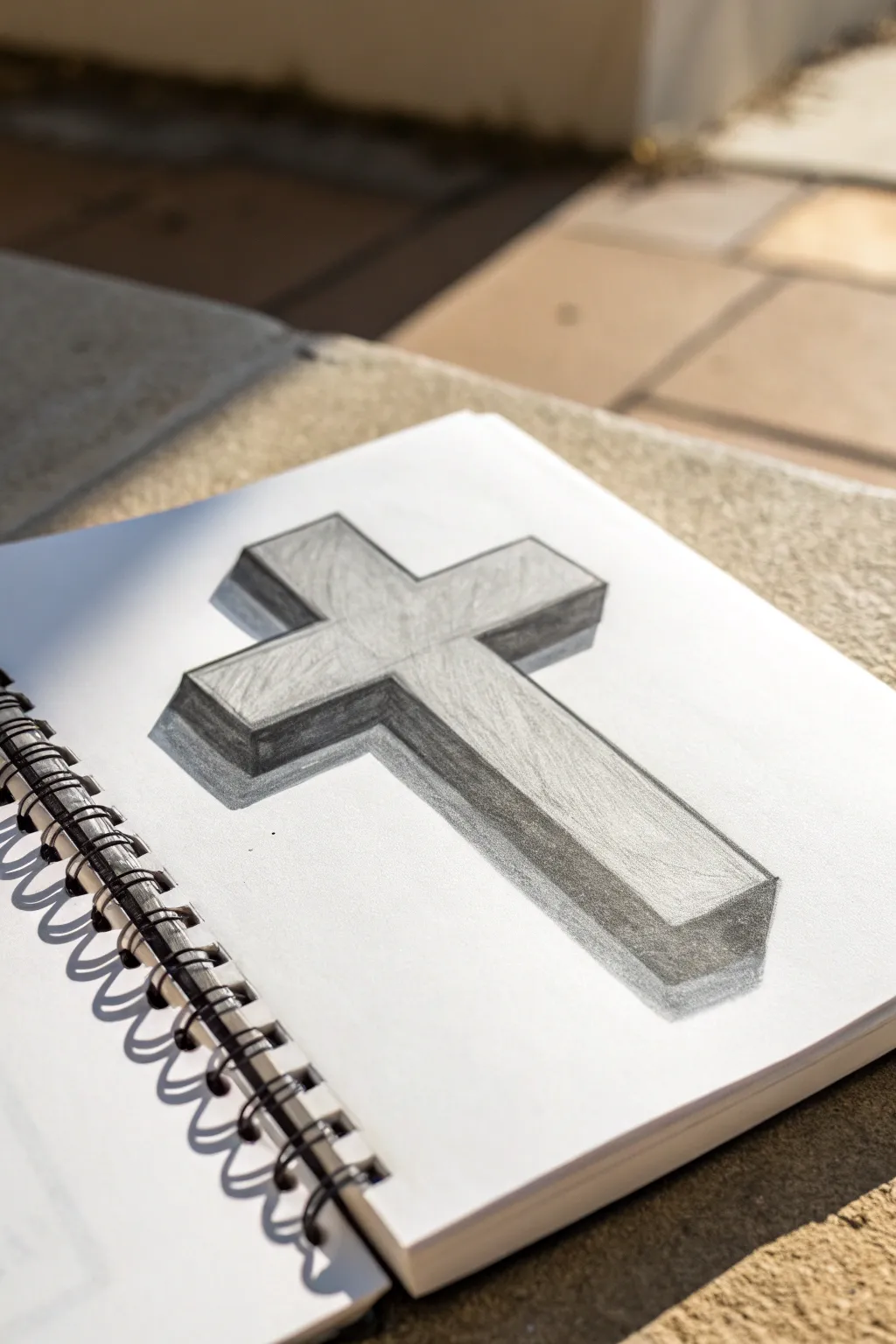
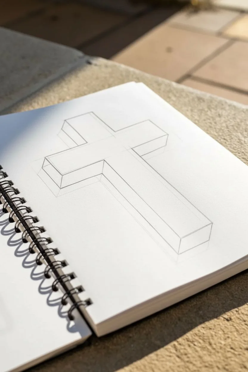
This classic 3D cross drawing uses simple perspective tricks to lift the shape right off the paper. By mastering consistent angles and soft graphite shading, you’ll create a solid, architectural look that feels heavy and grounded.
Step-by-Step
Materials
- Spiral-bound sketchbook or drawing paper
- HB or 2B pencil (for outlining)
- 4B or 6B pencil (for shading)
- Ruler or straight edge
- Vinyl eraser
- Blending stump (optional)
Step 1: Drafting the Outline
-
Mark the center line:
Begin by using your ruler to draw a faint vertical line in the center of your page. This will act as the spine of your cross and ensure the perspective stays balanced. -
Define the face top edge:
Draw the top horizontal edge of the cross’s face. Angle this line slightly downward to the right if you want a dynamic angle, or keep it perfectly horizontal for a simpler view. -
Form the crossbar:
Sketch the two side arms of the cross. For this specific 3D look, ensure the ends of the arms are parallel to the main vertical shaft. -
Connect the main shape:
Complete the ‘front face’ of the cross by drawing the long vertical bottom section and connecting all the inner corners. You should now have a flat, 2D cross shape.
Angle Consistency
Use a sliding set square or a second ruler to ensure every single diagonal projection line is exactly the same angle.
Step 2: Adding the Third Dimension
-
Project the corners:
At every corner on the left side and bottom of the cross, draw a short diagonal line heading down and to the left. Keep these lines identical in length and angle—this parallelism is crucial for the 3D illusion. -
Connect the side planes:
Connect the ends of your diagonal lines with lines that parallel the main cross outline. You will now see the ‘thickness’ or depth of the object appearing. -
Check your angles:
Pause and double-check that your new depth lines run perfectly parallel to the original outline. If one looks crooked, erase and correct it now before shading. -
Clean up the sketch:
Use your eraser to gently lift away any guidelines or overextended marks, leaving just the crisp outline of the distinct blocky shape.
Step 3: Shading and Definition
-
Establish the light source:
Decide where your light is coming from. In the reference image, the light hits the front face, meaning the sides and bottom edges will be in shadow. -
Apply base tone:
Using the side of your shading pencil (4B or similar), lay down a light, even layer of graphite on the side panels and the bottom surfaces created in the previous phase. -
Darken the deep shadows:
Go back over the side panels, pressing harder near the corners where the planes meet. I find that deepening these crevices makes the object look much heavier. -
Add texture to the face:
Lightly sketch faint, scratchy strokes across the front face of the cross. Don’t fill it in completely; just add enough texture so it doesn’t look like stark white paper. -
Refine the edges:
Sharpen your pencil and go over the outer boundary lines one last time. A crisp, dark outline helps separate the object from the background. -
Create the cast shadow:
To make the cross float or sit on a surface, sketch a horizontal shadow extending to the left from the base of the cross. -
Blend the cast shadow:
Smudge the cast shadow slightly with your finger or a blending stump, making it darkest right next to the object and fading out as it moves away.
Stone Texture
Add tiny cracks or chips to the corners of your drawing to make the cross look like it is carved from ancient stone.
With your shading complete, your cross should look like a solid block resting on the page


Radiant Cross With Sunburst Rays
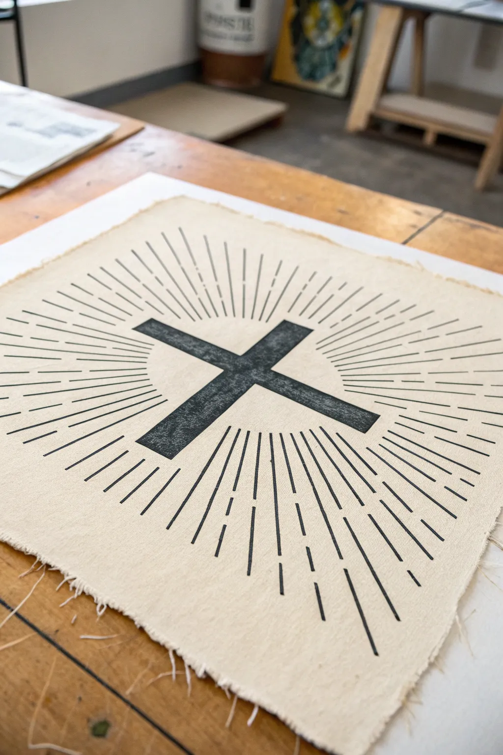
This project combines minimalist design with rustic textures by placing a bold, graphic cross onto raw, unbleached fabric. The radiating sunburst lines draw the eye inward, while the frayed edges give the piece a timeless, handmade quality perfect for framing or wall hanging.
How-To Guide
Materials
- Unbleached cotton canvas or linen fabric (cut to roughly 12×12 inches)
- Linoleum carving block (soft cut variety usually works best)
- Linoleum carving tool with V-gouge and U-gouge blades
- Pencil and eraser
- Ruler
- Fabric block printing ink (black)
- Rubber brayer (roller)
- Glass or acrylic sheet (for rolling ink)
- Baren or a clean wooden spoon
- Iron (for heat setting)
- scrap paper
Step 1: Designing and Carving the Block
-
Map out the design:
Begin by deciding the size of your final print. On your linoleum block, use a ruler to draw a central cross. For this specific look, make the cross arms thick and sturdy. -
Sketch the rays:
Lightly draw lines radiating outward from the center of the cross. Notice how the lines in the example are broken—some are solid near the center, then break, then continue. Mimic this interrupted line style for a dynamic effect. -
Refine the lines:
Before carving, go over your pencil lines to ensure you know exactly which parts will stay (black) and which will be carved away (white/background). -
Carve the negative space:
Using your V-gouge blade, carefully carve away the material *between* the sunburst rays. Remember, whatever you carve away will not print. -
Carve the cross outline:
Switch to a U-gouge if you need to clear larger areas, but carefully outline the main cross shape first to keep the edges sharp. Carve away the large empty corners of the block completely so they don’t pick up stray ink. -
Clean the block:
Brush away any loose linoleum crumbs. You can wipe the block gently with a slightly damp cloth to remove graphite residue.
Step 2: Creating the Fabric Print
-
Prepare the fabric:
Tear your canvas or linen to size rather than cutting it with scissors. Tearing along the grain creates that beautiful, naturally frayed edge seen in the photo. Iron it flat to remove creases. -
Prepare the ink:
Squeeze a small line of fabric block printing ink onto your glass or acrylic sheet. Use the brayer to roll it out until it sounds ‘sticky’—like velcro pulling apart—and has a velvety texture. -
Ink the block:
Roll the brayer over your carved block. Apply the ink evenly, rolling in multiple directions to ensure the cross and all the thin rays are fully coated. -
Position:
Place your fabric flat on a clean surface. Carefully hover the inked block over the center of the fabric and lower it straight down. Do not wiggle it once it touches the fabric. -
Transfer the image:
Apply pressure to the back of the block. I find using a wooden spoon to rub circular motions firmly over the back of the block helps transfer the ink deep into the fabric weave. -
The reveal:
Hold one corner of the fabric down and slowly peel the block up from the opposite corner to reveal your print.
Clean Carving Tip
Warm your lino block slightly with a hair dryer before carving. It softens the material, making it cut like butter and reducing the chance of slips.
Step 3: Finishing Touches
-
Dry the print:
Fabric ink takes longer to dry than paper ink. Let the print sit undisturbed for at least 24 hours (or follow the specific time on your ink tube). -
Heat set:
Once fully dry, heat set the design so it becomes permanent. Place a scrap piece of fabric over the design and iron on a high, dry setting for about 3-5 minutes. -
Enhance the fray:
Finally, gently pull at the loose threads on the edges of your canvas to exaggerate the fringe. You want a consistent, rustic fray about a quarter-inch deep on all sides.
Gold Leaf Accent
For a mixed media twist, apply gold leaf size to the central cross after the black ink dries, then lay down gold leaf for a stunning illuminated effect.
Now you have a striking, spiritually inspired piece of art ready to be mounted or gifted


Draped Cloth Cross With Flowing Folds
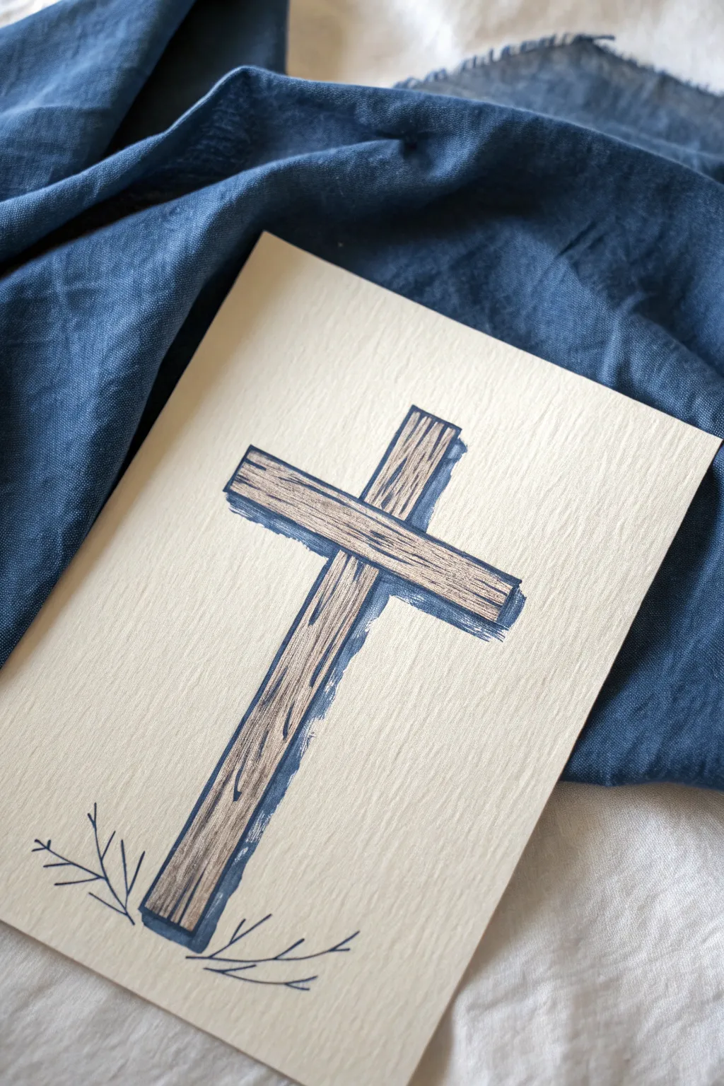
This project transforms a simple symbol into a textured, dimensional artwork using basic drawing tools. By combining careful wood grain lines with a bold shadow, you create the illusion of a rustic wooden cross resting slightly above the page.
Step-by-Step Tutorial
Materials
- High-quality textured paper (approx. 5×7 inches, cream or off-white)
- Pencil (HB or 2H)
- Fine liner pen (black, 0.3mm or 0.5mm)
- Brown marker or colored pencil (light to medium wood tone)
- Blue-grey marker or watercolor brush pen (for the shadow)
- Ruler
- Eraser
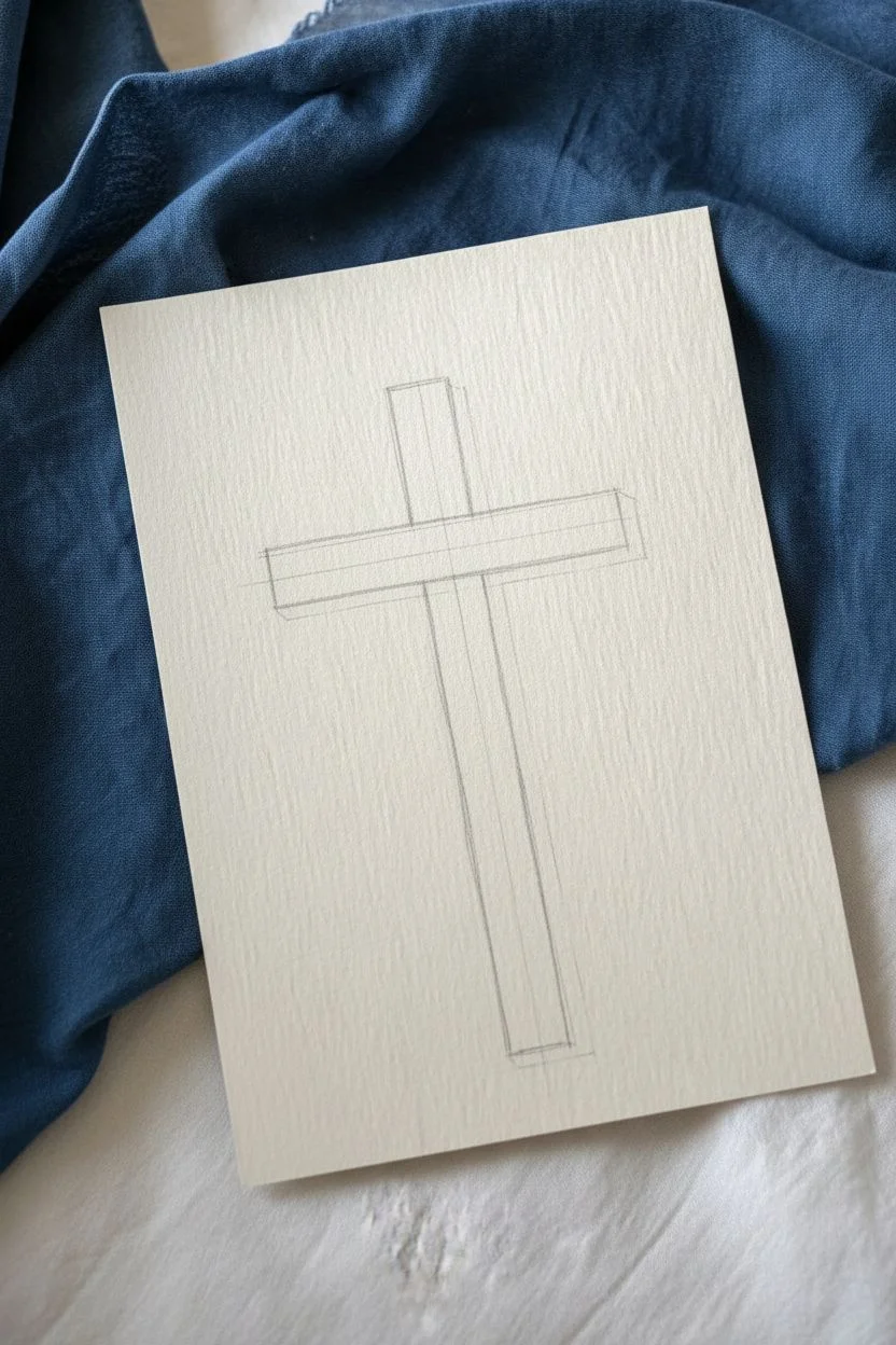
Step 1: Drafting the Structure
-
Set the foundation:
Begin by lightly sketching a vertical line down the center of your paper using your ruler and pencil. This will serve as the spine of your cross to ensure it stands straight. -
Establish the width:
Draw two parallel vertical lines on either side of your center line to create the main beam of the cross. The total width should be about 3/4 of an inch, depending on your paper size. -
Add the crossbeam:
Determine where the horizontal beam will sit—usually about one-third of the way down from the top. Use your ruler to sketch the horizontal beam so it intersects the vertical one at a perfect 90-degree angle. -
Refine the connections:
Erase the intersecting lines in the middle where the two beams meet so that the horizontal beam appears to be sitting in front of or behind the vertical sketch, though for this specific style, we want them to look like a single joined piece. Erase the internal crossing lines to make a clean outline.
Uneven is Better
Don’t stress about perfectly straight grain lines. Wobbly, broken lines actually look more like real timber texture than straight ruler lines do.
Step 2: Adding Texture and Detail
-
Ink the outline:
Using your fine liner pen, carefully trace over your pencil outline. You don’t need to use a ruler for this part if you want a slightly more organic, hand-carved look, but keep the lines generally straight. -
Draw the wood grain:
With the same fine liner, draw long, slightly waving vertical lines up and down the main beam. These shouldn’t be perfectly straight; let them curve and break to mimic natural wood grain. -
Detail the unevenness:
Add small knots or ‘eyes’ in the wood by drawing elongated oval shapes or small swirls within your grain lines. This breaks up the monotony of the vertical strokes. -
Repeat for the crossbeam:
Draw similar horizontal grain lines across the shorter beam. Ensure the direction of the grain follows the length of the wood. -
Add color definition:
Take your brown marker or colored pencil and lightly color in the wood area. If using pencil, vary your pressure to create highlights and depth within the grain.
Add a Watered Effect
Use a water brush to slightly bleed the blue shadow marker ink outward. This creates a softer, softer painted look rather than a hard graphic edge.
Step 3: Creating Dimension
-
Identify the light source:
For this piece, imagine the light is coming from the top left. This means your shadows will fall to the right and slightly below the cross. -
Outline the shadow zone:
Using your blue-grey marker, draw a thick line along the entire right side of the vertical beam. It should follow the contour of the wood perfectly but be offset slightly. -
Extend the shadow:
Continue this shadow line along the bottom edge of the horizontal beam. The consistent width of this shadow stripe is what creates the illusion of depth. -
Fill the shadow:
Go back over your shadow lines to ensure the color is solid and distinctive. The blue tone contrasts beautifully with the warm wood and cream paper.
Step 4: Finishing Touches
-
Sketch the foliage:
At the very base of the cross, lightly pencil in two small sprigs curving outward to the left and right. -
Ink the vines:
Go over the sprigs with your black fine liner. Keep the lines simple—just a central stem with small, V-shaped offshoots for leaves. -
Clean up:
Once the ink is fully dry, gently erase any remaining pencil marks from your initial sketch to leave a crisp, clean illustration.
Now you have a serene piece of art that balances rustic texture with clean lines, ready to be framed or gifted

PENCIL GUIDE
Understanding Pencil Grades from H to B
From first sketch to finished drawing — learn pencil grades, line control, and shading techniques.
Explore the Full Guide
Cross With Banner Ribbon for Names or Verses
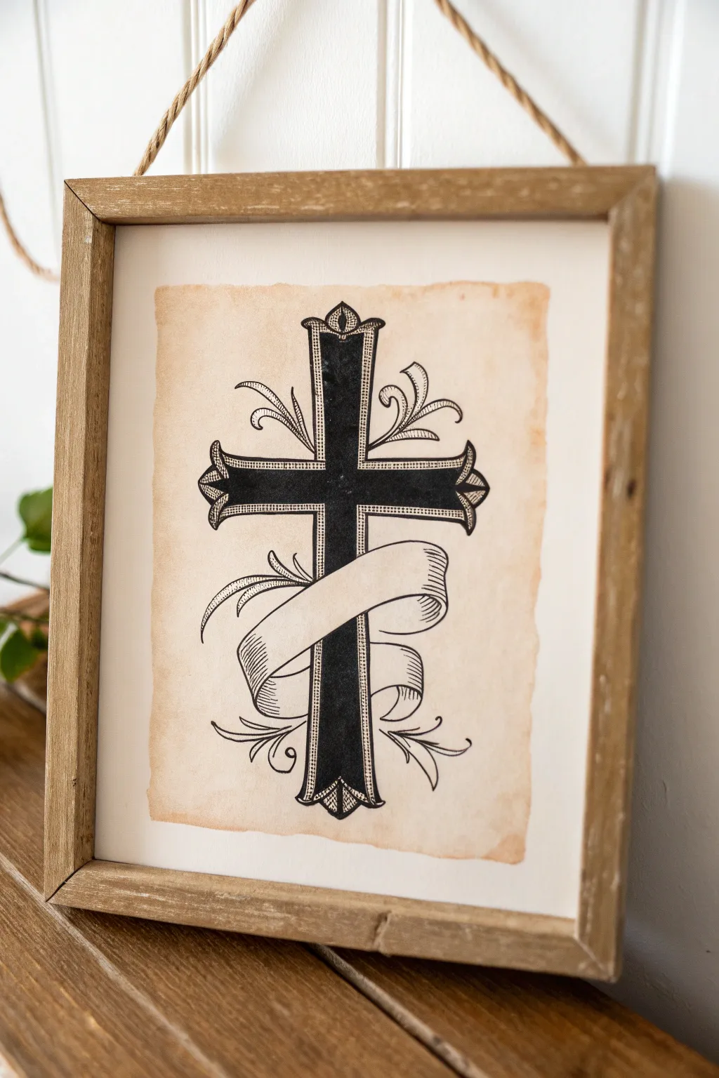
Create a timeless display piece with this meticulously detailed cross drawing featuring a classic blank banner ready for your favorite scripture or family name. The antiqued paper effect and sharp ink lines give it the distinguished look of a centuries-old heirloom.
Step-by-Step Guide
Materials
- Heavyweight drawing paper or watercolor paper (90lb or heavier)
- Black ink fine liner pens (sizes 005, 01, 03, and 05 or 08)
- Pencil (HB or 2H)
- Eraser (kneaded)
- Ruler
- Strong black tea or coffee (brewed and cooled)
- Sponge or wide brush
- White mat board or cardstock backing
- Rustic wooden frame
- Adhesive (glue stick or double-sided tape)
Step 1: Preparing the Aged Paper
-
Tear the edges:
Begin by gently tearing the edges of your drawing paper to create a deckled, uneven look. Don’t worry about being perfect; roughness adds character. -
Brew the staining solution:
Brew a very strong cup of black tea or coffee. Let it steep until dark and allow it to cool completely. -
Stain the paper:
Using a sponge or wide brush, unevenly apply the tea or coffee across the paper surface. Dab a little heavier around the torn edges to simulate natural aging. -
Let it dry completely:
Allow the paper to dry flat. If the paper buckles, you can place it under a heavy book once it’s bone dry to flatten it out before drawing.
Step 2: Sketching the Structural Outline
-
Mark the center:
Using your ruler and a light pencil touch, draw a faint vertical line down the center of your paper to act as the spine of the cross. -
Draw the cross beams:
Sketch the main vertical beam and the horizontal cross-beam. I recommend making the beams thick enough to accommodate the detailed border later. -
Add the pointed ends:
At the ends of each arm (top, bottom, left, right), sketch a flared, pointed cap shape, similar to a fleur-de-lis base or a gothic arch. -
Draft the banner:
Lightly sketch a flowing ribbon wrapping around the lower third of the cross. Draw an ‘S’ curve shape that passes in front of the vertical beam, looping behind it on the sides.
Ink Bleed Prevention
Aged paper can be thirsty. Test your pen on a scrap of the stained paper first. If it feathers, spray the paper with a matte fixative before inking to seal the surface.
Step 3: Inking the Details
-
Outline the cross shape:
Using a size 03 or 05 pen, ink the main outline of the cross, but stop your lines wherever the banner intersects so the ribbon appears to be in front. -
Ink the ribbon:
Carefully trace your banner sketch with the 03 pen. Add small vertical hatch lines at the curves of the ribbon to suggest shadow and depth. -
Create the inner border:
Switch to a 01 pen and draw a smaller outline inside the main cross shape, leaving a thin gap between this line and the outer edge. -
Fill the interior:
Using your thickest pen (08 or a brush pen), fill in the core of the cross with solid black ink. Be careful to stay inside your inner border line. -
Add texture to the border:
In the thin gap between the black core and the outer edge, use your 005 fine liner to draw tiny stippling dots or very fine hatching for a textured, engraved look.
Fixing Paper Buckles
If your paper dried excessively wavy from the coffee staining, cover it with a clean cloth and iron it on a low, dry heat setting to flatten it out perfectly.
Step 4: Adding Flourishes and Finishing
-
Sketch floral accents:
Lightly pencil in curved, vine-like flourishes tucked into the four corners where the cross beams meet. -
Ink the flourishes:
Trace over the vines with your 01 pen, using varying pressure to make the lines taper elegantly at the ends. -
Erase pencil marks:
Once the ink is completely dry—give it extra time just to be safe—gently erase all underlying pencil guidelines. -
Mount the artwork:
Center your aged paper onto a piece of clean white mat board or cardstock. Use adhesive to secure it flat. -
Frame the piece:
Place the mounted artwork into your rustic wooden frame to complete the vintage aesthetic.
Now you have a beautifully framed, custom piece of art ready to be hung or gifted to someone special
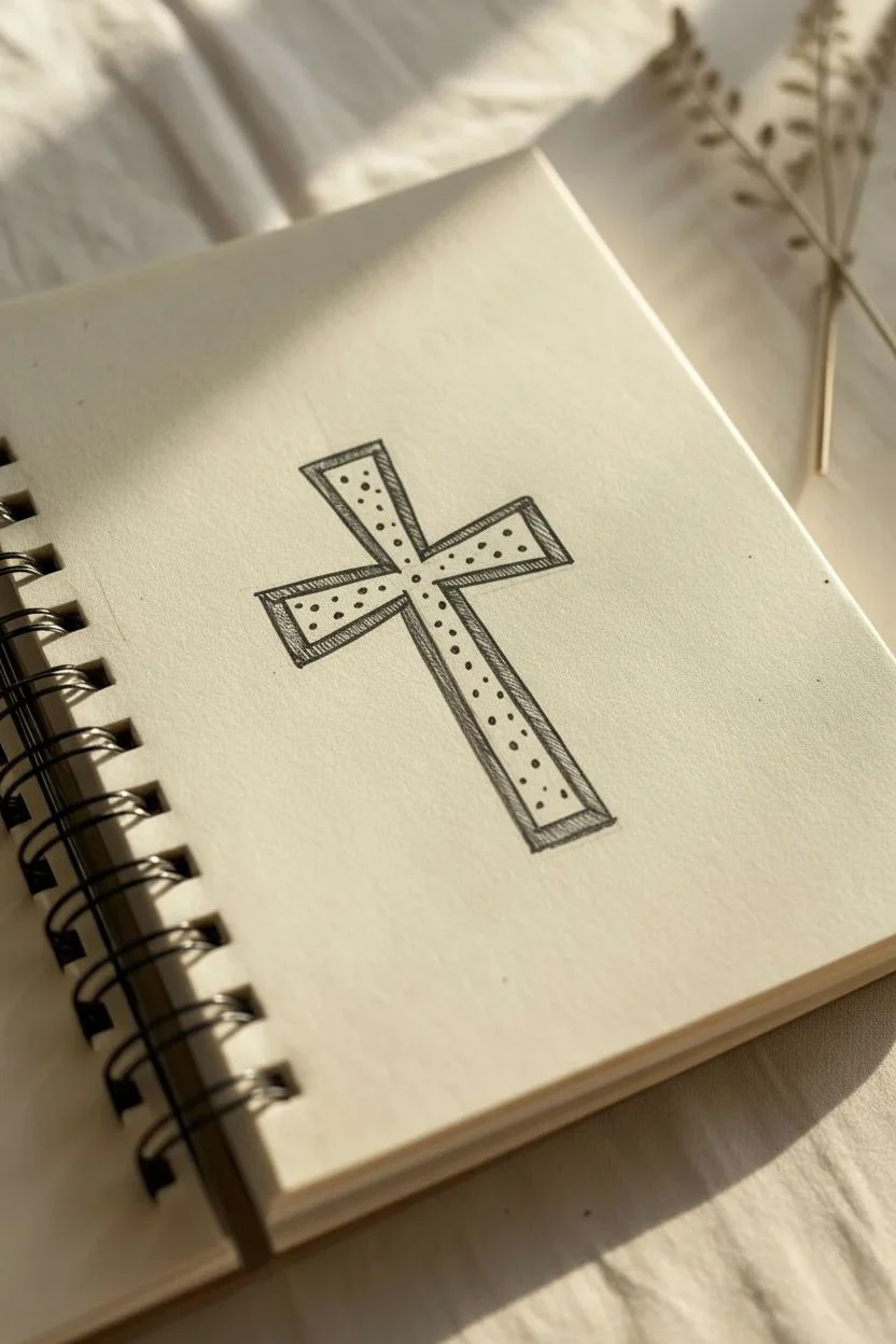
Cross Surrounded by Small Hearts for a Devotional Doodle
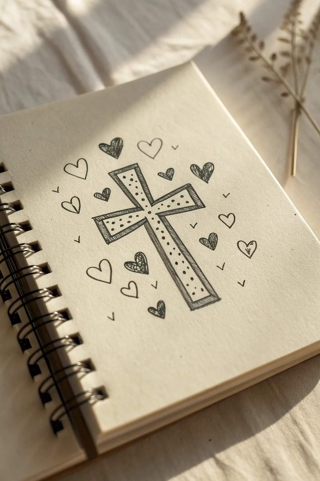
This charming devotional doodle features a simple, stippled cross surrounded by a floating halo of hearts. It captures a gentle, hand-drawn aesthetic perfect for Bible journaling or margin art.
Step-by-Step Tutorial
Materials
- Spiral-bound sketchbook or journal (cream or off-white paper looks best)
- Black fineliner pen (0.3mm or 0.5mm)
- Pencil and eraser (optional for sketching)
Step 1: Drawing the Central Cross
-
Sketch the outline:
Begin by lightly sketching a simple cross shape in the center of your page. The vertical beam should be longer than the horizontal one. -
Define the structure:
Using your black fineliner, trace over your pencil sketch to create the main outer shape of the cross. Keep your lines relatively straight but allow for a slight hand-drawn wobble for character. -
Add the inner border:
Draw a smaller cross shape inside the first one, maintaining an even gap of about 2-3mm from the outer edge. This creates a double-lined border effect. -
Connect the corners:
Draw tiny diagonal lines connecting the corners of the inner cross to the corresponding corners of the outer cross. This gives the drawing a subtle 3D, framed appearance. -
Fill with stippling:
Inside the central area of the cross (the inner shape), start adding small dots. Scatter them randomly rather than in perfect rows. -
Vary dot density:
I like to concentrate a few more dots near the intersection of the beams to create a slight shadow effect, leaving other areas a bit more sparse.
Ink Confidence
Don’t worry about shaky lines. The charm of this doodle comes from the imperfect, hand-drawn aesthetic, so avoid using a ruler.
Step 2: Adding the Heart Aura
-
Place anchor hearts:
Draw four medium-sized hearts around the cross—one near each of the four ends of the beams. Keep them roughly equidistant from the cross. -
Fill the gaps:
In the spaces between the anchor hearts, draw smaller hearts. vary their angles so they look like they are floating or dancing around the center. -
Outline style mix:
Leave about half of the hearts as simple open outlines. These provide breathing room in the composition. -
Scribble fill some hearts:
Select 4-5 hearts scattered around the circle to fill in. Instead of solid black, use a messy, tight scribble texture to color them dark grey. -
Pattern fill others:
Choose 2-3 other hearts and fill them with a different texture, like tiny scribbles or loops, just to add variety to the visual weight.
Step 3: Final Touches
-
Add confetti details:
In the empty negative space between the hearts and the cross, draw tiny ‘v’ shapes or small tick marks. -
Rotate the marks:
Ensure these small marks point in different directions to enhance the feeling of movement and radiation from the center. -
Review contrast:
Check if your scribble-filled hearts are dark enough. Go over them again if they need more contrast against the paper. -
Erase guidelines:
Once the ink is completely dry, gently erase any visible pencil marks from your initial sketch.
Add Color
Use watercolor pencils to lightly shade the hearts in soft pastels or add a gold gel pen outline to the cross for a glowing effect.
Your peaceful, hand-drawn devotional page is now ready to inspire reflection
BRUSH GUIDE
The Right Brush for Every Stroke
From clean lines to bold texture — master brush choice, stroke control, and essential techniques.
Explore the Full Guide
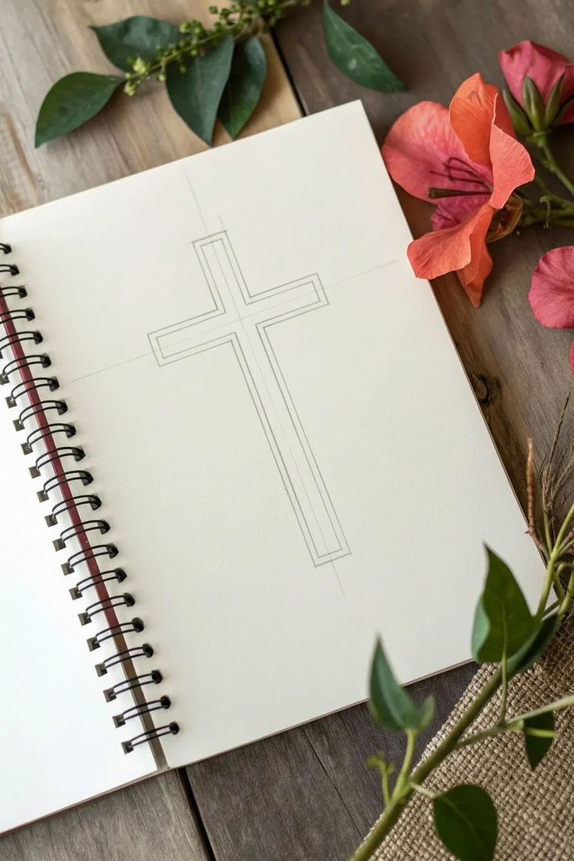
Floral Cross With Vines Wrapping the Beams
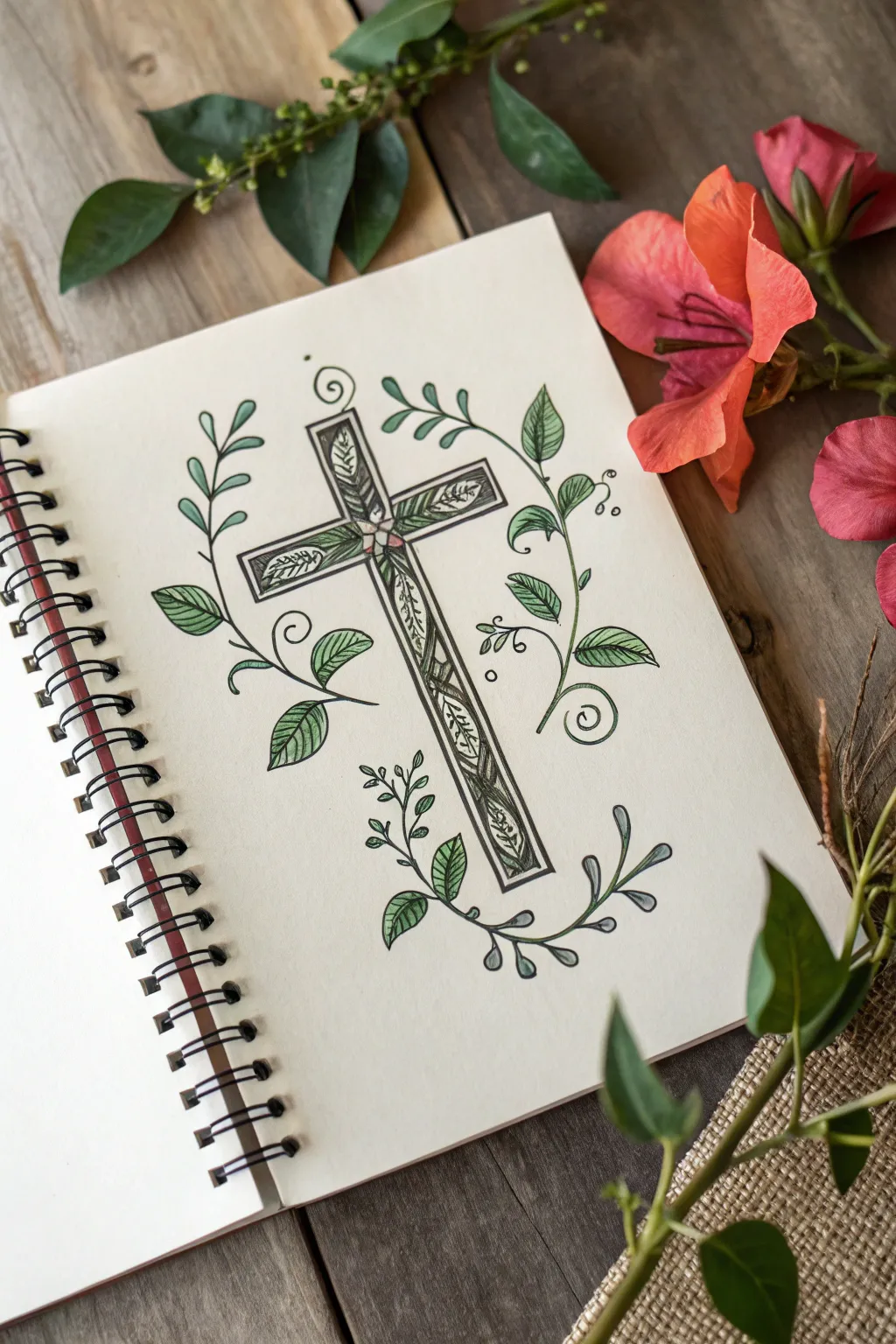
This elegant project combines geometric structure with organic flow, featuring a sturdy cross filled with intricate leaf patterns and framed by sweeping vines. The result is a clean, graceful illustration perfect for Bible journaling or a personal sketchbook.
Step-by-Step Guide
Materials
- Fine-point black fineliner pens (0.1mm and 0.5mm)
- Pencil (HB or similar for sketching)
- Quality eraser
- Ruler
- Green colored pencils (light and dark shades)
- Smooth heavyweight sketchbook paper
Step 1: Drafting the Structure
-
Mark the center:
Begin by lightly sketching a vertical centerline and a horizontal crossline to establish the position and size of your cross. Use a ruler to ensure your lines are perfectly straight. -
Define the beams:
Draw parallel lines on either side of your center guides to create the width of the cross beams. Aim for beams that are about the same width vertically and horizontally for a balanced look. -
Add the inner border:
Sketch a smaller rectangle inside each beam, creating a thin border or frame. This interior space is where the detailed botanical pattern will eventually live.
Uneven Vines?
If your vines look stiff, practice drawing ‘S’ curves on scratch paper first. Focus on keeping your wrist loose to get smooth, flowing lines rather than rigid strokes.
Step 2: Drawing the Inner Botanicals
-
Sketch the central motif:
Right at the intersection of the two beams, lightly sketch a tiny four-petaled flower shape to act as the anchor for your inner vines. -
Fill the vertical beam:
Starting from that center flower, draw a winding vine line that snakes up to the top and down to the bottom of the vertical beam. Add small, narrow leaves branching off this vine to fill the space densely. -
Fill the horizontal beam:
Repeat the process for the horizontal arms, drawing a vine that extends left and right from the center, adding similar small leaves. Keep these patterns contained strictly within the inner rectangle you drew earlier. -
Ink the interior:
Switch to your finer 0.1mm pen to trace over these delicate inner leaves and vines. Add tiny line details inside the leaves for texture.
Level Up: Wood Grain
Instead of leaving the border of the cross plain white, add tiny, broken vertical lines with your finest pen to simulate a subtle wood grain texture.
Step 3: Surrounding Vines & Details
-
Plot the outer curves:
Using your pencil, sketch three sweeping, curved lines around the cross. Place one on the left sweeping up, one on the right sweeping down, and a smaller branch at the bottom center to cradle the base. -
Add the outer leaves:
Along these sweeping vines, sketch larger, teardrop-shaped leaves. Space them out more generously than the dense interior pattern to create visual contrast. -
Inking the structure:
Take your thicker 0.5mm pen and trace the main outline of the cross to give it a bold, defined edge. Trace the inner border box with the same pen or a slightly thinner one. -
Inking the outer vines:
Carefully ink the sweeping outer vines and their leaves. Feel free to add small spiral flourishes at the ends of the vines for a whimsical touch. -
Erase guidelines:
Wait until the ink is completely dry—I usually give it a full five minutes just to be safe—and then gently erase all your pencil marks.
Step 4: Adding Color
-
Base layer for leaves:
Using a light green colored pencil, gently shade all the leaves, both inside the cross and on the surrounding vines. Use a light hand for a soft, transparent effect. -
Add depth:
Take a slightly darker green pencil and shade just the base of each leaf where it connects to the vine. This creates a simple gradient that makes the drawing pop. -
Color the center:
Add a tiny touch of pink or red to the very center flower intersection for a subtle focal point. -
Final shading:
If desired, add very faint gray shading along the right and bottom edges of the cross beams to give the structure a hint of 3D dimension.
Step back and admire how the organic vines soften the structured cross for a beautifully balanced piece
Easter Lily Cross With Blooms at the Base
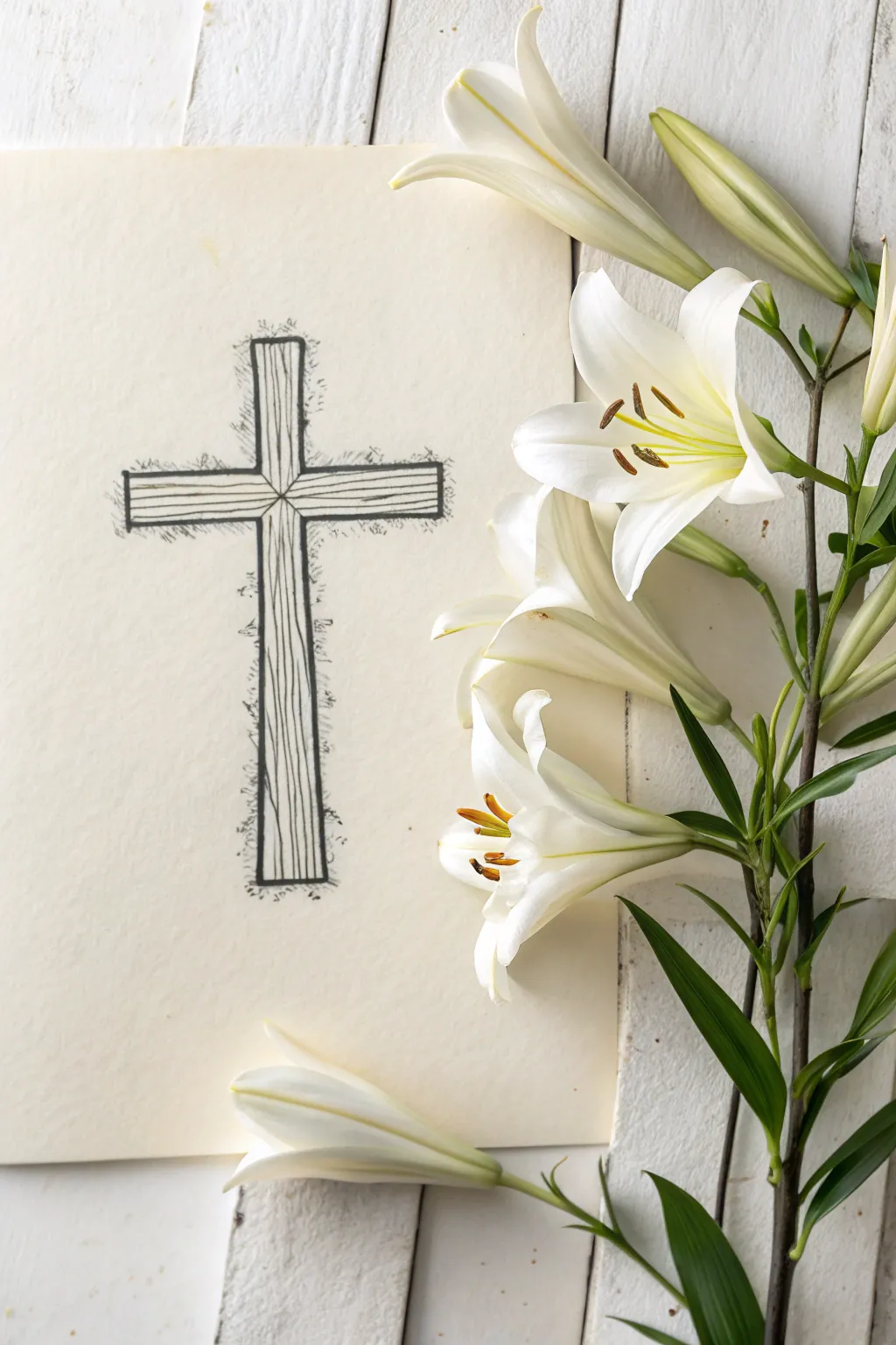
This elegant and minimalist project combines simple ink drawing techniques with nature’s beauty to create a stunning Easter display. The contrast between the stark, scratchy black ink lines of the cross and the soft, creamy petals of the lilies makes for a striking composition perfect for holiday cards or decor.
Step-by-Step Tutorial
Materials
- Heavyweight cream or off-white cardstock
- Fine-point black drawing pen (0.5mm)
- Medium-point black marker or pen (0.8mm)
- Pencil and eraser
- Ruler
- Fresh or high-quality artificial Easter lilies
- Double-sided tape or floral tack (optional)
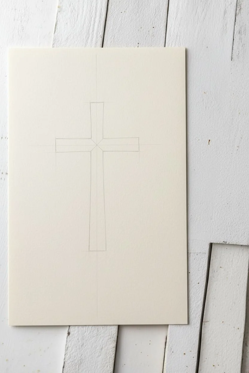
Step 1: Drafting the Cross
-
Center the layout:
Begin by positioning your paper vertically. Leave plenty of negative space on the right side for the flowers later. Use a ruler to lightly pencil a vertical line down the center-left area. -
Mark the dimensions:
Decide on the height and width of your cross. Mark the top, bottom, and the two ends of the horizontal crossbar. A classic proportion is to place the horizontal bar about one-third of the way down from the top. -
Draw the outline:
Using your ruler, sketch the rectangular shapes of the beams. Keep the beams relatively thin to maintain elegance. Don’t worry about perfect corners yet; a rustic look is better. -
Add the center point:
Draw an ‘X’ shape right where the two beams intersect in the middle. This creates the visual effect of four separate pieces of wood meeting at the center joint.
Rustic Line Quality
Don’t use a ruler for the final inking. A slightly shaky, organic hand-drawn line looks much more like aged timber than a perfectly straight edge does.
Step 2: Inking and Texturing
-
Ink the main structure:
Switch to your medium-point black pen. trace over your pencil lines. Instead of a single straight line, draw two or three very close, slightly wobbly lines to create a rough, hewn-wood edge. -
Erase pencil marks:
Wait a moment for the ink to dry completely, then gently erase all your initial pencil guidelines so they don’t smear during the shading process. -
Create wood grain:
With the fine-point pen, draw long, flowing lines running vertically up the main beam and horizontally across the crossbar. Let these lines waiver and break occasionally to simulate natural wood grain. -
Add knots and defects:
Draw small elongated ovals or squiggles within the grain lines here and there to represent knots in the timber. -
Detail the center joint:
At the intersection, draw diagonal lines radiating slightly outward from the center ‘X’ to reinforce the idea of mitered or joined wood.
Step 3: Shading and Atmosphere
-
Apply cross-hatching:
Focus on the areas surrounding the cross. Using quick, short strokes with the fine pen, create a scribbled or hatched texture extending outward from the edges. -
Build density:
Make the hatching denser right against the outline of the cross and sparser as you move away. This creates a glowing or vibrating effect, making the cross pop off the page. -
Darken the shadows:
Go back over the grain lines on the right side and bottom edges of the beams with slightly heavier strokes to suggest a light source coming from the top left.
Smudge Prevention
Cream cardstock is often more absorbent than printer paper. Test your pen on a scrap piece first to ensure the ink doesn’t bleed or feather into the paper fibers.
Step 4: Floral Arrangement
-
Prepare the stems:
Trim your Easter lily stems so they fit neatly alongside the drawing. You want the blooms to cascade down the right side without covering the cross itself. -
Arrange the main blooms:
Place the largest open lily near the top right, angling it towards the cross. Position a second open bloom slightly lower down. -
Add buds and leaves:
Fill in the gaps with closed buds and green leaves. I find that tucking a bud near the bottom corner balances the composition nicely. -
Secure the elements:
If this is for a temporary display or photo, you can simply lay them flat. For a semi-permanent piece, use small dots of floral tack or clear double-sided tape behind the sturdier parts of the stems to hold them in place. -
Final adjustment:
Place one loose petal or a small bud at the very bottom left, crossing over the paper’s edge, to integrate the 3D elements with the 2D drawing seamlessly.
Step back and admire how the simple ink lines beautifully complement the organic shapes of the lilies


Cross With Praying Hands Below It
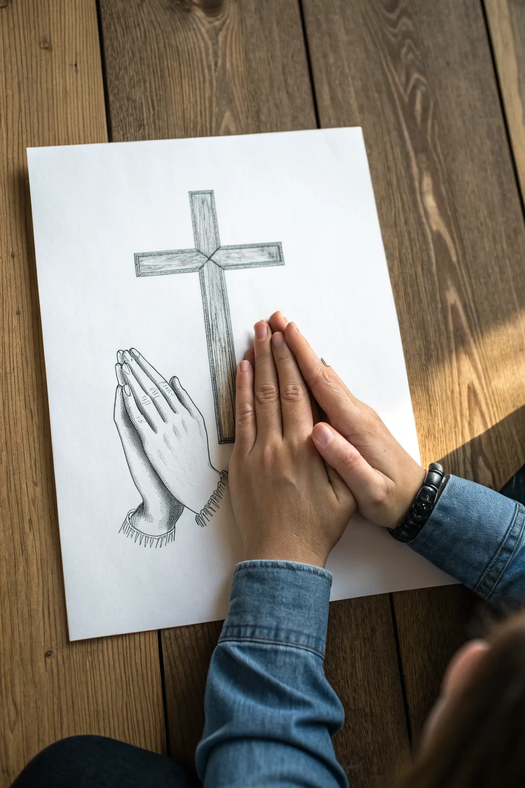
This poignant pencil sketch captures the texture of aged wood and the softness of prayer in black and white. By combining structured lines for the cross with gentle stippling for the hands, you create a striking contrast that is both simple and spiritually resonant.
Step-by-Step
Materials
- Drawing paper (smooth or medium tooth)
- H or HB pencil for initial outlining
- 2B and 4B pencils for shading/texture
- Fine-point black pen (0.1mm or 0.3mm)
- Ruler
- Kneaded eraser
Step 1: Drafting the Cross
-
Establish the vertical beam:
Begin by drawing a long, clean vertical rectangle using your ruler and an H pencil. Use light pressure so you can erase guidelines later. The beam should take up about two-thirds of the page height. -
Add the horizontal beam:
Draw the horizontal crossbeam about one-third of the way down the vertical post. Ensure the intersection is centered and forms a perfect 90-degree angle. Add a small inner border inside both beams to create a framed edge look. -
Create the wood grain texture:
Switch to your fine-point black pen. Inside the cross beams, draw vertical, slightly wavering lines to mimic wood grain. I like to let some lines break and restart to make it look naturally weathered. -
Define the intersection with an ‘X’:
At the precise center where the beams meet, draw a simple ‘X’ shape connecting the corners of the intersection for a finished, dimensional look. -
Shade the wood:
Using a 2B pencil, lightly shade the areas between your wood grain ink lines. Press harder near the edges of the cross to give it rounded depth.
Step 2: Sketching the Praying Hands
-
Outline the hand shape:
Position the hands slightly to the left of the cross base. Start with a light H pencil outline of the two palms pressed together, tilting slightly towards the cross. -
Refine the fingers:
Detail the fingers, making the pointer and middle fingers the longest. Ensure the fingertips of both hands align roughly with each other, creating a pointed apex. -
Draw the thumb and cuffs:
Sketch the thumb tucked against the side of the hand closest to the viewer. At the wrists, add a simple cuff detail—either a sleeve edge or a ribbed texture like a sweater. -
Ink the contour:
Go over your pencil outline with the fine-point pen. Use a steady hand, but let the line weight vary—thicker on the underside of the hands for shadow, thinner on top for light. -
Add basic skin folds:
Draw small, subtle curved lines at the knuckles and where the thumb meets the palm to suggest skin elasticity.
Stippling Rhythm
Keep your pen vertical when stippling. Slanted dots look like dashes. Work slowly; rushing creates messy “tails” on your dots.
Step 3: Shading and Stippling
-
Begin stipple shading:
Instead of traditional smooth shading, use stippling (tiny dots) for the hands. Use your pen to place dots densely along the bottom edge of the hands and between the fingers where shadows would naturally fall. -
Gradient the dots:
As you move upward towards the knuckles and the top of the hand, embrace negative space. Make the dots much sparser to represent where layout light hits the skin. -
Texture the sleeves:
On the sleeve cuffs, use short, quick vertical hatches (lines) rather than dots to differentiate the fabric texture from the skin. -
Deepen the shadows:
Return to the area underneath the thumb and the gap between the wrists. Add a second layer of dense stippling or cross-hatching here to anchor the hands visually. -
Final Erasure:
Once you are certain the ink is completely dry, take your kneaded eraser and gently lift away all remaining graphite pencil guidelines.
Shaky Lines?
If your cross lines aren’t perfectly straight, don’t worry. Slight wobbles actually enhance the rustic, old-wood aesthetic.
Take a moment to admire the quiet interaction between the textured wood and the delicate hands you have created
Dove Overlapping a Cross for Peace and Spirit
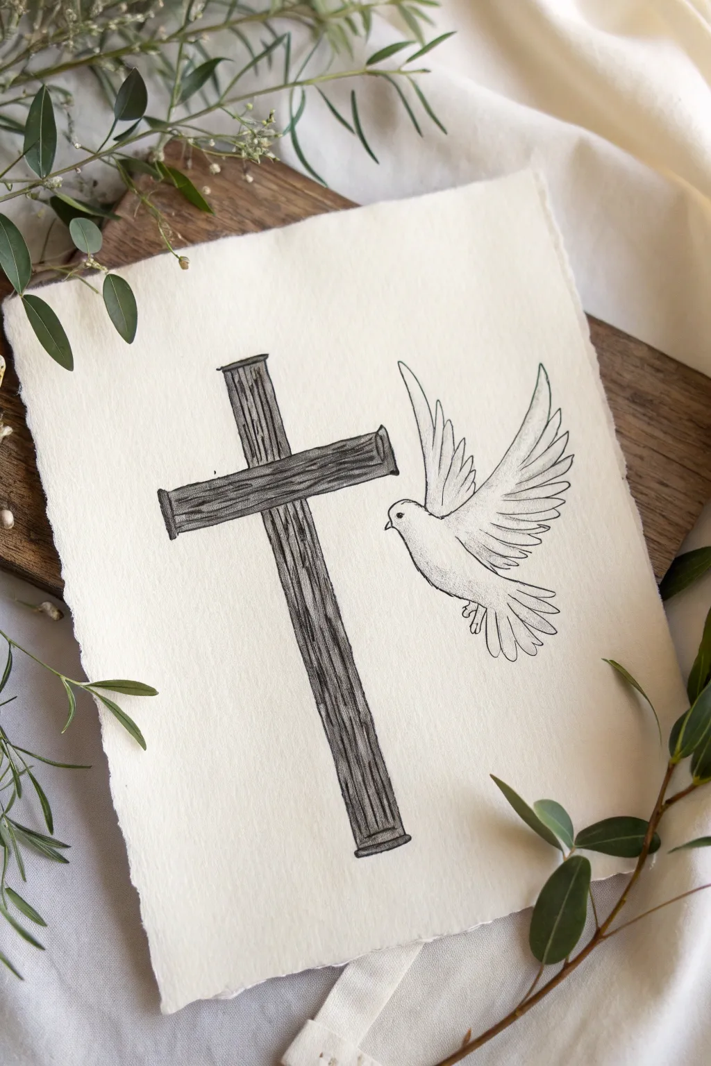
This elegant drawing combines the rugged texture of a wooden cross with the delicate grace of a flying dove, symbolizing peace and spirit. It captures a timeless sentiment using simple sketching techniques on beautiful deckle-edged paper for an organic, handmade feel.
Step-by-Step Tutorial
Materials
- Heavyweight textured paper (watercolor or mixed media paper with deckled edges)
- HB or 2B graphite pencil
- Fine liner pen (01 or 03 size, black pigment ink)
- Kneaded eraser
- Ruler
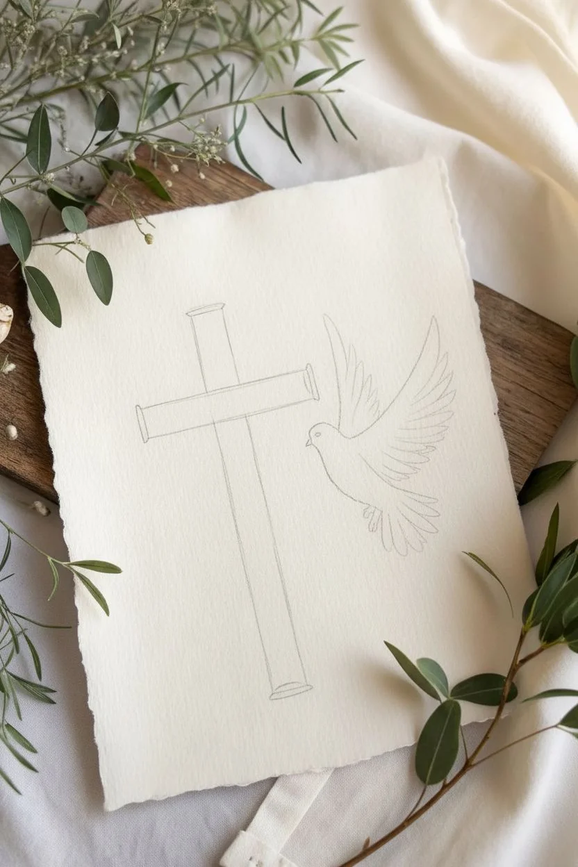
Step 1: Drafting the Foundations
-
Establish the Position:
Begin by lightly determining where your two main elements will sit. Place the cross slightly off-center to the left to leave breathing room for the dove on the right. -
Draw the Vertical Beam:
Using a ruler, lightly sketch the vertical post of the cross. Make it tall and slender, but don’t worry about perfect straightness yet, as we want a wood-grain feel later. -
Add the Crossbeam:
Sketch the horizontal beam intersecting the vertical post about one-third of the way down. Ensure the arms are roughly equal in length on either side of the center post. -
Outline the Dove’s Body:
To the right of the cross, lightly sketch a teardrop shape for the dove’s body, angling it upwards towards the intersection of the cross. -
Wing Placement:
Draw two large, sweeping curves extending upward from the dove’s back to indicate the spread wings. The wing closest to the viewer should appear larger and more prominent.
Uneven Ink Lines?
If your lines look shaky, embrace it! This drawing relies on organic texture. A ‘perfect’ straight line often looks too sterile for wood grain.
Step 2: Refining the Form
-
Define the Cross Ends:
Add small rectangular caps or distinct lines at the ends of the wooden beams to give the drawing dimension, suggesting the wood has thickness. -
Detail the Wings:
Flesh out the wings by sketching individual long flight feathers. They should fan out elegantly, with the tips slightly curved. -
Add Tail Feathers:
Sketch a fan of shorter feathers at the rear of the teardrop shape to create the tail, angling them downwards to balance the composition. -
Refine the Head:
Small details matter here. Sharpen the curve of the head and add a small, triangular beak pointing toward the cross. Mark a tiny dot for the eye.
Adding Softness
Use a light grey watercolor wash over the dove’s shadow areas after inking. It adds dimension that pure ink stippling sometimes lacks.
Step 3: Inking and Texturing
-
Outline the Cross:
Switch to your fine liner pen. Trace over your pencil lines for the cross, intentionally keeping the lines slightly wavy or broken to simulate rough-hewn timber. -
Create Wood Grain:
Fill the interior of the cross with vertical, shaky lines. I find creating clusters of lines that wander and break helps mimic natural wood grain effectively. -
Darken the Grain:
Go back over some of the wood grain lines to thicken them, adding contrast. Leave some white space between the lines so the texture breathes. -
Outline the Dove:
Ink the outline of the bird with a very light touch. Unlike the cross, these lines should be smooth and flowing to represent softness. -
Feather Details:
Add interior lines to the wings to separate the feathers. Do not close every shape; open lines suggest lightness and movement. -
Soft Shading:
Use a series of tiny stippling dots or very faint hatch marks on the underside of the dove’s belly and under the wings to give the bird volume without weighing it down.
Step 4: Final Touches
-
Erase Guidelines:
Once the ink is completely dry—wait at least five minutes to be safe—gently use the kneaded eraser to lift away all underlying graphite sketches. -
Line Weight Check:
Look at the drawing as a whole. You may want to slightly thicken the outer edge of the cross where shadows might fall (usually the bottom and right edges) to make it pop off the page.
Display your artwork in a simple floating frame to show off the beautiful paper texture
Calvary Hill Scene With Three Crosses
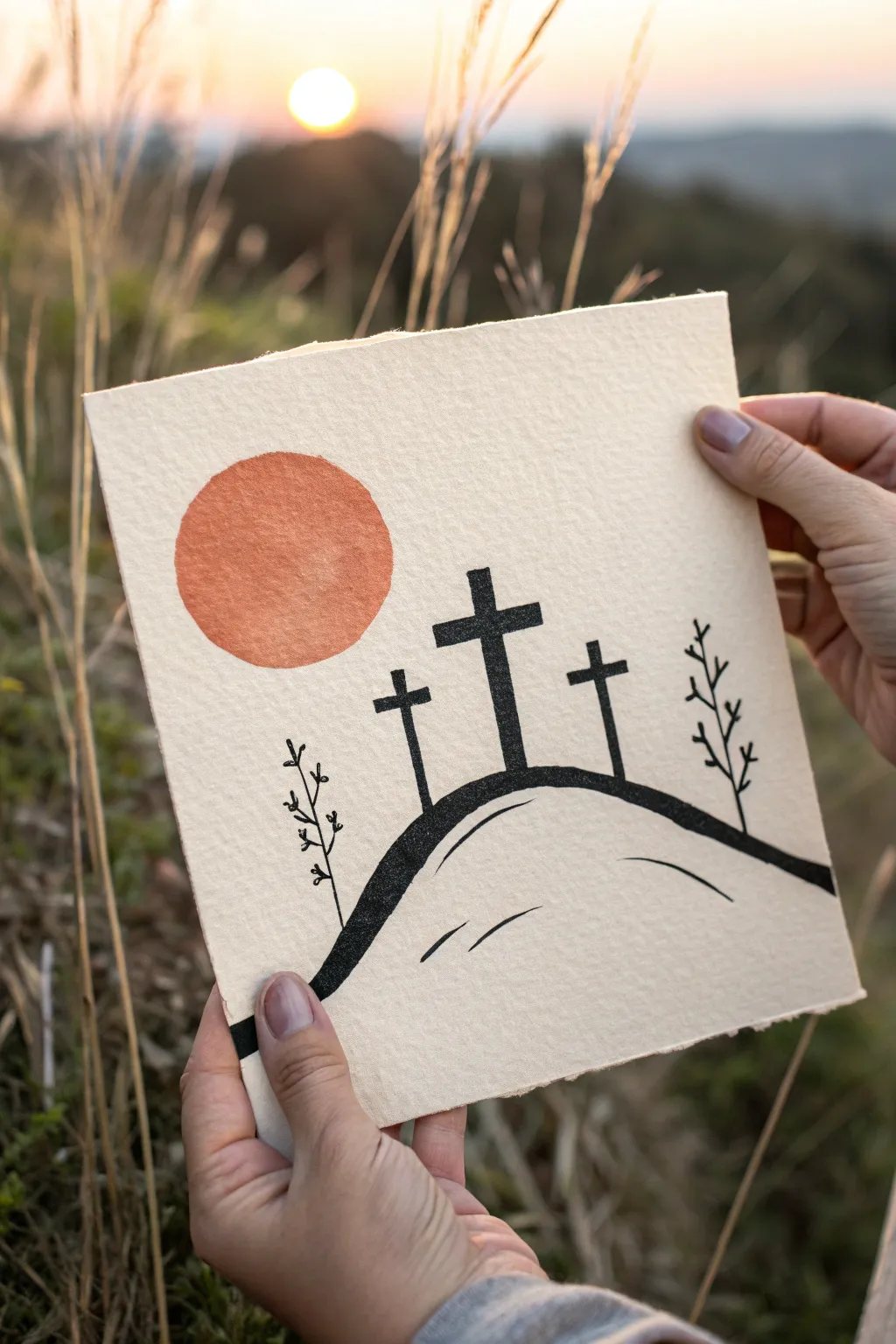
This serene mixed-media project combines the bold contrast of linocut printing with a soft watercolor accent to depict the scene of Calvary. The result is a striking, textured piece on rough-edged paper that perfectly captures the beauty of a sunset silhouette.
Step-by-Step
Materials
- Square sheet of heavy textured paper (handmade or cold press watercolor)
- Soft-cut linoleum block or rubber carving block
- Linoleum cutter tool with V-gouge and U-gouge blades
- Black water-soluble block printing ink
- Brayer (rubber roller)
- Glass or acrylic pane for rolling ink
- Burnt orange watercolor paint or ink pad
- Round watercolor brush (size 6 or 8)
- Fine-tip black archival ink pen
- Pencil and eraser
- Tracing paper (optional)
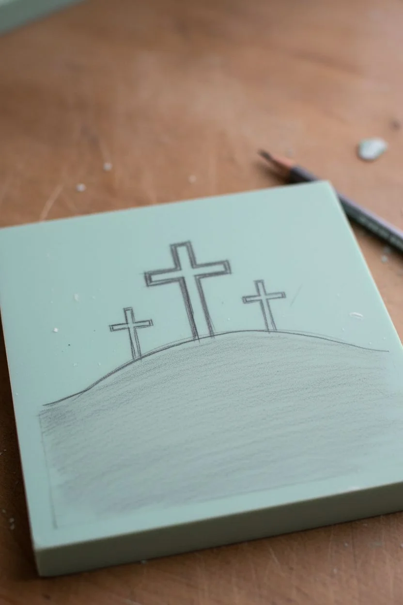
Step 1: Designing the Block
-
Draft the concept:
Begin by sketching your design on a scrap piece of paper first. You need a simple, flowing hill shape that rises in the center, topped with three crosses. The middle cross should be the tallest and thickest, with two smaller, slightly thinner crosses flanking it. -
Transfer to block:
Draw the design directly onto your soft-cut block using a pencil. Remember that your printed image will be a mirror image of what you carve, though for silhouettes like this, orientation matters less. -
Scale the crosses:
Ensure the crossbeams are thick enough to carve around without breaking. A good rule of thumb is to make the main cross about one-third the height of your printing block.
Clean Carving
Warm your lino block with a hair dryer or by sitting on it for a minute before carving. Warm material cuts much smoother and reduces the chance of slipping.
Step 2: Carving the Silhouette
-
Outline with V-gouge:
Using your finest V-shaped blade, carefully carve the outline of the crosses and the curve of the hill. Work slowly, pushing the tool away from your body. -
Clear negative space:
Switch to a wider U-gouge blade to carve away the background material. You want to remove everything above the hill line, leaving the crosses standing in relief. -
Defining the foreground:
Below the main hill line, carve away the bottom section as well, leaving just a thick, bold line for the hill’s ridge. Alternatively, you can leave the entire bottom solid for a heavier look, but the example uses a thick contour line. -
Test the carve:
Place a piece of plain paper over the block and rub with a crayon or pencil to see if your raised areas are clean and distinct.
Golden Hour Glow
Instead of plain orange paint, use metallic gold watercolor or add a tiny dusting of gold embossing powder to the sun while the paint is wet for a subtle shimmer.
Step 3: Applying the Sun
-
Position the sun:
Before printing the black ink, visualize where the sun will go. It should hover to the left of the main cross. -
Paint the circle:
Mix a diluted wash of burnt orange watercolor. I like to keep it slightly transparent to show the paper texture. Paint a freehand circle in the upper left quadrant. -
Dry completely:
Wait until the watercolor is bone dry. If the paper is damp, the block printing ink might bleed.
Step 4: Printing the Scene
-
Prepare the ink:
Squeeze a small amount of black block printing ink onto your glass pane. Use the brayer to roll it out until you hear a sticky, sizzling sound, ensuring an even coating on the roller. -
Ink the block:
Roll the brayer over your carved block, applying a consistent layer of black ink to the raised hill and crosses. -
Press and print:
Carefully align your block over the paper, centered horizontally but slightly lower than the vertical center. Press down firmly and evenly with your hand or a clean brayer. -
Reveal the image:
Lift the block straight up to avoid smudging. You should have a crisp, black silhouette against the textured paper.
Step 5: Final Details
-
Add foreground depth:
Once the ink is dry, use a fine-tip black pen to draw two small, curved lines inside the hill shape to suggest volume and slope. -
Draw the branches:
On the far left and far right of the hill, use the pen to sketch simple, leafless twiggy plants growing upward. Keep them delicate to contrast with the bold crosses. -
Deckle the edges:
If your paper has straight machine-cut edges, use a ruler to tear a thin strip off each side to create a soft, rustic deckled look.
Display this meaningful piece on a small easel or frame it in floating glass to highlight those lovely torn edges
Ornate Trefoil-Ended Cross With Gothic Flair
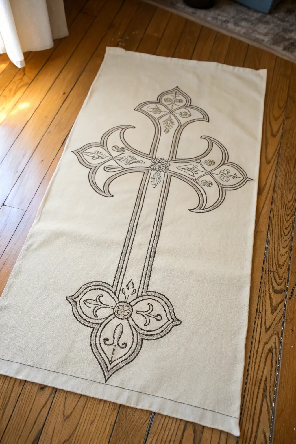
This project transforms a simple cream fabric runner into an elegant statement piece featuring a large, ornate cross with trefoil ends. The design combines the bold structural lines of Gothic architecture with delicate interior scrollwork, creating a stunning contrast against the neutral background.
Step-by-Step Tutorial
Materials
- Cream or off-white cotton or linen fabric runner (hemmed)
- Fabric transfer paper or iron-on transfer pencil
- Ornate cross template or large printout
- Fabric markers (fine and medium tip) in dark grey or bronze
- Dark grey fabric paint
- Fine liner paintbrush (size 0 or 00)
- Ruler or straight edge
- Iron and ironing board
- Masking tape
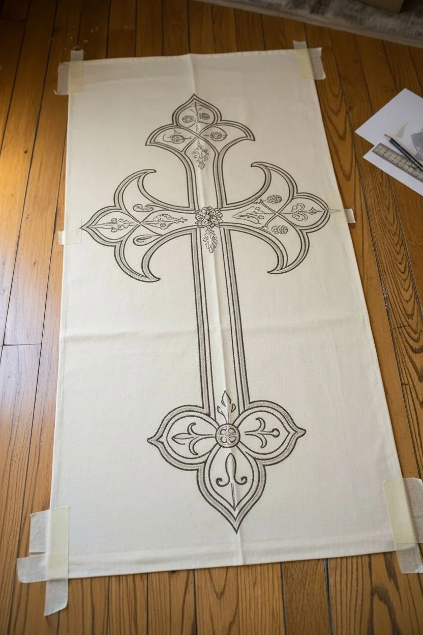
Step 1: Preparing the Design
-
Scale your template:
Measure your runner’s width to determine the best size for the cross. Print your trefoil cross pattern on multiple sheets of paper if necessary and tape them together to create a full-scale template that fits comfortably within the runner’s borders. -
Align the placement:
Lay the fabric runner flat on a hard surface. Fold it lengthwise to find the exact center line and lightly press with an iron to create a temporary crease guide. Place your paper template along this center line to ensure perfect symmetry. -
Secure the template:
Once you are happy with the positioning, tape the corners of your paper template down with masking tape so it doesn’t shift during the transfer process.
Uneven Lines?
If your straight lines wobble, don’t panic. Thicken the line slightly to hide the error, or turn the mistake into a feature by adding small decorative dots along the uneven edge.
Step 2: Transferring the Outline
-
Trace or transfer:
If using an iron-on pencil, trace the design onto the back of your paper, then flip and press. Alternatively, use graphite transfer paper between the template and fabric. Firmly trace over all main lines of the cross, including the long vertical beams and the curved trefoil ends. -
Add interior details:
Don’t forget the smaller details. Carefully trace the inner scrollwork, the central floral motif where the beams intersect, and the small clover shapes at the tips of the cross arms. -
Reveal the guide:
Gently lift one corner to check if the lines are transferring clearly. If they are faint, go over them with a bit more pressure before removing the paper entirely.
Add Metallic Depth
Trace over just the interior filigree details with a fine-tip gold or bronze metallic fabric pen. This adds a subtle shimmer that mimics metallic thread.
Step 3: Inking the Design
-
Outline the main shape:
Using a medium-tip fabric marker or a brush with dark fabric paint, go over the long straight lines of the cross first. Use a ruler to keep these lines perfectly straight and crisp. -
Thicken the borders:
To mimic the embroidered look in the photo, create a double line for the main border. Draw a second parallel line slightly inside the first one, keeping the spacing consistent. -
Fill the gaps:
Using a very fine hatching technique or small stippling dots between your double lines can add a textured, stitched appearance without actual sewing. -
Curve the trefoils:
Switch to a steadier hand for the curved ends. Rotate the fabric as you draw the swooping arcs of the trefoil shapes to maintain a smooth, fluid line.
Step 4: Detailing and Finishing
-
Work the center:
Focus on the intersection of the cross. Use your finest point marker or a 00 brush to ink the floral rosette in the middle. I find it helps to work from the very center dot outwards. -
Add filigree:
Carefully draw the vine-like flourishes inside the cross arms. These lines should be thinner than the main border to ensure the design doesn’t look cluttered. -
Create texture:
Add tiny textured rows to the interior of the trefoil lobes. Short, repetitive hash marks or tiny zig-zags mimic the density of thread embroidery. -
Clean up edges:
Inspect your lines. If any edges look shaky, carefully smooth them out with the fine liner brush and a tiny amount of paint. -
Set the ink:
Allow the paint or ink to dry completely (check manufacturer times). Once dry, heat set the design by ironing the reverse side of the fabric to make it permanent and wash-safe.
Layout your finished runner on a table or hang it vertically to admire the timeless geometric beauty of your work
Celtic-Inspired Knotwork Cross Weaving Through Itself
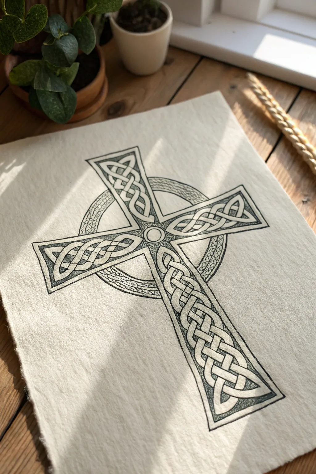
This project features a beautifully intricate Celtic cross design defined by its endless weaving loops and precise dotwork shading. Rendered on textured paper, the heavy black linework contrasts elegantly with the delicate stippling to create a piece that feels both ancient and modern.
Step-by-Step
Materials
- High-quality textured paper (watercolor cold press or handmade paper)
- HB pencil
- Ruler
- Compass or circular object
- Fine liner pens (sizes 0.1, 0.3, and 0.5)
- Clean eraser (kneaded preferred)
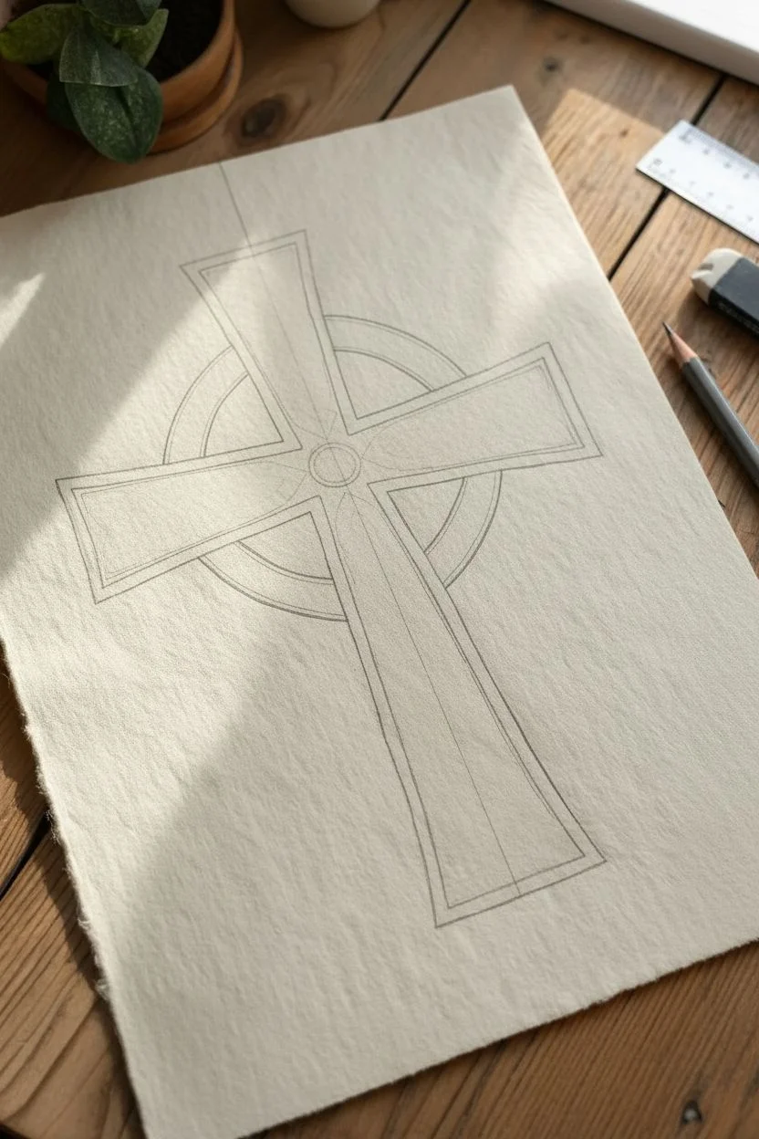
Step 1: Drafting the Structure
-
Establish the axes:
Begin by lightly drawing a vertical line down the center of your paper and a horizontal line crossing it near the top third. These will be your main guides for the cross shape. -
Draw the cross outline:
Using your ruler, measure equal distances from the center axes to build the basic blocks of the cross. The vertical beam should be longer at the bottom, while the horizontal arms should be equal in length. Flare the ends of the arms slightly outward for that traditional Celtic look. -
Add the halo:
Place the point of your compass at the intersection of your axes. Draw two concentric circles that pass behind the arms of the cross, creating the ‘halo’ ring typical of these designs. -
Create the internal borders:
Inside the main outline of the cross, lightly draw a parallel inner border about 3-5mm inside the edge. This creates the ‘container’ where your knotwork will live.
Grid Paper Trick
Draw your initial knotwork design on graph paper first to get the symmetry perfect, then use a light box or transfer paper to move it onto your final textured paper
Step 2: Designing the Knots
-
Grid the interior:
In the spaces reserved for the knotwork, lightly pencil in a diagonal grid. This lattice helps guide the overlapping ‘over-under’ flow of the ribbons. -
Sketch the ribbon path:
Start sketching the winding path of the ribbons. I find it easiest to work on one arm at a time, drawing curved lines that loop back on themselves at the edges. -
Define the overlaps:
Trace over your ribbon sketch, carefully deciding which line goes ‘over’ and which goes ‘under.’ Erase the tiny segments of the lines that go ‘under’ to create the illusion of weaving. -
Detail the center and halo:
Draw a small circle in the very center of the cross intersection. For the halo ring behind the cross, sketch a simple braided or rope texture rather than complex knotwork to keep the focus on the main cross.
Step 3: Inking and Detailing
-
Outline the main shape:
Switch to your 0.5 fine liner. Carefully ink the outermost perimeter of the cross and the heavy double-lines that form the border of the knotwork sections. -
Ink the ribbons:
Using a slightly finer 0.3 pen, trace your pencil knotwork. Be extremely careful at the intersections to preserve the over-under weaving effect you drafted earlier. -
Erase pencil guides:
Once the ink is completely dry—give it a few minutes to be safe—gently erase all graphite marks with a kneaded eraser to reveal the clean design. -
Add dimension to the borders:
Use your 0.1 pen to add stippling (lots of tiny dots) inside the thin border that frames the knotwork. Concentrate the dots near the corners and edges to create a shadowed, recessed look. -
Shade the knotwork:
Apply stippling to the ribbons themselves. Focus the dots heavily where a ribbon goes ‘under’ another to create a cast shadow effect, which makes the weave look substantial and 3D. -
Texture the background halo:
Fill the circular halo area with dense stippling or very fine hatching. This darker value will push the ring into the background and make the bright white cross pop forward. -
Final heavy outlines:
Take your thickest pen (0.5 or 0.8) and go over the very outer silhouette of the entire cross one last time to give it a bold, sticker-like clarity.
Aged Parchment Look
Before drawing, lightly stain your paper with tea or diluted coffee and let it dry flat. This gives the artwork an ancient, manuscript-like appearance
Enjoy the meditative rhythm of stippling as your intricate design comes to life on the page
Stained-Glass Geometric Cross With Faceted Shapes
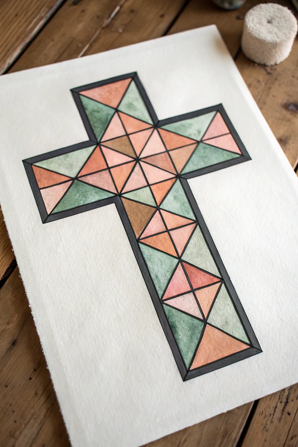
This elegant project combines the structure of geometric design with the soft, organic flow of watercolors to create a faux stained-glass effect. By breaking a simple cross shape into faceted triangles and filling them with alternating warm peach and cool sage tones, you achieve a dimensional, jewel-like appearance.
How-To Guide
Materials
- High-quality watercolor paper (cold press creates nice texture)
- Pencil and eraser
- Ruler or straight edge
- Black waterproof fine-liner pen (0.5 or 0.8mm)
- Black waterproof brush pen or thicker marker
- Watercolor paints (Terra Cotta/Peach and Sage Green)
- Small round watercolor brush (size 2 or 4)
- Jar of water and paper towels
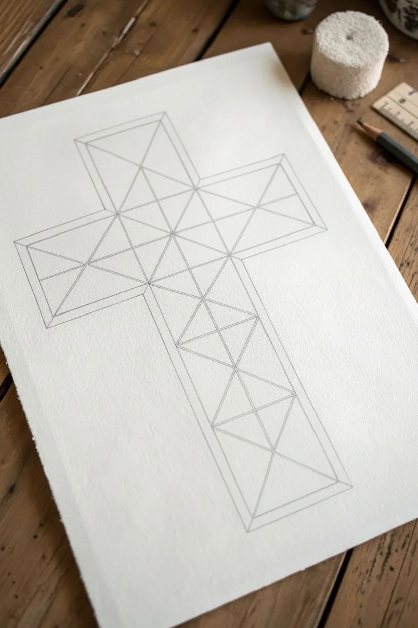
Step 1: Drafting the Geometric Frame
-
Establish the outer boundary:
Begin by lightly sketching the outline of a simple Latin cross in the center of your paper using your pencil and ruler. Ensure the vertical bar (stipe) is longer than the horizontal bar (patibulum). -
Create the inner border:
Sketch a smaller cross inside the first one, leaving about a 1/4-inch gap between the two lines. This gap will later become the thick black frame that holds the design together. -
Subdivide the intersection:
Focus on the center square where the two bars of the cross meet. Draw an ‘X’ from corner to corner of this central square to divide it into four triangles. -
Grid the arms:
Moving outward from the center, measure and mark even intervals along the arms of the cross. Connect these marks with diagonal lines to create a network of triangles, ensuring the points meet cleanly to mimic facets. -
Refine the triangles:
Check your geometric web. You want a mix of larger and smaller triangles, but maintain symmetry or a pleasing balance. If an area looks too empty, bisect a triangle with another line to add detail.
Clean Edges Pro-Tip
To prevent colors from bleeding into each other, paint non-touching triangles first. Let them dry completely before painting their neighbors.
Step 2: Adding the Stained-Glass Outline
-
Ink the structural lines:
Take your fine-liner pen and carefully trace over all the interior pencil lines that form your triangles. Use the ruler here if you want perfectly straight edges, or freehand it for a slightly more organic feel. -
Outline the main shape:
Ink the inner border line of the cross shape. This separates the colorful mosaic interior from the heavy black frame. -
Create the heavy frame:
Ink the outermost boundary line of the cross. Now, carefully fill in the gap between the inner and outer border lines using a thicker brush pen or marker to create a solid, heavy black frame. -
Clean up the sketch:
Wait at least 5-10 minutes for the ink to dry completely. Once safe, gently erase all remaining pencil marks to leave a crisp black-and-white purity.
Level Up: Metallic Touch
Once the paint is fully dry, trace over just the internal dividing lines with a gold or silver gel pen to simulate real metal soldering between the glass panes.
Step 3: Painting the Facets
-
Prepare your palette:
Mix a watery wash of terra cotta or peach paint, and a separate wash of muted sage green. You want the consistency to be quite fluid to allow for transparency. -
Start the warm tones:
Select a scattering of triangles to paint with your peach color. Try not to paint adjacent triangles the exact same shade; vary the water-to-paint ratio slightly for each one to create depth. -
Apply the first green layer:
Switch to your sage green wash and fill in alternating triangles. The goal is to balance the warm and cool tones across the entire cross. -
Refine edges:
Use the tip of your small round brush to push the pigment right up to the black ink lines, being careful not to go over them. A steady hand is key here. -
Build darker values:
Once the first layer is dry, I like to go back and add a second layer of glaze to just a few specific triangles. This darkens them and makes the pattern look ‘faceted’ like real cut glass. -
Add subtle texture:
While a painted section is still slightly damp, you can drop in a tiny speck of clean water or a slightly darker pigment to create a ‘bloom’ texture, simulating imperfections in glass. -
Final assessment:
Step back and look for any triangles that feel too flat. A light wash of a complementary color (like a touch of brown over the orange) can add necessary contrast.
This faux stained-glass piece brings a peaceful, artistic touch to any wall or greeting card without the need for glass cutting tools
Tribal Flame Cross With Bold Black Curves
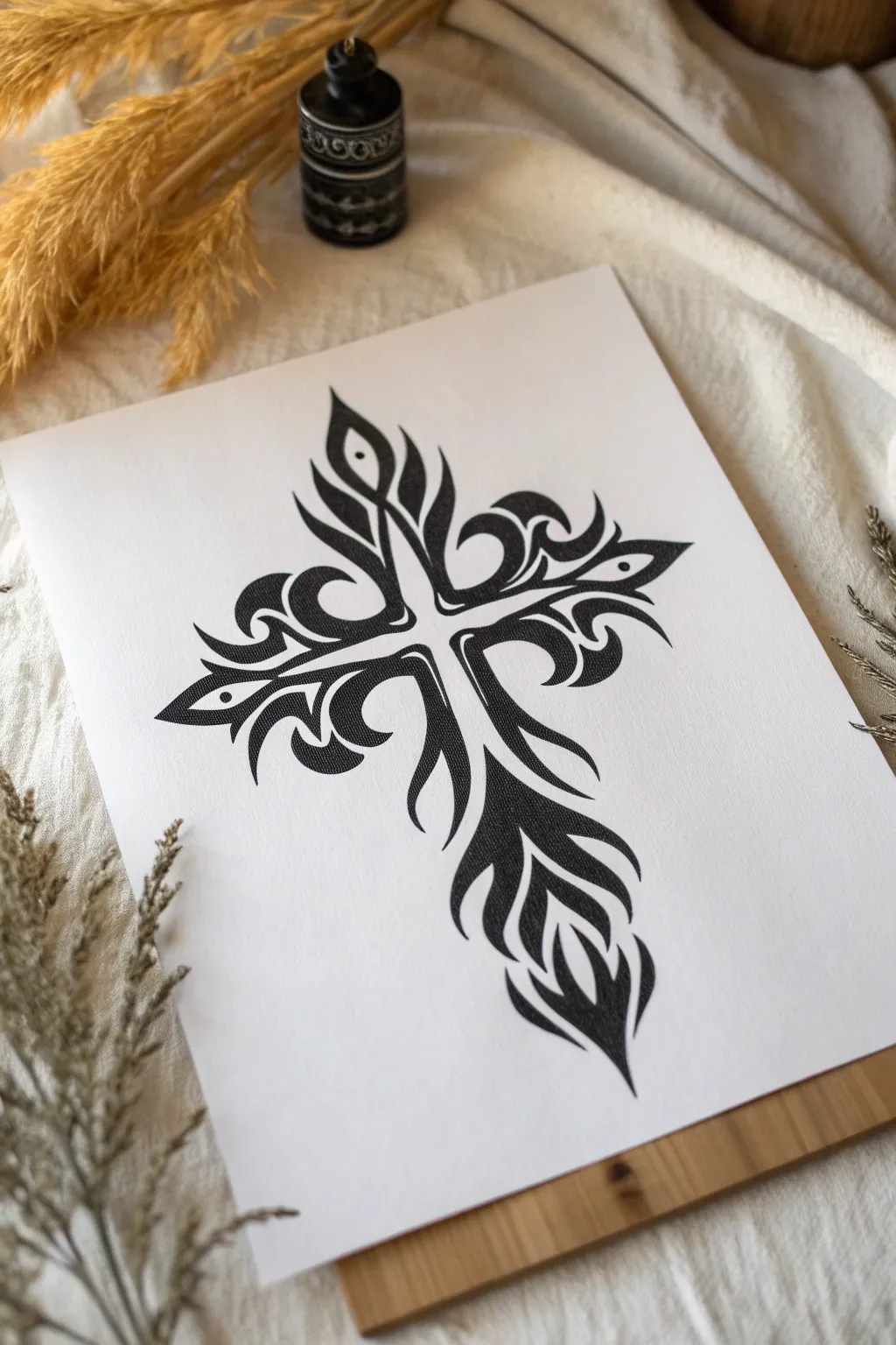
This striking cross design captures the essence of classic tribal art, using fluid, flame-like shapes to create a bold, mirrored silhouette. It’s a fantastic exercise in mastering sweeping curves and sharp, precise points with black ink.
Detailed Instructions
Materials
- High-quality white drawing paper or cardstock (smooth or slightly textured)
- Pencil (HB or 2H for sketching)
- Eraser (kneaded preferred)
- Ruler
- Fine liner pens (0.3mm and 0.8mm)
- Black ink marker or brush pen (for filling)
- A smooth surface or drawing board
Step 1: Structuring the Base
-
Draw the central axes:
Begin by lightly drawing a vertical line down the center of your page. This determines the height of your cross. Cross it with a horizontal line about one-third of the way down to establish the width. Use your ruler to ensure these are perfectly perpendicular. -
Mark the boundaries:
Lightly mark the end points for the top, bottom, and side arms of the cross. The bottom arm should be significantly longer than the top arm to maintain traditional cross proportions. -
Define the center gap:
Draw a thin, white cross shape around your guide lines. This negative space will remain untouched and separates the black tribal sections. It should be roughly 3-4mm wide.
Step 2: Sketching the Tribal Shapes
-
Start the top section:
Sketch two upward-curving, flame-like shapes originating from the center intersection. They should flare out slightly and then taper to sharp points at the top. -
Add the inner eyes:
Within the top flame shapes, draw small, tear-drop shaped openings. These ‘eyes’ add detail and break up the solid black mass. -
Draft the horizontal arms:
Sketch the left and right arms. These shapes should mirror each other, curbing outward from the center like waves. Each arm typically consists of a main upper curve and a smaller lower curve. -
Shape the long bottom arm:
The bottom section is the most complex. Sketch long, flowing lines that drape downward. Think of it as a cascading fire or flowing fabric that widens slightly before ending in a sharp, central focal point. -
Refine the perimeter:
Go over your sketch to ensure symmetry. The distinctive tribal look relies on ‘hooks’ and sharp interior corners where the curves meet. Sharpen these angles in your pencil sketch now. -
Add floating accents:
Near the tips of the horizontal arms, add small, detached floating dots or diamonds. These floating elements give the design a sense of energy and movement.
Ink Saturation Tip
If using markers, do a second pass on the black areas after the first layer dries. This eliminates streak marks and ensures a deep, solid black color.
Step 3: Inking and Filling
-
Outline with precision:
Switch to your 0.3mm fine liner. Carefully trace the outer boundaries of your shapes. Keep your hand steady to maintain smooth, continuous curves. -
Define the negative space:
Outline the inner boundaries that hug the central white cross shape. Press slightly harder here to ensure a crisp separation between the black ink and the white center. -
Erase pencil marks:
Once the outlines are completely dry, gently erase the visible graphite guidelines. This prevents the graphite from smearing when you do the heavy filling. -
Fill the large areas:
Use your thicker black marker or a brush pen to fill in the main bodies of the tribal shapes. I prefer a brush pen here because it handles the tapered points beautifully. -
Refine the sharp points:
Switch back to the 0.3mm or 0.1mm pen to sharpen the very tips of the flames. The filling marker often leaves rounded tips, so use the fine pen to pull the ink out into a needle-sharp point. -
Smooth the curves:
Look for any jagged edges on your filled areas. Use the 0.8mm pen to smooth out the transition between your outline and the fill, ensuring the curves look fluid and liquid. -
Final check:
Hold the drawing away from you to check for balance. If one side looks slightly lighter, you can thicken the black curves on that side incrementally until it matches.
Metallic Accent
Once the black ink is fully dry, outline the entire design with a silver or gold gel pen to create a stunning glowing effect around the tribal shapes.
Step back and admire the powerful contrast and flowing energy of your finished tribal design
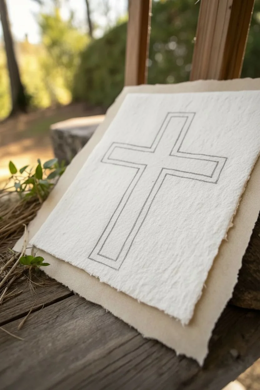
Abstract Cross Built From Broken Lines and Texture Marks
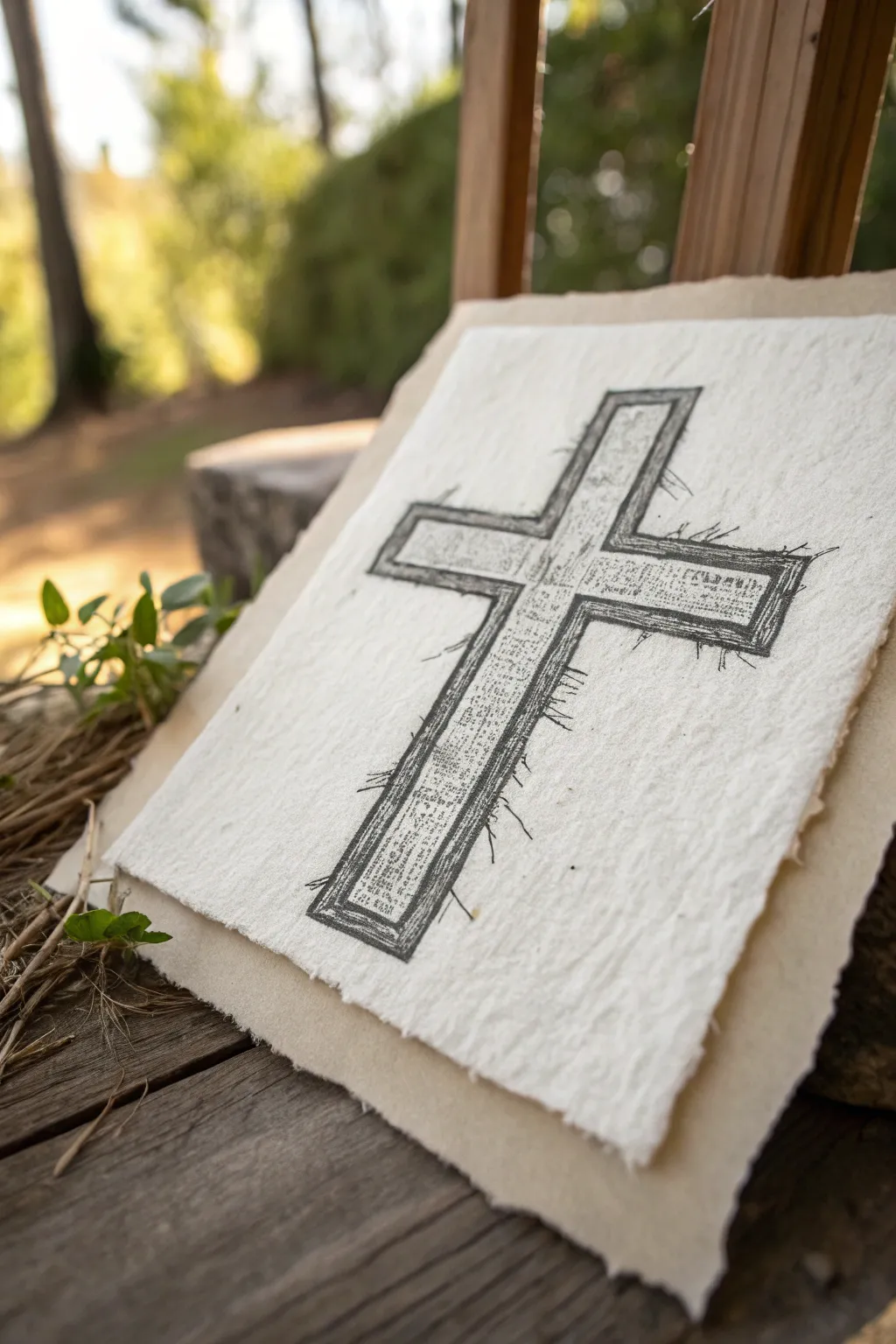
This evocative project combines the raw beauty of handmade paper with the meditative quality of ink sketching. The result is a cross that feels both ancient and immediate, built not from solid blocks but from thousands of tiny, deliberate marks.
Detailed Instructions
Materials
- Sheet of heavy handmade paper (white or off-white) with deckled edges
- Backing sheet of tan or beige cardstock or textured paper
- Fine liner pens (sizes 005, 01, and 03) in black
- Regular graphite pencil (HB)
- Ruler
- Kneaded eraser
- Double-sided tape or mounting squares
Step 1: Preparation & Outline
-
Paper Selection:
Begin by selecting your primary drawing surface. You want a heavy heavyweight paper with a strong tooth and uneven, deckled edges to give it that rustic, aged feel. -
Backing Assembly:
Before drawing, I like to visualize the final framing. Place your white paper onto the slightly larger tan backing sheet to center it, but don’t adhere it permanently just yet. -
Marking the Center:
Find the general center of your white paper. Since the edges are uneven, eyeball it for optical balance rather than strict mathematical centering. -
Sketching the Vertical Beam:
Using your ruler and the HB pencil, lightly draw the vertical beam of the cross. Make it roughly 1 to 1.5 inches wide. -
Adding the Horizontal Beam:
Draw the crossbeam about one-third of the way down from the top. Ensure the width matches the vertical beam for consistency. -
Defining the Border:
Inside your initial cross shape, draw a second, smaller cross about 1/8th of an inch inward. This creates the ‘frame’ effect prominent in the artwork.
Ink Bleeding?
Handmade paper is very absorbent. If lines are feathering too much, switch to an archival pigment liner and use faster strokes rather than letting the nib rest.
Step 2: Inking & Texturing
-
Initial Inking – Outer Edge:
Switch to your 03 pen. Trace over the outer pencil lines of the cross. Don’t try to be perfect; allow the line to break, wobble slightly, or double back on itself to create a sketched look. -
Inking the Inner Frame:
Ink the inner border lines you drew earlier using the same loose, sketched technique. This double-line structure gives the cross its dimension. -
Corner Accents:
At the corners where the beams meet, darken the lines slightly by going over them a few times to emphasize the intersection. -
Base Texture Layer:
Switch to the finer 01 pen. Inside the inner frame of the cross, start adding texture. Instead of standard shading, use tiny, illegible scribbles that mimic distant handwriting or ancient text. -
Building Density:
Focus these text-like scribbles heavily near the bottom and sides of the beams, leaving the center slightly lighter to suggest a rounded or raised surface. -
Cross-Hatching:
Layer vertical hatching lines over your scribbles on the vertical beam, and horizontal lines on the crossbeam. This reinforces the directionality of the wood. -
Spilled Lines:
Using the 005 pen, extend very fine, quick flicking lines outward from the edges of the cross into the negative space. These ‘thorns’ or ‘splinters’ add dynamic energy. -
Adding Contrast:
Go back with your 03 pen and selectively darken small patches within the cross to create depth, particularly near the ‘frame’ edges.
Step 3: Finishing Touches
-
Assess and Erase:
Once the ink is fully dry (wait at least 10 minutes to prevent smudging), gently dab the drawing with a kneaded eraser to lift visible pencil guidelines. -
Distressing the Edges:
If your paper looks too clean, lightly rub the edges of the sheet with your fingers to separate fibers and enhance the deckled look. -
Final Mounting:
Apply double-sided tape or mounting squares to the back of your drawing. Center it on the tan backing sheet and press firmly to secure it.
Add Gold Accents
For a ‘Level Up,’ trace the inner border line with a fine gold leaf pen or metallic gel pen to make the cross shimmer subtly in the light.
Now you have a deeply textured piece of art that invites closer inspection and quiet reflection


Have a question or want to share your own experience? I'd love to hear from you in the comments below!