Borders are the quickest way to make a page feel finished, like you intentionally designed it instead of just filling space. I love them because a good hand-drawn border can be simple, repeatable, and still look totally charming.
Simple Double-Line Frame With Clean Corners
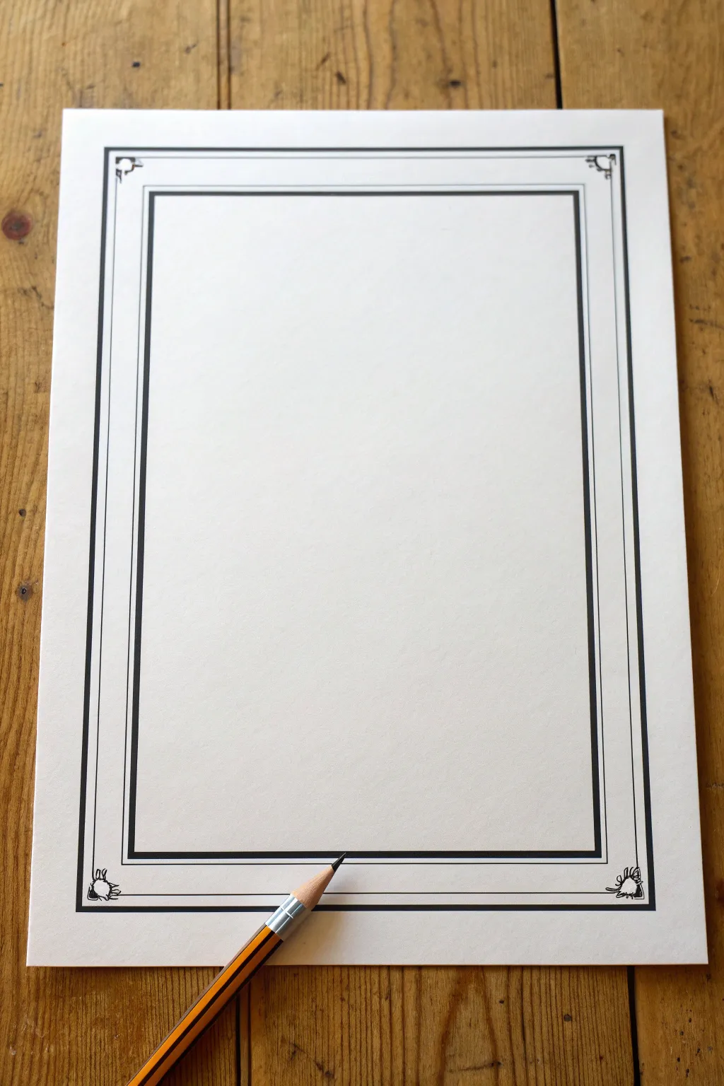
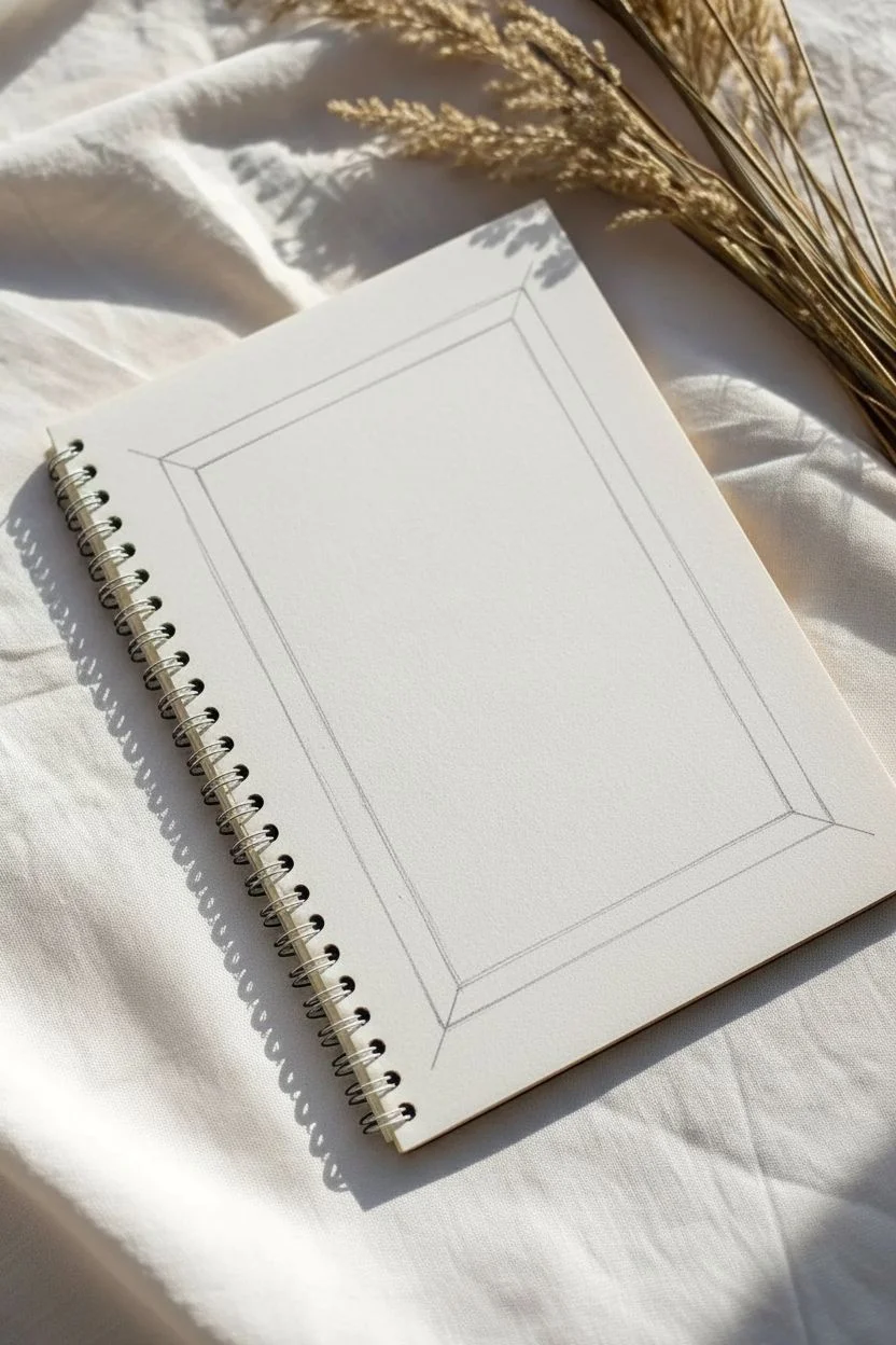
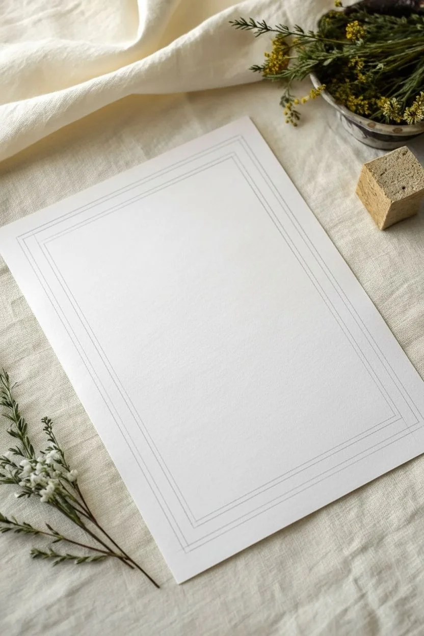
For a sophisticated look that doesn’t distract from your content, this double-line frame is timeless. By combining strong, straight lines with delicate corner flourishes, you create a polished boundary suitable for certificates, menus, or special letters.
Step-by-Step
Materials
- High-quality white paper or cardstock (A4 or Letter size)
- Ruler (preferably clear plastic)
- HB or 2B pencil for sketching
- Fine-point black drawing pen (0.3mm or 0.5mm)
- Medium-point black drawing pen (0.8mm or 1.0mm) or a thick marker
- Eraser
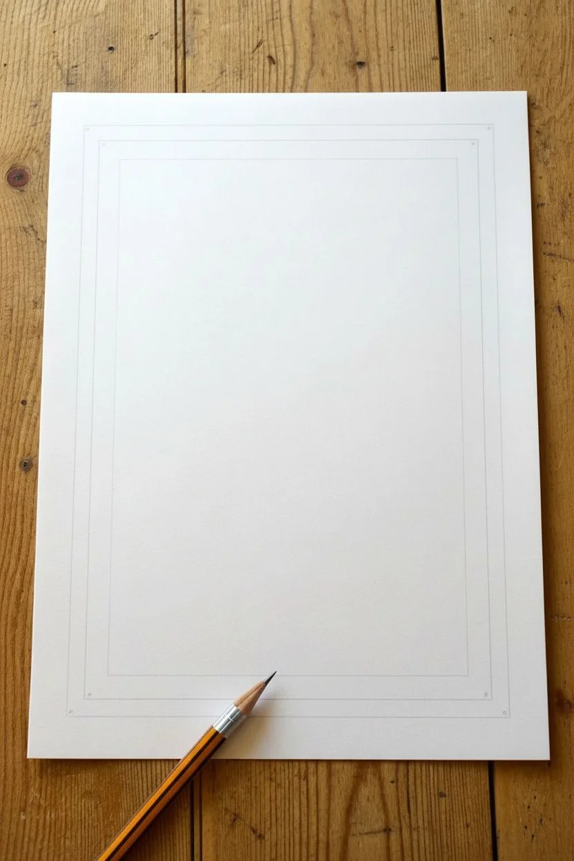
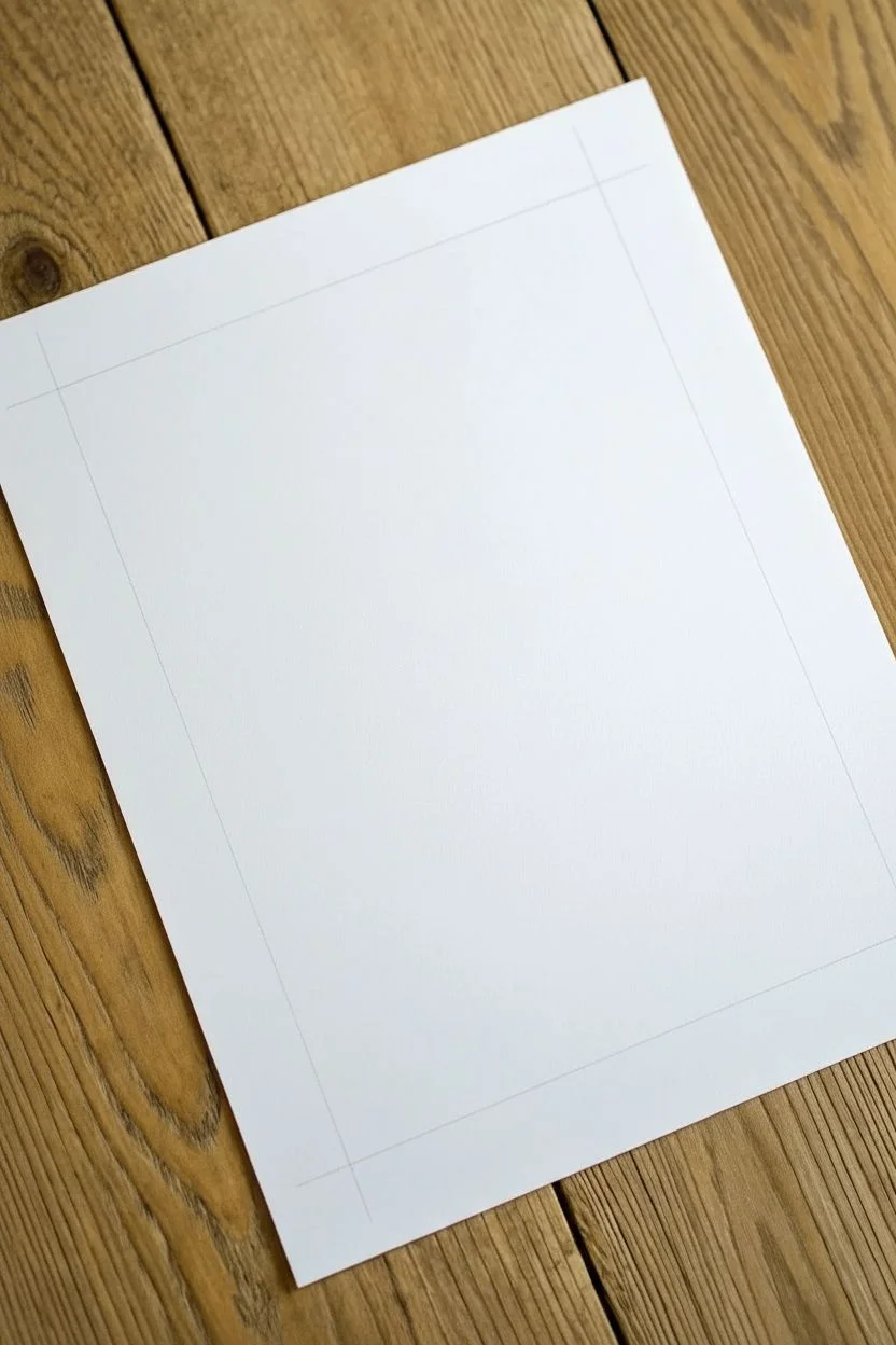
Step 1: Setting the Margins
-
Measure the outer margin:
Begin by deciding on the width of your outermost margin. Use your ruler to measure about 1 inch (2.5 cm) in from each edge of the paper. -
Mark the corners:
Place a light pencil dot at each corner where these measurements intersect. This ensures your frame sits perfectly centered on the page. -
Draw the outer guide:
Connect your corner dots using the ruler and a very light pencil stroke. This rectangle will serve as the baseline for your outer decorative border. -
Measure the inner margin:
From your first pencil rectangle, measure inward another 0.5 inches (approx 1.2 cm). Mark these points on all four sides. -
Draw the inner guide:
Connect these new inner marks to create a second, smaller rectangle inside the first one. This will become the boldest part of your frame.
Clean Edges
Wipe the edge of your ruler with a tissue after every ink stroke. This prevents wet ink transfer that causes smudges.
Step 2: Inking the Structure
-
Ink the bold inner frame:
Switch to your thicker black pen or marker. Carefully trace the inner rectangle you just drew. I find that holding the pen nearly vertical against the ruler’s edge prevents the ink from bleeding under the ruler. -
Thicken the line (optional):
If your marker isn’t thick enough, draw a second line right next to the first one and fill in the gap to create a substantial, heavy weight. -
Prepare the outer border:
Switch to your fine-point pen. You will now be working on the outer rectangle, but do not ink the corners yet. Leave a gap of about 1 inch (2.5 cm) open at each corner. -
Draw the outer lines:
Ink the straight sections of the outer rectangle using the ruler, stopping before you hit the corners where you planned the gaps. -
Create the parallel detail:
Using the same fine-point pen, draw a second thin line just inside the thick inner frame, about 2mm away from the heavy black edge. This adds depth and sophistication.
Step 3: Adding Corner Flourishes
-
Draft the corner motif:
In the gaps you left on the outer border, lightly sketch a small square or curved bracket shape that connects the horizontal and vertical lines. -
Add nature details:
Sketch tiny leaf-like shapes or small curved spikes radiating outward from the corner bracket. Think of them as stylized sun rays or flower petals. -
Ink the corners:
Go over your corner sketches with the fine-point pen. Make these lines crisp and sharp to contrast with the straight rulers lines. -
Connect the border:
Extend the straight outer border lines to meet your new corner doodles, ensuring there are no awkward gaps. -
Clean up:
Wait at least five minutes for the ink to dry completely. Gently erase all remaining pencil guidelines to reveal your crisp, geometric design.
Uneven Thickness?
If your bold inner line looks wobbly, thicken it slightly to hide irregularities rather than trying to erase or restart.
Now you have a professional-looking frame ready for your best handwriting or calligraphy


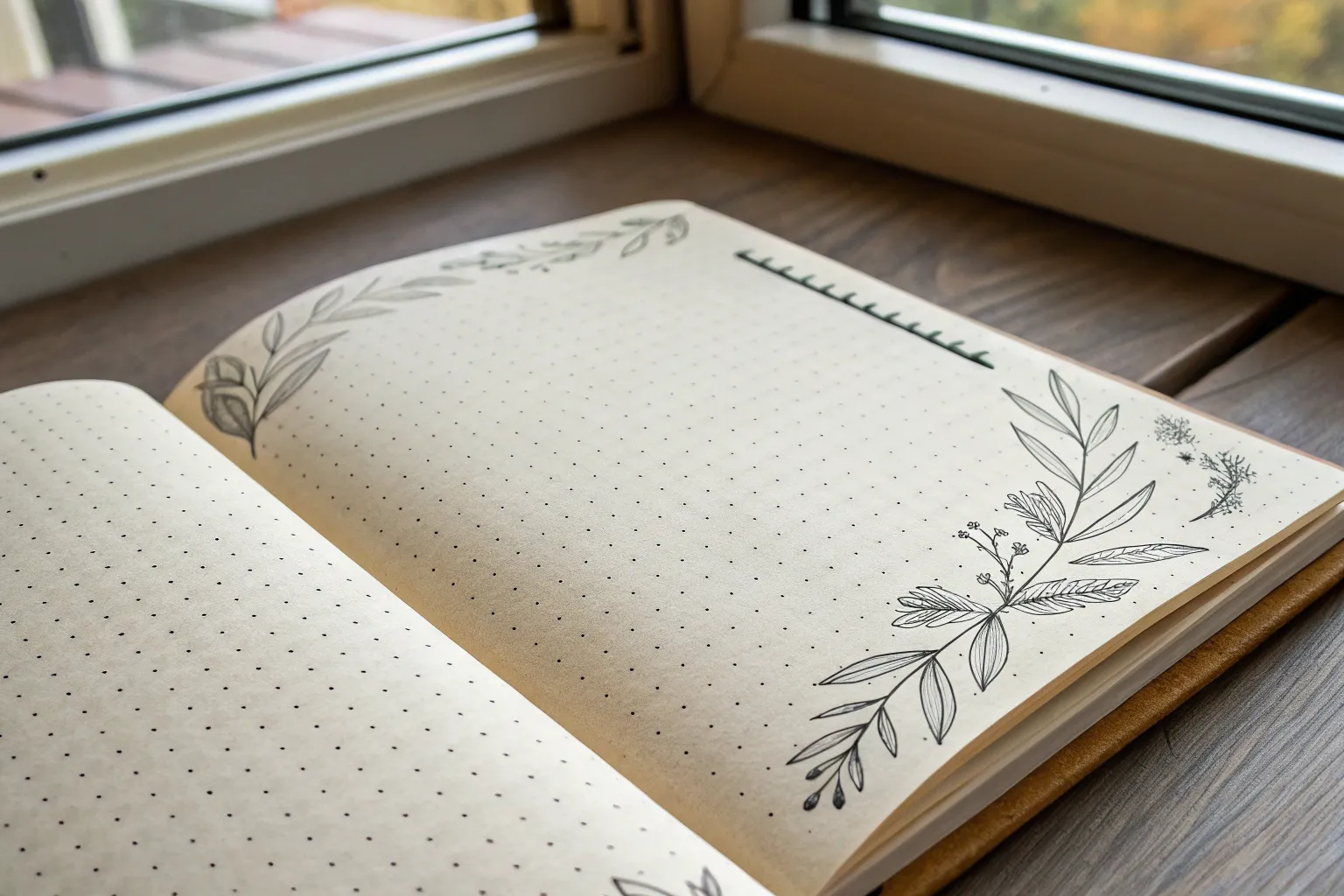
Dotted Line Border for an Easy Journal Look
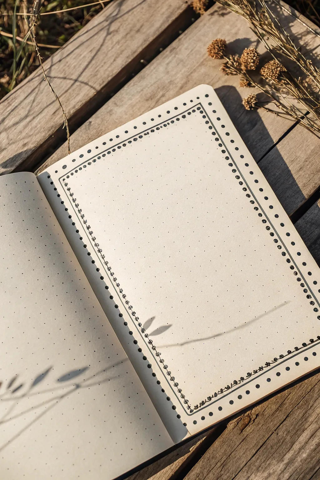
Achieve a clean and sophisticated look for your bullet journal spreads with this deceptively simple double-border design. Combining bold stippling with delicate line work creates a structured frame that highlights your content without overwhelming the page.
How-To Guide
Materials
- Dotted grid notebook (A5 size recommended)
- Black fine liner pen (01 or 03 size)
- Black brush pen or bullet tip marker (small/medium tip)
- Ruler
Step 1: Planning the Layout
-
Define the margins:
Begin by counting the grid dots from the edge of your page to determine your spacing. For this look, identify a margin of roughly 3 grid squares from the edge on all sides. -
Locate corner points:
Using a pencil very lightly, mark the four corner points where your border will begin and end. This ensures your rectangle stays centered before you commit to ink.
Uneven Spacing?
If your dots don’t meet perfectly at the corners, cheat the spacing on the last 3-4 dots of that side by shifting them slightly off-grid. Use a ruler to keep them aligned.
Step 2: Drawing the Outer Border
-
Select your marker:
Switch to your thicker marker or brush pen for the outer layer. You want a tool that makes a distinct, bold dot with a single press. -
Start the vertical columns:
Starting at the top left corner, place a bold dot directly over a pre-printed grid dot. Continue moving down, skipping one grid dot in between each ink dot, until you reach the bottom corner. -
Complete the rectangle:
Repeat this process for the remaining three sides, skipping every other grid intersection. Ensure the corners meet neatly; you may need to adjust your starting position slightly if the math doesn’t line up perfectly.
Step 3: Creating the Inner Frame
-
Switch to fine liner:
Pick up your 0.1 or 0.3 fine liner. We want a significant contrast in line weight compared to the bold outer dots. -
Draw the inner guideline:
Move exactly one grid square inward from your bold dots. Using a ruler, draw a continuous, thin straight line to create a smaller inner rectangle. -
Connect the corners:
Ensure the corners of this inner line intersect sharply. I like to lift the pen carefully at corners to avoid ink pooling.
Add Some Color
Use a mild highlighter to fill in the small open circles on the inner border, matching the color to your weekly theme for a subtle pop.
Step 4: Adding Delicate Details
-
Add the tiny circles:
Along the thin line you just drew, add small, open circles. Place these roughly every two grid squares apart, centered directly on the line. -
Draw the connecting beads:
In the spaces between the small open circles, draw a tiny solid black dot on the line. This creates a pattern: open circle, solid dot, open circle. -
Refine the spacing:
Continue this alternating pattern all the way around the inner frame. Don’t worry if the spacing isn’t machine-perfect; the hand-drawn variance adds charm. -
Erase pencil marks:
Once the ink is completely dry—give it at least a full minute—gently erase any pencil guide marks you made in the first phase.
Now you have a structured canvas ready for your daily tasks or notes


Scalloped Edge Border for a Soft, Cute Frame
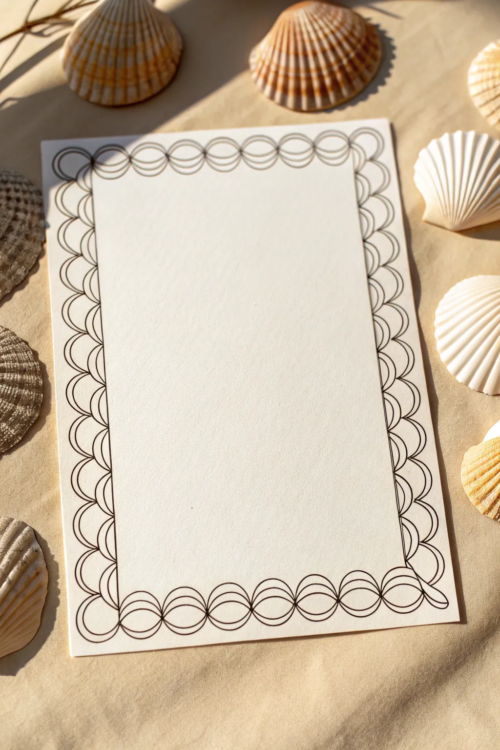
This project features a delicate, interlocking scalloped border that brings to mind fish scales or ocean waves. The clean line art creates a sophisticated frame for wedding invitations, menu cards, or special correspondence.
Step-by-Step Guide
Materials
- High-quality white cardstock or watercolor paper (A5 size recommended)
- Fine-liner pen (0.5mm, black)
- Pencil (H or HB)
- Ruler
- Eraser
- Compass or circle stencil (approx. 1.5 cm diameter)
Step 1: Setting the Guidelines
-
Prepare your paper:
Start with a clean sheet of heavy white cardstock. If you are cutting it down to size yourself, aim for a standard A5 or 5×7 inch rectangle to give yourself ample space for the border. -
Measure the margins:
Using your ruler and a light pencil, mark a margin about 1 inch (or 2.5 cm) in from the edge on all four sides. This inner rectangle will be the writing area. -
Draw the boundary box:
Connect your marks to draw a faint rectangular box. This will serve as the inner limit for your border design. -
Mark the outer boundary:
Draw a second, slightly larger rectangle about 0.5 inches (1.5 cm) outside of your first one. The scalloped design will live between these two lines.
Step 2: Sketching the Scallops
-
Start the corner circles:
Begin at the top-left corner. Place your compass point or stencil so that a circle fits snugly within the corner of your two guide rectangles. -
Sketch the primary row:
Working lightly with a pencil, draw a row of circles along the top edge. Each circle should touch its neighbor tangent-style, without overlapping yet. Fit them evenly across the width. -
Adjust spacing if needed:
If your circles don’t fit perfectly at the end of the line, slight adjustments to the overlap or diameter are better done now in pencil. -
Draw the secondary row:
Now, sketch a second row of circles ‘behind’ the first row. These circles should be offset, so the center of a new circle aligns with the gap between two circles in the previous row. -
Repeat for all sides:
Continue sketching this interlocking pattern down the sides and across the bottom. The corners can be tricky; I find it easiest to let the corner circles be the anchor points and work inwards from them.
Stay on Track
Draw a faint centerline down the middle of your paper. Start your circle pattern from this center point and work outward to ensure symmetry on the left and right sides.
Step 3: Inking the Design
-
Trace the outer curves:
Switch to your 0.5mm black fine-liner. Start by tracing only the outer, visible semi-circles of the ‘front’ row of scales. -
Ink the inner curves:
Next, ink the visible tops of the ‘back’ or offset row. Your pen line should start at the edge of one front circle and end at the edge of the next, creating that layered look. -
Complete the loops:
Notice in the reference that the design isn’t just half-circles; they are full interlinked loops. Carefully close the bottom shapes where they connect with the inner rectangular guideline. -
Check for consistency:
Keep your hand steady and maintain a consistent line weight. The charm of this design lies in the uniform, crisp thickness of the ink.
Add Depth
Use a light grey marker to add a tiny shadow under each overlapping curve. This simple trick makes the flat line drawing look 3D.
Step 4: Finishing Touches
-
Let the ink set:
Give your ink plenty of time to dry completely. Smudging a crisp line drawing at this stage is heartbreaking. -
Erase guidelines:
Gently erase all your pencil marks, including the rectangular guides and any sketching lines within the scallops. -
Inspect and refine:
Look closely for any tiny gaps where lines should meet. Use the very tip of your pen to bridge any breaks for a seamless finish.
Your elegant, hand-drawn stationery is now ready for your thoughtful words


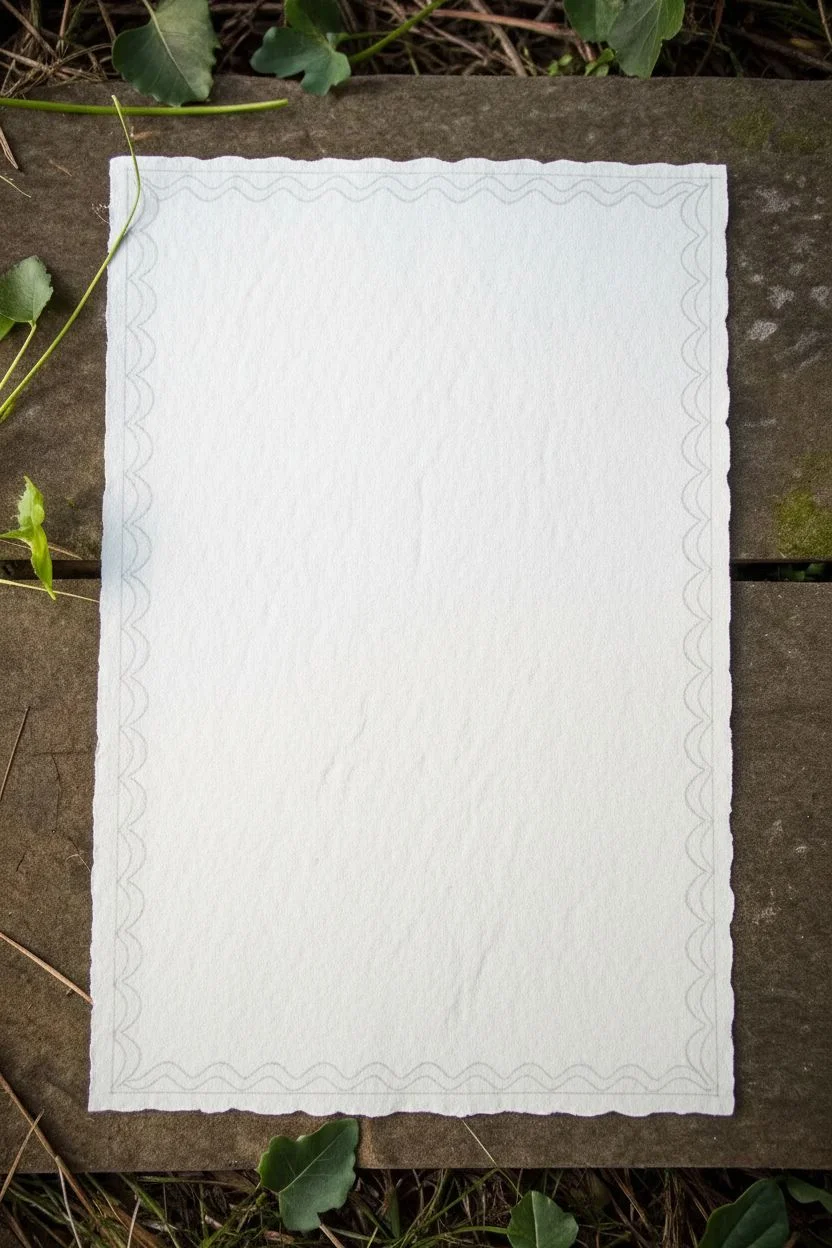
Wavy Line Border That Feels Playful and Loose
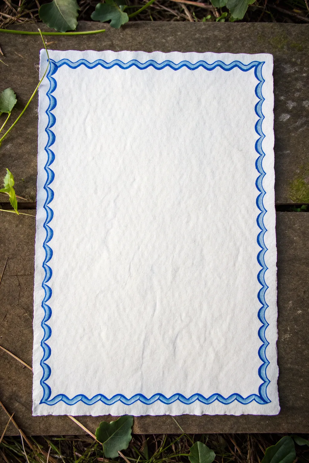
This charming border design features a loose, scalloped wave pattern that brings a sense of playful movement to your page. The simple two-tone blue effect creates depth while maintaining a clean, airy feel that’s perfect for stationery or journal headers.
How-To Guide
Materials
- Deckle-edge watercolor paper or textured cardstock
- Pencil (HB or H)
- Eraser
- Blue fineliner or gel pen
- Light blue marker or diluted watercolor paint
- Small round paintbrush (if using watercolor)
- Ruler (optional)
Step 1: Planning and Sketching
-
Prepare your paper:
Start with a sheet of textured paper. If yours doesn’t have a deckled edge, you can tear the edges carefully against a metal ruler to create that rustic, organic look. -
Define the margin:
Lightly sketch a pencil guideline about half an inch from the edge of the paper on all four sides. This ensures your border stays centered. -
Sketch the outer wave:
Using your pencil, draw a continuous scalloped or wavy line along the perimeter. Let the peaks of the waves point outward toward the paper’s edge. -
Draft the inner wave:
Draw a second wavy line parallel to the first one, but slightly further inward. These waves should mirror the outer ones, creating a ribbon-like channel between them. -
Connect the scallops:
At the points where your waves dip inward, sketch small curved lines connecting the inner and outer waves to form distinct scallop shapes.
Wobbly lines?
Don’t stress over shakes. If a line goes astray, thicken the neighboring curves slightly. The variation in line weight often makes the finished piece look more artistic rather than messy.
Step 2: Inking the Outline
-
Trace the outer edge:
With your blue fineliner, carefully trace over your pencil marks for the outermost wavy line. Keep your hand relaxed to maintain a fluid look. -
Trace the inner edge:
Ink the inner wavy line just as you did the outer one. Don’t worry if the spacing isn’t perfectly uniform; irregularities add to the handmade charm. -
Refine the connections:
Go over the small connecting curves between the scallops. Ensure the lines meet cleanly without overlapping too much. -
Corners check:
Pay special attention to the corners. You may need to adjust the wave slightly so a full scallop wraps around the turn rather than cutting off abruptly. -
Erase guidelines:
Wait a moment for the ink to dry completely to avoid smudging, then gently erase all visible pencil marks.
Make it sparkle
Once the blue ink is fully dry, outline the inner edge of the waves with a metallic silver or gold gel pen. This adds a subtle shimmer that catches the light beautifully.
Step 3: Adding Color and Depth
-
Thicken the lines:
Go back over your blue ink lines, thickening them slightly on the ‘downward’ swerves to simulate calligraphy strokes and add visual weight. -
Prepare the fill color:
Select a light blue marker or mix a very watery pale blue watercolor. You want a distinct contrast between the dark outline and this lighter fill. -
Fill the accent areas:
Color inside the ‘ribbon’ shapes formed by your double waves. I prefer to leave a tiny sliver of white space near the dark outline to make the blue pop. -
Shade the curves:
Add a second layer of your light blue just at the bottom of each scallop curve. This creates a subtle shadow effect. -
Final inspection:
Look over the entire border. If any areas look too thin, use your fineliner to touch up the edges for a crisp finish.
Your page is now beautifully framed and ready for a poem or letter

PENCIL GUIDE
Understanding Pencil Grades from H to B
From first sketch to finished drawing — learn pencil grades, line control, and shading techniques.
Explore the Full Guide
Dash-and-Dot Border for Quick Pattern Rhythm
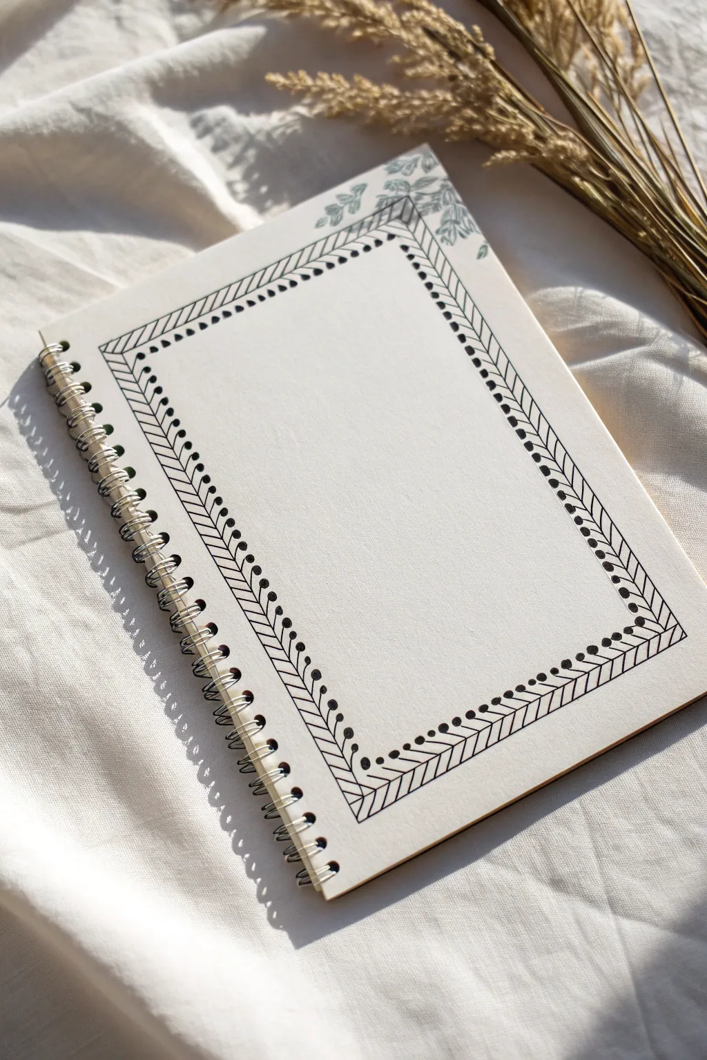
This minimalist, nature-inspired border uses a rhythmic pattern of diagonal lines and simple dots to frame your page. The clean black ink creates a crisp contrast against cream paper, offering a sophisticated but easy-to-draw design perfect for journals and sketchbooks.
Detailed Instructions
Materials
- Dotted or blank journal (spiral bound preferred)
- Fine liner pen (black, 0.3mm or 0.5mm)
- Ruler or straight edge
- Pencil (HB or 2H)
- Eraser (kneaded preferred)
- Green ink pad (optional, for corner accent)
- Leaf stamp (optional, for corner accent)
Step 1: Setting the Structure
-
Pencil the boundary:
Start by lightly sketching a large rectangle in the center of your page using a pencil and ruler. Leave about a 1-inch margin from the spiral binding and the outer edges to let the design breathe. -
Define the border width:
Sketch a second, smaller rectangle inside the first one. Aim for a gap of roughly 1.5 cm (about 0.6 inches) between the two lines. This channel will hold your herringbone pattern. -
Mark the corners:
At each of the four corners, draw a diagonal line connecting the inner corner to the outer corner. This ‘mitered’ look helps the pattern turn the corner smoothly later on.
Smudge Alert
Work from the top left corner down to the bottom right (if you are right-handed) to avoid dragging your hand through fresh ink.
Step 2: Inking the Herringbone
-
Ink the main rails:
Switch to your black fine liner. With a steady hand or ruler, trace over the two main rectangular outlines you penciled earlier. Do not ink the diagonal corner connectors yet. -
Start the left side:
Begin on the left vertical border. Draw a series of diagonal lines slanting downward from the outer line to the inner line. Keep them parallel and spaced about 2-3mm apart. -
Mirror the right side:
Move to the right vertical border. Draw diagonal lines here as well, but angle them to mirror the left side for symmetry. -
Complete the top row:
For the top horizontal section, draw your diagonal lines slanting towards the right. -
Finish the bottom row:
Fill the bottom horizontal section with diagonal lines, slanting them to match the flow of the other sections. Consistency in spacing is key here, but slight handmade imperfections add character. -
Detail the corners:
Where the patterns meet at the corners, draw a single diagonal line to split the angle (the miter line), creating a clean junction between the vertical and horizontal flows.
Step 3: Adding the Dots
-
Place the inner dots context:
Now for the defining detail. Along the *inner* edge of your border frame, place a solid black dot at the end of every diagonal line. -
Check dot positioning:
Ensure the dots sit right on the line, slightly overlapping into the white space of the center page. This creates a scalloped, decorative edge. -
Continue the rhythm:
Work your way around the entire inner perimeter. I find it helpful to rotate the notebook as I go to keep my hand position comfortable and prevent smudging. -
Erase guidelines:
Wait at least 5 minutes for the ink to dry completely. Gently erase any visible pencil marks, being careful not to buckle the paper.
Color Pop
Instead of black dots, use a metallic gold or copper gel pen for the dot detail to give the border a hint of elegant shine.
Step 4: Optional Flourishes
-
Select a stamp:
If you want to recreate the subtle foliage seen in the top right corner, choose a small leaf or botanical stamp. -
Ink the stamp:
Press the stamp lightly onto a sage or muted green ink pad. You don’t want it heavily saturated; a faded look works best here. -
Stamp the corner:
Press the stamp firmly on the top right corner of the page, letting it overlap the page edge slightly for a natural, cascading effect. -
Add drawn leaves:
Alternatively, if you don’t have stamps, sketch simple leaf shapes with a green fine liner or colored pencil in the corner to mimic the organic touch.
Your page is now beautifully framed and ready for your daily thoughts or sketches
Diagonal Stripe Border for a Bold Notebook Frame
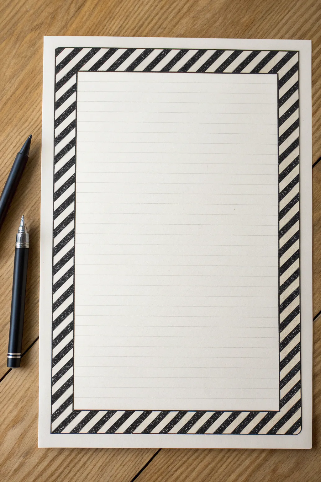
Transform a plain sheet of lined paper into sophisticated stationery with this bold, high-contrast frame. Using simple black ink, you can create a striking diagonal stripe pattern that adds a professional yet handmade touch to your notes.
Step-by-Step Tutorial
Materials
- Sheet of standard lined paper
- Black fineliner (0.5mm or 0.8mm)
- Black brush pen or thick marker
- Clear ruler (12 inches or longer)
- Pencil (HB or lighter)
- Eraser
Step 1: Planning the Layout
-
Define the outer edge:
Start by deciding the width of your border. Using your ruler and pencil, lightly draw a rectangular box that sits about half an inch inward from the paper’s edge on all four sides. -
Mark the inner edge:
Measure inward from your first rectangle by approximately one inch (or your desired border thickness). Draw a second, smaller rectangle inside the first one to create the frame where your pattern will live. -
Establish the diagonal angle:
Place your ruler at a 45-degree angle starting at the top-left corner. Lightly sketch your first diagonal guide line across the top left section of the frame. -
Grid the diagonals:
Continue moving your ruler down and across the frame, drawing parallel diagonal guide lines spaced evenly apart—about 1/4 inch is a good width for these stripes. -
Refine the corners:
Pay special attention to the corners where the vertical and horizontal sections meet; ensure your diagonal lines flow continuously rather than breaking awkwardly at the turns.
Uneven Spacing?
If your diagonal lines start drifting apart, use the markings on your ruler to measure the gap every few lines, realigning the ruler to ensure parallel perfection.
Step 2: Inking the Structure
-
Trace the frame boundaries:
Switch to your black fineliner. Carefully trace over the two main rectangles (the inner and outer edges of the border) to lock in the shape. -
Ink the diagonal lines:
Using the ruler and fineliner again, go over your penciled diagonal lines. Be firm and steady to keep them straight. -
Clean up the sketch:
Once the fineliner ink is completely dry to the touch, gently erase all the pencil marks to reveal a clean wireframe of your design.
Step 3: Filling the Pattern
-
Mark the fill zones:
Before you start coloring, place a tiny dot inside every *other* stripe with your pencil. This simple trick prevents the mistake of coloring two adjacent stripes black. -
Outline the fill areas:
Take your fineliner and slightly thicken the outlines of the stripes specifically designated for black fill. This creates a safety barrier so your marker doesn’t bleed outside the lines. -
Start filling with the marker:
Using your thicker black marker or brush pen, begin filling in the dotted stripes. I usually start from the top left corner and work my way clockwise to avoid smudging nicely done work with my hand. -
Watch the edges:
As you get close to the border edges, slow down. Use the fine tip of the marker or switch back to your fineliner to get crisp, sharp corners without overfilling. -
Second pass for density:
If your marker looks streaky or greyish, wait for the first layer to dry and apply a second coat to achieve a deep, solid black. -
Final inspection:
Check for any tiny white gaps where the black stripes meet the border lines and carefully touch them up with your fineliner. -
Re-line the main box:
To make the frame pop, re-trace the very inner and outer rectangular border lines one last time with a slightly thicker pen stroke.
Variant Vibes
Swap the solid black fill for a texture technique. Try filling the dark stripes with tiny polka dots or tight cross-hatching for a lighter, more intricate look.
Now you have a striking, custom-framed page ready for your most important list or letter
BRUSH GUIDE
The Right Brush for Every Stroke
From clean lines to bold texture — master brush choice, stroke control, and essential techniques.
Explore the Full Guide
Checkerboard Border for a Classic Graphic Pop
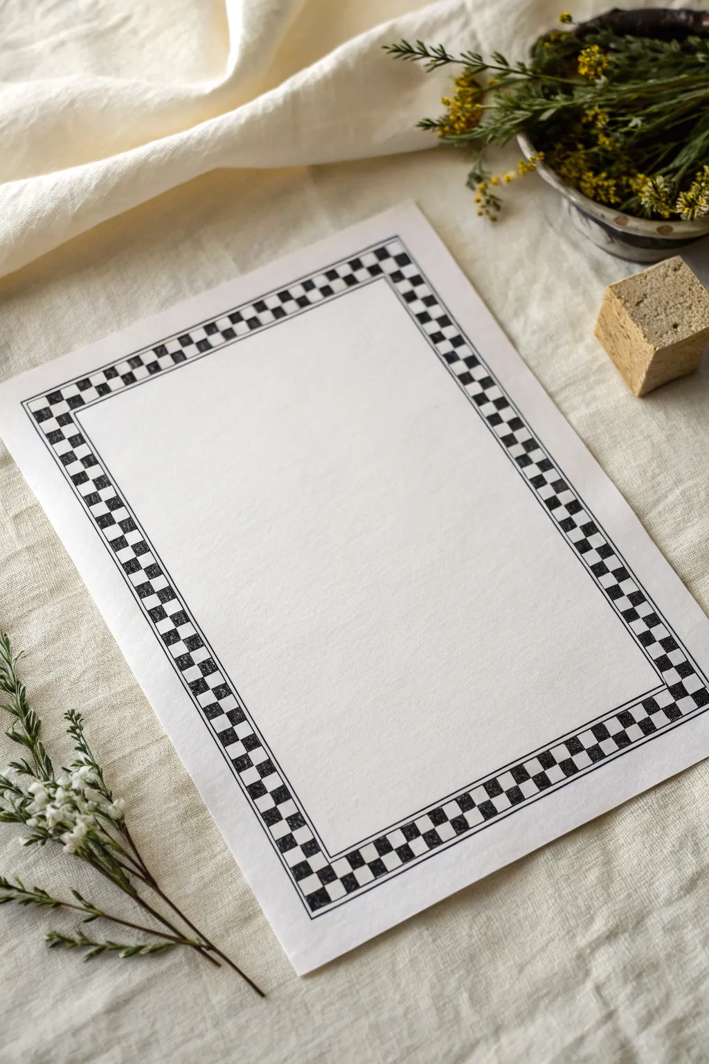
This classic checkerboard border adds a bold, structured frame to any piece of paper, perfect for calligraphy, menus, or stationery. The high-contrast black and white pattern creates a timeless graphic pop that feels both retro and modern.
Detailed Instructions
Materials
- High-quality white cardstock or drawing paper (A4 or letter size)
- Black fine-liner pen (0.5mm or 0.8mm)
- Black brush pen or marker (for filling)
- Ruler (12-inch or longer)
- Pencil (HB or H)
- Eraser (kneaded or white vinyl)
- Compass or divider (optional, for spacing)
Step 1: Setting the Structure
-
Measure the Margins:
Start by deciding how wide you want your border to be. For the look in the image, aim for a width of about 0.75 to 1 inch. Use your ruler to measure this distance from the edge of the paper inward on all four sides. -
Draw the Outer Line:
Lightly sketch the outer rectangle of the border with your pencil. This line will act as the exterior boundary for your checkerboard pattern. -
Draw the Inner Line:
Measure inward again from your first line to define the thickness of the patterned strip. A thickness of about 1 centimeter (or roughly 0.4 inches) works well. Sketch this inner rectangle lightly. -
Create the Enclosure Lines:
To mimic the specific design shown, draw a second, very thin borderline just inside the main strip (about 2mm away) and another just outside of it. This creates a double-lined frame effect that encapsulates the main pattern.
Grid Master Tip
Can’t get the math perfect? Start your grid marks from the center of each side and work outward. If the corner squares end up slightly rectangular, it will be less noticeable than uneven spacing elsewhere.
Step 2: Grid Construction
-
Divide the Horizontal Strips:
On the top and bottom strips of your border, use your ruler to mark equal intervals. I find that 1cm squares usually look best, but you can adjust based on your paper size. -
Divide the Vertical Strips:
Repeat the marking process for the side strips. Ensure your marks align nicely at the corners so the pattern flows continuously. -
Draw the Cross-Sections:
Connect your marks across the thickness of the border strip using the ruler. You should now have a ‘ladder’ look going all the way around the frame. -
Add the Center Line:
This step is crucial for the checkerboard effect. Draw a single line running directly down the center of the entire border strip, splitting all your little ‘ladder’ rectangles into two smaller squares. -
Check the Corners:
Examine the four corners. The grid might get a little tricky here; simply ensure the corner squares are resolved into a 2×2 grid so the pattern can turn the corner logically.
Step 3: Inking and Filling
-
Ink the Main Lines:
Switch to your fine-liner pen. Carefully trace over all the pencil lines involving the border structure—the inner and outer boundary lines and the internal grid. -
Mark the Dark Squares:
Before you start filling in with heavy ink, take your pencil and put a tiny ‘x’ or dot in every other square. This simple check prevents the heartbreaking mistake of coloring two adjacent squares black. -
Start Filling:
Using your thicker black brush pen or marker, begin filling in the marked squares. Start from the top left corner and work your way around. -
Watch the Edges:
Be careful near the lines. It’s safer to outline the inside of the square first with the fine tip, then fill the center with the broader marker to keep crisp edges. -
Refine the Lines:
Once the squares are filled, go back over the straight structural lines with your fine-liner to sharpen up any edges that look a bit fuzzy from the marker bleeding. -
Ink the Accent Lines:
Don’t forget those thin parallel lines you sketched earlier—one inside and one outside the main checkerboard strip. Ink these carefully for a polished look.
Level Up: Color
While black and white is classic, try a monochrome color palette. Use dark navy ink for the dark squares and a lighter blue wash for the ‘white’ squares for a Delft tile inspired look.
Step 4: Final Touches
-
Let it Dry:
Give the ink a good few minutes to dry completely. Smudging intricate line work at the very end is overly frustrating, so patience is key here. -
Erase Sketches:
Gently erase all remaining pencil marks. Hold the paper taut with one hand while erasing with the other to avoid crumpling the sheet.
Now you have a striking geometric frame ready to showcase your handwritten poem or dinner menu
Zigzag Border for Energy and Movement
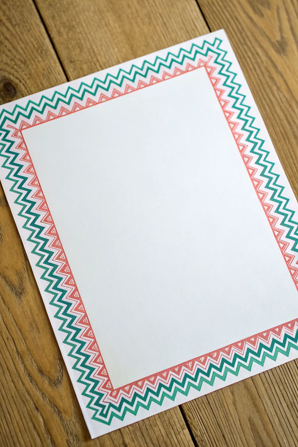
This vibrant border design adds a dynamic burst of energy to plain stationery or invitations, featuring interlocking rows of geometric peaks. The layered effect of coral, teal, and emerald green creates a rhythmic pattern that looks complex but is surprisingly simple to construct.
Step-by-Step Tutorial
Materials
- White cardstock or heavy drawing paper (A4 or letter size)
- Ruler
- Pencil (HB or lighter)
- Eraser
- Ideally: Zigzag pattern rubber stamps (individual components)
- Alternative: Fine-tip markers or gel pens (Coral, Teal, Dark Green) if drawing by hand
- Stamp pads (Coral/Salmon, Teal/Aqua, Dark Emerald Green)
- Scrap paper for testing
Step 1: Planning the Layout
-
Measure margins:
Begin by deciding how wide you want your border to be. Use a ruler to lightly mark a margin about 1 to 1.5 inches from the edge of the paper on all four sides. -
Draw a guide box:
Connect your margin marks with a very faint pencil line. This rectangle will serve as the baseline for your innermost zigzag row, ensuring the border stays straight and centered. -
Test spacing:
Before committing to the final paper, take a piece of scrap paper. Stamp or draw a few repetitions of your zigzag pattern to see how the corners will meet. This practice run helps save materials.
Stamp Alignment
If using clear acrylic stamps, print a zigzag grid on scratch paper first. Place your project paper over it (use a light box) to see exactly where to stamp.
Step 2: Creating the Inner Layer
-
Start with Coral:
We will build this border from the inside out. If using a stamp, ink it thoroughly with the coral or salmon-colored pad. If drawing, switch to your coral marker. -
Align the first impression:
Place your stamp or pen tip directly on the faint pencil guideline you drew earlier. The bottom points of the zigzag triangles should just touch this line. -
Continue the row:
Work your way along one side of the paper. If stamping, line up the start of the next stamp exactly where the previous one ended to create a seamless continuous line. -
Turn the corner:
When you reach a corner, you may need to cheat the spacing slightly. Ideally, try to have a peak or a valley land right at the 90-degree turn for a neat finish. -
Complete the inner rectangle:
Continue this process until the entire inner coral rectangle is complete. Let the ink dry for a moment so you don’t smudge it while working on the next layer.
Metallic Accent
Once the ink is dry, add a fourth ultra-thin row using a gold or silver gel pen on the very inside or outside to give the stationery a festive sparkle.
Step 3: Adding the Middle & Outer Layers
-
Switch to Teal:
Prepare your teal ink or marker. The goal here is to nest the new zigzag row snugly against the coral one. -
Offset the pattern:
Align the downward points of the teal zigzag so they slot into the upward ‘V’ shapes of the coral border. They should run parallel with a consistent gap of about 1-2mm between the lines. -
Follow the perimeter:
Trace around the entire coral border with the teal color. I find it helpful to rotate the paper as I work so my hand doesn’t block my view of the alignment. -
Prepare the final color:
Switch to the dark emerald green ink or marker for the outermost definition layer. -
Apply the outer border:
Just as before, nest the dark green zigzag against the teal one. Keep the spacing consistent. This final dark line acts as a frame, containing the lighter colors. -
Critique the corners:
Check your corners. If drawing by hand, simply connect the diagonal lines outward. If stamping, you might overlap slightly at the corners to create a solid mitered look.
Step 4: Finishing Touches
-
Let it cure:
Allow the artwork to sit for at least 10–15 minutes, especially if you used juicy stamp pads, to ensure the ink is fully set. -
Erase guidelines:
Gently erase the initial pencil rectangle you drew in step one, being careful not to rub over the ink if it still looks even remotely wet. -
Inspect for gaps:
If you notice any tiny breaks in the lines where the stamps didn’t quite meet, use a fine-tip pen in a matching color to bridge the gap invisibly.
Now you have a striking, geometric frame ready for your handwritten letter or printed text


Tiny Heart Chain Border for Sweet, Repeatable Doodles
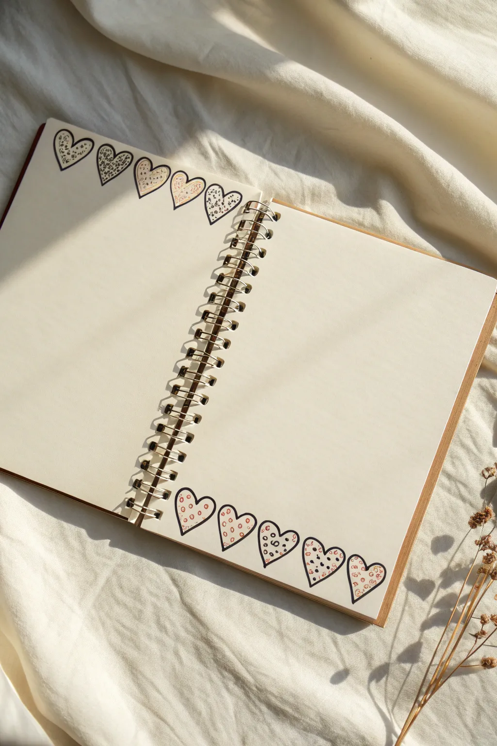

Transform a blank notebook spread into a lovingly framed canvas with this simple yet striking heart chain. This border uses alternating placements and intricate, hand-drawn micropatterns to give your journal entries a cozy, personalized touch.
Step-by-Step
Materials
- Blank coil-bound notebook or sketchbook (cream or ivory paper recommended)
- Fine-liner pen (black, 0.3mm or 0.5mm tip)
- Colored pencils or fine markers (shades of pink, blush, or light red)
- Pencil (HB for sketching)
- Eraser
Step 1: Sketching the Layout
-
Define the placement:
Begin by deciding where your borders will live. For this double-page spread effect, you’ll be drawing a row of hearts at the very top of the left page and a corresponding row at the very bottom of the right page. -
Draft the heart shapes:
Using your pencil, lightly sketch a series of five distinct hearts in a horizontal row. Aim for a slightly chubby, hand-drawn look rather than perfect symmetry. -
Connect the hearts:
Ensure the hearts are touching side-by-side or overlapping just a tiny fraction at their widest points. This connection is key to making it feel like a cohesive chain. -
Repeat for the opposite page:
Move to the bottom of the right-hand page and sketch a second row of five hearts, mirroring the style of the first group but keeping the orientation upright.
Spacing Hack
Draw the first and last heart of the row first to define the width, then fill in the middle three. This prevents running out of room!
Step 2: Inking the Outline
-
Trace the outer lines:
Take your black fine-liner pen and carefully trace over your pencil sketches. Use a steady hand, but embrace the slight wobbles; they add character. -
Create the overlap effect:
Where the hearts touch, decide which heart is ‘in front’ and stop your line work where it tucks behind its neighbor. This creates subtle depth without shading. -
Erase guidelines:
Once the ink is completely dry—give it a full minute so it doesn’t smudge—gently erase all your pencil marks to leave a clean slate.
Step 3: Adding Micro-Patterns
-
Plan your patterns:
Choose two distinct patterns for this project: a dense ‘animal print’ speckle and a simpler ‘open circle’ polka dot. -
Start the animal print:
On the top row (left page), choose the first, third, and fifth hearts. Fill these with small, jagged, irregular shapes using your black pen. Think of them as tiny, broken triangles. -
Draw the polka dots:
Still on the top row, fill the second and fourth hearts with small, hollow circles scattered evenly across the space. -
Reverse the pattern below:
For the bottom row (right page), switch the order. If you want variety, make the first heart the hollow circle pattern and alternate from there.
Level Up: Mixed Media
Instead of drawing the patterns, use tiny cutouts of washi tape inside the heart outlines for a textured, collage-style border.
Step 4: Adding Color Accents
-
Select your palette:
Grab your colored pencils or markers. Stick to a limited palette of soft blush pinks, dusty rose, or light coral to match the aesthetic. -
Color the animal print:
Gently fill the inside of the jagged black shapes with your chosen color. You don’t need to be perfect; a loose coloring style looks great here. -
Fill the polka dots:
Color inside the hollow circles of the other hearts. I find that using a slightly lighter shade here adds a nice rhythm to the border. -
Final touches:
Step back and assess your work. If any lines look too thin, you can thicken the outer perimeter of the hearts slightly to make the border pop against the cream paper.
Now you have a charming, customized frame waiting for your next journal entry or to-do list
Star Sprinkle Border for a Whimsical Frame
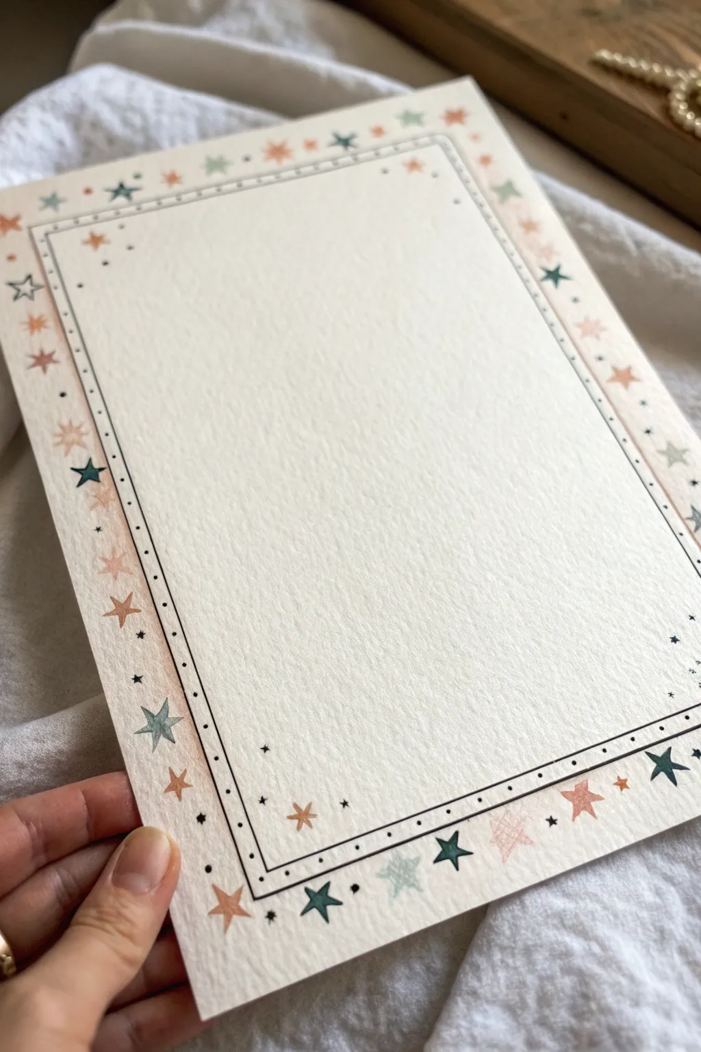
Transform a plain sheet of paper into magical stationery with this delicate, celestial border design. Featuring a mix of hand-drawn stars in soft, muted tones and crisp ink lines, this project adds a dreamy touch to any letter or journal page.
How-To Guide
Materials
- Heavyweight textured paper (watercolor or mixed media)
- Fine liner pen (black, 0.1mm or 0.3mm)
- Ruler
- Pencil (HB or H)
- Eraser
- Colored pencils or fine markers (muted teal, dusty pink/peach, terra cotta)
- White gel pen (optional, for highlights)
Step 1: Planning and Structure
-
Measure the margins:
Begin by deciding how wide you want your border to be. Using your ruler and pencil very lightly, mark a rectangle about 1 inch (2.5 cm) inward from the edge of the paper on all sides. -
Create the inner frame guide:
Mark a second, smaller rectangle about 1/4 inch (6 mm) inside the first one. This inner space will house your delicate ink lines later. -
Finalize pencil guides:
Connect your marks to create two faint rectangular boxes. These pencil lines act as the boundaries for your star placement, so keep them light enough to erase cleanly later.
Step 2: Inking the Structure
-
Draw the main border lines:
Switch to your fine liner pen. Place your ruler against the inner pencil guide and carefully draw a solid black line all the way around the central writing area. -
Add the secondary line:
Draw a second parallel line just slightly outside the first one, leaving a very small gap—about 1-2mm. This double-line effect adds sophistication to the frame. -
Stipple the detail:
In the gap between your two ink lines, add tiny dots evenly spaced apart. This simple stippling technique creates texture and mimics vintage stitching.
Keep it Steady
To keep your stars consistent, try gently rotating the paper as you draw each point, rather than twisting your wrist. This helps maintain symmetry.
Step 3: Drawing the Stars
-
Place anchor stars:
Using your colored pencils or markers, start drawing the largest stars first. I like to begin with the corners to ensure balance. -
Vary the star shapes:
Draw traditional five-point stars, but mix them up. Create some as solid shapes and others as simple outline stars (asterisks or 8-point bursts). -
Alternate colors:
Rotate through your color palette—muted teal, dusty pink, and terra cotta—as you work your way around the frame. Try not to place two stars of the same color right next to each other. -
Fill the gaps:
Once the main stars are down, fill the empty spaces between them with smaller stars. These should look like tiny twinkling spacers. -
Add micro-details:
Using your black fine liner again, draw tiny black asterisks and small dots scattered among the colored stars. This confetti effect ties the color layer to the black ink border.
Golden Hour Glow
Swap the black fine liner details for a gold gel pen or metallic marker. The gold accents against the dusty pinks will give the piece a luxurious, celestial feel.
Step 4: Finishing Touches
-
Check for balance:
Step back and look at the frame as a whole. If any area looks too sparse, add a tiny dot or a small colored star to fill it out. -
Wait for ink to dry:
Give the ink and marker pigment plenty of time to set completely to avoid smudging during the next step. -
Erase guidelines:
Gently erase any visible pencil lines from your initial layout. Be careful near the colored pencil areas so you don’t smear the wax pigment. -
Add highlights (Optional):
If you used darker markers or pencils for the stars, you can add a tiny dot of white gel pen in the center of the largest stars for a little sparkle.
Your page is now ready for a handwritten letter or a special poem
Leafy Vine Border for a Fresh Botanical Edge
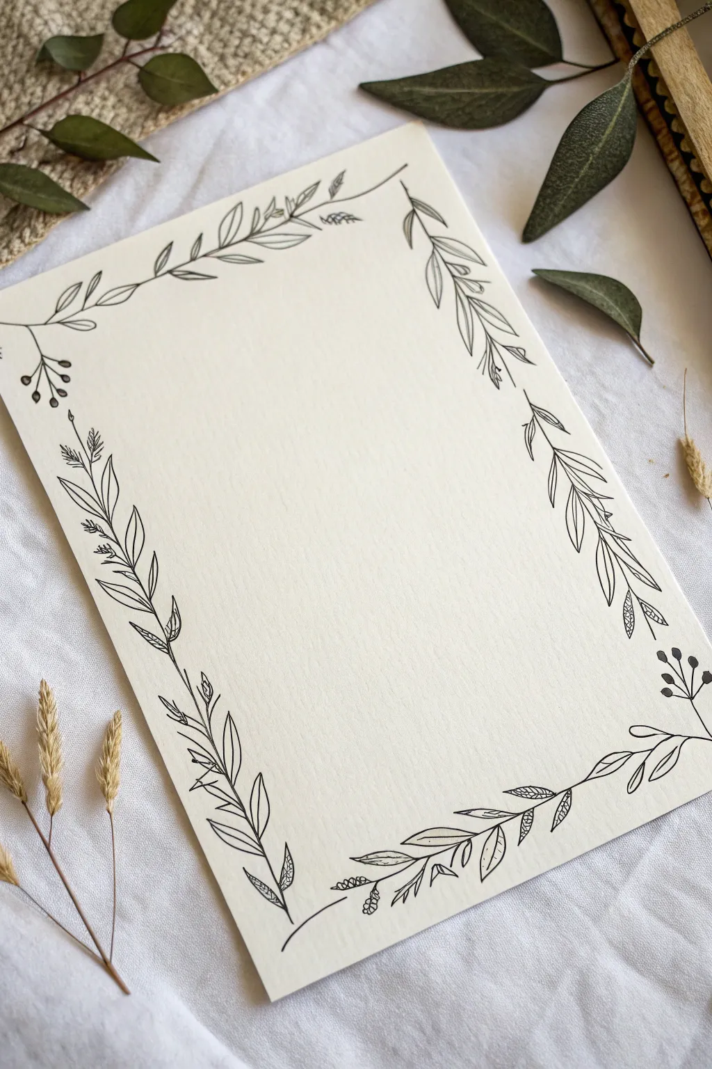
This elegant project frames your page with a delicate dance of leaves, vines, and tiny berries, bringing a touch of nature to your stationery. The contrast between the crisp black ink and the soft, cream-colored textured paper creates a sophisticated, organic look perfect for invitations or journals.
Detailed Instructions
Materials
- Cream or off-white textured cardstock (A5 or 5×7 inch)
- Fine liner pen (black, 0.1mm or 0.3mm)
- Pencil (HB or 2H)
- Kneadable eraser
- Ruler (optional, for spacing)
- Reference image of leaves (optional)
Step 1: Planning and Structure
-
Prepare your paper:
Begin with a sheet of high-quality, textured cream cardstock. The texture adds character to the ink lines, so smooth printer paper won’t quite capture the same charm. -
Lightly sketch the boundary:
Using your pencil, verify where you want the border to sit. You don’t need straight lines; instead, lightly sketch four wandering, wavy curves near the edges of the paper to act as the main stems. Keep them loose and organic rather than perfectly straight. -
Mark corner gaps:
Notice that the corners in this design aren’t always connected. Leave small gaps or looser connections at the four corners to keep the design feeling airy and open.
Wobbly Lines?
Don’t panic! Turn mistakes into features by thickening the line or adding a tiny leaf or berry over the wobble to hide it naturally.
Step 2: Drawing the Primary Vines
-
Ink the main stems:
Take your fine liner pen and trace over your pencil guidelines. Use a confident, fluid motion to create the main vine stems. Don’t worry if the line wobbles slightly; natural vines are rarely perfect. -
Add variance to the line:
Go back over certain sections of the stem to thicken them slightly, particularly at the bottom of curves, to give the vine some visual weight.
Go Metallic
Trace over the berry clusters or specific leaf veins with a gold or silver gel pen to add a subtle, luxurious shimmer to the piece.
Step 3: Adding Foliage Details
-
Start the left side leaves:
On the left vertical vine, begin drawing elongated, lance-shaped leaves. Draw them in pairs or alternating patterns, pointing generally upward. -
Detail the left leaves:
Add a central vein to each leaf on the left side. For a few selected leaves, draw tiny diagonal lines or stippling near the base to suggest shading. -
Create the top border elements:
Along the top edge, draw smaller, simpler leaves. Intersperse them with tiny sprigs that look like wheat or fern fronds—little clusters of short dashes attached to a stem. -
Draft the right side foliage:
For the right vertical border, focus on longer, sweeping leaves that drape downwards slightly. This asymmetry makes the border feel more dynamic. -
Incorporate playful gap-fillers:
Look for empty spaces along the main vines. Add small off-shoot stems that end in tiny circles to represent clusters of berries. I like using groups of three or four dots for balance. -
Draw the bottom border:
The bottom section features a mix of broad leaves and textured geometric leaves. Draw a few leaves that have a cross-hatching pattern inside them instead of veins for variety.
Step 4: Refining and Finishing
-
Connect the corners (optional):
Assess the corners. If they feel too empty, add a very thin, single curving line to bridge the vertical and horizontal vines, or perhaps a floating leaf. -
Review line weight:
Check your drawing for balance. If one side looks too light, darken the central veins of the leaves or thicken the outline of a few berries to add contrast. -
Let the ink settle:
Allow the ink to dry completely for at least 5-10 minutes. Smearing fresh ink is the biggest enemy of a clean border. -
Erase guidelines:
Gently roll your kneadable eraser over the entire page to lift the pencil sketches without damaging the paper surface. -
Final inspection:
Look closely at your leaves. If any lines don’t quite touch the stem, extend them carefully so the plant looks structurally sound.
You now have a beautifully framed page ready for your favorite quote or a heartfelt letter
Daisy Chain Border for a Classic Flower Frame
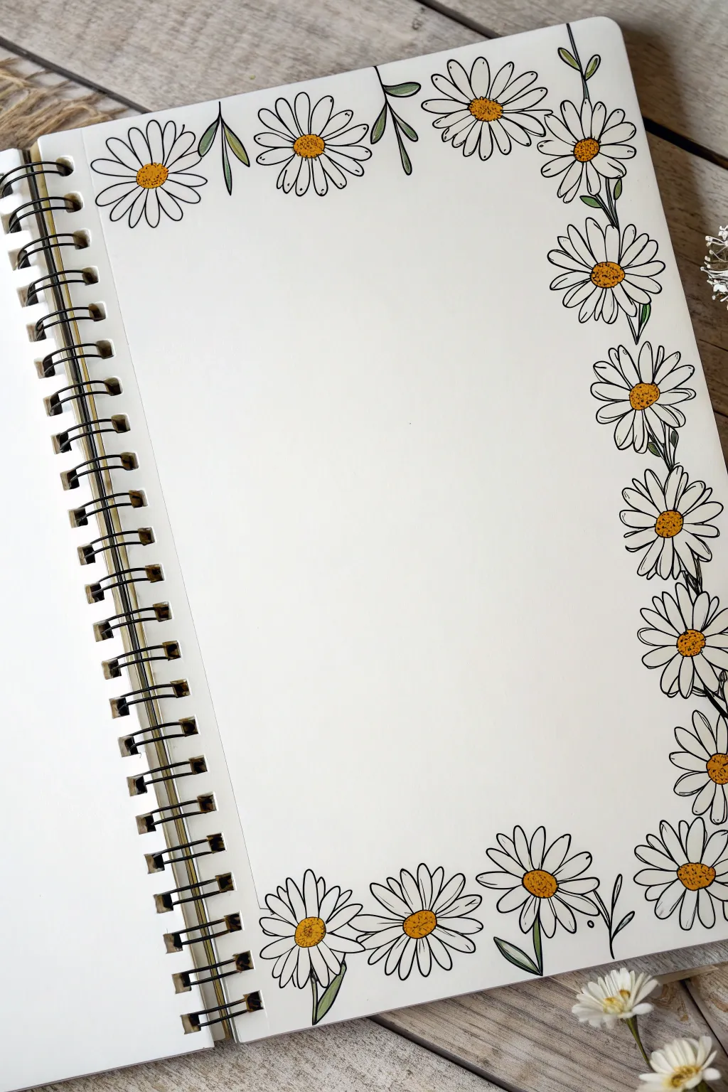
Transform a plain notebook page into a cheerful garden scene with this lovely daisy chain border. Using simple line work and pops of sunny yellow, you’ll create a classic floral frame perfect for bullet journals or sketchbooks.
Step-by-Step
Materials
- Spiral-bound sketchbook or journal
- Fine-point black drawing pen (0.3mm or 0.5mm)
- Pencil and eraser
- Yellow marker or colored pencil
- Sage green marker or colored pencil
Step 1: Planning the Layout
-
Define the corners:
Visualize where your main flower clusters will sit. The border is heaviest at the corners, particularly the top-right and bottom-right, creating an ‘L’ shape frame effect. -
Sketch anchor circles:
Using a pencil very lightly, draw small circles to represent the centers of your key daisies. Place one right in the top-left corner, three clustered in the top-right, and a row of them along the right edge and bottom. -
Check spacing:
Ensure your circles aren’t perfectly aligned in a straight soldier-line; stagger them slightly to make the vine look organic and natural.
Uneven Petals?
Don’t panic if petals look wonky! Real flowers are imperfect. Just add an extra line or fold to a misshapen petal to make it look like it’s fluttering in the wind.
Step 2: Drawing the Daisies
-
Ink the centers first:
Take your black fine-point pen and draw the centers of the flowers first. Instead of perfect circles, draw slightly bumpy, textured ovals to mimic the pollen texture of a real flower center. -
Draw top petals:
Start adding petals to the top-left corner daisy. Draw long, narrow U-shapes radiating outward. Keep the petals slightly irregular in length for realism. -
Cluster the top right:
Move to the top-right corner. Draw the petals for the most prominent flower first. Then, draw the petals of the surrounding flowers as if they are tucked behind the first one, stopping your lines when they hit a neighbor’s petal. -
Work down the side:
Continue drawing daisies down the right-hand edge of the paper. Orient them in different directions—some facing straight out, some tilted up or down. -
Create the bottom border:
Draw the row of daisies along the bottom edge. I like to make these slightly larger to ‘ground’ the page visually. -
Angle the bottom petals:
Notice how some petals on the bottom row look shorter or flattened? Draw the petals facing the bottom of the page slightly shorter to create a sense of perspective.
Sparkle Effect
Use a white gel pen to add tiny dots or ‘shine’ marks on the yellow centers and the green leaves to make the illustration pop off the page.
Step 3: Adding Greenery & Detail
-
Add connecting stems:
Where there are gaps between flowers, draw thin, single-line stems connecting them. You don’t need a stem for every flower, just enough to suggest a continuous vine. -
Draw leaves:
Add simple leaves coming off the stems or poking out from behind the petals. A simple teardrop shape with a single center line works perfectly here. -
Include buds:
For extra detail, you can draw a small circle on a stem with tightly closed petals to represent an unbloomed flower bud, like the one peeking out in the bottom right. -
Detail the petals:
Go back to your petals and add very short, quick flick marks at the base of each petal (near the center) and at the tips. This adds depth and makes them look less like cartoons.
Step 4: coloring & Finishing
-
Erase pencil lines:
Wait for the ink to be completely dry—give it a full minute—and then gently erase your initial pencil guide circles. -
Color the centers:
Use your yellow marker or pencil to color the flower centers. Don’t fill them in solidly; a stippling (dotting) motion creates a nice pollen texture. -
Add shadow to centers:
If you have an orange or darker yellow, add a tiny crescent of color to the bottom-right side of each yellow center to give it a 3D dome shape. -
Color the leaves:
Fill in the leaves and stems with a muted sage green. Again, you don’t have to be perfect—leaving little slivers of white space can add to the illustrative charm.
Now you have a blooming border ready to hold your daily notes or sketches
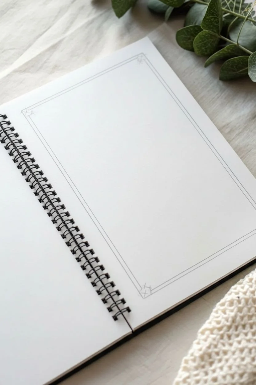
Corner Flourish Border With Minimal Lines in the Middle
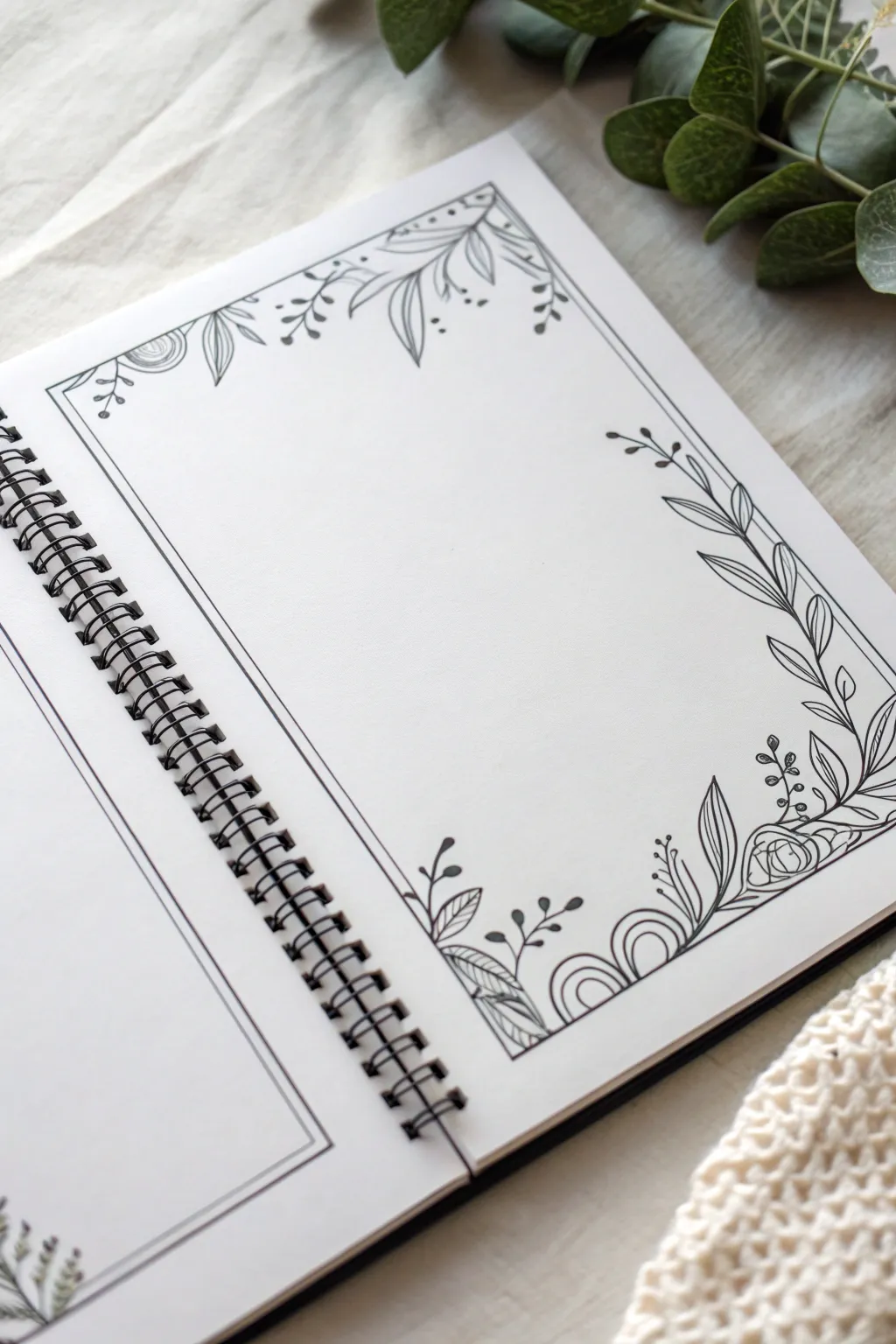
This elegant border design balances structured lines with organic, flowing floral elements to create a sophisticated frame for your journaling. The contrast between the rigid geometric inner border and the loose, whimsical leaves softens the page while keeping the focus on your writing space.
Step-by-Step Tutorial
Materials
- Spiral-bound notebook or sketchbook
- Fine liner pen (0.3mm or 0.5mm, black)
- Pencil (HB or 2H)
- Plastic eraser
- straightedge or ruler
Step 1: Setting the Structure
-
Define the outer limits:
Begin by penciling a light rectangle around the perimeter of your page. Leave about a half-inch margin from the paper’s edge to give the drawing room to breathe. -
Create the inner frame:
Using your ruler and pen, draw a definitive double line box inside your pencil margin. Keep these two lines close together, perhaps 1-2mm apart. This creates the ‘minimal lines’ referred to in the section title. -
Mark the corners:
Lightly sketch diagonal lines or small circles at the top-left and bottom-right corners. These will serve as anchor points where your floral clusters will sit.
Step 2: Top-Left Flourish
-
Draft the main stems:
Starting from the top-left corner of your double-line frame, draw a short, curved stem extending outward. Add a tiny spiral or snail-shell shape right at the corner junction. -
Add simple leaves:
Draw small, tear-drop shaped leaves attaching to the stem. Keep the lines continuous and smooth. Some leaves can be open outlines, while you might add a central vein to others for variety. -
Incorporate berries:
Extend a thin, stray branch away from the main cluster and dot the end with small, filled-in circles to represent berries or buds. This adds delicate detail to the heavier leaves.
Keep it fluid
Don’t worry if your lines overlap the straight frame border. Plants naturally grow over structures, so letting a leaf cross the line makes it look organic.
Step 3: Bottom-Right Focal Point
-
Anchor with arches:
In the bottom-right corner, draw a series of three nested semi-circles (rainbow shapes) resting against the frame line. This geometric motif grounds the larger floral arrangement. -
Draw the main vine:
Extend a long, sweeping line upwards along the right vertical edge of your frame. Let it wave slightly; it shouldn’t be perfectly straight. This will be the spine for the climbing leaves. -
Populate the vine:
Add elongated leaves to this vertical vine. Draw them in pairs or alternating sides. For visual interest, draw a line down the center of these leaves but leave the halves empty. -
Create the corner bloom:
Right next to your ‘rainbow’ arches, sketch a small, stylized rose or ranunculus. Start with a tight spiral center and add loose, enclosing petals around it. -
Fill the bottom edge:
Extend a shorter vine horizontally to the left along the bottom frame line. Add broad, striped leaves here—draw the leaf outline, then fill it with diagonal hatching lines.
Add a splash of color
Use watercolor pencils to lightly shade just the tips of the leaves in sage green, or color the berries in a muted red for a vintage botanical feel.
Step 4: Refining and Inking
-
Connect the elements:
Look for gaps between your main floral clusters. Add tiny sprigs, single stems with a dot on top, or small floating leaves to bridge the negative space without overcrowding it. -
Review line weight:
Go over your main structural lines (the frame) one more time if they look too faint compared to the flowers. I usually like to thicken the outer side of leaves slightly to give them dimension. -
Erase guidelines:
Wait until the ink is completely dry to the touch to avoid smudging. Then, gently erase all your initial pencil sketches and corner guides. -
Final touches:
Add tiny stippling dots near the base of the leaves or inside the corner arches to add texture and shading, giving the illustration a finished, professional look.
Your page now has a beautiful, custom frame ready to highlight your thoughts or sketches
Bracket-Style Border for Notes and Headers
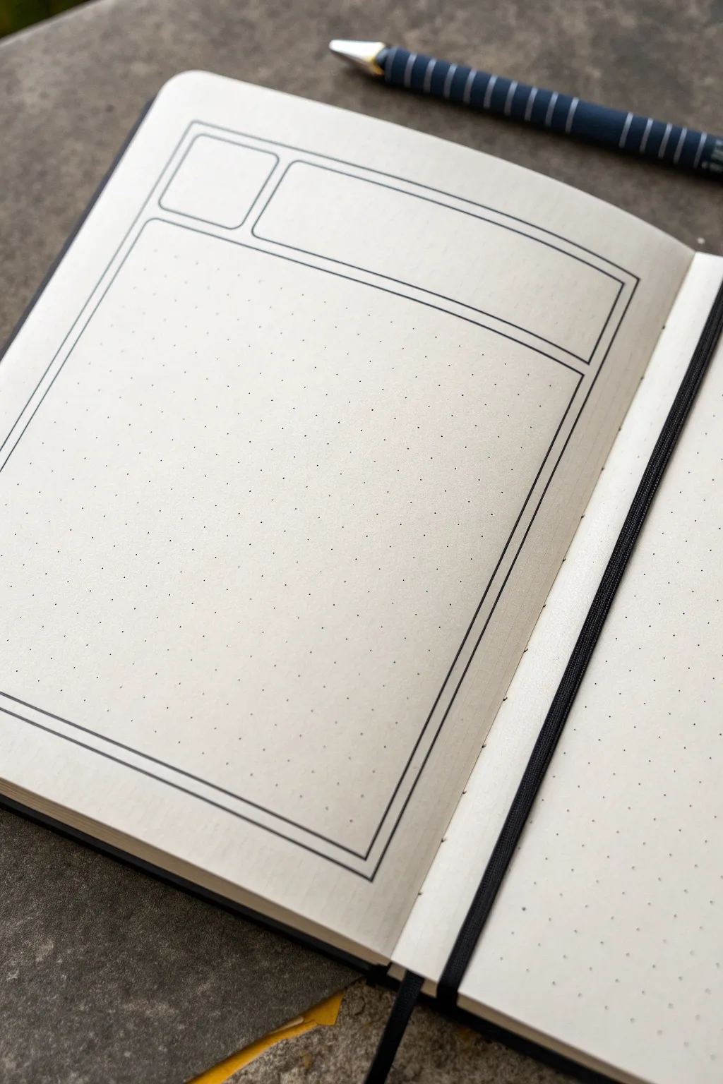
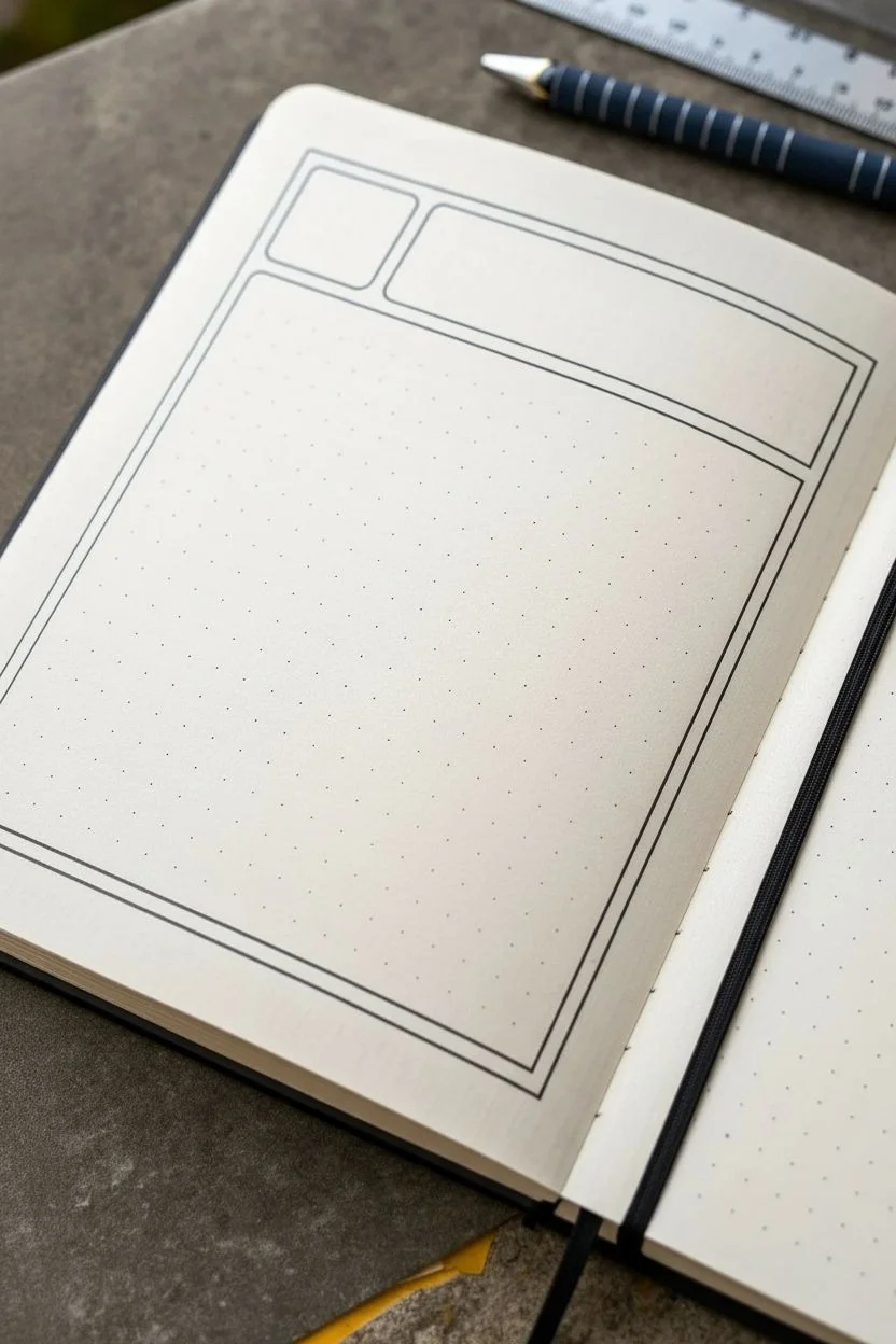
This clean, architectural layout transforms a blank dot-grid page into a structured space perfect for daily logging or meeting notes. By using simple geometric lines to create distinct zones, you achieve a professional, organized look that keeps headers and important data separate from the main body of your text.
Step-by-Step
Materials
- A5 Dot grid notebook (high quality paper)
- Fine liner pen (black, 0.3mm or 0.5mm)
- Ruler (preferably clear acrylic)
- Pencil (optional, for sketching)
- Eraser
Step 1: Setting the Primary Structure
-
Establish the margins:
Begin by deciding on your outer margin. Count two or three dots in from the edge of the paper on all four sides to ensure your frame sits centrally on the page. -
Draw the main vertical lines:
Using your ruler and fine liner, draw a long vertical line down the left side, starting near the top margin and stopping about three dots from the bottom edge. -
Complete the vertical framing:
Repeat this vertical line on the right side of the page, ensuring it mirrors the length and position of your first line perfectly. -
Close the bottom border:
Connect the bottom endpoints of your two vertical lines with a straight horizontal line to form the base of your main content area. -
Create the header separation:
Move your ruler to the top section. Connect the tops of your vertical lines with a horizontal line to close the large outer rectangle.
Ink Control
Lift your pen straight up at the end of each line rather than flicking it. This prevents tapered, messy ends and keeps your corners looking sharp and geometric.
Step 2: Creating the Header Zones
-
Define the header depth:
Count down about 4 to 5 dot spaces from your top border line. This will determine how tall your title boxes will be. -
Draw the divider line:
Draw a horizontal line across the entire width of the frame at this 4-5 dot mark. You now have a large bottom box and a wide top header section. -
Split the header:
In the top header section, measure a small box on the left side. I usually count about 4 to 5 dots inward from the left vertical line. -
Draw the vertical separator:
Draw a vertical line at that mark, connecting the top border to the divider line used in the previous step. You should now have a small square on the left (perfect for dates) and a long rectangle on the right (for titles).
Add Depth
Use a light grey brush pen to add a simple drop shadow to the right and bottom edges of the boxes. It makes the layout pop off the page instantly.
Step 3: Adding the Decorative Edge
-
Start the inner border:
To give the layout that polished ‘double-frame’ look, place your pen tip one dot-width inside the large main rectangle you drew first. -
Trace the left inner line:
Draw a vertical line downwards, keeping exactly one dot’s distance from the outer border. -
Continue the inner perimeter:
Continue this inner line along the bottom and up the right side, maintaining that consistent single-dot gap between lines. -
Detail the header area:
When you reach the horizontal divider line (the one separating the header from the body), bring your inner border across it. Do not draw inside the header boxes yet. -
Add inner lines to the header:
Now, create the inner border for the header boxes. Draw a smaller rectangle inside the date box, and a smaller rectangle inside the title box, keeping the spacing consistent. -
Refine the corners:
Check all your corners where the inner and outer lines meet. Use the fine liner to carefully sharpen any edges that look soft or disconnected. -
Check for gaps:
Scan the lines one last time. If pen pressure lightened at the end of a stroke, gently fill it in to make the frame look solid and bold. -
Erase guidelines:
If you used a pencil for initial layout, wait at least five minutes for the ink to fully set, then gently erase the graphite marks.
Now your page is structured and ready to organize your day with clarity
Geometric Triangle Border for Clean, Modern Pages
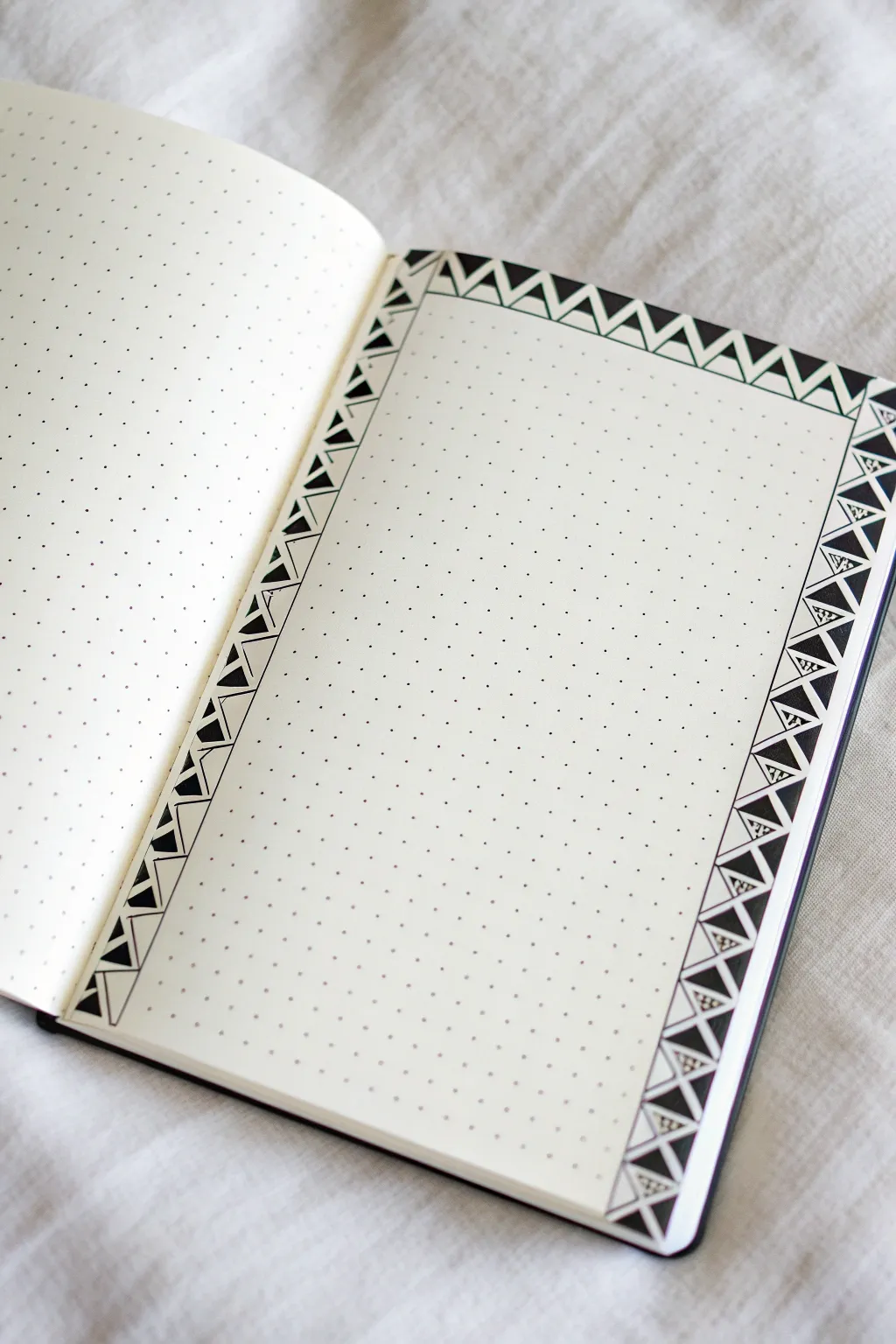
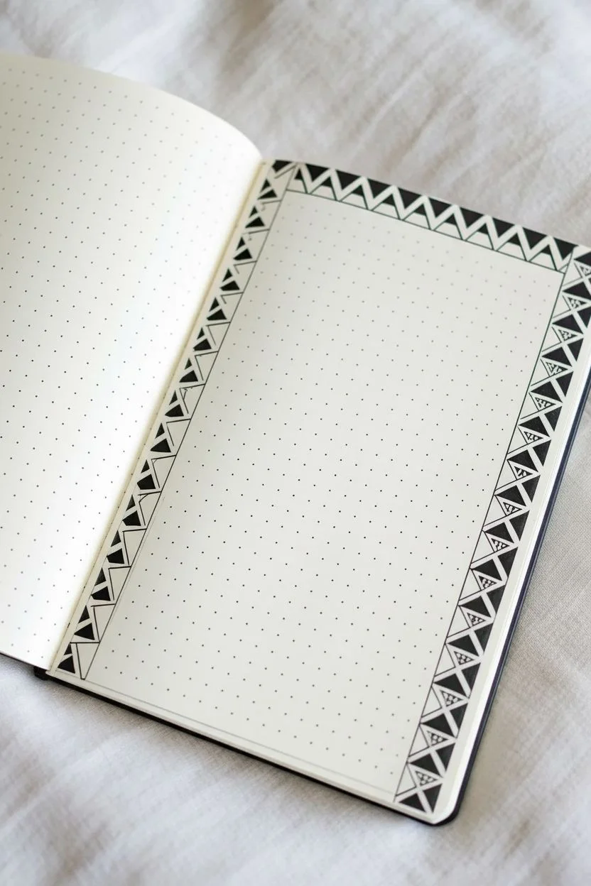
Elevate your bullet journal layout with this crisp, high-contrast geometric border that frames your page perfectly without overwhelming it. Using simple triangles and stippling techniques, this design creates a sophisticated, tribal-inspired look that feels both modern and timeless.
Step-by-Step Tutorial
Materials
- A5 Dot Grid Journal
- Fine liner pen (0.3mm or 0.5mm)
- Black brush pen or thick marker
- Ruler (clear acrylic is best)
- Pencil
- Eraser
Step 1: Setting the Framework
-
Define the boundaries:
Start by counting the dots on your page to determine the border width. For this design, leave a margin of one or two dots from the page edge, then mark a width of about 2-3 grid squares for the border itself. -
Draw the main box:
Using your ruler and a fine liner, draw a large rectangle that will serve as the inner edge of your border. Then, draw a larger rectangle around it to create the outer boundary. You should now have a ‘frame’ around your central writing space. -
Create the zig-zag guide:
Lightly sketch a continuous zig-zag line with a pencil inside your frame. The peaks and valleys of the zig-zag should touch the inner and outer boundary lines you just drew. Ensure the points align with the dots of your grid for symmetry. -
Ink the zig-zag:
Once you are happy with the spacing, trace over your pencil zig-zag line with your fine liner. This creates the primary triangular spaces. -
Add inner details:
Inside every other larger triangle formed by the zig-zag, draw a smaller, parallel triangle. This creates a nested effect. Do this for the entire border circuit.
Grid Guide Secret
Use the dots! Instead of measuring with inches or centimeters, count grid squares (e.g., ‘up two, over one’) to ensure your zig-zag angles remain identical.
Step 2: Filling and Patterning
-
Solid black fill:
Now for the high-contrast look. Take your thicker black marker or brush pen. Fill in the smallest, innermost triangles you just drew. Be careful to stay within the lines so the edges remain sharp. -
Create the secondary triangles:
Look at the larger finish triangles that remain empty. Draw a line straight down (or across, depending on the side) to bisect them, or create a smaller nested triangle within them, depending on the specific variation you want for the sides versus the top. -
Start the stippling:
Select specific triangular sections to fill with texture. In the example, the medium-sized triangles surrounding the solid black ones are filled with tiny dots. I find it relaxing to do this one section at a time. -
Refine the dot density:
Keep your stippling fairly dense but random. Don’t arrange the dots in rows; let them scatter naturally to create a textured, gray appearance that contrasts with the solid black and white areas. -
Top border variation:
Notice the top border is simpler. For this section, you might skip the stippling and focus on alternating nested outlines. Draw a second line parallel to the main zig-zag to create a ‘ribbon’ effect. -
Connect the corners:
Corners can be tricky. Resolve them by drawing a diagonal line from the inner corner of the frame to the outer corner, splitting the corner square into two triangles.
Uneven Corner Fix
If your pattern doesn’t end perfectly at a corner, just turn that awkward final space into a solid black block. It looks intentional and anchors the design.
Step 3: Finishing Touches
-
Check for gaps:
Go back over your solid black areas. If you see any white specs of paper showing through the ink, touch them up carefully to ensure a solid, matte black finish. -
Let the ink cure:
Give your page a good five minutes to dry completely. Stippling can put down a lot of wet ink in small areas, so patience is key here to avoid smudging. -
Clean up:
Gently erase your initial pencil guides. Hold the paper taut with one hand while erasing to prevent the page from crinkling. -
Final assessment:
Review the symmetry. If any lines look a bit shaky, you can thicken the border lines slightly with your fine liner to smooth out the visual weight.
Now you have a striking monochromatic frame ready to showcase your next journal entry or to-do list
Mosaic Circle Border With Mixed Sizes
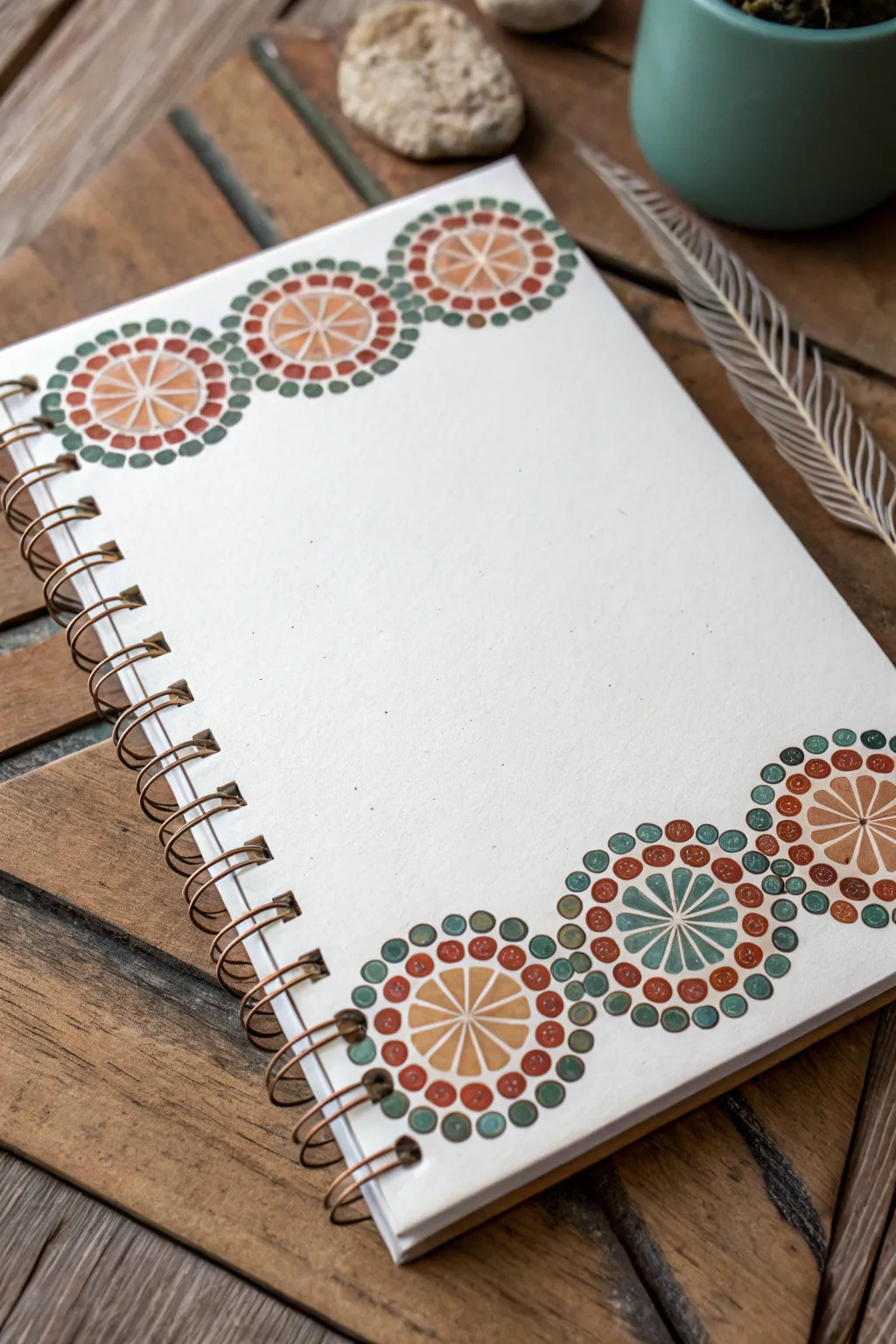
Transform a plain spiral-bound notebook into a personalized journal with this earthy, geometric border design. The artwork features repeating mosaic-style circles with radiating segments, framed by delicate dots for a handcrafted, bohemian feel.
Step-by-Step Guide
Materials
- Spiral-bound notebook with thick paper or cardstock cover
- Pencil (HB or H)
- Eraser
- Compass or circle stencil tool
- Fine liner pens (0.3mm and 0.5mm, black or dark brown)
- Colored markers, gel pens, or watercolor pencils (terracotta, ochre, teal, olive green)
- Ruler
Step 1: Planning and Layout
-
Mark the positions:
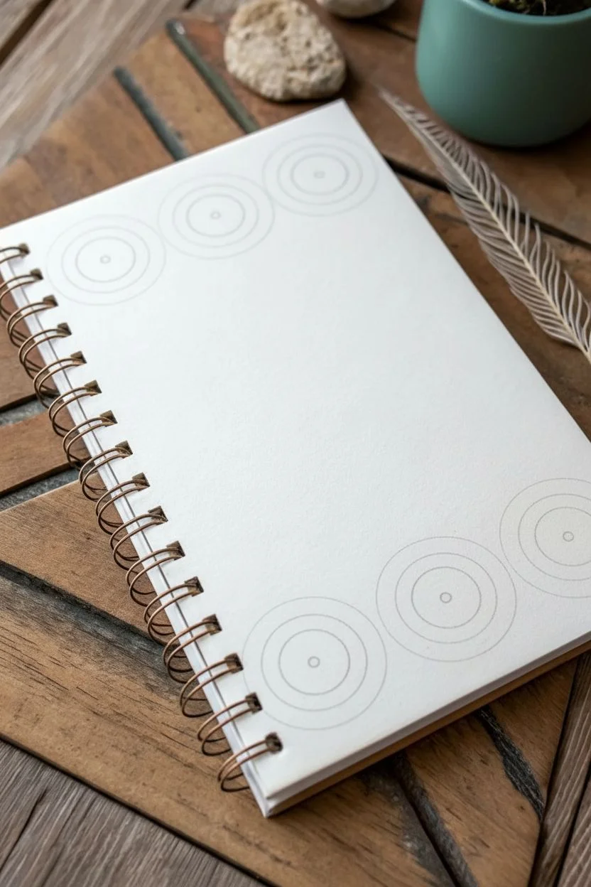
Begin by deciding where your main circular motifs will sit. In the reference, three large circles sit at the top left corner, and a cluster of four sits at the bottom right. Lightly mark the center points for these circles with a pencil. -
Draw the base circles:
Using a compass or a small circular stencil (about 1.5 to 2 inches in diameter), draw the outer boundary for your main mandala shapes. Draw lightly so these lines can be erased or covered later. -
Create concentric rings:
Inside each main circle, draw a slightly smaller inner circle to create a border band. Then, draw a small dot in the very center of each circle to act as a guide for the radiating spokes.
Stencil Hack
Don’t have a compass? Use coins, bottle caps, or washi tape rolls to trace perfect circles quickly.
Step 2: Drawing the Mandala Patterns
-
Draft the segments:
Use a ruler to lightly pencil radiating lines from the center dot to the inner circle edge, dividing the circle like a pizza. Aim for roughly 8 to 12 segments per circle. -
Inking the spokes:
Switch to your fine liner pen. Trace over your pencil spokes, but instead of straight lines, try making them slightly teardrop-shaped or leaving a small gap between the segments to emphasize the mosaic tile look. -
Adding the outer ring details:
Around the main central design, within the border band you created earlier, draw a series of small circles or dots. These should look like strings of beads wrapping around the central flower shape. -
Varying the designs:
For visual interest, alter the pattern slightly for one or two circles. Instead of simple spokes, you might draw petal shapes or use a different color scheme for the segments.
Step 3: Coloring and Details
-
Select your palette:
Choose an earthy color palette. The reference uses warm terracotta and orange tones paired with cool teal and olive greens. I find testing the colors on a scrap piece of paper first helps ensure they harmonize well. -
Color the segments:
Fill in the central radiating segments with your chosen markers. Alternate shades—perhaps orange segments with a yellow center, or teal segments with a brown center—to create depth. -
Fill the beaded border:
Carefully color in the small circles in the outer ring. Alternate colors here as well, such as alternating green and red-brown dots, to enhance the detailed mosaic effect. -
Add connecting dots:
To integrate the main circles with the rest of the page, draw loose, free-floating dots around the perimeter of your main shapes. Use varying sizes—some small like pinpricks, others slightly larger like beads. -
Layering colors:
If your markers allow, add a second layer of color to one side of each ’tile’ or dot to suggest a slight shadow or sheen, giving the drawing a bit of dimension.
Bleed-Through Check
If using alcohol markers, place a scrap sheet behind the cover page so ink doesn’t stain the first notebook page.
Step 4: Finishing Touches
-
Erase pencil guides:
Once the ink is completely dry (give it a few minutes to avoid smudging), gently erase any visible pencil lines from your initial sketch. -
Check balance:
Step back and look at the composition. If large gaps feel empty between the main circles, add a few more small colored dots to bridge them together visually. -
Protect the cover:
If you used water-soluble markers, consider spraying a light fixative over the cover to prevent smudging from moisture during daily use.
Your custom-designed notebook is now ready to be filled with your thoughts and sketches
Ribbon Banner Border That Frames a Title Area
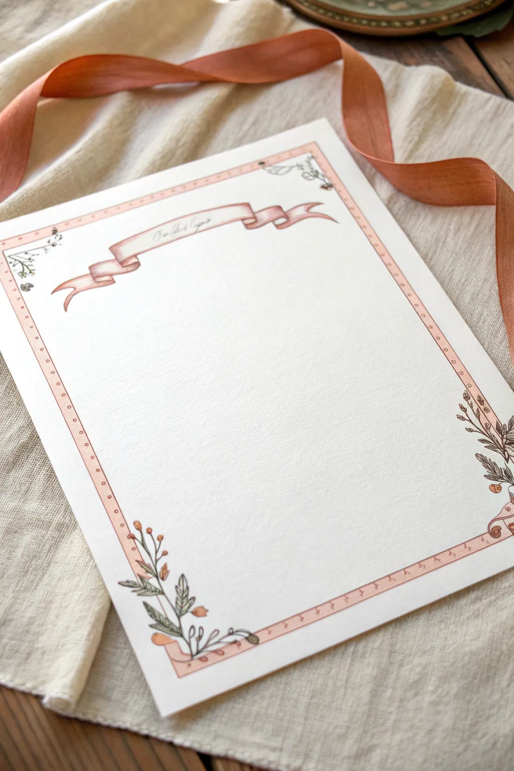
This delicate page border combines a flowing ribbon banner with subtle floral corner accents to create a timeless, vintage aesthetic. The soft peach and sage green palette makes it perfect for framing handwritten poems, wedding vows, or special letters.
Detailed Instructions
Materials
- High-quality white paper or cardstock (A4 or letter size)
- Pencil (HB or H for light sketching)
- Fine liner pen (0.1mm or 0.3mm, black or sepia)
- Copic markers or watercolor paints (Peach/dusty rose, sage green)
- Ruler
- Eraser (kneaded eraser preferred)
Step 1: Setting the Structure
-
Mark dimensions:
Begin by lightly measuring about 3/4 of an inch in from the edge of your paper on all four sides. Make small tick marks with your pencil. -
Draw the frame guide:
Using your ruler, connect the tick marks to create a light rectangular box. This will serve as the outer boundary for your decorative border. -
Define the border width:
Measure inward about a 1/4 inch from your first rectangle and draw a second, smaller inner rectangle. This narrow channel will become the pink border strip later. -
Position the banner:
Decide where your title banner will sit. I like to place mine centered horizontally, about 1.5 inches down from the top edge of the paper. Sketch a rough horizontal curve to establish the flow of the ribbon.
Step 2: Sketching the Elements
-
Draft the center ribbon:
Sketch the central part of the banner first as a waving rectangular strip. Add the illusion of depth by drawing the back folds where the ribbon loops behind itself. -
Add ribbon tails:
Draw the tails of the ribbon flowing outwards and slightly downwards. The ends can be cut in a generic ‘V’ shape or a slanted cut for a natural look. Keep your lines fluid rather than perfectly symmetrical. -
Sketch the lower left corner:
In the bottom-left corner of your frame, lightly sketch a grouping of leaves and stems growing upwards. Let the stems overlap the border lines slightly to break the rigidity of the box. -
Sketch the lower right corner:
Repeat the process on the bottom right, mirroring the general shape but varying the leaves so it doesn’t look like a carbon copy. Add small buds or berries to the tips of the stems. -
Add top corner accents:
In the top left and top right corners, sketch much smaller, simpler sprigs of greenery. These should be subtle so they don’t compete with the banner.
Wobbly Lines?
If your long ruler lines smudge or wobble, try using a ruler with a cork backing. It raises the edge slightly off the paper to prevent ink bleeding.
Step 3: Inking and Detail
-
Ink the ribbon:
Using your fine liner pen, carefully trace over your ribbon sketch. Use broken or thinner lines where the ribbon curves to suggest lightness. -
Ink the botanical elements:
Trace your leaves and stems. Add small veins to the leaves and textural dots to the berries. Don’t worry if your lines aren’t perfectly smooth; a little shake adds to the hand-drawn charm. -
Ink the frame:
Use your ruler to ink the long straight lines of the border frame. Stop your lines before you hit the floral corners or the banner so the drawing appears to sit ‘on top’ of the frame. -
Add pattern to the frame:
Inside the narrow channel of the frame, draw small, evenly spaced circles or dashes all the way around. This mimics a stitched ribbon effect. -
Clean up:
Once the ink is fully dry, gently erase all your pencil guidelines. Be thorough near the intricate leaves.
Pro Tip: Depth
Leave a tiny sliver of white space between the outlined edge of the ribbon and your color fill. This ‘highlight’ makes the ribbon look shiny and dimensional.
Step 4: Adding Color
-
Color the border strip:
Using a peach or dusty rose marker, fill in the narrow rectangular channel of the frame. Go lightly so you don’t obscure your ink dots. -
Shade the ribbon:
Use the same peach color for the banner. Apply a second layer of ink or a slightly darker shade to the ‘back’ folds of the ribbon to create shadow and dimension. -
Paint the leaves:
Color your leaves with a soft sage green. Vary the pressure or layout to get light and dark variants on the same stem. -
Tint the berries:
Add tiny touched of orange or darker pink to the berries or buds in your floral corners. -
Final touches:
If you wish, write a sample word like ‘Date’ or ‘Chapter’ lightly in the banner to finish the look.
You now have a beautiful, hand-illustrated page ready for your special inscription
Negative Space Border Using Tiny Cutout Shapes
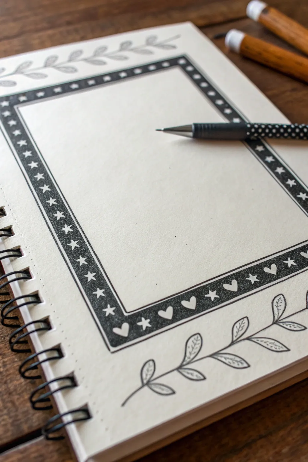
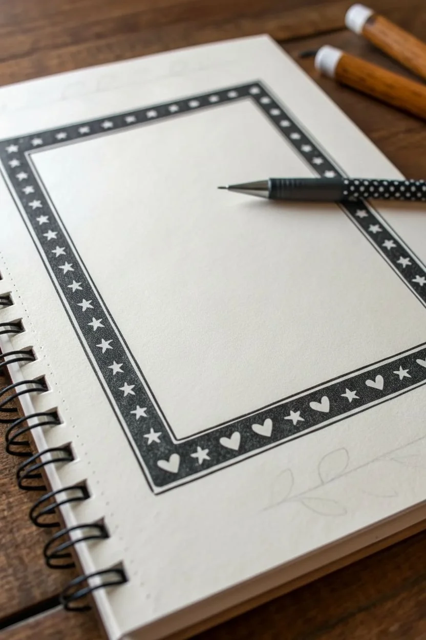
This elegant border design uses the concept of negative space to make simple shapes pop against a dark background. By drawing a solid black frame while carefully avoiding small stars and hearts, you create a striking, high-contrast look that frames your journal entries perfectly.
Step-by-Step Guide
Materials
- Spiral-bound sketchbook or bullet journal (heavyweight paper preferred)
- Black fine-liner pen (0.3mm or 0.5mm)
- Black broad-tip marker or brush pen (for filling)
- Pencil (HB or lighter)
- Eraser
- Ruler
Step 1: Planning and Layout
-
Define the outer edge:
Start by using your ruler and pencil to lightly draw a large rectangle on your page. Leave about a 1-inch margin from the paper’s edge to give the design room to breathe. -
Set the inner edge:
Draw a second, smaller rectangle inside the first one. Keep the distance between the two lines consistent—roughly half an inch wide—to create a distinct band for your border. -
Verify the spacing:
Double-check that your lines are parallel and the frame width looks even all the way around before moving on to ink. -
Ink the boundaries:
Using your fine-liner pen and ruler, trace over the pencil lines to create the permanent inner and outer walls of your frame.
Step 2: Drawing the Negative Shapes
-
Draft the top shapes:
With your pencil, lightly sketch a row of small five-pointed stars along the top strip of the frame. Space them evenly, leaving room for the black ink to surround them later. -
Draft the side shapes:
Continue sketching stars down the left and right vertical columns. Rotate the orientation of the stars slightly if you want a more whimsical feel, or keep them uniform for a structured look. -
Draft the bottom shapes:
For the bottom strip, switch the pattern. Sketch an alternating sequence of small hearts and stars. I like to center a heart in the middle and work my way out to the corners. -
Outline the tiny icons:
Take your fine-liner pen again and carefully outline each penciled star and heart. Do not fill them in; these outlines act as barriers for the coloring phase.
Ink Bleeding into Shapes?
If your black marker bleeds into the white stars, switch to a finer tip pen for the initial area right around the shape, then fill the rest with the broader marker.
Step 3: Creating the Solid Fill
-
Start the fill process:
Switch to your broader marker or brush pen to speed up the coloring process giving a rich, solid black tone. -
Work around the shapes:
Carefully color the space *between* the stars and hearts. Use the fine tip of the marker to get close to the tiny outlines without accidentally coloring over them. -
Fill the long stretches:
Once the delicate areas around the icons are safe, fill in the rest of the rectangular band with broad strokes to ensure a smooth, solid coverage. -
Let the ink set:
Allow the heavy black ink to dry completely to prevent smudging. Wait at least 5-10 minutes depending on your pen type. -
Erase guidelines:
Gently erase any remaining pencil marks from your initial sketching, leaving crisp white shapes against the dark border.
Make It Magical
Use a white gel pen to add tiny dots or sparkles inside the black areas after coloring to create a galaxy effect, or color the ‘white’ stars with pale yellow highlighter.
Step 4: Adding Organic Accents
-
Sketch the top vine:
Above the top frame edge, lightly pencil a simple wavy line running horizontally. Add small, tear-drop shaped leaves stemming from both sides of the vine. -
Sketch the bottom vine:
Repeat this process below the bottom frame edge, mirroring the style of the top vine but perhaps curving it slightly differently for variety. -
Ink the vines:
Trace the vines and leaves with your fine-liner. Use a deliberate, flowing motion for the stems. -
Detail the leaves:
Add a tiny central vein line inside each leaf for a touch of botanical realism. -
Final clean up:
Do one last pass with the eraser to remove the vine guidelines, blowing away the eraser dust carefully.
Now you have a bold, graphic frame ready to highlight your most important notes or memories

Have a question or want to share your own experience? I'd love to hear from you in the comments below!