If you’ve been craving simple painting ideas that actually feel doable, you’re in the right headspace. I’m sharing a lineup of quick, satisfying projects that lean on basic shapes, easy blending, and little tricks that make your painting look way more polished than the effort you put in.
Simple Sunset Gradient Sky
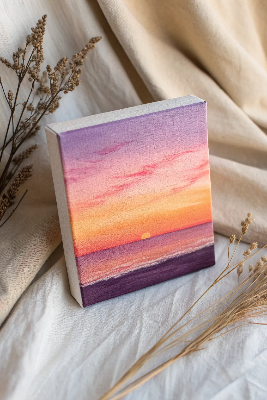
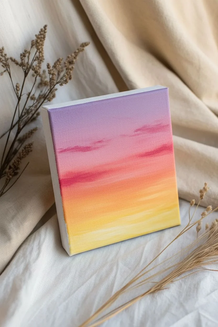
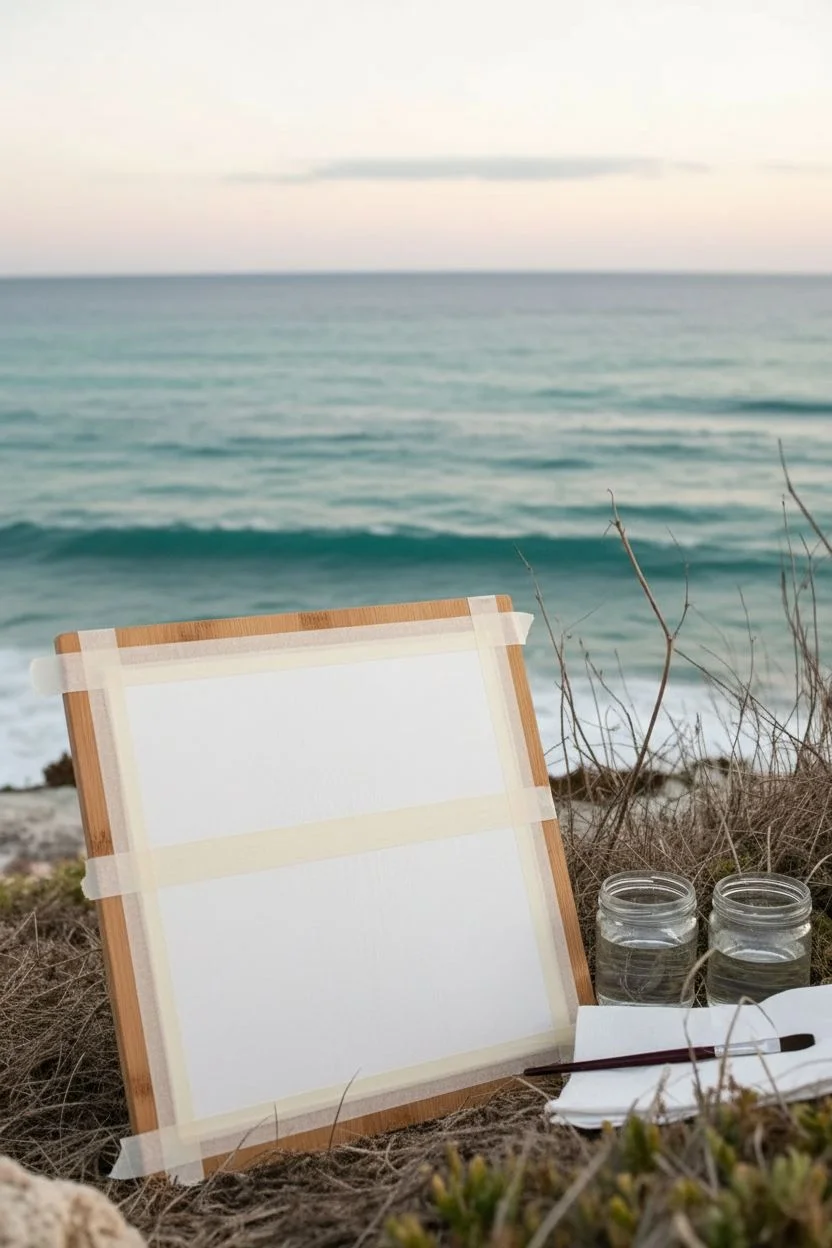
Capture the fleeting beauty of twilight with this pocket-sized canvas painting, featuring a seamless gradient sky that melts into a deep purple shoreline. The soft transitions from lavender to warm orange create a peaceful, dreamy atmosphere perfect for a small desk or shelf accent.
Detailed Instructions
Materials
- Small square canvas (e.g., 4×4 or 6×6 inches)
- Acrylic paints (Titanium White, Lavender, Magenta or Deep Pink, Orange, Yellow, Dark Purple/dioxazine purple)
- Flat shader brushes (medium and small)
- Small round detail brush
- Palette for mixing
- Water cup and paper towels
Step 1: Painting the Gradient Sky
-
Prime the top zone:
Start by mixing a soft lavender color using purple and a generous amount of Titanium White. Apply this to the top third of your canvas, brushing horizontally back and forth to get an even coat. -
Introduce pink tones:
While the lavender is still slightly wet, pick up some magenta or deep pink on your brush. Paint directly below the lavender section, overlapping the wet edges slightly. -
Blend the transition:
Use a clean, slightly damp brush to gently stroke back and forth where the lavender and pink meet. The goal is to lose the hard line so the colors drift into one another softly. -
Add the warm glow:
Clean your brush thoroughly. Paint the next band down using a bright orange. Start just below the pink area and bring it down almost to slightly below the halfway point of the canvas. -
Create the horizon light:
Mix yellow with a tiny touch of white to make it opaque. Paint the strip directly beneath the orange, blending upwards into the orange layer to create that intense sunset glow near the horizon line. -
Soft cloud details:
Using a very small amount of magenta on a smaller brush, gently dab a few thin, wispy clouds into the pink and lavender sections. Keep the strokes horizontal and light to mimic drifting clouds.
Step 2: The Ocean and Sun
-
Establish the horizon line:
For the water, mix a dusky purple shade. Using a flat brush or a ruler as a guide, carefully paint a straight horizontal line across the canvas where the yellow sky ends. -
Paint the water base:
Fill the water area below the horizon with this purple-pink mix. As you get closer to the bottom, gradually darken the color by adding more pure purple. -
Add water reflections:
To make the water look wet, take a tiny bit of the pink and orange sky colors and dry-brush horizontal streaks onto the water surface, keeping them mostly in the center under where the sun will be. -
Place the sun:
Dip the end of a brush handle or a small round brush into opaque yellow-white paint. Dot a semicircle right on the horizon line so it looks like the sun is half-dipped into the water.
Seamless Blending Tip
Work quickly while the acrylics are wet to get smooth gradients. If paint dries, mist it lightly with water or use a slow-drying medium to keep colors workable.
Step 3: Foreground and Finishing Touches
-
Paint the sand:
Mix a very dark, deep purple tone for the beach. Paint the bottom section of the canvas with this color, angling the top edge slightly to suggest the shoreline perspective. -
Create the seafoam:
I prefer to use a fine detail brush with thinned white paint for this step. Carefully drag a thin, jagged line of white along the edge where the dark sand meets the purple water. -
Soften the foam:
If the white line looks too harsh, tap it gently with a dry finger or clean brush to diffuse it, creating the look of frothy seafoam washing ashore. -
Paint the edges:
Don’t forget the sides of your canvas. Extend the colors from the front face around the edges—lavender on top, purple on bottom—so the painting looks complete from every angle. -
Final highlights:
Add one or two tiny horizontal dashes of white on the water right below the sun to emphasize the reflection before letting the piece dry completely.
Add Depth with Texture
Mix a little sand or modeling paste into the dark purple foreground paint. This adds gritty texture to the beach area, contrasting nicely with the smooth sky.
Place your finished mini-masterpiece on a tiny easel or amongst some dried botanicals to enjoy your personal sunset view.


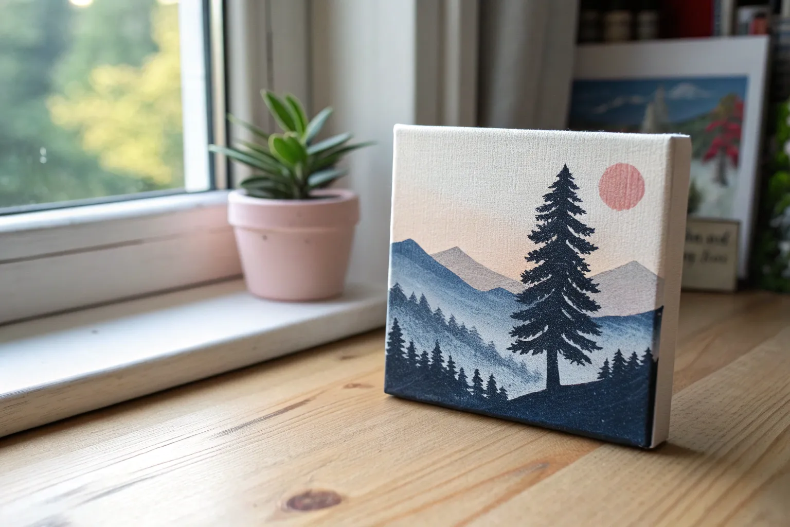
Minimalist Layered Mountain Landscape
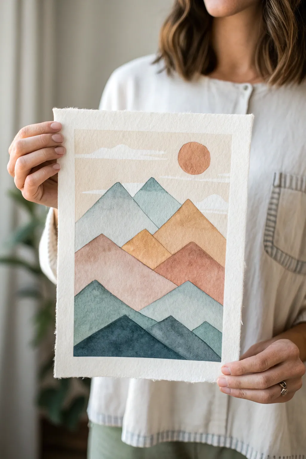
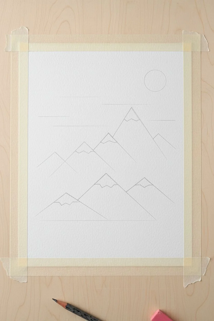
This minimalist landscape balances structured geometric shapes with the soft fluidity of watercolors for a calming, modern look. The layered mountain ranges in muted blues, rusts, and creams create a sense of depth while maintaining an approachable abstract style.
Step-by-Step
Materials
- Cold press watercolor paper (300gsm/140lb)
- Watercolor paints (Indigo, Burnt Sienna, Yellow Ochre, Paynes Grey, White Gouache)
- Flat shader brush (size 6 or 8)
- Round brush (size 4 for details)
- Washi tape or low-tack artist tape
- Pencil and eraser
- Two water jars (one clean, one dirty)
- Paper towels
- Ruler (optional)
Step 1: Preparation & Sketching
-
Prepare your paper:
Start by taping down the edges of your watercolor paper to a board or table. This creates a crisp border and prevents the paper from buckling when wet. Ensure the area inside the tape matches your desired final size. -
Map out the mountains:
Using a pencil, lightly sketch the mountain ranges. Start from the bottom with 2-3 wider peaks, then layer another range behind them, and finally the tallest background peaks. Keep the lines geometric—think triangles rather than jagged rocks. -
Add the sky element:
In the upper right quadrant of the sky area, trace a perfect circle for the sun using a small lid or stencil. Draw a few faint horizontal lines across the sky to indicate where clouds might float.
Crisp Edges
Work non-sequentially to prevent bleeding. Paint the top range, let it dry, then paint the bottom range. Fill in the middle last so wet edges never touch.
Step 2: Painting the Upper Layers
-
Wash the sky:
Mix a very dilute wash of Yellow Ochre and a touch of Burnt Sienna to create a creamy beige. Paint the entire sky area, carefully painting around the sun circle. Keep this wash very sheer. -
Create the sun:
While the sky is drying, mix a more saturated Burnt Sienna. Fill in the sun circle with your round brush. I like to drop a tiny bit of water into the wet circle to create a subtle texture as it dries. -
Define the clouds:
Once the sky layer is completely dry, use opaque white gouache (or very thick white watercolor) to paint thin, flat cloud shapes over the beige sky and slightly overlapping the sun. -
First mountain range (farthest):
Mix a pale, dusty blue-grey using Indigo and plenty of water. Paint the tallest, furthest peaks. The key here is to keep the color light to simulate atmospheric perspective.
Step 3: Mid-Ground & Texture
-
Middle mountain range:
Mix an orange-rust color (Burnt Sienna + Yellow Ochre). Paint the middle range of mountains that sits in front of the blue ones. Ensure the blue layer is dry so the colors don’t bleed into each other. -
Add a pinkish tier:
For the next layer down, water down your rust mix and add a touch of red or pink to create a dusty rose shade. Paint the shapes that bridge the middle and foreground. -
Introduction of texture:
While these warm-toned mountains are still slightly damp, you can dab them lightly with a paper towel to create subtle mottling, which mimics rock texture. -
Wait for drying:
Let these middle layers dry completely. This crisp separation is crucial for the ‘cut paper’ look of this style.
Creative Twist
Add metallic gold ink outlining to the mountain ridges for a luxurious, modern finish that catches the light.
Step 4: Foreground & Details
-
Lower teal range:
Mix a darker teal color by combining Indigo with a little deep green or mixing blue with yellow. Paint the second-to-last layer of mountains. -
Darkest peaks:
For the very bottom foreground mountains, mix your most saturated, darkest Indigo or Paynes Grey. Paint these shapes boldly to anchor the bottom of the composition. -
The deckled edge effect:
Once the painting is 100% dry, remove the tape. To match the photo’s rustic look, place a ruler against the paint edge and carefully tear the white paper margin away to create a soft, deckled edge.
Using a deckled edge adds a professional, artisanal finish that makes your piece ready for framing or gifting


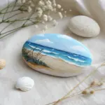
Easy Ocean Horizon With Color Blocking
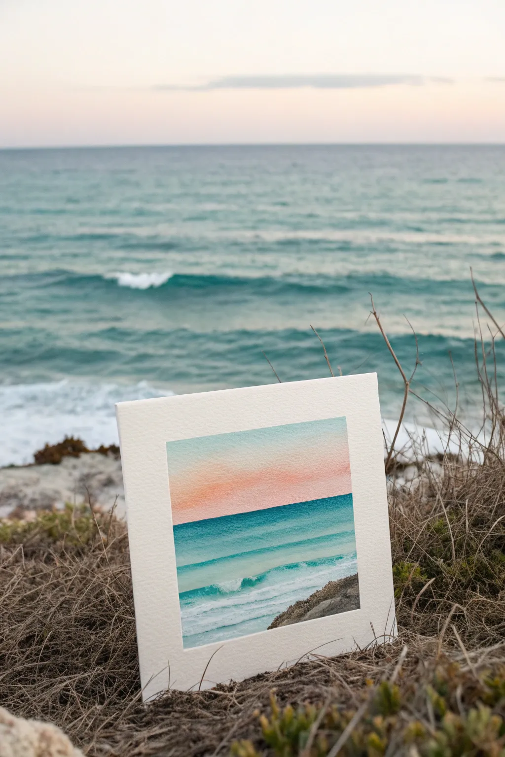
Capture the serenity of the shoreline with this gentle watercolor landscape, blending soft sky gradients into vibrant ocean blues. The clean horizon line and minimalist waves make this a perfect study in color blocking and wet-on-wet technique.
Detailed Instructions
Materials
- Cold-pressed watercolor paper (300 gsm)
- Painter’s tape or masking tape
- Watercolor paints (Cerulean Blue, Turquoise, Rose Madder or Soft Pink, Burnt Umber)
- Flat wash brush (1/2 inch or 3/4 inch)
- Round brush (size 4 or 6)
- Two jars of water
- Paper towels
- Painting board or clipboard
Step 1: Setting the Scene
-
Prep your paper:
Begin by taping down all four edges of your watercolor paper to a board. Ensure the tape is pressed firmly to create a crisp white border later. -
Mark the horizon:
Decide where your sky meets the sea. For this composition, place a strip of painter’s tape horizontally across the paper, positioned slightly below the vertical center. Burnish the edge well to prevent paint bleeding.
Step 2: Painting the Sky
-
Pre-wet the sky area:
Using your flat wash brush and clean water, gently wet the entire paper surface above the tape line until it has a uniform sheen. -
Apply the upper blue:
Load your brush with a very diluted Cerulean Blue. Start at the very top edge and paint horizontal strokes downwards, stopping about halfway down the sky section to let the color fade. -
Introduce the sunset warmth:
While the paper is still damp but not soaking, mix a watery wash of Rose Madder or pink. Apply this starting from the tape line upwards, blending it gently where it meets the blue to create a soft, violet transition. -
Let it dry completely:
Allow the sky section to dry fully. It must be bone dry before you remove the tape, or you risk tearing the paper or smudging the horizon.
Bleeding Horizon?
If paint seeps under your horizon tape, wait for it to dry, then gently lift the unwanted color with a damp, stiff brush or cover it with white gouache.
Step 3: Creating the Ocean
-
Reveal the horizon:
Carefully peel away the horizontal tape strip. You should have a sharp line separating the painted sky from the white paper below. -
Establish the deep water:
Mix a vibrant Turquoise. Using your flat brush, paint a solid, straight line right against the horizon. This should be your darkest, most saturated value. -
Gradate the water color:
As you move down the paper, dilute your turquoise mix slightly with water. Paint horizontal bands, leaving extremely thing slivers of white paper occasionally to represent distant wave caps. -
Form the breaking waves:
Switch to your round brush for more control. Near the bottom third, paint broader, sweeping strokes of lighter teal, creating the shape of a rolling wave. Leave larger organic shapes of white paper untouched for the sea foam. -
Add wave shadows:
While the wave area is still damp, drop in a slightly darker teal mix underneath the white foam areas to give the water volume and form.
Add Texture
Slightly wet a toothbrush with white gouache and flick tiny droplets over the wave crests to mimic sea spray.
Step 4: Foreground Details
-
Paint the wet sand:
At the very bottom left corner, apply a very faint wash of dirty blue-grey to suggest the shallow water receding over sand. -
Add the rocky shore:
In the bottom right corner, paint a rocky outcrop using Burnt Umber mixed with a touch of blue. Use a stippling motion to create a rough, stony texture. -
Define rock edges:
Once the base rock layer is damp-dry, use a more concentrated brown mix to dab in shadows and crevices, giving the rocks dimension. -
Final touches:
Review your painting. If the horizon line looks uneven, you can carefully re-straighten it with a steady hand and a small flat brush. -
The reveal:
Wait for the entire painting to be completely dry to the touch. Slowly peel away the border tape at a 45-degree angle to reveal your clean white frame.
Enjoy the calming effect of your new miniature ocean view


Big Moon Over a Quiet Sky
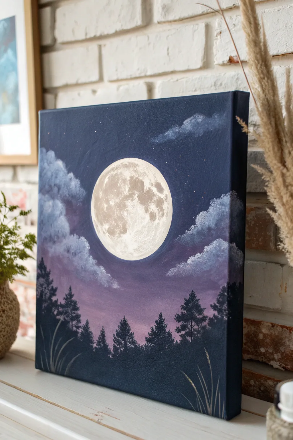
Capture the serene beauty of a quiet night with this striking acrylic painting. By blending deep blues into soft twilight purples, you’ll create a dramatic backdrop for a glowing, textured moon that steals the show.
How-To Guide
Materials
- Square canvas (stretched)
- Acrylic paints: Carbon Black, Titanium White, Prussian Blue (or Phthalo Blue), Dioxazine Purple, Magenta
- Large flat brush (for blending sky)
- Medium round brush (for moon blocking)
- Small liner brush (for trees and stars)
- Filbert brush or sponge (for clouds)
- Circular object for tracing (plate or lid)
- Pencil
- Palette and water cup
Step 1: Setting the Scene
-
Outline the moon:
Place your circular object (like a round lid or small plate) in the center of the canvas. Lightly trace around it with a pencil to establish the perfect shape for your moon, ensuring it is prominent but leaves room for the sky and ground. -
Mix the sky colors:
Prepare your palette with a deep navy mix (Prussian Blue + Black), a mid-tone purple (Dioxazine Purple), and a lighter twilight shade (Purple + Magenta + a touch of White). -
Paint the upper sky:
Start at the very top of the canvas with the deep navy mix. Use broad, horizontal strokes with your large flat brush, working your way down about a third of the canvas. -
Blend the transition:
While the navy paint is still wet, introduce the mid-tone purple. Blend this into the bottom edge of the blue area, using long, smooth strokes to create a seamless gradient. -
Create the horizon glow:
Switch to your lightest twilight shade (purple/magenta mix). Paint the area just above where your tree line will be, blending upwards into the darker purple. Avoid painting inside your traced moon circle as much as possible, though a little overlap is okay. -
Base coat the moon:
Clean your brush or switch to a medium round brush. Fill in the moon circle with a solid coat of Titanium White. It may need two coats to be fully opaque against the dark background. Let the entire canvas dry completely.
Step 2: Detailing the Moon & Clouds
-
Mix moon shadow colors:
Mix a very light grey (White + tiny dot of Black) and a slightly darker, warmer beige/grey (White + small touch of Brown or Orange + tiny dot of Black) often called ‘buff’. -
Sponge on moon texture:
I prefer using a dry sponge or an old scruffy brush for this. Dab the light grey paint onto the white moon in random patches to create craters and maria. Leave bright white areas to represent the glowing surface. -
Refine lunar features:
With the darker beige/grey mix, deepen the shadows on the left side of the moon and around the larger crater shapes. Keep your touch light and dabbing to maintain that rocky texture. -
Draft the clouds:
Using a filbert brush or sponge, mix a soft lavender-grey color. Gently tap in cloud shapes on the left and right sides of the moon. Keep the edges fluffy and irregular. -
Highlight the clouds:
Mix a brighter version of the cloud color (add more White). Dab the top edges of your clouds where the moonlight would hit them, creating volume and depth. -
Add the stars:
Load a toothbrush or stiff brush with watered-down white paint. Flick the bristles to spray tiny stars across the dark blue section of the sky. Alternatively, use a fine liner brush for precise dot placement.
Moon Glow Tip
To make the moon truly glow, dry brush a very faint, sheer layer of white paint just outside the moon’s edge onto the surrounding dark sky.
Step 3: Silhouettes and Grass
-
Mix the forest color:
Mix a very dark color for the trees. Don’t use straight black; instead, mix Black with a little Blue or Purple to make it rich and deep. -
Paint the tree line base:
Paint a solid wavy block of this dark color along the bottom 15% of the canvas to establish the ground. -
Create pine trees:
Using a small flat brush turned vertically or a fan brush, create vertical lines for tree trunks. Then, tap the brush horizontally, getting wider as you go down, to form the pine branches. -
Vary tree heights:
Ensure your trees are different heights to look natural. Place taller trees on the outer edges to frame the composition, letting the moon shine through the center gap. -
Add foreground grasses:
With your finest liner brush and a lighter grey-blue color, flick quick curved strokes upward from the very bottom edge. These represent tall grasses catching the moonlight. -
Paint grass seeds:
Add tiny dashes or dots to the tips of a few tall grass blades to suggest seed heads, giving the foreground delicate detail.
Level Up: Shooting Stars
Use a liner brush to add a faint, straight line of white fading out at the tail end to create a meteor streaking through the upper atmosphere.
Hang your masterpiece on a wall where it can catch the evening light and admire the tranquil atmosphere you have created
BRUSH GUIDE
The Right Brush for Every Stroke
From clean lines to bold texture — master brush choice, stroke control, and essential techniques.
Explore the Full Guide
Silhouette Tree Line at Dusk
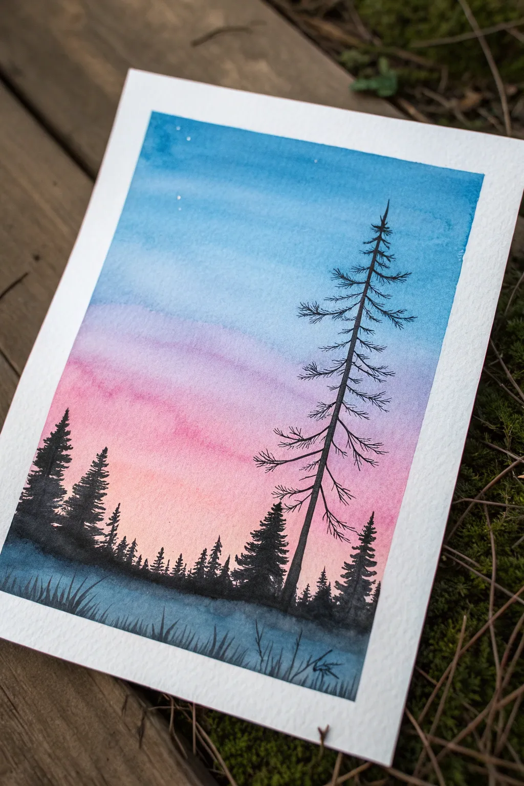
Capture the serene beauty of twilight with this atmospheric watercolor painting featuring a vibrant gradient sky and stark tree silhouettes. The contrast between the soft, blended background and the crisp, dark foreground creates a striking sense of depth perfect for beginners.
Step-by-Step Guide
Materials
- Cold press watercolor paper (300gsm suggested)
- Watercolor paints (Cyan/Teal, Purple, Magenta/Pink, Peach/Yellow Ochre, Paynes Grey or Black)
- Flat wash brush (large)
- Round brush (size 6 or 8)
- Fine liner brush (size 0 or 00)
- Masking tape
- Jar of clean water
- Paper towels
- Pencil (optional)
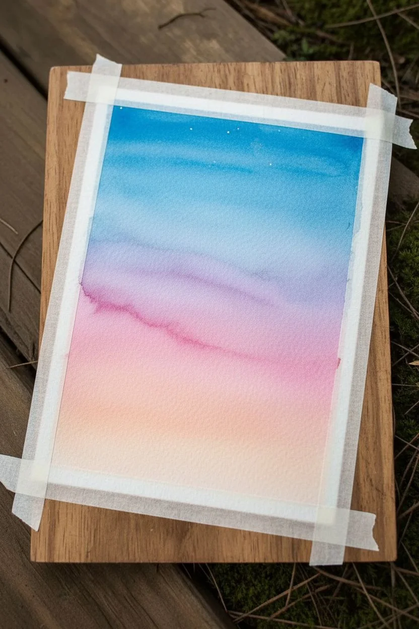
Step 1: Preparing the Sky Gradient
-
Tape the edges:
Begin by taping down all four edges of your watercolor paper to a board or table. This creates that crisp white border seen in the reference and prevents the paper from buckling when wet. -
Wet the paper:
Using your large flat brush and clean water, apply a clear wash over the entire sky area. You want the paper to be glistening and damp, but not soaking wet with puddles. -
Apply the top blue layer:
Load your brush with a teal or cyan blue. Start at the very top of the paper and paint horizontal strokes, letting the color be most intense at the edge and gradually diluting it as you move down. -
Transition to purple:
While the blue is still wet, introduce a violet or purple shade just below the blue. Blend the edges where they meet gently so there are no hard lines. -
Add the warmth:
Clean your brush and pick up a Magenta or Pink shade. Apply this below the purple, blending upwards. Finally, near the horizon line (about the bottom third of the paper), mix in a soft peach or diluted yellow ochre for that last bit of sunset glow. -
Create soft clouds (optional):
If you want a hint of texture in the sky, you can gently blot a dry tissue into the wet purple/pink area to lift a tiny bit of pigment, creating subtle cloud shapes. -
Scatter faint stars:
Before the sky is 100% dry but while it’s no longer glossy, you can flick tiny droplets of clean water or white gouache near the top blue section to suggest faint stars. Let the background dry completely before moving on.
Step 2: Painting the Silhouette Horizon
-
Block in the ground:
Mix a very dark, saturated color using Paynes Grey or Black. Use your round brush to paint an uneven, slightly hilly horizon line across the bottom of the pink sky area. -
Paint the distant trees:
Switch to a smaller round brush. Along the horizon line, dab vertical strokes to create a dense forest. Keep these shapes loose—just vertical lines with jagged edges to imply pine trees in the distance. -
Vary tree heights:
Make sure your tree line isn’t perfectly uniform. Paint a group of taller trees on the left side, dipping down in the middle, and rising again slightly on the right to create a natural composition. -
Add foreground details:
At the very bottom of the painting (the foreground), use slightly thicker, darker paint to suggest uneven ground and perhaps a few grassy tufts sticking up.
Wet-on-Wet Magic
Work quickly on the sky phase. The paper must stay damp for the colors to bleed seamlessly. If it dries too fast, lightly mist it with water.
Step 3: The Focal Tree
-
Draw the main trunk:
Using your finest liner brush and the darkest black paint, paint a long, thin vertical line starting from the foreground on the right side. It should extend almost to the top of the paper, slightly tapering as it goes up. -
Add primary branches:
Starting near the top, paint short branches extending outward. Notice in the reference that these branches droop slightly downward and then curve up at the tips. -
Detail the skeletal look:
This specific tree is bare or dead, so keep the lines thin and jagged. Avoid adding fluffy foliage to this main tree. Instead, focus on adding many tiny, splintering twigs coming off the main branches. -
Paint the bottom grasses:
Use the liner brush to flick quick, upward strokes at the very bottom edge of the paper. This creates the silhouette of tall grass or reeds in the immediate foreground. -
Reveal the border:
Wait until the painting is completely bone-dry. Carefully peel the masking tape away at a 45-degree angle to reveal your crisp white frame.
Blooms & Cauliflowers?
If you see weird water marks forming in the sky, you likely introduced too much water into a semi-dry area. Let it dry fully, then glaze over it to fix.
Now you have a tranquil evening landscape that captures the quiet moment just after sunset
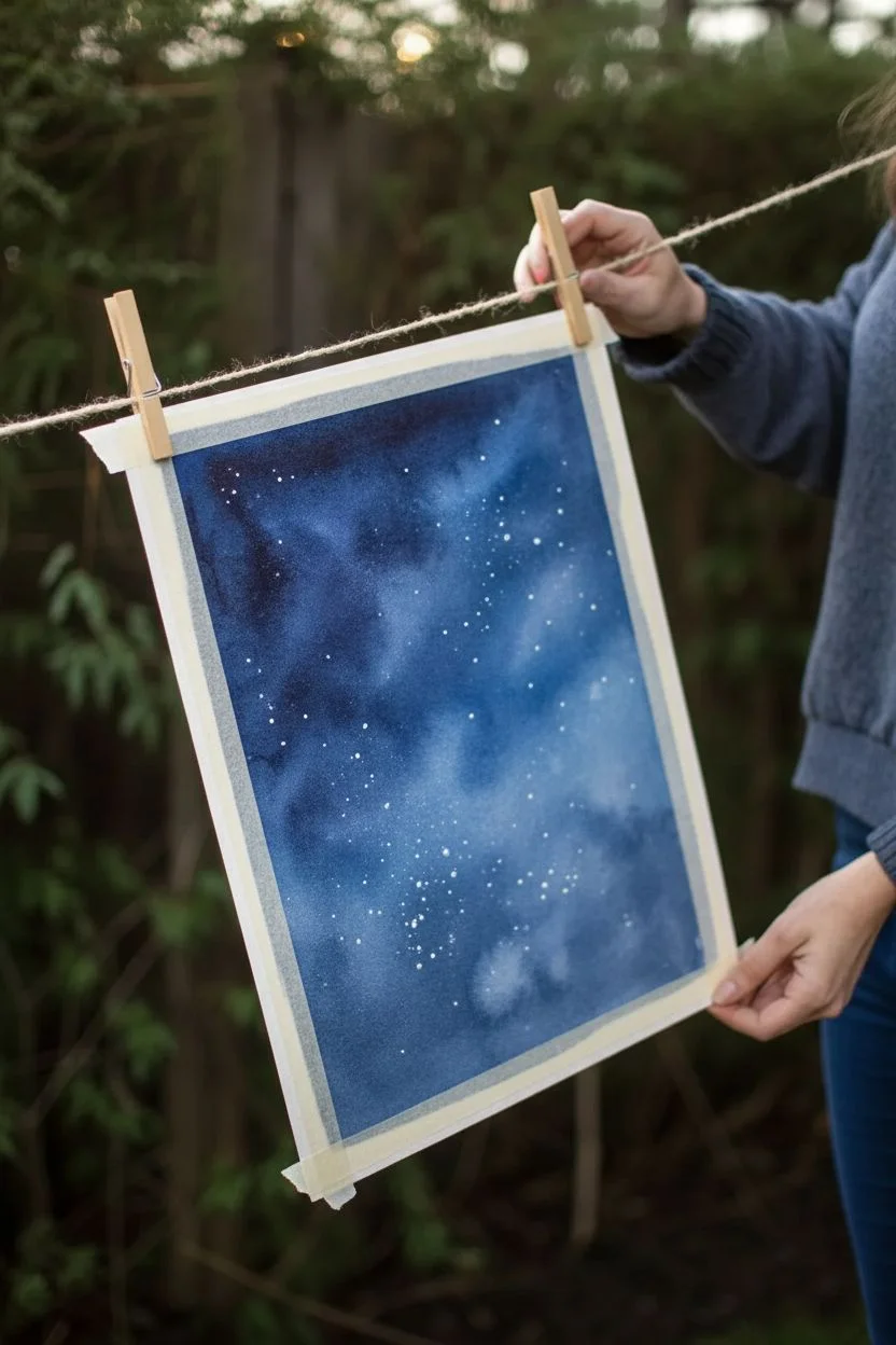
Starry Night Sky With Paint Splatter
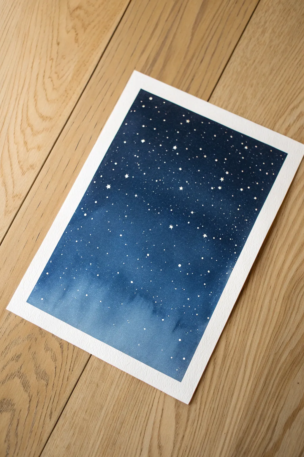
Capture the magic of a clear winter evening with this simple yet stunning watercolor painting. Using wet-on-wet techniques and splattered stars, you’ll create a serene gradient from deep midnight blue to a soft horizon glow.
Detailed Instructions
Materials
- Cold press watercolor paper (300gsm/140lb)
- Masking tape or Washi tape
- Watercolor paints (Indigo, Prussian Blue, Payne’s Grey, Phthalo Blue)
- White gouache or white ink
- Large flat wash brush
- Medium round brush (size 6 or 8)
- Small liner brush or fine paintbrush
- Old toothbrush (optional for splatter)
- Two jars of water
- Paper towels
- Mixing palette
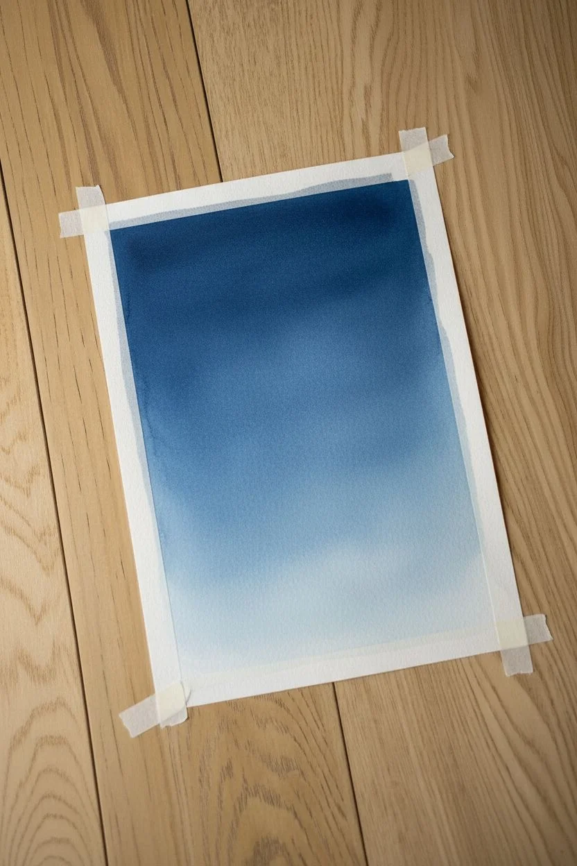
Step 1: Preparation and Gradient Base
-
Tape the borders:
Begin by taping down all four edges of your watercolor paper to a hard board or table. Press the tape firmly to ensure clean, crisp white borders when you remove it later. -
Prepare your colors:
Squeeze out your blues onto the palette. You’ll want a gradation of colors: a very dark Indigo or Payne’s Grey for the top, a rich Prussian Blue for the middle, and a watered-down Phthalo Blue for the bottom. -
Wet the paper:
Using your large flat wash brush and clean water, evenly wet the entire surface of the paper inside the tape. The paper should be glistening with a sheen, but not holding puddles. -
Start at the top:
Load your large brush with the darkest color (Indigo mixed with Payne’s Grey). Apply this across the top third of the paper using horizontal strokes. -
Introduce the mid-tone:
Without cleaning the brush completely, pick up the Prussian Blue. Apply this to the middle section of the paper, overlapping slightly with the dark top section to encourage blending. -
Create the horizon glow:
Rinse your brush thoroughly. Pick up a very watery mix of the lightest blue or just use clean water to drag the pigment down to the bottom, creating a pale, washed-out look near the horizon. -
Smooth the transition:
Tilt the board slightly to help the colors flow downward naturally. If you see hard lines, use a clean, damp brush to gently stroke back and forth horizontally to blend the gradient.
Starry Pro Tip
For more realistic stars, vary the size of your splatter. A toothbrush makes tiny mist-like stars, while tapping a loaded round brush creates larger, distinct planets.
Step 2: Deepening the Sky
-
Dry the first layer:
Allow the first wash to dry completely. The paper must be bone dry before adding the next layer to prevent creating ‘cauliflowers’ or water blooms. -
Re-wet carefully:
I like to gently re-wet the paper with clean water to do a second glaze, which makes the darks distinctively deeper. Be very gentle so you don’t lift the previous color. -
Intensify the darkness:
Drop very concentrated Indigo pigment into the top corners and the upper edge. This creates that deep space effect. -
Feather the edges:
Soften the bottom edge of this new dark layer so it fades into the lighter blue mid-section you painted earlier. -
Final drying time:
Let the painting dry completely again. This stage is crucial because the star layer requires a perfectly dry surface to stay crisp.
Troubleshooting Blooms
If you see ‘cauliflower’ back-runs in your sky, it means you added water to drying paint. Don’t fight it! These textures often look like distant nebulae in galaxy paintings.
Step 3: Adding the Stars
-
Mix the white star paint:
Dilute a small amount of white gouache or acrylic ink with a tiny drop of water. It should be the consistency of heavy cream—thick enough to be opaque, but fluid enough to splatter. -
Protect the area:
Place scrap paper around your workspace to catch stray splatters, as this step can get messy. -
Create the splatter:
Load a medium brush or an old toothbrush with the white mix. Tap the handle of the brush against another brush or your finger over the painting to release fine spray droplets. -
Vary the density:
Focus the densest splatter near the top center to create a ‘Milky Way’ type cluster, leaving the bottom lighter area mostly clear. -
Hand-paint larger stars:
Using your smallest liner brush, manually dot a few larger stars here and there. I usually add tiny cross shapes to mimic twinkling stars for variety. -
Paint the constellations:
Connect a few of the larger dots with incredibly fine lines if you want to suggest constellations, or simply add a few slightly bigger, brighter dots to anchor the composition. -
The reveal:
Once the white paint is fully dry, slowly peel off the masking tape at a 45-degree angle away from the painting to reveal the clean, white frame.
Now you have a tranquil piece of the cosmos captured on paper.

PENCIL GUIDE
Understanding Pencil Grades from H to B
From first sketch to finished drawing — learn pencil grades, line control, and shading techniques.
Explore the Full Guide
Simple Planets in Outer Space
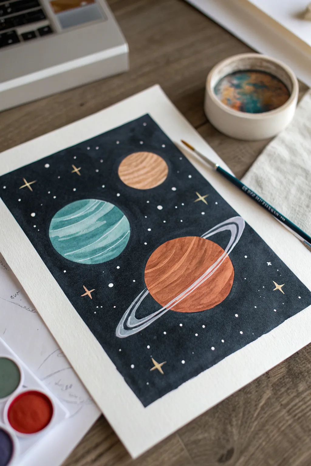
This charming watercolor project captures the simple beauty of our solar system with three stylized planets floating in a deep, starry expanse. The contrast between the dark background and the vibrant, textured planets creates a striking piece that is surprisingly easy to achieve.
Step-by-Step Tutorial
Materials
- Cold press watercolor paper (block or taped down sheet)
- Watercolor paints (teal, orange, brown, black/Payne’s grey, beige)
- White opacity paint (white gouache, white ink, or white gel pen)
- Round brushes (sizes 2, 6, and 10)
- Pencil for sketching
- Circular objects to trace (cups, lids, or coins) or a compass
- Masking fluid (optional)
- Two jars of water
- Paper towels
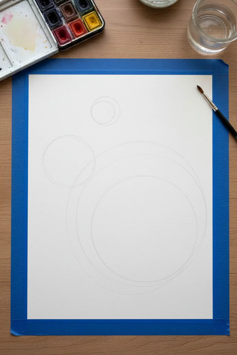
Step 1: Planning the Cosmos
-
Preparation:
Before dipping your brush, tape your watercolor paper down to a board or table using painter’s tape. This prevents buckling and leaves you with that crisp, professional white border when you peel it off later. -
Sketching the Layout:
Using a light pencil, outline your three planets. Use a compass or trace small circular objects to get perfect shapes. Place a large circle in the lower right, a medium one in the middle left, and a small one near the top center. -
Drawing the Rings:
For the largest planet in the lower right (the Saturn-like one), lightly sketch elliptical rings that extend beyond the planet’s body. Don’t worry about perfect symmetry; a slight tilt adds dynamism.
Bleeding Edges?
If black paint bleeds into the planets, dab it instantly with a clean paper towel. Once dry, you can fix the edge with opaque white gouache or a gel pen to reshape the circle.
Step 2: Painting the Planets
-
Teal Planet Base:
Start with the medium-sized planet on the left. Mix a watery teal color and fill in the circle. While it’s still wet, I like to drop in slightly darker teal pigment in curved bands to suggest atmospheric stripes. -
The Beige Moon:
Move to the smallest top circle. Paint this a soft beige or light ochre color. Similar to the teal planet, add subtle curved lines of a slightly darker brown tone while wet to give it roundness. -
Orange Planet Base:
Paint the large planet body with a warm, rusty orange. Leave the area where the rings cross in front unpainted for now, or just paint the main sphere solid—we can layer opaque white later. -
Texturing the Orange Planet:
While the orange paint is damp, sweep in curved bands of darker terracotta or brown. These strokes should follow the spherical curvature to make the planet look 3D rather than flat. -
Drying Time:
Allow all the planet layers to dry completely. If you move to the background too soon, the dark paint will bleed into your colorful worlds.
Add Some Shimmer
Mix metallic watercolor gold into your star spatter or use a metallic gold pen for the larger four-point stars to give the galaxy a magical, light-catching effect.
Step 3: The Deep Space Background
-
Mixing Space Black:
Create a rich, dark color for space. You can use pure ivory black, but mixing Payne’s grey with a touch of indigo or violet creates a deeper, more atmospheric night sky. -
Cutting In:
Using a smaller size 2 or 6 brush, carefully paint the dark background around the edges of your planets. Take your time here to keep the circle edges clean and sharp. -
Filling the Void:
Switch to your larger size 10 brush to fill in the rest of the background. Work quickly enough so the paint essentially dries as one even layer without harsh brush marks. -
Absolute Dryness:
Ensure the black background is 100% dry before proceeding. It should feel room temperature to the touch, not cool.
Step 4: Celestial Details
-
Adding the Rings:
Using white gouache or opaque white ink, paint the rings around the orange planet. Mix the white with a tiny bit of grey for the outer rings to give them dimension. -
Layering Ring Details:
Once the white ring base is dry, add thin, sweeping lines of white and light grey inside the ring shape to separate the bands. -
Planet Highlights:
Add extra definition to the teal planet by painting thin, opaque light teal or white semi-circles on top of the original stripes to boost the contrast. -
Star Clusters:
Dip a small brush or a toothbrush into white gouache. Flick the bristles to spatter tiny white stars across the black background. Cover your planets with paper scraps if you want them to remain pristine. -
Twinkling Stars:
Manually paint a few larger ‘cross’ shaped stars using a fine detail brush and opaque white or gold paint to make certain points of light pop. -
Final Reveal:
Once everything is completely dry, slowly peel off the painter’s tape at a 45-degree angle to reveal your clean edges.
Frame your cosmic creation and enjoy the peaceful view of your handmade universe
Clouds Made With Soft Dabbing
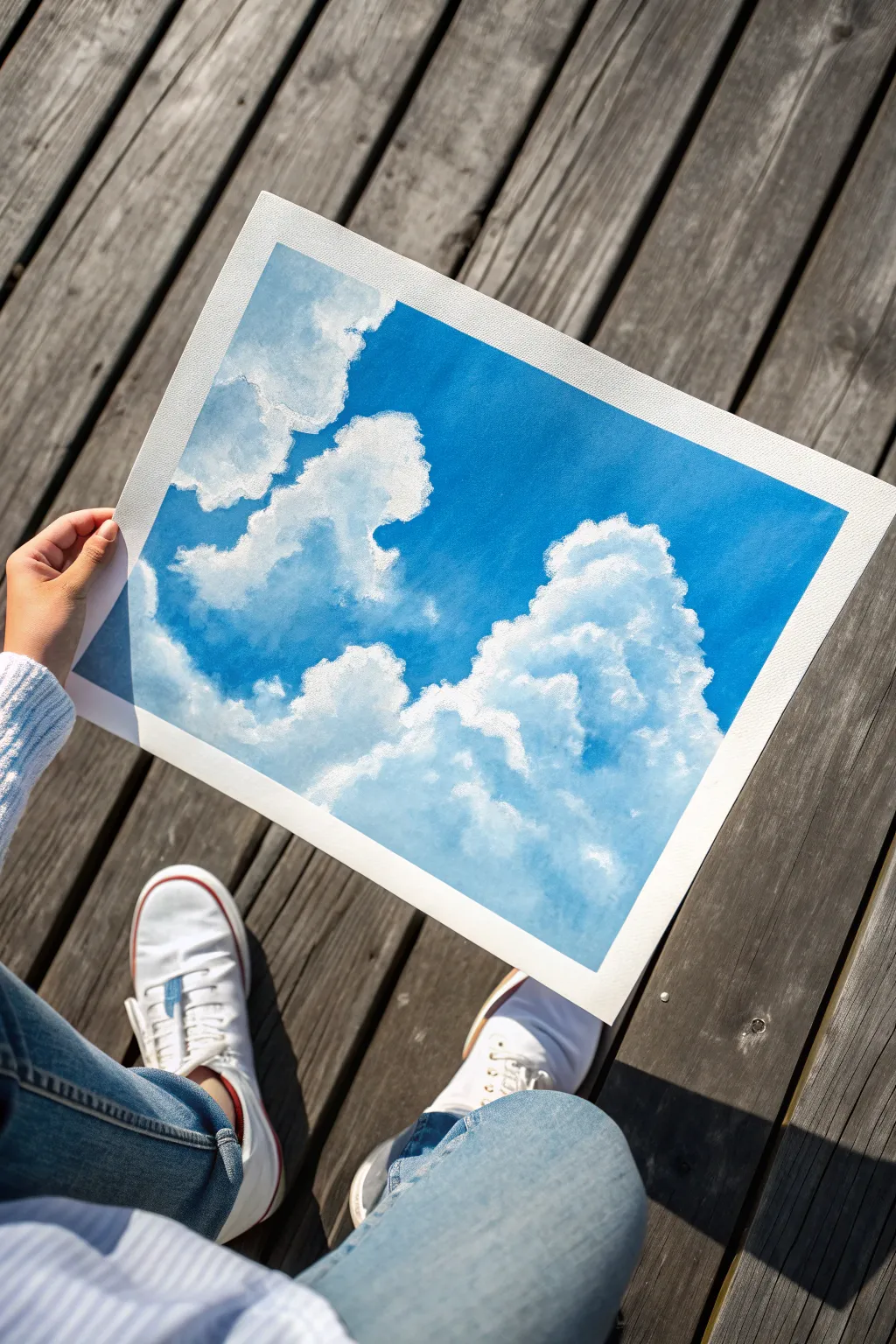
Capture the breezy tranquility of a summer day with this cloud study painted on paper. Using a simple dabbing technique, you will build up layers of white and gray to create soft, pillowy forms that float against a vibrant blue sky.
Step-by-Step Guide
Materials
- Heavyweight watercolor or mixed media paper
- painter’s tape (masking tape)
- Blue acrylic or gouache paint (primary blue or cyan)
- Titanium white acrylic or gouache paint
- A touch of Payne’s grey or a tiny drop of black
- Medium flat brush (for the background)
- Small to medium round brush (old, splayed brushes work great here)
- Palette or mixing plate
- Paper towels
- Water cup
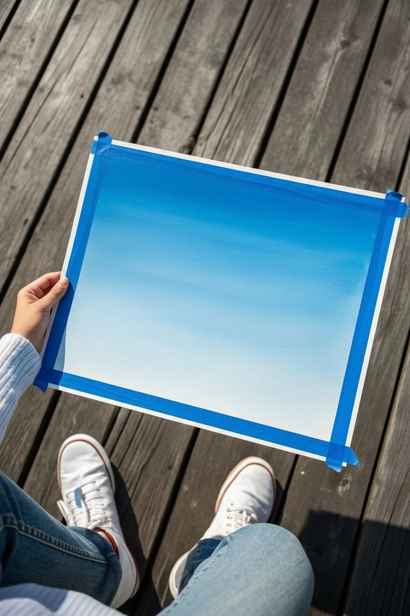
Step 1: Preparing the Canvas and Sky
-
Tape the Edges:
Start by securing your paper to a flat surface using painter’s tape along all four edges. This creates that crisp, professional white border seen in the final image and prevents the paper from buckling when wet. -
Mix Your Sky Gradient:
On your palette, squeeze out a generous amount of blue and a separate pile of white. For a realistic sky, you want a gradient: darker at the top and lighter near the bottom. Mix a mid-tone blue to start. -
Paint the Upper Sky:
Using your flat brush, paint the top third of the paper with your pure or slightly darkened blue. Use horizontal strokes for a smooth finish. -
Blend Downward:
Gradually mix more white into your blue paint as you work your way down the paper. Blend the transition areas while the paint is still wet to avoid hard lines. -
Finish the Horizon:
The bottom third of your painting should be a very pale, milky blue. This atmospheric perspective gives the sky depth. Let this background layer dry completely before moving on to the clouds.
Pro Tip: Use Your Finger
Don’t be afraid to use your fingertip to smudge the paint while it’s tacky. This creates the softest, most realistic transition between the white tops and grey bottoms of the clouds.
Step 2: Building the Cloud Shapes
-
Map Out the Placement:
Visualize where your main cloud formations will go. Following the reference, place a large, towering formation on the right side and a smaller, fragmented one on the left. No need to sketch; we will paint organically. -
Mix a Shadow Color:
Clouds aren’t just white; they have volume. Mix a light blue-grey using white, a tiny dot of blue, and a whisper of grey or black. It should be subtle. -
Base Layer of Shadows:
Using your round brush, lightly dab or ‘scumble’ this greyish tone into the general shapes of the clouds. Focus these darker tones on the bottom and middle areas of the cloud masses, leaving the tops empty for now. -
Prepare the Bright White:
Clean your brush thoroughly. Squeeze out fresh titanium white paint. You want this paint to be relatively thick, not watery, to achieve opacity. -
Define the Upper Edges:
Load your brush with pure white. Press the tip gently against the paper to create the crisp, rounded tops of the clouds. Use a dabbing motion rather than long strokes to mimic the puffy texture. -
Blend into the Shadows:
As you move down from the bright white top edge into the grey center, let the brush run slightly drier. Blend the white into the shadow layer created earlier so there is a soft transition, not a hard line.
Step 3: Refining and Detailing
-
Add ‘Satellite’ Clouds:
Use the tip of your brush to dab tiny, disconnected puffs of clouds floating away from the main shapes. This makes the formation look natural and less like a solid cutout. -
Deepen the Contrast:
If your clouds look too flat, mix a slightly darker grey-blue and carefully dab it into the deepest crevices or undersides of the largest cloud. I find this really helps the bright white pop. -
Highlighting:
Once your layers adhere, go back with pure, thick white on the very topmost curves of the clouds where the sun would hit most directly. -
Softening Edges:
If an edge looks too sharp (except for the very top), use a clean, slightly damp brush to gently smudge it into the blue sky, creating a misty effect. -
Final Dry:
Allow the painting to dry fully. Acrylics darken slightly as they dry, so you may need one final touch of white highlight. -
The Reveal:
Slowly peel away the painter’s tape at a 45-degree angle to reveal your clean edges and frame your skyscape.
Level Up: Golden Hour
Change the mood completely by tinting your white highlights with a tiny bit of yellow or pale pink to simulate a sunrise or sunset glow instead of midday sun.
Enjoy the peaceful feeling of your new cloud study as you hang it up or gift it to a friend


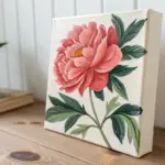
One Simple Flower Using Oval Petals
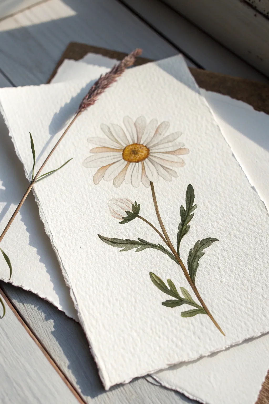
This project captures the gentle beauty of a field daisy using soft watercolors and simple shapes. The textured paper adds a lovely rustic feel, making the final piece look like a treasured botanical specimen.
Detailed Instructions
Materials
- Cold press watercolor paper (deckle edge preferred)
- Round watercolor brush (size 4 or 6)
- Small detail brush (size 0 or 1)
- Watercolor paints (Yellow, Brown, Green, Indigo/Blue)
- Pencil (HB or 2H)
- Kneaded eraser
- Jar of water
- Paper towel
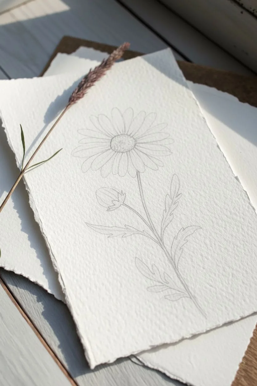
Step 1: Sketching the Composition
-
Position the Center:
Begin by lightly sketching a small, slightly flattened circle in the upper third of your paper. This will be the flower’s center disk. Keep your pencil pressure very light so the lines don’t show through the paint later. -
Map the Petals:
Lightly draw the petals radiating outward from the center. They should be long, slender ovals. Notice how the petals on the far side appear slightly shorter due to perspective, while the front petals look longer. -
Add the Stem:
Determine the curve of the stem. Draw a single line extending down from the flower head, curving gently toward the bottom right corner. -
Sketch Leaves and Bud:
Add a small, closed bud on a short stem branching off softly to the left. Then, sketch the jagged, lance-shaped leaves along the main stem. Daisy leaves have deep indentations, almost like feathery lobes.
Natural Edges
To get the soft, fuzzy look on the paper edges seen in the photo, rip your watercolor paper against a ruler instead of cutting it with scissors.
Step 2: Painting the Flower Head
-
First Wash for the Center:
Mix a warm yellow ochre or deep yellow. Paint the center disk using wet-on-dry technique, leaving just a tiny speck of white paper showing for a highlight. -
Texturing the Center:
While the yellow is still slightly damp, drop in a small amount of burnt sienna or brown on the bottom and right edge of the center. This creates a shadow and makes the center look spherical. -
Petal Base Layer:
The petals are white, but we need shadows to define them. Dilute a tiny bit of brown or indigo with lots of water to make a very pale grey-beige. Paint the inner base of each petal where it meets the yellow center. -
Defining Petal Edges:
Using that same very pale wash, carefully outline just the tips and one side of a few petals. Leave the center of the petals pure white to let the paper texture shine through. -
Stippling details:
Once the flower center is completely dry, take your smallest brush with a concentrated brown mix. Stipple tiny dots onto the lower shadowed side of the yellow center to mimic the texture of the pollen.
Add a Shadow
After drying, paint a very faint, watery grey shadow on the right side of the stem and petals essentially doubling the image to make it pop off the page.
Step 3: Painting the Stem and Leaves
-
Mixing Greens:
Mix a sap green with a touch of brown to get an earthy olive tone. This natural green suits the rustic style better than a bright artificial green. -
Painting the Main Stem:
Load your round brush and paint the main stem in one confident stroke if possible. Vary the pressure slightly; press down for a thicker line and lift up for a thinner one. -
Leaf Base Layer:
Fill in the leaf shapes with a light wash of your green mix. I like to drop in a little extra water while it’s wet to create a natural bloom effect. -
Painting the Bud:
Paint the green sepals (the leafy cup) holding the bud. Then, use the very pale petal wash (grey-beige) to paint the tightly closed white petals peeking out. -
Adding Leaf Depth:
Once the first green layer is dry, mix a darker version of your green by adding a touch of indigo. Paint veins or add a second layer to the underside of the leaves to create shadows.
Step 4: Final Touches
-
Deepening Shadows:
Assess your painting. If the stem or leaves look flat, add a thin line of the darkest green along one side of the stem. -
Separating Petals:
Use your smallest brush and a very light grey wash to add thin lines between overlapping petals. This helps distinguish individual petals without outlining everything heavily. -
Final Erasure:
Wait until the painting is bone dry—touch it with the back of your hand to check for coldness. Gently use the kneaded eraser to lift any visible pencil lines that weren’t covered by paint.
You have now captured a timeless piece of nature.
Easy Lavender Stems With Dot Strokes
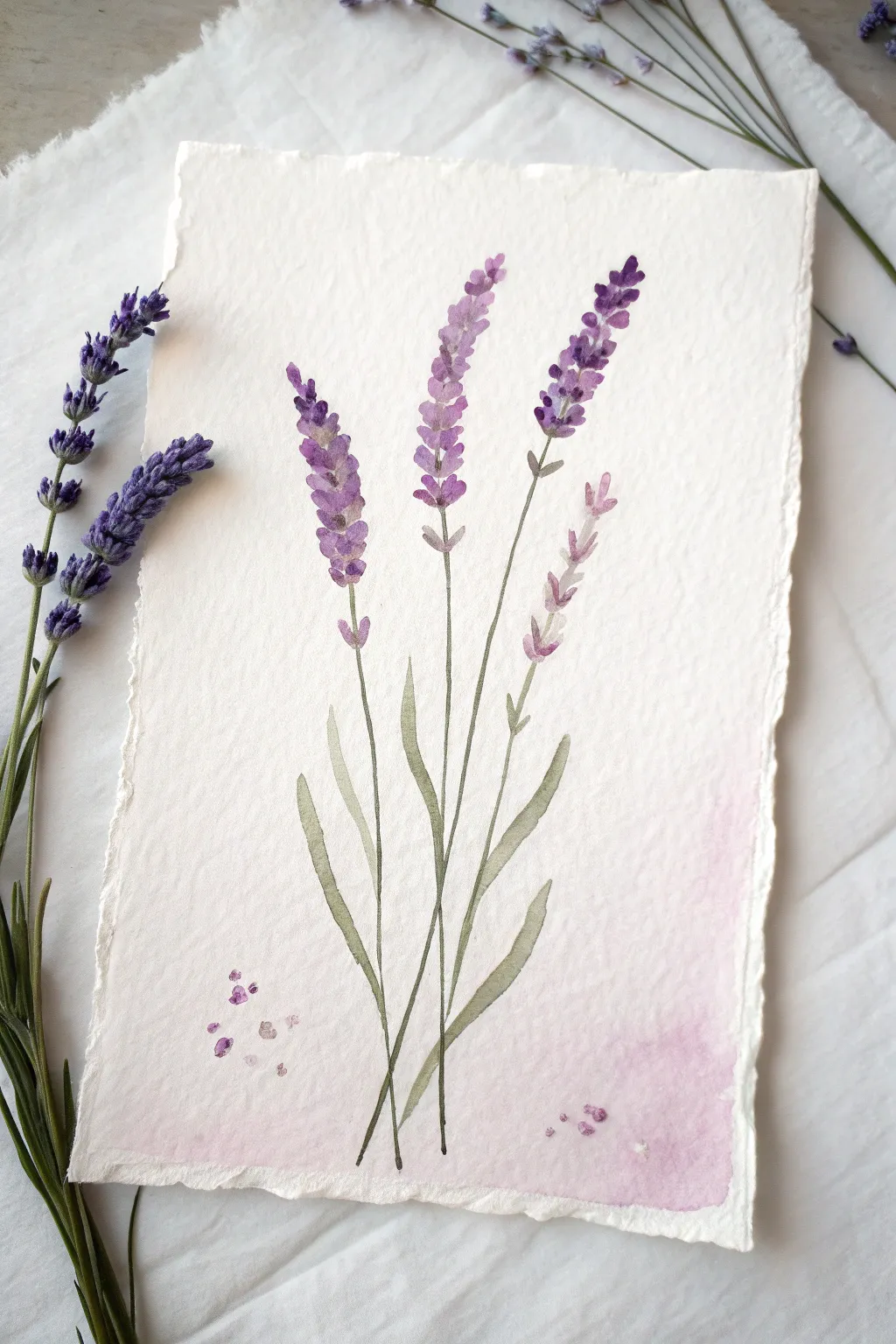

Capture the delicate charm of lavender using simple stroke techniques and gentle color blending. This project combines loose, dotted blooms with slender stems on textured paper for a soft, botanical feel.
How-To Guide
Materials
- Cold press watercolor paper (deckled edge optional)
- Watercolor paints (Purple/Violet, Sap Green, Magenta/Rose)
- Round brushes (sizes 2 and 6)
- Clean water jar
- Paper towel
- Pencil (optional)
Step 1: Painting the Stems and Leaves
-
Mix your green:
Start by mixing a muted green shade. I like to combine Sap Green with a tiny touch of purple or brown to make it look more natural and earthy rather than a bright, artificial grass green. -
Draft the stems:
Using your smallest round brush (size 2), paint three or four very thin, slightly curved lines radiating from the bottom center of the paper. Vary their heights so the tallest ones are in the middle. -
Add leave structures:
Switch to a slightly larger brush if available, or just apply more pressure with the small brush. Paint long, slender leaves near the base of the stems. -
Shape the leaves:
To get the right leaf shape, start with light pressure, press down to widen the belly of the stroke, and lift up at the end for a tapered point. Keep the leaves clustered at the bottom third of the composition. -
Stem offshoots:
Add tiny, short stems brancing off near the tops of your main stems. These will hold the individual flower clusters later. Keep these extremely delicate.
Variation Tip
Vary the saturation! Make one flower stem significantly lighter and more watered down than the others to create the illusion that it is further away in the distance.
Step 2: Creating the Blooms
-
Prepare purple shades:
On your palette, mix a primary purple. Create a second puddle that is more watered down for a lighter lavender, and a third that is thicker and darker for shadows. -
Start the top buds:
At the very tip of your tallest stem, dab small, teardrop-shaped strokes using the medium purple mix. These should point slightly upward. -
Build the cluster:
Work your way down the stem, adding clusters of small dabs. Leave small white gaps between the dabs to keep the painting looking airy and loose. -
Varying the tone:
While the paint is still wet, drop in tiny touches of the darker purple mix at the base of some flower clusters to create depth. -
Fading out:
As you move down the flower spike, make the clusters slightly larger but more spaced out. Use your lighter, watered-down mix for the flowers near the bottom of the spike. -
Repeat for all stems:
Paint the flower spikes on the remaining stems. Allow them to vary in fullness; some can be just a few buds, while others represent full blooms. -
Add loose petals:
For a whimsical touch, paint a few tiny, floating purple dots falling away from the stems, as if petals are gently dropping.
Level Up: Scented Art
Once your painting is completely dry, gently rub a drop of real lavender essential oil on the back of the thick watercolor paper for a multi-sensory art piece.
Step 3: Finishing Touches
-
Mix a pink wash:
Dilute a magenta or rose color with plenty of water until it is very transparent and pale. -
Apply the background wash:
Gently glaze this pink wash over the bottom third of the paper, painting right over the dried stems. This grounds the artwork and adds a soft glow. -
Soften edges:
If the pink wash has a hard line at the top, rinse your brush and run clean water along that edge to feather it out into the white paper. -
Scattered details:
Add a few tiny darker purple or pink specks within the pink wash area to suggest fallen texture on the ground. -
Final assessment:
Let the piece dry completely. If the stems look too faint against the pink wash, you can carefully re-darken the very bottom lines with a touch more green.
Frame your botanical study or gift it to a friend for a calming piece of decor
Cute Fruit Mini Painting (Peach or Strawberry)
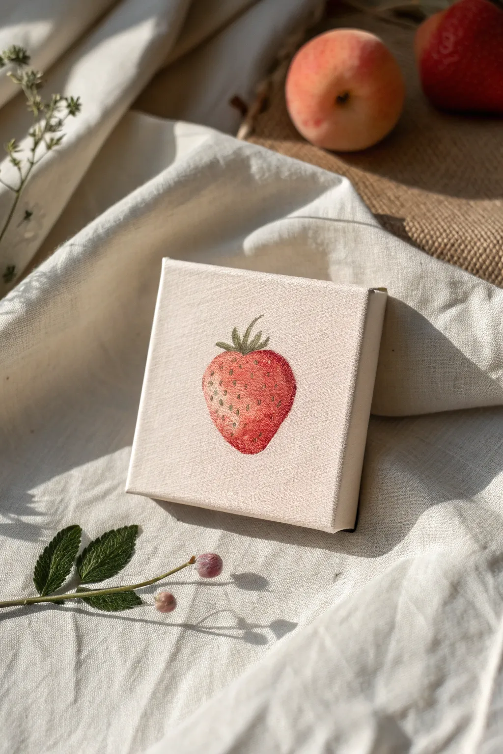
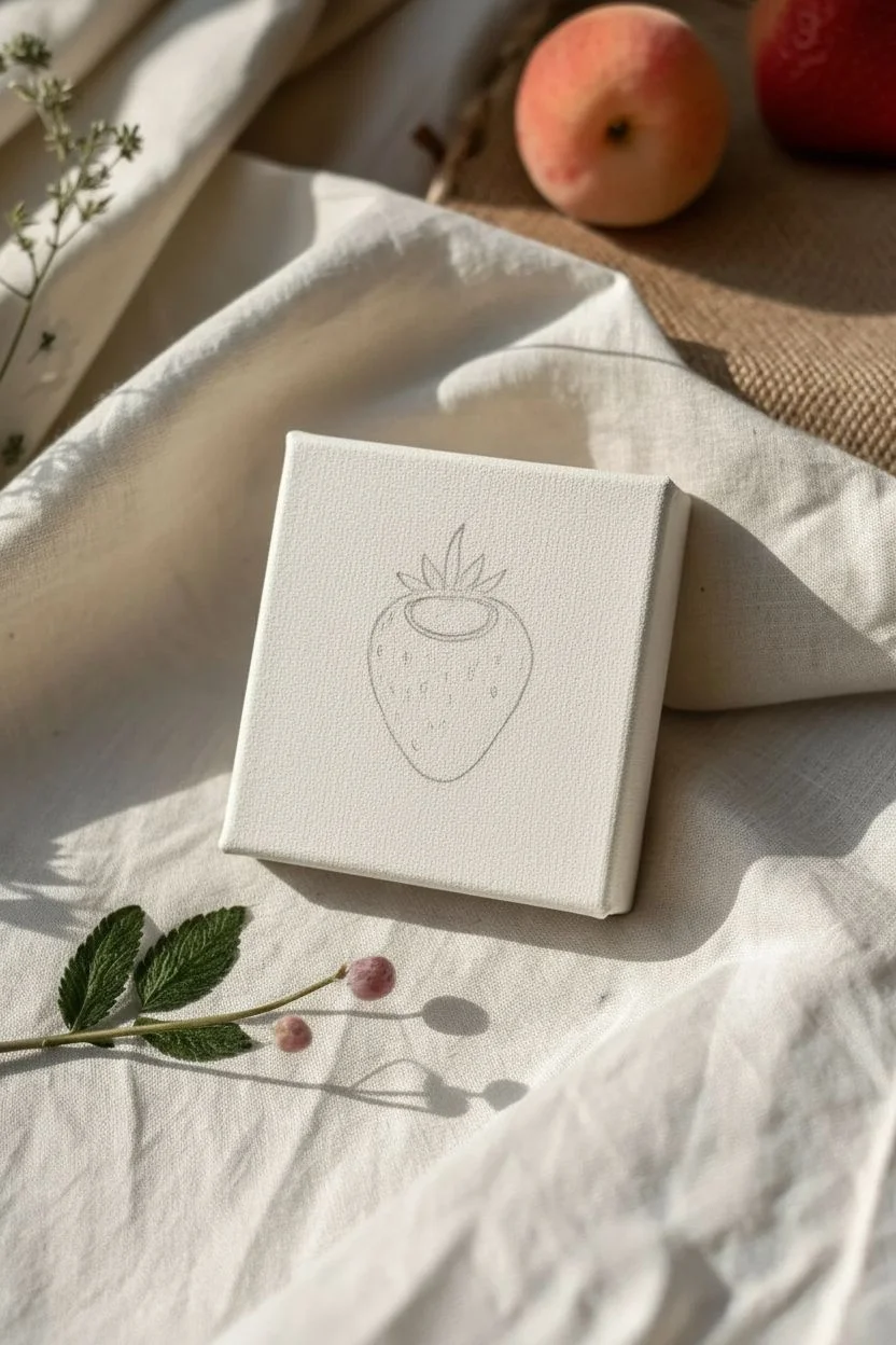
This charming little project captures the sweetness of summer with a single, delicately painted strawberry on a miniature canvas. The beauty lies in the soft, almost watercolor-like application of acrylics which lets the canvas texture shine through.
Step-by-Step
Materials
- Mini stretched canvas (4×4 inches or similar)
- Acrylic paints (Red, yellow, white, sap green, burnt umber)
- Small round brushes (Size 0 and Size 2)
- Palette for mixing
- Water cup
- Paper towels
- Pencil (HB or lighter)
Step 1: Sketching the Shape
-
Center Your Subject:
Place your mini canvas on a flat surface. Using a light pencil touch, draw a simple inverted triangle shape in the center with rounded corners to form the strawberry body. -
Add the Lead Cap:
Sketch a small oval at the top center of the berry where the leaves will sprout. -
Draw the Leaf Crown:
From the top oval, add 5-6 small, jagged leaves pointing upwards and slightly outwards, similar to a little crown.
Fuzzy Edges?
If your acrylics are bleeding into the canvas grain too much, use less water and mix in a tiny bit of matte medium to keep lines crisp while maintaining transparency.
Step 2: Base Layers
-
Mix a Coral Base:
Mix a small amount of red with a touch of yellow and plenty of water to create a thin, coral-colored wash. It should be semi-transparent. -
Apply the First Wash:
Paint the entire body of the strawberry with this coral mix, avoiding the leaf area. Let the canvas texture show through the thin paint. -
Create a Gradient:
While the first layer is still slightly damp, mix a slightly stronger, deeper red. Apply this to the bottom focusing on the tip and right side to start building dimension. -
Lift Highlights:
If the paint gets too dark near the top left (where the light hits), use a clean, damp brush to gently lift some pigment away. -
Base the Leaves:
Mix sap green with a tiny bit of yellow. Paint the leaves carefully with your smallest brush.
Go for a Pair
Paint a second mini canvas featuring a sliced cross-section of the strawberry to display alongside this one for a cute kitchen diptych.
Step 3: Adding Detail and Texture
-
Deepen the Shadows:
Mix red with a tiny speck of burnt umber. Paint the very bottom curve and the right side of the berry to create a rounded 3D effect. -
Map the Seeds:
Using a very small brush and a mix of yellow-ochre (yellow plus a dot of brown), paint tiny, shallow indentations or dots scattered across the berry surface. -
Shadow the Seeds:
Once the seed marks are dry, take your dark red mix and paint a tiny crescent shadow inside the top of each seed indentation. This makes them look recessed. -
Highlight the Seeds:
Mix a tiny amount of white with yellow. elaborate: careful placement is key here; place a microscopic dot on the bottom edge of a few seeds to catch the light. -
Refine the Leaves:
Mix a darker green using sap green and a touch of brown. Add thin lines to the center of the leaves and darken the base where the leaves meet the fruit.
Step 4: Final Touches
-
Enhance Contrast:
If the strawberry looks flat, distinct glazes of pure red can be added to the mid-tones to boost saturation without losing the texture. -
Check the Canvas Edges:
Decide if you want to paint the sides of the canvas. Leaving them white keeps the look clean and gallery-style. -
Final White Highlights:
Add one or two very small, pure white reflections on the upper left shoulder of the strawberry to make it look juicy. -
Dry Completely:
Let the painting sit for at least an hour to ensure all layers, especially the thicker seed details, are fully set.
Place your tiny masterpiece on a miniature easel or lean it against a shelf for a pop of freshness
Easy Heart Motif With Loose Brushstrokes
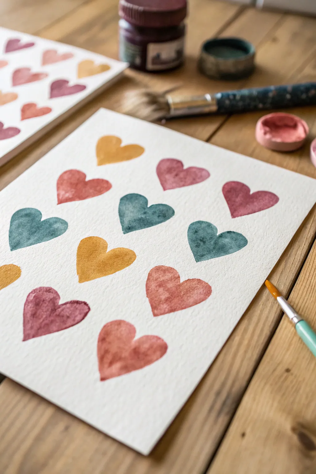
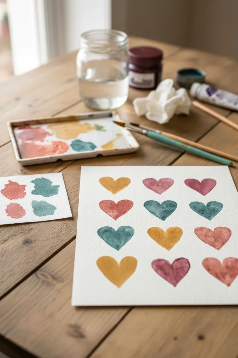
Embrace the imperfect beauty of watercolor with this simple yet striking heart motif project. Using a natural, muted color palette and loose brushstrokes, you will create a charming piece of art that feels both modern and handmade.
Step-by-Step Guide
Materials
- Cold press watercolor paper (approx. 140lb/300gsm)
- Round watercolor brush (size 6 or 8)
- Small detail brush (size 2 or 4)
- Watercolor paints (terracotta, mustard yellow, teal, dusty rose)
- Jar of clean water
- Paper towels
- Palette for mixing
- Pencil (optional)
Step 1: Preparation and Palette
-
Prepare your paper:
Start with a sheet of cold press watercolor paper. The texture is important here—it adds that lovely graininess seen in the hearts. Cut your paper to your desired size; an A5 or 5×7 inch sheet works beautifully for this pattern density. -
Mix your colors:
On your palette, prepare your four key colors. Aim for earthy, muted tones rather than bright primaries. For the teal, mix a viridian green with a touch of prussian blue and a little burnt sienna to dull it down. -
Create the warm tones:
For the mustard, mix yellow ochre with a tiny bit of brown. The terracotta is a blend of red and burnt sienna. Finally, water down a jagged crimson or alizarin crimson for the dusty pink. -
Test the consistency:
Swatch your colors on a scrap piece of paper. You want a medium consistency—creamy enough to hold pigment, but watery enough to flow and create those nice drying edges.
Step 2: Painting the Hearts
-
Start the first row:
Dip your medium round brush into the mustard yellow. Starting at the top left (or center, if you prefer), paint the left lobe of a heart using a single, confident curved stroke. -
Complete the shape:
Reload your brush slightly if needed and paint the right lobe, letting the two strokes meet at the bottom point. Don’t worry about perfect symmetry; the charm lies in the organic, hand-painted feel. -
Switch colors:
Rinse your brush thoroughly. Pick up your dusty rose color. Leave a gap of about an inch and paint the next heart in the row. I find that alternating warm and cool tones creates the best balance. -
Add a cool tone:
Continue the row with a heart in the teal shade. Notice how the pigment pools slightly in the textured paper—let this happen naturally. -
Establish the pattern:
Begin the second row. Position these hearts in the gaps between the hearts of the first row (a brick-lay pattern). This offset arrangement makes the composition feel dynamic. -
Vary the saturation:
As you paint, try dipping your brush in water before picking up pigment occasionally. This creates hearts with differing transparencies, adding depth to the overall piece. -
Work your way down:
Continue painting rows, alternating your four colors (terracotta, mustard, teal, pink) so that no two adjacent hearts are the exact same shade. -
Create the watercolor bloom:
While a heart is still wet, you can touch the tip of your brush (loaded with slightly more water or pigment) to the center of the shape. This encourages a ‘bloom’ effect as it dries.
Too much pooling?
If a puddle forms on a heart, dry your brush on a paper towel and touch the tip to the puddle. It acts like a sponge, lifting excess water without ruining the shape.
Step 3: Finishing Touches
-
Check for gaps:
Look at your composition. If there are half-spaces at the edges of the paper, paint partial hearts running off the page to suggest the pattern continues infinitely. -
Softening edges:
If any heart looks too rigid, take a slightly damp, clean brush and gently run it along one edge of the shape to soften the line. -
Let it dry completely:
Allow the paper to dry flat. Do not use a hairdryer if you want those crisp, hard edges (called ‘hard pans’) to form where the pigment settles. -
Flattening the sheet:
Once fully dry, if the paper has buckled, you can place it under a heavy book for a few hours to flatten it out perfectly.
Add metallic flair
Once fully dry, use a gold paint pen or metallic watercolor to add tiny dots or outlines to just a few hearts for a subtle, shimmering accent.
Frame your lovely new artwork or cut it into strips to make personalized bookmarks for friends
String Lights Over a Simple Night Sky
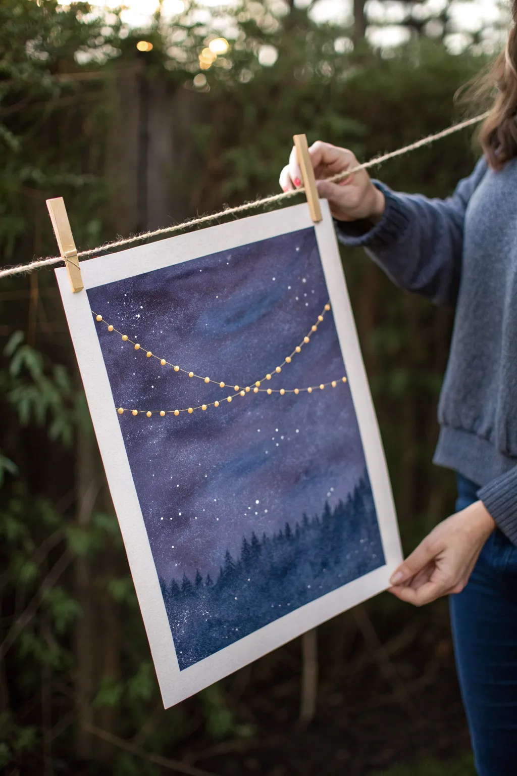
Capture the magic of a festive evening under the stars with this enchanting watercolor project. By combining deep indigo washes with delicate metallic accents, you’ll create a dreamy scene that feels both vast and cozy.
Step-by-Step Tutorial
Materials
- Cold press watercolor paper (140 lb/300 gsm)
- Watercolor paints (Indigo, Payne’s Grey, Ultramarine, Violet)
- Metallic gold paint or gold acrylic paint pen
- White gouache or white ink
- Large wash brush
- Medium round brush (size 6 or 8)
- Small fine-detail brush (size 0 or 1)
- Painter’s tape
- Board or clipboard
- Water cups and paper towels
- Old toothbrush (for splattering)
Step 1: Preparing the Sky
-
Secure the paper:
Before you begin, tape down all four edges of your watercolor paper to a board. This creates a clean white border and prevents the paper from buckling when wet. -
Wet-on-wet base:
Using your large wash brush, apply clean water evenly across the entire surface of the paper until it glistens but isn’t pooling. -
First color wash:
Load your brush with a watery mix of Ultramarine Blue and Violet. Dab this randomly across the upper two-thirds of the paper, leaving some areas lighter to suggest nebulae. -
Deepening the night:
While the paper is still wet, drop in concentrated Indigo and Payne’s Grey, focusing on the corners and the top edge to create a vignette effect. Let the colors bleed naturally.
Starry Night Secret
Use a hairdryer on a low, cool setting between layers to speed up drying. This prevents colors from getting muddy and keeps your stars crisp.
Step 2: Creating the Atmosphere
-
Adding texture:
If you want cloud-like textures, gently blot a few wet areas with a crumpled paper towel to lift pigment and create soft, lighter patches. -
Splattering stars:
Mix a small amount of white gouache with water until it’s the consistency of heavy cream. Dip an old toothbrush into it and flick the bristles with your thumb to spray tiny white stars across the damp sky. -
Adding brightness:
For larger, brighter stars, use a small detail brush to dot specific points of white gouache among the splatter field. -
Let it dry completely:
Ensure the sky layer is 100% dry before proceeding. The paper should feel room temperature to the touch, not cool.
Extra Festive Flair
Try using iridescent or pearlescent watercolor medium mixed into your sky wash for a subtle, magical shimmer that catches the light.
Step 3: The Forest Silhouette
-
Mixing the darks:
Prepare a rich, dark mixture using Indigo and a touch of Black to get a deep, shadowy tone for the trees. -
Painting the tree line:
Using the medium round brush, paint an uneven, jagged line across the bottom third of the paper. This represents the tops of the distant forest. -
Defining the trees:
Switch to a smaller brush to add details. Use quick, vertical dabbing motions to create the pointed shapes of pine trees along the top edge of your dark mass. -
Filling the foreground:
Fill in the rest of the bottom area with your dark mix solid black-blue color, ensuring it meets the bottom tape edge cleanly.
Step 4: The Golden Lights
-
Plotting the string:
Once the background is totally dry, lightly visualize two swooping curves where your string lights will hang. I find it helps to practice the motion in the air first. -
Painting the wire:
Using a very fine liner brush and gold paint (or a gold pen), draw two delicate, draping lines crossing each other across the sky. -
Adding the bulbs:
along the gold lines, paint small, evenly spaced circles using the metallic gold paint. Make them big enough to stand out against the dark blue background. -
Adding glow:
If you want a glowing effect, you can gently dry-brush a tiny halo of pale yellow or watered-down gold around each bulb. -
Final reveal:
Wait for the gold paint to dry completely, then carefully peel away the painter’s tape at a 45-degree angle to reveal your crisp white borders.
Now step back and admire how the golden lights pop against your moody, celestial background
Tape-Resist Geometric Blocks
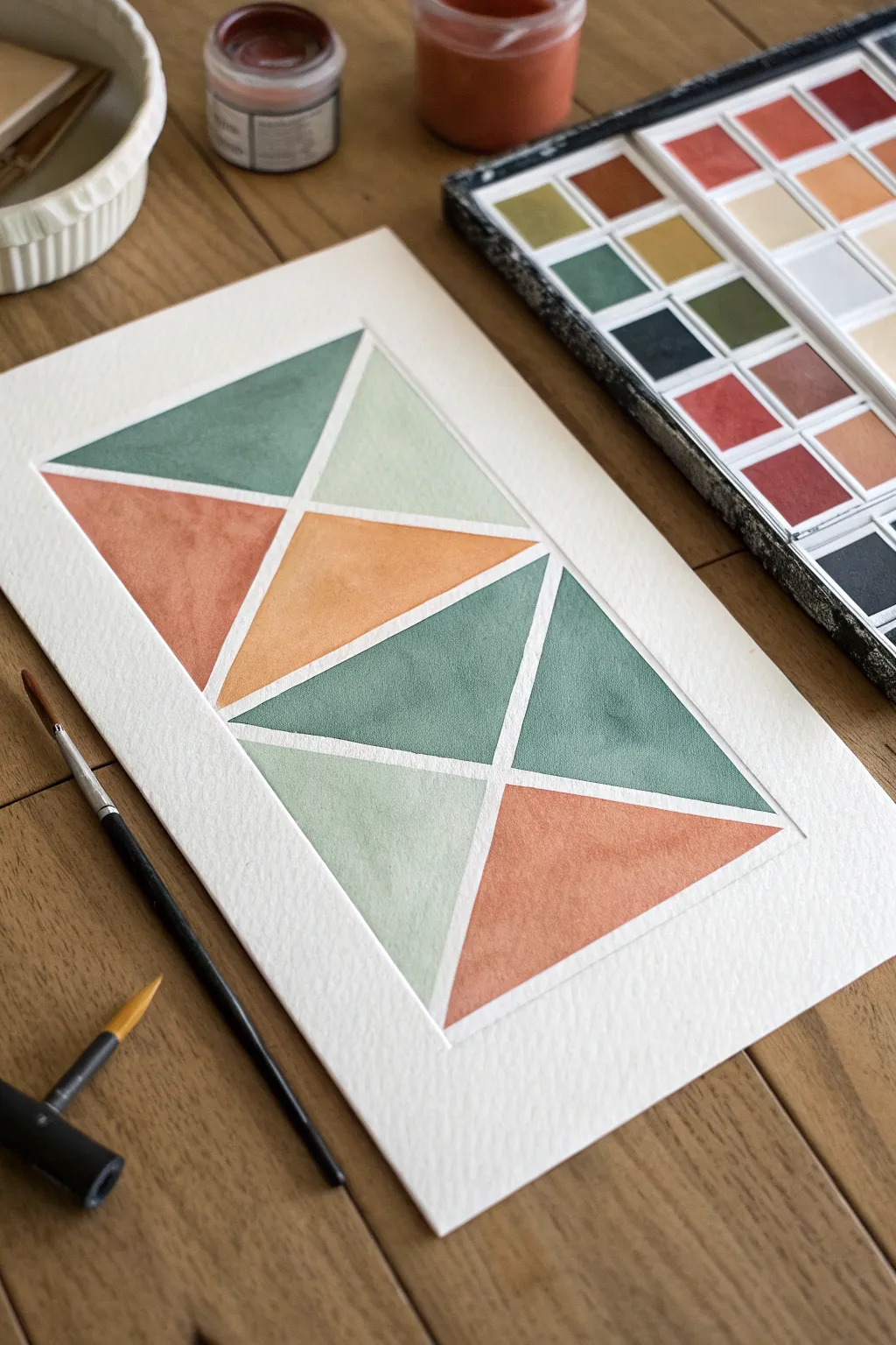
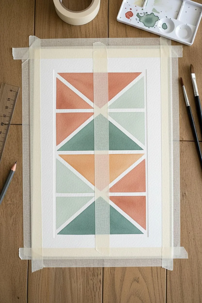
This soothing geometric project transforms simple triangles into a stunning modern art piece using a foolproof tape-resist technique. The result is a clean, crisp design with muted earth tones separated by striking white negative space.
Step-by-Step Guide
Materials
- Cold press watercolor paper (300 gsm)
- Artist’s tape or painter’s tape (1/4 inch width)
- Watercolor paint set
- Round watercolor brush (size 6 or 8)
- Ruler
- Pencil
- Eraser
- Paper towel
- Jar of water
- Mixing palette
Step 1: Planning and Taping
-
Paper Preparation:
Begin with a sheet of cold press watercolor paper, ideally around 5×7 inches or A5 size. Tape the entire sheet down to your table or a drawing board using masking tape along the very outer edges to prevent buckling. -
Mark the Border:
Using a ruler and a light pencil touch, measure a rectangular border inside your paper. Leave about an inch of white space around the outside to frame the design nicely. -
Tape the Frame:
Apply strips of artist’s tape along your pencil lines to create the outer rectangular boundary of your painting area. Press the edges of the tape down firmly to ensure a crisp seal. -
Create the Grid:
Lay a long strip of tape diagonally from the top left corner of your rectangle to the bottom right corner. Add a second strip from the top right to bottom left to create a large ‘X’ shape. -
Add Vertical Division:
Place a vertical strip of tape straight down the center, intersecting the middle of your ‘X’. You should now have the basic skeleton of the design. -
Subdivide the Triangles:
Look at the larger triangles formed by your tape. Add a horizontal strip of tape across the middle of the design to dissect them further. Feel free to add 1-2 more diagonal lines to break larger shapes into smaller, interesting triangles, matching the complexity shown in the example image. -
Seal the Edges:
This is crucial: run the back of your thumbnail or a spoon handle firmly along every edge of every piece of tape. This prevents paint from bleeding underneath and ruining your clean white lines.
Bleeding Lines?
If paint bled under the tape, use a slightly damp stiff brush to gently scrub the pigment away, then dab with a paper towel. A white gel pen can also hide small mistakes.
Step 2: Painting the Sections
-
Mix Your Palette:
Prepare your colors on a palette. Aim for a cohesive earth-tone scheme: mix a sage green (green with a touch of brown/red), a pale mint (diluted green), a terracotta or rust orange, and a warm ochre yellow. Test the shades on a scrap piece of paper first. -
Start with Sage:
Load your round brush with the sage green mixture. Paint two to three non-adjacent triangles with this color, ensuring the puddle of paint is even but not soaking wet. -
Apply Terracotta:
Rinse your brush thoroughly. Pick up the terracotta or rust color and fill in another set of triangles. I like to place these next to the greens for high contrast. -
Fill with Pale Mint:
Using the very diluted pale mint green, fill in the lighter sections. This value contrast adds depth to the composition and keeps the piece from looking too heavy. -
Add Ochre Accents:
Use the warm ochre yellow for the remaining central triangles. This brightens the center of the artwork and ties the warm and cool tones together. -
Wet-on-Dry Texture:
Let the paint settle. If you want more texture, you can drop a tiny bit of clear water into a drying triangle to create a ‘bloom,’ or add a second layer of pigment to one side of a triangle for a gradient effect. -
Complete Coverage:
Double-check that every white space inside the taped ‘windows’ is filled with paint. Be careful not to paint over the outer border tape.
Level Up: Metallic Pop
Once the watercolor is dry, paint over one single triangle with gold watercolor paint or metallic ink for a modern mixed-media accent that catches the light.
Step 3: The Reveal
-
Total Drying Time:
Wait until the paper is bone dry. If it feels cool to the touch, it is still damp. You can gently use a hairdryer on a low, cool setting if you are impatient, but air drying yields the flattest result. -
Peel the Tape:
Start peeling the tape off slowly. Pull the tape away from the paper at a sharp 45-degree angle. Do not pull straight up, as this can rip the paper fibers. -
Order of Operations:
Remove the inner geometric tape strips first, then remove the border tape last. This reveals the crisp white lines that define the structure. -
Final Touches:
If there were any tiny bleeds, you can touch them up carefully with a small amount of opaque white gouache or a white gel pen. Sign your work in the bottom corner.
Frame your new geometric masterpiece in a simple wood frame to complement the organic color palette
Simple Abstract Paint Scrape Texture
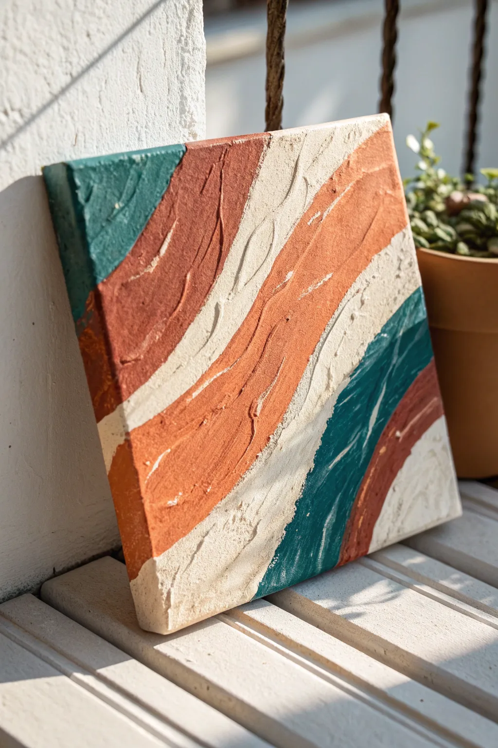
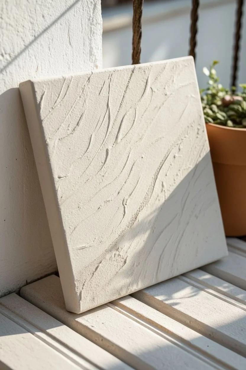
Create a stunning piece of modern wall decor with this simple abstract painting that focuses on heavy texture and earthy tones. Using modeling paste or plaster, you’ll sculpt undulating waves across the canvas before bringing them to life with diagonal swipes of teal, terracotta, and cream.
Step-by-Step Tutorial
Materials
- Square stretched canvas (approx. 10×10 or 12×12 inches)
- Modeling paste, texture paste, or joint compound
- Palette knife (trowel shape works best)
- Acrylic paints: Dark teal/turquoise, terracotta/rust orange, and warm cream/off-white
- Pencil
- Cardboard scrap or putty knife
- Drop cloth or messy mat
Step 1: Creating the Texture Base
-
Prepare your canvas:
Lay your canvas flat on a protected surface. If your canvas feels a bit loose, you might want to spray the back with water and let it dry to tighten it up before adding the heavy paste. -
Map out the design:
Lightly sketch diagonal wavy lines across the canvas with a pencil. These don’t need to be perfect; they are just guides to help you place the different texture sections. -
Apply the paste:
Scoop a generous amount of modeling paste onto the canvas using your palette knife. You want a thick layer, about the thickness of a coin. -
Spread and sculpt:
Spread the paste across the entire surface. Don’t smooth it out perfectly; instead, use the knife to create ridges and valleys that follow the diagonal wave pattern you sketched earlier. -
Add deep grooves:
Turn your palette knife on its edge or use a piece of cardboard to scrape distinct, deep linear grooves into the wet paste, enhancing the sweeping motion of the waves. -
Let it cure completely:
This is the hardest part—waiting. Allow the texture paste to dry completely. Depending on humidity and thickness, this can take anywhere from 12 to 24 hours. It must be rock hard before painting.
Crack Control
If your paste cracks while drying, mix a tiny bit of paste with water and fill the cracks. Let dry again. Avoid putting the canvas in direct sun or near a heater to prevent this.
Step 2: Adding the Color
-
Prepare your palette:
Squeeze out your teal, terracotta, and cream paints onto a palette or paper plate. Keep them separate for now. -
Start with the teal:
Dip your brush or a clean palette knife into the dark teal paint. Focus on the top left corner and a matching curved section near the bottom right to establish balance. -
Apply the terracotta:
Paint the large, sweeping bands of rust orange next to the teal sections. I find that painting in the direction of the texture ridges helps coverage. -
Fill in with cream:
Use the warm cream color to fill the remaining negative spaces between the colored bands. This neutral tone highlights the heavy texture best. -
Refine the edges:
Where the colors meet, don’t worry about a crisp straight line. Allow the paint to naturally follow the bumps and ridges of the dried paste, creating an organic, rugged transition. -
Dry brush highlights:
Once the base layer is tacky-dry, dip a dry brush lightly into the cream paint and wipe most of it off. Gently sweep it over the high points of the teal and terracotta sections to accentuate the texture. -
Paint the sides:
Extend your colors over the edges of the canvas. This gallery-wrap effect gives the piece a finished, professional look without needing a frame. -
Final drying time:
Let the acrylic paint dry completely. Since the surface is textured, check the deep grooves to ensure no wet paint is hiding in the crevices.
Tinting Tip
You can mix your acrylic paint directly into the wet paste before applying it. This creates a through-body color so if you chip it later, white won’t show through.
Hang your textured masterpiece in a spot where natural sunlight can hit the ridges and cast dynamic shadows


Have a question or want to share your own experience? I'd love to hear from you in the comments below!