Monochromatic paintings are my favorite way to get big mood and depth without juggling a whole rainbow. When you stick to one color family and push the value range from pale to near-black, your work instantly looks intentional and atmospheric.
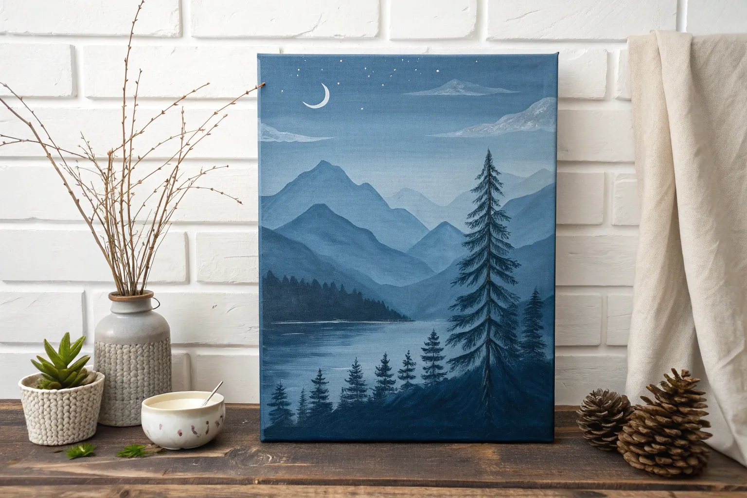
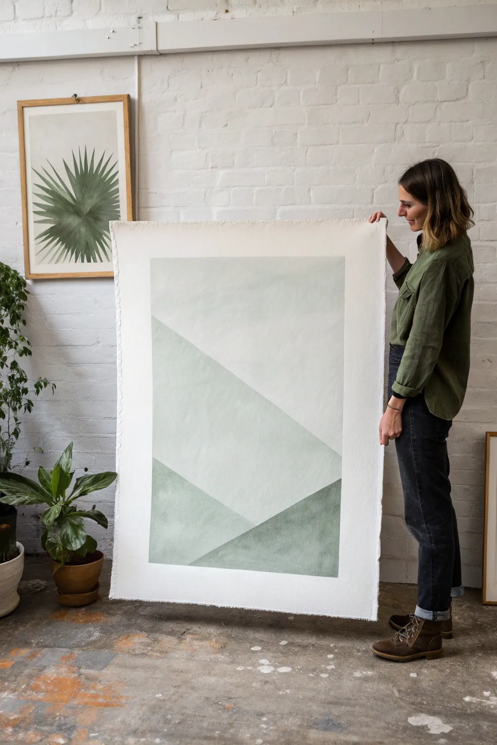
Layered Mountain Ranges in One Hue
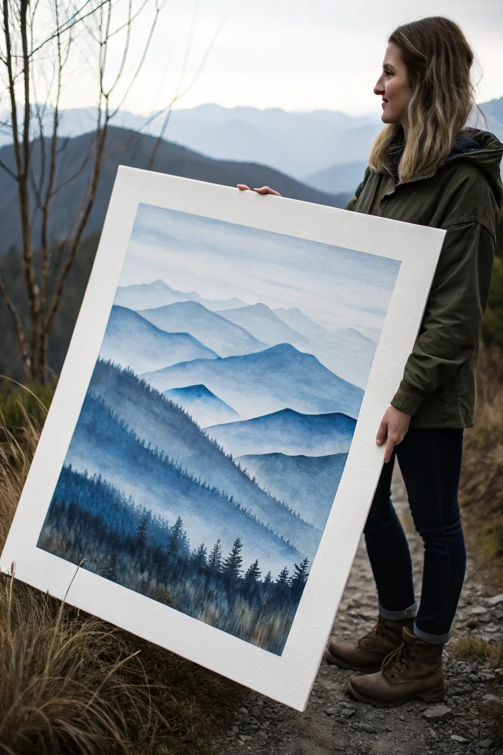
Capture the serene depth of a mountain range fading into the distance with this large-scale watercolor project. Using a single blue hue, you’ll master the art of atmospheric perspective by layering washes from faint, misty peaks to bold, detailed foregrounds.
How-To Guide
Materials
- Large sheet of cold-press watercolor paper (at least 18×24 inches)
- Indigo or Prussian Blue watercolor tube paint
- Large wash brush (flat or mottler)
- Round watercolor brushes (sizes 8 and 4)
- Detailed liner brush
- Mixing palette with multiple wells
- Two jars of water (clean and rinse)
- Masking tape
- Pencil (HB or 2H)
- Paper towels
Step 1: Preparation & Sky
-
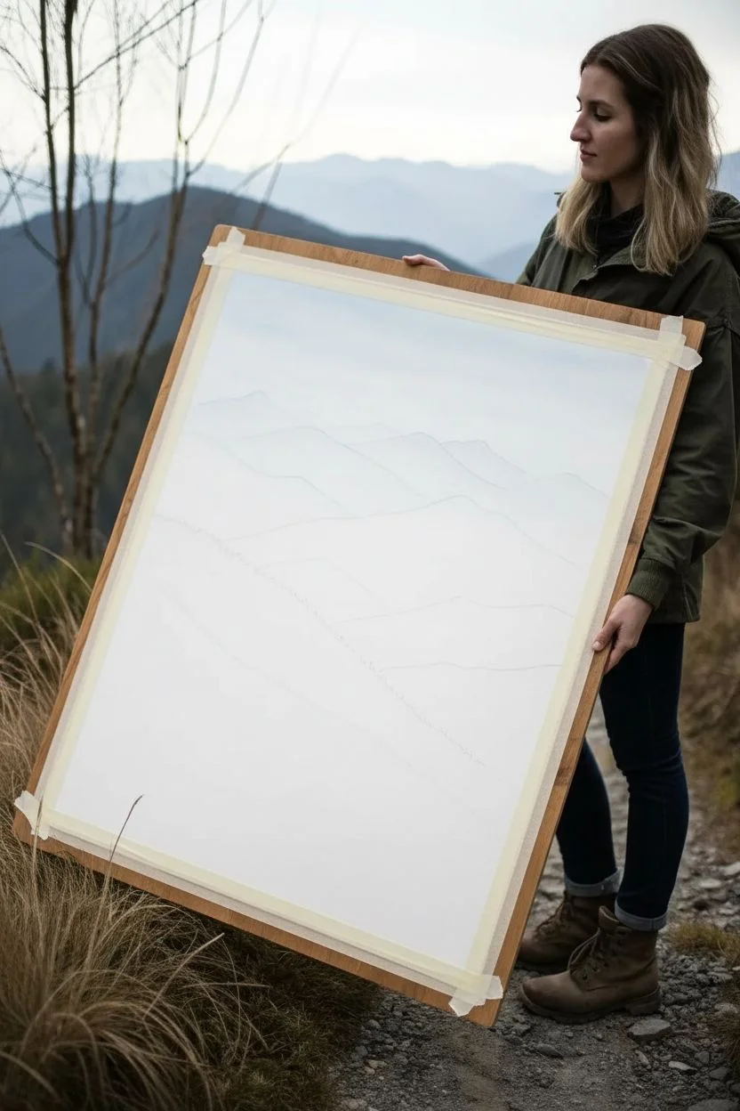
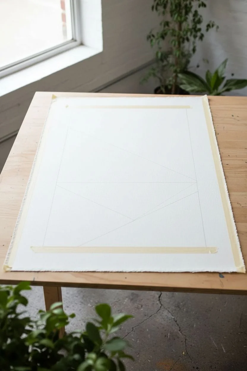
Secure the paper:
Begin by taping down all four edges of your large watercolor paper to a sturdy board or table. This prevents buckling when we apply heavy washes. -
Sketch the ranges:
Lightly sketch 5-6 overlapping undulating lines across the paper. These will be your mountain ridges. Keep the lines faint and irregular to mimic natural terrain. -
Mix your lightest wash:
Dilute a tiny amount of your blue paint with a large volume of water. Test it on a scrap piece; it should be barely visible, like a whisper of blue sky. -
Paint the sky:
Using your large wash brush, wet the entire sky area down to the first mountain line. Apply the very pale wash, perhaps adding a slightly stronger tint near the top to create a gradient. -
Dry completely:
Let the sky layer dry fully. If the paper feels cool to the touch, it’s still damp. Patience is key for crisp edges.
Mist Master
To enhance the foggy look, run a brush with clean water along the bottom edge of a wet mountain shape. This softens the fade into the white paper below.
Step 2: Middle Distant Layers
-
Mix the second value:
Add a touch more pigment to your mix. This next layer needs to be just slightly darker than the sky. -
First mountain ridge:
Paint the most distant mountain range. Create a crisp edge along the top silhouette, then fade the wash out with clear water as you move downward into the area that will be covered by lower mountains. This creates a misty effect. -
Dry and darken:
Once the previous layer is bone dry, mix a slightly darker value. I find that increasing pigment by about 20% for each layer creates the best depth. -
Second mountain ridge:
Paint the next ridge down, overlapping the first. The crisp top edge against the lighter mountain behind it creates the illusion of distance. -
Create variation:
As you paint these middle layers, don’t make the color perfectly uniform. Drop in a tiny bit of clear water or slightly more concentrated pigment while the shape is wet to add texture. -
Continue layering:
Repeat this process for the next 2-3 ridges, making your blue mix progressively darker and richer with each step downward.
Color Shift
Add a tiny drop of purple to the distant layers and a drop of green to the foreground layers. This subtle temperature shift increases the 3D effect.
Step 3: Foreground Depth
-
Mix the deepest value:
Prepare a very concentrated mix of paint for the foreground. It should be thick and dark, almost straight from the tube but fluid enough to flow. -
Paint the nearest slope:
Using a round brush, paint the large, diagonal slope in the immediate foreground. This should be the darkest shape on the paper. -
Add texture while wet:
While this dark wash is still wet, you can lift out small vertical streaks with a damp brush to suggest grassy textures or light hitting the ridge. -
Switch to a liner brush:
Now, load your liner or small round brush with the darkest pigment mix. -
Paint pine trees:
Along the silhouette of this closest ridge, paint tiny vertical lines. Use a tapping motion to create the jagged branches of distant pine trees. -
Connect the trees:
Ensure the bottoms of the trees blend seamlessly into the dark mass of the mountain below them so they look rooted, not floating. -
Add final details:
Scumble a dry brush with dark paint near the bottom edge to create the look of rough vegetation and tall grasses in the immediate foreground. -
Remove tape:
Wait until the painting is 100% dry before carefully peeling off the masking tape at a 45-degree angle to reveal your clean white border.
Step back and admire how simple layers creates a vast, atmospheric landscape ready for framing


Moody Forest Silhouettes Against a Gradient Sky
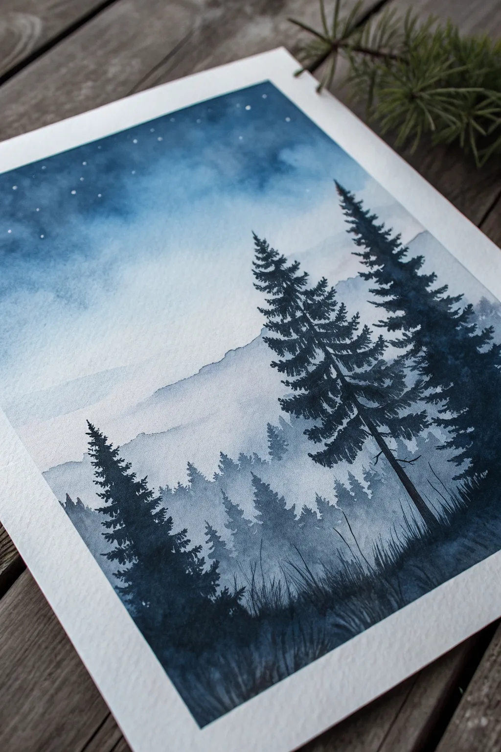
Using only a single shade of indigo or Payne’s gray, you can capture the serene mystery of a mountain forest at night. This watercolor project relies on mastering water control to create depth through varying values, from wispy distant peaks to striking foreground silhouettes.
Step-by-Step Tutorial
Materials
- Cold Press Watercolor Paper (heavyweight, 140lb/300gsm)
- Watercolor Paint (Indigo, Payne’s Gray, or Prussian Blue)
- White Gouache or White Gel Pen
- Flat Wash Brush (1/2 inch or larger)
- Round Brushes (Size 6 for trees, Size 0 or 2 for details)
- Masking Tape
- Two Cups of Water
- Paper Towels
- Mixing Palette
Step 1: Setting the Scene
-
Tape the edges:
Begin by taping down all four edges of your watercolor paper to a board or table. Press the tape firmly to ensure clean, crisp borders later on. -
Prepare your palette:
Squeeze a generous amount of your chosen blue paint onto the palette. Create two puddles: one very concentrated and dark, and one extremely watered down for the lightest values.
Bleeding edges?
If paint bleeds under the tape, try using a hairdryer to heat the tape gently before applying it, or use professional painter’s tape and press the edge with a bone folder.
Step 2: The Night Sky
-
Wet the sky area:
Using your large flat brush and clean water, thoroughly wet the top two-thirds of the paper. The paper should glisten but not have standing puddles. -
Apply the darkest sky value:
Load your brush with the concentrated dark paint. Apply horizontal strokes across the very top of the paper, letting the pigment bleed downward into the wet surface. -
Create the gradient:
Rinse your brush slightly and blend the dark top section downwards. As you move lower, add more water to the brush so the blue fades into a very pale, nearly white wash where the mountains will begin. -
Lift clouds (optional):
While the sky is still damp, you can gently dab a crumpled paper towel into the wet paint to lift some pigment, creating soft, nebulous cloud shapes. -
Let it dry completely:
Wait until the paper is bone dry. If you paint the mountains too soon, they will bleed uncontrollably into your sky.
Level Up: Color shift
Instead of pure blue, mix a tiny dot of black or dark purple into your foreground paint. This subtle shift makes the closest trees pop against the blue background.
Step 3: Layering the Mountains
-
Paint the furthest range:
Mix a very watery, pale wash of blue. Using a round brush, paint an uneven, jagged range of mountains just below the sky gradient. Keep the bottom edge soft by adding water to fade it out. -
Dry and repeat:
Allow that first layer to dry. Create a slightly darker mix of paint. Paint a second mountain range partially overlapping the first one to create a sense of distance. -
Create the middle ground mist:
Continue adding layers of mountains or hills, making each subsequent layer slightly darker and lower on the page. I like to keep the bottom edges of these shapes wet and blurry to mimic mist settling in the valley. -
Suggest distant treetops:
On the third or fourth layer of hills (medium value), use the tip of your brush to stipple tiny, vertical uneven spikes along the ridge line to suggest distant trees.
Step 4: The Foreground Forest
-
Mix maximum opacity:
For the foreground, you need your darkest possible value. Mix the paint with very little water so it is creamy and intense. -
Paint the main tree trunk:
Using a small round brush (size 2 or 6), paint a thin vertical line for a large pine tree on the right side. It doesn’t need to be perfectly straight; natural curves look better. -
Add pine branches:
Starting from the top of the tree, use a zigzag motion to add branches. Keep the top branches short and angled slightly upward, making them wider and heavier as you move down the trunk. -
Create a second tree:
Paint a second, slightly smaller tree nearby or on the left side to balance the composition. Ensure the branches look organic and somewhat texture-heavy. -
Fill the bottom silhouette:
Use the dark paint to fill in the ground at the very bottom. Paint upward, flickering strokes to create the look of tall grasses growing around the base of the trees. -
Add subtle scrub:
Paint smaller, jagged shapes near the bottom to represent smaller bushes or saplings in the foreground darkness.
Step 5: Finishing Touches
-
Add stars:
Once the sky is totally dry, use white gouache or a white gel pen to dot tiny stars in the darkest upper section of the sky. -
Vary star sizes:
Make a few stars slightly larger and brighter than the others to create a realistic constellation effect. -
Remove tape:
Wait for every part of the painting to be completely dry. Peel the masking tape away slowly at a 45-degree angle to reveal your crisp white borders.
Step back and admire the depth you’ve created with just one simple color


Simple Ocean Wave Study in One Color Family
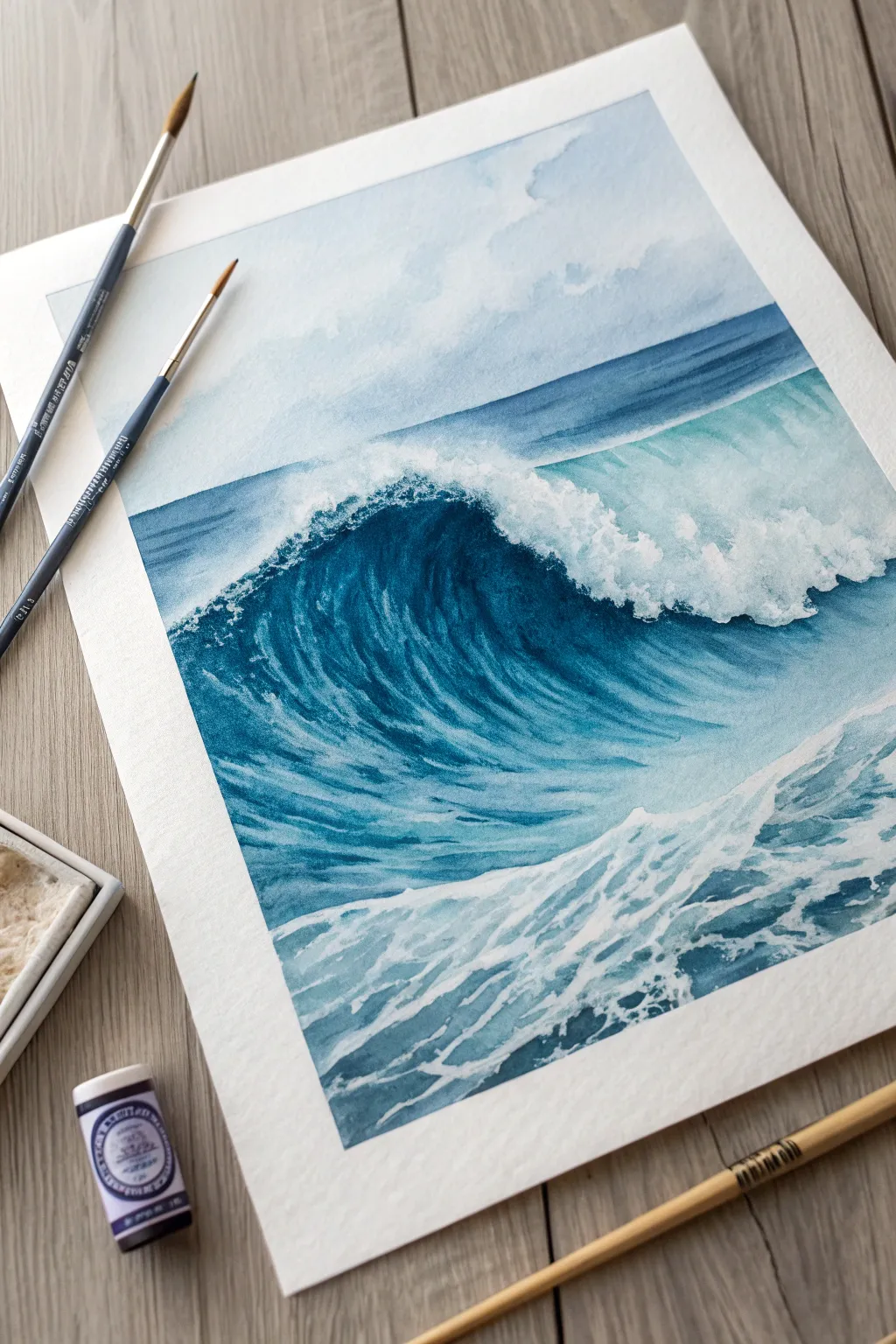
Capture the powerful motion of the sea using a single color family in this watercolor wave study. By layering indigo and teal tones, you will create depth and drama while leaving stark white paper reserved for the crashing foam.
Step-by-Step Tutorial
Materials
- Cold press watercolor paper (140lb/300gsm)
- Watercolor paints: Indigo, Prussian Blue, Turquoise
- Masking fluid (optional but helpful)
- Round watercolor brushes (size 4 and 8)
- Clean water jar
- Paper towels
- Drafting tape
- Pencil (HB or H)
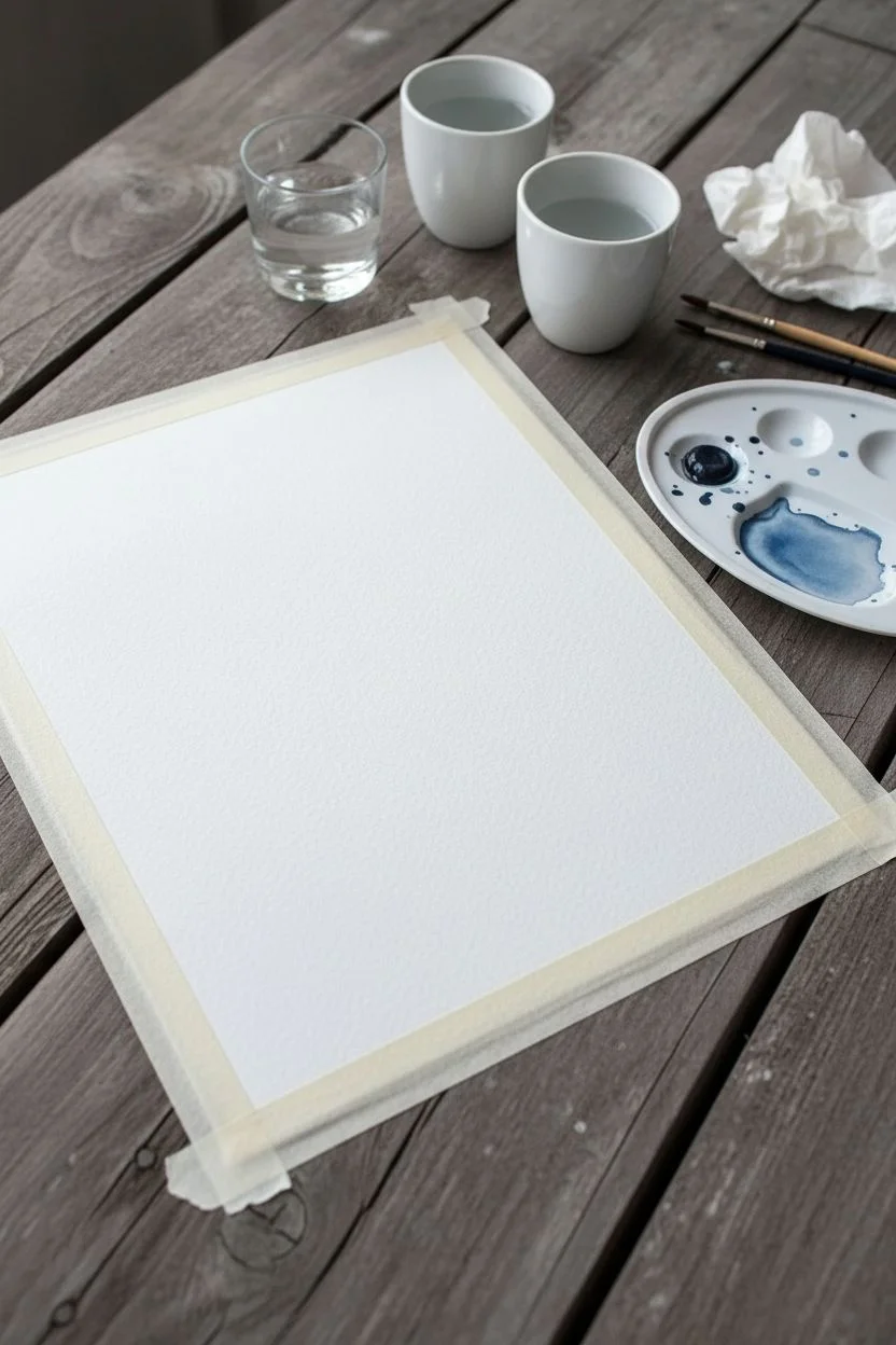
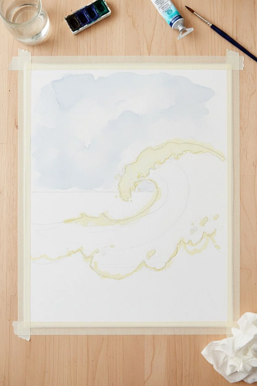
Step 1: Preparation & Sky
-
Secure Your Paper:
Tape your watercolor paper down to a board on all four sides. This prevents warping and creates a clean white border. -
Sketch the Composition:
Lightly sketch the horizon line about one-third down from the top. Outline the main curl of the wave and map out the jagged shapes of the sea foam in the foreground. -
Preserve the Highlights:
If you struggle with negative painting, apply masking fluid to the brightest white foam on the wave’s crest and the splashing foam in the foreground. Let it dry completely. -
Wet-in-Wet Sky:
Wet the sky area with clean water. Drop in a very dilute wash of indigo and water, letting it bloom softly to suggest distant clouds. Keep this extremely pale.
Step 2: The Distant Ocean
-
Horizon Line:
Once the sky is dry, mix a medium-strength wash of indigo and Prussian blue. Paint a straight horizon line and fill down to just behind the main wave. -
Gradated Transition:
While that strip is still wet, soften the bottom edge as it approaches the wave curl, letting the color fade slightly to indicate distance and mist.
Muddy Waters?
If your blues look dull, you likely overworked the wet paper. Let layers dry completely between glazes. Watercolors need patience to keep their transparency and glow.
Step 3: The Main Wave
-
Underpainting the Curl:
Paint the main body of the wave with a light wash of turquoise. This sets the translucent glow often seen where the sun hits the water. -
Deepening Shadows:
While the underpainting is damp, drop concentrated indigo into the deepest part of the curl (under the white lip). Use directional strokes that follow the curve of the water. -
Building Form:
Continue layering darker blues into the barrel of the wave. Leave the turquoise showing through in the middle section to create translucency. -
Rough Texture:
Use a ‘dry brush’ technique on the face of the wave. Load your brush with pigment but blot it on a towel, then drag it quickly across the paper texture to create sparkle and movement.
Level Up: Salt Texture
While the paint in the foreground water is still wet, sprinkle a pinch of table salt. As it dries, the salt pushes pigment away, creating organic, foamy textures effortlessly.
Step 4: Foreground & Foam
-
Foreground Wash:
Paint the water in front of the wave with a mix of turquoise and blue. Painted around your masked areas or reserved white spaces. -
Defining Foam Patterns:
Using your smallest brush and a dark indigo mix, paint negative shapes around the foam patterns in the foreground water. You are painting the water shadows, not the white foam itself. -
Connecting Shadows:
Connect the shadow shapes in the foreground water with soft, horizontal strokes to make the surface look ripples and uneven.
Step 5: Final Details
-
Remove Masking:
If you used masking fluid, gently rub it away with your finger or a rubber pickup tool once the paper is bone dry. -
Softening Edges:
Check the edges of your white foam. If they look too hard or like cut-outs, use a clean, damp brush to gently soften non-essential edges to integrate them into the water. -
Splatter Texture:
Load a toothbrush or stiff brush with white gouache (or very thick white watercolor) and flicker a fine mist over the wave crest for extra spray effect. -
Final Contrast Check:
Assess your values. Add one final layer of your darkest indigo into the deepest crevice of the wave curl to maximize contrast against the white foam.
Peeling off the tape to reveal that crisp white border is the most satisfying finish to your seascape study


Single-Color Sunset Using Warm Monochrome
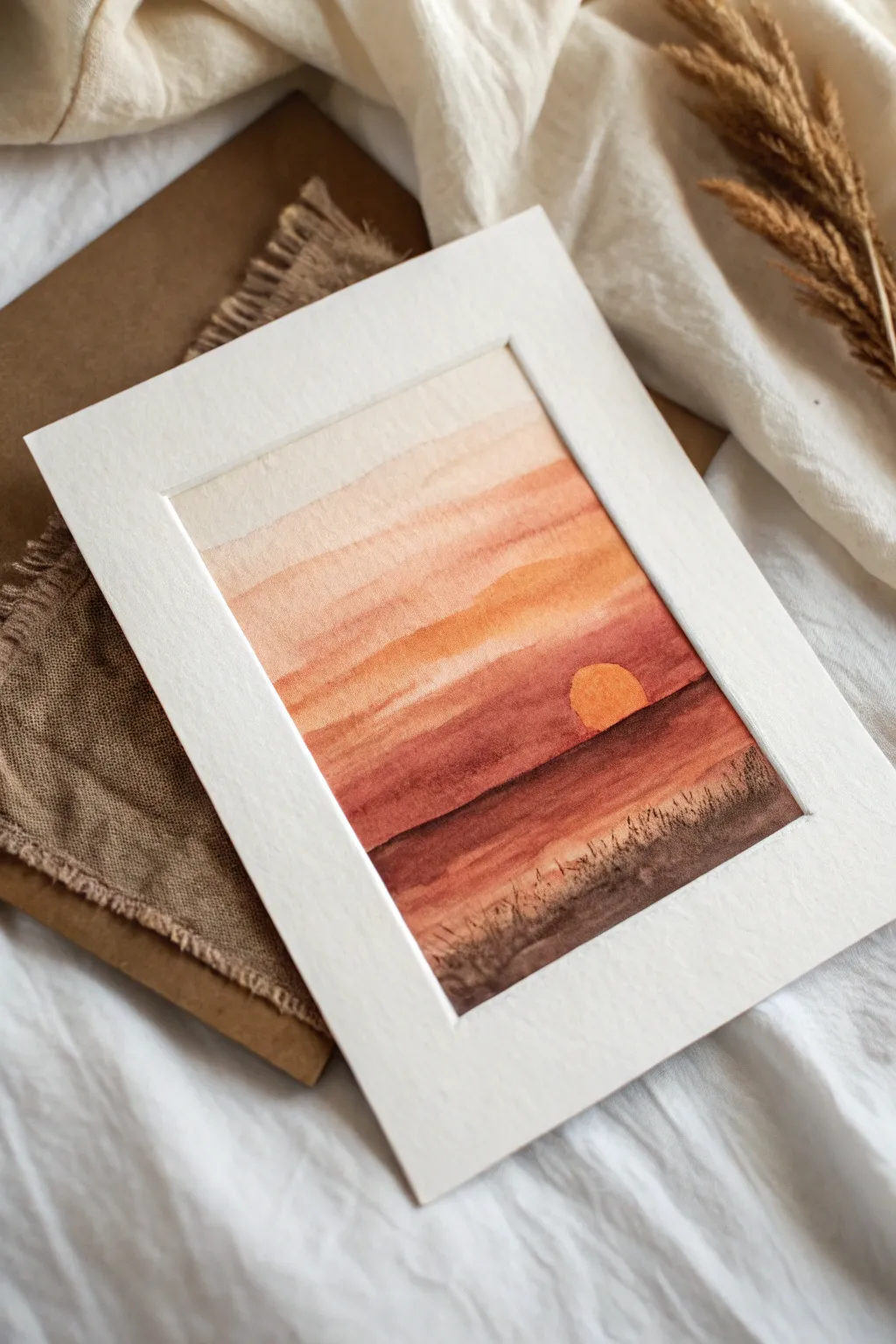
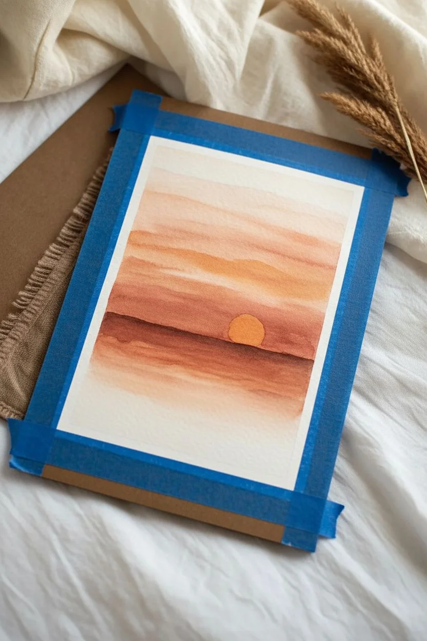
This serene landscape captures the warmth of a setting sun using mostly deep red-orange and soft beige tones. By layering washes of similar colors, you’ll create a glowing horizon that feels both simple and striking.
How-To Guide
Materials
- Cold press watercolor paper (approx. 5×7 inches)
- Watercolor paints (Burnt Sienna, Yellow Ochre, Alizarin Crimson)
- White or cream mat board for framing
- Painter’s tape or masking tape
- Soft round watercolor brush (size 8 or 10)
- Small liner or detail brush (size 0 or 2)
- Palette for mixing
- Two jars of water
- Paper towels
Step 1: Setting the Sky
-
Paper Prep:
Begin by taping down the edges of your watercolor paper to a hard board or table. This creates that clean, crisp border you see in the finished piece and keeps the paper from buckling. -
Mixing the Base Tone:
In your palette, mix a very watery, pale wash of Burnt Sienna with a touch of Yellow Ochre. This will be the lightest part of your sky. -
First Wash:
Using your large round brush, apply a broad horizontal stripe of this pale mixture across the top third of the paper. Use plenty of water so the pigment floats gently. -
Softening the Edge:
While that first stripe is still wet, dip your brush in clean water and drag the bottom edge downward to fade it out, creating a soft transition for the next layer. -
Building Intensity:
Mix a slightly stronger version of your Burnt Sienna, adding a tiny hint of Alizarin Crimson to warm it up. -
Middle Sky Layer:
Wait until the first layer is damp but not soaking wet. Paint another horizontal band below the first one, letting the edges touch and bleed slightly for a natural gradient look.
Step 2: The Horizon and Sun
-
Defining the Sun:
Before painting the horizon line, identify where your sun will sit. I like to paint around a small semi-circle shape, leaving the paper white or washing it with very faint yellow. -
Painting the Sun:
Once the surrounding area is dry, fill that circle with a mix of Yellow Ochre and a drop of orange. Keep it soft and slightly muted to match the monochromatic theme. -
Deepening the Colors:
Mix a concentrated amount of Burnt Sienna and Alizarin Crimson. You want a deep, rich terra cotta color now, much less watery than before. -
Horizon Line:
Paint a firm, straight(ish) line across the paper, crossing right over the bottom half of the sun. This establishes the distant land or sea line. -
Foreground Gradient:
Drag that dark color downwards, filling the rest of the bottom section. As you move lower, you can add even more pigment to make the bottom of the page the darkest point.
Unwanted Blooms?
If you see cauliflower-like blooms in your sky, you likely added water to a drying section. Let it dry completely, then gently glaze over it to smooth it out.
Step 3: Details and Finishing
-
Dry Time:
It is crucial to let the main painting dry completely before adding texture. Touch the paper lightly with the back of your hand; if it feels cool, it’s still wet. -
Mixing Shadow Color:
Create your darkest value yet. Use your Burnt Sienna and perhaps a touch of Payne’s Grey or dark brown to create a deep shadow color for the silhouettes. -
Adding Grass Texture:
Switch to your small liner brush. Using the tip, flick quick, upward strokes starting from the very bottom edge of the paper. -
Varying the Heights:
Make some grass blades tall and others short to keep it looking organic. Angle them slightly differently so they don’t look like soldiers in a row. -
Final Touches:
Add a few tiny dots or thicker clumps near the base of the grass to simulate earth texture. -
The Reveal:
Once everything is bone dry, carefully peel away the painter’s tape at a 45-degree angle to reveal your crisp white edges. -
Matting:
Place your finished artwork behind a white or cream mat board. This instantly elevates the simple painting and makes the warm colors pop.
Level Up: Birds
Use a 00 brush and your darkest paint mix to add two or three tiny, distant birds in “v” shapes near the sun for added scale and movement.
Now you have a warm, glowing landscape that brings a bit of sunset calm into your home
BRUSH GUIDE
The Right Brush for Every Stroke
From clean lines to bold texture — master brush choice, stroke control, and essential techniques.
Explore the Full Guide
Desert Dunes With Tonal Shadows
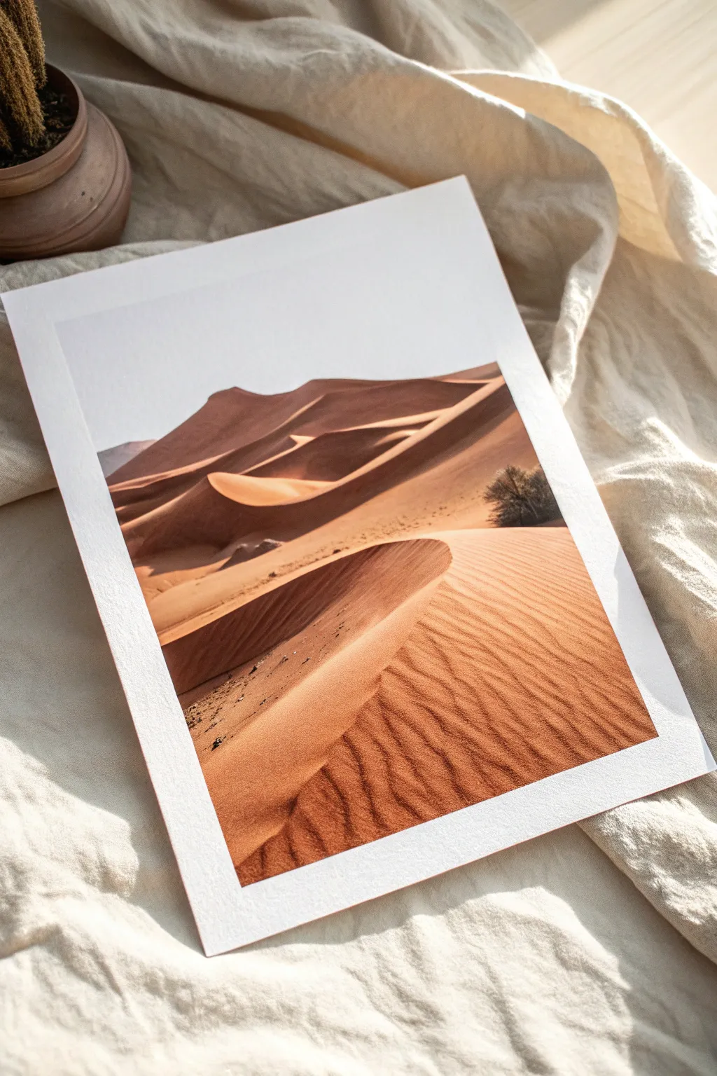
Capture the serene warmth and dramatic contours of a desert landscape using a limited palette of burnt oranges and deep browns. This tutorial guides you through building layers of acrylic washes to achieve the soft, undulating texture of sand dunes.
Detailed Instructions
Materials
- Heavyweight watercolor paper or mixed media paper (300gsm)
- Acrylic paints (Burnt Sienna, Yellow Ochre, Burnt Umber, Titanium White, Mars Black)
- Flat shader brushes (sizes 8 and 12)
- Small round detail brush (size 2)
- Palette knife (optional for mixing)
- Water container and paper towels
- Pencil for sketching
- Paper framing tape (masking tape)
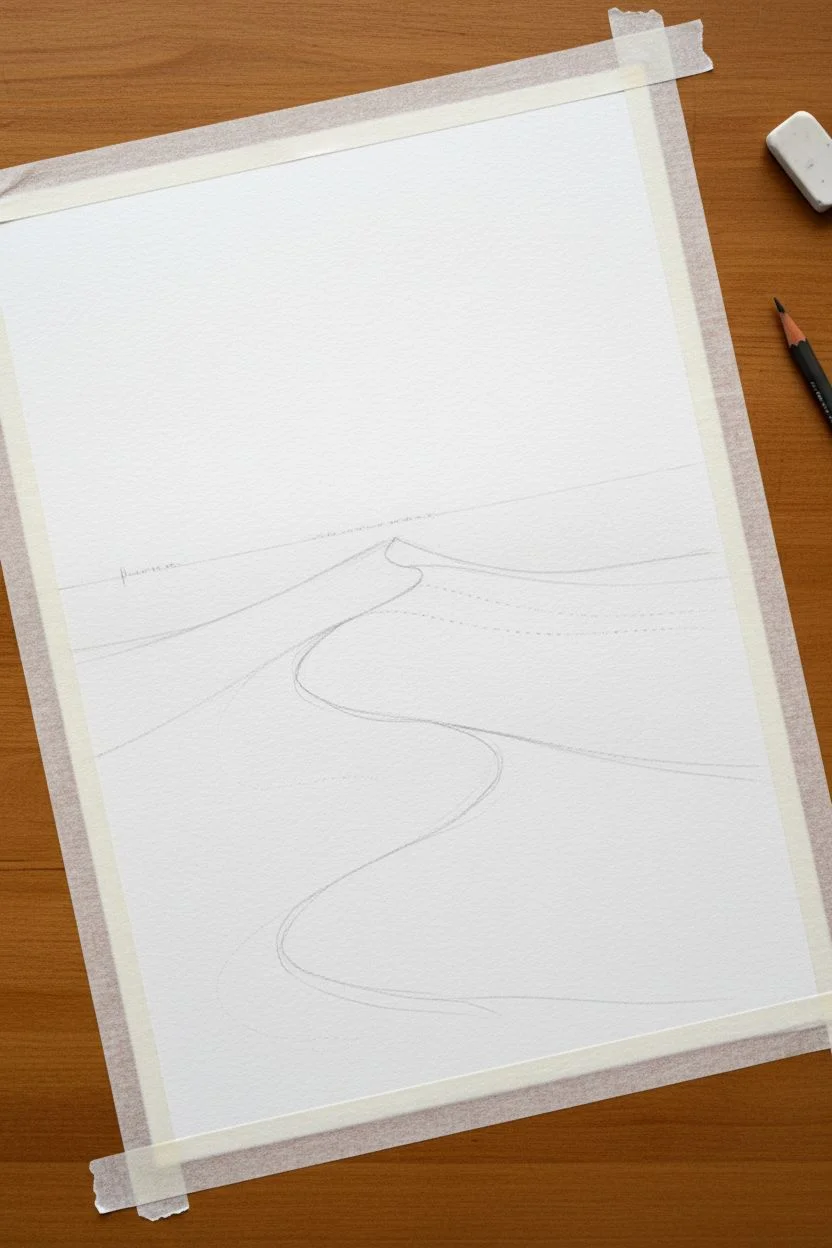
Step 1: Preparation & Sketching
-
Secure the paper:
Tape down all four edges of your paper to a flat surface using paper framing tape. This creates a clean white border (like a built-in mat) and prevents the paper from buckling when wet. -
Map the horizon:
Lightly sketch the main horizon line about one-third down from the top of the page. It doesn’t need to be perfectly straight; a slight dip adds realism. -
Outline the dunes:
Draw the sweeping, S-curve shapes of the primary dunes. Focus on where the sharp ridges will divide the light side from the shadow side. -
Mark shadow zones:
Very faintly indicate where the deepest shadows will fall behind the ridges. This map will save you while painting.
Step 2: Base Colors & Sky
-
Mix the sky tone:
Create a very pale grey-blue or off-white. For this high-contrast look, the sky is almost blown out, so use mostly White with a tiny dot of Black or Blue. -
Paint the sky:
Fill in the sky area with a solid coat. Keep the edge where the sky meets the farthest dune crisp. -
Mix the sand base:
Combine Yellow Ochre with a touch of Titanium White and a very small amount of Burnt Sienna to create a warm, sandy beige. -
Apply the first wash:
Dilute the paint slightly with water. Wash this base color over all the sand areas, ignoring the shadows for now. Let this layer dry completely.
Muddy colors?
If your oranges look dull, clean your water jar. Orange is easily muddied by dirty brush water. Mix fresh paint for the highlights.
Step 3: Defining the Dunes
-
Mix the mid-tone:
Add more Burnt Sienna to your base mixture to create a richer, terracotta orange. This will act as the transitional color on the sunlit sides of the dunes. -
Create gradients:
Using a flat brush, paint the sunlit sides of the dunes. I like to keep the paint thicker near the ridge line and feather it out as it moves down the slope. -
Create the shadow mix:
Mix Burnt Umber with a touch of Mars Black and Burnt Sienna. You want a deep, chocolatey color, not pure black. -
Paint the main shadows:
Apply this dark mix to the shaded side of the primary dune ridge. Use the edge of your flat brush to make the ridge line sharp and distinct. -
Soften the shadow edges:
While the shadow paint is still slightly wet, work the bottom edge into the lighter sand below it to create a soft transition, mimicking how light reflects in the desert.
Level Up: Texture Gel
Mix fine sand or pumice gel into your acrylic paint for the foreground dune. The gritty texture will catch the light beautifully.
Step 4: Texture & Details
-
Mix a ripple color:
Create a wash that is slightly darker than your sunlit sand color (Yellow Ochre + Burnt Sienna + Water). -
Add sand ripples:
Using the small round brush, paint fine, rhythmic lines across the foreground dune. Follow the curve of the dune’s slope. These lines should be faint and repetitive. -
Add texture marks:
For the darker shadowed areas, dry brush a tiny amount of black/brown mix to create the granular look of rough sand. -
Paint the shrub:
Use the small brush and pure Mars Black (or very dark brown) to stipple a small, bushy shape on the right side of the composition. -
Refine the ridges:
Go back over the main ridge lines with your darkest shadow color to ensure that sharp separation between light and dark remains the focal point. -
Reveal the border:
Once the painting is 100% dry, carefully peel away the framing tape at a 45-degree angle to reveal the crisp white edge.
Frame this piece behind glass to highlight the stark contrast between the warm dunes and the crisp white border
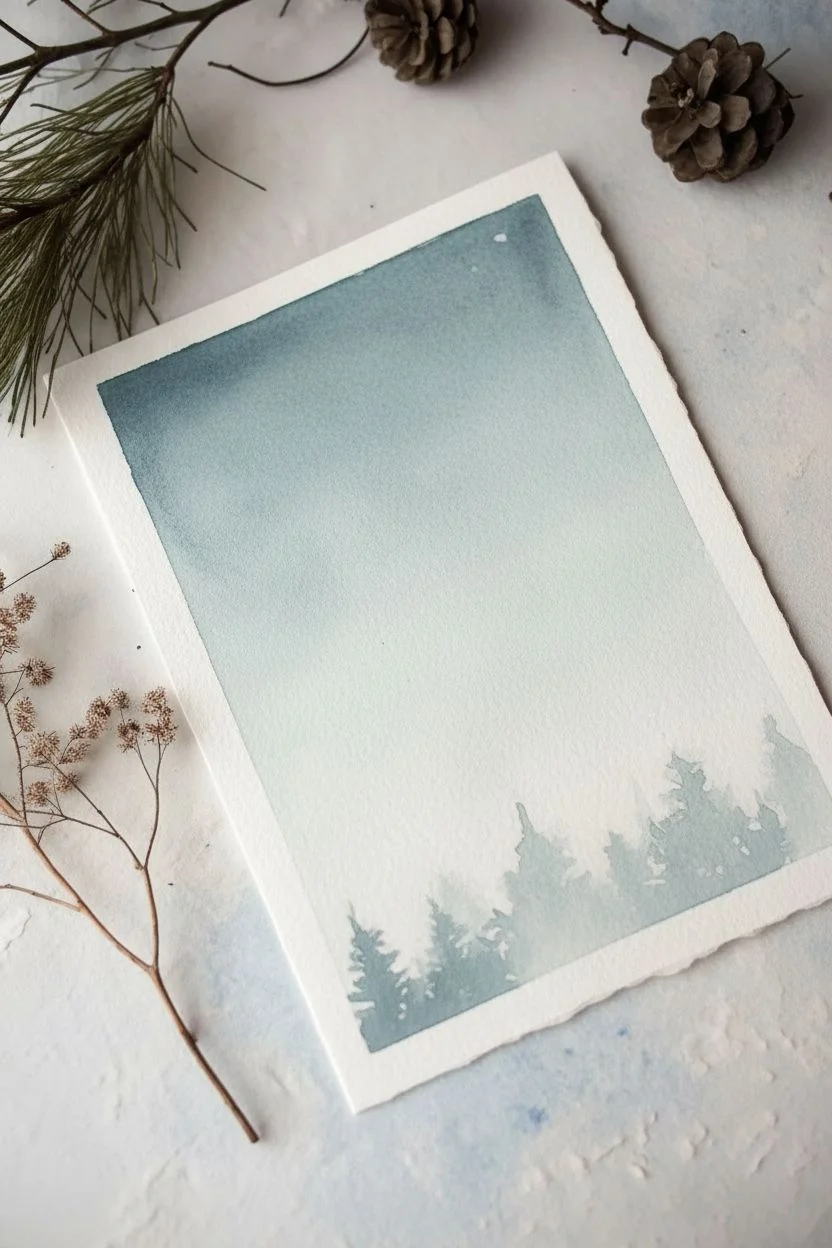
Bare Winter Branches as High-Contrast Linework
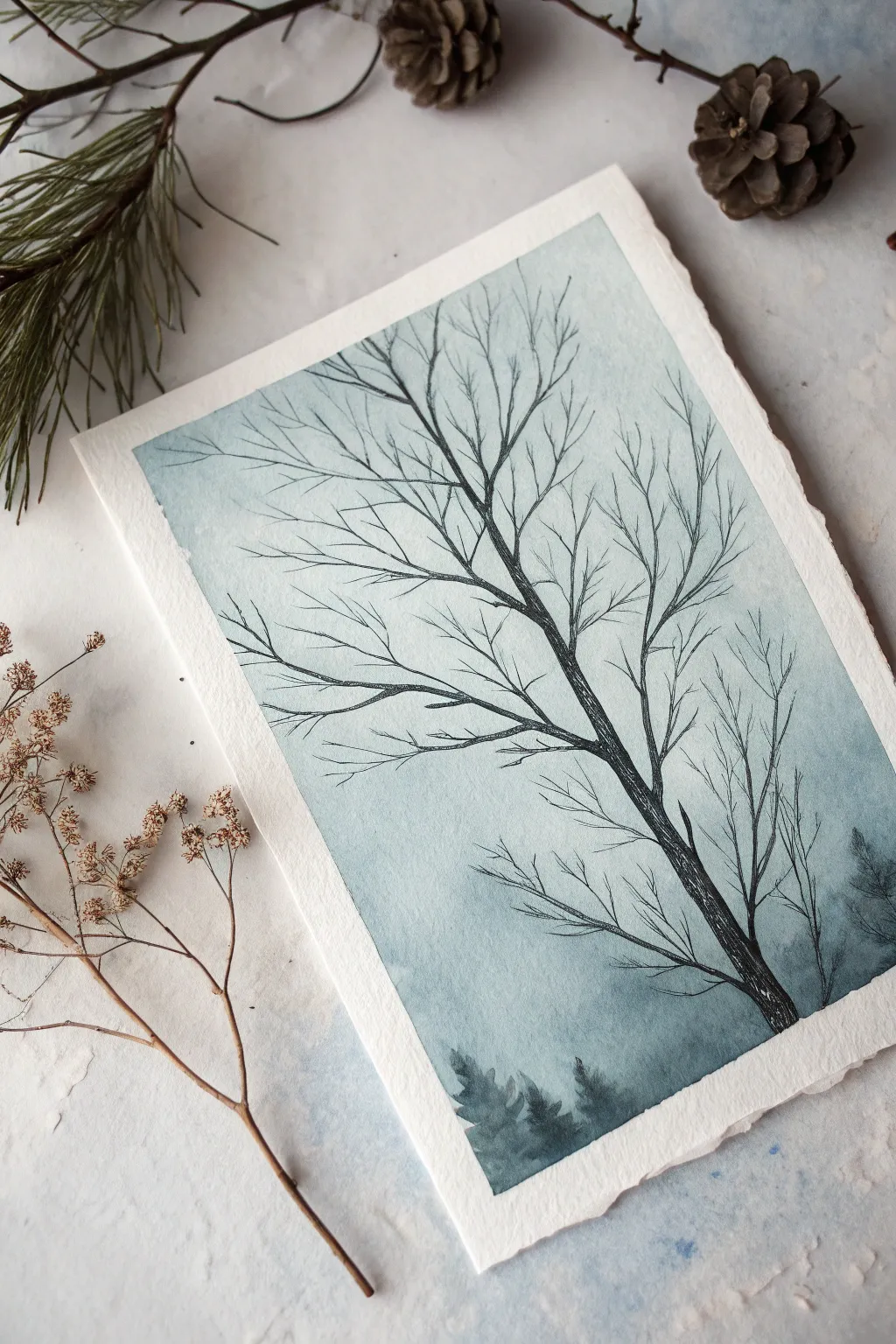
Capture the stark beauty of winter with this atmospheric study of a leafless tree reaching toward a moody sky. This monochromatic piece combines soft watercolor washes with crisp, high-contrast line work to create depth and drama on textured paper.
Step-by-Step Guide
Materials
- Cold-press watercolor paper (300gsm, deckle edge preferred)
- Watercolor paints (Payne’s Grey, Indigo, or Prussian Blue)
- Flat wash brush (1-inch)
- Fine liner brushes (Size 0 and 2)
- Waterproof black ink or micron pens (optional)
- Masking tape
- Paper towels
- Clean water
Step 1: Preparing the Atmosphere
-
Paper Preparation:
Begin by securing your cold-press paper to a flat board using masking tape along the edges. If you’re using paper with a beautiful deckle edge like in the example, you might choose to tape the back or float-mount it, but securing it ensures it stays flat during the wash. -
Mixing the Gradient:
Prepare a very dilute mixture of your chosen blue-grey hue—Payne’s Grey works beautifully for this. You want a ‘tea consistency’ wash that is mostly water. -
Applying the Wash:
Load your flat wash brush. Start at the top of the paper and sweep horizontally across, working your way down. -
Creating the Fade:
As you move toward the bottom third of the paper, dip your brush into clean water to dilute the paint on the bristles. This creates a natural gradient where the sky gets lighter and mistier near the ‘horizon’ line. -
Adding Distant Trees:
While the bottom section is still slightly damp but not soaking, mix a slightly stronger value of your grey-blue. Using a round brush, drop in vague, soft tree shapes along the very bottom edge. Let the paint bleed slightly upward into the damp paper to create a blurry, out-of-focus background forest. -
Full Dry:
This step is crucial: let the paper dry completely. If the paper is cool to the touch, it’s still damp. Wait until it is bone dry before starting the detailed line work to prevent the crisp lines from bleeding.
Pro Tip: Shaking Hands Helper
A slight shake in your hand is actually an asset here! Perfectly straight lines look unnatural on trees. Relax your grip and let the brush wander slightly for realistic branches.
Step 2: Drawing the Silhouette
-
Anchoring the Trunk:
Switch to your smallest liner brush loaded with highly concentrated paint (cream consistency) or use a waterproof fineliner pen. Start the main trunk in the bottom right corner, curving it gently diagonally upward toward the center. -
Building Texture:
Don’t draw a perfect solid line for the trunk. Instead, use short, broken strokes and varying pressure to mimic the roughness of bark. -
Main Branches:
Extend two or three primary branches from the main trunk. Keep them jagged and somewhat angular rather than perfectly smooth curves; bare winter branches often have sharp ‘elbows’ and sudden direction changes. -
The Secondary Growth:
From your primary branches, begin pulling out secondary branches. I like to twist the brush slightly as I pull the stroke to get that organic, unpredictable line quality. -
Fine Twigs:
Using the very tip of your size 0 brush or a fine pen, add the delicate twiggy growth at the ends of the branches. These lines should be hair-thin. -
Overlap for Depth:
Ensure some branches cross over others. This overlap is key to making the tree look three-dimensional rather than flat. -
Ghost Trees:
To add depth to the right side, mix a mid-tone wash (lighter than the main tree, darker than the sky). Paint a faint, secondary tree silhouette behind the main one on the right edge. This pushes the main black tree into the foreground. -
Refining the Contrast:
Go back to the main trunk with your darkest pigment. Add extra weight to the shadowed side (the right side of the trunk) to enhance the cylindrical form. -
Final Touches:
Step back and assess the balance. If the top left feels too empty, extend a few thin wispy twigs into that space, but keep the composition asymmetrical for interest.
Level Up: Salt Texture
While the initial sky wash is still wet, sprinkle a tiny pinch of table salt near the top. As it dries, it creates crystal-like textures that look like falling snow or frost.
Once the ink is fully dry, you will have a striking, minimalist piece that perfectly evokes the quiet stillness of winter

PENCIL GUIDE
Understanding Pencil Grades from H to B
From first sketch to finished drawing — learn pencil grades, line control, and shading techniques.
Explore the Full Guide
City Skyline Silhouette in a Single Hue
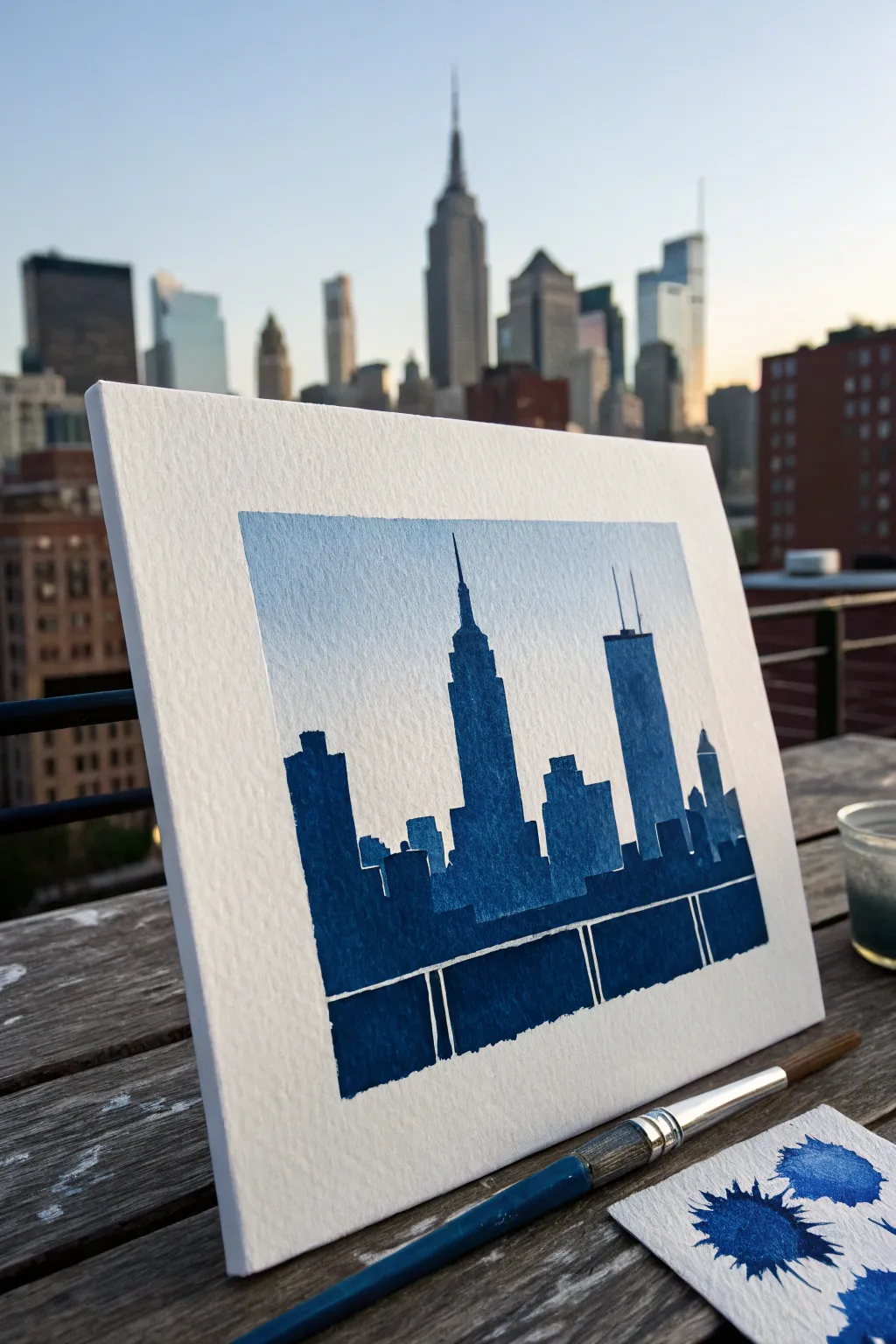
Capture the stark beauty of a city silhouette using just one color to create a stunning, architectural effect reminiscent of a blueprint cyanotype. This project plays with negative space and saturation to build a mood rather than realistic details, making it perfect for experimenting with monochromatic depth.
Step-by-Step
Materials
- Cold Press Watercolor Paper (approx. 140lb/300gsm)
- Painter’s Tape or Masking Tape
- Prussian Blue Watercolor Paint (or preferred dark blue)
- Flat Brush (medium size, approx. 1/2 inch)
- Fine Round Brush (size 2 or 4)
- Pencil and Eraser (optional)
- Ruler
- Two Jars of Water
- Paper Towels
- Scrap Paper for testing
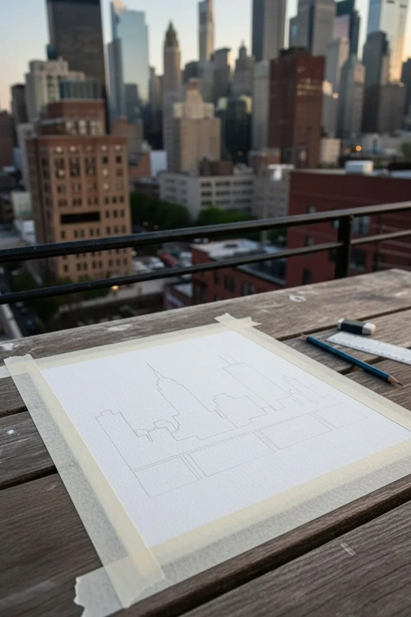
Step 1: Preparation and Sketching
-
Secure the Paper:
Begin by taping down your watercolor paper to a board or table on all four sides. Press the tape edges firmly to ensure a crisp, clean border when you peel it off later. -
Define the Frame:
Using more painter’s tape, create the inner rectangular border that will contain your painting. This creates that wide, professional-looking white margin seen in the reference photo. -
Establish the Horizon:
Lightly sketch a straight horizontal line across the bottom third of your painting area to represent the base where the buildings meet the water or ground. -
Outline the Key Landmarks:
Lightly draw the silhouette of the skyline. Focus on recognizable shapes like the Empire State Building’s spire or the slanted roof of the Citigroup Center. Keep these lines very faint, as you want the paint to do the work.
Step 2: Creating the Atmosphere
-
Mix a Weak Wash:
On your palette, take a small amount of Prussian Blue and mix it with plenty of water. You want a very pale, transparent ghostly blue for the sky. -
Paint the Sky:
Using your flat brush, apply this pale wash across the entire upper section of the paper, stopping just where the buildings begin. It doesn’t need to be perfectly even; a little texture adds character. -
Wait for Dryness:
Let this sky layer dry completely. If the paper is cool to the touch, it is still wet. Patience here prevents the dark buildings from bleeding into the sky.
Bleeding Edges?
If paint seeps under the tape, use a slightly damp, clean stiff brush to gently ‘scrub’ and lift the excess pigment while it’s still damp or use white gouache to cover it later.
Step 3: Building the City
-
Prepare Saturated Paint:
Mix a much stronger concentration of the same blue. It should be thick and dark, with very little water added, almost like ink consistency. -
Test the Opacity:
I always use a scrap piece of watercolor paper here to test the color intensity. You want a deep indigo that contrasts sharply with the pale sky. -
Edge the Buildings:
Switch to your fine round brush. Carefully paint the top outlines of the skyscrapers first, ensuring sharp points on spires and antennas. -
Fill the Shapes:
Once the delicate edges are defined, switch back to a slightly larger brush to fill in the main bodies of the buildings with your dark blue mix. -
Create Texture:
Don’t aim for a perfectly flat fill. Allow the natural texture of the cold press paper to show through slightly, giving the buildings a concrete, grainy feel.
Level Up: Salt Texture
While the dark blue paint on the buildings is still wet, sprinkle a few grains of table salt into the wettest areas. It creates a starry, textured bloom effect as it dries.
Step 4: The Foreground Details
-
Mask the Railing:
For the railing effect at the bottom, you can use thin strips of masking tape or simply carefully paint around the negative space. The goal is to leave thin vertical white lines unpainted. -
Paint the Foreground Block:
Fill the bottom-most section below the railing with the same deep blue, creating a solid base that grounds the image. -
Check for Gaps:
Look over the painting for any unintentional white spots within the buildings and touch them up with the fine brush. -
The Reveal:
Wait until the paint is bone dry—leaving it overnight is safest. Then, slowly peel back the tape at a 45-degree angle to reveal your crisp, clean edges.
Now step back and admire how a single color can capture the grandeur of an entire metropolis
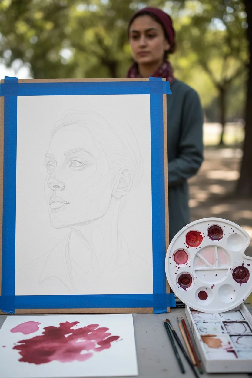
Single-Color Portrait With Bold Shadow Shapes
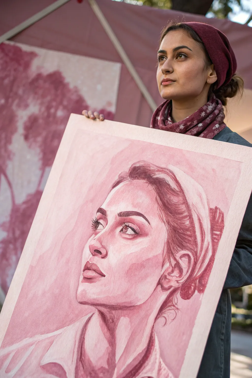
This striking portrait demonstrates the power of limiting your palette to a single hue, using deep burgundy and soft pinks to sculpt form purely through light and shadow. By focusing on bold shapes rather than intricate coloring, you’ll create a dramatic and sophisticated piece that captures emotion with just one color.
Detailed Instructions
Materials
- Large heavy-weight watercolor paper or illustration board (18×24 inches or larger)
- Burgundy or Alizarin Crimson watercolor or gouache paint
- Large flat wash brush (1-inch)
- Round synthetic brushes (size 4, 8, and 12)
- Fine liner brush (size 0 or 1)
- Mixing palette with multiple wells
- Graphite pencil (HB or 2H) for sketching
- Kneaded eraser
- Masking tape
- Two jars of water
- Paper towels
Step 1: Preparation and Sketching
-
Secure your surface:
Begin by taping down your paper or illustration board to a rigid surface using masking tape. This prevents buckling, which is crucial for the large washes we will be applying. -
Map the composition:
Lightly sketch the subject’s face using an HB pencil. Focus on the tilt of the head and the upward gaze. Keep your lines faint, as we want the paint to do the heavy lifting later. -
Define shadow shapes:
Instead of drawing every eyelash, outline the major shapes of the shadows—under the chin, the hollows of the eyes, and the side of the cheek. Think of the face as a topographical map of light and dark zones. -
Prepare your values:
On your palette, create four distinct puddles of paint using your single color intermixed with varying amounts of water. You need a ‘tea’ consistency (very light), ‘coffee’ (medium), ‘milk’ (darker), and ‘cream’ (pure pigment).
Muddy Shadows?
If shadows look dull or messy, you likely overworked damp paper. Let the layers dry completely between applications. Watercolor needs patience—creating crisp layers requires bone-dry surfaces.
Step 2: Laying the Foundation
-
Apply the initial wash:
Using your large flat brush, apply the ‘tea’ consistency wash over the skin areas, avoiding the brightest highlights like the bridge of the nose and the whites of the eyes. This establishes the mid-tone of the skin. -
Create soft gradients:
While the first layer is still damp (but not soaking), drop in slightly darker pigment (‘coffee’ strength) along the cheekbone and forehead hairline. Let the water soften the edges naturally. -
Block in the background:
Use the medium-strength mix to loosely paint the background, letting the brushstrokes remain visible for texture. Paint right up to the edge of the face to carve out the profile.
Level Up: Texture
Sprinkle a pinch of table salt onto the wet background wash while it’s still drying. The salt absorbs pigment, creating a beautiful, starry texture that adds interest to the negative space.
Step 3: Sculpting the Features
-
Establish core shadows:
Switch to a size 12 round brush and the ‘milk’ consistency paint. Boldly fill in the shadow shapes you sketched earlier: under the nose, the upper lip, and the heavy shadow beneath the jawline. -
Define the eyes:
Carefully paint the iris and the crease of the chosen eyelid. Leave a tiny speck of white paper for the catchlight in the pupil to bring life to the gaze immediately. -
Shape the nose:
Instead of outlining the nose, paint the shadow cast by it. Use a clean, damp brush to soften one edge of the shadow while keeping the other edge crisp. -
Paint the lips:
Fill the upper lip with a darker value, as it angles away from the light. Paint the lower lip with a lighter wash, leaving a highlight in the center to suggest volume. -
Deepen the contrast:
I like to wait for the previous layers to be bone-dry before this step. Using your ‘cream’ consistency (pure pigment), darken the nostrils, the corners of the mouth, and the pupil. This punch of contrast is vital for realism.
Step 4: Hair and Clothing
-
Suggest hair volume:
Don’t paint individual strands. Use broad, sweeping strokes with a size 8 brush to suggest the mass of the hair. Leave gaps of lighter underpainting showing to represent shine. -
Add hair details:
Once the hair mass is dry, use the fine liner brush to add a few loose tendrils escaping the main shape near the nape of the neck and forehead. -
Paint the clothing:
Keep the clothing loose and gestural. Use the medium wash to suggest the collar and folds of the shirt, keeping it less detailed than the face to ensure the viewer’s eye stays on the portrait.
Step 5: Final Refinements
-
Evaluate edges:
Step back from your work. If some shadow edges look too harsh, scrub them gently with a clean, damp stiff brush to soften the transition. -
Enhance the highlights:
If you lost any crisp highlights during the painting process, you can reclaim them using a tiny amount of opaque white gouache mixed with a speck of your red paint.
Allow your painting to dry flat overnight before removing the tape to reveal your crisp, clean borders


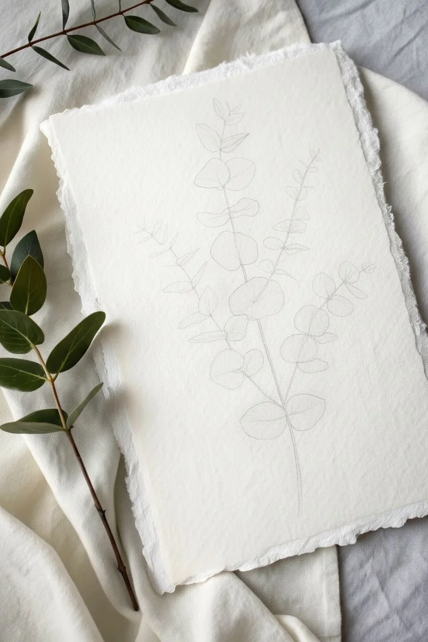
Monochromatic Botanical With Layered Leaf Values
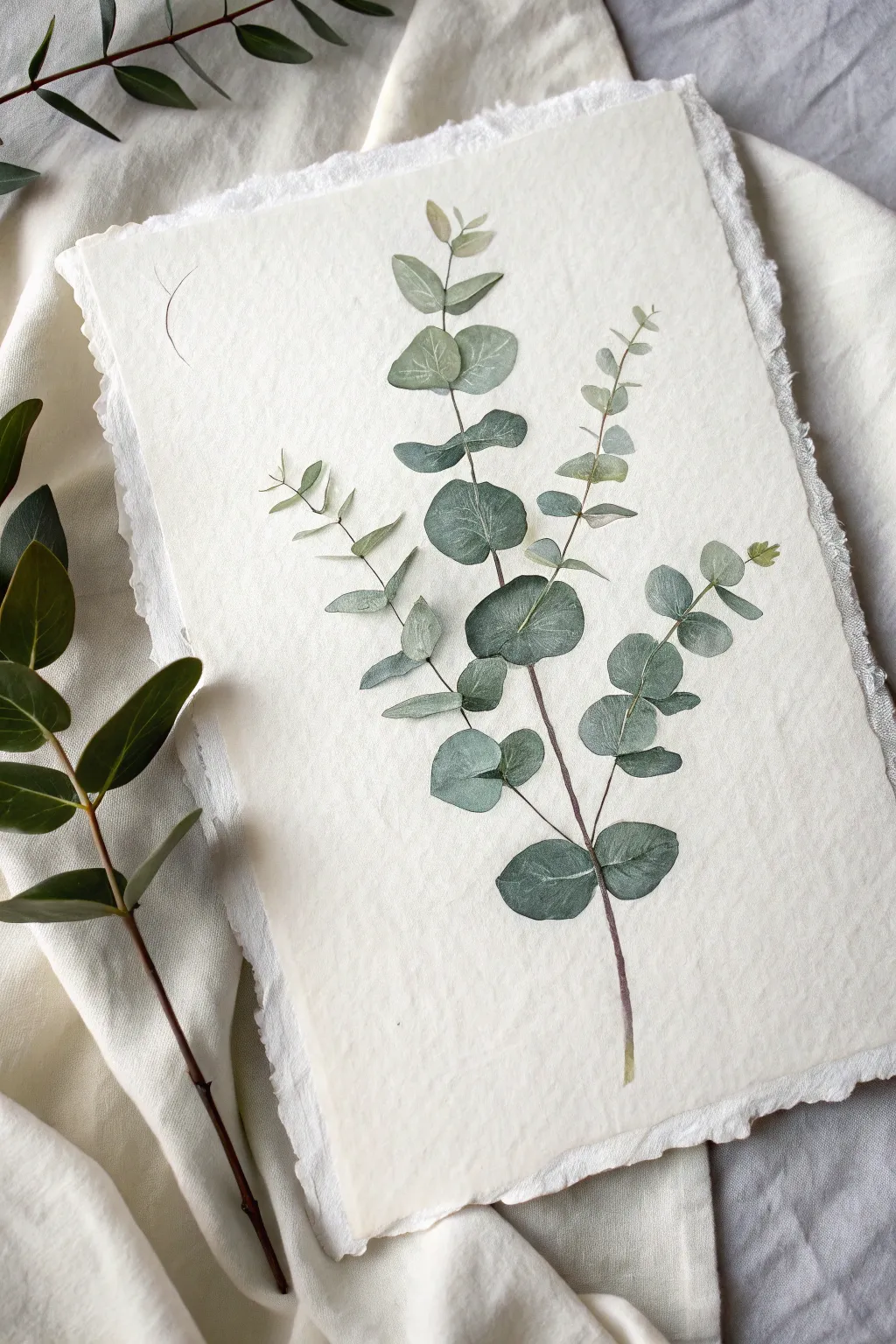
This project captures the delicate elegance of eucalyptus branches using a monochromatic palette of muted greens and soft teals. By layering values, you will create a sense of depth and translucency on beautiful deckle-edged paper.
Step-by-Step Guide
Materials
- Cold press watercolor paper with deckle edge (300 gsm)
- Watercolor paints (Sap Green, Hooker’s Green, Indigo, Burnt Umber)
- Round watercolor brushes (Size 2, 4, and 6)
- Pencil (HB or 2H)
- Kneaded eraser
- Two jars of water (clean and rinse)
- Paper towels
- Mixing palette
Step 1: Preparation & Sketching
-
Paper Selection:
Choose a high-quality sheet of watercolor paper with a torn or ‘deckle’ edge. This adds a rustic, organic feel that complements the botanical subject perfectly. -
Light Sketching:
Using an HB or 2H pencil, very lightly map out the main stem lines. Eucalyptus branches tend to be slightly angular rather than perfectly curved, so add gentle kinks to the line. -
Leaf Placement:
Sketch the oval shapes of the leaves. Ensure they are arranged in pairs or alternating patterns generally found in nature, varying their sizes—smaller at the top, larger near the bottom. -
Refining Shapes:
Go back over your leaf ovals and refine the outlines. Some leaves should turn slightly, showing a thinner profile, while others face forward fully. Lighten the sketch with a kneaded eraser until it’s barely visible.
Bleeds Not Blending?
If your dropped colors are creating harsh ‘cauliflower’ edges, your paper was likely too wet. Wait for the sheen to dull to satin before adding the second color.
Step 2: Mixing the Palette
-
Base Green:
Mix a substantial amount of your base green. Combine Sap Green with a touch of Indigo to cool it down, creating a muted, dusty eucalyptus color. -
Creating Value Variance:
Separate your base mix into three puddles on your palette. Leave one as is (mid-tone). Dilute one with water for a pale tea-consistency (light tone). Add a tiny bit more Indigo or Burnt Umber to the third for a deeper shadow tone.
Step 3: Painting the Leaves
-
First Wash:
Start with the uppermost leaves using the lightest watery mix and your size 4 brush. Paint the entire leaf shape, keeping the edges crisp but the center watery. -
Wet-in-Wet Texture:
While the first leaves are still damp—not soaking wet—drop a tiny amount of the mid-tone green at the base of the leaf where it meets the stem. Let it bleed naturally outward. -
Working Downward:
Move down the stem to the larger leaves. Switch between your light and mid-tone mixes for the base layers to create variety. I like to dry adjacent leaves completely before painting touching ones to prevent unwanted bleeding. -
Building Layers:
For the lower, older leaves, layer a glaze of the darkest mix over the bottom half of the leaf once the underlayer is dry. This indicates shadow and age. -
Leaf Veins:
Once the leaves are bone dry, use the size 2 brush and a slightly thicker mix of the mid-tone green to paint the fine center vein lines. Keep these lines broken and delicate; don’t draw a solid line from tip to stem.
Pro Tip: Color Harmony
Mix a tiny dot of red into your green to desaturate it instantly. This neutralizes the bright pigment and creates that perfect, dusty ‘dried botanical’ look.
Step 4: Stems and Details
-
Main Stem Construction:
Mix a brownish-purple hue by combining Burnt Umber with a touch of Indigo. Using the tip of your size 2 brush, paint the main stem in segments between the leaves. -
Connecting the Leaves:
Add tiny connecting stems (petioles) from the main branch to each leaf base. Make these lines very thin and precise. -
Adding Contrast:
Revisit your darkest leaf mix. Identify leaves that are cast in shadow (usually ones tucked behind others) and add a second glaze to deepen them. -
Softening Edges:
If any shadow lines look too harsh, use a clean, slightly damp brush to gently scrub and soften the edge, blending it into the rest of the leaf. -
Final Assessment:
Step back and look at the overall balance. If the painting looks too flat, darken the stem slightly in the lower sections to ground the composition.
Allow your painting to dry flat completely before framing or displaying this serene botanical study
Cloud Study Using Only Tints and Soft Edges
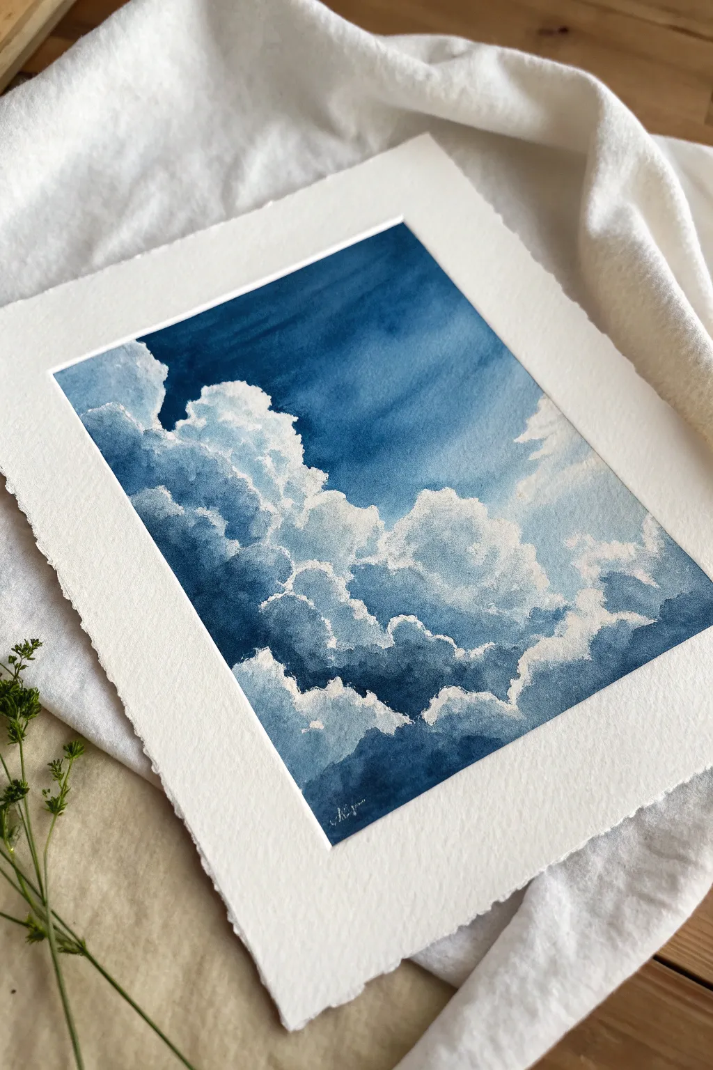
Capture the dramatic beauty of a rolling sky with this monochromatic watercolor study. By mastering the balance between crisp white paper and deep, moody indigo washes, you will create a sense of volume and atmosphere that feels both peaceful and powerful.
Step-by-Step Tutorial
Materials
- Cold press watercolor paper (300 gsm or heavier), roughly 8×10 inches
- Watercolor paint: Indigo or Prussian Blue
- White gouache (opaque white) for highlights
- Round watercolor brushes: Size 8 or 10 for washes, Size 2 or 4 for details
- Masking tape
- Rigid board for mounting
- Jar of clean water
- Paper towels or cotton rag
- Palette for mixing
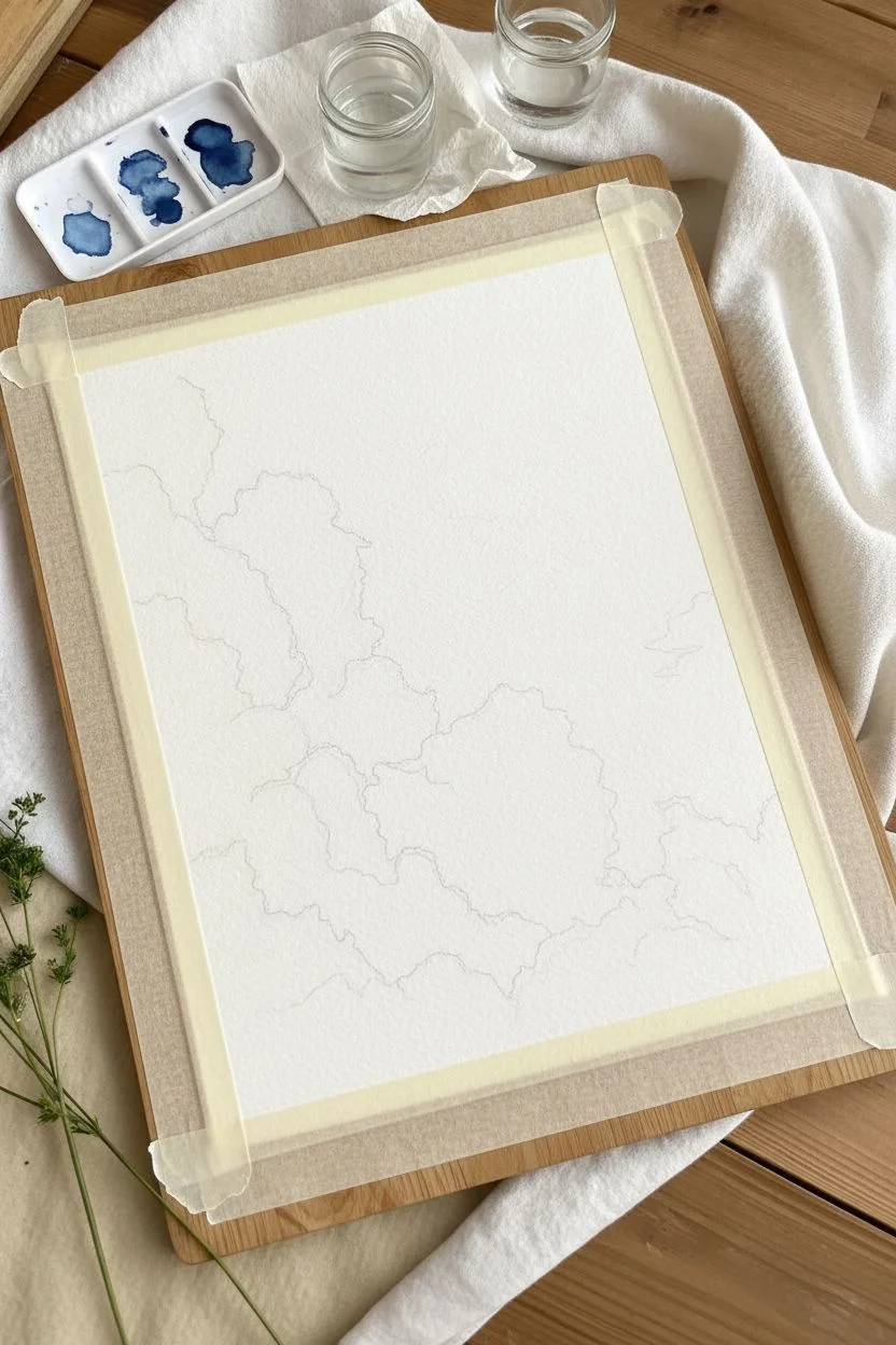
Step 1: Preparation and Mapping
-
Secure your paper:
Tape your watercolor paper down firmly onto a rigid board using masking tape. Ensure the tape creates a clean, even border around all four edges, as this white frame is crucial to the final presentation. -
Light sketching:
Using a very hard pencil (H or 2H), faintly map out the major shapes of your clouds. Focus on the boundary between the deep sky and the billowing white tops. Keep these lines extremely light so they disappear later. -
Prepare your washes:
On your palette, mix three pools of your blue paint: a watery, tea-like consistency for light tints, a milky consistency for mid-tones, and a creamy, thick mixture for the darkest shadows.
Muddy Clouds?
If your shadows look gray or muddy, you are overworking the paint while it’s wet. Lay down the stroke and leave it alone until it dries completely before adding another layer.
Step 2: Painting the Sky and Shadows
-
Define the upper sky:
Invert your board so the top of the sky is closest to you if it helps with gravity. Load your large round brush with the darkest paint mix. Paint the deep blue sky area in the upper section, carefully carving around the intricate, bumpy tops of the cloud shapes. -
Soften the transition:
As you move down the sky area, introduce a little water to your brush to create a slight gradient, making the blue slightly less intense as it nears the horizon line or lower cloud banks. -
Establish cloud volume:
While the sky dries, clean your brush and switch to the light tea-consistency wash. Gently paint the shadow sides of the clouds (usually the bottom and crevices), leaving the bubbly tops pure white paper. -
Building depth:
While the first shadow layer is still damp, dab in some of your mid-tone blue into the deeper crevices of the clouds. Let the wet paint bloom slightly to create soft, puffy edges naturally. -
The darkest cloud shadows:
Wait for the previous layers to be moist but not soaking wet. Take your small detail brush and drop the darkest indigo paint into the deepest pockets of the clouds to create high contrast and drama. -
Softening edges:
Clean your brush, blot it until just damp, and gently run it along any harsh internal edges within the clouds. You want the transition from white highlight to blue shadow to feel rolling and soft, not geometric.
Step 3: Refining and Highlighting
-
Evaluate the contrast:
Let the piece dry completely. Step back and look at the contrast. Re-wet areas of the deep sky if needed and add another layer of indigo to make the white clouds pop even more. -
Creating texture:
Use a nearly dry brush with a small amount of pigment to scumble texture onto the cloud bodies. This dry brush technique mimics the wispy nature of vapor. -
Adding opaque highlights:
Squeeze a tiny dot of white gouache onto your palette. Using your smallest brush, paint crisp white rims along the very top edges of the clouds where they meet the dark sky. I find this really separates the forms precisely. -
Correcting darker areas:
You can also mix a touch of white gouache with your blue watercolor to create a milky, opaque blue. Use this to soften any shadows that became too dark or hard-edged. -
Final atmosphere check:
Look for the bottom right corner of the composition. Ensure this area fades out softly or has less detail to keep the focus on the main cloud structure. -
The reveal:
Allow the painting to bone dry—if the paper feels cool to the touch, it’s still wet. Once dry, carefully peel away the masking tape at a 45-degree angle to reveal the crisp white border. -
Paper edge detail:
For the authentic look shown in the photo, you can carefully tear the outer edges of the paper against a ruler (deckled edge effect) or simply trim it cleanly.
Add Warmth
For a ‘golden hour’ variation, glaze a very watery, pale yellow or raw sienna over the pure white highlights after the blue paint is totally dry.
Mount your finished cloud study in a simple frame to let the deep blues speak for themselves
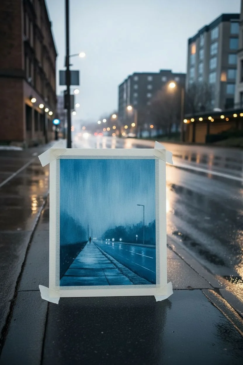
Rainy Street Scene With Tonal Reflections
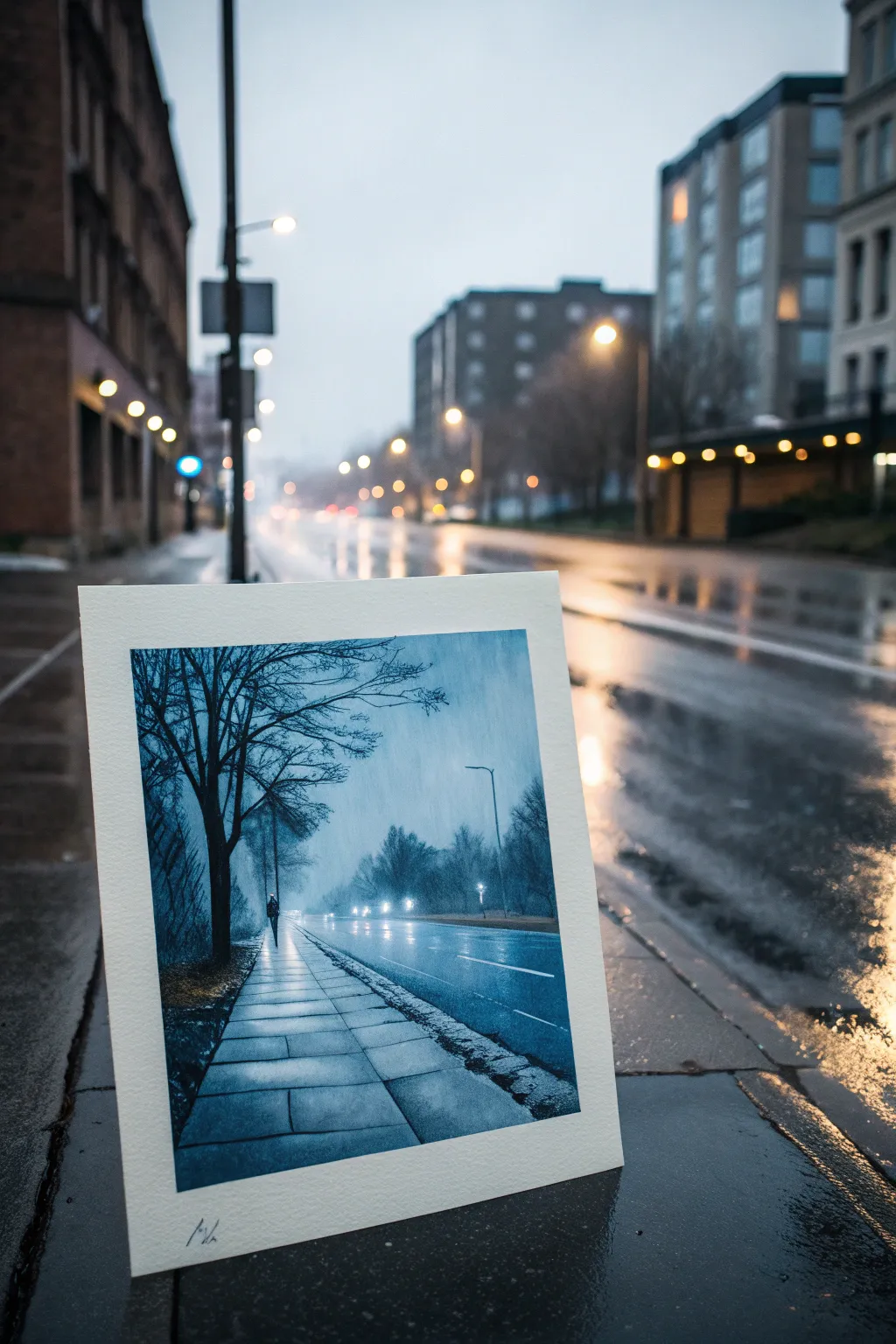
Capture the moody, atmospheric silence of a rainy evening with this striking monochromatic study. Using a limited palette of Prussian Blue and white, you will learn to render wet pavement reflections and misty depth.
Detailed Instructions
Materials
- Acid-free watercolor paper or mixed media board (minimum 140lb)
- Acrylic gouache or matte acrylic paints (Prussian Blue, Titanium White, Black)
- Masking tape
- Synthetic flat brush (3/4 inch)
- Small round brush (size 2)
- Detail liner brush (size 00)
- Palette knife
- Water container and mixing palette
- Paper towels
Step 1: Setting the Atmosphere
-
Tape the borders:
Begin by securing your paper to a flat surface with masking tape. This will create that crisp, clean white border visible in the reference image once you peel it away at the end. -
Mix the base gradient:
Create a mid-tone blue by mixing Prussian Blue with a touch of Titanium White and a tiny drop of water to improve flow. You want a creamy consistency, not a wash. -
Paint the background wash:
Apply vertical strokes of this mid-tone blue across the entire upper two-thirds of the paper to simulate falling rain. While wet, blend in a slightly lighter mix towards the horizon line to suggest distant fog. -
Establish the ground plane:
For the road and sidewalk, use horizontal strokes. The road should prove slightly darker than the sky, while the sidewalk area on the left needs to be lighter to eventually show reflections.
Muddy colors?
If your blues look dull, you likely added too much black. To darken Prussian blue without losing vibrancy, try mixing in a tiny bit of Burnt Umber instead of black.
Step 2: Building the Elements
-
Block in the tree silhouette:
Mix a dark navy by adding a small amount of Black to your Prussian Blue. Using the round brush, paint the main trunk of the large tree on the left, anchoring it near the bottom third. -
Branch out:
Switch to your liner brush. Extend thin, delicate branches outward and upward from the main trunk. Let the lines taper off naturally; shaky hands actually help make the twigs look more organic here. -
Add distant foliage:
For the trees in the background, mix a hazy blue-grey (more white, less blue). Stipple these shapes gently along the horizon line. They should look soft and out of focus, pushing them into the distance. -
Define the sidewalk perspective:
Use the flat brush edge or a ruler with the liner brush to paint the perspective lines of the sidewalk grid. Use a dark blue mix, ensuring the lines converge at a vanishing point on the horizon. -
Create the wet road surface:
Glaze a thin, watery layer of white over the road area in horizontal streaks. This creates the sheen of wet asphalt.
Level Up: Rain Texture
Before the background layer dries completely, scratch vertical lines into the paint using the back of your brush handle or a palette knife to create physical rain streaks.
Step 3: Reflections and Details
-
Paint the walking figure:
Place a small, dark silhouette of a person on the sidewalk. Keep the form simple—a vertical dash for the body and a small dot for the head. -
Add the figure’s reflection:
Directly below the figure, paint a softer, slightly wavy vertical smear of dark blue. This grounds the figure and emphasizes the wet surface. -
Streetlight glow:
With pure Titanium White, paint small dots for the distant streetlights and car headlights. Immediately soften the edges with a clean, damp brush to create a glowing halo effect. -
Reflect the lights:
Drag vertical lines of white paint downward from those light sources onto the wet road. I generally keep these strokes loose and slightly broken to mimic ripples in the water. -
Texture the foreground:
Use a nearly dry brush with dark paint to scumble some texture onto the bottom left corner, suggesting grass or rougher pavement near the tree roots. -
Final highlights:
Add sharp, pure white highlights to the edges of the sidewalk squares close to the viewer. This high contrast makes the surface look like slick, wet stone. -
The reveal:
Ensure the artwork is completely dry to the touch. Carefully peel away the masking tape at a 45-degree angle to reveal your crisp white edges.
Step back and enjoy the peaceful, rainy mood you have captured in blue
Monochrome Abstract Shapes With a Three-Value Rule
Embrace the tranquility of minimalism with this large-scale watercolor piece that masters the three-value rule. By dividing your composition into light, medium, and dark zones using a single hue, you create depth and modern architectural interest without needing complex color theory.
Step-by-Step
Materials
- Large sheet of heavyweight watercolor paper (Cold Press, min 300gsm)
- Watercolor paints (Sage Green, Paynes Grey, or similar mixture)
- Wide flat wash brush (2 inch)
- Medium flat brush (1 inch)
- Low-tack masking tape or drafting tape
- Ruler or straight edge
- Pencil
- Large mixing palette or plastic tray
- Clean water jar
- Paper towels
Step 1: Planning the Composition
-
Prepare your surface:
If your large paper came in a roll, flatten it out first by placing heavy books on the corners overnight. If you want that lovely deckled edge shown in the photo, you can carefully tear the paper against a ruler instead of cutting it with scissors. -
Sketch the layout:
On your paper, lightly sketch the borders of the main rectangular image area. Leave a generous white margin around the edges, as this negative space acts as a natural frame. -
Draft the geometric shapes:
Using a ruler, lightly draw two intersecting diagonal lines to create the ‘peak’ shapes. Start one line from the left edge, angling down toward the bottom right. Draw a second line from the bottom left, angling steeply up to meet the first line. This creates your three distinct zones. -
Tape the boundaries:
Apply low-tack tape along the outer rectangular border you drew in step 2. Press the edges of the tape down firmly with your thumbnail or a spoon to prevent paint from bleeding into your clean white margins.
Step 2: Mixing the Values
-
Create the base wash:
Squeeze a generous amount of sage green paint onto your palette. You will need a lot of liquid for a piece this size. Mix three distinct puddles: one very watery (light), one with a 50/50 paint-to-water ratio (medium), and one thick and concentrated (dark). -
Test your colors:
On a scrap piece of watercolor paper, test your three values side-by-side. Let them dry completely, as watercolors usually dry lighter than they look when wet. Adjust the mixtures until you have a clear contrast between the three tones.
Clean Edges Trick
Before painting, run a damp brush over the tape edge (just water!) to seal it. This creates a barrier and prevents the colored paint from seeping underneath.
Step 3: Painting the Layers
-
Mask the first section:
Decide which section will be your lightest value—in the reference, it’s the large top area. Tape off the boundary between this top section and the middle section using your drawn pencil line as a guide. -
Apply the lightest wash:
Using your widest brush, load up the lightest paint mixture. Working quickly from top to bottom, cover the entire top section. Keep a ‘wet edge’ to avoid streak marks. -
Dry thoroughly:
Allow this first section to dry completely. If you touch it and it feels cool, it’s still damp. Wait until it is room temperature to the touch before moving on. -
Prepare the middle section:
Once the top section is bone dry, carefully remove the internal tape. Now, re-tape along that same line, but place the tape on the *painted* side to protect your work. Add a new strip of tape along the line separating the middle and bottom sections. -
Paint the medium value:
Using the medium-tone mixture, paint the middle triangular section. Ensure your brush is fully loaded so you don’t have to scrub the paper, which can lift the texture. -
Final drying break:
Let this middle section dry completely. I like to use this time to clean my brushes slightly so no dried paint flakes get into the final dark layer. -
Mask for the final layer:
Remove the tape from the middle section. Re-tape over the dried medium paint to protect it, exposing only the final bottom triangle. -
Apply the darkest value:
Fill in the bottom shape with your darkest, most concentrated paint mixture. This anchors the composition and provides visual weight.
Level Up: Texture
For a stone-like effect, sprinkle coarse sea salt onto the painting while the wash is still wet. Brush it off once totally dry to reveal subtle speckles.
Step 4: Finishing Touches
-
The big reveal:
Allow the entire painting to dry—ideally for several hours. Then, very slowly peel away all the tape at a 45-degree angle, pulling away from the painted area to minimize paper tearing. -
Erase guidelines:
If any pencil lines are still visible in the unpainted white margins, gently erase them with a soft white eraser. -
Flatten the work:
If the paper has buckled slightly from the water, place the dry artwork face down on a clean sheet, cover the back with another clean sheet, and pile heavy books on top for 24 hours.
Hang your new abstract masterpiece using simple wooden poster rails to complement the organic feel of the torn edges
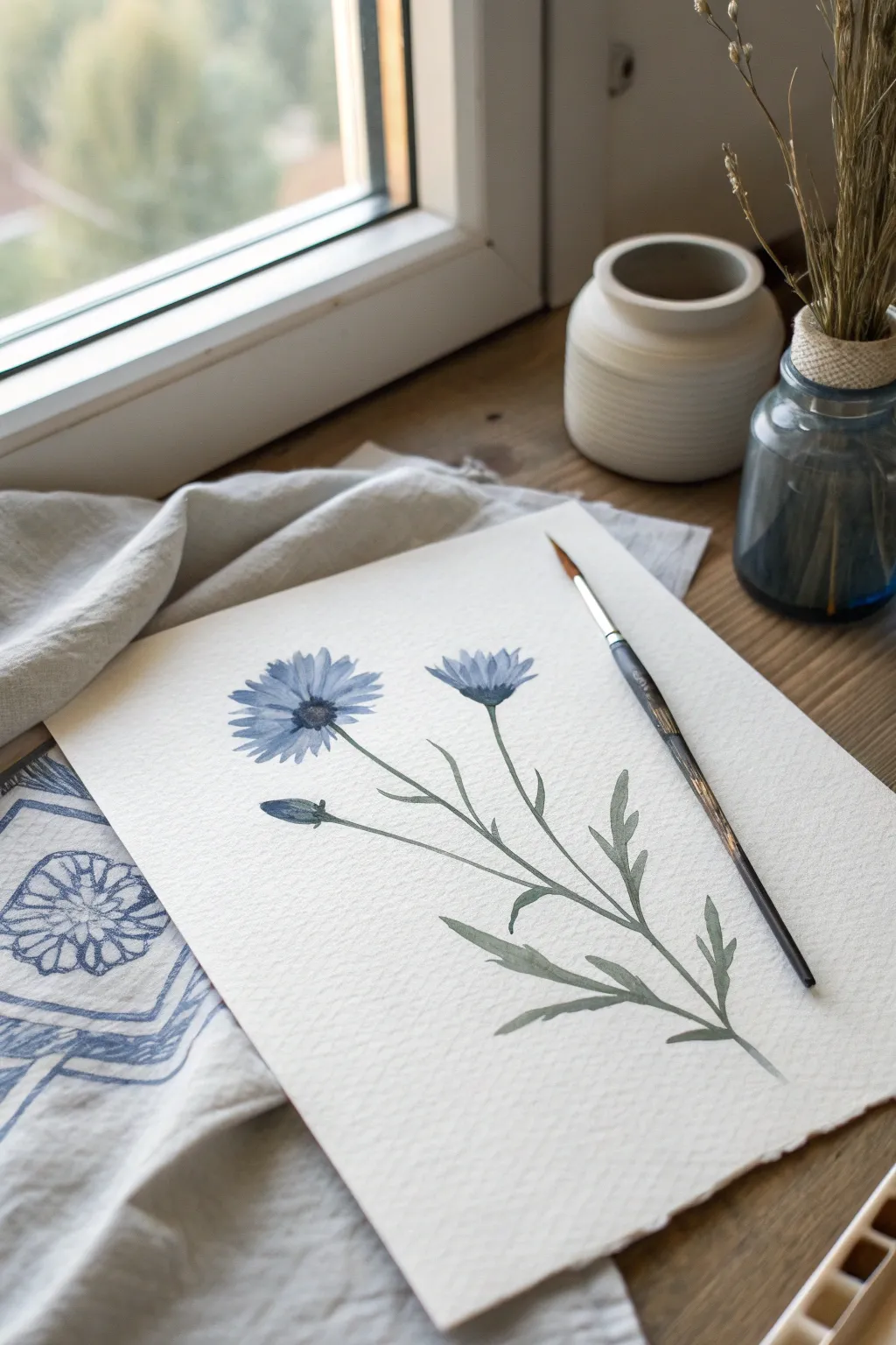
Single-Color Negative Space Painting
Capture the fragile beauty of wildflowers with this serene watercolor study, focusing on soft indigo blooms and muted gray-green foliage. The composition relies on gentle gradients and precise brushwork to create a lifelike botanical illustration.
Detailed Instructions
Materials
- Cold press watercolor paper (300 gsm)
- Round watercolor brush (size 4 or 6)
- Small round detail brush (size 1 or 0)
- Indigo watercolor paint
- Sap Green or Olive Green watercolor paint
- Payne’s Gray watercolor paint (optional for mixing)
- Clean water jar
- Palette for mixing
- Paper towel
- Pencil (HB or 2H)
Step 1: Sketching the Composition
-
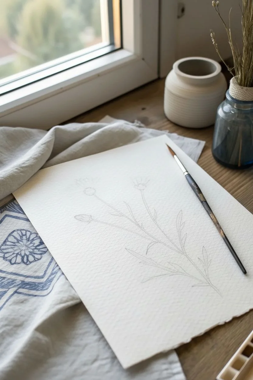
Outline the Stems:
Begin by lightly sketching the main stem line curving gently upwards from the bottom right corner. Add two branching lines extending to the left: one lower branch for a bud and a higher one for the main flower. -
Define Flower Heads:
At the top of the main stem, lightly draw an oval shape to mark the open bloom. For the side branch, draw a smaller, teardrop shape to represent the bud. -
Add Leaf Placement:
Sketch the placement of the leaves along the stem. Use long, jagged lines to suggest the characteristic thistle-like shape of cornflower leaves.
Brush Control Pro Tip
For those fine, jagged petal edges, try holding your brush more vertically. Use only the very tip and make quick, confident flicking motions outward from the center.
Step 2: Painting the Blooms
-
Mix Your Blue:
On your palette, dilute your indigo paint with water to create a medium-strength wash. You want a color that is distinctly blue but transparent. -
Petal Foundation:
Using the tip of your round brush, paint the individual petals of the main flower. Start from the center and flick the brush outward to create a ragged, natural edge. -
Variation in Tone:
While the paint is still damp, drop a slightly more concentrated indigo into the base of the petals near the center. This creates natural depth. -
Painting the Bud:
Move to the smaller bud on the left. Paint the tightly closed petals using the same indigo mix, keeping the shape compact and oval. -
The Second Bloom:
Paint the smaller, semi-open flower at the very top right. Use shorter strokes here to suggest petals that are facing away or not fully unfurled. -
Center Details:
Once the blue petals are dry, mix a very dark indigo or Payne’s Gray. Use the detail brush to stipple small dots in the center of the main flower to act as the pollen and stamens.
Level Up: Texture
Add subtle texture to the flower centers by sprinkling a tiny pinch of salt onto the wet paint. Brush it off once fully dry for a granulated organic look.
Step 3: Stems and Foliage
-
Mix Green Tones:
Create a muted green by mixing Sap Green with a touch of the indigo you used for the flowers. This harmonizes the color palette. -
Main Stem:
Load your brush with the green mix. Starting from the top near the flower, pull the brush downwards with a steady hand to create the slender stem. -
Connecting the Blooms:
Paint the smaller stems connecting the bud and the top flower to the main stalk. Ensure the lines flow naturally into one another. -
Calyx Detail:
Paint the cup-like base (calyx) under each flower head. Use small, scalloped strokes to suggest texture. -
Leaf Structure:
Begin painting the leaves. Press the belly of the brush down to create width, then lift as you pull outward to create the pointed tips. -
Refining Shapes:
Cornflower leaves have lobes; carefully paint these jagged edges rather than making them smooth ovals. -
Adding Depth:
I like to drop a tiny bit of darker green into the ‘V’ where the leaf meets the stem while the paint is wet to add instant dimension.
Step 4: Final Touches
-
Check Contrast:
Step back and look at your painting. If the leaves look too flat, add a second glaze of green to the shadowed areas once the first layer is completely dry. -
Sharpening Edges:
Use your smallest brush with a slightly thicker paint consistency to crisp up any petal tips or leaf points that look too soft.
Now let your botanical study dry completely before framing it to bring a touch of nature indoors
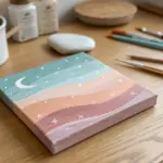
Monochromatic Night Sky With Stars and Glow Effects
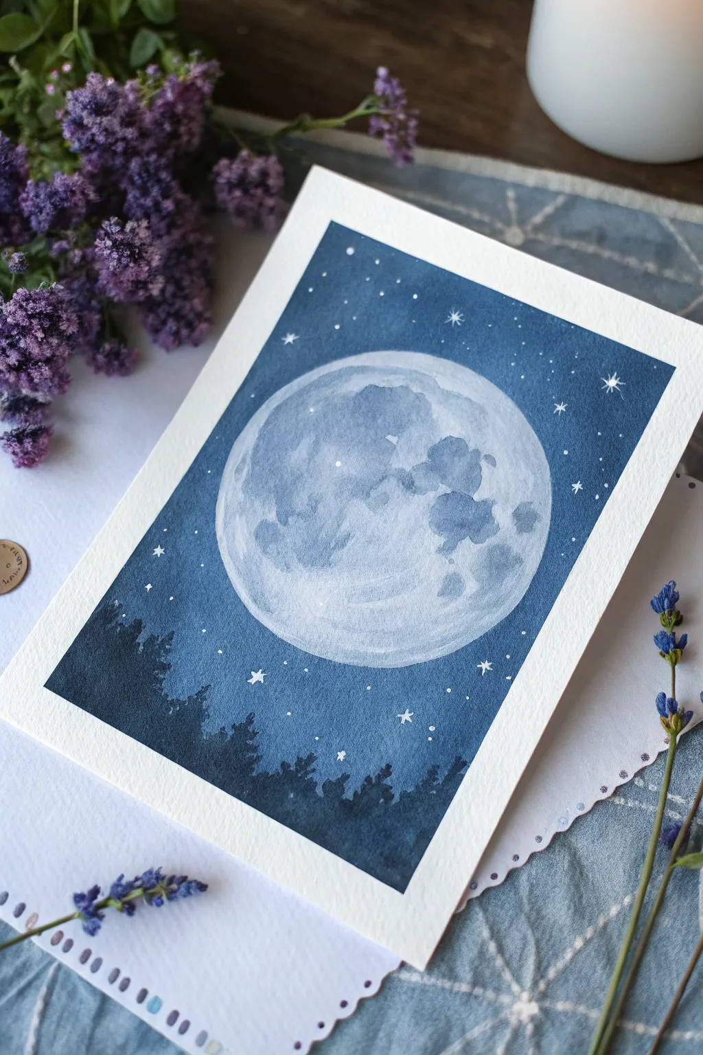
Capture the serene beauty of a full moon rising over a silent forest using shades of monochromatic indigo. This watercolor project focuses on negative space and layering to create a glowing lunar effect without using masking fluid.
Step-by-Step Tutorial
Materials
- Cold press watercolor paper (A5 size or similar card stock)
- Painter’s tape or washi tape
- Indigo watercolor paint
- White gouache or white gel pen
- Round watercolor brush (size 6 or 8)
- Small detail brush (size 0 or 1)
- Mixing palette
- Two jars of water
- Compass or a circular object (like a jar lid) to trace
- Pencil and eraser
- Paper towels
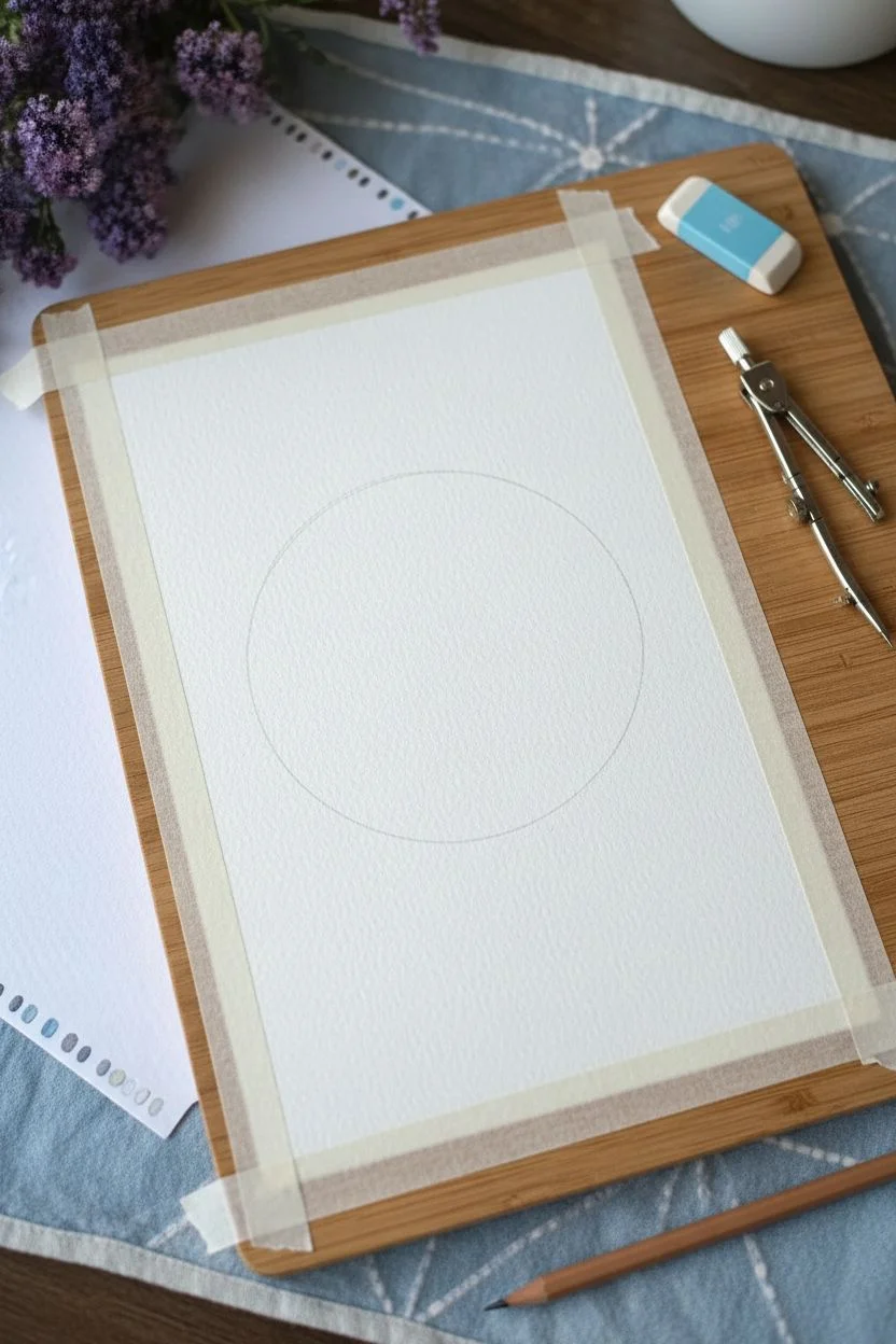
Step 1: Preparation and Sketching
-
Secure the paper:
Begin by taping down all four edges of your watercolor paper to a hard board or table. This creates that crisp white border seen in the final piece and prevents the paper from buckling when wet. -
Outline the moon:
Use a compass or trace around a circular object to lightly draw a large circle in the center of the paper. Keep your pencil lines very faint so they don’t show through the final paint.
Uneven Wash?
If your sky dries with unwanted ‘cauliflower’ edges, lightly glaze over the dry sky with a slightly damp brush to soften the hard lines without lifting the pigment.
Step 2: Painting the Moon
-
Base wash:
Prepare a very dilute, watery mix of indigo paint. Fill in the entire circle with this pale blue wash to establish the moon’s base color. -
Adding texture:
While the base layer is still damp, dab in slightly more concentrated indigo in random splotches to mimic lunar craters and maria. Let these bloom naturally for a soft texture. -
Deepening shades:
Once the first layer is dry, add a second layer of well-diluted indigo to specific areas to create distinct shadowy patches on the moon’s surface, leaving some areas very pale for highlights. -
Dry completely:
Allow the moon area to dry completely before moving on to the sky. You can use a hairdryer on a low setting to speed this up.
Step 3: Creating the Night Sky
-
First sky outline:
Mix a medium-strength indigo. Carefully paint around the outside edge of your moon circle. Creating this crisp edge is crucial, so take your time and use a steady hand. -
Fill the background:
Continue painting outward from the moon, filling the rest of the sky area with the medium indigo mix. The color doesn’t need to be perfectly flat; slight variations add atmosphere. -
Darkening the gradient:
While the sky is wet, drop in highly concentrated, thick indigo paint at the bottom corners and top edges. Tilt the paper slightly to let the dark paint flow downward, creating a gradient that gets lighter near the moon.
Level Up: Salt Galaxy
Sprinkle coarse sea salt onto the wet sky area while painting. Let it dry completely and brush it off to create unique, star-like textures naturally.
Step 4: Painting the Silhouettes and Stars
-
Tree line base:
Once the sky layer is fully dry, mix your darkest, most saturated indigo (almost black-blue). Using the tip of your brush, paint a jagged, uneven line across the bottom third of the painting. -
Adding tree details:
Switch to your small detail brush. Pull upward from the dark base using quick, dabbing motions to create the pointed tops of pine trees. Vary the heights to make the forest look natural. -
Filling the forest:
Fill in the bodies of the trees with the dark indigo, ensuring the bottom is solid and opaque to ground the composition. -
Large stars:
Using white gouache or a white gel pen, draw a few larger, four-pointed stars scattered in the darker parts of the sky. -
Stardust details:
Dot tiny pinpricks of white around the large stars and near the tree line for distant constellations. I like to keep these random to avoid a patterned look. -
Moon highlights:
Add a few tiny white dots or thin lines inside the moon’s craters to suggest reflected light on the lunar surface. -
The reveal:
Wait until the painting is 100% dry to the touch. Gently peel away the masking tape at a 45-degree angle to reveal your clean, bright white borders.
Enjoy the calm atmosphere your monochrome masterpiece brings to the room

Have a question or want to share your own experience? I'd love to hear from you in the comments below!