If you’ve ever made one little dot and suddenly wanted to fill the whole page, you’re in the right headspace. I’m sharing my favorite dot art ideas—from super-simple pointillism basics to those dreamy, meditative patterns you can lose an afternoon in.
Classic Pointillism With Cotton Swabs
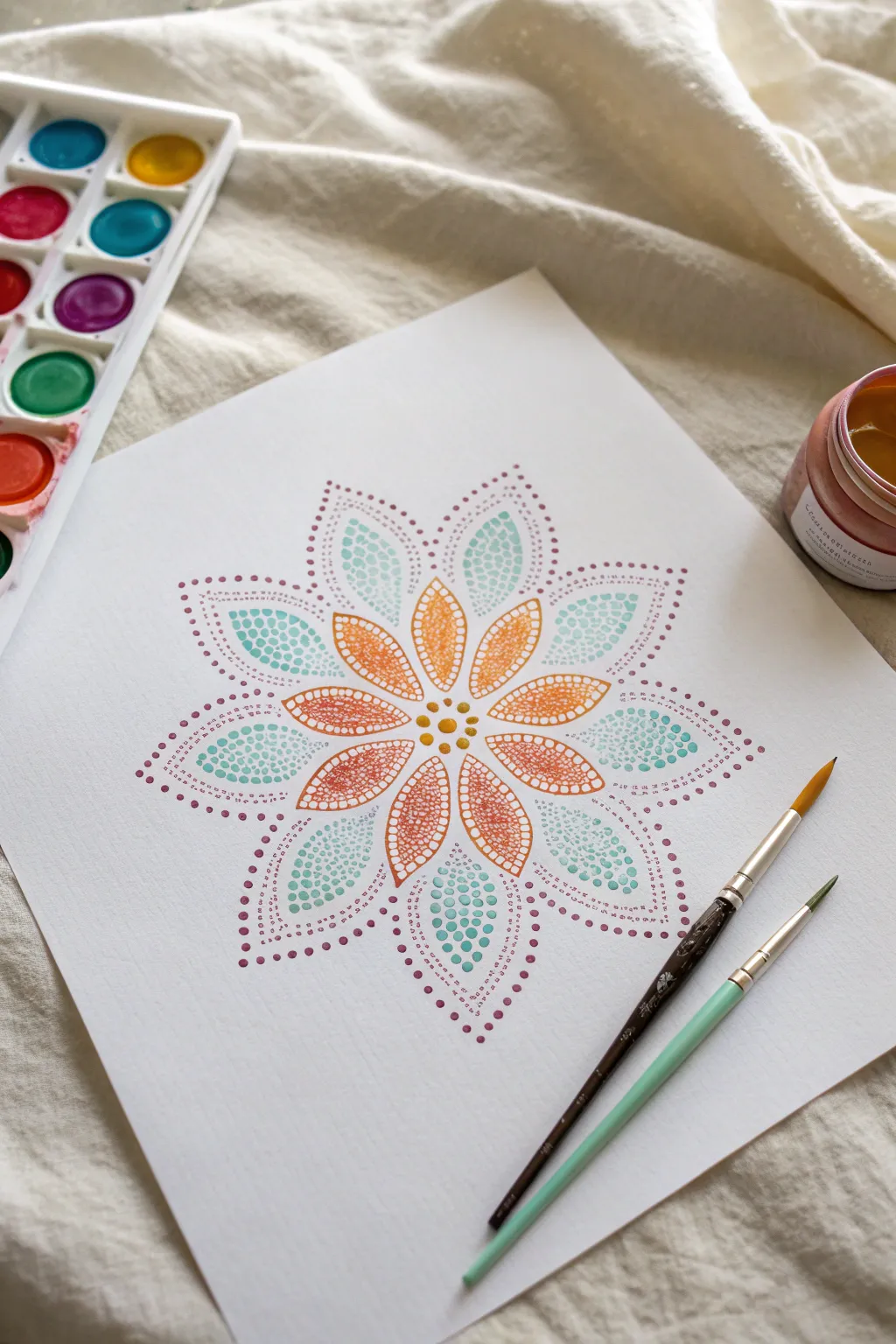
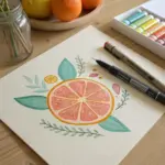
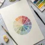
Capture the delicate beauty of pointillism with this vibrant flower mandala, created entirely through carefully placed dots. The translucent layers of watercolor build a soft, gradient effect that radiates warmth from the center outward.
Step-by-Step
Materials
- High-quality watercolor paper (cold press recommended for texture)
- Watercolor paint set (focusing on orange, yellow, and teal/mint)
- Small round brushes (size 0 and size 2)
- Jar of clean water
- Pencil and eraser for light sketching
- Paper towel for blotting
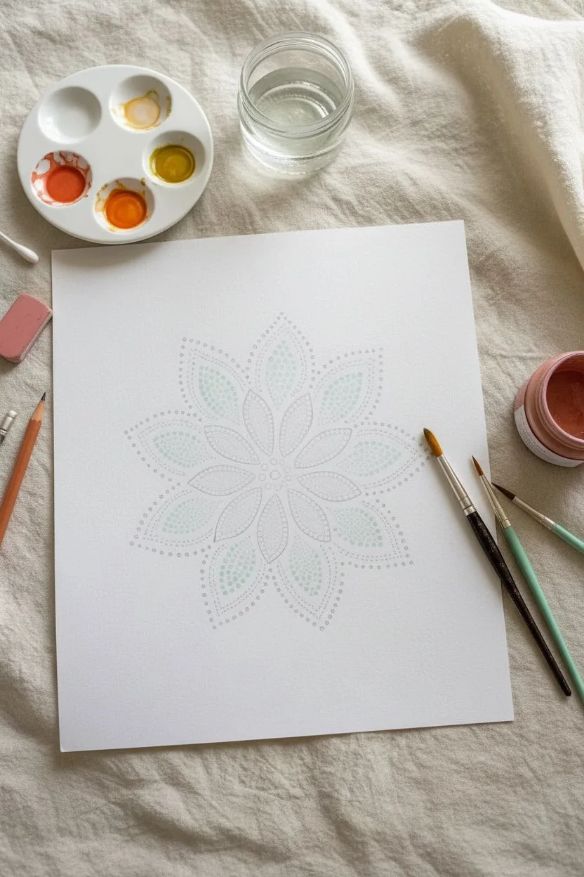
Step 1: Preparation & Sketching
-
Establish the center:
Start by lightly marking the exact center of your watercolor paper with a pencil. This will be the anchor for your radial design. -
Draft the petals:
Lightly sketch a small circle of eight petals radiating from the center point. These inner petals should be roughly 1.5 inches long and pointed at the tips. -
Add the outer ring:
Sketch a second, larger layer of petals behind the first set. Position these so their points peek out from between the inner petals, creating a layered bloom effect. -
Prepare your palette:
Pre-mix a warm orange, a golden yellow, and a soft mint teal on your palette. For this technique, ensure the paint is fluid but pigment-rich so the dots hold their shape slightly.
Bleeding Dots?
If your dots are running into each other, your brush is too wet. Blot it on a paper towel after loading paint to remove excess moisture before touching the paper.
Step 2: Painting the Core
-
The central seed:
Using your smallest brush (size 0) and golden yellow paint, place a single dot directly in the center of your flower. -
Inner ring details:
Surround the central dot with a tight circle of six to eight smaller yellow dots. Keep your hand steady and vertical to ensure round shapes. -
Start the inner petals:
Switch to your orange paint. Begin filling the inner petals with dots, starting at the base near the center. -
Creating gradients:
As you move toward the tip of the orange petal, slightly dilute the paint with a touch of water or space the dots further apart to create a fading effect. -
Outline the shape:
Once the interior is filled, use slightly smaller, denser orange dots to trace the outline of each inner petal. This defines the edges cleanly.
Add Metallic Sparkle
Once the main colors are dry, add tiny highlights using metallic gold watercolor or a gold gel pen on top of the orange center dots for extra shimmer.
Step 3: Expanding the Design
-
Fill the outer petals:
Load your brush with the mint teal color. Begin filling the larger, background petals with a similar stippling method. -
Varying dot size:
I like to vary the pressure here—press harder for larger dots near the widest part of the petal, and use a light touch for tiny specks near the tips. -
Define the teal edges:
Outline the teal petals with a precise row of dots. This separation is crucial so the colors don’t visually bleed into the orange layer. -
Add the decorative aura:
Mix a dusty purple or mauve shade. Create dotted arches that float above the tips of the teal petals. -
Extend the aura:
Continue these purple dotted lines down the sides of the outer petals, tapering them off as they approach the center of the flower. -
Finalize details:
Check for any uneven gaps in your stippling. Add tiny ‘micro-dots’ of the corresponding color to fill empty spaces without creating a solid wash. -
Erase guidelines:
Wait until the paint is bone dry—watercolors can be deceptive. Gently erase any visible pencil lines to leave only the pure color behind.
Step back and admire how thousands of tiny points of color merge to create a breathing, organic mandala

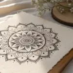
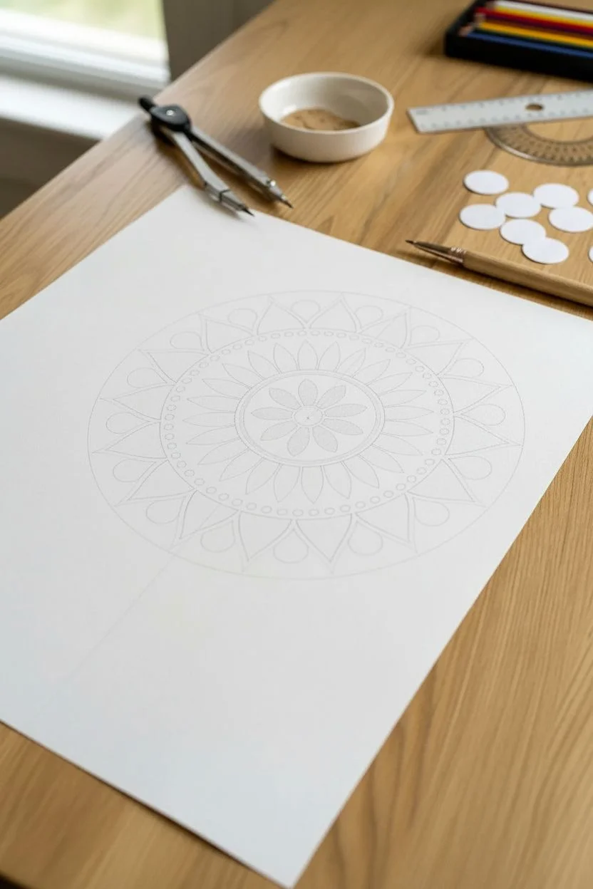
Easy Dot Mandalas on Paper
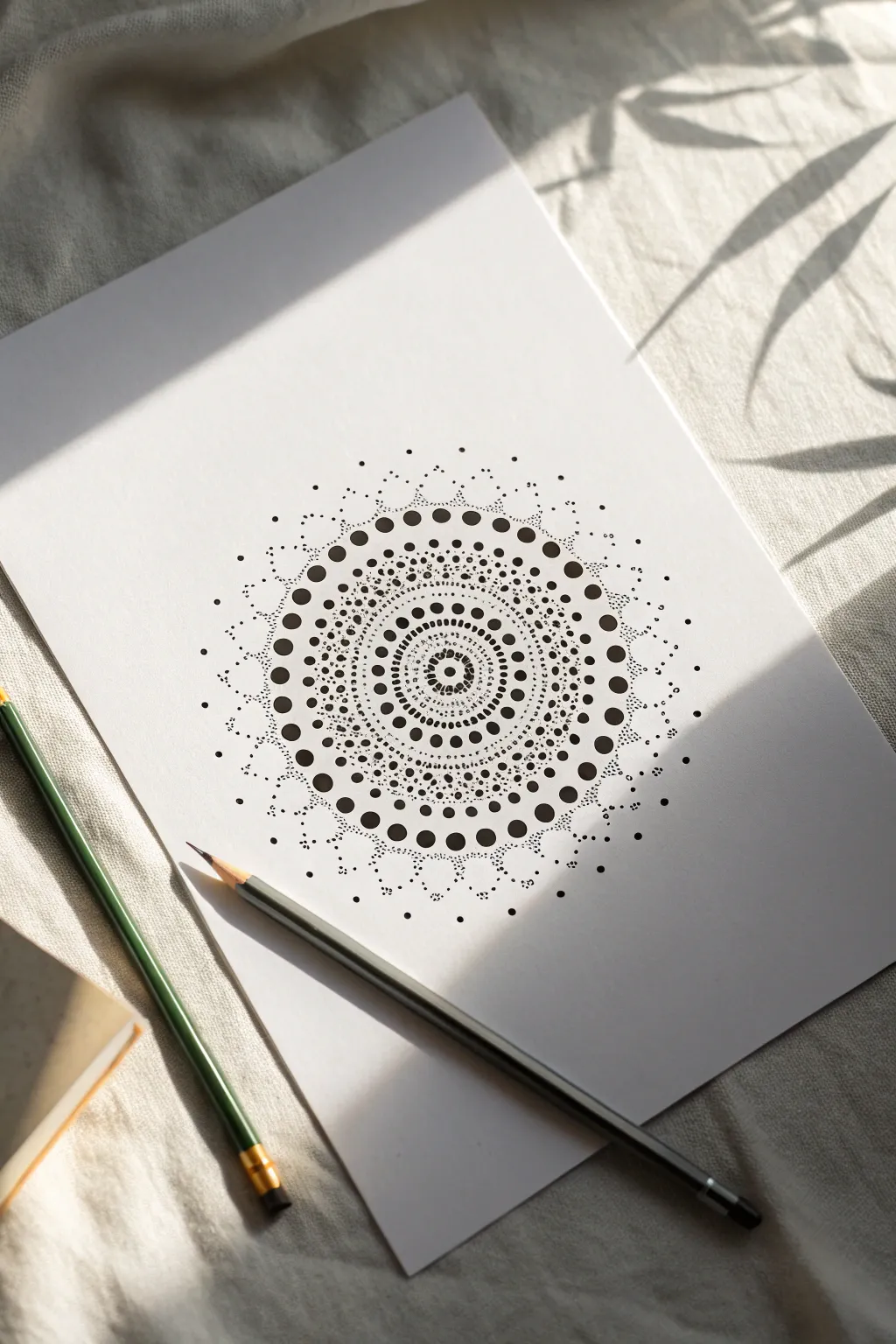
Embrace the meditative rhythm of pointillism with this stunning monochrome mandala. Using only simple dots of varying sizes, you will build complex radial patterns that look incredibly intricate but are surprisingly easy to master.
Step-by-Step Tutorial
Materials
- High-quality white drawing paper or cardstock (A4 or A5)
- Fine liner pens (black, sizes 0.1mm, 0.3mm, 0.5mm, and 0.8mm or similar)
- Pencil (HB or 2H)
- Compass
- Protractor
- Eraser
- Ruler
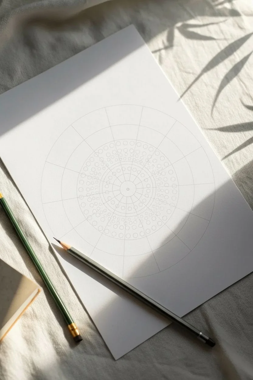
Step 1: Preparation and Grid
-
Find the center:
Begin by finding the exact center of your paper. Make a tiny, faint mark with your pencil. This anchor point is crucial for keeping your mandala symmetrical. -
Draw concentric circles:
Using your compass, draw a series of light concentric circles expanding from the center point. Space them out variedly—some close together (5mm) and some further apart (1-2cm)—to create different ‘zones’ for your patterns. -
Create radial guidelines:
Use your protractor and ruler to divide your circle into equal pie slices. Mark every 22.5 degrees (16 sections total) or 30 degrees (12 sections) depending on how dense you want the design. These lines will help align your dots.
Step 2: The Center Design
-
Start the nucleus:
Switch to a medium-thickness pen (around 0.5mm). Place a bold, single dot directly on your center pencil mark. -
First ring:
On the smallest pencil circle guide, place evenly spaced medium dots around the center point. Try to place one dot on every radial guideline intersection. -
Delicate stippling:
Using your finest pen (0.1mm), fill the space between the center dot and the first ring with tiny, scattered micro-dots. This texture creates a shadowed effect without solid lines. -
Geometric precision:
Move to the next concentric circle. Using a 0.3mm pen, draw a ring of small dots. I find it helpful to place the ‘North, South, East, West’ dots first to ensure spacing remains even.
Smudged Ink?
If you accidentally smear a wet dot, turn it into a deliberate mistake. Wait for it to dry, then build a larger cluster of dots over it to hide the smudge within a new pattern feature.
Step 3: Expanding the Pattern
-
Bold markers:
Select a larger concentric circle guide, perhaps the third or fourth one out. Switch to your thickest pen (0.8mm) and place large, confident dots at equal intervals along this line. -
Radial spokes:
Create lines radiating outward by placing a series of graduating dots along your ruler guidelines. Start with small dots near the center and get slightly larger as they move out. -
Filling the negative space:
Look at the bands of white space between your structured rings. Use your 0.1mm pen to create ‘dusting’ effects—dense clusters of tiny dots that fade out into emptiness. -
Double rings:
Create visual weight by making two rows of medium dots right next to each other on one of your middle guidelines. This creates a dark band that anchors the design. -
The petal effect:
Visualize flower petals spanning between your radial lines. Instead of drawing outlines, fill these imaginary shapes with concentrated stippling using the 0.3mm pen.
Pro Tip: Dot Size Variation
Don’t just rely on pressure for dot size. Actually switch pen nib sizes frequently. A 0.05mm next to a 0.8mm creates dynamic depth that single-pen pressure variation can’t match.
Step 4: Outer Detail and Finishing
-
Outer arches:
On the outermost rings, create scalloped shapes using dotted lines. Place a large dot at the peak of each ‘arch’ and smaller dots trailing down to the base. -
Fading edges:
Soften the outer boundary of the mandala. Instead of a hard stop, let the pattern dissolve by spacing your outermost dots further apart and making them smaller. -
Review and refine:
Step back and look at the overall balance. If a specific ring looks too pale, go back in and add more micro-stippling to darken it. Contrast is key here. -
Ink drying:
Let the artwork sit for at least 15 minutes. Black ink can pool slightly in the larger dots and takes longer to dry than lines. -
Erase guidelines:
Gently erase your pencil grid lines. Hold the paper taut with one hand and erase in circular motions to avoid crinkling your masterpiece.
Once the pencil lines are gone, your clean and striking dot mandala is ready to be framed
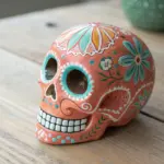
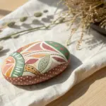
Mandala Rock Dot Painting
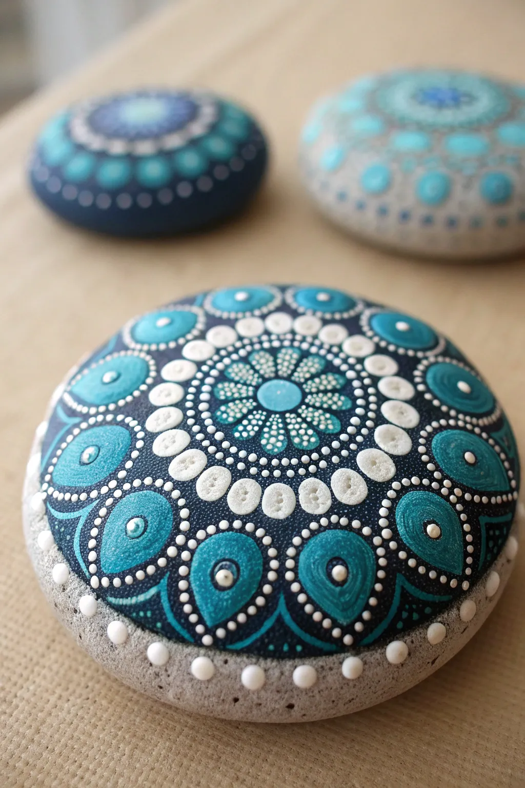
Transform a simple garden stone into a mesmerizing piece of art with this soothing mandala design. Featuring a calming gradient of deep navy, turquoise, and crisp white, this project uses precise dotting techniques to create intricate, lace-like patterns.
Detailed Instructions
Materials
- Smooth, round river stone (approx. 4-5 inches diameter)
- Acryclic paints: Navy Blue or Carbon Black, Teal/Turquoise, Light Blue, Titanium White
- Set of dotting tools (various sizes, from large ball stylus to fine needle tool)
- White pencil or chalk pencil
- Compass and ruler
- Gloss varnish or resin (optional for finishing)
- Damp cloth or paper towels for clean-up
Step 1: Preparation and Base
-
Clean the surface:
Begin by washing your stone with warm soapy water to remove any dirt or oils. Let it dry completely before starting. -
Find the center:
Use your ruler to find the approximate center of the stone. Mark it lightly with your white pencil. This central point is crucial for symmetry. -
Draft guide circles:
Using a compass centered on your mark, lightly draw concentric circles radiating outward. These don’t need to be perfect, but they will guide your pattern layers. Aim for roughly 1/2-inch gaps between rings. -
The base background:
Paint a large, solid circle of your darkest navy blue (or black mixed with navy) over the top surface where your design will live. Taper the edges slightly or leave a natural stone border if you prefer the look shown above. Let this base coat dry fully.
Step 2: Creating the Central Flower
-
The center dot:
Place a medium-sized Light Blue dot directly in the center of your navy background. This is the heart of your mandala. -
First petal ring:
Using a smaller tool, place white dots around the central blue dot. For the flower effect, gently drag the wet white paint inward toward the center with a needle tool to create teardrop shapes. -
Outer flower texture:
Around your flower center, create a ring of tiny white dots. Then, place larger Teal dots in a circle around that ring. While the Teal is wet, add a tiny dot of white in the center of each for a layered look.
Fixing Smudges
Accidentally placed a wonky dot? Don’t panic. Wait for it to dry completely, then paint over it with your dark background color. It serves as a perfect eraser.
Step 3: Expanding the Pattern
-
The white halo:
Create a prominent ring of large Titanium White dots. These should act as a border separating the inner flower from the outer petals. Space them evenly. -
Inner dot details:
Once the large white dots are dry, I like to go back and add very small dots of your dark background color onto the center of each white dot to create a ‘button’ effect. -
Walking the dots:
Around the large white ring, use a very fine tool to ‘walk the dots.’ This means placing one larger dot between the white circles, then making progressively smaller dots trailing off to the sides to fill the gaps.
Level Up: Gradient Dots
Mix your teal gradually with white on a palette to create 3-4 distinct shades. Use these progressively lighter shades as you move outward for a glowing ombré effect.
Step 4: The Large Petal Ring
-
Drafting the petals:
Using your chalk pencil, lightly sketch large teardrop shapes radiating outward. These are the large blue-green shapes seen on the outer edge of the design. -
Filling the petals:
Fill these teardrop shapes with your Teal/Turquoise paint. Ensure the paint is thick enough to be opaque but fluid enough to self-level. -
Outline the petals:
Once the teal shapes are dry, use white paint and a fine tool to create a dotted outline around each teardrop. Keep the dots consistent in size. -
Adding highlights:
Inside each large teal teardrop, place a single large dot of a lighter blue or white near the wide bottom end. This adds dimension and mimics a reflection. -
Bridging the gaps:
In the V-shapes between the large petals, add a stack of dots: a medium white one at the base, followed by smaller dots traveling inward toward the center.
Step 5: Final Touches
-
Top dots:
Look over the whole design. Add tiny ‘top dots’ (smaller dots on top of larger dried ones) in lighter shades to create a 3D effect. For example, add a tiny white dot on the teal highlights. -
The border frame:
Finally, place a ring of brilliant white dots along the very edge of the painted background, right where the paint meets the raw stone. This frames the artwork beautifully. -
Sealing:
Allow the stone to cure for at least 24 hours. Brush on a coat of gloss varnish to protect the paint and make the colors pop like wet ceramic.
Place your finished mandala stone on a desk or in a planter for a daily dose of zen-like calm

Concentric Circle Dot Painting
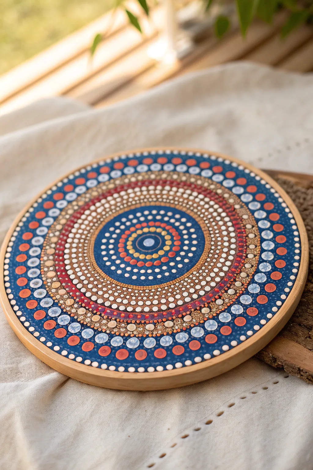
This radiant concentric circle dot painting captures the warmth of a sunset against a cool evening sky. Using a deep blue base and vibrant orange and gold accents, this project creates a mesmerizing, rhythmic pattern on a simple wooden round.
Step-by-Step
Materials
- Round wooden plaque or canvas board (approx. 8-10 inches)
- Acrylic paints: Navy Blue, Titanium White, Bright Orange, Terracotta/Rust, Metallic Gold, Pale Blue
- Gesso (white or clear) for priming
- Dotting tools (various sizes, from fine stylus to large rods)
- Compass and chalk pencil
- Ruler
- Palette or paper plate
- Damp cloth for clean-up
- Gloss varnish or clear coat spray
Step 1: Preparation & Base
-
Prime the Surface:
Apply a coat of gesso to your wooden round to seal the grain and create a smooth painting surface. Sand lightly once dry if needed. -
Center and Grid:
Find the exact center of your circle using a ruler. Use your compass and chalk pencil to draw several light concentric guide circles expanding outward from the center. These will help keep your dot rows perfectly round. -
Paint the Center Background:
Paint a solid circle of Navy Blue in the center (about 3 inches in diameter). Let this dry completely before dotting.
Oops! Uneven Spacing?
Don’t panic if a ring doesn’t close perfectly. Divide the remaining space visually and slightly adjust dot size or spacing for the last 3-4 dots to hide the gap seamlessly.
Step 2: The Central Core
-
The Focal Point:
Using your largest dotting tool, place a single, large Pale Blue dot directly in the dead center. This anchors the entire design. -
First Ring:
Use a small dotting tool to place tiny Gold dots immediately around the central blue dot. Keep them tight and evenly spaced. -
Expanding Colors:
Create the next ring using Bright Orange dots. Increase the tool size slightly from the gold ring. -
Adding Contrast:
Create a ring of White dots next. Notice in the reference image how the spacing starts to open up just slightly as the circles grow. -
Transition to Blue:
Switch back to small White dots, but this time place them further apart on the blue background to create an airy feel. -
Walking the Dots:
For the wider blue band, use the ‘walking the dots’ technique: place a large white dot, then use smaller and smaller dots to curve around it, creating a lace-like effect.
Add Subtle Sparkle
Mix a tiny amount of iridescent mixing medium into your white paint for the top dots. It won’t change the color but adds a pearl-like shimmer in the light.
Step 3: The Middle Bands
-
The Rust Ring:
Paint a thick band of Terracotta/Rust color around the navy center section. Let this base coat dry. -
Layering Dots:
On top of the dried Terracotta band, place medium-sized White dots close together. Once those are dry, place a tiny Gold dot on top of each white dot for a layered 3D look. -
Texture Zone:
Beyond the terracotta band, create a dense field of tiny dots in mixed sizes using Gold and White. This section acts as a textured filler before the outer rim.
Step 4: The Outer Rim
-
Outer Background:
Paint the remaining outer rim of the wood with the Navy Blue paint. Ensure a crisp edge where it meets the inner texture zone. -
Large Border Dots:
Using a large flat-end tool or dowel, place the largest dots around the perimeter. Use an alternating pattern: two Pale Blue dots, then two Terracotta dots. -
Inner Border:
Just inside the large border dots, create a row of medium Bright Orange dots. I find it easiest to align these between the larger outer dots. -
Highlighting Details:
Return to your large outer dots. Once dry, add a ‘top dot’ of a lighter shade to each one—white on the orange, and a lighter blue on the pale blue—to give them dimension. -
Final Fillers:
Use your smallest stylus to fill any awkward triangular gaps between the large outer dots with tiny white ‘micro-dots’ to make the design look cohesive.
Step 5: Finishing Touches
-
Clean Up:
Once the paint is 100% cured (give it 24 hours), gently wipe away any visible chalk guidelines with a damp Q-tip or a soft eraser. -
Seal the Work:
Apply a clear gloss varnish or spray lacquer. This will make the dot colors pop and protect the surface from dust and fading.
Now you have a stunning, intricate piece of mandala art ready to display on a shelf or hang on the wall.

PENCIL GUIDE
Understanding Pencil Grades from H to B
From first sketch to finished drawing — learn pencil grades, line control, and shading techniques.
Explore the Full Guide
Dot Marker Rainbow Circles
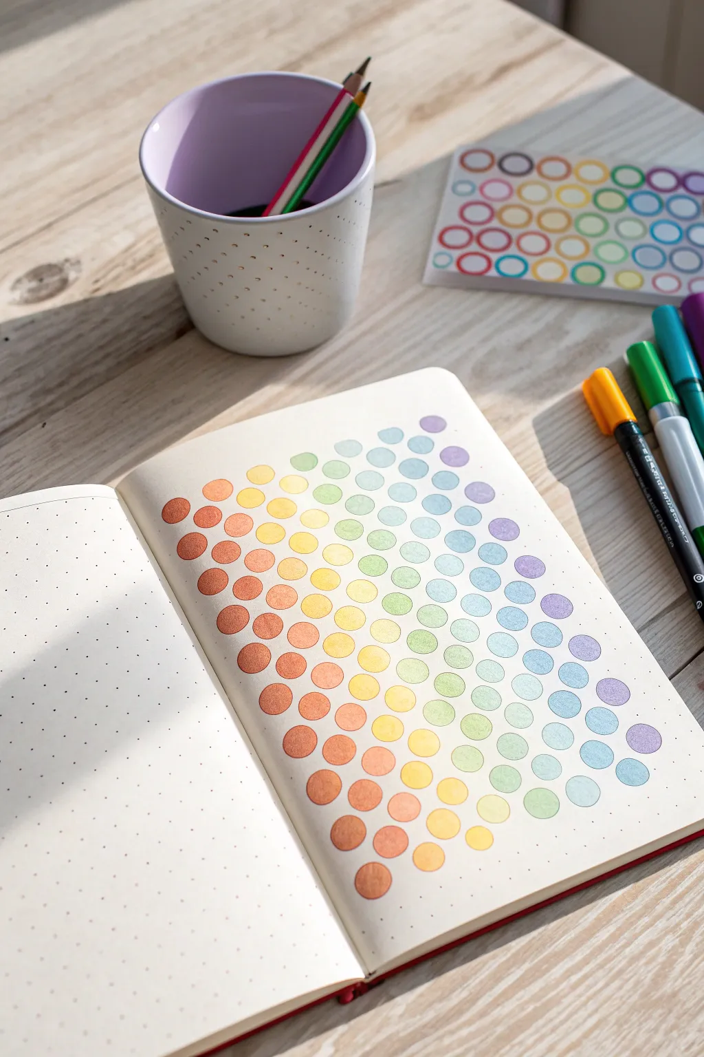
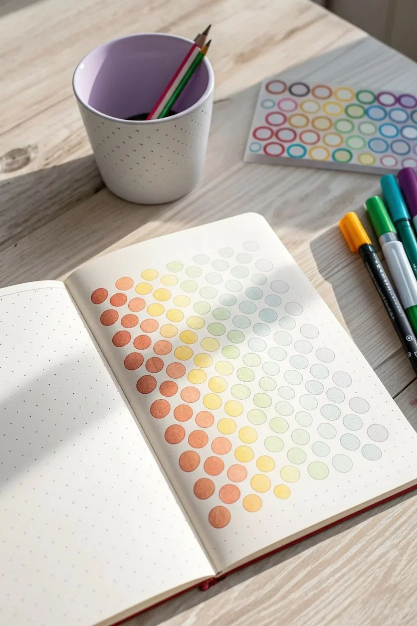
Transform a simple page in your dotted journal into a vibrant burst of color with this satisfying gradient project. Using dot markers or circle stickers, you’ll build a honeycomb-like pattern that shifts seamlessly through the rainbow spectrum.
Step-by-Step Tutorial
Materials
- Dotted Grid Journal or Notebook
- Dual-tip Brush Pens or Dot Markers (Rainbow colors)
- Circle Stencil (optional, if not using dot markers)
- Pencil (optional)
- Scrap paper for color testing
Step 1: Planning the Layout
-
Observe the grid:
Open your journal to a fresh spread. Take a moment to look at the dot grid; you will use these dots as the central anchor points for each circle to ensure perfect spacing. -
Determine spacing:
Decide on the density of your circles. To replicate the look in the photo, you will likely want to skip one or two grid dots between the centers of your circles horizontally and vertically to give them breathing room. -
Test spacing lightly:
If you are nervous about placement, lightly mark the center point of where each circle will go with a pencil first. This helps visualize the diagonal flow before you commit with ink.
Step 2: Creating the Gradient
-
Select your palette:
Gather your markers. Group them into color families: rusty oranges, warm yellows, bright yellows, lime greens, teals, soft blues, periwinkles, and purples. -
Test your color order:
On a scrap piece of paper, swatch your colors in a line to ensure the transition looks smooth. I like to swap colors around here until the gradient looks seamless. -
Start at the corner:
Begin at the bottom left corner of the page with your darkest warm tone—a rusty orange or terracotta. Draw your first circle centered on a grid dot. -
Establish the first diagonal:
Work diagonally upwards and to the right. The next circle should be the same terracotta color, placed one row up and one column over (depending on your chosen spacing). -
Transition to orange:
Switch to a true orange marker. Create a small cluster or short diagonal row next to your terracotta circles. Overlapping the color zones slightly creates a more natural gradient. -
Add golden yellow:
Move to a golden yellow or ochre shade. Fill in the next diagonal ‘slice’ of the page, keeping your circles aligned with the grid to maintain that honeycomb structure. -
Brighten with lemon yellow:
Introduce your brightest lemon yellow. This should sit roughly in the middle-left area of your design, acting as a highlight. -
Shift to green:
Transition into a pale, lime green. As you move toward the center and top of the page, ensure you are keeping the circle sizes consistent if you are drawing them by hand. -
Cool down with teal:
Bring in a soft teal or mint color. This marks the shift from the warm bottom-left side to the cool top-right side. -
Introduce light blue:
add a row of sky blue or baby blue circles. Watch how they interact with the teal; try to place them adjacent to create a smooth visual blend. -
Deepen the blue:
Switch to a slightly deeper, perhaps periwinkle or cornflower blue. This color will dominate the upper middle section of the page. -
Add soft purple:
Use a lilac or lavender shade for the next section. We are nearing the top right corner now. -
Finish with violet:
Complete the gradient at the very top right corner with a few circles in a deeper violet or purple, balancing the visual weight of the rusty orange you started with. -
Fill gaps:
Step back and look at the overall shape. If the cloud of circles feels unbalanced, add one or two extra circles on the edges to round out the form nicely. -
Erase guidelines:
If you used pencil marks to plan your spacing earlier, wait until the ink is completely dry before gently erasing them.
Circle Symmetry
If hand-drawing circles is hard, use a stenciled ruler or the cap of your marker as a tracing guide for consistent sizes.
Dates & Habits
Turn this art into a tracker! Write distinct numbers inside each circle to track hydration, mood, or habits for the month.
Enjoy the soothing visual texture of your new colorful page spread
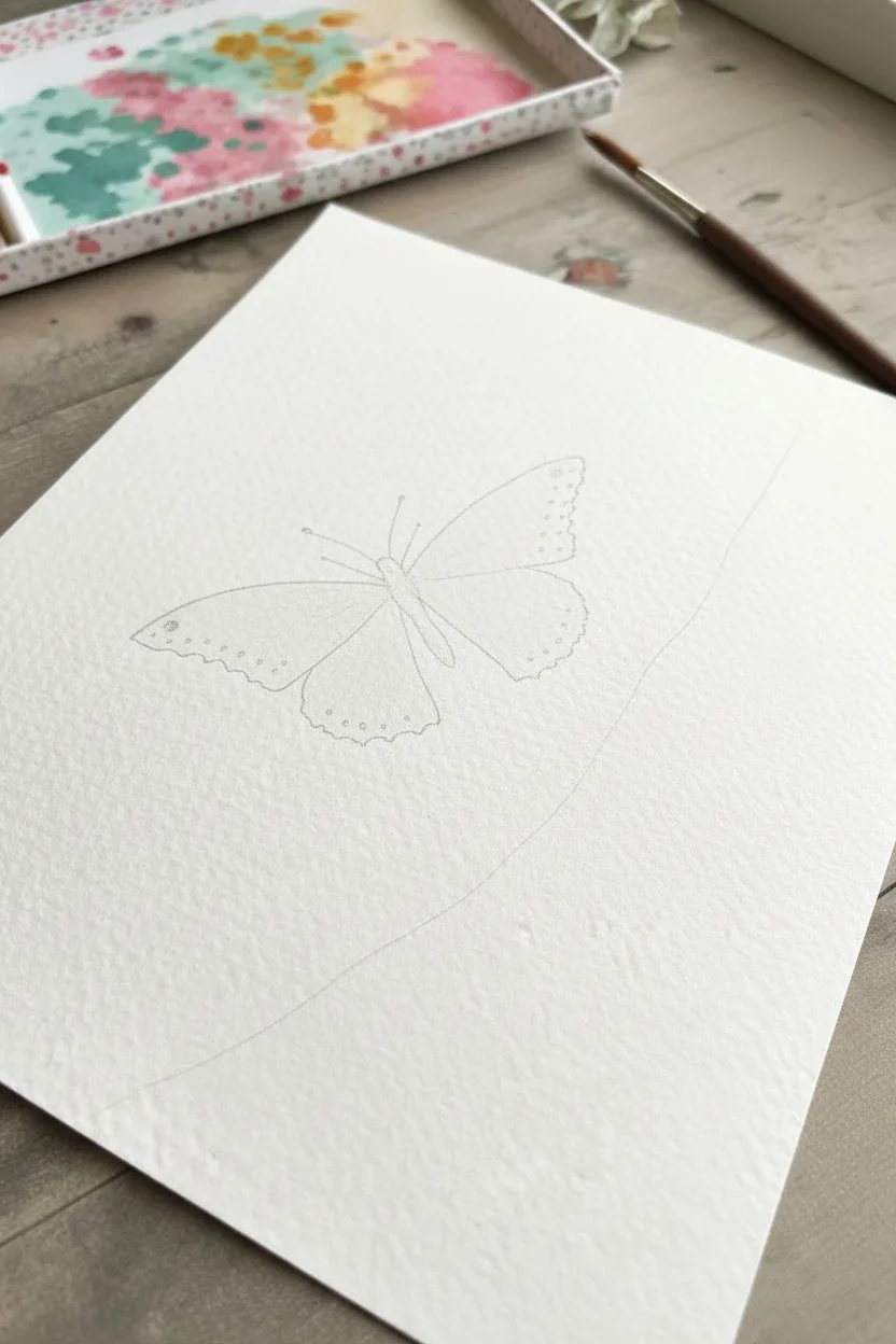
Dot-Filled Silhouette Art
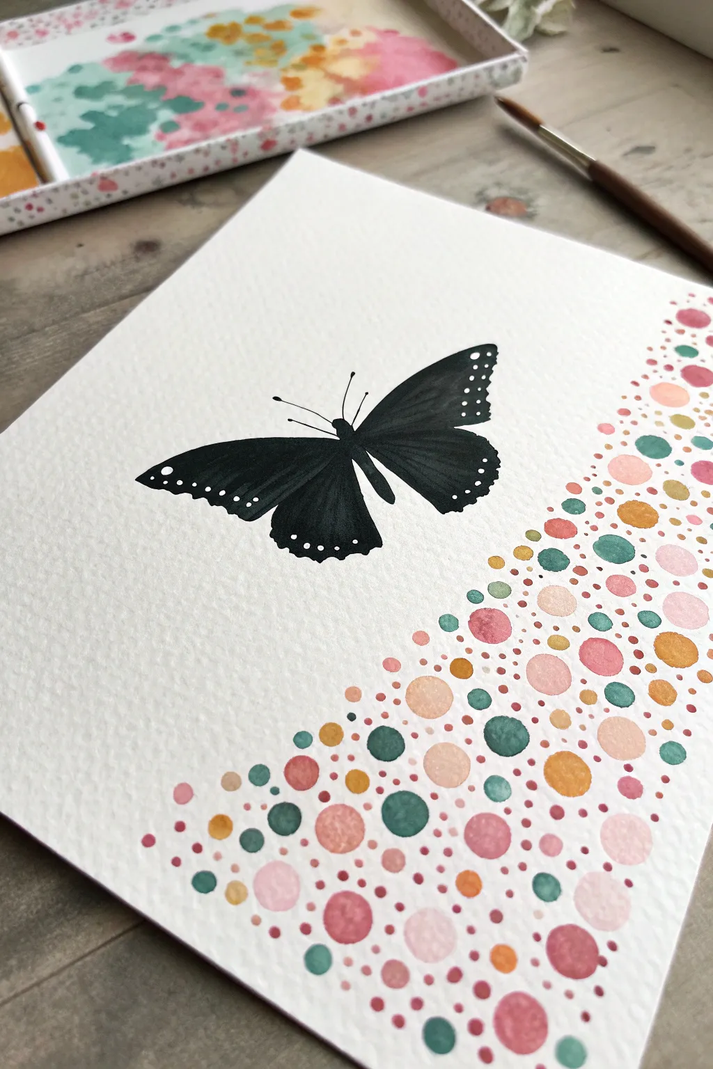
Capture the delicate beauty of a butterfly contrasting against a playful cascade of colorful bubbles in this mixed-technique project. You will combine precise silhouette work with loose, relaxing dot art to create a balanced layout that feels both modern and organic.
Step-by-Step Guide
Materials
- Cold press watercolor paper (140lb/300gsm)
- Black ink, gouache, or high-pigment watercolor
- Watercolor paints (teal, blush pink, coral, golden yellow, ochre)
- Round watercolor brushes (size 0, 2, and 6)
- Pencil (HB or lighter)
- Kneadable eraser
- Clean water and paper towels
- White gel pen or opaque white gouache
Step 1: Planning the Composition
-
Lightly sketch the butterfly:
Begin by sketching the outline of a butterfly on the left-center of your paper. Keep the pencil lines extremely faint, focusing on the large upper wings and slightly smaller lower wings. Do not worry about interior details yet. -
Mark the dot boundary:
Visualize a diagonal wave flowing from the top right corner down to the bottom center. You don’t need to draw a hard line, but lightly sketching a sweeping curve can help guide where your dots will eventually stop.
Bleeding Dots?
If your painted dots act like puddles and merge into a muddy mess, your brush is too wet. Dab it on a paper towel before painting to control the flow and keep circles crisp.
Step 2: Painting the Silhouette
-
Outline with black:
Using your smallest brush (size 0 or 2) and your black medium, carefully trace the outline of the butterfly wings. A high-pigment watercolor or black gouache works best here for deeper opacity. -
Fill the wings:
Switch to a slightly larger brush to fill in the wings. Instead of making it perfectly flat black, you can dilute the paint slightly in the center of the wings to create a subtle texture that mimics the velvet look of butterfly wings. -
Add body and antennae:
Paint the slim thorax and abdomen in the center. Use the very tip of your finest brush to pull out two delicate antennae from the head. I like to keep these lines very thin to maintain elegance. -
Dry completely:
Let the black silhouette dry thoroughly before moving on. Because watercolor reactivates with water, you don’t want to risk smudging the black while working on the colorful section.
Step 3: Creating the Dot Cascade
-
Prepare your palette:
Mix puddles of your chosen colors: teal, blush pink, coral, and golden yellow. You want the consistency to be watery enough to flow but pigmented enough to show color when dry. -
Start with large circles:
Using your size 6 brush, paint the largest circles first. Scatter them randomly within your ‘wave’ area on the right side. Vary the colors so no two large circles of the same color are right next to each other. -
Add medium circles:
Switch to a size 2 brush and fill in the gaps with medium-sized dots. Allow some of these to touch the larger circles slightly if the paint is still wet; this creates beautiful wet-on-wet bleeds. -
Fill with micro-dots:
Use the tip of your smallest brush to fill the remaining white spaces with tiny specks and dots. These act as ‘confetti’ that binds the larger shapes together into a cohesive mass. -
Fade the edge:
As you get closer to the butterfly, make the dots smaller and more sparse. This creates a fading effect, as if the color is dissolving into the white space around the subject. -
Dry the colorful section:
Allow the entire dot section to dry completely. If the paper buckles slightly, you can place a heavy book over it (once bone dry) to flatten it out.
Metallic Magic
Swap the golden yellow paint for metallic gold watercolor paint. This adds a stunning shimmer to the dot cascade when the light hits the paper at an angle.
Step 4: Final Details
-
Add white wing spots:
Once the black butterfly is completely dry, use a white gel pen or a detail brush with white gouache to add tiny dots along the outer edges of the wings. This mimics the patterns found on real butterflies. -
Detail the wing interior:
Add very subtle thin white lines radiating from the butterfly’s body into the wings to suggest veins. These should be faint and delicate. -
Erase guidelines:
Gently use a kneadable eraser to lift any remaining pencil marks that haven’t been covered by paint.
Frame this cheerful piece and enjoy the contrast between the bold silhouette and the lighthearted colors.
BRUSH GUIDE
The Right Brush for Every Stroke
From clean lines to bold texture — master brush choice, stroke control, and essential techniques.
Explore the Full Guide
Sticker Circle Mandala Layouts
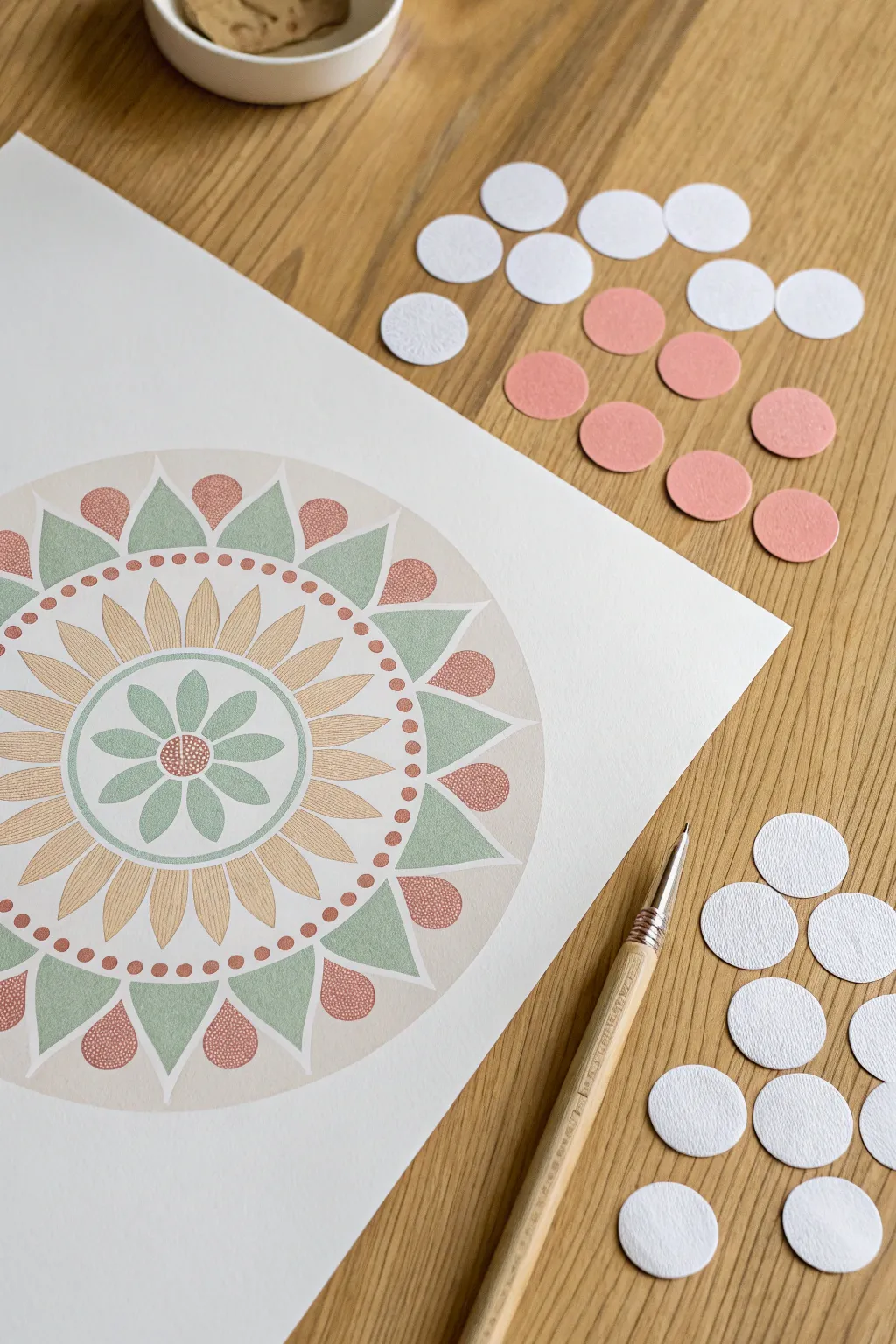
This soothing mandala project combines the crisp geometry of circle stickers with the soft textures of colored pencils or pastels. By using round stickers as masking elements and design guides, you can create a perfectly symmetrical flower-inspired pattern with a lovely, muted palette of sage greens, terracotta pinks, and warm ochres.
Detailed Instructions
Materials
- Heavyweight white drawing paper or cardstock (A3 size recommended)
- Round removable color-coding stickers (white, approx. 19mm/0.75 inch)
- Colored pencils (Sage Green, Light Pink, Terracotta, Golden Yellow)
- Ruler
- Compass
- Graphite pencil (HB or lighter)
- Eraser
- Fine liner pen (optional for details)
- Craft knife or stylus (for lifting stickers if needed)
Step 1: Planning the Symmetrical Grid
-
Find the Center:
Begin by finding the exact center of your paper. Make a tiny, faint mark with your pencil to anchor the entire design. -
Draw Concentric Guides:
Using your compass, draw four concentric circles radiating from the center point. These will define the boundaries for the inner flower, the petal ring, and the outer decorative border. Keep the lines very light so they can be erased later. -
Mark Radial Sections:
Use a protractor to divide your circle into 12 or 16 equal sections. Draw light straight lines from the center outward to create ‘slices’ of pie. These radial lines ensure your petals and stickers stay perfectly aligned.
Sticky Situation
Use removable ‘washi’ style stickers or lightly stick standard ones to your pants first to reduce tackiness, preventing paper tearing.
Step 2: Creating the Central Flower
-
Sketch the Inner Petals:
In the innermost circle, lightly sketch eight teardrop-shaped petals radiating from the center. Ensure the tip of each petal touches the circumference of the first guide circle. -
Coloring the Core:
Fill in these inner petals with a soft sage green colored pencil. Use a gentle, circular shading motion to get an even, matte finish without harsh strokes. -
Add the Center Texture:
Draw a small circle in the very middle. Fill it with a terracotta color, then add tiny dots of white ink or uncolored paper specks to mimic the texture of a flower’s stamen.
Guide The Eye
If your hand-drawn circles aren’t perfect, trace household items like bowls or cups for flawless concentric rings.
Step 3: Developing the Middle Ring
-
Drafting Elongated Petals:
For the largest ring, sketch long, slender petals that extend from the inner circle to the third concentric guide line. These should be more numerous—aim for about 24-32 distinct petals depending on your spacing. -
Gradient Shading:
Color these elongated petals with your golden yellow pencil. Start darker at the base and fade slightly toward the tips to give the mandala a sense of depth and dimension. -
Refining Edges:
Go back over the outline of these petals with a slightly sharper pencil tip to define the separation between them.
Step 4: The Outer Sticker & Shape Layer
-
Apply Formatting Stickers:
Place your white circle stickers around the outermost guide ring. You can use these as literal ‘dots’ in your art, or as masks to color around. For this design, I like to use them to visualize spacing before drawing the final shapes. -
Drawing Triangle Flourishes:
In the spaces between the intended outer circles, draw soft triangular shapes pointing outward. Color these in alternating shades of sage green to echo the center flower. -
Adding Terracotta Accents:
Between the green triangles, draw teardrop or small circle shapes. Fill these with a textured terracotta pink. This creates a rhythm of alternating colors on the border. -
The Dotted Boarder:
Draw a final ring of small, evenly spaced dots just inside the green triangles. Use the terracotta pencil for these to tie the color palette together.
Step 5: Final Touches
-
Erase Guidelines:
Once you are confident the colored pencil work is set and won’t smudge, carefully erase all your graphite pencil guidelines and radial marks. -
Inspect for Symmetry:
Step back and look for any uneven shading. Lightly layer more color over any petals that look too pale compared to their neighbors. -
Texture Check:
If you want a dotted texture on the pink shapes similar to the center, use a white gel pen or stippling technique to add those minute details now.
Now you have a serene, geometric artwork perfect for hanging in a quiet corner of your home
Round Object Stamping Dot Patterns
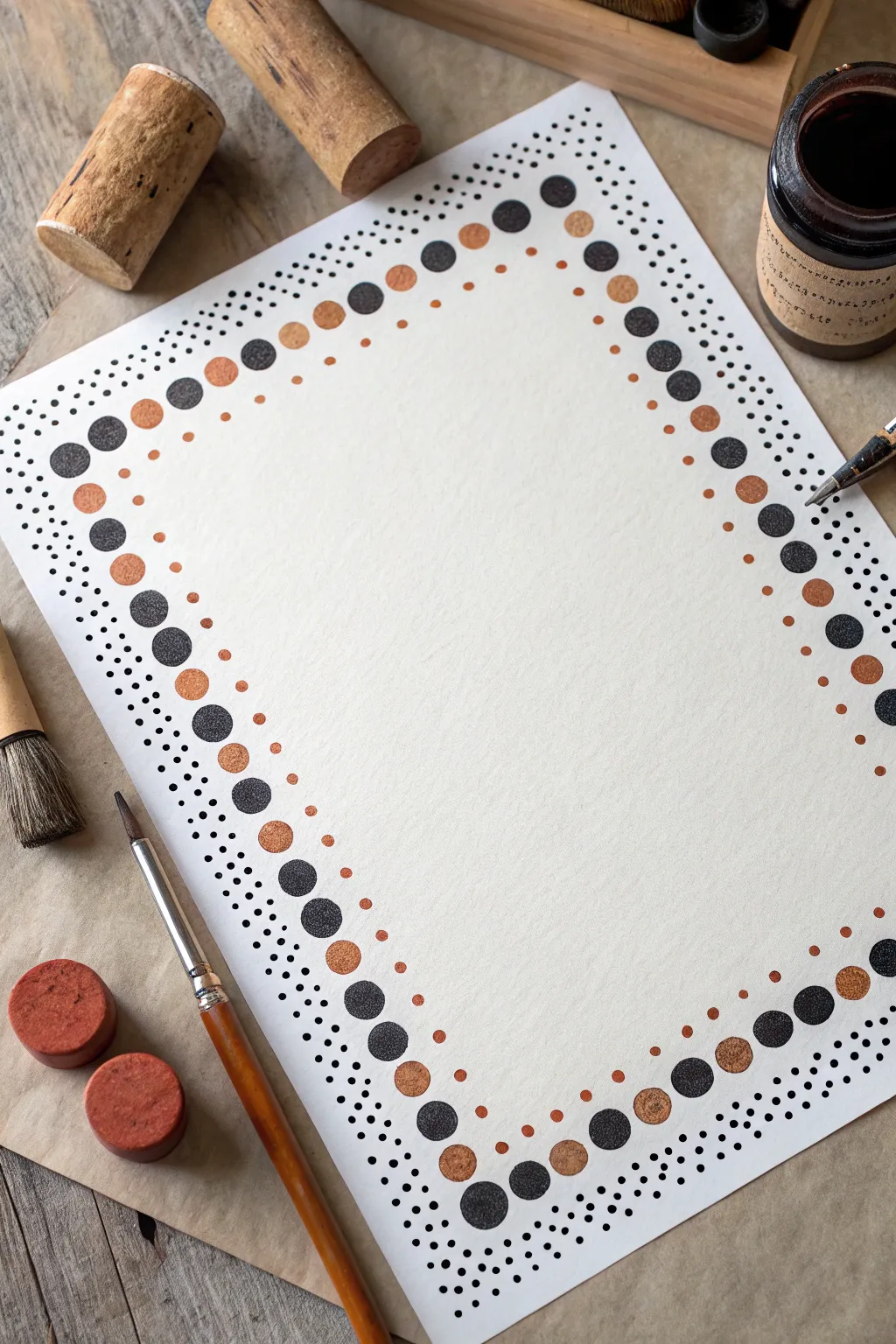
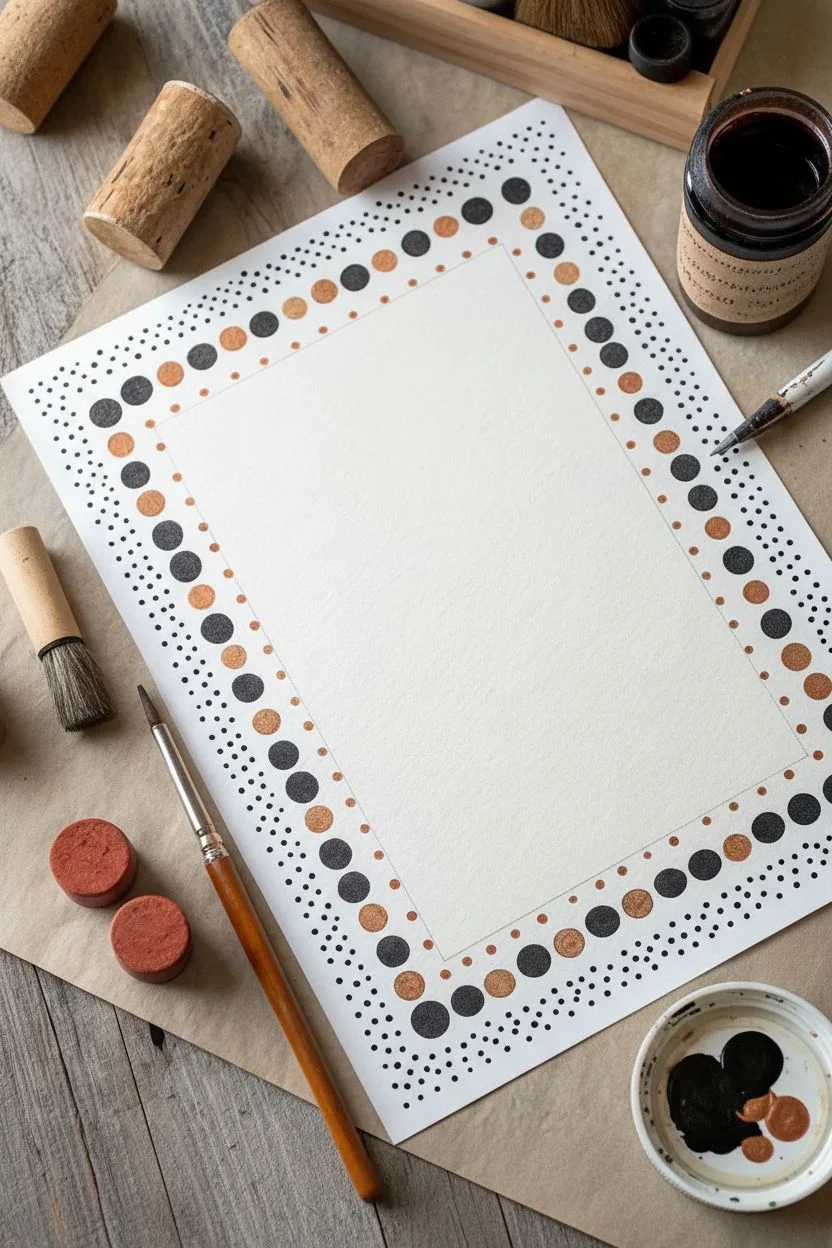
Create a sophisticated stationery border using simple household items as stamps. This project combines the precision of fine pointillism with the organic texture of cork stamping for a beautifully framed page ready for your calligraphy or notes.
How-To Guide
Materials
- High-quality white cardstock or watercolor paper
- Black ink or acrylic paint
- Metallic copper or bronze acrylic paint
- Wine cork patterns (or round foam stampers)
- Wooden dowel or smaller round object for medium dots
- Fine liner pen (black, 0.3mm or 0.5mm)
- Small flat brush (for applying paint to stamps)
- Ruler
- Pencil
- Scrap paper for testing
Step 1: Preparation & Layout
-
Define the workspace:
Begin by lightly tracing a rectangle in pencil on your paper where you want the inner text area to be. This guideline helps ensure your border stays straight and even. -
Prepare your stamps:
Select a wine cork for your large dots. If the end isn’t perfectly flat, sand it lightly. For the medium dots, you can use the other end of the cork if it’s smaller, or a wooden dowel rod. -
Test your colors:
On a scrap piece of paper, test your black and copper paints. You want a consistency that isn’t too runny so the stamp makes a crisp, textured circle rather than a blob.
Stamp Splotches?
If a stamp leaves a ‘halo’ ring instead of a solid circle, your paint layer is too thin. Apply slightly more paint to the cork surface and press firmly without wigging.
Step 2: Stamping the Main Pattern
-
Start the sequence:
Begin at the top left corner. Apply black paint to your large cork stamp using the brush—dipping directly can overload it. Stamp your first black circle. -
Establish the rhythm:
The pattern follows an alternating rhythm. Stamp two large black circles, leaving a gap between them for a copper one. Then, stamp two more black circles a bit further down. Visualise the pattern: Black, gap, Black, Black, gap, Black. -
Add the metallic accents:
Using your copper paint and the same (cleaned) stamp or a second cork, fill in the single gaps between black pairs with a copper circle. The pattern is generally: two black, one copper, two black, one copper. -
Complete the frame:
Continue this alternating 2-1 pattern all the way around your pencil guideline. Don’t worry if the spacing isn’t mathematically perfect; the rustic look is part of the charm. -
Inner details:
Switch to a smaller round tool, like a dowel end or pencil eraser. Dip it in copper paint and stamp a small dot floating just inside the main border, centered next to every main copper circle. -
Let it dry:
Allow the stamped paint to dry completely before moving on to the ink work. Wet paint acts like a magnet for smudges.
Step 3: Fine Pointillism Detail
-
Begin the outer stippling:
Take your fine black pen. You are going to create a gradient of tiny dots on the outside edge of the stamped circles. -
Dense inner layer:
Start right next to the stamped circles. Place your ink dots very close together, creating a dark, dense cloud that hugs the shape of the large stamped dots. -
Fading out:
As you move further away from the stamped border (about 1-2 cm out), start spacing your ink dots further apart. -
Creating the dispersion:
I find it helpful to vary the pressure slightly. The outermost dots should look like they are floating away into the white space, creating a fading mist effect. -
Repeat for the inside:
Now, do the same on the *inside* edge of the border, but keep this layer much thinner. It should just be a light dusting of dots compared to the heavy outer layer. -
Connect the gaps:
Ensure the stippling flows between the large circles. The tiny dots should fill the triangular gaps between the big stamped circles, creating a cohesive band of texture. -
Final review:
Stand back and look at the density. Add a few extra stray dots on the very outer edges to make the gradient look smoother and more natural. -
Clean up:
Once the ink is 100% dry, gently erase your initial pencil guidelines from the center of the page.
Clean Corks
Wipe your cork stamps on a damp paper towel in between every 3-4 impressions. Dried paint buildup on the cork face will ruin the circle texture over time.
Your elegant, hand-stamped stationery is now ready to receive a handwritten letter or poem


Stippled Shading With Fine Pens
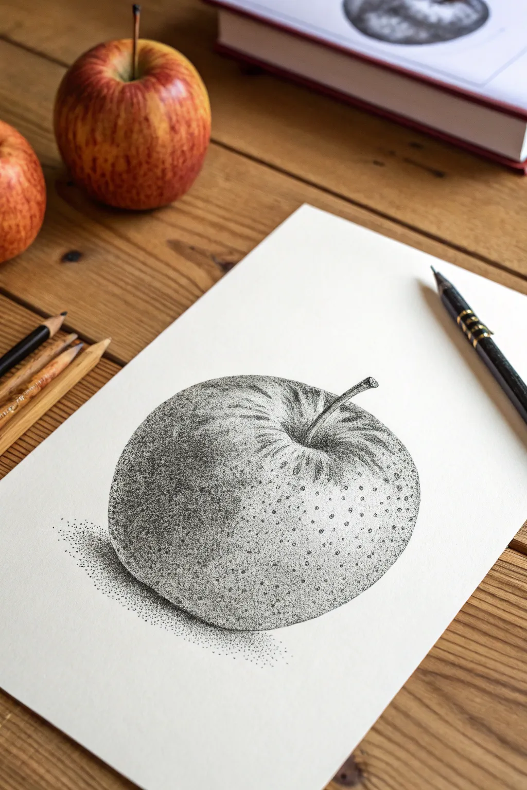
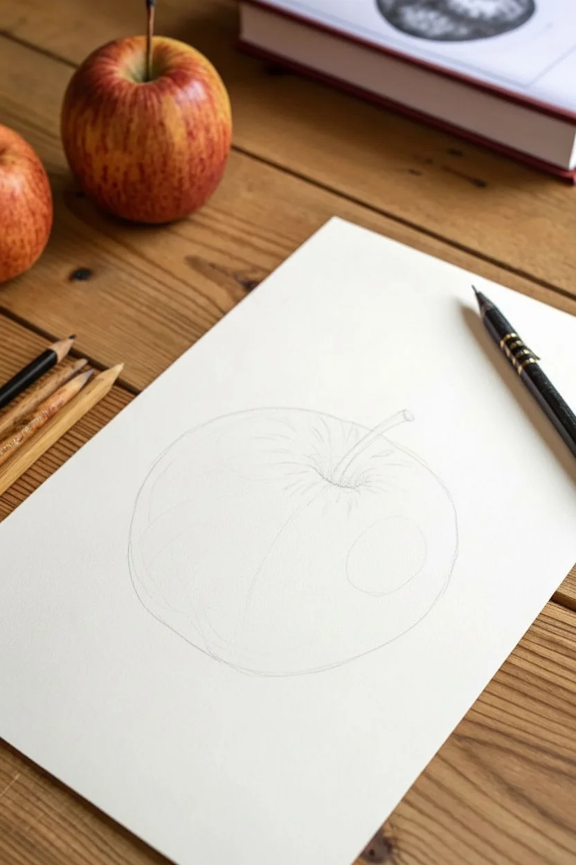
This project explores the incredible depth and texture achievable through simple stippling, using thousands of tiny dots to build a realistic form. You capture the subtle curves and sheen of an apple without drawing a single solid line.
Step-by-Step
Materials
- High-quality bright white drawing paper or Bristol board (smooth surface preferable)
- Fine liner pens (specifically 0.05mm, 0.1mm, and 0.3mm nibs)
- Graphite pencil (H or HB) for sketching
- Kneaded eraser
- Real apple or reference photo for observation
Step 1: Preparation & Outline
-
Light sketch:
Begin by lightly sketching the basic outline of the apple using your H or HB pencil. Keep your pressure extremely light, as you want these lines to disappear later. Focus on the organic, slightly asymmetrical circle shape. -
Marking landmarks:
Add the stem, curving it slightly to give it character. Sketch the indentation at the top where the stem meets the fruit, as this area will require careful shading. -
Mapping highlights:
Use your pencil to faint guidelines around the brightest areas of the apple—specifically the top ‘shoulder’ where the light hits. These areas will remain almost completely white.
Wrist Saver
Stippling takes time. Keep your grip loose and dot by moving your whole arm slightly, not just your wrist. Take breaks if your hand cramps to maintain dot consistency.
Step 2: Building the Dark Tones
-
Initial anchor points:
Switch to your 0.1mm fine liner. Start placing dots along the bottom shadow edge of the apple. Do not draw a line; instead, use a concentration of dots to imply the edge. -
Deepening the base:
Create a dense gradient at the bottom left curve. Place dots very close together, almost touching, to create the darkest value. This grounds the object and gives it weight. -
The stem connection:
Move to the stem area. Use a high density of dots in the deep crevice where the stem emerges. This ‘well’ needs to be quite dark to show depth. -
Defining the stem:
Stipple the stem itself, keeping one side darker to indicate a light source. Use tiny, precise dots here to maintain the thin form.
Go Wider
Try stippling a half-eaten apple next. The contrast between the smooth skin texture and the rough, granular texture of the inner flesh makes for an excellent challenge.
Step 3: Creating Form and Texture
-
Mid-tone gradients:
Using the 0.05mm pen, begin spreading dots outward from your dark areas toward the center. Space them further apart as you move away from the shadows. -
Structuring the curve:
Arrange your dots in subtle, curved currents that follow the roundness of the apple. Even though they are individual points, their collective flow should wrap around the form. -
Fading to light:
As you approach the highlighted area on the upper shoulder, disperse the dots significantly. I find it helpful to squint my eyes to check if the transition from dark to light looks smooth. -
Adding surface imperfections:
Apples aren’t perfect spheres. Cluster a few random, tiny groups of dots in the mid-tone areas to mimic natural speckling or bruising on the skin. -
Refining the top:
Add very sparse stippling around the rim of the top indentation. Leave the paper white for the very highest ridges to make them look shiny.
Step 4: Cast Shadow & Final Touches
-
Grounding the object:
Return to your 0.1mm or switch to a slightly thicker 0.3mm pen for the cast shadow on the table. Create a tight cluster of dots directly underneath the apple. -
Shadow dispersion:
Let the shadow fade out horizontally. The dots should act like dust settling—dense near the fruit and scattering loosely as they move away. -
Contrast check:
Step back and evaluate your values. If the shaded side looks too pale, go back in with the 0.1mm pen and add a second layer of dots to deepen the contrast. -
Erasing guidelines:
Once the ink is completely dry—give it a few minutes to be safe—gently roll your kneaded eraser over the sketch to lift any remaining pencil marks. -
Final speckles:
Add a few stray, microscopic dots in the highlight area just to break up the stark white paper so it doesn’t look cut out.
Now you have a beautifully textured apple study that demonstrates the power of patience and negative space
Gradient Ombré Dot Rows
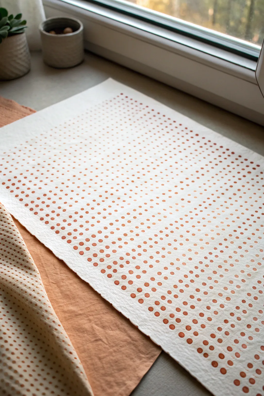
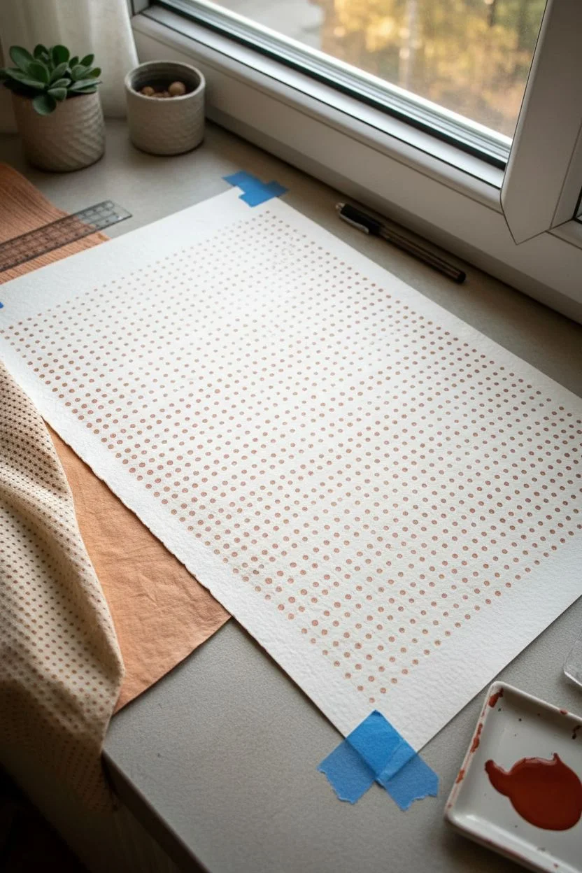
This minimalist project brings warmth and rhythm to your space with a subtle ombré effect created purely through dot density and size. By working diagonally, you transform simple terracotta circles into a flowing optical texture that feels grounded yet modern.
Detailed Instructions
Materials
- Large sheet of cold-press watercolor paper or handmade cotton rag paper (140lb/300gsm)
- Acrylic ink or high-flow acrylic paint in Terracotta or Burnt Sienna
- Foam pouncers (varying small sizes) or round sponge brushes
- Flat palette or dinner plate
- Ruler or straight edge
- Pencil (H or 2H for light marks)
- Kneaded eraser
- Paper towels
Step 1: Preparation & Grid Setup
-
Prepare your paper:
Lay your textured watercolor paper on a flat, clean surface. Tape the corners down gently with painter’s tape if the paper has a tendency to curl. -
Mark the margins:
Using your ruler, measure a 1-inch border around the entire edge of the paper to frame your artwork. Mark this lightly with your pencil. -
Create the grid structure:
Inside your border, lightly mark a grid of dots or tiny crosses spaced about 0.75 inches apart. These will serve as the center points for your painted dots. -
Check spacing:
Step back and look at your pencil marks. The spacing needs to be consistent, but handcrafted imperfections are part of the charm. -
Prepare the paint:
Pour a small amount of terracotta acrylic ink onto your palette. It should be fluid but not watery; if you are using tube acrylics, thin them slightly with a medium.
Uneven Texture Tip
Using cold-press or rough paper is key. The bumps in the paper create natural ‘noise’ in the dots, giving them that organic, stamped look rather than a perfect digital circle.
Step 2: Painting the Gradient
-
Test your applicator:
Dip your foam pouncer into the paint and test-stamp it on a scrap piece of paper. You want a solid circle, not a ring, so ensure the sponge is evenly loaded. -
Start with the darkest corner:
Begin at the bottom-right corner. Press firmly to create the boldest, most saturated dots. This area will represent the ‘heavy’ end of the gradient. -
Establish the diagonal flow:
Work in diagonal rows moving from the bottom-right towards the top-left. Complete one short diagonal row at a time to maintain consistency. -
Adjust pressure for fading:
As you move toward the center of the paper, begin using slightly less pressure or less paint on the sponge. This naturally lightens the opacity of the dots. -
Switch tool sizes (Optional):
If you want the dots to physically shrink rather than just fade, switch to a slightly smaller pouncer or brush tip as you cross the midpoint of the paper. -
Creating the fade-out:
For the top-left section, stamp off excess paint on a paper towel before touching the artwork. This ‘second generation’ stamping creates a ghostly, textured effect. -
Navigate the texture:
Because I used rough paper here, I found that twisting the pouncer slightly upon contact helps the paint get into the paper’s deep grooves. -
Review the gradient:
Pause and look at the overall transitions. If a transition looks too abrupt, add a few medium-tone dots nearby to bridge the gap. -
Complete the grid:
Finish stamping the lightest, faintest dots in the top-left corner, letting them almost disappear into the white of the paper.
Dual-Tone Variation
Mix a tiny drop of white into your terracotta paint as you move up the paper. Changing the tint along with the opacity creates a much softer, cloud-like gradient.
Step 3: Final Touches
-
Let it dry completely:
Acrylic inks dry quickly, but give the piece at least an hour to ensure the thickest dots are set. -
Erase guidelines:
Gently roll a kneaded eraser over the pencil grid marks. Avoid rubbing vigorously, as this can damage the texture of the cotton paper. -
Flatten the artwork:
If the moisture from the paint buckled the paper slightly, place the dry artwork under a heavy book overnight to smooth it out.
Once framed, the rhythmic pattern creates a sophisticated visual texture that warms up any neutral wall
Galaxy Dot Night Sky
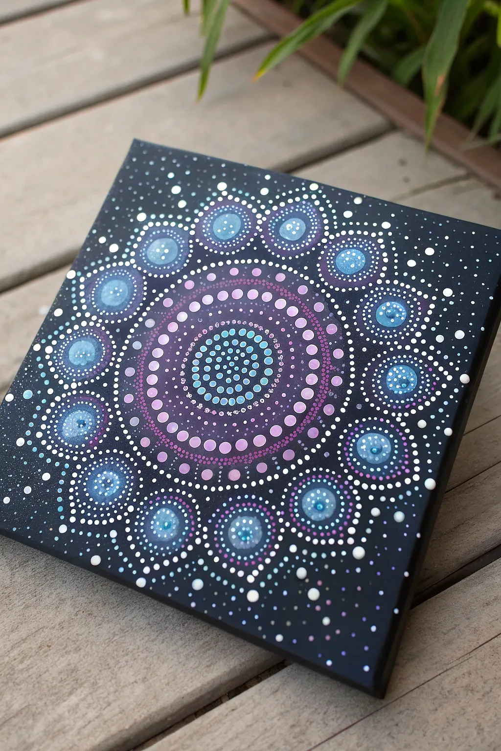
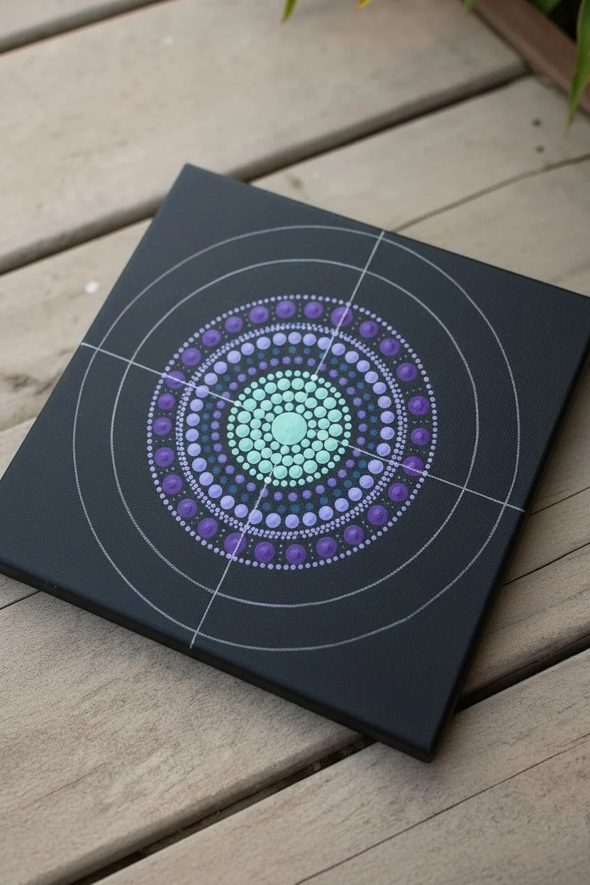
Capture the magic of deep space with this mesmerizing dot mandala, featuring cool celestial hues against a stark black background. The design radiates outward like a glowing galaxy, combining soothing purples, teals, and starry white accents.
Step-by-Step Guide
Materials
- Square black canvas (8×8 or 10×10 inches)
- Acrylic paints (Titanium White, Lavender, Deep Hubble Purple, Teal, Sky Blue, Metallic Pearl)
- Set of dotting tools (acrylic rods for large dots, styluses for small dots)
- Chalk pencil or white charcoal pencil
- Compass and ruler
- Palette or small containers for mixing
- Damp cloth for clean-up
Step 1: Preparation and Center
-
Grid the canvas:
Begin by finding the exact center of your black canvas. Use your ruler and chalk pencil to draw a vertical and horizontal line crossing at the center, then lighter diagonal lines to create an 8-point guideline system. -
Draw concentric circles:
Using your compass, draw very faint concentric circles starting from the center and moving outward. Space them about 0.5 inches apart to guide your rows of dots. -
Create the central galaxy core:
Mix a small amount of teal with white to create a focused brightness. Using a medium-sized dotting tool, place a cluster of dots tightly in the very center, creating a dense nucleus. -
Expand the first ring:
Switch to a slightly darker teal. Dot a tight ring around your central cluster. The dots should be uniform and nearly touching. -
Shift to purple:
For the next few rings, transition into your purple hues. Start with a light lavender ring, followed by a deeper purple ring. As you move outward, increase the size of your dotting tool slightly for each row.
Uneven Dots?
If your paint peaks or leaves a Hershey’s Kiss shape, your paint is too thick. Mix in a drop of pouring medium or water to get a creamy consistency.
Step 2: Radiating Petals
-
Establish the main anchor dots:
Look at the outer ring of your purple section. Using a large acrylic rod tool, place 8 to 12 large teal ‘anchor’ dots evenly spaced around this perimeter. -
Walk the dots:
Dip a small stylus in white or light lavender paint. Place a tiny dot at the top center of one large teal anchor dot, then ‘walk’ the dots down the side until you reach the purple base. Repeat on the other side of the same anchor dot to frame it. -
Repeat the framing:
Continue this ‘walking the dots’ technique for every large teal anchor dot in the circle. This creates a petal-like effect. -
Add the outer swooshes:
Between the peaks of your teal petals, place a medium-sized purple dot. Walk tiny white dots around these purple dots to connect the design flow.
Add Sparkle
Mix just a tiny pinch of fine iridescent glitter or shimmer medium into your top-coat varnish for a true twinkling star effect over the whole piece.
Step 3: The Outer Galaxy
-
Create floating planets:
In the negative space further out on the canvas, place large, standalone dots using a mix of metallic pearl and light blue. These act as larger celestial bodies. -
Add depth to larger dots:
Once the large ‘planet’ dots are semi-dry, take a smaller tool and drop a lighter color (like white mixed with a drop of blue) right on top of them. This creates a 3D crater or highlight effect. -
Scattered stardust:
Using your smallest stylus or even a toothpick, dip into pure Titanium White. Gently dot random areas in the black negative space, varying the pressure to create stars of different distances. -
Gradient details:
Go back to your central purple section. Add tiny top-dots of lighter pink or lilac on top of the cured purple base dots to add dimension and make the center glow. -
Final constellation check:
Step back and look for any large empty black spaces that feel unbalanced. Fill them with tiny clusters of ‘Milky Way’ dust—groups of very small white dots. -
Clean up guidelines:
Allow the painting to dry completely—I usually wait at least 24 hours just to be safe. Then, gently wipe away visible chalk lines with a damp cloth or Q-tip.
Hang your finished celestial mandala and enjoy the calming, starlit atmosphere it brings to your room
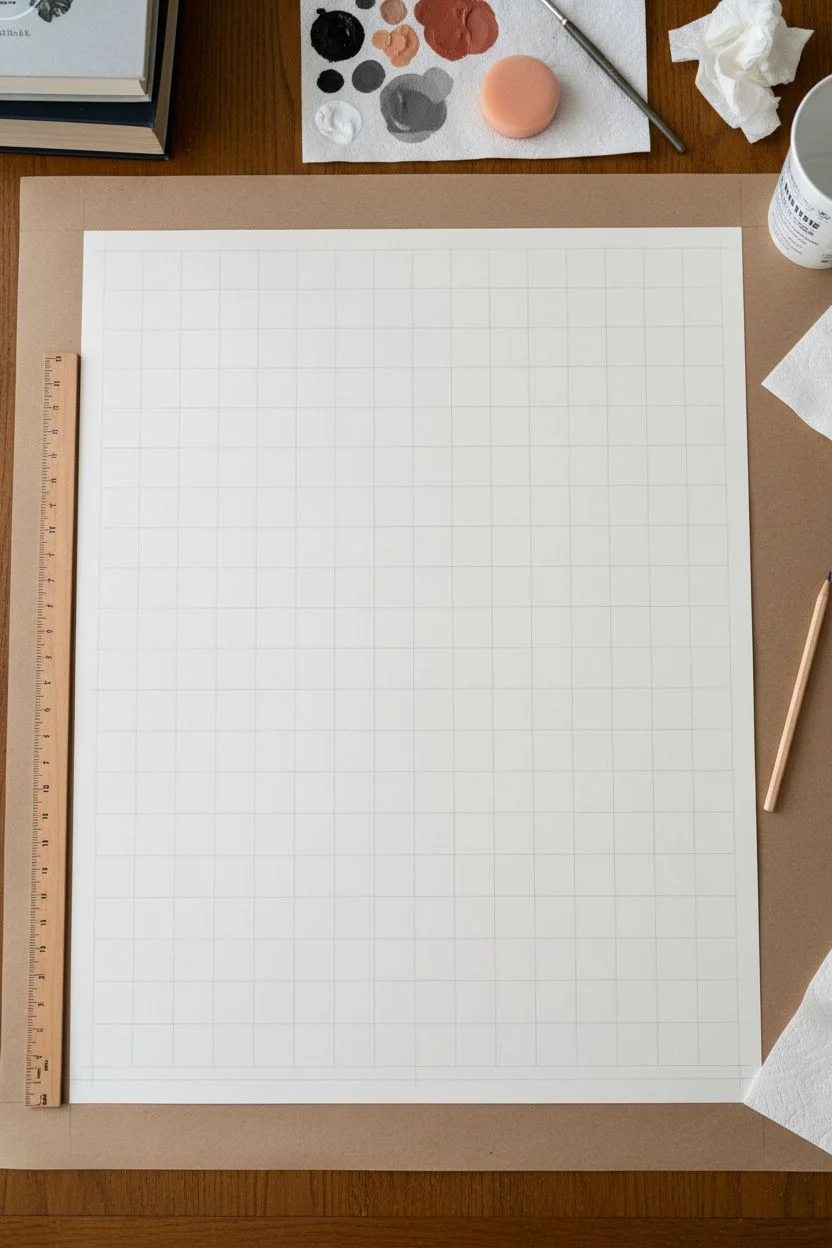
Bold Dot Grids for Modern Wall Art
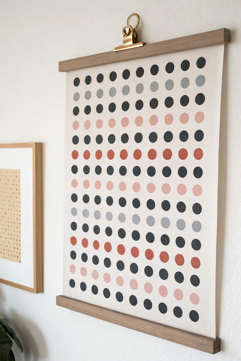
Embrace simplicity with this striking minimalist wall art that requires nothing more than patience and a steady hand. The repeating grid of softened colors creates a modern rhythm that fits perfectly into any contemporary living space.
Detailed Instructions
Materials
- Large sheet of heavyweight cream or off-white paper (archival quality recommended)
- Acrylic paints (black, charcoal gray, terracotta/rust, pale peach/pink)
- Flat artist paintbrush or a round foam pouncer (approx 3/4 inch diameter)
- Pencil
- Long ruler or T-square
- Kraft paper or drop cloth for surface protection
- Wooden magnetic poster hanger kit
- Gold bullion clip (optional styling detail)
- Artist palette or paper plates
- Cup of water and paper towels
Step 1: Planning the Grid
-
Prepare your workspace:
Lay down your protective kraft paper on a large, flat table. Unroll your large sheet of cream paper and weight down the corners so it lays perfectly flat. If the paper has a strong curl, you may need to let it rest under heavy books overnight. -
Calculate margins:
Measure the total width of your paper. Decide on the size of your dots (roughly 0.75 to 1 inch) and the spacing between them. Aim for generous margins on the sides, but leave extra space at the top and bottom to accommodate the wooden hanger rails later. -
Mark the grid lines:
Using your pencil and ruler, very lightly mark a grid on the paper. I prefer to mark only small crosshairs or tiny dots where the center of each painted circle will go, rather than drawing full lines that need erasing later. -
Double-check spacing:
Step back and look at your pencil marks. Ensure the columns are perfectly vertical and the rows are horizontal. A T-square is invaluable here to keep everything aligned with the paper’s edge.
Step 2: Mixing and Painting
-
Prepare the palette:
Squeeze out your acrylic paints. You want a distinct modern palette: a deep black, a mid-tone grey, a warm terracotta rust, and a soft pale peach. If your colors feel too bright, mix in a tiny drop of brown or grey to mute them. -
Choose your tool:
For perfect circles, a foam pouncer is easiest. Dip the pouncer into the paint, dab off the excess on your palette to ensure an even coat, and press straight down. If you prefer a more organic, hand-painted look like the example, use a flat brush and carefully paint each circle freehand. -
Paint the first color row:
Start with your darkest color (black) on the top row. Paint one dot at each marked intersection. Work from left to right (or right to left if you are left-handed) to avoid smudging. -
Establish the pattern:
Study the pattern in the image: distinct rows of single colors alternating with mixed or solid rows. The second row is grey, the third is black, the fourth is peach. Create a plan for your color sequence before you continue. -
Continue painting rows:
Move down the paper, painting one row at a time. Keep your hand steady. If using a brush, try to keep the brushstrokes varying slightly for texture, but keep the outer edges as crisp as possible. -
Manage drying time:
Acrylics dry relatively fast, but be careful not to rest your hand on a wet row above. I usually keep a piece of scrap paper under my painting hand to protect the surface. -
Vary the sequence:
Notice how the pattern shifts lower down on the artwork. It moves from solid alternating rows to a rhythmic disruption—like a row of black interrupted by rust, or grey interrupted by black. Don’t be afraid to break the uniform pattern for visual interest. -
Let it cure:
Once all dots are painted, allow the artwork to dry completely for at least 2-3 hours. The thicker the paint application, the longer it needs. -
Erase guidelines:
If any pencil marks are still visible around the edges of your dots, gently erase them now. Be extremely careful not to smudge the paint or roughen the paper surface.
Circle Perfection
If freehand painting scares you, trace a coin or bottle cap lightly with pencil first, then just ‘color inside the lines’ to ensure uniform sizes.
Step 3: Assembly and Hanging
-
Prepare the hanger:
Separate the magnetic strips of your wooden poster hanger. Lay the top back rail flat on your table. -
Align the top rail:
Place the top edge of your artwork onto the wooden rail, ensuring it is perfectly centered and straight. Snap the top magnetic front rail over the paper to sandwich it in place. -
Attach the bottom rail:
Repeat the process for the bottom of the poster. The weight of the bottom rail helps pull the paper taut and removes any remaining curl. -
Add the gold clip:
For that specific industrial-chic look shown in the photo, attach a large gold bullion clip to the string or the center of the top wooden rail before hanging. -
Final placement:
Hang your new masterpiece on a wall hook or nail. Adjust the bottom rail slightly if the paper needs to settle.
Metallic Accent
Swap one of the color rows (like the grey) for a metallic gold or copper paint to catch the light and add a glamorous twist to the muted grid.
Step back and admire how a simple grid pattern has transformed into a sophisticated piece of statement art for your home
Negative Space Letter or Shape With Dots
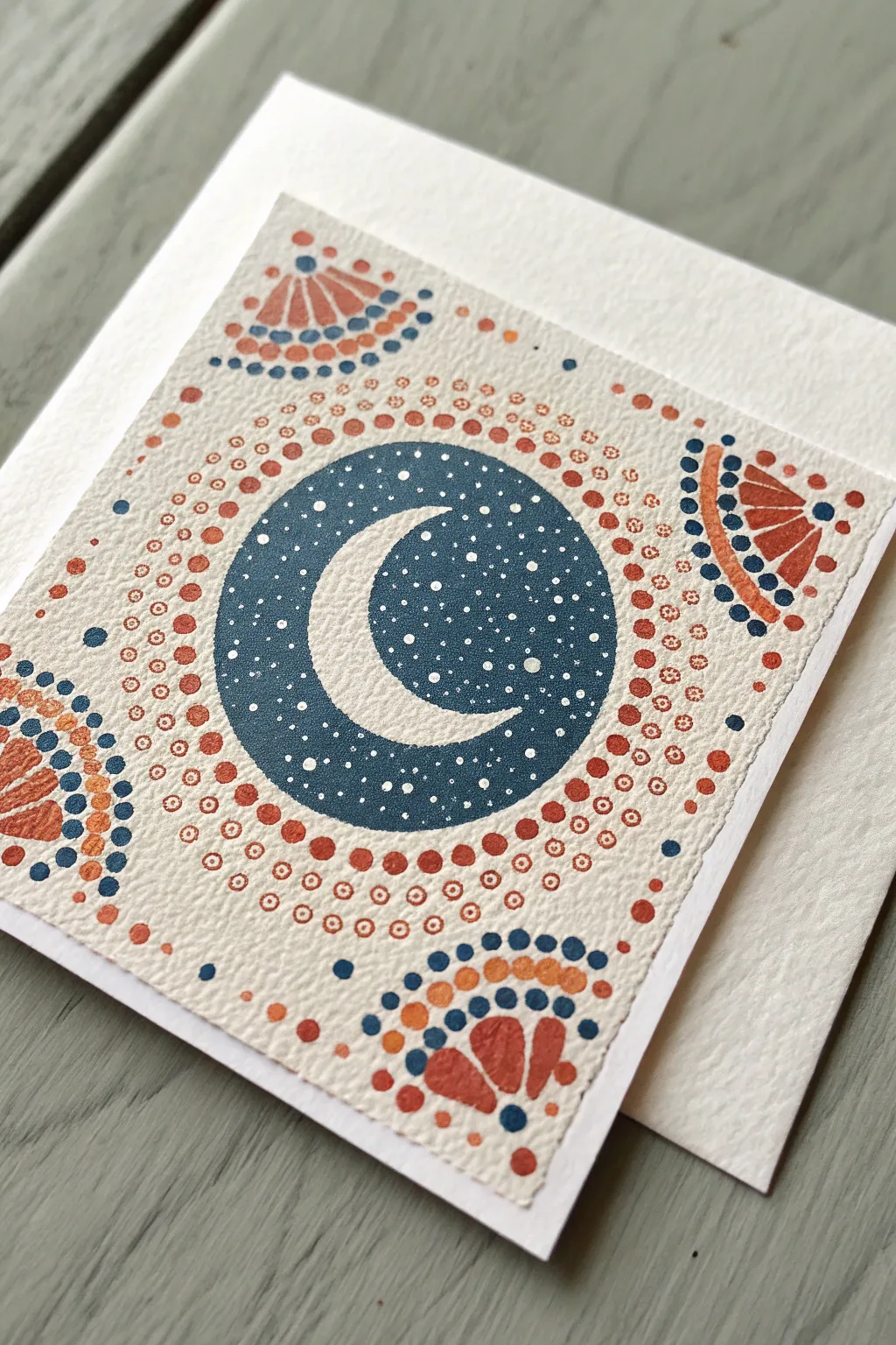
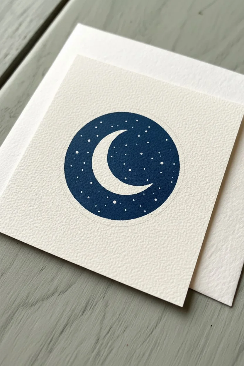
Create a stunning celestial greeting card using the negative space technique to make a glowing white moon pop against a deep starry sky. This project combines precise dotting with bold geometric shapes for a folk-art inspired finish.
Step-by-Step Guide
Materials
- Heavyweight textured watercolor paper or cardstock (square format)
- Acrylic paints (Deep Indigo/Navy Blue, Burnt Orange, Terracotta, White)
- Dotting tools (various sizes) or distinct brush handles
- Small flat paintbrush
- Compass or circular object for tracing
- Pencil and eraser
- Palette or mixing dish
- Paper towels
Step 1: Preparation and Centerpiece
-
Prepare the card base:
Cut your textured watercolor paper into a square, or use a pre-folded square card blank. The texture of the paper adds a lovely dimension to the final piece. -
Outline the central circle:
Using a compass or a roll of tape as a guide, lightly trace a perfect circle in the very center of your square card. -
Sketch the crescent moon:
Inside the circle, lightly sketch a crescent moon shape. Alternatively, I like to use a slightly smaller circular object to trace the inner curve of the moon to ensure it’s smooth. -
Fill the background:
Using a small flat brush and your Deep Indigo paint, carefully fill in the negative space around the moon, creating a dark night sky. Leave the moon unpainted so the white paper shows through. -
Smooth the edges:
Go back around the outer edge of the blue circle to ensure it is crisp and round. Let this base layer dry completely before moving on. -
Add the stars:
Dip a very fine dotting tool (or a toothpick) into white acrylic paint. Dot tiny stars randomly over the blue background, varying the pressure slightly to create different star sizes.
Uneven Dots?
If your paint is too thick, dots will peak. Thin acrylics slightly with a drop of water or flow medium for flat, perfect circles every time.
Step 2: Radiating Patterns
-
Start the first ring:
Select a medium-sized dotting tool and your Burnt Orange paint. Place a ring of evenly spaced dots immediately surrounding the blue central circle. -
Create the second ring:
Switch to a slightly smaller tool and the Terracotta (lighter orange) paint. Create a second ring of dots outside the first one. -
Add detail dots:
Using a very fine tool, place tiny Terracotta dots in the spaces between the larger dots of your second ring to add intricate detail. -
Form the third ring:
Create a third, wider ring using the Burnt Orange paint again. Space these dots out more generously than the previous rows. -
Fill the gaps:
Inside the center of each dot in this third ring, place a tiny dot of the lighter Terracotta paint to create a ‘bullseye’ effect.
Add Metallic Flair
Swap the white stars for metallic silver or gold paint to give the night sky a shimmering, magical quality that catches the light.
Step 3: Corner Motifs
-
Outline corner fans:
Lightly sketch a quarter-circle or fan shape in each of the four corners of the card. -
Paint the base fans:
Paint the main body of these fans with Burnt Orange, leaving a small gap between vertical segments if desired, or painting them solid. -
Dot the corner arches:
Using Deep Indigo paint, create an arch of dots above each orange fan shape, mirroring the curve of the fan. -
Add corner details:
Add a second, outer arch of dots using the Terracotta paint. Alternate the colors if you want more contrast. -
Final scattered dots:
To integrate the design, place a few loose Deep Indigo and Burnt Orange dots in the white space between the central medallion and the corner fans. -
Erase and dry:
Once the paint is 100% dry to the touch, gently erase any visible pencil marks to leave a clean, professional finish.
Send this beautiful handmade card to a friend or frame it as a miniature piece of celestial wall art
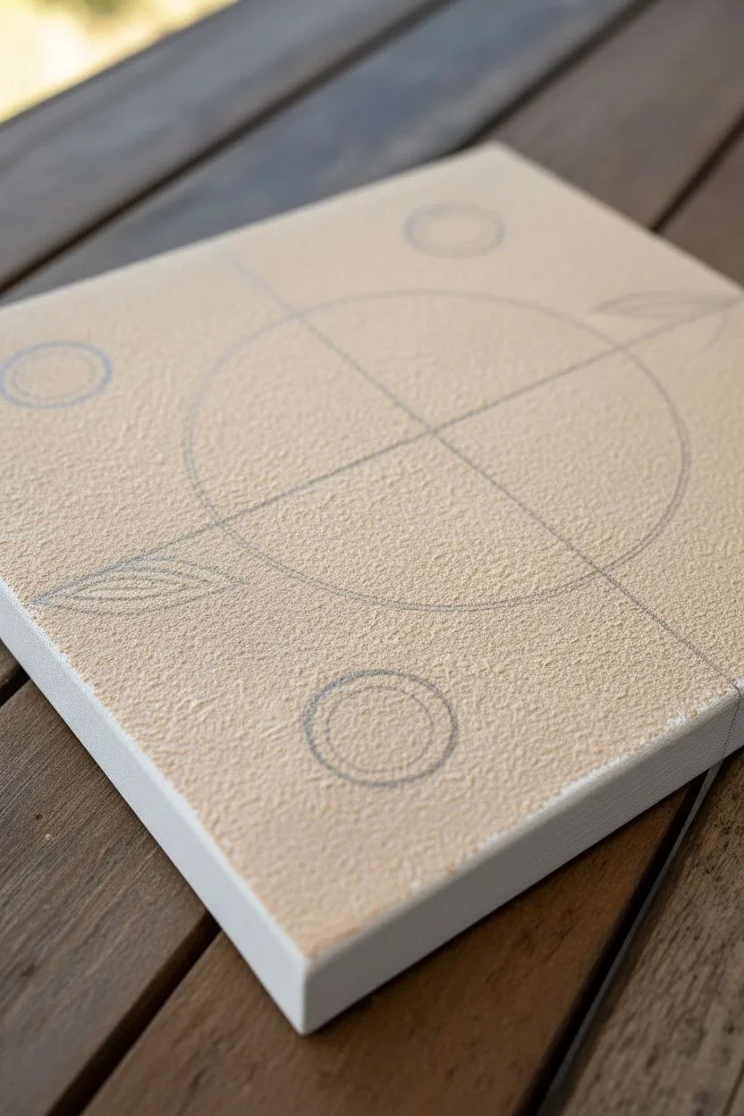
3D Raised Dot Painting
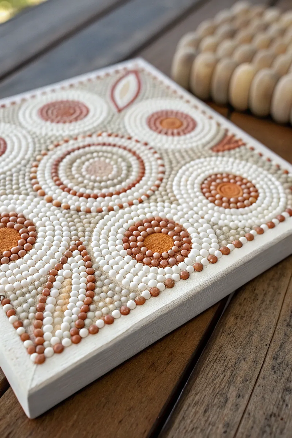
This project transforms a simple canvas into a tactile masterpiece using heavy-body paints and earthy hues. The design features soothing concentric circles and organic leaf motifs created with raised dots, giving the finished piece a beautiful 3D effect that begs to be touched.
Detailed Instructions
Materials
- Small square canvas or wooden panel (e.g., 6×6 inch)
- Heavy body acrylic paint or dimensional fabric paint (Terracotta, Burnt Orange, Beige, Warm Grey, White/Cream)
- Thick Gesso or texture paste (optional for base)
- Set of dotting tools (graduated sizes from stylus to large rod)
- Palette or small containers
- Damp cloth and paper towels
- Pencil and ruler
- Compass or circular stencils
Step 1: Preparation & Base Layout
-
Prime the Surface:
Begin by coating your canvas or wood panel with a layer of warm grey or beige acrylic paint. Let this base coat dry completely. -
Create Texture (Optional):
For the sandy, textured look seen in the background, you can lightly stipple a mix of thick gesso and beige paint over the dry base coat using a stiff brush or sponge. Allow to dry. -
Mark the Grid:
Using a ruler and a pencil, faintly find the center of your canvas. Draw a light vertical and horizontal line to divide the square into quadrants. -
Sketch the Design:
Use a compass to lightly draw your main circle placements. Place one large circle intersected by the grid lines, and position four smaller circles in the quadrants. Sketch the leaf-like shapes in the corners or open spaces.
Step 2: Building the Central & Outer Motifs
-
Center Dot:
Load a medium-sized dotting tool with terracotta paint. Place a single, crisp dot in the center of the large main circle. -
First Ring:
Using a smaller tool, dot a ring of cream or white around the center dot. Keep the spacing tight but don’t let the wet paints touch. -
Walking the Dots:
Continue expanding outward with concentric rings. Alternate between burnt orange, beige, and grey. For larger rings, try ‘walking the dots’—place a large dot, then use the remaining paint on the tool to make progressively smaller dots around it. -
Quadrant Circles:
Move to the four smaller circles sketched in the quadrants. Start their centers with burnt orange paint using a larger tool to create a solid focal point. -
Surrounding Rings:
Surround these orange centers with two rows of white dots followed by a ring of beige dots. Ensure your paint consistency is thick enough to hold a dome shape without flattening. -
Leaf Outlines:
For the leaf shapes, start at the tip with a small dot of terracotta. Place progressively larger dots as you move down the outer curve of the leaf, then taper back down near the base. -
Filling the Leaves:
Fill the interior of the leaf shapes with a contrasting color like cream or light beige. Use smaller tools here to fit the dots into the tapered space.
Peaking Paint Points
If your thick paint leaves sharp peaks when you lift the tool, lightly tap the bottom of the canvas on the table immediately after dotting to help them settle into smooth domes.
Step 3: Filling & Finishing Details
-
Background Filler:
The background texture is key. Use your smallest stylus tool and a mix of grey and white paint to fill the empty ‘negative space’ between the main circles with tiny, random stipple dots. -
Top Dots:
Once the base layer of large dots is semi-dry, add ‘top dots.’ Place a very small dot of a lighter color on top of the larger, dark dots to create depth and dimension. -
Checking Consistency:
Periodically wipe your tools clean. Dried paint on the tool tip can ruin the perfect roundness of your next dot. -
Rim Detail:
Finish the piece by adding a border of evenly spaced white or cream dots along the very edge of the canvas to frame the composition. -
Final Cure:
Because thick dots take much longer to dry than flat paint, lay the artwork flat in a dust-free area for at least 24-48 hours before handling.
Level Up: Gradient Dots
Mix two shades of orange on your palette but don’t blend fully. Dip your tool to pick up a swirl of both colors for a marbled, dimensional dot effect.
Once fully dry, you will have a stunningly tactile piece of decor that fits perfectly with natural interior styles
Dot Mosaics With Paper Punch Circles
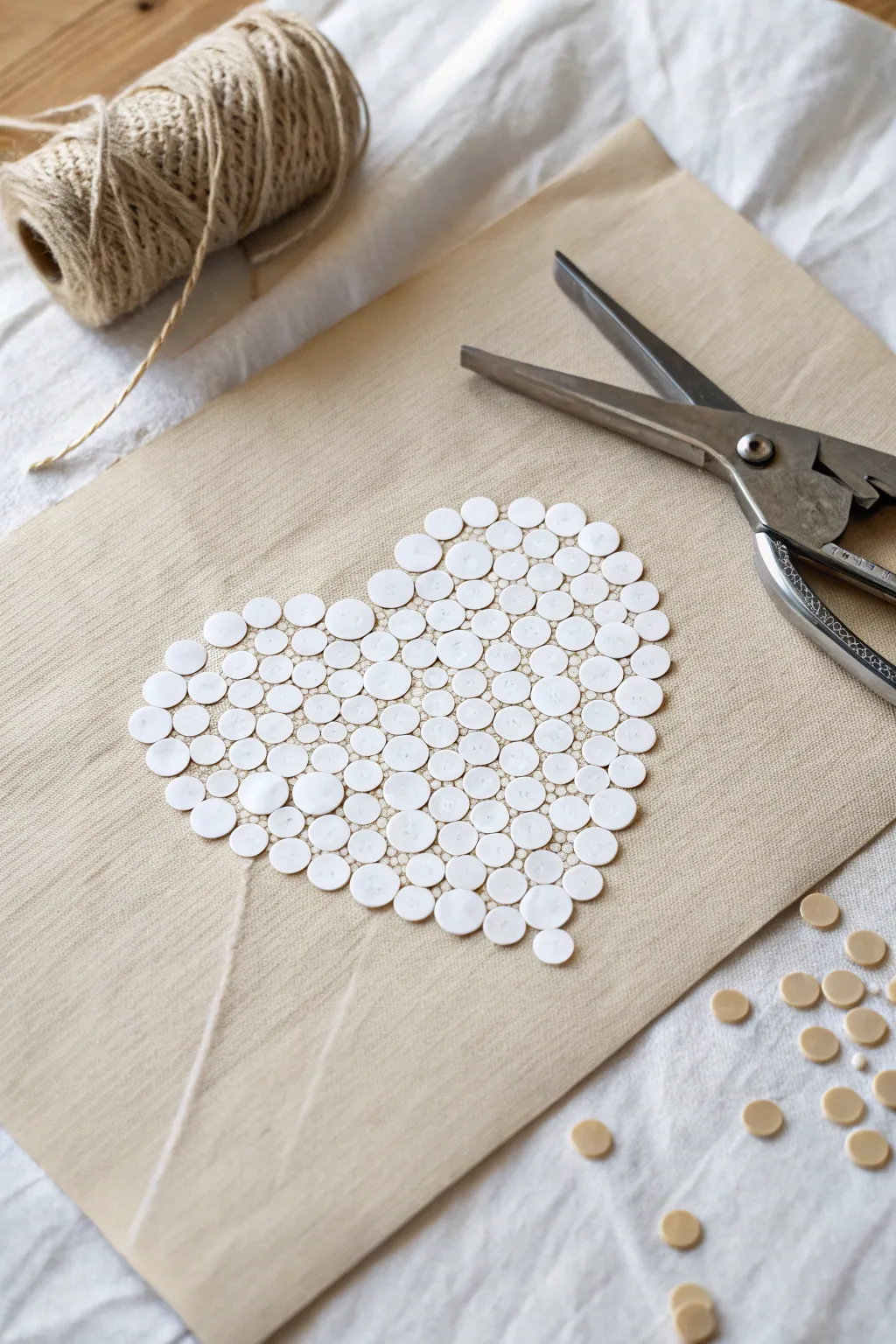
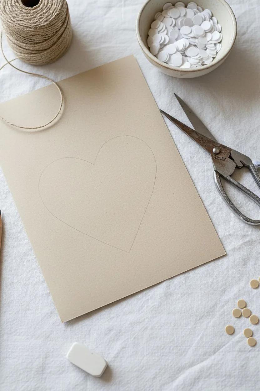
Create a delicate and textured piece of art using nothing more than paper circles and a simple outline. This minimalist mosaic technique relies on spacing and layering to form a recognizable heart shape that looks lovely framed or as a handmade card.
How-To Guide
Materials
- Beige or tan cardstock (for the background)
- White cardstock or heavy paper
- Small circular paper punch (approx. 1/4 inch)
- Pencil
- Eraser
- Clear craft glue or glue stick
- Tweezers (optional but helpful)
- Scissors
Step 1: Preparation & Punching
-
Prepare the Base:
Cut your beige cardstock to your desired size. A standard 5×7 inch or A5 size works well for framing or card-making. -
Sketch the Shape:
Lightly draw a heart shape in the center of your beige cardstock using a pencil. Keep the lines faint so they won’t show through later. -
Punch Circles:
Using your paper punch and the white cardstock, punch out a large quantity of small white circles. You will need roughly 100-150 circles depending on the size of your heart. -
Organize Your Dots:
Gather all your punched circles into a small bowl or container so they don’t get lost while you work.
Glue Control
Use a toothpick to apply tiny dots of glue to the back of each circle rather than the paper. This prevents excess glue from squeezing out.
Step 2: Building the Mosaic
-
Begin the Outline:
Start applying small dots of glue directly along the pencil line of your heart shape. Work in small sections to prevent the glue from drying too quickly. -
Place the Rim:
Carefully place paper circles along the glue line to define the outer edge of the heart. Try to space them consistently close together but not necessarily overlapping just yet. -
Fill the Inside:
Once the outline is established, begin filling the interior of the heart. Apply glue to a small area inside the shape. -
Arrange Inner Circles:
Place circles into the glued area. I find it creates a more dynamic ‘mosaic’ look if you don’t arrange them in rigid rows; try to nest them slightly into the gaps of the adjacent circles. -
Layer for Density:
To avoid large gaps of beige showing through, gently push circles close to one another. You can even let them overlap slightly at the edges for a fuller texture. -
Adjust While Wet:
Use tweezers or the tip of a pencil to nudge circles into better positions while the glue is still tacky. -
Check for Gaps:
Step back and look at the heart. If you see largely empty beige spots, punch a few more circles and slot them into the voids.
Step 3: Finishing Touches
-
Clean Up Edges:
Once the glue is fully dry, gently erase any visible pencil marks around the outer rim of the heart. -
Optional Texture:
If you have leftover beige circles like the ones shown in the scattering, you could glue a few randomly around the base for an artistic, scattered effect. -
Press Flat:
If the paper curls slightly from the glue moisture, place the finished artwork under a heavy book for a few hours once it is completely dry.
Gradient Effect
Mix different shades of white, cream, or pale pink paper circles to create a soft color gradient across the heart shape.
This simple paper punch mosaic creates a charming, handcrafted focal point suitable for any wall or mantel
Resist Dot Art With Tape and Dots
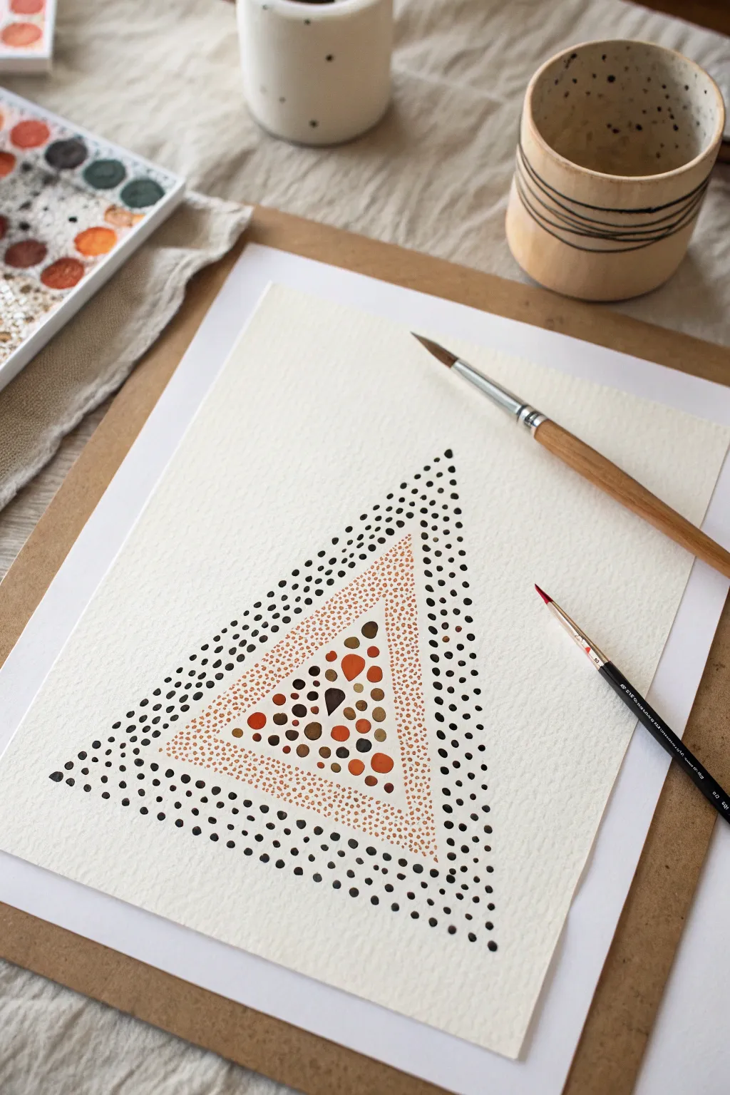
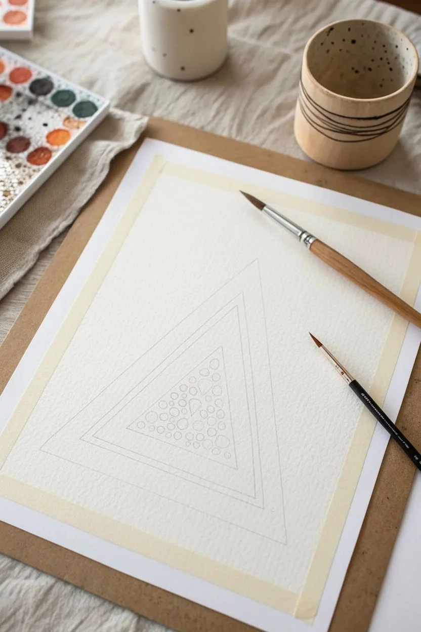
This elegant watercolor project transforms simple dots into a striking geometric composition through the clever use of negative space and varying dot sizes. By layering concentric triangles of different textures, you’ll create a piece that feels both organic and mathematically precise.
Detailed Instructions
Materials
- Cold press watercolor paper (300 gsm)
- Watercolor paints (black/payne’s gray, burnt sienna, rust orange, yellow ochre)
- Small round paintbrush (size 2 or 4)
- Fine liner or detail paintbrush (size 00 or 0)
- Pencil
- Ruler
- Eraser
- Mapping tape or masking tape
- Mixing palette
- Jar of water
- Paper towel
Step 1: Preparation & Sketching
-
Secure the paper:
Begin by taping down your watercolor paper to a board or table surface using masking tape. This prevents the paper from buckling when wet and gives you a nice clean border. -
Draft the outer triangle:
Using your ruler and a pencil, lightly draw a large equilateral triangle in the center of your page. Keep the lines very faint so they can be easily erased later. -
Create the inner boundaries:
Measure about 1.5 to 2 centimeters inward from your first triangle and draw a second, smaller triangle inside it. This creates the band for the black outer dots. -
Define the center:
Draw a third, even smaller triangle inside the second one, leaving another 1.5 cm gap. This middle band will hold the fine orange stippling, while the very center triangle will be filled with larger colored accents.
Step 2: The Outer Perimeter
-
Mix the dark shade:
On your palette, mix a saturated black or Payne’s Gray. You want a high pigment-to-water ratio so the dots remain opaque and sharp. -
Start the edge dots:
Using your size 2 or 4 brush, carefully place distinct black dots along the pencil line of the outermost triangle. Try to keep them evenly spaced but not perfectly uniform. -
Fill the outer band:
continue dotting within the band between your first two pencil outlines. I like to vary the pressure slightly here to create subtle size differences, making the pattern feel more dynamic. -
Approach the boundary:
As you dot closer to the inner edge of this black band, ensure the dots follow the pencil line cleanly to maintain a sharp geometric edge against the next section.
Brush Control Pro-Tip
For perfectly round dots, hold your brush vertically, perpendicular to the paper. Press straight down and lift straight up. Slanted angles create teardrops.
Step 3: The Middle Stipple Layer
-
Mix the rust tone:
Clean your brush thoroughly. Mix a warm, earthy tone using burnt sienna or rust orange. Dilute this mixture slightly more than the black paint. -
Switch to fine detail:
Pick up your smallest detail brush (size 0 or 00). You need a very fine point for this section. -
Begin micro-stippling:
In the band between the black section and the center triangle, apply hundreds of tiny, rapid dots. This technique, called stippling, should be dense enough to show color but airy enough to let the paper breathe. -
Build density:
Focus on keeping the stippling consistent. If your hand gets tired, take a break; uneven pressure can make the spacing look clumpy.
Uneven Spacing?
If your large center dots look awkward or too spaced out, wait for them to dry, then go back in with your tiniest brush and fill the white gaps with micro-dots.
Step 4: The Centerpiece
-
Prepare varied colors:
For the center triangle, you will need a small range of earth tones: yellow ochre, burnt sienna, deep brown, and rust orange. -
Place anchor dots:
Using your medium brush again, paint a few large, fluid circular shapes inside the centermost spaces. Let these be irregular and varied in size, like river stones. -
Fill the gaps:
Switch between your earth tone colors, painting medium and small dots to fill the remaining white space in the center triangle. Don’t worry about perfect circles here; organic blobs look better. -
Dry completely:
Allow the entire painting to dry completely. If you erase too soon, you risk smudging the damp dots. -
Erase guidelines:
Once bone dry, gently run your eraser over the painting to remove the visible pencil guidelines, leaving only the distinct dotted zones.
Step back and admire how the different densities create a cohesive geometric harmony
Hidden Message Dot Art Up Close
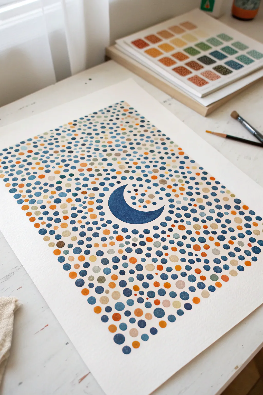
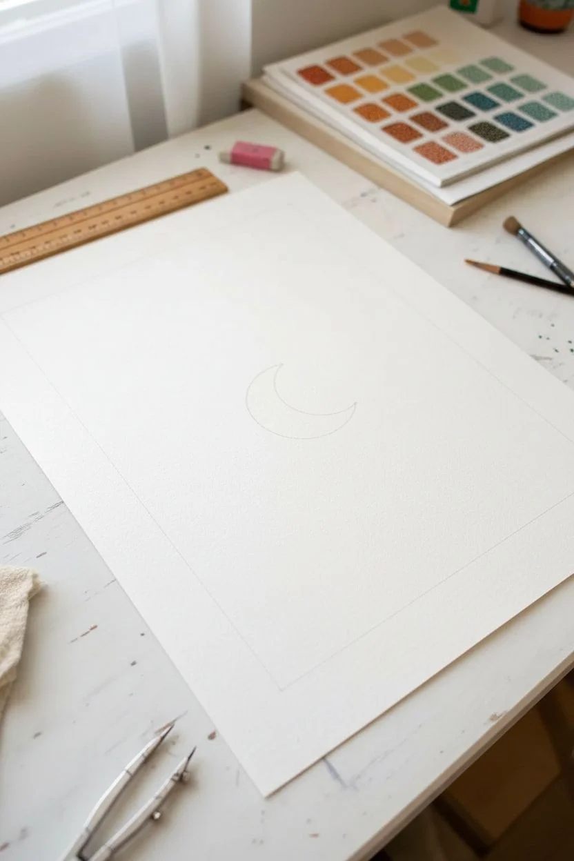
Create a mesmerizing piece of celestial art using simple pointillism techniques that radiate outward from a bold central motif. This project combines a striking crescent moon silhouette with a field of carefully placed colorful dots in calming blues and warm earthy tones.
Step-by-Step
Materials
- High-quality watercolor paper or heavy cardstock (white)
- Acrylic paints or gouache (Navy Blue, Teal, Light Blue, Burnt Orange, Mustard Yellow, Beige/Tan)
- Pencil and eraser
- Compass or circular objects for tracing
- Paint palette
- Assorted dotting tools (stylus, dowels, or brush ends)
- Small round paintbrush (size 0 or 1)
- Ruler
Step 1: Planning and Sketching
-
Define the boundaries:
Begin by lightly marking a rectangular border on your paper with a pencil and ruler. This will contain your dot pattern and give the finished piece a professional, framed look. -
Sketch the moon shape:
Locate the optical center of your rectangle. Use a compass or trace two overlapping circles to create a crescent moon shape right in the middle. Make sure the curve is smooth and balanced. -
Clean up your lines:
Erase any unnecessary guidelines or overlapping circle marks so you are left with just the clean outline of the crescent moon inside your rectangular border.
Clean Grid Trick
Use a piece of masking tape to define the outer edges of your rectangle. You can dot right over the tape edge, peeling it away later for a razor-sharp border.
Step 2: Painting the Centerpiece
-
Fill the moon:
Using your navy blue paint and a small round brush, carefully fill in the crescent moon shape. Keep your edges crisp and clean. -
Ensure opacity:
Depending on your paint quality, you might need a second coat of blue to achieve a solid, opaque finish without streak marks. Let this dry completely before moving on.
Metallic Moon Magic
For a magical twist, use metallic gold or silver paint for the smaller dots surrounding the moon, or paint the moon itself with a shimmering pearlescent blue.
Step 3: Creating the Dot Field
-
Prepare your palette:
Squeeze out small amounts of all your paint colors onto a palette. Consistency is key here; the paint should be creamy but not too runny to ensure the dots hold their shape. -
Start around the moon:
Begin placing small dots immediately surrounding the crescent moon. Use a mix of navy blue and lighter blues here to create a loose halo effect. Keep some negative space between them; don’t overcrowd. -
Vary dot sizes:
As you work your way outward from the center, switch between different sizes of dotting tools. I like to use the back of a paintbrush for medium dots and a fine stylus for the tiny filler dots. -
Introduce warm colors:
Once you have a base of blue dots established near the center, start randomly interspersing your warm tones—burnt orange, mustard, and beige. This creates a vibrant contrast against the cool blues. -
Create flow and movement:
Don’t place dots in perfect rows. Instead, place them organically to fill the space, ensuring an even distribution of colors so no single area looks too heavy with one shade. -
Balance the density:
Try to maintain a consistent density of dots throughout the rectangle. If you spot a large gap of white space, drop in a small beige or light blue dot to bridge the area. -
Check the edges:
Work carefully up to your pencil border guidelines. You can have dots barely touching the invisible line to define the rectangle clearly without needing a drawn outline. -
Refine the composition:
Step back and look at your piece from a distance. If the warm colors feel unbalanced, add a few more orange or tan dots to even out the visual weight.
Step 4: Finishing Touches
-
Erase guidelines:
Once you are utterly certain the paint is bone dry, gently erase the visible pencil marks of your rectangular border. -
Flatten the artwork:
If the moisture from the paint has slightly buckled the paper, place the dry artwork under a heavy book overnight to flatten it out perfectly.
Hang your new celestial masterpiece in a spot where it can catch the light and remind you of the night sky’s beauty


Have a question or want to share your own experience? I'd love to hear from you in the comments below!